

At the time of finalising this issue and sending it to print, there was a distinct morning chill and crisp breeze moving across the UK, as we settle into a new month and spot the first signs of Autumn. Along with the new month and season, we are also super excited to announce new life into the extended [d]arc media team. arc magazine’s editor Matt Waring welcomed a gorgeous baby boy who arrived on Tuesday 3 September. Welcome to the crew Zac Waring, and congratulations Matt, his wife Emma, and daughter Daisy on their newest family member!
And with that, I am pleased to bring you our Sep/Oct issue of darc, which delivers a focus on Restaurant and Bar design. Throughout the issue, we cover a beautiful array of international projects ranging from USA with the characterful Nardó Italian restaurant, to France with Tio, and Spain for Cabrón, both Mexican-themed dining spots, as well as the decadent San Carlo Liverpool in the UK.
As usual with each issue’s focus, we also bring you a small selection of brand case studies, which highlight some stunning decorative lighting solutions suitable for hospitality environments. This section is opened with an introductory comment piece from AB Concept’s Design Director Kevin Chung who discusses lighting approaches for food and beverage environments, and considerations designers should take into account.
Elsewhere in the issue, we take a glimpse at a unique decorative light-art installation that was featured at the Paris Olympics 2024 village, as well as a sustainable lobby lighting solution in a newly completed commercial building located in Salford, Manchester.
I also had the opportunity to catch up with iconic British furniture and product designer Terence Woodgate to discuss his career to date, some of his favourite products he has designed over the years, and his general approaches to designing decorative lighting.
Now grab yourself a pumpkin spiced latte (judge all you want, it’s an elite hot beverage choice), get stuck into this next issue darc and get lost in its pages of inspiration for your upcoming projects.

036
Materials
Terrazzo, Rothschild & Bickers
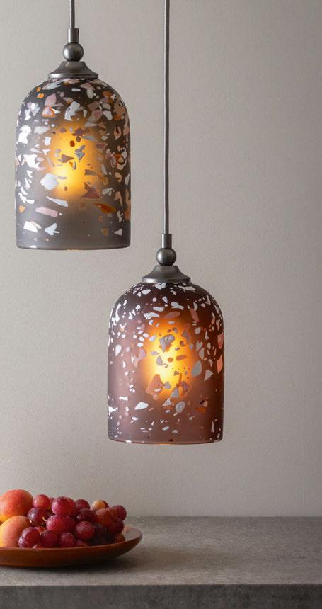
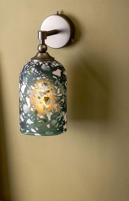
The contemporary glass lighting brand launches its newest pendant and wall light range, Terrazzo, which utilises coloured chips of glass.
044
Interview: Terence Woodgate
The iconic product and furniture designer sits down with darc’s editor Sarah Cullen to chat about his career, design inspirations, and memorable collections that he has created over the last 21 years as an official Royal Designer for Industry.
052
Feature Comment: Restaurant & Bar Lighting
AB Concept’s Design Director Kevin Chung discusses the importance of decorative lighting in an F&B environment, highlighting the considerations to the architecture and referencing recent projects case studies.
054
Feature Focal Point: Restaurant & Bar Lighting Wax Rabbit, Studio Munge
056
Feature Case Studies: Restaurant & Bar Lighting
A selection of some of the latest lighting solutions that are well-suited to hospitality environments.
Managing Editor | Helen Ankers
h.ankers@mondiale.co.uk
+44 161 464 4750
Editor | Sarah Cullen
s.cullen@mondiale.co.uk
+44 161 464 4750
Junior Journalist | Ellie Walton
e.walton@mondiale.co.uk
+44 161 464 4750
Contributing Editor | Matt Waring m.waring@mondiale.co.uk
International Sales Manager | Tristan Blowers
t.blowers@mondiale.co.uk
+44 7392 895771
012
San Carlo Liverpool
Fettle brings a new atmosphere to the already well-respected San Carlo restaurant in Liverpool, UK, utilising layered light with beautiful decorative fixtures.
020 Nardò
USA-based celebrity interior design and home stager Francesca Grace has completed her first restaurant project in the heart of West Hollywood. The Italian dining spot is filled with rich fabrics and colours, creating a unique, cosy dining experience.
026 Tio
Parisian interior design agency Bureau Lacroix has created a rustic and warm dining experience for new Latin American street food destination, Tio.
030 Cabrón
The recently opened Mexican bar grill Cabrón brings a colourful new dining destination to Madrid. The interiors scheme was completed by Spanish design studio PPT Interiorismo, who put a contemporary twist on traditional Mexican design.
008
Focal Point
Eden New Bailey, SpaceInvader
010
Focal Point
Ondes de Lumière, Miguel Chevalier
034
On The Board
Ekho Studio
Sarah Dodsworth, Founding Partner and Lauren Robinson, Interior Designer at Ekho Studio provide a detailed mood board and product specification highlight for an upcoming hospitality venue located in the idyllic British countryside.
042
Design Evolution
Part 1: Secto Design
Part 1 of this issue’s Design Evolution hears from architect and designer Seppo Koho about his inspirations for Secto Design’s latest collection, Kumulo. Part 2, revealing the final design, will be available in upcoming issue 57.
Artwork | Dan Seaton d.seaton@mondiale.co.uk
Editorial | Mel Capper m.capper@mondiale.co.uk
Managing Director [d]arc media | Paul James p.james@mondiale.co.uk
Marketing & Events [d]arc media | Moses Naeem m.naeem@mondiale.co.uk
Chairman Mondiale Publishing | Damian Walsh
Finance Director | Amanda Giles a.giles@mondiale.co.uk
Credit Control | Lynette Levi l.levi@mondiale.co.uk
[d]arc media ltd | Strawberry Studios, Watson Square, Stockport SK1 3AZ, UK | Printed by Buxton Press, Palace Road, Buxton, UK ISSN 2052-9406

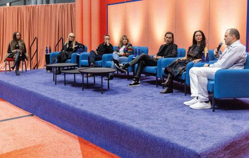
Save the Date 20 & 21 November 2024
Join us at LiGHT 24, the UK’s only trade show dedicated to high-end lighting specification.
For those working in design, it’s the best opportunity in the UK to explore new products, access design talks, and network with those across the sector. Now into its third successful year, LiGHT 24 will take place at the Business Design Centre in London. Join thousands of other industry professionals for a fantastic two days of design inspiration.
From the publishers of:
SALFORD, UK
SpaceInvader has created a stunning social hub on the ground and mezzanine floors of Eden, New Bailey - a newly-completed £36m office building in Salford, now one of the UK’s most environmentally-friendly buildings.
Manchester-based designers SpaceInvader were determined to use the practice’s extensive knowledge of designing sustainably to help push boundaries and create a scheme that would sit in harmony with the building’s many eco-friendly achievements.
The lighting design for the scheme needed to help create a variety of zones with different moods for taskoriented work or relaxation. Lighting is also a major feature of the ground floor sculptural installation and was developed, as with the amenity lighting scheme throughout, with Paul Shoosmith of Light Forms. To enhance the scheme’s human-centric experience further, the majority of the light fixtures have tuneable white LEDs, allowing the colour temperature of the space to change to suit the environment and reflect natural circadian rhythms. All architectural fixtures are also DALI dimmable, enabling complete control of the light output and energy consumption throughout the space.
“The thinking behind Eden, New Bailey was all about finding new and creative ways to deliver tangible sustainability and inclusivity – and to really walk the walk in the interiors too, responding to the building’s net zero operational carbon levels, which make it one of the UK’s most environmentally-friendly buildings, and which boasts an exterior featuring Europe’s largest living green wall,” explains John Williams, Founder, SpaceInvader.
“When we were asked to look at the ground floor amenity space, we knew it would be completely visible
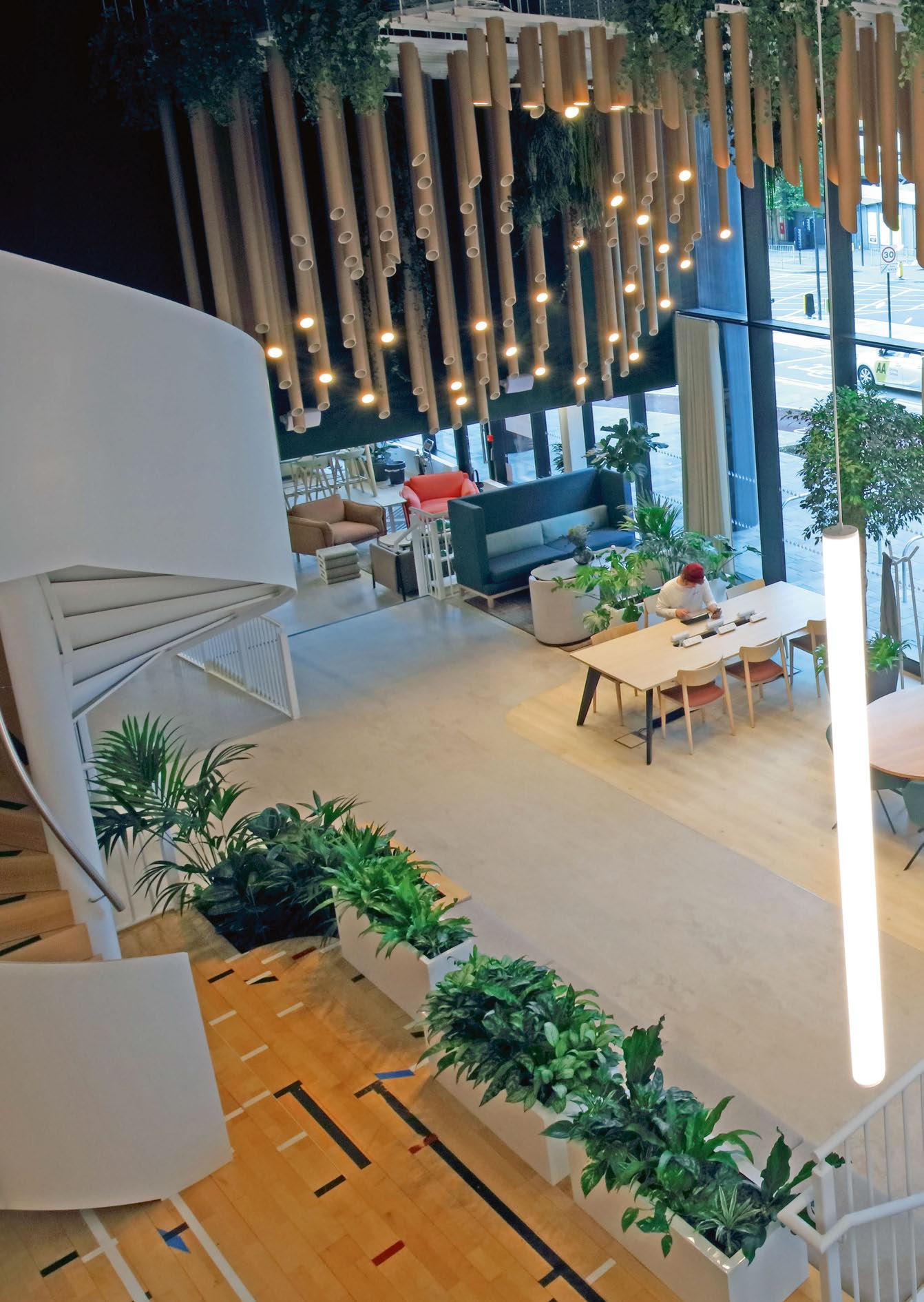
to passers-by. I immediately thought of a huge-scale sculptural piece that would be really impactful. I loved the idea of a parent taking kids to school and stopping and wondering at something that was both beautiful and intriguing.
“The aim was for a very layered installation that would be functional, sculptural and sustainable all at the same time. Initial inspiration came from an image of black carbon rods I came across while researching. I brought Paul Shoosmith of Light Forms on board right at the start for his technical expertise, to explore how this idea could be made real.
“We investigated materials that could absorb carbon, but came to a dead end, so thought of incorporating planting too, so that the installation nonetheless performed that absorption function. We still needed a material that could carry light and would work easily on a circadian cycle. Timber was a first route, but alternatives included recycled cardboard tubes, which sounded great, though they had to be tested for a very long time with a light on constantly to ensure they could withstand the heat transfer of an LED fitting!
“The third party who really made it all possible was our joinery contractor, Careys, who needed to create the structural frame to hold the sculpture and cut all the tubes to the required length. We couldn’t be more pleased with the result – a sculptural showstopper, with great sustainable credentials, human-centric circadian rhythm settings, and which responds in form and function to carbon, the basic building block of life, which we all need to respect, understand – and handle responsibly!”
www.spaceinvaderdesign.co.uk www.lightforms.com

As part of the charter “1 building, 1 work”, Vinci Immobilier commissioned artist Miguel Chevalier to create an artwork for the Universeine district in Saint-Denis, the heart of the athletes’ village during the Paris 2024 Olympics.
Chevalier conceived the work Ondes de Lumière consisting of eight organic-shaped resin chandelier sculptures suspended from the ceilings of five porches in the two blocks of buildings along the Allée de la Seine (Architects: Béal & Blanckaert, Pascal Gontier, Lina Ghotmeh, and Gaëtan Le Penhuel).
Chevalier highlights the proximity of the Seine and drew inspiration from the movements of the water. In a stylised, relief-like way, he materialises the phenomenon of waves.
Natural light creates a subtle effect in the material with striped bands alternating between transparency and translucency.
At nightfall, the sculptures light up, resembling large, colourful drapes. They project a succession of concentric rings onto the ground, representing the propagation of light waves and interference phenomena.
For each porch, these sculptures created a vibrant universe of energy. These five successive creations, visible by residents or passersby, develop a uniqueness and identity specific to this group of buildings.
The sculpture-chandeliers were made in Acrylic crystal Dacryl and Altuglas R-Life (recycled Cast Acrylic Sheet), with LED ribbons and gobo projectors.
www.miguel-chevalier.com
Photo: Thomas Granovsky


Fettle brings a new atmosphere to the already well-respected San Carlo restaurant in Liverpool, UK, utilising layered light with beautiful decorative fixtures.
In the heart of the UK’s northern city, Liverpool is the iconic San Carlo restaurant, which has recently undergone a stunning renovation by London and LA-based interior and architecture studio, Fettle.
Fettle’s brief for the project was to refresh and reinvigorate the existing, well-established space, an all-day dining restaurant, which offers an opulent and contemporary take on traditional Italian dining with elegant interiors inspired by Grand Milanese villas and gardens. Fettle also drew from the architecture of Piero Portaluppi, creating a space that has an alluring ambience and timeless sophistication.
Speaking with darc on their involvement in the project is Andy Goodwin, Co-Founder and Creative Director at Fettle. “San Carlo was an existing client of ours and we had already successfully worked with the company on two London restaurants. San Carlo Liverpool was an existing site in their portfolio that they wanted to completely renovate and re-design. Having previously worked with the San Carlo brand, we were excited to embark on this new, large scale refurbishment project. Our brief was to reimagine the space including the bar, restaurant, private dining room and wine room. We stripped back the existing space to a shell, completely renovating and re-designing each element of the building.
“Altogether, the project took 14 months to complete.”
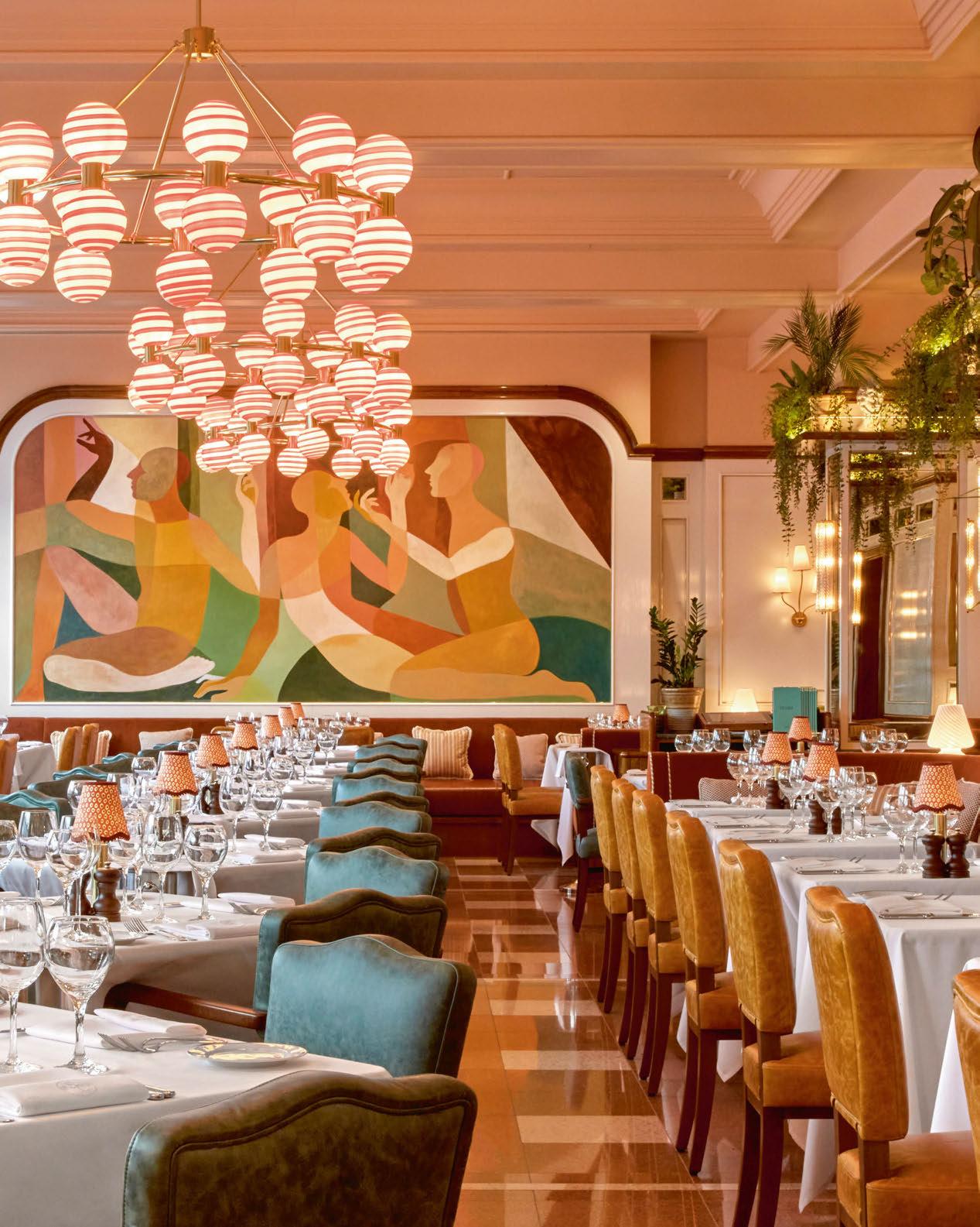
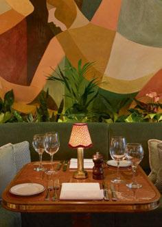
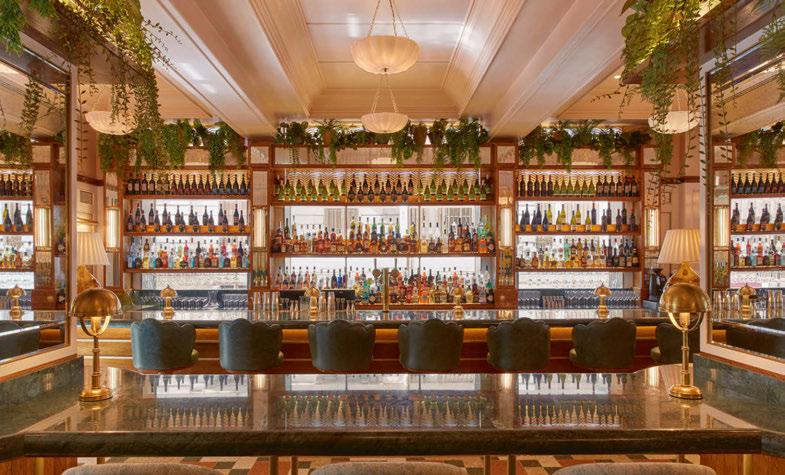
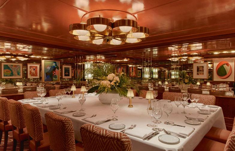
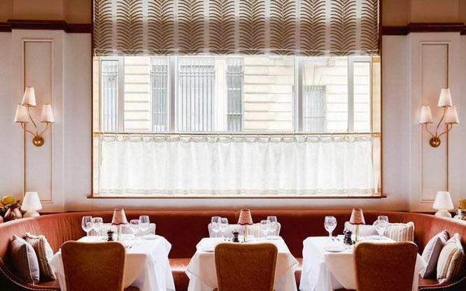
The design studio employed a rich and dramatic palette of marble, high gloss, timber and brass detailing throughout the venue. These are softened by layered mohair, leather and patterned fabric upholstery. The furniture has been designed specifically for the project, including marble and timber tables, fluted oak bar stools with brass bases and green leather seats, elegant curved legged dining chairs and burnt orange leather and velvet banquette seating.
According to Goodwin, the project brief remained consistent throughout, with minor developments only occurring when the team discovered


more about the site following its strip-out, and they were able to add a wine room to the basement corridor as requested by San Carlo.
The biggest challenge Fettle overcame was simply the process of re-designing an already successful site. Goodwin elaborates: “Our job was to retain the spirit of the existing space while totally reviewing and revising the aesthetic.”
When it came to lighting the space, Fettle introduced an array of decorative fixtures in colours and tones that beautifully blend with the overall design.
“Decorative lighting was a key component of the scheme and worked cohesively with other elements of the design to create a sophisticated ambience and timeless space,” explains Goodwin.
“We used a mixture of high-level chandeliers and pendant fittings to give an overall softness, as well as a range of wall lights and table lamps to give a more focused glow to each area of the bar and restaurant.
“Key pieces of the design have also been highlighted with concealed recessed LED lighting such as the back bar, planting and wine displays.
“We used a combination of bespoke and off the shelf lighting for the project. Bespoke Murano chandeliers were made in Italy by Sogni Di Cristallo, and these sit alongside a range of Visual Comfort wall and table lamps.
“We also used lights by Pure White Lines, Lion Iron Lighting, Northern Lights, Neoz, Humber, and bespoke lampshades by Yately Papers.
“Overall, we used a wide variety of types of lighting throughout each space, enabling us to dim everything down to create a comfortable and intimate atmosphere. We try to add as many layers of lighting as possible in order to give us and the client maximum flexibility in terms of light levels and dimming.
“Lighting is always a vital part of the design and helps inform the overall atmosphere of the space.
“We
used a mixture of high-level chandeliers and pendant fittings to give an overall softness, as well as a range of wall lights and table lamps to give a more focused glow to each area of the bar and restaurant.”

“The decorative lighting within the restaurant is a big part of its identity, complementing the interior design with a wide selection of chandeliers, pendants, wall lights and table lights working in combination. These elements add a lot of sparkle and contrast that add to the overall ambiance and character of the spaces.”
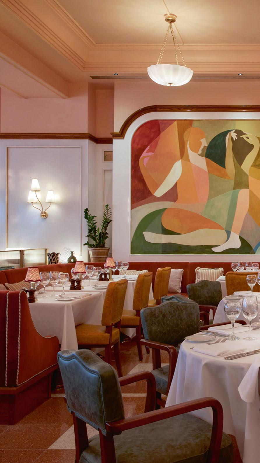
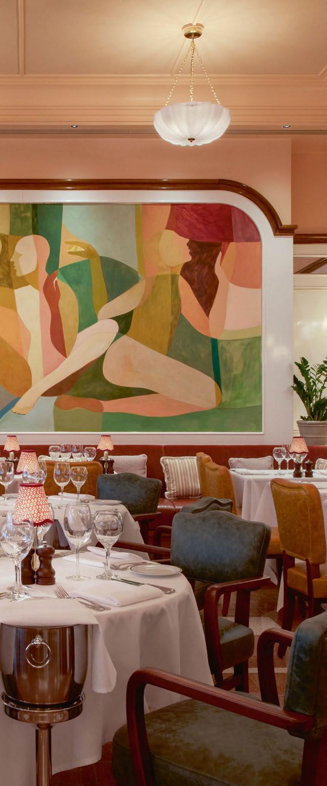
In San Carlo Liverpool’s case, it creates an elegant, intimate and playful ambience, working seamlessly with the interior design as a whole.
“The lighting scheme is broadly residential and layered in its approach.
Architectural lighting was typically used to highlight details in joinery such as bars / back bars and planters, as well as providing more functional lighting over waiter stations and within coffers.
“By using a mixture of pendants, wall lights and table lights we were then able to create atmosphere by keeping these fittings dimmed to a low level throughout.
“Lighting is always a vital part of the design and in San Carlo Liverpool’s case, it creates an elegant, intimate and playful ambience, working seamlessly with the interior design as a whole.”
Lighting designers from engineering consultancy Hoare Lea were brought onto the project to collaborate with Fettle due the client’s specific requests to have balanced light throughout the venue. “This isn’t something we would typically do on a restaurant scale project and is normally reserved for larger hotel projects,” says Goodwin. “However, the client team were very keen for the light levels to be absolutely right, and that compatibility was ensured between the high number of different fittings, the lamps and the overall dimming system.”
Ben Acton, Associate at Hoare Lea tells darc about his participation in achieving these desires from the client: “We had previously collaborated with Fettle Design on a hotel project that was highly successful. Following that, Fettle recommended us to the San Carlo team, believing we could contribute significant value to their project.
Fettle’s strong understanding of the importance of lighting played a key role in our collaboration. Our task was to work alongside Fettle to develop a lighting scheme that seamlessly complemented their decorative lighting choices with architectural lighting, resulting in a harmonious overall design. Coordination was crucial to ensure that each lighting element was discreetly integrated into the interior.
“Communication is the most important aspect to a successful project, and we have an excellent working relationship with Fettle. Initially we reviewed their design concepts, then, with multiple workshops together, we developed a detailed lighting scheme that offers layers of lighting that complemented their beautiful interior.
“Designing a restaurant that functions equally well during the day and night is a significant challenge. The goal is to ensure the space feels bright and inviting during the day while creating a warm and intimate atmosphere in the evening. Achieving this required a careful selection of luminaires and a sophisticated lighting control system. Since evenings are the restaurant’s busiest time, this was our primary focus. Our key approach to fostering intimacy was to create pools of light on the dining tables, allowing the surrounding areas to remain relatively dark. This effect was complemented by soft background illumination and the use of very warm, 2200K lighting along the perimeter, achieving the ambiance the client desired.
“To maintain the restaurant’s appeal during the day, we needed to provide relatively high lighting levels. While the restaurant benefits from ample daylight along one elevation, the deeper areas towards the rear risked feeling gloomy by comparison. To enhance the overall ambiance, large decorative globe pendants were used to deliver the necessary lighting, ensuring the space remained vibrant and inviting throughout the day.”
Due to the nature of the project, Acton goes on to explain the challenges they faced when tackling an already existing space: “This often presents unexpected challenges, especially when you start
opening ceilings and seeing what you have to work with. In some areas, finding suitable locations to conceal drivers was challenging. However, by utilising custom joinery and strategically placed access panels, we were able to accomplish this discreetly and effectively.”
He continues, describing the various decorative lighting layers and how they worked alongside the architectural lighting: “The decorative lighting within the restaurant is a big part of its identity, complementing the interior design with a wide selection of chandeliers, pendants, wall lights and table lights working in combination. These elements add a lot of sparkle and contrast that add to the overall ambiance and character and identity of the spaces. Battery powered table lights are also positioned to all tables, which provide functional illumination, but all importantly provide focused accent light throughout the restaurant.”
Reflecting on the completed project, Goodwin explains how their designed remained consistent with the team’s initial plans: “We approach every project with a detailed design narrative and each space is unique. Stand out features for this project include the oversized, contemporary murals by artist Jesslyn Brooks, statement chandeliers, and the rich and dramatic palette of marble, high gloss, timber and brass detailing, softened by layered mohair, leather and patterned fabric upholstery.
“We wanted to develop a clear identity for the restaurant while retaining an aesthetic commonality with San Carlo’s sister restaurants. We feel we have created a truly elegant space with design details, lighting and material finishes utilised to offer a sophisticated yet relaxed dining experience.”
Acton adds: “I’m extremely pleased with the final lighting scheme and how the layering of different elements creates a flexible and adaptable space. The way the lighting interacts with the mirrors throughout the restaurant adds a sense of dynamism, offering new and intriguing perspectives as you move through the space.
I’m particularly delighted with the bar backlighting, which makes a stunning first impression as you enter the restaurant and creates an eye-catching display visible from the street.
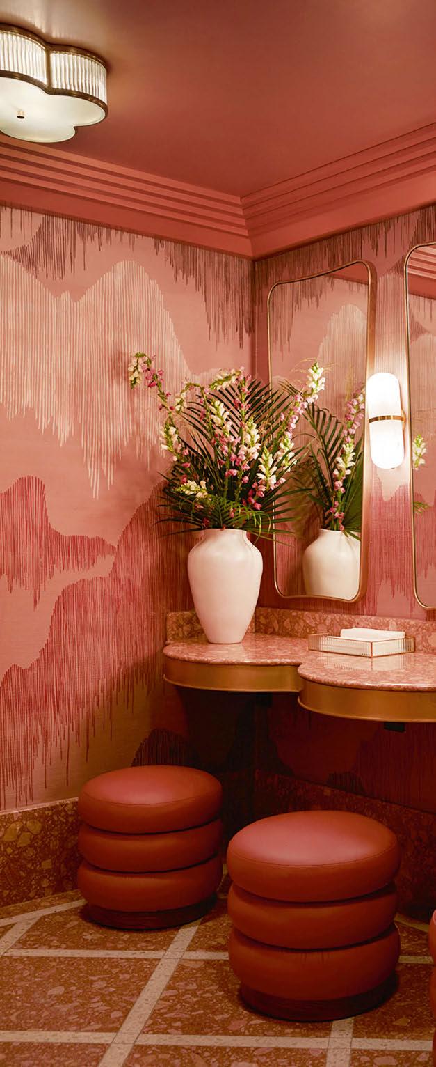

“The client for this project places a strong emphasis on lighting and has a deeper understanding of its importance than most I’ve worked with. This was especially evident during the commissioning of the lighting scenes, where he was very hands-on as we collaborated to create an ambiance that perfectly complemented the dining experience. It was incredibly rewarding to work with a client who truly appreciates the intricate details of a successful lighting scheme.
“The decorative and joinery-integrated lighting is a very warm 2200K, which effectively creates mood and intimacy throughout the space. The few downlights we’ve used are at 2700K, which works well for highlighting artwork, especially during daytime dining. However, in the evening, the contrast between these lighting elements becomes more noticeable. To achieve greater cohesion, I would like to have explored the possibility of using filters to warm up the downlights.”
www.fettle-design.co.uk
USA-based celebrity interior design and home stager Francesca Grace has completed her first restaurant project in the heart of West Hollywood. The Italian dining spot is filled with rich fabrics and colours, creating a unique, cosy dining experience.
Nardò is an authentic Italian restaurant located in the heart of West Hollywood, California. The new location for the small chain follows the success of its Huntingdon Beach location, which opened in 2022, expanding its presence on the Los Angeles food scene.
Nardò, founded by award-winning restaurateur Gianni Chiloiro, specialises in award-winning Neapolitan pizzas, luxurious homemade pastas, and traditional Southern Italian dishes, all crafted with locally sourced ingredients.
The interior design for Nardò was conceived and delivered by Francesca Grace, daughter of Gianni Chiloiro, who’s vintage-eclectic design aesthetic blends cottage-core and maximalist style with a touch of European vintage glamour. Known for her residential and commercial projects, Nardò is the first restaurant in her design portfolio. Sitting down with darc, she tells us about her design approaches to Nardò and how decorative lighting played a role in bringing the scheme to life.
“It’s been really exciting to watch it all come together from start to finish. My dad has been in the industry for years and owns restaurants up and down the coast of California, so it was a natural evolution when he decided to open in West Hollywood.
“Since a significant portion of our clients and projects are in this area, I begged him to let me design this location, and he agreed.
“Before opening my own design business, I would help my dad flip restaurants, providing input on his seating choices, paint colours, etc. so I already had some familiarity with the restaurant industry and what goes into making a successful one.
“The brief for Nardò was to create an environment that would feel both casual enough for a quick lunch, but luxurious enough to be a fixture in the bustling nightlife of West Hollywood while also incorporating our rich Italian heritage that makes Nardó so great. From start to finish, the project took about four months or so to complete.”
The family dynamics, as expected, came with its challenges for Grace in this project. She continues, telling us how she overcame them: “Having your dad as your client is both a blessing and a curse. Since he’s opened a slew of restaurants throughout his career, he had a specific vision of


what he saw for the restaurant. So, convincing him to hand over the reins in terms of design was a bit of a challenge, but he eventually obliged. As Italians do, we definitely bickered about certain design choices, as I am a true maximalist with a passion for vintage that my dad doesn’t necessarily share with me. But overall, I’m so grateful that he trusted me completely with the design and allowed me to make the decisions I knew would help the restaurant become a success. “Aside from that, I would say the biggest challenge I faced was fusing the design and functionality of the restaurant. There were certain design choices I was really excited about but had to compromise on just because the nature of a restaurant doesn’t allow for purely aesthetic design decisions in the same way a residential project does.”
Considering this was her first venture into restaurant design as a professional, Grace described the process as a relatively smooth experience. “After the initial
stages of locking down a design direction, it really was smooth sailing. As with any design project, there are always unforeseen circumstances that arise but for the most part we stayed very much in line with the initial brief and design direction.”
When it came to choosing and placing the decorative lighting fixtures in the space, Grace leant into the vintage aesthetic but also incorporated traditional Italian elements. “For me, lighting is one of the most important facets of any design project. I often feel like lighting can be an overlooked element of design, however the lighting decisions you make can be truly transformative to a space.
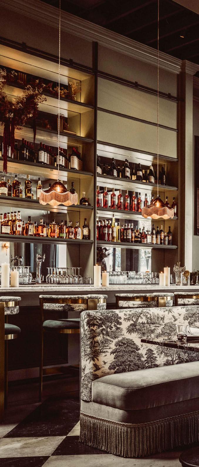
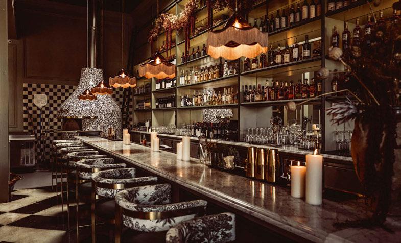
“I wanted the lighting to feel very cozy and romantic. I chose pieces with fringe to tie in all the fringe banquettes we used in the main dining rooms. A lot of the downstairs dining room relies on monochromatic colour schemes, so I wanted to use lighting to break up the colours and create visual interest.
“The next hurdle was figuring out how to fit LED light sources into our custom fixtures with shapes and forms that were designed for E27 lamps. The size, scale and proportions made it difficult to fit the light sources we wanted...”
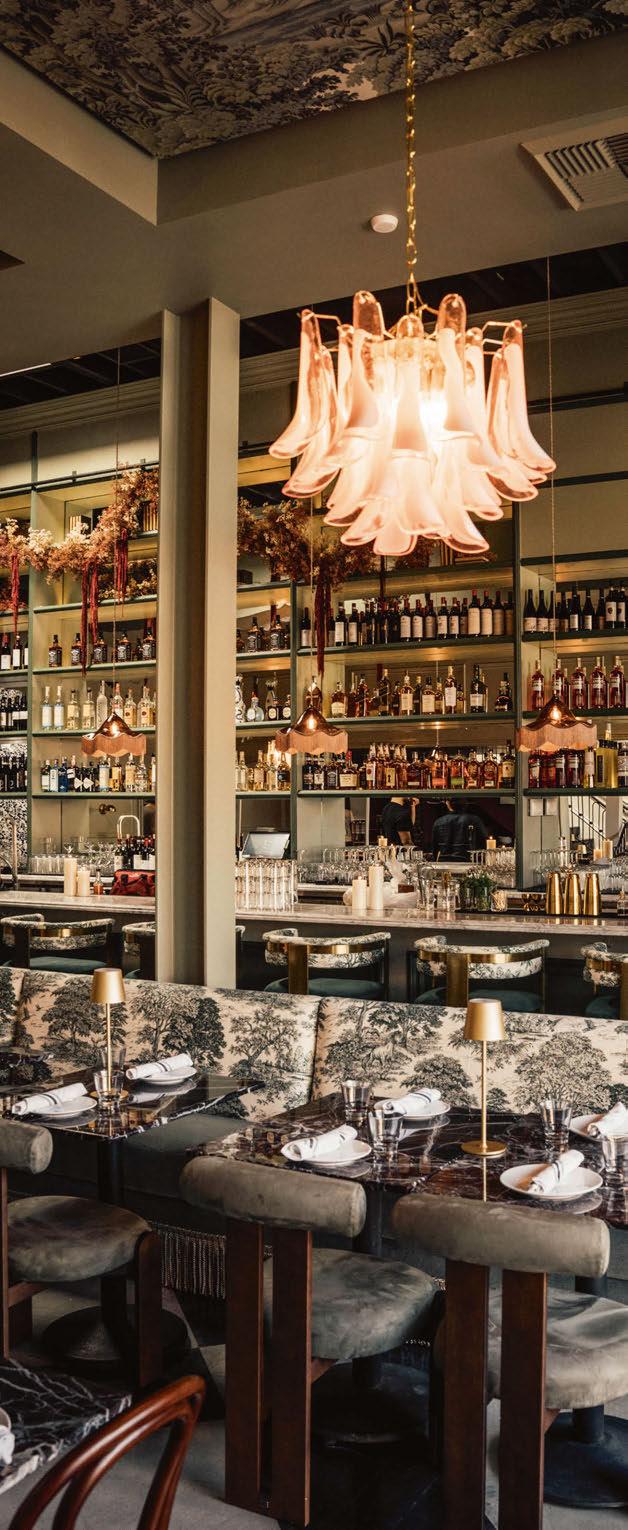
“For the bar area I wanted to use pieces that would really make a statement and stand out against all the earthy green tones I chose. I found these incredible mauve glass fringed pendants from Rothschild & Bickers and was immediately obsessed. I love how they complement the colours of the floral installation we did on the bar and tie the whole space together.
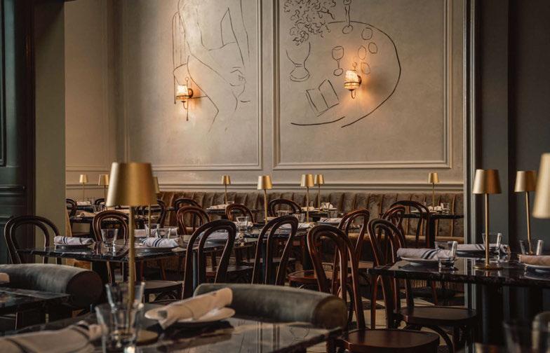
“For the main dining room, I also wanted to make a big splash and tie in those colours we brought in with the bar lighting. I sourced two incredible vintage Murano glass chandeliers from Italy. I love the surprise you get when you look up at the ceiling and see the sparkling glass against the whimsical green wallpaper we added to the ceiling. Additionally in this space, we kept it simple with romantic gold sconces and shades made by sister, Dede Chiloiro. I wanted the mural on the Venetian plaster walls to be the main event in this room.
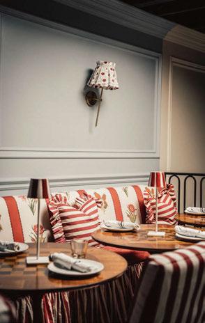
“Upstairs on the balcony, which we call La Opéra, I sourced these sweet little shades from Alice Palmer & Co to match the blue and red colour scheme I went with for this area. And, outside we kept it simple with some cute, shaded string lights from Pottery Barn. They’re understated and don’t take away from the outdoor space but provide just enough romance to keep it cute out there.”
Due to the nature of the space, which was previously a restaurant, Grace and her team were able to install the lighting fixtures with ease. If she had the opportunity, the only thing she would have changed in the overall scheme was to add more wallpaper. “But that’s my answer for everything. Give me any surface and I’ll wallpaper it.”


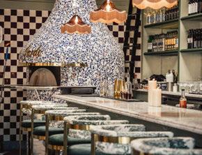
Reflecting generally on the project, Grace concludes: “I am beyond happy with the final result of the project. While we did make some adjustments to the design along the way, it really did become the restaurant I had dreamt up in my head. I’m so lucky to have had the privilege to take this project and run with it. Nardó West Hollywood is truly an amalgamation of all the things I love about design and a representation of who I am as a person and designer.” www.francescagrace.com
Parisian interior design agency Bureau Lacroix has created a rustic and warm dining experience for new Latin American street food destination, Tio.
Tio is a new Mexican restaurant that offers up Latin American street food in the heart of Paris, France.
Opened by Idriss Mansour, known for overseeing the artistic direction of iconic venues such as Manko, Tio is his first restaurant, which aims to elevate the image of South American street food through unique and flavourful recipes.
Bringing the menu to life through design was entrusted to interior architecture studio Bureau Lacroix. Conceived as a true destination, the space is designed to offer various tasting experiences: the main dining area, inspired by the warm ambiance of seaside locales, features a ceiling adorned with wood, straw, and stretched fabric, through which different lighting scenarios transition from lunch to dinner.
Guests can immerse themselves on light-coloured polished concrete banquettes for a shared meal at custom tables that subtly reference the brand’s identity, surrounded by lush vegetation. Alternatively, they can enjoy an authentic experience at the bar, which opens onto the chef’s kitchen.
Lighting in the space is simple yet brings an element of authentic design. The rustic Rosario Terracotta wall lamps are by Enamoura ceramists. The sconces are handcrafted in chamotte stoneware not far from the Saidnon rock. They are inspired by the Provençal tiles that were simply hung on the plaster walls of the region’s farmhouses. Revisited in the shape of an ogive in homage to the architecture of the chapel, it
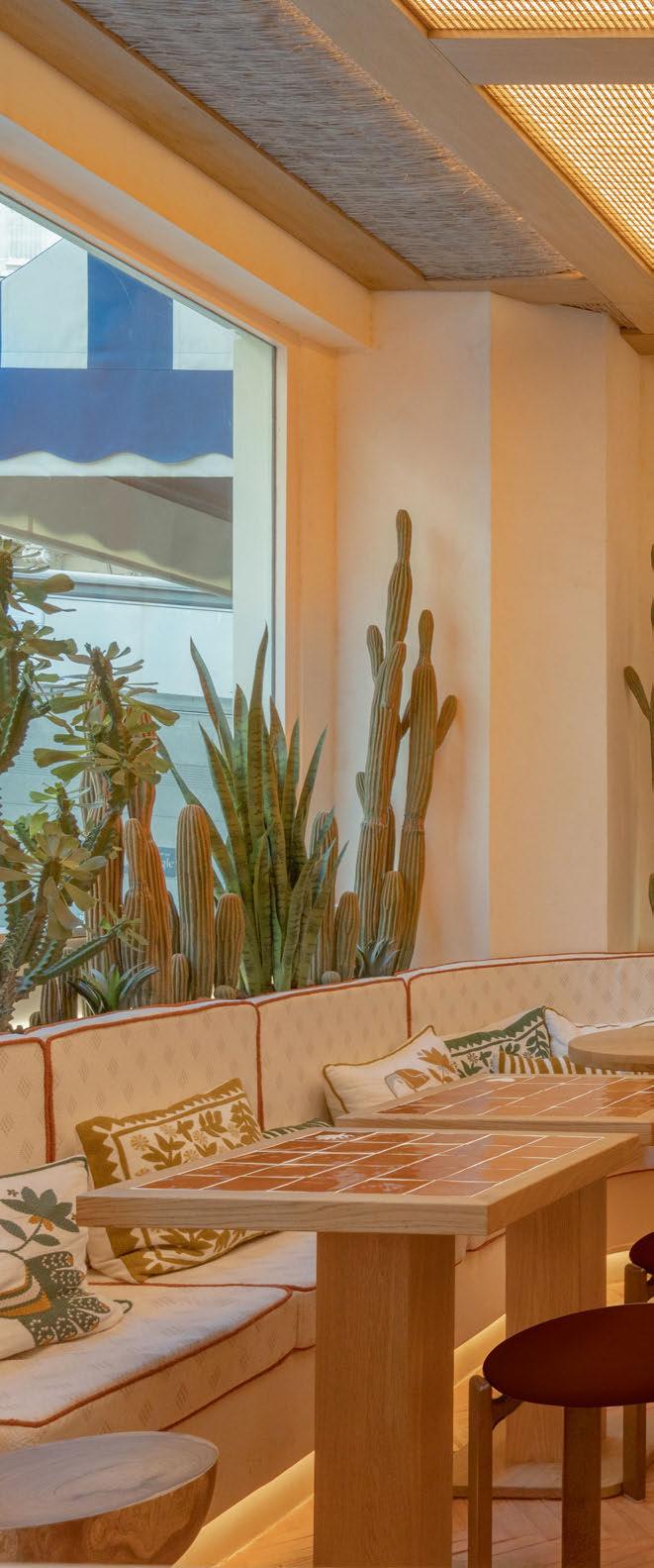

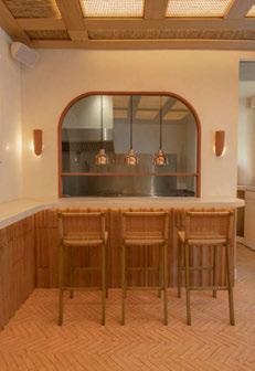


bears the name of the Argentinian sculptor Rosario who built - stone by stone - her unique house also located at the top of the Saignon rock. The raw mineral ceramic provides a soft diffused light to the restaurant, emphasising the warm interiors by Bureau Lacroix. Also featured is a large wicker Strikha pendant by Faina. Handwoven by Ukrainian artisans of willow vine, the form of Strikha lamps is meant to embody unity and close-knit family circles. Protective, like a strikha straw roof, traditional to a Ukrainian dwelling, the Strikha aims to bring warmth and protection from harm. www.bureau-lacroix.com
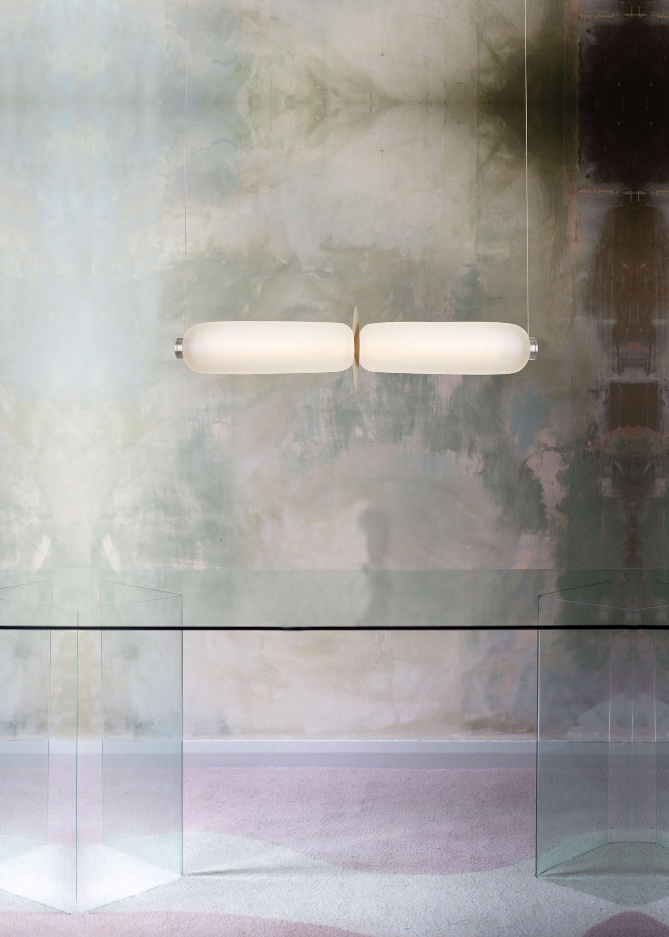


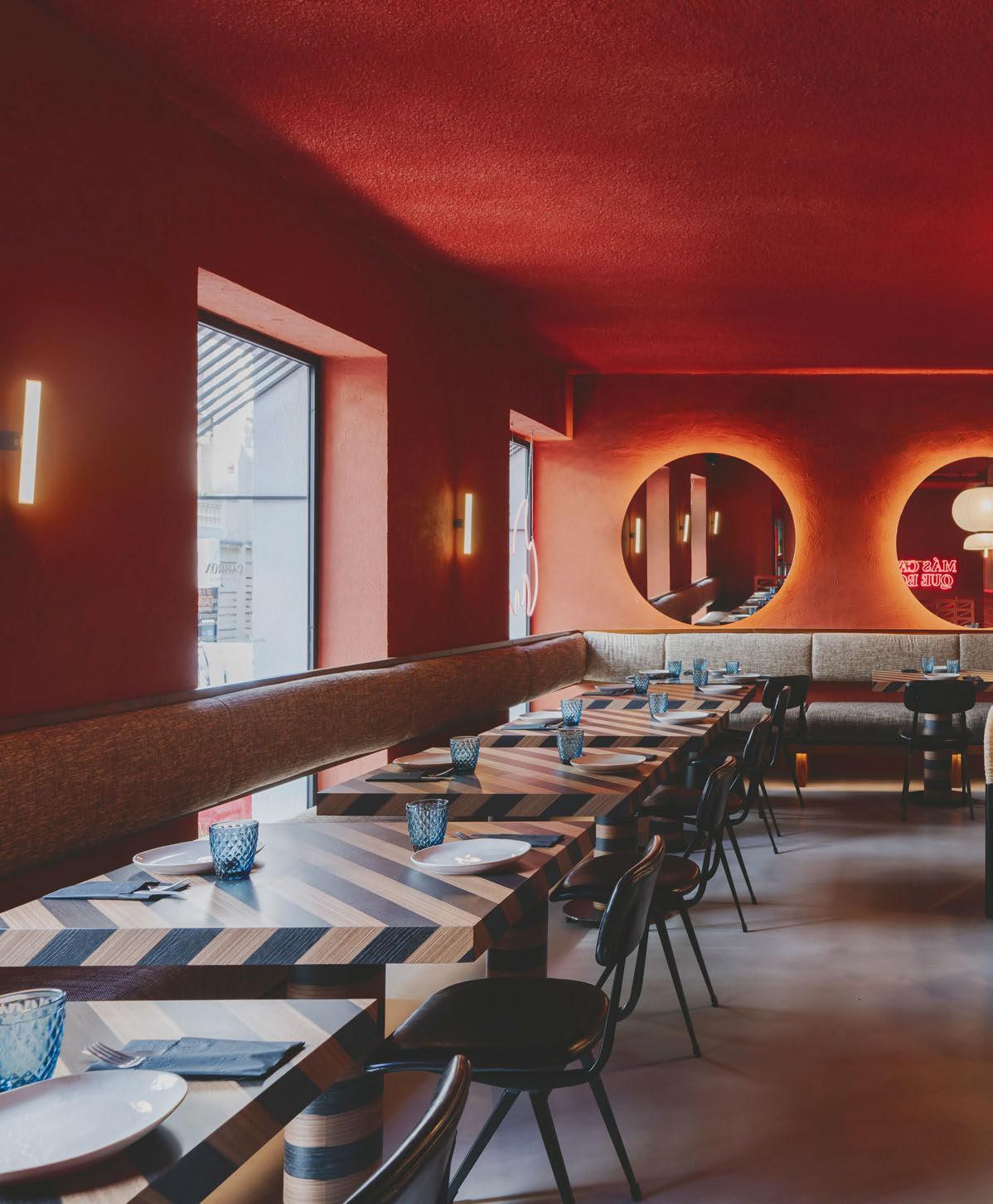

The recently opened Mexican bar and grill Cabrón brings a colourful new dining destination to Madrid. The interiors scheme was completed by Spanish design studio PPT Interiorismo, who put a contemporary twist on traditional Mexican design.
A colourful new dining spot, designed by PPT Interiorismo, has recently opened in the Salamanca neighbourhood of Madrid.
Cabrón, a casual Mexican grill, provides a vibrant atmosphere for visitors to enjoy tacos and cocktails. The interior scheme partly nods to Mexican culture without falling into clichés. “We kept the simplicity of the strong, warm and cheerful colours, as well as the various graphic landmarks that accompany the interior design,” says Helena Puig, interior designer from PPT Interiorismo.
Upon entering from the street, the restaurant teleports you to an authentic Mexican experience. With a setting that includes large natural cacti, typical of the Mexican countryside, the scheme has opted for the liveliness of a monochrome image in an orange-red russet tone. As a contrast to the predominant orange colouring, a large bar is covered with bright ceramic tiles in Klein blue, marked and illuminated by a perimeter LED. Next to the bar, a series of multi-coloured custommade posters by artist Tato Reppeto hang on the wall. This area is dominated by a large group-dining stainless-steel table, which contrasts with solid wood chairs and the warmth of the horizontal pendant Tekiò by Santa & Cole. Elsewhere in the space, decorative lighting from &Tradition and Castan bring soft levels of illumination and emphasise the warm and comfortable atmosphere the design team set out to achieve.
“We kept the simplicity of the strong, warm and cheerful colours, as well as the various graphic landmarks that accompany the interior design.”
HELENA PUIG, PPT INTERIORISMO
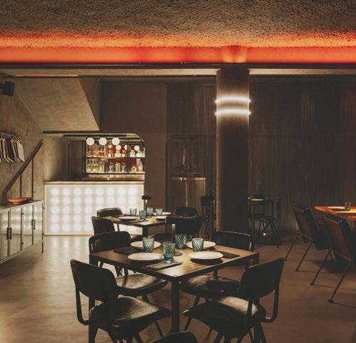
In the basement, the aim was to compensate for the lack of natural light by continuing a very warm atmosphere. The use of coloured LED lighting was key to achieving this. The rough, grey walls emphasise the power of the warmer shade of orange, along with a bright methacrylate bar.
In the bathrooms, a large mural by Tato Reppeto, depicts a cheetah alebrije and other abstract shapes, which give the room and the entrance to the toilets a spicy and colourful touch. The monochrome power of a strong pink permeates the entire restroom area, from the doors to the washbasins.
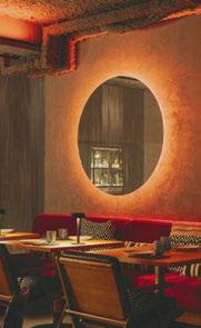
A neon sign is featured with the bold phrase “Cabrón el que lo lea” (Bastard who reads it) on a large, floorto-ceiling mirror. The design, which promises an Instagram-worthy photos for customers, is the work of the Melón Yubari studio, creators of the Cabrón restaurant’s graphics and communications. www.pptinteriorismo.com



a


Sarah Dodsworth, Founding Partner and Lauren Robinson, Interior Designer at Ekho Studio provide a detailed mood board and product specification highlight for an upcoming hospitality venue located in the idyllic British countryside.
We’ve been commissioned by an independent hotelier client to revamp the hospitality spaces of an existing country hotel and golf resort in the Ribble Valley, UK. The 400sqm space will be used from breakfast service through to dinner, and includes a bar, main restaurant, and private dining room.
As well as elevating the spaces to the next level of hospitality in terms of furniture and materiality, the design needs to ensure a flexible space to suit a variety of uses, as well as attracting new non-resident diners as both a destination dining and events venue.
The concept seeks to incorporate natural influences from the rolling hills and dramatic countryside all around, with heritage detailing reflecting the building’s age and identity and honest materials in sophisticated contemporary forms. The palette is made up of soft tones and warm timbers with flashes of heavy pattern, creating an atmosphere of depth, character and rustic charm.
For the flooring, we’re looking at terracotta tiles from Solus Ceramics [1] , evoking traditional rural buildings, with the small format helping define different dining spaces and cosy nooks in the bar area.
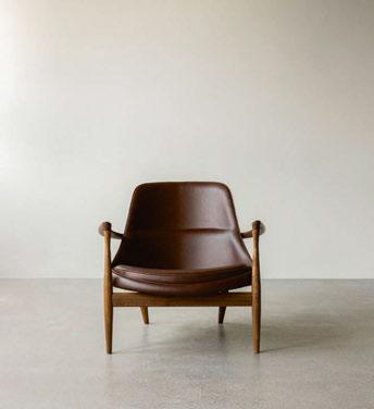
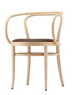
Favoured furniture includes the Elizabeth lounge chair from Audo [2] in a beautiful steamed solid ash with a notable grain. This is a take on a traditional ‘gentleman’s lounge chair’, except in a more striking, streamlined form. Another chair we love is the classic Thonet
Bentwood chair in walnut with a wicker cane backrest [3] , combining a relaxed, casual feel with a history of usage in both country estates and French upmarket dining establishments, going back to the 19th century.
Bespoke Shaker-style panelling will be used to line the walls. We love being able to add playful details too, such as coat-hanging hooks on the horizontal banding. We’ll probably go for a pale chalky neutral paint for this, such as Little Greene’s Portland Stone Light.


For the other walls, we’re thinking of a subtle lime-wash from Bauwerk, evoking a historic feel via the playful movement you get from the application. We love spaces that are liveable and feature the occasional deliberate imperfection. There are no straight lines in nature after all!
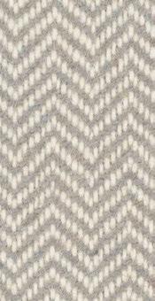
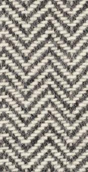
Key fabrics in our eyeline include the Lewis-cf840 from Bute [4] – a beautiful, textured upholstery textile, both warm and inviting and featuring traditional worsted patterns combined with a large-scale chevron. Also, the Assam by Sahco range from Kvadrat [5] –playful prints with raw textures reminiscent of the Lancastrian landscape, in earthy tones that convey warmth and cosiness.
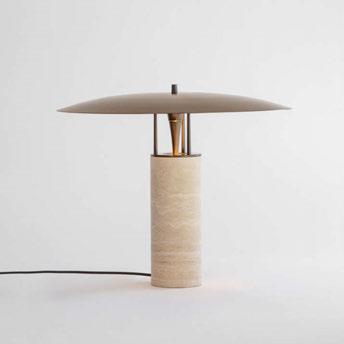
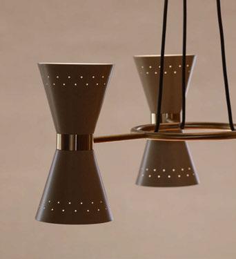
Feature lighting might include the Luna table light from J Adams & Co. [6]. We love the use of a high-quality, classic material for the base in natural stone, which you’d perhaps typically associate with a country vibe, but it’s the juxtaposition with a slim and sleek matte bronze
shade that really makes for an eye-catching piece.
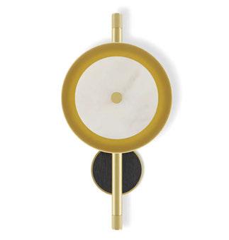
For suspended feature lights, we’re looking at the Collector Chandelier 3 by Audo [7] , which is a contemporary take on the kind of traditional suspended light fitting you might associate with a banqueting hall. Finally, the Juneau wall lamp from Frato [8], with a beautiful alabaster shade and the subtle warm effect from when the light source penetrates the material. This really aligns with the feelings of connection and cosiness we’re aiming for.
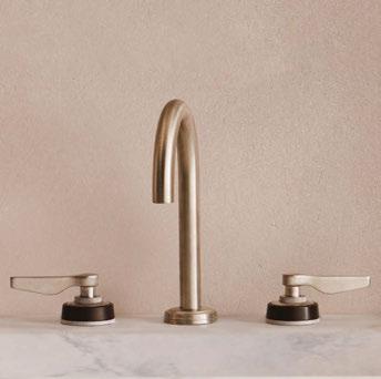
Last but not least, for the WCs, we’re favouring Samuel Heath’s One Hundred Collection Modern [9] for the fittings, instantly conveying heritage luxury, with flooring in Fitz Black-honed and White-honed marble triangle tiles [10] - traditional veined marble in colours that speak to the surrounding landscape.
www.ekho.studio


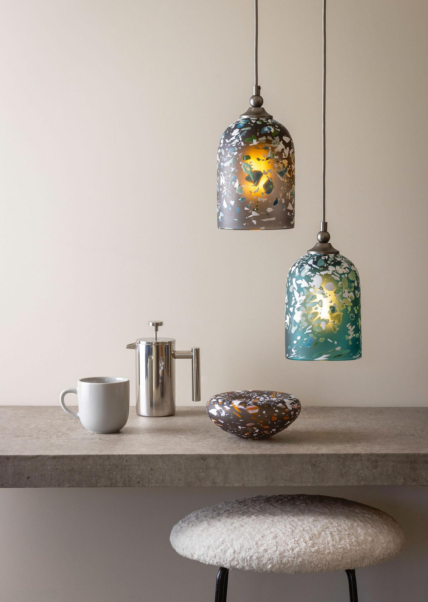
Contemporary glass lighting brand rothschild & Bickers launches its newest pendant and wall light range, terrazzo, which utilises coloured chips of glass.
Rothschild & Bickers is a British lighting brand that prides itself on being a sustainable manufacturer of contemporary glass lighting that reinvigorates classical techniques.
Founded by Victoria Rothschild and Mark Bickers, both trained at the Royal College of Art before graduating and establishing the studio in 2003. An admiration for heritage craft and the decorative arts is at the foundation of this partnership.
Brand-new to the studio’s portfolio is the Terrazzo Light collection. Talking exclusively to darc, Rothschild explains how the collection came to life in the Hertford-based workshop. “As makers, our designs are always trying to tell a story that twists and turns around two main characters, material and space. The primary influence is glass, a super liquid with the ability to create astounding textures and forms. The second is architecture, the spaces and interior style our clients specify for, from a period property to a modernist hotel.
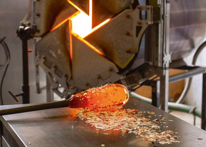
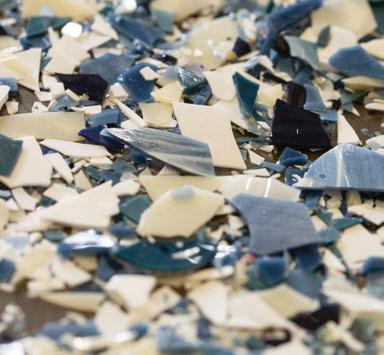
“With this in mind, the textured, colourful and playful Terrazzo Light pays homage to its Italian namesake and the rising trend for using this material in contemporary design. ‘Terrazzo’ was first invented by Venetian artisans who took discarded marble chips and embedded them into concrete mixtures. Inspired by this technique we have experimented and created a decorative pattern using coloured glass chips and shards, which are rolled onto molten glass and then blown into a form. A
transparent Terrazzo that allows light to pass through.”
According to Rothschild, two of the biggest design trends this year are texture and colour. “Natural soft materials from wood to frosted glass combined with modern earthy tones. With this in mind, the Terrazzo collection channels both these design elements,” she says. “The shape is simple with nods to Art Deco and a modernist aesthetic, a balance between sensual curves and straight lines. The palette is a spontaneous composition of tones from delicate peaches and celadon greens to darker charcoal greys and stoney blues.”
Bickers goes on to tell darc about design processes for the collection. Essentially, glass shards, which are blown from solid colour rods are applied to molten glass with a base colour. “The glass shards need to be graded into size and then mixed to the right consistency, making sure the composition of colours is correct throughout the form,” he explains. “They are then heated up on a metal marvel and molten glass is rolled into them.
Once there is an even coverage the glass is then melted in using a re-heating chamber and shaped.
“We spent a lot of time looking for the perfect chips. The shards needed to be dense in colour yet thin enough to be applied to molten glass. If they are too thick then they just become blobs, we wanted to hold onto the shape of the shards as there is a beauty in how each one is different.
Inspired by traditional Venetian terrazzo, this lighting collection is formed of a decorative pattern using coloured glass chips and shards, which are rolled onto molten glass and then blown into a form. A transparent Terrazzo that allows light to pass through.
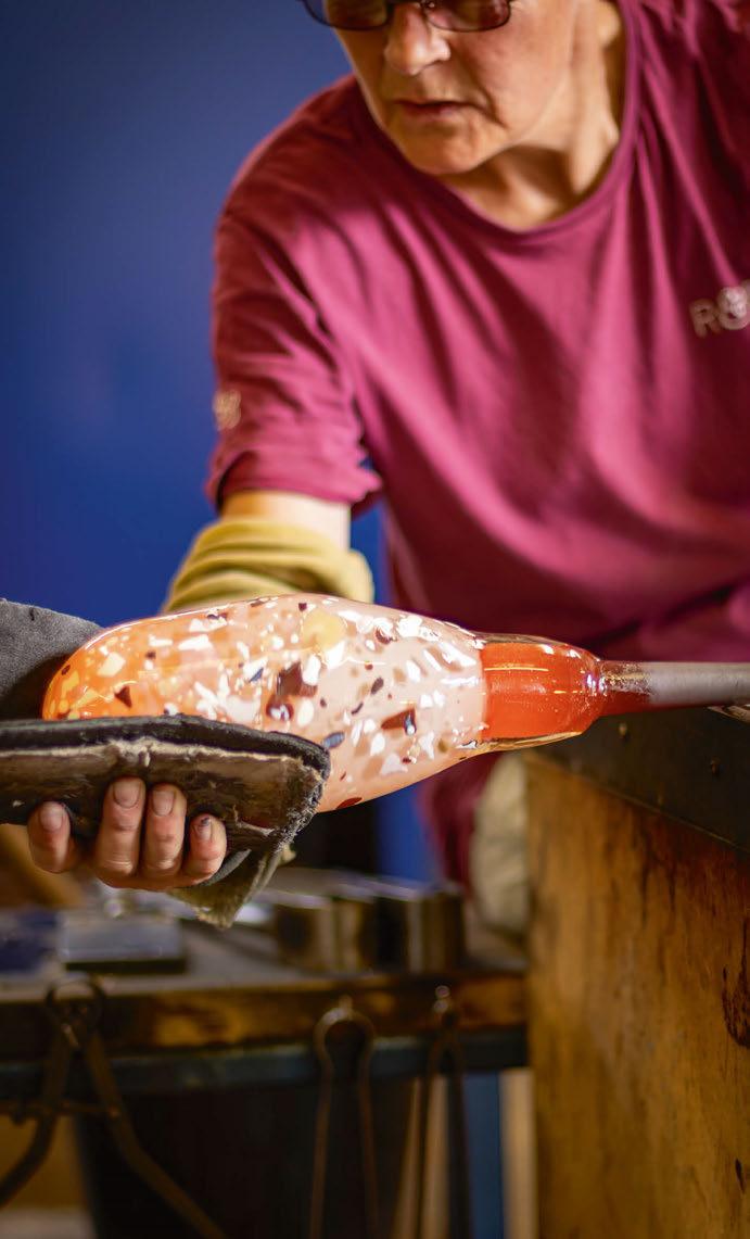
“The glass shards need to be graded into size and then mixed to the right consistency, making sure the composition of colours is correct throughout the form. They are then heated up on a metal marvel and molten glass is rolled into them. Once there is an even coverage the glass is then melted in using a re-heating chamber and shaped.”
- Mark Bickers.
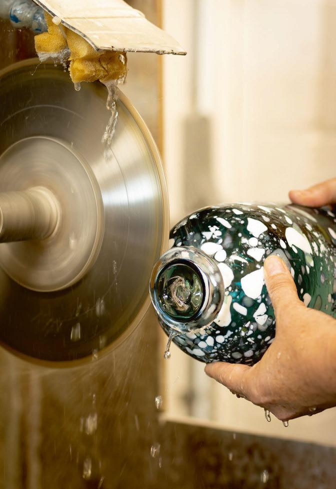
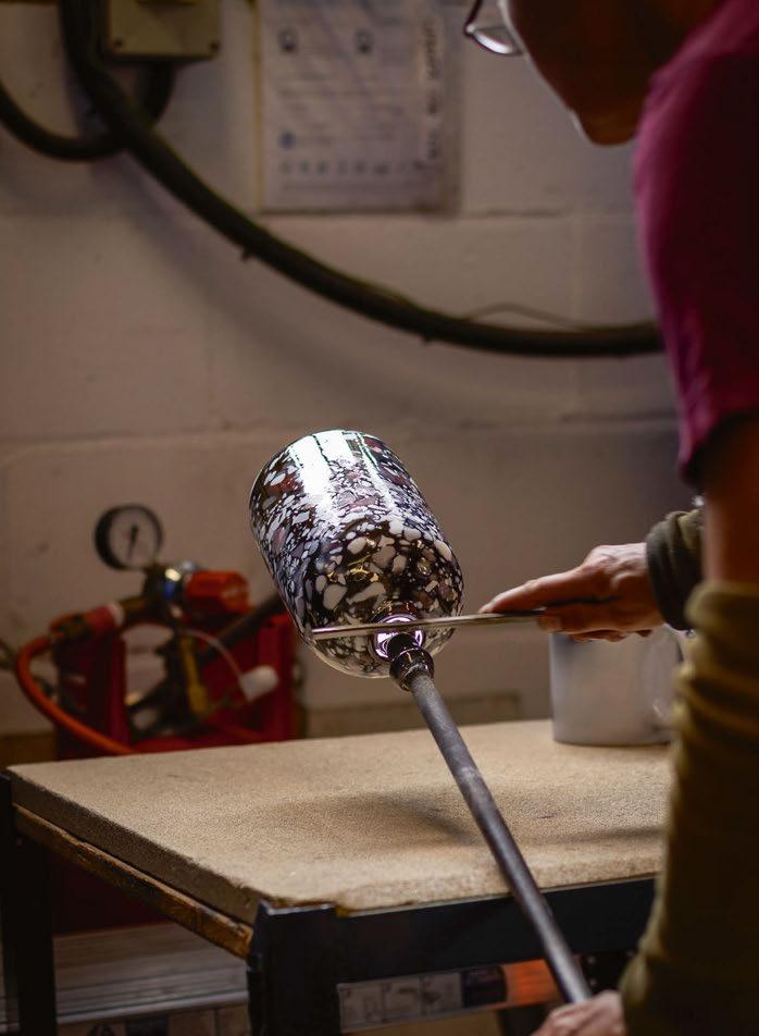

“The hardest part of designing this product was working out the colour mix and testing that each combination would sit together. Our studio is full of Terrazzo samples in every colour possible. We began with a huge palette, but in the end, we paired it back to just a simple range of tones in peach and green. These have been mixed with greys and whites to give both a transparent and opaque finish.
“The surface of the glass shades has been sandblasted to give a matte finish and bring out the natural strata of the coloured shards. One key design factor for this product was creating a pendant that would diffuse the light source from view, something that commercial specifiers are very keen on.
“It has taken up to six months to develop this process and complete the full range from pendants to wall sconces. The main stumbling block when designing in handblown glass is getting consistency in the production, it takes a lot of testing and training up staff before we launch a range.”
Speaking of where the collection fits into the specification market, Rothschild believes the pieces are aimed at clients who want a contemporary space that allows for a blend of both modern and vintage styles. “The Terrazzo Light is a stylish yet simple pendant that can bring a pop of colour and texture to a minimal sleek interior.
“Rothschild & Bickers specialises in handblown glass lighting, which can vary between traditional and contemporary. The common thread is quality and a sense of nostalgia, creating a light that captures a mood. The Terrazzo collection is very different, but it still possesses these attributes and hopefully reflects our brand.
“William Morris was quoted ‘Have nothing in your houses that you do not know to be useful or believe to be beautiful’. [We believe] working with light encompasses both these things.”
www.rothschildbickers.com



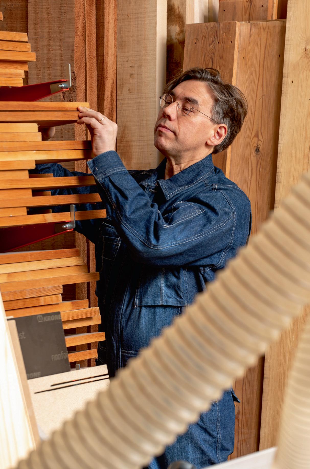
SEPPO KOHO, ARCHITECT & DESIGNER

Part 1 of this issue’s Design
Evolution hears from architect and designer Seppo Koho about his inspirations for Secto Design’s latest pendant, Kumulo. Part 2, revealing the final design, will be available in upcoming issue 57.
What would a puffy cumulus cloud look like as a wooden lamp? How about snow-crowned fir trees, transformed into shimmering statues by thick layers of snow?
Both of these, and my personal roots in Finnish Lapland, inspired me as I started designing Kumulo, Secto Design’s eagerly awaited new pendant.
A few years ago, I was travelling in Lapland, and began thinking about the possibility of using the layered nature of snow-covered trees for a design. This idea contributed to Kumulo, but the softness of a cloud is more strongly present in the work. I designed Kumulo in the summer, with the midsummer sky filled with clouds as an inspiration.


Like the snowy trees and floating clouds, the pendant, named after the cumulus cloud, became an eye-catcher – large in size and intriguing in form. Kumulo can easily become the focal point of a room. It provides warm, soft light that reflects the shades of the birchwood it is made of.
I see the novelty suitable for lobbies and restaurants as well as private spaces, on its own or in groups. The aspiration for Kumulo is to evoke the tranquil beauty of nature, bringing a piece of the serene Finnish landscape indoors. www.sectodesign.fi

Iconic product and furniture designer Terence Woodgate sits down with darc’s editor Sarah Cullen to chat about his career, design inspirations, and memorable collections that he has created over the last 21 years as an official Royal Designer for Industry.
Terence Woodgate is a well-respected British industrial designer who obtained Royal Designer for Industry (RDI) status in 2003. However, being a furniture and product designer was not on his initial career path. Speaking with Sarah Cullen, she discovers more about the designer’s past, creative influences, and future endeavors.
Woodgate grew up in the beautiful Parliament Hill area in Highgate, London. Here, he attended the Gospel Oak primary school where he majored in art. At the end of his primary education, he failed his 11+ exams and went on to attend Holloway Comprehensive School, which upon reflection was something he sees as a positive outcome: “It was probably for the best as I would not have enjoyed grammar school”. For context, secondary modern schools were a type of secondary school that existed throughout England, Wales and Northern Ireland from 1944 until the 1970s under the Tripartite System. Secondary modern schools were designed for most pupils between the ages 11 and 15; those who achieved the highest scores in the 11+ were allowed to go to a selective grammar school, which offered education beyond 15. It wasn’t until a little later in life in his 30s that Woodgate was diagnosed with Dyslexia, which
could have been a possible influencing factor on his educational direction.
“While in Belgium, I visited an exhibition on The Bauhaus at the Stedelijk Museum in Amsterdam and it had a massive influence on me.”
Post secondary school, Woodgate went on to study engineering at Westminster College before beginning work as a petrochemical design engineer in Belgium, creating oil rigs and nuclear power plants. “While in Belgium, I visited an exhibition on The Bauhaus at the Stedelijk Museum in Amsterdam, which had a massive influence on me. The Grand Comfort chair by CharlesÉdouard Jeanneret, known as Le Corbusier, blew me away. The idea of having an exterior structure in polished steel tube, holding soft leather cushions was exciting. It was totally different from what I grew up with and I wanted to create work like that myself. Also, the Lights by Walter Gropius were wonderful, stunning and still relevant today.
“Visiting an art gallery continues to have the same effect on me; after a while I want to run back to the studio and create new work!”
Following his stroke of inspiration attending art galleries in Belgium, in the mid-1980s Woodgate retrained as a furniture designer at the London Guildhall University before opening his own studio in East Sussex, UK, 1988.
Since then, blending his technical engineering training
“I love the technical challenges of architectural lighting, and I love the freedom of decorative lighting.”
with his appreciation for refined aesthetics, Woodgate has established himself as a contemporary designer that describes his aesthetic as “modernist/minimal”. He adds: “I am more interested in subtraction than addition. I don’t add decoration for the sake of decoration, instead preferring to focus on form and texture.
“[When it comes to designing] influences are everywhere for me. When offering advice to design students, I always encourage them to look outside their chosen discipline for inspiration, e.g., architecture, jewellery, racing cars, art. For me, art is probably the most important influence.”
As his studio began to grow, so did the recognition for his designs and his collection of accolades. A mere 15 years after establishing Studio Woodgate, in 2003 he was awarded his RDI as well as the German Red Dot ‘Best of the Best’ Award, IF Ecology Award, and Observer/Elle Decoration Design Award for Furniture. Not long after, in 2008 he also won the Wallpaper* Magazine Design Award.
Over the years, Woodgate’s portfolio of clients has also grown to include brands such as Case, Concord


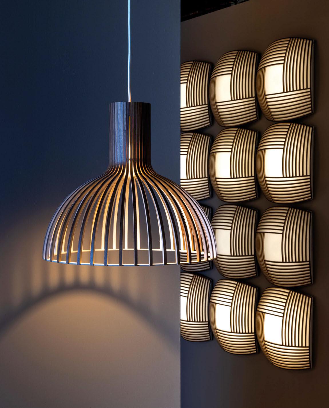
All Secto Design lamps are designed by architect Seppo Koho. The meticulous handwork is carried out by highly talented craftspeople in Finland from premium local birch wood.

Lighting, Established & Sons, Objekten, Punt Mobles, RVB and SCP. Examples of his work are now held in private and permanent collections such as the Museu d’Arts Decoratives, Barcelona, and the Victoria and Albert Museum, London.
Speaking of some of his most notable moments in his career to date, Woodgate says: “I designed several lights for Concord Lighting that were all speculative, i.e. not commissioned. Notably, Infinite and LED 150 were significant designs. Infinite was a low voltage collection with straight and curved track structures where fittings could be added to the top and bottom. It won various important design awards including the German Red Dot ‘Best of the Best’.”
Ahead of the curve with project circularity, Woodgate’s LED 150 was designed with longevity and flexibility in mind. “LED 150 was a downlight where LED was an acronym for Low Energy Downlight, long before LED light sources were around. It was a holistic design where I focused on benefits for everyone involved be they architects, specifiers, installers, maintenance, or end user. It was flexible in that it could be specified in the knowledge that if the building requirements changed so could the downlight system in terms of
optics and aesthetics. The product lit many large projects such as the Petronas Twin Towers and some international airports.
“I would also say my Solid collection for Case is one that I consider notable. The design has now evolved to be portable, which offers wonderful user flexibility.”
When it comes to his approach to designing lighting, Woodgate explains that within all design fields, whether that’s furniture or lighting fixtures, there are particular constraints that need to be considered.
“You need to identify what information you need to start work. When designing an architectural light fitting, you are designing a machine that provides light.
Decorative lighting is more about saying ‘look at me’ rather than ‘look at what I do’. And both are valid.
“Lighting can turn a space into something wonderful, be it warm and welcoming like enjoying a whiskey by a log fire, or it can enliven the space and the people within it like a fresh walk in the alps. It can also tell a story and provide a narrative.
“For me, good product design is refinement and engineering beauty either in the design itself or in the effect. It’s the ambiance it produces.”
Looking at the relationship between architectural and
“Working with light is always an exciting experience, because you never really know how it will perform.”
decorative lighting, he believes “each has a definitive role to play”. He continues: “Personally, I love the technical challenges of architectural lighting, and I love the freedom/liberty of decorative lighting.”
When it comes to challenges within design, Woodgate is self-proclaimed impatient by nature, stating that the time it takes between design concept to production and finally to reward is the most frustrating part about working in the world of design.
Speaking of one of the best developments in the industry, like many designers who work with lighting, he claims it is the revolutionary introduction of LEDs.
“[They] are amazing and have changed the industry. The energy saving aspects and the fact that they are emitting light at such low operating temperatures is excellent. Tuneable white light LEDs are particularly fantastic, but personally, I am not a fan of colour changing LEDs.”


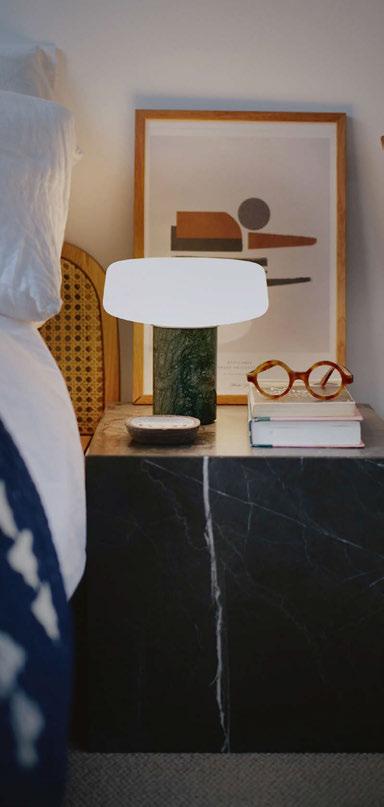
One of Woodgate’s long-standing brand partnerships is with Case, a British furniture, lighting, and home accessories brand established in 2006 by British designer Paul Newman.
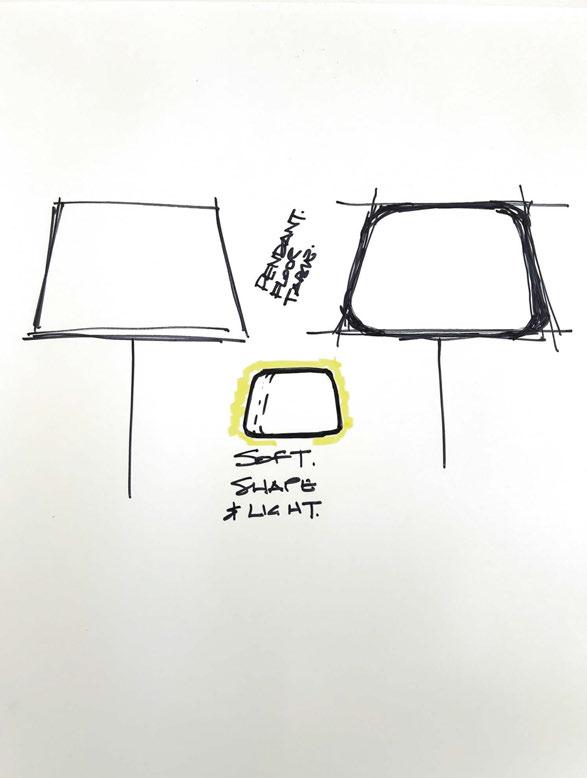
“I have known and respected Case for many years and the team has impressed me with their energy and enthusiasm. They have grown and are now a successful international producer with an intention to expand its decorative lighting. Case commissioned me to design a collection of floor and table lights, which is called Soft, due to its soft form of the traditional tapered shade. Made in Poland in mouthblown, three ply opal glass, it provides a beautiful, soft ambient light.”
The Soft collection’s elegant, rounded conic glass shade takes the centre stage, which is acid-etched to produce a diffused, gentle light. With a three-step touch control to dim the light, the collection is versatile and suitable for use in residential, office and commercial environments.
“Working with light is always an exciting experience, because you never really know light and how it will perform.”
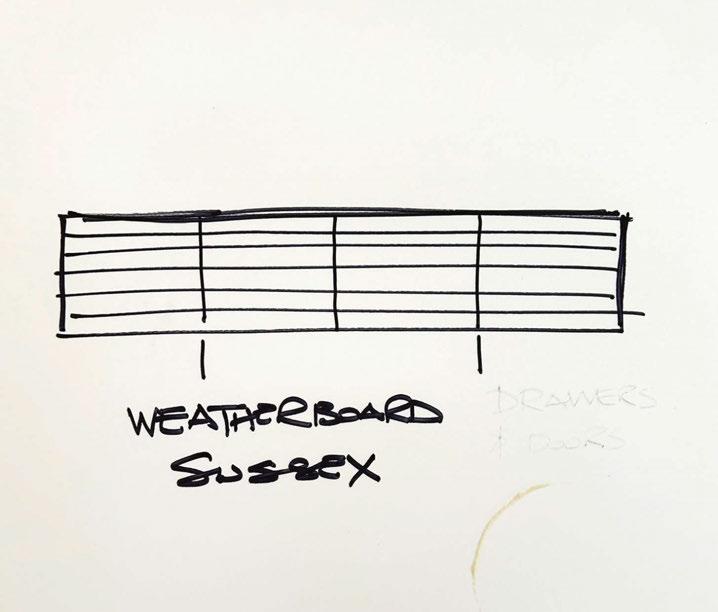
What can we expect from the designer next? A new collection of wall lights appears to be on the horizon…
“The wall lights are currently a speculative design without a manufacturer in mind; it is one of those designs that has been on my board for a while. As I am now living in Girona, I think I would like to approach a Spanish brand.”
www.studiowoodgate.com

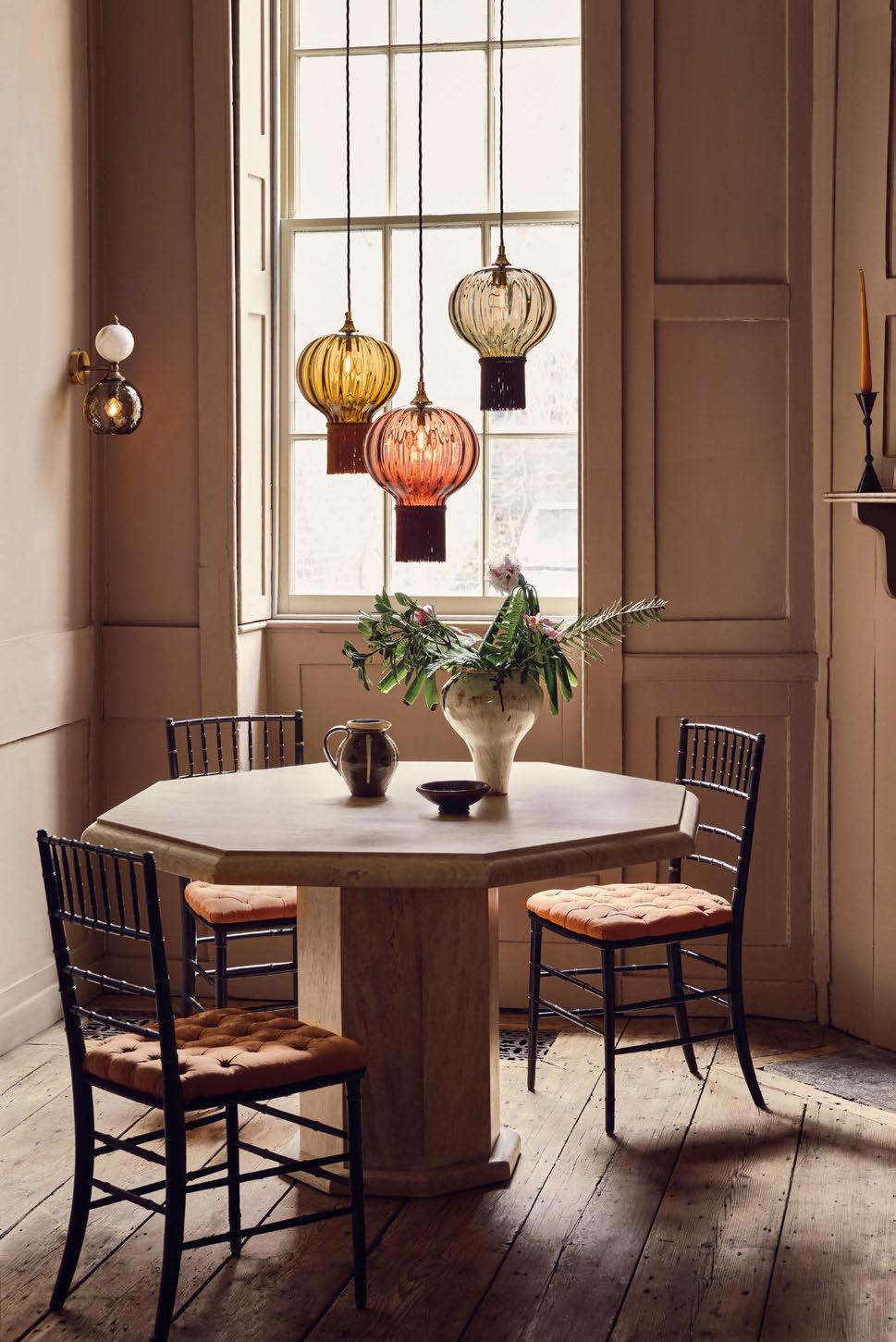

Kevin Chung, Design Director at AB Concept, discusses the importance of decorative lighting in an F&B environment, highlighting the considerations to the architecture and referencing recent projects case studies.
Decorative lighting is the soul of a space; without it, the environment can feel lifeless and uninspired. In nearly every project, especially in restaurant and bar designs, we would want to collaborate with a highly skilled and capable lighting designer.
Today, restaurants and bars are more than just places to eat and drink—they are immersive experiences where lighting significantly shapes the overall atmosphere. Consider the effort and creativity a chef invests in crafting a dish that is both visually stunning and delicious. The role of the lighting designer is to enhance and showcase this artistry. Poor lighting would not only fail to do justice to the chef’s work but also detract from the intended dining experience.
In many of our projects, decorative lighting serves as the primary light source throughout the interior. We believe that decorative lighting is a critical component of the overall design, both visually and aesthetically. As a result, we would custom design every piece of lighting within the restaurant to ensure it complements and enhances the space.
In projects involving heritage buildings or those meant to convey a classic narrative, the role of decorative lighting is particularly significant. These spaces demand a lighting approach that both honours the architectural integrity and aligns with the historical context. We are always very careful to avoid the use or hiding of visible architectural lighting, such as downlights, that do not correspond to the architectural era. We believe it is essential to maintain the authenticity of the design by adhering to the lighting conventions of the period. We deliberately limit the use of architectural downlights, using them only when absolutely necessary for function. This approach often ends up requiring custom design of almost every light fixture in the space, allowing us to create a cohesive narrative that not only respects the building’s history but also enhances its aesthetic integrity. With the sole purpose that the lighting design not only complements but also elevates the overall experience, preserving the character and essence of the
original architecture.
One of our recent projects, the all-day dining restaurant, Yun He, at the Four Seasons Hotel Suzhou, is nothing short of an architectural gem. The space is designed with soaring ceilings and expansive window glazing, allowing an abundance of natural light to flood in. This design choice brightens the interior and provides guests with breathtaking views of the hotel’s meticulously landscaped gardens, creating a tranquil and picturesque setting that elevates every dining experience.
The restaurant’s interior lighting has been carefully crafted to adapt to the natural rhythm of the day, ensuring that the ambiance remains inviting and harmonious, whether guests are enjoying breakfast at dawn or dinner at dusk. Lighting transitions are designed to seamlessly shift from one hour to the next, offering a gentle, warm glow that complements the restaurant’s sophisticated décor. The decorative lighting elements are custom designed to subtly weave into the experience, telling a story of timeless elegance, crafting a unique and memorable atmosphere that leaves a lasting impression for visitors.
In another of our projects, the Mei Li, which is an award-winning restaurant within the Grand Hyatt Hotel, Kuwait, we pushed the boundaries of interior design to create a space that is both visually stunning and culturally resonant. Drawing inspiration from the rich traditions of the Peking Opera, the restaurant features intricate designs and towering ceilings that evoke a sense of grandeur. Central to the experience is the dramatic decorative lighting, which plays a crucial role in highlighting the exquisite details of the space.
The lighting casts a captivating glow, accentuating the artistry and craftsmanship that define Mei Li. The abundance of decorative lighting not only enhances the presentation of the Asian culinary delights but also immerses guests in a sensory journey, where each meal is transformed into an unforgettable experience of taste, culture, and artistry. www.abconcept.net

Nestled within the recently unveiled Durango Casino and Resort, situated just off the iconic Las Vegas Strip, is Wax Rabbit Speakeasy. The venue, which is brought to life by the team at Station Casinos and operated by industry experts Clique Hospitality, has received a stunning scheme by design collective Studio Munge.
At the heart of Wax Rabbit Speakeasy’s design narrative lies a captivating myth from Mexican folklore. It centres around “El Centzon Tōtōchtin,” a group of 400 Divine Rabbits, offspring of Mayahuel, the goddess of the agave plant, and Patecatl, the god of Pulque— an ancient alcoholic beverage derived from agave sap. These rabbits roamed the land, revelling in lively gatherings while sharing the spirit of intoxication. As the legend goes, when indulging in agave spirits, the 400 Rabbits inhabit us all.
A perimeter cove light softly illuminates the drapery while 66 handblown smoked glass vessels hang above the central sofa groupings. The custom chandelier, by Boii Lighting, gives a red tint and soft glow to the room, adding an enchanting shimmer and artistry. Between the banquettes, delicate table lamps with redtinted glass globes mirror the grandeur of the central ceiling installation, adding to the tableside ambience.
www.studiomunge.com
Image: Brandon Barré


Designers are forever pushing the boundaries when it comes to creating memorable spaces in the food and beverage sector, meaning restaurants and bars are more than just places to eat and drink, they are rich and multi-sensory experiences where ambience is key.
With over 75 years of experience when it comes to lighting some of the world’s finest interiors, Chelsom has been lucky enough to have worked on a truly diverse collection of projects within the bar and restaurant sector. Its involvement with the vibrant cocktail bar and restaurant ‘The Alchemist’ in Salford’s Media City, has been an exciting addition to its portfolio.
The popular cocktail bar and restaurant prides itself on providing an atmosphere as creative and theatrical as the cocktails it serves and the venue combines elegant design with a decidedly contemporary twist and the lighting is no exception. Chelsom worked with the design team to carefully select fittings from
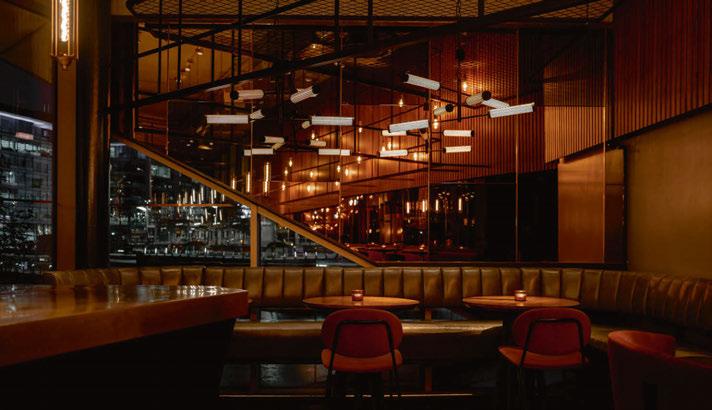

its latest collection, Edition 28, to enhance the distinct identity created throughout.
Chelsom’s striking custom Pod ceiling light was selected for the centrepiece fitting, creating a dramatic design statement. The fitting is a unique design from Chelsom’s custom ceiling ranges whereby clients are able to customise initial Chelsom design concepts to create a huge variety of different looks and effects. The centrepiece fitting features perforated brushed brass cylinders, which are capped at both ends and contain beautifully diffused LED light sources. The ‘pods’ are configured as points of light at the end of individual chandelier arms and create a striking light effect. Ornate mouthblown Veneto Glass Laguna pendants in Mocca featuring a geometric design were also specified throughout, complementing the interior scheme perfectly while creating a warm and ambient light effect.
www.chelsom.co.uk

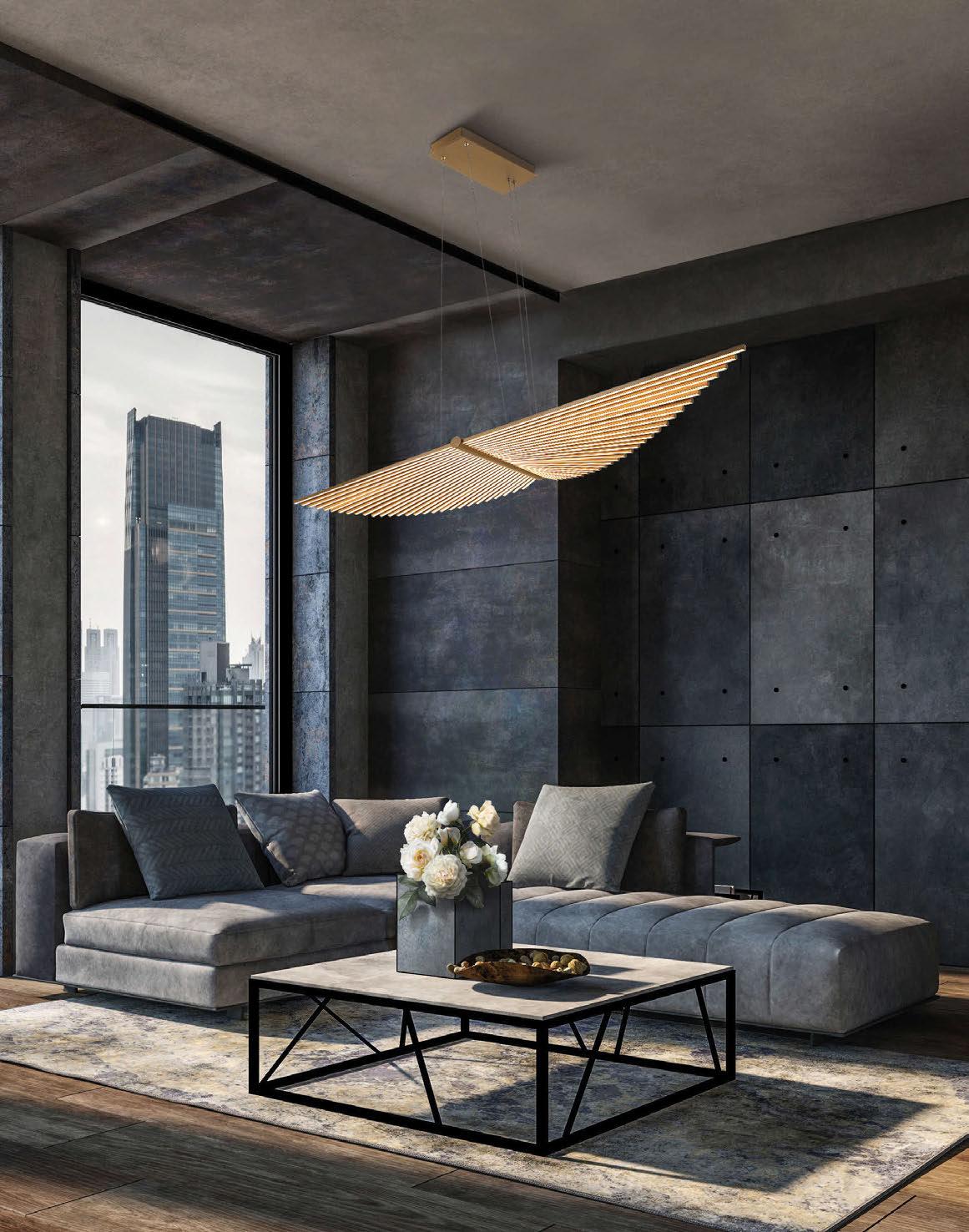
Cento Bangkok, a charming Italian restaurant, was driven by the goal of creating a cozy and understated ambiance that feels just like home. The client envisioned a warm, inviting space, and so the design focused on bringing that to life with a thoughtful blend of style and sustainability.
To achieve the desired atmosphere, Zico Lighting dim to warm G95 lamps were specified, which perfectly replicated the soft dimming effect of traditional incandescent lights. This not only enhances the restaurant’s welcoming vibe but also ensures energy efficiency dimming to 1%, aligning with modern sustainability goals.
In a move to further support environmental responsibility, the entire lighting control system from the previous venue was repurposed. This approach not only reduced electronic waste but also delivered significant cost savings for the client.
The result is a beautifully lit space where guests can relax and enjoy their meals under a gentle, inviting glow.
Interiors were completed by Mtmdesign, with the lighting scheme by Infusion Lighting and products supplied by distributor Mosaic Eins.
www.zico.lighting
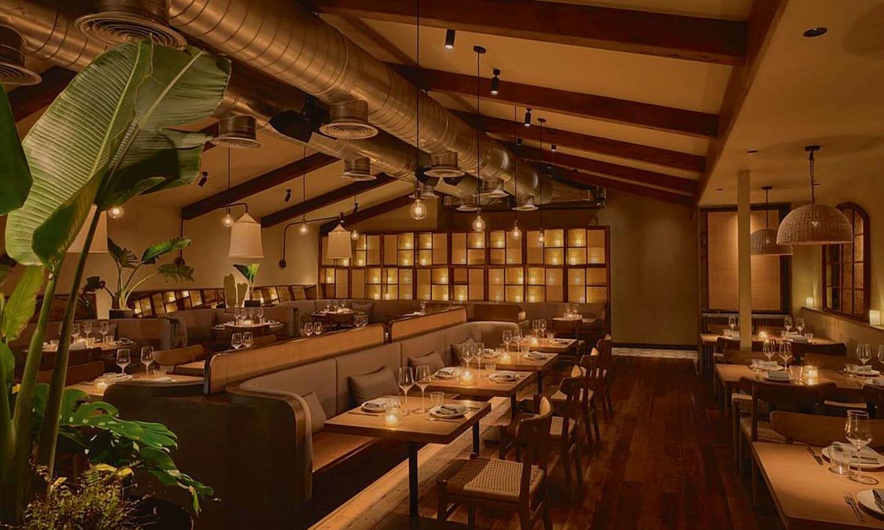
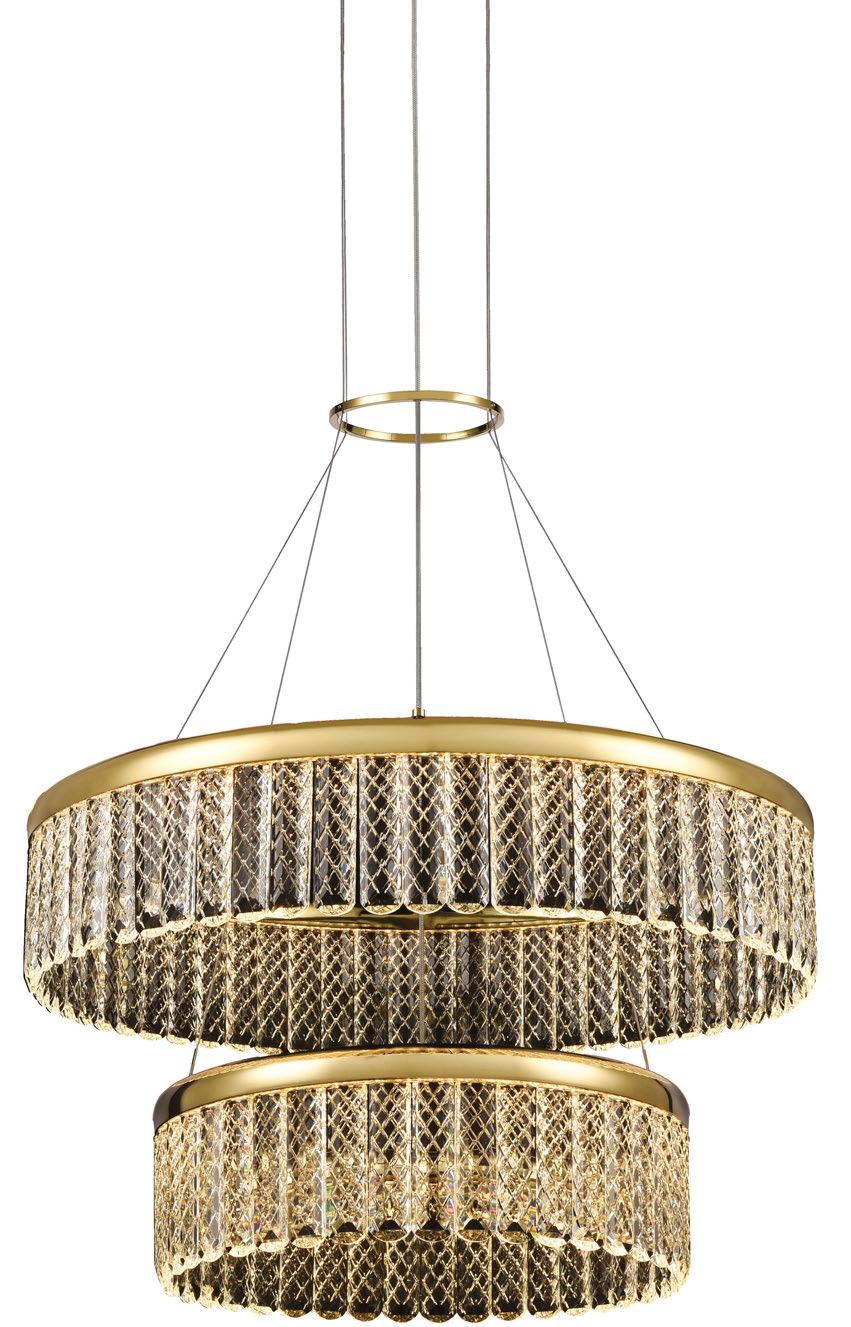
Scan the QR code to watch the Victoria 360° video.



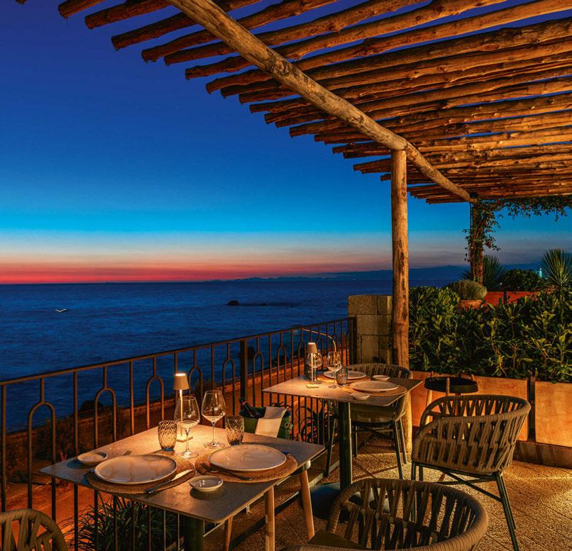


Lisola a new project from chef Nino Di Costanzo, pizzaiolo Ivano Veccia and Venetian entrepreneur Federico de Majo, opened in Forio, Ischia, Naples: a structure that houses a restaurant and pizzeria with strong references to traditional Ischian cuisine, open from aperitif to dinner.
The restaurant was built inside a structure of green tuff, a typical stone of the Forio area, dated 1927, located right in front of the sea. Behind, however, is Mount Epomeo, the highest peak of volcanic origin on Ischia. From the terrace you can see Ventotene and, to the right, the Soccorso Church. “We are in front of one of the most beautiful sunsets in the Mediterranean: a magical view,” says Chef Di Costanzo.
Set in 700sqm of space and 150 seats: the venue is developed mainly outdoors, with a garden on a large terrace, a handcrafted Sorrentine pergola, an olive tree in the centre, and five private areas, which are bordered by plants, pots and green spots: all with an exclusive view of the sea.
The rooms are cozy and informal, and the furnishings are almost entirely Italian. The choice of the three partners was to favour traditional materials produced by local artisans, such as wood, stone, and iron, which are also present on the terrace and in
the parking area. The design follows a contemporary style, with corded chairs and a predominance of earthy colours.
The play of light is another essential feature of the location. “Federico de Majo is very attached to Ischia: a lighting visionary who represents the elegance and innovation of the Murano glass masters,” Nino Di Costanzo points out, speaking of the Campania-born entrepreneur, founder of Zafferano and creator of Poldina, who has been working in the industry for more than 23 years.
“An atmosphere of simplicity and warmth, achieved also thanks to soft, diffuse and noninvasive lighting,” de Majo emphasises, ”with the exception of the areas involving the pizzeria, grill and kitchen. In the project, the Venetian designer included numerous glass elements, playing on shapes and colours also for the mise en place with plates, goblets, glasses and accessories. The hanging lamps installed in the pizzeria and in front of the grill are dynamic and modern: a tribute to the Bilia tumbler.”
Specified Zafferano products include Poldina Micro cordless lamps, and Bilia e Sfera suspension fixtures. www.zafferanoitalia.com


6-9 OCTOBER 2024 | OLYMPIA EVENTS | LONDON GET YOUR TICKET & SAVE USING:


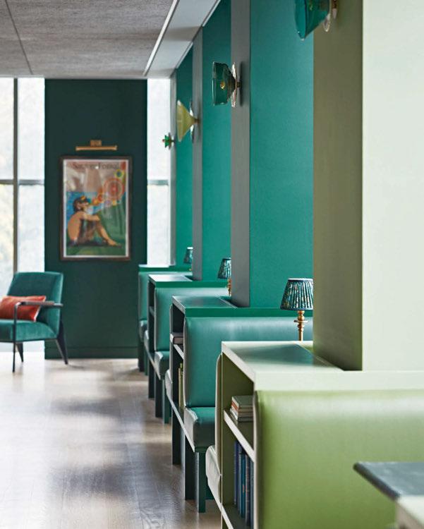

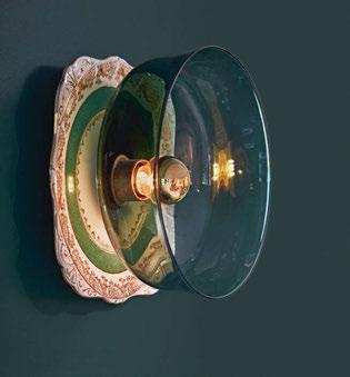

A selection of vintage and glass Siren wall lights by Curiousa feature in Matthew Williamson’s latest project, The Design Kitchen.
The new dining spot on the top floor of the renowned Design Museum located in Kensington, London, the space was created by Matthew Williamson, award-winning British interior designer, who worked together with BBC’s Interior Design Masters contestant Fran Lee. Combining rich tones of green throughout, the project brings an understated elegance to the design-led eatery.
Curiousa’s team worked with head interior designer Lee to select pieces from its curated selection of vintage chinaware, which were paired with free-blown glass pieces, handblown in tones of blue and green.
The resulting 13 siren wall lights adorn the length of The Design Kitchen, punctuating each of the seating booths while referencing the view of Holland Park outside. www.curiousa.co.uk

