
THE PINKY RING, USA
JO CALVER, ISLA JAMES INTERIORS
LIGHT 24 SHOW PREVIEW
HOTEL LIGHTING


THE PINKY RING, USA
JO CALVER, ISLA JAMES INTERIORS
LIGHT 24 SHOW PREVIEW
HOTEL LIGHTING


As always, this time of year comes around too fast. And with [d]arc media’s busy schedules across the second half of the year, time seems to fly by! Half of the team were away in Thailand in September for our inaugural [d]arc sessions Asia event, held at the beautiful Le Méridien Phuket Beach Resort. This event sees high end specifiers meeting with local lighting suppliers in an intimate networking event. After the hard work that goes into taking an event into a new region and market, our team was pleased to have been met with a wave of resounding praise from participants who thoroughly enjoyed the programme and found it a fruitful experience for their business.
Upon returning to the office, the countdown officially began for final preparations ahead of LiGHT 24, our exhibition held at the Business Design Centre, London, this November 20-21. If you haven’t caught it on a post across our various social media platforms and newsletters, attendance to the show is completely free! All you need to do is register on LiGHT’s website: www.lightexpo.london.
Not only is this the UK’s only lighting-dedicated exhibition, but it is also home to the well-respected [d]arc thoughts talks programme that Matt, Helen and I on the editorial team have worked tirelessly to put together.
And if we don’t say so ourselves, this one is a belter and probably the best yet! With heaps to see and do at the show, from the talks to networking events and an Instagram-worthy light art installation, make sure to catch our LiGHT preview on p.60 to check out some of the decorative lighting offerings that will be on show.
After LiGHT, the team’s focus will be turned to our next edition of the [d]arc awards.
This year, we are celebrating the awards’ 10th anniversary! That means, we’re adding a little more glitz and glam to our infamous [d]arc night party in March next year, and we’d love to see you there to help us celebrate.
If you have a recently completed project that features stunning decorative lighting, make sure to enter it.
Then, when voting opens, our peer-to-peer voting system ensures all winners are decided by you, the design community! Everyone that casts a vote in all categories will automatically receive a ticket to attend the party and share in the evening’s revelries.
Now, turning to this issue’s content, we are full to the brim with fabulous international projects, including an exclusive with Yabu Pushelberg on their recent project with Bruno Mars, The Pinky Ring. You can read all about the opulent bar starting on p.8.
I also got the chance to sit down with UK-based designer Jo Calver to discover her journey into interior design, which then led her into discovering a passion for lighting design. Jo discusses the value of incorporating lighting into your interior projects and her plans to expand into this sector in the near future. You can also catch Jo hosting a presentation at LiGHT 24. Details of this can be found at the end of her interview, which starts on p.26.
Hope to see many of you at LiGHT – make sure to come and say hi!

026
Interview: Jo Calver, Isla James Interiors
Ahead of her talk at LiGHT 24, darc’s editor sat down with designer Jo Calver to discuss her journey into interior design, and her passion for lighting, which has woven itself into being a core offering in her studio’s services.
034
Materials: FW 24 Poldina, Zafferano x Momonì Momonì and Zafferano, both Veneto region-based brands, have come together to create an elegant second collection of Poldina portable lamps, with designs that take inspiration from Japan.
054
Case Studies: Hotel Lighting
A selection of some of the latest decorative lighting solutions that are chosen for a hotel setting.
060
On Show: LiGHT 24 Preview
Held on 20-21 November, LiGHT 24 is the UK’s only lighting-dedicated show, which will be held at the BDC, London. Check out our show preview, which highlights some of the incredible networking opportunities, talks programme, and decorative lighting exhibitors.
006
Focal Point
Third Space, Studio Saar
008
The Pinky Ring
One of Las Vegas’ highly anticipated openings this year was Bruno Mars’ The Pinky Ring cocktail lounge and live music venue at the Bellagio Hotel and Casino.
016
The Sessile
The Sessile is the latest project to come from contemporary rental brand, Way of Life, designed in collaboration with former Soho House Design Director, Linda Boronkay.
040
The BoTree Hotel
Concrete Amsterdam worked with dpa lighting consultants to create a vibrant new hospitality destination in the heart of London, UK. Using layered lighting, the team has designed a unique residential vibe for the hotel.
048
Next Hotel Melbourne
Earlier this year, darc’s editor sat down with Ingrid Baldwin, FPOV’s Global Creative Director, to discuss a custom lighting installation they completed in Melbourne’s Next Hotel.
Managing Editor | Helen Ankers h.ankers@mondiale.co.uk
Editor | Sarah Cullen s.cullen@mondiale.co.uk
Junior Journalist | Ellie Walton e.walton@mondiale.co.uk
Contributing Editor | Matt Waring m.waring@mondiale.co.uk
International Sales Manager | John-Paul Etchells jp.etchells@mondiale.co.uk +44 7590 271 614
022
Design Evolution Part 2: Secto Design
Part 2 reveals the final design of Secto Design’s latest pendant, Kumulo. In case you missed the design concept, check out Part 1 in issue #56.
025
Comment: Designing for Longevity
Alessandro Munge, Founder and Principal of Studio Munge, discusses the importance of designing for longevity and how crucual it is to stay away from trends and fleeting design concepts.
052
On The Board: THDP
Manuella Mannino and Nicholas Hickson, CoFounders of interior design studio THDP, discuss its creative approaches to designing hotels, the local impacts these hospitality destinations have, and how to incorporate local influences.
066
In Focus: Zero Lighting
Discover more on Zero Lighting’s latest pendant, Curve Cluster, an expansion of its Curve collection that now brings with it various customisations.
Artwork | Dan Seaton d.seaton@mondiale.co.uk
Editorial | Mel Capper m.capper@mondiale.co.uk
Managing Director [d]arc media | Paul James p.james@mondiale.co.uk
Marketing & Events [d]arc media | Moses Naeem m.naeem@mondiale.co.uk
Chairman Mondiale Publishing | Damian Walsh
Finance Director | Amanda Giles a.giles@mondiale.co.uk
Credit Control | Lynette Levi l.levi@mondiale.co.uk
[d]arc media ltd | Strawberry Studios, Watson Square, Stockport SK1 3AZ, UK | +44 161 464 4750
Printed by Buxton Press, Palace Road, Buxton, UK ISSN 2052-9406
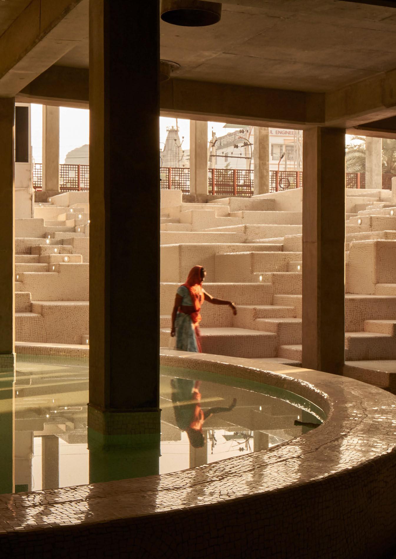
Anglo-Indian architecture practice Studio Saar has completed a new learning and cultural centre in Udaipur, Rajasthan for Dharohar, a not-for-profit organisation working with schools and volunteers to provide extra-curricular activities in the area. Third Space: The Haveli of Creativity, Curiosity and Community is a learning and discovery centre for all ages, that offers world-class facilities for educational programmes, informal learning, socialising and performing arts.
Intended as a ‘third space’ – a place without boundaries beyond home or school, local children and people of all ages are encouraged to encounter and explore diverse, hands-on activities to better understand more about the world and their place within it.
The new centre features a flexible entrance space for performances and community gatherings, a cinema, performing arts theatre, interactive exhibition of science and technology, tinkering and maker spaces, workshopping and co-working spaces, library, a café
and retail space, and a lookout tower to take in surrounding views. The building’s design draws inspiration from traditional havelis courtyard homes, featuring a central courtyard surrounded by a series of cloisters and shaded external circulation space. The façades feature intricate patterned Jali screens that provide ventilation while connecting the inside to the outside. Small, cantilevered niches in the façades, known as gokhra, act as wind catchers, playing a key role in the building’s passive cooling strategy and doubling as playful alcoves for reading, meeting and relaxing.
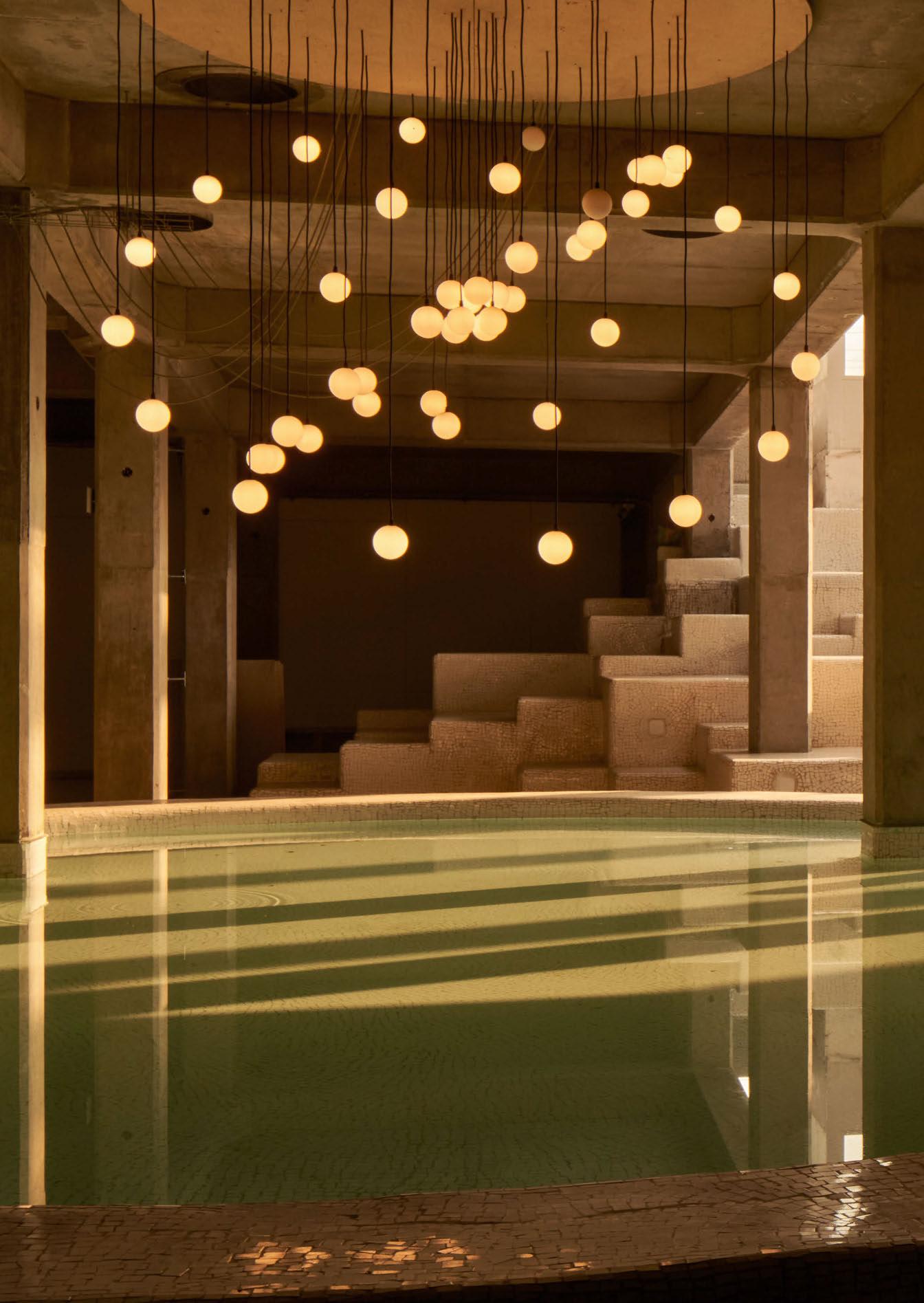
A focal point within the space is an elegant chandelier designed and manufactured by Studio Saar that features individual globe lights made by local Udaipur company, litomatic. www.studiosaar.design Image: Edmund Sumner
One of Las Vegas’ highly anticipated openings this year was Bruno Mars’ The Pinky Ring cocktail lounge and live music venue at the Bellagio Hotel and Casino.
Designed as an opulent adult playground, The Pinky Ring immerses patrons in an alluring ambience reminiscent of a 1970s private penthouse party.
Bruno Mars, an iconic musician with a strong sense of style, needed a design studio that would match his level of detail for aesthetics. He brought renowned global design studio Yabu Pushelberg on board to bring his vision of a new hospitality destination in Vegas to life. With an exclusive story on the lighting concept for the venue, darc’s editor Sarah Cullen caught up with George Yabu and Glenn Pushelberg, founders of the eponymous studio.
“Bruno had been searching for a design partner for The Pinky Ring for some time,” explains Yabu. “Together, we had a clear vision of the ambience we wanted to create: a sexy, smouldering cocktail lounge and jazz bar. We were introduced through MGM in September of 2022 and the project took off from there. It took about a year and a half to complete and opened in February on Super Bowl weekend, which was held in Las Vegas.” Pushelberg adds: “Bruno was involved in the design process from start to finish. He wanted to create an adult playground reminiscent of a 1970s penthouse party, drawing from the legacy of The Rat Pack, Sammy Davis Junior, and Silk Sonic. The Pinky Ring is just that.”
“There was a clear vision for The Pinky Ring from the start — not just in how the space should look, but how it should feel,” elaborates Yabu. “The final design stays true to the original concept.”
From the moment you enter The Pinky Ring, a huge amount of consideration was taken into account to preserve the full experience of the space. Guests are greeted by a circular screen façade that protects the venue from external factors such as casino lighting and sound. Upon entry, guests are swept into another world that begins through a dimly lit mirrored passageway, outfitted with Bruno Mars’ Grammy Award collection.
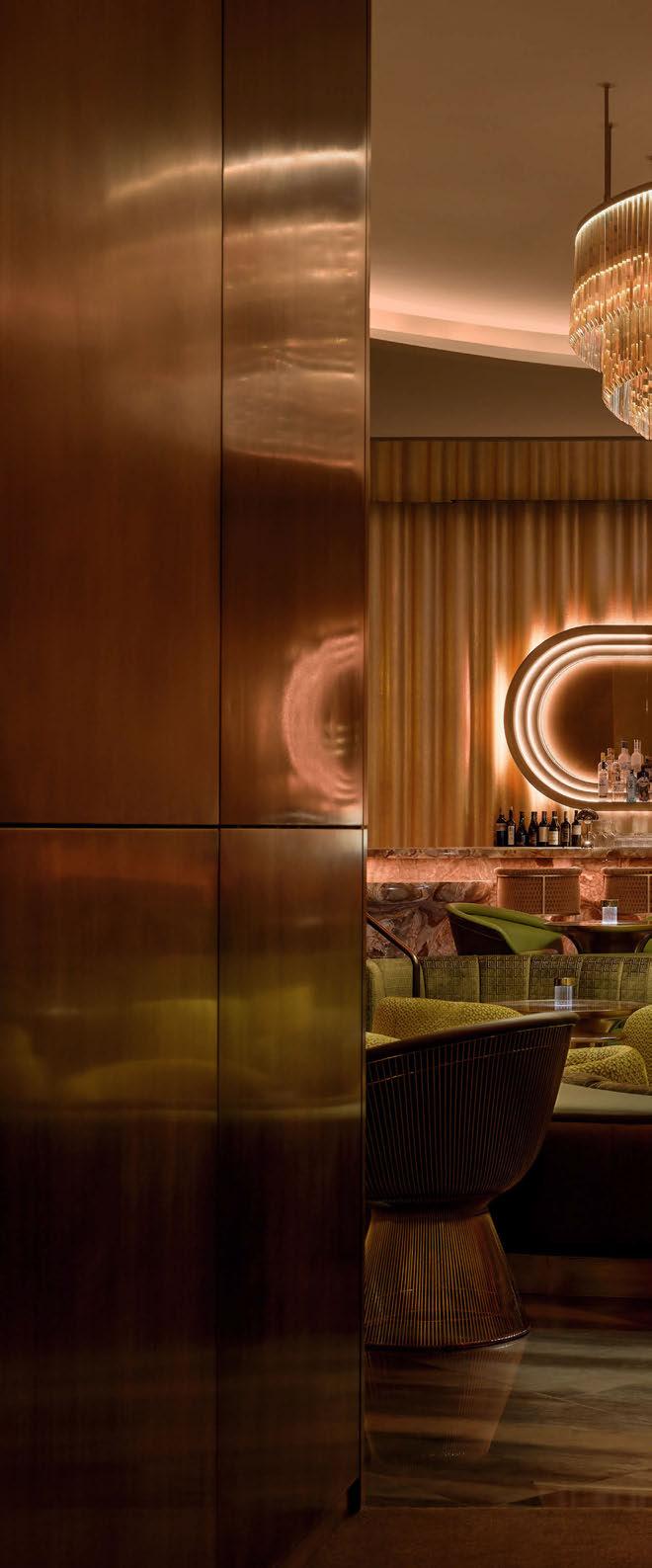

The corridor offers a visual palette cleanser from the outside noise of Vegas, taking inspiration from contemporary museum design, the display offers a discreet and soothing atmosphere.
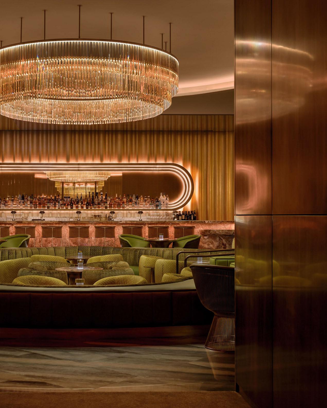
“Crafting a simmering prelude to the bar and lounge, the arrival serves as a vestibule to entertainment,” describes the studio. “Guiding guests along an enticing arrival pathway, it seamlessly leads to the heart of The Pinky Ring sunken conversation pit, the centrepiece of the 5,000sqft space. See or be seen, each area is composed of its own suave and purpose that echoes into the next.
“With a clear direction for how The Pinky Ring should not only be seen, but felt, lighting played a crucial role in establishing the aura and atmosphere. In the pursuit of perpetual allure, where lighting not only transforms spaces, but perceptions, The Pinky Ring unveils a strategic lighting innovation, schemed to make people look and feel their best. Through a strategic interplay of low-level, contrast, and accent lighting, The Pinky Ring lighting design unveils the unseen.
“Circles are key symbols throughout the visual language, representing Mars’ records, awards and accolades in an abstract and tasteful way
while alluding to visual nods of Palm Springs residences.”
The role of decorative lighting was an important one in achieving this desired aesthetic. “We wanted guests to feel sexy,” explains Pushelberg.
“A huge part of this is the way we lit the space, so we turned to music video lighting as inspiration.
“Our lighting scheme emits the perpetual allure - it doesn’t just transform the space, it transforms perception. We wanted guests to look and feel their best.”
Yabu adds: “In music videos, people look good 100% of the time. We achieved this at The Pinky Ring by using low-level lighting positioned close to the ground. This approach allowed us to create the desired aesthetic and ambience, channelling the energy of a 1970s private penthouse party, just as Bruno had envisioned.”
“We wanted to create a distinctive lighting language that transforms the ambience throughout the course of the evening,” says Pushelberg. “When guests first arrive, they are welcomed into a warm, inviting atmosphere. As the night progresses, the environment transitions into a dynamic, vibrant setting with dramatic colour changes, perfect for dancing.”
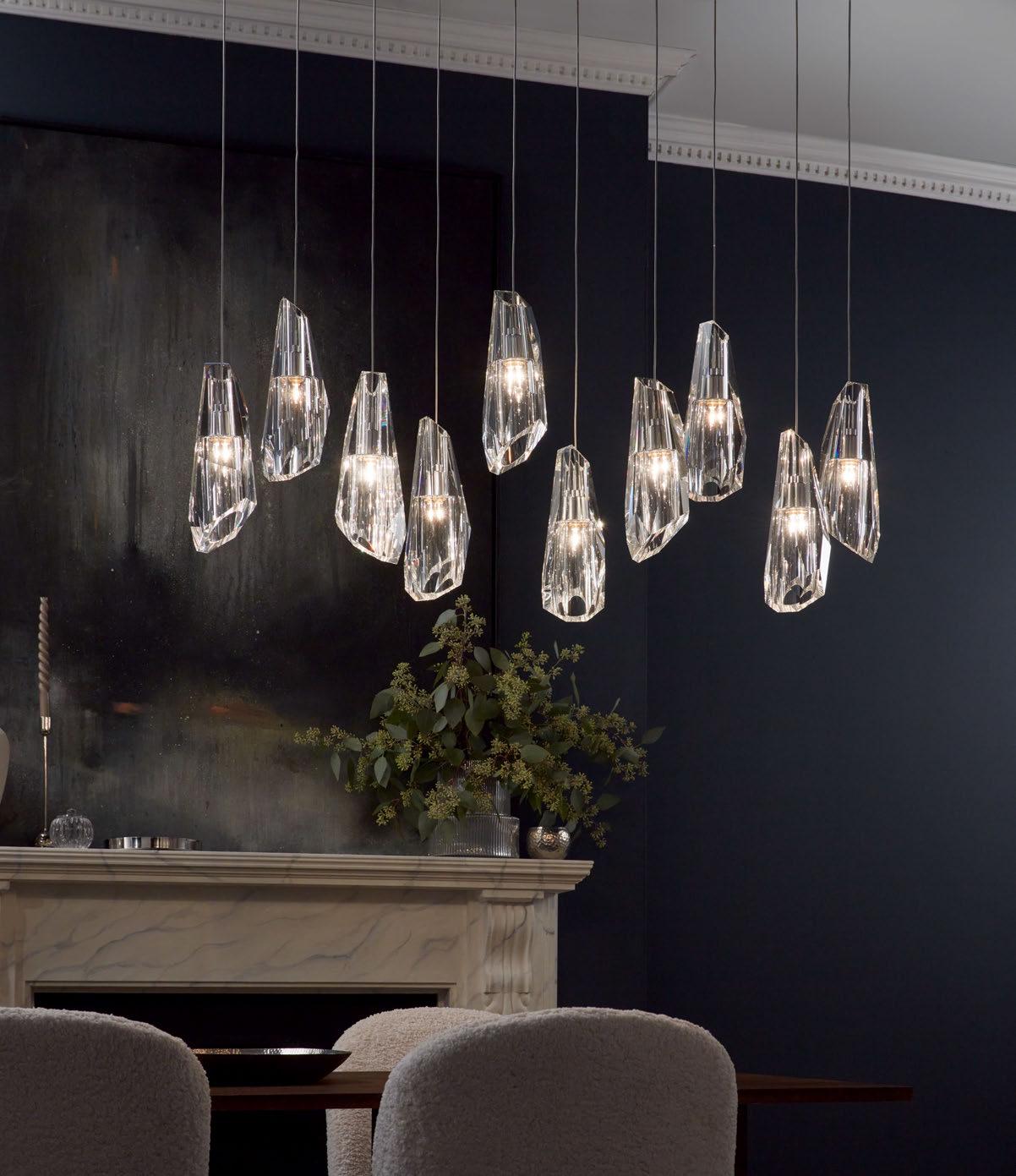
Yabu continues: “We used the latest lighting control technology, DMX, as a system that allows multiple fixtures to be affected by a single controller. DMX lighting uses a data signal to control the intensity, colour, and other parameters of LED lights. We used LED lighting because of its adaptability. LED lighting is not only versatile and energyefficient, but it’s also capable of controlling precise colour, temperature and intensity changes. The combination of these two technologies enabled us to create an immersive, customisable lighting experience, allowing us to achieve the music-video style lighting we were aiming for.”
“In terms of bespoke lighting, Lasvit created a custom chandelier that was designed as a replica to the chandelier that resides in Bruno’s Vegas home and hangs above the Conservation Pit,” adds Pushelberg.
The pair describe the design plan for the venue as a “performance in its own right” that pulled away from the gambling lifestyle of Las Vegas. “Yabu Pushelberg emphasised that rather than building a relationship to the happenings of the casino, it was their role to conceal it.
Instead of having direct views from the casino into the bar, the studio created a strategic design plan that transports guests away from it,” explains Pushelberg.
Yabu adds: “The journey begins upon arrival, where guests are greeted by a circular screen façade, protecting The Pinky Ring experience. On the other side is the VIP booth, where we added linear grazer uplights to frame both sides of the rings. Once inside the lounge, accent lighting is woven throughout: concealed in the ceiling cove, under the countertops, in the bar shelf, and below the planters. We also added table lamps and a custom Lasvit chandelier to bring the space to life.
“The Champagne Room is one of our favourite areas; it’s intimate and secluded but has a perfect view into the lounge. We used adjustable accent lights here to spotlight the champagne bucket.


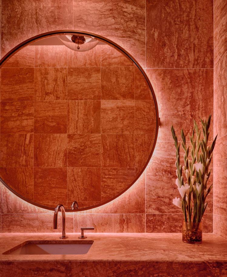
“We placed accent lights strategically to highlight and invigorate key design elements, like the lighting in the arrival corridor showcasing Bruno’s Grammy collection, but in a non-bombastic way. In the later hours, the contrast in lighting brings a new energy and vibrancy to the space, with the hues seamlessly shifting to create an ever-evolving visual experience.
“We have built and nurtured a team of talented lighting designers, who have been a part of our studio for more than five years. They help us bring our imagination to life. It is the unspoken and most impactful layer to projects. For clients who choose to bring our lighting service onto a project, like The Pinky Ring, it allows us to take the design process a step further, offering a more holistic approach overall.”
When it came to challenges on the project and with working alongside a very high-profile client, surprisingly there seemed to be very little the team couldn’t work out together.
“One of the design challenges we had was figuring out the right elevations for the Conversation Pit. It’s the centrepiece of the lounge, so we wanted to make sure it captured the attitude of the space while remaining elegant and functional.”
Pushelberg adds: One time during the creative process, Bruno was determined to go with a certain design direction that we did not feel was the best choice. Instinctually and in typical George fashion, he said: “No, no, no, no, no”. I think Bruno was initially taken aback by his response, but he appreciated the feedback and sincerity.
“Flash forward two weeks later when we were together in person, Bruno delivered the most bang-on impersonation of George: “No, no, no, no”. You have to have fun with one another. We are on the same team.”
“It was a joy to work with Bruno,” reflects Yabu. “He has a clear sense of who he is and what he wants, which made the design process smooth. He was open to collaboration and doing what is best for the project.”
With no structural constraints restricting lighting placement, it was just important for the team to ensure the decorative lighting “brought cohesiveness to the space”.
“As guests walk through each area, they can see and feel the fluidity from one space to the next,” explains Yabu. “The architectural and decorative lighting were designed together to create one layered, unified experience.”
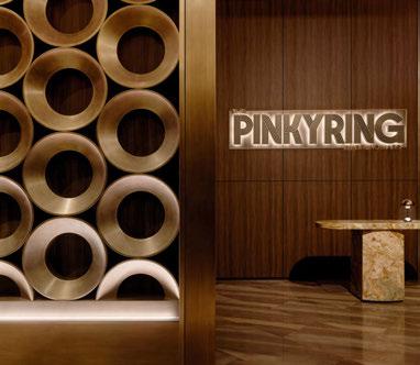


Overall impressions of the completed project are positive ones all around. “The Pinky Ring exudes a slowburn sexy feeling,” says Pushelberg. “Sexy can often be too obvious or cheap, but when you listen to Bruno’s music - it’s slow-burn sexy. That feeling is captured in the final design.
“We took on every aspect of the project, from interior design and lighting to styling, making sure to incorporate Bruno’s input along the way. Bruno kept things moving forward, and we had the most fun entering one another’s orbits, riffing ideas. This level of holistic involvement, and working so closely with Bruno, is what made the project stand out.”
If they could have changed anything, would they?
“I would have brought this project to life in the 70s, during the Studio 54 era,” adds Pushelberg. “There’s no way to fully recreate the energy of that time, but the closest we could get was by implementing a no-phone policy. There is freedom that comes from privacy that allows for deeper intimacy that disappears the moment someone pulls out a phone. We wanted to preserve that so people today can experience what we could at Studio 54.”
www.yabupushelberg.com


LONDON, UK
The Sessile is the latest project to come from contemporary rental brand, Way of Life, designed in collaboration with former Soho House Design Director, Linda Boronkay. The designer sits down with darc’s editor Sarah Cullen to discuss her approaches to the unique rental experience.
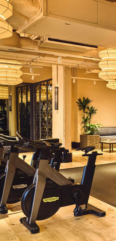
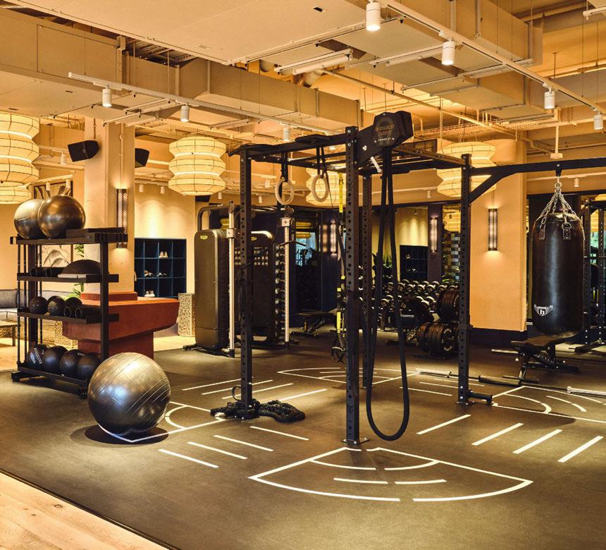
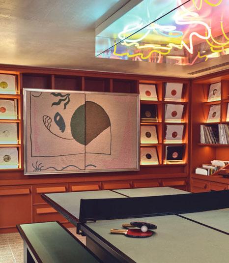
The residences are located in Tottenham Hale, London, and provide a multi-functional space for elevated living, boasting hotelquality amenities including a high spec gym, yoga studio, vinyl room, private dining area with fully equipped kitchen, and a rooftop Orangery with panoramic views across the city. The Sessile follows the success of Way of Life’s neighbouring property, The Gessner (which was covered in darc issue 45) designed by Fettle Design, and is their largest building to date, offering 310 studio, 1, 2 and 3 bedroom apartments.
Gavin Chetty, Brand Director for Way of Life, comments: “The Sessile is our largest London project and our most ambitious undertaking yet. We are thrilled to have partnered with world class interior designer Linda Boronkay on this project, who has created inspired amenities with a considered and sensorial design approach centred around Way of Life’s desire to create a sense of belonging through community and creativity.”
“We started working on the project in May 2021 and it completed Spring 2024,” shares Boronkay. “The initial brief was to design the communal areas, which included the gym, Orangery, dining space, meeting room and yoga studio, with a focus on bringing the community together and encouraging the residents to build and nurture relationships. We wanted to design a space that reflected the new art and culture groups that were being drawn into the area and provide the rental market with a home that really connected with the residents and expressed their individual personalities.
“The brief was multi-functional, and a lot of the spaces were designed to work as meeting rooms, dining spaces and lounge areas. We had to carefully consider the furniture, atmospheric and functional lighting and how we could partition the larger rooms to carve out functional spaces for each activity.
“The main challenge was designing a functional space that felt like an extension of the resident’s apartment, introducing character and warmth to a new build and providing a space that everyone felt connected to while catering to the varying needs and desires of the building.”
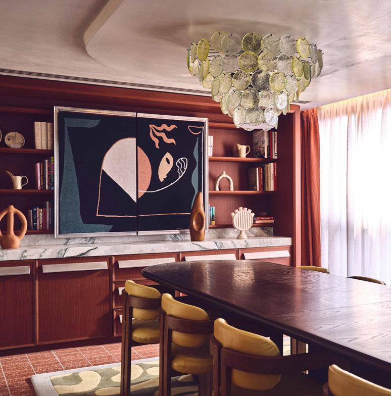
Throughout the building, Boronkay embraced a sensorial and multi-layered approach, pairing ornate pieces with contemporary lines, surfaces and textures. Typical to Way of Life’s buildings, the multi-use of a space is aided with the use of drapery that allows residents to change the function or ambience of the room accordingly. Inspired by postmodern forms and shapes, the design incorporates elements from past artistic movements, evident in the joinery handles, graphic veneers in the gym, custom neon artwork in the vinyl room, and bold colour accents throughout the building. Lighting, as always, played a big part in creating these layers and distinctions within the rooms, as well as the overall ambience. Boronkay specified various brands throughout the residence including ceiling lighting from Paul Matter Studio, Vaughan Lighting and Sogni, wall lights from Contain Lighting, table lamps from Visual Comfort, La Nena Home, and Lynguard Ceramics, and floor lamps from Objet Insolite and Bofred.
“Decorative lighting played a huge part in creating a warm and inviting environment,” says Boronkay. “We used a lot of low-level table and floor lamps to enhance the pockets of soft seating in the Orangery. Directional lighting illuminated the beautiful artwork that played a big part in the design of the spaces. We used large fabric pendants in the gym to create a space that didn’t just feel functional but layered the room with interesting forms from above.
“In the public spaces, including the lobby reception and corridors, we used sculptural pendants and wall lights in polished chrome finishes that contrasted with some of the more tactile wall and floor finishes to create a dynamic space. A deep red colour featured throughout the spaces, and this was applied to one of the wall lights that can be found in all the communal areas to link the spaces.
“In the gym we wanted to create a workout space that felt warm, and every detail was
considered. The material and colour palette were vibrant, warm and tactile. The stainless steel perforated light fittings brought an industrial aesthetic that contrasted seamlessly with the antique mirror and blue stained panelling. The hanging fabric pendants helped the space to feel warm with a softer light, which created a workout area that people could feel great in.”
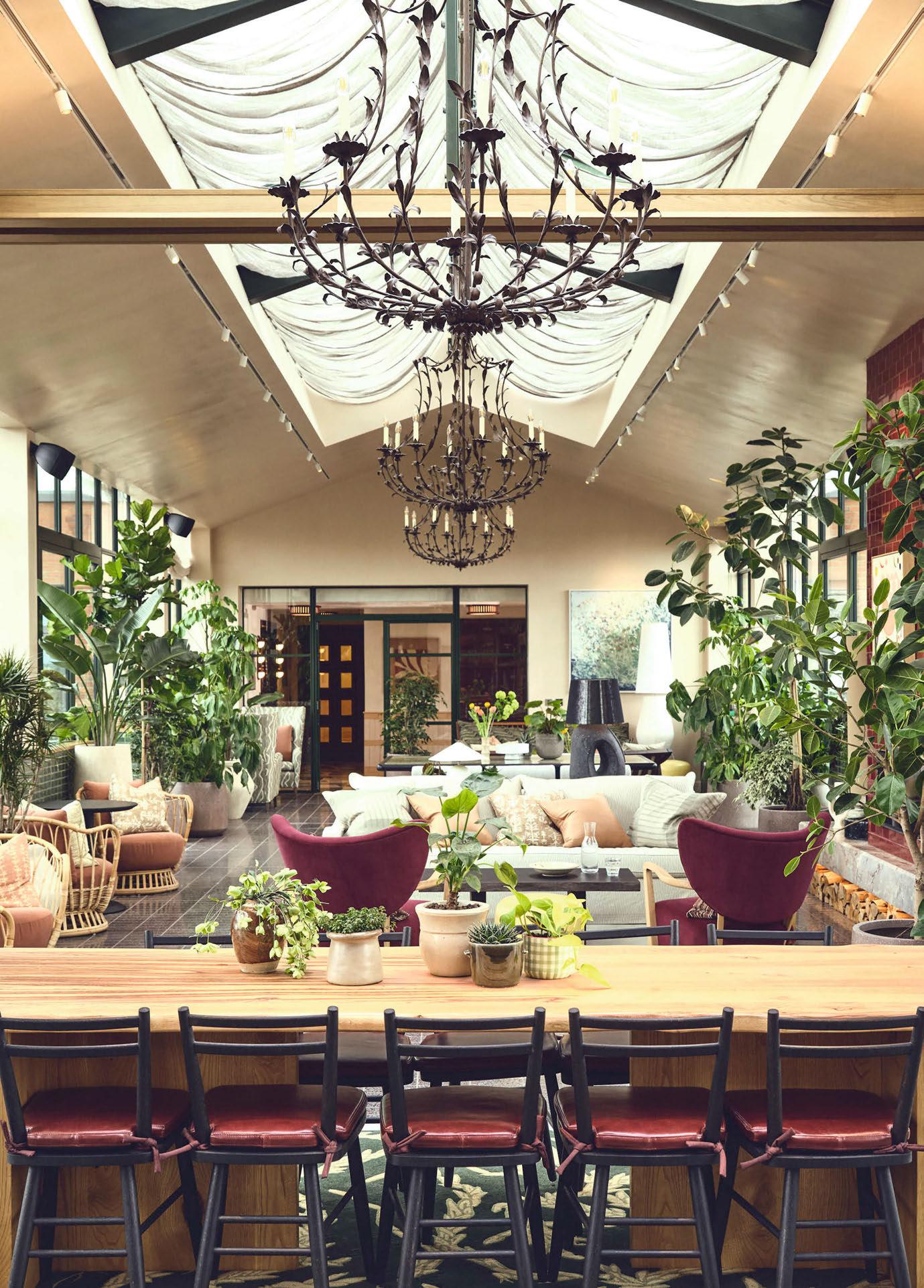
The 10th floor rooftop Orangery incorporates greenery from the surrounding parks and marshes with the aim of creating an oasis of calm. “The space invites the outside in with skylights and greenery, and leads out onto large terraces, which boast views across the city,” explains Way of Life. “The design is deeply rooted in the rich tapestry of its neighbourhood, a vibrant and diverse community, encircled by the local area of verdant parks, reservoirs, built-up residential zones and the picturesque Walthamstow Marshes.”
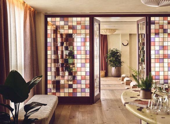
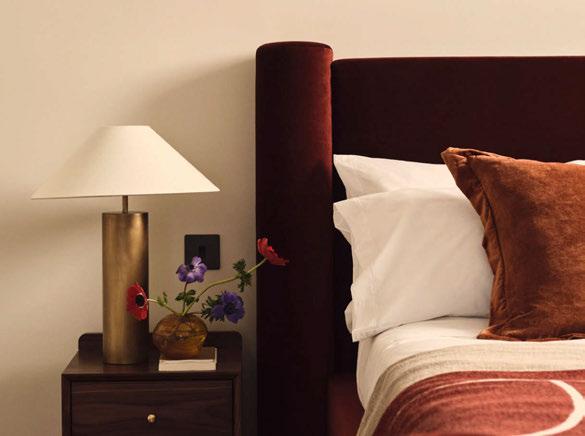
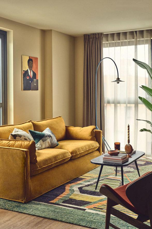

“Our goal was to create a warm and inviting atmosphere that feels like an extension of the residents’ apartments,
encouraging them to build their own communities or find moments of solitude in comfortable,
cosy spaces.”
LINDA BORONKAY
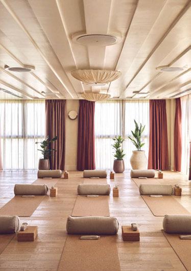
Boronkay adds: “In the Orangery we used large metal chandeliers to fill the double height space. Large scale table lamps and floor lamps with fabric lampshades softened the low-level lighting and created inviting seating areas.”
Reflecting on the finished project, she adds: “Our goal was to create a warm and inviting atmosphere that feels like an extension of the residents’ apartments, encouraging them to build their own communities or find moments of solitude in comfortable, cosy spaces. My designs for The Sessile weave together the area’s historical narratives, a variety of materials, rich colours, lush planting, and textured fabrics, with attention to detail from the joinery and lighting to the curtains and artwork. In essence, The Sessile is a blend of history, nature, and creativity, designed to foster community, inspiration, and a sense of home for its residents.”
Sowgol Zarinchang, Managing Director, Way of Life, concludes: “We are thrilled to launch our largest building to date, once again bringing design-led residences to the London rental market. We offer our third-party services to the market, for like-minded developers looking for a hospitality-led management firm with marketing and lettings capability. With best-in-class resident experience, it’s great to be part of another project utilising all of Way of Life’s skill set”.
www.wayoflife.com
www.lindaboronkay.com
Lighting
Lighting, Visual Comfort.
Images: Way Of Life
The Sessile is a multi-functional space for elevated living, boasting hotel-quality amenities, from luxury rental brand Way Of Life.
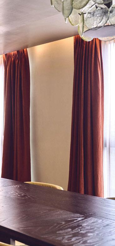
Interior Designer Linda Boronkay took inspiration from the nearby neighbourhood to create a cosy and inspirational design that took advantage of layered lighting to create its inviting atmosphere.
SEPPO KOHO, ARCHITECT & DESIGNER
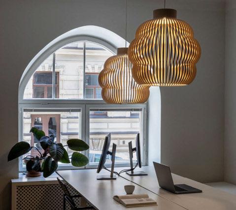
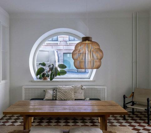
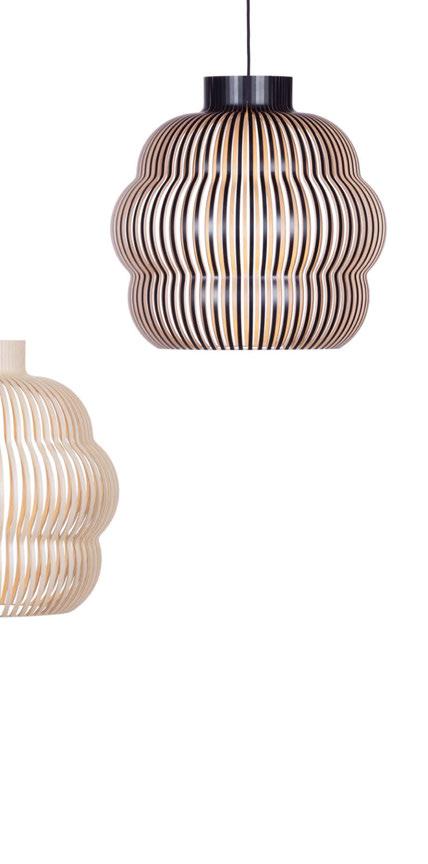
Part 2 of this issue’s Design Evolution takes a look at the finalised design and completion of Kumulo, the latest pendant to enter Secto Design’s portfolio of decorative lighting crafted from birch wood.
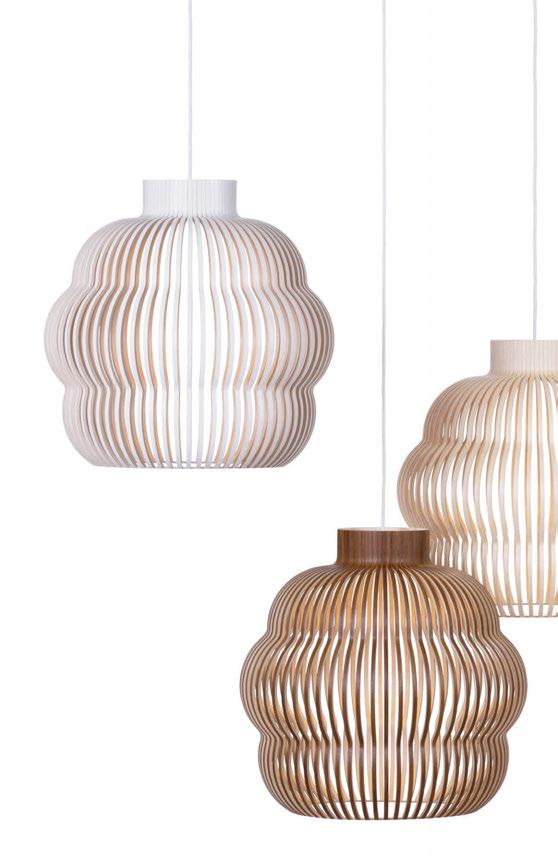
Secto Design lamps are all designed by architect Seppo Koho, and share the same unique visual language. But no previous model has been as polymorphic and challenging to manufacture as Kumulo, the latest addition to the collection.
Seppo Koho always produces the prototypes for his lamps personally at his own workshop. The lamp is then moved to production, which is not always simple. Kumulo is made from slats of form-pressed birch wood like the other Secto Design lamps, but due to it’s unique, undulating shape, new tools and processes had to be developed at the company’s factory in Heinola, Finland.
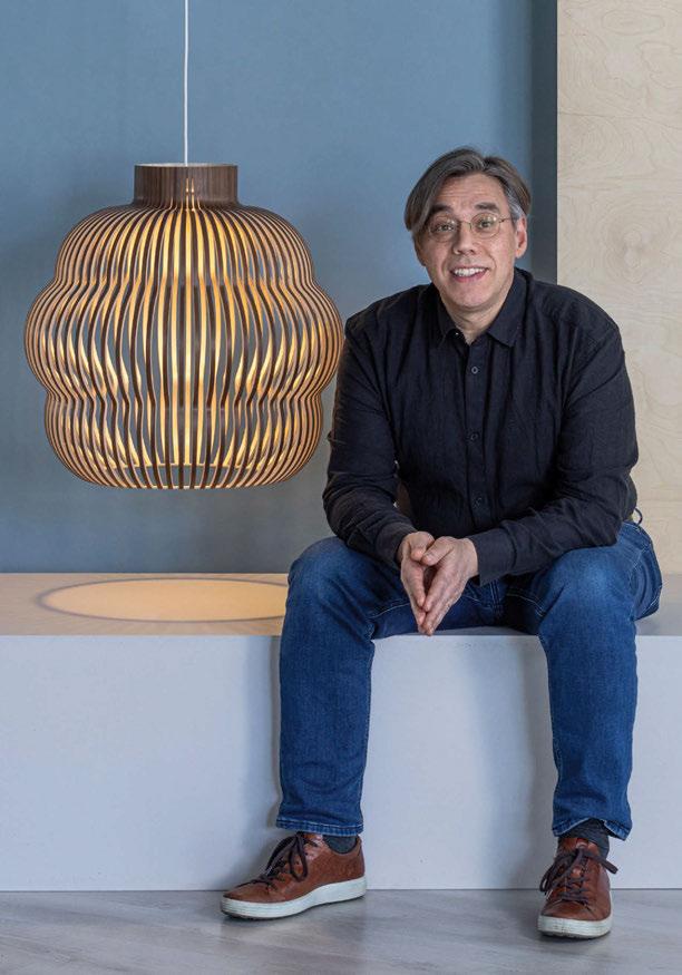
“With a clean, minimalistic design, handcraft has to be meticulous and extremely careful, as even the tiniest detail will be visible, unlike with more decorative designs that might be more forgiving.”
Along the process some minor changes were made for technical reasons, but they did not affect the visual aspects of the design.
“I am happy with the lamp and I hope it will become yet another model that the craftspeople enjoy making. It is important to ensure that the people making the lamps are proud to be on board. And that the design and quality of the lamp stands the test of time from one generation to the next.”
www.sectodesign.fi

Alessandro Munge, Founder and Principal of Studio Munge, discusses the importance of designing for longevity and how crucual it is to stay away from trends and fleeting design concepts.
In an age where social media’s influence drives every aspect of our lives and algorithms dictate our virtual consumption, the world of design is increasingly at risk of falling into a cycle of homogeneity. As designers, we face a challengeperhaps even a responsibility - to resist the seductive pull of trends that promise instant recognition but offer little in terms of lasting value. While the global economy and mass accessibility to platforms like Instagram and Pinterest expand, we all risk becoming echoes of the latest fad, resulting in washed-out, pastiche identities that lack depth and originality.
Trends are, by nature, fleeting. They emerge, captivate, and then fade, often leaving behind a trail of design that feels dated and irrelevant just a few years later. This constant chase for the next big thing conditions our minds to create work that is visually engaging for the moment but lacks the substance required for enduring significance. Good design remains iconic for a reason, and it remains iconic because it lives in people’s minds. It’s the people, their experiences and memories that make it iconic, not necessarily just the space. Consider the club scene - a sector where trends are arguably most prevalent. Nightclubs are designed to be ephemeral, to capture the spirit of the moment. But can a nightclub ever truly be timeless? Studio 54 is often held up as an iconic example, but was it the design that made it timeless, or was it the people and the cultural moment it crystallised? Good design becomes iconic because it is memorable, because it creates a lasting impression in the minds of those who experience it. It is not just about the physical environment but about the emotions and memories that space evokes. This is particularly true in hospitality, where guests return to a place not just for the amenities but for the feelings and memories it evokes. This is why I always push my team to go far beyond form and function to explore the emotive nature of the guest experience. Originality in design is a quest. It requires a willingness to venture beyond the familiar and to question the status quo. It’s a process that demands curiosity, passion, and dedication - a relentless pursuit of the right answer
rather than the convenient one. This journey often comes with personal sacrifices, as the search for true creativity requires time, effort, and a deep emotional investment. I see this dedication in my own life, in my family, and in my team. We all invest so much of ourselves into our work because we understand that design is more than just a job; it’s a calling.
The quest for true creativity often means navigating uncertainty and embracing challenges, pushing beyond the constraints that confine us. But the risk is the reward. True innovation comes from embracing the uncomfortable and unknown rather than settling for the safety of what’s been successfully done. For us, history feels as immediate as yesterday. What once spanned centuries now seems to unfold in a matter of days. And there is a certain beauty in creating spaces that transcend time - designs that are grounding and resonate on a deeper level because they are not tied to the whims of the moment. One perfect example of this is The Louvre in Paris, a testament to the timeless design that seamlessly integrates the past, present, and future. It’s also a brave act of rebellion. The juxtaposition of I. M. Pei’s modern glass pyramid with the historic grandeur of the Louvre’s classical architecture is a bold and courageous statement that preserves the essence of what was while inviting continuous reinterpretation. I always say: “You stand better as designers by not trying to replicate history. We can be inspired by it but don’t replicate it. The worst thing you could do is try to copy history.”
As we all navigate the pressures of designing in a trenddriven world, it’s important to remain optimistic and joyful and never lose sight of the fact that inspiration is boundless and all around us. True creativity comes from within, so what if, for a moment, we stopped following influencers and instead sought out a muse? As we evaluate the true cost of chasing trends, I invite all of you to seek the one who encourages you to look beyond the obvious, to dig deeper, and to embrace the process of discovery, someone who doesn’t direct you down a single path but ignites your own unique creative spark. www.studiomunge.com
Ahead of her talk at LiGHT 24, darc’s editor Sarah Cullen sat down with designer Jo Calver, Founder of Isla James Interiors, to discuss her journey into interior design, and her passion for lighting, which has woven itself into being a core offering in her studio’s services.
Isla James Interiors is an interior architecture and interior design practice that specialises in lighting design services. Headed up by founder and creative director Jo Calver, the studio is based in Pangbourne, Berkshire, and now has grown to seven full time designers. Within the team, every member has experience with lighting design, however, Calver works across interior design and lighting design and her colleague Amar Brar works solely as a lighting designer.
Calver grew up in the picturesque English town of Woodbridge in Suffolk, where she went to school with her now husband. During her time in education, Calver developed various musical talents, gaining high grades in singing, cello, and piano. Music, and in particular singing, remains a lifelong passion for her, as she was part of many choirs as a young adult and even had a stint as a backing singer for 90s British pop icon, Dina Carroll.
Today, music is a staple in the Calver household, with rarely a quiet moment in the home.
After school, Calver went on to study nursing at Birmingham University before qualifying as a paediatric nurse, where she worked at the John Radcliffe paediatric trauma unit in central Oxford for three months. “I did a degree in paediatric nursing, nothing to do with interior design, because when I was at school, I loved art, I loved music, I was definitely creative, but I had no idea what profession to go into. I’m not even sure that I knew of interior design, let alone lighting design. I’m not even sure a lighting designer was a even a thing when I was that age. My whole family had been in the medical profession, so I just followed suit.
have the time to spend with them, I was definitely frustrated and found myself wanting to do something more.
“16 years ago, a friend of mine said she was going to pay for an interior designer, or I could help her instead, and so it just started from there. I went on to help a few other friends and I felt invigorated and excited by not only having something for me, but I really loved what I was doing, and thought it was something I wanted to pursue more seriously.
“Shortly after, we moved as a family to Germany for my husband’s work. I couldn’t work as an interior designer there due to the language barrier. My husband’s work paid for me to complete a course of my choosing so I decided complete the KLC distance learning course in interior design. This taught me all the working-to-scale skills, with pen and paper and scaled rulers as back then there was no CAD involved. The course armed me with all of the important skills I needed when I came back to England.
“I wanted to create a studio that people came to for expert advice. I deliberately focused on the technical aspects of design. The majority of our work is assisting clients and architects in perfecting internal layouts.”
“Working in the NHS unfortunately meant I was underpaid and over worked. So, I jumped at the chance when head hunted by a pharmaceutical company. I worked for a smaller company for two years before moving to a large company, Schering Plough, for a further two years.
“Then, we moved to Newbury where we had our two children, Jamie and Isla. My husband worked long hours, and with no family nearby for support, it was impossible for us both to work at that continued pace. So, I spent 12 years at home looking after the children. During that time, while it was a privilege to
“I set up the business the moment we returned in November 2015 and worked for five years on large projects solo, just my pen, paper and scaled ruler.”
When it came to inspiration for Calver, at the beginning of her design career, the internet was a very different place. She refers to using multiple design magazines as a key source, as well as visiting places such as Chelsea Harbour Design Centre. Pinterest was also a main source and would be heavily used for the creation of project concept boards and mood boards, all of which can now be created just as easily on digital software.
At this point, Calver’s workload began to significantly increase, which led her to employing a trustful team around her. “I then went on to complete a lighting course with Rebecca Weir at KLC as well, which was really inspiring. I was like a sponge sitting there, thinking how amazing lighting design was.”
When establishing Isla James Interiors (named after her two children), Calver was aware of many others delving into the interior design business and it becoming a potentially over saturated area. Using her previous sales experience, she knew she needed a USP for her studio.
“I thought “I’ve got to have something that sets me apart”. Making homes feel cosy has always been a priority and lighting

“I have a passion for sciences, which is partly why I went into the medical profession. I think there’s not only a creative gene but also a scientific one and I think for me the combination of the two is why I love lighting so much.”
felt a natural complement. I was always playing around with layouts and moving lamps and felt far more inspired by the technical aspects of the job. So, I started getting involved in the lighting design on a larger projects. I was learning so much about lighting but I really wanted to try designing it myself.
Bruce Reynolds, Director of Xavio Design lighting consultancy had become a natural mentor for me with his kind words of encouragement and help. I asked him if I could design the lighting for my large residential projects and pay him to critique it and he thankfully agreed.”
Calver went on to use this approach for her next two large residential projects, gathering more feedback along the way and surrounding herself with reading and research, before she embarked on her first solo lighting project.
“I love being really knowledgeable about something, an expert. Interior design is an unregulated profession so you can experience a wide range of abilities from an interior decorator to an architectural interior designer with the same blanket title. I wanted to create a studio that people came to for expert advice. I deliberately focused on the technical aspects of design. The majority of our work is assisting clients and architects in perfecting internal layouts. AutoCAD, 3D visualisations, and lighting design are all part of our technical makeup. We design houses to the last accessory on the shelf even though the foundations have not yet come out of the ground. It’s the academic side of interior design that motivates me and I think the lighting plays into that toolkit perfectly.
“I have a passion for sciences, which is partly why I went into the medical profession. I think there’s not only a creative gene but also a scientific one and I think for me the combination of the two is why I love lighting so much.”
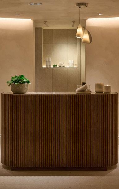
The luxury boutique Gate Hotel in London is a project Calver refers to as one of the hardest but most fulfilling in her lighting design portfolio. “Every single project we take on we care about, and every single project is made better by lighting. We actually don’t take projects now that don’t involve our lighting design because we know these projects will not be able to reach their full potential.
“One of the biggest accomplishments for me was maybe the most stressful, which is why it felt like such an achievement. The Gate Hotel was the very first hotel project that I did when I was solo, and the lighting design involved the level five member’s lounge, reception, bar, and entry reception. I didn’t have any of my team then and I didn’t have any CAD; I marked it up entirely by hand.”
Using her experience from the residential lighting projects that were aided with the critique of Reynolds, Calver was confident she could transfer the majority of those skills into a hospitality environment that followed similar lighting codes.
“Sure, you’re using more LEDs and you’re using more hidden lighting, but generally the principles are the same: to highlight the surfaces, to make it feel warm and cosy and to highlight artwork. “And another real triumph was I was doing it all by hand, which would then go to a CAD designer before coming back to me. There was a lot of backwards and forwards. At times I felt I’d bitten off more than I could chew. But in the end, it’s been a hugely successful project.”
Another notable project for Calver and her team at Isla James is The Store, a hotel in Oxford. Here, the team were responsible for designing the basement spa, ground floor spaces, restaurant, 101 hotel bedrooms and the level five bar and rooftop terrace, which brought with it some challenging light pollution

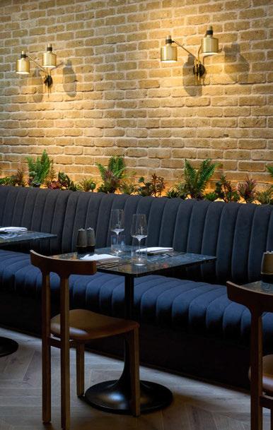

restrictions from the local council. “This was a real team effort that was a really big project, which lasted almost three years, and they’ve only just opened.”
In order to work around the lighting limitations imposed by the council for the external level five areas, Calver implemented a smart lighting system. “We installed a computerised system that could dim the lights down really low. We used DALI so that we could have a dimming profile right down to about 2%. It was a fine balance between the need for lighting as the hotel guests and customers headed for the bar and needed to be able to see on the terrace when it got dark. We installed a wall wash in the ground that caressed light up the sides of the building, but very closely. And because it was preset to 5%, it gave a glow to the very lower part of the building and didn’t go any higher therefore staying within the pollution requirements.
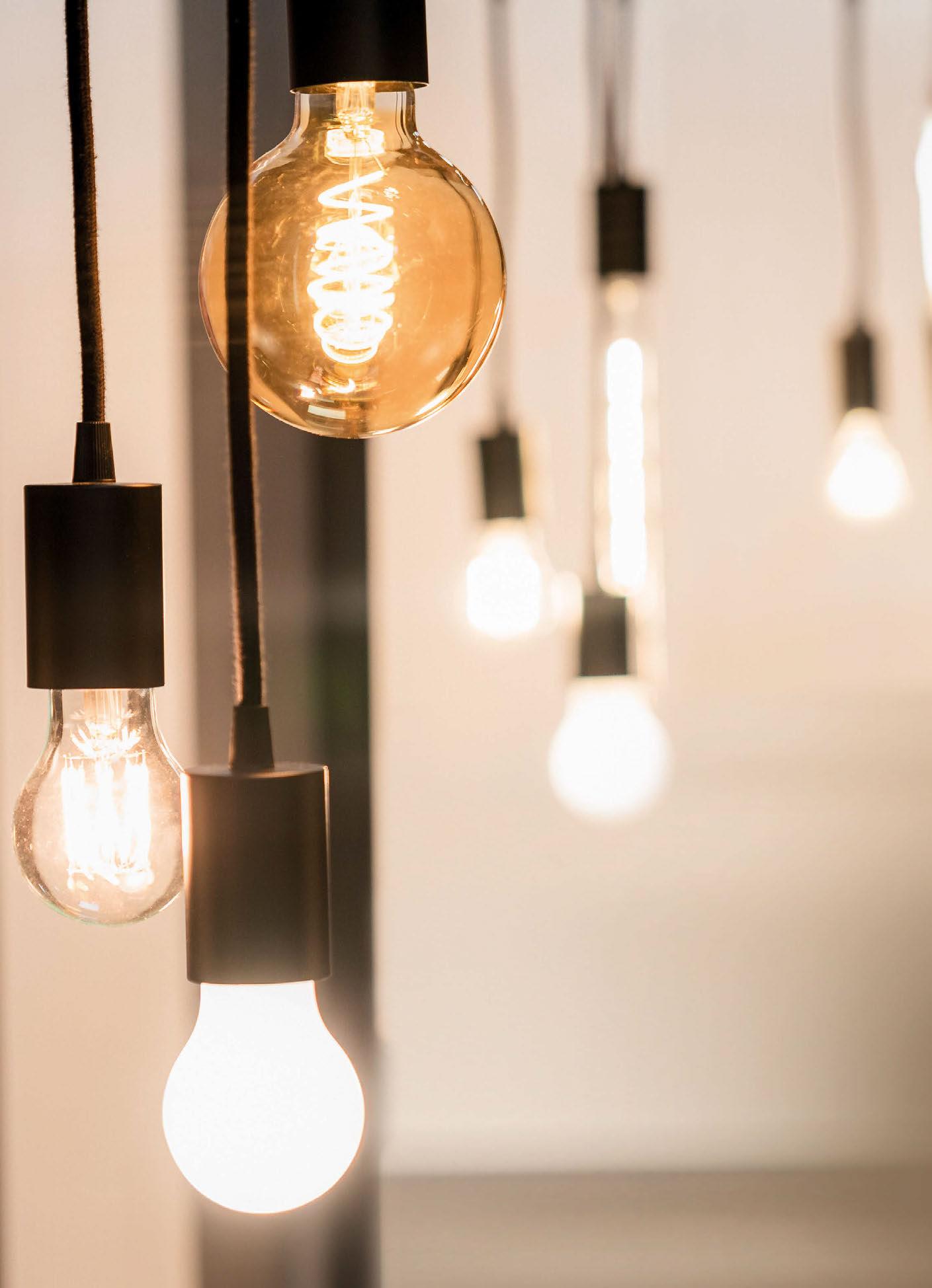
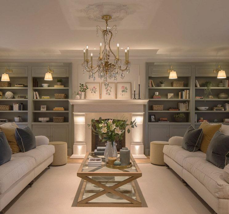
“On the residential side of things, we had a project go viral on Instagram, which I honestly think was down to the interwoven combination of the lighting design and interior design. The project had a lot of panelling, so we set downlights within the upper parts of the panels. This lifts the eye up and creates a sense of drama. There’s also a lot of hidden lighting in joinery, which was a big part of the project. This allowed us to have lots of different layers of hidden lighting and it just gave it this really sophisticated look. And of course, when you’re using lighting to enhance interiors, a high CRI fitting means that all the colours you see are true. We also used a lot of 2400K to bring a real sense of warmth and depth.”
Layered lighting is the absolute foundation any occupied space needs, according to Calver. “We’re still seeing a lot of open plan residential spaces, but the more recent trend is to divide the spaces using separating screens or pocket doors so that you can close off areas and then open them up when you’re entertaining. There’s a big demand for houses to not only be suitable for the occupants living in it but perform as large areas for entertaining and bringing lots of people over. I think people are entertaining more so in their homes since the Covid-19 pandemic, and when you have got young families, it’s very expensive to go out nowadays. A lot of our clients are in their thirties and forties with young families.
“For this, we create a lot of light zoning. I don’t remember the last time that we didn’t put a computerised system into an open plan space. We use a system for all open plan spaces, anything above two zones. And actually, most of our projects have three, maybe even four zones if you’ve got pocket doors shutting off a playroom, that then gets opened up. The idea is to give the ability to unify the spaces when required, but also to pick out the interesting aspects with the lighting in each zone so that you give a character to every space, but also unify it with the lighting. We are often using Lutron or Rako controls in the main open plan spaces.
“In most open plan spaces with, say, three zones there might be roughly 22 circuits, which sounds like an awful lot, but each circuit is doing something completely different. When that’s installed, we go on site and tilt the lights to the right places so they’re delivering light to
“The message that we’re trying to get across to people is, yes, lamps are fantastic, but independently, that’s one layer of lighting.”
the right elements. The correct lenses should already be in there - we know what we’re specifying - but if they’re not, we can take them apart and tweak them at that point. Then, we set up the controls system. We will preset most control pads, which typically have six buttons, with one on, one off, one cooking, one entertaining, one party, one rainy day, one sunny day, whatever the client wants. Then, we manipulate every circuit to set it at a percentage to create a different scene, just like a play at the theatre. Quite often, the client will have the controls on their iPad, so if they want to adjust, they can do so. Three months later, we return to the project to ask how they are finding everything. Are there any aspects that they’re not liking?
And we re-adjust accordingly.
“We’ve found that most people are turning on multiple lamps in their living room to create that cosy feel. But the message that we’re trying to get across to people is, yes, lamps are fantastic, but independently, that’s only one layer of lighting. You’re only ever going to get that sort of soft dewy glow in certain pockets of the room, and it feels one dimensional. Imagine if you add lighting to artwork on the walls, it makes you look up, it pushes the light out and actually makes the room feel larger than it is. If we’ve got a sideboard that has two lamps, we will always send a very focused light down into the centre so that you can have flowers in the middle highlighted or an
object to really enhance the look and feel. The difference is astonishing, it adds those complex layers of feature and architectural lighting. The complexity of lighting is so powerful in interiors.
“We’re also seeing a lot of ‘over-fenitisation’, which means there are too many windows. We’re reducing the amount of glass in homes quite often now. If you live in Texas, it’s great, but we don’t. We live in England and for at least nine or ten months of the year the windows are going to be looking out at dark skies and rain. What we need are walls to have lighting against; glass cannot be lit, and you cannot create a cosy home if you’ve got walls of glass everywhere.”
After going through the various concept and designing stages of a project, which involve numerous meetings with the client to establish the plans for the space, behind the scenes, Calver and her team also work closely on the relationship between lighting and finishes.
Towards the end stages of a project, when furnishings and paints are being finalised, the design team will test their lighting plans against the various fabrics, materials, and paint colours and textures to ensure they can adapt their lighting scheme accordingly.
“Anything shiny is a problem. When we are designing internally, we wouldn’t use any shiny finishes. When we are controlling the artificial light, we need to ensure the
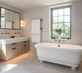
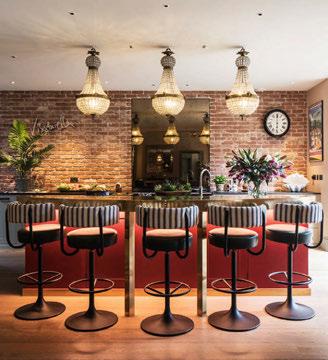
beam widths don’t interfere with the shiny surfaces. A good example is, if you’ve got a shiny floor in a bathroom and then you put an LED under the sink, all you see in the floor is the LED. So, it might be that we advise that the joinery is designed slightly differently so that the light washes across the cupboard rather than down onto the floor and the fixture is hidden in a lip that’s designed under the cupboard.
“Also, the Kelvin looks warmer in blue joinery than it actually is. So, if you want the same effect as the 2400K in blue coloured joinery, you need to use 2700K to get the look of 2400K. Anything in a dark colour, you have to go up in Kelvin because it can make it feel really rich and warm. And if you’re using deeper wood inserts as well, you need to move up a Kelvin as well because if you use 2400K, it turns really orange because the timber takes on some of the warmth. You are lighting not only the warmth of the light, but the warmth of the timber and it doubles it up and makes it more orange, so you have to step that back as well.
“We’ve got a massive kit bag in the studio with products that we plug in and test against various samples. There are times when designing when you have to recreate the situation and then hide the lighting by the dimensions that you want to try and gain the effect. We almost mock up the whole thing so that you can work out exactly where to place the lighting.”
Looking ahead to the future of Isla James Interiors, Calver has big plans to expand her studio with a lighting-dedicated service and studio in central London.
“The longer-term plan is that we will open a separate lighting design company and while we’ll still be totally integrated when we do our interiors and lighting, and there’ll always be a presence of a lighting designer here in Pangbourne, I think we need to come to London. We need to have a lighting design branch that is completely separate to the interiors, which is picking up those projects that we can offer lighting services for both clients and interior designers. We are maxed out now in terms of space at the Pangbourne studio, so the next move is to open Isla James Lighting in London.”
Part of her lighting design expansion services, Calver and her team produce monthly Instagram live sessions on @islajamesinteriors called the Interiors and Lighting Clinic, which invite people to join and ask questions specific to their projects that are then answered in real time. Additionally, for their Instagram subscribers, the team provides lighting teaching sessions and host chats once a month where participants can upload plans and discuss lighting-related questions.
Elsewhere, Calver is working on writing a beginner’s lighting design course, which she hopes will launch in Spring 2025.
Catch Jo Calver speaking at [d]arc media’s lighting exhibition
LiGHT 24 held at the Business Design Centre, London, on Wednesday 20 November at 3:00pm. www.islajamesinteriors.com
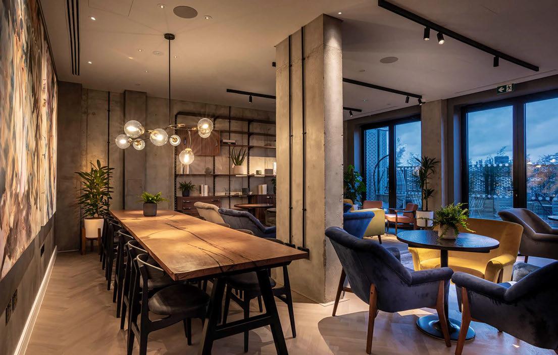
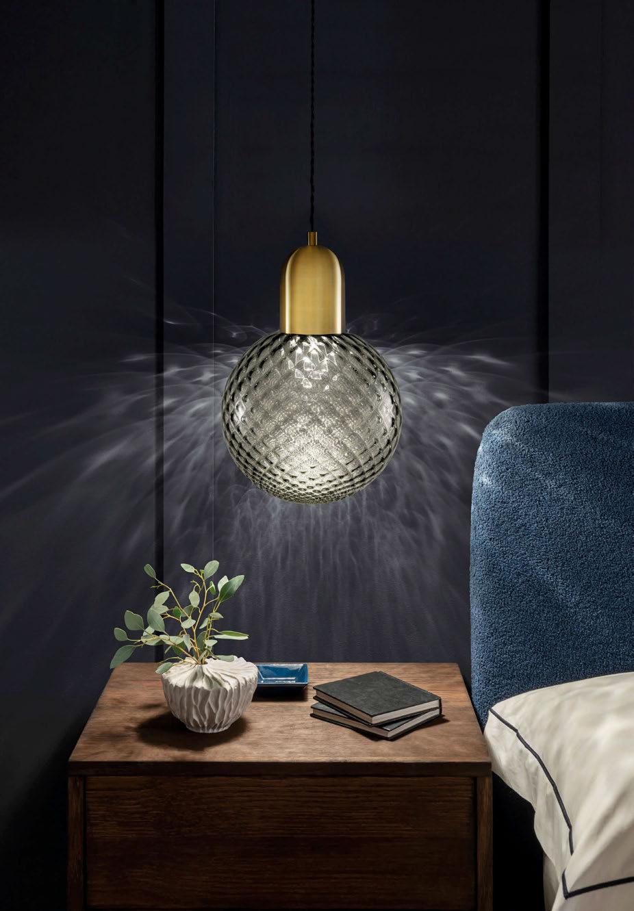
GLASS QUILT by Chelsom VISIT US AT HIX LONDON-27th-28th NOVEMBER 2024 CHELSOM.CO.UK

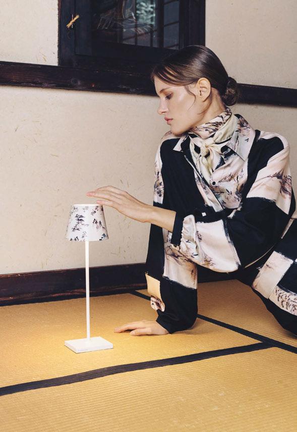
Momonì and Zafferano, both Veneto region-based brands, have come together to create an elegant second collection of Poldina portable lamps, with designs that take inspiration from Japan.
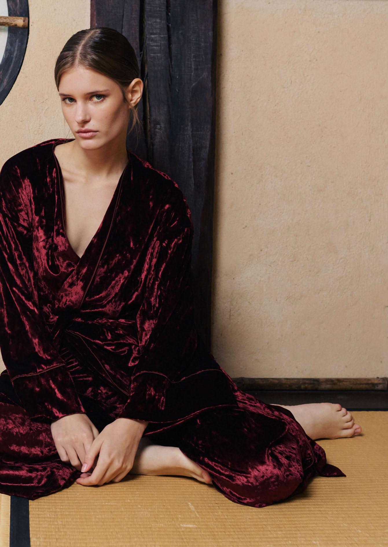
Following its successful collaboration during Milan Design Week 2024, Zafferano has teamed up again with Italian fashion brand Momonì to create a second collection of customised Poldina wireless table lamps. Zafferano’s Poldina is well-known for its ability to be customised in various colours and artistic collaborations, from graffiti artist Mr. Savethewall, Peanuts (comic strip art originally by Charles Shulz in 1950), and British fabric studio Fermoie.
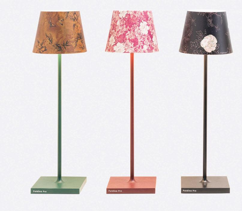
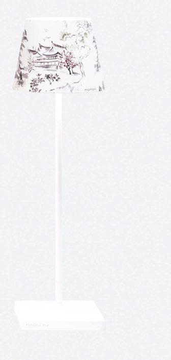
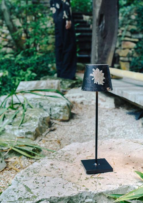
The new designs from Momonì’s FW 24 collection are printed onto the metal covers that transform the simple portable lamp into a piece of art.
“The strongest visual identity to convey the Momonì brand is tied to silk prints, a recurring theme that evolves each season based on the moodboard and defines the collection’s imagery,” explains the luxury fashion brand.
“Born in the Veneto region, Momonì has absorbed the historical influence of nearby Venice into its DNA, immediately identifying itself with the collective imagery of the “Silk Road”, known through the legendary Venetian merchant Marco Polo. Marco Polo’s iconic journey bridged the gap between the Occident and the Orient, serving as a symbol of the convergence of ideas, people, and cultures. Momonì is a brand that expresses sensory, emotional experiences and celebrates multicultural coexistence within its collections.
“The aesthetics of Momonì’s patterns this season are inspired by the hidden beauty of Japanese traditions: unique motifs and colour schemes reflect the essence of a creative vision that explores elegant shapes and precious fabrics, while further enhancing a useful and original product, making it even more captivating.”

Momonì, a brand that is closely associated with the art of silk painting for its fashion garments, has transferred these techniques to create patterns for Zafferano’s newest Poldina collection. Taking inpiration from Japanese art, the new patterns feature elegant floral and nature-inspired imagery.

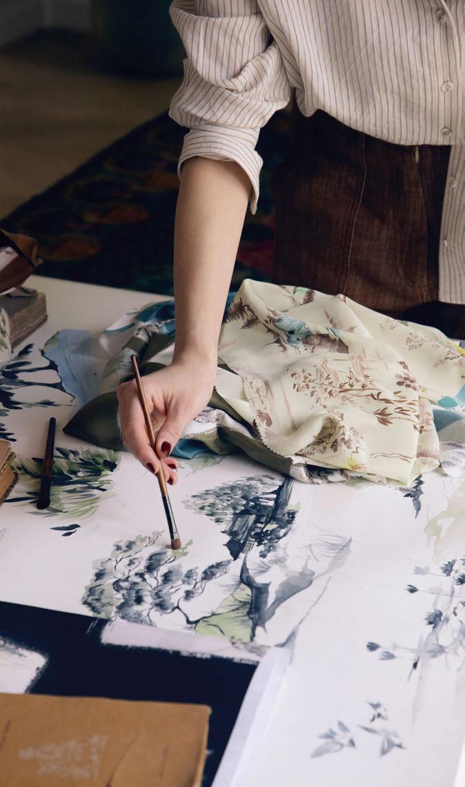
“The aesthetics of Momonì’s patterns this season are inspired by the hidden beauty of Japanese traditions: unique motifs and colour schemes reflect the essence of a creative vision that explores elegant shapes and precious fabrics, while further enhancing a useful and original product, making it even more captivating.” - Momonì.
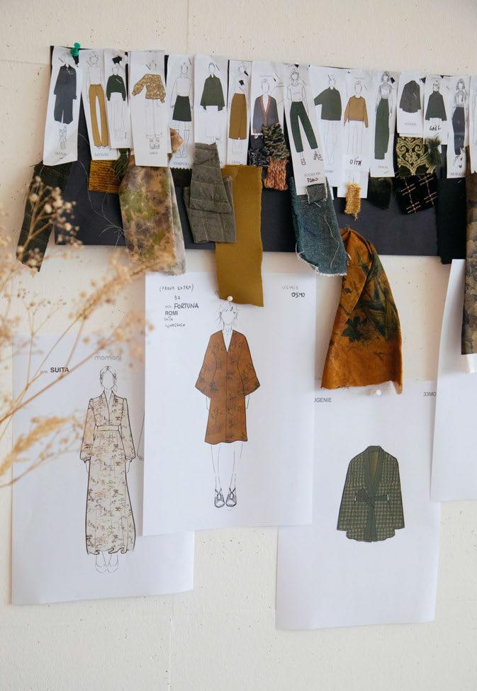

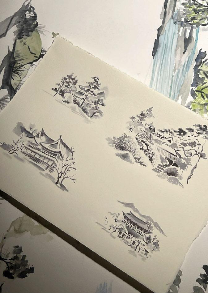
“In this creative journey, where Italian design meets the art of fashion, the customised version of the Poldina battery lamp embodies the shared vision of two Italian brands: to bring joy and originality into everyday life.”
The new Momonì FW 24 Poldina collection is available as two items, one being the portable, rechargeable lamp in four colours, each paired with a metal cover printed in a matching pattern, and secondly the standalone patterned cover that can be used to personalise an existing lamp.
“Zafferano’s expertise in the world of home design made it the ideal partner to diversify our business, supporting its debut in a sector perfect for welcoming and translating our DNA,” says Michela Klinz, Momonì’s creative director. “We both have roots in the Veneto region and share a history of creativity built around values of authenticity and heritage projected into the future, which guarantee high-quality products, distinguished by their design and craftsmanship content.”
Federico de Majo, founder and president of Zafferano, adds: “Our inclination to capture and develop stimuli from different worlds found its perfect complement in Momonì and their shared creative approach, translated into an exclusive offering that embodies elegance, style, and functionality. This partnership allows us to showcase our great customisation ability, using motifs of great beauty and charm.”
www.zafferanoitalia.com www.momoni.it
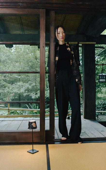


Concrete Amsterdam worked together with dpa lighting consultants to create a vibrant new hospitality destination in the heart of London, UK. Using layered lighting, the team has designed a unique residential vibe for the hotel and its public spaces.
The BoTree Hotel is situated in the vibrant London neighbourhood of Marylebone, where Mayfair and Soho meet. Designed by Concrete Amsterdam, the new five-star destination is designed with luxury and residential living in mind. The BoTree captures the village-like atmosphere of Marylebone Lane, the chic of Mayfair and the originality of Soho. The “Life on the Lane” is brought into the hotel and bar, thanks to a thoughtful design that guides guests through a journey that extends the very essence of the street into the heart of the hotel.
“Concrete was approached by its client Shiva Hotels, who had already assigned the team for one of their other hotel projects in London. We started to work on this project in early 2020, and the hotel opened in September 2023,” Concrete’s Senior Project Architect Melanie Knüwer tells darc.
“During our initial site visit, we encountered an empty parking garage with an iconic concrete façade. The team was inspired by the vibrant neighbourhood surrounding the site where the hotel was planned.
“The client’s brief was to aim for The BoTree Hotel and Bar to become a destination not only for international travellers but also for the stylish residents of these neighbourhoods. Concrete realised this by infusing the building with the fashionable essence of Marylebone, Mayfair and Soho. Adding to the allure of the The BoTree Hotel experience, the design reflects this essence of central London, evoking a luxurious and neighbourly feeling.”
When guests enter the lobby, they are welcomed into a warm and inviting space that evokes the feeling of a contemporary conservatory.
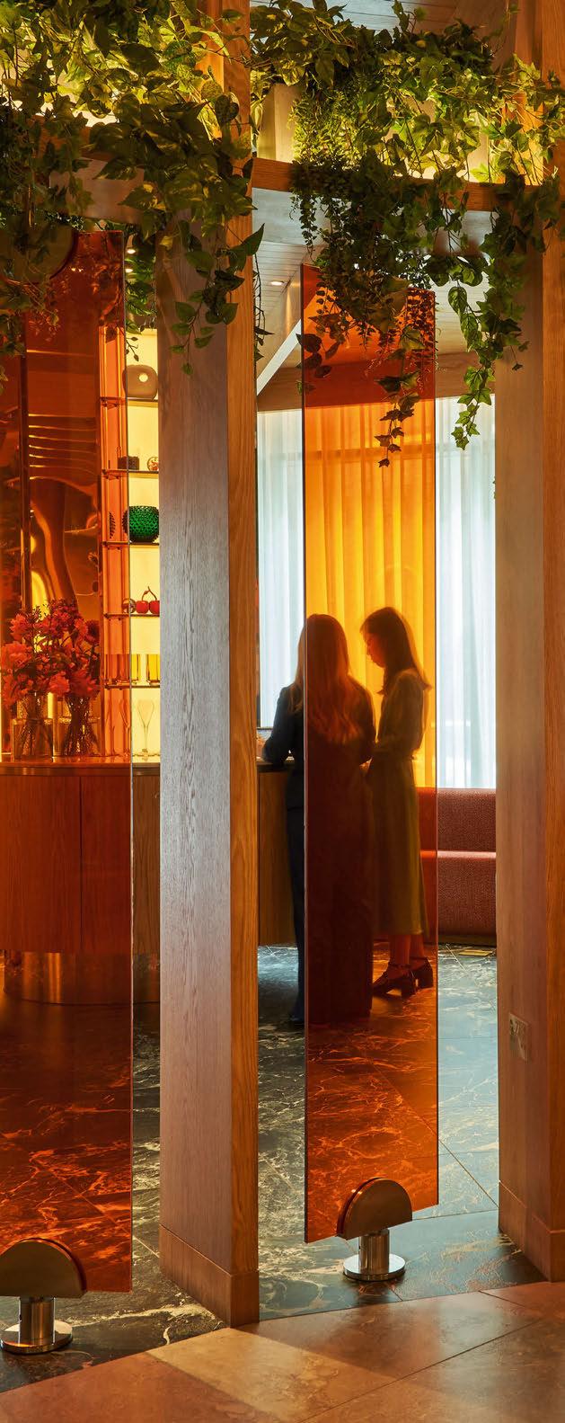
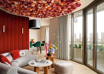
Staff provide a unique check-in experience, encouraging guests to relax on one of the sofas in the lounge while they complete the process. The use of lots of wood throughout this space adds to the natural warm environment, alongside amber-toned glass panels and a colour palette of warm greens, cognacs, and reds, which beautifully complement the natural materials and textiles.
“Lighting is always a key design element for Concrete, which is essential in creating a vibrant and exciting experience. We like to achieve ‘theatrical’ lighting scenes rather than evenly lit spaces, to highlight the unique character of the interior,” continues Knüwer.
“To realise the vision of “bringing the lane into the building”, The BoTree design highlights craftsmanship, an awareness of nature, and Marylebone’s unique floral infused lifestyle. One of the key considerations for the lighting was this connection between inside and outside, capturing the essence of the street within the heart of the hotel.
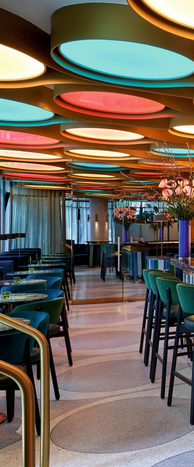
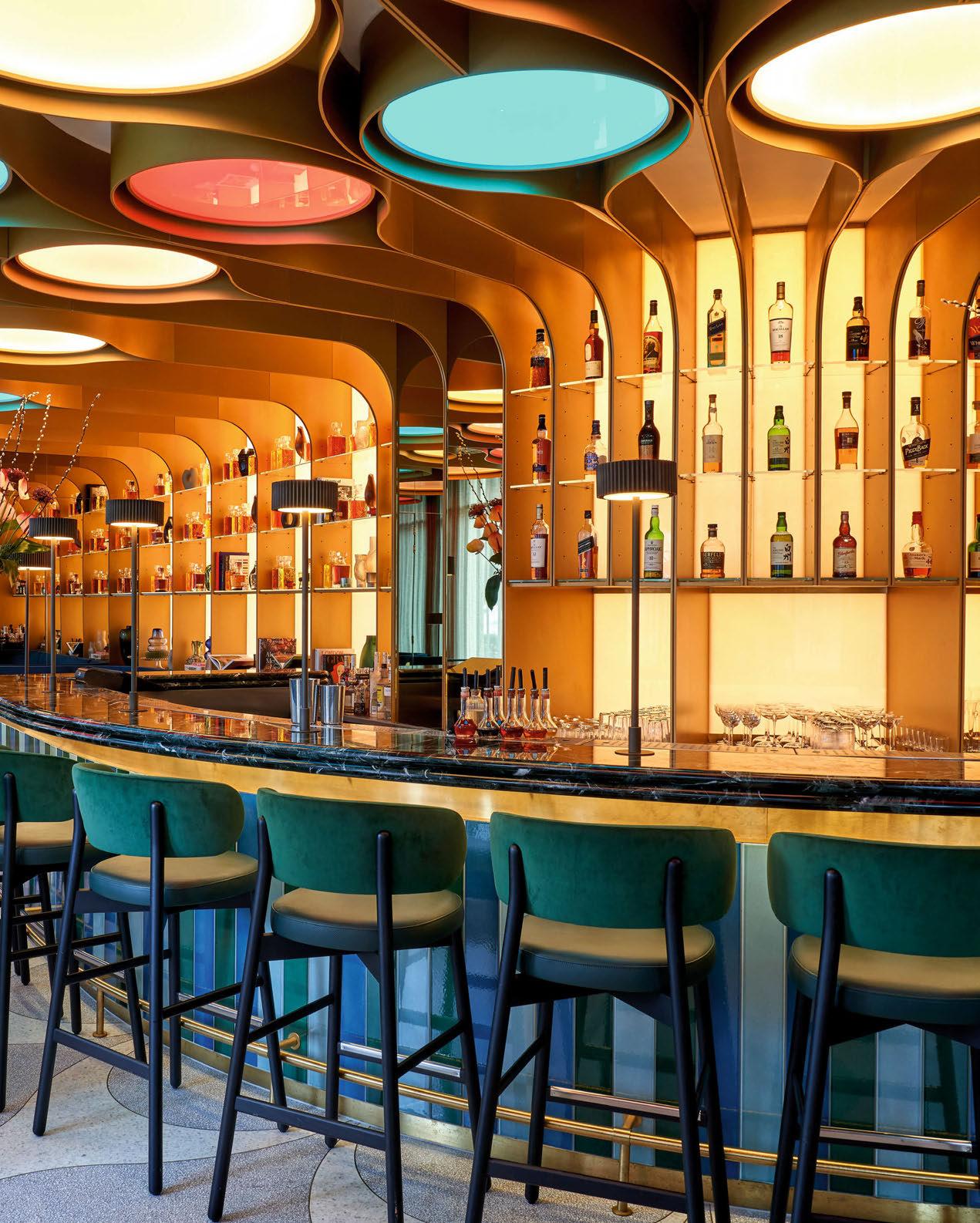

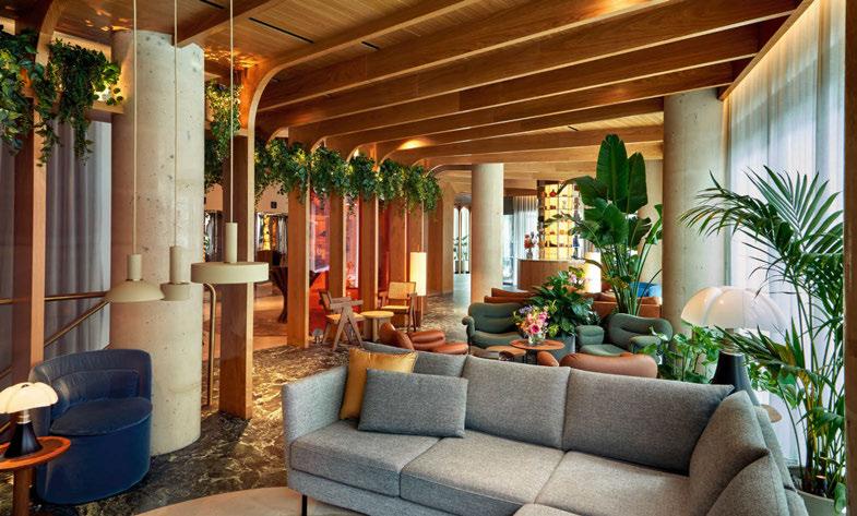
“Aiming to reflect the elegance and luxurious feel of the neighbourhood, we used decorative lighting to create a warm, residential ambience, making the spaces approachable and inviting to step inside. Many interior elements also have a strong effect on the exterior, casting a lantern-like glow onto the street, such as the small back-lit credenza-bar in the lobby or the illuminated wall and ceiling in The BoTree Bar.
“The decorative lighting was chosen to enhance the quality of each space. In the lobby, we aimed to create a residential feel living room with design classic floor and table lamps. The team selected fixtures casting a warm glow, like the glass spheres of the Santa & Cole ‘Cesta’ or the cotton shade of the ‘Dorica’.”
In the lobby, the lighting selected for the space included the Pipistrello table lamp from Martinelli Luce and the Cesta and Cestita table lamps from Santa & Cole. Elsewhere, Santa & Cole’s Dorica and Audo Copenhagen’s (formerly Menu) Hashira floor lamps
were placed for varied light levels along with pendants from Ferm Living.
The BoTree Bar continues the prestige and luxury aesthetic that embodies the hotel. Situated at the corner of Henrietta Place and Marylebone Lane, the bar presents an inviting view from the street, attracting you to step inside, or welcomes you through a hidden connection from the hotel lobby.
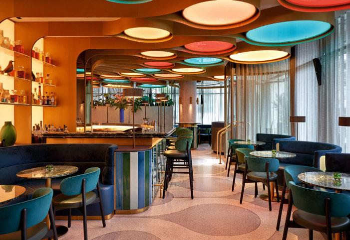
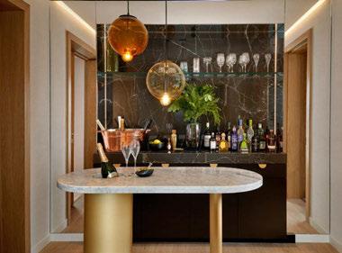
The design takes inspiration from the majestic display of a peacock’s tail, and in turn, the concept of ‘peacocking’ – the deliberate act of standing out and proudly showing off. Above the bar is an impressive display of gold shapes encapsulating coloured lights that change throughout the day. During the day the lighting gives a warm and inviting glow, and in the evening, it changes to a splash of petrol and red tones, casting a softer, more subdued atmosphere.
“In The BoTree Bar, the spectacular lighting ceiling forms a vital part of the design,” says Knüwer.
“Lighting is always a key design element for Concrete, which is essential in creating a vibrant and exciting experience. We like to achieve ‘theatrical’ lighting scenes rather than evenly lit spaces, to highlight the unique character of the interior.”
Introducing
“The bar’s allure and luxurious feeling are reflected in every detail of the interior, including the bespoke lighting: gold coloured table lamps with a special ribbed metal shade, designed in two different heights, were specifically created to complement the main bar. All bespoke table lamps and wall sconces were manufactured by Illumination. In the staircase leading down to the restrooms we used the golden ‘Kwic’ fixtures from Mooie Light, which resemble an abstract ‘Peacock eye’.”
The Dim-to-Warm LED range by Zico Lighting, in a wide selection of styles like Candle, Golfball, GLS, and G95 Globe lamps, gradually shift in colour temperature, moving from a bright, lively glow to a soft, warm light that mirrors natural lighting changes across the day in the space. Available in finishes such as clear, frosted, or porcelain glass, and with multiple base cap options, the lighting solutions were tailored to harmonise with the hotel’s restaurant aesthetics, blending luxury with eco-conscious design.
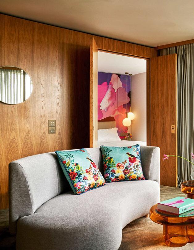
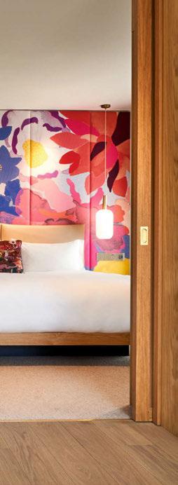
Moving through to the guestrooms, the design team took their inspiration from the floral-infused lifestyle of Marylebone. “The guest rooms and suites are inspired by the fashion-forward, floral-infused lifestyle that defines Marylebone and have been conscientiously designed to provide comfort, functionality, and a sense of luxury. As the lines between business and leisure blur, The BoTree’s guestrooms and suites provide guests with a temporary city residency that embraces a modern lifestyle, becoming a space not just for sleep, but one for gatherings, private dining, work or relaxation.
“The decorative lighting enhances this elegant and appealing ambience, a variety of lighting scenes from bright to moody can transform the rooms into different settings. From a sparkling location for a private party to a dimmed down moody oasis to relax and unwind. Fluted glass panels and sliding doors with Japanese inspired paper cast a subtle glow into the adjoining spaces, while creating privacy.
“The suites embrace a unique theme, inspired by both flowers and fashion. Each suite category is named after a local street and bears a unique character while maintaining the hotel’s signature blend of sophistication and comfort. For each suite, we selected iconic decorative lighting items to support the special ambience and create a differentiation and surprise element each time a guest chose to stay in a different room type.”
Throughout the guestrooms, Concrete’s team specified the decorative ceiling lamp Spider by Aromas del campo, wall lights from Flos (mini glo-ball) and Nemo (lampe de Marseille mini), the Socket Pendant High by Ferm Living, and bespoke table lamps from Franklite. In the suites, Tom Dixon’s Mirror Ball pendant was installed, along with Cappellini’s meltdown, JSPR’s Lunar, Ferm Living’s Vuetta and Socket pendant high and low, Lee Broom’s Fulcrum, and Autoban’s Flying Spider. Floor lamps were specified from Oluce (1953), Audo Copenhagen (Peek), Santa & Cole (Dorica), Foscarini (Twiggy) and Norman Copenhagen (Sten arching lamp), and wall lamps from Aromas del campo, Serge Mouille and JSPR.
“The design for the corridors was inspired by a sunlight infused roof of leaves,” explains Knüwer. “An abstract pattern of willow leaves is printed on the bespoke carpet, while the same pattern is projected on the walls and floors with individual gobo spots in the ceiling, creating the illusion of walking through the trees suffused with light. While walking down the corridor, the cast of the willow leaves shine down on the guest and create an almost moving image.
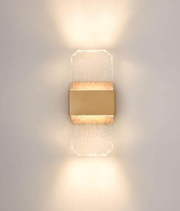
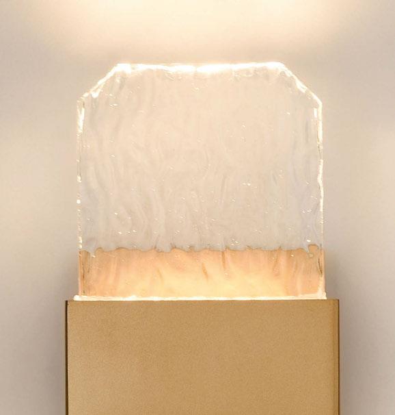
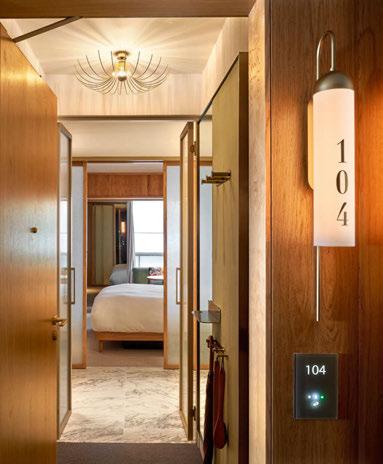
“Bespoke made wall sconces, manufactured by Chelsom, mark the entrance to each individual guest room. The warm lit wooden niches create a residential like entrance for the guest, the gold embossed numbers on each lamp also function as room number signs.”
Speaking on the combination of architectural and decorative lighting, Knüwer describes it as a “seamless” fit where both elements complement each other.
“The architectural lighting enhances the three-dimensional elements, often blending with the interior. Examples include the colour changing light ceiling in



the BoTree Bar and the back-lit brick wall in the restaurant. In the lobby, the recessed ceiling spots highlight the morphing shape of the wooden fins. The use of decorative lighting adds a layer of warmth and residential feel, making the spaces adaptable to the time of day and creating an inviting ambience. This combination entices guests and passers-by to step inside and enjoy the welcoming atmosphere.
“We always include our ideas about the lighting in our very first sketches and think of the moods we want to create. The lighting is a vital part of the design and defines the spaces. One of its essential qualities is the ability to change the mood of the interior and to adapt to the time of day. In both the public spaces and the guest rooms, the lighting scenes can vary from a vibrant, even colourful setting to the calm and serene mood of a private sanctuary.
“Also, we often work together with lighting designers, using their expertise to translate our ideas into the more technical implementation. The same applied for The BoTree hotel, we had a strong vision about the lighting in our designs and the theatrical effect we wanted to create for the various spaces. We captured this in our lighting intent, including a more architectural grid of recessed spotlights, concealed LED lighting as well as decorative lamps, both bespoke and off-the-shelf. In addition, we designed a variety of special light features, uniquely manufactured for this hotel.
“The standout feature at The BoTree is the layout of the rooms, surprising guests with a different experience than a traditional hotel room, The BoTree’s rooms are designed with adaptability in mind, acknowledging that modern travellers seek more than just a place to sleep.”
MELANIE KNÜWER CONCRETE
“Our experience of partnering with dpa lighting consultants was very good. They advised us in how to achieve our design ideas and how to implement our lighting intent, choosing the technical specifications and helping to arrange the lighting scenes in the finalised settings. They also designed and advised the client on the outdoor lighting for the hotel.”
Reflecting on the completion of the project that took 20-months to finish, starting in 2020 and opening in September 2023, Knüwer says: “We were really happy with the final impression of the design. Many elements were meticulously planned (on paper) to interlock and connect the walls, floors and ceilings in one gesture. Like the golden fins in The BoTree Bar, forming the shelves and displays of the backbar and spanning across the ceiling to encapsulate the drops of light, in the floor perfectly connecting with the brass inlays of the Terrazzo flooring – all following the abstract pattern of a Peacock plumage. These interior elements were manufactured and built on site by different companies, making it a challenge to come together as one perfect image.
“Many items were uniquely designed for this project, with only a prototype or partial mock-up to test the outcome. Like one of our stand-out features, the floral inspired headboards in the guest rooms. The fabric was uniquely designed and woven for this project and even exceeded our expectations. And we were closely involved in the finetuning of the perfect light settings to bring our vision to life.
“For the project The BoTree, Concrete had a comprehensive scope of work encompassing the entire guest experience, covering all public spaces and guest rooms. Our responsibilities included interior architecture and interior design for various areas within the hotel, such as the lobby, common areas, a signature



bar, a cinema room, a restaurant, guest rooms, suites, corridors, elevators and even a night club and spa (which are still under construction).
“Concrete designed the guest journey in a way that the guest is effortlessly guided through the distinct spaces. The design prioritises the guest experience, encouraging seamless connections between different areas, and creating an intuitive path through the building.
“The standout feature at The BoTree is the layout of the rooms, surprising guests with a different experience than a traditional hotel room, The BoTree’s rooms are designed with adaptability in mind, acknowledging that modern travellers seek more than just a place to sleep. The design eliminates the constraints of a conventional bathroom box, offering an open and flexible environment. Instead of a more traditional bathroom, The BoTree room offers a luxurious dressing area, spanning the entire room’s width, making it the perfect place to get ready before a night out. The dressing room is the first things guests see when they walk into the room, filling them with a wow-moment that creates anticipation. Guests can decide to open or close the sliding doors that divide the dressing room from the bedroom, shifting easily from privacy to openness. This kind of flexibility transcends the boundaries between hotel and residence, offering a temporary city residency where guests can effortlessly integrate their daily routines with their stay.
“All the sliding elements and room dividers between the wet areas and the dressing room have translucent infills, creating a lantern-like glow when closed off and intensifying the feeling of a comfortable cocoon.” www.concreteamsterdam.nl www.dpalighting.com
Lighting
Taking inspiration from its local London neighbourhoods, The BoTree Hotel uses a variety of colour and theatrical lighting levels to create a cosy and welcoming atmosphere for locals and travellers alike.
MELBOURNE, AUSTRALIA
Earlier this year, darc’s editor sat down with Ingrid Baldwin, FPOV’s Global Creative Director, to discuss a custom lighting installation they completed in Melbourne’s Next Hotel.
Nestled in Melbourne’s bustling 80 Collins Street precinct, the Next Hotel is an elegant new hospitality venue for visitors and local residents alike.
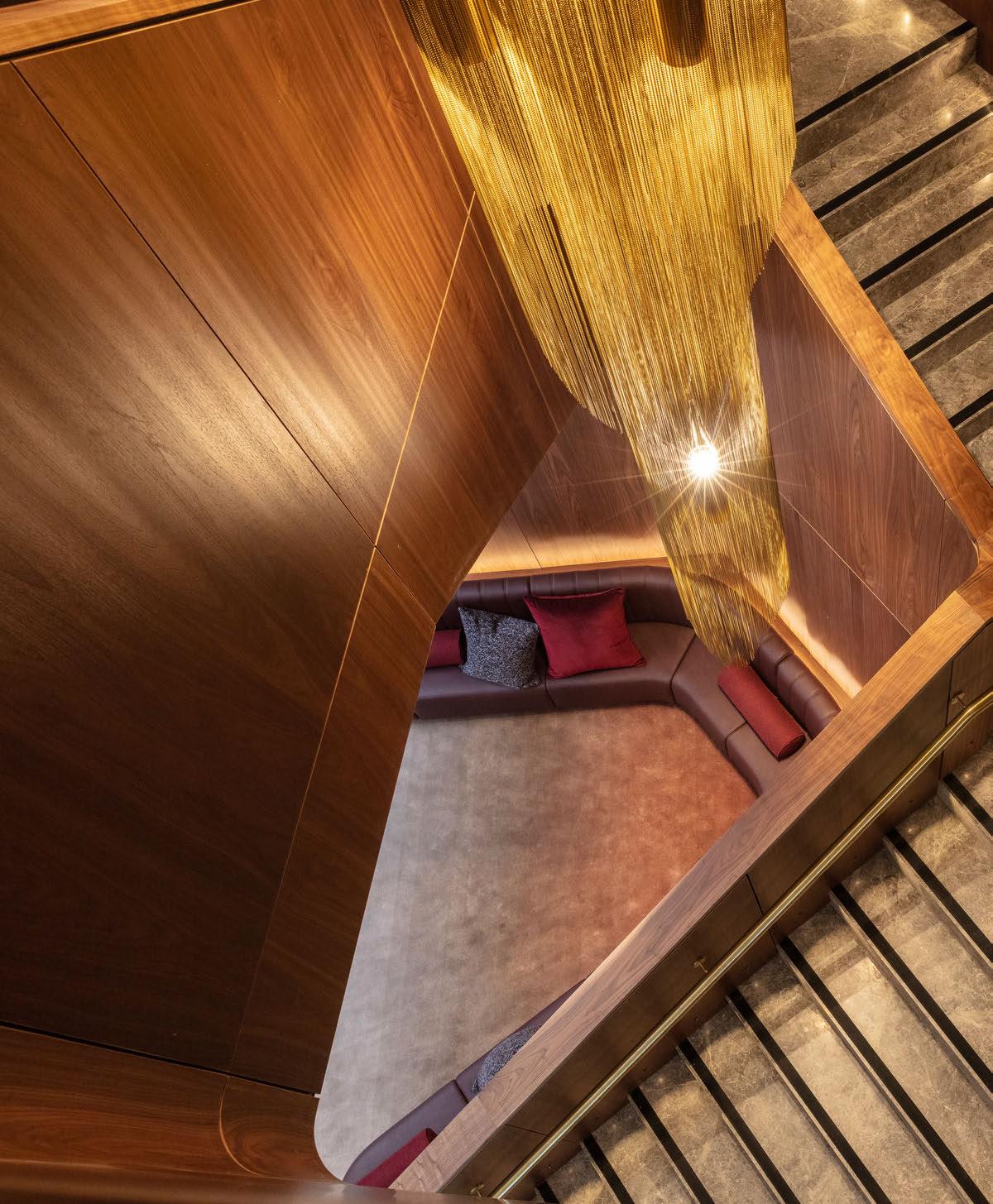
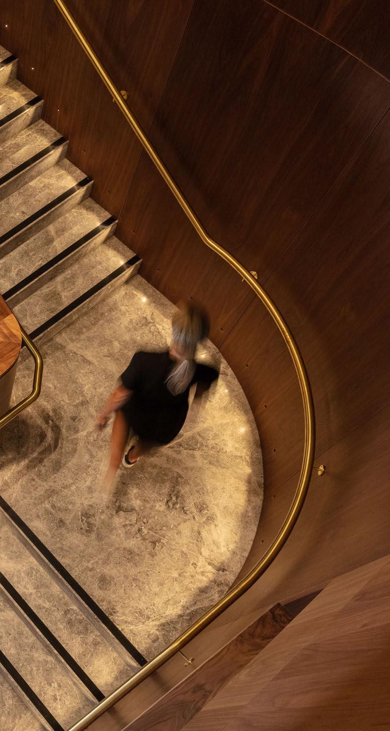
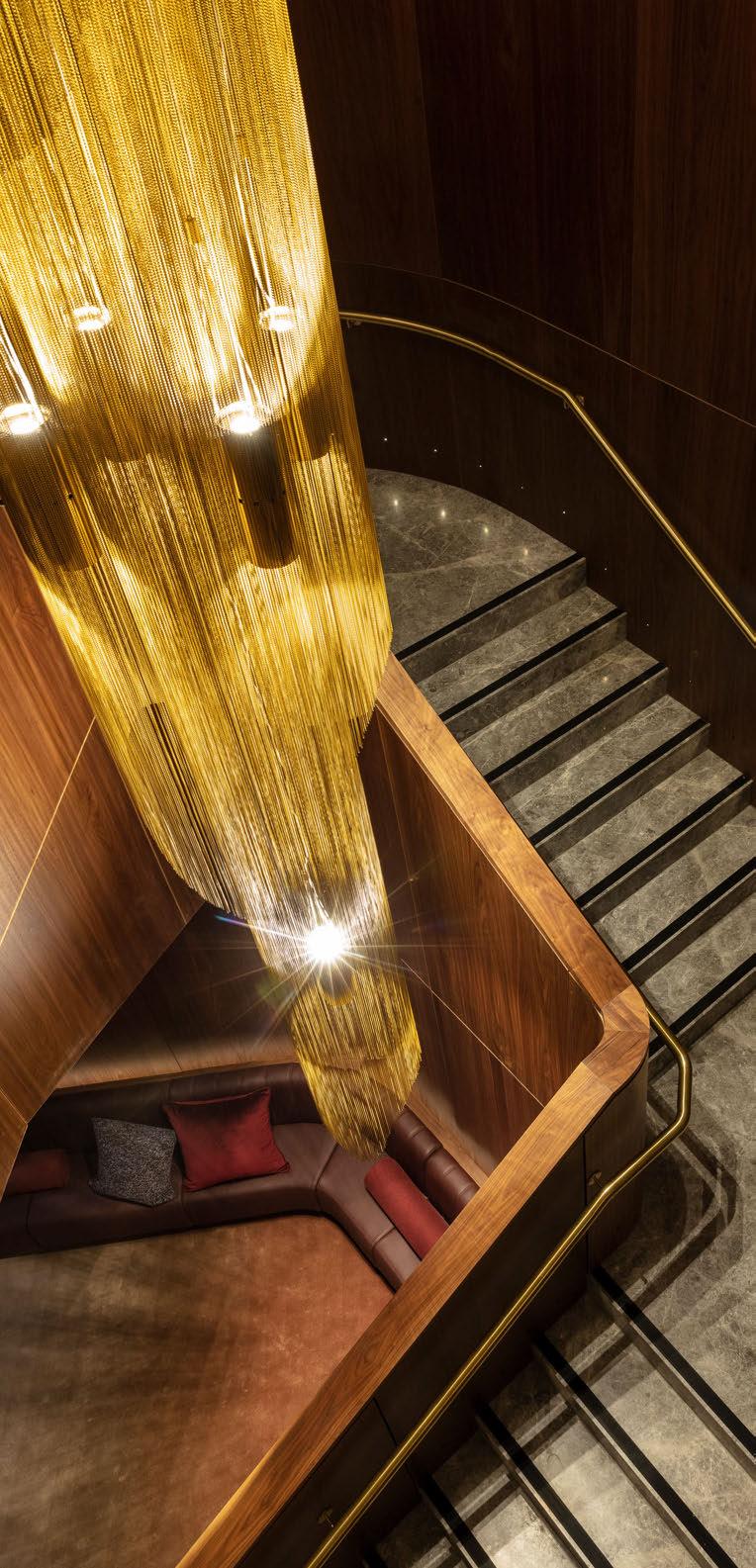
Working closely with the design teams at Woods Bagot, who completed the interior design, and QIC, the project’s client, Baldwin and her FPOV colleagues Chris Page and Lucy Krimmer created a stunning design scheme for the destination. Along with creating the lighting scheme for the entire hotel, a standout feature is the lobby stairwell chandelier.
“Our lighting scheme brings a touch of warmth and sophistication to the refined interior design inspired by global travel and the vibrant local neighbourhood of Collins Street, China Town, and the historic Horse Bazaar site,” explains the studio. “We’ve added brilliance to the exceptional ambience of Next Hotel Melbourne. But our involvement went further than lighting. We thoughtfully designed custom elements, including the captivating central stair feature, enhancing the hotel’s unique character.”
“The hotel is situated in the 80 Collins Street complex, which is formed of an existing tower and two new commercial towers of which one is the Next Hotel,” explains Baldwin. “It’s like a little urban centre. We had an existing relationship with QIC, the client, as we’d already completed a Next hotel in Brisbane. QIC are a development arm of the Queensland government – the Queensland Investment Corporation – and specialise in retail and lifestyle developments.
“We knew we wanted to have something tall and monolithic, which made sense within the stairwell. We then had to figure out what architectural finish we could use that will give us that sparkle without the physical weight of the tube.”
INGRID BALDWIN, FPOV
“We also knew the Woods Bagot team and have since done a couple of collaborations with them. Woods are really great to work with. They’re very collaborative, which is nice because ultimately, we’re all just trying to get something done. We aren’t particularly precious about ownership over things in terms of a project because it’s a design team, team being the operative word, so they were super-duper involved and a pleasure as always.”
The bespoke chandelier for the stairwell went through various iterations before an agreed upon design was chosen. The project initially started in 2020 and then the Covid-19 pandemic hit, which brought with it various challenges. The initial interior design scheme was completed, which dictated the final placement for the stairwell. Then, as a result of the pandemic, the interior design scheme changed, but they had to work around the existing placement of the stairs.
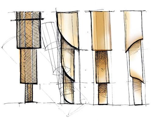
“The design response was to make the lighting installation quite architectural. With that in mind, we played around with a tube element for the chandelier. We originally planned for brass tubes with glass lantern-light sections, with the idea of light passing down and through the tubes, creating some fun sparkly striations and patterns. We had three different ways of lighting the piece, which would have given us the ability to have a very different lighting experience from day to night.
“However, as a result of the pandemic, budgets were adjusted, and designs had to change and adapt. We had to go back to the drawing board nine months later and essentially re-design the chandelier. We knew we wanted to keep the architectural simplicity, and from our experience on previous projects, we knew it would be financially beneficial to mix up the materials used. Not only did this aid in costs, but it also helped with structural constraints as weight was initially going to be an issue. Using metal instead of glass or crystal means the fixture is a lot lighter.”

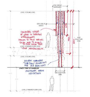
Baldwin and her team created three versions of a chandelier that were proposed to Woods Bagot and QIC.
“We knew we wanted to have something tall and monolithic, which made sense within the stairwell. We then had to figure out what architectural finish we could use that will give us that sparkle without the physical weight of the tube. With our weight restrictions, we ended up looking at a mesh chain of metal beads that were lightweight. We played with the tonality of the mesh, so you experience a difference between the inside and outside when looking up into the installation.”
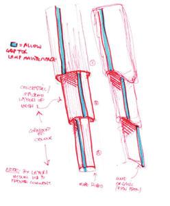
One of the challenges they faced with the location of the installation was access for maintenance and cleaning. According to Baldwin, typically they would put downlights in the ceiling plate, however the nature of the space wouldn’t allow access for this. Instead, they decided to fix uplights to the chandelier itself. And, unintentionally, a nearby air conditioning unit has provided a subtle flow of air that gently moves the chains, creating a lovely effect.
To create the chandelier, FPOV worked with a local
Australian-based manufacturer called Aglo Systems to create the fixture. “We’ve done some big ceiling features with Aglo before and have a good working relationship with them. We went through a workshop process with them, and they had a lot of involvement in the budgeting aspects too, which was useful.
“We had a lot of budget constraints for this project post-Covid, so it was really helpful to have a design manager from QIC who respects design. Instead of value engineering we had a lot of say on what could use alternates for and where we could keep to our spec. They trusted us and respected the design enough to allow us to find the right solutions that worked for everyone and the budget.”
Overcoming the challenges brought with the global pandemic and the changes to the original interior scheme, the team at FPOV successfully created a stylish and inviting atmosphere with a stunning focal point chandelier with a design that wasn’t compromised in effect or style.
“Overall, it’s such a nice, lush project with lovely warm lighting throughout.”
www.f-pov.com
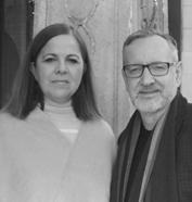
Manuella Mannino and Nicholas Hickson, Co-Founders of interior design studio THDP, discuss the creative approaches to designing hotels, taking into account the local impacts these hospitality destinations have, and how to incorporate local influences.
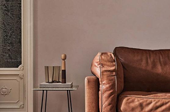

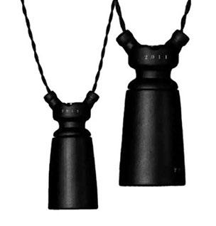
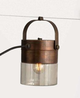
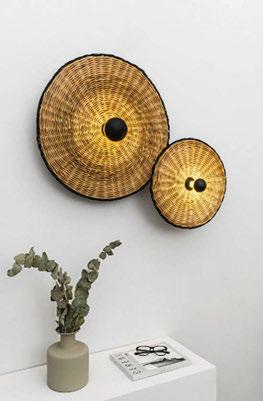
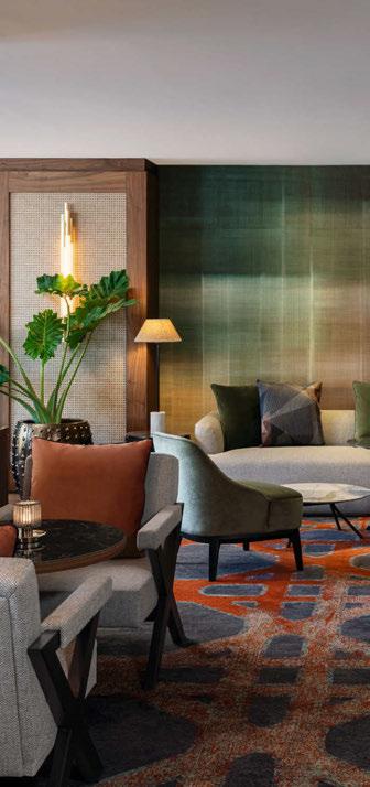

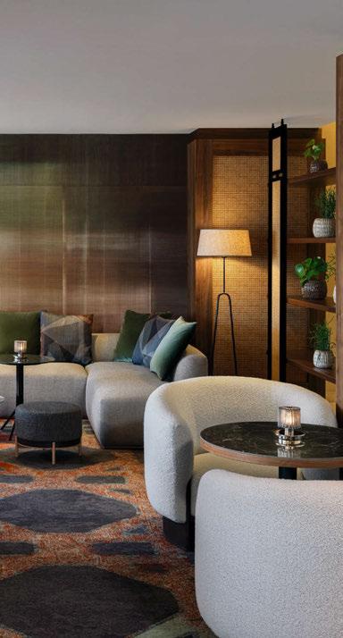
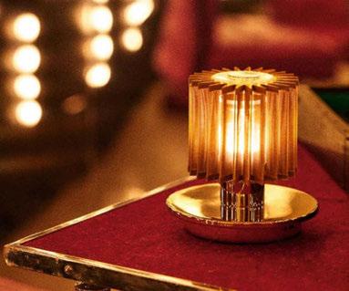
We don’t design hotels just for their guests, we design hotels for the communities in which they inhabit. Hotels are a local asset that increasingly nearby residents will use to have a meal, meet with friends or have an informal meeting. Workspaces within hotels allow for flexible working and drive revenue through the hotel’s Food & Beverage offering.
So, designing hotels with a strong connection to their surroundings is at the core of our practice, offering not just our guests but locals alike an authentic and immersive experience that deeply reflects the culture and identity of each destination. Both travellers and locals alike are increasingly seeking meaningful interactions with both the destinations they visit, or their friends and colleagues they work with.
In the past few years, we have been at the forefront of this movement, creating spaces that blend contemporary design with local influences, and appealing to the widest audience with authenticity. This approach can be seen in some of our hotel projects, where the use of locally inspired materials, textures, and artisanal crafts bring a sense of place to life.
Incorporating local elements in hotel design is about much more than aesthetics. It creates a deeper connection between the guest and the location, allowing visitors to experience the culture and ambience of the region without leaving the hotel, and locals to identify with a hotel interior that feels ‘one of theirs’. This design philosophy revolves around selecting materials, colours, and motifs that echo the history and landscape of the area. For example, for a recent project in Portugal we collaborated with local tile and brick makers to create feature walls and furnishings within the hotel, which were built from the earth the hotel stands on.
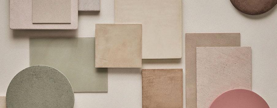
A critical aspect of this local connection is the collaboration with local artisans and craftspeople, such as La Calce Del Brenta (wall finishes) [1] , whose work can lend authenticity and individuality to a project. These unique, handmade pieces - whether it’s bespoke furniture, custom artwork, or locally sourced materialshelp create a sense of belonging, making the hotel feel like an organic extension of its surroundings. For this reason and in all our projects, we collaborate with local artisans to produce one-of-a-kind design elements that tell a story.
Lighting plays a pivotal role in setting the mood and enhancing the sense of place within hotel interiors, simply put, without lighting there is no interior. Choosing light fittings that feel local and artisan is key to our approach, whether it is a project in Spain, Portugal, Italy or the UK, we try to work with suppliers of those regions – this immediately drives authenticity within the look and feel of the hotel.
We are currently specifying fittings from Toscot [2] , they’re based near Florence and use local manufacturing techniques, they have a strong local design narrative, and as well, make each piece by hand – the results are not industrial but charming and decorative, perfect for adding character to an interior. For projects in Spain and Portugal we have found both local suppliers and local finishes to enhance the projects, such as Faro Barcelona [3]. Recently too we have used more international style such as DCW Editions for Oxbo lounge at Hilton Vienna Waterfront [4] , specifying the fitting in the Sun table light [5] , which offers the perfect colour of light to create a perfect dining experience.
Today’s trends in lighting design are increasingly focused on sustainability and flexibility, both of which complement the integration of local elements in hotel design. Natural materials like clay, rattan, and wood are being used to create eco-friendly lighting solutions that resonate with regional aesthetics.
Another trend is the use of dynamic lighting systems, which can be adapted to different times of day or moods. These systems, such as those offered by Lutron or Delta Light, allow hotel designers to adjust lighting based on the natural rhythms of the day and the surrounding environment.
Finally, designing a hotel that incorporates local elements creates a richer, more immersive experience for guests. By thoughtfully combining local materials, cultural motifs, and modern lighting trends, designers like THDP are able to craft spaces that are not only luxurious and comfortable but also deeply connected to their surroundings. The result is a hotel that feels authentic, rooted in its environment, and truly reflective of the local community.
www.thdpdesign.com
Headshot Image: Olivia Estebanez
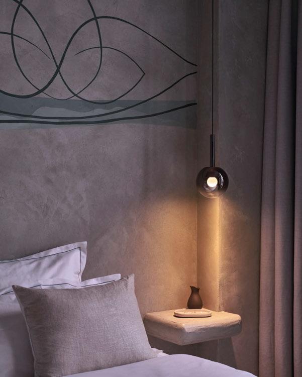
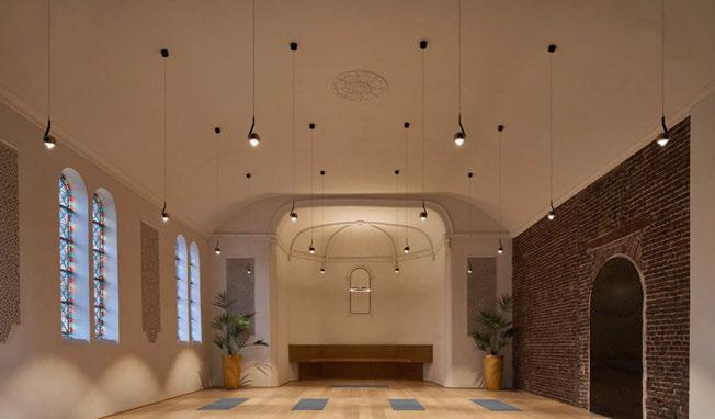

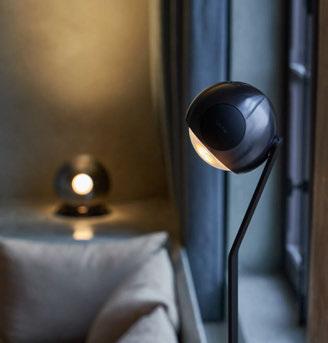
In the Belgium Ayuryoga Hotel, once a monastery, everything revolves around harmonising body and mind, with light by Occhio playing a central role both externally and internally.
Ayurvedic architecture emphasises natural light to create a soothing environment. Stained glass windows in the 18th-century building interact with sky light, while Occhio’s holistic system enhances the interior, deepening natural tones and textures, transforming the space into one of peace and contemplation.
The design of each of the five rooms draws on nature. Inspired by the moon, the Luna series features the floating Occhio fireball within Luna Sospeso and Luna Basso. The moon’s light transforms earthy room colours into cosy retreats, all controlled via a touchless control.
Aurelie Batteauw, Hotel Manager, says: “The light from Occhio not only creates a very peaceful and calm atmosphere during the yoga classes but also provides a soft and warm feeling in the other rooms.”
The io series responds intuitively with brightness to touch. Adjustable in three dimensions, it can be positioned on the floor or table to meet personal needs.
This multifunctional space retains its spiritual essence, with io Sospeso enhancing the room without overpowering it. Mito Sospeso completes the balanced design, offering symmetry and harmony. www.occhio.com


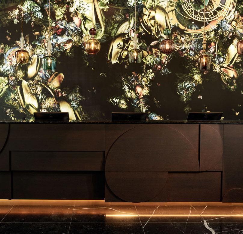
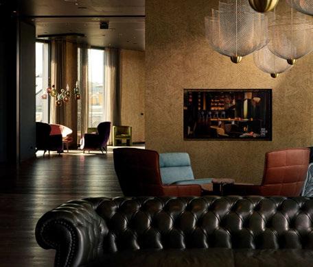
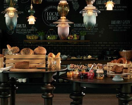
Motel One Group, with 88 hotels worldwide, recently opened a new branch in Prague, with 382 modern rooms designed by Schindler Seko Architekti and interior designer Anja Kaubisch. This economically focused hotel emphasises sustainability, unique design, and collaboration with local brands, fostering a welcoming atmosphere that reflects local culture.
Kaubisch believes successful interior design connects deeply with its surroundings, which is evident in the extensive use of glass - a nod to Prague’s rich glassmaking history, where its is renowned for techniques of bohemian glassblowing and prized by the elite. The hotel’s collection of playful glass lighting serves as a tribute to the city, with varying scales and spacing creating a dynamic, musical ambience that captivates the eye. More than just a place to stay, the hotel is a vibrant hub for both locals and tourists.
The ground floor of the hotel exudes a warm ambience that captures the charm of Prague while honouring the historical architecture and craftsmanship of the Czech Republic. Unique hand-blown glass lights from Rothschild & Bickers hang above the reception desk, reflecting the jewel-like colours of artwork by Renata Kudlacek.
This striking focal point contrasts beautifully with the dark Nero Marquinia natural stone, creating a masterful blend of historical heritage and contemporary design. The Cloud One Wine Bar & Lounge, located on the 6th floor, maintains the same design aesthetic, featuring high ceilings that evoke a sense of grandeur. The space is adorned with an exquisite array of glass pendant lighting from Rothschild & Bickers and Studio Kalff, emphasising transparency and radiating a cosy glow without obstructing views. Large Meshmetic chandeliers designed by Rick Tegelaar for Moooi add a contemporary yet classical touch to mirror the elegant grand cafés of Prague. www.rothschildbickers.com

The French creator Philippe Starck imagined a paradise, a calm and relaxing oasis - and that is exactly what Lily of The Valley is.
Starck has created the luxurious hotel, Lily of The Valley, located on the French Riviera, up in the hills of Saint-Tropez overlooking the Mediterranean Sea. The fantastic location makes demands on both materials and the interior, and the designer has especially focused on lighting to create an atmospheric universe that matches the extraordinary location.
The light has a profound influence on the guests’ first impressions of the hotel, especially if guests arrive in the evening, lighting is of immense importance - outside as well as inside. Therefore, it requires understanding of architecture, as well as knowledge of light and shadows, to create the best lighting conditions.
Starck appointed Venø copper lamp from Nordlux as the most optimal solution for outdoor lighting at the hotel. The lamp has a sophisticated and timeless design and is beautifully integrated
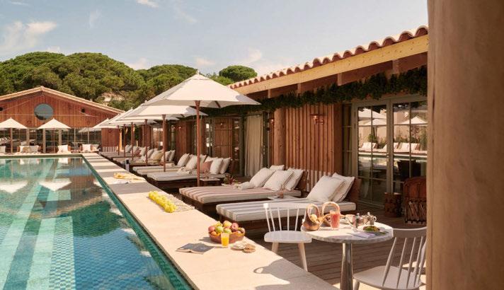
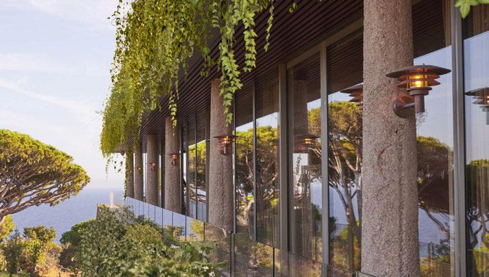
with the wooden walls and neutral earthy tones. Likewise, Venø is chosen as the three screens and glass insert lets a soft and comfortable light shine through, creating a relaxing and homely atmosphere in the luxurious oasis.
Starck is acknowledged for his beautiful designs and creations all over the world and has always pushed the boundaries of design. He has created the luxurious hotel with inspiration from Californian villas and the Hanging Gardens of Babylon. The hotel embraces and adapts the landscape with organic materials and tone-in-tone earthy colours, which reflects the stunning nature, where the Venø copper lamps fits perfectly into the unique atmosphere. www.nordlux.co.uk

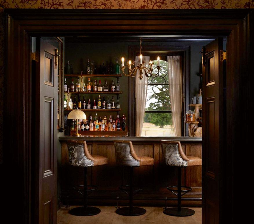
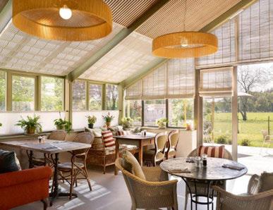
The recent renovation of New Park Manor Hotel, which was shortlisted for Best Interior Hotel Renovation in the Boutique Hotelier Awards 2024, has brought a refreshing blend of heritage and contemporary luxury to this historic estate in the heart of the New Forest, Hampshire.
Originally a 17th-Century royal hunting lodge, the hotel now combines classic elegance with modern comfort, enhanced by lighting solutions from Zico Lighting. To complement New Park Manor’s warm and inviting atmosphere, Zico Lighting worked directly with Luxury Family Hotels and supplied LED lamps from its extensive range, known for energy efficiency and exceptional ambience. The lighting effortlessly transitions in warmth, creating a cosy, adaptable glow that aligns with the hotel’s timeless charm.
Each lamp shape, including Candle, Golfball and GLS with a choice of clear, frosted, and porcelain finishes, was carefully chosen to align with the hotel’s refined aesthetics.
Zico Lighting’s sustainable approach aligns with the eco-conscious values that shaped the renovation, enhancing the guest experience with a sophisticated, environmentally-friendly lighting ambience. The renovation has transformed New Park Manor into a retreat that balances modern convenience with the elegance of a historic estate. www.zico.lighting


LiGHT 24 is the UK’s only dedicated high-end lighting exhibition, welcoming individuals from all areas of the lighting, interior design, architectural and specification communities.
There is something for everyone at the show - from networking opportunities through to the exclusive [d]arc thoughts talks programme, experience light art installations, and more.
LiGHT 24 provides unrivalled networking and socialising opportunities as visitors meet with exhibitors on their stands, enjoy late-night welcome drinks during the first evening, or take part in the popular LiGHT Lunch on day two. There’s also the on-site cafe, Jacks, for a more relaxed meeting or the dedicated workspace LiGHT WORK for quieter surroundings, allowing you to discuss potential project collaborations in more detail.
If you are looking for ways to more seamlessly integrate the right lighting solutions into your project designs then LiGHT 24 is for you and features hundreds of highend international architectural and decorative lighting brands all under one roof. Taking place at the Business Design Centre in London on 20-21 November, LiGHT 24 is the place to be for lighting specification and is free to attend - simply register via the LiGHT website.
This year’s LiGHT Lunch, taking place in the Associations Lounge on the Gallery level, will be co-hosted by Women in Lighting.
We invite LiGHT 24 visitors to engage with a panel discussion on the Importance of Women’s Industry Groups for both men and women and how male colleagues can help change the narrative. Female attendees are encouraged to bring a male colleague with them to engage and educate!
Speakers include: Carmela Dagnello of Ridge and Women in Lighting, Rachael Davidson of Smiths and Women in Architecture, Harsha Kotak of Women in Office Design.
This will be followed by a complimentary LiGHT Lunch and networking opportunity with representatives from Women in Lighting, Kimberly Bartlett of Introba and Women Lighting Professionals, Women in Office Design, Women in Architecture and Zoe Bonser of the Women in Furniture Network both in the room.
Head to the Associations Lounge on Thursday 21 November, from 12 - 1.45pm for this must-attend event.
The LiGHT 24 talks programme once again takes centre stage on the Gallery Level of the Business Design Centre.
Hear from more than 30 design professionals from all areas of the industry – lighting, interiors, architecture, specification, manufacturing and more – on the topics that really matter.
Due to popular demand, this year’s programme will be twice the size, with two programmes running side by side. In association with lighting control specialist, Lutron, this year’s main [d]arc thoughts programme will be split into themes –covering the Business of Design, Interiors + Lighting, and Designing for People and the Planet, which will be split further into content around wellness, sustainability, and the environment.
A splinter programme will run in the Associations Lounge, also on the Gallery Level, and feature talks run by industry associations LIA, IALD, ILP, and SLL. There will also be a presentation from Light Collective and a workshop in collaboration with DALI Alliance.
Curated by the [d]arc media editorial team and with expert guest moderators, this year, visitors can expect to see professionals and experts from all areas of design speaking over the two-days, including a panel curated by the BIID. Its current president May Fawzy will host a discussion titled ‘Shining A Light On Accessible Interiors’ with Carmelina Dalton, Lindi Reynolds, Manuela Hamilford. A well designed space is instrumental in ensuring interiors are not only accessible but in allowing those with accessibility concerns to flourish in their spaces. The BIID’s expert panel will discuss how lighting design achieves this.
Other studios featured include: Perkins & Will, WeWantMore, MS Lighting, Hoare Lea, Artin Light, Dark Source, Nulty, AS Light, Palladian, Isla James Interiors, Orms, Cordless Consultants, WSP, GDM and more.
All talks are free to attend but capacity is limited. Head to the LiGHT 24 website to download a talks schedule.
www.lightexpo.london
Images: James Gifford-Mead
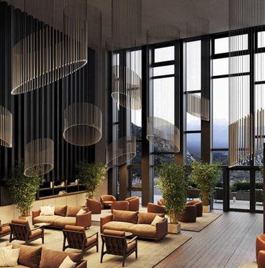
A-Tube Nano is a suspension lamp designed by Studio Italia Design. At the lower end of the lightweight aluminium structure, a transparent methacrylate diffuser houses an LED module whose light creates a soft, welcoming atmosphere. The three sizes and seven statement finishes allow you to create clusters of evocative lighting. A black cable version is also available.
www.lodes.com
Stand: 15
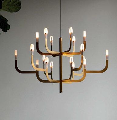
J-us G configuration Luceplan
J-us comes from an unusual interpretation of the traditional chandelier with arms, where the technological innovation and research on materials are completely concealed from view. The warm and remarkable luminous performance and the light, dynamic design of great visual appeal give rooms a refined tone without ever overstating the image. www.luceplan.com
Stand: D21
Designed by Nava + Arosio, Bilia lamps are characterised by bell shaped, handcrafted borosilicate glass diffusers, which are available in two sizes and in two variants: with and without decorative glass spheres. Bilia are characterised by a dimmable LED source, in two colour temperatures of light. They can be arranged into large suspended modular compositions, which create interesting visual and lighting effects. Indoor use only. www.zafferanoitalia.com
Stand: 14
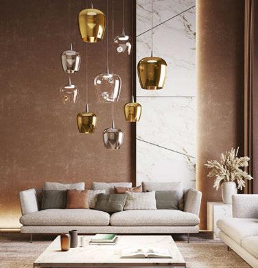
Gramm is a round, elegant light. Its main feature is rotation, offering flexibility for indirect lighting with just one move. Designed to feel feather-light, Gramm guarantees a serene ambience and always brings a sense of weightlessness to any space. With coated finishes its look is even more chic. www.intra-lighting.com
Stand: D12
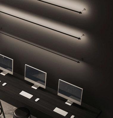
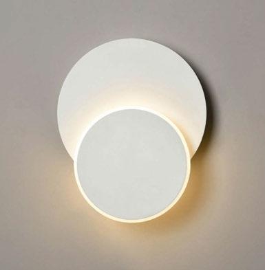
Franklite has many products perfect for specification, the Crescent wall lights with this unique design is just one of them. White finish LED wall lights comprised of two circular disks. The small disk is illuminated and can be positioned centrally or moved on an axis around 360°. Available in two sizes and dimmable with a trailing edge dimmer. www.franklite.co.uk
Stand: 22

Inspired by the graceful descent of sycamore seedpods, the Sycamore chandelier captures the natural beauty and elegance of these delicate seeds. It features glass wings that curve gently over a brushed solid brass frame, embodying the seed’s translucent quality and illuminating any space with a soft, warm glow. www.tala.co.uk
Stand: 5
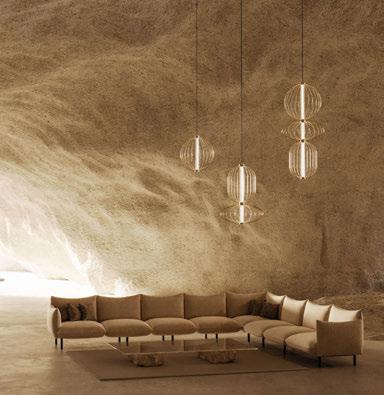
In this collection Aromas focuses on traditionally relegated materials to the construction finishes and decorative complements, such as marble, wood or ceramic. Elsewhere, the main materials remain metal and glass, combined in a diversion of solidity and lightness. Additionally, Aromas believes in the commitment towards a greener future so has developed a strategic plan to make the brand more sustainable. www.aromasdelcampo.com
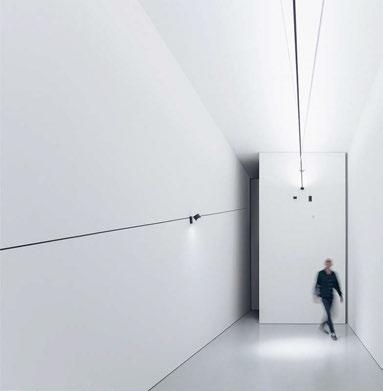
Davide Groppi Stand D3
Simplicity, weightlessness, emotion, creative invention and amazement are the fundamental ingredients of each lamp or lighting project designed by Davide Groppi. His creations are inspired by works of art, magic, ready-made objects and the desire to make things with his hands or simply the urge to play and have fun with light. Over the course of many years, Davide Groppi has developed products, projects and shows in collaboration with companies specialising in design. www.davidegroppi.com
Acclaimed for its iconic decorative collection, Artemide also boasts a wide range of professional workplace, retail and hospitality solutions that deliver the perfect balance of beauty, practicality and sustainability. With its unique blend of patented technological research, exceptional aesthetics, and meticulous construction, Artemide products are genuine game-changers in the industry. www.artemide.com

For the past 50 years, LedsC4 has been dedicated to developing a culture of light in which design, technology, and sustainability come together to offer the best lighting solution for your indoor and outdoor projects. The core of LedsC4’s service is to assist you simply, easily and efficiently, from conception, design, manufacturing and quality control, to delivery and installation. www.ledsc4.com


Blond
Stand D20
From the start Blond has focused on illuminating the contract market and to have a close cooperation with its clients, whom are mainly architects, interior designers and lighting designers.
Established in the city of Värnamo, Sweden, Blond is a manufacturing company that is staying true to the core values of high quality, great design and flexibility amongst customers. www.blond.se
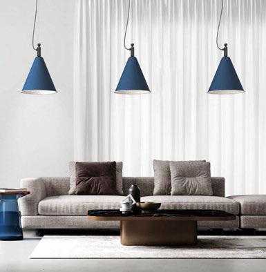
Luxxbox
Stand U37
Luxxbox designs and manufactures acoustic lighting and flexible solutions for modern, collaborative spaces. Its products are designed to enhance light, sound and comfort, transforming workplaces and open areas into happy, healthy spaces the world over. Servicing clients across the US through an extensive distributor network as well as right across the globe and our home base in Australia. www.luxxbox.com
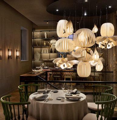
Since 1994, LZF Lamps has been crafting lamps. Every piece of wood it uses is carefully selected for its grain and transparency, treated with the same reverence as a precious fabric. It categorises its properties meticulously to shape each lamp into a specific, desired volume. Its collections are diverse, each with its own distinct identity, inviting clients to find the perfect model that resonates with their needs. www.lzf-lamps.com
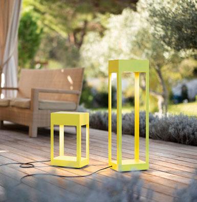
Roger Pradier Stand D18
Eclairage Roger Pradier is a distinguished French manufacturer renowned for its outdoor lighting solutions. Established in 1910, it has built a reputation for blending traditional craftsmanship with contemporary design. It offers an extensive range including wall lights, bollards, lamp posts, pendant lights, and ceiling lights. Committed to sustainability, the brand emphasises the use of recyclable materials and environmentally-friendly processes. www.roger-pradier.com
Quality, tradition and innovation. These are the bedrock values of Panzeri, a company that has a 70-year history of producing lighting and selling the Made in Italy brand. Handpicked raw materials, expert tradition and manual skill for the most exclusive detailing, innovative and cutting-edge techniques in the field of LED technology, and all-Italian design: all of these factors have been key to the success of Panzeri. www.panzeri.it
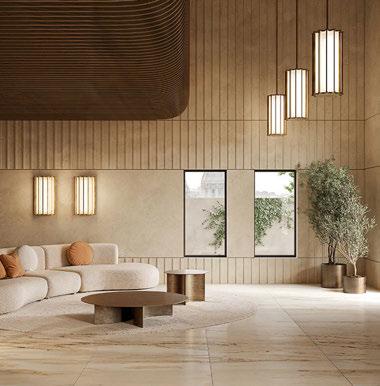
The brand pursues a perfect balance between aesthetic value and functionality while looking for an ongoing design research and experimentation of innovative shapes, materials and finishes. Though highly sophisticated, Tooy lamps are simple in appearance. Each product has been designed to illuminate residential as well as public places. www.tooy.it
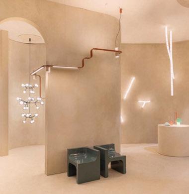

Penta designs and produces high-quality light fittings, with a contemporary design. Throughout its history, Penta has interpreted the ideas of sought-after and never predictable designers, transforming their vision into objects in which formal beauty meets functional utility. While remaining true to its origins, it experiments with new solutions and is able to enrich its tradition with new expressive and aesthetic codes, with special attention to smart building needs. www.pentalight.com
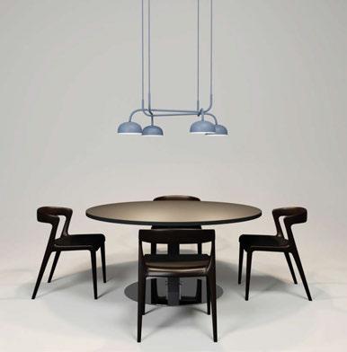
Zero Lighting Stand 60
Represented by UK Agent, Inform Furniture, Zero Interiör was founded in 1978 with the vision of producing unique light fittings for a design-interested audience. Its local roots and manufacturing have built long-term relationships with customers and suppliers that are vital to the company. More than 80% of manufacturing takes place within 200km of Nybro, Southern Sweden, and all assembly occurs in its workshop in Nybro. www.zerolighting.com
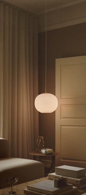
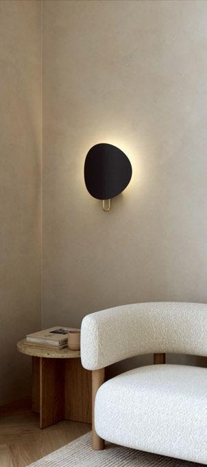


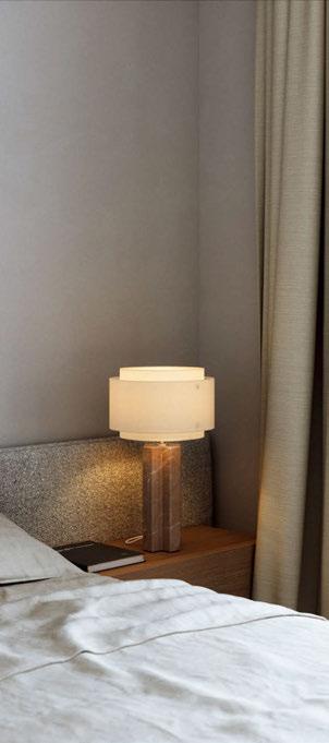


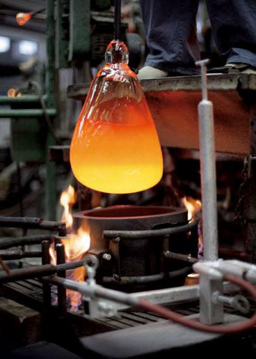

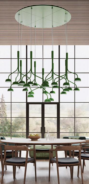
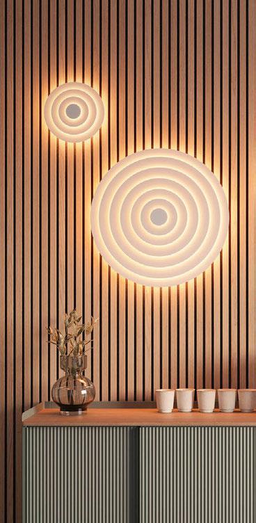

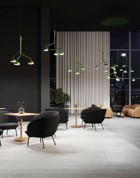
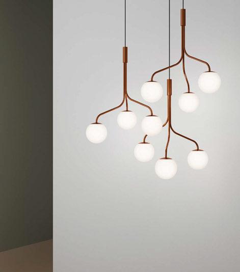

What is the concept behind the Curve Cluster Single? Curve is a collection of lamps that, with their organic shapes, give the impression of growth and adaption to their surroundings. The pieces in the collection mimic the organic development of a sprouting plant or mushroom, starting from a small and sturdy base.
The most recent addition, Curve Cluster, features three branches bundled together to form a pendant, which allows it to function as a standalone light or be combined with multiple pieces to create a chandelier.
How long have you been working on the product for?
The development and design took our team almost one year to finalise the pendant.
What was the most challenging aspect of producing the Curve Cluster?
The most challenging aspect of the Curve Cluster was creating the three branches so they could fit together in a harmonious way when bundled into a chandelier.
What materials have been used for the Curve Cluster? Can you describe the design process?
We worked with steel tubes and created shades in metal and opal glass in different sizes to allow for many possible variations.
Our brief to the designers at Front Design was to create a unique product that could truly define a space. Throughout the process, we exchanged
a variety of ideas before we ultimately decided to expand on our existing Curve collection. This approach allowed us to incorporate several components we already produced for Curve, which align perfectly with our core values: quality, environmental care, and innovation.
What technologies does the pendant use?
The Curve Cluster has incorporated LED with the possibility for DALI control.
What makes this product different to other Zero products available on the market?
The design is unique because of the bended steel tubes and its many variation possibilities to create large chandeliers.
The pendant can be placed on its own or it can be grouped together to form a large cluster and stunning decorative focal point.
Please describe the product in 3 words. Surprising - Unexpected - Unique
www.zerolighting.com

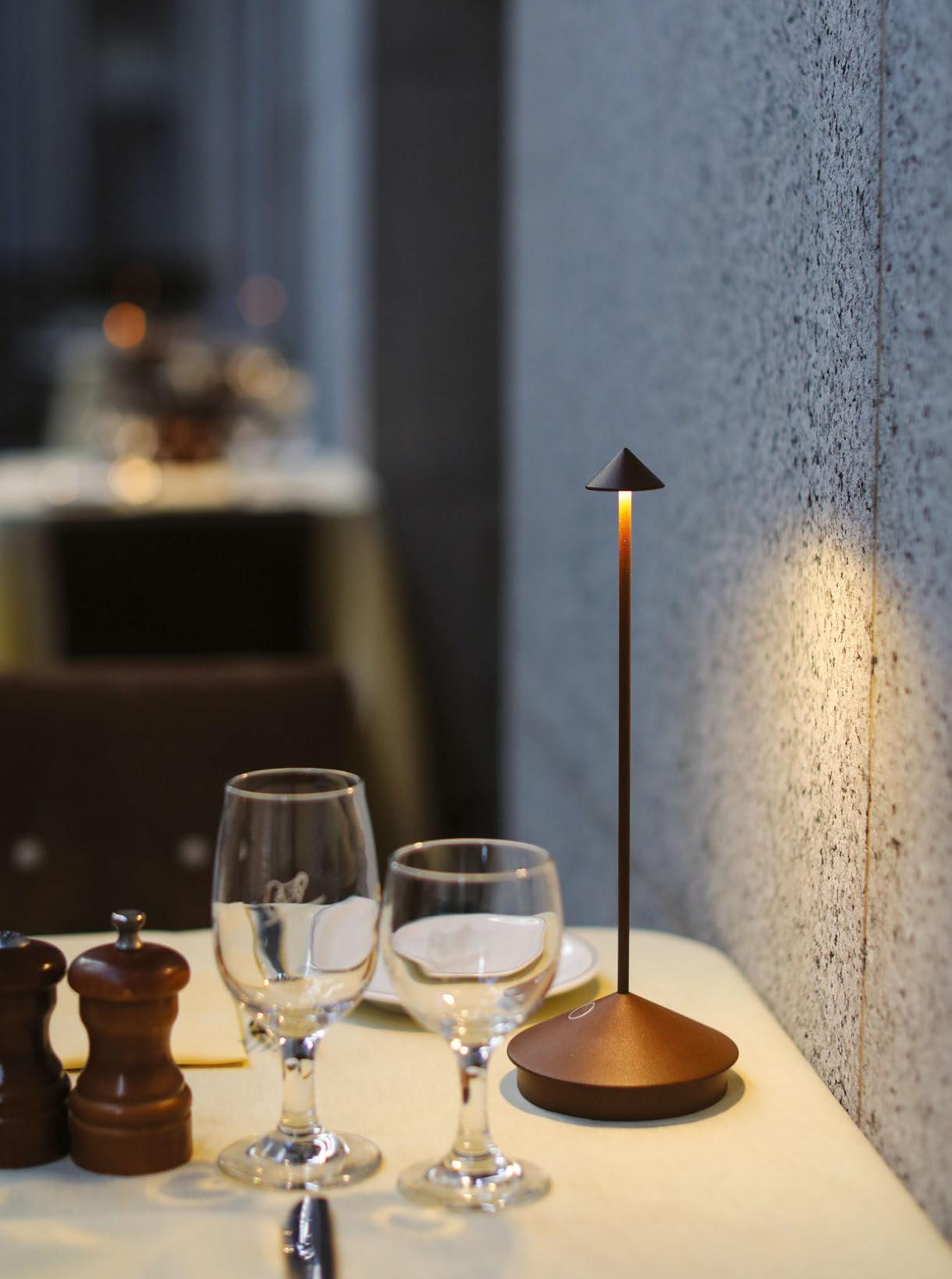

zafferanoitalia.com