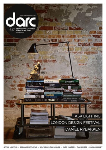
darc 17

Page 1

DECORATIVE LIGHTING IN ARCHITECTURE #17 SEPT/OCT 2016

TASK LIGHTING LONDON DESIGN FESTIVAL DANIEL RYBAKKEN

OFFICE LIGHTING • GODDARD LITTLEFAIR • SELFRIDGES TAX LOUNGE • ENZO PANZERI • PLUMEN 003 • DIANA YAKELEY

ADV DARC_Empatia.indd 1

01/09/16 19:54


Cover image by Jacob Termansen, styled by Lene Eriksen for Louis Poulsen.

Welcome HELEN FLETCHER • EDITOR

Issue #17 is our biggest yet! Filled to the brim with projects, features and interviews, we have a strong focus on the impending London Design Festival, where the entire darc team will be out in force. As Head Media Partner for lightjunction we are extremely excited to see what new designs and innovation the lighting industry brings to the table for this year's event, so keep an eye out for us if you're heading to designjunction's new home at King's Cross! Elsewhere in London, we are involved in an exciting light installation at TENT. I can't say much more at this stage as all details are top secret, but make sure you come and see us at the Truman Brewery and all will be revealed! As one of the most important weeks in the design community's diary, we've got previews for all the tradeshows that have a strong lighting element, including Decorex, 100% Design, lightjunction and Tent/ Super Brands. We also bring you our guide to the design districts and a selection of key showroom events, seminars and talks - turn to page 136 for everything London! Ahead of this year's festival, I caught up with product designers Terence Woodgate and Tom Raffield to discuss their involvement in the Dyslexic Design exhibition, taking place for the first time as part of designjunction. The exhibition takes a deeper look at the relationship between creatives and dyslexia; we discussed what it means to be dyslexic in the world of design and how its power should not be overlooked - more on page 148. Our main features this issue focus on task lighting and office design. While there is an argument that, as a result of improved architectural lighting, there isn't always a need for task lighting, sometimes the 'want' overrides. Lighting designer Deb Wythe takes a look back at the product's history on page 39 and discusses why it's become somewhat of a favourite in the design world. Following the same path, on page 66, architect and interior designer Dara Huang discusses the importance of decent office design and how lighting plays a huge role in creating a productive working environment. There's plenty more to sink your teeth into this issue, including an exciting announcement from darc awards Director Paul James, on the very first darc awards / decorative set to take place in May 2017. As always, enjoy the read!

#readinginthedarc


We ’ve had the arc hit ect ura l aw ard s. Now IT’ s TIM E FOR ... 15 SEPT EMBE R 2016 / LOND ON 15 SEPT EMBE R 2016 / LOND ON

WWW.DARCAWARDS.COM/ARCHITECTURAL


MAY 2017 / LOND ON

WWW.DARCAWARDS.COM/DECORATIVE


designjunction Immersed in design 22–25 September 2016 Granary Square King’s Cross, London

dj_london_Darc_ad_490x328mm_02_01.indd 2-3


25/08/2016 10:18

Register now. Please visit → thedesignjunction.co.uk

#immersedindesign #djKX


008

DETAILS

Contents

014 interview: diana yakeley

She's a multi award-winning designer, past President of the British Institute of Interior Design and has now won an OBE.

039 feature: task lighting

066 feature: office spaces

We take a closer look at the humble task light, showcasing new designs and project applications.

103 in detail: 003 lamp

Dara Huang introduces our office design focus, which takes a look at some of the more creative office spaces out there.

Plumen's latest energy efficient offering combines the technical with the beautiful, enlisting the skills of a jewellery maker.

REGULARS

FEATURES

010 DESIGN NEWS

014 DIANA YAKELEY

020 SELFRIDGES TAX LOUNGE

114 NORTHMODERN

Awarded an OBE for services to

016 FOCAL POINT:

TALDE RESTAURANT

JERSEY CITY

HOTEL SEMARQ

GANGNEUNG

ALBERT'S SCHLOSS

MANCHESTER

100 FOLIO: GODDARD LITTLEFAIR LONDON

LONDON

108 IN FOCUS: DIMPLE BARCELONA

160 CALENDARC 162 IF...

LONDON

Discusses inspiration and his recent collaborations with Luceplan. 066 OFFICE SPACES Introduced by Dara Huang. 097 ANTONI DE MORAGAS I SPA Celebrating an eighties icon. 148 DYSLEXIC DESIGN

COPENHAGEN

032 DAS BIER

126 MAISON ET OBJET

key design elements. 049 DANIEL RYBAKKEN

ON SHOW

MONTREAL

INTERNATIONAL

072 ASTRA ZENECA

MACCLESFIELD

NEW YORK

085 KING

STOCKHOLM

092 SMARTDIGITAL

BERLIN

Terence Woodgate & Tom Raffield

094 OSAK HEAD OFFICE

discuss the relationship with design.

ANKARA

134 INTERIEUR

VANCOUVER

082 EDUCATORS 4 EXCELLENCE

DUBAI

KORTRIJK

136 LONDON DESIGN FESTIVAL

080 AVISON YOUNG

LONDON

143 DECOREX

LONDON

146 100% DESIGN

LONDON

152 LIGHTJUNCTION

LONDON

155 TENT

LONDON

THE MAGAZINE

DESIGN

CORPORATE

Editor In Chief : Paul James p.james@mondiale.co.uk

Artwork: David Bell d.bell@mondiale.co.uk

Chairman : Damian Walsh d.walsh@mondiale.co.uk

Editor : Helen Fletcher h.fletcher@mondiale.co.uk Assistant Editor : Femke Gow f.gow@mondiale.co.uk International Advertising : Stephen Quiligotti s.quiligotti@mondiale.co.uk

Editorial: Mel Robinson m.robinson@mondiale.co.uk

FINANCE Finance Director: Amanda Giles a.giles@mondiale.co.uk Credit Control: Lynette Levi l.levi@mondiale.co.uk

PARIS

132 DOWNTOWN DESIGN

057 TASK CASE STUDIES

Introduced by Deb Wythe.

The brains behind the brand chats

London's finest.

044 ENZO PANZERI

030 FOCAL POINT:

Interior Design, we speak to one of

039 TASK LIGHTING FOCUS

018 FOCAL POINT:

103 IN FOCUS: 003 LAMP

PROJECTS

darc magazine, Waterloo Place, Watson Square, Stockport SK1 3AZ, UK Printed by Buxton Press, Palace Road, Buxton, UK • ISSN 2052-9406


Three Pendants LP Grand · Skyline · Patera CHRISTIAN FLINDT · JULIE RICHOZ · ØIVIND SLAATTO

www.louispoulsen.com


010

DETAILS

Hitting the Headlines For the most recent decorative lighting news head to www.darcmagazine.com and sign up to the designline newsletter.

Factorylux releases new shades

Designheure penetrates US market

(UK) – Create an oasis of calm and cool with the British lighting manufacturer’s new glass pendant. Factorylux’s vintage inspired collection is available in both clear and opal glass. Pair it with a beautiful filament lamp to create a wow-factor suited to any room. Users can design their own bespoke glass lamp shade online with Factorylux Made For You.

(US) – Designheure engages in US certification to set up positions on the US contract market. The manufacturer is now able to provide the ETL certificates required by the US and Canadian administrations for projects located in public spaces. This deployment is based on the opening of a Designheure office in Miami that will manage an agent network in each major state.

Asif Khan opens 100% Design 2016

Topics and talks announced for Restaurant Design

Slamp at Rio 2016 Olympics

(UK) – Asif Khan will open 100% Design 2016 in wide-ranging talks programme alongside Ron Arad, Assemble co-founder Paloma Strelitz and Afroditi Krassa. Focussing on quality and depth, the talks present agenda setting keynotes from thought leaders in the industry, as well as panel discussions exploring trends in contemporary practice and the future of design. There will be a unique opportunity to engage with the Design Museum’s programme ahead of its opening in Kensington on 24 November with three overlapping roles.

(UK) – First ever Restaurant Design Show to open a the end of September at ExCeL London. Free to attend, visitors will have the opportunity to experience 50 different educational seminars, over 120 inspirational suppliers, as well as the newest trends, ideas, and advice. The speakers attending the show feature award winning interior designers, architects, and hospitality professionals.There are three theatres available, split into three categories; Project Planning Theatre, Design Inspiration Theatre and Interior Architects Theatre.

(Brazil) – Slamp adorned Casa Italia during the 2016 Olympic Games in Rio, Brazil. Chosen amongst the best of Italian brands, Slamp lit up the exclusive Casa Italia, the temporary home to Italian athletes in Rio di Janeiro during the 2016 Olympics. Chantal, La Lollo, and Mille Bolle, designed by (respectively) Doriana and Massimiliano Fuksas, Lorenza Bozzoli and Adriano Rachele, are the collections that were on display, each product exhibiting a fusion of architectural and sartorial expertise as well as the latest artistic trends.


012

DETAILS

darc awards goes decorative Following the successful inauguration of the darc awards last year, the concept has been split into architectural and decorative elements with the decorative event launching at this year’s London Design Festival.

Last year the innovative peer-to-peer voting concept of the darc awards took the lighting design industry by storm. The unique format combined architectural and decorative lighting entries that were voted on by the international lighting design community to discover what were the best projects and products of 2015/16. The darc awards is a novel concept utilising darc and sister title mondo*arc magazines’ reputation as being the most widely read and respected lighting design publications in the world. With our database of over 1,400 international lighting design practices (as well as even more interior designers and architects) and, in collaboration with creative consultants Light Collective, we have created a unique opportunity to get

every practice involved in the awards process. This year the darc awards has been split into two distinct elements - darc awards / architectural for the architectural lighting industry and darc awards / decorative targeting, you guessed it, the decorative lighting industry. darc awards / architectural, launched earlier in the year, has been yet another incredible success with the awards event, darc night, taking place at MC Motors in London on September 15th. There were over 400 entries and 6,000 votes for this year’s architectural awards, which resulted in over 500 designers attending the darc night event. darc awards / decorative is being launched at this year’s London Design Festival with

its own decorative darc night taking place in May 2017 in London. The awards will showcase the best in decorative lighting, with projects and products entered being voted on by lighting designers, interior designers and architects. This will result in the winners receiving the highest accolade of being voted on by their peers and all the kudos that that brings. The categories for the awards will reflect the diverse range of decorative projects and products we cover in darc magazine ranging from residential, workplace, hotel and bar/restaurant schemes to a complete range of product categories from pendants and chandeliers right down to the lamps that power them (see the table right for full category listing). As with darc awards / architectural, the


FEATURE

sponsorship package for the decorative awards allows manufacturers to get more actively involved in the awards event by displaying their products in a creative installation during darc night. All of the pictures above show the installations by lighting designers using the manufacturer partners’ products. It is an excellent opportunity for sponsors to get their products in front of specifiers instead of just having a logo and a free table at a traditional awards. In fact, there are no tables at the darc awards. The atmosphere is very informal and relaxed with a free bar and street food all night so that attendees can explore the venue and the installations inside. But the best bit about darc night is that all independent lighting designers, architects

and interior designers that vote are eligible for a free ticket to the awards ceremony (non-sponsor manufacturers must pay a fee) so that junior designers and smaller practices have as much a chance of attending as the usual larger practices. The website (www.darcawards.com) features both the architectural and decorative components with the decorative awards content becoming live by the time London Design Festival 2016 is in full swing. Any decorative lighting manufacturer that is interested in becoming a sponsor for the darc awards / decorative should contact the awards director and darc / mondo*arc editor-in-chief Paul James (p.james@mondiale.co.uk). www.darcawards.com

DARC AWARDS / DECORATIVE THE CATEGORIES PROJECTS LIVE - the best residential project WORK - the best workplace project REST - the best hotel project PLAY - the best leisure project

PRODUCTS BESPOKE - the best bespoke fixture CEILING - the best pendant / chandelier WALL - the best wall fixture FLOOR - the best floor standing fixture TABLE - the best table standing fixture EXTERIOR - the best exterior fixture SOURCE - the best lamp

013


014

PROFILE


015

Transforming The Ordinary A multi award-winning designer and past President of the British Institute of Interior Design, Diana Yakeley has been awarded an OBE in the Queen’s Birthday Honours List 2016, in recognition for services to the interior design profession. With a career spanning over 35 years, darc magazine caught up with Yakeley to find out the secret to her success. Pic: Roy Mehta

AS A CHILD My bus journey to school each day took me along the South Downs and I loved their light curves and mysterious valleys. I remember finding bee orchids and fireflies after dark and still today, get misty eyed when seeing the Downs on visits to friends. Born in rural Hampshire, my parents gave me a part of the garden that was mine to do what I wanted with. This was the start of my love for gardening and feeling connected with nature. I also enjoyed digging deep tunnels and really hope the next owners didn’t fall into any of them! THAT MOMENT My mother told me I should learn to type before heading into a ‘den of iniquity’ (aka art school) as she called it. It was the early sixties... So I did learn to type and very useful it has been too, but I hung around Guildford Art School most of the time! THE BIG SMOKE Was definitely calling... I was desperate to leave home and set out for London without a plan, working in the photographic studio of the late fashion photographer John Cowan. This was the swinging sixties and an exciting and pivitol time in fashion and design. The studio was subsequently used to film Blow Up, loosely based on the life of David Bailey! MARRIAGE Came at a young age for me and I went on to have two wonderful children - both now

photographers. It was then that I decided I really should do something creative to earn a living. There was a brilliant government scheme to encourage women to retrain and so I took myself off to the job centre and demanded to do interior design. After an initial look of surprise the man consulted his papers and said I could go to Dundee or Knightsbridge all expenses paid Knightsbridge it was. INSPIRATION Comes from visits to Italy and France when looking at details and textures. I have always been influenced by architecture forms, spaces, materials and the way light changes interiors. The Cistercian Abbey at Le Thoronet is perhaps the most perfect example of form and function, purity, harmony and that sense of place that lifts one’s spirit. I like to work with a limited palette of colour and materials so that my clients’ personalities shine rather than any applied decoration. THE OBE Was an enormous and very emotional surprise! I am particularly proud that the citation is for services to ‘the UK Interior Design Profession’. Professional competence is at the core of what the British Institute of Interior Design stands for and has raised the awareness of high standards of practice over the years, so that word ‘profession’ means a lot to me.

THE PRACTICE Was originally based in Cambridge and the work was entirely commercial. Stephen (my husband) designed a whole village in Saudi Arabia, several research establishments, as well as some award winning private homes. After the recession in the early 90s we moved to London and found that work in the residential sector was both enjoyable and creative - that’s where the majority of our work is now. We’re enjoying what we do and never want to stop! LIGHT Is the most important element in any interior and good lighting transforms ordinary spaces into interesting and well modulated environments to live or work. Technology changes so fast that such a specialist task is best done by specialists, we have worked most recently with Lighting Design International who have been inspirational in their approach to each project. There is plenty of research into what makes poeple feel good at work and at home and lighting is key. TRENDS Are something I try to resist but I am so pleased that LED lighting is now so good and that it is possible to control lighting from an iPad anywhere in the world. I fear it may be too late for reinvention but I love sharing my experience with younger designers through mentoring and networking. www.yakeley.com


016

DETAILS

focal point TALDE JERSEY CITY, US An Asian/American restaurant and bar in Jersey City, US, Talde is an offshoot of Chef Dale Talde, brought to life by American designer Anthony Carrino. Over the bar, inside the restaurant, are 125 Graypants Scraplight natural series Moon pendants in three sizes, creating a sea of Scraplights. Handcrafted from recycled cardboard, Scraplights provide warm, intimate and functional lighting. Each shade is precision cut with a laser and assembled by hand. “The raw space is so powerful that we wanted to be very cognisant of what went into it,” Carinno commented. “Using Graypants’ Moons to effectively create a drop ceiling over the bar added a great level of intimacy and visual interest.” www.anthonycarrino.com Pic: Christopher Amaral


017


018

DETAILS

focal point HOTEL SEAMARQ GANGNEUNG, SOUTH KOREA Designed in 2015 by architect Richard Meier, Seamarq Hotel is a boutique hotel comprised of two main buildings nestled deep in a hill of dense pine trees overlooking the East Sea, Gyeongpo Lake and the Teaebaek mountains in South Korea. Rebuilt as part of a revitalisation of the region in preparation for the 2018 Winter Olympics in PyeongChang, the hotel building canopy and entrance to the Banquet Hall opens to a grand two story lobby lounge and bar facing the sea, where Ingo Maurer’s Golden Ribbon installation steals the show. At an extraordinary length of 13.5m, the fixture mimics the silhouette of a bird soaring through the sky over expansive sea views while taking on the ebb and flow of the waves. www.richardmeier.com Pic: Park Young Chae


019


020

PROJECT


021

The Luxury of Tax The Selfridges International Tax Lounge in London brings luxurious surroundings to its customers through detailed design. Pics: Ruy Teixeira

Providing an ambience similar to that of a business lounge at an airport, the new International Tax Lounge at Selfridges, London, is the first of its kind in the UK. London-based lighting design consultancy Illuminationworks collaborated closely with Waldo Works, architect and interior designer for the scheme, to create lighting that brings a hotel-style environment and service to the heart of one of London’s most iconic stores. Tripling in size from its previous tax service reception, the new areas within the International Tax Lounge provide comfort, luxury and relaxation enabling transactions to be undertaken privately and at leisure. Illuminationworks’ Managing Director Chad Rains commented on the collaboration: “We’ve worked with Waldo Works on many projects over the years going back to 2001. We hadn’t worked with Selfridges since the Selfridges Hotel renovation project in 2008, which was put on permanent hold due to the financial crisis. The Waldo Works invitation to work on the lounge was a reintroduction to Selfridges that has continued to this day on several other retail projects.” In the early 1900s when Selfridges opened, the era was marked by a golden age


022

PROJECT

of travel and a growing opulence that influenced the way public and private buildings were designed. During this time, Selfridges opened its Palm Court restaurant, an eatery famously known for its vibrant, tropical décor. “The lounge was inspired by that era, by a desire to bring back the Palm Court and golden age of travel with glass tunnels and palm trees,” said Rains. From the very beginning, the project was about giving international customers, who form a very large part of total revenue for the brand, a lounge space within the department store. “The new space triples in size from the previous tax lounge, which resembled where your GP’s office meets

the bus station,” commented Rains. With a range of facilities for overseas clients, the new 16,000sqft facility includes a main reception and waiting hall, as well as two banking halls, two libraries, a VIP area, café and quiet room. The scheme also includes a faith room, which is one of the first within a UK department store. The central focus of the main waiting hall is Bec Brittan’s Shy pendant, which immediately draws attention to the lighting scheme that continues to stun throughout. Forming a key feature of the two spacious Banking Halls are bespoke globe light fittings manufactured by Nocturne in pendant, wall and table versions; these numbered glass globes hung from, or

Opening spread Bec Brittain's dimmable Shy pendant in the main waiting hall. This page Nocturne's custom made numbered pendants serve as a way-finding strategy to assist guests, also featuerd in table and wall mounted form elsewhere in the lounge.


Much more than a nice object. A real illuminating fixture.

Eclisse So

Design by Massimiliano Raggi Lights and shadows, unveilments and overlapping. Simple forms which create an eye-catching piece that becomes protagonist. Main light comes from the ceiling disc. The side rings are the secondary and emotional light.

Discover Eclisse So and Contardi collection on: www.contardi-italia.com


024

PROJECT

1

supported by, brass rails act as a vital element of the way-finding strategy. “Each globe is individually controlled to slowly flash when a customer’s number is called leading them to a particular tax desk,” explained Rains. “When you come into the reception area, you’re handed a ticket and you wait for it to appear on the screen. When it does, you follow the flashing light to that numbered desk. This non-verbal communication was crucial to the success of a space where transactions are carried out between individuals who rarely speak the

same language.” In a number of areas, including the VIP rooms and café, the architects have referenced a domestic setting with Vaughan’s Carcassone floor lamps and the Periscope Ball pendant by Areti selected to enhance a comfortable atmosphere. Within the faith room, Illuminationworks installed a sun-like circular fitting, Flos’ USO 900 Cove, set within a recess in the curved wall. This central feature of the faith room is surrounded by Chimera Controls' LED tape outlining the curve of the ceiling, which

2

1. Azucena’s Imbuto Torchere free standing floor lamps provide soft illumination for seating area in main waiting hall. 2. Pendant mounted illuminated signage by Waldo Works provides further direction to guests.


LIT BY GEOMETRY The Rio LED plaster wall light is a study in clean lines. The smooth plaster finish and crispness of profile deliver a pure architectural simplicity that brings a solidity and sense of luxury to any interior. Model: Rio 325

astrolighting.com


026

PROJECT

Vaughan's Bolzano table lamps creating a living room feel for the VIP waiting lounge.

“The lounge was inspired by a golden age of travel, with glass tunnels and palm trees.” - Chad Rains, Illuminationworks

also feature elsewhere in the facility. The cooler light source of the sun, compared with the surrounding downlights, creates a calming focus to the room. To control the ambience of each of these spaces, a dimming system was installed to alter the mood of the spaces throughout the day into the evening, balancing the artificial light with the increased levels of natural light, which was an important aspect of the brief. To achieve this, Lucent’s Prospex downlights used throughout the scheme feature LED dim to warm technology that mimics the dimming effect of halogen or incandescent sources, combining energy

efficient technology with the moodenhancing quality of traditional light sources. “This is the first project in which we’ve used the dim to warm technology and we’re excited about its potential as energy efficiency becomes ever more important.” Despite being in a department store, Selfridges International Tax Lounge is essentially a hospitality project with soft, relaxing lighting that envelops the guest. “Downlights are carefully located over tables and in circulation areas but never over seating,” said Rains. Lighting is integrated only where possible and necessary, such as with new furniture pieces like the

VIP Lounge banquette complemented by Vaughan’s Bolzano table lamps, and in the waiting hall where Azucena’s Imbuto Torchere free standing luminaires stand either side of a couch, offering a domestic illumination for the waiting space. “This less slick approach helps to reinforce the timeless quality the client was seeking,” said Rains. With an expert focus on discretion within retail and hospitality sectors, Illuminationworks’ scheme within the Selfridges' tax lounge enables customers to have their tax-free paper work completed before going to the airport. “It is quite


PERFECT DAY LIGHT

winner

The new table lamp LUCTRA® TABLE PRO stimulates well-being with innovative, biologically effective light. Like the natural course of the day LUCTRA® changes the light colour – individually and automatically. Researched, Designed and Manufactured in Germany. For more information go to www.luctra.co.uk

LUCTRA_darc 3d_07_2016.indd 1

15.07.16 14:31 15.07.16


028

PROJECT

The coffee bar is illuminated with Chimera Controls' linear LED tape light.

a specific function! We’ve never done anything like it. Light levels were very different from our hotel projects, and retailers are not used to the lower light levels of hospitality work. You can’t step directly from brightly lit linens into a moody lounge space. Where our instinct is to go dark and atmospheric, this space still had to fit with the character of the department store.” Illuminationworks’ experience with retail, hospitality and high-end residential work was undoubtedly a benefit as this project brings together all three. Rains commented on the successful integration of the scheme: “It has been exciting to work on a project that is a first, and to hear that other stores are now looking at implementing similar areas is a compliment to the client as well

as the entire design team. Our approach was to follow the aspirations of Waldo Works and to create a lighting scheme that helped provide the ‘cool luxury’ Selfridges wanted.” Despite the challenge of ensuring that the demands of the area and its location tied together in a coherent way, the increasing popularity of these spaces being used for events and parties is a testament to its success. As a result, Illuminationworks is working on other projects for Selfridges in London, Manchester and Birmingham, and if the International Tax Lounge is anything to go by, they will be an enticing blend of domestic comfort in its highest form of luxury. www.waldoworks.com www.illuminationworks.com

design details SELFRIDGES INTERNATIONAL TAX LOUNGE LONDON, UK CLIENT: SELFRIDGES INTERIOR DESIGN: WALDO WORKS LIGHTING DESIGN: ILLUMINATIONWORKS

lighting specified ARETI PLATE WALL SCONCE ARETI PERISCOPE BALL PENDANT AZUCENA IMBUTO TORCHERE FLOOR LAMP BEC BRITTAIN SHY PENDANT CHIMERA CONTROLS LINEAR LED TAPE FLOS USO 900 COVE LIGHTING LIGHTGRAPHIX LD56-700 UPLIGHT LUCENT PROSPEX PINHOLE EDGE ACCENT AMBIENCE WARMDIM NOCTURNE NUMBERED CUSTOM PENDANT, WALL MOUNTED AND TABLE LAMPS WALDO WORKS CUSTOM ILLUMINATED SIGNAGE PENDANTS TM LIGHTING ZEROSEVEN LED ACCENT LIGHT VAUGHAN CARCASSONE FLOOR LAMPS AND BOLZANO TABLE LAMPS


Galleria Shopping Plaza Melbourne

we design cool stuff www.yellowgoatdesign.com Australia

|

USA

|

UAE

|

Canada


030

DETAILS

focal point ALBERT’S SCHLOSS MANCHESTER, UK An installation of Bright Goods LED filament lamps has helped recreate the atmosphere of a traditional Bavarian schloss, or country house, within one of Manchester’s newest music and entertainment venues. A popular daytime destination for business and social meetings, as dusk approaches, Albert’s Schloss transforms into an energetic, live music beer hall. The Light Corporation was commissioned to design a spectacular lighting system that achieved the performance of incandescent lamps but ensured flexibility and energy efficiency. At the heart of the design lies Bright Goods’ Josephine LED filament lamps augmented by an impressive array of George LED filament globe lamps. www.lightcorporation.com Pic: William Pearce


031


032

PROJECT

Das Bier is a place for beer lovers and there are several allusions of it throughout the project. The ceiling in the lounge area is an assemble of aluminium beer barrels which HumĂ design + architecture added lighting fixtures to in order to bring down the ceiling for a more casual effect.


033

Cask Lighting Making the most of a dark and rich colour scheme, industrial materials and bespoke lighting features, Humá Design + Architecture has created a modern venue for Montreal's beer lovers, taking inspiration from the traditional German 'Bierhall'. Pics: Adrien Williams

Das Bier in Montreal, Canada, is a place for beer lovers. Having taken over the premises of a former show bar, an industrial style German ‘bierhall’ concept has been implemented by Humà design + Architecture, featuring key design elements such as large round chandeliers, large communal tables, and lockers for the Bavarian beer mugs. Humà’s first job was to open up the space, composed of three buildings with three different ground floor levels, to create one single large hall. During demolition a number of original materials were exposed and layers of the building’s history were revealed, which Humà was keen to make the most of. Features including terrazzo floors and a stone façade have been brought back to life with the warmth of wood walls and the sobriety of crude steel elements, enhanced by a contrasted black and white palette to heighten the mood. Towering the space, large interpretations of the typical Bierhall chandeliers were introduced over communal tables. With the search for the perfect chandelier proving fruitless, the Humà team decided to custom design their interpretation of the Bierhall chandelier. Made from perforated hot rolled steel for its industrial feel, the chandeliers

gently diffuse light through their perforated design. “We had issues with their construction of course,” said Humà’s Mathieu Turgeon. “Initially, we asked for a diameter of 2.7m but the craftsman told us the largest diameter possible on his curving machine was 2.4m, so we had to make them a bit smaller. As it turns out we are quite happy with their size as they are a perfect fit for the space.” Fixed to two large beams that now cross the open space, while the chandeliers aren’t totally centred over the communal tables, as guests enter, their attention is drawn to them, so placing them in the centre of the black beams gives a sense of symmetry to Das Bier. The language of the chandeliers continues throughout the space, including the exterior overhung façade and the internal steps that transition between the different levels inside the space - all made of crude steel. “One of the client’s demands for the lighting was to be able to create different atmospheres with just one touch,” continued Turgeon. “The lighting had to be able to be dimmed during the night as well as be bright to announce closing time and help the cleaning team. As the space was

initially composed of three distinct buildings covering 3,000sqft, this didn’t make it easy. All the electricity had to be redone so that we could work with a central dimming control panel pre-programmed to create different moods.” Although there are a lot of windows at Das Bier, it is a bar that opens late in the afternoon so Humà had to work mainly with artificial lighting to create the right ambience. The design team did however use the windows in another way, enlarging them to create picture frames for people walking by to see the action inside. “The central large tables put people upfront in the space and that’s what you feel as you pass by,” said Turgeon. Discussing the brief with darc, while initial plans didn’t change all that much over time, the client did ask Humà to incorporate new things into the project, mostly beer promoting elements. With access to free beer caps and aluminium beer kegs, they were incorporated into the design, as Turgeon explained: “We worked closely with the general contractor DVA entrepreneur généraux, to find ways of building the ideas we had on plans. We’ve designed the restroom’s entrance wall with a composition of 7,500 white and gold beer caps assembled


034

PROJECT


035


036

PROJECT

into a pattern that reflects light and shines through the space. In addition, the ceiling in the VIP lounge is made of an assemblage of aluminium beer kegs cut in two on which we’ve added lighting fixtures, bringing down the ceiling for a more casual effect.” With the chandelier and keg lighting fixtures firmly taking centre stage at Das Bier, Humà decided to complement them by gently lighting the walls with a curved rod black matte fixture. Working with the Boreal model from a local lamp design studio called Authentik Lighting, the copper interior of the fixture provides a warm lighting effect. Reflecting on the project, for Turgeon one of the major success stories is the chandeliers, telling darc: “We are amazed by how close to our initial design the big chandeliers are. They are a key feature of the space and the fact they are custom handmade makes them even more impressive. The space within Das Bier is mainly wood panelling and a lot of black and white, so the lighting had to be really warm to create a cosy atmosphere. “Deciding to custom design almost

everything from the tables, the banquette, all the millwork, all the steel work across both bars and specifically the lighting fixtures made this project really different for us,” continued Turgeon. “We rarely design lighting fixtures so our main concern was to see if the effects we wanted would work – if the light would travel through the perforations we designed and mostly, if it would provide enough light on the tables where people would be eating, drinking and dancing. “We didn’t have the budget or time to create a 1:1 scale model of the chandeliers so we had to make estimates and listen carefully to the advice given by the craftsman and general contractors we worked with. In the end I feel we accomplished something truly outstanding.” Thanks to a flexible working relationship between all parties involved, the residents of Montreal now have a warm and inviting space to partake in their favourite German brew. www.humadesign.com

design details DAS BIER, MONTREAL, CANADA INTERIOR DESIGN: HUMÀ DESIGN + ARCHITECTURE GENERAL CONTRACTOR: DVA ENTREPRENEURS GÉNÉRAUX LIGHTING SPECIFIED: CUSTOM DESIGNS FROM HUMA & AUTHENTIK LIGHTING BOREAL FIXTURES

Previous page The large chandeliers have been custom made by Humà design + architecture. Made from hot rolled steel, they gently diffuse light through their perforation design. This page Lighting brings a warm and cosy atmosphere to the vast space, which features a lot of wood panelling and makes use of a black and white decor.


darc magazine_3OP.pdf

C

M

Y

CM

MY

CY

CMY

K

1

2/9/16

1:28 PM


TASK LIGHTING

The Jielde Standard task light.

The Task At Hand Lighting designer Deb Wythe of Design in Progress discusses the history of the task light and its appeal, considering whether in today’s working environment, it is a necessity or a luxury.

With eighteen years of lighting experience Deb Wythe started her award winning practice, Design In Progress, in 2010. Working on high end commercial and residential projects, she combines her product design skills with scheme designs and often integrates light into the fabric of the building, or creates bespoke lights for her projects. Having played with light while studying for a degree in Furniture and Related Product Design at Ravensbourne College, she later went on to win an RSA award for a light she

designed. Once graduated she completed private commissions before working for a couple of lighting manufacturers, and eventually moved to Lighting Design International, under the wing of Sally Storey, where she really learnt her trade, working her way up to Associate level. Wythe was also an Associate lecturer at Central St Martins on the BA Product Design degree course for five years whilst at LDI and last year, at the inaugural darc awards, her light art installation was voted second in the People’s Choice award.

“There seems to be a renewed interest in task lights. I wonder if this is because working from home is more prevalent or perhaps, because offices have become less sterile. Is this a trend or have designers picked up on research about the relationship between lighting conditions and productivity? Surveys have concluded that poor lighting or eyestrain are frequent staff complaints. The major advantage of an adjustable-arm task light is that the user controls the lighting in their immediate work environment. This

039


040

TASK LIGHTING

Artemide’s Tizio task light.

allows an individual to compensate for fluctuations with their visual acuity, as well as for variations in ambient lighting. But with current lighting control technology and the skills of lighting designers, it makes me wonder if we actually need desk based task lights at all. I think the answer is that it’s not about need but more about desire. We are, after all, talking about a light that performs several tasks. It has to provide even, glare free illumination to a workspace, local control of light levels, as well as be a beautiful piece of design on a desk. Lighting a desk can be done in many ways but when the light is something to see by as well as be seen, taste and trends play a big role in which fitting you choose or if you choose a dedicated task light at all. Task lights have taken many forms over the years yet the functions have stayed the same – those being a light that provides a good output, low glare and an ability

to move it freely into position enabling maximum control of the light level for optimal comfort. Research suggests that if you were to just use a task light in a dark room, you would exhaust yourself more quickly. Your eyes would be constantly adjusting to the light and dark in the space causing eye strain and tiredness. It is important to have a general light in the room and on the walls so that when you look up from your task your eyes don’t have to keep adjusting to the light levels. Advancements in materials and lighting technology have allowed for new forms and scales of task lights to be played with. These lights no longer need to be a round metal shade hiding a traditional filament lamp, thus opening up new opportunities for the form of the light fitting to take. Tizio, designed by Richard Saper in 1972 for Artemide, was one of the first desk lamps to

use the low voltage halogen capsule lamp. A transformer in the lamp base, powers the halogen lamp through the moveable arms of the light’s form, eliminating the need for electric cables. It has a beautiful balance and form which is why Tizio has become a design classic and is still hugely popular. Since high output LEDs have been made available, many designers have explored using a linear light source. A very elegant example of this is Vertigo Bird’s Antenna. When OLEDs were launched, Amanda Levete used them for the Established & Sons sculptural Edge task light. But for some reason it seems the current most popular task lights are two design classics that have been around for decades - The Angleposie, designed in England in the 1930s and the Jieldé ‘Standard’, a French design from the 1950’s. Both of these classics were instrumental in popularising the industrial look for domestic spaces and have been


042

TASK LIGHTING

Established & Son’s Edge task light.

updated in recent years. Sir Kenneth Grange redesigned the Anglepoise in 2003 and the brand has more recently collaborated with fashion designers Paul Smith and Margaret Howell who added more colourful palettes to the range. In doing these collaborations it has made the product more desirable to the domestic client, often using this light in living as well as working spaces. When Jean-Louis Domecq developed the Standard in the 50s, creating the company Jieldé, he wanted something simple, robust and articulated in order to adapt itself to all workstations. The Standard also

conducted the power through its arms and joints like Tizio but this wasn’t for aesthetic reasons. Electrical wiring was often a fire hazard back then in articulating lamps. Jieldé released the Loft lamp in 1987 and the Signal lamp in 2006, variations on the original that added colour and also made the lights a little smaller in scale in order to appeal to a more domestic consumer. Ironically, Anglepoise has gone in the opposite direction, and produced Giant versions of its lamps, including an IP rated one to be used outside. With today’s technology a task light no longer needs to look like ‘a task light’ but

people love the nostalgia of classics. If you indicate you are going to telephone someone you create a shape with your hands prescriptive of a phone designed in the 1930’s. Ask someone to sketch a task light and it’s likely to be something like the Anglepoise. The question is why do we do this when there have been so many different styles since its incarnation? So do we need table based task lights with today’s advanced lighting control systems? I don’t think so. Do we want a beautifully engineered design that provides local light on our desks? Yes!” www.designinprogress.eu

Concept Task Light By Deb Wythe “I wanted to update the task light by giving reference to its history. Stripping it back to its bare bones and hiding all the workings leaving a skeleton form and simple 3D line sketch that everyone would recognise. The heat buildup of the metal shaded Jieldé is enough to take the skin off your fingers so an additional ring offset from the outside of the shade enabled you to manoeuvre the head. I have kept the memory of that movement with the ring as the head and also housed the LED inside it. The LEDs would be housed behind a prismatic diffuser to protect them but also aid to distribute the light evenly. Despite being an incomplete circle of LEDs in the ‘shade’ the throw of light is an even circle on the working plane. Due to heat buildup from the tungsten lamps there were holes at the top of the Anglepoise shade to allow air to flow through and let heat escape. Light leaks out of the back of the fitting casting a soft ambient glow onto the wall so the addition of a single LED at the top of the head mimics this effect.”


V– rec 200 x 80 photo Gionata Xerra

Via Vivarini 7 Milano Tel. +39 02 89502342 info@lollimemmoli.it www.lollimemmoli.it

lolli e memmoli stampa.indd 1

22/06/16 12:40


044

INTERVIEW

It’s a Family Affair Italian product designer Panzeri has firmly established itself as a leader in the lighting industry. With its history strongly rooted in family, it comes as no surprise that it’s lead designer is of the same name. darc met with Enzo Panzeri to discuss the importance of light and how design is moving further towards simplicity and elegance.


045


046

INTERVIEW

Since 1947, lighting brand Panzeri has been at the forefront of Italian design. Its core values of quality, research and innovation are firmly placed in its heritage in terms of tradition and craftsmanship and represent the brand philosophy. Very much still a family run business, the company’s lead designer Enzo Panzeri considers himself an “autodidact, with a natural attitude for design.” With a passion for art and painting that raises an inner sensitivity towards beauty, this passion for visual art has inspired Enzo to turn on his creative flair. Having grown up in Monza and Brianzo, a district of excellence in design and technique in Northern Italy, Enzo comes from an area with a great passion for hard work and dedication where technique mingles with Italian taste, resulting in a history of 500 years of research in beauty from the Renaissance onwards.

“This is a region where religion plays a strong role and the philosophy is to understand our past in order to improve the present and innovate the future,” Enzo tells darc. “Growing up in this environment gave me – and still does – the opportunity to develop my interests towards mechanical engineering and functional design, shaping myself into a figure able to combine my extreme sensibility towards visual art and technical drawings.” But it is not only art that inspires Enzo; he recalls a trip to Brazil in the 1980s: “I am fond of beauty in all its forms and while in Brazil I remember being caught by the shape of a fisherman’s sailing boat. Its lightness and rounded form made me visualise the image of a product that I instantly had to draw in the sand. Soon after, I turned that idea into a tangible product.” Going into the family business, for Enzo there was never another path he would have

wanted to take: “I felt from my very first day that this was the place I was supposed to be. A world where it was possible to combine my creative attitudes with technique. Applying my natural tendency for design to the family business has been my only job.” When it comes to designing a luminaire, for Enzo, it is important to always look at the industry and try to listen to the needs. “The essential difference between an artist and a designer is that the artist’s goal is to make a unique piece to showcase in a museum, while the designer’s goal is to make a serial product that can create a solution for as many people as possible. “Light has the power to influence the mood, to transmit emotions, to change the look of a room. Light is the main influencer of our first view - just compare the light of a candle with the light of a dentist’s room.” One of Enzo’s most notable designs, is also


047

one of his most recent; the Jackie LED task light (pictured on the opening spread) has picked up design awards both in Europe and North America, but this – according to Enzo, is not the measure of it’s success. “I believe this product succeeded in combining a sense of elegance and beauty with technicality and a clean design. This is, for me, what makes a project notable since it conveys the philosophy of our territory.” Jackie is a collection of LED multi-faceted lighting solutions ranging from a rigorous and functional desk lamp; an elegant and refined floor lamp; and an architectural object in its wall or ceiling spotlight version. Jackie strikes a balance between extreme linear simplicity and high architectural technical details. The revolutionary innovation of Jackie is indeed its structure, characterised by extendible arms and a double junction system, which allows the head to be orientated in multiple ways. A

simple and minimalist design is obtained thanks to the miniaturisation of the elastic system, which is hidden in the body of the structure. “My aim is to create a clean and simple style with mechanical perfection,” says Enzo. “The key is simplicity - employing mechanics to find the easiest solution for the desired design. I believe mechanics should be used to simplify products and procedures rather than making them intricate. This is why my design style is linear, clean and essential… It reflects my personality.” As a company so well established in the lighting design industry, Panzeri has naturally played a role in the shift of lighting trends over the last few decades. “Lighting is becoming more and more minimalistic and embedded in architecture, mixed with the use of a few – but essential – decorative items,” says Enzo. “This is

what I see also for the future of lighting. The predominant colours will be black and white mixed with the use of gold and other decorative colours. Though I have never developed an interest for different materials or colours, my attention is on the perimeter and shape of an object.” Looking ahead, Enzo’s curiosity and perseverance will continue to see Panzeri lead in design. The designer is adamant he will continue reinventing and updating himself by continuing to look and listen to the lighting world. “This is the role of the designer,” he says, “to come up with a durable solution to the need. To me, design is working and responding to the needs of people, building a product able to interact with their daily routines. It’s a laboratory of daily work. Lighting to me – is functional and elegant simplicity.” www.panzeri.it


INTERVIEW

Inventing Freedom Approaching design through the eyes of an inventor, Norwegian designer Daniel Rybakken explores light in all capacities, from its subconscious effects to the mechanisms of his task lights for Luceplan.

049


050

INTERVIEW

“In the field of lighting, you can invent whatever you like. You’re not restricted by all the norms of how something should look.” - Daniel Rybakken

Since his youngest days filled with dreams of becoming an inventor, Norwegian designer Daniel Rybakken has explored an interesting relationship with Scandinavian light that drove him to his recent creations. Raised by a fashion designer mother and graphic designer father, Rybakken sees himself as some kind of amalgamation of their careers and his own dreams, as he tells darc: “I guess if you add design to being an inventor, that’s what industrial design is.” Rybakken grew up in Oslo, where he went to the Oslo School of Architecture. He went on to study at the School of Arts and Crafts in Gothenburg, Sweden, where he completed his Masters degree in design. Rybakken started working with light in his student project ‘Daylight Comes Sideways’, after which he went on to explore the potential in recreating the subconscious positive effects of daylight. ‘Daylight Comes Sideways’ started in a room in his mother’s house into which shone an inspiring stream of natural daylight. “Being in Scandinavia, it gets very dark by three or four o’clock. That’s why I

started designing lamps really. I was able to recreate the light of this room by putting some fluorescent tubes behind the curtain to give the effect of the light coming in from outside. Subconsciously, it extends the space and you feel connected with a space that is larger than the physical one you are actually in. “These were much more conceptual than my recent works. In a way, it was a criticism of how light can be designed today, which is basically a lampshade with a light source in the centre.” Starting his own studio in 2008, Rybakken began to explore the field of lighting design in a different way. “In the field of lighting, you can invent whatever you like,” he tells darc. “You’re not restricted by all the norms of how something should look. Like a chair for example has to have four legs and if you do one with three or six, it feels kind of weird. We’re used to seeing that typology, but in lighting, some lamps have three legs, some have none. You have a lot more freedom.” Rybakken’s collaboration with Luceplan


051

1

3

2

4

Previous page Rybakken’s Counterbalance peering over table. Pic courtesy of Luceplan. 1. Counterbalance is seen reaching over a table, while Ascent sits on the desk, showing the difference between the two in usability. Ascent can be dimmed by sliding the head down. 2. Counterbalance Spot is a wall fixture that can be used as a bedside lamp. 3. Counterbalance floor has the same proportations and head size and Ascent but stands at about 180cm. 4. Daniel Rybakken with Counterbalance. Pic: Magnus Johanson. Pics 1-3 courtesy of Luceplan. Next page Sketch of Counterbalance.


052

INTERVIEW

started with him wanting to design something more industrial, something that was about mechanics. “That’s something I’ve always been interested in, whereas my earlier work was more abstract and diffused. I wanted to do something more hardcore, mechanical.” This perspective can really been seen in the Norwegian artist’s Counterbalance task lamp, his first project with Luceplan, which holds a mechanical and industrial personality. Aiming to make a large wall-mounted lamp with a very graphical appearance, Rybakken counterbalances the weight of the head using a mechanical movement in a very direct and honest way. “Counterbalance is meant to illuminate a specific surface with a strong, even light. This is very different to something like the Stochastic chandelier for example which needed something more ambient to give the chandelier a more atmospheric appearance.” Counterbalance went on to inspire another project for Luceplan, a table lamp called Ascent. “When we presented Counterbalance, I was envisioning a library

or a restaurant filled with that light,” says Rybakken. “But what about the tables or desks further than two metres from a wall? This was the starting point when designing Ascent. The light ended up with a truly unique way of dimming the light; when pushed downwards, the light cone would increase and the light would dim down. For me, this action feels so natural, even more so than the ordinary dimmer switch.” Demonstrating the elements necessary to consider when designing task lamps, Counterbalance and Ascent have the same proportions and head size, but Counterbalance is much taller, measuring approximately 180cm. Counterbalance also doesn’t feature the same dimmable function when the head is moved up or down, illustrating the necessary difference between the two to suit certain types of spaces and tasks. The tangible purpose of Counterbalance as a task lamp and Rybakken’s pull towards industrial design runs deep through the product into the choice of material as well. While his Scandinavian industry comrades may tend towards wood as their preferred

material, Rybakken didn’t feel that to be an option in designing Counterbalance. “Wood isn’t really my material. I might be the only Scandinavian designer that doesn’t work with wood, but I don’t come from that background. I like to work with what I call dead materials, like steel and aluminium as in Counterbalance, because I can control it. I have a precision that I don’t have with wood, but I think that’s because I don’t have the knowledge. I don’t think of myself as a craftsman in that sense.” With an intuitive understanding of product design and his own capabilities, Rybakken’s creations demonstrate the level of critical thinking and awareness necessary to understand what needs to be created and how a product is best executed. His attention to detail is what defines his task lights, creating the essential difference between Counterbalance and Ascent. This is a deliberate, considered difference to suit the needs of different tasks and bring nothing but comfort and ease to its users. www.danielrybakken.com


www.bover.es T. +34 938 713 152

One of the most distinctive signs from Vietnam is the hat used by women in the countryside to protect themselves from the sun and the rain and as a basket to carry food. NĂ“N LĂ is the name used to describe this Vietnamese hat and it is also the name we selected for this lamp. Jorge Pensi Design Studio


054

TASK LIGHTING

Work, Rest & Play Task lighting doesn’t need to be confined to the office environment and can bring a beautiful, decorative element to any design. Looking for that perfect fixture to add that final touch? Look no further...

HOKU LIMELAB HOKU combines efficiency with the most advanced technology to bring to life a table lamp from which you would never want to be separated. Designed and made in Italy to be intuitive; it only needs to be touched to reproduce the daylight that filters through a window on a sunny day, allowing productivity at any time. www.limelab.it

MICROSTICK KARBOXX MicroStick is a smart desk lamp on a simple and compact aluminium body. The 10W LED light source provides a soft, comfortable light, with no strong contrasts. A special touch sensor with dimmer function is used to switch the lamp on/off and to adjust the brightness. MicroStick is available in white and silver. www.karboxx.com

SPOCK BOVER Spock has an aspect of great lightness; designed and produced using a language of simple, easy and close design. A clear example of ‘less is more’, the Spock family is a set of reading lamps that provide direct and concentrated light, through its four LEDs. The structure of the screen is adjustable and in the case of the table or standing head lamps, they have a circular rotation of 360º and a maximum inclination of 25º for the mast. www.bover.es

COBRA INNERMOST Cobra is a wall mounted LED task light with a natural leather covered adjustable stem. The light has a touch switch and comes with a USB charging socket that supports the latest generation smartphones and tablets. www.innermost.net


055

ATELIER TRACE GLAMOX

Trace is a compact LED task light, with excellent light output and minimalistic design. A slim arm carries the distinct lamp head, which has the form of a superellipse, a square with rounded edges. The task light changes shape and expression when seen from different angles. In spite of its modest size, Trace has a definite presence and posture that makes it suitable for most modern office environments. The combination of simple lines and an elegantly shaped lamp head gives it a distinct personality. The lamp head may be complemented with a décor ring, available in three rich colours, giving it a playful expression. www.glamox.com

ASTRO LIGHTING Astro’s Atelier range evokes the type of task lamp you would find in a craftsman’s workshop of old: think toolmaker, architect or jewellery designer - it has fully-articulated joints to provide maximum adjustability. James Bassant, who conceived the range, and Rob Speck who engineered it, decided to highlight the design of these joints by leaving them in a raw polished aluminium finish, regardless of the colour of the lamp (white, black or natural aluminium). Atelier comes IN a wide range of options, including table, clamp, wall, floor and pendant versions in all three finishes. www.astrolighting.co.uk

VOLEE FONTANA ARTE Volée is a latest-generation LED lighting fixture, in which formal research is combined with technological innovation. Characterised by a minimalist design, it is operated by an almost tennis-like gesture: a simple swipe of the hand beneath the head activates an electronic sensor that turns it on and off, without any physical contact. A touch sensor placed over the head allows the regulation of four levels of light intensities - 0%, 40%, 60%, 100% and a time out system automatically turns the lamp off after five hours of operation. The balancing mechanisms, with a hidden spring, are tensioned by steel ropes, which allow the user to direct the light with one fluid motion. Available in table, wall and floor versions, the table version can be equipped with a USB port for charging smartphones and tablets. www.fontanaarte.com

JORDAAN CREATIVE MARY In Amsterdam, Jordaan is home to many art galleries, particularly for modern art. The name derives from the French word jardin, meaning garden, and most streets and canals are named after trees and flowers. The floral forms and variety inspired the Jordaan table lamp with a high gloss piano black lacquered shade and copper plated brass arms that will bring the serenity and peace of Jordaan hofjes (inner courtyards) to any space. www.creativemary.com.pt


Experience 21-24 September 2016 O LY M P I A L O N D O N

THE UK’S LARGEST TRADE SHOW FOR ARCHITECTS AND DESIGNERS R E G I S T E R AT w w w . 1 0 0 p e r c e n t d e s i g n . c o . u k


TASK LIGHTING

Lightening The Load Task lighting can be used in a multitude of interior schemes. Whether working on a boutique hotel, high-end residential or office space, there is always room for beautiful, technical lighting, as this selection of projects highlights.

Eike Becker Architects Berlin, Germany Eike Becker Architects is an internationally recognised architectural firm for the planning and realisation of complex urban construction projects. The firm, which was founded by Eike Becker and Helge Schmidt in 1999, is focused primarily on the areas of administrative buildings, hotels, housing and city planning. In 2015, the Berlin office, along with about 40 employees, moved to the 14th floor of the recently completed Total Tower opposite the Berlin Central Station. Since then, the desks for this interdisciplinary team have been equipped with Luctra workplace lamps.

Across the 440m² space, workers concentrate for long hours at fixed workplaces. Their activities primarily include work on computer screens and the creation of designs and drawings. The white Luctra Linear Table Pro design blends perfectly into the restrained design of the rooms. It completes the image of the sleek and functional furnishings without standing in the centre. The proven biologically effective light can be adapted to the individual daily schedule and needs of the user. This enables it to support high-output phases as well as regenerative moments.

Four high-performance LED lights perfectly illuminate the respective workplaces, so the user can work effectively and without fatigue. “Our team needs to be able to work highly efficiently at all times,” says Eike Becker, Executive Director of Eike Becker Architects. “So we were looking for the best lighting, which on the one hand meets our standards for design and aesthetics and on the other hand meets our needs for good workplace lighting.” www.luctra.eu

057


058

TASK LIGHTING

Martyrs Kirk St Andrews, Scotland Page \ Park Architects was commissioned by the University of St Andrews to convert the newly acquired Martyrs Kirk into a postgraduate reading room for the Faculty of Arts. The original church by Gillespie and Scott, completed in 1928, sits in the post first world war national tradition, its horizontal emphasis of volume being characteristic of the period. The quality of this new academic fit was enabled through a dynamic briefing process where Page \ Park Architects was able to determine the functions of the reading room; the activities to take place within these settings; and the furniture required to support the activities. Crucial to the outcomes of this consultation was the idea that in removing the pews users should not simply end up ‘reading’ in the empty volume of an old church. Rather that new uses and associated furniture and fittings needed to be exploited in order to reconfigure the space, by bringing down the scale of the volume, creating an intimacy within the greater volume. Crafted bookcases, located between the arches, replace the original pews, their illuminated ends referencing ecclesiastical stained glass. A central reading spine, aligned with the original aisle, is comprised of a series of writing tables, each one individually lit by an Anglepoise Type 75 desk lamp. www.anglepoise.com

Bel Ami Hotel Paris, France The Bel Ami hotel is ideally located in the heart of Saint Germain des Prés, and is a five-star boutique hotel designed by design studio Pascal Allaman. Its interior design features two Contardi fixtures, which were chosen for the bedrooms - the UP desk and a custom version of the FlexiLED AP, which is covered in leather, wound around the fixture. The UP is the first desk lamp from Contardi and aims to reinterpret the image of the desk task light with a modern-classic touch. Also available in an XL Large version for an executive office or classy residential, all versions use LED light sources, the stem is covered in braided silk and the adjustable head is gold laminated. The lamp perfectly reflects the natural class and sophisticated simplicity of Hotel Bel Ami. www.contardi-italia.com


059

Dansk Metal Copenhagen, Denmark Danish lighting manufacturer Louis Poulsen is changing the standards for office lighting, with its newest project for The Danish Metal Workers' Union, Dansk Metal. Attention is increasingly being brought to the working environment’s enormous influence on employee’s well-being and performance. Strong demands for innovative office lighting is therefore becoming more and more common. Employees’ daily assignments vary immensely and the lighting should be modifiable to various situations, therefore quality, efficiency and, in particular, flexibility is important in lighting for the workplace. Dansk Metal was a project where no compromises where made, resolving in an ergonomically sound and energy futureproofed project.

All workstations are equipped with the new Louis Poulsen work lamp - NJP Table designed by Oki Sato from nendo design studio. The lamp provides a large work radius and is offered with two light intensities. The lamp can be adjusted in a wide range of positions because of its flexible joints and adjustable fixture head and is available with two fixed colour temperatures: 2,700K and 3,000K. Oki Sato has also succeeded in adding a decorative touch to the purely functional object. The fixture head is open in the back, throwing decorative light onto the top arm. At the same time, this opening allows heat to dissipate from the LED light source, significantly increasing its lifetime. Colour reproduction is another factor, which is substantial in creating a pleasant,

homogenous workplace environment, feature that set the foundation for this project. Serving as the general lighting for this project is Louis Poulsen's LP Circle, an integrated ceiling fixture available in two sizes with several installation options. This fixture features a Kelvin adjustable system that allows adjustment of the colour temperature from 2,700K to 5,700K, consequently artificially mirroring the changing light rhythm of the day. The Dansk Metal project is a good example of the demands made in modern office projects. Undoubtedly, the increasing requirements to the workplace will come to influence lighting in our homes and home offices in the future. www.louispoulsen.com


060

TASK LIGHTING

Fairmont Rey Juan Carlos I Barcelona, Spain GSR Interior Design removes the smoke and mirrors, alters the story-telling and presents unforeseen solutions to design challenges that are both poetic and practical. And this is exactly what they have done at the Fairmont Rey Juan Carlos I in Barcelona, a luxury five-star hotel. For the guest room desks, they picked the M-1137 by Estiluz, one of the company's classic designs, in a brass finish. Chosen by the designers for its elegance and its easy integration with furniture, the lamp is fully adjustable from the base to the arm to the head. This allows the light to be shared by different people and it adjusts perfectly for reading at the desk or use with a laptop. A 2,700K LED provides warm, efficient light for a multitude of uses. www.estiluz.com

Albert Sloman Library University of Essex, UK Artemide worked together with consulting engineers Mott MacDonald and Patel Taylor Architects to provide a clean, elegant and sophisticated solution to lighting the study bays in the new Albert Sloman Library. Due to the prominence of the study bays within the building, a fixed position LED luminaire was favoured by the architect in order to retain the architectural purity of the space. Rob McDougall, Artemide UK commented: "It was a challenging brief, we had a luminaire which met the aesthetic criteria the architect was seeking, but within this we had to undergo extensive re-engineering on the M&E side. We engineered a flush mounted plate and switch for the fitting to reduce the footprint of it within the study bays, the concealed bracketry also allows for height adjustment of the fitting if screens are introduced in the future. From the consultant's side they really wanted an absence detection solution which we seamlessly achieved without any visual impact on the clean line of the fitting. The project has been a huge success winning RIBA awards and it was a pleasure to be involved." www.artemide.com


www.alger-triton.com

Property: Park Central New York

Designer: Jeffrey Beers International

Purchaser: Bray Whaler International

Photographer: Rick Lew (www.ricklew.com)


062

TASK LIGHTING

King Stockholm, Sweden The Stockholm office of gaming company King, is located in one of the city's liveliest areas. With this in mind, interior architects Adolfsson & Partners wanted to create a forest-type oasis, a breathing space where visitors and employees could experience something different. The office space needed to be flexible and provide multiple places suited for all types of operational methods, while at the same time focussing on the company's creativity and playfulness. As a company that constantly uses energy and power to search for new ideas, King needed an office to match that drive. When you enter the office, it is like entering a new world, with the lighting design from AF Lighting playing a decisive role in this.

The central idea to the lighting scheme was to allow the light to create an inspiring environment that felt natural and enhance feelings, where darkness would also be part of the experience. The light was to be largely based on actual activities and work done in the office as an honest interaction with nature. As part of the overall design, it was decided early on in the process to create a luminaire for qualitative lighting in a working environment, which at the same time would provide an added 'feature' to the space. Set in an open plan fashion, 121 work spaces are each equipped with custom desk lamps designed by Adlofsson & Partners' interior architect Mia Culi and manufactured by ateljĂŠ Lyktan.

In the shape of a fishing rod, the luminaire allows each employee to adjust the light to their own individual needs, with the light level remaining constant regardless of where the desk is situated in the office. “Individuals can adjust the lighting levels to their own personal taste and this has shown to increase people's well-being,� commented Hans Adolfsson. The lighting scheme at King has carefully been thought out by humans, for humans and goes to great lengths to provide stimulating comfort for people who create a global form of entertainment. To read the full lighting story on the King office project, turn to page 85. www.atelje-lyktan.se


063

Golden Crown Hotel Prague, Czech Republic The light that is used to illuminate working surfaces is one of the most investigated and tested themes. In reality, as always, it would be just enough to use some common sense to design and properly use light on working surfaces. Light is the added value to a space and it allows us to give meaning to such space and create depth. In the end we often forget that artificial light has changed our lives, however, it is not natural light. Artificial illumination is a wonderful tool for seducing, telling stories and creating the performing stage of our own life. For Davide Groppi creating light is not an exact science. Although, at the same time, it is necessary for him to pinpoint a method that uses light with the aim of getting closer

to the truth and then use light with humility, simplicity, lightness, emotion and creative invention. And so inevitably, the projects that arise, are straightforward, sometimes extreme. Over 100 years old and dedicated to King Vladislav II, the Golden Crown Hotel is located on Vladislavova St, one of the oldest streets of Prague. Once used as a framework for a tourism school, it has been newly renovated into a boutique design hotel, with the idea of creating the perfect combination of modern and historic architecture. As part of the design overhaul, Davide Groppi's Neuro lamp, designed by Beppe Merlano and winner of the L+B Design Plus Award in 2014, is featured. A simple project, almost a revival of the

old electrical wiring, a plug, cable, some isolators, socket and LED is used. The idea behind the Neuro lamp is to bring light to wherever you like, starting from a wall socket. www.davidegroppi.com


064

TASK LIGHTING

Officine Roma Rome, Italy Passion meets style at Officine Roma, a design studio in Rome, Italy near the Vallelunga racing course - a place where vintage bikes are reborn. For their headquarters Officine Roma selected some unique pieces of furniture and lighting, including the Cyrcus F Cemento task lights, part of the Matt Collection from In-es.artdesign. The lamps work to highlight the beautiful detail of the Triumph Bonneville and orange fixie showcased at the design studio. Made in Italy and a perfect match for the headquarters, the Cyrcus Cemento feature an industrial yet artistic aesthetic, making use of grey concrete for the exterior and red or blue Nebulite (specially treated mix of resins and fiberglass) for the inside. www.in-es.com

Boulter & P London, UK Boulter & P is a contemporary Londonbased jewellery boutique owned by sisters, Annette Boulter and Geraldine Purves, founders of successful jewellery company, Toko. Exhibiting the clarity and detail of the jewels requires bright, high quality light but the halogen lighting initially used across the store was producing poor quality light and was inefficient. As well as this, while exhibiting and scruitinising the jewellery, salespeople and customers were coming into close contact with the display lights, which were often hot.

The solution was Dyson Lighting’s CSYS task lights, which are now being used for upclose exhibiting at a special display table. “We can show customers individual pieces up close without fear of burning them,” said Purves. “The CSYS is perfect for illuminating jewellery up-close, such as a ring on a finger or the cut of a stone.” Commenting, Jake Dyson told darc: “I designed the CSYS task light with a function first approach, as every component plays a part in the functionality of the product and the form is entirely dictated by how it works.

“The horizontal arm of the light doubles up as the heat sink, through which heat is drawn away from the eight LEDs via a copper heat pipe and dissipated into the room. This enables us to position eight highpower LEDs close together for a precise and powerful light output of 648 lux over 1m², while retaining their brightness for up to 144,000 hours. The LEDs are recessed into the arm of the light and housed in conical reflectors, to control glare and help keep the light source out of sight.” www.dyson.co.uk/lighting


AD INTOTHESIGN.IT

“A concrete product, harmonious and simple, without unnecessary superstructures.” Enzo Panzeri

JACKIE Design Enzo Panzeri

PANZERI.IT

AS AWARDED BY THE CHICAGO AT H E N A E U M : MUSEUM OF ARCHITECTURE AND DESIGN.

Finalista Delta Premios ADI 2016


066

OFFICE SPACES

BETC HQ London, view of the board room that opens up to an adjacent room next to it for flexible expanding space.


067

Twenty Four Hour Office People As an architect and founder of Design Haus Liberty in London, Dara Huang gives us her thoughts on how important the right working environment is and how feature lighting can play a crucial role.

Dara Huang is the founder of Design Haus Liberty (DHL), an international award winning architecture and interior practice based in London. Since 2013, the practice has been the recipient of The 2013 RIBA Forgotten Spaces Competition awards, showcased on the BBC and exhibited at The Somerset House, London; The Art Club Gallery, Seoul; while more more recently taking part in the Venice Biennale 2016. With current projects including a 550 unit, new-build graduate housing block for The Collective; a 110 unit, new-build, mixed residential/commercial development in Central London; and £20m penthouses in South Bank Tower, Huang is well versed in restaurant, hospitality, commercial, residential and office design. Previous to setting up her own practice, she graduated from Harvard in 2007 and trained under the apprenticeship of Herzog de Meuron and Foster + Partners. There, she contributed to 56 Leonard Street and Tate Modern II Museum. Her personal awards include The Clifford

Wong Prize, The KPF Travelling Fellowship, The Young Architects Award, and First Place in The AIAS National Design Review. She was also personally invited to design the Samsung Pavilion for the London Olympics 2012. While DHL is very much an architectural practice, with 25 architects currently ‘on the books’, for Huang it is a practice that is still very much led by design, telling darc: “I think because I come from an architectural background I can relate to this way of working much more, the way architects work with form, light and space. I like the way architects have a general way of wrapping their heads around things and then when we get into the details of a project, we turn to people from different disciplines to take it to the next level, such as product designers and lighting designers. “Our strengths and our ‘bread and butter’ are our ideas,” she continues, “so first and foremost we’re definitely an architectural firm and then everything else comes out of that. When I started out on my own,

I always did the architecture and the interiors but it was the interiors that caught the developer’s eye so we started doing more and more schemes, or we would be brought in as creative directors and end up consulting on all the other elements as well.” For Huang and her team, whether the project is residential or commercial, it is important that they produce something unique to the client and use what is special about the area to influence the design. “We did a tech office where so many people were saying to us how much they loved the design and wanted us to recreate it… but we had to just say no! That’s not your office, that’s not the vibe you’re giving off and that’s not who you are, so let’s sit down and come up with something that’s right for you. Every site has character in its history and its context and needs looking at individually – from there, you bring out the roots of where the company’s from and what makes it unique.” Commenting on office design specifically,


068

OFFICE SPACES

2

1

for Huang the office sector is split into three types: the private owner; serviced offices which are growing in the market; and offices which are owned by a developer and rented out to multiple businesses. “There’s so many ways to design an office,” she tells darc, “but what I decided to do and what I think is the right direction, is to think about what a healthy office space means. So there definitely should be natural light adjacent to being able to see the outdoors and some aspect of greenery. “There should also be a mixture of materials – not just all desks and hard spaces, introduce some soft seating, various lighting aspects. Mix it up from floor to floor – don’t just use carpets and tiles, but give the tenant something that says the space is more than just an office. At the end of the day, what you’re investing in is the amount of efficiency you will get out of each employee – meaning they will work better

3

if they’re more comfortable, they’ll stay at the office longer if it feels more homely and also, you’re getting tenants that don’t want to leave which is a bonus for a landlord.” The problem with the office space, according to Huang, is that a lot of the time, developers and landlords want the quickest, cheapest, solution and don’t often see the long-term cost of things. “Being cheap and cheerful can result in tenants moving out quicker,” she says, “meaning the landlords have then got to pay an agency to get people back in there. NeueHouse in New York is a great example of how it can work well. They created this amazing space, which has gone global and all eyes are on them. There’s a lot to be said for creating good space and I don’t care if it’s office type a, b or c. I think every one of those can have a touch of design. “I think back in the 90s and early 2000s it was all about fire regulations, maximising

your floor space and then copy and pasting the design all the way through the building,” Huang continues. “This is definitely being replaced with different ideas and you can see it in the new World Trade Center in New York where it used to be geared towards finance companies and now the new money makers are the tech guys. They’re not interested in uninteresting spaces, so they’ll add roof terraces to some of the floors and double height spaces so you can see the neighbours below, and cafes and so on… “This connection with being more interesting in the design is something developers really need to think about and consider and if technology is the future, maybe we shouldn’t be copy and pasting things thinking that the next investment bank might take the space, but the next Google might take the space and want something more creative.


FEATURE

4

5

“Office space is evolving and I think that some of the industry is slow to pick up on this. I think honestly, it’s only going to improve by example; people are going to see things happening in New York, want it and copy it in about ten years time, it’s always the same. Technology and the internet aren’t going anywhere; our whole lives are controlled by apps so why should architecture stand still? It all needs to move together and office space needs to look to embrace creative needs, desires and spaces.” For Huang, the right lighting within an office project is paramount to the entire environment. “It’s the most important thing,” she tells darc. “Not just for office designs, but in general, lighting sets your mood, how alert you are… everything! So when we’re doing a project we’ll look at lighting from a technical point of view, considering regulations, where switches

should be and so on. Beyond that we’ll put in low heat emitting fluorescents that turn on by section, or whatever is needed. “I feel it’s crucial to have key areas of lighting, especially feature lighting which is the one thing a lot of offices don’t have. So when we recently did a tech office we went out of our way to design things that purposely fit the identity of the office and introduced key light features. For example on one project we took spaghetti jars and turned them into a suspended chandelier, and we’ve used old recycled bottles and scripted them into an amazing sculpture that hangs over a reception desk space. “These are definitely points of interest, so when I design an office I think of it as a collection of moments, which generally occur in a conference room, or over a reception desk, or maybe even in the main space. I think that people don’t use feature lighting enough, but that it is a really cool

1. Head HQ Box meeting room spaces designed by Design Haus Liberty. 2. Head HQ’s entry lounge and cafe bar. 3. DHLiberty Desk system and industrial lights at Head HQ. 4. AnalogFolk London’s HQ ground floor. 5. Industrial lights were placed over the cafe bar at AnalogFolk London’s HQ.

069


070

OFFICE SPACES

3

1

4

2 1. AnalogFolk London’s HQ main loft working space with lounge space and fluorescent tube lights down the centre. 2. Design Haus Liberty at London HQ - a sketch brain storming session Dara Huang to left. 3. AnalogFolk London’s HQ reception and cafe area. 4. AnalogFolk London’s HQ - recycled bottle light installation. 5. Brunswick London’s HQ main working space with a mixture of light fittings.

element that can impress visitors and make them stop for a second and think ‘wow’.” Besides feature lighting, task lighting is another element Huang feels is important to incorporate into office design. Not only for efficiency reasons should an employee choose to work late into the night, but the fact it gives out a different colour light. “So if you’re working on 2,700K then it will give you a much warmer glow,” she says. “Where as with building regulations and so on you need to implement fluorescent lights that produce that colder glow… And I don’t know about you, but when I sit under a cold light all day I just want to go to sleep! It’s not a good feeling. So, the more lights you can introduce and the more variety, changing the shade of the environment, the

5

more you’re going to divert the attention of your task workers to work longer, more efficiently and so on…” One such variation in lighting is the pendant, which for Huang can help create zones within an office – hung over a small meeting area or over the kitchenette. “Introduce a couple of gorgeous pendants instead of those stupid fluorescents again,” she says. “Lighting is THE most important thing. We’ll even use floor lights on some of our projects where it’s suitable. We did this for an industrial warehouse we were working on, we put them in the corners of the room and the light would shine up the edges of the exposed brickwork giving it a really dramatic effect – it changed the whole mood!”

With more and more companies using their office spaces 24hrs a day, for Huang it is imperative this is taken into consideration within the design, the space needs to be flexible to accommodate different scenarios and working needs and as part of this, varying lighting only works to aid the multitudes of work and nuances. “The entire design of a space can be dictated by one light,” Huang tells darc. “We create bespoke light features as part of our service and in the past we’ve had clients with the most dire of spaces who have completely changed their mind once the lighting has been changed. It only takes one light piece to completely reform an entire space.” www.dhliberty.com


Ogle Mini by Form Us With Love

M E M B E R O F T H E FA G E R H U LT G R O U P

www.atelje-lyktan.com


072

OFFICE SPACES

Metamorphosis Inspired by the site's history adjacent to the ancient Silk Route trading network, interior designers SpaceInvader worked with Enigma Lighting to recreate AstraZeneca's Macclesfield campus in the UK, offering a new found flexibility more akin to the medical researcher's forward-thinking values. Sketch: Cherie Jerrard Pics: Gareth Gardner


073


074

OFFICE SPACES

1

Medical research company AstraZeneca's (AZ) Macclesfield office, Middlewood Court, was in desperate need of a revamp to bring back to life a fading 1960's building that reflects the true nature of a modern, dynamic company. Manchester-based interior design studio SpaceInvader worked with lighting consultant Enigma Lighting to repurpose the campus, originally built as a manufacturing and packing facility in the 1960’s, and re-define the future of AZ’s workplace portfolio. SpaceInvader Design Associate and Lead Designer on the project, Sarah Dodsworth commented on the priorities of the Macclesfield campus that underlined the design team’s vision: “Recent organisational changes meant that AZ’s priority was to instil a sense of pride back into the Macclesfield campus and re-affirm the company’s position in the North West.” Hugely important to SpaceInvader’s vision of redefining the campus was the relevance of silk to the office site. Middlewood Court sits adjacent to a stretch of the Silk Road, a series of trade routes along which cultural knowledge and commodities such as silk were exchanged between the East and West. This was pivotally important to Macclesfield’s development as a silk producer in the 18th and 19th centuries, as today, both synthetic and natural silk fibres are leading to breakthroughs in modern medicine. The silk concept was a huge driver to the holistic design through the introduction of a ‘Silk Route’ that flows through Middlewood Court. This acts as the principle thoroughfare featuring bespoke Silk Route central pendants, made in a collaborative effort between SpaceInvader, Enigma Lighting, manufacturing firm Woodcraft Joinery and Northern Lights. The silk route central pendants house Enigma Lighting's Cocoon Ring pendants, echoing the shape of informal silk spun cocoons that

1. Meeting room 3 featuring a decorative pendant structure off which Artemide's Tolomeo pendants are suspended. 2. Silk Route central pendant featuring Enigma Lighting's Halo pendant in the entrance, with Enigma Lighting's bespoke linear pendants suspended elsewhere around the entrance.

2


Marco Pagnoncelli - 2015

ARBOR

iconeluce.com

GRAFINVEST INVEST - Press Office OGS - Ph. Mattia Aquila


076

OFFICE SPACES

provide cluster meeting spaces to promote the exchange of knowledge between colleagues. The consensus of the design team was that the existing environment, inflexible layout, out-dated infrastructure and fit-out did not meet AZ’s global workplace philosophy – iWORK – that promotes an activity based working philosophy, nor did it reflect a progressive pharmaceutical company. Dodsworth commented on SpaceInvader’s approach to capturing AZ’s personality and vision for the future: “Middlewood Court is not the home of a buzzy media company – it is home to 1,000 highly intelligent, highly trained scientists, IT technicians and human resource specialists who need quiet areas for focussed work, collaboration zones to share knowledge and breakout spaces where they can remove themselves from the pressures of their role and take an hour to recharge, refresh and socialise with colleagues. Fundamental to the design brief was the ability to deliver a state-of-theart workplace that would encourage and nurture this cultural shift towards flexible, collaborative working at AZ.” An intelligent lighting scheme was essential in developing this kind of set up. Having worked together in the past, Middlewood Court was the first opportunity for SpaceInvader and Enigma Lighting to engage

from initial concept to implementation and delivery. Dodsworth continued: “This proved a real success and strengthened the interior design scheme. The interior and lighting design work intrinsically well together. The lighting fundamentally dovetails with the interior scheme and the two cannot be separated as individual aspects of the overall – that is the true success. The lighting assists in creating the perfect atmosphere and ambience across the varied range of workspaces, appropriated according to the style of work that is undertaken in each area. “Lighting is fundamentally important to support employees to undertake their roles successfully and comfortably. I personally believe that achieving the creation of a successful lighting scheme is one of, if not the trickiest of elements in an overall interior design scheme.” Enigma Lighting worked to embody AZ and Space Invader’s visions of form, function and flexibility through the lighting. Enigma Lighting Sales Director Paul Shoosmith commented on the collaboration between the two design firms: “The brief was all LED, DALI dimmable and using SpaceInvader’s vision, the brief never altered. It was refreshing to all be working with the same goal and pulling in the same direction.” SpaceInvader’s design response to realise a


077

1. Enigma Lighting's Flex Set and LED filament lamp structure frame the Brew Hub area. 2. Middlewood Court's open plan layout can be seen with Muuto's Under The Bell pendants and the Silk Route central pendants surrounded by Engima Lighting's bespoke linear pendants adorning the entrance, off which sits Meeting Room One and the café area.

1

flexible space that supports a democratic activity-based culture with no cellular offices and no owned desks, was to create notional neighbourhoods across the openplan floorplates. Each neighbourhood provides a variety of work settings to encourage the full spectrum of work styles, with flexibility offered by non-allocated desking, and departmental organisation defined by neighbourhoods, or team bases. The design brief stipulated that the building should become a hub to encourage all employees across the campus to utilise the facilities provided, which flow through and around Middlewood Court’s Silk Route. Along Silk Route flows the entrance, breakout areas, four meeting rooms and a communal café, where Muuto’s Under the Bell pendants are suspended over café tables and seating alcoves. The creation of a new entrance on

the north side creates a welcoming arrival experience for visitors and employees. Each of the four meeting rooms take on unique shapes and use decorative lighting to give each a different personality. Meeting Room One houses warm coloured rugs and wooden floors for a comfortable ambiance, complemented by Luceplan’s Archetype LED pendants to offer a homely glow. Meeting Room Two features DARK’s Aba-Nuit LED lamps in pendant and floor forms, while the third meeting room sees a green ornamental pendant structure, fixed to the ceiling, with Artemide’s Tolomeo LED pendants attached, playfully leering down. The fourth meeting room opens a conversation with the rest of the office with Artemide's Castore pendants - these are also seen dotted elsewhere throughout the building. Middlewood Court relies heavily on its

2


078

OFFICE SPACES

1. Muuto's Under The Bell pendants provide illumination for café diners. 2. Artemide's Castore pendants feature throughout the office. 3. Luceplan's Archetype pendent offers a glow to the homely ambiance of Meeting Room One.

2

1

decorative elements to define spaces with decorative lighting, working to ensure areas are still dedicated to certain tasks, with each requiring a different personality of lighting. The desk spaces make the most of an abundance of daylight flooding in through large windows, working with the architectural lighting to ensure a fresh and bright working area for optimum productivity. Both Anglepoise’s Type 75 and Luceplan’s Costanza desk lamps provide task lighting for each individual desk top, allowing employees to adjust their lighting levels according to their needs throughout the day. Elsewhere throughout the open plan desk space, lounge chairs offer zones to relax by the illumination of Calligaris’ Sextans floor lamps. Another unique space offered by Middlewood Court is the Brew Hub, which is exactly what it sounds like – a space to enjoy Britain’s favourite drink. The Brew Hub reflects the openness of the office space, outlined by the lighting structure of Enigma Lighting’s Flex Set and LED filament lamps, strung from a frame and suspended over the coffee table. In order to reduce energy consumption and maintenance costs, the installation of this complete lighting scheme required Enigma

3

Lighting to replace all existing fluorescent type lighting with LED fittings throughout. The all-new LED lighting is complete with a full dimmable lighting control system and daylight sensors to ensure lighting turns off ten minutes after no detection of movement. As a truly thoughtful and functional design, Shoosmith commented on how Enigma Lighting's scheme interacts with the overall design of the office: "It offers a visually stimulating space that is warm and flexible. With different colours, shapes and materials, it’s a unique and inspirational space where the lighting creates the right mood." With lighting at the forefront of this project's success, Dodsworth commented on the importance of lighting in offices generally and what a properly developed scheme has achieved for Middlewood Court: “All too often a lighting scheme is produced simply to satisfy the latest building regulations and budgetary constraints, rather than developing a scheme by understanding the requirements unique to each project. The result is that very often, spaces are overlit, uncomfortable and with no degree of management or user control. By challenging the norms, we have been able to produce a comfortable environment that supports the nature of the work undertaken,

while being aesthetically beautiful and underpinning the overall design concept.” Championed by a forward-thinking client, this project delivers a workplace transformation and complete overhaul of a once traditional cellularised office culture and way of working. The design process and finished product can now go on to inform a more progressive approach to workplace design across all AZ sites, using decorative lighting as a definitive tool to encourage healthy and productive work environments. www.spaceinvaderdesign.co.uk www.enigmalighting.com

design details MIDDLEWOOD COURT, MACCLESFIELD, UK CLIENT: ASTRAZENECA INTERIOR DESIGN: SPACEINVADER LIGHTING DESIGN: ENIGMA LIGHTING

lighting specified ANGLEPOISE TYPE 75 DESK ARTEMIDE CASTORE PENDANT ARTEMIDE TOLOMEO DESK CALLIGARIS SEXTANS FLOOR DARK ABA-NUIT FLOOR AND PENDANT ENIGMA LIGHTING BESPOKE HALO PENDANT ENIGMA LIGHTING BESPOKE TUBE PENDANT ENIGMA LIGHTING FLEX SET AND FILAMENT LUCEPLAN ARCHETYPE PENDANT LUCEPLAN COSTANZA DESK MUUTO UNDER THE BELL PENDANT


Industrial Brilliance Exhibiting at 100% Design 2016 21—24 September – Kensington Olympia Stand Number L426

www.industville.co.uk 020 7971 7871


080

OFFICE SPACES

City Slicker studio B architect's vision for commercial real estate firm Avison Young's Vancouver headquarters needed dynamic lighting to reflect the energy of its client. Pic: Ema Peter

studio B aimed to create a space that would connect people and reflect Avison Young's values, at its Vancouver headquarters. Partner at Vancouver boutique design firm studio B architects, Michelle Fenton thought, “a well-tailored suit would be the right approach for the team at Avison Young; clean, well fitted and exquisitely detailed.” Inspired by the beauty of the Pacific North West as well as emerging technologies, Studio B takes the approach that design not only encompasses the hard wall and edges of a room, but how it feels when it is in use, how one transitions from one room to the next, and what draws the user through the space. Fenton sees lighting as a big part of that, as she tells darc: “Lighting is one of those subtleties in design that often gets forgotten, or is not integrated into the

overall design. Clever use of lighting in concert with overall design can greatly enhance the experience of living in a space.” A commercial real estate services firm, Avison Young’s headquarters includes a café and several small meeting rooms. Fenton comments: “Light can evoke a sense of place if selected appropriately. Throughout the project, our approach was to highlight the different types of areas with feature lighting. The goal was to create a different feel for each of the types of areas within the office. Given that the overall material design was fairly consistent, varying the quality and look of the lighting allowed us to vary the mood of the spaces. The café lighting was a bit more relaxed and playful while in the boardroom we opted for something more slick and badass.”

Studio B had a clear vision from the beginning of what the lighting in the boardroom should be like. “We were looking for something unique that spoke specifically to our client. This is why we chose Tokio’s Carbon Light in the boardroom – it’s evocative of a high end well-tuned racing bike; fast, efficient, cutting edge design and very, very slick.” Through the intelligent use of lighting, studio B succeeded in highlighting the client’s nature as a dynamic agency. This energetic office project serves as an example of the power and versatility of decorative lighting to define a room’s personality. With dynamic lighting features, a working environment is brought to life to reflect the nature of its employees and the philosophy of the company. www.studiobarchitects.ca


ph. b. saba a.d. emiliana martinelli www.martinelliluce.it

28

27

DARC - SETTEMBRE 2016 - LED+O.indd 1

18

STRUCTURE POWER FLUX CCT CRI LED

ALUMINIUM 17,5W 1650LM 3000K >90 LUMILEDS LUXEON 3 STEP MACADAM

05/08/2016 14:02:05


082

OFFICE SPACES

The Core of Excellence New York-based interior design studio Kati Curtis Design, tapped into educational non-profit firm Educators4Excellence’s refreshing and motivated professional approach, to create a stimulating working environment with the Big Apple at its core.

Rapidly growing educational non-profit organisation Educators4Excellence reached out to Kati Curtis Design (KCD) to create a new office space that would accommodate their national and local headquarters in New York City. Principle designer Kati Curtis met Educators4Excellence’s CEO at a tradeshow in New York, which marked the beginning of a synergistic design relationship that grew into the space they now occupy in downtown Manhattan. As an advocate organisation for teachers, the client’s mission was serious – crystal clear, modern and clean. The CEO wanted a budget-friendly space that would be a sanctuary for working, training and supporting teachers not only in New York, but throughout the country. Clean lines, raw concrete floors, good lighting and ergonomic furniture were of paramount importance. Located in New York’s Wall Street area, the decision was made to gut the space down to the raw structure. Keeping the original concrete floors and exposed ceilings opened up the space to city views, allowing in

an abundance of natural light. With such a clean slate to work from, Curtis chose to exploit the organisation’s gestural apple logo as the key recurring element throughout the office. “I envisioned millions of apples surrounding you as you enter the space,” said Curtis. The New York designer used the apples in different ways to define areas by printing them along glass partition perimeters, while still allowing light into the interior. The café and lounge areas feature David Trubridge’s Floral pendants with a yellow interior hanging above oak tables and tree stump coffee tables. These spaces double as work/ meeting spaces where the lighting creates an energising link with the furniture. The decorative pendants here work to reinstate the company’s logo shape and foundations of its modern, clean aesthetics. The project proved a success with staff as a playful yet productive space that evokes the organisation’s mission of advocacy and unification. www.katicurtisdesign.com


083


Leading the way FOR NEW

DESIGN

T H E I N T E R I O R D E S I G N S H OW FO R P RO F E S S I O N A L S Featured Designers and Makers: Tom Raffield | Nicky Haslam | Lulu Lytle | Georgia Kemball | Nic Webb | Guy Goodfellow Tim Gosling | Staffan Tollgard | Laszlo Beckett | Sebastian Cox | Merete Rasmussen | Martin Hulbert | Tanya Gomez

DECOREX.COM

4587_Decorex16_333x236mm.indd 1

04/08/2016 12:47


OFFICE SPACES

Into the Woods... King, creator of Candy Crush and one of the world’s leading game development companies, appointed Adolfsson & Partners to work with lighting practice ÅF Lighting on finding nature a home within its new office, K36, in Stockholm, Sweden. Pics: Joachim Belaieff

085


086

OFFICE SPACES

1

2

Originally designed by German architect Cyrillus Johansson, the building in which the K36 office resides is a striking brick structure influenced by North German brick architecture in the turn of the 20th century. Since its construction in 1931, the building has been home to numerous professions, from a pastry-shop to a Swedish bank. Now named after the office’s address, Kungsgatan 36, K36 stands at the intersection of two of Stockholm’s major streets, surrounded by a vibrant crossing in a district that now works as a melting pot for the media industry. Swedish interiors and building company Adolfsson & Partners worked in close collaboration with lighting practice ÅF

Lighting and Czech interactive video technology experts 3Dsense to develop functional and ambitious concepts for turning light into something unique. Adolfsson & Partners was responsible for the interior design and decorative lighting scheme, while ÅF Lighting was responsible for the architectural lighting design, and developed interactive elements with 3Dsense. Adolfsson & Partners recently worked for King on creating its other office at Sveavagen in Stockholm, which resulted in a unique and inspirational place full of colour and creativity with graphics from King’s world of games. Founder of Adolfsson & Partners Hans

3

Adolfsson commented on how the King offices differ: “In comparison to the other office, K36 was developed for a team that creates more realistic looking games and therefore the concept of the venue follows that style.” For K36, the inspiration came from Swedish nature – a place to be free in both mind and spirit. Working at King, where teams change frequently depending on the project, the office space needed to be flexible and provide multiple places suited for all types of operational methods. At the same time, Adolfsson & Partners had to focus on how King’s world is driven by creativity and playfulness. As a company that constantly uses energy and power to search for new


087

4

5

ideas, King needed an office to match that drive. K36’s interior from the entrance on ground level to the lower level working zones is an extraordinary combination of playfulness, stimulation and calm. “With a strong vision from Adam Schaub, King Studio Manager, we took this project to heart and came up with a concept that has its roots in the Swedish forests,” said Adolfsson. “We decided we wanted to apply the same inspiring and calming effect that you get from spending time in natural surroundings, to the new King office. From the moment you step inside the doors of K36, you are struck by how this concept goes to the next level.” The central idea to ÅF Lighting’s scheme

was to allow the light to create an inspiring environment that felt natural and enhance feelings, where darkness would also be part of the experience. The light was to be largely based on actual activities and work done in the office as an honest interaction with nature. The reception wall, set off by Muuto’s E27 pendants, is entirely covered in treated Norwegian lichen, a type of moss, immediately setting the tone for growth and natural inspiration that progresses throughout the entire office. Head of Design at ÅF Lighting and project Design Manager Kai Piippo commented: “This foam-like wall actually made it very difficult to fit lights. With the building construction

Previous page K36 central forest space combines architectural lighting and interactive video technology with the natural flow of daylight flooding in through the atrium sky light. 1. ateljé Lyktan’s bespoke desk lamps designed by Mia Cullin at Adolfsson & Partners provide personal task lighting for each desk space. 2. Dining area featuring Zero’s Daikanyama pendants. 3. Creative space where employees can experiment with a variety of tools and games, inspired by the playful shape of Muuto’s E27 pendants. 4. Interactive floor designed in a collaborative effort between 3Dsense and ÅF Lighting. 5. Frama’s E27 pendants add a sparkle to the seating area of K36’s reception.


088

OFFICE SPACES

Main table in dining / kitchen area illuminated by a linear arrangement of Frama’s E27 pendants.

time being only six weeks, we didn’t have much time to question anything, so we had to think fast in finding solutions.” Walking past ice hockey tables and pinball rooms with Zero’s Par table lamps, NUD Collection’s BASE lampholder and textile cables lead employees down the spiral stairs to the working space, a setting enhanced by painted plywood silhouettes of trees. “Combine that with soft woven fabrics and the result is both organic and sculptural,” said Adolfsson. “This works well with the colour theme of warm green and different shades of grey on both floors, walls, textiles and tables.”

Stepping into the working space at the lower level, employees are greeted by greenery where the concrete jungle of a city meets the Swedish forest. Beneath an atrium skylight, a digitally interactive forest uses a combination of Crestron light control solutions with the flow of natural light to dark from overhead to create this organic, digitally innovative scene that serves as a meeting hub, a lunch spot or simply to spark imagination. The forest uses lighting design to reflect the changing seasons, so at the touch of a button, wintry ice can appear to crack in the river underfoot, or leaves turn green in an abundant summer scape.

Surrounding this indoor forest in an open plan fashion are the office’s 121 work spaces, each equipped with custom desk lamps manufactured by ateljé Lyktan, designed by Mia Cullin at Adolfsson & Partners in collaboration with ÅF Lighting. “Individuals can adjust lighting levels to their own personal taste, and this has shown to increase people’s well-being,” Adolfsson told darc. Employees can then walk through the forest to reach the kitchen and dining area where Moooi’s Salago pendants are suspended above smaller tables, and Frama’s E27 pendants are arranged in a linear fashion


DC_right-hand-advert_v3.indd 2

16/08/2016 12:08


090

OFFICE SPACES

Daylight shines in from the skylight above, casting shadows across the interactive forest.

down the main long table. The office also houses fourteen private meeting spaces, where Gubi’s Grossman Cobra floor lamps provide adjustable and personable illumination, continuing the theme of natural adaptability in office design and employee development. In further encouragement of its employees’ natural growth and progression, K36’s library serves as a space for people to learn and develop as natural beings under the illumination of Normann Copenhagen’s Amp, Lightyears’ Carvaggio table lamps and Wästberg’s Studioilse w084f floor lamps. “When designing an office, it is important to create a better and more human-centric lighting solution,” said Adolfsson. “People are spending more time in these spaces so the lighting needs to meet the demands in terms of flickering, glare and so on.”

With telephone rooms housing Lampe Gras’ No2010 and No213L wall lamps, and lounge areas for well earned rests, K36 is humancentric through to its core. The project stayed true to its original mission to create a unique office for King, a company that wants its employees to think about something other than work 25% of the time. Its lighting scheme is carefully thought out by humans, for humans, and goes to great lengths to provide stimulating comfort for people who create a global form of entertainment. As an artificial design made possible by creative technology, K36 holds an immense amount of the natural world within its manmade walls, serving as a reminder of the inescapable relationship between humans and nature. www.adolfssonpartners.se www.af-lighting.com

design details K36, STOCKHOLM, SWEDEN CLIENT: KING INTERIOR DESIGN: ADOLFSSON & PARTNERS DECORATIVE LIGHTING DESIGN: ADOLFSSON & PARTNERS ARCHITECTURAL LIGHTING DESIGN: ÅF LIGHTING

lighting specified ATELJÉ LYKTAN BESPOKE TABLE CRESTRON CONTROL FLOS TAB TABLE FRAMA E27 PENDANT GUBI GROSSMAN COBRA FLOOR LAMPE GRAS NO210 WALL LAMPE GRAS NO213L WALL LIGHTYEARS CARVAGGIO TABLE MOOOI SALAGO PENDANT MUUTO E27 PENDANT NORMANN COPENHAGEN AMP TABLE NUD COLLECTION BASE LAMPHOLDER PENDANT AND TEXTILE CABLE WÄSTBERG STUDIOILSE W084F FLOOR ZERO DAIKANYAMA PENDANT ZERO PAR TABLE


Enigma Advert 333x236:Layout 1 09/08/2016 13:01 Page 1


092

OFFICE SPACES

Street Style Outdoor advertising and street furniture designer Wall, settles into its new SmartDigital office in Berlin, Germany, by creative studio IONDESIGN. Pic: IONDESIGN

Berlin-based IONDESIGN focuses on 3D design across disciplines, connecting interior design and architecture as well as other forms of physical and digital design. Aiming at the timeless utility in design, the SmartDigital office in Berlin is no exception to the studio’s focus in its flexible floor plan and definitive lighting scheme. Excluding the space on the ground level, which is now occupied by the SmartDigital office, Wall was already using a large part of the building, so IONDESIGN was tasked with connecting the new office to the rest of the company headquarters. As such a vibrant colour, the neon red entrance from the street to SmartDigital demanded a large amount of light; Slide’s Globo Hanging pendants were selected to bring the space to life, and stand out against the red backdrop. The entrance from the street was closed

off and a staircase was opened again to access the new office space from the first floor. The red neon entrance opens into the bar area where Muuto’s Unfold pendants hang out in a playful yellow, contributing to the lively atmosphere that IONDESIGN set out to achieve, adding a splash of colour to the interior while emitting an atmospheric light. This lively part of the office is placed in the most public area to help partition the open plan structure, highlighting the role decorative lighting plays in departmentalising this popular type of spatial office design. SmartDigital’s yellow and red neon colours were inspired by the ground floor venue’s surrounding road traffic, and help to create a lively atmosphere while increasing the wellbeing of employees. www.iondesign.de


093


094

OFFICE SPACES

Luxury Construction Turkish design firm ARTI Interior Architecture adorned building company Osak's new head office in Ankara, Turkey, with the sparkling elegance of Brand van Egmond's sculptures of light. Pics: Fethi Magara

Through this project, ARTI Interior Architecture wanted to reflect Osak’s personality as a Turkish building company with a long history focussed on providing quality service with cutting-edge technology, and as such approached it with function and elegance at the forefront of its design. Also working as a reflection of Osak’s vision for its employees and work, lead interior designer Ipek Toplu Bilgic worked closely with architectural group Hatirli & Hatirli to create a concept capitalising on transparency, light and reflection. Set back from the adjacent avenue, the building’s most noticeable external feature is the well-lit entrance that creates an interesting and inviting welcome at first glance. With different materials all coming together in the front façade, the building stands as an architectural statement that reflects the ambition and capabilities of the firm housed within. Bilgic asked three partners to join her in this project; a Turkish stained glass artist Zehra Talay, a Turkish painter Funda Iyce, and lighting supplier Tepta, which supported Bilgic in creating a unique experience through Brand van Egmond lighting sculptures. “I had used Brand van Egmond sculptures on two residential projects before, and I chose them again for this office because of their

sculptural qualities,” commented Bilgic. The Hollywood chandelier and Crystal Waters suspension lamp seen in both galleries were chosen for their iconic character and transparency. Having designed both the interior and exterior scheme of the office, Bilgic said: “I placed Crystal Waters at the glass entrance. At night, Osak leave the lights on to enhance the night view of the building. Crystal Waters creates a strong sculptural image towards the whole exterior of the front façade.” Holding light as the most important aspect of any interior, Biglic’s view towards lighting in an office project emphasises its significance in terms of personal impact. “Lighting totally changes the ambiance of an interior. If a working area doesn’t have the right light, it decreases the motivation of employees, especially in areas where the light should be more homogenous than bright.” Brand van Egmond's sculptural pieces selected in a collaborative effort between ARTI and Tepta, work here to emit notions of luxury, reflecting the style of Osak's work and what it aims to achieve for its employees and clients. Decorative lighting is key in this portrayal for Osak's staff to be surrounded by what they aim to create. www.artiicmimari.com www.tepta.com


095


ICFFM-137C Registration Ad; DARC Mag.indd 1

8/2/16 9:00 AM


IN FOCUS

80's Revival The Vaghe Stelle chandelier was originally created for Brasserie FLO in the early 80's by Santa & Cole, in collaboration with renowned architect and designer Antoni de Moragas i Spa. Re-issued for 2016, as part of the brand's 30th anniversary, darc takes a closer look at this significant historical design.

097


098

IN FOCUS

The Vaghe Stelle chandelier by Antoni de Moragas i Spa (pictured left) was created specifically for Brasserie FLO in 1982. Inspired both by medieval architecture and the designs of the Viennese Secessionists Joseph Maria Olbrich and Adolf Loos, Vaghe Stelle also has literay roots, taking its name from Giacomo Leopardi's poem Le Ricordanze, which refers to the Vaghe stelle dell'Orsa.

Founded in 1985 by Nina Maso, Gabriel Ordeig and Javier Nieto, Barcelona-based lighting brand Santa & Cole has, over the last three decades, developed an impressive catalogue of contemporary and historic lighting by Spanish and internationally recognised designers. As part of its 30th anniversary celebrations, this year, the company has reissued its Vaghe Stelle chandelier, originally designed in collaboration with renowned architect Antoni de Moragas i Spa. The son of architect Antoni de Moragas i Gallissa - one of the leading figures in the architectural renovation of post-war Spain, and one of the cornerstones of modernity - Antoni de Moragas i Spa has won several awards for architecture and interior design during his career and has, throughout, combined his work as an architect with teaching, and interior and furniture design.

Reflecting on the Vaghe Stelle's roots, he tells darc how the initial brief for the chandelier arrived when he received a commission from restaurant owner Jean Paul Bucher, to convert an old textile warehouse in Barcelona into a restaurant – the Brasserie FLO. “I was in charge of the overall design of the restaurant and our relationship was a positive experience from the outset,” Moragas tells darc. “He was very open to my proposals, apart from the lighting initially. My design included a series of white glass globes to which Bucher said: ‘Monsieur Moragas: pas de boules’ (Mr Moragas, no balls). And so, he provided the solution – 'create the lighting yourself.' That was how the Vaghe Stelle came to be.” Inspired both by medieval architecture and the designs of Viennese Secessionists Joseph Maria Olbrich and Adolf Loos, Vaghe Stelle


099

also has literary roots, taking its name from Giacomo Leopardi’s poem Le Ricordanze, which refers to the Vaghe stelle dell’Orsa (the vague stars of the Big Dipper). Commenting on the reinvention of the Vaghe Stelle for today’s market, Santa & Cole's Nina Maso tells darc: “We had to adapt the fixture to the requirements of new markets and one of the main challenges was to simplify the lamp assembly and installation process. It is a simple design that boils down to the essentials - this is what makes it a timeless piece.” Maso strongly believes that a designer is the guardian of the vision of their work and as such, when it came to bringing this fixture back to life Moragas worked closely with the Santa and Cole team to ensure Vaghe Stelle was released according to his vision and specifications. “A designer should always create products

that are not too prescriptive and can live well in a variety of settings,” says Moragas. “Vaghe Stelle was never designed to be fashionable.” And because of this, the chandelier is still suited to the same kind of projects it was initially intended - whether it’s a lobby of some kind, restaurants or public spaces even homes, thanks to its warmth that can create a very welcoming ambience. “The Vaghe Stelle light was first made in the 1980s and back then it was a practically unknown design,” adds Maso. “Part of our work at Santa & Cole is to rediscover and recover historical designs to put them back on the market. The reason why Vaghe Stelle is in our 2016 catalogue is because we believe that new generations will understand and appreciate this magnificent design. We want to give it a second life.” “Santa & Cole has a catalogue of design

‘classics’ and I am delighted my light has been added,” continues Moragas. “It’s a huge honour and I hope it reflects how I approach all of my work in design and in architecture. Things should stand the test of time and it would never occur to me to have one ‘signature design’. I design with the aim of answering a question that I put to myself with each different brief that I take on. “Light in my projects plays the same role as colour… It is the only thing that can be drawn. I would say my use of light is cinematic. “Today the world is a democratic place. There are more people, more ideas are shared and there is greater awareness about design. The re-edition of Vaghe Stelle is an example of that.” www.antonidemoragas.com www.santacole.com


100

FOLIO

South Bank Tower LONDON, UK South Bank Tower is a three-bedroom, 220sqm duplex show apartment in a west-facing corner on South Bank Tower’s 36th and 37th floors, planned around a double-height living space. The apartment’s spectacular views, including the evening sunset over London’s west end, inspired the rich colour scheme. The dramatic hanging sculpture in the living space was designed by Goddard Littlefair and refracts warm hues across the space as its catches the sun’s light. Given the apartment’s grand proportions and generous natural light, the lighting scheme was primarily designed to create intimacy and a human-scale.

folio Our regular feature highlighting the importance of decorative lighting in the work of a lighting design practice or interior designer. This issue, we present Goddard Littlefair. Founded in 2012 by Martin Goddard and Jo Littlefair, Goddard Littlefair quickly established a reputation for elegant and highly-accomplished interior schemes. The company’s UK and international client base includes high-end residential developers, private home-owners and major hotel, spa and hospitality operators. Its founders are experienced hands who know their craft with a reputation for bespoke interior design and for providing a service to clients who seek out an attentive, practical and flexible attitude. In 2015, Goddard Littlefair’s residential work won both a London Evening Standard Property Award and a British Sunday Times Homes Award, whilst its revamp of the Hilton Hotel in Budapest took Gold for Hospitality Interiors at the London Design Awards. The firm prides itself on the quality of its award-winning schemes and on having a true understanding of the workings of the luxury market. www.goddardlittlefair.com

If you’re an interior or lighting designer with an eye for decorative lighting and have projects worth sharing, contact Editor Helen on: h.fletcher@mondiale.co.uk

Hilton Hotel BUDAPEST, HUNGARY The Hilton Budapest was refurbished for the first time since the 1970s when Goddard Littlefair won the commission to redesign its public spaces. Located in the city centre alongside St Matthias Church, the hotel’s new interior brings a new light and elegant contemporaneity to the public spaces. Lighting and bespoke art installations play a major role, helping to create zoned areas with a particular feel, from the reception area drama of the bespoke triple-tiered, scallop-edged chandeliers to the elegant floor lamps in the lounge space, where the lights help illuminate the gold and silver sculpture above, designed by Hungarian artist Sándor Oláh.


101

Private Residential LONDON, UK This central London penthouse apartment was designed for an international family, who divide their time between London and their Mediterranean home. The overall brief for the scheme was to be ‘bold, elegant, timeless and sumptuous’. Glamour was also a key requisite, with feature lighting to be used throughout including a two-tier Pentagon rectangular chandelier by Bella Figura over the dining table, whilst the master bedroom features the Arctic Pear chandelier (pictured right) from Ochre, weighing in at 56kg with pear-shaped, solid glass elements.

Southbank Place LONDON, UK

Gleneagles Hotel PERTHSHIRE, SCOTLAND The company’s most recently-completed project is comprised of almost 30 suites and estate rooms for the world-famous Gleneagles Hotel. Lighting in the bedrooms is a combination of central chandeliers, lamps and wall lights, whilst the linking corridors are lit by a series of bespoke brass-and-glass lanterns and wall lights, with the corridor walls themselves lined with top-lit picture rails, showing artwork hanging down on antique brass chains, including botanical prints, geographical maps and old plans of the building. Each bedroom door also features a bespoke lantern highlighting the room number.

Featured in issue #14 of darc, the Southbank Place development brings luxury riverside living, integrated office space and affordable housing to the South Bank. As well as designing parts of the overall scheme, Goddard Littlefair designed the Marketing Suite, located in the former Grade II*-listed County Hall building, including the former private offices of one-time GLC Leader Ken Livingstone. The Marketing Suite is made up of a reception, sales rooms, apartment mock-ups and a dedicated exhibition suite. Architectural lighting here was created together with lighting designers DesignPlusLight, to illuminate the exhibition’s self-supporting steel structure (which couldn’t touch the listed building fabric), clad with leather panels and brass-roddetailing.


WWW.D OWN TOWN D ES IG N .C OM

#d owntownd esig n2016

DISCOVER ORIGINAL DESIGN IN DUBAI 25–28 OCTOBER 2016


IN FOCUS

The Magical Flame The Plumen 003 - created with sheer beauty in mind. Not intended to blend into the background, the lamp's creator Nicolas Roope gives darc the inside story on what could be, 'the most beautiful lamp in the world'.

What would the world’s best lamp do? This is the question British design company Plumen found itself asking five years ago when it began work on its latest lamp release - the 003. The answer? “It would make you and everything around you, look beautiful.” Reinventing the future of lighting, Plumen has launched a ‘shade in a bulb’, a hybrid, new format of lamp that tames the glare of LED light while putting the magical flame back in. Giving a warm, cosy glow around the sides and a bright clear light on the surface below, the 003 is a practical yet beautiful light. Plumen’s Co-founder and Creative Director, Nicolas Roope takes darc

back to the beginning… “When we launched the Plumen 001 we wanted to create the first beautiful low energy lamp because, quite frankly, every efficient lamp up until that point was boring, ugly and utilitarian. We made the first designer lamp in the low energy category and it worked very well. “When we started with the 003 project five years ago we knew we’d have to set the bar higher. Going as far as creating the most attractive LED lamp would have been an easier goal, but we wanted to go further. “The reason Plumen started was to try and inspire the general public to choose

efficient lighting technology through the allure of beautiful design. We’ve sold over half a million products but have only really scratched the surface. The reason being, that the traditional filament lamp is such a fantastic product and lighting experience that it’s an incredibly hard act to follow.” Having spent two years researching developments in LED technology and how different brands were trying to recreate the beauty of incandescent lighting, designer Claire Norcross worked with the Plumen design team to shape the lamp envelope and element silhouettes. “We wanted to improve the look, the light

103


104

IN FOCUS

experience, its ‘real world’ efficiency, as well as the standard benefits of moving to LED,” says Roope. At Plumen the idea is to revolutionise formats and as such R&D takes a very different course and really starts at the fundamental questions about how different technologies, materials and formats interact. “What we’re trying to find is the kernel of something really interesting and powerful at its essence, and therefore something that can scale and range across products whilst maintaining a certain quality of look and lighting experience.” While previous Plumen products have worked within the scope of existing production methods for lamp manufacturing, with the 003 some elements needed to be sourced from other sectors because of the unique materials and processes. One of the things the team kept going back to when contemplating the beauty of the incandescent was how the light really appears to burn in the heart of the lamp. “When you read old quotes from around the times of the Edison lamps you realise how magical and mesmerising they were (and still are),” says Roope. “Many described how the glowing elements seemed like it burned like a small slice of the sun.” As such, a principle part of Plumen’s ambition was to create something that felt like a really convincing element that appeared to burn and that convinced the eye that it was alive. “Many still complain of the coldness and flatness of LED and our thesis believes this is because, on inspection, LED lamps don’t feel magical. “We got to a point where we’d created metallic elements that were incredibly beautiful but lacked something. The surface needed to spread the light across, so the silhouette of the element shape would appear more full from a distance. The reflected light lacked texture and some of this illusive magical quality we wanted to create. We started playing with making impressions onto the parts, which on one hand drew the light out across the surface and on the other created a very ornate and interesting effect on the reflected light.” It was at this stage that jewellery designer Marie-Laure Giroux worked with the Plumen design team to fine tune the element faceting design and colour and material surface texture. Now jewellery might seem like a very different discipline to lighting design but it’s much closer than you think according to Roope. “A jeweller must work with many of the same qualities of light as we do in lighting. Reflection in both metals and precious stones and the optical effects refraction and internal reflection have in cut stones. A great jewellery designer manages all these qualities, working in the different colours and textures of each material. So a jewellery designer IS a lighting designer. And as we wanted to create some magic in our element, involving a jeweller in the production made a lot of sense.” While the look and feel of the 003 lamp were of upmost importance to Plumen, creating the ‘best lamp in the world’ meant delicately balancing aesthetics and technology in order to make a product that progresses on as many fronts as possible. “The 003 had to look as fantastic as it could but also perform as well as possible, and of course be delivered at a relatively affordable price,” says Roope. “These issues are often in tension but it doesn’t mean they have to fight each other,” continues Roope. “We’ve seen many products come to market that look great but don’t work as well or the other way around. If you want to tick every box it’s a tougher brief but you can get there, it just takes more time, more exploration, more imagination, more trials. What I love about the Plumen 003 is how it’s a beautiful but very useable product that reconciles looks and use perfectly.” So how does the 003 work? How has Plumen balanced aesthetics with technology? The light output from the LED chip, which is mounted in the 003’s lamp base is managed by a structured optic that carries


105


106

IN FOCUS

light through the centre of the metallic elements. Some of the light is kicked off by refracting sections of the beam onto each metal element. The light is also bounced on the golden faceted material, providing an indirect light source to the user that is both lower in intensity and also warmer in colour than the source, creating a beautiful image and a very flattering light on skin, much like candlelight. The majority of the lumens however, make it out of the end of the optic and flow onto the surface beneath, providing an even 2,700K light – a really balanced warm white light that illuminates food, drinks, books and so on. “So it provides the general ambience of a dimmed incandescent with the bright, task orientated spot,” says Roope. “And it creates a really strong architectural accent light with a hard-working spot, so will allow specifiers to create a completely different environment and lighting effect.” Describing the lamp’s construction and method for distributing light as ‘unique in LED products', Roope says: “We’ve seen most LEDs settle into using either general diffusion or optical distribution in their approach to taking directional light sources and making them omnidirectional, and of

course with filament LEDs spreading the chips out themselves to enable the light to spread out. We have taken a unique approach that combines optical control with reflection that has been resolved by the way we use the optics as structural components to hang the elements so no shadows are cast.” With so much choice in the ‘designer energy saving lamp’ category, Plumen has created a fixture that is much more luxurious in both its look and effect in comparison to other products in the market. “We wanted to do something spectacular so allowed the costs to follow this ambition,” says Roope. “If the 003 goes as well as we hope, then we will look to launch different colour and material variants to create very different looks and experiences. And we’ll also look at adapting the construction into many different formats to work across different styles and interior treatments.” Reflecting on the project, Roope describes the most significant part of the journey, telling darc: “I think it was the first time I saw all the elements coming together. There’s been a full team working together on this and those long runs in the dark are challenging. You’re sharing a vision that no one else can see yet and it’s their trust

in you alone that keeps things moving. But then, when things fall into place and everyone can start to see where it’s going it’s a huge boost. “When we started firing up the first working prototypes it was a similar situation, we could see how special the feeling was from our theoretical assumptions and beliefs. The first time we set the final production models properly - above our meeting table - was for Prince Andrew’s visit to Plumen in the spring of 2016. It was wonderful sharing our journey for the first time with the Duke, but the atmosphere in the room the 003 created was incredible and really created a positive conversational atmosphere. It was at this moment I knew we’d created something special.” www.plumen.com

Previous page Looking up into the 003 lamp from beneath. The lamp gives a warm, cosy glow around the sides and a bright clear light on the surface. This page Plumen created metallic elements that were incredibly beautiful but lacked something and so they played with making impressions into the parts, which on one hand drew the light out across the surface and on the other created a very ornate and interesting effect on the reflected light.


Fractal Collection Design by William Brand

Customised Lighting Sculptures Visit us at Decorex, September 18th until 21st, London www.brandvanegmond.com

2016-BVE-advert-Darc.indd 1

+31 (0)35 692 1259

info@brandvanegmond.com

29-07-16 09:37


108

IN DETAIL

Finding 'The One'... When it came to lighting the 2017 Pronovias bridal fashion show, lighting designer David Monguet knew he needed something extra, that show stopping moment... And so, making it's onstage debut, we introduce ByBeau's Dimple. Pics: Jordi Anguera

Marriage is a moment that stands as a symbol, a union, a meeting of minds. Creating that ‘moment’ is fittingly collaborative, as families unite and artists of all disciplines work towards that special day… And at the centre of it all, the dress. The launch of the Pronovias 2017 bridal collection in Barcelona, Spain, reflects what a wedding dress symbolises; a meeting of minds distilled in a moment of magical intimacy, suspended amidst a breath-taking spectacle. Working to create a beautiful backdrop that enhanced and showed off the stunning wedding gowns, the lighting for the show saw talents and the meeting of minds from lighting designer David Monguet, Beau McClellan of ByBeau, Rebeca Sanchez of LEDScontrol and Sarah Cortes of Studio Cortes. Working together, the team looked to capture the emotion of ‘that’ moment, ‘that’ dress underneath a shimmering sky of light that makes use of ByBeau’s Dimple installation - a modular lighting

system designed by Beau McClellan and manufactured, built and tested, in full-scale for pre-programming ahead of the show, by Climar at its HAB50 R&D facility in Portugal. Born from contrasting inspirations, Dimple is an interpretation of both dramatic engineering spectacle and the most intimate of emotions. Dimple's roots are in McClellan’s earlier project Reflective Flow, comprised of handground crystals, each shrouded by concave glass and finished with a unique reflective coating. Invisible behind this glittering body was a state-of-the-art system of individually controllable LEDs. Each crystal was fully independent to create shifting tides of colour, shape and light; when illuminated the reflective surfaces become either fully or semi-transparent, bursting alive with waves of light in an unmatchable expression of movement; a unique sensory expression. Dimple incorporates similar upgraded features, a plug and play RGBW chip, specially designed for its unique palate


109


110

IN DETAIL

1

2

3

of colours and to give total control over each unit – giving true interactivity; with different moods and ambiences reactive to a range of stimuli. Different temperatures and movements are interpreted and expressed by Dimple to create an art installation of unlimited variability. When turned on, the two-way mirror-coated finish unveils an extra interior hand-blown glass ball. Speaking with darc about the collaborative process for the Pronovias show, McClellan said: “The introduction with Pronovias came through Rebeca, she’s an old friend and we have worked on other installations together over the years. When she got the phone call from Pronovias’ lighting designer David Monguet, she immediately thought of Dimple and it moved from there really. “I had never really thought about Dimple being used on a stage, so in that sense this project was really unique. Dimple was originally designed as a bespoke piece but the fact it can also be used as an amazing set piece or in its simplest form as a single pendant light, really shows its potential. “The brief was the sky, in keeping with the title of the show, and we had about a month to pull everything together. The number of Dimples required kept increasing - we started with just 500, then it jumped to 1,000 and we ended up with 1,500 for the final installation. At this point we hadn’t ever designed Dimple as a rental kit so we also had to design flight cases so it could be transported safely and built up quickly. We really had to consider how it was all going to work logistically. “Once we had decided on the number of Dimples required, we then had to look at what was required for the catwalk and considered lots of different designs. Getting it right and making a final decision before we shipped to the venue was key, as we didn’t want to have to start changing things once on site - also, Rebeca required a final full 3D model for progamming. Everything had to be built at Climar's cutting edge R&D department HAB50 in Portugal first. This is also where the hanging structure for the Dimple installation was developed. It was pretty full on and we had to work

1. Moving heads were used by lighting designer David Monguet to bring a new dynamic, that hand't been realised before, to the Dimple installation. 2. When switched on, the pioneering two-way mirror-coated finish used for Dimple, unveils an extra interior hand-blown glass ball. 3. A total of 1,500 Dimples were used for the Pronovias 2017 fashion show in Barcelona.


112

IN DETAIL

hard to pull it off, but we got there.” The Dimple installation created specifically for Pronovias, reflects the brand’s message of luxury and glamour. The idea of using a light installation was something very new for a catwalk show, as the lighting is usually hidden in the ceiling, so for McClellan, this project has really opened up the possibilities of incorporating Dimple on stage. At the start of the fashion show the audience were presented with the Dimple installation at stage level, hovering just a few centimetres above the mirrored catwalk floor, before being lifted up so the dresses could take centre stage. “A couple of things happened during set up that made us realise the full potential of Dimple,” continued McClellan. “When we started working with David we discovered

that Dimple’s mirror-coated finish absorbs light as well as reflecting it, so this brought a different dimension again – it became something really spectacular as David used moving heads to externally light the Dimples so we could change the colour – what could be achieved by combining all the different elements was amazing.” Having been awarded a Design Plus Award at this year’s Light + Building in Frankfurt, and Best Decorative Lighting product at the 2015 darc awards, this latest collaboration with one of the top international bridal designers, is further reinforcement of Dimple’s unique qualities and versatility. “Dimple has been a massively collaborative product to realise,” said McClellan, “and here again, for Pronovias, it required multidisciplinary management to involve

specialists like David Monguet and Studio Cortes to create the magnificent stage lighting and set design. All of this working towards capturing the emotion of the moment, stunningly demonstrated as each beautiful dress was presented underneath a shimmering sky of Dimple stars.” www.bybeau.com www.climar.pt www.ledscontrol.com www.studio-cortes.com www.linkedin.com/in/davidmonguet

Model Irina Shayk looks stunning under a sky of Dimple stars. The installation was created with the Pronovias bridal brand specifically in mind, reflecting the gowns' beauty and glamour.


LED technology with aesthetics in mind

British designed fittings 1-100% Dimmable LED Lamp Products Product ranges and OEM manufacturing from Zico Lighting London

www.zico.lighting For more information: Sales & Technical UK: jm@zico.lighting • Sales & Technical EMEA, GCC, USA: sd@zico.lighting • Sales Hong Kong: hk@zico.lighting

Phone: +44 (0) 207 223 3087 • 531 Battersea Park Road, London, United Kingdom, SW11 3BL


114

ON SHOW

northmodern Review August 18-20 2016, Copenhagen, Denmark Dutch Exhibitor Ribbons Studio Truly Truly In efforts to boost Dutch design exports, northmodern worked with the Dutch embassy and curator of the show's Dutch collection Signe Nørgaard to highlight the Dutch exhibitors throughout the fair. Together they commissioned Studio Truly Truly to devise an interesting signifier that could double as a way-finding system during the show. Aware that anything too eye-catching would draw attention away from the exhibitor's stands, Studio Truly Truly were inspired by the way people pin a small ribbon to their shirt as a way to show support for a cause. They used the idea of a ribbon that could be positioned just outside each exhibitor's space. The result is a hanging light sculpture composed of curled ribbons of mesh covered in a repeating pattern of the words ‘dutch exhibitor’. www.northmodern.com

The Big Bubble Alex de Witte

Chlorophilia Artemide

Volta T Estiluz

Every Big Bubble is unique and mouth blown in the Czech Republic, with the glass blowers twisting their skills further each time until the bubble almost collapses. They are initially available in three different sizes; a premature safe mini bubble, a confident medium bubble, and an extreme big bubble. www.alexdewitte.nl

Chlorophilia is a new project by Ross Lovegrove showing his signature approach to organic and fluid forms. It is highly scenic with a light suspension appliance, which when switched on unveils a contrast of delicate shades interacting with space to complete it. The central body emits indirect light, filtered by three clear surfaces. www.artemide.com

Volta T is a suspension lamp with a curved black metallic body, cylindrical aluminium heads and acrylic lens diffusers, all suspended by transparent nylon cables. Volta T is customisable with adjustable height and users can create their own design combining two models to suit their space. www.estiluz.com


115

1

2

3

4

5

6

1. Bottle Green Haeng

2. Core New Works

3. Edison Kemikaze

Bottle Green consists of a six metre fabric cord, an incandescent lamp, a walnut socket, an oak logo gem, a bullet of merino wool, a wenge hexagon and a cork ball. With all materials crafted in Scandinavia, Bottle Green is inspired by the green movement and urban garden culture in Copenhagen. www.haeng.dk

Core Table lamp exudes honesty with its rough surfaces and contemporary form. Its precise production is coupled with a raw blue granite composition, as its crystals shimmer under the illuminated light. As if cut directly from the earth, Core brings a refined slice of Norway's rugged landscape into the home. www.newworks.dk

Kemikaze is a Scandinavian design company, inspired by equipment used in scientific work. Edison is a table lamp with a large globe bulb, that celebrates the inventor of the lamp, Thomas Edison. The lamp is held by the original labstand, which brings the lamp into focus, making it simple in a surprising way. www.kemikaze.dk

4. Spider Studio Italia Design

5. Lollipop Studio Thier & van Daalen

6. Collect ferm LIVING

Spider is a small bright pearl designed to give every room a unique contemporary atmosphere. Available in a variety of finishes including gold, chrome, white and rose gold, Spider is majestic when arranged in compositions that spread along the ceiling, as a spider reaching the right areas with evenly distributed light. www.studioitaliadesign.com

The Lollipop leaning lamp is a product that fits in any corner that needs a bit of light. Because of the natural strength of glass and of the two flat sides, the glass object can be easily placed in the corner leaning between two walls. Unique and handmade in the Netherlands, the RGB LED offers a variety of colours. www.thiervandaalen.com

ferm LIVING's interchangeable lighting system allows users to create customised looks. Offered in a fully compatible series of multiple shapes and colours, Collect Lighting allows users to select a lampshade, pair with a chosen socket pendant, and add the series' decorative brass ring to complete the design. www.fermliving.com


THE LARGEST COLLECTION OF INTERNATIONAL EXHIBITIONS, DESIGNERS, BRANDS, COUNTRY PAVILIONS AND GALLERIES IN ONE DESTINATION DURING THE LONDON DESIGN FESTIVAL. NOW WITH THREE FLOORS OF PURE DESIGN. —

22—25 SEPTEMBER 2016 PRE-REGISTER FOR YOUR TRADE PASS OLD TRUMAN BREWERY, E1 6QR — londondesignfair.co.uk

Media partner


118

ON SHOW

Show Home Heaven Inspired by the creativity of northmodern exhibitors, the fair’s Brand Ambassador and Creative Consultant Birgit Tarp designed the interior of the Bellakvarter’s showhome in the emerging neighbourhood surrounding the Bella Centre. Pics: Kim Wendt


119

Adjacent to the Bella Centre exhibition hall that hosts progressive trade fairs such as northmodern is Copenhagen’s new neighbourhood in the making, Bellakvarter. With the Bellakvarter’s Bellarækkerne collection of townhouses aiming to be completed by December, a show home has been decorated in just 48 hours by northmodern Brand Ambassador and Creative Consultant, Birgit Tarp of Design Circus. For one hour on Friday August 19, the newly completed show home was open to northmodern’s visitors, and is said to have already lured in potential buyers. Inspired by the classic Copenhagen residential district, Kartoffelrækkerne in Copenhagen’s Østerbro, Bellarækkerne’s townhouses boast a sustainable approach to a quality of life surrounded with a focus on good design. As founder of her own brand Design Circus and working as northmodern’s Creative Consultant since 2014, Tarp's work had been positively received by the fair’s director Kristian Andersen, who asked if she would like to manage the project for Danish construction company Solstra. “As owner of Design Circus, I know most of the brands that exhibit at northmodern,” Tarp tells darc. “I work with interior design, decoration and visual concepts in my studio, which was established in 2004, so I am well informed about trends and products, and have well-established contact with most of northmodern’s business partners, which was very valuable for this project.” With lighting as one of Tarp’s favourite aspects of interior design, Bellarækkerne’s show home features choice fixtures that add the essential details to complete the Danish atmosphere referred to as hyggelig – something similar to cosy but which has no direct translation in English. “Lighting plays an extremely important role in my interior

designs, especially here in the north where we have long winter periods of darkness and short days with limited natural light. I try to use warm and functional lighting for each room to offer a cosy and holistic lighting and interior scheme.” Entering into the open plan kitchen and dining area, natural light floods through glass doors at both ends of the space. In small houses such as this, it’s essential that the lighting fixture doesn’t occupy too much space or block out any natural light. Resident’s Hex pendant fits this brief perfectly as its hexagonal shape and hollow centre allows natural light to pass through the actual fixture while a warm blow emanates from underneath. Tarp chose her fixtures with this notion of space in mind, while also considering a variation in colour scales within each room. Venturing up to the second floor, Resident’s Parison pendant designed by Nat Cheshire complements the purple hues of the furniture as a glass pendant, mouth blown from a mixture of black and clear glass. Its surface is a fluid gradient from opaque to transparent, again allowing natural light to flow through when turned off. “I chose some black fixtures to give a graphic edge to certain areas of the interior,” said Tarp. “The result has to always be harmonious and accommodating – especially in a private home where you have to feel comfortable and relaxed in your everyday life.” The living room also features Friends and Founders’ La Lampe black floor lamp, which offers an elegant outline and solid form. This can be used as a reading lamp, and adds to the atmosphere that Resident’s Parison creates. Also on this floor is a spacious and bright home office where Spant Studio’s A-Frame AA Desk, with an integrated linear LED,


120

ON SHOW

1

3

2

sits in the middle of the room to encourage an open and welcoming working space. “Lighting is an incorporated element of the AA Desk," continues Tarp. "Instead of having to place a lamp in a corner, AA Desk offers homogenous and even lighting for the entire work area. The power saving LED light is incorporated into the wooden beam connecting the two iconic AA frames.” On the third and final floor, the family bedrooms add the final touches to make this show house a home. Both as bright and spacious as the rest of the house, the main bedroom features Tom Dixon’s Melt chrome pendant suspended above the bed. Its unique silhouette and intricate swirling patterns are the result of an advanced process of vacuum moulding. Creating

refractions of light, the metallised finish has a smooth, shiny surface that reflects exterior lighting when turned off – a mirror finish that when not in use turns translucent once light is emitted from its interior or displayed in full daylight. Finally, the kids room houses New Work’s Lantern pendant in frosted white opal glass. Inspired by the Chinese rice paper lamp, the frosted glass replicates a soft illumination that complements the abundance of natural daylight. In just two working days, Tarp completed a holistic and functional interior design for this show home over which she had complete free reign. “There was only the brief about the practical function of each room, so it had to have a living room, dining

Previous page The second floor living room uses Resident’s Parison pendant and Friends and Founders’ La Lampe floor lamp to offer a comfortable ambiance without detracting from the natural daylight. 1. Open plan living and dining room uses Resident’s Hex pendant above the dining table to provide illuminatoin without clutter. 2. Spant Studio’s AA desk with integrated linear LED. 3. Kids’ room featuring New Works’ Lantern pendant offers a soft illumination in a bright room.

room, two bathrooms, two bedrooms and a home office. As an interior designer, I really appreciated this freedom.” The style of her firm Design Circus emanates from this project in bringing energy, warmth and tranquility to people. “Furniture and lighting need to make promises to each other,” says Tarp, and that is exactly what this show home does. It makes a promise to prospective buyers that there is enough room in a small townhouse to live amongst desired collections of designer furniture and lighting without being cluttered, making the safe the personal and paramount decision of buying a new home. www.designcircus.dk


TRANSFORM YOUR RESTAURANT SPACE WITH NEW DESIGN IDEAS

VVPETER

27 & 28 SEPTEMBER

VEALE

DISCOVER THE LATEST TRENDS FOR 2017 FIND NEW IDEAS AND ADVICE HEAR FROM THE INDUSTRY’S LEADING RESTAURANT DESIGNERS

50 EDUCATIONAL SEMINARS 120 INSPIRATIONAL SUPPLIERS 3,000 LIKE-MINDED VISITORS EXPERT ADVICE FREE TO ATTEND

AFRODITI KRASSA

SALLY STOREY

ROBERT ANGELL

JACK HOLLANDS

AFRODITIKRASSA

LIGHTING DESIGN INTERNATIONAL

ROBERT ANGELL DESIGN INTERNATIONAL

SIGNWRITING JACK

REGISTER FOR FREE TICKETS WWW.RESTAURANTDESIGNSHOW.CO.UK OR CALL 08000 68 69 70


The Middle East’s premier Exhibition, Conference & Awards for Lighting Design and Technology

31 October – 2 November 2016 Dubai, United Arab Emirates

Witness the ideas, products and intelligence that are shaping the future of the lighting industry at Light Middle East. Pre-register to visit now at www.lightME.net/register2 Platinum Sponsor

Silver Sponsors:

Gold Sponsors:


124

ON SHOW

Pic: Irina Boersma

Very Important Pendants northmodern’s VIP lounge brought a futuristic display of light to the show by Danish designer and northmodern exhibitor Xenia Lassen of 3DLightworks.

Xenia Lassen is the Danish artist and northmodern exhibitor under brand name 3DLightworks, whose work was chosen by northmodern Brand Ambassador and Creative Consultant Birgit Tarp, to offer the Danish show’s VIP guests a glimpse into the future of light. Lassen works with large scale light installations that touch on a futuristic way of using light to fill rooms, while northmodern is equally progressive in its aesthetic design and calibre of exhibitors. Lassen said: “northmodern is a very creative, open space that embraces quality and future in modern living. As an artist, I have a vision for the future where light fills homes and public spaces even more and in a new way.” northmodern’s VIP lounge featured three of

Lassen’s progressive pieces. Arc of Reality steals guests’ attention on entrance with a shimmering rainbow effect above the coffee table. The piece is made in transparent acrylic and radiant plexiglass, while Piece of Heaven, hangs in front of a white wall to leave a futuristic pattern of refracted colour on the floor. Made in transparent acrylic and dichroic glass, the three coherent parts create a rhythm, which together with the material, transmit and reflect light and colours in inner luminous patterns. Finally, Message features coloured neon tubes fixed to a supporting structure in transparent acrylic. Its open structure allows all eighteen colours to be seen at the same time, while the multi-coloured light is perceived as white.

Making huge lamps in transparent materials that turn light into colours, Lassen’s idea is to free as much light as possible while emphasising its beauty. Each lamp is a colour phenomena that changes with the light in the room and the angle of the viewer. Her creations bring complex structures and beauty into a simple unity of light that changes a room. The sizes of the lamps are variable and aim to fill rooms as well as people. “To me, art is about putting out clues for the future that are worth following. As an avant-garde artist I am attracted to art that works through its practical function as well as its wonders and phenomena.” www.xenialassen.com


Photo by Sophie Mutevelian

BRITISH HANDMADE & BESPOKE LIGHTING

+44 (0)330 223 3940 │ alchemist@thelightyard.com │ www.thelightyard.com Visit our new North West showroom (Please phone for an appointment) The Cotton Mill, Mather Lane, Leigh, WN7 2PW


126

ON SHOW

Maison et Objet Review September 2-6 2016, Paris, France Light as material What is light in architecture? Lighting designers of I.C.O.N. Akari - Lisa Ishii and Motoko Ishii joined Christine Blanchet, Editorial Coordinator of architecture and design practice archiSTORM, to discuss the importance of light in revealing space, shapes and material form. Presenting itself in various ways, light is an element that is inseparable from design. It is either a requirement or a constraint, and controlling it sometimes demands specific knowledge. This round table session, organised to coincide with the publication of Les 101 Mots de la Lumière dans l’Architecture (Archibooks, 2016), brought together people who attempt to control this natural material or to create it artificially—architects, light designers, manufacturers, and artists. www.maison-objet.com

Knot Brokis

U7 Arpel

Incalmo Artemide

Knot is a collection of stately pendant lights by Italian design studio Chiaramonte Marin, which has a passion for objects intended as industrial products. Knot apposes two dramatically dissimilar materials; the design combines coarse natural fibre with smooth, transparent blown glass to arouse a contrast as striking as it is dignified. www.brokis.cz

U7 is part of the U-SERIES, a family of several suspensions. The creation of this collection is based on a single U-shaped module manufactured in extruded aluminum. The LEDs, placed in outer periphery of the U, emit a warm, soft, powerful light whose intensity can be easily adjusted to suit the desired atmosphere. www.arpel-lighting.com

Designed by Carlotta Bevilacqua, Incalmo arose from the initial concept of an optical, thermal and technological machine where every part belongs to a higher system. A human, handcrafted dimension is also taken into account, as the beauty of imperfection is discovered through a reinterpretation of blown glass. www.artemide.com


127

1

2

3

4

5

6

1. Triarc Bert Frank

2. Phenomena Bomma

3. Lederam Catellani & Smith

With three intersecting brass discs hung from a single drop, the Triarc chandelier makes a dramatic impression. Grouped together with two or more pendants, it creates a sculptural focal point. The Triarc chandelier is available with opal or black diffusers, and in satin brass with white or black diffusers. www.bertfrank.co.uk

Designed by Dechem Studio, the Phenomena collection was inspired by simple shapes: a circle, a triangle, a rectangle and an oval. The term phenomenon comes from the Greek word for appearance. Phenomena are transient, a fitting name for a collection made in a material that is so difficult yet versatile, such strong yet fragile glass. www.bomma.cz

The Lederam collection includes floor, wall and ceiling versions, with its latest version being a suspension lamp. This unique collection is characterised by a last-generation LED module enclosed by one, two or three discs finished with a sheet coloured black, white, copper, gold or silver. www.catellanismith.com

4. Etta Round DelightFULL

5. Garota do Calhau Nini Andrade Silva

6. Metropolitan Lobmeyr

Etta Round suspension ďŹ xture has a nostalgic feminine retro glow, courtesy of the jazz singer Etta jones. It is a luxurious chandelier that provides a soft and warm light through its layers, giving a romantic ambiance to any setting. All brass leaves are shaped and assembled by hand, with custom versions available upon request. www.delightfull.eu

As suggested by its curvavious shape and natural hues, Nini Andrade Silva's design is inspired by the eternal pebbles of Madeira Island, Portugal. Once the Garota do Calhau Collection was born, it gave name to a cause whose purpose is to help the less favoured and open up paths towards new opportunities. www.niniandradesilva.com

Maison et Objet marked the 50th anniversary of Metropolitan, by Hans Harald Rath for the Metropolitan Opera in New York. Inspired by pictures of distant galaxies from the Met's architect Edward K. Harrisson, the first model of the chandelier was a potato with toothpicks, while it now comprises brass, Swarovski and hand cut crystal. www.lobmeyr.at


128

ON SHOW

1

2

3

4

5

6

1. I Model Anour

2. Mahari Nahoor

3. Float SkLO

Made in Denmark, I Model adds elegance and beauty to any room. Available in copper, brass and steel, I Model is individually surface treated, resulting in a finely structured surface. Anour lamps are available in nine unique surface treatments to suit your personal preference, with special sizes available on request. www.anour.dk

Perched at the end of an adjustable arm is the cylindrical light of William Pianta's Mahari table lamp for Nahoor, which occupies the space without invading it. It functions according to the needs of the user: sources of light modulate and broaden the horizons and can create a new visual order of space. www.nahoor.com

Float is a large sphere of transparent coloured Czech glass. Each glass sphere, available in 16 or 20 inch diameter, is broken hot from the glass master's pipe and then the mouth is torch-polished to create a unique detail. Two thumb screws attach the removable brass socket from the glass sphere on one side. www.sklostudio.com

4. Classic S Clear Thermo Lamp

5. Sirius Eloa

6. Curved Style Segula

The S series introduces the new flexible LED filament technology into Thermo Lamp's current LED light bulbs. Classic S is a true reproduction of the original Edison light bulbs. They emit light in a soft and warm tone of 2,200K with a high CRI, high PF and are dimmable. The S series includes the Edison shape as well as the Linestra model. www.thermolamp.com

Sirius combines the liveliness of light with the beauty of organically rounded horizontal shapes, to bring a magestic feeling of levitation into any space. Its iridescent hues sparkle, suspended from the ceiling, with its irregular form creating an impression of quiet movement throughout the room. www.eloa.co

Segula prides itself on innovation and premium quality. The Curved Style and Ambient Dimming ranges compliment the traditional Vintage Range and offer new shapes and glass variants that open up the material-efficient and environmentally friendly LED lamps for even wider fields of applications. www.segula-lighting.de


130

ON SHOW

Light Contagion Invited by Maison et Objet to create something spectacular for its visitors, Japanese art collective teamLab put together an immersive installation of its newest work, Forest of Resonating Lamps - One Stroke. Pic: Eric Valdenaire

Upon entering the mirrored room in Maison et Objet's Hall 7, guests found themselves immersed in the eternity of teamLab's resonating, colourful Murano glass lamp installation, Forest of Resonating Lamps One Stroke. All the lamps, seemingly scattered out at random, are placed in the space to form a continuous line. When a person stands still at close range to a single lamp, it shines brightly and emits a colour. This light becomes the starting point, and the colour spreads to the two nearest lamps, contagiously washing over the room in a loop until the resonating actions ends at the

original lamp, all the while being reflected in the mirrored walls and ceiling. This enabled visitors to become aware of the presence of others in the room as each lamp reacts to the people closest to it. Despite the installation’s notions of freedom and eternity, the planar arrangement of the lamps was a constraint as they are staggered in a zigzag to fill a space, staying in a perfectly ordered grid. The height and width of the room added to this constraint as a boundary condition to a room that desires to be limitless. In order to combat these constraints, the placement of lights was mathematically

calculated. The quantification of the variability of the lamps' direction and the average angle that creates a 3D route were also examined multiple times in order to achieve the final placement. The result is a mesmerising arrangement of lamps not only in an immobilised, static way, but more so in a dynamic way caused by human interaction. It emphasises the space of a new era, freely designed through digital technology, while adapting the change and movements made by people's existence within it. www.team-lab.net


PURO by Lucie Koldova PURO 2016

by Lucie Koldova 2016

PURO by Lucie Koldova 2016 PURO PURO by Lucie Koldova by Lucie Koldova 2016 2016

PURE PURE PURE PURE PURE DESIGN DESIGN DESIGN DESIGN DESIGN HANDBLOWN HANDBLOWN HANDBLOWN HANDBLOWN GLASS HANDBLOWN GLASS GLASS GLASS

GLASS

BROKIS CAROLINE CALVERT BROKISBROKIS at DESIGNJUNCTION BROKIS CAROLINE CALVERT at DESIGNJUNCTION BROKIS CAROLINE CALVERT BROKIS at DESIGNJUNCTION www.brokis.cz 22—25 September w wwww.brokis.cz agentagent for UKfor UK 22—25 September w www.brokis.cz agent for UK 22—25 September BROKIS CAROLINE at DESIGNJUNCTION +420 567 T (0)777 +44 (0)777 923 8778 CubittLondon House, London T T+420 567 211 211 517 517 CALVERT T +44 923 BROKIS 8778 Cubitt House, T +420 567 T +44 (0)777 923 8778 Cubitt House, London w www.brokis.cz E Eorder@brokis.cz agent for211 UK517 E caroline@brokis.cz 22—25 September Stand B39 order@brokis.cz E caroline@brokis.cz Stand B39 T +420 567 211 517 E order@brokis.cz

E order@brokis.cz T +44 (0)777 923 8778 E caroline@brokis.cz Cubitt House, London Stand B39

BROKIS w www.brokis.cz T +420 567 211 517 E order@brokis.cz

E caroline@brokis.cz

Stand B39

CAROLINE CALVERT agent for UK T +44 (0)777 923 8778 E caroline@brokis.cz

BROKIS at DESIGNJUNCTION 22—25 September Cubitt House, London Stand B39


132

ON SHOW

Downtown Design Preview October 25-28 2016, Dubai, UAE

All That Glitters Bringing new talent to the forefront

Returning for its fourth edition during Dubai Design Week, Downtown Design brings together over 100 brands from 25 countries. Held at the Dubai Design District, it features furniture, lighting, textiles and accessories and presents an opportunity to discover new launches and fresh talent. Taking a wider scope, the fair also hosts Design Weeks from around the world; each of which bring a co-curated presentation of three emerging design brands that offer visitors the chance to discover products they would not ordinarily encounter at the bigger shows. The popular initiative, entitled ‘Destinations’, this year brings Addis Ababa, Barcelona, Beirut, Reykjavik and Taiwan Design Weeks to Dubai. www.downtowndesign.com

Zero Apparatu

Grasshopper Klove

Design-Drop Laokoon

On show at this year's Downtown Design is ZERO, designed by Xavier Manosa. A simple pendant lamp with a unique twist: the lamp holds the shade in place - the three components of the lamp (shade, lamp-holder and rose) are handmade in stoneware in Apparatu’s pottery workshop in Rubi, Barcelona. www.apparatu.com

The Grasshopper is a great example of Klove’s take on a mid-century modern design. Muted sepia and warm wooden tones are highlighted by edgy rose gold details making it a truly contemporary lighting piece. An India-based boutique luxury studio, Klove specialises in custom lighting solutions. www.klovestudio.com

The Laokoon Design-Drop table lamp is a collaborative piece by textile designer Zsuzsanna Szentirmai Joly and product designer, Zsolt Csizmadia. Through this design, Laokoon compiles the unconventional strength of assorted colours, textiles and threads to create new organic design forms and structures. www.laokoondesign.com


133

1

2

3

4

5

6

1. Intergalactic Lasvit

2. Uncle L Meta

3. Vector Neo Studios

This dynamic lighting sculpture created by Lasvit designers Petra Krausova and Libor Sostak is made of green uranium glass, pulsing with changing light like an asteroid entering the atmosphere. Its spherical black metal base is covered with more than 1,500 hand-blown glass elements. The lighting is programmed to different modes. www.lasvit.com

Uncle L by Yaungo Cheng is a LED desk lamp made of natural wood. Featuring a touch dimmer, users can easily adjust its brightness. The bamboo between the walnut veneer hardens the structure and gaps between different layers become air holes for the convection of airflow inside the lamp. www.meta.com.tw

Vector is a geometric wall fixture inspired by the contemporary growing interest for wall decoration. Walls have become surfaces of creativity and designer Rodrigo Vairinhos was definitely inspired by the wall art movement for this piece. As such, he has created a functional yet brilliant fixture that is easy to install. www.neo-studios.de

4. Crystal Automata Preciosa Lighting

5. Luna Serip

6. Once Upon a Cauliflower Tamara Barrage

Created by Michael Vasku and Andreas Klug, Crystal Automata combines the fascination of automata and the beauty of crystal into a design collection. In Crystal Automata, the viewer can witness cyclical installations that set the movement of light in motion, so that it is forever changing, but never ceasing. www.preciosalighting.com

Inspired by the full moon contrast light. The Luna collection is sophisticated, slim and one of the most modern pieces in the Serip line, designed with multiple ring compositions. The indirect LED lighting irradiates the circles of glass that let’s the observer wondering where the light comes from. www.serip.com.pt

Every element in nature has a story to tell, which unfolds with every curve and bend. Synthetic materials have a tale too. They speak to us about far away, imaginary lands. With every object, we write the story together and the results take us by surprise. Once upon a time, Tamara met cauliflower and silicone. This is their story‌ www.tamarabarrage.com


134

ON SHOW

Interieur Preview October 14-23 2016, Kortrijk, Belgium

1

2

3

4

5

6

1. PoPuP Davide Groppi

2. Laurent Lambert et Fils

3. Flex Luctra

PoPuP is a project that combines light and music with a rechargeable battery so music and light can be taken everywhere at any time. Its technical characteristics make it exceptional with the light and audio able to function separately with different controls, offering twelve hours of light and 30 hours of audio when operating separately. www.davidegroppi.com

Designed and created in MontrĂŠal, the contemporary Laurent collection combines the classic Bauhaus milk globe with a series of sculptural forms that carve through space, moving between line, surface and volume. The different models combine in endless patterns to inhabit any space with subtlety and quiet power. www.lambertetfils.com

Good light where it's needed any time of the day, the new lamp from Luctra delivers it all. Flex is the wireless biologically effective lighting solution for mobile working in the office or at home. Thanks to its battery, the portable Flex lamp lets its user carry the perfect light anywhere, with four high performance LEDs. www.luctra.eu

4. Mais plus que cela je ne peux pas Nemo

5. Bow tossB

6. Austere-Elements Trizo21

Designed by French architect Rudy Ricciotti, the essence of his work is defined in his debut lighting project - a brutal, nonconformist and radical reducer of a clear environmental imprint. This project was born in the waste of the industry, with its French title translated in English to "but more than this I am not able". www.nemolighting.com

Since Roman times, the arch has been part of daily life, simultaneously expressing deepness, strength and equilibrium. Bow translates the essence of the arch into a minimalistic luminaire, combining gravity and balance in its design. It is a small family composed of a floor/pendant lamp, and seven different chandeliers. www.tossb.com

Austere-Elements expands the Austere collection by creating chemistry using the aesthetic desires of a perfectionist. Molecular compounds are the inspiration of this fixture. The potential for branching the structure of warm white LEDs is a mathematical beauty, functional and aesthetically pleasing. www.trizo21.com


soft collection by molo

flexible, acoustic, partitions + luminaries molodesign.com ¡ molotrade.com ¡

design by Stephanie Forsythe + Todd MacAllen


136

ON SHOW

London’s Calling London Design Festival continues to prove itself as a must-attend event for the design world. With darc magazine once again out in force for the entirity, over the next few pages we bring you just a slice of what you can expect from the various exhibitions and events taking place.

BROMPTON

ISLINGTON

SHOREDITCH

DESIGN

DESIGN

DESIGN

DISTRICT

DISTRICT

TRIANGLE

Curated by Jane Withers since the beginning, the 2016 programme goes back to first forms and elements. In the ten years since its inception, the district has proven to be the seed-bed for some of the world’s most exciting and free-thinking designers. Brompton Design District alumni have gone on to be among the most creative players in the international design industry. • LATE NIGHT OPENING: Thursday 22 www.bromptondesigndistrict.com @BromptonDesign

The Islington Design District bring together a growing collection of design-led shops, showrooms and cafes in the Islington area. Visitors can walk the Islington Design District Trail from Amwell Street south of Angel, through to Camden Passage and along Upper Street, to discover new designers, special product launches and one-off exhibitions and events. • LATE NIGHT OPENING: Tuesday 20 www.islingtondesigndistrict.com @IslingtonDD

With a reputation as one of the most exciting districts, Shoreditch Design Triangle is a true celebration of the area, hosted by the creative companies who work there. It blends a range of product launches, exhibitions, installations, workshops, talks and tours. The Ace Hotel will provide a hub for people to meet, relax and gather information. • LATE NIGHT OPENING: Tuesday 20 www.shoreditchdesigntriangle.com @ShoreditchDT

TENT

FOCUS/16

DESIGNJUNCTION

OLD TRUMAN BREWERY 22-25 SEPT

CHELSEA HARBOUR 18-23 SEPT

KING’S CROSS 22-25 SEPT

Tent London and sister event Super Brands London will present some of the world’s newest design ideas from a mix of established and emerging designers. The show will exhibit the work of designers and manufacturers from over 280 companies. www.tentlondon.co.uk @tent_london

Focus/16 at the Design Centre, Chelsea Harbour offers a creative hub of over 500 international brands in 103 showrooms. A packed programme of international launches, design encounters and exchange of ideas, it brings the design world together for an unmissible event. www.dcch.co.uk @DesignCentreCH

designjunction2015 takes on two spectacular new venues. lightjunction will take place on the ground floor of The College and present a curated selection of international lighting brands alongside pioneering, design-led lighting installations. www.thedesignjunction.co.uk @_designjunction


137

darc at London Design Festival You can pick up copies of darc from distribution points across London Design Festival, including Decorex, 100% Design, London Design Fair and lightjunction.

CLERKENWELL

CHELSEA

DESIGN

DESIGN

QUARTER

QUARTER

A new blog tour of Clerkenwell will reveal hidden studios and design gems; exclusive content, interviews and launches. The Clerkenwell Design Quarter map will guide visitors through the district, highlighting the best contemporary design along the way. Showrooms and local businesses make the area a serious contribution to the capital’s design festivities. • LATE NIGHT OPENING: Tuesday 20 www.clerkenwelldesignquarter.com @ClerkenwellDQ

One of London’s freshest and most eclectic interior design hubs where classic and contemporary sit cheek by jowl. With the largest and most diverse selection of established interiors specialists concentrated in one area, this Quarter is located in and around the southern end of King’s Road running along Lots Road to Imperial Wharf. • LATE NIGHT OPENING: Monday 19 www.chelseadesignquarter.co.uk @ChelseaQuarter

After a successful debut, the Bankside Design District returns for a second year. Spanning from Borough Market to OXO Tower, a number of exciting events and activities are lined up to showcase the creative industry within the area, from workshops to walking tours, exhibitions and outdoor installations. In terms of lighting, there will also be open studios at Buster + Punch and Innermost. www.banksidedesigndistrict.co.uk @BanksideDesign

100% DESIGN

DECOREX

OLYMPIA 21-24 SEPT

SYON PARK 18-21 SEPT

BRIXTON DESIGN TRAIL

Now in its new home of Olympia London, staged over 20,000m², across two floors of the venue, 100% Design is the commercial cornerstone event of LDF. 100% Design features an unrivalled talks programme, bespoke installations, and showcases of world-leading brands. www.100percentdesign.co.uk @designlondon

Syon Park once again provides the setting for this year’s Decorex International, showcasing more than 400 leading British and international luxury design brands. The site offers greater space for feature areas, larger stands and an expanded seminar programme. www.decorex.com @decorex_intl

This is the newest design district for 2016. Under the theme ‘Rebel Rebel’, Brixton Design Trail will present a series of installations, exhibitions and events by resident artists, designers and creative organisations. • LATE NIGHT OPENING: Friday 23 www.brixtondesigntrail.com @BrixtonDT

BANKSIDE DESIGN DISTRICT


MINAR FO C SE • US

EVENTS &

• EVENTS & US

ON SHOW

MINAR FO C SE

138

The London Design Festival was conceived by Sir John Sorrell and Ben Evans. Building on London’s existing design activity, their concept was to create an annual event that would promote the city’s creativity, drawing in the country’s greatest thinkers, practitioners, retailers and educators to deliver an unmissable celebration of design. This year’s London Design Festival seminar programme, running from September 19 - 27 continues to educate, stimulate and inspire, with leading names in the design world coming together for a series of insightful talks. With designjunction’s ‘Design for a Reason’ programme; Talks With 100% Design curated by London’s Design Museum; Super Talks at London Design Fair; and several seminars held at the Victoria & Albert Museum, amongst others held during the week long festival, these talks are set to influence, inspire and initiate movements amongst the public and professional sectors. Take a look at some of our picks of noteworthy seminars from esteemed members of the design community presenting their thoughts for this year. www.londondesignfestival.com

GLOBAL DESIGN FORUM Patricia Urquiola Patricia Urquiola gives voices to her personal stories that are emotional explorations of her empathic relationships with people, objects and contexts, which she has been getting in touch with throughout her career. Her experimental approach and her rich and many-layered works will spark many ideas and inspirations. Date: Friday Sept 23 2016 Time: 15:30-17:00

V&A MUSEUM Gallery Talk: Beloved Istanbul-based architecture firm Tabanlıoğlu Architecture have created an installation, titled Beloved/Reading Room which takes the form of a thirteen metre long mirrored black box over the V&A’s Medieval & Renaissance galleries. Join the team for a talk within the space to hear more about the installation. Date: Monday Sept 19 2016 Time: 13:00-13:30


139

DESIGNJUNCTION Dyslexic Design More than ten leading designers from multiple design disciplines including product, fashion, illustration, home decor and fine art – all of whom are dyslexic – will showcase their work in a temporary curated exhibition at designjunction. Confirmed designers include: Sebastian Bergne, Terence Woodgate, Kristjana S Williams, Tom Raffield, Tina Crawford, Rohan Chhabra, Vitamin, and Jim Rokos. On Saturday September 24, designjunction will host a panel discussion with Dyslexic Design exhibitors Kristjana S Williams, Tom Raffield and Margaret Rooke. Date: Saturday Sept 24 2016 Time: 17:00

GLOBAL DESIGN FORUM Nipa Doshi and Jonathan Levien Internationally acclaimed designers Nipa Doshi and Jonathan Levien of London based studio Doshi Levien will present a selection of their work in the Lydia & Manfred Gorvy Lecture Theatre at the Victoria & Albert Museum. Focussing on their process of working together, they will talk about how they arrive at and develop ideas. They will illustrate a design approach that is plural; one that celebrates the hybrid and explores the coming together of creative industries. Date: Wednesday Sept 21 2016 Time: 15:30-17:00

DECOREX MINAR FO C SE • US

EVENTS &

MINAR FO C SE

Rebecca Weir is Creative Director and founder of Light IQ, a London based practice through which her ability to explore the boundaries of illumination has lead to international success. She will discuss how the interior designer, architect and garden designer collaborate to create a client’s dream garden. Date: Sunday Sept 18 2016 Time: 15:00-15:45

• EVENTS S & U

Rebecca Weir


MINAR FO C SE • US

EVENTS &

• EVENTS S & U

ON SHOW

MINAR FO C SE

140

Over the period of London Design Festival, there are hundreds of events taking place across the city from September 17 to 25 encompassing a wide range of design disciplines. The week long festival’s many partner organisations put on a dazzling variety of events that show the richness and depth of the design activity that takes place in the capital. To that, there will be a series of major events at the V&A and Somerset House as well as high profile landmark projects in some of London’s most iconic spaces. Let this be your event guide to what’s going on around LDF in the world of decorative lighting. www.londondesignfestival.com

BOFFI CHELSEA SHOWROOM Following the successful merge with Boffi in 2015, Italian lighting and furniture manufacturer De Padova presents its latest 2016 collections during LDF. The selection features Mogura, a collection of light fittings designed by nendo studio, as well as Swedish designer Alexander Åhnebrink’s Firefly nomadic styled lamp inspired by the classic picnic thermos. A special lighting exhibition curated by Michael Anastassiades featuring the Mobile chandeliers collection will also be on display on Thursday September 22. • Visit: 10:00-18:00 September Monday 19 to Saturday 24 www.depadova.com www.boffiuk.com

LOUIS POULSEN LIGHT+COLOUR Louis Poulsen has pieced together a creative installation using the new material, size and eleven colours of the Panthella Mini by Verner Panton. The colours are drawn from those specified for Panton’s last exhibition, Light & Colour, at Trapholt Museum of Modern Art, Denmark in 1998. At design hub Skandium’s Marylebone store, Light & Colour will present a visual feast for visitors, in addition to the window of Skandium’s iconic Brompton Road store housing a creative installation of Panthella Minis. • Visit: September Saturday 17 to Sunday 25 www.louispoulsen.com

Terzani invites you to celebrate the opening of its new London showroom during LDF at the Design Centre Chelsea in Chelsea Harbour. • Visit: September Sunday 18 from 16:00 www.terzani.com


141

INNERMOST BARBICAN X BOCCI

Bocci’s immersive light installation 44 is the second site-specific commission for the Lightwell in the Barbican foyer. Designed by Omer Arbel, the light installation comprises of over 300 free-poured aluminium forms which are suspended from the ceiling by a matrix of thin cables. • Visit: September Friday 14 to April Tuesday 18 2017 www.bocci.ca

THE LDF CHILL OUT: BUSTER + PUNCH To celebrate this years London Design Festival, Buster + Punch is inviting everyone to chill out at its London Bridge showroom, as it launches twelve new lighting, accessory and fragrance products, including the much anticipated LED heavy metal chandelier, for which there will be a late night drinks event on Wednesday September 21st. The rest of the week will launch its Machined range and exclusive collaborations with Haeckles and John Lewis. • Visit: Wednesday 21 until 20:30 www.busterandpunch.com

TEN Coinciding with this year’s London Design Festival, Innermost is celebrating ten years of calling the Oxo Tower its home. To mark both occaisons, the team is hosting the Innermost Ten event, a total of ten events held during LDF at Innermost’s newly refurbished showroom and bar in the Oxo Tower Wharf on the Southbank in London. Most of these events will be open to the public, some will be trade or invite only, so keep an eye on social media for updates. Of particular interest to thirsty design festival wanderers will be Innermost’s free pop-up drinks event - follow @innermostdesign for updates on #innermostbar • Visit: September Tuesday 20 to Sunday 25 www.innermost.net


BE energized. informed. immersed. current. challenged. privy. inspired.

...A PART OF IT. connected.

productive.

NOVEMBER 13-14, 2016, NYC JAVITS CONVENTION CENTER You don’t just attend the BDNY trade fair and conference, you participate. In panel discussions with industry visionaries. In CEU sessions and hands-on workshops. And in meaningful conversations with manufacturers, peers and potential clients—in an intimate atmosphere designed for business exchange.

It’s an elevated trade fair experience in the epicenter of the hotel industry. And this year it’s expanding to 100,000 sf and more than 600 exhibitors, with anticipated attendance at a record 7,000+ hospitality design professionals.

REGISTER TODAY > BDNY.COM

presented by

produced by

in association with

in partnership with

co-located with:


ON SHOW

Decorex Preview September 18-21 2016, London, UK What defines British interior design?

Pictured: Sally Storey

Where do we go now in a luxury market? An interactive discussion between key British designers

Furniture designer Tim Gosling; interior designer Joanna Wood; And So To Bed buying & merchandising director Campbell Thompson; and Sally Storey of John Cullen Lighting and Lighting Design International will discuss the impact of Brexit on the future of British interior design. Storey has developed her expertise as Design Director of John Cullen Lighting, recognising a need for a separate area of the business as a lighting design consultant on larger commercial projects. As a result, Lighting Design International was born with Storey as Design Director, giving her a strong platform to discuss the country's relationship with lighting and interior design. www.decorex.com

Eve Brand van Egmond

Provence Elstead

Helios Martin Huxford

Eve takes Brand van Egmond back to the origins of humanity in evoking the figures of Adam and Eve, and the temptation of eating a forbidden apple. Focussing on the power of nature, the collection is both lively and tranquil, a captivating contradiction with fruit-shaped light globes tempting its user. www.brandvanegmond.com

Provence is a flexible six light chandelier that has adjustable knuckle joints to project long and wide over a table, or contract back to a deeper more compact chandelier. Available in polished nickel, Provence can be manufactured to special order in old bronze, aged brass or polished copper finishes. www.elsteadlighting.com

The Helios chandelier is a purely sculptural modernist inspired design, constructed with a series of interlocking textured curved shades contrasting with smooth geometric facets of hand folded metal. With the hidden LED light source creating dramatic pools of light, the chandelier is available in silver and 24 carat gold. www.martinhuxford.com

143


144

ON SHOW

1

2

3

4

5

6

1. Mirage Ochre

2. Aureol Tigermoth

3. Caravaggio Curiousa & Curiousa

Mirage pendants are cocoons of coloured woven stainless steel and organza creating a semi-transparent glow. The artisan technique used to create the sculptural shade from this lustrous metallic fabric has a millinery touch. While the hues are blush pink, storm grey and mist white, Mirage is available as a pendant or wall light. www.ochre.net

Aureol table lamp features two hand-gilded discs, held within an elegant patinated bronze metal frame, made by craftsmen and women the Tigermoth workshops in the UK. A matching wall light in also available, and different shade colours including orchid, ivory, birch, navy and graphit, can be chosen to suit a variety of interiors. www.tigermothlighting.com

Decorex will see the new Caravaggio lights offer a sprinkling of Baroque opulence. Each light, designed by Esther Patterson, is adorned with a hand-made trim from trimming weaver Jessica Light with black, square beads by Swarovski. Caravaggio is made from hand-blown glass, and is available in small and medium sizes. www.curiousa.co.uk

4. Olive Branch Cox London

5. Rio In & Out Kaia

6. Pinnox Lyngard

As with many of the Cox London pieces, the Olive Branch chandelier can be tailored in size and shape to suit all applications. It was created after a single stem found it’s way into the sketchbook. Created using a forged iron process, the branches are a free and natural composition of metal and glass foliage. www.coxlondon.com

The Rio In & Out light, a solid brass ring embedded with LEDs on both sides, is suspended by near invisible brass wires from a smaller ring, casting sculptural shadows onto the ceiling. Also available as a ceiling product, it stands as a perfect example of the design and functional beauty which has become Kaia's trademark. www.kaia.at

The Pinnox pendant was hand sculpted by Carmen Lyngard, using special lustre techniques and traditional methods passed down through generations such as coloured fine bone china and handpainted marble effects. The piece is slip cast using Lyngard's premium Fine Bone China, with the exterior in gloss and a choice of interior finishes. www.lyngard.com


[romeoegiulietta]

e federicodemajo.it


146

ON SHOW

100 % Design Preview 1

September 21-24 2016, London, UK OLED Light with Ron Arad LG Display at the Auditorium Renowned architect Ron Arad is set to headline 100% Design this year as part of a stand out programme curated by London's Design Museum. The designer, architect and artist will take to the stage on the Auditorium sponsored by LG Display to discuss his career and work, where experience has brought him and the future projects he is most excited about. LG Display OLED light with Ron Arad at 100% Design marks a collaboration shedding a new experience on light. Arad and Korean design studio Zinoo Park have embraced OLED Light panels as the medium to bring their next visions to life. This is a must-see in the exhibition's Design and Build area for those interested in witnessing how new experiences can be created by using light. When: Thursday September 22 13.45pm www.100percentdesign.co.uk

4

Lute Ebb & Flow

Eclipse Illuminati Lighting

Orlando Industville

The Lute pendant is a modern classic. Made of mouth blown glass, Ebb & Flow's Lute is inspired by the medieval musical instrument, with its tall and elegant funnelshaped top and balanced base. It is playful in its choice of colours such as green with gold and deep blue with copper, varied to suit different settings. www.ebbandflow.dk

Amidst a display of table, wall and suspension lamps, Illuminati introduces Eclipse, an acrylic and metal LED sphere. The crystal effect is made of thousands of glass microbeads, and is available in a large range of models and in two colourways, chrome and copper. Eclipse is customisable with complete bespoke options available. www.illuminati-lighting.co.uk

Orlando balloon cage pendant is an elegant light fitting available in dark pewter and copper finishes. It has been designed in components, allowing users to tailor the fitting to their exact specifications. It can be used singularly or clustered in numerous configurations as a dramatic decorative feature in any interior. www.industville.co.uk


147

1

2

3

4

5

6

1. Walter Original BTC

2. Jules Mambo Unlimited Ideas

3. Nautilus Woodlikes

With a combination of brushed satin brass and glass, the 1960's-inspired Walter exudes minimalist glamour. Available in either opal or anthracite, the cylindrical shade is hand-blown at Original BTC’s Birmingham glassworks, then the edges are handpolished for a neat finish. The pendant is suspended from a brass ceiling rose. www.originalbtc.com

Jules collection is one of the latest additions to the Utu Soulful Lighting Collection. Jules suspension lamp is a light and delicate combination of three materials embroidered together: lacquer metal embroidered in a smooth shape and copper frame enriching the piece, finalised with a fabric lamp shade. www.mambounlimitedideas.com

This handcrafted chandelier is made of brass and zinc with an internal LED system. The design allows for a variation in the composition of the branches, including the positioning of the nautilus-inspired spheres. Light is cast at different angles creating a cosy, subdued feel to the interior, with different finishes available. www.woodlikesfurnituredesign.co.uk

4. Pistyle Designheure

5. London Globe Zico

6. Scraplight White Graypants

Pistyle invites nature into the office, taking its inspiration from the bird of paradise flower. Davide Oppizzi designed the Pistyle lighting collection to bring freshness and playfulness to the work place. The collection’s lively colours and 'yo-yo'like base provide a sophisticated lighting suitable for the office. www.designheure.com

On display at 100% Design and LuxuryMade is the London Globe. Designed by LED lighting specialist Zico Lighting London, using recycled brass, it is fitted with BSI approved lamp holders and a fully dimmable LED filament lamp from 22,00K-2,600K that works with specialist 1-100W Zico Lighting rotary / handheld LED dimmer. www.zico.lighting

Distributed by Pad Home, the Scraplight White pendants are carefully handmade in Holland using custom FSC-certified paper, produced from forests that replant more trees than they harvest. The Scraplight White series is available in all of the original shapes, including all of the classic series and larger frame series Scraplights. www.graypants.com


148

INTERVIEW

Strength in Numbers Part of this year’s designjunction, Dyslexic Design takes a deeper look at the relationship between creatives and dyslexia. In an exclusive interview with product designers Terence Woodgate and Tom Raffield, darc’s editor Helen Fletcher discovers what it means to be dyslexic in the world of design and how its power should not be overlooked.

This year’s designjunction will play host to the inaugural Dyslexic Design, an exhibition that explores the connection between dyslexia and the creative industries. The project, in support of the British Dyslexia Association, is to celebrate dyslexic designers’ work over five days during the London Design Festival. Curated by one of the UK’s leading designers Jim Rokos, the exhibition will challenge perceptions of dyslexia by accentuating the positive effects of living with dyslexia and its close association with design, in a bid to remove the stigma sometimes associated with it. More than ten leading designers from multiple disciplines - all of whom happen to be dyslexic and include Terence Woodgate and Tom Raffield, well-known names in the lighting sector – will showcase their work in a stunning temporary curated exhibition. darc took time out to speak in depth with both Woodgate and Raffield, on their experiences of growing up with dyslexia and

how they’ve put their creative flairs to good use. During childhood, it’s fair to say there were some definite similarities for the two designers – with a keen interest in making and creating, whether it was Meccano, Lego or Play-Doh. “I actually really enjoyed the winter months because that’s when you stayed in and made models,” Woodgate says. “I failed my 11+ exam, which should have been the first indication that there was a problem, but I just loved making things and always gravitated towards it so I found the workshops at school fantastic - woodwork, metalwork and the art studio… I always found those masters engaging.” And for Raffield, while everyone else was writing in school, he would be the kid at the back of the room playing with the Play-Doh and making shapes: “I’m definitely not academic,” he says, “but very creative and clearly very dyslexic. I wasn’t stupid and my mum knew there was something going on

but I was really behind at school – I excelled at art and materials, design technology and so on and it was just the natural way for me to go. I always loved design and creating, if I pick up a book I’m asleep in two minutes!” With his school picking up on the fact he was struggling to keep up, Raffield took psychiatric tests to determine whether he was dyslexic or not. Once diagnosed, learning became much more about colours and shapes rather than words. “That really helped me and as a result I got fairly decent results, was able to do a foundation course in art and design and went on to university and got a 1st level degree,” he says. “It did affect me though and the way people treated me – ultimately people think you’re stupid when you can’t spell properly and can’t write very well, so naturally you get cornered into a box.” While Raffield considers himself “lucky” as one of the first groups of people where dyslexia was recognised during school,


149

Terence Woodgate

resulting in special attention being paid to his learning, for Woodgate the diagnosis didn’t come until much later in life, meaning he “ran away” from the subjects that he found difficult. “English was a real hate, as was history,” Woodgate tells darc. “Although I loved the subject, writing about history fills me with dread. I’m fine at reading but it’s spelling that’s the big issue for me – you kind of run away from it because you think you’re really incompetent and it’s embarrassing. “It was only when my son was diagnosed with dyslexia that it became apparent to me that I was also dyslexic. All the way through school I was considered thick and I remember going to bed that night feeling quite comforted by the fact I had this condition and it had a name. I did wake up at about 3am though and think, hang on, can you be thick and dyslexic? “I still perspire if someone’s looking over me when I’m writing… even if it’s just a cheque,

Tom Raffield

but I believe very much in the saying knowledge dispels fear and once you’re diagnosed, it all makes sense.” One thing the two designers do agree on is that everyone is wired differently, dyslexic or not. “It’s definitely a good thing,” says Woodgate. “I always get freaked out about the spelling of thirty and fifty… As a dyslexic I remember words, I remember how they’re spelt but I can’t construct them – everyone looks at things in a different way. Even now, when I ask my wife how to spell something, she fires off the letters far too quickly – I have to imagine them going down on the paper for me to construct the word. If she fires the letters out too quickly they just float around in my head and don’t make sense. I almost get anxiety because I can’t grasp them and still get hung up on very simple words.” “Everyone has their own strengths,” adds Raffield, “and what’s really nice is you start to see that neither are more or less

important – they are just different skill sets and ways of thinking. Academic or creative, they’re both very valid in today’s world. For me, it’s never been a massive issue and I sometimes think dyslexia is called that so people can get help in a different way but I never think of it as a condition because it affects so many people. It’s just an alternative way the brain works - to me it’s not a disability. Half of the people who work with me are dyslexic and it’s crazy how many people are, all it means is you approach things in a slightly different way.” Woodgate agrees, telling darc: “Being diagnosed quite late in life I’ve just got on with it. I don’t think it’s something that should be used as a crutch as it could then work against you because you don’t try and give up and that’s no good.” Throughout the Dyslexic Design exhibition debates on design education, the relationship between dyslexia and both lateral and visual thinking will take place.


150

INTERVIEW

Tom Raffield’s Scots Light is inspired by Inspired by the trees in the design studio’s own woodland and is handmade from individual cut leaves of wood.

The Solid Table Light in in Nero Marquina marble from Terence Woodgate. This latest design is also available in Carrara marble.

Exhibition organiser Jim Rokos believes that he is able to design the way he does because of his dyslexia and not despite it and that other dyslexic designers have idiosyncratic styles because of their dyslexia. darc discussed this with Woodgate and Raffield in more detail, as well as the idea that dyslexia drives and inspires creative thought and design. “Whether dyslexics really do have more spatial awareness than other people, I really couldn’t say,” Woodgate says. “I’m confident that in some respects I do, because when I try to explain shapes or form to people sometimes they glaze over, in the same way I glaze over when someone’s trying to spell a word to me.” For Raffield, again he raises the idea that dyslexia is just an alternative way of approaching something. “Dyslexic people are normally fairly good at talking to people in my experience,” he says. “I’m very passionate and honest about what I do and our approach, because I believe in what I’m doing and saying. The dyslexic way of thinking allows people to approach things in a different way and as a result, sometimes new and exciting design and innovation comes out of it.” In terms of products then, what do the two designers deem ‘good design’, what are the key elements? “I’ve always loved

art and sculpture but at the same time it annoys me because it has a purpose but no functionality in the same way lighting and furniture does,” says Raffield. “I’ve always wanted to create a really beautiful form or lighting effect so it’s aesthetically striking but at the same time it’s really functional. I really believe functionality and form go hand in hand – I see them as equals, it helps you create something that’s really magical but serves a purpose. “As such, for me, there has to be a balance between the two things, they’re both so important… I’m also really process driven, the understanding of a manufacturing process whether it’s bending metal or plastic or wood, if you really get to understand it as a designer then you understand the parameters and what can be achieved. Also, it’s really important that I’m inspired by nature and look at forms and shapes used, as a direct influence to create and inspire.” This focus on materials and understanding is equally important to Woodgate, telling darc: “I think it’s quite nice to let the materials speak for themselves rather than decorating them for the sake of it. I like to see texture but only if it’s intrinsic to the material. I’m more interested in subtraction than addition, which almost immediately associates me with modernists and even minimalists. Less is more as they say!”

And through their involvement in Dyslexic Design, what are the designers hoping to achieve? “I’m looking forward to some insightful talks and debate because I don’t think you should ever be scared of having a condition,” says Woodgate. “There are always benefits and when you look back through history there are an awful lot of creative people who had issues whether they were manic depressives or autistic or dyslexic and so the point is, to use your strengths and not let something put you off or turn you away from doing something.” “For me, a recent tweet sums it up,” adds Raffield. “A parent got in touch with us after we retweeted something Jim Rokos had put up and told us that she was going to bring her dyslexic son along to see the exhibition she thought it was a brilliant idea. “It’s about showing people that don’t have the confidence and have real problems with school, that they can achieve and saying to them, ‘look at the work we’re doing because we’re dyslexic.’ That’s the most important thing, just being able to show dyslexia not as a medical negative condition but how powerful it can be in the creative industry.” www.bdadyslexia.org.uk www.terencewoodgate.com www.tomraffield.com


ON SHOW

E RTN R • HE PA

lightjunction Preview

E RTN R • HE PA

INE MEDI A DL A

INE MEDI A DL A

152

September 22-25 2016, London, UK #djkx Designjunction King's Cross With its new location spanning across the University of the Arts London campus at Kings Cross, #djkx resides in a number of existing locations as well as temporary structures. #djkx consists of four sections, one of which is Cubitt House, home to lightjunction, the area dedicated to the very best of decorative lighting. Designed by architectural firm Satellite Architects alongside Icons of Denmark, Cubitt House features a 70m long by 7m high façade at the entrance with more than 4,000 modular GRID cubes by Danish designer Peter J. Lassen, as well as a secret garden. The other three sections include The Canopy: The retail destination, Granary Square, and The Crossing, hosting a number of exciting installations and exhibitors from the broader design community. www.thedesignjunction.co.uk

Mini Hawk Blott Works

Nelly Cameron Peters

Kew Copper & Silk

Another take on Blott Works' Light Beam bird lamp series, Mini Hawk is inspired by birds of prey, airliners, construction cranes and other things that hover. Handengineered, it is made from aluminium, oak, concrete and brass, and features a playful kinetic adjuster mechanism, with a ‘tower block’ pendant light shade. www.blottworks.com

As lighting advisers and suppliers, Cameron Peter launches its first collection of lighting during this year's designjunction. The Nelly family of table lamps combines paredback contemporary form by young Italian design studio Brogliato Traverso with the unparalleled traditions of handmade glass from Murano. www.cameronpeters.co.uk

Inspired by botanical forms, Kew uses traditional metal-working methods to make each metal shade from two rolled pieces of brass, folded in layers to form their blossom-like shape. Each shade is independently angled from its base, allowing the user to position the shade at a custom angle. www.copperandsilk.com


153

1

2

3

4

5

6

1. Succession 6 Ango

2. Leaf Eddy Haberdashery

3. Mezza Luna Cemento In-es.artdesign

Succession 6 features jewel-like light diffuser spheres circling each other like planets. In progression from the Full Moon single pendant, each silk cocoon diffuser is handcrafted around a core structure in Ango’s soldered steel technique, magically refracting and reflecting light from its nucleus. www.angoworld.com

lightjunction will see Haberdashery's new wall-mounted system launched, Leaf Eddy, which, like the ceiling version, is comprised of bone china leaves made and handfinished in Stoke-on-Trent. Both versions of Leaf play with shadow and reflection from each intricate leaf form finished in 14 karat gold and platinum lustres or white glaze. www.haberdashery.com

The Mezza Luna Cemento pendant combines handcrafted manufacturing, Italian taste and materials, placing tactile sensations and atmosphere at the forefront of its design. The external part is made of cement effect varnish, and the internal part, available in different colours, is made of coloured nebulite, a mix of resin and fibers. www.in-es.com

4. Luna Smoky Well Lit

5. Flora Slamp

6. Ceramic Room 9

Well Lit is using designjunction to launch its new LED lamp – the first LED filament lamp with a flexible filament. Well Lit was able to be creative with the shape of the filament in order create a more design focussed and aesthetically pleasing lamp, available in clear, smokey and golden glass to give the lamp a sophisticated look www.well-lit.co.uk

The Flora family’s glossy foliage unfolds from a central LED source, imitating Brazil’s Monstera Deliciosa flowering plant. The gold, silver, and copper collections have 60 metallic petals that cast diffused, varying plays of reflection against Slamp's patented, sustainable materials. Subtle tones turn the petals into a fascinating light ball. www.slamp.com

The Ceramic pendant series is offered in three shapes and colours. They are inspired by traditional French spun steel shades; classic shapes, re-imagining the use of its key material. Suited to shine solo, in uniform groups or mixed clusters, the shade’s exterior is left unfinished giving the natural matt finish exposed earthenware. www.room-9.co.uk


Lobby What do you see when you go to Sleep? Sleep 2016 presents and explores the most exciting products, technologies and ideas for the evolving values of hotel guests. Comprising the exhibition, conference and installations including the Sleep Set competition, Sleep invites you to look again at hotel design. Register now at www.thesleepevent.com using code SLP14

The Hotel Design Event

Founder Partner:

Official Media Partner:

The Hotel Design Event

4822 Sleep16 Advert 333x236+3mm.indd 1

22-23 November 2016 The Business Design Centre, London

Official Partner:

Supported by:

Organised by:

22-23 November 2016 The Business Design Centre, London

05/09/2016 17:18


ON SHOW

Tent / Superbrands Preview September 22-25 2016, London, UK The Open Debate Reasons to collaborate Reflecting on the provocative theme for this year’s Designers in Residence at the Design Museum, this debate during Tent / Superbrands brings together leading thinkers to explore the predominant trends influencing open design. These include the increasing importance of open and collaborative design and manufacturing processes as well as the increasing prevalence of open design principles to empower communities and challenge preexisting structures. The panel will be chaired by Creative Director of From Now On Professor Daniel Charny, and will include architect Joni Steiner, designer Alice Casey, and Special Projects co-founder Adrian Westaway. When: Friday, 23 September 2016 19:00 - 20:00 www.londondesignfair.co.uk

Pic courtesy of Sophie Mutevelian

Lightweave-Frustum Leo Scarff

Viiva Mervalia

Waisted One Foot Taller

The Frustum is a simple conical form and can be ordered in custom sizes or combination of form. The pendants have a warm white diffuser disc recessed under the base, and any of the perspex acrylic colours can be used. Many other forms of this fitting can be supplied to suit the needs of the user. www.leoscarffdesign.com

Viiva is a collection of pendant lamps for OLED inspired by the OLED’s flat shape and soft, comfortable light, rejecting the imagery often associated with glowing screens. Hanging horizontally, the OLED panels disappear into their own thinness, leaving empty the wire structure, highlighting the lack of a traditional lamp. www.mervalia.com

Inspired by the powerful elegance of long robes with a slight waist, and heavy blown glass, Waisted brings these two elements together in its production in a Scottish glass blowing atelier. Boasting simple yet durable feminine strength, One Foot Taller strives for a loving elegance and the excitement of connecting with its users. www.onefoottaller.com

155


156

ON SHOW

1

2

3

4

5

6

1. Cymbal Shane Holland Design

2. Barro Negro David Pompa

3. Long Shade Vij5

Cymbal is a spun ground 2mm copper plate set on a turntable to create unique concentric patterns by hand. Designed in collaboration between Shane Holland and drummer Greg Tisdall, Cymbal’s diffuser is a torched stainless steel hemisphere and is set with three prongs to allow for lamp changing. www.shanehollanddesign.com

Barro Negro black pottery pendant is from Mexico, characterised by its black colour, which is polished before firing with smoke to create the metallic shine on the surface. Its form and finish accentuate its elegance, with its tubular shape and edged terrace combining heritage and tradition with a modern twist. www.davidpompa.com

With Long Shade, Vij5 introduces a hybrid LED light, suited to both private residences and contemporary office applications. Designed by Daphna Laurens in collaboration with Vij5, Long Shade is available in two lengths to create straightforward utilitarian light or domestic and playful configurations. www.vij5.nl

4. Pathleaf Serip

5. Flora Marcin Rusak

6. Mikrofon Tingest

Pathleaf is not just a wall light. It becomes an art installation that stretches through walls, ceilings with countless shapes and metal colours. The indirect lighting hides the source of light and reveals just a portion of it to show the dramatic aspect of this installation like a natural painting and is ideal for flat decoration of walls. www.serip.com.pt

From a multindisciplinary designer and artist interested in ideas of value, ephemerality and aesthetics, Flora features selected and processed flowers, resin in a hand patinated brass structure in sand blasted mouth blown glass. Flora is a sensitive piece with a touch sensitive switch. www.marcinrusak.com

Based on shadow play, Mikrofon's raster effect holds a strong statement value. Tingest used a different thickness of medium in the patterning to other components, allowing the pattern to shine through the lampshade, casting an appealing light and shadow play across an interior. www.tingest.se


Provence PV6 PN

NEW PRODUCTS FOR AUTUMN 2016

Douille 1 BPB

LIGHTING

www.elsteadlighting.com Visit our showroom: Elstead House, Mill Lane, Alton, Hampshire, GU34 2QJ | Contact: +44 (0)1420 82377 - enquiries@elsteadlighting.com


The best inspiration source for contemporary interiors

interieur.be Biennale INTERIEUR 2016 25th Silver Edition 14-23 October Kortrijk, Belgium

Principal partner


SPECIFY THE RIGHT ONE FROM THE BEST.

ARCHITONIC.COM Architonic is the world’s leading research tool for the specification of premium architectural and design products. Our curated data­base currently provides information about more than 200‘000 products from 1‘300 brands and 6‘200 designers. 16 million architects, interior designers and design enthusiasts annually choose Architonic as their guide to the very best.


160

CALENDARC

On Show

A look ahead to forthcoming design shows with a strong lighting element.

LONDON DESIGN FESTIVAL •

LONDON

17-25 September, 2016 (www.londondesignfestival.com)

DECOREX • LONDON 18-21 September 2016 (www.decorex.com)

100% DESIGN • LONDON

HONG KONG LIGHTING FAIR • HONG KONG

21-24 September 2016 (www.100percentdesign.co.uk)

27-30 October 2016 (www.hktdc.com)

LUXURYMADE • LONDON

LIGHT MIDDLE EAST • DUBAI

21-24 September 2016 (www.luxurymade.co.uk)

31 October - 2 November 2016 (www.lightme.net)

DESIGNJUNCTION • LONDON

BD|NY • NEW YORK

22-25 September 2016 (www.thedesignjunction.co.uk)

13-14 November 2016 (www.bdny.com)

TENT / SUPERBRANDS • LONDON

SLEEP • LONDON

22-25 September 2016 (www.londondesignfair.co.uk)

22-23 November 2016 (www.thesleepevent.com)

RESTAURANT DESIGN SHOW • LONDON

DESIGN MIAMI • MIAMI

27-28 September 2016 (www.restaurantdesignshow.co.uk)

30 Nov - 4 Dec 2016 (miami2016.designmiami.com)

ICFF MIAMI • MIAMI

IMM COLOGNE • COLOGNE

5-6 October 2016 (www.icffmiami.com)

16-22 January 2017 (www.imm-cologne.com)

INTERIEUR • KORTRIJK

MAISON ET OBJET • PARIS

14-23 October 2016 (www.interieur.be)

20-24 January 2017 (www.maison-objet.com)

DOWNTOWN DESIGN • DUBAI

ARCHITECT @ WORK • LONDON

25-28 October 2016 (www.downtowndesign.com)

25-26 January 2017 (www.architect-at-work.co.uk)

AD INDEX Designheure.................................................................. 129

Louis Poulsen................................................................... 9

Alger-Triton......................................................................61

Downtown Design.....................................................102

Martinelli Luce.................................................................81

Architonic....................................................................... 159

Durable/ Luctra.............................................................27

Molo.................................................................................. 135

Artemide............................................................................ 2

Elstead............................................................................. 157

Neonlite.............................................................................38

Astro Lighting................................................................25

enigma................................................................................91

Martin Huxford............................................................. 151

BD NY.............................................................................. 142

Fagerhult...........................................................................71

Panzeri...............................................................................65

Bover..................................................................................53

Federico de Majo........................................................145

PLDC................................................................................. 116

Brand Van Egmond .................................................107

Fritz Fryer....................................................................... 151

Plumen.............................................................................. 89

Bright Goods...................................................................111

ICFF................................................................................... 96

Prandina.............................................................................41

Brokis................................................................................ 131

Icone...................................................................................75

Restaurant Design..................................................... 122

By Beau.............................................................................37

In-es.artdesign............................................................. 157

SLAMP............................................................Back Cover

Chantelle Lighting....................................................... 48

Industville.........................................................................79

Sleep.................................................................................154

Contardi............................................................................23

Interieurs......................................................................... 158

Tent.................................................................................... 117

darc Awards..............................................................4 & 5

KARBOXX....................................................................... 161

Terzani................................................................................. 11

David Trubridge.......................................................... 163

Light Middle East....................................................... 123

The Light Yard............................................................. 125

Decorex............................................................................ 84

Light Source Europe (LSE).................................... 121

Yellow Goat Design.....................................................29

designjunction.........................................................6 & 7

Lolli e Memmoli............................................................ 43

Zico.................................................................................... 113

100% Design...................................................................56


LOOKING FOR CREATIVE STAFF? WE’VE GOT IT COVERED. darc has the most targeted international circulation of any magazine covering the decorative lighting sector Look at 3d our design directory to see what we mean. Reach our comprehensive circulation of 12,000 including Lighting Designers, Consultants, Architects, Manufacturers, Distributors and end users in 107 countries. Your advert can be in Print/Digital/Online. For more details contact Stephen Quiligotti: Tel. +44 161 476 8394 Email. s.quiligotti@mondiale.co.uk

www.darcmagazine.com


162

DETAILS

if...

There was ever a better use for neon lights and bright colours, we can’t think of one! The Indian Tiffin Room restaurant in Manchester, UK, offers authentic Indian street food and required a lighting design that reflected its culture. Tyson Lighting Design worked to recreate the look and feel of the bustling streets of India, which come to life at night. It was key that the finished design conveyed the client’s brief of creating an outdoor, night market inside. As such, multi-coloured neon tubes were fixed as a light art installation to a display wall, while bespoke chandeliers were designed and manufactured using parts from up-cycled automobile parts, bicycle wheels, motor chains and pistons and were hung in the floor to ceiling window next to the entrance. Meanwhile exposed filament lamp pendants are positioned above the bar whilst LED lighting is integrated into the bar itself illuminating the highstool seating. A canopy of soft feature pendant lighting hangs in the main section of the restaurant, while 2,000K LED filament lamps and glowing halogens are used throughout to illuminate the vast and airy space bringing a sense of warmth. www.tysonlighting.com


Artistry from Nature Coral light davidtrubridge.com


Turn static files into dynamic content formats.

Create a flipbook
Issuu converts static files into: digital portfolios, online yearbooks, online catalogs, digital photo albums and more. Sign up and create your flipbook.