HOSPITALITY EXPERIENCE & DESIGN

MAMULA ISLAND – MONTENEGRO • RADHA ARORA • 1 HOTEL MAYFAIR – LONDON

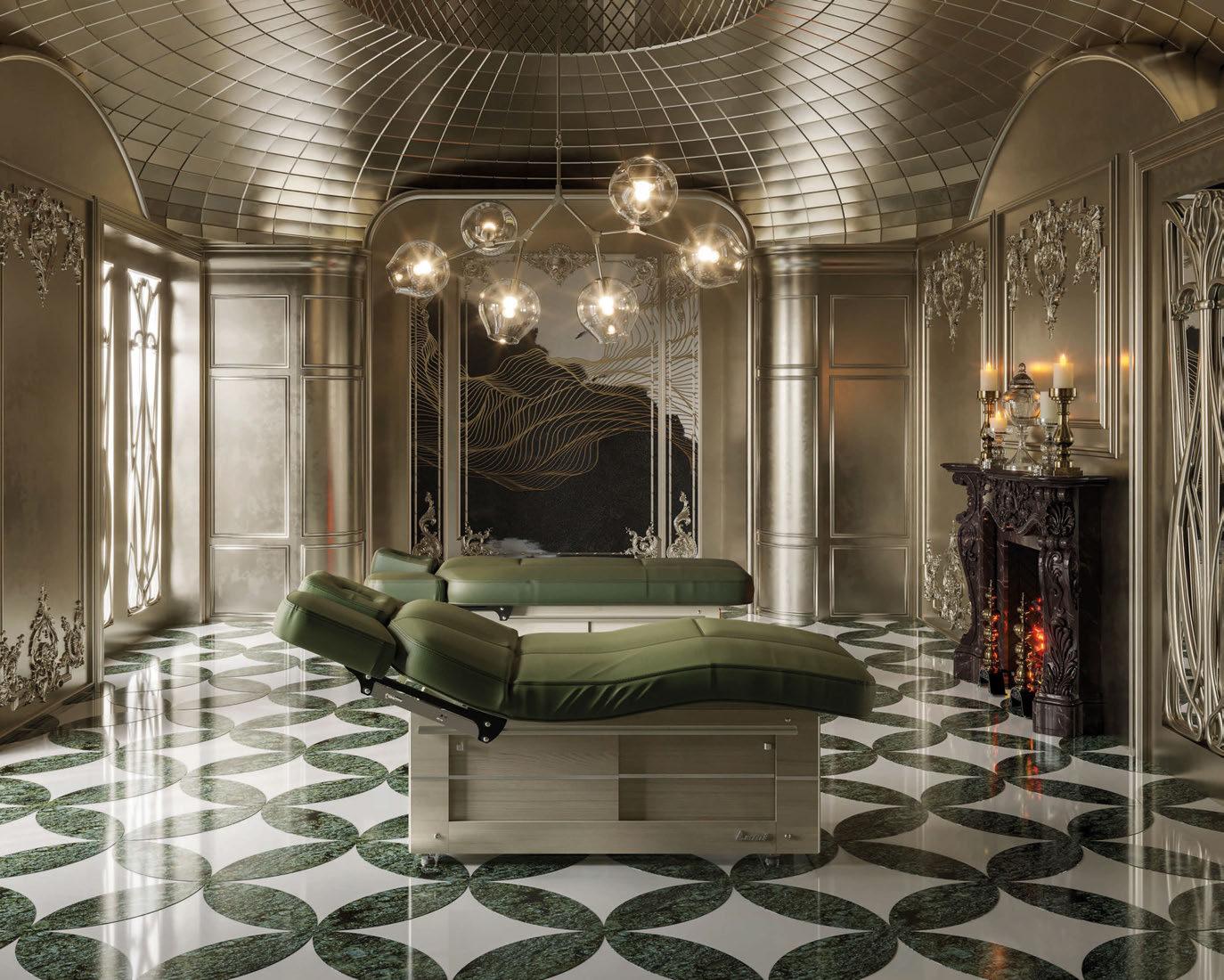
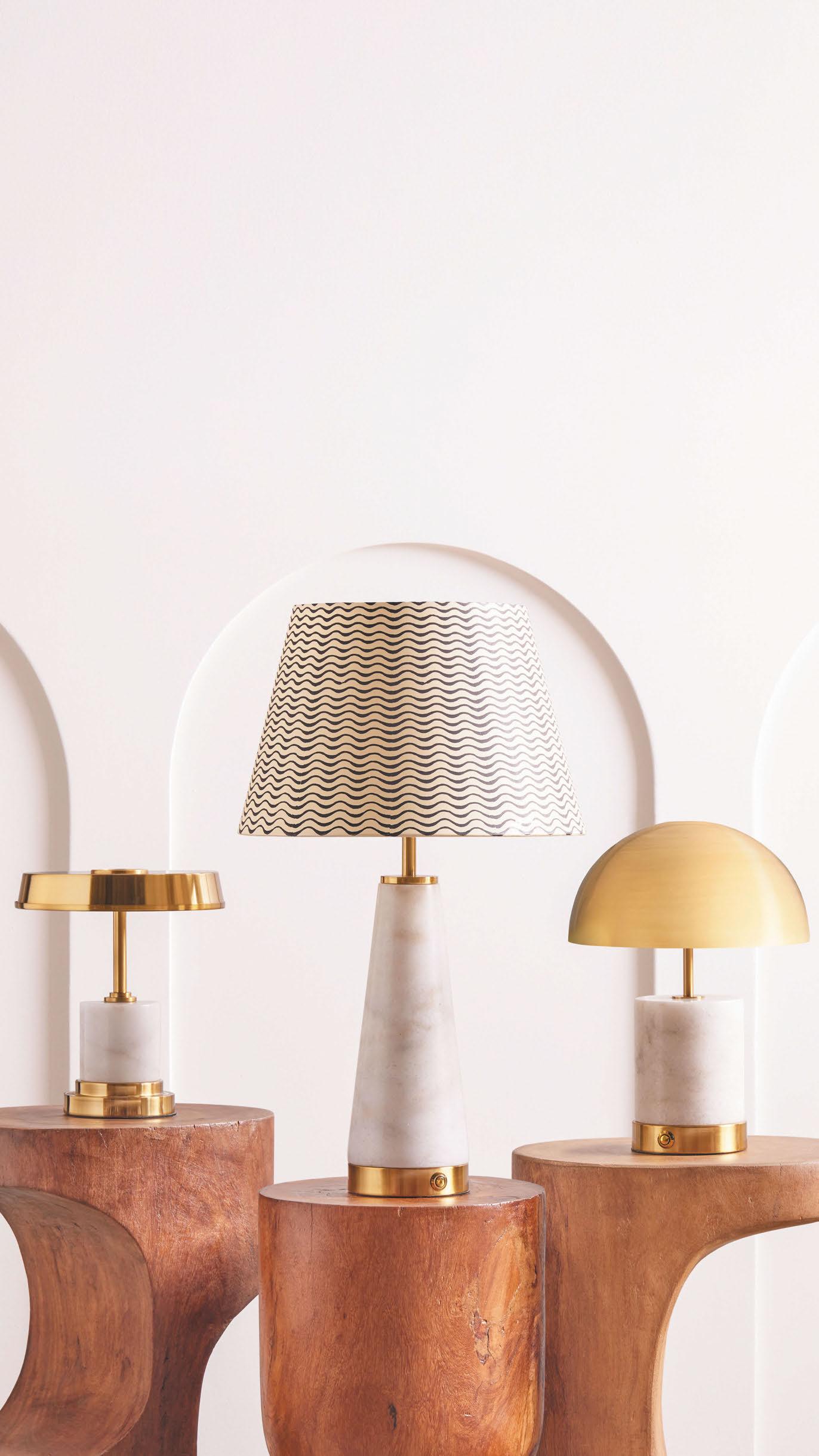
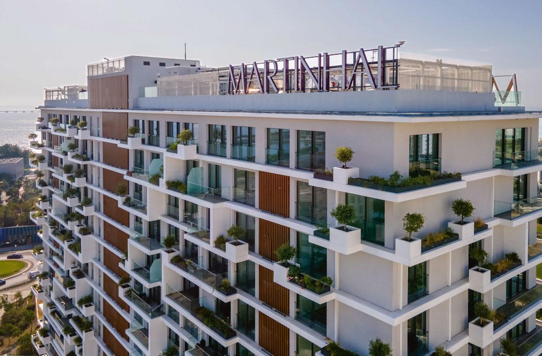
Introducing our new collection
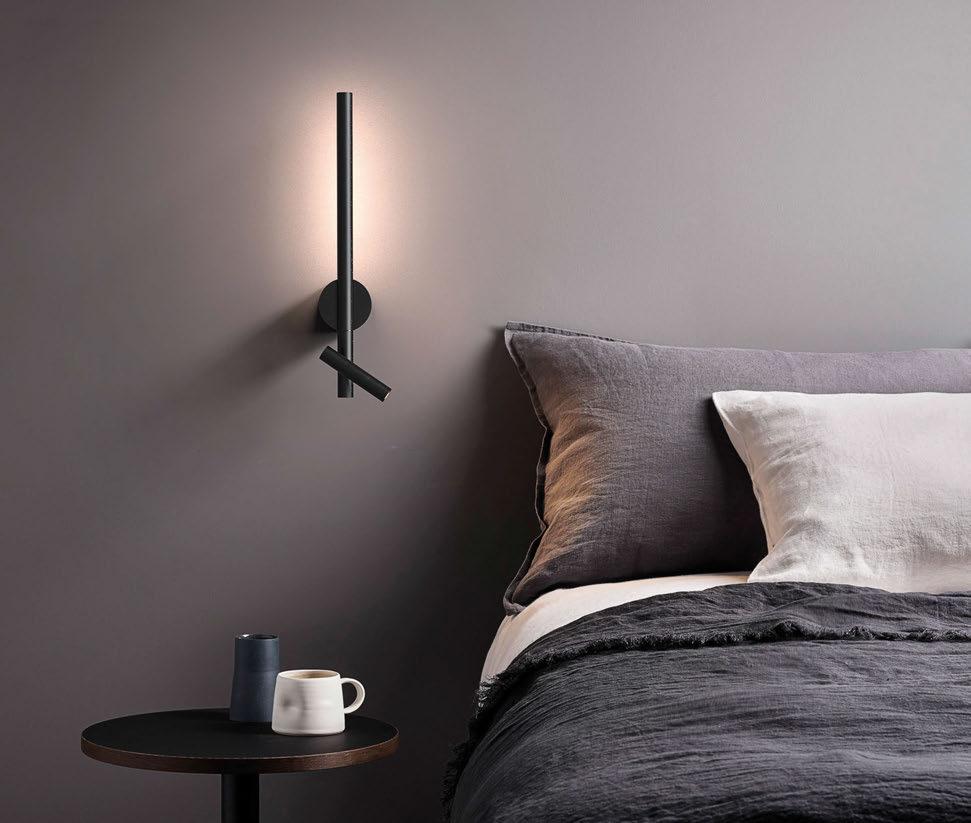
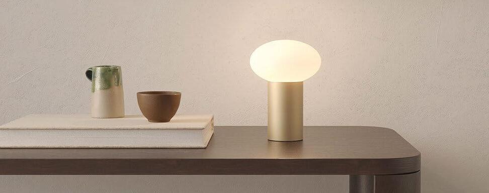
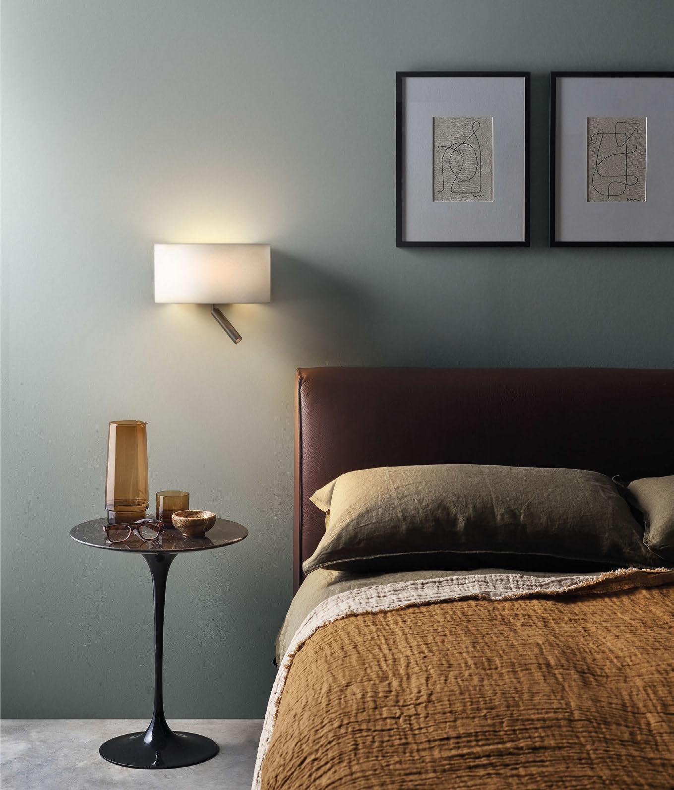
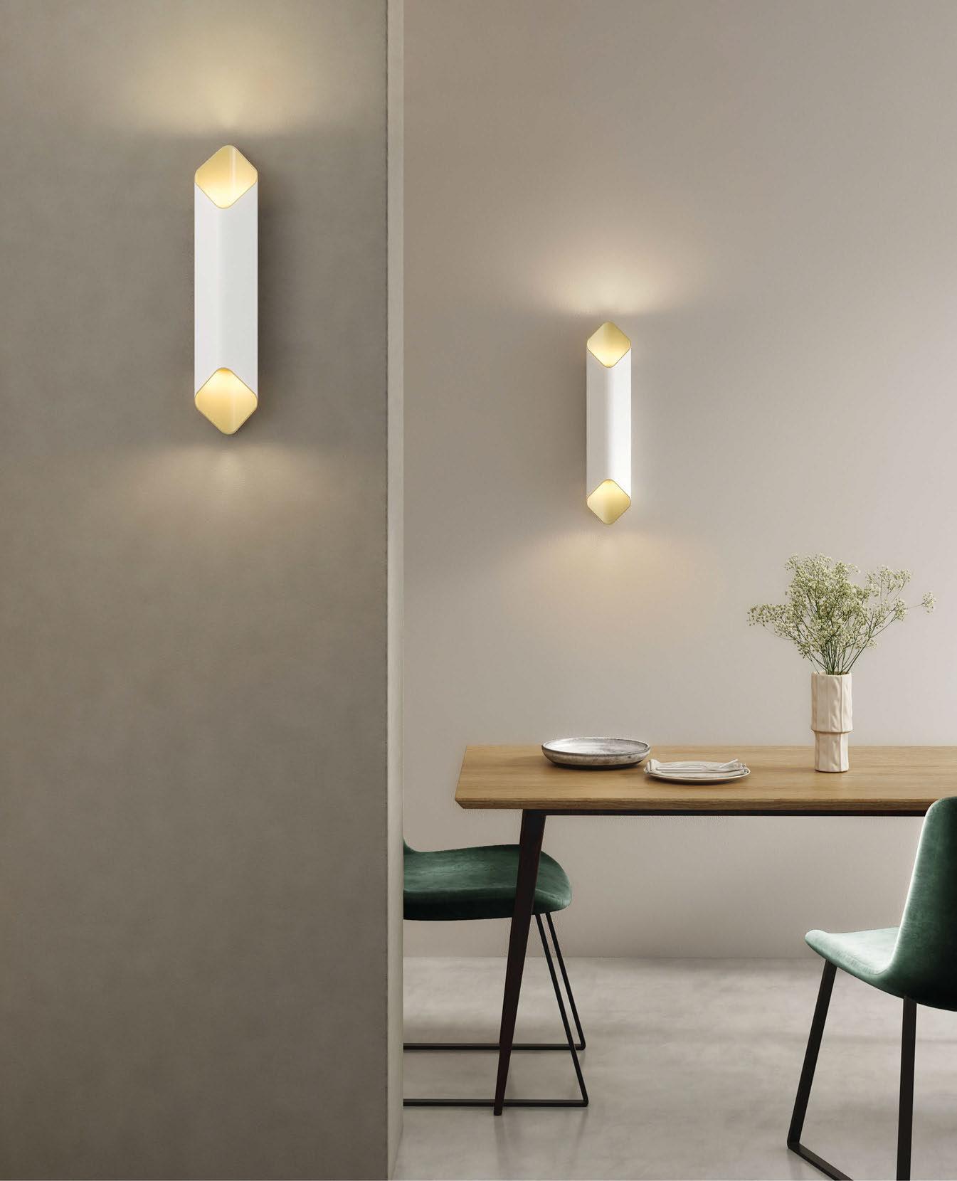
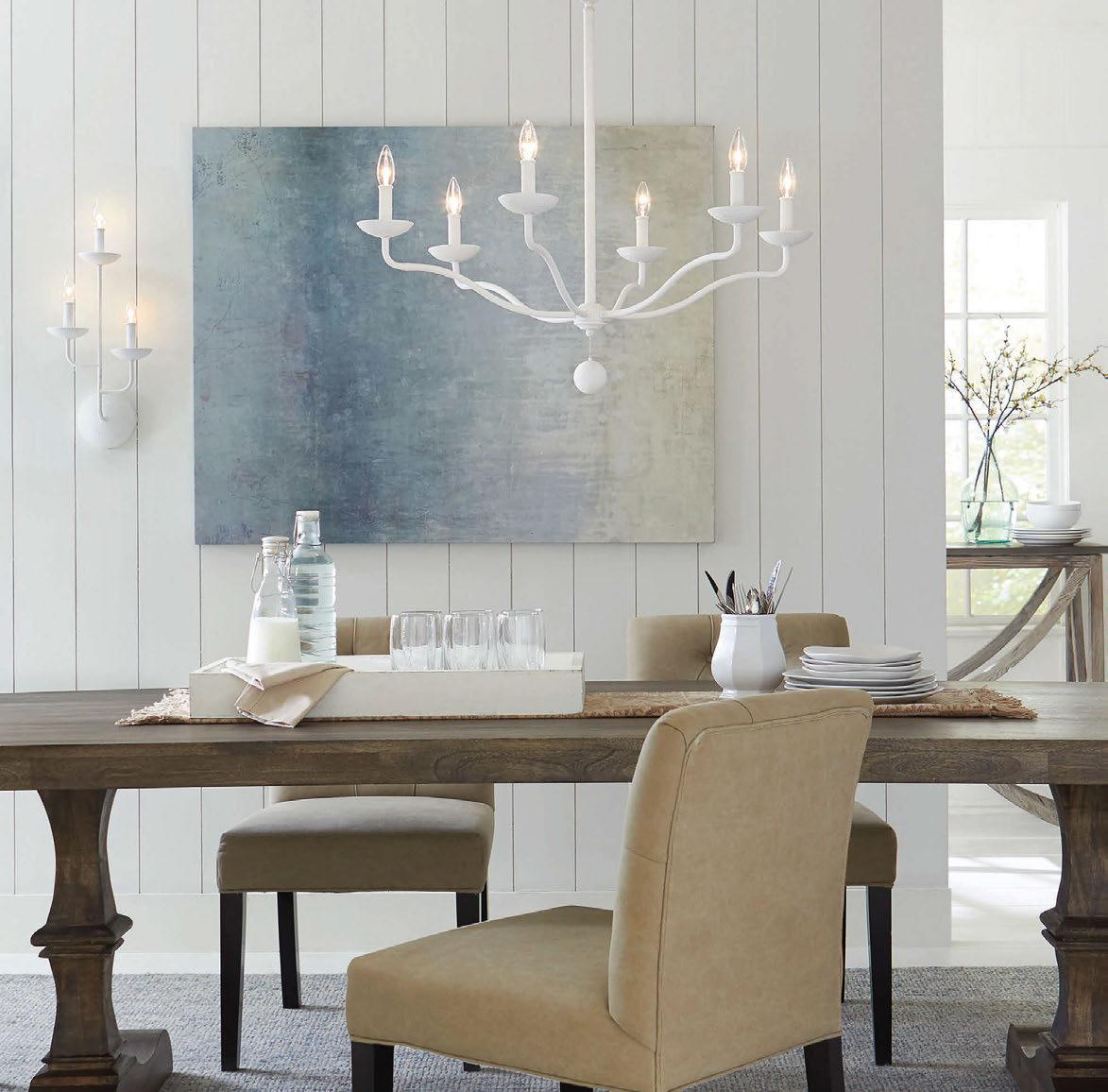
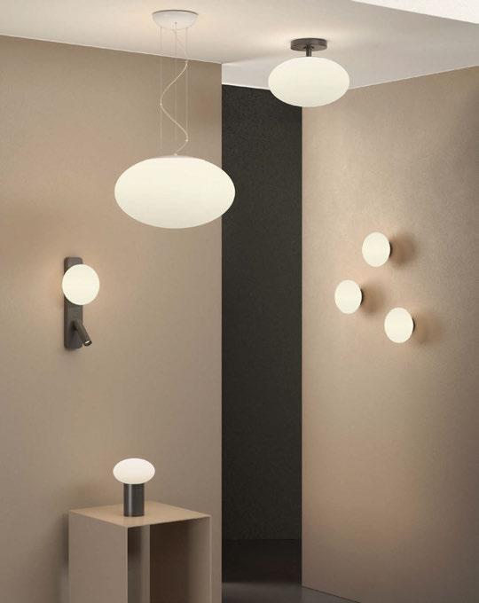
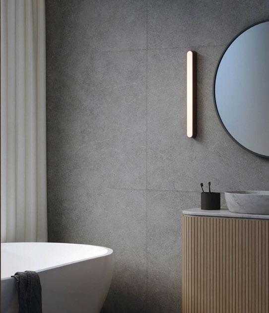
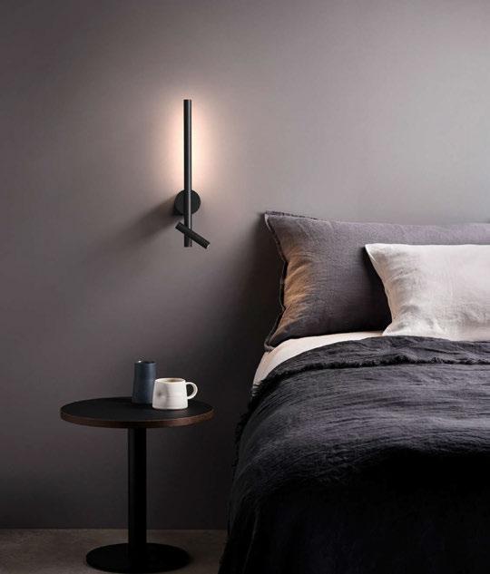
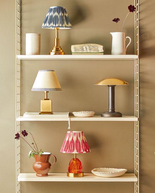
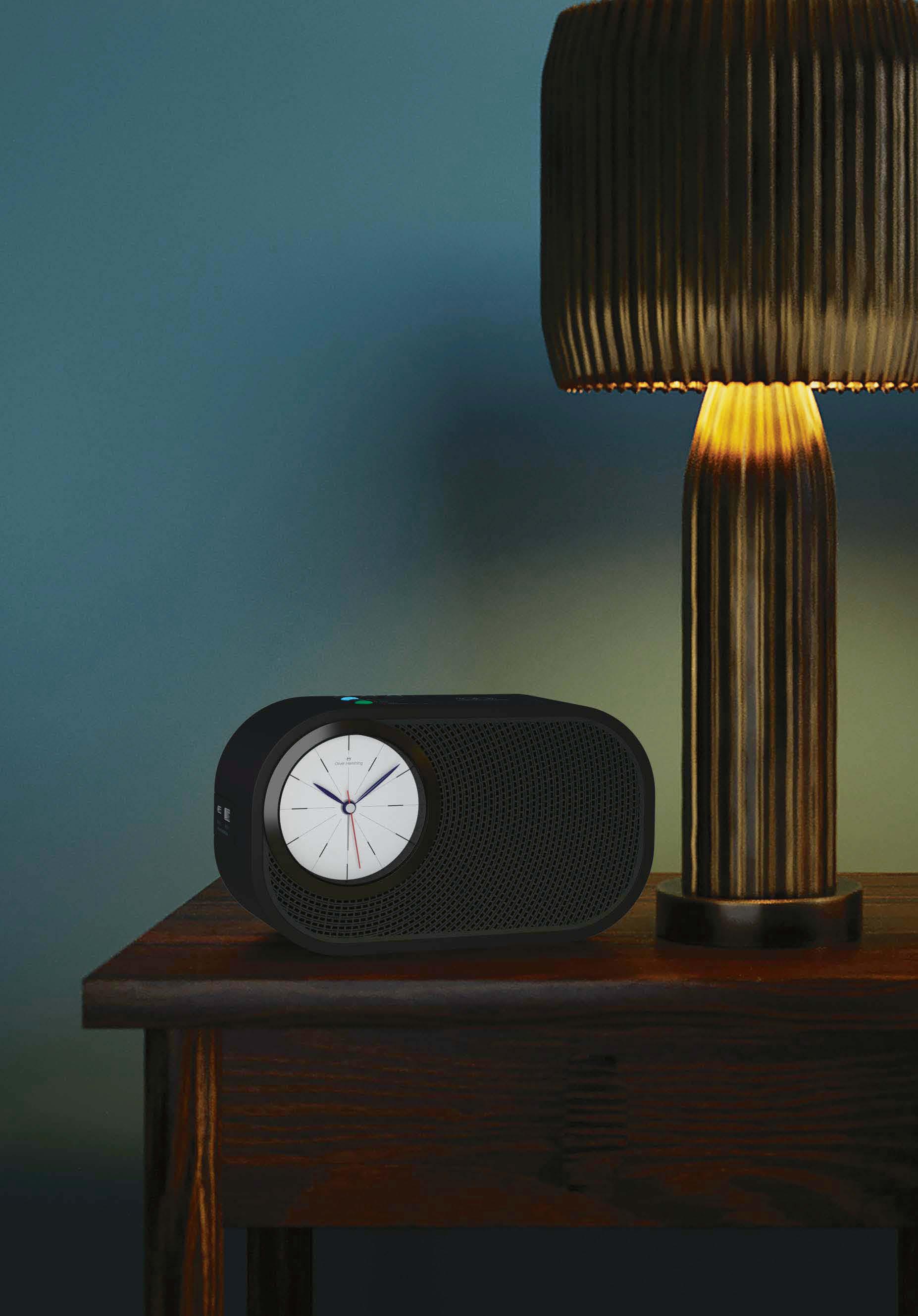
Innovation meets timeless design in our new collection of contemporary lighting concepts for hospitality, residential, and commercial spaces


Lighting designed to stand the test of time
follow @astrolighting | astrolighting.com
arte-international.com
Showrooms London Paris Culemborg Los Angeles
collection LES FORÊTS pattern TINTO
005 CONTENTS ISSUE 110 HOTEL REVIEWS Mamula Island 072 Montenegro The Lodge 080 Mallorca Como Le Montrachet 089 Burgundy Penny Williamsburg 094 Brooklyn The Largo 102 Porto Zel 111 Mallorca The Tempus 117 Northumberland Mongibello 125 Ibiza Hôtel Barrière Fouquet’s 131 New York Martinhal Oriente 139 Lisbon 1 Hotel Mayfair 144 London 080 102 072 © Joachim Wichmann 144 © Jon Day
FEATURES
Meeting... Radha Arora 054
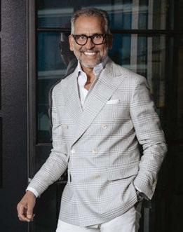
As Rosewood Hotel Group looks to its next phase of growth, the company’s President and Co-Chief Development Officer reveals why a measured approach will continue to prevail.
Meeting... Louis and Anouk Solanet 060
Following the arrival of Hôtel Orphée in 2022, the Paris-based founders of Orso discuss family, design flair and the future.

Meeting... DesignAgency 062
Upon celebrating a milestone anniversary, the Founding Partners of DesignAgency discuss the past, present and future of hospitality design.
Design Details
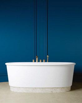
154
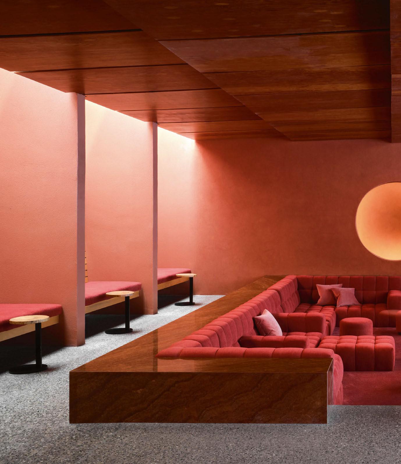
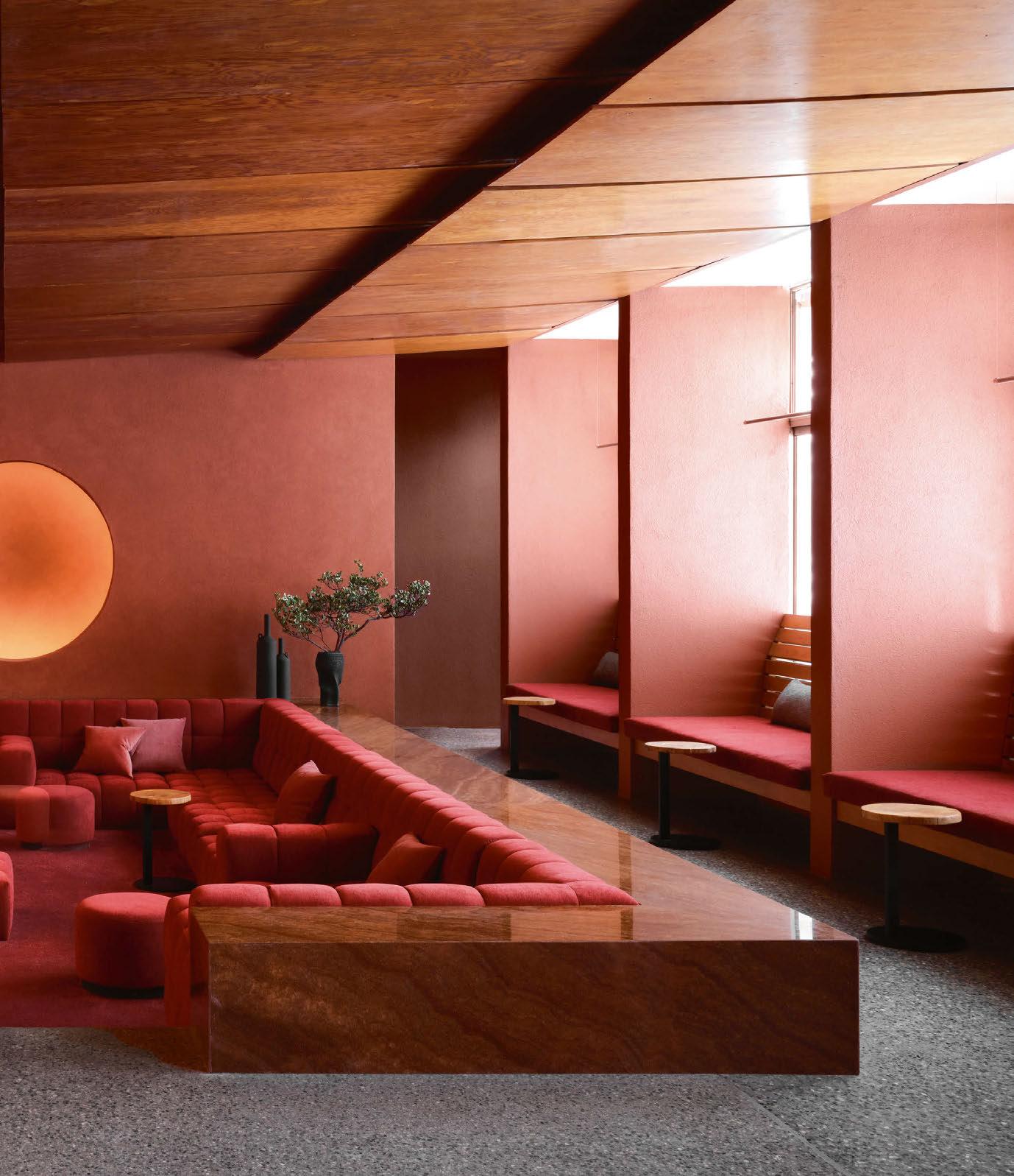
Embodying the spirit of its surroundings, a renovated spa resort in Arizona champions the sculptural quality and vivid tones of Boynton Canyon, mirroring the landscape with a rich red palette.
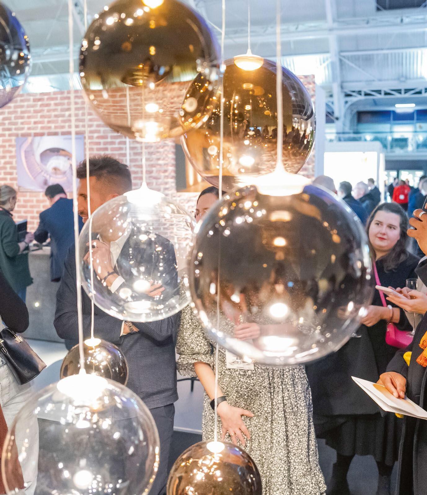
Spotlight... Astro Lighting
172
As lighting designers seek greater flexibility, the new made-to-order service from Astro Lighting allows for the customisation of key collections for hospitality projects.
REGULARS
006
ISSUE 110
CONTENTS
Check-In 036 Drawing Board 038 The Lobby 067 Business Centre 160 Events 170 Bathrooms & Amenities 179 Specifier 195 Check-Out 210 © Diana L
117 094 131 179 054
Ragland
© Read McKendree
© Alice Gao
© Jeffreys Interiors
Introducing the Samsa collection, designed by Maximilian Jencquel. Upholstery and pillows in Perennials fabrics I perennialsandsutherland.com

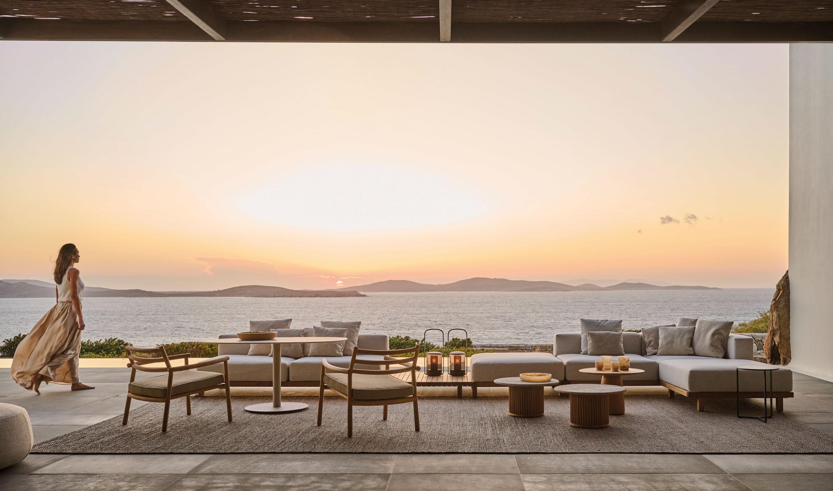

TRIBU.COM
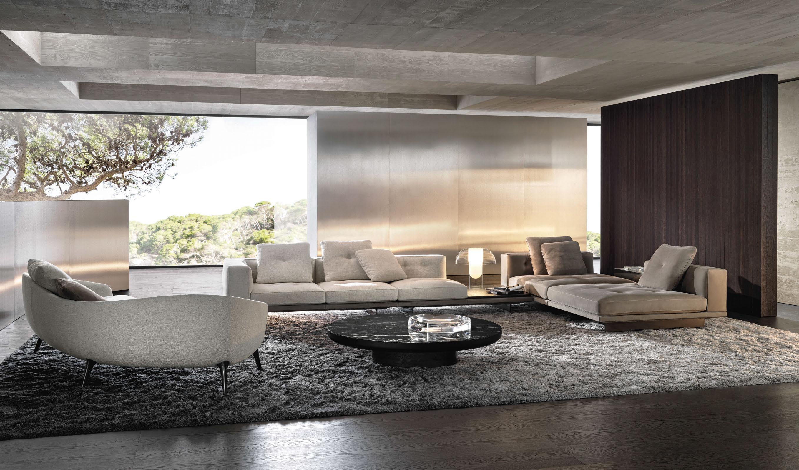
BY EDC 77 MARGARET STREET - LONDON W1W 8SY T. +44 020 73233233 - INFO@MINOTTI.CO.UK LONDON

 DYLAN SEATING SYSTEM | RODOLFO DORDONI DESIGN
DISCOVER MORE AT MINOTTI.COM/DYLAN
RAPHAEL SOFA | GAMFRATESI DESIGN
RH.COM/CONTRACT
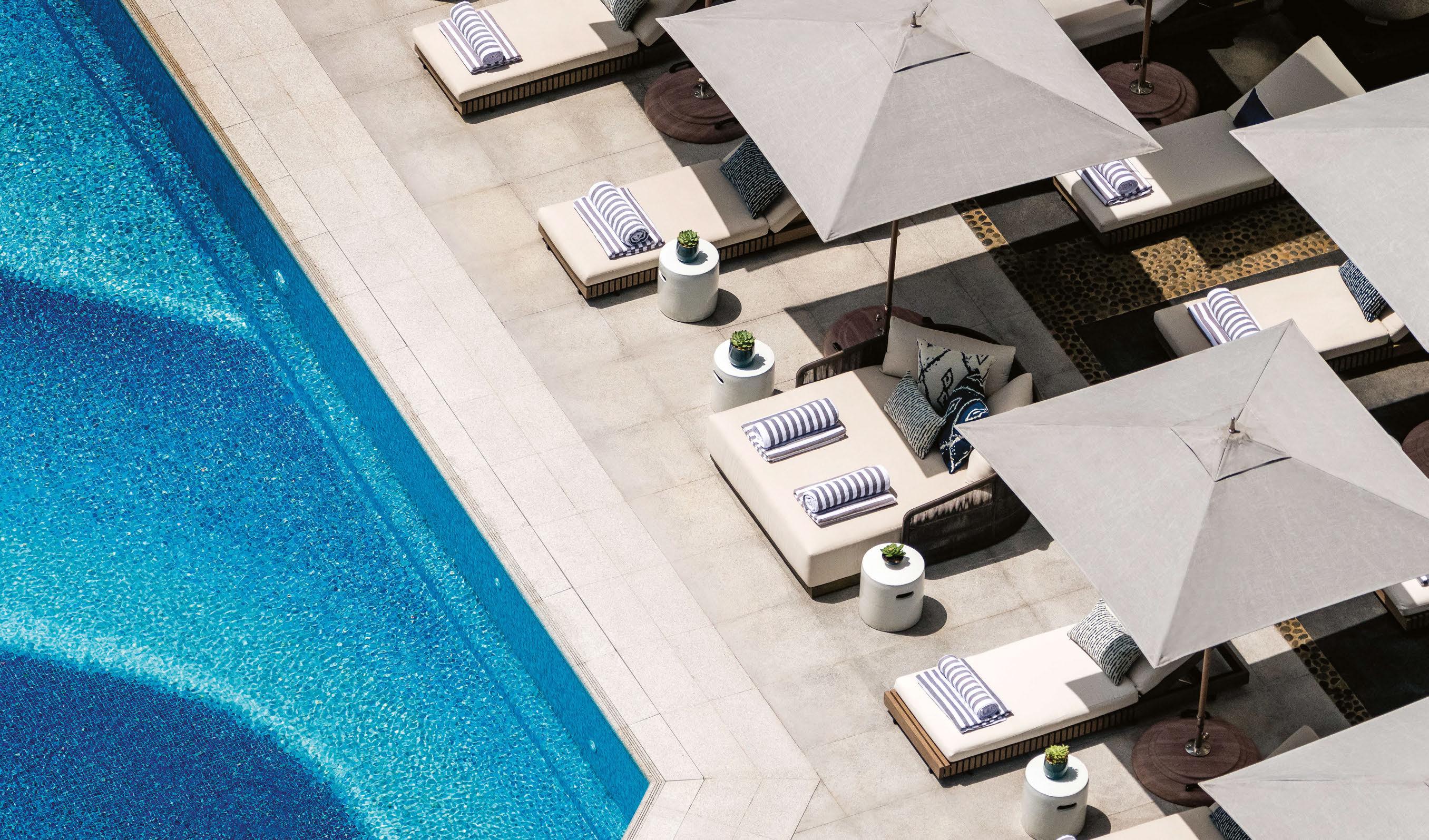 Regent Hong Kong, Hong Kong
Photographer: Andrew Loiterton

Sandua . collection

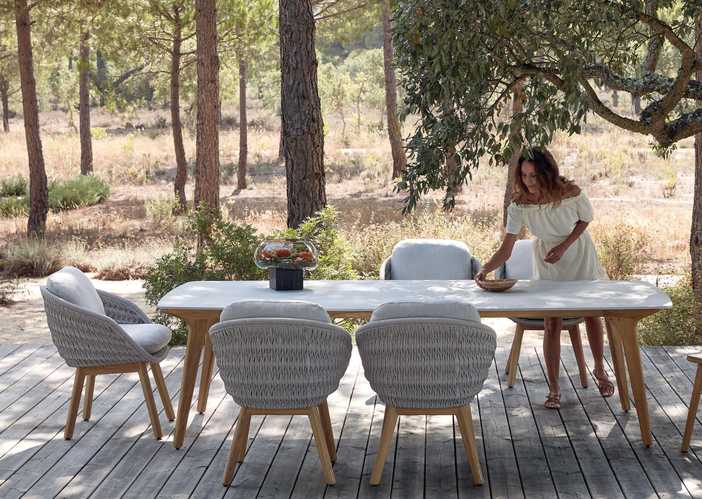 designed by Robin Hapelt

manutti.com @manutti_official outdoor luxury


Going in circles is the best way forward
At Ege Carpets, we believe in circular thinking. Holding a top 1% Platinum ranking from EcoVadis, we’re recognised as one of the most advanced companies in terms of sustainability practices. Most of our carpets are Cradle to Cradle Certified® and now we’re taking another giant step forward with Ege CircleBack.
egecarpets.com
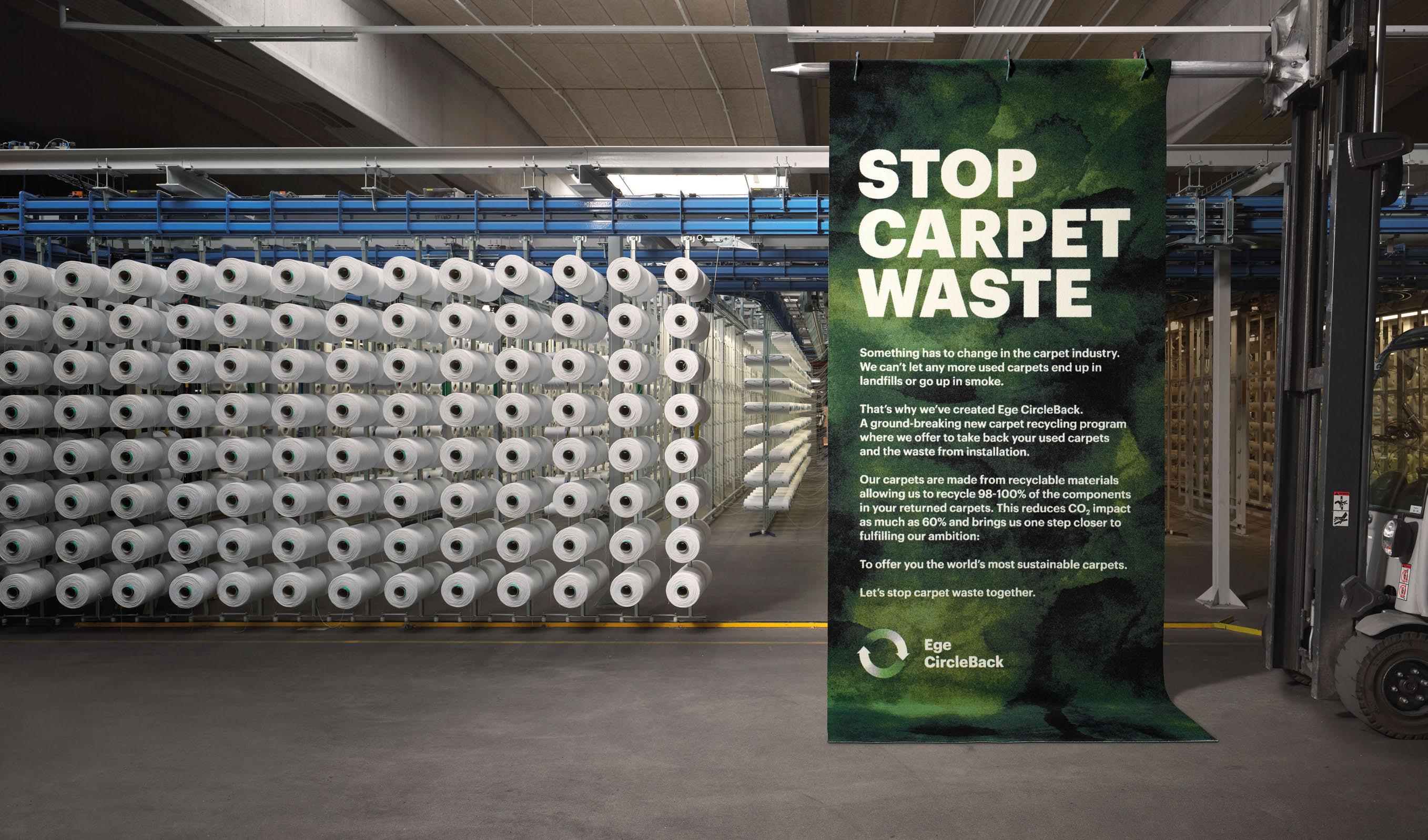
sustainable design at your feet


Search. Sample. Specify.
200+ leading brands. One site. One box.
Overnight delivery.
Free for architects and designers
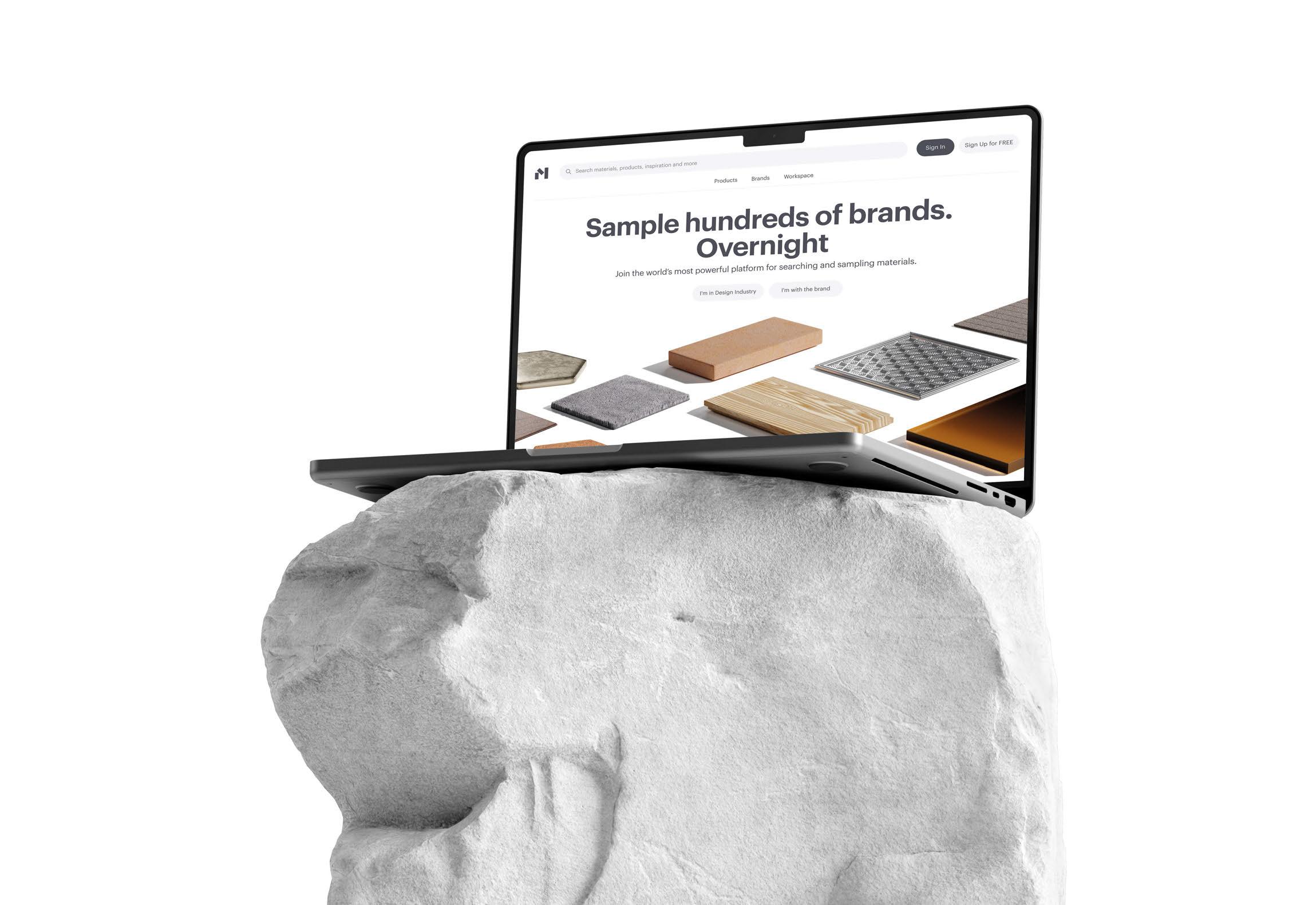
materialbank.eu

RAK-Joy Uno Available in 5 colours
RAK-Joy Uno Available in 5 colours










PATENTED MEMBRANE. ULTIMATE HYGIENE.


Unlock the world’s most hygienic dispenser for cosmetics.



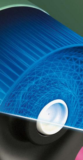


 JOIN US @ STAND 1710

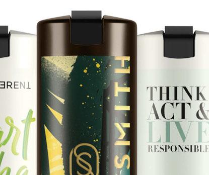




Special o ers, product demos & more: discover the full power of Smart Care + System CHOOSE THE WORLD’S MOST HYGIENIC DISPENSER SYSTEM ada-cosmetics.com putting beauty into travel surprising, sustainable & safe
The Retreat
Hotel Lighting Collection
1920s-1970s original restored vintage lights for hotels.
Sustainably salvaged from around the world, restored and ready to bring vintage charm to modern escapes.

•
skinflintdesign.comdoddsandshute.com

INTERCONTINENTAL LYON – HOTEL DIEU.
FRANCE
 Studio Jean Philippe Nuel.
Let Nature Lead The Way
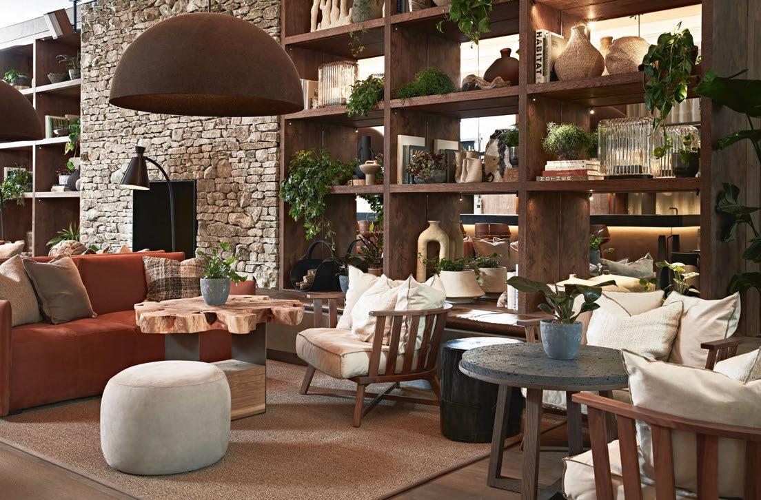
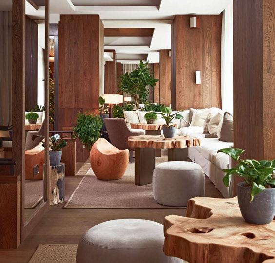
Is there any better feeling than being at one with nature? The smell of freshly-cut grass, the sound of water trickling over rocks or the gentle touch of a summer breeze? You could be forgiven for thinking I’ve been frolicking in a meadow, but this is the feeling a stay at 1 Hotel Mayfair elicits.
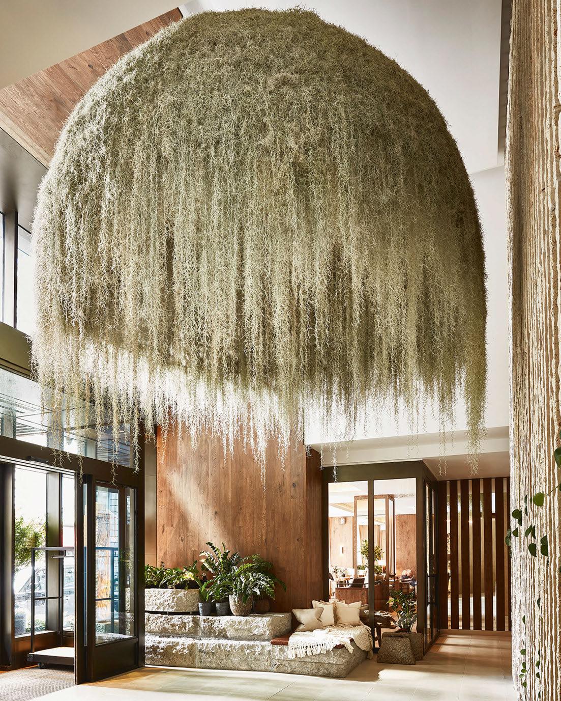
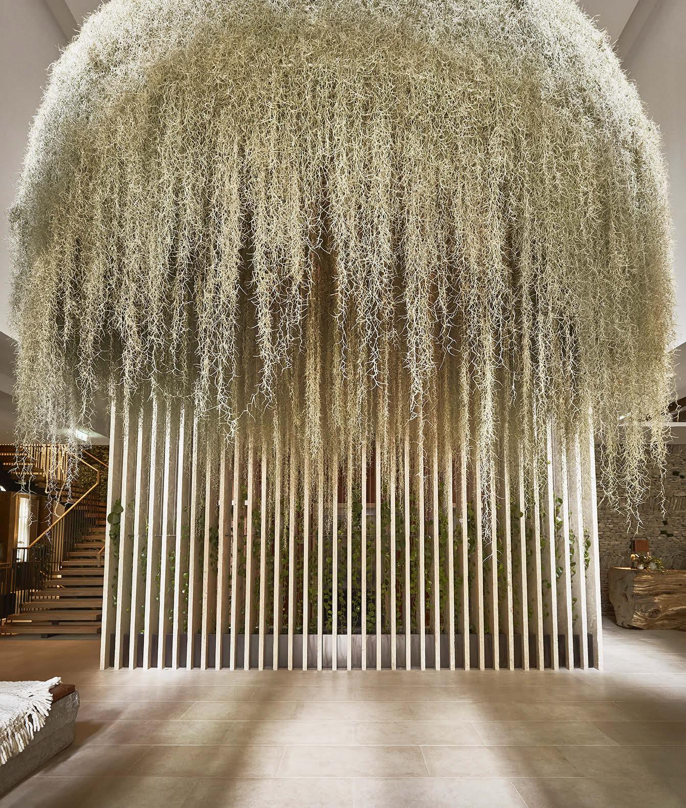
Despite its location in Central London, the first UK outpost for the eco-conscious brand is a veritable sanctuary from the hustle and bustle of the city, so much so that the sense of relief on arrival is almost palpable. Shoulders loosen, frown lines disappear and there’s an audible inhale to take in the scene. Right from the moment you step through the door, the natural world takes centre stage. Water features either side of the entrance are immediately calming, while a chandelier made from living air plants encourages guests to look up in awe – it’s like walking through a rainforest.
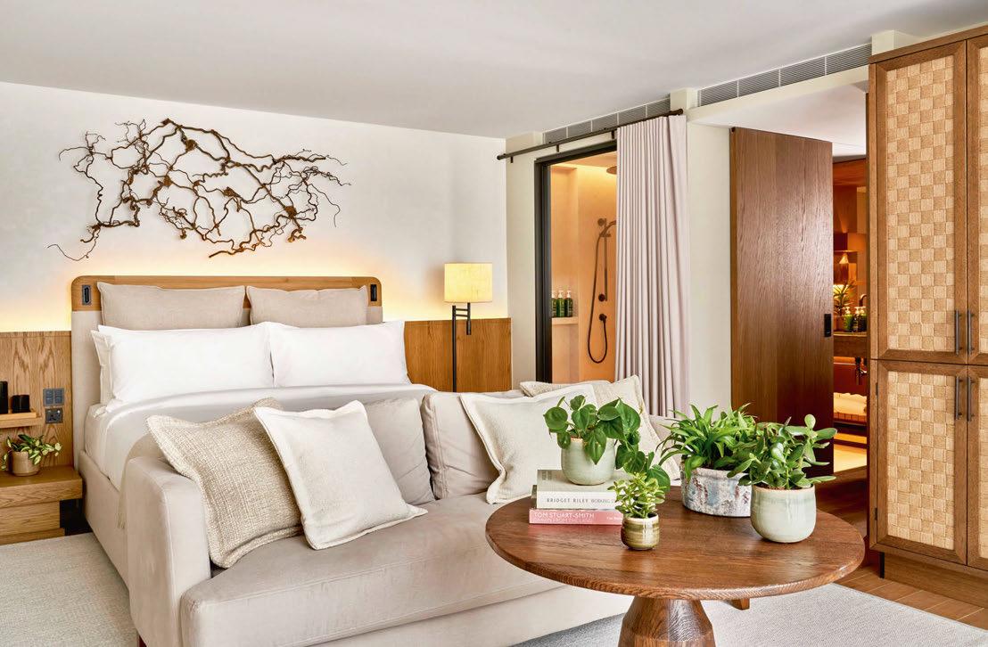
At check-in, the grain of the desk – the trunk of a felled tree, now given a second chance at life – sees the formalities fade into insignificance. The living walls and omnipresent greenery immerse you in nature, well known for its healing properties for the mind, body and soul. And upstairs, every touchpoint brings skin-to-skin contact with a natural material: the flooring is crafted from British oak, encouraging you to go barefoot; toiletries are made using active botanicals; bathrobes are natural cotton; and you can rest easy on eco-friendly mattresses topped with organic linens. Even the keycards are natural, made from FSC-certified birch.
This commitment to the cause undoubtedly takes consideration, but at 1 Hotel Mayfair, the results speak for themselves. A couple of hours here is almost as restorative as
an afternoon forest bathing or hugging trees, and it does force the question as to what more can be done to bring nature back to the built environment, particularly in urban metropolises where the majority of hotel development takes place.
There’s already plenty of initiatives under way, from the landscaped parklands that form part of a mixed-use site to green roofs and planted façades. On Sleeper’s recent travels – visiting hotels, design studios and supplier showrooms – we’ve seen plant fibres being used to craft fabrics and furnishings; a bar made from mycelium; and experimentation with a wide range of natural materials in a bid to reverse the negative impact of mass production. Granted it may be some time before some of the most innovative solutions hit the market and can stand up to the heavy-use demands of a hospitality setting, but we’re certainly moving in the right direction – far from the days of a potted plant in the corner constituting greenery.
In putting nature at the heart of a hotel, the benefits are multifold, providing wholesome and healthy spaces that guests want to spend time in, all the while fostering a connection with the great outdoors. So whether designing a cabin in the wild or a high-rise hotel in the concrete jungle, consider letting nature lead the way.
 Catherine Martin • Managing Editor
031
ON THE COVER
WELCOME
Mamula Island, Montenegro © Courtesy of Design Hotels
TIDES OF SILVER AND GOLD RIPPLE AGAINST A NEUTRAL BACKGROUND. INTRODUCING SHORELINES FROM OUR ARCADIAN COLLECTION. HANDKNOTTED IN 150 KNOT, WITH TIBETAN WOOL AND CHINESE SILK. MADE IN NEPAL.
WWW.CREATIVEMATTERSINC.COM LABEL STEP PARTNER – IMPROVING THE WORKING AND LIVING CONDITIONS OF CARPET WEAVERS, AS WELL AS PROMOTING ENVIRONMENTALLY FRIENDLY METHODS OF PRODUCTION.

GUEST BOOK
125 Diego Calvo
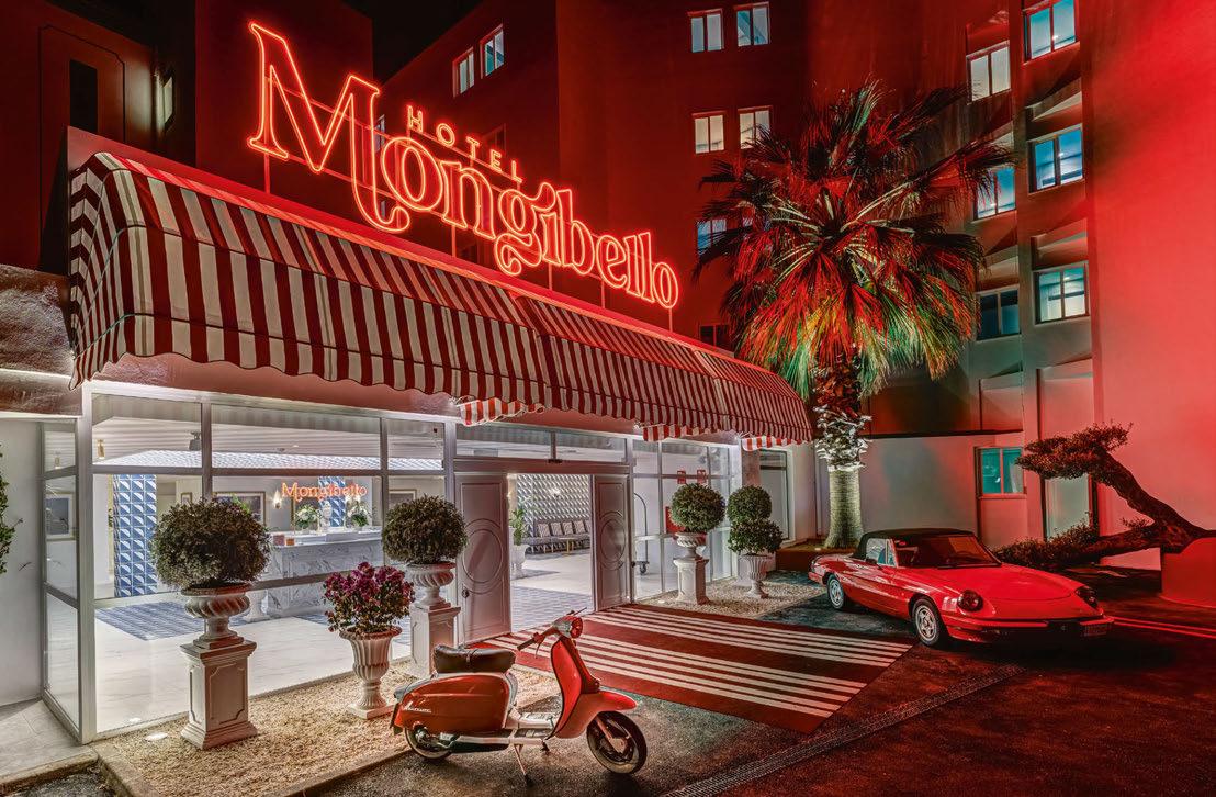
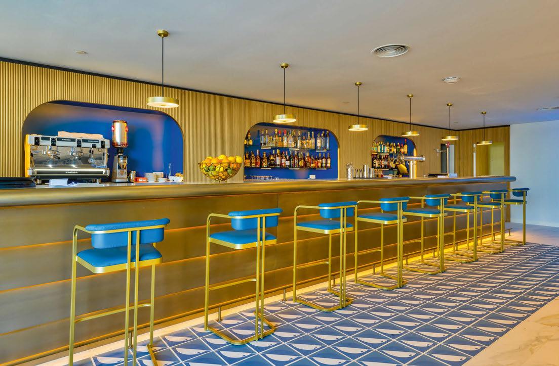
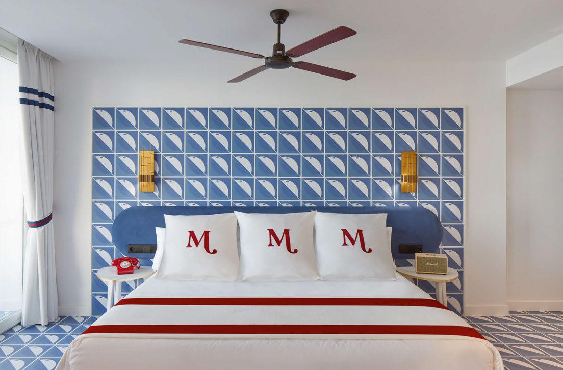
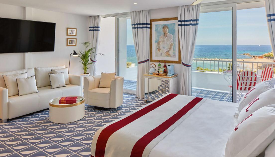
When Diego Calvo stayed at Sorrento’s Parco dei Principi in 2021, the Concept Hotel Group CEO was in awe of Gio Ponti’s dazzling design and the distinct spirit of the Amalfi Coast. The trip sparked a desire to replicate the experience back home in Ibiza, so when an existing hotel on Caló de s’Alga – which reminded Calvo of the region – became available, it made for the perfect spot. Named after a fictitious town on the coast, Mongibello salutes la dolce vita while paying homage to Balearic heritage and Ibizan culture.
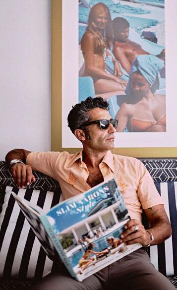
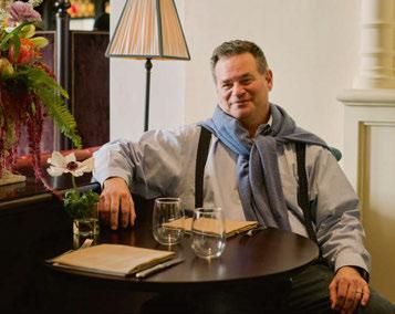
Having developed an industryacclaimed portfolio that includes brands such as Freehand, The Line, NoMad and The Ned, Sydell Group founder and CEO Andrew Zobler has now combined the worlds of hospitality and student accommodation. Taking its name from Zobler’s beloved chihuahua, whose larger-than-life personality inspired the brand’s ethos, Penny has begun its journey in Brooklyn’s trendy Williamsburg district, where a partnership with art school Bard College sees works from students past and present adorn the walls.
102 Space Copenhagen
Peter Bundgaard Rützou and Signe Bindslev Henriksen, founders of Danish design studio Space Copenhagen, describe their approach as ‘Poetic Modernism’ – one that forges new paths by balancing opposites. The firm’s latest hotel project continues this philosophy, bringing together Scandinavian hygge, Portuguese heritage and technology across five historic buildings in central Porto. Fusing old and new, The Largo is unmistakably of the city, with the owners even dubbing the hotel as “The Home of Porto”.

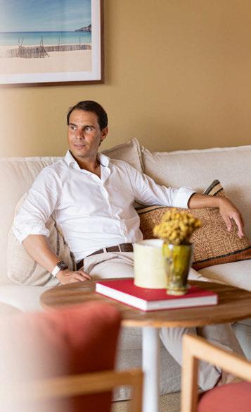
Spanish tennis star Rafael Nadal is no stranger to luxury hotels, having stayed in countless throughout his glittering career. So, when it came to launching his own hospitality brand – Zel – in partnership with Meliá, the former world number one had a vision: “The design must have soul and elements that identify with my roots.” With this in mind, the brand’s debut property in Mallorca – where Nadal grew up and still lives – embodies the spirit of the island, celebrating the Mediterranean through an earthy and marine-inspired palette.
033
094 Andrew Zobler
111 Rafael Nadal
094
125
102
111
© Andres Iglesias
© Maru Serrano
© Nathaneal Turner
FRONT DESK
EDITORIAL
Editor-in-Chief
Matt Turner m.turner@mondiale.co.uk
Managing Editor
Catherine Martin c.martin@mondiale.co.uk
Deputy Editor
Ben Thomas b.thomas@mondiale.co.uk
Editorial Assistant
Cara Rogers c.rogers@mondiale.co.uk
Editor-at-Large
Guy Dittrich
COMMERCIAL
Business Development Rob Hart r.hart@mondiale.co.uk
Business Development
Charlotte Gowing c.gowing@mondiale.co.uk
Business Development Kate Borastero k.borastero@mondiale.co.uk
Account Manager Holly Huish h.huish@mondiale.co.uk
EVENTS
Commercial Lead
Kirsty Studholme k.studholme@mondiale.co.uk
Event Manager
Kayley Johnson k.johnson@mondiale.co.uk
Marketing & Events
Olivia Mavers o.mavers@mondiale.co.uk
RESEARCH & MARKETING
Content & Research
Ellie Foster e.foster@mondiale.co.uk
Data & Marketing
Lauren Blain l.blain@mondiale.co.uk
DESIGN
Design Manager
David Bell
Production
Dan Seaton
CORPORATE Accounts ar@mondiale.co.uk
Finance Director
Amanda Giles
Chairman
Damian Walsh
SUBSCRIPTIONS
Visit the online store to subscribe and save across all Sleeper Media magazines.

SUSTAINABILITY
Natural • Renewable • Recyclable
Sleeper is printed by Buxton Press on FSC Mix-certified paper using 100% vegetable-based inks. Magazines mailed from Spatial Global are packaged in FSC-certified wrap that is fully recyclable.

Subscription records are maintained at Sleeper Media. For address changes, email enquiry@sleeper.media.
Sleeper (ISSN: 1476-4075 / USPS: 21550) is published bi-monthly by Mondiale Media Ltd and is distributed in the USA by RRD/Spatial. Pending periodicals postage paid at South Hackensack, NJ. Send USA address changes to Sleeper, c/o RRD, 1250 Valley Brook Avenue, Lyndhurst, NJ 07071, USA.
Strawberry Studios, Stockport, SK1 3AZ, UK Tel: +44 (0)161 464 4750 • www.sleeper.media
POWERED BY PORTFOLIO
@SleeperMagazine


© William
Jess Laird
CHECK-IN
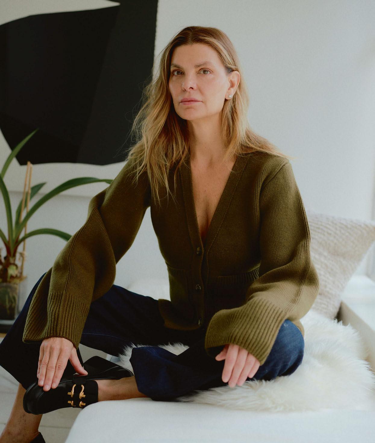
Christine Gachot
The co-founder and Principal of Gachot takes a fantasy break at a townhouse hotel in her home city, where creature comforts make for a restful stay.
Where are you?
New York – the most exciting city in the world and the place I call home. It’s early fall, the air is crisp and there’s nowhere else I’d rather be.
How did you get there?
The hotel sent a car to pick me up from my office. My weekend luggage was retrieved earlier in the day, and I was notified that my belongings had been unpacked prior to my arrival.
Who is there to greet you on arrival?
It’s a warm welcome from Philip Truelove, General Manager at The Greenwich Hotel and a family friend, whom my children – taken with his English accent and charming charisma – nicknamed ‘Chappy’. He’s the loveliest and most talented gentleman in hospitality, so I immediately feel at ease.
And who’s at the concierge desk?
The hotel doesn’t need a dedicated concierge and certainly not a desk. The team is at my disposal, well-versed in the guest experience. I have no expectations as they are bound to be exceeded.
Who are you sharing your room with?
I have the pleasure of my husband’s company
for the weekend. John’s love for design rivals mine so he is busy snapping photos of our suite before joining me for cocktails.
Is there anything you would like waiting for you in your room?
Always appreciative of handwritten notes, I’m pleased to see one from Philip welcoming me home. Bowls full of my favourite candy are calling my name and there’s a bottle of prebatched margarita chilling – it’s clear my profile has been carefully reviewed. A fire crackles as classical music plays through the speakers; I don’t wait for the song to finish before I pour myself a drink.
Describe the hotel, your room and the view...
It has a townhouse feel and is my home away from home. With a dedicated entry foyer, it is residentially proportioned and there’s a place for everything. The hotel-branded umbrella leans in a brass Carl Auböck stand next to the closet, where my Khaite cardigan is already hanging below a shelf with two yoga mats. The bathroom oozes luxury, from the exquisite Paonazzo slabs lining the room to the La Mer amenities. The bedroom feels warm and inviting with furniture in hues of camel and blush. Rare and insightful books line open shelves, while the artwork is eclectically curated. As I perch on the sumptuous king bed, I notice the view is prime for people-watching. Looking out onto a tree-lined block, I have a front-row seat to the parade of beauty that comes with Fashion Week. I can feel the energy but can’t hear it - a new meaning of quiet luxury.
Who designed it?
Ilse Crawford, of course.
What’s the restaurant and bar like?
We’re invited to join the friends-and-family debut of the hotel’s newest venue, The Conservatory. Filled with hanging orchids amongst glowing lighting, it feels intimate, like a dining room in someone’s home. Wine and champagne sit in grand silver buckets while the butler mans a cabinet of cocktail curiosities. It is full of fabulous people and I’m starstruck by one guest in particular.
Who’s manning the stoves?
The Conservatory is Jean-Georges Vongerichten’s new gem. Large tins of Petrossian Caviar are on the table when we arrive – no garnish, just spoons. Chef is working the room, welcoming everyone, but he spends most of his time at our table. We’re joined by our mutual friend, lighting designer extraordinaire, Hervé Descottes.
And what’s on the menu?
Jean-Georges’ newest creations with some of his signature dishes. I’m having the sweet pea soup with parmesan foam and croutons – a favourite of mine. I ask chef to select my entrée.
Would you like something to drink with that?
Billecart-Salmon Brut Rosé.
What’s in the mini-bar for a night cap?
John offers me a glass of Dow’s 40 Year Old Tawny Port, and I immediately unwrap a Twix – it’s a delicious a pairing before bed.
037
NOTABLE HOTEL PROJECTS Pendry Manhattan West, New York; Shinola Hotel, Detroit; Eaton DC, Washington www.gachotstudios.com
DRAWING BOARD
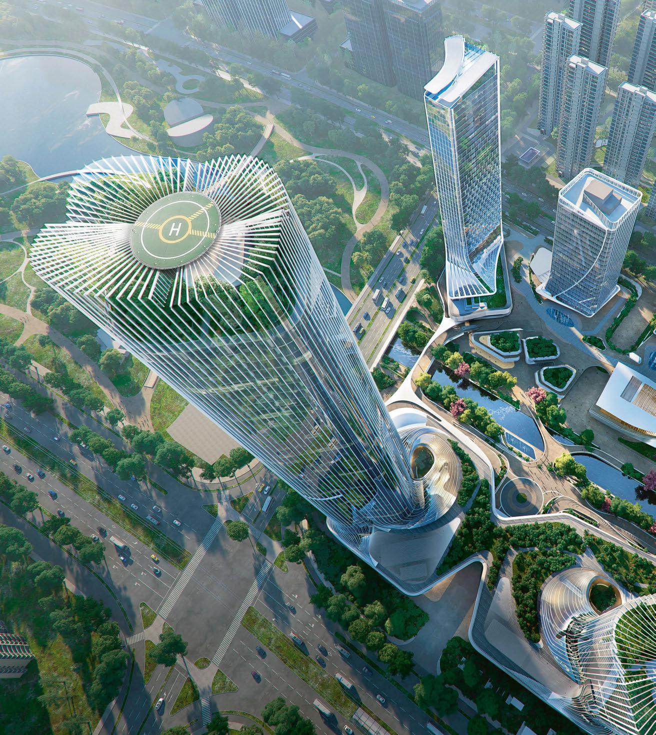
K.Wah G72 NANJING
Dutch architectural practice UNStudio has designed a new mixed-use development in the Chinese city of Nanjing, following a commission by developer K.Wah Group.
Tasked with creating a human-centric destination where sustainability and culture play a key role in daily life, the firm has proposed a dynamic waterfront community that provides a lush environment for working and living. Among the structures planned are high-rise office towers, commercial and cultural institutions, two serviced apartment buildings, a headquarters tower and a luxury hotel, which form an urban silhouette that rises from the waterfront.
The site is split into four plots with a green corridor that extends throughout, bringing together community and nature for socialising and events, providing a leisurely sanctuary from a fast-paced life.
Sustainability is also at the centre of the design, with UNStudio’s scheme making use of energy-saving technologies such as natural ventilation, HVAC systems and solar photovoltaic panels to lower the energy demands of the buildings. The office towers will also use prefabricated components as well as a modular supporting structure.
The project is located along the urban central and economic development axes in Nanjing’s Hexi New District, and will be connected to the Metro Rail Transit to the northwest and the coast to the south.

“Our vision is set to realise a future-oriented, multipurpose community, which will contribute to Nanjing’s ambitious urban development goals,” says Hannes Pfau, Partner at UNStudio. “The design aims to create a synergy between building scale and human scale, bringing a healthy and pleasant working, shopping and living environment for residents, visitors and creative professionals.”
Ben van Berkel, founder and Principal Architect at UNStudio, adds: “K.Wah G72 will serve as a one-stop destination in which lifestyle, innovation and work are brought together. It aims to be a benchmark for urban developments in Nanjing, across the country and beyond.”
Equinox Amaala
SAUDI ARABIA
Equinox Hotels has been selected by Red Sea Global to bring a luxury resort to Amaala on Saudi Arabia’s Red Sea coast.
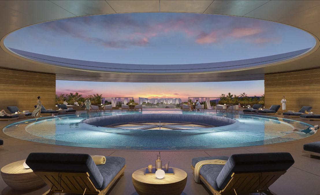
Set to open as part of the first phase of the Triple Bay development, the property comprises 128 guestrooms and suites, several culinary concepts and a beach club, as well as a spa, a magnesium salt rooftop pool and a signature Equinox Fitness Club.
The design by Foster + Partners has been created to ensure complete connectivity to the surroundings, with guestrooms planned to capture panoramic views of Hijaz Cove or of the marina and its promenade.
EXPRESS CHECK-OUT
Developer: Red Sea Global
Operator: Equinox Hotels
Architecture: Foster + Partners
www.equinox-hotels.com
The porte cochère and its distinctive floating canopy will welcome guests in, while four open courtyards take inspiration from traditional local architectural styles. Water features will work to naturally cool the shaded spaces, allowing guests to comfortably enjoy the resort, even in the warmer months.
Sustainability will also be at the centre of the resort’s design, with the wider Amaala development targeting a 30% net conservation benefit to local ecosystems by 2040. This will be achieved by enhancing biologically diverse habitats including mangroves, seagrass, corals and land vegetation. The destination will be powered by 100% renewable energy and run with a zero-carbon footprint once fully operational.
“Amaala is a destination that aligns with our mission of redefining luxury hospitality,” says Christopher Norton, CEO of Equinox Hotels. “We’re excited to partner with an amazing developer like Red Sea Global, which has similar and strong values rooted in sustainability.”
John Pagano, Group CEO of Red Sea Global, adds: “Equinox’s unique brand of luxury is a perfect fit for Amaala, allowing visitors to choose self-improvement, getting back to nature on land or at sea, or simply enjoying quiet moments in comfort and privacy.”
DRAWING BOARD 040
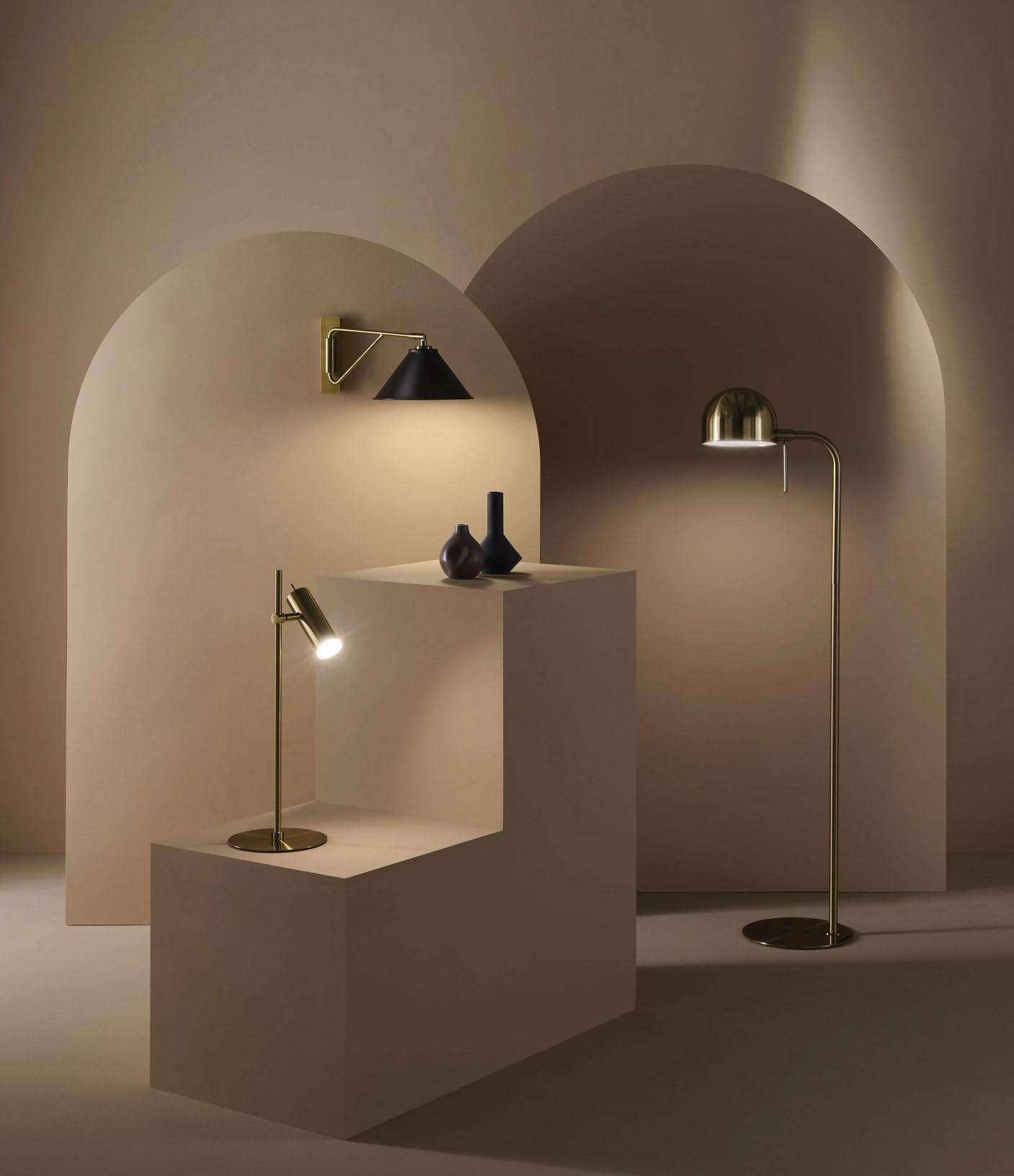
EDITION 28 New Lighting Collection
CHELSOM.CO.UK
Mondrian Riyadh Al Malga
SAUDI ARABIA
Ennismore has revealed plans for a new hotel in Saudi Arabia’s capital with Mondrian Riyadh Al Malga, a 200-key property set for completion in 2026. Developed in partnership with owner Olayan Financing Company, the hotel will form part of mixed-use Al Malga Urban Village.
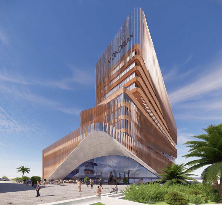
Designed by architecture firm Benoy, the hotel’s gleaming façade features bronze louvres that envelop the structure, forming a dynamic wrap that exposes public dining spaces and landscaped terraces. “We wanted to bring something bold and sculptural to this scheme,” explains Zaynib Khan, Senior Associate Director at Benoy. “The hotel’s innovative design resonates with the brand’s core values, celebrating an expansive imagination.”
Inside, Mondrian’s oversized imagination will be brought to life by interior architect Tristan Du Plessis, whose portfolio includes AHEAD Award-winning projects such as Gorgeous George in Cape Town.
Bringing a lifestyle experience to the city, Mondrian Riyadh Al Malga comprises 130 standard rooms and suites, with 25 onebedroom, 35 two-bedroom, and ten threebedroom serviced apartments. The F&B offering will include three restaurants and lounges envisioned by Ennismore’s in-house F&B studio, Carte Blanched, while events spaces and social wellness areas will complete the offer.
The hotel and wider development – which includes entertainment, dining and retail – will be LEED-certified, constructed with a focus on energy savings, water efficiency, reduced carbon emissions and improved indoor air quality.
Mondrian Riyadh will be Ennismore’s first hotel in the city, making it a significant milestone for the company’s growth in the Middle East. The pipeline also includes properties in Singapore, Hong Kong, Bordeaux and Ibiza, as well as Cannes, Dubai, Abu Dhabi and Australia’s Gold Coast.
EXPRESS CHECK-OUT
Owner / Developer:
Olayan Financing Company
Operator: Ennismore
Architecture: Benoy
Interior Design: Tristan Du Plessis www.ennismore.com
DRAWING BOARD 042
DESIGN BY CHRISTIAN WERNER
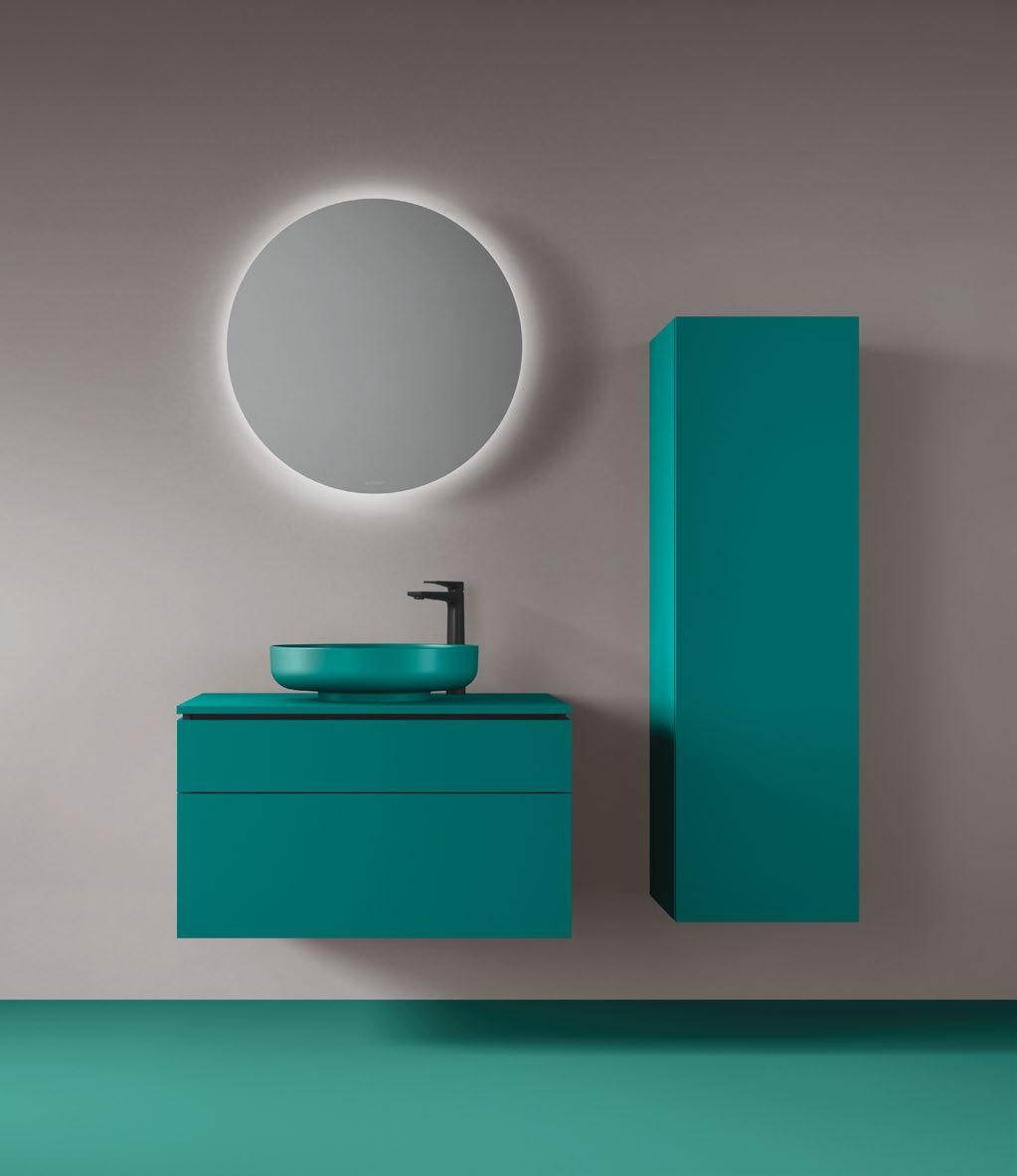
VITRIUM COLOURS
COLOUR UP YOUR EVERYDAY The series which offers statement pieces for the bathroom. www.dura v it.co.uk
The Apurva Kempinski Ubud
Following the opening of a beachfront resort in Nusa Dua in 2019, Kempinski Hotels is expanding its portfolio in Southeast Asia, with The Apurva Kempinski Ubud set to open its doors in 2027.
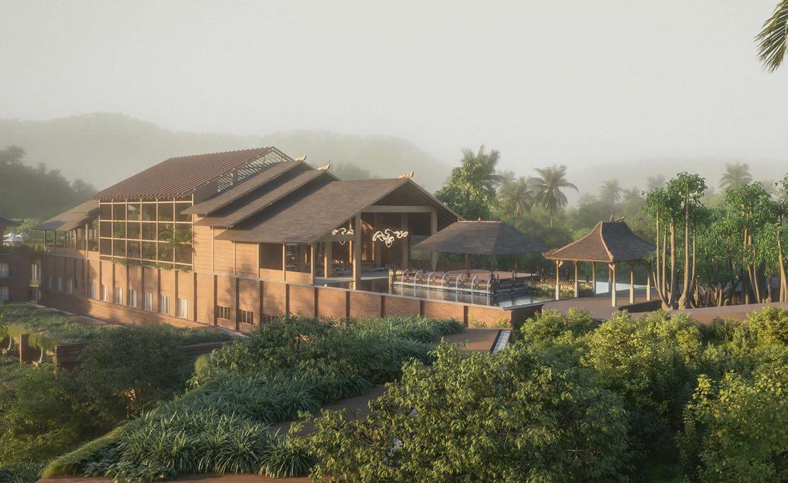
The latest hospitality project from Indonesian real estate developer Panorama Indah Dewata, the hotel finds home in central Bali, close to the emerald rice terraces and coffee plantations of Tegalalang village.
also set to offer panoramic views, as will a speciality Indonesian restaurant. Completing the facilities, a Balinese spa perched on a ridge overlooking the valley will offer a wide range of rejuvenating treatments and immersive wellness journeys.
EXPRESS CHECK-OUT
Developer: Panorama Indah Dewata
Operator: Kempinski Hotels
Architecture and Interior Design: Trivium Design Group www.kempinski.com
With architecture and interior design by Rudy Dodo of Jakarta-based studio Trivium Design Group, the design scheme sees 160 rooms and villas cascading down jungle-covered slopes, set around an open-sided lobby lounge. Rooms and suites will start at 60m2, with six additional 200m2 villas also nestled into the forest. Putting nature centre stage, the resort will house a tropical aviary providing sanctuary for a range of exotic birdlife from Indonesia and beyond.
An infinity pool, rooftop lounge and bar are
“With the addition of Ubud to our already existing The Apurva Kempinski hotel in Nusa Dua, our guests will have the opportunity to live two very different luxury experiences during their holidays in Bali,” says Christophe Piffaretti, Chief Development Officer, Kempinski Hotels. “Ubud is such a unique place. Many of our guests have been dreaming of staying in the Balinese nature, surrounded by the wonderful hilly landscape terraced with lush green rice paddies. The Apurva Kempinski Bali established itself as the island’s undisputed leader thanks to its privileged location, wonderful local design and refined handicraft, and of course the beautiful performance delivered by our team.”
DRAWING BOARD 044
BALI
Mandarin Oriental ATHENS
Mandarin Oriental has revealed plans for a new hotel and accompanying residences in Athens, slated for completion in 2027.
Developed by Belt Riviera – established by Temes and Hellinikon, a subsidiary of Lamda Development – the property will be located within The Ellinikon, one of the largest sustainably-built urban regeneration projects in Europe, costing circa €8 billion.
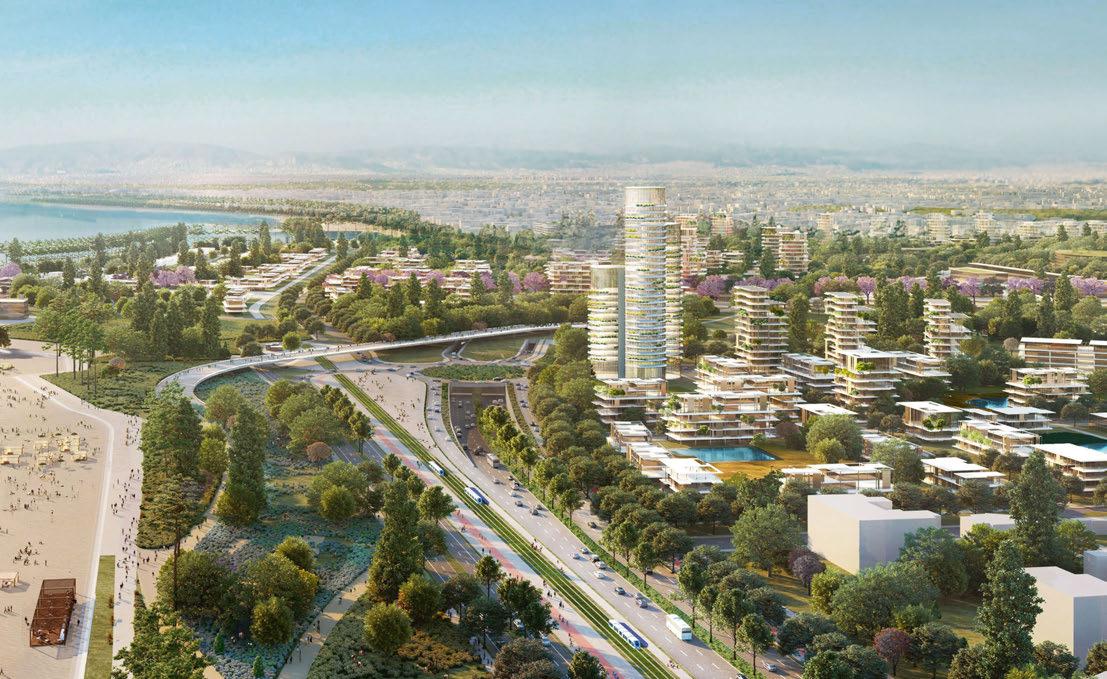
The hotel itself will comprise 123 guestrooms and suites, as well as 17 branded residences, ranging from loft apartments to waterfront villas. Accommodations will feature a contemporary design and offer views of the Aegean Sea, maximising the site’s location on the Athenian Riviera.
EXPRESS CHECK-OUT
Developer: Belt Riviera
Operator: Mandarin Oriental Hotel Group
www.mandarinoriental.com
In addition, a range of dining options will be offered across several F&B outlets, while indoor and outdoor events spaces are to provide an elegant backdrop for meetings and social gatherings. Elsewhere, the spa will showcase
Mandarin Oriental’s signature wellness therapies and beauty treatments, with a focus on locally inspired programmes.
“We are delighted to be working with Temes and Lamda Development on this project,” says James Riley, Group Chief Executive of Mandarin Oriental Hotel Group. “I am confident that, with this location and our legendary service, Mandarin Oriental Athens will be the leading luxury hospitality hub for both travellers and Athenian residents.”
Odisseas Athanasiou, CEO of Lamda Development, adds: “The new highstandard hotel complex will become another beautiful landmark and serve as an additional international point of reference for the emblematic investment of The Ellinikon.”
Mandarin Oriental Athens will be the brand’s second property in Greece, following the partnership with Temes for the development of Mandarin Oriental Costa Navarino.
DRAWING BOARD 046
New York | Los Angeles
maderasurfaces.com Custom Flooring. Integrated Millwork. Bespoke Furniture.
Photography by Eric Petschek
Photography by Angela Hau
Anantara Preá Ceará BRAZIL
Minor Hotels has revealed details of its second Anantara property in Brazil; set to launch in 2026, the eco-resort will be located in the state of Ceará on the country’s northeast coast.
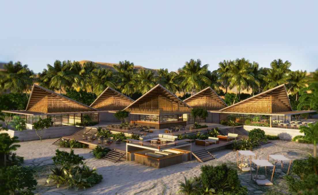
Developed in partnership with Grupo Carnaúba, the new venture comprises 60 guestrooms and villas, as well as 25 branded residential bungalows – some with their own private pools – and a 120m2 Presidential Suite. The site will also be home to a regional restaurant and an Anantara Spa, while the wider Vila Carnaúba development is to feature restaurants, bars, sports facilities and a gym –all of which are accessible by hotel guests.
EXPRESS CHECK-OUT
Developer: Grupo Carnaúba
Operator: Minor Hotels
Architecture and Interior Design: Miguel Pinto Guimarães
Landscaping: Embyá Paisagens & Ecossistemas www.minorhotels.com
Unfolding over 52,000m 2, the project’s design and décor have been created by Miguel Pinto Guimarães, a Brazilian architect known for envisioning contemporary schemes that harmonise with the natural environment and the beauty of the surroundings. The hotel’s construction will therefore focus on organic and
regional materials, with landscaping by Embyá Paisagens & Ecossistemas.
The sustainable and social initiatives of Vila Carnaúba, which is in the final stages of development, are an essential element of the operation. Initiatives include waste disposal and recycling, reforestation, the replanting of Carnauba Wax Palm Trees – a fan palm indigenous to northeastern Brazil – and supporting local food producers. Once the sun sets, there will also be reduced lighting to help preserve the sky’s panorama and minimise the impact on local fauna.
“In 2022, we announced Anantara’s first hotel in Brazil,” says Dillip Rajakarier, CEO of Minor Hotels and Group CEO of Minor International. “We are excited to follow this with a second Anantara in the country, demonstrating our commitment to expanding our footprint in Brazil with quality projects focused on preserving nature and the surrounding landscapes.”
DRAWING BOARD 048

GERMAN HOSPITALITY TRADITION Hotel Hair Dryers Cosmetic Mirrors Bathroom Accessories Guestroom Accoutrements MAX IMA www.aliseo.de
Rosewood
SEOUL
Rosewood Hotels & Resorts has been appointed by Korean real estate developer Eleven D&C Co to manage a newbuild hotel in the city of Seoul.
Set to open in 2027, the hotel will form part of The Parkside Seoul, a mixed-use development comprising an array of retail offerings and private residences, connected by expansive outdoor spaces.
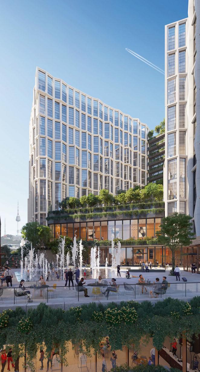
Occupying the former site of the United Nations Command, the hotel will channel the brand’s signature A Sense of Place philosophy, ensuring that the spirit of the destination is infused throughout the property.
Architecture by Kohn Pederson Fox is designed to blend the building seamlessly into its surroundings, while interiors will be courtesy of Space Copenhagen.
Along with 250 rooms and suites, the hotel promises a range of amenities including seven F&B venues and comprehensive wellness facilities. Asaya, Rosewood’s wellness concept, will offer 4,500m2 of space committed to health, beauty and wellness across multiple treatment rooms, hydrotherapy areas, an indoor pool and saunas, as well as a fitness centre and indoor golfing facilities.
Seok Oh Eum, Chairman of Eleven D&C, comments: “The combination of the dynamic charm of Seoul – a city where the past and the present coexist – and Rosewood’s guiding principles is sure to make Rosewood Seoul a new landmark, beloved by sophisticated travellers from around the world and Seoulites alike.”
EXPRESS CHECK-OUT
Developer: Eleven D&C
Operator: Rosewood Hotel Group
Architecture: Kohn Pedersen Fox
Interior Design: Space Copenhagen www.rosewoodhotelgroup.com
DRAWING BOARD 050
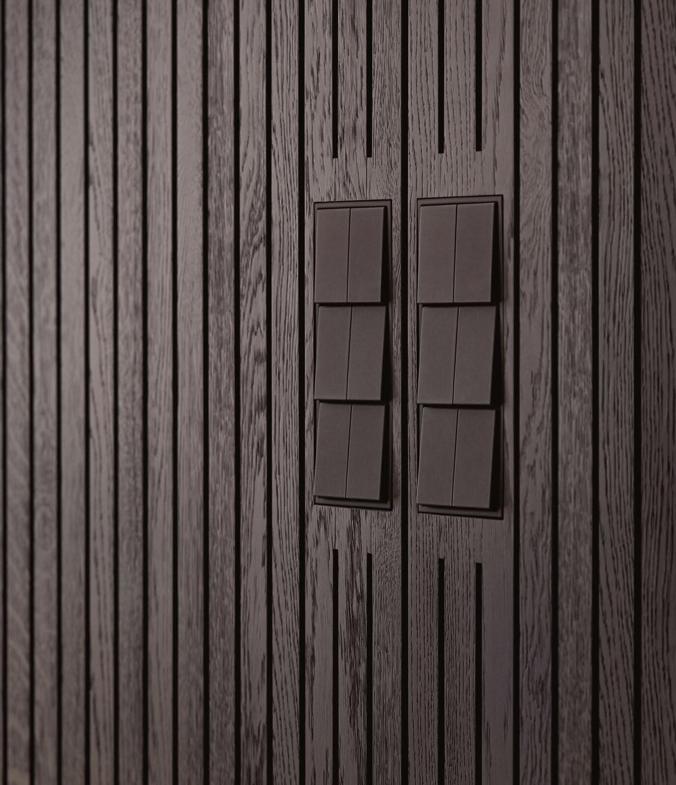
MADE TO TOUCH. DESIGNED TO CONTROL. LS ZERO – FLUSH-MOUNTED.
JUNG.DE You are welcome to visit us at: JUNG UK Showroom · 6 / 7 Albemarle Way · Clerkenwell · London Visit by prior arrangement: jung-group.com/london
Photographer: Stefan Grau, Interior: Thatenhorst Interior GmbH
Thompson Palm Springs CALIFORNIA
Hyatt Hotels Corporation has announced that Thompson Palm Springs will open its doors in late 2023.
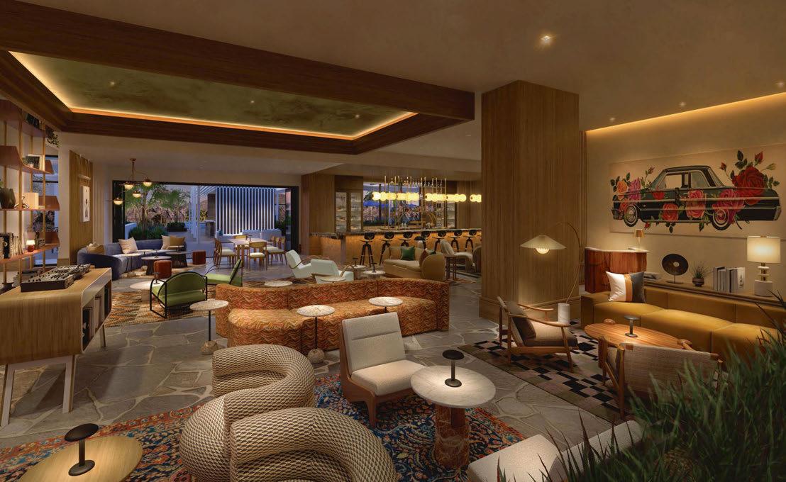
Developed by Dallas-based Hall Group with design by SMS Architecture and B2 Architecture + Design, the hotel comprises 168 guestroom bungalows, each with private balconies or outdoor spaces that allow guests to take advantage of panoramic views of the San Jacinto mountains and surrounding desert. Set amongst winding walking paths, extensive outdoor spaces include gardens and two swimming pools, immersing guests in the natural landscape of Palm Springs.
EXPRESS CHECK-OUT
Developer: Hall Group
Operator: Hyatt Hotels Corporation
Architecture: SMS Architecture
Interior Design: B2 Architecture + Design
Art Curation: Shore Art Advisory www.hyatt.com
Additional amenities across the hotel include a signature restaurant, indoor and outdoor bar and lounges, a spa and fitness concept, and approximately 8,000ft2 of meeting and events space. The development will also offer over 20,000ft2 of ground-level retail and restaurant space along Downtown’s Palm Canyon Drive.
The design scheme channels a Mid-Century Modern aesthetic, with a custom art collection curated by Shore Art Advisory on display throughout public spaces and guestrooms.
“The interiors of Thompson Palm Springs pay homage to the surrounding landscape, incorporating soft stone, light woods, and neutral furnishings that are beautifully contrasted with splashes of vibrant and dramatic colours from specially curated and commissioned artwork,” explain B2 Architecture + Design. “We’ve set out to tell a layered and playful design story with a mix of locally-sourced vintage furniture finds, modern pieces, handcrafted furnishings from across the world, and important art commissions.”
The launch will be followed by the opening of four additional Thompson Hotels by the end of 2024, with properties in Houston, Miami, Monterrey and Shanghai, the latter marking the brand’s entry into Asia Pacific.
DRAWING BOARD 052
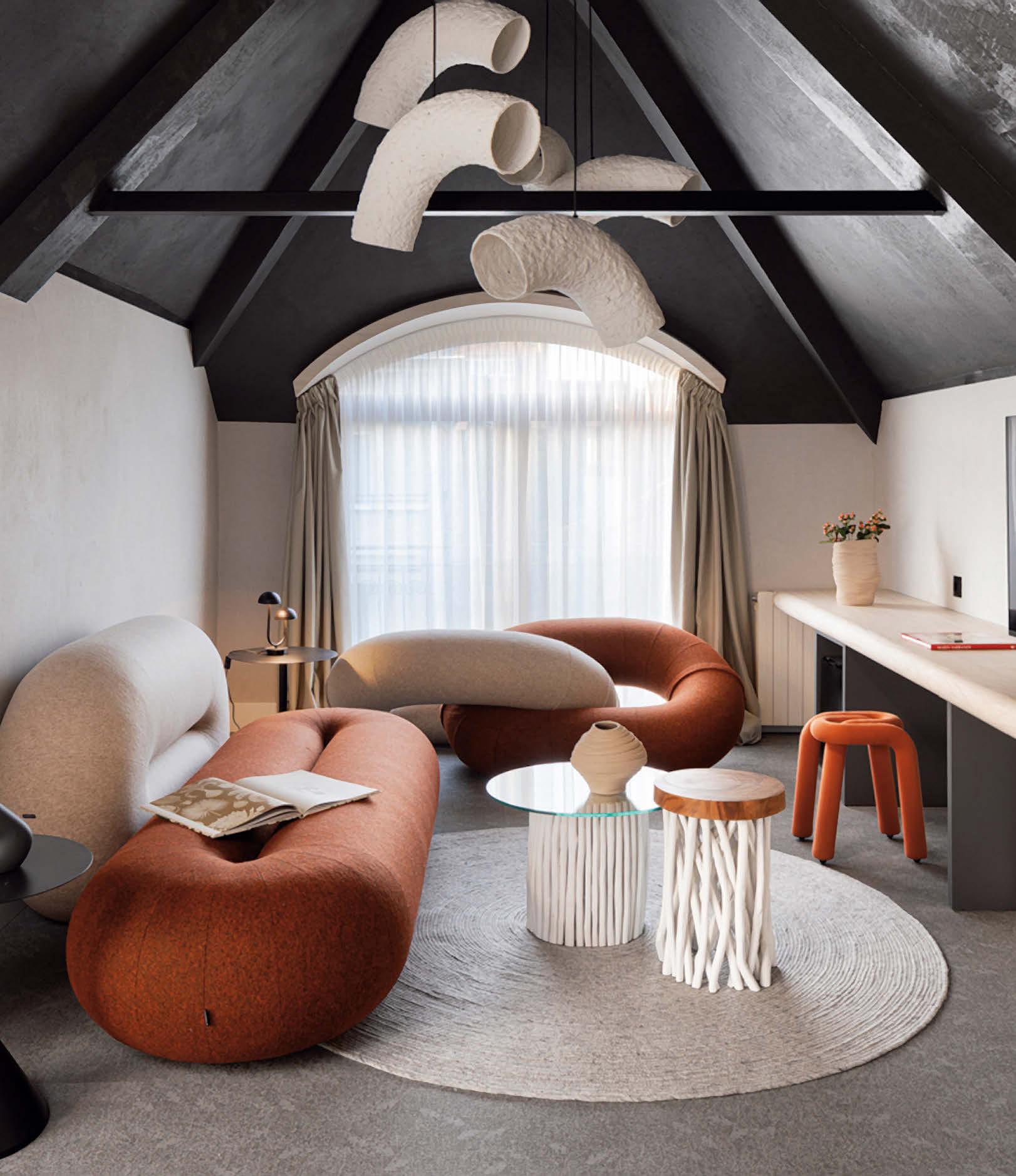
www.ligna-group.com
Boutique Art Hotel Oborishte 63
The Thread Guestroom

Meeting…
Radha Arora
As Rosewood Hotel Group looks ahead to its next phase of growth, the company’s President and Co-Chief Development Officer reveals why a measured approach will continue to prevail.
Radha Arora began his journey as President of Rosewood Hotels & Resorts in 2011. In the same year, Rosewood was acquired by Hong Kong-based New World Hospitality, which was subsequently renamed Rosewood Hotel Group, itself owned by Chow Tai Fook – a privately-owned and multifaceted conglomerate of several major business categories including jewellery, property development, retail, energy and telecommunications. It was an auspicious year that also saw Sonia Cheng appointed as CEO of Rosewood, the group where both her father and grandfather were patriarchs.
RHG has four brands. At the top of the pile is Rosewood, which numbers some 44 ultra-luxury hotels, resorts and residences in 20 countries. The other three are the upperupscale New World Hotels & Resorts; Asaya, an integrated wellbeing concept; and its latest launch Carlyle & Co, a fresh take on the private members’ club, recently launched at Rosewood Hong Kong.
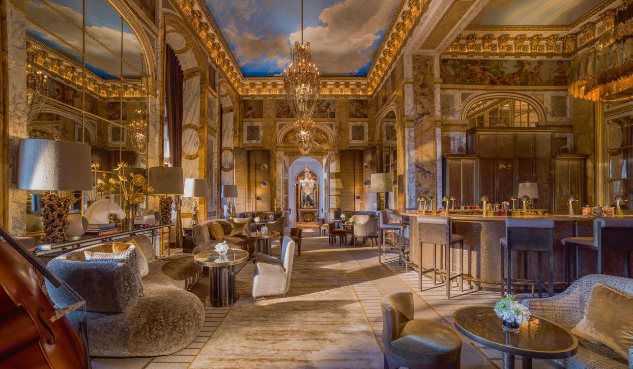
Arora’s first job in hospitality was in the laundry room of Paris’ iconic Hôtel de Crillon. Coming full circle, the same hotel became part of Rosewood in 2017 following a four-year renovation. In many ways, the hotel epitomises the path that Rosewood has followed. A landmark property fastidiously restored by a group of local specialists to create a timeless, modern classic. “Rosewood 2.0,” chips in Arora, speaking from his base in northwest Los Angeles in beautifully enunciated English. Son of an Indian ambassador, Arora
travelled the globe as child, picking up a world of hotel experience along the way.
Arora’s connection with the Cheng family goes back some way, having previously managed their asset, Beverly Wilshire, a Four Seasons Hotel. Following over 20 years of service with Four Seasons, Arora had risen to the role of Regional Vice President. “I had responsibility for nine properties, so it was an easy transition to the President role at Rosewood, as the group only had 16 hotels at the time,” he recounts of his appointment.
Rosewood 2.0 is a reference to the jump-start in design the new owners brought to the portfolio with the launch of five new properties, a mix of newbuild and renovations between 2013 and 2021. Strengthening the group’s global presence, the hotels landed in London and Beijing (both 2013), Paris (2017), Hong Kong (2019) and New York (2021). Between them, they have picked up a hatful of wins across multiple categories including Hotel of the Year at AHEAD Asia 2020 for the Hong Kong landmark. “We made a statement with these properties,” says Arora of the five guiding lights that epitomise Rosewood’s design style and ‘A Sense of Place’ philosophy. “Design is fundamental to everything we do,” he reaffirms.
“From its inception, Rosewood has always held true to the idea of residential design,” he narrates of the group’s first property, Rosewood Mansion on Turtle Creek. Located in an upmarket neighbourhood of Dallas, the private estate was transformed into a luxury hotel and restaurant by American
Words: Guy Dittrich • Portrait Photography: © Diana L Ragland
 © Adrian Houston
© Durston Saylor
heiress and philanthropist, Caroline Rose Hunt, who started the business in 1979.
Residential implies family, and for familyowned Rosewood, this is important. So too for Rosewood’s go-to designer Tony Chi, founder of tonychi studios, who was responsible for the interiors of three of the five ‘guiding lights’. For Chi, it’s personal – he designed a home for the Cheng family over 20 years ago. Together with his Asian sensibilities, he just got it. Keeping to the programme, Chi embraced the phrase “Rosewood 2.0”, referring to Rosewood London as a “mansion” and Hong Kong as an “estate on the harbour.”
The overriding ethos of A Sense of Place binds all the properties. Never doing things by halves, Rosewood has even trademarked the phrase.
Arora elaborates: “Our design choices are made with our guests in mind, ensuring that we’re immersing them in the given destination. It’s all about the people and the experience.” He also refers to the passion for design shared by not only Cheng but the entire design team, led by Executive Vice President Trish Luyckx.
This residential style, combined with the underpinnings of modern luxury while still capturing a neighbourhood spirit, can be seen in the design detailing – often, but not always – by local designers who have in-depth knowledge of the location. Details that include an emphasis on the work of native artists and artisans using traditional techniques and materials. Take the Parisian team of Aline Asmar d’Amman, Chahan Minissian, Tristan Auer and Cyril Vergniol for Hôtel de Crillon.
The designers used are not always local but always connected. For example, selecting Chi was an obvious choice for The Carlyle in Manhattan’s Upper East Side. “Tony has lived in New York for a long time and is a true New Yorker,” explains Arora. “He had a profound understanding of what The Carlyle ought to be moving forward to the next generation.” Similarly, Martin Brudnizki, who designed the
celebrated Scarfes Bar at Rosewood London, may not be from London but is also an adopted son of his chosen city.
Several of the properties, including The Carlyle, Rosewood Little Dix Bay in the British Virgin Islands, and the hotels in Hong Kong and Beijing, are also owned by the group. As the collection expands, Rosewood is becoming more operator focused. Nevertheless, the values seen in ownership are apparent across the whole portfolio. No shortcuts.
“We collaborate well with our owners, and when we sign opportunities together, there’s already a deeper understanding of what Rosewood will bring to their assets,” says Arora. “The internal team oversees the project from start to finish, ensuring the vision is fulfilled in collaboration with our valued partners, designers and ownership groups.”
Additional to the grandes dames of Hôtel
de Crillon and The Carlyle is Rosewood Le Guanahani St Barth in the French West Indies. There are also “new classics”, as they are referred to in press materials, such as Rosewood São Paulo, which was named AHEAD Americas Hotel of the Year in 2022.
Rosewood São Paulo is a good stepping off point for a discussion around Rosewood’s sustainability ideals, titled Rosewood Impacts. “We are working to redefine luxury to make it synonymous with responsibility and impact. That means evolving our definition of success to include empowering people and the part we play in sustaining the earth,” elaborates Arora.
The Brazilian property was carefully developed over 12 years through the lens of Rosewood Impact, from sourcing the majority of the design materials locally, to hiring for key positions from within the São Paulo community and providing indigenous groups with a platform to promote their work. “It was designed as a love letter to Brazil,” says Arora emotively, adding that it’s about uplifting and empowering those who call the destination home. The property is part of Brazil’s largest upcycling project and, a year after it opened, the site is operating on 100% renewable energy. Rosewood is grasping sustainable luxury through “a thoughtful approach to realising these goals in pursuit of setting a new bar across the brand,” says Arora.
Amongst the goals of this mission is the diversion of 70% of waste from landfills by 2025, with the ultimate target for zero waste. Another more locally inspired initiative is the provision of schooling to the children of underprivileged families and of employees at Rosewood Mayakoba, located on the Riviera Maya in Mexico. Having started out with a kindergarten, a high school has since opened and now children can continue their education through the property’s scholarship programme.
“It’s been an inspiration and motivation for us to do more of that in other parts of the world,” explains Arora.
057 MEETING…
“We are working to redefine luxury to make it synonymous with responsibility and impact. That means evolving our definition of success to include empowering people and the part we play in sustaining the earth.”
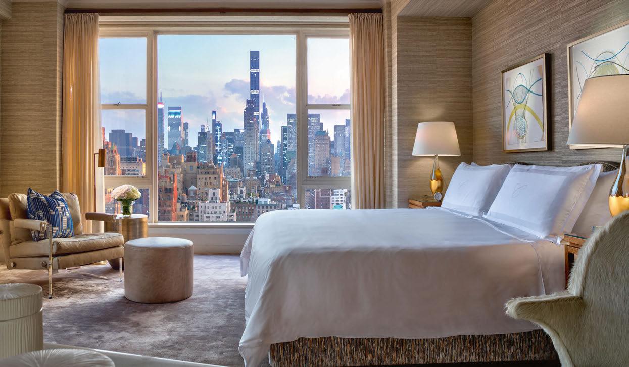
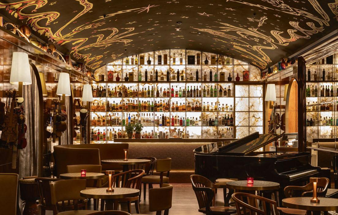
From Hôtel de Crillon in Paris (top) to The Carlyle in New York (bottom), Rosewood has stayed true to a residential style often inspired by the surroundings
And the world of Rosewood that lies ahead is in for rapid change. Three new hotels will arrive in the second half of 2023 – Hawaii, Doha and Munich – and six more are due for 2024 in Amsterdam; Riviera Nayarit and Polanco in Mexico; Miyakojima in Japan; Rome and Fuschlsee in Austria. Another five openings are expected in 2025, including a second in London, two in Italy – Venice and Milan – as well as debuts in Riyadh and Shenzhen. Can the group maintain this rapid rate of expansion whilst not taking its eye off the ball of the current hotels? Arora believes so: “Absolutely! The existing portfolio is the template for what happens in the future. It’s important to have that lineage between the two.”
Using The Carlyle as an example, he describes how the hotel underwent extensive renovations over seven years, during which time the world changed dramatically, meaning the group had to ensure the design was thought through. “These are showcases for our future projects,” he notes.
And whilst the pipeline may be impressive, Arora also recognises that Rosewood is a small organisation. “We keep our eyes on everything as the devil is in the detail. We all work together, ensuring that nothing is amiss with our current properties and going forward. We’re looking ahead to Rosewood 3.0.”
Rosewood’s measured path to the development of its design illustrates the longterm view typical of a family-owned business. One that cherishes residential qualities and uses some of the best in the industry – Bar Studio, French compatriots Jean Nouvel and Philippe Starck, Tara Bernerd, David Chipperfield, Joseph Dirand and Meyer Davis to name but a few. Rosewood is developing, as Arora describes, into “something that is extremely intangible”. Something that needs a certain sensibility and takes time to be both created and appreciated. Devilish details, the making of estates and love letters to destinations all speak of this considered approach. Here’s to Rosewood 3.0.
058 MEETING…
“Our design choices are made with our guests in mind, ensuring that we’re immersing them in the given destination. It’s all about the people and the experience.”
Designed by French compatriots Jean Nouvel and Philippe Starck, Rosewood São Paulo was carefully developed over 12 years through the lens of Rosewood Impact, the group’s sustainable ideal

+44 (0) 1332 497111 | info@hypnoscontractbeds.com | hypnoscontractbeds.com Carbon Neutral, 100% Sustainable and Recyclable COMFORT WITH INTEGRITY HOSPITALITY SLEEP SOLUTIONS
PROFILE
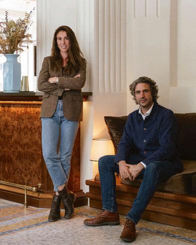
Louis and Anouk Solanet Co-founders, Orso
Having gained experience in hotel management through the family business, Louis and Anouk Solanet launched the Orso brand in 2020, and have built a sevenstrong portfolio across Paris. With an eye for design and a steadfast commitment to the core values of hospitality, the husband-and-wife team work closely with collaborators to curate every aspect of their hotels, from the interiors and brand identity to the warm welcome on arrival.
Portfolio:
Hôtel Doisy (2017); Hôtel Léopold (2019); Hôtel Cabane (2020); Hôtel Rochechouart (2020); Hôtel Ami (2021); Hôtel Wallace (2021); Hôtel Orphée (2022)
Meeting… Louis and Anouk Solanet
Following the opening of Hôtel Orphée in 2022, the Paris-based founders of Orso discuss family, design flair and the future.
From low-cost lodgings to palatial grandes dames, Paris has a vast and varied inventory of hotels, catering to every demographic, every taste and every budget – it is, after all, one of the most-visited cities in the world. But amongst the single-property independents and multi-brand portfolios, one couple are doing things a little differently, building a modest collection of hotels that combine good design with the good old-fashioned values of hospitality.
FAMILY FIRST
Meet Louis and Anouk Solanet, the husbandand-wife team behind Orso. Based in Paris, the duo describe their journey as a family story, beginning with Louis’ father, Jean Solanet, who ran a hotel management firm and can be credited with the success of the Campanile brand, which saw rapid growth through the 1980s. “When I returned to France from studying abroad, I had the opportunity to work with the family to help develop the business,” explains Louis, admitting that at the time, he had no intention of a career in hospitality. Anouk was also following her own path, relocating to Paris from the Netherlands, where she worked for an international law firm. It was here she met and married Louis, and soon stepped into the family business.
“We spent work and holidays visiting the hotels we managed, but they weren’t always in the best
areas of a city,” says Louis of their travels, first as a couple, then as a family with young children. “We then realised that we wanted to develop our own brand and create a hotel that we would like to visit ourselves.”
The opportunity came in the form of an existing hotel in the 17th arrondissement, not far from the Champs-Élysées. “It was a chance to combine our own interest in design with the experience we have from the franchise hotels,” Anouk explains. “Our aim was to create a more personalised, family-friendly brand.” And so Orso was born.
A WARM WELCOME
“The inspiration for Orso came from our own experiences; we stayed at a lot of different types of hotels, guesthouses and even with friends, and what we remembered most was the warm welcome,” continues Anouk. “We wanted to offer that same kind of welcome in our own hotels.”
On a mission to restore the core values of hospitality, the duo reveal that good manners, simplicity and generosity are at the heart of Orso, along with a style of service that only comes from the human touch. Welcoming guests as friends rather than another anonymous booking makes for a homely arrival, as does the aroma of freshly-brewed coffee and a slice of homemade cake. Other details feed into the ethos too: the
060
Words: Catherine Martin © Ludovic Balay
breakfast offer is made up of quality produce from the local boulangerie, and specially curated neighbourhood guides pinpoint bars, cafés, restaurants and boutiques that are frequented by Parisians rather than tourists. For younger guests, games, colouring sets and a dressing-up box are provided, and come nightfall, a bedtime story helps them drift off to sleep.
DESIGN DNA
The design of Orso’s hotels is also likened to a family. “We see them as members of the same family, each with their own personality, style and identity,” reveals Louis. “They are all very different, yet linked through the same DNA.”
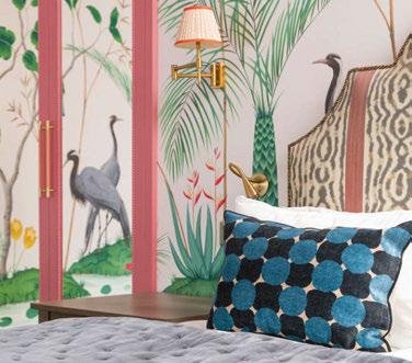
For example, at Hôtel Ami in the 15 th arrondissement, Gesa Hansen has brought her minimalist Nordic style; Hôtel Wallace by Hauvette & Madani channels retro-chic; Hôtel Orphée by Éloïse Bosredon plays with geometric shapes and block colour; and at Hôtel Léopold in the heart of the Montparnasse district, BR Design pay tribute to the Roaring Twenties with a rich colour palette, bronze detailing and statement headboards. Each is distinct. “We don’t want to create the same product every time, so we look at the architecture of the property, the history of the area and the characteristics of the immediate neighbourhood, then choose an interior designer who we feel is the best fit for
that particular project,” Anouk continues, adding that a close relationship with École Camondo, an interior architecture school in Paris, has been key to finding new talent. “We like to work with people who haven’t designed a hotel before,” Louis picks up. “They are very enthusiastic and are open to fresh ideas; there are no limitations to their creativity.”
Preferring to collaborate directly with small studios and individual designers, it’s clear that Louis and Anouk are closely involved in every aspect of bringing new properties to life – they have even developed their own fragrance and skincare line using wild fennel from Corsica, as well as pre-mixed cocktails that are available to purchase. They are meticulous in their approach to selecting a designer too, first observing them from afar, then meeting up in person to ensure there’s a synergy between them. Rigid design briefs are not part of the process, however. “At the beginning, we ask for a moodboard to ensure the style and quality aligns with what we have in mind,” says Louis. “Then we like to give them the freedom to express their creativity.”
This freedom has resulted in original and imaginative interiors. At Hôtel Cabane – cosy cabin-style lodgings designed as a haven in the city – interiors have been furnished with vintage and second-hand pieces from Selency. And at Hôtel Rochechouart, Festen recently returned
to create the interiors for seductive basement bar Mikado, having renovated the guestrooms and restaurant in 2020. The property also features a newly-opened oyster bar, Citrons et Huîtres, where Marion Mailaender has utilised a cyanotype printing technique to envelop the space in dramatic blue tones.
MAKING MEMORIES
As Orso’s largest property to-date, Hôtel Rochechouart signifies the future direction of the brand, with Louis and Anouk actively looking to expand. “We opened seven hotels in two years, so it was very quick,” points out Louis, stating that the rapid growth was very much opportunistic. Now the Orso name is established, the duo are being more strategic in their growth, both in location and key count. “We’re looking to develop four-star properties with more guestrooms and larger common areas, which isn’t so easy to find,” he continues. “We would like to expand further in Paris, but also outside of France, to city centre locations around Europe.”
Despite the growth potential, the duo remain committed to their core brand values of welldesigned spaces and a warm welcome. “There has to be a nice ambiance and a story behind the design,” they conclude. “Then it’s all about the neighbourhood and the people; that’s what the best hotel memories are made of.”
061
© Pierre Musellec
MEETING…
Allen Chan, Anwar Mekhayech and Matt Davis founded DesignAgency in 1998, combining their expertise in architecture, engineering and landscaping. The firm now has a team of 115 working across design studios in Toronto, Washington DC, Los Angeles and Barcelona.
25 Years Of DesignAgency

Upon celebrating a milestone anniversary, the Founding Partners of DesignAgency discuss the past, present and future of hospitality design.
Aquarter of a century after DesignAgency’s inception in Toronto, the studio’s Founding Partners Allen Chan, Anwar Mekhayech and Matt Davis reveal more about the journey so far.


ON THE INITIAL VISION
AC: Since the very beginning, we envisioned a design studio that functioned at the crossroads of various disciplines. We were inspired in part by some of the prolific creative studios of the past including the Eames Office. Our academic backgrounds are Architecture (Allen), Engineering (Anwar) and Landscape Architecture (Matt), but our passions have always stretched much further to travel, food, art, graphic design, branding, industrial design and music.
AM: When we founded DesignAgency in 1998, we were already good friends – Allen and Matt met at school, and Matt worked at my family’s restaurant during his thesis year. We had discussed launching a design studio together when I was offered the opportunity to open a bistro called SpaHa – that was the catalyst for us.
ON ITS EVOLUTION
AC: We each have our strengths, and those have continued to gel over the past 25 years, both creatively and in terms of running the studio. But it’s no longer just the three of us – we now have a team of 115 people in studios around the world, including Toronto, Washington DC, Los Angeles and Barcelona.
AM: As our team has grown, so too has the scope of our work. We have ramped up our services to focus on creative strategy, design thinking, branding and graphic design, and we work with many clients in the early stages of their projects. Today, we have so much more experience than when we started, but we’re still always asking ourselves how we can be better, think better and design better.
MD: Expanding our footprint to include studios in Europe and key US cities has been important in terms of how we work, because it allows us to maintain our collaborative approach. Today, we have projects all over the world, yet we continue to work closely with our clients as well as local artists, craftspeople and suppliers. We enjoy fostering relationships with fabricators and artists to develop bespoke furnishings, lighting and art installations. That dynamic remains integral to our DNA.
ON MILESTONE HOTEL PROJECTS
AM: Looking back, we’ve had a series of big breaks that have helped us grow. Some significant milestones have included the opportunity to collaborate with Nick Jones and his design team on Soho House Toronto. Generator was another brand that catapulted us into the global hospitality market. I would also include the
062
recent expansion of The Drake in Toronto as a meaningful hotel project. The property made history when it opened as the city’s first design hotel and the new phase gave us the chance to help reimagine it for the future. Uniquely, almost every member of our design team lived in the neighbourhood. Our knowledge of the area and the building’s history had a profound influence on every decision, from choosing materials to identifying local collaborators.
AC: We’ve grown our portfolio in the lifestyle and luxury sectors to include brands like St Regis, Ritz-Carlton and Hilton, working on multi-phase transformations as well as newbuild projects. The Dalmar in Fort Lauderdale was our first newbuild hotel, where we were not only the designers but also the creative lead.
MD: Looking ahead, there are projects underway that I anticipate will be future milestones. We first partnered with Pendry Hotels & Resorts to craft a creative direction and design language for Pendry Washington DC – The Wharf, which opened in late 2022. We’re thrilled to be partnering with the brand again to transform a 1912 Manor House – located on 90 acres of rolling hills in Somerset County, just outside of New York City – into Pendry Natirar. We are also embarking on collaborations with Accor and Four Seasons Hotels & Resorts, and we look forward to sharing more about those soon.
ON CHANGES IN HOSPITALITY DESIGN
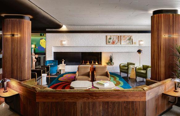
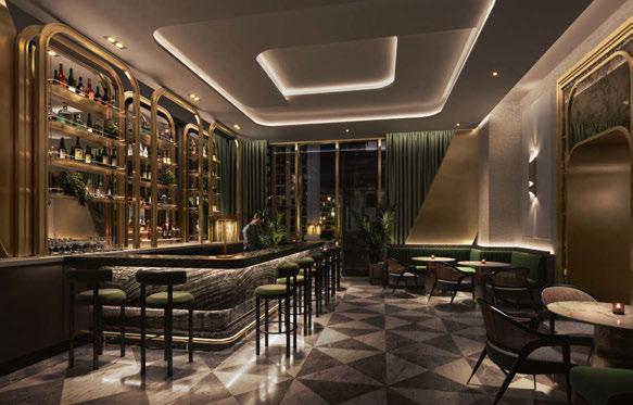
AM: The pace of projects and expectations of clients have changed due to technology and visualisation tools. Clients and end-users are much more design savvy than before and we’ve continued to treat the design process as a creative business strategy model, developing experiences and interiors that fit a business plan yet also function well and look great.
MD: We’ve found that the role of the interior designer has
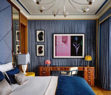
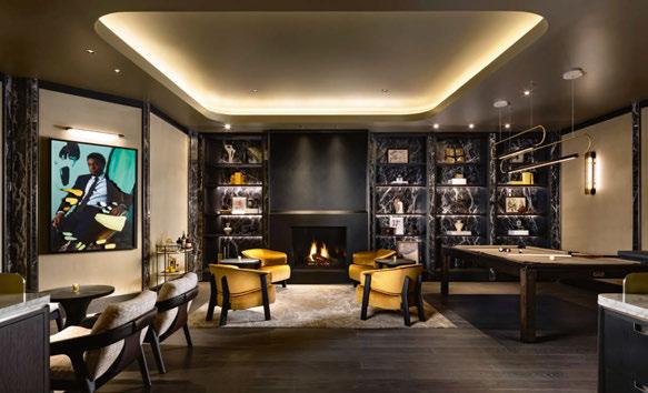
Top to bottom: The Drake demonstrates DesignAgency’s localised approach; The Ritz-Carlton Toronto reflects the studio’s role as a creative lead rather than a consultant; and Andaz Toronto will champion its focus on the user experience
063
MEETING…
“The role of interior designers has shifted and become more significant in the business model, moving from consultant to creative lead.”
MATT DAVIS
shifted and become more significant in the business model, moving from consultant to creative lead. 25 years ago, an interior designer was brought on after the model was figured out, but now we’re involved in the early conceptual stage, which affects focus and budgeting. It’s about setting the overall tone and using design to enhance the user experience.
ON THE NEXT 25 YEARS
AM: There are many opportunities to use design to change, grow and improve while maintaining our core values of designing with passion and purpose, leading the pack and bringing people together. Diversity is strength. We’ll always love to take on projects that involve reinvention and challenging the status quo.
AC: We are constantly exploring projects in different sectors and geographies, and I suspect that will still be true 25 years from now.
ON HOTEL DESIGN IN 2100
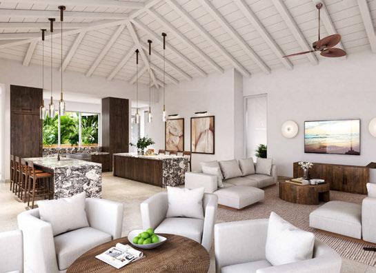
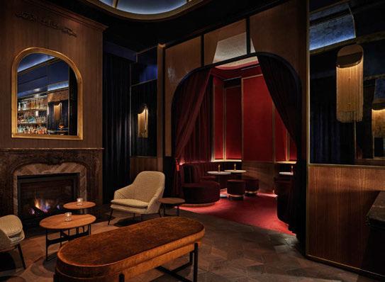
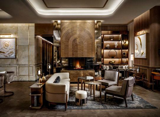
MD: Over the past decade, we’ve seen some unpredicted shifts from disruptive companies as well as market, technology and consumer-driven influences – not to mention the pandemic. The climate crisis and the environmental impact of travel is also an important conversation, with sustainability playing an ever-increasing role in hospitality. All these things will change the way the coming decades shape up.
AC: I don’t know if anyone can predict what hotels will look like in 2100, but as designers, we must plan for the future. It’s clear that sustainability and technology will play a huge role in how we think about design and experiences. Wellness is also here to stay, and as the world gets smaller, travellers will be looking to differentiate one experience from the next. We’re already seeing luxury redefined in more personal and experiential ways. How that all shakes out will be interesting to see and contribute to.
064
Top to bottom: The St Regis Toronto highlights DesignAgency’s renovation expertise; Pendry Washington DC embodies its deep-rooted DNA; and Montage Cay will showcase the studio’s adaptability
“I don’t know if anyone can predict what hotels will look like in 2100, but as designers, we must plan for the future.”
MEETING…
ALLEN CHAN

VINCENTSHEPPARD.COM KODO
SHOWROOM
COLLECTION
KORTRIJK, BELGIUM
WWW.DECOR-WALTHER.COM BATHROOM ACCESSORIES SERIES MIRRORS LIGHTS HIX EVENT 2023 LONDON 16-17 NOVEMBRE 2023
THE LOBBY
Exactly As Nature Intended
The integration of biophilic principles into hospitality design has flourished in recent years, cultivating an environment that aims to better connect guests to the natural world. The approach has come a long way since the early days of a few potted plants sitting lonely on the windowsill, with green façades, living walls and garden rooms amongst the initiatives that contribute to a healthy built environment.
At 1 Hotel Mayfair, Patrick Nadeau has taken a different approach, combining interior architecture with nature for his own style of ‘vegetal design’. Working with SH Hotels & Resorts and designers GA Group, the Paris-based atelier dressed an illuminated dome with 50,000 strands of Tillandsia Usneoides, a type of moss that typically attaches to trees in the tropics. More commonly known as air plants, they are able to
grow without soil, absorbing moisture and nutrients from the air around them and changing colour as they blossom. The result is a living, breathing chandelier that serves as the dramatic centrepiece of the lobby.
Through the combination of botany, design and human sciences, Nadeau’s objective is to improve quality of life in interior spaces, a philosophy that aligns perfectly with the 1 Hotels brand promise to bring the outdoors in and celebrate the beauty of nature. In total, 1 Hotel Mayfair houses 1,300 individual plants, shrubs and trees across more than 200 local and regional species. Thankfully, following a recruitment drive for ‘nature creators’ there are now three members of staff dedicated to watering, trimming and tending to the greenery, ensuring it continues to thrive exactly as nature intended.
© Jon Day
Play Don’t Pay
Birch collaborates with Joy Bomb London to create a playful pop-up at its new hotel and members’ club in Selsdon.
As brand collaborations go, Joy Bomb London’s latest link-up with hotel and members’ club Birch is one that will certainly catch the eye. Inviting visitors into a whimsical world where the conventions of traditional commerce are gleefully subverted, the immersive art experience encourages guests to reconnect with their creative side as they shop their worries away.
Making its mark between the reception desks and signature restaurant Elodie, with a playful palette that is detached from the otherwise minimalist aesthetic, JoyMart is a celebration of spontaneity, imagination and the wonders of being fully present in the moment. Shoppers can grab a trolley and wander the aisles with Store Manager Panda, taking in the guilt-free goodness of play without paying a penny; the only currency in the till here is imagination.
The aim of the JoyMart experience is to foster a culture that cherishes the value of playfulness, not only for children but for adults too. According to Joy Bomb London, play unlocks many
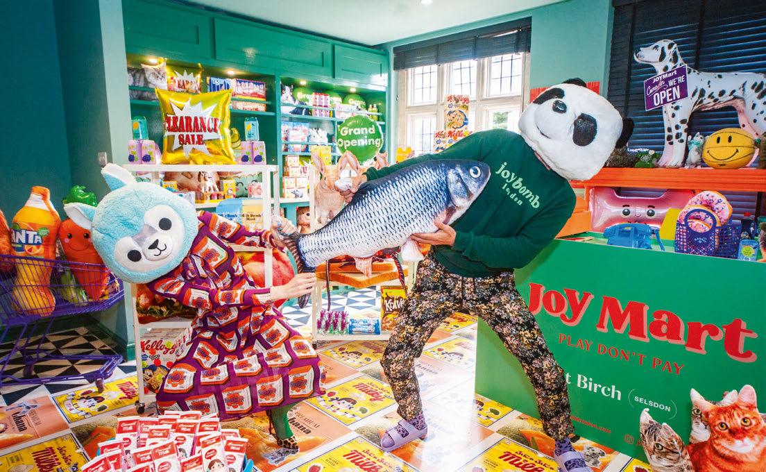
scientifically proven health benefits including stress and anxiety reduction, improved mood, better problem-solving skills and cognitive function, as well as increased emotional resilience. Imaginative play also encourages a sense of creative community and connection, which neatly aligns with Birch’s brand ethos.
“Through this installation, we hope to provoke a reflection on the ways in which our society prioritises material wealth over the intangible richness of lived experiences,” explains Amy Broch, founder of Joy Bomb London and Chief Joy Officer, who draws on childhood nostalgia, pop culture and her own imagination to transform ordinary spaces into site-specific interactive installations, or “mini worlds” as she puts it.
“By questioning the prevailing notion that value is synonymous with monetary exchange, we seek to inspire a shift in perspective – one that celebrates the transformative power of play and prompts us all to re-evaluate the true sources of joy and fulfilment in our lives.”
THE LOBBY 068
Colour calling
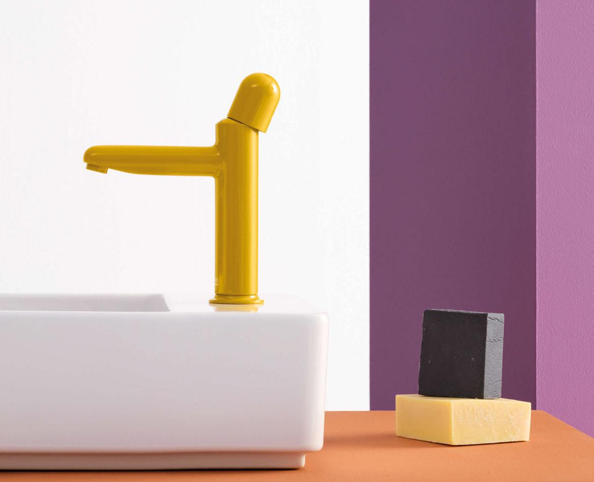
Nu faucets represent a purity of visual expression and a synthesis of essential design elements: form, shape and colour. A collection that strips away the artifice to arrive at the essence of its timeless design.
roca.com/nu
Nu Collection
À La Mode
Hotels are staying abreast of the latest trends, partnering with fashion houses for a stylish series of pop-ups.
Ever since Versace put its haute couture stamp on the hospitality sector – in the form of a lavish palazzo on Australia’s Gold Coast – hotels have continued to forge partnerships with luxury fashion houses, hoping to attract the most stylish of guests.
The likes of Armani and Bulgari have branched out into branded hotels; Missoni has tailored its colourful knitwear for interiors; and, more recently, Karl Lagerfeld’s characteristic style has come to grace a hotel-within-a-hotel at Grand Lisboa Palace Resort in Macau.
But for those cautious of investing in an allout fashion-forward fad – they are notoriously fleeting, after all – there are other ways to draw on the allure of a big-name design house; bringing the glamour of the catwalk, pop-ups are the latest en-vogue trend to hit the mainstream.
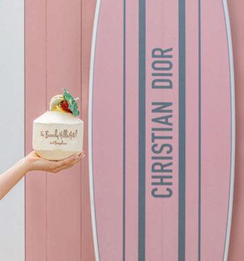
Summer 2023 has seen Louis Vuitton land at Zuma Mykonos, where the hotel’s pool and daybeds have been emblazoned with signature LV monograms alongside a summer boutique. Valentino has customised Palazzo Avino’s beach club, bringing its signature red to the Italian riviera through custom sun loungers and parasols. And Dior has flown its Toile de Jouy across the globe, in the form of a perfectly pink café and art installation at Four Seasons Resort Bali at Jimbaran Bay, following the brand’s poolside stint at The Beverly Hills Hotel.
Others are taking a different approach, opting to host special one-night-only events. Hotel Cala di Volpe on Costa Smeralda, for example, staged a catwalk show to spotlight Bulgari’s new jewellery collection, while Pillows Maurits at the Park

recently held a night of glamour in collaboration with Vogue Netherlands.
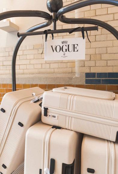

“Hotels and fashion brands complement each other perfectly since they both target the same audience without competing,” says Haris Stavridis, a former Vogue editor and the founder of Globe & Trotter, a boutique PR agency that focuses on brand partnerships. Having collaborated with the likes of Missoni, Assouline and Elite London, Stavridis knows all too well the power of the perfect partnership. “Pop-up boutiques within luxury hotels add a desirable point of sale for brands, with holidaying guests relaxed and ready to spend. Not only that, but such collaborations produce high-quality content that is shared widely on social media, spreading the word to guests’ social circles and beyond. The potential for huge exposure makes it a win-win situation for everyone.”
There are risks however. “As hotels increasingly partner with fashion brands, the novelty factor can wane,” Stavridis notes. “Heavy usage of logos risks becoming too loud, repetitive and predictable. The solution – especially for pop-up spaces – is a more creative and localised approach adapted to each hotel. That’s the magic.”
Mutually beneficial, hotel and fashion collaborations tap into the retailer’s desire for experiences that go beyond high-street stores, while bringing a new USP to hotels looking to take their offerings to new heights. For fashion fanatics who are after more than just a handbag, hotel operators have the power to give them the whole haute couture package by keeping their fingers on the fashion pulse.
© Audrey Ma
© Iris Ooms / Presstigieux
© Iris Ooms / Presstigieux
devon-devon.com
Mamula Island
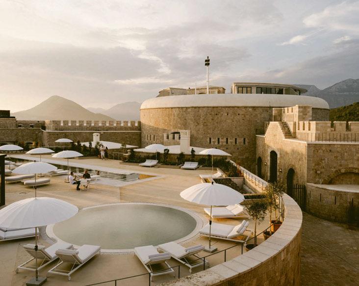
A historic fortress guarding the Bay of Kotor is transformed into a luxury hotel, featuring interiors the foster a sense of serenity.
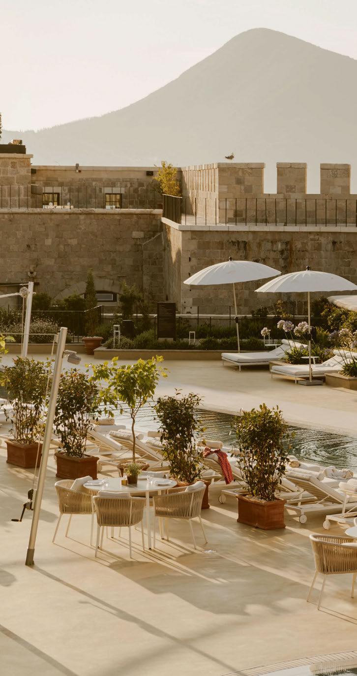
On the sailing over to Mamula Island, a 19th-century fortress emerges majestically from the rocky outcrop, its imposing walls growing ever mightier on the approach; it’s easy to see why enemies once feared these waters. Set in the Adriatic Sea off the coast of Montenegro, the fort has a chequered history, having been commissioned by Austro-Hungarian general Lazar Mamula to guard the Bay of Kotor and defend against attack, before serving as a barbarous concentration camp under Mussolini’s regime through World War II. Since then, it has been left to ruin, neglected and vandalised, haunted by its turbulent past. But the vision of Egyptian businessman Samih Sawiris has ushered in a new era, bringing a sense of serenity to the site through its transformation into a luxury hotel. As the former CEO of Orascom Development Holding, Sawiris is no stranger to developing and operating hotels, and, having fallen for Montenegro’s charm, set about embarking on his passion project. After presenting his scheme to the government, a lease was granted in 2015, and, with Mamula Island forming part of a UNESCO World Heritage Site, the agreement was based on the condition that the fort’s historic importance be preserved. This meant that crumbling brickwork was to be repaired and cleaned; new architectural interventions had to be in keeping with the original structure; and when a series of frescoes were discovered beneath layers of concrete during construction, they were to be painstakingly restored in a process that took six months. Every aspect had to be approved by Montenegro’s Ministry of Culture. To
072
MONTENEGRO
Words: Catherine Martin • Photography: Courtesy of Design Hotels
073
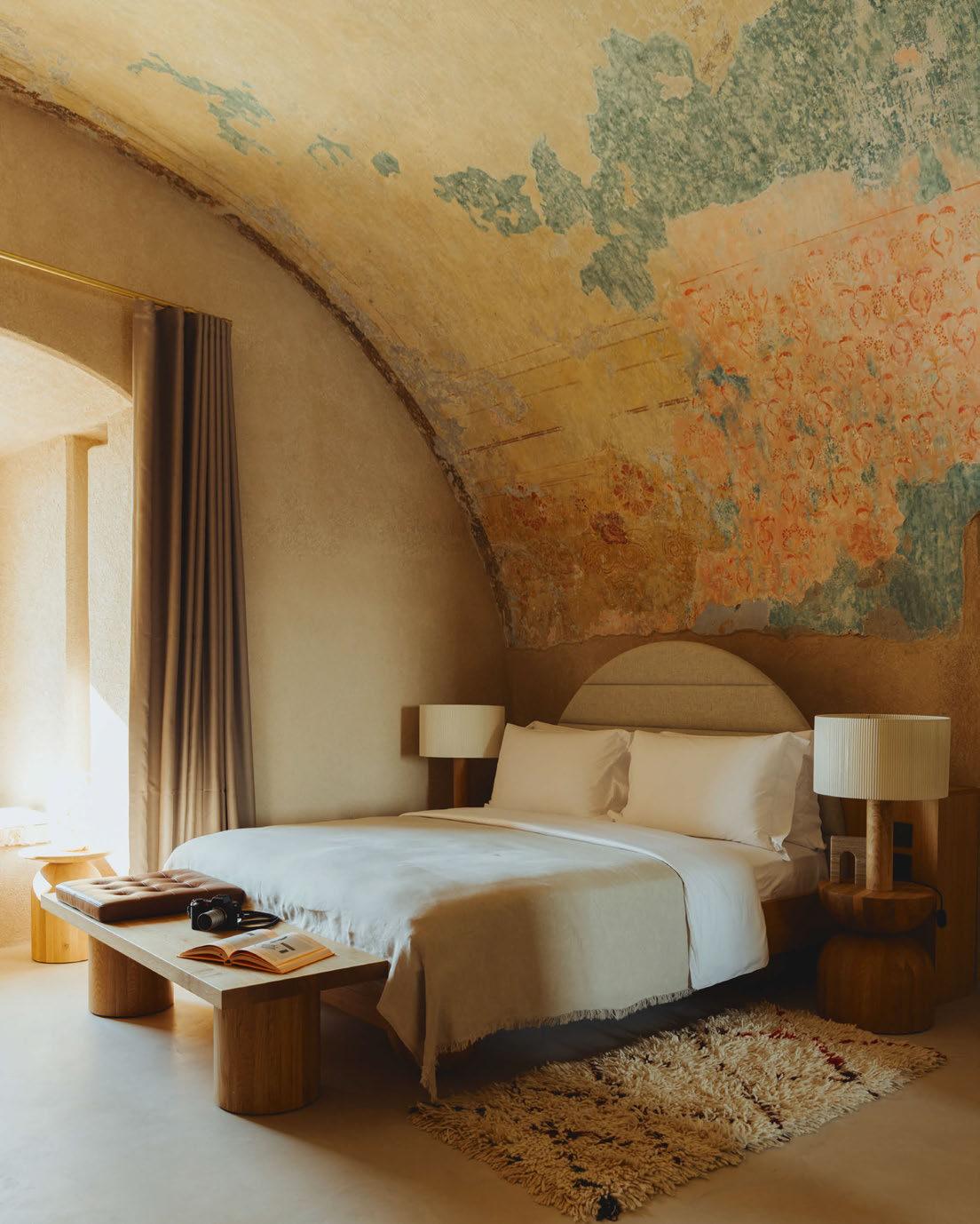
A series of frescoes discovered beneath layers of concrete during construction were painstakingly restored to become a feature in the suites
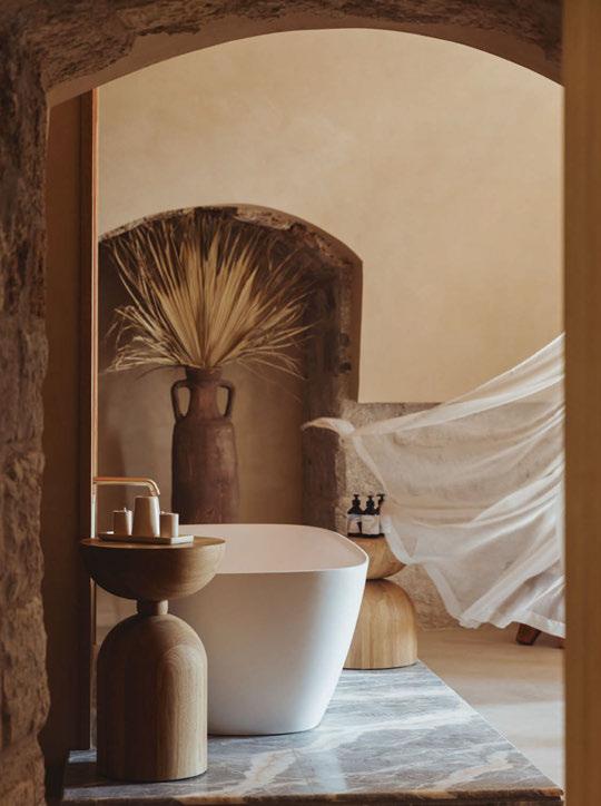
demonstrate his commitment to the heritage of the island, Sawiris has also created a memorial gallery featuring nautical charts and photographs from the archives, whilst a mounted plaque commemorates those who spent time incarcerated there.
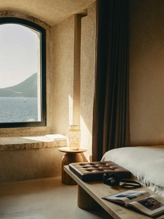
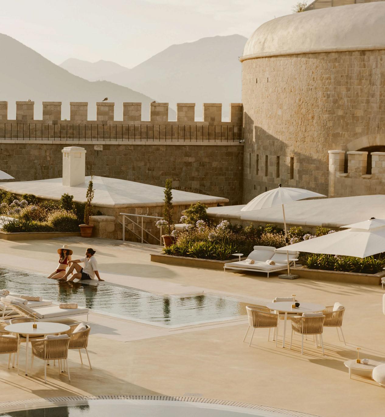
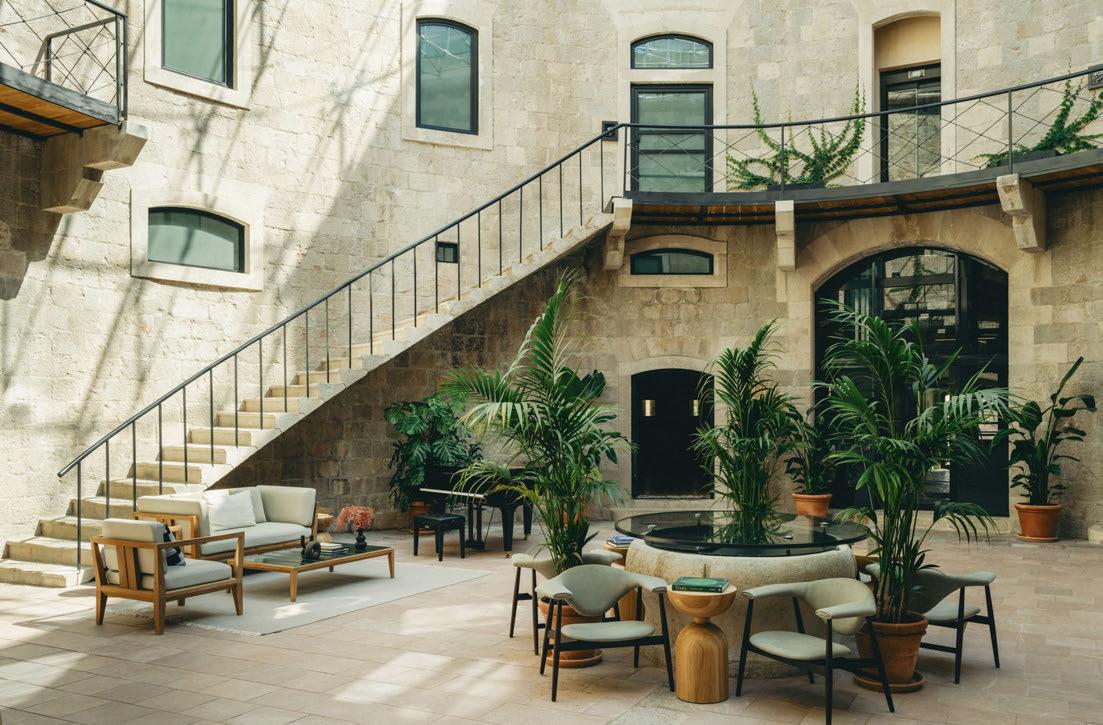
On entering the fort – via a steeply inclined electric buggy ride from the jetty – there’s no doubting the structure’s former use, its drawbridge still intact and counterweight and pulley mechanisms on display. Arriving guests are whisked up to the summit of the site to bask in the shade of a Mediterranean pine tree, and it’s from here that the resort can be seen in all its glory, with guestrooms and suites primarily spanning the perimeter, a spacious pool deck at the centre, and the dominant circular tower now housing the spa. The thick sturdy walls of the original fortress remain, as do the arrowslit apertures and distinctive battlements –the gaps that once allowed for the launch of projectiles from within the defences. Look closely and there are newbuild elements too, such as the addition of two panoramic suites on the upper level of the tower, as well as a series of garden rooms that perch atop the perimeter walls and look out to the landscape;
so sensitive are these extensions that they appear as part of the original build. Taking a more contemporary approach is the poolside restaurant, an all-glazed insertion with wraparound bi-folding doors to make for an indoor-outdoor eatery.
Leading on the architectural elements, Lisbonbased MCM Architecture & Design worked closely with the authorities through the restoration process and in planning the newbuild components, while WeStudio was brought in to create the interiors. Appointed in 2021 when construction was already well underway, the practice was tasked with developing a holistic design concept that extends to the furniture and finishes, having caught the eye of Sawiris for its work at The Cōmodo in Bad Gastein. “Our goal was to create a holistic resort in which everything looks like it comes from one hand – the public spaces, the guestrooms, the old, the new – using the same materials, the same shapes and the same colour palette,” explains Piotr Wisniewski, co-founder of We Studio, adding that these elements come together to form an environment where guests feel connected to the location.
Though the interior planning and position of
074
075
Arches, a feature of the original architecture, have been used in various ways to develop a consistent design language
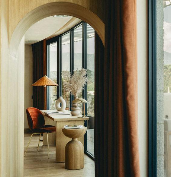
plumbing and lighting was already determined, We Studio was given free rein to develop a design concept, the only stipulation from Sawiris being that it had to feel luxurious. “Everyone has a different idea of luxury, so I wanted to do what is right for the location,” Wisniewski continues. “For me, that meant taking an honest approach and using durable and luxurious material in a simple way.”
The honest approach sees a selection of natural materials including solid oak, aged brass and different types of stone feature alongside a colour palette that harmonises with the landscape. Upholstery is breathable and organic in earthy tones of olive and ecru; even the plaster is at-one with nature, a process that involved colour-matching to the island soil. We Studio also looked to cultural references and artisanal techniques for inspiration; giant terracotta amphoras – urns that are part of the heritage of this region – stand tall in every corner, while artworks and pottery have been commissioned from local studios.
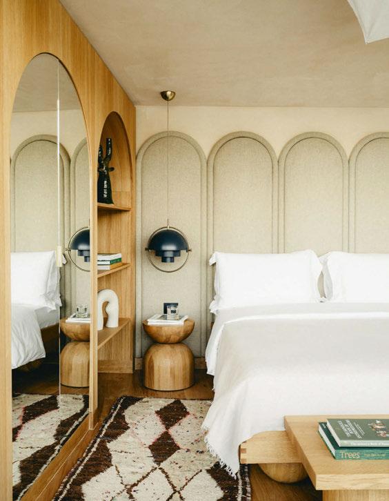
Perhaps the most prominent reference to the location is in the humble arch, a feature of the original architecture that has been used in various ways to develop a consistent design language. Not only does it form the shape of the suites with the ceilings gently curving overhead, window openings and doorways follow the same contours too. “As I designer, I tend to stay away from trends and over the past year, arches have been used everywhere as a motif,” explains Wisniewski. “But for this project, it is a motif that I can justify; it’s not just aesthetic, there’s context.”
Circles and curvilinear forms are also prevalent throughout the interiors in honour of the fortress’ floorplate, with its
076
LIGHTING FOR LIFE
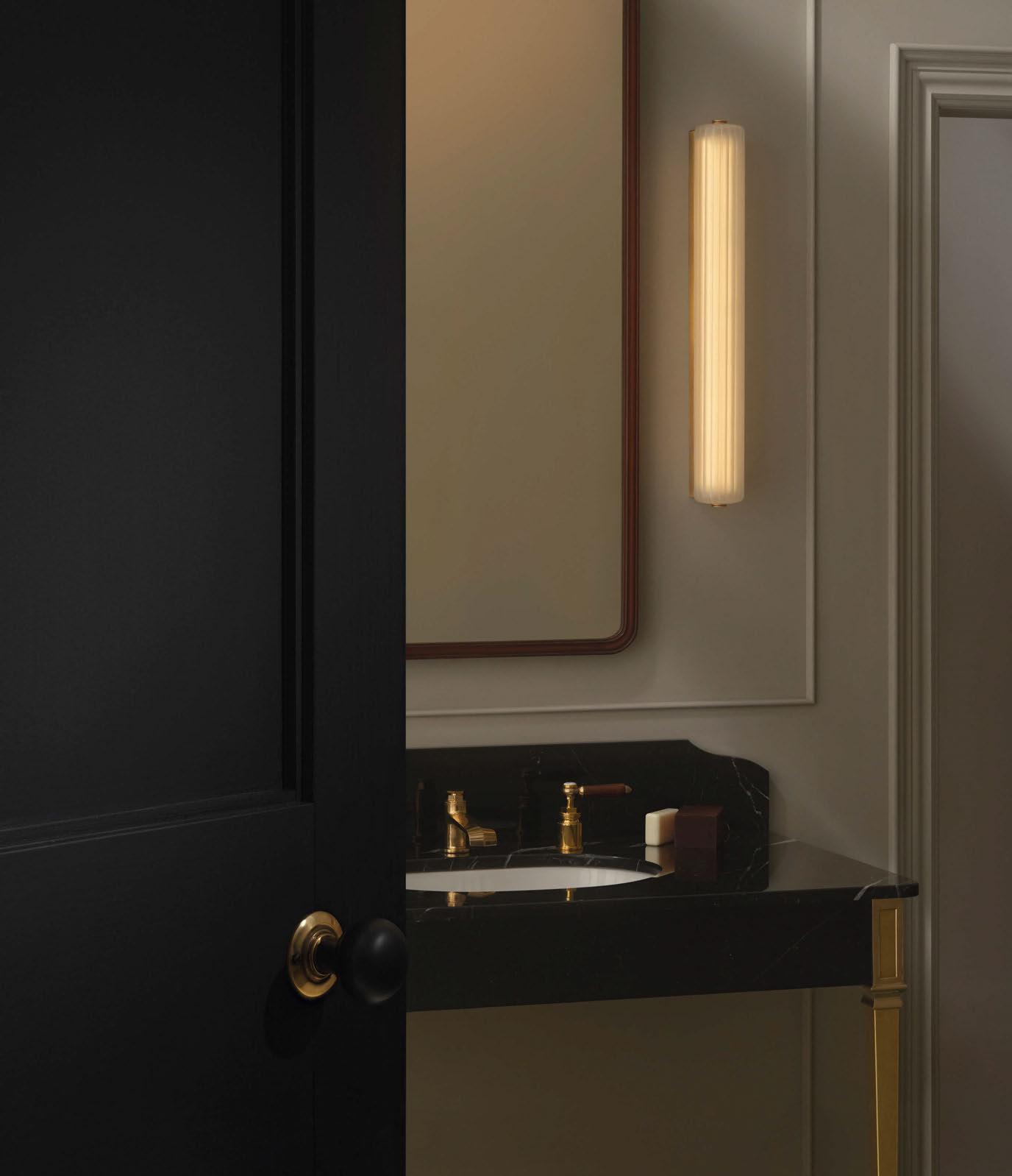
two intersecting circles making up the resort’s logo. Every piece of furniture and light fitting features curves or rounded edges, from the bedhead and inviting sofas to the tables, dining chair backrests and pendants. While some furnishings are from Gubi, Roda and Flos, the majority is designed bespoke by Wisniewski. “I was reading up on Yugoslavian and Balkan design and found multiple examples of local joinery that uses no glue or nails,” he notes, adding that he has utilised the same techniques to craft bedside tables and shelving units.
There are other clever design solutions too: in the suites beneath the arches, a mirrored headboard reflects the light to open up the space; in Kamena – a fine-dining restaurant that nestles in the cliff – horizontal windows counteract the low ceilings and offer views of the sun setting over the sea; and in the spa, the centre of the tower is now topped with a glazed roof, making for a voluminous atrium that can be used for events – on Sleeper’s visit, an opera recital attracted music lovers from the
mainland, the natural stone walls effectively enhancing the acoustics.
By day, the atrium serves a lounge for spa guests, providing a serene spot to linger after an afternoon relaxing in the steam room, sauna and experience showers, which are best enjoyed with the windows open to feel the gentle sea breeze. Even treatment rooms foster a connection with nature, either through direct views to the landscape or in the scent of the organic skincare products, made by Ananné using plants from the island.
In all, a stay at Mamula Island is a restful and reenergising experience. Despite being only a few kilometres from mainland, it feels a world away from the expansive mixed-used developments that dot the coast. Landscaping is wild and the only sound is the waves rhythmically crashing against the rocks and the occasional squabble of the nesting gulls. The design is sympathetic to its setting so that nothing feels jarring or out of place, as if it has always been here. The island finally feels at peace.
EXPRESS CHECK-OUT
Owner: Samih Sawiris
Developer: Mamula Construction
Affiliation: Design Hotels
Architecture:
MCM Architecture & Design
Interior Design: We Studio
Lighting Design: Rossi Bianch
Branding: Studio AS-CC
Landscaping: Gaia Chaillet Giusti
Heritage Consultant: Projektor
www.mamulaisland.com
078
View the full gallery on




SNOWROOM
highest form for a holistic cool down. indoor.technoalpin.com
The
080
The Lodge
MALLORCA
Único Hotels converts an agricultural estate into a rural retreat that immerses guests in nature.
Lavender fields flank the driveway leading to a 19th century finca in the north of Mallorca. Once a farm producing potato, corn and olive oil, this 157-hectare plot is now home to a new hotel – The Lodge – that offers an immersion into the rural heart of the island, urging guests to believe in the value of nature and heritage in luxury travel.
Today, the grounds are filled with olive, cypress and carob trees. Guests wander the finca by foot, buggy or bike to absorb the essence of the agricultural land that continues to bear fruits like apples, oranges, figs and pomegranates, as well as herbs including mint, thyme and rosemary. Goats and other wild animals are spotted on occasion, while a patch of solar panels generates 40% of the property’s energy.
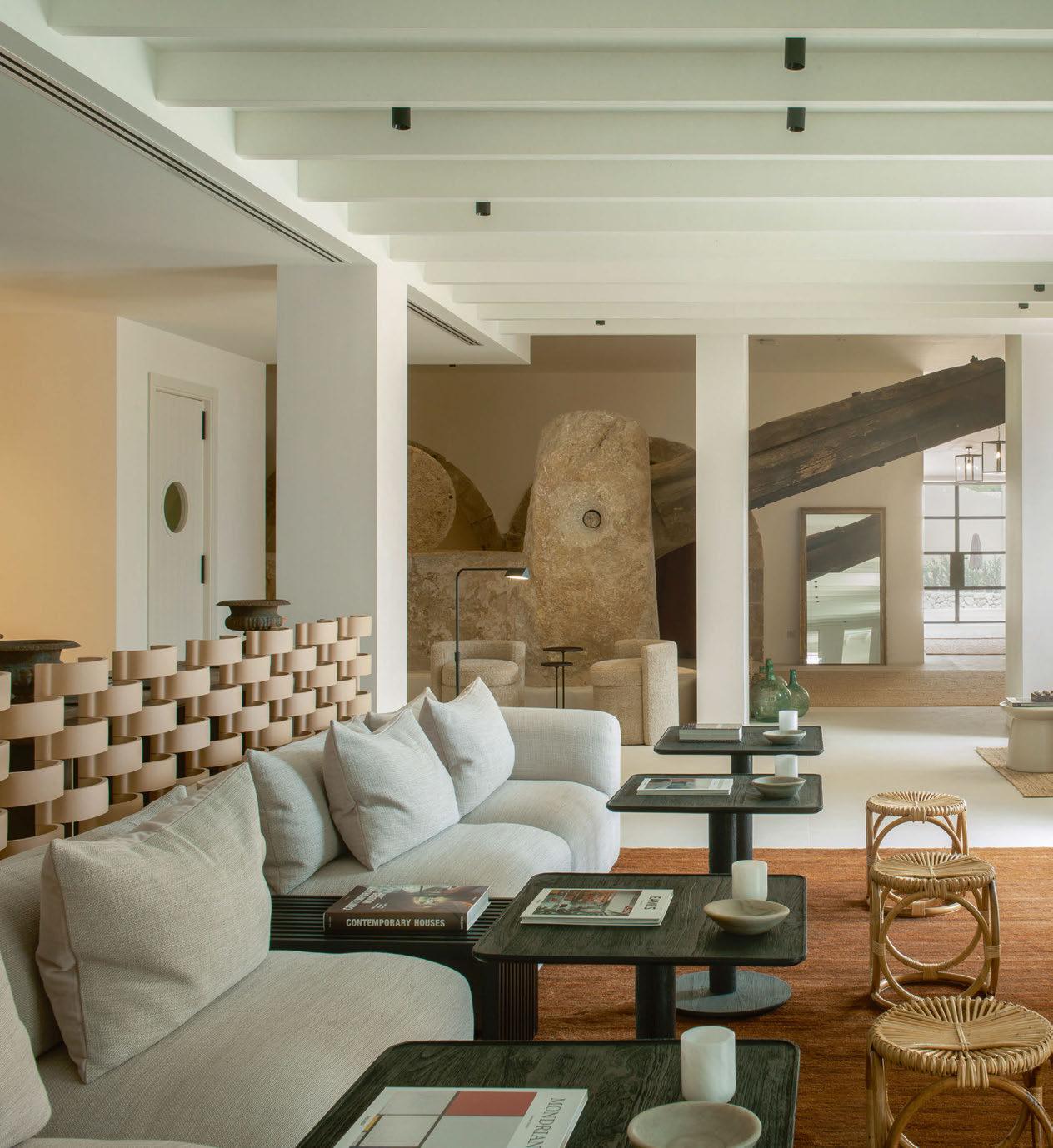
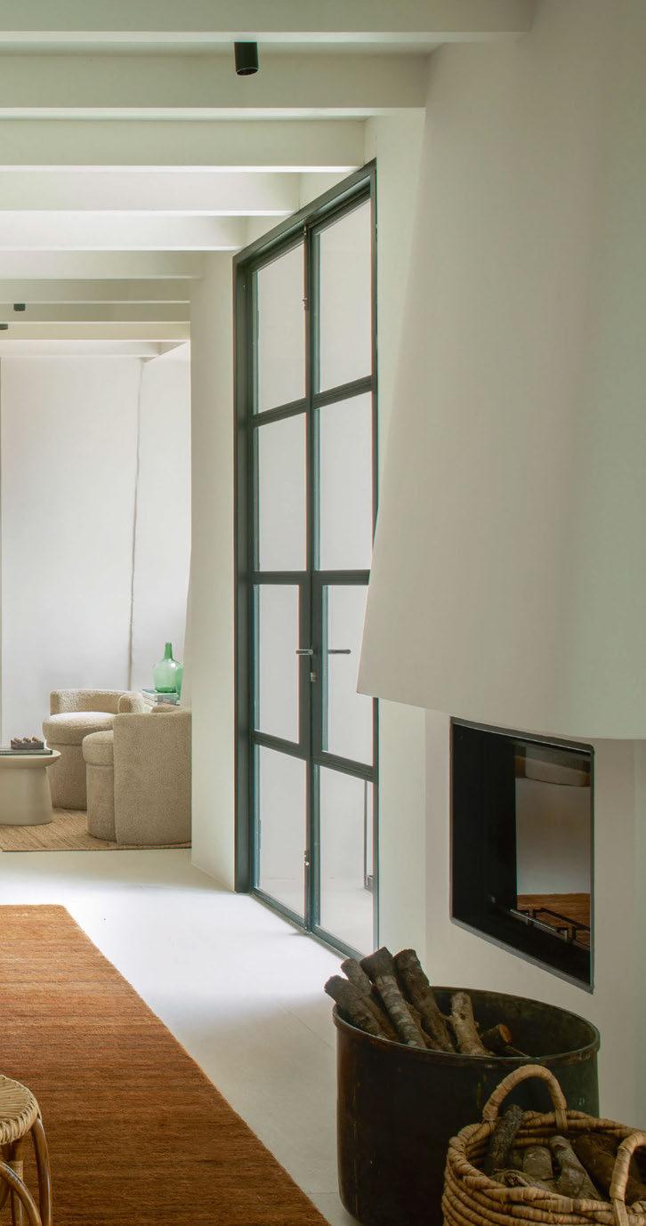
The centrepiece of the lobby stands in tribute to the agricultural heritage of the plot. It is the finca’s original oil mill, known as a tafona and made from iron and stone, where olives gathered from century-old trees were pressed to yield their golden nectar. Other original features include a stone sink that once stood in the farmhouse’s kitchen, now a water fountain whose soothing trickle greets visitors as they approach the reception.
This is the second property in Mallorca by Único Hotels; the group opened Finca Serena in 2019, a similarly peaceful
081
Words: Agnish Ray • Photography: Courtesy of Único Hotels
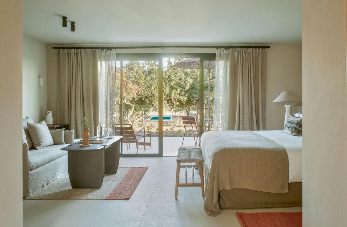
The interiors are modern and minimalist without compromising on the cosy, inviting atmosphere of an age-old farmhouse
hideaway built on a medieval ranch. Now, Único has two such stops on the island for those seeking an escape to nature.
Six of The Lodge’s suites are located in the main farmhouse, along with the reception common areas, while 18 others are distributed in clusters around the estate – newly constructed yet on the remains of the farm’s various outhouses. The most luxurious among them measures over 50m2 with its own pool and terrace. Meandering between the buildings and beyond are three different hiking routes, totalling 20 kilometres, which have been created for active travellers to explore the grounds of the estate.
The vegetation of the land will take a year or two to fully flourish. Juan Segura, Global Sales Director at Único Hotels, says that planting choices were consciously made to be as native as possible, regenerating the vegetation that was already part of the heritage of the land – particularly considering its location within a protected area of natural interest.
“The landscaping is based on Mediterranean plants,” he explains. “We could have chosen lawns and palm trees, but since we’re in the Sierra de Tramuntana, we wanted non-invasive, ecological landscaping.”
Lettuce, aubergine, peppers, tomatoes, courgettes and other produce from the vegetable orchard are served at Singular, the hotel’s restaurant, directed by Ramón Friexa. The twoMichelin starred chef also runs the F&B offers of two other properties in the group’s portfolio, Único Madrid and Mas de Torrent.
At The Lodge, his menu focuses on cooking over a wood fire. Guests enjoy the smoky flavour of meats such as lamb cutlets and Iberian tenderloin, together with fish like sea bass and sea bream, roasted and chargrilled using firewood gathered from the finca itself. The cuisine is also an homage to the gastronomic heritage of Mallorca; the prawns are from Sóller, the salt is from Es Trenc and the olive oil and wine are produced at Finca Serena.
Spiced with cinnamon and cumin, the
082
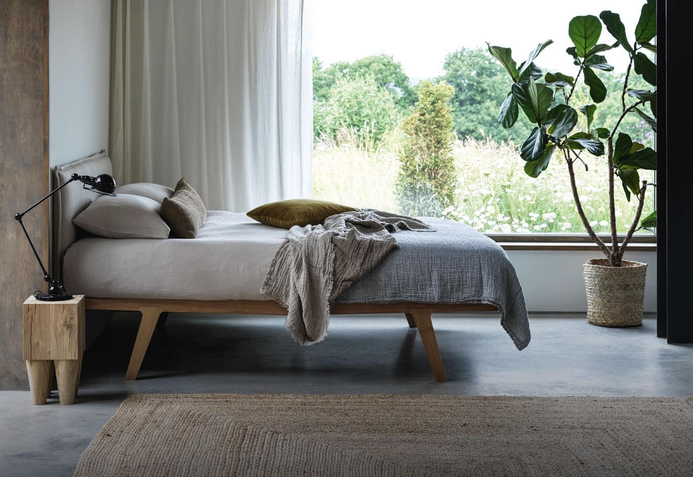
creamy arròs pobler – rice stewed with pork belly from the Mallorcan black pig, botifarró, a kind of blood sausage typical on the island, and cuttlefish – is Freixa’s interpretation of a favourite dish from the hotel’s nearest town, Sa Pobla. The chef says this particular part of the island absorbed Jewish and Moorish influences centuries ago, whose traces have remained in its cuisine today.
The original stone walls of the finca are left exposed in parts of the restaurant, interspersed with the cool, contemporary feel of polished cement. Crafted by Único’s in-house designer Pilar García-Nieto, the interiors feel modern and minimalist without compromising on the cosy, inviting atmosphere of an age-old farmhouse; esparto table mats and wicker window blinds, for instance, are rustic yet homely.
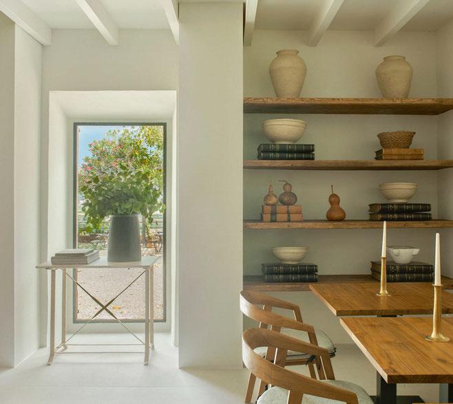
García-Nieto says she looked to the nature around her – the colours and textures of the earth – in designing the space. “We wanted to achieve a serene, harmonious and elegant style, balancing the old and the new,” she explains.
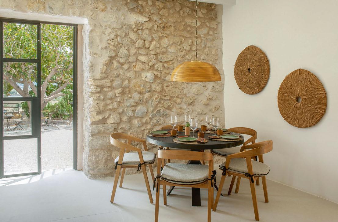
084

Follow us @dernier_hamlyn info@dernier-hamlyn.com www.dernier-hamlyn.com Lighting manufacture, design, restoration and installation T U R NINGDES I GN CONCE P T S INTO R E ALITY
Breakfast is served on a large, antique wooden cabinet, whose shelves display pieces of pottery; many of the ceramic pieces dotted around the hotel were found in the original farmhouse, while others have been designed by local artisans. García-Nieto says moulding clay is one of her own favourite hobbies and reveals that the property also plans to offer ceramics workshops for guests to sink their hands into one of Mallorca’s most prized craft traditions.
In the lounge area meanwhile, dark timber coffee tables feature books on iconic figures in art and design, from Charles and Ray Eames and Ludwig Mies van der Rohe to Ai Weiwei and Piet Mondrian.
Copper, orange and brown rugs and cushions add touches of colour against the neutral background of grey sofas and cream-coloured floors and walls, while rounded stools mimic the shade of the oil mill’s pale stone structure. At the entrance, an ornate French tapestry makes an extravagant break from the otherwise understated space.
The Lodge feels remote, though picturesque towns like Pollensa and Alcudia are just a short drive away. Smaller, quaint villages like Campanet and Búger are even closer by, and coastal spots like Playa de Muro are at hand for beach lovers.
Now with two hotels in Mallorca, Único is keen to ensure each has a unique offer and audience. “Both are quite different,” explains Segura. “Finca Serena is more secluded and focused on relaxation, peace and finding yourself. The Lodge is also a refuge but it’s for a more active clientele, who want to walk in the mountains or go to towns with places to eat, visit and shop.”
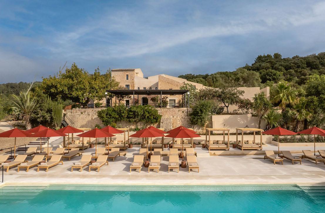
A stay at The Lodge is an immersion into the cycles of the earth, whether observing the gradually changing landscape or enjoying morning yoga classes conducted in an openair cabin set amidst the vegetable garden. It’s a feast for the senses, and the infinity pool offers an idyllic viewpoint at which to pause and watch it all go by.
EXPRESS CHECK-OUT
Owner / Operator: Único Hotels
Affiliation: SLH
Interior Design: Pilar García-Nieto
Landscaping: PPB Proyectos
Paisajísticos de Baleares
www.thelodgemallorca.com
086
View the full gallery on
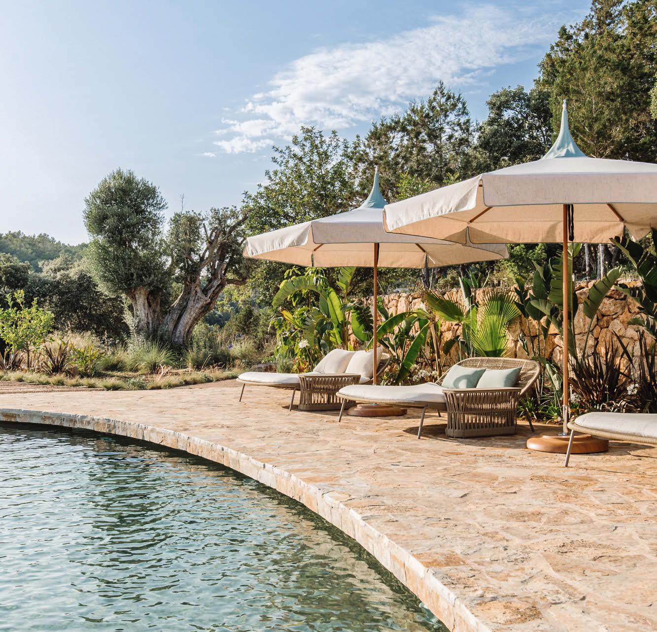

START DESIGNING TODAY AT TUUCI.COM/SHADESTUDIO DISCOVER UNLIMITED SHADE CUSTOMIZATION.
IMAGINE. DREAM. CREATE.
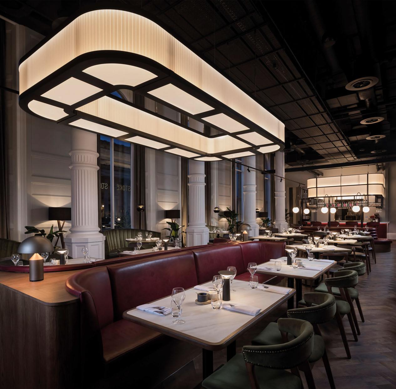


Radisson
RED, Liverpool // © Radisson Hotels // northern-lights.co.uk
Como Le Montrachet
BURGUNDY
Paola Navone transforms a 19th-century place du village into Como Group’s first French property.
The small, picturesque village of PulignyMontrachet, which lends its name to a classification of wine, lies prettily amid the vineyards of Montrachet, best-known for its Grand Crus made from Chardonnay grapes. It’s for this reason that the peaceful hamlet in France’s Côte-d’Or region attracts so many wine aficionados from across Europe and beyond.
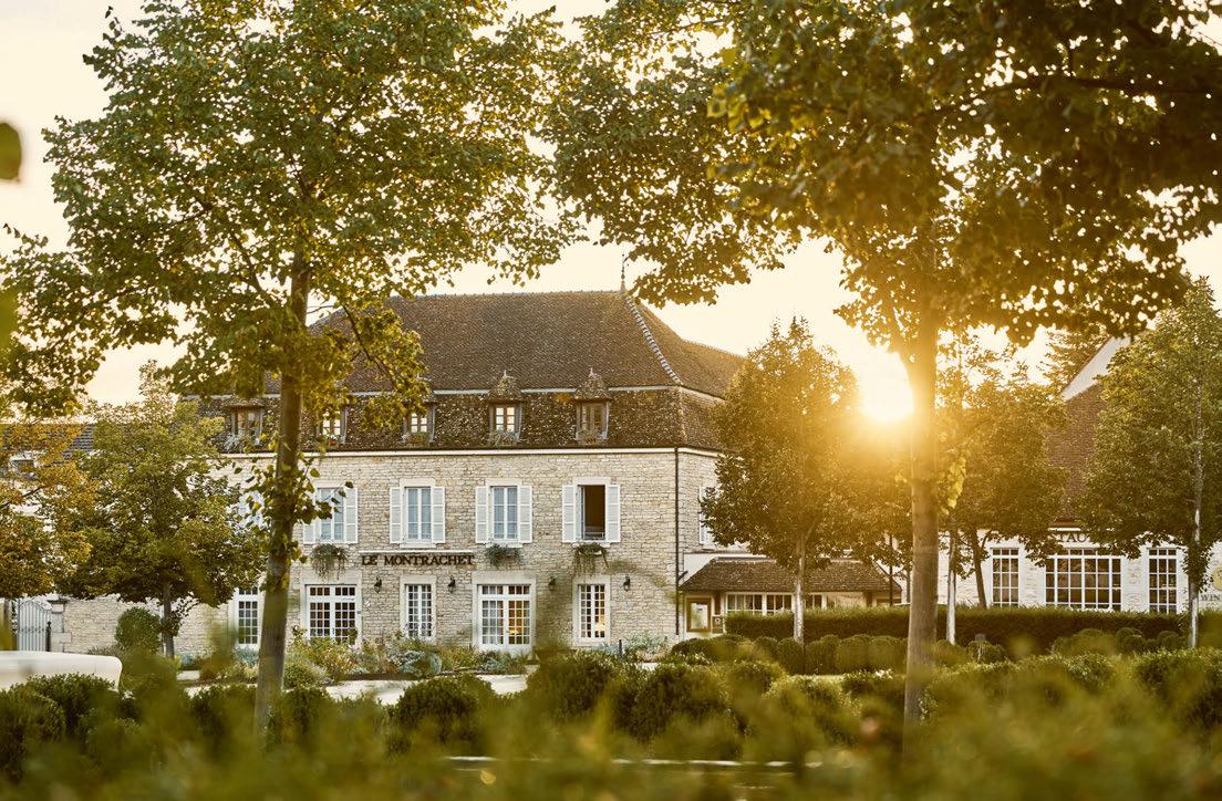
At the heart of the community’s Place des Marronniers, a 19th-century inn has entered a new chapter as the latest edition to the Como Group, after the company’s founder Christina Ong fell in love with the location. Just like Como Castello del Nero in Tuscany, the hotel has been reimagined in collaboration with Italian architect-designer Paola Navone – founder of Milan-based Otto Studio and a long-time friend of the group.
Drawing inspiration from the locale – under the guiding theme of translating the esprit du lieu, or the spirit of place – Navone has transformed several buildings to create a total of 30 guestrooms and suites across the property.
The main building, which houses the lobby, restaurant, bar and 17 guestrooms, is joined on the square by the neighbouring Residence –home to eight suites. On the opposite side of the square, Villa Christine comprises another five suites, some of which benefit from the villa’s high-beamed eaves.
“The architecture is typical of this area of the French countryside,” says Navone, explaining her sensitive approach to designing the property. “Our aim was to create connections with the location and the way it makes you feel. There is a spirit that is connected to the landscape and its agriculture, the wine and the concept of slow living. We wanted to introduce touches that the guest can experience here, but nowhere else.”
Reconnecting to French interior design tradition, Navone has brought distinct artisanal elements to the multi-site property, in some cases with the help of specialists. The expansive high-ceilinged restaurant now features an entire wall made from woven willow, which
089
Words: Lauren Jade Hill
Photography: Courtesy of Como Group
Throughout the three buildings, the guestrooms and suites are grouped by colour, from green to blue-grey to a more graphic black-and-white scheme
is a reference to the baskets typically found in Burgundy, while enamelled terracotta finishes nod to the colourful, zig-zagging tiles that decorate the town hall across the street.
The neighbouring bar, facing out onto the square, features a zinc bar counter, made by a small factory outside Lyon in honour of the classic bars long established as a cultural reference across the country. “I’ve wanted to create a zinc bar like this for many years, so when I finally discovered these craftspeople –who are using the same technique today that people used in the past – I realised my idea was a possibility,” Navone enthuses, noting that zinc is a material typical of French roofs.
The connection to the locale is also seen through the choice of fabrics and furnishings decorating the property. In each room and suite, the headboards, lampshades and sections of the walls showcase the designer’s love for Toile de Jouy fabric, which has been used throughout France since the 18 th century and depicts pastoral scenes.
Across the property, these references to French design tradition are brought into a contemporary context. The limestone walls of the original structure for example are complemented by 2m-wide white sphere moon lights with honeycomb patterns hanging from the vaulted ceiling. Minimalist modern furnishings in dark grey fill the expansive room, while black-and-white Toile de Jouy curtains hang down each side of the French doors leading out to the restaurant terrace and garden.
On the other side of the restaurant’s arched doorways, the bar pairs circular black tables with soft seating in emerald green beneath pale sage painted beams. The same shade is used for the walls and ceiling of the reception and lobby, which is decorated with grey-green sofas, deep grey rugs, shelves of pottery and large standing lamps. Green beaded chandeliers hang at differing heights from the ceiling above the reception desk.
Throughout the three buildings, the guestrooms and suites are grouped by colour,
090
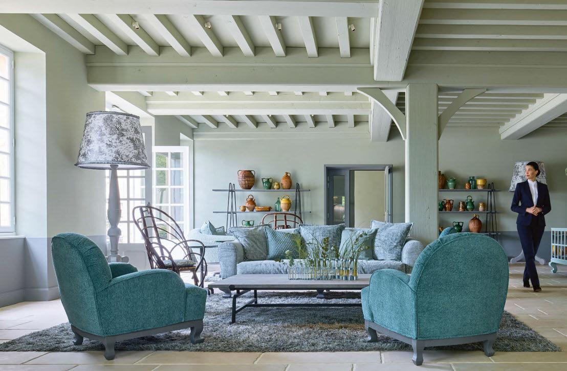
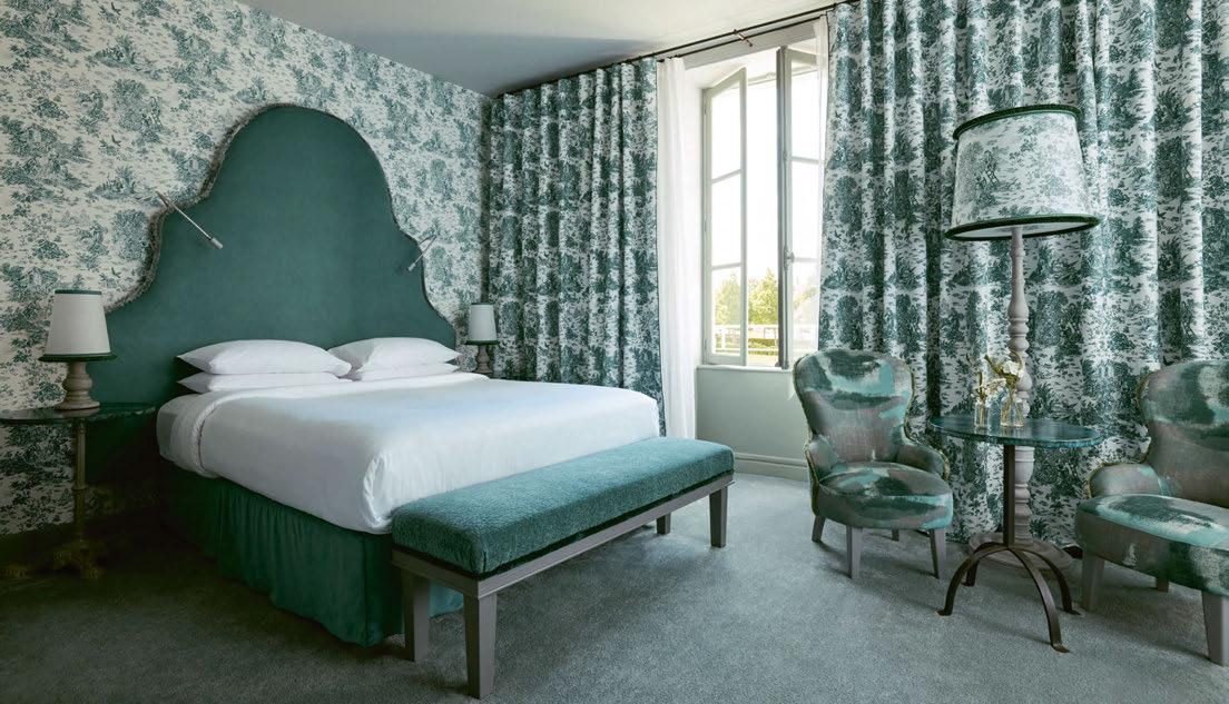
091
from sage to blue-grey and a more graphic black-and-white scheme, chosen to work with the warm light. At Villa Christine, the Montrachet Suite and two-bedroom Como Suite each span a generous 70m2 and come with expansive living spaces, also decorated in the villa’s monochromatic design.
These locally inspired interiors, filled with artisan-created design details, set the stage for a guest experience led by General Manager Florian Bonnin, which is centred around the evolution of French gastronomy through the years. In keeping with Burgundy’s gastronomic traditions, the experience naturally showcases the region’s exceptional wines, alongside an appreciation for the bucolic landscape and rural French charm.
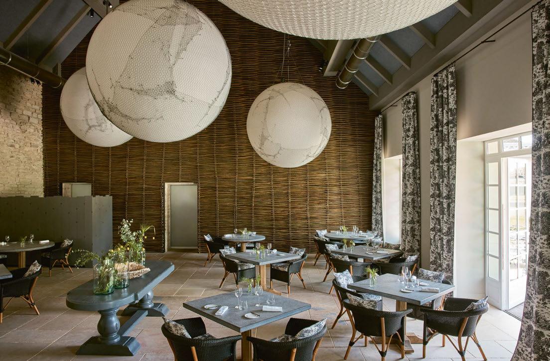
The property’s main structure is set across the square from Maison Chanzy – residing in an old house that belonged to Côte d’Or legend Vincent Leflaive – which through a partnership with the hotel, offers wine tasting experiences to guests. Tours of the region can also be
booked, taking visitors to the historic wineries of Côte de Beaune, while other experiences include hiking through prestigious vineyards and joining a local chef for a market visit and Burgundian cooking class.
At the hotel itself, the gastronomic experience is defined by Executive Chef Romain Versino, who produces seasonal menus of creative fine dining dishes highlighting local produce. The property’s Sommelier, André Berthier – who also hosts private tastings – pairs these dishes with wines from the region.
While Como Le Montrachet may already seem complete, plenty more is yet to come. Another building in the square’s vicinity will soon welcome a Como-branded spa, while a swimming pool is planned for the lawned garden of the main structure.
“For every hotel’s design, we work to come up with a different story,” Navone concludes with a smile. “It’s like writing a movie, and Como Le Montrachet is a movie that we are yet to finish.”
EXPRESS CHECK-OUT
Owner: Olma Luxury Holdings
Operator: Como Group
Interior Design: Otto Studio www.comohotels.com
092
View the full gallery on
Working in close collaboration with the professional team, BECK are delighted to be the main contractor on The Dorchester. To find out more, please contact Vanessa Budd: vbudd@beckinteriors.com
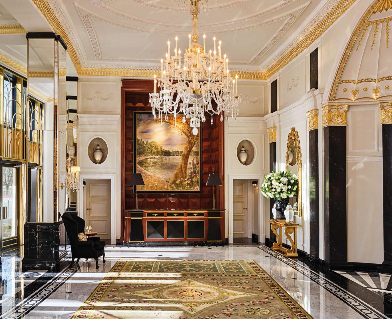
THE DORCHESTER
SCAN ME!
Penny Williamsburg
BROOKLYN
Sydell Group blends the worlds of hospitality and student housing with an artful property in one of New York’s trendiest boroughs.

Stroll the leafy lanes of Brooklyn’s Williamsburg neighbourhood and the bustling streets of Manhattan feel like a world away. Despite being a short subway ride across the bridge from the soaring heights of the concrete jungle, the shift in energy is palpable and it’s this trendy, residential spot that has seen hospitality experts Sydell Group launch a new brand at its very heart.
Having developed an industry-acclaimed portfolio that includes brands such as Freehand, The Line, NoMad and The Ned – each of which offers a different take on hospitality and picked up numerous awards at AHEAD – Sydell Group’s latest mission was to create a forward-thinking model that combines a hotel with accommodation for graduate students.
Enter Penny Williamsburg, the first of a brand dreamt up by Sydell Group founder and CEO Andrew Zobler. “When we launched Freehand, the hybrid hotel-hostel market didn’t really exist in the US,” he explains. “Penny feels innovative in a similar way.”
Not only does the fusion of hotel and student housing deliver operational benefits, blending residential and hotel occupancy year-round, but the partnership with liberal arts institution Bard College also adds a unique culture to the building, according to Sydell Group’s Senior Vice President of Operations, Adam Bussell: “The hotel feels like part of the neighbourhood because it is. Bard College is a beloved school
094
Words: Ben Thomas • Photography: © Alice Gao
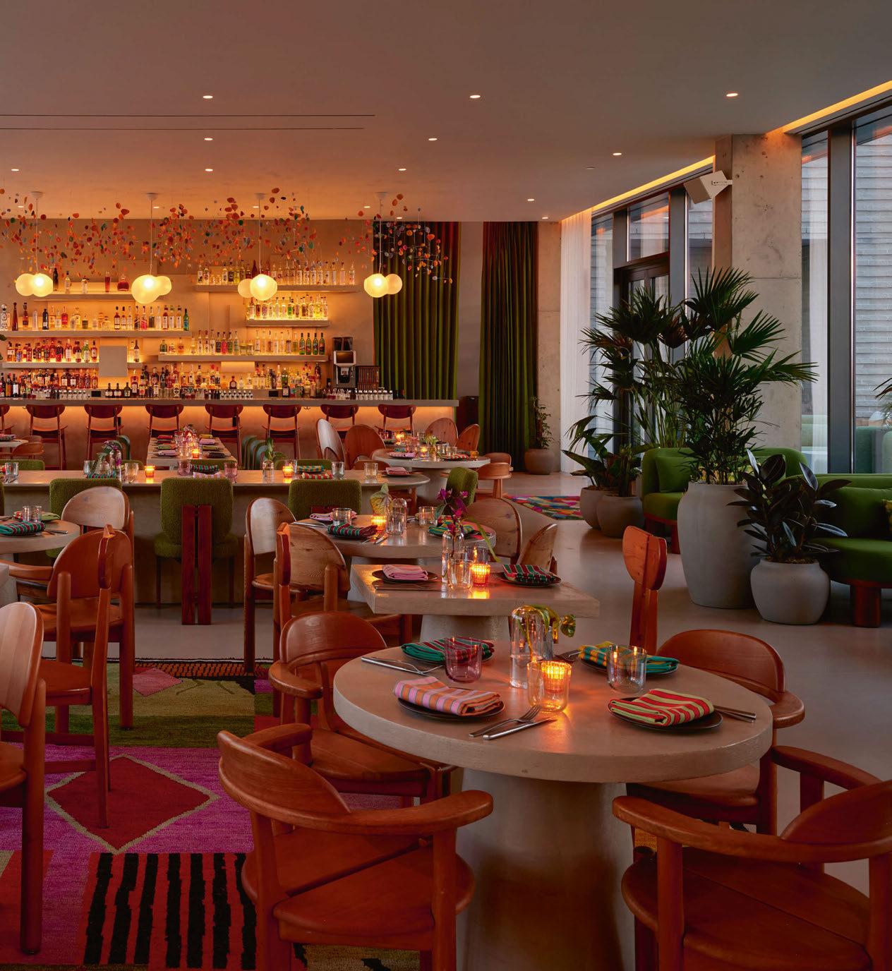
095
Blending an industrial style with idiosyncratic touches, guestrooms are home to artworks curated by local non-profit groups Land Gallery and Pure Vision Arts
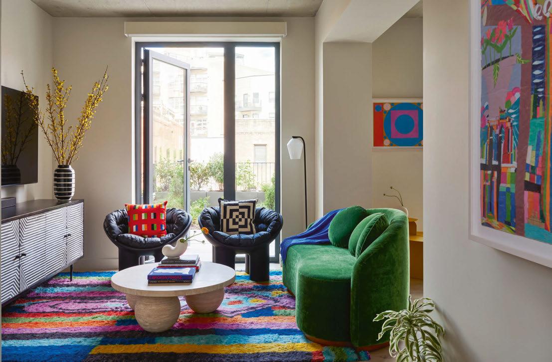
with an emphasis on fine arts, and guests can sense that creative energy throughout.”
While the property is far from the largest in the portfolio, comprising 118 guestrooms in comparison to The Ned London’s 250 and NoMad Las Vegas’ 293, its larger-than-life personality puts it on an equal footing, much like Zobler’s canine companions. “Since Penny Williamsburg is our most intimate site, it felt right for me to name it after my pet chihuahua, Penny,” he explains. “I’m a dog lover and typically have four at a time. Penny is the smallest dog I’ve ever had but by far the most loving of all. Penny Williamsburg may not be our largest to-date, but I want it to be our most special.”
Such ambition called for a design partner that Sydell Group could trust, and with New Yorkbased architecture and interior design firm Stonehill Taylor – a longstanding collaborator of Zobler and his team – involved in the development before the company entered the mix, little discussion was needed around who would be best placed to take the lead.
Aditi Shah, Associate at Stonehill Taylor, reveals that the brief for the 11-storey structure remained the same once Sydell came on board. “From an architectural perspective, the project is a newbuild in a predominantly residential neighbourhood, so we wanted to combine traditional façade materials with a more contemporary limestone brick,” she confirms. “We then enhanced the architectural detailing via joints and brickwork patterns.”
Perhaps more challenging for Stonehill Taylor was the floorplan. “This is the first time we have designed a hotel and student housing in one, so that presented few obstacles to overcome,” says Shah, noting that the guestrooms and dormitories required very different layouts.
For the interior design, Stonehill Taylor worked under the guidance of Sydell Group’s Director of Brand & Creative, Zoe Goldberg, to envision a scheme that blends industrial elements – think exposed ceilings and dark metals – with playful, idiosyncratic touches that reflect the casual spirit of Williamsburg. “We
096
LET’S FOCUS ON THE “WE” IN WELLBEING.

From the start of planning all the way to the finishing touches, we’re your partner of choice when it comes to bringing health-promoting sauna and spa solutions to life. Whatever your wishes are and whatever the spa trend is, together we can make it happen. After all, one thing is for sure: guests will be looking for a healthy lifestyle, more than ever before. And where better to find it than in the unique spa experience you offer?
Be inspired, discover your spa vision of the future at www.klafs.com


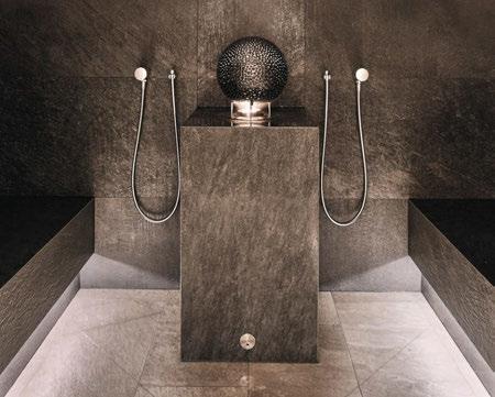
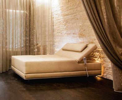
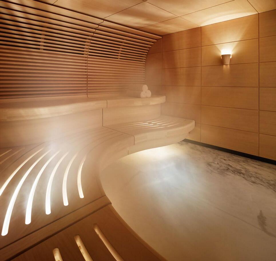 Courtesy of Faena Hotel, Miami Beach. Photographer Nik Koenig, USA
KOKON Corporate Campus, Liechtenstein
Chalet Anna Maria, Photographer Alex Kaiser, Austria
had freedom within Zoe’s guidance,” explains Senior FF&E Designer Tomomi Waga Meininger, pointing to the practice’s involvement in the signature suite, the rooftop restaurant and bar, and the outdoor terrace. “We worked within the existing concrete surroundings to design colourful, homely spaces; high pile rugs for instance exude a luxurious residential feel, but we had to be careful not to lose durability.”
More like studio apartments than traditional hotel rooms, the private quarters feature lounge and dining areas, a selection of books curated by New York bookstore The Strand, and a functioning kitchenette. Other room types such as the Sleeper Queen offer a pull-out sofa for kicking back after a day in the city, while a 700ft2 suite boasts a queen bed, bathroom with a soaking tub, and living and dining areas, as well as a kitchen and a private terrace with a garden overlooking the nearby rooftops. Adding to the luxurious feel are fabrics by Rubelli and linens by Bellino, which invite guests to sleep in.

Given the hotel’s partnership with Bard

098


College, art forms another key pillar of the design, with 250 original works from 26 artists – curated by non-profit groups Land Gallery and Pure Vision Arts – dotted throughout the rooms and public spaces. A portrait of Zobler’s dog Penny – by Dallas-born Bard graduate Michelle Devereux – hangs above the entrance, while the ground floor functions as an art gallery with pieces by Brooklyn-based creatives. Japanese lighting designer Yuko Nishikawa has also made her mark between the lobby and rear courtyard, installing an explosion of vibrant pods that dangle from the ceiling.
“The artwork is central to the property’s ethos,” says Zobler, citing how the pieces are offset by vintage and designer furniture that adds tactility and warmth, together with lush plantscapes designed by Mac Carbonell of nearby landscaping firm Verdant. “Our rooftop restaurant and bar, elNico, is filled with an abundance of plants and design accents that are relaxing yet bold, setting the stage for approachable food and imbibing experiences.”
Serving up imaginative Mexican fare by Executive Chef Fernanda Serrano, who grew up in Mexico City and spent time in the kitchen at The NoMad London, elNico embodies the hotel’s vivacious spirit. “It’s like dining in someone’s stylish apartment,” says Meininger, who encourages visitors to sample the cocktail menu crafted by the group’s Vice President of Food & Beverage Leo Robitschek.
The drinks may well be flowing at Penny Williamsburg, but Sydell Group is certainly not resting on its laurels with the opening of this debut property. According to Bussell, the company will continue to invest in the arts, infusing the unique perspective of neurodivergent artists into the guest experience, while plans are also afoot to expand its culture gatherings and introduce a whole new facet of showcasing artistic talent.
There’s talk of expansion into cities across the US and Europe too, though whether Zobler will be naming future properties after his canine companions, remains to be seen.
Owner / Operator: Sydell Group
Architecture: Stonehill Taylor
Interior Design: Stonehill Taylor, Sydell Group (in-house team)

Art Consultant: Land Gallery, Pure Vision Art
Landscaping: Verdant www.penny-hotel.com
100
EXPRESS CHECK-OUT
View the full gallery on


102
The Largo PORTO
There’s a before and after staying at The Largo. Before, one may never have experienced the joy of finding a secret wine cellar behind a waterfall or realised the absolute necessity of an automatically opening toilet seat. Life after The Largo is also unlikely to feature a fridge full of pre-mixed white negronis or a spider crab omelette sprinkled with pink and purple edible flowers for breakfast.
Imagined by Danish hospitality collective Annassurra, The Largo sets the tone immediately upon entering the lareiro, the Portuguese word for hearth – their take on the lobby. There’s no check-in desk; arrival at the property is a casual chat with the ‘journey’ team over a delicious glass of local port on a plush, feathered sofa. This room, guests are informed, is the heart of the hotel – its foundation. In the centre is a centuries-old pillar, one of the few remaining parts of the building’s interior that is as old as its 16th century shell.
Another is its beloved rock piece, a stone wall onto which a projector beams an evershifting image that changes colour with the time of day, the seasons and, thanks to carefully placed sensors, when a guest waves their hand
over it. If one were to describe the room in the style of a tech start-up elevator pitch, it might go something like ‘Scandinavian hygge meets Portuguese heritage meets innovation’ – a philosophy that continues throughout.

The owners have dubbed the property ‘The Home of Porto’. The home comforts come not only in the sofas that guests sink into and never want to leave, or the down-to-earth colours and materials, but also the service. Staff feel like friends rather than people who are paid to cater to guests’ every whim, and the whisper network between them ensures that a conversation with, say, José, begins just where the one with Katarina left off.
Beneath the hygge, The Largo is also unmistakably of the city, and of Portugal. The designers, Peter Bundgaard Rützou and Signe Bindslev Henriksen, founders of Danish design firm Space Copenhagen, didn’t go for the obvious colourful Portuguese tiles. Instead, they undertook more than six years of research, visiting artisans, blacksmiths and stonemasons across the country, and delving deep into its history in museums and archives. The result shines through in the details.
103
An amalgamation of five historic buildings brings together Scandinavian hygge, Portuguese heritage and technology to create an experience like no other.
Words: Elly Earls • Photography: © Joachim Wichmann
The ornate ceiling panels of the 18 guestrooms are modern, yet based on the historical building’s original design, while the bathtubs, which are best enjoyed with a pre-mixed white negroni from the expansive minibar, were hewn from gigantic slabs of Portuguese stone. The pleasing solidity of the stonework and millwork, all executed by Portuguese artisans, contrasts with the cloud-like comfort of the enormous beds and the almost-too-cosy sofas and armchairs. Technology is integrated seamlessly too. Anything guests desire can be summoned via the in-room iPad or iPhone, while sensors mean that, upon entering the bathroom, there is no need to manually lift up the toilet seat.
The surprises continue with the one-of-akind Cabinet of Curiosities in each bedroom, which explore different aspects of Portuguese design, industry and history. In one room, the theme is Before the Object, which celebrates the process of craftsmanship rather than the result. One shelf is simply filled with virgin wool sheared from an indigenous breed of sheep,
which would probably be extinct were it not for the work of a local biodynamic farm, a close partner of The Largo. Guests are encouraged to open the cabinets and engage with the items they find. If something really piques their interest, the team might even be able to connect them with the craftspeople behind it.
Community engagement is one of the owners’ key tenets and the building’s original ceiling panels also served as inspiration for an art exhibition displayed across the hotel. Five students studying at The University of Porto’s Department of Fine Arts were challenged to reimagine them from their own perspective. Their answers to the call – which range from sculptures to paintings to abstract pieces –adorn the walls throughout the property.
“The owners wanted to bring the spirit of Porto into the hotel,” says Rützou. The students are at one end of the spectrum of Portuguese collaborators. At the other is the nonagenarian Pritzker Prize-winning architect Álvaro Siza, who, after turning Space Copenhagen down

104
Crafted by Portuguese artisans, ornate ceilings in the guestrooms are modern yet based on the building’s original design


Rather than selecting obvious materials like Portuguese tiles, Space Copenhagen opted for more earthy colours that pay homage to the country’s craft heritage
– twice – eventually agreed to create a mural for The Largo’s Nuno Mendes-helmed, streetfacing restaurant Cozinha das Flores.
For Henriksen, Siza’s approach to the project encapsulates the hotel’s philosophy. “Álvaro began by drawing musicians as he felt their vibrant feel was the right approach to infuse on this wall,” she recalls. “He is known for his extremely sharp and modern approach to architecture, stripped from detailing and nostalgic or romantic features, but this was so down to earth, human, beautiful and simple.”
Henriksen continues: “The theoretical part was infused with a playful, intuitive way of working, which is what we have also tried to achieve. We wanted to balance out the features, needs and functions of a hotel whilst also making it surprising and making guests feel good when they close their eyes.”

The entire property plays with the senses. With the limitations of its footprint – an amalgamation of five historic buildings, acquired over time and with a 25m height difference between the front two and the back

106

three – there was no other choice, according to Rützou. “In the spaces towards the rear of the hotel, which are away from natural daylight, we tried to focus on different sensory mechanisms,” he reveals.
For example, the small courtyard behind the lareiro seemed like a bottomless pit when the designers first laid eyes on it, so they opted to install chiselled granite up the wall and added an artificial waterfall, along with chairs and sofas from Sutherland Furniture’s Franck collection. “The space engages both light and sound because the sunlight reflects in the water, while the water dripping from shelf to shelf adds an element of sound,” Rützou explains.
Henriksen adds: “Approaches like this allowed us to transcend the limitations of the building’s small footprint.” Of course, there’s a hidden door, too, which leads to a secret wine cellar. “It feels like small universes opening when guests dive into each of the areas.”

When it comes to dining, there is almost no need to leave the room, with its pantry, bar
cart, mini-bar and fully stocked wine fridge. But the temptation of breakfast at the terrace restaurant upstairs, with its plunge pool and sweeping views of the city, or dinner at Cozinha Das Flores on ground level, melding right into the heart of the bustling city centre, will lure most guests out of their home from home. The team’s advice is to enjoy an expertly mixed cocktail at the bar, Flor, before heading next door to sample Nuno Mendes’ surprising take on traditional Portuguese cuisine; one wouldn’t expect the turnip natas and spider crab donuts to work, but they absolutely do.
Although leaving the comfort of The Largo feels mournful, the staff manage to make even that journey an enjoyable one. A freshly-brewed pot of tea, or final glass of port in the lareiro on the way out, far surpasses most check-out experiences. Guests are then whisked to the waiting chauffeur via a chain of staff extending across the plaza. Life after The Largo may never match up to how guests feel in ‘The Home of Porto’, but at least they have the memories.
EXPRESS CHECK-OUT
Owner / Operator: Annassurra
Architecture:
Frederico Valsassina Arquitectos
Interior Design: Space Copenhagen
Lighting Design: Filamento

Graphic Design: All The Way To Paris, Margarida Olo
Procurement: Annassurra, Designbrokers Hospitality
Landscaping: Escala
Main Contractor: Grupo San Jose www.thelargo.com
108
View the full gallery on
It looks like a normal toilet, but there’s something about it:
The integrated shower function cleans with a gentle, warm water jet, giving you a feeling of pure freshness. At the turn of a button. TECEone can be operated intuitively. No power supply. No gimmicks. Perfect hygiene at an attractive price.


www.tece.com/teceone
Looks good – and it’s easy to use, too: You can easily regulate the temperature and amount of water using the regulators on the side.
REFRESHINGLY DIFFERENT!
– the
TECEone
new toilet with shower function.
TECE GmbH | Hollefeldstrasse 57 | 48282 Emsdetten | www.tece.com | international-business@tece.de | T + 49 25 72 / 9 28 - 999

Astone’s throw from Palma’s Old Town, the first-ever Zel hotel is gorgeously Spanish. Overlooking the Mediterranean, the property marks the beginning of a partnership between tennis superstar Rafael Nadal and Meliá Hotels International, embodying Nadal’s freedom of life after tennis as well as his emotional connection with Mallorca, the island where he grew up and continues to live.
The family-first spirit of the former world number one is apparent as soon as guests walk through the door, thanks to a wonderous combination of Modernist chic and cosy design. There is no reception desk as such, rather an inviting lobby – or large terracotta-tiled patio –where staff with iPads welcome visitors.
The lobby is the epicentre and energy source for the hotel, reflecting Nadal’s passion for outdoor life. With this in mind, design firm ASAH Studio decided to use the space to knit various areas together, including a coffee bar, retail outlets and a Beso Beach club – whose popular venues on the neighbouring islands of

Ibiza and Formentera will no doubt help draw the crowds to its new Balearic spot.
“When bringing Zel to life, we wanted the design to allude to the bountiful nature of the Mediterranean, blending natural, earthy and oceanic tones with different textures and shapes to generate a sense of peace, wellbeing and relaxation,” say Adriana Sans and Alvaro Sans, founders of ASAH Studio.
“Throughout, guests will find features of Mediterranean culture from Italy and Greece, as well as patterns and finishes with a Mallorcan essence. Zel’s integration with its surroundings, the open-air living concept and the patio – an essential element of local architecture – all contribute to a celebration of open spaces, creating an atmosphere brimming with energy.”
Taking this love of outdoor settings as inspiration and using biophilic design as a starting point, the rooms have been conceptualised with colours, textures and shapes that convey the natural world, generating an aura of calm and a space for guests to reflect.
111
ZelMALLORCA
Meliá Hotels International teams up with Spanish tennis superstar Rafael Nadal to launch a new Mediterranean-inspired brand.
Words: Chrissy Iley
Photography: © Tomeu Canyellas Moragues
The interiors feature colours, textures and shapes that convey the natural world, as well as the island’s connection to the sea

The interiors also nod to the island’s connection to the sea, with prints and finishes in a mixture of maritime tones.
The 165 guestrooms – including 21 suites –are high-tech yet homey. Behind a linen curtain for instance is a screen that enables guests to watch their own phone or tablet, while the rocking chair on the balcony is perfect for taking in the views.
The aesthetic is like that of a sea cabin; marine colours are combined with blonde oak flooring, navy and white linen wall hangings, and a timber cabinet. A daybed and oak ladder – on which matching towels hang – add to the residential feel, while hessian is a common material used throughout. Even the shower is cordoned off by nautical ropes.
Some rooms, including the junior suites, are also equipped with a record player and vinyl; it’s mostly ‘80s and ‘90s records, like Rod Stewart’s greatest hits and other disco divas. But in the true paradox that is this hotel, there is also a plug-in stereo for guests’ mobile phones and
headphones, meaning they can be private party animals too.
Nadal’s influence is perhaps most visible in the sports camp-like facilities on offer; there’s a spa, sauna, state-of-the-art gym and even a Spanish-style yoga studio. “With our first Zel hotel and the concept we have created for the brand, we are looking to offer those moments in life that we enjoy so much,” he explains. “Everyone knows that I love sailing, particularly in the Mediterranean, as well as eating on the beach, and feeling at home by spending time with family and friends. This is what we wanted to convey with Zel and I believe we have achieved that.”
Having travelled the world during his glittering career, staying in countless hotels along the way, Nadal has learnt a lot about what he – and others of a similar lifestyle – demands from a hospitality experience. “My travels helped me in having an idea of the direction for Zel,” he confirms. “Making our hotels feel like a second home is a key principle.”
112


113
Nadal’s relationship with Meliá has been built over several years, having discussed the possibility of a collaboration with founder and Chairman Gabriel Escarrer Julià during many conversations. After meetings between Nadal and Escarrer’s teams, the duo arrived at a concept that they believe embodies the spirit of the island.
And with the two Spaniards calling Mallorca home, the isle was a sure-fire choice for Zel’s debut. “Launching the brand here just made sense, like it did to me when I created the first Rafa Nadal Academy in Manacor,” says Nadal. “I had many options and places around the world that offered to host the academy, but I decided to open the main one in Mallorca. I suppose the mental exercise, on my part, has been the same with Zel.”
Also critical to the vision was the integration of sports facilities, including two outdoor pools, one with sea views and direct access to the beach, and the other surrounded by a quiet garden. “We are lucky to have such a privileged
position in front of the Mediterranean Sea,” Nadal emphasises, noting the importance of fusing a contemporary style with a traditional Mediterranean feel. “I love modern décor, but the design must also have soul and elements that identify with my roots.”
Antonio Albiol, General Manager at Zel Mallorca, puts it nicely: “The personality of the hotel has a little something for everyone. Here, they can do everything or simply enjoy themselves while doing nothing; we have thought of every last detail to make sure their visit to our home is unique. We also have a programme full of events that celebrate life, from concerts, parties on the beach or by the pool, to endless hours of music that flows through each moment of the day.”
With Mallorca now up and running, Nadal and Escarrer have turned their attention to South America, where Zel Sayulita will open in 2025. Using the Balearics as a blueprint, the hotel will again celebrate the outdoors, serving up Mediterranean culture to the Mexican market.

EXPRESS CHECK-OUT
Operator:
Meliá Hotels International Architecture and Interior Design: ASAH Studio
Art Consultant: Futura Project
Main Contractor: S’estel, Sampol
Project Manager: RM Arquitectura www.melia.com
114
View the full gallery on
Providing you with the best


LEAVE THE REST TO US


LUSSO.COM
The Tempus NORTHUMBERLAND
The Doxford Group opens its first hotel, where Jeffreys Interiors break all the rules for an enchanting wonderland escape in North East England.

Who says you can’t layer snakeskin and leopard print, geometrics and florals? Perhaps not what you might expect from a remote retreat in the Northumberland countryside, but when the aim is to stand out from the crowd, a bold combination of texture, pattern and colour speaks volumes.
Designed by Jeffreys Interiors, The Tempus is the latest addition to The Doxford Group, a family business that has made its name through the creation of memorable wedding venues; the rustic Doxford Barns opened in 2015, soon followed by Charlton Hall, an 18th-century stately home. For Richard Shell, the group’s founder, a hotel has long been part of the plan for the 150-acre estate, with the region experiencing a significant rise in demand for overnight stays.
“I wanted to create an inclusive destination for guests to experience Charlton Hall Estate and believe that the introduction of The Tempus will achieve this,” he explains. “Charlton Hall is a renowned wedding and events venue and to now have an extension of this in the form
of The Tempus, we hope to encourage visitors and locals to our hotel, bar and restaurant from far and wide as well as the surrounding areas.”
Featuring 15 individually designed guestrooms, the hotel is primarily newbuild, slotting neatly between existing farmhouses in an architectural scheme devised by Sadler Brown Group. Externally, the same stone is used to remain in keeping with the surroundings, while the gin gang – a roundhouse built to enclose a horse engine – has been retained and transformed into the lobby, where original stone and a pitched timber roof juxtaposes with a contemporary starry sky lighting installation by April Key.
For the design scheme, The Doxford Group granted creative freedom to Jeffreys Interiors, having previously worked with the studio on Charlton Hall. Using this venue as a starting point, Design Director Jo Aynsley let her imagination run wild, developing a look she describes as cohesive chaos. “Our aim was to create a visual delight, a daring place of wonder
117
Words: Catherine Martin
Photography: Courtesy of Jeffreys Interiors
Interiors are rich in texture, pattern and colour, with a wide range of fabrics and finishes from the likes of Timorous Beasties, Romo, Paolo Moschino, Elitis and Pooky
and awe,” she explains. “We knew we needed to break the mould to have a USP and saw a gap in the market to play with the rules, which is where the Alice in Wonderland theme stems from. We want to take guests on a journey as they walk through the areas, as if they are falling down the rabbit hole.”
It is indeed a journey of whimsy and wonder, stimulating the senses at every turn. From the light-filled lobby, a library lounge takes on a darker, richer tone, with Farrow & Ball paintwork in deep aubergine accompanied by verre églomisé mirrors, handpainted tortoiseshell panels and House of Hackney fabrics. Lowlevel lighting in the form of rechargeable table lamps sourced from Pooky also add to the ambiance. “We intentionally made the library a moody and enclosed close space and kept Alice in Wonderland in mind when designing the nooks,” says Aynsley, pointing out the maze-like layout of the bench seating that is suggestive of the titular character’s difficulty in navigating her fantasy world. References to the

Lewis Carroll novel can be found throughout the property, from the Queen of Hearts wallpaper to the tea-party cake-stand that has inspired the back-bar display. Even the hotel name –meaning time in Latin – alludes to The White Rabbit racing against the hands of the clock. The bar journeys deeper into the magic and mystery, resulting in an enchanting space that comes into its own at nightfall. Referencing the fictional Tulgey Wood where Alice’s adventures play out, a series of booths are partitioned by tree branches sourced from the grounds of the estate, while wallpaper by Jean Paul Gaultier features woodland scenes embellished with the suits from a deck of playing cards. There are yet more layers of fabric drawing attention for their vibrant patterns and colourways – this time from Dedar, Zoffany, Romo and Nobilis – and a section of black-and-white flooring in a nod to the role of the chessboard in Alice in Wonderland.
For Aynsley, the lighting scheme has also been key to shaping the ambiance. “We zoned
118

the areas with creative lighting to cater to different uses at different times of the day,” she explains, pointing out the haunting shadows of the tree branches caused by uplighters after dark, an almost opposite effect to the cluster of disco balls by day. “Of course the bar was always going to include disco balls!” she quips. “They catch the light in the most magical way; when the sun beams through the orangery, the whole room sparkles.”
The orangery is home to the hotel restaurant, serving classic dishes made using seasonal Northumbrian produce. With floor-to-ceiling windows overlooking the landscaped gardens and out to the countryside beyond, the space is flooded with natural daylight. The palette here is warmer and softer, featuring sunset shades of pink and orange alongside Kit Kemp’s Tall Trees Mural Wallpaper, which depicts birds and mythical creatures against rolling hills fading into the distance. For pockets of privacy, there’s cosy nooks between greenery and beneath a striped canopy, as well as under archways.


120

Marking the divide between the restaurant and bar, a set of Mughal-style arches also have a tale to tell. “I spotted the antique arches on a buying trip years ago and knew we had to have them,” recalls Aynsley. “I persuaded Richard to buy them for use at wedding fairs, but I knew they would go into the hotel eventually. They have gained a few more marks of time being carted around before finding their home in the restaurant – this has only added to their story.”

Jeffreys Interiors had fun with the Instagramready public bathrooms too – take the cosmic Terrazzo-effect tiles from Mandarin Stone –while guestrooms are kitted out to the max; no two rooms are alike. “Everything goes together, but not in a matchy-matchy way,” she explains, adding that every room has its own personality. “We designed custom headboards for each room; every curtain features a different fabric and trim; and each space has its own wallpaper and paint colour. Yes it was a challenge, but we would do it all again!”
There’s florals, geometrics and stripes;
birds of paradise, butterflies and stags; Alice in Wonderland’s flamingo also makes an appearance. In Sleeper’s room, three different types of animal print make a statement beneath an inky-black ceiling, while a golden heron appears to emerge from the wall, keeping watch over the in-room freestanding bathtub from Lusso Stone. Each room offers an entirely different ambiance, ranging from a tropical to dreamy to regal, with the design team sourcing products from Paolo Moschino, Timorous Beasties and Elitis amongst many more.
Though Aynsley is first to admit that the interiors won’t be to everyone’s taste, there’s a clear commercial value in the offer. “It’s somewhere you can visit again and again and try out a different room every time, with whichever explosion of colour and pattern calls to you,” she concludes. “Although the hotel wouldn’t look so out of place in a city centre location, it is pushing all boundaries for rural Northumberland; love it or hate it, you are going to talk about it.”
EXPRESS CHECK-OUT
Owner / Operator: The Doxford Group
Architecture: Sadler Brown Group
Interior Design: Jeffreys Interiors www.charltonhall.co.uk
122
View the full gallery on


Luteca.com @lutecafurniture Contemporary design inspired by Mexican heritage PARIS | NYC | LOS ANGELES MEXICO CITY
Mongibello
IBIZA
Concept
Italian architect Gio Ponti left an inimitable impact on Mid-Century European design, epitomising the rational, functional vision of Modernism while adding bursts of personality and playfulness. He is best known for buildings like the Pirelli Tower in Milan and the Concattedrale Gran Madre di Dio in Taranto, but he also designed a hotel – Parco dei Principi in Sorrento, a landmark for design lovers holidaying on the Amalfi Coast.
Covered in blue and white tiles, the property was an homage to the dazzling myriad of colours in the Tyrrhenian Sea. Its opening in 1960 came as the region of Italy became an unmissable stop for glamorous jetsetters, artists and filmmakers, offering a mix of natural beauty and enchanting luxury. When Diego Calvo, CEO of Ibiza-based Concept Hotel Group, stayed at the property in April 2021, he was taken by the distinctive spirit and aesthetic of the area.
Calvo says that thinking of the Amalfi Coast in the ‘60s conjures a sense of elegance, freedom and rebellion. He travelled around towns such
as Ravello, Capri and Positano, photographing details of style, design and architecture, which sparked his desire to replicate something similar on his home island.
The result is Mongibello, a coastal property located near the town of Santa Eulalia, that aims to replicate the glamour and decadence of the dolce vita on the Balearic Sea. “I had the concept in mind for a long time, but I needed to find the right location,” says Calvo. The setting of Mongibello’s site against a mountain on Calo de s’Alga bay reminded him of a landscape like Positano, so it made for the perfect spot.
The Italian theme is clear on arrival, with a giant Testa di Moro – an iconic symbol of Sicily – set in the middle of a fountain. So too is Calvo’s fondness for vintage automobiles, with an Alfa Romeo Spider and red and white Vespa scooter sitting either side of the doorway.
Inside, the blue and white tile pattern wrapping the reception and lobby areas recalls Ponti’s iconic azulejos at Parco dei Principi. The contemporary reinterpretation of the original is

125
Hotel Group brings a taste of Amalfi to the Balearics, opening a dazzling property that marries the best of both regions.
Words: Agnish Ray • Photography: © Adam Johnston
Throughout the guestrooms and public spaces, blue and white tiles recall Gio Ponti’s iconic azulejos at Parco dei Principi in Sorrento
designed by Madrid-based studio Ilmiodesign, run by Italian duo Michele Corbani and Andrea Spada. The pair have also placed Ponti’s furniture designs throughout, including chairs by Molteni&C in the lobby.
The studio’s architectural intervention in what was previously another hotel, entailed bringing more natural light into the ground floor. “Before, it was totally closed off to the outside,” explains Spada, “We wanted to open the lobby up to the pool area at the rear. Now, when guests enter the reception, they can look straight towards the pool and the sea.”
The colour theme of the pool area – most striking when viewed from the room’s balconies above – is also blue and white, this time with a wavy pattern found in the tiles. Eye-catching stripes are repeated as a motif across the property too: “When you go to an Italian beach, it always has striped huts and umbrellas,” says Espada. “It’s a typical pattern, particularly in localities like Amalfi and Liguria.”
The romantic, indulgent essence of the Amalfi
Coast continues through photographs captured by artists like American photographer Slim Aarons, one of Calvo’s favourites. His works are displayed across the hotel’s lounge areas, depicting sunkissed bodies reclining languidly on sea fronts, by pools or on yachts. In the Art of Living corner, guests can flick through books about photography, design and architecture, or spin a vinyl on the record player.
Overlooking the bay, diners at La Terraza can also enjoy a Mediterranean menu with Italian touches, from pastas like trofie and caserecce to tiramisu, risotto and Aperol Spritz. Bar Aperitivo acts as the daytime restaurant, offering tributes to the sea including grilled octopus, steamed mussels and yellowfin tuna.
Before co-founding Concept Hotel Group in 2013, Ibiza-born Calvo worked for NH, Marriott and Hilton. His homegrown firm has carved out a distinctive space on the island, drawing in fun-loving crowds with the creative touch offered by its properties. As the group’s name suggests, each hotel is designed around

126


127
a particular concept: Cubanito is packed with the sounds of salsa and the swagger of Havana; Gran Paradiso is an homage to cinema; and the saucy neon lights at Romeo’s evoke the love motels of America’s Route 66.
Unlike the other properties in the Concept portfolio, all one-offs, the latest project will function as its own brand and expand further. Calvo cannot say where or how many, but the ambition is for other Mongibellos to open in coastal destinations outside Ibiza. Concept also plans to launch the fashion-themed Los Felices in 2024, reveals Calvo, something of a local style icon himself, owning a collection of 500 colourful vintage shirts.
Mongibello takes its name from the fictitious town – inspired by Positano – in The Talented Mr Ripley, a 1955 novel by Patricia Highsmith. Hedonist, playboy and bon vivant, the character of Dickie Greenleaf – played by Jude Law in the 1999 film adaptation – optimised the carefree, pleasure-seeking spirit that came to be associated with this part of Italy in its heyday;

his charm is alluring and risqué, ultimately driving the tale’s protagonist to madness. Murder and deadly mind games aside, Calvo finds the passion and intensity of the story a thrilling fit for the theme of his new hotel.
But amidst all the Amalfi fever, Mongibello has not forgotten its Ibiza home. Instead, the property aims to marry the two locations. Another photography installation at Lola’s cocktail bar – a clandestine room designed like a 1970s disco with carpeted floors, velvet sofas and a glittery disco ball – pays tribute to 32 iconic characters from Ibiza, each of whom also has a suite themed around them.
Said icons include Tony Pike, founder of legendary nightclub Pikes; Pino Sagliocco, founder of Pachá; Elena Ruiz, Director of Ibiza’s Contemporary Art Museum; artist Marcos Torres; actress Ángela Molina; and others who have lived the sweet life on the island. Together, they form a picture of Ibiza’s social fabric – a reminder that, in the end, Balearic heritage and culture lie at the heart of this hotel.
EXPRESS CHECK-OUT
Owner: Bain Capital, Stoneweg
Operator: Concept Hotel Group
Interior Design: Ilmiodesign
Graphic Design: Marcos Torres www.mongibelloibiza.com
128
View the full gallery on

vola.com The original NEW SHOWROOM COMING SOON 74 Margaret Street London W1W 8SU Tel.: 020 7580 7722 | sales@vola.co.uk VOLA UK LTD. - Highfield House 108 The Hawthorns Flitwick MK45 1F Tel.: 01525 720 111 | sales@vola.co.uk Brushed gold Naturally inspiring. Purity of design and craftsmanship. 2471-060 Build-in mixer with wall-mounted round head shower and hand shower. Explore the story vola.com/on-design.
Beauty enlightened

EXPERIENCE AND CONTROL BEAUTIFUL LIGHT
Hôtel Barrière Fouquet’s
Paris meets Manhattan at Groupe Barrière’s first American outpost, where Martin Brudnizki has drawn inspiration from both metropolises.
Agentle glamour and soft delicateness suffuse the volumes of Hotel Barrière Fouquet’s New York, the first American outpost for Groupe Barrière, a French hospitality and casino business founded over 100 years ago. The property has plenty of connections to its French origins as well as its place in the desirable Tribeca neighbourhood of Manhattan. Martin Brudnizki Design Studio has managed to blend a quiet femininity within its recognised maximalist design spirit, whilst at the same time keeping the hotel rooted to both brand and location.

This feeling of connection is the result of a joint venture between Groupe Barrière and Caspi Development, a third-generation property developer with commercial ventures across New York and Connecticut. Josh Caspi, CEO of Caspi Development, is a man who likes to get it right, as testified by the numerous iterations of mockup rooms he required for the 97-key hotel.
Upon purchasing the 99-year lease on the former Tribeca parking lot in 2015, Caspi was
“fascinated by the generational play” offered by the corner plot on Greenwich Street, just two blocks from the Hudson River. Architects SBJ Group were appointed to “maximise the capabilities” of the land with its strict zoning permissions. Two basement floors were added for the back-of-house, a spa and gym kittedout by Peloton, and meeting rooms – the largest of which cleverly doubles as a cinema.
Above ground, Fouquet’s is relatively lowrise at only six storeys. And like its residential neighbours, the hotel’s red-brick façade was a landmark stipulation fitting for the heritage, cobblestone streets. Punctured by Crittall-like square windows, the look is functional. The top two floors are set back to create space for the landscaped bar, Le Vaux Rooftop, and the pièce de résistance, Le Grand Appartement Terrasse, spread across two floors. The double-height of its stairwell required a special order of Le Parc wallpaper by Pierre Frey, based on Louis de Carmontelle’s Promenade au parc landscape that hangs in the Louvre.
131
NEW YORK
Words: Guy Dittrich
Photography: © Read McKendree
The neighbours, who include stars from the worlds of music and sport, are attracted to the low-key discretion the area affords and are very protective over it. The quiet acknowledgement amongst visitors to the Titsou Bar and Brasserie Fouquet’s spoke volumes of their acceptance of the property. Caspi alludes to their positive response to the hotel’s members’ club, which offers access at a similar level to that of guests. As the immediate blocks around the property are currently relatively ungentrified, it is no surprise they are happy to have a new upmarket watering hole.

After assessing a wide range of potential operators, Caspi was attracted by the “intangibles” of the pedigree of Groupe Barrière and its outlier status in the Manhattan market. General Manager Karen Earp leads operations, with her considerable experience on both sides of the pond, making her well placed to run the show. Earp is pleased with the “ownership every one of the team demonstrates” and of the design, she specifically admires the custom
Tribeca Toile de Jouy, a classic wallpaper that originated in France, which covers the guestroom walls.
The tongue-in-cheek line drawings were created in-house by Schumacher following a Tribeca-icons brief from MBDS, which bring New York and Paris together. Look out for the pigeon carrying a croissant or an oversized pretzel hanging from an elegant Parisian lamppost. For Earp, these motifs are “thoughtful touches of aesthetic charm, guaranteeing a timeless appeal that resonates with guests”.
The appointment of MBDS, whose New York office opened in 2010, was down to Caspi. He had to convince his business partners to consider the studio, but it was a gamble that paid off. The fact that Brudnizki knew and respected Groupe Barrière helped get things “straight off the mark and not from a standing start”.
Maxime Lemoine, Associate at MBDS, explains that “the inspiration for the interiors was Downtown-New-York-meets-Paris”. He goes on to reveal that the essence of the Barrière
132
Martin Brudnizki has blended a quiet femininity with his typically maximalist spirit, whilst at the same time keeping the hotel rooted in its brand and location

brand is most evident in the interiors of Brasserie Fouquet’s. These follow strong guidelines regarding the timber finishes, red upholstery and black-and-white photography of cinematic icons. Gazing around the restaurant with its closely packed tables, gives a true continental brasserie experience lit by chandeliers of MBDS’s design.
The other two ground-floor F&B options are also accessed via the separate street entrance that its corner location affords. Titsou is a small bar of beautiful proportions that comes into its own at night. “It’s luxe and glam, featuring warm tones and walls lined with red velvet, so we nicknamed it the Jewel Box,” explains Lemoine. Tented with draped red fabric, the ceiling ensconces drinkers seated on low-slung leather lounge chairs or at the bar, subtly lit by tasselled lampshades.

For a bar with a strong cocktail menu, the name of marble for the countertop, Confusion Dark, is apt. Par Ici Café is a more informal all-day dining choice built around a terrace covered with a retractable glazed roof. Woven plastic chairs, typical of Parisian street cafés, sit on diagonally
laid roof pavers. A simple place for the à la carte petit déjeuner.
Most of the hotel’s furnishings and lighting are custom designed by MBDS. The ottomans in the lobby and the spiralling glass tubes of the Wherwell wall lamps in guestroom corridors meanwhile are from Brudnizki’s product design portal, And Objects. The lobby also sees several restored and reupholstered heritage pieces found in New York markets, arranged around an elegant bespoke screening solution. Further lighting comes from the studio’s designs, including the dramatic teardrop chandelier illuminating the main stairwell, and collaborations with, for example, Sogni of Mirano in Italy, for whom MBDS configured the delicate multi-coloured parts of the guestroom chandeliers. The latter, as with all lighting in the private quarters, can be set to personal taste using Lutron controls. Materiality plays a strong role in the interiors with a variety of exotic stone. Guestroom bathrooms are havens of soft, purple-tinged Afyon, or Turkish violet marble. Faceted crystal-
134
Tented with draped red fabric, the ceiling at Titsou ensconces drinkers seated on low-slung leather lounge chairs or at the bar, subtly lit by tasselled lampshades

cut antique mirror panels line a front desk topped with rainbow onyx, mimicking Groupe Barrière’s Paris hotel. All the timber is oak, with flooring supplied by Havwoods in different pattern arrangements and stains. Wide dark boards in a herringbone pattern adorn the lobby, and a lighter geometric Mansion Weave layout is used for the basement spa. Many walls in the public spaces are lined with bespoke drumshaped, tambour columns also in oak.
The same tambour pattern can be seen horizontally in the marble of guest bathrooms, opulently appointed with brassware from Waterworks. And here, the key colour choices by MBDS of pale lavender, green and cream come to the fore, adding to the delicate femininity of much of the detailing, such as the headboard fabrics by Rubelli and quaint lampshades.
Stronger are the brass-edged desk set-up and mirrored TV ensemble, the high-gloss lavender not-so-mini-bar armoire and the dark, pinstripe wallpaper of the corridors. The thick guestroom rugs by ABC follow the Art Deco
patterning seen throughout MBDS’s design. Short for the French Arts Décoratifs, the style was not only popular in Paris but also in New York and from where the 1920s skyscrapers of the Empire State Building and Chrysler Building derived their iconic forms.
The hotel’s artwork, curated by Saatchi Art and Jessica Chestman, also brings together French and New York influences. “We included many different types of artists, so it feels like guests are walking the streets of New York and seeing art in different galleries,” she relates of the collection, which strikes a balance between the Modern Industrialism of Tribeca and the elegant Classicism of Paris. Images from the savannahs and Meurice, the cap-wearing gorilla made from resin and clutching the Eiffel Tower reflect the eclectic nature of the series.
Fouquet’s is the story of a New York developer and Parisian-headquartered hotel brand. The property tells of both metropolises, blending Parisian savoir faire with the sterner aesthetic of Downtown Manhattan.

EXPRESS CHECK-OUT
Owner / Developer:
Caspi Development
Operator: Groupe Barrière
Architecture: SBJ Group
Interior Design: Martin Brudnizki Design Studio
Lighting Design:
Tillotson Design Associates
Art Consultant: Saatchi Art, Jessica Chestman www.hotelsbarriere.com
136
View the full gallery on


Made in the UK | since 1997 info@curtisfurniture.co.uk | 0113 248 0605 | www.curtisfurniture.co.uk
The Other House, South Kensington
Ember Locke, Kensington
Martinhal Oriente LISBON
Hoteliers Roman and Chitra Stern launch a fifth property in Portugal, bringing a mixed-use development to the capital’s Parque das Nações district.

There is a celebratory mood in the air when Sleeper arrives at Martinhal Oriente, a new hotel and branded residences in Lisbon’s Parque des Nações district. Local football team Benfica have just won the Primeira Liga, and fans are partying in the bars and restaurants along the riverfront, revitalised over the past two-and-a-half decades thanks to the transformative effect of Expo ’98.
And there is additional cause for celebration. Posters and placards marking the 25 th anniversary of the expo are on display all around the city – a suitable milestone to reflect on the positive impact of the event. Once something of a sick man of Europe, the Portuguese economy is in a much healthier state these days, thanks to a boom in tourism, government initiatives such as the Golden Visa scheme encouraging investment, and a Digital Nomad equivalent attracting remote workers to relocate here.
Martinhal founders Roman and Chitra Stern have cause for celebration too, having just secured the licence for the opening of their
latest project in the days leading up to Sleeper’s arrival. The result is the fifth property in their portfolio, alongside a family-friendly resort in Sagres, subsequent resorts at Quinta do Lago and Cascais – the latter since resold to its original owners Onyria Group – and a serviced apartment property in Lisbon’s Chiado district.
The combination of hotel and residences is well placed to capitalise on the recent economic growth. Lisbon’s property market is red hot, and while this is creating affordability issues for many locals, whose wages are lagging behind the price increases, Martinhal Oriente’s proximity to the airport, an international school – also founded by the Sterns – and the leisure and cultural attractions of Parque des Nações will make it appealing to hotel guests, longerstay workers and property investors alike.
“We always thought this was an amazing location,” says Chitra over breakfast in Terrace, the all-day café, bar and restaurant at the heart of the hotel’s public spaces. “Parque des Nações is the new Lisbon. The original plan when we
139
Words: Matt Turner
Photography: Courtesy of Martinhal Group
got the land was to create an office building, but then we realised there was a great opportunity to do something tourism related.”
Many of Lisbon’s major cultural institutions and architectural landmarks are on the doorstep; a worldleading Oceanarium, the gravity-defying concrete canopy of the Portugal Pavilion, and live events venue Altice Arena, all linked by picturesque parks and gardens, and numerous walking trails.
“Previously, this area was home to oil refineries, shipping containers and rubbish dumps,” Chitra continues. “But Expo ’98 kicked off a huge urban regeneration project and a clean-up of the river. They accomplished so much between the government and private entities, bringing in the European Union infrastructure funds to build a 17km bridge. Expos don’t always work, but this one was successful.”
Architect Eduardo Capinha Lopes was commissioned for the development, which combines an office building – leased out to insurance company Ageas Seguros – with the main hotel and residential element.
“This was the last plot left to be developed in the park,” Capinha Lopes explains. “For 20 years, we
believed that nothing was going to happen here. It was parkland that was built in 1998 but then got completely forgotten.” The architect’s response to the site has been to connect the plot back to its urban environment via two distinct but related buildings. A layered biophilic façade links the hotel and residential structure to the green spaces of the surrounding area.
“There was originally supposed to be one large building here, closing the end of Avenida Dom João II. With a plot of this size, the first idea that crosses an architect and the client’s mind is to create some sort of landmark,” he says. “But I had two completely different attitudes. One building is a landmark, the other blends in with its surroundings. The façades also differ in terms of their vertical elements – one side is more urban, the other is more natural. People always notice something new when they look at it, so their first impressions may not be their last.”
Capinha Lopes worked with interior designers Romano Design and FF&E supplier Epoca on the interiors, which are flooded with natural light and decorated with contemporary furnishings. The lower floors are exclusively used for the hotel guestrooms,

140
Accommodation options range from studio spaces to threebedroom apartments, some with tree-adorned balconies offering views over the surrounding park


whilst the upper floors house the residences, with services and facilities provided by, and shared with, the hotel.
Accommodation options range from studio spaces to three-bedroom apartments, some with tree-adorned balconies offering views over the surrounding park and the Tagus River beyond. All apartments have kitchens and feature an array of brands including Ferreira de Sá, Vincent Sheppard and Ege – the latter supplying carpets throughout. The building is also kitted out with the latest environmental technology, featuring a smart control system by Projedomus that handles lighting, shading, irrigation, solar panels and HVAC, as well as monitoring water and energy use.
Facilities shared between residents and hotel guests include indoor and outdoor heated swimming pools, a gym, an all-day café, bar and restaurant, and a business centre with quiet nooks and call pods. Martinhal was founded on family-friendly luxury and its experience in catering to this market is evident here, not just
for hotel guests but the residents, who also have access to the extensive childcare facilities. Parques des Naçoes is well-known for its urban art too, and Martinhal’s owners have long been associated with the Portuguese art world, undertaking several initiatives to support emerging artists. The new project features an extensive programme throughout the property. Renowned street artist Bordalo II’s eyecatching work Big Trash Animals – created from leftover neon LEDs – provides a focal point in the Terrace restaurant, whilst the lobby is a backdrop to The Lionesses, one of his Small Trash Animals collection using found objects such as nets, fabrics and soft toys. Graça Paz’s Lugares’ sequence of 20 different paintings lines the corridors, while Kruella D’Enfer has created The Sea, The Sky and Everything in Between, a towering vertical mural that spans the height of the building’s lift lobbies. Pieces by Pedro Batista, Vasco Águas and Tamara Alves also feature, making for a property that lives up to its artistic surroundings.
EXPRESS CHECK-OUT
Operator: Martinhal Group
Architecture:
Eduardo Capinha Lopes
Interior Design: Romano Design, Eduardo Capinha Lopes

Landscaping: João Ceregeiro
www.martinhal.com
142
View the full gallery on
FULL FIT-OUT CONTRACTOR TO EUROPE’S BEST HOTEL, THE LONDONER


WWW.EESMITH.CO.UK @EESMITHCONTRACTS
1 Hotel Mayfair LONDON
As Barry Sternlicht’s mission-driven lifestyle brand lands in London, the owner, operator and design team reveal more about setting a new standard of luxury that positively impacts the planet.
When Barry Sternlicht announced plans for a new hotel brand back in 2015, he had successfully identified the changing mindset of a new generation of travellers. “It’s simple. We have an impact on nature and nature has an impact on us. I decided that if I was ever going to create another hotel, I wanted it to be more than a brand; I wanted it to be a cause,” he said at the time. “People are already living like this and are now looking for ways to travel in the same fashion.”
In much the same way his launch of W Hotels kickstarted the lifestyle category, 1 Hotels has been a driving force in mission-driven hospitality. For Sternlicht, who has long believed that we all share a responsibility to protect the planet, the aim was to spawn a movement with a mindful purpose; to celebrate nature while encouraging guests to live well, do better and connect with the world around them.
Operating under SH Hotels & Resorts – a subsidiary of Starwood Capital Group – 1 Hotels made its debut in Miami’s South Beach, followed by openings in Central Park and Brooklyn Bridge in New York, as well as San Francisco, Nashville and West Hollywood. News of a London flagship came in 2019, with Sternlicht then stating: “1 Hotel London will undoubtedly set a new standard in the city for the luxury hotel experience, while also advancing our brand mission to inspire conscious consumption and become a platform for change. Now, more than ever, the idea of living well must include the thoughtful and thorough protection of the natural beauty that is everywhere, and nowhere is that effort more important than the UK, with its growing commitment to the
adoption of sustainable practices, its stunning countrywide landscape and the diverse cityscape of London.”
And so, with Crosstree Real Estate Partners as owners and GA Group appointed to take the lead on interiors, Sternlicht set about introducing his nature-inspired ethos to the capital.
THE OWNER
The story begins in 2011, when Sean Arnold and Nick Lyle founded Crosstree Real Estate Partners. “This was actually the first property Crosstree bought as a business,” explains Arnold, from the lounge at 1 Hotel Mayfair. “I had been at Starwood Capital and Nick at Blackstone, and this was our new venture; we acquired the Holiday Inn on Berkeley Street and a commercial building on Piccadilly.”
As prime real estate in the heart of Mayfair, the duo knew they were onto a good thing, however the leases with various tenants meant they were unable to access the opportunity of refurbishing the building until the leases expired, several years later. “We bought it with the long-term in mind,” continues Arnold. “It was the highest RevPAR Holiday Inn in the world, but hadn’t been invested in. The idea was always to redevelop the site as a luxury hotel and residences.”
The acquisition of an adjacent building on Dover Street gave Crosstree an enviable one-acre freehold site to develop, with the initial plan to demolish and rebuild, bringing in Baccarat Hotels – another of Sternlicht’s brands – as operator. In the meantime, Crosstree won praise for its revitalisation of a Brutalist building in King’s Cross, opting to retain and improve rather than demolish what was, at the
144
Words: Catherine Martin • Photography: © Jon Day (unless otherwise stated)

145
time, considered an eyesore. With The Standard coming in as operator, it won an impressive five accolades at AHEAD in 2020, including the coveted Hotel of the Year, making it the most successful adaptive reuse scheme in Europe.
Did this success trigger a change of heart in Mayfair? “We like taking tired, ugly buildings and turning them into something beautiful,” Arnold admits. “We asked ourselves whether it made sense to knock it down and start over and realised that we had a great building, it just hadn’t been loved. Of course, there were improvements to make, but it was fundamentally ok, so we decided not to go ahead with the original plan and instead rehabilitate the building.”
The Holiday Inn closed in January 2020, just before the pandemic, meaning that construction could take place through the quiet months of lockdown without too much disruption. In all, 80% of the existing structure was retained, marking a significant carbon saving.
Then came the process of finding a brand.
“We had already started a discussion with SH but felt that Baccarat Hotels was no longer the right fit,” says Arnold. “I spoke to Barry about the new scheme and explained why I thought it would be a great for 1 Hotels: the brand is at the forefront of the hospitality industry in terms of sustainability so we felt it would be a natural fit for London and well received by the market.” Never one to miss an opportunity, Sternlicht agreed.
THE OPERATOR
“Once Barry saw Sean’s vision, it was an immediate go from us,” says Raul Leal, who was appointed CEO of SH Hotels & Resorts in 2021. Though not involved in the early stages, Leal is well-versed on Sternlicht’s mission and goals. “Barry’s reason for launching the brand was for the good of the planet,” he points out. “He also loves design, so the idea is to be sustainable through design. We want to draw attention to the fact that the natural environment is beautiful and we need to protect it.”
As a leading market attracting both business and leisure travellers, London was always on the hit-list for 1 Hotels. “This was one of the most important cities for us and Mayfair is arguably one of the best locations of any city in the world,” Leal continues. “Landing in London has been pivotal; though it’s our tenth hotel, it marks the beginning of a real push for international expansion.”
In selecting the design team, both Crosstree and SH felt it important to appoint a Londonbased firm, essentially bringing a localised approach to the brand. “As with any of our properties, we collaborate closely with the owner to ensure the designer is a good fit,” Leal explains. “We’re looking for the right talent and skillset, but besides that, they have to have a sensitivity to the local community; we want to make sure that whoever we assign has the ability to elevate the asset so that the community will immediately embrace it.”
GA Group was appointed to take the lead on the lobby, bar and lounge, and 181 guestrooms

146

and suites, while Dion + Arles – who also worked with Crosstree at The Standard –designed Dovetale, the ground-floor restaurant helmed by Chef Tom Sellers, which, on Sleeper’s visit, was fully-booked. For Leal, to finally see the spaces buzzing is particularly pleasing. Surveying the scene on opening day, he points out the mix of arriving overnight guests and curious locals eager to check out their new neighbour. He also reveals his enthusiasm for the opening of Dover Yard, an alleyway link and courtyard, where the hotel’s F&B venues spill out during in the summer months. “I’m looking forward to seeing what it will do for the community,” he explains. “It provides a connection back to the city.”
THE DESIGN DIRECTOR
Also taking the time to speak to Sleeper on a busy opening week was Christopher Alvarado, Senior Vice President of Design at SH Hotels & Resorts, having flown in from the US to see the success of the scheme first-hand. Appointed
in 2022, Alvarado came to the project through its latter stages, providing the crucial link between owner, operator and designer – a role that will in future fall to Neil Andrew following his appointment as Vice President of Design for EMEA. “I worked closely with GA Group when we were going through final approvals, making sure that everything was up to the standard of the 1 Hotels brand, and up to the standard the ownership expects,” he explains, adding that, despite the growing portfolio, Sternlicht remains “insanely close” to the design process of every property. “It’s his passion, every detail is approved by him. Barry cares about everything he does, but 1 Hotels is particularly close to his heart.”
According to Alvarado, the goal of this property was to stay true to the brand, but also stay true to the location. “We knew this one was going to be a little different to the rest of the portfolio because of its location in Mayfair; it has such a strong identity that you can’t fight against it, you have to work with it,” he reveals.
“I feel like I’m in Mayfair, but as soon as I walk through the door, I feel like I’m in a 1 Hotel.”
Indeed, the key attributes of the 1 Hotels brand are evident from the off, with biophilic principles at the heart of every space. “The aim is to bring the elements of nature inside to a human environment. As our Chairman says, nature is our CEO; if it doesn’t look like nature, don’t put it in!” quips Alvarado. “Many aspects are similar to the properties in the US – such as the tactile finishes and handcrafted quality – but you’ll find it’s a little more refined here, it’s appropriate for Mayfair.”
THE INTERIOR DESIGNER Responsible for creating the refined and localised interiors is Jessica Morrison, Associate at GA Group. Having won the project through the typical pitch process, Morrison and her team embarked on a brand immersion, visiting other properties in the portfolio to build their knowledge on the overarching design ethos. “The 1 Hotels in America are often more

148
© Milo Brown


industrial or rustic,” she explains. “Our challenge was to determine what a 1 Hotel looks like in this neighbourhood; nature is still at the heart, but the twist in Mayfair is that it’s about craftsmanship, using natural materials in a way that is relevant to the setting.”


In the lobby, Morrison points out 7m-tall travertine fins that cleverly screen the lifts, and the water features either side – introduced at Sternlicht’s request that guests arrive to the sound of trickling water. The scene-stealer however is a dramatic living chandelier by Studio Patrick Nadeau, which specialises in large-scale planted installations. Measuring 4m in diameter, the dome is hand-covered with over 50,000 strands of Tillandsia Usneoides – or air plants – creating a spectacular rainforest experience that encourages guests to linger. “Mayfair is one of the most prestigious addresses in London and the green chandelier is a playful take on what a chandelier can be,” Morrison explains. “It’s more in keeping with the 1 Hotels brand than the traditional chandeliers you might expect in other luxury hotels.”
The reception desk garners attention too, made from the colossal trunk of a British oak tree. “We always envisaged the reception desk as this sculptural feature piece, so set about sourcing a log that was appropriate for the space,” reveals Morrison. “We were told of this tree that fell in a storm, and so travelled to its location in East Sussex and worked directly with the sawmill to cut the section we wanted.”
Lightly sanded to retain the wild texture of the trunk, the tree illustrates the notion of letting nature take centre stage, as well as giving a second life to something that might otherwise have gone to waste. It’s a theme that continues throughout the property, from the artworks that make use of off-cuts of willow, to the coathangers made from discarded packaging and tattered books.
150
Dovetale (left) – the restaurant helmed by Tom Sellers – has been designed by Dion + Arles, while GA Group took the lead on the guestrooms and remainder of the public spaces

WWW.CRASTER.COM Intelligent Design Exceptional Experiences
Other materials celebrate traditional British craftsmanship, such as the use of rattan in Neighbours, the streetside café bar – a nod to the picnic baskets carried by daytrippers at Green Park. There’s the dry stone wall that separates the bar from the lobby, a beautiful piece of British heritage built on-site by Richard Clegg and his son, specialists from the Yorkshire Dales who have repurposed stone from the past. And the Windsor rocking chairs in the bar, made to traditional techniques by Katie Walker. Other pieces make use of waste that wouldn’t typically be associated with beauty, such as Steve McPherson’s artworks that repurpose plastics found washed up on the beach, or the bar counter by Kate MccGwire, which layers 3,000 feathers collected from local pigeon fanciers.
On a tour of the property, Morrison reveals that a conscious effort has been made to source from within Europe, with every supplier scrutinised for its sustainability through the entire supply chain. Furniture by Gommaire hails from Belgium, lighting by Marset is from Spain,

as are the carpets and rugs by Nanimarquina, featured alongside further floorcoverings by Portugal’s Ferreira de Sa. There’s eco-friendly mattresses, organic bed linens, toiletries with active botanicals and climate-positive vodka in the mini-bar. And rethinking the typical amenities, chalkboards are provided as an alternative to paper and pencil, plus there’s a filtered water tap in every guestroom. Amongst all this is over 1,300 plants, ranging from shrubs and trees to living moss walls – a constant reminder that nature is the star.
As the 1 Hotels brand continues to grow, the sustainable and conscious initiatives that permeate development, design and fit-out through to day-to-day operation, will come to Copenhagen, Paris, Crete and Melbourne. Yet, given the mission-driven approach, the expansion feels less about planting flags, and more about spreading the word. As Barry Sternlicht puts it: “It’s more than a hotel, it’s a platform for change.”
EXPRESS CHECK-OUT
Owner: Crosstree Real Estate Partners
Operator: SH Hotels & Resorts
Interior Design: GA Group; Dion + Arles (Dovetale)
Art Consultant: Saatchi Art www.1hotels.com
152
View the full gallery on
© Milo Brown

Introducing Bouclé, our newest high performance upholstery fabric, purposely designed for hospitality spaces. aguafabrics.com
HOTEL RENOVATION

Mii Amo
Hotels often embody the spirit of their surroundings through design, and spa resort Mii Amo in Arizona takes this idea to new heights. Nestled in the red rocks of Sedona’s Boynton Canyon, the property has undergone a USD$40 million, two-year renovation by Gluckman Tang Architects and San Francisco-based studio EDG, who drew on the setting to reimagine the interior. The design teams have championed the sculptural quality and vivid tones of the canyon, mirroring the landscape with a rich red palette. A new Living Room is anchored by a sunken lounge, where tufted scarlet banquettes are flanked by veined marble that mimics the layers of sandstone rock formations. Daybed niches also line the perimeter of the room, offering a visual connection to the environment beyond, while the flooring is reminiscent of pebbles on the river bed, and a circular artwork on the rear wall resembles a setting sun. “The team was judicious about selections, applying great attention to materiality,” say EDG. “Clean, contrasting textures combine with inspiring views and soft light. The effect is calming, peaceful and centring.” Elsewhere, 16 renovated and seven new Casita accommodations are resplendent in hues of Canyon Red, while consoles have been crafted from local rosewood by an Arizona sculptural woodworker, and tables are made using cuts of native eucalyptus. “The design elements we have introduced are tactile, natural and elegantly crafted,” EDG concludes. “A new logo marks the entry, thoughtfully reinterpreted in a series of handmade clay pieces, while the colour palette, like everything else at Mii Amo, is taken directly from the landscape.”

Radical Innovation
FINALISTS ANNOUNCED
Seeking groundbreaking ideas in travel and hospitality, the competition for bold thinkers unveils its finalists.
Following a global call for entries, Radical Innovation has announced its finalists, offering a glimpse into the hotel of the future. Having first launched in 2006, the annual competition is open to professionals and students, and challenges creative thinkers to pioneer innovations that fuel the future of hospitality.


In all, 100 entries were received from around the world, with finalists split across the competition’s four categories – Professional Project, Student Project, Professional Product and Student Product. A judging panel –comprising 32 experts from the likes of Accor, Hilton and WATG – was tasked with selecting finalists based on the innovative nature of their vision, the excellence of their design, the project’s feasibility, and its capacity to have a positive impact on the industry.
PROFESSIONAL PROJECT FINALISTS

The finalists in the Professional Project category have been named as Spinhous by Populous and The Turtle Bungalow by Luxury Frontiers.
Taking the lead on behalf of Populous, Associate Joel-Laurent Mbala-Nkanga has envisaged a mobile hotel concept rooted in a desire to break free from conventional travel limitations. The unique accommodation solution combines the convenience and comfort of a hotel room with the freedom and flexibility of a vehicle, allowing travellers to embark on extraordinary journeys without sacrificing on luxury and relaxation.
For the Luxury Frontiers team – made up of Nadine Van Vuuren, Juan Cloete and Graeme Labe – mobility was also the focus. Their concept, known as The Turtle Bungalow, is an aquatic nomad designed to sail from island to island in tropical waters. Spread across two levels, the accommodation has ample space for relaxation, with an overwater hammock, rooftop bar and lounge and hot tub, as well as a slide offering direct access to the water. Developed for minimal impact, it also incorporates solar panels, a desalination plant and environmentally-safe sewage treatment.
156
STUDENT PROJECT FINALISTS
In the Student Project category, both finalists hail from Kazan State University of Architecture & Engineering. Cross-Over Hotel by Adelina Khabibullina and TiArch Studio is a response to the increasing population in urban environments, which results in less space for new hotel development. Through construction of a bridge system that fits any body of water, the concept sees built elements stacked over water, effectively preserving land resources.

The Rocky Hotel meanwhile, by Nadia Shumeeva and TiArch Studio, is built into existing mountain terrain. Set across multiple levels, it makes use of natural materials and offers direct access to the landscape, resulting in true immersion into the surroundings.

PROFESSIONAL PRODUCT FINALISTS
Finalists in the Professional Product category are designed to bring something new to the market. A sustainable alternative to disposable plastic cups, The Gourd Project – by Crème
Design founder Jun Aizaki – sees a biodegradable and compostable drinking vessel crafted from dried and hollowed gourds, a fleshy fruit with a hard skin. Inspired by Japanese traditions, the concept follows centuries-old methods; future development for the project will involve grower outreach, production research, scalability and selecting a biodegradable liner to make the cups sturdy enough to withstand repeated use. The second finalist – StoreX by StoreXapp co-founders Sergei Mamedrzaev and Ragib Veliev – is a fully-automated robotic store that facilitates 24/7 unattended order pick-ups by humans and delivery robots. By leveraging these technologies, the duo believe that hotels can optimise their operations, reduce costs and meet growing demand for faster, more personalised and sustainable services.
STUDENT PRODUCT FINALISTS
Finalists in the Student Product category are studying at universities in China and the UK. Envisioned by Wen Shin Zeng of Ming Chi
University of Technology, H+S Health Spring aims to provide a healthy and relaxing shower experience. The product’s volcanic stone tank enables the incorporation of herbs and essential oils, while the shower can also be connected to a smartphone via Bluetooth so that guests can listen to music for a calming experience.
Pulpatronics meanwhile, by Barna Soma Biro, Chloe So, Jingyan Chen and Rui Ma from Imperial College London and Royal College of Art, is a sustainable radio-frequency identification tag that can be embedded into items for smart inventory management. The tags could be integrated into the hospitality industry where temporary information storage is needed, including in key cards or wristbands.
Online voting for 2023 winners will open on 18 September on the Radical Innovation website. The finalists will present their concepts, and the winner will be announced at a ceremony and dinner on 24 October in New York. www.radicalinnovation.io
157
Finalists in the professional and student categories include (opposite page, clockwise from top left) Spinhous, Cross-Over Hotel and The Gourd Project, as well as The Rocky Hotel (above) and The Turtle Bungalow (right)

Browse thousands of hotel openings by date using our ‘NEW’ feature.
Introducing Sleepifier... For
In the planning stage of your next project? Searching for suitable collaborators to realise your vision? Look to Sleepifier; an online photographic archive of hotel openings past and present. With an ever-expanding portfolio of projects to browse as well as a unique filter system to tailor to your specifications, there’s no end to the inspiration and information to be gained from this first of its kind digital directory. Our team is dedicated to selecting only the best imagery, crediting principal designers with precision and building relationships with the most notable suppliers in the industry.
Start your journey with us today by scanning the QR code to sign up for your free account.
Suppliers...
Suppliers have the opportunity to join the platform and receive the following benefits, for a cost-effective annual fee:
PERMANENT LISTING…
in home page ‘SUPPLIER’ menu with link to profile
PLACEMENT OF TILE ADVERT… on image grid with brief company description and link to profile

PROFILE IN SUPPLIER DIRECTORY… with more detailed contact information and full project list
PROJECT AFFILATION… with your company listed as a supplier to all reference projects on Sleepifier
Contact endorsed suppliers and gain access to their affiliated projects.
PROJECT UPLOADING… of all your company’s project references not already listed on Sleepifier*
PRICING
£499 pa
Annual fee covers:
• Highlighted listing in SUPPLIER section
• Tile placement in image grid with logo and brief wording
• Unlimited affiliation with existing projects on Sleepifier
Each project is curated using high-resolution photography and extensively researched information.
• Five project uploads per year
For further information please contact the Sleeper team at advertising@sleeper.media
*Additional fee applies.
www.sleepifier.com
Hotel Construction Pipeline Europe
The UK remains the most active country for hotel construction in Europe according to the latest data from THP, with 455 pipeline projects currently listed in its database.
London ranks highest amongst the cities, with 93 projects (16,731 rooms) in development, while Edinburgh and Glasgow maintain their spots in the top ten. Manchester boasts the largest pipeline outside of London, with the Northern Powerhouse set to welcome Treehouse Hotels and Soho House before the year is out, the latter occupying the former Granada Studios building.
Elsewhere in Europe, Lisbon continues to appeal to investors and operators – Nobu, Six Senses and The Standard all have plans for the Portuguese capital – while Budapest enters the mix thanks to new signings from Marriott International, IHG Hotels & Resorts and Accor. Marriott is expected to introduce Moxy; IHG will expand its presence through Kimpton and Voco; and Accor is set to open a dualbranded Tribe and Ibis property.
And having staged a comeback in 2022, Greece’s hotel sector is forecast to grow through 2023 and beyond, with 54 projects (8,431 rooms) listed by THP. Amongst those in progress are hotels from Mandarin Oriental, Waldorf Astoria and One & Only, all located in close proximity to Athens.
THP is a data service to support the design, build, furnishing and operation of hotels worldwide. For more information visit: www.tophotelprojects.com
160 UK 455 62,093 GERMANY 314 47,527 SPAIN 167 23,417 ITALY 116 15,110 FRANCE 88 13,206 IRELAND 77 10,814 PORTUGAL 68 11,708 AUSTRIA 63 9,033 TOP COUNTRIES SWITZERLAND 60 6,509 GREECE 54 8,431 Projects Rooms Projects Rooms 1 2 3 4 5 6 7 8 9 10 DUBLIN Projects 44 Rooms 6,722 PARIS Projects 25 Rooms 4,283 MANCHESTER Projects 24 Rooms 4,289 GLASGOW Projects 23 Rooms 3,664 HAMBURG Projects 24 Rooms 4,672 LONDON Projects 93 Rooms 16,731 EDINBURGH Projects 24 Rooms 4,139 LISBON Projects 22 Rooms 3,690 VIENNA Projects 21 Rooms 3,862 BUDAPEST Projects 21 Rooms 3,282 TOP CITIES
CONSTRUCTION PHASE
Of the 314,925 rooms in the pipeline, 33% (103,075 rooms) are under construction and a further 42% (133,522 rooms) are in planning. It is within these phases that interior design schemes and FF&E fit-outs are being planned and implemented.
GROUPS AND BRANDS
Accor is the most active group in the region according to the THP database, while Hilton’s European expansion continues at pace, driven by the Hampton by Hilton and Hilton Garden Inn brands.


115 Projects
104 Projects
84 Projects
69 Projects
58 Projects
161 BUSINESS CENTRE
YEAR OF OPENING
VISION Projects 51 Rooms 6,523
PRE-PLANNING Projects 285 Rooms 47,259 PLANNING Projects 826 Rooms 133,522 CONSTRUCTION Projects 688 Rooms 103,075 PRE-OPENING Projects 163 Rooms 24,546 BRAND PROJECTSROOMS Hampton by Hilton 355,608 Radisson Blu 183,790 Hilton Garden Inn 172,478 Hotel Indigo 172,252 Curio Collection by Hilton 161,490 Meliá Hotels & Resorts 152,652 Radisson 152,497 Mercure Hotels 151,919 Radisson Red 142,591 Novotel 132,279
2023 (16%) 2024 (27%) 2025 (15%) UNCONFIRMED (33%) 2026+ (9%)

www.sleepersessions.com #4 PHUKET 5-7 MARCH 2024
WE WILL MEET AGAIN
Accor sets out its stall
Accor has set targets of adding more than 1,200 hotels over the next five years, as it returns over EUR3bn to shareholders.
The goals were set out by the company in a capital markets day that explained how the group has changed over recent years, has recently transformed into two divisions, and aims to drive forward growth with a refreshed, more agile management team.
The group expects 2023 RevPAR to grow by 15-20%, and is already pencilling in full year EBITDA of EUR920-960m. It says that, after its most recent restructure, RevPAR is already at EUR106, 19% ahead of the first quarter of 2019.
CEO Sebastien Bazin said the last few years had seen a transformation of Accor in three phases - get light, get broad and get fit. This last phase involved improving the operating model, moving to more variable support costs, and launching a new mindset.
“Now asset light, the group has expanded its brand portfolio to become the leader in luxury and lifestyle, strengthened its geographical footprint and simplified its organisation, while preserving its financial independence and the strength of its balance sheet,” said Bazin. “With its two recently created divisions, the group is embarking on a new chapter of rapid, profitable growth. We have set ambitious targets for the coming years. We have great talents, unique brands, owners’ confidence, efficient digital tools, the energy and the desire. It’s now a question of execution.”
The results, he pointed out, meant that over the last decade Accor has moved from 59% of rooms under asset-light operation to 97%, while the percentage of fees from luxury and lifestyle has grown from 11% to 34%. The business has also become substantially more global, with non-European volume shifting from 26% to 61% in a decade.
The recent split into two divisions means there are now two very different businesses. Premium, midscale and economy dominates the portfolio in rooms, accounting for 91% of the group’s hotels and two-thirds of fees. Geographically, it is still Europe heavy, with 60% of the portfolio in Europe and North Africa, with 32% in the Middle East and Asia Pacific. Of the portfolio, 30% is franchised.
In contrast, the luxury and lifestyle division has just 9% of Accor’s hotels, but delivers 34% of the company’s total fees. It is spread 38% in the Americas and 25% in Europe and North Africa. Just 5% of this division is franchised, the balance being managed.
The group has set out targets to grow EBITDA in the premium, midscale and economy division by 5%-9% over the next four years, while luxury and lifestyle will aim for 15%-20%. Growth in sales and margins should enable a EUR3bn return to shareholders over the period.
The group is also looking to sharpen up its distribution, with chief digital officer Alix Boulnois admitting that most of the Accor brand websites are in need of an update. The Novotel and Movenpick websites have already been relaunched, while Fairmont, Sofitel and Raffles are currently in the works.
Currently, Accor’s mobile app drives around 27% of revenue, up from 18% in 2019. But any move to more digital needs to respect local customs. Boulnois revealed, for example, that 12% of US bookings for Fairmont come via the traditional route of a contact centre.
Accor is also aiming to make more of its loyalty programme. Currently, it has 89 million members, up 40% on 2019, and those members spend 10% more per night than non-members, and deliver 87% of direct bookings.
Accor recently completed another disposal on its route to an asset-light structure. In June 2023, the company disposed of a 33% stake held in Risma, a listed hotel operator in Morocco and
also sold its holding of Risma bonds. The buyer of the shares was the Moroccan investment company Mutris.
Accor will remain in partnership with Risma at its portfolio of Moroccan hotels, where Accor currently has 39 properties with a further four in the pipeline. The company said the approach follows its disposal of shares in Polish operator Orbis in 2020, and shares in Chinese group H World, sold earlier this year.
Another disposal completed last month was the sale of Accor’s headquarters office building in Paris. The property was bought for EUR460m by Velasco, with a 12-year leaseback agreement in place, for which Accor will pay an initial EUR22m per year; there is also a shareholder loan of EUR100m wrapped into the transaction.
HA PERSPECTIVE
By Andrew Sangster: Does Accor have an inferiority complex? I ask this because I struggle to understand why the company tries so hard to change and be something different rather than celebrating what it is brilliant at.
Accor has for decades garnered a reputation for being a relentless cost control machine and it dominates the economy hotel market in Europe and most other parts of the world, apart from the US and China. And yet it keeps eyeing opportunities in segments where it is weaker rather than exploiting its strengths.
The key division that highlights this conundrum is what is now dubbed Premium, Midscale and Economy, internally known as Power Brands. This market, on Accor’s own figures, was worth USD315bn in booking value in 2022 excluding US and China. The entire global accommodation market was worth USD960bn.
This year, the Power Brands global market –excluding the US and China – is estimated to be worth USD340bn. This is down on the USD360bn of 2019, but current CAGR of 8% will see it soon overtake this previous peak.
163 BUSINESS CENTRE
The
intelligence source for the hotel investment community
Accor has 18% of the economy hotels market –excluding the US and China – 9% of midscale and 5% of premium. Ibis, with more than 2,500 hotels worldwide, is the number one global economy brand and, across its three sub-brands, it contributes 37% of the fees in the Power Brands division.
With this global leadership position, it might be expected that you double down on this and push to take things further ahead. But Accor’s selfimage problem means it is instead focusing on its premium brands, principally Pullman. It sees the 5% market share in rooms it has in this category as the opportunity rather than building on its domination in economy.
When I worked on the newsdesk of Caterer & Hotelkeeper magazine, we would report diligently on which UK restaurants won Michelin stars. Six months later, we would pull up the list and see how many had gone bust. There was always a good trawl.
Meanwhile, as Business Editor of the magazine, I struggled in vain to get a story of more than a few paragraphs about how McDonald’s was doing. Those Michelin stars always caught the eye of the editor.
The market cap of McDonald’s is currently USD215bn. As an investor, I’d take this over a Michelin star or three. And as a franchisee looking to maximise my economic return, it is the embrace of Ronald McDonald rather than the latest Michelinstarred chef that I would seek.
There’s a huge amount more in Accor’s Capital Markets Day, but to conclude, let me point out that McDonald’s share price is up 86% over the last five years; Accor’s is down 25% over the same period.
To be fair, European rivals like Whitbread are only slightly better – down 17% over five years, despite its focus on economy and midscale. However, it remains the case that Accor is yet again emulating what works for others and not fully embracing the opportunity its existing market success offers.
Experiences to the rescue
The UK’s leading office and retail landlords are having to substantially repurpose their portfolios, acknowledging that shopping and workspace habits have fundamentally changed.
And it is hospitality and leisure that are their leading alternative options.
At Landsec, the REIT was recently forced to declare a GBP622m pre-tax loss for the year to end March 2023, with the red ink entirely due to a downward valuation of the group’s substantial property assets.
“Last year saw the most striking difference in performance between occupational markets and investment markets that I can remember,” commented chief executive Mark Allan. “In investment markets, rapidly rising interest rates led to a sharp slowdown in transaction activity and falling asset values as valuation yields rose, whereas from a customer perspective, strong demand for Landsec’s best-in-class space drove consistently strong leasing, rising occupancy levels and growing rents across our portfolio.”
Landsec has many shopping centre holdings, and is working through a remake of those. In its recent capital markets day presentation, it said tanking retail real estate values mean current values are around half of replacement cost. It is carrying out repurposing projects in key major shopping centres in Cardiff, Oxford and Leeds, cutting retail space and converting it to residential, office, F&B or leisure. Of its planned retail division capex over the next four years, 55% will go on introducing alternative uses, 20% on bringing in differentiated F&B, and 18% on enhanced placemaking.
The company is working through a disposal of up to GBP4bn of London offices and other assets, but is also busy repurposing assets too. While still building new offices, its Mayfield development in Manchester, for example, includes the reuse of a former multi-storey car park into a mixed-use building that will include the city’s largest bicycle park, with more than 400 spaces.
Speaking on a recent debt panel, Dan Williams, head of hotel and real estate finance at Virgin Money, noted that office to hotel conversions are an increasingly active part of the market. And typical of the way hotels are playing a key role in this repurposing is Edinburgh’s hotel pipeline - where no less
than seven of eleven projects recently listed by The Scotsman are conversions. The upcoming Ruby Hotel in Edinburgh will be created by Hunter REIM out of several vacant retail units on Princes Street. A former Debenhams store is being converted to a 207-room hotel, which is expected to open in 2024 as a Tribute Portfolio property. The new Resident Hotel in the city is being converted from an office building, with offices the basis for at least two other hotel and serviced apartment projects.
While not actively participating in hotel development, Landsec has an investment in hotels - albeit consigned to being a part of its ‘subscale’ portfolio. In its most recent results, to end March 2023, the company noted the 21 Accor properties saw occupancy rise to 94% of pre-Covid levels, up from 67% in the previous year, “driving a substantial increase in RevPAR”. The hotels account for 5.4% of the group’s total rental income. The hotels were downvalued by 3.1% year-on-year, at GBP408m, delivering a rental income of GBP31m and with an average of just over eight years remaining on their leases. A deal to dispose of the assets to Ares Management for more than GBP400m was reported in April 2023, but is understood not to have completed.
At LXi REIT, which merged in the last year with Secure Income REIT, the combined entity now has a more diversified portfolio - and a longer run of rental income. The group is now spread 22% in healthcare, 21% in budget hotels through holding a large portfolio of leased Travelodge properties, and 19% in theme parks. Creative renegotiations with tenants have enabled the lengthening of lease agreements, so that the average weighted time to first lease break has shifted from 21 years to 27 years, in 12 months.
LXi says it sees opportunities including “a significant pipeline of assets through permanent structural change within open-ended funds”, and expects to pick up sale and leaseback opportunities as “corporates facing a cliff-edge of refinancing events”.
One promised REIT in the co-living space
164
continues to be stalled, more than a year after listing plans were pulled. Gravis Capital Management had planned to list its co-living REIT in 2022, but called off the idea amid concerns the Ukraine invasion had dampened investor interest. The aim had been to raise GBP300m for investment into two operational assets, and one development project in the UK. There’s no news as to when a restart of the process might happen.
HA PERSPECTIVE
By Chris Bown: Shopping’s not what it used to be, and the pandemic accelerated consumer habits of ordering more online. The result is simple - while we might need more big box warehouses to stock our deliveries, we need less retail space to visit. Flat footed landlords across the UK, and to a lesser extent across Europe, have watched the value of their assets plummet, as they failed to react to the change.
Similarly with offices, where there’s a combination of both lower space demand due to hybrid working, plus a realisation that those old, inefficient glass boxes of old will no longer meet stricter environmental requirements.
As our Edinburgh example shows, creative developers and hotel operators can come to the rescue, alongside an ever broader mix of leisure uses, and F&B concepts. We don’t need shopping to have a good time!
HA PERSPECTIVE
By Andrew Sangster: The big question around Land Securities is why the purported deal with Ares to sell the portfolio of 21 Accor hotels has not been completed. It has probably not helped that the leases leave the owner responsible for repairs.
It is not that Ares has suddenly got cold feet regarding hotels. In June 2023, the group loaned GBP300m on a portfolio of central London assets that included the 601-room Hilton London Kensington as well as the flagship Burberry store, both owned by Cola Holdings.
What Ares is getting excited about is the opportunity to lend to the commercial property sector. It thinks it can “structure CRE loans with effectively high minimum coupons”. There is an
interesting white paper on this subject that can be downloaded from the Ares website.
Traditional banks are leaving the market –despite what they claim – thanks to pressure on their balance sheets from stricter capital and liquidity requirements. The decline in credit availability is creating “an attractive investment environment for CRE lenders”. Ares expects this to continue for the next 24 to 36 months. In the US, USD450bn to USD500bn will mature over the next three years. In the UK and Europe, more than EUR390bn is maturing this year alone according to Ares figures, quoting Bloomberg numbers.
Ares points out that if loans are currently at LTVs of 70%, lenders would only lose out if capital values fell by 30%. In Ares’ words: “By providing capital returns and downside protection, CRE debt can generate attractive risk-adjusted returns during times of economic volatility, such as today”. The future could see a rapid shift away from bank lenders. In the Eurozone, non-bank lenders are just 10% of the total. In the UK it is 25%. But in the US it is 40%. Will the appeal of the debt market right now slow the appetite for acquisitions? Private equity funds are liking the look of lending when you can get tasty returns – particularly if you can do a back loan for some of the debt, pocketing the extra margin you have negotiated – without equity risk. This could well take some money away from the equity side.
The big reveal
Hilton and Marriott have been revealing more details about their upcoming brands arriving into the economy and lower midscale extended stay segments. And their arrival comes as yet more brands are added to the hotel space, by Hyatt among others.
Hilton is still securing its preferred brand name for its Project H3 extended stay brand, which it says is aimed mainly at those seeking an apartment-style stay for 20 nights or more. This includes a major tranche of blue collar workers who might be away on projects, a niche Hilton reckons is worth USD300bn.
Hilton and Marriott have stood by and
watched as both Choice and Wyndham, with solid extended stay offerings already in this segment, enjoyed bumper business all through the pandemic period. Many of these key handson workers were excused from work-fromhome initiatives, and stayed on the roadgiving the franchise champions a consistently strong occupancy. “We tend to look at the opportunities relative to the positioning within the chainscale,” Hilton’s chief brand officer Matt Schuyler said recently.
“The notion of ‘take your work with you’ and ‘work is a thing you do, not a place you go’ is definitely a post-pandemic phenomena,” said Schuyler, noting the emphasis on value: “The price point is their value equation, and so they’re willing to stay for whatever length makes sense for them if the price is right.” Hilton is aiming for an average USD100 per night room rate.
Compared with Hilton’s existing Homewood Suites and Home2 products, Project H3 sites will feature smaller common areas, and are much more self-serve focused, designed to operate with a smaller operating team. With lengthier stays, the laundry room and fitness space feature more prominently.
In the rooms themselves, guests have more storage space than in a hotel, as well as a kitchenette with fridge, dishwasher, microwave and two burner hob. Hilton expects the product to attract not just new guests, but new investors and owners to the Hilton name.
Marriott, too, has been talking about its blueprints for its new extended stay offer, codenamed MidX Studios. Leeny Oberg, chief financial officer and executive vice president of development, commented: “We see it as a unique opportunity to enter the space and grow, particularly in the US and extended stay. The team created Project MidX Studios to reach both new customers and new markets.” The Marriott design has two room types - with a 300ft 2 double or 350ft2 room with two double beds.
Noah Silverman, who heads development for the USA and Canada, said developers were keen on the product, which will be launched by Concord Hospitality and Whitman Peterson:
165 BUSINESS CENTRE
“We’re in active discussions with a number of other groups about multiple-unit commitments that we would expect to sign those deals before the end of the year.” Concord expects to have three projects under way shortly, while Marriott believes it will soon have 250 sites signed.
And Hyatt has added another brand to its allinclusive resort collection. A 400-room Vivid property is set to land on a site in Cancun, Mexico alongside an adjacent 616-room Dreams Grand Island.
In contrast with its family friendly neighbour, Vivid will be adult-oriented: “These plans for the first Hyatt Vivid resort reflect the continued evolution of travel and Hyatt’s unwavering dedication to the all-inclusive concept,” said Javier Coll, group president, global business development & innovation, at Hyatt’s Inclusive Collection.
Mexican developer Grupo Murano will develop the properties, which are expected to open in early 2024.
And in the US, hotel operator Sonesta has launched a pair of soft brands - apparently responding to demands from both hotel owners and customers. Classico is an upper upscale offering, while Mod is an upscale offering, promising eclectic design touches and localised F&B experiences.
“Consumers want more of an experiential experience. They want something unique. They want something rooted in the local community. They want something with a nod towards design,” said Brian Quinn, Sonesta’s chief development officer in a launch interview. “They’re sensitive around the food and beverage offering. They’re sensitive to how the product comes to market and how it serves all of its constituencies right.”
The first Classico to come aboard is the Z Ocean hotel in Miami Beach, while launching Mod is Hotel 11 in Calgary, Canada. Classico is expected to sign hotels in larger cities and
lifestyle destinations, while Mod has the opportunity to branch out into a larger number of smaller markets.
The additions come to a group that has previously worked in the more affordable end of the market with its Sonesta Essential and Sonesta Select, and in the straight luxury end of the market with Sonesta Hotels & Resorts and Royal Sonesta.
HA PERSPECTIVE
By Chris Bown: Launching new brands without revealing their brand name is the new thing, it seems. Wyndham started it with Project Echo, now Hilton and Marriott are pushing hard to get developers building, while the due diligence teams are still checking trademarks. Is this rush simply a desire to beat the rival, or a real commitment to capture an enticing new market?
What is sure is that these carefully crafted, cheap to build designs are suited ideally to the vast, open edge-of-town lots that can still be found across the US, with consents for greenfield construction. Whether they would work in any other region, we will discover in years to come. Right now, both Hilton and Marriott believe there’s a big opportunity in their home market to grab new customers.
Will they be stealing them from other established brands, such as Extended Stay America, or the several Choice and Wyndham extended stay offers, or rather end up pulling market share from unbranded hotels? Only time will tell – and if Choice and Wyndham team up, as has been rumoured, that would be a strong defensive move against the newcomers in economy extended stay.
And then there’s Hyatt, adding another allinclusive brand and taking its tally in this niche to ten. We can’t help feeling that’s simply too manyhow can any consumer really tell the difference or work out brand one from another? It feels as though they are simply being created to suit owner and brand exclusion zone needs, rather than the dear old guest.
BUSINESS CENTRE 166
Hotel Analyst is the news analysis service for those involved with financing hotel property or hotel operating companies.
For more information and to subscribe visit: www.hotelanalyst.co.uk

bespoke stone fabrication for over 50 years #stoneexperts #bringingstonetolife www.stone-circle.com Beck Interiors | Tala Fulstok Studio quarter book match Silver Wave marble foor
Performance benchmarking for the global hospitality industry
1. CANADA
Canada’s hotel industry reported its highest ADR and RevPAR on record in June 2023, with occupancy the highest since August 2022. Among the provinces, Newfoundland and Labrador recorded the highest occupancy (86.7%) – a 9.0% increase on 2022 – while Vancouver was the best performing of the major markets.
June 2023 (year-over-year % change)
Occupancy 74.4% ( 3.6%)
ADR CAD221.86 ( 12.0%)
RevPAR CAD164.97 ( 16.1%)
2. USA
The USA reported higher performance from the month prior, but lower year-over-year percentage changes, according to June 2023 data from STR. Amongst the top markets, New York City experienced the highest occupancy (85.4%), and was the only market to post ADR over US$300, at US$305.51.
June 2023 (year-over-year % change)
Occupancy 69.7% ( 0.4%)
ADR US$158.40 ( 2.3%)
RevPAR US$110.33 ( 1.9%)
3. BERLIN
Berlin’s hotels are reporting improvements in performance in 2023; looking at daily data, the city saw its highest occupancy on Tuesday 20 June (96.3%) and Wednesday 28 June (95.4%), the latter bolstered by Pink’s concert. Overall, the market’s occupancy levels surpassed the 90% mark ten times in June and saw all but four days above 70%.
June 2023 (year-over-year % change)
Occupancy 83.1% ( 1.5%)
ADR EUR140.83 ( 13.6%)
RevPAR EUR117.04 ( 15.3%)
4. JAKARTA
Attracting both business and leisure travellers, Indonesia’s capital continues to perform well, recording its highest ADR and RevPAR since October 2018, the latter up 20.8% year over year. According to daily data, the highest occupancy (82.2%) and RevPAR (IDR820,272.66) were recorded on Thursday 22 June.
June 2023 (year-over-year % change)
Occupancy 66.7% ( 1.2%)
ADR IDR996,926.80 ( 19.4%)
RevPAR IDR664,759.69 ( 20.8%)
STR provides premium data benchmarking, analytics and marketplace insights for global hospitality sectors.
For more information and to subscribe visit: www.str.com
168
BUSINESS CENTRE
1.
2.
3.
4.

DESIGN BROUGHT TO LIGHT +44 (0)1420 82377 | enquiries@elsteadlighting.com | www.elsteadlighting.com Download the New Elstead 2024 Catalogues this Autumn


170
Speakers include (clockwise from top left): Marie Soliman, Henry Reeve, Jonathan Ashmore, Lorraine Copes, Ryan Butterfield and Sebastien Ricard, while installations will be designed by Blacksheep and MIXD
HIX 2023: A Room with a Point of View
16-17 November 2023
LONDON
HIX 2023 is all about people, perspectives and progress. Here’s what to expect from Europe’s only hotel design event.
Taking place in the heart of London’s design community, HIX 2023 will bring the hospitality industry together for two days of exhibitions, installations, discussions and parties. Celebrating the latest and greatest hotel interior experiences, Europe’s only hotel design event is this year guided by the theme ‘A Room with a Point of View’, highlighting the voices, concepts and values set to define the next chapter of hospitality experiences. Welcoming investors, operators, architects, designers, project managers, procurement specialists and more, guests can discover the entire hotel supply chain under one roof at Islington’s Business Design Centre. Plug in to the cutting edge of hotel design with a curated programme of immersive and engaging activations across the show floor, put on by Europe’s leading design brands.
A ROOM WITH A POINT OF VIEW
Where last year’s theme was all about the great things that grew in the wake of Covid’s disruption, HIX 2023 is all about people, perspectives and progress, looking ahead to the next era of hotel design with a special focus on the unique viewpoints shaping the guest experiences of tomorrow.
EXPO
Across the show floor, guests will find a curated
selection of leading design brands from across Europe. Representing all aspects of hotel design, from statement furnishings, fabrics and textiles and bathroom fixtures to lighting, surfaces and technology systems, returning exhibitors include Grohe, Roca, Ligne Roset Contract and Vaughan, whilst the HIX community will welcome new members Dornbracht, Chelsom, Bode and Duravit. Also returning for 2023 is Collection – a dedicated space showcasing product ranges from Lyndon, Martella, Muuto, Marset and more.
INSTALLATIONS
For 2023, HIX is doubling down on immersive hospitality experiences with two installations exploring the future of hotel design. Created by London-based Blacksheep and Wroclaw’s MIXD, the innovative hospitality spaces will allow guests to journey through forwardthinking environments that address issues facing guests, designers and operators alike.
The Umwelt Paradigm by Blacksheep will delve into the intersection of experience and perception by shining a light on the hidden influences of our surroundings and highlighting how hospitality spaces can dictate, distort and manipulate, for better or worse.
MIXD’s Unfinished Works, meanwhile, will generate a space that continually adapts and responds to varying challenges, demands and
desires, creating a solution for a modern work mired by endless uncertainty and flux.
TALKS
How can we create hotels that cater to all? Can design help forge stronger bonds with local communities? What will be the next big concept to take the industry by storm? Across two days and eight sessions including panels, interviews and presentations, HIX Talks is a platform for the hotel design community’s brightest minds to investigate the industry’s biggest questions. From inclusivity and hyperlocal hospitality to adaptive reuse architecture and incubating innovative concepts, this year’s line-up includes speakers making a true difference, including developers, operators, designers and thinkers from David Chipperfield Architects, Zoku, Buro Happold, Room2, Wilkinson Eyre, Feix & Merlin, IHG Hotels & Resorts, Anarchitect, BeInclusive Hospitality, ReardonSmith, Bergman Interiors, SUSD and more.
Meanwhile, sessions focused on the creation of this year’s installations will see the studios behind them explore the future of hospitality design with their project partners, looking at both the challenges and opportunities that tomorrow’s hospitality leaders will navigate.
Join the HIX movement and register for free today at www.hixevent.com
EVENTS 171


172
Head of Design Riley Sanders and Design Director James Bassant have together created new ranges for Astro including Zeppo, Veo and Venn
Different By Detail
As lighting designers seek greater flexibility, the new collection from Astro allows for the customisation of key product ranges for hospitality projects.
One of our overarching mantras is to design products that we actually like ourselves,” says James Bassant, cofounder and Design Director at Astro Lighting, as we sit down to discuss the company’s new product range at its headquarters in Essex.
Having co-founded the business in 1997 with John Fearon, Bassant reveals that while its design approach has evolved over the 26 years since, his trusty sketch book still plays an important role. “I often find a scrap of paper, jot an idea down and stick it in the book. It’s my record.”
This craftsmanship permeates through the entire Astro team, with Head of Design Riley Sanders taking a similarly hands-on, personal approach: “The fundamental question we ask ourselves is whether we would purchase the product for our own home. Sometimes a design ticks all the boxes but something isn’t quite right, so we keep working away at it.”
It’s an ongoing process with no beginning or end, according to Bassant, but one which ultimately leads to lighting collections that embody the brand’s mission to obsess over the details, refine elements and challenge themselves to get it just right.
Part of that mission has included investing in tools to achieve more complex engineering solutions, as well as LED technology that enables the brand to create more dynamic forms. “All our products are designed in-house and bear
the Astro signature,” says Bassant. “Some are more decorative, others are pared back, but as a whole they are harmonious.”
Sanders goes on to explain that attention to detail – or “the unseen elements” as he puts it – is at the company’s core, referencing aesthetic advantages like having no visible fixings on a wall base, which, despite adding complexity to the engineering process, brings a sleeker look. Not only does this offer stylistic benefits, but it means the lighting solutions can stand the test of time – another key Astro principle.
As the product portfolio grows however, the British brand has decided to segment its concepts for hospitality, residential and commercial spaces, as well as introducing a new made-to-order service that provides more choice and flexibility than ever before. “We’ve been toying with the idea for the last two or three years, but feel now is the time to make it official,” Bassant confirms. “The bespoke service will allow for greater customisation within our core range, with only slightly longer lead times.”
For the hospitality sector, two statement collections – Venn and Leda – feature a complete set of floor, table, wall and wallmounted reading lights, while stylish yet functional wall lights such as Arbor and Serge have been designed with hotel guestrooms in mind. Astro also has the bedside covered with Koto and Baton, the latter characterised by a
linear design with two integrated LEDs and an adjustable reading light. Sanders explains that in developing the range, the user experience was a key consideration for the team, who believe that “lighting determines the atmosphere of an environment and how guests interact with it”.
The same goes for decorative wall lights like Ako, with its narrow profile and warm glow; Toro, inspired by the shape of traditional East Asian lanterns; and Veo, with its fluted glass shade and sleek metal base, which nod to the fluted columns of classic Greek architecture.
Across the new hospitality collection, the desire for more homely, controllable solutions also shines through, whether that be through portable lamps like Halo, Zeppo or Nomad – all of which are rechargeable and energy-efficient – or contemporary bathroom designs such as Nara, Ottawa, Lyra and Atticus. “Lighting is one of those things that when done well, people don’t really notice it, but when done badly, they do instantly,” says Bassant, with Sanders adding that “the emotional response to good lighting is huge”, meaning Astro must provide interior designers with the tools they need to elevate the guest experience within hotels.
The evolution of materials and technology is helping the brand innovate too; for the first time in two decades, it has introduced three ranges featuring precision-crafted translucent porcelain shades, which gently diffuse light to generate a rich, warm glow. Ella combines
SPOTLIGHT 173
Words: Ben Thomas
the soft radiance with a tapered arm that flows effortlessly into its round metal base, while Imari – inspired by classic Italian lighting designs from the 1980s – is available as a desk light and two different wall light designs, including one that features a handy adjustable arm. Completing the trio, Carlton has a longer porcelain shade and brings a sense of minimalism in both desk and wall models.

Developments in materials and technology have also seen Astro put new twists on popular designs. The Enna desk lamp now comes with an integrated USB port, while its classic Curve shades have been launched in clear glass, with a choice of two sizes depending on the requirements of guestrooms or dining areas.

“The way we’re developing products has changed dramatically,” Sanders explains. “There’s more rigour and robustness to the process, with the product management team helping us to design solutions that are needed by our clients. We’re delivering answers to the questions they are asking.”
Bassant says the “symbiotic relationship” with Astro’s hospitality clients also involves being transparent about the manufacturing process, with clients increasingly seeking information on
the eco credentials throughout the entire supply chain. “Requests for sustainability reports are becoming more common in today’s market,” he notes. “We’re ahead of the game, but like a lot of processes, success will not be achieved overnight. As an industry, we need to do better going forward.”
From a design perspective, considering sustainability from the get-go is therefore a must. In Astro’s case, the company has redesigned its modular components to allow for replacement without having to substitute the entire fitting, as well as ensuring products can be disassembled and recycled accordingly. “When we talk about timelessness, that includes both aesthetics and sustainability,” says Sanders, who recognises the complexities of the process, but confirms that the design team are actively working on finding solutions. As Astro looks ahead, Bassant reveals the brand is building on what it has started. “There’s a level of intensity within the strategy we’re laying out for the near future,” he concludes. “Even though the business has been going for 26 years, I’m more excited than ever about what’s to come.” The future is indeed bright. www.astrolighting.com
174
“Even though the business has been going for 26 years, I’m more excited than ever about what’s to come.”
JAMES BASSANT


21 & 22 November 2023 Business Design Centre • Islington • London New for 2023 A dedicated area to shine The UK’s only dedicated lighting specification exhibition www.lightexpo.london darc space is a one-stop-shop for designers and specifiers looking for their next stunning decorative light fixture.
jp.etchells@mondiale.co.uk
To exhibit in darc space contact John-Paul Etchells
on
ECOFILL

A clean, safe, refillable and traceable dispenser thanks to its changeable sealed pouches, for a minimum environmental impact.

8g RECYCLABLE POUCH
Discover
FAST & EASY
Unscrew the upper part of the dispenser, insert pouch, replace the upper part, screw and drill. our Care About Earth program
SPOTLIGHT BATHROOMS & AMENITIES
From freestanding tubs to carefully crafted accessories and amenities, our top pick of products are guaranteed to elevate the hotel bathroom.
Devon & Devon White Tec Plus Bathtubs
Devon & Devon’s range of timeless bathtubs is available in Aurora White, Celine White, Dove and Holiday. As well as being a sleek addition to hospitality interiors, the bathtubs boast sustainable credentials. Entirely restorable, reusable and recyclable, as well as non-toxic and hypoallergenic, the body of the tubs is made entirely from White Tec Plus, a compound with Greenguard Gold certification produced exclusively for Devon & Devon using biobased plant-origin resins. The further addition of titanium dioxide to the substance mix increases antibacterial and antiviral action, thanks to the compound’s photocatalytic property. Compact and velvety to the touch, White Tec Plus blends beauty and sustainability in an ideal synthesis. www.devon-devon.com

1. Grohe Private

Grohe Private collection brings two stalwart design houses together through a unique design that encourages personalisation. An extension of Grohe’s existing premium materials, the series is customisable by colour, finish, material and handle options. Additionally, the brand has partnered with Ceaserstone to provide options of white or black Caesarstone Quartz to fitting options of knurled knobs or stick levers, in a range of finishes including Warm Sunset, Cool Sunrise and Hard Graphite. The Private collection comprises over 200 individual product codes, with a wide variety of bepoke options available for a truly personal design.
www.grohespa.com
2. Dernier & Hamlyn The Arts Club, Mayfair
Bespoke lighting designer and manufacturer Dernier & Hamlyn recently supplied lighting solutions to the guestroom bathrooms of the boutique hotel that sits above The Arts Club, a private members’ club in Mayfair. Founded in 1863 as a sanctuary for those with a professional or amateur relationship with the arts, literature or sciences, the property holds a storied history that required careful navigation in crafting new lighting solutions. Within the boutique hotel above the club are 16 guestrooms and suites, which – through considered design details – offer a peaceful retreat away from the bustle of London. With a design required to complement The Arts Club’s Art Deco styling, while satisfying budgetary constraints and meeting technical requirements, Dernier & Hamlyn worked closely with the hotel’s design team and interior fit-out specialists Beck to produce cornice lighting with a handcast bronze frame. The completed fitting appears delicate and subtle to the eye, yet is sufficiently robust, providing the required strength to uphold the light’s concave opal shade diffusers. “The hotel’s design narrative was to provide a haven for guests to relax in high-quality, glamorous and discreet suites in central London,” explains Michael Mulhall, Director of Dernier & Hamlyn. “The lighting is key to realising the appropriate ambience and the property was delighted with the unique solution produced by our team.”

www.dernier-hamlyn.com
3. Lusso Statement Baths

Lusso’s range of statement baths add a luxury touch to hospitality interiors. With rich materials, striking designs and silhouettes, the baths can elevate a range of bathroom styles with Lusso’s signature opulence. The Amore Bath, available in smoked and translucent resin, is the first resin tub to be introduced by the brand. The Jadore bath meanwhile, which comes in three different styles, brings together Doric fluting and sweeping curves in a chic blend of classical and modern design. Elsewhere in the series, Vivere is the world’s first forged carbon fibre bath, exclusive to Lusso. It takes inspiration from the Bugatti Veyron Vivere supercar, which is crafted from the same material.
www.lussostone.com
SPOTLIGHT 180
1.
2.
3.

1. Vola 590H
Vola’s 590H one-handle mixer tap uses ceramic disk technology alongside a water-saving aerator. Available in 25 different colours, which span from orange to light green, carmine red to pink, the tap embodies the Danish design heritage and craftsmanship that Vola incorporates into all of its collections. Since 1968, the brand has operated with an approach that prioritises pure form and geometry alongside innovative functionality. The first Vola taps were designed for the National Bank of Denmark by Arne Jacobsen, with the company since providing varied taps and accessories for all manner of interiors, all from its base in Horsens, Denmark.
www.vola.com


2. Aliseo Maxima
Aliseo’s Maxima is a bold, contemporary toilet brush design that combines strength and durability with utilitarian beauty. Available in either black or white and complete with a chic matte finish, Maxima is a sleek addition to a range of bathroom styles and hospitality interiors. The products – which can be wall-mounted or used as a freestanding model – are made from a base of high-quality metals and alloys, including pure stainless steel, brass, zamac and aluminium, complete with a matte powder coating. Maxima’s soap baskets come with a removable insert crafted using ABS plastic, which facilitates easier cleaning and makes them scratch-resistant.
www.aliseo.de
3. Acquabella Shower Grids

Acquabella has introduced three new grating patterns for its Base and Arg shower trays. The new customisation options, named Mia, Lux and Geo, have been designed to facilitate the creation of bespoke bathroom spaces with contemporary design. Mia, an evolution of its predecessor, will be the main grating and is available in Akron and stainless steel, while Lux and Geo will be offered only in Akron. As with the Akron gratings, the new designs are also incorporated in the high-definition textures of the brand’s Base models – Slate, Beton, Zero and Nude – and in the colour of the shower tray, creating continuity across Acquabella’s products.
www.acquabella.com
4. Roca Nu
Roca’s faucet catalogue has expanded with Nu, a vivid collection created by Spanish designer Inma Bermúdez. Unveiled at ISH in Frankfurt, the series offers a wide range of design possibilities through three different handle options and a selection of vibrant tones, shapes and sizes. The collection plays with colour in bold ways and is available in six variations inspired by Roca’s Mediterranean DNA: green, blue, yellow, black, white and chrome. The shades –intentionally chosen as saturated rather than pastels, are complete with a glossy finish. Nu also offers three different handles – Pin, Dome and Stripes – with each designed to take a different shape.
www.roca.com

SPOTLIGHT 182
1.
3.
4.
2.

@graff_designs +1 800 954 4723 +44 020 8133 7645
CAMEO COLLECTION
The Modern Heirloom Design
Atlas Concorde
Efrem Grasselli, Global Marketing Director

We sat down with Atlas Concorde’s Marketing Director to talk all things bathroom design and the solutions the brand brings to hospitality spaces.

What makes a well-designed bathroom?
A well-designed bathroom strikes a delicate balance between form and function, which largely depends on the type of materials chosen, their technical and aesthetic characteristics. From a hygiene point of view, porcelain tiles are ideal as they offer durability, easy maintenance and cleaning, and are not affected by moisture. Moreover, porcelain tiles allow us to work with colour, which can be further enhanced by a well-studied use of light.
How do you balance functionality and aesthetics in design?
We engage in research on both technical and aesthetic levels, enabling us to offer a variety of solutions that can be customised to the needs of each project. Atlas Concorde is a complete product system that combines floor and wall tiles with the large slabs of the Atlas Plan brand, and the bathroom and living elements of Atlas Concorde Habitat.
What solutions can Atlas Concorde bring to hospitality spaces?
Atlas Concorde offers modern, contemporary design solutions that are highly functional, hygienic, practical and long-lasting. The Atlas Concorde Habitat range, dedicated to the world of furniture, comprises porcelain washbasins and bathroom fixtures that are highly aesthetic, hygienic and easy to clean. All washbasins are equipped with a steel tilting panel, which allows the drain to be inspected and even the most hidden areas of the basin to be easily cleaned.
How do you approach the development of new collections?
The process begins with a thorough study of market needs in parallel with analysis of trends in the world of design. Above all, it is the continuous study of customers’ needs that leads to the development of a product that is always current and sought after by our clients.
Tell us about some of your latest bathroom collections...
Complementing our floor and wall tiles for bathrooms, recent developments include new washbasins in the Habitat range, which can be mixed and matched with all the surfaces in the Atlas Concorde catalogue.
www.atlasconcorde.com
SPOTLIGHT 184
Q&A


eisenbahnstrasse 61, 1190 vienna – austria phone +43 ( 1 ) 5334298, info@aquadomo.com www.aquadomo.com with aquadomo loo flush-plates FLUSH IN STYLE
1. Sanipex Group Chiasso
Sanipex Group’s Bagnodesign brand has launched a new metallic brassware range that helps interior designers to create standout bathroom aesthetics. Chiasso is a contemporary collection of basin and shower mixers, available in four versatile brassware finishes: chrome, brushed nickel, soft bronze and PVD gold. The range also features an accent porcelain, while inserts on the handles are offered in 12 finishes including antique brown and marble laurent. Bagnodesign provides high-quality, on-trend bathroom products with an extensive range of sanitaryware and furniture, brassware and accessories, bath and shower components, as well as a spa selection.

www.bagnodesign.it
2. RAK Ceramics RAK-Petit
Created for RAK Ceramics by Italian designer Giuseppe Maurizio Scutellà, RAK-Petit is a collection of small washbasins designed with limited space in mind. Transforming this practical area of the bathroom into a stylish focal point, the RAK-Petit Round and Squared countertop washbasins stand at 340mm tall, with design inspired by the larger floorstanding models in the collection. Crafted from high-quality ceramic, the countertop washbasins tap into trends of curves and geometric lines in the bathroom. Minimal, elegant and functional, the washbasins are also ideal for pairing with RAK-Petit Round and Square brassware.

www.rakceramics.com/uk
3. Decor Walther Black Porcelain

Decor Walther has stood for quality bathroom furnishing such as lamps, mirrors and accessories for over four decades, operating with a philosophy that champions the creation of discrete luxury. Founded in 1973 by Harald Walther in Frankfurt, the brand has evolved to become a leading supplier in the sector, reaching far beyond Germany’s borders into Europe and beyond. Decor Walther’s latest collection of bathroom accessories is made from black porcelain. Available in glossy or matte black, the collection comprises an array of amenities for the bathroom, including soap dispensers, tumblers, soap dishes, tissue boxes and toilet brush sets.
www.decor-walther.com

4. Kaldewei Superplan
Kaldewei has given its classic Superplan shower a makeover for 2023, introducing sharper edges, tighter angles and clean lines. As well as an increased installation depth of maximum 25mm, the new shower uses narrow margins throughout to create an elegant look and guarantee a lavish standing area. Made from recyclable steel enamel and a non-porous glass surface, the latest iteration of Superplan also sees reduced angles on its outer corners and edges, allowing for easier integration into an existing tile grid and much simpler tiling up to the edge of the shower surface. Superplan is also entirely compatible with all of Kaldewei’s smart accessories.
www.kaldewei.com
SPOTLIGHT 186
2.
4.
1.
3.


A CARBON NEUTRAL
COSENTINO GK07 CEPPO CEPPO KODE TK05 TK06 SABBIA MARMORIO TRAVERTINO KODE NEBBIA AVORIO GRIGIO VK03 VK04 VK02 VK01 GRAFITE VICENZA KODE
Pietra
yesteryear
DEKTON for contemporary architecture and design. COSENTINO UK - CENTRAL OFFICES Unit 10 Bartley Point / Osborn WayHook Hampshire RG27 9GX HQ: info.uk@cosentino.com cosentino.com / Follow Us: F T
PRODUCT BY
Introducing
Kode: the Italian stones of
recoded by
1. ADA Cosmetics Soapsmith Guest
With the new Soapsmith Guest collection from ADA Cosmetics, London’s Home Grown Private Members’ Club offers its guests immersive sensory experiences. All of the products in the collection are fragranced with Soapsmith’s original signature fragrance Hackney – inspired by founder Sam Jameson’s childhood in the North London district. Fresh notes of bergamot, rosemary and geranium represent summer days on Hackney Marshes, while a base of sandalwood, amber and musk is reminiscent of the capital. All products are free of SLES/SLS, parabens and mineral oils, are veganfriendly and not tested on animals, and use readily biodegradable surfactants. www.ada-cosmetics.com
2. LSA International Bathroom Accessories


LSA’s collection of versatile and contemporary bathroom pieces favours clean lines, natural materials and muted colours – an ideal addition when creating a relaxing and restorative bathroom environment. Containers in the collection can be used to keep surfaces and cupboards tidy, providing practical storage and contemporary display solutions for bathroom amenities. Each piece is made using carefullysourced renewable materials, including mouth-blown glass, as well as cork and FSC-certified timber for warmth and texture. LSA International is a Londonbased design studio specialising in contemporary handmade glass creations. www.lsa-international.com
3. FOH New York
FOH’s New York collection is the perfect mix of fashion and function. Inspired by the bustling city, the pieces are constructed of a high-gloss composite with a structured finish. The material is versatile, durable and ideal for high-traffic areas that require quick turnarounds for cleaning and organisation. The series comprises a variety of hospitality essentials, including tissue box covers, soap dishes, amenity trays, ice buckets and waste baskets. Available in Onyx, Snow, Steel, Chocolate, Peacock, and the most recent addition, Stone, products from the collection can be chosen in one shade or mixed and matched for a unique look that elevates any space. www.fohworldwide.com
4. Groupe GM Groupe GM x Trussardi
Groupe GM has announced a collaboration with lifestyle brand Trussardi. Reflecting Trussardi’s contemporary take on classic elegance, the forthcoming hotel amenities collection features neutral tones and minimalist graphics. The fragrance, a woody floral musk blend, harmonises zesty citrus top notes with an iris-jasmine heart and a warm cedar-musk base. Reflecting the brands’ eco-conscious values, the line includes 30ml and 400ml variations crafted from sustainable materials, including a refillable dispenser named Ecofill. The Groupe GM x Trussardi partnership embodies shared values of social and environmental responsibility. www.groupegm.com

SPOTLIGHT 188
3.
2.
1.
4.
CONSIDERED DESIGN

Terrazza Collection
lsa-international.com
1. Tece TeceSolid
The TeceSolid toilet flush plate now comes in versatile metal and textured surfaces. The product is available in four new, brushed relief surfaces, which include graphite and nickel, two variants with a line structure, and brass and bronze, two further versions with a diamond structure. The new flush plate variations are available in stainless steel, bright chrome, matte white, bright white and matte black. The brand has introduced the additions following an increased demand for structured surfaces within bathroom design. Tece has been providing solutions in the sanitary installation sector for over 30 years from its headquarters in Germany.
www.tece.com
Geberit Aspire
Geberit has announced significant upgrades to Aspire. The brand’s Acanto Turboflush 2.0 Pan is now complete with an advanced Turboflash 2.0 system, maximising flushing potential with less water. A new seat with Easymount fixings is now also compatible with the iCon seat. The fresh iCon bidet and WC pans feature Geberit’s Rimfree+ flushing system, complete with a short projection pan, back-to-wall pan and bidet. Additionally, Geberit has introduced matte black options for iCon and Geberit One, while the brand has also launched white satin ceramics in both iCon and Geberit One ranges, bringing an alternative to standard gloss.

www.geberit.co.uk


3. Aquadomo Diamond Flush Plates

Dedicated to the belief that functionality does not mean having to sacrifice aesthetics, Aquadomo brings style and sophistication to toilet flush plates. The company’s workmanship and high-quality materials make sanitaryware necessities a desirable piece of design. Made in solid hand-polished brass with a galvanised finish to match their surrounds, the Diamond flush plates fit seamlessly with a range of interiors and other products in Aquadomo’s range. The company’s pursuit of aesthetic perfection and functionality has seen it land inside an array of projects in the luxury hotel sector, including Six Senses Southern Dunes and Rosewood Vienna.
www.aquadomo.com
4. Laufen Pro S
Laufen’s Pro S shower trays are made from composite material Marbond, which is durable, stable, easy to clean and – importantly – repairable if slightly scratched. In addition, the surface is noise-reducing, anti-slip, tactile and warm to the touch. Marbond also contains resin, which is crafted from recycled PET bottles, used as an alternative to conventional resin. The Pro S trays are superslim – less than 45mm – and can be installed flush to the floor for a seamless look. Pro S trays are available in a range of colours, including matte white, matte anthracite, matte concrete and matte caffe, and come in sizes spanning from 900 x 900mm to 2000 x 1000mm.
www.laufen.com
SPOTLIGHT 190
2.
2.
1.
4.
3.


Made-to-measure solutions for your projects www.acquabella.com
1. Graff Bathroom Collections


Selected by interior designers for integration into luxurious hospitality properties worldwide, Graff’s bathroom fixtures feature timeless designs for classic and contemporary interiors. Graff’s bathroom collections include Harley, MOD+, Incanto, Phase, Targa, Solar, Finezza and Camden, with the brand’s products finding home in hotel projects across the globe. Château de Belet, a B&B in Saint-Aquilin, France chose Graff’s traditional Finezza and Camden bath collections for its spa-style ensuite bathrooms upon refurbishment. In Manhattan meanwhile, within the light-filled bathroom spaces of 75 Kenmare, the geometric silhouette of Graff’s Solar Collection complements the building’s contemporary design details and architectural style. Heading south to New Orleans, the modern design of Graff’s Phase collection elevates the bath suites of Four Seasons’ Private Residences. Headquartered in Milwaukee, with locations throughout Europe, Graff is globally recognised for its trend-setting products and unique vision. Supported since 1922 by wide plumbing and hardware manufacturing experience, the company creates a wide range of designer-based collections for the luxury market. The brand employs over 900 professionals and has complete control over the production process, making it an entirely vertically-integrated manufacturer. www.graff-designs.com
2. Duravit Bento Starck Box
Duravit has introduced a new take on the washing area with Bento Starck Box, designed as sophisticated, elegant spaces that intelligently separate wet and dry areas. Designed by Phillipe Starck, the range – which the designer describes as “the start of an elegant serenity” – is arranged like a bento box, a traditional Japanese lunchbox divided into several compartments. All ceramic washbasins in the Bento Starck Box series, as well as the toilets, are available with antibacterial ceramic HygieneGlaze for the first time. Alongside 650mm-wide washbasins, the Bento Starck Box collection comprises above-counter basins in a range of sizes, all available in white and white satin matte. The range’s freestanding acrylic infinity bathtub has been designed with an integrated overflow for a spa-like experience, while a tapered water channel prevents a build-up of water and can be used as a storage area for bathroom accessories. Bento Starck Box toilet sets harmonise with the design of the rest of the collection, and include a floor-standing, close-coupled toilet and matching bidets, where integrated push buttons on the seat mean that it can be easily removed and cleaned. Bento Starck Box is part of the Duravit Artisan Lines range, which features products developed in collaboration with internationally renowned designers. www.duravit.co.uk
SPOTLIGHT 192
1.
2.

KALDEWEI SUPERPLAN ZERO SHOWER FLOOR Visit KALDEWEI.COM
The steel enamel SUPERPLAN ZERO shower floor combines the strength of steel with the exquisite beauty of glass. Its refined and graceful lines fit perfectly with the overall look of the room.
Choreographed precision and elegance DANCER TATIANA MARTINEZ
PHOTOGRAPHER Br yan Adams


farmboyfinearts.com / @farmboyfinearts
WE CHANGE LIVES WITH ART
SPECIFIER
Creative Matters
Canopy by Hilton Toronto Yorkville
Toronto-based brand Creative Matters has supplied over 2,000ft of custom corridor carpets to the recently opened Canopy by Hilton in its home city. Working with interior design firm Studio Munge – whose intention for the corridors was a strong organic design that featured a layered painterly effect – the company’s floorcoverings were designed to feel non-repetitive and without visible breaks or seams. The carpet is also accentuated by natural light, which adds to its drama and movement. Under Creative Matters’ direction, the woven Axminster range makes extensive use of barber pole blends, which allow for a softer transition between colours and increase the shade combinations possible. Creative Matters has been offering imaginative and practical floorcovering solutions to the hospitality industry for over 25 years. The studio’s design and eco-conscious production expertise has seen it supply hundreds of hotels in 28 countries, from the handtufted red carpet in Faena Miami Beach’s lobby to 128 handknotted rugs for Shinola Hotel in Detroit.
www.creativemattersinc.com

Vincent Sheppard
Frida
Vincent Sheppard has extended its Frida collection with a new dining chair combining teak and tactile rope. Having spent several years developing the Frida lounge chair to achieve a balance of design expression and optimal comfort, the company has tapped into its knowledge of weaving and wood to produce the dining version. “The seat and back of the chair are crafted from a single length of rope,” explains CEO Coralie Claeys. “Weaving the rope onto the solid teak frame is a technically complex process, which takes a day to complete. The handwoven seat elevates the design to a real piece of art.” The new model also maintains Frida’s silhouette, bringing together tactility with a sense of lightness and Scandinavian design aesthetic. With its sturdy teak legs and rounded frame, the chair supports a seat made of tightly strung rope. For additional comfort, users can add a cushion shaped to the curves of Frida without compromising on its Scandi style. Claeys concludes: “The Frida dining chair makes a statement and serves as an elegant welcome to hotel interiors.” www.vincentsheppard.com
Il Fanale Drop Mini
Inspired by the lights seen at traditional village festivals, Il Fanale’s Drop collection has been designed by DT Studio – the Italian brand’s laboratory of ideas – to bring an atmospheric ambiance to hospitality spaces. Simple yet refined, the pendants offer an original solution for both indoor and outdoor décor, even in more compact spaces, thanks to the new Drop Mini. The downsized reinterpretation comes with a higher IPrating, meaning it is waterproof, though the antique brass frame follows the aesthetic of the wider range. Combining elegance with versatile installation, Drop enables designers to create unique compositions across a variety of settings. www.ilfanale.com


SPECIFIER 196

20 SEPTEMBER 2023 PARKROYAL COLLECTION MARINA BAY - SINGAPORE 19 OCTOBER 2023 WEYLIN - NEW YORK 28 SEPTEMBER 2023 W THE PALM - DUBAI 17 NOVEMBER 2023 EVOLUTION - LONDON VISIT AHEADAWARDS.COM TO LEARN MORE TICKETS NOW AVAILABLE
CASE STUDY
Parla
Four Seasons Hotel Istanbul
Turkish furniture manufacturer Parla has collaborated with interior designers Goddard Littlefair on the renovation of Four Seasons Hotel Istanbul in the city’s Sultanahmet district. Thanks to its expertise in bespoke production, Parla has created custom furnishings for both indoor and outdoor spaces, and crafted doors and panels in various materials. Following a two-year refurbishment, the property now combines wood finishes and brass details with quality furnishings in neutral and delicate colours. The pieces are inspired by Ottoman lines and decorations, giving life to the contemporary, elegant design. The seating in the public areas of the hotel – from a large restaurant whose structure resembles an Ottoman tent, to a bar on the rooftop terrace – has allowed Parla to push the limits of its production by fusing different materials that balance tradition and modernity. The ability to use varying materials, from wood to metal to upholstery – in a wide variety of colours both in its standard collection line and in bespoke – means Parla can meet the needs of projects

like this one. In curating such a broad-ranging portfolio, the company blends craft heritage and savoir faire, combining the two with advanced technology. The forward-thinking approach, which is also centred around a respect for natural resources, caters to the requirements of architects and interior designers, allowing them to stretch the parameters of what is possible with FF&E. A former prison, Four Seasons Hotel Istanbul is a well-known local landmark surrounded by stone walls, a working masjid and guard towers – a history that has been respected throughout the redesign process, according to Martin Goddard, Director and co-founder of Goddard Littlefair: “Our designers researched styling, pattern and details from antiques, fabrics, architecture and distilled these influences through a contemporary filter to create designs that feel completely in tune with the building and setting.” During the renovation, Goddard Littlefair also discovered that part of the hotel’s grounds is a protected archeological site, which further informed its design.
www.parladesign.com
SPECIFIER 198
Registration now open. Expo. Talks. Installations. Social. Be a part of it: www.hixevent.com The ever-changing design experience that makes hotels incredible Find your headspace at HIX www.hixevent.com @HIXevent HIX-event HIX_event
Shelved Modular Shelving


Providing innovative storage systems for commercial spaces, modular furniture company Shelved is expanding its reach into the hospitality market, thanks to an easy-to-use product configurator that enables architects and interior designers to create bespoke solutions for their projects. The British manufacturer recently showcased its capabilities in Manchester, working with Workshop Design Studio to create a dynamic office space for J’adore Models’ new headquarters. Blending luxury with an industrial aesthetic, Workshop Design Studio transformed a 347m2 space on the ground floor of a residential apartment block in the city’s Ancoats area, delivering a stylish environment that encapsulates a New York loft feel. Supplying an intuitive modular furniture system and helping to shape the scheme’s aesthetic, Shelved not only offered a decorative asset and abundance of display shelving, but also zoned the open-plan space using its anthracite and oak units. Complementing the industrial-inspired colour palette and exposed cast-iron pipework, the units are styled with lush green plants and ceramics for a laid-back yet homely look and feel. With a number of projects in the pipeline, Shelved is now looking to branch out into the hotel sector, offering a range of modular shelving products along with customised shelving that meet specific requirements. From concept to completion, the company’s in-house team work closely with architects and interior designers to bring their vision to life, ensuring functional yet aesthetically pleasing results.
www.shelved.co.uk
Madera The Quoin, Wilmington DE
Design and fabrication firm Madera has worked closely with US hospitality brand Method Co to supply recently opened boutique hotel The Quoin in Wilmington DE, developing an elegant, old-world palette that exudes a worn and lived-in feel in honour of the property’s storied past. Madera landed on Rök as the primary finish due to its inherent depth and richness of colour, caused by a fuming process that interacts with the oak’s tannins and naturally highlights the wood’s variation. A slim herringbone and basketweave pattern was also a fitting choice in homage to the hotel’s quaint aesthetic, while leather Chesterfield sofas and velvet settees sit on a quality parquet pattern. Timber features throughout the property’s public and private spaces, tying the project together in a rich, warm tone that epitomises the structure’s careful restoration. During the fit-out process, Madera was able to align the hotel’s design to the budget, identifying more economical dimensions and specifications without sacrificing quality or durability. Born in Brooklyn in 2012, the company has grown from local to global, executing projects all over the world and opening a second showroom in Los Angeles in 2019. Along the way, it has collaborated with a variety of clients, from a Benedictine Monastery who took a leap of faith with Indigo Ash, to Patagonia, who came to them for sustainably sourced reclaimed timber. Madera’s aesthetic is rooted in Scandinavian design, from wood floors to millwork to furniture, with the aim to inspire and engage a modern audience.
www.maderasurfaces.com
SPECIFIER 200
CASE STUDY

CASE STUDY
Ligna Group
Oborishte 63 Boutique, Sofia
Situated in Sofia’s creative district, Oborishte 63 Boutique is a hotel enriched by artistic traces that pay homage to Bulgarian heritage. After a thorough analysis of the physical and cultural context, applying the philosophy of genius loci, Ligna Group’s concept was born. The interior design studio and FF&E hospitality procurement company tapped into the individuality of the building and the layout of its nine guestrooms, creating unique guest experiences based on nine emblematic Bulgarian artworks. The one-of-a-kind canvases were meticulously selected, while the wider guestroom designs – characterised by clean lines and modern furnishings – are influenced by the respective artists. Material selections were important too, ensuring that each room is distinct yet considers all the necessary requirements for durability, maintenance and functionality. The Fairytale suite draws inspiration from dreamscapes of painter and poet Sirak Skitnik,

combining calming shades of greens and blues with luxurious textures, décor and lighting that nod to the clouds. Wild Pears on the other hand champions the tranquil curves, peaceful colours and whimsical patterns of nature, influenced by the Modernist works of Nikolay Raynov. Coppers, greens and blues offer a calm respite from the outside world, while the natural textures of wicker, palms and live plants bring nature inside. Another of the hotel’s notable suites is The Thread (pictured), which celebrates the flowing, organic shapes found in the tapestries of Marin Varbanov’s textile sculptures. Natural fibres and earthy tones are used throughout, along with contemporary furniture inspired by the knots of the artist himself. The pièce de resistance however is the dramatic ceiling above the living room, at the centre of which hangs an abstract lighting installation of varying heights.
www.ligna-group.com
SPECIFIER 202


NOVEMBER 12 + 13, 2023 JAVITS CENTER, NYC BDNY.COM Exclusive Insight. Empowered Design. Your trade fair only pass is complimentary with promo code BDNYSLEEPER.
Minotti Raphael

Designed by Italian-Danish duo GamFratesi, Raphael comprises three sofa variants, two armchairs, two smaller dining armchairs and a footstool. Organic forms with generous yet cosy proportions are enhanced by sophisticated upholstery that interprets the collection’s sinuous lines. The furniture also stands on modern feet in die-cast bronze or polished pewter aluminium or licorice-stained ash, the design of which adapts to the morphology of the seating shapes. Each individual element has its own identity and silhouette; the sofas come in linear, semi-curved and asymmetrical semicurved variants, with the latter animated by the sinuous lines of its backrest, punctuated by a gentle change of heights. The armchairs meanwhile are characterised by their comfortable seating, not only in the larger model, but also in the smaller dining versions, which are available both fixed, with legs in licorice-coloured ash, and with a four-spoke, die-cast swivel base in bronze or polished pewter. www.minotti.com
Pooky Cordless Lamps
British lighting brand Pooky has built on its reputation for supplying high-quality cordless lamps at exceptional prices with new additions that join Phileas by Matthew Williamson – the fastest selling lamp in its history. Portable lighting solutions are becoming increasingly popular for adding an ambient glow to cosy bar tables as well as tackling tricky nooks and corners that may be without sockets. The collection now comprises portable, rechargeable, cordless lamps in antique brass and antique bronze finishes, as well as new Mid-Century-inspired versions in white marble and brass. Both stylish and practical, each light is dimmable and provides at least ten hours of light per charge. Pooky also stocks a vast array of shades to mix and match with bases to create bespoke combinations that can be delivered within days. Whether perched on a shelf as an object to admire, placed in the bedroom to bring extra warmth and indulgence, styled as part of an elegant dining table spread, or used out on a patio after the sun sets, the options are endless with Pooky’s cordless collection. www.pooky.com

SPECIFIER 204

8 - 11 October 2023 Olympia London Decorex Nat Maks decorex.com
TechnoAlpin SnowRoom
Italian manufacturer TechnoAlpin is constantly working on new resource-saving snow solutions, with its TechnoAlpin Indoor department looking to create unique sensory experiences indoors too. One of the company’s latest turnkey solutions is SnowRoom, which immerses guests in snowscapes at minus ten degrees. Available in four designs – Rock, Cubic, Stone and Forest – the room is replenished on a daily basis, with patented nozzles delivering a fresh blanket of snow every morning. Once inside, a seven-inch display ensures the easy control and monitoring of the EcoSnow 2.0 technical snow unit, with a scheduler programme permitting automatic control of both snowing and defrosting times. TechnoAlpin can also access the device and make changes to the settings at any time via remote maintenance, if necessary. For operators meanwhile, the mechanical room can be positioned up to 50m away from the SnowRoom and access is simple, with special openings to the air conditioning units and snow nozzles. There is also a choice of door positions, ceiling colours and accessories, and TechnoAlpin’s SnowRoom configurator even allows for customised designs. “The advantage for users is that they don’t really get wet; it’s a gentle cooling option and suitable for everyone, including people who are sensitive to pain,” says Sara Brenninger, Product Manager at TechnoAlpin Indoor. “Snow is the perfect addition to any setting, be it fitness, a sauna, private spa, or as a furnishing highlight independent of the wellness area.”

www.technoalpin.com
RH 2023 RH Interiors Sourcebook
RH has revealed the 2023 RH Interiors Sourcebook, a 604page catalogue featuring 100 exclusive collections. The cover of the new publication features Byron, a collaboration with Sydney-based designers Nicholas and Harrison Condos, which boasts a gently contoured and handcarved reeded design crafted from European white oak. Thomas Bina and Ronald Sasson meanwhile evoke Brazilian Modernism with Santiago, and in first-time partnerships with RH, Francesco Crivellari and Oliver Oulton introduce sofas and sectionals Bella, Dillon and Durham, which use Libeco Belgian linen, Holland & Sherry Australian wool twill, Italian hides and Viganò merino wool velvet. Elsewhere, Ligné by Julie Lawrence features a silhouette constructed from rift-cut American white oak. The designer also introduces Josephine, inspired by a 19th-century French garden table. Van Thiel & Co present Padua, with American oak fashioned into streamlined shapes. The firm’s second series, Belmont, pays homage to French Art Deco designs. In another debut for RH, Ron Mann unveils Andora – dining and occasional tables evoking Post-Modernist architecture. Two new ranges by Nils Verhoeven are a first for RH too; Jorris features a minimalist form set in a narrow frame, and Julien uses carved narrow reeding to counter the timber’s rusticity. Illuminating the range is lighting by Alison Berger; Hemisphere nods to the architecture of Paris’s Notre-Dame; Tulip reflects flowers in bloom; and Demaret by Jonathan Browning is influenced by Austrian designs of the 1960s. www.rh.com

SPECIFIER 206
find out more clerkenwelldesignweek.com Join a series of showroom events including product launches, workshops, talks, parties & more in Clerkenwell this Autumn spotlighting the uk’s hub for design cdwfestival clerkenwell.design.week clerkenwelldesignweek @clerkenwelldesignweek

FIND NEW LEADS IN THE GLOBAL HOTEL INDUSTRY Try it for free! www.tophotelprojects.com
ADVERTISING INDEX ISSUE 110
209
Acquabella 191 ADA International 026-027 Agua Fabrics 153 AHEAD 197 Aliseo 049 Aquadomo 185 Arte 004 Astro 002-003 BDNY 203 Beck 093 Chelsom 041 Clerkenwell Design Trail 207 Cosentino 187 Craster 151 Creative Matters 032 Curtis Furniture 138 Decor Walther 066 Decorex International 205 Dernier & Hamlyn 085 Devon & Devon 071 Duravit 043 EE Smith 143 Ege 018-019 Elstead 169 EPR 099 Farmboy Fine Arts 194 FOH 020-021 Gessi 212 Gommaire 147 GRAFF 183 Groupe GM 178 Havwoods 133 Hector Finch 077 HIX 199 Hospitality Design Expo 175 Hypnos 059 Il Fanale 045 JC Hospitality 149 Jung 051 Kaldewei 193 Klafs 097 Lemi Group 105 LiGHT 23 176-177 Ligna Group 053 Ligne Roset 030 LSA International 189 Lusso 116 Luteca 124 Lutron 130 LX Hausys Europe 137 Madera 047 Mandarin Stone 121 Manutti 014-015 Material Bank 022-023 Minotti 010-011 Modbar 101 Naturalmat 083 Northern Lights 088 Oliver Hemming 211 Palecek 110 Paolo Moschino 123 Parla 035 Peloton 135 Perennials & Sutherland 007 Pooky 119 Projedomus 141 RAK Ceramics 024-025 Reconnection 201 RH Contract 012-013 Roca 069 Sanipex 181 Skinflint 028-029 Sleepeezee 115 Sleeper Sessions 162 Sleepifier 158-159 SNS 107 Stellar Works 016-017 Stonecircle 167 Tece 109 TechnoAlpin 079 THP 208 Tribu 008-009 Tuuci 087 Vincent Sheppard 065 Vola 129
Barbie Land
With Barbie hysteria well and truly sweeping the globe, turning everything from food to fashion an unmistakable shade of pink, the hospitality industry is the latest to get in on the act, thanks to a collaboration between Airbnb and NigerianAmerican designer Victoria Adesanmi.
A real-life venture in sunny California, Barbie’s Malibu DreamHouse has opened its doors, having been kitted-out to suit the loves and lifestyle of everyone’s favourite dreamboat, Ken. Barbie fans need not despair however, the three-storey mansion is still pink from top to bottom.

On the ground floor, swing doors lead into the Kendom Salon – a bedroom adorned with all manner of Western-themed paraphernalia, ranging from pony hide rugs and equine artworks to cowboy boots and a display of Stetson hats hanging on the wall. Ken’s own majestic stallion
also roams the lawn outside, where a BBQ terrace and al fresco lounge sit alongside an infinity pool, complete with K E N-shaped floats and a winding water slide.
Keeping guests entertained with maximum ‘Kenergy’, the oceanfront mansion also features a dance floor with DJ decks and a glittering disco ball, as well as a workout space equipped with barbells, a basketball net and a barrel of chocolate-flavoured Beefy Body Brine. Plus, for those who dream of living the Barbie-and-Ken life long beyond their stay, souvenirs include a pair of pink-and-yellow Impala skates.
“We all have dreams, and Barbie is lucky enough to have a house full of them,” says Ken. “But now, it’s my turn, and I can’t wait to host guests inside these one-of-a-kind – dare I say, one-of-a-Ken? – digs.”
CHECK-OUT 210
Barbie puts a pink-heeled stamp on the hospitality industry with the launch of her Malibu DreamHouse.
© Hogwash Studios

Wake Up The Hemming Way JAZZMAN BLUETOOTH SPEAKERS AND ALARM CLOCKS www.oliverhemming.com


 DYLAN SEATING SYSTEM | RODOLFO DORDONI DESIGN
 Regent Hong Kong, Hong Kong
Photographer: Andrew Loiterton


 designed by Robin Hapelt


 JOIN US @ STAND 1710


 Studio Jean Philippe Nuel.
 Catherine Martin • Managing Editor


 © Adrian Houston
© Durston Saylor


 Courtesy of Faena Hotel, Miami Beach. Photographer Nik Koenig, USA
KOKON Corporate Campus, Liechtenstein
Chalet Anna Maria, Photographer Alex Kaiser, Austria
