Missouri Ag Ed Brand Guidelines
THE OFFICIAL BRAND GUIDELINES OF THE MISSOURI FFA ASSOCIATION,
MISSOURI FFA FOUNDATION, MISSOURI FFA ALUMNI & SUPPORTERS, AND MISSOURI AGRICULTURAL EDUCATION





THE OFFICIAL BRAND GUIDELINES OF THE MISSOURI FFA ASSOCIATION,
MISSOURI FFA FOUNDATION, MISSOURI FFA ALUMNI & SUPPORTERS, AND MISSOURI AGRICULTURAL EDUCATION


Missouri Agricultural Education encompasses all entities serving ag ed in Missouri, including the Missouri FFA Association, Missouri FFA Foundation and Missouri FFA Alumni & Supporters. The agricultural education and FFA missions complement one another, driving a collaborative effort to support youth in agriculture in Missouri.
Agricultural education envisions a world where all people value and understand the vital role of agriculture and natural resources in advancing personal and global well-being. FFA makes a positive difference in the lives of students by developing their potential for premier leadership, perso l th d ccess through agricultural education.


As two separate entities, Missouri Agricultural Education and Missouri FFA have separate brand guidelines. The Missouri FFA Association, Foundation and Alumni & Supporters share branding assets.
Missouri Agricultural Education branding aims to showcase all facets of ag in the state. Its concise color palette allows for recognizable assets, complemented by typography that mirrors branding of Missouri FFA.
Missouri FFA utilizes primary, neutral and secondary color palettes for versatility in asset design. The typography keeps branding professional, yet playful for high school students.


Missouri Agricultural Education uses the logos on left to represent our organization. These logos and the following identity assets should only be reproduced from authorized digital files. Please refrain from the following actions that may alter the logos: altering or modifying the files bending, stretching or rotating the logos altering the colors cropping the logos using shadows or other graphic elements
Our primary brand color palette consists of jacket, sky, corn and grass. All layouts should lean heavily on these colors. This concise color palette allows for consistently recognizable brand assets. Any of the colors can be made transparent as needed.
Thin
Thin Italic
Extra-Light
Extra-Light Italic
Light
Italic
USE FOR: HEADLINES, SUBHEADS, BODY COPY, QUOTES, TAGS, NAMES
USE FOR: HEADLINES, SUBHEADS
USE FOR: HEADLINES, SUBHEADS, BODY COPY, QUOTES




Our icon set includes both specific and abstract objects. The icons should always appear in a color from the official color palette of Missouri Agricultural Education.

The three circle model graphic uses Missouri Ag Ed colors and branding. This graphic can be used to share the three main components of ag education.

The pattern on left can be used where a background is needed. For example, a website background, business cards, social media graphics, printed collateral, presentations and more.


The Missouri FFA Association uses the logo on left to represent our organization. This and the following identity assets should only be reproduced from authorized digital files. Please refrain from the following actions that may alter the logo: altering or modifying the files bending, stretching or rotating the logo altering the colors cropping the logo using shadows or other graphic elements
In addition to the Missouri FFA logo, there may be instances the National FFA emblem should be used. For example, it can appear on ceremonial documents and official awards. Please refrain from the following actions that may alter the logo: altering or modifying the files bending, stretching or rotating the emblem altering the colors cropping the emblem using shadows or other graphic elements



The Missouri FFA Foundation uses the logos on left to represent our organization. These logos and the following identity assets should only be reproduced from authorized digital files. Please refrain from the following actions that may alter the logos: altering or modifying the files bending, stretching or rotating the logos altering the colors cropping the logos using shadows or other graphic elements
Missouri FFA Alumni & Supporters uses the logos on left to represent our organization. These logos and the following identity assets should only be reproduced from authorized digital files. Please refrain from the following actions that may alter the logos: altering or modifying the files bending, stretching or rotating the logos altering the colors cropping the logos using shadows or other graphic elements
Our primary brand color palette consists of blue, yellow, red, corduroy and blue sky. All layouts should lean heavily on these colors, mixing in the neutral color palette when necessary and the secondary palette to add small graphic elements when more variety is warranted. Any of the colors can be made transparent as needed.
The neutral palette acts as a balance to the vibrant primary tones. Use them as needed to fill excess space in designs or tone down the overall color scheme. Too much content or too many colors can make for a busy composition.
#1A839A #ECB04A #B3BAA0 #5E683C
#F1DCAA #B25A3D #DF591D
The secondary palette should only be used to accent the primary color palette. This palette can be used to add small graphic elements or diversified colors where necessary, but should not be used in place of the primary pallette.
Thin
Thin Italic
Extra-Light
Extra-Light Italic
Light
Italic
USE FOR: HEADLINES, SUBHEADS, BODY COPY, QUOTES, TAGS, NAMES
USE FOR: HEADLINES, SUBHEADS
USE FOR: HEADLINES, SUBHEADS, BODY COPY, QUOTES
USE FOR: SHORT CALLOUTS, QUOTES








Our icon set includes both specific and abstract objects. The icons always appear in a color from the official color palette of the Missouri FFA Association.

The following templates were created to be used by Missouri FFA chapters to help them share their story on social media, specifically Instagram and Facebook. The following pages outline three social media templates and their uses, as well as instructions on how to access, edit and use each.
The goal in providing these templates is to encourage the use of Missouri FFA’s brand guidelines among chapters while providing examples of the branding in action. We also hope these temples serve chapter reporters, advisors and others in sharing their members, supporters, events and more. These templates do not replace school protocols for social media. Please refer to your school’s direction, using these templates as they fit.
Any questions about these social media templates should be directed to Brandelyn
Twellman - brandelyn.twellman@missouriffa.org.

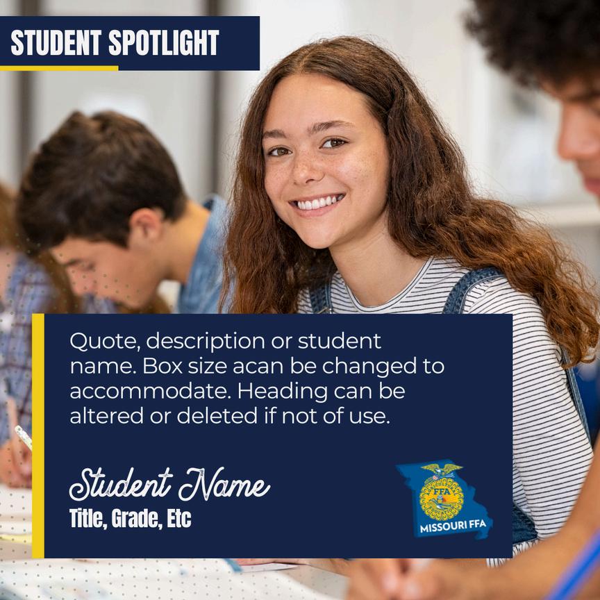
This template can be used to share spotlights. For example, student spotlights, officer spotlights, SAE spotlights, etc. The title can be edited to fit your post. The text box can be resized, moved or deleted as needed.
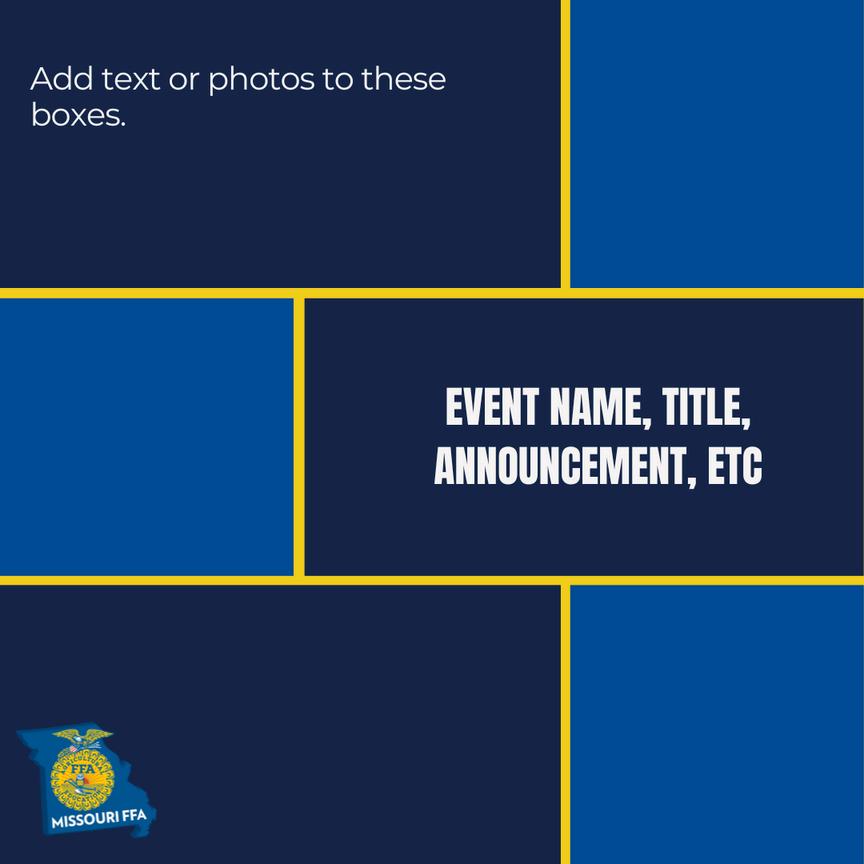
This template can be used to share announcements and other long-text posts. Text and/or photos can be added to any box as needed. The title text box can be moved to a different colored box as needed. You may also leave boxes blank if the extra space is not necessary.

This template can be used to share photos from events. We recommend using this template as a cover photo and adding additional event photos to the post after it.
The corduroy bar can be made transparent and moved up or down as needed. It can also be made wider if the event title is long enough to need a second row. The Missouri FFA logo should be deleted if it is in the way of the title.
Create a free Canva account at canva.com.
1. Paste this link into your browser: https://bit.ly/45Yri0d.
2. Select “Use template for new design.” DO NOT edit the template.
3. A file should open with all three templates included. Before editing, select “File” in the upper left corner of the screen.
5.
4. Select “Make a copy.” This should open a second window with the same template. This file will be titled “Copy of Copy of 2024 Missouri FFA Branded Social Media Templates.”
6.
You may now edit this file as needed, as you have a copy of the original templates saved to your account for future reference.
7.
Once edited, you can download for use by selecting “Share” in the upper right corner, then selecting “Download” and “Download.”





The logos on left should be used in jointly branded materials. Only the logos of the entities publishing jointly branded materials need be used. These logos and the following identity assets should only be reproduced from authorized digital files. Please refrain from the following actions that may alter the logos: altering or modifying the files bending, stretching or rotating the logos altering the colors cropping the logos using shadows or other graphic elements
The joint branding primary color palette consists of blue, corduroy and blue sky from Missouri FFA’s color palette and corn and grass from Missouri Agricultural Education’s. All jointly branded layouts should lean heavily on these colors, mixing in the neutral color palette when necessary. Any of the colors can be made transparent as needed.
The neutral palette acts as a balance for the vibrant primary tones in the joint branding palette. Use them as needed to fill excess space In designs or tone down the overall color scheme. Too much content or too many colors can make for a busy composition.
Thin
Thin Italic
Extra-Light
Extra-Light Italic
Light
Light Italic
Italic
Italic
Italic
USE FOR: HEADLINES, SUBHEADS, BODY COPY, QUOTES, TAGS, NAMES
USE FOR: HEADLINES, SUBHEADS
USE FOR: HEADLINES, SUBHEADS, BODY COPY, QUOTES
USE FOR: SHORT CALLOUTS, QUOTES





Our joint branding icon set includes both specific and abstract objects. The icons always appear in a color from the joint branding color palette.
