The Dreamers Issue A MOTIVATE PUBLICATION DHS 25.00 OR 2.70 BD 2.60 SR 25.00 KD 2.10 ARCHITECTURE, DESIGN, INTERIORS + PROPERTY identity.ae ISSUE 228 / FEBRUARY 2023
C M Y CM MY CY CMY K



44 Features Regulars Design Focus Products Library #idmostwanted 44 70 72 74 28 40 contents 20 Reinventing tradition Studio Lél is reinventing the ancient technique of handcrafted stone inlay 56 A wholesome escape escapefromsofa has designed a soulful home for a family who wanted to escape the chaos of city life 28 Walls of perception Wallmakers aim to build architecture using earth and waste materials 50 Classic meets modern This Beijing home combines traditional Chinese furniture with contemporary architecture 40 The future of craft Trame highlights the shared heritage of the Mediterranean through its diversity of crafts 36 Sands of time The Zaha Hadid-designed Beeah Headquarters creates a blueprint for future smart buildings 24 Making a mark Elvira Solana is using murals to challenge the ways we create space
Editor-in-Chief
Obaid Humaid Al Tayer
Managing Partner and Group Editor
Ian Fairservice
Editor
Aidan Imanova
Designer Hannah Perez
Sub-editor
Max Tuttle
Chief Commercial Officer
Anthony Milne
Group Sales Manager
Manish Chopra
Senior Sales Manager
Sharmine Khan
Sales Representative - Italy
Daniela Prestinoni
General Manager - Production
Sunil Kumar
Production Manager
Binu Purandaran
Production Supervisor
Venita Pinto
Contributors
Amir Hazim
Karine Monié
Head Office: Media One Tower, PO Box 2331, Dubai, UAE; Tel: +971 4 427 3000, Fax: +971 4 428 2260; E-mail: motivate@ motivate.ae

Dubai Media City: SD 2-94, 2nd Floor, Building 2, Dubai, UAE
Tel: +971 4 390 3550 Fax: +971 4 390 4845
Abu Dhabi: PO Box 43072, UAE, Tel: +971 2 677 2005; Fax: +971 2 677 0124; E-mail: motivate-adh@motivate.ae
Riyadh: Office 452, Regus Offices, 4th Floor, Al Hamad Tower, King Fahad Road, Al Olaya, PO.Box 12381, Riyadh 6764, Kingdom of Saudi Arabia; Tel: +966 11 834 3595 / +966 11 834 3596; Fax: +966 11 8343501
London: Acre House, 11/15 William Road, London NW1 3ER, UK; E-mail: motivateuk@motivate.ae
id
® contents 34
entity
Photography by Amir Hazim

BY
- T. +961 1 333767 BY MADAR HOME SIGNATURES, 5A BY THE WATERWAY DEVELOPMENTS, NEW CAIRO - EGYPT - T. +2 010 1 110 4390 BEIRUT CAIRO
M-GROUP SAL, ACHRAFIEH, ACCAOUI STREET, IVORY BUILDING, BEIRUT - LEBANON
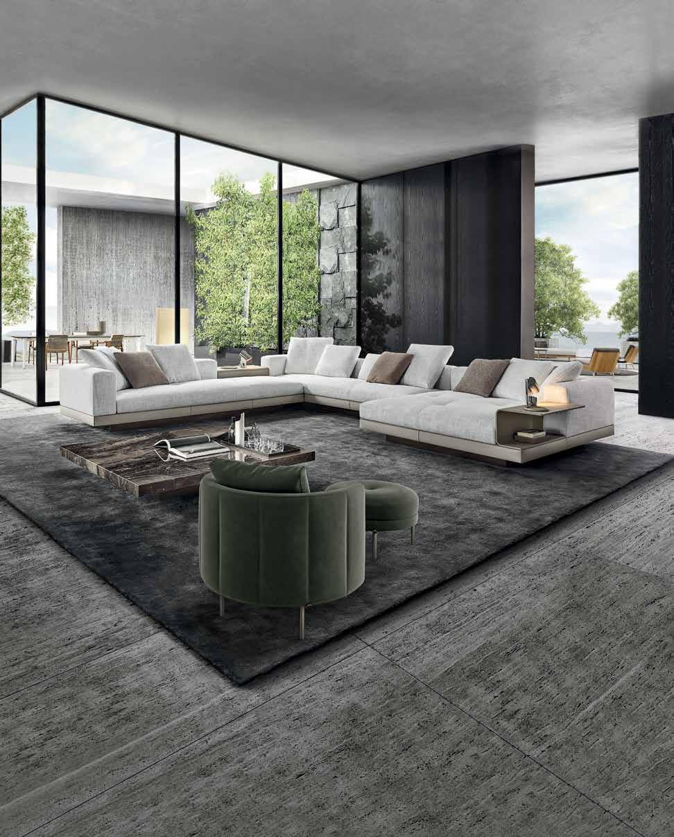
CONNERY SEATING SYSTEM | RODOLFO DORDONI DESIGN TORII ARMCHAIR | NENDO DESIGN BOTECO COFFEE TABLE | MARCIO KOGAN / STUDIO MK27 DESIGN DISCOVER MORE AT MINOTTI.COM/CONNERY
Editor’s Note
As children we are often encouraged to dream, but the older we get, the more we are introduced to caution, told to think safely, to be rational; not to dream too big because… what if it doesn’t work out?
Today when we look at some of the biggest accomplishments in any industry, many of the people behind these accomplishments will mention the importance of having a dream, a vision or a goal, and not succumbing to what may be considered the “safest path”.
In many of the interviews in this month’s ‘The Dreamers Issue’, we heard from architects and designers about breaking the status quo – not only to fulfill a dream of their own, but to create in a way that allows for a better future, even if the path to that future is more challenging.
The field of architecture, for example, is still centred around creating new buildings, but architects
Vinu Daniel and Elvira Solana are setting their sights on new approaches with the hope that more architects today start becoming conscious of the kind of structures they are bringing into the world.
For Daniel – who has vowed to use earth and waste material to build his projects – the fundamental question goes beyond, ‘how should we build?’ to ‘should we build at all?’
“The first question to be asked is ‘should we build?’ and in the inevitable case that we need to build is where the second question comes in, which is ‘how should we build?’. The answer to that question lies in the site that we are going to be building in or in the neighbourhood around the site. What is different in every project is the site. Hence the site is the God, and the design should always be our interpretation of that site,” he says.
Solana, on the other hand, takes a different approach; using murals as an act of altering an architectural space without having to knock down any walls.
“Using paint as a constructive element, I can create something new without creating something new. This is what I intend to do: rethink space through surface intervention alone,” she explains. “There is no need to knock down any wall. We can just modify the way we perceive them, transforming the architectural perception of a room or a space – creating architecture by painting architecture.”
And while the results of such commitments are sure to take time, if more people in our industries commit to their own dreams of building a better future, then surely, we will start seeing some of these dreams becoming a reality.
On the cover: A home in Beijing designed by KiKi ARCHi
Aidan Imanova Editor
 Photo by Young Habibti
Photography by ZHANYING Studio





Interpreting emptiness
On view at Maraya Art Centre in Sharjah until 13 February 2023, the exhibition ‘Space Between’ delves into the work of UAE-based artist Patricia Millns, inviting viewers to take time for contemplation
 WORDS BY KARINE MONIÉ IMAGES COURTESY OF MARAYA ART CENTRE
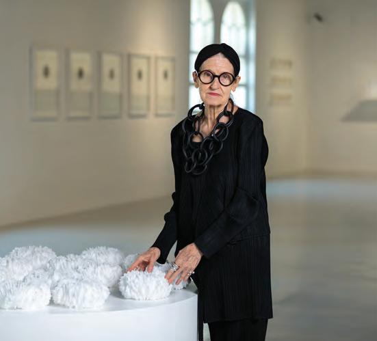
England-born artist Patricia Millns has been based in the Middle East for over 40 years; she has lived in Kuwait and Oman, and currently resides in the United Arab Emirates. The region has played an impactful role in her life, and similarly, has strongly influenced her extensive career as an artist.
“The welcome, hospitality, friendship and love of the people of [the Arab world] has informed my practice and my life,” she says. “I can’t mention individual names as it is the entire nation. They have allowed me to make this my nest, my refuge, my sanctuary… my home.”
Initially fascinated by the repetition of imagery in Islamic art and design, Millns has developed her own language throughout her career, connecting the West and the East while expressing a strong interest in fashion.
“Symbolism of the cultural, textile and olfactory heritage of the region, in particular woman’s studies, has informed my work,” she explains.
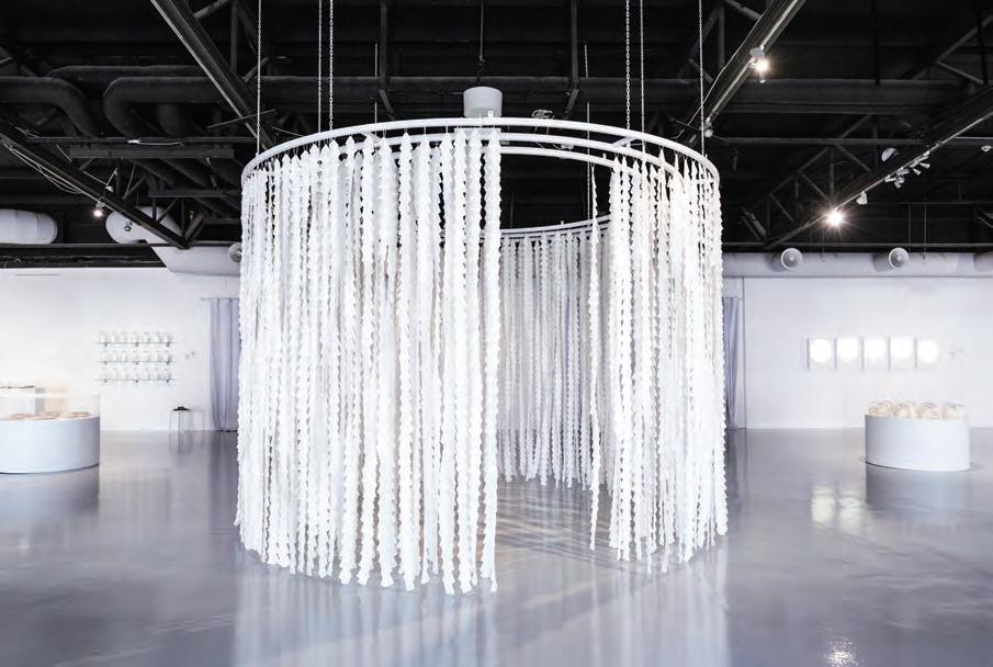
Pieces created by the artist over the last two years are being presented in this solo show at Maraya Art Centre in Sharjah until 13 February 2023, under the title ‘Space Between’, referring to the Japanese principle of ‘ma’ that is at the heart of Millns’s practice.
“In Japanese culture, this interval or break is what allows you to reflect on what was just said, or to appreciate the other person in front of you,” describes curator Nina Heydemann (director of Maraya Art Centre and 1971 Design Space). “Quite literally, ‘ma’ addresses enlightenment through concentration on the meaningful. Often, we don’t listen to silence anymore, nor do we appreciate it. This is exactly where Patricia Millns’s artworks start – driving out the noise and focusing on the lessons of simplicity.”
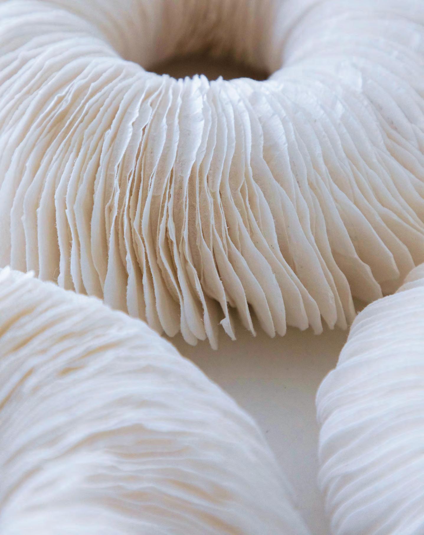
Through the use of understated materials and everyday domestic objects such as tea bags, coffee filters and paper doilies, as well as needlework, Millns invites viewers to pause and observe, to experience and understand her artworks through knowledge and imagination, to appreciate silence and to interpret the empty.
“The spaces between the objects become as valid as the objects themselves,” says Millns. “Their placement creates intervals within which to contemplate and experience a different passage of time.”
Influenced by British artist and potter Edmund de Waal, the notion of repetition and seriality is omnipresent in Millns’s work. Echoing the concept of infinity, the circle is also a recurrent motif.
Recently, Millns started to create nests composed of steel wires and hand-collected white feathers,
reminiscent of the work of German conceptual artist Rebecca Horn. Drawing inspiration from a variety of sources that run from fashion designer Issey Miyake – for his interest in technology and ability to transform fabrics – to 13th-century Persian poet Rumi, Millns constantly strives to “go beyond the surface illusion and lose oneself in a deeper spiritual dimension.”
“Density and transparency enter an interesting dialogue in this exhibition, the same way that [the] absence and presence of colour does,” says Heydemann. “The artist fulfils her own take on the ‘space between’, a space where just the right balance between appearance and disappearance is struck. Literally, a ‘Room for Thought’.” id
11 THE DREAMERS ISSUE art
An image of change
Aïda Muluneh’s solo exhibition at Dubai’s Efie Gallery tackles topics of advocacy through surrealist photography
 WORDS BY AIDAN IMANOVA PHOTOGRAPHY COURTESY OF THE ARTIST AND EFIE GALLERY DUBAI
In the Valley of My Shadow, 2021
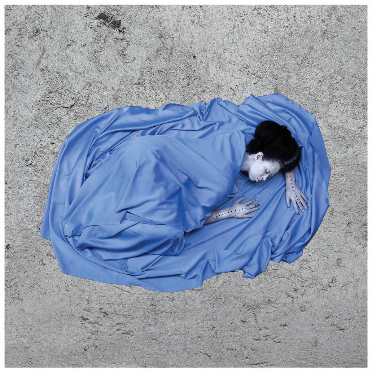
There is no mistaking the striking images of Ethiopian photographer Aïda Muluneh, which typically depict female figures with faces bearing masks, paint and intricate patterns, dressed in chromatic garments. While one may assume that Muluneh’s female protagonists are a representation of a surrealist world of fantasy, that would only be half true. Her visual expression is often a reflection of her own personal experiences and explores both the realities and fictions of post-colonial Africa, while drawing the viewer towards topics surrounding human rights, the environment, conflict and health.
Muluneh also explores the African female identity within the colonial experience while interrogating the foreign gaze on African women and advocating for the development of photography in the continent and its impact in shaping cultural perceptions.
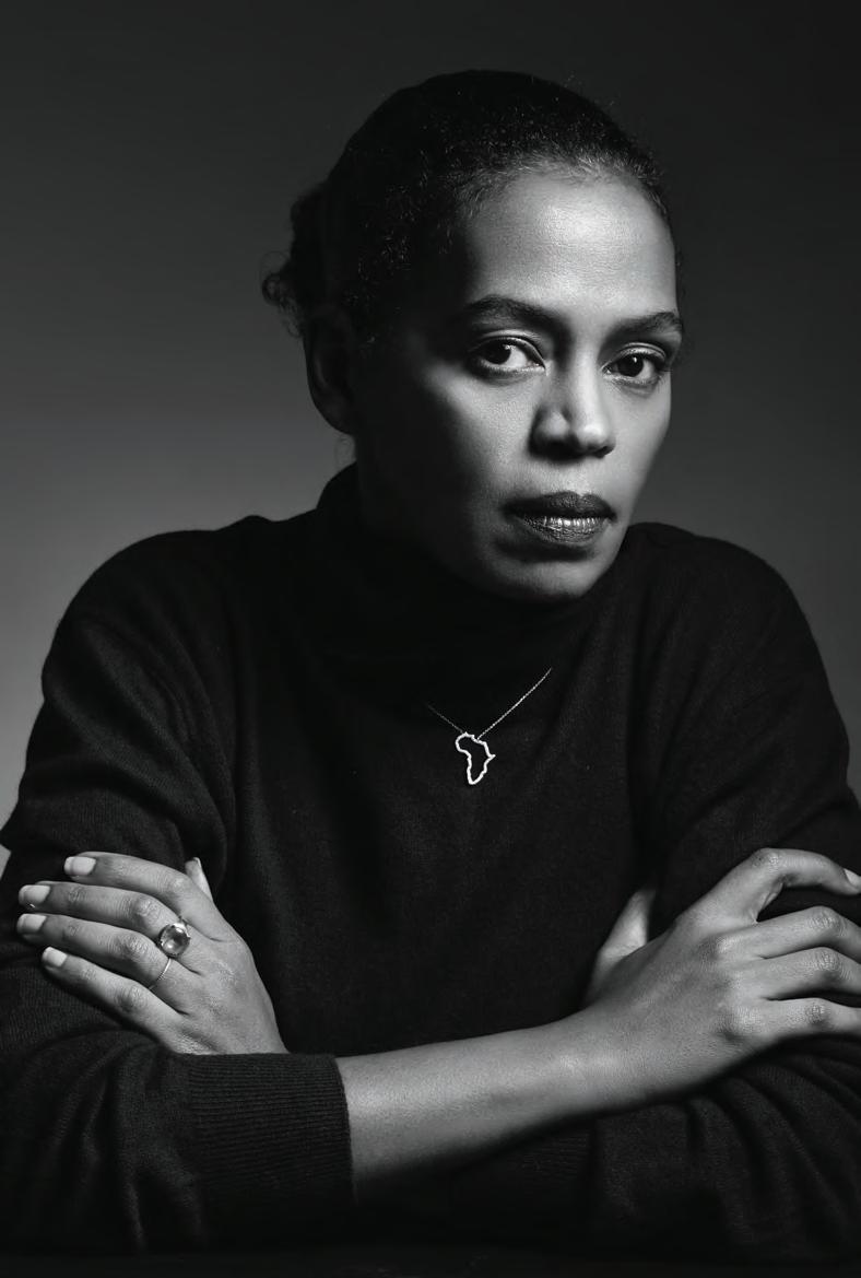
“Aesthetically [my photographs represent] a different approach on representing social issues in Africa without the western cliché that continues to promote the one-sided story,” she explains. “I am utilising my creativity to express topics of interest through a different visual language. The basis of my work is rooted in realities that are expressed through an abstract visual form.”
Having creatively directed Efie Gallery’s solo exhibition titled ‘Shard Song’, showcasing the work of pioneering Ghanian artist El Anatsui, Muluneh’s own solo show at the gallery, titled ‘The Art of Advocacy’, is the continuation of an impactful collaboration, part of the gallery’s aim in representing and advancing both
established and emerging artists from the African continent and its diaspora. “We as a family have long admired Aïda, both as an artist and an advocate, and her ethos aligns with the gallery’s vision – she is innovative and challenges norms while respecting traditions, [as] evidenced through the number of initiatives that she has found, including Addis Foto Fest,” say the founders of Efie Gallery, run by
13 THE DREAMERS ISSUE art
Aïda Muluneh
Photography by Mario Epanya

The Blind Gaze, 2021
Valentina, Kobi and Kwame Mintah. Much like its name suggests, the collection at Efie Gallery – on show until 24 February 2023 –showcases commissioned works on the topics of advocacy relating to water scarcity, health and the plight of war. It is also the first time the artist is displaying a new piece of work in which she explores a new process of hand-painting acrylic on photographs. Also on display are works from her ‘Water Life’ (2018) series – commissioned by Water Aid – through which she addresses the plight of water access in rural regions and its impact on liberation, health, sanitation and education. Set in the arid salt flats of Dallol in northern Ethiopia, Muluneh draws from her own experience of regions where the transportation of water to various households falls
on the women who do so by travelling on foot. The works advocate the urgent supporting of clean water in the rural regions of Africa. Another series, ‘The Crimson Echo’ (2021) – commissioned by The END Fund – highlights the impact of neglected topical diseases (NTDs) on gender equity, mental health, mobility and access to resources. Featuring insects and abstracted body parts, as well as elements of Ethiopian body ornamentation used to honour traditional knowledge and beliefs across Africa, the works look to dismantle bleak representations of the continent while provoking the viewer to question whom these diseases affect and why.
“My approach is to shed light on social issues that evoke questions in the viewer on [their] causes,” Muluneh concludes. id
15 THE DREAMERS ISSUE art
The More Loving One Part 2, 2016
Cabinet of curiosities
Fashion designer Nadine Mos’ latest venture into sculpture is an ode to her childhood self and a means to honouring her Egyptian heritage
 WORDS BY AIDAN IMANOVA
When one of the small fashion brands she worked for shut down due to a lack of funding, designer Nadine Mos found herself faced with the harsh reality of running a design business. “[This] is such a common story in fashion,” she says. “It’s so sad because the reality is that being super talented and hardworking is not always enough for you to succeed. I saw this many times in my process.”
Of Egyptian heritage, born in Kuwait, and brought up in Dubai, Mos moved to Toronto to complete her last year in high school and graduated from the Toronto Metropolitan University with a degree in fashion design. Upon completing university – which she did following countless challenges – Mos moved to London to pursue her career in fashion, which didn’t quite go as she had planned.

“Even though I had two jobs I still couldn’t afford to buy the clothes or the things I wanted and that’s where my brand fell into place because I just started making my own clothes. I got a sewing machine – it was the first thing I got when I moved to London – and I just sewed whenever I had time and it became something my friends and others noticed. I kept getting asked about what I was wearing,” she remembers.
A trip to her native Egypt inspired Mos with its rich craftsmanship which she felt was underappreciated. “I had never seen craftsmanship and work at that level, and I live in London where you see good work. I was so humbled by my own ignorance. And it is a standard of work that is not credited or valued simply because it is not from the West,” she says.
Enter the pandemic and Mos was stuck in Toronto for seven months, not being able to return to London and falling into a depression. “I surrendered completely because everything I wished for was not happening,” she admits. It was around this time that Mos started sewing again, finding a plain white cotton jersey fabric in her suitcase, and deciding to fashion a dress out of it for the summer.
“I decided, just by coincidence, to post that picture of the dress on my Instagram and that dress is now my bestselling dress and it is the reason why I have a brand,” she shares. “It sold out within 10 minutes; I couldn’t even believe it.”
Around this time Mos moved back to London, where she found a ‘tiny’ studio from which she created her designs. “It was so tiny, but it was perfect; it was just what I needed,” she says. “One of my studio mates called it ‘The Cabinet,’” she laughs, “but in that cabinet, my creativity flourished. And it was the first time I had a place that was fully my own. I had always wanted a dream world and I got [the chance] to create one, even if it was in a cabinet.”
Mos’ curiosity for sculpture sparked on her trip to Egypt but solidified even further when she realised that her fashion career was starting to grow faster than she was able to maintain and she felt that another outlet was necessary.
“Because of my trip to Egypt, what I realised is that the master sculptors of the world were the Egyptians and everybody else were just learning from them. It also made realise that many sculptors that we respect in the West – such as Henry Moore and Barbara Hepworth – all borrowed from the Ancient Egyptians. And we praise their work, but we
17 THE DREAMERS ISSUE art
don’t actually go back to the source. And to me it became a mission that if I can have any visibility in the world, I will bring it back to my heritage,” says Mos.
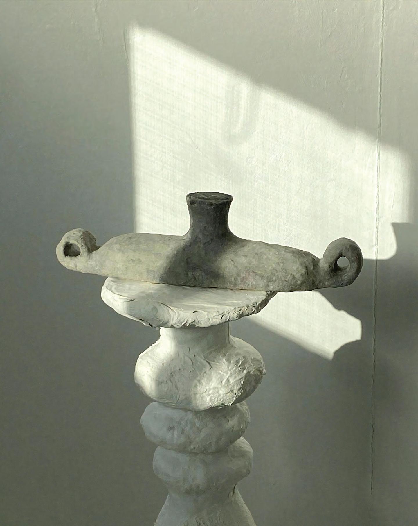
Mos’ sculptures – which she makes out of papier-mâché – began garnering attention.
“When you hold it, it feels solid and heavy, but it’s still not considered a serious material. At the time I couldn’t afford clay or plaster, so I decided to go with the cheapest material that was accessible to me from a dollar store. That was what I needed and that’s how it started,” she explains.
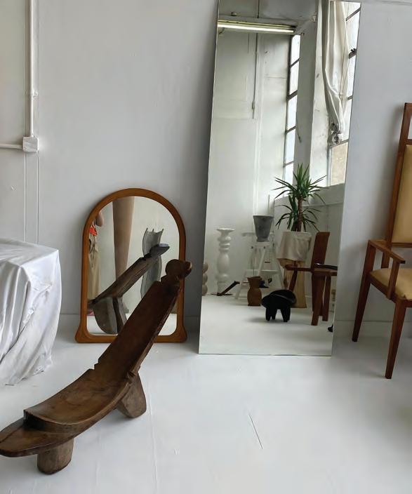
Mos has made vases, plinths, and a lamp, and is experimenting in reproducing some of the pieces in other materials. “I like that my process is very step-by-step and DIY, so if I were to reproduce it, I would know every step of how to get there and I could pass the knowledge on to someone else,” she says.
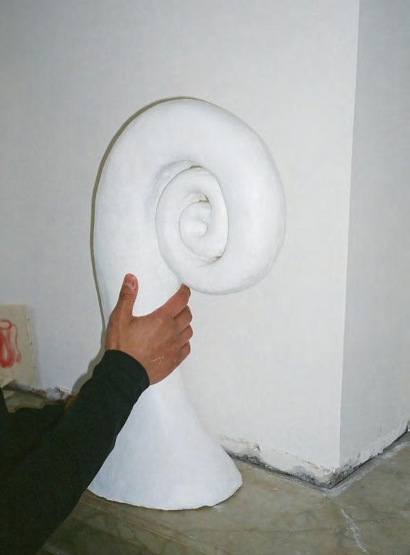
“When I was creating, I was really obsessed with a whimsical universe,” she muses. “I really wanted a dream world, even if it looked ridiculous that was what I wanted. I wanted something with soft forms, soft shapes, that looked wonky and not necessarily well-made. I think I wanted to create something that if my childhood-self walked in and saw it, she would be screaming of joy and excitement. That was my intention.
“I kept all the pieces in white but very wonky in shape, so you will see there are no sharp edges, they are very round. To me they are like bodies. It’s something for the kid in me to live, to keep on going and that was the idea of why I created in the way I created. As a child, I always felt safe in my dreams. So, for me what was in my head started coming out of my fingers. I owed it to my childhood self to do this.”
Although already gaining attention for her work, Mos has decided to take time to really hone and learn her craft. “[Sculpture is] something I love too much to just do for a quick year. This is my life and if it’s my life then I’m not rushing it.” id
18 art

Reinventing tradition
In northwest Pakistan, Studio Lél is a creative collective at the crossroads of fine art, design and craft, creating exquisite objects using a reinvented ancient technique of handcrafted stone inlay
 WORDS BY KARINE MONIÉ
Few people outside of Pakistan may have heard about its city of Peshawar – which is located close to the Afghanistan border. However, in the opinion of architect and artist Meherunnisa Asad, the artistic director of collective Studio Lél, Peshawar should be considered a cultural hub.
“There are still many misconceptions about Pakistan in the West,” she begins. “Many people have a distorted perspective of the country because of what they see in the news. Peshawar is one of the oldest living cities in South Asia, with a walled city that is remarkably well preserved.”
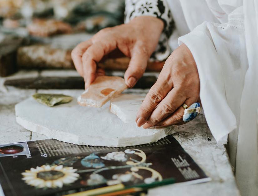
It is there – in the sixth most populous city of the country – that Studio Lél has its workshop. Everything started around 30 years ago, when the founder of the collective, Farhana Asad (Meherunnisa’s mother), came across a box in a bazaar in northern Pakistan that was adorned with inlaid stonework. When Farhana found the
20 craft
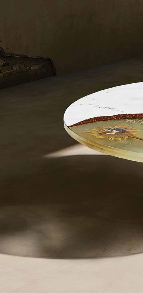
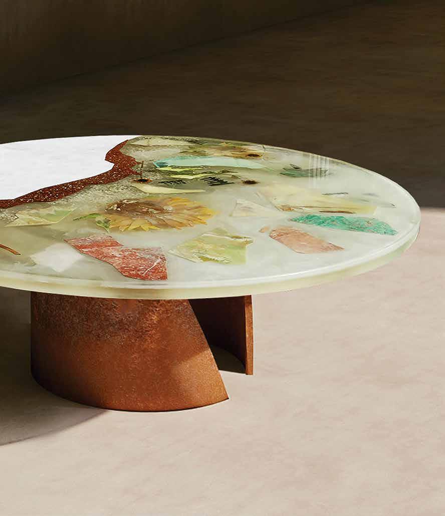
Together Apart Dinette, featuring Lapis Lazuli, Serpentine, Malachite, Jade, Amazonite, Jasper, Onyx, marble, preserved flowers, leaves and resin
21 THE DREAMERS ISSUE craft
Photography courtesy of Studio Lél
Afghan craftsman who had made this piece, she asked him to give her lessons. This collaboration between artisans who have mastered old techniques and people escaping the war in Afghanistan is key for Studio Lél today.
“When refugees cross borders, they bring tangible and intangible parts of their culture with them,” says Meherunnisa, who graduated from the National College of Arts, Lahore and Pratt Institute in New York City. She has worked as lead conservation architect at the Aga Khan Historic Cities Programme on the conservation of the Lahore Walled City project before joining Studio Lél. “Making becomes part of the healing mechanism – a belief in something that is greater than, and beyond, the region’s sustained conflict and migration. I believe craft has the power to reconstruct identity.”
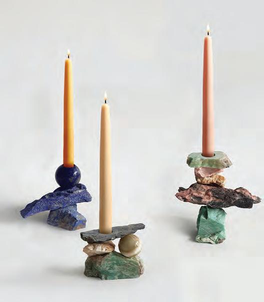
At the heart of Studio Lél is the art of pietra dura, which dates back to the Roman opus sectile technique that reached its peak during the Italian Renaissance in the 16th century. Consisting of the cutting and fitting of stones into intricate forms, it was considered similar to painting in stone and soon found echoes in Iran, Russia, India, Afghanistan, Pakistan and other countries throughout South Asia. At Lél, this art form now also incorporates other techniques such as French verre églomisé (glass gilding), Chinese cloisonné (enamelling), Italian scagliola and epoxy resins,
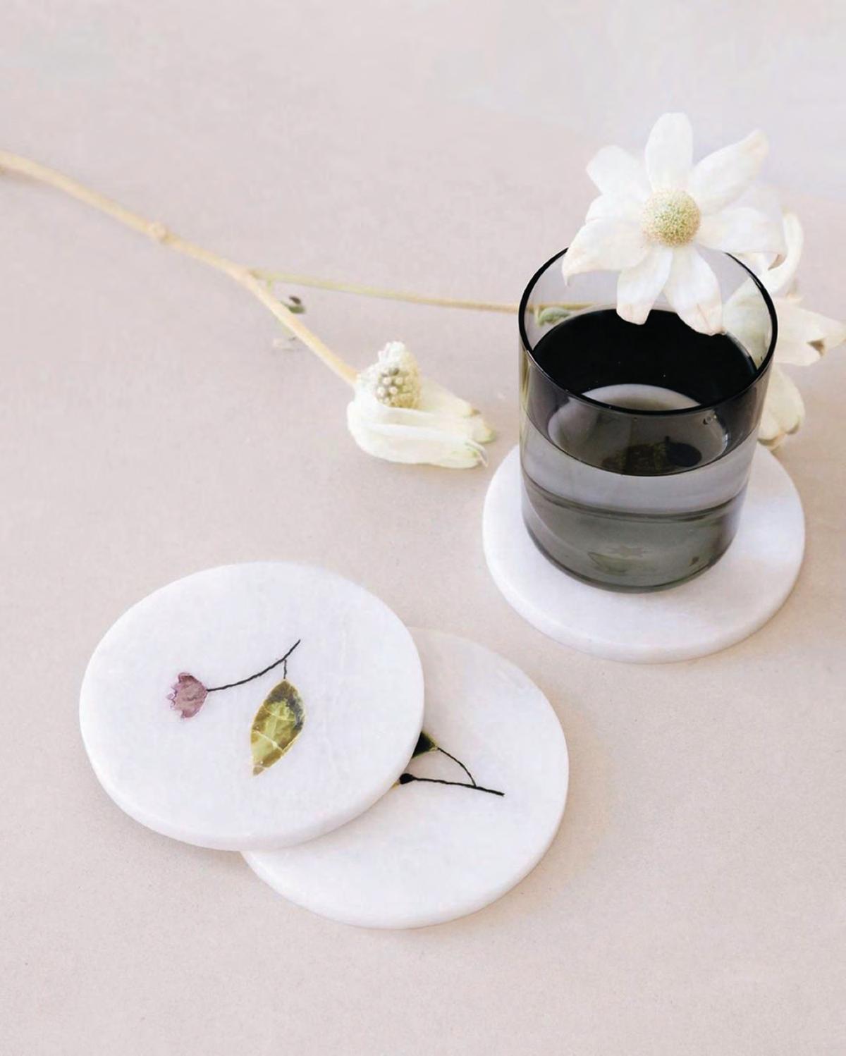
resulting in one-of-kind furniture and decorative objects. From onyx, jasper, amazonite, agate, jade, serpentine and sandstone to coloured marble sourced from the mountains of Pakistan, lapis lazuli from the Badakhshan province in Afghanistan, malachite from South Africa and turquoise from Iran, a variety of gems and semi-precious stones adorn Studio Lél creations, offering a vast array of colours to create an infinite number of motifs.
For Meherunnisa, telling the stories of the artisans who created these pieces is just as important as preserving their savoir-faire. In addition to promoting the traditional crafts of her country, she also strives to offer a reinterpretation of it, to make it accessible to an international audience. This approach has proven to be successful, with the growing recognition of Studio Lél beyond the borders of Pakistan over the past few years. It’s collaborations with designers and initiatives across the globe – such its recent work with Nada Debs and its collection with Sharjah-based platform, Irthi – has helped spread its message beyond its national borders.
“Through my practice, I seek to draw the world’s attention to Peshawar’s layered history, its importance in the region and the fine craftsmanship that has existed and flourished here for centuries – encouraging new perspectives of Peshawar within its citizens and abroad,” Meherunnisa concludes. id
22 craft
This page, top: Sage Goddess candle holders featuring Onyx, Lapis Lazuli, Jasper, Amazonite and marble. Next page: Studio Lél x Bulbul Home coaster sets featuring Serpentine and Calcite inlay on marble
Photography courtesy of Studio Lél
Photography courtesy of Studio Lél
23 THE DREAMERS ISSUE craft
Photography courtesy of Bulbul Home
Making a mark
While the field of architecture continues its focus on new buildings, Spanish architect and muralist Elvira Solana has other ideas
 WORDS BY AIDAN IMANOVA
PHOTOGRAPHY BY DAVID MOYA
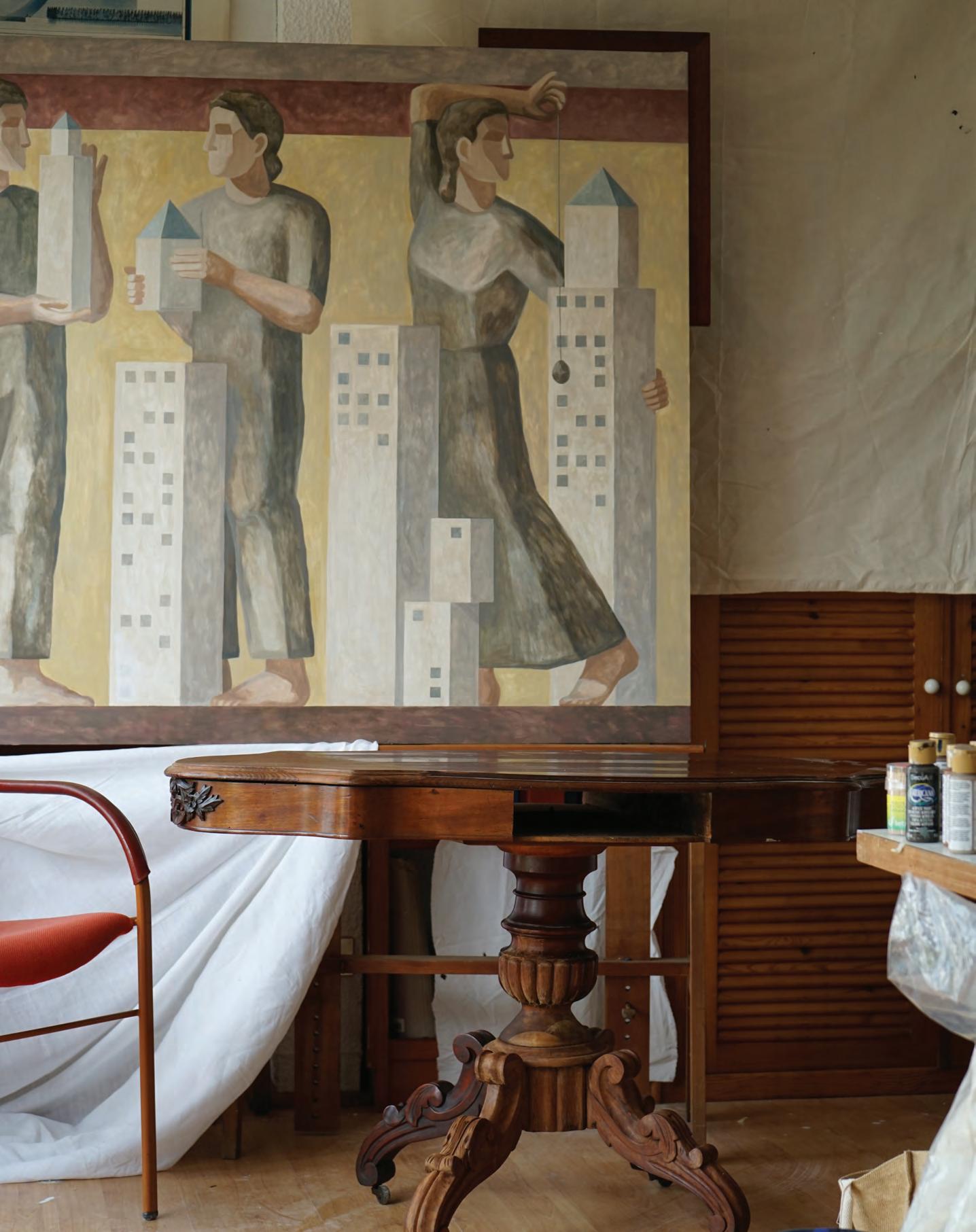
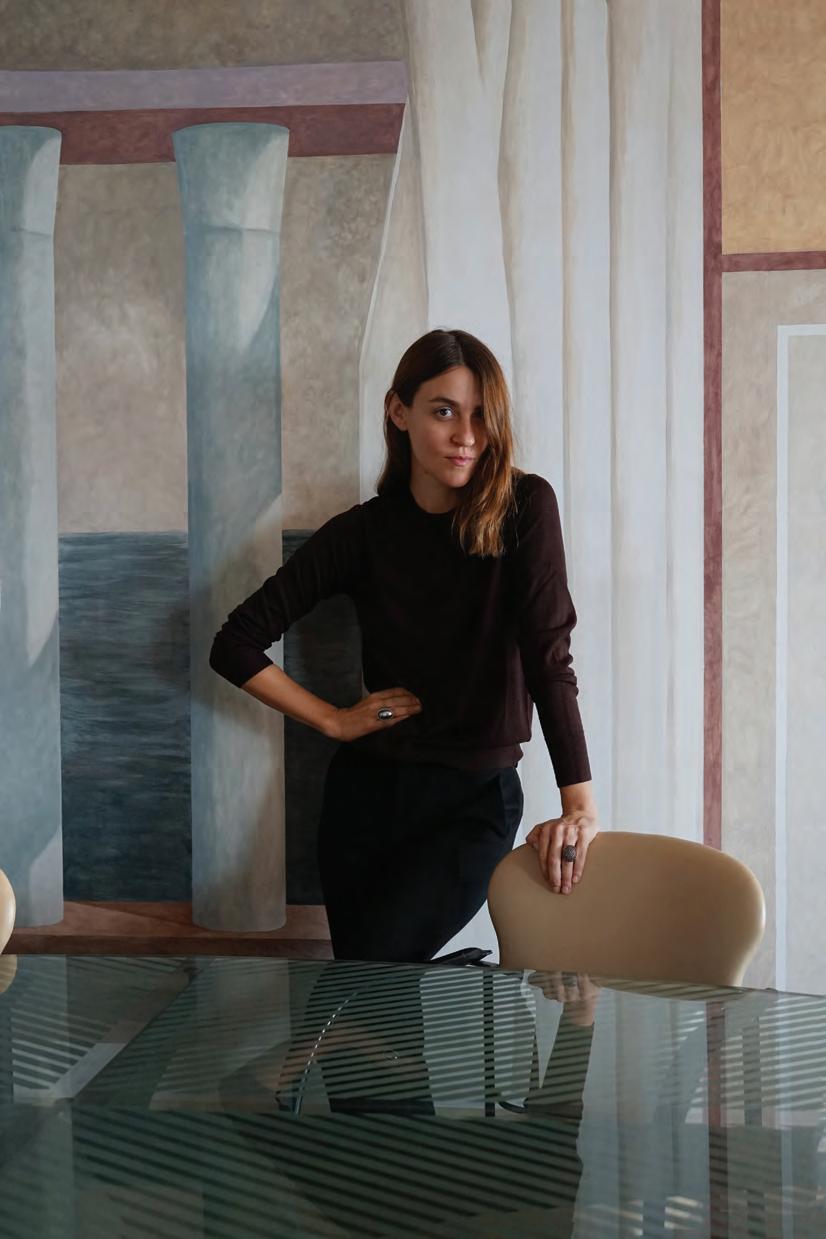
Architecture transforms our physical habitat. A mural [on the other hand] can transform the way we perceive architecture,” begins Spanish architect Elvira Solana, whose transition into painting murals is part of a wider mission to rethink the ways in which one can practice architecture. Having studied in cities across the globe – from Madrid and Barcelona to Ahmedabad, Istanbul, Paris and Florence – for Solana, painting architecture is another way of creating architecture – without having to actually build anything. “Using paint as a constructive element, I can create something new without creating something new. This is what I intend to do: rethink space through surface intervention alone,” Solana explains. “There is no need to knock down any wall. We can just modify the way we perceive them, transforming the architectural perception of a room or a space – creating architecture by painting architecture.”
Solana’s projects are wide-ranging and include commissions from private clients, restaurants and brands. “I have always interpreted
murals from an architect’s perspective. Unlike a painting on canvas, a mural is always made for a specific context and location. The painting (mural) and the surface (wall) become an inseparable unit. The context [becomes] part of the mural, and vice versa,” she explains.
For Sant Ambroeus restaurant in Milan – designed by architect Fabrizio Casiraghi – Solana has painted a wooden panel, her first time working on free-standing walls.
In the bathroom of a private home, another mural called ‘Private Pleasures and Misfortunes’ is an 80-centimetre frieze that surrounds the entire room. The project is two-sided: one side is
25 THE DREAMERS ISSUE architecture
Previous page: Saint Ambreous restaurant in Milan. This page: Elvira Solana in her Santander apartment
“

allegorical and refers to traditional Roman paintings; while the other, Solana describes as an “architectonic essay depicting a series of geometrical objects with a theoretical – rather than metaphorical – intention.”
“From an architectural point of view, each mural is a unique project – it must be made to fit in a specific location and serve a specific purpose,” says Solana. “Therefore, the first step in the design of a mural requires a correct analysis of the context through experience, plans, architectural models and sketches. Each project gives rise to its own storyline and, therefore, has its own look and feel.”
For her own apartment in Santander, Solana created a ‘virtual’ expansion that transformed the “pictorial space into an architectural one” without the need to knock down any of the walls in the home. Instead, she painted a colonnade beside the dining room and a pyr-
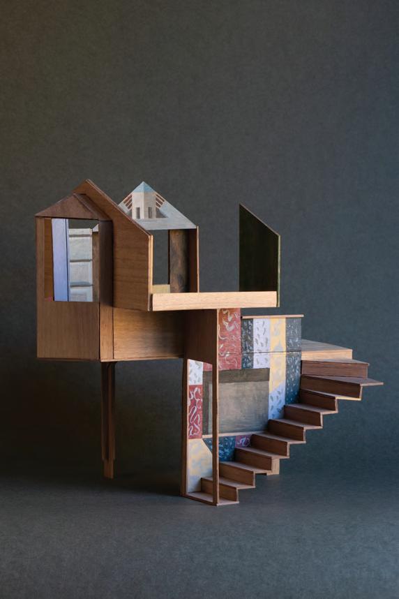
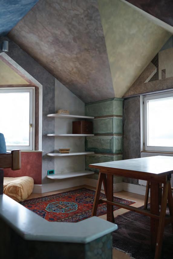
amid behind the living room, completely transforming the spatial qualities of the space. “Using the classic trompe-l’oeil technique, the context and the perception of space are modified to question our pace and way of life, all while re-establishing the dialogue between architecture and painting. Is it possible to transform our homes without wasting goods and material resources? Indeed, it is,” she says.
For Solana, choosing murals was a conscious response to the negative impacts of building. “The world we inhabit is physical and finite. Even our digital actions have some material consequences on the planet,” she says. “[Therefore], we need to think about ways of living and transforming architecture without creating more material waste. Although none of our actions are completely impact-free, murals can transform architecture with [the] minimum waste of materials and resources.” id
27 THE DREAMERS ISSUE architecture
Previous page: Solana’s Santander apartment features a classic trompe-l’oeil technique that has transformed the spatial qualities of the space. This page from left: Studuilo Tower. A private studio. Santander, 2022. Paravent. Personal art project. Madrid, 2022
Walls of perception
Indian architect Vinu Daniel challenges the way we build by creating architecture that uses mud blocks and waste material
 WORDS BY AIDAN IMANOVA
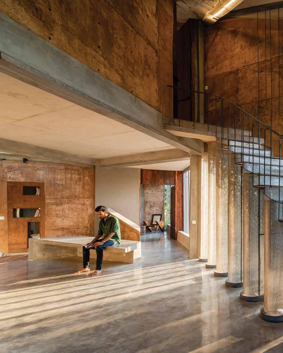
Shikhara, 2019
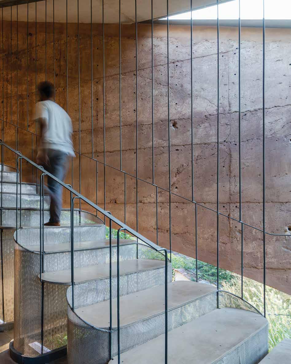 Photography by Akash Sharma
 Photography by Syam Sreesylam
We cannot ignore waste,” begins architect Vinu Daniel, founder of Wallmakers, an architecture practice based in Kochi, India that is committed to building using only mud and waste materials. “One must start thinking that maybe waste is a new material because it is all we may have in the future. We must prepare ourselves for the day when the resources we take for granted may no longer exist.”
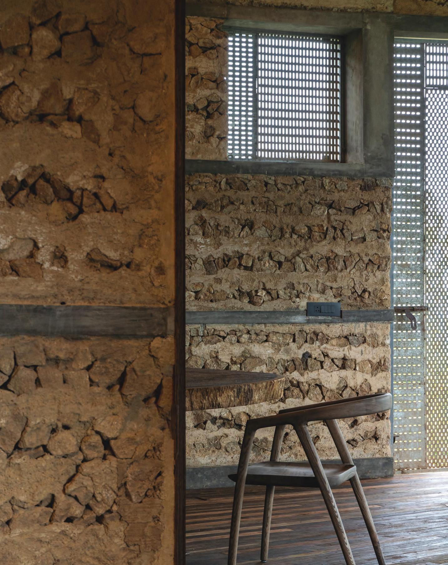
“All our earlier settlements have always been made of natural materials. But the sad fact is that today, less than thirty percent of the world’s population live in buildings made of earth, even though it is a more sustainable and durable material; the blame of which may be solely placed on the advent of industrialisation and a widespread demand for ‘cement’ houses,” he continues. “We, at Wallmakers, have devoted ourselves to the cause of using mud and waste as chief components, to make structures that are both utilitarian and alluring.”
Born and raised in Abu Dhabi – and aspiring to become a musician – Daniel’s dream career took a backseat at the insistence of his family that he find a ‘conventional profession’. As a result,
Daniel decided to move back to his hometown of Kerala to study architecture at the College of Engineering, Trivandrum, imagining it to be a creative space to express himself. “Within a year or two, I was angered by the pedagogical framework within which conventional architecture was taught,” he shares. “Adjusting to it was difficult, and I felt that architecture had become all about satisfying one’s ego.” It was during this time of disillusionment that Daniel had a chance meeting with pioneering British-Indian architect Laurie Baker in his fourth year of college. “[This meeting] played a critical role in making me fall in love with architecture,” Daniel remembers. Baker taught him that architecture can, in fact, symbiotically coexist with nature. He also revealed to Daniel some of the wisdom told to him by the revolutionary Mahatma Gandhi, about the need to build for ordinary people in need, living in villages and in the congested areas of cities. “One of the things that Gandhi said [that] has influenced my thinking,” Daniel shares, “is that the ideal house in the ideal village should be built using material that is found within a five-mile radius of the home.
31 THE DREAMERS ISSUE architecture
“
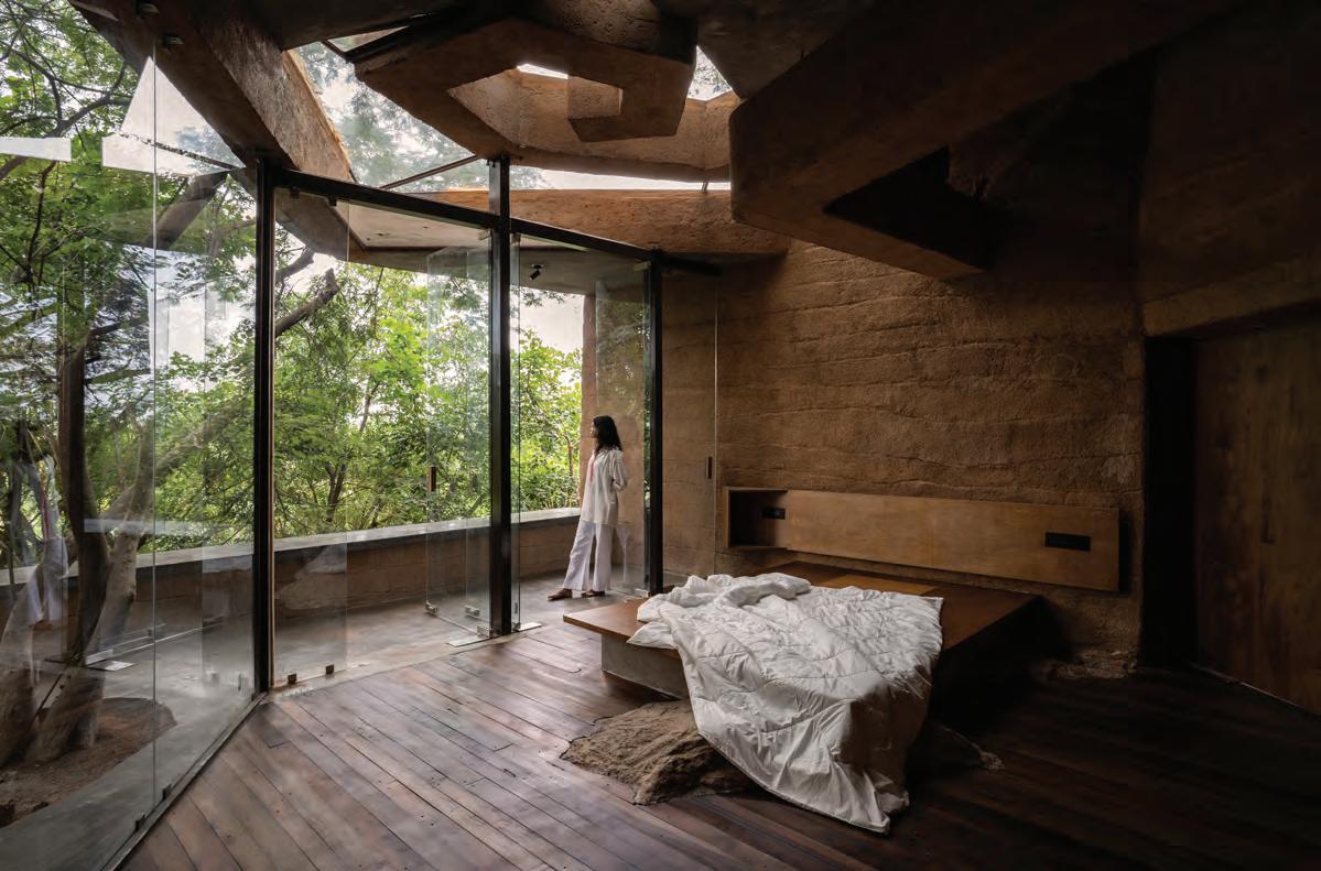
Left: Chuzhi, 2020 This page: The bedroom in Wallmaker’s Chuzhi project looks out to the surrounding nature
Photography by Syam Sreesylam
Upon concluding his architecture degree, Daniel travelled to Auroville, India where he trained under Satprem Maïni, director at the Auroville Earth Institute in CSEB, learning about Nubian building techniques and vault-making. It was during this time that Daniel worked on rehabilitation projects in the Tsunami-stricken areas of Tamil Nadu. Returning to Pondicherry (Puducherry) in 2007, Daniel started Wallmakers, where for many years he practiced building with only mud blocks.
Things changed when one client commissioned a home on a site that was once a dumping yard for construction waste, encouraging the architects to question how the waste around them could be utilised for the project. “That’s when we did our research and first came up with the ‘debris wall’ and later the ‘shuttered debris wall’, which are our patented techniques now,” Daniel remembers. “Once again, it’s coming back to the Gandhian philosophy of utilising materials found within a five-mile radius. In India you will find lots of waste material like plastic and construction debris strewn around the cities everywhere we go.”

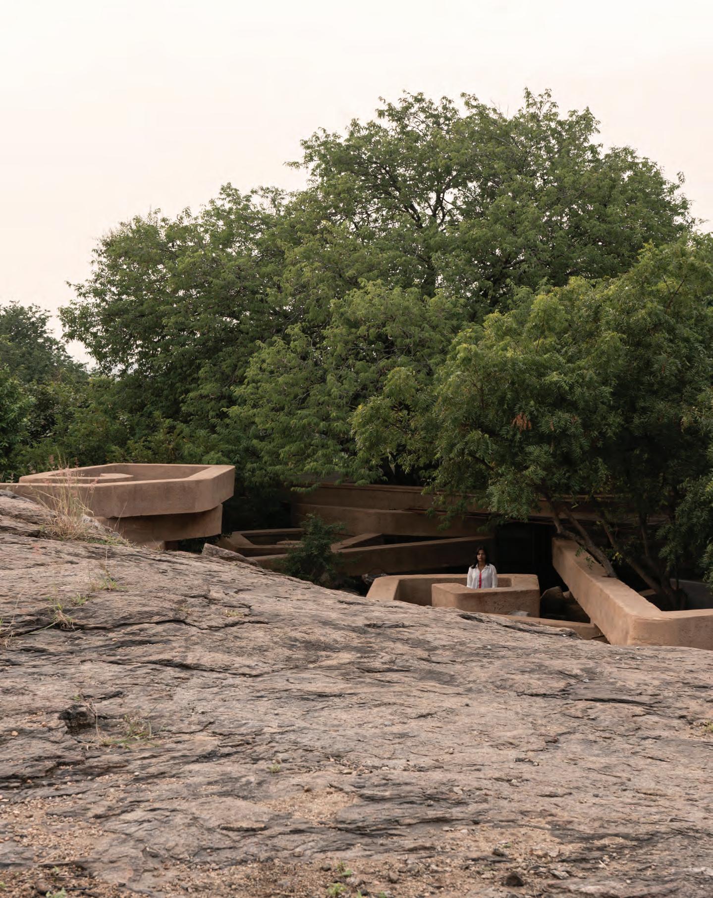
Wallmakers’ latest project is called Chuzhi (meaning ‘whirlpool’ in Malayalam), whose premise is about understanding how one can build on sites that are generally deemed ‘unsuitable’ for construction; in this case, it being a steep rocky typography with large trees and thick vegetation.
“In current times, when people are obsessed with achieving beautiful scenic views from their homes, and less concerned with how their houses end up looking like unnatural eyesores in beautiful virgin landscapes, our concept here of ‘camouflage architecture’ [allows the] buildings to stay hidden and merge seamlessly with the existing topography.”
The home consists of ‘swirls’ of precast poured debris earth composite bottle beams, fashioned from 4000 discarded plastic bottles, designed around the three large Tamarind trees on site. The idea was to make a subterranean home that would originate from the rock bed, forming multiple whirls around the tree and adjoining to create a secure private space below for the residents, as well as a space around the trees above to ensure that the thick vegetation and ecosystem continues to thrive undisturbed. “I strongly believe that it’s better not to build rather than contribute poorly designed buildings, and it’s okay to take time,” Daniel muses. “Understanding the value of the material is the essence of architecture. Every blade of grass is valuable. Take your time and
pray before cutting it. We are answerable to every organism on site. No matter how little we can do to protect them, we must.”
Daniel adds that those dismissing waste material and earth as secondary in quality and luxury are, in fact, in the wrong. “I believe that these false notions stem from a fact that is wire-brained in us, which is that ‘waste’ cannot look beautiful. Mud in today’s time is associated with being ‘a poor man’s material’. We need to stop looking at materials with these misconceptions and start seeing them for what they are: their properties, the advantages they offer us. We do not condemn the use of any material, even concrete and steel. But it becomes a serious problem if we do not understand a material and start using it in a non-judicious manner.
“And secondly, what is luxury?” Daniel questions. “Today the word ‘luxury’ has been confined to the kind of finishes clad onto buildings and interiors. But luxury can also be about the quality of space or a passively cooled building that allows you to breathe in fresh air. Sustainable architects generally tend to follow an eclectic sense and trivialise design. For me, design is paramount. The place you live in should enchant you.” id
32 architecture
This page: Late afternoon view from Wallmaker’s Shikhara project.
Right: The Ledge, 2021
Photography by Jino Sam
 Photography by Syam Sreesylam
Sands of time
Zaha Hadid Architects’ dune-shaped Beeah Headquarters in Sharjah marries design and technology to create a blueprint for future smart buildings
 WORDS BY AIDAN IMANOVA
PHOTOGRAPHY BY AMIR HAZIM
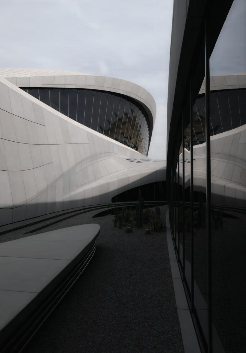
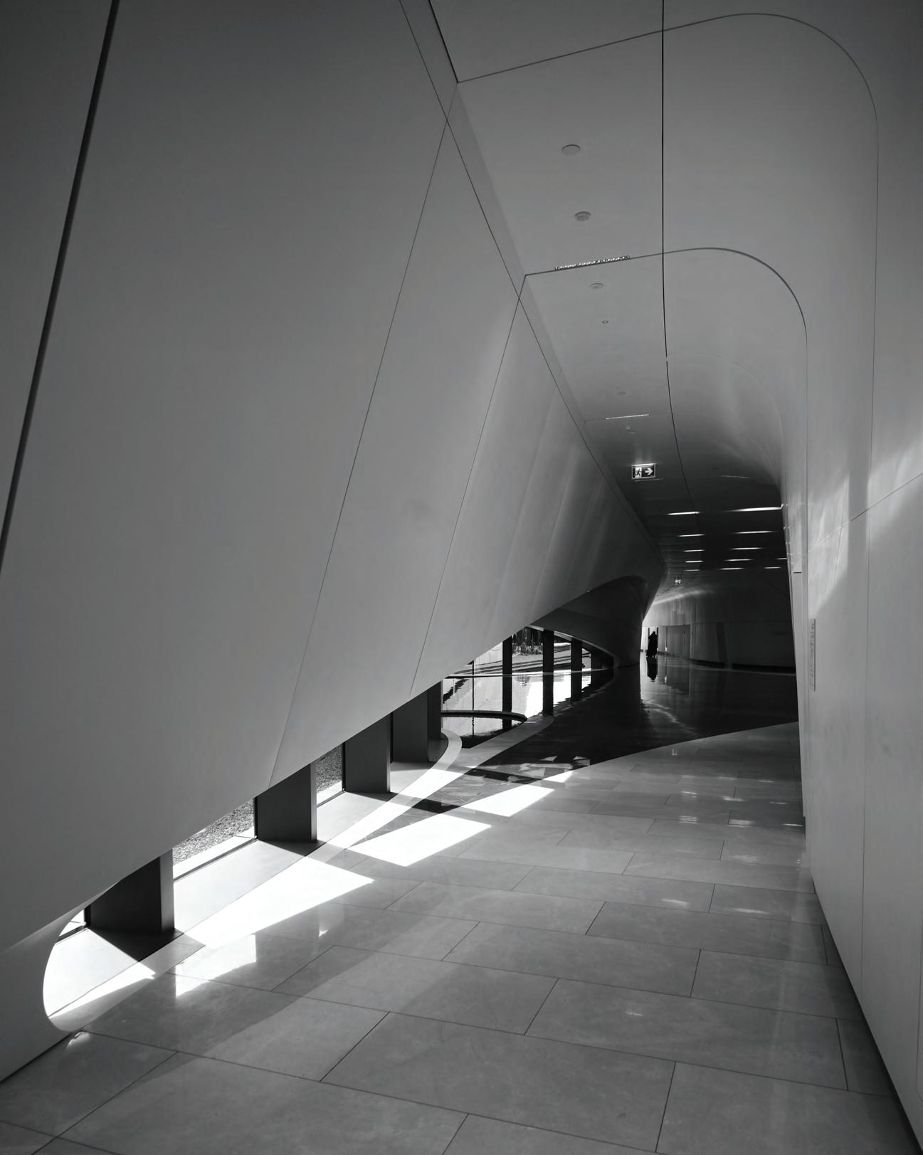
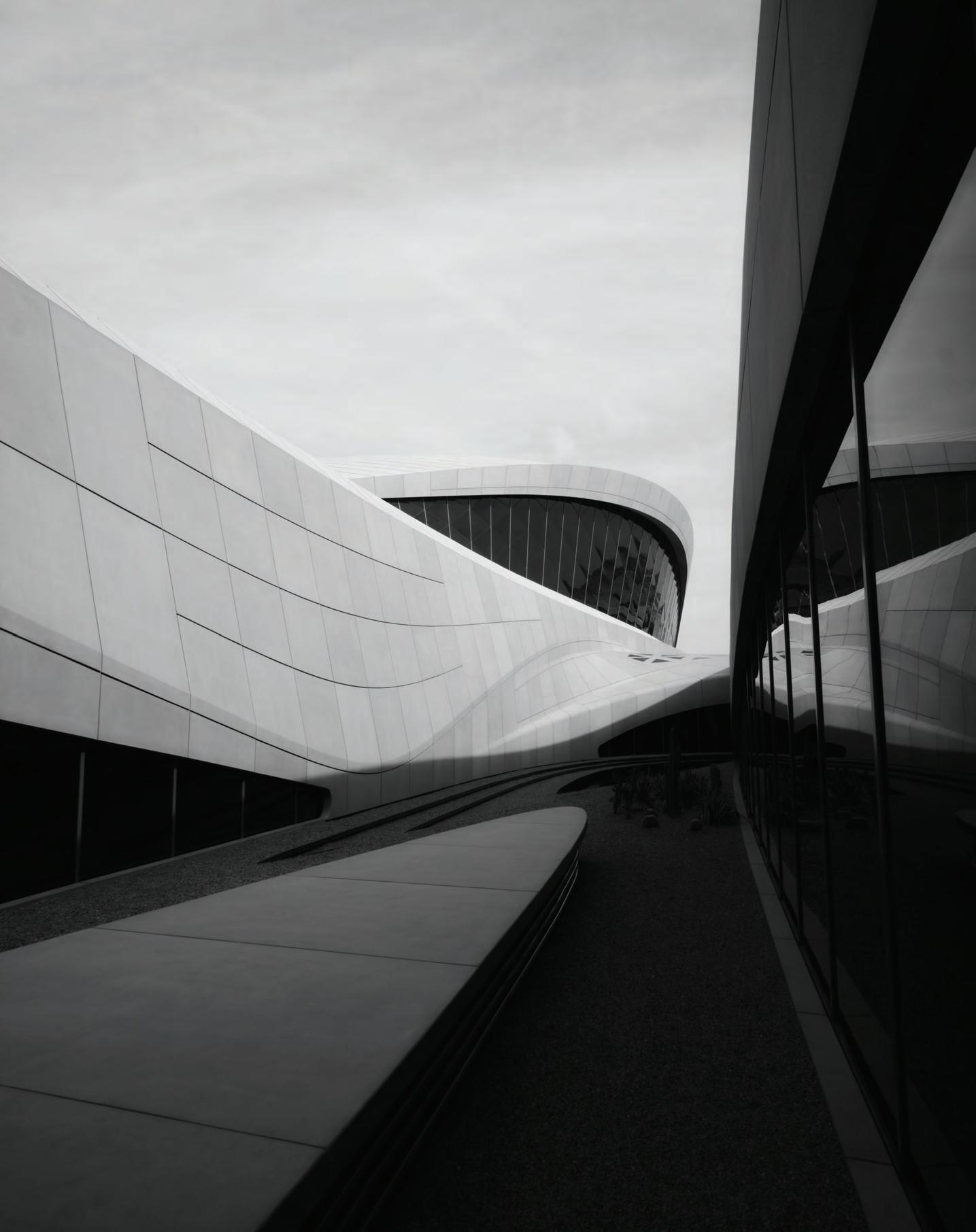
When nearing the site of the newly opened Beeah Headquarters in Sharjah, one becomes instantly overwhelmed by a peculiar form protruding from the Al Sajaa desert, at once strongly futuristic yet soft in its curvaceous forms, like a dormant mammal of sorts. In fact, the building has been designed to mimic its natural surroundings, embodying a series of interconnected ‘dunes’ that are orientated and shaped by the Shamal winds to optimise local climatic conditions.
“[Our] architecture is rooted in the notion of seamless connectivity and often evolves from a building’s context and programme to assimilate with the natural patterns and networks of its surroundings,” says Sara Sheikh Akbari, project director at Zaha Hadid Architects.

Designed by the late Zaha Hadid and commissioned by the emirate’s leading waste management company, Beeah – whose two main pillars include sustainability and digitisation – the building takes on
the challenge in responding to both these themes through a series of design-led and technological interventions.
At 9000 square metres, the building serves as the management and administrative centre for Beeah Group and is powered by a solar array linked to Tesla battery packs which, according to the studio, meets the building’s energy demand throughout the day and night, operating at LEED Platinum standards and at net-zero energy.
“The building’s photovoltaic system generates power to meet the building’s peak summer demand, thus producing excess electricity during off-peak months which is then fed back to the grid. The Tesla battery storage packs enable this system to power the building at night,” Akbari explains.
Glazing is minimised to prevent the harsh desert sunlight while also ensuring that the interiors are filled with ample daylight. The locally produced external glass-fibre-reinforced concrete cladding

37 THE DREAMERS ISSUE
increases the building’s thermal mass while regulating internal temperatures and allowing natural ventilation for cooling.
The building also utilises the twin technologies of ‘self-learning’ and ‘self-healing capabilities’ through a smart management system that predicts occupancy and uses the data to automatically adjust light and temperature to optimise the building’s energy use.
Its two primary ‘dunes’ are divided into the public and management departments and the administrative zone, connected by a central courtyard, which is designed to mimic an oasis and helps provide natural ventilation. The building also features open-plan offices, smart meeting rooms and an immersive visitors’ centre and auditorium.
Inside, visitors enter beneath a 15-metre-high fair-faced concrete dome that covers the double-height space of the lobby and contrasts with the rest of the interiors. Being one of the main
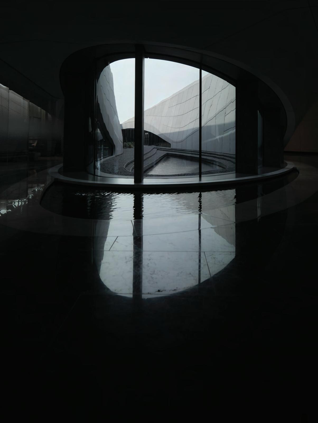
architectural features of the building, it is also the main support for the steel structure of the roof.
“The feature stair located at the centre of the lobby leads visitors and staff to the gallery area surrounding the concrete dome and the management spaces at level 1. GRC panels introduced at the walkable surfaces of the steps lift up and interface with the GRP handrail, which merges with the GRP walls and ceilings,” Akbari describes. “While responding to the performance requirements, the lighting design also emphasises geometry, fluidity and directionality. “Beeah Headquarters is a climate-conscious building that constantly modulates itself, becoming smarter and more efficient and drawing on data within its living laboratory,” she continues. “The advancements in its design and construction technologies can hopefully serve as a blueprint for smart, sustainable developments in the future.” id
38 architecture
The future of craft
Founded by Moroccan-born Ismail and Adnane Tazi, homeware brand Trame highlights the shared heritage of the Mediterranean through its diversity of crafts
 WORDS BY AIDAN IMANOVA
Ahotbed for traditional crafts and leather tanneries, the northern Moroccan city of Fez is where Parisian homeware brand Trame’s founders Ismail and Adnane Tazi were born and raised. “I come from a family with generations of craftsmen and have always felt deeply connected to our ancestral savoir-faire. My two grandmothers were embroiderers and a whole other part of my
family are in ceramics,” Ismail begins. “I think being born in Fez has helped me understand the uniqueness of old crafts that are a living repository of centuries of collective memory.”
Ismail studied economics at the Sorbonne in Paris, later completing his masters at the French Grande Ecole EM in Lyon, France. And while his academic background may not suggest it, Ismail has
40 design
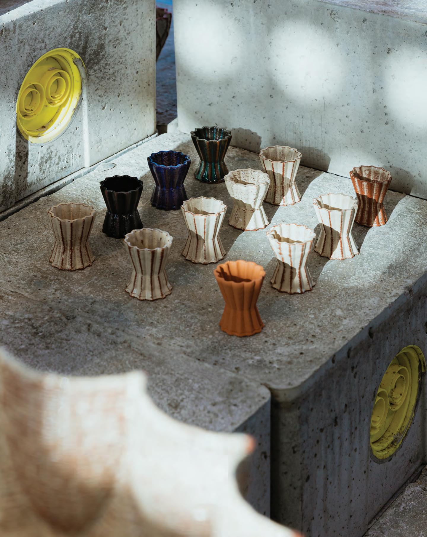
always had a taste for contemporary art and design. Having grown up amidst a long tradition of craftsmanship that is prevalent in Fez, Ismail explains that he was often surprised by the lack of innovation in the production of these pieces, as well as the limited creativity in the works – all of which typically depicted the same patterns, colours and materials (specifically in the southern part of the Mediterranean). In response to this, Ismail and his business partner Adnane started Trame in order to create a platform to build bridges between innovative design and traditional crafts of the Mediterranean, both from the European and the African side.
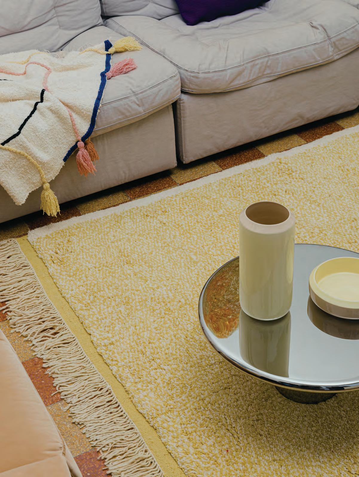
Each of Trame’s collections, created in collaboration with a select global design talent and artisans, focuses on a specific region of the Mediterranean (be it Morocco, Italy or Spain), showcasing the obvious connections between the crafts in this region while also highlighting their notable differences.
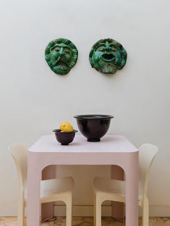
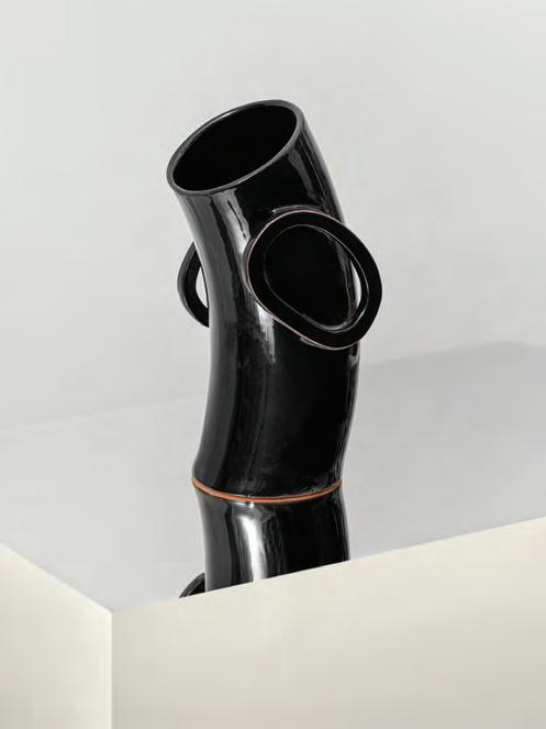
“Trame wants to highlight this common heritage, which is the result of centuries of shared historical roots in an era where, unfortunately, the Mediterranean Sea is perceived more as a separator between Europe and North Africa rather than the cultural connector it was for thousands of years,” Ismail explains. Focusing primarily on terracotta and natural wool allows Trame to explore the different traditional and innovative techniques more deeply, as well as to master the crafts across the entire value chain – from material sourcing, preparation (wool spinning and
dying, for example) to the final results (such as hand-glazing for ceramics).
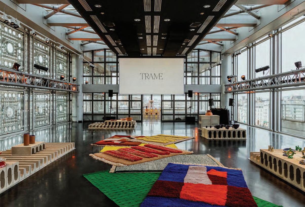
Trame’s latest collection, Alhambra.gcode, was inspired by the Moorish architecture of Alhambra and its rigorous geometric patterns and launched at the Jean Nouvel-designed Institut du Monde Arabe in Paris. “We created innovative designs in ceramic that were 3D-printed in clay, hand-finished, and later hand-glazed using a unique combination of design technology and craft,” says Ismail. For this collection, Trame worked with designers Amandine David, Arthur Mamou-Mani and Wonmin Park.
“Trame is about authenticity and innovation,” Ismail adds. “While preserving our common cultural heritage and traditional craft is important, I do believe that we need to think about the craftsmanship of the future [such as] investing more in the intersections between craft, design and new technologies like digital fabrication and blockchain.” id
42 design
43 THE DREAMERS ISSUE design
Objects of desire
Whether minimalist or maximalist – or somewhere in between – many of our homes are filled with objects we love. It is these items of decoration that reveal just that much more about who we are, what we like and where we’ve been in the world. Here, identity has selected some of the latest home décor pieces to add to your collection
A work of art
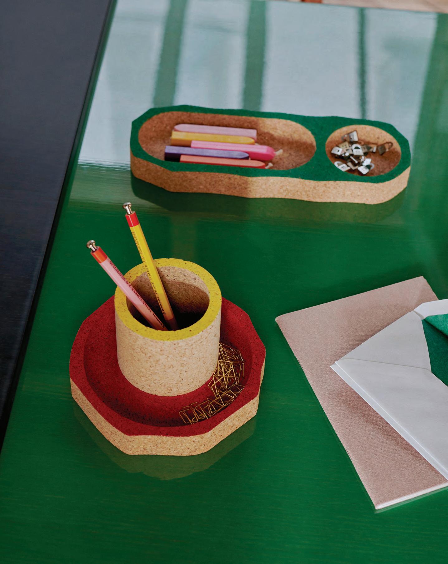
With offices taking on different shapes and spaces, Maison Matisse’s first accessories collection for the workspace is functional, versatile and expressive, reinterpreting Henri Matisse’s 1950s painting ‘Les Milles et Une Nuits’ into three-dimensional objects. The collection of the same name is designed by Guillaume Delvigne and debuted during Maison & Objet in Paris last month. “It was really important for me that the results were not rigid, because that would not have been in the spirit of Matisse; [I] wanted to instead create movement and make the collection dynamic,” the French designer says. Borrowing from the essence of the artist’s painting, specifically its scissor-cut shapes and bold colours, the collection features blocks of sliced cork that are made into stools, trays, shelves and other playful objects.
 WORDS AND CURATION BY AIDAN IMANOVA
Organic objects
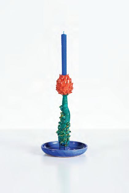
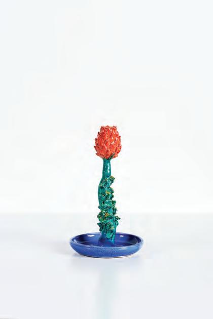
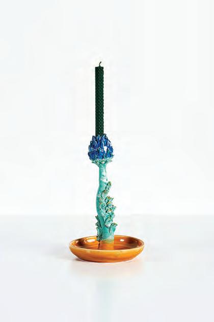
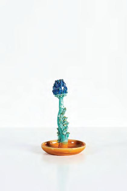
Nilufar Gallery, founded by Nina Yashar, has long been known for sourcing and showcasing special pieces of art and design that are both functional and decorative. Its latest presentation sees the whimsical works of artist Lola Montes Schnabel, whose candleholders made from clay form her Le Castraure collection. The objects follow the steps of a traditional Sicilian craft which Schnabel learnt from a master clay artisan during the pandemic. The candleholders take the abstract form of an artichoke, whose cultivation Schnabel found to be poetic. The artichoke, for the artist, displays a certain type of dichotomy: a sweet core with a sharp outer shell, becoming a metaphor for love which Schnabel aims to depict in these vibrant and organic pieces.
45 THE DREAMERS ISSUE home décor
Natural connection
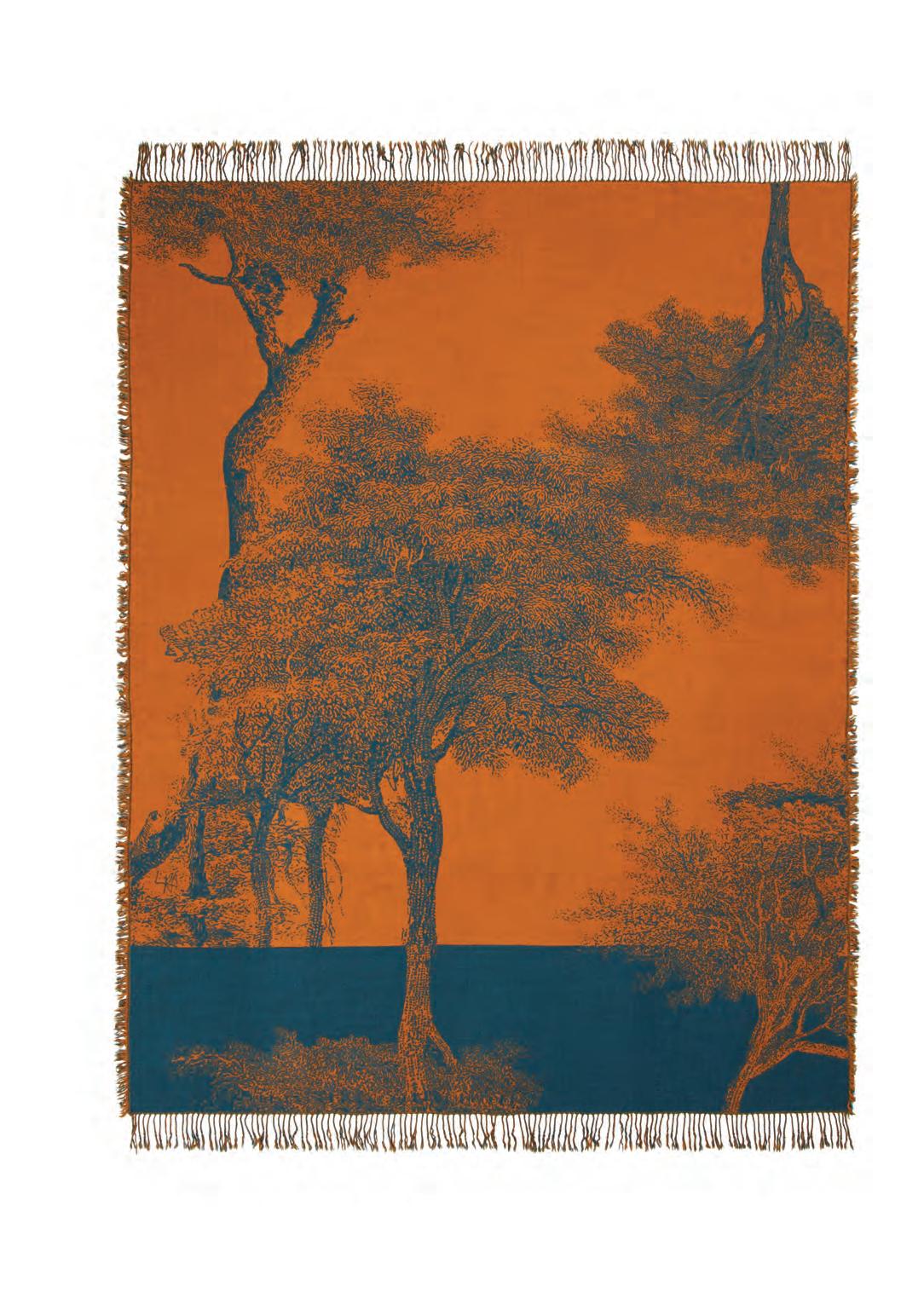
Since carving its path for interior textiles, Italian brand Lanerossi has collaborated with acclaimed names in design, art and photography to reinterpret its visual heritage. So, it is of no surprise that for its latest collaboration, the brand tapped Italian celebrity duo Ludovica+Roberta Palomba of Palomba Serafini. The new capsule collection, called Radici, features a series of blankets weaving together a story of technique, craftsmanship and chromatic contrasts that depict trees as the archetypal symbols of force and growth. Available in five colours, from beige to gold and orange, the Radici blankets are made from 100% virgin wool obtained from selected flocks of Merino sheep, woven with the jacquard technique for a contrasting effect on the back, and enhanced by fringes along the borders.
46 design focus
Grand gestures
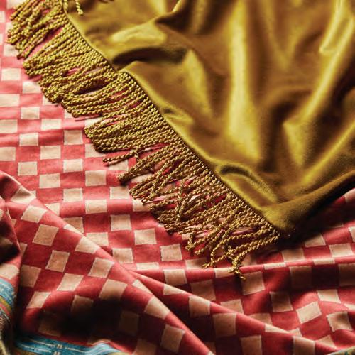
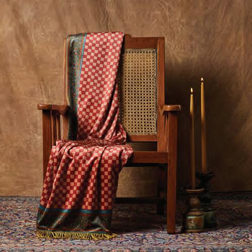
Mumbai-born founder and creative director of The Itihāas Company, Devika Kanadé started her brand with the intention of creating a boutique maximalist home and lifestyle concept that combines history with interior design, allowing stories to be retold and objects to be reinvented, to bring pieces from the past into people’s homes. Her latest collection, Colour Me Constantinople, is inspired by the Byzantine era, evoking its architecture, ornamentation and grandeur. The collection of cushions and throws is immersed in luxuriously vibrant and rich tones and prints, with each piece having a different meaning – and story – of its own.


47 THE DREAMERS ISSUE home décor
A magic formula
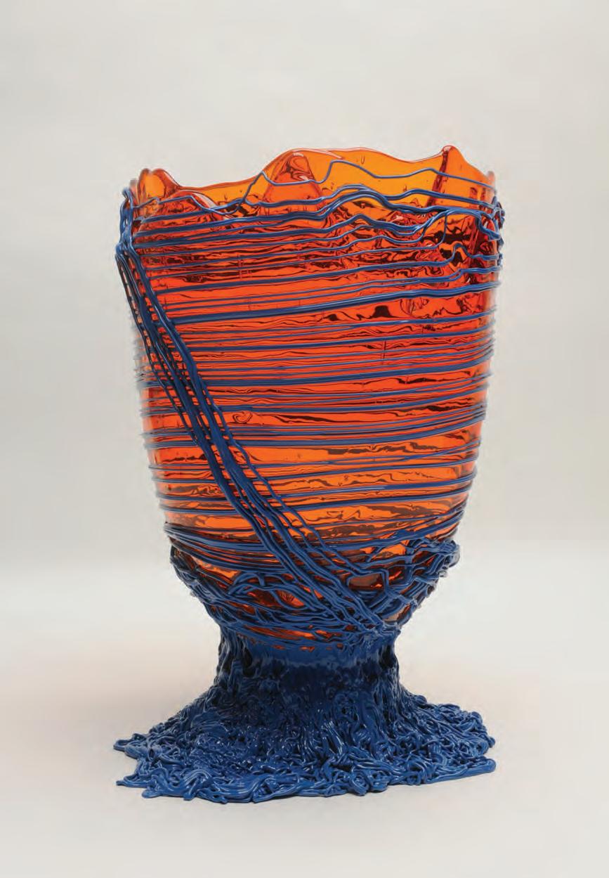
Beginning their chanced collaboration in 2003 – and birthing Corsi Design in the process – famed Italian designer and architect Gaetano Pesce and artisan Andrea Corsi began perfecting Pesce’s resin Fish Design range. After years of experiments, trails and errors, and new discoveries, the bold collection is now part of a staple series of products marked by the trusted ‘Made in Italy’ stamp. The vases, mirrors and trays from the range feature several techniques and a variety of resins – each one specific to the piece or collection. The use of moulds, coloured pigments, spatula strokes, mixtures, pouring and extrusions represents a culmination of the purest gestures, using resin as if it were clay.
48 design focus
Tactile nature
Loro Piana’s 2023 collection – which was first showcased at Paris Deco Off – focuses on the natural qualities of fibres, with the wallcoverings, fabrics, blankets and accessories in the collection all directly inspired by nature’s creations. Raffia and jute add a textural personality to the wallcoverings, while wool offers an enveloping warmth. Other fabrics include silk, mohair and cashmere – all enhancing the colours of the collection while also ensuring a sense of softness and playing with light, patterns and weaves. Many of the designs have a geometric theme, be it diamonds or stripes, further characterising the Japanese igusa rush, which is central to the collection. id

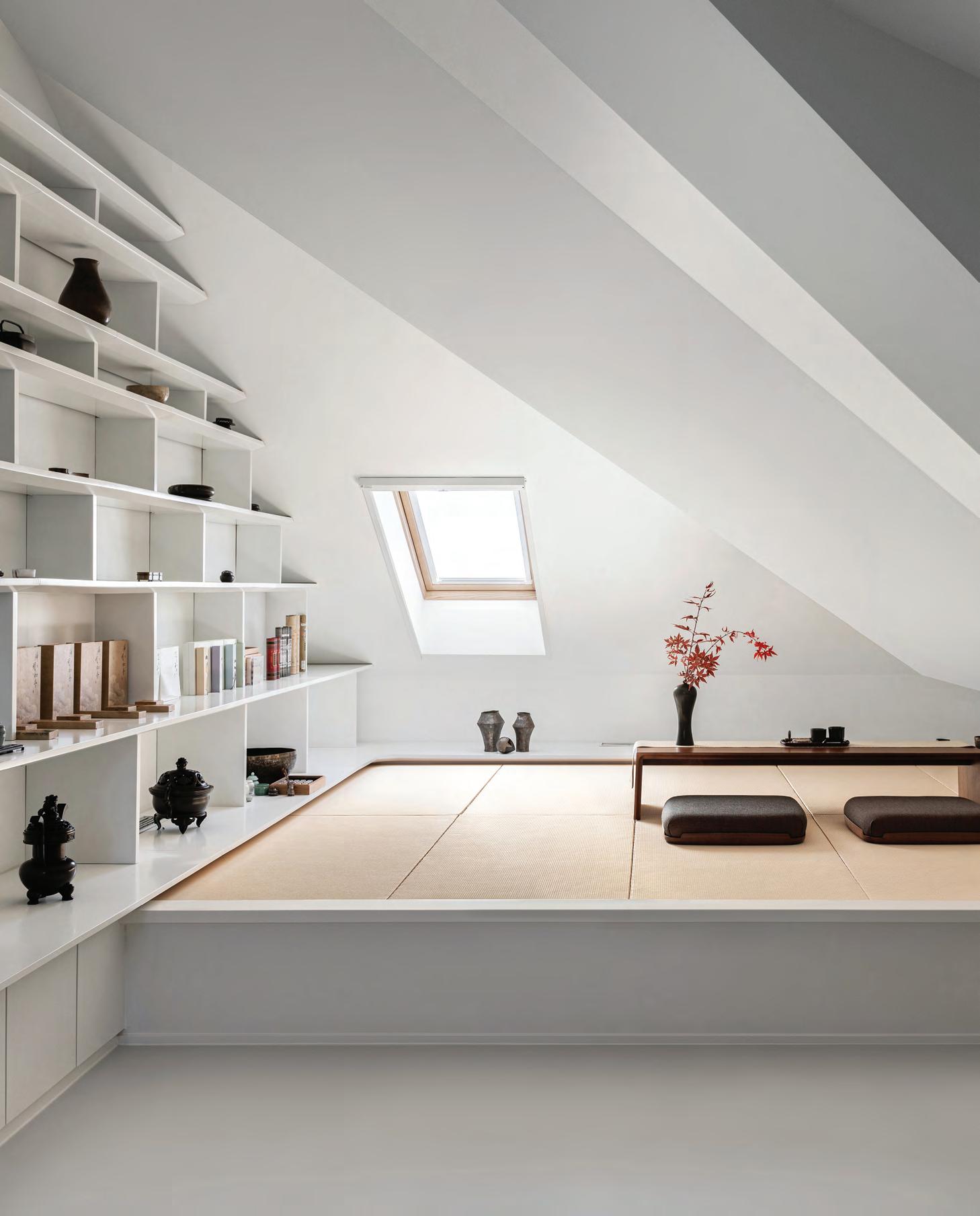
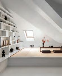
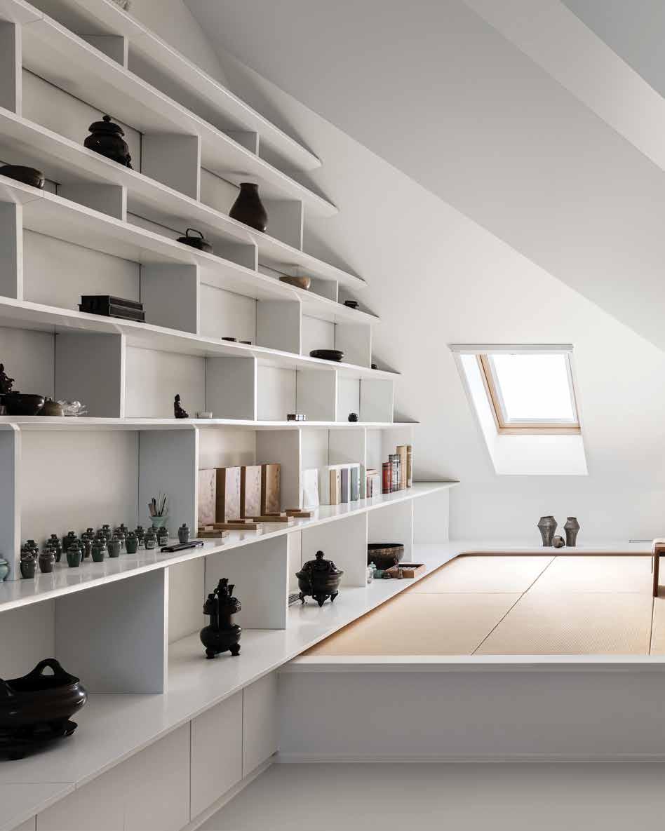
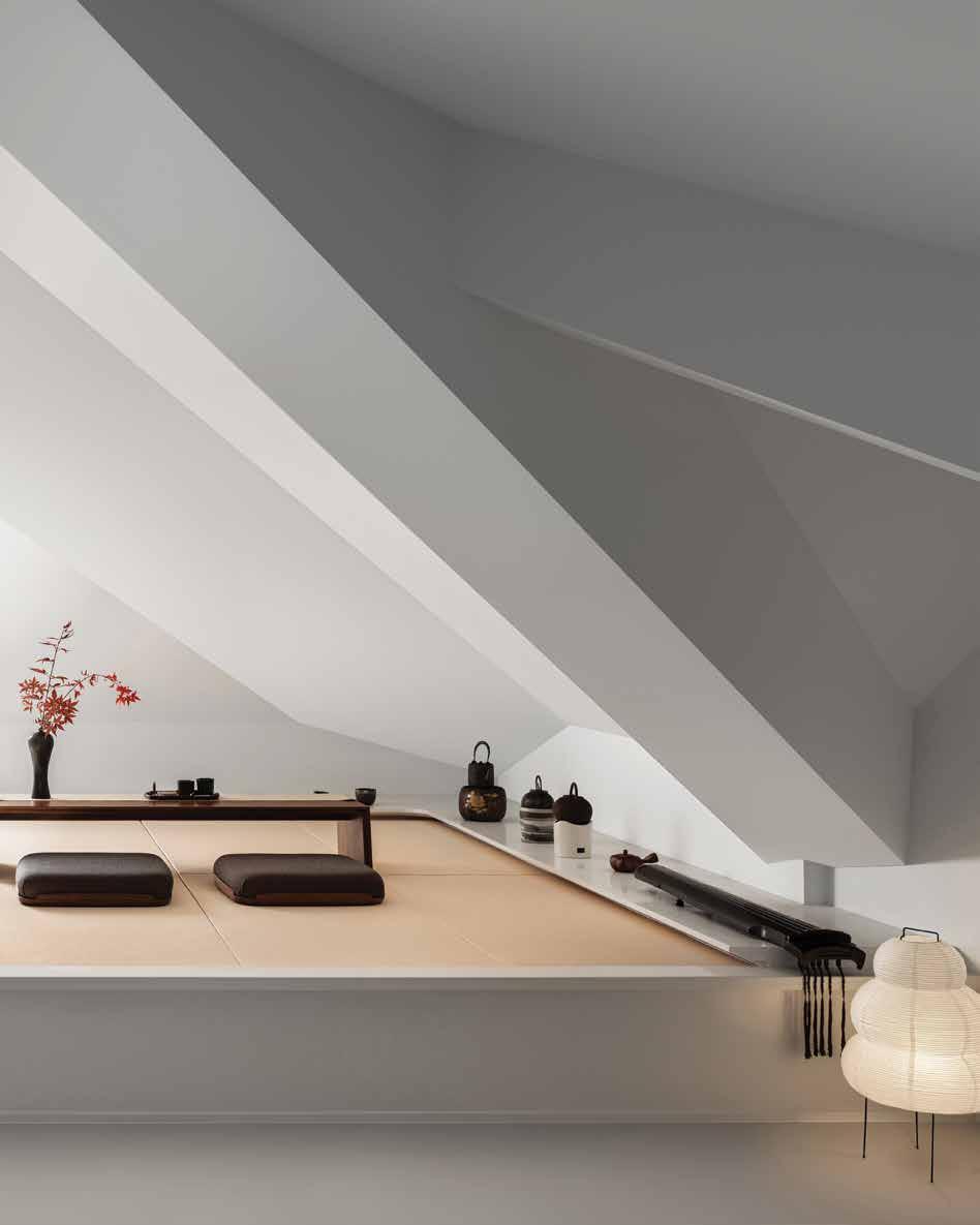
Featured here is the attic, which has been transformed into a small space where the homeowners can meditate and play the zither
Classic meets modern
Combining the homeowners’ traditional Chinese furniture collection with the architects’ contemporary design, this home exemplifies the art of the balancing act
 WORDS BY KARINE MONIÉ
IMAGES BY ZHANYING STUDIO
 Located in Beijing, China, this home spreads over 120 square metres
With offices in Tokyo, Beijing and Shanghai, Japanese architects Yoshihiko Seki and Saika Akiyoshi joined forces to launch their design studio in 2013 under the enigmatic and poetic name KiKi ARCHi.
“KiKi in Japanese is a sense of appreciating things, which means mastery, attainment and unique opinions of things in various fields,” the co-founders describe.
From the Quanzhou Museum of Contemporary Art to their winning new media art installation in Boston’s The Quad competition, to residential and retail projects, all of Seki and Akiyoshi’s projects share a common thread: they evoke a sense of emotion. This home, located in the centre of Beijing, is no exception.
Spread over 120 square metres, the townhouse-style property is owned by a Chinese couple who tasked the team of KiKi ARCHi to introduce their traditional golden nanmu wood furniture collection into the different spaces, making it the main protagonist.
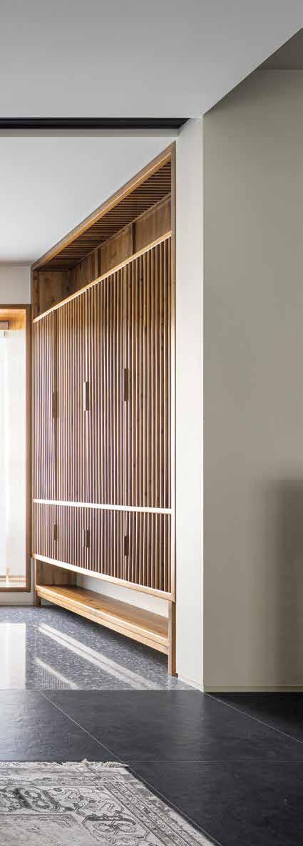
“Nanmu was a popular architectural and furniture material for the imperial family in [the] Ming and Qing dynasties, used in the forbidden city in Beijing,” the architects share.
A blank canvas with alternating bright and dark areas, characterised by pure architectural lines, is the backdrop of these large pieces that feature a classical style.
The hallway was designed to echo the concept of a patio. “The original washroom above was removed to create a five-metrehigh space while bringing light from the second floor to the first floor,” the architects describe.
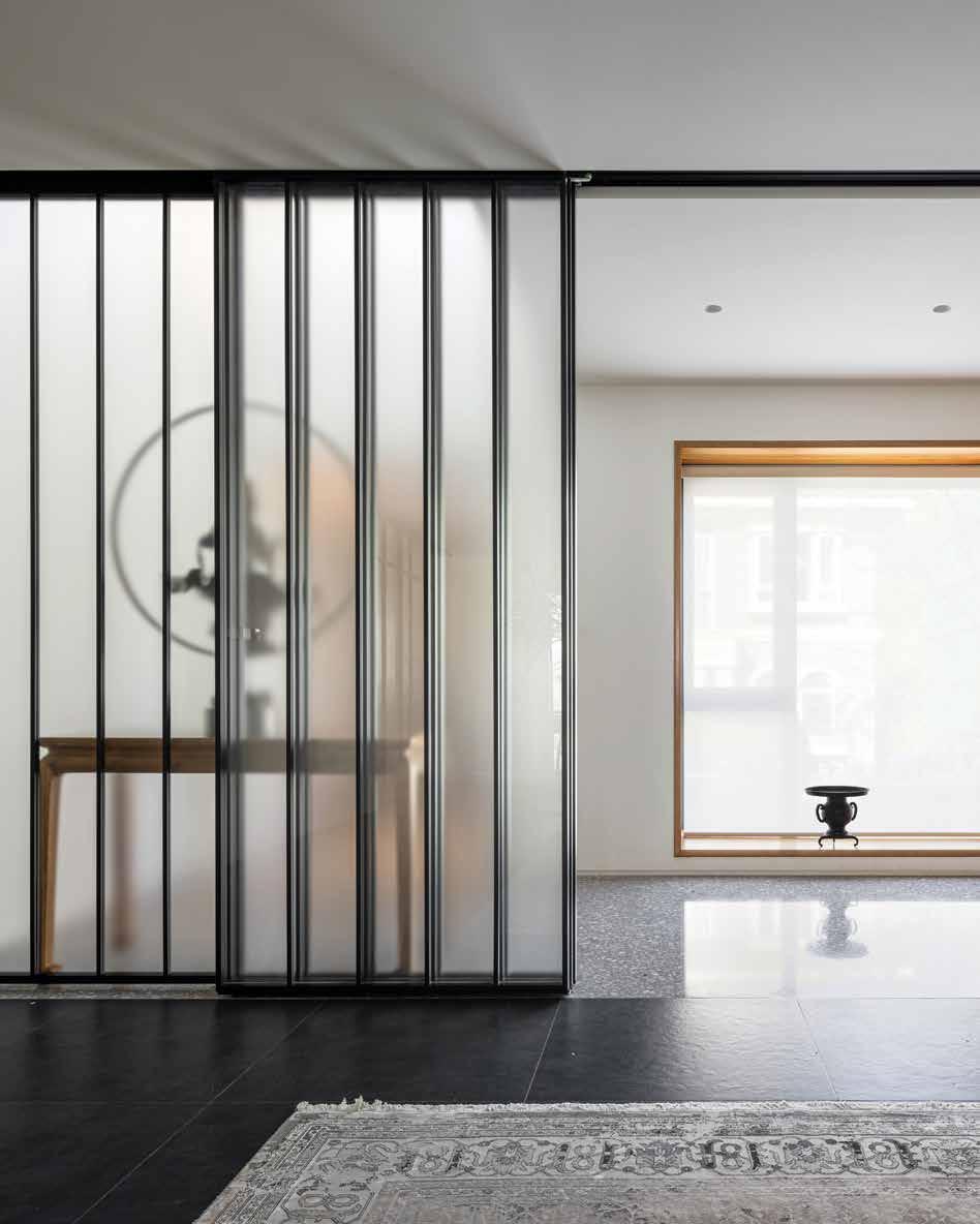
On the side of this preliminary space, a black-framed glass sliding door provides transition to the living room with dark flooring and walls, where a long table sits under calligraphy work placed on the wall above, referencing the past. The sofa on the carpet breaks the symmetry, for a more modern feel.
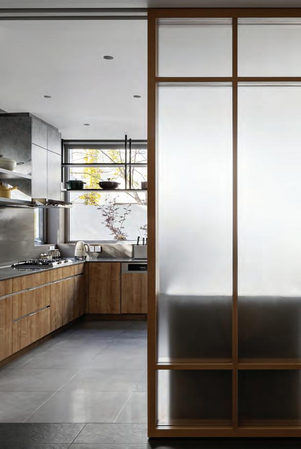
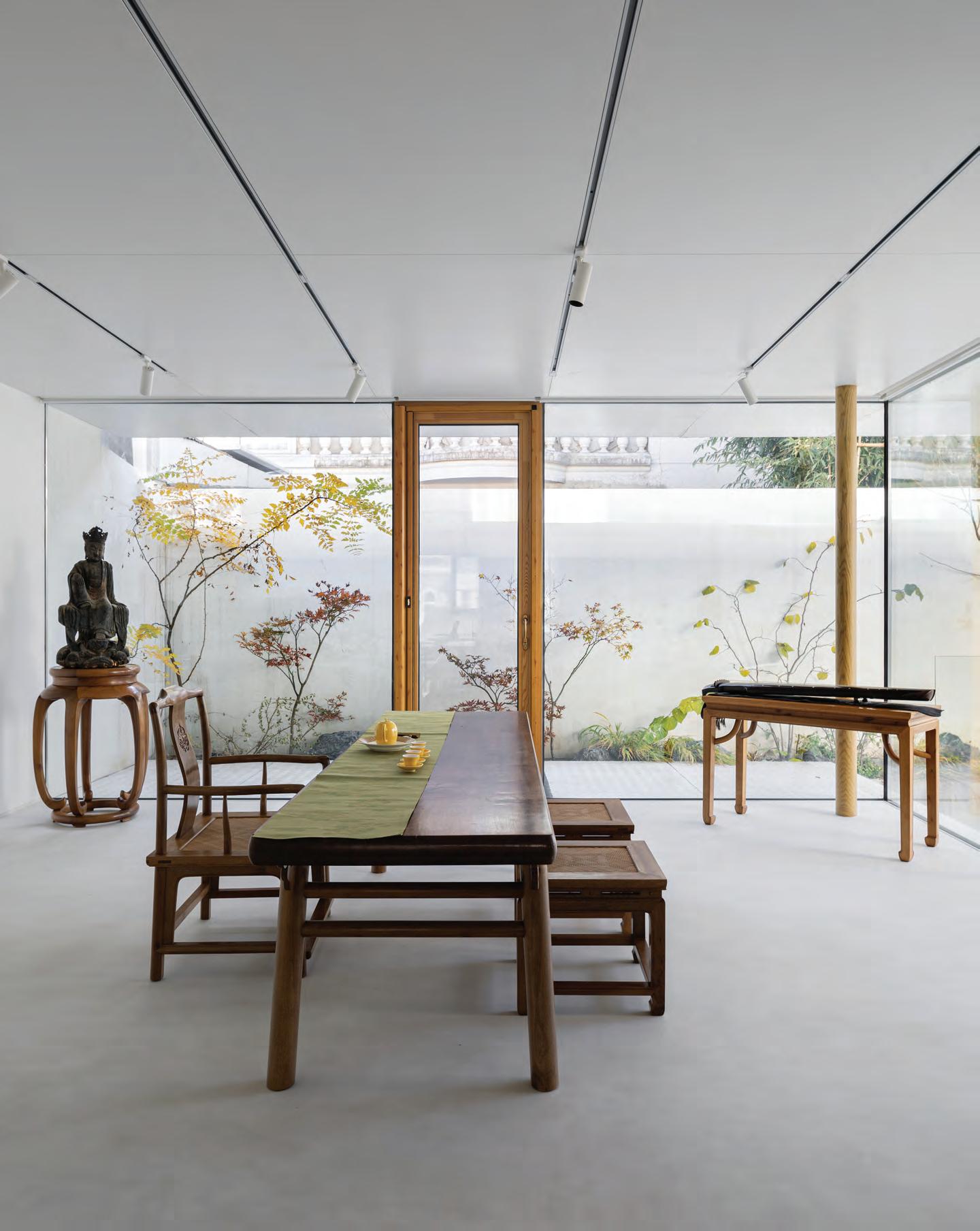
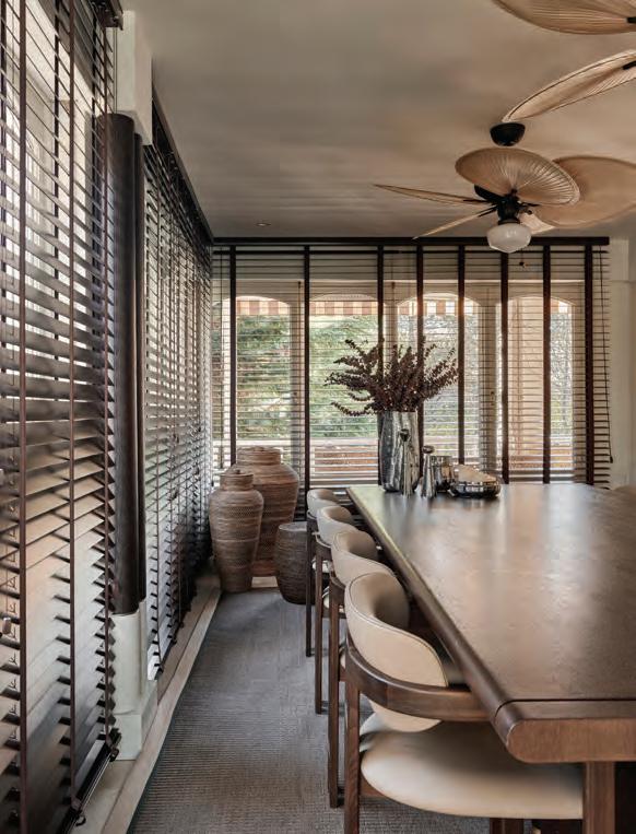
With the grey terrazzo floor acting as a visual element of continuity, the dining area features contrasting white walls with a built-in side cabinet. The grey kitchen connects to the minimalist garden terrace – with a sunken platform and an external stairway that goes to the basement – where the homeowner’s favourite tearoom is attached, with a glass partition and an aluminium roof that offers the illusion of floating.
53 THE DREAMERS ISSUE
This peaceful environment, where light and shadow intertwine, offers an invitation to observe the changing landscape, depending on the season. “The concept of time seems to disappear, and a spiritual dialogue starts,” says the team.
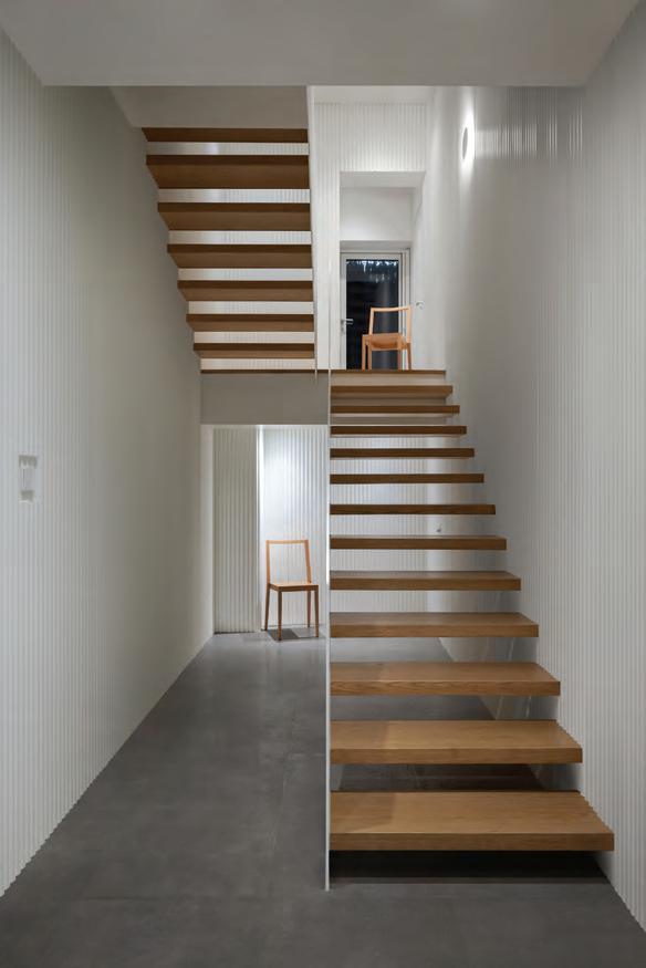
The home reflects “the sense of ritual and inclusiveness in life,” according to the architects, who found the right balance between the traditional furniture and the architecture and interior design, through monochromatic, soft colours and texture. Leading to the upper floor, where a quiet and warm atmosphere pervades the more private areas such as the study and the
main bedroom, the staircase was designed with floating steps and a one-piece handrail. Last, but not least, the attic was transformed into a small space for meditation.
“It is recorded in ancient Chinese books that golden nanmu is a fine and sturdy material with a special texture and silky lustre, emitting a delicate fragrance and being very elegant,” says the KiKi ARCHi team. “It is similar to a well-designed house – the coherent design logic creates a stable ‘inner part’ while the exquisite display presents a beautiful ‘exterior part’, which carries a lovely life for a long time together.” id
54 interiors
This page, from left: The kitchen connects to the garden terrace, while the floating staircase leads to the private areas of the home. Next page: Furnished with traditional Chinese pieces, the glass tea room is attached to a garden terrace
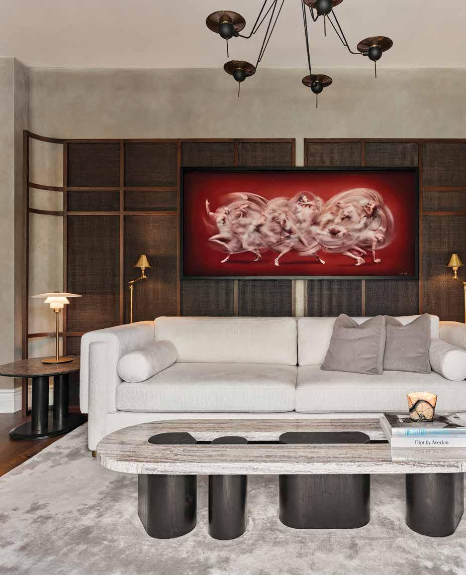 The living area features a white sofa by Atelier 1976, pendant lamp by Lightwork Design, side tables by Koçgiri furniture as well as lamps by Öztaş lighting. The artwork is by Ali Alışır and the carpet by Madderugs
A wholesome escape
WORDS BY KARINE MONIÉ PHOTOGRAPHY BY IBRAHIM ÖZBUNAR
In the neighbourhood of Göktürk, in Istanbul, Turkey, this house – a typical Kemer country structure built in the late 1980s – needed a complete refresh to fit the needs of the homeowners: a lawyer and a restaurant owner with a child. The team from escapefromsofa – a design studio co-founded in 2009 by Mahmut A. Kefeli and Kerem Erçin – tackled the challenge, starting by resolving the need for water insulation since the house (and surrounding neighbourhood) is located on a wetland. Once this first step was done, the designers had to figure out how to respond to the initial spatial, structural and functional issues in order to improve the quality of daily life for the family of three residing there.
“Before we started the makeover, the home was colourless and monotone,” remembers the escapefromsofa team. “The wife has a calm and minimal style, but we convinced her to use bold colours through some pieces. The detail that completely changed the shell of the house while giving it a new soul was the wall paint.”
The spaces are organised on three levels across a total area of 300 square metres. One of the main objectives was to ease the daily flow of the inhabitants and allow them to host large groups of friends, which they do frequently.
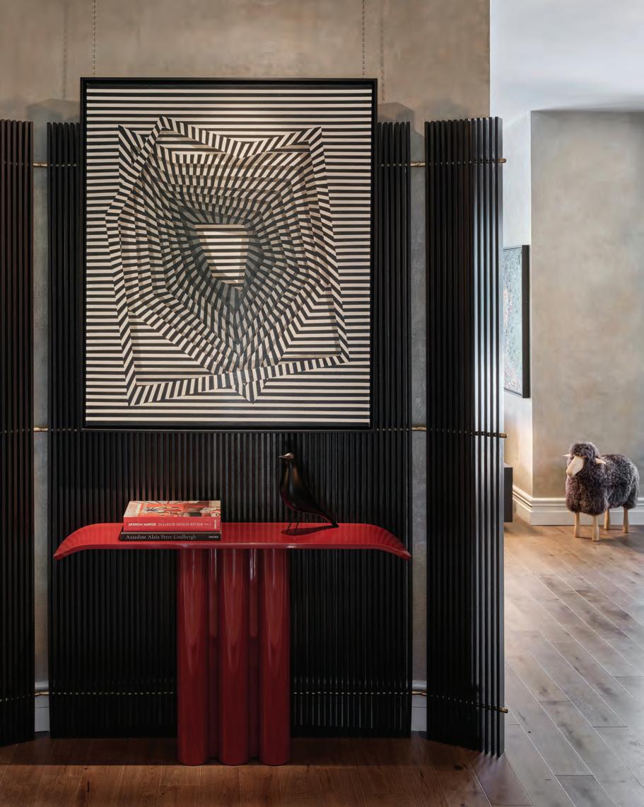
The fireplace wall that defines the entrance hall and welcomes anyone entering the home was preserved. The marble that covers the floor immediately creates an elegant atmosphere upon entrance, while a black partition combined with a red console by Atelier 1976 – with an artwork by Hasan Pehlevan above it – leads the way to the living room.
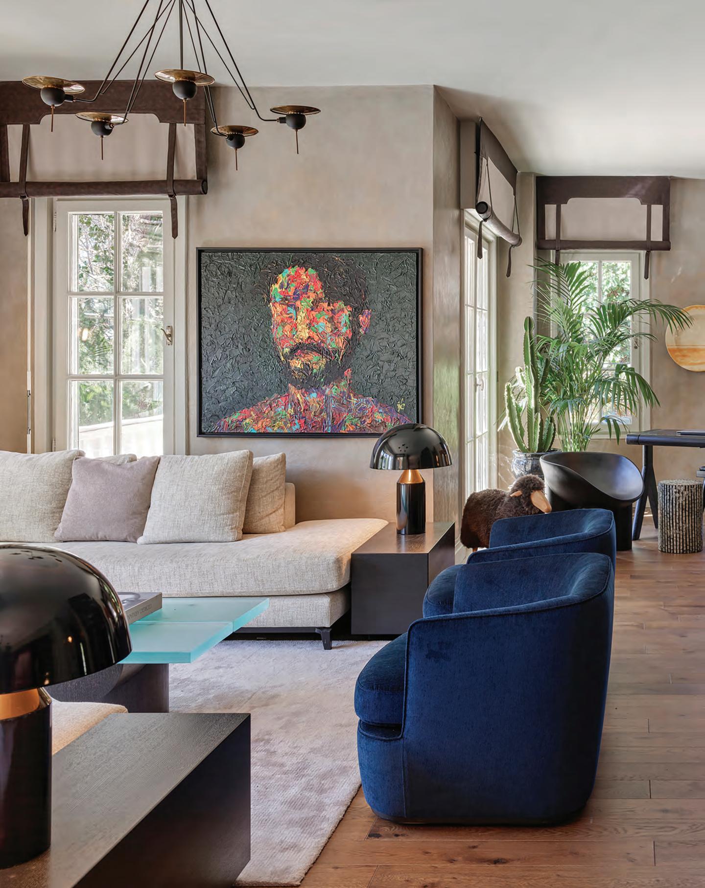
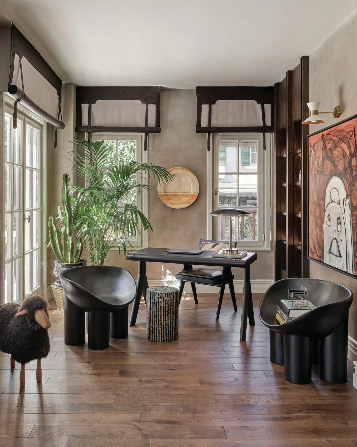
Occupying the heart of the home, this space comprises two sitting areas and a working area. One side is furnished with a white sofa by Atelier 1976, a side table by Koçgiri furniture with an Öztaş lamp, a Madderugs carpet and an artwork by Ali Alışır. In the centre, dark blue armchairs, white sofas and a coffee table – also by Atelier 1976 – invite anyone to sit comfortably in a stylish atmosphere. On the other side, escapefromsofa designed the desk and chair for the work area, which

57 THE DREAMERS ISSUE interiors
The escapefromsofa team has designed a soulful home for a family who wanted to escape the chaos of city life
58 interiors
This page, from left: In this home, the team from escapefromsofa focused on the use of natural materials, with every detail of the design giving personality to the space. Next page: Here, the blue armchairs, white sofa and coffee table are by Atelier 1976, while the artwork is by İlhan Tolga Ergün
is adorned by an Haluk Akakçe artwork. On that same floor, the winter garden is a haven of peace.
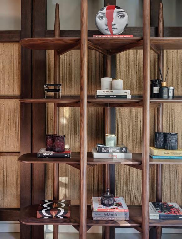
With a big focus on entertaining, the home features another living room in the basement, which is decorated with an artwork by Ali Atmaca that combines with a wooden shelf, dresser, coffee table and wall panel designed by escapefromsofa.
Separated from the rest of the home for more tranquillity, the main bedroom and the playroom occupy the upper level. Lamps by Öztaş and Lightwork Design provide the perfect illumination in every nook. “We usually like to use a combination of different and natural
materials,” say the designers. “For this project, we opted for wood, marble, steel and leather.”
By considering design as a way to tell stories, the escapefromsofa team has found a way to introduce visual surprises into different corners of this space and express a sense of chicness throughout. The blue and red accents in several of the furniture pieces and artworks add playfulness to this lively project. “Every home has its own soul,” the team says. “In this one, besides creating a spacious, comfortable and elegant cocoon, we wanted to design a living space that would respond to our clients’ desire to spend time with their loved ones.” id
60 interiors
This page: The red console is by Atelier 1976 and the artwork by Hasan Pehlevan. Next page: The desk and chair are by escapefromsofa, the curtains by Belle Maison Boutique and artwork by Haluk Akakçe
A feast for the eyes
La Nena Coffee is a new hot spot where taste is present both in the cup and through its design
WORDS BY KARINE MONIÉ PHOTOGRAPHY BY SERGEI KRASOV
Whether you love coffee or design –or both – a stop by La Nena Coffee in Al Quoz, Dubai has become a must: a singular café, store and design studio all at once. Behind the concept is A Vida Group, known for mastering the use of local materials and traditional techniques from Galicia, Spain. Founded in 2005, the company has since become a reference in cementitious coating, exploring the material to develop innovative finishes for various types of buildings. In 2020, A Vida Group expanded into the world of interiors with the launch of La Nena Home to sell unique handcrafted collections for discerning decorators.
“We have our own atelier in Lugo (Galicia, Spain), as well as local craftsmen working there,” says the team. “All our products bear the ‘Made in Spain’ stamp in every store. In our workshops, tradition is recovered, without losing sight of innovation and new technologies, which allows us to develop infinite decorative solutions.”
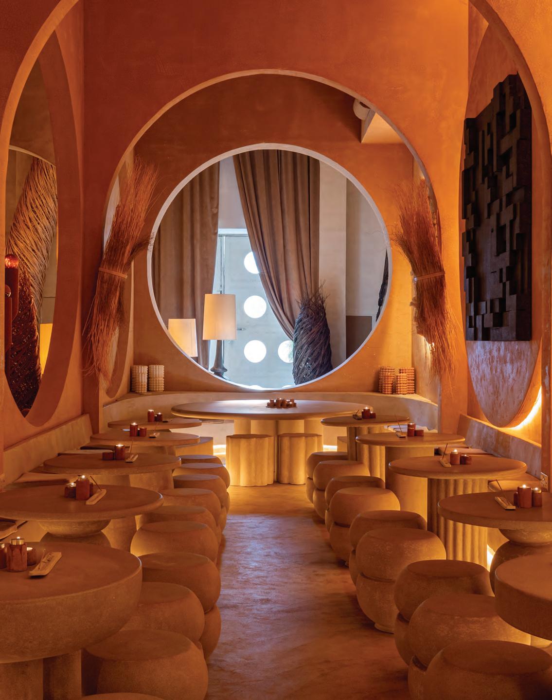
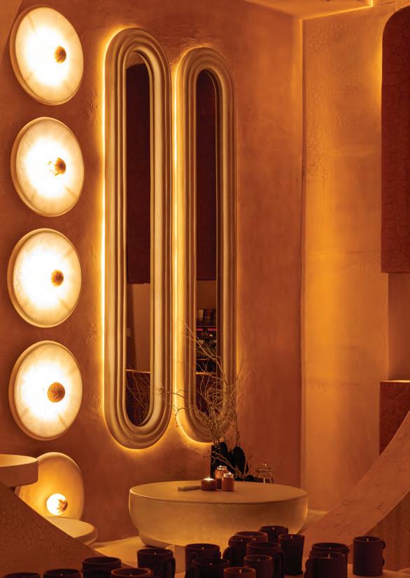
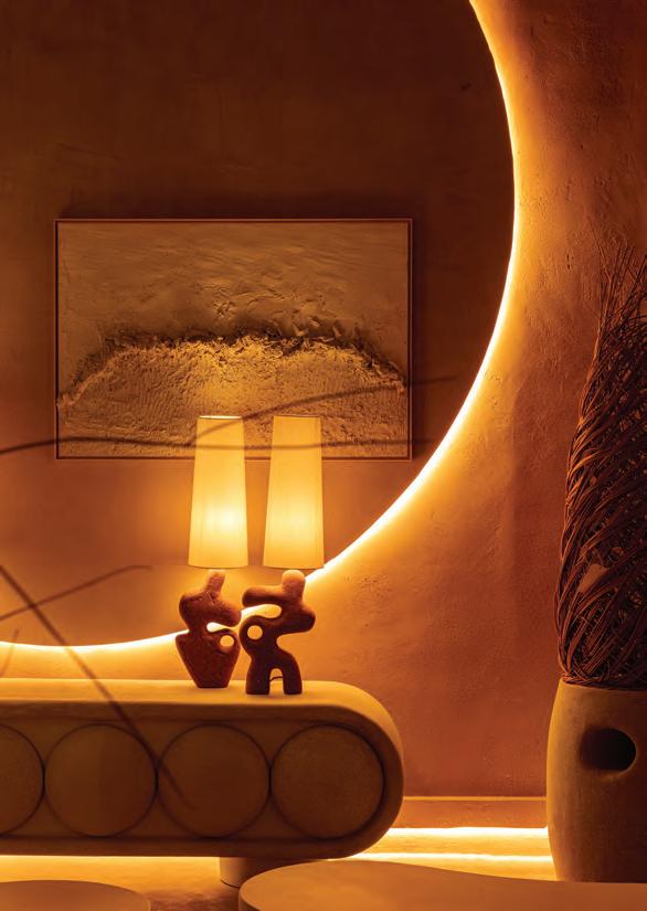
La Nena Coffee is one of La Nena Home’s latest projects. Featuring organic shapes, its cavernous interior immediately gives a feeling of fluidity. Throughout, natural textures and earthy colours characterise the warm ambience, complemented by décor and kitchenware that can be purchased in the adjoining store.
62 interiors
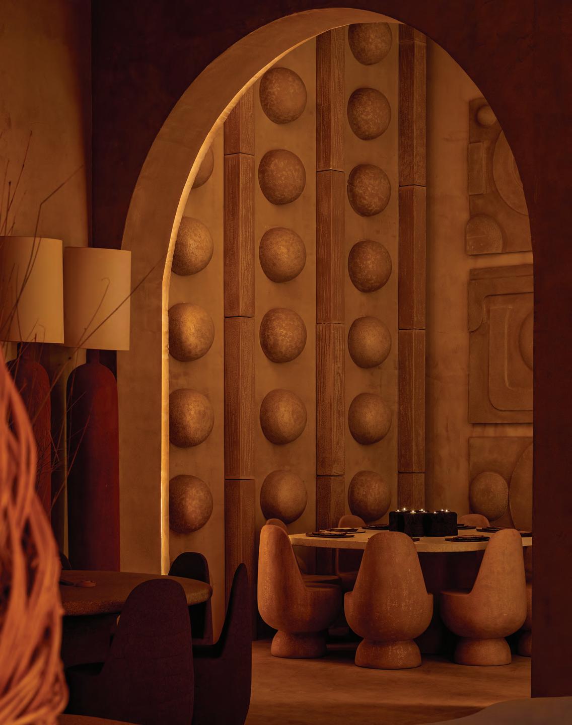
“Our mission is to offer the best coffee and explore its taste potential, accompanied by a selected menu and a carefully curated atmosphere, creating a 360-degree experience within the La Nena space,” says the team, who clearly takes coffee culture seriously.
Designed in-house, the space is an ode to the hand-made. The soft lighting and textures are inviting and contribute to the perfect harmony that is reflected in every corner. “La Nena’s style combines minimalist influences inspired by
natural and Mediterranean landscapes,” describes the team. “We embrace the imperfection of craftsmanship, creating pieces full of personality.”
In addition to showcasing the Spanish savoirfaire, this place is also adorned with Middle Eastern shapes such as arches and curves, making the design relevant to its context.
“Our coffee is roasted daily and served, along with our pastries, in crockery pieces from the La Nena Home line,” says the team. Offering a space in which to relax and savour good products, this
café also gives guests the opportunity to discover the vast array of products and services provided by La Nena Home, which already has stores in Spain, Andorra, Italy, the Netherlands and here in Dubai – with locations coming soon to the United States, Mexico, Morocco and China.
This hybrid concept is part of the retailer’s transformation that started a few years ago – a movement that focuses on creating experiences in immersive environments. With La Nena Coffee, the result is a delight both for the eye and the palate. id
65 THE DREAMERS ISSUE interiors
A sea of inspiration
French designer Pierre Yves Rochon looked to the hues of the sea to inspire a specially designed collection by THG Paris for Waldorf Astoria Lusail
Gracing the sumptuous rooms and suites of the recently opened Waldorf Astoria Lusail in Doha, Qatar is THG Paris’ luxurious bathroom line Froufrou, designed by Brittany-born designer Pierre Yves Rochon – whose collaboration with the French brand dates back to 2005. The decorative ‘Baroque-chic’ collection is adorned with the classic art of porcelain motifs, exhibiting exquisite detailing and elegant finishes.
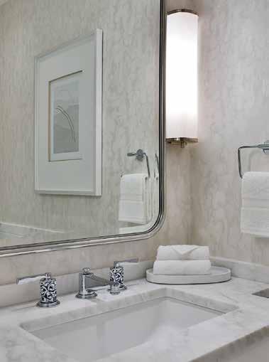
The French interior designer, who is known for his work across luxury hotels and restaurants from around the world, has created a glamorous and decadent collection of taps featuring Bernardaud porcelain with a golden damask pattern. His childhood, spent living in different countries across the globe, informs his open-mindedness and popularity with
international hospitality brands the world over. Much like THG Paris’ other partners, Bernardaud – France’s leading manufacturer and exporter of table porcelain – is home to knowledge and techniques dating back 2000 years, having been handed down from father to son. Intricately decorated and delicately sculpted, Froufrou features a
marriage of white porcelain and gold detailing. However, a special custom design has been created for the Waldorf Astoria Lusail hotel, using a blue toned pattern that is inspired by the colour of the sea.
The collection’s functional simplicity is reminiscent of the early 1900s, allowing it to complement both modern and classic interiors, while the sharp clean lines of the metal have been hand-crafted and polished for a gleaming finish. Available as simple pillars-like knobs, or crowned with long slim handles, Froufrou offers a range of styles to suit a variety of needs and projects.
It offers sophistication and refinement in both precious materials and classic design – two attributes which are intrinsically linked to the THG Paris brand.
66 partner content
Legacy makers
From metal and silver-carving to ceramics, 1865 has carved its place as a modern homeware brand that is deeply dedicated to preserving traditional craft techniques from around the globe through furniture and objects that are, in themselves, functional pieces of art. Founded by Lubna Allana, who also serves as the brand’s creative director, the ultimate goal of 1865 is to bring together a family and community of artisans from around the world to “preserve and showcase their specialised design skills and talents to a global audience”.
“1865 is the year our family business started,” says Allana. “It’s a legacy and an ode to artisans and craftsmen who create handmade furniture and accessories, from ancient crafts to contemporary artefacts.” The aim for the brand is to eventually build an artisanal village where crafts can be taught to future generations as functional art, she adds.
Allana shares a passion for both designing and conceptualising the decorative pieces, as well as for overlooking the design process for each piece – from the ethical sourcing of materials to identifying the appropriate skill sets and the right artisans, each of whom is a master in their own specialisation of techniques and crafts. The outcome is a series of elevated ‘home jewels’ that act as modern heirlooms and liveable art pieces.
The brand works with natural materials such as marble, semi-precious stones and wood, all of which are crafted using age-old techniques.
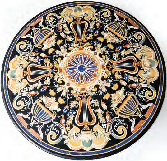
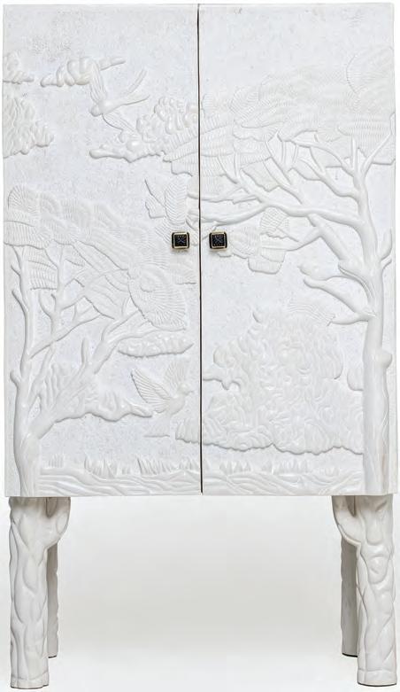
Among the signature pieces in the collection is the Florentine coffee table, which is a mid-century styled piece with a black inlaid marble top positioned on a marble stand, giving it a vintage patina. Another piece is Cervidae, which is a finely handcrafted console in ivory white Makrana marble featuring a three-dimensional image of a deer, visible on both sides. The thread connecting each individual piece is that it’s handcrafted and one of a kind. The delicate craftsmanship of this piece has been nurtured through 1865 La Maison to sustain dying skills and ensure these artisanal talents live on. “We are committed to the human aspect of safeguarding the crafts community,” says Allana. “Our modern antiques are bespoke-made by hand; driven by the labour of love that goes into the creation of beautiful objects, furniture and design.” www.maison1865.com
67 THE DREAMERS ISSUE partner content
Artisanal homeware brand 1865 La Maison is on a mission to create a community of craftspeople from around the globe to preserve traditional know-how through design
Natural beauty
Celebrating 10 years of its Marvel project, Atlas Concorde’s latest Marvel Gala series is an ode to nature
Ceramic tile brand Atlas Concorde’s Marvel World collection is an extensive series of marble-effect porcelain floor and wall tiles featuring a range of formats, colours and decorative elements that allow the creativity of any interior space to truly shine. The latest in the series is the newly launched Marvel Gala, a bold new collection celebrating the beauty of the natural world.
The brand describes the collection as “marble putting on an evening gown”. It is inspired by five natural stones that aim to redefine and push the boundaries of surfaces used in the making of interior spaces. From marbles, crystals, granites
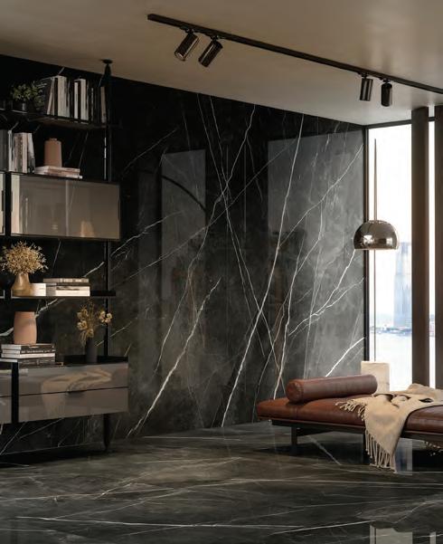
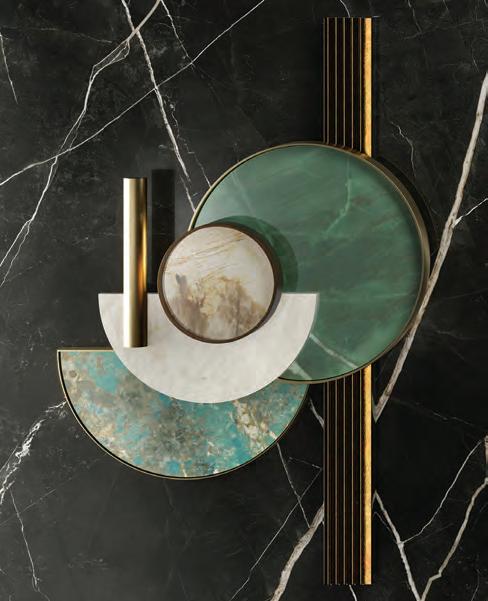
and quartzes featuring bold tones and intense colour schemes, Marvel Gala is as expressive as it is elegant. Its polished finish emphasises the depth of the shading and graphic detailing, while its large format allows for versatility: it can be used as a scenic backdrop, wall cladding or flooring; even as furniture surfaces, from worktops and tables to washbasins. Featuring beige, grey and gold veins, the Crystal White version recalls the sparkle of Alaskan glaciers, while the texture of the Desert Soul reinterprets a quartzite of volcanic rock from South America. Exotic Green features emerald and sage shades, evoking the
hues of a tropical forest, while Amazonite features a bright turquoise tone reminiscent of the depths of a tropical seabed. Completing the collection is Calacatta Black, dubbed as the “evening gown of marble-effect tiles”, inspired by Iceland’s volcanic soils and featuring grey and black hues.
One of the greatest attributes of the collection is the freedom to pair it with any other marble effect from the Marvel World series or the Atlas Concorde collections, from concrete and wood to stone-effect designs, allowing for an overwhelming range of stylistic pairings and juxtapositions. www.atlasconcorde.com
68 partner content
EXCLUSIVE PAINTINGS, SCULPTURES, PHOTOGRAPHY AND TIMEPIECES FROM AWARD-WINNING INTERNATIONAL ARTISTS


 Shadab Khan
Sculpture by Armin Shahhosseini
Photograph by Mahsa Namvar
Organic forms
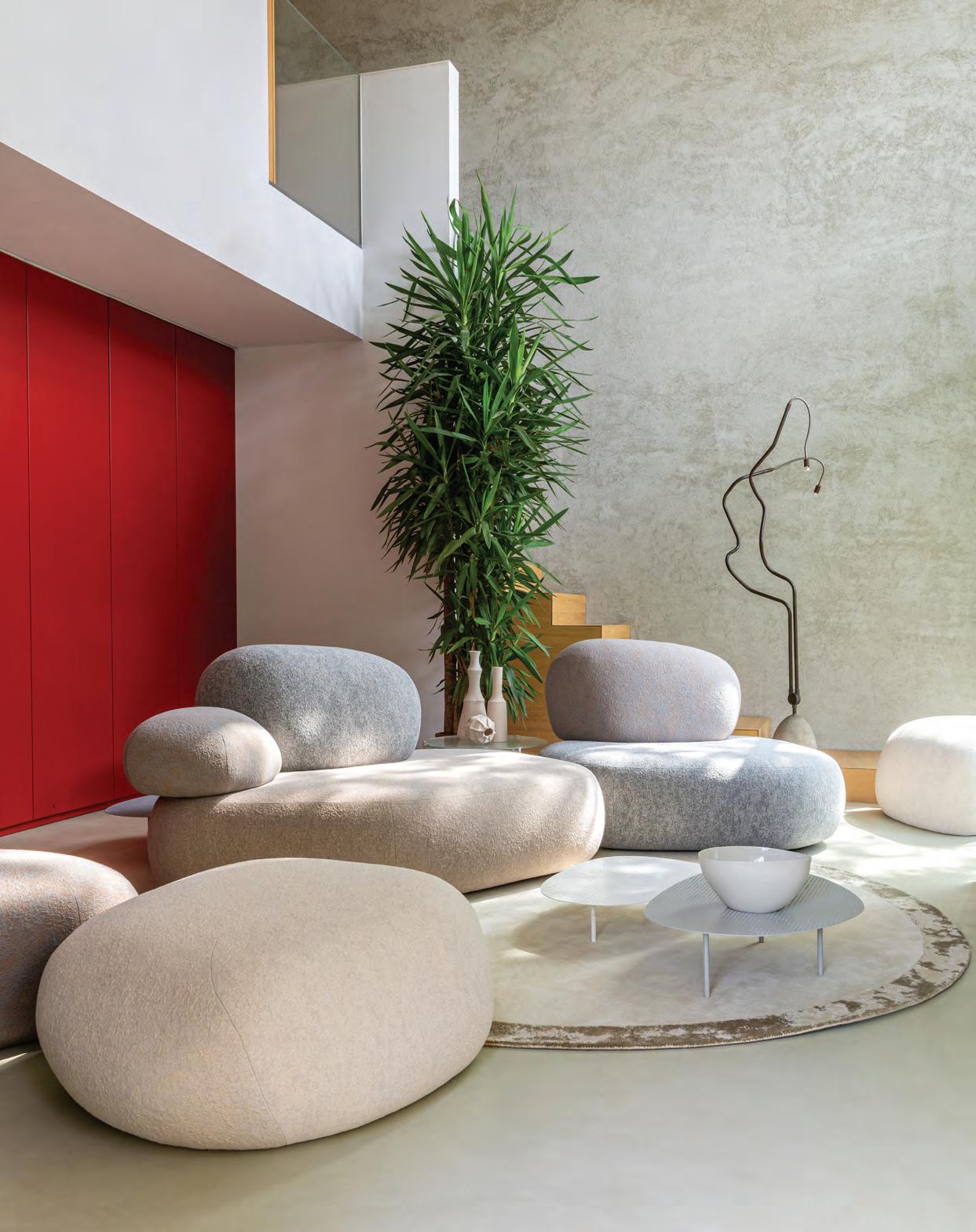
From pebble-like sofas to curvasceous armchairs and wave-trimmed napkins, this month is all about the beauty of natural forms

70 products
Pebble Rubble
Front Design for Moroso Available at moroso.it


71 THE DREAMERS ISSUE products
1. The Coming to Life console. Available at nadadebs.com 2. Pearl earrings by Mateo . Available at matchesfashion.com
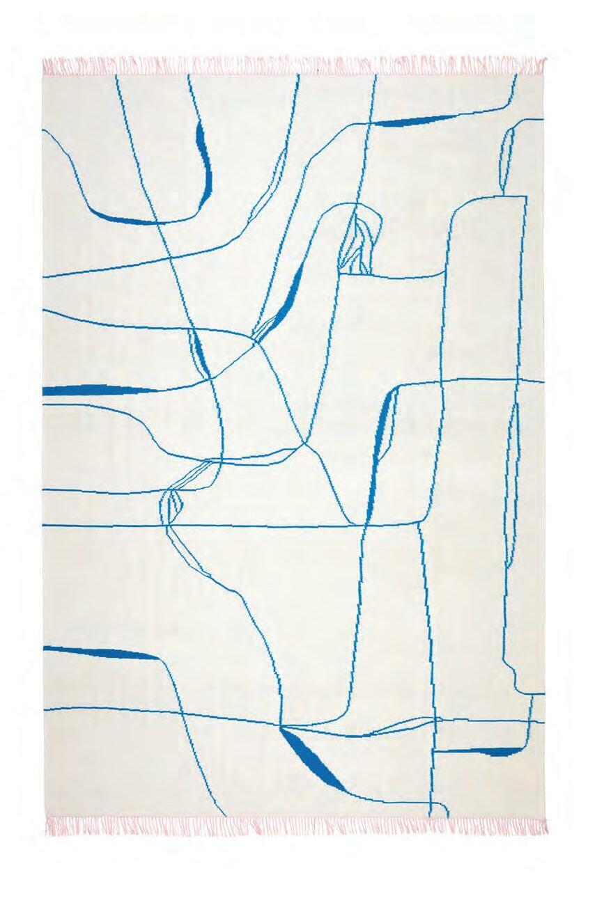
3. Ravie Rose rug by Elena Barengh for NODUS. Available at nodusrug.it 4. Paseo credenza by Lenny Kravitz for CB2. Available at cb2.ae
1 3 4 5 6 2
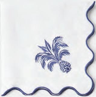
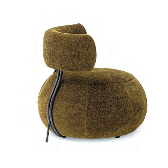
5. Ananas embroidered linen napkins by Aquazzura Casa. Available at matchesfashion.com 6. Single seater sofa from Pan Emirates. Available at panemirates.com
A world of poetry
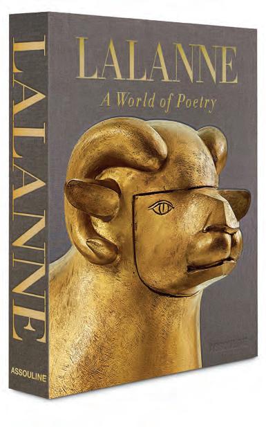
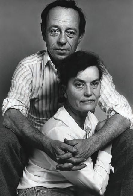
One of the most creative couples of the 20th century, François-Xavier Lalanne (1927-2008) and Claude Lalanne (1924-2019) lived and worked in parallel for over five decades in their home and studio near Fontainebleau in Ury (south of Paris). Born in the French city of Agen, François-Xavier moved to the capital to study sculpture at the Académie Julian; while Claude, originally from Paris, studied architecture at the École des Beaux-Arts. The two met in 1952 and married in 1967. At the beginning of their careers, they were surrounded by a community of artists – including Constantin Brâncuși, who was François-Xavier’s neighbour –in the Montparnasse neighbourhood.
Published by Assouline and written by JeanGabriel Mitterrand, the couple’s long-time
gallerist and friend, the book Lalanne: A World of Poetry celebrates the two artists’ surrealist sculptural works through 240 pages, with 200 illustrations.

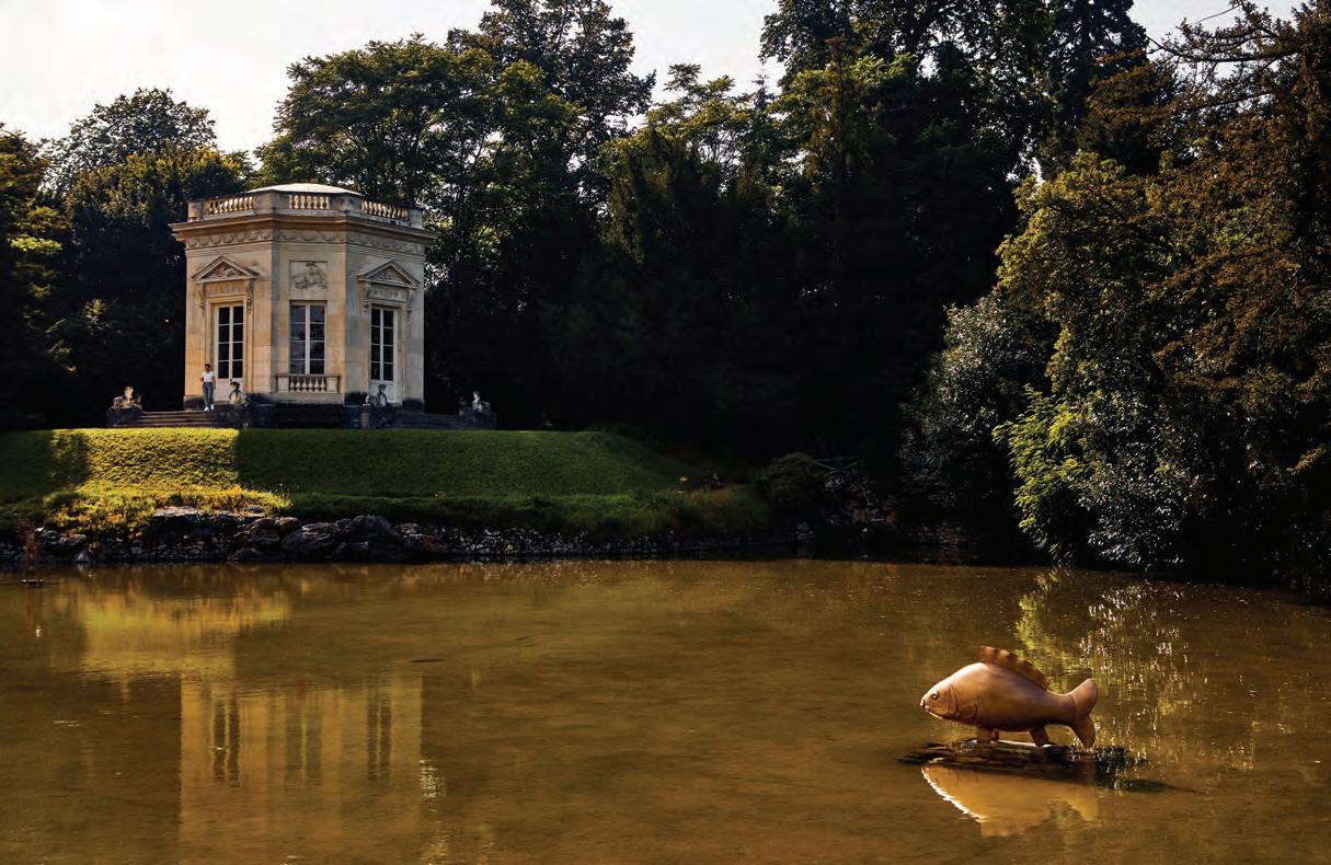
Mitterrand – who opened his first gallery in 1988 in Paris’ sixth arrondissement before moving to Rue du Temple in the third arrondissement, where he is still based today – organised more than 20 exhibitions of Claude and François-Xavier Lalanne’s art, in addition to exceptional events in other locations, including the Petit Trianon at the Château de Versailles in 2021. On this occasion, Mitterrand said: “Les Lalanne are ambassadors of French taste in contemporary art coming from the 18th-century French tradition of high taste, which is why they fit so well in Versailles. Les Lalanne help us to escape the pollution and
aggression of the city, because when you are with their works, you come back to simplicity, nature and contemplation.”
Animals, plants and flowers were part of François-Xavier and Claude Lalanne’s visual vocabulary. While Claude approached sculpture through moulding and assembly, and FrançoisXavier focused more on the techniques of drawing and construction, both gave function to the pieces they created, which was a true revolution in their time. As François-Xavier once said: “It is, after all, easier to have a sculpture in an apartment than to have a real sheep. And, it’s even better if you can sit on it.” Through their work, frogs become chairs, ostriches are bar tables, hippopotamuses’ bathtubs, twigs intertwine to create benches, and the forms of rhinoceroses are used to give life to desks.
At the crossroads between fine and decorative art, the poetic and iconic work of Les Lalanne has fascinated, and continues to fascinate, collectors from all over the world, such as Yves Saint Laurent, Serge Gainsbourg, Peter Marino, Karl Lagerfeld, Tom Ford and François Pinault, among many others.

72 library
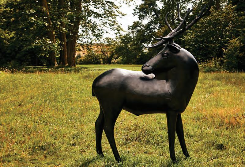
Left: Wapiti, 1996, François-Xavier Lalanne
WORDS BY KARINE MONIÉ
This new book published by Assouline delves into the whimsical art of French duo François-Xavier and Claude Lalanne
Photography by Oliver Pilcher


73 THE DREAMERS ISSUE library
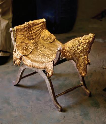
Clockwise from top: Carpe, 1996, by François-Xavier Lalanne. François-Xavier and Claude Lalanne, 1973. Crococurule, 1992, by Claude Lalanne
Photography by Horizonfeatures/Bridgeman Images
Photography by Oliver Pilcher
Photography by Paul Kasmin. Courtesy of Kasmin Gallery and the Estate of Paul Kasmin
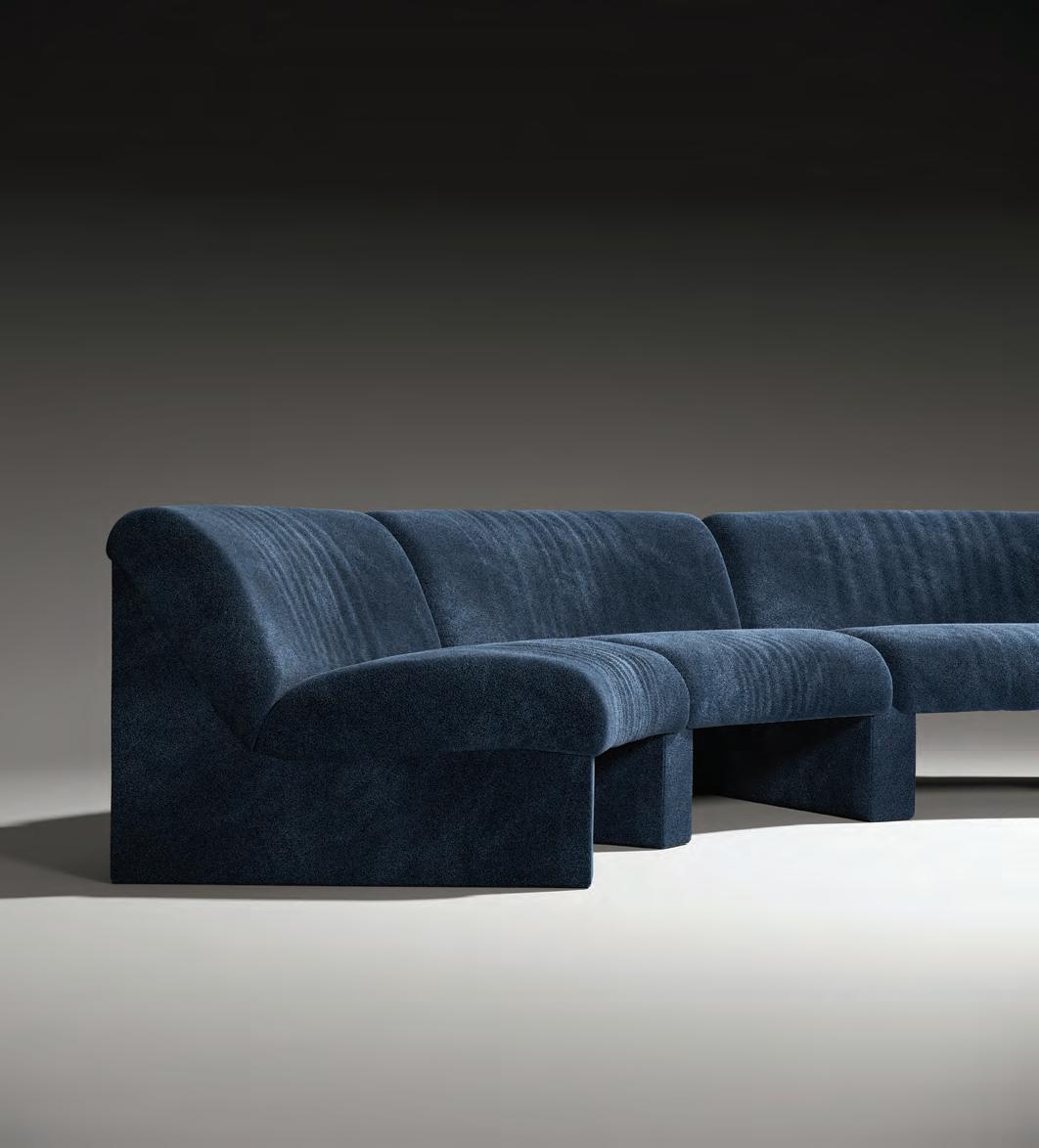
Inspired by the way snow changes the landscape from hard to soft (“even the most Brutalist building morphs into blurry and puffy shapes”), Note Design Studio’s modular Snow sofa is composed of two elements – a straight module and a rounded 30° module – that can be combined to create an infinity of shapes. With a nod to 1970s design, Snow conveys this idea of the relaxed opulence typical of the era.

74 id most wanted
Snow by Note Design Studio
IMAGINE YOUR S PACE

RAKCERAMICS COM Imagine a space where your inspiration can run free. A world that tells your own story, every single day At RAK Ceramics we help create the perfect living space, for you and your loved ones. Imagine your space

Oikos Atelier Dubai The Opus, Tower A, office 1205 Al A’amal St, Business Bay - Dubai T +971 4 589 3332 | M + 971 52 556 7376 atelierdubai@oikos.it | oikos.it
in Italy Entrances
by You
Made
Designed
Hall C4 - Stand 530


 Photo by Young Habibti
Photography by ZHANYING Studio


 WORDS BY KARINE MONIÉ IMAGES COURTESY OF MARAYA ART CENTRE


 WORDS BY AIDAN IMANOVA PHOTOGRAPHY COURTESY OF THE ARTIST AND EFIE GALLERY DUBAI


 WORDS BY AIDAN IMANOVA


 WORDS BY KARINE MONIÉ


 WORDS BY AIDAN IMANOVA
PHOTOGRAPHY BY DAVID MOYA


 WORDS BY AIDAN IMANOVA
Shikhara, 2019
 Photography by Akash Sharma
 Photography by Syam Sreesylam


 Photography by Syam Sreesylam
 WORDS BY AIDAN IMANOVA
PHOTOGRAPHY BY AMIR HAZIM


 WORDS BY AIDAN IMANOVA


 WORDS AND CURATION BY AIDAN IMANOVA


 WORDS BY KARINE MONIÉ
IMAGES BY ZHANYING STUDIO
 Located in Beijing, China, this home spreads over 120 square metres


 The living area features a white sofa by Atelier 1976, pendant lamp by Lightwork Design, side tables by Koçgiri furniture as well as lamps by Öztaş lighting. The artwork is by Ali Alışır and the carpet by Madderugs


 Shadab Khan
Sculpture by Armin Shahhosseini
Photograph by Mahsa Namvar
