A MOTIVATE PUBLICATION DHS 25.00 OR 2.70 BD 2.60 SR 25.00 KD 2.10 ARCHITECTURE, DESIGN, INTERIORS + PROPERTY identity.ae ISSUE 231 / MAY 2023
The Design Issue
Beolab 18
Conceived as an exceptional sound column, introducing a refined symbiosis of form, craftsmanship and performance.
 Acoustic Lens Technology
Wall mounted or free stand
Elegant wooden lamellas
Available in stores:
Bang & Olufsen Manama, Bahrain
Moda Mall, Bahrain Commercial Complex (Sheraton Tower)
Bang & Olufsen Lagoona Mall, Qatar
Lagoona Mall - First Floor, Doha
Bang & Olufsen Lebanon


Gouraud Street, Saifi, Beirut
Bang & Olufsen Riyadh, KSA
Aknaz center, 2043 Prince Muhamad Ibn Abdulaziz Rd
Bang & Olufsen Symphony Mall, Kuwait
Symphony Style Mall, Salem Mubarak Street
Find out more:
Objects that matter

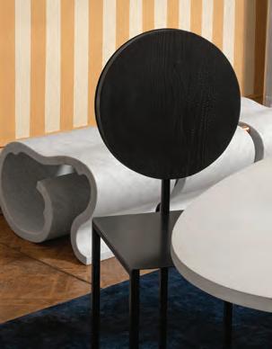
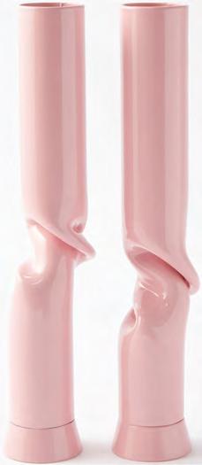
Magical realism

28 Features 36 34 contents 10
Chris Glass curates a collection for YOOX spotlighting young designers 52 Balancing act F&R Partnership preserved the identity of this beach house using a minimalist design vision 14 A moveable feast Astet Studio shares its philosophy for designing award-winning restaurants 28 Natural lines Didi NG Wing Yin uses experimental surface treatments to showcase the potential of wood 24 Inside out Formafantasma’s latest collaboration with Tacchini introduces a new fabrication method 20 Take a seat Loewe continues its support of craft through a new exhibition exploring chairs 12
Karim+Elias are reviving rammed earth through the creation of contemporary art Regulars Design Focus Library Products #idmostwanted 40 70 72 74

Editor-in-Chief
Obaid Humaid Al Tayer
Managing Partner and Group Editor
Ian Fairservice
Editor
Aidan Imanova
Senior Art Director
Olga Petroff
Junior Designer
Charissa Canlas
Sub-editor
Max Tuttle

Chief Commercial Officer
Anthony Milne
Senior Sales Manager
Sharmine Khan
Sales Representative - Italy
Daniela Prestinoni
General Manager - Production
Sunil Kumar
Production Manager
Binu Purandaran
Production Supervisor
Venita Pinto
Contributors
Aisha Zaman
Jennifer Copley
Karine Monié
Head Office: Media One Tower, PO Box 2331, Dubai, UAE; Tel: +971 4 427 3000, Fax: +971 4 428 2260; E-mail: motivate@ motivate.ae

Dubai Media City: SD 2-94, 2nd Floor, Building 2, Dubai, UAE
Tel: +971 4 390 3550 Fax: +971 4 390 4845
Abu Dhabi: PO Box 43072, UAE, Tel: +971 2 677 2005; Fax: +971 2 677 0124; E-mail: motivate-adh@motivate.ae
Riyadh: Office 452, Regus Offices, 4th Floor, Al Hamad Tower, King Fahad Road, Al Olaya, PO.Box 12381, Riyadh 6764, Kingdom of Saudi Arabia; Tel: +966 11 834 3595 / +966 11 834 3596; Fax: +966 11 8343501
London: Acre House, 11/15 William Road, London NW1 3ER, UK; E-mail: motivateuk@motivate.ae
contents 20 ®
NEW

TECHNOGYM RUN. The training experience that paves the way to a healthier future.
Editor’s Note
Many of us are busy recovering from what seemed like a ‘back to normal’ Milan Design Week (the halls of Salone del Mobile were once again packed with visitors and the city’s streets bursting with long queues outside myriad exhibitions and public installations). While we do that, I am hoping that we are also taking the time to reflect on what the most important week in the design calendar has to say about the realities and impacts of our industry. After as much pondering as my exhausted brain could manage, I am left with more questions than answers.
It is always difficult to decide what can be said aloud (or in print) and what should be kept to private conversations, but I believe that in order for us to do better, we must be honest about where we fall short and act accordingly. For that we must question more and be open to discussions – be it on public platforms, between friends and colleagues and in our own private musings.
I have been visiting Milan Design Week every year since starting 2017 – even during the COVID-19 restrictions, when a good chunk of the content of the event reflected (to some extent) the state of the world at the time. Now, as we move away from a global pandemic, it was difficult to ignore the feeling of ambiguity while navigating the city and its many activations.
While on one hand, the commercial side of the industry is focused on returning back to top-chart sales with eye-catching launches and immersive installations, another – newer – side to the industry is led by a roster of younger people whose focus (and even design sensibilities) are speaking an entirely different language. The themes here are of materiality and waste and rethinking the visual language of ‘luxury’ and good design, which is all well and good. The issue is when there is a lack of connection – or a divide – between the two that leaves one wondering: what exactly are we doing here?
If the aim is innovation and new ideas, then how long does that take and does the pressure of showing something every year take away from making truly innovative proposals? If the aim is fighting climate crisis (which many brands and designers highlighted in their ethos), aren’t we doing more to contribute to it than helping to overcome it?
In fear of sounding too negative here, I think there is a lot that can be done in bridging the commercial and the experimental sectors of the field under a common goal. If anything, each one needs the other to operate within this ecosystem and in turn, see results.
Italian design duo Formafantasma are a great example of merging research and commerciality and their project ‘Tacchini Flock’ at Capsule Plaza demonstrated just that. “It is a way of showing how what we are doing with a museum or an institution in terms of research can also be applied to a company,” co-founder Andrea Tramarchi told me over the phone.
There is no denying that for many young designers today, being conscious of the challenges of our time is of vital importance. As much as the final product, what equally matters are the ideas put forward to influence positive behaviours and changes. As one talented designer told me the other day, “the only way to save the world is by promoting consciousness.”
On the cover: A collage featuring the ‘making of’ Loewe Chairs for Milan Design Week
 Aidan Imanova Editor
 Photo by Young Habibti
Individual images are courtesy of Loewe


+971-4-551-3793
Objects that matter

Interior designer Chris Glass curates a collection of objects for YOOX, spotlighting young designers and makers from diverse backgrounds
WORDS BY AIDAN IMANOVA
10 design
“
As a child, my mother always said she had a great desire: to give her children a better world than the one in which she was born. These ideals have served to instil in us a deep sense of responsibility towards others; [to] understand the present, to be fundamental for everyone’s future,” begins interior designer and curator Chris Glass, who has recently been appointed Global Director of Diversity and Inclusion at Soho House club, helping to form creative communities across the globe, while also being the curator of A Place to Meet – a home-gallery in Berlin where everything is available for purchase. Continuing his work in spotlighting young creatives who are often outside the mainstream, ‘Objects of Matter’ is a collection of design objects and art pieces curated by Glass for YOOX – an online store for ‘long-lasting’ fashion, design and art which promote empowerment and inclusion.
“As with many of the things I do in my life, I wanted to shift perspective on who can create and consume art and design,” Glass explains. “I made a list of some of the makers I personally collect and others that I’ve followed, and massaged the list to come up with a wholistic group that represents different identities, geographies, mediums and prices. The final group is varied, but still just the tip of the iceberg in terms of other underseen creatives out there.”
As an admirer of handcrafts – especially clay and textiles – Glass’ selection of artists reflects his love for beauty and storytelling.

One of them is Paboy Bojang, who is from Gambia and now lives in Naples where he has founded his own line of handcrafted cotton pillow covers. Having collaborated with brands such as Paul Smith and Bally, his work is about encouraging others to live a more colourful life.
Others include Visual Citizens – a duo formed by Shali and Adam Kelly, former architects who create digital works inspired by nature, and focus on the use of technology and hyperrealism, as well as Bouchra Boudoua, who lives between Casablanca and Marrakech and creates functional and decorative ceramics that combine ancestral techniques of pottery with a modern aesthetic, all handmade in collaboration with Moroccan artisans. Glass also selected pieces from Viso Project – a brand of lifestyle and design objects made by artisans and manufacturers from around the world. Founded in 2017 between Madrid and New York by David
Vivirido and Francesco Sourigues, the pieces include cotton tapestries with distinct patterns created by American artisans, a craft tradition that goes back to the first weavers in the American colonies and has been handed down for generations.
Lastly, the collection includes the work of self-taught jewellery artist and designer Githan Coopoo from Cape Town, who works exclusively with clay to produce sculptural works, described as “fake ceramics”. The ‘Shopping for Destiny’ collection for YOOX consists of five clay sculptures in the form of tote bags.
“I think there is change happening in the world and art and design are part of the ways we experience that change. Access for makers from marginalised communities to create has increased in recent years, thereby making the work more varied as well as broadening the audience of consumers,” says Glass. “Diversity benefits everyone because it not only challenges us to innovate – it also exposes us to other understandings of beauty and creativity.” id
11 THE DESIGN ISSUE design
Building with earth
A young studio based in the UAE is reviving rammed earth through the creation of contemporary art and design pieces
 WORDS BY KARINE MONIÉ
Working with sand – one of the most versatile and abundant natural and local materials in the UAE – is, for the founders of multidisciplinary studio Karim+Elias, a way to pay cultural homage to the region.

Architects Karim Tamerji and Elias El Hage are inspired by their immediate context and geography, as exemplified by their first project, ‘IOTA’, which launched their practice at Dubai’s Downtown Design last year. ‘IOTA’ was a temporary open-air installation exhibiting over 150 hand-made modular and – mostly – blood-orange and powder pink spheres of sand that welcomed guests into the fair.
“Each tactile sphere is unique in texture and composition, naturally pigmented in an array of colours,” say Tamerji and El Hage. “We’ve come to recognise sand as a material with meaning, one which tells a story steeped in heritage, that speaks to people on a primal and universal level.”

Through their work, the duo is preserving the old method of rammed earth – which dates back thousands of years and consists of hand-pressing earth and natural materials layer above layer –while reinventing within a contemporary context. Used throughout history to build habitable shelters, this technique requires a mix of earth, clay and water and has thermal, fire-proof and ecological benefits, particularly when it is sourced locally.
As a way to introduce the material to interior or exterior wall applications, Karim+Elias recently
launched a rammed-earth surface application called ‘Sand Skins’. “We designed a solution that allows us to hand-press sand into thicknesses of as little as six or seven centimeters, enveloping full surfaces in any shape, form or size,” they say. “Where typical architectural interventions aren’t an option, ‘Sand Skins’ achieves the same detail-oriented result with as much flexibility. The solution opens up possibilities for creative collaboration within the design field, allowing designers and curators to incorporate the material into their own work as artistic feature pieces.”

The duo is fascinated by the possibilities presented by sand, either in its loose or solid state, and strives to craft pieces that tell a story “about the people’s land or heritage – something they’re proud to showcase and talk about.”
Currently busy, Tamerji and El Hage are working on several bespoke artworks for a prime waterfront hotel, “in line with the establishment’s artistic vision of sea textures and silhouettes of the desert dunes,” they describe. Design installations both for private and commercial spaces will also be revealed in the coming months.
“Our studio is preserving the ancient art of sculpting with sand, much like the preserved artistry of sculpting marble, carving wood or weaving textile,” say the pair. “We consider ourselves revivalists of a traditional craft, now reimagined through contemporary art and design.” id
13 THE DESIGN ISSUE craft

A moveable feast
Astet Studio shares its philosophy for designing award-winning gastronomic experiences while it prepares to open its first restaurant in Dubai
 WORDS BY AISHA ZAMAN PHOTOGRAPHY BY SALVA LOPEZ

Within a short span of four years, Astet Studio has become a force to be reckoned with. By amassing a number of design accolades – including winning World’s Best Restaurant Design for their Leña Marbella project at the Restaurant & Bar Design Awards in 2021 – the Barcelona-based multidisciplinary design studio has become synonymous with luxury hospitality design.

Trained as architects, both Jordanian designer Ala Zureikat and Spaniard Oscar Engroba followed their passion for interior design and building cultural bridges through craftsmanship by launching Astet Studio in late 2018, specialising in hospitality, restaurants and private residences.

The co-founders believe that design must be driven by purpose, empathy and elements of escape, especially in a post-pandemic world.
“What really inspired me to become a designer was Maison Bordeaux, an intriguing project by OMA,” recalls Engroba. Designed for a couple and their family when the husband was left paralysed after a car accident, OMA created their new home as a seamless piece of apparatus to enable living with ease and comfort.
“Everything was sophisticatedly orchestrated to facilitate the movement of the husband, who was in a wheelchair. The house design was not only aesthetically appealing [but] it simultaneously offered a functional solution.
“Interior design is not just about having a great eye and enthusiasm; it also needs to focus on human needs and connections. Great design execution is a combination of understanding the clients’ personalities, cultural contexts, specific needs and how they will interact with the space
17 THE DESIGN ISSUE interiors
Photography by Marquez Studio
itself. We use emotions as a base in our projects, in which a balance between simplicity and complexity is achieved. Throughout all our projects, human value and user’s needs are the heart,” Engroba adds.
To design a restaurant lauded as one of the world’s best is no small feat. Astet Studio’s fascinating design philosophy revolves around conceptualising spaces that generate inspiration – “complex details for a smooth user experience”, as Zureikat claims. Both Leña Marbella and Leña Madrid attest to the designers’ keen eye for detailing and passion for finesse. “Authenticity, a human-centric approach and executing a fine
interplay between simplicity and opulence is our core area of focus and interest,” says Zureikat.
Nature always appears as a source of inspiration for the duo; its shapes, colours and textures offering a springboard for most of Astet Studio’s projects. For example, Leña, the upscale steakhouse by acclaimed Andalusian chef Dani Garcia, subtly reflects his smoked and charcoal grilled dishes in the restaurant’s nature-inspired design featuring wood, stone and fire. The strategy was to be true and honest to the materiality while creating an elevated dining experience, with the different techniques of preparing meat being the main driving force behind the concept.
The duo often adopts a design language of organic shapes, supported by an earthy palette of colours and natural textures. They conjured the primitive experience of cooking meat on a fire pit without abandoning their trademark sense of contemporary sophistication. Earthy textures and raw materials are predominant, as is a primarily darker colour palette inspired by yakisugi, a Japanese wood preservation process involving slightly charring the surface of the wood, which references Japanese grilling techniques. Another important and reoccurring element in their designs is the ceiling. Leña in Spanish means firewood, which is what inspired Astet Studio to create an organic ceiling made from stained ash wood, resembling the rings of time found in firewood. Not only is it sculptural – it also doubles as a lighting feature that intimately illuminates the space, creating the impression that the rings are on fire.
Now jumpstarting its work in the Middle East, Astet Studio has teamed up with regional hospitality titans Addmind to bring its award-winning Leña restaurant to Dubai by the end of the year.
“Dubai and Leña share a similar cosmopolitan vibe,” Zureikat explains. “We aim to combine the excitement and energy of Dubai with the sophisticated culinary experience that Leña offers. Our mission is to create a new way of experiencing hospitality venues – where all aspects of a project can interrelate and coexist harmoniously”. id

18 interiors

Take a seat
Loewe continues its support of craft through its latest project in Milan that puts the spotlight on the simple chair
WORDS BY AIDAN IMANOVA
20 design


JW Anderson’s appreciation for craft is unquestionable –and has been ever more present since he was named creative director of Spanish fashion house Loewe over a decade ago, where he launched the Loewe Craft Prize in 2017, spotlighting the work of makers from diverse backgrounds and disciplines. Anderson’s grandfather was a textile designer and since visiting the factory with him in Northern Ireland, the designer became fascinated by the act of making. Anderson’s Loewe has extended far beyond fashion, and his craft-honing participation during Milan Design Week has proven that.

From exploring bamboo and various weaving techniques (including with leather, straw and paper), this year’s focus is on the wooden ‘stick chair’, a term which has been used to describe the apparent simplicity of the build and appearance of the domestic furniture item; one that has long been considered a ‘peasant item’, and not worth documenting.

Of course, Anderson disagrees and instead has created an entire exhibition where the chair is the starting point, while highlighting the creative process of weaving and embellishment by skilled artisans from around the world that transforms a seemingly mundane piece of furniture into a collectible object. The humble stick chair thus becomes a springboard for unbridled woven decoration.
According to Loewe, the earliest records of the ‘stick chair’ can be traced back to the time of the 10th-century king Hywel Dda, and while the shapes and forms of the chairs can vary, what unites them is the method of construction, where all the uprights and legs are fixed into the seat and are typically held in place with a wedge.
In total, thirty stick chairs have been embellished: twenty-two of these are original antiques, while the remainder have been newly crafted by a British atelier that specialises in this style of chairs. The other eight ‘Lloyd Loom’ chairs – honouring the technique of creating a durable woven texture of the same name – were created by Belgian company Vincent Sheppard.
The myriad chairs featured in the exhibition spotlight various weaving techniques and an even wider assortment of materials; some of which, like leather and raffia, are familiar to the brand’s DNA, while others, such as the foil of thermal blankets, are unexpected additions. Additional materials include shearling and felt, giving the chairs a soft and tactile texture. The powerful use of colour is also surprising, emphasising the medley of colours and artistic interventions. In the end, each item becomes a creative dialogue between the artisans and their preferred medium and object.
23 THE DESIGN ISSUE design
Inside out
Formafantasma continues its collaboration with furniture brand Tacchini to introduce a new method of fabrication using a nature-based manufacturing process
 WORDS BY AIDAN IMANOVA


Formafantasma – led by Italian architects Andrea Trimarchi and Simone Farresin – describe themselves as a research-based studio investigating the ecological, historical, political and social forces shaping the discipline today – and rightfully so. While also contributing to the commercial segment of the industry, the studio’s work is largely led by investigations into the more passive actors of the design process, such as trees (the focus of its ‘Cambio’ exhibition that explored wood and the global dynamics of the timber industry), animals and the wider environment.
“For a very long time, as designers we have been focusing [solely] on the relationship with humans, making design a human-centred activity, which, in one way, we think is positive. But a human-centred perspective also means only focusing on their needs and aspirations and undermining the analysis of the surrounding production in the design of objects and systems,” Trimarchi tells identity.
“When you talk about the extraction of materials, you [must] also talk about the ecosystems and animals involved in the production process; other beings that are not human, and so the inclusion of this in our investigation is a way of recognising that the ecosystems of object production and design are much larger and [reach] far beyond the user,” he says.
The duo is currently preparing for the opening of its exhibition titled ‘Oltre Terra’ at The National Museum of Norway in Oslo, where they were commissioned to explore the subject of wool along with its farming and distribution and the sheep used for its production. An outcome of this research informs their latest collaboration with furniture brand Tacchini for a project titled ‘Tacchini Flock’ that rethinks the brand’s manufacturing process by introducing a nature-focused alternative based on circularity and environmental concerns as well as time-honoured traditions.
Part of a wider showcase at Capsule Plaza in Milan, the project involved reworking the upholstery of four of Tacchini’s most iconic seating designs from the inside. Using a technique inspired by antique mattress production in Italy, the new upholstery uses surplus sheep’s wool in combination with natural latex to replace industrial foam, utilising a natural material that has “paradoxically” been treated as a waste material. As with most projects by
Formafantasma, the goal is never just about the object itself but a step towards a larger mission. ‘Tacchini Flock’ looks at the wider relationship with shepherding in Italy and Europe as a whole, and the challenges faced by nomadic farmers in disposing of wool – the same challenges that are presented in other parts of the world due to the centralised wool market that is based primarily in Australia, South Africa and New Zealand. “Many facilities for the processing of wool are no longer available, so farmers need to dispose of wool almost as a waste material, [which causes] a struggle with the management process or [ends up] becoming a cost,” Trimarchi explains. “For us, this
project with Tacchini is a way to introduce a more sustainable material – but it is also about thinking about the larger implications of producing things with wool and how it can be beneficial for multiple actors. And it is [also] a way of showing how what we are doing with a museum or an institution in terms of research can also be applied to a company,” he adds.
Each of the designs will continue to be available by the brand with its traditional stuffing, now alongside an option with the new wool and natural latex filling conceived by the duo. And while the team acknowledges the benefits of using the latter option, they also admit that the proposal is far from perfect.

“I think the challenge here is that wool over the years needs to be maintained – it becomes much more compact and loses volume, and this means that the product will need to be opened up, moved and aired out,” Trimarchi explains. This would also mean sending the furniture back to Tacchini’s facilities for maintenance which could involve travel, depending on the user’s location.
“The system now is not perfect, but I think it is important to at least start making these changes and over the years see where it leads,” Trimarchi says.
“The next step we want to take is designing a product for Tacchini [where] we start from the material and design around it. I don’t know how long that will take; hopefully it will be ready by next year – it is the next step in the project.” And while much of the research takes inspiration from traditional techniques, Trimarchi assures us that the past is not the driving force here.
“This project is not about tradition or nostalgia,” he says. “It is actually about going forward and doing better.” id
27 THE DESIGN ISSUE design
Natural lines
Didi NG Wing Yin uses experimental surface treatments and hand carvings to showcase the vast potential of woodworking in contemporary design
 WORDS BY AIDAN IMANOVA
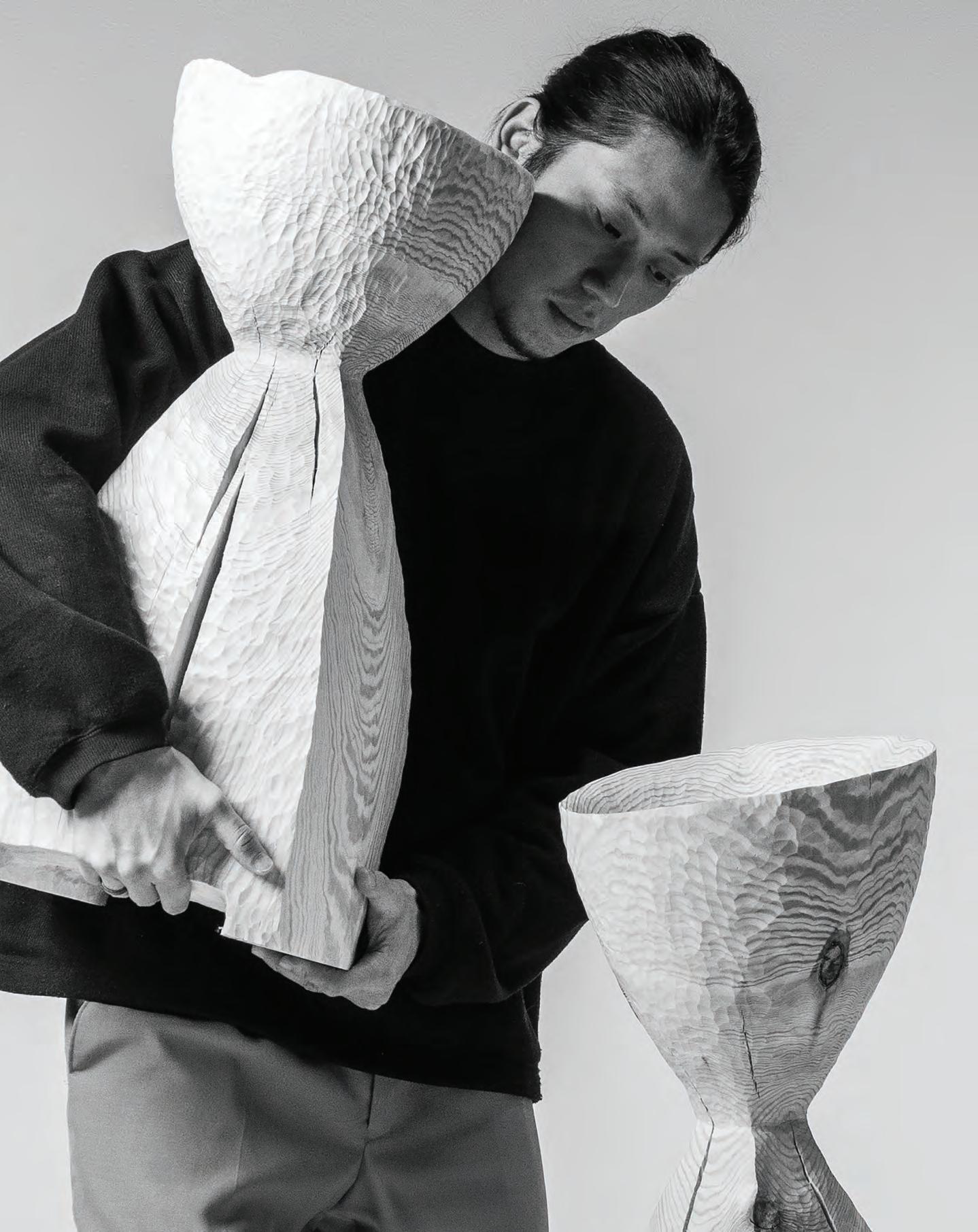
My artistic creation has changed a lot since I began focusing on working with wood,” shares artist-designer Didi NG Wing Yin. Having initially studied industrial design at the Hong Kong Polytechnic University, Yin moved to Finland to pursue his master’s degree in Interior Architecture at the Aalto University. It is here that his practice completely shifted to focus purely on woodworking, producing works that lie in the spaces between sculpture, installation and furniture.
“To me wood is a very spiritual material; it tells its own history through its grains and textures,” the designer muses. “And even though wood is just a material, its grain somehow implies that it is still living; [therefore I am] more respectful and considerate while working with it.”
Yin showcased two wood-crafting collections at the Alcova Project Space in Milan; each one revealing an experimental technique in wood working, aiming to expand perspectives on the artistic potential of the material while highlighting its natural qualities and materiality. Both these collections possess an unexpected tactility and encourage audiences to see the traditional material from a novel perspective.
“To me, every piece of wood is like sculpture,” Yin shares. “As a maker, I try to create things without over-controlling or manipulating the material, and [to] explore the balance between materiality and naturalness. The inspiration for the pieces [at Alcova] comes mainly from nature. Perhaps my design approach became influenced by the Finnish landscape and culture. As I am originally from Hong Kong, my thoughts toward nature have changed dramatically. I have begun to embrace and see nature differently and [I] attempt to infiltrate this new feeling into my creations.”
The first collection, ‘Wood Pleats’, consists of a chair and side table and employs a brushing technique on the wood to create a seamless, almost fabric-like texture. The directions of the grains on the wood appear uniformly horizontal, reminiscent of the calm waves of a lake’s surface. ‘Feather Branches’, on the other hand, is a wall sculpture made out of an entanglement of two axe-split branches, to the surfaces of

which have been applied a unique carving technique that creates a feather-like texture as a second skin. The resulting wood ‘feather’ is thin, light and fragile-looking, its texture resembling the fur or pelt of a living creature. “The uniqueness of the technique is that there is no material being subtracted from the wood but, rather, it is retained,” says Yin.
To him, contemporary design and craft are inseparable. “Craft is one of the best ways to form a creative dialogue and bring value to contemporary design,” he explains. “In most artworks in contemporary design, the creators spend a lot of time studying the material and actualising the works through trial and error. The time spent on crafts guides one to a unique outcome that makes the design distinctive. The combination of the two consists of both the emotional part of the craftsman and the rational mind of a designer.” id
29 THE DESIGN ISSUE design
“
Time travel
AB+AC Architects’ kaleidoscopic installation for Fantini Mosaici celebrates mosaic and terrazzo art while exploring its future potential
WORDS BY AIDAN IMANOVA
Ayoung practice, AB+AC Architects –headed by Arianna Bavuso and Andre Chedid – believes that architecture holds an emotive power that has the ability to provoke a reaction. Their own work attempts to channel or influence that power, creating spaces that are not solely about being seen, but also about being felt.
The duo’s most recent installation, ‘Back to the Future’, demonstrated this approach, creating an experience that is hypnotic, visual and tactile all at the same time. AB+AB Architects was tasked by Fantini Mosaici – a company that has been creating mosaic works for over 100 years – to explore new forms of expression to reflect age-old artisanal techniques and craftsmanship. As a result, ‘Back to the Future’ formed a physical experience that celebrates the art of mosaics and terrazzo “by bringing high craftsmanship (which generally lives in a collective memory of history and tradition) into the future,” the architects describe.
But while on one hand the project is a call for the preservation of ancient techniques, it is also, more importantly, a showcase of how such crafts can respond to future needs. “It makes us reflect on how, in order to move forward, we often have to look backward,” says the duo.
The installation was organised in a sequence of rooms that divvied the exhibition into two acts: the first being a dark room featuring a

specially designed hand-made floor of waves alternating between tesserae in precious Nero Portoro and Orobico Chiaro marbles. Following this space, the installation itself was revealed: a kaleidoscopic room that plays with the illusion of a limitless universe, formed by a mixture of precious and rough stones that compose a three-dimensional floor of floating pyramids framed by an endless sequence of portals.
Proving an educational journey, the installation saw a mixture of terrazzo – including a combination of marbles with larger and more valuable pieces, such as Calacatta marble – used in combination with smaller-sized discarded fragments, as in the case of Lasa White marble, Botticino marble or Sodalite – a blue volcanic rock that in the ancient practice of crystal therapy was used as a healing stone.
“Our starting point was perhaps the challenge itself,” the architects recall. “We asked ourselves questions like, ‘what shape will luxury assume in the future?’ From there, the intention was to create a timeless experience with a design that would provoke emotion and desire yet, at the same time, inspire a certain sense of calm and peace.
“Never before have we seen the future manifest itself so frequently in our present as in this last decade, so it was crucial to explore solutions bridging ancient techniques such as Venetian terrazzo and mosaic with a world in such rapid evolution.” id
30 architecture

Cultural spirit
Annabel Karim Kassar created a welcoming salon that showcases the warmth of traditional design from the MENA region
 WORDS BY AIDAN IMANOVA
Photography by Paul Raeside
The Western emphasis on minimalism in interior design lacks warmth and emotion, yet design in traditional societies still manages to combine simplicity with the ornamental, the emotionally satisfying with the utilitarian,” says Lebanese-French architect Annabel Karim Kassar, who devised a vibrant place of gathering for 5Vie Design Week in Milan, aptly called ‘Le Salon d’Annabel’.
The makeshift salon – set inside Gilda Contemporary Art – combines modernist simplicity with traditional craft and ornamentation commonly found across North Africa and the Middle East, creating a space that doesn’t shy away from colour and is adorned with an assortment of furniture and lighting designs. Featuring her own works and pieces from international design brands, the salon is a showcase of Kassar’s approach to design, which encourages the meeting of Eastern and Western principles and aesthetics. “For over three decades, my work has tried to forge a dialogue between eastern and western design, with a celebration of the detailed craftsmanship and aesthetic of traditional Arab, Berber and Ottoman cultures,” Kassar explains.
“With Le Salon d’Annabel, I again tried to tie-in this element of my work with a more modernist twist to create a space that could at once be as at home in Milan as it could in Beirut, or elsewhere. I have

worked and lived across the globe, and my practice as an architect and designer is equally varied. I wanted to showcase more of my bespoke furniture and my approach to textiles, materiality and the way we inhabit spaces today through this installation.”
The core of Le Salon d’Annabel is a set of mattress cushions and pillows that can be arranged to create sofas of different heights and lengths. They come covered in traditional African patterns and fabrics from internationally renowned brands such as Rubelli, Knoll and Nobilis. The result is a modular seating system that can fit within any room or size of apartment. Hand-painted wallpapers incorporating the designer’s artistic hand, bold acrylic mezze trays and handmade fabrics and upholstery could also be found across the space. Punctuated with Middle Eastern influences throughout, guests were able to explore Kassar’s contemporary reinterpretation of the traditional Liwan, quilts with bold patterns, a bespoke hand tufted rug based on her own paintings, and her ‘Diamond’ tables –geometric mirrored works which are a nod to the area’s detailed coffee tables.
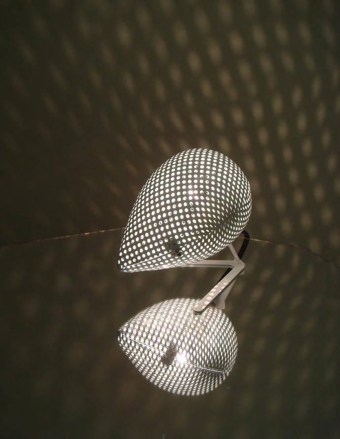
The lighting included the Cai Stocking Light – a free-standing spherical work adorned in crocheted fabric – and the Cai Splashing Drop, a lighting fixture enclosed in perforated metal casing, providing an ambient effect. id
33 THE DESIGN ISSUE
“
A room of one’s own
WORDS BY AIDAN IMANOVA
Set in an historic Milanese building, ‘L’Appartamento’ is an installation conceived for Milan Design Week by Artemest. An online destination for Italian craftsmanship and design, it features six rooms that were curated by international interior design studios T.Zed Architects, Kingston Lafferty Design, Moniomi Design, Nina Magon and Styled Habitat. Digging through Artemest’s extensive portfolio of brands, artists and artisans, the studios selected over 130 pieces to craft a distinctive creative vision that celebrates Italian craftsmanship and design from varying perspectives. “We begin all of our projects by understanding the context in which the space is situated,” says Rabah Saeid, founder of Dubaibased Styled Habitat, who conceived a bedroom interior for the installation.
“It is crucial for us to be conscious of how best to preserve the unique significance of every space.” Delving into the history of the 1930s, the studio translated the spirit of the bygone era into an interior concept that embraces the romantic style of the time. “To capture the experimental and avant-garde trends of European modernism, we juxtaposed new and old classics, such as the Cassina Utrecht armchair and the Artemest Tula bronze bookcase, with organic handcrafted décor seen through glass blown bottles by Ars Murano and sculptured figurines in the Her side table, creating a sense of timeless glamour,” the Sudanese-American designer shares.
Highlighting the importance of reviving old artistic craft endemics, the studio also featured pieces such as a hand-blown Murano glass chandelier by Luci Italia – testament to centuries of Venetian glass traditions – as
well as a limited edition Fauno torso bronze sculpture, moulded by sculptor Raffaello Romanelli, to emphasise the study of the human anatomy inspired by the Renaissance. The black Roma bed with laurel crown by Porte Italia anchors the room while doubling as a showcase of the finest Italian artisanship. The art selection also represents the rise of abstract art against the more traditional religious paintings in the space, demonstrated in the oil paintings of Adriano Annino.

“While the colour palette draws inspiration from the broader international influences of the time, you can see a reflection of rich hues inspired by the fall of the Ottoman Empire and hints of gold reflecting subtle references of orientalism as the western world became more aware of the Far East and Middle Eastern styles through the growing accessibility of air travel,” Saeid adds. “We view spaces as rooms with souls and we wanted to capture the essence of the room and the persons that lived [there],” she continues. Visiting nearby flea markets, Saeid picked out a silver frame portraying a gentleman›s photo (“that was very fitting to our story line”) as well as other items such as an old vintage pen, a photo and a handkerchief of a woman.
To depict a specific image of the story for our audience to resonate with, we wrote down a poem by Khalil Gibran, ‘A Lover’s Call’, to demonstrate the feeling of longing that our main character was enduring,” Saeid describes. “We pride ourselves in our ability to create atmospheres that leave a lingering memory of the space; a distant reminiscence of an experience worth remembering.” id
34 design
‘L’Appartamento’ by Artemest features a series of rooms reinterpreted by six interior design studios, including Dubai-based Styled Habitat who created a bedroom reminiscent of the 1930s

35 THE DESIGN ISSUE design
Second skin
Filippo Carandini’s furniture – painted entirely by hand – encourages one to take a step back to admire its decorative skin
 WORDS BY AIDAN IMANOVA
Bold paint strokes define Filippo Carandini’s ‘New Pompeii’ collection, hand-painted with acrylic colours by the designer himself through a layering process and reflected here in the ‘Mensa’ dining table in wood. A variety of tones are applied onto each other, creating countless chromatic variations while also revealing the previous phases of the process.
Different drying stages of the acrylic paint are visible through sudden interruptions and smoother blending, later followed by a highgloss polyester coated finish that deepens the palette while protecting the handcrafted surface. Shown as part of Nilufar Gallery’s inaugural ‘Nilufar Open Edition’ project, the collection features six pieces in total, including a bookcase, cabinets and coffee table.
“This is a collection of furniture where the chromatic aspect becomes dominant as the structure of the pieces that are deliberately uncomplicated, and carries out the function of support for the pictorial narrative,” explains Carandini. “The shapes are secondary compared to the surface treatment and [the] overall impact [of the pieces]. The idea here is to say one thing: colour.” id
A metamorphosis
Tom Dixon presents a bold architectural vision, using Cosentino’s ultra-compact surface Dekton to spark ideas about the future of bathrooms
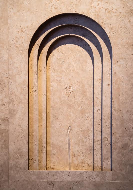
I’ve long been fascinated by prefabricated bathrooms inserted into buildings as modules, which was the departure point and initial inspiration behind Metamorphic,” explains British designer Tom Dixon when speaking about his Milan Design Week installation for Spanish surfaces brand Cosentino, which was created almost entirely with its innovative ultra-compact surface, Dekton®. More than an installation, Metamorphic is a reflection on what the future of the bathroom could look like, while also demonstrating the versatility, sustainability and durability of innovative materials. “After visiting the Dekton® production facility in Spain,
I was enthralled by the innovation and sustainability of the material. The durability and beauty of Dekton® allowed me to create a unified and seamless 3D installation – almost as if it was carved out of stone. The end-result showcases the bathroom as a practical place of refuge and awakens the opportunity for these spaces to be more expressive and heroic,” adds Dixon.
Inspired by the designer’s fascination with new methods of modular construction and his deep understanding of the properties of Dekton®, the installation features four modules of varying size that together showcase a new vision of the bathroom space as a focal point of interior
architecture. The sculptural intervention challenges the perception of the bathroom as a purely functional space, with the aim of reinventing its position and visibility within interior design.

Using only the new Dekton® Pietra Kode collection, which reinterprets the timeless beauty of three classic Italian stones – Vicenza, Travertine and Ceppo di Gré – the five colourways of Grafite, Sabbia, Ceppo, Nebbia and Marmorio convey the look and natural texture of classic Italian stone. An experience in its own right, Metamorphic took visitors on a journey through a modular world of surreal shapes and the dramatic effects of water, sound and light. cosentino.com
37 THE DESIGN ISSUE partner content
“
A new legacy
From Pan Emirates to Pan Home: a long-standing legacy gives rise to a new contemporary identity and furniture designs to match

With more than three decades under its belt in the Gulf region, home furnishings brand Pan Emirates has evolved to launch its latest rebrand: Pan Home. With 22 stores across the region, the brand is evolving its identity to cater to the ever-changing tastes in design. With a renewed contemporary look, the 360-degree makeover hints at a modernised approach and a shift in perspective, focusing on balancing aesthetics and function.
With each product carefully selected by an expert team of buyers and designers from around the world, Pan Home is focused on creating bespoke pieces that are centred around proportions, organic shapes, natural materials
and handcrafted designs. “Each product at Pan Home blends contemporary sensibilities with traditional craftsmanship and exceptional quality to create a range of products that brings style and flexibility to modern dwellings,” says the team.
“Our passion for design is reflected in every product we offer. We curate globally inspired designs with a focus on modern, clean, organic lines, with a wide range of products and styles,” they add. “Our consumer-centric approach to product sourcing ensures we’re able to offer the latest trends, coupled with practical and functional design that’s suitable for everyday use.
We are continually on the lookout for new and innovative design solutions that align with the
latest trends, to inspire and elevate home interiors.” With a goal to offer products that are both aesthetically pleasing and durable, Pan Home is eager to showcase its commitment to affordable luxury and to elevating one’s living experience.
In addition to its selection of furniture and décor pieces, Pan Home also offers customised services for homes to meet end-to-end requirements – these include interior design solutions and turnkey projects. From personalised interior design consultations to modular kitchen solutions, Pan Home brings tailor-made design solutions to transform your space. Discover its wide selection of furnishings and décor items in-store and online. panhomestores.com
38 partner content

39 THE DESIGN ISSUE partner content
No place like home
Salone del Mobile has come to a close – and here we select our highlights from this year’s furniture fair
WORDS BY AIDAN IMANOVA
A celebration
In collaboration with Formafantasma, cc-tapis has realised its Telegram collection, which salutes the makers behind the creation of the rugs by using the woven scraps to craft messages from the artisans, recounting the names, places and thoughts that each rug-maker holds dear. The restrained colour palette and straightforward shapes of the rugs underscore the centrality of the personal messages: free expressions of their choosing, alongside responses to a series of questions posed by the designers to the artisans such as where they come from, what they see out of their window as they work, or a favourite band. “We wanted to remove the veil between us and the makers,” says Formafantasma.
“It’s the beginning of a dialogue, instead of merely a finished product.”

Tie the knot
Studiopepe’s Shibari armchair for Visionnaire features a backrest in the shape of a knot – designed to represent the many symbols of knots across history and cultures, including those that are religious and spiritual. In Egypt it represented life: the knot of Isis stood for immortality and divine love. The endless knot is also one of the most ancient figures utilised in Buddhist symbolism in China and Tibet to convey an infinite devotion. In essence, the chair is designed as a symbol of everlasting love.


41 THE DESIGN ISSUE living spaces
Bahaus revival
Fendi Casa’s multifaceted collection showcases a passion for raw materials and craftsmanship, with some core elements evolving to become more essential parts of the design, such as the tubular components – in metal and in high-quality wood variants –to form seats, table bases and beds. It is at once a reflection of the birth of the brand in 1925, around the time of the Bauhaus, which is revisited here from a completely new perspective, where the precision of lines meets precious materials. Dimorestudio’s Icaro table is the perfect demonstration of this, showcasing a glamorised take on a linear metal structure.

42 design focus
Rebellious spirit With Black Flag by Konstantin Grcic – an extendable wall light for Flos that illuminates an area up to 3.5 metres away from its frame – a new type of lamp is born: one that is wall-mounted but functions as a centrepiece. Inspired by the pioneering spirit and rebelliousness of the punk band of the same name, the extensible wall lamp is composed of one vertical and three horizontal bars, designed to take up minimum space when closed and provide maximum illumination when open. With its strong geometry, Black Flag is sure to be a strong presence in any room.

Soft embrace
The Cinnamon armchair marks the first collaboration between Molteni&C and the Japanese designer Naoto Fukasawa. “The inspiration for the Cinnamon armchair was the feeling of being wrapped in a soft embrace, like floating in an inflatable ring, with your arms drifting along the water surface,” describes the designer, who has created a simple yet cosy shape “in which the body is pleasantly welcomed”. The shape of the armchair is characterised by a rounded line that follows the entire perimeter, while the bulbous central seat features a removable cushion. Cinnamon has been upholstered with two elastic jersey fabrics, specially made for the project, that carefully adapt to its rounded structure for maximum comfort.

design focus 44
Quiet reflection
With the bedroom ever more becoming a space for reflection and rituals, Gabriel Tan’s transversal collection for B&B Italia evokes that same feeling of quietude. Consisting of a writing desk, bench, bedside table and screen, it is a reflection of the designer’s research into serenity. Curved and padded surfaces bring tactility and comfort while dampening sounds. The silhouette of each piece is composed of curved and straight lines, forming graphical compositions. Driven by circular design principles, each component in Quiet Lines has been designed to be easily disassembled and separated, allowing each piece to be individually reupholstered, refinished or repaired when needed.


45 THE DESIGN ISSUE living spaces
A union of shapes
UniFor and Snøhetta have joined forces in their exploration of the world of libraries, and the architecture studio’s Bokhus shelving system is a direct result of this research, combining Italian craftsmanship with Scandinavian simplicity and tactility. The open, lightweight and flexible system – made of wood and metal – also features an integrated light that illuminates the book spines while adding an atmosphere to the surrounding space. “Through the use of aluminium extrusion and refined technical solutions, the shelf seems to be lightweight and effortless,” the architects describe. “It was important for us to create a shelf that is not only a book carrier but also adds warmth and elegance to the library space, which, in the future, will become more of a social hub where people spend time.”

living spaces
Creative collaboration
Representing a continued collaboration with creative duo m2matelier, the new Tie X armchair now accompanies the seat bearing the same name, which was introduced two years prior. Drawing inspiration from the world of fashion, its discreet silhouette reveals a deep, seductive back slit reminiscent of haute-couture garments. Other such detailing includes the stitching that runs along the entire profile, accentuating its sinuous silhouette, as well as the counterweight of the headrest that regulates its height while also embellishing the back of the seat like a necklace. The frame is cushioned, and the upholstery is entirely removable, available in either fabric or leather as well as two colour options.

Blurring boundaries
The integration of indoor and outdoor is an ever-growing preference for living spaces today. Outdoor collections reflect the interiors and vice versa, and designers are purposely conceiving them this way. Roberto Lazzeroni’s outdoor collection offers a series of sculptural pieces built in sandblasted iroko essence and finished with a protective varnish that enhances its materiality. The collection, featuring pieces like the Himba pouf, are inspired by African art as well as the works of Isamu Noguchi. “[They are] made of wood so that over time they blend in with the plants of the garden and become familiar and reassuring presences,” says Lazzeroni.


48 design focus
Solid nature
Jean-Marie Massaud’s Rock Tables for MDF Italia is a family of indoor and outdoor tables featuring a fluid silhouette and characterised by a solid conical base at its centre and a thin top that appears to be floating. The collection offers a series of contrasts, its soft yet bold contours and materials allowing for a measured balance. The family also includes coffee table versions in which the lines of the collection are appropriately reproportioned to create furnishing accessories that are suitable for both indoor and outdoor spaces.

Shape shifter
Luxury German kitchen studio Häcker Kitchens offers a guide to creating one’s dream kitchen, using four distinct design styles as inspiration
In recent years this functional space has transformed from a utilitarian room set at the back of the home to one that now sits at its centre, doubling as a space for socialising, and even working. Renovating your kitchen is one of the most transformative changes you can make to your home. Not only will it improve the functionality of the space and the value of the home, it will also
allow you to select a style that better matches its overall aesthetic. “The beauty of customised kitchens is that every single element is handpicked by you, but that can actually be daunting for people who aren’t sure where to start,” says David McCreath, Director of Design at Häcker Kitchens Dubai. To encourage more confidence in starting one’s kitchen journey, the luxury German kitchen

50 partner content
studio has developed a ‘Style Spectrum’ that details four popular design styles. “What you can design from the Häcker collection is virtually limitless,” McCreath explains. “So, while the Style Spectrum does not limit what is possible with our brand, it does help guide clients to understand their aspirations and how to get started with selections.”
Classic Elegance is the first in the series and evokes a sense of nostalgia, using natural materials such as wood, and soft colours, resulting in traditional comfort. Common elements of this style include framed doors with traditional handles or knobs, metals such as gold, copper or brass, and countertops with ornate profiles, while ceramic sinks are a popular choice along with traditional tap designs.
Contemporary Classic, on the other hand, enables clients to step into today’s world of style while retaining the cosiness of traditional design.
It applies modern touches to evolve classical design yet retains its charm, resulting in a timeless kitchen. Less ornate than its predecessor, it generally maintains soft colours and wooden touches such as the base, while a pop of colour may be used to liven up the overall design. Unlike Classic Elegance, the worktops in this style are straight-edged and sinks are integrated. Effortlessly stylish, the Modern Eclectic style does not limit itself to guidelines, but instead reflects personality through design in whatever way necessary. Featuring handle-less door fronts, this popular style relies on bold choices of materials and colours, with contrasting combinations adding depth and character to the space, in addition to metallic accents and edgier textures. Wood accents add warmth and natural elegance, while coloured glass creates a vibrant, stunning visual effect.
Lastly, uninterrupted lines and clean simplicity are the hallmarks of Seamlessly Modern kitchens. A dream for purists, these highly functional spaces are defined by a streamlined look combined with the world’s best technology, to create the perfect canvas for culinary adventures. Handle-less doors with high-gloss or matte lacquered fronts, along with fully integrated appliances, create an ultra-modern feel. The colour scheme is generally limited to one or two colours, with white being the most common choice. Subtle and integrated lighting enhances the overall ambience, while stainless steel and glass accents serve as the only décor elements. This kitchen is the ultimate definition of minimalism.
To see more of what is possible within each style and beyond, visit Häcker’s flagship showroom on Sheikh Zayed Road and meet with the experienced kitchen designers to bring your aspirations to life. hacker.ae

51 THE DESIGN ISSUE partner content
 The comfortable lounge chairs and sofa are an invitation to relax outside
Balancing act
Cairo-based architects Ahmad Fayyad and Malak Rashad preserved the identity of this beach house while introducing their own, minimal design vision
WORDS BY KARINE MONIÉ PHOTOGRAPHY BY NOUR EL REFAI
53 THE DESIGN ISSUE interiors
The goal of any holiday home is to create sanctuary, a place where time seems to stand still. Far from everyday stresses, obligations and constraints, a refuge is where recharging happens, and the concept of slow life makes sense. Located a three-hour drive from Cairo, along the Mediterranean coast, this house fulfils such requirements.
Husband-and-wife duo Ahmad Fayyad and Malak Rashad, who are the founders of Cairobased architecture and interior design firm F&R
Partnership, designed the property by echoing their minimalist aesthetic through every detail. “We are very inspired by [buildings] such as the Barcelona Pavilion by Mies van der Rohe, for its clean lines and fusion of materials, as well as the Neue Nationalgalerie by David Chipperfield Architects, for its openness and universality. Minimalism set the tone for the entire project,” they say. According to Fayyad and Rashad, luxury lies in simplicity – and this house perfectly illustrates this idea. Always focusing on the
importance of proportions and the feeling of wellness, the duo has mastered the art of reflecting balance and harmony through its designs.
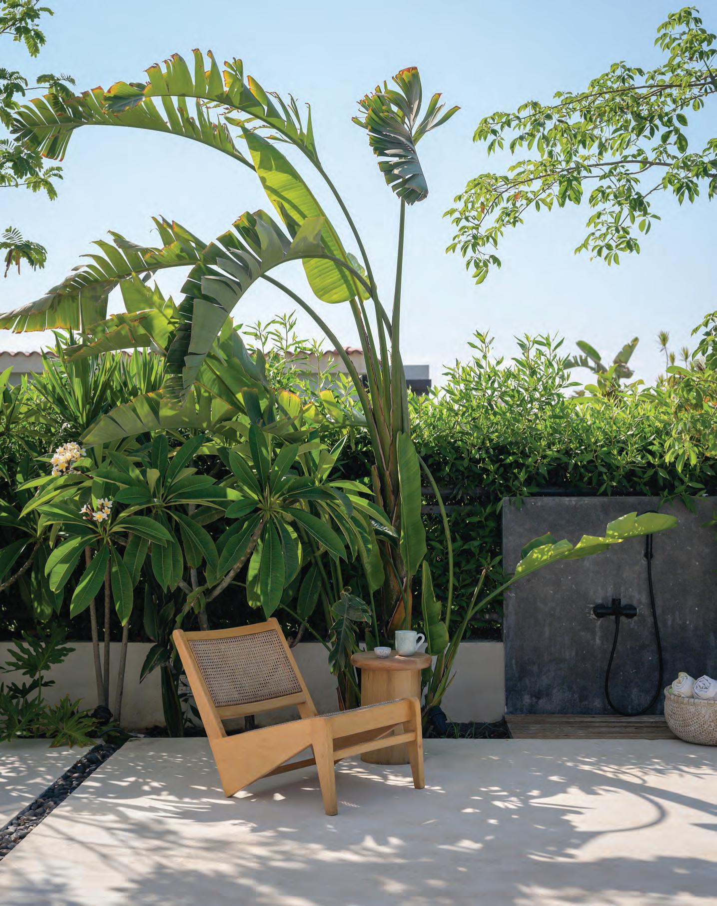
Organised across a single floor, the home exudes a natural sense of flow. Everything was crafted to be part of the whole, where floor-toceiling sliding glass doors and windows create an immediate and permanent connection between the interiors and the exteriors. “The biggest challenge was to try to integrate the indoor spaces and the outdoor areas as much as possible,”

54 interiors
Above:
The colour palette
is
mostly soft
and
neutral, with a few bright accents. Next page: In this home, the main objective was to integrate the indoor spaces with the outdoor areas

recalls Fayyad. On the floor, the architects chose Neocement to achieve a cohesive look throughout. “Most importantly, it reflects the natural light in the whole house,” Fayyad says.
For the overall palette, the architects took a slightly different route to their typical approach. “We usually use neutral tones and [let] the colourful accents come from the plants and landscape,” Fayyad explains, “[But] this time, we decided to opt for a green palette for the indoors.”

Several pieces of furniture, and decorative elements with this hue, reinforce the dialogue with the tropical vegetation outside that plays a key role in the design and identity of the home.
At the heart of the inspiration, Fayyad and Rashad look toward “the conventional Greek
summer houses with white seamless floor and monochromatic tones.” Using these conjured images, they created a home that exudes a feeling of peace; an invitation to breathe and contemplate, to enjoy every minute and learn to observe and hear the sounds of nature.
Beyond an atmosphere, Fayyad and Rashad wanted to create a specific energy. “Our objective was to bring the natural light in as much as possible, and we decided to demolish all the unnecessary walls, for an open feel,” they say. “Moreover, the many plants that are clearly visible from the inside always give a fresh and natural liveliness to the house.” With its aura of tranquillity, this home feels like an oasis that is soothing and invigorating all at once. id

56 interiors
Top left: In the interiors, green details are a nod to the vegetation that surrounds the house. Top right: The villa was inspired by Greek summer houses, married with a contemporary approach. Next page: The landscape design played an important role in the creative concept of the project
Mediterranean spirit
Architects Tiziano Vudafieri and Claudio Saverino have transformed a 1950s house in an Italian seaside town into a holiday home that embraces nature
 WORDS BY JENNIFER COPLEY PHOTOGRAPHY BY PAOLO VALENTINI
Table by Desalto with chairs by Cassina. Vintage chandelier by Venini


Every place has its own genius loci, a suggestion that is already contained within it, and that can be physical or immaterial,” explain Tiziano Vudafieri and Claudio Saverino, founders of Milan- and Shanghai-based architectural firm Vudafieri-Saverino Partners. It is this understanding of context and place that distinguishes their approach, and one that is unmistakable in their new project – a holiday home in Tuscany’s sought-after seaside destination, Versilia.
In their renovation of a 265-square metre 1950s house, the partners have captured this genius loci, or ‘spirit of a place’, by creating a home that is characterised by light and warmth and has a distinct relationship to its natural surroundings.

Central to the client’s brief was creating a vacation home that welcomed family and friends, in an atmosphere that recalled southern Italy and Greece, which the architects sought to incorporate into the design while also considering the property’s specific location.
“Our work always starts with defining the ‘story’, which is the most difficult part,” the duo explains. “It is necessary to establish a strong bond with the client, to understand what to tell and how to tell it, and then to check whether we are telling it in the right way or not.”
With the Versilia property, there is a clear design story of a holiday home made for relaxation and entertaining, and where the garden and exterior are intrinsic to the interior living space. This was
61 THE DESIGN ISSUE interiors
“
Above: Vintage furniture and carpet. Bookcase designed by Vudafieri Saverino Partners. Previous page: Bed designed by Vudafieri Saverino Partners. Floor lamp by Servomuto. Vintage rocking chair
achieved by enhancing the glazed areas: installing large windows and glass doors that frame the surrounding lush greenery. Here, the architects not only redistributed and enlarged certain areas in the home to create volume, but also created permeable spaces. This is most notable in the design of the outdoor deck, adding depth to the living room on one side and welcoming in the changing light and verdant foliage of the garden on the other.
The seaside town of Versilia is known for its sandy beaches, riviera and alpine backdrop. In their careful selection of natural materials, textiles and lighting, Vudafieri and Saverino’s design story subtly pays tribute to these notable elements of the town. There is continuity woven into every design detail – from the Mediterranean colour palette, rattan ceiling panels and bleached oak flooring to the striped textiles

and white terracotta tiles. There are also references to Southern Italy, as seen in the beige Marmorino finish created by the artist Filippo Falaguasta in the master bedroom and bathroom. While the materials and finishes recall the property’s surroundings and the client’s reference points, they also create a richness in terms of surface and space. The house incorporates glass, stone and panelled wood, among other materials, creating a dynamic interplay between textures. The design is characterised by light and warmth.
“One of the features we are most excited and proud of is the overall welcoming and elegant atmosphere of the house,” Vudafieri and Saverino share. “[It has] a relaxing Mediterranean atmosphere […] that we were able to realise through the dialogue created between the house, garden and outdoor spaces, which is the highlight of the entire project.” id

62 interiors
Top left: Stone sink and shower walls designed by Vudafieri Saverino Partners.
Top right: Hanging lamps by Santa & Cole. Floor lamp by Fontana Arte. Vintage wicker armchair and vintage rugs. Next page: Sofas by Talenti. Floor lamp by Marset. The open design unites the exterior and interior spaces

A family affair
In the north-western region of Morocco, the new La Fiermontina Ocean hotel – opening its doors in June – reveals its magic surrounded by a peaceful natural décor
 WORDS BY KARINE MONIÉ
PHOTOGRAPHY BY ALESSIO MEI
La Fiermontina Ocean overlooks the wild coast of Larache


On the coast of Larache, in Morocco, about an hour drive south of the city of Tangier, La Fiermontina Ocean tells a family story. Part of La Fiermontina’s Family Collection, this new hotel is the fourth establishment to have been inspired by Antonia Fiermonte, grandmother of the owners Antonia Yasmina and Fouad Giacomo Filali. The siblings created this intimate and authentic collection not only as an homage to their family, but also to blend different cultural influences while reflecting the spirit of each location.

La Fiermontina Ocean represents the synthesis of 100 years of travel, from Italy in the 1930s to Paris in the 1940s and to the north of Morocco today. The luxury retreat – which will open in June this year – is situated in the heart of Les Dunes de Khemis Sahel. Characterised by the sunlight, the wind and the deserted beach, this mesmerising image of the natural landscape played an important role in shaping the project.
“Thirty years ago, my brother Fouad Giacomo discovered a virgin land with a sublime ocean view,” remembers Antonia Yasmina Filali. “We then decided to build our family house in stone, and we started to establish some relationships with the surrounding communities. He first helped the habitants of the village of Dchier by finding a way to bring them running water. One year later, he applied to a programme for community development, thanks to the Fondation Orient-Occident
67 THE DESIGN ISSUE
The living room of one of the 11 suites of La Fiermontina Ocean hotel. The rug is from the Atlas Mountains, while traditional pieces of furniture have been repainted. The flooring is in taza stone

[a Moroccan non-profit organisation created to promote integration and intercultural dialogue]. That is the reason why one part of La Fiermontina Ocean is located inside the village.” Guests can choose between the 11 suites, with pools and private gardens carved into the rock, and the two villas. Integrated with the natural landscape and clad in local stone, all the accommodation options are bathed in natural light and delicately reflect the owners’ story with a wise mix of Italian charm, French elegance and colourful Moroccan warmth. This combination of styles starts in the lobby, designed as a meeting and discovery space and adorned with turquoise sofas, Italian lamps from the 1950s to ’70s, and Moroccan and French
armchairs from the ‘60s, with wooden swings installed in the terrace. A variety of shapes, materials, fabrics and artworks give character to the spaces, many of which are that dressed with rugs from the Atlas Mountains, as well as Berber poufs, repainted traditional furniture pieces and flooring in taza stone. Guests who want an even more immersive experience can stay in one of the four traditional stone houses, built using ancestral techniques. They are located in the rural village of Dchier, about one kilometre away. Close by, The Cadi’s House is a museum that pays tribute to the Filali family and where visitors can discover historic photos and old jewels or attend classes on traditional cuisine.
The hotel also features a traditional hammam, a café with an exceptional panorama, a beach club with a private beach, a conference room, a boutique and Italian and Moroccan restaurants. Going beyond luxury, La Fiermontina Ocean is more importantly a social and hospitality project that promotes the idea of travel as an enriching experience and a form of virtuous cultural exchange. “The best way to succeed was to move forward together, to implement a project based on strong common values,” says Filali. “The enhancement of this place in a natural park also guarantees the protection of biodiversity and cultural diversity. It’s a challenge [for] human beings [to] come together to envision a new future.” id

69 THE DESIGN ISSUE interiors
Left: The restaurant offers the best of Italian and Moroccan cuisines. Previous page: One of the bedrooms inside the Villa Akhazane, designed to evoke the atmosphere of Morocco
Mother of the world
WORDS
“[Cairo] is like a giant roller coaster, it’s always on the go. It has an energy like no other, yet you can also find pockets and windows of silence here and there,” says Mai Eldib, author of Cairo Eternal, the first Egyptian destination in Assouline’s Travel series. Eldib is a cultural strategist and specialist in visual art and culture from the Arab world, Iran and Turkey, and has been working at Sotheby’s since 2008, contributing to numerous artist monographs and exhibition catalogues throughout the region. Having moved
to Cairo in 2010, Eldib remains enamoured with city to this day. “It is truly a city that never sleeps; you can always do something or meet someone at any time of the day.”
This sense of vibrancy is what Eldib hoped to capture in the pages of Cairo Eternal, on which she worked alongside countless Egyptian photographers and collaborators. The book includes photographs captured by Karim ElHayawan, the art of Naila Marei and
the objects of designer Omar Chakil, who works with Egyptian alabaster.
No other city is as integral in symbolising the ancient past of humanity or the everyday hustle and bustle of our present day. The Cairo metropolis is known for its desert landscape, dotted with the Great Pyramids, while also hosting the longest river in the African continent. Defying categorisation, Cairo is a city of constant evolution. The newly opened Grand Egyptian Museum is home to the finest collection of Egyptian artefacts in the world, while the city’s streets are rich with the creativity of local artists and artisans, some of which can be seen at the energetic Khan El Khalili bazaar.
The book tells of the city’s past, the historic dynasties that ruled its lands, its cultural impacts, its music and heritage, its revered and lesser-known landmarks, as well as its rich cuisine, and so much more.

“I think the book was my attempt at capturing the nostalgia and the beautiful past of the city, alongside the thriving newness and evolution that we are currently experiencing,” Eldib explains.
Cairo has been the protagonist of many a Hollywood production and the subject of countless documentaries, many of which reiterate the same cliches. How does one avoid this when putting together a book that celebrates its identity?
“That was one of my main concerns,” Eldib admits. “I didn’t want the book to be cliche or kitsch. I wanted to give a real taste of the city. I wanted everyone to see and experience the Cairo that we experience, not the Cairo you see in travel guides. id

70 library
Left: ‘Nubian Bromance’, Louis Barthélemy, 2020. Appliquéd and handembroidered cotton canvas. Barthélemy employs a technique called khayameya
BY AIDAN IMANOVA
Assouline’s latest tome, Cairo Eternal, showcases a visual story of the Egyptian capital, far beyond what one sees in travel guides


71 THE DESIGN ISSUE library
Clockwise from top left: Terrace of a home in the chic Garden City district of Cairo. Statue of Akhenaten, the revolutionary Sun King and husband of Nefertiti. Youssef Salem wearing a traditional tarboosh paired with a tracksuit by designer Kojak in Downtown Cairo. A felucca, a traditional Egyptian wooden boat with a canvas sail, glides across the Nile, past the Cairo Tower
Photography by Andrew Holt/Alamy Stock Photo
Photography by Malak El Sawi
Photography by Nour Elmassry
Cool down
Whether steel, nylon or stone, this month we celebrate the beauty of cool tones, from Rimowa’s latest addition to its Never Still collection to the vase iteration of Thomas Trad’s Alia series
at rimowa.com

72 products
Flap backpack in nylon Rimowa Available


73 THE DESIGN ISSUE products
1. Tub Y outdoor light by Andreu Carulla for Calma. Available at calmaoutdoor.com 2. Terra coffee dripper set by ÅSLUND TSANG . Available at ssesnse.com
6 5 4 1 2 3
3. Dune rug by Mush Studios. Available at ssense.com 4. Alia stool by Thomas Trad. Available at thomastrad.com 5. Steel candle stick holders by Colville. Available at matchesfashion.com 6. Brown splatter plate by Bombac. Available at ssense.com
Inspired by the piles of stones built over centuries by travellers in the Andes as a tribute to the spirit of Pachamama –Mother Earth – Argentinian designer Cristián Mohaded’s Apacheta furniture collection is a tribute to nature. Sofas, stools, a bench and courtesy tables appear much like these stones themselves, featuring wood, fabric by Loro Piana Interiors and coloured ceramics that create small lagoons between the furniture.

74 id most wanted
Apacheta by Cristián Mohaded for Loro Piana
Choose from our extensive range of authentic Thesiger photographs.


PERFECT DECORATIONS FOR HOTELS, OFFICES AND HOMES.
Framed or unframed prints available exclusively from The Arabian Gallery

USE CODE FESTIVE10 AND GET GET 10% OFF


theone.com THE One Total Home Experience Abu Dhabi · Al Ain · Bahrain · Dubai · Jordan · Kuwait · Qatar · Tunisia

 Acoustic Lens Technology
Wall mounted or free stand
Elegant wooden lamellas


 Aidan Imanova Editor
 Photo by Young Habibti
Individual images are courtesy of Loewe


 WORDS BY KARINE MONIÉ


 WORDS BY AISHA ZAMAN PHOTOGRAPHY BY SALVA LOPEZ


 WORDS BY AIDAN IMANOVA


 WORDS BY AIDAN IMANOVA


 WORDS BY AIDAN IMANOVA
Photography by Paul Raeside


 WORDS BY AIDAN IMANOVA


 The comfortable lounge chairs and sofa are an invitation to relax outside


 WORDS BY JENNIFER COPLEY PHOTOGRAPHY BY PAOLO VALENTINI
Table by Desalto with chairs by Cassina. Vintage chandelier by Venini


 WORDS BY KARINE MONIÉ
PHOTOGRAPHY BY ALESSIO MEI
La Fiermontina Ocean overlooks the wild coast of Larache


