

16 From Paris with love
Our picks from Paris Design


The world’s
stage
Building the future
Tosin
Living heritage
50 Artful living

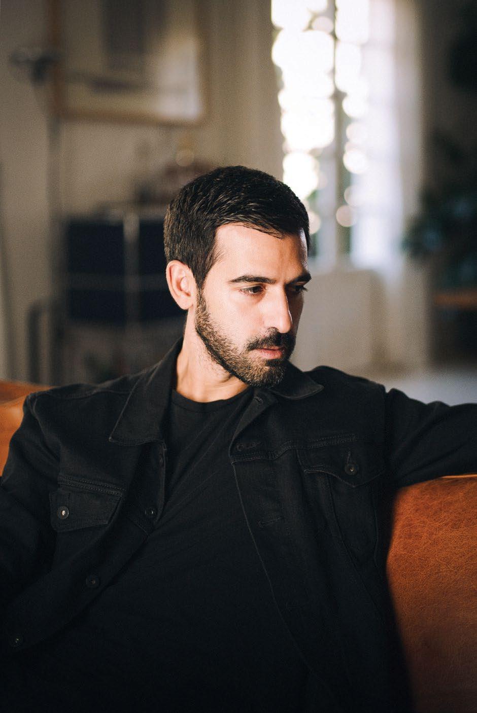
Enis Karavil
A modern history
A stone house


Our picks from Paris Design


Tosin

Enis Karavil
A stone house
Obaid Humaid Al Tayer
Managing Partner and Group Editor
Ian Fairservice
Max Tuttle
Chief Commercial Officer

Anthony Milne
Group Sales Manager
Manish Chopra Sales Manager
Jules Acciarresi
Sales Representative - Italy Daniela Prestinoni
General Manager - Production Sunil Kumar Production Manager
Binu Purandaran Production Supervisor Venita Pinto Contributors
Bashar Belal
Karine Monié
Lemma Shehadi
Natascha Hawke
Yehia El-Alaily
Head Office: Media One Tower, PO Box 2331, Dubai, UAE; Tel: +971 4 427 3000, Fax: +971 4 428 2260; E-mail: motivate@ motivate.ae

Dubai Media City: SD 2-94, 2nd Floor, Building 2, Dubai, UAE Tel: +971 4 390 3550 Fax: +971 4 390 4845
Abu Dhabi: PO Box 43072, UAE, Tel: +971 2 677 2005; Fax: +971 2 677 0124; E-mail: motivate-adh@motivate.ae
Riyadh: Office 452, Regus Offices, 4th Floor, Al Hamad Tower, King Fahad Road, Al Olaya, PO.Box 12381, Riyadh 6764, Kingdom of Saudi Arabia; Tel: +966 11 834 3595 / +966 11 834 3596; Fax: +966 11 8343501
London: Acre House, 11/15 William Road, London NW1 3ER, UK; E-mail: motivateuk@motivate.ae





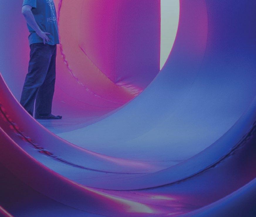


It’s strange to think that I’ve been writing about architecture for over a decade now and, in some ways, it feels like nothing has really changed when, actually, a lot has changed: both in the world and within the architectural discipline. For one, the angle has shifted from disproportionately focusing on an ego-driven ‘starchitect’ narrative (which was largely driven by the media) to one that casts a wider global net. This is not to invalidate some of the truly groundbreaking works of these starchitects, but it does make one reconsider whether the focus of the architectural field had been evenly distributed. Especially if we are going to be tackling the global issues that we are faced with today, we are going to need a wider world view – and a strong willingness for collaboration.
While the Global North has historically embraced a more individualistic approach, societies in the Global South are predominantly community-driven – which naturally lends itself to a more collaborative approach. The second edition of the Sharjah Architecture Triennial will set its sights on this part of the world and examine how practices can tackle today’s issues outside of the more global, Western canon. The exhibition is being curated by Nigerian architect Tosin Oshinowo, who is featured on this month’s cover. “There is a lot more inclusivity now [in the architectural field]; it is very encouraging, and I am optimistic that we are going to carry on in this direction,” she told me during our interview. Championing a multidisciplinary approach, Oshinowo hopes to engage product and industrial designers, architects, researchers and urbanists from across the Global South, hoping to bring to the foreground unfamiliar names from their respective fields for an alternative way of ‘doing things’. “The point is that we inclusively look for solutions that are not always from [within] the sector,” she said.
And while taking on the curator role is a prestigious and highly important endeavour, Oshinowo kept it real by admitting that she may not possess all the tools to bring the kind of diverse and wide-ranging conversation that she’d like if she were to solely stick to her own knowledge of the region. For that reason, she appointed an advisory board of international experts from the fields of art, design and architecture to help guide the exhibition. And for me, that is an important lesson to learn: which is that it is OK to admit that we don’t know everything – even within a professional environment. And this is exactly where the beauty of collaboration is so apt – it brings together different forms of knowledge and expertise for a greater cause, while focusing on togetherness as a pillar for progress. It is a theme I am always encouraged to explore – in this issue and the ones that came before and those that will, I hope, come after.
On the cover:
Tosin Oshinowo at Al Qasimiya
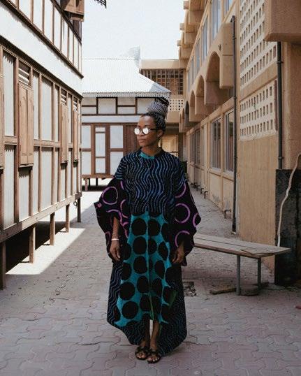
Private School in Sharjah
Aidan Imanova Editor Photo by Young
Habibti
Photography by Bashar Belal


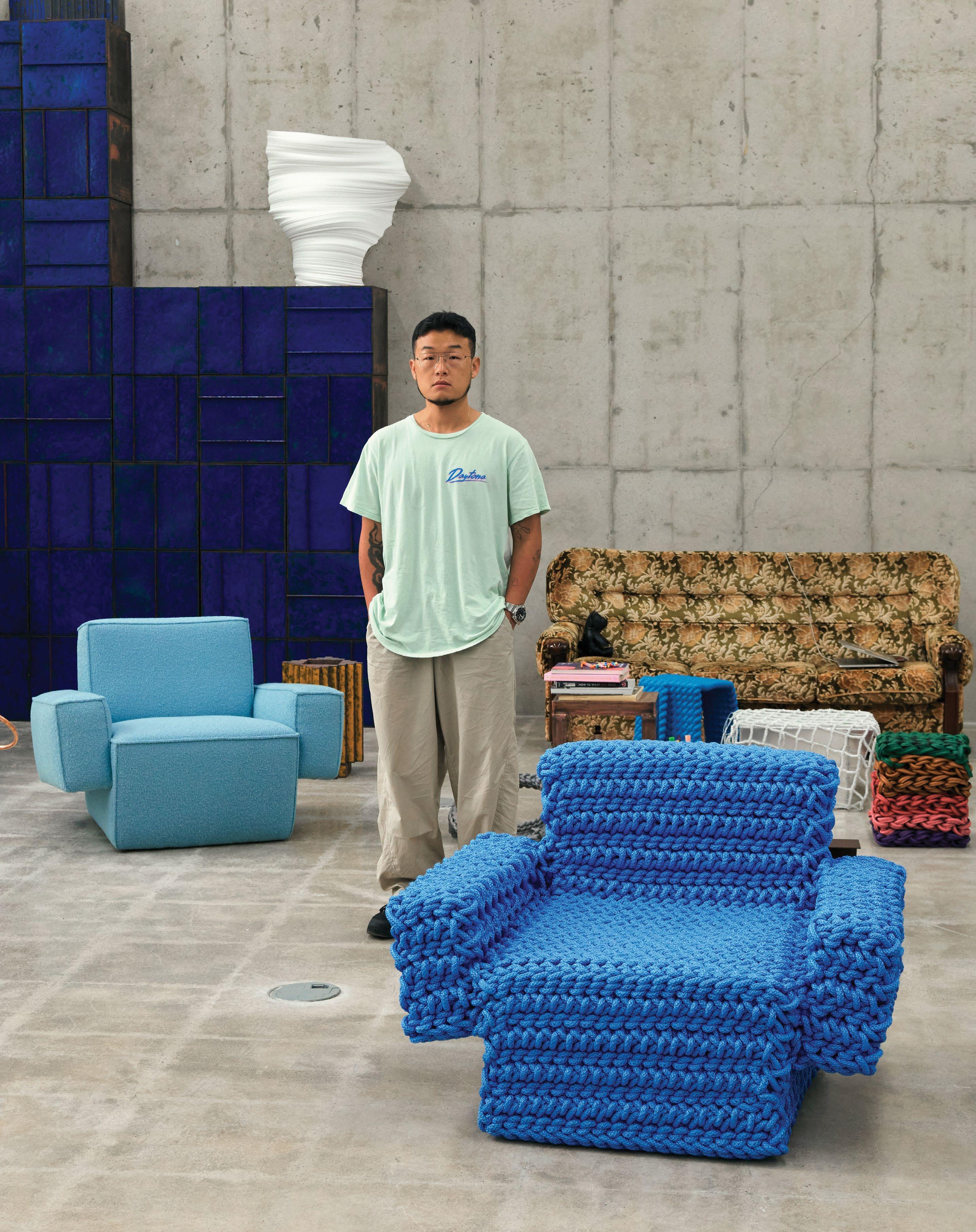
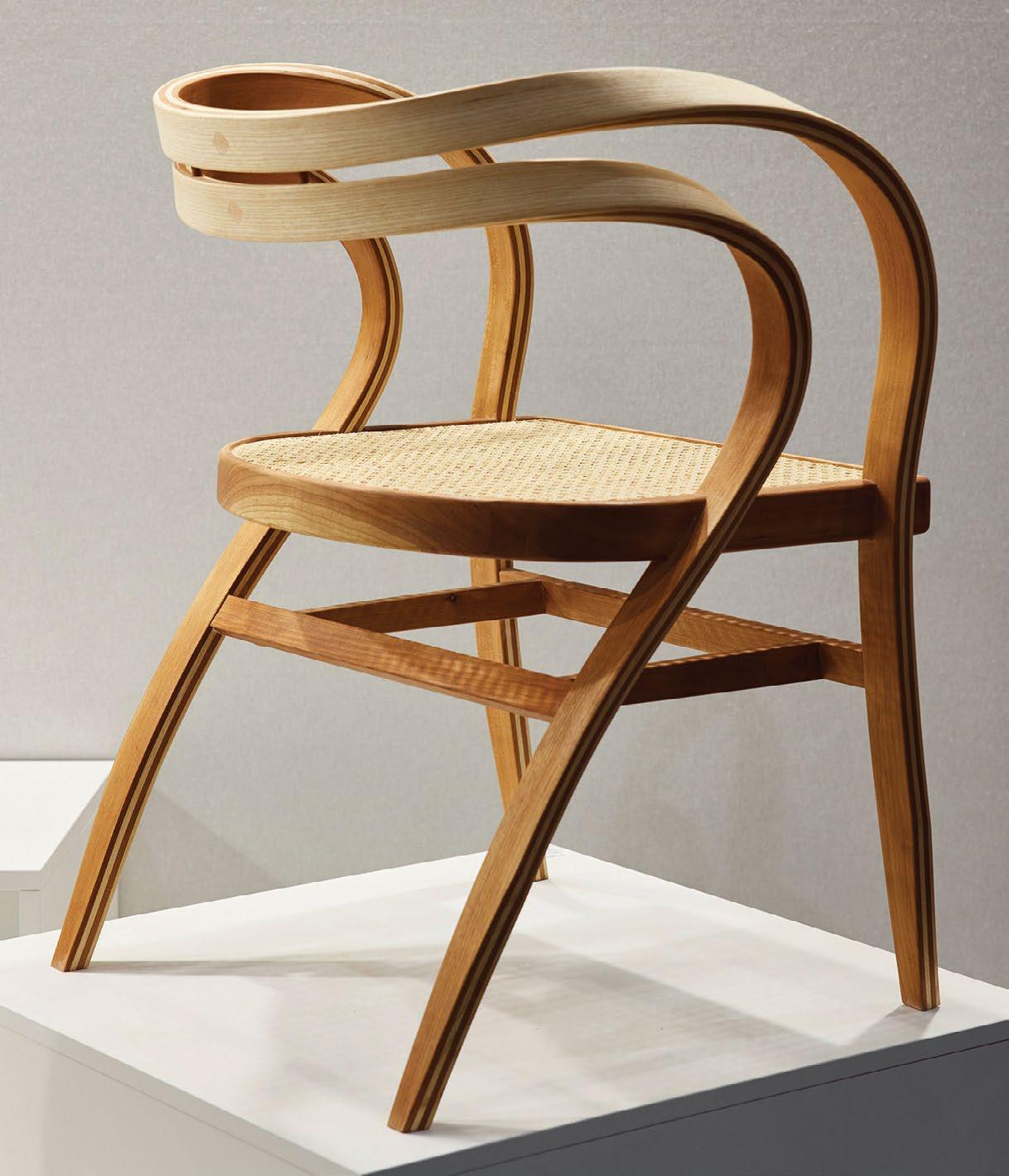
Like many other furniture brands in recent years, Hem regularly invites international designers to collaborate and create unique pieces that speak to its customers. This is the first time, however, that the Stockholm-based company has called on Kwangho Lee, who cur rently lives and works in Seoul.

“Kwangho is constantly at work and relevant, fully relying on his instincts and curiosity,” says Hem founder and CEO Petrus Palmér. “For us, any new design that gets brought to the world needs to have a unique voice and story, and to resonate deeply with the audience.”
It is no coincidence that the South Korean designer appeared to be the per fect match for the brand. “Kwangho stands out as a highly original designer and artist, someone who is motivated by creativity and craft, who draws – in a seem ingly frictionless way – from ancient craft references to pop art. He applies his craft and creativity to fashion, sculpture, interior design and now industrial design.”
Having always loved hand-making things, Lee –who studied metal art and design – has his very own way of looking at everyday objects, which helps him develop new functions and meaning through his work.
In 2009, at only 28 years old, Lee introduced his Obsession series that revealed how rope – through knotting techniques – could be used to shape furniture. These fascinating pieces were the starting point of the design er’s new creative adventure with Hem, which has result ed in the recently launched bold Hunk chair.
“Working with Hem for the mass market was like any other commission at the outset, but the fact that it targeted a [larger] variety of users and col lectors was pretty exciting,” confesses Lee. “[This collaboration] required a slightly different way of using my time. It was a great experience because I could learn a new side of manufacturing… Shape, material, colour – all of these basic but essential elements were discussed together.”
WORDS BY KARINE MONIÉIdeal either for a home environment or hospitality and office spaces, the Hunk chair – available in Swan, Chocolate and Icicle colours, as well as with or without oversized armrests – was almost entirely influenced by natural materials. Instead of using plastic and traditional furniture foam for the upholstery, natural rubber and coconut fibres were employed.
In addition to this piece, Lee and Hem also worked on the collection of Glyph tables, which, depending on how they are positioned – upright or on their side – can have multiple functions, includ ing that of a side table, nightstand or hall console. Inspired by hieroglyph ics, this series is an ode to Lee’s work, with metal crafting applied to sturdy sheet steel covered in a powder-coat finish of green, yellow, chocolate brown and grey-white.
While Lee’s work is part of the collections of the Montreal Museum of Fine Arts and the San Francisco Museum of Modern Art, these new pieces with Hem give us an opportunity to get closer to his creative world.
When a leading designer and a mass-market brand join forces, creativity and efficiency come to the forePhotography by Erik Lefvander
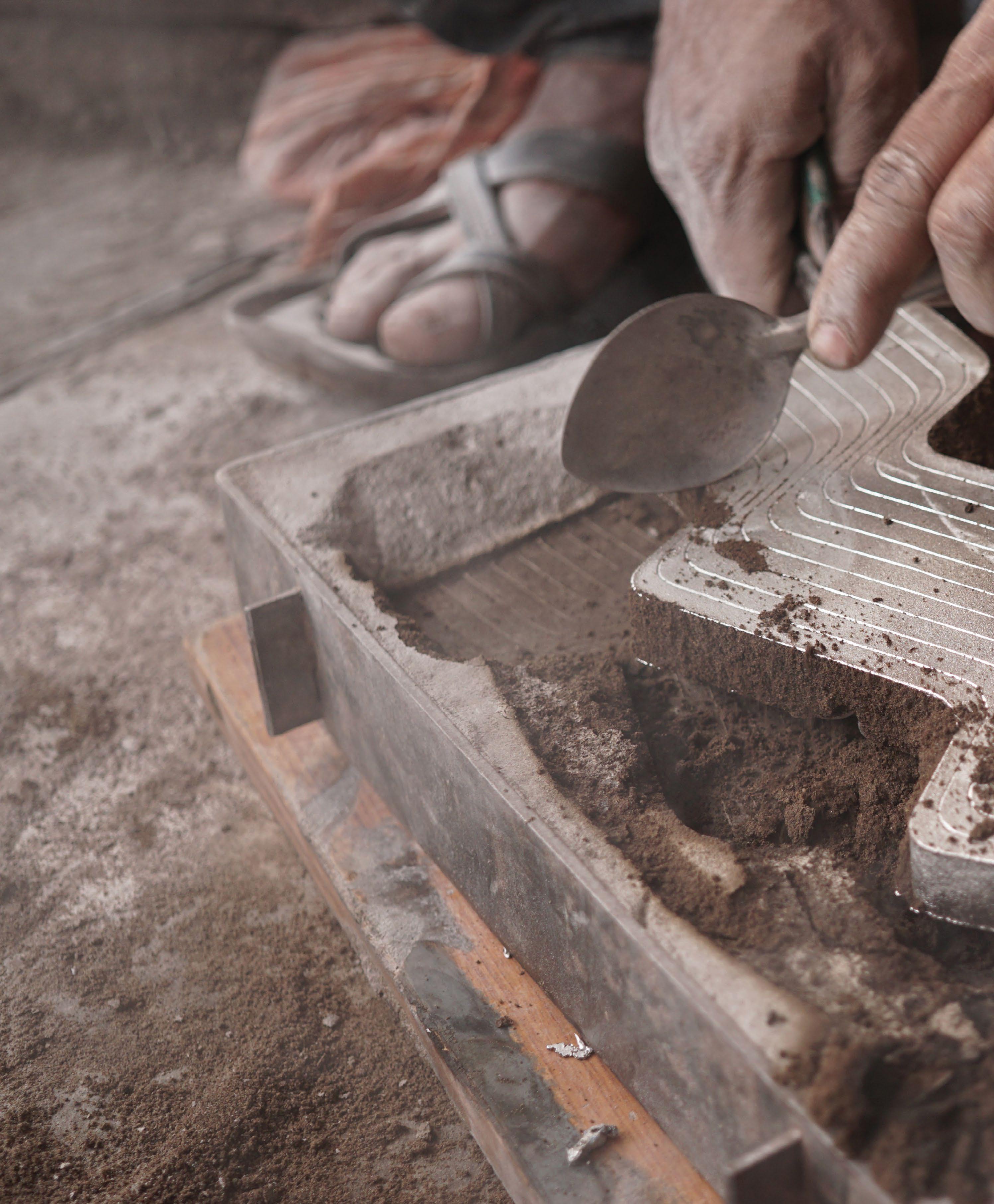
Designer Saif Faisal is working with local craftsmen in south-west India to contemporise a complex and precious metal craft
 WORDS BY LEMMA SHEHADI
For designer Saif Faisal, sustainable design is not just about saving the environment. “We have to talk about cultural and social sustainability,” he tells identity. “We are losing our culture and our social fabric. Our phones and our watches look the same. Everything becomes homogeneous.”

To address this gap, he says designers must revive local craft traditions. As such, the Bangalore-based designer has been working to contemporise a historic metal craft from south-west India known as Bidriware. “Our crafts and traditions are a way of maintaining that link to the past,” he affirms.
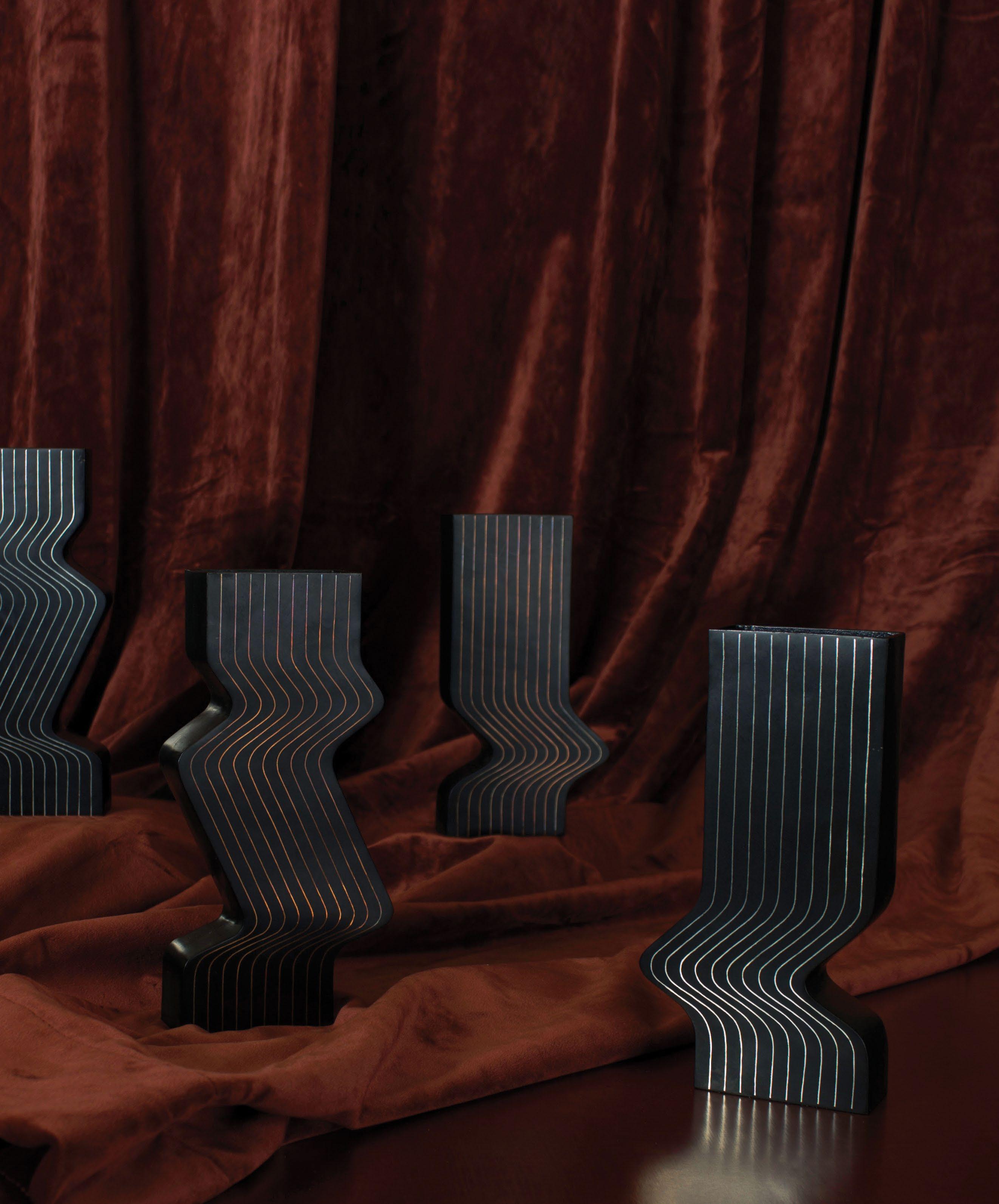
His latest collection, in collaboration with Swedish design platform KATHA, was unveiled during Paris Design Week in September. “It feels like a sculpture when you hold it. You have this matt black surface with a super-glossy inlay. It is between a functional object and a decorative object,” says KATHA’s co-founder Elena Freddi.
Bidriware was developed in the town of Bidar in the 14th century, when the south of India was ruled by the Persian Bahmani Sultans. The craft’s decorative household objects are made of black ened brass with a detailed and ornate silver inlay.
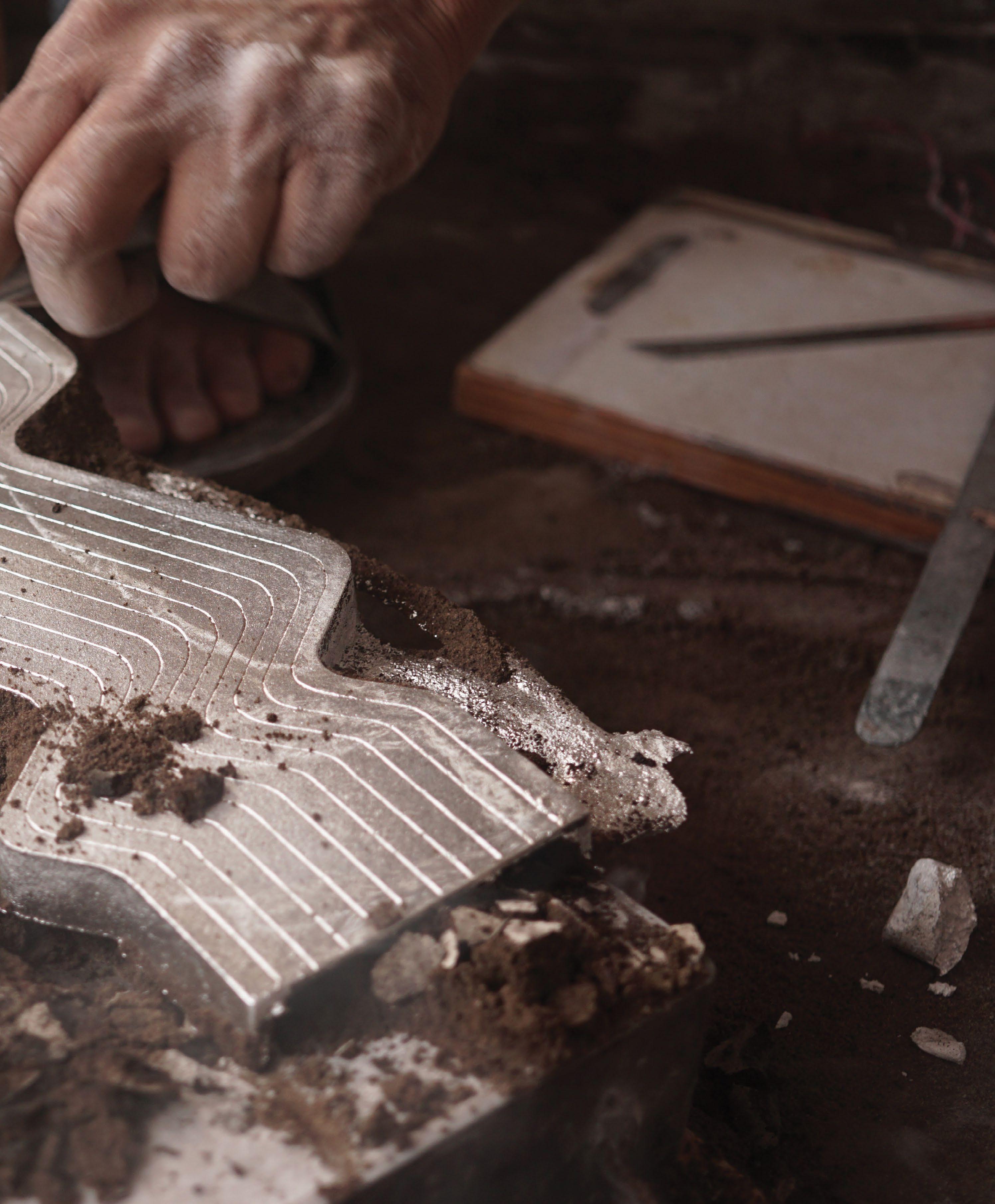
A special soil, found only in Bidar’s Bidri Fort, is used to oxidise and blacken the brass. “The technique was discovered by the Persian alche mist Abdullah Bin Khaizar,” Faisal explains. “He found a unique mud in the fort that has been attributed to the armoury’s gunpowder or, pos sibly, pigeon droppings.”
To date, only a handful of master craftsmen are able to source the right mud that is needed to make Bidriware. “They can’t just pick any mud. They have to taste it to see the properties of the mud, that it’s metallic and salty.”
Only a few master craftsmen remain today, who learnt the trade from their forefathers. “To the best of my knowledge there are only two remaining in Bidar,” says Faisal, who grew up in the town and knows both families. “Only one of them is interested in collaborating with contemporary artists and designers.”
Part of the issue is India’s social hierarchies and caste system, which make artisanal profes sions unattractive to younger generations. The other is the craftsmen’s rigid approach to the tradition. “There’s been no technical update, and most of the crafts men are happy doing traditional pieces. Their work is like imitated pieces from history,” says Faisal.
The KATHA collection is composed of two vases, which bring together contemporary minimalism with the delicate manufacturing of Bidriware. The Alhambra vase echoes the domed buildings of Islamic architecture, including the tomb of Ali Barid Shah in Bidar, which
Faisal points out “is a lot more refined than the Taj Mahal.”
A simple inlay of cross-cutting lines recalls Islamic geometric motifs. “The vase looks very simple but there were a set of geometric principles that you could not deviate from,” the designer explains. To achieve this effect, Faisal collaborated with Bidar’s master craftsman M A Rauf. “He’s like a Renaissance man or polymath. He is really good at geometry, and works very well with his compasses.”

It can take one week to complete a vase in Bidriware. “There are ten stages of production; if one of them gets spoiled, the whole product is spoiled.” As such, the design er introduced modern technology such as 3D-printed moulds. “The finished industrial moulds give a consisten cy to the craft and helps minimise the stages,” Faisal adds.
For KATHA’s co-founder Mina Panic, the project is helping to revive a craft which she believes risks being relegated to museums. “Our aim at KATHA is to trans
form these interesting techniques and materials into a modern-day tale, to take the craft out of the glass vitrines [of museums] and use it,” she says.
Faisal hopes that a modern approach to Bidriware can create accessible and unique design pieces. “We want product pieces that could become heirlooms, that are carried from one generation to another,” he says. “It’s a gesture that gives the sense of a slow and sustained lifestyle.” id
identity visits Paris Design Week – and Maison & Objet –to scout the new voices in the capital’s design scene, with highlights including collections by designers from Lebanon, South Korea and France
 WORDS BY AIDAN IMANOVA
A sense of mystery prevails in Ginori 1735’s home fragrance collection Le Compagnia Di Caterina – designed by revered multidisciplinary Luca Nichetto – which now offers two new fragrances: Amber Lagoon and Musk Road. Comprising candles, incense holders and fragrance diffusers, the collection is inspired by characters in the court of Catherine de’ Medici, who travelled with the Queen from Florence to Paris. It also takes cues from lucha libre masks, the illustrations of Jean-Paul Goude and graffiti art, which together form the statuesque faces of the archetypal protagonists of the collection. Mixing classism with rigorous lines, the faces and sculptures take on an iconic and mysterious dimension, creating a fusion of graphic symbols and colours that recall the ingredients used to create fragrances.
The sought-after Italian designer Cristina Celestino – who is Maison & Objet’s September edition’s Designer of the Year –threw open the doors to her Palais Exotique (‘Exotic Palace’) during the fair: an eclectic and whimsical restaurant space that aimed to pull visitors into another world, in which Celestino once again asserted her creative flair and wide-ranging oeuvre.
It’s one she has accomplished in an extremely short period of time (“I’m very tired,” she jokes). She has designed interiors through her own eponymous practice, and accessories for her
brand Attico Design, but has also collaborated on furniture pieces and jewellery for brands such as Etel and Fornace Brioni. Palais Exotique is reminiscent of the city’s coffee and tea rooms of the last century, with elements borrowed from different cultures around the world. Defining features include bright-coloured garden fences, architectural forms typical of a palace, and wallpapers and coverings in geometric patterns or tropical flower designs. The space is also an exhibition of Celestino’s collabora tions: from her wallcoverings for Misha to her chairs for Billiani and sofas for Moooi.

Acclaimed for luxury leather homeware, Gio Bagnara’s elegant creations have long been the standard for traditional know-how and craftsmanship in leather products, and the brand has become a key partner for a large number of interior decorators as well as yacht and private jet designers. The brand’s collaboration with designer Stéphane Parmentier (who is now its creative director) officially began in 2017, born from a shared passion for refined detailing and modern elegance, and has since given rise to a number of creations, from home décor pieces to furniture designs. Scala is one such collection, inspired by the ‘stacked’ shape often seen at the base of some Italian buildings and in Salvatore Ferragamo’s celebrated heel. At times, a pure cylin drical shape stands alone; at others a duo or a trio form a stool or occasional table; yet the key to these pieces’ elegance is the absolute precision of their proportions.

Coastal dreams
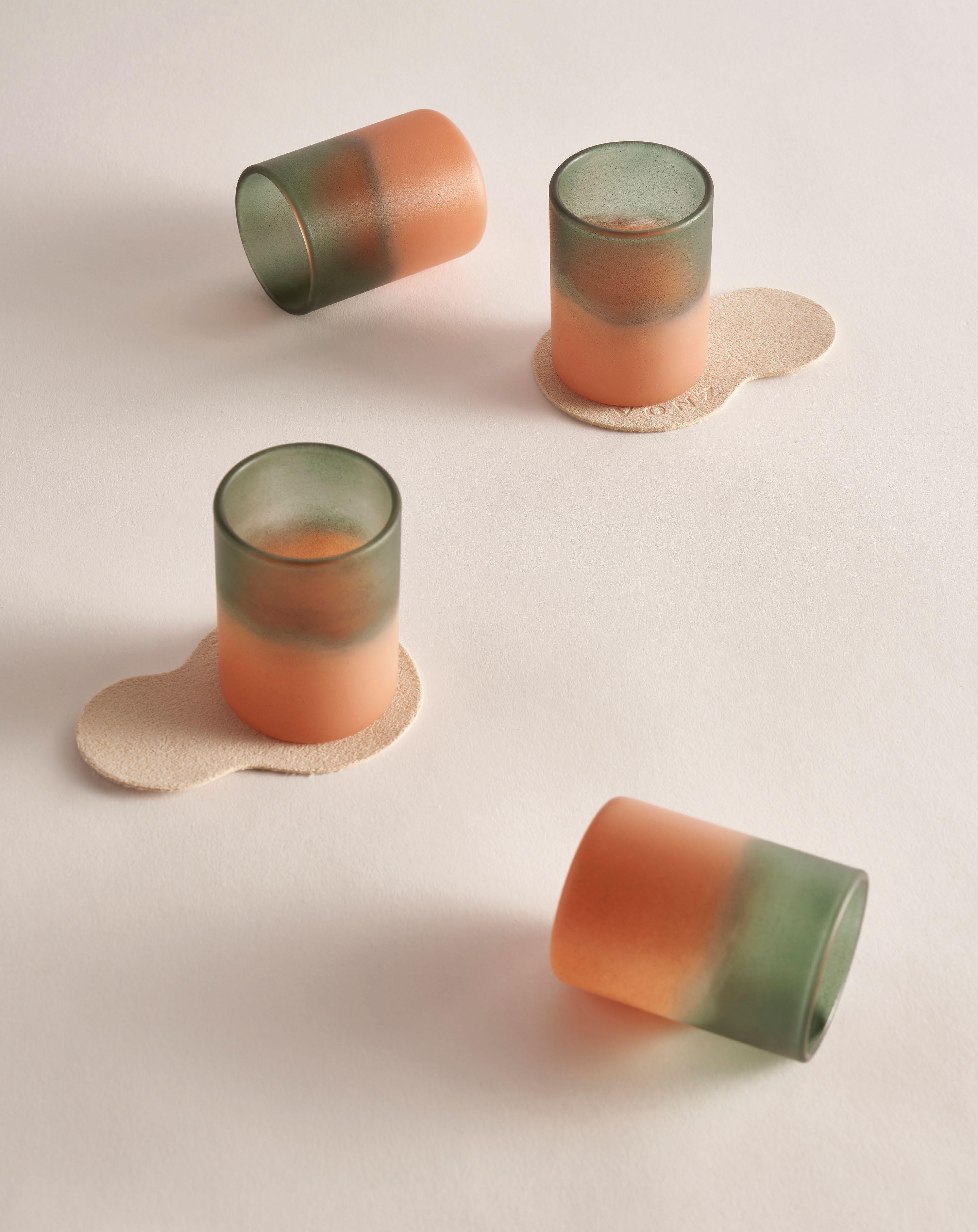
Seoul-based artist and designer Jeongeun Kang – founder of exper imental brand VONZ – focuses on the cultural research of Korean traditions and materiality, creating functional yet artistically-inclined objects that seek to bridge the gap between traditional craft and contemporary living. Since 2018, VONZA has been experimenting with textures using Ottchil (Korean lacquer), mixing it with tofu and modern-day industrial by-products such as sawdust, roof tile dust and ceramic powder – all created by craftspeople in small workshops in Korea. Her collection, Midsummer Seaside, features fresh green and amber tones inspired by foamy waves that are washed up on red rocks – an effect created by applying thin layers of Ottchil. The collection is an ode to the sense of serenity and consolation that the designer experienced along the Olle Trail in Jeju Island in South Korea.
Taking cues from the natural world, Beirut-based designer Roula Salamoun introduces her latest pieces: Archipelago seats and Strata tables. The seats evoke the visual language of insular landscapes seemingly shaped by the passing of time. The tapered base hints at coastal erosion, while the prominent backrest is reminiscent of mountainous highlands. Mimicking island clusters and peninsulas, the organic silhouettes are available in an array of colours and dual textures, reflecting natural environments. Made and upholstered by hand, the
core features foam on a solid wood structure. Similarly, the Strata tables are rooted in topographical studies and are an evolution of the designer’s rug collection under the same name. The Strata tables echo terrain variations, inviting the user to imagine how they came to be. The pieces are hand-cast using resin and natural marble, applied with an intuitive moulding method. To translate the rich colours of the natural realm while being mindful of environmental impact, the designer carefully selected natural stones left over by the construction industry.

Supporting and promoting Lebanese designers is at the heart of Beit Collective, a platform created by Emilie Skaff that brings together designers and craftspeople to create tributes to Lebanese culture. The Groove collection was born out of one such partnership, and created by Beirut-based Studio Caramel – led by Rami Boushdid, whose works strive to create a ‘collective curiosity’. Encompassing an aesthetic from the 1950s, the collection marries historical elements with the present, stemming from the designer’s fascination with Lebanon’s archaeological and artistic sites, all while aiming to preserve its craft traditions. Comprising a bench, stool, side and coffee table that feature precise geometric carvings, Groove is crafted by Lebanese woodworkers who have passed down their craft for generations.

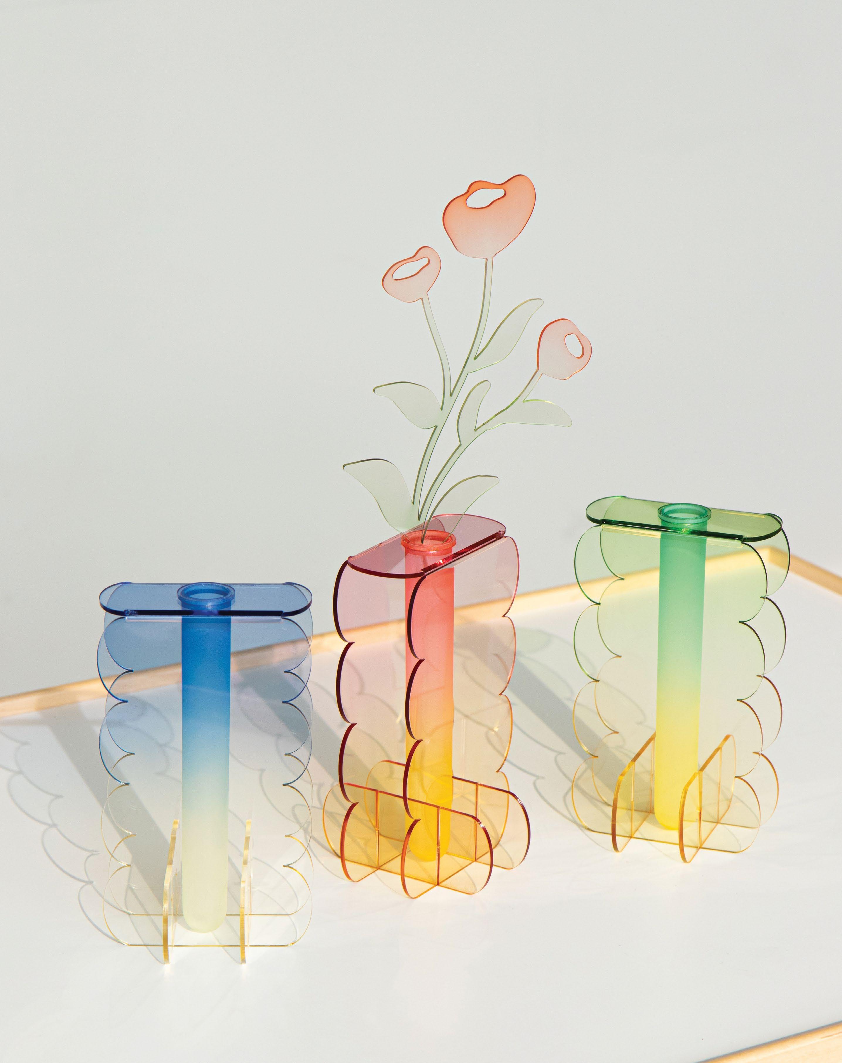
Creating objects that evoke the concept of rest in everyday life, Seoul-based Studio Riposo’s works are based on handicrafts, many of which use acrylic to create home décor objects – such as this acrylic Cloud vase, designed by installation artist Kim Tae Woo and created using a hand-dyeing technique that is typically used in textile crafts and now seen in this transparent acrylic material. The vase evokes the image of a puffy cloud rising in the summer sky. “I want it to be a visual pleasure, like a break in a corner of daily life,” the designer says. The same material is used across other objects, using the same hand-dyed technique.
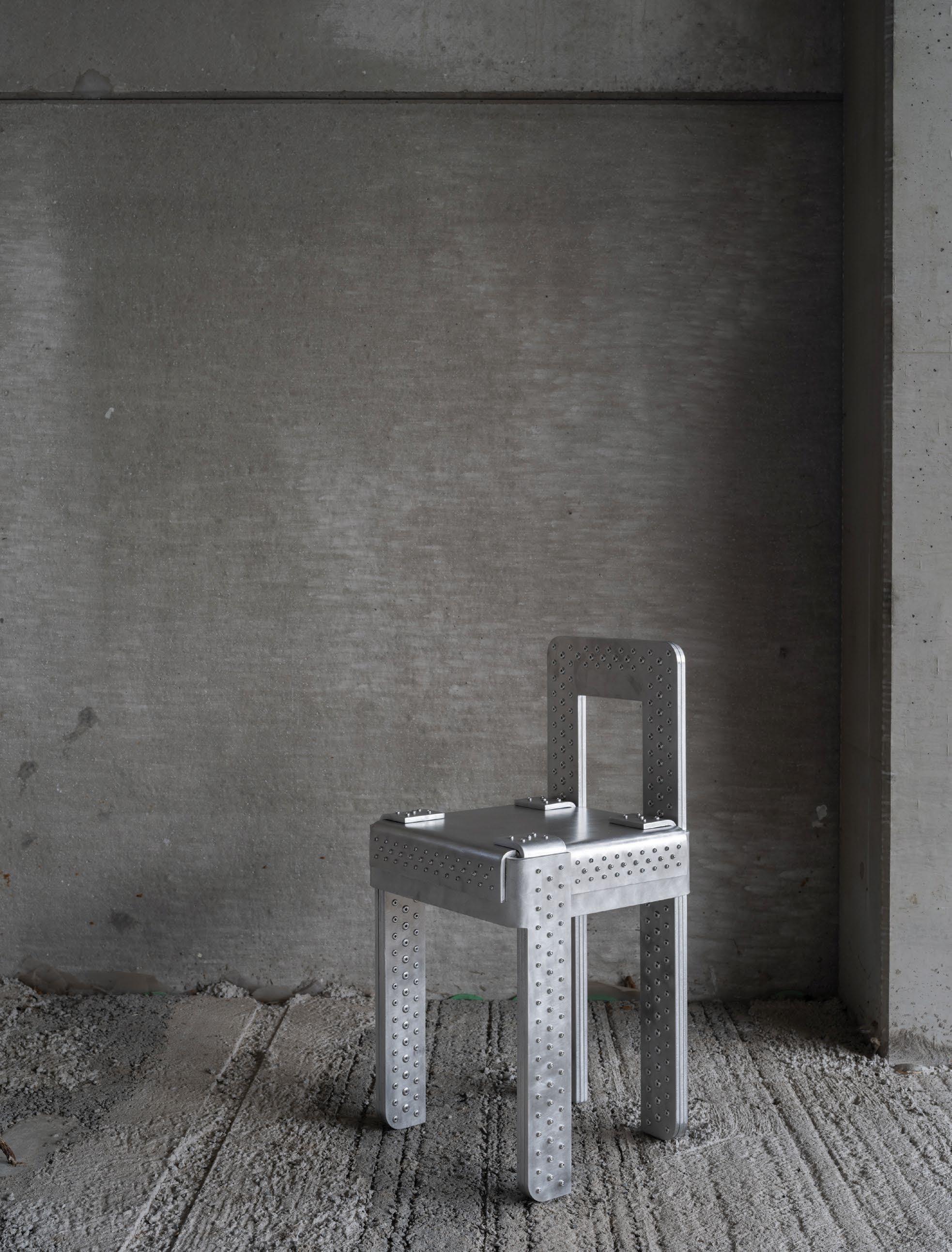
Arthur Vandergucht is a young Belgian designer and craftsman, and a specialist in TIG (tungsten inert gas) welding, who has created a table and seating collection made of folded sheet metal compartments using a series of repetitions, inversions and bends that are neither hidden nor obscured, and finished by applying circular movements with soft steel wool to create a matte effect. The designer
then contrasts this by applying the same movement for the final finishing coat, now using a glossy product. “My love for industrial materials and traditional connections came from an early age. I grew up in my father’s garage, where I saw him working with cars and car parts [and] I remember seeing so much sheet metal being repaired and restored that I got fascinated by the many possibilities the material offered,” says Vandergucht.
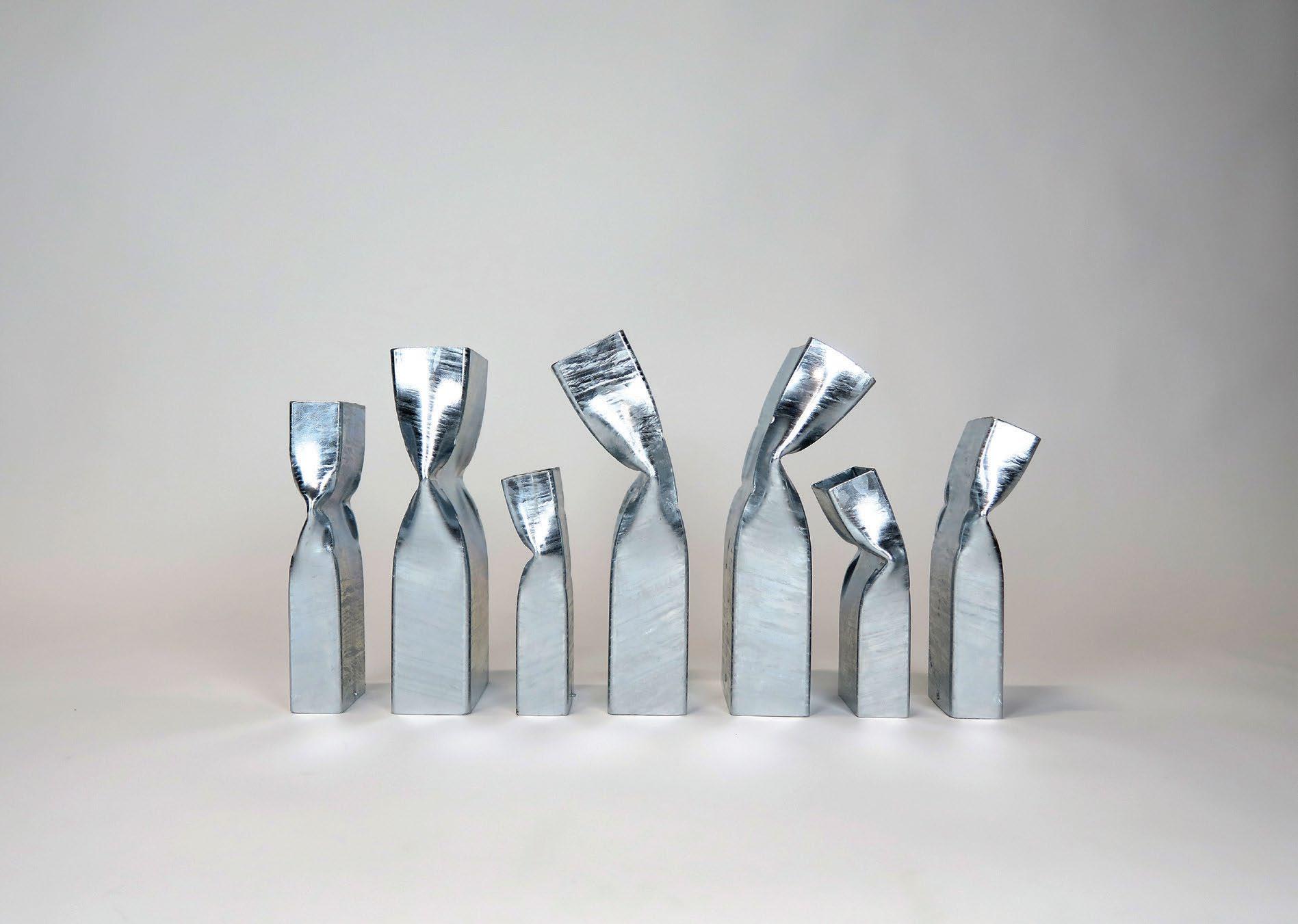
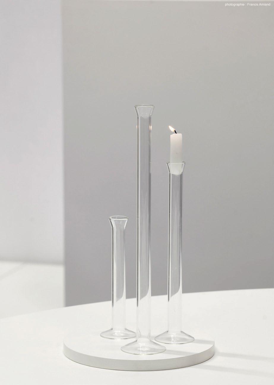
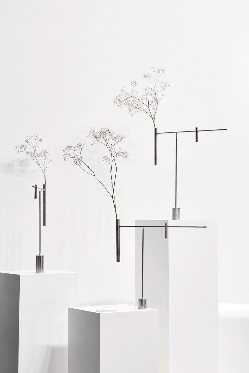
“We create objects that do not rely on a combination of materials but rather on the purity of a mono-material,” proclaims young French brand Manip, headed by entrepreneur Nicolas Caillet and industrial designer Maxime Lis, who claim that the ethos of the brand is centred around designing without a manual: a coffee table turns into a seat, a glass into a vase, and a knife into a screwdriver. At the heart of their designs is a desire to create human objects for humans, to be used as one deems fit, and interchanging based on functionality and need. But while this notion is at the forefront, there is nothing utilitarian-looking about their designs. Created with a deep sensitivity, each object represents a balance between an art object, an everyday object and a tool that contributes a sense of lightness and timelessness.
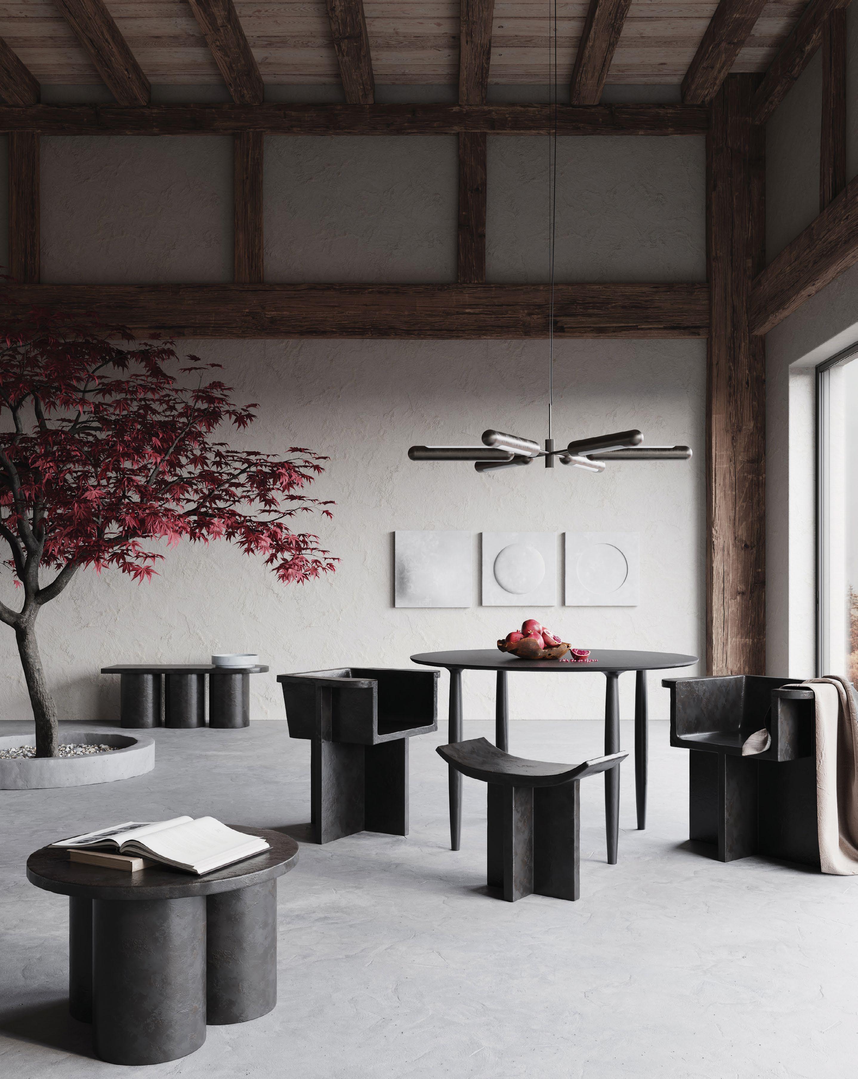
While 101 Copenhagen’s autumn collection is inspired by minimalist Japanese aesthetics, the brand is maintaining its Nordic roots, resulting in sharp contrasts between textures and forms. The monumental shapes and refined details of the collection are timeless yet remain undisputedly contemporary, reflecting its Eastern inspirations. The Brutus stool is the latest addition to the eponymous collection inspired by the Brutalist architecture movement, and is cast in lightweight fibre concrete, creating a distinctive surface texture that increases its mobility. Designed by Kristian Sofus Hansen and Tommy Hyldahl, it draws on traditional Japanese wooden stools with a curved seat and signature cross legs. The designers are also behind the new Lotus vase, which was inspired by the floral shapes of the lotus flower, emphasised by its organic shapes that form this sculptural ceramic vase. Completely handmade, the smooth and organic surface is contrasted by sharp lines, running from the feet to the top of the vase, creating a star-shaped opening. id
 BY LEMMA SHEHADI PHOTOGRAPHY BY CARL GERGES ARCHITECTS
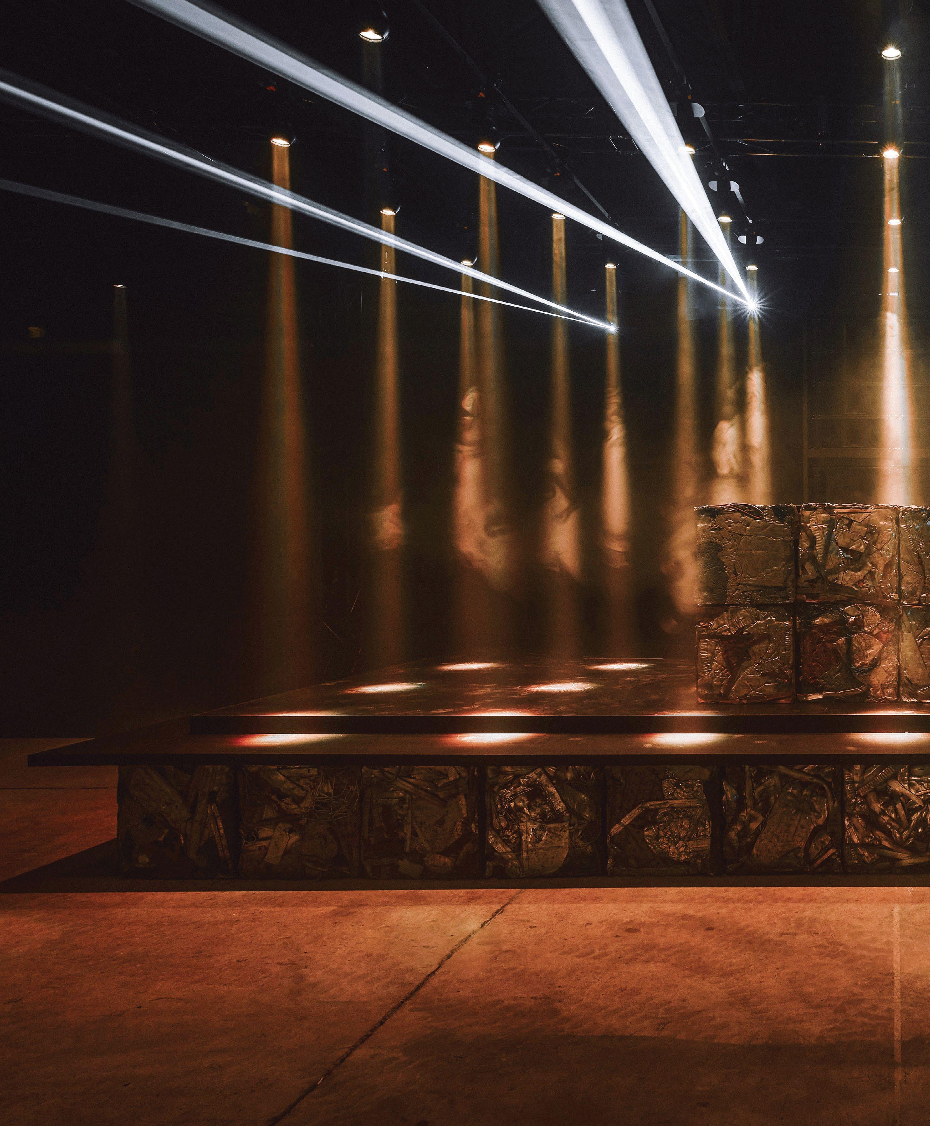
When designing an immersive space to launch Bottega Veneta’s Winter 2022 collection in Seoul, architect Carl Gerges harked back to his days as a touring musician. “I wanted people to experience what it felt like to be on stage,” he says of his collaboration with the Italian fashion house.
Gerges wears many hats. Besides his architecture career, he is also known as the drummer of Lebanese band Mashrou’ Leila, a rock group that became recognised globally for its spectacular performanc es. “There is something unreal about how sound is experienced during a performance: it transports you, and the crowd’s presence is so powerful, even if it isn’t tangible,” he says.
Since founding his own architectural studio, Carl Gerges Architects, in Beirut and Paris in 2020, he has found himself designing spaces for fashion, music and the arts. His latest collaborations with Bottega Veneta have seen him help transform an old amphi theatre in Detroit, design a pop-up event space in Dubai, and create an immersive catwalk experience in the South Korean capital. In 2021, he also led the renovation of an exhibition hall for the Institut du monde arabe in Paris.

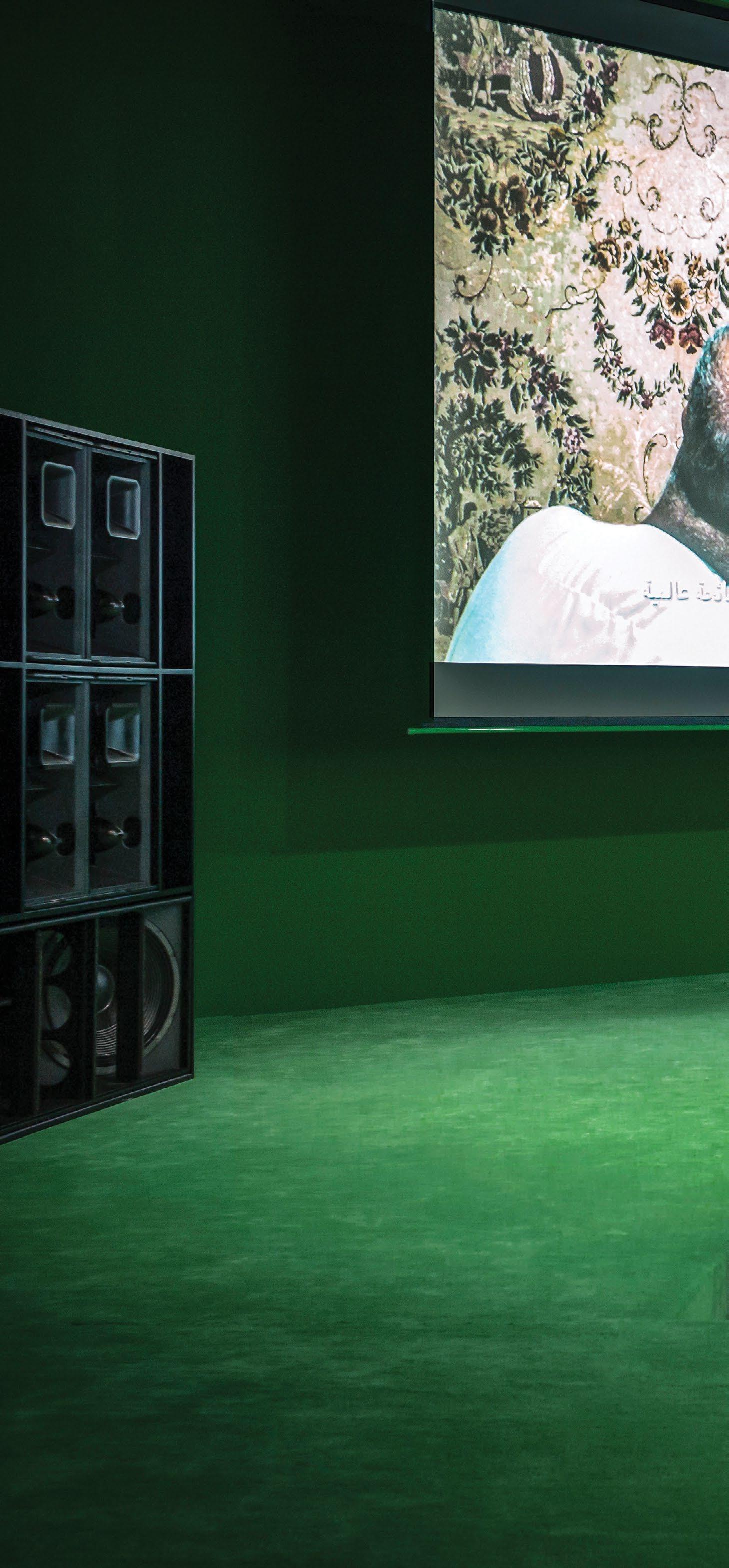
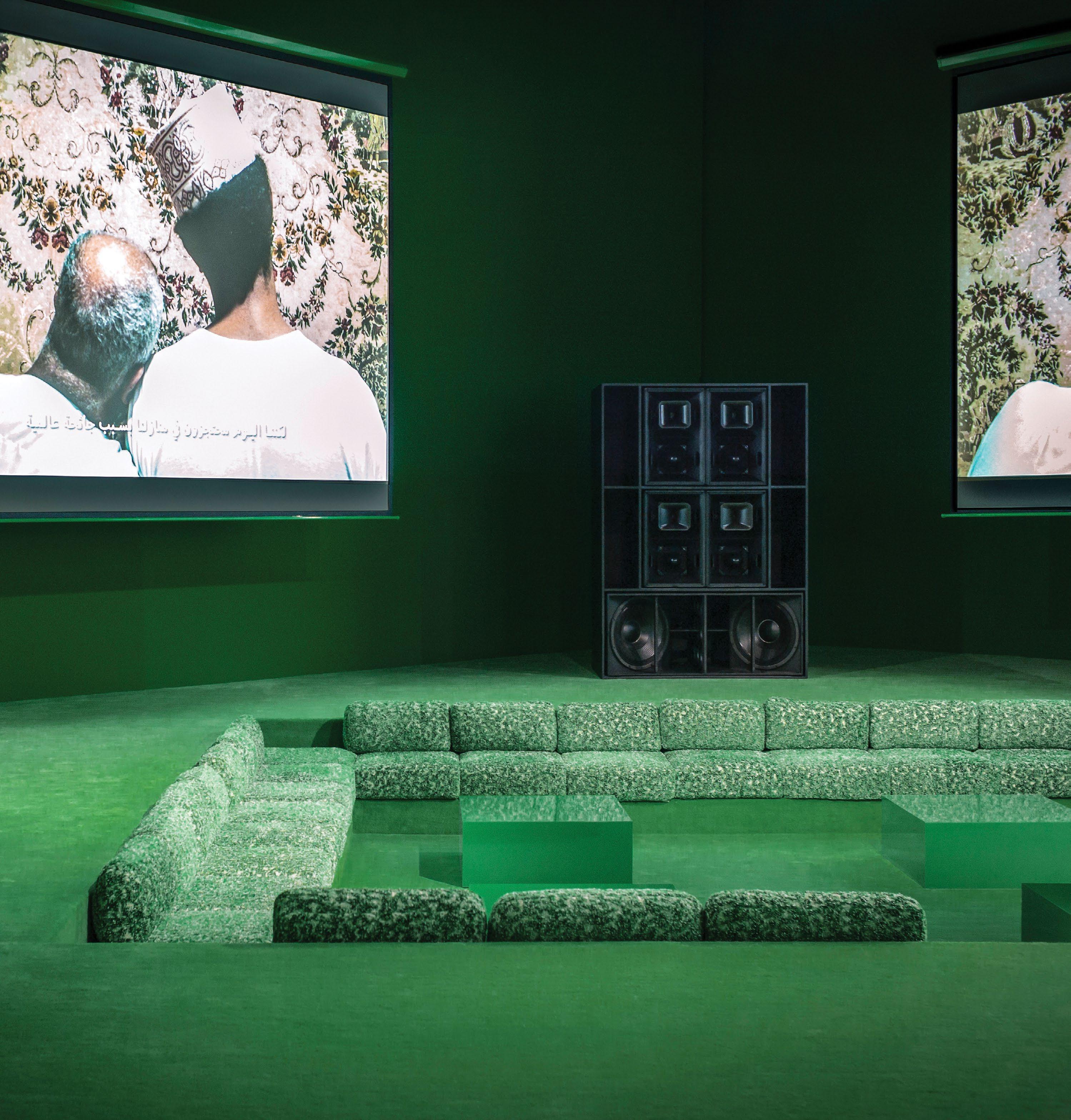
Earlier this year in Dubai, Gerges designed The Square, a ‘majlis’-style seating area for a three-day pro gramme of cultural events during the holy month of Ramadan, set inside the OMA-designed Concrete build ing in Alserkal Avenue. Visitors were invited to sit in a square pit fit ted out in Bottega Veneta fabric and branded with its iconic green colour, where they enjoyed a programme of art performances, video, music and poetry. “The idea was to integrate a green square inside the cubic venue – [which] emphasises [the idea of a] square within a square structure, creating a subtle arabesque pattern,” he explains.
The live performances played a key role in Gerges’ architectural vision. “We wanted people to belong in the interventions rather than attend passively. The live poetry readings and freestyling brought the space to life,” he says.
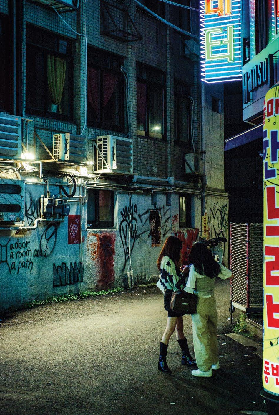
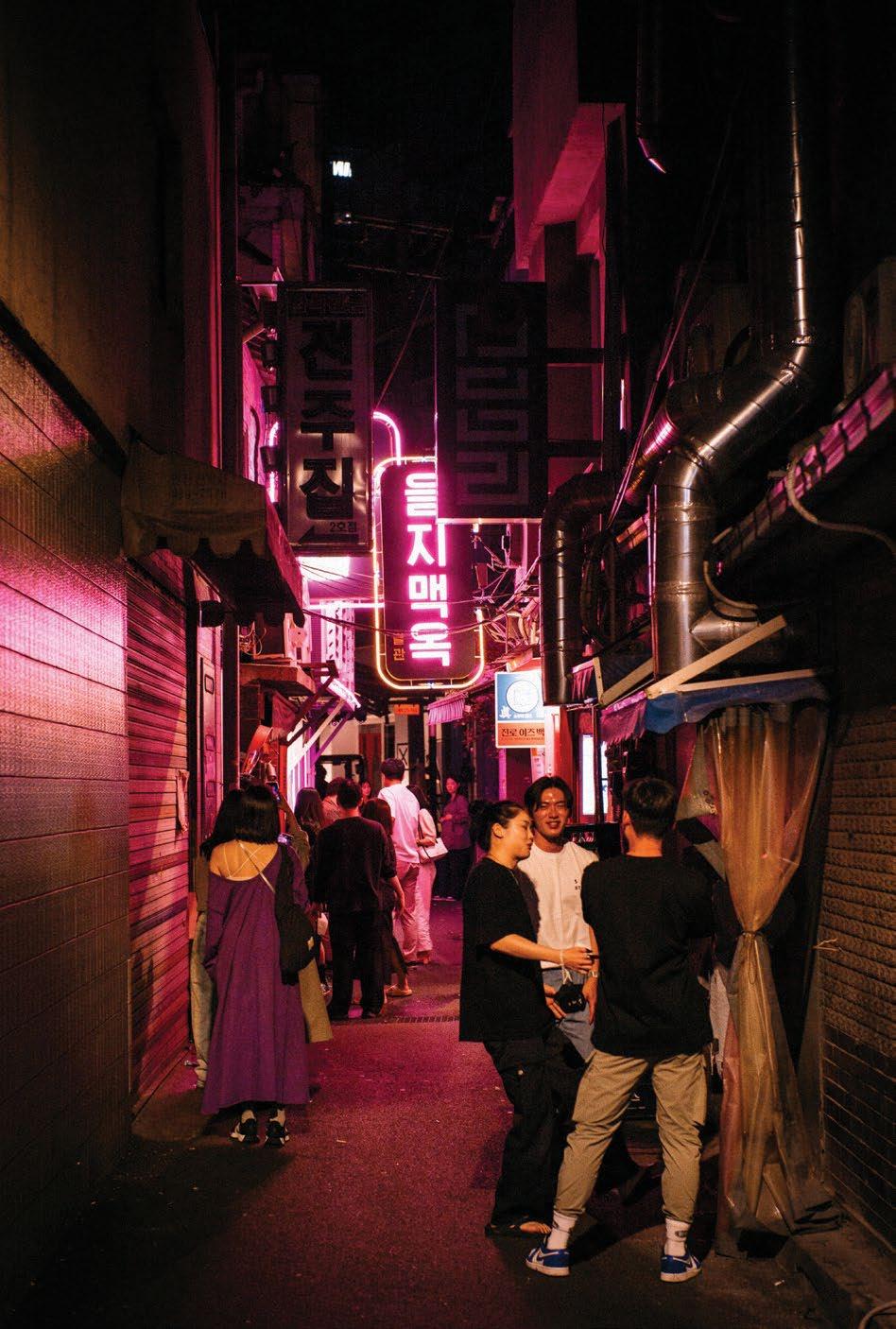
In Seoul, Gerges designed the event space around the ritual of raving. “Seoul has a ground-breaking art scene – which often incorpo rates technology, and always defies convention – and a vibrant nightlife governed by blinding neon lights,” he says. A large warehouse (‘chang go’) in Seongsu, an up-and-coming industrial area known as Seoul’s Brooklyn, was converted into a dance floor. Spotlights from the ceil ing echoed the city’s high-rises, and a video of the catwalk show projected on the walls through an LED screen. The stark interiors were left as they
were, the bare concrete walls giving a cold, industrial feel to the space.
The designs, he explains, were inspired by the city of Seoul itself. “Sculptural beams occupied the dance floor, where volumes cast by light were disrupted and explored by the audience as they moved through the longitudinal space,” he describes. “It was an homage to Seoul’s distinct spirit, a city where temples and pop culture intersect. It emulates a feel ing of calm within cacophony, and centeredness within speed, blurring the lines between reality and fantasy.”
Taking centre stage were massive cubes made of compressed steel. “The imposing material contrasted heavily with the more ethereal elements like light and smoke, which added an air of surrealism,” he says.
To many, the worlds of architec ture, music and fashion couldn’t be further apart. While architecture centres around building spaces that are at least semi-permanent in nature, music and fashion have a more tran sient nature and are pegged to live events and performance.
By blending events with physical spaces, Gerges aims to build on these contrasts as he develops his line as an architect. “I naturally approach my projects in a theatrical way, as if they were a series of moments rather than a series of spaces,” he says.
The biggest challenge, he adds, is making a space feel right in the heat of the moment: “This spark that happens at the right place at the right time is what’s challenging to emulate.” id

Tosin Oshinowo’s curatorial programme for the second iteration of the Sharjah Architecture Triennial will cast its gaze towards sustainable solutions from the Global South
WORDS BY AIDAN IMANOVA CREATIVE DIRECTION BY AIDAN IMANOVA AND HANNAH PEREZ PHOTOGRAPHY BY BASHAR BELALNigerian architect Tosin Oshinowo believes in a human-centric architecture. Her Lagos-based practice CmDesign Atelier is behind several res idential and commercial projects in (and around) the city, such as the Maryland Mall (dubbed ‘The Big Black Box’ due to its frame and size), as well as apartment complexes and stylish beach houses. Her practice has also recently complet ed a rehousing project with the United Nations Development Programme in Northeast Nigeria’s Borno State, replacing the original Ngarannam village whose inhabitants had been displaced by insurgent group Boko Haram in 2015. The project includes 500 earthen-style homes arranged in a grid with shared facilities and was built in close consultation and communication with its community.
Many of Oshinowo’s endeavours follow these prin ciples of human-centric design, whether it is about community engagement or giving voice to artists and creatives as part of her own projects (she has participated in several artistic projects herself, such as her collabo ration with Lexus and London-based designer Chrissa Amuah). But besides being conscious of human efforts,
Oshinowo is also keenly aware of the importance of one’s context, which has given way to an alternative view of sustainability: one that merits local materials and local ly-appropriate architecture which strays from Western ‘modernisation’ and a ‘global style’. “[The architecture] needs to reference where it is from, it needs to be con scious of the environment and it needs to pull inspiration from its context,” she tells identity
Oshinowo plans to carry forward these principles as part of her new role as the curator of the second edition of the Sharjah Architecture Triennial, under the theme ‘The Beauty of Impermanence: An Architecture of Adaptability’, that will explore issues of scarcity across the Global South which has given rise to a culture of re-use, re-appropriation, innovation, collaboration and adaptation. “[The theme] comes from my understanding of my environment, my contextuality, and the fact that particularly in Africa, and in Lagos, we are always working with limited resources. [With this comes] an [abundance] of innovation and cre ativity. I used to think of it as a constraint, but to be honest, that is where we found our freedom.”
Set to take place in November 2023, the Triennial will bring together architects, designers, planners, artists and product design ers who are working towards reorienting global conversations to create a more inclusively sustainable and resilient future for people and the planet.
To prioritise sustainable practices that work with the climate rather than against it, Oshinowo asserts that one must “go back to go forward” and this calls for moving away from the canon of global notions of sustainability. “If I look at traditional buildings prior to colonialism, they were comfortable, they were appro priate, [and] there was a culture of maintenance, of renewal, of regeneration, which we have lost. We have this buzzword ‘sustainability’ today which [is] highly abused. It is not enough to have ‘zero impact’. The traditional buildings of the past were about the cycle of life and regenerating and renewing. [For example], in Northern Nigeria, at the end of every rainy season, there is a pro cess of repairing the walls [of the building]. [It is] a natural cycle. We have lost so much of that in modern architecture,” she says.
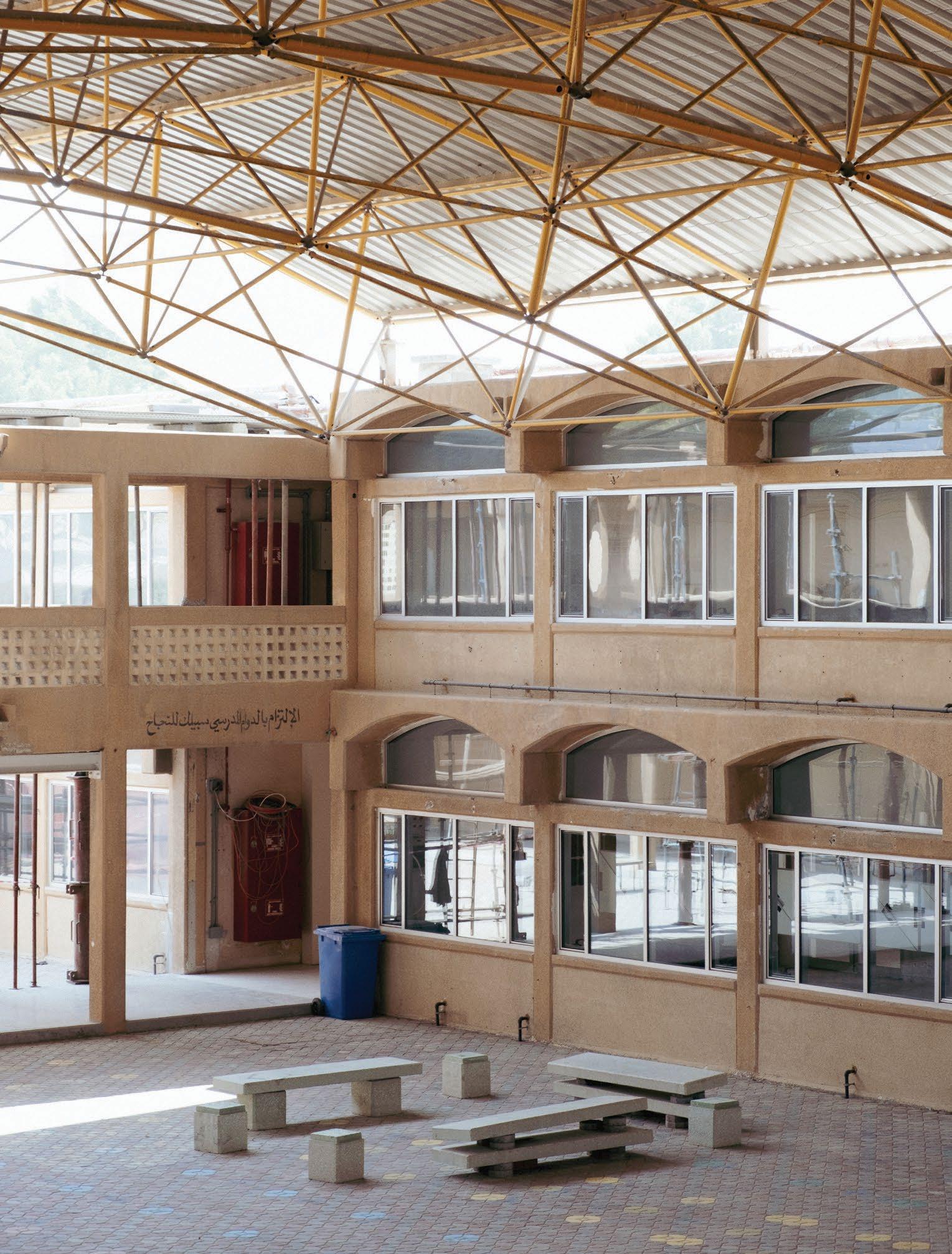
The architect plans to tap prac titioners from across the Global South who are working within the reality of scarcity, traditional tech nologies and adaptable design that are relevant to their contexts and could become learning examples for the rest of the world. While the detailed programming and partici pant list has not been fully defined, current plans include dividing the exhibition into a series of sections: one exploring architectures that adapt to their environment, one on innovative and contextual materials and another one the use of waste, that - although prob lematic – is being used to create interesting interventions.
“One of the biggest challenges we have, particularly in West Africa, is that we have become the dump ing ground for the West’s clothes,”
Oshinowo explains. This has affected local economies and is becom ing an ecological issue as discarded textiles – and car parts – increase in the continent’s landfills. “The irony is that people do such interest ing things with this waste.” While some of these waste products are recycled within their genre of use, other times they are readapted to create a whole new function. Car tyres, for example, play a big part in innovative furniture in Nigeria, with artists and designers giving discarded items a second life. Kenyan fashion designer, Sunny Dolat, for example, upcycles balls of second-hand clothing to create walls for houses.

The challenge here – and there are many –is convincing high-end clients that working with local materials and upcycling can produce comparable results to importing said materials from overseas, but Oshinowo is hopeful that with the right approach, the narrative can be changed. She cites Indian architect Vinu Daniel, founder of Wallmakers, who is building high-end residential projects using traditional techniques and eco-friendly materials such as clay. “It just goes to show that if architects and designers start to make a different way of seeing things attractive and aspirations, you would be surprised who will follow you down that road,” says Oshinowo. It is one thing to create this type of architecture because the planet requires it, but one must also make it attractive to a client, she adds. “We must be honest. Particularly as architects, we are providing a professional service that someone
must pay for. We don’t have the luxury – as artists do – to produce work and that people then engage with. We are indirect salespeople, and we have to make it aspirational. And if we can do that then we are on the way to ensuring that these are the things that can become part of everyday life.”
To create an exhibition that is more diverse and gives voice to a larger pool of practitioners, Oshinowo has selected an advisory board of international architects who will help broad en the scope. I am very familiar with people within the African continent who are doing interesting work, but I was very aware that there was a limit to my knowledge of people who potentially could contribute to this theme from regions that I am not familiar with,” she says. It includes Hoor Al Qasimi, President of Sharjah Architecture Triennial and President & Director of Sharjah Art Foundation; Beatrice
Galilee, co-Founder and executive director of The World Around; Mariam Kamara, founder of Atelier Masomi in Niger; Rahul Mehrotra, founder of RMA Architects of Mumbai BritishNigerian artist Yinka Shonibare CBE RA; and Brazilian architect and urbanist Paulo Tavares.
I am very optimistic that, because of the advisory board, I’m really going to have a great, intense mix of people, that people haven’t seen [or may not know about],” says Oshinowo. The architect’s aim is to create an exhibition that is accessible to all and one that will hope fully make a future impact.
“I am not trying to answer any questions, but I am hoping that it will help us all think dif ferently about how we approach our practices, how we approach climate change and have some type of long-term influence in how we generally do things,” she says. “The point is that we can inclusively look for solutions.”


With kitchens becoming an increasingly more important part of the living space, here are the latest designs on our radar

A new kitchen model that is somewhat classic, yet minimal, Garde Hvalsøe’s Framed kitchen features solid ash drawers that are framed by a cabinet in a contrasting material – be it patinated copper or zinc. Reminiscent of traditional copper and zinc kitchenware, it reintroduces two archetypal components in a contemporary design that links the past with the future, and which beautifully patinates over time. The cabinet’s oblique profile lends a floating appearance to the drawers, which are joined with hidden dovetail joints, with the gaps acting as grips. The cabinet frame also serves as a worktop – a design solution that is both refined and functional.
Hailing from Brazil, Ornare has been developing cabinetry for kitchens, bathrooms, closets and vanities for 35 years, and opened its first showroom in the Middle East – in Dubai – earlier this year. Its kitchen collections range from more classic designs to pared-back minimal systems, with inspira tions ranging from cultural influences to those of the natural world. With careful attention paid to design and craft, its collections are about functionality as much as aesthetics. The Mech collection, for example, is one that embodies lightness. Its structural skeleton is open to a wide range of modular elements that are characterised by their cubic joints. To obtain the best results, the system should be arranged with open sides; however, glass doors can also be chosen for added lightness.

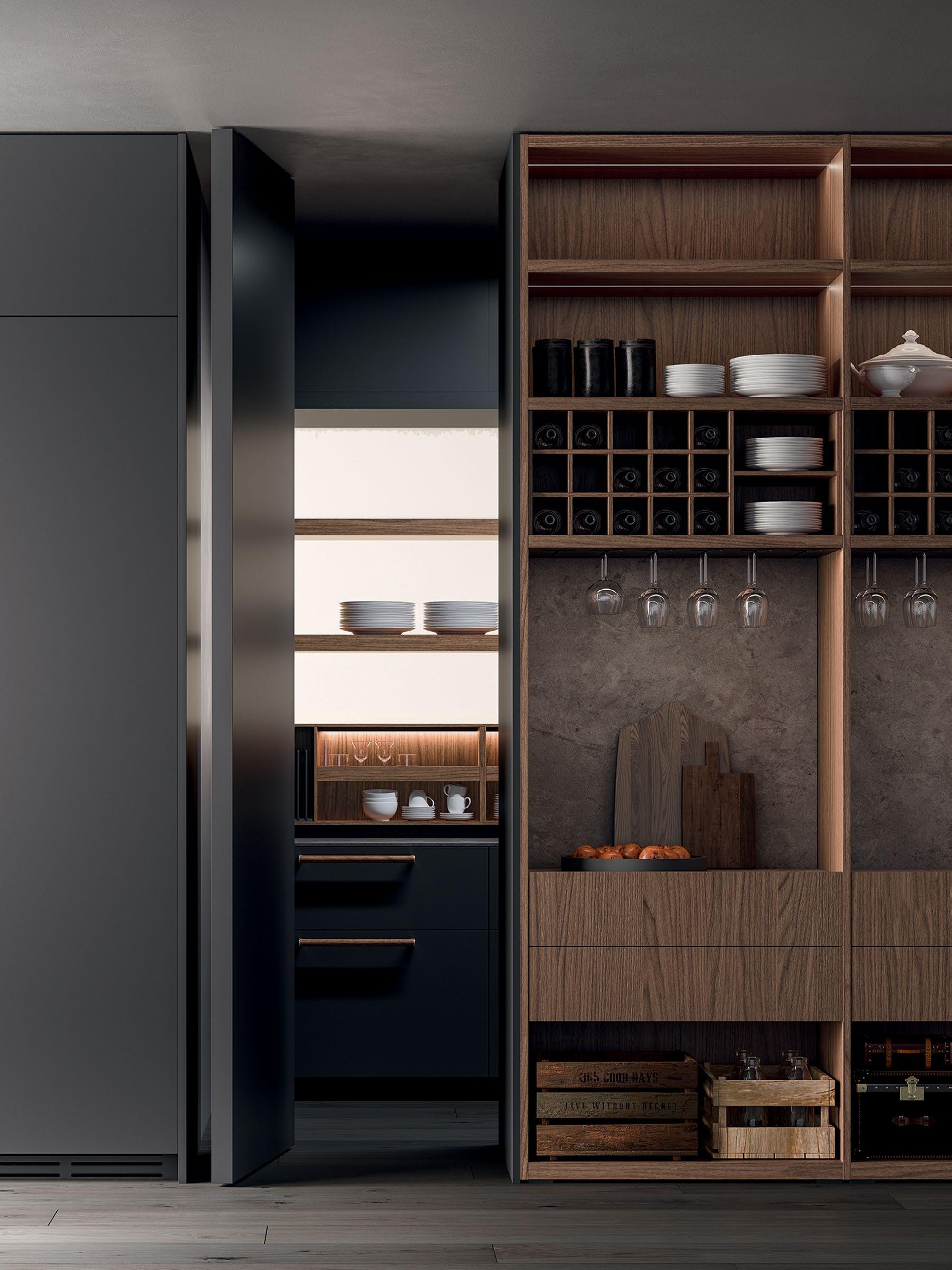
Boffi kitchens have long been revered for their contemporary elegance and for cultivating a culture of design. Drawing on a strong dedication to research, the brand’s latest Antibes K collection features open-faced column systems with modules for holding glass bottles and ladles. With a sleek design by Pierro Lissoni, it comprises glass, marble and wood shelves with a new composition that is aimed at satisfying the necessary storage functions of the kitchen. The collection is distinct in its details, staying true to the ethos of Boffi.
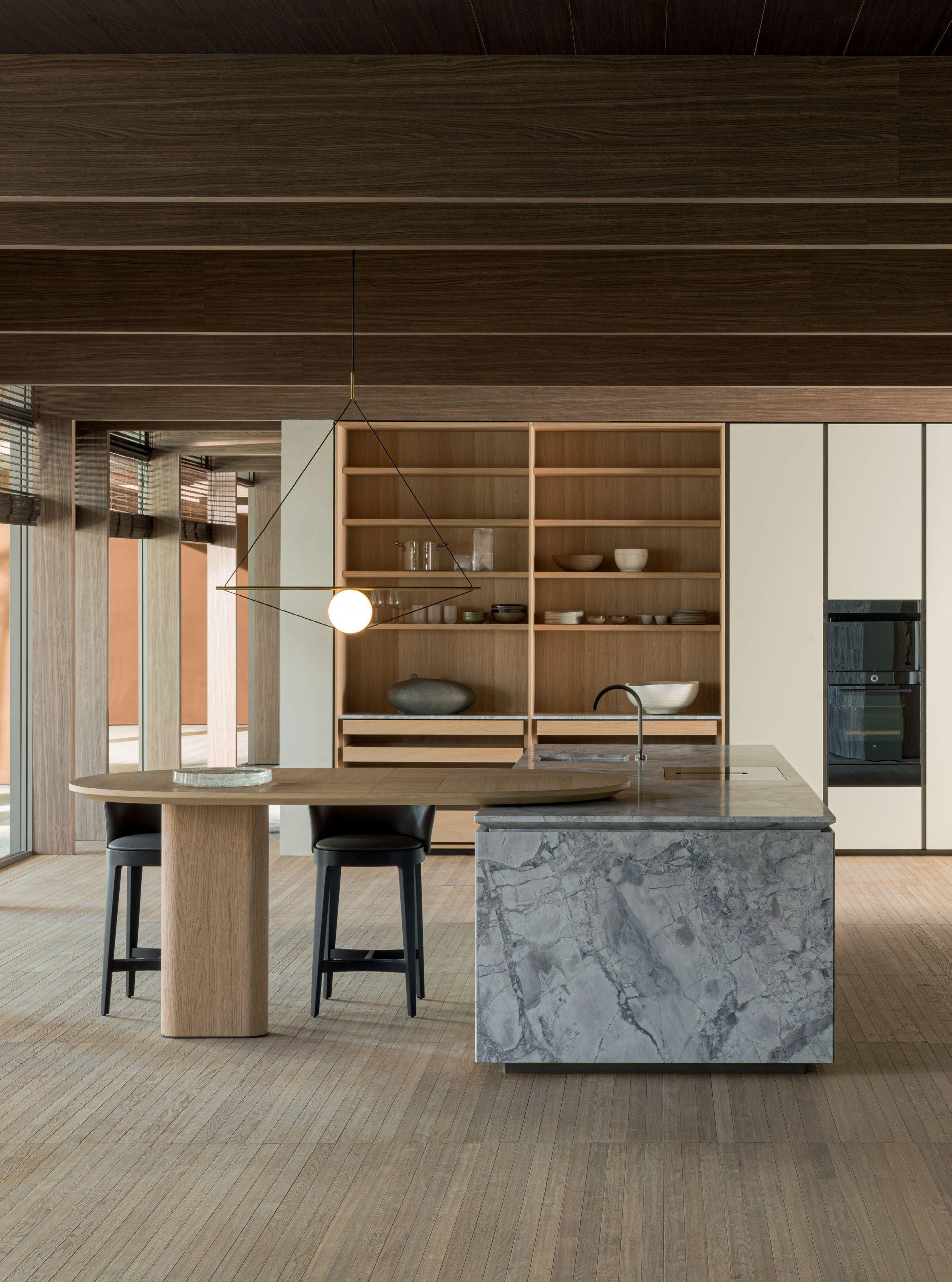
Belgian designer Vincent Van Duysen has long been fascinated with monolithic objects created from a single material: an inspiration that he applied to his Intersection kitchen by Dada, further highlighting the brand’s excellence in working with materials. Made of natural stone, the designer was inspired by the likes of Piet Mondrian and Carlo Scarpa, the former for his use of geometric compositions and the latter for his refined use of materials – primarily in his Querini Stampalia Palace in Venice, where marble, stone, ceramics, wood and metal fittings are used in a masterly way to create highly sophisticated and beautiful environments. Bringing a monolithic sense of nature into the home, the stone slabs have been processed to create lighter panels that are suitable for a home environment.
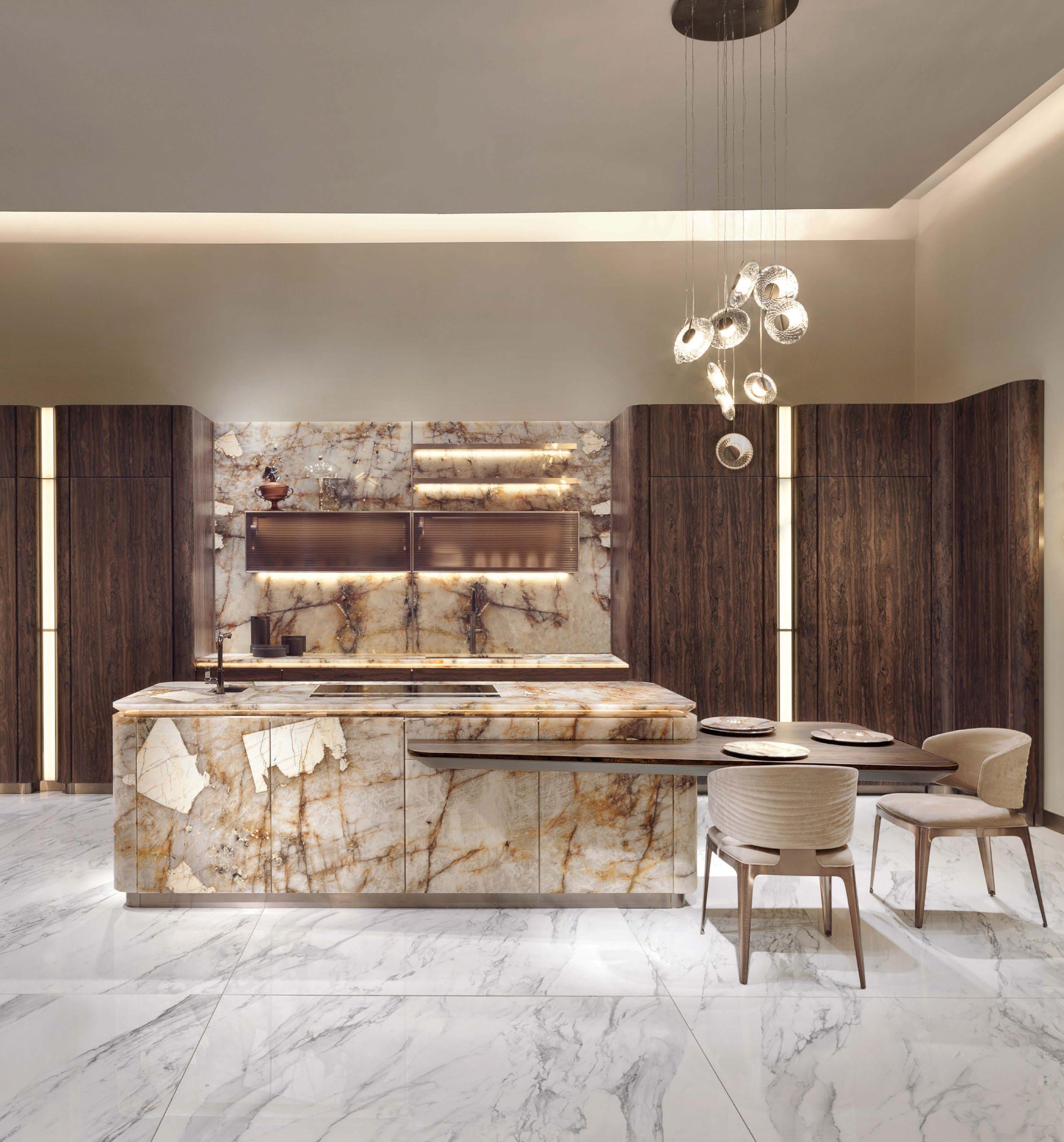
Mauro Lipparini’s Villa D’Este kitchen for Visionnaire pays homage to the essence of its name as a theatre of culture, pleasure, well-being and happiness. Designed as a ‘true dry/show kitchen’, it is created to take on the role of queen of the home. Villa D’Este encourages revelling in the slow pleasures and sacredness of preparing a meal, blending concave and convex forms that are bold in their classical craftsmanship yet contemporary in shape. Its main elements include the Tivoli boiserie and the central island, the former acting as the skin of the entire collection. Underlining the connection between the kitchen and living room, the boiserie integrates doors and wall units, shelves and built-in lights, opacities and transparencies. The central island, on the other hand, acts as the reference point for the kitchen. Villa D’Este is also defined by its rich use of materials - American ziricote wood, Patagonia quartzite and faceted engraved glass - offset by the luminous lines that are carved into the depths of the boiserie.
When a professional chef and designer come together to create a kitchen, one can only expect great results. Such is the case with Arrital’s AkB_08 collection, created through a collaboration between designer Franco Driusso and chef Andrea Berton, transferring the practicality of a professional kitchen to a home environment. In keeping with Arrital’s simple and elegant kitchen systems, the collection uses a frame door with a ‘floating core’ where clean lines match the structure’s robustness, creating a contem porary design that fits well with its various accessories. Functionality-wise, it includes elements such as the ‘Twice’ worktop that allows users to increase their work surface or, by lifting it, reveal the ergonomic stainless steel-equipped space featuring an array of essential accessories and tools used for food preparation. id

A historic townhouse in Old Cairo has been restored and turned into an arts hub for the community
WORDS BY LEMMA SHEHADI PHOTOGRAPHY BY YEHIA EL-ALAILY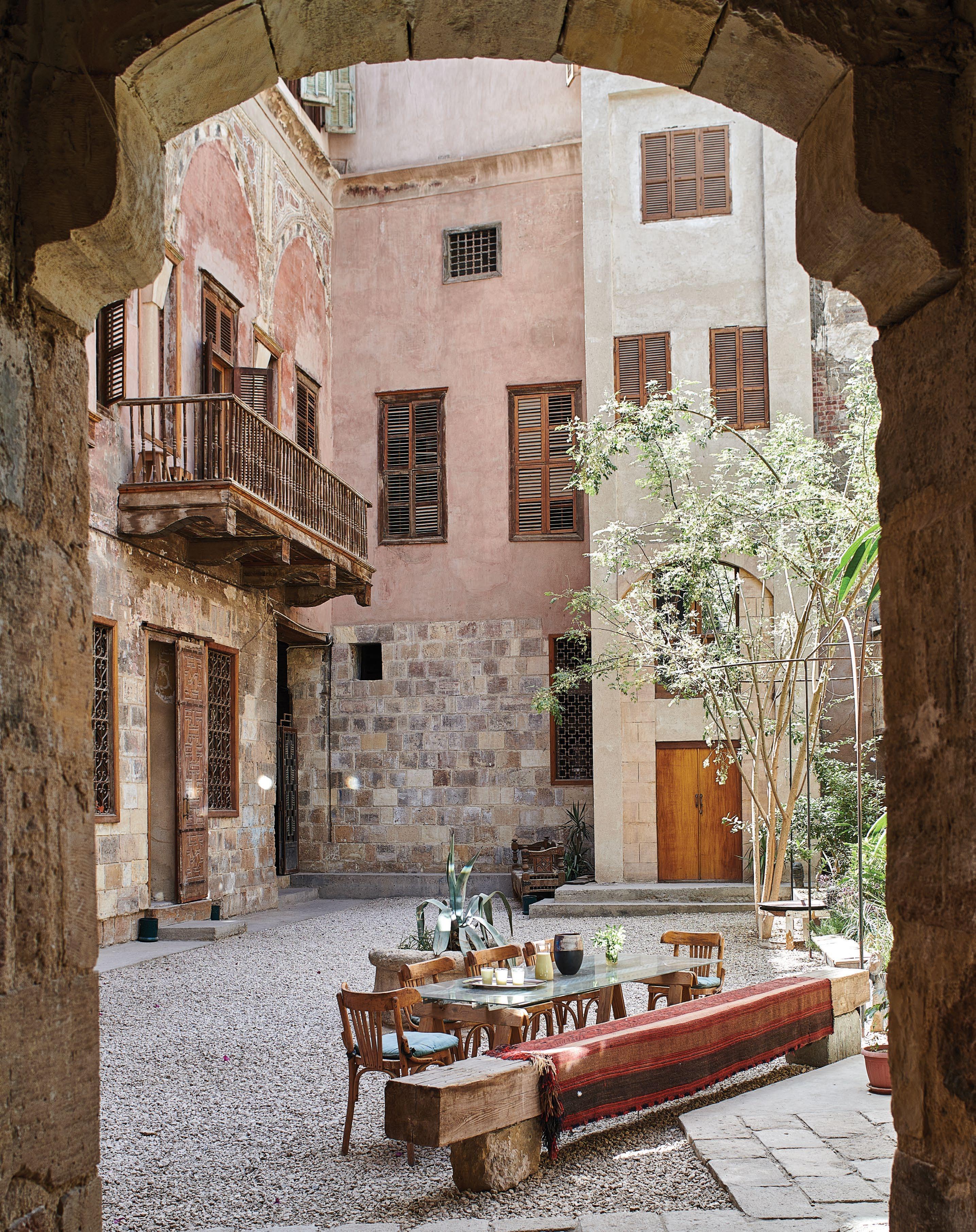
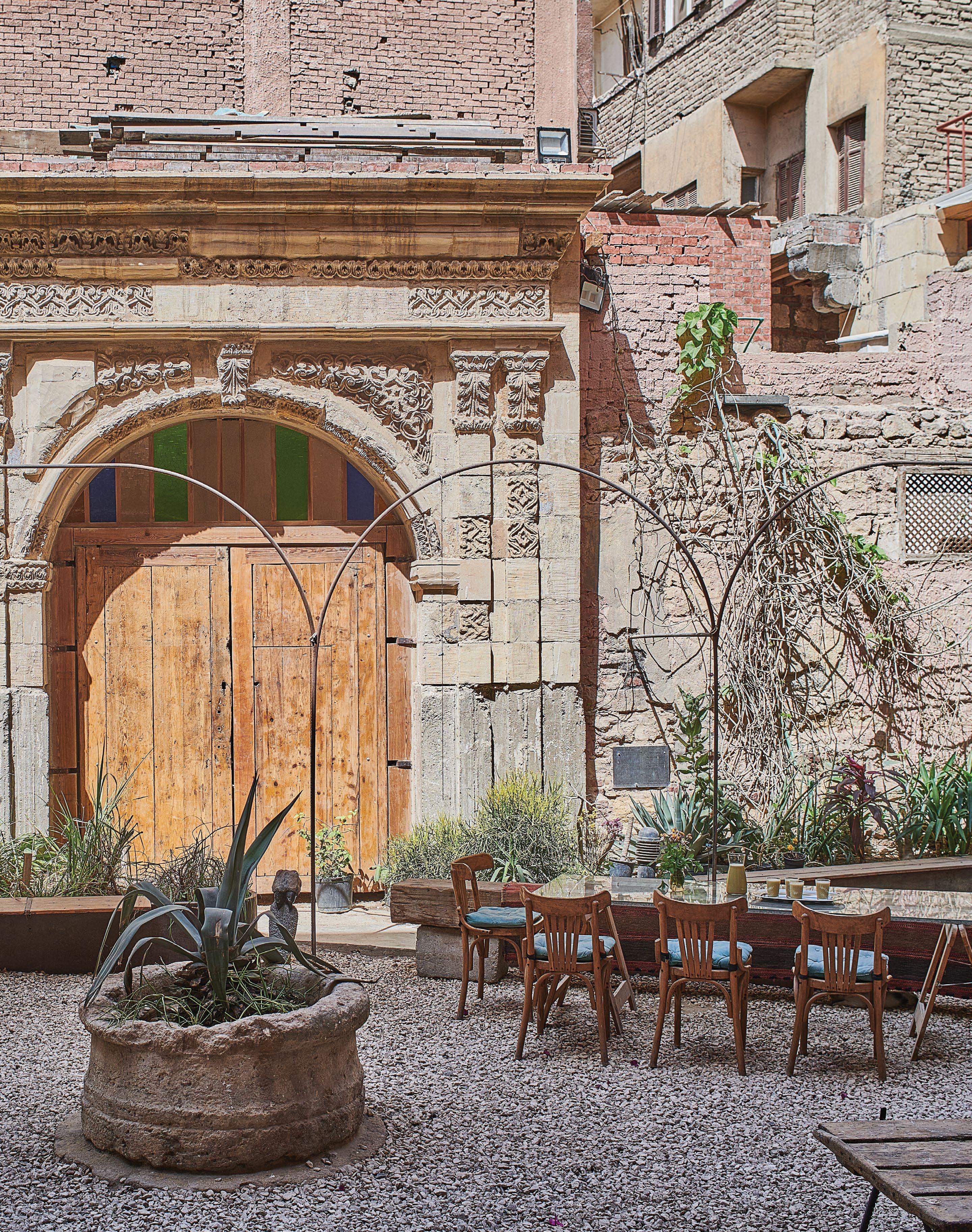
eritage should be living,” says con servation architect Alaa Al Habashi. “It should develop and should not be encased in museums.” For over 13 years, Al Habashi has worked to restore an 18th-century townhouse in Old Cairo yet, instead of turning it into a museum, Al Habashi now lives in the house, and has transformed it into a cultural centre and public library to serve the local community.
Beit Yakan, as the house is known, was once owned by elites from Cairo’s successive Mamluk, Ottoman and colonial rulers. But when Al Habashi bought the building in 2009, it belonged to a local butcher. “Large sections of the roof had collapsed after the earthquakes of the 1992 and 2005, like many historic buildings. The remaining built premises were evacuated, suffered from years of neglect and finally served as a nursery for cows and sheep,” says Al Habashi. “A vast area of the courtyard was built over to house the owners, and the remaining part was used as the butcher’s slaughter podium.”
Cairo boasts hundreds of historic homes, yet only a handful of these are protected by the Ministry of Culture and Antiquities. Even now, many are being destroyed to make way for new builds. “We’re seeing the erosion of
the Historic City, due to neglect and demolitions,” says Al Habashi, who cur rently serves as the head of Menoufia University’s architecture department.
The architect has worked
on major recovery projects across Egypt and the Middle East, including the resto ration of Bahrain’s pearl fishing trail, which has been placed on the UNESCO World Heritage List.
According to Al Habashi, the house’s earliest known owner was Hassan Agha Kokilyan, a high-ranking military officer. Typical of the Mamluk style of architecture that was popular in Cairo, the stone house with arched windows was composed of several public quarters that served the community. This included a sabil or charita ble water fountain. “Kokilyan dated the sabil back to 1694,” says Al Habashi, adding that the house may have been built sometime before the 1690s.
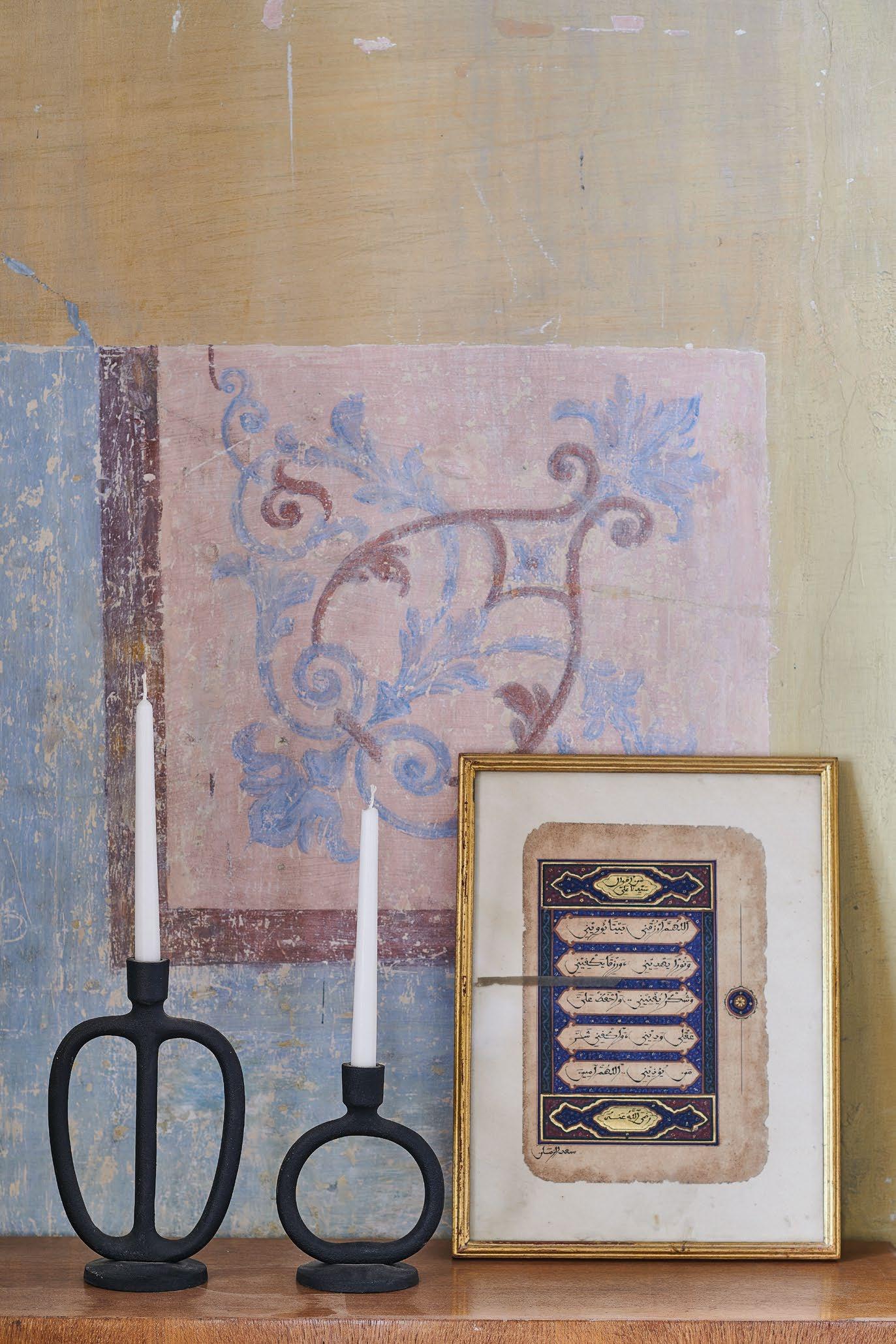
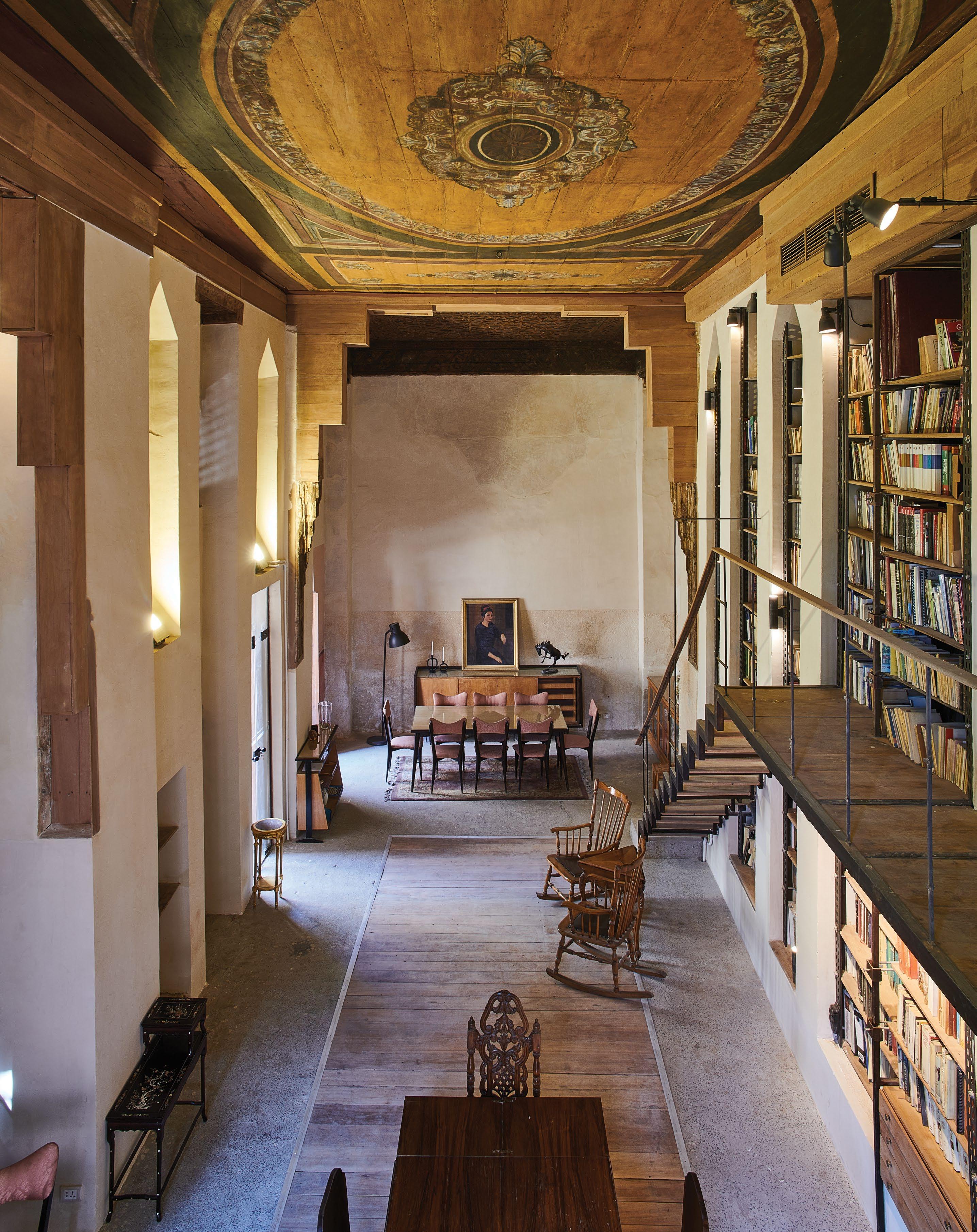
In the 19th century, Ottoman ruler Mohammed Ali, who ended Mamluk rule in Egypt, confiscated such townhouses and offered them to members of his family. The house’s new Ottoman owners, the Yakan brothers, shunned Mamluk architecture and attempted to conceal traces of it in their home. Instead, they opted for Ottoman baroque-style ceilings, with latticework windows instead of turned wood, and ornate wall paintings.
Beit Al Yakan is on a street known as Souk al Sleih, a market that was once dedicated to crafting weapons. Over time, it evolved into a hub for various other crafts. Today, carpentry has become the area’s main skillset.
These layers of Cairo’s history are immedi ately visible from the house’s exterior. In the building’s courtyard, the Mamluk-style stone walls have been left worn, as if to reveal the passage of time. The latticework and wooden balconies have been restored, and the col lapsed roof rebuilt. To this, Al Habashi added his own contemporary interventions, with the aim of making all three time periods visible in the house.
The building’s library, which is open to the
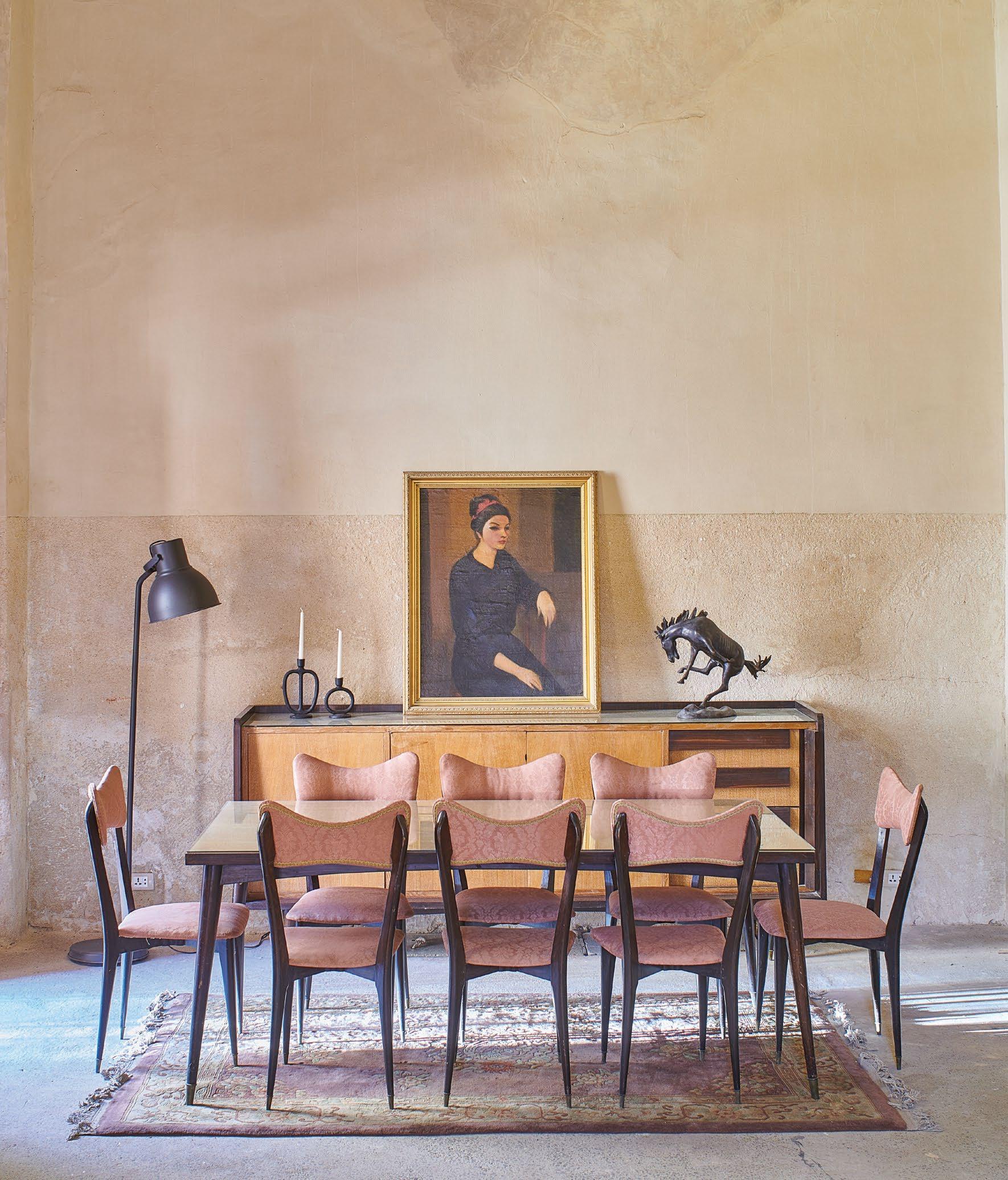
public, houses 20,000 books from Al Habashi’s collection. There, an Ottoman baroque-style painted ceiling was fixed adjacent to one from the Mamluk era. A simple and modern steel staircase gives access to the towering book shelves. “The modern additions reflect the house’s continuity, from the 18th and 19th centuries to the present day,” says the architect.
But for Al Habashi, a personal highlight is the newly installed lift. “A lot of people are surprised when I say this,” he says. “Introducing new technologies into the house, while pre serving its historic character, was the biggest challenge. But this continuity is essential to living heritage.”
Al Habashi gathered a team of local
stonemasons and carpenters whom he had met and trained over his years while working as a conservation architect. Such collaborations, he explains, are challenging due to the dwindling numbers of craftsmen and the lack of knowl edge in historic techniques. “The craftsmen have not been trained in conservation and their approach is always to renew,” he explains, “so it’s the architectural conservator’s job to work closely with them.”
The house is a rare example in Cairo of what is known as adaptive re-use: creating functional living spaces that blend historic buildings with contemporary additions. “I want locals, particu larly from the neighbourhood, to see what is possible when you restore heritage buildings.” id
 Sofa by Oliver Gustav. Side tables by Sanayi313. Chair by Pierre Jeanneret. Rug by Beni Rugs. Custom-made stainless steel coffee table. Mirror by Obsolete
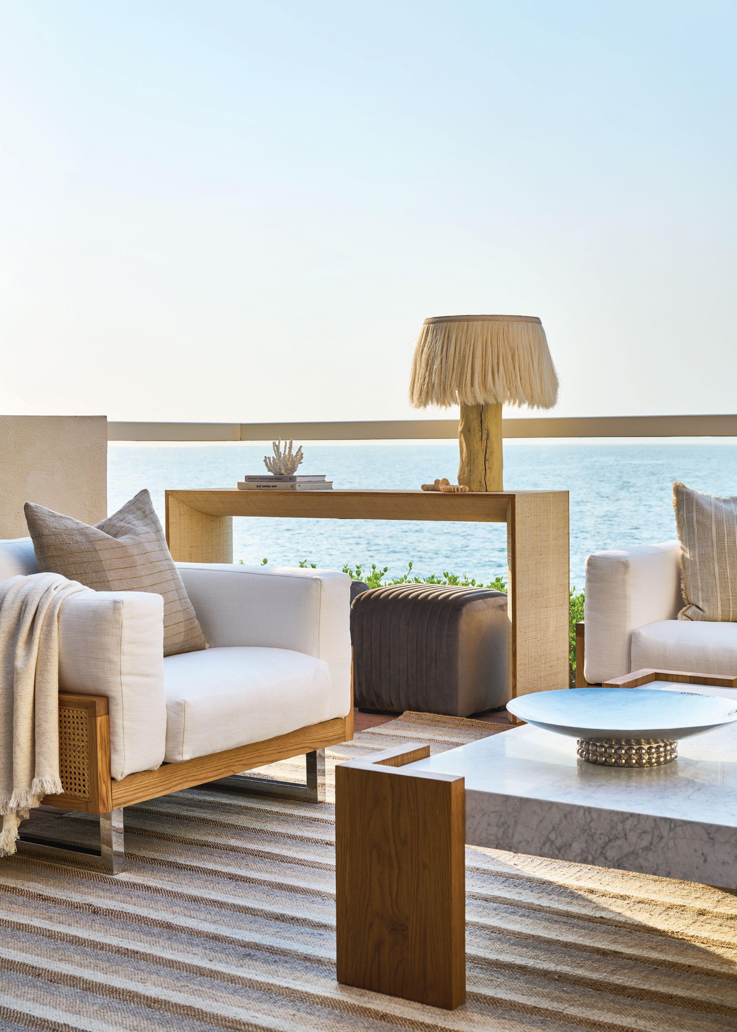
Eclectic yet curated, the interiors of this waterfront home were created by Enis Karavil of Sanayi313 for the daughter of a Turkish textile industry giant and her husband, who owns South Florida’s largest boat dealer
 WORDS BY KARINE MONIÉ IMAGES BY TIM WILLIAMS STYLING BY LISA ROWE
Ideally located on Allison Island in the new com munity of Aqua, this townhouse – which spreads over four floors connected by a staircase and an elevator – takes cues from Streamline Moderne (a late type of Art Deco design), characteristic of Miami Beach, for its exterior. But when it comes to what’s inside, it tells a completely different story.
The creative director and co-founder of Sanayi313, Enis Karavil, shaped an art- and light-filled home for his clients, who also happen to be his close
friends – so the trust was already there. One of the biggest challenges, however, consisted in managing this long-distance project between Florida, where the house is located, and Istanbul, where the design team was based.

The homeowners, Serra Kutuk and her husband, wanted to showcase their artworks and book collec tion in a comfortable atmosphere that would reflect a seamless flow between the different rooms, as well as between the interior and the exterior.
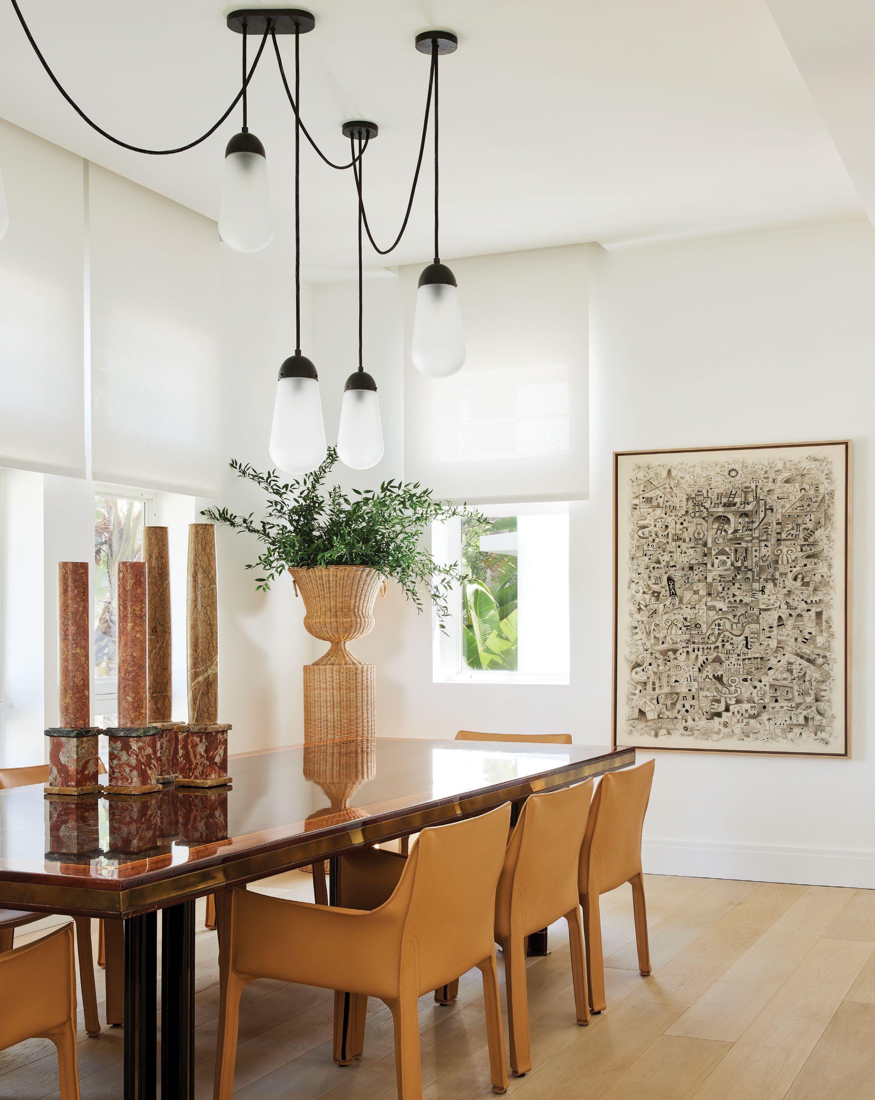
This page: Custom-made display cabinet. Bar stools by Rose Uniacke. Ceiling lamp by Serge Mouille. Next page: Cab 413 armchairs by Cassina upholstered in cognac leather, used as dining chairs. Gloss lacquered Macassar ebony and walnut table with a maple inlay by Paolo Barracchia. Obelisks by Monica James & Co. Lariat 19 ceiling lamp by Apparatus. Artwork by Luis Rodríguez Noa
Immediately upon entering, paintings by Muhsin Kut, Ayşe Wilson, Komet, Michelle Jezierski, Daniel Fletcher and Marc Chagall bring visual interest. Situated on the second floor, the living area features neutral tones and iconic design pieces, including a sofa by Oliver Gustav, the Barcelona couch by Mies van der Rohe and the Easy chair by Pierre Jeanneret. They are accompanied by a pair of 07313 side tables by Sanayi313, a Beni rug, a custom-made stain less steel box coffee table, a handmade Syrian
mother-of-pearl side table, a Tube chandelier by Michael Anastassiades and artwork by Brazilian artist Theo Pinto, among others. A double-sided display unit separates the living room and the dining area, which is connected to the kitchen through a doorway. On that same level, the powder room is a feast for the eyes – imagined as a very small gallery with its walls of framed art.
“I think different eras look good together,” says Karavil. “We kept the base plain and simple and played with the juxtapositions of old and
new, modern and antique, minimal and extravagant furniture. More importantly, the house melds design and function.”
On the first floor, the main bed room is adorned with a Rives du Bosphore wall mural by de Gournay, Cleo sconces by Kelly Wearstler and an Angelo Lelli three-arm flush mount chandelier for Arredoluce, to name but a few of the embellishments. The discovery continues in the main bathroom, where the back wall of the shower is covered in custom tiles depicting a portrait of Manon Balletti by Jean-Marc Nattier from the National Gallery collection, two art works by The Heidies, an Apparatus ceiling lamp and a stool by Philippe Starck for Kartell.
The top (fourth) level comprises a library with a masculine vibe that opens up to two terraces on both sides. In this room, a Camaleonda sofa by B&B Italia, a Philip and Kelvin LaVerne coffee table and a Gebrüder Thonet Vienna Stocksessel folding chair contribute to the cosy ambiance.
“The selection of natural materials, furniture, rugs, lighting and accesso ries together gives the space a calm essence that reflects what this home is for the clients: a place to relax and enjoy the salty air and the gentle breeze,” says Karavil.

The sense of calm that prevails throughout provides the perfect backdrop for the extensive art and design finds. Contemporary spaces and objects with a heritage feel combine among mostly black-and-white decor with occasional pops of colour, expressing Sanayi313’s approach of “maximalist expressions in minimalist details.”
“From start to finish, it was a flawless process,” says Karavil. “The most rewarding part [is] to see the homeowners living happily in the environ ment we’ve created for them.”

The main wall of the house rising from the kitchen to the living room was designed with a special plaster technique. The door that leads to the bedroom is carved from raw wood and made in the same pattern as the wall to create visual coherence. The lighting fixtures are by Foscarini

On the western coast of Turkey, this stone house was transformed by interior architecture studio Erdem Hamza to meet modern needs while respecting the property’s past
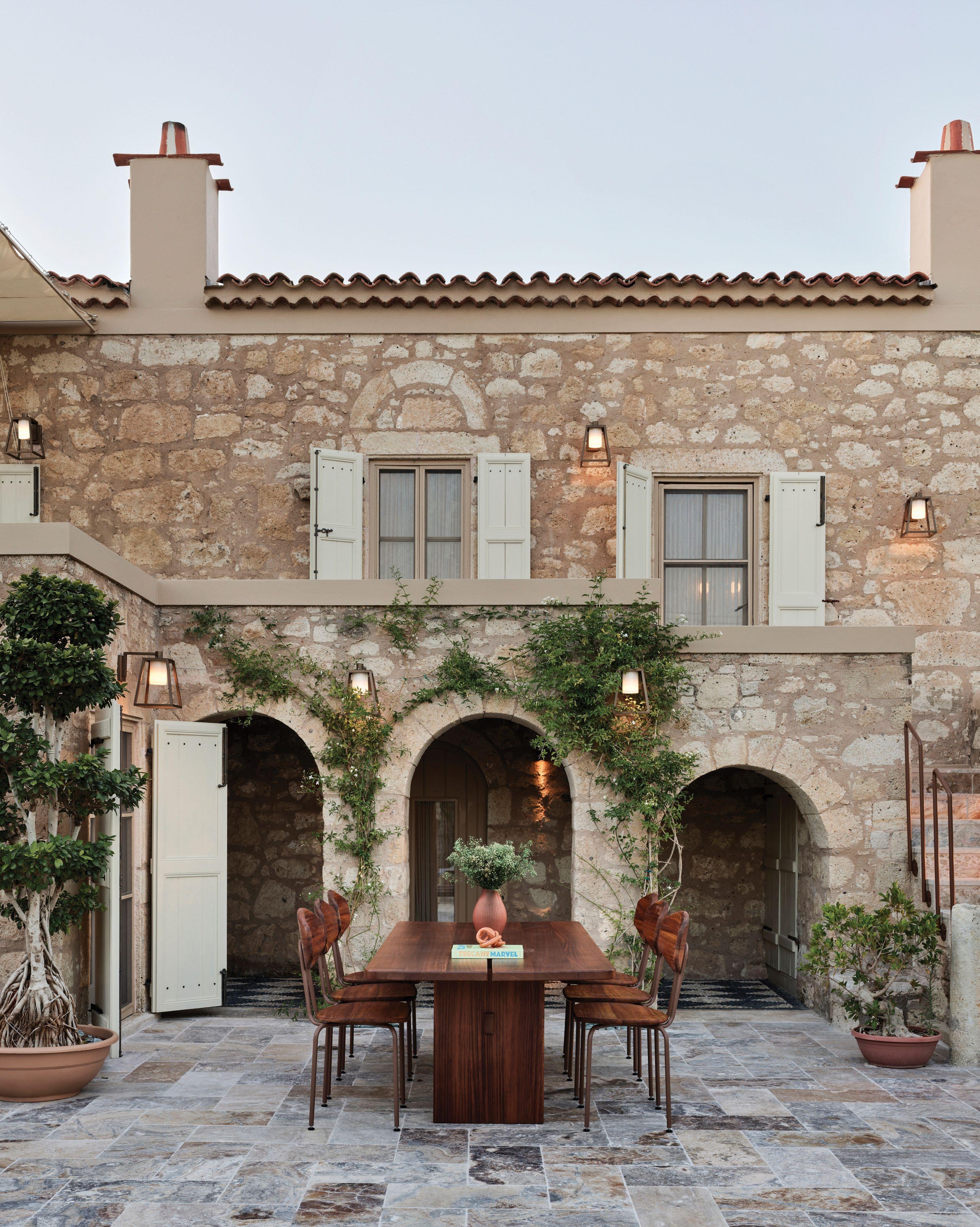
WORDS BY KARINE MONIÉ PHOTOGRAPHY BY IBRAHIM ÖZBUNARA dining area was created by preserving the historical texture of the walls. Since this area is located in a part of the house that does not receive light, Otto Tile material was used on the ceiling to make it spacious.

like to blend elements from different periods in the history of architecture and design,” begins Erdem Hamza, who leads his eponymous Istanbul-based interior architecture practice.
“In the spaces we design, we always try to offer something unexpected, while favouring a full sensory experience.”
Located in Alaçati, in the province of Izmir on the west ern coast of Turkey, this house reflects the architect’s vision of intertwining different influences and creating unique sensations. “The summer months in the region are lively, while quietness prevails the rest of the year,” Hamza notes.
Dating back 130 years, the property – which was originally used as a place to extract olive oil and gum tree resin – was carefully renovated and transformed over the course of five months for a family of three – a couple
with a child – who are long-time residents of France.
“The biggest challenge was to create a design without getting in the way of the historical texture of the structure, and without damaging it,” says Hamza, who worked to reveal the hidden layers of the property’s past.
Organised across two floors with a central garden, the house comprises three bedrooms, a kitchen and a study on the lower level. The living room, dining area and another bedroom occupy the upper level. Outside, the pool reflects the green of the vegetation and the blue of the sky. Outdoor areas and closed spaces that shield the property from the sun alternate naturally thanks to a flu id floor plan that is an invitation to explore every nook. The interplay between light and shadow is omnipresent throughout the design.
“WeThe lighting fixtures are by Pharestudio and the table was specially designed with local materials
This page: Plaster work was done in the dining area, creating an elegant and more modern atmosphere. Next page: With its low ceiling height, the lower floor of the house was previously used for olive oil storage. For this reason, wood and light colours were used in the kitchen to give the feeling of a more open space. The marble is by Stoneline Group, the wall is adorned with ceramics by Otto Tile and the furniture was custom-designed with local materials


The existing wall texture in the bedroom was preserved. Le Soleil pendant is by Foscarini

All the interiors were reconsidered in terms of functionality to meet contemporary living requirements. Throughout the project, the main goal consisted of bringing a serene design to life, with references both to an urban aesthetic and a holiday home. As a result, a feeling of calm and peace exudes among the stone walls that bear the traces of the original building. “In our projects, we usually try to reflect the old spirit [in] a new housing, but with this one we were excited by the idea of reflecting a new spirit in an old housing,” says Hamza.
Authenticity, through the use of local materials, and refined
simplicity characterise this house, where wooden beams add even more character to the distinctive atmosphere. Even if the furniture and lighting from the likes of Foscarini, Pharestudio, Jonathan Adler and Georg Jensen – among other names – are more modern and contemporary than the architecture, they nevertheless give the impression of belonging to the same place.
“We see the concepts of art and timelessness as a common lan guage in our designs,” says Hamza. With this home, he has achieved a true sense of harmony where every detail, colour, texture and material are perfectly aligned with the whole. id
 The floor
 Cosentino’s latest Dekton Kraftizen collection is a marriage of technology and craft
Buildings made from rammed earth or bamboo, or finished in limestone, possess a certain warmth that other, more processed materials, perhaps have difficulty attaining. The latter’s hand crafted nature displays markers of the human touch, which makes it at once natural and intimate.
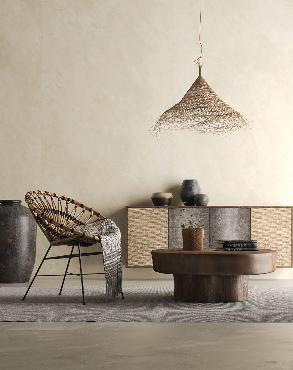
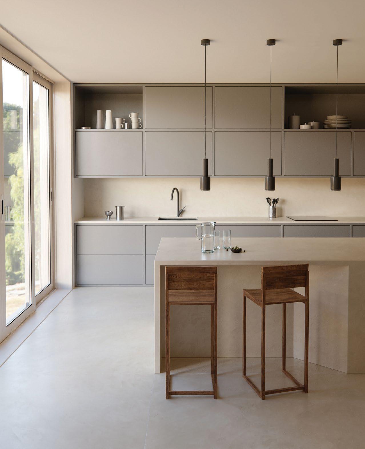
Enter Kraftizen, the latest Dekton collection from producer and distributer of innovative and sustainable architectural and interior surfaces, Cosentino. Kraftizen takes inspiration from the var ious techniques that have been perfected by master craftspeople across centuries, revealing a range of colours boasting deep, rich textures.
Reinterpreting the versatility, beauty and honesty of hand-crafted materials using digital craft tech nology, the carbon-neu tral Dekton surface is both weather-resistant and durable and is the first large-format stucco material of its kind to be used across both interiors and exteriors.
Kraftizen consists of five hues – Umber, Nacre, Argentium, Micron and Albarium – that are reminiscent of Venetian stucco and rooted in a minimalistic approach. Umber is a timeless colour that has a warm and cosy terracotta shade of the earth, bringing a sense of nature to any building or space. Nacre, on the other hand, has a silkier finish and is highly decorative and emotional, with trowel marks that bring the colour to life, evoking sea waves or the sense of running one’s fingers across a mother-of-pearl.


Argentium revisits the legend of silver, which was believed to be created from the magic of the moon. Inspired by this, its matte grey hue is ever-changing and can be combined with cold or warm
atmospheres for different results. Its trow elled structure, typical of lime plastering, strengthens the personality of the series.
Another colourway with a strong trowelled texture is Micron, which is both elegant and restrained and comes in a deep, dark grey. Finally, Albarium is a powdery white shade that reflects its primary element: marble dust. Its subtle trowel marks overlap, achieving a rich continuity and making it ideal to apply on larger surfaces. It is captivating in refinement and lightness – qualities that it brings to any space.
Synonymous with wealth, power, greed and glamour, Wall Street is arguably New York’s – possibly the world’s – most famous street. The subject of numerous movies, it’s where Hollywood heavyweight directors, including Oliver Stone, Martin Scorsese and Mary Harron, have fed their imaginations through blockbusters such as Wall Street , Wolf of Wall Street and American Psycho – inspired by the much-documented cut-throat nature of the New York Stock Exchange and the bon vivant characters who work and play there.
But aside from the glam ourised Hollywood narrative, Wall Street and Downtown Manhattan in which it’s situated are steeped in history, with the southern tip of Manhattan Island – now the Financial District – being the actual birthplace of New York City, which was founded in 1624.
In recent years, Downtown Manhattan has been undergoing a reinvention, with many office build ings being repurposed into residential towers, and
in excess of US$30 billion being invested in real estate and infrastructure, resulting in a three-fold increase in the area’s residential population and a growing number of affluent residents.
Enter One Wall Street, the 102,000-square metre restoration project from real estate tycoon Harry Macklowe. Formerly the Irving Trust Company Building, an Art Deco masterpiece designed by

Ralph Walker, One Wall Street is the largest office-to-residential conversion in New York’s histo ry and is set to change the face of modern city living with an inno vative, super-luxury approach to its design and amenities.
Spread over 56 storeys, the redevelopment saw architect Lilla Smith completely gut the building – even moving elevator shafts to the middle – in order to achieve the most gracious layouts for the 566 apartments that range from studios to four-bedrooms, with – at the very top – a magnificent penthouse with 360-degree views across the city, rumoured to be priced in the region of US$70 million.
The building’s inaugural model apartments were designed by Elizabeth Graziolo of Yellow House Architects, French architect and designer Cyril Vergniol, and award-winning architect Deborah Berke, with Berke also creating One Works, the stylish stateof-the-art co-working space – one of the many luxury lifestyle amenities provided exclusively for residents.
New York’s financial district is transforming into a coveted cultural destination and residential hotspot - and its latest luxury development, One Wall Street, is leading the charge
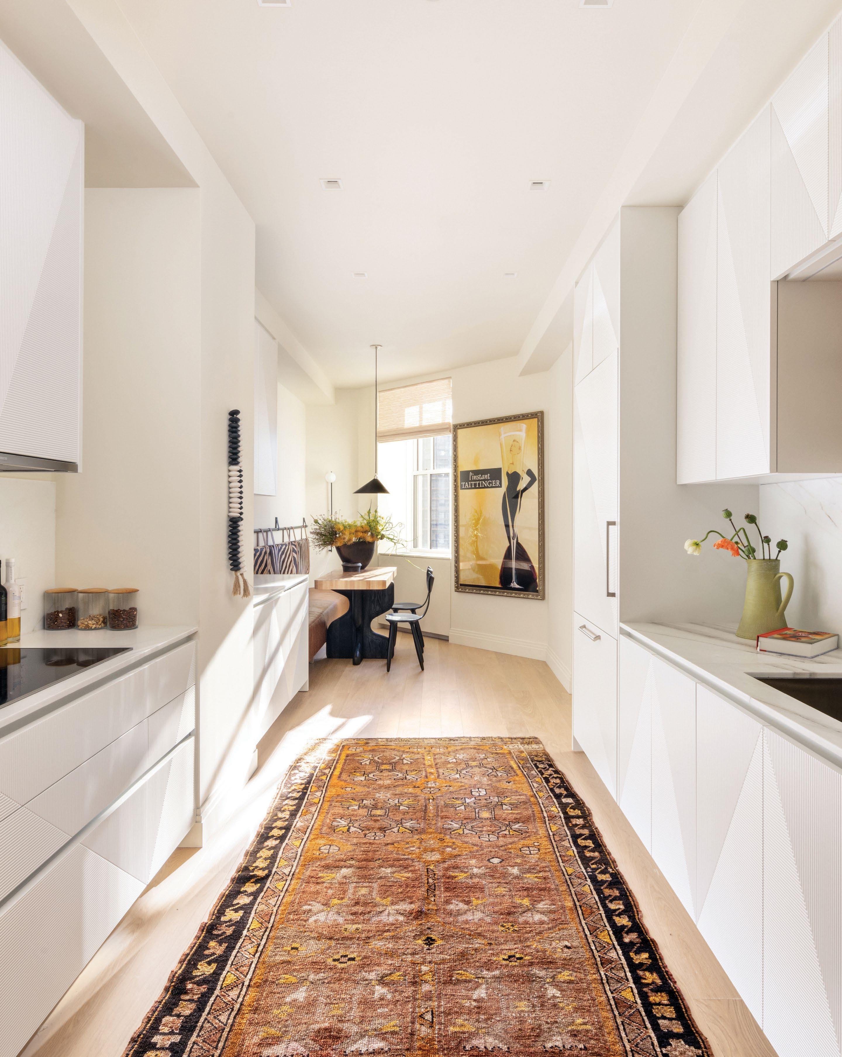 Custom breakfast table made out of a butcher block top, fabricated by Brooks Custom on Crate and Barrel legs. Daiku chairs by Victoria Magniant. Vintage 'L'instant Taittinger' poster features Grace Kelly
Grey sofa and burr wood table by Yellow House Architects. Sofa by Kagan. The skeleton art piece by the terrace door is from Carrie Haddad Gallery, New York, is made of black cones by artist Donise English. Anony mobile light fixture above the dining room table - from Gestalt. The large William McLure painting above the sofa was a commission from William McLure
“The opportunity to work on One Wall Street was a once-in-a-lifetime experience, particularly as the Art Deco period has always been one of my favourite architectural styles,” says Graziolo, who was drafted in to design Model Unit 2501, that showed potential buyers exactly what life could look like owning an apartment in One Wall Street.
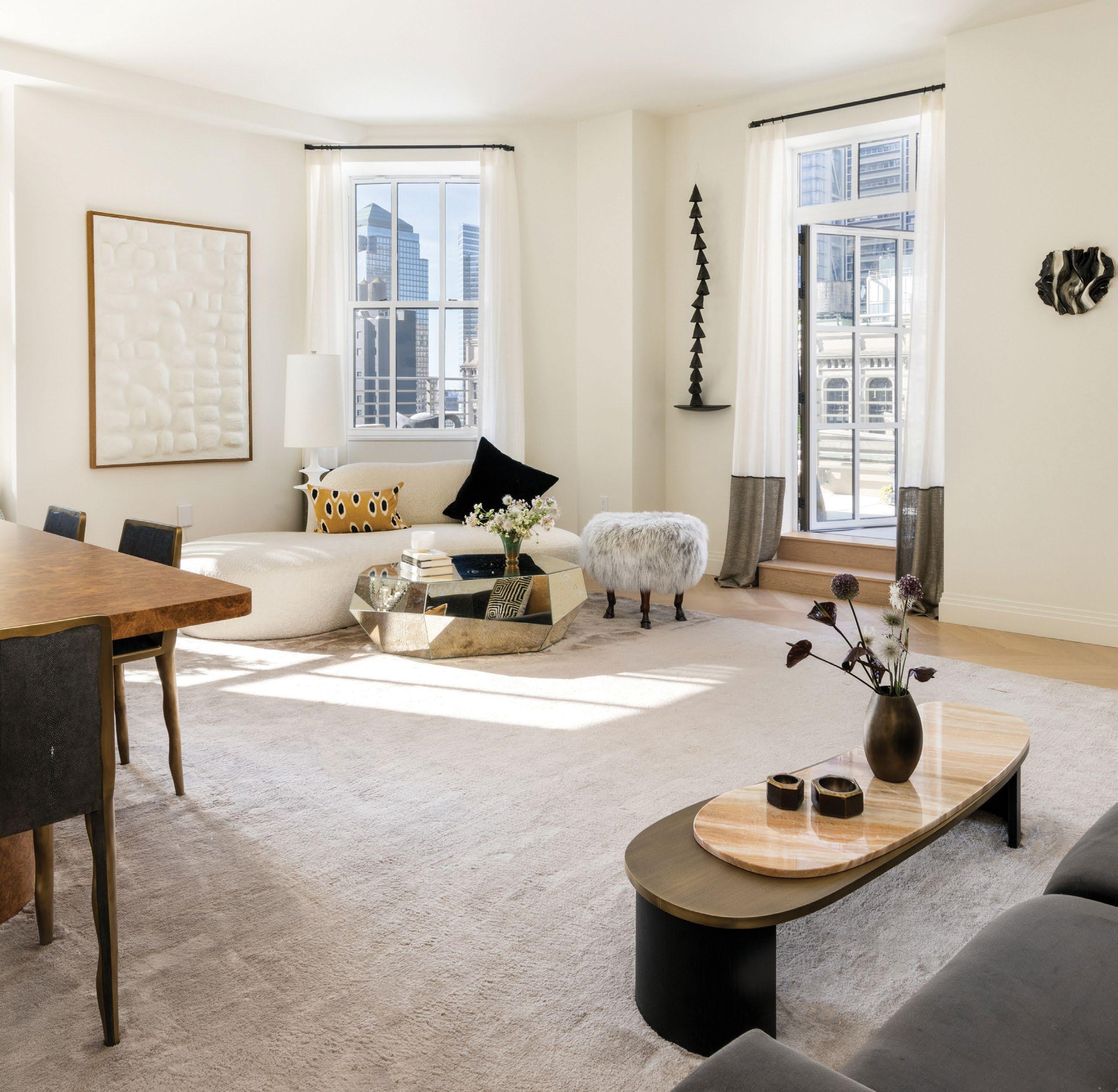
Graziolo worked closely with Harry Macklowe himself, with the design concept to create a
space that paid homage to the vintage glamour of the Art Deco period of the city. “We wanted the apartment to exude luxury and comfort. We took inspiration from the organic shapes of the building’s exterior stone, where the rigid mate rial was softened to make it feel almost sensuous. We then selected an equal amount of organic and traditional pieces to create a play between old and new. For example, we designed a traditional sofa for the living room and paired it with an
organically shaped Kagan Zoe sofa. We carried this theme throughout the apartment.”
Designing the apartment during a pandemic also presented challenges: “The world had changed, and now everyone was on the web to sell and buy. The days of travelling to a Paris gal lery were behind us, and we suddenly had access to all this excellent merchandise right at our fingertips, from the comfort of our own homes – which was great,” explains Graziolo.
And while the pandemic inspired the inner interior designer in us all, it also resulted in a shortage of materials and long shipping delays – for example, the burr wood living room table from Love House took nine months to arrive. “The most challenging part of this project was the timely procurement of pieces,” Graziolo says.
Delays aside, Graziolo’s two-bedroom apart ment came to fruition and is a dreamy, sophis ticated space that perfectly complements Lilla Smith’s elegant renovations.

The primary bedroom “in the clouds” is a surrealist space that exudes escapism from the bustling city life beneath. Layers of textured creams and beige, the tactile sheepskin chair from Koket, the Dali-esque droopy mirror over the wall-mounted vanity by Debra Folz, and the ‘Blossom Trail’ installation by Valéria Nascimento that weaves across the wall behind the bed all add ethereal touches.
In the second bedroom, Graziolo was more playful. “This room is for a very sophisticated cosmopolitan kid! A luxurious yellow bed is placed opposite a Crate and Barrel writing desk with a Magnus Læssøe Stephensen-style wing chair by Mazo from Gestalt, New York. A playful rainbow Meander leather chandelier by Avantgarden Ltd. hangs in the centre of the room. The pièce de résistance is a vintage Omersa leather giraffe placed in the corner near the desk,” she shares.
Due to budgetary constraints, one of the more challenging spaces to design was the librarycum-home office-cum-movie room. The long, slim space required a creative approach in order to maintain the feeling of calm not clutter. It was also the space in which Graziolo came to understand Harry Macklowe’s penchant for the colour white. “We’d painted everything in the library – walls and ceiling – this beautiful deep blue-green colour named Dark Harbor. I imme diately received a wonderful call to remind me about the beauty of the colour white,” she laughs. After fast adapting a new design direc tion, beginning with a beige suede wallpaper, the library is, overall, “a modern, monolithic architectural space paired with a curvilinear sofa as the room’s foundation,” complemented with a unique Gazelle chair by Amorph Inc. in
front of a bronze-patina brass writing desk by R&Y Augousti, covered in cream shagreen.
In the living room, the playful arrangement of furniture was directed by Harry Macklowe’s preference for pieces to never sit flush against a wall; therefore, the curved Kagan Zoe sofa sits just so away from the wall, next to an angular contemporary mirrored coffee table.
Art plays an integral part in the visual language of the apartment. Harking back to New York’s golden age of glamour, a large vintage ‘L’instant Taittinger’ poster, featuring Grace Kelly sipping champagne, hangs in the kitchen and “puts the final touch on the room, tying all of it to the
Crate and Barrel writing desk with a Magnus Læssøe Stephensenstyle wing chair by Mazo from Gestalt, New York. Meander leather chandelier by Avantgarden Ltd. Vintage Omersa leather giraffe
building’s era.” The poster is contrasted against the modern, organic form of the skeleton art piece made of black cones by artist Donise English, which sits by the terrace door, and the large abstract painting by William McLure that sits in the living room. Even the powder room showcases artworks sourced in Sicily, and two paintings by Ron Giusti hang in the hallway.
A true labour of love, Graziolo’s apartment harmoniously marries the Art Deco energy of One Wall Street’s iconic architecture with a contemporary design aesthetic that will help potential buyers envision their new life in the world’s most prestigious address. id
Technogym’s innovative products provide the ideal solution for training without stepping outside of the house
From good health and fitness to reducing stress, the benefits of exercise are multiple. Finding some time to do it regularly, however, is not always easy. So, why not simplify the process by having all the equipment at home? World-leading fitness, sport and wellness product and digital technology brand Technogym has already convinced over 55 million people to train in 400,000 private homes (in addition to 85,000 wellness centres). These high numbers are not by chance. Rather, they can be explained by the connected smart equipment, digital services, on-demand training experiences and apps that are available to anyone who is motivated to take the (small) jump.
When training at home, the Technogym App – which was devel oped by combining scientific research and artificial intelligence – is the perfect tool for goal setting. It gives users access to a wide choice of on-demand video workouts as well as personalised plans
that are adapted to every user’s needs and lifestyle, while allowing them to follow their progress along the way.
Thanks to its compact equipment – including MYRUN for run ners, Technogym ellipticals for those who want to avoid impact and favour fluid movements, and Technogym Cycle for bike enthusiasts – there are options for anyone in all types of spaces.

Newly launched, Technogym Ride now gives users access to the apps used by the best cyclists – including Zwift, Strava, ROUVY, TrainingPeaks, Kinomap and Bkool, plus Netflix and Eurosport, among others. No matter what the weather is outside, this immer sive indoor experience (thanks to a 22-inch screen) is the perfect way to get ready for outdoor performance. And, last but not least, the Technogym Bench offers equipment to do resistance, strength and core training exercises, all in a small room.
With so many possibilities at hand, sport is definitely within reach.
Designer Charles Zana reflects on his 20-year collaboration with THG Paris, which has recently seen the launch of their first collection together
How do you approach the world of the bathroom in your work? Since the beginning, we have always consid ered the bathroom to be a living space. Like the kitchen, bathrooms are often seen as the most beautiful spaces in a house. This is very impor tant to me. In fact, during an exhibition at the Musée des Arts décoratifs, we did an installation of a living-room-bathroom – a bit like ArmandAlbert Rateau’s bathroom. We always try to approach the bathroom not from the technical side, but from the aesthetic side - more a moment of life than a utilitarian need.
How did your collaboration with THG Paris come about? We have worked with THG Paris on numerous projects for 20 years now. It is a family business that has supported us since the beginning. It is a company we know really well, with legendary product lines that we have used since the beginning. I really like the idea of a bathroom fitting being a familiar object, like a pet that you live with every day, so I have a lot of affection for this brand.
What was your inspiration for the Hamptons collection? When we had the idea of doing a collection with THG Paris, images of New York immediately came to mind, where technology and networks of pipes and plumbing are all visible. And we really see aesthetic, engi neering and industrial materials as something beautiful, because [they are] also so refined and well designed. At the same time, I was thinking of Gérald Genta’s creations from the 1970s when he designed all his watches with [visible] screws. In the end, we merged this industrial aesthetic with the refined jewellery aesthetics of the watch. What did your architectural approach bring to this collaboration? It is very nice to be able to work on projects with THG Paris’ range of bathroom fittings. We have been using this fitting in some of our projects in the last six to eight months. It is very satisfying to be able to go all out on the detail and to be able to integrate a

collection of fittings designed by the agency into our projects. I have also put the fittings in my own bathroom, so I see them every day and I enjoy using them. How would you sum up THG Paris’ artisanal know-how in a few words? For me, there is true expertise at THG Paris, which helps us to draw up the specifications of our projects, and which accompanies architects and decorators as
closely as possible. It’s really a brand which works with a family mentality and a manufacturing mindset to create such well-made objects. The collaboration for the creation of the Hamptons collection was completely idyllic. They provided us with incredible modelling tools and 3D mockups. From the first sketches, we had a team that listened, that was very attentive, and that allowed us to make a dream come true.
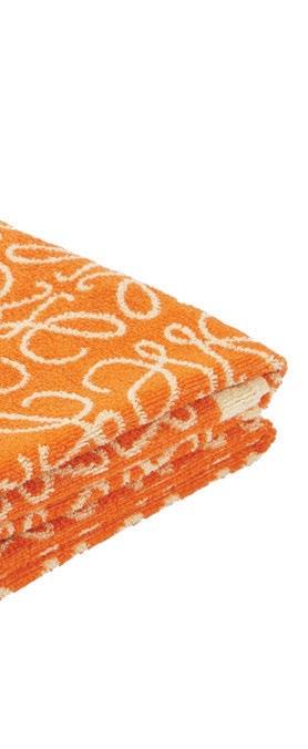
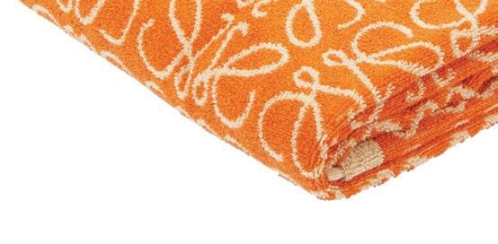
Hues of burnt orange, burgundy and terracotta dominate this month's moodboard of objects and accessories, from the bright Loewe beach towel to Casina's amorphic Coral vase
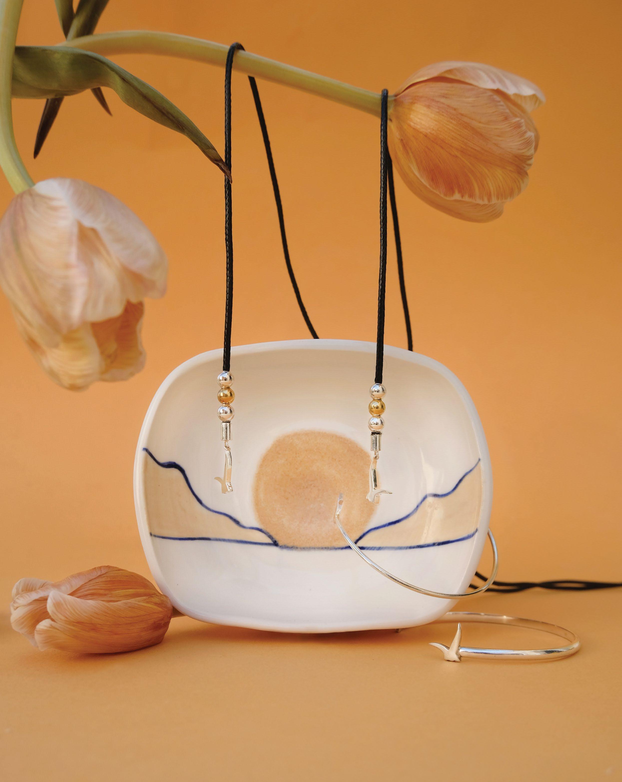
Pink Horizon jewellery dish Usfur x Lutem Ceramics Available at usfur.com


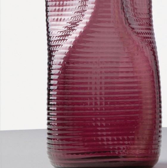


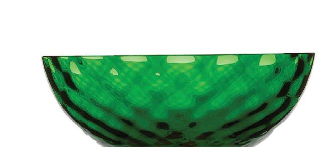


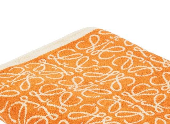




 WORDS BY KARINE MONIÉ PHOTOGRAPHY BY HODA AFSHARE COURTESY OF THE ARTIST AND MACK
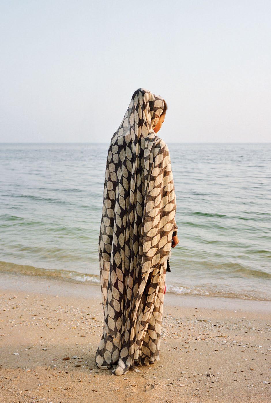
Born in Tehran, Iran, and currently based in Melbourne, Australia, Hoda Afshar is a renowned documentary photographer who gained international recognition in 2015 when she received the National Portrait Gallery’s National Photographic Portrait Prize for her ‘Portrait of Ali’. Selected from among 2,500 entries and 44 final images, Afshar convinced the judges unanimously.
“The portrait is poignant for its intimation of this boy’s future – likely as a shepherd,” said National Portrait Gallery’s senior curator Dr. Christopher Chapman. “The photographer has
captured a powerful sense of mystery that adds to the compelling nature of the portrait – the boy, standing calmly within the rocky, misty setting.”
This fascinating way of capturing her subjects through her lens makes Afshar’s work particularly distinctive. That same year (2015) brought her to the islands of the Strait of Hormuz, near the southern coast of Iran, for the first time. There, she discovered inhabitants with a rich culture, as well as inimitable landscapes of mountains and valleys, that she paid tribute to in
her new book, Speak the Wind, whose title refers to the local belief that the winds can possess a person and cause them to experience diseases.
Through her photos that grace the book’s 168 pages, Afshar tells the story of the rituals of the island’s inhabitants, such as a ceremony led by a hereditary leader using incense, music and movement in order to stop the wind’s harmful effects.
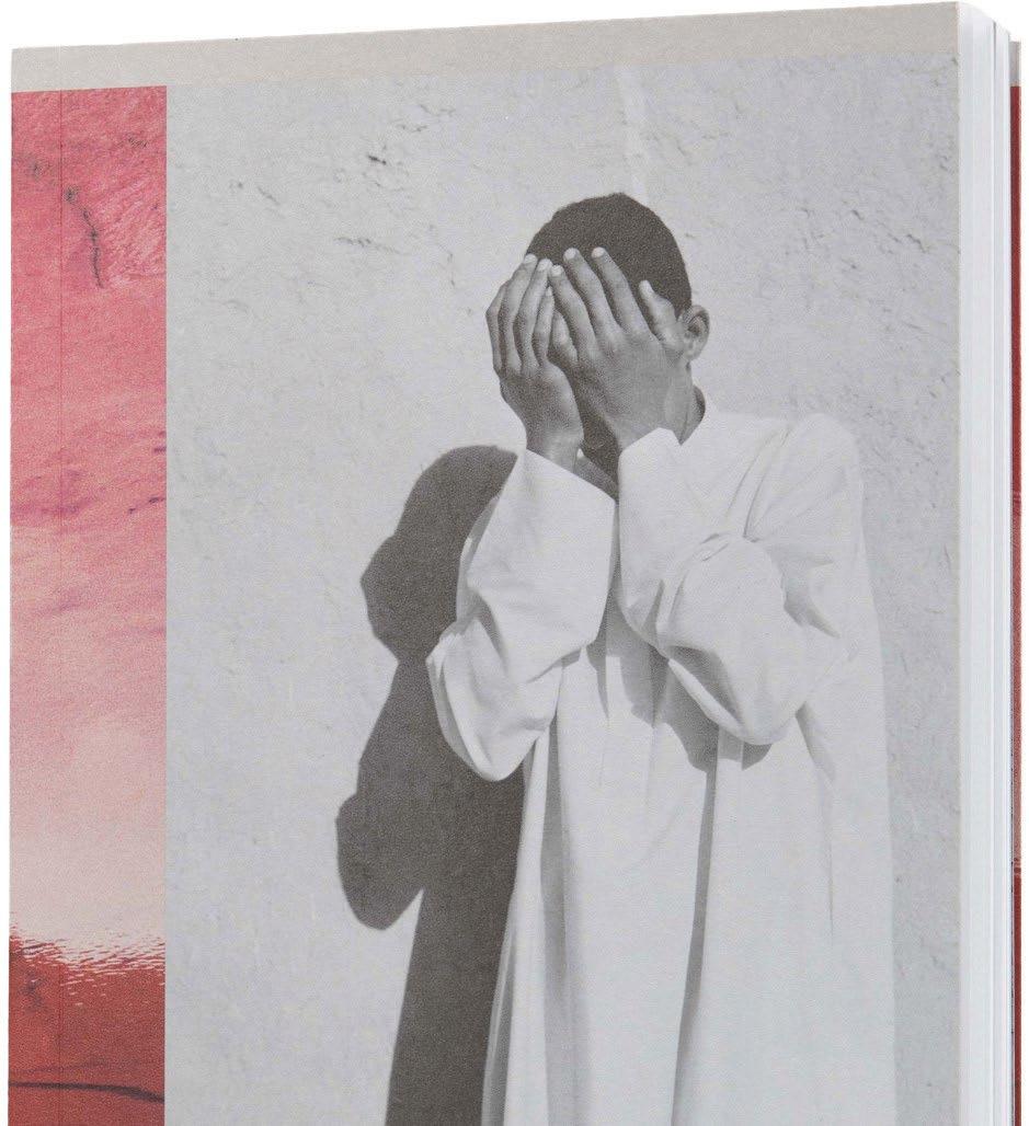

In this project, Afshar questions and challenges the traditional modes of documentary photography with processes that disrupt traditional image-making practices – an approach she has taken in her work for years. By beautifully recording and showcasing the invisible through powerful yet subtle images, Speak the Wind is an invitation to another world where imagination and reality, as well as history and the present, merge with nuance and a sense of magic that characterises Afshar’s body of work.
Her photographs – which form part of private and public collections – are set at the crossroads of the conceptual and the real, transforming our way of seeing and understanding what surrounds us, whether it be far from or close to what we are used to seeing in our everyday lives.
Speak the Wind is available at Gulf Photo Plus.

With her new book, Iranian-born artist Hoda Afshar explores the relationship between cultural traditions and the natural environment


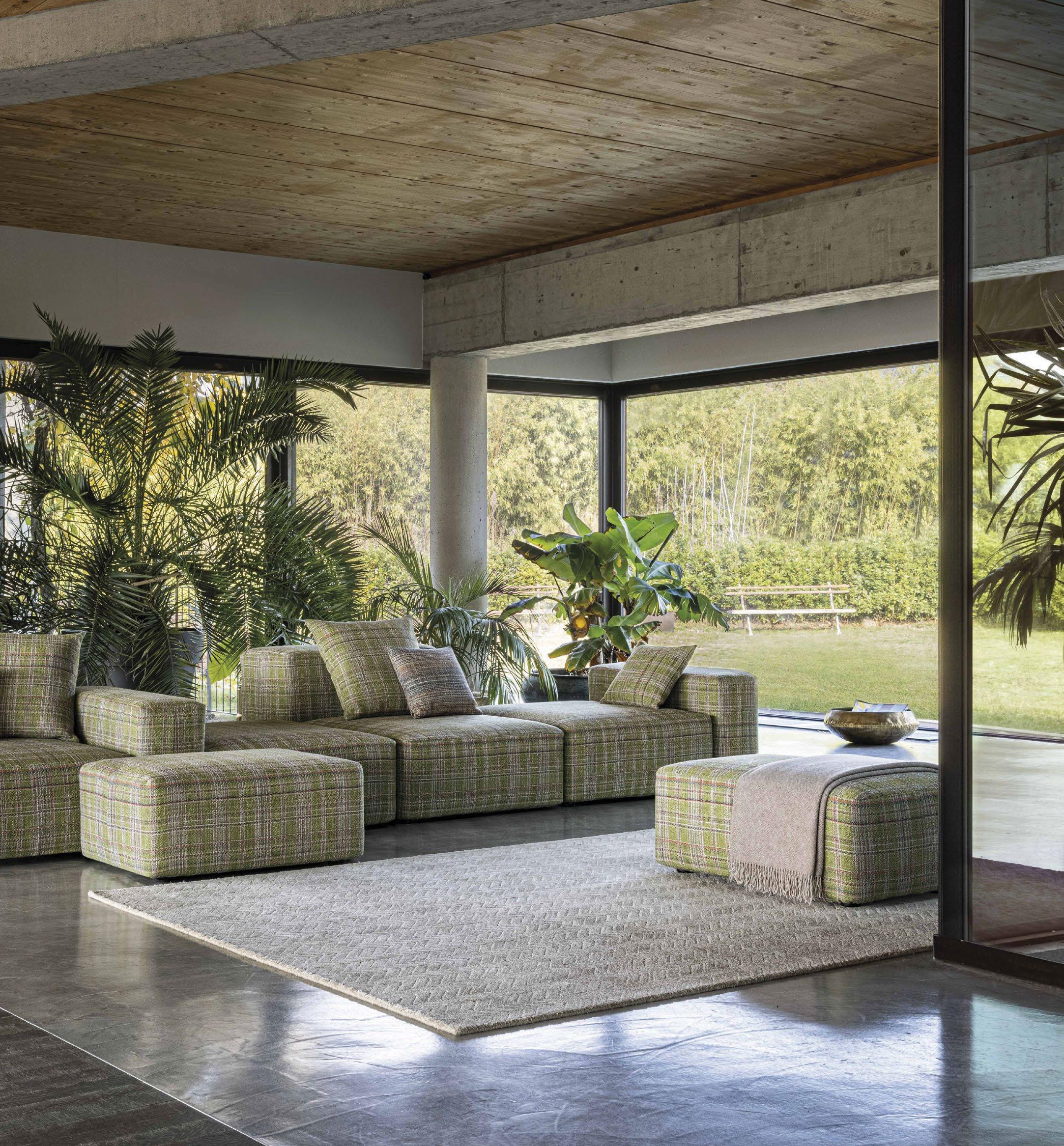
Missoni Home’s latest collection echoes the eclectic and playful patterns and hues that feature across all its bodies of work: be they of home décor or fashion. This artistic energy continues here with the unrestricted manner in which the furniture pieces blend indoor and outdoor spaces, contrasting muted tones with bright colours. The Bali collection comprises patchwork and tartan effects, alternating between moods and materials: indoor and outdoor, wood and weave. The Tektonik modular seats are upholstered in tartan using Belmopan outdoor jacquard, the Cordula lamps feature woven tops, and the Harry outdoor glass tables boast a zigzag pattern.
