Identity | May 2011

Page 1

K_\ D`[[c\ <XjkËj `ek\i`fij# [\j`^e gifg\ikp dX^Xq`e\

identity

50 years young: i Saloni at its prime Design apps: the future of home media Alessi shines on: the new age of metal Checkmate: Putmanʼs pioneering essence

® @JJL< E@E<KPKNF P<8I <@>?K D8P )'(( 8 DFK@M8K< GL9C@:8K@FE

;?J (,

Dubai Technology and Media Free Zone Authority


Baltimora design Vuesse & Marco Pareschi


KOMMA

Kitchen Designs Llc P.O.BOX 81553 Salahudeen Road Deira - Dubai Tel. 971 - 4 2691003 ayman@kitchendesigns.ae For trade only: www.scavolini.biz

Pls. download our general catalog from www.scavolini.com

Scavolini S.p.A. 61025 Montelabbate (PU) - Italy Tel. +39 0721443333 Fax: +39 0721443413 contact@scavolini.com www.scavolini.com

For the carcase of the kitchens Scavolini uses only Idroleb: a water repellent V100 panel with the lowest formaldehyde emission, lower than specified on the Japanese standards F**** (4 stars).

System of Quality Management UNI EN ISO 9001

Discover Scavolini’s commitment for a cleaner world on

System of Health & Safety Management OHSAS 18001

www.scavolinigreenmind.com

System of Environmental Management UNI EN ISO 14001

The “best seller” from Italy


INSIDE

MAY 2011

identity

22

®

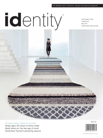
Cover photography: Mangas Naturales rug by GAN

28

76

FEATURES

22 Design in the city

52 Haute metal

Come rain or recession, if you are in the design industry, i Saloni is still the party to attend.

Function, innovation and creativity are key for Italy’s venerable design factory, Alessi, which continues to be nimble at 90.

28 Wave of optimism

76 The French connection

From the first-ever PET bottle derived from plants, to an energy-efficient research centre – some exciting developments in sustainability.

Andrée Putman’s magnificent design legacy, as seen through her daughter Olivia’s eyes.

May 2011

17


INSIDE

identity

®

DESIGN FORMULA

ISSUE 92

EDITOR-IN-CHIEF

Obaid Humaid Al Tayer GROUP EDITOR & MANAGING PARTNER

Ian Fairservice GROUP SENIOR EDITOR

Gina Johnson | gina@motivate.ae GROUP EDITOR

POLIFORM

Catherine Belbin | catherine@motivate.ae DEPUTY EDITOR

Shalaka Paradkar | shalaka@motivate.ae CHIEF SUB-EDITOR

Iain Smith | iains@motivate.ae

35

EDITORIAL ASSISTANT

Home techorating Today’s best-looking media rooms are spaces where entertainment meets design in a new art form – techorating.

Belinda Igaya | belinda@motivate.ae DESIGNER

Michelle Liu | michelle@motivate.ae GENERAL MANAGER – PRODUCTION AND CIRCULATION

S Sasidharan | sasidharan@motivate.ae MANAGER – PRODUCTION

C Sudhakar | sudhakar@motivate.ae

PROPERTY

GENERAL MANAGER – GROUP SALES

Anthony Milne | anthony@motivate.ae SENIOR ADVERTISEMENT MANAGER

Seema Kausar | seema@motivate.ae DEPUTY ADVERTISEMENT MANAGER

Shweta Praful | shwetap@motivate.ae GREENWICH VILLAGE APARTMENT, MANHATTAN

SENIOR SALES EXECUTIVE

Atiya Naseer | atiya@motivate.ae GENERAL MANAGER – ABU DHABI

Joe Marritt | Joe@motivate.ae ADVERTISEMENT MANAGER – ABU DHABI

Darryl Wiley | Darryl@motivate.ae CONTRIBUTORS:

Steve Hill | Joanne Molina | Samia Qaiyum Lisa Vincenti | Richard Warren

59

id Property + Bear necessities + Rising fortunes + Antennae

Motivate Publishing FZ LLC Office 508, 5th Floor, Building 8 Dubai Media City, United Arab Emirates Tel: +971 4 390 3550, Fax: +971 4 390 4845

REGULARS

Head Office: PO Box 2331, Dubai, United Arab Emirates Tel: +971 4 282 4060, Fax: +971 4 282 4436, E-mail: motivate@motivate.ae

21 75 84 92 96 98

Abu Dhabi: PO Box 43072 United Arab Emirates Tel: +971 2 677 2005, Fax: +971 2 677 0124, E-mail: motivate-adh@motivate.ae London: Acre House, 11/15 William Road, London NW1 3ER United Kingdom E-mail: motivateuk@motivate.ae

Editorial Subscription Forum Antennae Books Icon

IDENTITY NEXT ISSUE JUNE 2011

Website: motivatepublishing.ae

+ Joining the 2011 design pack

Member of

+ Hip’n’ hot kitchen environments + Adrian Smith: Beyond Burj Khalifa + Cycling and more with Antonio Citterio

Printed by Emirates Printing Press, Dubai

LEPARK RUG BY GAN

+ Check-in to St Lucia’s real estate + Eco moves for stylish sustainability + much, much more… All prices quoted in identity are correct at the time of going to press.

May 2011

19


Gandia Blasco is Exclusively Distributed by Nakkash Gallery in the UAE Tel. +9714 2826767 E-mail. nakkashg@emirates.net.ae www.nakkashgallery.com www.gandiablasco.com


EDITORIAL

Bold and bountiful

Clockwise from top left: Antonio Citterio; Nerio Alessandri; Nicolo Rubelli; Eduardo Souto de Moura.

PHOTOGRAPHY: VIKRAM GAWDE

Portugal is back in the limelight, but this time for all the right reasons, as the country is celebrating the naming of 58-year-old architect Eduardo Souto de Moura as the Pritzker Prize laureate for 2011. The formal Pritzker ceremony and prize-giving will be held next month at the Andrew W. Mellon Auditorium in Washington, DC. De Moura is the second Portuguese after Alvaro Siza, to win this prestigious architectural prize. He follows in the blueprints of Frank Gehry, Tadao Ando, Renzo Piano and Zaha Hadid. The University of Porto professor is recognised for his bold architecture in creating everything from hotels, museums, private residences and sports facilities, most notably Braga’s stadium where several of the 2004 European Football Championship games were staged. With the 50th anniversary edition of i Salone the International Furniture Fair now behind us, those in search of locally targeted products will be heading to the UAE capital for Interiors UAE from May 9-11. The opportunities and potential that Abu Dhabi offers to the architecture, design and construction sector have never been so tantalising. Over the next two decades, as part of the 2030 plan, numerous multi-billion dirham projects are to be launched – including an industrial zone that is to be two times the size of Singapore, as well as the cultural district featuring the Guggenheim and Louvre museums. Numerous new hospitals, hotels, residences and educational projects form part of the vision. As Abu Dhabi’s international profile grows, design studios and stores continue to open for business in the city, the latest being Grand Royal. Located in the Khalidiya area, the boutique sells pieces from Versace Home, Jumbo Collection, ipe-Cavalli, Blumarine and Francesco Molon. Hoteliers still have a huge appetite for the region, with Rocco Forte Hotels announcing expansion plans to include luxury properties in Marrakech, Jeddah and Cairo over the next three years. The Abu Dhabi hotel is expected to open this year. During this year’s Cityscape it was announced that the first Nobu Hotel in the Middle East is to be located in the city, although no date has been set. Italy’s premier architect, Antonio Citterio, is a frequent visitor to the Gulf following his commission to design part of the new Doha Airport facilities. One of his main Italian clients, Technogym, is planning the opening of its first boutique in Abu Dhabi later this year, where some of Citterio’s award-winning designs will be displayed. Technogym’s founder Nerio Alessandri is expected to attend the opening function. Held at the Abu Dhabi National Exhibition Centre, the annual Interiors UAE show is the only one dedicated to design in Abu Dhabi. An interesting selection of seminars, including forecasts for 2012-2013, will complement the exhibits. Back in Dubai, design work is moving ahead on the interior of the new Donghia showroom, which according to CEO Nicolo Rubelli, will open early next year in the up-and-coming Business Bay area. See you at Interiors UAE 2011…

Group Editor Catherine Belbin.

May 2011

21


Design in the city Creative energy buzzed around the world’s design capital during the 50th edition of the International Furniture Fair – i Salone 2011 as enthusiasm for innovative new ideas were shared in real time. TEXT: CATHERINE BELBIN

With or without a half-century anniversary to celebrate, Milan design week is the world’s best-attended design party of them all. Come rain or shine, recession or boom, this is a week to honour some of the best designers of our time and discover the untapped talent emerging from the Politecnico Milano, the Zona Tortona studios and the halls of the Salone Satellite. The spirit of new ideas, unlimited imagination and vibrant creativity was paramount, temporarily throwing Italian PM Silvio Berlusconi’s embarrassing scandals off the radar. From the Piazza Duomo to the Triennale and beyond, the city was abuzz with dynamic installations and exhibitions that collectively form the fuorisalone. Capturing the essence of the best was a retrospective of Italian design, co-curated by Alberto Alessi, at the Triennale Design Museum. In front of the Gothic cathedral, an eight room molecular pavilion was erected to house Principia – Forward Arts. Curated by Denis Santachiara, the exhibition highlighted diverse works of art based on scientific principles. Most of the design world’s protagonists opted to take a conservative stance, restricting the number of new products and primarily sticking to designers who

22

identity [interior/design/property]

are a commercially viable bet. Arad, Bellini, Cibic, Citterio, Dordoni, Hadid, Lissoni, Lovegrove, Massaud, Putman, Rashid, Sottsass and Piva continue to rule the ongoing era of the super designer. Meanwhile, Patricia Urquiola and Philippe Starck continue to be neck and neck for the title of the most prolific. Japanese talent also seems to be gaining popularity, such as Shiro Kuramata, Toshiyuki Kita and Masanori Umeda, to name a few. Sustainability and quality was the name of the game, as manufacturers and designers put forth a politically correct product – many modifying iconic designs to bring them into the “green age”. Starck created Zartan for Magis, proudly claiming that the chair is completely natural and made with a new technological process that allows for an extensive use of bamboo. Kartell’s large stand (above) pulled in the crowds with its flashing neon signage, reminiscent of the Las Vegas Strip. With a cult like following, it continues to be the king of plastic democratic design. The id design team, like thousands of visitors from all over the globe, trawled through the Rho Perro exhibition halls, driven by a desire to experience the new, the exciting and the novel…


TRENDS

CIN CIN

Celebrating the iconic Fiat 500 is the Fiat 500 Design Collection by Lapo Elkann. The 70s model of the universally loved car is converted into the Panoramic sofa, the Cin Cin console and the Pic Nic table. This joint venture between Elkann and Meritalia also coincides with the 150th anniversary of Italian Unification.

WEB RIDER

Only design maestro Antonio Citterio, in tandem with his long-time design partner Toan Nguyen and Vitra, could create a stationary exercise bike that looks more like sculpture. The state of the art Recline Personal features an ergonomic seat and back rest. This is the first interactive bike that allows you to surf the web using the integrated VISIOweb screen to access the internet and your iPhone, as well as follow Technogym’s training programmes as part of your daily workout. FLY ME TO THE STARS

Designed by Alfredo Haberli, Desede’s sporty new Radical Cocooning sofa features the company’s 90-degree swivel function and is the perfect lounger in which to recline in comfort and watching movies.

ALICE IN EDRA-LAND

Edra and Jacopo Foggini created their own fairytale with the launch of the illuminated Alice chair that is a cross between a giant jellyfish and a blob of molten plastic. As always, the Edra stand drew much attention with their unconventional furniture collections. Many tried and tested Edra classics were updated with new upholstery as part of the 2011 collection.

BEDDED BLISS

With a distinctively Nordic feel, Odoardo Fioravanti’s Sveva bed for Flou is yet another marriage of both the traditional and contemporary. Made from solid wenge stained ash, the headboard features 27 turned spindles arranged radially. The basic simplicity of the Sveva collection, which was inspired by traditional Scandinavian chairs, adds to its charm. A freestanding mirror and side tables are included.

May 2011

23


TRENDS

SHELF LIFE

Practical and multi-functional Adhoc steel sheet storage units, designed by Bruno Fattorini and Partners for Zanotta for modern spaces, can be mixed and matched according to your needs.

DESIGN FABLES

Flamboyant designer Marcel Wanders created the quirky Babel table and chair collection for xO this year, which is an eclectic mix of traditional shapes and contemporary materials in his signature style.

JE T’AIME

Philippe Starck and Eugeni Quitllet scored yet another winner for Alias with their interpretation of the humble coat stand, called to’taime. The three-legged cast aluminium structure features a handy shelf for keys and resembles a totem pole.

ARCH-COMFORT ZONE

Originally created for the Sofitel Hotel, Wittmann’s Vienna seating collection took centre stage at the company’s 2011 collection debut. The modular functional and timeless collection by Pritzker Prize-winning architect Jean Nouvel is atypical of the designers who like to be referred to as “architects who design”. The collection is both bold, yet practical.

GLASS MAIDEN

Faint, by Spanish designer Patricia Urquiola, is a monolithic dining or office table manufactured by Glas Italia. It’s made from tempered extra-light glass, while the top and legs are seamlessly glued together as if moulded.

24

identity [interior/design/property]


ph Federico Cedrone

u.a.e. Dubai +971.43.32.91.97 - www.rubelli.com


TRENDS

READY, SET, COOK

Rodolfo Dordoni has been back in the kitchen of late, designing the new Set kitchen for Dada. According to the designer, the kitchen is a workshop where all the tools are within easy reach and all the shelves open like a bookcase – a space that is also a ‘living’ room. Dordoni’s new kitchen is sleek and high-tech, yet at the heart of it is a traditionally shaped extractor fan hood – reminiscent of those once found in grandma’s kitchen. Acknowledging that many don’t have large spaces, he has sought to create a stylish, practical and functional unit that is bound to set new standards in kitchen design.

TOP THIS

One again, the suave Minotti brothers, Renato and Roberto, have entrusted Rodolfo Dordoni, with whom they have been collaborating with since 1977, to take control of their new Design Identity 2011 collection. The practical and chic Clayton dining table is available in both mocha-stained oak, marble and lacquer. TUBULAR HARMONIES

Designed by Glen Oliver Low, Thonet’s maple veneer and tubular steel S1072 extendable table is a perfect match for their iconic cantilevered S series chairs for either the home or workplace. Claudio Bellini’s new solid wood 580 chairs match his 1580 table, winning an iF product design award this year and attracting much attention.

FLOORED!

Spanish design house Gandia Blasco, best known for its über-cool outdoor furniture, is increasingly raising its profile in the flooring sector. Working with Patricia Urquiola, the new 100 per cent wool Mangas collection from Gan is considered to be quite revolutionary. Inspired by a traditionally hand knitted sweater, the 2011 collection includes new floor and bed runners, as well as ottomans. ID

26

identity [interior/design/property]

PLANT ME

Lluna Nova and Lluna Plena are both extensions to Joan Gasper’s earlier collection for Serralunga. In addition to the horizontal pots, Gaspar has created slimmer vertical shapes that can be used in smaller spaces. Meanwhile, Lazy – the foldable, stackable bench and stool collection designed by Michael Bouquillon – is made from extruded aluminium, Batyline fabric and marine grade stainless steel in keeping with the spirit of Serralunga.


Wave of optimism The development of the world’s first PET plastic bottle made entirely from plant-based, fully renewable resources; the use of wind power technology and kites to reduce greenhouse gas emissions in the shipping industry; and a competition entry for an energy efficient marine research centre in Bali make this month’s green headlines. TEXT: STEVE HILL

SHAPE OF THINGS TO COME

Solus4, an architectural company based in Maine, unveiled an energy-efficient entry in an international design competition for a marine research centre in Bali. The devastation caused by the 2004 Indian Ocean earthquake and tsunami, and the need to address preparations to deal with further natural phenomena, sparked the launch of the contest. The Solus4 design team’s entry was inspired by the structure of a tsunami wave, the shapes of which have been integrated into the futuristic building form. Its 2,500-square-metre structure would be located 150m off shore from Kuta Beach, and would feature research labs, accommodation for scientists, sea water pool, aquatic garden library and an auditorium. The project is intended to be totally energy efficient. Large glass-based panels form the skin – both transparent and opaque as well as embedded PV cells – while the close-to-shore location allows for tidal/current generators to serve the power requirements. Rainwater collection and seawater conversion systems take care of domestic water requirements while deeper source seawater is circulated through the skin for radiant cooling and temperature control of the overall anthropomorphic shape.

28

identity [interior/design/property]


ECO

May 2009 2011 March

29


ECO

TAKING OFF

REINVENTED FURNITURE

Boeing recently took the wraps off its 747-8 Intercontinental, which the company says offers airlines the lowest operating costs and best economics of any large passenger plane while also providing enhanced environmental performance. The 747-8 Intercontinental will have the lowest seat-mile cost of any large commercial jetliner, with 12 per cent lower costs than its predecessor, the 747-400. The aeroplane provides 16 per cent better fuel economy, 16 per cent less carbon emissions per passenger and generates a 30 per cent smaller noise footprint than the 747-400. First delivery of the 747-8 Intercontinental is scheduled in the fourth quarter of this year.

Woodpop is a British company founded by Emma Wood that takes retro and antique pieces of furniture and reinvents them using different decoupage techniques. Wood originally worked in the music industry where she also created design pieces such as Pop Art lamps and unique upcycled furniture. She was soon commissioned to create promotional items for a range of artists and interest in that work prompted her to establish London-based Woodpop. She sources furniture spanning 100 years of design, limited edition wallpapers, 1950s comics, vintage wine labels and rare music magazines to help create her unique pieces which can be viewed at www.woodpop.co.uk

SITTING PRETTY

Handmade in Vietnam from 100 per cent bamboo is Ekobo’s MELLO stool. Available through British online retailer e-side, this super stylish piece of furniture can be flipped over to reveal a handy storage space. The exterior surfaces of the stool are fully lacquered while its concave top and smooth lines ensure plenty of seating comfort. Bamboo has strong ecological credentials because it grows rapidly without needing pesticides or herbicides while also recycling large quantities of CO2 and producing 35 per cent more oxygen than a tree growing in the same environment.

AND… ACTION

The Twentieth Century Fox Film Corporation in California is now home to a 160kW photovoltaic solar system. It has been mounted on Fox Studio’s historic Building 99, and combines Solar Power’s SkyMount commercial rooftop system and conventional racking. Energy generated by the system will help power on-site productions. It is the company’s first venture into on-site renewable energy generation. Hal Haenal, senior vice-president of Fox Studios Operations, said: “As a carbon neutral company, this project is a key component of our ongoing commitment to sustainability.” Steve Kircher, the CEO of Solar Power, said: “Our system is a perfect fit for their needs and now they can begin to enjoy the savings and environmental benefits the system will deliver.”

30

identity [interior/design/property]


ECO

INTERIORS

SAILING AHEAD

Cargill has signed an agreement with SkySails to use wind power technology to reduce greenhouse gas emissions in the shipping industry. Hamburg-based SkySails has developed innovative, patented technology that uses a kite which flies ahead of the vessel and generates enough propulsion to reduce consumption of bunker fuel by up to 35 per cent in ideal sailing conditions. In December, Cargill will install a 320sq/m kite on a vessel of between 25,000 and 30,000 deadweight tonnes, making it the largest vessel propelled by a kite in the world. The SkySails kite will be connected to the ship by rope and is computer-controlled by an automatic pod to maximise the wind benefits. The kite functions at a height of between 100m to 420m and flies in a figure of eight formation. The SkySails system is automated and requires only minimal action by the crew. GJ van den Akker, head of Cargill’s ocean transportation business, said: “In addition to lowering greenhouse gas emissions, the SkySails technology aims to significantly reduce fuel consumption and costs. We are very impressed with the technology and see its installation on one of our chartered ships as the first part of an ongoing, long-term partnership.”

According to a United Nations (International Maritime Organisation) study, up to 100 million tonnes of carbon dioxide (CO2) could be saved every year by the broad application of the SkySails’ technology on the world’s merchant fleet. This figure would equate to 11 per cent of the CO2 emissions of Germany.

GREEN BOTTLE

PepsiCo has developed the world’s first PET plastic bottle made entirely from plant-based, fully renewable resources. The 100 per cent recyclable bottle is made from bio-based raw materials, including switch grass, pine bark and corn husks. And in the future the company expects to broaden the renewable sources used to create this bottle to include orange peel and potato peel, oat hulls and other agricultural by-products from its foods business. Key to the development of the new bottle was PepsiCo combining biological and chemical processes to create a molecular structure that is identical to petroleum-based PET (polyethylene terephthalate), which results in a bottle that looks, feels and protects its product identically to existing PET beverage containers. PepsiCo is to pilot production of the new bottle in 2012 with the intention of then moving directly to full-scale commercialisation.

HOT HYBRID

Porsche will launch its second production hybrid model, the Panamera S Hybrid, later this year. Billed as the most fuel efficient Porsche of all time, this new Panamera produces 380 horsepower with fuel consumption of only 6.6 litres/100km on the New European Driving Cycle. Optional low-rolling resistance tyres developed specifically for the Panamera have helped achieve this figure. The same petrol engine/electric motor combination that has already proven itself in the Cayenne S Hybrid drives the Panamera S Hybrid. A 3.0-litre supercharged V6 engine delivering 333 horsepower is supported by a 47-horsepower (34kW) electric motor. Depending on driving conditions, either drive unit can operate independently or together to drive the rear wheels. The electric motor, which also serves as the car’s generator and starter, combines with a decoupling clutch to form the compact hybrid module located between the combustion engine and the transmission. The electric motor is connected to a nickel metal hydride battery that stores electric energy recovered from braking and other driving situations. The Panamera S Hybrid has a top track speed of 270km/hour. ID

32

identity [interior/design/property]

March 2009

32


MEDIA ROOM | DESIGN FORMULA

Home techorating Media rooms are proving to be a major area of focus for discerning homeowners. In these financially constrained times, at-home entertainment continues to dominate, and the lure of new technologies and gizmos is proving difficult to resist. Thankfully, blending technology and aesthetics has never been easier with a range of sublime, stylish products on offer. TEXT: LISA VINCENTI

DESIGN FORMU LA

CONTENTS: 36 A fresh start 38 Electronic attraction 42 Wall or nothing 46 Setting the scene 48 Viewing pleasures

BeoLab3 speaker, Bang & Olufsen

May 2011

35


DESIGN FORMULA | MEDIA ROOM

Consumers remain cautious about spending, yet they are beginning to loosen their purse strings. The sense of optimism that began last year has continued into 2011, so while they may still find themselves entertaining at home rather than going out, they are opening their wallets to enhance and upgrade that experience. The media room is expected by some to receive a lot of attention in the coming months as homeowners bring their entertaining areas up to speed. High-end contractor to the stars Stephen Fanuka points out that among his clientele, the number one request these days is for media. Yet these new technologies, including 3D televisions and internet streaming devices, prove a continual aesthetic challenge in media room design. Still, with a range of clever, multi-functional furnishings, “techorating”, as some have dubbed the incorporation of hi-tech toys into decorating, proves function and form can, and do, often go hand-in-hand. A FRESH START

“This year is all about enjoyment and taking that pleasure to a higher level,” says Victoria Redshaw, lead forecaster at trend agency Scarlet Opus. “For 2011 and moving into 2012, we’ve been talking about truly enjoying the things you already own, and indeed having a renewed enjoyment and love for your home and the spaces you work in, getting creative and stamping your own personality on your environment.” Joanna Feeley of UK forecast group Trend Bible, adds: “There’s a cleaner, slicker aesthetic coming in to play in 2011 and it’s set to develop through 2012, too – it’s the antithesis of all things cosy, familiar and vintage, and is all about a fresh start following the recession and the green shoots of a new decade. The cosy, familiar theme is still in play by the way – thanks to the recession, nostalgia still sells. It’s just a case of making it still look fresh.” The media room and its role as a casual entertainment area is ready for an upgrade after the past few years of holding back. Yet just where and how we engage with our latest media darlings continues to morph as more technology is incorporated into every room of the home.

36

identity [interior/design/property]

Top: With its range of simple components, home theatre systems such as Pass by Molteni & C, offer simple solutions to resolve complex media situations. Bottom: Goldmund’s limited edition Eidos Reference Blue adds masterful BluRay feature to its CD/DVD playback.


DESIGN FORMULA | MEDIA ROOM

Ad Notam’s mirror TVs, shown with Kettnaker furniture, transforms a flat-screen into an aesthetic device.

However, the entertainment hub of the home still rests mainly in the living room, unless one is fortunate enough to have a dedicated media room, or better yet a fully decked out home cinema. Regardless of what corner of the home hosts this entertainment gear, downplaying technology and playing up design prove a stylistic must. “The hardest area for me [to design] now is the living room,” architect Deborah Berke says. “In my house, the library/family room is the one with lots of books and a big sofa and a big TV. But as the way we engage all these various media changes, the rooms in which we hang out are changing. In the past, we did houses with dens and libraries and media rooms. As people become more interested in having smaller homes, those ‘hangout’ spaces are turning into one room. Now it’s about how much of the room’s wall space is devoted to the TV screen, to books, to art, to windows.” ELECTRONIC ATTRACTION

Major style directions follow the same trajectories that began last year, with coziness, comfort and sustainability remaining top priorities. It is proving challenging to incorporate new media into the interior design scheme, and to do so with cohesion and sophistication. In fact, a major no-no is buying equipment that is simply too large for a space – for example high-definition televisions where the screen size is too large will overpower even the most expertly designed room. “This year should be another big year for electronics and, once again, we’ll be challenged to find effective ways to adapt our environments to make room,” notes Maxwell Gillingham-Ryan, founder of apartmenttherapy.com, a popular American design blog. “Nearly every gadget and piece of electronic that we bring into our lives has the potential to create more clutter. Techorating is the idea that you can easily incorporate technology into your living space without

38

identity [interior/design/property]

compromising its interior design aesthetics. By following simple guidelines, anyone can make efficient use of their space and reduce the clutter caused by electronic devices.” Some quick solutions Gillingham-Ryan recommends are merely going wireless, whether for connecting a laptop to the internet or the latest surround sound speakers to the television. He also suggests that if you find yourself charging multiple mobile phones or mp3 players, invest in a system that allows you to charge all of them from one spot without a tangle of wires hanging from the outlets. Gillingham-Ryan recently teamed up with Duracell to create some products that allow home owners to seamlessly incorporate technology into their home: his myGrid charges up to four devices at the same time in one slim universal system. “The initial concept of techorating is about decorating with all the gadgetry and equipment of modern technology,” says interior designer Doug Wilson, who is credited with coining the term and is also the official techorator for consumer electronics giant LG. “LCD and plasma flat-panel televisions, surround-sound audio, home theatre design, and other consumer electronics have been invading the home for the past several years and techorating is about working them into a room so that they are aesthetically pleasing.” Wilson developed a system, a sort of feng shui for hi-tech gear, outlining the importance of planning and placement in creating a sense of visual harmony. For example, he advises balancing a wall-mounted flat screen with artwork and selecting paint colours that help electronic equipment blend into a room. “Televisions can actually add to the aesthetic of a space rather than detracting from the design. With sleeker flat screens and new design elements available, the TV no longer has to be hidden or stick out like a sore thumb,” he says. In fact, many of the top makers in the media-storage sector have been showcasing their wall systems in dark greys and black to make the television “invisible” when not in use. Wilson also suggests that electronics should be sized


DESIGN FORMULA | MEDIA ROOM

40

identity [interior/design/property]


MEDIA MEDIA ROOM ROOM || DESIGN DESIGN FORMULA FORMULA

The range of Italian furniture maker’s Presotto’s ModulArt wall system offers decorative magnetic panels that can be changed to suit the mood.

May 2011

41


DESIGN FORMULA | MEDIA ROOM

Many new systems, such as Tisettanta’s Thesis collection, are being presented in dark colours to minimise the impact of the television when not in use.

appropriately for the space they occupy. “The technology in your room should be in proportion to the room for the best aesthetic and functional fit. For example, look for the best integration, not necessarily the biggest TV,” he says. The rule of thumb for sizing a television is to keep the viewing distance at about three times the diagonal measurement of the screen to avoid the television from taking over the space. He also recommends going super flat with the TV and wall mountable speakers. “Techorating is simply the art of stealth performance,” says Chris Lucera, owner of US-based home-entertainment setup specialist. “Ideally, you should only see the equipment necessary to visually enjoy the experience while the brains and brawn of the setup are concealed as much as possible but still provide maximum performance.” Lucera is absolutely right – the best way to techorate is to hide as much of the technology as possible, and the top furnishings makers in Europe have been working overtime to help. WALL OR NOTHING

Necessity does prove the mother of invention when it comes the media area of our homes. Each year, the introductions of creative wall systems to house all our technology accoutrements continues to astound. Despite the various, and growing, technical needs a media room must now address, from listening to music playlists to watching streamed videos to surfing the web, it also must serve everything up with style. From the top European cabinet-makers, a spirit of investigation and invention has created a new breed of media storage systems. Whether an update of a line that has been around for years or a new presentation, the ranges have become ever more ingenious.

42

identity [interior/design/property]

Howard Wiggins, an author and interior designer, notes: “Always start buying your most expensive, large items first. You can always wait to buy other things. It’s better to live without than to have the wrong things. What you base your whole room on, which are the larger items such as a sofa or rug, determine the direction your room will take.” A sophisticated wall system (which can cost as much as a new kitchen) would certainly be among the large-ticket items of a media room, not the TV. In fact, a wall system is a critical element of so many modern homes because it provides a simple solution to not only organise everything from books and DVDs, but the electronic components and television as well. Furthermore, so many high-end collections feature strong geometric compositions, a smart juxtaposition of materials and ambient lighting elements, which are so critical when creating a specific atmosphere at home. Since the flat screen became the centre of the home entertainment universe, its role in the design of the media room has drastically diminished. No longer do designs give the sprawling televisions centre stage, instead they must now fade into the background. Systems, whether using a lift technology, discreet mirror TVs or simply clever compositions, downplay the television’s affect on surroundings. The workhorse of the media room, the modern wall system, continues to toy with expectation and proves a never-ending source of inspiration. More than a decade ago, Italian architect Piero Lissoni conceived a storage system for contemporary furniture maker Porro. His Modern line, with its system of storage units, tops and shelves, underwent a major restyling recently to address the new demands of contemporary homes. Available in a number of configurations, the revised collection offers a system perfectly suited to the media area. The structuring of Modern is translated into a wall composition that combines a base


44

identity [interior/design/property]


MEDIA ROOM | DESIGN FORMULA

Pari & Dispari from Presotto incorporates a marble-like finish with lacquered surfaces and glass for more natural energy in tech laden areas.

unit with folding door designed to hold media equipment, a wall-mounted shelf and units pairing both open elements and gloss “anthracite” grey closed ones. Porro, a brand committed to minimal lines and essential style, proves it has its finger on the pulse of current tastes with its 2011 collection. Forms, colours and fittings offer “objects of desire” that tie together “modernity with memory, function with aesthetics, reinterpreting the past into a more intimate and fluid future”. Lissoni’s Modern was showcased in a deep charcoal yet brought to life with the simple addition of one canary yellow shelf. The deep grey wall unit makes the television virtually disappear, while the stroke of one vivid colour brings the entire composition to life. “We’ve had interiors that have been very correct and soothing and classic, but people are looking for an injection of playfulness in their homes now,” notes Vanessa Cohen, owner of New Zealand-based Magnolia Trading Company. “There’s a real freedom and a lot more personality in our homes now. There’s a big reaction to minimalism. I love the quote by Jonathan Adler, a famous interior designer in the US, who says: ‘Minimalism is a bummer’. But while we don’t want stark minimalist interiors anymore, we also don’t want clutter.” Modern living room furniture today now has both style and storage. Top manufacturers understand that the minimalist wants a clean and contemporary look but which also addresses the requirements of technology. Rigorous and linear on one hand, smart and fresh on the other; the full suite of options are available. In fact, some cabinet makers have introduced new textures and unusual materials to add yet another sought-after contemporary dimension to their lines. Presotto, an innovative Italian cabinet-maker, offers its media storage proposals with some unexpected finishes. Its stunning ModulART programme introduces rough and rugged black slate into the equation and proves the stone is the perfect counterpoint to smooth lacquered and wood-finished units. Likewise, another series, Pari & Dispari, incorporates Silver Shine Stone (a light grey, marble-like finish) with lacquered surfaces and glass, imbuing the system with a more natural and textural, yet still highly sophisticated, aspect. Both collections feed into the desire of homeowners to introduce more outdoor-like and textured elements into their surroundings, including the technology-laden media area. Best of all, the latest crop of wall systems accommodates all the unsightly living area clutter that accumulates. Pari & Dispari features an option of a pure matte-white finish with coloured glass doors finished in the veined Stone Silver Shine. Behind the closed doors, you’ll find your TV, stereo, CDs, DVDs, cables, books, magazines and glassware. Another appeal, is that many of the systems, including Pari & Dispari, offer homeowners the freedom to change the look and feel of their homes to reflect changes in lifestyle; the modular design also allows one to go as large or small as needed when moving from one type of living space to another. So they offer the potential to be portable. “Homeowners want to buy things for long-term investments rather than a quick changeover, and they want to invest in things that won’t date,” notes Katie Lockhart, an Auckland-based interior designer. “They want objects and furniture that are well designed. The look I’m seeing in homes is comfort and pared-back luxury, too. They’re looking for warmth in their homes.”

May 2011

45


DESIGN FORMULA | MEDIA ROOM

Top: From Koo International comes Sake, a lounge worthy sectional with adjustable headrests and optional sliding seats. Bottom: Spherical solid wood horns lend an eco-sensibility to Cessaro’s Gamma 1 loudspeakers.

SETTING THE SCENE

All the design trends that have dominated the home in the past year, be it the injection of brighter colours, natural materials or softer shapes, turn up in the home’s media centre as well. Mood lighting, ample lounge seating, rounded forms and statement pieces dominate the latest introductions for the residential settings. “Since the recession, there seems to be a return to darker, warmer colours, and the curvy lines of traditional furniture constitute a sort of ‘comfort food’ approach to design that I think is going to be very popular,” Gillingham-Ryan says. “For example, a Chesterfield sofa against a dark grey wall is an image that I’ve seen a few times recently on our sites, which also seems really fresh to me right now.” Even if upholstered pieces follow the simple, pure lines of earlier years, they are relaxed. From Koo International comes a worthy introduction to media room lounging with the just-released Sake sofa. It features adjustable headrests and optional sliding seats that transform the sofa into havens of comfort and relaxation. The softened corners and low profile are paired with the discreet use of capitonné on the seat and lend a classic air to this contemporary piece. The media area is all about creating drama and mood, so if your entertainment hub’s one statement piece is the sofa, make it sing. From a new collaboration between Italian fashion house Borbonese and Matteograssi comes Borbonese’s Casa collection. Designed by Lorena D’Ilio with Studio Mamo, the upholstery is sinuous and sensuous, and the entire collection was created for impact. According to Amy Herbert of Aesthetic Answers, too many people fall into the utilitarian “wooden clog” mentality of design. “They start out looking at their homes from a practical standpoint and go pick up design items that ‘work’,” she says. “However, other people don’t just want something that ‘works’, but something that ‘speaks to them’. They want the practical and utilitarian aspects of a clog, but they also want those special touches that unify and distinguish this space from others.”

46

identity [interior/design/property]


Top: Sonos’ Zone Player can be controlled by one’s iPhone. Bottom: Porro’s relaxed Jade lounger in black leather is designed for viewing pleasure.

Stylish seating comes in all shapes and sizes. Comfort no longer has to be sacrificed for fashion and in any media area comfort is truly king. Peanut B, with its soft lines and extra padding, is one among many that are easy on the eyes and the bottom. Italian architect and designer Mauro Lipparini based the modular system on a famous sandwich in which soft, whipped sugar – fluff – is combined with peanut butter. His sofa, available in a broadened range of fabrics and colours, delivers a deliciously tempting wallop that is impossible to resist. “We jokingly talk about ‘the new normal’,” Deborah Berke says. “Ever since the economic downturn, fee negotiations and budgets are more aggressive. There’s also a new normal in residential design – a return to understatement, and an interest in environmental approaches. There has been a lot of redefining of design and domestic priorities, and that’s going to stick with us for quite a while. It’s about simplicity and ease of use – rooms that are easy to be in.”

48

identity [interior/design/property]

VIEWING PLEASURES

This year’s big hits, according to what consumer electronics makers have been showcasing at their recent fairs, will be smart TVs, which have built-in computer style processors and operating software that can be modified by applications. An added perk, as TVs and media systems evolve (remember, this phenomena is still in its infancy) is that you can expect to need fewer accessories to access movies, games, TV shows and other content in the not so distant future. Furthermore, as the latest crop of sets are tapping into the “cloud”, an app that allows cable customers to get rid of their cable box and watch their programming by clicking on an built-in TV app, that’s one more accessory that won’t have to be dealt with. Our home theatres are no longer restricted to TV programming from cable or satellite; online connectivity, with its flexibility and range, is what consumers crave


MEDIA ROOM | DESIGN FORMULA

and what is making smart TVs (with built-in internet) and players so soughtafter. In fact, the newest models are getting even more intelligent as more manufacturers are getting on the app bandwagon that started with Samsung last year. Twenty-one per cent of the roughly 250 million TV sets sold worldwide last year had an internet connection, according to DisplaySearch, a research firm based in Santa Clara, California. It forecasts that figure will rise to more than 50 per cent by 2014. Leading the pact of this new generation of connected televisions is Smart TV from Samsung, which brings the world of mobile smartphones to the television, transforming it into an instant-access entertainment system. Accessed through its Smart Hub menu system, it can connect, find and play a wide range of content as users can easily search for movies, shows and videos via online services and across connected devices. The Smart TV remote is a touch control, full-screen device even has the look and feel of a smartphone. Still, if a brand-new set isn’t on the cards for the coming months, old TVs can be also smartened up. LG’s Smart TV Upgrader is a network media player and media streamer that puts LG’s full user interface on existing TV sets. Or there are other alternatives, such as D-Link’s Boxee Box, a media streamer that can find and deliver TV programmes from the internet. The company is also partnering with Iomega to release the Iomega TV with Boxee; and ViewSonic has showed off a 42-inch HDTV with built-in Boxee, which will be released in the second half of this year. Another major trend that hasn’t yet lived up to the manufacturers’ hype is 3D TV, which hasn’t excited consumers as much as was hoped. However, now that more 3D movies and content is available online, streaming is certain to entice more people to don their glasses. Also, as leading manufacturers such as Sony or Toshiba get ready to introduce models of 3D TVs that work without glasses, more consumers may make the switch. As technology continues to reach further into our homes, there is nothing that a bit of aesthetic wizardry can’t solve. “I’ve seen a number of great techorating ideas, but among my favourites are those designed to hide some of your less-than-sleek audio and video equipment,” Gillingham-Ryan continues. “One example of this I’ve seen is with a woman who hid away her audio and video equipment into her wall. She did this by creating a hidden cutout in her wall, which she then masked as a built-in wall speaker. This way she can easily get access to all her equipment, but keep the look simple and uncluttered.” ID

From top: The Tekno sofa by Koo International is designed for adaptability; Lapalma’s glowing Floe Table by Tomoko Azum pair Swarovski crystals and LED lights; fashion house Borbonese, in collaboration with Matteograssi, presents its first high-impact collection of furnishings.

May 2011

49


DESIGN FORMULA | MEDIA ROOM

Design sources

Theatre at a new Royal Monceau hotel in Paris

50

identity [interior/design/property]

PHOTOGRAPHY: HARALD GOTTSCHALK/LASOCIÉTÉANONYME

ad-notam.com archimedia.com; tel: (04) 337 0181 bang-olufsen.com; tel: (04) 342 2344 bonaldo.it; tel: (04) 425 7888 borbonese.com cessaro-horn-acoustics.com dlink.com; tel: (04) 880 9022 goldmund.com iomega.com koointernational.com lacividina.com lapalma.it leroyalmonceau.com lg.com; tel: (04) 800 4714 maurolipparini.com; tel: (04) 425 7888 mitsubishi-tv.com molteni.it; tel: (04) 297 1777 parrot.com; tel: (04) 343 1441 poliform.it; tel: (04) 394 8161 porro.com; tel: (04) 334 9943 presottoitalia.it rimadesio.it samsung.com; tel: (04) 339 9607 sonos.com; tel: (04) 337 0181 sony.com; tel: (04) 881 5488 studiomamo.com swarovski-elements.com; tel: (04) 398 9380 tisettanta.com toshiba.com; tel: (04) 881 7789


Citrus basket by Karim Rashid

52

identity [interior/design/property]


DESIGN@LARGE

Prototypes of the Alessi 2011 spring/summer collection were exhibited at the id-Alessi design event, held at Tavola – Alessi’s new regional flagship store. Clockwise from top left: Spinning desk organiser by Frederic Gooris; Liquid soap dispenser by Piero Lissoni; Espresso coffee maker by Alessandro Mendini; Tealight holder by Doriana e Massimiliano Fuksas; Knife block by Anna e Gian Franco Gasparini.

Haute metal Alessi, one of Italy’s best-known design companies, has returned to its austere roots, where function, innovation and costs are paramount. TEXT: SHALAKA PARADKAR

An Italian design factory like no other, Alessi has been around for 90 years, worked with 500 designers, had more products in permanent museum collections around the world than any other company, and yet firmly remains a family managed business. Matteo Alessi, the only one of 15 members of the fourth generation to work at the family business, admits that he grew up with a deep appreciation of quality, functionality and attention to detail. The latter is immediately apparent as he casually leafs through a copy of identity and points out the Seiko Alessi watch sported by designer Ghislaine Viñas. Yet becoming part of the management team wasn’t a given. Matteo was on a whistle-stop tour of Dubai to inaugurate the Tea and Coffee Towers exhibition at Bloomingdale’s Dubai and to launch the new spring/summer 2011 collection, which includes first-time collaborator Marcel Wanders’ Dressed range of dinnerware, Japanese designer Naoto Fukasawa’s Shiba pans and David Chipperfield’s Tonale tableware. Design aficionados can also look forward to the launch of the new Moka Alessi coffee maker. “It is something we don’t do often, but it is one of our most iconic product typologies,” Matteo says, referring to designers such as

Michael Graves, Richard Sapper, Aldo Rossi, Piero Lissoni and Wiel Arets, all of whom have designed cult coffee makers for the brand. The new aluminium espresso coffee maker is a tribute to Alfonso Bialetti, who designed and manufactured the Moka Express, the popular Italian espresso coffee maker in the 1930s (Bialetti’s sister was Matteo’s grandmother). This time it is Alessandro Mendini who re-interprets the ingenious invention to come up with a low-priced product that will be accessible to a larger market outside Italy. “We are making it available for a wide audience – in terms of the retail price, the language of design and the international distribution,” Matteo says. The new Moka also represents a new direction for Alessi – a move towards a simpler design aesthetic. Many of the company’s past products have been reissued; they still feel fresh and contemporary in their design language, as timeless design always does. “These were not designed to appeal to a certain segment of the market or follow a certain trend. They were just designed in order to represent a certain degree of creativity and innovation.” Matteo cites the example of an Alessi tray, a reproduction of an object unearthed during the archaeological excavations at Pompeii. “It could have been designed yesterday, though it was designed 2,000 years ago,” he

May 2011

53


DESIGN@LARGE

1

2

3

4 Exhibit from the Alessi Tea and Coffee Towers exhibition at Bloomingdale’s Home. Clockwise from top left: tea and coffee sets designed by Massimiliano Fuksas and Doriana Mandrelli; Tom Kovac; Zaha Hadid and Gary Chang.

54

identity [interior/design/property]

explains. “More than in the past, there are now several overlapping design trends. We want to promote now a ‘less-designed design’.” For Alessi, this means eschewing slick “designer” values for a return to a simplicity in materials and manufacturing, more sustainable processes and products. “Lately, the word design has been abused a lot; it has become a spice that is added to the recipe at the end to make it taste better. Companies are making products and then getting them signed by a designer to make them sell better,” Matteo says. “But at Alessi, design is at the heart of everything we do. Being the company that we are, we feel the value of a product should come from its intrinsic creativity – not from its looks or the signature it carries, but from real innovation.” Hailing from Lake Orta, a narrow valley in the Italian Alps close to Switzerland, the Alessi family are heirs to a long-standing tradition in wood and metal handicraft. Giovanni Alessi, Matteo’s great grandfather, founded Alessi in 1921 as a workshop in valle Strona in the Italian Alps, producing tableware in metal. The intention was to produce hand-crafted items with the aid of machines. When Carlo, Matteo’s grandfather, joined the firm in the mid-1930s, he drew on his training as an industrial designer to design most of the Alessi products between 1935 and 1945, many of which are classics of Italian design from the Second World War period. When he took over the company in the 1950s, Carlo started a tradition that continues today: of hiring freelance designers to work for the company, resulting


DESIGN@LARGE

DESIGN ICONS 9093 KETTLE

Designed by celebrated architect-designer Michael Graves, this kettle with a bird that sings when the water has boiled, was a great success when it was introduced in 1985. For Alessi, it represented a meeting of great design and mass production methods. The 9093 kettle has been one of Alessi’s runaway successes, having sold in millions.

ANNA G CORKSCREW

Designed by Alessandro Mendini, the whimsical Anna G corkscrew has been a best-seller since it was first produced in 1994. The Anna G. is a tongue-in-cheek homage to a real woman whose smiling face has become something of a cult figure over the years.

Matteo Alessi at the id-Alessi design event

WIRE BASKET

Simple yet stupendously successful, this kitchen counter basic made its debut in 1951. Alessi’s round wire basket in mirror-polished stainless steel reinterpret an item that has been a household fixture for centuries. This basket represents the fruit of Ufficio Tecnico Alessi’s research on folded metal wire; it was also the starting point for Alessi’s containers for table and kitchen.

JUICY SALIF

Arguably the most iconic lemon squeezer ever designed and displayed in New York’s Museum of Modern Art, the Juicy Salif squeezer by Philippe Starck is not just edgy, but surprisingly functional too. It was born out of a paper napkin sketch by Starck on a seaside holiday in Italy. “While eating a dish of squid and squeezing a lemon over it, Starck drew his famous lemon squeezer on the napkin,” Alessi recalls.

56

identity [interior/design/property]

in pieces that have achieved totemic value – Alessandro Mendini’s Anna G. corkscrew, Michael Graves’s bird-whistle kettle, and Philippe Starck’s three-legged Juicy Salif lemon squeezer. Under Matteo’s uncle, Alberto, Alessi has grown as a brand synonymous with high design. In his role as director of trade marketing and international development, Matteo is upbeat about the future. “There are markets that already show potential understanding of what Alessi is about but we haven’t been able to leverage the greatness of the brand – the Middle East, the Far East and the United States,” he says. “Our future growth lies in expanding into new markets where we have been previously only reacting to requests.” The collaborations with other companies will continue. At this year’s Salone del Mobile, Alessi will be launching two new products, the details of which were still under wraps at the time of going to press. “We ventured into areas where we were not able to look after production and distribution. It started with watches with Seiko, and we went on to produce tiles, pens, lighters, barbecues, wallpaper… Bathroom products was our most successful experiment, done with Laufen,” Matteo explains. “Our core competence continues to be design development. We still see our role as artistic mediators between expressions of creativity and the consumer’s requirements.” ID


COLLECTION ALLEGRETTO

Original lighting designs handcrafted in America and specified worldwide since 1940. www.fineartlamps.com

FOUR SEASONS RAMESH GALLERY Al Zomorrodah Building, Zabeel Road, Dubai, T: +971 4 334 9090 - Mall of the Emirates, Dubai, T: +971 4 341 3334

www.fourseasonsgallery.com


ŠNef Kitchens Manufacturers Limited


idProperty

CONTENTS: 60 Bear necessities 66 Rising fortunes 72 Antennae

May 2011

59


idProperty | INTERNATIONAL

Griffin Court Condominium located in Hell’s Kitchen in West Midtown, Manhattan.

60

identity [interior/design/property]


Bear necessities Manhattan’s skyscrapers appear to defy both gravity and the property market slump afflicting the rest of the United States. TEXT: RICHARD WARREN

Bears are roaming the streets of Manhattan. No, this is not the final chapter in a credit-crunch induced collapse of Western civilisation, but a possible turning point for better times, the start of a sustained recovery in New York’s property market and an opportunity for the financially astute to make a fortune. These bears are not the kind with unkempt fur and a love of wrestling in undergrowth, but the suited, city slicker types who spot weaknesses in financial markets and then exploit them for their own personal gain. New York’s bears include some of the biggest names of the credit crunch era, individuals who made reputations and fortunes forecasting it. Today, they are making headlines again, but this time it is because they are buying property, not advising others to sell it. John Taylor and Nouriel Roubini are the two “Dr Dooms” who warned years in advance of the impending global financial crisis that engulfed us in 2008. They have both bought houses in Manhattan in recent months, as has John Paulson, the hedge fund manager who successfully bet the United States housing bubble would burst in 2006. Other Wall Street investors are smartly following them.

May 2011

61


idProperty | INTERNATIONAL

Clockwise from left: Balcony of one of the 95 apartments in Griffin Court Condominium; a penthouse on the 55th floor of The Millennium Tower has views of Central Park, the Hudson River and the city skyline; a 12-bedroom house in Bridgehampton, Long Island.

At first glance their decision to invest in New York property may appear a little odd. Nationally, the housing market is suffering a downturn that has reduced property values by 31 per cent over the past five years. There was a short period of respite from falling prices in late 2009 and early 2010 when tax incentives encouraged buyers back into estate agents’ offices, but these were withdrawn last April, sending the market into a renewed downward spiral, the much-feared double-dip. Almost everywhere in the US was affected almost immediately, but not Manhattan’s luxury homes market, which remained buoyant until the last three months of 2010 when prices edged back 0.3 per cent compared to the previous quarter, figures from Prudential Douglas Elliman Real Estate show. It is tempting to think Manhattan’s luxury homes sector has finally been sucked into the national downturn, but the borough’s sluggish final three months of 2010 may only be a blip – average prices in Manhattan rose 14.4 per cent over the whole of last year, reaching Dhs5.4 million Across the East River, the market was relatively buoyant in Brooklyn’s smarter areas in 2010, until those last three months, as buyers priced-out of Manhattan headed east across the Brooklyn Bridge. Within Manhattan some traditionally poor areas, including parts of Harlem, are becoming “gentrified”, with new condos appearing and locals offered millions of dollars to sell their brownstone houses to Wall Street types.

62

identity [interior/design/property]

Key to Manhattan’s fortunes are the super rich. Their interest in the borough remained firm at the end of 2010 and is expected to grow in 2011. “The market for trophy properties was busier than expected at the end of 2010,” says Neil Palmer, CEO of Christie’s International Real Estate. The company’s affiliate in New York, Brown Harris Stevens, reports a growth in sales of properties offered at more than Dhs37 million since September 2010, which accelerated in the fourth quarter of last year when several properties were sold for more than Dhs73 million each. Much of this money is being spent by Wall Street bankers and stockbrokers, who received Dhs496 billion in bonuses in 2010, the highest amount ever paid, roughly equal to Dhs518,000 per employee. With the credit crunch becoming a distant memory, the financial services sector is back in rude health and so is much of the rest of New York’s economy – 51,200 new jobs, including 6,000 in the financial sector, were created in the city last year. In addition, overseas buyers continue to find the Big Apple alluring. “We are seeing an increase in inquiries from Europe, Canada, Asia and the Middle East,” Palmer says. “Manhattan has immense international cache, which is only enhanced by current prices which are attractively lower than when the market was at its peak in 2008.” Palmer is confident about Manhattan’s prospects for the coming year. An upturn in the wider US economy will strengthen confidence in New York’s


INTERNATIONAL | idProperty

Left to right: A five-bedroom apartment in the trendy Greenwich Village; a 59-square metre studio in Griffin Court Condominium starts at Dhs2.7 million.

luxury homes market. US GDP grew at 2.9 per cent in 2010 and is expected to expand by between 3.6 to 4 per cent this year. “As the general economic outlook continues to improve in New York City, it stands to reason that the demand for housing will remain strong,” he says. “New York was among the last areas to feel the effects of the recession and all indications are that it will be among the first to recover as well. It is encouraging to the global market that sales in Manhattan are taking place at a stable and healthy rate.” Manhattan’s buoyant housing market stands out in stark contrast to troubled markets elsewhere in the US. Consultancy Capital Economics forecasts US housing prices will fall another five to 10 per cent in 2011 because widespread negative equity means up to half of US homeowners do not qualify for a new mortgage. Expectations that prices will continue to fall and a record numbers of forced foreclosures mean properties nationally may remain undervalued for another three to four years, the consultancy warns. The foreclosures crisis centres on banks rushing to repossess properties without proper paperwork during the credit crunch, a scandal exposed last autumn. Manhattan does not have these problems. Wealthy Wall Street and overseas buyers tend to be less mortgage-reliant than Main Street buyers because they have more money in the bank. Foreclosures fell by one-third in Manhattan last year. “In Manhattan, foreclosures aren’t a major problem,” Palmer says. “The scarcity of supply and a strong rental market are two important contributing factors.” However, there are deals that can still be done in Manhattan. Prices for apartments at Griffin Court Condominium, a new block of 95 residences, have been cut 15 per cent by its developer. Located in Hells Kitchen in the West Midtown area, prices start at Dhs2.7 million for a 59sqm studio at this project. At the strongest end of the Manhattan condo market, the top end, Brown Harris Stevens is marketing a three-bedroom penthouse for Dhs40 million. Located on

the 55th floor of the Millennium Tower, the apartment offers views of Central Park, Hudson River and the city skyline through its floor to ceiling windows. Manhattan’s splendid isolation relative to the rest of the US appears all the more marked bearing in mind the housing market in Wall Street’s favourite weekend playground, The Hamptons, continues to struggle. Neighbouring east New York, the Long Island communities collectively known as The Hamptons experienced much building activity during the property boom years in the mid-noughties when many so-called “McMansions”, lookalike, large, modern houses on small plots, were constructed, too many for the market to handle. Vendors are slashing prices to attract buyers. “The Hamptons are a second home market for New York and are experiencing a different dynamic than Manhattan,” Palmer says. “The luxury market was challenging last year with the majority of the sales in properties under US$1 million [Dhs3.7 million]. We are starting to see increasingly motivated sellers with realistic price expectations.” Long Island homes marketed by Brown Harris Stevens include a two-year-old, 12-bedroom house on a five-hectare plot at Bridgehampton offered at Dhs182 million which has a bowling alley, disco and spa. Whether that is enough to attract any bears remains to be seen – they may want a home with a den in it. ID

May 2011

65


Rising fortunes The spotlight is on Abu Dhabi, with a raft of projects unveiled at Cityscape – including plans for the Middle East’s first Nobu hotel, tenants moving into the leaning Capital Gate tower and Aldar projects going full steam ahead. TEXT: SHALAKA PARADKAR

66

identity [interior/design/property]

A CAPITAL IDEA

Commercial leasing at Abu Dhabi’s leaning tower, Capital Gate, has started. Designed by RMJM, the stunning tower has been built using some of the world's most advanced construction techniques and leans an astonishing 18-degrees westward. It holds the Guinness Record for “world's furthest leaning man-made tower”. The tower's appeal, however, goes far beyond being an engineering marvel, explains Simon Horgan, ADNEC Group CEO, owner-developer of Capital Gate. "Capital Gate is inter-connected with the thriving Abu Dhabi National Exhibition Centre which hosted 148 events in 2010. Tenants will only be a short walk away from a number of business and entertainment events which relate directly to them – a case of being at the heart of the action, while also having the added conveniences that come with being located within a well-planned destination." The 35-storey 160m Capital Gate offers approximately 15,000 square metres of Grade A+ office space. The tower will also house the five-star Hyatt Capital Gate Hotel – Abu Dhabi's very first Hyatt property. Additionally, Capital Gate tenants will be presented with sweeping views over the Arabian Gulf, Abu Dhabi Island, the Mangroves, Yas and Saadiyat Island.


PORTFOLIO | idProperty

Clockwise from left: side view of splash on ADNEC's Capital Gate; the award-winning Trust Tower by Foster & Partners; an artist's rendering of the Nobu Hotel on Reem Island, Abu Dhabi. LOOKING FORWARD

Cityscape Abu Dhabi concluded last month, with organisers boasting the exhibition floor was a hive of activity and deal making. Several large-scale announcements were made during the course of the event, including plans for the Middle East’s first Nobu hotel; all of which reflect the developing marketplace in the region and the shift in focus for developers. At the Cityscape Awards, held at the glitzy Emirates Palace, Aldar took home top honours in three categories: its Trust Tower development designed by Foster & Partners was named Best Future Commercial Office and Retail Project, Al Bandar, designed by Broadway Malayan, was awarded Best Built Residential Project, while Yas Island won the Best Urban Design and Master Planning award. Other winners included Sorouh Real Estate, whose Shams Gate won Best Future Mixed Use Development for Shams Gate, while Baniyas Investment & Development took home the Best Built Mixed Use for Bawabat al Sharq. Aabar Properties and design firm dwp were recognised in the Best Future Residential Award category for the Maysun Residence. Affordable housing was the buzzword as the UAE’s Urban Planning Council announced new contracts for the delivery of 7,500 new homes for Emirati

families in Al Gharbia, Abu Dhabi and Al Ain. The Middle East Real Estate Summit at Cityscape Abu Dhabi had several sessions focusing on affordable housing and making it attractive for developers and investors. NEW-BU

High-end Japanese restaurant chain Nobu, which counts Giorgio Armani and Robert De Niro among its investors, will be opening its first hotel in the Middle East after inking a deal with a UAE developer. Abu Dhabi-based Reem Investments has signed a letter of intent with Nobu Hospitality to operate and manage a Nobu Hotel planned for the Najmat district, Reem Island. Once complete, the waterfront project will have a Nobu restaurant, residential apartments and retail outlets. The UAE’s other Nobu is located in Dubai’s Atlantis Hotel and is designed by the Rockwell Group. Earlier this year, Nobu announced plans to build its first hotel in Las Vegas, USA. Reem Investments is the master developer for Najmat, a Dhs29.3 billion, 1.5 million-square-metre real estate development on Reem Island, just 300 metres off the coast of Abu Dhabi’s city centre.

May 2011

67


idProperty | PORTFOLIO

From top: St George Wharf Tower in London; heated pool and chaise lounges in the ESPA spa at the Istanbul Edition Hotel.

BEST OF BRITISH

UK realtors Chesterton represented leading British developer the Berkeley Group, and exhibited four of London’s most exciting residential schemes including The Tower – One St George Wharf – Britain’s tallest residential tower. Designed by Broadway Malayan, the tower is 180 metres high, crowned by a wind turbine and triplex penthouse. When finished, it will be the tallest residential tower in the UK. Apart from the spectacular views, residents will experience a hotel-style service provided by internationally renowned Harrods Asset Management with a doorman, 24-hour concierge and a dedicated valet parking service. St George has also incorporated a residents-only health club with gym, infinity swimming pool, sauna and steam room, a private screening room, meeting room, business lounge, underground car park and private catering facilities. With a growing network of offices across Britain and international offices in the EU and Australasia, Chesterton is also establishing a strong presence in the Middle East and Asia. It is currently looking to add to its Middle Eastern exposure by opening an office in Dubai this month, and offices in Saudi Arabia (Riyadh and Jeddah) later this year.

68

NO GOOD DEED GOES UNPUBLISHED

BLISS-TANBUL

From flooring for Mercedez-Benz showrooms worldwide to London’s Heathrow Airport, Manila’s Metro and even the Armani Central shop in Milan, RAK Ceramics has supplied some of the world’s most prestigious projects. The world's largest ceramic tiles and bathware manufacturing company also has a robust CSR scheme in place. It was recently awarded the CSR Company of the Year award in recognition of its long-term commitment to various environmental and social causes at the Middle East Business Leaders Summit & Awards (MEBLSA) held in Dubai. Dr Khater Massaad, CEO of RAK Ceramics, was also recognised as Masterclass Global CEO. RAK Ceramics' CSR programme encompasses product development and maintenance of its facilities. The company has invested aggressively to introduce products that are friendly to the environment, while implementing energy-efficient technologies and techniques. It has also adopted recycling, reuse and waste management systems to further enhance the sustainable upkeep of its facilities.

Hirsch Bedner Associates (HBA) has completed the design of the ESPA spa in the groundbreaking Istanbul Edition Hotel. HBA London designed a state-of-the-art spa with influences drawn from Turkish tradition and local customs. Spread over three floors, this extraordinary 1,858-square-metre spa has dark lighting, rich metallic woods, embossed bronze floors and walls upholstered in exquisite horsehair. Crystals are also delicately integrated into the spa design. According to Nathan Hutchins, an associate at HBA London: “Inspiration for the spa’s design was taken from the faceted cut out patterns found in a traditional hammam to create a subtle yet atmospheric feeling using light and dark.” The hammam, a tradition in a Turkish spa, is dressed up in opulent chocolate brown marble and cast bronze sinks. The multiple treatment rooms include a VIP suite decorated with patterned leather floors and smoked onyx walls where couples can unwind in the oversized bathtub, steam shower and unique relaxation bed suspended from the ceiling. A stunning pool and a cutting-edge fitness centre completes this extraordinary experience.

identity [interior/design/property]


idProperty | PORTFOLIO

From top: Sofitel Essaouira Mogador Golf & Spa in Morocco; Aldar HQ in Abu Dhabi.

IT’S THEIR FORTE

Taking part in its first-ever Arabian Travel Market (ATM) this month, Rocco Forte Hotels is highlighting its expansion into the Middle East and North Africa region. Luxury properties in Abu Dhabi, Marrakech, Jeddah and Cairo are expected to open over the next three years to complement the brand’s existing 13 hotels and resorts throughout Europe. While Abu Dhabi Rocco Forte will open later this year, the new-build hotel in Jeddah and a golf and spa resort in Marrakech are due to open in 2013 and 2014 respectively. The company is poised to start the restoration of Cairo’s famed luxury Nile-side hotel, The Shepheard, later this year and is set to re-launch in 2013.

70

ALDAR’S GOING ALL OUT

VERY MOORISH

With a property portfolio that includes major projects in Abu Dhabi such as Yas Island, Al Raha Beach and Central Market, and owning over 50 million square metres of land throughout the emirate, it's little wonder that the Aldar Properties stand was one of the most buzzing at Cityscape. Among Aldar’s commercial projects, tenants are now moving into the pie-shaped HQ building designed by MZ & Partners and Arup. Trust Tower at Central Market, designed by Foster & Partners, is planned for completion in Q2 2012. Located in the Central Business District, Trust Tower sits above Central Market and will be Abu Dhabi’s tallest dedicated Grade A office building. In the residential segment, Aldar showcased Al Bandar’s modern apartments and duplexes, loft-style residences and larger family apartments. In September 2010, Al Bandar became the first residential community to be delivered within Al Raha Beach, Aldar's waterfront development. Aldar also exhibited two residential communities set for completion in 2011 – Al Zeina and Al Muneera. The first phase of the Al Zeina development, which consists of three residential buildings, will be delivered in the second quarter of this year, with the remaining four buildings scheduled for completion in the following quarter. In the retail segment, The Souk at Central Market was also shown at the stand. Already a key landmark in the heart of the city, the Souk fully opened its doors in November 2010 with a variety of perfume, jewellery and watch stores, as well as health and beauty and food outlets.

Designed by interior architect Didier Gomez, architect Rachid El Andaloussi and landscape artist Isabelle Linski, The Sofitel Essaouira Mogador Golf & Spa in Morocco has welcomed its first guests. Built in the new seaside resort of Mogador, this is Sofitel's seventh property in Morocco. The Sofitel Essaouira Mogador Golf & Spa has been designed as a tribute to the beauty of the outstanding natural environment surrounding it. A skilful and seamless continuity between the indoors and outdoors really becomes noticeable when you enter the huge lobby, and the view stretches away into the distance, beyond the golf course and out across the ocean. Mashrabiyas and Essaouira dry stone are used extensively. From the majestic hall, decorated with huge Moroccan lanterns and a plant wall, guests can directly access two of the hotel's key attractions. The Tea Lounge celebrates and perpetuates time-old tea rituals while the astonishing Tiki So (whose bar comprises no fewer than 50,000 pieces of glass) proposes an extensive cocktail menu, in tribute to the first rum routes, which began in Mogador. The decorative schemes for the bedrooms form a natural extension to this project. Mashrabiyas are extensively used, in addition to clawed wood, dry stone and Moroccan patterns featured on padded fabric. Gomez has paid an impressive tribute to the picturesque town of Essaouira through the rich colours, exotic wood varieties and Moorish patterns, all subtly combined in the resort's contemporary design. ID

identity [interior/design/property]


idProperty | ANTENNAE

Many of the world’s property markets may be “stumbling”, but the Mediterranean looks pretty good at this time of year. TEXT: RICHARD WARREN

WHO NEEDS MORTGAGES?

72

GLOBAL COOLING

US HEADS SOUTH

The global housing market has “stumbled”, estate agency Knight Frank says. It’s Global House Price Index, quarter four, 2010, shows property values rose 2.8 per cent in the year to December 2010. Hong Kong’s prices rose fastest – 20 per cent – but the agency’s head of residential research, Liam Bailey, says the number of countries recording price falls in late 2010 grew. “It looks increasingly likely that Asian markets will escape a crash in prices, but in many of the previously ‘hot markets’ [India and China] price falls later this year seems a realistic assumption,” he says. “Across Europe and the US, the lack of bank lending is likely to extend the recent period of price reversals. Outside of the luxury markets in the global city hubs, it is difficult to see what could bring about a rapid improvement in the housing markets of the developed economies.”

Another month, another record. The annualised rate of new home sales in the United States has hit a new all-time low of 250,000 and analysts warn price falls in 2011 may be worse than predicted previously. Prices in the lower and middle bands of the property market have hit new cycle lows. Only in the upper end of the market have prices not lost all of the gains made in 2009 and early 2010, but that might not continue for much longer, warns consultancy Capital Economics. Its forecast of a five per cent fall in US home prices overall in 2011 may be exceeded if the wider economic recovery continues to fade, it warns. Proposed tighter regulation of the banking sector may mean homebuyers must put down deposits of at least 20 per cent in future, which will slow down recovery, the consultancy adds.

identity [interior/design/property]

There is hope for countries suffering with house price falls and too few banks willing to lend mortgages. Argentina went through these problems, including a 20 per cent fall in property values, following its currency crisis in 2002. Its residential property prices recovered strongly afterwards and although the global credit crunch of 2008 put the breaks on, Argentina has been identified as a “future high growth luxury residential market” by estate agency Knight Frank. Interestingly, the Argentine housing market now functions without mortgages, because of that 2002 crisis. If you want to buy a home you must pay in cash, preferably US dollars, because faith in the peso remains weak. Underpinning the housing market is a buoyant economy – GDP grew eight per cent last year. Notably, Chinese investment has risen from millions of dollars to billions over the past decade. All good news for homeowners.


A VERY VINE HOME

DES RES DISTRICTS DODGE DIP

Property prices in the northeast of England have fallen below their 2009 lows, Land Registry Figures show. The rest of northern England and the West Midlands are close behind as the effect of sluggish economic growth, higher taxes and public sector cuts bite. London and southeast England, meanwhile, remain relatively buoyant. Property values in the capital, the country’s best performing housing market, remain 15 per cent above 2009 lows. However, much of this is down to the strength of its des res areas, because Britain not only has a north-south divide, but a “prime” versus “mainstream” split. Property markets in Kensington, Chelsea and other “prime” areas of central London continue to surge thanks to bankers spending their Dhs41.4bn bonuses and overseas HNWI’s from more than 60 countries looking for “boltholes”, trophy homes and other housing. These buyers are bolstering demand and prices in southern England’s country homes markets, too.

Portugal’s public finances may be in a mess, but that does not affect the quality of its grapes. If you fancy becoming a bit of a viticulturist, then L’AND Vineyards may be for you. Located at Mentemor-o-Novo in the Alentejo region of southern Portugal, the 66-hectare estate will have 125 homes sited round vineyards when completed in 2012. Each home comes with its own vines and you can choose to be hands on, producing your own wine, or be a gentleman/lady vintner and let the estate do it for you. Prices start at Dhs1m for a two-bedroom, 90sq/m house with vines that can make up to 42 bottles each year. The estate will make other products, too, including oils and soap. The homes, which have private gardens and terraces, can be leased out through a hotel that opened on the estate in April.

LA DOLCE VITA SAVOIR FAIRE

POLE POSITION

While the rest of the world’s property markets have been losing their metaphorical heads over the past few years, the French housing sector has been almost serene. It didn’t go crazy like dozens of others in the boom years up to 2007, didn’t collapse horribly in 2008, didn’t rebound sharply immediately afterwards, nor stumble like many “recovering” property markets are now. Prices rose a healthy 9.5 per cent in 2010 and omens for the upper end of the market look promising this year. Tim Swannie, director of buyers’ agency Home Hunts, says: “2011 is looking great for the south of France as people are looking for stable places to invest their money and the Riviera is certainly one of those destinations. Provence has become extremely popular. We believe prices will remain stable as more English, Dutch and Scandinavians are showing interest in this stunning area.”

It’s May, and that means the Formula One Grand Prix comes to Monaco this month. Whoever wins the race will have much to celebrate, and so will homeowners who rent out their apartments to visiting fans. Renting out an apartment on race day alone can be profitable – a price of Dhs22,000 for a track-view apartment is not unheard of and sometimes homeowners only need to rent out their balcony for the day. For anyone looking to buy a pad in Prince Albert II’s microstate, the upper floor apartments at 23 Boulevard de Belgique, a new block being built halfway up the principality’s steep slopes, have balconies from where you might catch a glimpse of the race. An added bonus, the apartments are interior designed by Jacques Garcia, who has made a name for himself styling a string of luxury hotels in Paris and Monaco.

Two international estate agencies are building up their presence in Italy, a sure sign that they sense a property market on an upswing. In Umbria and Tuscany, Chesterton Humberts has teamed up with Great Estate Immobiliare, while on the southern tip of the Italian peninsula, Experience International has started marketing homes in Calabria. Stefano Petri, managing director of Great Estate Immobiliare, says: “While Italy’s economy has suffered as a result of the global recession, our property market has remained relatively stable.” Estate agents say added attractions are the lack of inheritance tax and that homes resold after five years are free of capital gains tax. In Calabria, furnished, three-bedroom villas are on sale at the Baia Verde resort at prices starting from Dhs1.7 million through Experience International. In Tuscany, Chesterton is marketing an eight-bedroom farmhouse with swimming pool and small vineyard near Sienna for Dhs6.5 million.

May 2011

73


id

limited promotion K_\ D`[[c\ <XjkËj `ek\i`fij# [\j`^e gifg\ikp dX^Xq`e\

identity

®

Scene stealers: an insight into i Saloni – Milan 2011 Full steam ahead: bathrooms with clean green appeal Turkey’s new delight: the flavour of new architecture Spanish conquest: Jaime Hayon’s design rhythms

@JJL< E@E<KPFE< P<8I <@>?K 8GI@C )'(( 8 DFK@M8K< GL9C@:8K@FE

+ ;?J (,

Dubai Technology and Media Free Zone Authority

Design in Dubai by identity

identity magazine

ONE-YEAR SUBSCRIPTION

❏ Yes, please send me identity magazine for one year at Dhs180 in the UAE and GCC and Dhs300* outside the GCC. *Only credit card payments accepted for overseas subscription. BOOK OFFER – EXCLUSIVE TO THE UAE

❏ Yes, please send me the Design in Dubai by identity book at the special price of Dhs150.

LIMITED COMBINATION – OFFER EXCLUSIVE TO THE UAE

❏ Yes, please send me both a year’s subscription to identity magazine + the Design in Dubai by identity book for Dhs330.

TITLE

FIRST NAME

FAMILY NAME

COMPANY

DESIGNATION

PO BOX

AREA CODE

CITY

COUNTRY

DELIVERY ADDRESS

TEL

FAX

EMAIL

MOBILE

❏ ENCLOSED PLEASE FIND MY CHEQUE PAYABLE TO MOTIVATE PUBLISHING OR ❏ PLEASE DEBIT MY CREDIT CARD (PLEASE TICK ONE) ❏ AMEX ❏ MASTERCARD ❏ VISA CARD HOLDER’S NAME

CARD NO

EXPIRY DATE AMOUNT

SIGNATURE

SEND THIS FORM + CHEQUE MADE PAYABLE TO MOTIVATE PUBLISHING THE SUBSCRIPTION MANAGER, identity, PO BOX 2331, DUBAI, UAE. TEL: +971 4 2052497 OR FAX TO +971 4 2827898

MOTIVATEPUBLISHING.COM

Books


PROFILE

Le Rivage Boutique Hotel, Hong Kong

76

identity [interior/design/property]


The French connection AndrĂŠe Putman is revered throughout the design world and some of her most famous work was recently shown at a stunning retrospective in Paris. Her daughter, Olivia, explains her influence and enduring appeal. TEXT: JOANNE MOLINA

May 2011

77


78

identity [interior/design/property]

PHOTOGRAPHY BY: NICOLAS KOENIG/MORGANS HOTEL GROUP

Iconic black and white interior of Morgans Hotel Group.


PHOTOGRAPHY: COPYRIGHT DEIDI VON SCHAEWEN

PROFILE

Top to bottom: Interior of a private residence in Spain; Andrée Putman and her daughter Olivia.

The Venus de Milo, the Regent Diamond, the Mona Lisa – and Andrée Putman, all are French institutions. “She is a national, living treasure,” proclaimed the former French Minister of Culture, Jack Lang. Known for her eclectic, avant-garde and timeless style, the 85-year-old Parisienne designer, interior architect and visionary behind Studio Andrée Putman was the subject of the retrospective: Andrée Putman: Ambassador of Style, at the Hôtel de Ville de Paris – the first exhibition in France to honour her. Visitors stood in the cold for more than an hour to walk through the intimate first floor of Paris’ city hall and experience a journey through Putman’s life and work. Her signature perfume, her Pleyal “voie lactée” piano, Christofle jewellery and accessories, a special edition Steamer Bag for Louis Vuitton and a Concorde jet interior – not to mention images of residential projects and hotels that have become destinations – were among the many items on display. The job of curating objects and projects as extensive and dynamic as those that comprise Andrée’s 52-year oeuvre needed to be handled by those closest to her: Olivia, her daughter who, at the wish of her mother, has been the art director of the studio for the past four years, and Sébastien Grandin, the studio’s executive director and personal friend. “I was really interested in creating an atmosphere when I was thinking about how to exhibit my mother’s work. I really didn’t think about any other exhibition when designing ours,” Olivia says. Those choices reflect the essence of Andrée Putman: unpretentious, wickedly smart and sensual. “The idea to create this exhibition emerged when we were given the chance by the city hall of Paris. They asked us about organising the exhibition and I was very happy that they did not wait too long,” Olivia says. “My mother was not involved at all, but she was very interested in the choices we made.” Grandin explains his vision: “I wanted viewers to understand that humanism is a very important theme in Andrée’s work. It is really interesting because she always keeps in mind the final destination and purpose of her work: the user. Her name is synonymous with luxury, but in her work luxury is not linked with money. For her, luxury is related to freedom and simplicity.”

His favourite object in the exhibition? The Pleyel piano. “It tells a lot about her because it summarises the major points of her life and career. It is a kind of synthesis,” Grandin says. “I wanted visitors to feel that she is a very courageous woman who, before becoming somebody with an international reputation, was many years ahead of her time,” Olivia muses. “I also wanted to reveal her fragility and this is why I chose to use the filmed interviews with her speaking about her projects. I was afraid that if we only used pictures of her, visitors would not really be able to fully understand this aspect of her personality, or even imagine this element given her reputation as a perfectionist with an uncompromising vision. “The most interesting and challenging part of creating the exhibition was to try to become more objective about the work and life of my own mother,” she continues. “The process really consisted of making difficult selections from a very long career that, in some ways, began 85 years ago. I needed to decide

May 2011

79


PHOTOGRAPHY: COPYRIGHT DEIDI VON SCHAEWEN

PROFILE

Clockwise from top left: Morgans Hotel Group; bottle by Andrée Putman; coffee cup and cannisk from Nespresso Ritual collection.

80

how to present the main moments that illustrate how my mother finally became recognised [she was already 59 when she imagined the Morgans Hotel] as the French ambassador of style. “Curiosity, courage and humour are the three words that describe my mother’s legacy,” Olivia says. Trained as a pianist and musician, Andrée worked as a design and interiors journalist for French magazines until she decided to launch her career as a self-taught interior designer, eventually opening her own business, Écart, in 1978. While at Écart, she reissued classic Modernist furnishings from often-forgotten designers such as Eileen Gray and Jean-Michel Frank, and designed boutiques throughout the world for fashion designers Karl Lagerfeld, Yves Saint Laurent and Thierry Mugler. “The best advice that my mother ever gave me was to work a lot and to not hesitate to fight for my ideas,” Olivia says. This advice is clearly from life experience, because despite her success at Écart it wasn’t until the mid and late 1980s that Andrée achieved the international recognition she deserved. In 1984, the Morgans Hotel commissioned her to refurbish the building and, to accolades from the design community, she rebelled against the stuffy, traditional notions of luxury, using her signature black-and-white checkerboard tiles and shades of grey throughout the boutique hotel’s hallways and bathrooms – one of many decisions that would secure her the 1987 Interior Design Hall of Fame Award. “I think the Morgans Hotel [also redesigned by Studio Putman in 2008] is one of my mother’s most beautiful and compelling projects. I, of course, love the bathroom of the hotel, as she really invented something, but I also think that it speaks about the moment of freedom we can have if our client is opened to new ideas,” Olivia says. Years followed with numerous product, spa, boutique and hotel commissions, as well as shared credit as a production designer for Peter Greenaway’s film The Pillow Book, and in 1997, Andrée opened the company that currently bears her name. Now at the creative helm, Olivia says: “The biggest difference between what the

identity [interior/design/property]


PHOTOGRAPHY BY: ERIC LAIGNEL

PROFILE

Top to bottom: Interior of the flagship Guerlain boutique, Paris; Fermob Chair by Andrée Putman.

82

identity [interior/design/property]

firm was doing when my mother started it in 1997 [and what we are doing now] is that we are doing a lot of sociology and psychotherapy. It is very important.” Perhaps this is also why Olivia is quick to recall the psychological dynamic of her mother’s musical training when describing how she approaches clients. “Music is very present in my life and I think that even a piece of design or new architecture responds to composition and harmony. I am very open minded and I think that in order to create you have to look, listen, feel in many fields in order to feed and sustain your creativity. Even a trip to the Metropolitan can give you new ideas,” she muses. This devotion to understanding the complex nature of design, as well as the necessity of creative freedom, has guaranteed an exciting future for the Studio, including a top-secret villa project in Kuwait. “Curiosity is the trait that Olivia and Andrée have the most in common,” Grandin says. It’s clear that he is spot on when Olivia exclaims: “I cannot wait for the moment somebody asks us to design our first yacht. I would love to create a boat!” Olivia’s ability to embrace and explore the delicate and sensual elements of an experience was truly the most striking aspect of the Paris exhibition. In addition to the visual display of freestanding objects, such as her piano and her Ritual coffee service collection for Nespresso, the exhibit used the dynamic of sound. The notably absent silence was replaced by the vitality of Olivia’s mother’s voice emerging from the filmed interviews being screened in open alcoves. This infusion made each encounter with Andrée’s designs much more personal. “I could hear my mother’s voice from the interviews as I encountered each object and image. The sound of her voice is beautifully interacting with her work,” Olivia says. However, even being the daughter of a national treasure doesn’t mean all your wishes are granted. “We really wanted to show Jack Lang’s desk that she designed when he was the Minister of Culture,” Olivia says. “Now the Prime Minister has it and was not quite ready to lend it…” But who can blame him? ID


FORUM

Luxe marks the spot

Luxury was on a roll last month, with a slew of upscale retail destinations and plush products making their debut on the design scene. TEXT: SHALAKA PARADKAR

HOT CONCEPT

BoConcept’s new mid-season accessories collection offers plenty of new ideas to create a warm and cosy home, with a touch of nostalgia. The colour palette is centred on gorgeous moss green, set off with 1970s inspired patterns and colours. New additions to the accessories range include doormats made of high-quality wool, which can be used both inside and outside. Also check out the four new colourful photographic art works by Danish painter Poul Pava and the candlesticks in three different heights and six different colours that can be mixed and matched according to your mood, not to mention the gorgeous new cushions in floral prints and trendy colours. www.boconcept.ae.

84

identity [interior/design/property]


A SMART WAY OF WORKING

Workspace design budgets have shrunk, yet according to the experts at International Interior Design Association (IIDA) poor design actually increases operating costs through diminished productivity. Cheryl Durst, executive vice president and CEO of IIDA, is among the industry experts confirmed to speak at The Office Exhibition 2011 (May 17-19, DWTC). “Smart, innovative and efficient workplaces help businesses not just to cut occupancy costs, but to add real value. A thoughtfully designed workspace can increase productivity, foster a sense of community, and minimise environmental impact. It also expresses the values of the organisation,” Durst says. The Great Place to Work Institute UAE is a global research and management consultancy that recognises the best workplaces in over 45 countries. Earlier this year it announced the top 10 companies to work for in the UAE. Dr Michael Burchell, partner and director, says: “Take Microsoft Gulf for example, the top company to work for in the UAE. The majority of this office consists of various types of meeting rooms, breakout areas, gaming zones – all designed to enable employee collaboration.”

FABULOUS FABRICS

A damask worked in the spirit of the 18th century, Tassinari & Chatel’s Pomme de Pin fabric is similar to druggets with its weave effects. Inspired by small motifs for clothes, it can be used for small, additional chairs in a bedroom or sitting room. Included in their collection of luxury fabrics, it’s available in five new sophisticated colours and elegant neutral tones. Grand Dauphin from Tassinari & Chatel is a magnificent Louis XIV style damask. Extravagant with the sumptuous proportions typical of the period and a subtle colour palette, it feels as contemporary now as it was in the 17th century.

INNOVATIVE INTERIORS

This month the spotlight is on Abu Dhabi as the fifth edition of Interiors UAE 2011 takes place at ADNEC. Highlights include the Young British Design Pavilion, a display of the very best of International Design (showcasing the very latest product launches from i-Saloni Milan, Maison et Objet Paris, Interiors UK, IMM Cologne & Stockholm Furniture Fair chosen by leading editors), Interiors UAE Student Design Challenge, and exclusive Educational Design Seminars. This year’s event also includes a showcase of award-winning luxury designs from the European Hotel Design Awards. Design fans can look forward to seeing the works of lighting creative Sharon Marston’s chandeliers, backdrops and room dividers, Swedish wood flooring brand Kährs’ new collection and handmade carpets from Veedon Fleece, which have been bought by A-list celebs such as Madonna and Robert De Niro.

May 2011

85


FORUM

RUG UP

Designer carpets maker Stepevi has been making carpets since 1919. Its new Harvest collection, now in store at its showroom in The Dubai Mall, is produced using a unique upcycling process. It involves taking what is old and unusable, and giving it new life by salvaging pieces that are still intact. The rug’s journey starts with collecting vintage Anatolian carpets of organic wool from select regions. Thousands of used carpets are then exposed to the Mediterranean sun and humidity, left open on fields for weeks to reach a faded and battered look. These naturally worn out vintage rugs are then re-dyed in contemporary colours, cut into pieces and finally hand stitched into a new rug that will inject some vintage appeal into modern spaces.

ROYAL APPOINTMENT

The latest entrant into the UAE’s buzzing home furnishings market is Grand Royal, a network of showrooms featuring high-end Italian luxury furniture designed with the discerning buyer in mind. Grand Royal will feature top brands including Versace Home, Blumarine, IPE Cavalli, Francesco Molon, Jumbo Collection, Faustig, Mechini and Rozzoni, among others. “These names are certainly well known in UAE, but the concentration of all of them in one shop is an event that deserves special attention,” says Tatiana Starinets, general manager of Grand Royal. Spread over two floors in Das Tower, off Abu Dhabi’s Corniche Road, the showroom has Versace Home on the ground floor and showcases the largest exposition of the brand’s latest home collections in the Gulf.

FAMILY SIZED

Louis Vuitton’s new Dubai store in Mall of the Emirates (the design is based on Peter Marino’s concepts for LV maisons in Paris and London) has unveiled a “family room”, developed specifically for the Middle East and a first for LV worldwide. Damien Vernet, general manager, Louis Vuitton, Middle East and India, says the store, “reiterates our engagement to the city of Dubai and to its citizens, paying homage to art and culture and supporting education and children.” The family room is decorated with vintage Louis Vuitton posters and quirky furniture including the Eames Elephant stool and Panton Junior chairs from Vitra, as well as Nadim Karam’s The Travelling Elephant, created with a group of Dubai children. The store is done up in beige and brown marble, soft beige carpeting, and off-white bleached Aniegre wood panels. Of course, it wouldn’t be a LV maison without the “bags bar”, where collections are exhibited on a vertical wall of cubes and shelves. A backlit glass façade with LV’s signature Damier pattern wraps around the store facade.

86

identity [interior/design/property]

“We’re ready to provide turnkey interior solutions, starting right from the architectural drawings and the building of the space, all the way to interior design and implementation. We have furnished everything from mansions and yachts, to spas and boutique hotels. The one overriding element in all these projects was the delivery of high end quality,” Starinets says. A special guest at the opening event was Alan Rohwer, an international interiors stylist who has worked for Versace Home. Rohwer has styled the interiors of Grand Royal, combining the brand names in exciting arrangements. He is known for his branding and design expertise through his years of global travel, product development and knowledge of retail science.


Sensi Trading LLC Office 502 Dusseldorf Business Point, Al Barsha 1, Dubai - UAE Tel: +971 4 447 4634 | Fax: +971 4 447 4635 Email: info@sensi.ae Website: www.sensi.ae


FORUM

Design agenda Proposte 2011, Cernobbio, CO, Italy, May 4-6 MOVEXPO 2011, Olinda, Brazil, May 10-13 Strategies in Light 2011, Hong Kong, China, May 10-12 ICFF 2011 (International Contemporary Furniture Fair), New York, USA, May 14-17 LFI LIGHTFAIR INTERNATIONAL 2011, Philadelphia, USA, May 17-19 La Casa 2011, Cairo, Egypt, May 17-20 The Hotel Show 2011, Dubai, United Arab Emirates, May 17-19 The Office Exhibition 2011, Dubai, United Arab Emirates, May 17-19 InLightExpo 2011, Lyon, France, May 24-26 LET’S ROLL

The world’s largest Rolls-Royce showroom has now opened in Abu Dhabi’s Umm Al Nar area. Unveiled by Rolls-Royce CEO Torsten Müller-Ötvös, the 894 square metre showroom is part of Abu Dhabi Motors’ multi-million dirham redevelopment of its existing showroom. Combining state-of-the-art facilities with a showroom floor for five cars, it also features exclusive parking for Rolls-Royce customers, coffee bar, a lounge including colour and trim samples and a direct connection to the new dedicated Rolls-Royce workshop. It’s been a milestone year for Rolls-Royce as it unveiled the Phantom EE (102EX), the world’s first electric vehicle for the ultra-luxury segment. It bears the famous hallmarks of the Rolls-Royce Phantom on which it is based, such as hand craftsmanship, fine detailing and iconic design cues like the pantheon grille and the Spirit of Ecstasy (which celebrates its centenary this year as well). The Phantom’s V12 and six-speed gearbox have been replaced by a lithium ion battery pack and two electric motors mounted on the rear

Interzum 2011, Cologne, Germany, May 25-28 100% Design Rotterdam 2011, Rotterdam, Netherlands, May 26-28 Saudi Luminex 2011, Riyadh, Saudi Arabia, May 29-June 1 Furniture Shanghai 2011, Shanghai, China, June 2-4 Pulse Home 2011, London, United Kingdom, June 5-7

sub-frame. There are other subtle modifications: an elegant battery charge indicator, for instance, replaces the fuel gauge. The interior features an experimental leather, Corinova, which is entirely chrome free and is coloured with chestnut extract, sustainably sourced from Southern Europe, and Tara powder from the crushed fruit of the South American Tara bush in South America. The bad news is there are no plans to build a production version – the Phantom EE’s role is as a test bed, to pose, as well as, to answer questions.

STIMULATING SENSES

Leading entertainment design and integration firm, Dubai-based Archimedia showcased the latest in customised home entertainment and automation solutions at a recent display at the Mall of the Emirates. As anyone with an iPod knows, you no longer have to worry about finding a CD to listen to your favourite track, nor worry about a friend returning your favourite DVD before the weekend. Archimedia displayed an elegant solution that does away with the need for bulky media storage; the Kaleidescape entertainment server. It accommodates a movie and music collection and can stream the collection to any room in the house. “Media rooms can be created in a single room as well. Single room solutions can be packaged for as little as Dhs12,000-15,000 and may include, for example, a surround sound system with a single touch screen remote control for that AV system as well as for the lighting within that room,” says an Archimedia spokesperson. Another brand Archimedia handles is Bowers & Wilkins, whose Zeppelin Air revolutionised wireless music control by allowing the user to stream music from iTunes or handheld devices such as the iPhone, iPod Touch and iPad. Customised media rooms can be designed by US designer Theodore Kalomirakis and TK Theatre. Selecting custom installation products from global brands such as Bowers & Wilkins, Meridian, Amina, Classe, Rotel, BDI and Screen Research

88

identity [interior/design/property]

ensures seamless integration. For instance, the BDI home theatre furniture offers integrated features such as hidden casters, adjustable shelves and cabling management. Stewart Filmscreen, Beamax and Vision Art solutions allow for concealed flat panel television and projector screens. ID


FORUM – KITCHEN & BATHROOM

CULTURE AND CUISINE

Kitchen company Scavolini’s popular Scenery range has been reissued this year. Designed by Perry King and Santiago Miranda, of King & Miranda Design, this is a kitchen that is more cultural project rather than cooking place. The new model for 2011 is an on-trend live-in kitchen with a high degree of technological innovation. The wooden doors are available in several textures and colours, with lacquered, laminate or glass finishes. The Mirage island and peninsula divides the working area of the kitchen with a movable mirror partition and the extractor hood and air-conditioner are combined in a single unit. All cabinet carcases are made of Idroleb Ecological Panels, made entirely from FSC-certified postconsumption wood, with the world’s lowest formaldehyde emissions.

NORDIC COOL

WASTE NOT, MUST-HAVE

Food waste disposal systems are one of the most convenient and effective ways to dispose of kitchen waste. InSinkErator’s food waste disposers can reduce the amount of waste generated by the average family in the UAE by about 50 per cent. The company claims the system uses only about one per cent or less of a household’s total water consumption and costs on average Dhs3 to Dhs5 a year in electric usage. All food particles are ground down before entering the drain, thus preventing clogs.

COOL MIXERS

New ideas for the bathroom come from Dubai-based Bagno Design’s exclusive new luxury mixer collection. The collection is both modern and classic. Among the most interesting pieces is the glamorous Vermont mixer, the minimalistic Emperor mixer that balances design and practicality, and the soft flowing lines of the Sophia range. The Malmo freestanding bathtub mixer offers flexibility in bathroom design planning, and the most innovative is the newest edition – the Cascade mixer with an open waterfall spout.

90

identity [interior/design/property]

Fresh from Scandinavia is SagaForm’s homeware collection designed by top Swedish designers and retailed in Dubai through Kollektion Trading. Particularly eye-catching is the Retro collection of dinnerware and kitchen accessories – reminiscent of Orla Kiely’s prints in a summery palette of white, blue and green.


KITCHEN & BATHROOM – FORUM

CULINARY ARCHITECTURE

La Cornue, the century-old artisanal producer of French ranges and rotisseries, is expanding its repertoire from cooking ranges to the entire kitchen. La Cornue’s Culinary Architecture approach to kitchen design considers how people feel in the space as well as aesthetics and ergonomics. Stocked at Dubai’s Carpe Diem showroom, the company provides all the elements for the kitchen: a generously scaled table, cabinetry, prep sinks and faucets, refrigeration, ventilation and even French-designed accessories. The built-in Flamberge rotisserie, an element in French kitchens since the 1450s, makes a comeback; it is the only UL-approved unit for built-in residential use.

IT’S A WRAP

WATER RELIEF

At this year’s ISH Frankfurt, Grohe exhibited its new Eurocube faucets and fittings and its digital collection, which has already bagged a Red Dot ‘best of the best’ 2011 award. The wireless digital controllers were praised for their intuitive design, easy-to-use functions and modular concept, which give designers complete freedom when planning a bathroom or kitchen.

After her first interior design project, designing a series of rooms and suites at the Claridge’s London, fashion designer Diane von Furstenberg has now ventured into the home décor arena with a new tabletop collection. Comprising dinnerware in highly glazed finishes, flatware in lustrous metallics and glassware in intricate patterns, the collection is rounded off with lacquered trays with gold details, horn serving accessories and striking brass and rattan serving bowls. Produced in partnership with Springs Global US, the collection is now available at Bloomingdale’s Home.

PRETTY IN PINK

Pantone has predicted honeysuckle, a pinkish-red hue, as the colour for the year. Villeroy & Boch’s new line relies on variations situated between the classic nuances of pink, red, shocking pink and purple. A few select accents suffice to add zing to a bathroom – accents such as the freestanding La Belle bathtub, winner of the 2010 Red Dot Design Award in product design, or the Villeroy & Boch Loop basin in purple. Furniture surfaces, taps, shower trays and ceramics are in a contemporary matt look. New bathroom design possibilities are made easy with the My Nature collection: thanks to a magnet mechanism, it’s a snap to switch furniture fronts, be it chestnut veneer or the new hues of sand, aqua and grey. The result is lots of latitude in individual bathroom designs.

May 2011

91


ANTENNAE

The completion of a purpose-built velodrome for the 2012 London Olympics, an innovative Centre for the Promotion of Science in the Serbian capital of Belgrade and the inaugural North American project by the award-winning Bjarke Ingels Group make this month’s architectural headlines. TEXT: STEVE HILL

7

5

4

3

2

1

6

92

PHOTOGRAPHY: COOP HIMMELB(L)AU

PHOTOGRAPHY: BIG

8

1. NEW YORK

2. BELGRADE

3. DALIAN

BIG PLANS

WINNING DESIGN

NEW LANDMARK

West 57th, a 600-unit residential building, is to be the inaugural North American project by Danish Architectural company Bjarke Ingels Group (BIG). The structure, which will strive for LEED Gold Certification, has been conceived as a cross between a Copenhagen courtyard and New York skyscraper. The slope of the building allows for a transition in scale between the low-rise structures to the south and the high-rise residential towers to the north and west of the site. The highly visible sloping roof consists of a simple ruled surface perforated by terraces – each one unique and south facing. The fishbone pattern of the walls is also reflected in its elevations.

Austrian architectural company Wolfgang Tschapeller was the unanimous winner of an international competition to redevelop a key block and design a Centre for the Promotion of Science in the Serbian capital. The proposal is described as “a floating city” with parking and service facilities located underground. The architectural language of the centre focuses strongly on technology and the display of structural principles while 65 per cent of the site will be green and feature local and exotic plants as well as waterlines, cycle routes and jogging paths. The new building is also viewed as an optimistic sign positioned on a main route into Belgrade.

The Dalian International Conference Centre will become the focal point of a vast transformation of this Chinese city in the province of Liaoning. Designed by Coop Himmelb(l)au, it will feature a 1,600-seat grand theatre and flexible conference hall capable of seating up to 2,500 guests complete with a cone-shaped roof screen that will control daylight input and help minimise reliance on the use of artificial lighting. Sustainable features include utilising the thermal energy of seawater through heat pumps for cooling in summer and heating in winter, while solar panels will be integrated into the structure of the building for energy production.

identity [interior/design/property]


5. LONDON WHEELY GREAT

Due to be completed next year is Science Park Amsterdam, the new Dhs47m sculptural home for the Liberal Arts and Sciences programme at Amsterdam University College. Designed by Mecanoo, it will accommodate 900 international students and feature office buildings, laboratories and educational facilities, a hotel, conference facilities, sports and cultural programmes, restaurants and housing. The building uses thermal storage and concrete thermal massing. Daylight enters deep into the structure from three elongated voids. The large zig-zagging roof area has a moss cover that provides insulation and water storage while sensors detect movement and daylight monitors are also applied throughout the new building.

Preparations for the 2012 Olympic Games are moving into top gear, as demonstrated by the recent opening of a purpose-built Dhs530m velodrome. Billed as the fastest indoor cycling track in the world, it is constructed from sustainably sourced Siberian pine that has been grown in such an extreme climate that it will not shrink or contract for 40 years. Underground heating has been installed to produce a temperature of 26C during races and guarantee fast times. A total of 6,000 spectators will be able to watch the Olympic action while post-Games the arena, designed by Hopkins Architects, will be used by elite athletes and the local community.

6. SINGAPORE

7. STOCKHOLM

8. SYDNEY

SCIENTIFIC MARVEL

INTEREST GROWING

SOLAR SUCCESS

The lotus-inspired ArtScience Museum at the new landmark Marina Bay Sands development features 10 “fingers” anchored by a unique round base in the middle. The design of each finger reveals different gallery spaces featuring skylights at the “fingertips” that illuminate dramatically curved interior walls. The museum’s dish-like roof channels rainwater through the central atrium of the building creating a 35m water drop into a small, reflecting pool. The rainwater is then recycled for use in the building’s restrooms. Designed by Moshe Safdie, the museum is surrounded by a 4,000-square-metre reflecting pool and boasts commanding views of Singapore and the Bay Sands.

Danish architectural company 3XN is to design the new international headquarters of Swedbank. Due to be completed by the end of 2013, it will eventually become home to around 2,500 employees. Transparent facades help to underline Swedbank’s openness towards the surrounding world while highlighting the building’s semi-public functions such as the restaurant and conference facilities on the lower floors. The sculptural triple-V structure above creates an integrated roof for the main entrance and breaks up the façade into smaller geometric units. Open atria give access to plenty of daylight while the 45,000-square-metre building’s compact shape results in low energy consumption.

The new student quarters for Boston University by Tony Owen Partners and Silvester Fuller Architects feature a unique design using fissures to provide maximum solar access to bedrooms as well as natural ventilation throughout. The windows are oriented to trap sunlight whilst ensuring privacy between rooms. The eight-level, environmentally efficient building can contain 164 beds as well as a caretaker suite. It also has three lecture halls, a library, internet lounge, rooftop terrace with timber deck and an adjoining fully-equipped communal kitchen, plus cafe. The building also contains a seven-storey glass louvered atrium, which will feature a light installation called fluid dynamic.

4. AMSTERDAM BIG SCIENCE

May 2011

93


Inspirations

The House Of Ethnic Style

94

identity [interior/design/property]

Abu Dhabi - Spinney’s: +971 2 6811977, Carrefour: +971 2 4494839, Meena (Warehouse): +971 2 6732749, Souk at Qaryat Al Beri: +971 2 5581712, Souk at Central Market: +971 2 6282562 N Dubai - Showroom: +971 4 3235199, Al Quoz (Warehouse): +971 4 3412080 OPOEM IN I W O O R N HOW Z DUBA Ras Al Khaimah - Al Hamra Mall: +971 7 2434363 S OU AL Q


BOOKS

This month we look at design from different countries and perspectives: the transformation of Beijing, how the Made in Italy brand was developed, MoMa’s collection and icons of the 21st century.

96

BEIJING ARCHITECTURE

AMERICAN DESIGN

21ST CENTURY DESIGN

DESIGN IN ITALIA

& DESIGN

RUSSELL FINCHUM

MARCUS FAIRS

STEFANO CASCIANI & TOM SANDBERG

DAAB PUBLISHING

5 CONTINENTS EDITION

CARLTON

5 CONTINENTS EDITIONS

DHS 195

DHS 150

DHS 130

DHS 263

China’s capital city, Beijing, is the playground today for the world’s biggest architecture and design firms (including Foster & Partners, Rem Koolhaas’ OMA and Paul Andreu). The run up to the 2008 Olympics sparked off a flurry of ambitious building and infrastructure projects in Beijing and radically transformed one of Asia's oldest and largest urban conglomerates, in a somewhat controversial rebuilding programme. This coffee table book, with text in five languages, looks at some of the significant schemes driven by the Olympics – from sports and cultural infrastructure, to office blocks and commercial facilities – that replaced the uniform Communist architecture. Now the emerging Chinese middle-class can live, work and play in Western-style residential buildings, offices and malls, such as SOHO Shangdu, and can be seen in some of the city's trendiest venues, like Philippe Starck's LAN restaurant and Zhong Song's Song Music Bar + Kitchen. A useful resource is the index that has contact information for the designers and architects.

Despite the author’s disclaimer that exclusion is the norm rather than the exception in this book, it is an enjoyable sampler of American design from the 19th century into the first decade of the 21st century. The featured examples are drawn from the collection of the Museum of Modern Art (MoMA), New York. From the flat-bottomed brown paper grocery bag, designed by Charles Stillwell in 1883, to the computer mouse designed by Steven T. Kaneko for Microsoft, the collection – like American contemporary culture – takes in both items of mass consumption, such as clothespins and knives, to furniture by design gurus such as Frank Lloyd Wright and Charles Eames. Senior curator Paola Antonelli's lively introduction provides an overview of American design culture, while an essay by Russell Flinchum illuminates the masterpieces of modern American design that are superbly reproduced in this volume's plate section.

This is a book dedicated to design in various manifestations throughout this millennium: be it architecture, interiors, furniture, lighting, homeware, products, clothing, visual communications or urban design. Tackling both the avant-garde and the mass market, this book is ambitious in scope and in its treatment of contemporary movements, styles and trends. Fairs’ authoritative commentary ties the disparate themes together and makes it a coherent and lucid whole. While placing 21st century design within a historic framework, Fairs also analyses the socio-cultural forces that have shaped it, identifies seminal trends and designers, and highlights current concerns and debates in the design fraternity. As Marcel Wanders, a designer whose oeuvre is most representative of the trends of the new millennium, writes in his excellent preface: “In the 21st century, we can no longer use humanity to serve technology; we have to use technology to serve humanity.”

How the Made in Italy brand was nurtured and exported to every part of the world makes for fascinating reading. This book pays homage to the unsung heroes of Italian design: generations of entrepreneurs and dealers who, along with designers and craftsmen, built the image of Italian design around the world – industrialists such as Aurelio Zanotta, Patrizia Moroso, Roberto Poggi and Giulio Cappellini. Casciani takes the storyteller’s approach, leavening the narrative with socio-economic and political analyses. His story of Italian production, and the men and women of design, is rich in detail and anecdotes. The text is in both Italian and English. Tom Sandberg’s portrait pictures complement Casciani’s writing. While the Made in Italy brand was born out of a war-ravaged country, from the passion shared by a small group of industrialists to translate the artisanal qualities of Italian goods into mass production of objects, it now stands for goods that epitomise luxury, style and the finest quality money can buy – be it in clothes, furniture or cars.

identity [interior/design/property]

BOOKS AVAILABLE FROM MAGRUDY’S


HANDWOVEN OUTDOOR FURNITURE CREATED WITH WEATHER-RESISTANT DEDON FIBER

www.dedon.de Nakkash Gallery · Al Garhoud Street · P.O. Box 26767 · Dubai-UAE Tel. 00971 4 2826767 · Fax 00971 4 2827567 nakkashg@emirates.net.ae · www.nakkashgallery.com


ICON

Chanel No 5 TEXT: STEVE HILL

PHOTOGRAPHY: CHANEL

The best-selling perfume in the world is also one of the most instantly recognisable and influential consumer products on the planet. Launched in 1921, Chanel No 5 was an immediate success, combining unique scent properties with luxurious packaging that soon became iconic, establishing a template for thousands of rivals to follow. Chanel No 5 was the first perfume to carry the name of its designer, helping establish a brand that is so successful, a bottle is still reportedly sold every 55 seconds. One of the most intriguing facts about No 5 is the fact that Coco Chanel asked perfumer Ernest Beaux to create “something artificial”, hence his innovative use of aldehydes to recreate the mesmerising scents of the rivers and lakes of the Arctic Circle which had made such a profound impression on him.

98

identity [interior/design/property]

Eight sample scents were presented to Chanel who selected the fifth, hence the name. And so much care and attention was paid to the initial packaging that very little has changed since it was first launched 90 years ago, bar the introduction of bevelled edges to the Art Deco glass bottle in 1924 and the later addition of an atomiser. The luxurious appeal of this perfume has been underlined by using movie stars such as Catherine Deneuve, Ali MacGraw, Nicole Kidman and Audrey Tautou in advertising campaigns. Marilyn Monroe’s celebrated endorsement of her favourite perfume and Andy Warhol’s series of nine silkscreens, which in 1969 secured a place in the permanent collection of New York’s Museum of Modern Art, further helped immortalise Chanel No 5. ID


P.O.Box 29860, Dubai U.A.E T +971 4 2691377 - F +971 4 2665461 info@granitiuae.com - www.granitiuae.com


Turn static files into dynamic content formats.

Create a flipbook
Issuu converts static files into: digital portfolios, online yearbooks, online catalogs, digital photo albums and more. Sign up and create your flipbook.