ARCHITECTURAL PORTFOLIO

Nandita Warrier
2012-2022 selected Works


2012-2022 selected Works

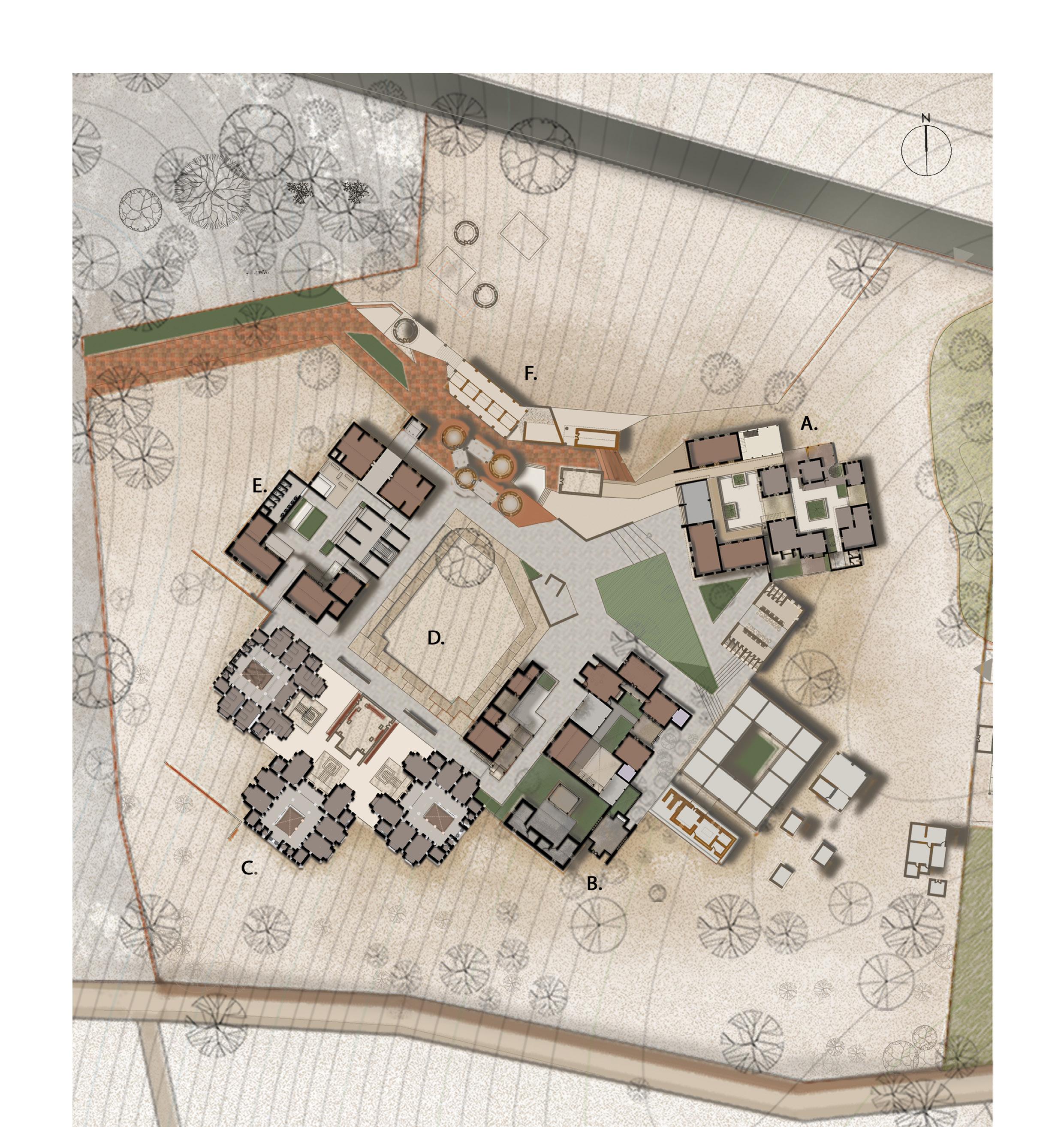
1 Into the Ocean Library design | Academic 2 Udayalur Rural Study | Academic 3 Utavum Karam a helping hand Urban study | Academic 4 Reviving Nirona a land of artisans Thesis study | Academic 5 The Sandwich House Residential project | Professional 6 A Rural Twin House Residential project | Professional
1-4 5-6 7-14 15-32 33-46 47-64
Academic work Location Type Site area Library Built up area
Semester 03 | Individual 11SC campus Bangalore, Karnataka, India Educational - Library Design 10271 sq. m 4450 sq. m
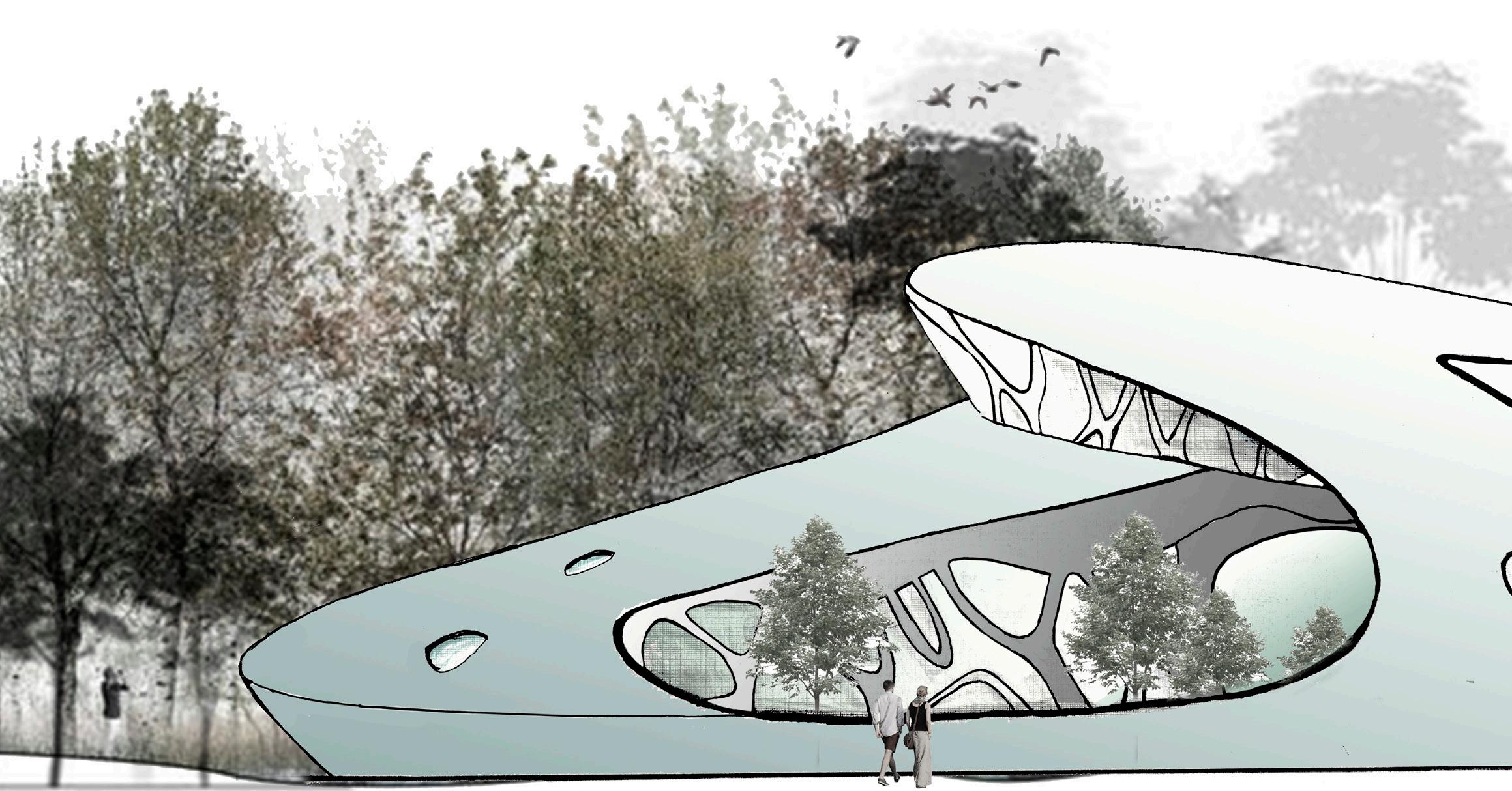
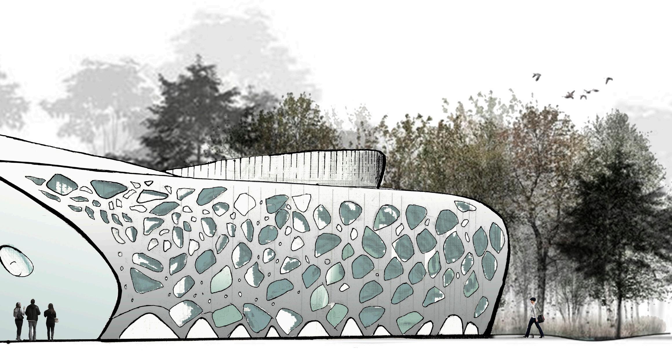
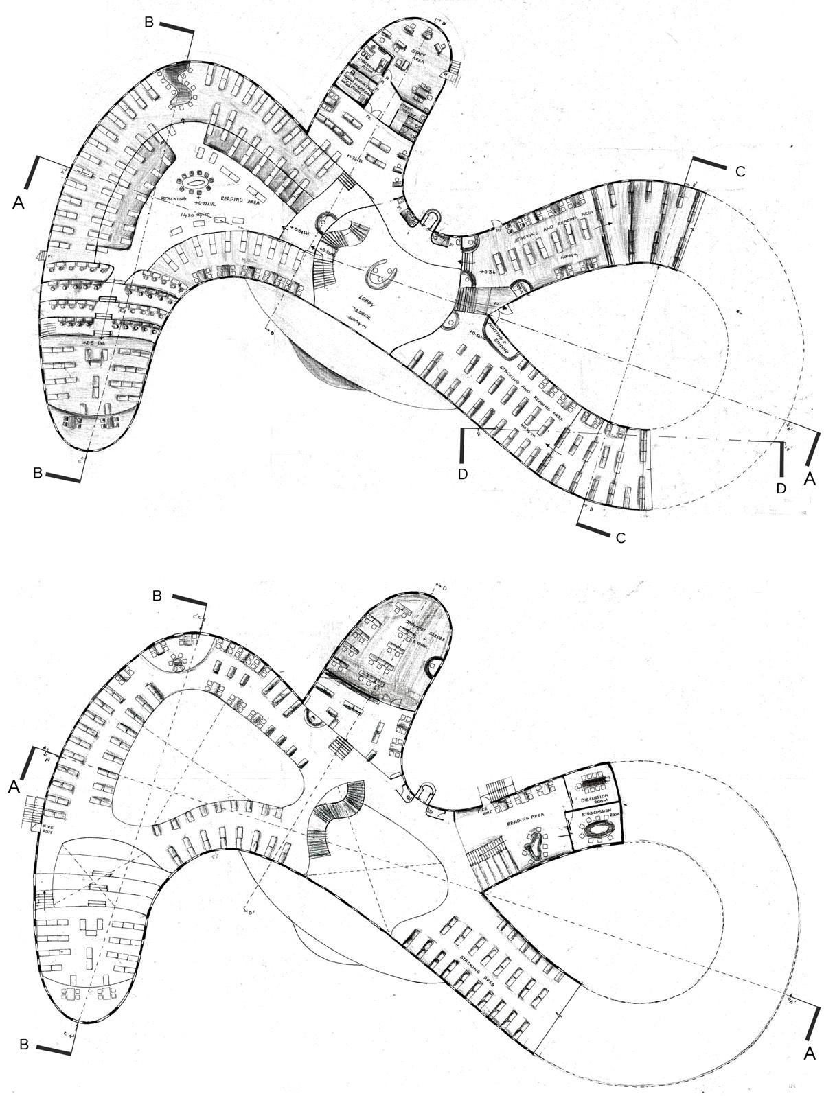
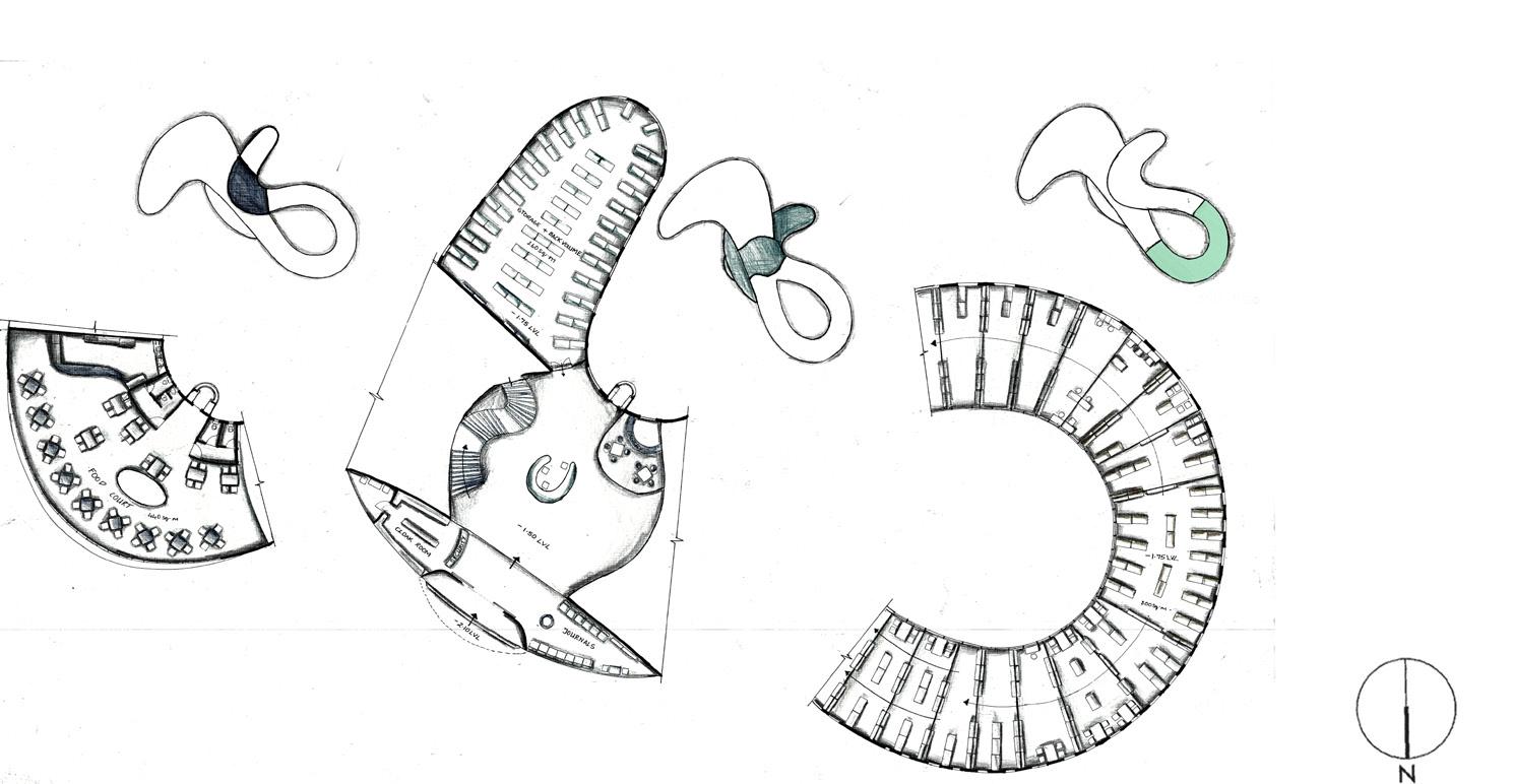
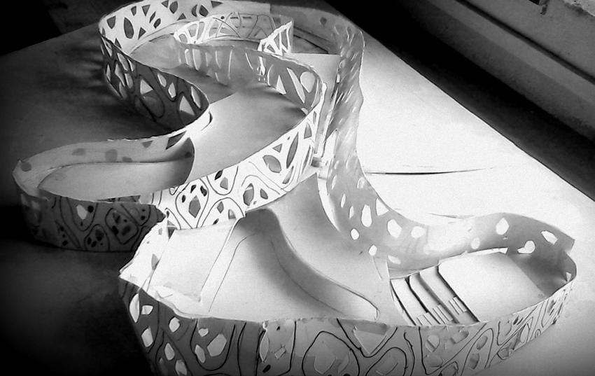
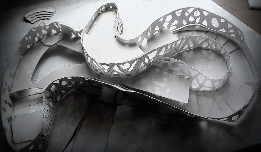
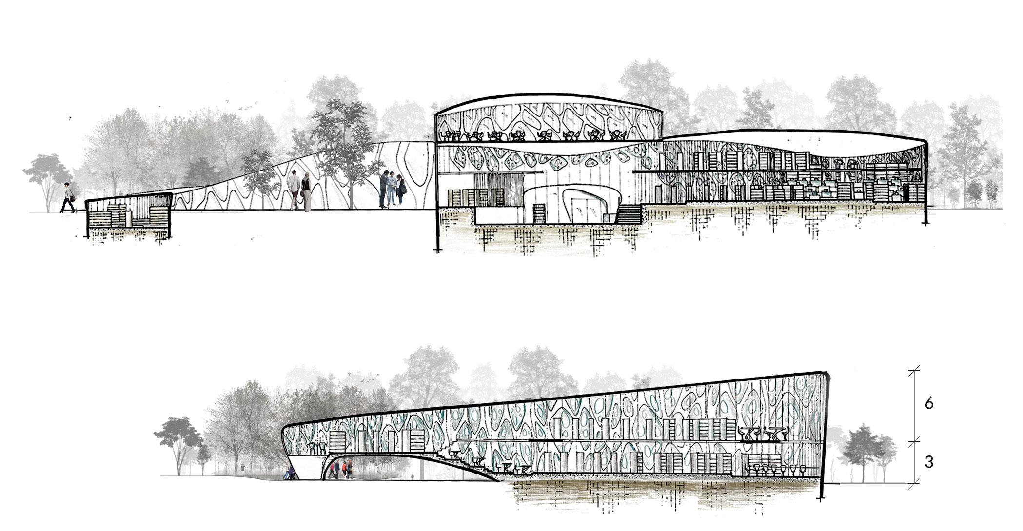
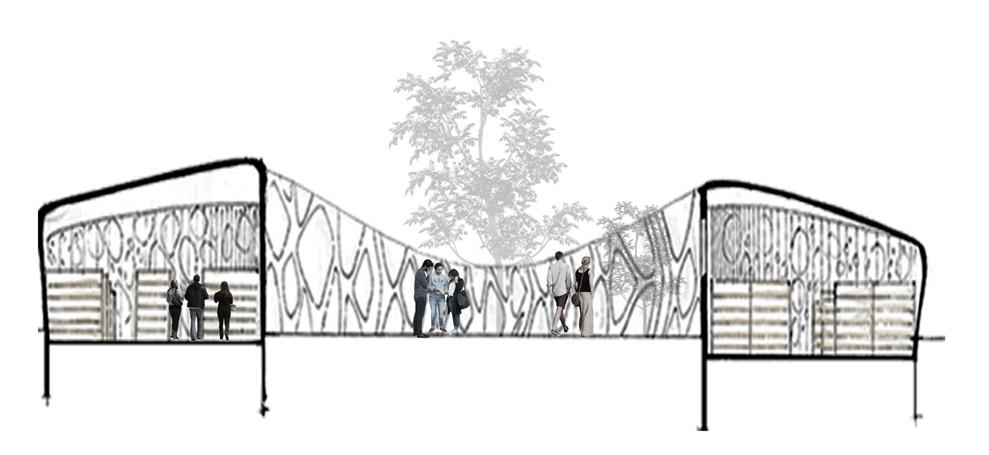
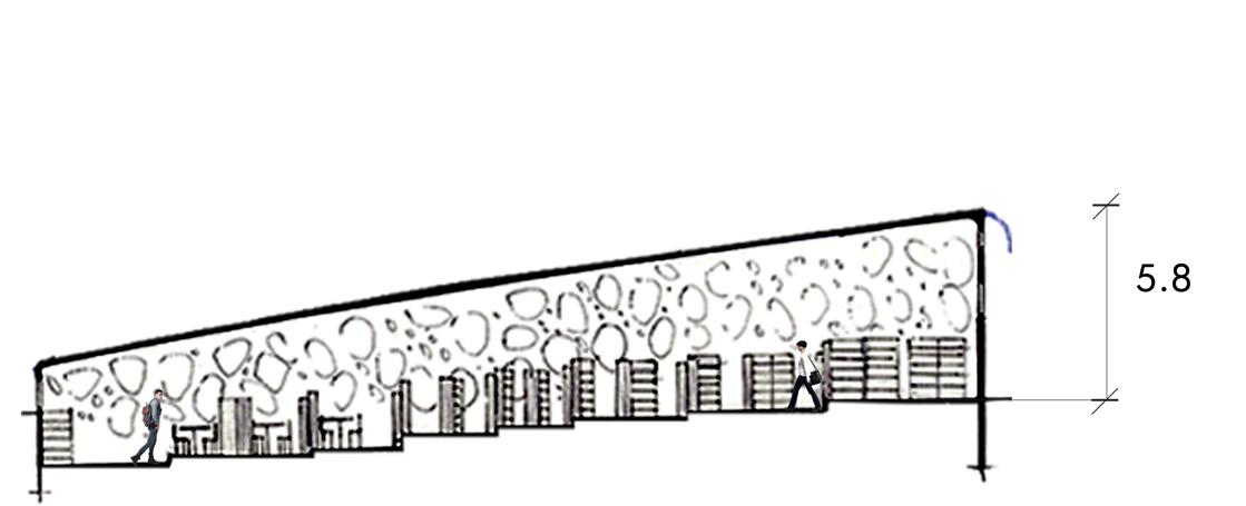
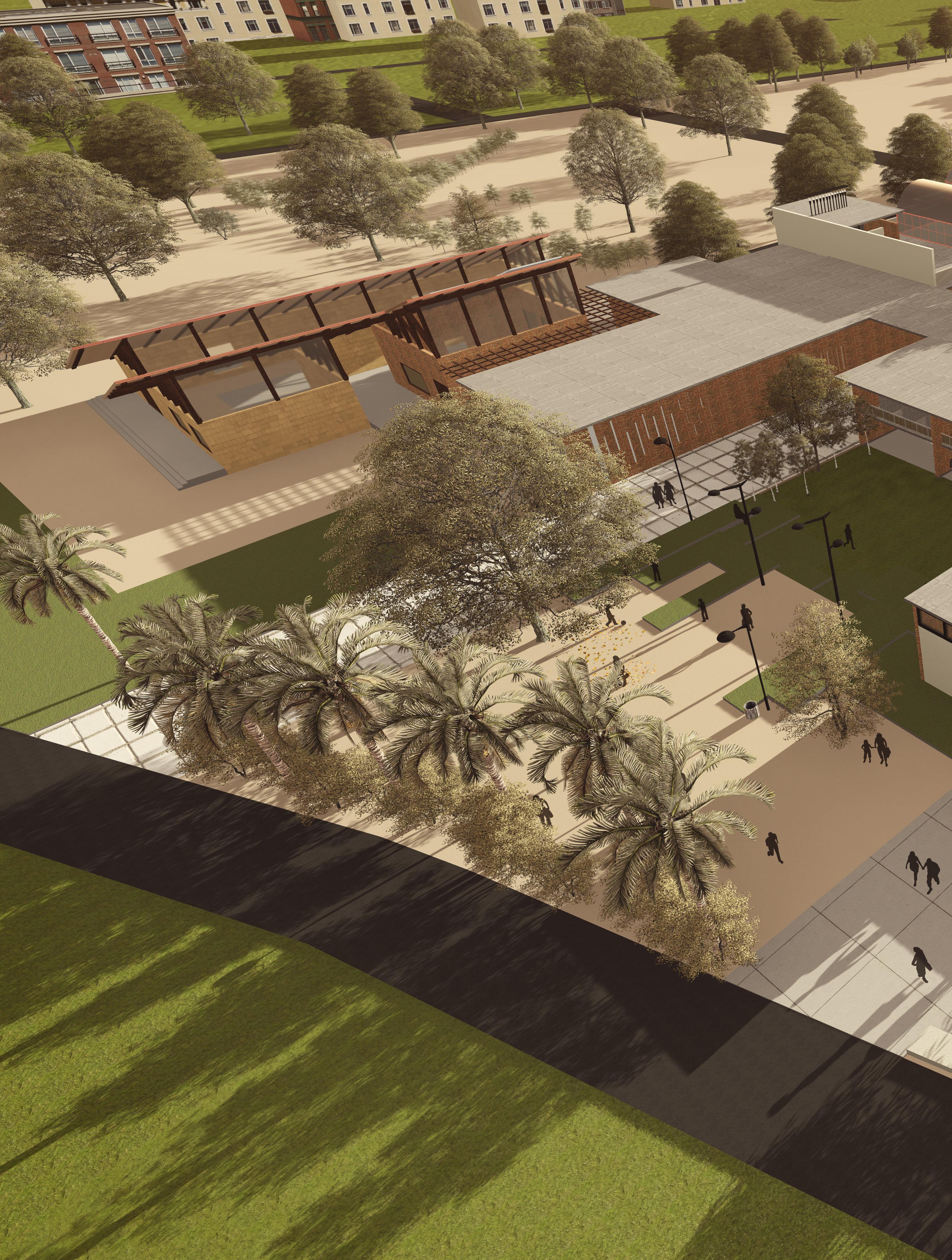
Inspired by Ocean as Metaphor for Knowledge, Library is set in an undulating levels depicting the depth of knowledge as ocean floor. The organic form is wrapped in a wave like ferro cement skin with integrated voids in stained glass, gives one a strong sense of being underwater.
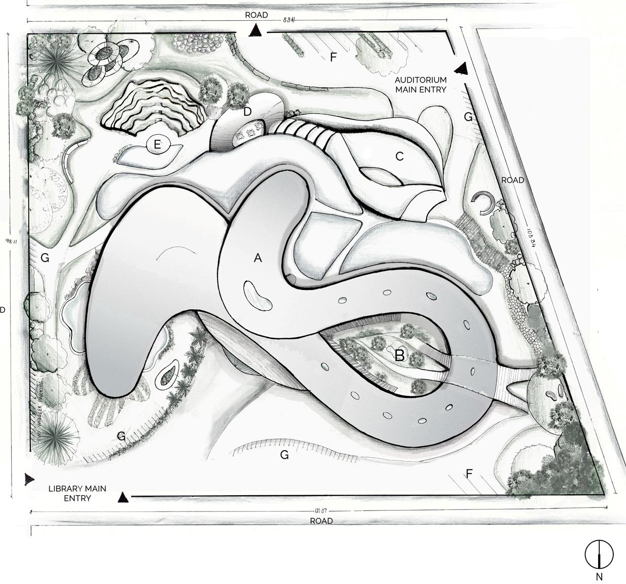
a. Library b. Court c. Auditorium d. Food court e. Open air theatre area f. Car parking g. Bi-Cycle parking/ Two wheeler parking

SITE PLAN | SCALE 1:1500


Academic work Location Type
Semester 04 | Individual Work Udayalur Village | kumbakonam, India Rural study | Visual Team
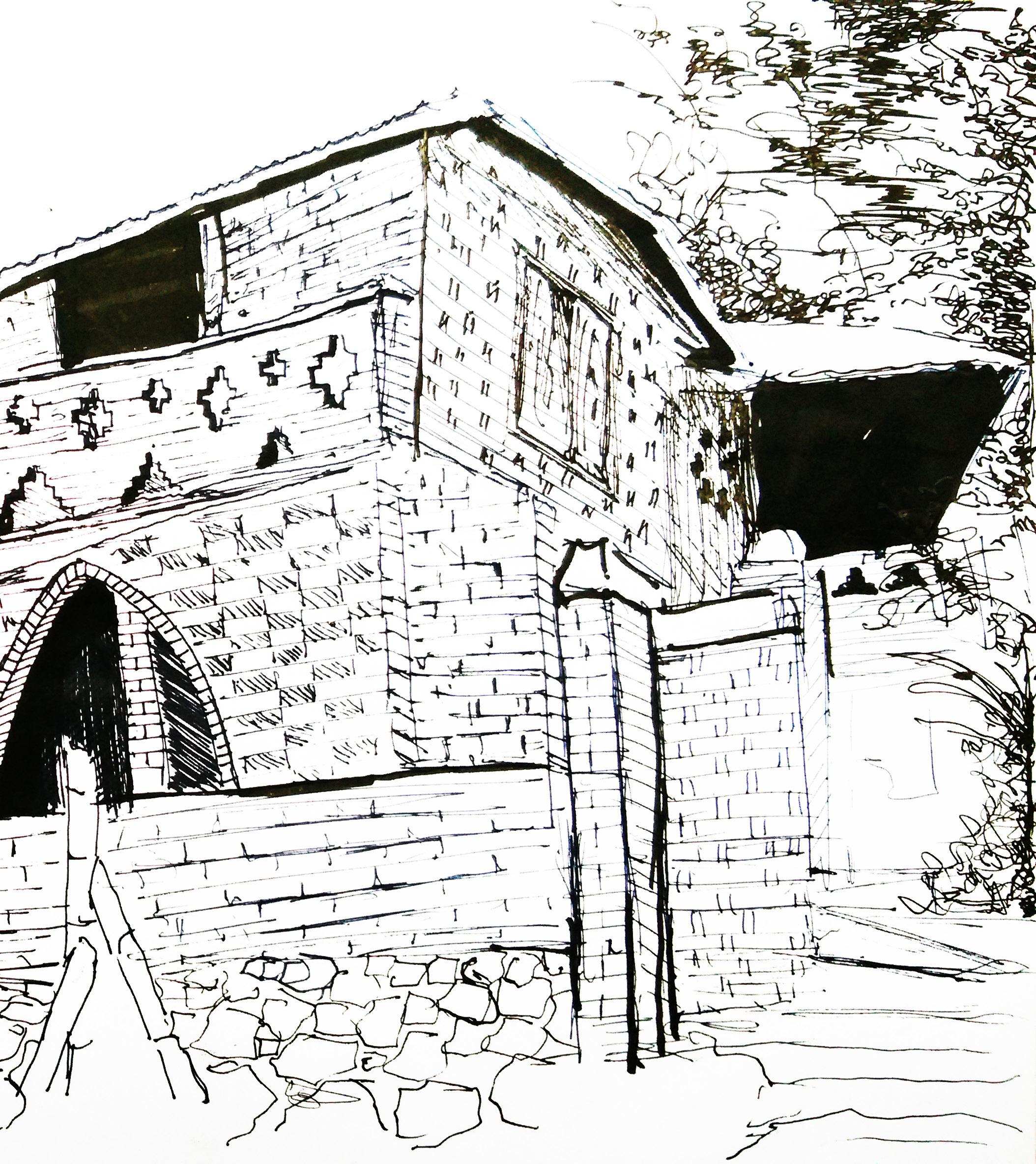
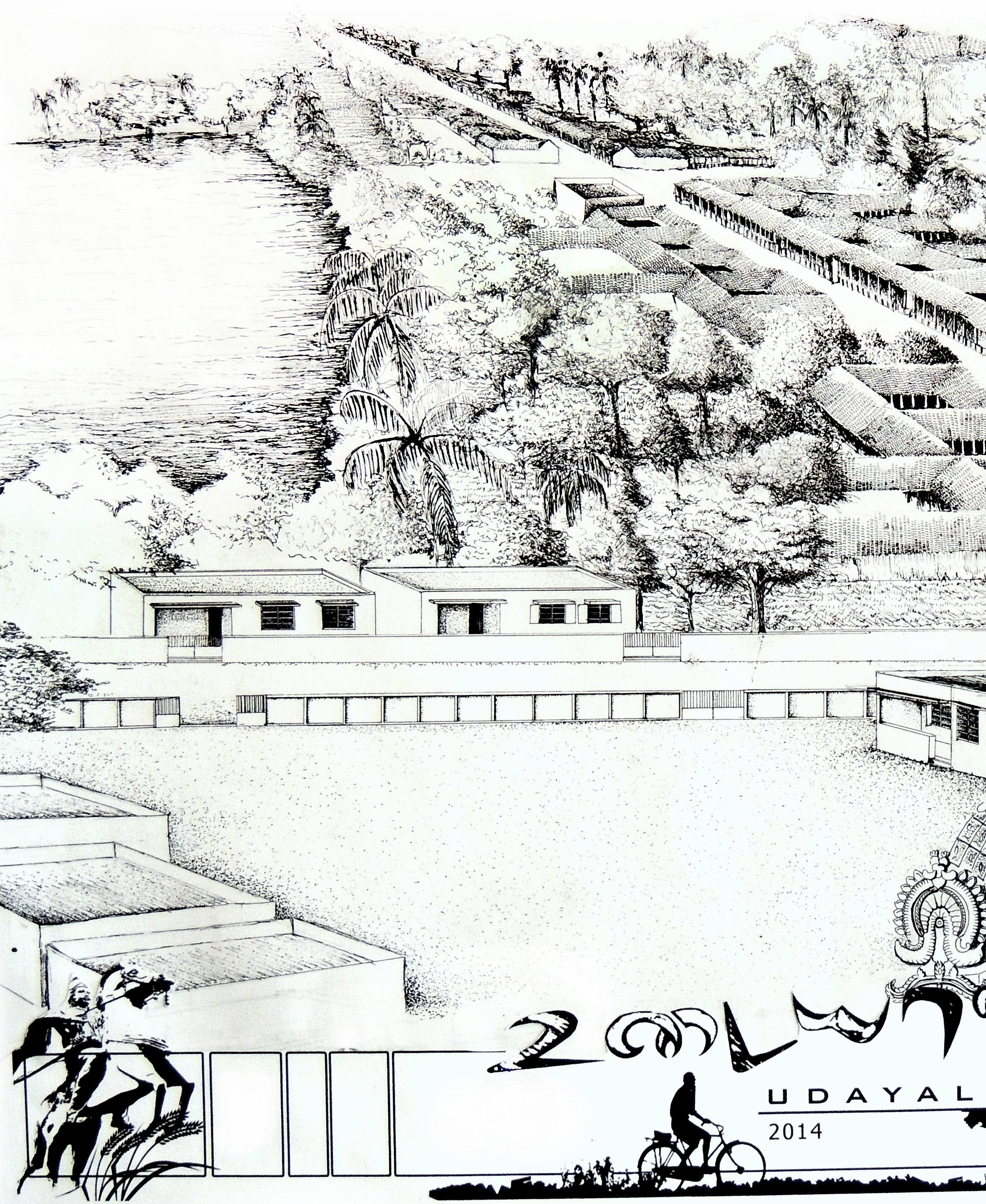
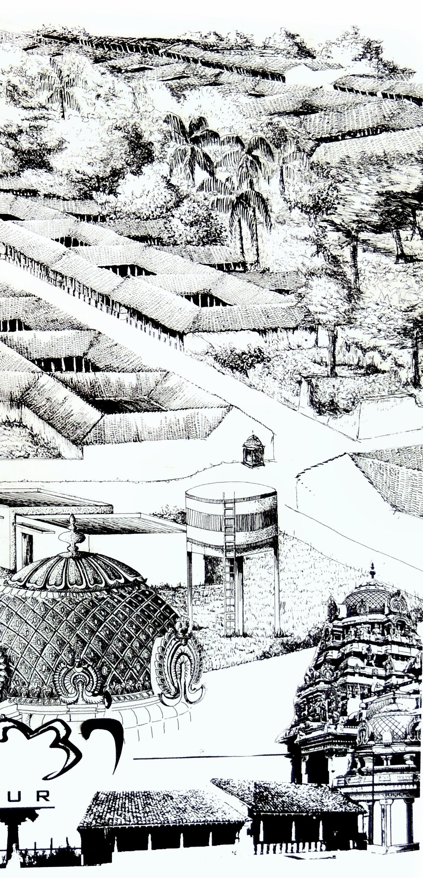
As Part of the Architectural Design Studio in 4th semester, Rural study was conducted. The study area was Udayalur Village in Kumbakonam District in Tamil Nadu, India. Set in a rural backdrop with rich heritage and cultural background. The class was separated in teams to conduct study on different aspects like the Social-Cultural fabric of the village, Construction and Technical details of the housing which varied based on the economic and cultural background, Physical and Geographical team documenting the layout of the village and the Visual Team illustrating the activities and important aspects in general and study conducted by the above teams.
As Head of the Visual Team, this is pen render depiction of the Ariel view is one of the works which conveys the outline of the study area.

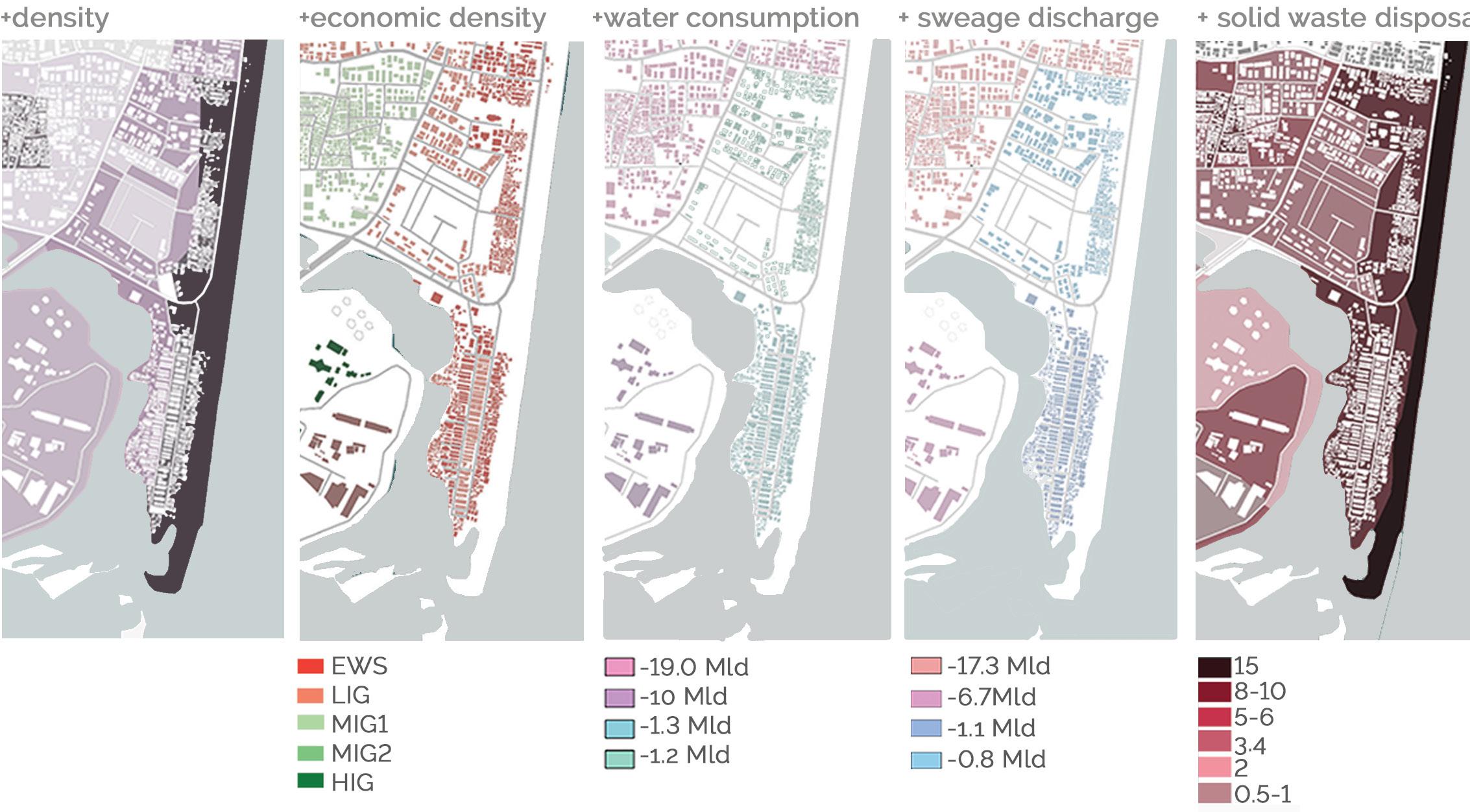
In growing decades we have failed to preserve water bodies which were once an integral part of our life. Adyar is one major river which is highly polluted and seen some major affect during the floods. The word “Adyar” derived from “Adai” meaning clogged;it was formally known as Chingleput River. The flow of the water in the river is not high enough to have a steady course ,therefore the water takes up the lowest possible course through which it meanders and further narrowing by encroachment. The major factors pertaining are mindless urbanization and complete lack of awareness.
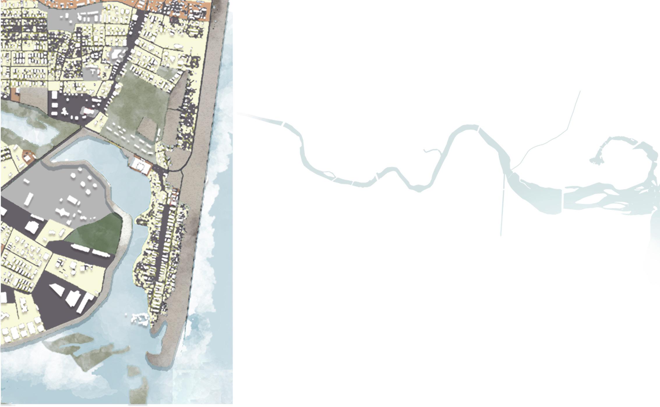
Both the areas lack any common facility and are high density areas with government provided Low income housing and illegal tenements. The site chosen is in close proximity to both the areas and is quite easily accessible from the main road thus avoiding congestion.
The proposed two phased intervention encompasses a number of critical issues relevant to Foreshore Estate and Srinivasapuram. It addresses two major overarching issues: integration and sustainable development. The design intends to disperse the existing social boundaries among the natives and city dwellers since these fishing communities have an “unseen future” as far as livelihood is concerned.
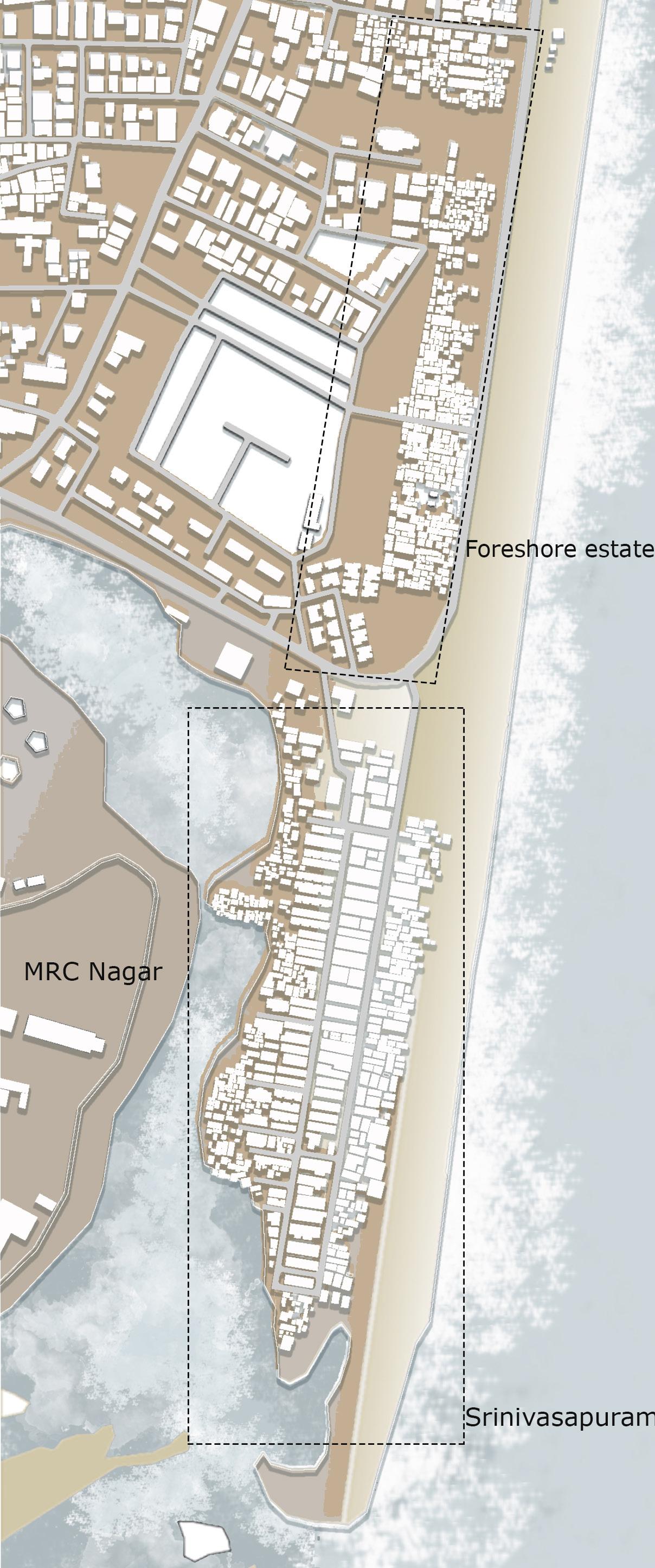
The first phase aims to provide a community and an interactive learning center for the fishermen kid’s. This center aims to insert new activities and services based on micro-intervention and cater to the needs of the infrastructure facility and enhance the skills of the natives (i.e boat builders, net weavers and fishermen). It blends low-tech sustainable approach in newer applications of the unused waste, enhancing the allied ‘skills’ of the inhabitants. One of the major pollutants responsible for the ecological degradation of coastal and mangrove, is plastic debris causing coastal and marine habitat de -
struction and bio-invasion. The above intervention allows the participation of natives with their existing skills while encouraging team work, leading to the socio-economic and cultural permanence within the community.
Second Phase is to set up a efficient Grey water disposal method through Reed bed and Aquaponic system. This helps in bringing about inland fish culture and also enables organic farming, uplifting the economy in times of climatic limitations.
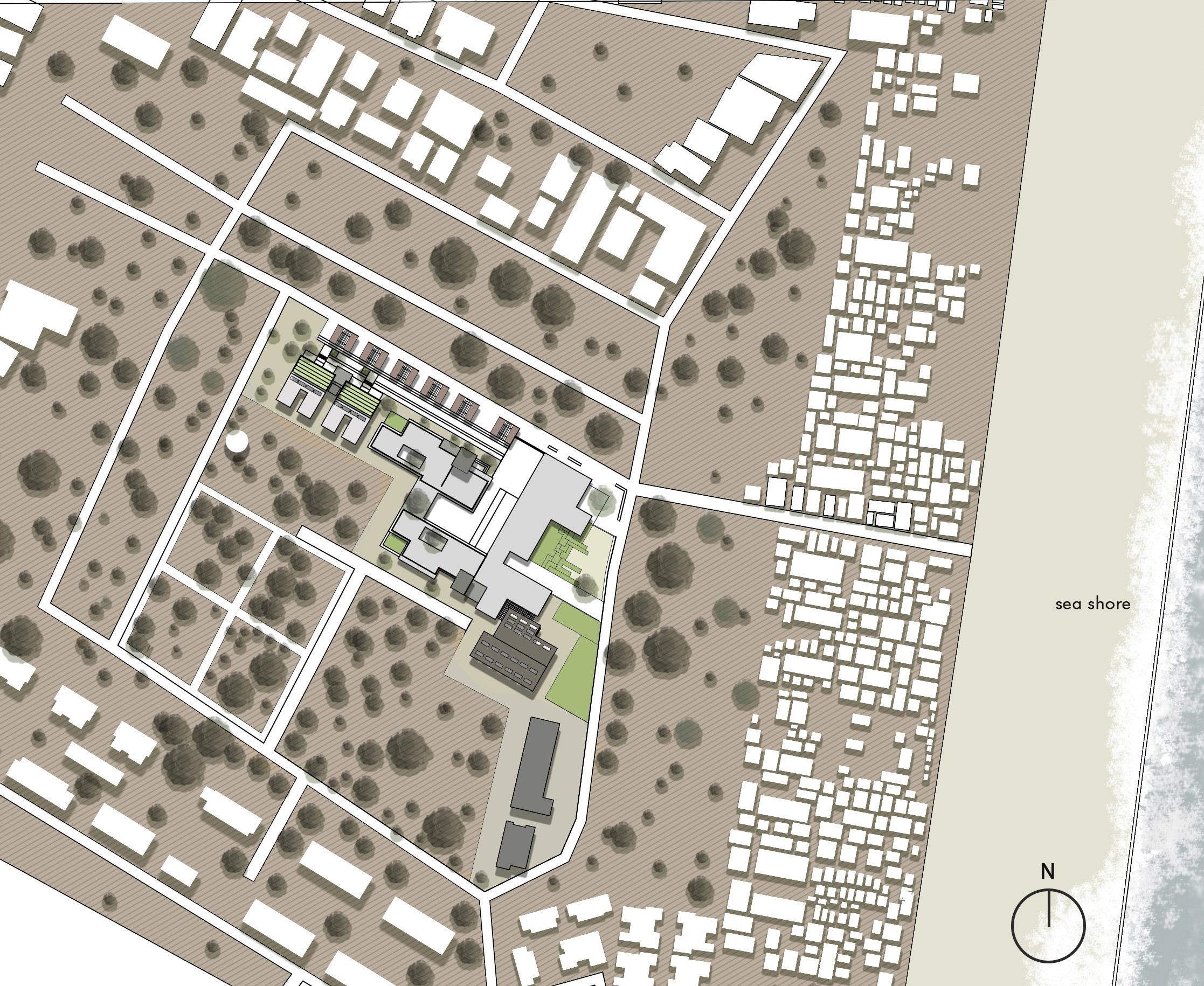
FLOOR PLAN | SCALE 1:500
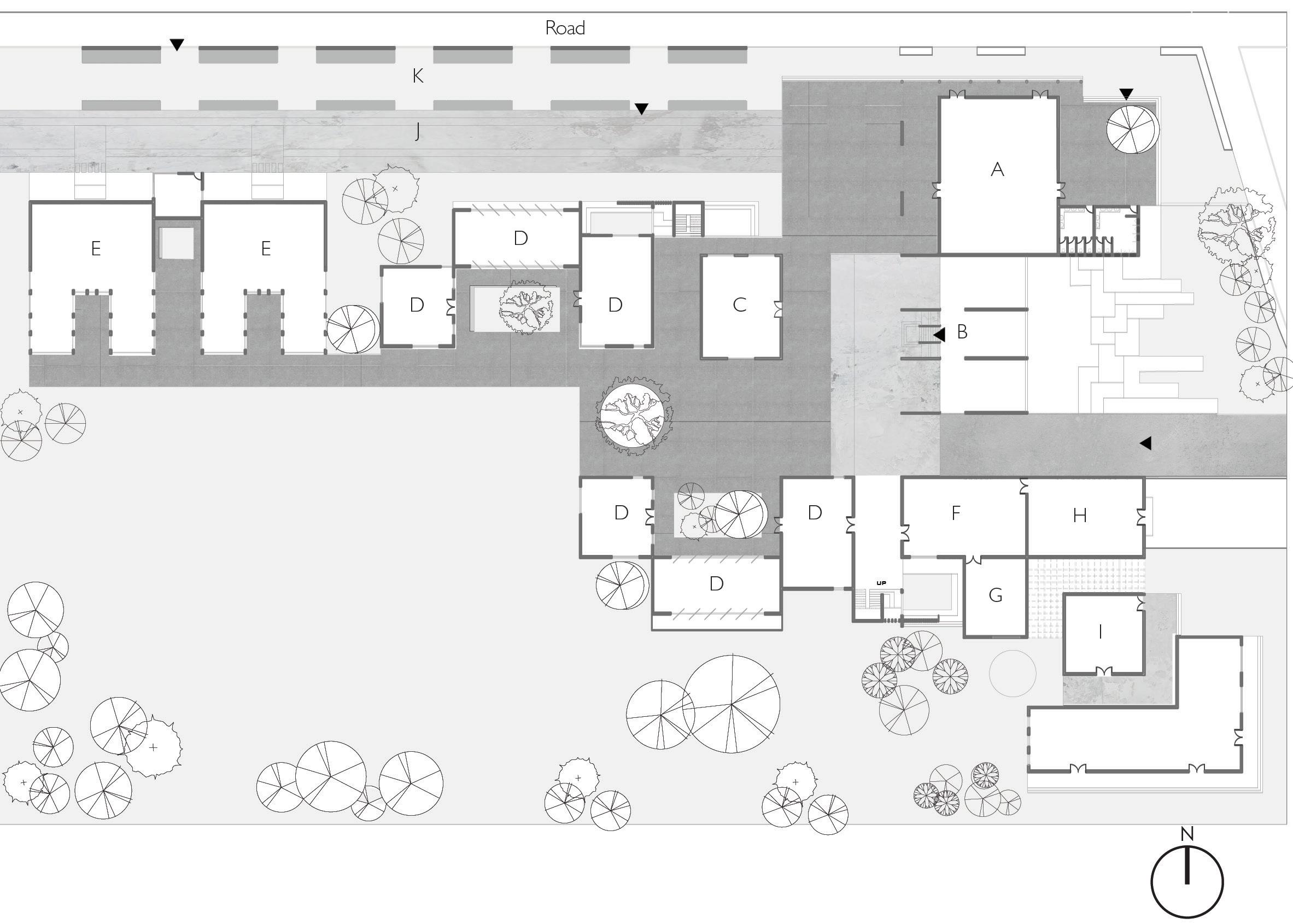
A. Community hall
B. Pavilion
C. Admin
D. Training rooms
E. Organic farm
F. Waste segregation unit
G. Store room
H. Waste collection unit
I. Kitchen and dining
J. Platform
K. Market space
Longitudinal section
Transverse section
Utavum Karam | community center


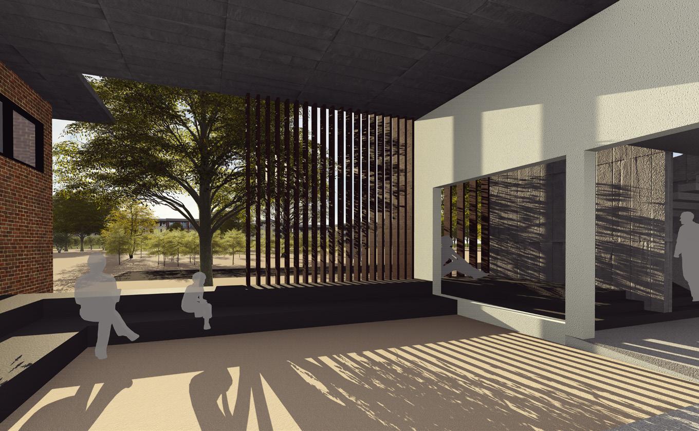


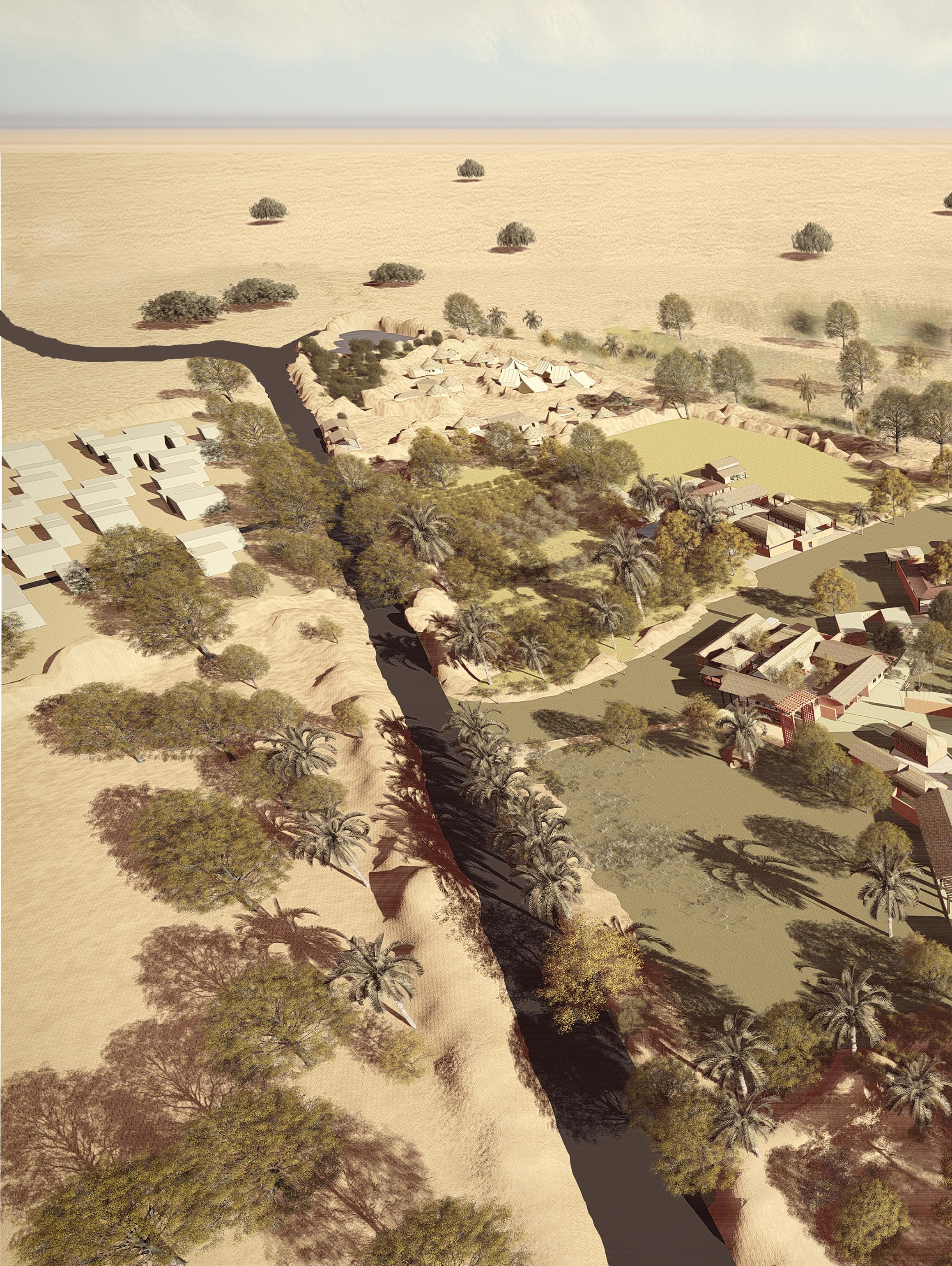
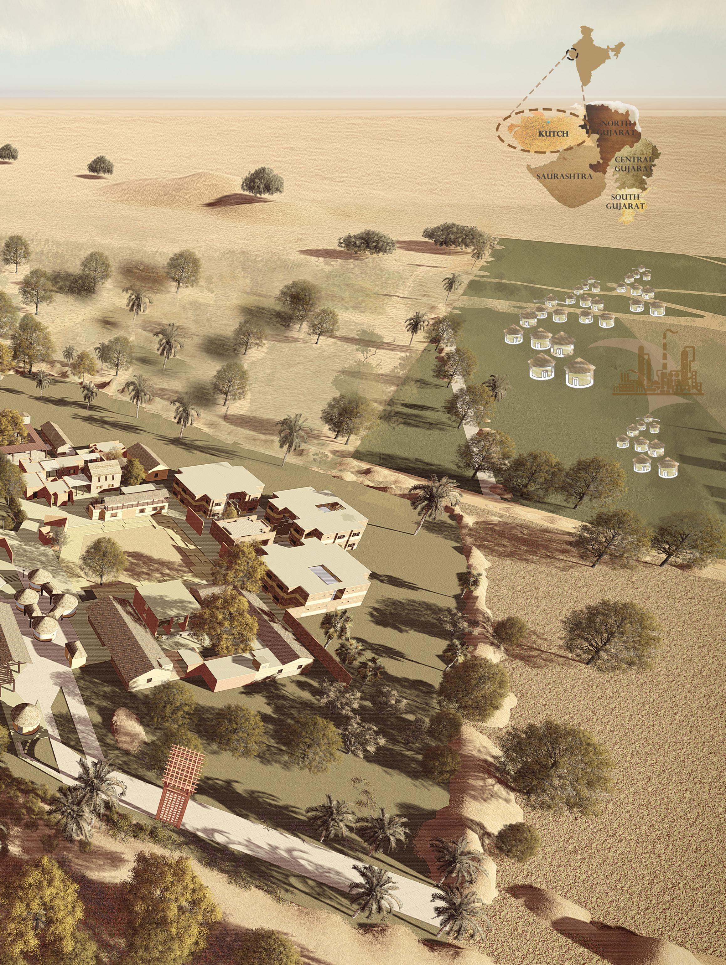
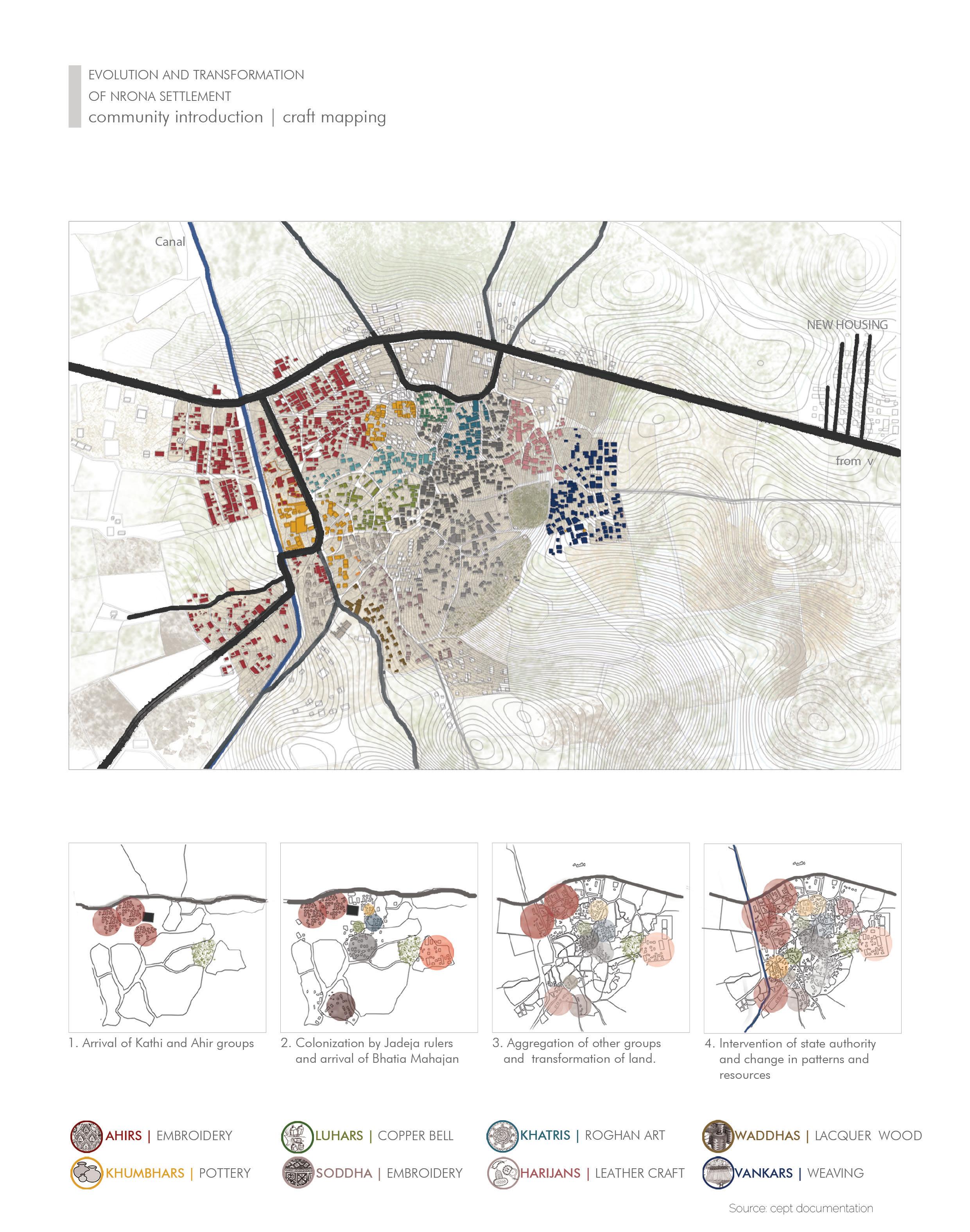
Nirona is home to more than 12 communities with more than seven crafts being practiced from the time it was inhabited. The village represents various social and environmental interrelationships that existed through its craft. Some of these crafts practiced in Nirona are just unique to its region and not exist elsewhere and have striven to achieve the state of distinct excellence & appreciation like the Rogan art, copper bell, lacquer works. Inorder to ensure the existence of such craft practices, it is important to conserve the natural habitat of this region.
Nirona has a weaving together of Multi-layered Identities, interwoven and interdependent with surrounding environment. The social interrelations and economic interdependence
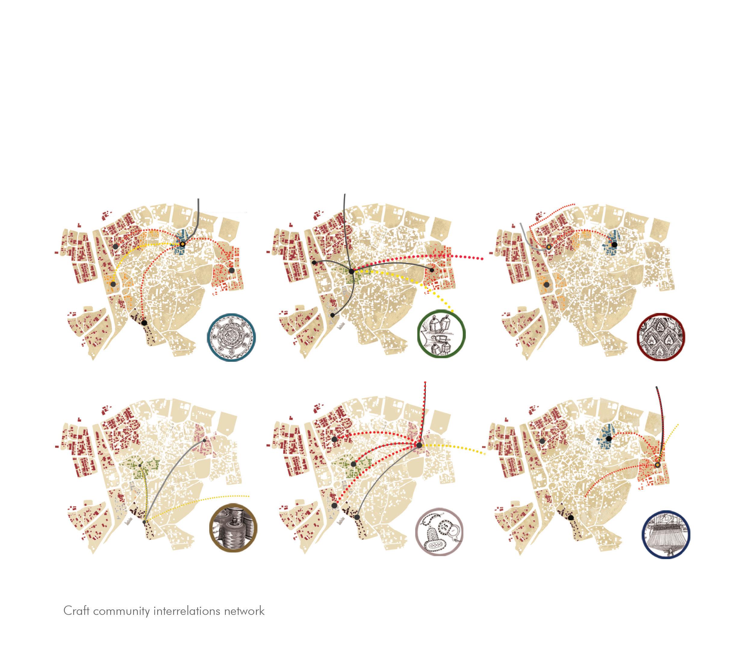
showcase a strong cultural fabric between the communities. The hierarchical framework have made the occupational structures (craft practices , agriculture and cattle rearing) significant to one another.
Therefore, the ideology is to initiate strategic interventions that are self scalable by the community. There is tremendous untapped potential in the village which can be harnessed with widening their livelihood options, improved infrastructure and an up gradation of quality of life through integrating all potentials and strategies in a way where all the communities work together as a whole .The design strategy is to interweave the different fragments of the community and make individuals work as a group for a sustainable habitat.
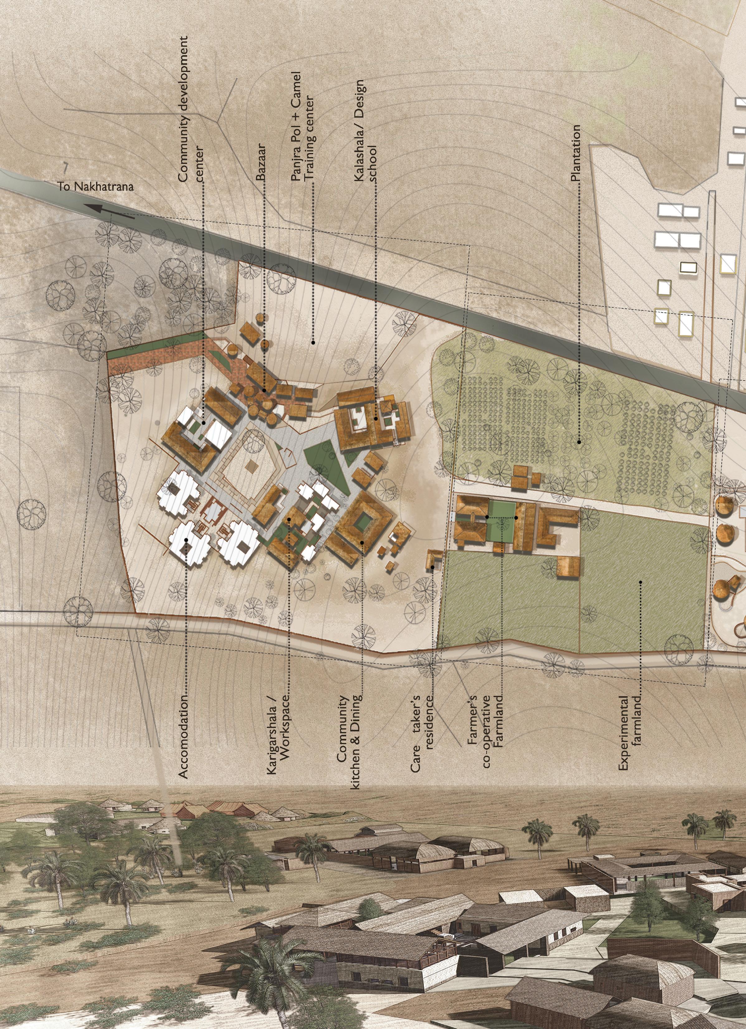
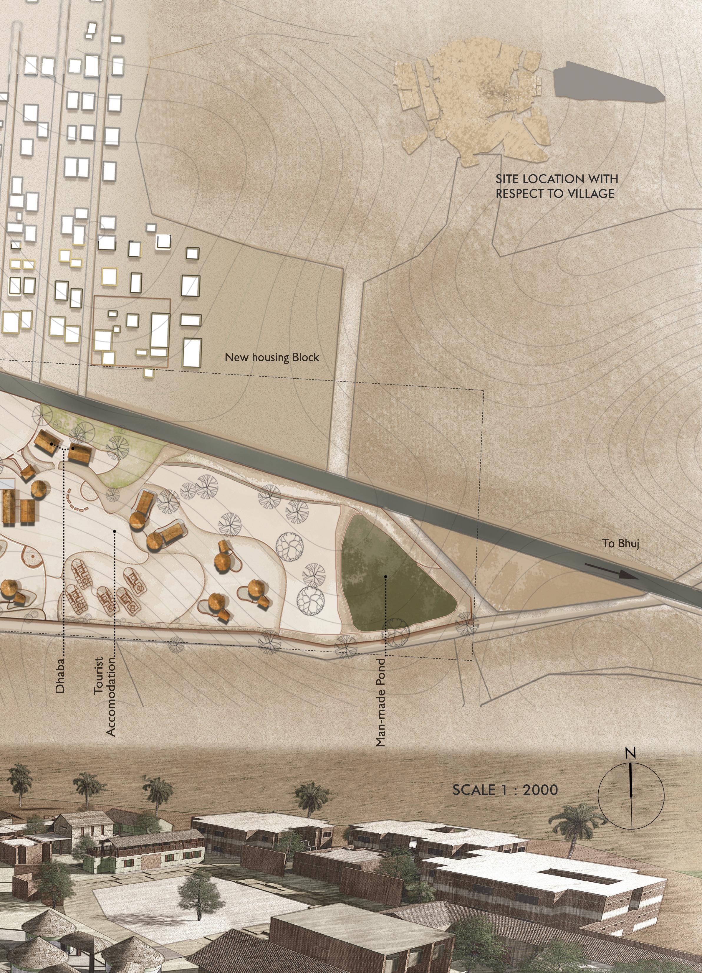
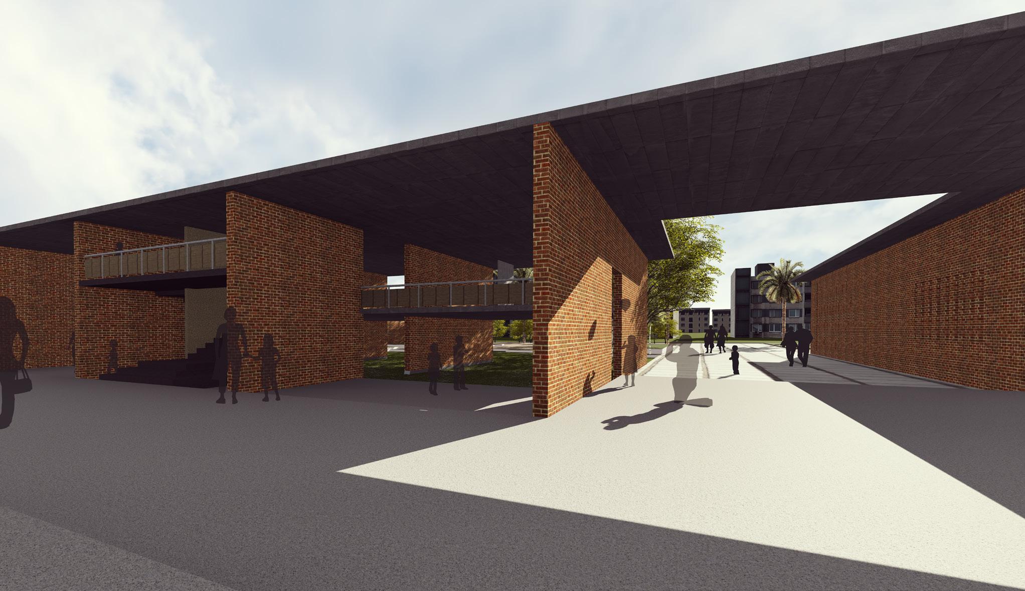
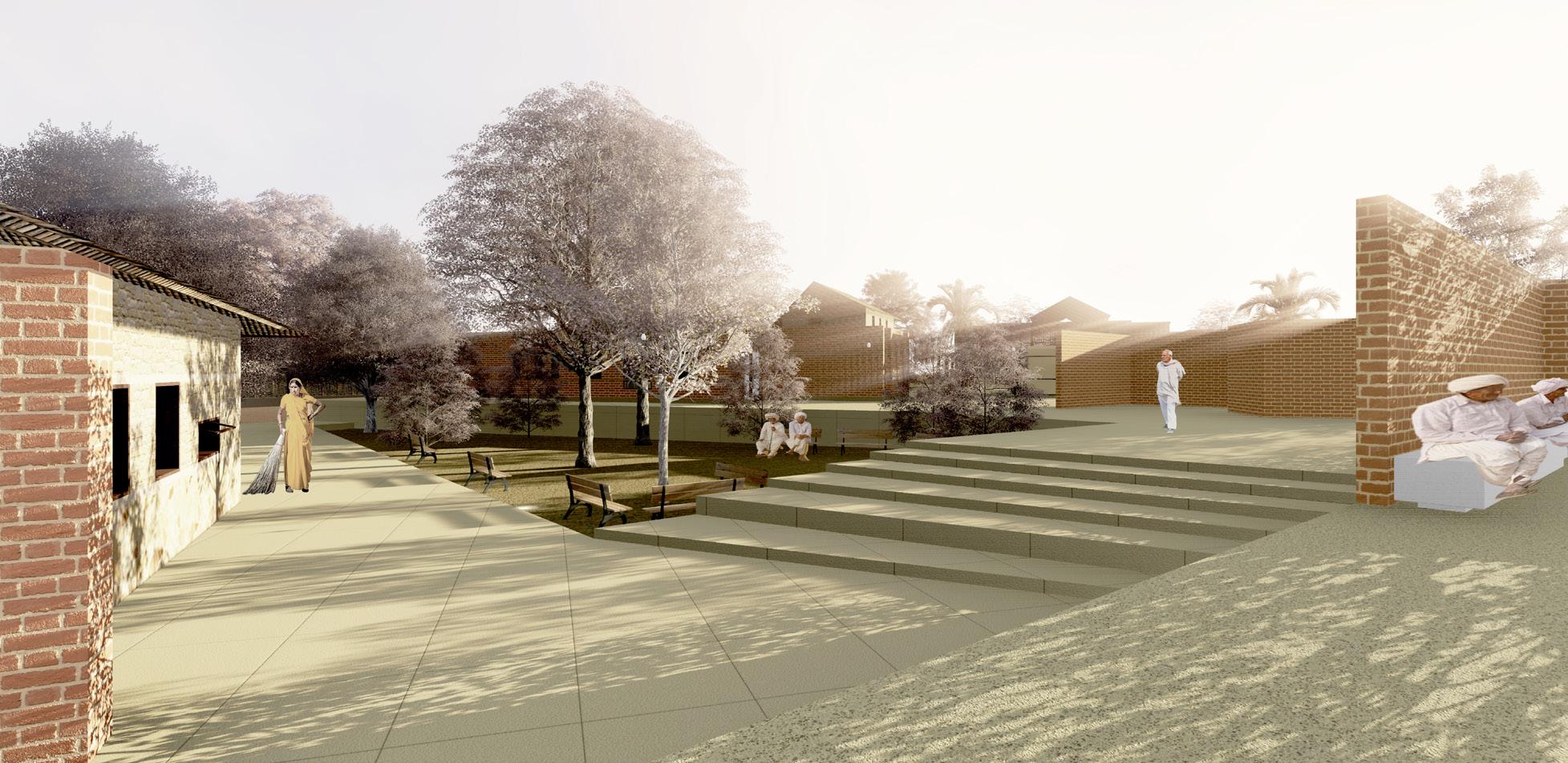
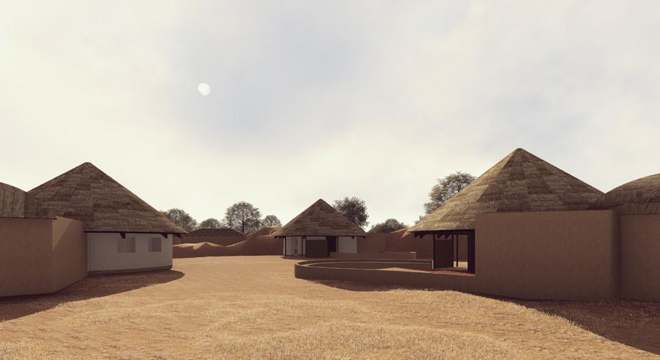
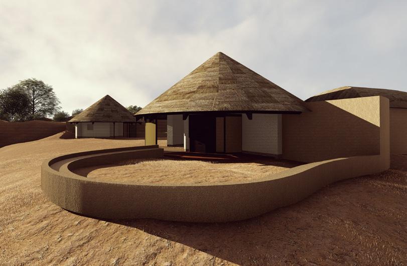
The design of the center is an inspiration from historic precinct Dholavira ,where entire structure is on a raised platform with different functions operating on different levels. Each blocks has a separate identity and function and residual spaces between these arrangement becomes an open court. This centre serves as a space to connect and collaborate. The central courtyard acts as a core that weaves together multilayer functions as a whole.
manage | training | market
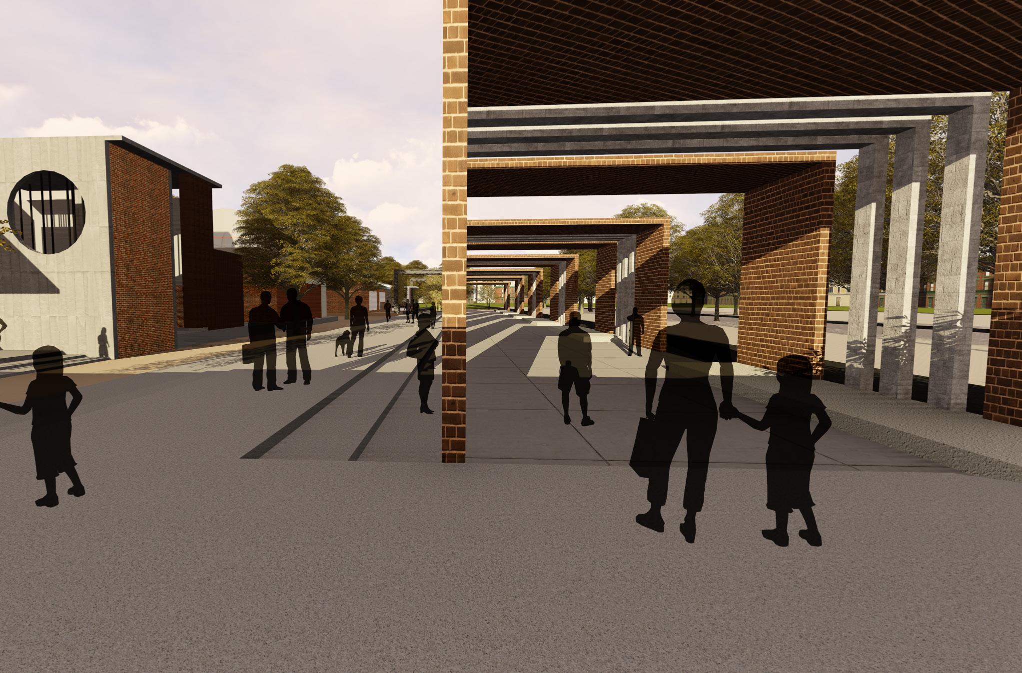
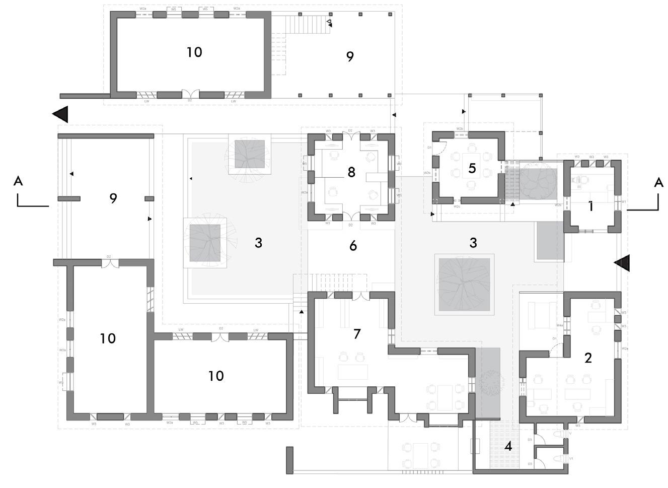
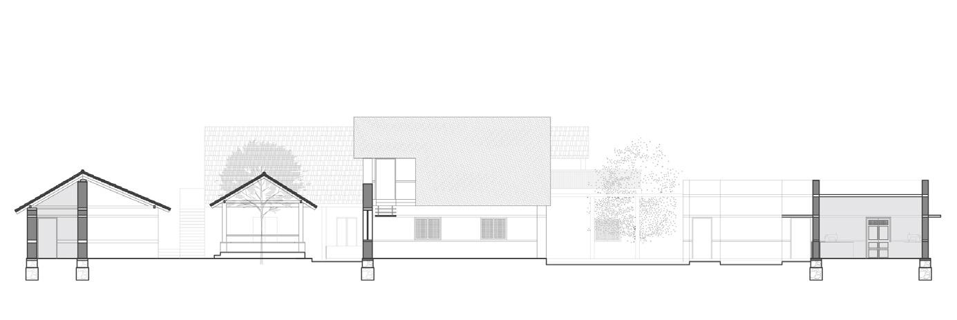
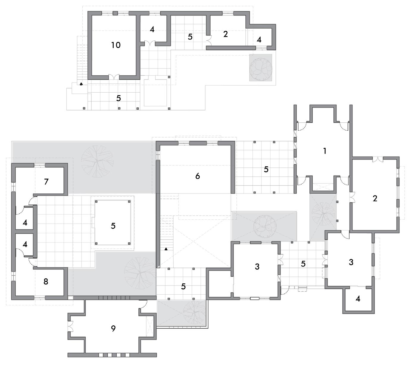
This block operates as a admin space and a technical learning center. It creates job opportunities for educated young adults who can manage and connect to the current market. It has computer center and training rooms functionally supporting and co-ordinating the exhibitions, fairs, marketing the merchandise of the artisans. The block comprises of two open court (chowks) seperating the spaces functionally yet connected by a semi open space (deli) . Almost all spaces have an outer seating on a raised platform abutting the wall (otla) serves as zone of interaction.
01 Reception 02 Office space 03 Small open court (chowk) 04 Restroom 05 Discussion room 06 Semi open (deli) 07 Library archive 08 Marketing office 09 Semi open pavilion 10 Technical training rooms

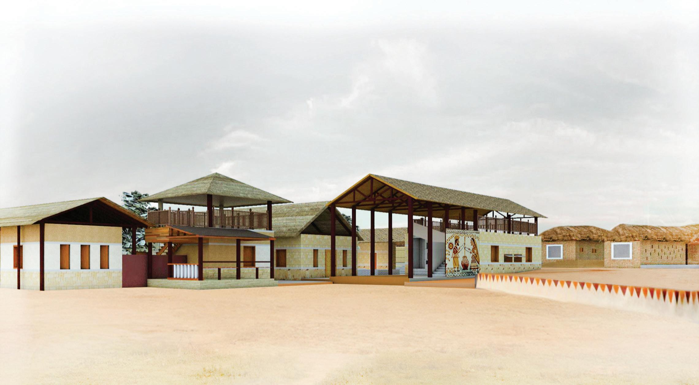
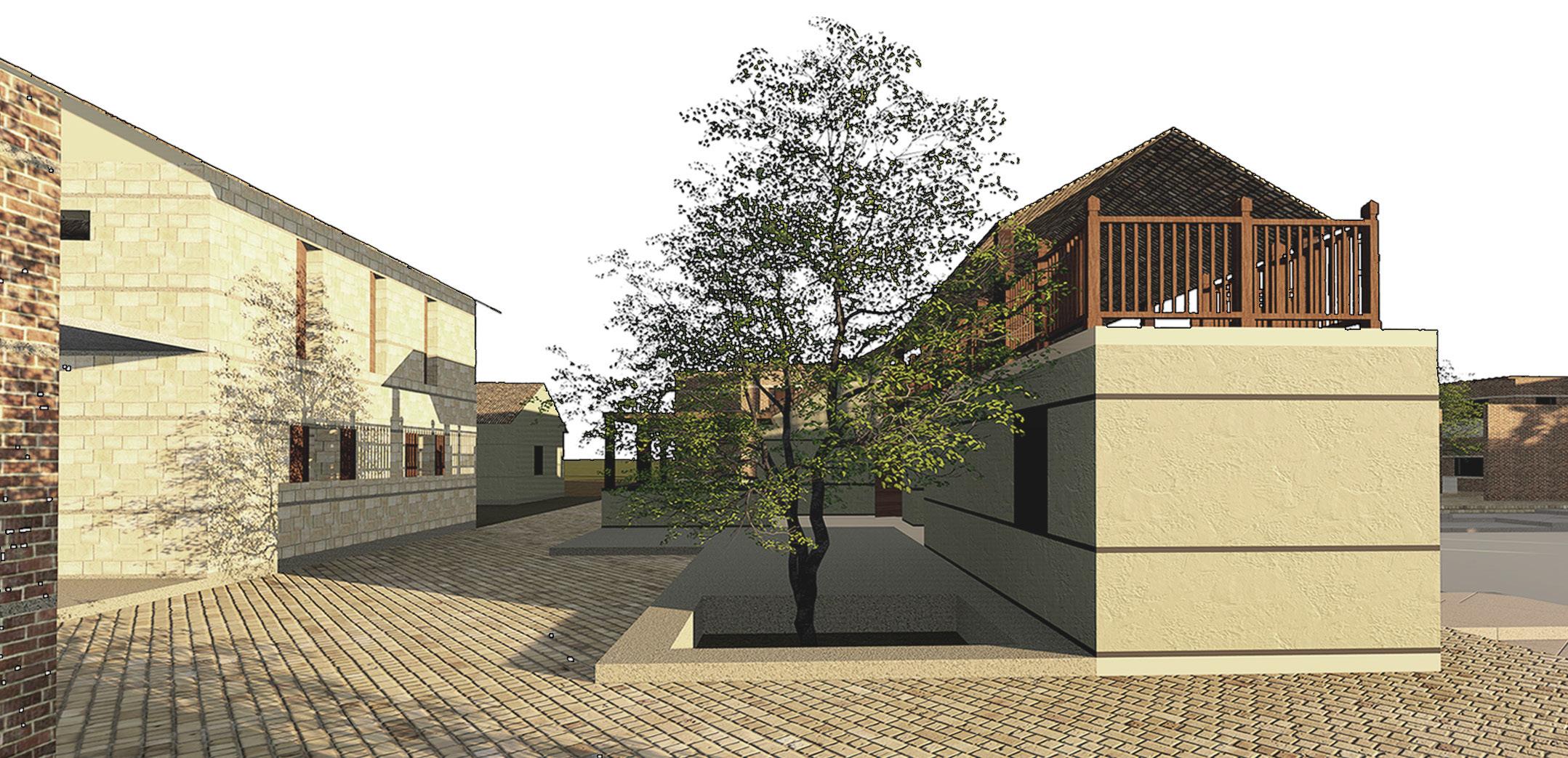
Karigarshala serves as a workspace for the artisans of Nirona village as well for the craftsmen enrolled in the Design school. This space enables artisans to work in large groups, creating a vibrant atmosphere in contrast to the normal working idle atmosphere. The work sheds are designed in different sizes and scales, functionally flexible for the need & program. The spaces are aligned in a compact form around small open courts creating a micro environment for the artisans. The open courts acts as a buffer space between the work sheds.
workspace
worksheds
workspace
making
Leather craft workspace
Pottery workshed
Lacquer and wood craft workspace

stay | mingle | share
FLOOR PLAN & SECTION | 1:400


Accommodation block has 36units. Each block has 12units & a central courtyard. Each blocks opens up to a central open space, which serves as a interaction zone for the artisans. Community hall is placed centered which serves a multiple functions .
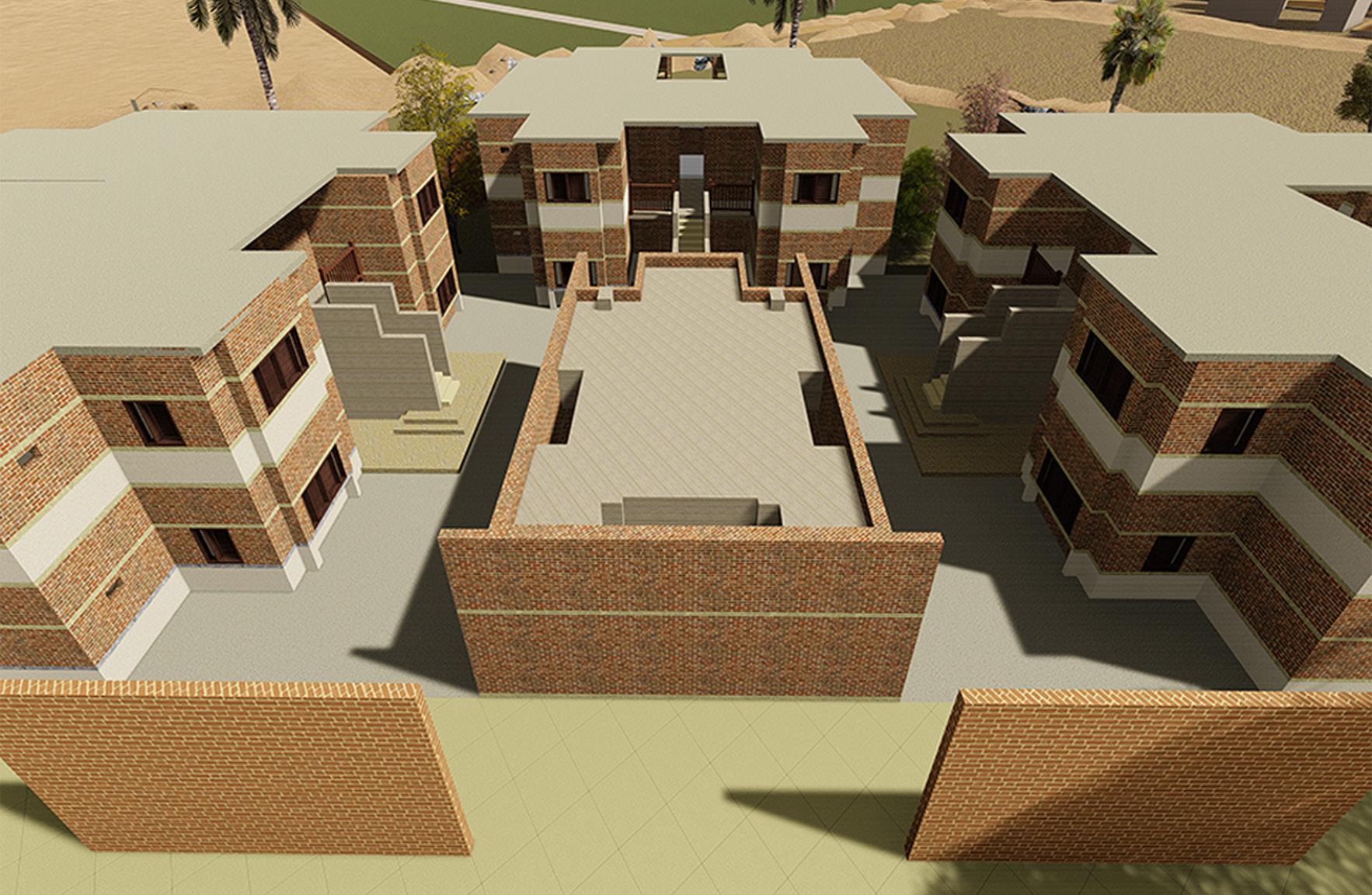
Central court is an significant part of the design where it interlinks visually and functionally the each programed buildings together. The open court serves a multi functional zone for activities like a place to interact, address large gatherings and to host large exhibitions.

Reviving Nirona | a land of artisans

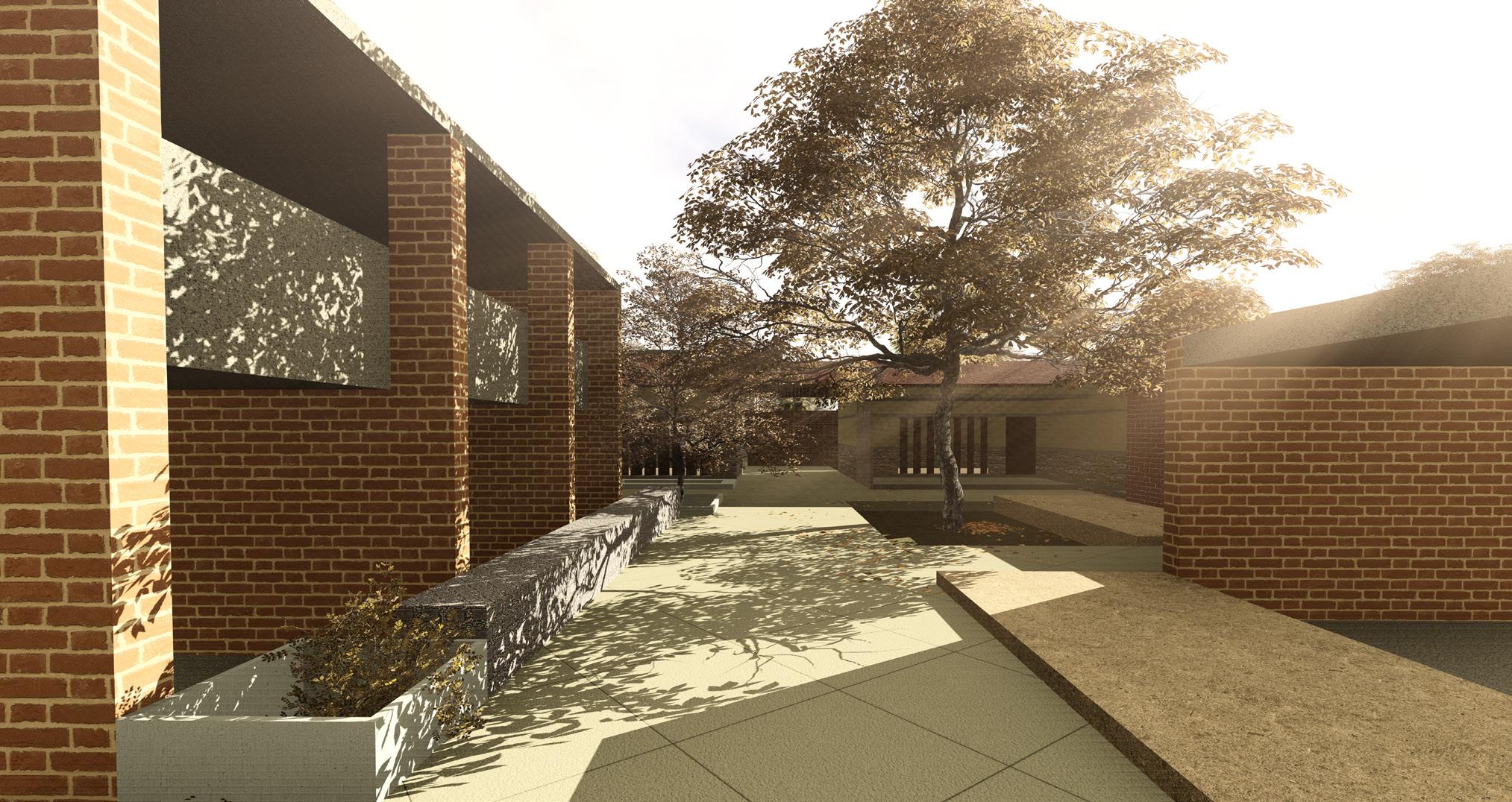
Multipurpose rooms serves as space for Youth empowerment and women welfare activities. Admin office space for Farmer’s co-operative society and Resource management is set up to maintain the Natural capital of the village; Agriculture, livestock, Forest and water resources, thus creating a socially responsible future for the village. Pavilion can host community meetings, small gatherings, folk art practice area and other needs . The overall design is similar to the village layout of houses connected with one another having open courts in between.
resource management and welfare center 01 Women welfare center 02 Youth welfare center 03 Food stall 04 Pavilion 05 Agricultural and livestock management 06 Water and Forest management 07 Restroom
FLOOR PLAN & SECTION | 1:400
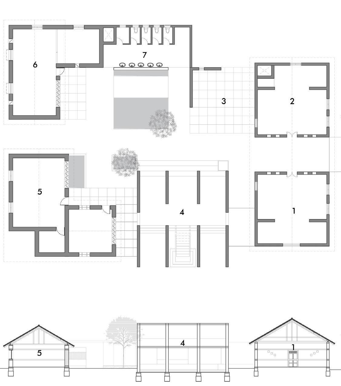
Market / Bazaar street serves as a community market zone where its functions accordingly to the user needs. On daily basis it could function as a daily market space .
During the tourist season, the spaces gets transformed to a museum, exhibition space. The design has also incorporated traditional Bhunga structure as aesthetic element adorned with Lippan work (mud and mirror ). The center is open to all during the tourist season where they can go around the worksheds and visually experience the art of making theses craft products and even have a hands on experience.
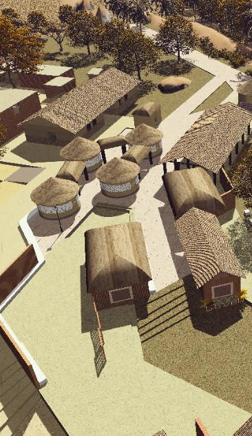
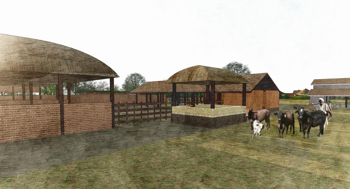
Famer’s co-operative society is a type of community supported agriculture practice (CSA).This approach responds to micro level environmental and social context. The shift to organic practice can revitalize the land and therefore the center takes up process of educating and training the farmers. It is a joint effort with village panchayat, CSA and the mill creating a socio-economic network in the village. Inorder to maintain the natural capital (cattle) which is integral for organic farming the CSA society own and maintain a farm.
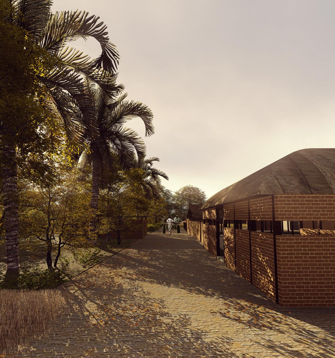
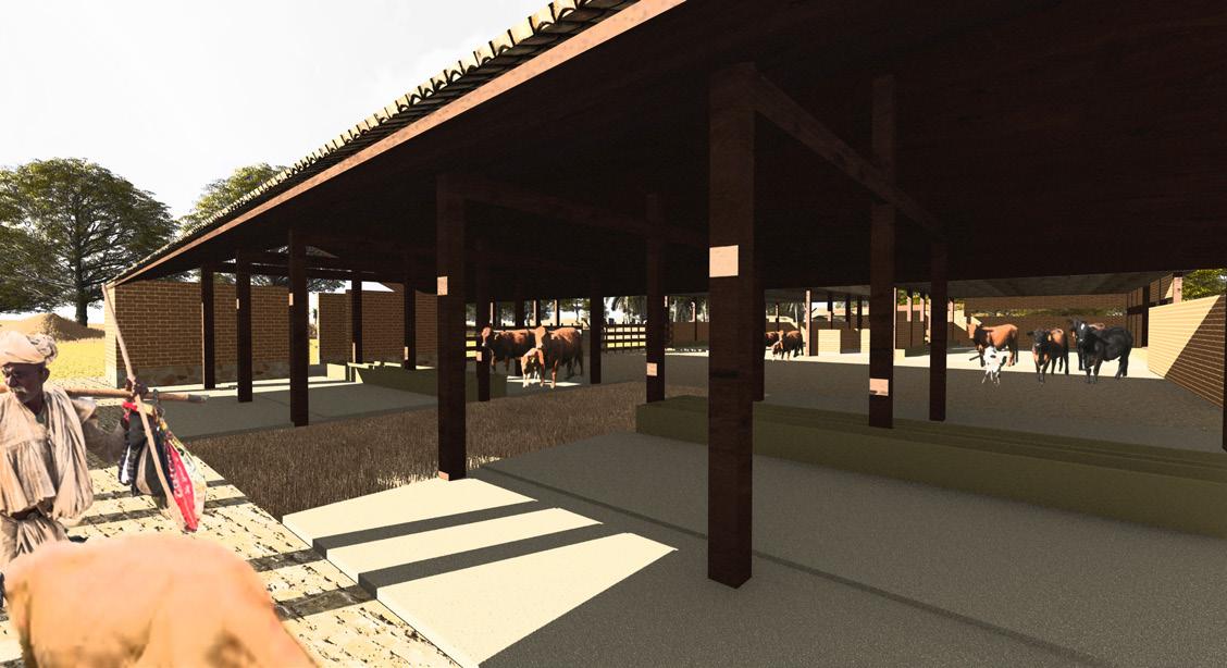
The co-operative land is divided in two zones by a passage way that connects the artisan center to the tourist accommodation. The zone abutting the highway is alloted for plantations and this in turn acts as a buffer space from the highway. The lower zone comprises of 2acre experimental farmland, a cattle shed (70), a training shed, storage shed for fodder and fertilizers.

community owned and managed
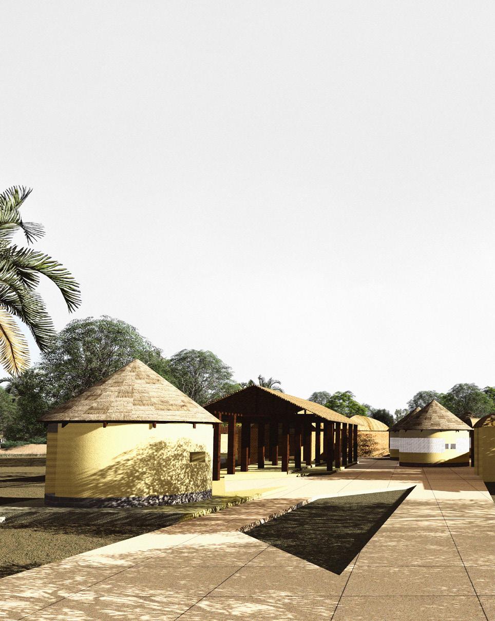
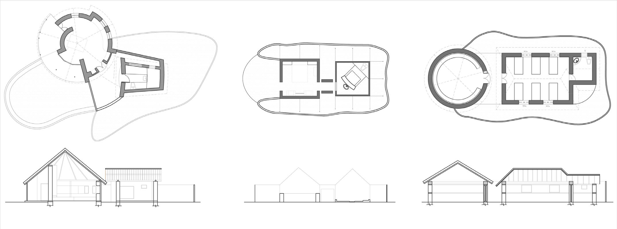
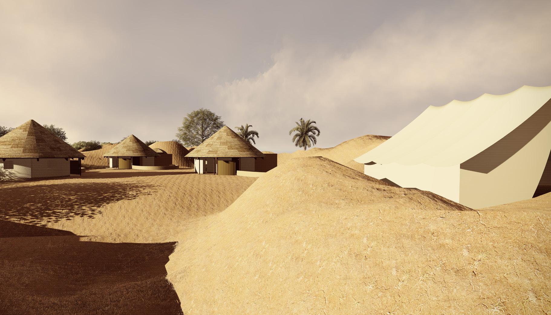
The resort is designed in true kutchhi style giving the tourist an experience of rural lifestyle. Traditional mud Bhungas or cottages and Tents are the two accommodation style units. This is managed and run by the villagers which provides capital to run the whole development.
Reviving Nirona | a land of artisans
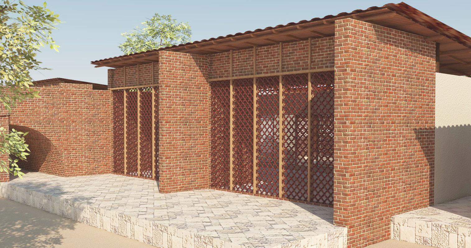
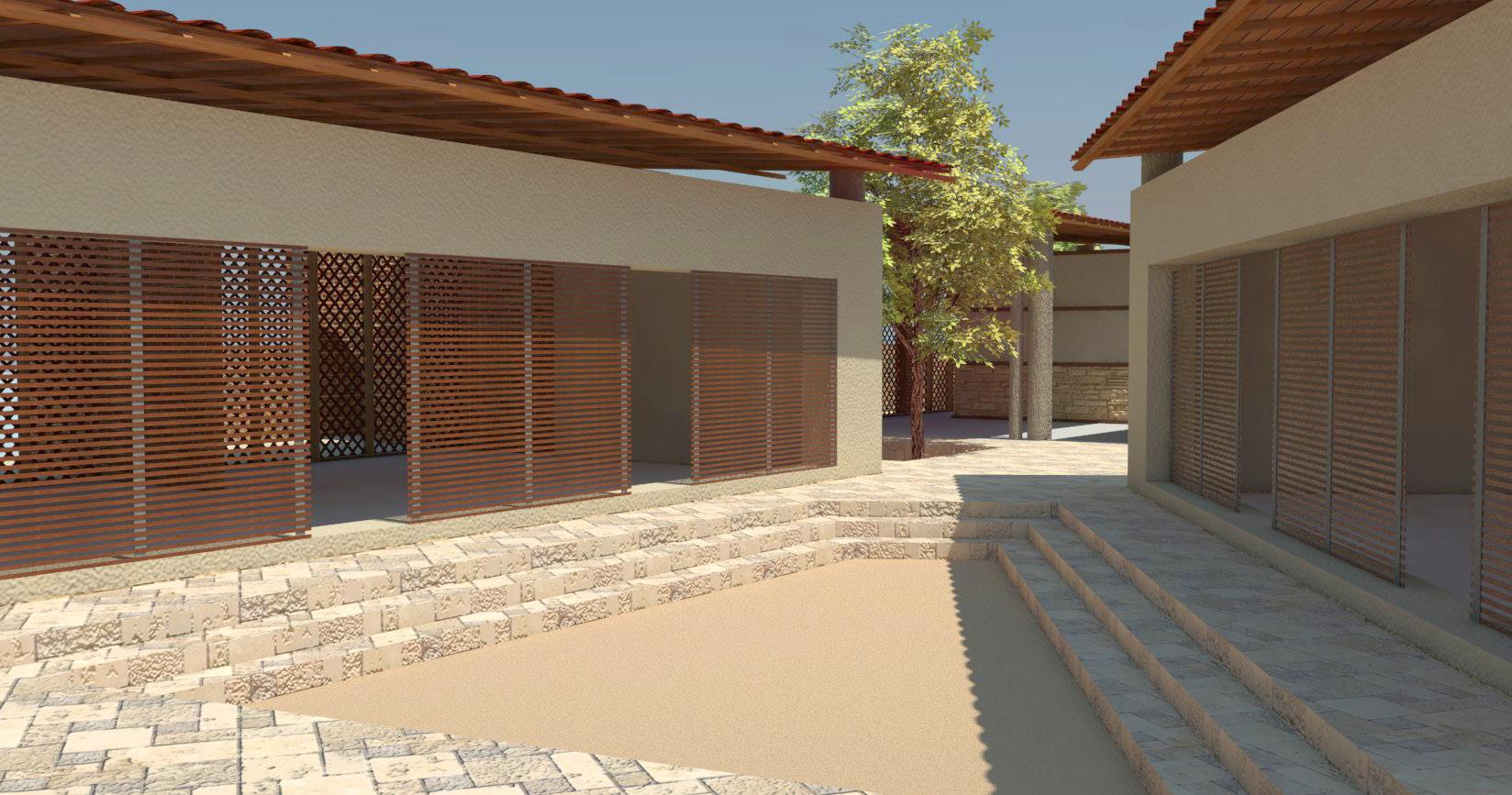
Learning centers serves as an informal learning space , with activity oriented learning. The design is an introvert design but at the same time does not create an enclosed feeling .Th outer walls are semi permissible by the use of lattice work in the wall thus constantly provides a visual connection to the exterior except for the west wall which is enclosed to arrest the harsh sun radiation into the space.

Professional Work Project Year Role Location Type Site area Total Built up area
Design Partner, Atelier Nord Jan2021-Feb2022 Design & Site co- ordination Chennai, India Residential 130.2 sq. m 193.1 sq. m
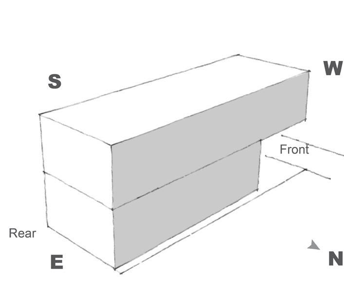
The site is located in a busy crowded residential area. This is a very linear site measuring 20 ft by 60 ft with the shorter span facing the road on West. The neighbourhood where the site is located, the houses are built with maximum plot coverage with no setbacks resulting in wall-to-wall houses. Hence the name “The Sandwich House”. The client requirement was to accommodate 2 small one Bedroom houses for rental purpose and a three bedroom house for his residence.
Considering the site condition and the client requirement, the main constraint was to layout each functional areas efficiently in the given tight space meeting the basic parameters for a habitable indoor living. The client was not particular with any style for interior as long as it was bright and airy. One advantage was the presence of a government land with a natural lake at rear side of the site which was being converted to a park for public use. This became a focal point in the planning of spaces.
On the ground floor, rental units and parking spaces were provided. The upper level housed the private residence of the client. The entry to this residence is shared with the corridor of the adjacent building. Being a linear site with buildings on the North and south side, the only viable option is to have openings for lighting and ventilation on the 20-foot span of the west and east faces, which is insufficient.
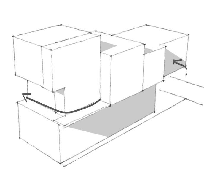
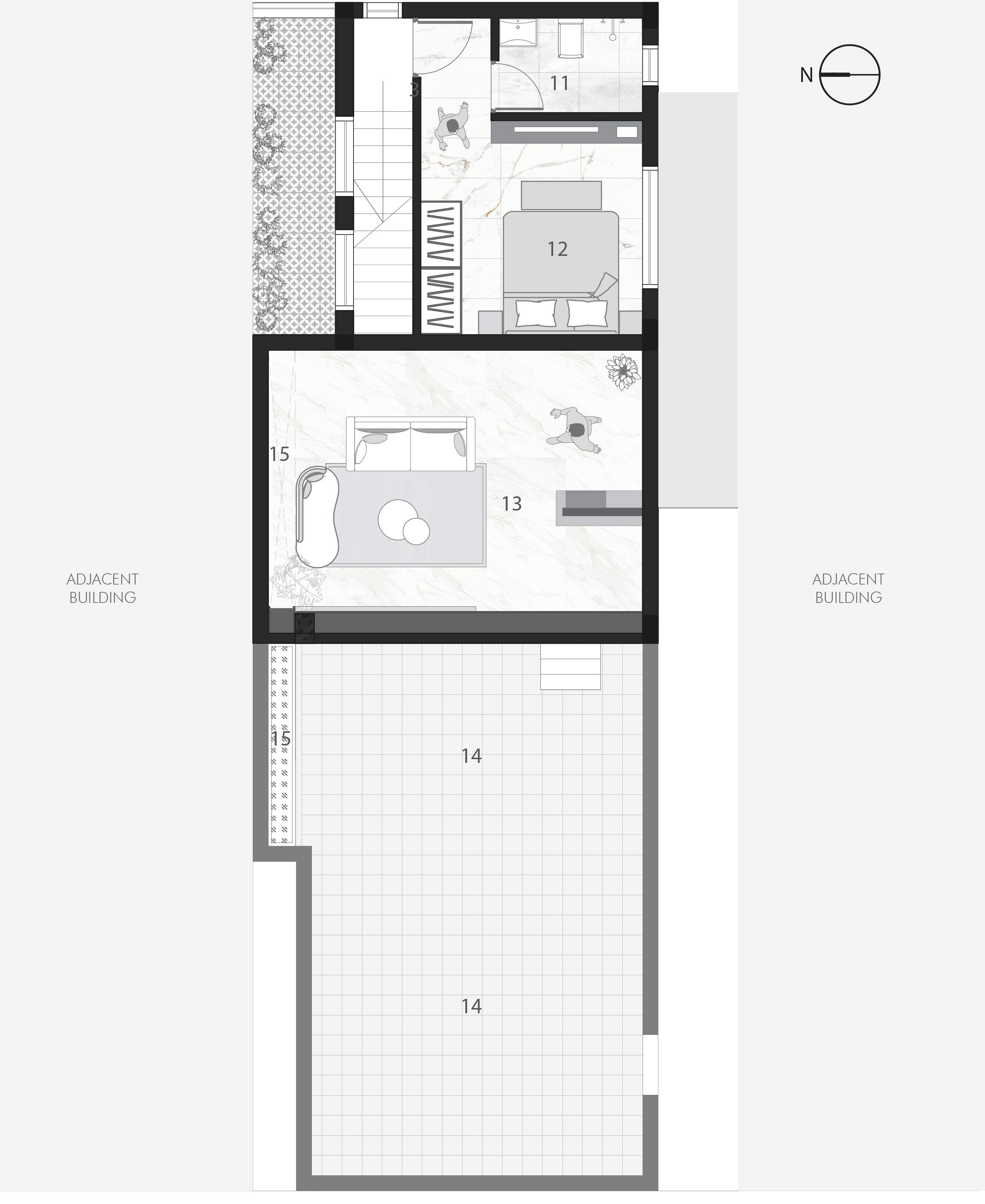
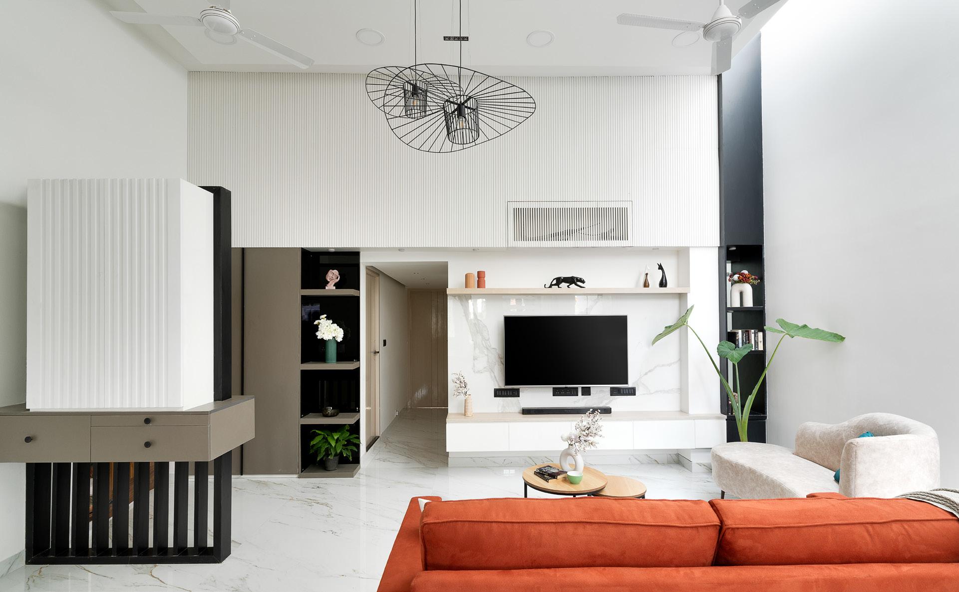
The Design intervention emphasized careful planning of voids and levels to help arrange fenestration and apertures so the mid-section of the span also gets adequate lighting and ventilation. The lakeside served as the project’s main point because the open park area surrounding the lake will bring in uninterrupted lighting and airflow. To harness this advantage to the maximum, spatial zoning was done accordingly. As a result, the semi-private areas like the living and kitchen were positioned at the rear, and the private areas, such as the bedroom, to the front. Accommodating all the rooms on the same level was impossible, so a mezzanine level with a bedroom and an attached bath was added on the rear end. Below this, an open kitchen concept was planned, with a staircase leading to the mezzanine floor. The living occupied the mid-section.
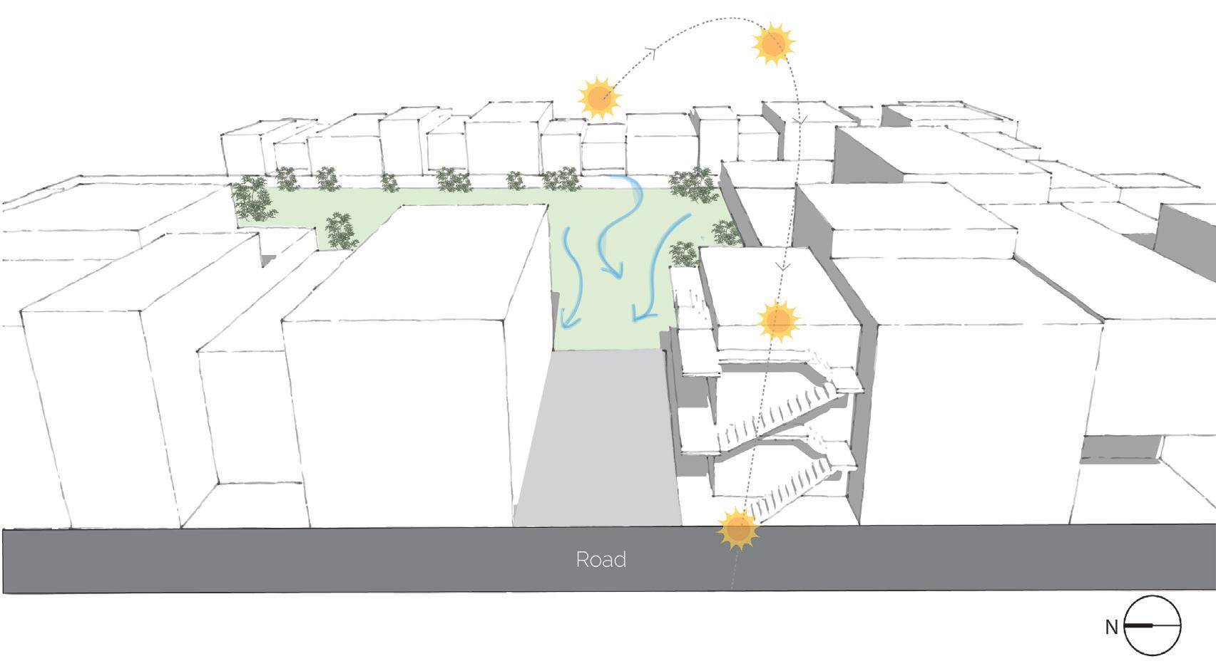
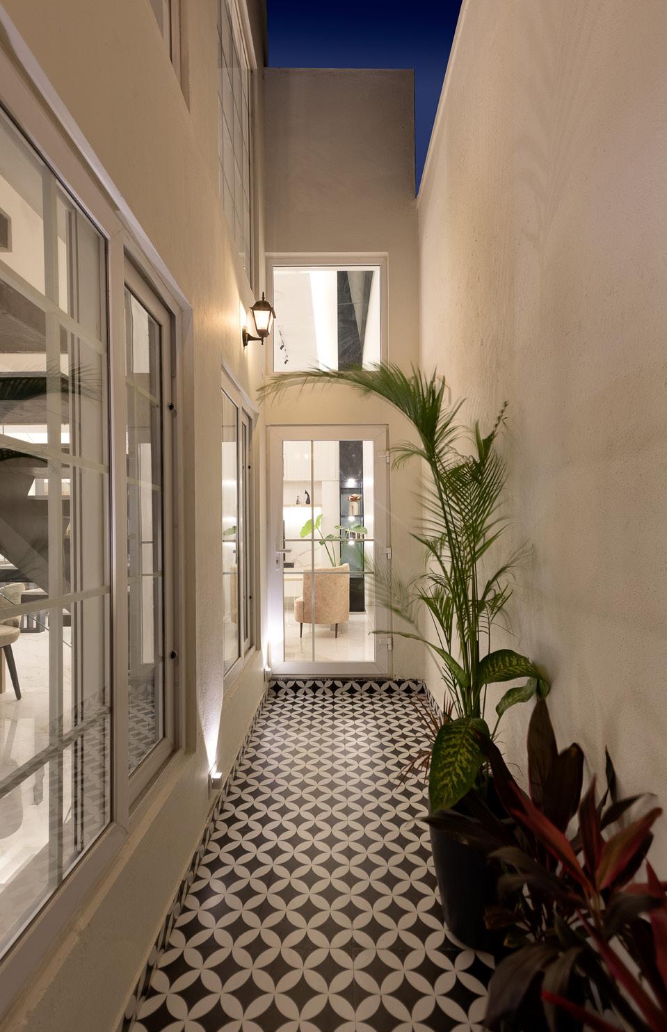
By strategic subtraction of volumes by creating voids on the north and east plane aided in connecting the mid section to the exterior. This created a wonderful wrap around balcony in the north east void, with a partial open-to-sky area from the living room spanning along the staircase wall towards the rear and a covered balcony wrapping along the kitchen wall. Wide openings along the staircase wall brought in good breeze from the west and natural lighting.
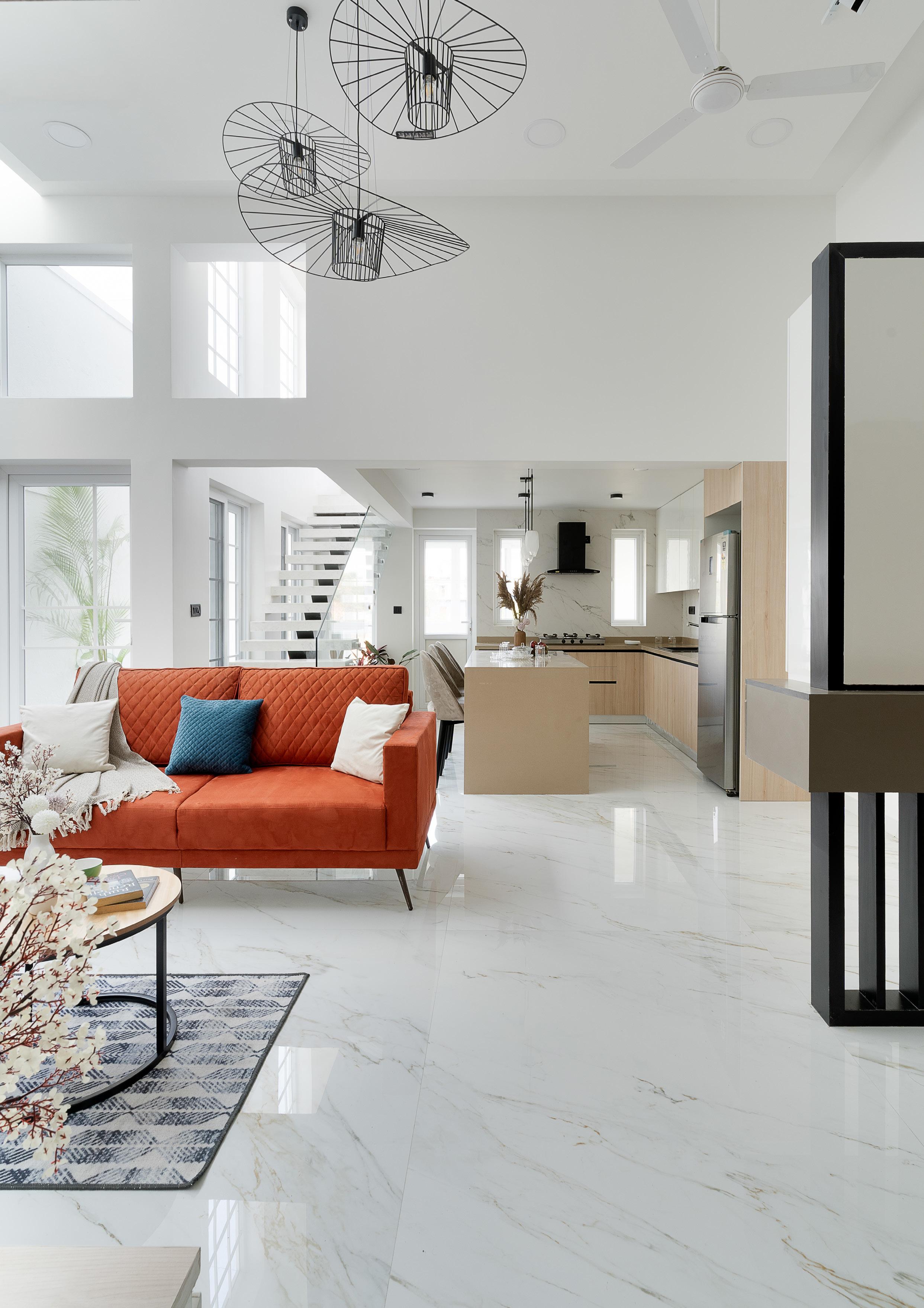
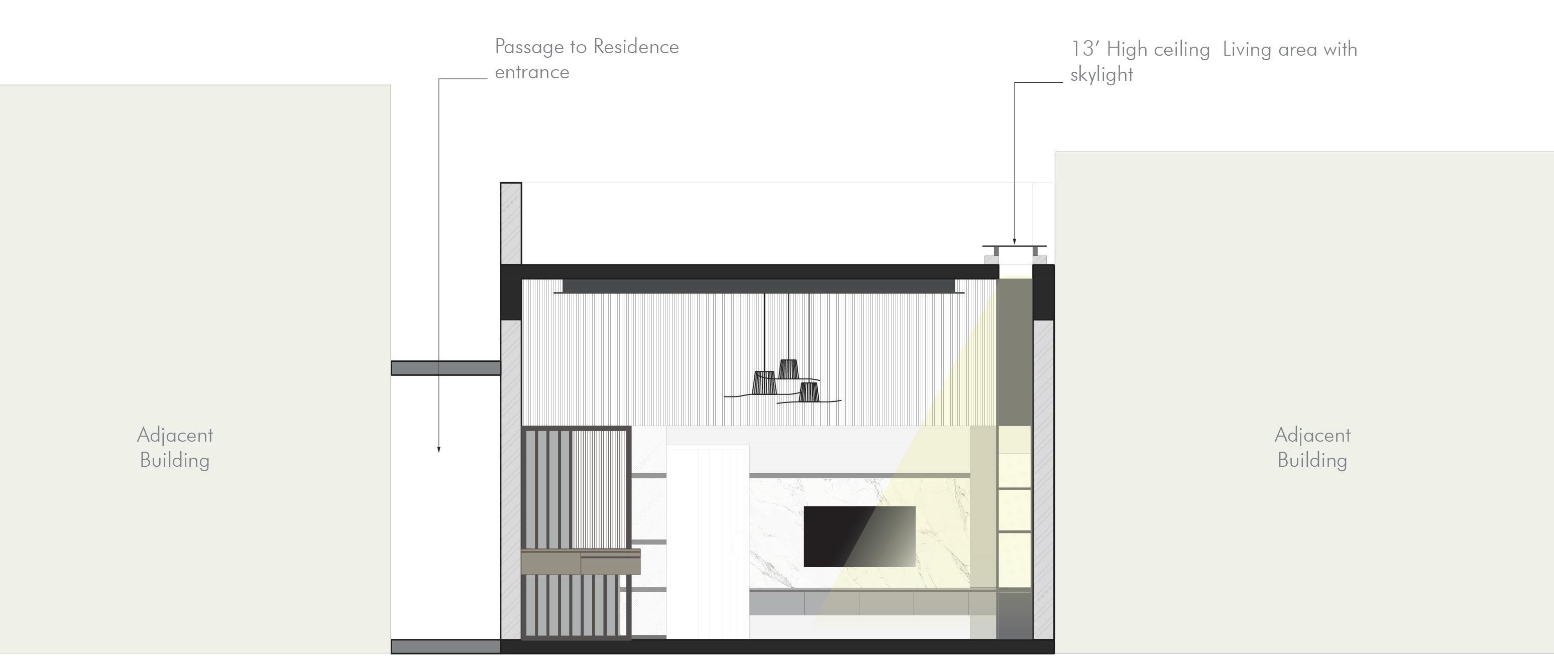
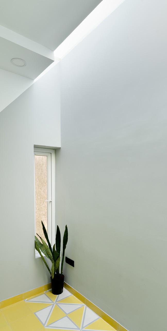
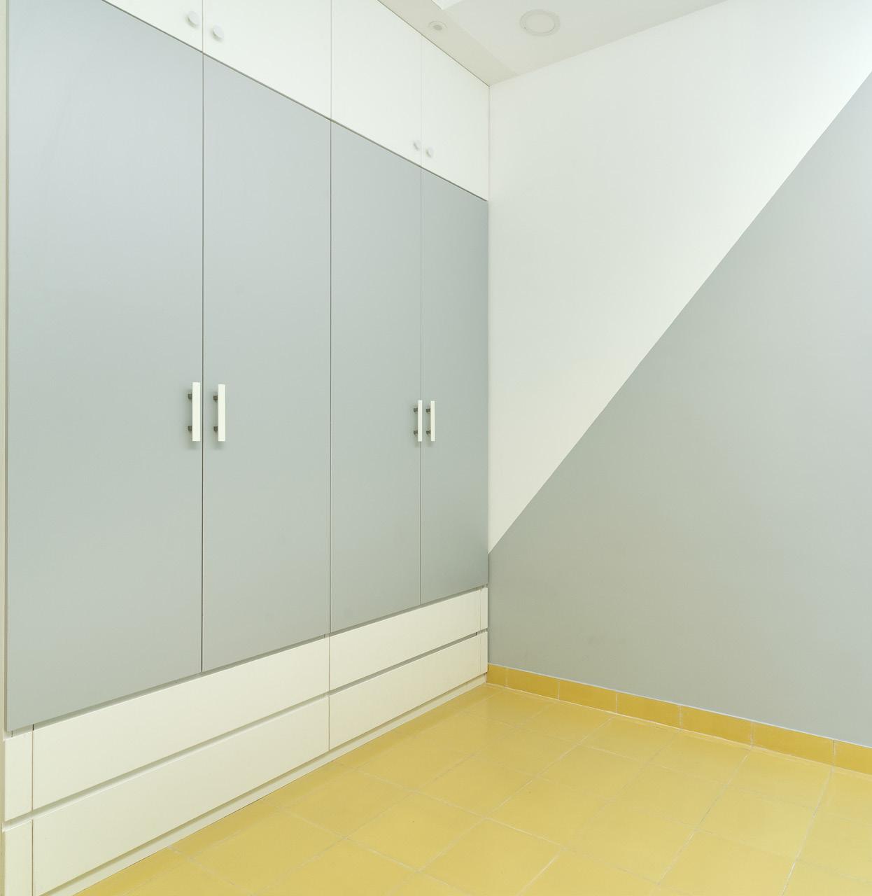
To utilize this the living area was made double height with a skylight to let in natural light. The rear side balcony can also be accessed from kitchen which also housed a small area for utility. A passage from the living space led to the two bedroom spaces. The Master Bedroom occupied the west end facing the road with a walk in closet and bath. Common toilet and Parents bedroom occupied the midsection which also had a skylight to bring in natural light. This thoughtful planning to improve the quality of each space helped in the final outcome. The modern interiors look stunning, a complete contrast to the surrounding context.
The overall project budget is 6,300,000 INR.
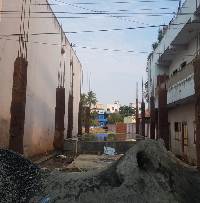

2 Rental units + Car park
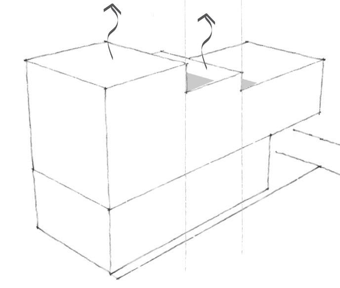
+ deliberate subtraction of volumes to bring in natural light and ventilation into the mid span building by creating setbacks from adjacent building and brining a sense of connectivity to exterior
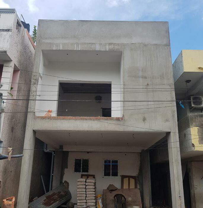
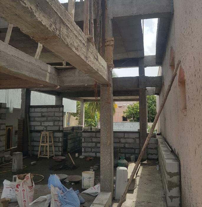

+ addition of volumes to accommodate spatial and functional requirements

+ strategic planning of fenestrations / apertures to harness maximum natural light and cross ventilation



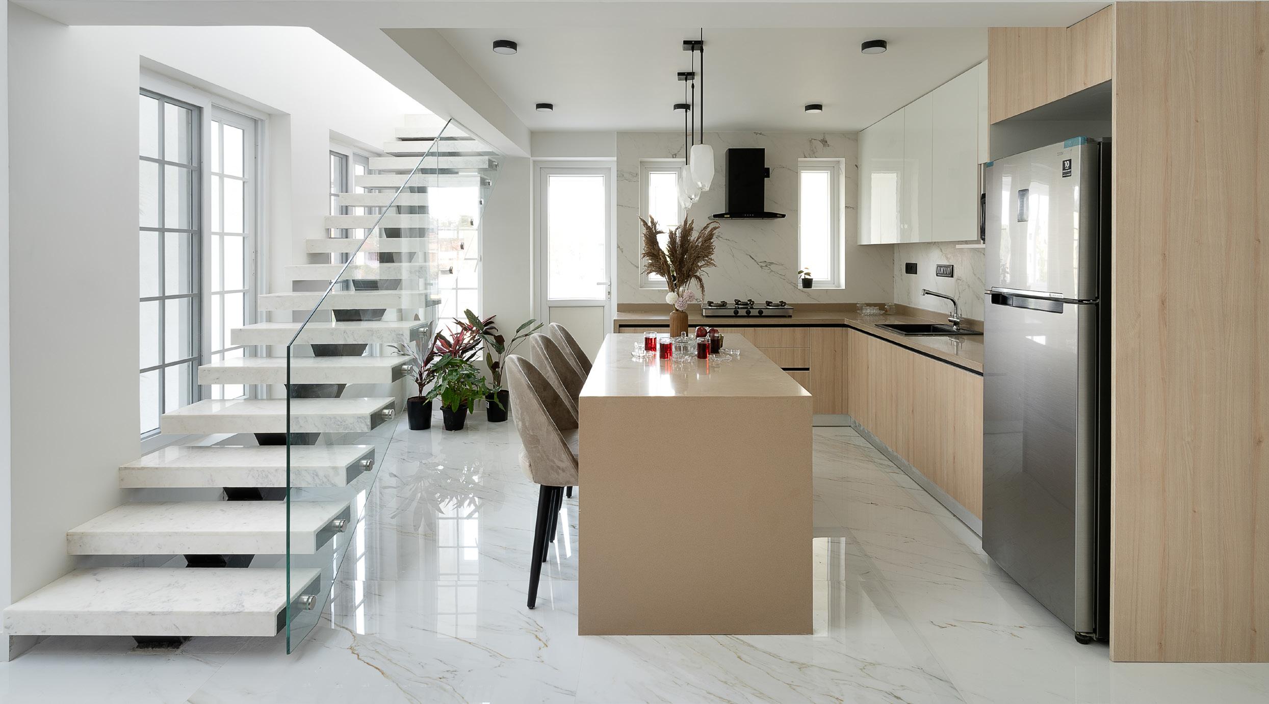
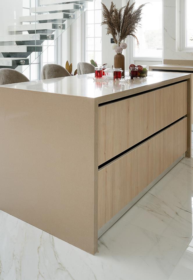
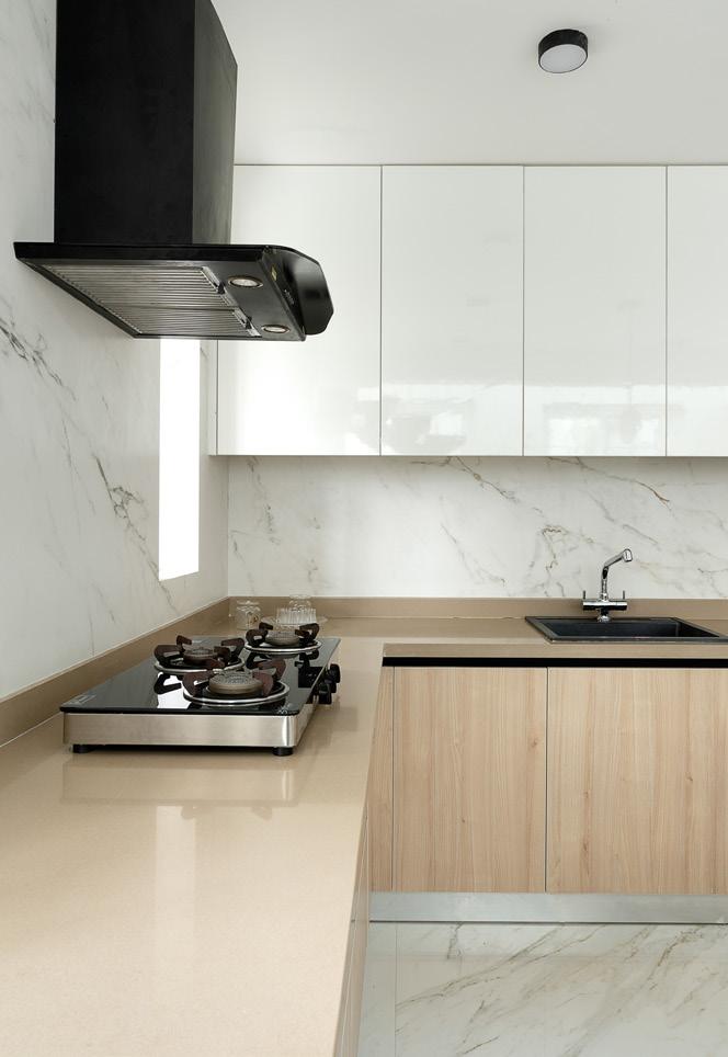
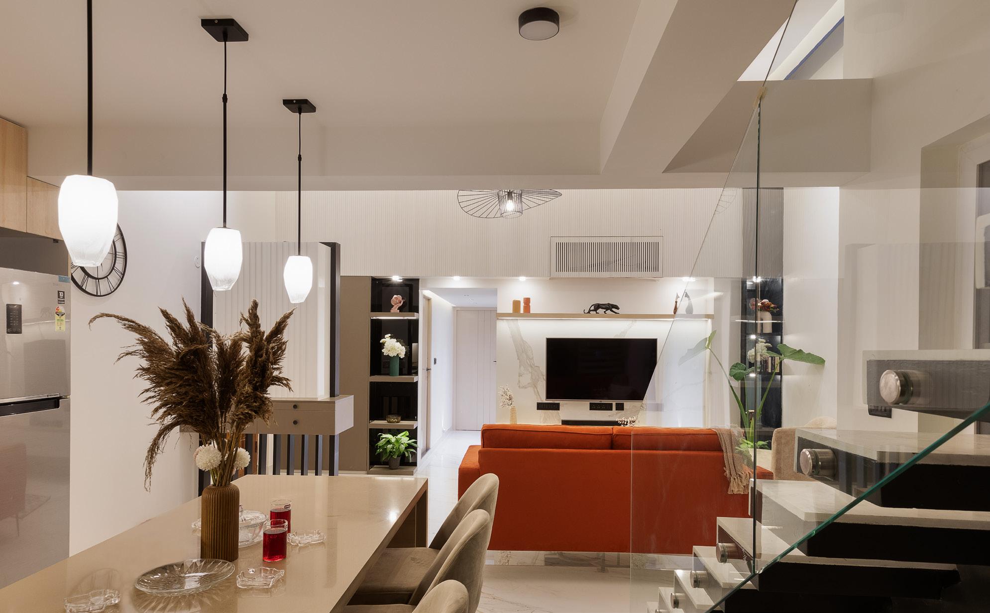
A sleek modern minimalist kitchen finished in white glossy and a light wooden tone laminate to give a sense of warmth to the space. A satin finish marble like vitrified tile covers the backsplash and the Counter top is finished in mocca creme engineered quartz with a waterfall detail for the island counter.
1

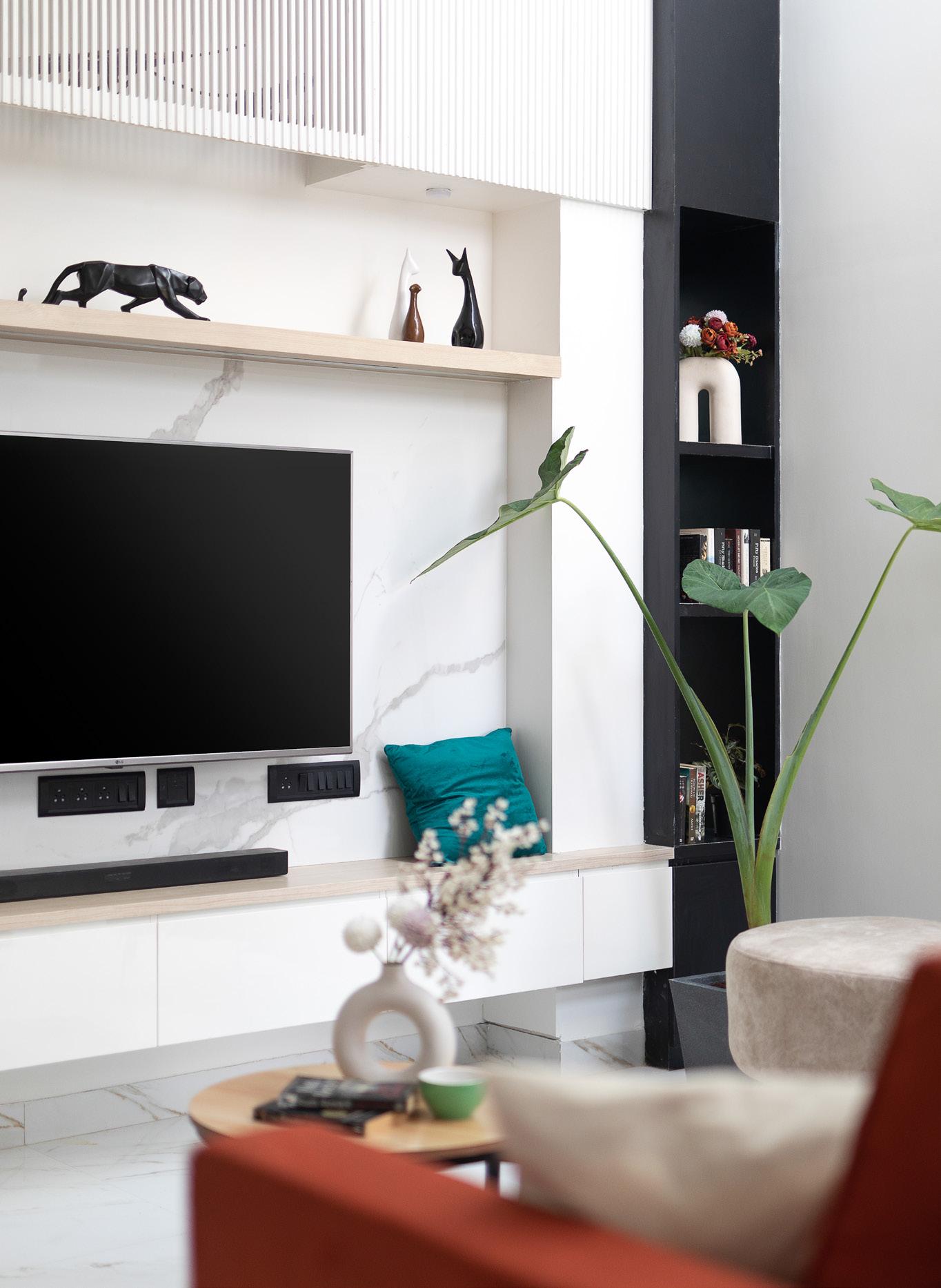
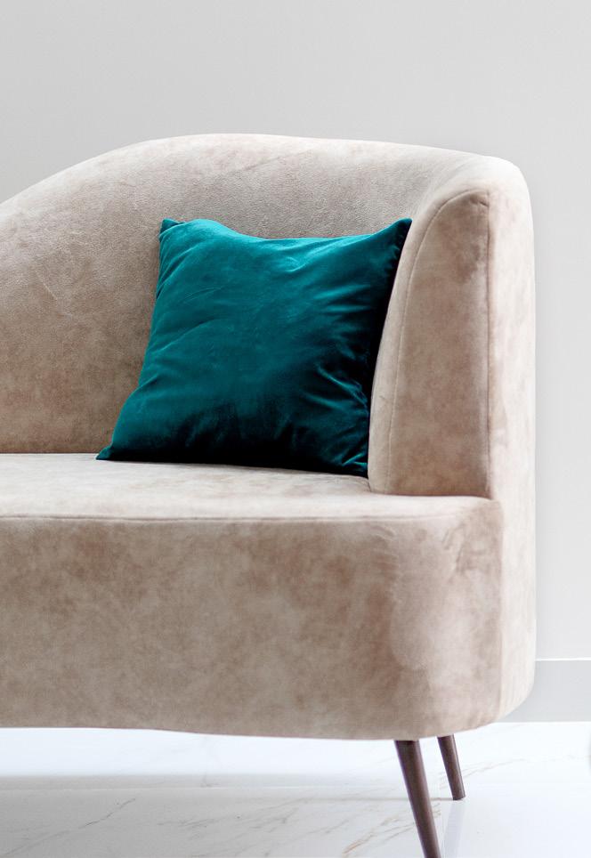
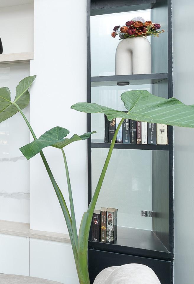
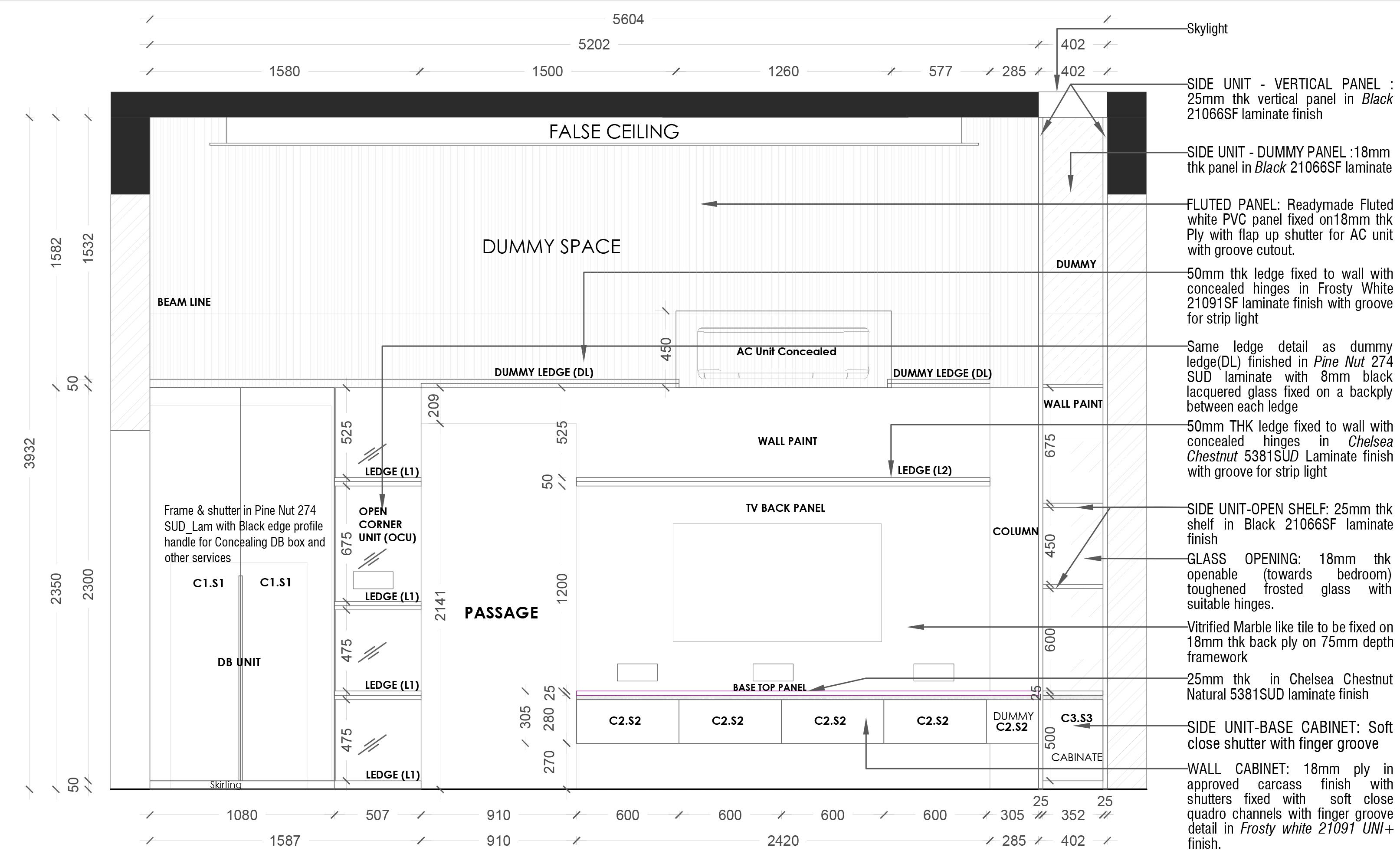
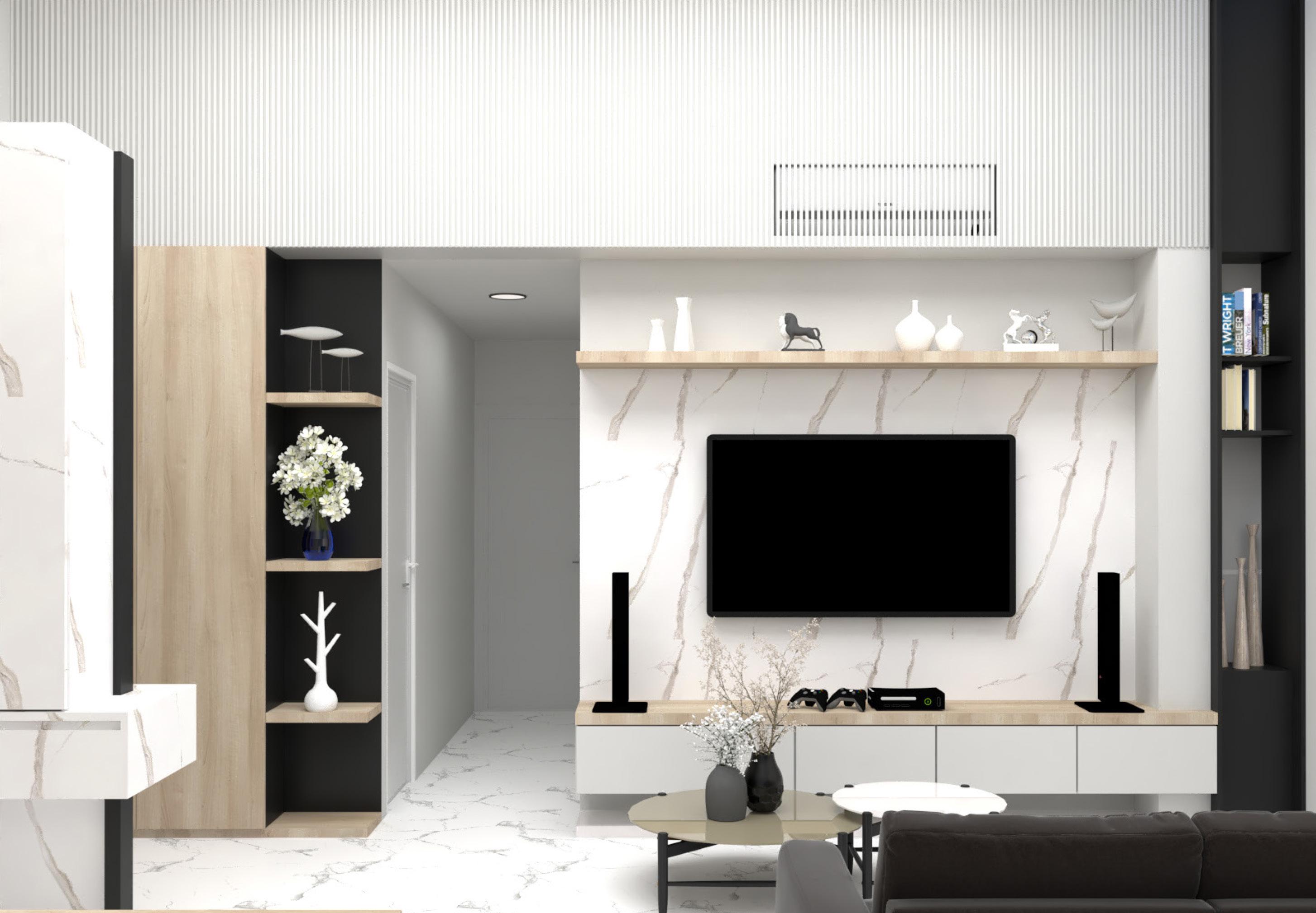
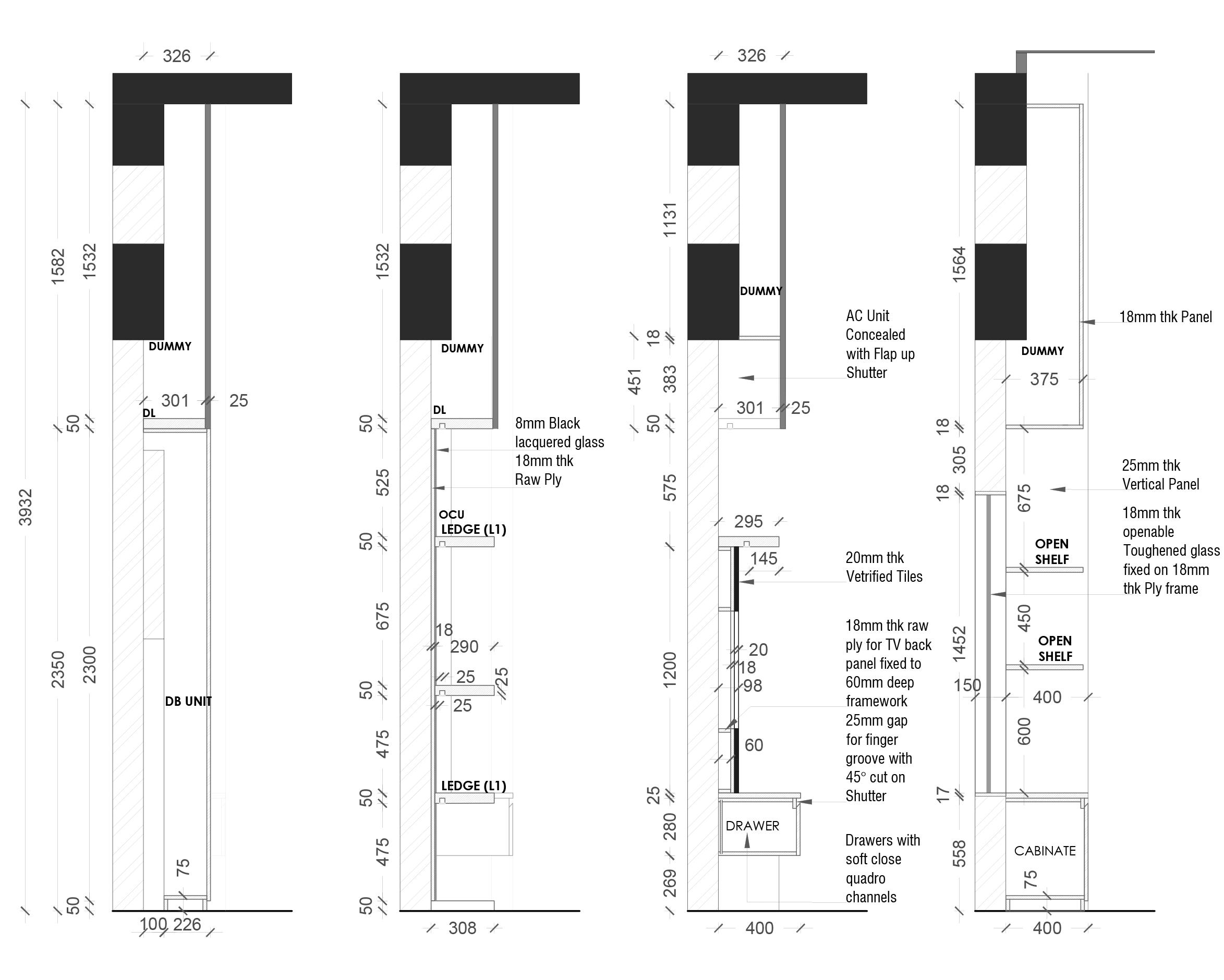
Closer view of the TV unit .1 Custom made sofa .2 Custom made Chaise lounge .3 A storage niche with an opening .4
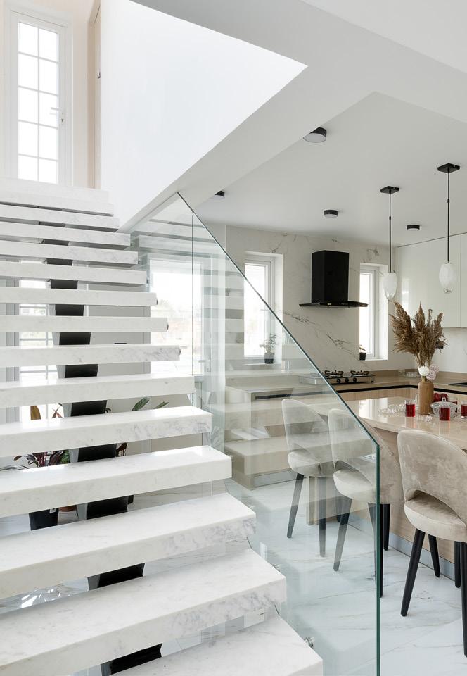
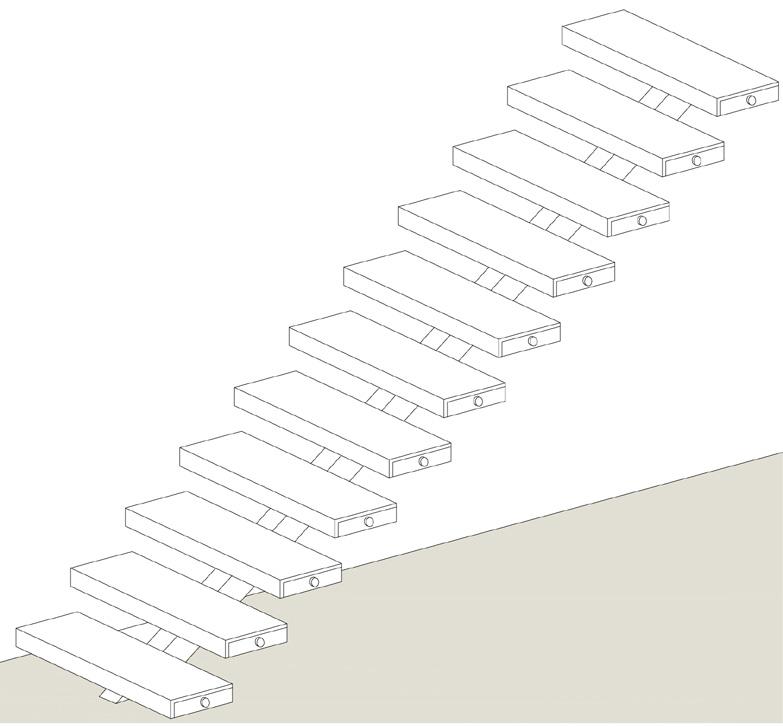
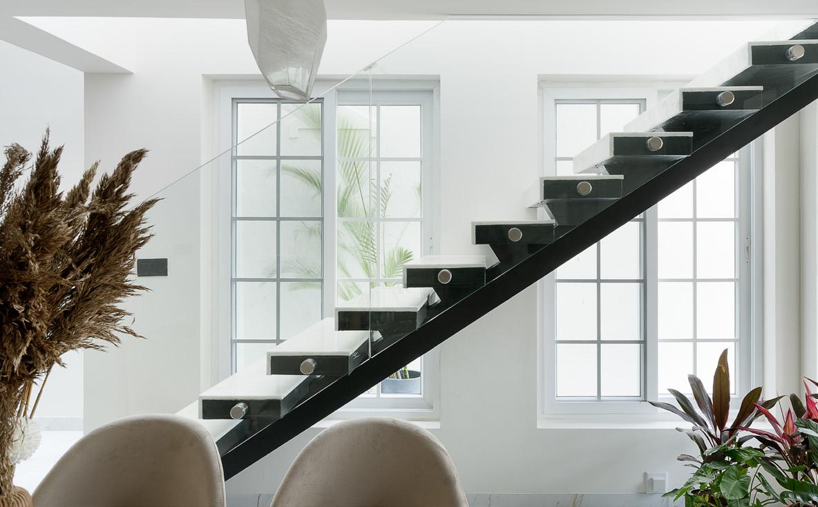
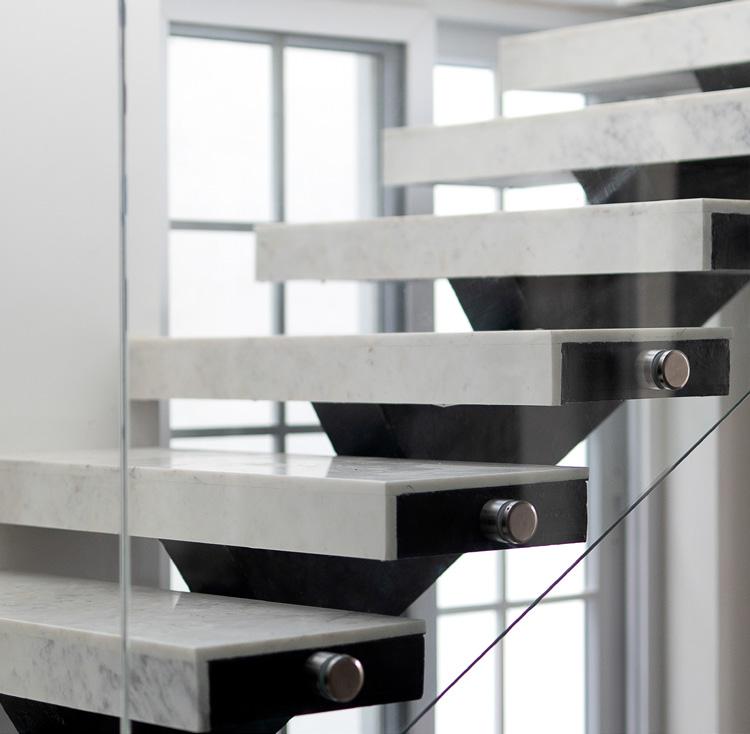
Detail | Stringer beam metal staircase with marble cladding and glass railing
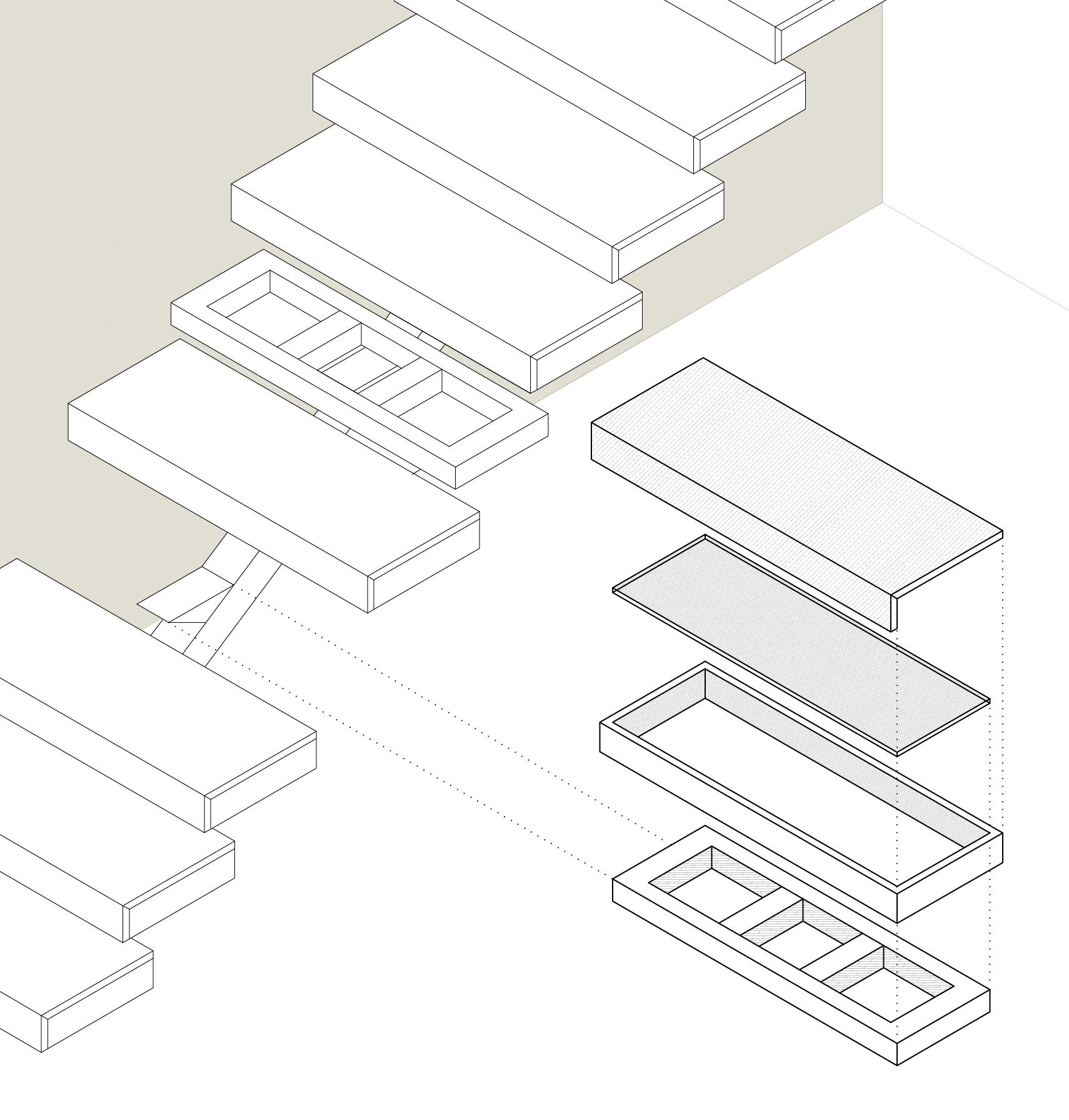
d. Marble floor
c. 12mm ply sheet
b. 18mm ply boxing on 4 sides
a. Metal frame
This design aids in unhindered natural light and makes the area look more light and spacious
A closer look
A partial view of Wrap around balcony space
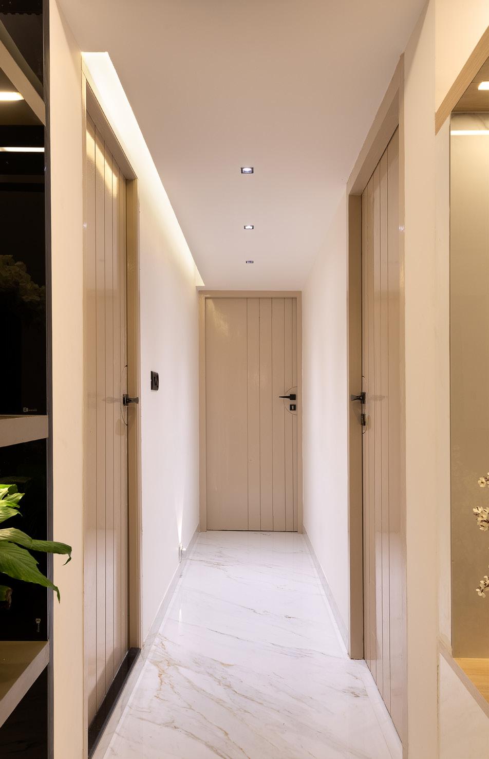
View of the passage leading to the private space
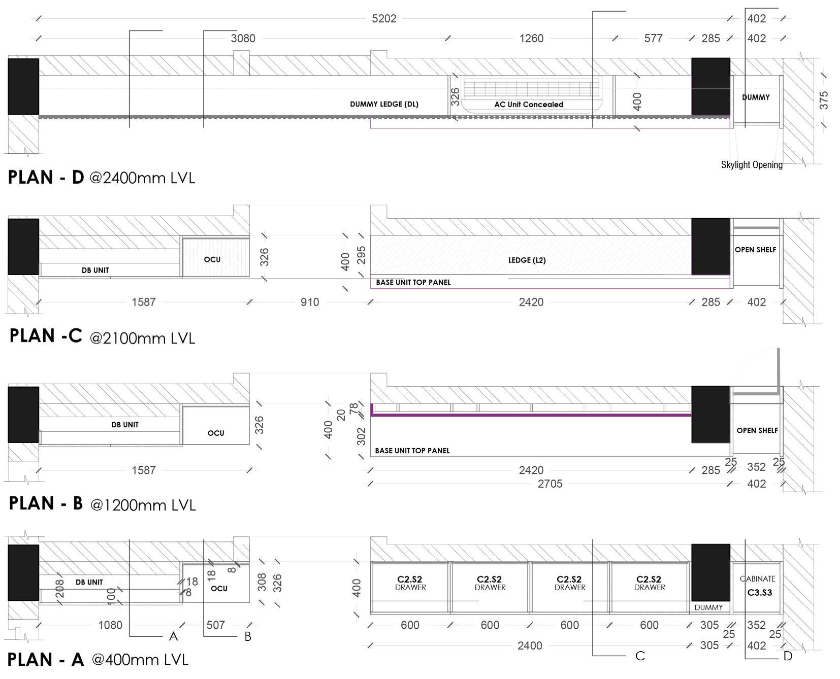






Professional Work Project Year Role Location Type Site area Total Built up area
Design Partner, Atelier Nord Oct2020 - Jun 2022 Design & Site Co - ordination Munivazhai, Tamil Nadu, India Residential
2.5 acres (10117.1 sqm) 306.5 sq. m
The Rural Twin House is the result of a young working professionals decision to return to his home town from the city and start an organic farming business. He wanted to build a house on part of his land and use the rest for his livestock, poultry farming and organic farming. A comprehensive approach toward the overall development of the site with respect to the zoning of residence and other activities was a prerequisite.
The main requirement was to build two residence integrated as one single unit. The primary residence is for the client and his family consisting of his wife, a kid and 4 dogs. The secondary residence is for his parents and brother. The two houses comprising 5 bedrooms -has to function separately yet look cohesive. Another aspect to consider was that the dogs should have an open space within the residence to roam freely but also not interfere with the inmates of the second residence.
A practical and functional development was what the client needed where aesthetic aspects were clearly not a priority. In comparison with the allocated budget, the spatial requirements were on the higher side. A conventional approach to this requirement was not a solution with respect to the given budget.
The main challenge was to factor the client requirement within the given budget since this project was taken up during Covid period and the prices of the Building materials were rapidly changing. Electricity is very scarce in the village and hence minimizing the dependency on electricity for thermal comfort was also a priority.
Total Budget for Residential development on site INR 70,00,000.
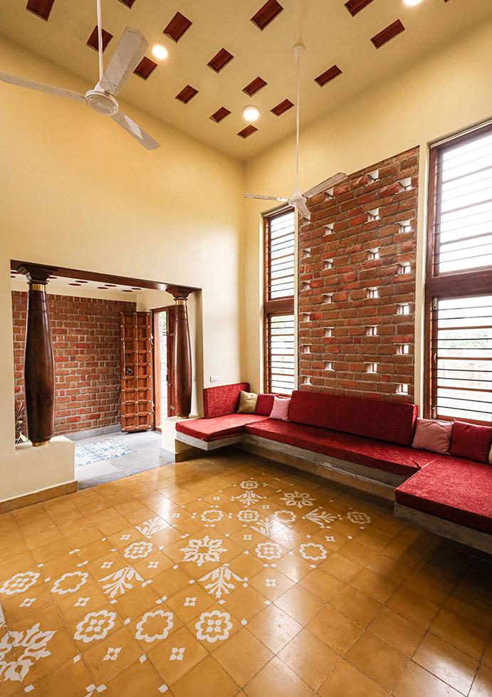
The client’s brief left us with two train of thoughts; one is how it should be built and two is, what it should have. The former should be a house that sits suitably on earth in synchronization with the neighbourhood while the latter draws inspiration from an experiential charm of an ancestral South Indian house with a central courtyard. Our intention was to build a house that carries the spirit of a traditional home while responding to contemporary values and issues.

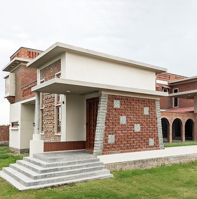
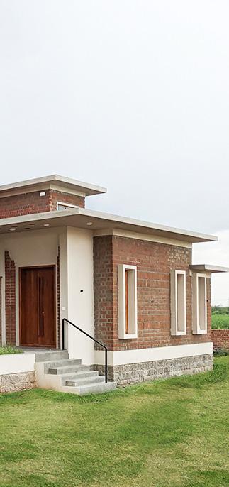
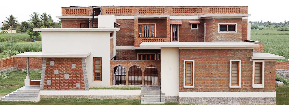
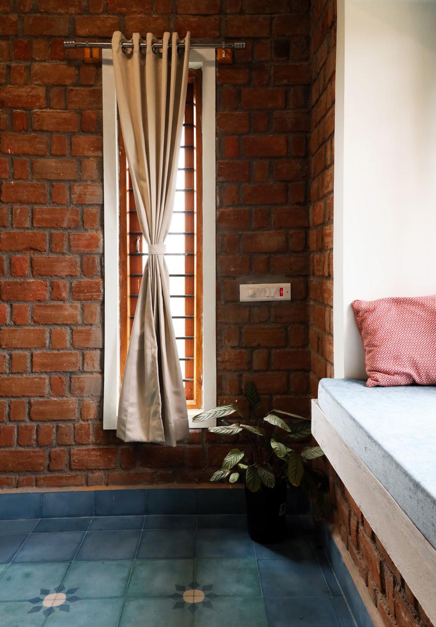
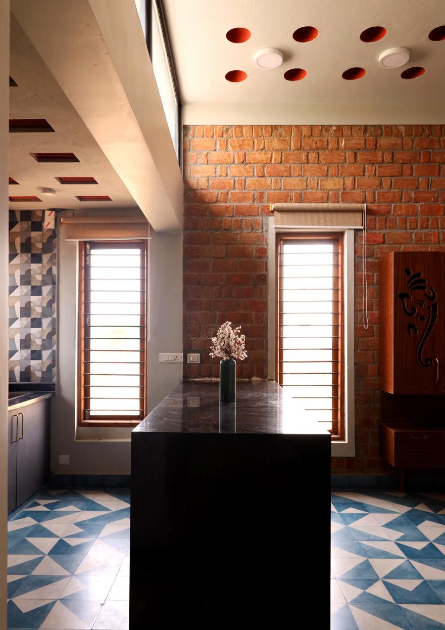
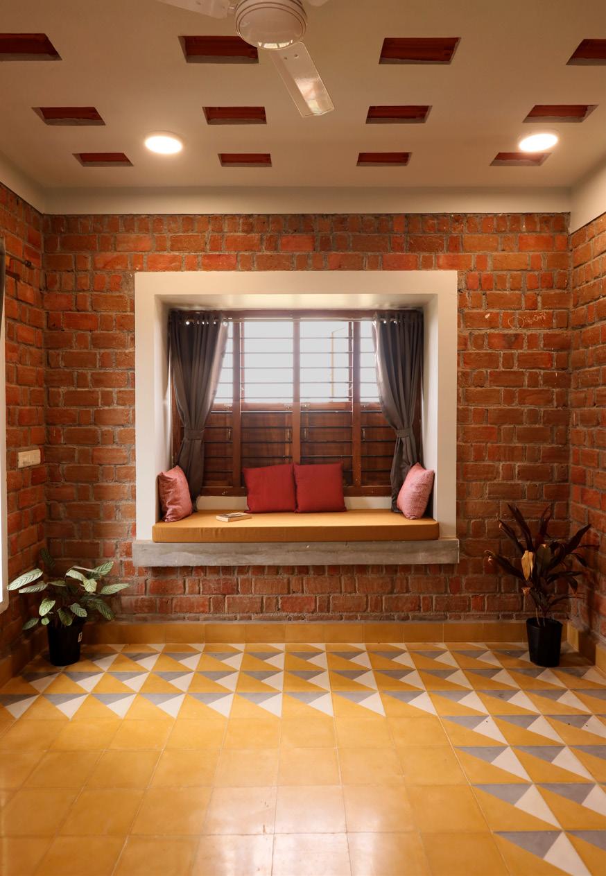
The site location is on the outskirts of the suburban town of Kallakurichi, a rural location with an agricultural field as backdrop. This was a benefit because it allowed for beautiful views as well as ample ventilation and natural light. As we moved around the locality, we noticed a quarry, hand-made bricks, and cottage manufacturing of clay products. We realized making use of these resources will help utilize the budget. With work experience from COSTFORD, I drew inspiration from Architect Laurie baker’s Non load bearing cost effective construction technique. Thus we decided to go with a non load bearing structure with Ground plus one level. A rustic look with exposed bricks and stone set the tone of the design language.
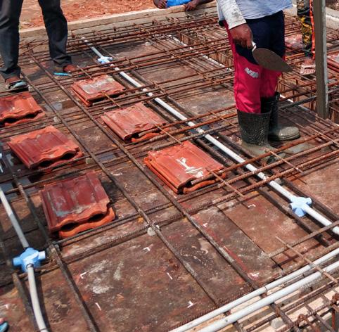
The site spans around 4 acres of land surrounded by agricultural fields on east and south. The site had an existing house in ruins which was more than 100 years old. By demolishing this structure we utilized the rubble for foundation, sand for land filling and few elements like 2 columns were restored into the new residence as feature in foyer and unbroken roof tiles were utilized as filler in roof slab.
0 1 2 3 5m SCALE 1:150
05 Kitchen 06 Utility 07 Store room 08 Guest Bedroom 01 | Floor Plan
09 Wardrobe 10 Bathroom 11 Parents Bedroom 12 Powder Room
The two residences wrapped around the courtyard. The primary residence was zoned towards the North side facing the road comprising 3 bedrooms with attached bath, a hall, a dining and a kitchen. The secondary residence, which included two bedrooms with connected bathrooms, a powder room, a living room, and a small kitchen, was situated to the south and faced the farmlands.
The site has a moderate-hot climate, with the South and West receiving the most radiation. As a result, semi-private spaces are carefully planned to provide optimal thermal comfort while private spaces are allocated to the east. The stairwell of house 2 majority covers the south side and the west-facing
13 Corridor 14 Patio 15 Courtyard
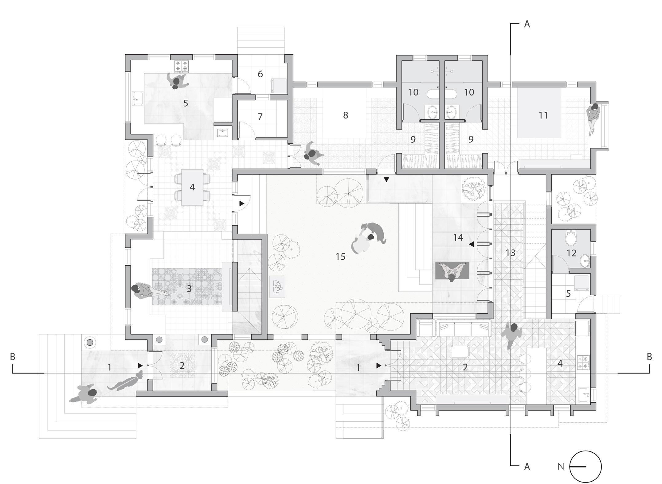
09 Wardrobe 10 Bathroom 16 Terrace 17 Kids Bedroom
18 Master Bedroom 19 Office 20 Balcony 21 Guest Bedroom 02
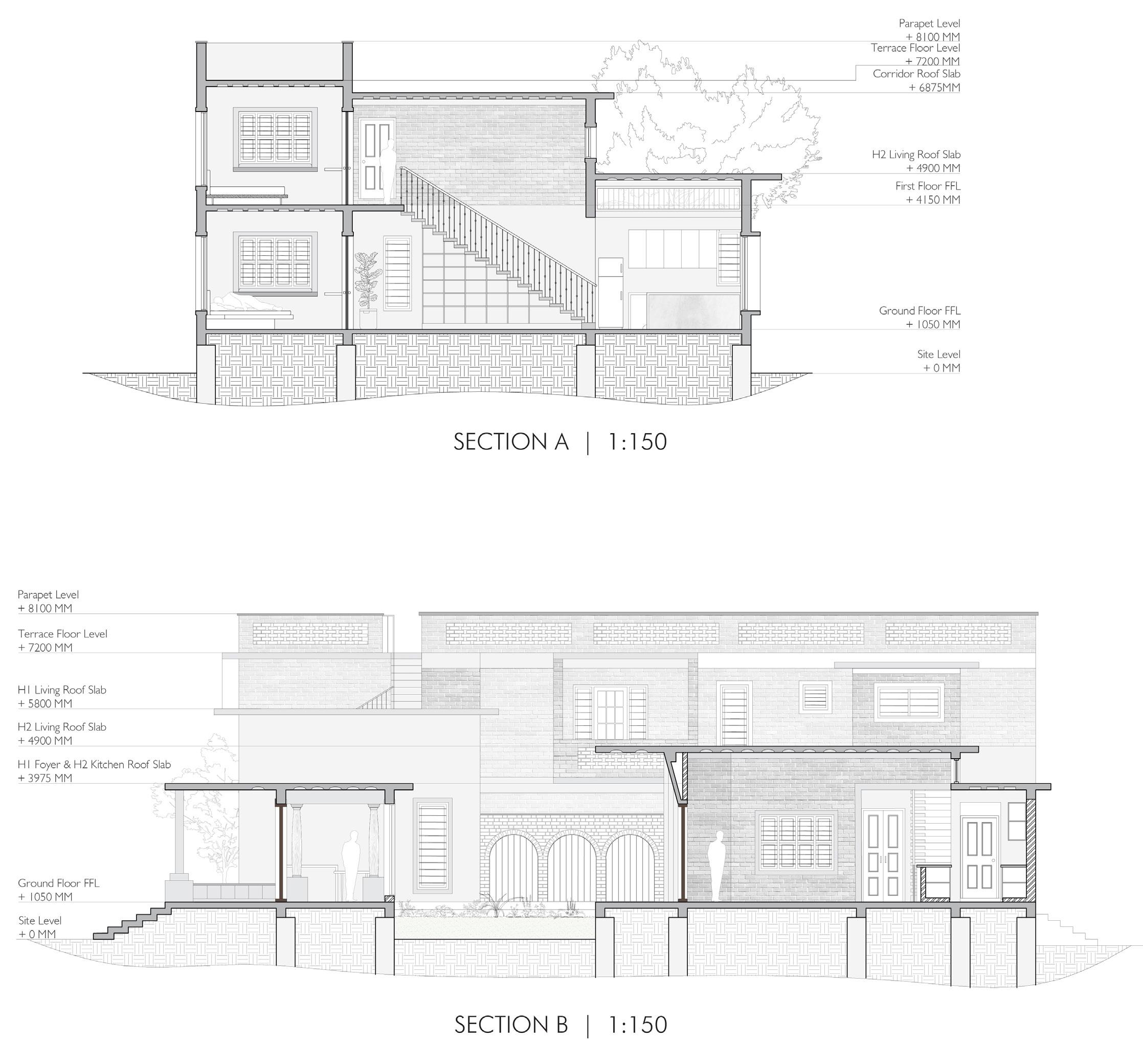
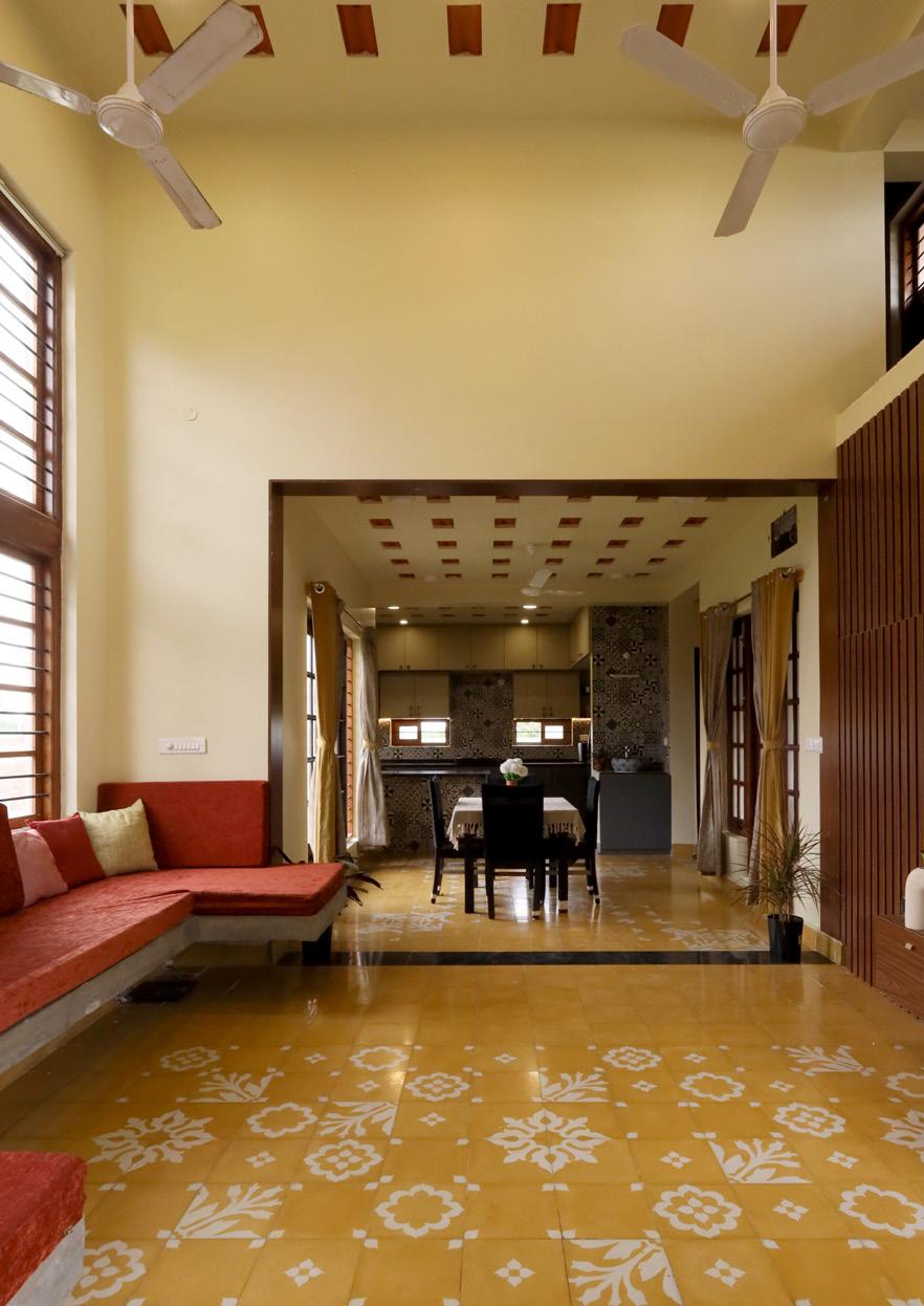
semi-private areas have high ceilings for thermal comfort. Together, these two volumes serve as a thermal barrier to the courtyard. The courtyard’s west side includes arches with grills and a pool of water in front that serves as a fenestration and allows air to enter the building from the west The main entrance of both residence are aligned in same line on purpose to create a visual alignment with the garden area in-between.
By adjusting the ceiling clearance of each specific space aided optimum material usage while creating intriguing levels in the facade. Thus, the Rural Twin house is an embodiment of a collage made from these local and recycled elements.

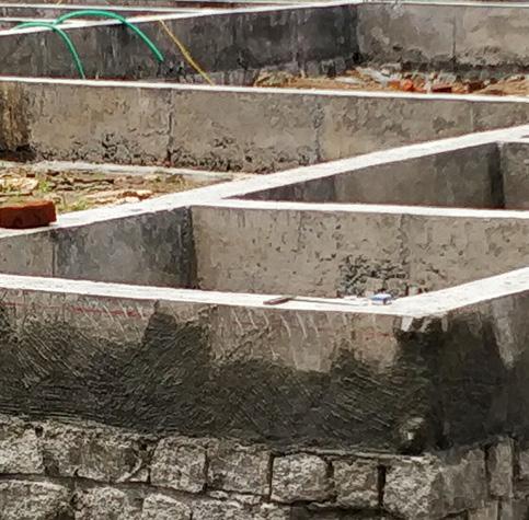
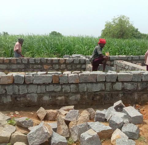
Random Rubble Foundation with coursed rubble masonry | Concrete belt for additional stability

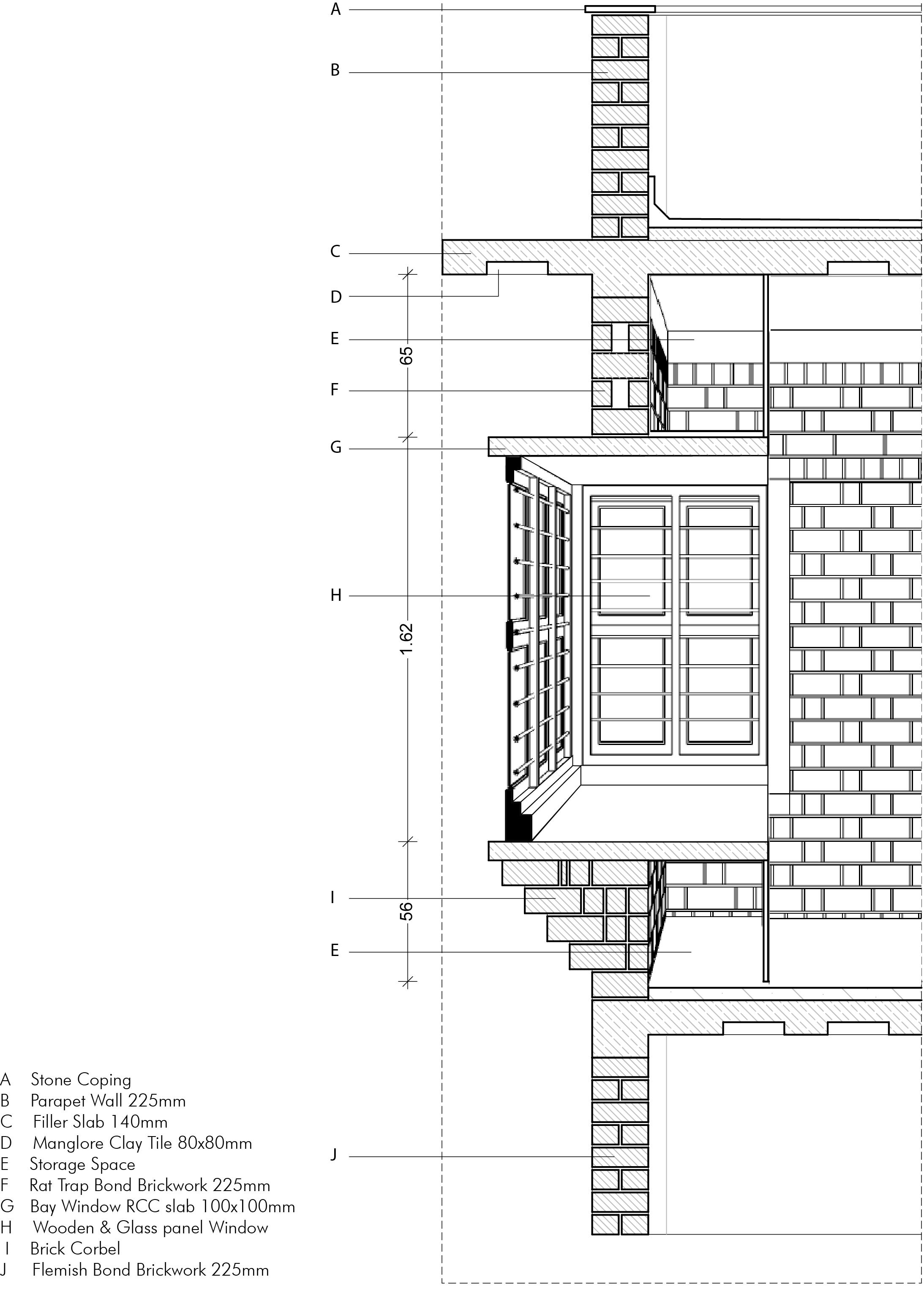
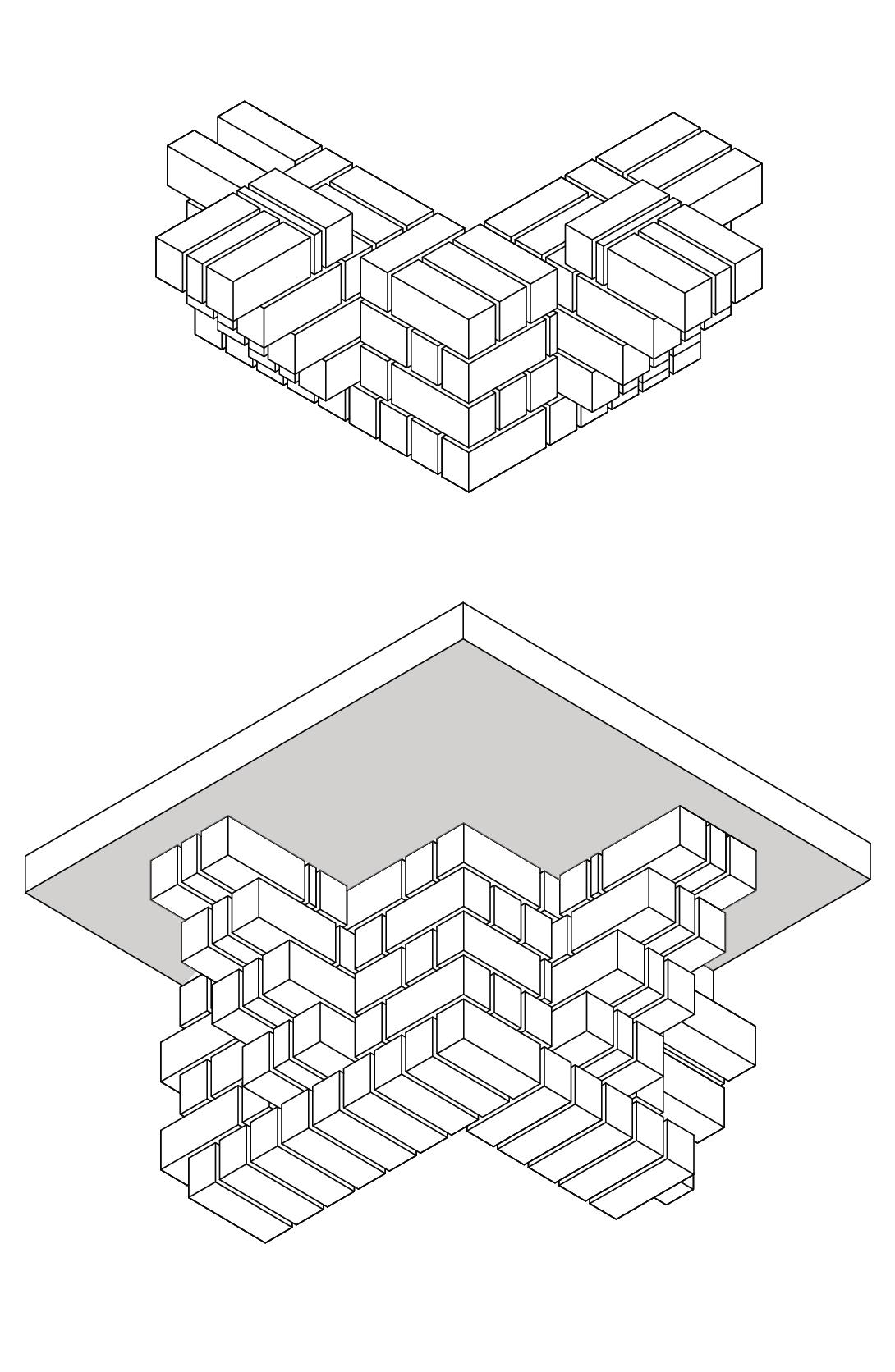
Rat-Trap Bond Brickwork with recessed pointing | Flemish bond for Service areas
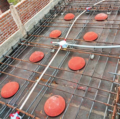


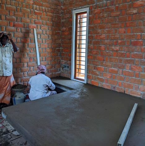
Brick lintel to minimise mortar | Cut lintel for specific openings

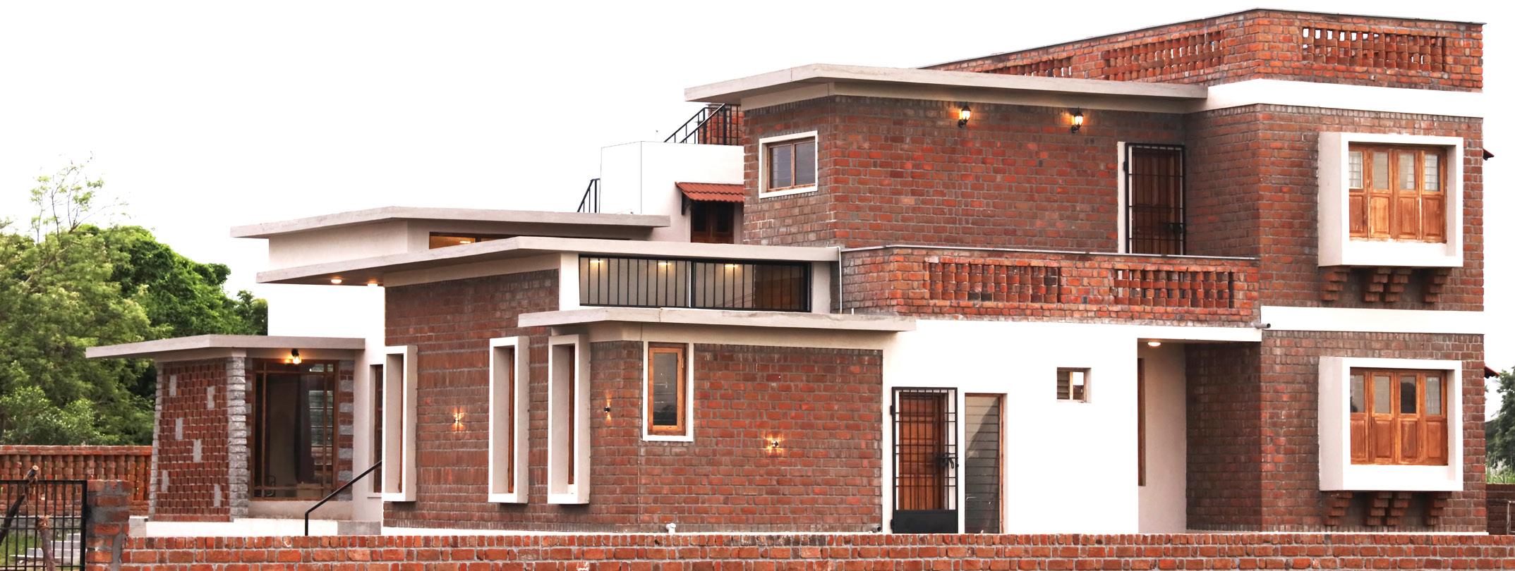
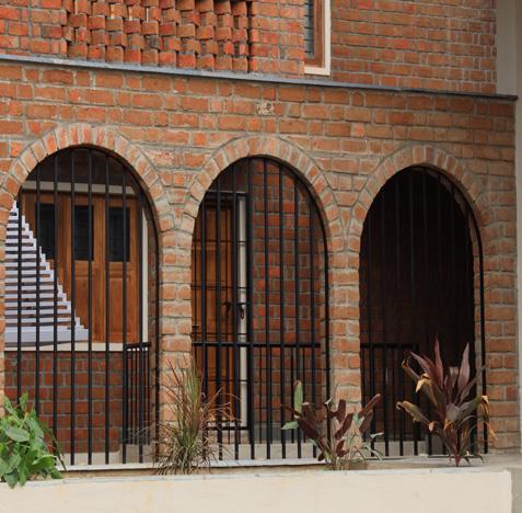
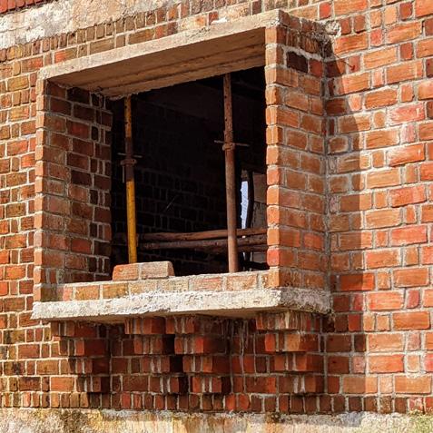
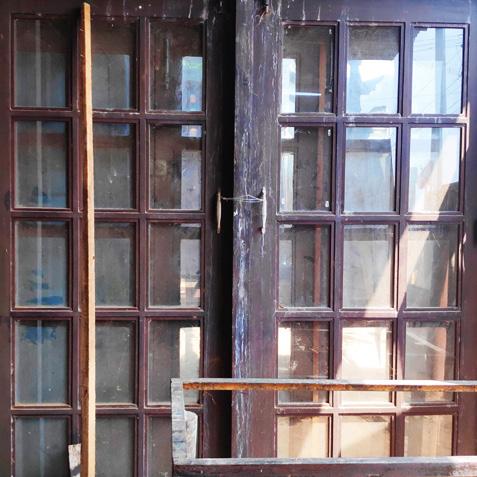

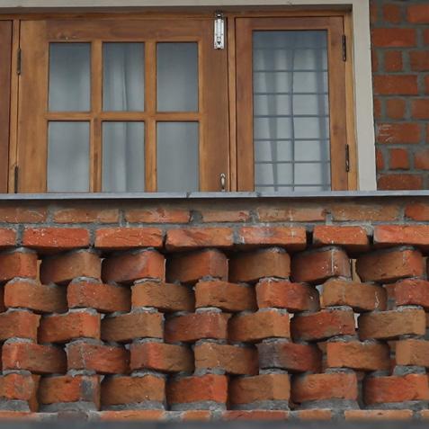
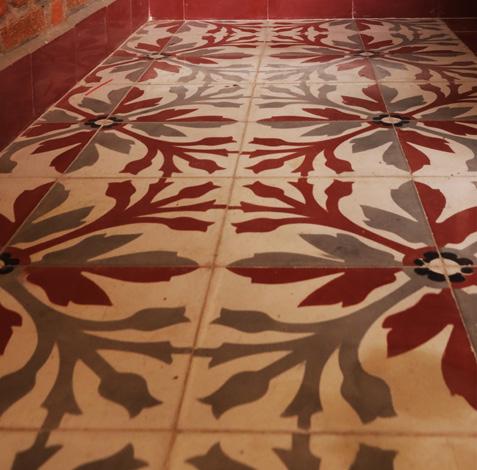
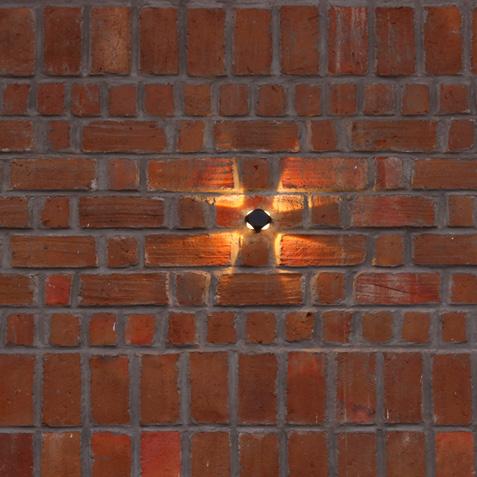
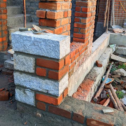
View of North elevation of House 1 with exposed brick facade with glass punctures to break the monotony of brick and add drama to the interior living area.

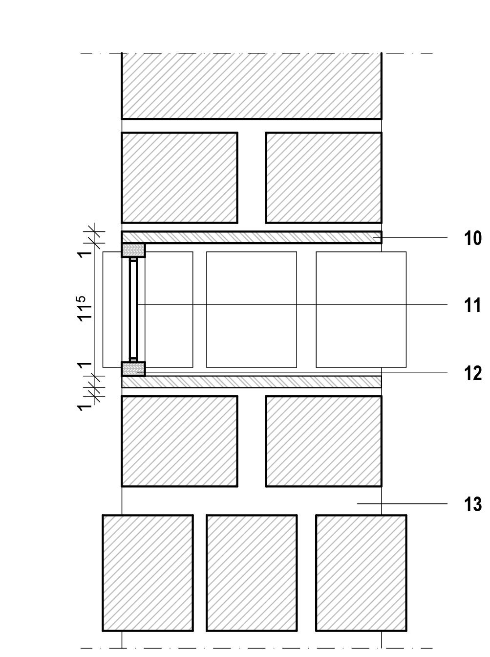
Detail A 1:5 Section through Facade 1:20

1 Fillerslab 140mm with Manglore Clay tile 80x80mm
Built in seating (RCC slab)
Athangudi Floor tiling
PCC 150mm
Plinth Beam 225 x 381mm
Coursed Rubble masonry
Rammed Earth
PCC 150mm
Random Rubble foundation
GI Metal Plate 10mm thk
8mm Toughened glass
Wooden Frame
25mm thk Mortar


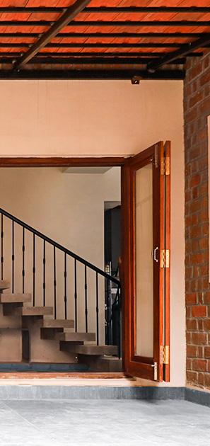
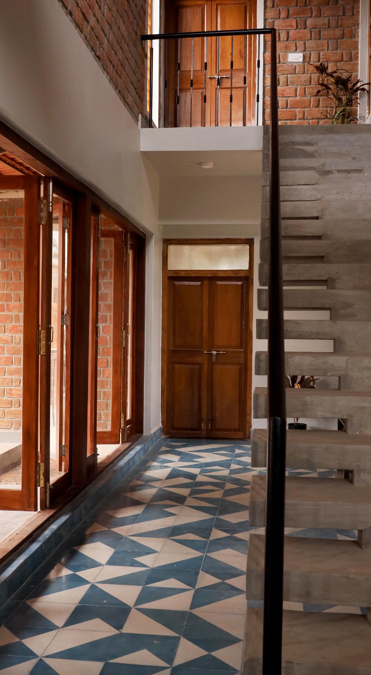


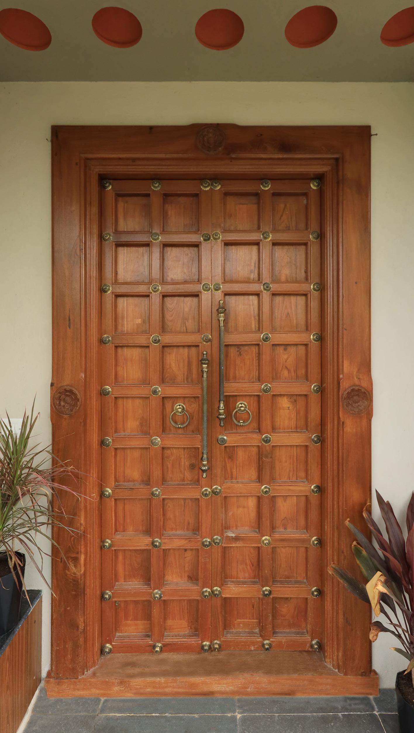
opening in foyer 1 emphasis the thoughtful alignment of both entrances creating a visual treat.

nanditawarrier.n@gmail.com | +1 (602) 299 2652