3 minute read
Picture-Window Perfect
STORY BY HOLLIE DEESE | PHOTOGRAPHY BY RACHEL TENPENNY
When Dr. Stephen Fesik first tackled a remodel on his 1989-built traditional Forest Hills home about five years ago, he completely renovated the inside, swapping out brass chandeliers, dated knobs and flowery wallpaper for a cleaner, more modern design.
One thing he didn’t include in the project was new windows and doors, and that decision became a growing issue for Fesik. There was no way to open them and get a little fresh air every once in a while, and they were an eyesore.
“They had brass crank mechanisms that didn’t work, and they just didn’t fit the house,” Fesik says.
Melissa Frederiksen, principal interior designer and owner of Atmosphere 360 Studio in Nashville, also happens to be dating Fesik and worked with him to achieve just the right look in windows to go with what they had achieved with the earlier remodel.
“Oftentimes, people are more focused on style, colors, furniture choices and other cosmetic issues,” Frederiksen says. “Old, outdated windows can be the weak spot and become very obvious when everything around them is new.”
The variety of window styles available on the market can be overwhelming, so together Frederiksen and Fesik worked with Pella on the upgrade, changing paned windows in the back of the house to picture windows, to take full advantage of their beautiful view.
“The salesperson, Jonathan, was extremely knowledgeable about the product, and he actually immersed himself into the project,” Fesik says. “The sunroom, he must have spent an hour working with us to design it properly so it fit within the guidelines of the windows he could get, but also had the best aesthetic value.”
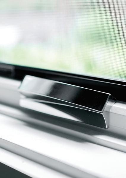
They went with Pella’s Architect Contemporary Series, which appealed to them because of the narrow lines and the contemporary hardware. They chose black on the exterior and custom-matched white on the interior with chrome hardware.

Fesik replaced the entire rear and sides of his home in the first phase of the project. At the end of August, the second and third phase was completed, including the sunroom and his front entryway that includes a 75” x 119” Architect Contemporary double door with sidelights and transom.
“It feels more like a modern home now,” Frederiksen says. “The windows really have more of an effect than I think people realize. You look at them all day long, but you don’t realize how much you actually look at your windows.”
Black accents were added to complement the recently painted gray brick exterior. A new slate roof is also scheduled to be installed. NI


