2 minute read
Indesign Workshop: ReDesign
InDesign Workshop Re:Design
BRIEF:
Advertisement
You will be given a file of text to work with this text will form your content. The text will relate in some way to the theme/subject matter of the book you have read over the summer. The task is to read the text before the workshop and then design and print a publication using Indesign.
It is important that you use Indesign to design and not just as layout. The objective is to improve your design skills and knowledge of the software working with copy, adding images to content, layout, use of master pages etc. Your own interpretation of content is crucial.
The publication can be of any size but must be multi-page- please consider size, stock, colour, type family, print finish and message.
You will have timetabled workshops in InDesign at the EPI Centre in which you will cover importing copy material to InDesign, working with both illustrator and photoshop in Indesign, the production of a multi-page document, the use of style sheets, master pages, and how to save to print etc. and understand how to output as a PDF.
APPROACH:
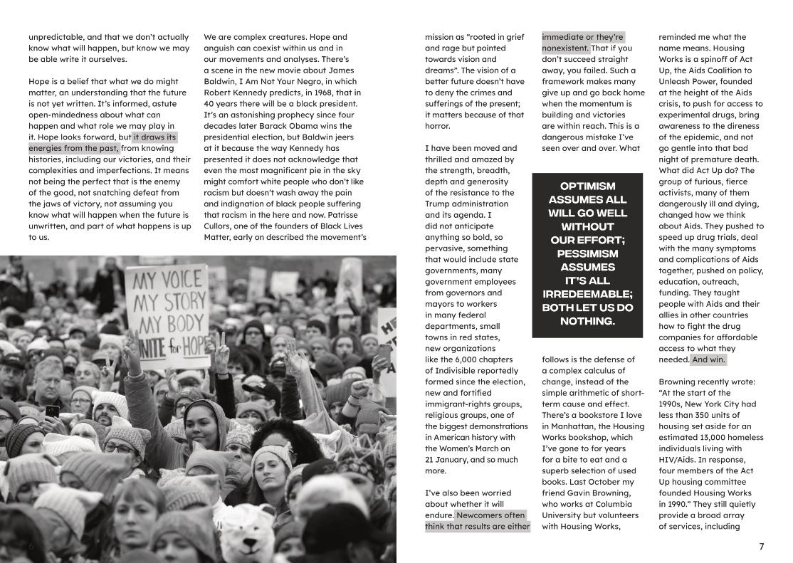
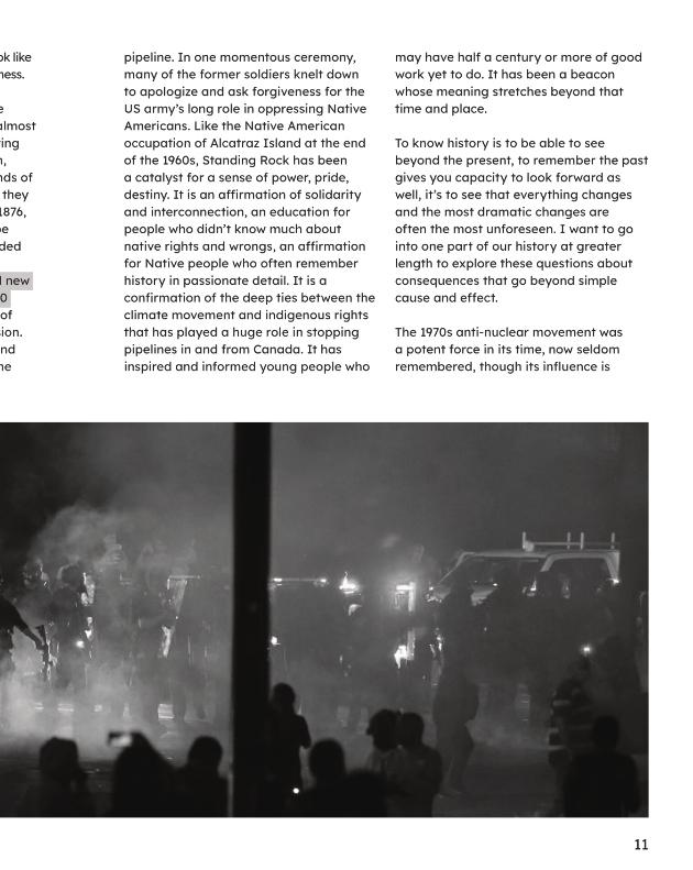
The article is all about protest and keeping up hope as positive change is rarely immediate and actions can have positive consequences far beyond there initial purpose.
I decided to match the article with images from recent protests including the Black Lives Matter movement and the Hong Kong Pro Democracy movement, showing both protestors and the police / riot police. I think this best illustrated the immediate struggle of all protests, where they start and who the opposition might be, whether it’s against the police or if they are protecting those being protested against.
I decided to design the publication in black and white, partly to get consistency between photographs but I felt it set a more serious note, plus images in monochrome rather than colour is a nod to the grey area about protesting, its perceptions, its achievements and its methods.
I had a play around with setting different columns and image layout as a way to explore InDesign and get to know it better. I also made Character Styes for highlighted areas. Finally I did my best to make sure there were no orphans or widows at the beginnings and ends of paragraphs. Magazine layout research


FINAL OUTCOME: https://issuu.com/nathfiction/docs/protest_and_persist_article_web


