
5 minute read
Book Interpretation
Borrow an Non-Fiction book from someone you know (flat mate, friend, relative etc.).
It can be about anything. The subject is irrelevant. It can be any size, can be instructional, historical, bibliography, poetry, craft etc, as long as it’s nonfiction. Don’t go looking for something specific, just get a book immediately.
Advertisement
The only rule is that you can gave it as a physical copy.
When you have a book photography the cover an put it on the padlet, there is a column call Book.
This book is the information you will be working with for this brief. Read and examine the book, read the content. Can you understand the subject? Is all the information new to you? Examine the book, for example, what condition is it in? What does the condition tell you about the book/ subject/or the people who have loaned it? What type of stock/ font has been used? Is it image or mostly text? What is your opinion of the book/subject? Do you see the book as information, narrative, object, language, etc?
Your brief is to interpret your book from your personal perspective.
Your outcome must clearly communicate this interpretation of the book. Consider how will you interpret the book and its content, please be aware that this brief comes at the end of a module in which you have explored your lateral thinking, ideas generation, type & image, design methodology and your design process. Consider your design approach; be innovative, open, experimental, diverse and intelligent. Pay attention to detail and finish, consider your audience.
BRIEF:
Represent your interpretation of the book in ONE of the following formats:
A 90 second moving image piece or up to 5 minutes documentary video (must include type, image and sound)
OR
A multi-page publication (min 8 page) consider size, stock, binding and print finish
MY BOOK: VIVIENNE WESTWOOD
APPROACH:
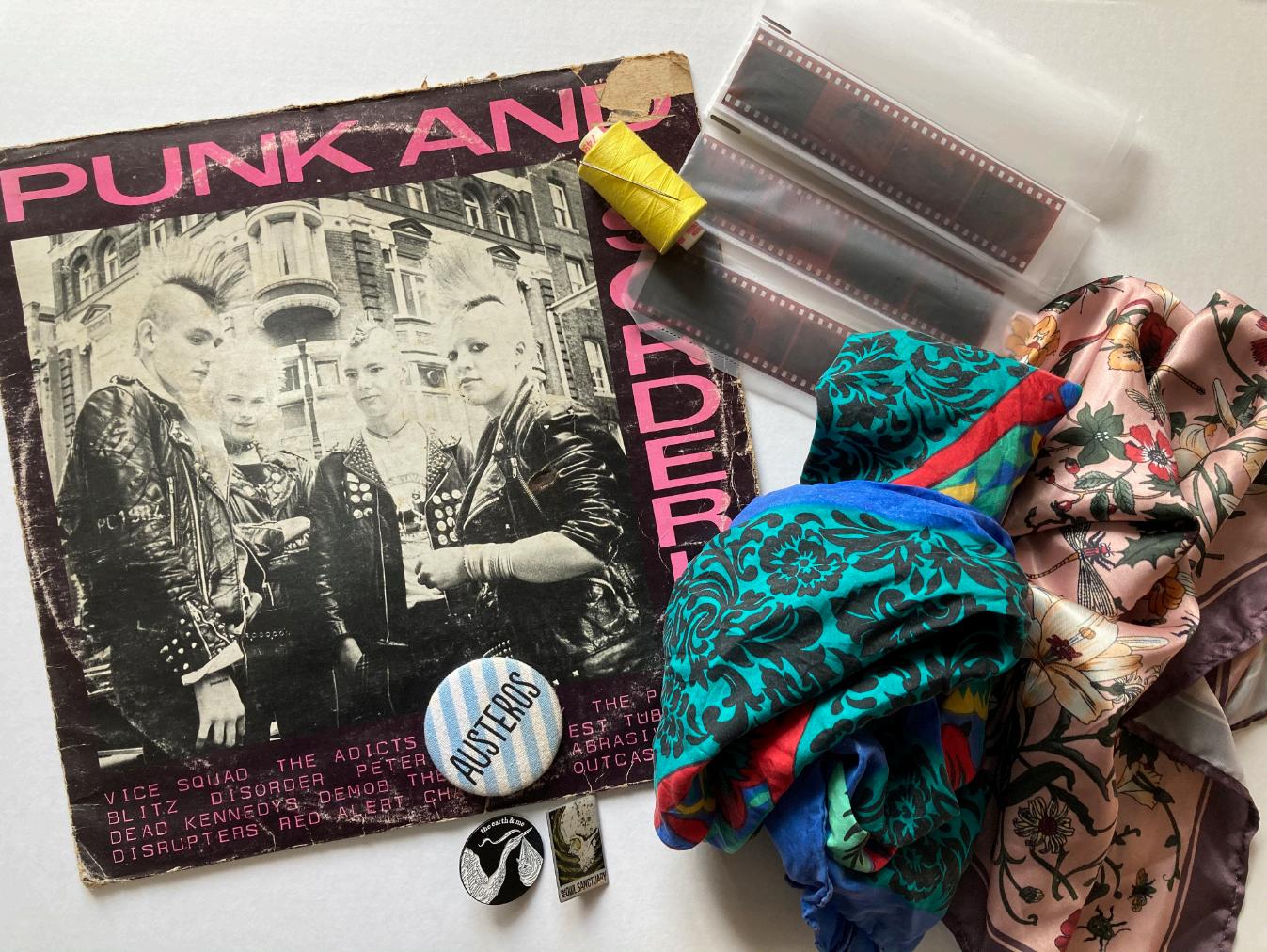
We were asked to bring in 5 items that we felt represented the book. The book contains a a short biography and then a chronological gallery of photos that represent her story as a fashion designer from the early punk days to the early 2000’s (when the book was published). I chose these 5 items as I felt they summed up the content best, fabric, a punk vinyl, pin badges, a needle and thread and some film negatives.


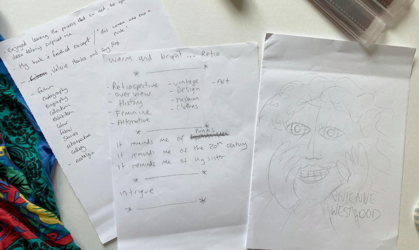
Initial sketches and ideas generated during a tutor lead session.
DEVELOPMENT:
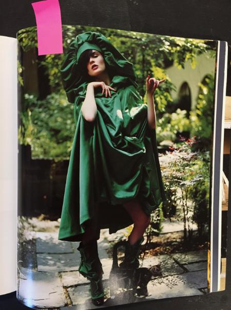
What I found most surprising about the book was that Westwood is seen as (and is) such an innovator in fashion however her approach to her pieces is deeply rooted in classic tailoring and dress making, and in the book she states “I’m not trying to do something different, I’m trying to do the same thing but in a different way”. I really liked this phrase and used it as my basis.
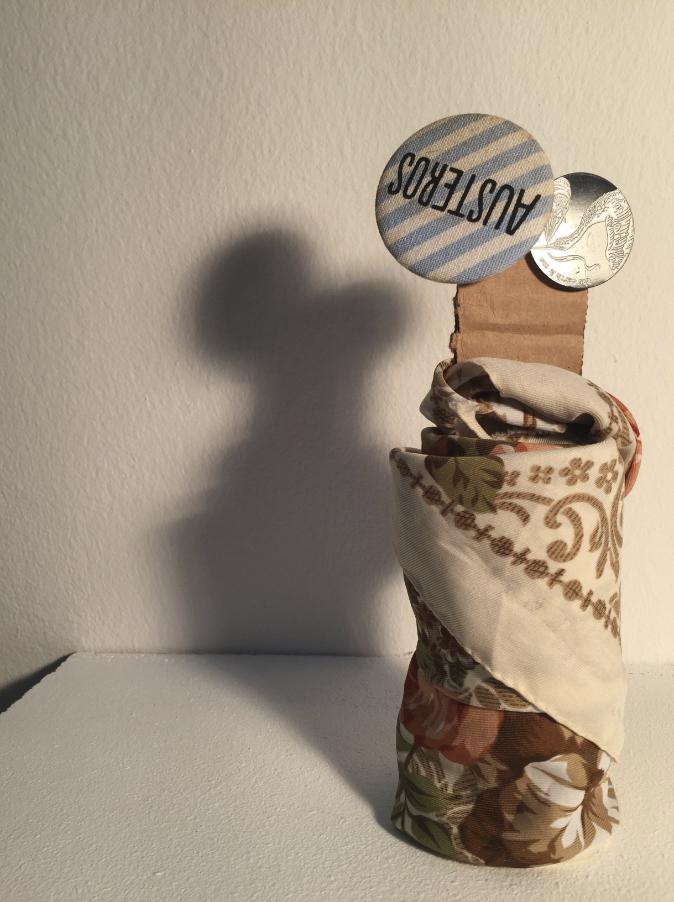
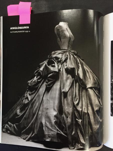
I had originally intended to create a motion piece but after running through a few ideas I instead settled on creating a set of photographs that focussed on silhouettes. Many of Westwood’s pieces have very striking and recognisable silhouettes so my aim way to recreate them using everyday items (the same thing in a different way). I wanted to try out projection on white fabric as well as making shadows that resemble her pieces out of small objects.
For the projections I wanted to use baroque paintings and pottery designs, as these feature in her work and is also a reflection of her appreciation of the classics.


INITIAL IDEAS




DEVELOPMENT:
After taking the initial photos I decided to bring in more fabric and items to play with and went though the book to find some of the most distinctive silhouettes that I thought I could try and recreate. I brought all white fabrics including curtains, a bed sheet, a towel and a table cloth; and to make the shadows I bought toilet roll, post-it notes and yoghurt pots, amongst other things.
I set up two stations for photography, one against a white wall for the shadows and the second in front of a projection screen. I made 8 shadows and 5 projections, choosing my favourite 5 shadow images to match the projection photos. I then edited the images in photoshop and laid the images out pairing a projection image with a shadow image.
I also took photos ‘with the lights on’ as a way to reveal what was really being photographed, so showed what was making the shadows or what fabrics were used in the projections.
Finally when it came to printing and binding the book, I decided on an A4 portrait with a 20mm column on one side where I could stitch the pages together. I left the excess thread in reference to dressmaking. I had it printed on silk stock to give it a glossy high end magazine feel.
MODELS: AMY WRIGHT RHYS WHITE


