ARCHITECTURAL PORTFOLIO
 Navya Ramesh





 Navya Ramesh


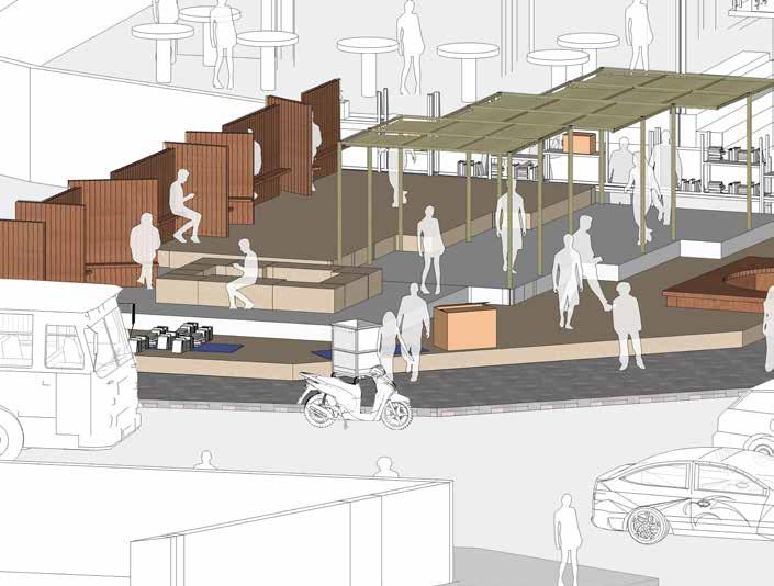
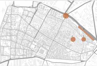
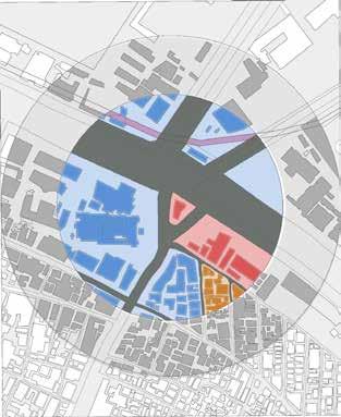
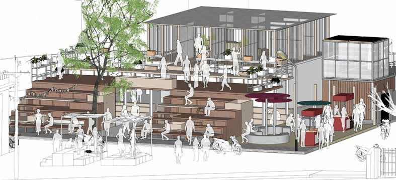
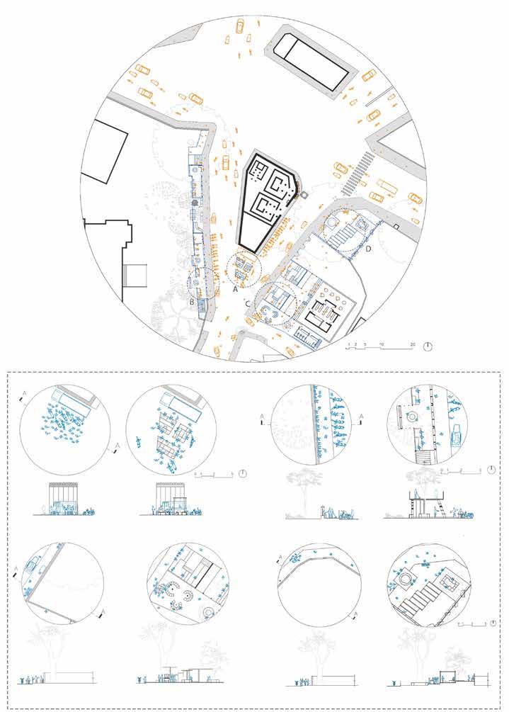
Urban cities with high densities lack open space and resources; temporary spaces used during the nomadic period when materials were light and portable allowed people to migrate easily from one location to another. Human activities and movements are essential in urban centers; understanding them via regular observation and analysis enables us to provide a better environment for them to improve their activities. When spaces are ephemeral and give future flexibility, they can be used efficiently and multi-purposely. This study examines how places change over time and adapt to their surroundings, as well as how urban interventions can make them more humane. The project aims to intervene temporary transformable spaces in potential urban nodes.
After analysis site was chosen in Bangalore, as its density is growing from past decades and there is a need for temporary spaces to use existing spaces efficiently.
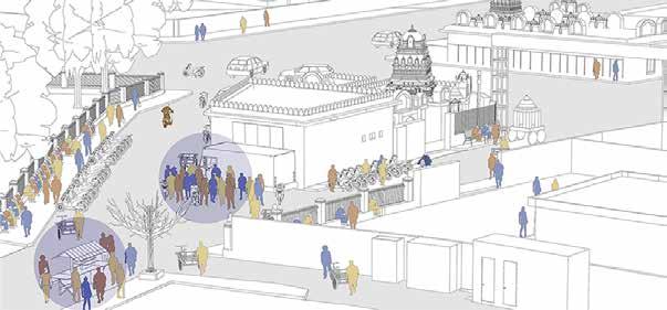
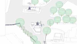
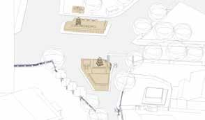
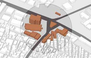
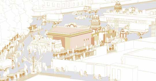
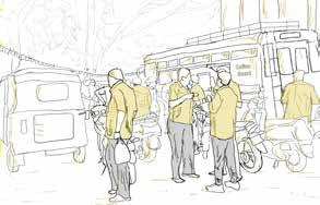
Afternoon Activities at 1pm filled with large density of people, vendors and vehciles
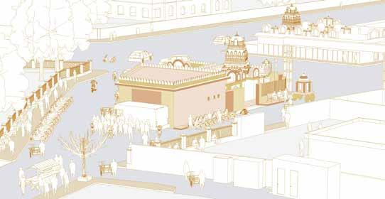
Different moment of people at node
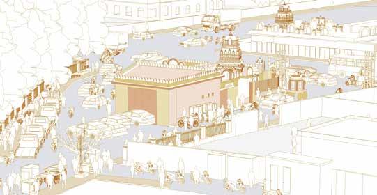
Evening activities at 5pm when space gets filled with food vendors and pedestrians How activities temporarily change at different times of the day and keep it interactive with people.
providing shades for pedestrians and vendors
providing shades for pedestrians and vendors
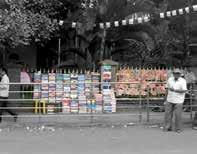
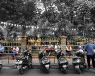
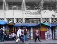
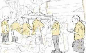
Compound wall providing space for vendors.
Node 1
Temple and Books
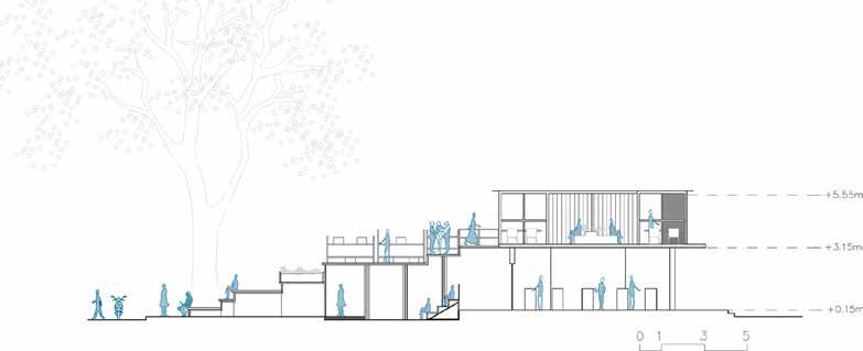
Section along Recreational area
Zoom Ins: Existing and proposed
Detail A
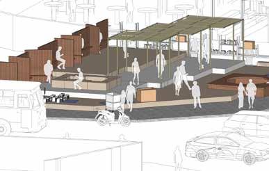
Redefined edges around the temple node
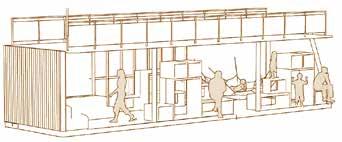
Temporary Pavilion with flexibility
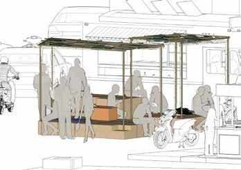
Recreational space with existing context




1st semester - Polimi
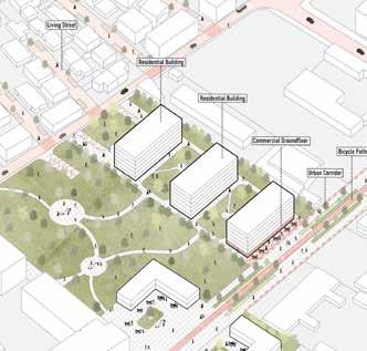
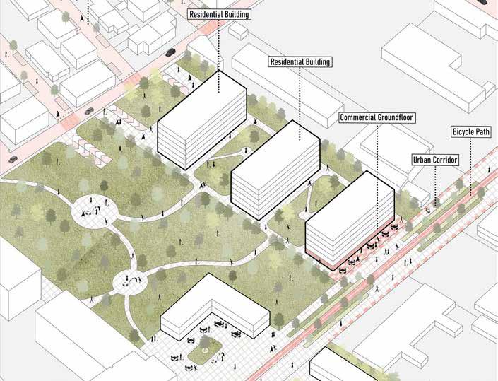
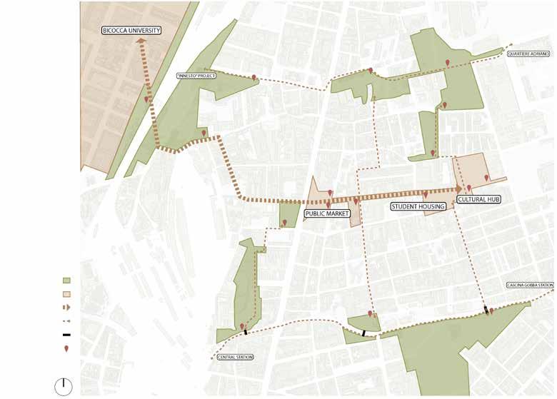
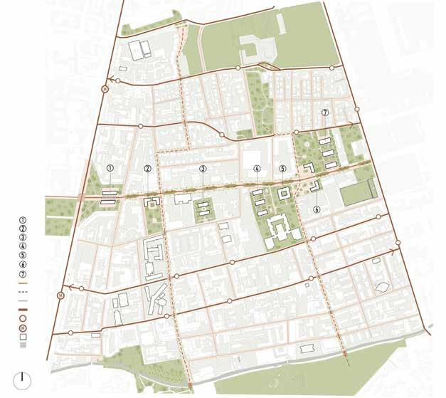
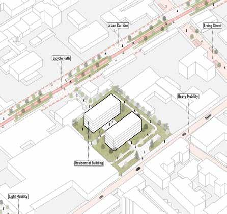
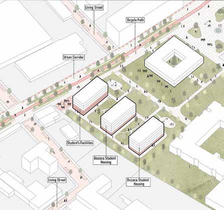
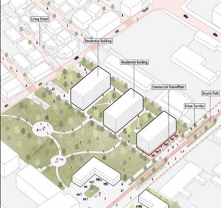
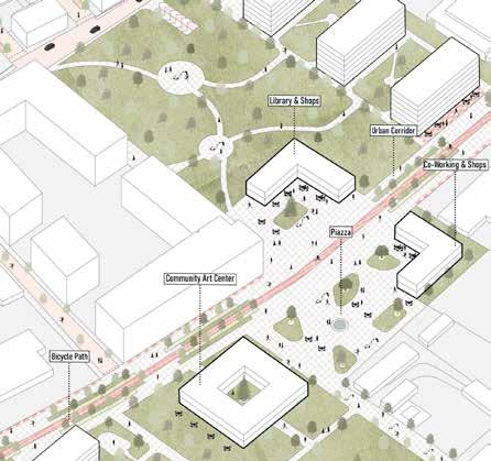
The purpose of the project is to reconstruct a neighborhood with an emphasis on energy efficiency and social impact, making it more active in the surrounding area. It also attempts to address existing concerns with social housing for migrants and students.
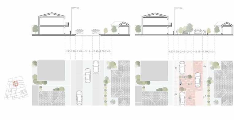
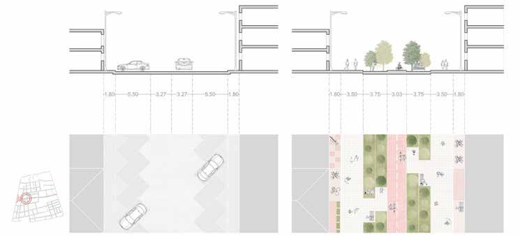
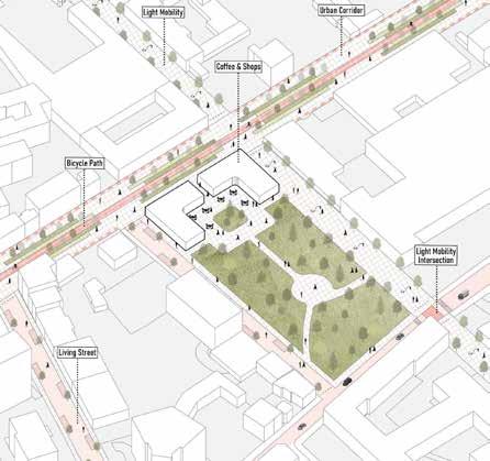
Creating an experimental neighborhood, moving without a car, and incorporating a people-friendly concept all sought to create a self-sufficient and sustainable neighborhood. By designing a new urban corridor with social housing, a community center, and market spaces, we aim to make this district more active and lively by attracting a diverse range of people..
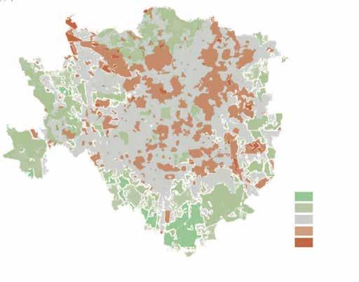
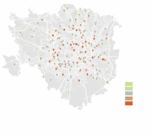
Milan surface temperature
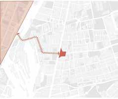
1. Connecting with the active Biccoca District Formal Public spaces
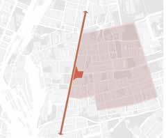
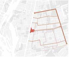
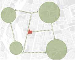
Public Infrastructures
Informal Public spaces Railways
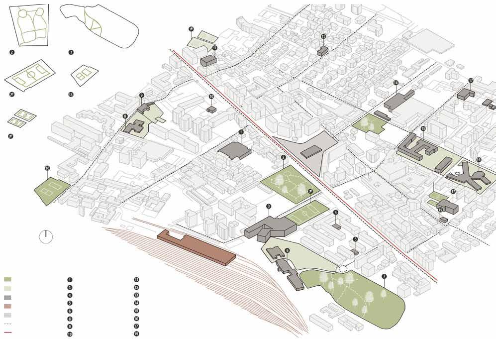
Iperal Milano Iperal Milano Hospital Hospital
Community Centre Community Centre
Teatro officina Teatro officina
Kinder garden

2nd Semester - Polimi
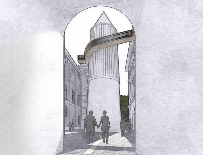
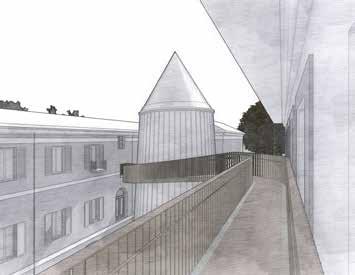
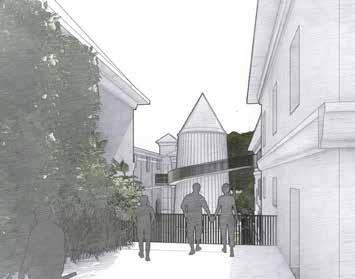
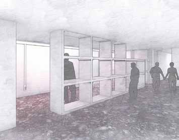
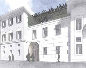
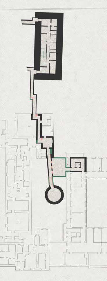
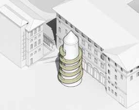
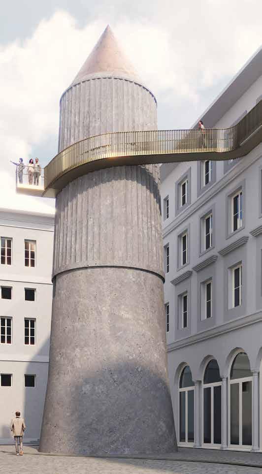
The project aims to illuminate the extraordinary history of Plazzo Isambardi an architectural masterpiece in Milan, showcases a rich history spanning significant eras, allowing visitors to immerse themselves in Palazzo Isimbard’s ambiance. Guests will navigate a curated circuit, exploring the World War II bunker and evacuation tower, gaining a deeper understanding of the intertwined layers of history within these spaces. Against the backdrop of the splendid 20th-century reconstruction, this experience offers a profound encounter with the past. The concept was to establish a loop of sensory experiences encountered on-site, including audio, visual, tactile, and perception-based sensations for visitors to connect with the time period of the site.
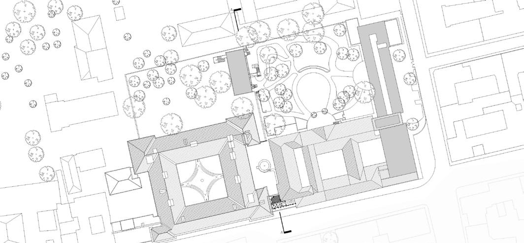

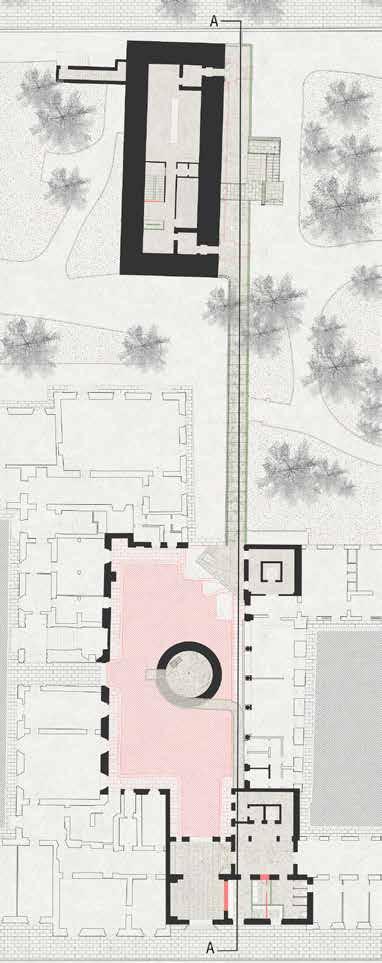 Section AA - Along the green corridor
1. The Portal
6. Level 1 Bunker
12. The Bridge
14. Rooftop
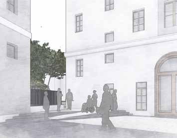
2. The courtyard acess
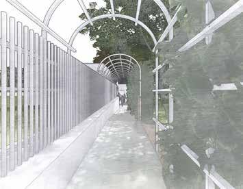
3. The green corridor
Master plan - Ground floor

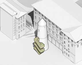
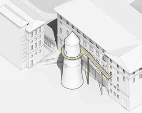
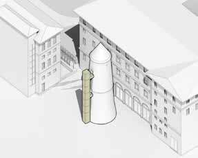
The existing condition makes it difficult for users to access the tower and requires a ladder for two-way circulation, which congests the area. The intervention proposes providing wheelchair accessibility for the entire bunker up to the first level of the tower, along with a way to evacuate the building before going up to the subsequent levels. The 4th level allows users to exit directly through the ribbon and connect them to the exit node. This minimal and lightweight intervention keeps the tower almost in its original condition without adding any structures to the ground and gives flexibility to remove if necessary in the future.
2nd Semester - Polimi
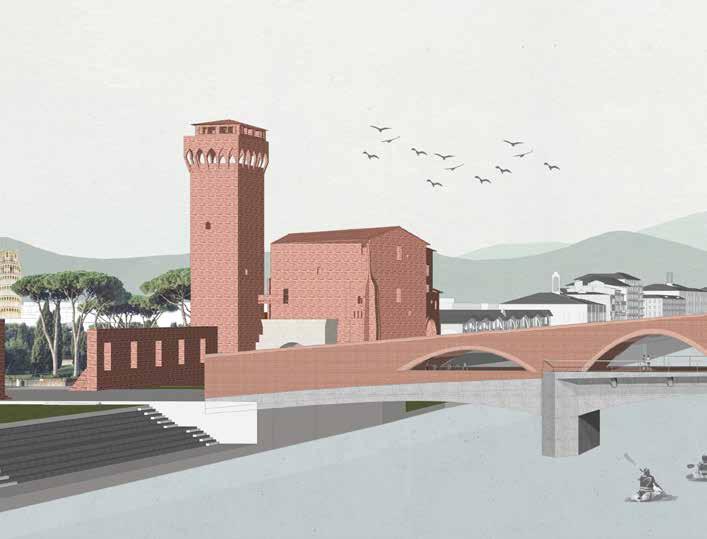
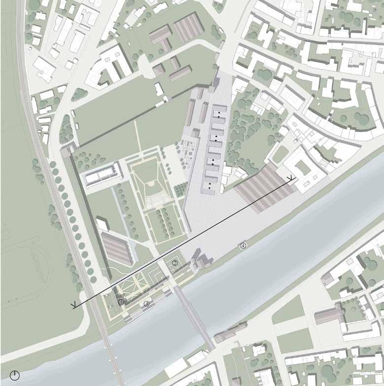
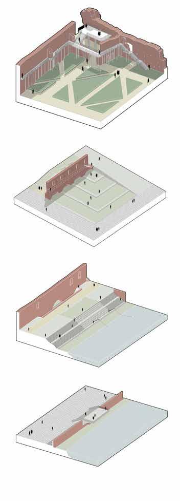
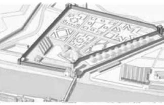
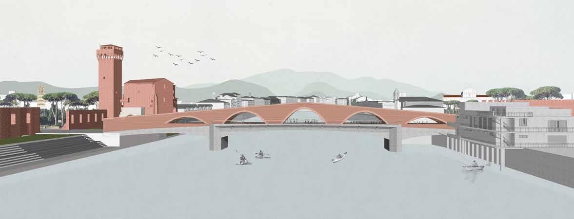
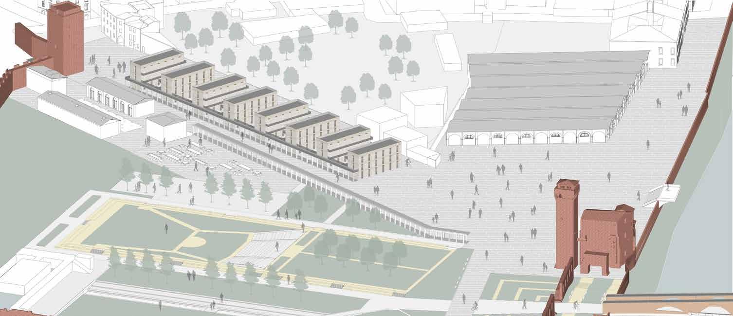
The theme of the studio is to enhance the cultural and monumental pole in Pisa that have a huge potential for international tourism that is indeed ignored - St. Paul on the bank of the Arno and the Citadel Park. The approach is to enhance waterfront in the historical context of the world, the concept journey begins with retracing the past historical elements in order to respect the memory. Keeping this in the mind the existing bridge was redecorated to serve as a landmark and to enjoy the views of Arno river, a strong direct axis is created between the two existing towers along with the arrangement of modular student housing lineraly instead of tall buildings which is obstructing the connection presently.
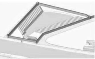
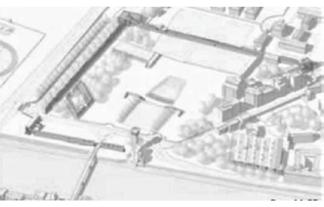
The location is on the western side of the historic city of Pisa, just a short distance from the Piazza dei Miracoli and the city’s central station. It was a shipyard and ponte de mare (sea entry) in the eleventh century. Later, the location became the first botanical garden, which was moved and used as an army barracks. These areas were no longer required after the war, and the site’s purpose was therefore altered once more. These aided in the recreation of some of these historical layers as a reflection of memory.

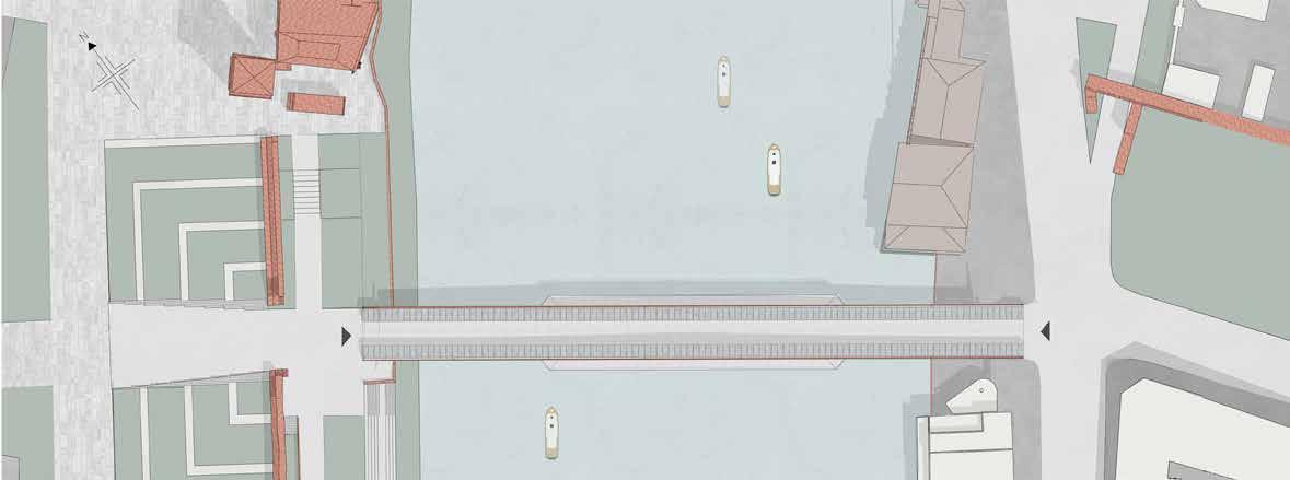
 Plan of redesigned Bridge
View of redesigned Bridge from west side
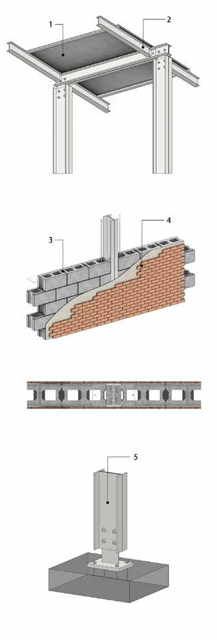
Roof detail
Wall detail with the column
Joinery detail of the column to the base
1. Fibre cement board 4. Terracotta bricks
5. Beams
2. sections
3. Aerated concrete bricks

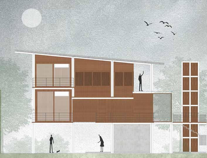
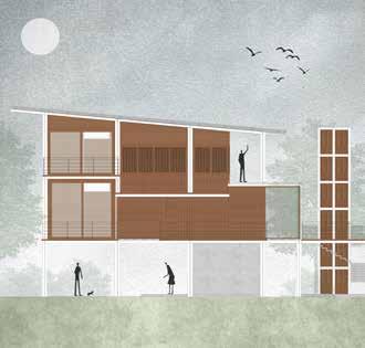
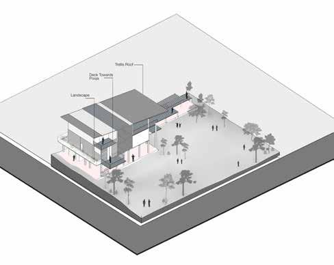
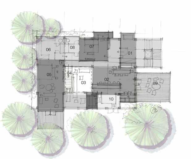
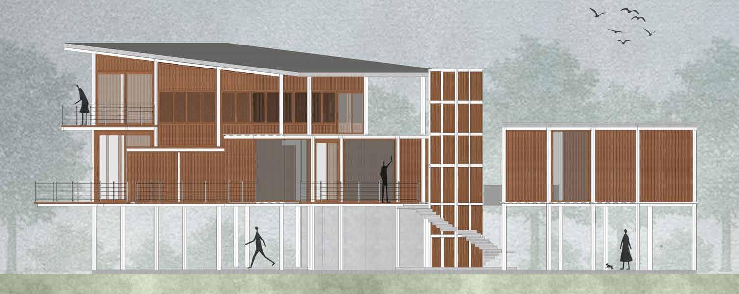
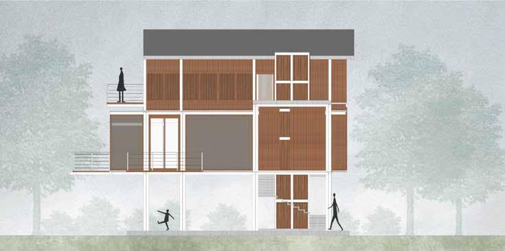
It’s an adaptive reuse project that keeps the ground floor level the same while constructing new floors on top of it and improving the existing garden with Balinese landscaping. It’s a steel and timber composite construction thats light weight and simple to install and disassemble. The location is on the outskirts of Bangalore in a calm area with plenty of vegetation, The design incorportes more greenery and a garden inside the home, allowing it to blend in with nature. It aims towards sustainable projects by preserving the current contour and creating a landscape within it, as well as reusing old steel and timber. .


Existing
Preserving existing site features to enhance landscape and greenery.
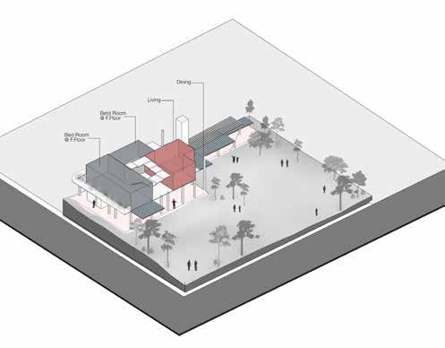
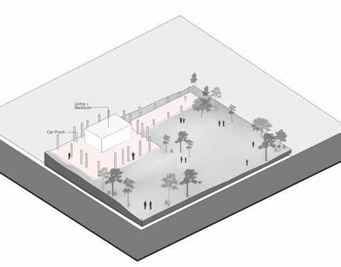
Adding on new levels with light weight structure according to their functions.
Interconnecting the mass volumes along with the sloping roof.
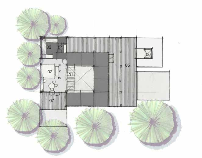
 First floor concept
1st floor spaces
Trellis Roof
Second floor concept

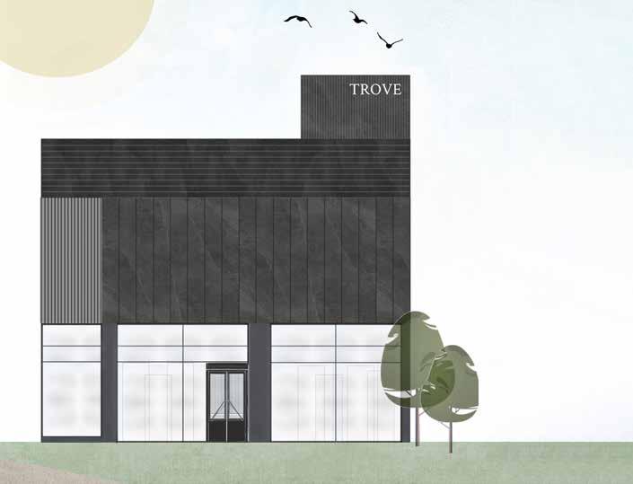
The property is in the middle of Banglore, in a busy region with a lot of competition in the granite and tile industries. The project’s goal is to create interiors for a tile showroom that would attract all types of users and stand out among other showrooms. It was built in such a way that as many tiles as possible can be presented throughout the design by employing it on the flooring, ceiling, wall cladding, facade, and even furniture, allowing users to experience it all the way through. It was kept minimal in terms of material and colour usage.
Ground Floor
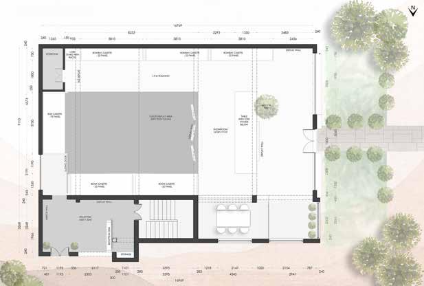
The showroom has two stories, with the ground floor being double height with exposed concrete beams and columns. Cable tray was used as a fasle ceiling with a grid design, each place was created for a certain display of tile, and tile itself was used as a material.
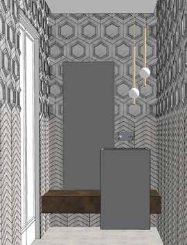
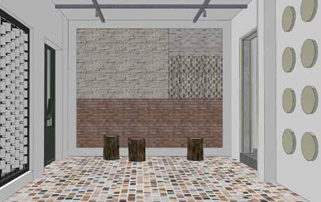
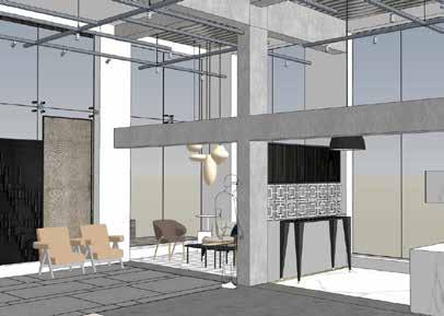

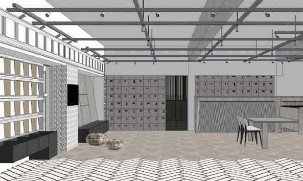
First Floor Concept Views
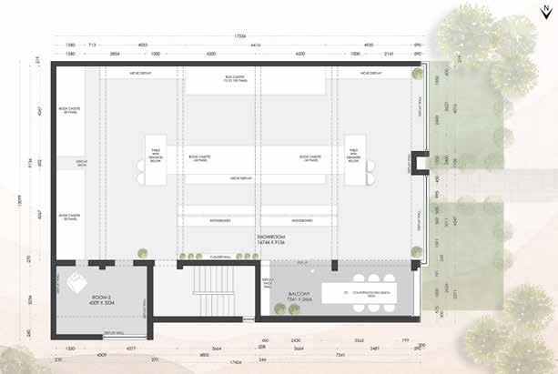
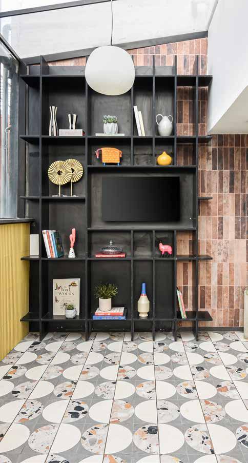
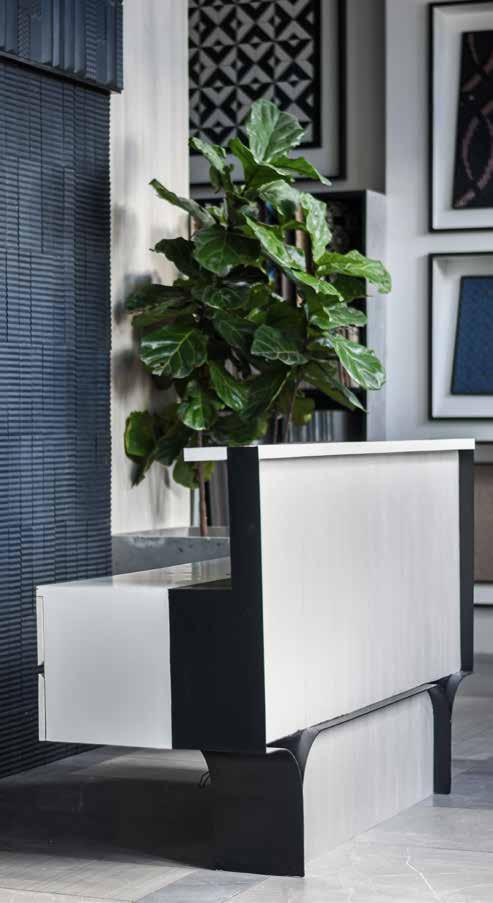
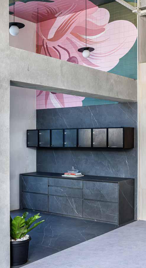 Kitchen Cabinet exhibit
Reception
Library Unit