
01 FOOD COLONIZATION
A Process Of Re- Ruralization For Food Farming And Supplying
Location: Tokyo, Japan Time: 2022.9-2022.12
Type: Individual Work Semester: 2022Fall
Course: GIS Tutor: Mario Giampieri, Leah Meisterlin,
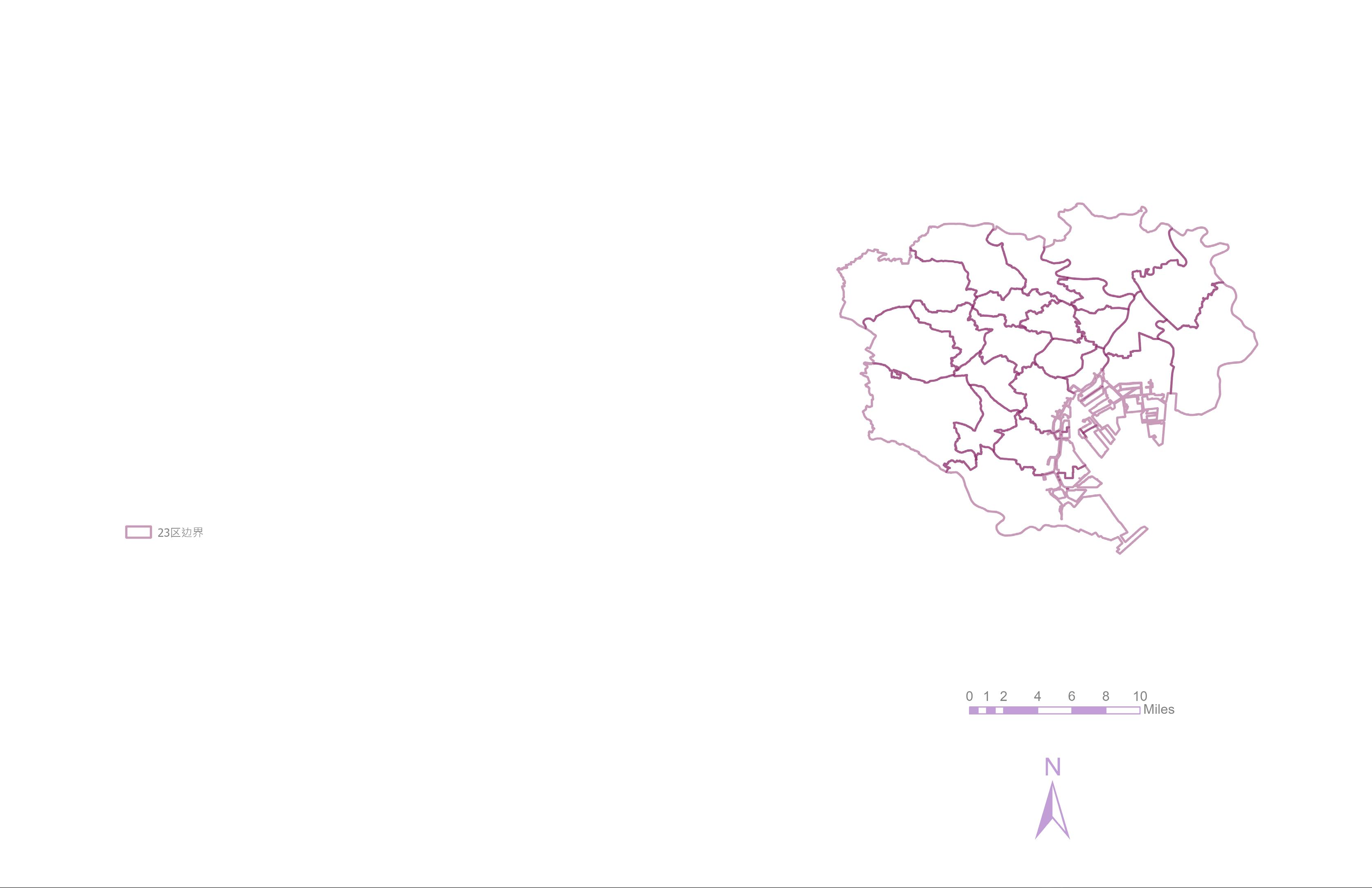
Since the implementation of the policy of the three major metropolitan areas in Japan. The urbanization in the 23 wards* of Tokyo has been increasing, and the isolation between cities and suburbs has become more obvious. This rapid urbanization has had a great impact on the development of agriculture in Tokyo. Through the data of the amount of farmland and farmers, we can know that the farmland in the city of Tokyo became a housing area within ten years. Especially the productive green space in the urban area, which is constantly decreasing due to rising land prices and ecological changes. At the same time, there is an increasing demand for exurban farming as food consumers live away from agricultural land.
Dwindling Agricultural Land In Tokyo
Unbalanced Agricultural Production And Consumption In Tokyo
Consideration About Leaving Farmland In Tokyo
Changes In The Number Of Registered Farming Volunteers
The Number Of Farm Houses In Tokyo Is The Lowest In Japan
Expection of Farmland’s Functions in Tokyo

Weighted Dicision Layers
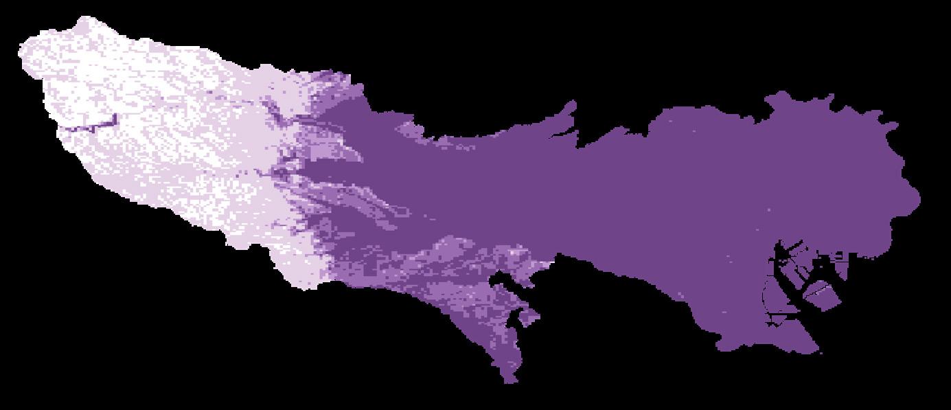
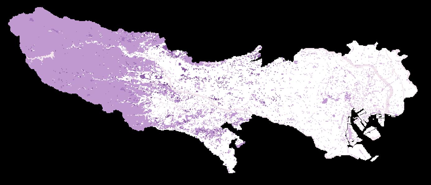
Agricultural Suitability Scores Based on Terrain and Land Use
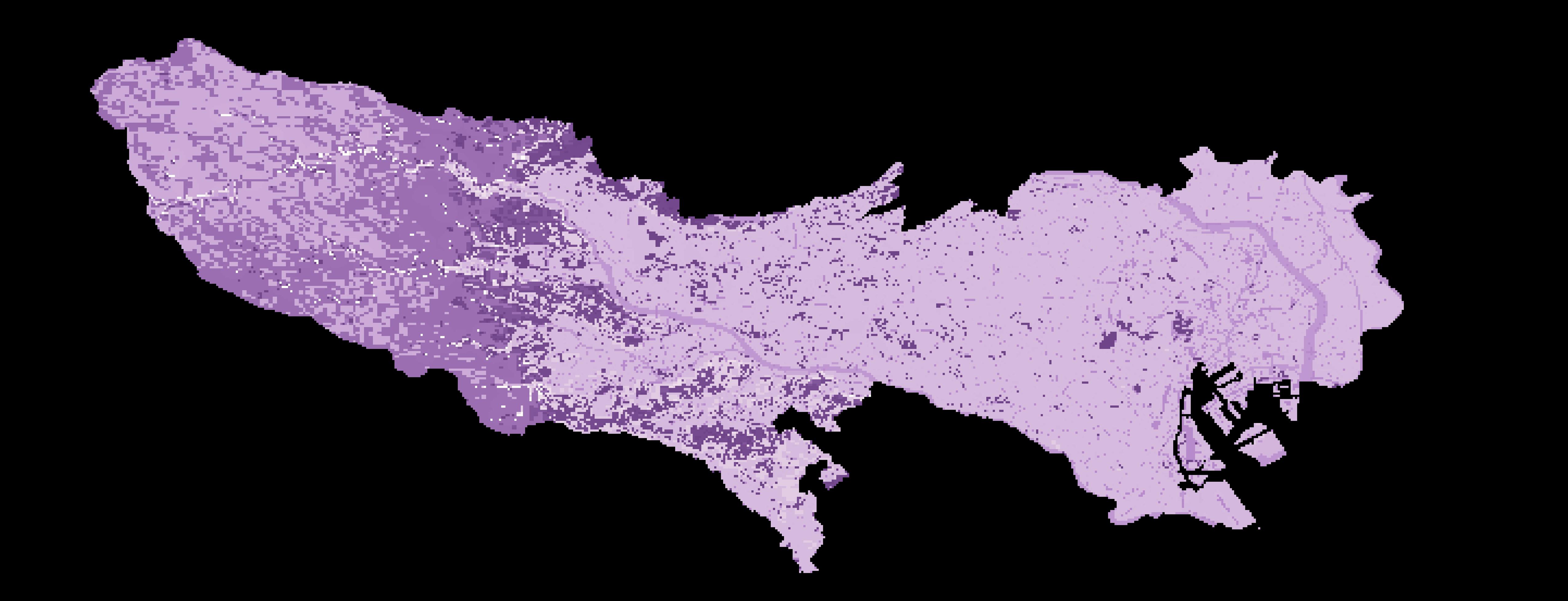
When the slope rises to 15 degrees, the limitations of the terrain become more and more obvious. [1]
Terrain Score Based On Slope
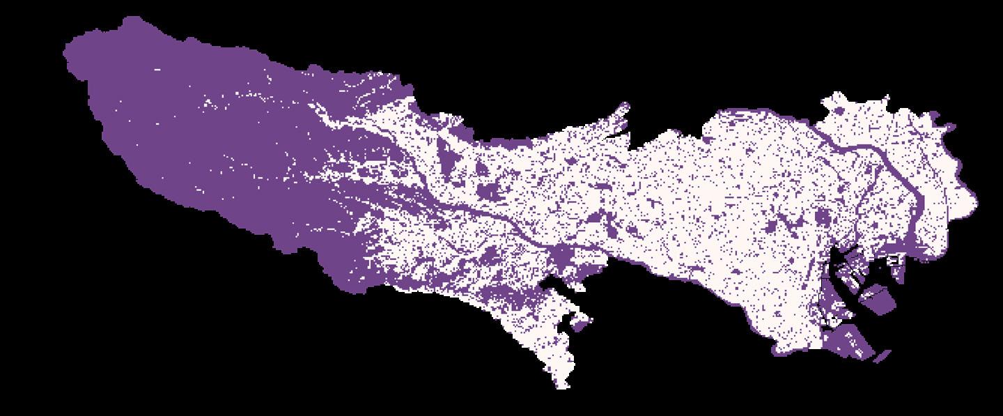
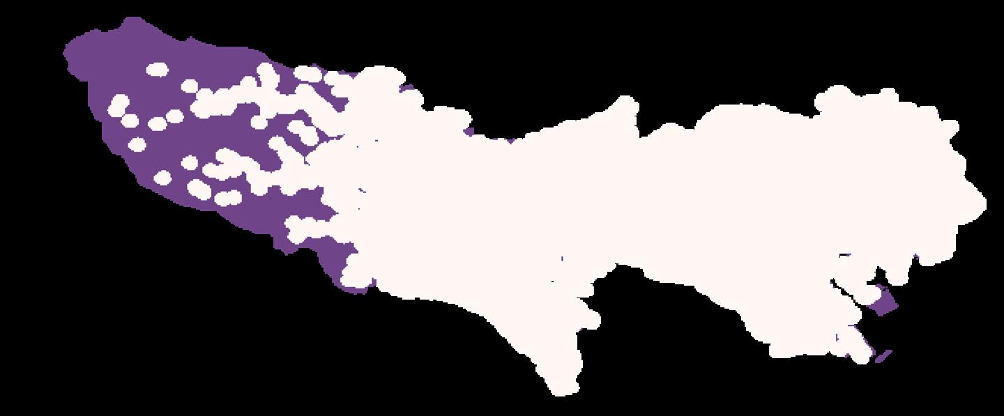
Reclassified Existing Residential Area
Based on “Proximity to Crops and Residential Exposure to Agricultural Herbicides in Iowa”, households with crops within 750 meters detected four times more agricultural herbicides than households without crops. [2]
Reclassified Residential Area with 750m Buffer
[1] Zhong, Shouqin, et al. “Engineering Design Parameters of Farming Plots Construction and Plot Characteristics in Hilly Area: A Case Study of Chongqing.” Chinese Agricultural Sciences, 1 Dec. 2017, https://www.chinaagrisci.com/CN/abstract/abstract19939.shtml.
[2] Ward MH, Lubin J, Giglierano J, Colt JS, Wolter C, Bekiroglu N, Camann D, Hartge P, Nuckols JR. Proximity to crops and residential exposure to agricultural herbicides in iowa. Environ Health Perspect. 2006 Jun;114(6):893-7. doi: 10.1289/ehp.8770. PMID: 16759991; PMCID: PMC1480526.

Factor1: Landuse& Terrain
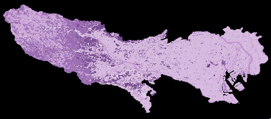
For the classification of the nature of land use, the research selects the land that has a certain impact on exurban agriculture, and assigns a value to its positive impact on exurban agriculture. The higher the score, the easier it is for this type of land to be converted into exurban agricultural land to produce positive effects. For example, the existing agricultural land and the agricultural and forestry land with the potential to be developed into agricultural land, as well as pits, ponds, and ditches are assigned higher values, all of which are above 70 points. Tokyo’s current existing residential area has occupied most of the entire city. Obviously, these lands cannot be used for the development of agricultural land and will be subtracted points.
Besides, according to the slope change, the smaller the slope area is, the more likely it is to convert exrban farmland, and the larger the slope area is, the more difficult it is to convert. So this project sets a slope of 15 degrees as the boundary, and gives different scores to each slope ranges


Factor2: Accessibility
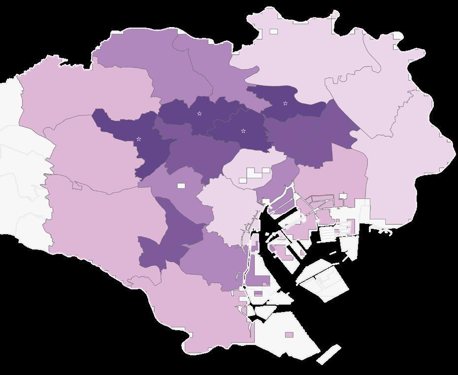
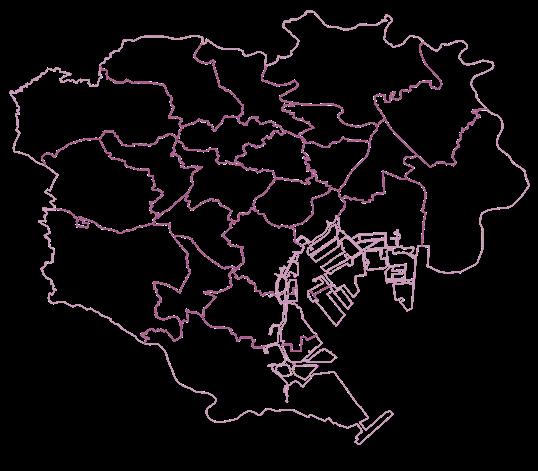
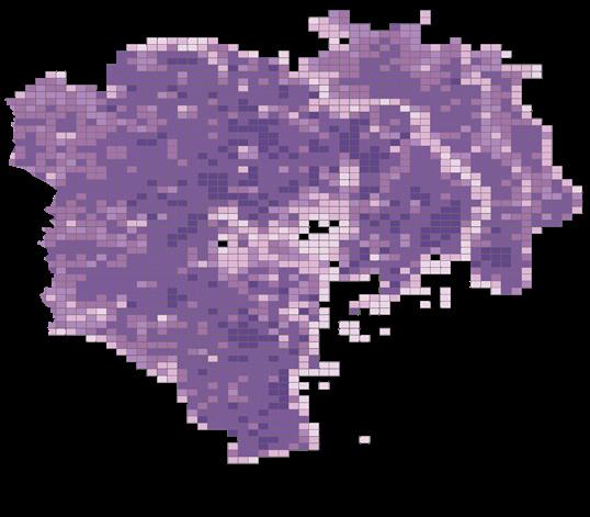
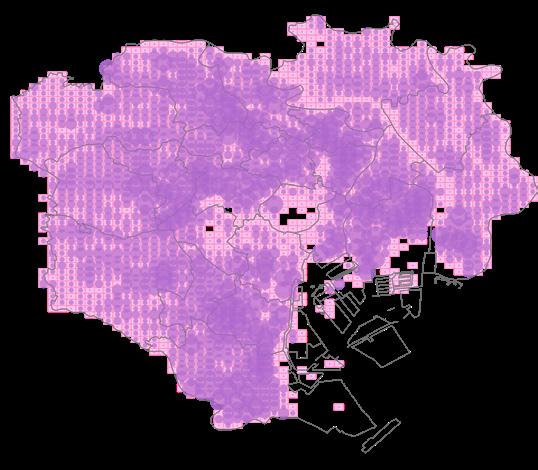
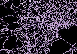
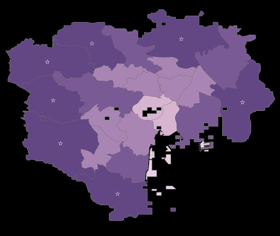
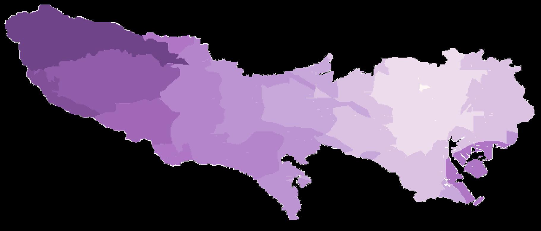
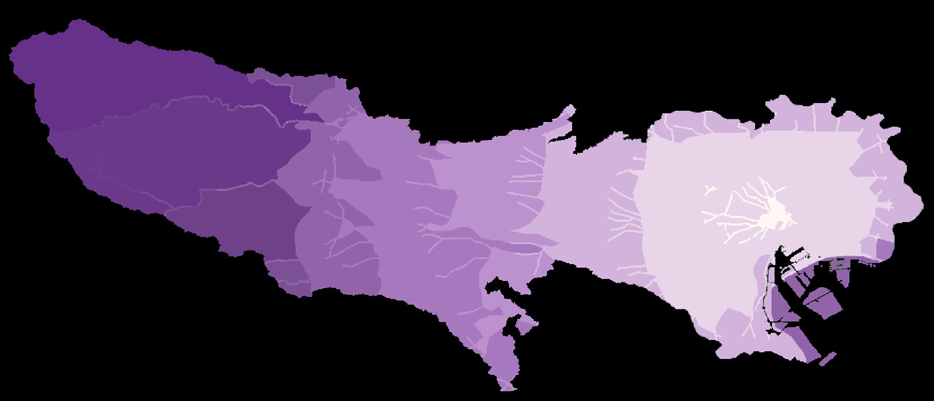
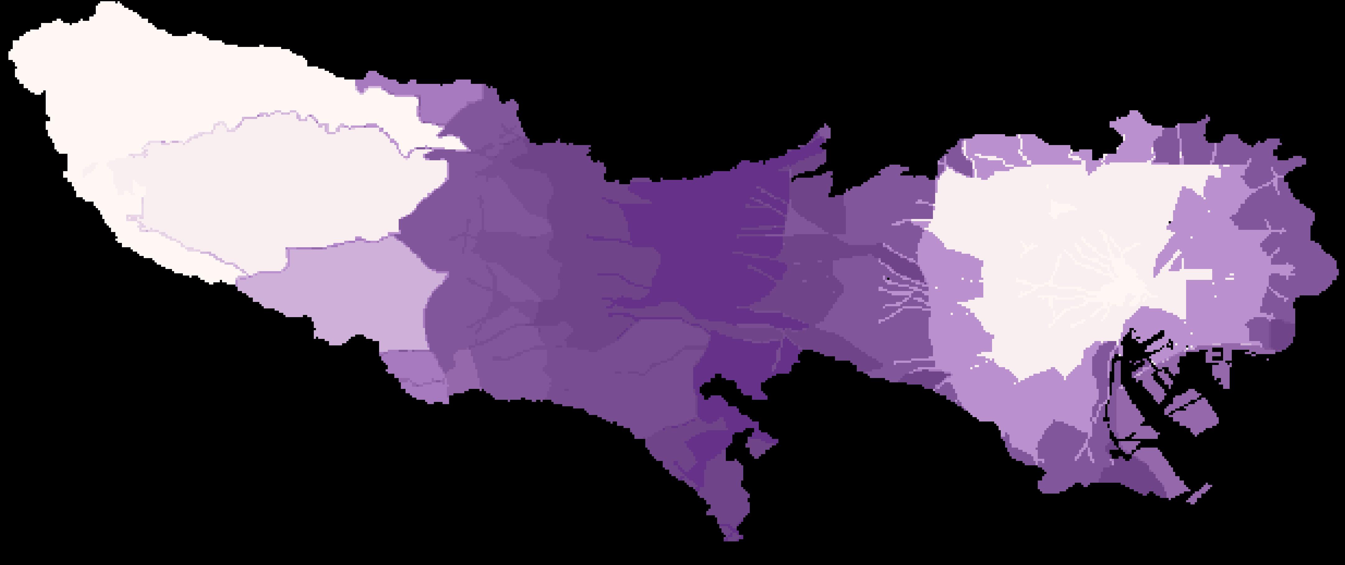
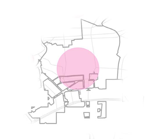
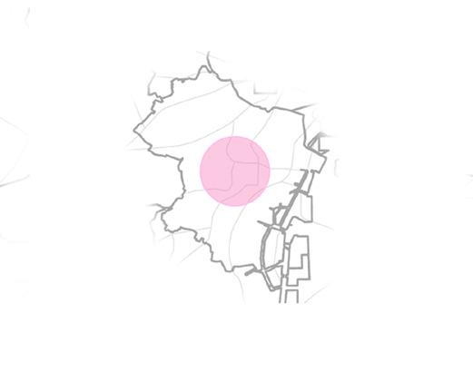
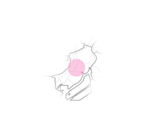
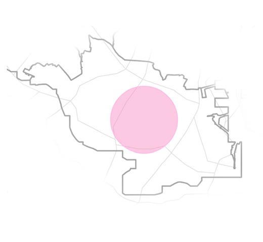
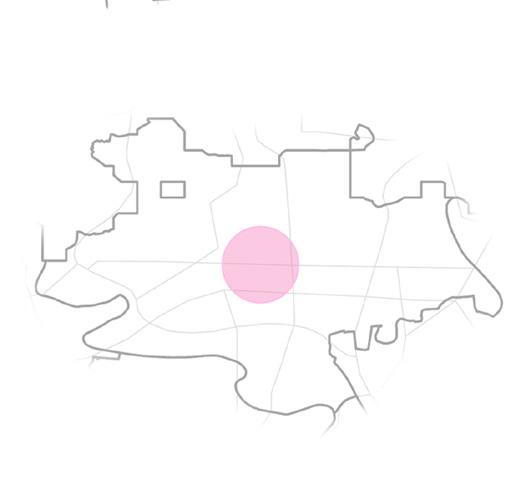
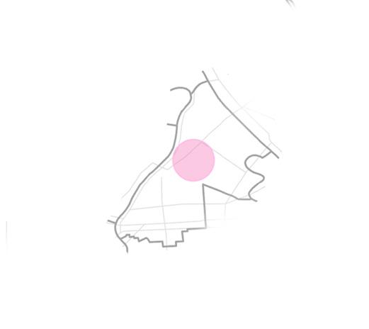
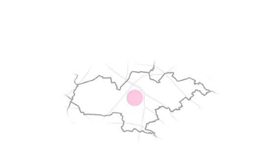
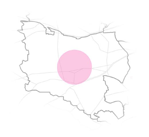
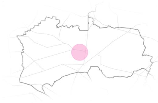
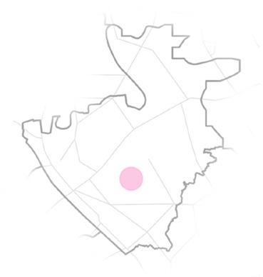
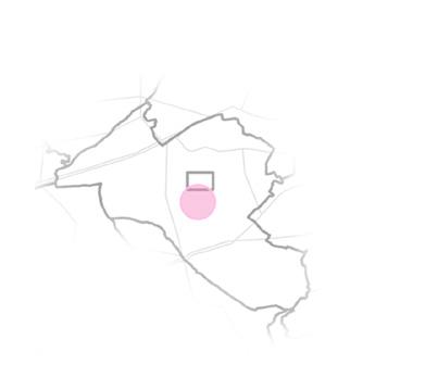
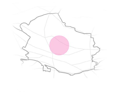
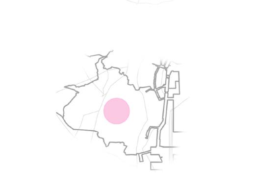
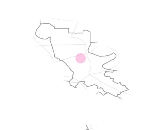
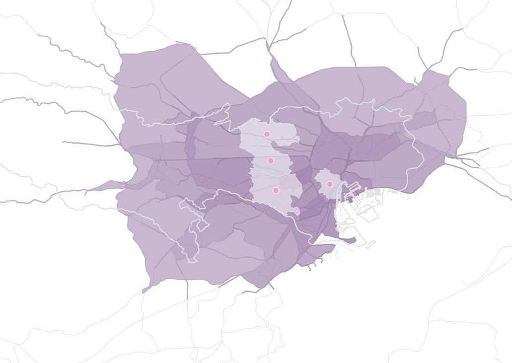
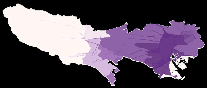
Due to the bustling business and the high renting price is not suitable for people to live in the Tokyo city center, so most people choose to live around the center. Based on our study, there are four wards with high population density and seven wards with high OD traffic volume among the 23 special wards Based on Tokyo's roadway network, this project centers on those 11 wards and generates service areas. After obtaining the distinct (nonoverlapping) service areas at distance intervals of 10 thousand miles, up to 120 thousand miles, from the centroid point, distance is divided by speed In this project, the average highway driving speed in Japan is 60 kmph[1].
Taking the accessibility of the central point of the high-density population and high-OD areas as a potential factor, and assigning points based on the time distance to the central point as the value: Exurban agriculture should keep a certain distance from the urban area to ensure the scale of land use and not occupy the space for urban growth. After a certain distance, the suitability begans to decay.
[1] Japanistry. “Driving in Japan: Rules & What to Know Japanistry.Com.” Japanistry.Com, 20 Oct. 2016, https://www. japanistry.com/driving-in-japan/.

Agricultural Suitability Scores Based on Accessibility
Areas



Factor3: Organic Waste Transportation
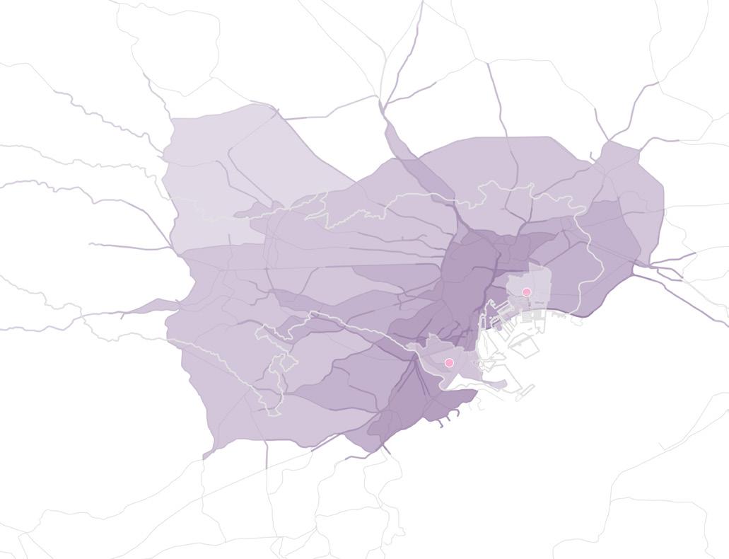
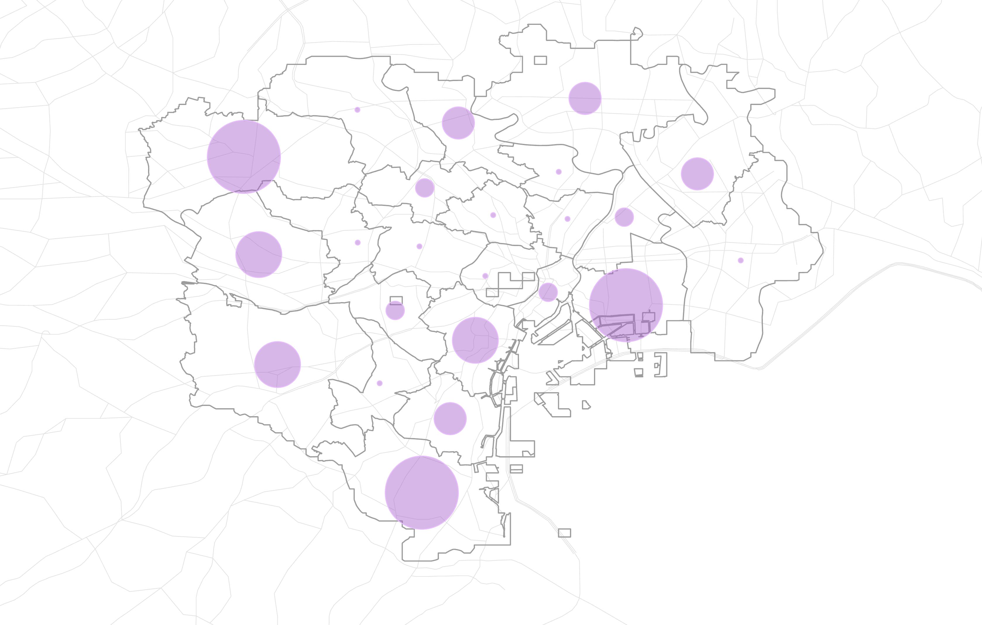

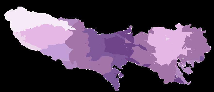
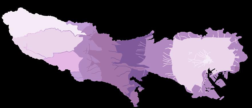
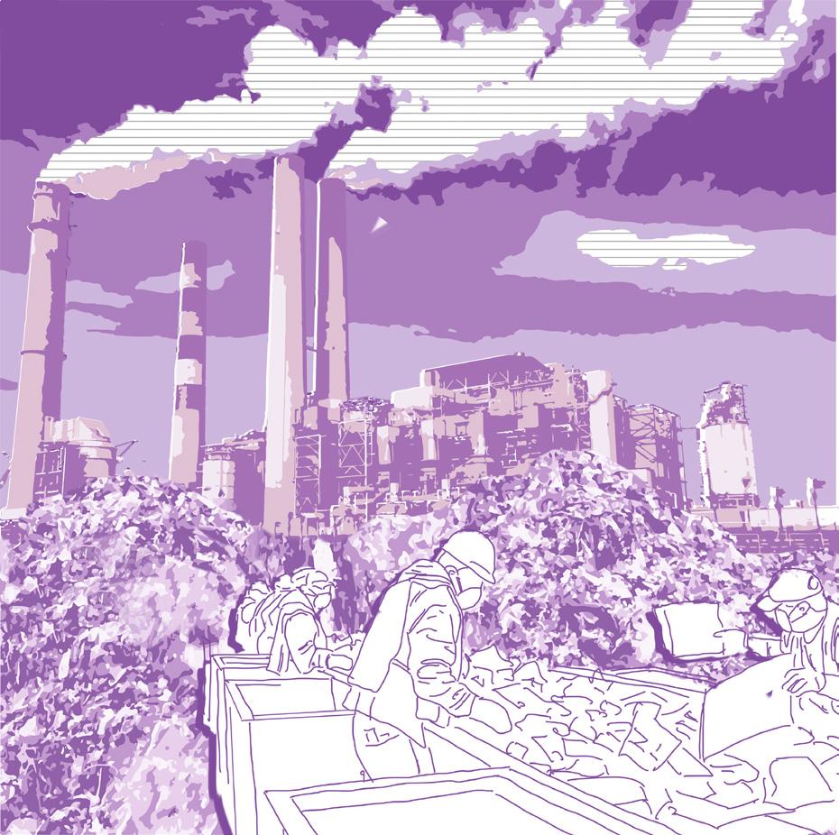
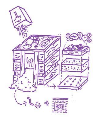
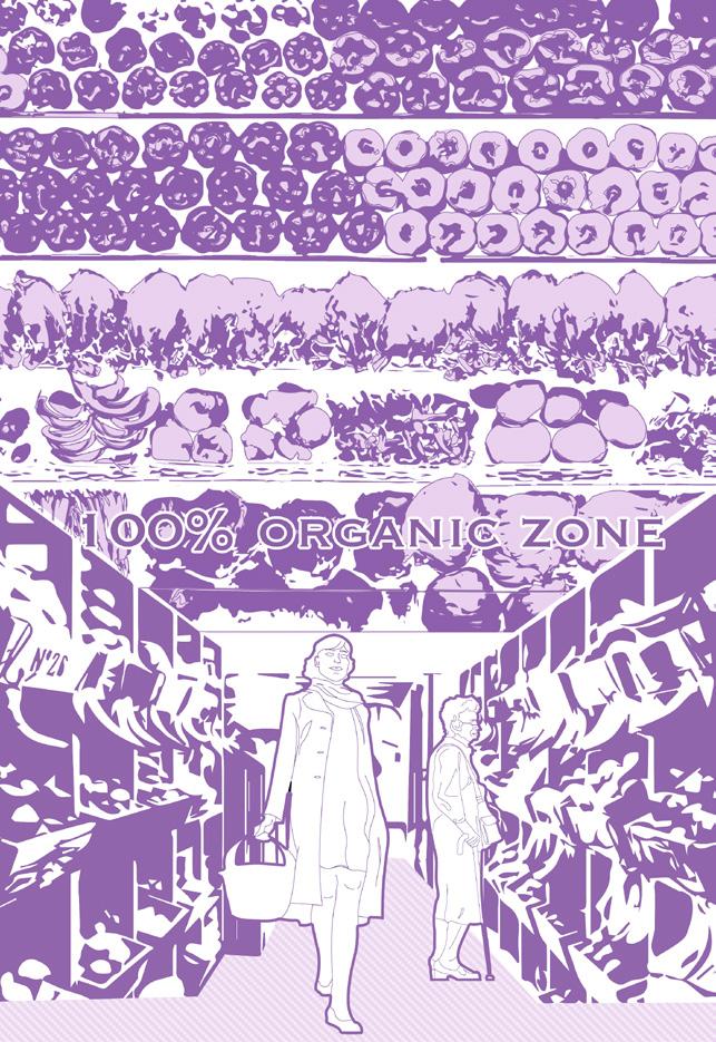
In bustling tokyo, industrial food waste from restaurants reaches up to 980 thousand tonnes annually. Japan’s food self-sufficiency rate is approx 66%, but if you look at tokyo, this number drops to only 3%. There is a contradiction baked into tokyo’s food system, where it imports large amounts of food from outside the city, yet throws them away without consuming them.
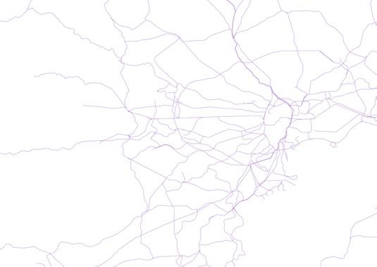
Therefore, this project tries to calculate the annual organic waste of incineration plants in 23 wards, classify the wards according to the amount of organic waste processed, and combine the railway transportation network to establish service areas for the first three groups of wards. Finally get the transportation time and give each group a different weight according to the amount of garbage to get organic waste transportation accessibility score
Service Area Analysis

Reclassify
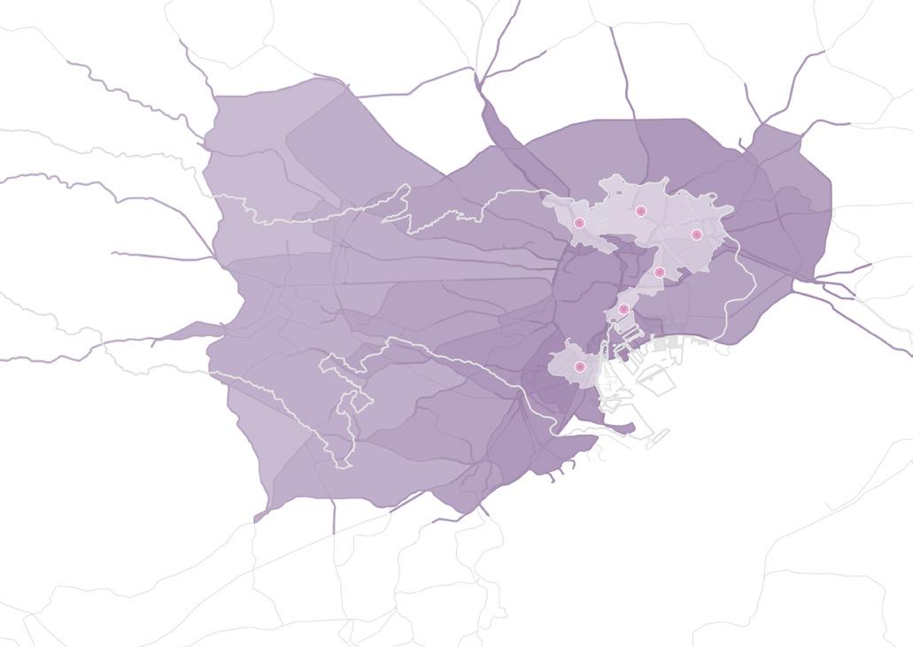
Agricultural Suitability Scores Based on Organic Waste Transportation
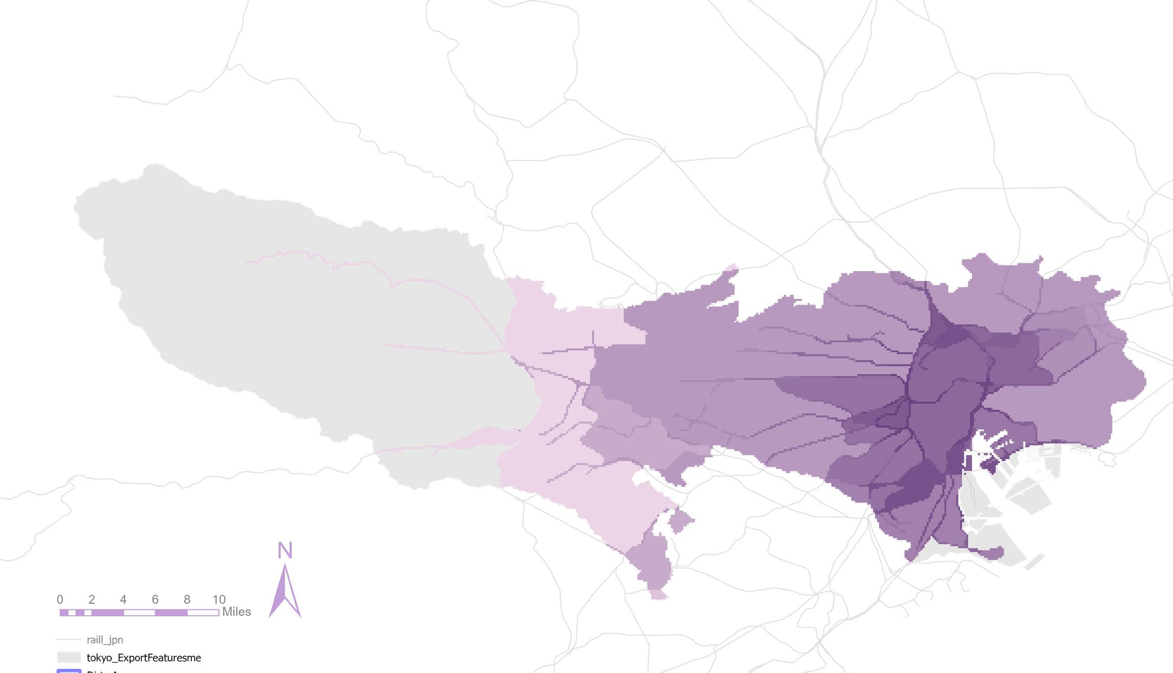

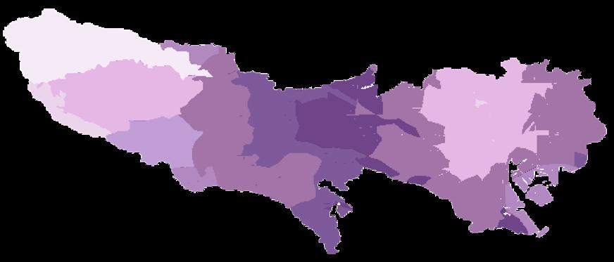
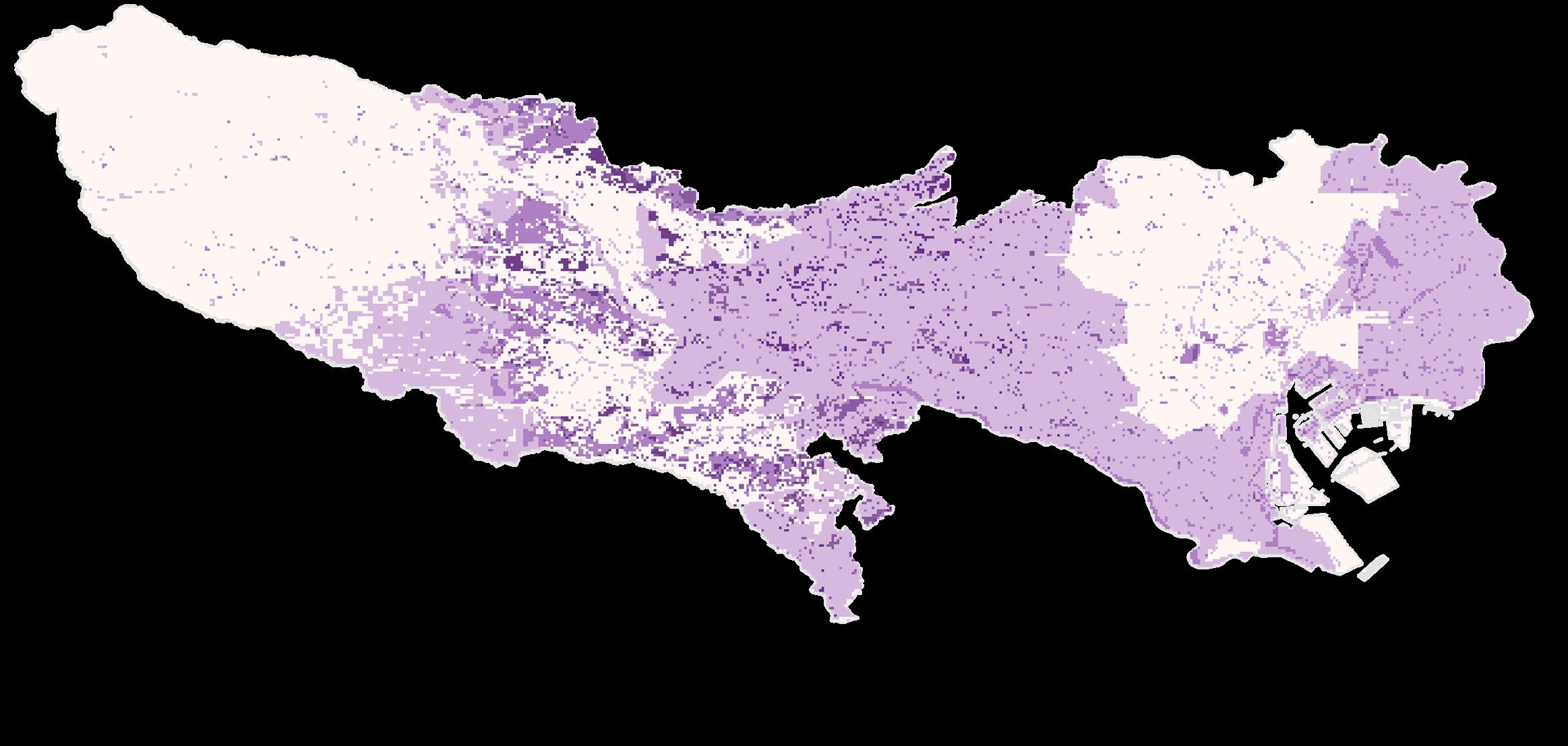
Potential Environment- Friendly Exurban Agricultural Land in Tokyo
Through the above-mentioned analysis of each individual factor, the determination of the proportion of each factor is obtained according to the AHP method.
Wi(Landuse & Terrain)= 0.6586; Wi (Accessibility)=0.1852; Wi (Organic Waste Transportation= 0.1562
Then, all three factors were all three factors were weighted and superimposed in ArcGis, and finally the project obtained the exurban agriculture suitability evaluation map. According to the score, the suitability can be divided into five levels: completely unsuitable, relatively unsuitable, general, moderately suitable and very suitable, as shown in the table on the left. Very suitable and relatively suitable areas can be used as potential areas and spare site selection areas for the final site selection of exurban agriculture in this study, and areas with general suitability and below are not considered as urban agriculture

Existing Condition
Relatively Unsuitable
Completely Unsuitable




Japan’s food self-sufficiency rate is approx 66%;
1.3 billion tonnes of edible food is still wasted annually;
Japan has 98000 hectares of unused farmland organic waste

Urban high density area
Garbage treatment plant
02 MAPPING THE FIGHT
Study Covid Trends and Deploy Resouces
Academic Project, Course Work Course Name: Modeling Geographical Objects
Location: Bronx, NYC Time: 2023.9-2023.12 Semester: 2023 Fall
Type: Individual Work Tutor: Shea O’Neil
This project involved a comprehensive GIS analysis to address COVID-19 trends and resource deployment in New York City, focusing on predictive modeling and strategic planning. Utilizing spatial statistics, I created maps to identify clusters of COVID-19 cases, deaths, and positivity rates. The project evolved into optimizing locations for Pandemic Response Centers in The Bronx, using advanced location allocation methods. The final stage entailed detailed data summarization around these centers, providing critical insights into demographics, land use, and amenities.
Clusters for Covid Death Rate
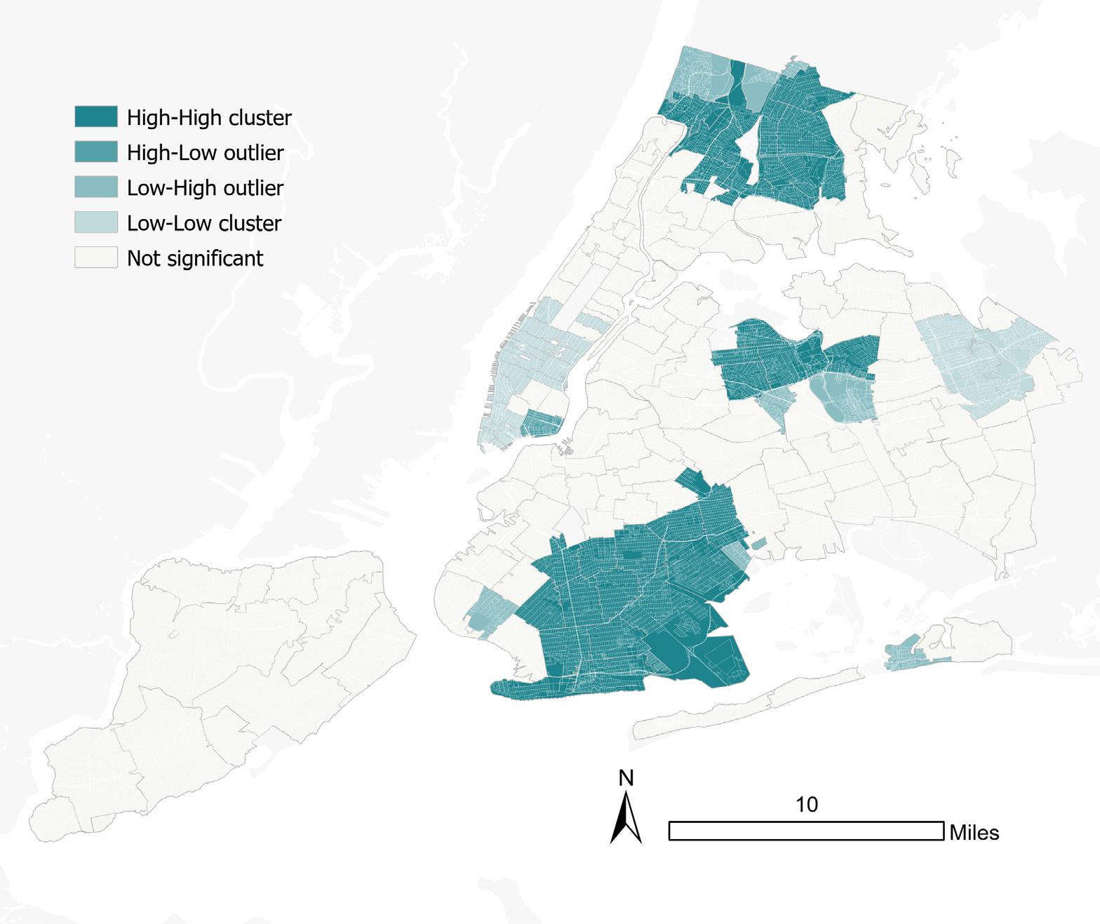
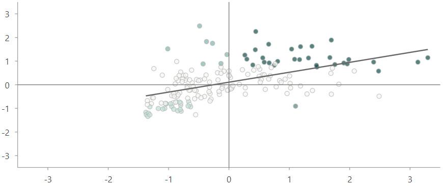

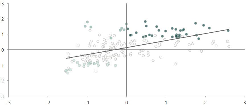
The lower R² values in Moran’s I scatterplots for both COVID death and case rates indicate moderate spatial autocorrelation, suggesting that while clustering exists, spatial patterns are not the sole determinant. It is hypothesized that other factors, such as population density, healthcare accessibility, socioeconomic status, and public health interventions, may also influence the distribution of death rates.
And the spatial patterns of death rates and case rates are relatively similar. This could suggest that areas with high case rates also have high death rates, which might be expected as more cases can lead to more deaths.
Clusters for Percent Positive
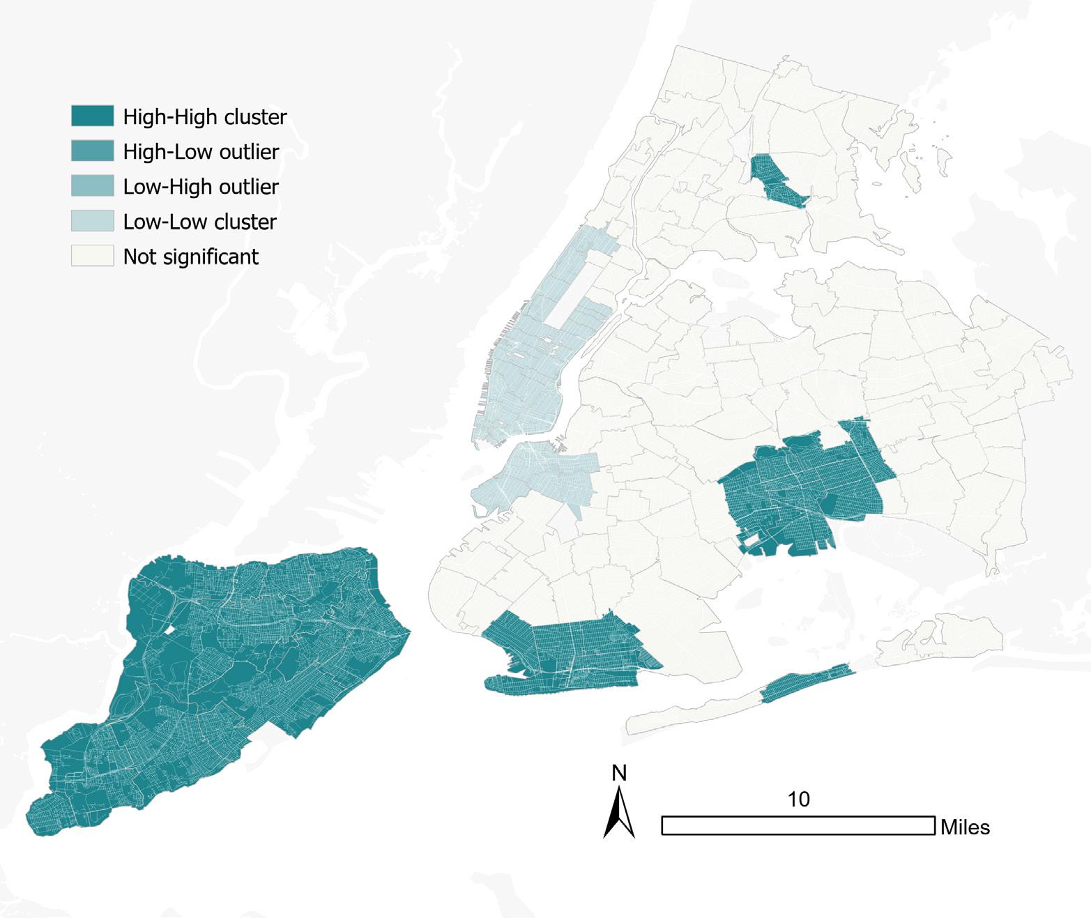
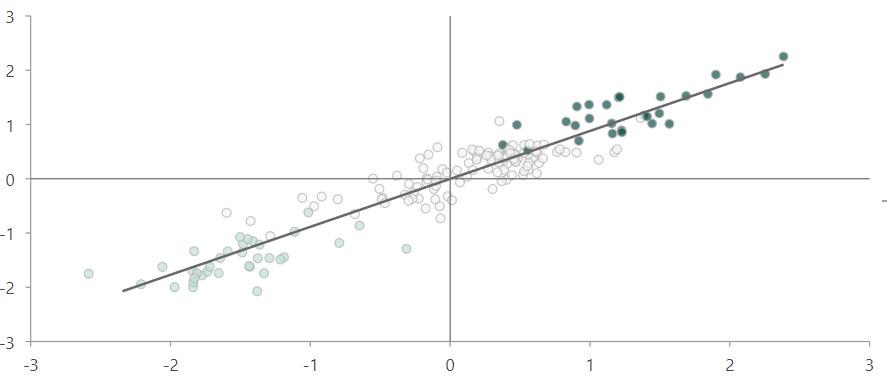
The Moran’s I scatterplot for NYC’s COVID-19 percent positivity rate indicates strong spatial autocorrelation, with a high R² value of 0.9 suggesting neighboring areas exhibit similar positivity rates. It signals pronounced regional trends in the spread of the virus.
Moran’s Scatterplot Moran’s Scatterplot Moran’s Scatterplot Clusters for Covid Case Rate Spatial Lag Spatial Lag Spatial Lag NYC Percent Positive of Covid19 Tests (Z-Transformed) NYC Covid19 Cofirmed Case Rate (Z-Transformed) NYC Covid19 Cofirmed Death Rate (Z-Transformed) R2=0.32 R2=0.29 R2=0.9Location- Allocation
Centroid points for Zipcode Districts Fishnet
Travel Mode
Walking Distance/ Facilities= 3
Problem Type
Minimize Weighted Impadence
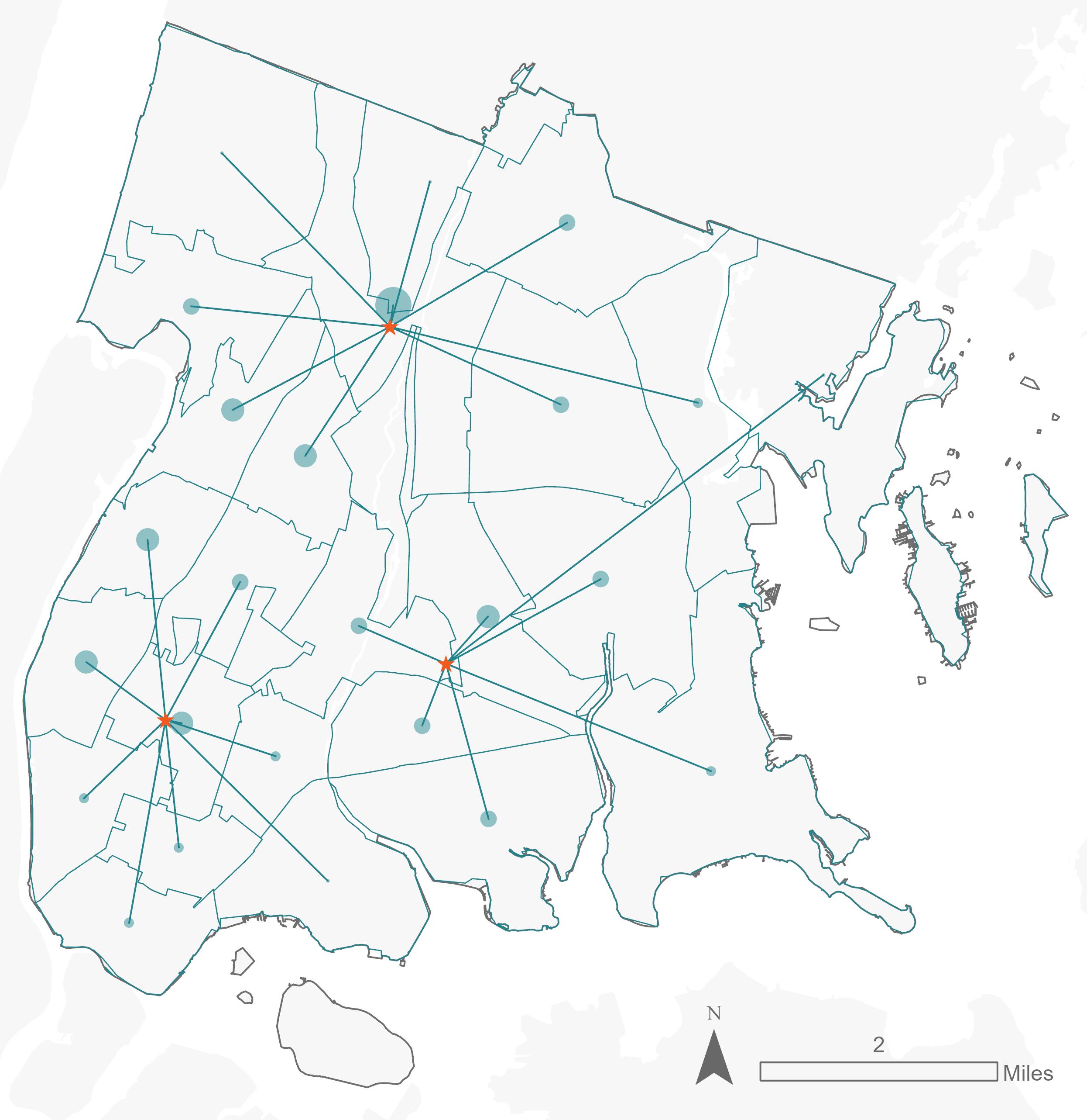
Scenario 1: Defined Number / Cases Access
The analysis will be weighted by case numbers to determine facility locations, prioritizing areas where people are more susceptible to illness.
Location- Allocation
Demand Points
Facilities
Centroid points for census tracts Fishnet
Input Locations Default Value:
Travel Mode
Walking Time: 30 mins
(Set Speed As 1.5m/s)
Problem Type
Maximize Coverage and Minimize Faciliies
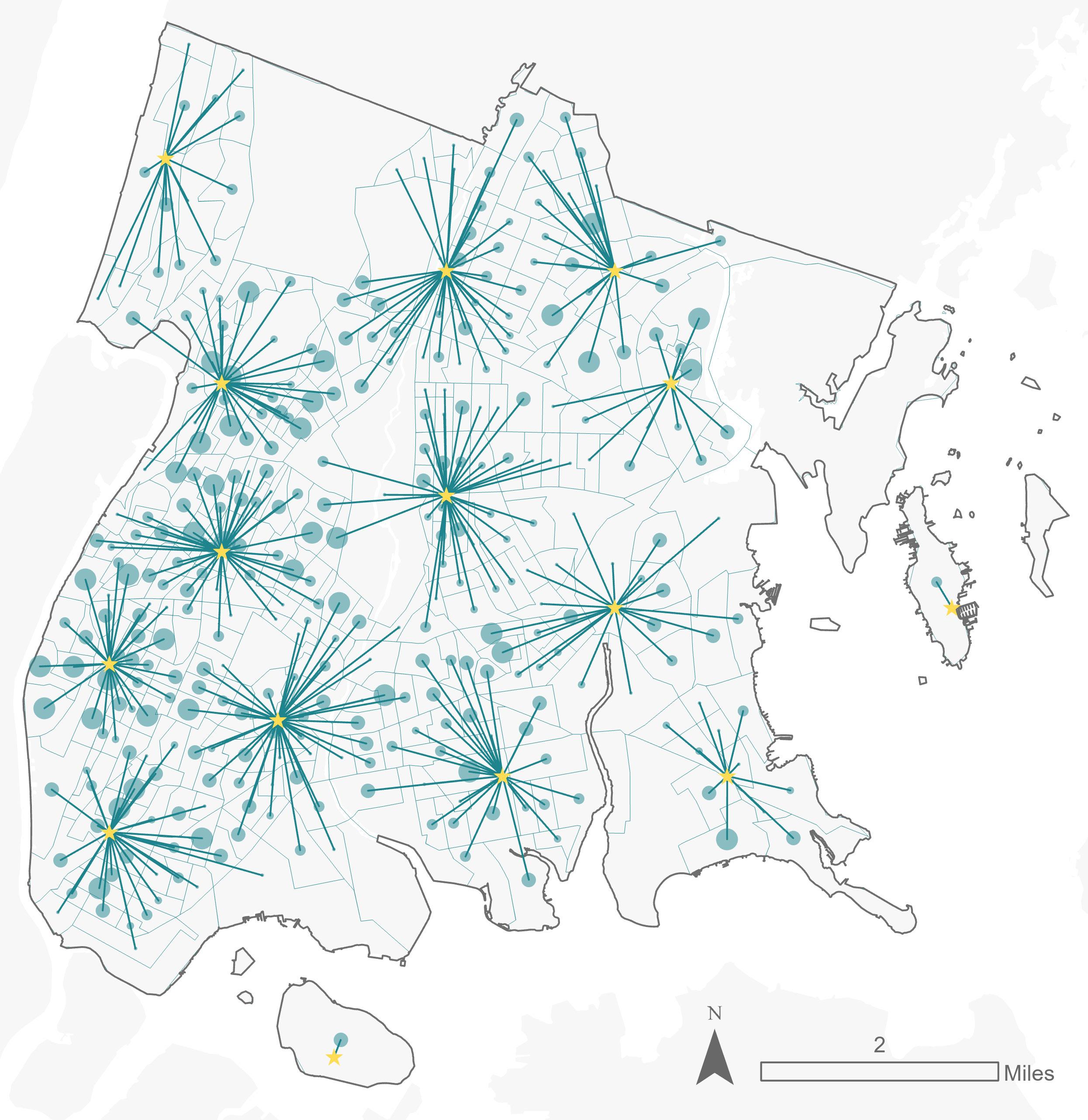
/ Population Access
Scenario 2: Flexible Number
Facilities are located such that every resident of the Bronx can access a site within a 30-minute walk
Summarizing Data Around Response Centers
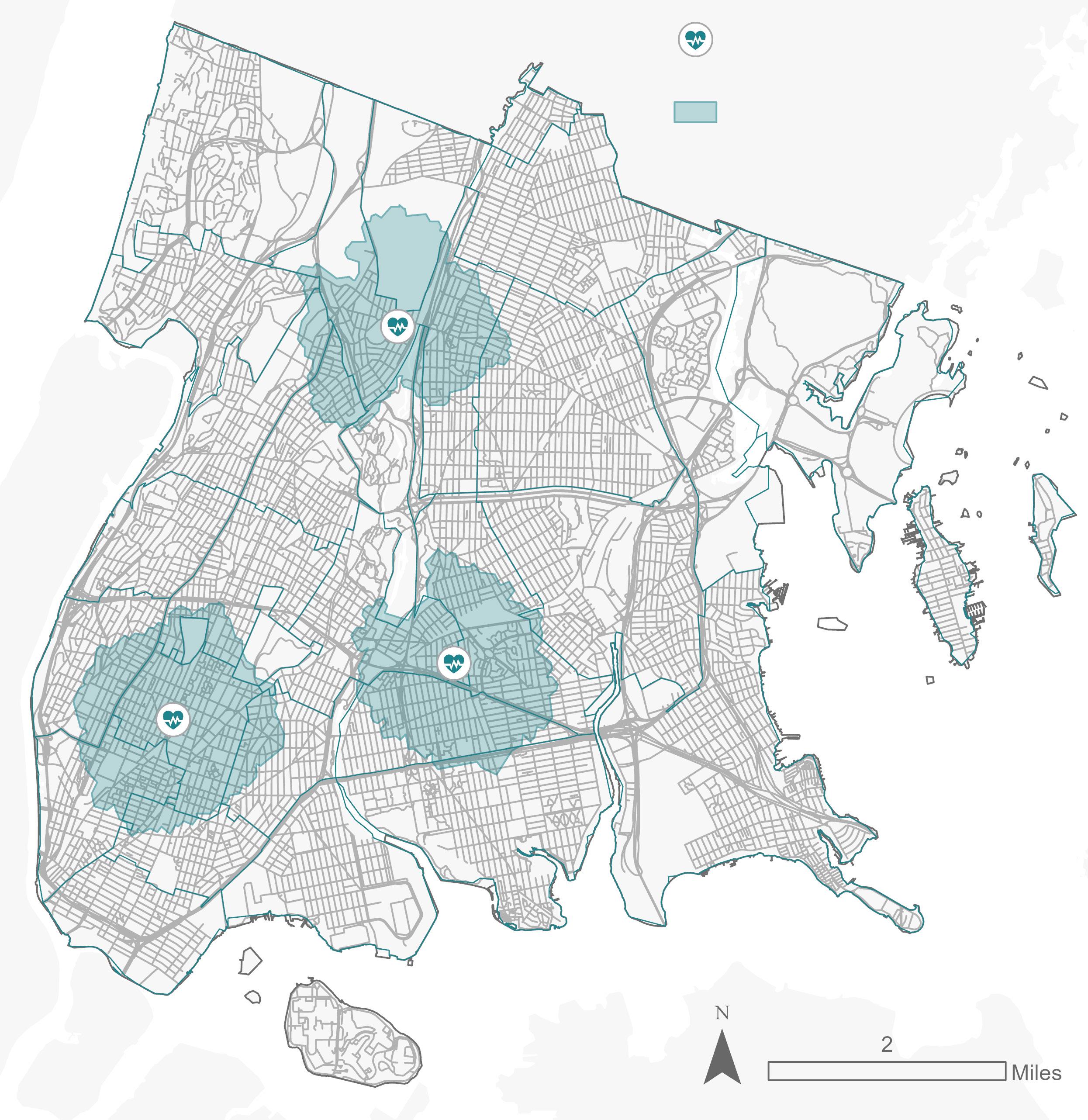
This map illustrates the final part of the assignment, focusing on three selected sites from Scenario 1. Around each site, a onemile walkshed is drawn to encapsulate the nearby area. The map provides a detailed summary of the activities and features within these walksheds, offering insight into the local environment, infrastructure, and community dynamics around each site. This visualization aids in understanding the immediate impact and relevance of the sites within their respective one-mile radius.
Chosen Response Centers
One-Mile Walkshed
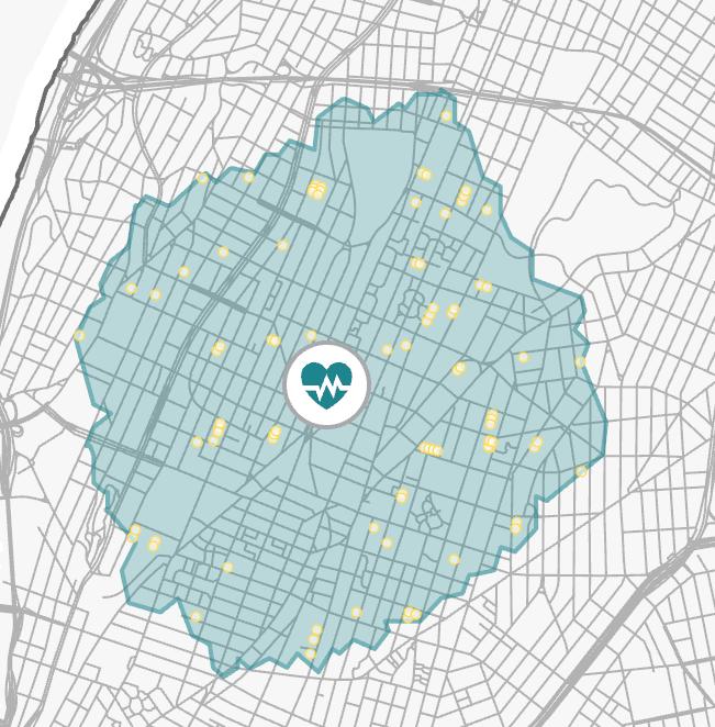
the num of schools: 85
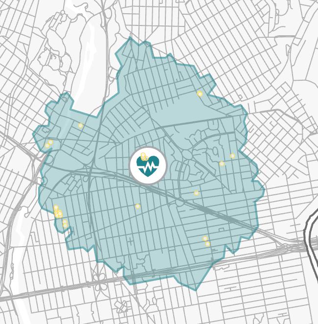
the num of schools: 25
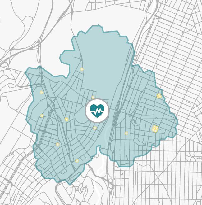
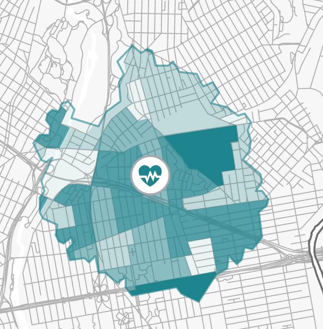
the num of schools: 20
Center [1] has a high density of schools, with 85 in the vicinity, which could be advantageous for disseminating public health information and for vaccination campaigns targeting youth populations. Center [2], with 25 schools, and Center [3], with 20, have fewer educational institutions, which might limit outreach capabilities but could also mean less demand for emergency resources from school-related cases.
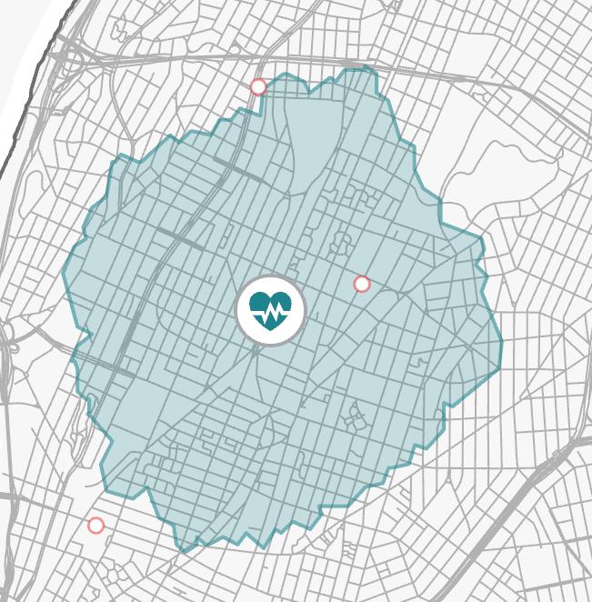
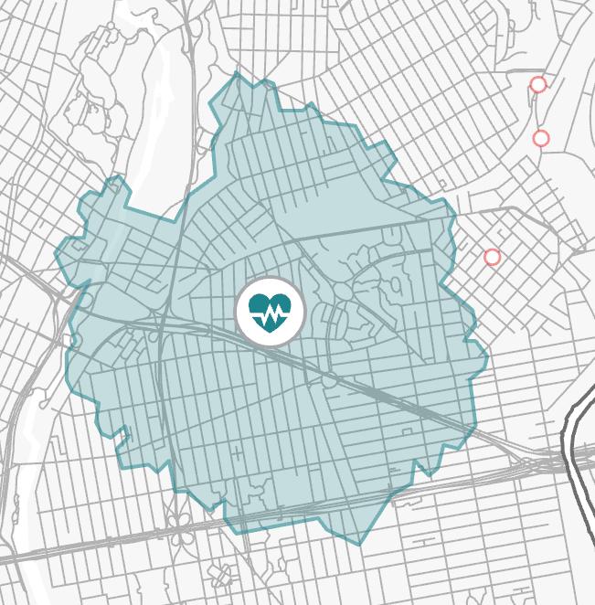
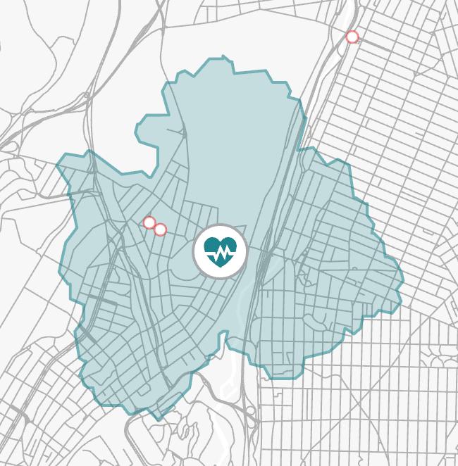
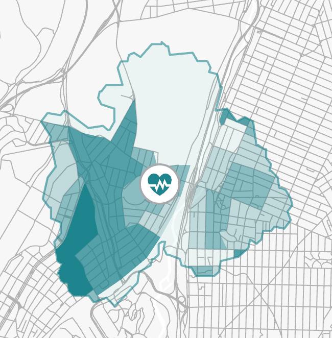
Summary of Population Summary of Bus Stops

Sum: 256,082 Mean:4,656
Sum: 175,119 Mean:4,169
Sum: 147,412
Mean:3,779
Center [1], with the highest sum and mean population, would serve the most significant number of people, indicating a higher demand for services and possibly a greater impact on public health efforts. Center [2] and [3] serve smaller populations, which might mean less strain on resources but also fewer individuals benefiting directly from the center’s proximity.
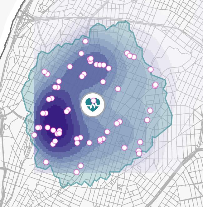
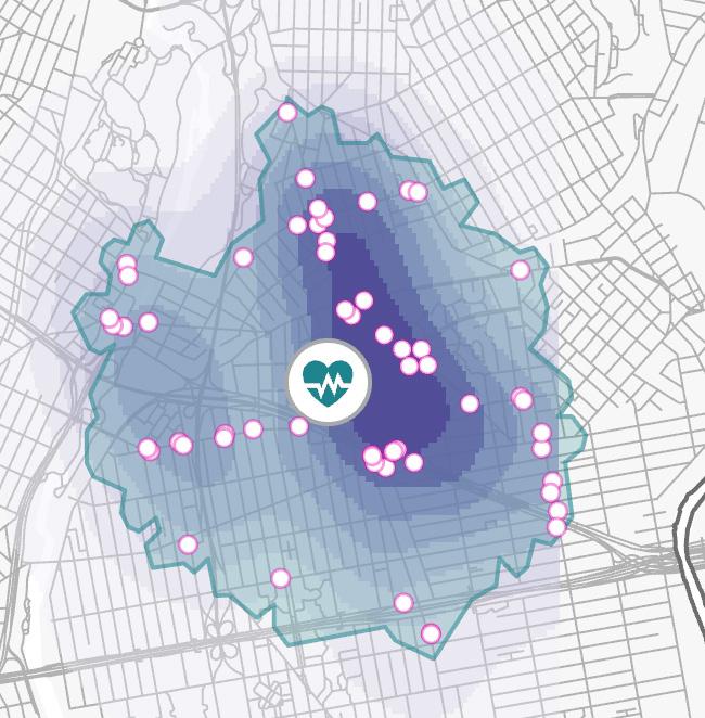
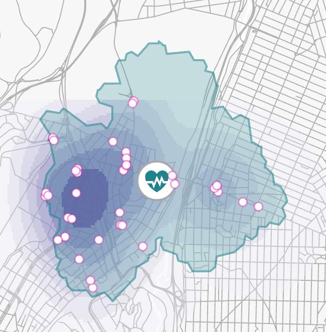
The map suggests two of the centers (1 and 3)are strategically located near hospitals, enhancing coordination for rapid emergency response. The second center, further from hospitals, may face challenges in immediate resource sharing and patient overflow management.
The kernel density map for The Bronx shows [1] and [2] Pandemic Response Centers well-placed in areas with high bus stop density, aligning with robust public transit. However, one center lacks this proximity, indicating a potential gap in transit accessibility that may necessitate additional services or new routes to ensure equitable healthcare access.
03 CREATION OF A FLOOD MODELING CENTER
Location: Miami- Dade County
Time: 2024.1- 2024.5
Course: Landuse and Environmental Modeling
Tutor: Michael Fichman
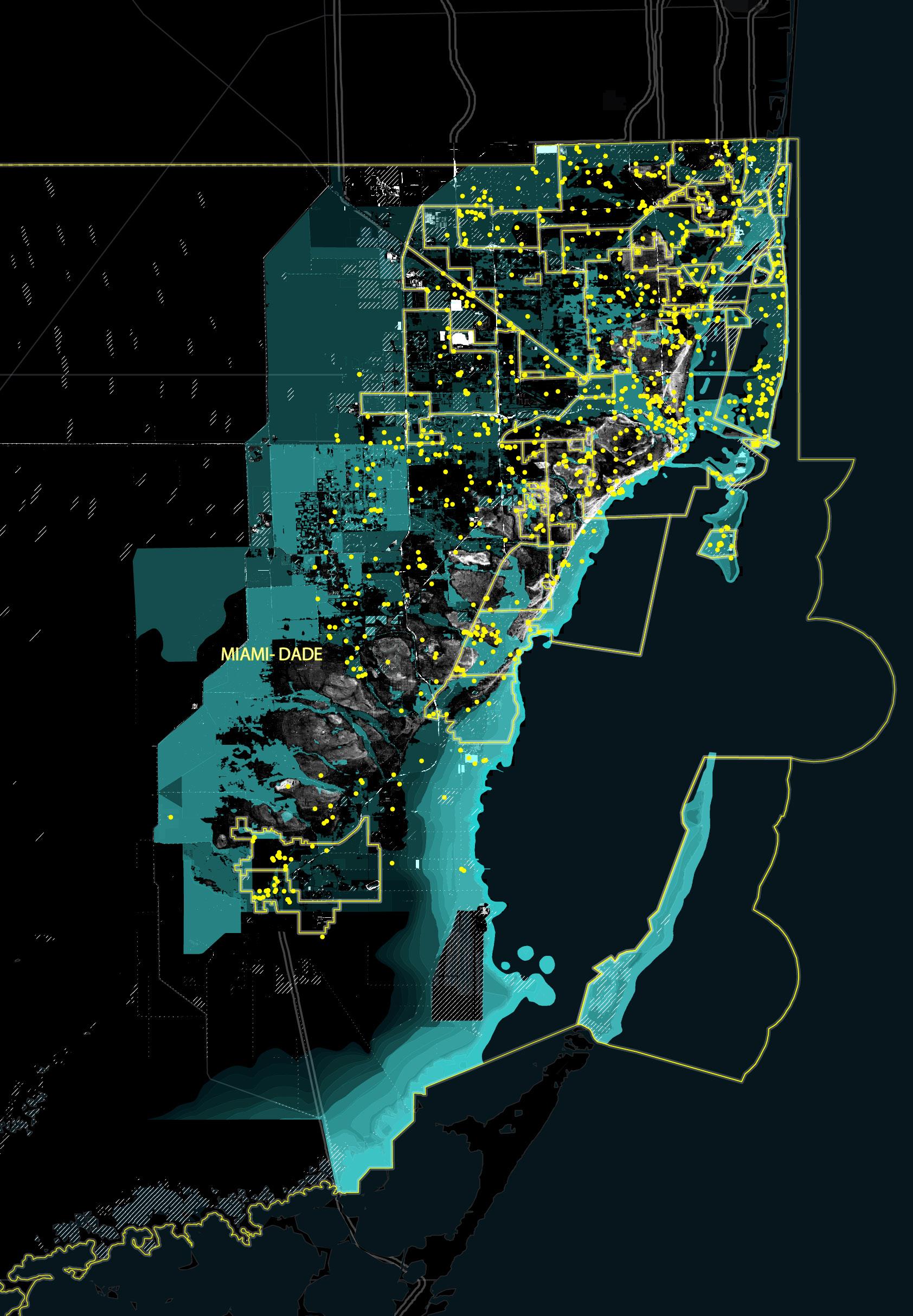
Establishing the FIMPC is a critical step in combating the flood risks brought about by climate change. By centralizing expertise and technology, we can better assess and forecast future risks, providing a solid scientific foundation for decisions at local, regional, and national levels. By acting now, we can effectively mitigate the impacts of climate change, protecting people and infrastructure from future flood threats.
Financial Support:
Analysis of Local Mitigation Strategies (LMS) Projects Distribution reveals that each municipality’s financial commitment and funding allocation for flood response vary. This also might reflect the different levels of external financial aid and the varying degrees of public and stakeholder awareness about flooding response.
Inter-Municipal Cooperation:
The efficacy of FIMPC is challenged by disparate objectives across municipalities and regulatory impediments that limit data sharing and cross-jurisdictional collaboration.
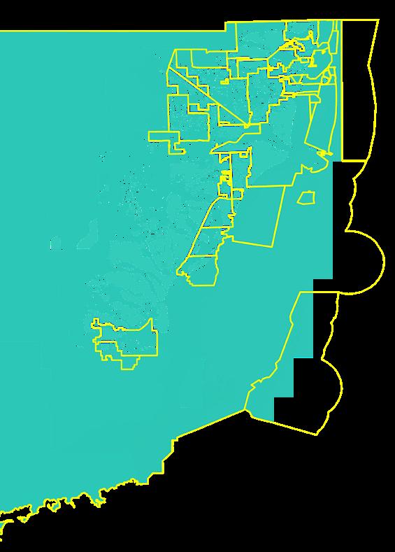

FEMA Flood Zones:
This map shows some zones is at high risk of flooding, potentially qualifying as part of the 100-year floodplain.
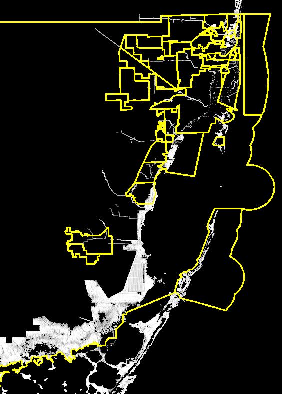
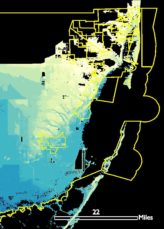
1- Feet SLR: Predicting a 1-foot sea level rise reveals significant threats to Miami, underscoring the urgent need to establish FIMPC.
Storm Surge Zones:
The threat of storm surge to Miami is also very serious. When the storm surge comes, most areas will be in crisis.
04 A PHILADELPHIA ESCAPE
Strategizing Evacuation Routes in Response to Hypothetical Zombie Virus Threats
Location: Philadelphia, Pennsylvania
Time: 2023.9- 2023.12
Course: Modeling Geographical Objects
Tutor: Shea O'Neill
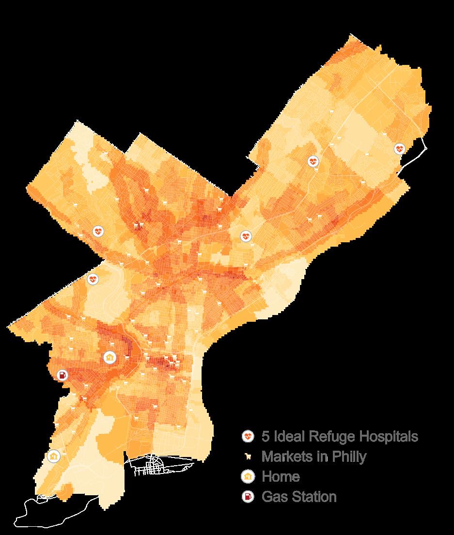
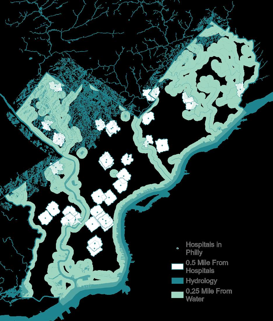
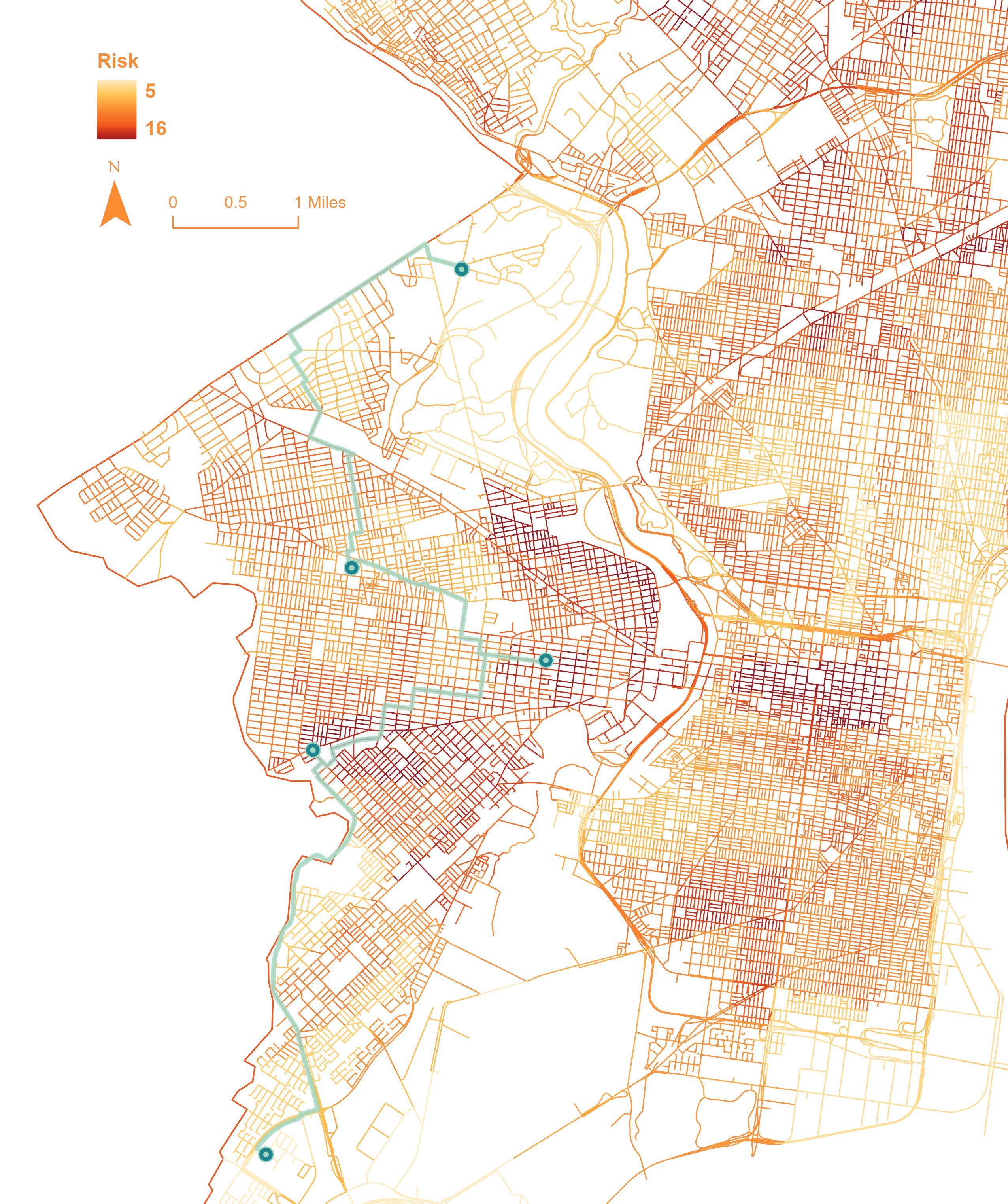
In this project, I analyzed Philadelphia's vulnerability to a hypothetical virus outbreak. I started by identifying initial outbreak points and then assessed high-risk areas by considering population density, commercial activity, major transport routes, and past epidemic trends. Subsequently, I determined safe areas for hospital locations based on terrain features like slope, aspect, and elevation, and compared these with the high-risk zones. Finally, I developed an evacuation plan by evaluating the risk associated with different roads and identifying the safest route connecting key locations.
COVER CHANGE
Academic Project, Course Work
Course: GIS Location: Houston, TX
Time: 2023.9-2023.12 Semester: 2023 Fall
Type: Individual Work Tutor: Mario Giampieri Jr.
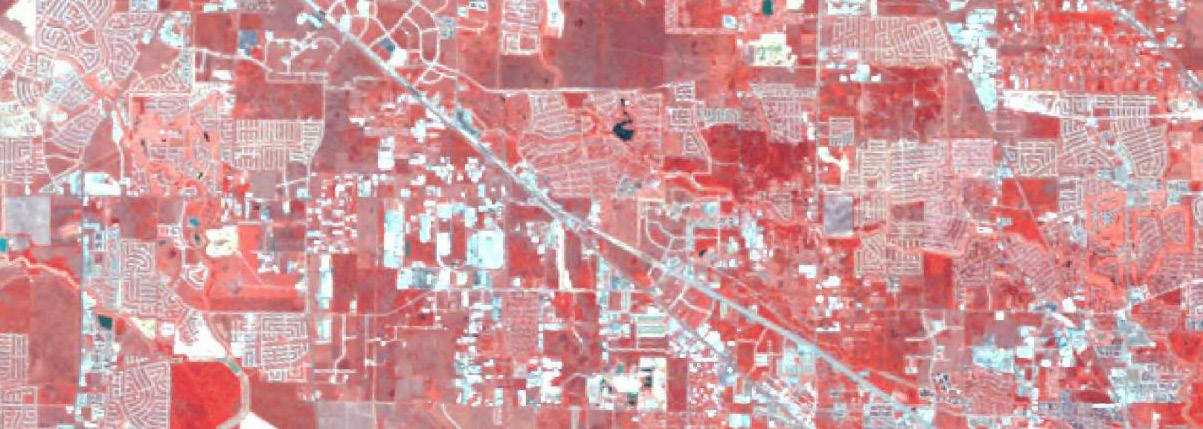
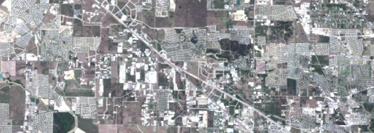
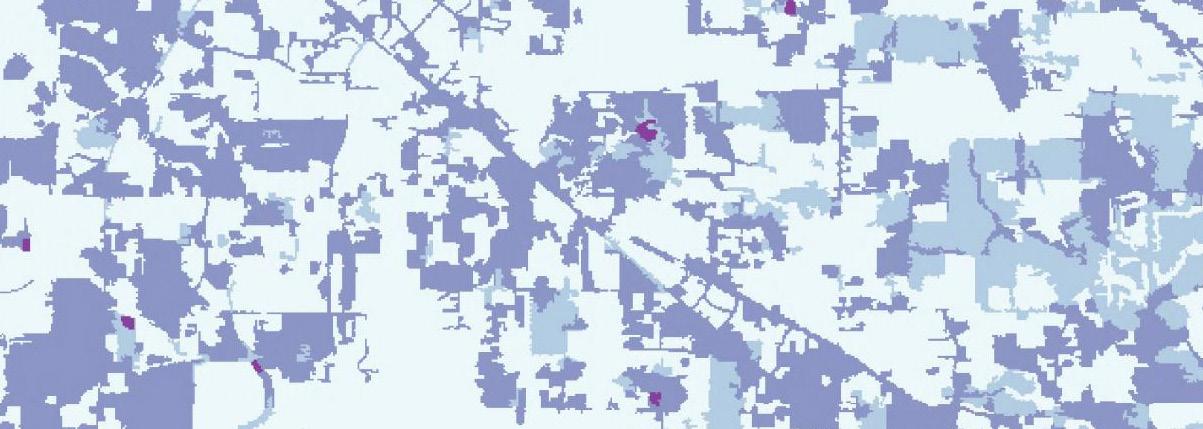
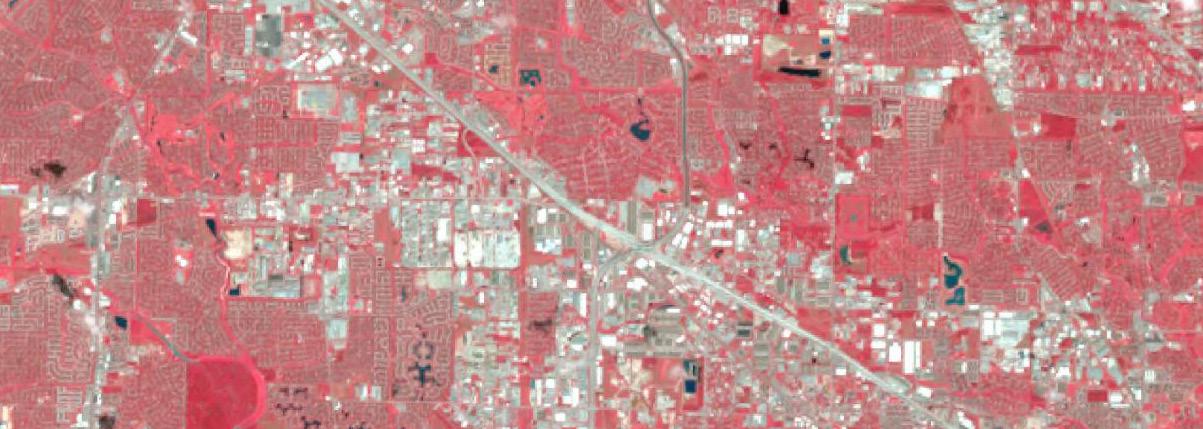
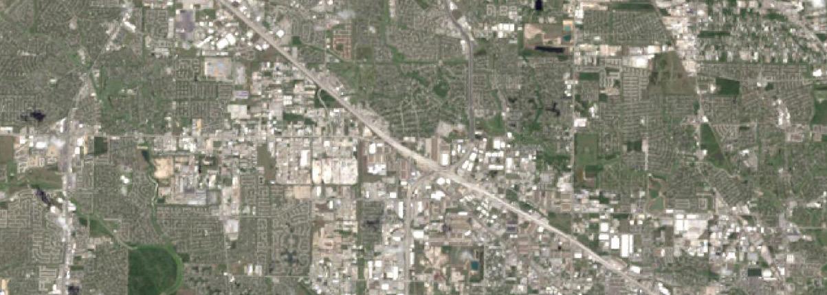
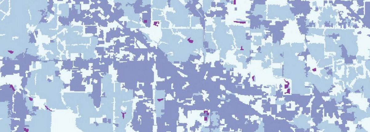
This project analyzes the loss of wetlands in Houston, Texas, between 1987 and 2017 using Landsat satellite imagery, focusing on the impact of urbanization on flood mitigation. It includes three map compositions comparing natural, infrared, and urban landscapes, and a fourth map showing wetland changes over 30 years, quantifying the total acreage lost.


SAFE STREETS INITIATIVE
Estimating Street Safety Level with Crime Data and Street View Images from the Perspective of Female
Academic Project, Course Work Course Name: Machine Learning
Location: New York, US Tutor: Mauricio Rada Orellana
Time: 2023.1-2023.5 Semester: 2023 Spring
Type: Group Work with Mingrui Jiang, Hanfei Fu, Xiutong Yu
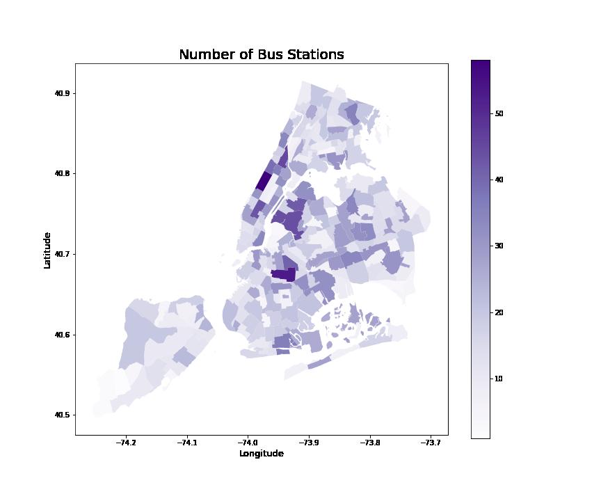
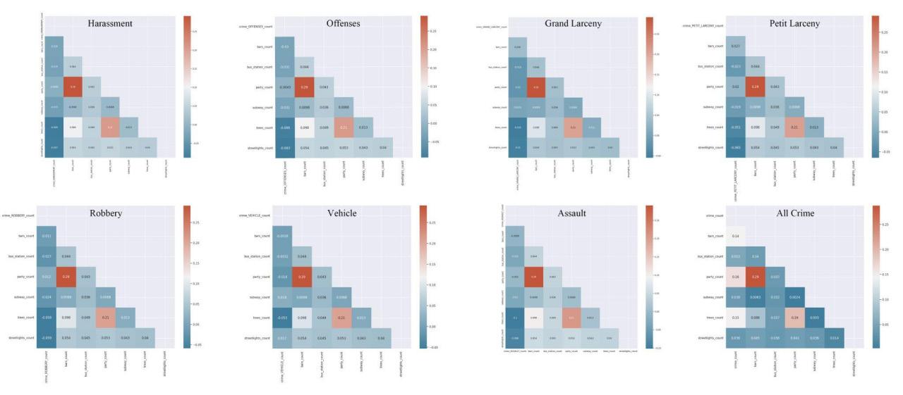
We selected seven crime types that predominantly target women from the NYC crime dataset between 2017-2019 and analyzed the correlations between street environmental elements and different types of crimes. Our analysis revealed that the presence of more trees and street lights is associated with lower rates of harassment and robbery. Additionally, an increase in street lights alone is correlated with fewer offenses, grand larceny, and petit larceny. Besides, more trees are associated with a decrease in vehicle and traffic law violations. More bus stations are correlated with fewer assaults. On the other hand, we found that more bars, parties, and trees had a positive correlation with all types of crimes.

Exploratory Analysis (NYC Scale)
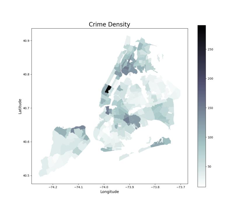
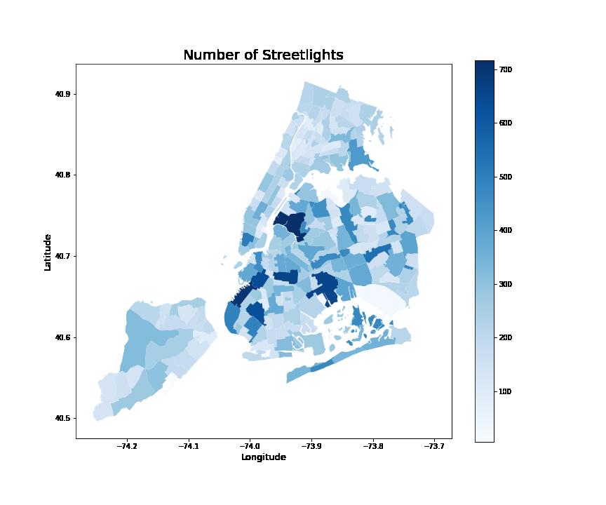
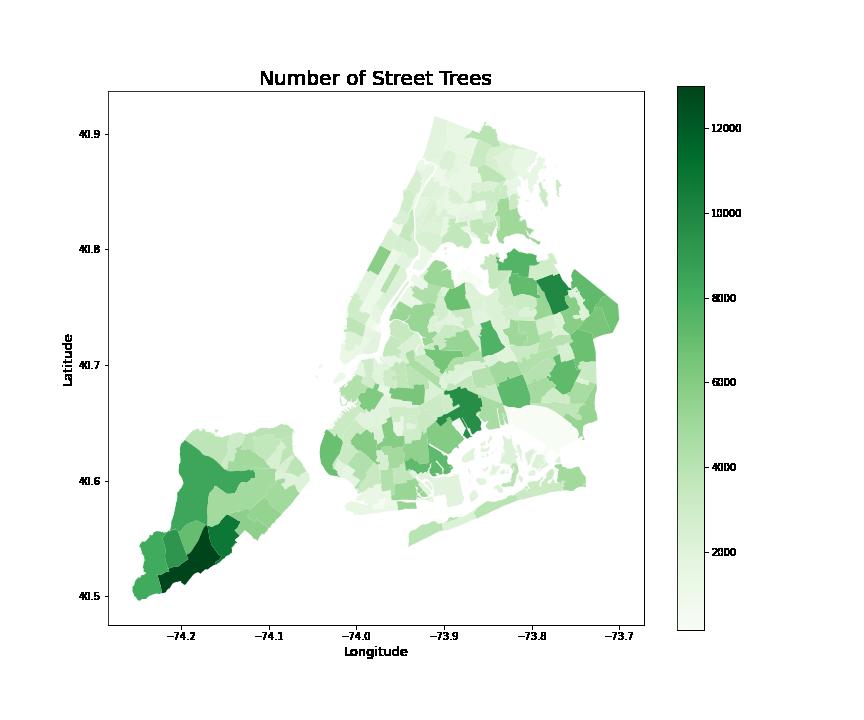
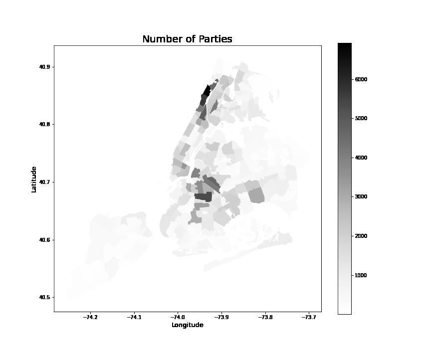
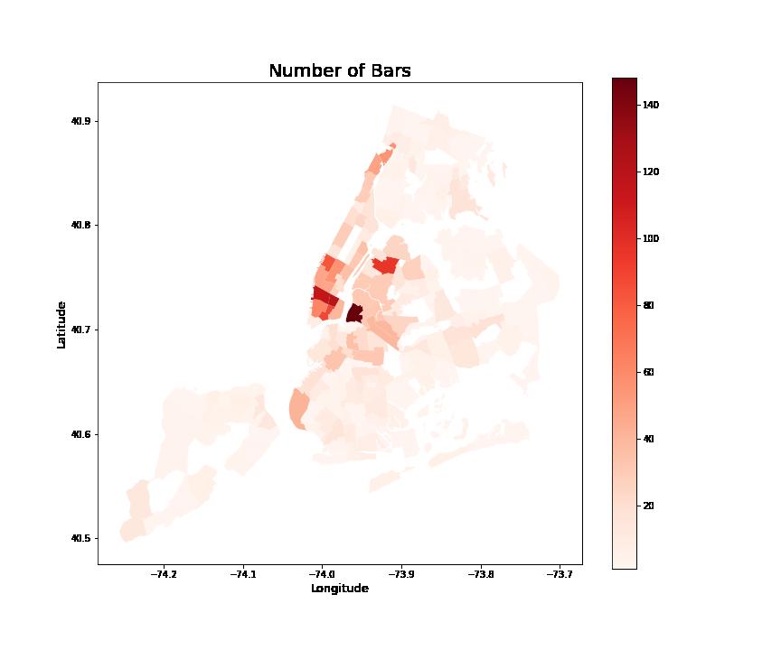
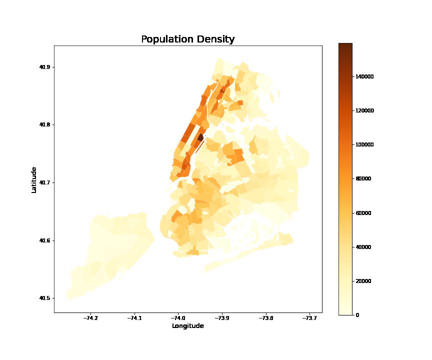
First, after cleaning the chosen datasets, we grouped each of the crime and street environmental data by New York City’s tracts to get a preliminary sense of the distribution of the elements. Then, we used Choropleth Maps to visualize the population and crime density (crime number per 1000 people) and other elements
Exploratory Analysis (Manhattan Scale)
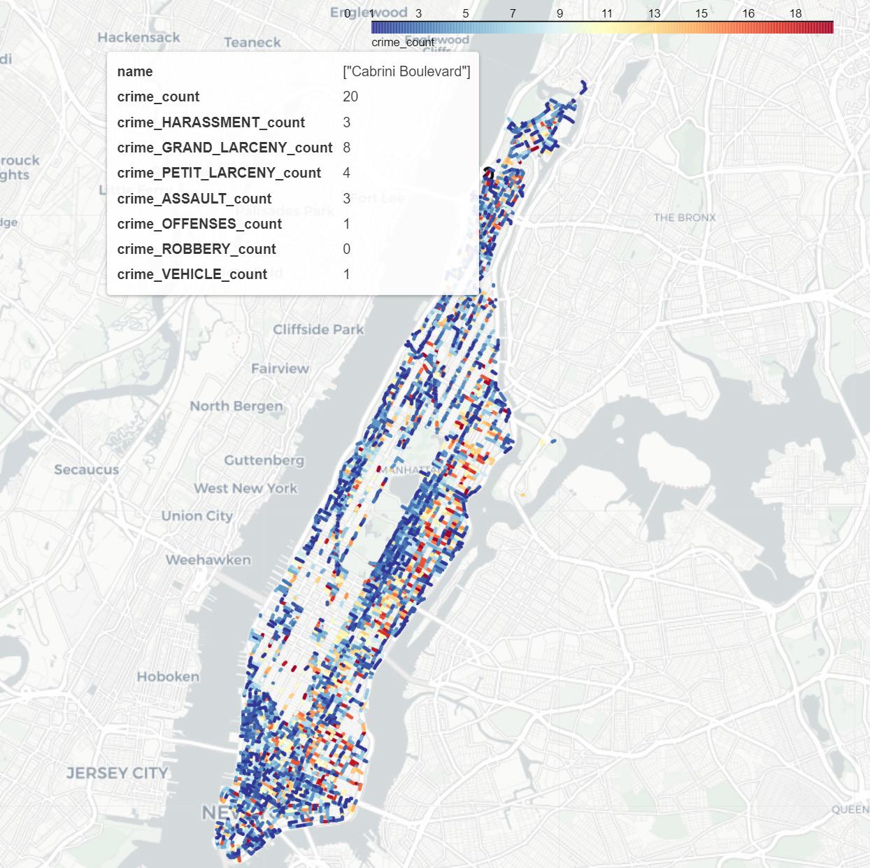
Second, in order to coordinate with the GSV analysis which needs to locate on a specific street, we further zoomed in on the Manhattan borough and used R-tree to project each type of data point to the nearest line of the street before clustering the data of each street segment.
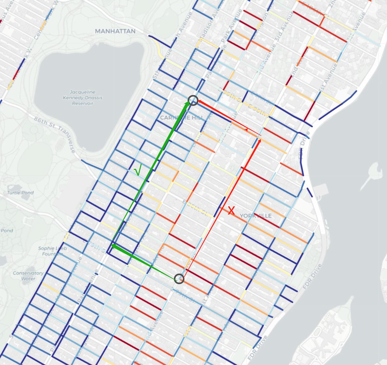
Besides, we created an interactive Manhattan Crime Map indicating the amount of the seven main kinds of crime types that happened to women and their total during 2017-2019.
Street Sample
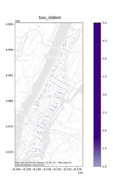
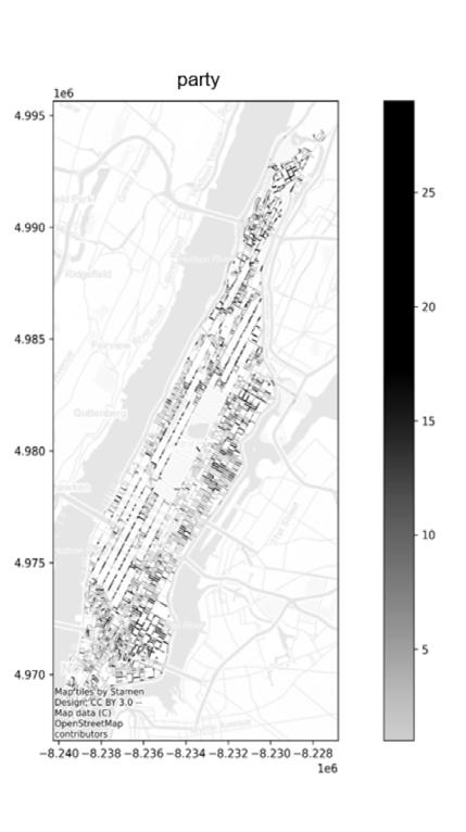
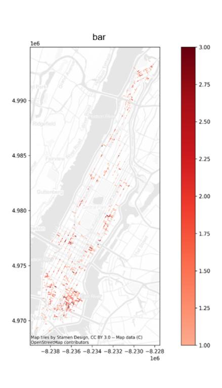
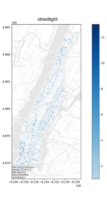
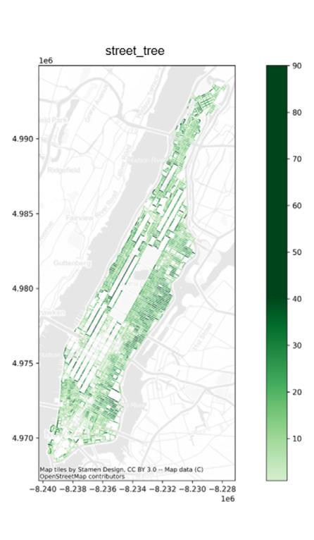
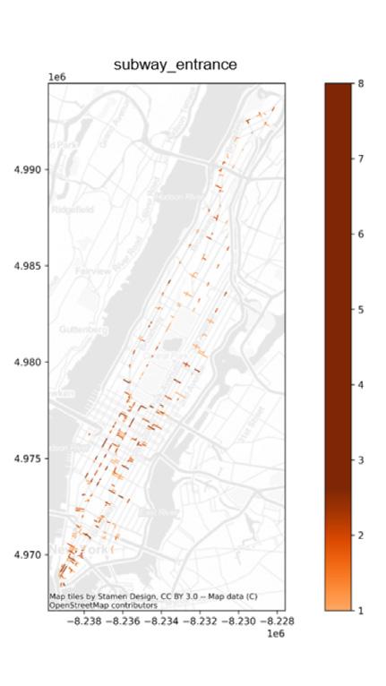
We choose East Harlem- Upper East Area as our sample streets be causeThe samples in this area are very diverse, there are streets with high and low crime rates. And for greater reliability in assessing the features of the segment, we chose to use 20m intervals to set points. At each point, we pulled four images using the GSV API that was oriented based on direction (front, rear) or side of the street (right, left). We finally downloaded 13896 GSV images in this area. To analyze the images we used semantic segmentation. According to the literature review, we find it suitable for segmenting the GSV images from sample streets through the Deeplabv3+ model trained through the ‘Cityscape’ dataset.

Correlation Analysis
We selected seven crime types that predominantly target women from the NYC crime dataset between 2017-2019 and analyzed the correlations between street environmental elements and different types of crimes. Our analysis revealed that the presence of more trees and street lights is associated with lower rates of harassment and robbery. Additionally, an increase in street lights alone is correlated with fewer offenses, grand larceny, and petit larceny. Besides, more trees are associated with a decrease in vehicle and traffic law violations. More bus stations are correlated with fewer assaults. On the other hand, we found that more bars, parties, and trees had a positive correlation with all types of crimes.
Model Evaluation
From the Manhattan Model Evaluation chart, we found that the models performed generally well. Among the predictions of the eight crime variables, the best performing LGBM regression algorithm predicted the number of Harassment crimes, with the model explaining 25.5% of the variables.
Across all crime categories, the prediction of Harassment crime performed better among the six regression algorithms, probably because this type of crime has the highest probability of occurrence and the largest number of samples available for learning and prediction, from which the model is able to learn more information and therefore is more likely to make accurate predictions.
For the different regression algorithms, LGBM and random forest performed the best, and linear regression and SVM performed very poorly. From this, we speculate that nonlinear models may be more suitable for regression problems on crime datasets. LGBM and random forest are both nonlinear models based on decision trees, which indicates that crime events are not simply linearly related to the street environment and need to be explored further. And the general performance of decision trees and KNN may be due to their over-fitting or under-fitting problems.
From the Upper East Site Model Evaluation chart, we found that the addition of the street element data decreased the model’s predictive power for the number of seven crime types, but became better for the total number of crimes, with Random Forest still being the best performing algorithm, with the model explaining 37.2% of the variables. We believe the largest reason for this change to occur is due to the small sample size of each crime type.


Manhattan LGBM Model Evaluation (R2, MAE, RMSE, comparison
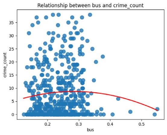
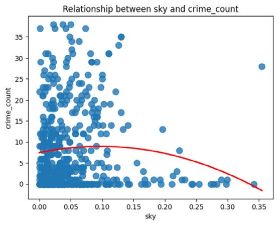
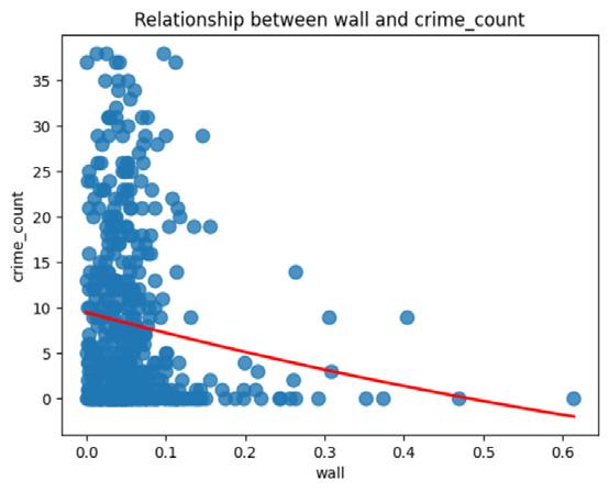
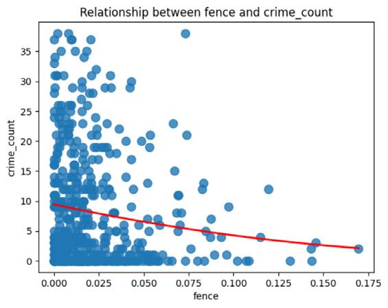
Relationship between Streetscape and total crime count of Upper East Site
Practical Implication
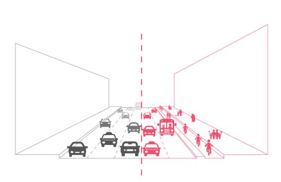
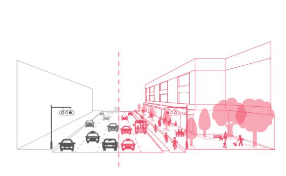
From our identified elements of the street environment and street characteristics that influence street safety on females, we can further apply these thoughts to the design and renovation of the high-crime-risk streets in Manhattan. Inspired by the Shanghai Street Design Guideline, we as urban designers can create a guidebook for New York City and even other places in the world that can improve street safety, especially for women. Also, with the Manhattan Crime Map, women can choose a route that has less crime risk when they are moving from one point to another.
Street Design Guideline
Manhattan Crime Map
07 THE FABRIC OF GROWTH
Mapping and Collaging Shenzhen's Development
Course: Recombination Urbanism Location: Shenzhen, China
Time: 2023.9-2023.12 Semester: 2023 Fall
Tutor: David Grahame Shane
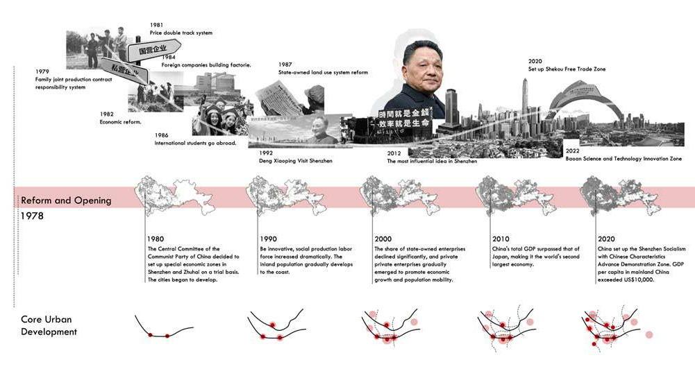
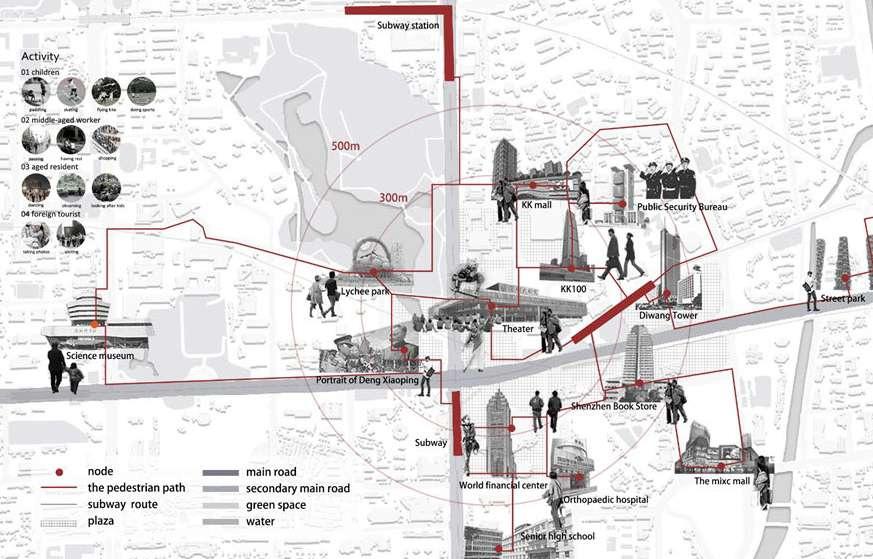
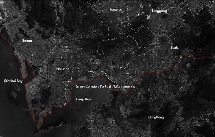
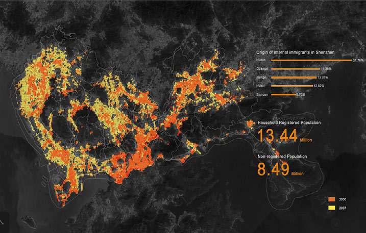
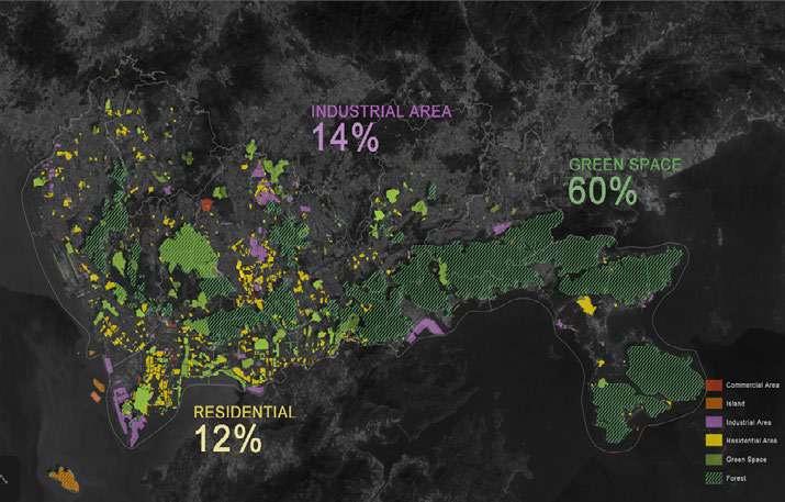
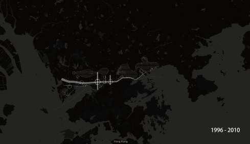
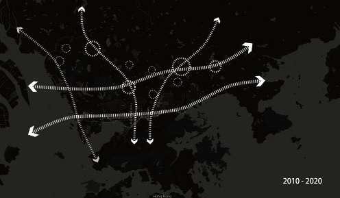
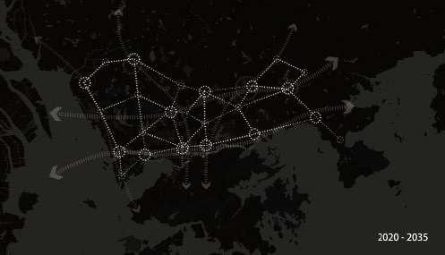
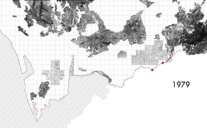
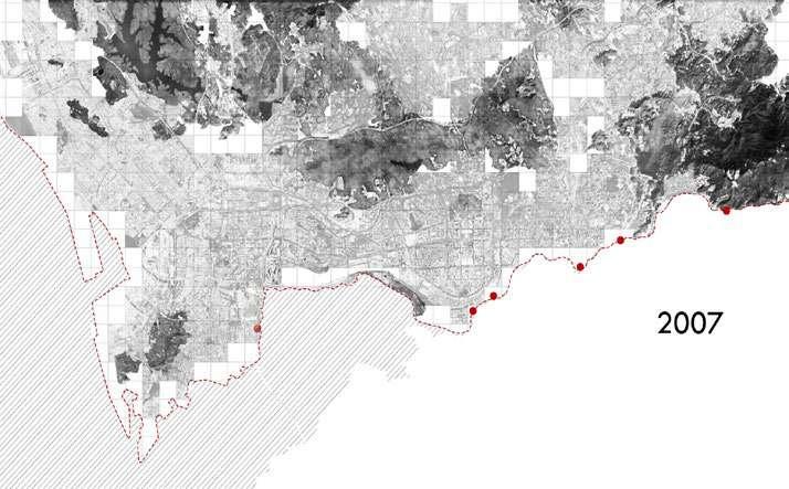
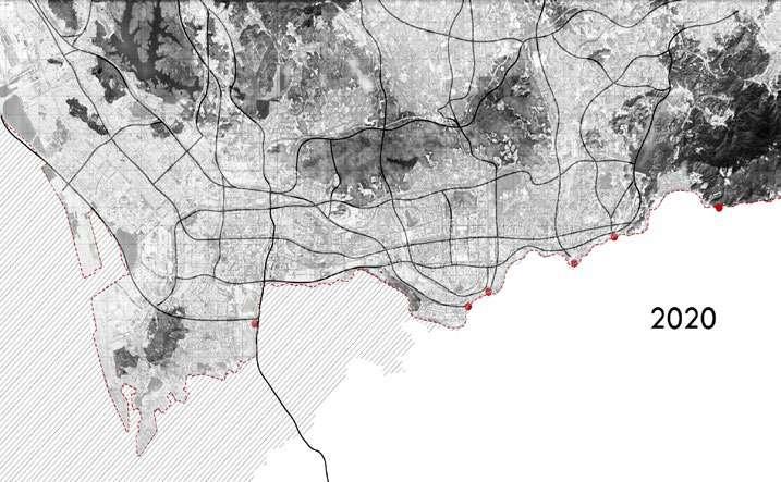
After the reform and opening up, Shenzhen changed from horizontal dual-core to multi-centered development. From 1978, lots of non-local moved to Shenzhen and became the first generation of builders. It started with Luohu and Baoan County as the core and began to spread the development and construction in all directions.
of Peral River Delta Region
 Master Plan
 of Shenzhen
Master Plan
Master Plan of Shenzhen
Master Plan of Peral River Delta Region
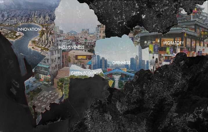
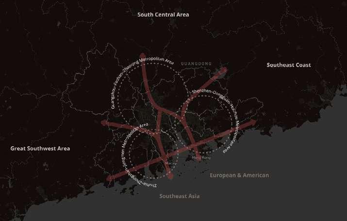
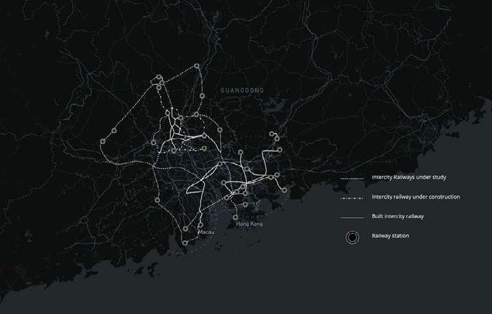
Through the expansion of settlements and the enrichment of transportation hubs, the core areas became more connected and formed the metropolitan area.
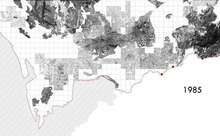
Shenzhen Changing through Reform and Opening
