Dulux
Paint Picks
This seasons expertly curated paint colours
comprehensive guide on rising trends

Issue #01 Autumn Edition


This seasons expertly curated paint colours
comprehensive guide on rising trends


Welcome to our first edition of our quarterly NDA magazine. As design pioneers, together we will explore the evolving world of design, where innovation, creativity, and inspiration come together to redefine the way we live and embrace our surroundings.
In this edition of our Autumn NDA magazine, we invite you to immerse yourself in a diverse array of thought-provoking articles written by our expert National Design Academy Tutors. As design educators, we are fortunate to witness and guide the next generation of interior, garden, and soft furnishing future tastemakers. So, we want to share our insight and knowledge with our wonderful community of designers from every industry.
In this first edition, we explore a wide breadth of subjects, ranging from some divisive topics like AI generated design schemes, to winter evergreen planting guides. This magazine has something for everyone, no matter your area of creative interest. We invite you to sit back, relax, and delve into this magazine which we hope will be the first of many more!
Garden Design Tutor


Time at NDA
6 years.
Course/s you teach Professional Diploma in Garden Design.
If your personality was a design trend, what would it be?
A harmonious wildlife garden with a natural swimming pond!
Career high
There really are too many to focus just upon one. I genuinely love what I do! The joy of seeing fledgling designers achieve never fails to give me a buzz!
Favourite design trend
You can’t give me just one, surely! Foliage gardens really work for me. They invoke a real sense of serenity.
Time at NDA
2 years and 6 months.
Course/s you teach BA (Hons) Interior Design, MA Interior Design & PID Diploma.
If your personality was a design trend, what would it be?
I have two loud, noisy boys so I really appreciate calm and clutter free spaces. Japandi and Minimalism with a touch of Biophilia suit me well!
Career high
Designing a 5-star spa in Dubai.
Favourite design trend
Incorporating different textured design elements throughout an interior space.

Hated design trend
Matchy-matchy furniture.
Time at NDA 5.5 Years.

Course/s you teach PID BA and MA.
If your personality was a design trend, what would it be?
Maximalism.
Career high
Designing a Million-pound project.
Favourite design trend
I don’t really believe in trends.
Hated design trend
Colours of the year.
Tutor
Time at NDA 6 years.
Course/s you teach BA Heritage, Retail & Interior Design and Professional Diploma in Interior Design.
If your personality was a design trend, what would it be?

Brutalism with a splash of Cottage Core.
Favourite design trend
Y2K revival.
Hated design trend
Greige.


Time at NDA
17 yrs & 6 months.
Curriculum development and industry relevance across all courses.
If your personality was a design trend, what would it be?
Heritage Modern: Looking at history through the lens of the present in order to inform the future.
Career high
I don’t really think in that way about my career, there have been many exceptional and memorable moments. I tend to look forward … as Karl Lagerfeld said “People who say that yesterday was better than today are ultimately devaluing their own existence.”
Favourite design trend
Antiquarian Minimalism – because it is warm, scholarly, and presents endless possibilities – rather like myself!
Whilst I find contemporary interior design energising and interesting, ‘Overtly Trendy Design’ is problematic, for two reasons:

A) If an interior is resolutely bang on trend, it cannot truly reflect the personality of the inhabitant and, for me, that is completely missing the point of interior design.
B) Nothing dates more quickly than the height of trendiness, therefore, waste of materials, energy and other resources is implicit in this approach. An interior cannot possibly be both on-trend and wasteful in the current climate and therefore can only be, by definition, old fashioned.

Time at NDA 1 year.
Course/s you teach
BA Hons Interior Design + BA Hons Outdoor Living + Software course.
If your personality was a design trend, what would it be?
Art Deco - Optimistic for the future, breaking with old trends and embracing technology.

Career high
Winning the contract to design the retail areas for Westminster Abbey.
Favourite design trend
When I was a young man, I came across a book by Charles Jencks about Post Modernism. I was fascinated and this is what started my interest in interior design and subsequent career.
Hated design trend
Dadaism, the movement deliberately set out to be ugly, weird and in every possible way the opposite of traditional art and celebrated the title of ‘anti-art’. This was, in my opinion, a cultural low point that should remain in room 101.
An interior designer has many responsibilities, they must plan, research, coordinate, inspect, and communicate designs to name a few. Therefore, it’s no surprise that lots of designers are excited about emerging technology that has the potential to save time and energy. The power of artificial intelligence (AI) has become a disruptive technology in many industries, and the interior design sector is no exception. AI holds the power to enhance interior design processes, efficiency, and design, but does it exploit existing designers hard work and signature design styles?
Artificial intelligence design tools use machine learning algorithms to generate design ideas and layouts based on human inputs and prompts such as room size, budget, or style. A human will input prompts and the AI software will generate visual life-like renders sourced from online images or uploaded visuals.

Examples of AI tools include Planner5D, Interior AI, and Midjourney. There’s no denying the appeal AI holds for designers, as it can quickly generate design concepts with different compositions styles, colours, and furniture. It is so powerful that sometimes it is impossible to identify AI sophisticated renderings between real-life designs!
There is no denying AI’s game-changing benefits. It helps interior designers to leverage data to create individualised, unique, and efficient spaces through personalised recommendations. Designers can enter preferences and receive multiple recommendations in seconds for furniture, textiles, and colours schemes.
AI is also playing a big role in predictive trend analysis. It can dissect huge amounts of customer data to forecast future style and product trends that can help designers to shape their projects in line with customer demand.
Augmented reality (AR) and virtual reality (VR) are two other artificial intelligence pillars that really bring ideas to life. Designers can create virtual and augmented experiences for clients so they can explore 3D room mock-ups which will give designers real-time client feedback before actualising projects.
Photography by Mo Eid from PexelsSo, we’ve brushed upon AI’s benefits, but should interior designers be rushing to use AI? Many of us already use AI in our everyday lives, take Siri or Alexa for example. We may even reluctantly admit that we’re unwittingly reliant on these “helpful” tools. If designers introduce more AI tools into their work, they run the risk of becoming over reliant on them. It takes time to develop creativity and design intuition and if you rely of AI to do this for you, you run the risk of stifling your creativity.
Whilst AI can generate thousands of unique designs in seconds, can any of them be truly original? Take Greg Rutkowski for example, he is an artist with a distinctive fantasy scene style. Yet, if you search his name, you’ll see plenty of images in his exact style that he never made. How can this be? You guessed it, AI. This “style copying” is still an ethical grey area as the images are original, but the design style isn’t. Many artists are choosing to boycott AI altogether. Amy Stelladia, a Spanish illustrator, spoke out publicly to complain about an AI app for using her artwork to generate portraits.
“They are meant to compete with our own work, using pieces and conscious decisions made by artists but purged from all that context and meaning,” Stelladia said. “It just feels wrong to use people’s life work without consent, to build something that can take work opportunities away.”
There’s no denying AI’s efficiency and productivity lure but everyone should be mindful of the impact AI could play on their creativity and future careers. Will you be using AI to help you with your interior design projects, or will you avoid it entirely?
Interior design is now a very accessible career choice, whether you have recently graduated or are thinking about embarking upon a new career path, it is likely you’ve considered setting up your own interior design business. If so, we have some expert advice that will help you to kickstart your business journey.


So, you’ve decided to set up your own interior business, but it is important to ask yourself why? What are the core reasons behind launching your new design company? Write your reasons down and refer to them over the next few weeks. Once you have settled on a handful of main “whys”, discuss your whys with trusted friends or family. Clearly being able to speak about your objectives will help you to confidently pitch your business and define your branding down the line.
After the “why”, it’s time to research. Conducting thorough competitor research is key as it helps you to identify your niche in a competitive market. Ask yourself, what are the unique benefits your business can offer to prospective clients? What will make your business stand out from the competition? You may even decide to specialise in a specific design niche. Recently, the world’s first vegan hotel suite was created for a London hotel, by the design studio Bompas & Parr. This specialist approach could be something you can harness, perhaps offering something completely innovative in today’s market.
Next, it is important to evaluate your own level of expertise. What areas of interior design do you excel in, and where do you need some additional support? Businesses that succeed are ones that can both recognise their strengths and weaknesses. Dedicating time to train your weaknesses or inviting in some additional support will help your business to thrive.
Behind any successful business is a solid and coherent business plan. A business plan will become integral especially if you need funding to get your business off the ground. A formal business plan is something a bank would want to see to assess your loan suitability.
A basic business plan will cover areas such as, an executive summary, company description, products and services, market analysis, marketing and operations plan, management and organisation, financial projections, and appendices. Writing a business plan may seem overwhelming at first, especially if it is your first time, but we encourage you to use online templates.
After you have completed your first draft, use a close friend or family member to read through your plan, as it is likely you will have overlooked some areas. No one gets their business plan right the first time as it takes hard work to craft.
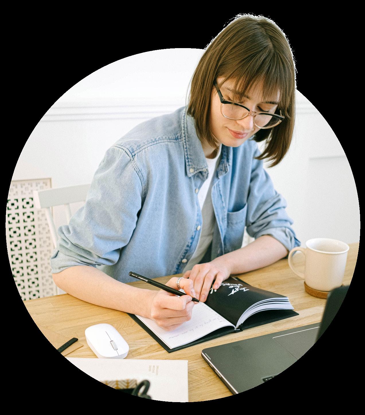
However you approach writing a business plan, your business will start to feel more real as you put all your thoughts down on paper.
A key aspect that should never be underestimated is your business name and branding. Whatever name you decide upon, it is crucial to explore whether someone else is using it, even if it is your personal name. When choosing a business name, you need to
explore the connotations that it may evoke, or any potential negative associations too. Afterall, your brand is who you are, it needs to give the right impression.
Your business name should also attract your ideal target market. Do you want to attract clients that are high end, middle of the road, or entry level? When you have decided on a name, we recommend that you go online and secure a website domain.
Next, you need to go to Companies House to register your business. Do you want to register as a sole trader or a limited company? If you are unsure about how you should register your business, seek further advice, or visit the GOV.UK website which has extensive guidance.
Now that you have a business name, you need to develop a marketing plan and strategy. Have fun exploring brand colours, iconography, and tone of voice. Once you have a basic brand developed, decide on how you will attract your clients. Will your clients come through digital channels such as online search and social media, or will you try and attract clients using more traditional methods like referrals or magazine adverts?
We recommend exploring all inbound and outbound channels to grow your business awareness especially in the beginning. You may find that your clients come from the most unlikely of places and you never know until you try! However, in today’s competitive recommend having a strong digital presence. A good place to start growing your digital presence is through a website where you can host your digital project portfolio, leadership articles, and contact information.
There are lots of easy website building tools on the market, which means it is a lot easier a professional looking website with no experience. However, if your budget allows it, we recommend hiring a website developer as they
will be able to build you a bespoke website that will encapsulate your unique brand and voice.

Lots of interior design businesses use social media to grow their brand awareness and we advise you to do the same. Instagram is a great place to start as it has a huge audience, and it is likely your target market will already be using it. Make sure that you post regularly and follow the latest trends so you can use them to your advantage. Video based posts and reels always perform well and you will get a larger audience reach.
Having a strong digital presence is important, but you shouldn’t overlook a physical portfolio.

In today’s digital world, most people are set up to work from anywhere. Whether it is at home, in a coworking space, or from an office. Gone are the days when it would have been necessary for your business to have a physical office space somewhere prominent and located near your target market.
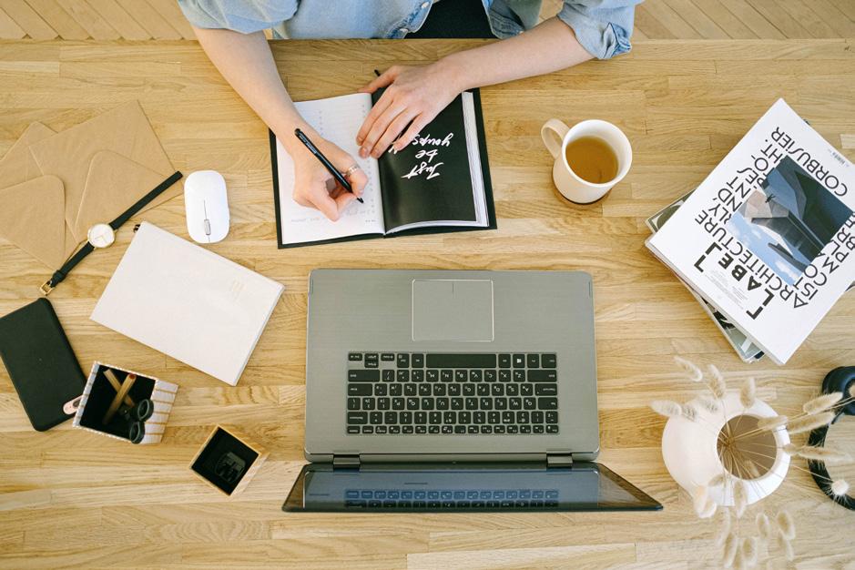
Times have changed and the ability to work anywhere has been revolutionary. There is simply no right or wrong answer when it comes to choosing your location. However, an important aspect to consider is cost. When starting your business, it is likely you will want to keep your overheads down, so working from home or space can be the most
It is important to consider where you can work optimally and in conjunction with your current schedule. If that means sitting at the kitchen run is done, then so be it. Or perhaps you might use a spare room at home that you can turn into a studio. Maybe you want a small outbuilding in the garden may well be the perfect setup. Whatever flexibility is usually key.

The financial side of your business can seem a little intimidating, but it remains a crucial side of your business to master. Not everyone will feel comfortable managing accounts, especially if you have no prior experience. Seeking a reliable accountant for advice or services could be a great place to start. It could save you much needed time that you can invest into other areas of your business.
Starting your own interior design business is a rewarding journey and we commend you for taking the first steps.
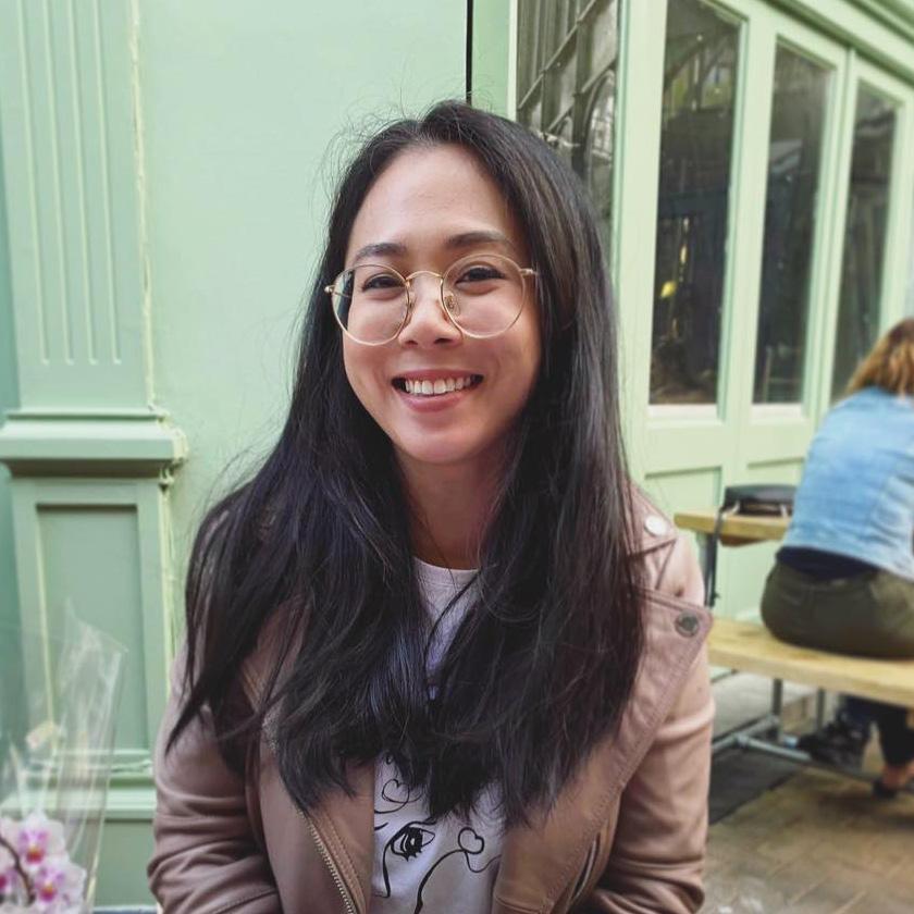 Instagram
Julienguyendesigns
Website
linkedin.com/in/julienguyendesigns
NDA Course studied/studying MA Interior Design
What made you want to get into interior design? How old were you?
Since I was a young girl, even before 10 years old I always geared more towards the creative and the arts side of life. I play multiple instruments and draw as a hobby. It was when I started playing Sims that I found my passion for interior design. I would never actually play the game itself, but I would spend hours upon hours just creating different homes again and again. I also really loved watching Grand Designs with my mum when I was young. I think it holds a special place in my heart having similar interests and spending time together as we were both wowed and amazed by these amazing architecture and interiors that were being designed on the TV.
Can you describe your style in 3 words?
Minimalistic, polished, and experimental.
What was your favourite unit/module of the course?
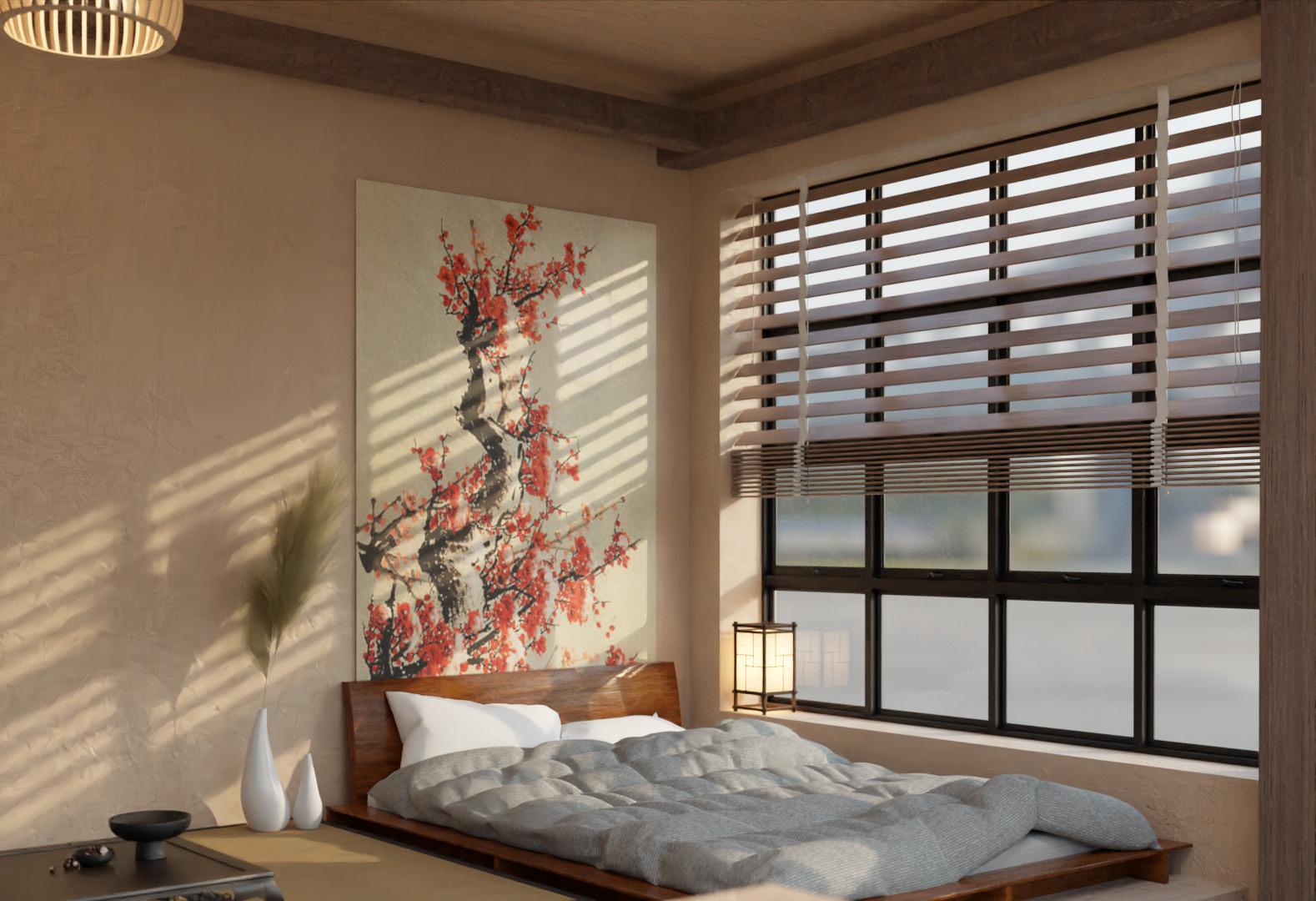
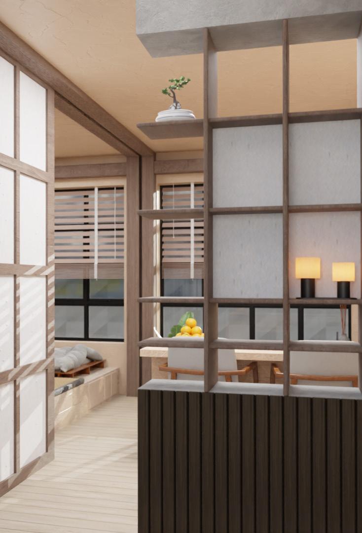
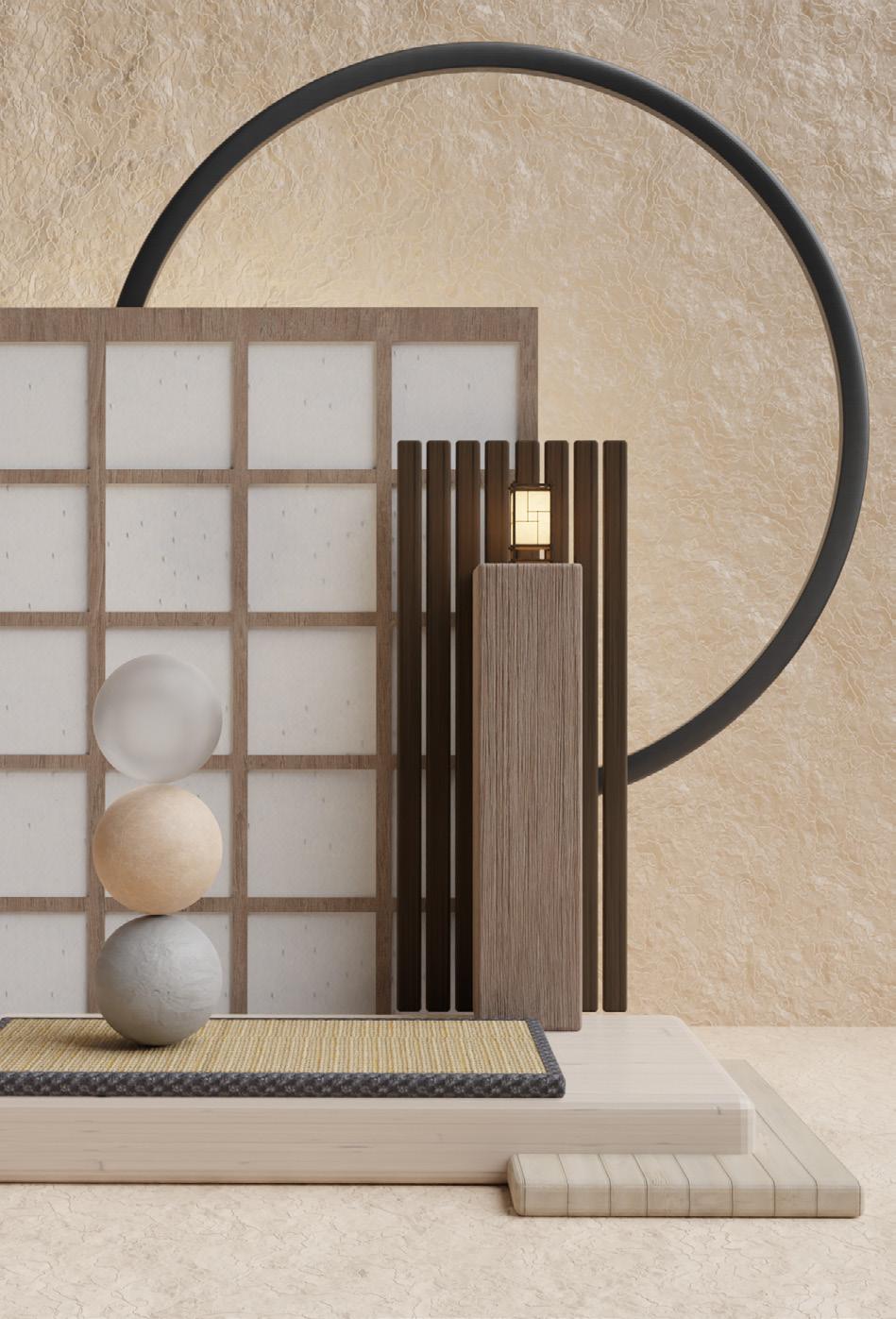
I really loved Module 4, Cultural Contexts as I love to explore Japanese culture and architecture to design my own space. I found the research of Japanese culture very interesting, particularly their ethos in life and their Zen beliefs. For this, I designed a very small Japanese apartment which utilises smart storage solutions whilst showcasing and combining the change from traditional Japanese into modern Japanese design.
How did you find studying the course online?
At first, I found it quite overwhelming to start, as I didn’t really know the level of work that would be acceptable for each project. Overtime I found a balance and understanding of what was expected. I loved studying online as it gave me the flexibility to continue working 4-5 days a week as a head barista at a coffee shop during my master’s course.
Who was your tutor and how did you find communication virtually?
My tutor was Odette Maine, and she always gave me such amazing feedback. She always gave me in-depth feedback on what I’ve possibly missed out on and led me in the right direction whenever I was feeling stuck or lost; especially with the essays and research as these are my weak points. Her feedback has also always been fair.
Now/when you’ve just finished your course, what are you doing next?
I am now seeking opportunities in the Hospitality or Commercial sector as I believe I have found my interests within interior design.
Who would be your dream client or what would be your dream project?
My dream client would be a brand or organisation with an unlimited budget so that I can truly and freely explore and design a space (such as headquarters, hotels, or restaurants) without limitations! I love to explore and look at innovative materials and technology to incorporate into my design. However, there are of course always budget limitations in reality which can hold design back.
Who is your biggest inspiration?
I think I’d say Zaha Hadid as an architectural inspiration. I love how she pushes the boundaries with architecture. Her exploration of shapes and geometry has in a way created a new type of architecture and style.
If you could give someone considering studying Interior Design any tips, what would they be? Really familiarise yourself with a 3D Software before starting, whether it be SketchUp or a rending software such as V-Ray or Enscape (I used Blender throughout my course). This will really give you a next step and elevate your designs better without being overwhelmed having to learn it along your course, which can be difficult. AutoCAD is also so helpful and so useful for 2D plans and drawings, and much quicker than hand drawing these.
What projects are you most proud of?
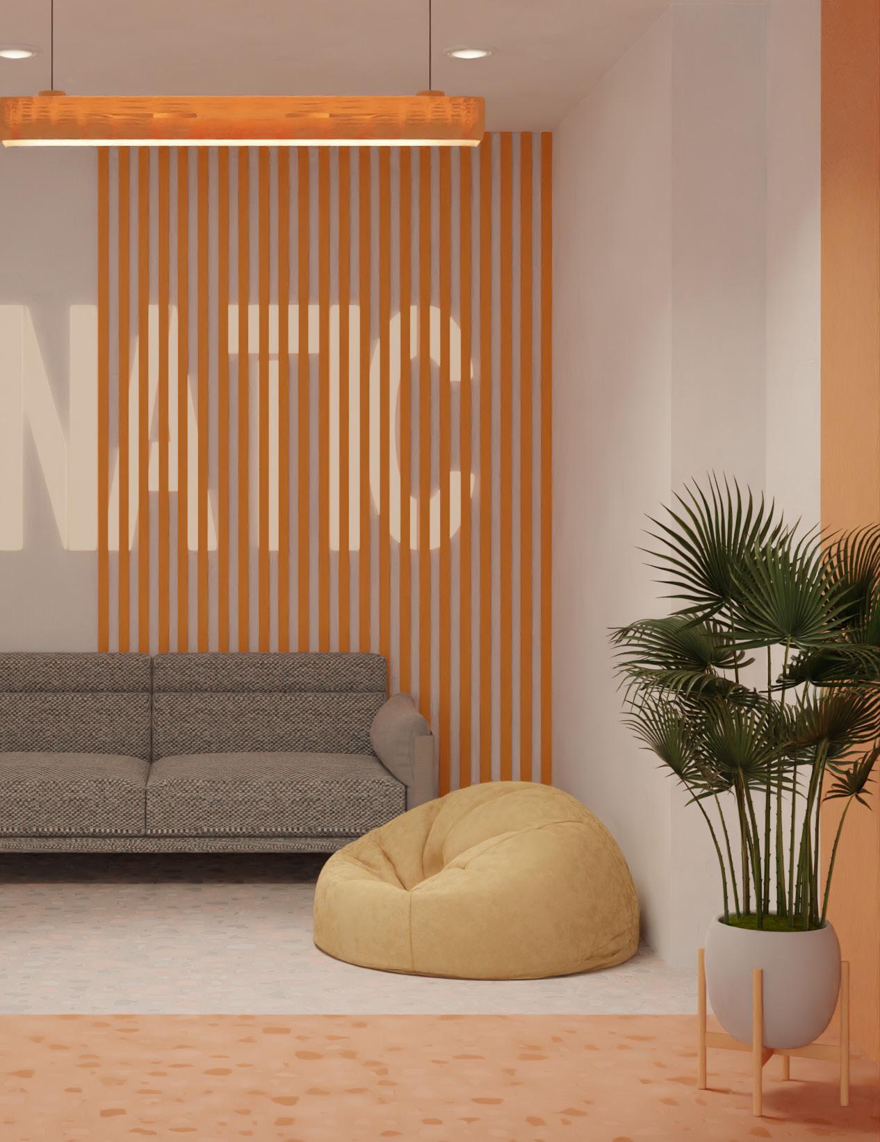
Small Japanese Apartment: This apartment really used my problem-solving skills to create a unique space whilst utilising an interior to its maximum potential which I really enjoyed. I incorporated sliding screen partitions rather than doors to create a semi open plan space that had multiple smart storage solutions and multi-use furniture. I really love Japanese culture as well, so I really loved this project.
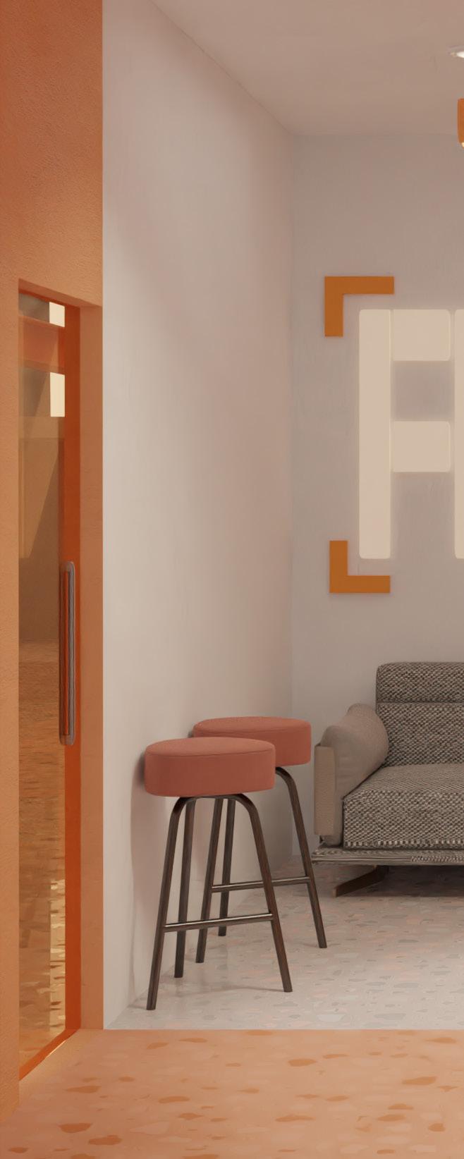
Esports Training Facility: Having a particular interest in gaming (specifically VALORANT), I created a training facility and headquarters for a team organisation that I support. The space includes streaming rooms to stay connected to their audience and fans; a training area for players and coaches; as well as a space to be able to strategise and review team gameplay. This project also integrates collaborative workspaces for staff to work with other companies and brands. There’s also a retail space to sell their merchandising and esports gear. Within the training facility, there is an area where people can rest, and have food or drinks with one another. This project also explores the role of glass in interior design, as it can elevate an esports headquarters and experience which can enhance players’ performance in gaming.
Trends help us make sense of what is happening in the world whether these are global scale megatrends or a domestic scale microtrend. Trends reflect society and as today’s fragmented society is made up of what French designer, Phillipe Starck, describes as “tribes”. There now exists as many trends as there are tribes. The following six examples are some of the trends we think will be influential for Autumn 2023. Not all are new, not all will be lasting, not all are established, but they do reflect the times we are in. We hope they are signalling to a culture that’s more empathetic, diverse, exciting, responsible, and inclusive.
Antiquarian Minimalism harmoniously mixes old and new whilst masterfully blending Eastern elements with Western designs. The trend reflects the need for simplicity (minimalism) enhanced by a deep connection with the ancient past (antiquity) within an overall ambience of soft luxury. Minimaluxe interiors should be of museum quality but immediately accessible.
It is not about showing off or dependent upon other people’s reactions, it’s “a belief that a home should be a personal expression of your soul. It should represent the way you want to live, the ideas that define your tastes, perspectives, and connections to the world. “The spaces where people share private experiences with family and friends should restore and give energy.” (Axel Vervoordt in conversation with Nergis Yuksel)
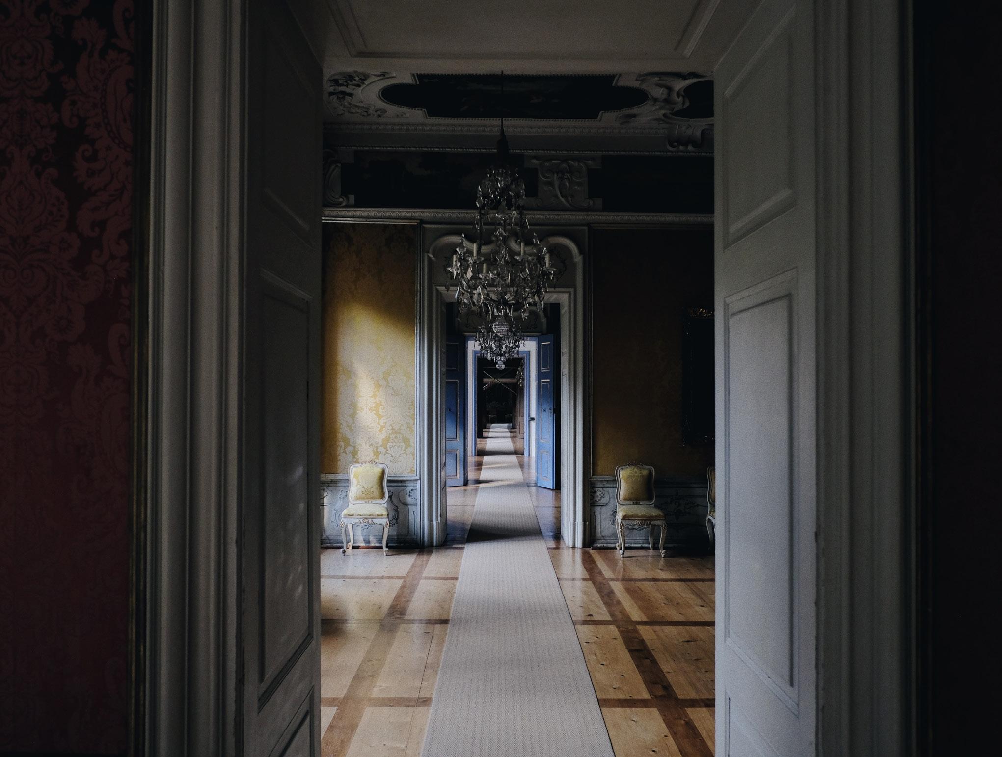
“We’re all products of the past, but we must also take inspiration from the present. And we have a responsibility to build a new society for tomorrow.”
Axel Vervoordtin conversation with
Nergis YukselPhoto by Peter Oswald, on Unsplash
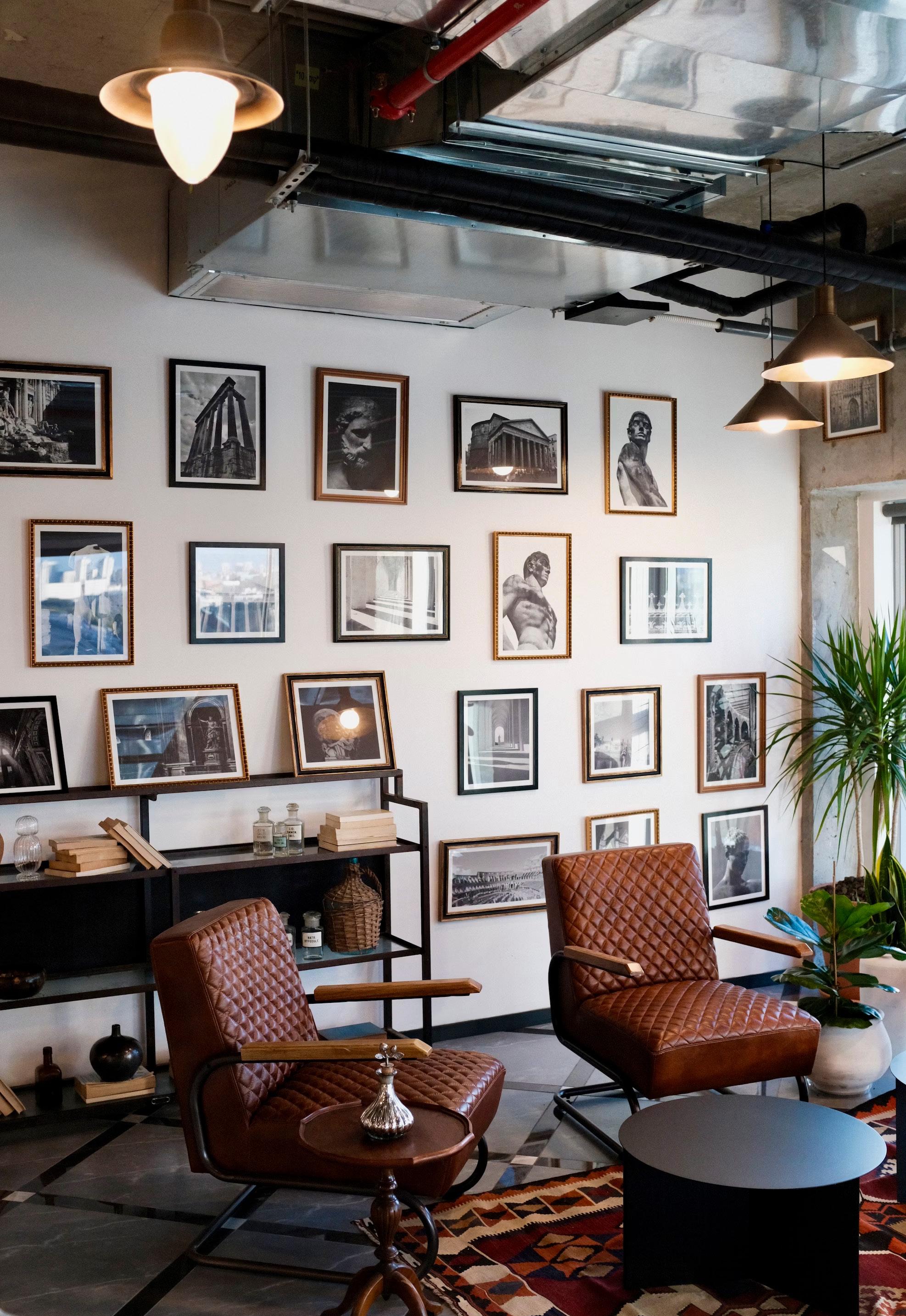
Maximalism, the aesthetic of excess, has its roots in several wildly different cultures from Romany to the English country house. Antiquarian Minimalism, is directly connected to the expression of personality. Maximalism is not an overexcited combination of clutter but is more about the carefully layered and nuanced presentation of personality. It is the direct descendant of the Renaissance idea of the Wunderkammer or Cabinet of Curiosities –small private museums filled with the owners most treasured possessions. By excess, we are not discussing the overt display of wealth. Maximalism is rather about the scholarly understanding of the power of objects –think of a curator’s study or the private apartments in a grand house.
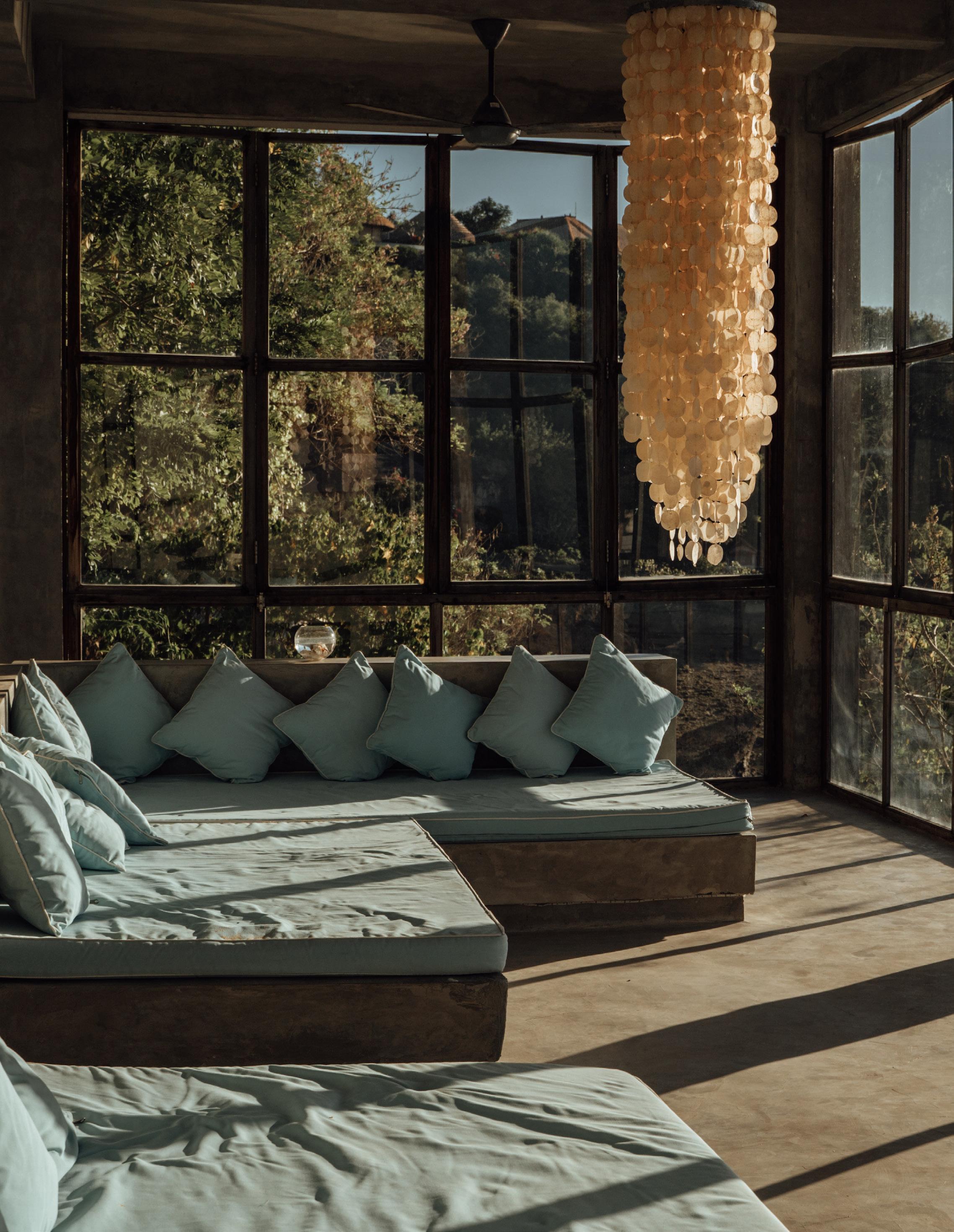
Responsibility and wellbeing combine two subtrends that have been gaining impetus over the past few seasons. Responsible designers adopt the point of view that it is impossible to achieve wellness without first becoming responsible – to yourself, your immediate society, and to the planet. Wellness to a designer or client should achieve emotional, mental, and physical harmony – this is easier said than designed!
Responsible, recycled, and ethical wellness are hot topics in every aspect of life including interior design. Every year, we learn more about sustainable practices and what to opt for regarding the planet’s health. As a result, on-trend interiors look and feel different from those of the past. We’ll see an increase in green materials and organic surfaces in upcoming designs, from residential to commercial, but collated in increasingly sophisticated ways as technology and understanding advance.
“I think design is so key to wellbeing; we should be creating spaces that resonate…”
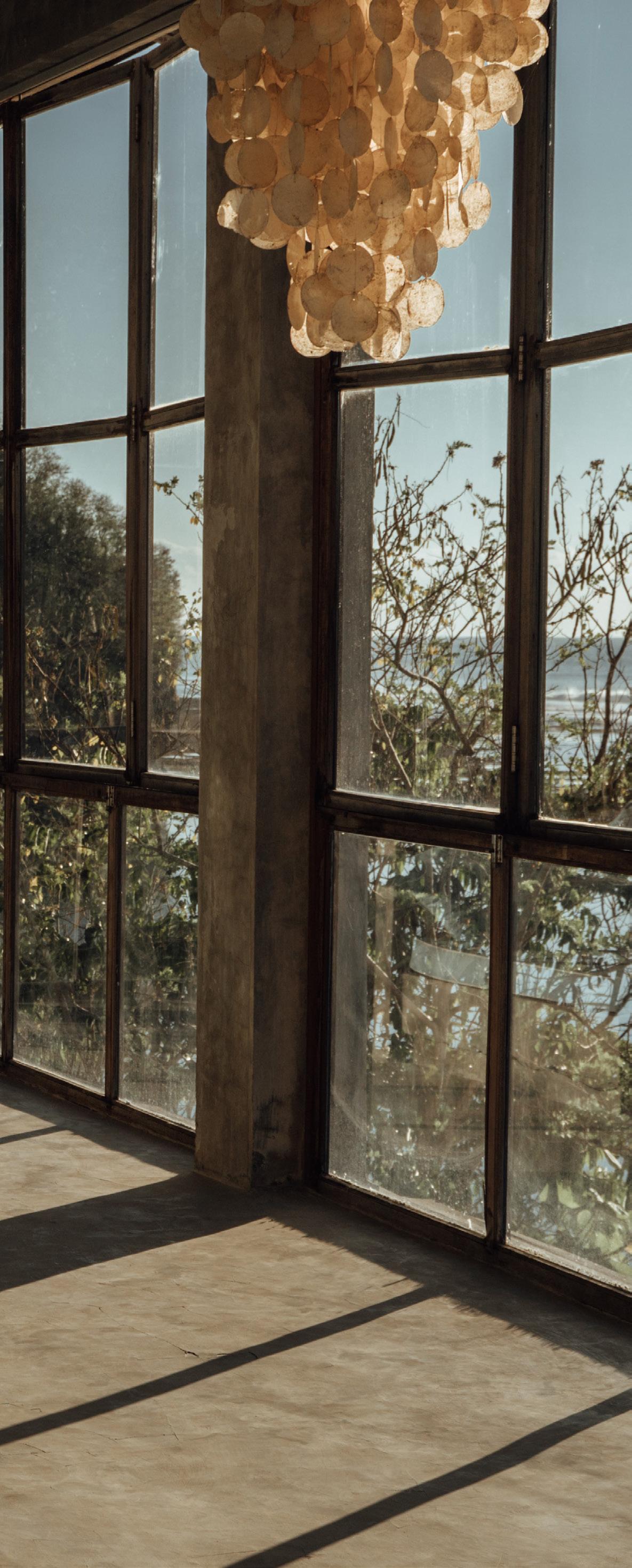 Valentina Cereda
This trend will continue for some time to gain strength and clarity, possibly transcending its ‘trendiness’ and becoming a necessary condition of our society.
For those who love the rigorously controlled interiors but can’t bring themselves to live an equally rigorous lifestyle, Soft Minimalism comes to the rescue. A cuddlier version of its more demanding cousin, Soft Minimalism allows texture, personal possessions, creative freedom (up to a point) and a more relaxed approach to personal space. Soft Minimalism won’t mind if you have a wild party – if it is cleaned up properly the day after!
Soft Minimalism was born out of a need for sanctuary, calm, and peace. The moment the door is opened, tension recedes, and calm is restored. There are a few things required before this state can be achieved. First, treat your space as a canvas, view from all angles, photograph it, if necessary (photos are much less forgiving than eyesight). Then you can compose your interior with absolute care and attention. Only buy artisan or unique, if possible, if not customise. Add texture – lots of it. Watch your tones, tints, and shades – they don’t all work together. Include natural materials – think driftwood or rare basketwork. Detail is paramount, colour is possible, but it mainly encompasses creamier tones.
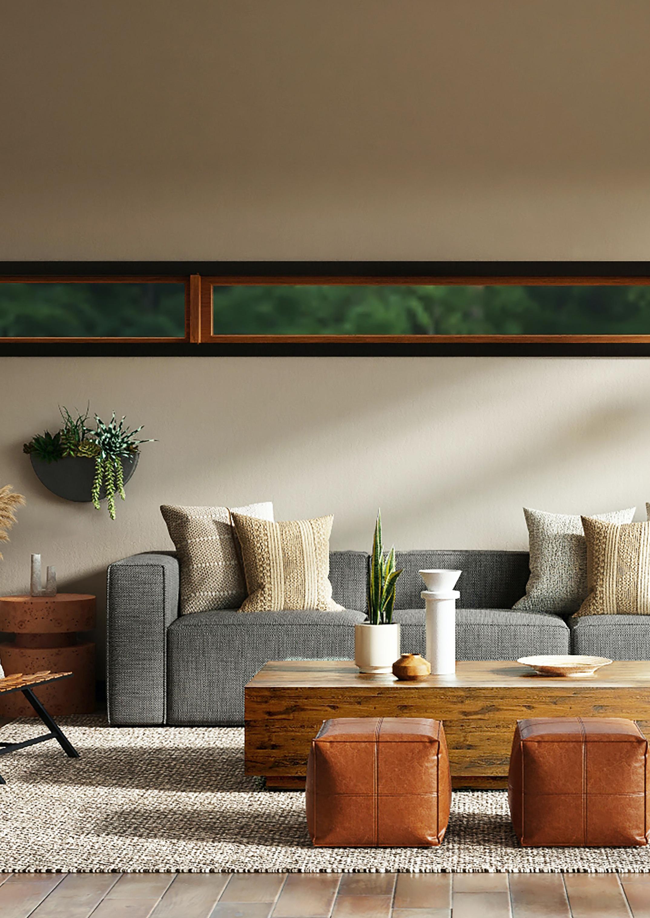
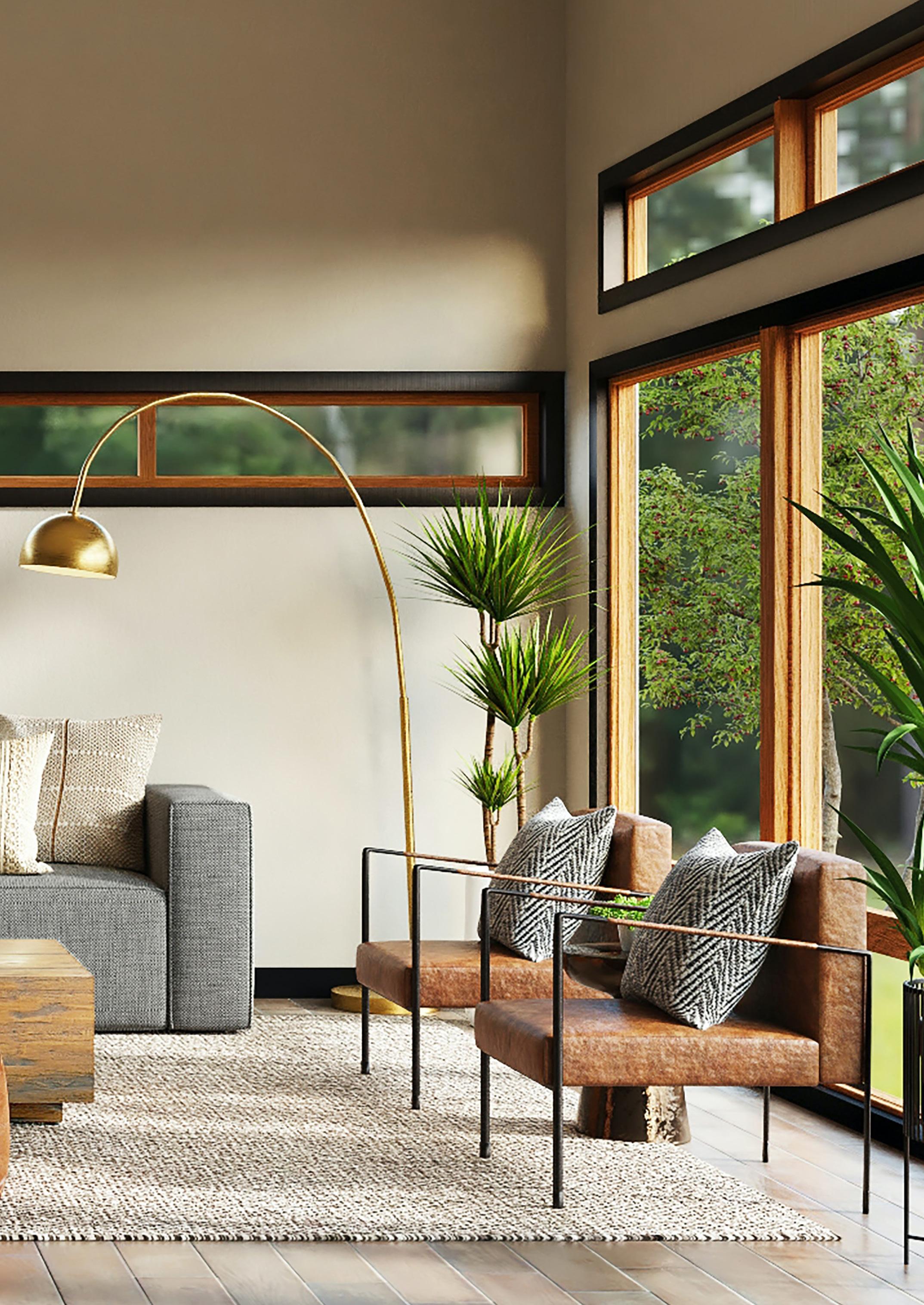 Leesburg, Vermont... by Spacejoy on Unsplash
Yes, that’s right, Formality in interior design is returning. This does not mean that we will all be living in Neo-Georgian splendour or any other backward-facing iteration of the formal interior. Instead, think structure, a degree of symmetry or balance, a sense of ordered space that is fuelled by a desire for serenity - the state of being calm, peaceful, and untroubled.
New formality is light, colourful, and spacious. It treats furniture, textiles, and objects with respect and integrity. Formality spaces are a balance between traditional rich design principles with modern cutting-edge perception.
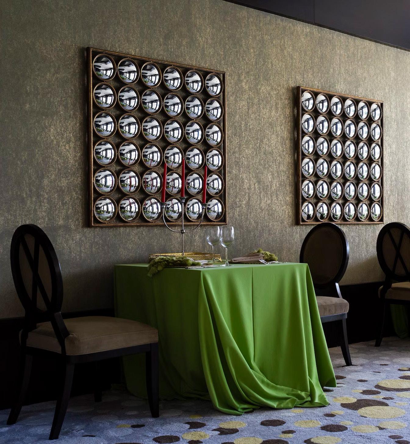
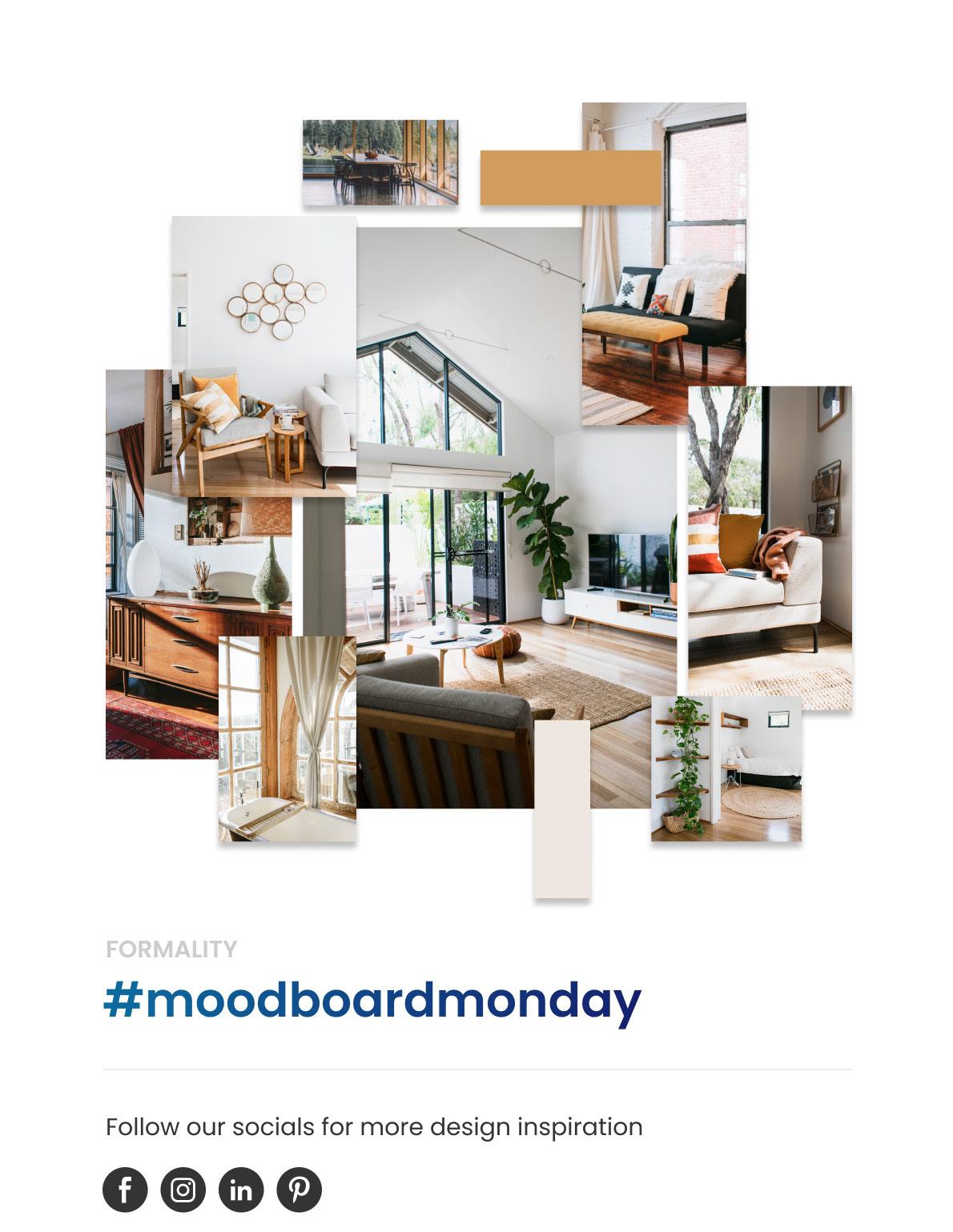

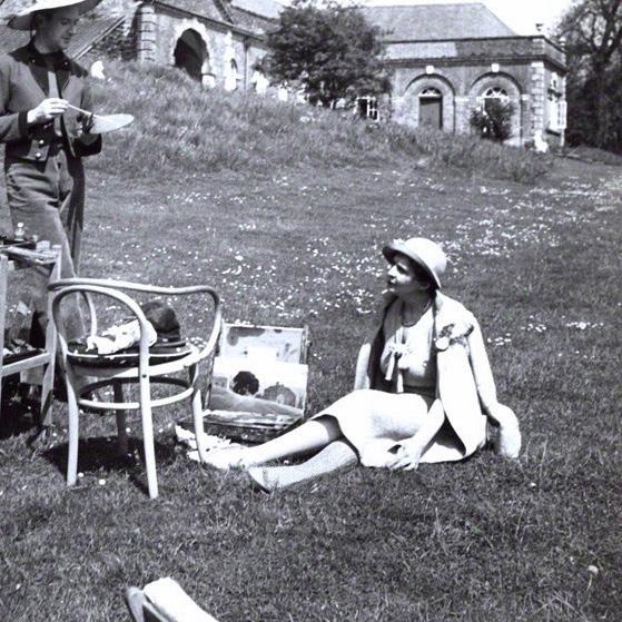

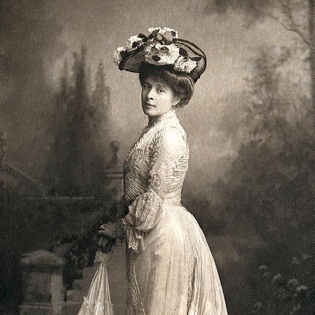
Elsie De Wolfe (also known as Lady Mendl) is highly regarded and recognised as one of the first female Interior designers. Born in New York, she started her career as an actress, but she later took an interest in interior design. Her personal interior design style eventually led her to design the Colony Club (Americas first women clubhouse). She soon had a distinguished list of clients including the Duke and Duchess of Windsor and Henry Clay Frick. Her signature style was light compared to the dark Victorian aesthetic that was popular at the time as she favoured simple and airy spaces.
Born in Wimbledon, Sibyl Colefax is known as one of the biggest influences on classic English Interior design. Her signature style is timeless, relaxing, inviting, and elegant. Colefax started designing in the 1930’s and later in her career she went into partnership with John Fowler in 1938. Her name still lives on today in the company she cofounded called Colefax & Fowler.

1898–1972
Elisabeth Scott became one of the first women to study at the Architectural Association after it started allowing women on its courses in 1917. After gaining her Diploma in 1924, she won a major architectural competition for the new Shakespeare Memorial Theatre at StratfordUpon-Avon in 1928. As a result of her success in the competition there was a change for women working in architecture at the time. Scott went on to design many different projects such as the Marie Curie Hospital Hampstead and the Pavilion on Boscombe Pier.

1878–1976
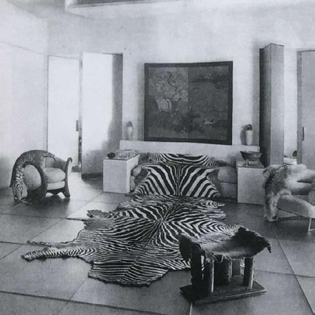
In 1898 Eileen Gray became one of the first women to study at the Slade School of Fine Art, she then went on to study Lacquer Technique with the Japanese lacquer craftsman, Seizo Sugawara. In 1922 Eileen opened a gallery where she exhibited her designs, these included Chrome, glass, and steel tube furniture. She worked alongside some of the most important designers of the modern movement including Le Corbusier. In her late 40’s Eileen turned to architecture and designed E–1027, a seaside villa in France without having any formal architectural training. Eileen Gray’s work remains a source of inspiration for artists, designers, and architects around the world.

1879-1955
Sometimes known as the Queen of White, Syrie Maugham designed the first white music room at her home in London using various white shades. In 1922 she later opened her own shop on Baker Street, London and became a leader for high end furniture and sometimes commissioned her own custom-made furniture.
1889-1969
Dorothy Draper is one of the first female interior designers to work in the commercial sector. In 1923, she created the first interior design company in the United States (Dorothy Draper and Company). Draper coined the style ‘Modern Baroque’ and is well known for her use of vibrant colour combinations. She was commissioned to design many high-profile public spaces including the Fairmont in San Francisco and the Metropolitan Museum of Art. In addition to commercial design, her talents extended to product design. She designed the interiors of jet plans, automobiles, cosmetics packaging, and created a decorating advice column for Good Housekeeping.


Despite the fact that Nancy Lancaster was American, her style was described as ‘quintessential English country house’. She had a talent for redesigning English houses that were comfortable and at the same time elegant. In 1948 she bought the decorating company Colefax and Fowler from her friend Sybil Colefax and worked closely with John Fowler for the next 20 years. Together they created the Yellow Room which became a source of inspiration for many years.
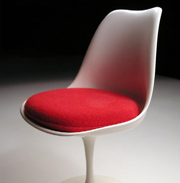
Ray who trained as an artist, left her hometown of Sacramento for New York in 1933 and learned to paint under the German Expressionist émigré Hans Hofmann. She later became a founding member of the American Abstract Artists group. She met her husband Charles Eames at Cranbrook Academy of Art and together they became two of the most influential designers of the 20th century opening the Eames office in 1947. Their work remains inspirational even today, mostly famous for their iconic chairs.

1917–2019 1950–2016
Florence Knoll who trained as an architect and designer defined the standard for the modern corporate interiors of post-war America. She created clear and uncluttered corporate spaces that changed the way workplaces were arranged. Knoll worked with some of the leaders of the Bauhaus Movement in the 1940’s and met her husband Hans Knoll who was a furniture maker. Together they built Knoll Associates, which became an international prestigious design firm. Florence also went on to design furniture, one of her designs was the iconic Florence Knoll Sofa.
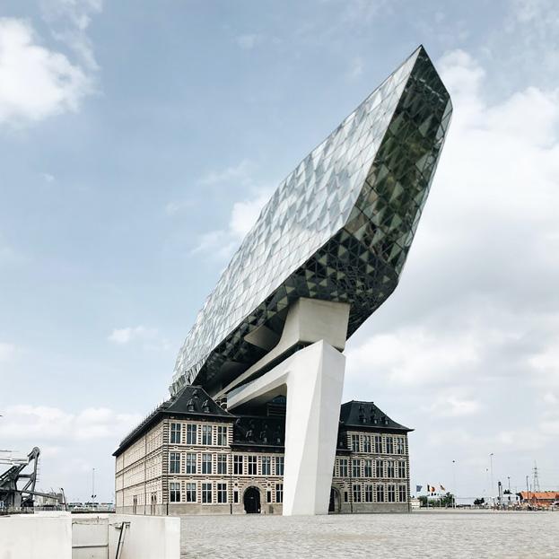
Dame Zaha Hadid’s geometric designs are original, fluid, and beautiful. Many of her designs in the 1980’s and early 90’s were never actualised, including her competition winning entry ‘the Peak’, as it was too Avant Garde to actually be built. Hadid’s work earned her the highest honours from civic, academic, and professional institutions around the world including the 2004 Pritzker Prize, the 2010 and 2011 Stirling Prize. She was the first to receive the RIBA Royal Gold Medal for outstanding contributions to architecture. Hadid’s vision redefined architecture and certainly captured imaginations around the globe.
 Photo by Scarbor Siu on Unsplash Guangzhou Opera House, Guangzhou, China | Designed by Zaha Hadid

A winter garden can bring great joy during those dreaded dark days when the climate and hours of daylight may prevent you from fully enjoying the outdoors. However, a carefully curated garden can be cherished all year round.
Achieving an evergreen winter garden is notoriously challenging, and you may find conflicting information about what plants can survive and thrive over the cooler months. That’s why we’re sharing our top planting picks and tips for an evergreen winter garden.
As a rule of (green) thumb, one-third of the garden should contain evergreen plants. For more visible areas, these proportions should be increased.
Neatly clipped hedges and globes such as Buxus (Box) are currently very popular in both traditional and contemporary gardens. There are also many wonderful evergreen plants that provide the same visual drama but without the extensive maintenance requirements.
It is also important to consider your garden’s nectar sources for intrepid invertebrates such as bees and butterflies; they appear from hibernation on warmer days. This can be
achieved quite easily using winter flowering shrubs and herbaceous plants. The shape of rounded evergreens provides a wonderful contrast against plants with looser forms. Rounded evergreens make effective ‘full stops’ at the end of a border. They command attention and draw your eye down towards the bed.
Here some of our favourite evergreen plant picks that require little or no clipping:

Place in:
Full Sun, Partial Shade, Full Shade
Plants for attracting pollinators
Pittosporum Tenuifolium ‘Golf Ball’

Produces a compact globe up to 1m across and seldom needs clipping.
Hebe ‘Green Globe’
Grows naturally in a ball up to 30cm across.

Softly feathered grey-green foliage grows, as the name suggests, up to 1m diameter.

Sarcococca Confusa, Sweet Box
The flowers are tiny but have a powerful sweet scent.

The Italian Cypress provides wonderful fastigiate drama, whether used individually or in a rhythm. Pencil-like, evergreen conifers with dense, dark green foliage.

Hellebore hybrids are available in a wide variety of colours. They’re best viewed faced on, so plant them intentionally.

An evergreen shrub with architectural foliage and beautifully scented winter blooms.

Soak your plants with water: Ideally, immerse your plants into a bucket of water for about 20 minutes before planting, or until bubbles stop appearing. Soaking the plant ensures it’s well hydrated but it also helps the plant adapt to its new environment.
Planting Hole: Dig a planting hole that’s twice the width of the root ball. Extend the hole if the soil is compacted.
Correct Depth: Place the plant so it sits at the same level as its pot. As a rule, bulbs should be planted at a depth of 2 to 3 times the depth of the bulb itself.
Tease the roots: Part the roots gently from one another, this will help to promote healthy root growth.
Slow-release fertilizer: As the name suggests, it releases nutrients at a steady rate through the growing season. It can be added either to the planting hole or scattered around the soil surface.
Mycorrhizal fungi: It help plants to establish themselves by building successful underground networks for better uptake of moisture and nutrients.
Autumn is an ideal time for planting. The soil is still warm to promote good root growth in readiness for the next year. Furthermore, the threat from pests and diseases is slightly reduced. The cooler weather eliminates the threat of heat stress on new plants, as they have time to establish by Spring.
While it can be tempting to pick up a bargain or perform plant rescue, it is preferable to select healthy plants. Even if you pay slightly more for them, this will reduce the chances of introducing new pests or diseases to your patch! If you wish to reduce the cost, purchase smaller plants. You can even have a go at propagating them yourself.
When selecting plants, look for:
Healthy roots – tip plants out of their pots to check for healthy root growth. Avoid root-bound plants. Root bound plants are identifiable when the roots compact at the bottom of the pot.

Healthy leaves – Autumn purchases enable you to appraise plant health at the end of the growing season when the foliage is no longer fresh. Avoid plants with signs of disease or predation. While notches out of the leaf may relate to a past visitor, they may also be a sign of a (quite literally) deeper-rooted problem.
We hope that this information can help you turn your garden into an evergreen paradise. If you have any other evergreen plants that you simply adore, share them on our socials by tagging #thenationaldesignacademy.

30-minute make 2/5 fright factor
There are several great scary options for Halloween wreaths from ones adorned with doll heads to autumnal leaves. A Halloween wreath can be a fun ghoulish make, which doesn’t require much effort.

Take any standard craft wreath, whatever size you wish. Next collect Halloween items and foliage and decorate the wreath as you wish using hot glue or thread. The weirder the items, the better! Once assembled hang it on your front door and wait to see who the bravest trick or treaters are!
15-minute make 4/5 fright factor


Need something creepy for the mantelpiece this year? Well, this make is prefect for adding some frightening drama. This decoration works great with a glass cloche or even a jar.
All you need is a centrepiece item like a fake bird, creepy figure, or spiders are ideal. Place the figure in the centre of the jar or cloche and add some foliage around it. You can use moss, dirt, or even cotton wool cobwebs for that extra eerie feel!

10-minute make 3/5 fright factor


This is a super little make that will haunt your home during the spooky season. These mini ghouls are great for hanging by your front door, as the ghosts will swing and sway spookily in any breeze.

To make them, drape lace-edge table linen napkins, or any other lightweight material over a polystyrene craft ball. Use double-sided tape
to keep the material in place. Then, smooth the fabric over the ball to create the face and figure shape. Next, attach a length of fishing line into place with a small stitch at the top of the head and hang it from a ceiling or roof. Now you have a spooky little friend to welcome trick or treaters. For greater effect, you can even make a small group of ghouls.
Top tip: if you want to make them a little creepier, you can swap out a polystyrene ball for some skulls which adds an extra fright factor!
15-minute make 3/5 fright factor


This is the perfect time of year to immerse yourself with witch and wizard potions, plus they are an easy make! To make eerie looking potion bottles, collect empty glasses, plastic bottles, or jars. Give them a clean with water and set aside.

Next, a quick search online for ‘Halloween bottle labels’, should offer a range of free, printable ideas, which can be cut out and stuck to your bottles. Now you’re ready to fill them with water. Add some food colouring to mix the most frightening potions!
Top tip: add some toy spiders or snakes onto your bottle to really enhance the creep factor.
20-minute make 3/5 fright factor
If you’re a Harry Potter fan, then you’ll probably love this craft. It certainly adds that ‘Hogwarts’ feeling to your home. This project is simple and requires only a few elements. All you need are two inexpensive items which are black card and fishing wire.
Next, cut out bat shapes from the card and thread the bat heads with the wire. Once threaded, you can hang the bats from your ceiling. For greater effect, you can add a glow stick behind the bats to create a foreboding spooky glow.

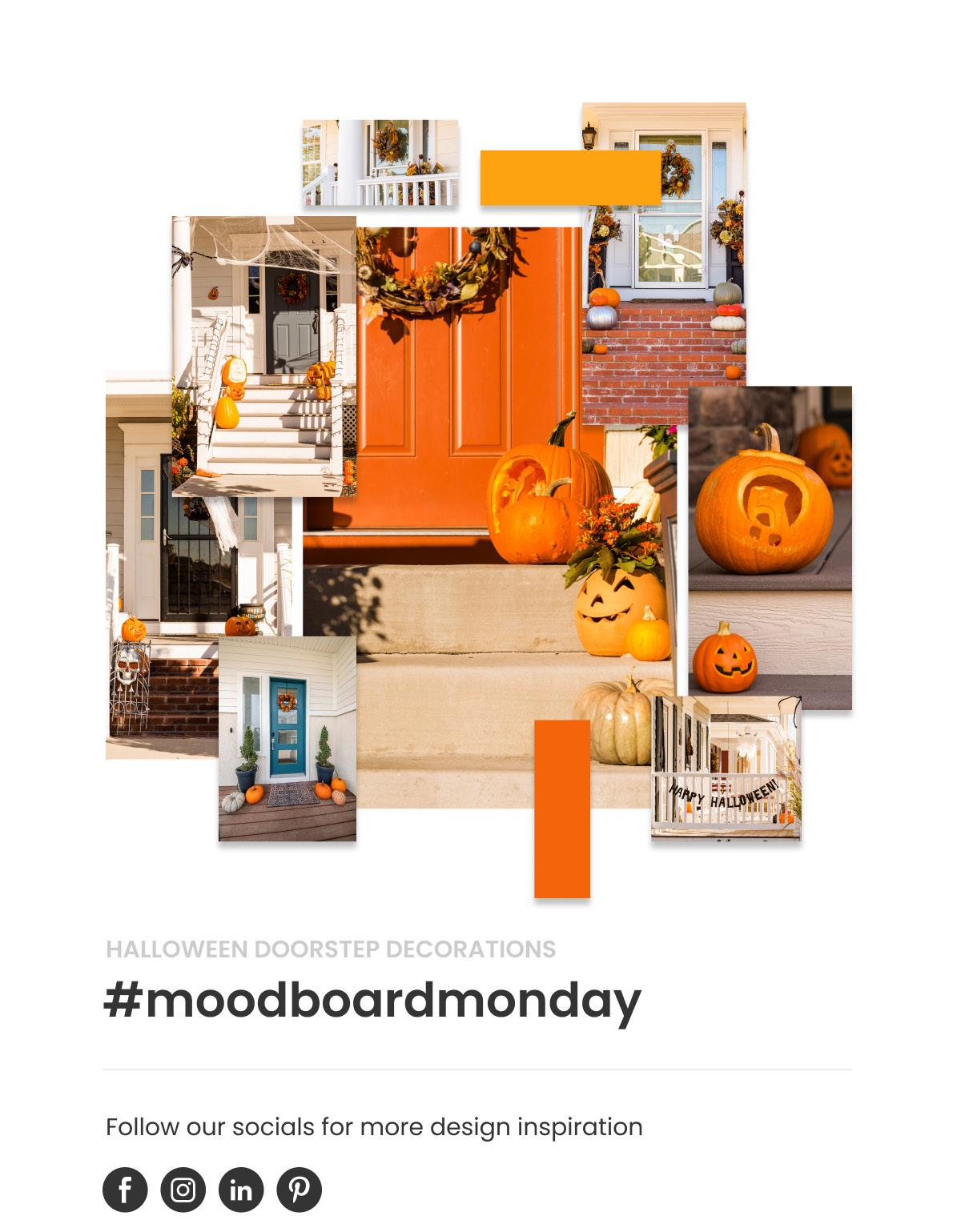
The term “trend” within interior design can seem a like an oxymoron. This is because interior “trends” do not usually rapidly change from season to season. Usually, popular decorative styles tend to slowly fade in appeal as early adopters and innovators select newer styles.
Interior fads will always have quick leaps in popularity, only to be discarded in a few months’ time. However, if you carefully track emerging trends, it is possible to predict the ones that will rise further in favour over the coming months. Here are our top material picks that we think will be trending this Autumn.
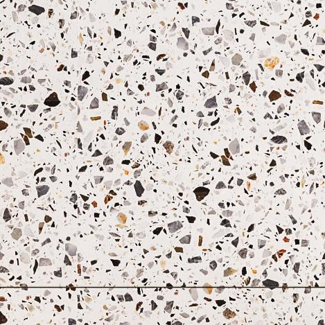
You would be right in thinking that the use of stone and marble within high-end interior design is far from revolutionary. Historically, it has been used functionally for door frames, countertops, and windowsills. Recently however, we are seeing stone being used for its aesthetic merit rather than its innate functionality.
Stone is now commanding centre-stage to highlight architectural details in fireplaces, splashbacks, and even trims. It’s lovely to see a timeless material being injected with a rejuvenated sense of place within the home.
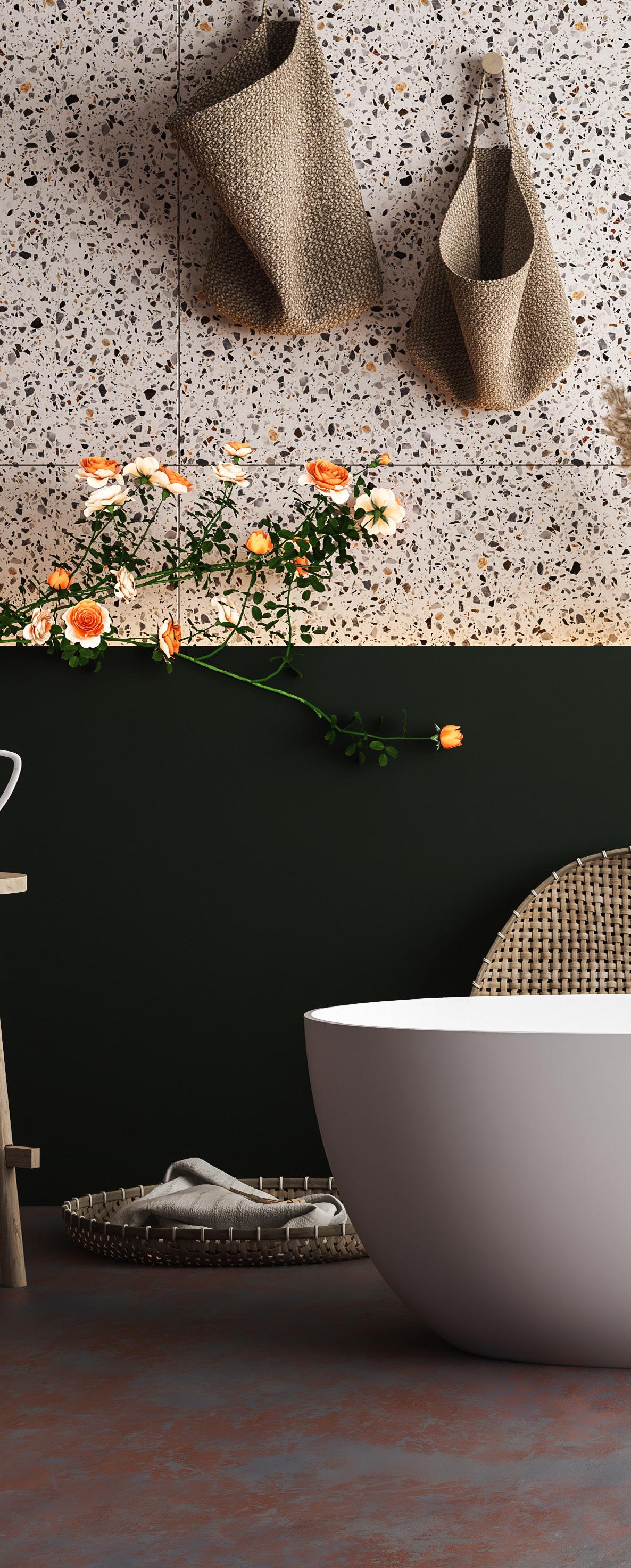
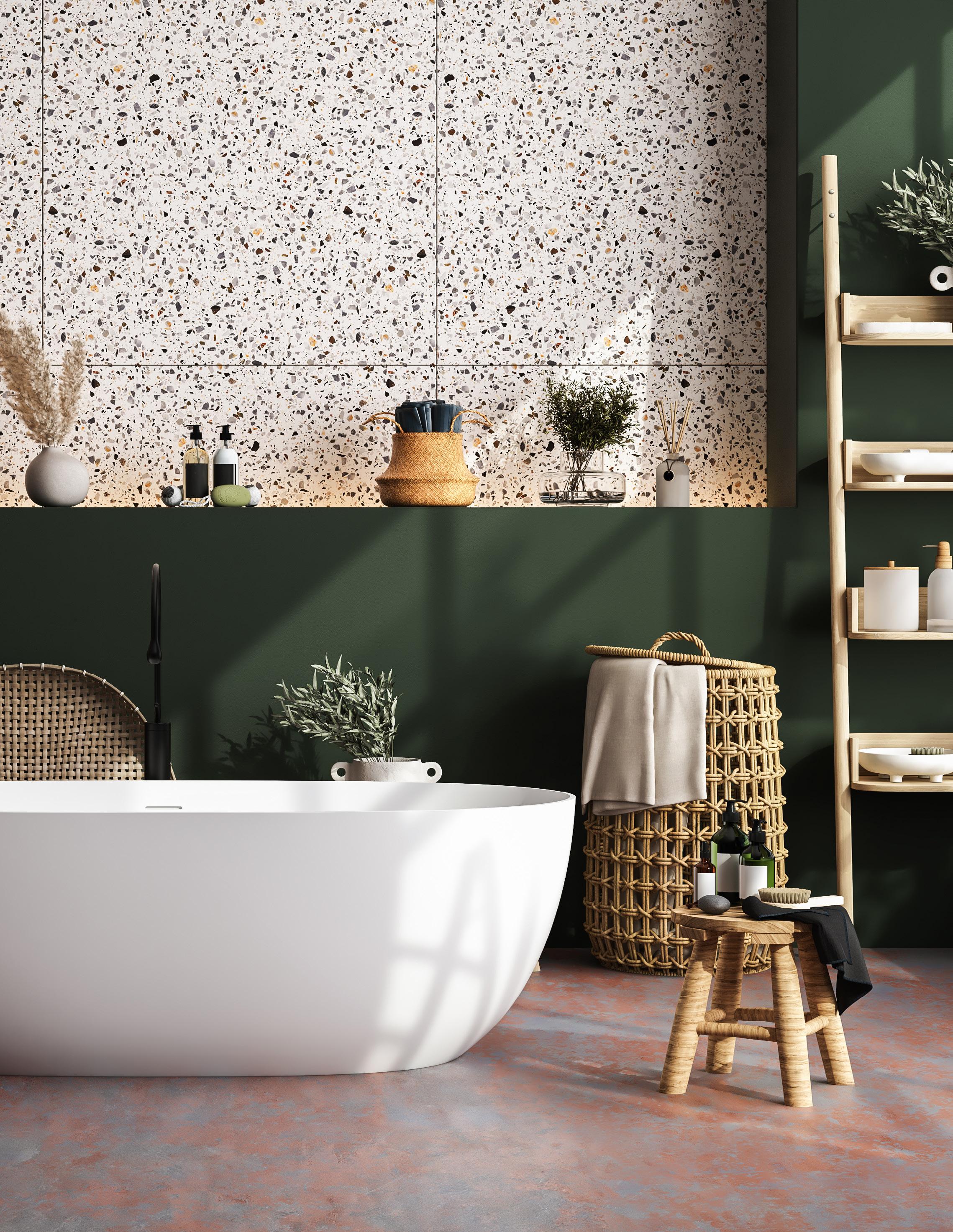
Concrete humbly came into existence as a structural building material. Recently however, it has become an indoor architectural and decorating staple used across many domestic and commercial properties.
Its brutalist, raw aesthetic has been harnessed by many to create stunning floors, walls, and even furniture. It was only a matter of time until we saw this popular material evolve into its next logical form. And now we have coloured concrete! It’s concretes more glamorous cousin that can inject personality, texture, and depth into any room.
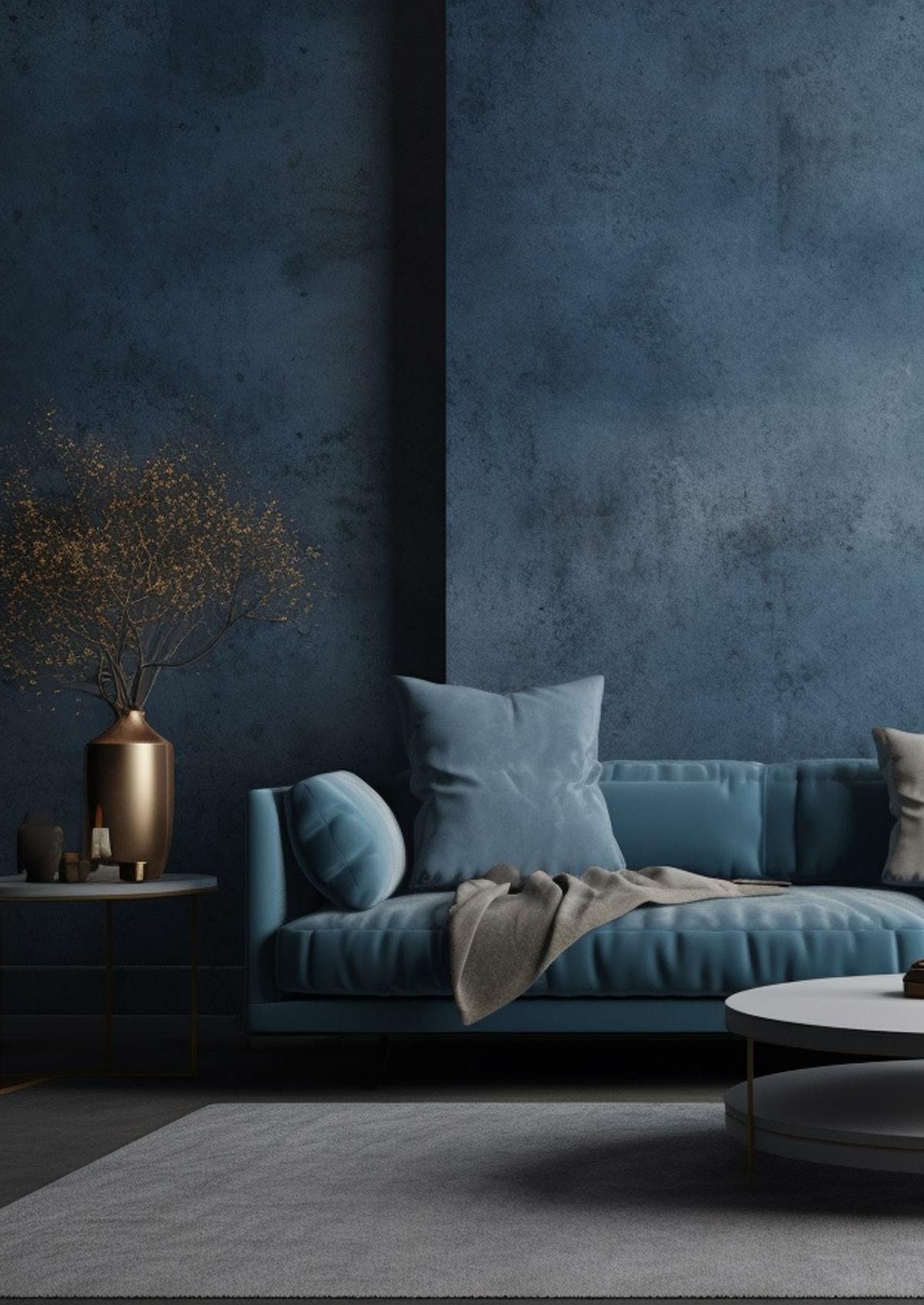
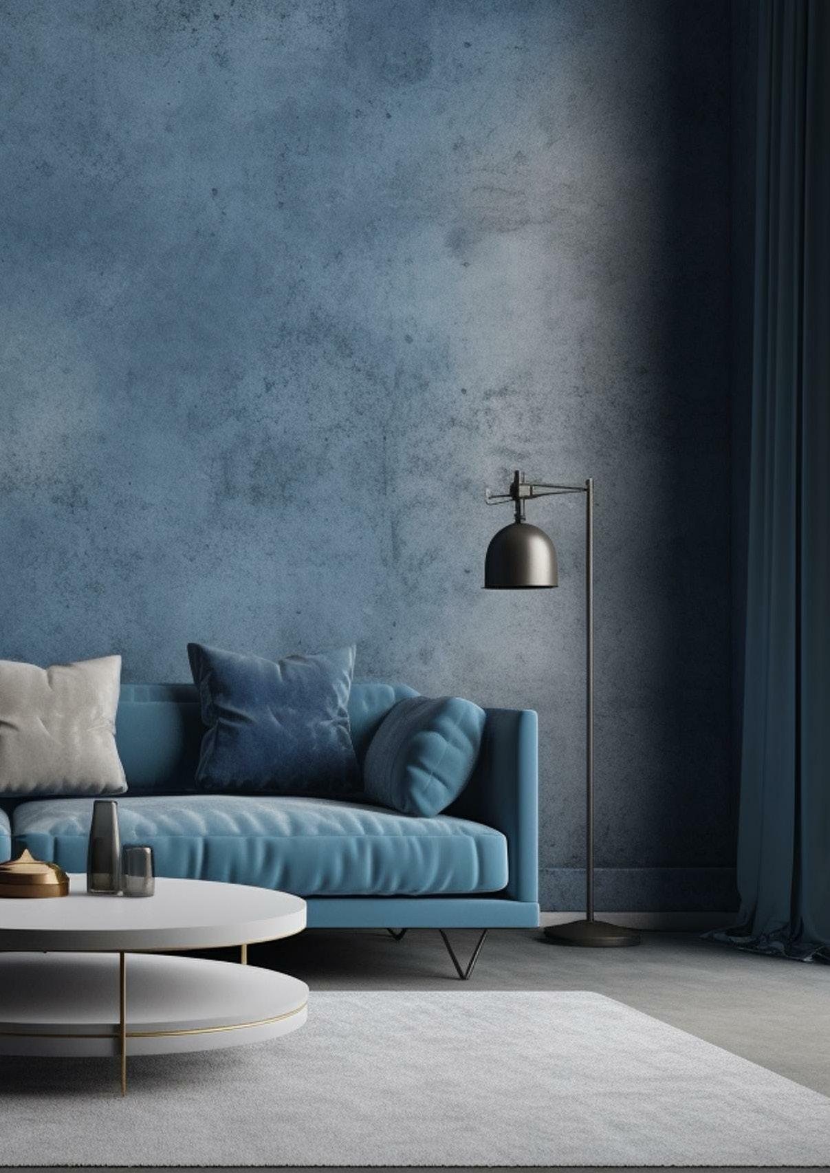
Textured tiles with 3D dimension are an interior material trend that’s already picking up a lot of traction as we nearer the cooler months. Textured tiles give spaces more of an organic and wabi-sabi feel; the art of finding beauty in imperfections found in nature. Naturally textured tiles are a welcome change to the clinical, flat, and shiny tiles that we have been accustomed to over the past few years.
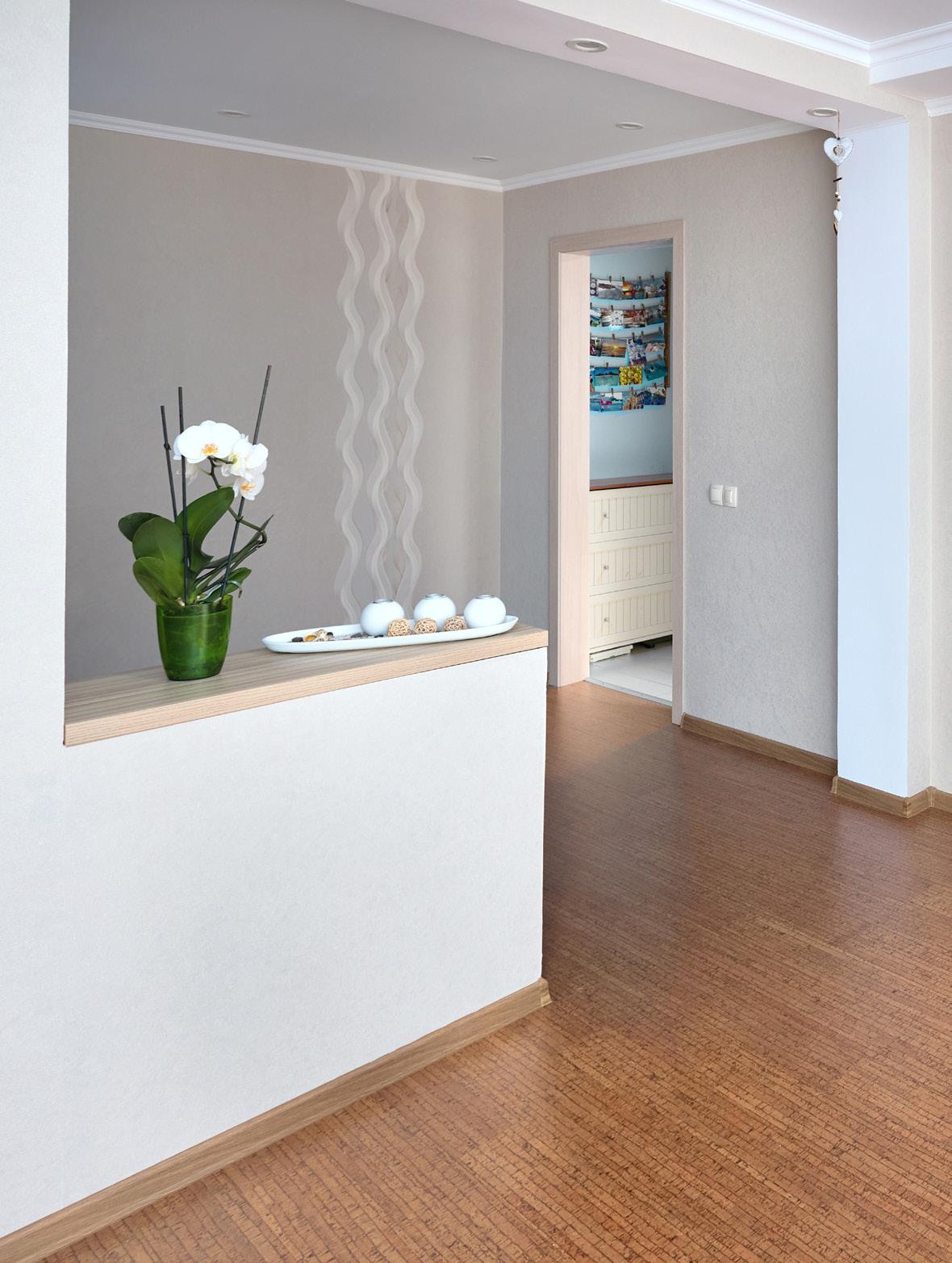
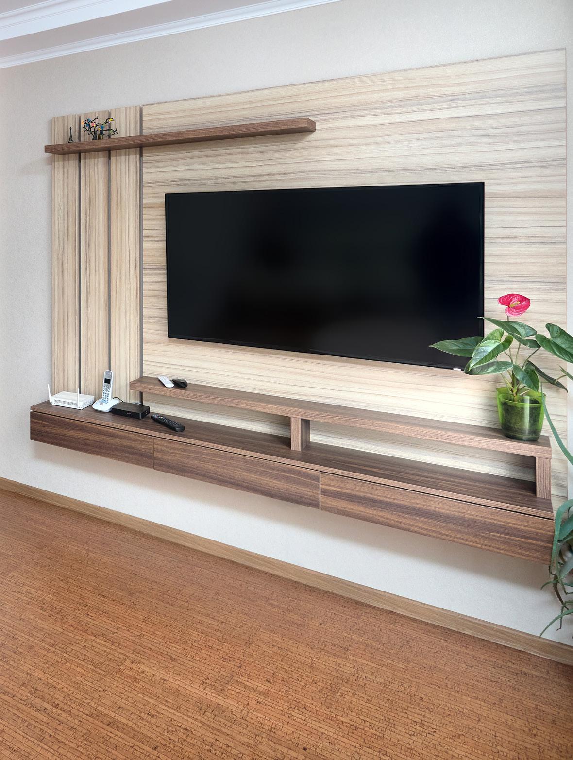
The 1970’s was a popular era for cork tile flooring, and we’re set to see a resurgence of this divisive flooring option. Don’t worry, we’re not seeing it paired with sad avocado bathrooms or pink bathroom suites but love it or hate it, it is becoming popular again, and for good reason.
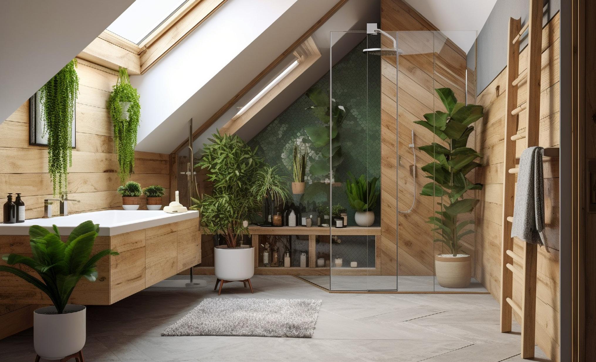
Stripped to its core, cork is natural and sustainable which makes it a compelling choice for environmentally conscious consumers. It’s also extremely durable, especially paired with tough yet biodegradable coatings. There’s also a bigger selection of cork flooring tiles or planks on the market, which makes it even easier to select the right tile for any space.
Our last material trend focuses on the exterior rather than the interior. Over the last few months, we’ve seen a surge in popularity over glazed exterior tiles and cladding. Historically a neglected aspect of many domestic properties, they are now getting a much-needed makeover.

Bright, glazed exterior tiles are on the rise and they make a refreshing change and contrast against traditional brickwork or stone. They provide an opportunity for unique, crafted, and personalised exteriors. Both stylish and practical, glazed tiles are packed with clean, grime-fighting properties that you can’t achieve using traditional alternatives.
From textured tiles to coloured concrete, there’s a lot of exciting and innovative material trends that are set to become even more popular as we nearer Autumn and Winter. Which materiel trend will you be using more? And which one will you be avoiding? We’d love to know!
There is a bewildering array of landscape design software on the market which usually results in the same question, which one is the best? Like most things, the answer to this question isn’t simple, as it depends on several factors like affordability, functionality, and ease of use. Broadly speaking however, you can split landscape design software into two categories. The first category is software that’s built for the working professional who requires more functionality.

The second category is usually more affordable and is aimed at entry-level designers who require less functionality for their required design outputs. In this article, our Tutors put landscape design
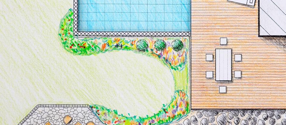
software to the test and offer their feedback so you can select the right landscape design software for your desired needs.
Entries 1-3 in this list are aimed at working professionals with higher levels of functionality, but come at a higher cost.
AutoCAD
AutoCAD is used worldwide by architects, interior designers, and landscape designers. The great thing about AutoCAD is that professionals can pass drawings back and forth between one another to complete large projects.
For example, an architect or a surveyor can send an AutoCAD drawing to a landscape designer who can use it as the basis of the new landscape design.

Whilst AutoCAD has a 3D facility, its major strength resides in its accuracy. By harnessing AutoCAD, you can build pinpoint accurate plans that can be imported to create lifelike 3D models.
SketchUp
SketchUp is a modelling software that allows you to build 3D models of landscaping schemes.
Its popularity is derived from the simple user interface and intuitive tool navigation. This means users can quickly produce beautiful models.
You can even combine SketchUp with rendering software like Enscape or Lumion if you want to produce lifelike renders.
Cost to Students: £1,986 per year. Students can get one year’s free access with the right eligibility.
Ease of use: This can be a complex program to learn when you initially start, especially if you are not familiar with CAD based software. However, after the initial learning curve it becomes second nature to use.
Pros and Cons: This is advanced software that is capable of drawing literally anything from detailed plans to elevations. By implication, this means that it has a lot of sub menus to perform desired tasks which can take time to learn. Once you have mastered the basics however, it is easy to isolate the main tools that you need to create your landscape designs.
Platforms: PC and Mac.
Cost to Students: £245 - £549 per year. Students can get one year’s access for £55 with the right eligibility.
Ease of use: This is one of the simplest 3D software on the market due to its intuitive navigation tools.
Pros and Cons: It is economical, easy to use, and will allow you to build highly detailed landscape models at a professional standard. However, some of the navigational commands are nonexistent which makes it hard to work optimally at times.
Revit is a 3D modelling software that allows you to build model landscaping schemes. The software operates in a similar way to the CAD (Computer Aided Design) software like SketchUp however, Revit is slightly different. It’s known as BIM (Building Information Modelling) software.
To explain the difference simply, CAD software produces a computer-generated drawing or 3D render whereas BIM software embeds multiple layers of information into the model. Revit is often preferred by landscape architects that work on larger projects as it allows them to embed a lot of technical specifications within the drawing.
DynaScape is a software package specifically designed for landscape designers. It is split into the following three packages:
• Design – You can produce detailed CAD plans of the garden.
• Colour – You can add colour to the plans.
• Sketch 3D – You can build 3D models.
Cost to Students: £2,940 a year. Students can get one year’s free access with the right eligibility.
Ease of use: Users find this software fairly hard to navigate so be prepared to watch a lot of tutorials.
Pros and Cons: As previously discussed, the main advantage of Revit is that you can embed lots of technical information within the model which makes it incredibly useful for complex projects.
The main disadvantage is the price tag and challenging software navigation.
This means it often takes longer to construct drawings and conduct alterations.
Platforms: PC and Mac.
Cost to Students: The cost is based on the following monthly subscription rates per package:
• Design - £140.00 per month
• Colour - £50.00 per month
• Sketch 3D - £50.00 per month
Ease of use: The software very intuitive to use, so it is possible to start working with it quickly. However, there’s a lot of complexity hidden beneath the seemingly superficial tools. DynaScape does teach advanced courses, but these will come at an extra cost.
Pros and Cons: It is simple to learn the basics, but you may have to invest in training to get the full benefit. It’s only compatible with Microsoft which eliminates potential users. Whilst the monthly cost looks reasonable at first glance, it can be expensive to run all three packages at once.
Platforms: PC.
VizTerra is an entry-level landscape design software and it’s easy to pick up the basic functionality. It is ideal for smaller garden schemes, but it does have limitations with the amount of detail you can add compared to other software on the market.
Cost to Students: £97 per month.
Ease of use: Most elements of the drawing process are easy and intuitive. However, a few elements can be awkward so it can take a little time to get used to.
Pros and Cons: It is easy to produce 3D rendered versions of your scheme directly from the plan. The disadvantage is that the visuals aren’t as refined as they have limited colour and texture palettes. This results in flat and unrealistic representations on some occasions.
Platforms: PC.
Realtime Landscaping is ideal for smaller to medium garden schemes and is more than capable of producing good quality, detailed plans.
Cost to Students: It’s a one-off payment but you need to pay for future upgrades.
• Realtime Landscaping Architect 2023£599.00.
• Realtime Landscaping Pro 2023 - £279.00.
• Realtime Landscaping Plus 2023 - £149.00.
Ease of use: The planning aspect of the software is very easy to learn and produces an excellent colour plan. The 3D modelling side of the software, however, is more complex and takes more practice to achieve a reasonable model.
Pros and Cons: There is a free trial so you can access the software right away to test it out. They also provide three different packages which allows you to select the correct level for your needs.
The plan layouts are easy to work with and the quality of the drawings is very good, but the 3D renders aren’t presented in the highest standard.
Platforms: PC.
Predicting how we want to live and thrive in our homes, is fundamental to commercial success in the world of colour and design. Our commitment to research at Dulux is ongoing. We hold annual Colour Futures trend workshops at our Aesthetics Centre in Amsterdam with future tastemakers from across the creative community and globe. Each member of the Colour Futures panel presents their future colour predictions with a focus on their country or region.
Collectively, we identify common themes which resonate with worldwide community. Using this research and insight, we can a story of colour with a particular focus on living spaces and paint colour. Our aim is to create a toolbox of colours that will inspire and enhance everyday life. The focus for the past few years has been less about physicality, and more about emotional, and spiritual elements of design. As a result, our Dulux colour predictions have become and more meaningful.
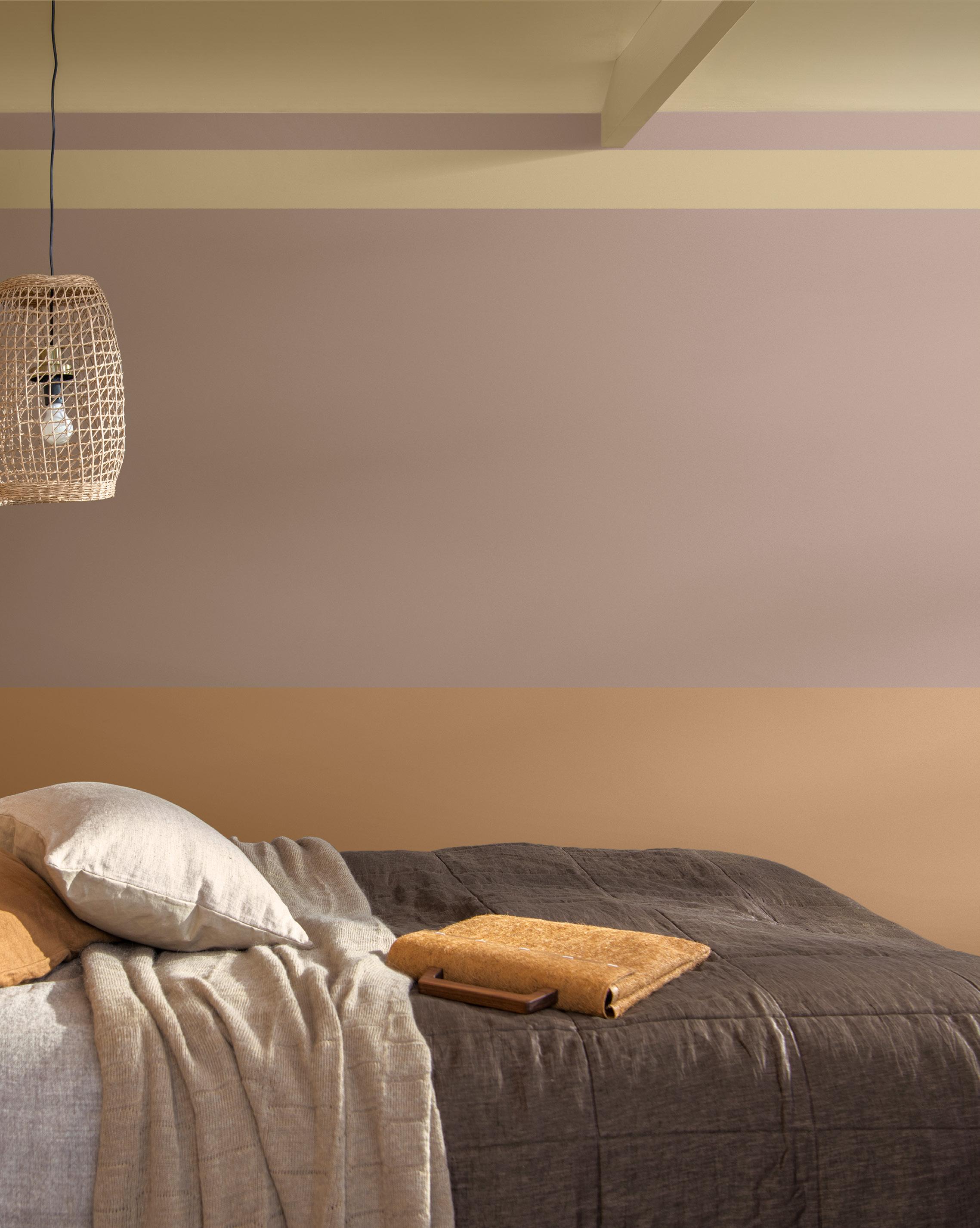
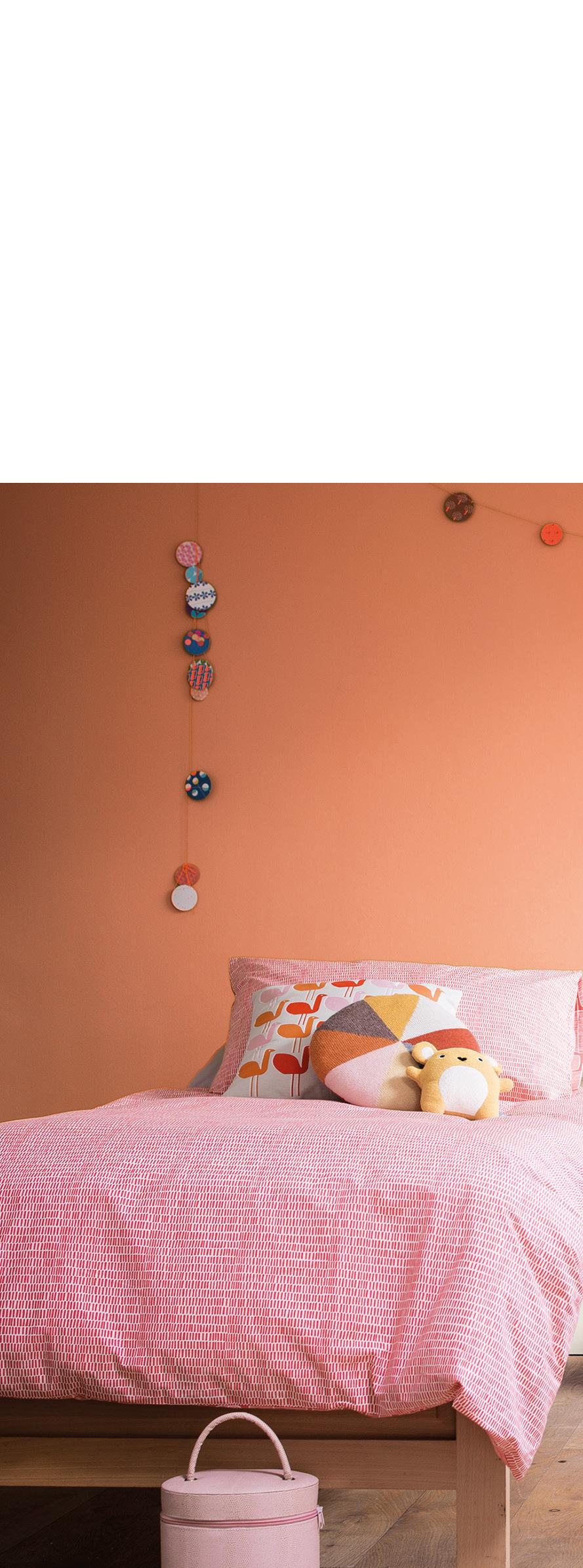
Despite it being over 30 degrees outside at the time of writing, could be facing another Autumn and Winter where we may have to turn down the heating and put on another layer of clothing. Gently warming colours inspired by natural materials, layered with soft organic greens combat the chill perfectly and reconnect us with the great outdoors in an elemental way. Combining different shades, layering tone on tone in bands and checks, plus adding colour woodwork will help to enhance cosiness without overpowering the space.
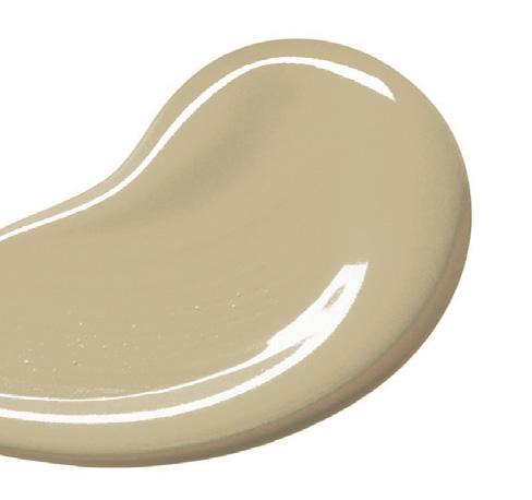
Look at our Dulux ‘Raw’ palette of 10 colours from Colour Futures which includes Colour of the Year Wild Wonder. These warm earthy shades are perfect Autumn, Winter paint colour picks that can across walls and furnishings to create perfect spaces to retreat into.



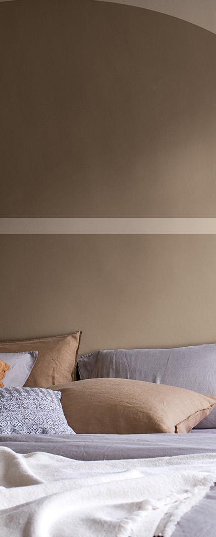
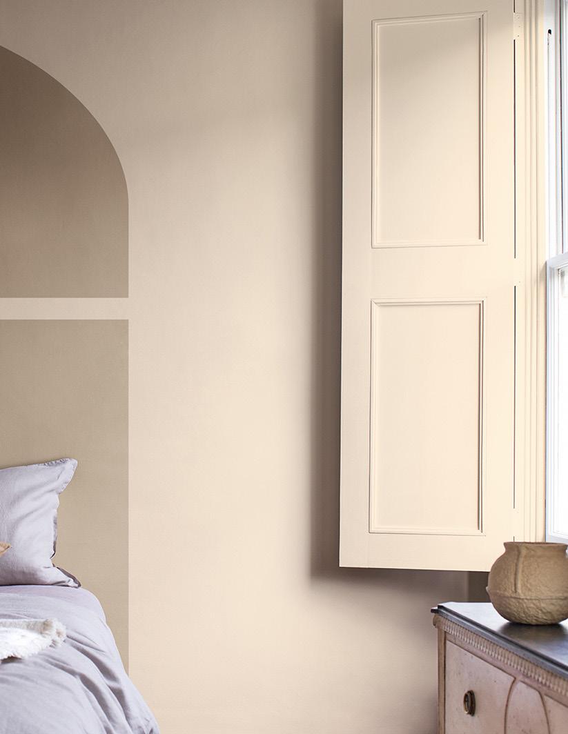
Close your eyes and touch everything in the room. If it feels good, it stays. If it doesn’t, move it on.

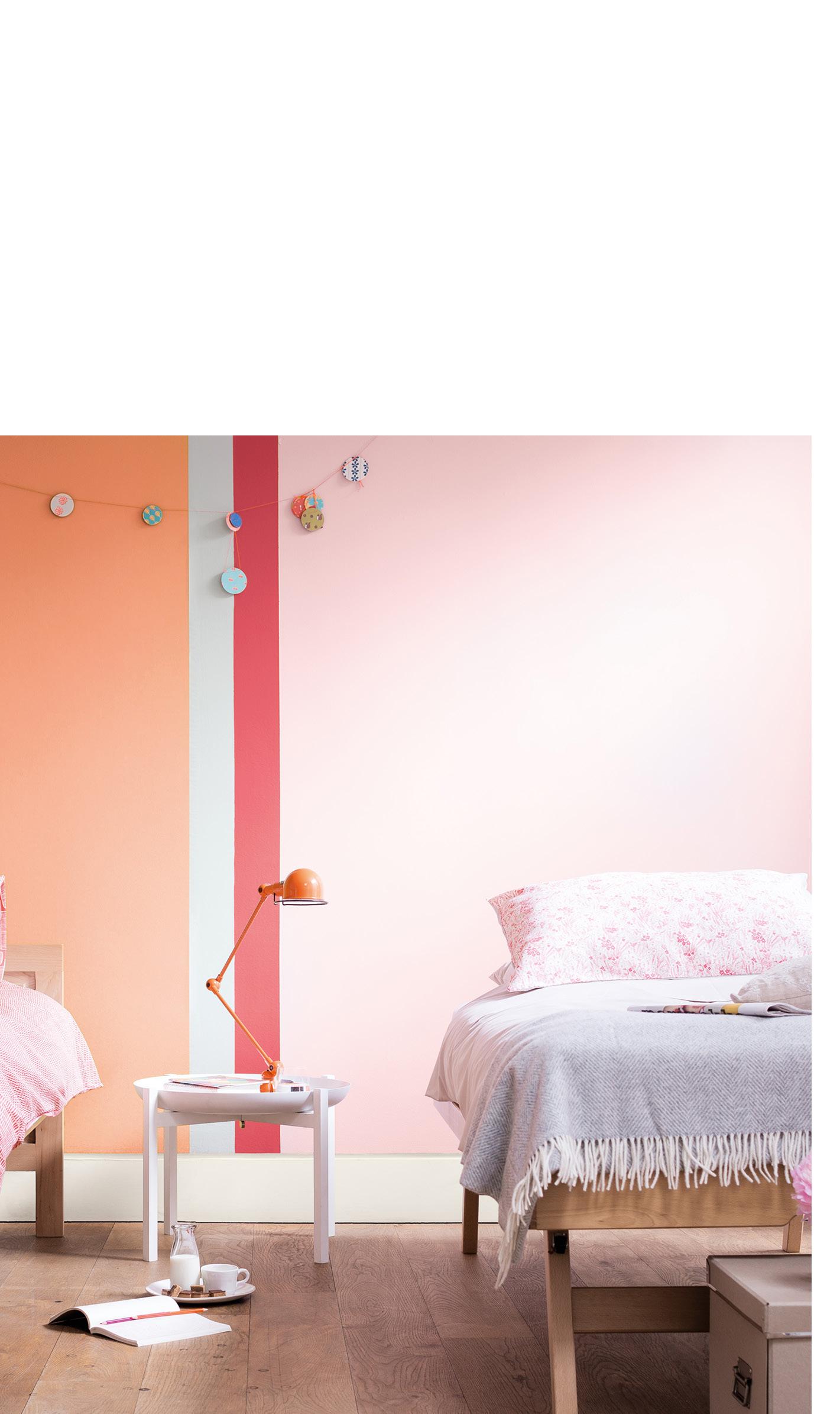
Pinks make an effortless transition into the cooler months and their popularity in every shade and tone continues to rise. They give us just the right amount of blush as an accent teamed with classic grounding clay hues. This is an Autumn/ Winter look that reminds us that Spring and Summer are only around the corner.


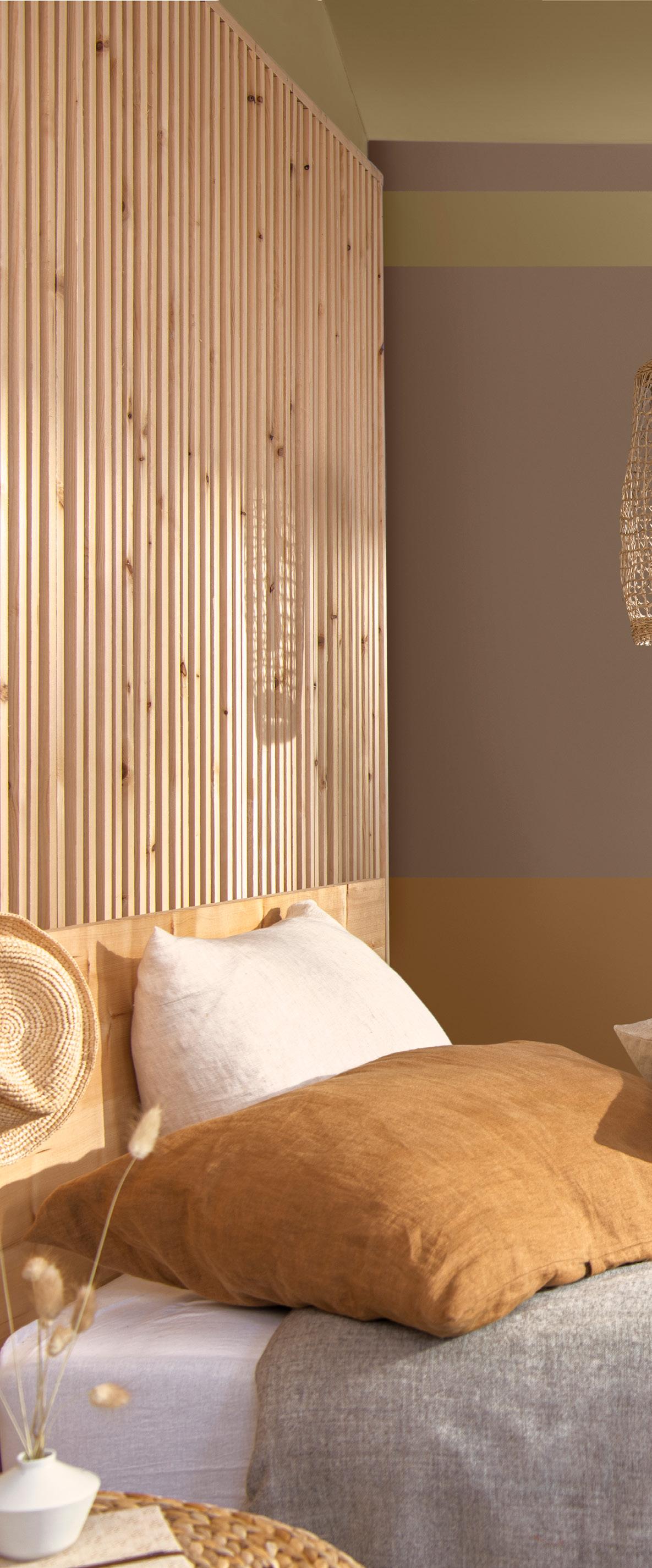
Creating a nurturing cocoon with rich earthy ochre and shades of chestnut bronze enhances the handmade elements and puts natural materials centre stage.
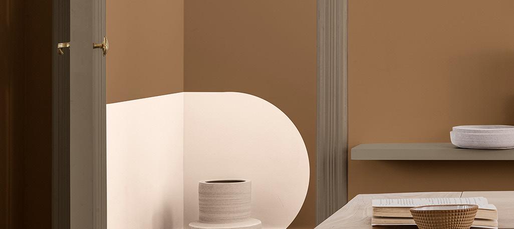
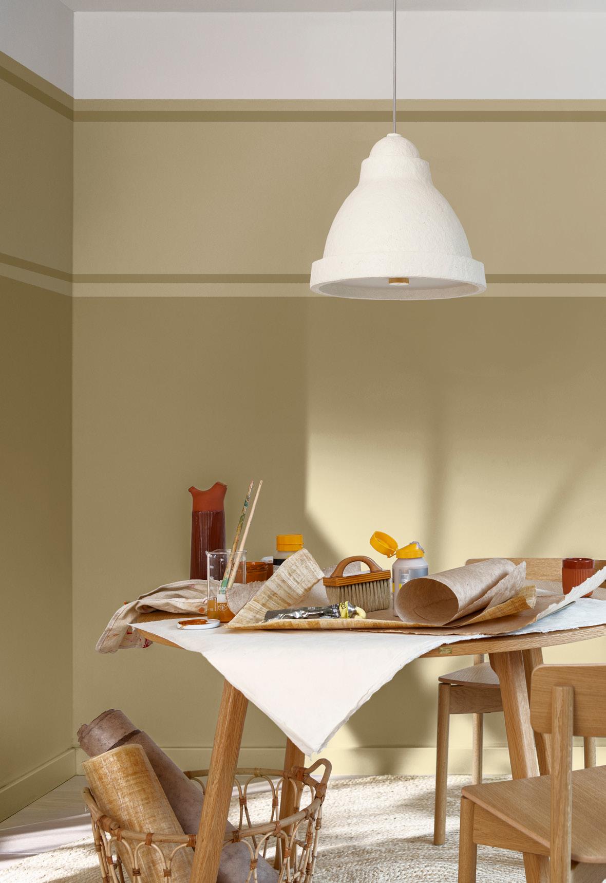
Natural colours love natural materials and things that are made by hand. Fill your space with possessions and furniture that tell a story rather than things that are mass produced. Knowing how something was made, who made it, and where it was bought, will create a richer, more meaningful, and authentic experience of home. Plus, they will last a lifetime.
Less is more when it comes to possessions that we are buying to put in our homes right now. As we reduce the number of things we surround ourselves with, we possibilities of being more creative with decorating. Colours do not need to begin and end in the corner of a room and the ceiling is a canvas crying out for attention. So, give it the attention it deserves and add some colour!
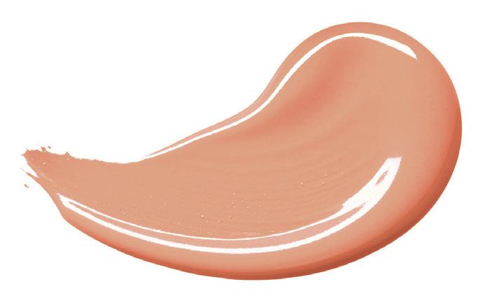

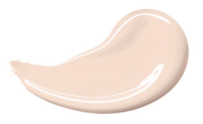
Our homes are becoming spaces in which we create and work. Design in the flexibility to do both effortlessly.
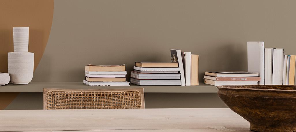
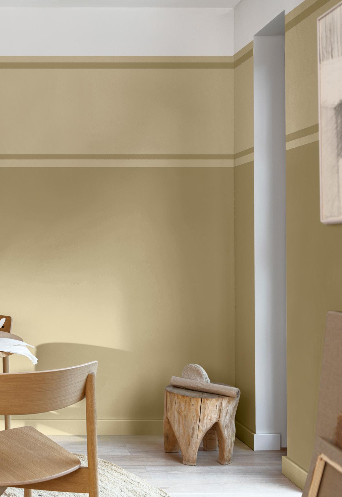


If you are designing for a client with a stressful job, too much going on with the decorating and furnishings is going to be counterproductive. So, try a bit of subtle tone on tone and keep the ceiling light.
Horizontal bands of colour instil calm wherever you include them. If you add a band of detail around the top part of the room, it encourages better posture by drawing attention upwards away from a screen or keyboard.
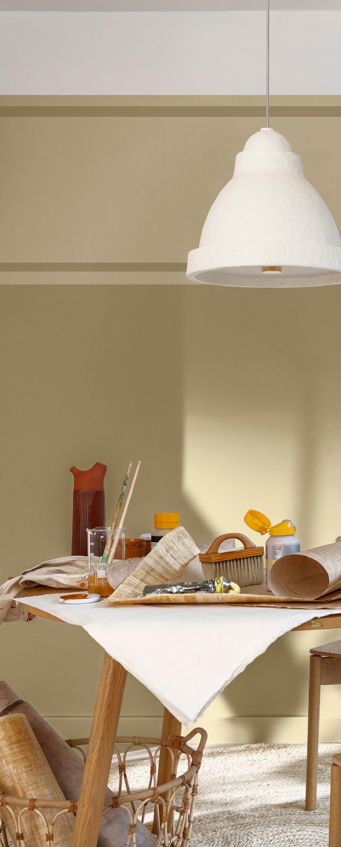
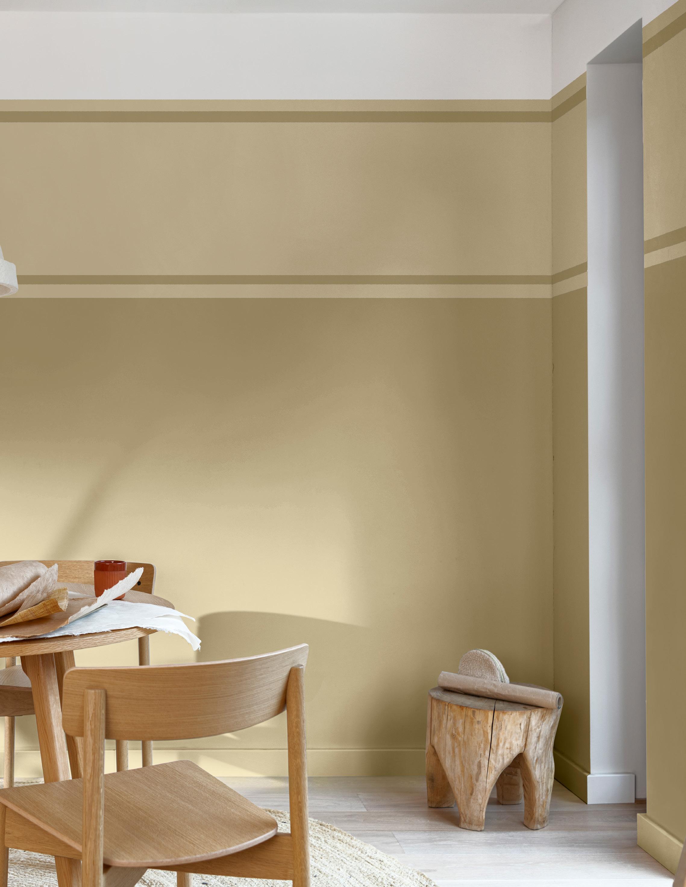
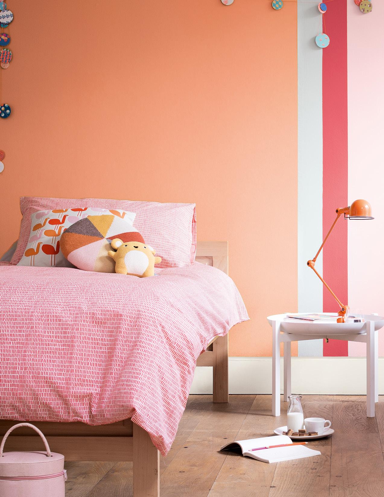


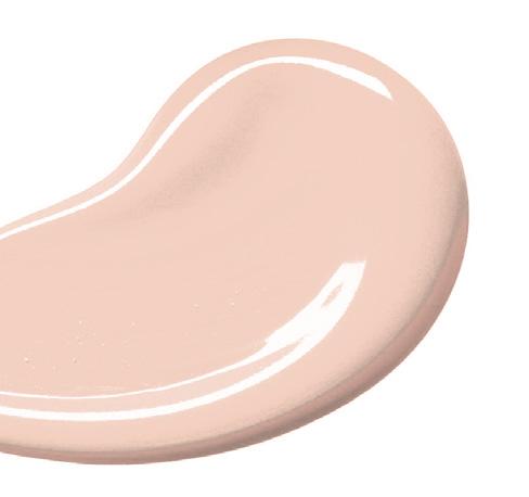
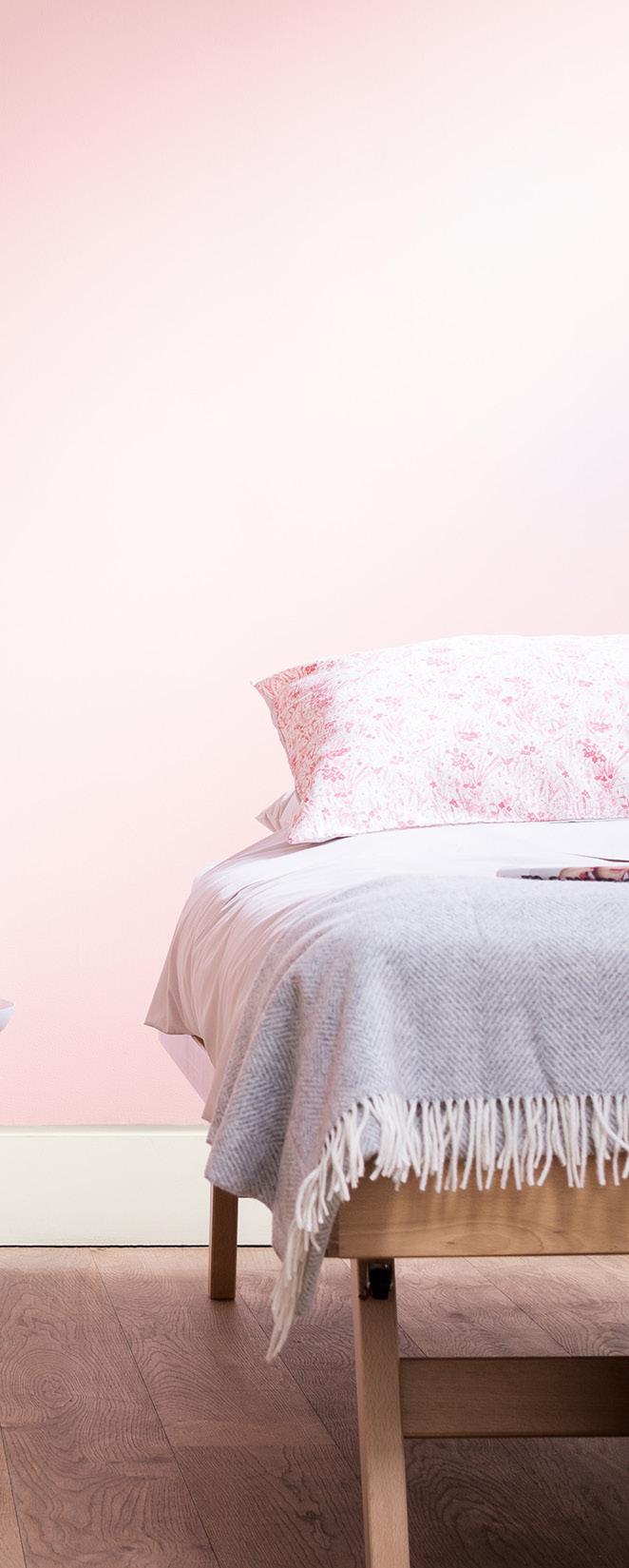
Deeper colours towards the bottom of the room have a grounding effect on its atmosphere. Perfect for when you need a bit of stability.
Home offices and creative spaces benefit from a more inspiring approach when it comes to decorating. In the Autumn and Winter, we usually become more sedentary, so we need to banish the cold with warming shades. Keep deep rich colours to the lower part of the room and combine with a pale organic hue on the ceiling.

Autumn and Winter trends this year are on the visual softer side. Our living spaces must work harder than ever to evoke the right atmosphere. They should make us feel comfortable, safe, and relaxed, in a fast-paced world.
To do this, make everything count on a sensory level. From the rug under your toes, to the fabrics, furnishings, and light quality. Design spaces that capture the way your clients want to feel and become part of a revolution in design that has true heart and soul at its core.
Written by Marianne Shillingfordwho is
the Creative Director of Dulux UK andIreland. She works with international teams of colour experts, designers, and decorators, to create colours we want on the walls of our living spaces.
She is also the founder of the Colour in Design Awards which champions outstanding use of colour in design by recent graduates.
