Tutor Paint Picks Spring Colours
Integrate these mesmerising tones into your own interior spaces and projects.
How


Curate


Integrate these mesmerising tones into your own interior spaces and projects.
How


Curate


Hello, and welcome to the latest edition of our NDA magazine! If you’re anything like us, then you’re welcoming the vibrancy and energy of spring with open arms as it shines brightly into all our homes.
So, what can you read in this issue? It's brimming with captivating content, ranging from Spring Indoor Treatments to Spring Colours 2024: Tutor Top Tones. Additionally, we offer invaluable advice on crafting a Professional Interior Design Portfolio, including what to include, effective presentation techniques, and common pitfalls to avoid.
We hope you enjoy this edition and kindly invite you to share it with those who would also appreciate its contents.

Professional Curtain Making and Soft Furnishings Tutor
Time at NDA 16 years.
Course/s you teach
Diploma in Interior Designer / Professional Curtain Making and Soft furnishing.
If your personality was a design trend, what would it be?
Gosh, this is a hard one. You should ask my friends and colleagues. I love being outdoors so maybe something along the lines of Biophilia. I must have plants around me, along with light open spaces. Obviously, fabrics play a big part, my favourite being linen, wool, and velvet.
Career high
Over the years there are far too many to mention. I would have to say it’s when I hear back from students who are excited about the prospect of changing their careers or setting up their own businesses.
Favourite design trend
I’m drawn towards trends that have calming colour palettes, natural materials, or are sustainable. I love the simplicity of the Scandinavian way of living. The Swedish word ‘Lagom’ always springs to mind which means just the right amount. Although I prefer the minimal look, I still like a homely feel.
Hated design trend
I can’t say there are any trends that I hate, but there are certainly trends that don’t appeal to me. I’m not a fan of bold colours and I didn’t jump on the popularity of rose gold.


Senior Tutor Head of HE Undergraduate Design Studies
Time at NDA
10+ years.
Course/s you teach
BA (Hons) Interior Design & MA Interior Design.
If your personality was a design trend, what would it be?
The intersection between, Minimaluxe and Hygge with a splash of Art Deco.
Career high
Designing a multi-functional hub and exhibition space platforming cultural education and contemporary needs. The design narrative was for a community, bridging between heritage whilst facilitating the present needs through design.
Favourite design trend
Never had a favourite ‘trend’ however, the aesthetic of minimaluxe plus the ethos of slow design is appealing.
Hated design trend
Any colour that becomes the new ‘go to’ for every space. For example, light grey, specifically when it became the new magnolia.


Time at NDA 6 years.
Course/s you teach
Professional Diploma in Garden Design.
If your personality was a design trend, what would it be?
A harmonious wildlife garden with a natural swimming pond!
Career high
There really are too many to focus just upon one. I genuinely love what I do! The joy of seeing fledgling designers achieve never fails to give me a buzz!
Favourite design trend
You can’t give me just one, surely! Foliage gardens really work for me. They invoke a real sense of serenity.
Hated design trend
Tiling that reminds me of public conveniences.
Time at NDA 2 years.
Course/s you teach
BA (Hons) Interior Design, MA Interior Design & PID Diploma.
If your personality was a design trend, what would it be?
I have two loud, noisy boys so I really appreciate calm and clutter free spaces. Japandi and Minimalism with a touch of Biophilia suit me well!
Career high
Designing a 5-star spa in Dubai.
Favourite design trend
Incorporating different textured design elements throughout an interior space.
Hated design trend
Matchy-matchy furniture.


Carla Newman Interior Design Tutor
Time at NDA
7 Months.
Course/s you teach
Professional Interior Design Diploma.
If your personality was a design trend, what would it be?
Japandi.
Career high
Creating a presentation deck which was pitched to Maya Jama.
Favourite design trend Wabi Sabi.
Hated design trend
Maximalism.

Molly Johnson Interior Design Tutor
Time at NDA 2 years.
Course/s you teach
BA Interior Design (Hons), Professional Diploma in Interior Design, Interior Design for your Home.
If your personality was a design trend, what would it be?
Danish/Nordic.
Career high
Designing for some incredible companies such as John Smedley.
Favourite design trend
Anything Danish!
Hated design trend
Shabby Chic.
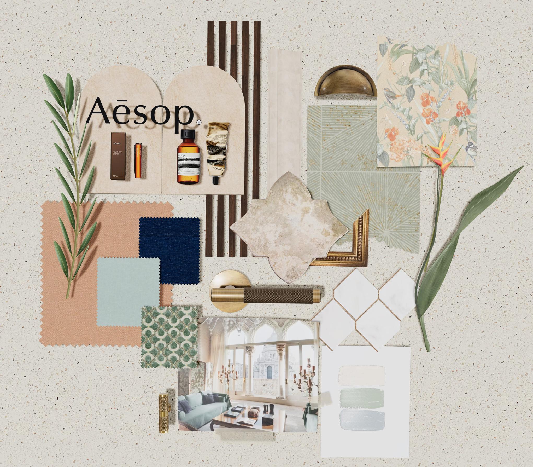
The Mattoboard Challenge Winner is Bensu Uzuncan!! (@bensuuzuncan)
Here’s what Bensu, an MA Interior Design National Design Academy student, had to say about their Mattoboard submission:
“In my design, I wanted to interpret the serene design style of the Aesop retail store through the spirit of the Venetian interiors that have been shaped over the centuries. I brought together materials such as Venetian plaster, terrazzo, oak wood, and botanical-patterned 16th-century-inspired wallpaper, using a palette that pays homage to the nature of Venice.”
Congratulations Bensu and thank you to everyone who participated!! We love seeing your creativity, and we are looking forward to the next Mattoboard challenge.
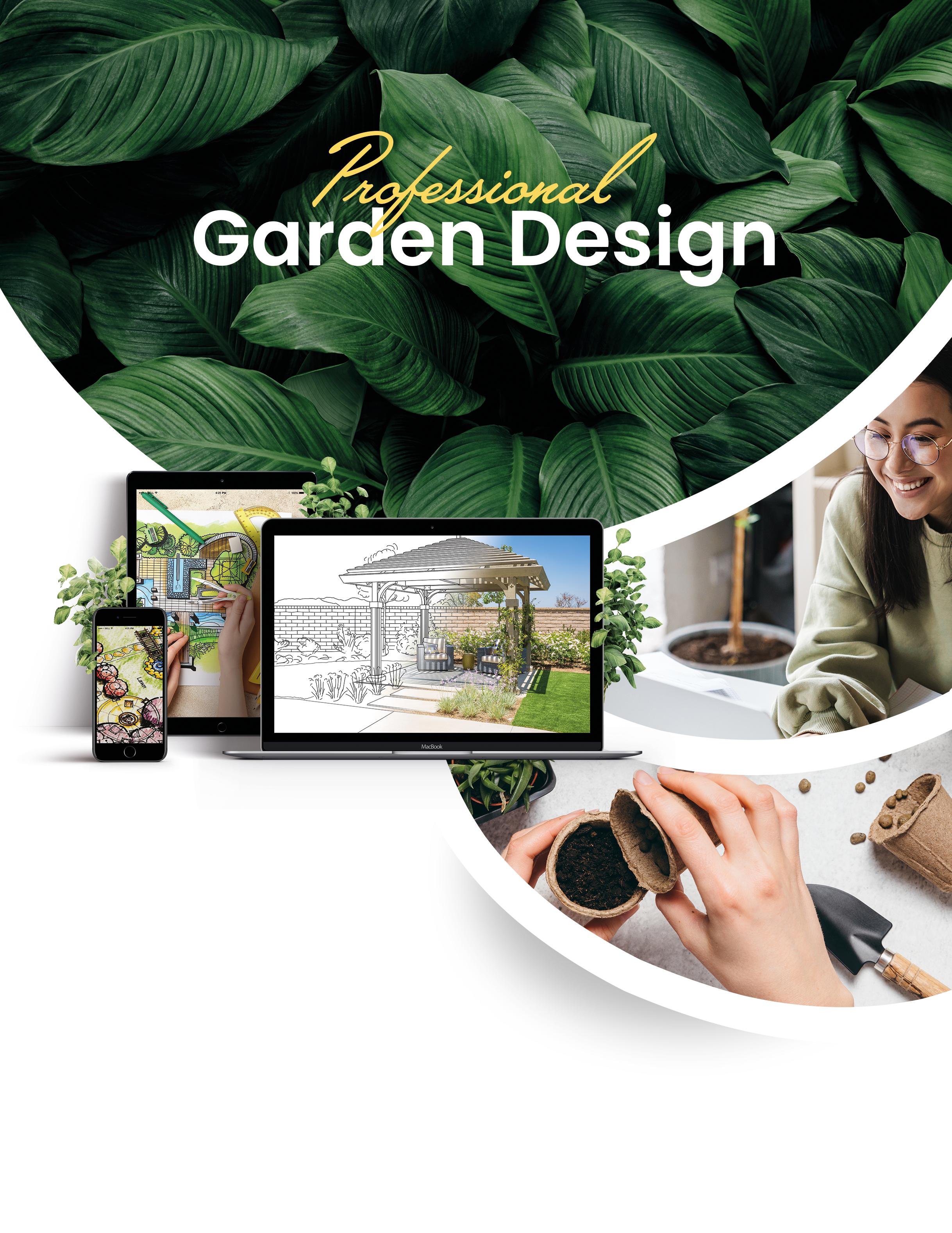
Whether you want to create your dream garden or are looking to enter a rewarding career, we’ll equip you with the skills you need.
Start Date
Enrol at any time & choose your start date. No term times or semesters.
Entry Requirements
No previous qualifications required, just an interest & enthusiasm for garden design.
Assessment
No exams — Tutor assessment only, portfolio moderation by AIM Qualifications.
Course Duration
Online: 8-10 months (flexible)
Online Fast-Track: 14 weeks
More Information
For more information visit: www.nda.ac.uk/study/ courses/diploma/garden-design/
As we embark on spring, we’re seeing some exciting trends emerging and developing across the world of interiors. Below are some of our favourite trends that we anticipate will find their way into our homes this spring.
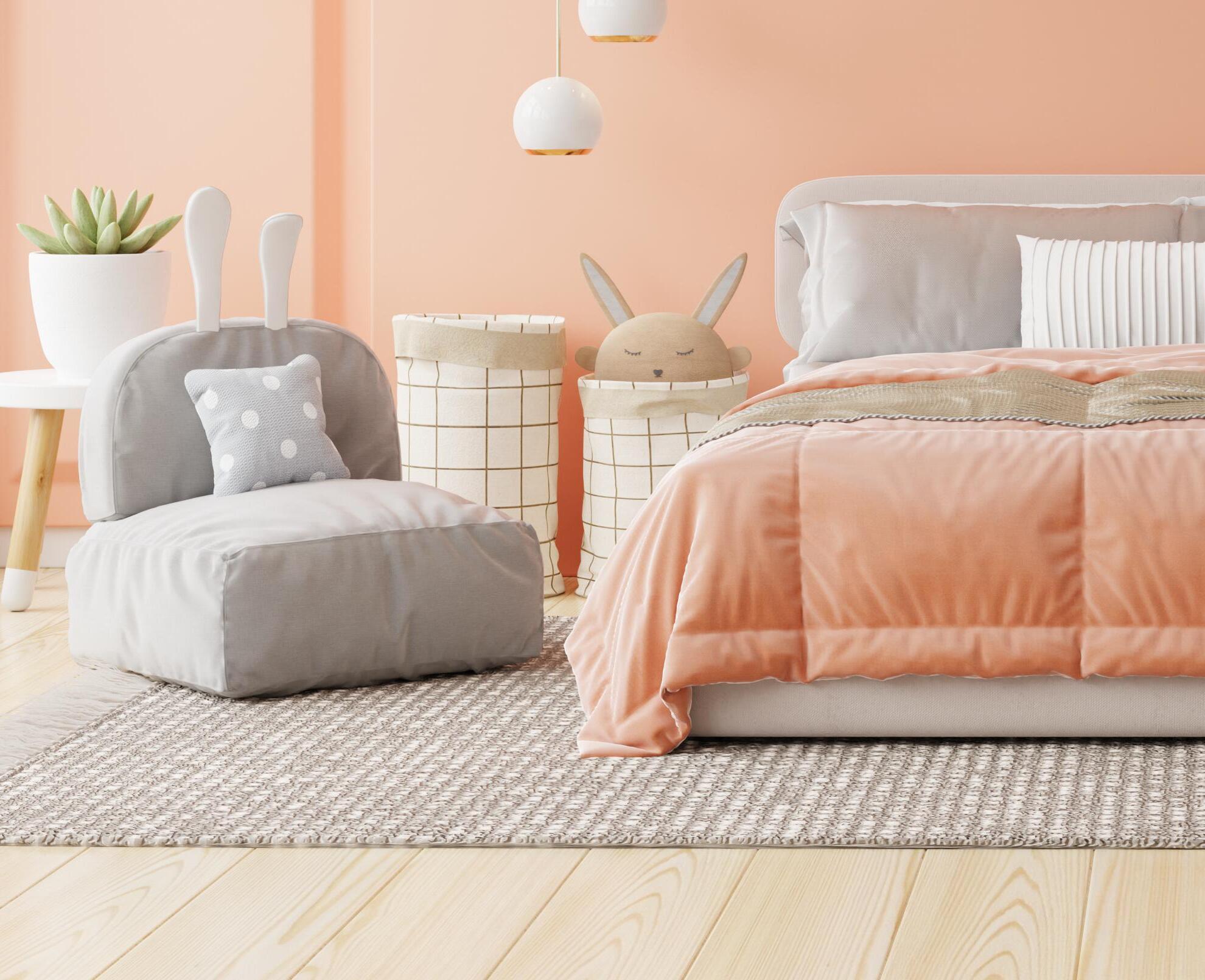
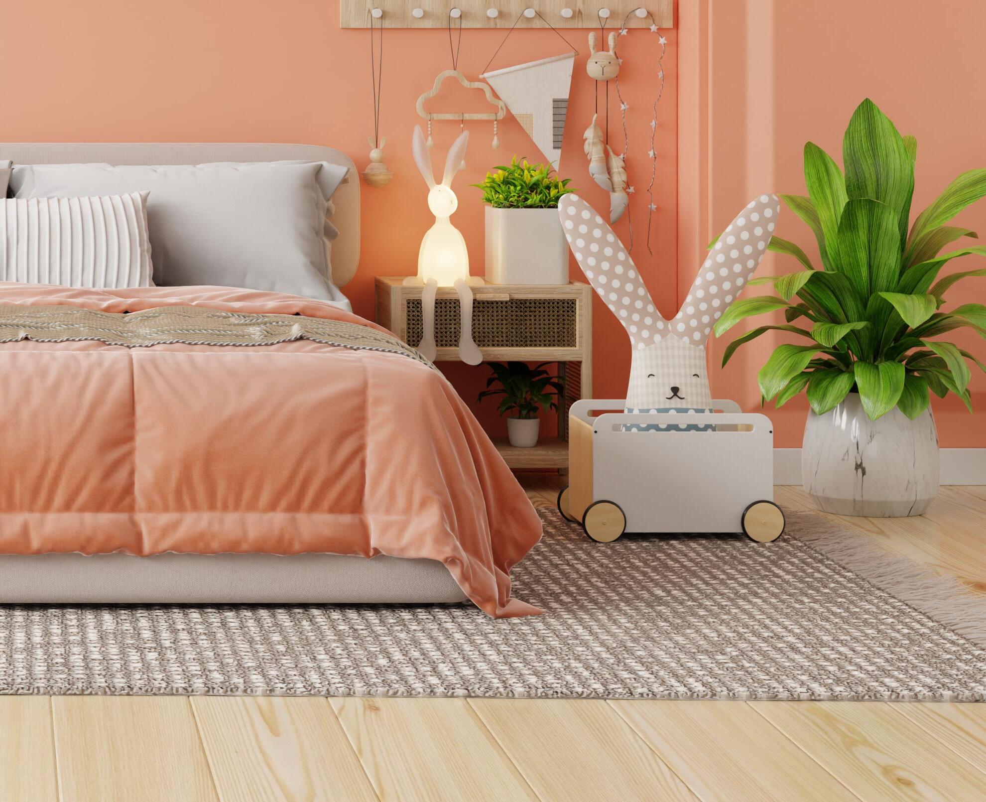
As spring emerges, brighter versions of earthy tones start to consume our spaces. WGSN identified "Apricot Crush" as a "restorative, refreshing, and energetic hue...cultivating a hopeful and positive mindset." A narrative of "care, connection, and community" is also represented, alongside the obvious nutritional benefits of the actual fruit. This hue exudes energy, offering warmth and positivity.
‘Peach Fuzz’, a lighter peach hue with subtle echoes of pink, has been named the colour of the year by Pantone. With its soft and peaceful connotations, this pleasant pastel shade embodies the essence of anticipation. Peach will continue to be prominent across various mediums, including wall finishes, ceramics, fabrics, tinted or smoked glass, and more. It's possible that colour drenching, which gained traction in 2023, will evolve to include lots of peach tones.

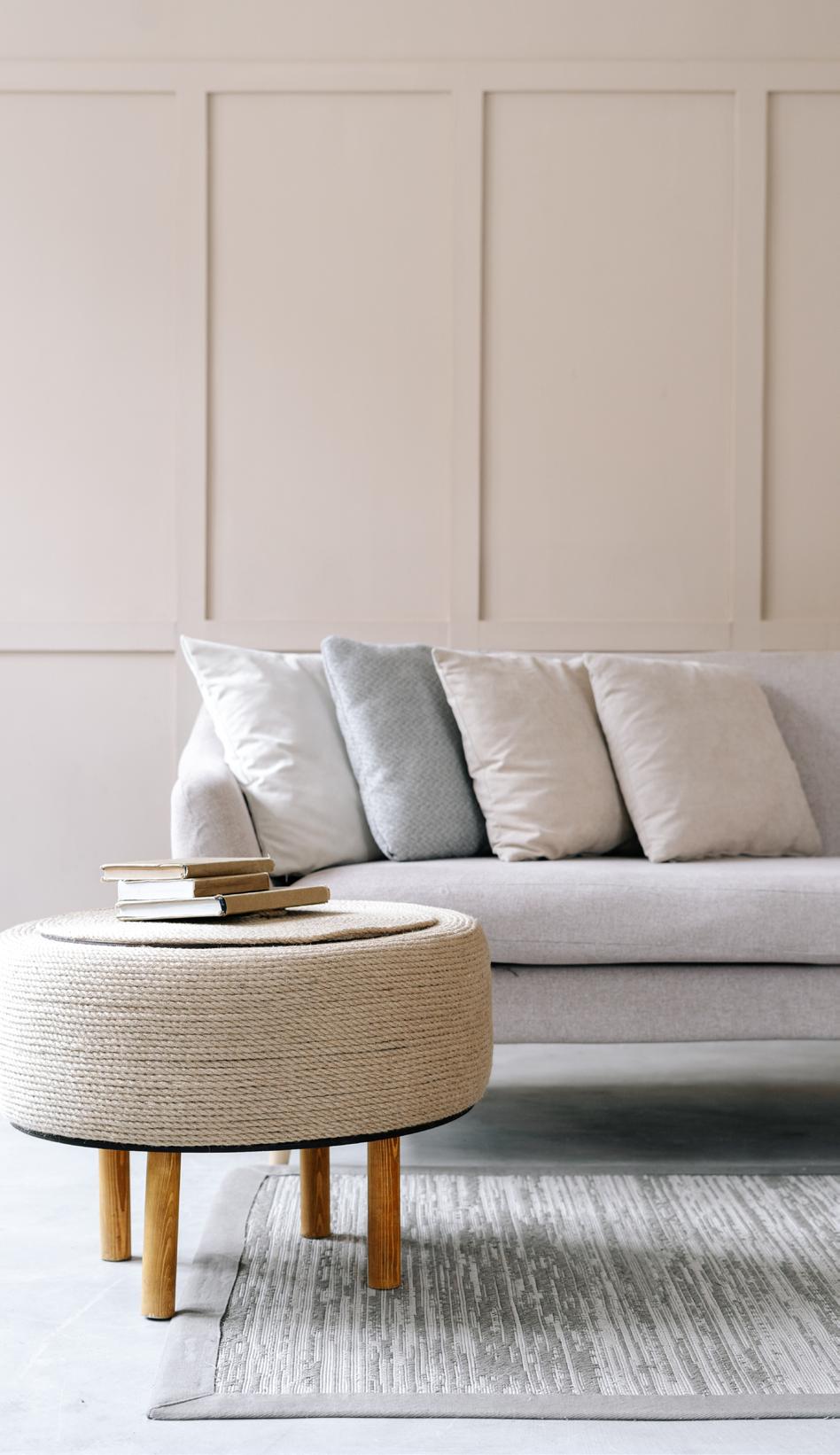
"Quiet luxury" is an unconventional approach that has steadily gained momentum since 2023, particularly in the fashion industry. Since its emergence, this concept has permeated every sector of the design world.
While its understated appearance may not immediately catch the eye, the distinction lies in the details, which work to evoke an atmosphere of belonging and calmness. Quiet luxury entails a deliberate, restrained colour palette and a thoughtfully curated collection of cherished items and essentials.
To embrace this trend, keep an eye out for harmonious, tonal, or muted colour schemes that reside within the neutral palette. Pay attention to material quality, craftsmanship, and the use of high-end fabrics. Additionally, focus on the layout of zones and furniture placement to leverage natural light.
Throughout 2024, we will see this trend evolve to include injections of colour, oversized curved seating, and a seamless blending of luxury and responsibility. Artem Kropovinsky, from the New York-based interior design firm 'Arsight', refers to this as the rise of 'experiential luxury'.
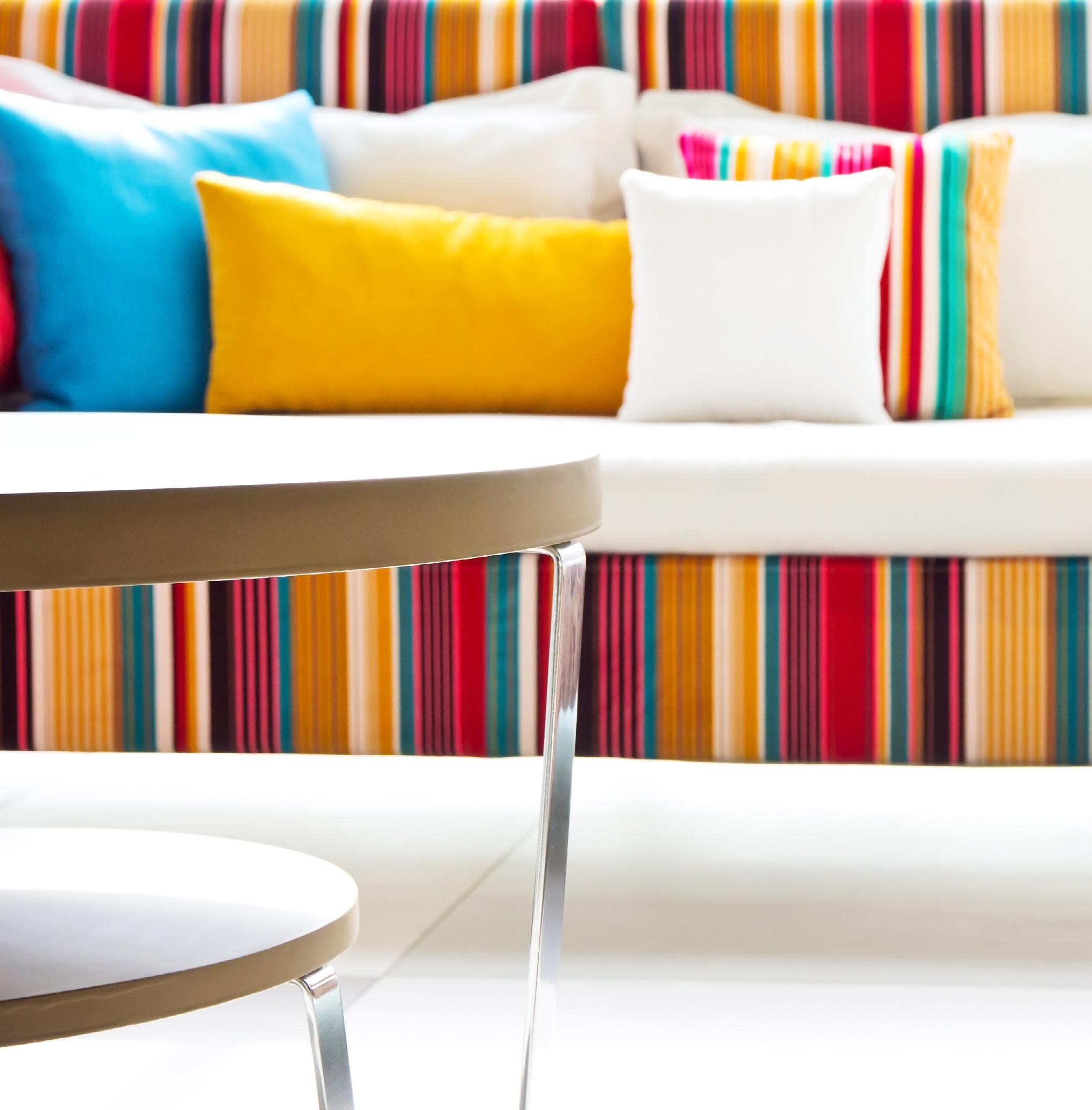
In complete contrast to 'Quiet Luxury', bold stripes are set to return in 2024. Perfect for the maximalist but still adaptable for the minimalist too.
The ticking retro stripe is set to remain an integral part of this trend, ideal for all types of soft furnishings and window treatments. From nautical to bolder cabana stripes, we will be flooded with varying styles.
Pastel stripes within interiors are also experiencing a resurgence, providing the perfect backdrop for colours like 'peach fuzz' which adds a contemporary twist to a classic pattern.
From walls and furnishings to decorative objects and dining settings, this trend will bring a sense of lightness and nostalgia to any design scheme.
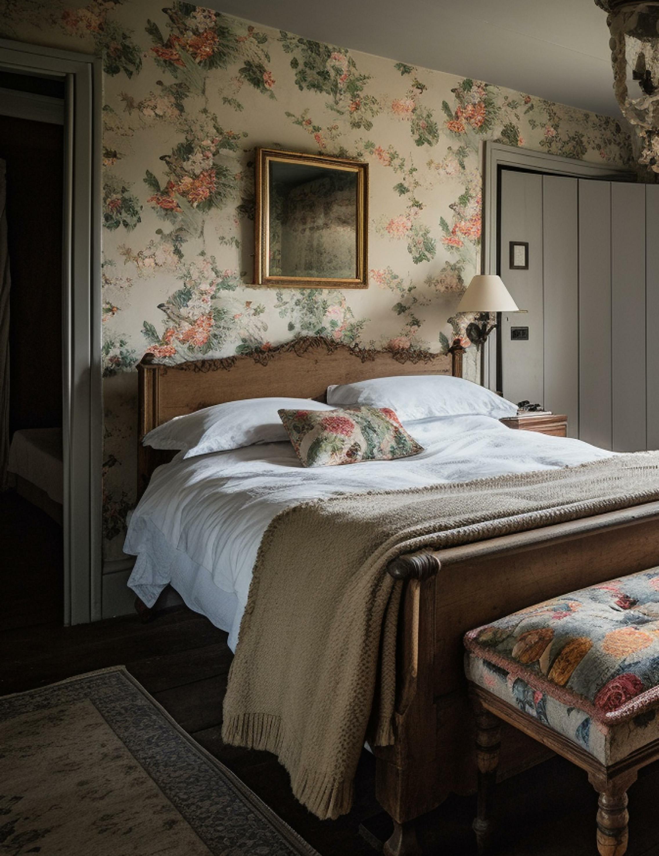
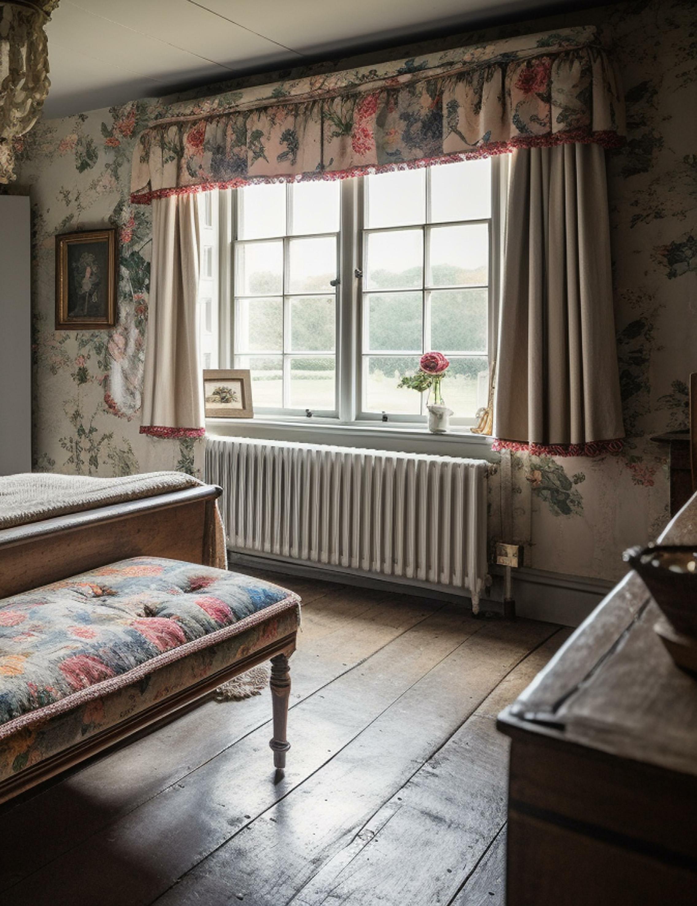
Chintz is another surface pattern that is gaining traction, embracing the allure of new nostalgia by blending the old with the new. Reminiscent of items and products found in the homes of previous generations, it is experiencing a resurgence with fresh additions and contemporary options.
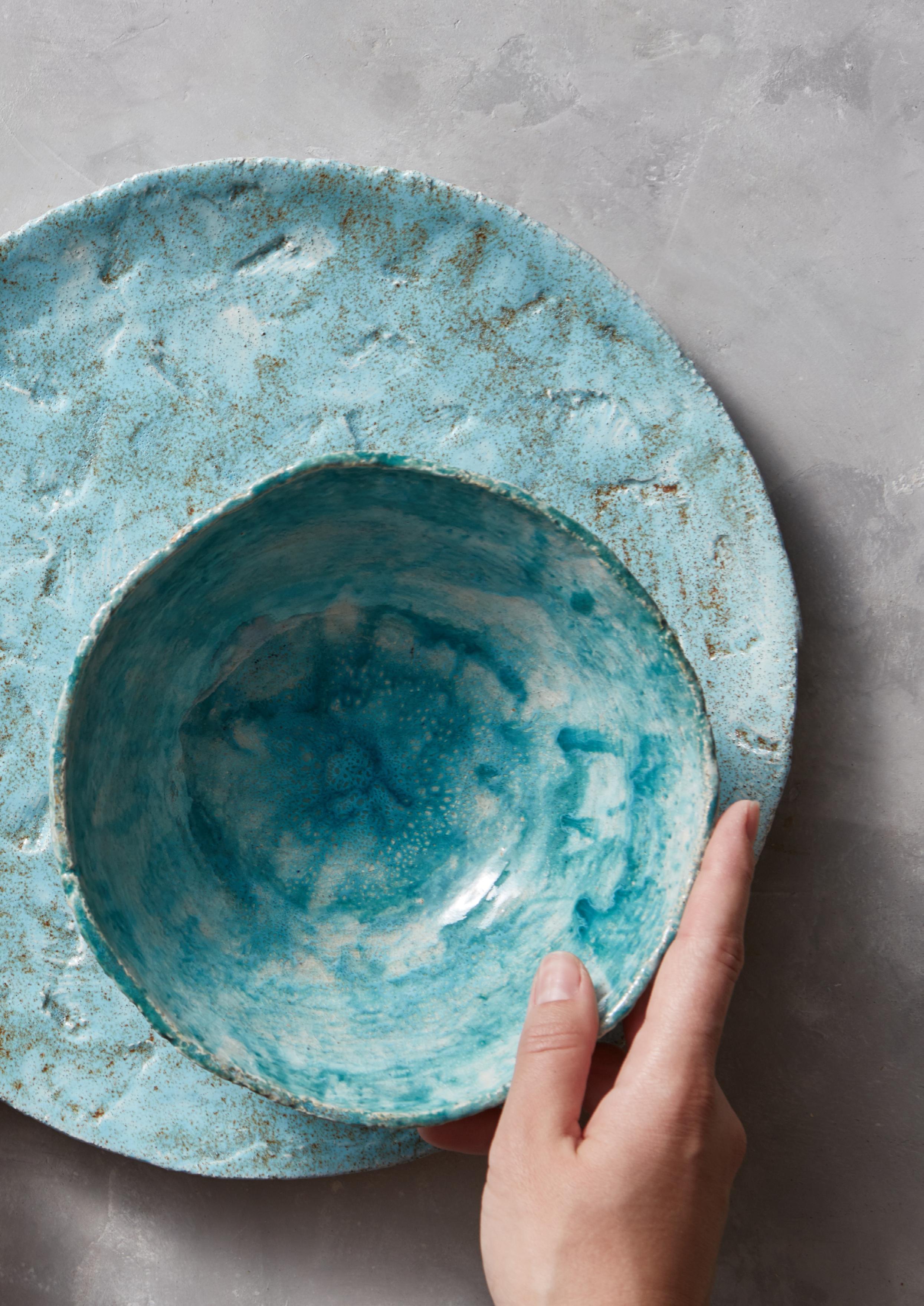
Thankfully, sustainability continues to drive the production of more environmentally conscious product offerings. One stand out example are lampshades made of mycelium and other homewares crafted from industry by-products.
Bio-composite panels by the Polish brand Vank are another great example of how material reuse continues to inspire new interior products. These panels are ideal for the walls of any space, adding depth, texture, and subtle dynamics with sound-absorbing qualities.
With materials based on renewable fibrous plants such as hemp an flax, this innovative and circular material demonstrates a shift holistic wellbeing.
The artist's hand is still being championed to add one-of-a-kind impressions, giving a greater sense of place and personality to any space or design.
The next iteration is called ‘digital artisan’, which embraces technology for precision where needed, while still incorporating the beauty of handwork through craft and art.
Sustainable crafting continues to be adopted by artisans, and there is a growing trend towards sourcing from local artists. This encompasses a wide range of mediums such as ceramics, accessories, furniture, and finishes.
That’s our take on which interior trends we believe will take centre stage this Spring. Which trends are you favouring? We’d love to know.
Send us a message on one of our socials.



Based in Essex and specialising in residential design, Denisa Jusic found her passion for interior design whilst following her father around while he worked on home projects. She found real joy during these times when her father let her get involved.
Since then, she has pursued a career in interior design, starting her own business and working as a freelance designer. Looking to push herself out of her comfort zone and expand her knowledge, Denisa decided to enrol on our Online Master’s Degree (M.A.) Interior Design.
What made you get into Interior Design?
I was probably around 6 or 7 years old when I first became interested in interior design. My dad is a builder/decorator and when we started personal projects, I became his shadow. Occasionally, he would let me get involved in the project and I absolutely LOVED it.
Who is your biggest design inspiration?
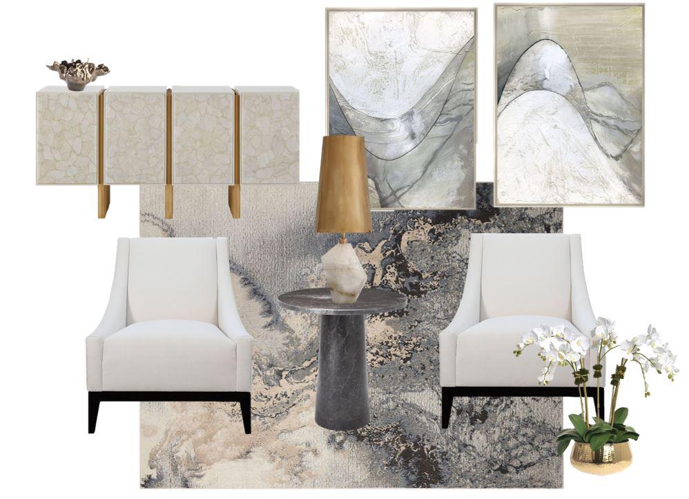
My biggest design inspiration is Kelly Hoppen. Her work is just amazing, and I am never bored of seeing what she can create and design.
How would you describe your style in 3 words? I would say my style is timeless, contemporary, and minimalist.
What was your favourite unit/module of the course?
My favourite module on this course was the cultural context module. I am a massive fan of travelling and I love learning about different cultures and traditions when I travel. So, being able to learn more about how culture impacts design was impressive.
Who was your tutor and how did you find the communication and support?
My tutor was Simone Haley, and I could not fault her in any way, she is brilliant. The communication and support throughout have been great and whoever gets Simone as a tutor next will be very lucky.
How did you find studying with the NDA?
The course has been brilliant throughout. Being able to study online and having that flexibility is what made me decide to apply with NDA in the first place. The online VLS platform is very straightforward to use and has a lot of resources and guidance tools to help the learning process. It’s a great system to have. I believe the time frame for each module is a reasonable amount based on the context for each one. Time management is one of my attributes, so I did not need extra time. However, you can apply for holidays and extensions if needed.
Who would be your dream client/what would be your dream project?
I don’t really have a dream client or individual as such, but my dream projects would be to have high end residential projects, whether that be UK based or even overseas. Building up a reputable business is paramount, and I truly believe once you have that, the clients will follow.
Which projects are you most proud of? Can you describe them?
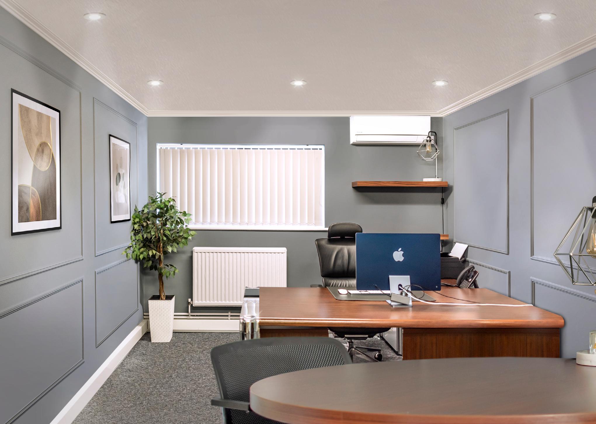
I have several projects that I am proud of. But there are two that really stick to mind. The first one I am proud of is my first ‘proper’ project, where the client found me directly and not through referrals. I don’t think you ever forget having your first client, nor do you forget all the excitement and feelings that come with it. The project was to redesign a very standard white walls, blue-tiled carpet box office space into something with character and warmth. The outcome was fantastic, and the client was super happy with it.
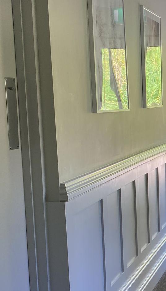
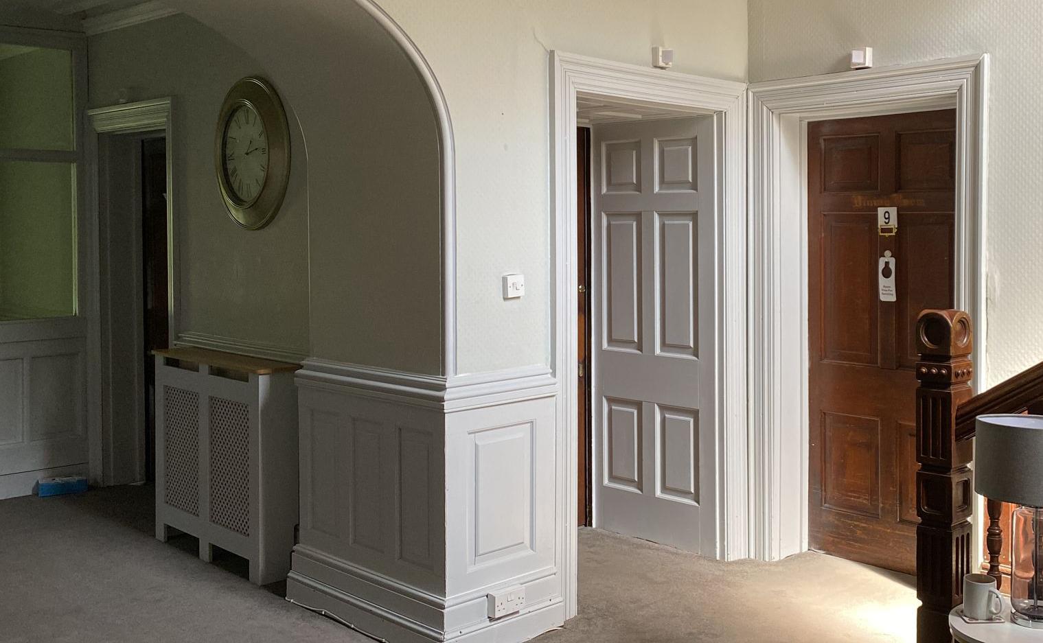
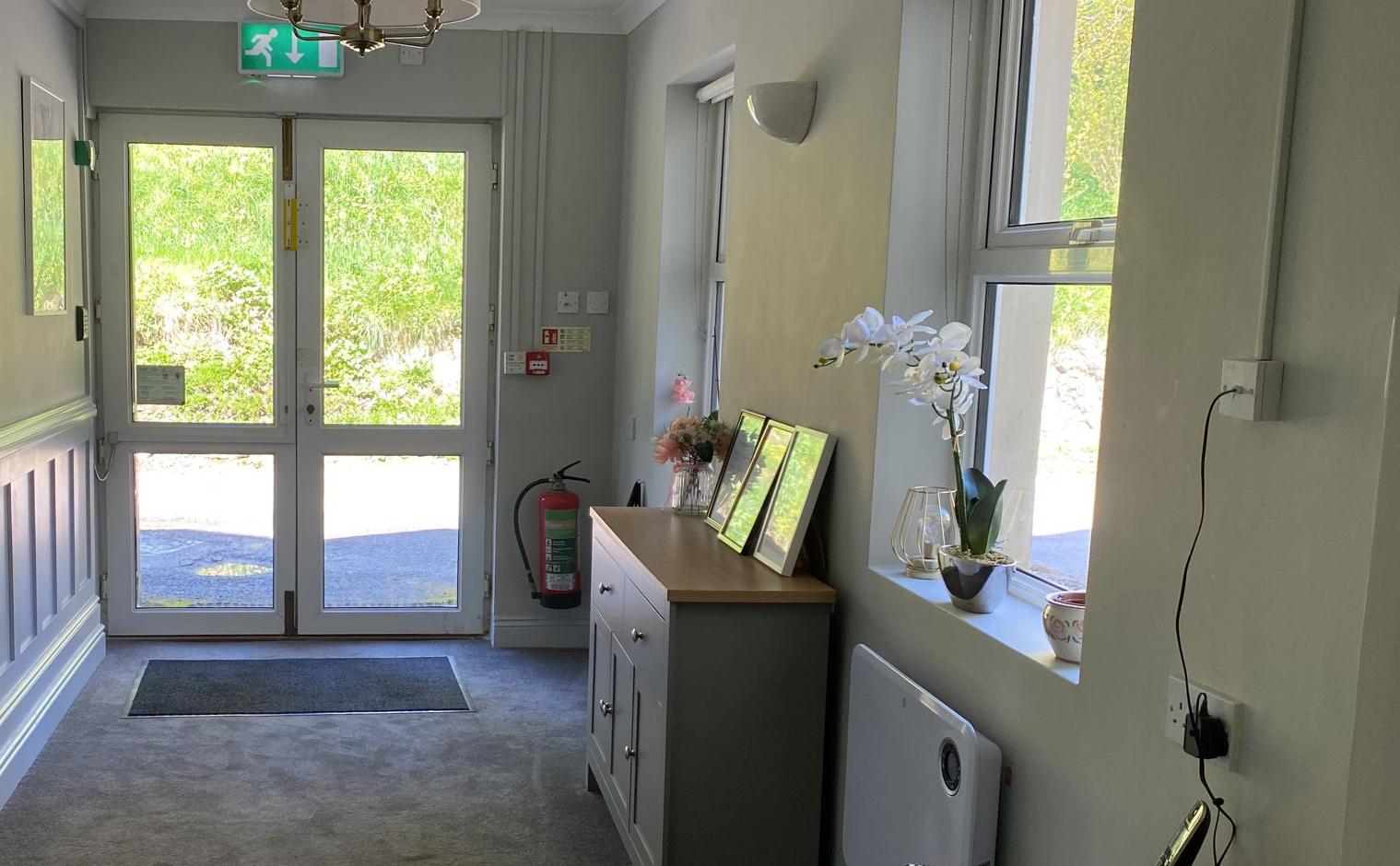
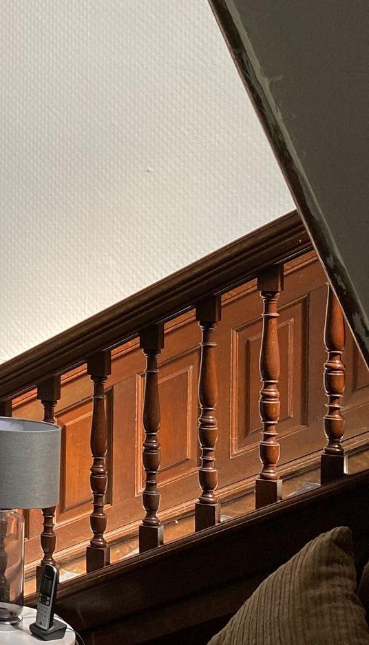
The second project, I was recommended to an individual who owns several care homes. The brief was simple enough, where I had the privilege of re-designing the main hallways of this beautiful country mansion care home circa 1650’s. The brief was simple, but there was lots to consider.
Designing for a care home with residents residing in them, I had to ensure they felt safe, secure, and not disorientated by the changes. Not only this, the design approval needed to not only go through the client, but the residents, staff, local authorities, and commissioners. I was so pleased to hear that they all LOVED the changes. From this project, I have now made a client/friend for life.
You’ve now finished your Master’s, what are you doing next?
When I complete this course, I plan on continuing to grow my freelance business and see where it takes me.
Joining the NDA and doing the Master’s course has really given me a fresh lease of new design perspective. It helped me push out of comfort zones and in turn provided me with more self-confidence to go out and achieve my work goals. I would highly recommend this course for anyone who wants to push their capabilities, learn new things about themselves, and anything design related. If you want more information about the MA Interior Design course visit: www.nda.ac.uk/study/courses/ma/interior-design/

Christian Bense is a South African-born interior designer who established his London-based studio in 2020. His interiors convey an effortlessly curated aesthetic, blending layers and understated elements with an eclectic flair that possesses a refined and timeless allure. Christian's career includes a diverse range of projects, from high-endresidential designs to commercial boutique projects.
His sources of inspiration are eclectic, drawing influences from New York designer Robert Stilin and the vibrant and colourful designs of London decorator Beata Heuman. He also pays tribute to his South African roots through abstract tiles and warm, earthy tones.
christianbense.com | @christian_bense

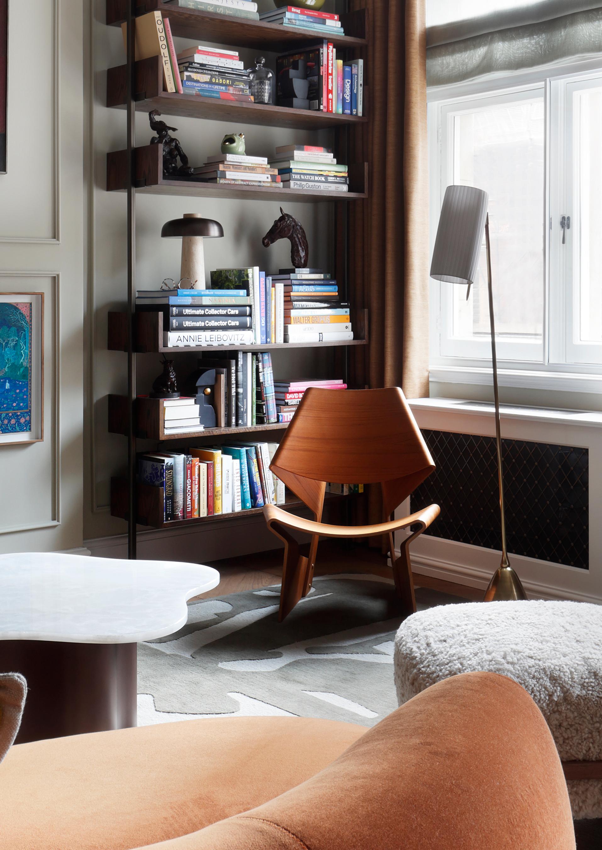
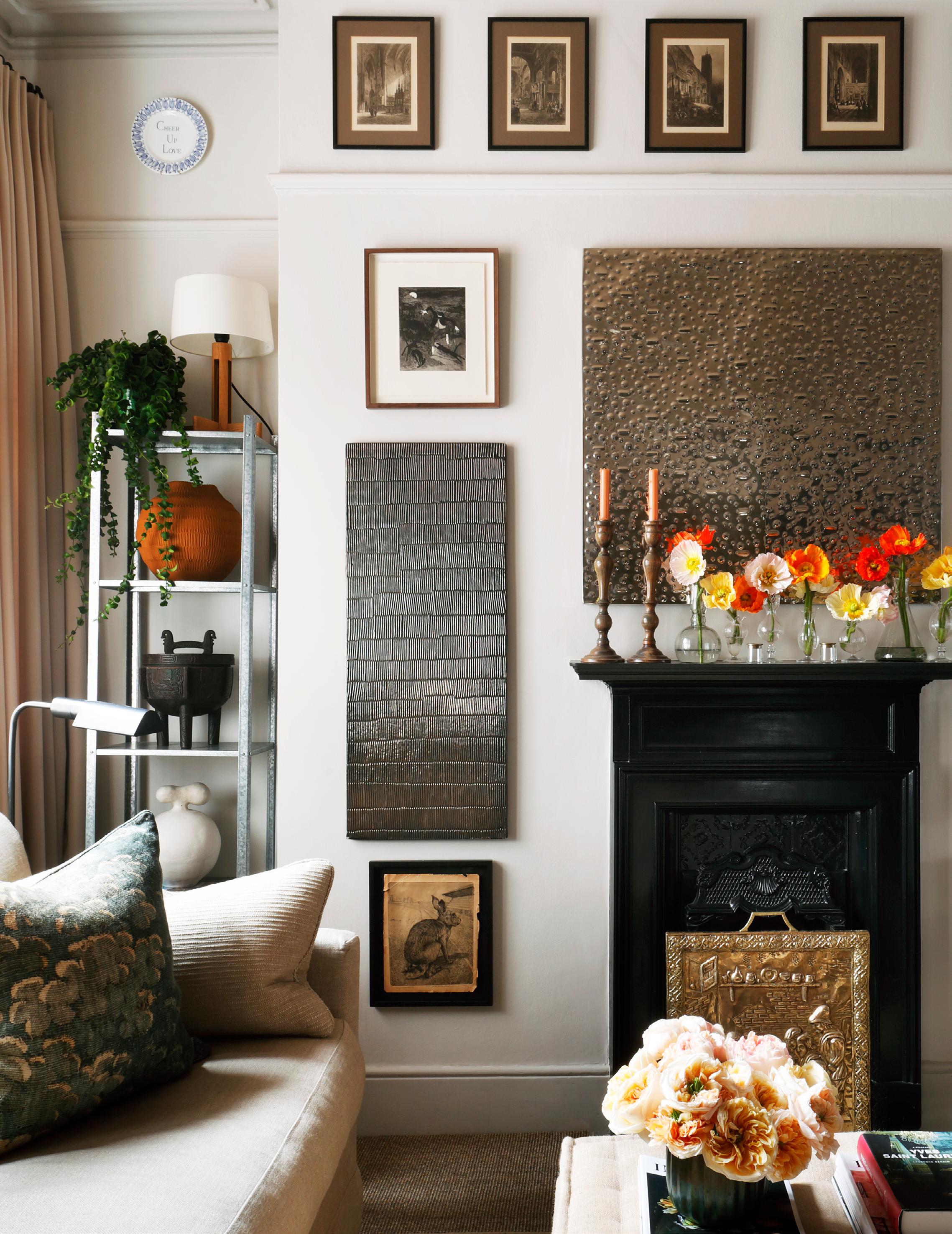

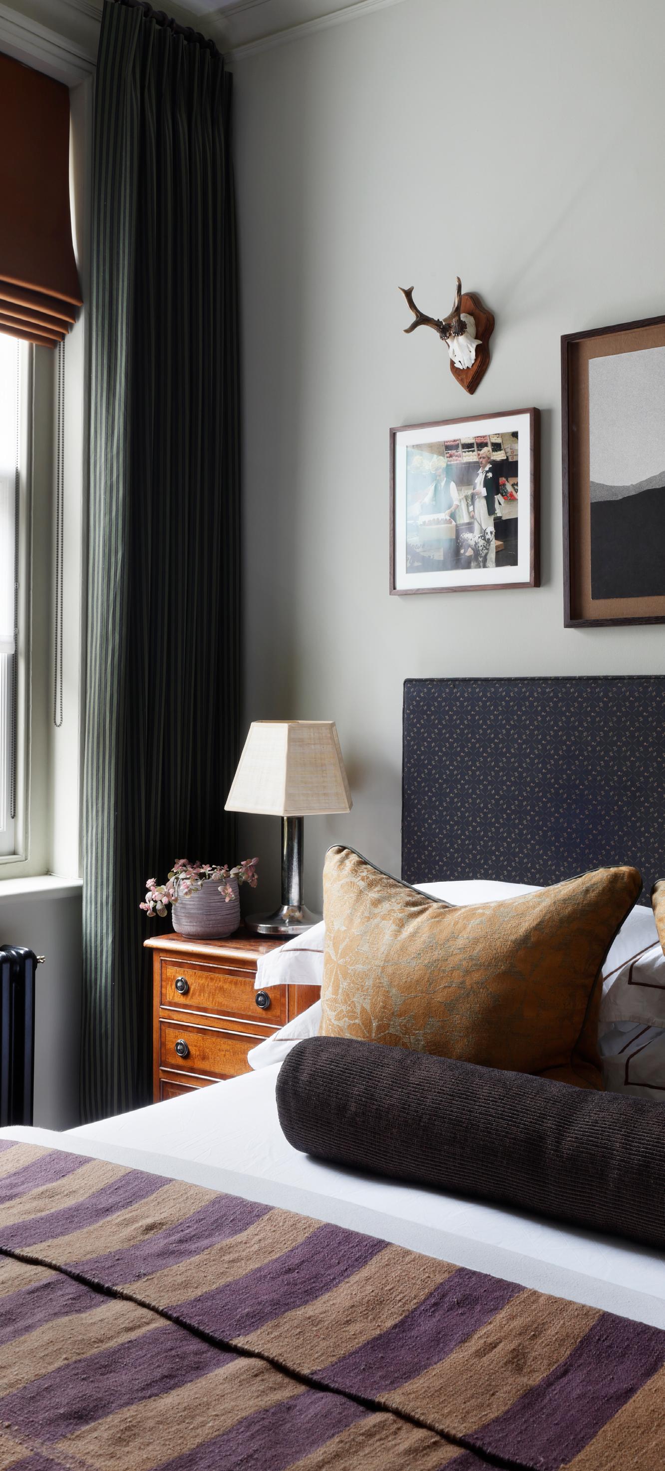


In the competitive world of interior design, a well-curated and reflective portfolio is the selling point for you as a designer. Whether you are a student seeking a work placement or a recent graduate looking to find your breakthrough design role in the industry, your portfolio acts as your visual resume.
Together, we will outline the key stages that will enable you to produce a design portfolio that authentically reflects your identity as a designer. We’ll explore presentation techniques, portfolio contents, pitfalls to avoid, and we’ll signpost some helpful external resources. It’s also important to consider building your portfolio in several formats; this will increase your overall engagement.
Digital interior design portfolios allow for interactive experiences, incorporating multimedia elements such as photos, videos, and virtual tours to bring designs to life. When approaching an online portfolio, designers should consider the layout, navigation, and user experience to ensure seamless interaction.
Images should be high quality, so ensure you export them at a high enough resolution to reduce the likelihood of pixelation.
Videos provide an opportunity to delve deeper into the design process, offering a ‘behind-thescenes’ insight from concept to completion. Additionally, virtual tours or 3D renderings enable viewers to explore spaces from different perspectives, gaining a comprehensive understanding of the designer’s vision.
By strategically using social media platforms, interior designers can effectively establish an online presence for free. These can also be highlighted on printed collateral such as CVs or business cards.
Instagram - With its visually appealing grid layout, Instagram serves as an ideal platform for designers to showcase their projects, inspiration, and behind-the-scenes creative processes.
TikTok – This app provides an opportunity for designers to engage with a slightly younger audience through short, captivating videos that offer quick design tips, DIY hacks and beforeand-after transformations, thus expanding their reach and brand awareness.
LinkedIn - A professional setting for designers to network with industry professionals, share articles and achievements, and ultimately showcase their expertise through written posts.
Printed portfolios offer a tactile experience, allowing attention to detail in a tangible format. When preparing a printed portfolio, consider your choice of paper; opt for a thickness of 250gsm, as it is known for its sturdiness and ability to hold the weight of high-quality prints without bending or creasing. The recommended format for printed portfolios is A3 landscape, as it provides ample space to showcase designs in detail while maintaining a visually appealing layout. However, this is down to personal preference.
To ensure optimal print quality, entrust the printing process to a professional print shop. This approach guarantees a crisp and vibrant outcome that demonstrates your commitment to professionalism.


Portfolios can be bound in various ways, each offering different benefits in terms of presentation, durability, and versatility. The choice of binding method depends on factors such as budget, aesthetic preferences, and the intended audience. Together we will explore a few binding options below.
Ring Binders - This method offers flexibility as pages can be easily added, removed, or rearranged. It makes them ideal for designers who frequently update their content or want to customise presentations for specific clients or projects. However, ring binders may not offer the same polished aesthetic you may desire.
Hand Binding - This approach involved the meticulous process of assembling each page by hand. This method allows for complete customisation, from the choice of materials to the stitching technique used.
Hand binding celebrates craftsmanship and individuality. This makes them a standout option. However, this method is time consuming and requires more specialised skills.
Perfect Binding - This involves adhering the edges of each page to a flat spine, creating a clean and polished finish. This method is commonly used for printed books and magazines, offering a sleek and modern aesthetic. This method can be costly and does not offer flexibility.
Hardcover Binding - This involves attaching the pages into a rigid cover made of cardboard or chipboard. This approach provides maximum durability and protection, making it the most suitable for long-term use.
Understanding when and where to use each type of portfolio is crucial for making a lasting impression. While digital portfolios excel in online presentations and email correspondence, printed portfolios are advisable in face-to-face meetings, job interviews, and networking events.
The tactile nature of a printed portfolio fosters a personal connection, allowing clients and employers to engage with your designs.

The first stage in producing a design portfolio is outlining a rough template or page composition for your portfolio to follow throughout, ensuring consistency.
You may feel confident enough to design your own layout for your portfolio. However, if you need an initial structure to work from, there are some helpful resources which we will explore below.
Issuu – is a very helpful online marketing platform which allows a user to post content which can then be viewed and downloaded by all users. There is a plethora of interior design portfolios available that can serve as inspiration.
Pinterest – is another valuable tool that allows users to explore a vast array of images and documents shared by others. It is a favoured platform for discovering templates for portfolios and CVs, as well as for exploring design projects and various styles of 3D visualisations.
Canva – is a very user-friendly graphic design platform that provides customisable templates for creating both digital and physical print materials.
Adobe - If you opt to use a program such as Adobe InDesign to create your portfolio, it’s worth noting that Adobe also provides free downloadable templates for a variety of document types. These documents can be modified to suit a range of preferences.
WIX – For online portfolios, WIX is a comprehensive resource that offers many presets that may align with the graphical preferences of you as a designer. Wix also enables you to create blogs and fully functioning online stores.
Squarespace – is best utilised for online portfolios or websites. Squarespace is a user-friendly portfolio website builder that allows users to showcase work online. Again, professional templates are accessible through Squarespace.
When collating projects for your own design portfolio, it is important to select work that demonstrates both a range of different skill sets and versatility. A general rule to follow is quality over quantity, as a strong portfolio with a handful of projects is often preferred over a lengthy compilation of average projects.
Additionally, selecting projects that you are most passionate about will ensure that your enthusiasm comes across to a potential employer when you’re presenting it. Make sure to include a variety of briefs within different sectors or industries. This will illustrate your adaptability as a designer and potentially appeal to a broader audience. Below we will outline the elements you should include in your portfolio.
The Process - The process holds almost as much significance as the result in interior design projects. Key skills and elements such as development sketches, research, mood boards, and model making allow a potential employer to understand your creative journey, design process, and problem-solving skills.
Image Quality - It's important to invest time in ensuring that the imagery used is crisp, highquality, and defined. Additionally, ensure that any photographs of models or finished projects are well-lit and consistent across the portfolio to support overall cohesion.
Technical Skillset - Displaying a diverse range of skill sets within your design portfolio is crucial. Among the top skills sought by employers are your technical abilities, including technical floor plans, elevations, sections, 3D visualisations, isometric/axonometric drawings, and detail drawings.
These not only showcase your ability to translate ideas into reality but also communicate your proficiency with a variety of design software. Your technical drawings should also represent you as a designer.
Personalisation - Add your personality to your portfolio. Potential clients or employers are investing in you and your creative flair. Including a brief statement or bio about your design approach sets the tone for your portfolio.
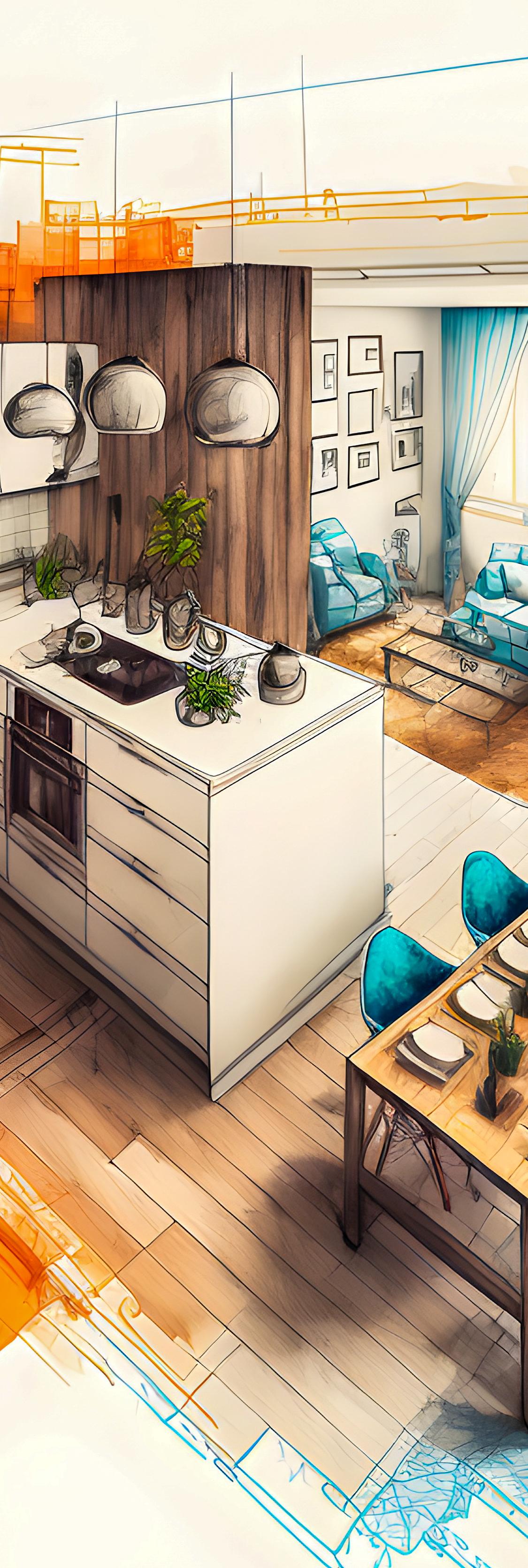
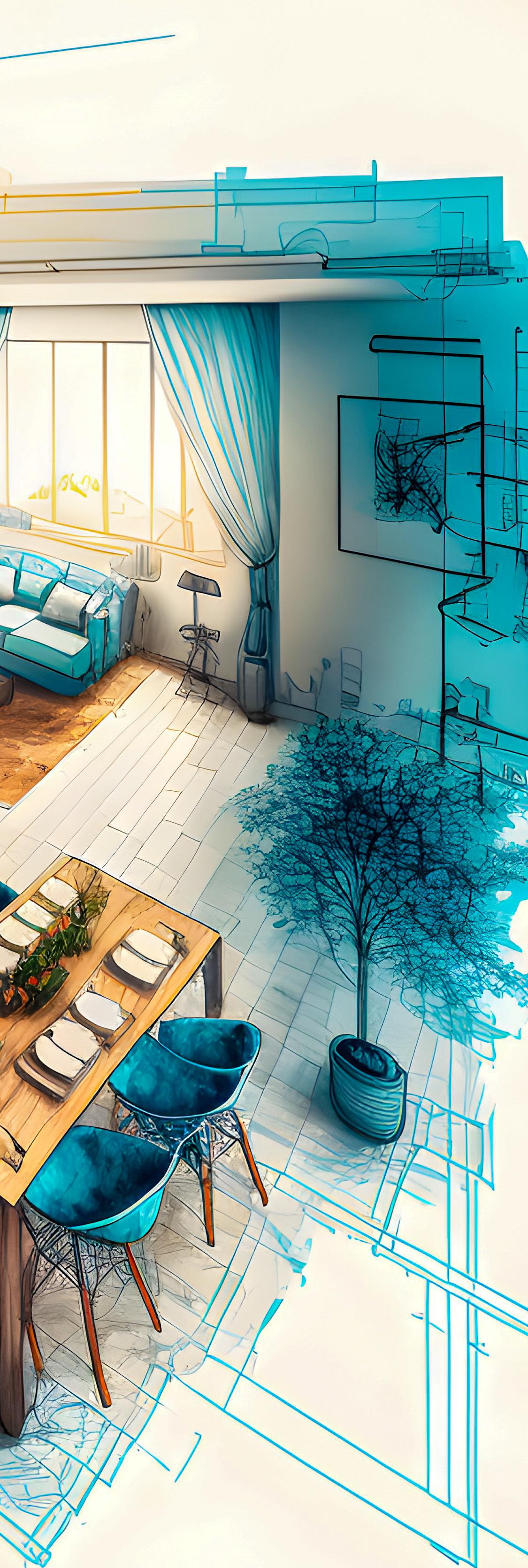
Adopt a consistent and visually appealing layout that reflects your design aesthetic. Consider a compatible font, colour palette, and page composition.
Organisation - Structure your portfolio in a logical and easy-to-follow manner. Creating sections for each project with clear headings can help with this. A table of contents and page numbering make for quick referencing. Employers will see many portfolios and may not have much time to look through them entirely, so ensure that you are making this process as smooth as possible to impress.
Project Examples - Where possible, include projects or collaborations that have been actualised. This could include work from internships, freelance projects, or instances where you have assisted a family member or friend. This experience adds credibility to your portfolio and demonstrates your ability to work within practical constraints.
Using Unlicensed images - It is important from a plagiarism perspective that you only use images of designs that you have either produced or taken yourself, avoiding stock images.
If you are incorporating images that aren't your own for research, concepts, or inspiration, then these should be clearly referenced throughout.
Too Much Text - While it is important to explain your design process, avoid overwhelming your portfolio with excessive text. Keep descriptions concise and focus on key insights.
Producing an impressive interior design portfolio is a crucial step towards building a successful career in the industry.
By showcasing your strongest projects, a variety of skill sets, and presenting your work in a graphically considered format, you can stand out within a competitive field.
The last piece of advice is to remember that your portfolio is a representation of your continuously evolving skills, so keep it fresh and up to date with recent projects.
Taking inspiration from the fashion industry, interior design colour trends often mirror the latest style influences. Pantone released their London Fashion Week Spring 2024 colour report, and we are seeing energising brights with nature-inspired shades.
Leatrice Eiseman, Executive Director of the Pantone® Colour Institute had this to say about this season’s shades. “Both respectfully considered and hyper personal, this season’s colour’s move beyond the predictable to interact with each other in powerful ways.
Drawn from daydreams of simpler times and at the same time showcasing contemporary modernity, a palette of colour where our unfettered desire for freedom and authenticity sets the rules and personal style comes without limits.”
Through our research we have selected our tutor top tones for Spring 2024. We’ve even outlined how you can integrate these mesmerising tones into your own interior spaces.
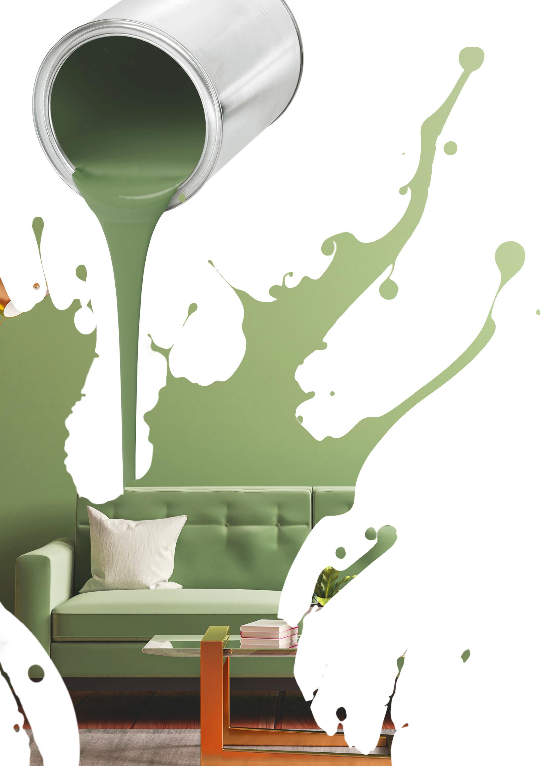
PANTONE 15-0326 – Tarragon
“A fresh green infused with notes of citrus, Tarragon displays a delicate piquancy.”
A feature wall in Tarragon Green can instantly transform a room, creating a harmonious backdrop for the entire space. Complementing Tarragon Green with neutral tones like soft whites or earthy beiges can enhance the overall balance of your design.
For those who like bold statements, don't shy away from experimenting with contrasting colours.
Pairing Tarragon Green with complementary shades such as coral, blush pink, or golden yellows can create a lively and energetic atmosphere.
When it comes to materials and textures, Tarragon Green seamlessly blends with natural elements. Introduce wooden accents, rattan furniture, or woven textiles to create a connection with the outdoors.

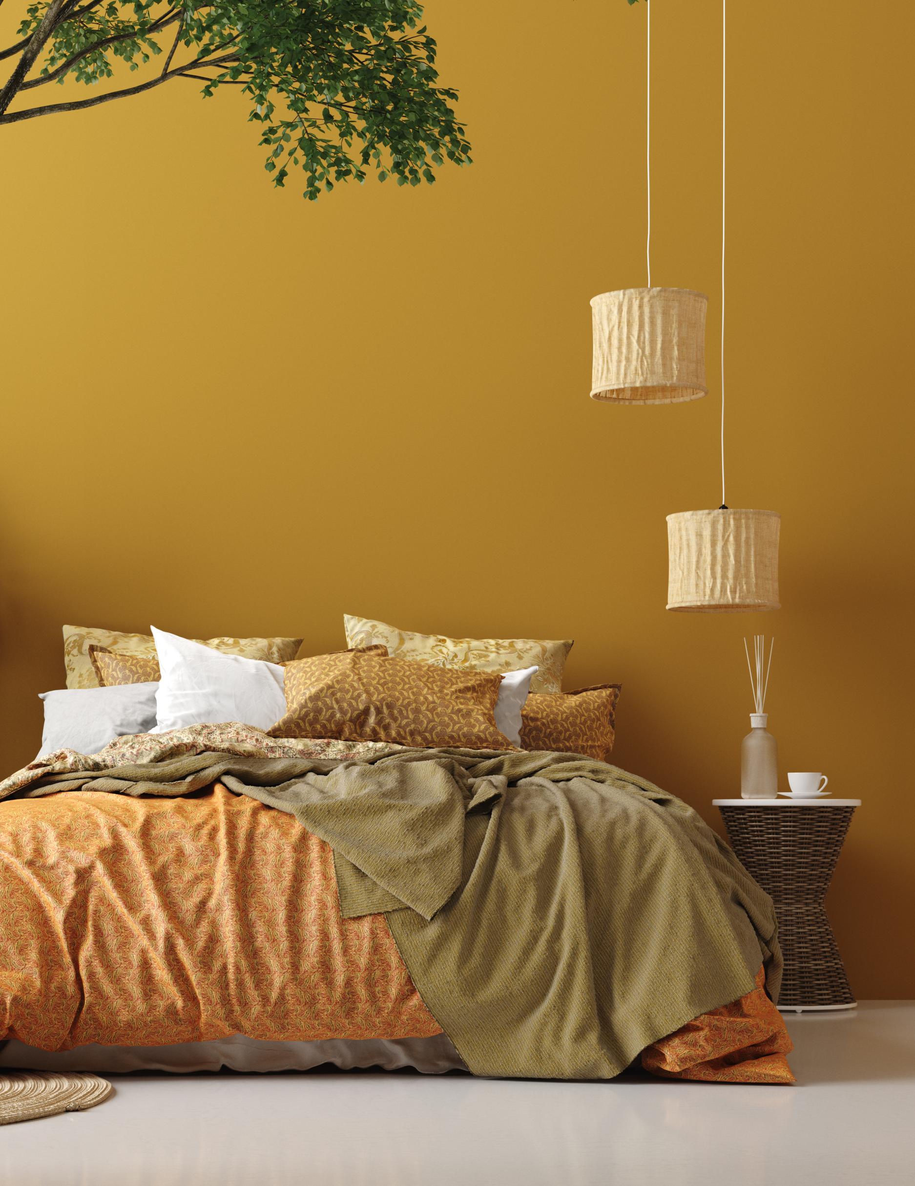
PANTONE 14-0952 - Spicy Mustard
“Pungent Spicy Mustard is strikingly exotic.”
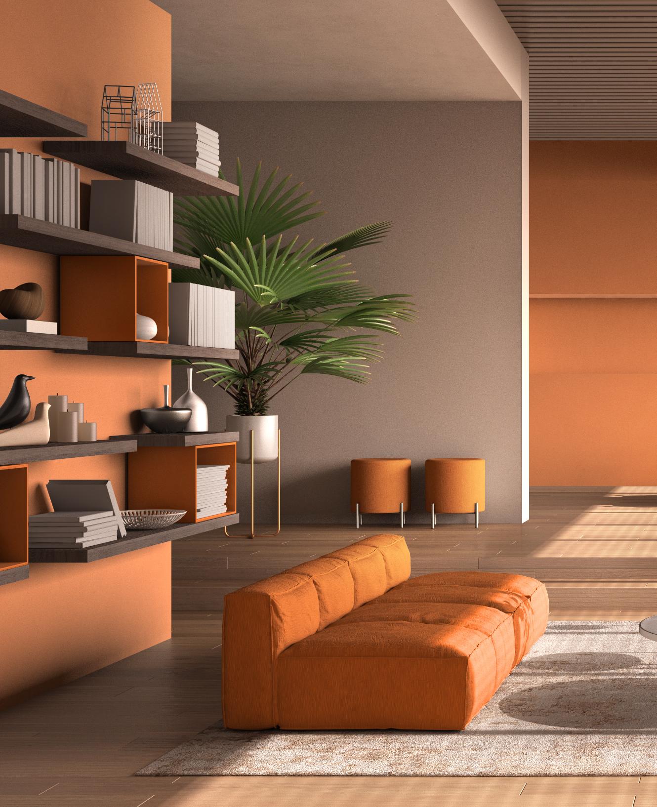
PANTONE 16-1257- Sun Orange
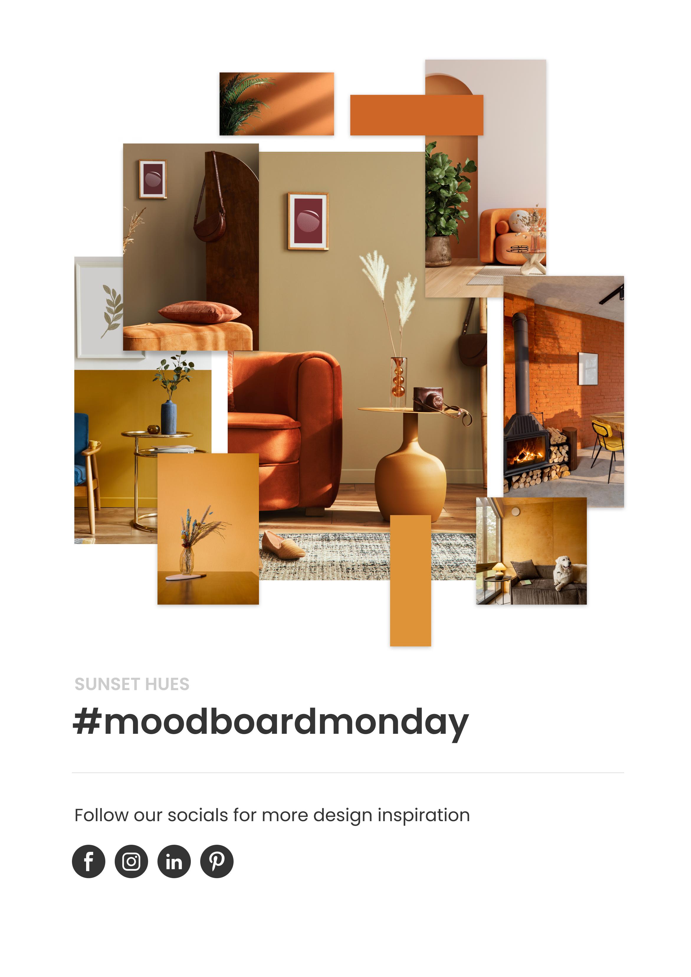
“Sun Orange, an enveloping orange reflective of a brilliant sunset.”
A vibrant colour like Sun Orange can be used across a whole wall for an energising feel. Alternatively, for a subtler approach, incorporate orange through furnishings and accessories. Think throw pillows, statement sofas, or even decorative vases. These pops of colour bring warmth without overwhelming the space.
The rich, golden hue of Spicy Mustard invites a sense of comfort and cosiness, making it an ideal choice for larger furniture pieces or textured elements like rugs and drapes.
To create visual interest and depth, consider combining orange and mustard in a complementary manner. For instance, a neutral base with mustard accents, such as a chair or throw blanket, can be enhanced with orange decorative elements.

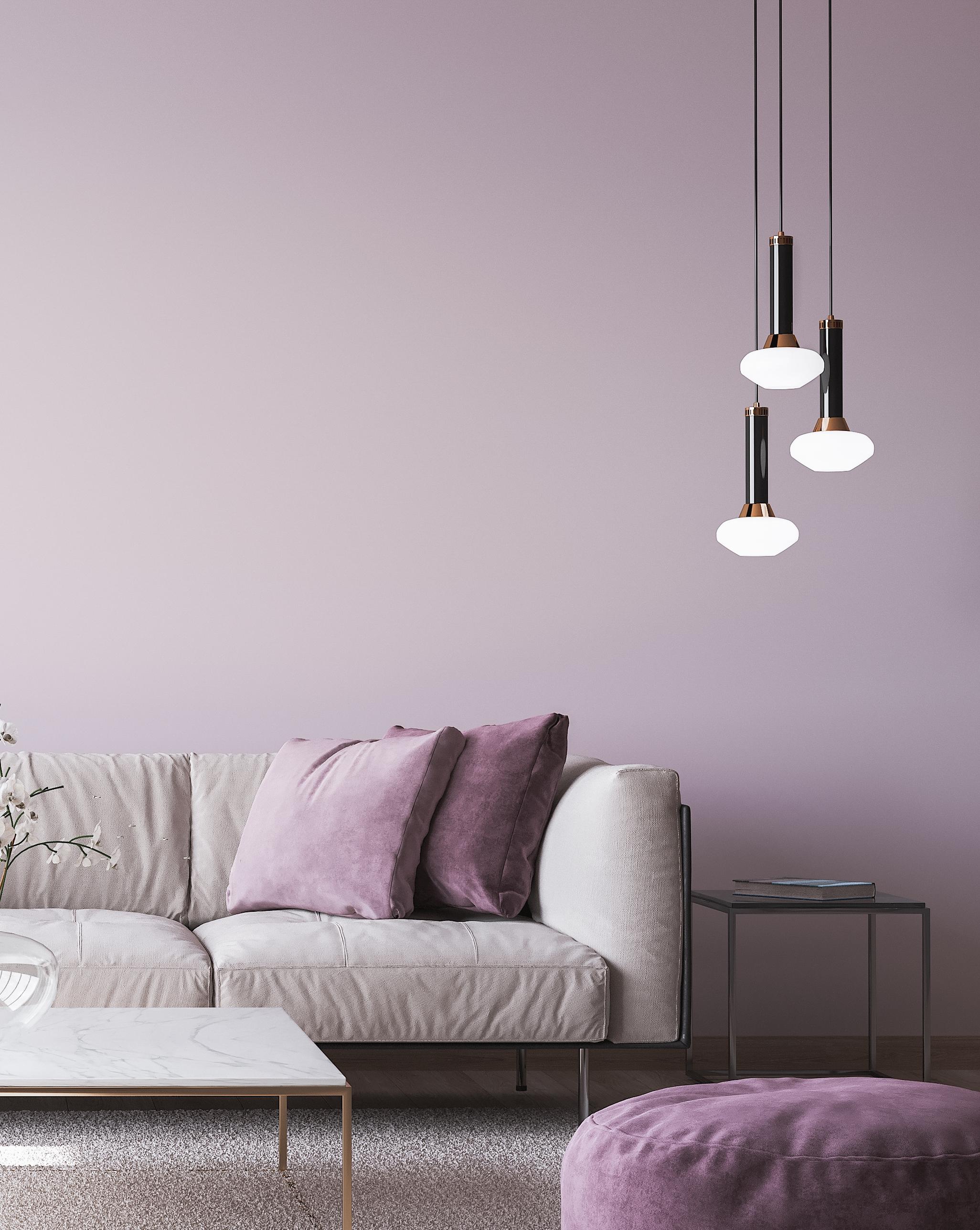
PANTONE 15-1905 - Burnished Lilac “Burnished Lilac, a tinged and smoky lavender tone with a new sophistication.”
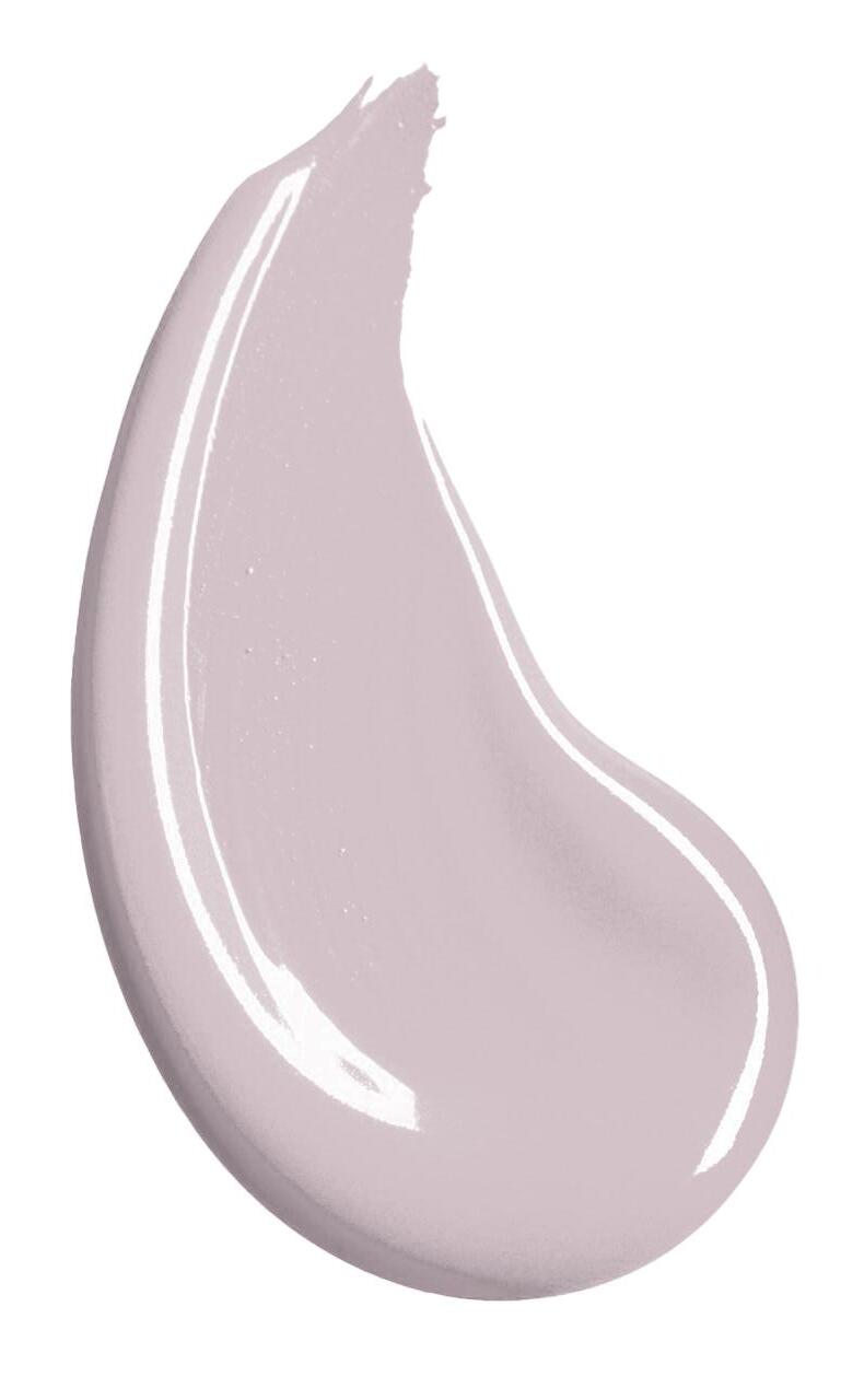
A reminder of blooming lilac bushes, this colour brings a touch of elegance to living spaces. For a focal point, consider painting the woodwork or an accent wall in a bathroom for a serene backdrop inspired by the calmness of spring. Lilac pairs well with a variety of colours, offering versatility in creating a harmonious palette.
Consider combining it with muted greens, soft blush pinks, or even gentle greys for balance. To enhance the elegance, incorporate metallic accents such as gold or brass. Think about gold-framed mirrors, lighting fixtures, or decorative accessories. This infusion of metallic elements adds a touch of opulence.

All four colours offer a balance of energising brights with tranquillity for Spring 2024 interiors. Whether you choose to make a bold statement with feature walls or subtly weave in colour through soft furnishings and accessories, any of our top tones will bring the hopeful energy of spring.




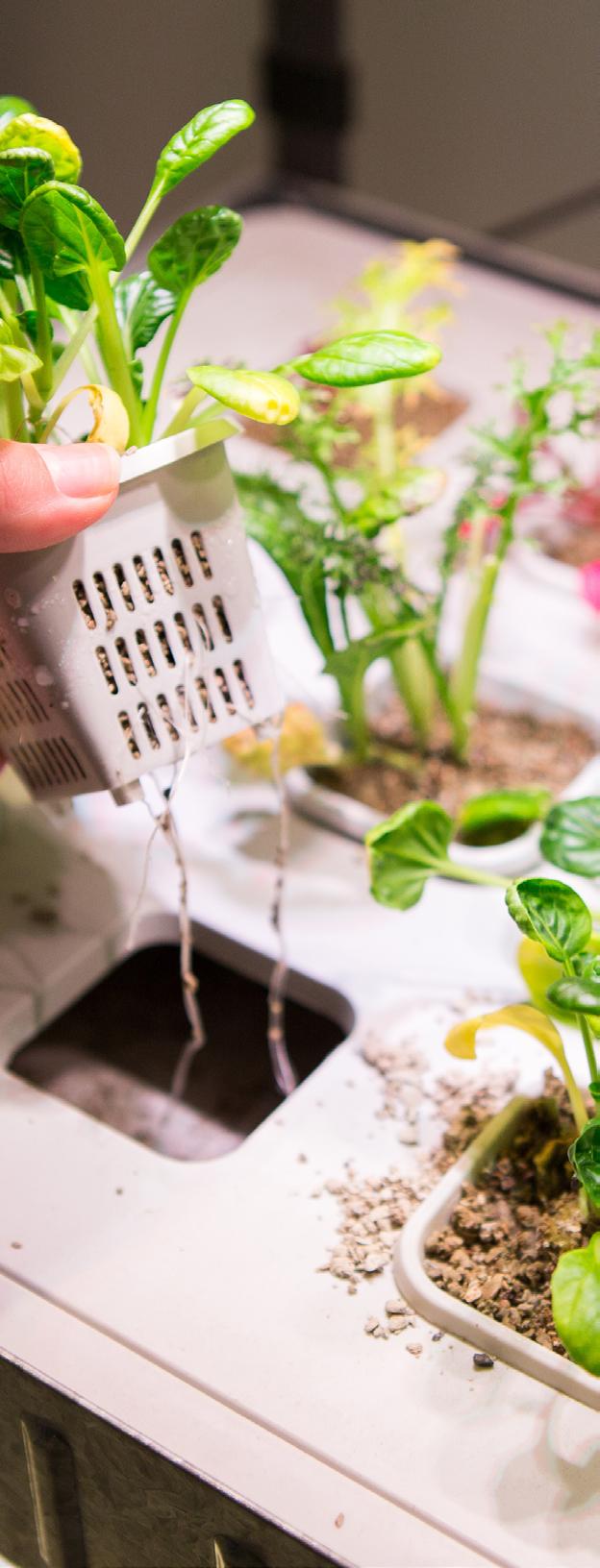
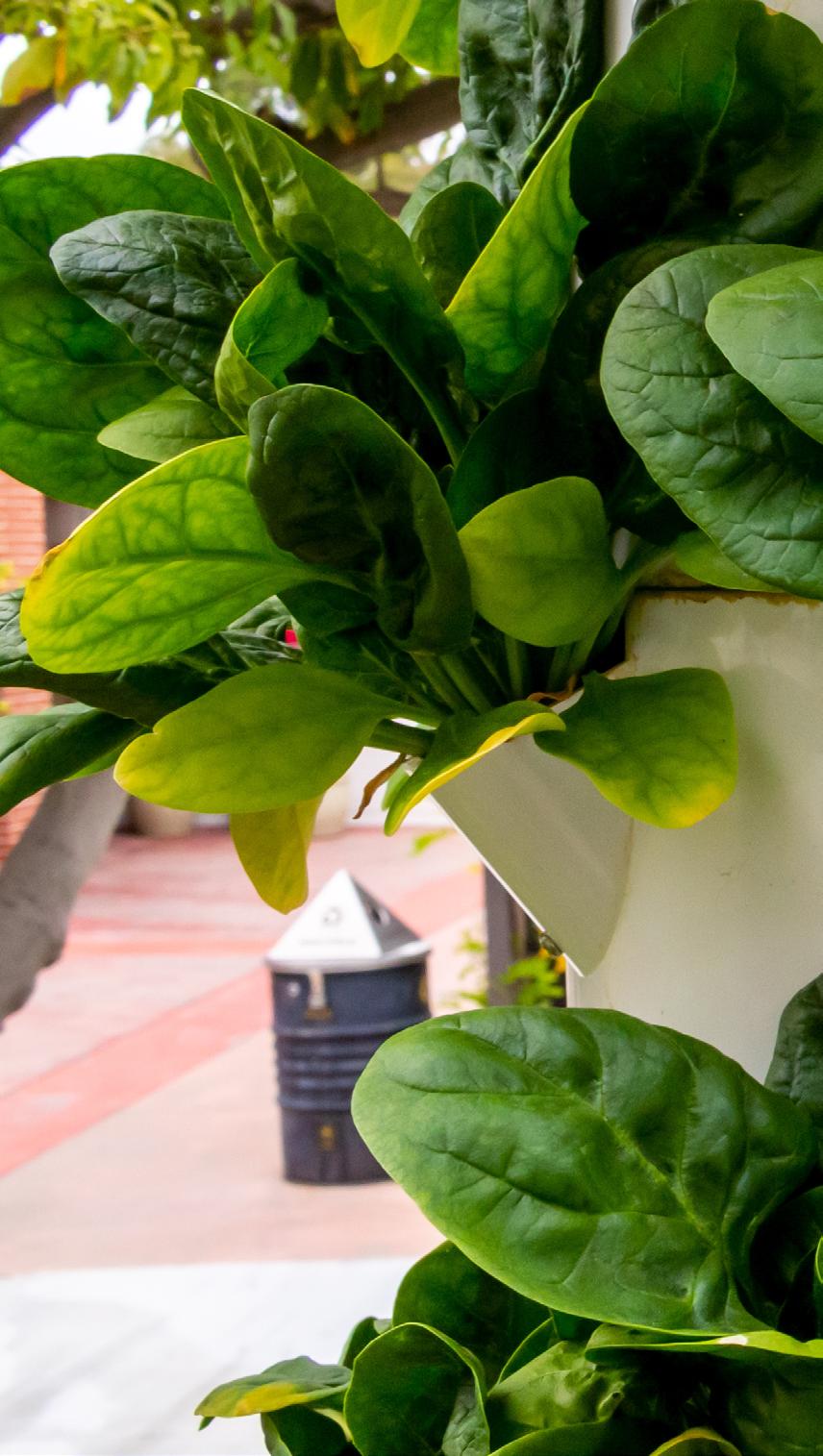
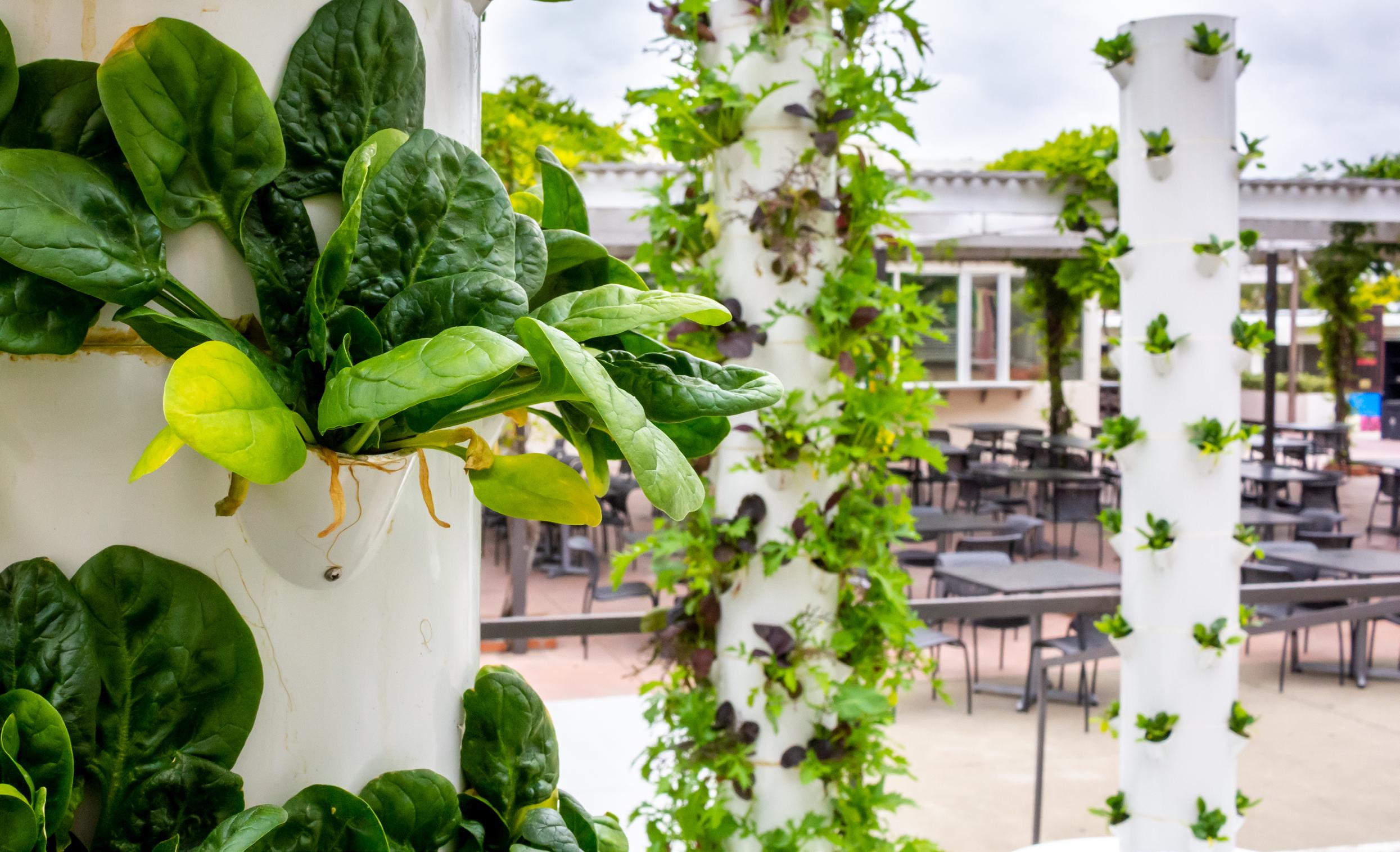
Hydroponics is a method of growing plants without the need for soil. Plants are either rooted in an alternative substrate such as rock, wool, perlite, or suspended in, or washed by, a nutrient-rich solution of water and minerals. This method can be used outside, but the greatest benefits arise from its use inside during cooler months, enabling crops to be produced all year round.
Hydroponic methods have proven to be highly efficient for growing plants, especially when space is at such a premium.
Although there is great variation in agricultural land statistics, one consistent theme arises time and time again: with rises in global population, hectares of food-producing land per capita (per person) are falling at an alarming rate.
Faced with rising global food demand, hydroponics therefore has enormous potential both in the commercial and private sector. In fact, it is already widely used in glasshouses and poly tunnels for growing salad crops.
It's even increasingly gaining popularity in the domestic market, proving particularly useful for those living in apartments or rented accommodation where a garden or allotment isn’t available.
Plant growth requires the function of many complex metabolic processes. In a traditional setting, the soil provides anchorage for the roots, giving the plant stability, and acts as a reservoir containing water, oxygen, and nutrients needed by the plant to thrive.
By contrast, hydroponics delivers a nutrient-charged aqueous solution directly to the roots, keeping plants fed and hydrated. Because roots require oxygen, the solution is aerated, much like an aquarium to allow fish to survive.
Supplemental lighting solutions can be achieved to mimic sunlight which enables plants to be grown throughout the year.
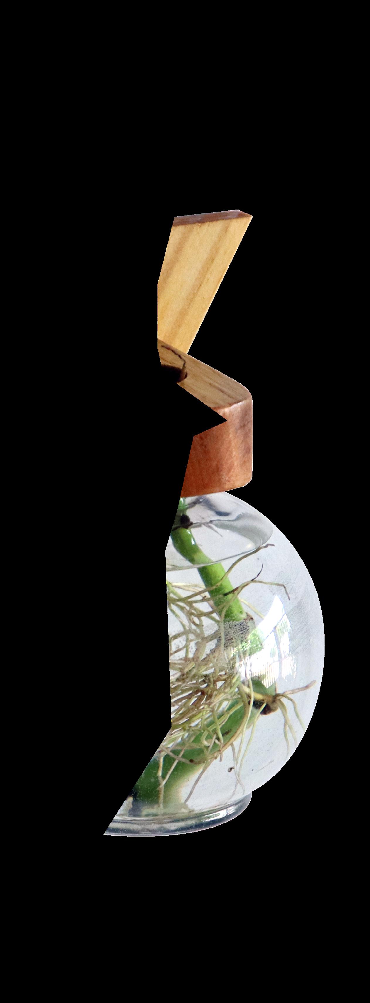
Plants can either be rooted in a soil-free substrate such as coconut coir, perlite, vermiculite, or rock wool; or suspended directly into a solution.
Active systems utilise pumps to aerate and circulate the solution, whereas passive systems have no pumps or moving parts.
Instead, gravity or capillary action delivers the solution to the plants' roots, allowing oxygen to reach them either by partially suspending the roots in the solution or drip-feeding the solution over the roots, while ensuring oxygen reaches them between regular applications.
In such systems, the solution drains back to a stock tank, from where it is recirculated until the solution is no longer viable.

The birth of modern hydroponics took place around 100 years ago, but humans have been devising creative ways of growing crops in dif situations since farming began. While some historians believe that hydroponics were used by ancient civilisations, this is very much a matter of conjecture depending upon where definition boundaries Nevertheless, there are many examples of irrigation and fertilisation methods throughout history. We’ll briefly explore them below.
The Aztecs built rafts of rushes and reeds called chinampas. These were lashed together and loaded up with organic, mineral-rich sediment from the lake bottom. Crops of vegetables, flowers, an even trees could be grown on these, and the roots were able to grow through the rafts and into the water.
The Ancient Egyptians maximised the benefits of the River Nile fl and depositing mineral-rich silt across otherwise barren land. During the dry season, they were able to grow crops with the aid of irrigation. A simple device known as a shaduf (shadoof), a counterbalanced pole with a weight at one end and a bucket at the other, was used to deposit water either directly onto the land and into irrigation channels.
The existence of the Hanging Gardens (of Babylon) is a matter of debate, although they are elaborately described in several accounts. They were thought to be built around 600 B.C. and were speculated to have been destroyed by an earthquake in 226 B.C. Their exact location is by no means certain, although it is likely that a creative solution for irrigation would need to have been found. The Greek geographer, Strabo, described the gardens as:
"The ascent to the highest story is by stairs, and at their side are water engines, by means of which persons, appointed expressly for the purpose, are continually employed in raising water from the Euphrates into the garden."
The method used could have been a chain pump; a continuous loop of receptacles (e.g. buckets, troughs, or clay pots) attached to a chain around winding gears. This device is known from archaeological excavations and texts to be in existence since around 700 BC.
In 1929, following years of research, a fascinating article appeared in a popular science journal of the time. William Frederick Gericke, while working at the University of California, grew 7.6m (25-foot) high tomato vines using hydroponics. It was claimed that a space of 2.3 m (25 square feet) yielded 136 kg (300 pounds) of tomatoes.



A similar tomato grown in soil usually produces only 3.2 kg (7 lb) of tomatoes. Similar experiments produced potatoes that grew 7 times faster than in soil. This had enormous implications for large commercial scale growing and the potential alleviation of world hunger. In fact, today, many greenhouse crops are grown using hydroponic methods.
Hydroponics offers numerous advantages. Firstly, no soil is required, which conserves resources. Despite the absence of soil, plants grow at a significantly faster rate (sometimes double the normal growth rate) and produce increased yields. This is largely attributed to the nutrient density and available oxygen in the water. Furthermore, hydroponics allows for greater planting density, while also reducing pests, diseases, and essentially eliminating weeds and the need for pesticides.
Hydroponically grown plants use 80-90% less water than those traditionally grown in soil. In traditional growing methods, water is applied to the soil, which then seeps down to the plant roots. During this process, a significant amount of water evaporates. In contrast, the water solution in a hydroponic system is recirculated multiple times before it needs changing, at which point it can be used to water and fertilise ground-based planting.
Additionally, precise control of light and temperature enables yearround plant growth. Systems can be set up for both small and largescale operations, making them suitable for inclusion on a kitchen worktop, balcony, or living wall. Installation at comfortable heights provides easy access, particularly beneficial for individuals with mobility impairments.
Hydroponic systems require expensive set ups compared to traditional growing methods. Although hydroponic costs will vary depending on size and type; both passive and active systems rely on electricity for lighting, pumps, aerators, and fans which are all pricey. On a commercial scale, it would be vital to include backup generators in case of power outages.
In a traditional growing environment, the soil offers a degree of protection from extreme changes. However, in hydroponics, in the case of inadequate conditions or malfunctioning equipment, plants can deteriorate rapidly. The same can be said for waterborne diseases, which can ravage through plants at alarming rates. There is no doubt that careful monitoring is required to maintain a successful balance of nutrients and to ensure that equipment is clean and functioning correctly.
Three hydroponic systems are suitable for beginners: wick, raft, and ebb and flow. We'll discuss each of them in more detail below.
Wick – The wick system operates through capillary action; it is the simplest of the three with no moving parts, making it ideal for growing microgreens, herbs, and peppers.
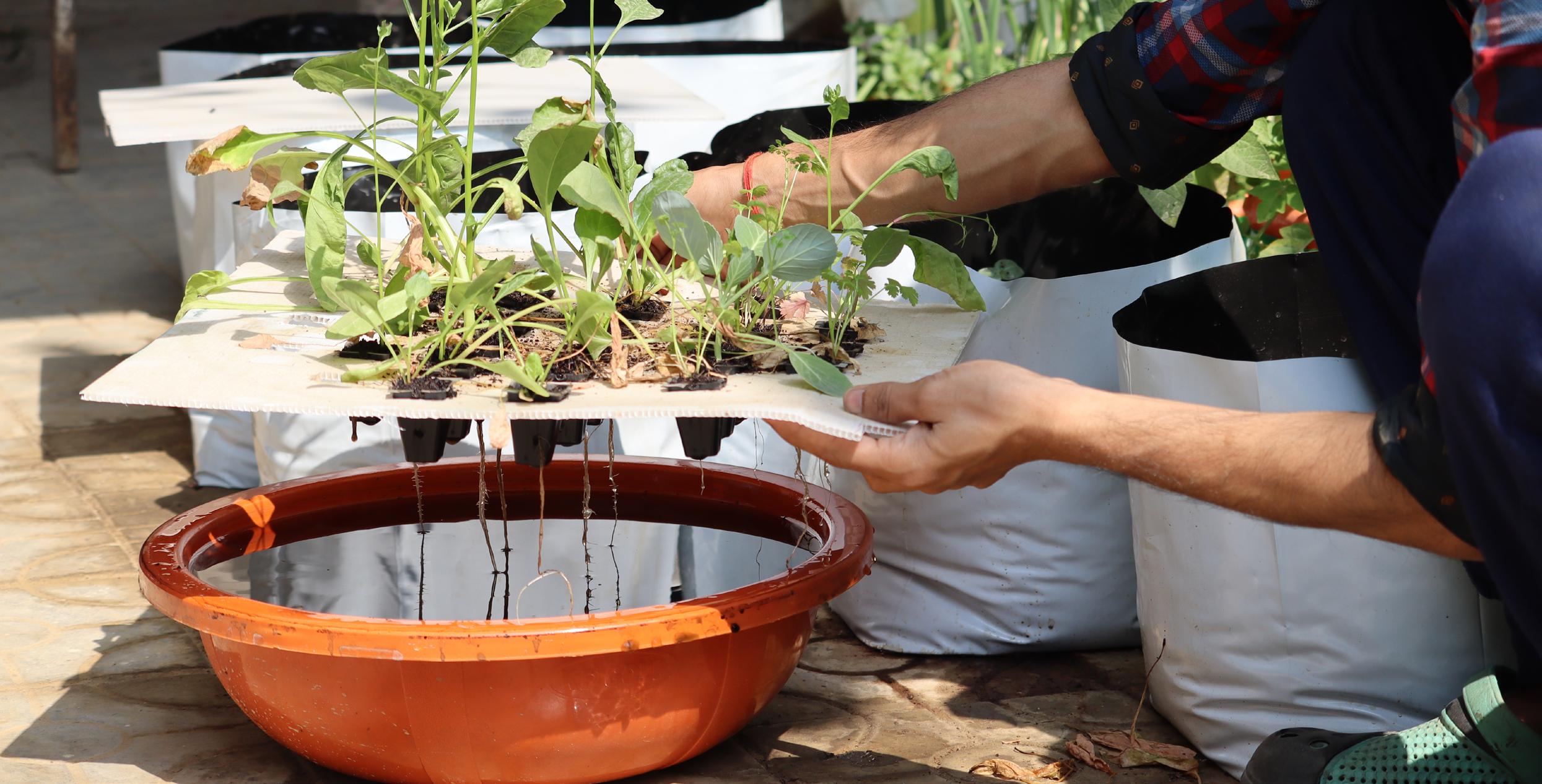
Raft – The raft system involves plants sitting on a floating platform with their roots suspended into the solution below. These systems require the use of a pump to oxygenate the water and are particularly suited for growing lettuce.
In commercial settings, rafts float on approximately 450 mm (18 inches) of nutrient-rich circulating tank water, with air bubbles providing oxygen to the roots. For domestic use, a compact raft system with an integral pump and adjustable height lighting is available. A window allows for easy monitoring of water levels.
Ebb and flow – In the ebb and flow system, the growing medium is periodically flooded and then allowed to drain away. This process may be repeated several times daily to ensure that plants receive the correct levels of nutrients and oxygen.
Typically, some of the root mat is exposed to air, even during flooding. The excess water drains away to a holding tank below for recirculation.
The nutrients can be mixed from chemicals such as potassium nitrate and magnesium sulphate, but it's easier to buy them ready-made. Vigilant maintenance is required: as water is used by the plants, the nutrient concentration in the solution increases, which can damage the plants. This can be monitored using a meter to test the solution's electrical conductivity and rectified by adding water. The solution needs to be changed approximately every two weeks and can be used to water garden soil as a fertiliser.
Monitoring pH is also crucial: an ideal level is between 5.8 and 6.2. To achieve this, a pH meter or test papers are used for regular testing, and baking soda or citric acid can be used to raise or lower the PH.
The solution will contain a mix of macronutrients (nitrogen, phosphorus, potassium, magnesium, and sulphur) and micronutrients (copper, boron, iron, manganese, molybdenum, and zinc). Experienced growers will adjust these according to specific crops and individual requirements. As with other forms of horticulture, both organic and non-organic routes are possible, while some intrepid growers even opt to make their own solutions.
While the method may seem complex, the implications for hydroponics are clear, especially when considering the vast demands on our planet. As a species, we yearn to reconnect with nature, as shown by the growing trend for biophilic design. What better way to spend the winter months than by cultivating microgreens, herbs, and salad for the table? Furthermore, the taste and nutritional value of fresh, organic food are terrific and immensely satisfying. Why not consider putting a small hydroponic kit on your present list this year?
Spring is around the corner, and soon we can bid farewell to the short days and dark winter evenings. Here are five ways in which we can maximise natural light and allow the sunshine to pour into our homes. Start by giving your windows a good clean. You'll be surprised at the difference simply washing the glazing and window frames will make, and how much brighter everywhere will look!
Foliage is an easy way to bring a springtime feeling into your home. A pot of spring bulbs, such as hyacinths or daffodils, or a vase of tulips, is a great way of bringing in colour and fragrance. If your windows allow, think about adding hooks to the top of the window recess and hanging jars filled with cut flowers.
When you’re considering what changes you want to make, consider the purpose of the room. For example, a room with great views or one that connects with the garden doesn’t want to be obscured by heavy window treatments. Maybe it’s an east-facing bedroom that receives early morning sun; therefore, having options to block out light will be a key factor. A room that receives a lot of light throughout the day may benefit from multi-layered options such as curtains and blinds, which will provide light control flexibility.





Over the darker months, we’ve become accustomed to drawing the curtains or pulling down the blinds and hibernating away. Now it's time to pull back the curtains and let the light in. There are numerous designs of holdbacks and tie-backs that can easily be added to any windows. These can be especially beneficial for north-facing rooms or rooms with small windows.
Jim Lawrence has a beautiful wrought iron holdback, which is a simple yet stylish way of draping the curtain off the window, allowing it to stack neatly against the wall. Alternatively, you can opt to use a matching tieback for your curtain; Laura Ashley has lots of collections to choose from. Alternatively, if you fancy using something different, use a leather tieback, which looks lovely against a country-inspired interior.
If you’re not a fan of curtains, blinds, or any other type of window treatment for that matter, adding frosting to the glazing could be the answer. Brume and Purlfrost offer a wide and varied range of styles, patterns, and colours, making their products suitable for both contemporary and traditional properties. This is the perfect way to add interest to a bland or boring window or to a window that requires privacy.

You may fancy the idea of having a complete change, and what better way to do this than by taking down your existing curtains or blinds and packing them away for the summer. Think floaty delicate fabrics such as cotton, linen, and muslin that can billow in the spring breeze.
Soft neutrals, warm beiges, and muted pastels will sit seamlessly against any window. The beauty of these sheer drapes and blinds is that they will diffuse the sunlight in the parts of your home that get midday sunshine and offer an element of privacy to those rooms that need it, such as bedrooms.
Alternatively you may prefer something simpler in the style of a sheer roller blind. When pulled up it virtually disappears, blending in with the colour of the surrounding walls and window frame.
When decorating windows in a bedroom, light is one of the major concerns as not everyone wants to get woken up at the "crack of dawn." Fitting a Roman blind inside the recess will help prevent morning light from entering, and with the addition of blackout lining, this will solve all problems.
To soften the hard edges of the window reveal, why not add a sheer curtain, but draw this back onto one side and secure it with a delicate beaded tieback, allowing the fabric to gently drape and puddle on the floor.
For those rooms that have large expanses of glazing, such as the bay window in a living room, natural bamboo or rattan-style blinds can work effectively when combined with lined curtains. Sunlight can discreetly work its way into the room through the woven natural fibres of the blinds, and during the colder months, the heavy-lined curtains will offer insulation and stop any heat from escaping.
What better way to brighten up a room than to add a splash of colour! Maybe your room is looking outdated and ready for a refresh. A simple way to do this is to change some of your accessories.
Swap your winter textured wool and velvet cushions for more delicate fabrics such as cotton and linen and opt for brighter and bolder colours such as cerise pink, zingy yellows, and greens. Blend large and small floral patterns together to create impact. Pack away heavy knitted throws and replace them with lightweight cotton for those chillier evenings.
For those of you who are feeling much more confident, why not choose a combination of different fabrics to create real impact? To successfully achieve this, start by selecting 3-4 colours. It’s a good idea to incorporate 1 or 2 plain fabrics with your selection and then choose fabrics with both large and small-scaled floral designs to create interest.
The key to this working successfully is to mix and layer up fabrics, combining a range of textures. These might include silk, linen, cotton, and velvet. If you want to create more of an impact, explore mixing up different patterns. Who would have thought mustard yellow diagonal-striped curtains would work with floral wallpaper?
Colour expert and interior designer Sophie Robinson has collaborated with Harlequin and designed a range of fabrics incorporating floral and leafy designs alongside basketweaves, vertical stripes, and diagonals in her signature bold and vibrant shades of pink, blue, yellow, and orange colourways. What better ways to celebrate and embrace Spring 2024?

Make sure you secure your spot for this summer! Take a look at the courses we have lined up. Can't find a time that works for you, or have questions? Reach out to our team at 01159 123 412

•
•
•
•
•
•
•
•
Diplomas
Professional Soft Furnishings & Curtain Making
Read More
• 12 Weeks Online
• In-studio Week 1: 20th to 24th May
• In-studio Week 2: 1st to 5th July
In-Studio (UK) Nottingham
Professional Interior Design
Read More
• 10 Weeks Online
• In-studio Week 1: 10th to 14th June
• In-studio Week 2: 22nd to 26th July
In-Studio (UK) Nottingham
Professional Interior Design
Read More
• 14 Weeks Online
• 21st June to 1st October
• 6pm to 8.30pm
• Tuesday & Friday (UK) Online FastTrack
Degrees
BA (Hons) Interior Design
Read More
• Start Anytime
• 3 Years Flexible Study
BA (Hons) Heritage Interior Design
Read More
BA (Hons) Retail Design
Read More
• Start Anytime
• 3 Years Flexible Study
• Start Anytime
• 3 Years Flexible Study
BA (Hons) Design for Outdoor Living
Read More
• Start Anytime
• 3 Years Flexible Study


