Role of Materials in Space making

Expression in works of Ar. Poppo Pingel.
Guide : Atreya Bhattacharyya Student : Nishit Gandhi - IU1743000015 July 2022
 Role of Material in Space making : Works of Ar. Poppo Pingel.


Expression in works of Ar. Poppo Pingel.
Guide : Atreya Bhattacharyya Student : Nishit Gandhi - IU1743000015 July 2022
 Role of Material in Space making : Works of Ar. Poppo Pingel.
I would like to express my gratitude to everyone who has helped me and supported in the course of the process of my thesis as well as during my academic years.
To begin, I would want to express my gratitude to my guide, Prof. Atreya Bhattacharya for believing in my interest in the field and guiding me thoroughly with complete dedication and for the regular discussions which have been very insightful and helpful for me to form the thesis.
I would also like to thank the IDEA department and all the faculties for giving me this opportunity and platform of learning and for guiding me at different courses of time. I would like to pay my special gratitude to all the people from auroville who have helped me to gather data which helped me to formulate the thesis.
I would like to specially thank Ar. Mona Doctor - Pingel and Ar. Poppo Pingel for their valuable time and support in auroville. I am also thankful to Mr. Mirao Pingel , Mrs. Helga Pingel and Mrs. Davaselvy for allowing me to visit their place.
I am also thankful to the people who reviewed my work,and cleared all my doubts and provided me with various learning opportunities, Bhairavi Kikani and Rushank Patel . I would also like to express my gratitude to my fellow classmates and the people who helped me out when I was stuck and for being there throughout the process, Sanjay , Abhi , Muskan , Bhruvi , Navneet , and Manit
Finally, I would like to thank my parents , my sister , my entire family and Sanjay’s family for always supporting me and believing in me through all these years, without their patience and support this might not have been possible.
Materiality in architecture has been able to determine structural stability, and visual identity by the aesthetic, and tactile aspects. It is also associated with social, cultural, and historical significance. Materiality also combines architectural expression, which refers to the medium to communicate the designer’s intent, which helps in better experience and aesthetics of space. Today, to develop concepts or designs that enhance the quality of space more effectively and efficiently, architects have used material as a medium to communicate.
The use of the material as an expression also incorporates individual ideology and philosophy along with the architects approach and sensitivity towards space making. Therefore, the use of materials as an expression will vary for each individual. The focus of the study is to investigate the impact of the materials in space making as an expression in terms of spatial experience and its articulation. The character of the building is mainly based on the functions and the arrangement of the elements. It is seen that every architect has a way of approaching the use of materials in their design. Ar. Poppo Pingel also talks about the use of the material as a holistic approach to design and not only to develop aesthetics. The study has been conducted on his design philosophies related to the use of materials in space making as an expression.
The attributes of the material define space, structure, form, and its visual appearance. Each material has limitations that have an impact on its structural characteristics and design elements. The tactile qualities of the material contribute to the perception of space and play a significant role in the creation of a holistic experience. Thus, the study has been modulated into four major aspects of material expression that suggest Ar. Poppo Pingel’s materiality philosophy as an expression,i.e., Formal expression, Structural identity, Spatial expression, and Details. The inference of the study demonstrates the way in which Poppo has explored different materials to achieve form, structure, space, and details and how his background in carpentry comes to and fro while designing spaces.
Chapter 1 - Introduction
1.1 Introduction
1.2 Aim and Objective
1.3 Objective
1.4 Primary Question
1.5 Secondary Question
1.6 Scope and Limitation
1.7 Methodology
Chapter 2 - Architect Poppo Pingel
2.1 About Ar. Poppo Pingel
2.2 Early Life Poppo Pingel
2.3 Influences
2.4 Architectural Philosophy
Chapter 3 - Role of Materials
3.1 Role of materials in architectural design.
3.2 Impact of materiality and space: Works of Poppo Pingel.
Chapter 4 - Role of materials in aspects of space making
4.1 Formal Expression 4.2 Structural Identity 4.3 Spatial Expression 4.4 Details 4.5 Inference
Chapter 5 - Analyzing Case Studies
5.1 Criteria for selecting case studies.
5.2 Case Study 1 - Miraonevi Nivas
5.3 Case Study 2 - Mukuduvidu and Studio Naqshbandi
5.4 Case Study 3 - Udavi School
Chapter 6 - Summary
6.1 Inference 6.3 Annexure Bibliography Illustration Credits
6.2 Conclusion
1-4 1 2 2 2 2 2 3 5 6 7-8 8-9 10-12 13-14 15-17 18-20 21-24 25-26 27-28 29-32 33-60 61-88 89-116 117-120 121-122 123-126
5-9 10-14 15-28 29-116 117-126 127-130 131-132
Today, architecture is visually identified by aesthetics and materiality, with the latter being particularly important to the authenticity of the design. The Architect’s visual language and expression are accomplished by material use and detailing; materials complement the form, engage users, and offer depth and richness to the building. It is the architect’s ideology that reflects in their approach.
Material is considered an integral part of the design process. Some architects work with the same materials as they found fundamental meaning in it and some choose specific materials as their approach to design. For example, most of the work done by Lauri Baker is in exposed brick. He says that “I learn my architecture by watching what ordinary people do; in any case, it is always the cheapest and simplest because ordinary people do it” [1] . He believes in designing as per varying cultural patterns and lifestyles of people which is responsive towards the use of locally available material and expresses itself in many different forms. For him form was not his initial approach to designing, it gets developed gradually from its location, function of the building, and arrangement of elements.
The study helps to understand the role of material in architectural design and the aspects that define the expression of the building. To understand the expression, it is important to understand the architect’s philosophy and ideology in relation to materiality. The study will be conducted through the work of Ar. Poppo Pingel, who has his own set of principles and different approaches toward the material.
As per Poppo Pingel, “ Aesthetic is developed from material and not the other way around. Art or architecture that is not rooted in, or honest to the material and its craftsmanship - form for the sake of form- does not excites me” [2] . He does not believes in trends but does what is best suited with the best resources available. The study aims to learn Ar. Poppo Pingel’s ideology in the expression of material and space-making and will focus on architects design intent and its manifestation with the elemental expression of material in developing form, structure, spaces, and details.
1. Laurie Baker - Life, Work and Writing, Penguin Books (New Delhi).
2. Auroville Architects Mono Graph series Poppo Pingel, Mapin Publishing pvt. Ltd ( Ahmedabad ), Pg.25 .
The study aims to understand the role of material in space making through the works of Ar. Poppo Pingel.
• To understand the architect’s philosophy and its manifestation in the building.
• To identify the important aspects that contribute towards the space making.
• To identify materiality aspects in architect’s philosophy.
How has Ar. Poppo used the expression of material to manifest his ideas of space making?
• What are the design approach and ideologies of Poppo that evokes his architecture?
• How material expression contributes in his space making?
• What are the characteristics of material used as a medium to give expression to space in Poppo’s architecture?
This dissertation will focus on the manifestation of intent and approach of Ar. Poppo Pingel in his architecture. The study includes research about role of material in architectural design through secondary sources. The analysis conducted would help to understand architect’s way of using material in his space making as an expression. The selected case studies are based on availability of drawings and possibilities of site visit. Study will be conducted through architectural drawings, diagrams and images .The study will not focuses on process of procuring the material, calculation of cost efficiency while designing and the context of auroville. Architectural drawings of case study are re-drawn from the original drawings provided from Studio Naqshbandi, Auroville.
Architects approach through materiality in space making.
Understanding the early life of the architect.
To know the early influence on architect’s architecture.
Going through architects Design Philosophy.
Literature review Collecting data
Literature review of books and articles on Ar. Poppo Pingel
Role of materials in architectural design.
Looking at impact of materiality in space through works of Ar. Poppo Pingel
Literature review of articles and books to establish the aspects of study.
Role of materials in aspects of space making
Establishing major aspects seen in works of Ar. Poppo Pingel with respect to materiality. Creating frame work for analyzing the established aspects.
Interpreting his work from material point of view, by reading articles and books. Through other building / other architects examples and articles.
Miraonevi Nivas
Mukuduvidu
Udavi school
Applying the understanding of above read literature, analyzing the projects.
Through diagrams, architectural drawings, axo, and photographs.
Inference
Conclusion
Role of Material in Space making : Works of Ar. Poppo Pingel.
Ar. Poppo Pingel is originally from Germany. He was born in 1942, in a small village, Oestinghausen, near Soest, in northwestern Germany. Before architecture, he did his apprenticeship in carpentry. After completing his education from Germany in architecture he came to India to Auroville in 1968, at the age of 26. Since then he is practicing architecture in Auroville. His designs are like him simple and straightforward.
There is a rustic quality, a sense of playfulness, poetry, and elements of surprise that reflect his nature. He likes to be the master of his own time. He does archery, archaeology, painting, calligraphy, and, health and healing. Poppo enjoys his own company and nature, in his unique way and does not follow the trend. He does not use a cell phone, computer, or Laptop, and likes to do things in the old forgotten ways, reusing the thrown away things which people think are waste.
“His work has been compared to Geoffrey Bawa’s, the Sri Lankan architect (1919 -2003), as to how he designed outdoor-indoor spaces, of the garden and a series of rooms” [3] . For both of them, being practical and honest in design is an internal process. Climate of both the places are almost same, thus the approach of design tends to be same. Bawa’s approach had sensitivity towards local context which combines with the form making principle of modernism. This led in developing new architectural identity and aesthetics for many tropical aesthetic.
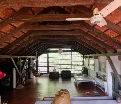
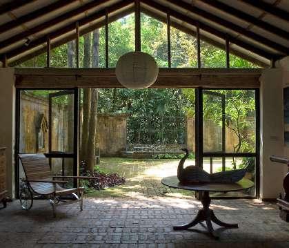
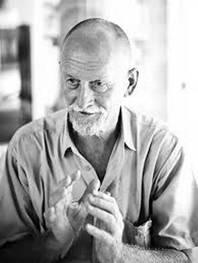
fig 2.1.1.
fig 2.1.2.
fig 2.1.3.
Poppo spent his early years in his village’s 200-year-old timber-framed house. This was the perfect place for him to improvise, play, fantasies, and dream, and it helped him develop his particular relationship with nature and materials as an architect. Born into a family of malers, expert house painters, and locksmiths, he learned the value of craftsmanship early on. Poppo and his family eventually relocated to Muenster, Germany, where his mother remarried an architect. He was the source of my desire to become an architect.
From 1957 until 1960, Poppo worked as a structural carpentry apprentice. As a result, he learnt to value material, the importance of detail, and respect for experience and on-site personnel during the most crucial years of his life. Poppo completed his education at the State Engineering Institute for Building Sciences for three years.
He arrived in India in 1967 and began his career as a teacher at the School of Fine Arts and Architecture in Hyderabad, where he taught design, building construction, and freehand sketching. He utilized Samanvaya Ashram as his headquarters in Bodhgaya, and he was tasked with digging wells and constructing a small house in the Bihar forest that would function as a school. Electric poles and asbestos sheets were the materials to be used.
During the inauguration of Auroville on February 28, 1968, Poppo placed German soil in the urn. There were 5,000 persons from 124 nations in attendance. Poppo was chosen as Germany’s representative. He recalls seeing Golconde, a dormitory for Sri Aurobindo Ashram’s disciples, when visiting Pondicherry ( 1937 -1945 ). He sees it as an example of pre independence India’s finest modern functional architecture. It’s also a fantastic example of climate adaptability and material usage.
fig.2.2.1. Ar. Poppo Pingel digging wells with the locals in bihar.
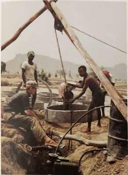
fig.2.2.2.Poppo constructing simple structures out of electric poles and asbestos sheets.
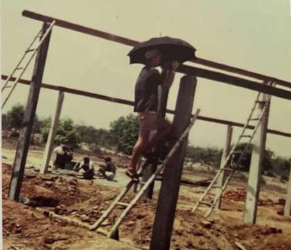
fig.2.2.3. Image of Golconde ashram.
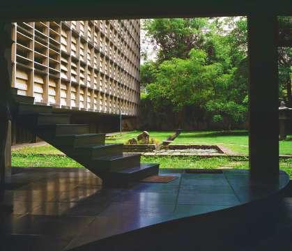

Poppo after spending his three years in carpentry as an apprentice, worked as a draftsman for six months in a reputed office, followed by six months as a trainee for masonry and concrete works on a site. He worked for Baak and Broeskamp Architects in Muenster well known for restoring churches and historical pubs. He describes Herr Baak one of the principal architects of the office as “Cigarette in left hand and a thick 6B in his right, he would draw with fluidity and Elegance” [4] . Their mastery in drawing influenced Poppo to turn to sketch and calligraphy.
After completing his graduation in 1964, he joined the reputed firm in his hometown. Paul Bonatz believed in “ the importance of giving a clear understanding of that which is necessary, to show the structure in a pure manner, at the same time differentiating between Form and Function” [5] Their firm was based on strong engineering and extensive use of the RCC frame structure. Working with them for two years, Poppo refined his sense of materiality, order, perfection, and detailing.
After coming to India in 1967, he visited Auroville and found a place similar to his thought process. For him, Golconde evoked the thought of minimalism not as bareness or poverty, but as the clear and conscious use of material. After seeing Poppo’s project one can wonder what impact Golconde had on Poppo’s approach to architecture. The first principle taught to all architects is to start with the local situation and enable the structure to take the most logical shape based on that situation. Japanese architecture teaches us to value the natural substance and surfaces of the material and avoid artificial finishes and false imitation. Poppo’s architecture reflects the Japanese sense of detailing, craftsmanship, perfection, and working with corresponds to the nature of material that comes naturally to Poppo. Traditional Japanese architecture reveals its essence of process by which it was made, and logic of joinery with a profound simplicity of structure [6] .
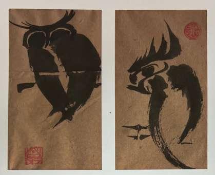
fig.2.3.1
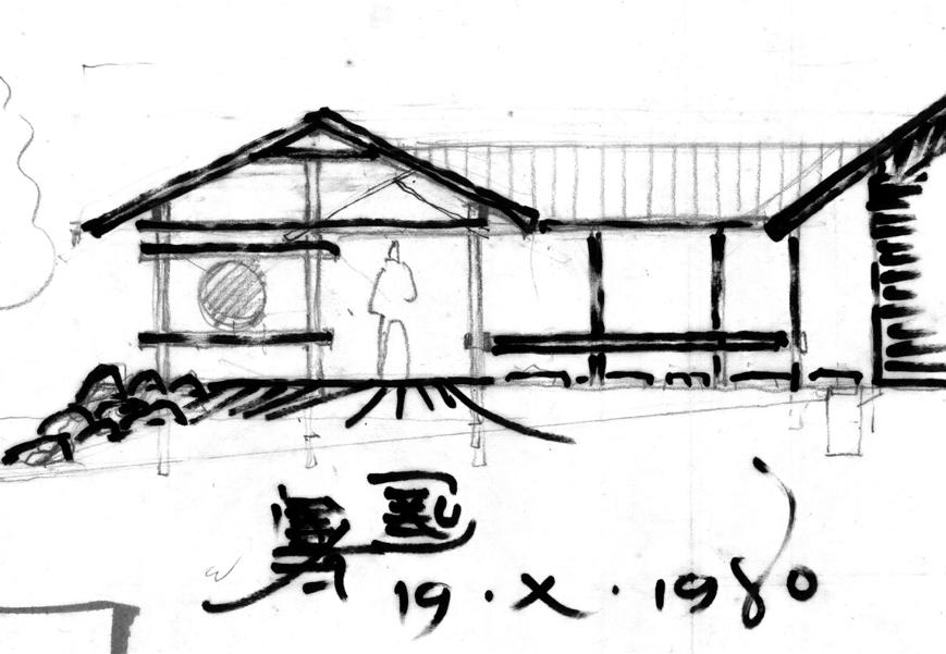
fig.2.3.2
4. Auroville Architects Mono Graph series Poppo Pingel, Mapin Publishing pvt. Ltd ( Ahmedabad ), Pg.28.
5. Auroville Architects Mono Graph series Poppo Pingel, Mapin Publishing pvt. Ltd ( Ahmedabad ), Pg.28.
6. Auroville Architects Mono Graph series Poppo Pingel, Mapin Publishing pvt. Ltd ( Ahmedabad ), Pg.81.
The finer details reveal a thorough understanding of the nature of materials gained through years of work and experience. According to Poppo, Japanese carpenters had developed their talents in recognizing wood for its smoothness, durability, grain pattern, infinite variety, and graceful aging and renewal patina. The intense process of producing and working inspires the Poppo design process.
Poppo’s architecture lies between the plastic and the elemental, the sensory and the rational. He works with structural clarity, basic design and details, clear unmistakable visibility of building parts (everything exposed), and the harmonious composition of building materials in response to their nature, as he comes from a traditional carpentry background. He believes that materials develop aesthetics rather than the other way around. For him, art and architecture are only created for the sake of producing if they are not obvious and justified, and that does not inspire him.
According to Poppo, architectural recipients should have the following characteristics: clarity in design - a clear overview of design in a single brushstroke, honesty in the structure - everything is revealed and nothing is hidden, spaces related to human scale, nurturing the senses, giving the spirit space to breathe, and, if projects allow, pointing to the spirit itself in its simplicity and playfulness while avoiding dirty corners. When the majority of criteria are met, beauty emerges naturally. Poppo claims that his inspiration for the projects comes in two forms. The first method is to visualize ideas on the forehead while the eyes are still closed in the early morning. Or it’s as if the idea for a need was already there, and now it’s just a matter of solving the problem with pre conceived thoughts.
fig.2.4.1. Sketch for an 8 -meter dragon, bas-reflief in concrete for school library, Germany, 1969.
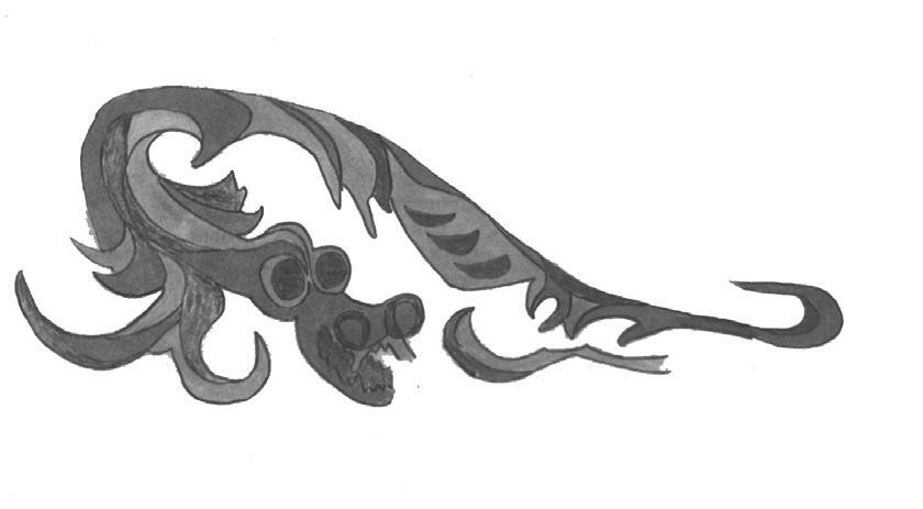
fig.2.4.2. Rammed earth mold and technique - sketches from the book, Rural India: Village Houses in Rammed Earth, 1979.
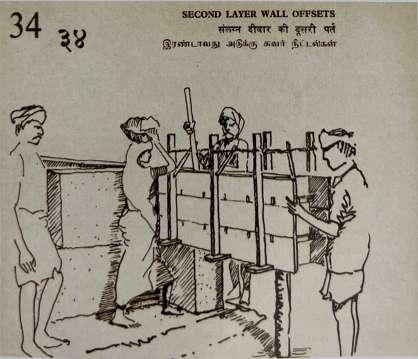
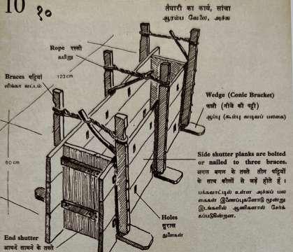
Sketching for Poppo happens later and is used to translate the concepts into an aesthetically pleasing form. He believes that sketching only as a search for form is meaningless without thoughts. Ideas can sometimes lead themselves in accordance with scale, material nature, climate, workmanship, site functions, and the distinct power of money, eventually blossoming into a harmonious whole. In the early stages of the design, detailing is critical to the overall success of the project. It’s a never-ending backand-forth from the tiniest detail to the grander scheme. His sentences are rich in detail as a result of his life experiences.
Poppo limits him self from advance communicating technologies i.e. computers, television, and telephones. He is a firm believer in his fountain pen, his loved once, and health insurance. He believes that as long as one believes in oneself, one can always act. Working with hand drafting as a medium, his analysis, conceptualization, and design become interwoven, much like a craftsman’s technique. “ There is no doubt that our design instrument determines the forms we make” by Juhani Pallasmaa (Pingel)(2012).
Poppo decided to work alone, with contractors he knows and trusts. ‘Small is beautiful,’ he believes. This allows him to explore, travel, and be in charge of the entire project’s design, structure, and oversight. The decision to combine different materials becomes easy when there is no division of labour. Analysis, concept, design, and structure become physically linked to one another, much like a craftsman’s working process.
7. https://www.coa.gov.in/show_img.php?fid=181#:~:text=The%20building%20material%20affects%20the,of%20the%20building%20 material%20used.
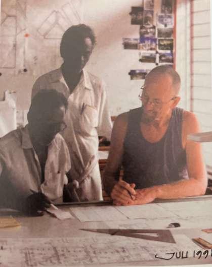
Building material forms an integral part of the architectural design. The type and form of the structure can be determined from the building material. The concept of building material glorifies stability and visual aspects of design. It does not only enhance the character of the building but also express the aesthetic quality of a building [7] .
Important aspects of building material in architecture:(Das) (2014)
• Establish a relationship between visual quality and structural stability.
• Select the appropriate technique of construction.
• Provide character and visual appeal to the structure.
• Decipher the time and era of construction of a building.
• Trace the evolution of the art of construction.
• Mix aesthetic elements with practicality.
• Highlight the theme and concept of design of the building project.
• Determine the appropriate site for a project based on availability of material and suitability to the design.
• Determine the budget of building projects.
• Establish a relationship between quantity and quality.
The usage of construction materials in the structure’s design is symbolic of its existence. In architectural design, it aids in establishing a link between visual excellence and structural integrity. An architect’s choice of building material directs architectural practice and construction.
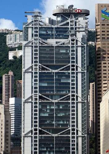
For example, HSBC bank in Hong Kong shown in (fig.3.1.1) is the example of architectural design, with visual excellence and structural integrity. While the building’s floors are cantilevered with the support of trusses, the construction of the building’s exterior has been developed to enhance its aesthetic value. Steel is a strong and flexible structural material that has been utilized in construction. As a result, the building serves as a good illustration of the importance of structural support.
Architecture focuses on construction techniques that are based on a design concept or subject. Based on the construction processes, there are several types of masonry styles that represent diverse types of architecture at the period of execution. There was a period when single construction elements were used to construct entire structures. Different elements are being used in various parts of the same construction.
The visual quality of a structure is influenced by the materials used in its construction. It also determines the structure’s long-term viability. As a result, it establishes the building material’s quality-quantity relationship. The aesthetic impact of building materials has an impact on architectural design theories of simplicity and complexity. It has also sparked curiosity. Building materials have a crucial role in architecture.
Walt Disney concert hall shown in (fig.3.1.2), designed by Frank Gehry, is a clear example of how material and form impact visually. Gehry seems to defy any rules of harmony and symmetry while designing this building. The building is essentially a shell structure consisting series of interconnected volumes.

Architectural typology represents the type of architecture practiced at the time in terms of the building’s function. This feature defines the material and structural system that was utilized. The historical worth of building materials also aids in the investigation of cultural and historic structures. The architectural materials and construction techniques employed in Islamic structures, for example, have a different character from those used in temples.
fig.3.1.2. Walt Disney Concert Hall showing the visual impact of material.
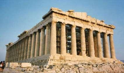
fig.3.1.3. The Great Parthenon showing the use of material in the past.
The kind of architecture and the type of civilization are glorified by:
• The kind of material used as the basic element.
• The availability of the building material, in the period when the structure was built.
• The technique in which the building material has been used.
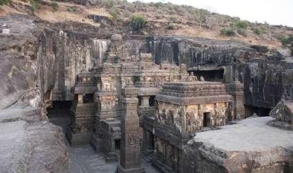
Figures showing Parthenon, Jama masjid and Kailasa temple are constructed from stone, but arrangement of elements and form of the building determines the type of the building.
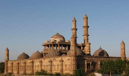
The great Parthenon has bold simple and straight stone columns arranged, which defines its character. Where as, Jama mosque in Champaner is also constructed from stone, but have different elements arranged. Mosque consists of domes and minarets which are articulated. This articulation gives language to the building and can be defines as Islamic building. Kailasa Temple, narrates a very different story of using stone as a material. In first two cases stone was arranged to achieve form, but Kailasa temple itself is a stone, the temple has been chiseled out of one single rock. Here the expression of the building is very different from other building. In other two cases one can identify different part assembled, where as in kailasa temple there are no traces of different parts and has monolithic character.
The architectural elements are determined by the type of construction material utilized. The concept of structure is taken into account when spatial organization is used in a design. Each element is related to the other in terms of colour, dressing, and outlook, depending on the construction material. The material used makes a link between the structure’s stability and the technical and structural features of the design.
fig.3.1.4.
fig.3.1.5.
fig.3.1.6.
In works of Ar. Poppo Pingel.
Poppo’s architecture is informed by his experience as a traditional carpenter, which has given him a better understanding of material value and nature. Poppo seeks structural clarity in the built form, simplicity in design and detailing, and clear sight of building components that are all apparent and distinct. He prefers not to hide any features or joints in his architecture as a craftsman. His architecture is primarily based on the use of material and its expression in space. His architectural approach is highly practical and clear.
According to Poppo “Aesthetic has developed from the materials and not another way around”. [8] Art and architecture which is not rooted, or if there is no honesty in material and craftsmanship, or form evolved just for the sake of form does not entertain him.“His experiment from Fraternity workshop to sloping timber roofs, desert domes, and Prussian vaults, each resonated with the spirit of Japanese Architecture. Traditional Japanese architecture in its essence, reveals the process by which it was made, the logic of its joinery with a profound simplicity of structure. The details conveys a deep understanding of the nature of the material”. [9] The Japanese sense of detailing, craftsmanship, perfection, and using material wisely comes naturally to Poppo, many a times his architecture has been labeled as, ‘Japanese style’ which he refuses and says, style is temporal and also fashion, it is the idea that inspires him.
Poppo explores and source ready-made components available in the market to develop details for horizontal and vertical elements that brings his craftsman’s background to come to and fore. Thus helps in creating aesthetic .
fig.3.2.1. Sketch by Poppo of Tamil heritage center, the line thickness in the sketch display the type of materials to be used.
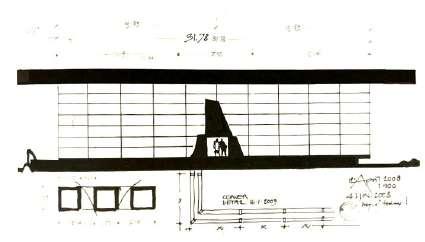
fig.3.2.2. Aureka building, is an admin building for auram press manufacturing plant. This building shows the use of brick and concrete not only for the aesthetics but also as structure.
fig.3.2.3. Fraternity workshop, project by poppo built with only material asbestos sheets and wood.
8. Auroville Architects Mono Graph series Poppo Pingel, Mapin Publishing pvt. Ltd ( Ahmedabad ), Pg.25 .
9. Auroville Architects Mono Graph series Poppo Pingel, Mapin Publishing pvt. Ltd ( Ahmedabad ), Pg.81 .
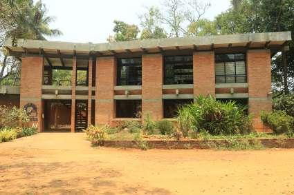
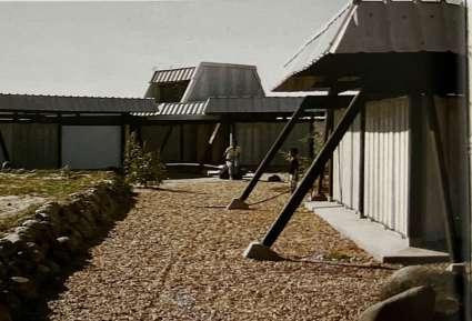
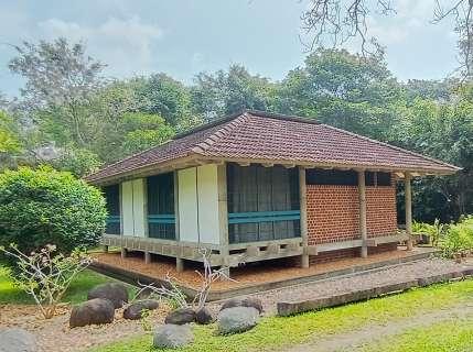
He tries to evolve the module from the size of the materials clear expression of material, transcending the usual aesthetic associated with the material, with fine detailing and a rich inside-out dialogue. “Poppo’s mastery over combining different material harmoniously, generates a sense of peace and calmness”. [10]
The above paragraphs talks about the skill of the architect to combine different materials in space making as an expression to the space. His architecture demonstrates the innovative use of local materials and his environmental sensitivity and local vernacular helps in deriving the form.
Poppo’s philosophy and ideologies majorly talks about his exploration with material, creating inside - outside space, his craftsmanship in developing details and clarity in structure. Thus Poppo’s architecture can be classified as per four major aspects.
fig.3.2.4. Afsanah guest house cottage represent combination of different material and its expression.
As the study focuses on the materiality of Poppo’s architecture. Form, structure, space and details transcends certain expression into space and overall design due to the arrangement of materials as elements. Thus, the four aspects are categories as Formal expression, Structural Expression, Spatial expression and Details.
Form is a broad term with a number of meanings. It could relate to a recognizable exterior look, such as a chair or the human body that sits in it. The term is frequently used in art and design to refer to a work’s formal structure—the method of arranging and coordinating the elements and pieces of a composition to produce a coherent image.
For example Shodhan house (fig.4.1.1), represents arrangement of horizontal and vertical planes which essences porosity into the form. Grid arrangement of cylinder columns elevates the reinforced concrete roof slab above main building, completing the cuboid form.
The formal expression refers to the arrangement of elements with materiality that reflects the character of the building. It also refers to both internal structure and external outline and the principle that gives unity to the whole. Form also includes a sense of three-dimensional mass or volume, shape refers more specifically to the essential aspect of form that governs its appearance.
Thus, it can be said that formal expression can be analyzed through shape of the elements, solids, profile of the building, volume and its impact on the space, and combination of elements. These elements can be further differentiated and accentuated by changes in colour, texture, or material.
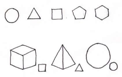
The characteristic outline of a plane figure or the surface arrangement of a volumetric form is referred to as shape. It is the most important factor in recognizing, identifying, and categorizing any given form.
In architecture we are concerned with the shapes of(Ching) (2007):
…cubes, cones, spheres, cylinders, or pyramids are the great primary forms that light reveals to advantage; the image of these is distinct and tangible within us and without ambiguity. It is for this reason that these are beautiful forms, the most beautiful forms.” Le Corbusier (Ching., Francis D.K. Architecture - Form, Space, And Order. 2007.)
fig.4.1.1. Shodhan House, Ahmadabad, India, 1956, Le Corbusier. A grid of columns elevates the reinforced concrete roof slab above the main volume of the house.
fig.4.1.2. The characteristic outline or surface Configuration of a particular form.

i. Wall, floors, and celling planes that enclose the space.
ii. Door and window openings with in a spatial enclosure. iii. Silhouettes and contours of building forms.

The primary shapes can be expanded or rotated to create unique, regular, and immediately recognizable volumetric forms or solids. These shapes can be organized or combined to form a three-dimensional geometric body. The triangle is transformed into a truss, the circle into domes or arches, and the square is transformed into walls. The qualities of the material utilized determine these shapes.
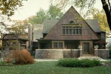
fig.4.1.3. FLW house and studio represents arrangement of elements , results in generating shapes.

The development or outline of shapes, which indicates the volumetric composition of the buildings, is referred to as the profile of the form. The shape and size of the space can be determined by the form’s profile. It can also determine the form’s axis.
Profile is a physical characteristic that can be classified as either balanced or unbalanced, as well as regular or irregular. The symmetry and asymmetry of the form or plan can also be determined by the profile.
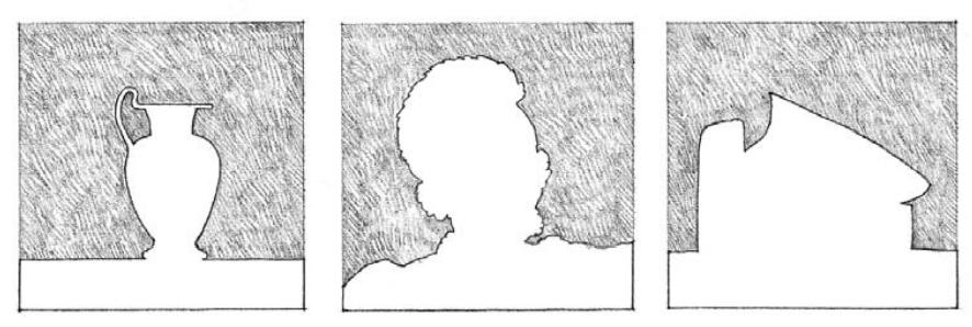
A volume is formed when a plane is stretched in a direction other than its intrinsic direction. A volume has three dimensions in theory: length, width, and depth. A volume’s key distinguishing feature is its shape. The volume’s bounds are defined by the shapes and interrelationships of the planes that define the volume’s boundaries. In architecture, a volume is defined as a portion of space defined by the wall, floor, and ceiling, roof planes, a quantity of space displaced by the mass of the building. It is important to perceive this duality, especially when reading orthographic plans, elevations, and section. [11]
The increase/decrease of volume or the irregularity in the volume has a great impact on perceiving the space.
Building forms that stand as objects in the landscape can be read as occupying volumes in space and building forms that serve as containers can be read as masses that define volumes of space.
fig.4.1.4. Represents the profile of the objects
fig.4.1.5. Notre Dame Du Haut, Ronchamp, France, 1950–55, Le Corbusier, represents volume as per the form of the building.
fig.4.1.6. Section of Villa Rotonda showing change in volume as per change in form.
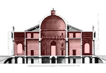

The form of the building is majorly dependent on the manner of arranging and coordinating the elements and parts of a composition to produce a coherent image. [12]
These elements can be any material, shape, size, colour, or texture, and they are arranged in a contrast that provides the elements in the space a different expression. These can also aid in the identification of various elements of various materials utilized to create a form.
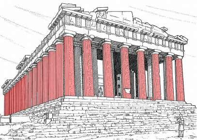
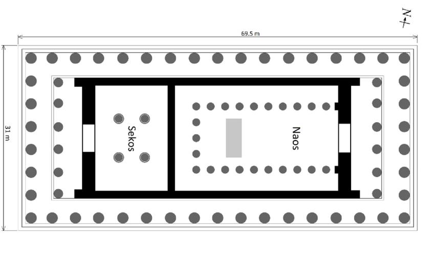
For example (fig.4.1.7), Parthenon consist of huge bold cylindrical columns on the periphery of the building made out of stone, arranged in grid structural system. This expresses boldness of the overall building and shows depth. The overall language of the building is enhanced by the arrangement of the columns in a linear way. Thus, it also shapes the plan of the building (fig.4.1.8).
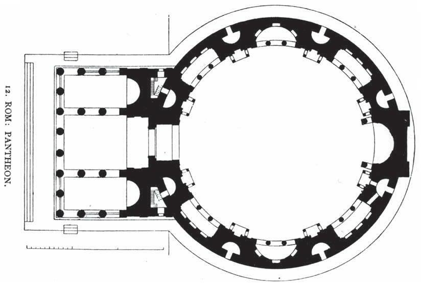
Where in (fig.4.1.8), Pantheon consist of slander columns compare to Parthenon, arranged in the entrance with vertical plan at the back. Here the slender columns creates a gesture of entrance. This arrangement creates entrance foyer and obstructs the dept of the building. Though the columns are made out of stone it does not expresses boldness. Here arrangement of columns does not defines the building, but the entrance act as an identity of the building. Thus, the plan of the building is not linear due to arrangement of other elements.
Thus, arrangement of elements in a particular manner defines the form of the building and with certain material expression becomes an identity of the building. Materiality also defines the character or language of the building.
fig.4.1.7. View of Parthenon highlighting the arrangement of stone columns.
fig.4.1.8. Plan of Parthenon highlighting arrangement of columns and walls.
fig.4.1.9. Elevation of Pantheon highlighting arrangement of columns.
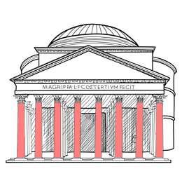
fig.4.1.10. Plan of Pantheon highlighting arrangement of columns.
The purpose of the structure in the building is to organize a portion of space, giving it an identity of a dwelling. It also improves the building’s visual quality and determines the best construction strategy. Architecture uses both structure and space as medium. The structure is what keeps the building standing.
The structural identity of a building refers to the arrangement of structural members that maintain the structure while also serving as an aesthetic aspect. Materials used as the structural member defines the language and the form of the building.
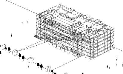
For example Pompidou center is a steel structure. Here architect had choose to expose the steel structure, which became the identity of the building. Building has a liner form because the material used has linear nature in original. Thus, the arrangement of the internal spaces is also as per the arrangement of structural system.
The relationship between space and structure is not always simple and straightforward, it has different approaches. One can use the structural system to define the space, or one can decide on the space and force the structure system. Thus there are three main categories to relate space with structure: the dominance of the structural system, the dominance of spatial order, and equal contribution of the structural system and spatial order.
The art of architecture is to design the structural strategy which work in relation with the intended spatial organization.
fig.4.2.1. Sketch of the Pompidou center, the structure of the building itself is the aesthetic element.
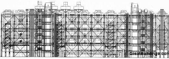
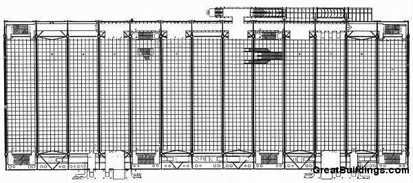
fig.4.2.2. Plan and elevation representing arrangement of space as per structural system.
“Geometry and proportion have been used to achieve compositional order since the beginnings of architecture. Formal relationships between elements of architecture have been used in countless variations to make aesthetically pleasing compositions. Designers have also used proportions of the human body to relate occupants to architectural space and form.” [13]
Geometry is the most compositional tool used by designers. It is manifested not only in the use of simple two- and three-dimensional shapes, but also the relationship between these shapes. Symmetry, balance, grids, and proportions are examples of common themes based on geometry.

Proportions of important spaces and forms can express harmony throughout the building. The quality of composition can be enhanced at no additional cost, simply by the placement and sizes of the building elements.
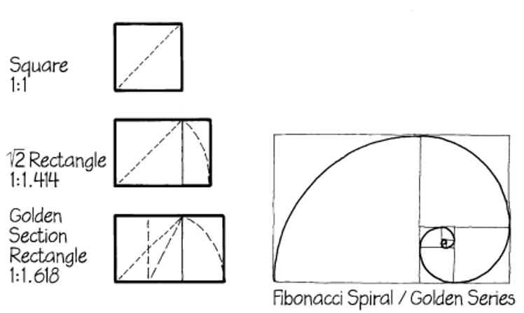
An example of a proportional system is the golden section, which is 1:1.618. This proportional system occurs in many forms in nature and the human body. Its proportions are found to be pleasing to the human eye.
For example the plan of Gandhi ashram is a clear representation of grid structural system. Entire plan has been derived from the module of 6mX6m square. The construction consist of 51 units, with darker highlighted units in (fig.4.2.6) are enclosed by walls and rest are semi open with brick columns on four sides. Composition of the plan evokes the feel of harmony ans simplicity.
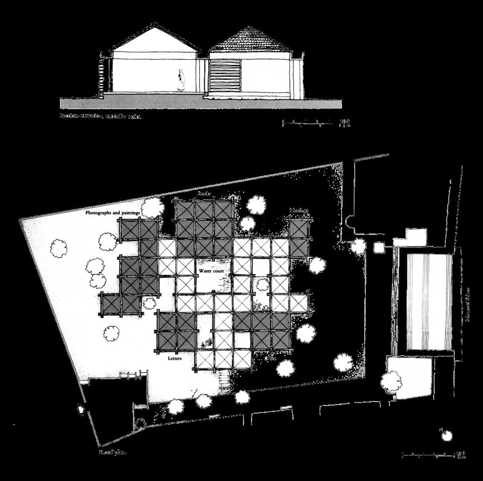
fig.4.2.3. Structural geometry in Palladio’s work.
fig.4.2.4. Golden Section fig.4.2.5. Plan and section Gandhi ashram.
The structural elements are the components of the structure’s entity, which are beams, columns, members, slabs, domes, arches, barrel vaults, rings, cables, fabrics, etc. The arrangement of these elements in a particular order results in structural system of the building as well as in aesthetics quality of the building. Elements can be composed in a part which, together, give the effect of a grouping. The principle of grouping is reinforced by repetition, similarity, proximity, common enclosure, symmetry and orientation of the parts.
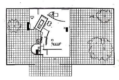
As shown in (fig.4.2.5), the idea behind the plan of Brick country house was to open up enclosing regions while reorganizing and articulating a more simple composition. Interconnecting rooms were created by strategically arranging mis aligned vertical and horizontal brick walls, free of doors and windows, to blur the divisions between outside and interior areas. Three extended walls that lead out to the outdoors create regions of sorts, but they also move the viewer’s eyes between these interwoven spaces, which are suggestive of ‘De Stijl ‘cubist and abstract paintings in concept.

The material brick used in the brick house’s ground plan is an excellent illustration of Mies van der Rohe’s development of the art of construction from the beginning. A brick wall’s structure starts with the lowest divisible unit: the brick. [14]
fig.4.2.6. Freestanding brick bearing walls, together with L-shaped and T-shaped configurations of Plans, create an interlocking series of spaces
14. https://archinect.com/features/article/133573310/completing-mies-van-der-rohe-s-brick-country-house#:~:text=Mies%20van%20der%20Rohe’s%20Brick%20Country%20 House%2C%20conceived%20in%201923,considered%20visionary%20at%20the%20time.
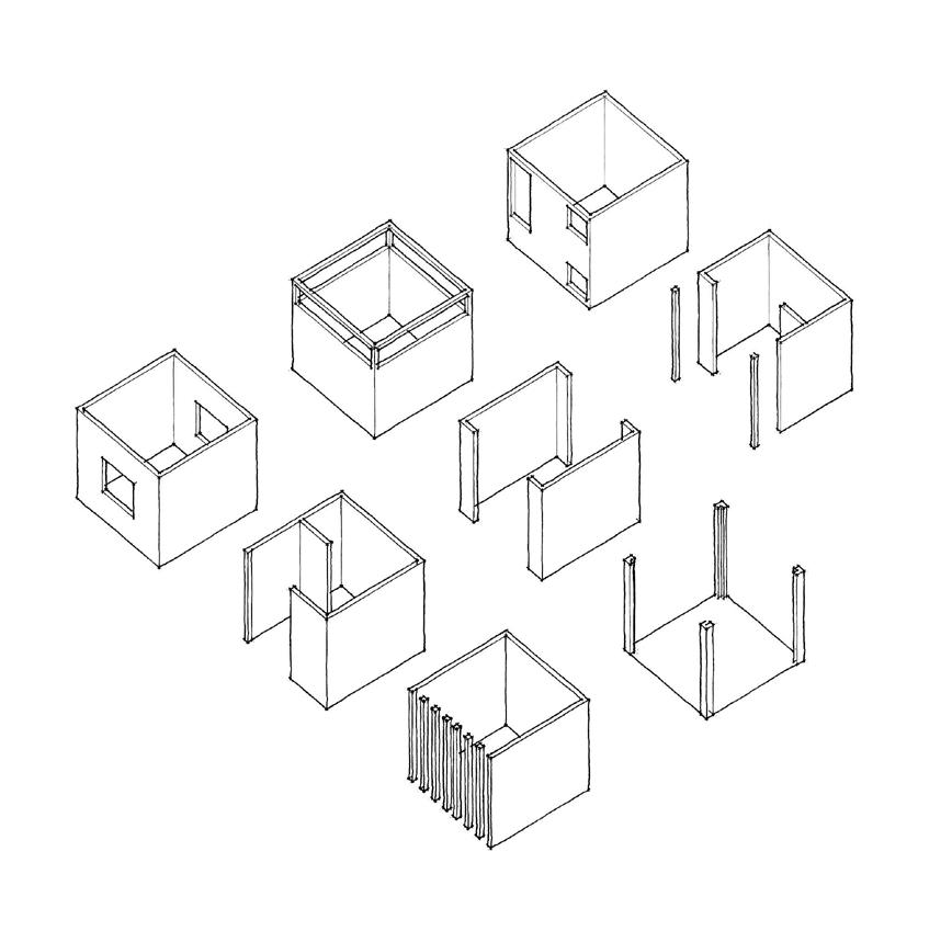
“Space in architecture is the relationship between elements or boundaries and planes which do not have any character of the object, but defines the limits”. [15] The colonnades, for example, form clear borders despite the fact that the number of gaps is more than the number of solids.
It can also be referred to as the composition of different elements which gives shape and form to achieve a cohesive structure of the design.
One of the key oppositions that allows different forms of architectural space to be distinguished is whether they are closed, introverted, and centrifugal, or open, extrovert, and centrifugal.
For example arrangement of four columns in (fig.4.3.1), represents open or extrovert space, but depicts enclosure. Same way arrangement of walls with each side adjacent to each other depicts enclosure or close space but walls with certain shape and size of the openings can change the character of the space.
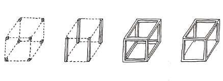
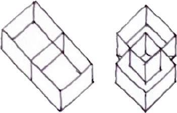
Order of Space.
Order of space describes building design, which is structurally organized and details are presented as they are located in space. “Architects uses the method of juxtaposition and interpenetration to regulate interior and exterior relationship and to articulate transitions as insideoutside, man-nature, private-public, elements-context”. [16]
The elements of spatial definition and the openings characterize the type of spatial relationships, which is the degree of which space remains independent or is more or less linked to the other spaces. We can classify this into two types (Meiss)(2013):
i. Juxtaposition of spaces
ii. Interpenetration of spaces
15. Elements of Architecture: From Form to Place + Tectonics, Routledge
16. Elements of Architecture: From Form to Place + Tectonics, Routledge, pg. 109
fig.4.3.1. Arrangement of colonnades defining boundary.
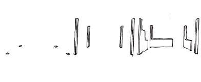
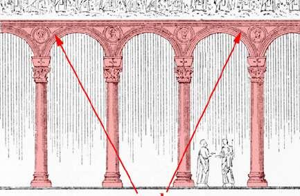
fig.4.3.2. Relationship between object and the boundary.
fig.4.3.3. Arrangement of space in Juxtaposition and Interpenetration.
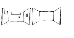
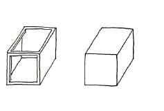
Juxtaposition insists on the existence of a separate area. This suggested the relatively well-defined and confined areas of room, bedroom, cell, hall, and corridor, all of which were associated with the concept of ‘privacy’ and the exclusion of other spaces. The connection between the adjacent spaces is done through a door, window, or by narrow passages in a wall.
The adjacent space does not coincide with the envelope of the building, suggesting the existence of another similar space. To arrange or distribute the space becomes the most important structuring factor of the whole.
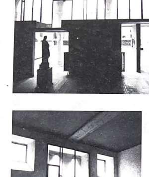
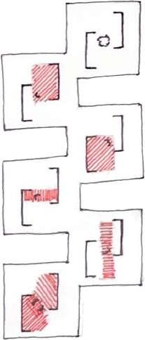
The employment of the load-bearing system of construction or another manner of making the material function in compression in previous centuries has often resulted in cellular organization with clear defining Juxtaposed spaces. “Spatial interpenetration creates continuity from one place to another from the moment when an important element defining, a wall, ceiling, or flooring, appears to belong to two or more spaces” [17] . The plane separates the space, which then becomes less important and produces an important division. A lintel, a column, the framing of a big aperture, the top of a wall, a variation in texture on the surface, or objects create the conditions for not visible closure. Different conceptions of space emerge as a result of the role performed by various means.
fig.4.3.4. Diagram showing spatial Juxtaposition
fig.4.3.5. Diagram showing arrangement of space in Interpenetration.
fig.4.3.6. Diagram showing spatial Juxtaposition
Transparency
One of the most basic ways to differentiate the type of space is to consider whether it is close, introverted, and centrifugal, or open, extroverted, and centrifugal.
The degree of enclosure is not just determined by the number and size of apertures. When one tries to make an area appear more outside, one is attempting to hide it. As a result, the degree of openings and closure has a direct relationship with the concept of obvious and non-obvious space.
The door and window are the two most common ways to handle an opening in a load-bearing wall structure. The opening serves as a passageway, a framing for the outside perspective, and a source of light and air.
The position and size of the apertures, as well as their shape, help to frame the space and define the envelope’s nature. The greater the openings, especially when it’s a corner entrance, the less noticeable the wall becomes. The use of reinforced concrete, steel, and glass has enabled the separation of structure and apertures.
Light, color, and texture are aspects that enhance the quality of space. The Colour used in the space defines the importance of the element or it can be a strategy to control the reflection of light into the space. The texture of the elements can define the character in the space. Light in the space is dependent on the size and the placement of the openings. It also dependent on the function of the space and the quality of light it requires. Light, color, and texture are related to each other in a certain way. For example, the white coloured wall used in the interior of a space helps in reflecting the light easily and lights the space even more. The texture of the element can be introduced in relation to the function of the space and also the function of the element.
fig.4.3.7. Diagram showing type of openings done to achieve transparancy.
The line of movement connects a building’s inner and exterior spaces, or any pair of internal and exterior spaces.
As we go through the sequence of spaces, the experience of the place defines our entry into that space and where we should expect to go next. Our perception of space and building shape is influenced by certain major components of the building circulation system. The circulatory system is made up of the following main components:
Approach : Before actually passing into the interior of the building, one needs to approach its entrance through a path. This path is the first phase of the circulation system, which hints at the experience of building within.
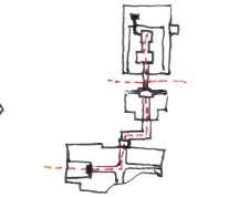
Entrance : Entering a building, is an act of penetrating a vertical plane that distinguishes one space from another. The act of entering can be defined in various ways, one could punching a hole into the wall, passing through the implied plane established by two parallel pillars, or an overhead beam.
Configuration of the Path : All the paths, whether it is of anything, are linear. The paths have a starting point that leads to a sequence of spaces to our destination. The form and the scale should always convey the functional and symbolic distinction between the spaces.


Path - space relationship : Paths may have a relation to the space it is passing through. They could be passing by the spaces, passing through the spaces, and Terminating into a space.


fig.4.3.8. Approach fig.4.3.9. Entrance fig.4.3.10. Configuration of the Path fig.4.3.11. Path - space relationship fig.4.3.12. Form of the circulation space
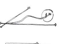
The smallest form of architecture in a built environment, as a part of the whole, is defined as a detail. They’re the smallest details that add up to form a character or image. When two or more pieces intersect, architectural detail is created. Details are an important aspect of the overall design of a building in architecture. These minor details are just as vital as the drawings, sections, and elevations. The goal of detail design is not simply to solve physical difficulties, but also to incorporate the same considerations and conditions that inform the overall structure.
What is a junction detail? Junction details are the connection between two or more elements. The junction between two elements can be better understood by the example of when a beam comes on the top of a column capital. To emphasize the column capital and the bracket supporting the beams, these elements are highly decorated.

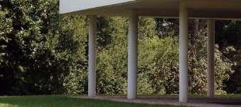
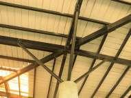
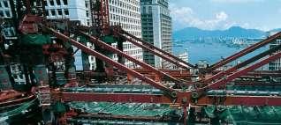
The junction can be categorized as the expression of language, which is based on the following aspects: Articulation, Continuous (seamless), Separated.
Articulated junctions are usually exposed junctions, which while trying to solve technical requirements create a new element.
Continuous junctions are those which are majorly hidden and can be linked to technological advances in design and construction. Separate junction are those which highlights the contrast between two different materials coming together in the space.
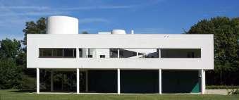
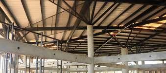


Details play their role in three categories, Functional, Constructional, and Aesthetic. These aspects are elemental fragments and can be found in building details of all scales and typologies.
The functional role of the detail can be briefly categorized as protecting from the weather, allowing circulation in the space, and acting as structural support.
The construction role of detail includes the ease of assembling a detail, providing flexibility in inaccessibility, and efficient use of resources.
The aesthetic role of the detail dwells in the visual and sensitive part of the human space. It deals with highlighting ornamentation and grabbing attention.
Detail in design language can be classified in two ways, first is the technical aspect or tangible aspect and the Intangible aspect. A detail is judged good or bad on how it performs in construction criteria. Details combine all the aspects in the tiniest form and have an impact on people experiencing space.
Example: The detail can be as simplest as the use of rough finish flooring for safety purposes in the public area.
There are intangible aspects of detail. The expression of these details catches the attention of the viewer and engages them in the built space.
The above chapter talks about Ar. Poppo Pingel’s philosophy, the role of material in architectural design, materiality in works of the architect, and aspects that define materiality in his projects.
The material is an integral part of architectural design. Above mention aspects of building material in architecture(chapter 3.1 role of material), can be associated with one of the philosophies of materiality and space making in Ar. Poppo’s work.
Poppo’s work expresses materiality which governs the character of his projects. The development of form, structural stability, aesthetic quality, spatial quality, and details, result from the arrangement of material as elements. According to poppo every material has its own character and expression, which should not get cover through layer of covering ( plaster or cladding). As per his philosophy, Material used has a role to perform in the building, it cannot be placed just for the sake of aesthetics. Even material finishes has great impact into the space.
His main aim to be in Auroville was to experiment with the materials. He explored various materials like rammed earth to develop a village, asbestos sheets to design a workshop for a weaving community, wood initially as a structural system, brick and lime to explore vaults and domes in his projects, concrete with the change in demand and for fast construction. He started using concrete but his craft of working with the wood allowed him to use concrete the same way as wood. He makes an impression while casting concrete same as he carving done in the wood. Poppo uses precast members as if he is joining wooden members. This shows his exploration of material in his designs.
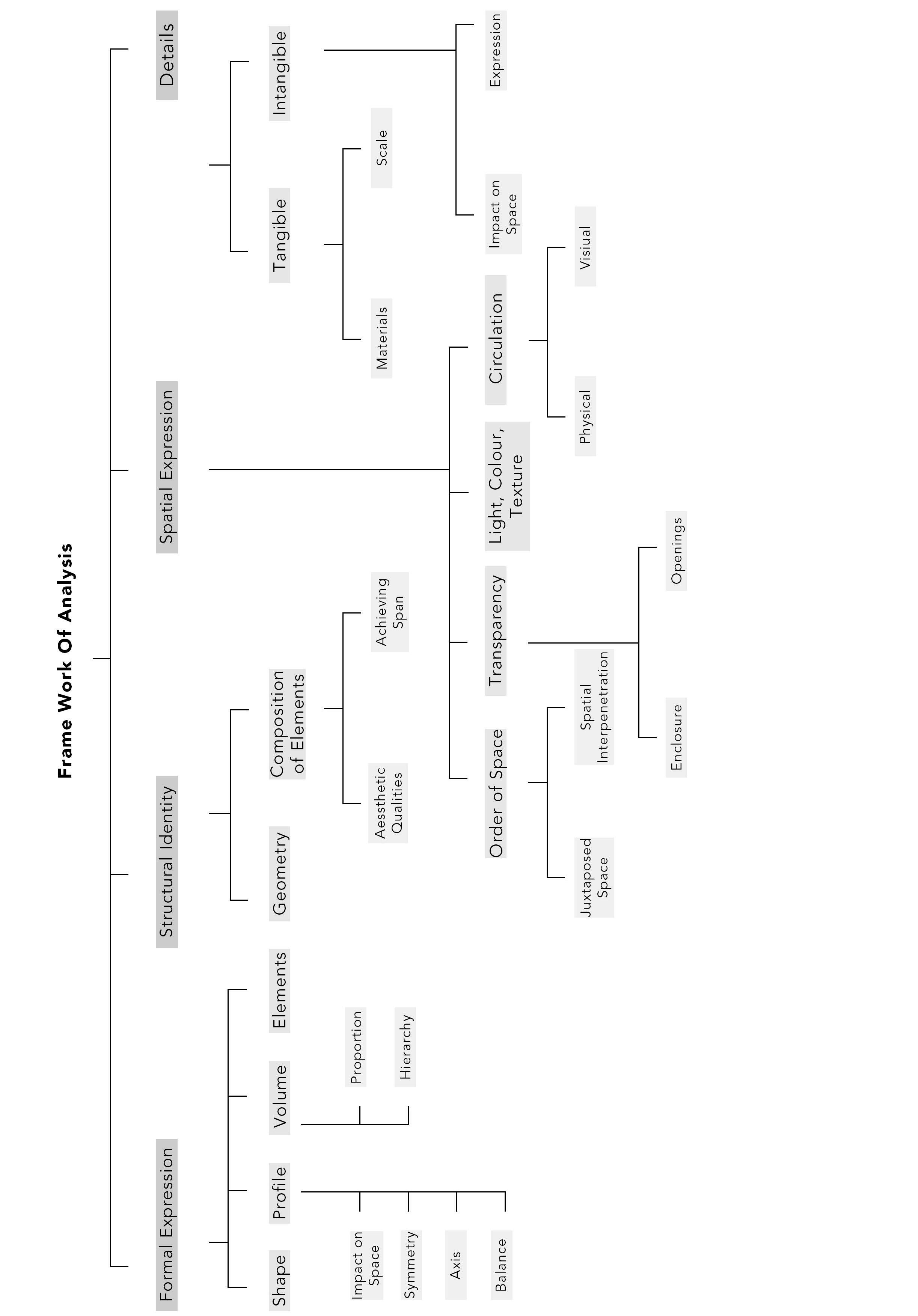
His exploration of building material results in achieving the form of the building, it also reflects appropriate construction techniques and structural application, organization of space as per the arrangement of elements, and conscious efforts to design details. Thus, it results in categorizing factors for analyzing .i.e., Formal Expression, Structural Identity, Spatial Expression, and Details shown in (fig.4.5.1).
fig.4.5.1. Frame work of analysis.
I. Criteria for selecting case-studies
II. Analyzing case study -1
III. Analyzing case study - 2
IV. Analyzing case study - 3
Ar. Poppo Pingel has worked on various projects of different typologies in his life which includes institution, residence, studios, commercial buildings and industrial. Case studies are selected keeping in mind, Poppo’s ideology and philosophy- of expression of material in various ways in space making. His exploration of material and generating form, structure and aesthetics with the understanding of nature of material. Case study thus selected should be varied such that one should understand various aspects with different factors. Hence following are the criteria for selecting case study:
• Case study of different typology are selected, so that different scale of building, with different function,and with different time line can be analyzed.
• Case studies are selected based on the possibilities of site visit and availability of drawings.
• Case studies are selected keeping in mind that they have a strong approach to materiality and its expression to space.
Following are case studies selected:
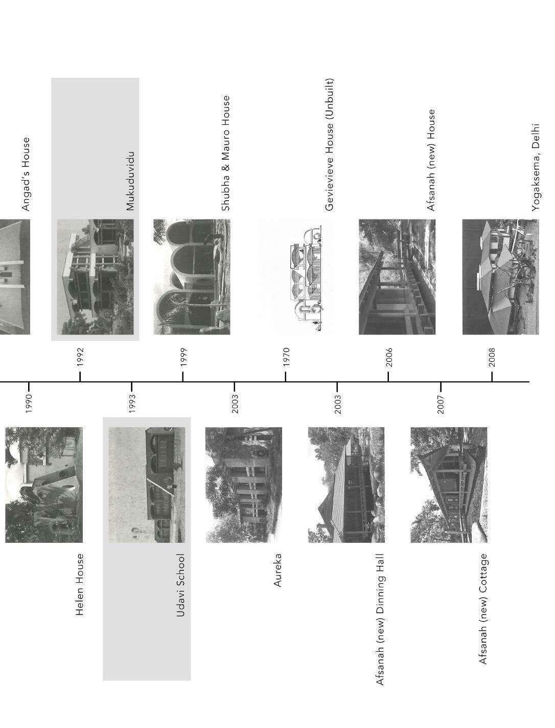
• Miraonevi Nivas, certitude community, Aurcoville (1980-81)
• Mukuduvidu and studio Naqshbandi, Kottakarai, Auroville, (1990- 1992)
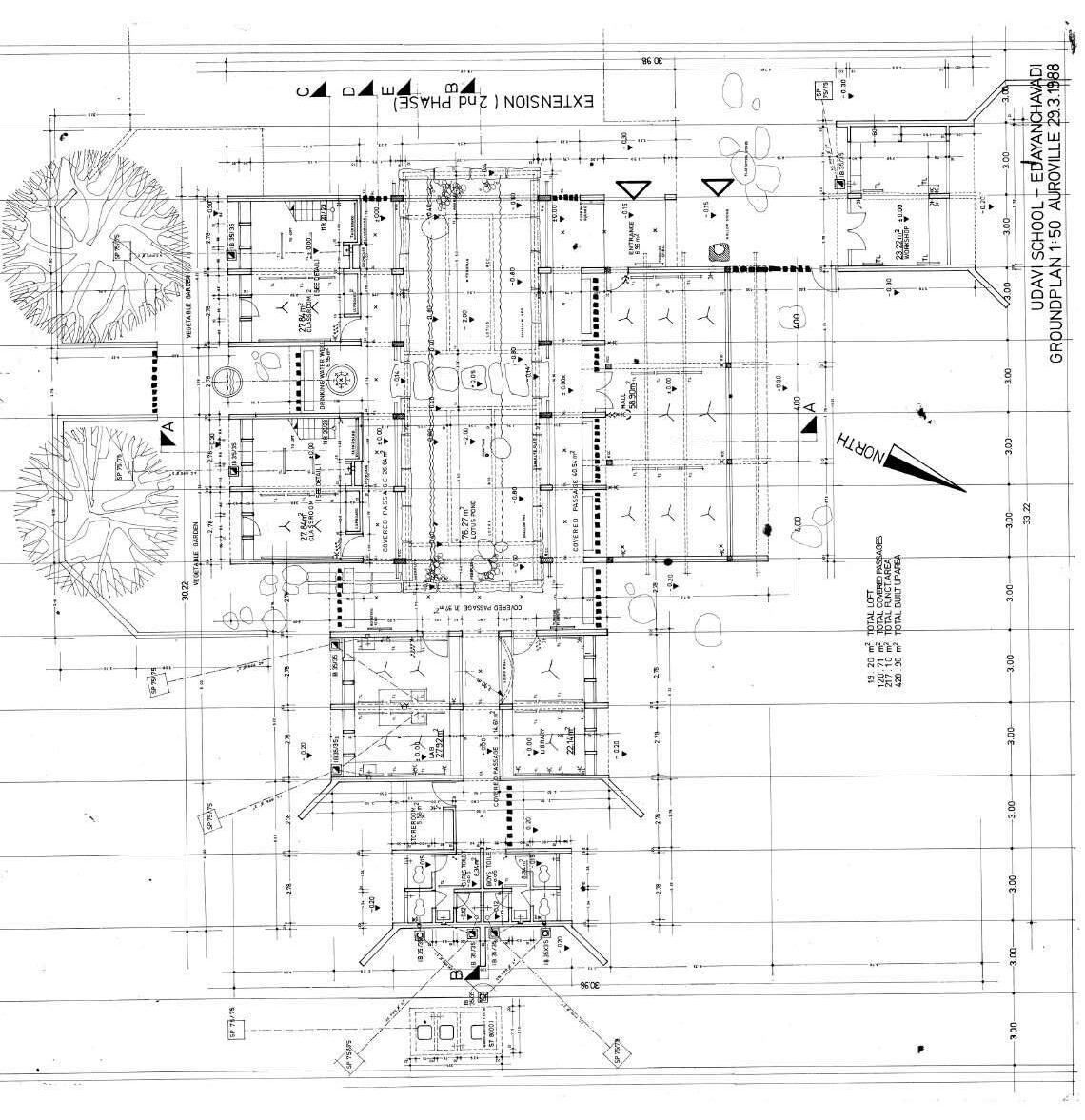
• Udavi School, (1991 - 1993)
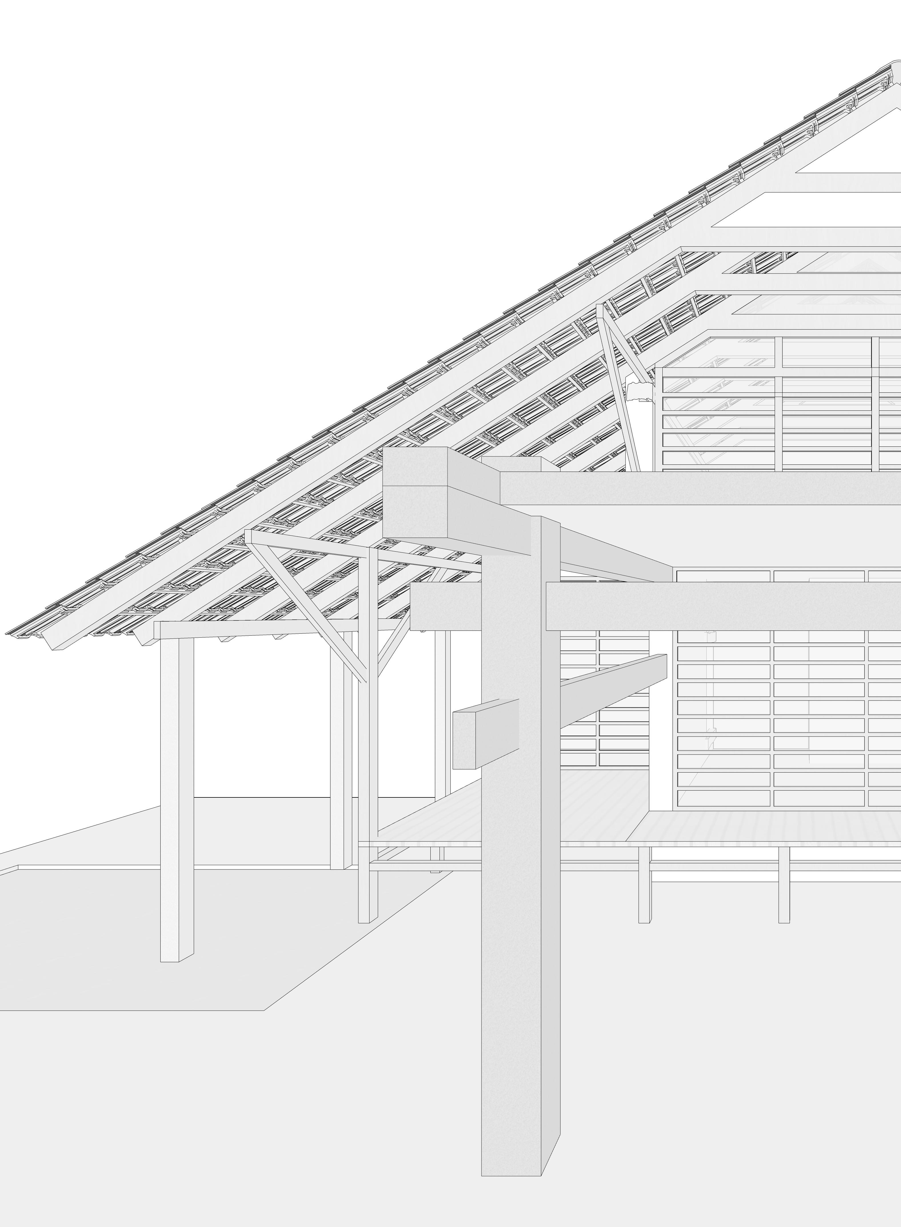
Built year: 1980 - 1981
Materials : Wood, Stone, Bricks, Concrete, Glass.
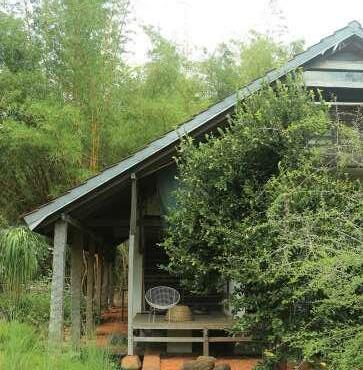
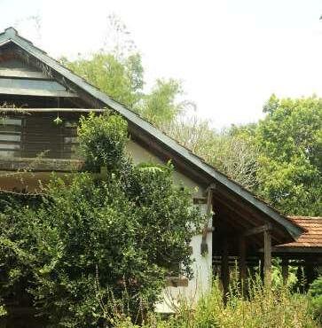
Miraonevi nivas is the first residence that Poppo built for him self and his family, in certitude community, near Matrimandir. Setting of the building with in the landscape and the extensions which comes out from the building are one of the main features of the building. This was like one of earliest project of Poppo. The huge roof sitting on the building act as the wings of the birds. The building gives an experience of both living in the built and at the same time living in the nature.
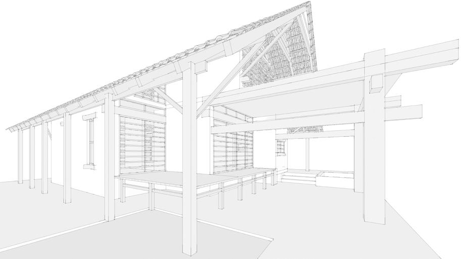
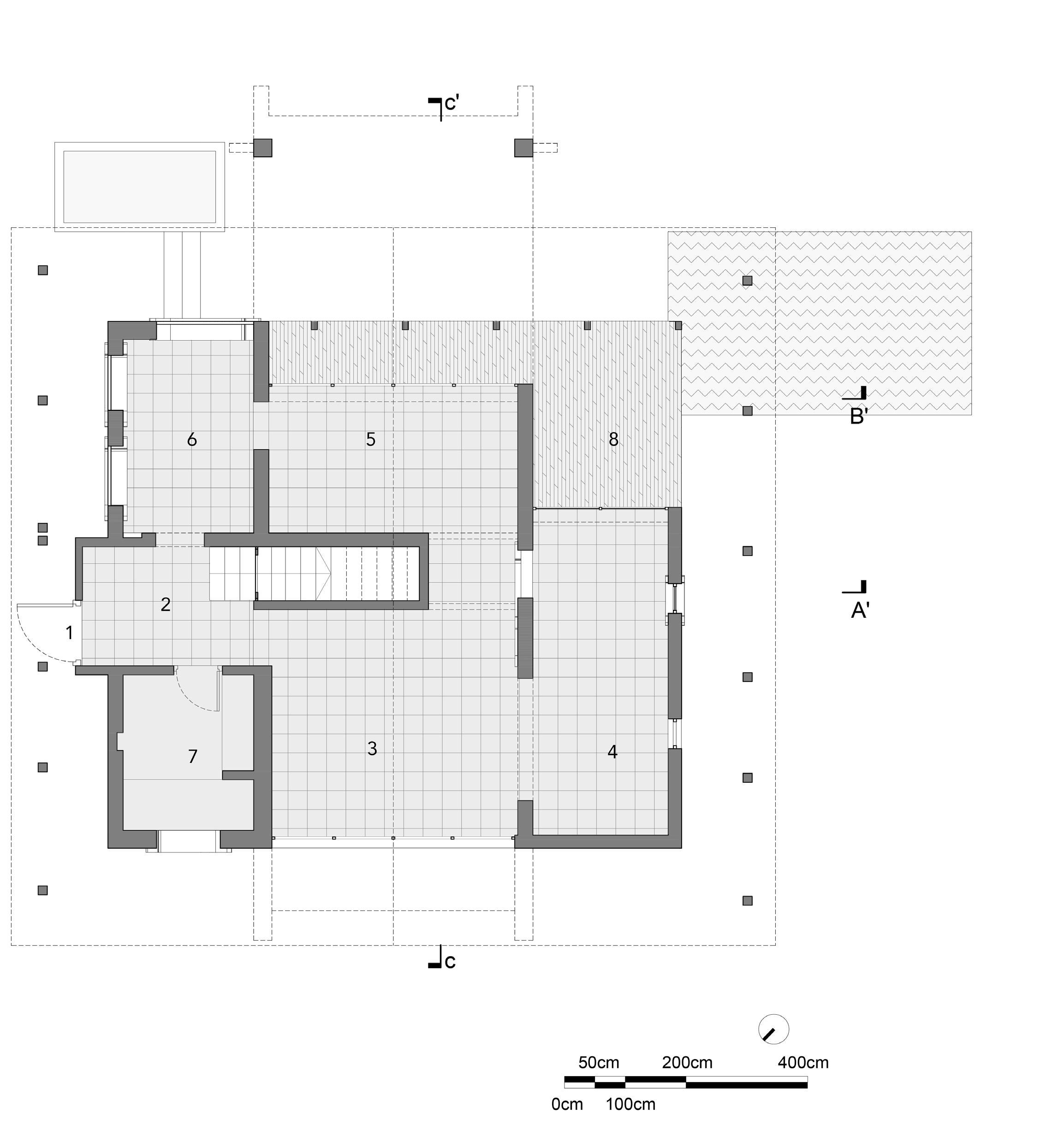
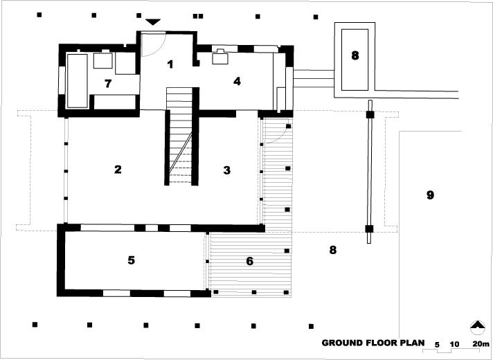
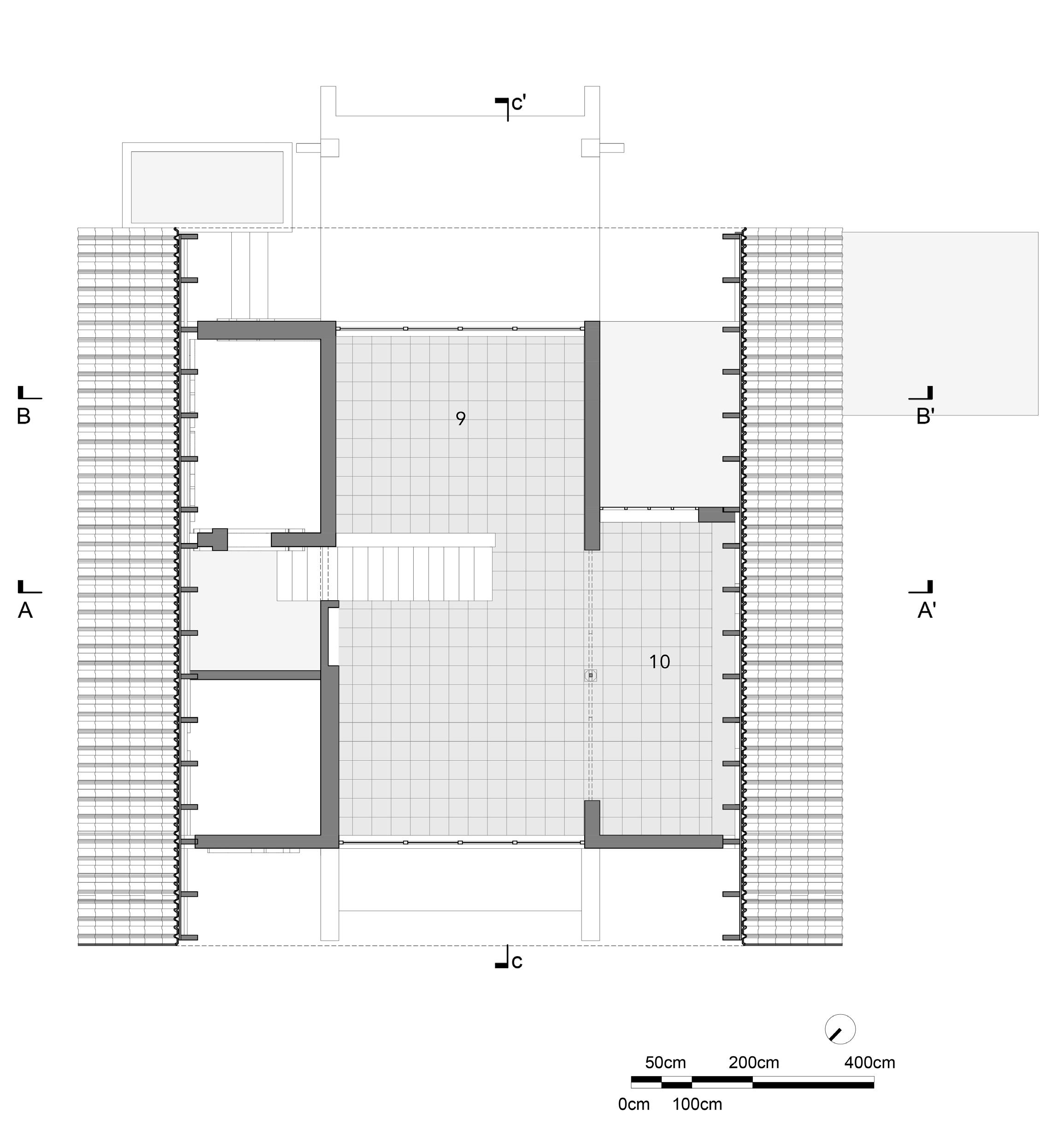
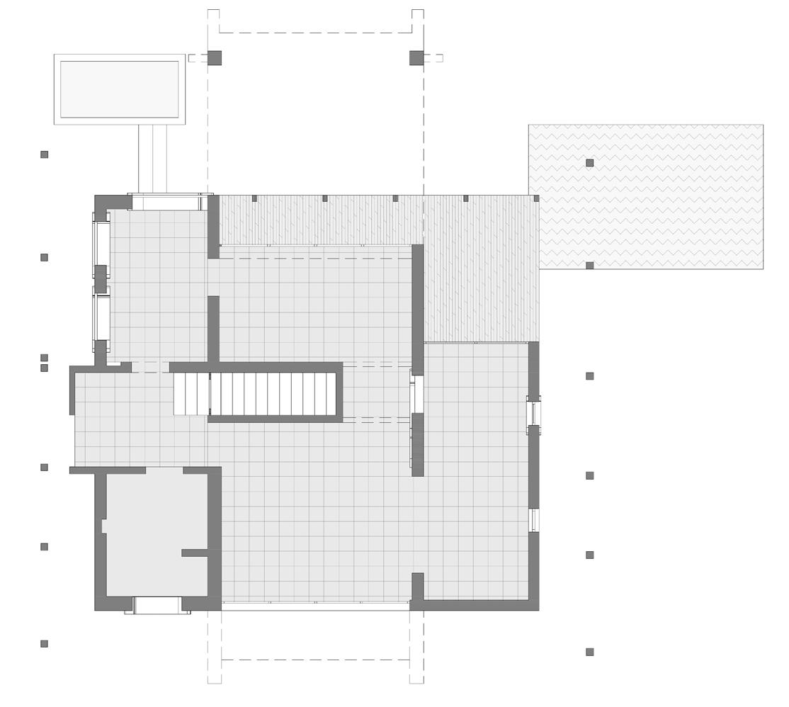
fig.5.1.2. First floor plan of Miraonevi Nivas
Plan redrawn from the original plan given from studio Naqshbandi, Auroville.
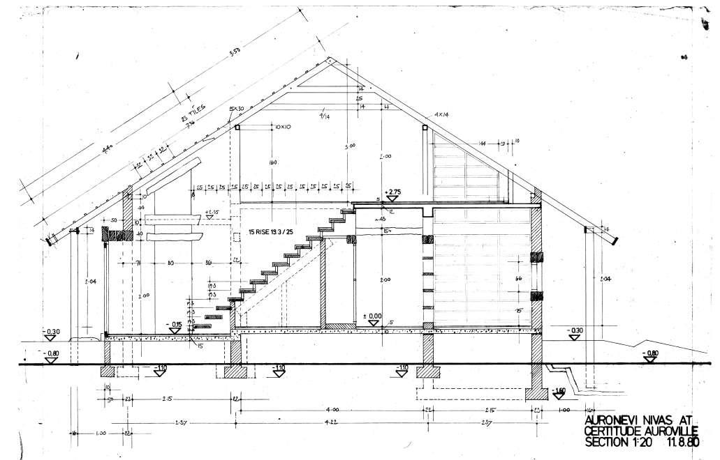
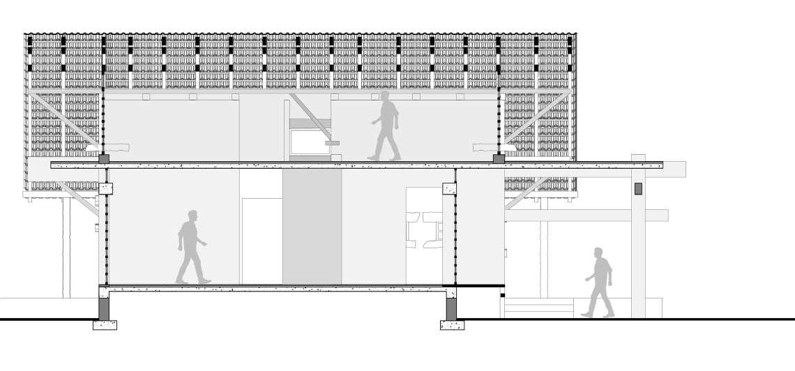
Section AA’

Section BB’ fig.5.1.3. Sections Plans of Miraonevi Nivas Sections redrawn from the original plan given from studio Naqshbandi, Auroville.
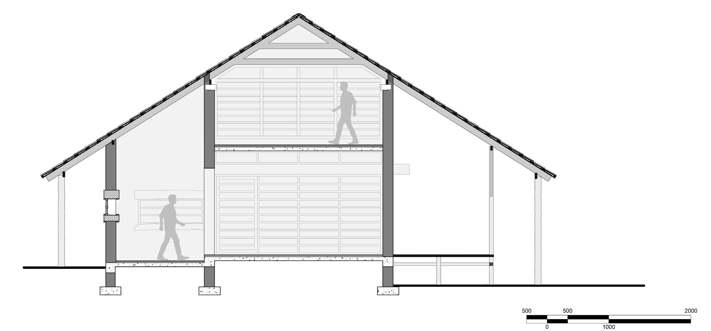
Role of Material in Space making : Works of Ar. Poppo Pingel.
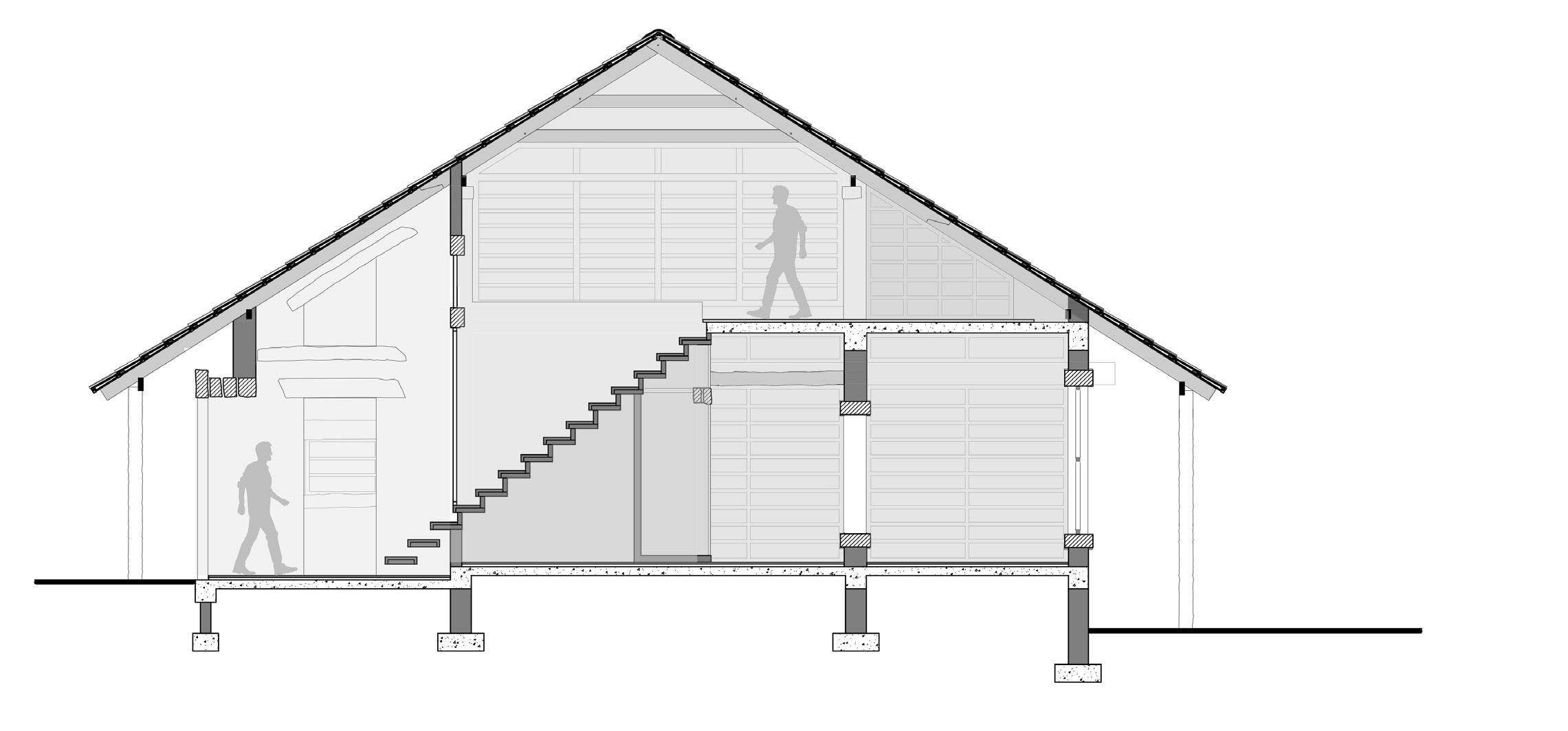

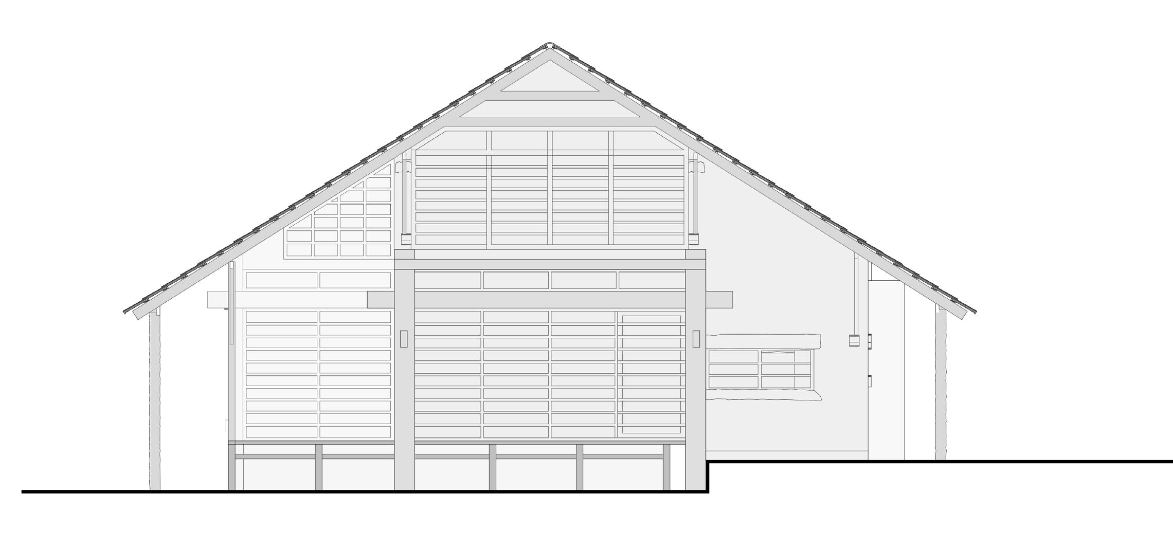
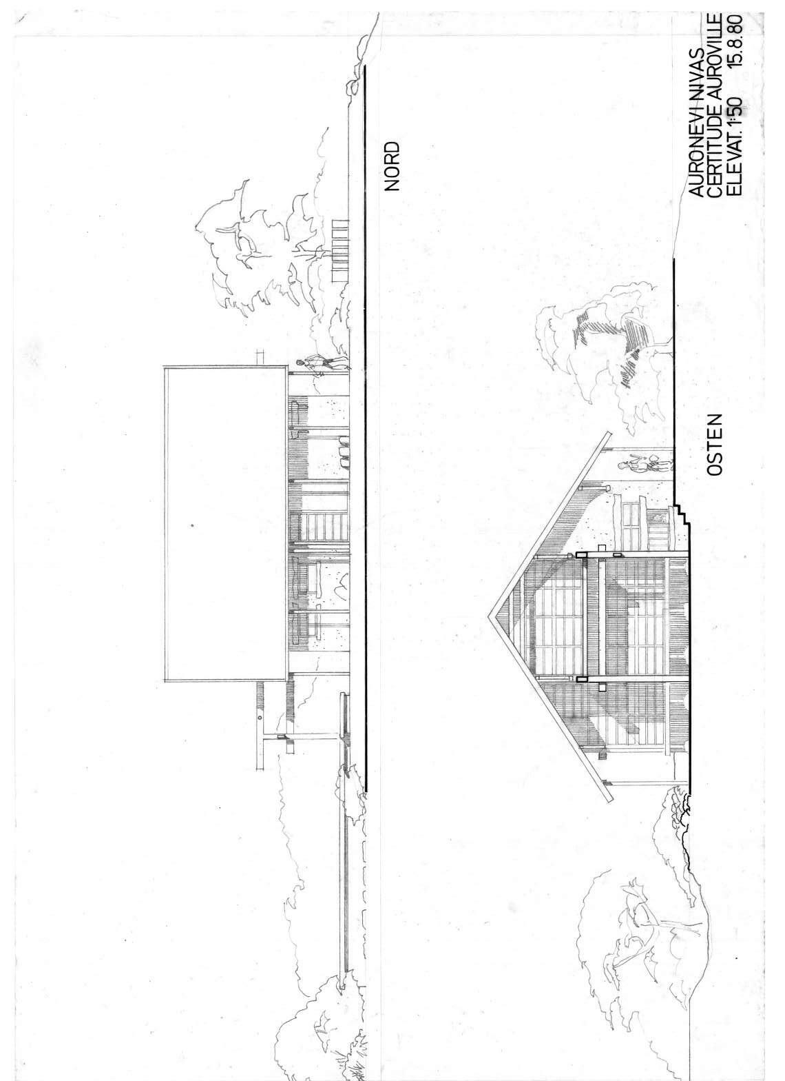
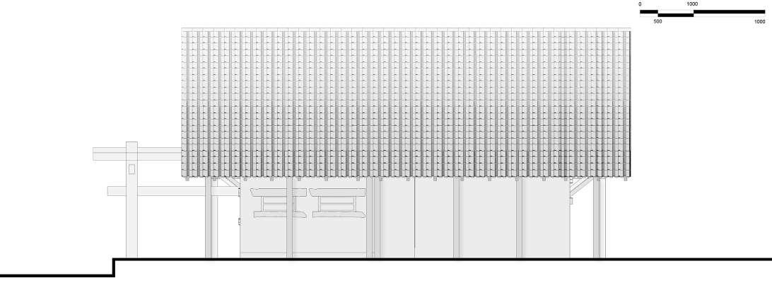
fig.5.1.4. Sections and Elevations Plans of Miraonevi Nivas Sections and Elevations redrawn from the original plan given from studio Naqshbandi, Auroville.

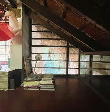
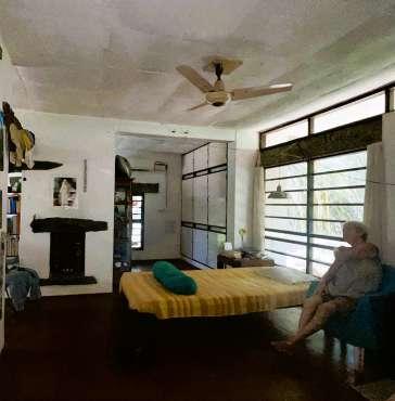

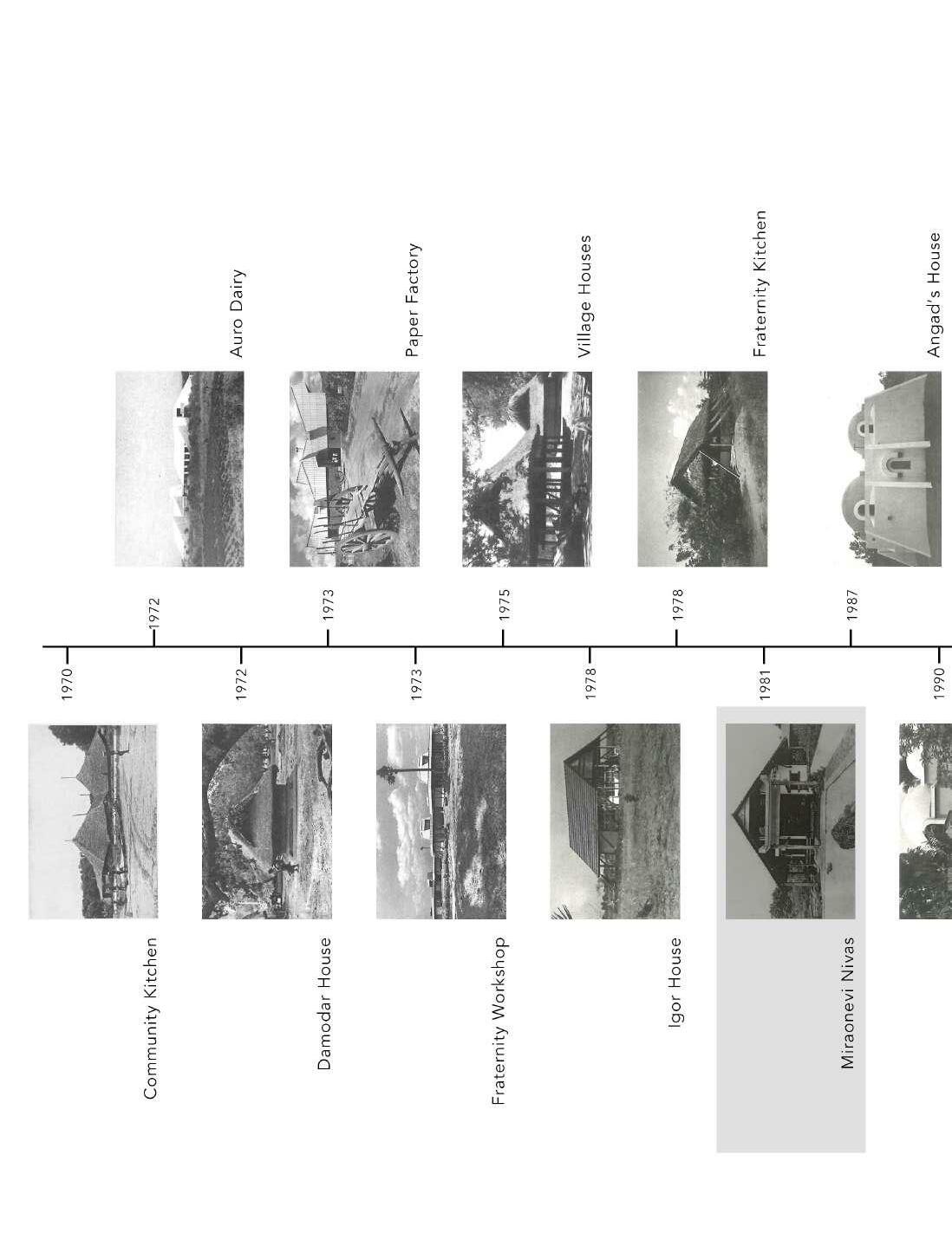
Following diagram and the timeline indicates the evolution of the typology Poppo was building. He used palmyra wood as a primary material because it was easily available and were strong.

The form of the miraonevi nivas evolved from the other project Poppo did in past as shown in (fig.5.1.8 )to (ig.5.1.11).
fig.5.1.8 Damodar House, Kuilapalayam, 1972

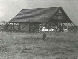
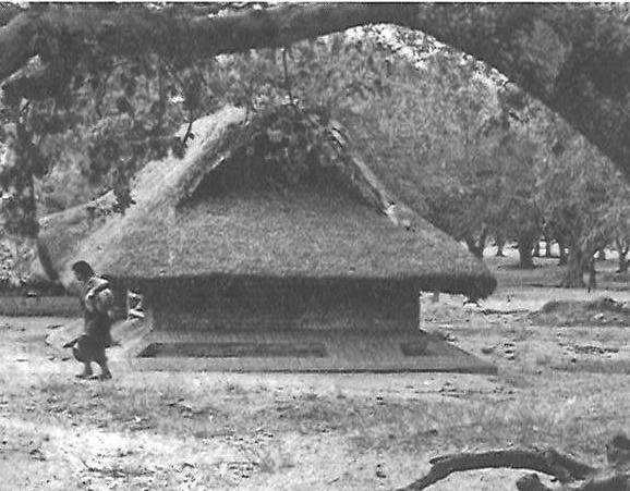
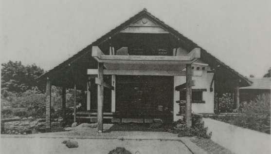
fig.5.1.9 Fraternity Workshop, 1973
fig.5.1.12(a) Part section of the house highlighting wood junction.
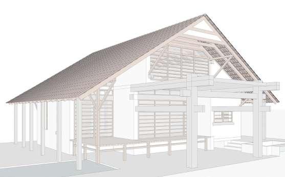

fig.5.1.12(b) Lap joint detail to extend the length of the member.
fig.5.1.10 Igor House, 1977-78
fig.5.1.11 Fraternity kitchen, 1978
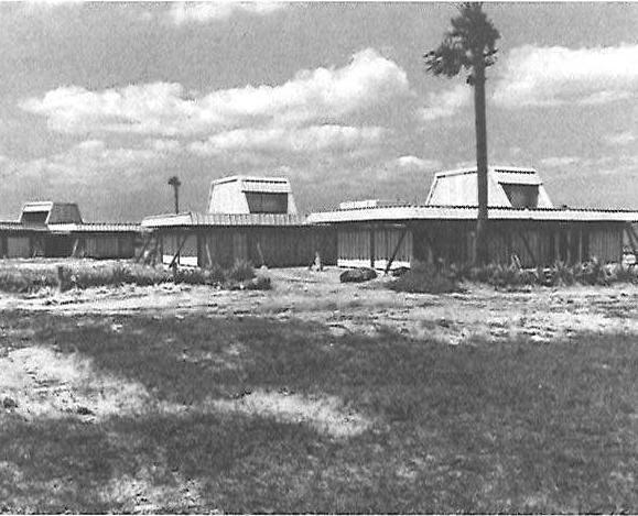
fig.5.1.13 Repetition of ‘A’ frame to achieve form.
Lap joint helps to extend the wood member which results in forming a huge ‘A’ frame which defines the form of the building.
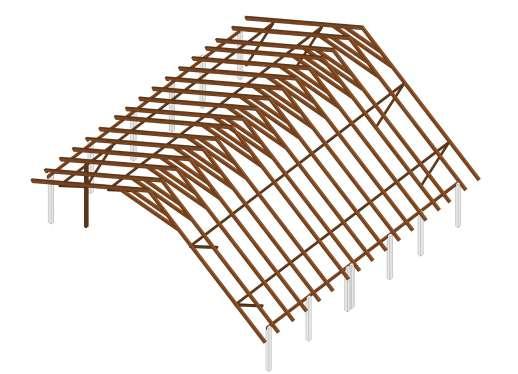

fig.5.1.14
fig.5.1.13 View of Miraonevi Nivas illustrating overall form of the building.
fig.5.1.16. Typical section, space devided from the ridge line, which results in two compartments with same volumes
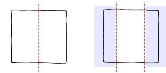

fig.5.1.18. Miroanevi nivas section, section is devided into 3 parts, which results in three different comparments and varation in volume.
fig.5.1.17. Typical form of plan, space devided from the ridge line
fig.5.1.19. Miroanevi nivas plan divided into three parts.
Sloping roof on the squarish plan is very tricky placed, as the squarish plan gives to freedom to open from each sides equally. The roof is designed in relation to the plan, such that two sides which gets a physical obstacle due to the valley of the roof which act as a privacy factor.
As the plan gets divide in to three parts, space on the either sides of square with the lower roof are designed as the service spaces and the study space. This allows to open up the central space connecting outside, which are family spaces.
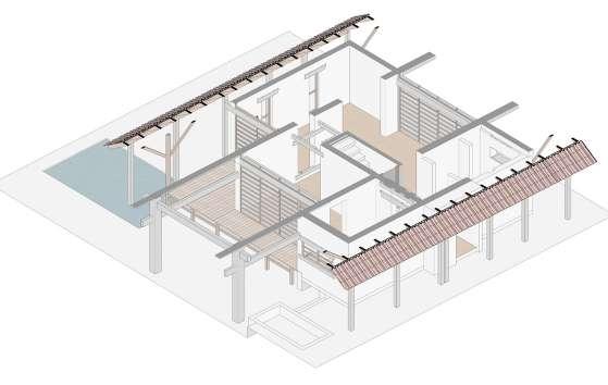

Due to the sloping roof and the squarish plan, the building appears to be balanced and visually symmetrical. This also determines the central axis of the building shown in (fig.5.1.20).
fig.5.1.20. Miroanevi nivas ground floor plan, spaces filled with red colour indicates space beneath the valley of the roofs on either sides.
fig.5.1.21. Section showing roof profile and impact on the space due to roof profile.
fig.5.1.22. Isometric showing roof profile and impact on the space due to roof profile.
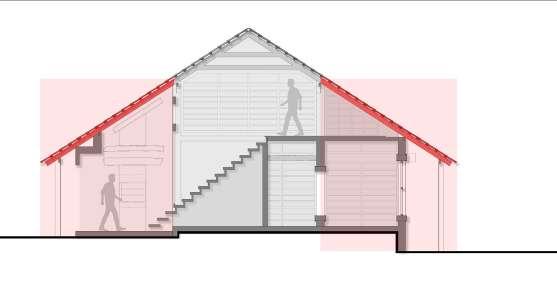
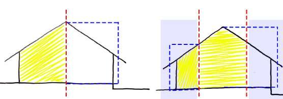
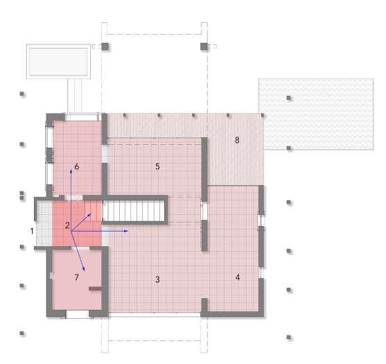
fig.5.1.23. Plans showing the hierarchy of volumes
fig.5.1.24. Section showing the hierarchy of volumes

fig.5.1.25. Section showing the hierarchy of volumes fig.5.1.26. Section showing the hierarchy of volumes
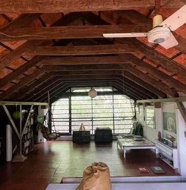
The profile of the space also affects the volumes inside the building. As one start entering the building, one enters from the lower space which is extruded out form the wall, which is an gesture of an approach to the space. After entering from the lower space, one ends up into the entrance foyer which is an double hight volume. This foyer act as an pause point to decide further direction into the house. Moving straight forward is the living space with a lower celling height uniform in the rest of the spaces. To maintain the height same as the bottom floor the architect has placed an horizontal member which cut of the hight beneath the ridge.
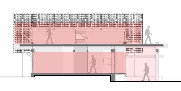
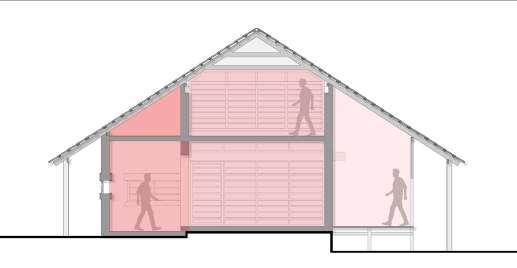
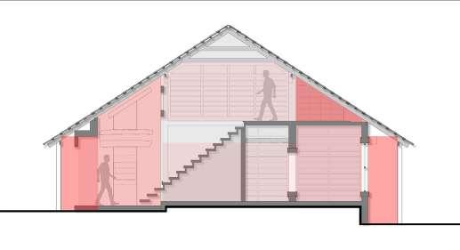
The sections above represents the veration in the volumes in the building according to the functions. The wooden deck also has the double high which gives the experience of inside out side space.

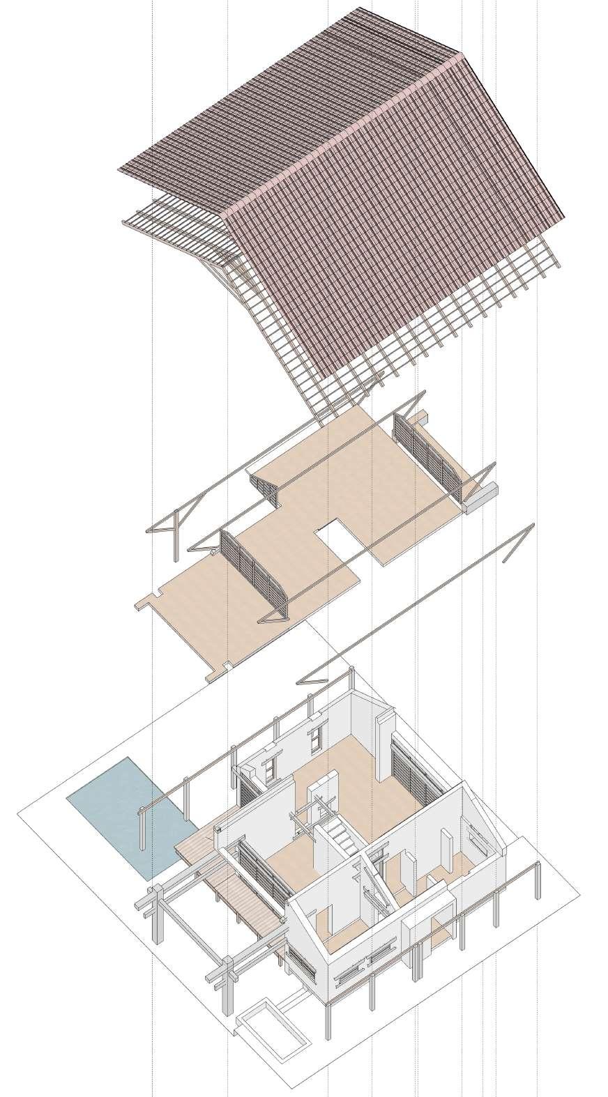
Wooden battens to rest the roofing tile.
Wooden truss which gives profile to the roof.
Wooden members supporting the truss.
Wooden brackets supporting the overhang of the roof
Wooden beams
Load bearing walls
Concrete column and beam
Undressed granite columns
fig.5.1.27. Exploded Isometric showing different elements used.

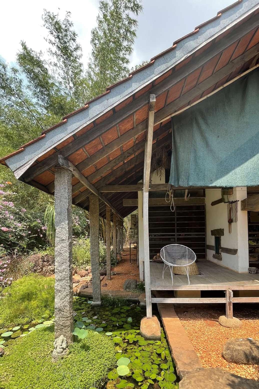
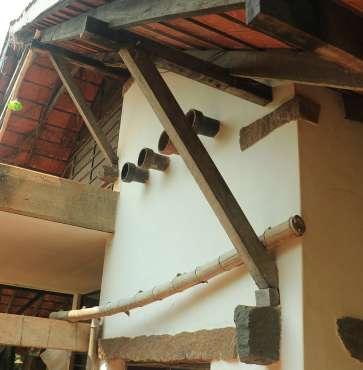
Poppo has used various locally available material in construction of his projects. He uses the material as per the nature of the material. Granite stone are placed undressed supporting the roof on the periphery of the building. The stones are placed undressed, with white walls and concreter columns and beams.
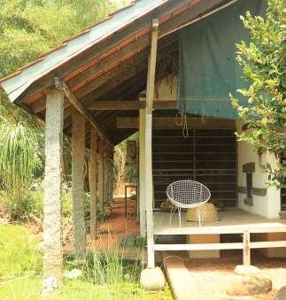
The granite stone used into the space seen in (fig.5.1.30) supporting the wooden beam, are placed to create a cavity between wall and the roof members. This cavity act as an adjustable space for retaining form of the roof when gets deformed due to any natural calamities.
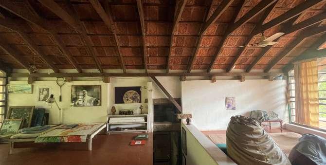
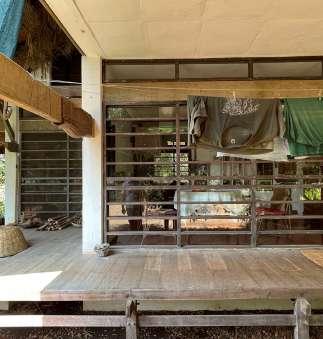
fig.5.1.28. Image showing contrast of different materials.
fig.5.1.29. Image showing contrast of different materials.
fig.5.1.30. Image showing contrast of different materials.

fig.5.1.31(a). Images represent the arrangement of different material to retain the form

Screws are inserted into the wooden member ends up into the wall, act as an jack to maintain the level of the horizontal wooden member.

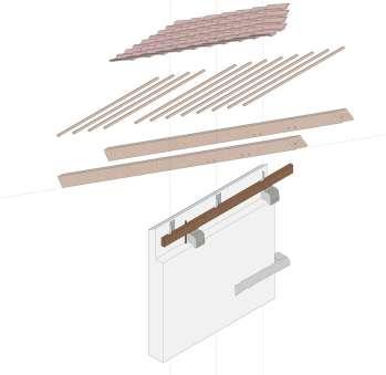
fig.5.1.301(b). Exploded axo of roof to wall junction detail.
fig.5.1.31(c). Screw and bolt used to retain the form of the roof if gets deformed due to natural calamities

To achieve form of the building, arrangement of the elements is important. Poppo made a module of granite stone and wooden truss, and then repeated it at an equal distance which gave a form to the building. Repetition of the elements also helps in achieving the depth to space. Element placed linearly also suggests the direction of vision and circulation.
fig.5.1.32. Image showing repetition of members.
fig.5.1.33. Image showing repetition of roof truss to achieve form. fig.5.1.34. Image showing repetition of granite stone columns.
The above (fig.5.1.33) shows the repetition of the wooden ‘A’ frame, defining the linear form of the building. Repetition also helps in achieving depth to space. It also suggests the central axis of the plan.
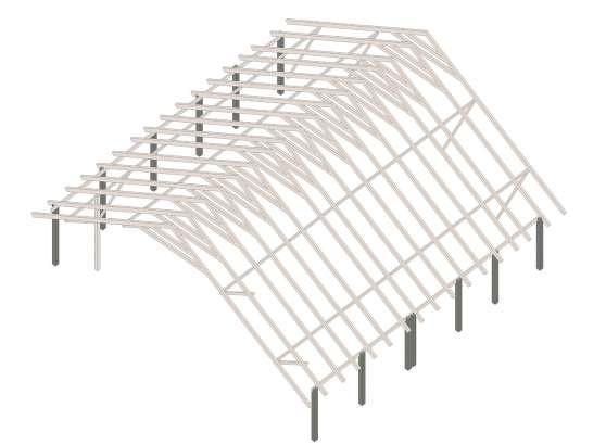
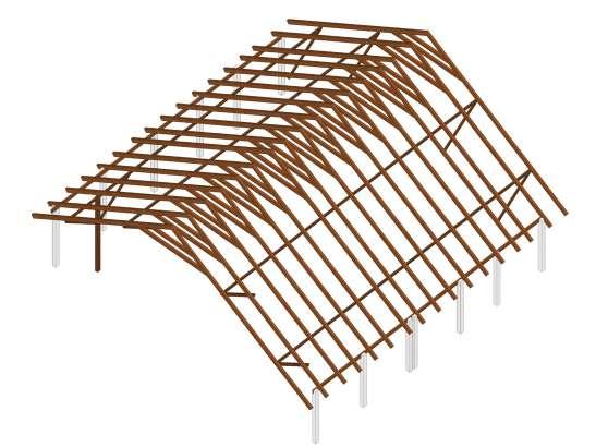
Undressed granite columns placed on the periphery of the building supports the overhangs of the wooden frames. Columns are repated in the line of the roof, and suggests the bold character.
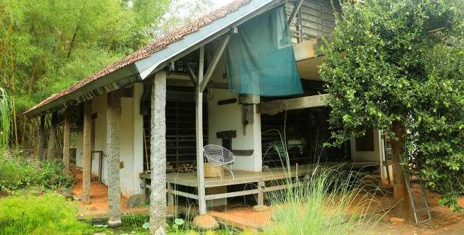
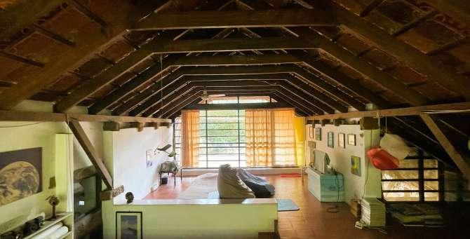

Ar.Poppo Pingel uses material according its nature. The geometry of the structural system in Miraonevi Nivas has been derived from the nature of materials. In the project Poppo has use undressed granite stone, wood for posts and beams, brick for load bearing walls and concrete. Most of the materials use have a linear properties except concrete. Thus, the outcome of the building is an orthogonal plan and section, in a grid structural system. Spaces are place one after the other in an liner form. Resulting in the juxtaposition form of space. Wall arranged in grid defines disorganize plan and signifies boundaries of the spaces. Type of element arrange also affects the character of space. For example placement of the staircase in the center of plan divides the entire plan into four parts. Structural line in (fig.5.1.36) evokes balance ans symmetry.
fig.5.1.35. Plan showing grid structural system.
The placement of the brackets are also in the line of the grid system, which evokes an experience of a balanced and symmetrical form. Brackets placed in the line of the structural system also suggests, as the structural member supporting the roof system.
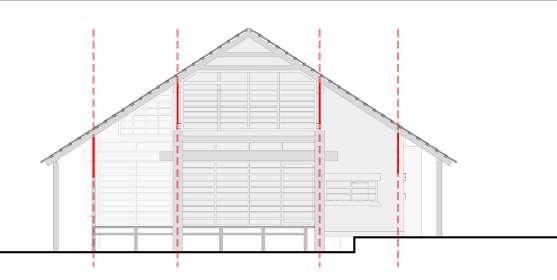
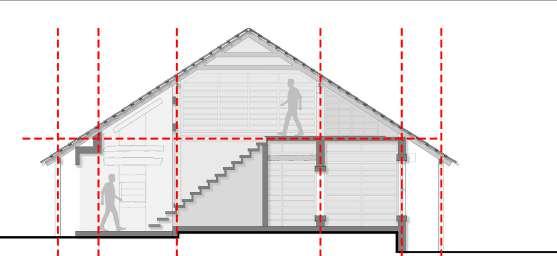
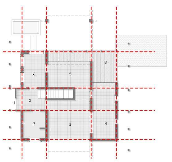
fig.5.1.36. Section showing grid structural system.
fig.5.1.37. Section showing brackets arranged in the grid of structure.
fig.5.1.38. Axonometric view of horizontal wooden member resting on stone and bracket.
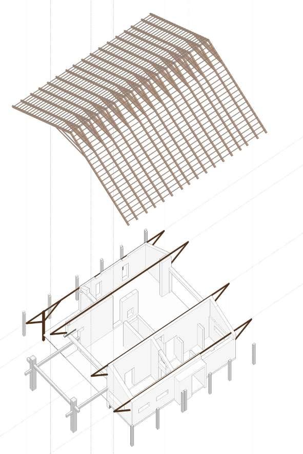
fig.5.1.39. Part section of first floor highlighting the placement of horizontal wood member on stone base.

fig.5.1.40. Exploded axonometric of the wooden column and bracket detail.
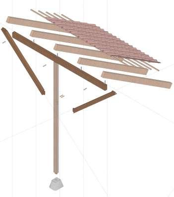
Fig. (5.1.39) represents, the horizontal wooden members placed on the stone, running parallel to the walls and are connected with the brackets are the primary members of roof. Thus, the load of the roof is transfered through walls and the brackets helps the roof to hold its lateral movement.
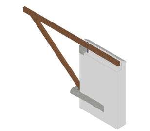

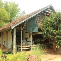
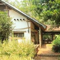
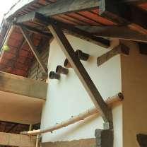
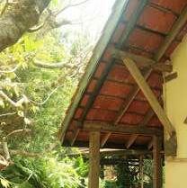
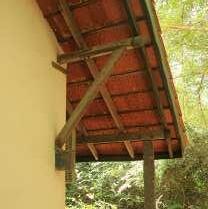
fig.5.1.41.Exploded Isometric view highlighting wooed horizontal members.
fig.5.1.42. Images showing wooden brackets.
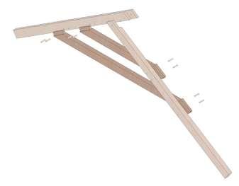
fig.5.1.43. Digram showing roof without tie member
A frame member
Tie beam

A frame member
fig.5.1.45. Exploded roof detail
fig.5.1.44. Digram showing roof with tie member
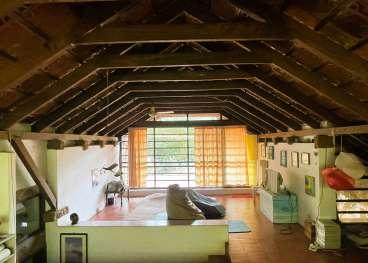
fig.5.1.46. Interior view of first floor showing the role of horizontal member placed.
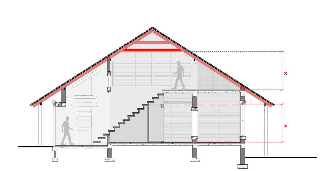
fig.5.1.47. Section showing horizontal tie member.
Poppo has use certain elements strategically which has an great impact on the space. The huge wooden roof supported by the granite columns, need a horizontal tie member so that the form does not get deform. He placed the horizontal member such that it cuts off the volume on the first floor, as shown in above fig. Eventually the placement height of the tie member and the height of the horizontal member on the ground floor are same, shown in fig. (5.2.47).


Role of Material in Space making : Works of Ar. Poppo Pingel.

Wooden batons to rest the roofing tile.
Wooden Barckets
Wooden Posts
Undressed granite columns
Brick load bearing walls. Concrete columns and beam structure
fig.5.1.48. Exploded Isometric showing structural members.

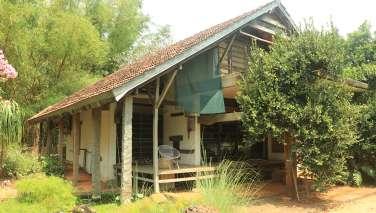
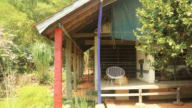
fig.5.1.50. Sketch showing undressed granite columns.

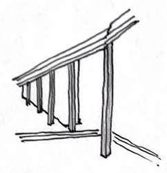
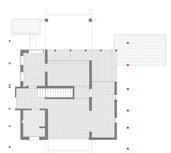
fig.5.1.49. Plan highlighting square undressed granite columns.
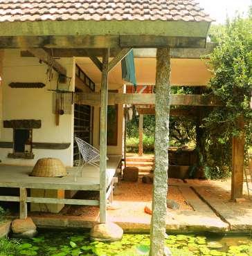
Columns placed outside the building supporting the overhangs of the roof. These columns are kept undressed or rough as they are outside the building and does not need to be get finished. Rather, these columns evokes the feeling of strength and boldness to hold the huge sloping roof. This also evokes the creation of buffer space between inside space and outside space.
fig.5.1.50. Sketch showing undressed granite columns. fig.5.1.51. Sketch showing undressed granite columns.
fig.5.1.51. Sketch showing undressed granite columns. fig.5.1.49. Plan highlighting square undressed granite columns.
Above (fig.5.1.49) and (fig.5.1.50), shows the use of two different columns adjacent to each other supporting the same roof. Undressed granite column is demarcated in red, while wooden column is demarcated in blue. Both columns serve as structural elements, however because granite columns serve as the principal supporting structure for roofs, their sizes differ. and also marks the house’s perimeter.
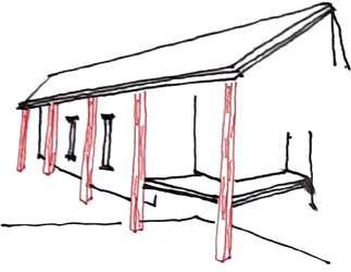
fig.5.1.52 (a). Diagram showing arrangement of granite columns.
fig.5.1.52 (c). Diagram showing arrangement of granite columns.

fig.5.1.52 (b). Diagram showing arrangement of wooden columns fig.5.1.52 (d). Diagram showing arrangement of wooden columns
Where as wooden columns are designed with brackets creating triangulation and resulting in slender use of post. The wooden beam it supports is further supported on the wall, which is another reason of using the slender post, and the post thinness also prevents it from blocking the view from the home.
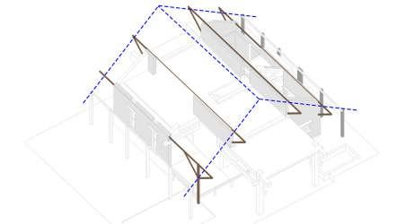
fig.5.1.54. Section highlighting the extended portion (porch)
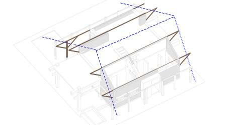
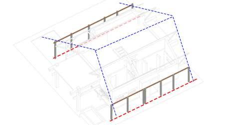
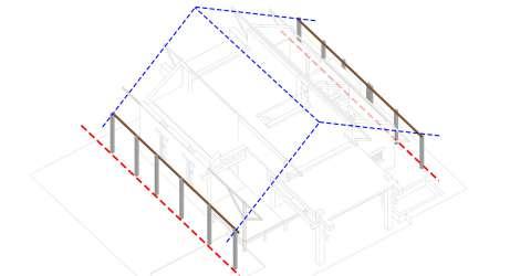
fig.5.1.53. Plan highlighting the extended portion (porch)
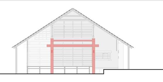
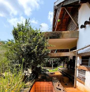
The extended porch is created with the wooden deck which incorporates the landscape into the design. This porch is casted out of concrete, as it also act as an viewing frame from the dining area towards the sand garden. To have a crisp and clean edges like a frame the structure is casted out of concrete. Also this act as an terrace on the first floor.

The overall plan has been divided into three parts. The orthogonal plan has been derived as per the nature of material. As per the profile of the roof both the end sides spaces are service space and the study area shown in (fig.5.1.55). The left hand side in the fig there is toilet, entrance and kitchen. where as on the right hand side there is a study room. The central portion of the room act as an family area.
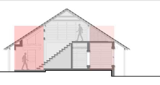
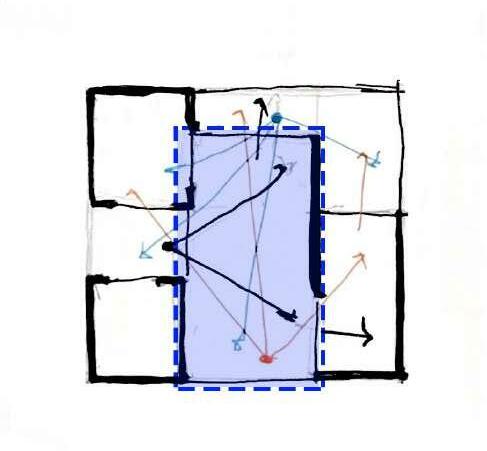
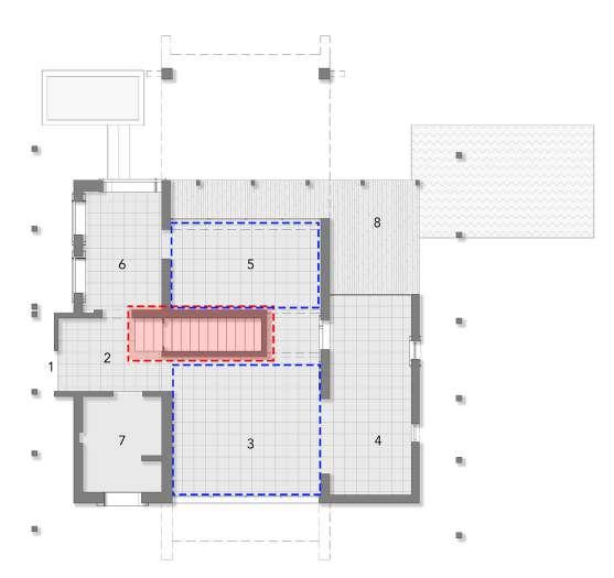
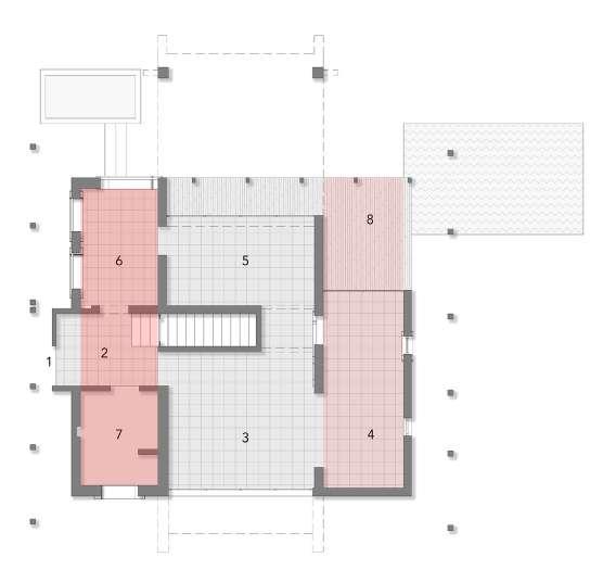
Not only in the plan but also in section poppo has divided the space same as in the plan. The entrance area on the ground floor has double hight space and on the top the study area there is a small library space.
Staircase as an element is strategically placed dividing the family space into two parts as Living and dining. This helps in the giving proper path for circulation, rather then free flowing path.
fig.5.1.55. Plan highlighting order of spaces. fig.5.1.56. Section highlighting order of spaces.
fig.5.1.57. Sketch showing plan without staircase block fig.5.1.58. Plan representing staircase block
fig.5.1.59. Plan showing density of walls and size of openings.
The order of spaces can be identified from the placement and size of the openings and through the density of the walls. Basic openings doors and windows define the envelope of the spaces.
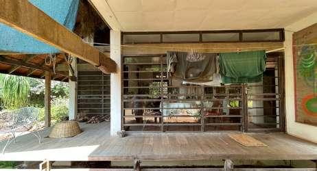

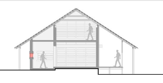
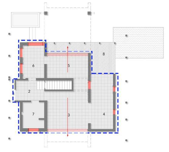
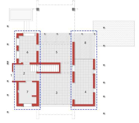
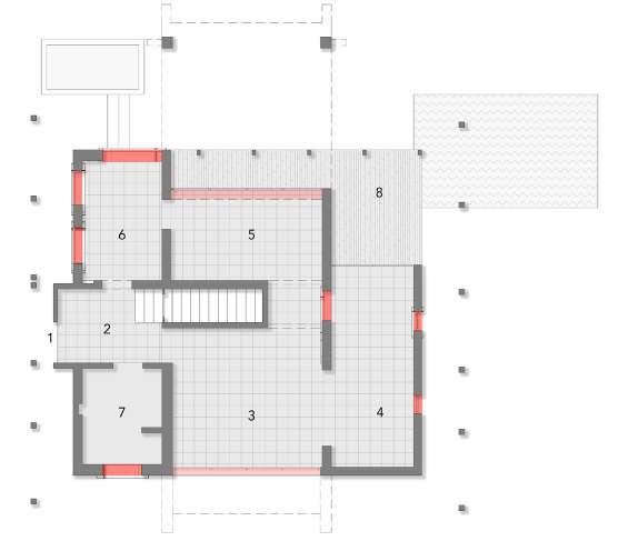
fig.5.1.60. Sections size of openings.

fig.5.1.61. Images showing different size of openings.
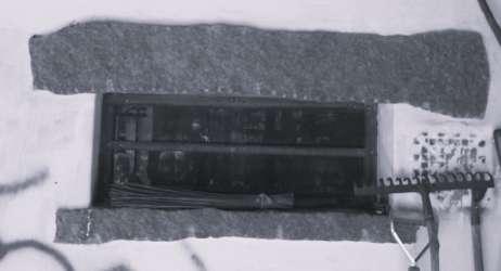
The (fig.5.1.59) represents the density of the wall, which defines the space. On both the edges, the spaces require a bit of privacy and closure. Therefore the density of the walls is higher, and the size of the opening is smaller compared to the openings in the central part.


The living and dining spaces act as a link or a multipurpose space opening completely into nature.
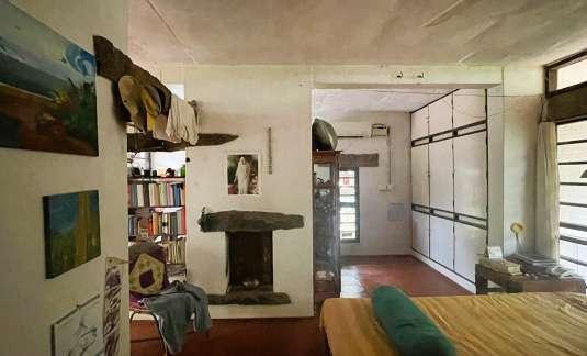
Due to the bigger opening in the dining space, the wooden deck is strategically placed adjacent to it, which opens into the surroundings and incorporates landscape into the building.
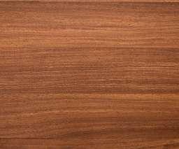
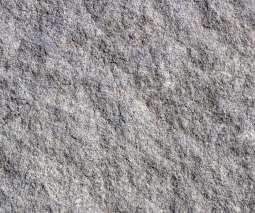
fig.5.1.62. Images showing various materials used in the building.
Colour, Texture and Light.
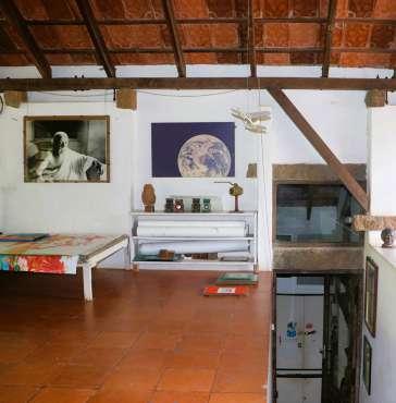
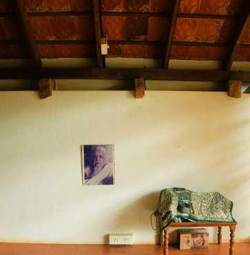
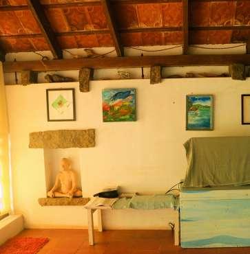
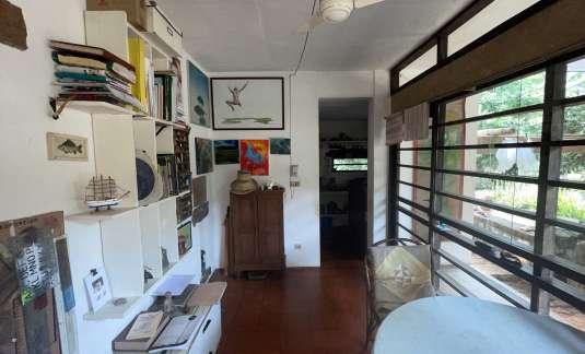
Poppo used locally available materials to built his projects. The roof structure of the building is of wood and the undressed granite stone. Wood has been use in various parts od the house i.e., barcktes are made out of wood, deck near the dining space is made from the wood, window frames are made from the wood. Poppo has use undressed granite stone also in various ways, he used the stone as an entrance gate, then for the path of approach, as columns , beams, sill and lintel. For the flooring poppo used red rough kota tile which work as an contrast to the white walls. Poppo use white lime plaster on the walls, as the white colour reflects more light and lit up the space. (Fig.5.1.63) shows the interior of the house with white colour plaster.
fig.5.1.63. Images showing interior of the rooms lit up due to light reflecting from white colour walls
The most dramatic portion of the project is the path of approach from the entrance gate towards the building. Fig.5.1.65 shows the entrance gate made from the undressed granite stone placed vertically, giving the sense of entrance and also the gist of the type of building inside.
After passing through the entrance gate, poppo has designed an path with granite stone leading towards the building. The path cut through the bamboo plants. The white plaster wall gets highlighted due to contrast with colour of nature.
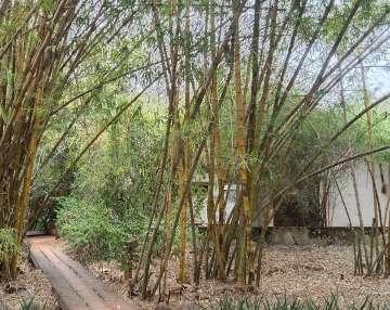
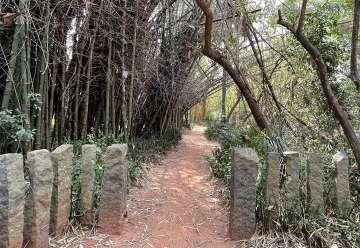
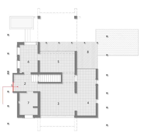
fig.5.1.64.Plan showing entrance direction to the building.
fig.5.1.65. Image showing vertically placed granite stone.
fig.5.1.66. Image showing granite stone use as bridge.
fig.5.1.67. Image showing main entrance door of the building.
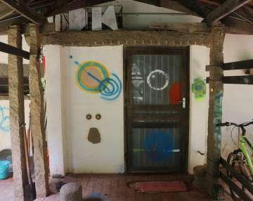
After walking through the bamboo forest, on the granite stone path, the entrance of the house which is not straight. Shown in (fig.5.1.64) , the entrance of the house is from the side ways. It is a low hight entrance door, which open up into the double hight foyer space. Which act as an pause point shown in (fig.5.1.68) . From the foyer space the first object which attracts the eyes in the niche with the horizontal granite stone boldly placed shown in fig.5.1.68 . Moving further from the foyer space towards the niche is the living space. From the living space one encounters another horizontal granite back side shown in (fig.5.1.70) , which evokes depth to the building.
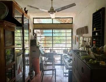
Moving further from the living space towards the another granite lintel is the study space shown in (fig.5.1.71) . Coming back to the living space and seeing left, there are two more horizontal stone acting as a beam shown in (fig.5.1.72). From there one notices huge amount of light penetrating into the house. That is the dining space shown in the (fig.5.1.73) , from were there is a view of the sand garden.
fig.5.1.74. Image of kitchen.
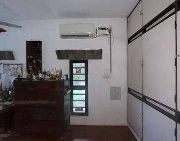
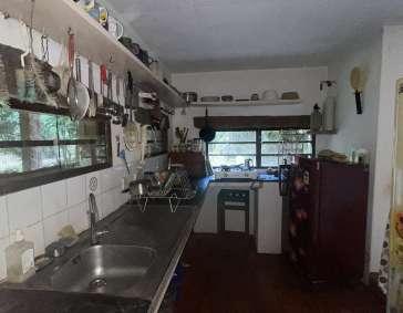
fig.5.1.72. Image view towards dining space fig.5.1.73. Image of dining space
fig.5.1.67. Image from the foyer space towards living space.
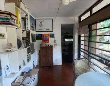
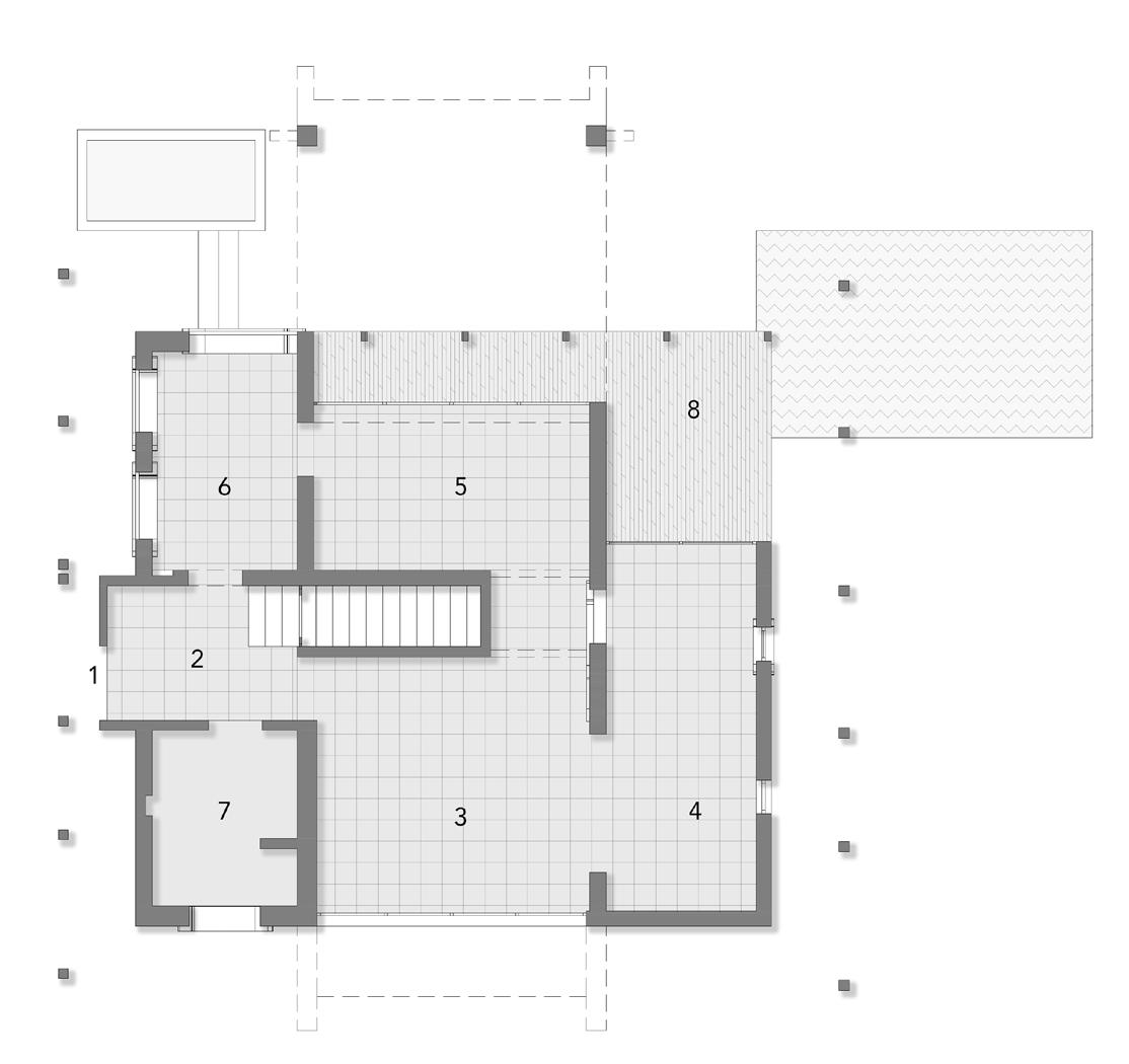
fig.5.1.69. Image view from the living space
fig.5.1.70. Image view towards study area

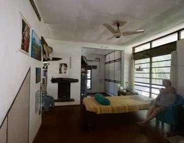
fig.5.1.71. Image view of study area.
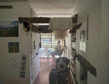
From the dining room, one sees small windows inside a dark space from a small door opening. That is the kitchen space with small windows shown in (fig.5.1.74) . From there one again reaches the double hight foyer space.
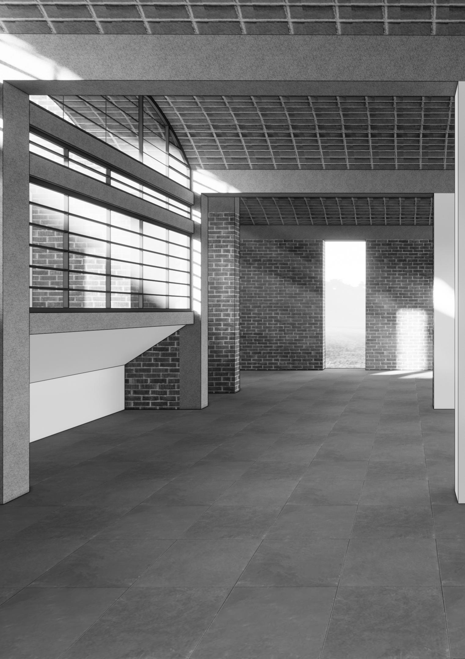
Built year: 1990 - 1992
Materials : Brick, Concrete, Stone, Steel and Glass.
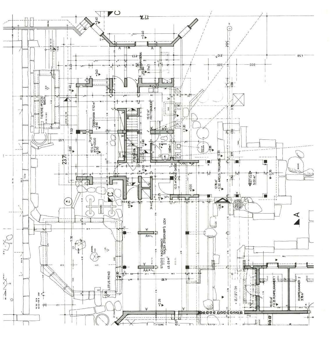
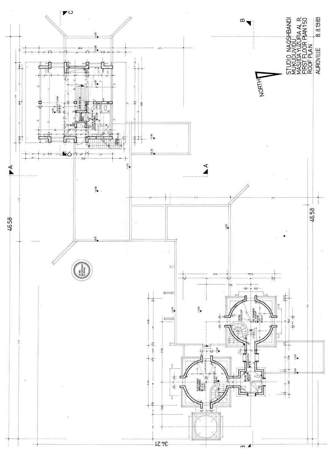
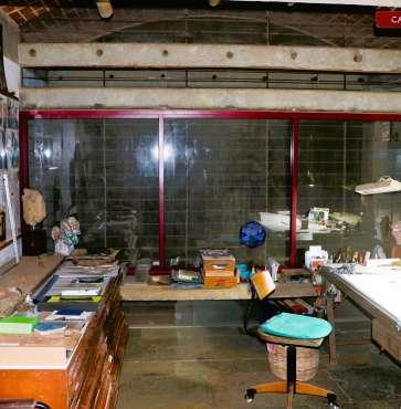
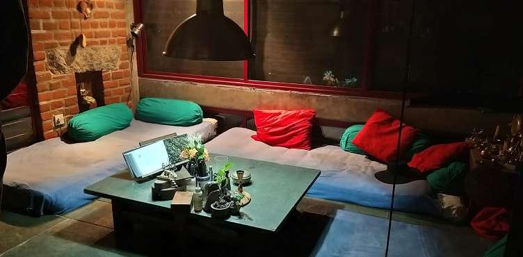
Mukuduvidu is a residence with studio for two people. The home evokes a continuous east-west wall with projections of various functions at varied scales. All of the areas are connected, both inside and externally, to the terrain and the surrounding environment. Poppo was researching alternate building materials and techniques following the cement scarcity, and this house, which was constructed after that, expresses similar concerns and construction methods such as vaults and domes. Because of the surrounding trees, the upper profile of the house is not usually visible while approaching it from the north side. The full building form is visible from the south side, where there is a sand garden.


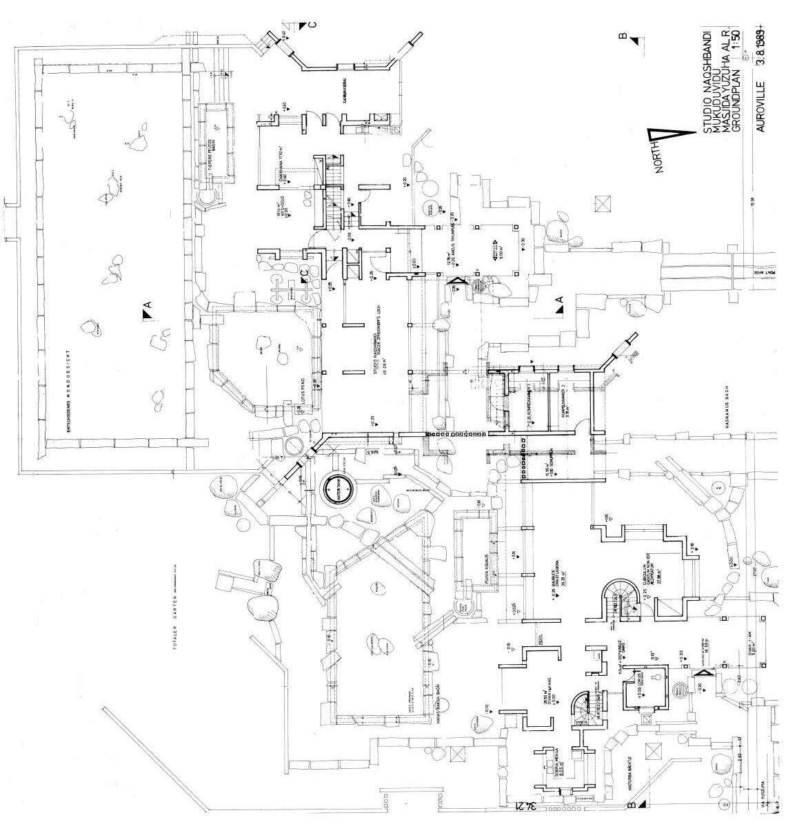
fig.5.2.2. First floor plan of Mukuduvidu
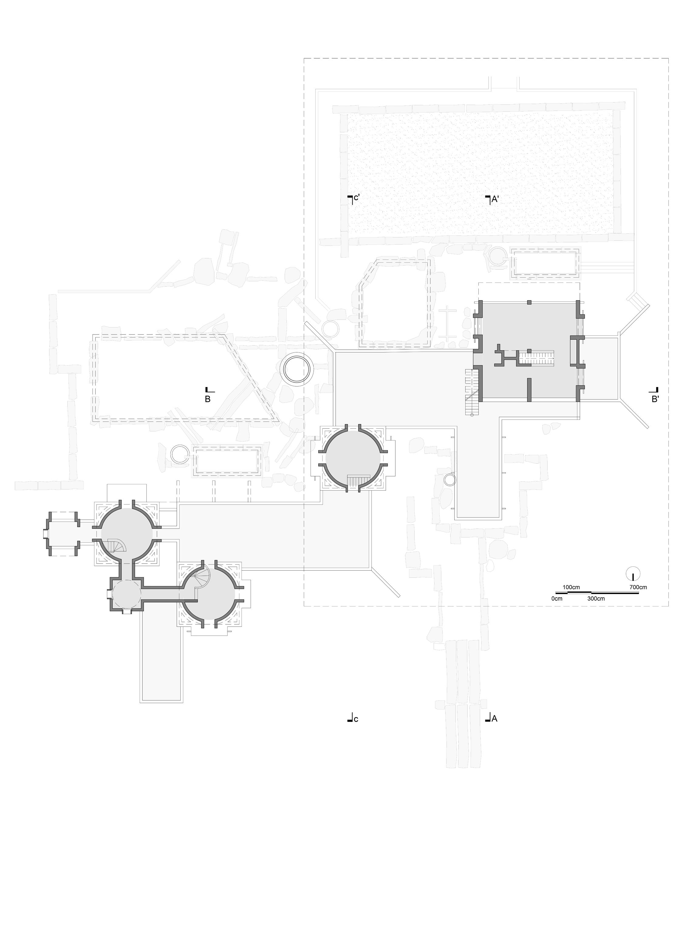
7 13 13

13 9 12 12 Plan redrawn from the original plan given from studio Naqshbandi, Auroville.
13
Section AA’
Section BB’
Section CC’

fig.5.2.3. Sections of Mukuduvidu
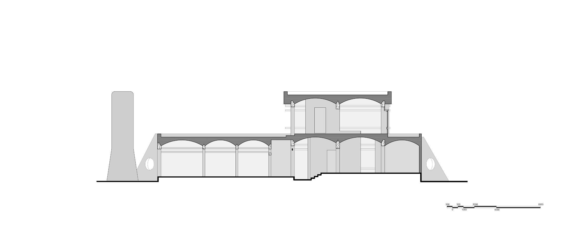
Sections redrawn from the original plan given from studio Naqshbandi, Auroville.
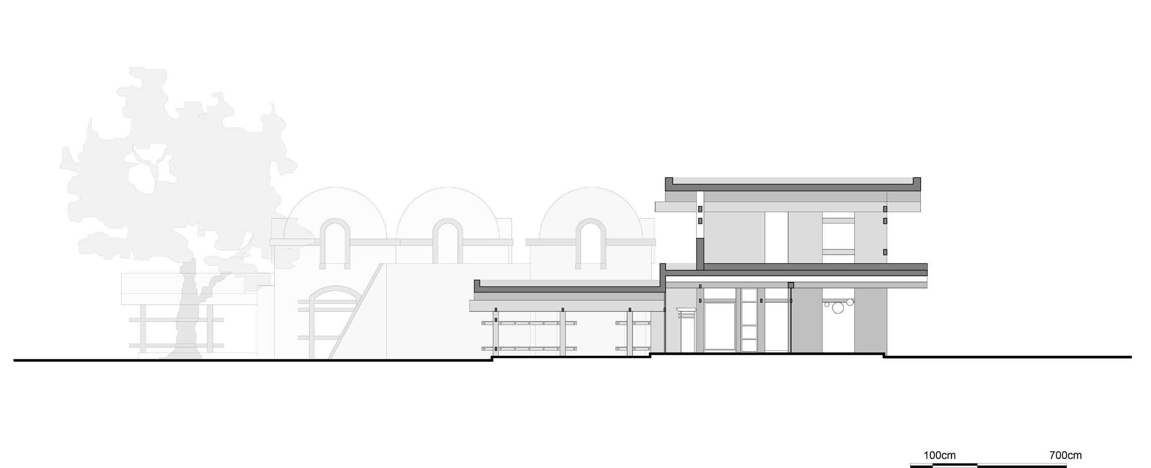
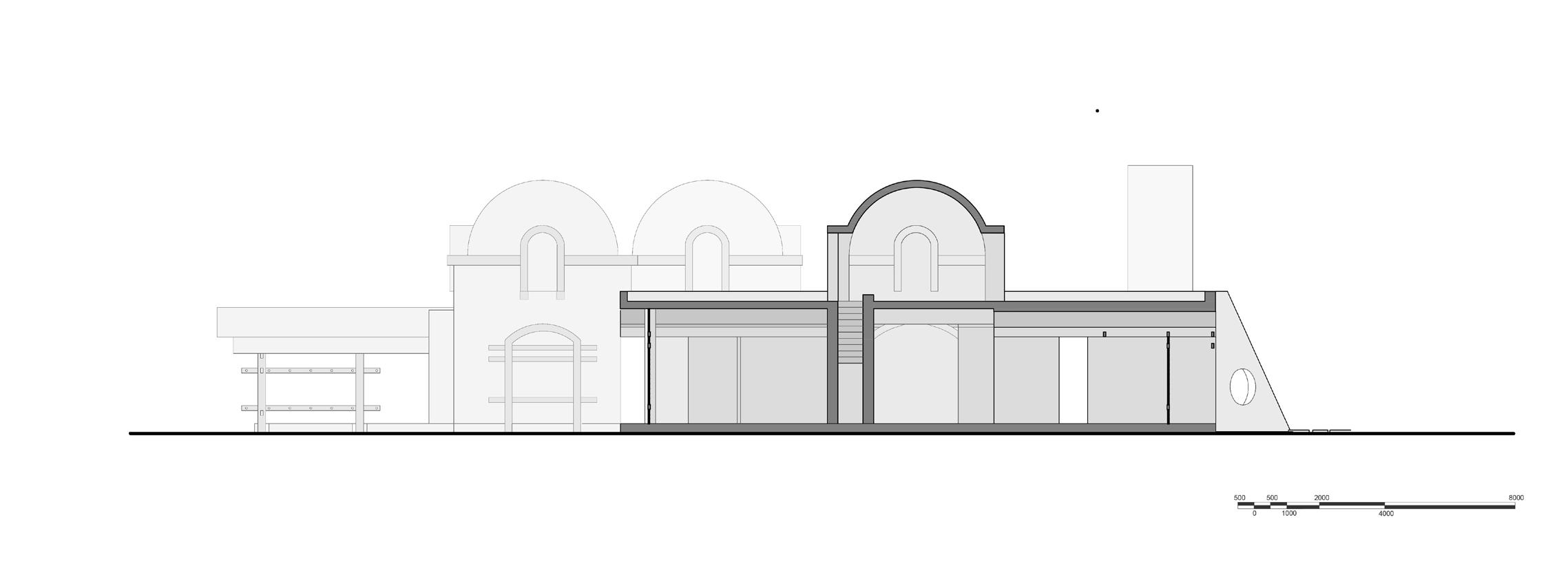
fig.5.2.4. Elevations of Mukuduvidu Elevations redrawn from the original plan given from studio Naqshbandi, Auroville.

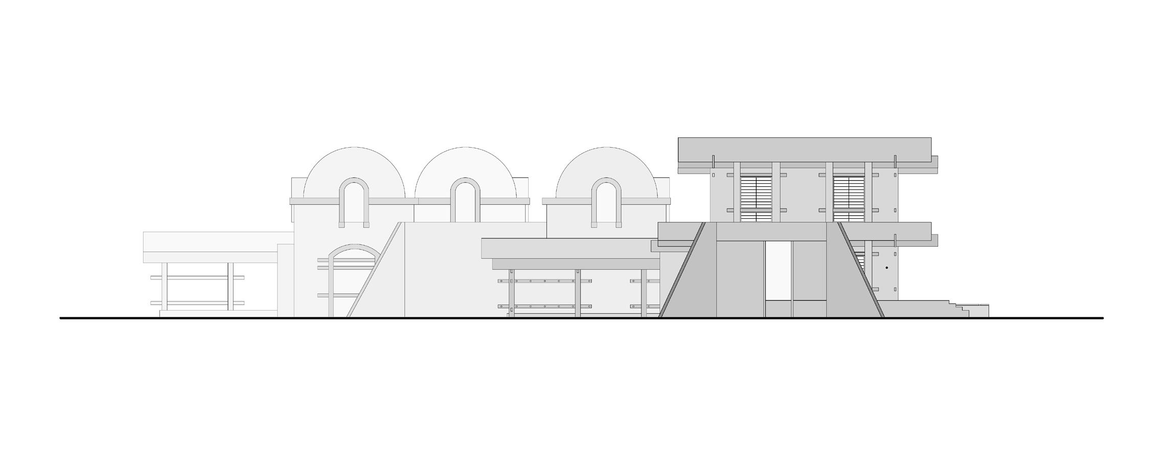
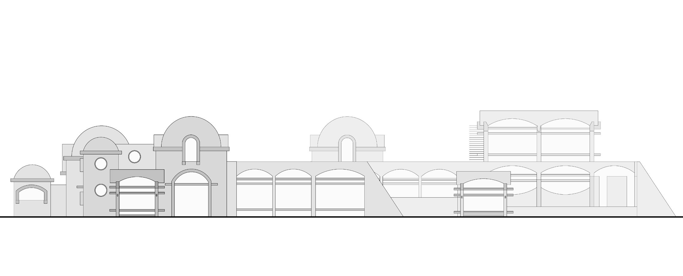

fig.5.2.5. Isometric of Mukuduvidu

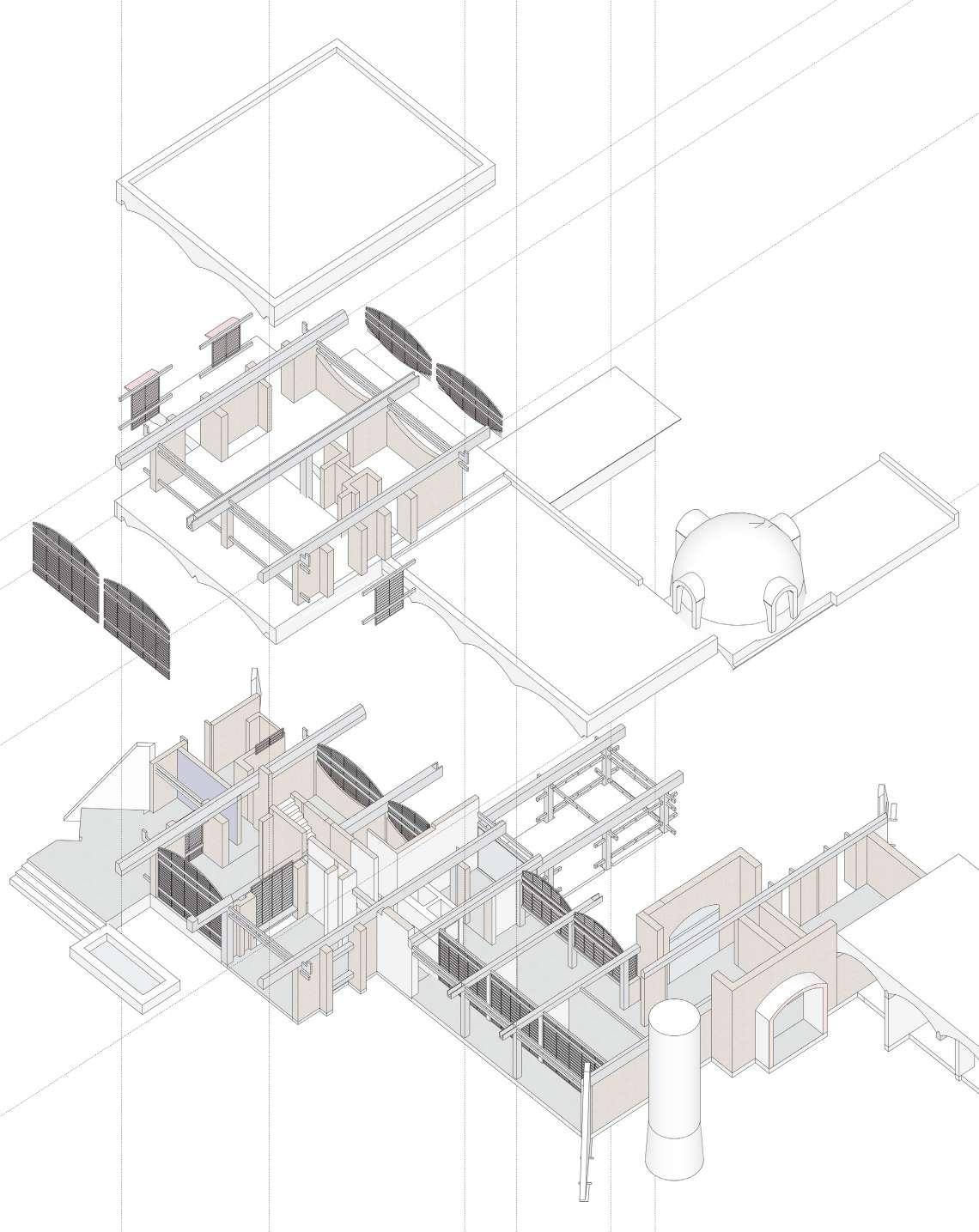
fig.5.2.6. Images showing view from the sand garden towards the building.
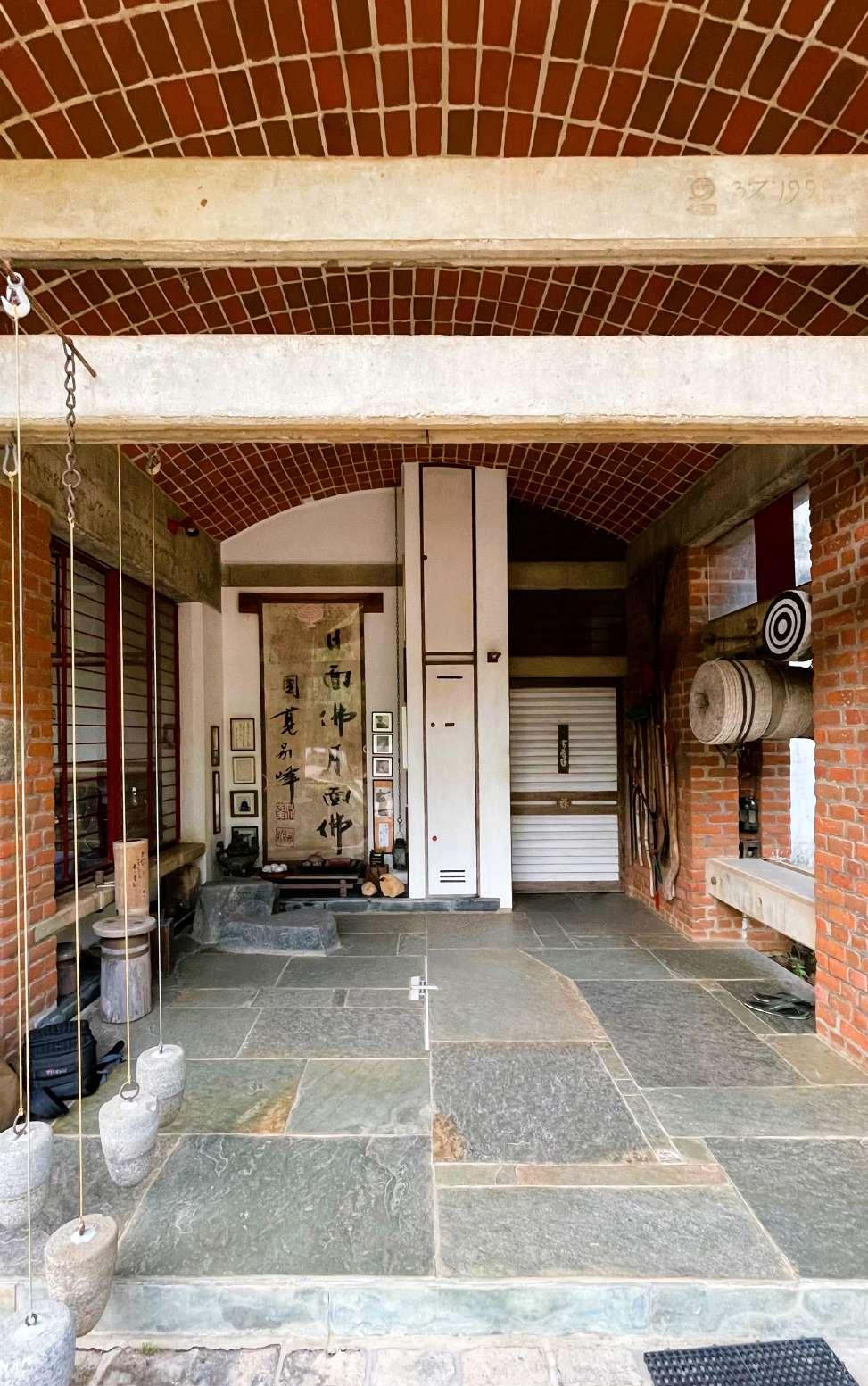
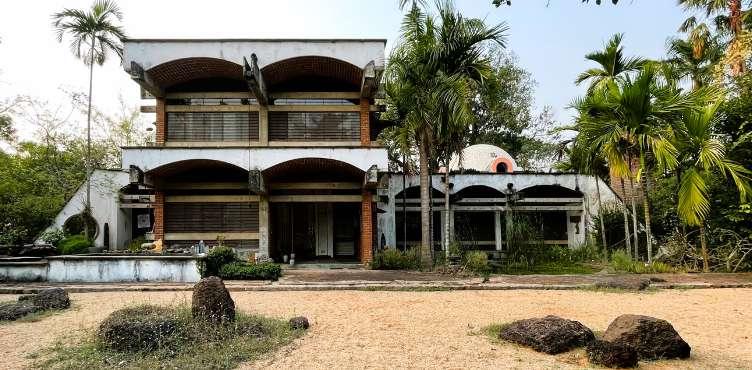
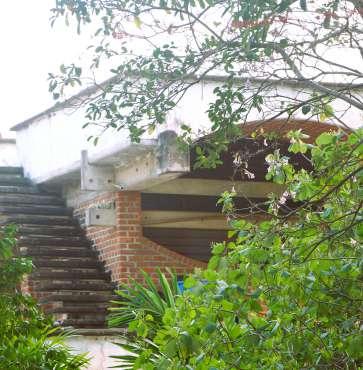
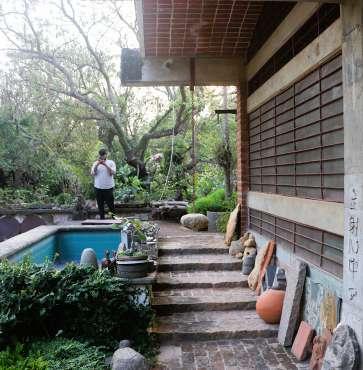
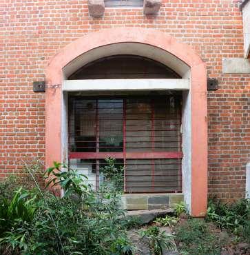
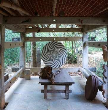
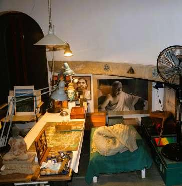
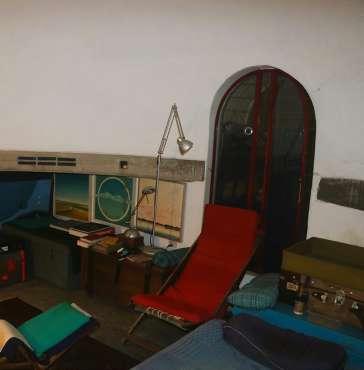
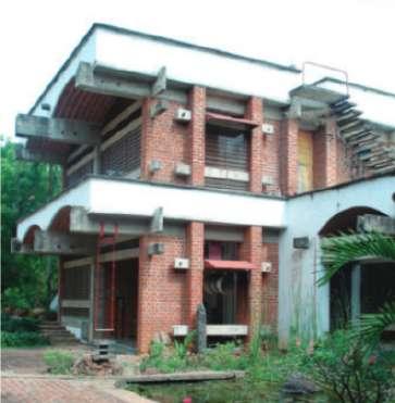
The following images represents the time period when poppo explored vaults and domes in his projects. In the early eighties, with the rationing of cement and strict government controls, archetypal themes of vault and dome evolved as a structural response yet exploring a sense of place responding to their intrinsic function(Pingel)(2012).
fig.5.2.8 Peter and Nicole House, Gaia, 1986-87
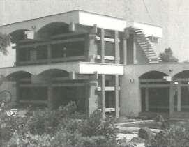
fig.5.2.9 Angad’s House,Kottakarai, 1986-87
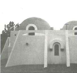
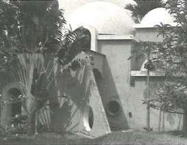
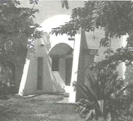
fig.5.2.10 Helen House, 1989-90
fig.5.2.11 Mukuduvidu, Kottakarai, 1990-92
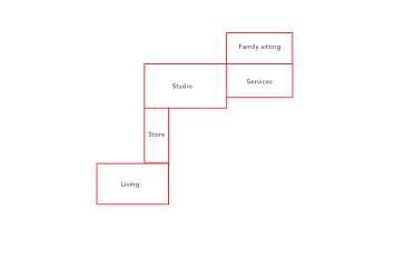
fig.5.2.12 Diagram representing evolution of plan
Above digram represents, simple arrangement of space with studio in center, connecting living space, and services and family sitting. Initially poppo designed building considering for two person. The orthogonal form of the building in generated due to the nature of brick and concrete.
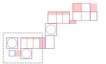
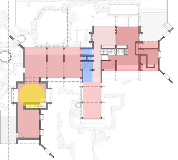
The following diagram represents how the basic plan evolved with the addition of supporting spaces marked in blue. The black doted line represents Ar. Mona Pingel’s house and rest Poppo’s studio and living space. The overall plan of the building seems to be organically fragmented.
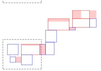
The above diagram demonstrates spillover spaces designed. These act as the buffer between the inside space and outside space. This is also maintain air ventilation in the space, responding to the humid climate.
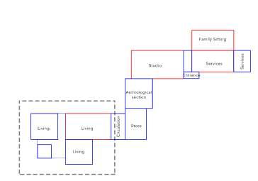
fig.5.2.13 Diagram representing typical section.
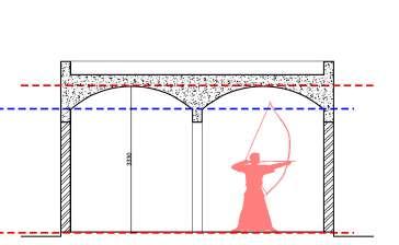
The following digram represents a typical flat concrete slab with the clear celling height of 2810mm from the plinth level part section. Poppo is found of playing Kyudo. With flat roof he practicing Kyudo would not be possible. And designing a flat roof from brick and lime was not a great idea.
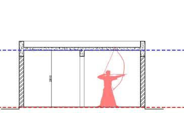
fig.5.2.14 Diagram representing Vault section.

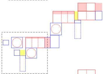
The following digram represents part section of vault design. This helps in achieving volume into the space. It also gives different experience to the user. The reason Poppo did vault was to achieve certain height so he can practice Kyudo. Then he decided to use vault rather then flat roof in his design.
The above diagram represents division of space as per arrangement of vaults. It also demonstrates change in plan form as per the roof. For e.g. dome needs squarish base to take shape and transfer its load equally. Thus, the blue squares with doted circle represents dome roof.
The yellow patch in the digram represents flat roof. This creates change in volume and expression. Flat roof in this project is use over entrance. Thus, giving an experience of entering through flat low space to volumetric vaults.
The following digram is the final result of the evolution, with the division of spaces, formulating roof, creating entrance and orienting the building as per the context.
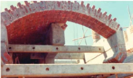
(fig.5.2.13), demonstrates the construction technique of brick vault, in the image clearly represents two layers of vault construction. The bottom layer is of horizontally arranged stack bond bricks, which has an expression of even surface seen from the space. The upper layer is off vertically arranged bricks in certain angle which gives shape to the vault and also act as main structural layer.

Though the building is linear and cuboid in shape, the language of the building is enhance through vaults and domes. The rhythmic repetition of vaults evokes an experience of lightness in contrast to the heavy mass of exposed brick wall. Implementing the vault-dome theme, the studiohome extends and shares its walls with the home of a friend. The form appears more centralized than linear due to symmetrical location of the domes. (fig.5.2.15) and (fig.5.2.16), emphasis on the white colour plaster done only on the celling (vaults and domes), on the walls of studio space and buttress. Poppo applied white colour to the celling which extends outside because, it hids the brick masonry done to construct vault, which looks clean. Also white paint signifies a specific space, it also signifies the vault and dome profile. Expose bricks and white colour are contrasting in nature and , he kept walls exposed brick which has a heavy and rough character, which also does not come up too bright. Where as Poppo used white color to highlight the specific decision which contributes to the form of the building.
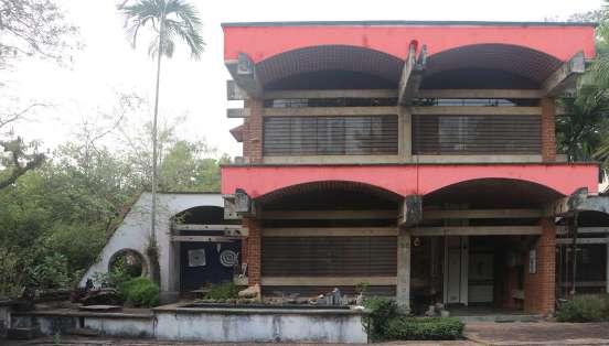
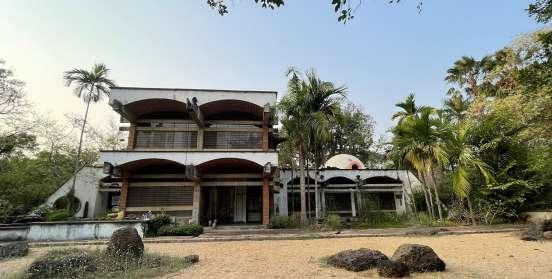
fig.5.2.16
fig.5.2.17
fig.5.2.18
fig.5.1.23. Section showing the hierarchy of volumes
fig.5.2.19 Section showing the hierarchy of volumes


The overall volume within is similar, and the roof line maintains the height. By lifting the plinth in order to minimize the volume, there is a minor variation in the volumes. This scale disparity occurs between the work area and the living area, with the former requiring a bigger volume and the latter requiring a smaller one. The upper floor follows the same scale as the lower floor, resulting in a larger square when the two floors are combined.
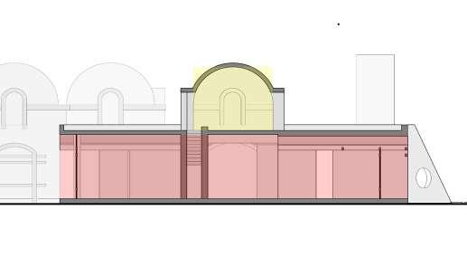
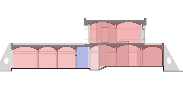
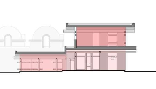
The dome of the Gol Gumbaz is semicircular. As a result, all of the spaces have a comparable scale, yet the essential pieces of the spaces are proportioned differently.
Concrete tie beam
White Plaster Brick Vault Steel Framed Window Expose Brick Walls Brick Vault Buttress
Concrete Tie beams
Concrete Stringer Beam Concrete columns
Role of Material in Space making : Works of Ar. Poppo Pingel.
fig.5.2.20. Exploded Isometric showing different elements used.


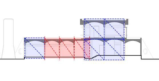
fig.5.2.24. Ground Plan showing proportionating system fig.5.2.21. Plan showing grid structural system of ground floor plan
fig.5.2.25. First Plan showing proportionating system of fig.5.2.22. Plan showing grid structural system of first floor plan
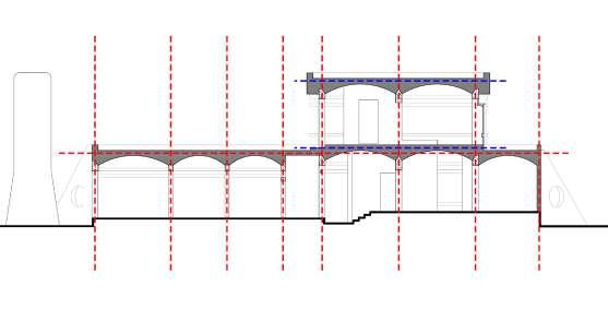
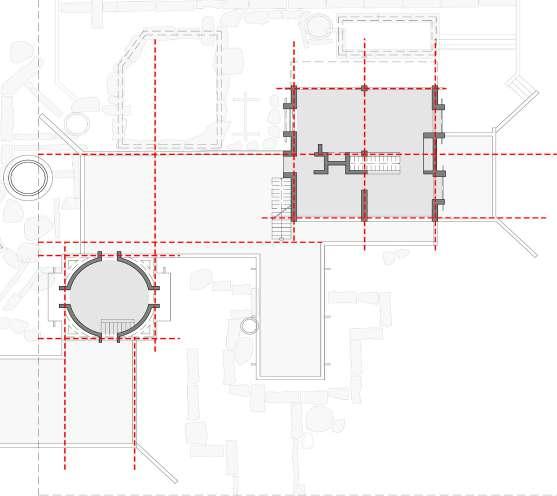
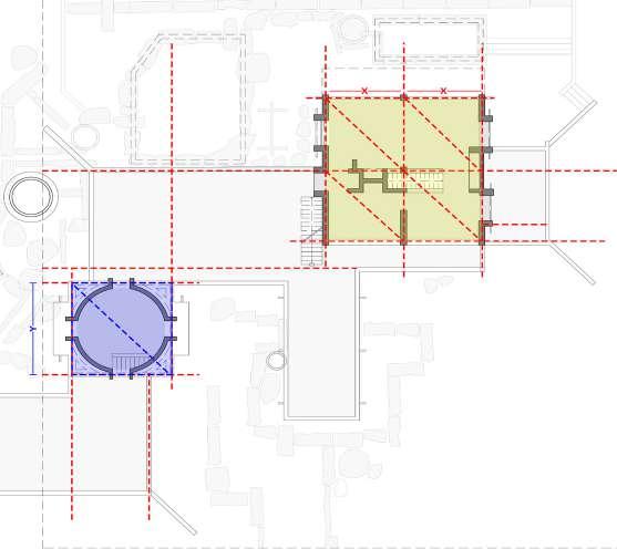
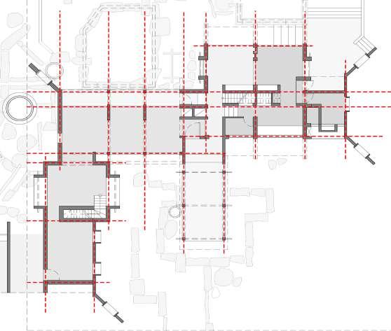
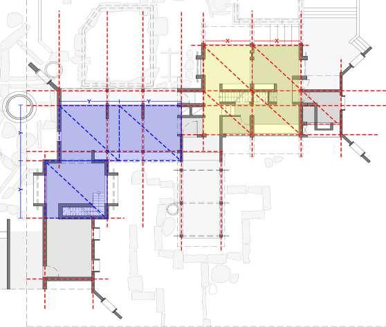
fig.5.2.23. Section showing grid structure system
fig.5.2.26. Section showing proportionating system.


Role

The following page demonstrates structural grid of the building. The building is a composite structure of brick and concrete. As mention above the orthogonal form depends upon nature of material, as per Poppo. The house is a great composition of geometric spaces with different character and scales come together in a definite proportioning system to blend into each other and to create a distinctive identity.

fig.5.2.27(b). Elevation showing load transferring through buttress.


The bigger square structure, which holds the living room and kitchen, is made up of four smaller squares that divide the larger square evenly. Even in the volumes, the same square appears. The dome, which has a square plan, has another dimension that is repeated. In the overall plan, there are three such individual squares that are spaced apart as shown in (figs. 5.2.24),(5.2.25) and (5.2.26).
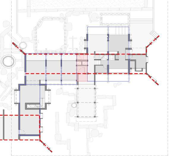
fig.5.2.27(a). Ground Floor plan showing structural bay of buttress.
fig.5.2.28. Drawing showing construction technique of vaults.
The studio’s bays follow a different grid, but the overall length of the studio may be calculated using the same Gol Gumbaz square size shown in (fig.5.2.24). The studio is shaped like a rectangle, with twice the length of the Gol Gumbaz square measurement. However, the studio is divided into three sections, each having three vaults and two floors.
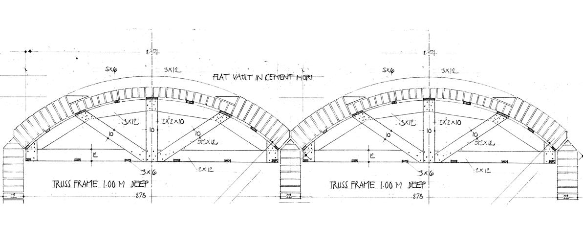
fig.5.2.29. Exploded isometric representing Construction technique of Pre cast beam and column
fig.5.2.30. Diagram showing importance of tie beam and buttress in vault construction
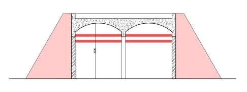
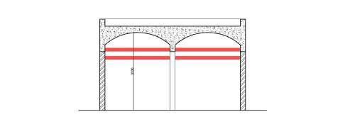
fig.5.2.31. Diagram showing importance of tie beams in the plan.
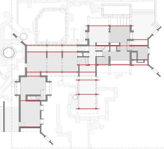
fig.5.2.32. Elevation highlighting horizontal members (tie beams).


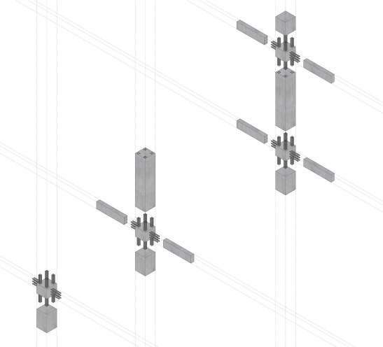
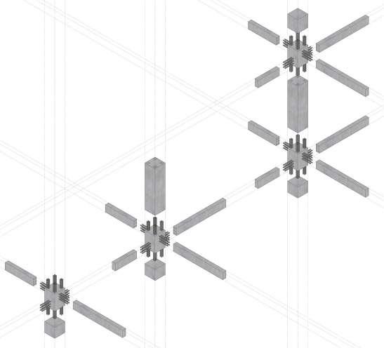
Role of Material in Space making : Works of Ar. Poppo Pingel.
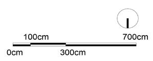
Poppo used buttress to counter the thrust created by the vaults shown in (fig.5.2.30). He strategical placed the buttress, which is visually balanced as seen in (fig.5.2.31) and also structurally stable.
Grey horizontal members in the house are the precast concrete beam. Poppo has used precast members of concrete and assemble them as working with wooden members. This precast beam act as a tie member between vaults, which also contributes in defining character of the building. Poppo designed the building orienting north - south direction for ventilation in humid climate. To mark the boundaries of the building he used this pre cast members which depict boundaries of the house.
fig.5.2.34 (a). Diagram highlighting buffer space created through extension of beams.

fig.5.2.33. Images highlighting horizontal members into the building.
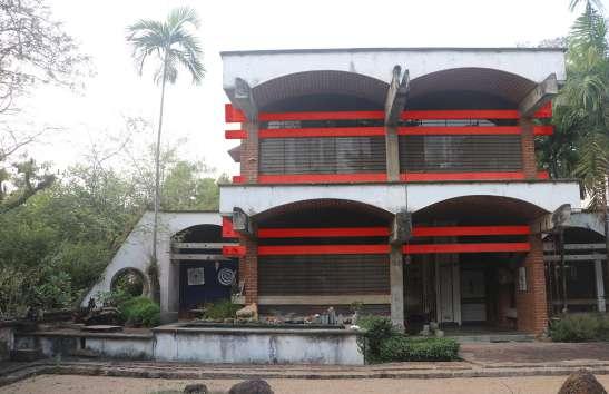
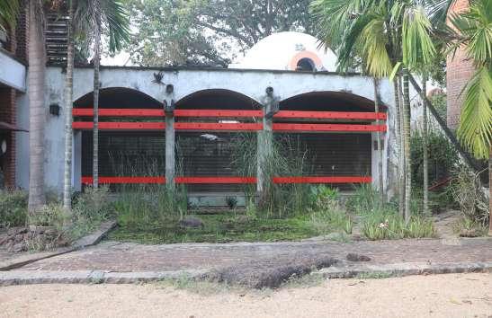

fig.5.2.34 (b). View showing buffer space created through extension of beams.
Above diagram represent, a similar type of pattern that poppo use to create buffer space between inside space and out side space, by extending beam resting on columns. This also creates a gesture of degree of transparency moving from outside to inside.
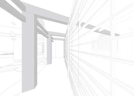
The overall form of the building has linear character. Horizontal beam and tie beam enhance the horizontality in the beam. Poppo strategically, used white and gray colour for slabs, parapet and beams in contrast with expose brick texture for walls shown in (figs.5.2.35) to (fig.5.2.37) demonstrates the horizontal band on the facades, which contributes in enhancing aesthetics qualities of the building.
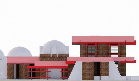
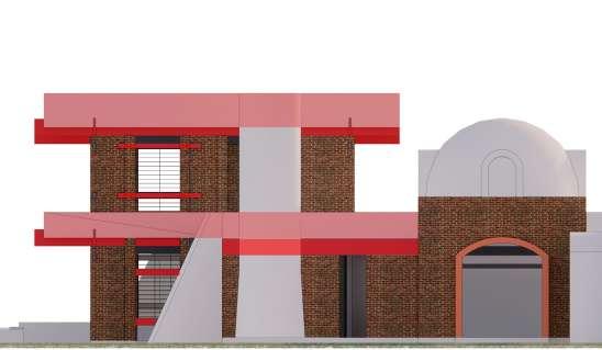
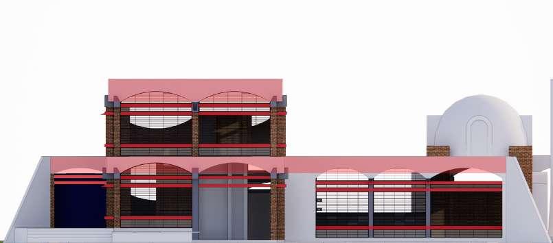
fig.5.2.35. East elevation representing horizontality. fig.5.2.36. West elevation representing horizontality.
fig.5.2.37. North elevation representing horizontality.
Brick Vault Concrete Tie beams
Brick Buttress Brick Dome
fig.5.2.38. Exploded Isometric showing structural members.

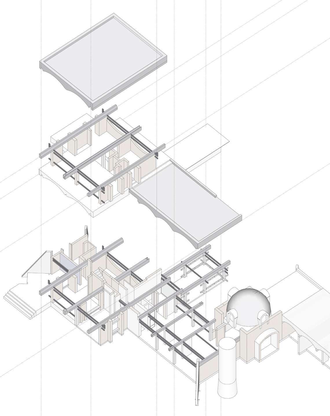
This building is a residence - studio, Poppo designed for himself. (fig.5.2.39) , represent different type of ceiling’s explored, red colour depict vaults, blue colour domes and yellow colour flat roof. The fig also suggest the staggering of space to create pockets between space connecting nature.
Spaces are arranged one after the other due to vaults, this is know as juxtaposition arrangement of space. Vault form also allows the space to open up from two sides shown in (fig.5.2.40). Thus, Poppo has oriented the building north-south direction which is also the response to the climate in auroville.
fig.5.2.39. Diagram representing spaces with vaults and dome.
(fig.2.40), represents compartment of spaces divided through vaults. The yellow patches shows semi open spaces being accommodated with the structural geometry.
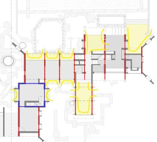
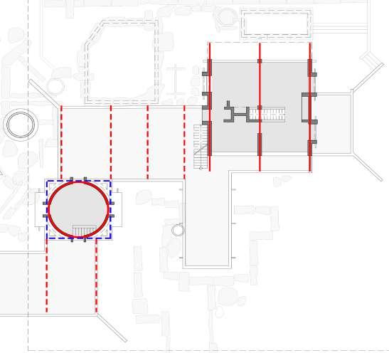
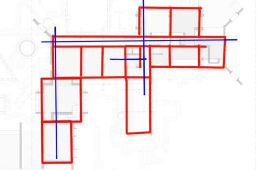
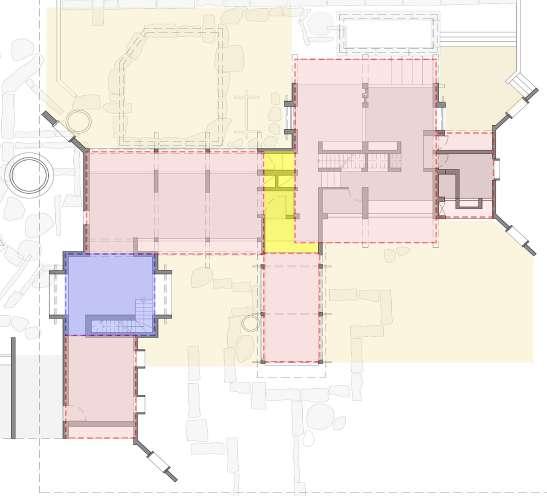
fig.5.2.40. Diagram representing order of space and axis.


fig.5.2.41. Diagram highlighting semi open spaces accommodated with geometry.
fig.5.2.42. Diagram highlighting type of space on first floor.
fig.5.2.43. Isometric diagram showing impact of Vault into space.
fig.5.2.44. Diagram highlighting type of space as per density of wall

(fig.5.2.44), demonstrates type of space as per density of walls and openings. Blue patch space in fig .,., is studio space and entrance foyer which has low wall density and big openings. This allow space to open up from two sides.

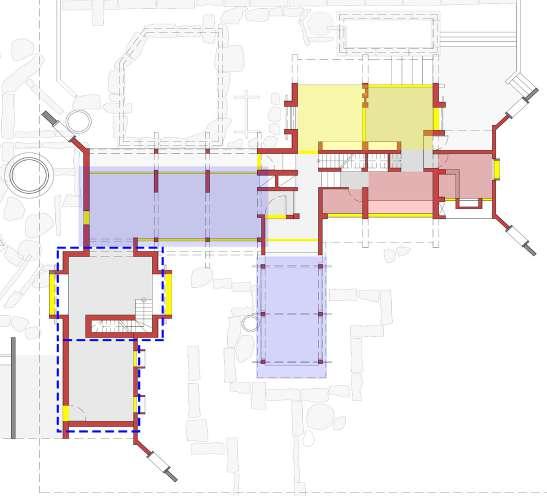
Patch with red color and blue dotted line has high density of wall with small opening percentage. Thus, this define private space or service space. In this fig., red colour patch is a service space, containing toilet and kitchen, and space highlighted with blue dotted line are archaeology room which need proper close space to protect the excavation from outdoor environment and a store room. On the first floor seen in (fig.5.2.45), with red colour path is the sleeping space. This is the only space on first floor which has an internal partition wall.
Yellow colour patch in both the diagrams represents family area or study space. They can be define as a gesture of semi-open space or a free flowing space in Poppo’s plan. Thus, Poppo’s plan with arrangement of wall and openings can suggest the type of space he has designed.
fig.5.2.45. Exploded Isometric highlighting type of space as per density of wall.
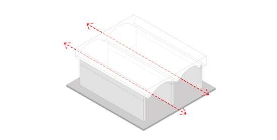
fig.5.2.46. Image of the studio space from sand garden.
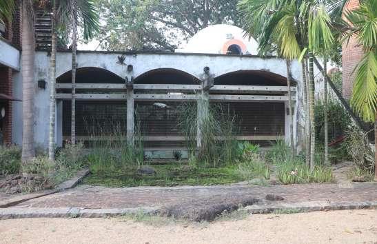
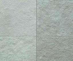
Poppo’s work has quality of composition material he used. As mention in first case study he does not import materials from different region, he prefer using local materials. In this building poppo used bricks, concrete, lime, kota stone, and steel and glass for window. Brick in auroville is easily available and can be produced on site due to the red soil. He used white plaster in contrast with expose brick walls. He used white plaster in work space as white colour reflects more sunlight and can lit up the space more brighter. The finish also enhance the space quality with smooth and finish walls. Granite stones are used in landscaping primarily, but he has used it as seal and lintel for niche, as he used it in a previous project. Except work spaces poppo left the walls as expose brick shown in (fig.5.2.47) and rough kota stone has been used in entire house because as per poppo rough kota stone feels good in feet while walking. He used steel for window frame, so that he can easily bend the marital when need. For example, to make the window touching the vault, steel makes it.
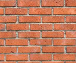
fig.5.2.46.



fig.5.2.47.

interiors of the studio space and Sleeping space.

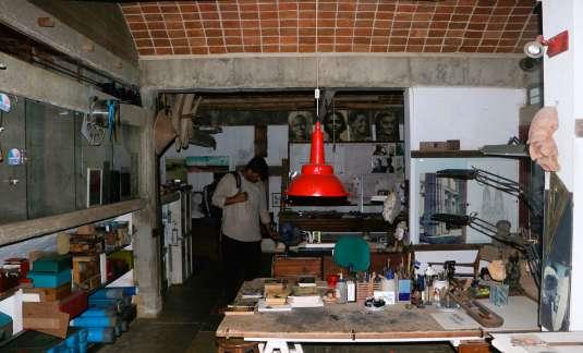
The house is approached via a paved pedestrian route that can been seen while passing. This is the only way to get to the house, being on the front side. The path leads to the house is both raw and finished, and it is created from stone scraps, granite stone laid horizontal, other tiles and mosaics. This is the formal public entrance of the house. Another private movement extends from the south side of the home to the east side of the next house, around the sand garden. This is a common movement that connects the back sides of both houses, and it is relatively private because it can only be accessible after passing the house.
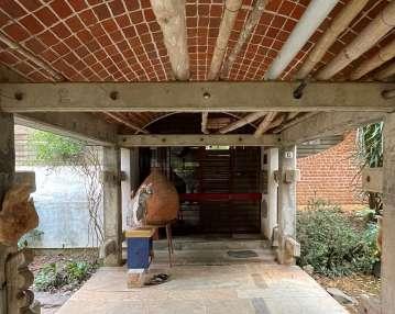
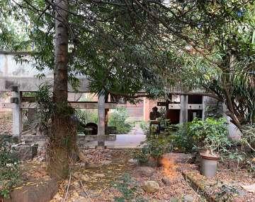
fig.5.2.49. Image showing bridge to approach towards the building.

fig.5.2.50.

fig.5.2.48.Plan showing external approaches of the building.
fig.5.2.51.
The internal circulation within the house is majorly designed as per the arrangement of walls. As the walls are arranged in linear axis creating spaces one after the other, makes circulation clear and distinct in its access. Circulation can also be designed as per the nature of the space. For example, staircase which leads to the Poppo’s room on upper level is opposite to the corridor which is parallel studio between two high walls. This stairs are quite private with door at starting point and is restricted entry. Same way the last bay of the studio becomes more private in its nature as it get closer to the next room. Elements like horizontal beam also directs the circulation.
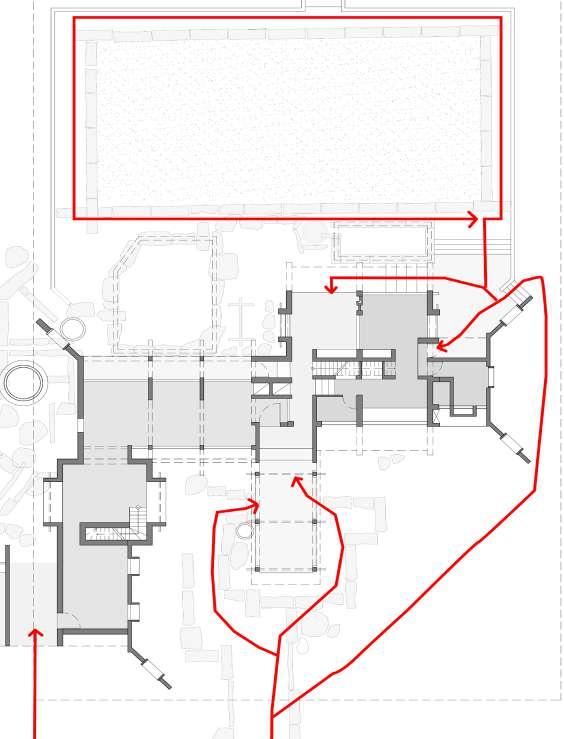
fig.5.2.55. Image view towards Kyudo practice space. fig.5.2.56. Image of studio space fig.5.2.57. Image of archaeology room.
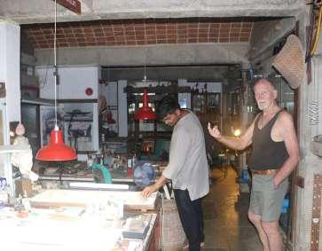
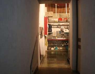

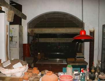
fig.5.2.52. Image view from the entrance porch. fig.5.2.53. Image view towards kitchen area. fig.5.2.54. Image view of Chaikhana.
The external circulation of the house if quite free, curvy and flexible. Where as the internal circulation of the house is quite rigid on defined path in a liner direction.


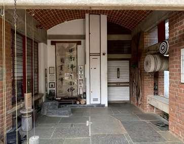
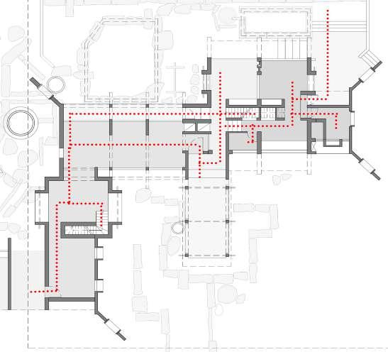
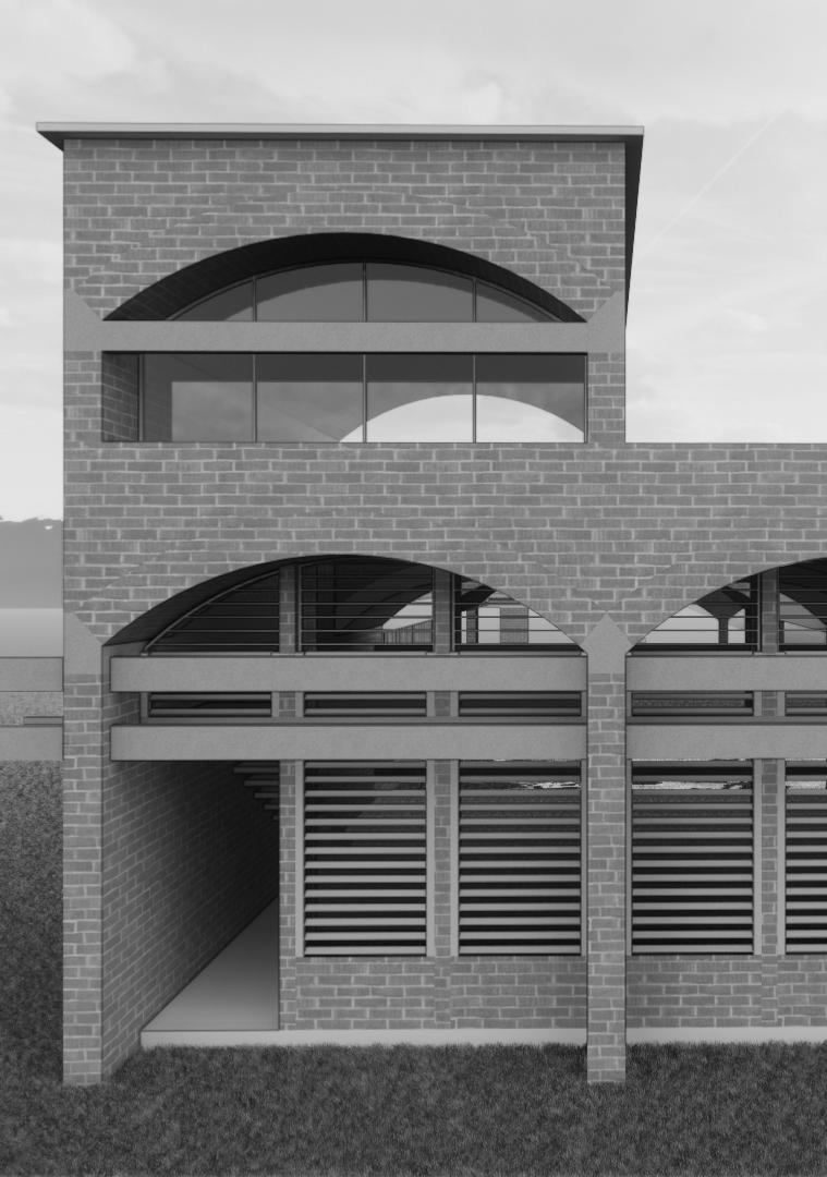
Built year: 1991 - 1993
Materials : CSEB, Concrete, Glass and Stone
Udavi School was one of the first schools established in Auroville (1973) for local students. It has evolved over time into a jumble of several structures constructed at various times by various persons, serving roughly 250 students now. Udavi school is the part of Udavi campus initiated as a evolution of experiential school. Expose CSEB and concrete defines the identity of the building.
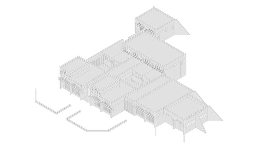
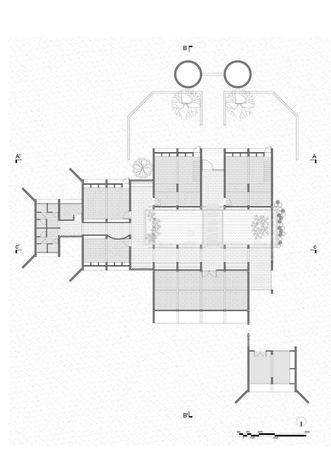
7 7 9 9 9
9 Plan redrawn from the original plan given from studio Naqshbandi, Auroville.
fig.5.3.2. First floor plan of Udavi School
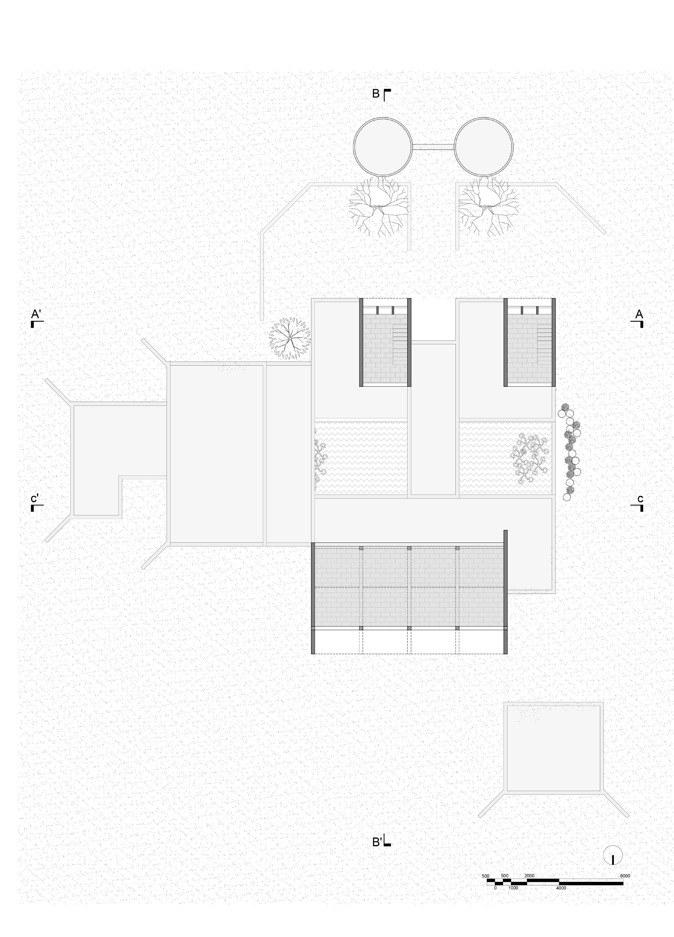
Section AA’
Section BB’
Section CC’

fig.5.3.3. Sections of Udavi School
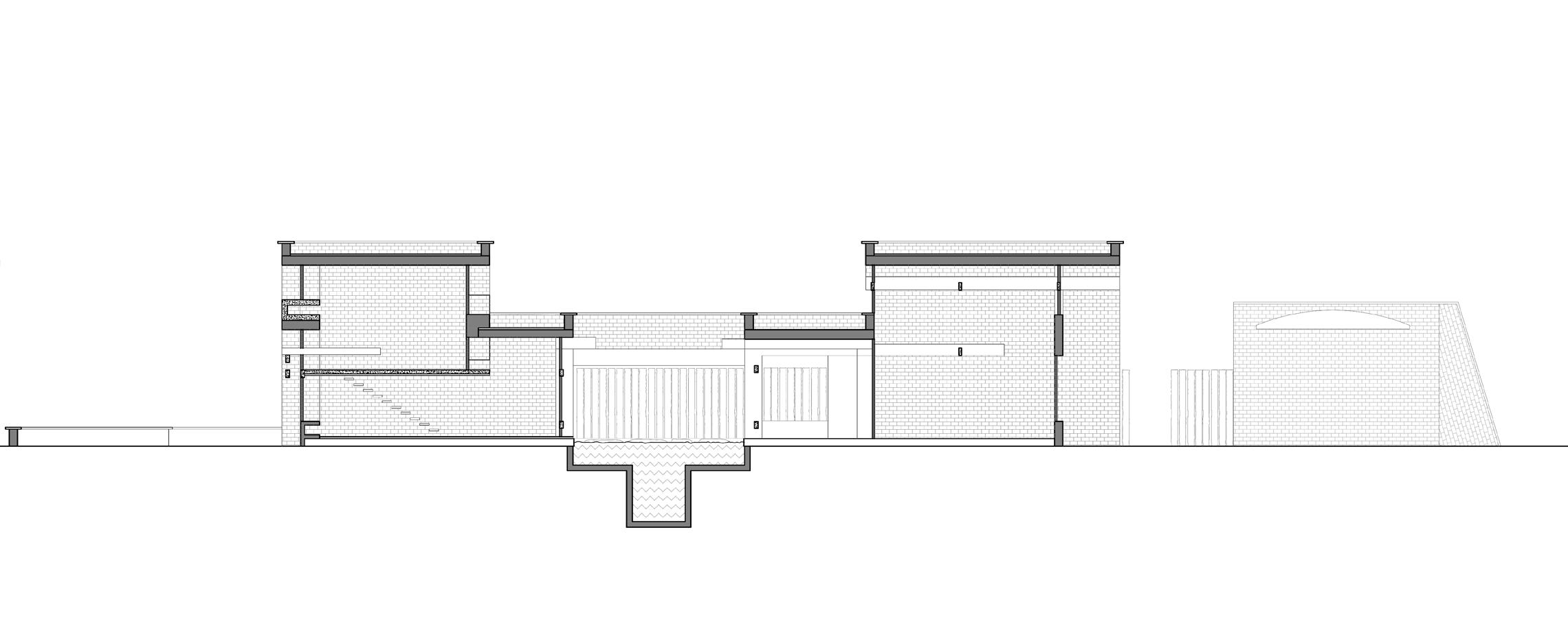

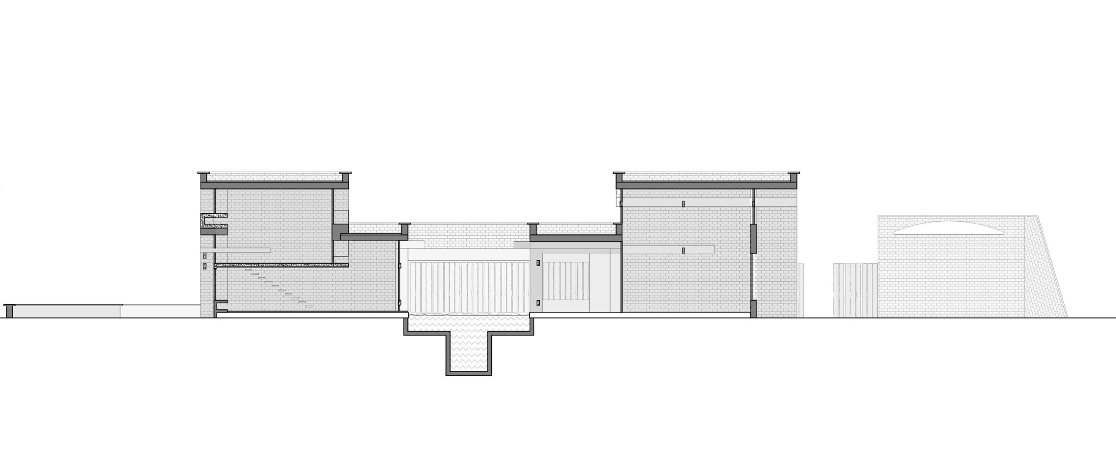
Sections redrawn from the original plan given from studio Naqshbandi, Auroville.
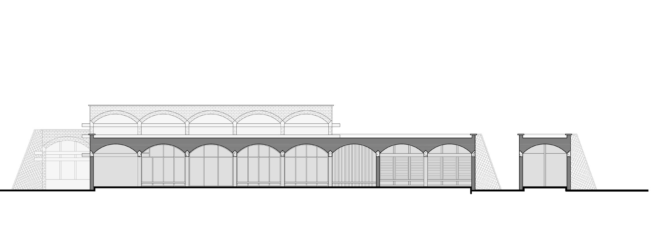
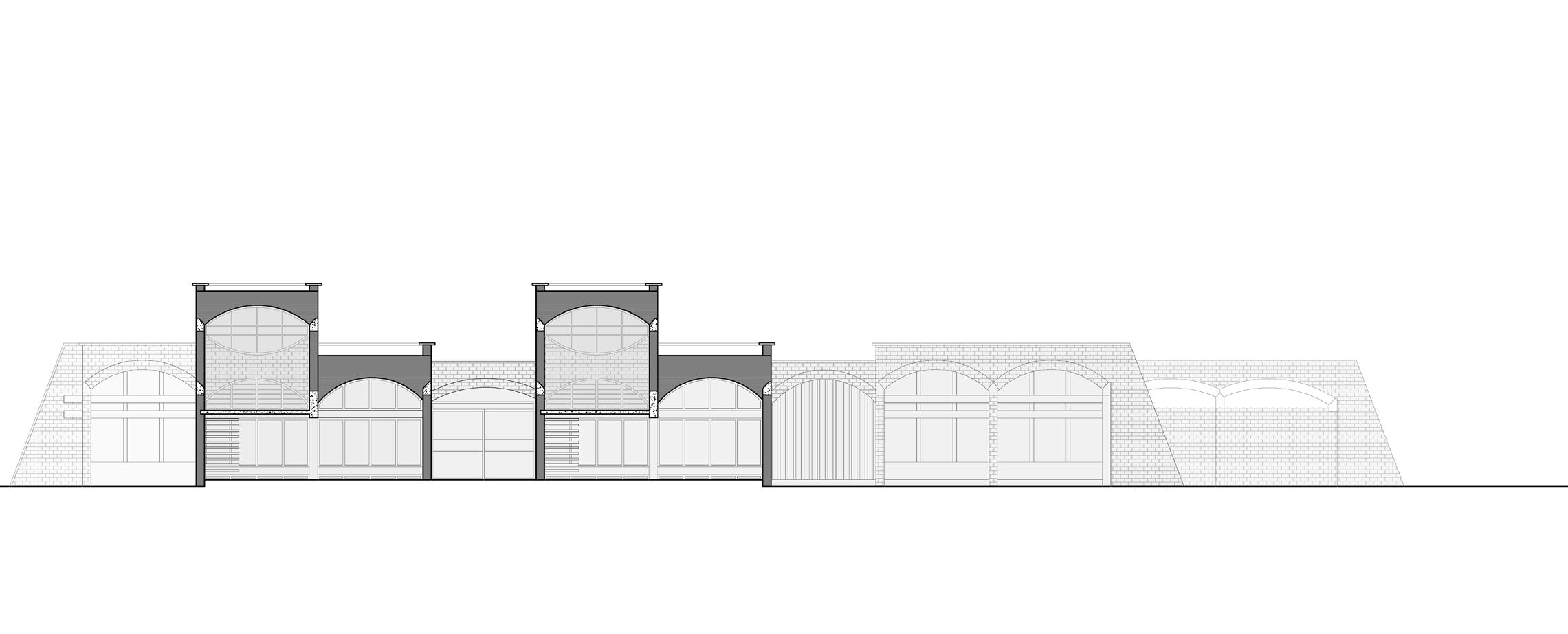
fig.5.3.4. Elevations of Udavi School Elevations redrawn from the original plan given from studio Naqshbandi, Auroville.

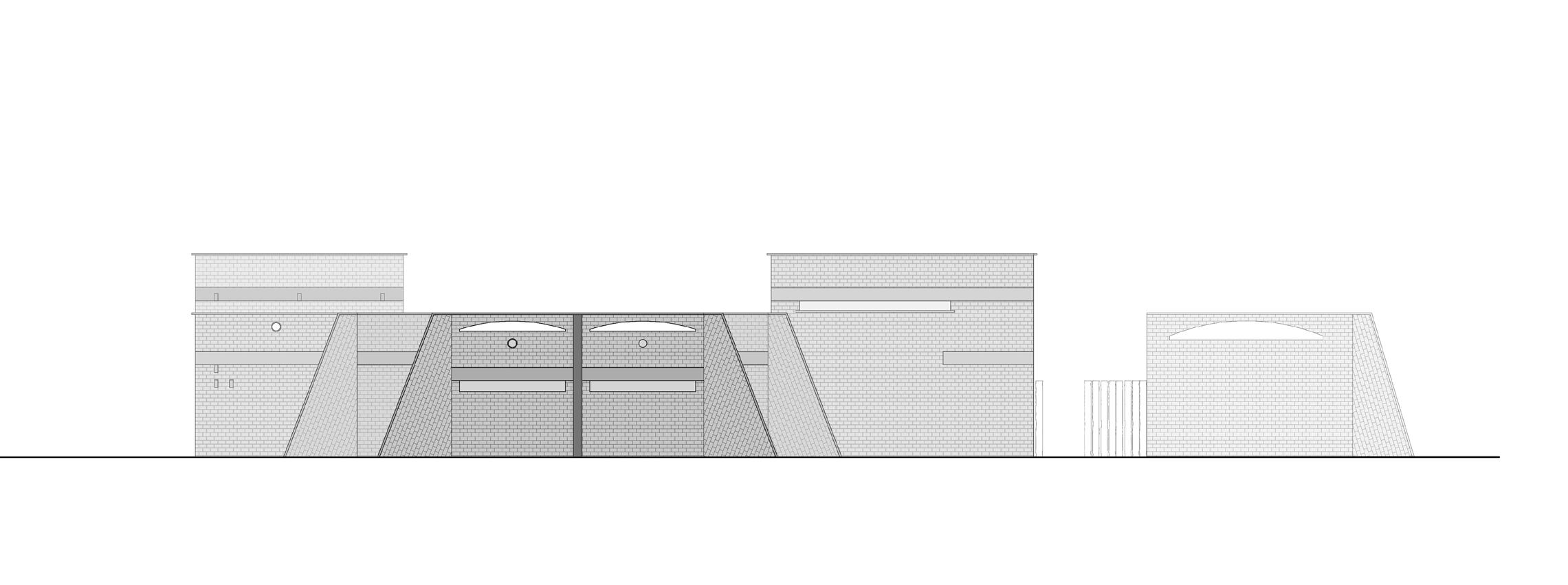
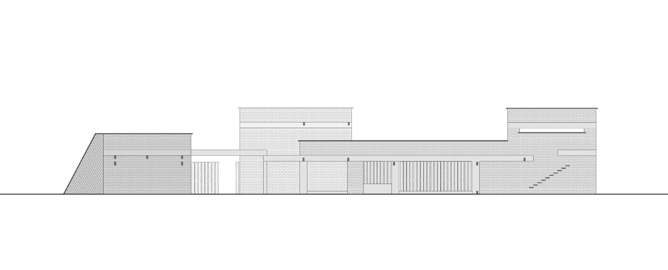
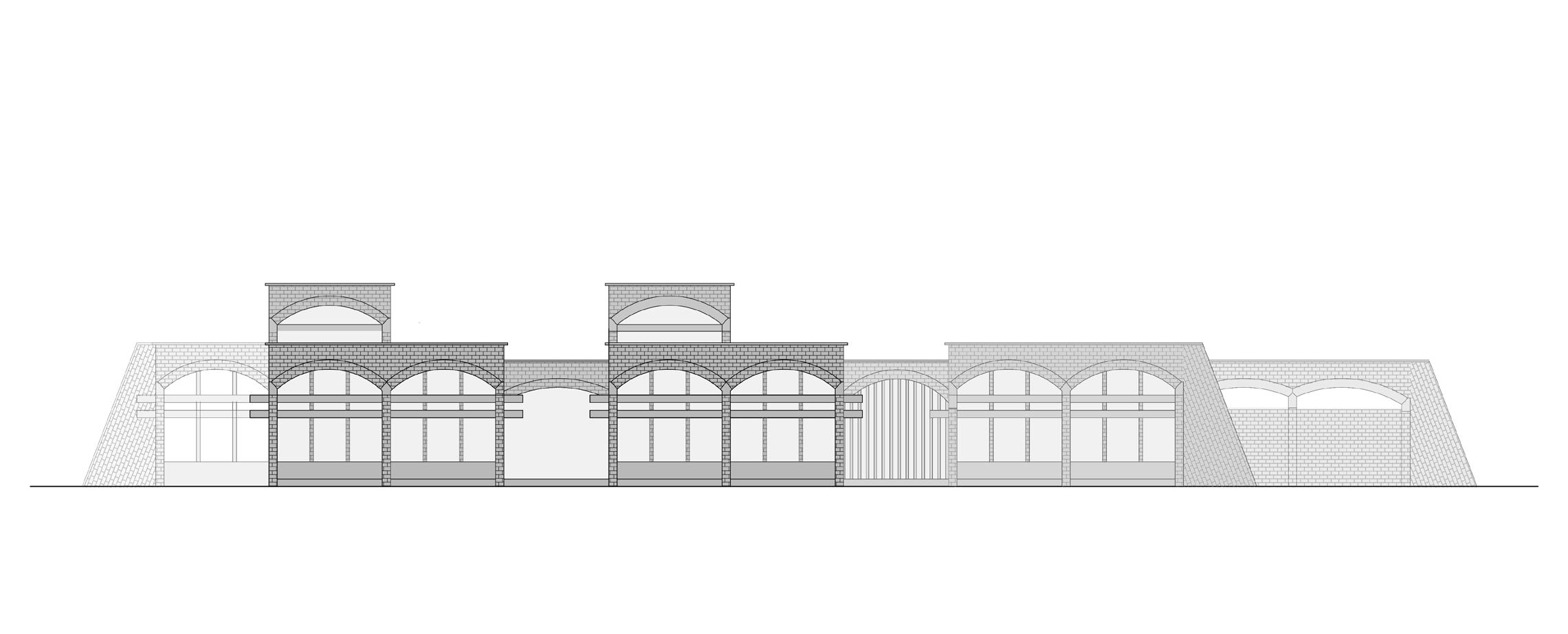
fig.5.3.5. Isometric of Udavi School

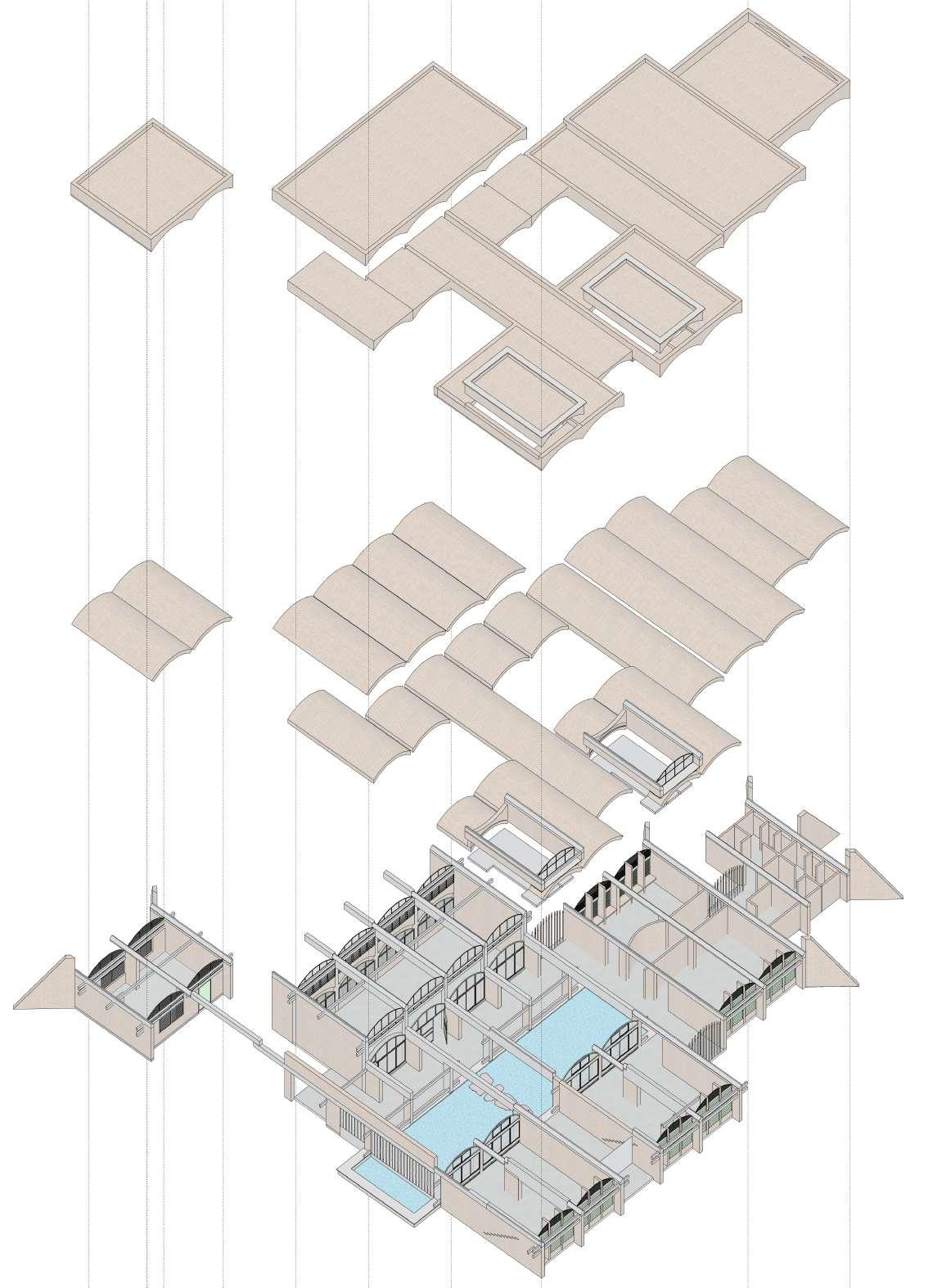

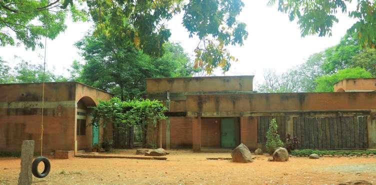
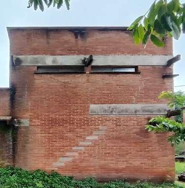
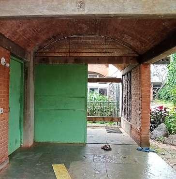
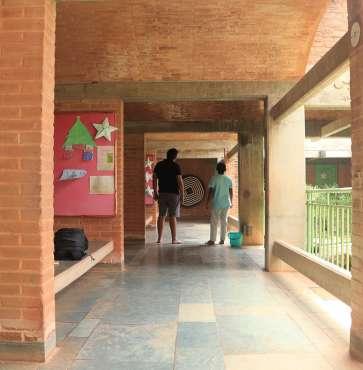
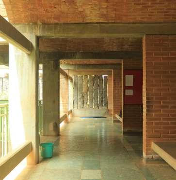
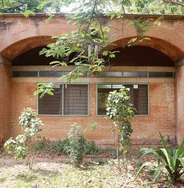
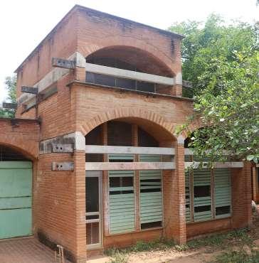
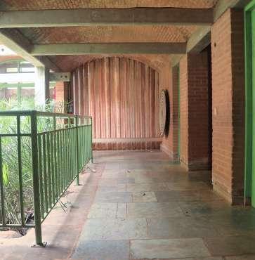

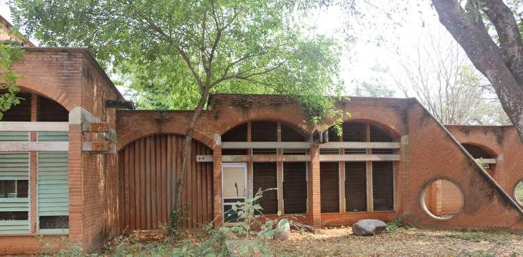
The following images, represents the evolution of Udavi school from Mukuduvidu, where mukuduvidu had different expression of form then Udavi school. The form of the building looks cuboid from all the sides, but the element which gives character to the building are the CSEB vaults used as slabs and roofs. These gets extruded out forming overhangs, highlighting a play in horizontal plane. Use of concrete beams and expose cseb blocks defines the language of the building.
Initially when Ar. Poppo Pingel was approached to design, client instigated on developing a constructive dialogue of an experiential school. School is a part of a school campus located into the wilderness of the indigenous tress, oriented in north - south direction. Lilly pond in the center becomes a core of the building as shown in (fig.5.3.11), extending outwards into the landscapes. Building is constructed form stabilized earth blocks made on the site. Mud for the blocks is extracted from the Lilly pond. Lilly pond binds the whole building as one with the experience of inside-out within the building.
fig.5.3.8. Mukuduvidu, Kottakarai, 1990-92 fig.5.3.10. Udavi School, Edayanchavadi, 1991 - 93 fig.5.3.11. Udavi School plan showing Lilly pond as core space fig.5.3.12. Sketch by Ar. Poppo Pingel of Udavi school concept plan
fig.5.3.9. Quite Healing Center, 1993- 96
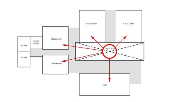

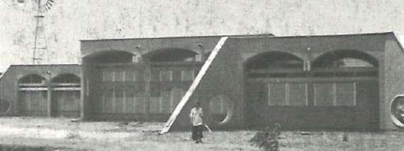
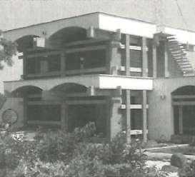
The sketch of the elevation shown in (fig.5.3.13), act as a module for overall building. The modular organisation of the plan recognises the evolution of the plan in future. Changes and transformation through same concept of module enhance the same sense of center.
Almost like an old town, it is an organic process of evolution. Many of the early conceptual drawings depict potential future stages of growth as a range of possibilities that must be considered over time as show in (fig.5.3.12).
fig.5.3.13. Elevation drawing by Ar. Poppo Pingel of module use to evolve
(fig.5.3.14), shows the construction technique of vaults in the building. As the building is modular, Poppo has developed a form work which helps in getting shape of the vault. This single form work has been used to develop all the vaults of the building. Poppo has tried to express a clear expression of cseb block in vaults, where in Mukuduvidu he plastered the vaults with white colour, in this project he has kept vaults expose with fine articulation of bricks.

fig.5.3.14. Image showing construction technique of vaults
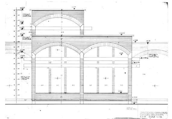
Ar. Poppo makes an effort to show each and every element of the actual building materials. Udavi school is an clear expression of brick mass and bands of concrete beams.
fig.5.3.15. Image showing part elevation from south direction.
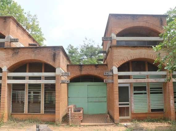
fig.5.3.16. Ground floor plan showing the hierarchy of volumes


fig.5.3.18. Section AA’ showing the hierarchy of volumes


fig.5.3.17. First floor plan showing the hierarchy of volumes


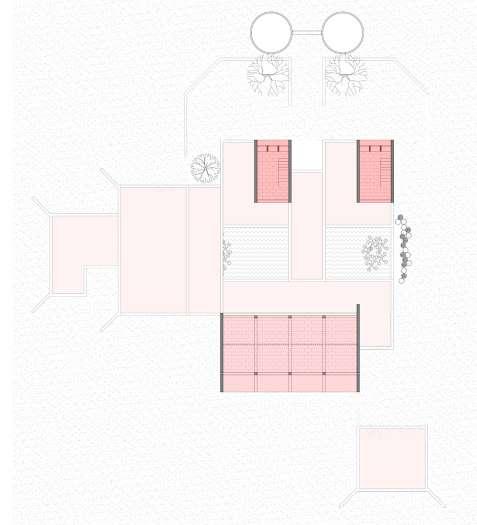
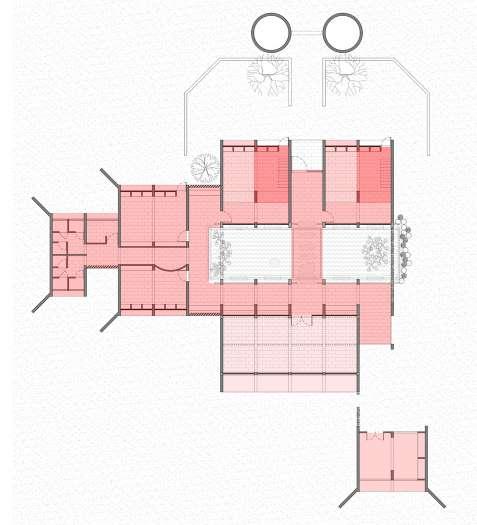
fig.5.3.19. Section BB’ showing the hierarchy of volumes
fig.5.3.20. West elevation showing the hierarchy of volumes fig.5.3.21. East elevation showing the hierarchy of volumes fig.5.3.22. Section CC’ showing the hierarchy of volumes

Udavi school has very distinct language of built inside then outside. From outside the built depicts a solid chunk of masses arranged to from different spaces. But from inside vaults helps in creating a transparent character through out the building. Udavi has very few spaces but the volumes of spaces vary from function to function. Overall circulation and service spaces has similar volume as shown in (fig.5.3.16), considering change in volume while entering the rooms.
Both the classroom have a mezzanine floor in part as shown in (fig.5.3.16), which lowers the height of space below it. Hall is bigger in size and also has a double hight space. (fig.5.3.19) and (fig.5.3.20), represents the balance of the building on the either side of the pond. Though the height of built is same, but the volume of the space vary from inside.
Terrace
CSEB block Vaults Buttress
CSEB block fixed louvers Concrete mezzanine floor
Concrete tie Beams
Exposed CSEB bricks walls
Concrete Beams
Vertically placed Granite Stone
Louver Windows
fig.5.3.23. Exploded Isometric showing different elements used.


fig.5.3.27. Ground Plan showing proportionating system fig.5.3.24. Plan showing grid structural system of ground floor plan
fig.5.3.28. First Plan showing proportionating system fig.5.3.25. Plan showing grid structural system of first floor plan

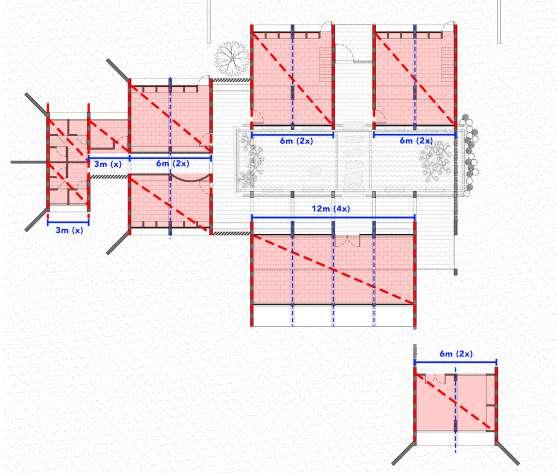
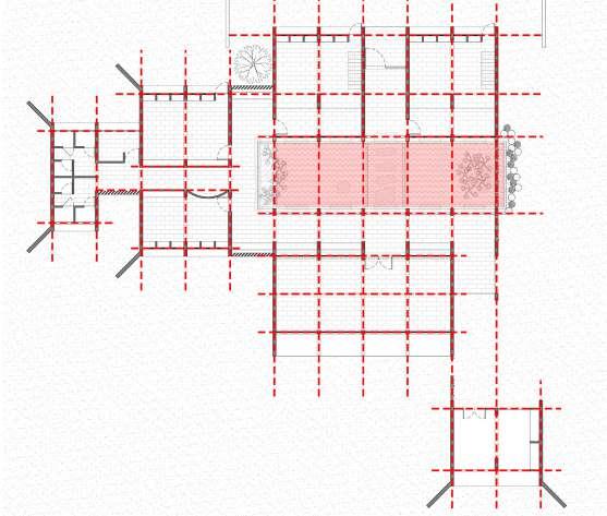
fig.5.3.26. Section showing grid structure system
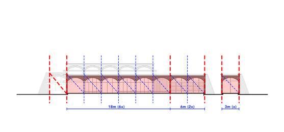
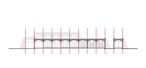
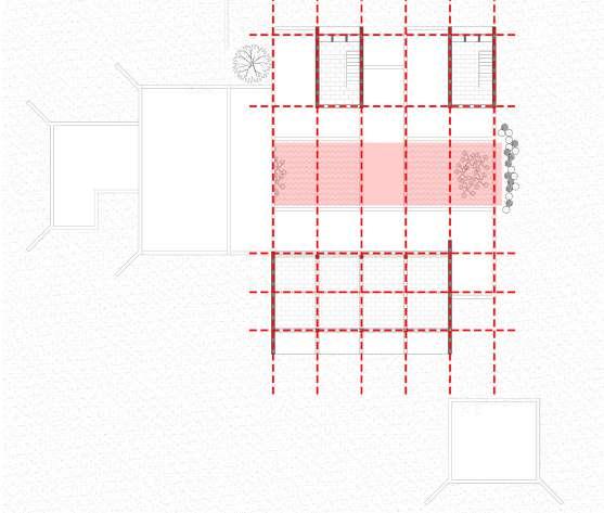
fig.5.3.29. Section showing proportionating system


In Udavi school Poppo has made efforts to combine modern technology with a local available material, like mud, in both its materials and construction. The basic rhythm of the plan is created by a sequence of vaults that span 3m and spring from CSEB load-bearing walls that were manufactured on site. Thus, the spaces are modulated in multiples of three shown in (fig.5.3.27), (fig.5.3.28) and (fig.5.3.29) The geometry of the cell like classrooms are designed for 20-25 students,facilitates additions to respond to possible future needs.
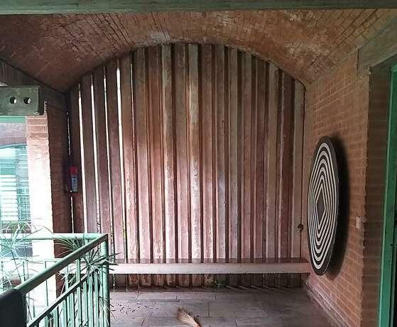
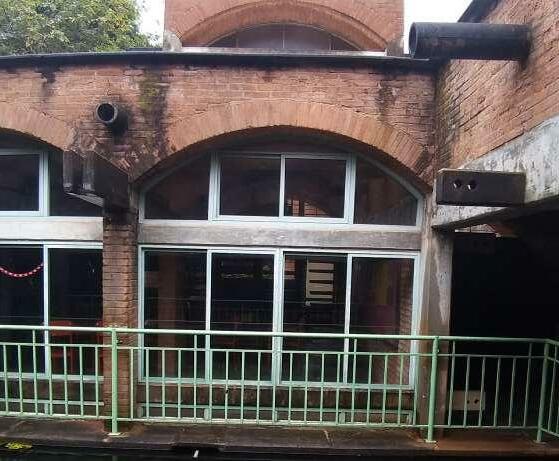
Tough the arrangement of the spaces are fragmented, the overall organisation of the plan has grid structural system. This results in easy perception of horizontal proportion moving through the building. Modular arrangement results in identical use of elements in different spaces.
fig.5.3.31.
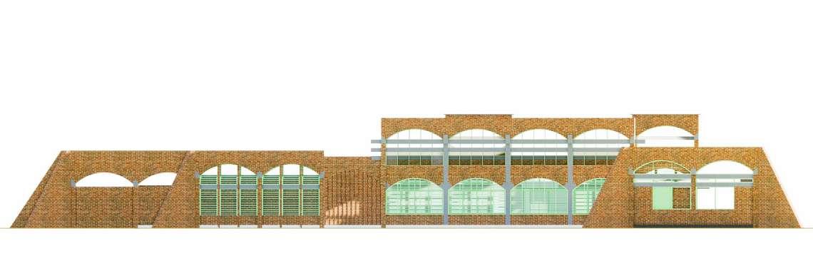
Buttress is a structural element to transfer the thrust of the vaults to the ground. Ar. Poppo Pingel has use it strategically, placing it on at the end of the house. As vaults are arranged in a series transferring thrust to last vault, which has the support of buttress shown in (fig.5.3.33(a)) and (fig.5.3.33(b)).
(fig.5.3.35) shows the cladding of CSEB done on concrete buttress to appear it as identical with the walls. Thus, giving a uniform expression to the building. The image also shows the interlocking of stone with the buttress, which protects it with weather and also gives finish on the top.
fig.5.3.33(a). Ground Floor plan showing structural bay of buttress.

fig.5.3.33(b). Elevation showing load transferring through buttress.


The area where the buttress are placed, changes the language of the building completely seen in (fig.5.3.34). Punctures in the buttress are made to reduce the amount of material use and it also act as an sitting place students.
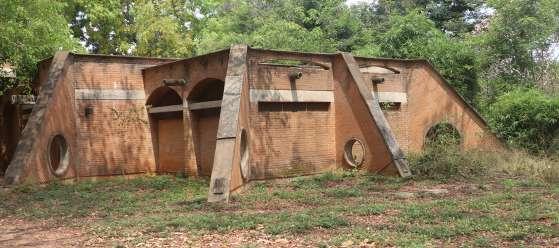
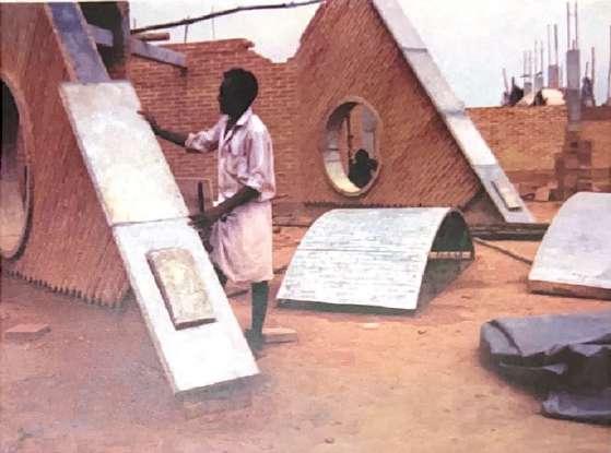
fig.5.3.34. Image showing arrangement of buttress.
fig.5.3.35. Image showing construction of buttress.
Another identical element use in Udavi school are the thin horizontal beams. These beams serves the main purpose of tie beam, which hold the vaults from the edges. These beams are attached with the stringer beams which bears the vaults .
Ar. Poppo Pingel articulated these beams such that they signifies the boundaries of the spaces shown in (fig.5.3.36(a)), and also act as an aesthetic element on the facade shown in (fig.5.3.36(b)).
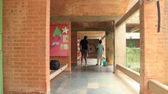

Beams are articulated such that, they also guide the circulation inside the building, shown in (fig.5.3.37) and (fig.5.3.38).
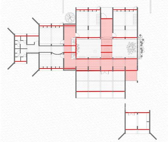
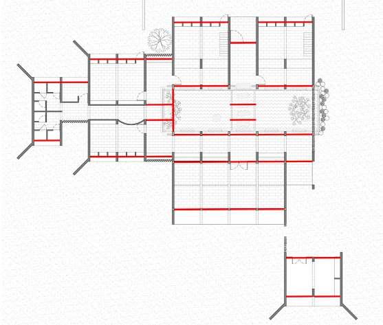
fig.5.3.36(a). Diagram showing importance of tie beams in the plan.
fig.5.3.36(b). Elevation highlighting horizontal members (tie beams).


fig.5.3.37. Image showing circulation guided by tie beams in the corridor.
fig.5.3.38. Diagram highlighting corridor and tie beams
Same as in Mukuduvidu,the overall form of the building has linear character. Poppo has use the skillfully use the contrast in material of stabilized concrete earth blocks and concrete. Concrete bands of stringer beams and tie beam clearly express the emphases on the horizontality character. Thus, contributing in enhancing aesthetics qualities of the building.
fig.5.3.39. West elevation representing horizontality.
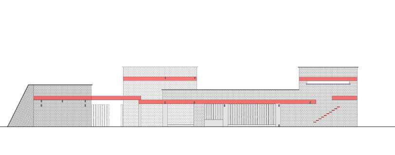
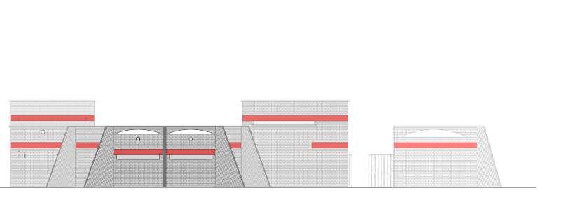
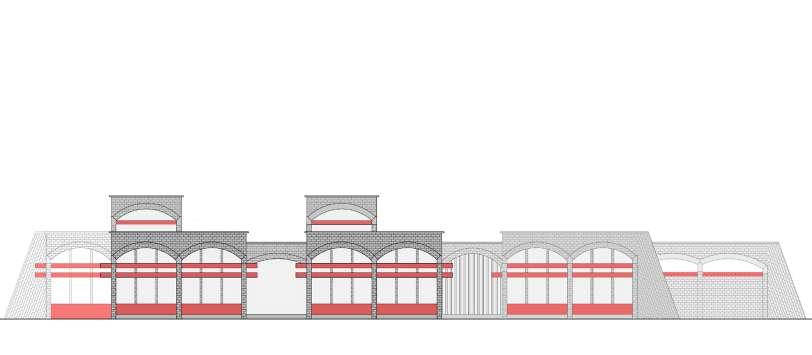
CSEB block Vaults Buttress
Concrete mezzanine floor
fig.5.3.40. East elevation representing horizontality.
fig.5.3.41. South elevation representing horizontality.
Concrete tie Beams
Exposed CSEB bricks walls
Role of Material in Space making : Works of Ar. Poppo Pingel.
fig.5.3.42. Exploded Isometric showing structural members.

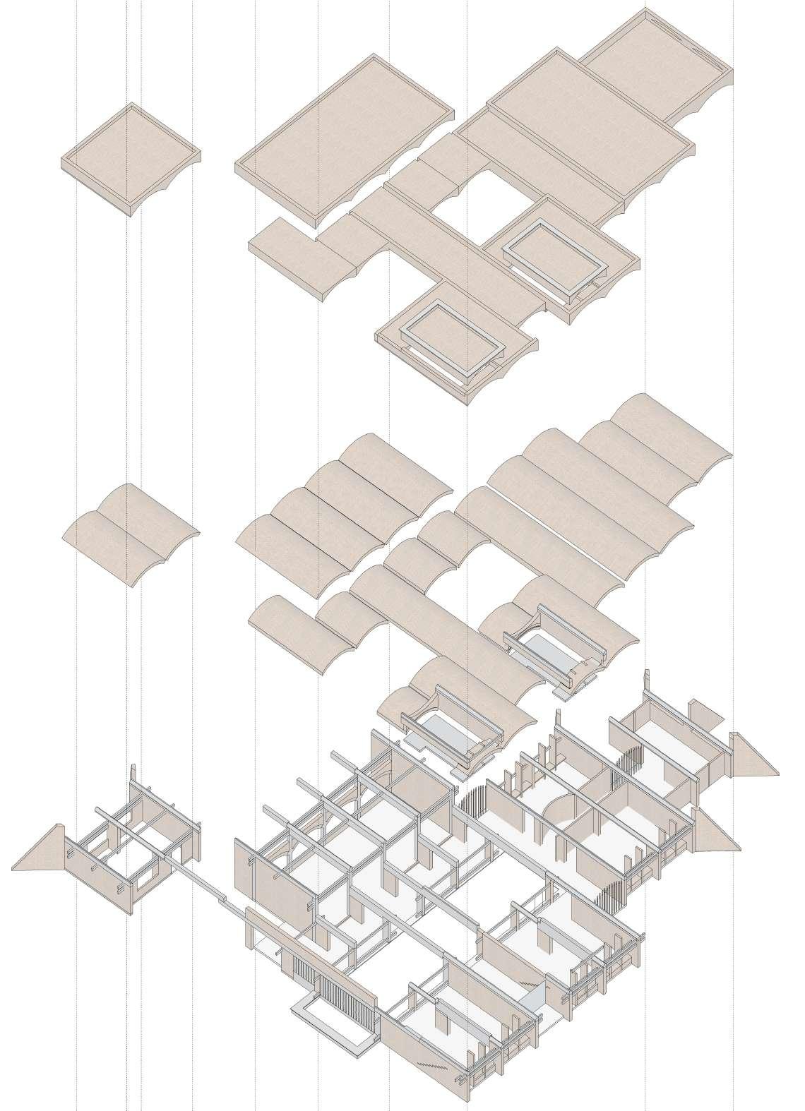
Udavi school was designed as an constructive dialogue of and experiential school. (fig.5.3.43) represents served spaces and services spaces. Dark red colour represents rooms which are served spaces and the light red colour represents circulation space which is services space. Rooms are basically bundle of vaults arranged around the Lilly pond, which is in blue colour in the fig.
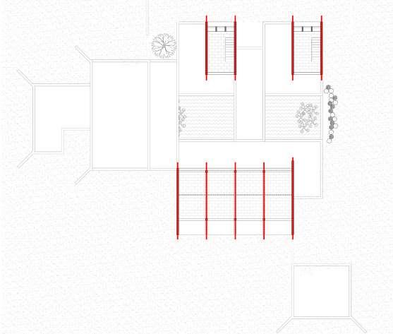
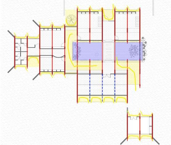

Poppo has designed the vaults with north-south orientation, which makes it possible to open up the spaces in that direction. Unlike Mukuduvidu, spaces are staggered to create areas where nature and space are connected.
Due to the vaults, spaces are positioned in a juxtaposition layout, where one area is placed after another.
(fig.5.3.45), shows the arrangement of spaces and its connection with outside space. A lily pond in the middle of the building gives the impression that the outside and inside of the building are same.
fig.5.3.43. Diagram representing type of spaces fig.5.3.44. Diagram representing order of space and axis.
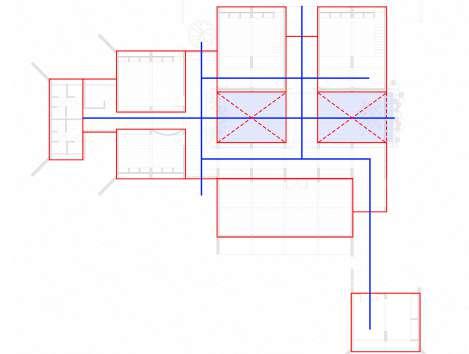
fig.5.3.45. Diagram highlighting semi open spaces accommodated with geometry.


fig.5.3.46. Diagram highlighting type of space on first floor.

(fig.5.3.47), demonstrates type of spaces as per the density of walls and openings. In (fig.5.3.47), blue colour represents Lilly pond in the center of the building. The lightest red colour represents circulation space which connect all the spaces. It is a loop circulation with one main entrance.
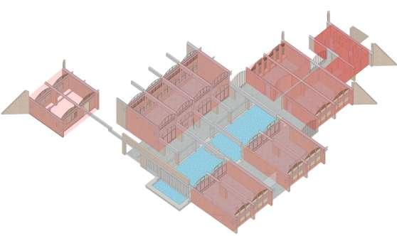
A bit darker red space then the circulation space is the hall, classrooms and the workshop with bigger size of openings. As seen in (fig.5.3.48), these spaces feature complete openings on both of their ends. Since these areas need better lighting and ventilation.
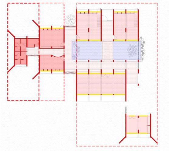
A bit darker red space then the classrooms with the less amount of opening is the library and laboratory. In these spaces openings are placed on one side opening towards the landscape. At the last is the toilet space with no full openings. It can be observe that the degree of transparency decreases as one moves inside the building.
Poppo has designed low sill windows as a new experience for the children, relating their sense of scale as show in (fig.5.3.49), with carefully detailed adjustable wooden louvers to modulate the quality of light into the space.
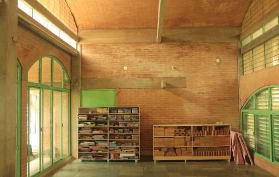

fig.5.3.47. Diagram highlighting type of space as per density of wall
fig.5.3.48. Exploded Isometric highlighting type of space as per density of wall.

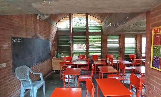
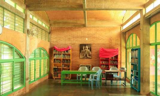
Poppo has worked with stabilized concrete earth blocks in this project. These are compressed blocks made on site with a bit of smooth texture. This allowed poppo to use it in entire building. As mention above, mud was extracted from the Lilly pond. Other material used were concrete, granite stone , kota stone for floorings, steel for window frames painted green colour and glass. Kota stone was use in the entire building as the rough texture of the stone has pleasing experience in feet and considering the feet of the children will be contentiously be in touch with the floor.


Window frames are painted green which creates a complete contrast between the colour and highlights them more effectively. Granite stone has been used vertically on the pond facing pond which creates a transparent character between insde and outside.
fig.5.3.52.

The school is located into the Udavi campus. The primary approach of the school is from a small gate towards the entrance of the building as show in (fig.5.3.53). There are several secondary entrance to the building seen in (fig.5.3.53), but the main entrance is front of the workshop building. Udavi is located deep inside the campus between the tress. While approach the building once see the entire building as big chunk of brick and concrete. The main entrance is like a pavilion depicting the sense of entrance shown in (fig.5.3.55).
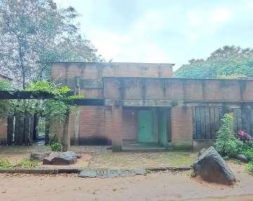
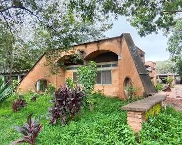
fig.5.3.53.Plan showing external approaches of the building.
fig.5.3.54. Image showing elevation of workshop building on the entrance of the building
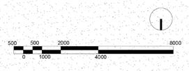
fig.5.3.55. Image showing entrance porch of the building fig.5.3.56. Image showing main entrance door of the building.
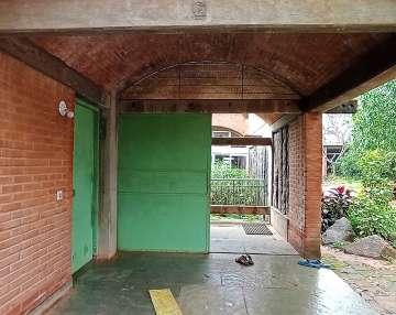
The internal circulation within the school is quite simple, with a corridor running into the entire building connecting every spaces. Arrangement of elements and Lilly pond in the center creates a new experience inside the school. All the classrooms seems to be semi open spaces without the windows rather then boxed rooms, which creates a dialogue of interaction. Mezzanine floor in the two classroom makes the space more interesting beneath the floor and on top of the floor creating dualistic sense of place. Horizontal tie beam guides the circulation in entire building. Order of space arrangement increase moving inside .i.e., first comes the hall which is a type of gathering space, then there are classrooms and labs specific for students and then there are services for students.
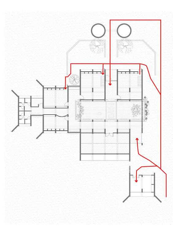
fig.5.3.60. Image of classroom with mezzanine floor fig.5.3.61. Image of corridor fig.5.3.62. Image of lab

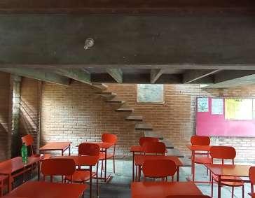
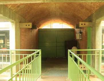
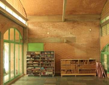
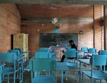

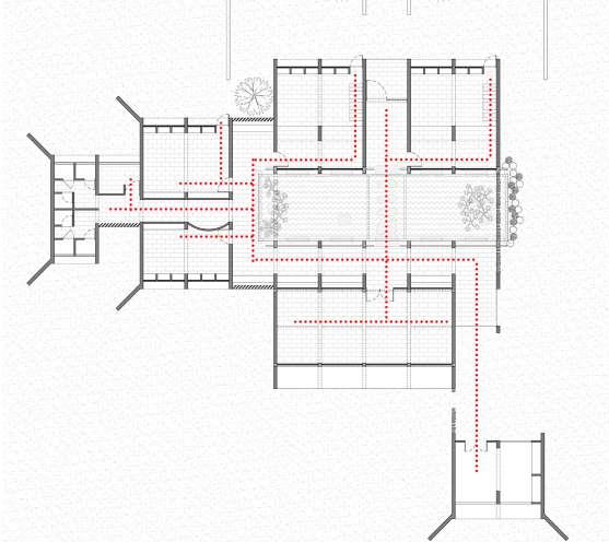
fig.5.3.59. Image of hall fig.5.3.58. Image from the bridge towards back exist fig.5.3.57. Image from entrance corridor
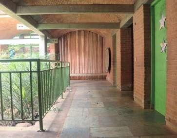
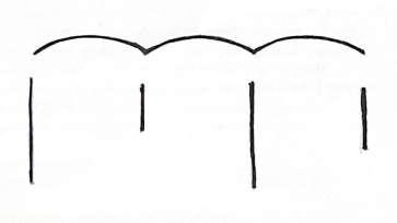
Role of material determines the language of the building, and the use of material as per its properties determines the craftsmanship quality of the architect. His potential of combining materials while space which enhance the quality of space and the character of building. Analyzing projects of Ar. Poppo as case study helped in understanding materiality, and its impact on space through exploration of form, Relationship of structure and space, Exploration and expression of details into the space and dominating element governing the identity of the building.
Going through his philosophy and projects, his way of working is simple and straight, he uses locally available material and works as per the nature of material. The thing which makes his architecture interesting is his process of designing. There is a pattern of evolution in his designing from projects to projects. “Mundane is excellence” is a Japanese philosophy to improve work could define Ar. Poppo Pingel’s work.
Exploration of form in relation to role of material.
Referring to the timeline mention in fig.5.1, Ar. Poppo has done various projects of different typology in and around auroville. Each project seems to be the evolution of the project he did before. This shows his constant process of exploring material and evolution of form. This represents craftsmanship quality of continuously working and evolving. The below diagrams shows the evolution of designs as per the material used.
fig.6.1.1 Form of project Fraternity Workshop
fig.6.1.2 Form of project Auroville Handmade Paper Factory
fig.6.1.3 Form of project Aurodon’s Tractor Shed
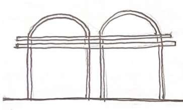
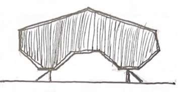
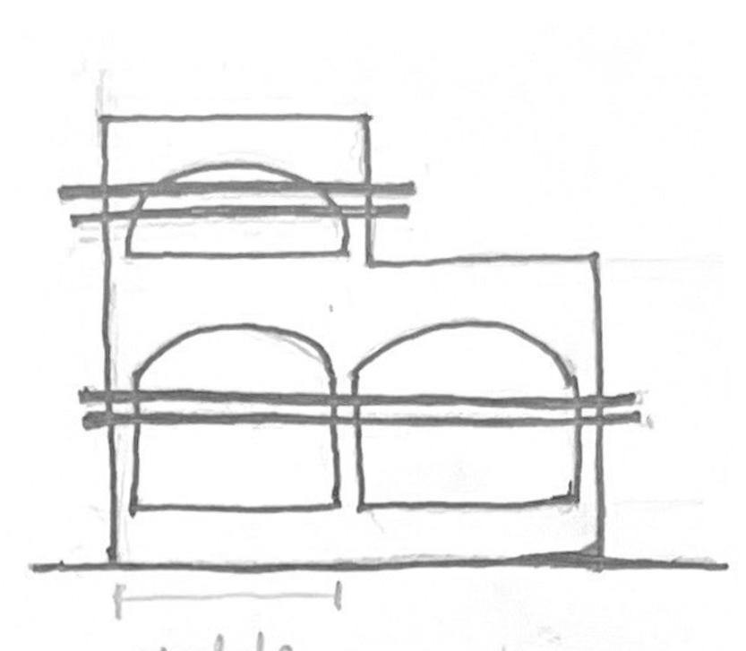
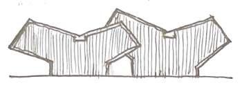
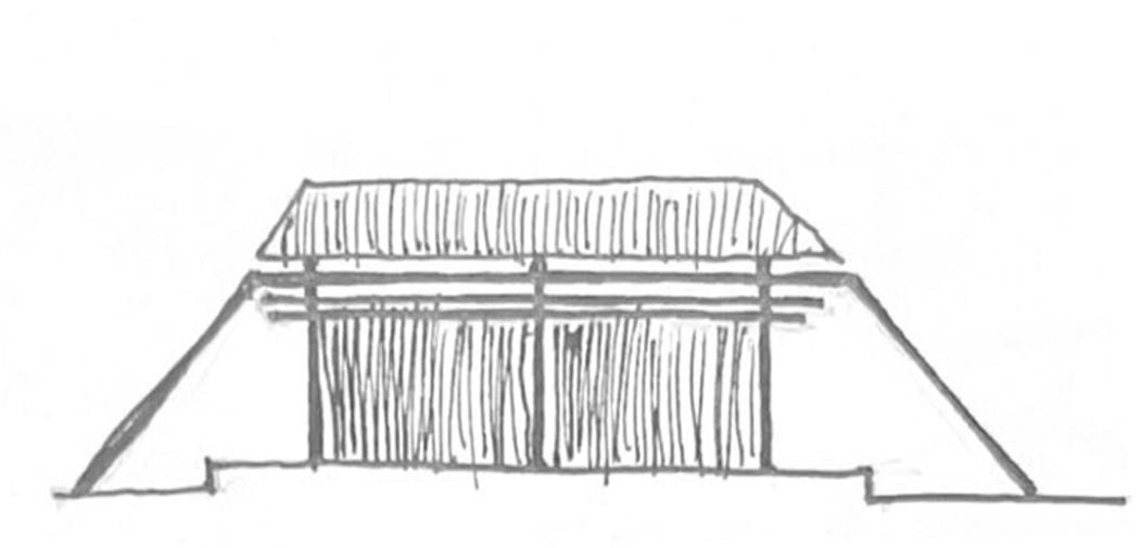
fig.6.1.4 Form of project Mukuduvidu
fig.6.1.5 Form of project Udavi School
fig.6.1.6 Form of project Shubha and Mauro
Fig: 6.1.1, 6.1.2, 6.13 are the projects architect did in wood and asbestos sheets. First is the Fraternity workshop, it was the first project poppo did in asbestos sheets. He used size of the sheet to derive the plan of the workshop. In this he explored details of wood and asbestos sheets. Further 2nd and 3rd diagram shows how he explored the same material in paper factory and tractor shed.
From flat roofing to exploring truss in factory and shed show architects process of working and exploring multiple possibilities with the same materials.
Fig: 6.1.4, 6.1.5, 6.1.6 are the projects architect did in brick or CSEB and lime. After certain constrains by the government on using concrete in construction, Poppo started exploring vaults for the slabs and roof. Incorporating vaults in the design, results in linear form in planning. Here space are arranged one after the other as per the arrangement of walls. With such constrains Poppo has played with the plan and volume shows his conscious discussions of working with vaults. The another two diagrams are of Udavi school and Shubha and Mauro house, where Poppo has evolved the use of vaults in his design.
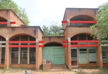
Using, slopping roofs, vaults, domes and flat roof results in play of volume, which makes the spaces interesting and defining as per the function of the space. Form has also been defining the arrangement of walls and spaces in Poppo’s architecture.
Relationship of Structure and Space.
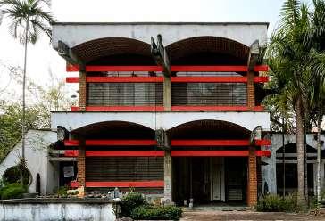
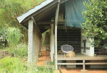
When discussing materiality in design, it’s equally important to consider the structural system employed. Most of the projects are designed in grid structural system since Poppo’s constructions had linear forms as per the materials use. Linear form transcends structural discipline into the design and easy arrangement of spaces as per the function of the building. Poppo has a pattern which is followed and can be observe into structural members such as beams. Poppo’s building gets identified by the beam extruding out from the main structural system. Poppo believes that this make the joint more stringer. The below figures shows his identical use of beams in to various projects which defines his character of the building.
fig.6.1.7
fig.6.1.8
fig.6.1.9
fig.6.1.10 Digram of Miraonevi Nivas fig.6.1.11 Diagram of Mukuduvidu fig.6.1.12 Diagram of Udavi school
The above diagrams represents relationship of structure and space, i.e., poppo extends beams out from the main structural wall and rest then on the columns. These creates a buffer space between inside and outside space. And also act as an peripheral layer which has transparency expression. This is also a type of pattern which can be seen in Poppo’s designs through structural members.
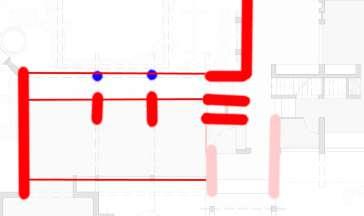
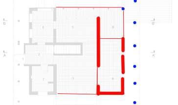
Poppo works with at most precision. While analyzing case study Poppo has considered of the type of finishes used into the space. Major part of the his designs has expose materials. As per poppo every material used into the building should be visible and one can able to identify the junction of two different material coming together. Poppo has used white colour into his projects to highlight certain elements or to hide the unwanted finishes. White reflects the light more and can lit up the space more brighter, thus he has used white plaster finishes into studio space and on the wall of miraonevi nivas. In mukuduvidu architect has used white plaster on the exterior of the building to highlight the profile of vaults and domes and on walls to highlight the studio space. He had not only used white plaster but kept certain textures rough which expresses raw experience into the space.
The most important aspect of Poppo’s architecture is combination of materials, know as joinery. He does not only explores the joineries but also evolves them from project to project to project. He has developed pre cast concrete joineries inspired from the wooden joinery, showing his craftsmanship quality of working with various materials.
fig.6.1.13 Wooden joineries. fig.6.1.14 Pre cast concrete joinery developed by Poppo.
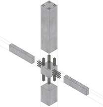
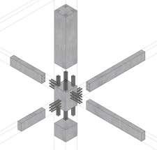

The above diagrams illustrates same joinery in two different materials. Poppo has develop certain joineries which are inspire from wooden joineries. These joineries works better then the normal joiners and supports the nature of material.
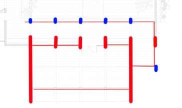
In overall design there is always on dominating element which governs the identity of the design.

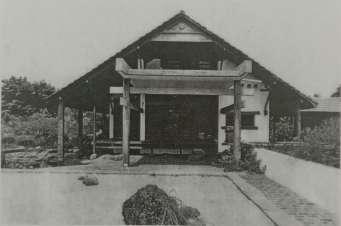
fig.6.1.15
Huge wooden roof becomes the identity of the building and becomes an element that governs the space making . Also the concrete extension acting as a viewing frame define the building.
Vault with plastered with white colour and domes affect the volume and expression of space. Extruded vault profile defines the identity of the building.
fig.6.1.16
An vault module with two horizontal tie beams become the identity of the building. This module gets repeated to form overall building.
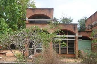
fig.6.1.17
Asbestos sheets pivoted into the wooden beams becomes the identity of the building. With the diagonal wooden columns braced for extra support.
fig.6.1.18
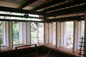
Materials are essential to provide a particular character to any built form. Also, the way in which materials are use reflects architect’s philosophy and approach. Studying three varied projects designed by him, helped in understanding his manifestation of aspects of materiality as an expression in space making. The projects are analyzed through four major aspects derived from his philosophy of material expression in space making- i.e. Formal Expression, Structural Identity, Spatial Expression and Details.
According to the analysis, formal expression shows the development of form as per the function of the building and its impact into the space. Poppo made considerable innovations in the form, which are visible in the slabs and roofs, resulting in varying volumes into the structure. While the roofs and slabs are derived from the type of function of the building and combination of materials, it act as an dominant element, determining the evolution of plan and the character of the building.
Structure is the arrangement of elements as per the nature of material to achieve stability to stand. Poppo, in his projects try to show each and every structural member distinctly. As a result, the use of materials gives the building identity and contributes to the aesthetic value of the architectural form. Certain elements strategically used by Poppo hold the over all form the building. For example the use horizontal wooden member on the ‘A’ frame use in Miraonevi Nivas of the roof hold the main members together. Same way in other two projects he used slender concrete beams as a tie member to hold the vaults. These member function as the structural element, also defines the boundary of the space and contributes to the visual quality of the building.
Arrangement of elements helps in achieving form and structure that also impacts on spacial organization and the spatial quality. In all the analyzed projects roof acts as an governing factor in the arrangement of spaces and the type of roof determines the arrangement of the walls which results in space organisation and development of form. Quality of space is enhance through the shape size and the orientation of the opening regulate the type of light penetrating into the space. In the case studies Poppo has strategically use the material finishes to modulate the quality of space as per the function.
All these sums up to ability of Poppo to use various materials strategically in space making which also signifies the identity of the building. His ability of developing details and combining materials, expressing the identity of the built form defines his craftsmanship quality. His process of designing also portrays a his backdrop of carpentry coming to and fro. Thus, it is possible to conclude that holistically use of materials, will not only regulate form but also spatial quality of space. Adolf Loss is correct when he says, “Materials have their own language form.” Thus, materials can be use as an important aspect that governs the space making of an architect, along with stable structure, form and details.
Author: 6.3.1. What is the impact of material on architectural design, and what were your approaches in design in relation to material?
Ar.P.P: Okay, the point when I came here is to learn what is available. I was never interested to get materials from Russia to build here, or from another country. What people did to Matri Mandir. They get materials from Kota, they get from Rajasthan, and even now you can get them from Jaisalmer. But from the very beginning, I was looking for locals. For 10 years, I’ve worked in the villages. And there you learn, you know, people cannot afford to get materials from far away. They get materials from what is local. And this is Palmyra. And in those days, it was common to cut up Palmyra, you could cut but today you raise a different awareness about nature. They will cut but those who are building it. And anyhow, Palmyra and rammed earth are only low-cost and local materials. And institutions in India as they worked on it in Bangalore and Chennai, and in other places also low cost for they call it economically weaker section. I don’t know how they call it today. So we see people who don’t have much money now more redistributes for houses to the people. And it’s a different story than those houses have to be also done. If you do if you take a PWD you can very well imagine how to do it. Yeah. So either you prefabricate elements and set them together. Or you heard about Laurie Baker, how he puts everything in his bricks, which is very normal. Yeah, but more laborintensive. And you need to have good Mason to finally end up in rammed earth. You don’t need a mason you need a person to put the rammed earth-shattering into plumb correct on this. Cool, he won’t do it yet to break his head. You should know how to put it? Yeah. And so from that context. Yeah. And then the lifetime is also limited. Yeah, you have to take care, the awareness of termites going up from the house eating up the softer part of the Palmyra it’s not even today. Yeah. And it took me 20 years to study termites, how they are they’re very intelligent and they’re more intelligent than you. The only thing is they cannot talk, but they talk among themselves. They’re all busy.
I have different ideas about the people and they want to learn they want to have houses like this. They cannot live in it. Yeah, they put first of all their privacy below the parapet Yeah, so but this is our lifestyle we come from we are making villages house for ourselves. Do you understand? Especially for Auroville. So I think I was the only person who tried all possible materials which are relevant at the moment starting with asbestos in wood, now what we forget is the wood costs were cubic foot 17 rupees and you could buy the wood in Pondy and then kept in with big logs and they carry from the Mysore area. And they cut it here. So but we sent a man into the forest to bring all the wood for fraternity. I gave him a list of different sizes and he get it cut, if you have little changes that you could cut in Pondy. So with this was built, at 190 rupees per sq. feet, very cheap and permanent that people are they don’t think they don’t maintain and then, especially among local aurovillians who took over fraternity. This competition, then they make a fence in between they destroy what you have done. Beautiful. Yeah. There’s one workshop you’ve seen. It’s still standing. The braces are removed. Yeah. And people don’t realize the value of the existing wood there. They did little things to prevent the termites, they put some stones below. Yeah, they don’t realize the value of standing there unused. Secondly, the openings ventilation, humid climate, and asbestos are vertical instead of line It is all local innovations with little money. So, fraternity was one of my first star projects where there was no interference I totally agree with the people who go into work there, and was financed from Germany.
Role
Author: 6.3.2. The projects you did are mostly linear in form and are not round, does this has any relation with properties of material?
Ar.P.P: Squares and you can make it round. But once you make it round, it is more expensive. Wood is straight, you cannot bend like this. Also bricks. You cannot bend bricks. Brick can be. But then you need to make an arch. Automatically the building materials determine the building. It’s like IIM in Ahmadabad, look at the arches or Laurie Baker’s Church. Yeah, then you can make it well, and it’s still a brick. Still, the big brick is rectangular, or cubic. Yeah.
Author: 6.3.3.What are your initial approaches while designing the building, do you consider material first, or function of the space or the context?
Ar.P.P: Not thinking like this, like a start point. No, what you do is very mental. Yeah. First, you do this, then you do this with some constant interchange within yourself. Do you understand? It’s not like, first I look for space. And then the materials? No, it’s a process that I do that is very simple. I’m not doing it for one or two hours. It goes over weeks and months. And then especially this house. Now everything is dome and vaults. But I was not sure whether I prefer like afsanah, tile roof, you understand? You cannot go for a walk. But Indian skies are beautiful, and so many flat roofs can live on. Okay, so it was a choice. And you cannot decide in a day? Yeah, there’s a terminal shift from space to materials. Yeah. Then. And then especially the aesthetics, you know, we are much in the form and form develops from the material or the arrangements of other elements. Yeah, when that you have elevation or spaces.
It was an office when it was built. It was not planned that way. Okay, during building it changes, or during planning, it changes, okay. Secondly, this space, so there’s no reason, you can make 3,3,3,3 you can make 3,4,3,3 the freedom you have. Here you have 4, 4. Yeah. So there are no constraints.
You need to pay also, you have to pay for the building you built. I spend my own money and the money in those days was limited. If you make another roof you can play with the client who has enough money. I calculate the building cost, it was about roughly 1 lakh 40 years ago, this is 15 lakhs, this one you have no idea yet to calculate you know and then during building time you have ideas shall I do this? Okay, or risk you know exactly how much money you have. And to take a loan No, not my nature. So there are these constraints which have been within yourself in that case, I’m the architect I’m the client so, what you do externally with the client I have to do internally with myself and I’m the contractor as well there was no building company here, there were no supervisors wrong no normally what were all were carpenters and masons and in the first 10 years I trained myself, not for my building but other buildings. Carpenter could speak a little English Yeah. And with my little Tamil. Very little Tamil it was enough. The one who built this died last year. And now they could do, they could read, first, they have to learn to read and draw Yeah. Especially details, detailed drawing and then and I noticed in the village where we live five kilometers from here next to the highway and I was showing 60-millimeter films in the villages okay, there was no TV. TV came 10 years later. So villages in Hindi, Tamil then foreign languages from embassies or consulates Chennai, Delhi you have to apply they send it you have to send it back. So, I showed three-four villages regularly for eight years.
I use to take a normal jeep they are not you can still see. So I use a metal box with a film projector inside and that box I wanted to simply take out of the Jeep on sliding rails. Plug it in and show yeah. And the box was made by that carpenter and of course, you have to make rail you have to think he won’t think for you. he wants only measurement. Yeah, and then slowly one by one buildings or two buildings on him and another about were carpenters. Now for many contractors who want to make money and buildings were cheap, those buildings are built for the people in church or the church only later. Did it free for Auroville? Yeah.
No first you have to believe in the vault now you come there are already vaults. There was no vaulted house I’d ever seen. I know it only from books. When these vaults were done some 200 to 300 years ago in Germany also in India, some Mundapums, etc. But here they do it in Granite kind of granite slabs on top. Yeah, but vault like this. And then economical vault can make thick vault no way to pay if it’s just to be structurally sound. And then so I didn’t believe I collected the best Masons. I knew after 10 years in Auroville, for one experiment first building a vault. No, you have to show me they don’t know. They did well, then we start first with normal cement. First cement, this is lime mortar toothpaste. Placing bricks at an angle. So this was practice and but I didn’t dare to cement this. Didn’t feel walk over then one Mason said an elephant can walk over I said not an elephant, But you can walk over you know. So you build up the confidence. There’s nobody to tell you. It’s only bits but which For Jake arches you need beams here only the only a beam here yeah you can make a wall also whatever to have protruding are up to so all you have to think yeah what you want Jack arches different is a building in which you know Aureka it’s also an I think in the book, but not described in jack arches. So, one beam carrying jack arches is one time what you put up the second floor good and you need crane all these things you have to if you want to have bricks, or you want to have a natural stone. People making vaults out of bottles, yeah, the old countries will have bottles, especially where they have drinks and leave the bottle, collect bottles and put one on the other to make a wall. You don’t have to plaster it. Let the sunshine through. Depends on what you want. Certain clarity of materials. Its brick exposed brick and concrete. If you start here in natural stone also all that is available in the market tiles here. Then you develop kitsch you know the word kitsch is when you overdo things or people do to show. the latest chemical colours and maybe come with the lipstick colour and puttu colour and then heavy yellow in between you go in the villages and then putting a golden gate there not gold at all that you can do it the people practicing them but they are not architects that’s where you go to school, learn about composition what colour what fits to the colour.If you have a large span, for example, seven 8 -10 meters then you will think about the trust you can make a concrete slab and meet up with all that then you have to design a truss. So, you know truss you can span 20 meters it depends like if you ever have requirement of 7 Mater by how wide? 20m wide dependent you cannot make a vault of 20 meters, it has limits. You can make a big thick wall. Then you need a heavy foundation. There should be an economy also in what you design. The structural possibility of any material. So if you have 10 Mater, then think about truss. We have designed the factory here is a wooden truss in the very beginning roof eight to 10 meter two sides but you have to put columns or whatever. The space requirement and the materials you cannot separate it goes together. The use of golden proportion you learn in school. The client will not understand but you should do it. It adds to the harmony of the place.
Ar.P.P: Craftsmanship means working properly with the material, whether carpentry or masonry, concrete building shattering, detailing in that you do everywhere so that the child when it comes to seeing the building could see all the building is being done with concrete. Now if you have a concrete building, outside everything is white the windows are there and you don’t see any of the material from outside yeah children by repetition will say oh there’s a concrete slab somewhere. Now here you can see, that’s why the structure should be clear. And then in terms of craftsmanship, but I said precise working with the materials. The joining of beams and converted into the funnel, when it rains is a big stream coming down Falling eight-meter down and when I did this I wasn’t sure whether it’s good but if you cannot make water running 20 meters high down to the ground then you need pipes, yeah but for me, it’s an element to see the water falling from the roof, especially last year when it rained a lot.
Then the combination, craftsmanship how do you meet the wall on the ground? How do you meet detail? I won’t tell you to look around yeah I’ve seen a design of this glass going straight into the ground of course as a channel in the grass. Good idea? Then you have to learn about grass. What about splashing water when the rain falls and reflects on the building if it gets wet.
So you have to make provision because when to do bricks it sucks uptight capillarity and the water moves up and suddenly you have some water in this thing just craftsmanship or do you join wood with them with plaster or do you draw and wood with bricks, concrete and that you should have done in your studio and detailing goes together with designing, you design immediately detail.
All you do is clients will not follow you they like your nose, not your quality. He’s a good fellow. Clients are exceptions. Then the combination As from here in that case when here this house was built it was nothing how do you connect nature to building not necessarily landscaping, landscaping even its larger how do you connect nature to the building. I made a big mistake here the trees which were there in front you’re seeing this big when we plan only this thin. Trees are not dead bodies and their natural cycle in the year yeah, they inform each other trees only they don’t speak English Yeah Or neither anyway they inform each other all this we didn’t know three cut finish roofing no tree is a living being like you and me. Yeah, and when you plant a tree and you notice a difference you will learn in school ever learned over here.
Author: 6.3.5.How do you order the building in a clean canvas?
Ar.P.P: Geological points north-south, if you can in a city you can is north-south but magnetic poles, not the geographical north the magnetic north it’s five degrees off you know you think about the sun in winter it comes here in summer then you have the sun is it the sun is in North you have shadow there.
Unless mentioned, all the other illustrations are by author
fig 2.1.1- Pingel, Mona - Doctor. Auroville Architects Mono Graph series Poppo Pingel. 2012. fig 2.1.2 - https://www.remodelista.com/posts/geoffrey-bawa-lunuganga-country-estate-sri-lanka-tropicalmodernism/
fig.2.2.1. - Pingel, Mona - Doctor. Auroville Architects Mono Graph series Poppo Pingel. 2012.
fig.2.2.2. - Pingel, Mona - Doctor. Auroville Architects Mono Graph series Poppo Pingel. 2012. fig.2.2.3. - https://www.architecturaldigest.in/story/a-look-at-indias-first-modernist-building-golconde-inpondicherry/ fig.2.3.1 .- Pingel, Mona - Doctor. Auroville Architects Mono Graph series Poppo Pingel. 2012. fig.2.3.2. - Architect’s office, Auroville.
fig. 2.4.1. - Pingel, Mona - Doctor. Auroville Architects Mono Graph series Poppo Pingel. 2012. fig. 2.4.2. - Pingel, Mona - Doctor. Auroville Architects Mono Graph series Poppo Pingel. 2012. fig. 2.4.3. - Pingel, Mona - Doctor. Auroville Architects Mono Graph series Poppo Pingel. 2012. fig.3.1.1. - https://en.wikipedia.org/wiki/The_Hongkong_and_Shanghai_Banking_Corporation
fig .3.1.2. - https://en.wikipedia.org/wiki/Walt_Disney_Concert_Hall#/media/File:Image-Disney_Concert_Hall_ by_Carol_Highsmith_edit.jpg.
fig.3.1.3. - Das, ParthaSarathi Mishra and Aseema. “Building Material: Significance and Impact on Architecture.” ARCHITECTURE - Time Space & People (2014): 6.
fig.3.1.4. - https://en.wikipedia.org/wiki/Jama_Mosque,_Champaner#/media/File:Jama_masjid_in_Champaner. JPG.
fig.3.1.5. - https://allthatsinteresting.com/kailasa-temple. fig.3.1.6. - https://www.timeout.com/chicago/museums/frank-lloyd-wright-home-and-studio.
fig.3.2.1. - Pingel, Mona - Doctor. Auroville Architects Mono Graph series Poppo Pingel. 2012. fig.3.2.3. - Pingel, Mona - Doctor. Auroville Architects Mono Graph series Poppo Pingel. 2012.
127
Role of Material in Space making : Works of Ar. Poppo Pingel.
fig.4.1.1. - Ching., Francis D.K. Architecture - Form, Space, And Order. 2007.
fig.4.1.2. - Ching., Francis D.K. Architecture - Form, Space, And Order. 2007.
fig. 4.1.3. - https://www.timeout.com/chicago/museums/frank-lloyd-wright-home-and-studio.
fig. 4.1.4. - Ching., Francis D.K. Architecture - Form, Space, And Order. 2007.
fig.4.1.5. - Ching., Francis D.K. Architecture - Form, Space, And Order. 2007. fig.4.1.6. - https://i.pinimg.com/originals/3b/51/13/3b5113978f30644283c44bba304d17da.jpg. fig. 4.1.7.- https://i.pinimg.com/originals/8f/3f/09/8f3f09be453e0722eaf932a233340ae2.jpg.
fig. 4.1.8. - https://www.researchgate.net/publication/317416569_Moving_Shadows_and_the_ Temples_of_Classical_Greece/figures?lo=1
fig.4.1.9. - https://image.shutterstock.com/image-vector/rome-famous-building-italian-landmark260nw-217143760.jpg.
fig.4.1.10. - https://commons.wikimedia.org/wiki/File:Dehio_1_Pantheon_Floor_plan.jpg
fig.4.2.1. - https://www.google.com/url?sa=i&url=https%3A%2F%2Frandomarchitecturememories.
fig. 4.2.2 - http://www.greatbuildings.com/cgi-bin/gbc-drawing.cgi/Centre_Pompidou.html/ Pompidou_Plan.html
fig.4.2.3. - http://www.e-architects.net/Analysis-WittkowerVillas.htm.
fig.4.2.4. - Rand, Edward Allen and Patrick. Architectural Detailing - Function, Constructibility and Aesthetics. 2016.
fig.4.2.5. - https://architexturez.net/file/dpc3949-page-2-bw-png-0 fig.4.2.6. - Ching., Francis D.K. Architecture - Form, Space, And Order. 2007. fig.4.3.1. - http://www.medart.pitt.edu/_medart/image/glossary/arcade.jpg. fig.4.3.2. - Meiss, Pierre von. Elements of Architecture: From Form to Place + Tectonics. EPFL Press, 2013, n.d. fig.4.3.3. - Meiss, Pierre von. Elements of Architecture: From Form to Place + Tectonics. EPFL Press, 2013, n.d. fig.4.3.4. - Meiss, Pierre von. Elements of Architecture: From Form to Place + Tectonics. EPFL Press, 2013, n.d.
fig.4.3.5. - Meiss, Pierre von. Elements of Architecture: From Form to Place + Tectonics. EPFL Press, 2013, n.d. fig.4.3.6. - Meiss, Pierre von. Elements of Architecture: From Form to Place + Tectonics. EPFL Press, 2013, n.d. fig.4.3.8. - Ching., Francis D.K. Architecture - Form, Space, And Order. 2007. fig.4.3.9. - Ching., Francis D.K. Architecture - Form, Space, And Order. 2007.
fig.4.3.10. - Ching., Francis D.K. Architecture - Form, Space, And Order. 2007. fig.4.3.11. - Ching., Francis D.K. Architecture - Form, Space, And Order. 2007. fig.4.3.12. - Ching., Francis D.K. Architecture - Form, Space, And Order. 2007.
fig.4.4.1 (a). - https://industrialhistoryhk.org/the-construction-of-the-hsbc-building-in-hong-kong-designed-bynorman-foster/ fig.4.4.1(b). - https://industrialhistoryhk.org/the-construction-of-the-hsbc-building-in-hong-kong-designed-bynorman-foster/ fig.4.4.1 (c). - https://en.wikipedia.org/wiki/HSBC_Building_%28Hong_Kong%29#/media/File:HK_HSBC_Main_ Building_2008.jpg
fig.4.4.2 (a). - https://archeyes.com/the-villa-savoye-le-corbusier/#jp-carousel-16864.
fig.4.4.2 (b) - https://archeyes.com/the-villa-savoye-le-corbusier/#jp-carousel-16855. fig.4.4.2 (c). - https://archeyes.com/the-villa-savoye-le-corbusier/#jp-carousel-16872
fig.5.1.1 - From architect’s office, Auroville fig.5.1.2 - From architect’s office, Auroville fig.5.1.3 - From architect’s office, Auroville fig.5.1.4 - From architect’s office, Auroville fig.5.1.6. - Pingel, Mona - Doctor. Auroville Architects Mono Graph series Poppo Pingel. 2012. fig.5.1.7. - Pingel, Mona - Doctor. Auroville Architects Mono Graph series Poppo Pingel. 2012. fig.5.1.8. - Pingel, Mona - Doctor. Auroville Architects Mono Graph series Poppo Pingel. 2012. fig.5.1.9. - Pingel, Mona - Doctor. Auroville Architects Mono Graph series Poppo Pingel. 2012.
Role of Material in Space making : Works of Ar. Poppo Pingel.
fig.5.1.12. - Pingel, Mona - Doctor. Auroville Architects Mono Graph series Poppo Pingel. 2012. fig.5.2.1. - From architect’s office, Auroville fig.5.2.2. - From architect’s office, Auroville fig.5.2.3. - From architect’s office, Auroville fig.5.2.4. - From architect’s office, Auroville fig.5.2.8. - Pingel, Mona - Doctor. Auroville Architects Mono Graph series Poppo Pingel. 2012. fig.5.2.9. - Pingel, Mona - Doctor. Auroville Architects Mono Graph series Poppo Pingel. 2012. fig.5.2.10. - Pingel, Mona - Doctor. Auroville Architects Mono Graph series Poppo Pingel. 2012. fig.5.2.11. - Pingel, Mona - Doctor. Auroville Architects Mono Graph series Poppo Pingel. 2012. fig.5.3.1. - From architect’s office, Auroville fig.5.3.2. - From architect’s office, Auroville fig.5.3.3. - From architect’s office, Auroville fig.5.3.4. - From architect’s office, Auroville fig.6.1.13. - https://www.researchgate.net/publication/341113488_HexBox_Canopy_a_Rapid_Assembly_ Segmented_Timber_Shell_with_Wedge_Joints/figures?lo=1
fig.6.1.15. - Pingel, Mona - Doctor. Auroville Architects Mono Graph series Poppo Pingel. 2012.
Published
Archilogic. Repurposing Brick Country House. 28 Sept 2017.
Bhatia, Gautam. Laurie Baker - Life, Work and Writting. New Delhi: Penguin Books, 1991.
Ching., Francis D.K. Architecture - Form, Space, And Order. 2007.
CRAFTSMANSHIP IN ARCHITECTURE – A BLUEPRINT SEMINAR WITH TURKISHCERAMICS Chairman of Turkishceramics Bahadir Kayan. 15 June 2017. Document.
Das, ParthaSarathi Mishra and Aseema. “Building Material: Significance and Impact on Architecture.”
ARCHITECTURE - Time Space & People (2014): 6.
Garvin, Gary. “Completing Mies van der Rohe’s Brick Country.” 7 Aug 2015.
Hafedh Yahya, Muna Hanim Abdul Samad. “The Role of Building Materials in Architectural Design.” Applied Mechanics and Materials (2014): 9.
Kohli, Ansha. “Poppo Pingel : Life, Works, And Philosophy behind Colonizing the Architecture of Auroville.” (2021).
Meiss, Pierre von. Elements of Architecture: From Form to Place + Tectonics. EPFL Press, 2013, n.d. Pingel, Mona - Doctor. Auroville Architects Mono Graph series Poppo Pingel. 2012.
Rand, Edward Allen and Patrick. Architectural Detailing - Function, Constructibility and Aesthetics. 2016.
Rodgers, Debbie. “The sense of Architecutre.” (2015). “Space And Structure.” 2022.
Tredgold, Thomas. Elementry Principles of Carpentry. London, 1992.
Weston, Richard. MAterials, Form and Architecture. London: Laurence King Pub. Ltd, 2008. Book. Your Own Architect - Form and Space in Architecture. n.d.
Role of Material in Space making : Works of Ar. Poppo Pingel.
D, Shraddha Waghmare. Understanding ‘space making in the work of ‘Louis I Kahn’. Ahmedabad, 2012. Cept Thesis.
Karode, Neha. “Study of Architect own house: The case of Auroville.” Karode, Neha. Cept University, Ahemdabad, 2009. 42-49.
Menezes, Fiona. Continuing traditions with an individual expression : works of Tadao Ando and Luis Barragan. Ahmedabad, 2004. Cept Thesis.
Shah, Akshita. Materials - as design generator : role of material in architectural design process of Shabbir Unwala. Ahmedabad, 2018. Cept Thesis.
Tanwar, Ishani. Design Language and Detailing: Understanding relationship/s between materiality, elememts of space and detailing through case studies. Ahmedabad, 2020. Cept Thesis.
