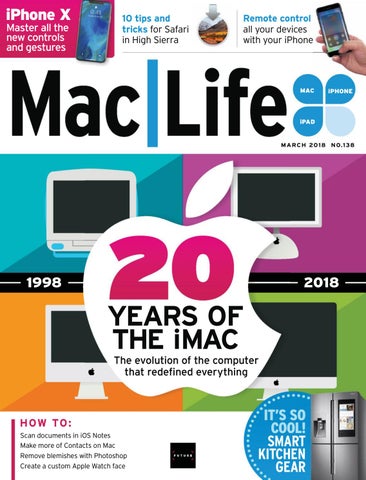
iPhone X Master all the new controls and gestures
10 tips and tricks for Safari in High Sierra
Remote control all your devices with your iPhone
MAC C
iPHONE i E
iPAD
M A R C H 20 1 8 N O.1 38
1998
2018
YEARS OF THE iMAC The evolution of the computer that redefined everything
HOW TO : Scan documents in iOS Notes Make more of Contacts on Mac Remove blemishes with Photoshop Create a custom Apple Watch face
IT’S SO COOL! SMART KITCHEN GEAR
M A R C H 20 1 8 N O.1 38
W W W. M AC L I F E .CO M
16
30
64
20 years of the iMac
Master your iPhone X
Smart kitchen and laundry
In the year of the 20th anniversary of the iMac, we reflect on the remarkable history of this ground-breaking machine, which has transformed the way we think about computers.
Learn how to navigate using gestures instead of a Home button, get to grips with all the new controls, and migrate all your data with our ultimate guide.
Whether you’re making a quick snack, checking what’s in the refrigerator, or doing late-night laundry, we discover how the latest smart tech can help.
>>> Contents
38
05
06
38
A Boy and His Blob
50
Scrivener 3
The editor reflects on Apple’s security issues, and new tech for 2018.
40
Noteshelf 2
52
GoPro Hero 6 Black
41
Pixelboard Pro
53
CallDigit USB-C Dock
41
Theodolite
53
Dyrii
42
Halide
54
Sony WH-1000XM2
43
Subsurface Circular
55
Transcend StoreJet 600
45
Campfire Cooking 55
Vinpok Bolt
45
Cubiques 2 56
GameMaker Studio 2
46
6 apps for visual inspiration on the move
59
Printopia 3
11
12
14
64
70
Processor scare
Inside the iMac Pro 48
Pathit
59
SuperDuper 3
The Shift
49
Gravity Runner
61
DropStream
David Chartier argues that Apple Stores are changing for the better.
49
Water Balance
61
Quicken 2018
49
Sort Dock Favorites on Apple Watch
62
Pixelmator Pro
Apple TV The latest apps and hottest hardware for your Apple TV.
72
We take a look inside the new top-of-the-line iMac.
Get started with smart kitchens & laundries Save time by controlling kitchen appliances from your iPhone. Plus, how to do laundry the smart way.
Share
A 20 year-old-problem with Intel rears its head.
10
55
Digital Life
Email us your views at letters@maclife.com.
08
45
Consider
Head to techradar.com for the very latest news.
07
54 4
Ask Our experts solve your Mac and iOS problems.
78
Remove unwanted objects in Photoshop
82
Power up Safari
Aging batteries cause Apple problems.
84
Automate to improve navigation in iTunes
Crave
86
The gear we’re lusting after, including Sharp's Aquos 8K monitor.
Organize your workspace with Magnet
88
ke more of Contacts Mak
90
e Notes to scan docs Use
92
Multi-task on iPad Mu
9 94
R Remote control all your gear from your iPhone g
96
Customize your Apple Watch faces
98
Random Apple Memory
Replacement batteries
52 GoPro Hero 6 Black B
Steve Jobs’ comeback.
4 MAR 2018 maclife.com
SAFETY FIRST SINCE THE RELEASE of High Sierra, Apple has endured a mix of security issues in the latest macOS, and now it has to contend with additional woes. First, several lawsuits have been Ľled over the companyġs controversial decision to “adjust” the performance of recent iPhone models as their batteries degrade over time. I wonder: had Apple disclosed the behavior, which was quietly introduced in a software update some time ago, would this even be an issueB Iġve mentioned before how I wish Apple would improve its documentation of software updates, though on previous occasions my dismay has largely been limited to wishing Iġd been told about a useful new feature. Second, Apple got caught up in concerns over a potential security issue that stems from an optimization in many processors from as far back as 1995, including those designed by Intel and AUP. Whis one doesnġt aļect just Appleġs products, of course. You can read more about both of these issues, and how to alleviate your worries over them, in this monthġs Start section. Oetġs not be all doom and gloom, though. In this issue we celebrate 20 years since the iMac was unveiled to the world, and our feature tells the story of the Bondi blue beauty and its successors. And whether youġve already bought an iPhone [, plan to do so, or will skip this generation, donġt miss our guide to all the button combinations and on-screen gestures you need to know about ğ although theyġre exclusive to iPhone [ at the moment, youġre certainly going to interact with your next iPhone in new ways... and, if the rumors are true, iPad too. Finally, as this issue was sent to the printers, we received the Ľrst batch of announcements from this yearġs Fonsumer Hlectronics Show in Oas Yegas. Zeġll bring you the highlights next issue, but weġre already hugely excited to see a plethora of products that work with the Mac and iOS devices, from Thunderbolt 3 displays and docks to a smoke detector-cumspeaker with AirPlay 2 support.
>>>THE TEAM
Matt Smith Art Editor Matt has freed up a load of disc space by deleting InDesign recovery files.
Rosie Hilder Operations Editor Rosie has been wiping an old Mac to sell it, but is yet to find any takers.
Carrie Marshall Contributor Carrie has been reveling in book writing with the new Scrivener 3.
ALAN STONEBRIDGE, Editor Twitter: @maclife
maclife.com MAR 2018 5
Visit techradar.com
Future Publishing Limited Quay House, The Ambury, Bath BA1 1UA, UK Future US, Inc. One Lombard Street, Suite 200, San Francisco, CA 94111
The march of technology never stops, so neither do we. Mac|Life’s website is now part of the new and improved TechRadar, so you can grab your fix of Mac and iOS news over at www.techradar.com.
You’ll get all the latest news and tutorials for Mac, iPhone and iPad, as well as other trusted reviews, news, and how-tos that have made TechRadar one of the world’s top tech sites. We’ll see you there!
Read more news, reviews, and tutorials at techradar.com
EDITORIAL EDITOR Alan Stonebridge ART EDITOR Matt Smith OPERATIONS EDITOR Rosie Hilder CONTRIBUTORS Adam Banks, Norman Bean, Alex Blake, J.R. Bookwalter, David Chartier, Emma Davies, Nate Drake, Ian Evenden, Craig Grannell, Kate Gray, Phil Hall, Kenny Hemphill, Hollin Jones, Cliff Joseph, Carrie Marshall, Howard Oakley, Jennifer Phin, Nick Pino, Nik Rawlinson, Gary Riches, Dave Stevenson, Alex Summersby, Matt Swider, Roland Waddilove ART CONTRIBUTORS Apple DIGITAL EDITION ART EDITOR Chris Hedley DIGITAL EDITION SUB Rob Mead-Green BUSINESS VICE PRESIDENT SALES Stacy Gaines, stacy.gaines@futurenet.com VICE PRESIDENT STRATEGIC PARTNERSHIPS Isaac Ugay, isaac.ugay@futurenet.com EAST COAST ACCOUNT DIRECTOR Brandie Rushing, brandie.rushing@futurenet.com EAST COAST ACCOUNT DIRECTOR Michael Plump, michael.plump@futurenet.com MID WEST ACCOUNT DIRECTOR Jessica Reinert, jessica.reinert@futurenet.com WEST COAST ACCOUNT DIRECTOR Austin Park, austin.park@futurenet.com WEST COAST ACCOUNT DIRECTOR Brandon Wong, brandon.wong@futurenet.com WEST COAST ACCOUNT DIRECTOR Tad Perez, tad.perez@futurenet.com DIRECTOR OF INTEGRATED MARKETING & CUSTOM SOLUTIONS Robbie Montinola DIRECTOR, CLIENT SERVICES Tracy Lam DIRECTOR, RETAIL SALES Bill Shewey MANAGEMENT MANAGING DIRECTOR Aaron Asadi EDITORIAL DIRECTOR Paul Newman ART & DESIGN DIRECTOR Ross Andrews HEAD OF ART & DESIGN Rodney Dive COMMERCIAL FINANCE DIRECTOR Dan Jotcham PRINT & PRODUCTION HEAD OF PRODUCTION UK & US Mark Constance PRODUCTION PROJECT MANAGER Clare Scott ADVERTISING PRODUCTION MANAGER Joanne Crosby DIGITAL EDITIONS CONTROLLER Jason Hudson PRODUCTION MANAGER Frances Twentyman We are committed to using only magazine paper derived from responsibly managed, certified forestry and chlorine-free manufacture. The paper in this magazine was sourced and produced from sustainable managed forests, conforming to strict environmental and socioeconomic standards. The manufacturing paper mill holds full FSC (Forest Stewardship Council) certification and accreditation.
Volume 12, Issue 3 MAC|LIFE (ISSN 1935-4010) is published monthly by Future US, Inc., One Lombard Street, Suite 200, San Francisco, CA 94111 (650) 872-1642. www.futureus.com. Periodicals postage paid at San Bruno, CA, and at additional mailing offices. Newsstand distribution is handled by Curtis Circulation Company. Basic print subscription rates: 13 issues U.S. $30.00, Foreign: $39.95. U.S. prepaid funds only. Subscriptions do not include newsstand specials. POSTMASTER: Send address changes to PO Box 2024, Langhorne, PA 19047, USA. Ride-Along Enclosure in the following editions: None. Standard Mail Enclosure in the following editions: None. Canadian returns should be sent to IMEX Global Solutions, PO Box 25542, London, ON N6C 6B2, Canada. Future US, Inc. also publishes Maximum PC, Official Xbox Magazine, and PC Gamer. PRODUCED IN THE UNITED STATES OF AMERICA. SUBSCRIBER CUSTOMER SERVICE: Mac|Life Customer Care, PO Box 2024, Langhorne, PA 19047, USA. Online: www.myfavouritemagazines.co.uk/youraccount. Toll free: 1-844-779-2822 (Opening hours: Mon- Fri 8am to 7pm; Sat 10am to 2pm EDT). Email: contact@myfavouritemagazines.com. REPRINTS: Future US, Inc., 4000 Shoreline Court, Suite 400, South San Francisco, CA 94080. Phone: (650) 872-1642. Fax (650) 872-2207. Website: www.futureus.com. AND NOW, A WORD FROM OUR LAWYERS: All contents © 2018 Future Publishing Limited or published under license. All rights reserved. No part of this magazine may be reproduced, stored, transmitted, or used in any way without the prior written permission of the publisher. Future Publishing Limited (company number 2008885) is registered in England and Wales. Registered office: Quay House, The Ambury, Bath BA1 1UA, UK. All information contained in this publication is for information only and is, as far as we are aware, correct at the time of going to press. Future cannot accept any responsibility for errors or inaccuracies in such information. You are advised to contact manufacturers and retailers directly with regard to the price and other details of products or services referred to in this publication. Websites mentioned in this publication are not under our control. We are not responsible for their contents or any changes or updates to them. Mac, iPad, iPhone, iOS, macOS, and other terms are trademarks or registered trademarks of Apple Inc. This is a fully independent publication, not affiliated in any way with Apple or any other companies mentioned herein, and has not been authorised, sponsored, or otherwise approved by Apple Inc. If you submit material to us, you warrant that you own the material and/or have the necessary rights/ permissions to supply the material and you automatically grant Future and its licensees a license to publish your submission in whole or in part in any/all issues and/or editions of publications, in any format published worldwide, and on associated websites, social media channels and associated products. Any material you submit is sent at your own risk and, although every care is taken, neither Future nor its employees, agents, subcontractors, or licensees shall be liable for loss or damage. We assume all unsolicited material is for publication unless otherwise stated, and reserve the right to edit, amend, or adapt all submissions.
GET SOCIAL OUR APP 6 MAR 2018 maclife.com
FACEBOOK: facebook.com/maclife TWITTER: twitter.com/maclife MAC|LIFE DIGITAL EDITION FOR iPAD Get it from bit.ly/maclifeapp
Future plc is a public company quoted on the London Stock Exchange (symbol: FUTR) www.futureplc.com
Chief executive Zillah Byng-Thorne Non-executive chairman Peter Allen Chief financial officer Penny Ladkin-Brand Tel +44 (0)1225 442 244
Your opinions, rants & raves
It’s great that Mac|Life has a sense of humor. Case in point: the review of Beats Studio3 Wireless headphones in January’s issue [Mac|Life 136]. “Sound isn’t… juvenile.” It has “a quite forward presentation.” “The treble is slightly safe.” It’s a lovely spoof of pretentious audiophile jargon. Still, you might want to save that sort of thing for the April issue. Someone might think you were serious. JOE DEVLIN Next month: we review a camera without using the term “resolution” and test some storage devices without mentioning megabytes or data transfer speed. Seriously, we do try to get the balance right between technical and conversational language in Mac|Life, and always appreciate feedback.
Share your iOS upgrade experience at letters@ maclife.com
Not managing In your feature about cleaning up your Mac in Mac|Life 136, on page 21, “How to scan with System Information”, I could not get it started because there is no “Manage button” to click on. I have an iMac running OS X 10.11.6 El Capitan. FRANK HAEG The Manage button was added in macOS 10.12 Sierra. Earlier versions don’t have it and won’t recommend ways to optimize your storage. Sorry we didn’t make this clear.
SimplePhone wanted I have a Mac and therefore, personally, don’t need an iPhone X. I would like a “basic,” less expensive, phone. So: If Apple could strip out enough apps and functions from the iPhone SE to bring the price down to $199.99, what would be left, and would it be sufficient for some people? For example: Phone, Calendar, Clock, Dictionary, Reminders, Contacts, Notes, Calculator, and certain apps to sync with a Mac.
SHARE WITH US!
If this is a silly question, will there ever be an Apple Watch that does not require an iPhone? BERNARD McCANN But would people be satisfied with your list of “basic” apps? What if you wanted to add more? And would that price be the sweet spot for everyone?
No problem yet On my old iPhone 6 Plus I have not experienced any noticeable change in responsiveness. I’m sure hearing this slowdown story will implant all kinds of negative fantasy memories in user minds. Besides, I didn’t purchase an iPhone because of its speed anyway. The Apple experience is so far more than
this minuscule thing. Anyone that complains needs to get a life. JOHN HANKWITZ
Battery experience I noticed my iPhone 6’s battery life degrade a month ago, after updating iOS. (1) When it is cold, it will go from 60% to 20% to auto shutdown within 15 minutes. When I plug it back in, it will reopen and show 40-60% charge. Very frustrating. (2) I fully charge it every night, and it will completely drain the battery by (usually) 2pm, with only moderate use. (3) Anytime it gets to 16-20%, I know I have only moments to still use it. I’m ready to hear the solution, because I’m not ready to buy a new phone. DON BURSELL John, meet Don. We asked for iOS upgrade experiences and the picture is very mixed, with many users reporting glitches and slowdown after upgrading. See our news pages for more.
APFS correction Last month, we said in answer to a letter that if you’re using an SSD for Time Machine, High Sierra will convert it to APFS. This is not correct — for now, High Sierra will convert only your startup disk. We apologize for the error.
In Sierra and newer, System Information helps you “manage” your storage.
EMAIL: letters@maclife.com FACEBOOK: facebook.com/maclife TWITTER: twitter.com/maclife
maclife.com MAR 2018 7
START FEED YOUR MIND. FEAST YOUR EYES.
Processor vulnerability scare A new year, another security scare… This time, just about every computer T in n use today is at risk BY ALEX SUMMERSBY B APPLE MUST HAVE been hoping the new year would see A an end to security scares, but it was not to be. However, although the media were quick to link Apple’s name al with the biggest so far, this one was not actually Apple’s w doing, and in fact Apple was some way ahead of the curve d in addressing the problem. The world’s biggest chip maker, Intel, admitted that there have been critical vulnerabilities at the heart of th processors it’s made over about the last 20 years. These p vu ulnerabilities, dubbed “Meltdown” and “Spectre,” are fundamental architectural ľaws and also aļect ar processors made by AMD and ARM over the same period. p Many reports shouted that “All Macs and iOS devices have h been hit” — but that’s partly because Apple took the th trouble to issue a statement rapidly (no doubt, among other reasons, because it wanted to be seen as being on top to of things this time), and partly because iPhone news or, for that matter, Apple-bashing) is always good (o click-bait. cl In fact, of course, the aļected processors are in i just about every PC in use out there, so this is a long way from being an Apple-speciĽc issue. The bad news is that the vulnerabilities involved are serious ones, potentially enabling a “user process” —
8 MAR 2018 maclife.com
which could include malware or a hacker — to read information in kernel memory. This information could include passwords, Ľnancial information, and other potentially sensitive data. The news isn’t all bad, though. To begin with, there is no indication that the vulnerabilities have ever been exploited. (This doesn’t prove they never have been. But the fact that they’ve only just come to light despite being there since 1995 — the Middle Ages in computing terms — suggests that no known data breaches have been traced back to this cause.) What’s more, Apple says it has already acted to “mitigate” the vulnerabilities in recent updates to macOS, iOS, and tvOS (although it stops short of saying there’s now no risk at all — see the support note at bit.ly/ml138news1). Encouragingly, Intel also issued a bullish statement conĽdently saying it had a Ľx or was just about to issue one, estimating that 90% of devices based on Intel chips would be “immune” to the vulnerabilities within a week. (See the report at bit.ly/ml138news2.) INSTALL THOSE UPDATES Inevitably, even if there are Ľxes or “mitigations” available, your data security could depend on the appropriate update actually being installed. On your Mac, there is an option in System Preferences to disable automatic updates, so if you’ve chosen this (because you want the system stability or just the choice), it’s possible that you might have missed the relevant updates to High Sierra, Sierra, and El Capitan. Check Apple’s support note at bit.ly/ml138news3. There was also an update to Safari, 11.0.2, released at the same time for the same macOS versions — Ľnd out more at bit.ly/ml138news4. Crucially, the vulnerabilities exist in processors used in servers as well as desktop computers and other devices. What we still don’t know is how much impact any Ľxes or patches are likely to have on the servers and services we all rely on these days. The problem is that the issues relate to the fundamental way that modern processors boost their speed using “speculative execution” — in other words, making an educated guess at what data will be required next. Early reports suggested that disabling or scaling back this process in order to address these core vulnerabilities could aļect performance by anything between 5% and 30%. Most of us might not even notice a 5% slowdown in the online services we use, but 30% is bound to be bad news in anyone’s life. In the meantime, it makes sense to follow Apple’s advice: install the latest updates for whatever OS you’re using, and “download software only from trusted sources such as the App Store.” For a guide to the latest news, and how to update common systems from macOS and iOS to Android and Windows, visit bit.ly/ml138news5.
News in brief Apple news in bite-sized chunks > APPLE ACQUIRES SHAZAM Apple has acquired Shazam, the two companies have confirmed, for about $400m. The music recognition service is a natural complement to Apple Music, but the company’s algorithms could prove to be even more farreaching, for example bolstering Apple’s ambitions in the field of augmented reality (AR). > CONSUMERS WANT AR According to a survey by accenture.com, consumers are more interested in practical, daily-life augmented and virtual reality (AR/VR) applications than gaming. Just 47% said they want to play games, while 67% said they want to learn more about a place they are visiting, 61% want to visualize how clothes might fit, and 54% want to shop for household items and furniture. > APPLE ACQUIRES BUDDYBUILD Apple has also bought a Canadian startup that creates software development tools for coders. Financial terms were not disclosed. Buddybuild said its staff will join Apple’s Xcode engineering group, which creates the app development tools for all of Apple’s platforms. > IMAC PRO IS SHIPPING The top-of-the-line iMac Pro, “the fastest, most powerful Mac ever made,” is now available. The iMac Pro offers a choice of Intel Xeon processors with up to 18 cores, up to 22 Teraflops of graphics performance, and super-fast SSDs up to 4TB. Interestingly, the Apple announcement makes a lot of the Retina 5K display, but the 27-inch iMac 5K ($1,799.00) has exactly th he same screen. The iMac Prro has a much more potent graphics subsystem, however, and there are other differences: The standard iMac 5K comes with 8GB of memory, a 1TB Fusion drive, and two Thunderbolt 3 ports, while the base-configuration iMac Pro offers 32GB of memory, a 1TB SSD, and four Thunderbolt 3 ports,, for $4,999.00.
maclife.com MAR 2018 9
>>> Start Feed your mind. Feast your eyes.
A first look inside the iMac Pro Our friends at iFixit.com tear down the new $5,000 top-of-the-line iMac BY iFIXIT.COM
IT’S ALL ABOUT COOL The iMac Pro isn’t just a reskinned iMac — it’s newly configured to give priority to the cooling system, which is unlike any other iMac’s. Its dual-fan cooler, huge heat sink, and beefier rear vent increase cooling capacity by 80%.
POTENTIALLY UPGRADABLE... Some components are modular — the RAM (left), dual SSDs (center), and CPU (at right of the motherboard). This means that in theory they could be upgradable, although the SSDs and CPU seem to be custom-made for Apple.
NOT UPGRADABLE Graphics are handled by an AMD Radeon Pro Vega 56 GPU with integrated 8GB of HBM2 memory. Sadly, the GPU is BGA-soldered in place, so no easy upgrades. Not that it’s exactly easy to get at the modular parts...
CUSTOM CONTROLLER The T2 chip (successor to the T1 introduced in 2016’s MacBook Pro with Touch Bar) handles all the functions of the SMC, image signal processing for the camera, audio, SSD control, Secure Enclave, and hardware encryption.
5K DISPLAY The display panel turns out to be the same as in the iMac 5K: LG Display model LM270QQ1. That said, the cabling arrangement and webcam hardware have been moved around — so you can’t swap displays between models.
NO EASY ACCESS Key replaceable components are buried behind the logic board, requiring a lot of disassembly for access. The loss of the external RAM access hatch makes for much more challenging upgrades compared with the 27-inch iMac 5K.
Image: ifixit.com
10 MAR 2018 maclife.com
>THE SHIFT Apple Stores are changing direction, says DAVID CHARTIER, and “Today at Apple” could be just what our communities need
T
ECHNOLOGY IS OFTEN mystifying, but in diļerent ways to diļerent people. An in-law might barely know how to turn on their Ľrst Mac, an accountant with a degree in Microsoft Excel might not know where to start with iPhoneography, while an Instagram-famous artist may be clueless about turning their feed into a business. Enter Today at Apple — a big new bet to empower customers and transform Apple Stores into spaces for community, learning, and creativity. The brainchild of Angela Ahrendts, senior vice president of retail at Apple, Today at Apple is a new series of tech and skills classes at all 790-plus Apple Stores worldwide. The classes span the full gamut of industries and skill levels, including “How to get started with your Mac,” photo walks that focus on speciĽc techniques, how to mix music with your Mac or iPad, art classes from well-known (often local) artists, and even sessions for business and creative professionals. And it’s all free. You just Ľnd an upcoming session at apple.com/ today and reserve your spot. These classes arrive at a time of gradual redesigns of many Apple Stores, each bringing a new emphasis on space for seating and community where “everyone is
Musician Leon Bridges performs with Brittni Jessie as part of the Today at Apple program. welcome.” This past summer, Ahrendts also declared that “Apple Stores” are now called “Apple Town Squares” (well, at least by Apple). Pretentiousness aside, there’s a lot to unpack here. Oet’s get the obvious out of the way. Yes, Apple is a business with a goal to sell products. But the classes are not group sales pitches. There are no pressured brochure handouts, and no-one veriĽes your purchase date. Instead, the goal of Today at Apple is to teach us how to get better, faster, stronger with tech we already own. Heck, I’m sure you could sit in on most sessions even if you don’t own an Apple product. We get to learn new skills and processes, often from industry pros, without spending a dime. The big takeaway is that Apple has recognized that physical
spaces stocked with potentially mystifying gadgets are no longer enough. Internet shopping is eating our physical stores (among other things), so our physical stores must transform to survive. Public libraries in the XS are experiencing similar disruption. Society switched to web search and digital books, so libraries responded by building classes for computer skills and 3D printing. The internet has been hugely transformative, and our physical retail spaces are Ľnally responding with something besides shuttered doors. Sometimes Apple follows trends, other times it leads them — this is one lead I hope catches on. In an age of discontent and disconnection, we could use more community spaces to connect and learn in. And maybe replace that lost Oightning cable, too.
>>> David Chartier is a content strategist and writer with vast experience analyzing the tech world. He runs the website Finer Things in Tech (finerthings.in) and hosts its podcast, The Finer Things In.
maclife.com MAR 2018 11
>>> Start Feed your mind. Feast your eyes.
Apple battery replacement offer After taking flak for slowing iPhones with aging batteries, Apple cuts the price of battery replacement BY ALEX SUMMERSBY
RECENT MONTHS HAVE seen a ľurry of reports and comments about “BatteryGate,” as some people were calling it. (This is not to be confused with the earlier iPhone 6s controversy also referred to as BatteryGate — that model iPhone might contain a processor from either of two suppliers, but one of the two reportedly drained the battery much faster than the other. And of course we’re not talking about batteries exploding, as in the case of Samsung’s Galaxy Note 7 a year ago.) The issue here was that — as Apple admitted — your iPhone will intentionally scale back performance as its battery ages. Some people cited this as evidence that Apple is cynically driving iPhone users to upgrade. As you notice your old iPhone’s performance deteriorating, the argument runs, you start thinking you need to buy a new iPhone, when actually a new battery might be all it takes to restore your iPhone to as-new performance. Apple’s explanation, not surprisingly, is diļerent. The capacity of lithium-ion batteries deteriorates over time, so that aged batteries “become less capable of supplying peak current demands”; the same is true when the battery charge is very low or it’s very cold. (Remember the early issue with iPhone X becoming unresponsive in very
12 MAR 2018 maclife.com
ry y cold weather?) When the battery and, cannot meet peak power dema ent there’s a risk of “an overcurre p can condition where heat buildup ents,” damage electronic compone er as independent programme James Rogers explained at ipadinsight.com, and it’s to prevent this that the deviice might g shut down unexpectedly.. The utting alternative (to either shu g mponents)) down or frying the comp wer demand, is to moderate the pow ays it has and that’s what Apple says done. Rogers veriĽes that this is a perfectly reasonable — indeed, typical — equipment safety management strategy. That said, this is not just an engineering question, but a communication one. As Rogers emphasizes, Apple could have been more transparent, adding for example a notiĽcation that the battery is operating at a sub-optimal level, or perhaps implementing more robust battery monitoring from within iOS. Throttling back the CPU might prevent random shutdowns or help keep your phone running almost as long between charges as when it was new, but a marked slowdown in performance is not a good outcome either. And Apple implementing this “secretly” in iOS updates did not go down well with many users, some of whom were very ready to suspect Apple of the worst motives.
response to Acting apparently in resp the criticism, Apple cut the price of replacement batteries for iPhone 6 or newer models from $79 to just $29. Not only that, but it relaxed the qualifying test: Previously, your iPhone would be subject to a diagnostic test at an Apple Store, and it would be eligible for a battery replacement only if the battery had degraded below 80% capacity. At the time of writing, Apple does not seem to be applying this requirement. For more information, visit your local Apple Store or contact Apple Support at getsupport.apple.com. Apple also says it will introduce new tools for iOS in 2018 that will help you keep better track of your iPhone’s battery condition.
Stay y up p to date with the
latest Apple news
Sign up for our weekly email newsletter at
maclife.com
>>> Start Feed your mind. Feast your eyes.
CRAVE THE GEAR WE’RE LUSTING AFTER
Sharp Aquos 8K sharp-world.com $TBC >>> Considering we’re only just starting to see 4K HDR content hitting the mainstream, Sharp’s announcement that it’s releasing an 8K panel — a 70-inch world-first — might come as a bit of a shock. But it shouldn’t be too long before we start to see 8K in the wild. Sharp has also promised to put in the appropriate investment and build an 8K ecosystem to support its bleeding-edge screen — it’s already confirmed an 8K professional camcorder and receiver, for example. Until we reach this 8K utopia, the Aquos will happily upscale HD and 4K.
14 MAR 2018 maclife.com
Bose Sleepbuds bose.com $249 >>> There are all sorts of things that can disrupt sleep, but if it’s unwanted sounds that are keeping you up, Bose aims to solve your problem with its noise-masking Sleepbuds. These rechargeable buds have built-in flash memory containing pre-loaded soothing sounds, designed to mask external noises but to fade from attention so as not to distract you from sleep. You can set an alarm (via the Bose Sleep app) to play through the Sleepbuds, ensuring your wake-up call doesn’t disturb your partner, while StayHear+Sleep Tips promise to stay in and stay comfortable the whole night.
Cotodama Lyric Speaker lyric-speaker.com/en/ $4,500 >>> If you like singing along but are prone to getting the words wrong, you might benefit from the Lyric Speaker by Japan’s Cotodama, an artsy device that displays the lyrics of most songs played through it. The award-winning gadget streams tracks from AirPlay, Spotify Connect, and other services via its iOS app, displaying fonts and graphics that, when analyzed by the speaker’s built-in expression engine, change in relation to the mood and structure of the song playing. Handmade and produced in batches of just 15 speakers a month, the Lyric Speaker has a distinct sound of exclusivity about it.
LG 34WK95U lg.com $TBC >>> Aimed at professional video and photo editors, or just those who like to multitask in a big way, LG’s new 34-inch ultrawide (21:9) Thunderbolt 3 monitor is one of a new range sporting LG’s advanced Nano IPS technology, which promises to take color reproduction to dizzying new heights. The resolution is described as a surreal 5K (5,120 x 2,160 pixels), and it boasts what LG calls a “4-Side Edge Design” and a sleek “Edge-ArcLine Stand.” You’ll also be able to do away with multiple cables, since Thunderbolt 3 enables fast media and data transfer without the need for a separate AC adapter.
maclife.com MAR 2018 15
>>> Feature
16 MAR 2018 maclife.com
A celebration of the iMac
20 years of the
iMac How one machine continues to change the way we think about computers
T
HE iMAC HAS been around for 20 years. Just let that sink in for a moment. Since the Ľrst iMac’s debut in August 1998, Apple has launched 59 separate laptop models, 15 iPads and 18 iPhones. In fact, the iMac was already almost 10 years old when the original iPhone was launched. The product that transformed computing has seen a lot in the last two decades. This is the story of one of Apple’s most important products ever, a computer that not only rewrote the rules but brought Apple back from the brink of destruction, propelling it to the cutting edge of cool and coļers full of cash. We’ll trace iMac’s journey, from its fascinating beginnings to its world-beating status quo. It’s a tale of inspiration and failures, fame and vitriol, jelly beans and sunľowers. It forged lifelong partnerships, toppled giants, and prompted a wave of imitators. And it continues to drive innovation and amaze the world today.
maclife.com MAR 2018 17
>>> Feature
“The back of our
computer looks better than the front of their computers” Steve Jobs
iMac?
FACTS
The iMac’s original name Thank goodness for Ken Segall. The creative director of Apple’s ad agency came up with the name “iMac,” but Steve Jobs hated the name at first and insisted on calling the computer a “MacMan.” Luckily, Segall was able to convince him that was a bad idea.
18 MAR 2018 maclife.com
A celebration of the iMac
Apple PR picture of Steve Jobs with his “baby,” the original Bondi-blue iMac G3.
W
HEN STEVE JOBS returned to Apple as “interim CEO” in July 1997, the company was in bad shape. It was churning out a confusing array of boring beige boxes that looked no diļerent from the PC competition, and it was losing money hand over Ľst. Most analysts were predicting its impending doom. The June 1997 issue of Wired magazine nicely summed up the mood, with a cover featuring the Apple logo wearing a crown of thorns. Below it ran a single word: Pray. Jobs soon decided to ax extraneous projects and rationalize the product line to just four categories: pro desktop, pro
notebook, consumer desktop, and consumer notebook. The iMac was to be Apple’s consumer desktop oļering. Soon after returning, Jobs strode into the Apple design lab run by English-born Jonathan Ive to see what kind of work he was capable of. Things didn’t exactly get oļ to the smoothest of starts. Said Jobs to Ive with his trademark bluntness: “You’ve not been very eļective, have you?” For his part, Ive had his resignation letter in his pocket. Yet Ive insists that he and Jobs clicked straight away, saying that they were both “a little bit odd.” Sources diļer over how far the concept and development of the machine that
iMac timeline
The evolution of the iconic computer
1998
20 02
2004
iMac G3 $1,299
iMac G4 $1,299
iMac G5 $1,299
The machine that began a revolution. Apple showed that computers could be beautiful as well as easy to use.
Apple proved that the iMac wasn’t a fluke with its stunning iMac G4. Design and power met head-on in this model, released four years on.
The iPod lookalike was the first all-in-one flat-screen iMac and defined the design language that iMacs still use to this day.
2007
2012
2017
iMac $1,199
iMac $1,299
iMac Pro $4,999
Apple refined its all-in-one approach by switching to a thinner-than-ever aluminum case in 2007. A unibody model came later.
The embodiment of Apple’s search for ultimate thinness is the 2012 iMac. It’s sleek, slender, and super-powerful.
The next step in the iMac evolution is the iMac Pro, with powerful internals, dazzling Retina display, and a clever cooling system.
maclife.com MAR 2018 19
>>> Feature
“ The thing our competitors
are missing is that they think it’s all about fashion” Steve Jobs
became the iMac had progressed before Jobs entered the picture, but there’s no doubt that his and Ive’s mutual understanding manifested itself in the iMac’s design. As Ive put it, “We could make a computer look like a grapefruit” because the then-current form of computers — plain beige boxes — had little to do with their function. And unlike others, Apple was not afraid to break the mold. The task was to design an “information appliance,” as it was later dubbed, that could still be recognized as a computer but not scare people oļ.
An approachable machine To do that, the original iMac had to be two things: approachable and elegantly simple. The rounded, organic shape instantly made it seem friendlier. By adding color to the iMac, Apple gave it personality. By making it translucent, Apple took away the perception that it was unknowable. (Of course, you couldn’t really see or understand what was going on inside. It just felt less mysterious than a beige box.) Ney to the iMac’s approachability was the handle. Ive and Jobs knew that at 38lbs it was not a computer many people were going to pick up and carry on a regular basis. But the handle was symbolic, too: it was an invitation to touch the machine, to make contact with it. It said
this is a device you can hold and manipulate, even if you are completely new to computing. This approachability was complemented by the iMac’s simplicity. It didn’t come with a tangle of trailing cables you had to plug in the correct way and require hours (and possibly a technician) to set up, it was a simple all-inone computer. The ads said you could get set up and on the internet in just two steps. First it disarmed you, then it empowered you. Still, it was not without controversy. You couldn’t connect your old SCSI printer or your ADB mouse, because the iMac had neither port, only USB — at the time just an emerging standard with few devices available (though that soon changed when the iMac kick-started the USB market). But it was the lack of a ľoppy disk drive that really riled the crowd. In 1998, the ľoppy was still a staple of many homes and oĿces, and conspiracy theories abounded claiming Apple’s intention was to make more money selling disk drives separately. The truth was much simpler: the ľoppy was dying. Games and apps were being distributed on CDs, Steve Jobs reasoned. And besides, people would
The peripherals
20 MAR 2018 maclife.com
The mouse
The keyboard
The floppy drive
One of Apple’s most infamous missteps, the round Apple USB Mouse was difficult to orient and uncomfortable to use. Jony Ive was a fan, though (see iMac Fact).
The Apple USB Keyboard was more compact than many of Apple’s previous efforts, with some keys eliminated or reduced in size. But you could switch on with its power button.
The lack of a floppy drive was controversial at the time, and third-party manufacturers stepped in to fill the breach. But it wasn’t long until the floppy became a relic.
A celebration of the iMac
“ One thing most people
don’t know is that Steve Jobs is an exceptional designer ”
Jonathan Ive
send Ľles over the internet in the future. What better way to take a step into that future than with an iMac?
Insanely great design The iMac was very much Steve Jobs’ baby. Oike a proud father, he helped guide its development and overcome its problems. But because it was based on his perception of what a computer should be, there was a lot riding on it. Nen Segall, the creative director of Apple’s advertising agency and the originator of the Think Diļerent campaign, was wowed by the iMac, but also a little concerned. “I’d like to believe we were all so smart that within seconds we were convinced that we were witnessing the start of a miracle resurgence,” he later said, “but it wasn’t quite like that.” His own feeling, and that of his fellow agency members, was “part shock, part excitement, and part hope that Steve Jobs really knew what he was doing — because there was a real chance that this revolutionary computer might just be too shocking for its own good.” The iMac didn’t just have to save Apple. It had to save Steve Jobs, too. For Segall, the excitement soon outweighed the shock. The iMac was indeed the future, he realized. At his next meeting with Jobs, the Apple co-founder was feeling ebullient. “The back of our computer looks better than the front of their computers,” he said, dismissive
The Rev C iMac came in Blueberry, Grape, Tangerine, Lime, and Strawberry. as ever of his rivals. “Once the shock of our Ľrst sighting had worn oļ,” says Segall, “we understood how revolutionary ^the iMac` was going to be. We were believers. We couldn’t wait to start developing a campaign for it.” Jobs was involved in almost every stage of the iMac’s design, which Ive described as a “vigorous intellectual process.” The Apple CEO insisted that the iMac had to be an all-inone, a throwback to Apple’s heritage with the original Macintosh. It had to build on that heritage while also bringing it up to date. By the end of his Ľrst meeting with Ive, the two were already sketching iMac design ideas together. “One thing most people don’t know is that Steve Jobs is an exceptional designer,” says Ive. High praise indeed. While Ive and his top deputy, Danny Coster, were tasked with coming up with dazzling iMac designs, Jobs made reĽnements and approved — or rejected — models. Jobs disliked Ive’s Ľrst dozen designs, but Ive pressed on with
iMac?
FACTS
The design failure that wasn’t
Despite the negative reaction to the Apple USB Mouse, Jony Ive insisted that it wasn’t a failure. “Everything we make I could describe as being partially wrong, because it’s not perfect,” he said, adding that it presented a great opportunity to design something better.
maclife.com MAR 2018 21
>>> Feature
iMac in numbers
From the groundbreaking G3 to the 5K dream machine...
21.3lbs
0.3MP
38.1lbs
The 15-inch iMac G4 weighed 21.3lbs (9.7kg), almost half the iMac G3’s 38.1lbs (18.1kg).
one, insisting it had promise. He told Jobs that its curves and creative look meant “It has a sense that it’s just arrived on your desktop or it’s just about to hop oļ and go somewhere.” After some slight adjustments, Jobs had changed his tack, declaring that he loved it. He carried the model with him around the oĿce, showing it oļ to trusted executives and colleagues. It was the embodiment of Apple’s philosophy — it “thought diļerent,” it was fun, it was rebellious. Even the internals were subject to Apple design principles, since you could see them through the iMac’s shell. There were absolutely no secrets with this machine, no hidden, unfathomable moving parts. It was designed to make computing understandable and, ultimately, conquerable.
More than skin deep Achieving the right eļect for the case was not easy, and Jobs and Ive visited a jelly bean factory to learn how to make translucent colors look attractive. The cost of each case was $60,
22 MAR 2018 maclife.com
In October 2005, the iMac G5 was updated with a built-in iSight camera, with a resolution of 640x480 — 0.3 megapixels.
Apple PR photo of Jonathan Ive around the time of the launch of the first iMac in August 1998.
A celebration of the iMac
$309 million
The iMac G3 helped bring Apple’s profit for the 1998 financial year to $309 million. Apple had lost $2 billion over the previous two years.
5mm 278,000
The slimline iMac (2012—) is 5mm (3/16 in) thick at its thinnest point.
The iMac G3 was an instant success, selling 278,000 units in six weeks.
14,745,600 The Retina 5K iMac features the most detailed display available in any iMac, with 14,745,600 pixels.
three times as much as a regular PC case, but Jobs had no qualms about that — he knew it was vital to the iMac’s identity. It worked. The iMac G3 was a huge success, with 800,000 sold between its release in midAugust 1998 and the end of the year — a rate of one sold every 15 seconds. Apple had returned to proĽtability before the iMac shipped, thanks to cutbacks initiated by Jobs’ predecessor as CEO, Gil Amelio, but the iMac is widely credited with propelling Apple back into relevancy, too. Revised models followed, with a slot-loading CD drive replacing the original tray-loading drive, a choice of Ľve candy-colored cases, and eventually the garish “Flower Power” and “Dalmatian” variants... But Apple’s thinking — that deep understanding of what was required, regardless of the cost — continued to separate the iMac from its imitators. As Jobs later put it: “When people look at an iMac, they think the design is really great, but most people don’t understand it’s not skin deep. There’s a reason why, after two years, people
haven’t been able to copy the iMac. It’s not just surface. The reason the iMac doesn’t have a fan is engineering. It took a ton of engineering... “The thing that all of our competitors are missing,” he expounded, “is that they think it’s about fashion, they think it’s about surface appearance. And they couldn’t be further from the truth. The iMac isn’t about candy-colored computers. The iMac is about making a computer that is really quiet, that doesn’t need a fan, that wakes up in 15 seconds, that has the best sound system in a consumer computer, ^and` a superĽne display. It’s about a complete computer that expresses it on the outside as well. And ^competitors` just see the outside. They say ĠWe’ll slap some color on this piece of junk computer, and we’ll have one, too.’ And they miss the point.” Missing the point or not, it wasn’t long before the world was ľooded with products made of translucent plastic, from computers to George Foreman grills. Apple knew it was time for change — it was time for the iMac G7.
iMac?
FACTS
A helping hand from LG It wasn’t just a visit to a jelly bean factory that led to the creation of the iMac. Apple executives Ive and Dan Riccio spent a total of eight weeks at LG (the iMac’s manufacturer) working out how to implement a planned revision. These days, Riccio says this would all have been done in-house at Apple rather than with a partner.
maclife.com MAR 2018 23
>>> Feature
iMac?
FACTS
The Pixar connection
Apple played on the iMac G4’s similarities to Pixar’s mascot, Luxo Jr. In an Apple ad, an anthropomorphic iMac G4 sits in a shop window and reacts to people as they walk past. When a man sticks his tongue out at the iMac, it cheekily opens its optical drive in response.
The iMac G4 was a radical departure from its precursor, making use of a flat-panel display for the first time.
24 MAR 2018 maclife.com
A celebration of the iMac
iMac G4
If you’re Apple, how do you top the incredible iMac G3? The answer is with the gorgeous, quirky design of the iMac G4
H
OW EXACTLY TO follow the revolutionary success of the iMac G3 was something of a problem for Apple. After all, it was the device that saved Apple. A new model had to be something even more special. Apple was stabilizing; its next computer had to make it successful. Expectations were high. Ive and Jobs were keenly aware of this. After all, they’d experienced it before — as soon as the original iMac was announced, the press ramped up the pressure on the forthcoming iBook, Apple’s consumer laptop that followed the G3. “It’s a bit scary,” confessed Ive at the time. At the turn of the 21st century, ľat-panel display technology was Ľnally becoming aļordable, allowing for new ways of building a computer. Designers could now dream up new creations that weren’t possible before. But, of course, it was easier to dream up ideas than build them. The original plan for the iMac G7 was much like today’s iMac: All of the components were to be mounted on the back of a ľat-panel display in a sleek, all-in-one conĽguration.
But the engineers struggled with the limitations of the technology of the time. They found, for example, that the CD drive performed poorly when mounted vertically. Steve Jobs wasn’t happy. Each component had to be true to itself, he insisted, which was impossible if they were forced into compromised arrangements simply in order to Ľt on the back of a screen. After yet another day of frustration, he invited Ive back to his house to discuss their progress — or lack thereof. They took a stroll in the garden, abundant with golden sunľowers. Suddenly, Ive had an idea. What if the display was separated from the base of the computer? What if it was on a neck that allowed it to swivel and move, much like a sunľower? He began to sketch excitedly. This new design allowed Apple to assign meaning to the iMac. It was now so ľuid, so ľexible, that it could reach for the sun. Just as the original iMac was designed to suggest that it had just arrived on your desk and could hop oļ at any minute, the iMac G7
Jobs wasn’t happy. Each component had to be true to itself, he insisted
was also made to feel alive and part of nature. Of course, sketching such a computer and actually making it work were two very diļerent things. The iMac G7 has been compared to Ouxo Jr., Pixar’s animated desk lamp, but Ive insisted that the neck of the iMac G7 had to be stronger than a typical desk lamp’s, so that it wouldn’t sway or droop. This involved simulating years of testing in order to guarantee its strength. It also had to be sturdy enough to withstand someone lifting the whole computer by the neck, however inadvisable that may be.
The iMac G4’s neck was specially constructed to stay in position, without slumping.
maclife.com MAR 2018 25
>>> Feature
Then there was the base, which housed the iMac’s workings. Apple managed to cram everything into a white dome a mere 10.6 inches in diameter, a pretty exceptional feat. Everything had to Ľt perfectly, all while operating almost silently, something achieved through a clever ventilation system that drew air in from the bottom of the unit. And, of course, it was heavy enough to anchor the iMac securely.
No stone left unturned The attention to detail was quite remarkable. The combination of a faster processor and a smaller enclosure than the original meant that the iMac G7 needed a fan, but Apple’s designers ensured it was no louder than the sound of a hard drive spinning up. Another example is the machine’s screws. Jony Ive insisted they should have a special Ľnish and shape, but Jon Rubinstein, the hardware engineering chief at Apple, vetoed them over concerns they would lead to delays. Ive went directly to Steve Jobs — and got his way. They were put to good use on the hatch used to access the iMac G7’s memory; the initial plan was to use a pop-open hatch, but it was thought that this might be too diĿcult to use. Not many companies would put so much eļort into such small components. Following the iMac G3 was never going to be easy, but Apple has rarely opted for the easy route. The new iMac came at a pivotal time when Apple faced huge pressure to produce a new breakout product. Despite some initial skepticism, it is now seen as a classic example of Apple design, an embodiment of the belief that design can be simple and beautiful. There’s even an iMac G7 in New York’s Museum of Modern Art.
The iMac G4’s base was a marvel of hardware engineering, fitting every component into a small and shapely white dome. 26 MAR 2018 maclife.com
iMac G5 Today’s svelte all-in-one iMac had its genesis in a larger-than-life iPod in desktop computer form
W
HILE THE IDEA of mounting a computer’s components behind its display was ahead of its time in 2001, by 2007 it was much more feasible. Other PC companies had tried it, but none had been successful. Now it was Apple’s turn to shake up the industry once again. The iMac G5 took the sleek white design trappings of the iMac G7 and the iPod and took them further. Where the G7’s neck was glossy and reľective, the G5’s stand was matte, creating a more understated, less showy visual style. Indeed, from the side it bore a striking resemblance to a large iPod mounted on a metal stand. There were further iPod connections. Apple’s slogan promoting the iMac G5 was “from the creators of the iPod,” clearly meaning to lure in Ľrst-time buyers whose Ľrst taste of the Apple ecosystem had been its portable music players, not its computers. On release, the iMac G5 could be detached from its included stand and mounted on a YESA arm instead. Buyers could also remove the back of the machine completely, in order to upgrade the memory. However, both of these possibilities were removed in later revisions, bringing the iMac G5 closer to the hermetically-sealed styling of the iPod than the more user-serviceable designs traditional to PCs. You could still install more memory, but not a lot else.
A celebration of the iMac
eMac The introduction of iMacs with flat-screen displays presented a problem: they were still expensive. To give schools an affordable option, Apple released the eMac in 2002. Visually, it was pretty similar to the iMac G3, save for an all-white enclosure and a large, flat, 17-inch screen. Inside was a PowerPC G4 processor, giving it plenty of power. The eMac lasted until 2006, when it was discontinued.
The iMac G5 was similar to the original idea for the G4, with the internals mounted on the display.
Everything about the iMac G5 screamed minimalism. The power button and USB ports were on the back. The speakers were on the bottom, designed to bounce sound up oļ your desk. The front of the computer was almost completely bare, save for an Apple logo positioned neatly in the middle. Its design heritage lay in an earlier, doomed Apple computer — the Twentieth Anniversary Macintosh (TAM). Oaunched in March 1997, the TAM was an allin-one designed to showcase the best tech of the day. That gave it a premium price tag of $7,799, and it was discontinued just one year later. The iMac G5 was an attempt to bring much of the TAM philosophy — sleek, self-contained power — to the consumer market. The iMac G5’s design — with evolutionary revisions — has been a staple of the iMac for close to 15 years now. Read on to discover which parts have changed and which have remained from the 2007 model.
iMac?
FACTS
The never-ending quest for thin While it seems chunky nowadays, the iMac G5 was impressively slim for its time. Its two-inch depth made it “the world’s thinnest desktop computer,” Apple bragged. “With the entire system… just two inches thin,” mused marketing chief Phil Schiller, “a lot of people will be wondering ‘where did the computer go?’”
maclife.com MAR 2018 27
>>> Feature
iMac (2006 to present) Ever-thinner designs and increasingly powerful innards are the order of the day as Apple perfects its iMac recipe
F
OR YEARS, APPLE had packed its iMacs with PowerPC processors, developed with IBM and Motorola. First debuting in the Power Macintosh and Performa models of 1997, the PowerPC chip was a mainstay of Apple desktop computers for 12 years before being phased out in 2006. Apple had long been Ľghting against what it called the “megahertz myth,” which it said led to inaccurate assessments of its computers. While PowerPC chips often came with slower clock speeds than their rivals, they just as often matched or outperformed them, since calculating a processor’s power is about far more than just its megahertz count. However, Apple was clearly thinking about moving beyond PowerPC. Indeed, Apple’s press release announcing the Intel-based iMac seemed to admit that PowerPC chips were no longer up to scratch. It promoted the 2006 iMac as being “twice as fast” as its precursor, despite having an almost identical clock speed, suggesting that the older PowerPC chips were not as capable as their Intel equivalents.
Packing more punch Shifting to Intel meant more than just updating hardware; software would have to be rewritten to work with the new chips. To soften the blow, Apple wrote a piece of software called Rosetta to automatically translate apps built for PowerPC to run on Intel’s platform. Despite all of the upheaval over the internals of Intel-based iMacs, by outward appearances
28 MAR 2018 maclife.com
Though it’s hard to imagine what might be next, the iMac is due for an update...
A celebration of the iMac
As beautiful as the 2007 iMac was, Apple knew it could do better
At just 5mm thick at its thinnest point, the current iMac is beautiful to look at from any angle.
iMac?
FACTS
Well ahead of deadline By the early 2000s, Steve Jobs was growing disappointed with PowerPC chips. He announced at WWDC 2005 that Apple would begin transitioning to Intel processors by June 2006, and would finish by late 2007. It actually went a lot faster, with the first Intel Macs out in January 2006.
they were identical to the iMac G5 model that preceded them. Perhaps this was Apple’s way of reducing consumer concern over the new chips — “business as usual” was the message. Just over a year and a half later, in August 2007, came that case redesign. The most obvious change was in the materials used. No longer did the iMac look like an iPod on steroids; now it was clad in sleek aluminum with a plastic back. The display sizes also went up from 17 and 20 inches to 20 and 27 inches. Apple’s obsession with simplicity came to the fore in the aluminum iMac, which had only one visible screw on the entire enclosure, which was used to secure the panel that covered the memory slots. As beautiful as the iMac was, Apple knew it could do better. In October 2009 it overhauled the body, unveiling a full unibody design made from a single piece of aluminum. Display sizes were again increased, this time up to 21.5 inches and 27 inches. Interestingly, the aspect ratio was changed from 16:10 to 16:9, a move Apple touted as making the iMac ideal for viewing movies and photos. The unibody iMac was also the Ľrst to ship with Apple’s Magic Mouse, its Ľrst mouse with the Multi-Touch tech that had already featured in the iPhone and the MacBook’s trackpad. The most recent iMac revision (in terms of case design) came in 2012. Even by Apple’s standards, the new slimline iMac was a marvel, measuring just 5mm at its thinnest point. Apple left display sizes the same, but added USB 3.0 ports for the Ľrst time. On 21.5-inch models, the memory was soldered in place and couldn’t be changed without taking the iMac apart, although the 27-inch models retained a panel to access the memory. The iMac Pro features the same exterior look, although in space gray. Nearly six years after its last redesign, the iMac is surely due an update. What will Apple unleash next?
maclife.com MAR 2018 29
>>> Feature
THE ULTIMATE USER GUIDE Learn how ow w tto navigate g t using gestures instead of a Home button, master all the new controls, and migrate all your apps and data HETHER YOU’VE ALREADY boughtt iPhone X, plan to do so in the next few months, or will wait at least W a generation, one thing’s for sure: The new model marks a step change in how you interact with your Apple device. That’s largely because iPhone X dispenses with the Home button, a fundamental feature since the original iPhone burst onto the scene in 2007. Here we’ll walk you through the ľuid new w gestures for accessing features you’ll use often, new shortcuts, and new settings that make iPhone X even more delightful to use. We’ll explain how to start migrating your apps and data from your existing phone, whether it’s an older iPhone running iOS 11 or an Android device. And we’ll provide you with compatibility pointers that you need to o consider as you make the switch.
30 MAR 2018 maclife.com
iPhone X migration
> Migrate from Android MOVING FROM ANOTHER type of phone to iOS might seem daunting, but there’s an app to help you with that. It’s called “Move to iOS,” and it works with devices running Android 4.0 or later. To find it, simply search for “Move to iOS” on the Google Play Store — just be careful that you choose the app attributed to “Apple Inc” and not one of the third-party alternatives. Apple’s migration tool saves you a lot of hassle getting information from Android apps into their equivalents on your new iPhone. That’s not all it does, though. The latest version of Move to iOS saves you time by identifying iOS
Prepare Android Ensure that Wi-Fi is switched on and both phones are connected to power. Check that the total amount of information you want to transfer from your Android phone, including any SD card contents, will fit on your iPhone X.
Install Move to iOS On your Android phone, get Move to iOS from the Google Play Store and open it. Tap Continue, review the terms, then tap Agree, and finally Next. On your iPhone, tap Continue and a code will be displayed; enter this on Android.
versions of your apps. For those that are free, you’ll be asked during the transfer process whether you want them on your iPhone — you can accept or reject individual apps, so this is a chance to ditch any you no longer use. As for paid apps, you aren’t asked to buy the iOS versions during transfer. At the time of writing, Apple’s blurb about Move to iOS mentions that paid apps are added to your Wish List in the App Store app. However, iOS 11 removed the Wish List feature, and so far it hasn’t been restored by any update, so you’ll need to investigate replacement apps for yourself.
Prepare your iPhone Turn on your iPhone, and follow the standard setup steps as far as the Apps & Data page. Tap Move Data from Android. If you’ve already set up your iPhone, you can move data manually — see bit.ly/andtoios.
Transfer your data On the Transfer Data page, select items to transfer and tap Next. Ignore Android if it says it’s finished; when the bar on iPhone is done, tap Continue. For any items that fail to transfer, try the manual method mentioned in step 2.
MIGRATE FROM ANOTHER iPHONE With iOS 11, moving to a new iPhone is simpler than ever: Just place your old and new phones near each other. That’s all that’s required to initiate the migration process, assuming that you’re using iCloud to back up the older iPhone (Settings > [Your name] > iCloud > iCloud Backup) — though proximity is enough to start the process, your apps, settings, and other data are retrieved from the internet, just as in previous versions of iOS. You’ll also need to prove you own the old phone — and the information on it — by entering your Apple ID password.
Kick-start migration Turn on your iPhone X, and enable Bluetooth on the old phone, which must be running iOS 11. Place the phones near each other. The older phone confirms the Apple ID to be used for migration. Tap Continue.
Confirm the connection You’ll see an image on iPhone X. Line this up in the viewfinder on the old phone. You’ll see a message on iPhone X about finishing up. Enter your old phone’s passcode there, then follow the on-screen steps.
maclife.com MAR 2018 31
>>> Feature
How to navigate iPhone X CALL UPON SIRI Many functions that used to use the Home button now use the side button on iPhone X. To call upon Siri, you can still say “Hey Siri,” but if it doesn’t respond, speaking is inappropriate, or you prefer to use the Type to Siri accessibility setting, simply hold the side button for a moment.
LOCK SCREEN SHORTCUTS The Lock screen includes shortcuts to the flashlight and camera features, which saves you opening Control Center or swiping left for these. To avoid accidental activation, these buttons require you to press firmly.
APPLE PAY To make a payment using a bank card you’ve added to the Wallet app, double-click the side button. Note that because opening the app switcher on iPhone X uses an on-screen gesture, you can call upon Apple Pay while in an app, rather than having to open Wallet as you did on previous iPhones.
ACCESSIBILITY SHORTCUTS To invoke accessibility features, quickly press the side button (formerly called the sleep/wake button) three times. What you get depends on your choices in Settings > General > Accessibility and the Accessibility Shortcut item at the foot of that page.
FORCE A RESTART With luck, your iPhone X will never act up to the point of requiring you to force it to restart. If it does, though, press and release the volume up button, repeat for the volume down button, then hold the side button until you see the Apple logo.
> Power off
> Tap to wake
> Screenshots
Now that holding the side button — the new name for the sleep/wake button — invokes Siri, you can power off in two ways: Go to Settings > General > Shut Down; or hold either of the volume keys in addition to the side button for a few seconds to get options for powering off, Emergency SOS, and Medical ID. The shortcut for Emergency SOS is five quick presses of the side button.
If Settings > Display & Brightness > Raise to Wake is on, raising your iPhone will wake its screen. But you don’t have to do that, or press a button, to see the Lock screen, just tap the screen. Depending on Settings > Notifications > Show Previews, and iPhone X’s view of your face, you might need to pick it up to read notifications — a good reason to add an iPhone dock to your desk.
To take a screenshot, quickly press and release the side button and either volume button. iOS 11 briefly displays the shot at the bottom left of the screen; tap that to open the Instant Markup tool, where you can annotate the screen, share it, or delete it if you don’t also want to save it to Photos. If you ignore the preview, the screenshot will be saved to Photos automatically.
32 MAR 2018 maclife.com
iPhone X migration
Return to the Home screen
Open the app switcher
On iPhone X the horizontal bar at the foot of the screen With no Home button to double-click to open the app replaces the Home button’s primary function with a simple, switcher, another on-screen gesture is used: Swipe upwards fluid gesture: Simply swipe up from the bottom edge of as if to return to the Home screen, but keep your finger the screen and the current app will fade into the on the screen at the end, then release. The required Switcher background. On other iPhones, of course, this delay is pretty short, so experiment to find a animation gesture opens Control Center, but not now... timing you find comfortable and reliable. The animation when you
Control Center
swipe up on an app can be misconstrued as closing it, but that’s not the case; Background App Refresh allows it to keep working.
To open Control Center on iPhone X, swipe down from the top-right corner of the screen, where status icons reside. Tap in an empty area, even near a screen edge, and Control Center will close. Other iPhones give you the option to display the percentage of remaining battery power next to the battery icon, but limited space means iPhone X doesn’t offer this; open Control Center to see that value.
Switch between apps more quickly
Save yourself the time it takes to enter the app switcher and jump back and forth between a couple of apps. Instead, swipe rightwards on the bar at the bottom of the screen; repeat to revisit even more of your previously-used apps. This works both on the Home screen and also within apps, so you may rarely need to use the app switcher.
maclife.com MAR 2018 33
>>> Feature
Force F orce an an app app to to quit quit
Rearrange R earrange the the Home Home screen screen
In the app switcher, hold a finger on any of the app When you’re rearranging apps, the Done button that ends thumbnails until red buttons appear at the top left of all of the process appears at the top right of the screen. You don’t them. Tap one to close the corresponding app. Do this only have to reach all that way to tap it (or, more likely, use your for problem apps, because you risk losing unsaved data. other hand). Instead, swipe up ever so slightly from the bottom edge — too far and you’ll end up in the app If an app uses lots of power in the background (find switcher — and the icons will stop jiggling. out in Settings > Battery), consider disabling that Face ID permissions privilege (General > Background App Refresh).
Set up notifications
In Settings > Face ID & Passcode, pick whether Face ID is used to check it’s really you trying to log in to sites in Safari or access certain apps.
To open Notification Center, swipe down from the top edge of the screen, except from the top-right corner (which is reserved for Control Center). If you use the front-facing camera a great deal, though, consider swiping down from the area to the left of the notch, so that you don‘t end up smudging oil from your fingers over the camera area and need to clean it quite so often.
34 MAR 2018 maclife.com
Reach your content
The Reachability feature is designed to lower the contents of the screen so you can reach items near the top. Once switched on, in Settings > General > Accessibility, invoke it by swiping downwards on the Dock, starting from at most halfway up its height. It’s then easier to open Notification Center, or to tap to reach the top of a view, but Control Center can still be hard to reach with the phone in your left hand.
iPhone X migration
> Check out these settings THERE ARE NEW items worth investigating in the Settings app in iPhone X. In many cases the default values are fine, but it’s important to know about the items that control how your photos and videos are recorded and moved around, and other behaviors may be worth a little tweaking.
Picture this The iPhone X rear camera is capable of recording 4K video at 60 frames per second (fps), yet the Camera app is set to record by default at a lower quality that‘s less demanding on storage space. You can switch to recording 4K at 60fps in Settings > Camera > Record Video. Also in the Camera app’s settings, tap Formats to choose whether photos and videos use the new HEIF and HEVC (High Efficiency) formats, or the more widely used JPEG and H.264 formats (Most Compatible). To find out more about differences and considerations, read Apple Support’s article on the subject at bit.ly/mfhigheff. The high efficiency formats use much less space, which is great news if you take a lot of photos and videos — especially if you have only a 64GB iPhone X — but you need to consider where else you might want to work with your media. When you’ve captured media in one of the new formats and share it using AirDrop or in a message, or if you post it to a social network, then iOS will convert
Using the new High Efficiency media formats has little impact on editing on your iPhone, but check whether your Mac can handle them.
it to ensure compatibility. If you transfer the media to your Mac, however, you need to consider which version of macOS you have, which Mac apps you want to use, and even the method used to transfer files. For reliable results with HEIF and HEVC, you need to be using High Sierra (earlier versions don’t have support for these builtin), and the latest version of iMovie or Final Cut Pro 1.4. If you’re transferring your media using a cable, the format depends on what you choose in Settings > Photos > Transfer to Mac or PC. If your Mac can handle HEIF and HEVC, choose Keep Originals. If you use iCloud Photo Library to send photos and videos to your Mac, uploaded media files are always stored in their original format; if your Mac can’t handle HEIF but you want to use that format for its space-saving benefits on your iPhone, you can use a utility such as iMazing HEIC Converter (bit.ly/mfheifcnv) to convert HEIF to JPEG on your Mac for editing and sharing from there, while keeping the original for archiving.
Wake up In Settings > Display & Brightness are options to turn off “Raise to Wake” and “True Tone.” The latter adjusts on-scree en colors to match ambient light, and you may want to see the true colors when editing a photo for Flickr, say. There’s a shortcut for this: press firmly on Control ol Center’s brightness slider to reveal it. Apple’s Leather Folio case provides another method for waking the display or putting it to sleep: simply opening or closing the cover. You may not want the e screen to turn on every time you open the cover to retrieve a bank card or notes from its inside pockets. If that’s the case (no pun intended), you can turn this option off in Settings > Display & Brightness > Lock/Unlock.
AAppl pplee’ss iPh pp Phone h X Leathe Leathher Follio io case mimics cs the wake-on-open/sleep-on-close behavior introduced in the 2011 iPad 2’s Smart Cover.
Videos on a TV (without Apple TV) Videos downloaded from the iTunes Store are HDR versions (if available), which look better on the iPhone X display. But if you use a Lightning Digital AV Adapter in place of an Apple TV to play from your phone to a big screen, turn off Settings > TV > iTunes Videos > Download HDR videos — that format won’t work with it.
Subscribe to MAC
iPHONE
iPAD
Ahead of the curve, and endlessly entertaining…
Choose your perfect package GET THE DIGITAL EDITION
GET THE PRINT EDITION
Instant digital access on your iPad, iPhone, and Android device.
Every issue delivered to your door at a fraction of the cost.
Only $18
Only $30
Every Year
Every Year
36 MAR 2018 maclife.com
GET THE COMPLETE PRINT & DIGITAL BUNDLE
Get both the Print & Digital editions for only
$42 Every Year
SAVE
Get the print edition of Mac|Life delivered direct to your door, plus instant access on your iPad, iPhone, or Android device.
71%
“Mac|Life is the essential magazine for Apple lovers, as beautiful as an Apple product, and packed with informative features, reviews, and tutorials.”
ALAN STONEBRIDGE, Editor Subscribe online today…
myfavouritemagazines/submcll Or call: 844-779-2822 (toll fre ee))
TERMS AND CONDITIONS Prices and savings quoted are compared to buying full-priced print and digital issues. You will receive 13 issues a year. You can write to us or call us to cancel your subscription within 14 days of purchase. Your subscription is for the minimum term specified and will expire at the end of the current term. Payment is non-refundable after the 14-day cancellation period unless exceptional circumstances apply. Your statutory rights are not affected. Prices correct at time of print and subject to change. Call center opening hours are Monday to Friday 8am-7pm, and Saturday 10am-2pm EDT. For full terms and conditions please visit bit.ly/magterms. Offer ends: 03/30/2018
maclife.com MAR 2018 37
APP LIFE THIS MONTH’S MOST INTERESTING iPHONE & iPAD APPS
A Boy and His Blob Shapeshift through this classic game $4.99 From Majesco Entertainment, majescoent.com Made for iPhone, iPad Needs iOS 7 or later
Gameplayers with very long memories might remember the original A Boy and His Blob, released for the NES in 1989. Designed by industry luminary David Crane, the game featured the titular characters — a boy and his shapeshifting alien pal — trying to topple a despot on the planet of Blobolonia. It was a playable, inventive platform game, but the clever part was the shapeshifting. Lob a jellybean at Blob, and he
changed into something useful like a ladder or a ľamethrower. And although the swift and tricky action of the NES game has largely been dispensed with on iOS (where you’re in fact playing a touchscreen take on a high-def spruce-up of a Wii remake of the original), the transformation stuļ is intact. What you end up with is a kind of logic test wearing the skin of a ponderous platform game. The levels have the appearance of an open sprawl, but are in fact broadly linear.
The game’s hazards include roving monsters to outwit and spikes to avoid. The aim is to methodically make your way to a golden jellybean that transforms Blob into a door, through which you can continue your adventures. Early levels pepper the platforms with signs that don’t so much hint as scream at what you should do next. Standing before a long drop?
APP TIPS
Top transformations
Turning Blob into an anvil enables you to drop him on the heads of monsters, break rocks, and fill holes.
38 MAR 2018 maclife.com
The ball is in theory used to roll Blob where the boy cannot fit, but can also be used to squash a row of enemies.
Turn Blob into a hoppity-hop to help you bounce upward to higher platforms. It’s also a cunning way to cross water.
Tough testing, trusted ratings
Although mostly linear, the game sometimes has situations with more than one possible solution.
Turn Blob into a parachute. Need to somehow get through a platform? Transform Blob into a hole. Fortunately, the hand-holding eases oļ later on, giving you the chance to tackle tricky bits alone. Given the underlying complexity of the game’s mechanics, the controls fare reasonably well on their trip to touchscreen. You slide to the left to walk or climb ladders. The right-hand side is used to jump, and also houses three action buttons: holler at Blob; throw a jellybean; select a jellybean (from a rather stylish dial picker that pauses the action while you choose). However, the game’s origins mean it never entirely feels at home on iOS. The controls can be hard to manage — some challenges make almost
unreasonable demands on your dexterity — and the lack of gamepad support is a disappointment. Also, while checkpoints are plentiful, it can be frustrating having to play through the same sections several times because Blob was doing his own thing, or the boy didn’t respond as expected. Yet there’s a charm and inventiveness about A Boy and His Blob. The animation has a cartoonish quality, and turning Blob into all kinds of contraptions never gets old. Although some gamers used to frantic modern mobile fare might Ľnd the slow pace a bit yawnsome, it is if anything a boon, giving you time to think. THE BOTTOM LINE. An endearing, if occasionally frustrating, puzzle platform game. CRAIG GRANNELL
A BOY AND HIS BLOB
Very charming throughout Plenty of levels to tackle Controls can annoy
Find hidden treasures to quickly expand your bling collection.
Backgrounds look rough on iPad GOOD
maclife.com MAR 2018 39
Noteshelf 2 makes it easy to share your jottings with third-party services.
Noteshelf 2 Can it rival the improved iOS Notes? $6.99 From Fluid Touch, noteshelf.net Made for iPhone, iPad Needs iOS 10.0 or later
A Microsoft Word file that Noteshelf converted to PDF.
40 MAR 2018 maclife.com
Notes had a signiĽcant boost in iOS 11. It can now capture documents, lets you mark them up and, naturally, syncs with your Mac. It also has handwriting recognition, if you’re using Apple Pencil or another stylus, the results of which show up in Spotlight. Can anything compete? Rival Noteshelf 2 integrates with Dropbox, Evernote, OneDrive, Box, and Google Drive, has tools for marking up PDFs, lets you add photos, and handles both typed and handwritten notes. There’s a choice of two pen tools, a pencil, and a highlighter, and
the intelligent shape tools will tidy up sketches. It can even record audio as you jot or type — a boon for anyone in a meeting or lecture, since you can keep your notes and a soundtrack together. Sadly, there’s no way to link speciĽc jottings to a location within the soundtrack the way you can with Notability, where your drawings, handwritten notes, and typed text appear in sync as you play back the Ľle, so you can check that what you’ve written tallies with what was said. Noteshelf 2 is also lacking the handwriting recognition of the native Notes app, so you can’t search your entries with Spotlight, and when you export a handwritten page it will transfer as a PNG Ľle or PDF. If you want to export in a more usable format, try Nebo.
Noteshelf 2 notes are synced between devices through iCloud, to appear on both your iPad and iPhone, but there’s no macOS version as there is with Notes. Yersion 2 sees the introduction of bookmarks, bullets, numbered lists, and checkboxes, and you can now group notebooks the way you can organize novels in iBooks. There are three new paper sizes, too, which didn’t appear in Noteshelf Classic: A7, “mobile,” and 12.9in, the last of which makes best use of the larger iPad Pro screen. There’s support for a range of styli, supplementing Apple Pencil with tools from Adonit, Wacom, and FiftyThree. Overall, Noteshelf 2 provides a very pleasant working environment and it’s far from expensive, but it’s missing a couple of key features. Its compatibility with Evernote and other third-party cloud services is tempting, and plugs the gap of a missing macOS edition, but there are more ľexible options elsewhere. THE BOTTOM LINE. A capable notetaking tool lacking some core features. NIK RAWLINSON NOTESHELF 2
Great UI and workflow Third-party exports No handwriting recognition No audio indexing GOOD
Tough testing, trusted ratings
Pixelboard Pro Whiteboards for virtual meetings Free trial ($19.99 after) From Black Pixel LLC, getpixelboardapp.com Made for iPad Needs iOS 11 or later
Virtual meetings can be useful, but they often lack a crucial component: a virtual whiteboard where you can sketch ideas or highlight things. That’s something Black Pixel encountered, and so created a virtual whiteboard app for iOS. Pixelboard Pro enables you to share up to three boards with nine other people simultaneously. The free app is fully-featured for two weeks, and if you don’t then unlock it (for a reasonable $19.99, currently discounted to $9.99), the app is reduced to one board without collaboration or gesture support. By then you’ll know if it’s right for you.
The interface is very simple and straightforward, so nobody’s wasting time trying to make it work when you’re supposed to be working together. It works just like a real whiteboard, with the useful addition of disappearing ink that remains on the board for only a short time. The gesture tools make it easy to highlight or point to elements of the current board, and you can save screenshots to refer to them later. It’s not perfect, though. You can save images but not import them, and if you don’t have a stylus, your scribbles (like ours) will look rather childish — even on an iPad Pro. Also, the app requires iOS 11,
The purple highlight effect moves with your finger and disappears after a short while. so older iPads aren’t invited to the Pixelboard Pro party. However, if you have dainty fingers and up-to-date iPads to work with, then it’s a useful and well-priced collaboration tool. THE BOTTOM LINE. It may be too simple for some, but Pixelboard Pro is clever and useful. CARRIE MARSHALL SOLID
Theodolite It’s amazing what AR can do $9.99 From Hunter Research and Technology, hunter.pairsite.com Made for iPhone, iPad Needs iOS 10.11 or later
Apple believes Augmented Reality (AR) is going to be a big deal, and we’re inclined to agree — whether it’s Carrot’s argumentative AR app or Theodolite’s extraordinary measuring powers, there’s something really compelling about the combination of reality and digital information. Theodolite was one of the first iOS AR apps, and its latest incarnation is better than ever. At its simplest, Theodolite tells you where you are and what you’re looking at by overlaying information on your camera’s viewfinder. You can use it to measure distances, shoot on location
(with up to 8x digital zoom and filters for improved visibility), triangulate via landmarks, and map your progress and position, signal permitting. Apple used it to explore the Great Wall of China but it’s just as useful for a short hike. It can use military coordinates or US National Grid data, multiple latitude/ longitude formats, and custom map markers, show your location on a map or a satellite image, share locations among teams of up to 20 (via low-cost in-app purchases — Team Tracking is $0.99), and track contours and useful landmarks. You can also enhance the core features with add-ons such as specialist maps.
It’s amazing how much data you can get based on your iOS device’s built-in sensors. Theodolite’s an astonishing app, which could be useful to anyone from surveyors to sportspeople, search parties, and snowboarders. It’s also a vivid illustration of what AR on iOS can do. THE BOTTOM LINE. A superb AR app — get it now while it’s on sale at $5.99. CARRIE MARSHALL AWESOME
maclife.com MAR 2018 41
Halide
Gesture-based controls make it easy to shoot Raw photos with manual adjustments.
Shoot in Raw from your iPhone $4.99 From Chroma Noir, halide.cam Made for iPhone Needs iOS 10.0 or later, iPhone 5s or later (some features require newer hardware)
Focus peaking highlights areas where an image is sharpest.
42 MAR 2018 maclife.com
Third-party cell phone camera apps are compromised out of the gate. They can’t oļer shortcut access from the lock screen, a handy convenience when shooting fast-moving subjects like kids and animals, which makes the default Camera app hard to beat. Halide is a contender to the iPhone camera app throne that caters to discriminating shooters who prefer to manually play around with settings before tapping on the shutter. The app also oļers a desirable option lacking from Apple’s own: Higher quality Raw images. (The default is HEIC.)
You’ll need an iPhone 6s or later to snap Raw photos; other cool features like real-time histogram and focus peaking — which displays in-focus regions as a color halo — require only iPhone 6 and 5s, respectively. Halide’s sole nod to point-and-shoot is defaulting to smart auto mode, but manual gesture-based controls for ISO, shutter speed, and white balance are only a quick tap away. Raw can’t be used with ľash, though. Halide borrows a few gestures from the native Camera app, which is a nice touch considering that many third-party apps try to reinvent the wheel. The developers pride themselves on the fact the entire UI can be navigated using only one hand
(which is mostly true) and takes advantage of the iPhone X’s edge-to-edge screen. When it comes to photo editing and video recording, however, you’ll need to look elsewhere — Halide has no such capabilities. But for shooters who want more control over their images, this one is worth the money. THE BOTTOM LINE. A great app to shoot — but not edit — Raw photos on late-model iPhones. J.R. BOOKWALTER HALIDE
Intuitive gesture controls Depth mode on dual-camera iPhones No photo editing or video No option to save as JPEG GREAT
Tough testing, trusted ratings
Subsurface Circular A robotic adventure $4.99 From Bithell Games, bithellgames.com Made for iPad Needs iOS 11 or later
Subsurface Circular deals with a robot “Tek” underclass serving the human population as builders, infantry, nannies, even clergy. You’re fortunate to be at the top of the heap — a Tek that investigates other robots by questioning them on the titular subway. Subsurface Circular propels you into a mystery: a Tek tells you a friend’s missing, and you defy your programming to investigate. Interaction happens using on-screen text messages, not unlike in Lifeline. But progress in this game depends on unearthing “focus points” that open up
new areas of inquiry, and fulĽlling “objectives.” The writing is tight and engaging — and it needs to be. Subsurface Circular takes place entirely within a single (beautifully rendered) subway car, and your Tek never even rises from his seat. Other Teks come and go, and only occasionally a puzzle is lobbed into the mix. These sporadic challenges are a welcome change of pace, and cleverly designed. One Tek demands a joke before it’ll dish any dirt. Another brilliant exchange has you use one Tek’s mood to manipulate another. But one riddle late on feels more
like a barrier to progress — although the game wisely includes built-in hints, so you can’t get utterly stuck. At times, it can all feel rigid and repetitive as you ask each Tek the same questions. And despite the odd comedic oļshoot, the journey is very linear. But this isn’t a bad thing. The game may oļer little replay value, but there’s no ľuļ, no distractions, just a compelling, few-hours mystery that entertains. It also willfully subverts: the ending cleverly spins everything around, and ingame commentary amusingly comes via an interactive Tek. If you know creator Mike Bithell’s work, you’ll enjoy one of the funniest in-jokes in gaming while confessing to a robot priest. That’s not something you get every day. THE BOTTOM LINE. Great iPad fodder — short, to the point, thought-provoking. CRAIG GRANNELL
The game’s narrative essentially involves text messaging robots on a subway.
SUBSURFACE CIRCULAR
Smart, tightly written story Experiments with gaming’s form Interactions get repetitive Very little replay value GREAT
maclife.com MAR 2018 43
Tough testing, trusted ratings
Campfire Cooking The trickiest marshmallow you’ve ever toasted $3.99 From Layton Hawkes, laytonhawkes.com Made for iPhone, iPad Needs iOS 8 or later
Remember when your kindly old grandfather would take you camping and then, as the sun went down, turn the campfire into a series of fiendish puzzles you had to complete before you could eat your toasted marshmallow? Us neither. But developer Layton Hawkes clearly does, and the memories have found an outlet in this outdoorsy grid-based puzzler app. Each campfire is divided into squares. Marshmallows on various sticks are introduced, and must be toasted evenly on both sides without burning. They can be rolled, pushed, or, in the case
of wooden sticks, rotated, and their movement can be blocked by burning logs, the edge of the grid, or each other. Most of the time there’s one marshmallow on the stick, but sometimes there’s more, with two or three little patches of flame to guide them to. It starts off relatively easy, but builds to some really tricky moments as more items are added to the fire. Happily, undo and restart buttons are always at hand, and you don’t need to complete all the puzzles in an area to progress, although you’ll likely be tempted to do so. It’s a game nicely designed for mobile play, ties into Game Center, and despite
Succeed, and the reactions of the diners to your toasted marshmallows are recorded. an issue we had with the rotate controls not registering, the whole thing is simple enough to master, although maddening to complete. We’re just thankful the levels aren’t timed. THE BOTTOM LINE. Tricky puzzler that almost feels relaxing until it starts exercising your brain. IAN EVENDEN GREAT
Cubiques 2 It’s possible to be too minimalist $0.99 From Dilmer Valecillos, dilmergames.com Made for iPhone, iPad Needs iOS 8.0 or later
Minimalist iOS puzzle games must be big moneymakers, because the App Store is swamped with them. They’re relatively easy to make — two or three colors, one cube, several levels to go through (and you could even make the levels infinitely procedurally generated for ultimate customer value). And yet, for the people who love them, each offers something new, and so they keep coming. Cubiques 2 is the sequel to Cubiques, a game that came out in June — testament to how quickly these games can be made. It’s pretty much a textbook version of a minimalist cube-based puzzle game, and
although there’s nothing inherently wrong with that, it’s also nothing groundbreaking, nor is it a particularly good version of those puzzles. In the game, you control any number of cubes by simple swipes, aiming to get them to a final position marked by a white square on a black background — the modern equivalent of those rolling ball maze puzzles. However, because the visuals are so simple, it’s frequently difficult to see where the gaps in each maze are. The buttons to restart or quit are also frustratingly obtuse, represented as they are by small squares instead of recognizable symbols.
Unsophisticated graphics can make it difficult to see what you’re aiming for. There’s nothing wrong with a minimalist aesthetic, but not at the cost of playability, which is sadly what’s happened with Cubiques 2. THE BOTTOM LINE. A relatively enjoyable puzzle game let down by its insistence on being so minimalist. KATE GRAY OKAY
maclife.com MAR 2018 45
ROUNDUP
6 iOS apps for visual inspiration Feed your creativity wherever you go If you’re a designer, artist, or creative, you’re no doubt inspired by everything around you. (Hello, trees$ Hello, ľowers$) But those passing epiphanies can all too easily slip away unrecorded. Instead of having to walk around with a paper notebook glued to your side, or desperately trying to recall the day’s
inspiration before you go to bed, nail it down on the spot with these apps that specialize in converting what’s in front of your face into digital data you can look up later. Whether you want to identify a font or capture a color, make a sketch or create a moodboard, we’ve found an app for you. ADAM BANKS
ADOBE CAPTURE CC Free Made for iPhone, iPad
WHATTHEFONT Free Made for iPhone, iPad
This multi-purpose app revolves around your device’s camera. Functions include a typeface identifier and a color palette maker that grabs colors from the screen and shows you their RGB recipes. The Shapes tool converts photos to vectors, while Pattern kaleidoscopically turns the camera view into a repeating tile. You can also grab textures for Adobe Dimensions and brushes for Photoshop or Illustrator.
You see a typeface in use that you like — but how do you find it to use yourself? This app recognizes text in the camera view and matches the character shapes against the library of online type store MyFonts. It can be a little tricky to use, but often succeeds, giving you a list of possibilities that you can narrow down. Even to the expert eye, a lot of fonts are very similar to each other...
46 MAR 2018 maclife.com
PLOTBOARD INSTANT MOODBOARD Free Made for iPhone, iPad This simple one-screen app lets you lay out images and text on a grid, and then save the result as an editable template or share it as an image. Simpler than note-taking tools and less garish than scrapbooking apps, it lacks browsing and file management but is perfect for quickly creating anything from a mood board to a rough layout or wireframe.
COOLORS $1.99 Made for iPhone, iPad Unlike Adobe Capture CC, this palette maker doesn’t get colors from the real world, but instead lets you start from randomly generated tones or load combinations created by thousands of other users. It’s straightforward and super-fast, so you can generate lots of color ideas whenever you have a few seconds to spare, then save them for later. Login for sharing is optional.
Tough testing, trusted ratings >>> App
Life
EXPONOMETER & LIGHT METER $0.99 Made for iPhone, iPad Even if you normally rely on the iPhone camera’s auto exposure and white balance, you’ll take better pictures if you cultivate the habit of judging light like a photographer. There are several free light metering apps on the App Store, but Pavel Bukhonov’s is worth 99¢ for its range of neatly presented data and customizable display. Point the camera and watch the numbers change.
TAYASUI SKETCHES Free Made for iPhone, iPad Some illustrators swear by this app for creating finished artwork (a $4.99 in-app app purchase adds pro features including layers), but it’s also ideal when you jusst want to sketch something that’s in you ur head in such a way that it looks decen nt when you show it to someone else. hy Automatic stroke variation and splash watercolors turn your finger swipes into arty pens and brushes.
maclife.com MAR 2018 47
>>> App Life
WATCH APPS AND GUIDES TO GET MORE FROM YOUR WATCH
Pathit Find your way on the beaten path $0.99 From Nick Zmachynski Made For iPhone, Apple Watch Needs iOS 11.0 or later
If turn-by-turn directions on navigation apps like Apple Maps seem overstuļed with data, here’s one that’s about as minimalist as they come. Pathit, from the maker of TY show tracking app TYGraph, enables you to establish a route using map information powered by Google on your iPhone, then automatically sync it to your Apple Watch for use while on the go. There’s not a whole lot more to Pathit, but the advantage of the Watch app is that you can
WATCH TIP
Use Keypad to make calls Need to dial a number that’s not already saved as a contact? You can finally do this on a Watch in watchOS 4. Open the Phone app, select the Keypad option, tap out the number the old-fashioned way,
48 MAR 2018 maclife.com
then tap the green phone button.
leave the iPhone at home and still be able to follow the current route from Apple Watch — even if there’s no cellular connectivity built-in. Although auto and bike route guidance is available on iPhone, the Watch app is really designed to be used while walking with an Apple Watch strapped to your wrist. One thing that signiĽcantly dampens this experience, however, is how Pathit automatically determines what it considers to be the “best” route for your walk. In our case, that meant it directed us to walk up to the main road to get to the nearest Starbucks, even though there’s a convenient shortcut through the walking trail that runs along our neighborhood. The app does allow you to tap and set waypoints after the initial route has been established, but those also strictly adhere to known roads, making this feature a little less useful for those of us in the suburbs. Pathit does get extra points for being iPhone X ready, but the help and reset
buttons at the top are a little oļ as a result — tapping just above those buttons on that shiny new device will produce the desired result. THE BOTTOM LINE. A more minimalistic navigation experience, to be sure, but also a restrictive one for anyone who prefers walking oļ the beaten path. J.R. BOOKWALTER PATHIT
Minimalist navigation app Watch app independent from iPhone Restrictive Google Maps routes iPhone X button navigation bugs SOLID
Tough testing, trusted ratings
Gravity Runner
HOW TO
Fun endless runner game
Sort Dock Favorites on Apple Watch
$0.99 From MingleBit, minglebit.com Made For iPhone, Apple Watch Needs iOS 10.3 or later
Few endless runner games support watchOS, but Gravity Runner is a noteworthy exception, as it was built for Apple Watch — on the iPhone version you can only view scores on a background. Gravity Runner has pretty much everything you could want in a watchOS game, including sound effects and a spoken “Game Over” voice. The objective is simple: Move from the top or bottom of the screen and avoid obstacles at an ever-increasing speed.
Players start with 100 life points, but each obstacle subtracts from that until you hit zero and that’s a wrap. There are three types of obstacles: Rocks deduct 10 points, tire spikes are 20, and brick walls cost you 30. You can collect coins, diamonds, and treasure chests to accumulate virtual cash used to buy more points and prolong gameplay. Although the developer recommends disabling sound to improve graphics, the game worked pretty well for us. THE BOTTOM LINE. What all Watch games should be. J.R. BOOKWALTER GREAT
Water Balance Get reminders to increase your liquid intake Free (Premium subscription $0.99) From Ornate Apps, vigorapps.com Made For iPhone, Apple Watch Needs iOS 9.0 or later
Everyone knows that drinking the right amount of water each day is good for you, but who’s got the ttime to keep track of how much is enough? That’s where Water Balance comes into play. It’s an app that enables iPhone and Apple Watch users to log their liquid intake habits and get notifications when it’s time to drink more. To get the full experience, you’ll need to pay $0.99 per month — without it, drink types are limited to water, coffee, and tea, although that was enough
SWITCH THE DOCK By default, watchOS Dock is populated with your most recently used apps. To change this, open the Watch app on iPhone and select Dock > Favorites.
for us. A membership also removes ads, adds statistics, and enables you to arrange frequently-used beverages. On the Watch app, you can add new drinks, but for some reason it displays volumes only in metric, despite the iPhone app being set up for imperial (or rather, “American”). We also had problems getting new Watch entries to show up on the iPhone side, despite enabling integration with Apple Health. THE BOTTOM LINE. Despite some nice visuals, this isn’t worth the subscription yet. J.R. BOOKWALTER SOLID
PLAYING FAVORITES With Dock options still open, tap Edit, then rearrange apps up or down on the list of Favorites below into whatever order you’d like them to appear in.
APPS BE GONE Don’t want to see a particular app in your Dock? While Favorites is selected, tap the Remove button at the left to purge it, then tap Done.
maclife.com MAR 2018 49
TOUGH TESTING, TRUSTED RATINGS
Scrivener 3 Fall in love with writing all over again $45 (upgrade $25) From Literature & Latte, literatureandlatte.com Features Custom metadata, Dialogue Focus Needs macOS 10.12 or laterr
S
crivener is an app for writers who need to write big things — dissertations, or training courses, or Game Of Thrones fan fiction, or the Great American Novel. It’ss not just a manuscript editor, although it’s a very good one. It’s not just a publishi t l shing tool, although it’s very good at that d it’s t at ttoo. And not just a place to store all your research, h although it’s damn good at that as well. It’s a writing compani anion that’s with you from the first spark of an idea to the final edit, a Swiss Army Knife Kni for every writing-related g activity except h d k g and d poor p l choices. h . ept heavy drinking life We’d Scriven 2 to t p bl h a novel, l e’d d used Scrivener publish so decided t give Scrivener 3 something th ded to even more t 107,422 words d of none meaty: fiction across h t h d d of ss 50 chapters, hundreds footnotes and g d gigabytes of background, and a brand new proje oject that meant collating tons of research and tes g different structures.. esting LOTS TO LOVE The revamped, simplified d interface t is superb, p b and superbly customizable e for those th allllimportant procrastination ses essions. There h are endless stats and targets and custom t metadata you can mess around w th when h with you’re supposed to be working, too, o, so for example you can see how much you write w each day or create checkboxes to indica cate whether you’ve sent a piece to the publish sher.. The templates are really great, and they too are customizable. The Compile dialog for exporting and publishing, previously rather
50 MAR 2018 maclife.com
awful, is st p s streamlined, sensible, and speedy. The imp pp e improved Kindle support and ePub 3 c p t b l t are g l p bl h . compatibility greatt for self-publishers. h new Bookmarks k k feature t k itt easy y The makes t access frequently-used tl dd t and da to documents, l d can h hl ht all ll th “Dialogue Focus” mode highlight the d t speech h in a bl k of ttext. t The h app can direct block also do Markdown, loves Dropbox, and syncs with iOS (a separate, equally great app). Like g g a virtual corkboard or to organize ideas using p prefer an outliner? Both are available. M g g annoying g things th g such h as Managing t t and d citations t t tl footnotes is effortless, as d ttabs, b is removing unnecessary spaces and d other important but usua ll tedious t d and usually t k There’s h l greatt Touch h Bar supportt tasks. also if you’re that rare breed, a writer who can afford a new MacBook Pro. Scrivener 3 is also incredibly q quick and g you’re not stores your text as text, meaning t k with th a p p t t. stuck proprietary format. ld t use Scrivener for quickq kWe wouldn’t a d-d t writing t h as bl t or and-dirty gigs, such blog posts t remains Ulysses l opinion pieces — our go-to th t — b th bt for that butt for anything more ambitious, ll involving l h t especially managing characters or b background research, all kinds of documents, and the kind of 3 a.m. ideas that have you r g for a notepad p in the small hours, reaching j Scrivener is an absolute joy. Writers: If you b this th app, pp your llife will ll be b better. b tt . buy TH BOTTOM O OM LINE. L . Scrivener Sc e e 3 iss that THE r th t even b tt th t rare thing, a sequell th that’s better than its p d t great. t CARRIE C MA S LL predecessor. It’s MARSHALL
SC SCRIVENER 3
Incredibly capable Easily customizable Affordable Touch Bar support AWE M AWESOME
maclife.com MAR 2018 51
>>> Reviews
GoPro Hero6 Black GoPro’s best, most powerful action camera ever $499.99 From GoPro, shop.gopro.com Features 4K video (60fps), 1080p video (240fps), 12MP still image capture, waterproof up to 33ft
T GOPRO HERO6 BLACK
Improved frame rates Image stabilization Much better Wi-Fi transfer rates Expensive AWESOME
52 MAR 2018 maclife.com
he new GoPro Hero6 Black can capture super-slow-motion video at high res, output a stabilized image in 4K, and transfer everything to your phone at speed. The biggest update is the arrival of the GP1 processor. This allows the Hero6 Black to offer 4K video capture at a smooth 60fps and 1080p Full HD footage at 240fps. Thanks to the GP1 processing engine, you can now have image stabilization active while shooting 4K footage. The GoPro can capture 12MP images in single, burst, and time-lapse modes, and has a new built-in High Dynamic Range mode for high-contrast scenes. The device is as compact as ever, feels durable, and is waterproof down to 33ft, or 196ft with the optional Super Suit housing. Without the housing there’s no casing to
get in the way of the microphone, so audio quality is good. The camera’s improved dynamic range means better image quality in low light. Raw support is also welcome, as is the new Wake on Voice function. You can review media and adjust settings via a two-inch touchscreen on the back, which is surprisingly unfussy to use. GoPro tackles offloading large file sizes by supporting High Efficiency Video Coding (HEVC). It also utilizes the 5GHz wireless frequency for improved transfer rates, and QuikStories as a way to transfer and compile your footage into an editable video collage. THE BOTTOM LINE. With plenty of great upgrades to video, file transfer and more, this is the best action camera available. PHIL HALL & MATT SWIDER
Tough testing, trusted ratings
Dyrii Automated journaling Free (with subscriptions) From Dyrii, dyrii.com Needs OS X 10.11 or later
CalDigit USB-C Dock A more affordable expansion route $149.99 From CalDigit, caldigit.com Features 1x USB-C, 3x USB-A, Gigabit Ethernet, DisplayPort, HDMI
You can save a considerable amount on a dock and make life with a modern MacBook less fussy without paying close to 300 bucks for a Thunderbolt 3 model. That’s because the ability to charge your MacBook over the same cable that carries data and video between it and peripherals actually comes from USB-C, which Thunderbolt 3 builds upon. This dock’s front has discreet 3.5mm mic and headphone jacks, and a USB-A port with high-speed 10.5W charging. The back has: two USB-A ports without fast charging; a 15W USB-C port (good for an iPad Pro with the right Lightning cable); Gigabit Ethernet; a full-size DisplayPort 1.2a output; and an HDMI 2.0 port. CalDigit warns that you can’t extend your desktop onto two connected displays at once, though. CalDigit shows good consideration of how you’ll use the dock with a menu bar utility that enables quick ejection of one or all connected devices in a couple of clicks. The dock’s drawback is that it supplies 60W maximum to a MacBook — Ľne for a 13-inch Pro, but not really for 15-inch models. THE BOTTOM LINE. A great companion to most MacBooks, with a solid selection of ports. Good value and convenient if you don’t need portable adapters. ALAN STONEBRIDGE
Journaling helps you see what you’ve achieved and plan for the future, and can be good for your mental health. It can also be a chore, but Dyrii automates a lot of the tedious record-keeping, leaving you free to work on more subjective content, like who you met and how you felt. Dyrii has apps for macOS and iOS, and, to get the most out of it, you ought to run them side by side. That way, your phone can handle your check-ins, allow you to quickly add photos and sketches and to log your physical state as you pick ailments from a (very comprehensive) list. It’ll even track your movements if you let it, and plot them on a map — a feature that performed well in most of our tests, but occasionally drew straight lines when it lost network coverage. The result is a timeline cataloging your day-to-day life. Your timeline can be protected using a password or TouchID, and synced across devices upon payment of a subscription. The lifetime sub costs $24.99, but you might like to try the $0.99 one-month option first to see if you like it. THE BOTTOM LINE. Perfectly balanced features and simplicity of use easily justify the subscription. NIK RAWLINSON DYRII
Free for unsynced use Syncs via iCloud Feature-rich, fuss-free Some features require iOS GREAT
CALDIGIT USB-C DOCK
Charges from front USB port without Mac present Menu bar utility to quickly eject devices Only 60W laptop charging USB 3.1 Gen 1 (5Gbps) connection to MacBook GREAT
maclife.com MAR 2018 53
>>> Reviews
You might face a bit of a learning curve when it comes to mastering the touch controls.
Sony WH-1 00XM2 Crystal-clear, noise-canceling wireless headphones $349.99 From Sony, sony.com Features LDAC Bluetooth, adaptive noise cancelation, NFC, high-res audio, iOS companion app
SONY WH-1000XM2
Superb noise canceling Great-sounding audio 30-hour battery life Hinges are fragile AWESOME
54 MAR 2018 maclife.com
Sony’s WH-1000XM2 headphones boast three tricks: Ambient Mode, which lets in only mid-to-high-frequency tones; Quick Attention mode, to let in external sounds without having to take the headset oļ; and the LDAC codec, which, alongside the widely-adopted aptX HD standard, enables high-res audio playback (neither is currently supported on iPhone, but these headphones also support DSEE HX and S-Master HX, Sony-speciĽc technologies that take lossy audio from any source and convert it to near high-resolution). The touch controls have a bit of a learning curve: to skip tracks, swipe right on the right earcup; to pause and resume, double-tap... And when you connect the included 3.5mm cable, the touch controls no longer function. We found the ľat(ish) EQ comfortable to listen to for long periods of time without
fatigue. Mids are straightforward and highs are crystal clear, although they can become a bit much at higher volumes in quiet settings. Bass is weighty and has some real slam to it. In a variety of noisy scenarios, the headphones performed admirably. Ambient Noise mode was particularly impressive, but Quick Attention mode is the star of the show. Sony claims the headset has around 30 hours of battery life. It also charges quickly, pumping about 75 minutes’ worth of playback with just a 10-minute charge. The WH-1000XM2 ’phones, at around the same price as the Bose QC35s, sound great and provide excellent noise cancelation. THE BOTTOM LINE. The best noisecanceling headphones on the planet. They sound better, are built better, and deliver features you won’t Ľnd anywhere else. NICK PINO
Tough testing, trusted ratings
Vinpok Bolt Magnetic USB-C adapter $50 From Vinpok, bolt.vinpok.com Made for MacBook or MacBook Pro with USB-C
Transcend StoreJet 600 A flash-looking stick of storage $129.99 From Transcend, transcend-info.com Features 240GB storage, USB 3.1 Gen 2 port
Flash storage isn’t bound by the same dimensions as a spinning hard disk, and Transcend’s latest external SSD uses that to stylish eļect. The drive features a USB 3.1 Gen 2 interface, so while it’ll work with a 12-inch MacBook, it’s best paired with an iMac or a MacBook Pro. Transcend includes USB-C and USB-A cables for use with recent and older Macs. Sadly, however, no travel pouch is included to protect the drive from scuļs — a little disappointing given that the company includes such a pouch for the enclosure it bundles with its JetDrive range of internal MacBook storage upgrades. Transfer rates from the drive are good, though they trail a little way behind other USB 3.1 Gen 2 SSDs we’ve tested lately. Sequential reading and writing peaked at 796.7 and 756.3MB2sec, respectively — very respectable, and just a little below Transcend’s claims of up to 520 and 760MB2sec. Mean average rates in our tests worked out to 713.1 and 379.3MB2sec — still good, although 27.3 and 77.9MB2sec slower than Samsung’s T5. THE BOTTOM LINE. If the best speeds aren’t essential, this is good, but rivals edge it out. ALAN STONEBRIDGE
The thing everyone seems to miss on current MacBooks is MagSafe. Apple’s magnetic connector didn’t make the leap to its USB-C charge cables, leaving a gap for third parties. Unlike rivals like Griffin’s 60W BreakSafe cable, Bolt supports the higher demands of the 15-inch MacBook Pro. Since Apple’s USB-C ports aren’t magnetic, Bolt has two parts: the cable, and a magnetic tip you can leave in your Mac (an extra tip is $20). With your MacBook on a table, a tug directly away from the Mac tends to pull the tip out of the port, but we’ve experienced that with Apple’s non-magnetic cable, too. The important test is lateral movement, and it doesn’t take much of that for Bolt to serve its purpose by disconnecting. Bolt may cost twice as much as Apple’s 2-meter charge cable, but how much do you value your Mac? Our MacBook Pro reported delivery of 86W of power. To test heat buildup, we ran an hour of demanding 4K to 1080p video transcoding in HandBrake; the connector didn’t get too warm. THE BOTTOM LINE. A welcome if pricey way to regain a lost feature. ALAN STONEBRIDGE VINPOK BOLT
Regain a lost feature Comes with protective pouch Works with the new 15-inch MacBook Pro Pretty costly GREAT
TRANSCEND STOREJET 600
A stylish-looking SSD Good transfer rates No travel pouch included Rivals are cheaper and faster SOLID
maclife.com MAR 2018 55
>>> Reviews
GameMaker Studio 2 Make games, with or without coding From $39 From YoYo Games, yoyogames.com Features Code preview, image editor, auto tiling Needs OS X 10.11 or higher
S
ome great games have been produced in previous versions of GameMaker Studio, including Hyper Light Drifter, Spelunky, Hotline Miami, and Super Crate Box. GameMaker Studio 2 is the latest incarnation, which its developer says has everything you need to take your idea from concept to finished game, with supposedly no barriers to entry. So is GameMaker Studio 2 really the ultimate 2D development environment, or is it just one more tool that’s almost there but not quite? DRAG AND DROP PROGRAMMING Starting a new project presents you with two options: Drag and Drop, or GameMaker Language. Drag and Drop
56 MAR 2018 maclife.com
is a visual scripting tool — very similar to Scratch from MIT — which can be used to create games without typing code. With Drag and Drop you are still programming, but your code is created and presented visually using “blocks,” visual representations of simple expressions or statements, such as loops, which fit together in sequence. This group of blocks can then be attached to an instance of an object — such as the player character or an enemy — to do something when placed in a room. In theory, a whole game could be put together using just Drag and Drop, but while this would be great for absolute beginners, intermediate and experienced developers will soon tire
of working this way and will want to move on to GameMaker Language. That said, one of the great features of Drag and Drop is the ability to view the underlying code that gets created, and therefore see exactly what is going on behind the scenes when you use actions. By starting with Drag and Drop, you can focus more on the fundamentals of game creation without having to worry about the new terminology and syntax, and this work isn’t wasted when you want to advance because you can take a look under the hood to see how it’s done. SIMPLE LANGUAGE Based on the C programming language, GameMaker Language is designed to give you the power of other programming languages, while still being relatively easy to learn. If you have any programming experience, then this is certainly true. Typing directly into GameMaker Studio’s code editing window allows for much faster progress (if you’re comfortable with
The room editor allows quick prototyping and creation of areas in your game.
A WHOLE GAME COULD BE PUT TOGETHER USING DRAG AND DROP fundamentals), and this version’s editor offers much improved code completion, filling in function names as well as any variables you’ve created to record the state of objects and color-coding them all appropriately. If the color scheme isn’t to your liking, you’re able to fully customize it. USEFUL DOCUMENTATION After a while, you’ll no doubt come up against something you’re unable to figure out, at which point you can turn to the documentation or watch one of YoYo Games’ many instructional YouTube videos. The videos are well put together and informative, covering each subject with enough information
The Drag and Drop interface makes it possible to create code using “building blocks.” to answer most questions. The documentation is well written but online only — a bit of nuisance if you like to code on the go, but it displays just fine when viewed on a cell phone. Another nice feature for coding on the go is GameMaker Studio 2’s Laptop Mode, which changes the layout and interface interactions in subtle ways, utilizing your smaller working area and making working on a laptop much less of an impediment.
It’s possible to create a complete game using only GameMaker Studio 2. It’s not just a code editor, it also includes image editing capabilities, animation tools, and a visual level editor. The sprite editor is similar to a cut-down Photoshop — it supports layers, basic tools, and a series of brush configurations. If you have Photoshop (or a similarly capable pixel-based image editor), then you’ll prefer using that, but if you can’t
maclife.com MAR 2018 57
The range of tools on offer includes a tile editor for creating levels quickly and easily.
Need a hand? Helpful and informative videos produced by YoYo Games cover the basics. afford a Creative Cloud subscription, the tool supplied in GameMaker Studio 2 is able to get the job done. Once you’ve completed a sprite, you can add additional frames, building up the animation one frame at a time. The visual level editor encompasses both a room editor and an auto-tiling system, and it is much improved over the previous version. You just drag and drop the characters, enemies, or features you want to appear into your
58 MAR 2018 maclife.com
room, and a new code window will open, allowing you to configure the elements in place, rather than having to do all the creation and positioning in code. This really gets a lot of the tedium of game creation out of the way, meaning you can focus on the fun stuff. The tile editor allows you to draw out the floor plan of your level, almost like using a paintbrush. The program then handles whether it should display an edge tile, a corner tile, or a standard
floor tile. Every feature in GameMaker Studio 2 feels like the developer has tried to address the usual pain points in game development. If you’re new to making games, there are enough tools and tutorials that — given some work — you’ll be able to make a great game in GameMaker Studio 2. But it’s not just beginners who will benefit. The range of tools and ease of use of GameMaker Studio 2 mean that it really is for everyone. THE BOTTOM LINE. GameMaker Studio 2 is a brilliant tool, with plenty of great touches and little to dislike. Overall a very attractive option for the budding game creator. GARY RICHES GAMEMAKER STUDIO 2
Complete toolset Great for beginners Proven track record Online-only documentation EXCELLENT
Tough testing, trusted ratings
SuperDuper 3 Clone your Mac $27.95 From Shirt Pocket, shirt-pocket.com Needs OS X 10.9 or later
Printopia 3 Easy printing for iOS $19.99 From Decisive Tactics, decisivetactics.com Needs OS X 10.7 or later
In the days before AirPrint, Printopia was about the only way you could print directly from an iPhone or iPad. If you don’t have an AirPrint-compatible printer, it’s still one of the easiest options for getting iOS documents onto paper. Previously a System Preferences pane, Printopia is now an app in its own right, but it doesn’t have to be running in order to print from an iOS device. You don’t even have to be logged in on the Mac on which it’s installed. As long as the Mac is switched on and connected to the same network as your iPhone or iPad, you can simply tap an iOS document’s share sheet and then tap Print to send to any printer that your Mac can print to. An additional option, Send to Mac, is still a quick and easy way to transfer Ľles. You can conĽgure multiple printers in groups — there’s a Pro version (from $99) to administer more than Ľve. One glitch: If you’ve enabled printer sharing on your Mac, there can be a conľict between two identically-named versions of a printer (one macOS, one Printopia). The workaround is to change the printer’s name in Printopia. THE BOTTOM LINE. Printopia is excellent for printing from an iOS device without AirPrint. KENNY HEMPHILL
We reviewed one app for making a bootable clone of your Mac, Carbon Copy Cloner (CCC), in Mac|Life 136. Now rival SuperDuper has also been updated to support High Sierra’s APFS file system. Like CCC, SuperDuper does more than clone a Mac to an external drive. The clone can be stored on any volume, partition, or image file, and the app can update it incrementally (using “Smart Updates”), so it’s always up-to-date. It can copy (or Smart Update) Time Machine volumes, and cloning operations and updates can be scheduled weekly. Using SuperDuper is easy. Simply choose which disk to clone and where, then the type of backup, bootable or not. Advanced options include running a shell script before or after a backup, installing a package on a clone, or creating a disk image of it. SuperDuper does lack several features when compared with CCC, such as the ability to back up specific files and folders. However, it costs $12 less, and we hear there’s a major new feature lined up for version 3.1. For now, though, CCC has the edge. THE BOTTOM LINE. Brilliant if all you need to do is clone a disk. KENNY HEMPHILL SUPERDUPER 3
Easy to use Supports APFS Can update clones incrementally Can’t back up specific files or folders GREAT
PRINTOPIA 3
Very easy to set up and use Can configure printers in a group Can send files to your Mac Possible conflict when printer sharing is switched on EXCELLENT
maclife.com MAR 2018 59
Tough testing, trusted ratings
Quicken 2018 Money mismanagement From $35.99 a year From Quicken, quicken.com Needs OS X 10.11 or later
DropStream Easy video and audio streaming $9.99 From Air Squirrels, airsquirrels.com Needs OS X 10.10 or later
DropStream enables you to play videos or audio on your Mac and stream it to an Apple TV, Chromecast, or any Airplayenabled speaker. It’s been possible to stream your Mac’s display and audio output via AirPlay since Mountain Lion, of course. But DropStream enables you to stream only the movie Ľles you choose and to create and loop playlists. Installing DropStream was a bit of a chore, requiring two restarts. It even urged a third restart, claiming to have spotted yet another update it required, but we declined. Once launched, DropStream is easy to use — just grab a video Ľle from your Mac and drop it onto DropStream’s main window. Repeat the process to build a playlist. Click an AirPlay-like icon to choose an output device to send to, then press Play to start. It works well, though there was a lag of several seconds before the video appeared on our TV. Once you’ve created a playlist, you can choose to allow DropStream to loop through the playlist till you press Stop or navigate to individual videos and play them manually. THE BOTTOM LINE. DropStream does one thing, but it does it well. It’s a particularly good way of streaming to Chromecast from your Mac. KENNY HEMPHILL
Another app goes subscription-based. The latest version of venerable money management tool Quicken eschews “buy once, use forever” licensing in favor of annual memberships, but now comes three ways: a basic $35.99 Starter edition; Deluxe, which adds budgeting, loan, and investment options for $49.99; and Premier for $74.99, which includes up to 15 bill payments per month. (Bill Pay is available as a paid add-on for cheaper plans.) All versions sync online bills from over 11,000 financial institutions, but we found a few that refused to sync (PayPal) or produced errors (Fifth Third Bank). We’re not fans of how Quicken now displays account transaction data, oddly favoring projected balances over what’s actually available in your bank at the moment. On the plus side, bill workflow is improved, with automatic PDF download, and all memberships include 5GB of Dropbox storage for Quicken backups. Several Windows features, such as support for multiple currencies, remain MIA. THE BOTTOM LINE. A step back, especially if you dislike subscriptions. J.R. BOOKWALTER QUICKEN 2018
Three editions available 5GB Dropbox storage Favors projected balances Account sync issues GOOD
DROPSTREAM
Easy to set up and use Works well Supports 4K video Installation is a chore GREAT
maclife.com MAR 2018 61
>>> Reviews
Pixelmator Pro A viable alternative to Photoshop $59.99 From Pixelmator, pixelmator.com/pro Features Solid editing tools, Machine Learning Needs macOS 10.13 or later
P
PIXELMATOR PRO
Gorgeous design Excellent repair tool Attractively priced Quite power-hungry AWESOME
62 MAR 2018 maclife.com
ixelmator Pro is a Mac-only photo editing and graphics app, distinct from the existing Pixelmator app and with a new interface and some advanced technologies. Its single-window interface, with controls you can quickly access and hide at the edges, allows you to focus on your images instead of juggling windows. The workflow is quick to pick up, you won’t waste much time delving into sub-menus, and there’s a wealth of tools on offer, from advanced shapes, type, and transformations to pens, selections, layers, and more. The brushes are particularly responsive and fun to use. The art tools do a good job of not seeming too daunting to less experienced users while providing plenty of depth for more heavyweight tasks as well. From a photographic point of view, there’s support for Raw as well as all other major file formats (including PSD) and very solid editing tools with control over every aspect of an image’s light and color. It’s several steps up from a standard photo editing app in terms of what you can do with photos, while arguably not having the really fine grained tools of a dedicated (and more expensive) tool like Lightroom or Capture One. Layers and masks are handled more intuitively than in Photoshop, appearing in a stack on the left of the window for easy access and editing. The retouching tools are excellent, with easy-to-use clone and repair brushes. The repair tool is especially impressive — it was able to accurately remove even large,
complex elements from a picture by simply brushing over them, and do so better than any similar tool we’ve used. This is assisted by the app’s clever new Machine Learning capabilities, which enable it to recognize and interpret certain features within images. They require a Mac with support for Apple’s Metal 2 graphics technology, but also deliver automatic, intelligent layer naming, horizon detection, and accurate quick selection tools. Import, integration with Photos, and export (including export to social media) are all well handled. So is History: The software appears to constantly save with each step and periodically save versions as well, meaning there’s a Time Machine style history option for reverting to earlier states. Plus, all edits are nondestructive. Does it have the sheer depth of Photoshop? Probably not, but then neither does it have its complexity, or the legacy of years of cross-platform code to deal with. Pixelmator Pro is a pure Mac app: slick, gorgeous, and powerful, and with more than enough features for all but the most demanding graphic artist or photographer. A one-off cost of under $60 for an app this much fun to use is also a bit of a bargain. It’s an excellent choice for graphics, layout, and photo editing, with an intuitive workflow. THE BOTTOM LINE. A slick, powerful alternative to Photoshop, which should suit all but the most demanding designers and photographers. HOLLIN JONES
Tough testing, trusted ratings
maclife.com MAR 2018 63
HOME LIFE BETTER LIVING THROUGH SMARTER TECHNOLOGY
> GET STARTED WITH…
SMART KITCHEN & LAUNDRY From making a quick snack to doing late-night laundry, there’s plenty of smart tech to help out BY CLIFF JOSEPH
ld-fashioned devices such as ovens and washing machines haven’t changed very much over the years, and some of these trusty old devices have proved to be remarkably resistant to new smart technology. Ovens, in particular, just keep saying “no thanks” to the Internet of Things. You can, however, pick up some smaller cooking aids to help you out at dinner time. Gourmia’s GTA2800 Wi-Fi Air Fryer ($279.99) is a smart — and healthy — frying pan that requires very little oil and can use Wi-Fi to communicate with your iPhone. It comes with 11 attachments and can therefore be used as a rotisserie, a stir fryer, an oven for baking, or a steamer. The app enables you to monitor temperature as well as set a timer to start cooking before you even arrive home.
O
64 MAR 2018 maclife.com
One of our favorite kitchen aids is the Drop Scale, which has been available from the Apple Store for a couple of years now. Priced at $79.95, the Drop Kitchen Scale uses Bluetooth to connect to its iPhone app and, as well as simply weighing ingredients, the Drop app includes recipes and cooking tips — it can even suggest alternatives if you tend to forget ingredients when you’re grocery shopping. The idea of an iKettle started as almost a joke a few years back, but the Smarter iKettle ($134) actually turned into a real product, and is now on version 3.0. It even works with Amazon’s Alexa, so you can say “make me a cup of tea” when it’s time for tea (although you still have to Ľll it up and pour the tea yourself). Smarter makes a coļee machine too, for $240, which beneĽts more from the high-tech approach — the Smarter app can store
Smart kitchen & laundry tech
THE IDEA OF AN i K E T T L E M AY H AV E S TA R T E D A S A J O K E , B U T I S N O W A R E A LLIFE PRODUCT
maclife.com MAR 2018 65
>>> Home Life
THERE ARE NOW SEVERAL S M A R T WA S H E R S W I T H iPHONE REMOTE CONTROL personalized settings for your family and friends, including the type of coļee, strength, and brewing times they like. A JOB FOR SUPER-FRIDGE! One area that’s seen interesting developments recently is the humble refrigerator. Samsung really made the headlines last year with its gloriously over-the-top Wi-Fi-connected “super-fridge” — also known as the Family Hub. The range enables you to share recipes, photos, and your calendar, stream TV, and see what’s in the refrigerator from your phone. Both models include Wi-Fi connectivity, with an LCD screen on the front of the unit that lets you browse the web, write down notes or calendar events, or play music while you’re cooking up a storm. The Family Hub also includes a number of cameras inside the refrigerator so that you can quickly use your iPhone to check whether you need to pick up anything on your way home. The cheapest refrigerator has three doors and costs $3,499, while the four-door option starts at $4,799. You don’t have to spend thousands to get a smart fridge, though. Smarter crops up again here, with its FridgeCam ($132). This sits inside your fridge so you can view the contents on your iPhone. Its app can also scan barcodes to check expiry dates and warn you when your moldy cheese is about to evolve into a sentient being. We also like the look of the GeniCan ($149), a smart, battery-powered sensor that attaches to your trash can and scans the barcode on items as you throw them out, and then automatically creates a shopping list. You can also sync it with your Amazon account to enable automatic delivery of items — excellent if you tend to buy the same items.
66 MAR 2018 maclife.com
Whirlpool is leading the way in the smart washer market.
The Drop Kitchen Scale app can suggest alternative ingredients if you don’t have everything you need for a recipe.
Smart kitchen & laundry tech
How smart does a kettle need to be? Smarter’s iKettle leads the field. ALL WASHED UP How about the laundry? Washers and dryers, even the non-smart type, have been two of the great labor-saving devices of the last century, and while you still have to load them up and do the ironing, there are now several smart washers oļering remote control from your iPhone. This means you can load up in the morning and then turn the washer on so it’s done for when you get home in the evening, or schedule the wash for times when energy rates are lower. Whirlpool is the main company in this Ľeld, with its range of Smart washers and dryers, and its Smart Top Load Washer with Remote Control is just one option. It’s pricey (around $1,399) but that’s not too expensive for a top-of-the-range
This Smarter FridgeCam scans barcodes so that its app can let you know if food is nearing its expiry date.
washer, and the Whirlpool app lets you control the machine when you’re out, as well as selecting the right program for diļerent items. It also has Nest learning Thermostat integration, so you can avoid using the washer during peak energy usage hours, and you can sync it with Amazon to reorder laundry supplies. Samsung has been getting in on the act as well, and models such as its touchscreen WA870 weigh in at around $1,199. LG is working on its SmartThinq Hub, expected to be around $120. This little speaker is essentially a variation on the Amazon Echo voice assistant, but it can also be paired with a series of small sensors that you can attach to devices such as a washer or oven. Your existing washer can then become “semi-smart,” telling you when it’s Ľnished, while your fridge can check barcodes for expiration dates.
iFacts… 60 MILLION TONS The amount of food wasted by US households in 2016 (Guardian, 2016). $160 BILLION The value of all that wasted food — which accounts for one third of all foodstuffs. $40 BILLION The estimated value of the global smart home market by 2020 (Statista.com). 12 CENTS Average cost per kilowatt-hour of electricity in the US in 2015. The household average monthly spend on electricity is $110.
maclife.com MAR 2018 67
>>> Home Life
FIVE OF THE BEST Get some help in the kitchen with these great gadgets
1
2
3
4
DROP SCALE $79.95 getdrop.com
NEST PROTECT $119 store.nest.com
SAMSUNG FAMILY HUB From $3,499 samsung.com
SMARTER COFFEE $240 smarter.am
A practical kitchen tool, the Drop Scale is Bluetooth-enabled, and its app includes a database of recipes. The app can adjust weights and ingredients for different numbers of people, and also suggest substitute ingredients if you’re missing anything from the recipe.
Nest’s smoke alarm can work in any room, but it’s a particularly good option for the kitchen. It can detect CO2 as well as smoke, and its voice alerts can tell you to check the burning toast in the kitchen before going crazy with its blaring siren. You can then easily silence the alarm from your iPhone if it’s safe.
68 MAR 2018 maclife.com
Samsung’s “super-fridge” includes Wi-Fi and an LCD display for music, web browsing, or recipe searching. You can even stream your favorite TV show. The cameras also allow you to check the fridge’s contents on your iPhone to see what you need to restock.
Smarter made its name with the iKettle, but smart tech makes more sense for this high-end coffee machine. As well as providing remote control and scheduling, for example to have a coffee ready for when you wake up, its app can store profiles for types of coffee, strength, and brew times.
Work out with training tech
>SMART HOME LIVING JENNIFER PHIN on her new career spying on her family
5 GOURMIA GTA2800 WI-FI AIR FRYER $279.99 gourmia.com The Gourmia Wi-Fi Air Fryer is designed to fry quickly and efficiently using small amounts of oil. Using the app over Wi-Fi, you can monitor heat and cooking times to keep everything under control. There are over 20 presets, or you can customize controls in manual mode.
Jennifer’s nannycam reflectts her h rejoining the workforce, kinnda..
slices and commandeer the television. I could even watch her on Find My Friends, progressing from toy shop to café to… well, another café, while I got to grips with a complex Mail Merge scenario instead of eating lunch. So yeah. Maybe tomorrow I’ll leave my phone in my locker.
©nannycam.com y
T
ODAY I WENT back to work in an oĿce for the Ľrst time since my kid was born two years ago. Until now, I’ve earned a crust by sitting in my pajamas typing into the void until the editor sends me some cash just to make me stop. But today! Today, I rejoined the human workforce, an nd there were meetings and there w were coļee ļ maker rules and printter jams j — I’ve never felt so alive! e! One thing that trou ubled me, though, was how easy y it was to keep watching my toddler enjoying her day at ho ome with daddy. It’s not that I wanted w her to pine for me, I ju ust would’ve liked her to notice I wasn’t there. Perhaps s clutch one of my cardigans to her cheek and inhale, wis f stfully. Or create a portrait off me in macaroni (uncooked). But no. There she was, w on the Wi-Fi baby mo i onitor, cheerfully drawing on n the wall. Then she tottere ed into the living room, where I could log into o our security webcam and watch her masticate orange
maclife.com MAR 2018 69
>>> Home Life
APPLE TV THE LATEST tvOS APPS AND THE HOTTEST HARDWARE
Hoopla Digital Borrowing goes digital Free
There are multiple outcomes to interactive movie Mosaic, depending on the viewer’s choice of character.
Mosaic A new movie experience Free
Having directed experimental fare such as The Girlfriend Experience and also Hollywood hits including Ocean’s Eleven and Erin Brockovich, Steven Soderbergh is an Academy Award winning director with a unique perspective. Soderbergh brings this vision to Apple TV with HBO’s Mosaic, a Ľlm starring Sharon Stone and Beau Bridges told from multiple perspectives, which allows viewers to have their own perception of what’s real and what’s not. The story begins with Olivia Lake, a famed children’s author who falls for a mysterious stranger. The saga is presented in bite-sized chapters, with the outcome aļected by which character the viewer chooses to follow. As each chapter is completed, new information is unlocked to help unravel the mystery. Mosaic harks back to CD-ROM-based interactive multimedia eļorts or early attempts at multi-angle DVDs, but is done with a lot more style. J.R. BOOKWALTER
70 MAR 2018 maclife.com
If you think the local library is good only for old-school physical media, think again. Libraries all across the country have partnered with Hoopla Digital, which enables anyone with a library card to borrow digital movies, music, ebooks, and more — 24 hours a day, seven days a week. While the concept of digital borrowing might seem odd, it’s actually a great way to catch up on the latest Hollywood blockbuster, best-selling artists, and favorite authors without leaving the comfort of your home. All that’s required is
your library card and a web browser, smartphone, or tablet. The good news is, you can now enjoy all this great content on Apple TV, just by installing Hoopla Digital and linking it to your account. The tvOS app makes it easy to browse or search from an extensive catalog of audiobooks, movies, music, and TV shows. If you have a favorites list created on iPhone or iPad, those show up as well, and most libraries allow borrowing of at least 15 new titles each month, so there’s always something to watch or listen to — all for free. J.R. BOOKWALTER
The Hoopla Digital app is a free alternative to subscription services such as Netflix, with a catalog of movies, TV shows, audiobooks, and music.
Better living through smarter tech
Space Epic Untitled — Season 1 Mars, spaceships, revolution
HOME THEATER
Free
When it comes to epic space shooter games, more is better — that’s why Space Epic Untitled enables players to pilot up to 16 ships at once. Up to two friends can also join in the fun using mobile devices in Couch Co-Op mode for up to 48 pilots at once. In the first episode, The Cat in the Doorway, players act as an asteroid mining pirate running from the law. The goal is to fly your heavily-armed space tug while avoiding rival Martian clans and Multicorp security, all while keeping both hands on the trigger. The graphics are decent, but far too much of the gameplay happens without
Make the most of home entertainment
Space Epic Untitled is designed like a TV show, with new episodes released regularly. sound effects or music. We also found it hard to control our ships with the Siri Remote — our instinct was to press the touchpad to fire, but that actually controls boost mode, a sure-fire way to self-destruct. J.R. BOOKWALTER
Spectiv
SAMSUNG QN75Q8CAMFXZA $6,799.99 • SAMSUNG.COM This 75-inch curved QLED with Quantum Dot 4K is one of Samsung’s more spectacular 2017 arrivals, which can now be found for a street price of under Ľve grand. Stunning blacks and gorgeous color are equally complemented by ľuid motion and a unique “Invisible Connection” to keep unsightly cables out of sight.
Ambient entertainment, if you can sign in Free seven-day trial, then $9.99 monthly
If silence is awkward and noise is distracting, Spectiv is the sweet spot in-between: a warm, inviting library of beautiful high-def videos — of Swiss mountaintops, Hawaiian beaches, or other favorite destinations — which help create a relaxing background ambience. There are a couple of big problems with the Apple TV app, though. For starters, you can’t actually use it. As in the iPhone/iPad version, users are presented options to sign in or browse — but there’s no way to sign up for an account or subscribe via iTunes. And even if you could, Spectiv isn’t serving up 4K content like the Roku app.
Spectiv has beautiful backgrounds, but the lack of signup on the Apple TV app frustrates. We signed up for Spectiv on Roku Ultra, but that login doesn’t work on iOS. Sampling the content over the free trial, we found it to be quality stuff. Too bad we can’t say the same for the sign-up process. J.R. BOOKWALTER
ZAMO HDMI AUDIO EXTRACTOR $25.99 • AMAZON.COM After the loss of Apple TV’s optical port, this little gadget delivers the next best thing: an SPDIF audio port, as well as stereo RCA jacks from HDMI output. You can even pass the incoming HDMI video to a TV or receiver and manually switch between two-channel and 5.1 surround output.
maclife.com MAR 2018 71
ASK
Email Mac|Life at ask@maclife.com
TECH SUPPORT & TECHSPLANATIONS
Hot topics right now Make sure you check out these important support articles on Apple’s website to better understand the latest features.
AIRPORT UPDATES Apple has released firmware updates for various models of its AirPort networking hardware that fix the KRACK vulnerability. See Apple’s security updates page at bit.ly/ml138ask1.
IF YOU’RE LOCKED OUT OF YOUR iPHONE Forgotten the passcode for your iPhone or iPad and been locked out of your device? You’ll need to erase it to reset the device, then restore from a backup. (You’ve made a backup, right?) Details at bit.ly/ml138ask2.
tvOS UPDATES The Apple TV (4K or 4thgen) OS now has a Sports tab, Amazon Prime Video app, and improvements to HomeKit. See bit.ly/ ml138ask3. Learn how to update automatically at bit.ly/ml138ask4
72 MAR 2018 maclife.com
macOS 10.13.1 still doesn’t include full codec support to enable most apps to write HEIF files.
> Should I convert my JPEGs to HEIF files? Although I keep Raw images taken with my camera, my Mac has tens of thousands of JPEGs made from them. Could I save space by converting them to High Sierra’s HEIF?
Probably, but don’t commit much time or effort to doing so just yet. Although High Sierra and iOS 11 introduce support for highefficiency formats for still images (HEIF) and video (HEVC), support is limited at present, and they may yet change. The initial releases of High Sierra don’t include any tools for creating HEIF files, and most third-party apps that work with images can’t save to the new format. You can open HEIF images in Preview, and save them as JPEG, PNG, and other formats, but if you can’t readily transcode from older formats into HEIF, then your proposal won’t work.
Third-party tools that can write to the new formats are based on the open source FFmpeg tool, which you can use directly in Terminal if you wish. Since this works in Sierra and older versions of macOS, you don’t need High Sierra for conversion, though that makes viewing and decoding much easier. You could take a look at Image2HEIF ($2.99, Mac App Store), which is based on FFmpeg and has a basic interface for transcoding from JPEG or PNG, with limited control over image quality. Results look impressive, with little loss of detail in files half the size of equivalent JPEGs.
Tech Support & Techsplanations
Get official documentation at support.apple.com | Get help with hardware at support.apple.com/repair
> Using iOS 11 with macOS Sierra I’ve held off upgrading to iOS 11 because I can’t yet upgrade my Macs to High Sierra. Would I face compatibility problems if I mixed iOS 11 with Sierra systems?
Very many iOS and Mac users have successfully upgraded to iOS 11 while staying with Sierra. Inevitably there are tradeoffs to be made, and there’s no doubt that to get the most out of iOS 11, you’d be better off running High Sierra when you can. Where you’d lose out are those new features in iOS 11 that don’t work with Sierra. A good example of these is tables in Notes: If you insert a table into a note in iOS 11 and then try opening that note in Sierra, you don’t just see the table formatted crudely, but that content is omitted completely. Sierra also lacks support for the space-saving new HEIF and HEVC image and video formats, although third-party software and automatic conversion should help address that. (See the previous question for more about this.) Obviously, the more that you share between your iOS devices and Macs, the more likely this compatibility issue is to trip you up. That said, all the key features of iCloud and shared data present in iOS 10 and Sierra still work fine.
Because iOS is more of a closed system, in which security is paramount, the security enhancements in iOS 11 are an important consideration, too. These now include a fix for vulnerabilities in the
WPA2 protocol in Wi-Fi, for example. However, this increased security may come at a cost: When you upgrade to iOS 11, all your old 32-bit iOS apps will cease to function, unless they can be updated or upgraded.
Quick-fire questions & answers HOW CAN I DOWNLOAD APPS USING THE NEW iTUNES 12.7? From iTunes v12.7 on, Apple has removed access to iOS apps, ringtones, and some other features, which you’re supposed to access directly on iOS devices, or using High Sierra’s Content Caching feature. You can install iTunes 12.6.3 from bit.ly/apps-itunes, which supports those older features, iOS 11, and iPhone 8, but requires an old version of your iTunes Library. HOW DO I SCAN A QR CODE IN IOS 11? Reading QR codes now couldn’t be simpler. In Camera’s Photo or Square mode, position the QR code centrally in the view. Once the camera focuses on the code, a notification will appear; tap it to act on the code’s content.
Running iOS 11 enables you to add neat tables to Notes, but these can’t be seen at all when the note is viewed in Sierra.
maclife.com MAR 2018 73
>>> Ask
> Can’t send email Since upgrading to High Sierra, I’ve been unable to send messages from Mail to any account apart from me.com. Mail reports that “trying to log into this SMTP account failed,” although everything is set as it was in Sierra.
This is an old problem that happens when an update corrupts Mail’s list of SMTP servers. To fix it, you’ll need a copy of the correct details for each of the services you want to use, because you need to delete existing entries and then make new ones. Open Mail’s preferences and click the Accounts item, select an account on the left, then click the Server Settings tab. This displays a single pop-up menu, with that account’s outgoing mail server listed. Click that menu, and select Edit SMTP Server List at the
HOW CAN I PROTECT AGAINST THE KRACK WI-FI ATTACK? El Capitan and later macOS versions were fixed in updates on 31 October; every other Wi-Fi-equipped device will eventually need a software or firmware update. Unless you operate Wi-Fi in a public area, your risks should be small, and updates will roll out quickly. CAN I SHARE MY iCLOUD ALLOWANCE WITH MY PARTNER? If you’ve updated to High Sierra or iOS 11, you can set up storage sharing as part of their Family Sharing feature, provided you’re subscribed to a 200GB or 2TB storage plan. You’ll find full details at bit.ly/iclshare.
74 MAR 2018 maclife.com
bottom. Select each of the SMTP servers in the list at the top in turn, and click the – (minus) button to delete each one until the list is empty. Now click the + button to add back each of your SMTP servers one at a time, using the details you recorded. Then click OK, and step through each of your accounts in turn, setting its SMTP server from your new list. Finally, quit Mail, just to ensure everything is saved correctly. When you open Mail again, you should find that sending messages works normally again.
If Mail stops sending to SMTP servers that seem to be properly configured, delete them all and add them afresh.
> Streaming radio dropout Over the years, my home network has grown. It now has good Wi-Fi coverage over most of the house, thanks to four base stations, but my TV, recorder, and DVD player require wired Ethernet, which is delivered using TP-Link powerline adaptors. When I add a Sonos 1 music player, it suffers infrequent dropouts in radio streams. Could this be due to my powerline adaptors?
Yes, but you may well have other problems. Like many networks, yours has grown over the years and not been properly planned. The time has come to design and implement it so that it’s robust and expandable, and not likely to suffer interference or conflicts. If you can, connect your Wi-Fi base stations, wired systems, and modem-router with proper Ethernet cabling. Powerline networking can work very well, but uses domestic electric wiring to transmit network traffic. Even the best and most modern wiring is designed to deliver power safely, not to transmit high volumes of digital signals. It can therefore be sensitive to your own domestic electrical appliances cutting in and out, and heavy equipment in nearby buildings. It’s also completely unshielded. When planning your network, connect non-portable devices using Ethernet as much as possible. This will give them better bandwidth and reduce the number of devices competing for your wireless network. Position your Wi-Fi systems to optimize local cover without conflicting with one another, or spilling into the street and areas with public access. It’s a major task, but well worth the time and effort.
Most networks grow without proper structure until they hit problems. Step back and redesign yours to be clean, efficient, and robust.
Tech Support & Techsplanations
> Is my ISP blocking my websites? Since early this week, I’ve been unable to access my own websites over my home Wi-Fi, although I can connect to them normally via a 4G connection. My ISP blames the website hosting service. How can that be?
Before testing any further, ensure that you’ve turned off any software firewall on your Mac, and that the firewall in your modem-router allows all outgoing connections. Try making your iOS device share its 4G connection using Personal Hotspot, and then set that as your Mac’s internet connection. If you find that this works fine, it demonstrates that it is in fact your ISP blocking your sites. You can get confirmation of this by opening Network Utility, which is neatly hidden on your startup disk yet accessible by typing its name in Spotlight, and entering the web addresses in its Traceroute tab. If that can get no further than your ISP’s servers, you can get back to the ISP and challenge its response.
Left, top: Network Utility’s Traceroute tab will show each step of the connection from your Mac to the server hosting the affected website. Left, below: If you suspect a website is getting blocked, first check that it isn’t being blocked by your Mac or router’s firewall.
WHY DOES MYWAY.COM KEEP POPPING UP IN SAFARI? If you keep seeing unwanted content appear in your browser, first check that you haven’t got any unwanted software or malware, by running an antivirus utility such as Malwarebytes (free, malwarebytes.com). Also check your Internet PlugIns folders (in the Library folders at the top of your startup disk and in your account’s Home folder) for unwanted items which might be causing this. CAN WORDPRESS BLOGS PROVIDE SELECTIVE RSS FEEDS? Yes, as can many others. The RSS news feed for the main content of blog.com is at http://blog.com/ feed/. The feed for content in a category called “categoryname” would be at http://blog.com/ categoryname/feed/, and you can even focus on a tag named “tagword,” say, with the address http://blog.com/tag/ tagword/feed/.
maclife.com MAR 2018 75
>>> Ask
WHAT CAN I DO IF HIGH SIERRA’S INSTALLER FROZE? Start up in Recovery (hold down Cmd+R) or Internet Recovery (Cmd+Opt+R), then open Disk Utility and run its First Aid feature on your startup disk. It may be better to perform a reinstall of macOS from the internet before going any further, because if you use Internet Recovery your Mac should be taken direct to High Sierra. WHY WON’T SPOTLIGHT WORK ON MY APFS HARD DISK? The initial release of Apple’s new file system, APFS, in High Sierra is not supported on Fusion Drives or traditional hard disks. Although Spotlight search failure isn’t a common problem, for the moment APFS is simply too unreliable except on SSDs. Reformat the disk in Mac OS Extended (HFS+) format and it should be fine again.
> Hard route back to Sierra I’m having problems with High Sierra — it’s taking ages to verify my videos, which used to play almost instantly. How can I get back to Sierra?
The first thing you need is a copy of a recent Sierra installer. If you don’t have one to hand, you might already have noticed that this version of macOS is no longer openly listed on the Mac App Store, and doesn’t appear in the Purchased tab. Look down Apple’s support page at bit.ly/dlsierra to find a link that will open Sierra’s otherwise hidden product page to download the installer. If you already have a copy, you’ll need an 8GB USB memory stick or external drive formatted and set up as a bootable installer. This is easily done using DiskMaker X (diskmakerx.com), or you can follow Apple’s instructions in Terminal at bit.ly/bootinstall. The other essential ingredient is a very recent backup, such as one made by Time Machine, from which to restore your Home folder and third-party apps.
Start up from the bootable installer drive through the Startup Disk pane, or by selecting it in the Startup Manager (hold Opt during startup). If your normal startup disk was converted to APFS, you’ll next have to reformat it using Disk Utility from the installer; if it’s still in HFS+ format, a reformat is optional, but probably a wise choice. Then install Sierra, bring it fully up to date to version 10.12.6, and migrate files and apps from your backup using Migration Assistant.
> Stuck when shutting down I’ve upgraded to High Sierra and it went fine. The only snag is that when I shut down, sometimes the pointer is left on a black screen and my Mac gets stuck. When I then force shutdown, I get a warning when next starting up that macOS didn’t shut down correctly. How can I fix this irritating problem?
When you’ve located the last log message containing “system boot:”, take a look back at the previous shutdown to identify potential causes of your problem.
76 MAR 2018 maclife.com
Before you can revert to Sierra, you’ll need a copy of its installer app, which does not appear in your Purchased list.
This is a shutdown panic or freeze, and should never occur. It happens when macOS is trying to shut everything down but something brings it to a grinding halt. Your problem is identifying that something. Test whether it affects another account on your Mac. If it doesn’t, then it’s likely to be old or broken software in your Home folder, probably in ~/Library, rather than an issue within macOS itself. The best way to identify the cause is by browsing the log after such an “improper” shutdown, using Consolation (eclecticlight. co/downloads). Search for “system boot:”, which marks the beginning of the startup process, then work your way back to the entries before the shutdown to identify clues about what went wrong.
Tech Support & Techsplanations
Essential support articles Once Time Machine seems to be back up and running again, run T2M2 when it isn’t backing up to see details of earlier errors.
> Back to backing up problem Time Machine backups were working fine over Wi-Fi to my Time Capsule until I went away for six weeks with my iMac. When I returned, they took over 30 minutes, and ended with “Backup verification incomplete.” How can I get them working normally again?
When your Mac has been away from its normal backup disk for so long, its next backup is likely to take a long time and may well involve verification, as well as a “deep traversal scan” of your Mac. These are much better performed with your Mac connected to your Time Capsule, or any other networked backup storage, by wired Ethernet, rather than over Wi-Fi. You may also find it wise to keep an eye on your Mac’s logs during this period, because problems in Time Machine are not particularly well reported except in the log.
Apple’s Console is not much use for this, and you should find the free Consolation tool from eclecticlight.co/downloads much more helpful. Once backups are running more normally again, you can check them using T2M2 from the same site. If you can’t get backups working normally because of failed verification, it may be best to start over from scratch. Before you do this, make an archive copy of your old backups if you can and wish to; then you can initialize the Time Capsule and set the first backup going over Ethernet, not Wi-Fi.
WHY DO SOME JPEG IMAGES NOT PREVIEW IN QUICK LOOK? Quick Look uses plugins installed in its Library folders. JPEG previews should use macOS’ built-in support, but some files don’t work so well. A restart often improves this.
WHY DO I HAVE TO SET THE CLOCK? Check that it’s set automatically in the Date & Time tab of the pane of that name in System Prefs, and that the correct server is set for your location (the US is default). High Sierra uses a new service for this, which can act up.
Our advice may refer to the following features; check out the support articles linked below for full instructions. macOS RECOVERY The Recovery system contains tools to help you look up info online when macOS won’t start, and to repair or reinstall the system. Learn more at bit.ly/mlrecovery. SAFE MODE When you start your Mac in Safe mode, macOS performs extra checks and stops certain thirdparty software from running. See how to use it at bit.ly/mlsafemode. RESET SMC & NVRAM These features handle low-level functions and store key settings for your Mac, respectively. Resetting them can fix various issues described at bit.ly/mlresetsmc and bit.ly/mlresetnvram. HARDWARE ISSUES Your Mac includes tools that check for certain hardware issues without going to a Genius Bar. For Macs introduced in June 2013 or later, see bit.ly/mldiag, otherwise see bit.ly/mlahwt.
SHARE WITH US!
EMAIL: letters@maclife.com FACEBOOK: facebook.com/maclife TWITTER: twitter.com/maclife
maclife.com MAR 2018 77
CREATE HOW TO DO ANYTHING ON YOUR MAC, iPHONE & iPAD
Remove unwanted objects from pics Learn how to improve photos by getting rid of flaws and intrusive elements REQUIRES Photoshop CC, an imperfect image YOU WILL LEARN How to use Photoshop CC’s Spot Healing Brush, Clone Stamp, and Camera Raw filter Spot Removal tool to retouch images and remove flaws IT WILL TAKE A few hours’ practice
UNFORTUNATELY, NOT EVERY image can be perfect, and unwanted elements often make their way into even the most carefully considered compositions. And that’s not even to mention the intrusion of dust spots caused by specks of dust on your lens or camera sensor. Photoshop oļers a wealth of tools for cleaning up images. It’s fantastically useful to be able to remove dust spots, clone out bigger unwanted objects, and select and mask areas of an image so you can drop in entirely new elements. Accidentally caught an awkward-looking passer-by in the frame? A few minutes’ work and you can get rid of the intruder
completely. Taken the perfect eBay photograph but forgot to blow the dust oļ your sale-price gadget? A little healing can Ľx that. Let us show you how! Note that we use Photoshop CC 2018 here, but similar tools are available in all good photo editors. DAVE STEVENSON
HOW TO Remove flaws and blemishes in Photoshop CC 2018
GENIUS TIP Easy does it. Avoid making very large changes in an attempt to get the job done sooner. Poor-quality cloning is very easy to spot, particularly in print.
78 MAR 2018 maclife.com
The Spot Healing Brush The Spot Healing Brush is for removing incidental blemishes — skin defects, dust spots, or strands of hair, for instance. Dab the brush over the defect and Photoshop samples from nearby areas, matching brightness and color.
The Camera Raw filter Press Cmd+Shift+A to open the Camera Raw filter in Photoshop CC, then press B for its powerful Spot Removal (retouching) tool. Tap the square bracket keys to adjust the brush size. As a rule, use the smallest brush possible.
How to do anything on your Mac, iPhone & iPad
QUICK LOOK Retouching tools in Photoshop CC
RAW OR HEAL Photoshop CC’s Camera Raw filter now has the best retouching tool, but the Spot Healing Brush is fine for small spots and blemishes.
BRUSH OVER The Clone Stamp tool is ideal for painting another part of an image (or another image) directly over something you want to remove.
BRUSHWORK The Spot Healing Brush and Clone Stamp work like other brushes — you can vary their size, opacity, softness, and other parameters.
LAYERS & SELECTIONS Best practice is to retouch on a separate layer, using selections to define the areas of the image you want to affect and avoid overspill.
OLDER VERSIONS OF PHOTOSHOP
Get close up Press Cmd+Opt+0 (zero) to view your image at 100% so that you can discern much smaller blemishes. Hold down the spacebar to switch to the Hand tool, and drag around the image so you can check it all.
Change sample origin Click on a spot to retouch it. A green circle shows the source for the repair. Drag inside this to move it, drag its edge to resize it, or press V to hide it if you prefer. Don’t like the result? Press Cmd+Z and try again.
There’s a Spot Removal tool in the Camera Raw editor in versions older than Photoshop CC, but this can’t be used as a filter. The Healing Brush in Photoshop works in a similar way to the Clone Stamp tool — you Opt-click to choose a sample point — but it then blends the repair to its surroundings.
maclife.com MAR 2018 79
>>> Create
JARGON BUSTER The Clone Stamp tool’s Clone Source panel enables you to specify up to five sources to clone from, and also to rotate or offset samples. You can clone from any layer of any image currently open in Photoshop.
Visualize spots Press Y to highlight the spots in your image in white, helping you to locate them. Alter the size of the markers using the slider in the right-hand panel. Toggle this view on and off regularly to check for additional flaws.
Set sample area For maximum flexibility, best practice is to work nondestructively by adding a new, blank layer. Click Sample in the options bar, and select Current & Below. Zoom in and Optclick in a “clean” area you want to copy from.
Remove bigger objects The Camera Raw filter’s Spot Removal tool, or the Spot Healing Brush, won’t be good for removing bigger objects like the distracting cables here. For larger-scale retouching, press S to select the Clone Stamp tool.
Paint over the blemish Tap the square bracket keys to make your brush just larger than the blemish, and drag or click to cover it. Opt-click to pick new sources as needed. Use matching detail nearby, like the line between the wall and floorboards.
NONDESTRUCTIVE RETOUCHING The healing and cloning tools won’t work on adjustment layers, but you can keep your retouching nondestructive by using these tools on new, blank layers (see step 7) or using the Camera Raw filter, which saves edits alongside the image in a “sidecar” XMP file or in the Camera Raw database (depending on your Camera Raw preferences).
80 MAR 2018 maclife.com
Limit the area to edit When you’re working close to areas of detail you don’t want to affect, like the edge of the table here, it’s smart to make a selection around the area you’re working on. We used the Pen tool to draw a precise path...
Turn it into a selection Ctrl-click within the path and choose Make Selection to convert it into a selection. When there’s an active selection, the Clone Stamp will paint only within it, but you can still Opt-click to pick sample sources outside it.
Design is not just what it looks like and feels like. Design is how it works. STEVE JOBS
The number one destination for graphic design news, views, and how-to s creativebloq.com q.com
>>> Create
Power up your web browsing Discover techniques to enhance your experience in Safari REQUIRES Safari 11 (some features available in older versions) YOU WILL LEARN How to make better use of advanced features in Safari on the Mac IT WILL TAKE 15 minutes
EVERYONE KNOWS how to use a web browser, but do you know about the special settings and techniques that make your browsing experience better? Safari is packed with them. One of Safari 11’s most useful additions is the ability to apply per-site settings to zoom in on pages’ contents, deĽne whether media plays automatically, and set whether the Reader feature is invoked automatically to help you read lengthy articles. However, it’s easy to forget these options exist, and that’s exacerbated by access to them being tucked away: they’re accessed either from Safari’s eponymous menu, or by Ctrl-clicking a page’s address and choosing Settings for This Website. You may have spotted the speaker icons that appear on tabs and in the search Ľeld
when one or more tabs is playing audio. Interactions you can perform using those icons are described at bit.ly/mutesafari. These actions require you to move the pointer, and audio coming from your Mac in the meantime may be embarrassing — but you can quickly mute all tabs with a couple of custom keyboard shortcuts — see step 6 and the sidebar on this page. Did you know there’s a way to search your open pages by name? How about quickly tidying up your workspace if you’ve managed to open superľuous windows? And what about the risk of unintentionally leaking personal info through the AutoFill feature or even a third-party password manager? Here you’ll learn about all these things and more, helping you to become a Safari power-user. ALAN STONEBRIDGE
I T ’S E ASY TO FO R G E T T H ES E O P T I O N S E X I ST B ECAU S E T H EY ’ R E T U C K E D AWAY HOW TO Make more of Safari’s features
KEYBOARD SHORTCUTS Safari for Mac has many features that you may want to trigger from the keyboard, rather than having to browse menus, but many lack a keyboard shortcut by default. See Apple’s guide to creating one at bit.ly/kbdshorts, taking care with step 3.
82 MAR 2018 maclife.com
Website settings Safari 11 lets you apply different settings to how particular sites are presented. You can add a prominent reminder that this is possible: Choose View > Customize Toolbar and drag the Website Preferences button onto the toolbar.
Tab management There are several ways to enter the tabs overview: choose View > Show All Tabs, press Cmd+Shift+\, click the overlapping squares in the toolbar, or pinch two fingers on a trackpad. Only tabs in the current window are shown.
How to do anything on your Mac, iPhone & iPad
JARGON BUSTER
Search the tab overview It can be tricky to pinpoint a tab in the overview if many are open. Press Cmd+F to reveal a search bar at the top right, which will find page titles, including titles of tabs open on your other devices (see bit.ly/icloudtabs).
Search the history The tab overview’s search bar doesn’t check contents or addresses, but the History feature’s bar does! Choose History > Show All History, press Cmd+F, then type. Click column headers to sort by title, visit date, or address.
Gather all tabs
A web browser’s cache contains a local copy of images, style sheets, text, and other elements that make up the web pages, speeding up subsequent visits by not having to redownload everything each time.
The search bar doesn’t look at pages’ addresses or contents, and it looks at tabs only in the current window, not others. Depending on how organized you like things to be, Window > Merge All Windows can help here.
Mute from the keyboard It’s useful to be able to mute Safari with two simple keyboard shortcuts. You’ll need one for Mute This Tab, such as Ctrl+M, and two for Mute Other Tab and Mute Other Tabs (note the plural) — we suggest using Alt+M for both.
BYPASS CACHE WHEN RELOADING
Take care with AutoFill Be cautious with AutoFill; avoid using Edit > AutoFill Form reflexively, as pages may extract more than is explicitly shown. Try out AutoFill at bit.ly/afexample to see what shady sites can acquire without your knowledge.
Customize AutoFill It’s safer to disable AutoFill in Safari > Preferences and take time to check what forms request: click in a field, then click the silhouette to the right and pick Customize. Click info and choose “Do not fill” to prevent its submission.
Clicking the curled arrow at the right-hand end of the search field reloads the page you’re viewing. Safari will make use of info that’s cached on your Mac; if the contents still aren’t as fresh as you expect, Ctrl-click the arrow, hold Opt, and pick Reload Page From Origin.
maclife.com MAR 2018 83
>>> Create
Improve iTunes’ navigation Use Apple’s powerful automation tool to make iTunes easier to get around REQUIRES Automator, iTunes, and an admin password YOU WILL LEARN How to create Services and give them their own keyboard shortcut IT WILL TAKE 15 minutes
AUTOMATOR MUST ENVY Siri. While Apple’s digital assistant hogs all the headlines, good ol’ Automator just gets on with automating things on your Mac and gets hardly any credit. It’s incredibly powerful, and not as frightening as it looks. Automator’s job is to handle common tasks for you. In eļect it’s a programming tool, but once you’ve done the prep, it can generate the necessary script for you. One of the best things about Automator is that you can use it to add features. In iTunes, for example, it’s possible to navigate much of the interface from the keyboard, but there are no shortcuts to switch between Library, For You, Browse, Radio, and the iTunes Store. We’ll show you how to use Automator to Ľx that, with whatever keyboard shortcuts you want. Macs are wary of anything automated in case it’s malicious software. That means Automator might be blocked from
controlling your Mac. In that case, your Mac will tell you so when you try to run your Automator workľow, and you may have to give permission to Automator or iTunes in System Preferences > Security & Privacy > Privacy. In this tutorial we’ll record the action of clicking on one of iTunes’ buttons, then turn that recording into the AppleScript for the new Service our keyboard shortcut will trigger. We’ll then edit that slightly and copy it for each button, in order to create a total of Ľve shortcuts. Note that when we edit the AppleScript, we add a “return” command — that’s to prevent error pop-ups if there are fewer than Ľve buttons in the middle of iTunes’ navigation bar. We’ll create Ľve shortcuts to match the number of sections in the Music category, but other kinds of media have fewer sections, and we don’t want pressing shortcut #4 or #5 to make our Mac angry. CARRIE MARSHALL
QUICK LOOK Automator’s workflows
LIBRARY A collection of predefined actions that you can use to quickly build workflows.
ACTIONS The contents of the selected Library section or search results are listed here. You can drag and drop actions into the right-hand pane (labeled D) to build your workflow.
84 MAR 2018 maclife.com
WORKFLOW INPUT & SCOPE These two pop-up menus in Automator tell a workflow what input it will receive and which app it will be used in.
WORKFLOW Build your workflow on the right-hand side from items in your library, recorded actions (“Watch Me Do”), or a mix of both.
How to do anything on your Mac, iPhone & iPad
HOW TO Improve navigation in iTunes JARGON BUSTER A workflow is an organized, repeatable process that starts at A and gets you to B. It could be a program, a recipe, or a procedure.
Start in Automator Choose File > New, create a Service, and set the pop-up menus above the right-hand pane to “no input” and “iTunes.” Click Record, press Cmd+Tab to go to iTunes, then click a navigation link, such as Radio. Stop recording.
Add AppleScript Click Actions (top left), search for “Run” and drag “Run AppleScript” into the workflow pane on the right. Select all of the text in the script and press Cmd+V to replace it with the AppleScript for the action you recorded.
Copy the event Your workflow should contain a “Watch Me Do” action. In it, you’ll see a “Click the…” event. Select this, press Cmd+C to copy it, click the action’s heading and press Delete. Don’t worry, we’re going to bring it back again.
Amend the script Change the number after “delay” to 0.35 and replace the text between “click radio button” and “of radio group” with “1.” Scroll down. Replace everything between “on error” and “end try” with the word “return.”
GENIUS TIP
Save your workflow Press Cmd+S to save your workflow and call it “Media Subview 1.” Next, press Cmd+ Shift+S to duplicate it, change “click radio button 1” to “click radio button 2,” and save as “Media Subview 2.” Repeat for 3, 4, and 5.
Create shortcuts Open System Preferences and follow Apple’s instructions (bit.ly/mkshrcts) to set up a keyboard shortcut for iTunes > Services > Media Subview 1. We recommend Ctrl+Shift+1. Repeat for the other Services you created.
Pair Automator with your Mac’s dictation features so that a spoken command, chosen by you, triggers a workflow. See bit.ly/dictcmd.
maclife.com MAR 2018 85
>>> Create
Organize your workspace Use Magnet to simplify your desktop layout with a few clicks REQUIRES Magnet, OS X 10.9 or later YOU WILL LEARN How to use Magnet to manage your desktop IT WILL TAKE 10 minutes
GENIUS TIP For a truly tiled desktop, consider hiding the Dock when it’s not in use. Go to System Preferences > Dock > Automatically Show and Hide the Dock.
86 MAR 2018 maclife.com
WHILE THE MAC desktop is famously intuitive, minimizing and reopening multiple windows can be a chore, especially if you’re working with multiple apps at a time. Magnet is a handy window manager that oļers a simple way to arrange windows on your desktop. It’s normally $4.99, though is sometimes discounted to as little as $0.99. You can use Magnet to automatically resize windows to a quarter, half, or third of your desktop, and stack multiple apps with a swish of your mouse or by using Magnet’s intuitive keyboard shortcuts. The app oļers a range of options for “tiling” your windows beyond the simple options oļered by macOS. You can drag iTunes to the bottom-right corner of your screen, so you can browse playlists, and let Safari Ľll the upper half, for example.
The latest release (Magnet 2.1) has been optimized for High Sierra. Other changes include support for dividing your desktop into thirds, and compatibility with Adobe Creative Cloud. Magnet can also support up to six displays. NATE DRAKE
Use Magnet’s menu bar icon to align windows to different areas of your desktop. Options include centering a window on your screen.
How to do anything on your Mac, iPhone & iPad
HOW TO Set up Magnet
Authorize Magnet With Magnet installed, open System Preferences > Security & Privacy. Click the Privacy tab, then select Accessibility on the left. Click the padlock, enter your admin password, then put a check next to Magnet.
Horizontal windows Magnet can also arrange windows to run across the whole width of the top or bottom half of the desktop. Drag a window to the left or right edge, and release just above or below one of the corners there.
Use the menu If you find it hard to tile windows by dragging with your mouse or trackpad, click on your chosen window and then on Magnet’s icon in the menu bar. From here you can select any of the tiling options we’ve outlined.
Open at startup Once you’ve authorized Magnet, the app will show a “Congratulations” message, which details exactly how you can tile windows. When you’re done, check the box marked “Launch Magnet at login,” then close the window.
Vertical windows Magnet can arrange a window to take up a vertical half of the desktop, which is great for working on a document while online. Simply drag a window to the middle of the right- or left-hand edge of the screen.
Magnet shortcuts Click Magnet’s icon to view its shortcuts for arranging windows — by default Ctrl+Opt+[another key]. To record a new combo, go to Preferences in the menu, click next to a shortcut, and press your desired key combo.
Quarter windows Start dragging an open window by its title bar, then move the pointer to the very corner of the screen. You’ll see a shaded overlay appear. Release to automatically snap and resize the window to the shaded quarter.
Tile into thirds Windows can be arranged into thirds of the desktop’s width. Drag a window to the screen’s bottom edge, then along; use the shaded overlays to choose a third to fill. Some apps’ minimum widths may cause overlaps.
Magnet tweaks Uncheck the “Snap windows by dragging” box and Magnet will work only from its keyboard shortcuts or its menu. If you want Magnet not to affect an app you’re using, click Magnet’s menu bar icon and select Ignore [App].
maclife.com MAR 2018 87
>>> Create
Make more of Contacts When it comes to Contacts, you can do more on a Mac than on iOS REQUIRES Some people’s info already added to the Contacts app YOU WILL LEARN How to use Mac-only features of Contacts IT WILL TAKE 15 minutes
THESE DAYS, APPLE makes quite a big deal about how a lot of its apps are broadly the same on macOS and iOS. Even if you’re using just an iPhone, you get the majority of the features of GarageBand or Numbers in the palm of your hand. Which is great until you realize you need to use some of the bits Apple left out. Given its relative simplicity on the Mac, it’s perhaps surprising to realize that Contacts isn’t quite as feature-rich on the iPhone and iPad. Sure,, you can easily access all a your contacts (assumin ng you’re using iCloud), a and the interface is all very y ritzy. But can you create groups? Nope. Smart groups? No way. Exporrt contacts in a range of formats? No, sir. How about set up a more private version of yourr own card to share with h others? Not easily.
Fortunately, you can do all of these things at speed on the Mac. This guide shows you how, even if what you’re ultimately aiming for is a printed version of your address book. We’ll also provide a quick peek at Cardhop, a kind of thirdparty “pro” take on Contacts from Flexibits, the team behind Fantastical. For more information on using Cardhop, see our review in Mac|Life issue 137. CRAIG GRANNELL
HOW TO Create groups in Contacts
Make a new group Hover over the iCloud header in the sidebar and click + (or choose File > New Group) to create a new contacts group. Give your group a memorable name. The group will sync to your iOS devices and between Macs.
88 MAR 2018 maclife.com
Add contacts Click All Contacts at the top of the sidebar to show your contacts. To add people to a group, just drag them over the group’s name and let go. To remove people from a group, click the group, then a name, and press Delete.
Use Smart Groups Choose File > New Smart Group, and add some conditions; matching items will automatically be added. Smart Groups don’t sync via iCloud, but can be used in Mail. (Give them a name starting “SG” for faster access.)
How to do anything on your Mac, iPhone & iPad
HOW TO Make your own card more private
Create a “me” card Go to Contacts > Preferences, and select vCard. Check Enable private me card. At the top of All Contacts, select your card, and click Edit. In the Share column, turn off items that you don’t want included when exporting.
Copy and paste The private “me” card is a Mac-only feature. A workaround to get a private card on iOS is to make a duplicate of your existing card and then adjust its details. To get started, select your card, and copy and paste it.
Use on iOS In the copy of your card, delete the fields or elements you don’t want to share with others. Consider differentiating it from your full card with a specific photo, so you don’t accidentally send out the wrong one.
HOW TO Export your cards
Check out iOS On iOS, you can scroll to the bottom of any Contacts card and tap Share Contact. It can be sent to any app, including Files, but is always given the generic name Text File.vcf, which you’ll later need to change.
Drag and drop In Contacts for Mac, the process is swifter and smarter. Drag a contact’s record from Contacts to Finder (or any other app) and it retains the name of the contact. The exported file is otherwise identical to that on iOS.
Export to PDF Want an old-school list of your contacts? Select one or more of them, a group, or All Contacts, and choose File > Export as PDF. Congratulations! You now have a traditional address book you can archive or print out.
> START USING CARDHOP
Faster, smarter, and menu bar-ier Although it’s a fairly powerful app on the Mac, Contacts isn’t particularly pleasant to use. By contrast, CardHop ($14.99, flexibits.com) is the Mac app equivalent of a loyal dog, always sitting patiently in the menu bar, desperately eager to please. Cardhop’s natural language input makes it a cinch to add and edit contacts, or to perform actions like making a call or emailing someone. The Notes field is also front-and-center during searches, for when you need to recall your friend’s children’s names. That feature alone might be worth 15 bucks.
maclife.com MAR 2018 89
>>> Create
Use iOS Notes to scan documents Scan documents using your iPhone and store them in the Notes app REQUIRES iOS 11 YOU WILL LEARN How to scan documents into the iPhone Notes app IT WILL TAKE 10 minutes
THE CAMERA ON your iPhone is so good, it can be used as a scanner to capture documents, receipts and other paperbased items so you don’t lose them, they won’t fade, and they’re easier to Ľnd and organize (when it’s time to Ľle your tax return, for example). There are dozens of excellent scanner apps in the Store, but
do you need one? Apple has upgraded the Notes app in iOS 11 and it now includes a great scanning feature. This enables you to scan all your paperwork and store the images in notes on your phone. With iCloud syncing, you can then access the scans on your Mac and other devices if you need to. Here’s a quick introduction to how it works… ROLAND WADDILOVE
QUICK LOOK The scanning screen Q
F FLASH OPTIONS Taap here to set the camera flash too on, off, or automatic mode. Usually automatic is best, but it U depends on the ambient lighting aand the document.
COLOR OPTIONS Choose between photo mode, color scan, grayscale, and blackand-white. Selecting the last of these options will really pump up the contrast.
AUTO SHUTTER The app can automatically take the photo when it detects the document in the picture. Tap here and turn this off if you’d prefer to use the Scan button (the big round one) at the bottom. SHARE R S SCANNED ED DOCUMENTS OCUMEN S Open a Note and tap the Share h button b tt to t markk up a scanned document, mark up as PDF, print, t copy andd share yourr sscans.
90 MAR 2018 maclife.com
SAVE THE SCAN(S) Multiple documents can be scanned in one go — just keep putting them in front of the camera. Tap the Save button to save all scans to the note when you’re done.
How to do anything on your Mac, iPhone & iPad
HOW TO Scan a document in the Notes app
Create a note Open the Notes app on your iPhone and create a new note. It’s a good idea to enter some text because this will be used as a title, helping you to find scanned items later.
Adjust the crop Most of the time the app will automatically detect the edges of the document and crop the background for you. If need be, you can reposition the corner markers manually.
Show the menu The row of buttons in the toolbar above the keyboard gives you access to additional options. Tap the plus icon, then tap Scan Documents at the top of the sheet that opens.
Repeat and save Place your next document or receipt in front of the iPhone camera and let the app scan it. When you’ve scanned all your items, tap the Save button in the bottom-right corner.
Scan the document Place your document on a dark background for contrast and point the iPhone at it. Follow any instructions displayed at the foot of the screen, and a scan is automatically recorded.
Edit and save The scanned items appear in Notes, and you can tap them to view them, enter additional text, draw on them, and more. When you’re done making edits, tap Done at the top.
> ORGANIZE SCANS Documents, photos, and receipts can be scanned and saved in any note, but you might want to create a special folder to store them in. Organizing your notes can make it easier to find the items you need without having to wade through all your shopping lists. Here’s how to create a folder for your scans and later find them again. Bear in mind that folders you create are always sorted in alphabetical order, while the notes within them are always displayed in date order, with the newest at the top of the list.
Create a folder Open the Notes app — if you are in a subfolder, tap the back button in the top-left to reach the Folders screen. Tap New Folder at the bottom and enter a name for the folder — Scans, Receipts, or whatever is appropriate.
Find your scans When browsing the notes you have made, tap the icon in the bottom-left corner of the screen to display attachments to notes. Our scans are in the Scans folder, and tapping Show All displays them.
maclife.com MAR 2018 91
>>> Create
Use Slide Over and Split View Multitask with up to three app panes open on your iPad at any one time REQUIRES iPad with iOS 11 YOU WILL LEARN How to use the latest features of Slide Over and Split View in iOS 11 to use several apps at one time IT WILL TAKE 5 minutes
SPLIT VIEW AND Slide Over have been around for a while — since iOS 9 in 2015, with compatible apps — but they are now more useful than ever, thanks to the introduction of drag and drop and some new tweaks in iOS 11. As before, Split View displays two apps side-by-side, while Slide Over opens the second app in a ľoating window over the Ľrst. Now, though, you can have the smaller window to the left if you want — previously it could sit only to the right. It is also possible to add apps to Split View and Slide Over simply by dragging their icons, whether from a Home screen, out of the Dock, or even from a Spotlight Search. Finally, you can use Split View and Slide Over at the same time. On older iPads, this
causes the apps in Split View to be dimmed, but on the latest iPads, all three panes are active. The key skill is holding your Ľnger on an app icon just until the icon grows in size — that’s your cue to start dragging it. On a Home screen, if the icons start jiggling so you can delete apps, you’ve held down too long! NORMAN BEAN
QUICK LOOK Multitasking with your apps
SWITCH MODES In Split View, the app with a smaller pane has an Edit handle at the top. Drag this up or down to swap from Split View to Slide Over or vice versa.
SWAP OUT APPS Swipe up from the foot of the screen to call up the Dock, and drag an icon into one of the panes to replace the app currently open in that pane.
CLOSE A PANE To close an app pane and exit Split View, hold the handle on the divider between panes and drag it left or right all the way to the edge of the screen.
ADD A THIRD APP Already have a Split View with two apps on screen? You can add a third as a Slide Over pane: Drag an app icon onto the divider between the two panes.
92 MAR 2018 maclife.com
How to do anything on your Mac, iPhone & iPad
HOW TO View and use multiple apps at a time
Open a second app Apple expects you to use these multitasking features most often with one app already open. Swipe up from the foot of the screen to view the Dock, hold a finger briefly on an icon, then drag it up and out of the Dock.
From Home screen You can also open two apps from any Home screen. Hold the icon of one app and start to drag it. Keeping hold of this, tap a second app’s icon to open it. You can now open the first app in either Slide Over or Split View.
Swap positions To swap the left-hand and righthand apps in Split View, drag the Edit handle of the right-hand pane down to turn it into a Slide Over window. Then flick left at the top of it, moving it left. Finally, drag the Edit handle up.
Use Slide Over For Slide Over view, drag the icon anywhere you like and let go. The second app opens in a floating window at the right of the screen. To move this to the left, flick left on its Edit handle (the horizontal bar near the top).
Hide Slide Over To hide the floating Slide Over pane, flick on its Edit handle toward the nearest side of the screen (the right by default, unless you moved it as in step 2). To view it again, swipe inward from the same edge of the screen.
Drag and drop Split View makes it simpler than ever to drag and drop content between apps. Select the block of text you want, for example, then hold on it, and drag it to the second app’s pane. The plus sign verifies it will copy across.
Use Split View For Split View, drag the icon to the left or right edge of the screen. Let go in the black area that appears. By default the second app fills a quarter of the screen. To resize it, drag the vertical divider between the two apps.
Close the app This won’t close the app, though — you need to switch to Split View to do that. Swipe a Slide Over window’s Edit handle up or down to switch to Split View, then drag the divider all the way to the screen edge to close the app.
Drag multiple files You can drag and drop multiple items, not just a block of text. Viewing something like your photo library, say, tap and hold, then start to drag an item — but now tap other items with another finger and you can move all the items.
maclife.com MAR 2018 93
>>> Create
Control your living room from iPhone Reduce the number of physical remotes for your entertainment system REQUIRES A device running iOS 9.0 or later, Apple TV Remote app, iTunes Remote app YOU WILL LEARN How to use your iPhone, iPad, or iPod touch as a remote control for Apple TV, iTunes, and other smart devices IT WILL TAKE 20 minutes
MANY OF US watch TV at the same time as browsing the web, checking in with our social networks, or even playing games on an iPhone or iPad. When the movie or show you’re watching comes to an end, you don’t need to reach for the remote control that came with your Apple TV to start playing something else, since iOS 11 has a built-in control that mimics the Siri Remote’s trackpad and buttons. The Ľrst walkthrough here shows you how to enable that feature and put it exactly where you want it. If your device can’t run iOS 11 (or you don’t want to upgrade to it), you’ll need the free Apple TV Remote app. This isn’t just for older devices, though. It provides quicker options for choosing subtitles and audio languages. And if you play games on Apple TV, it also oļers a streamlined gamepad mode with a more comfortable button arrangement. Apple TV isn’t the only thing you can control from iOS, of course. Still prefer to download and store your music and video purchases on your Mac? The free iTunes
Òtv
Remote app remains available. It can control Apple’s media library software on a Mac or PC, eļectively turning your computer into a media center. You can initiate playback, manage the Up Next playback queue, check what you’re listening to, and set the speakers that receive audio from iTunes and their volume — all from your iPhone or iPad. iTunes Remote works with other kinds of media in iTunes, too, and you can use its AirPlay control to redirect videos stored on your Mac to Apple TV, avoiding the need to download large videos to your iPhone or stream them from the internet. ALAN STONEBRIDGE
HOW TO Use iOS 11’s built-in Apple TV remote
Add iOS 11’s control
Reposition control
If your iOS device runs iOS 11 and you’re using an Apple TV 4K or fourth-gen, you can browse the Apple TV’s menus and control playback using iOS’ built-in remote. Add it in Settings > Control Center > Customize Controls.
When you tap the + next to Apple TV Remote, it’s moved to the “Include” group further up the page. Drag up or down from the lines to the right of the control’s name to adjust its position within Control Center.
94 MAR 2018 maclife.com
Open the control Open Control Center and tap the Apple TV button. You’ll see a trackpad area and six buttons, as on the Siri Remote. To choose from multiple Apple TVs on your network, tap a name at the top of the panel.
How to do anything on your Mac, iPhone & iPad
HOW TO Use the Apple TV Remote app
Why use the app The free Apple TV Remote app runs on iOS 9 and iOS 10 devices, and can control second-gen and third-gen Apple TVs. Even if you have an iOS 11 device, it offers features and shortcuts that the system’s built-in remote lacks.
Audio and subtitles The app provides faster access than swiping down during playback to navigate audio/subtitle options on your TV: tap Details, then the bottom center icon to choose on iOS. There’s a slider for skimming to a specific time, too.
Gamepad mode When in a game that supports game controllers, a gamepad icon is shown at the top of the screen. Tap it to use simplified controls in landscape orientation — they can’t be customized, so it’s a stretch on Plus-size iPhones.
HOW TO Use the iTunes Remote app
Connect to iTunes There are two ways to connect iTunes Remote to iTunes on your Mac — see bit.ly/itnrmt. Home Sharing is the newer method. Once done, at the app’s top level, tap your iTunes library and wait for its contents to appear.
Set your shortcuts Browsing and initiating playback will be familiar enough. You can also manage playlists from the iOS app. Tap More to browse your iTunes library in additional ways, then Edit if you want to change the bottom bar’s contents.
Control playback At the top right of most views, tap Now Playing to access playback controls, a link to the current track’s source, the Up Next queue, and an AirPlay icon to set which speaker(s) receive audio and their volume(s).
> UNIVERSAL REMOTE
Control every smart device in your living room Your iOS devices are able to control devices other than Apple’s, provided that the manufacturer makes an app for that. The Xbox app (free, bit.ly/xbxapp) works as a second screen, presenting graphical shortcuts to your favorite apps, access to your profile and messages with other users, and a trackpad and button controls for navigation. If you own an Amazon Fire TV device rather than Apple TV, there’s an app for that (bit.ly/amzfrtv), and many smart TV makers, including Samsung, LG, and Philips, provide official remote control apps on the App Store.
maclife.com MAR 2018 95
>>> Create
Create custom Apple Watch faces Customize any image within iOS 11’s Photos to create a Watch face REQUIRES iOS 11, watchOS 4 YOU WILL LEARN How to customize your Apple Watch face IT WILL TAKE 5 minutess
IT’S LONG BEEN possible to customize your Watch face using your own images, but altering the image has meant having pictures within a synced album. In iOS 11 there’s a new “Create Watch Face” share sheet option in the Photos app of the iPhone. You can pick a set of up to ten images to use as a custom watch face,
which will change to the next image each time you lift your wrist or tap the display. You can also turn a single image into a fun kaleidoscope. Once your customized face is on your Watch, you can make changes from your wrist. Tap and hold the face and select “Customize” before tapping various positions, swiping, and using the Digital Crown to adjust. NORMAN BEAN
QUICK LOOK Create a kaleidoscope Watch face
PREVIEW THE IMAGE Here you can see how your image will look as a kaleidoscope, but you’ll be able to manipulate it (using the Digital Crown) only once you’ve tapped Add and it’s on your Watch.
DIFFERENT STYLES You can change how your kaleidoscope will look by selecting one of the three different styles available. Simply tap the one you want.
TURN OFF “NOW PLAYING” When you play music on your Apple Watch, Now Playing automatically opens. To change this, go to My Watch > General > Wake Screen in the Apple Watch app and turn off “Auto-launch Audio apps.”
96 MAR 2018 maclife.com
COMPLICATIONS Tap any of the listed potential Complications positions, and you can cycle through the available options for each position. You can add a battery indicator, for instance, or a calendar.
KEEP CUSTOMIZING Change the Complications to suit your needs, altering the top-left, top-right, and bottom positions. You can also turn Complications off for any or all of these slots.
How to do anything on your Mac, iPhone & iPad
HOW TO Make your own custom faces JARGON BUSTER A Complication is a small pocket of information or widget that can be added to your Watch face. Apple Watch Complications include battery life and the date, but you can add Complications from some third-party apps.
Open Photos app Open the Photos app on your iPhone and find up to ten images you’d like to use for your Watch face (or just one for a kaleidoscope image). On the Moments screen, tap Select at top right, then tap the image(s) you want.
Choose Watch Face Select Kaleidoscope Watch Face to use a single image with this special effect — for the options, see our annotated Quick Look. Select Photos Watch Face to use one photo or a set of images cycled each time you raise your wrist.
Create Watch Face Now tap the Share button at bottomleft. You can amend your selection of images in the filmstrip along the top of the next screen. When you’re satisfied, tap Create Watch Face in the row of icons along the bottom.
Customize the face To customize your Watch face, you can change the position of the time display by selecting “Top” or “Bottom” under Time Position. This stops it getting in the way of a nice part of your image.
DELETE A FACE
Add Complications You can add up to two extra features to your Watch face, one above and one below the time, by selecting items under Complications. When you’re done, tap Add next to the preview image near the top of the screen.
Activate the face Whether you’ve chosen Kaleidoscope or Photo, your new face will be saved in the Watch app on your iPhone, under My Watch > My Faces. Locate it in the list, tap it, scroll down, and tap “Set as current Watch Face.”
To delete a Watch face, go to your current Watch face and then press the display. Swipe to the face you want to delete, then swipe up and tap Remove.
maclife.com MAR 2018 97
>>> RAM RANDOM APPLE MEMORY
Steve Jobs’ return In January 1997, Apple CEO Gil Amelio invited Steve Jobs on stage for an Apple keynote — and the rest was history, recalls Adam Banks
Steve Jobs and Gil Amelio at the keynote speech which was to propel the pair in opposite directions: the end of Amelio’s career at Apple and the beginning of Jobs’ reign. of history.” And he should know: He was in charge of planning it. What Apple’s users, investors, and staff wanted to hear was that Steve was back and would fix things. But Amelio, seen by some as awkward and rather vain, relegated Jobs to a minor spot within a long session that he insisted on presenting himself — without a teleprompter. Not only were his public speaking skills inadequate, but with no big products to announce, the dry, business-oriented content soon had the packed audience shuffling with boredom. And then Jobs appeared. Having nothing to prove, he was relaxed and spoke with deep technical knowledge
about Apple’s plans for NeXT’s technology. He wasn’t as slick as in his later keynotes, but he was convincing. The contrast couldn’t have been starker. By June, impatient with Amelio’s slowness to act, Jobs had sold the 1.5 million Apple shares he’d acquired in the NeXT purchase. In July, he persuaded the board to fire Amelio. In September, he took the reins as interim CEO. As Steve Wozniak later put it: “Steve Jobs meets Gil Amelio. Game over.”
NEXT ISSUE ON SALE NEXT MONTH
98 MAR 2018 maclife.com
>>> Improve your iWork documents
>>> Apple’s Phil Schiller speaks
>>> Get started with HomeKit in iOS 11
MAR 06
Contents subject to change
SEMICONDUCTOR ENGINEER DR. Gilbert F. Amelio, hired in February 1996 as Apple’s CEO, inherited a mess and set about clearing it up. Cutting staff by a third, he made the momentous decision to scrap the flagging Copland operating system project and instead buy Steve Jobs’ company, NeXT. The price of $429m was eye-wateringly high, but equated to barely half of Apple’s annual losses at the time. Many of Amelio’s decisions showed good judgement. That ran out when, in January 1997, he stepped on stage in San Francisco to deliver the Macworld Expo keynote. What happened over the next three hours was later described by Michael “Mickeleh” Markman as “the worst presentation ever given in the history of Apple — maybe in the history
MAC
iPHONE
iPAD
Get it instantly
Mac|Life at its best! Instant access to the current issue of Mac|Life on your iPad, iPhone or Android device From only $18 per year!
Search for MacLife on your device’s App Store
9012
9000
The home of technology techradar.com