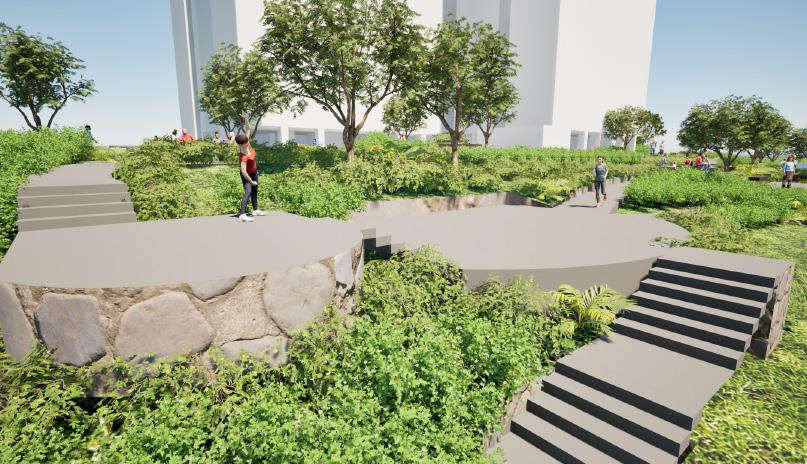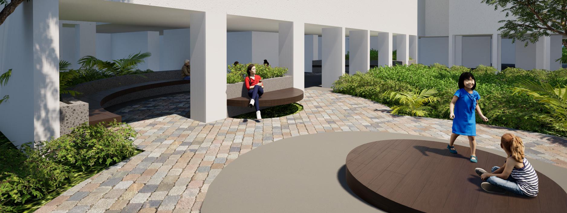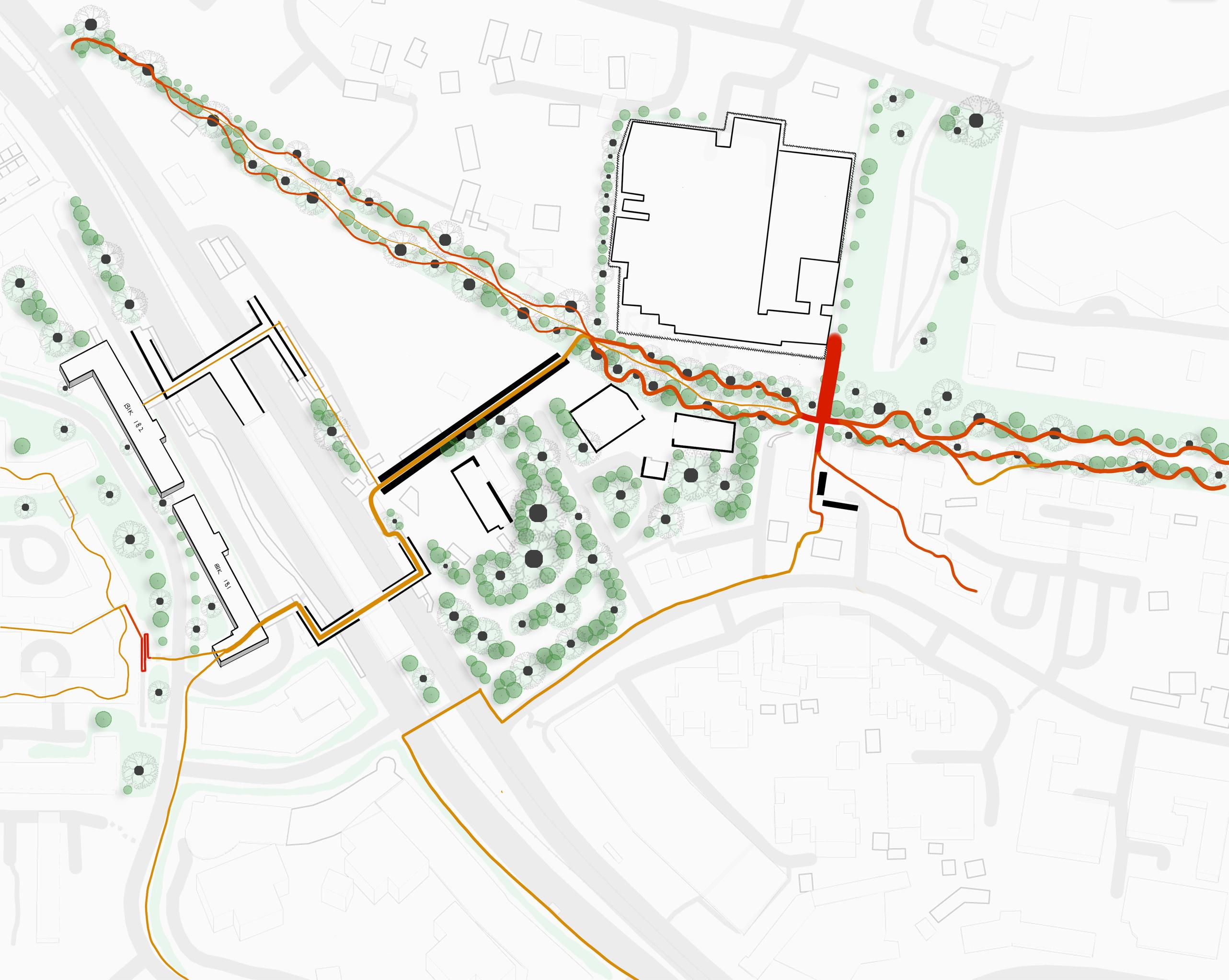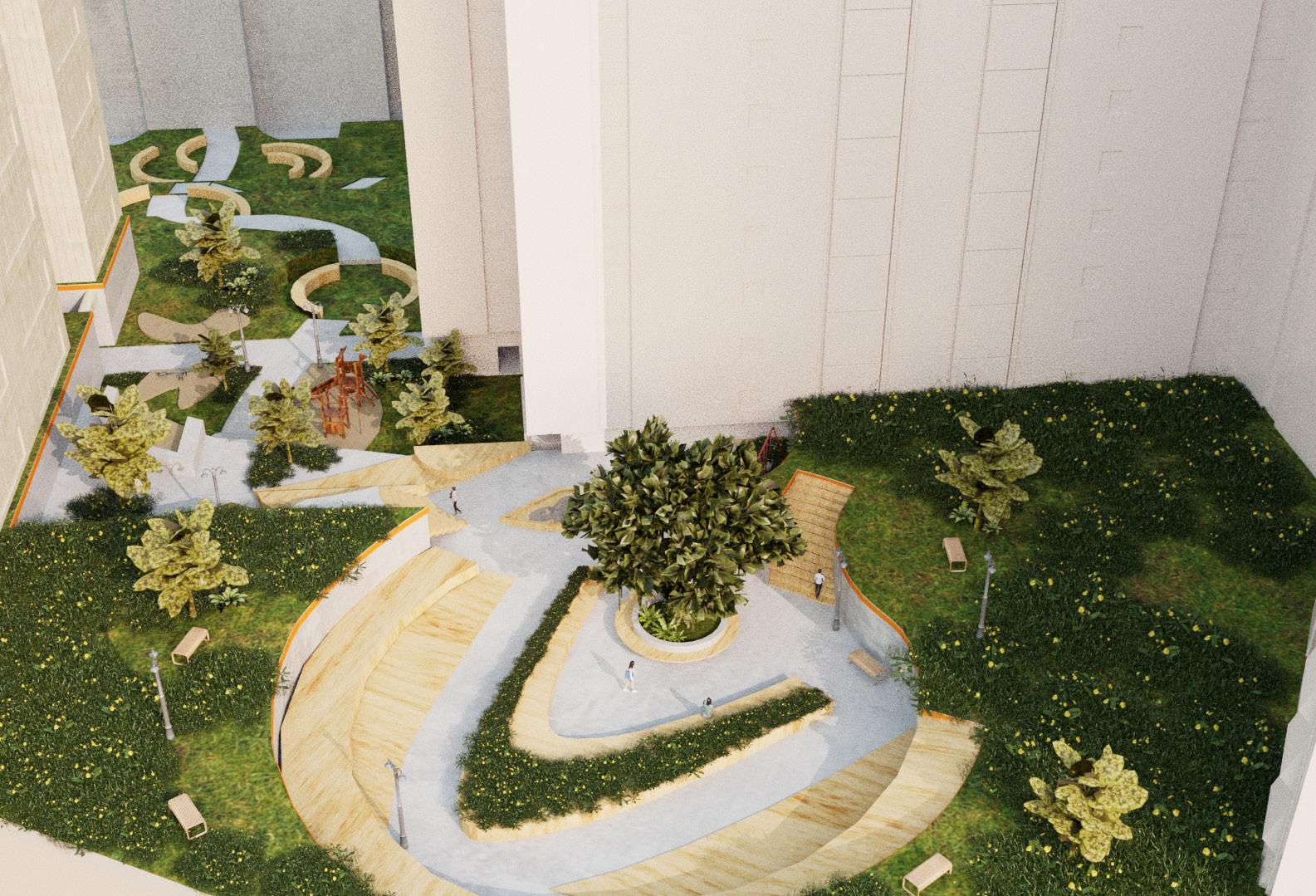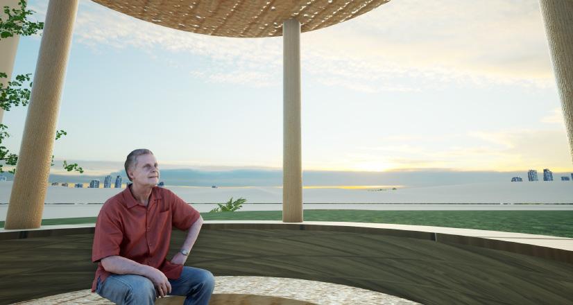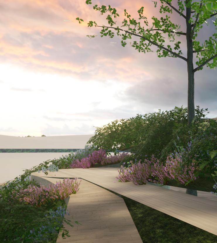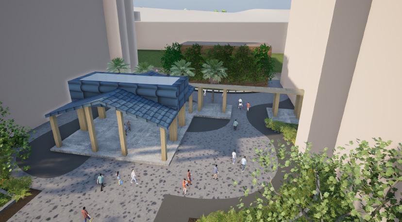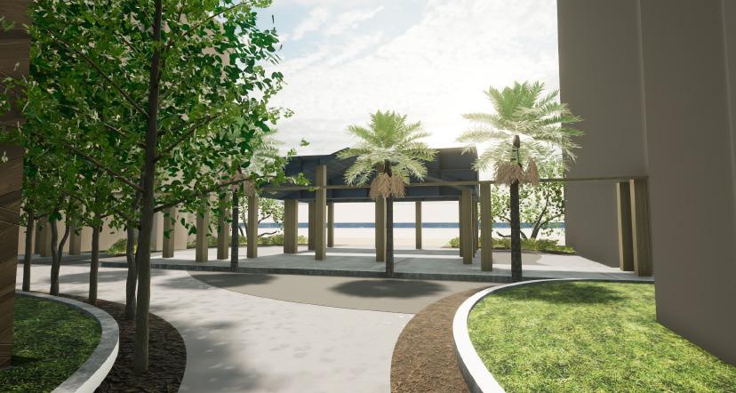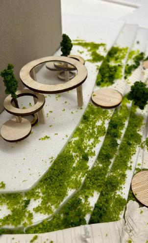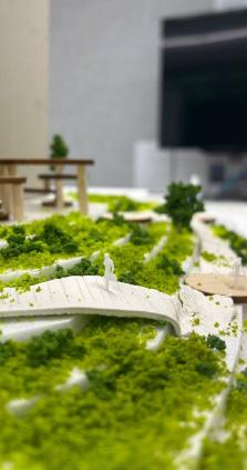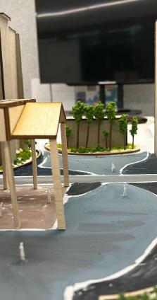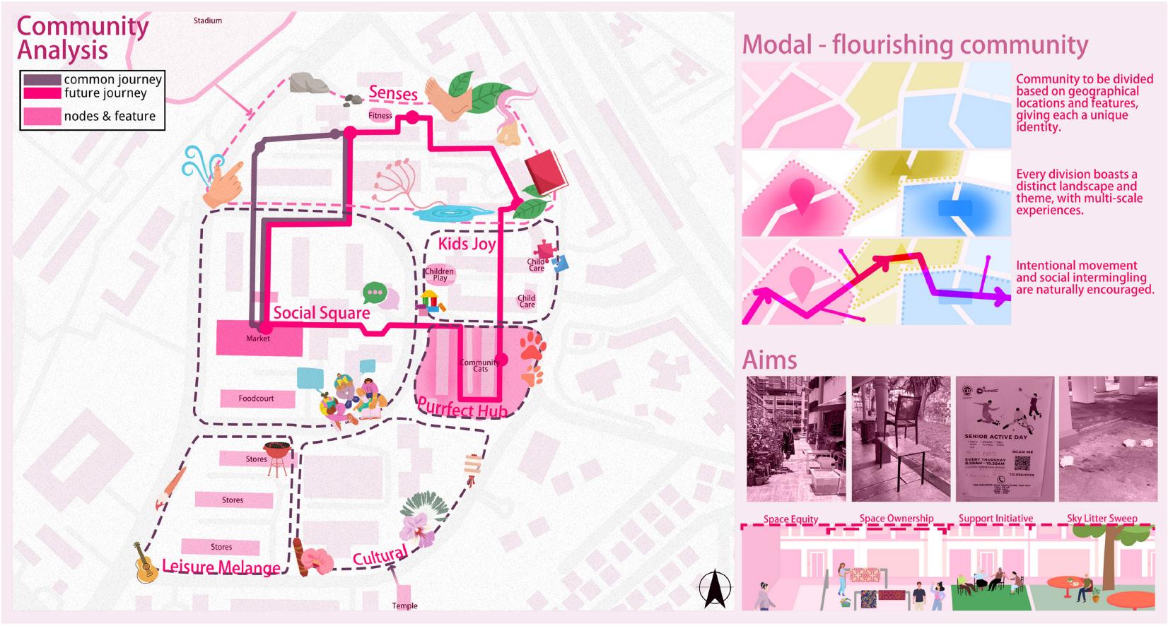
LANDSCAPES OF INCLUSIVITY
1
2007 Studio: DESIGN 4 AY2023/24 SEM2 National
of Singapore,
and Engineering Bachelor of Landscape Architecture Programme IMAGE CREDIT: YOUNG HAND HOLDING GRANDPARENT BY ITUMMY @ ADOBE STOCK I #88391982
LAD
University
College of Design
DISCLAIMER
This work is a product of students’ outcome from LAD2007 Landscape Design Studio 4 (2023-24 spring semester) offered by NUS Department of Architecture, Bachelor of Landscape Architecture Programme. The findings, interpretations, and conclusions expressed in this work do not necessarily reflect the views of NUS, or the Department of Architecture. The department does not guarantee the accuracy of the data included in this work. The report reflects public information available up to April, 2024.
RIGHTS AND PERMISSIONS
The material in this work is subject to copyright. This work may be reproduced, in whole or in part, for noncommercial purposes as long as full attribution to this work is given. Any queries on rights should be addressed to the editors; Kenya Endo, Melissa Yip, Huei Lyn Liu (email address is available from the NUS Department of Architecture website).
 Published by CASA Centre of Advanced Studies in Architecture Department of Architecture School of Design and Environment
National University of Singapore 4 Architecture Drive Singapore 117566
TEL: +65-6516-3452
FAX: +65-6779-3078
2
PUBLICATION
This booklet was edited by lecturer
Kenya Endo, part-time lecturers
Melissa Yip, Huei Lyn Liu, and with the core source being student’s work from the design studio, under the guidance by three tutors.
First of all, we take this opportunity to thank our 25 year 2 students who dedicated numerous efforts for achieving studio’s learning objectives and coming-up with out-of-the box ideas.
Secondly, we had valuable contributions from a number of local collaborators, guest experts, as listed here, for providing useful advice, feedbacks, and inputs for student’s learning (alphabetical);
Guest critics and guest lecturers;
Alfred Lee (STX Landcape)
Anton Siura (Siura Studio)
Dorothy Tang (NUS)
Janice Tung (Gardens By The Bay)
Max Decaudin (NUS)
Trecia Lim (WeCreate Studio)
Xin Yu Hoo (HDB)
ACKNOWLEDGEMENT
Collaborators for site visits, community workshops, and public exhibition;
Queenstown Public Library; Mr. Boon Poh Thian, Ms. Tasha Phua
St. Joseph Nursing Home; Ms. May Wong, Ms. Zheng Hong
We appreciate the support and seek future collaboration to elevate the discourse even further. Lastly but not least, we acknowledge NUS Department of Architecture for financially assisting the activities that took place during the semester.
3
SYNOPSIS / SITE CONTEXT
Individual Works PLAYSCAPE
tile by rewilding tile dang van trang evolving path | danea binte mohamad khalid whismy wheels | kwok ka yi charie nursery in a nursery chee shi jia, maydalene
STUDY TOURS 8
40
Individual Works WAYFINDING
lifelines | faith gan universal trails | jonald khaw nodesway in mei ling street | ng jun hao community outwards lee huei min nexus | ong qin hui the wave | lim junyoung mobility makeover | emily jing jiaxin
72
COMMUNITY ENGAGEMENT WORKSHOPS 12
Individual Works SOCIAL HUB
the outdoor living room | arya muthukumar the observer’s oasis calyn chia xin mei cohesiety | khoo zhi luo pinnacle @ mei ling ian hiedie zuraimi (haidy) extended community | tan jiayi joey beyond my bubble | jasmine eng greet, grow, ground | dong yukun
126
4
6
SITE & PERSONA ANALYSIS
REFLECTIONS / CLOSING REMARKS
Individual Works SOCIAL HUB
slopeside sanctuary | choo wei ling, clara mindfulness@meiling | melissa tang welcome back small ones! wang lu moving together lee lu yi harmony crossing | felicia poh shi han bubbles and books | soh seh ting brew and blossom | lim xin yi
5 CONTENTS
20
236


Pilot Health District in Queenstown to focus on residents’ holistic well-being. Image source by NUS, NUH, and HDB. https://news.nus.edu.sg/pilot-health-district-in-queenstown-to-focus-on-residents-holistic-well-being/
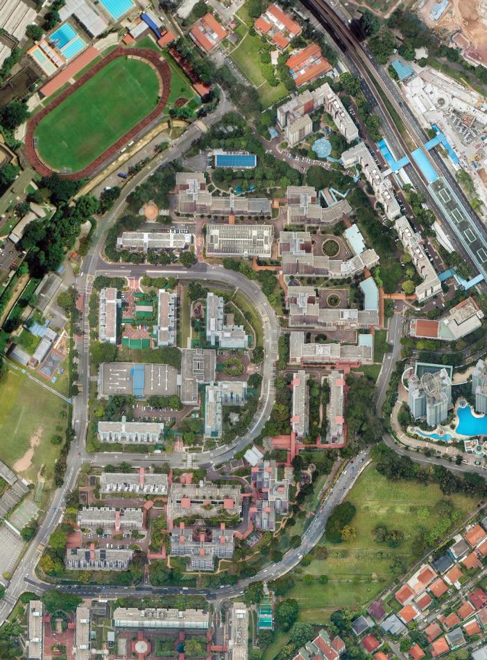
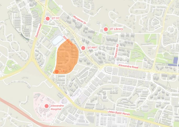
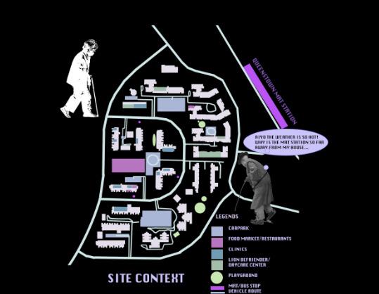
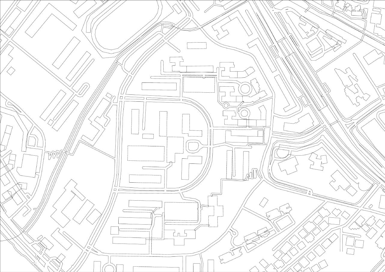
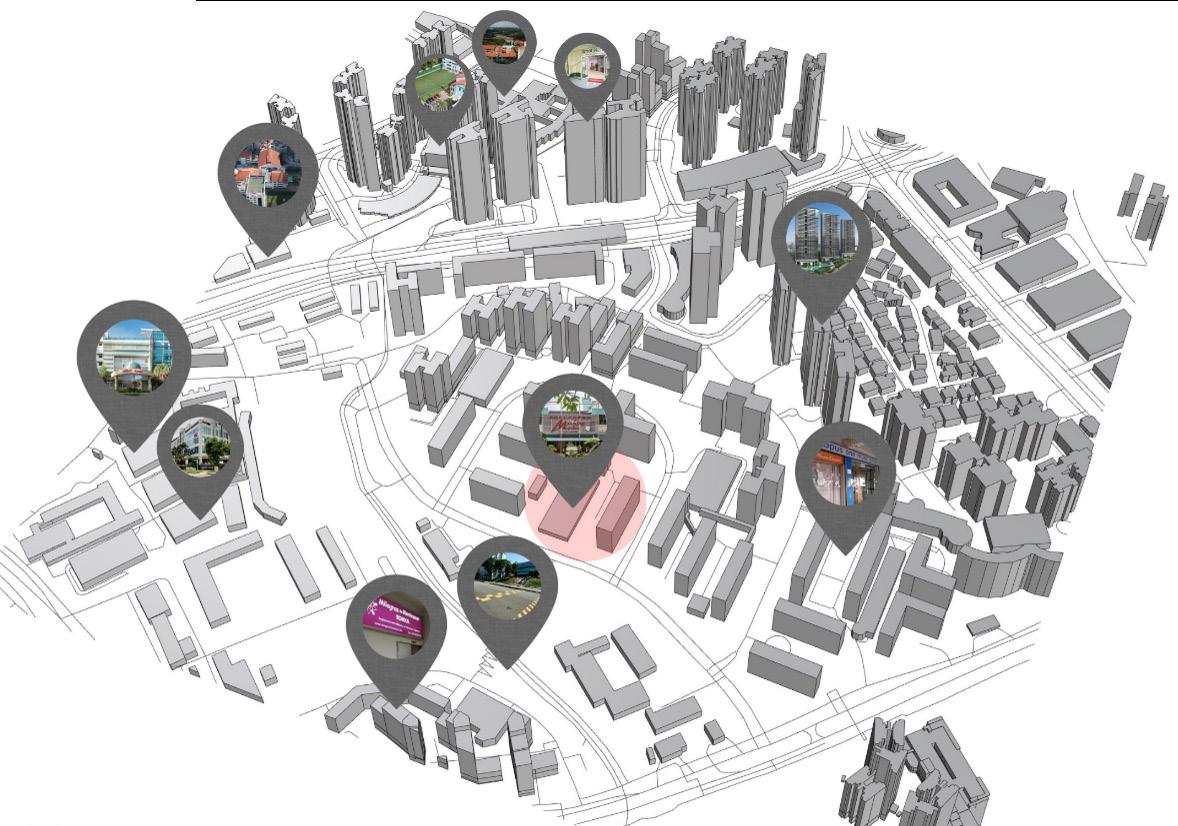
SITE: Meiling Heights
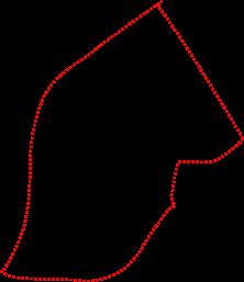
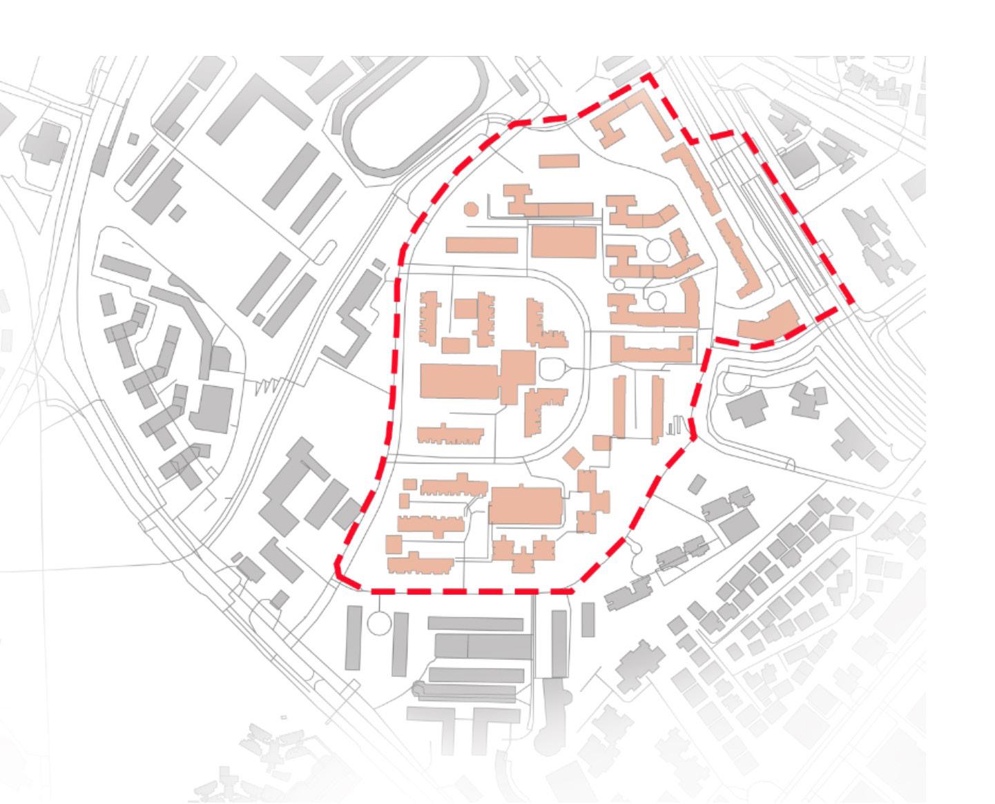
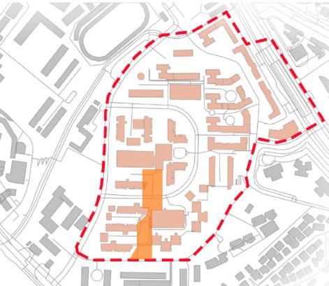
Meiling Heights is the focus of the studio. Approximately 19-hectare residential neighborhood is surrounded by MRT viaduct (with Queenstown Station), Stirling Road, and Mei Chin Road. HDB flats, car parks, food center, shops, elderly care facilities (e.g. Lions Befriender training centre), play grounds, and so on, are built at the hilly terrain. Senior-unfriendly stairs and ramps, limited crossings, and confusing way-findings are pointed out as one of the spatial obstacles of the site. Students are challenged to read the site conditions carefully, and identify spots/types of spaces for design intervention. The area highlighted in red, however, can be considered as soft boundary, as other facilities and open spaces around the site can also become a part of the design narrative. Some of these places include rail corridor, PCN, ActiveSG sports complex, Rainbow Centre, St Andrew’s Nursing Home, Edible Garden City, Alexandra Hospital, Queenstown CC, schools, etc.
6 SITE CONTEXT
100m
“Queenstown’s demographics closely mirror Singapore’s projected national demographics by year 2030“.
“The town currently has one of the oldest populations in Singapore, with almost one out of every four Singaporeans aged 65 and above“.
Context: The Old and the Young, Our Heritage and Our Future
The Queenstown Health District, launched in October 2021, is an excellent location to test out the ideas stated above. “Queenstown has been selected as the pilot site for the Health District as its demographics closely mirror Singapore’s projected national demographics by year 2030. The town currently has one of the oldest populations in Singapore, with almost one out of every four Singaporeans aged 65 and above.”1 Digital solutions, health care programs, and outdoor communal spaces are advocated in this senior-friendly district that promotes active aging in place. Although the studio runs parallel to this narrative, we apply landscape design as a means to go beyond targeting senior citizens, and to shape social and physical spaces that address long-term engagement-ability.
The root of Queenstown being the pioneer can be found in its history too. Queenstown has the distinction of being the first satellite town, and first place that HDB built its first flats in October 1960, just months after the Housing and Development Board was formed. It was also in Queenstown that the first public library, poly clinics, and technical school was opened, and where the first neighborhood shopping centre was built.
In contrast to its historic significance, recent BTO (Built-toOrder) HDB flats along Margaret Drive and Dawson Estate have attracted young families. The dynamic demography and the proximity bring interesting opportunities to test out innovative designs for integrative, intergenerational public spaces.
Progressively, urban planners and policymakers are not only highlighting the need to design the city for our most vulnerable dwellers, but also vouching that such a paradigm shift has created greater inclusivity and, in turn, a better environment for everyone, as seen in many precedents. Beyond static indices of liveability, convenience and comfort, this facilitates an organic growth in other-awareness, sociability and empathy. This could potentially spark off more community initiatives that unearth previously hidden social issues and design interventions capable of addressing them.
Intervention: Landscape as Catalyst
There is an increasing amount of professional literature to support the claim that interaction with nature is highly beneficial for our physical, mental, emotional, and social well-being. For example, research has even delved into
SYNOPSIS
how exposure to greenery can improve the symptoms of specific cognitive disorders in both demographic groups, including ADHD (attention deficit hyperactivity disorder), dementia, depression, etc. Outdoor natural environments are optimum in achieving this for several reasons:
-Multi-sensorial stimulation
-Build confidence in independent mobility
-Corresponding healthy environments (natural ventilation) and activities (recreation and exercise)
Spatial designs should engage the senses of smell, sound and touch more thoughtfully. The other senses that are not often discussed are just as important. The vestibular sense helps us keep our balance and sense movement, while proprioception is the ability to sense where our body is relative to the space around it. This would have implications on the kind of movements that the landscape spaces will require of its users, such as climbing, crouching, balancing, swinging, sliding, etc.
7
Queenstown Health District
NUS news. 20th October 2021. Joint NUS, HDB and NUHS Press Release

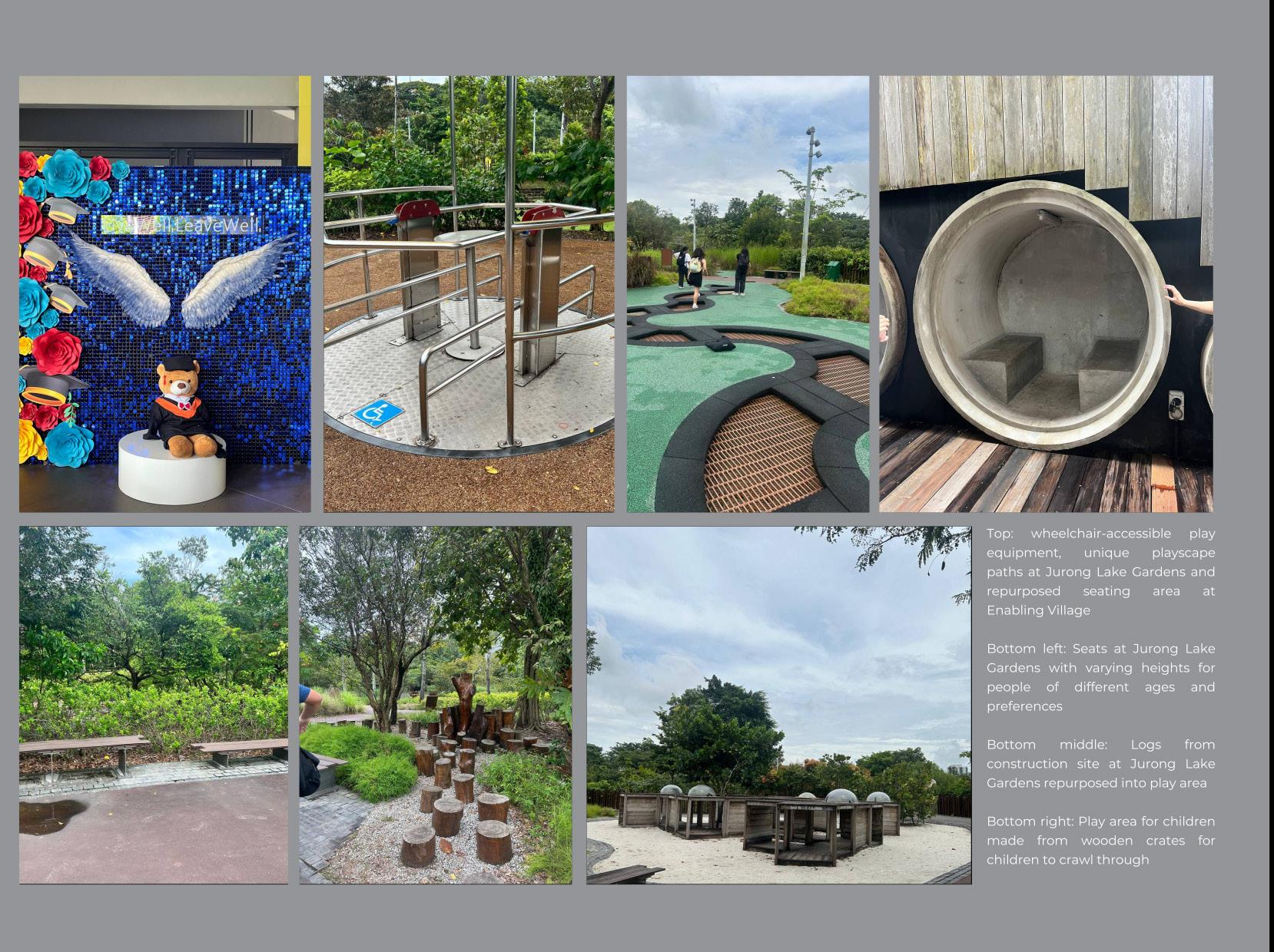
Top: wheelchair-accessible play equipment, unique playscape paths at Jurong Lake Gardens and repurposed seating area at Enabling Village
Bottom left: Seats at Jurong Lake Gardens with varying heights for people of different ages and preferences
Bottom middle: Logs from construction site at Jurong Lake Gardens repurposed into play area
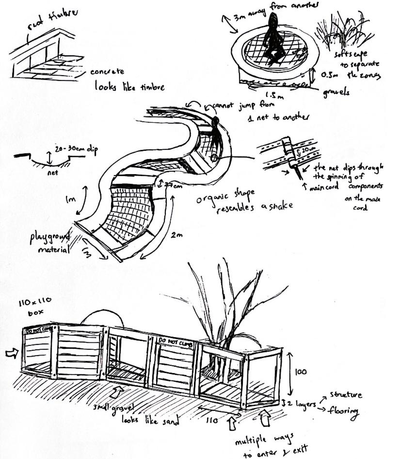
Bottom right: Play area for children made from wooden crates for children to crawl through
8
Top : Colourful wheelchair-accessible ramp and multi-purpose seating and play area
Bottom : Wheelchair-accessible viewing deck overlooking the eco-pond. Both photos are from Enabling Village.

STUDY TOURS
Queenstown Public Library
St Joseph’s Home Enabling Village
Jurong Lake Park
The first few weeks of studio focused on study tours and visits to relevant spaces that exemplify sensitive design responses to the specific needs of vulnerable target users.
Queenstown Public Library
The presence of Queenstown Regional Library, rich in heritage with ambitious community-outreach programs to actively serve the neighbourhood, forms a strong nucleus for the spine of newly built BTO HDBs along Margaret Drive. The studio engaged with the library on outreach activities (the venue for the participatory design workshop, and the usage of community wall to collect inputs from nearby residents).
St Joseph’s Home (SJH)
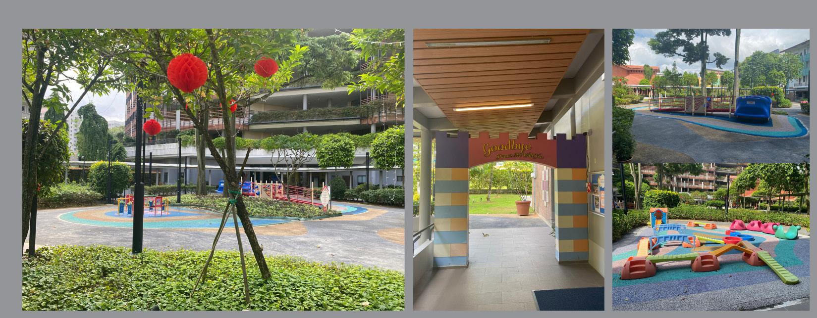
As Singapore’s first nursing home to be co-located with an infant and childcare centre, SJH has been pioneering and advocating for quality inter-generational programmes.
Enabling Village
The Enabling Village champions sustainability and sociability by promoting the learning, bonding and healing of people with varying abilities within a biophilic environment. This creates an inclusive space that enables and values everyone.
Jurong Lake Park
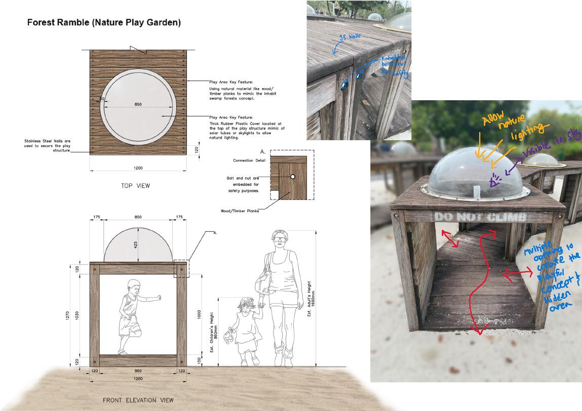
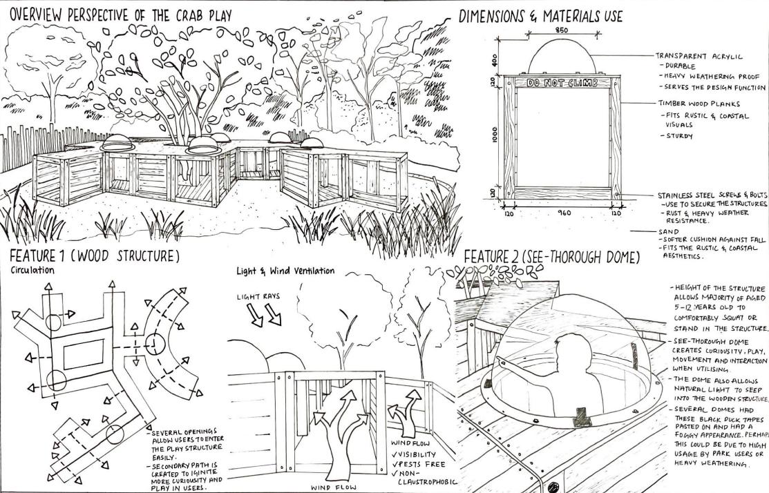
Opened in 2019, this 53-hectare park embodies biophilic and restorative design which brings back wildlife that was unique to the Jurong area. It also provides public access to the restored swamp forests, wetlands, grasslands, a nature-themed play area, etc. Students studied the playground design in detail, “forest ramble” to know the essence of children’s point of view.
https://stjh.org.sg/2020/impact-of-inter-generational-programmes-findings-from-st-josephs-home/ https://www.archdaily.com/801850/enabling-village-woha
https://henninglarsen.com/projects/jurong-lake-gardens
9


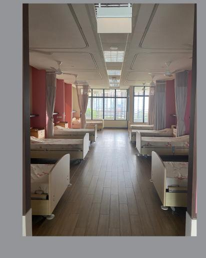
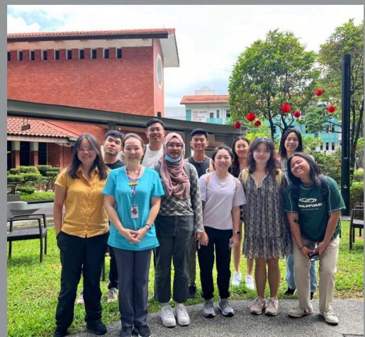
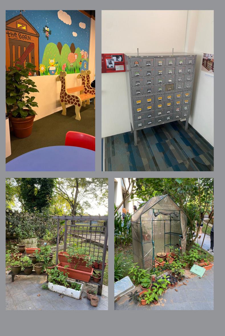
Indoor facilities and gardens of the St. Joseph Nursing Home. Students had an in-depth briefing on the “making” of the spaces which took careful considerations of the users, and their perception and mobility.
10


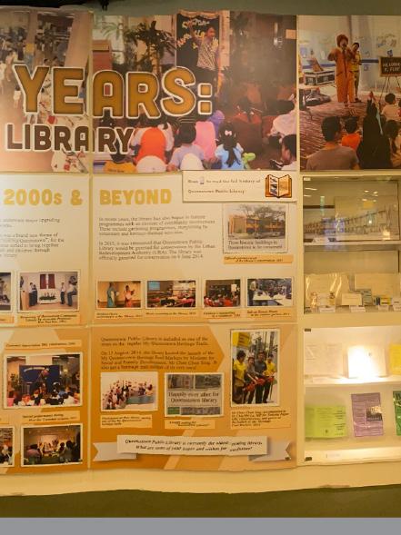
Various exhibits and gardens at the Queenstown library. The facility is not only for readings and books, but it also serves as a communal hub for exchange and interaction. We had a briefing of the library’s history and the projection towards the future.
11

12

COMMUNITY ENGAGEMENT WORKSHOPS
Queenstown Regional Library
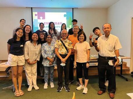
3 sessions, March 22nd-24th
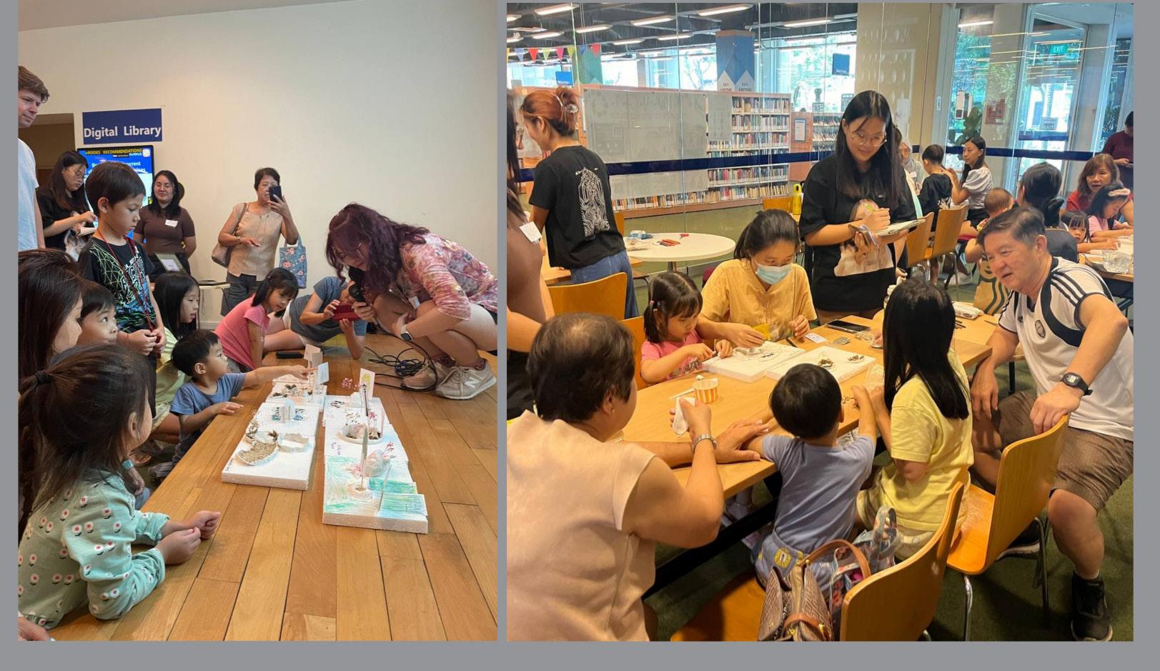
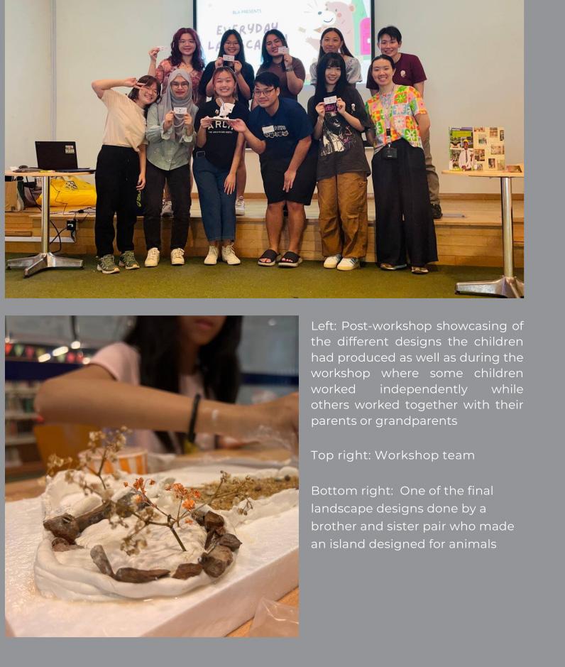
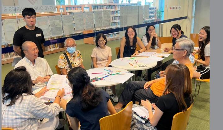
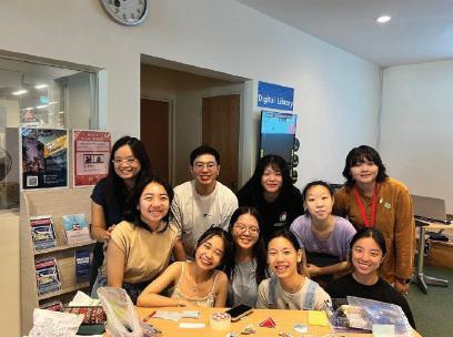
To promote participatory design, students were required to facilitate a workshop to engage a group of preschool children or older adults, in order to understand their needs and perspectives more realistically.
Students were challenged to prepare content (including verbal presentations, diagrams, models, visual aids etc.) in a manner that is easily understandable by people who have little prior knowledge of design and to facilitate the session as a meaningful dialogue with the participants. The intent of this engagement is neither to impose their ideas upon the attend-
ees, nor to accept the attendees’ ideas wholesale. The pedagogical focus is to interpret the inner needs / social issues through the conversation, and finally to provide spatial solutions to mitigate these problems.
Group of 9 students engaged with below personas respectively, throughout 3 sessions, 1 hour each.
• March 22nd, 1030-1130: Seniors
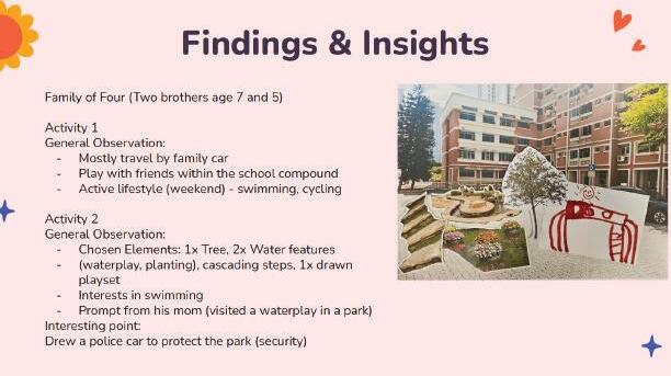
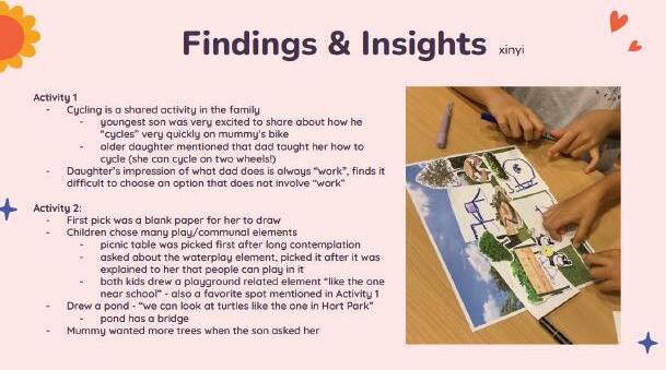
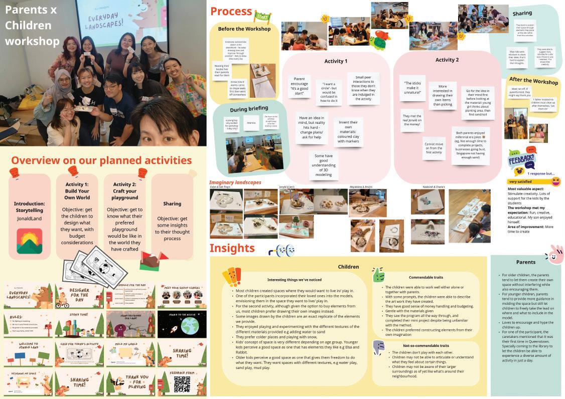
• March 23rd, 1130-1230: For parents and children (age 5-8)
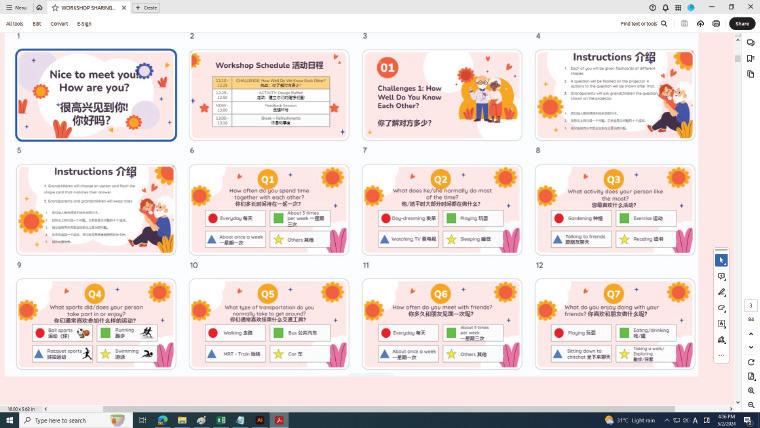
• March 24th, 11-12: For grand-parents and children (age 5-8)
13

14

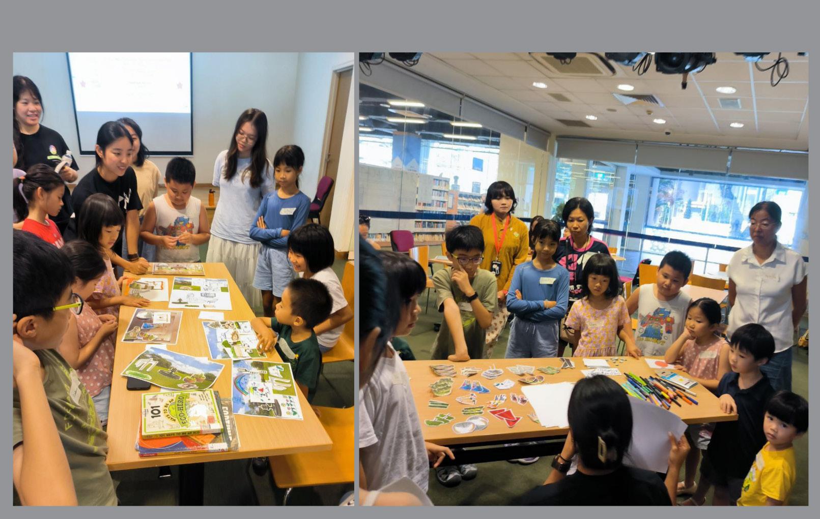
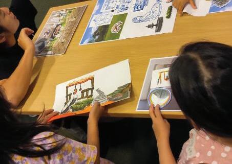
The workshop kick-started with the question of “how well do you know each other”, and then, moved-on to activity 2: design your dream neighbourhood. Visual aids and cut-outs were used to facilitate the collaging process for participants to dream their ideal landscapes.


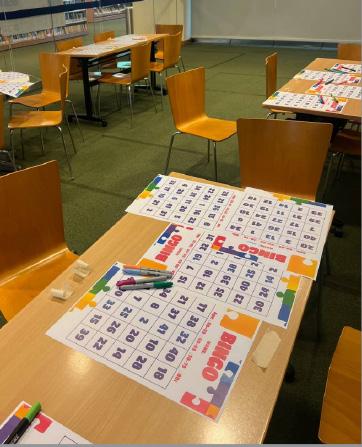
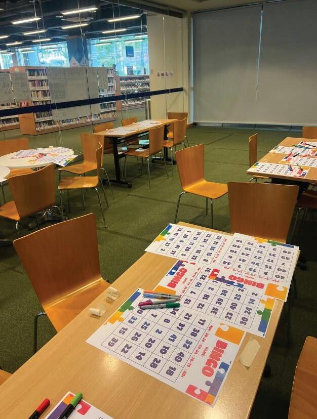
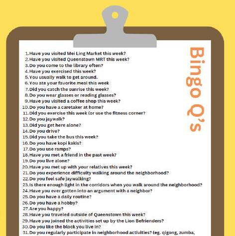
Bingo Game was used to understand participants’ age group, life styles, and their needs better.
Questions listed in the next page (yes / no questions) were given one at a time to circle the number on the Bingo Sheet (if the answer is “yes”). Participants elaborated more on their inputs, and enjoyed the conversation with each other and with the facilitators.
15
Elderlies Workshop
22 March 2024 10:30am - 11:30am
Facilitated by Arya, Clara, Jun Hao, Danea, Lu Yi, Julia, Zhi Luo, Melissa, and Hiedie
Bingo Game was used to understand participants’ age group, life styles, and their needs better.
Questions listed on the right (yes / no questions) were given one at a time to circle the number on the Bingo Sheet (if the answer is “yes”). Participants elaborated more on their inputs, and enjoyed the conversation with each other and with the facilitators.


Inter-Generational Workshop

16 3: Interactive Community Workshop Queenstown Public Library Exhibition, May 2024
University of Singapore, College of Design and Engineering, Department of Architecture
National
l k e o t a k e a w a k o m G h i m M o h t o C e m e n t v a U l u P a n d a n P a r k C o n n e c t o w a l k h e r e d u e o s c e n e y a n d h e r e s a n N T U C a t C e m e n f o r m e o ge g o c e r e s ” “ O b s e v e d i n m y e s a e t h a t d f f e r e n ge n e r a t o n s e n o y t h e i o w n i e s t y l e s E v e r y b o d y u s e s s p a c e s d i e e n t y ” i k e t o d w e l i n n a t u e a r e a s b u t w o u d b e e v e n m o r e d e a f t s n e a r e r t o m y h o m e

Inter-Generational Workshop
24 March 2024 11 am - 12 pm
Facilitated by Faith, Felicia, Grace, HueiMin, Jasmine, QinHui, Wanglu, XinYi


17
Parents with Children Workshop
23rd March 2022, 1130AM-1230PM
Facilitated by Jen, Jonald, Calyn, Emily, Maydalene, Nadzirah, Charie, Seh Ting, and Joey


Queenstown Public Library Exhibition, May 2024 National University of Singapore, College of Design and Engineering, Department of Architecture

19

20
APPROACH
STUDIO
Designing to Include the Most Vulnerable: Design Questions
This studio assumes a bold stance that landscape architecture, as it stands at the intersection between ecology, infrastructure, and social space, is strategically poised to augment the health of the environment and the people symbiotically.
How will outdoor and semi-outdoor spaces in and around our residential estates be designed differently if designers had a deeper understanding of the needs and circumstances of the vulnerable in our society?
How will design objectives (for example, convenience of transportation versus pedestrian safety) be prioritised and measured differently if our key users are defined differently (fit young working adults versus the mobility-impaired or -challenged)? Other possible objectives include thermal comfort, place-making or way-finding, safety and privacy, universal accessibility and community-building.
How can spaces be designed to be multi-functional, have temporal flexibility and encourage intergenerational interactions?
How can spaces be choreographed to maximise the variety of spatial types (for example, quiet, contemplative spaces for mental restoration versus
active, stimulating spaces for social engagement).
How can these different spatial types cater to different cognitive states (such as distracted, engaged, frustrated, bored) and needs (such as discovery, predictability, exploration, creativity)?
Intergenerational Symbiosis
It is also useful to consider similarities and distinctions in the circumstances of vulnerable groups as well as the symbiotic relationship that could arise from their interactions.
For example, studies have shown how intergenerational interactions are mutually beneficial for both the young and the old. Children’s regular interactions with the older generation translate to improvement in language and social skills development. By reading and playing with the young ones, old people become less prone to loneliness. It is indeed a win-win situation.
Around the world and in Singapore, intergenerational care centres that incorporate both a nursing home and a nursery are increasingly becoming popular. This studio takes on the further challenge of asking, “how can intergenerational interactions be facilitated outside of institutionalised settings and occur in most residential estates?”
SITE & PERSONA ANALYSIS
At the beginning of the semester, students worked in groups of 3 to conduct site and persona analyses of Meiling Heights. Each group took on a particular lens through which to assess the user-friendliness of the site.
Persona Studies
The specific personas were:
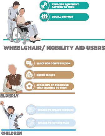
• Elderly with Mobility Issues
• Able-Bodied Elderly
• The Routined Retiree
• Elderly Above 60 Pre-Dementia and Early Stage Dementia
• Elderly Wheelchair Users
• Wheelchair Users
• The Lonely Elderly
• Living Elderly with Dual Impairment
• Queenstown Primary School Students
This information was thereafter translated into visuals and graphics to form a succinct knowledge base for subsequent individual design interventions.
Detailed Site Analysis
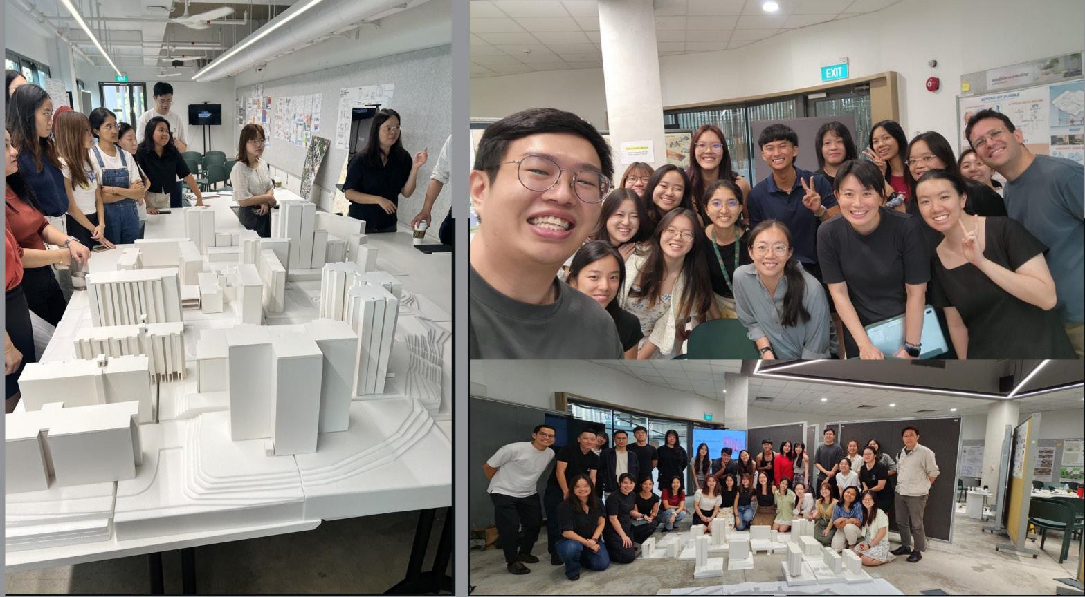
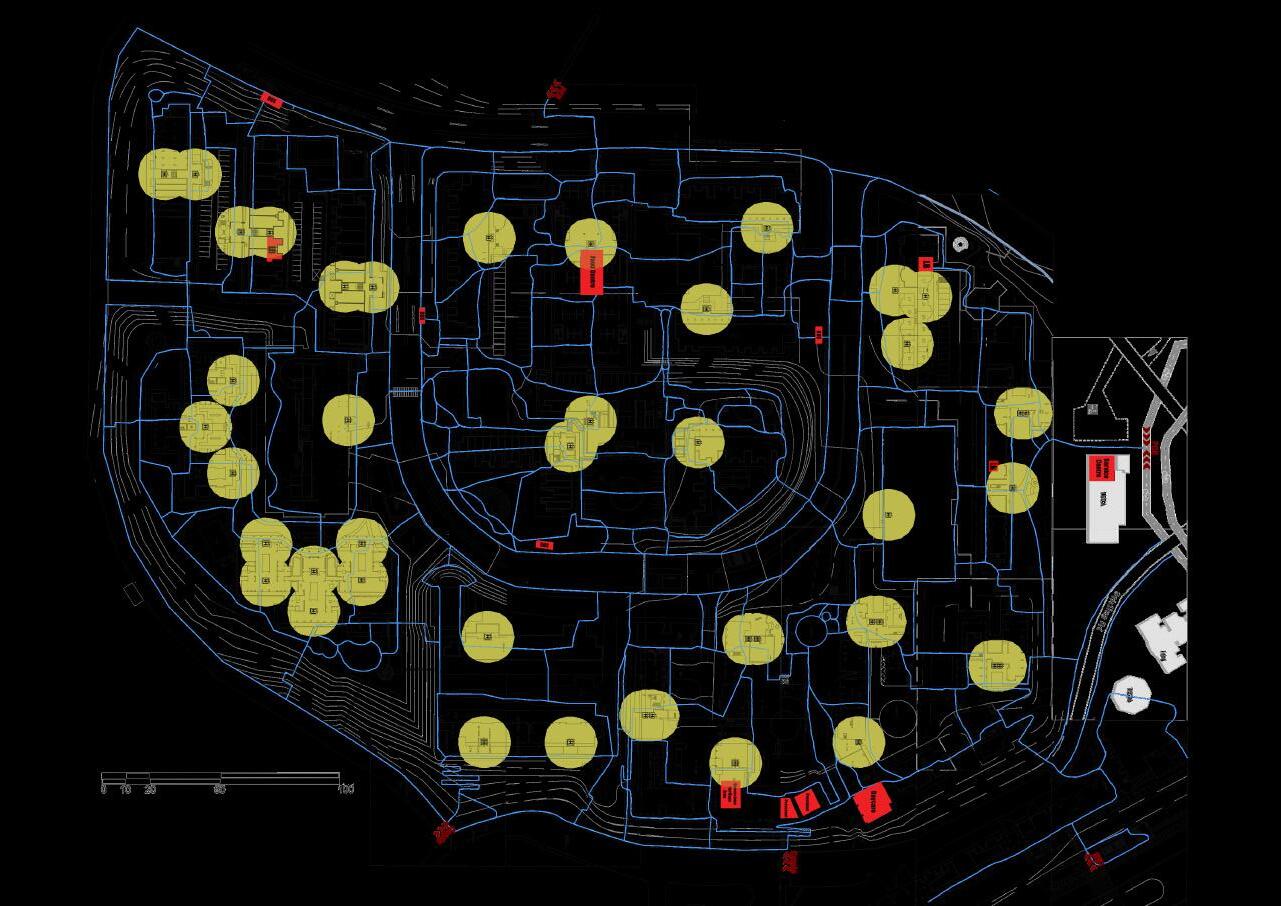
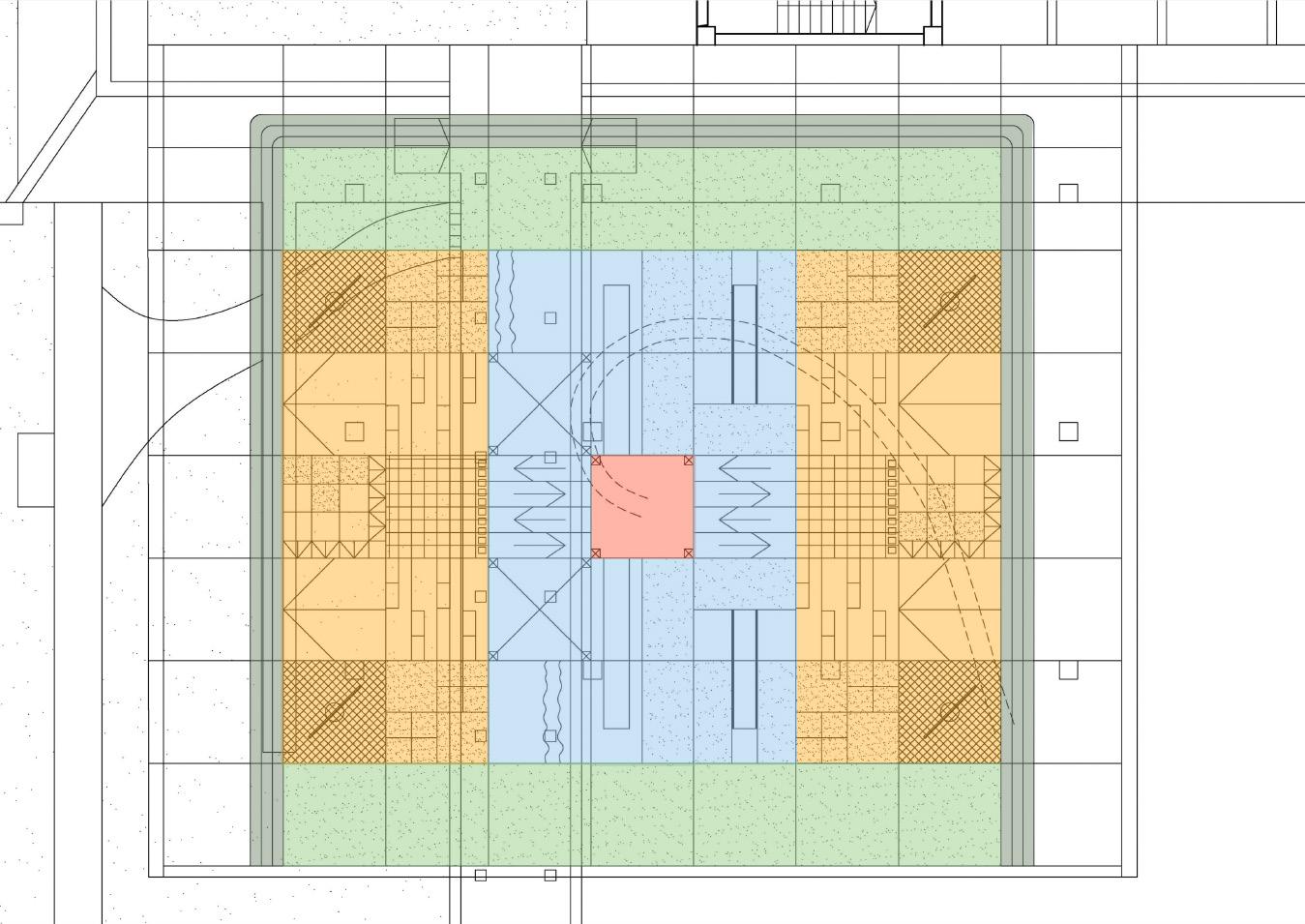
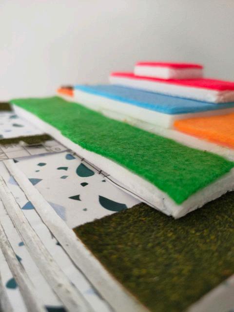
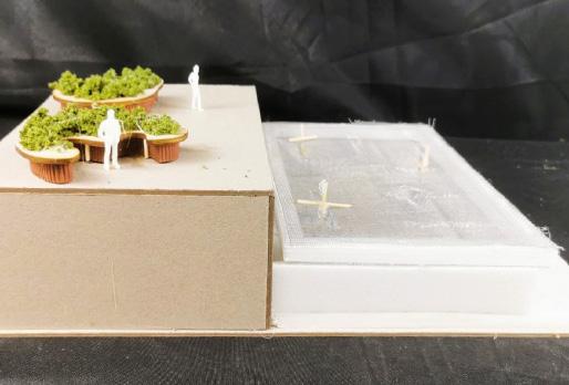
At the same time, individual students worked on 84 X 60m site (subdividing the overall site into 27 parcels, which each student becomes responsible for 1:200 in A3 size paper extent) to map the details of the site: to the level of columns, lifts, and in-door programs. They have created a physical model as well (shown in left photos). For this process, students have visited their focul sites many times in order to understand circulation pattern, frequency of usage, and to collect interviews from residents.
Individual Design Intervention
Individual design projects have set a clear target user group (or groups), and deployed designs that addressed the needs of such people. The goal is to innovate the way our heartland landscapes are shaped, and used by the people nowadays. Based on the outcome, projects were categorized into three themes:
• Playscape
• Wayfinding
• Social Hub
21

22
ELDERLY WITH MOBILITY ISSUES
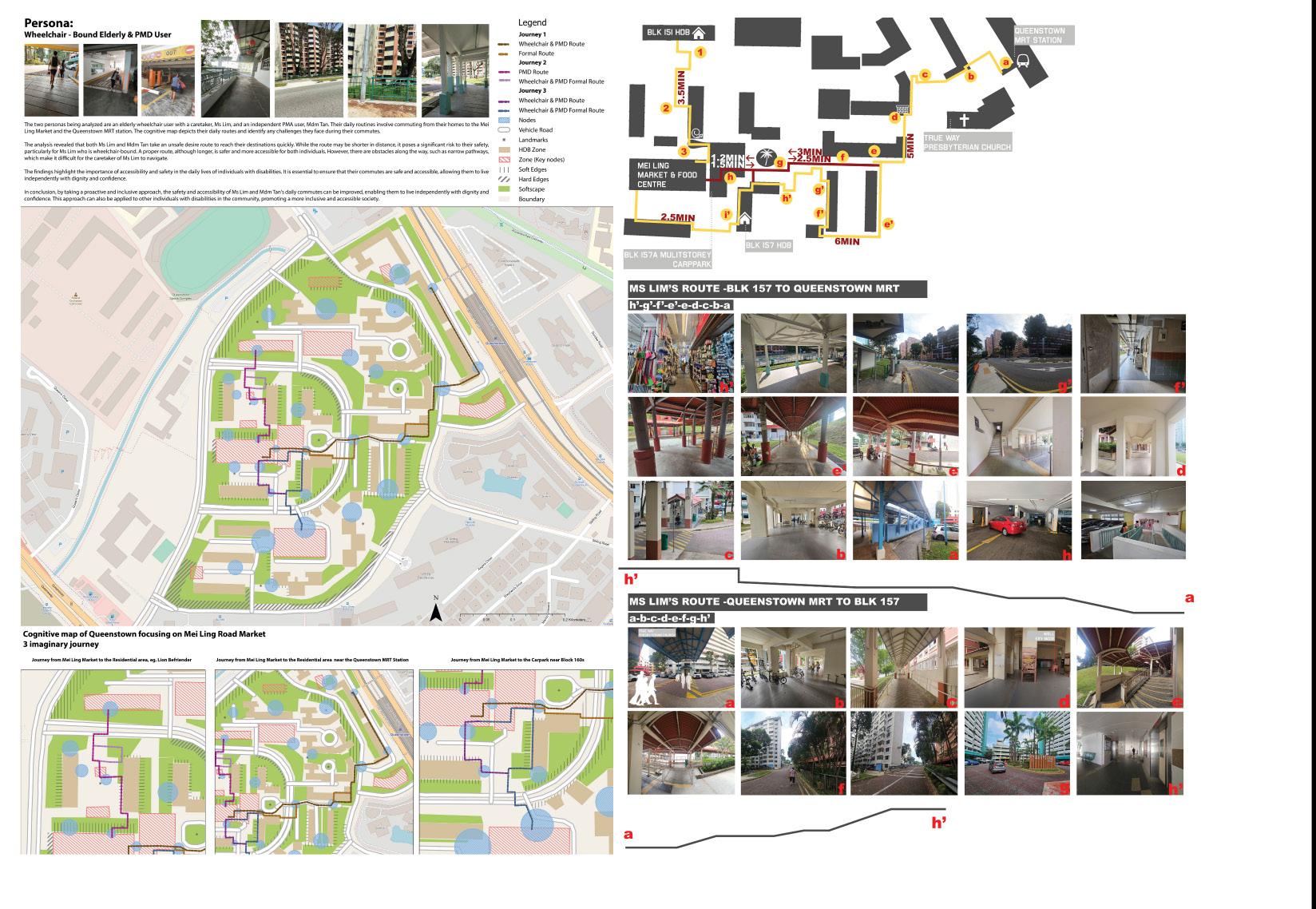
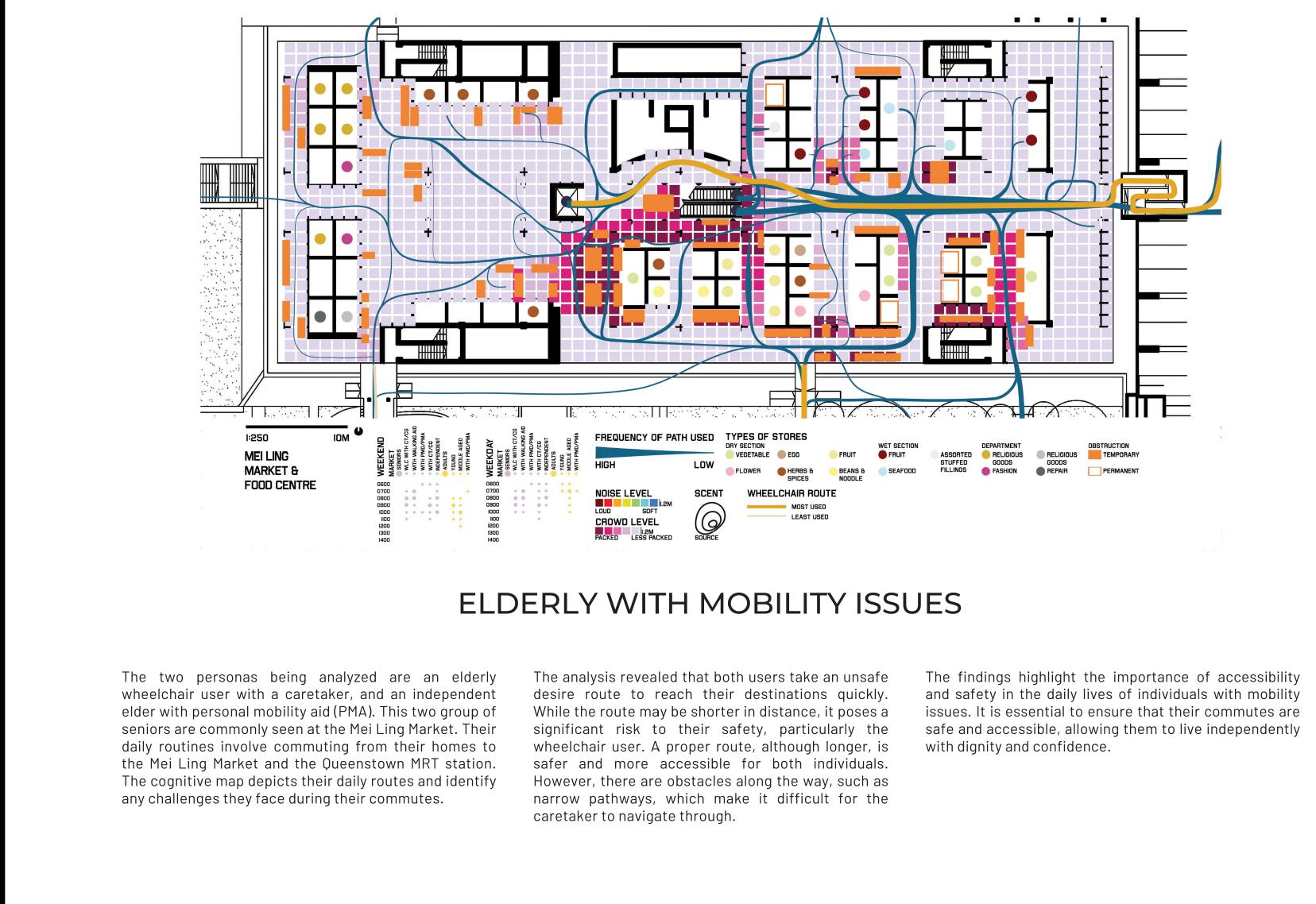
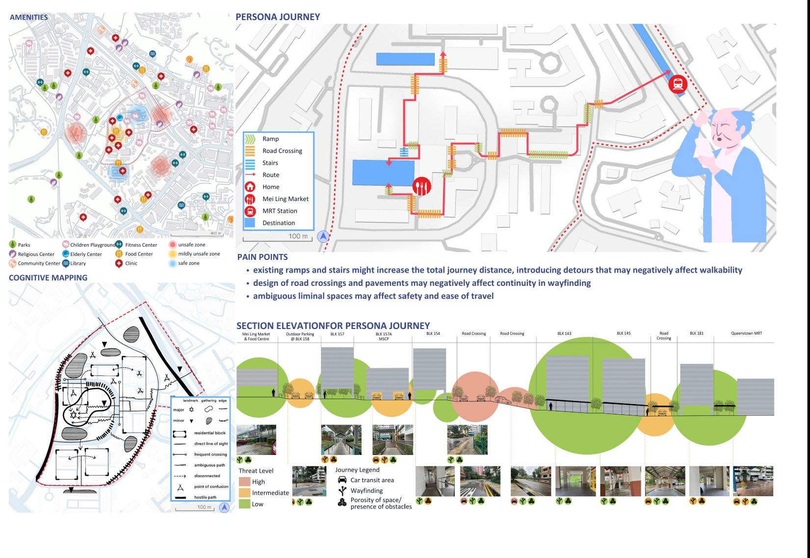
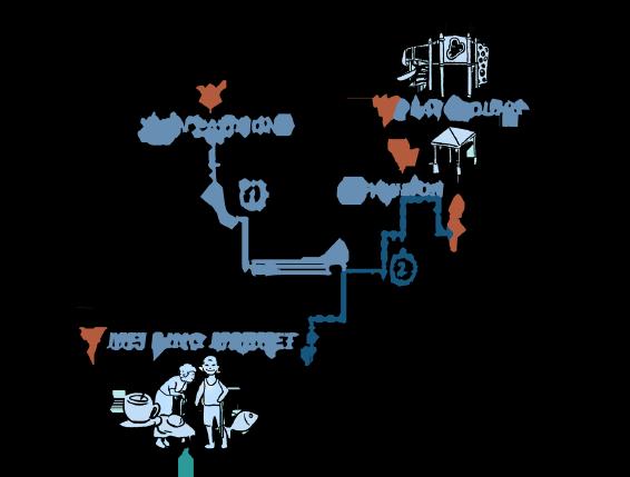
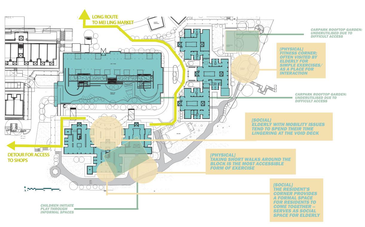
The two personas being analyzed are an elderly wheelchair user with a caretaker, and an independent elder with personal mobility aid (PMA). This two group of seniors are commonly seen at the Mei Ling Market. Their daily routines involve commuting from their homes to the Mei Ling Market and the Queenstown MRT station. The cognitive map depicts their daily routes and identify any challenges they face during their commutes.
The analysis revealed that both users take an unsafe desire route to reach their destinations quickly. While the route may be shorter in distance, it poses a significant risk to their safety, particularly the wheelchair user. A proper route, although longer, is safer and more accessible for both individuals. However, there are obstacles along the way, such as narrow pathways, which make it difficult for the caretaker to navigate through.

The findings highlight the importance of accessibility and safety in the daily lives of individuals with mobility issues. It is essential to ensure that their commutes are safe and accessible, allowing them to live independently with dignity and confidence.
23

24
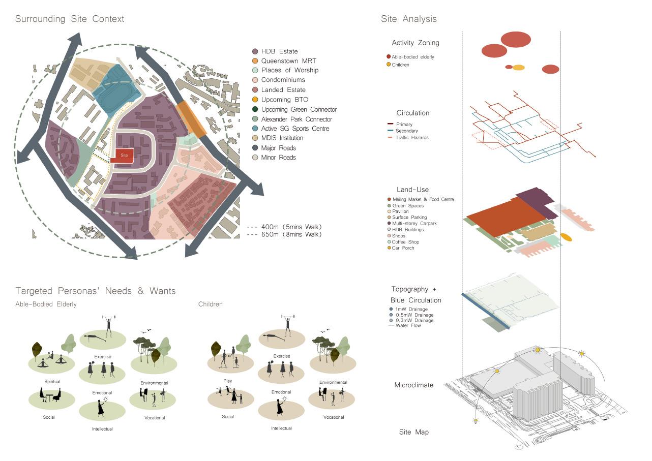
ABLE-BODIED
PERSONA ANALYSIS:
ELDERLY

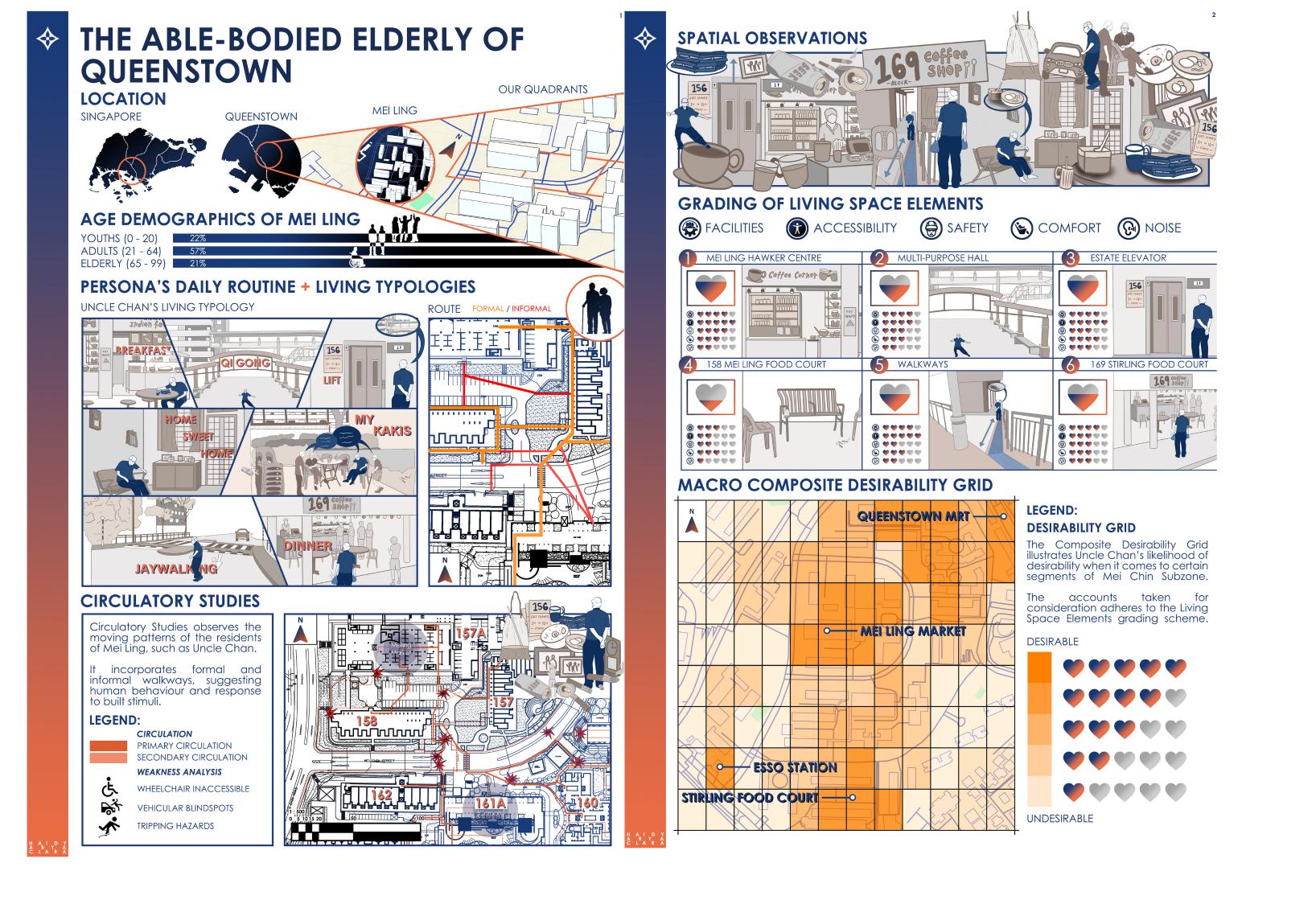
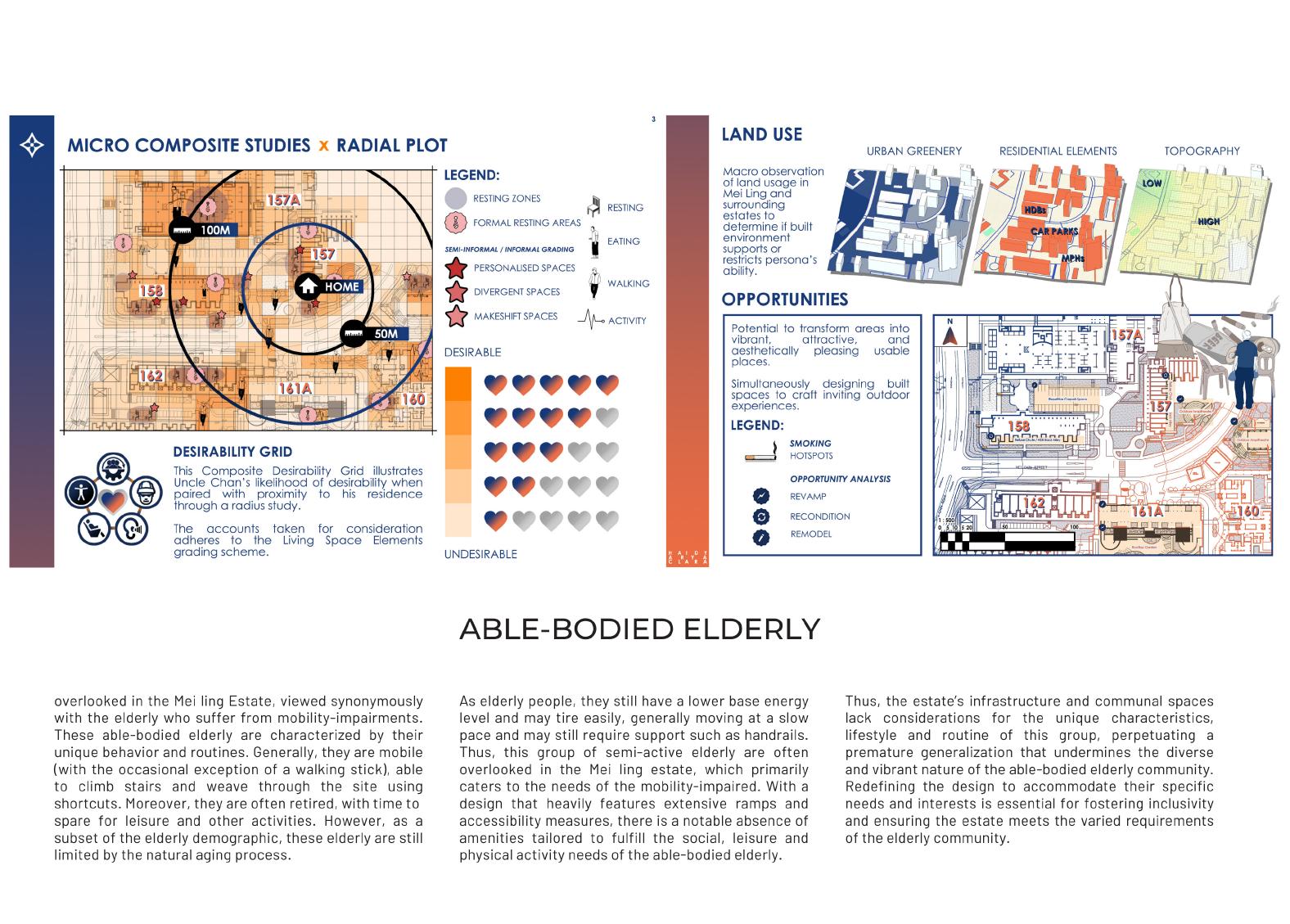
Overlooked in the Meiling Estate, viewed synonymously with the elderly who suffer from mobility-impairments. These able-bodied elderly are characterized by their unique behavior and routines. Generally, they are mobile (with the occasional exception of a walking stick), able to climb stairs and weave through the site using shortcuts. Moreover, they are often retired, with time to spare for leisure and other activities. However, as a subset of the elderly demographic, these elderly are still limited
ABLE-BODIED ELDERLY
by the natural aging process. As elderly people, they still have a lower base energy level and may tire easily, generally moving at a slow pace and may still require support such as handrails. Thus, this group of semi-active elderly are often overlooked in the Mei ling estate, which primarily caters to the needs of the mobility-impaired. With a design that heavily features extensive ramps and accessibility measures, there is a notable absence of amenities tailored to fulfill the social, lei-
sure and physical activity needs of the able-bodied elderly. Thus, the estate’s infrastructure and communal spaces lack considerations for the unique characteristics, lifestyle and routine of this group, perpetuating a premature generalization that undermines the diverse and vibrant nature of the able-bodied elderly community. Redefining the design to accommodate their specific needs and interests is essential for fostering inclusivity and ensuring the estate meets the varied requirements of the elderly community.
25

26 PERSONA
THE
ANALYSIS:
ROUTINED RETIREE
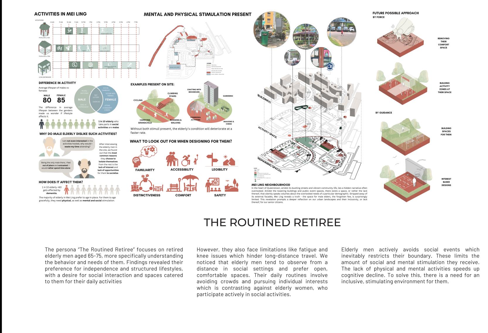
The persona “The Routined Retiree” focuses on retired elderly men aged 65-75, more specifically understanding the behavior and needs of them. Findings revealed their preference for independence and structured lifestyles, with a desire for social interaction and spaces catered to them for their daily activities.
THE ROUTINED RETIREE
However, they also face limitations like fatigue and knee issues which hinder long-distance travel. We noticed that elderly men tend to observe from a distance in social settings and prefer open, comfortable spaces. Their daily routines involve avoiding crowds and pursuing individual interests which is contrasting against elderly women, who participate actively in social activities.

Elderly men actively avoids social events which inevitably restricts their boundary. These limits the amount of social and mental stimulation they receive. The lack of physical and mental activities speeds up cognitive decline. To solve this, there is a need for an inclusive, stimulating environment for them.
27

28
ELDERLY ABOVE 60 PRE-DEMENTIA AND EARLY STAGE DEMENTIA
PERSONA ANALYSIS:
ELDERLY ABOVE 60 PRE-DEMENTIA AND EARLY STAGE DEMENTIA
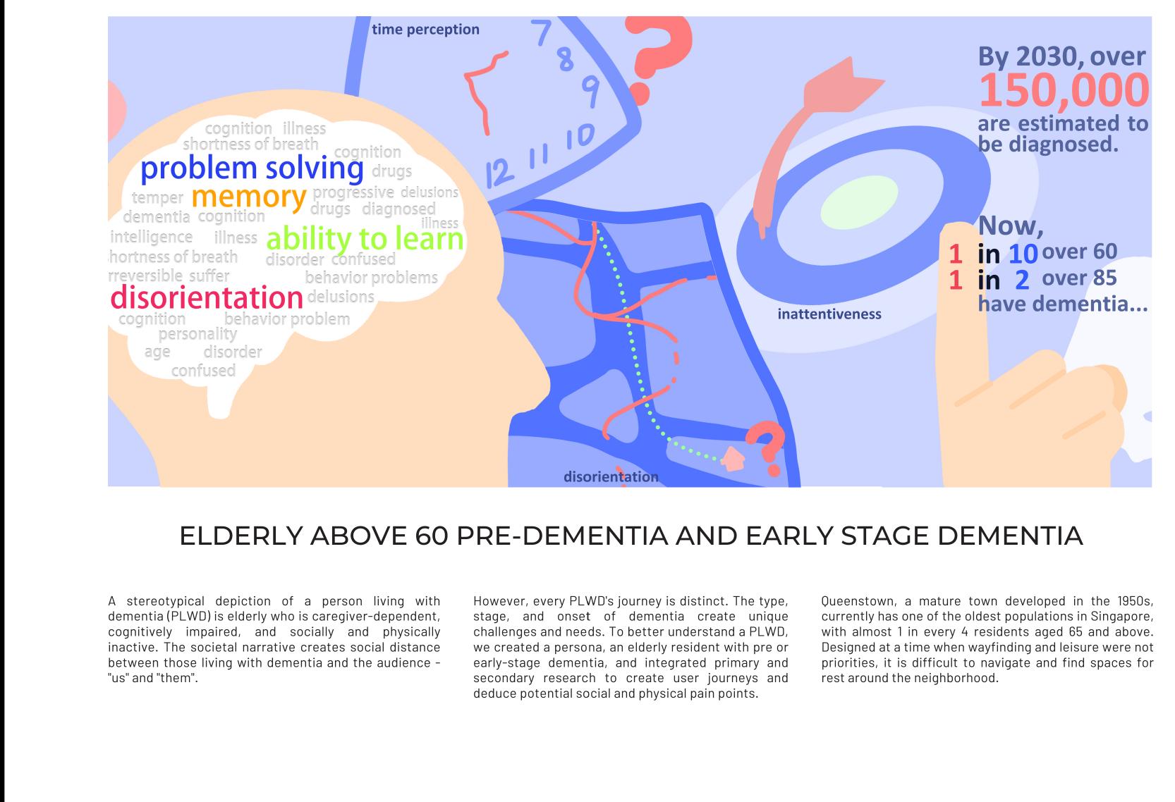
A stereotypical depiction of a person living with dementia (PLWD) is elderly who is caregiver-dependent, cognitively impaired, and socially and physically inactive. The societal narrative creates social distance between those living with dementia and the audience - “us” and “them”.

However, every PLWD’s journey is distinct. The type, stage, and onset of dementia create unique challenges and needs. To better understand a PLWD, we created a persona, an elderly resident with pre or early-stage dementia, and integrated primary and secondary research to create user journeys and deduce potential social and physical pain points.
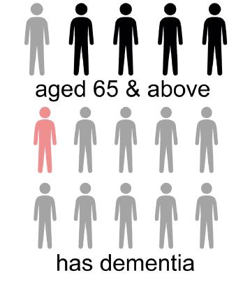
Queenstown, a mature town developed in the 1950s, currently has one of the oldest populations in Singapore, with almost 1 in every 4 residents aged 65 and above. Designed at a time when wayfinding and leisure were not priorities, it is difficult to navigate and find spaces for rest around the neighborhood.
29

30
ANALYSIS: ELDERLY WHEELCHAIR USERS
PERSONA
ELDERLY WHEELCHAIR USERS
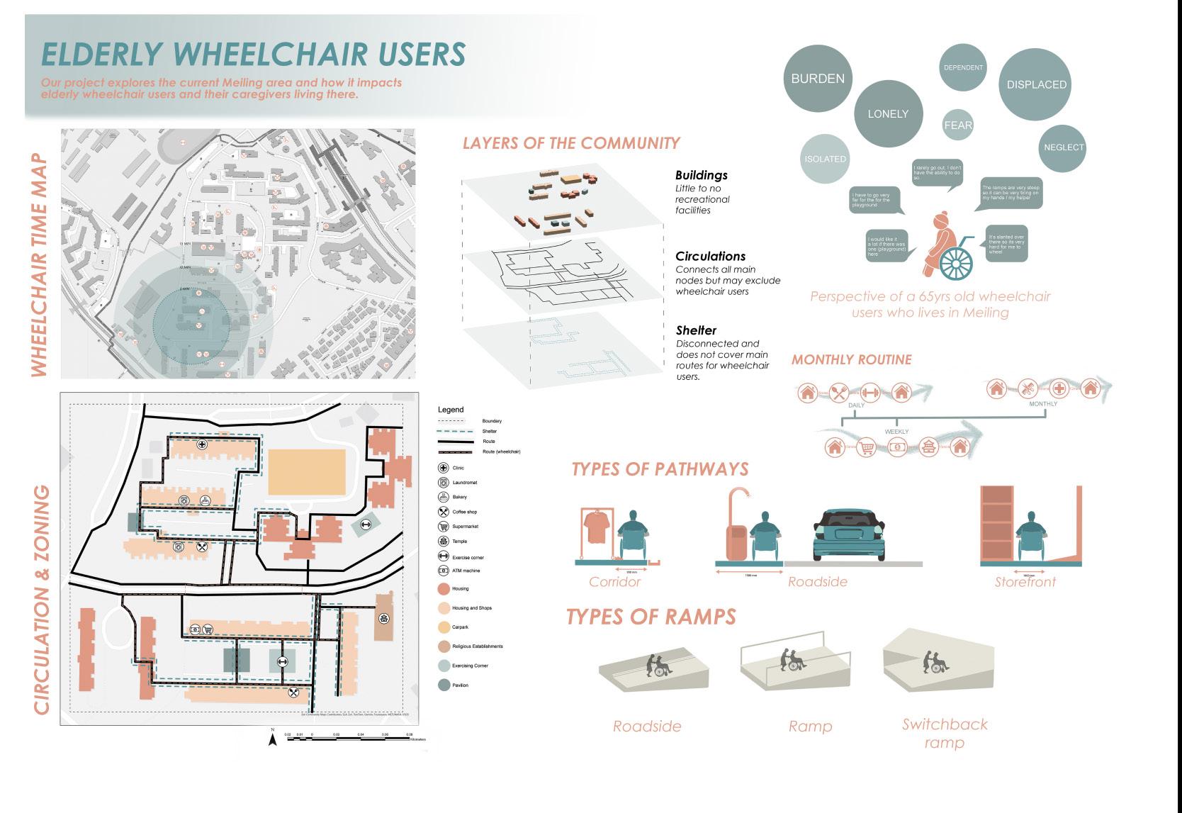
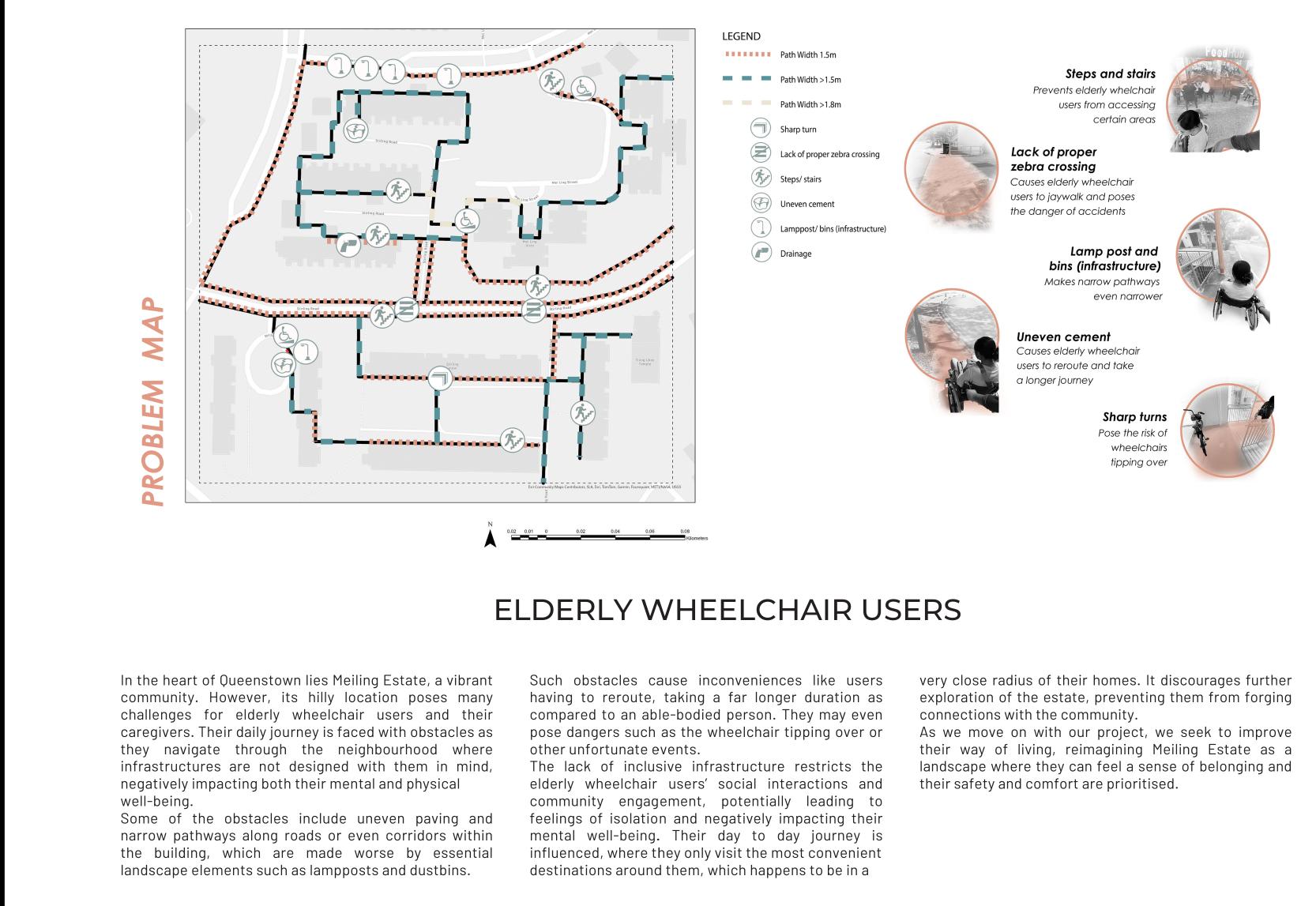
In the heart of Queenstown lies Meiling Estate, a vibrant community. However, its hilly location poses many challenges for elderly wheelchair users and their caregivers. Their daily journey is faced with obstacles as they navigate through the neighbourhood where infrastructures are not designed with them in mind, negatively impacting both their mental and physical well-being. Some of the obstacles include uneven paving and narrow pathways along roads or even corridors within the build-
ing, which are made worse by essential landscape elements such as lampposts and dustbins. Such obstacles cause inconveniences like users having to reroute, taking a far longer duration as compared to an able-bodied person. They may even pose dangers such as the wheelchair tipping over or other unfortunate events.
The lack of inclusive infrastructure restricts the elderly wheelchair users’ social interactions and community

engagement, potentially leading to feelings of isolation and negatively impacting their mental well-being. Their day to day journey is influenced, where they only visit the most convenient destinations around them, which happens to be in a very close radius of their homes. It discourages further exploration of the estate, preventing them from forging connections with the community. As we move on with our project, we seek to improve their way of living, reimagining Meiling Estate as a landscape where they can feel a sense of belonging and their safety and comfort are prioritised.
31

32 PERSONA ANALYSIS: WHEELCHAIR USERS

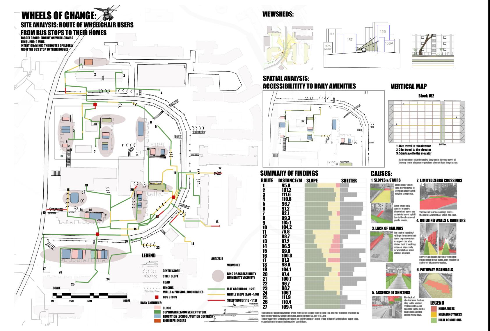
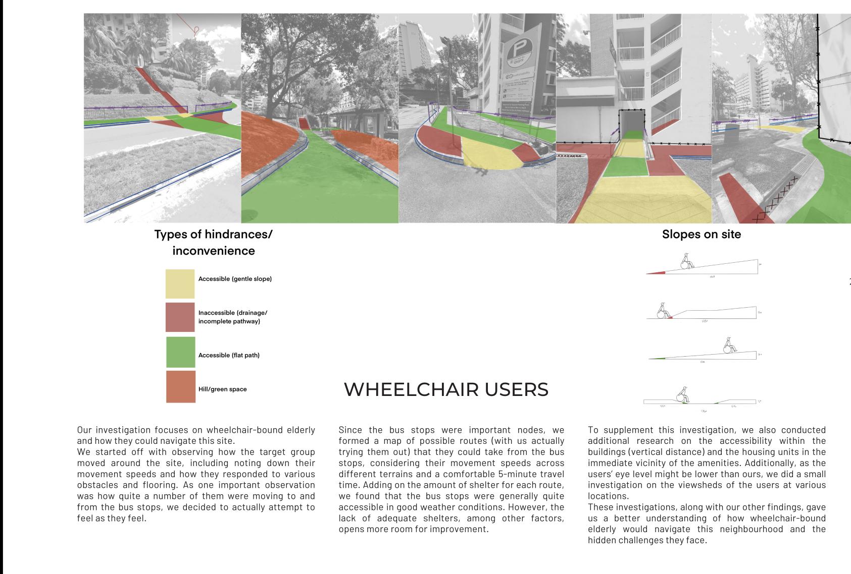
Our investigation focuses on wheelchair-bound elderly and how they could navigate this site. We started off with observing how the target group moved around the site, including noting down their movement speeds and how they responded to various obstacles and flooring. As one important observation was how quite a number of them were moving to and from the bus stops, we decided to actually attempt to feel as they feel. Since the bus stops were important nodes, we formed a map of
WHEELCHAIR USERS
possible routes (with us actually trying them out) that they could take from the bus stops, considering their movement speeds across different terrains and a comfortable 5-minute travel time. Adding on the amount of shelter for each route, we found that the bus stops were generally quite accessible in good weather conditions. However, the lack of adequate shelters, among other factors, opens more room for improvement. To supplement this investigation, we also conducted
additional research on the accessibility within the buildings (vertical distance) and the housing units in the immediate vicinity of the amenities. Additionally, as the users’ eye level might be lower than ours, we did a small investigation on the viewsheds of the users at various locations. These investigations, along with our other findings, gave us a better understanding of how wheelchair-bound elderly would navigate this neighbourhood and the hidden challenges they face.
33

34
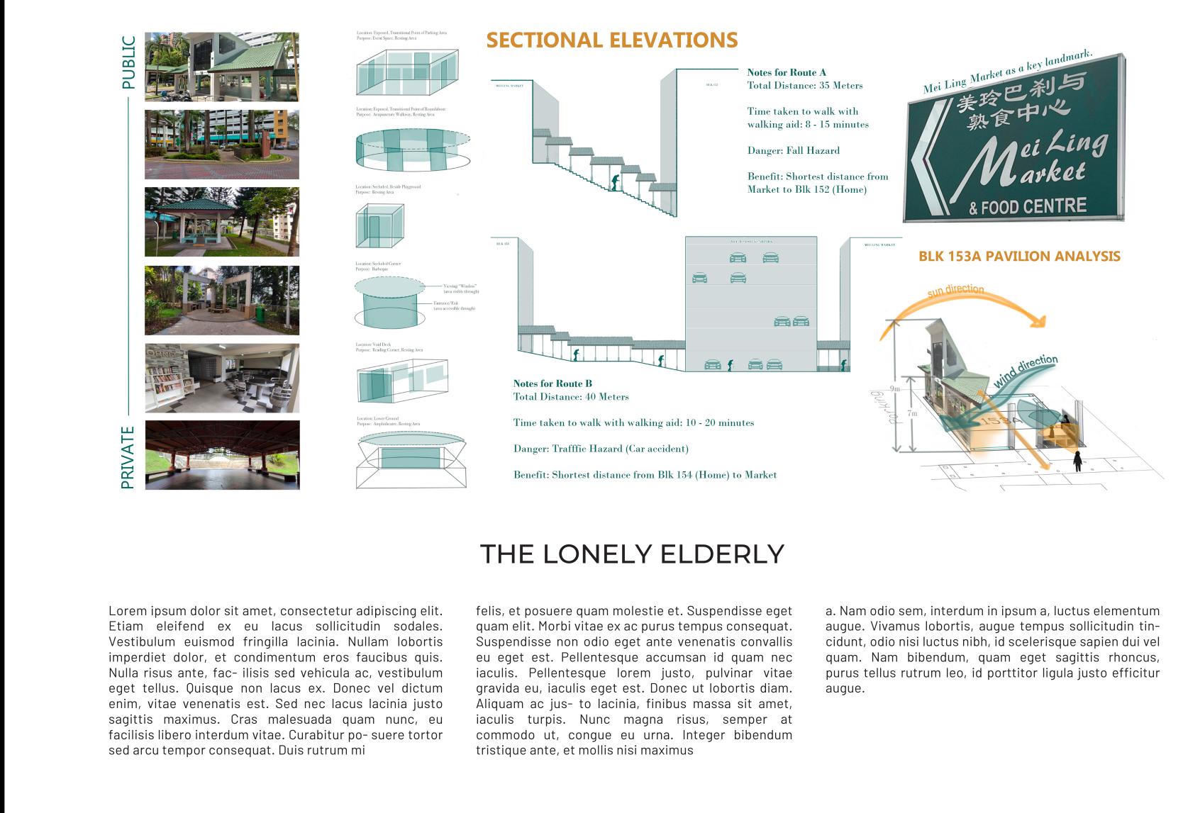
PERSONA ANALYSIS: THE LONELY ELDERLY
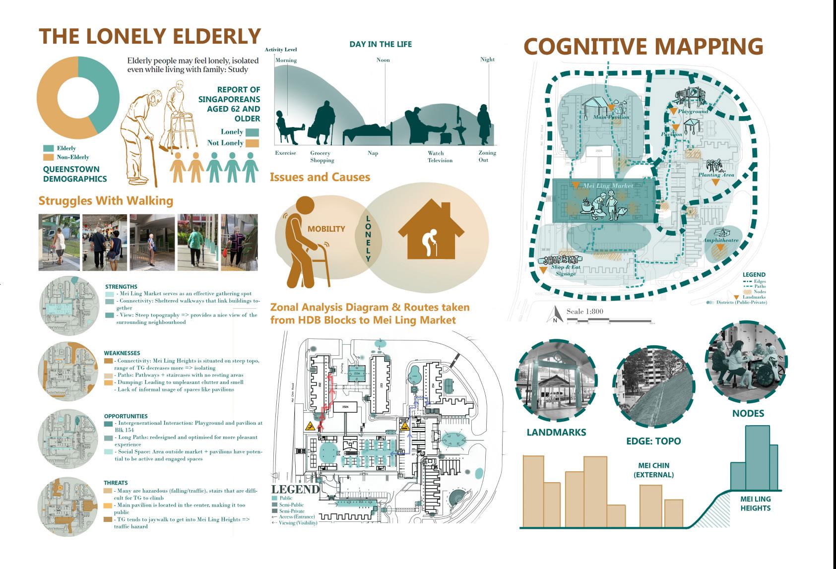
About 40% of Queenstown’s demographic consists of the elderly. We observed that many of them travel independently with some form of walking aid. Noting the lack of social interaction and mobility issues for a majority of them, we researched and discovered that, in Singapore, 2 in 5 elderly above 62 report feeling lonely - mainly because it is challenging for them to get around. As such, we studied how our persona would perceive the area of Mei Ling Heights; thereby gaining a better understanding of elderly
THE LONELY ELDERLY
loneliness.
To understand the site, we conducted cognitive mapping and SWOT analysis. Focusing on circulation, distance, time, hazards and benefits of different routes brings about different levels of comfort and preference for our persona. A zonal analysis was also done to identify spaces that are public, semi-public and semi-private to better understand the existing usage of space. Different types of gathering points within the neighbour-

hood were evaluated to understand the amount of social interaction each of these spaces could encourage. These allowed us to understand the difficulties and concerns of our persona regarding movement, along with the idea of public-private design and the type of social interactions it could bring about to reduce elderly loneliness.
35

36
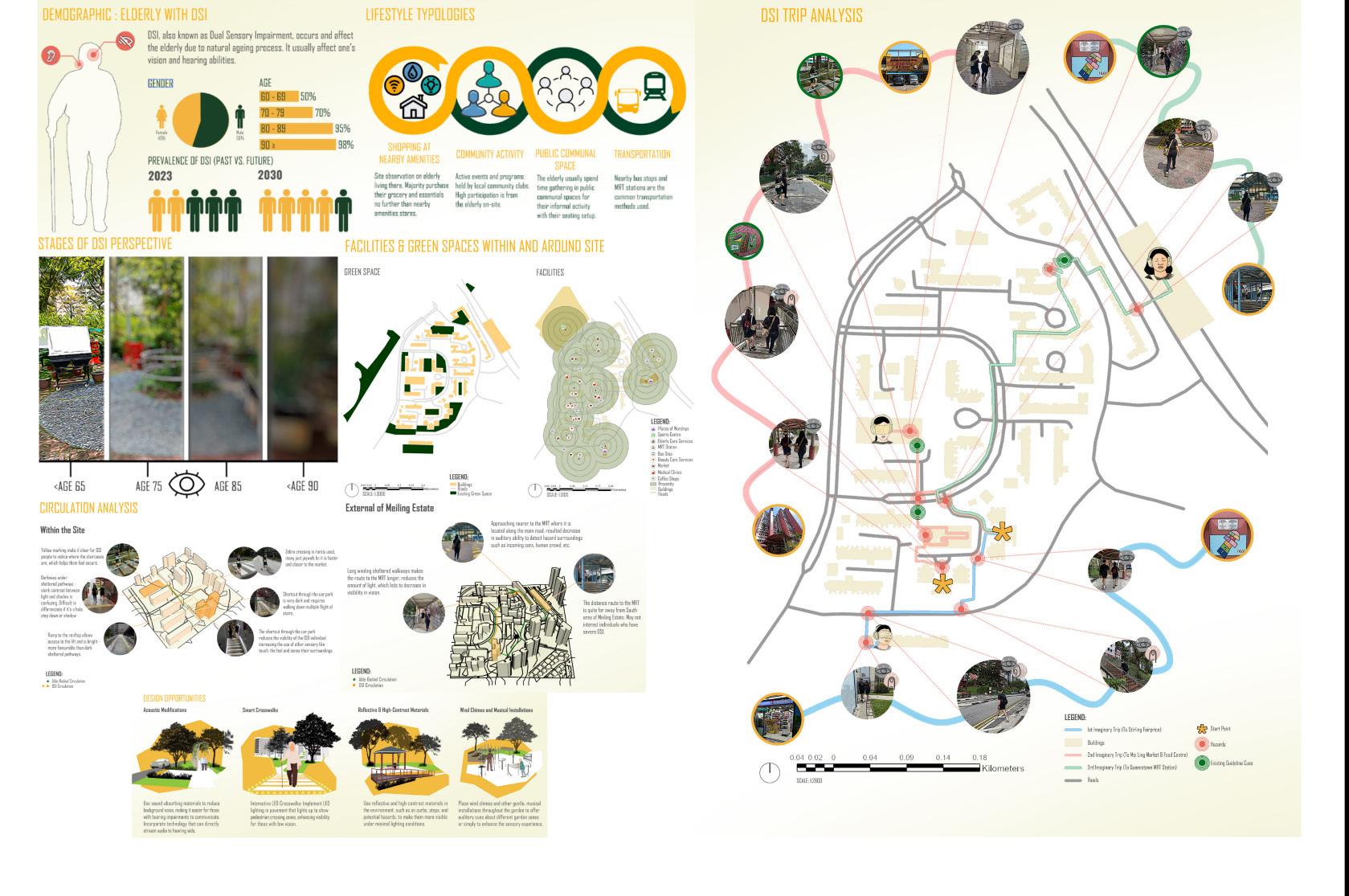
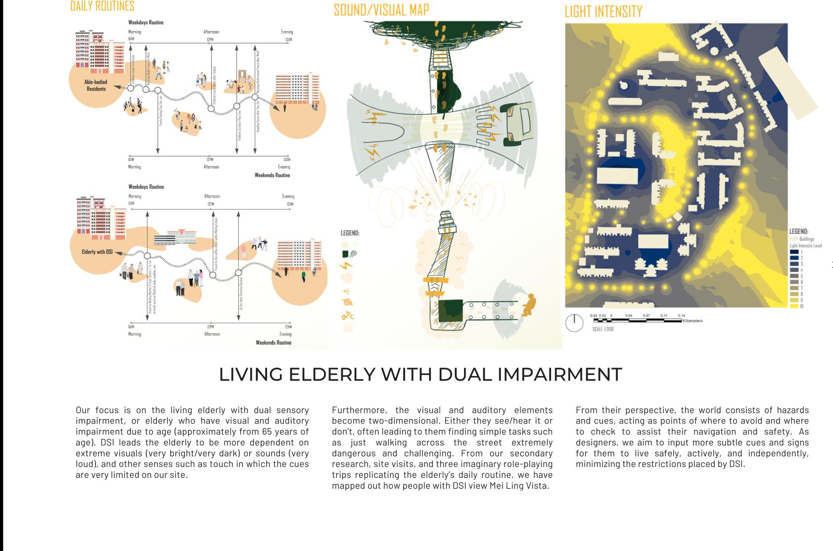
PERSONA ANALYSIS: LIVING ELDERLY WITH DUAL IMPAIRMENT
LIVING ELDERLY WITH DUAL IMPAIRMENT
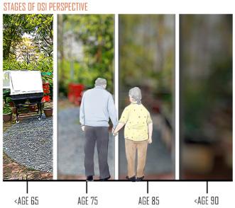
Our focus is on the living elderly with dual sensory impairment, or elderly who have visual and auditory impairment due to age (approximately from 65 years of age). DSI leads the elderly to be more dependent on extreme visuals (very bright/very dark) or sounds (very loud), and other senses such as touch in which the cues are very limited on our site.
Furthermore, the visual and auditory elements become two-dimensional. Either they see/hear it or don’t, often
leading to them finding simple tasks such as just walking across the street extremely dangerous and challenging. From our secondary research, site visits, and three imaginary role-playing trips replicating the elderly’s daily routine, we have mapped out how people with DSI view Mei Ling Vista.
From their perspective, the world consists of hazards and cues, acting as points of where to avoid

and where to check to assist their navigation and safety. As designers, we aim to input more subtle cues and signs for them to live safely, actively, and independently, minimizing the restrictions placed by DSI.
37

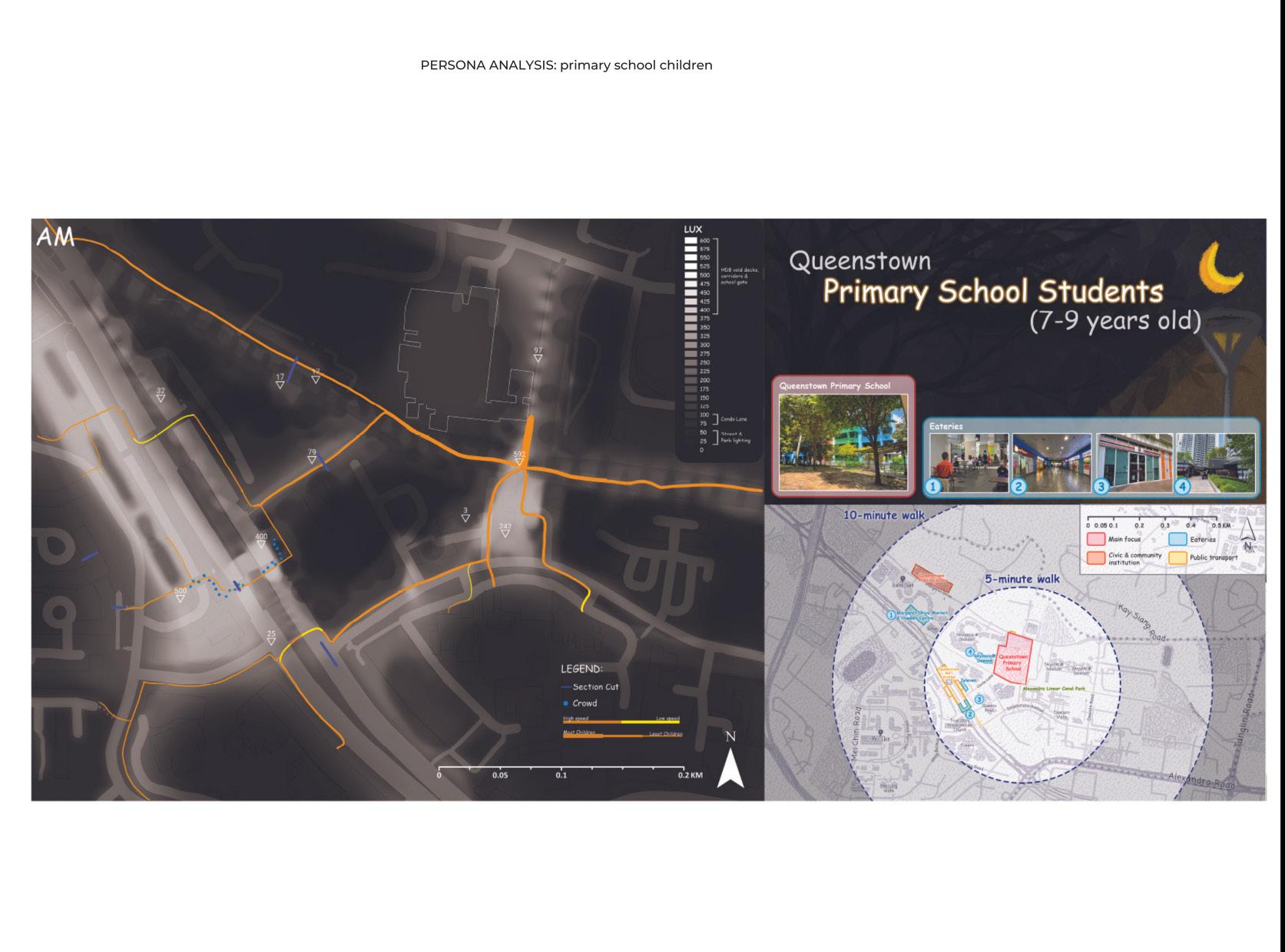
38 PERSONA ANALYSIS: QUEENSTOWN PRIMARY SCHOOL STUDENTS
QUEENSTOWN PRIMARY SCHOOL STUDENTS
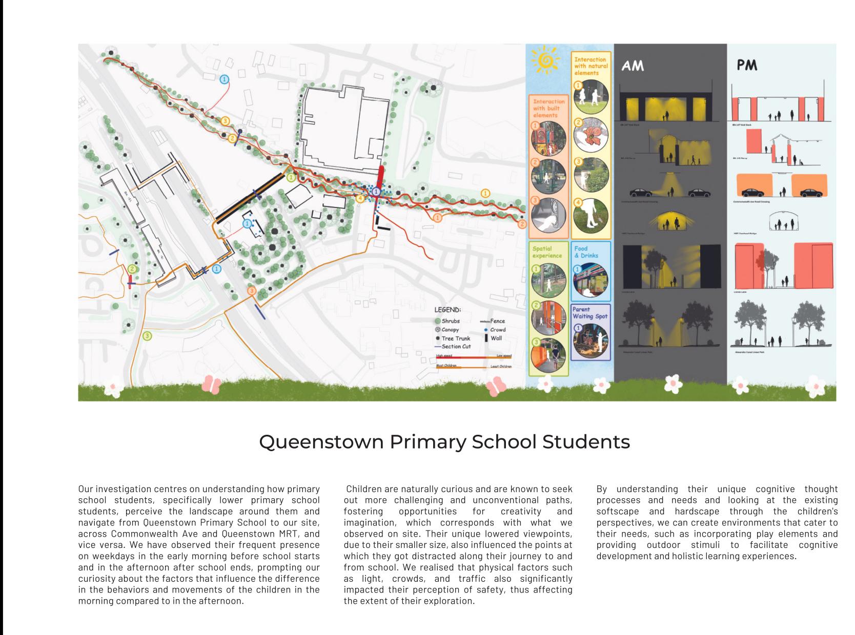
Our investigation centres on understanding how primary school students, specifically lower primary school students, perceive the landscape around them and navigate from Queenstown Primary School to our site, across Commonwealth Ave and Queenstown MRT, and vice versa. We have observed their frequent presence on weekdays in the early morning before school starts and in the afternoon after school ends, prompting our curiosity about the factors that influence the difference in the behaviors and
movements of the children in the morning compared to in the afternoon. Children are naturally curious and are known to seek out more challenging and unconventional paths, fostering opportunities for creativity and imagination, which corresponds with what we observed on site. Their unique lowered viewpoints, due to their smaller size, also influenced the points at which they got distracted along their journey to and from school. We realised that physical factors such as light, crowds,

and traffic also significantly impacted their perception of safety, thus affecting the extent of their exploration. By understanding their unique cognitive thought processes and needs and looking at the existing softscape and hardscape through the children’s perspectives, we can create environments that cater to their needs, such as incorporating play elements and providing outdoor stimuli to facilitate cognitive development and holistic learning experiences.
39


40 PLAYSCAPE

41 Individual Works PLAYSCAPE
Tile By Rewilding Tile
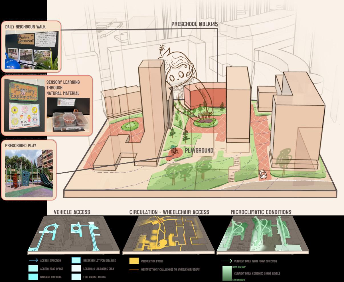
Inspired by Singapore’s “Cities in Nature” vision, I was captivated by the idea of reversing hardscape dominance and reintroducing authentic nature into neighborhoods like Mei Ling, mimicking the structure of natural forests and optimizing green space patterns in urban settings. Children possess innate creativity, playfulness. They learn through sensory experiences and natural materials. Thus, the central focus of my design became empowering children to co-create a neighborhood where nature thrives. Mei Ling’s car park node, located adjacent to a preschool, provided an ideal starting point for collaboration and engaging children actively in shaping the design.
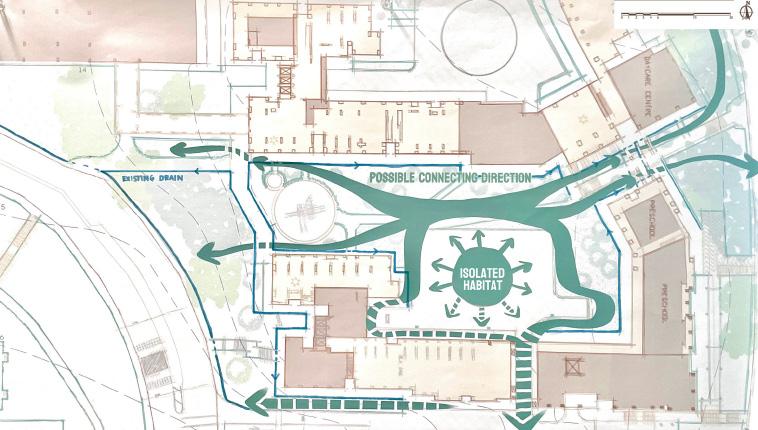
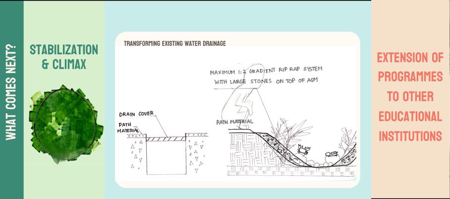
The project unfolded in planned phases, each aligned with the natural progression of the softscape to allow for growth and spread. In Phase 1, we implemented Miyawaki’s method—a technique for creating dense, native forests—to accelerate forest growth and establish a self-sustaining ecosystem in a small area. Phase 2 involved spreading the impact further, with a particular focus on intervening in the substantial hardscape presence of car park tiles. As the succession progressed, Phase 3 addressed the change in microclimatic conditions, strengthening connections with existing green spaces and creating interconnected urban habitats. Repurposing the tiles is also considered for economic and educational purposes.
This participatory process hope to instil a sense of ownership and responsibility for children, nurturing them into responsible citizens who cherish and protect their environment as they grow. Looking into the future, this design would establish ecological connections, strengthening the ties between green spaces and serving as a pilot project for future implementations.
42
Dang Van Trang

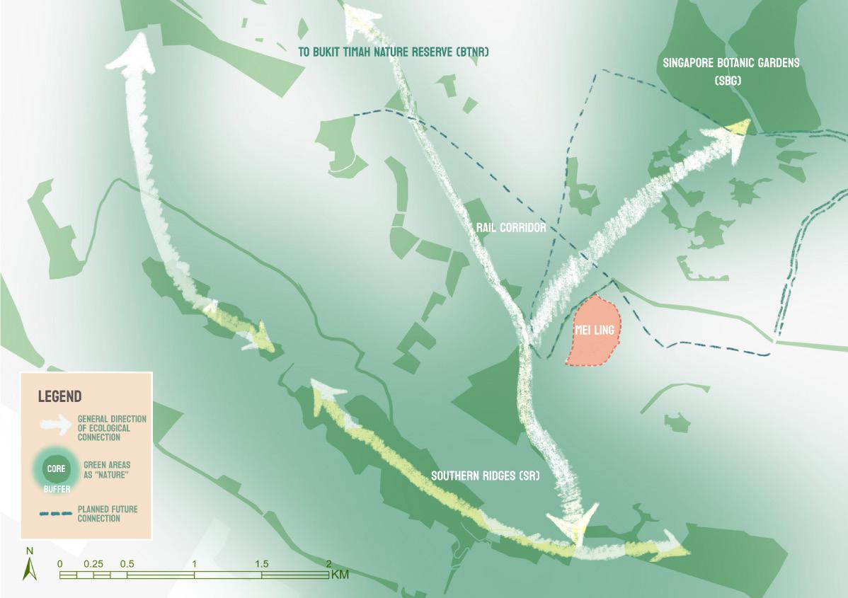
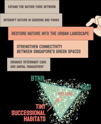
Strategies for “Cities in Nature” and the concept of “Tiny
Successional Habitats”

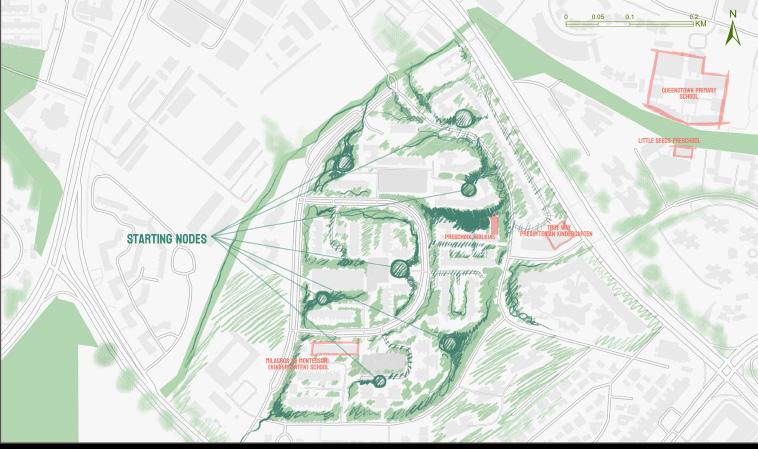
The concept of “tiny successional habitats” is inspired by Richard Forman, an urban ecologist. In his book, “Urban Ecology”, he mentioned this as a way for optimizing green space patterns in cities.Through establishing mini forests in neighbourhoods, I can create a buffer area to strengthen existing and future connections between Singapore’s green spaces.
43

44 SITE:
Mei Ling’s car park node


SECTIONS FOR PHASES 1, 2 & 3
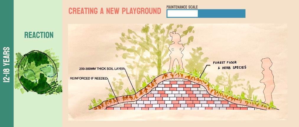
These show how the site would change over the period of 1-2 months, 2-3 years, 12-18 years respectively. This follows each phase of the design, which successional stages of how a mini-forest would establish over time. As the plants grow taller and denser, the space also encourages a different kinds of interaction and play for the children.
45


PHASE 1 & 2: Design Plans
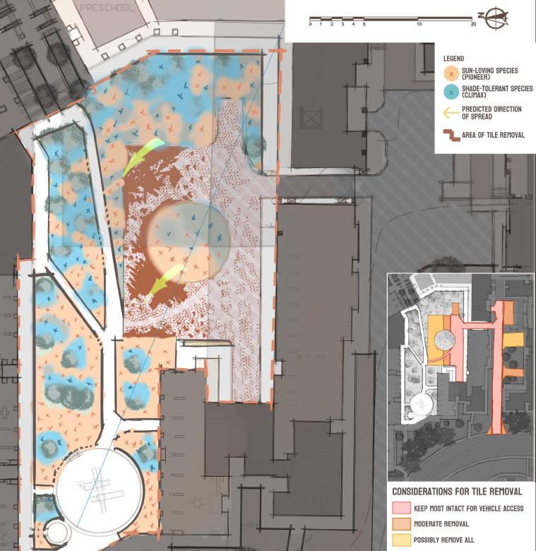
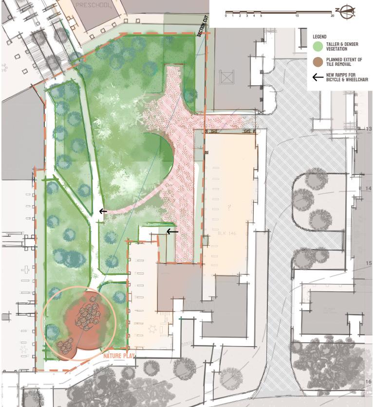
Phase 1 involves creating a bare ground (Nudation), with rich soil materials inspired by Miyawaki’s method. Children will participate in the making of seedballs to participate in the introduction of the new species into the area (Invasion).
Phase 2 involves monitoring and directing the spread and growth of these species. Car park tiles are intentionally removed, with the help of the children to encourage this process (Competition & Co-action).
46


PHASE 1 & 2: Design Interventions & Considerations
47

PHASE 3 & FUTURE SCENARIOS: Design Plans


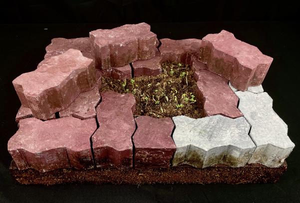
As the succession progressed, Phase 3 addressed the change in microclimatic conditions, forming a new nature play area that repurposes the car park tiles, giving them a new life. Moving on, the design aims to strengthen ecological connections with existing green spaces and creating interconnected urban habitats, complementing Singapore’s park connector and roadside planting networks.
48


PHASE 3 & FUTURE SCENARIOS:
Design Interventions & Considerations (left)


Removing hardscape tiles to reintroducing tiny pockets of nature is a bold statement that I would like to make through this design. This seemingly small-scaled intervention could potentially create a new neighbourhood typology where there is adelicate balance between human needs and the space necessary for nature. And wouldn’t it be amazing if these tiny successional habitats all start with our children’s hands?
49
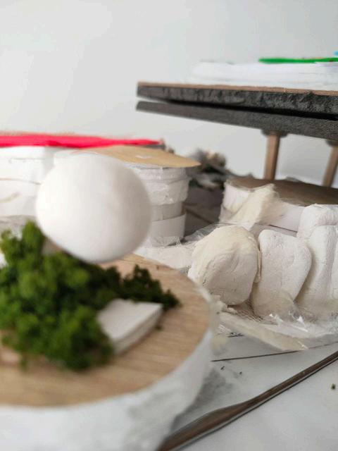
1:2 MODEL OF CAR PARK TILES (right)
Evolving Path
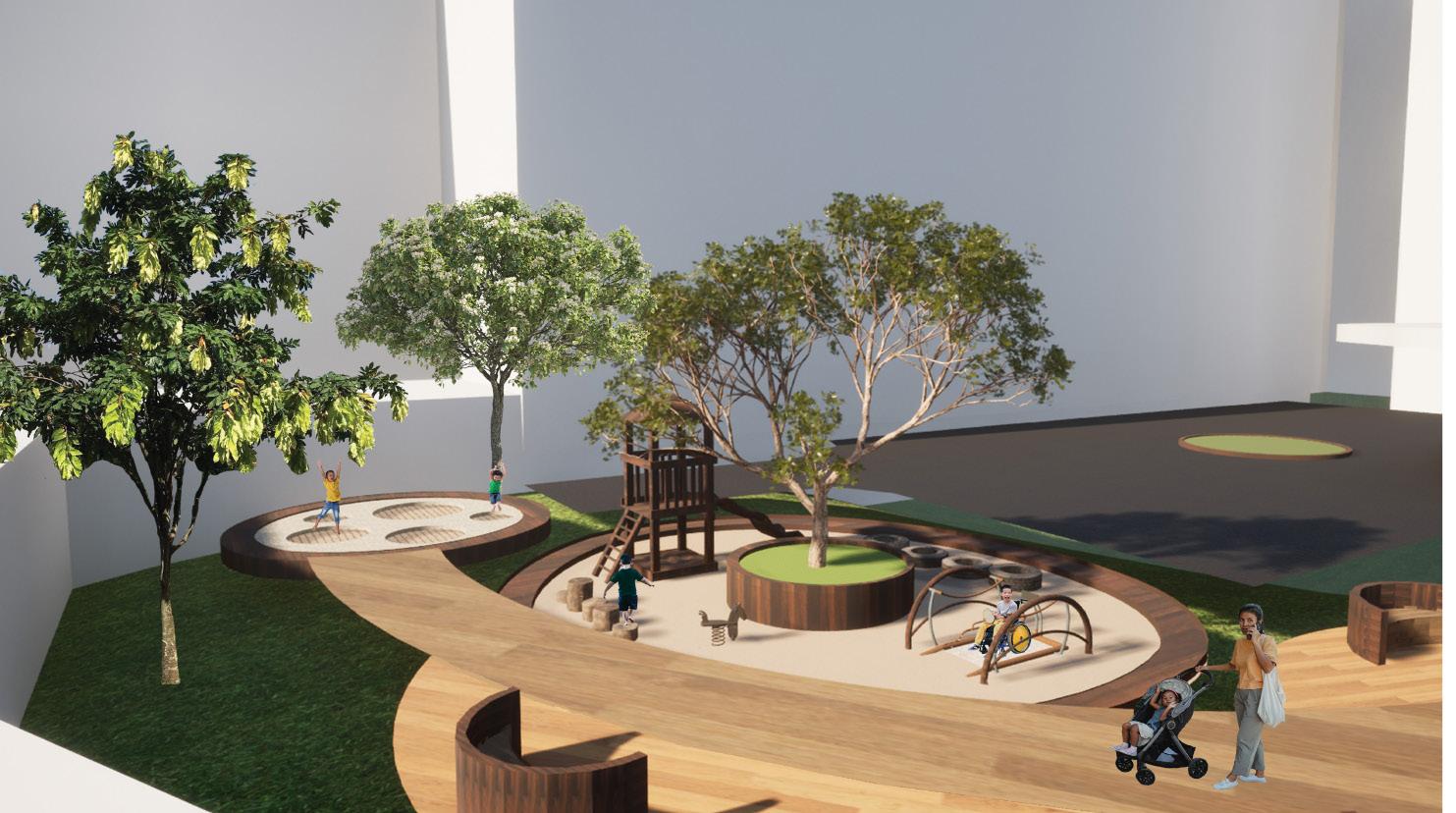
A funtional space for the elderly and the rest of the community to gather and exercise
Danea Binte Mohamad Khalid
The concept of this project is an everchanging landscape for the community to exercise their mind and body. The objective is to create versatile exercising tracks and spaces around the HDB spaces that caters to a variety of ages by designing multiple tracks of different levels of difficulty while integrating therapeutic yet functional spaces along the tracks.
This project considered the routine of an elderly as it has been found that the Mei Ling district is densely populated by elderlies.
It has been observed that most elderly has exercise included in their routine and it consist of simple repetitive movement and walking. Their routine also revolves around their neighborhood as they may not be as capable to travel far which can lead to them being lonely, especially those elderly living alone.
In attempt to address this issue, this design is located around HDB and includes Rock Stacking area and a Rock Garden. Rock stacking provide a little challenge for the elderly as the motion of stacking rock mimics their repetitive exercise which encourages them to exercise without it being boring as it is gamified.
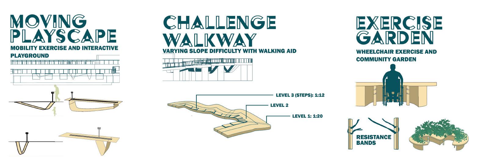
There is also a nature track that is incorporated in the existing topography at the existing site. The nature track has three different levels that can cater to different demographics. The three different level varies in gradient and floor material so that as the level progress it get more challenging for the more abled bodied demographic. This allows many different people to gather and enjoy the spaces together so that the elderly will not feel so lonely.
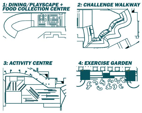
There are also spaces such as Rock Climbing, Exercising corner and Rest Stop incorporated to the nature track for the community to enjoy.
50

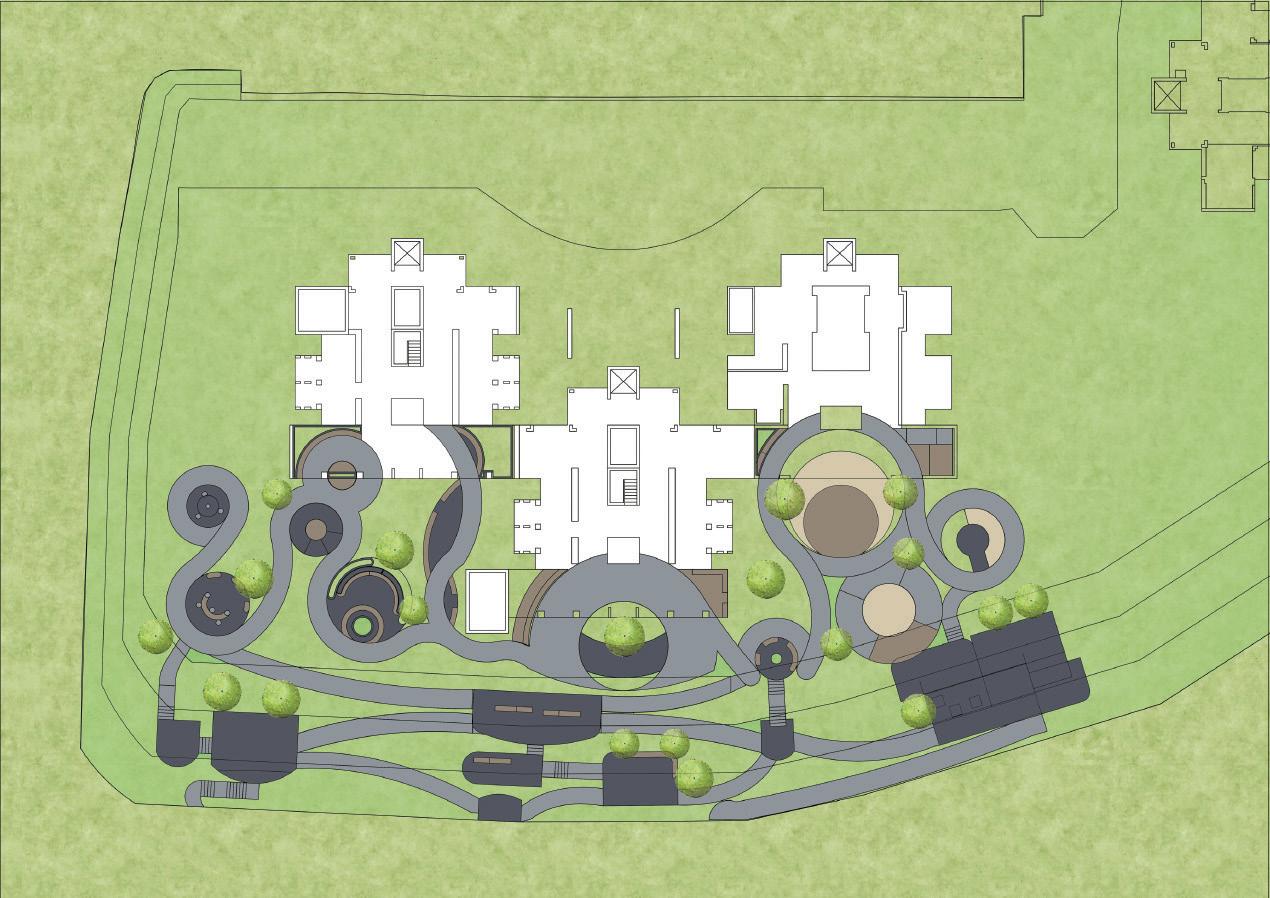
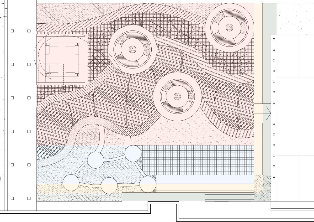
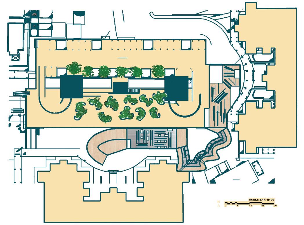
Landscape Layout Plan
Chosen site revolves around a HDB block to increase accesbility and incoporates existing landform to make funtional nature track.
51

Rock Stack
A space for users to take part in rock stacking and exercise
This space is to encourage users, especially elderlies to excerise and use rock stacking to replace their exercise fo repetitive motion like raising thier hands.
52

Rock Garden
A
therapeutic and contemplative space
A space for users to relax and gather together. The rock gartden is a space for the community to relax with a serene surrounding and the lush greenery around the garden creates an everchanging environment as the plants grow as the days past, changing the visuals of the space
53


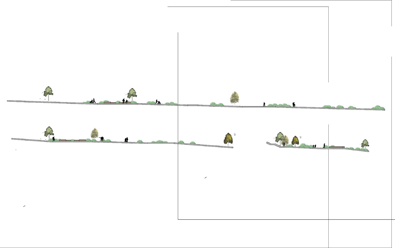
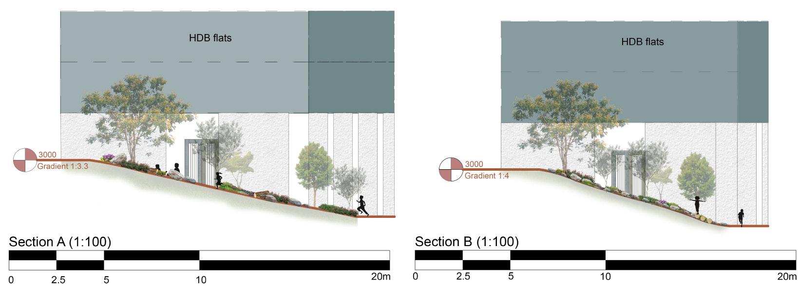
Section of the three different levels
Level 1: Gradient:>1:25
Level 2: Gradient:>1:12
Level 3: Gradient:<1:12
Zen Rest Stop
A look out deck

A Deck incoporated into the Nature Track for users to have a view of the overall track and relax to take a reak from walking
55


Both spaces are integrated into the Nature Track to give users with a variety of activitiies and provide them with spaces to exercise and socialize.
56
Rock Climb & Exercising Corner

Breaking the Boundary of Void Decks
The design integrates the existing void deck as it break the barrier of it. It encourages and invites users coming out of the lift to the outdoor space as the pathway from the void deck leads to the outdoor spaces. There are also plenty of benches and spaces for users to relax and gather under the shaded void deck.
Whismy Wheels
Kwok Ka Yi Charie
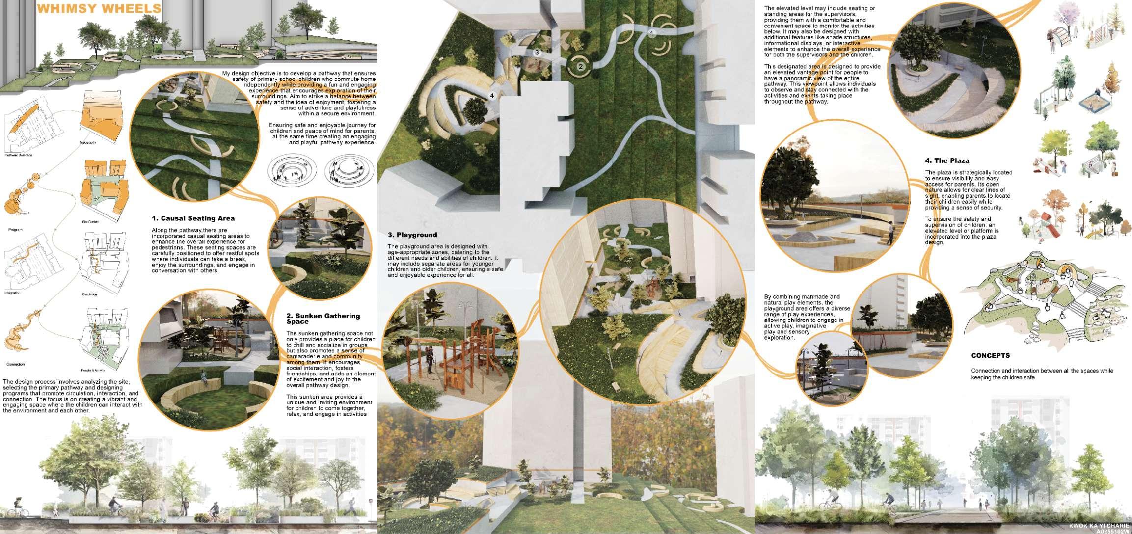
The primary objective of this project is to create an interactive and safe pathway for primary school students who commute home independently in the Meiling neighbourhood. The aim is to rejuvenate the liveliness of the area by incorporating engaging elements into the pathway. This design approach seeks to strike a balance between ensuring the safety of the children and providing an enjoyable and explorative experience. Safety is of paramount importance in the design. The pathway will be designed to minimize potential hazards and create a secure environment for the students. Clear signage, well-marked crossings, and appropriate lighting will be implemented to ensure visibility and guide the children along the route. The use of thermal imaging can assist in identifying potential safety risks, such as overheating electrical components or inadequate lighting, allowing for proactive measures to be taken.
To make the pathway engaging and enjoyable, interactive elements will be incorporated. These may include educational displays, interactive games, or artistic installations that inspire curiosity and promote learning. The pathway can showcase the rich history, culture, and natural elements of the Meiling neighbourhood, fostering a sense of pride and connection among the students. These interactive features will encourage exploration, playfulness, and a sense of adventure, making the journey home an exciting part of their day.
Careful consideration will be given to the aesthetics of the pathway. Colorful and visually appealing elements will be integrated into the design to create a vibrant and welcoming atmosphere.
58


Overview of the design
The pathway design includes casual seating areas for pedestrians to rest and enjoy the surroundings. A sunken gathering space encourages social interaction and community building. A new playground fills the void left by closed or removed playgrounds, offering diverse play experiences. A plaza with clear lines of sight allows parents to easily locate their children, with an elevated platform for supervision. The design aims to create an engaging, safe, and community-oriented pathway experience.
60

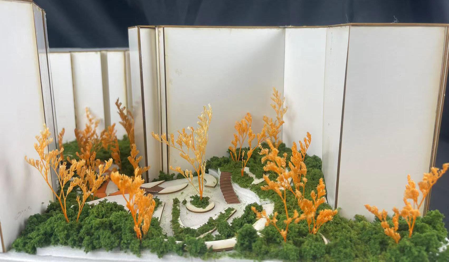
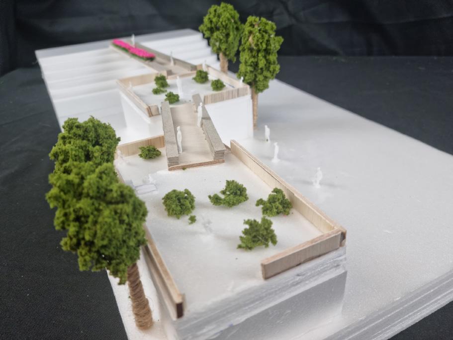
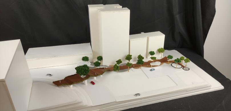
Physical model of Whimsy Wheels
My primary focus is to design a pathway that prioritizes the safety of primary school children while allowing them to fully enjoy their journey without concerns about vehicles or getting lost. By implementing robust safety measures, including physical barriers, clear signage and designated crossing points, I aim to create an environment where children can freely engage in play while parents can feel less worried about their young ones commuting home independently.

Overview of Whimsy Wheels
My design aims to provide an interesting and captivating pathway that offers opportunities for play and exploration as children make their way home. We will incorporate interactive elements and engaging features that invite children to participate in various activities along the route. By seamlessly integrating play areas and interactive installations, children can enjoy themselves while progressing towards their destination.
62
63
Nursery in a Nursery
Chee Shi Jia, Maydalene
Queenstown is Singapore’s oldest neighbourhood and known to be home to many elderly people, but with the increase of BTO flats being built in Meiling, there is a need to bridge the gap between the old and the increasing young. Thus, this project aims to build on the common ground between the elderly and children and create a space that attracts both groups to engage with one another through shared activities, with gardening as the main focus. Gardening is a popular activity among the elderly in Meiling,with plants filling up corridors and community gardens, while children attending the preschool go for daily neighbourhood nature walks, where they are encouraged to observe the flora and fauna around their neighbourhood through their 5 senses. To facilitate a deeper sensory learning of the outdoors, children will be involved with the process of growing a plant from a seed with the elderly as their gardening mentors. Taking into account Singapore’s One Million Trees Movement, Nursery in a Nursery integrates gardening into the children’s preschool curriculum, where one child is responsible for one tree, with the help of the elderly, that will grow alongside the children from seed to sapling to young tree across the average of 5 years that the children spend in the preschool, before the children graduate and the young tree they have nurtured is transported somewhere else to begin a new life. To do this, the neighbourhood has been redesigned to facilitate seed collection, seed planting, water collection as well as composting, all of which have been made into playscapes for the children to learn through play, with the key theme of a maze throughout the redesigned neighbourhood, which is a playscape that combines playfulness, challenge as well as a difference in perspective be-tween children and adults.
64

Finding Common Ground between Elderly and Children
Needs and Activities
65


Plan of Redesigned Nursery
Connecting the preschool to the void deck areas where the elderly commune through a series of maze-like functional areas for seed collection, water collection, planting and composting, while drawing the elderly out of their void deck boundaries through blurring the edges of the void decks through extending benches, shelter and greenery. Creating a space for the elderly and children to interact through gardening.
66


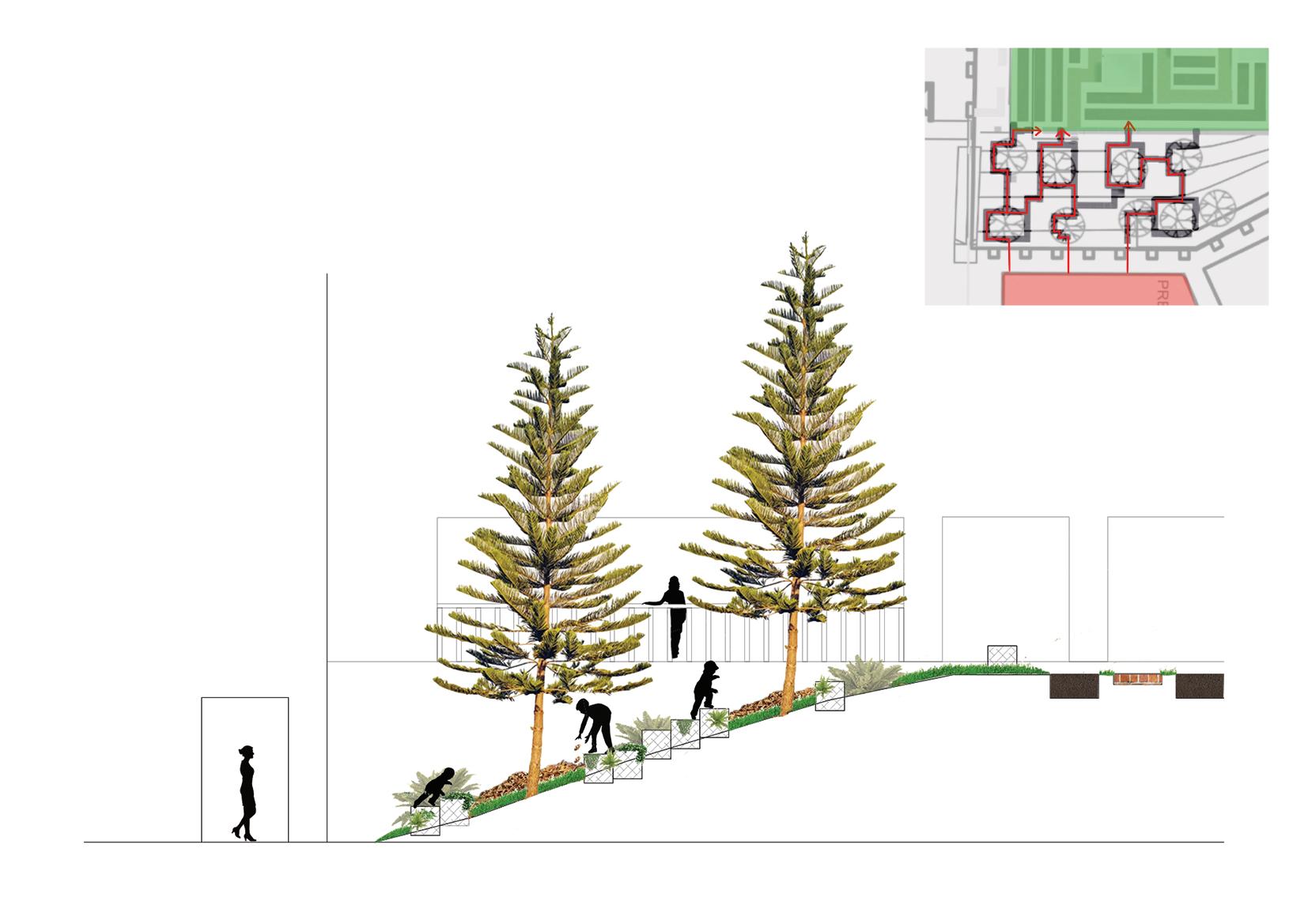
Composting and Climbing Structure
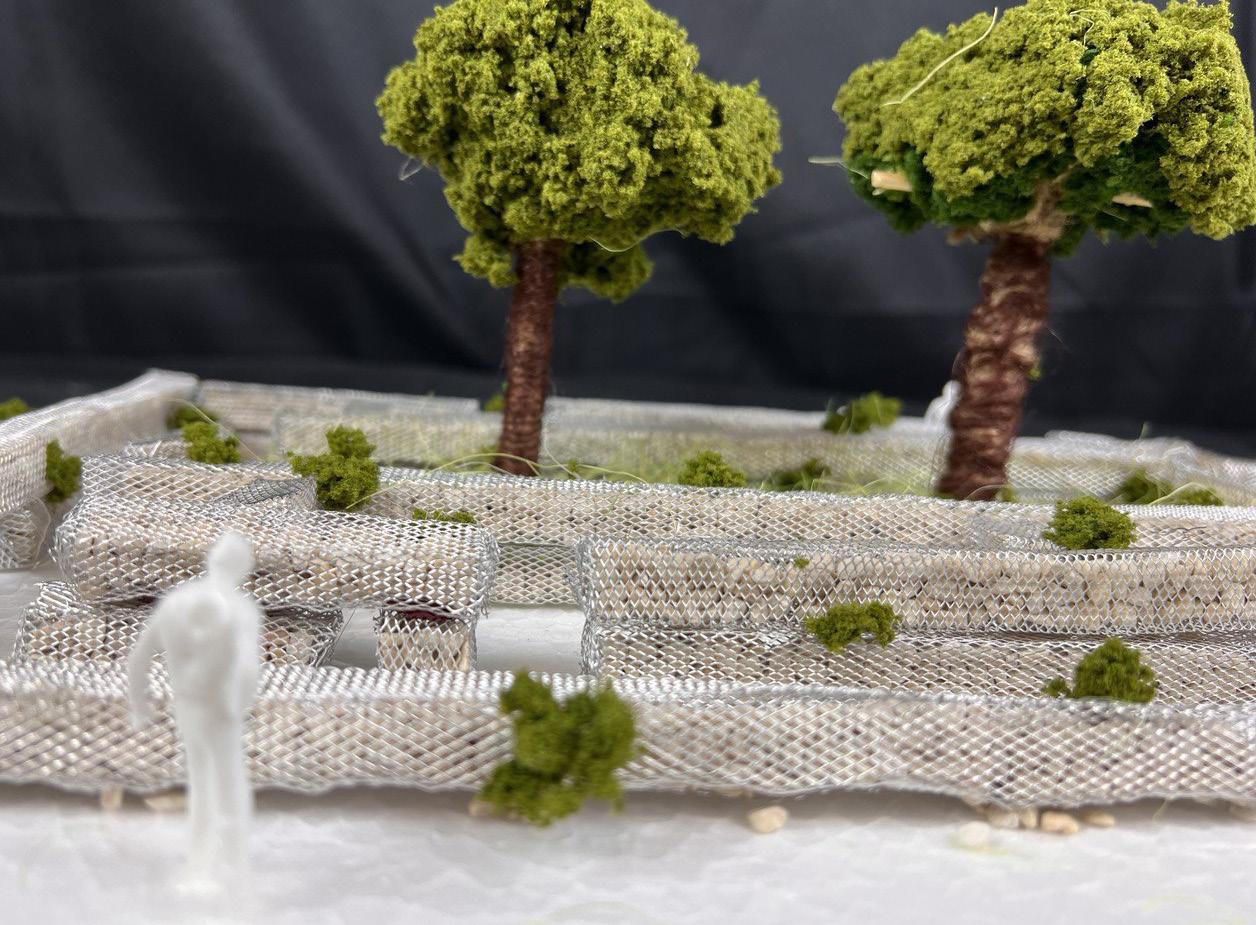
Gabions act as Climbing Structure and collect dead leaves dropped from existing trees, forming a composting bin where children can throw in other organic materials collected from around the site. Gabions are arranged to wind through the existing trees, inspired by observations of children on site zig-zagging between trees instead of taking conventional paths
67


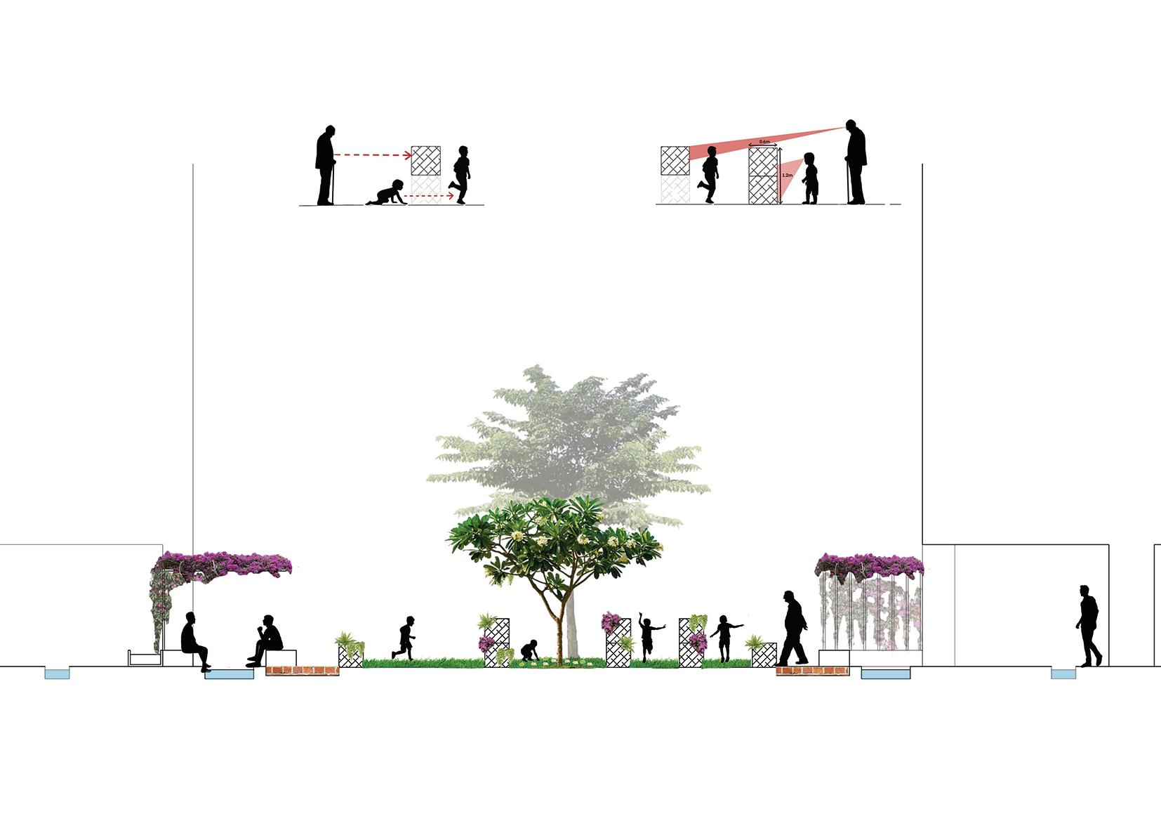
Seed Collection Maze
Trees reminiscient of Kampung days such as Angsana and Saga trees are planted in the middle of the maze, which produce seeds that were used to be collected by older generations when they were children as well. Children have to wind through the maze to get to the middle to choose which seeds they want to grow, while the elderly sit under trellis shelters on benches extended from the void decks to watch the children play.
68


Water Collection Maze
Gabions line the water’s edge and pathway widens into a platform for children to collect water. Water comes from downpipes in HDB flats as well as rainfall collection shelters before flowing into the central pool area, located near a drainage system at the top of the hill.
69

Tree Nursery after 5 years
After 5 years, the seeds have grown into young trees and the nursery becomes a garden of young trees of different species, depending on the type of seeds chosen by each child. Resting areas are inspired by the communal round tables frequently used by elderly on site, to facilitate storytelling and chit-chatting between elderly and children taking a break from gardening
70

71
Model of Maze with Seed Collection in the middle


72 WAYFINDING


73 Individual Works WAYFINDING
Studio: Singapore
scapes of Inclusivity
rs: Kenya Endo, Huei Lyn Liu, Melissa Yip
LIFELINES: EVERYDAY SPACES, A VISION FOR CONNECTING MEILING
Faith Gan
e0990637@nus.edu.sg
LIFELINES: EVERYDAY SPACES,
A VISION FOR CONNECTING MEILING
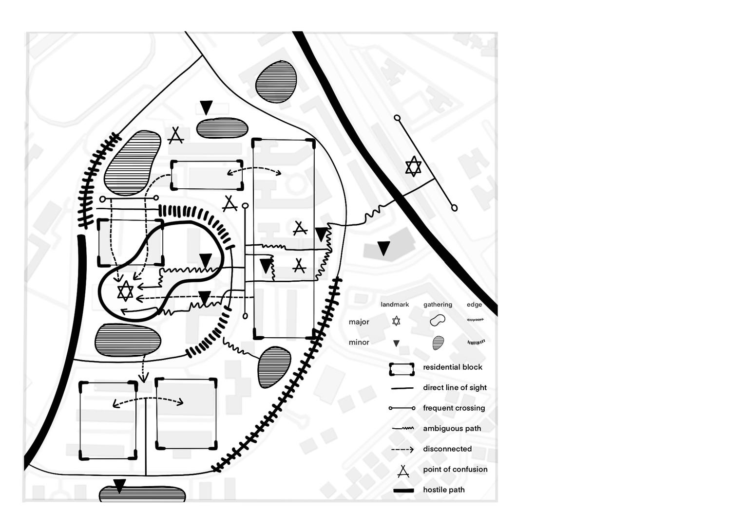
Queenstown, a mature town developed in the 1950s, currently has one of the oldest populations in Singapore, with almost 1 in every 4 residents ages 65 and above. Designed at a time when wayfinding and leisure were not priorities, it is difficult to navigate the hilly terrain as it presents many points of confusion, ambiguous paths, and disconnectedness due to the presence of indistinct and liminal spaces. For young and able-bodied residents, moving through the varying levels may be second nature, but for elderly and non-residents, this might be a challenging task.
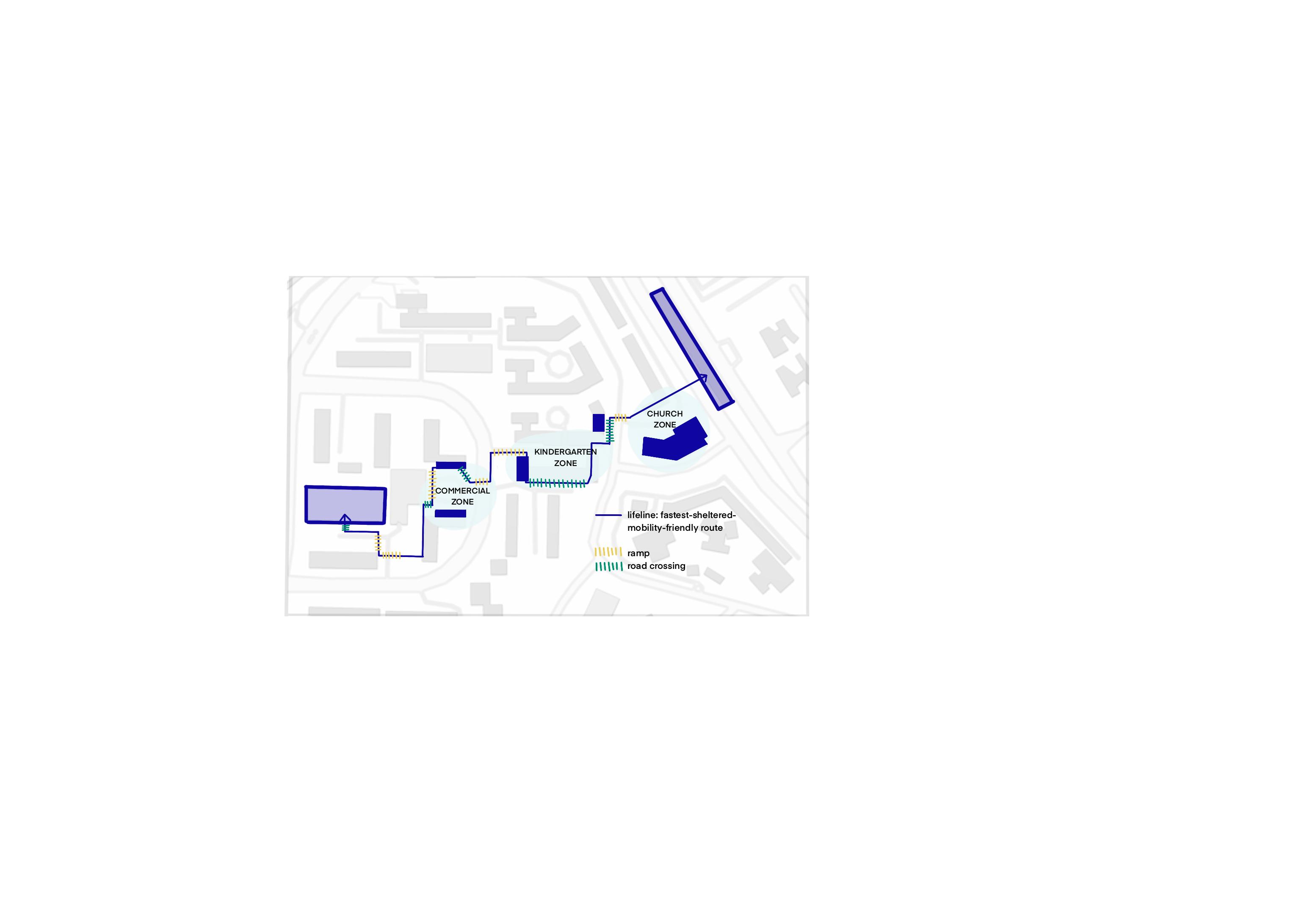
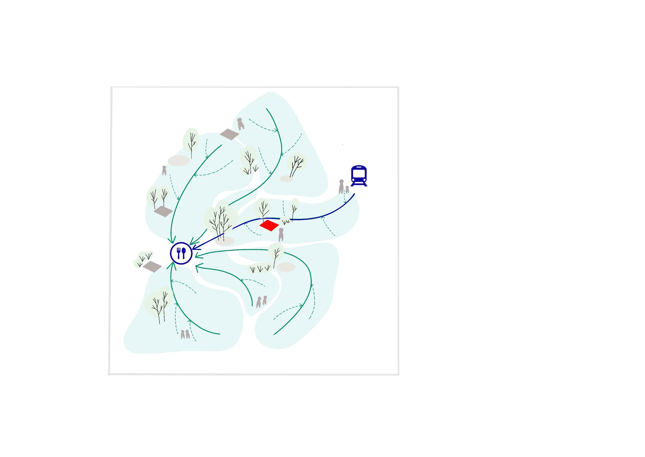
Presenting, Lifelines. Inspired by the concept of “lighthouses” and “lifebuoys”, Lifelines is a line of everyday spaces (lifebuoys) that connect major landmarks (lighthouses). This project examines the shortestsheltered-most mobility-friendly route from Queenstown MRT to Meiling Market & Food Centre and uses existing landmarks along the periphery of this route to provide orientation cues and memorable locations to improve user journey and wayfinding.
The design strategy for Lifelines consists of establishing zones (church zone, kindergarten zone, commercial zone) using notable landmarks like the True Way Presbyterian Church, Top Marks Student Centre, and first-floor commercial shops near Block 157A MSCP, extending the zone of influence by borrowing existing programmes or creating new identities, strengthening indistinct spaces, and minimising impact of places of confusion and ambiguity.
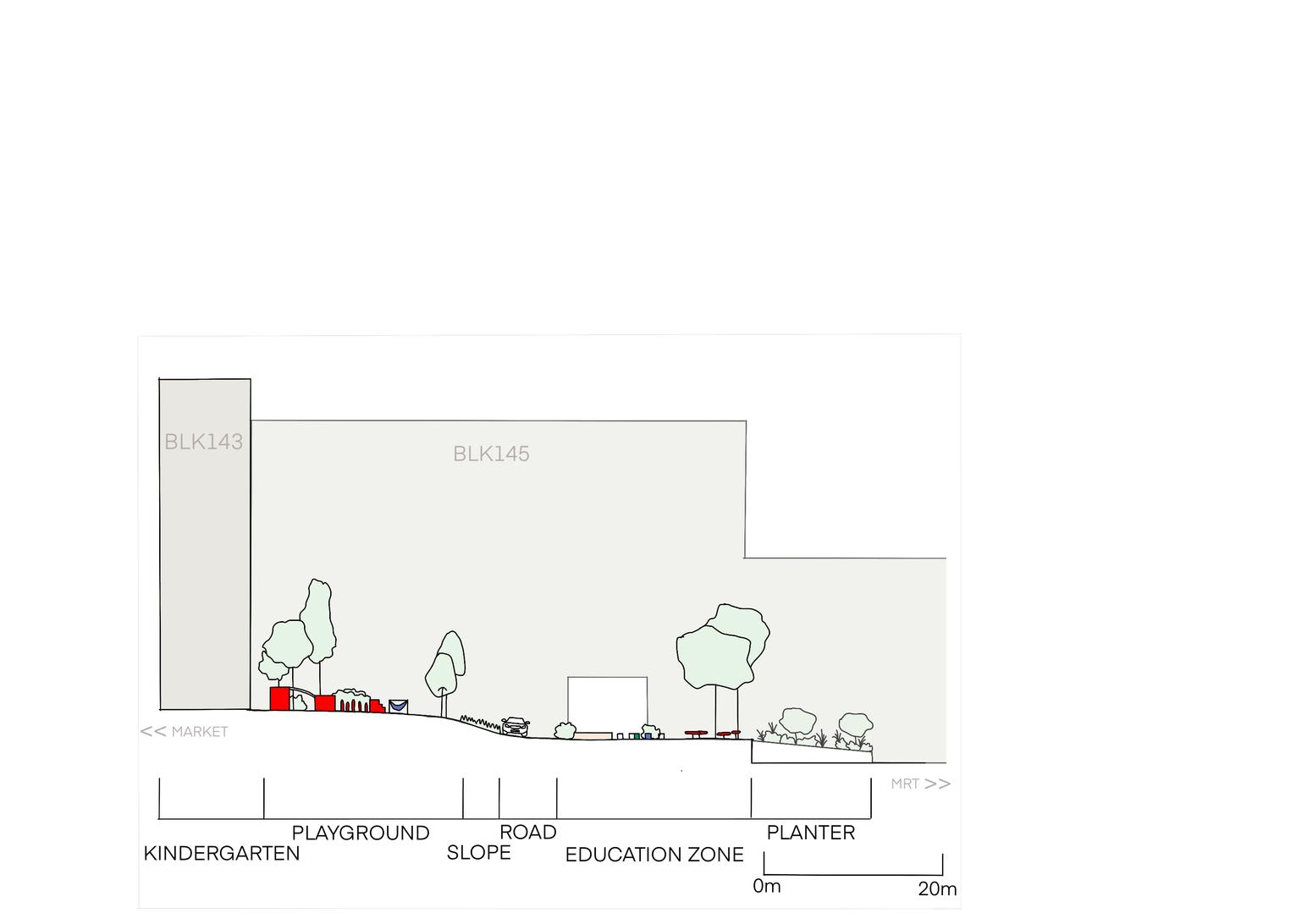
Focusing on a site within the kindergarten zone wedged between Block 143 and 145, the new design creates a new identity, from once an empty bricktiled service and drop-off point, to a vibrant and inclusive space where children can play, learn, and engage with the community. The strengthened Lifeline link not only improves wayfinding but also fosters social connections and enriches the overall neighbourhood experience for people of all ages.
74
LA
,
Gan
Semester 2

Cognitive mapping of site
Cognitive mapping highlights the major and minor landmarks and shows the presence of multiple points of confusion, ambiguous paths, and disconnectedness.

The zoning of landmarks along the periphery of the Lifeline shows three distinct spaces that could be strengthened as “lifebuoys” to improve the route’s directional pull
Diagram of existing zones along the periphery of the Lifeline
of design strategy

Establishing zones using existing landmarks, extending their zone of influence, and strengthening indistinct spaces to reduce the impact of points of confusion or ambiguity Ultimately, creating memorable spaces as orientation cues to improve user journey to and from major landmarks
Diagram
Concept map of multiple Lifelines

Concept of establishing and extending zones and their influence can be replicated throughout desired area to connect new and existing functions .
78

Plan and elevation

79


Playground and educational zone


81
Model images
Universal Trails
Jonald Khaw
The Universal Trail is crafted with the dual purpose of fostering local wayfinding ease while extending a welcoming embrace to visitors from diverse backgrounds. This project epitomizes inclusivity and accessibility, with a primary focus on enhancing the lives of local residents while seamlessly integrating wheelchair users into the community fabric.
Within the vibrant local community, the Trail seeks to accentuate key aspects of the neighborhood, elevating the experiences created by them, for them. In this regard, existing spaces so cherished by the community are largely left untouched, while instead, new spaces previously inaccessible now reveal themselves.
Beyond serving as a lifeline for locals, the Trail also extends its reach to embrace outsiders, beckoning them into the heart of the community and connecting all that is Mei Ling to the outside world. Crucially, the Trail is also designed to be fully accessible, accommodating individuals of all abilities, including wheelchair users. This was done through careful and mindful planning, allowing the trail to have zero road crossings or stairs and its slopes to be no steeper than 1:15 at all times.
By foot or train, bicycle or wheelchair, Mei Ling Street welcomes all.
82

Mapping of wheelchair user’s area of movement
Our initial step was to attempt to understand how wheelchair-bound users navigated the site. This map shows the distance and paths they can take within 5 minutes from the bus stops. The green sections are flat, yellow with slopes between 1:16 and 1:12 and red being steeper than 1:12.
83

Initial mapping of all pathways, elevators, important areas and inlets to the site
The main mapping here is the overall path mapping in blue. This was done on site by observing where people were and the directions they were walking. This was done over 2 seperate occaions. This map was the foundation upon which the Trail was built.
84

Initial mapping of all trees on site
As a planting design is one design strategy I was employing, this map was crucial in helping me better understand and emphasise the areas that were more open and those that were more sheltered.
85

Final design plan
Source: Code on Accessibility in the built environment 2013 https://friendlybuildings.bca.gov.sg/industry-professional-ud-code-on-accessibility
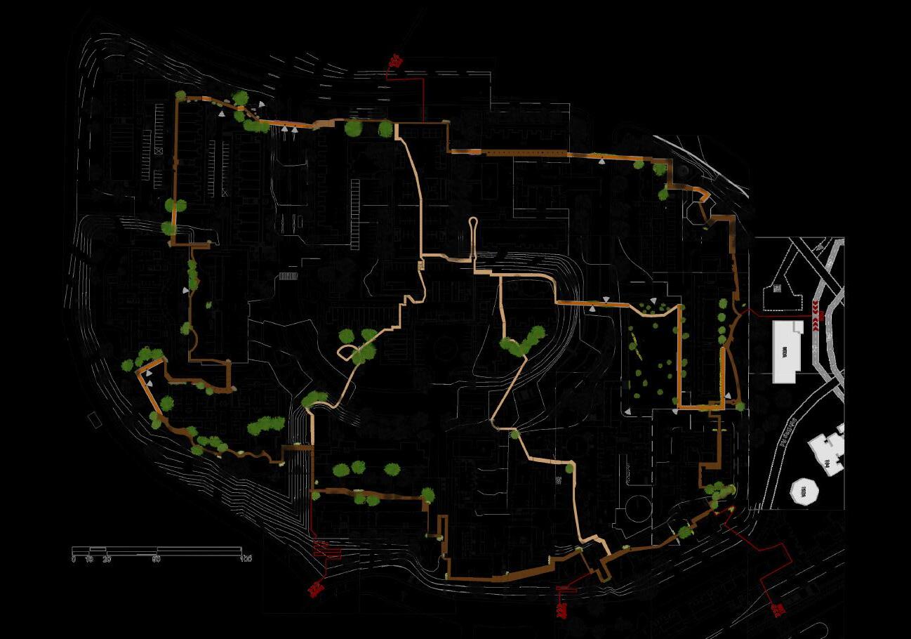
My final design features 2 pathways, the 1.6KM primary pathway in darker brown and the secondary pathways in lighter brown. As stated in the initial abstract, there are no road crossings or stairs along the pathways, and its slopes are no steeper than 1:15. The pathway also features bridges and tunnels, and connects all key locations and inlets.
86

Long section through the primary pathway
This long section showcases the experience one could have as they traverse through the primary pathway. Each row (left to right) measures about 120 meters. Depicted here are the full range of users, from local residents going about thier daily lives to outsiders exploring Mei Ling Street
87


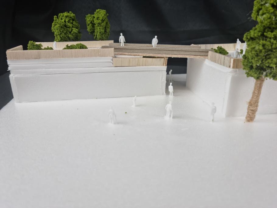
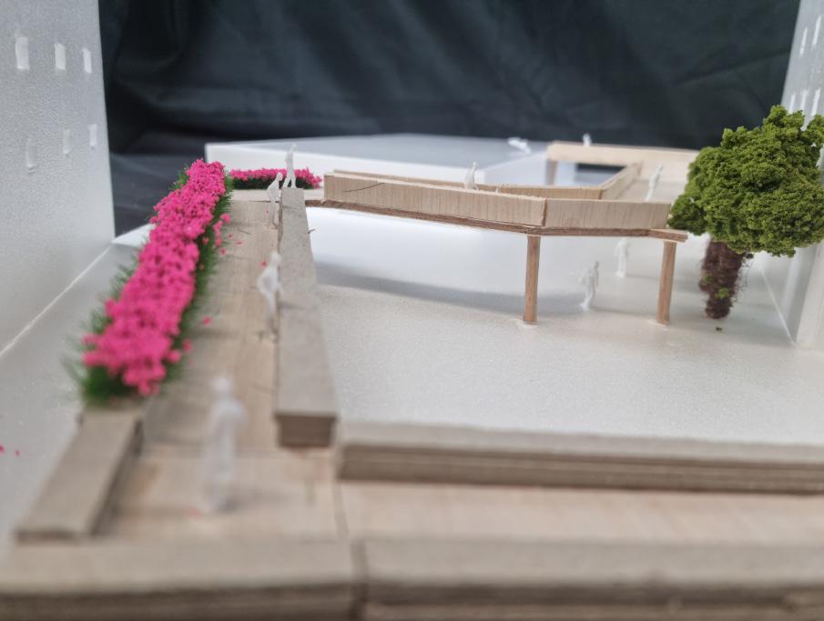
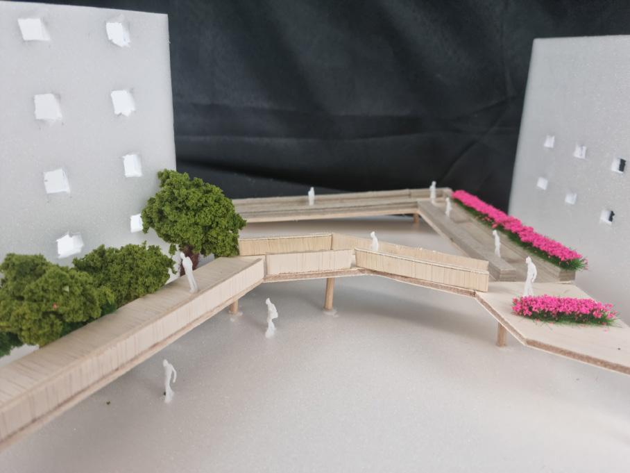
The bridges here connect the primary path to the rooftops of 2 utility buildings, before crossing the road. The left shows the perspective of someone walking on the rooftops while the right shows how the people on the Trail may interact with the local community moving along below.
88
Model of bridges across utility buildings


Model of a bridge to the top of a covered linkway
This bridge brings users to the top of a covered linkway before reaching the rooftop of a carpark. The left shows the perspective of someone on the bridge, while the right shows how they coexist with locals on the ground level. Here we can see how the planting design forms visual barriers to protect the privacy of residents in the nearby buildings.
89
<Source: If used>
Nodesway In Mei Ling Street
Living With Visually Impairment
Ng Jun Hao
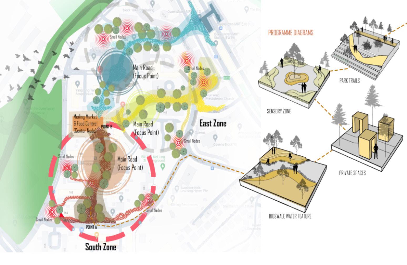
“The Landscape Design Project on Queenstown Meiling Street aims to enhance the urban streetscape for the local community, with a keen focus on inclusivity for the elderly and visually impaired adults. This initiative seeks to transcend traditional wayfinding solutions by integrating tactile pathways, auditory cues, and distinctively textured zones to aid navigation and ensure safe, comfortable movement through urban spaces. Central to the project’s vision is the creation of a series of interconnected spaces that are not only functional but also enriching for all users. These include park trails that encourage exploration and physical activity, bioswale water features that contribute to sustainable urban drainage while offering sensory experiences, private areas for contemplation and rest, and a sensory zone designed to stimulate the senses and enhance environmental perception. A unique aspect of the design strategy involves the innovative use of historical materials—specifically, repurposed bricks and colors from existing Housing Development Board (HDB) buildings—integrated into gabion cages. This method not only serves an aesthetic purpose by reflecting the rich historical tapestry of Meiling Street but also embeds a sense of place and continuity within the urban fabric. The project emphasizes sustainable design principles, community engagement, and the importance of creating inclusive environments that cater to the needs of minority groups. Through its comprehensive approach to landscape design, the project not only addresses the practical needs of visually impaired and elderly community members but also enhances the overall quality of urban life, fostering a sense of belonging and community. It stands as a testament to the power of thoughtful, inclusive design in transforming public spaces into accessible, enjoyable, and meaningful environments for all.”
90


Conceptualize Master Plan and Program on Site
Visually impaired individuals, whether elderly or young adults face unique challenges that can significantly affect their quality of life. In Singapore, including areas like Mei Ling Street, efforts are typically made to support such individuals through various services and infrastructure improvements. Through the master plan level of a design study proposing 3 zone strategies to tackle the needs of the minority, but also still accommodate the local community. Varie activities are recommended to be included in the design shown in the diagrams.
91
SITE


Site Boundary and Location Map at Mei Ling
Project Site Mei Ling Street
Mapping Scale: 1:1500
The Project site area is located at Queenstown Mei Ling Street Estate. Highlighted in the red dotted line are the boundary of the project focusing area. The nearest checkpoint is the Queenstown MRT station.
92
Queenstown MRT Station


Design Detail Plan
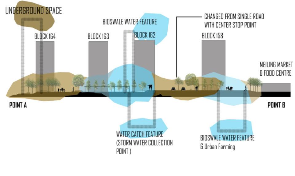
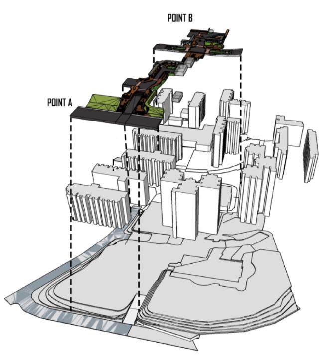
The design detail plan shows how space within space in the neighborhood is designed to provide wayfinding to points A to B while still being able to enjoy the journey of experience.
93
Floor Plan Scale: 1:700
Design Location: South Zone
Point A Main Road
Point B Mei Ling Market & Food Centre
Ideation Design Section


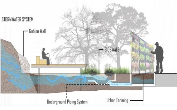
Stormwater System Detail Section
Ideation Design, Stormwater System Section and Isometric

Design Isometric
The design sections and isometric show the intention of providing a design experience through space and identifying the site context in a coherent.
94


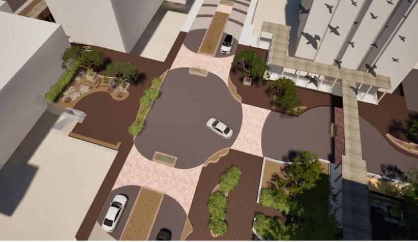
Design Perspective Views
Design Perspective Views show the integration of materiality and spatiality to how it changes the environment through user experience.
Road Warning System
Bioswale Water Feature & Stromwater System


Design Perspective Views
Design Perspective Views show the integration of materiality and spatiality to how it changes the environment through user experience.
96
Shelter Walkway
Stormwater Collection Area

Physical Models can demonstrate in a physical and textual way able to mimic the actual design creation to achieve the desired results of the design intention.
97
Model Scale: 1:200
Physical Model
Community Outwards
Lee
Focused on Queenstown’s Meiling Street, where 1 in 5 residents are over 65, with 1 in 10 above 60 experiencing dementia, my design targets mildly dementia-affected elderly. My design aims to challenge stereotypes about dementia by empowering the elderly and educating the public.
I chose to focus on the area between Meiling Market and Food Center and Queenstown MRT because of their high usage as a transitional zone, being the two main landmarks from my analysis. From these, I decided to zoom into the garden between Blk 147 and Blk 146.
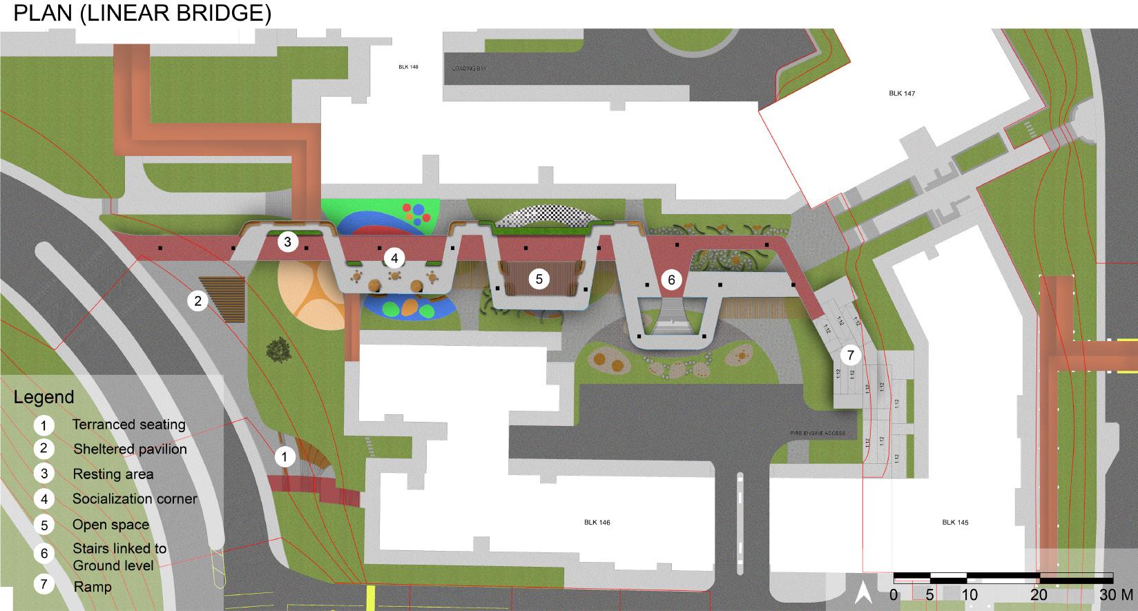
My design is split into two sections. The first, the dementia-friendly linear bridge, is an iconic space that offers a safe and engaging environment for purposeful activities, enhancing the mental mapping of the elderly and aiding in navigation. This is crucial for the elderly experiencing cognitive challenges as it enhances their levels of independence and confidence in navigating their surroundings.
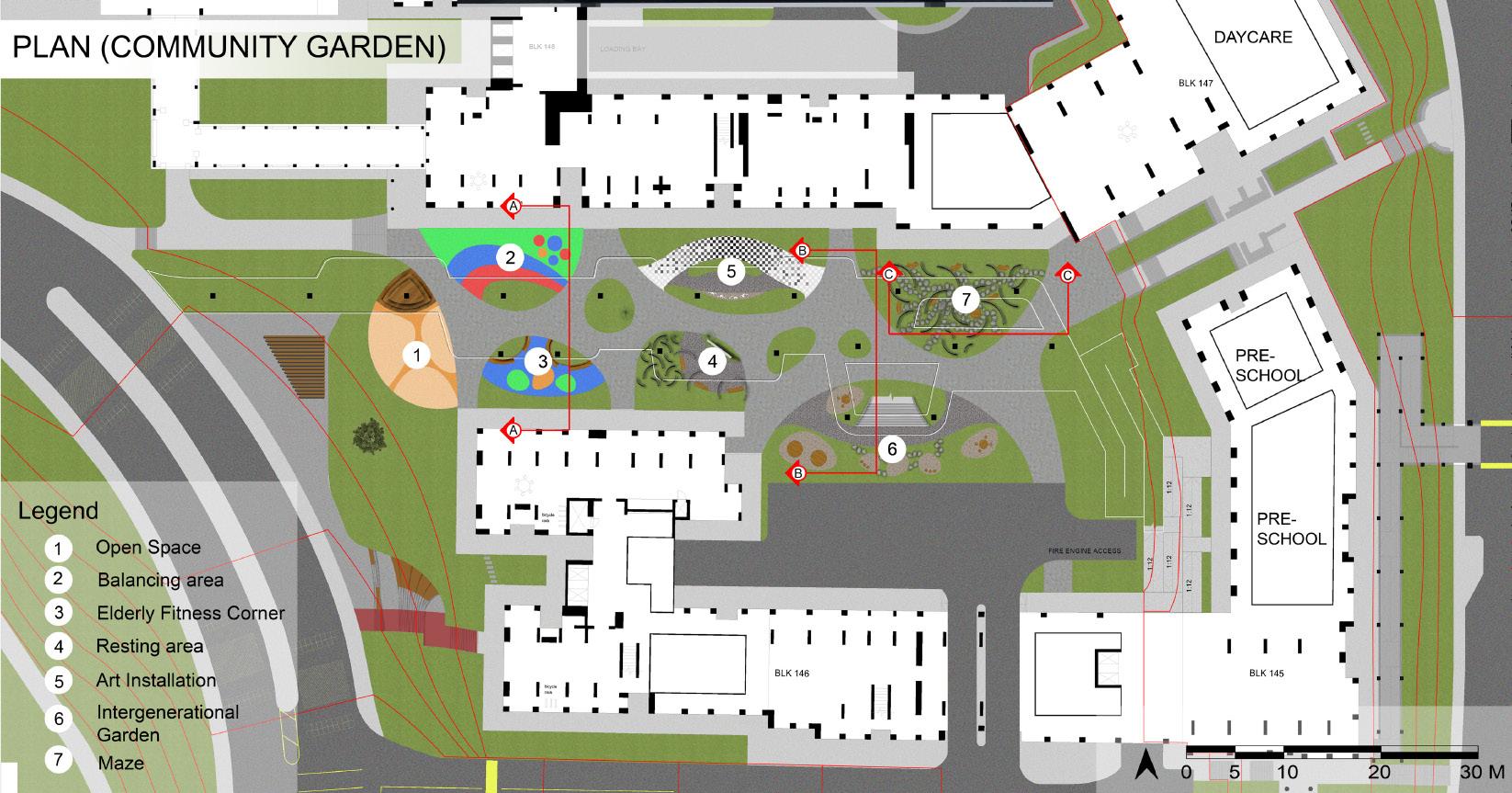
The second section, the community garden, provides an experiential jour¬ney for all users, fostering empathy through sensory experiences simulating challenges faced by the elderly. Play and art installations represent symptoms, with signboards explaining their significance. Within this community garden, the elderly are also engaged through spaces and programs designed to foster intergenerational bonding.
Through thoughtful programming and inclusive design, the project aims to empower the elderly, offering safety, choice, and meaningful engagement in their community.
98
Huei Min

Site Analysis
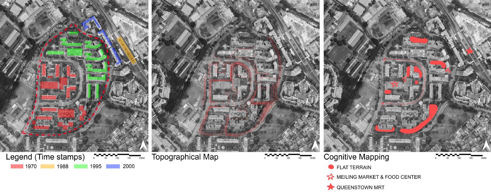
So meliling street, Queenstown was built during 2 time periods mainly 1970 and 1995, possibly resulting in the segregated site circulation for human and traffic, making the site hard for navigate. This is in addition to the naturally hilly terrain of the site as seen in the topographic analysis of the site. From the cognitive analysis, I’ve identified the landmarks in the landscape and areas with flat terrain to implement my design.
99


Design Process and Design Concept
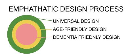
My targeted users are mild dementia patients. From an inclusivity standpoint, we understand that dementia-friendly design incorporates guidelines from both universal and age-friendly design. Dementia-friendly design adds an additional layer to this by considering the challenges faced by people living with dementia, including cognitive considerations, sensory stimulation, and physical abilities and limitations.
100

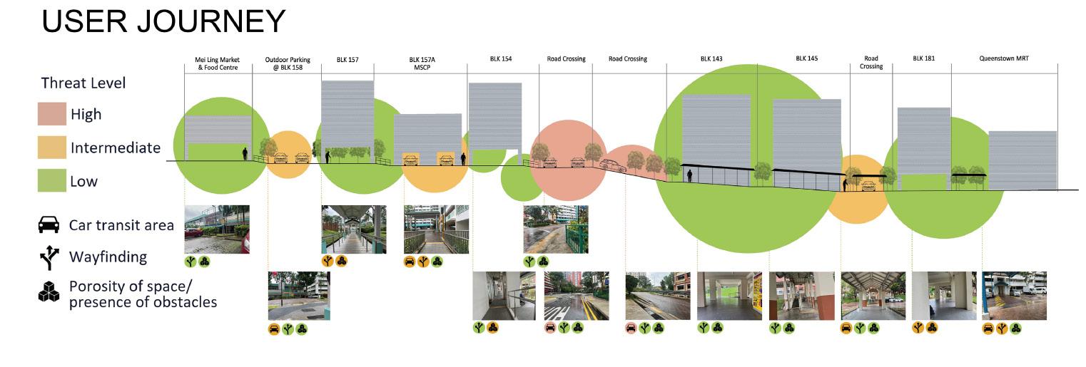
In this user journey, we are able to see the risk of the path taken from meiling market and food centre to Queenstown MRT. The overall risk levels of each transition zone are accessed, with further analysis of risk in these 3 categories: car transit area, wayfinding and porosity of spaces.
101
Diagram of User Journey from Mei Ling Market & Food Center to Queenstown MRT

The linear bridge is meant be an iconic landmark to serve as a bridge between Queenstown MRT and Mei Ling Market and Food Center. A ramp of gradient 1:12 is connected from Blk 145 void deck at a GL 12.0 to GL 14.0, where it will be link to the community garden. Continuing the jouney up the ramp, users will find themselves at GL 17.0 where the linear bridge is. The linear bridge is a straight linear path that links to the road crossing that leads to Mei Ling Market and Food Center.
102
Plan View of Linear Bridge

The comminity garden is built upon an exsisting garden on site, catering for children. Due to the presence of exsisting preschools located around my focal area, I have decided to create a community garden to cater to all users and allow intergenerational bonding within my design. The play and art installations are not suitable for the elderly as they might be over simulative or be a threat to them, to counter that, I created observation zones where the elderly will be able to observe from safely.
103
Plan View of Community Garden

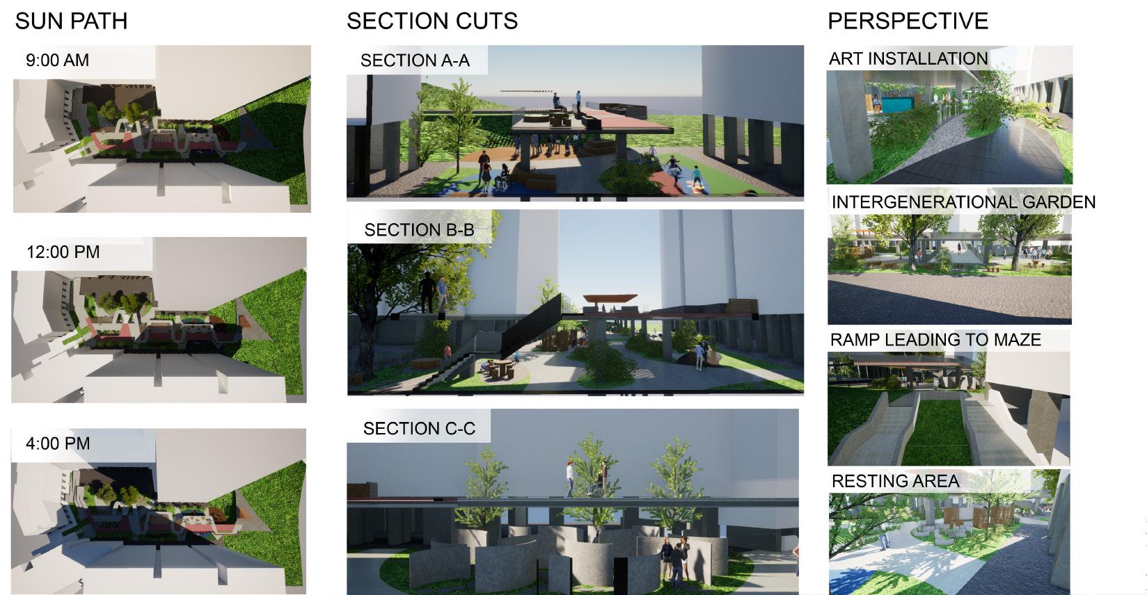
Sun Path/ Section Cuts/ Perspective views of spaces
104

105
Perspective Views of Linear Bridge
Nexus: Rejuvenate Mei Ling
Neighbourhood Centre
Live, Learn, Play, Move: A Thriving
Neighbourhood Centre
Ong Qin Hui
The vision is to create a vibrant and active community centre that promotes a strong sense of belonging and well-being for all residents, regardless of age and mobility. The aim is to transform the centre by integrating the backyard landscapes into a multi-functional space that fosters intergenerational and multigenerational connections, thereby creating a sense of community and connection among residents, while also providing convenient access to alternative routes to the market.
In the future, multiple active ageing centres can be strategically established at different blocks throughout the neighbourhood, each with its own sole purpose. This will encourage seniors to engage with their community, promoting physical and mental well-being. The centres will offer a diverse range of activities and programs, including fitness classes, art workshops, and community events, catering to the varied interests and needs of the community.
To further promote connectivity and accessibility, several empty commercial units on the ground level will be converted into a linkway, allowing residents to move easily between the front and backyard landscapes and to the Mei Ling Market. The Mei Chin Road will be transformed into a pedestrian boulevard, serving the future residents, with seasonal programs and events planned by the residents of Mei Ling. This will create a sense of belonging and encourage residents to explore their surroundings.
The new landscape elements will also serve as wayfinding tools, providing a sense of familiarity and orientation for residents. The vision of this rejuvenation project is to create a thriving community town centre where residents of all ages can live, learn, play, and move. A place where they can build relationships, pursue their interests, and feel a strong sense of belonging and purpose. By fostering a culture of community and inclusivity, Mei Ling Neighbourhood Centre will become a vibrant hub of activity and a source of pride for all its residents.
106

Lorem ipsum dolor sit amet, consectetur adipiscing elit. Nam hendrerit nisi sed sollicitudin pellentesque. Nunc posuere purus rhoncus pulvinar aliquam. Ut aliquet tristique nisl vitae volutpat. Nulla aliquet porttitor venenatis. Donec a dui et dui fringilla consectetur id nec massa. Aliquam erat volutpat. Sed ut dui ut lacus dictum fermentum vel tincidunt neque.
107
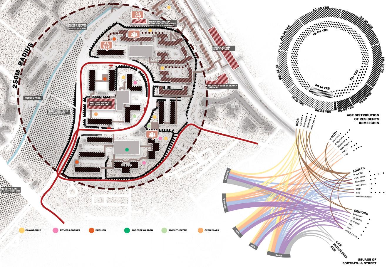
Diagram of Mei Ling Site and Demographic Profiles

Ground Floor Plan of Mei Ling Neighbourhood
Centre & Circulation Route
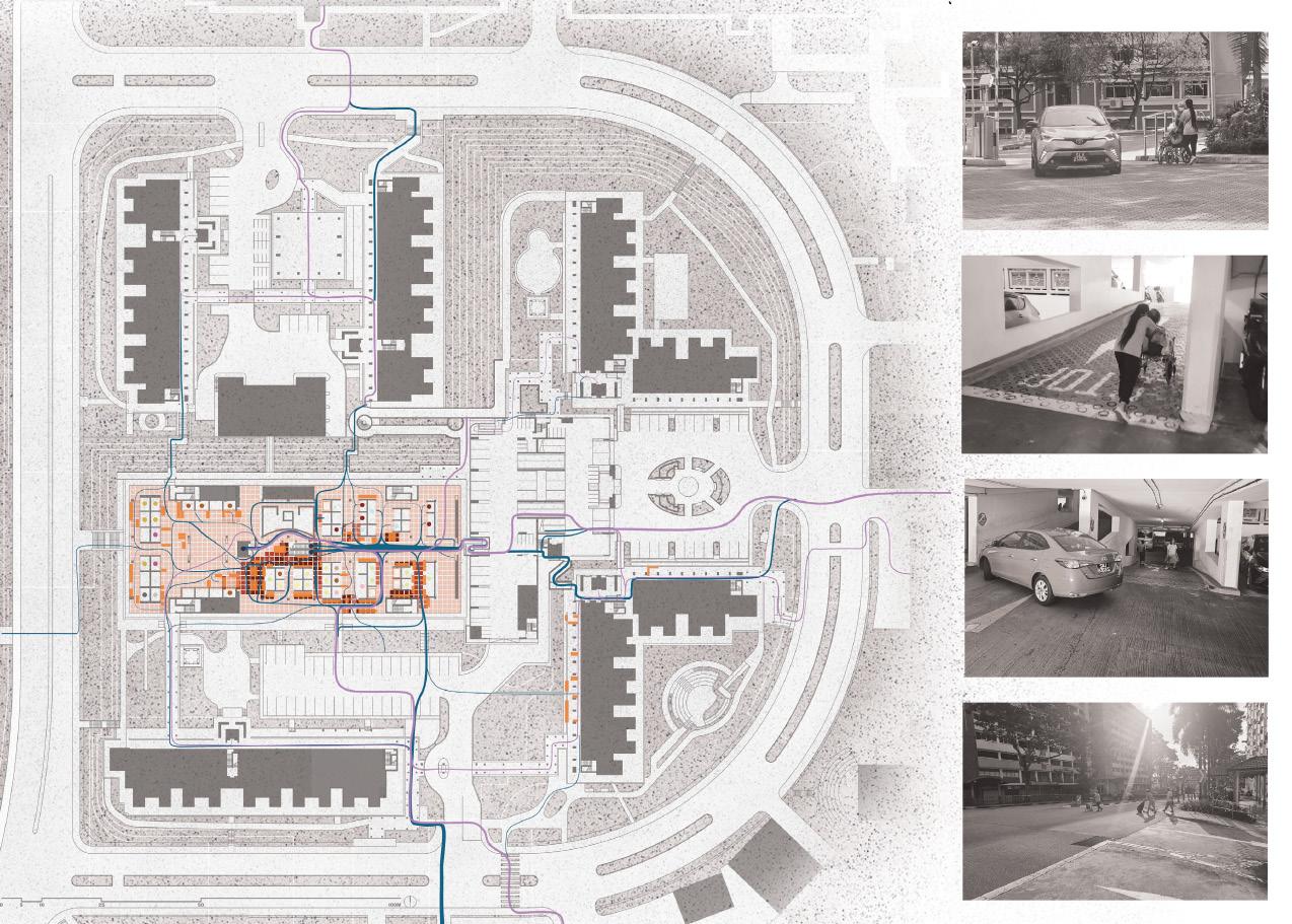
Residents’ commuting behaviors and movement patterns reveal their needs and challenges. The study found that wheelchair users with caretakers uses the multistorey carpark ramp to get to the market faster, despite the danger of blind spots. Shopowners displayed goods onto the walkway, adding width restrictions for users on mobility devices, causing them to take alternative routes. Residents also jaywalk across the street despite proper zebra crossings being provided, but requiring additional distance to use them. These behaviors inform the design interventions to improve the neighborhood centre’s accessibility.
108

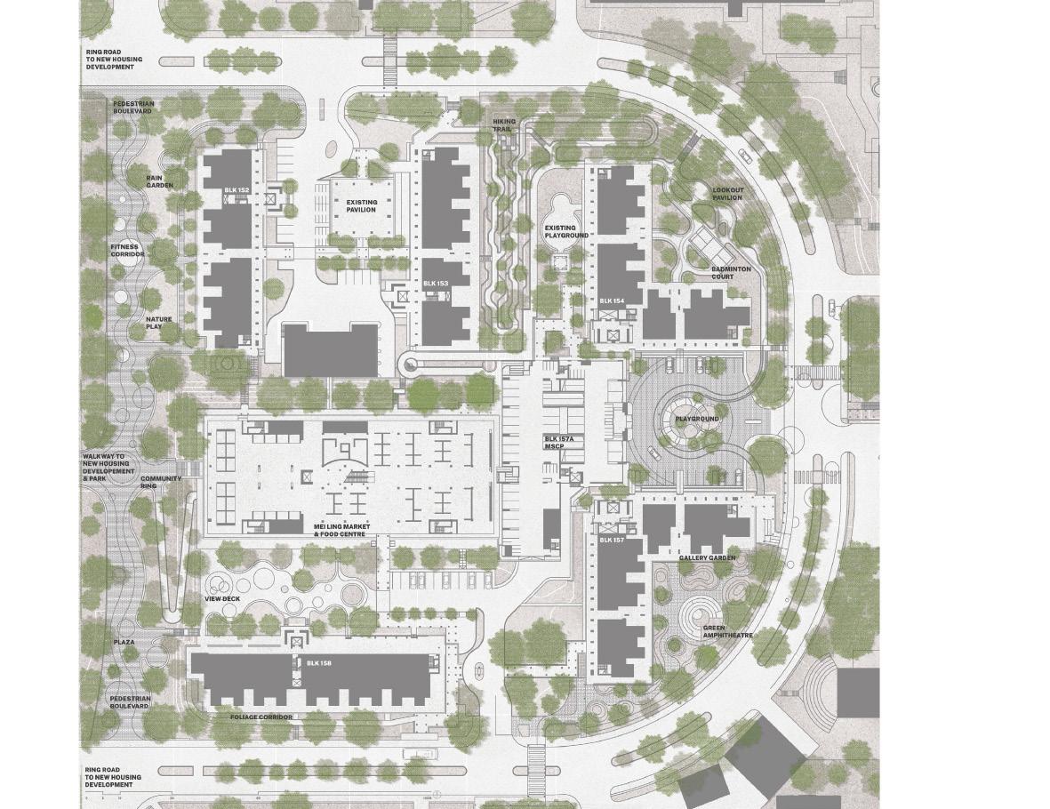
Proposed Mei Ling Neighbourhood Centre Master Plan

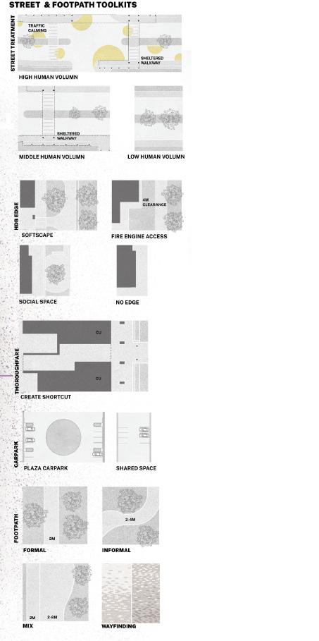
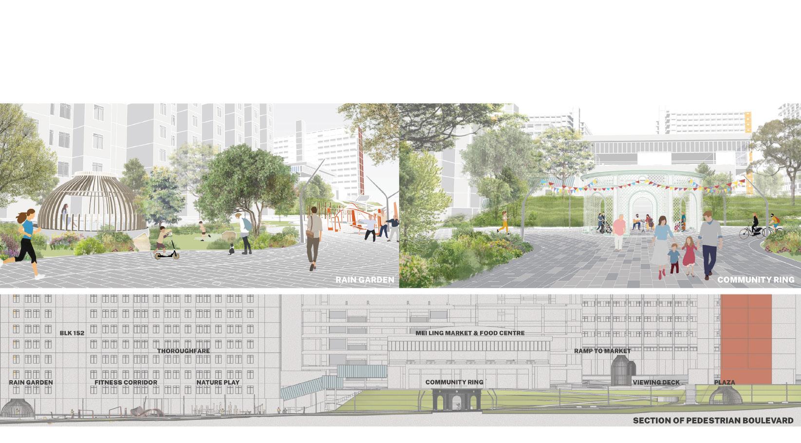
The rejuvenation of Mei Ling Neighbourhood Centre is divided into two phases. The first phase focuses on revamping the accessibility route of the older estates and enhancing the quality of the backyard landscapes. The second phase, which will take place in conjunction with new housing developments, aims to transform Mei Chin Road into a pedestrian boulevard featuring community programs and activities. The design will incorporate various street and footpath typologies to accommodate diverse human traffic flow.
109

Zoom In Focus Area Layout Plan
The carpark’s brick materials will be replaced with smoother tiles to improve accessibility for wheeled devices. Ramps will be installed at the center point to facilitate easy access to the linkway leading to the backyard garden and to bypass tight spaces along the walkway to the market. Each garden will have its own distinctive materials and placementvvv to serve as landmarks for wayfinding.
110

Carpark Plaza
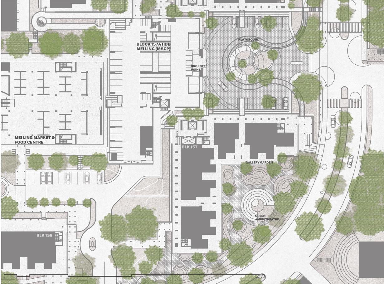
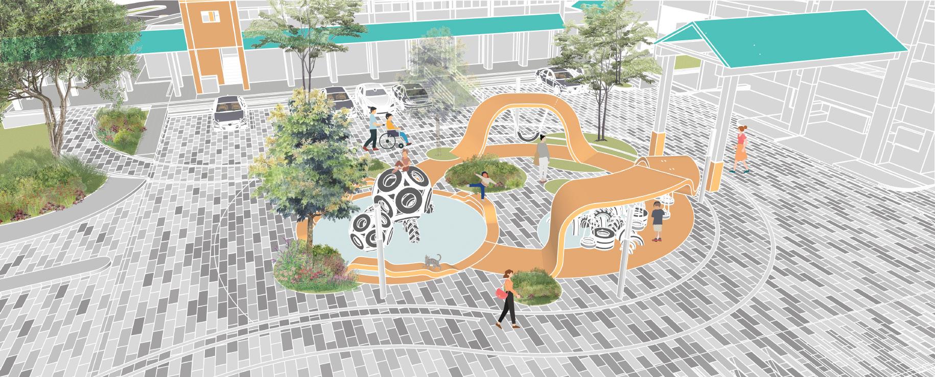
The playground serves as a navigation and social activity within the estate, while the pedestrianized carpark provides a versatile space for residents to convene and foster a sense of community. By occasionally closing the carpark for small to medium-sized gatherings, residents can utilize the space for various functions, such as community events, or festivals, further enhancing the liveliness and sense of connection within the estate.

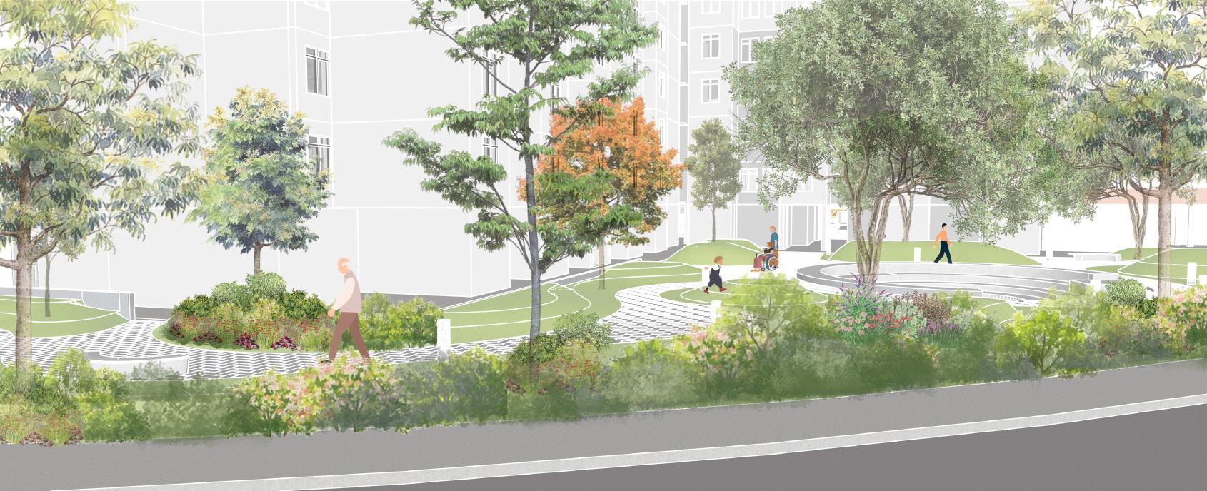
The existing amphitheatre has been transformed into a vibrant blue-green amphitheatre, complete with a water retention system at the bottom stage that flows into a nearby open canal. The surrounding garden serves as an outdoor art studio and therapeutic garden, where seniors from the Active Ageing Centre (AAC) can share and display their creative talents, and foster a sense of community and purpose.
Gallery Garden

Pedestrian Boulevard is a linear park that serves as a community gathering space, hosting seasonal events and activities that cater to new young residents and connected to the backyard garden to allow them to explore around the neighbourhood. The boulevard’s gentle gradient makes it easily accessible and walkable for people of all ages and abilities.
113
Pedestrian Boulevard
As a neighbourhood populated mainly by the elderly demographic, Mei Ling Estate in Queenstown is a home to many retired citizens. With regular visitors to the estate such as extended families and students from surrounding schools, the site possesses great opportunities for education about ageing, and understanding about how the elderly view the world.
Focusing on the persona of elderly with vision loss due to age, this design’s vision is to express the change of senses over time and ultimately create empathy and understanding towards the elderly by the general public.
The Wave
Lim Junyoung
Through site analysis, secondary research and a community workshop with the elderly, it was revealed that the elderly vision is constantly changing and adjusting to the surrounding stimuli. This unique change in vision naturally causes them to rely more on their other senses, such as hearing and touch¬ing.
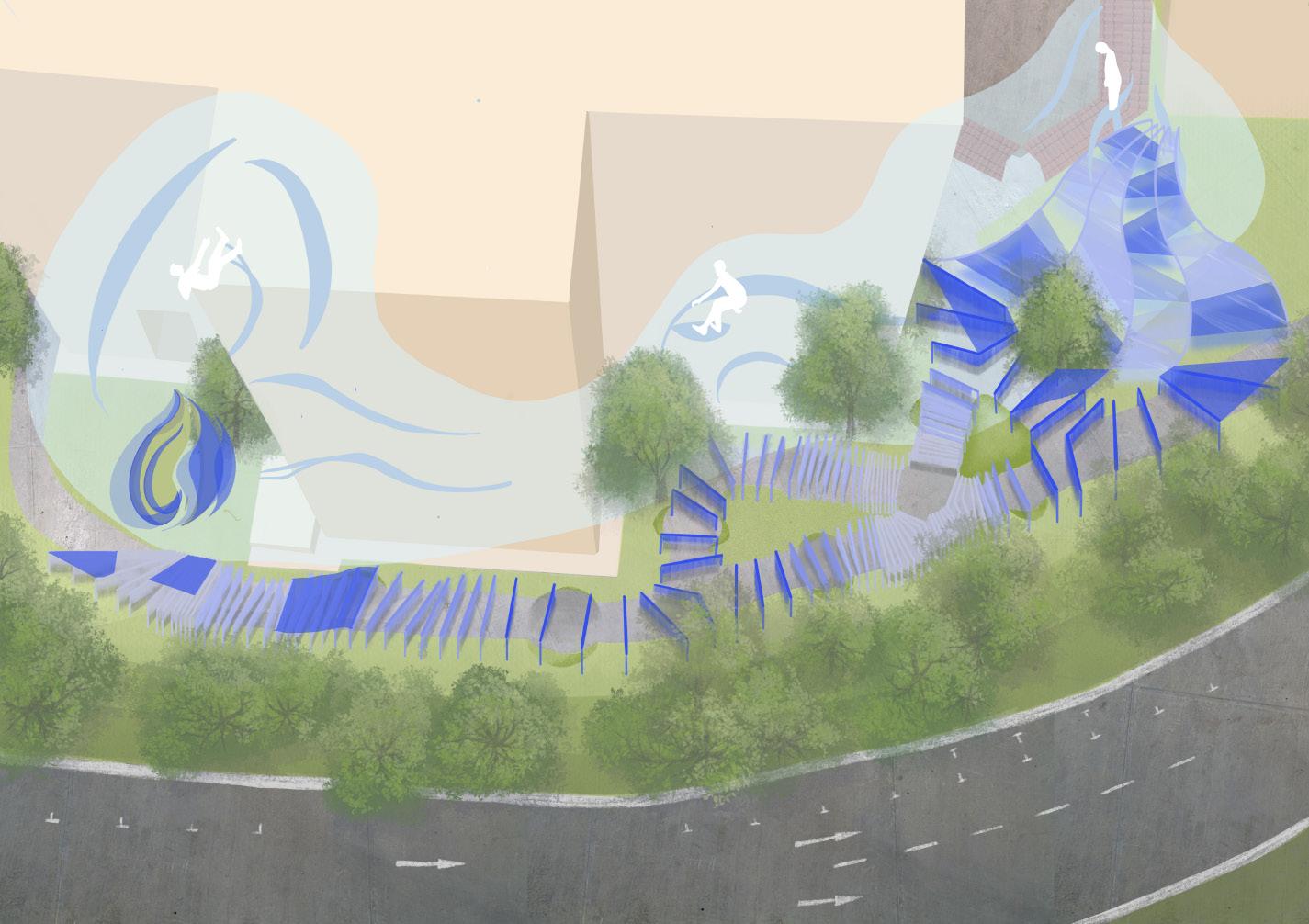
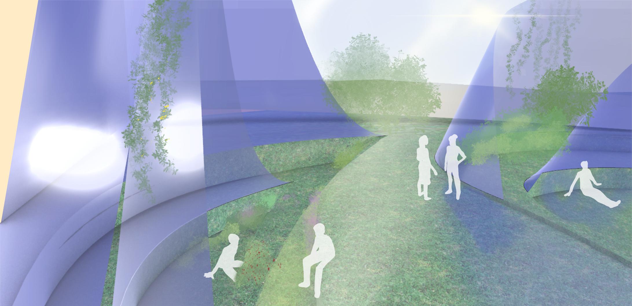
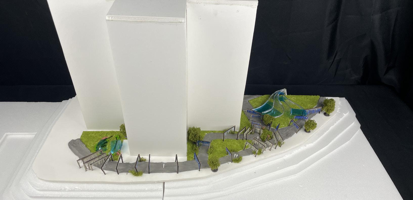
The Wave, with a general motif of waves representing the constantly shifting nature of elderly vision, incorporates design strategies such as light and shadow manipulation through translucent layers, leading vision towards various angles and heights, and creating an enclosed space to emphasise the senses of touch and hearing. This new sensory experience creates spaces that have a metaphorical meaning of the ageing process, while creating a variety of insightful sensory spaces that celebrates ageing. The pleasant and aesthetic atmosphere of the space embedded in the landscape can be enjoyed while walking through the path or observing seated.
114
Concept and Isometric View Drawing

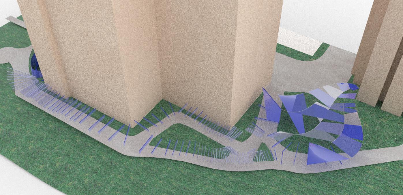
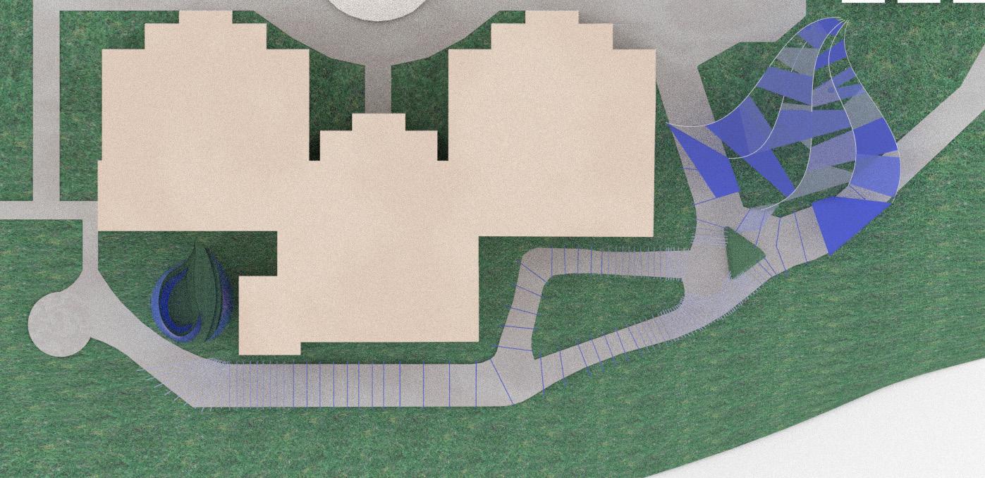
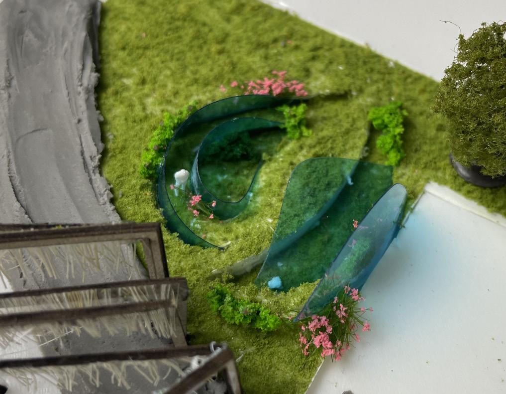
The Wave comprises of three zones: the Entrance, the Path, and the Breaking Wave. Each zone varies in depth of sensory, replicating how we view the world as we age. The Entrance brings visitors’ focus on the ‘vision’, which is the main sense most people rely on until adulthood. The Path indicates the transition from adulthood into senior years, with shifting vision through manipulation of translucent chain curtain layers, and enclosed stopping points of sensory experience that stimulates both vision and touch. The Breaking Wave encourages active exploration by the visitors, where the acrylic structure creates various perspectives and vegetation encourages the use of other senses such as touch and smell.
115

Perspective
View: The Breaking Wave
The Breaking Wave encourages active exploration by the visitors, where the acrylic structure creates sharp shadows and various width and height of paths, creating a variety of perspectives replicating the elderly’s visual perception. With various sensory plants, the zone also encourages the use of other senses such as touch and smell.
116

Isometric
View: The Entrance and The Path
The use of angles with the context of the building allows a dramatic widening visual effect from the Entrance into the journey. The structure of the Entrance is designed to be lifting towards the Path, leading the visitors’ eye further, stimulating curiosity.
117

118
Design Plan
N
Design Plan rendered on Rhinoceros.

119
Physical Model
Located on the very south of the Queenstown Mei Ling Estate, this model can be slotted inside of the 1:200 model of the whole Mei Ling Estate.


Diagram and Physical Model: The Path
The ageing vision makes it difficult for elderly to see the shade of blue, making it seem more dull over time. In the Path, this factor is played together with the density and height of chain curtain layers, making certain areas more difficult to see ahead, while others show little hindrance. THe diagram shows manipulation of vision to replicate the shifting perspective of the elderly, and the use of enclosed spaces and vegetation to initiate sensory experience using multiple senses.
120


Physical Model: The Breaking Wave
The shape of the acrylic layers itself replicates a breaking wave, creating a round and circular motion for users to explore within. The height of the acrylic layers overlook the zone, creating an enclosed feeling for users and allowing limited sunlight to shine directly. Instead, the blue coloured shadows are shed sharply on the ground, demonstrating the threat of elderly being unable to distinguish betgween a physical drop and a shadow border. Furthermore, the use of differing topography between each acrylic layer creates various perspectives for visitors to observe and interact with the vegetation.
121
Mobility Makeover
Emily Jing Jiaxin
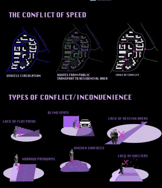
Mobility Makeover is an innovative project specifically designed to enhance mobility and improve the quality of life for elderly individuals who struggle with daily commuting challenges due to existing infrastructural barriers. Located in an area previously known only for its two-lane road, adjacent car park, and a notably steep hill, the region posed considerable risks and accessibility issues for its senior residents. The swift movement of vehicles added a layer of danger, resulting in numerous safety concerns and frequent accidents that disproportionately affected the elderly community.
The core objective of Mobility Makeover is to fundamentally transform this environment to foster better accessibility and safety, thereby promoting greater independence and well-being among the elderly. This is crucial as the existing conditions severely limit seniors’ ability to reach essential services independently, such as the main food market, public transportation options, and medical clinics. These limitations not only pose physical risks but also contribute to mental stress and isolation among elderly populations, who may feel confined to their homes due to the daunting nature of navigat¬ing their neighborhood.
To address these challenges, the project involves comprehensive planning and re-engineering of the current infrastructure. Key initiatives include the widening of roads, the introduction of pedestrian-friendly pathways, and the installation of traffic calming measures to slow down vehicle speeds in high-risk areas. Additionally, the project plans to enhance the overall landscape by implementing better lighting, clearer signage, and accessible pedestrian crossings, which are all geared towards creating a safer and more navigable environment for the elderly.
122
Diagram of Site and Site Analysis:
An analysis of the Queenstown area, focusing on vehicle circulation, pedestrian routes, and zones of conflict, requires a comprehensive approach to understanding both the current infrastructure and the behavior of its users. Conflicts and inconveniences have also been identified and taken into considerations for my design. Vehicle Circulation


123

Redesigned Topography:
Redesigning the topography of Queenstown area to include natural pathways that function as ramps for wheelchair users and the elderly requires thoughtful planning and integration with the existing landscape.
124


The Queenstown area has been thoughtfully designed to cater specifically to the mobility and social needs of elderly residents through a network of wheelchair-friendly routes. These pathways not only facilitate seamless access to essential services like the Meiling food market and Queenstown MRT station but also connect various social hubs, enhancing outdoor engagement and promoting a leisurely, mindful pace of life.
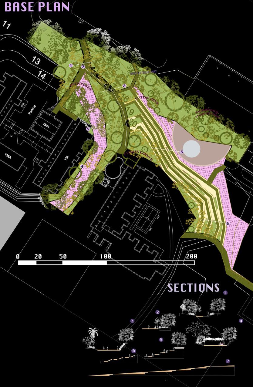
Central to this design is the inclusion of an open-air amphitheater that integrates with the natural topography, leading down to an artificial lake similar to the serene settings of botanical gardens. This setup not only enhances the landscape’s beauty but also cleverly incorporates a natural drainage system that directs water from higher elevations to the lake, ensuring efficiency and aesthetic appeal.
The area is divided into zones that cater to different needs, providing tranquil spots for solitude and more active areas that encourage intergenerational interactions. These include fitness corners and walking paths near playgrounds, which help foster connections between the elderly and younger generations. Such strategic placements of amenities aim to cultivate a strong sense of community and inclusivity.
Additionally, the pathways are lined with a variety of tree species, creating shaded, sheltered walkways that not only offer directional guidance and reduce noise but also break large open areas into more navigable sections. These treelined paths provide both a physical and sensory barrier, offering safe, comfortable, and engaging outdoor experiences.
125
Guiding Routes
Recreational zones
Guiding Routes
Open Amphitheater


126 SOCIAL HUB


127 Individual Works SOCIAL HUB
The Outdoor Living Room
Creating Vibrant Social Space for Seniors
Arya Muthukumar
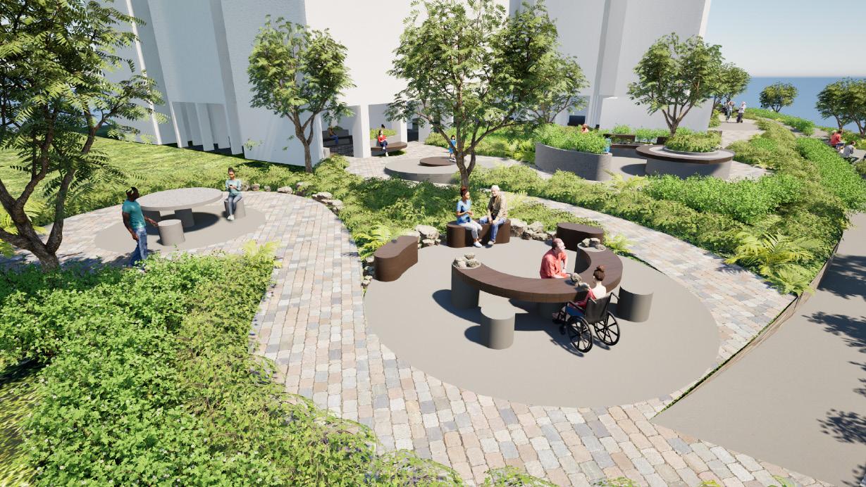
The Outdoor Living Room is designed as a communal area for elderly residents of Mei Ling Estate to engage in daily activities while fostering social connections. By promoting increased interaction and introducing new social initiatives, it aims to inspire seniors to lead more active lives, both mentally and physically, enhancing the quality of their retirement years. Located at the heart of community, the chosen outdoor carpark blossoms into a bustling hub of life, a gathering spot where neighbors can come together, share stories, and create memories. The heartwarming sight of elderly residents, once isolated and lonely, now finding companionship and purpose in the vibrant community space, becomes a beacon of hope and unity - a testament to the transformative power of community. With each passing day, friendships blossom, and bonds grow stronger, weaving a tapestry of connection that unites neighbors.
128

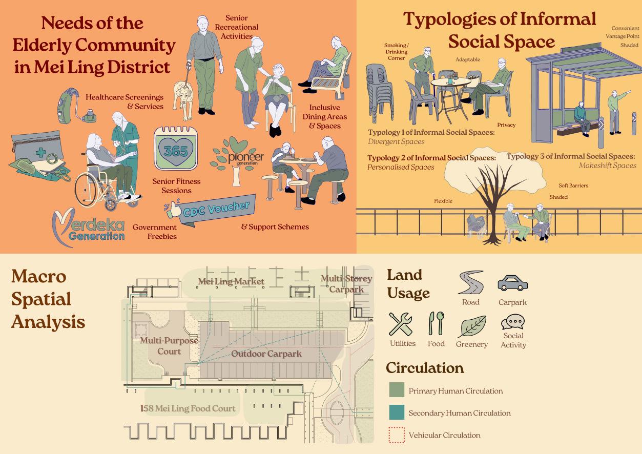
Analysis of Mei Ling Estate: Needs of Elderly Community, Typologies of Informal Social Space, Macro Spatial Analysis
Within Mei Ling Estate, there is the occurrence of many informal social spaces. These informal spaces have been categorized into 3 typologies according to their characteristics and nature of emergence. Alongside this, the community engagement at Queenstown Library gave evidence to the immediate needs of the able-bodied elderly around Queenstown. With these aspects including my spatial analysis, my design centers around drawing in passersby to create a community through a community hub, that will facilitate programmes for bonding and social interaction.
129

Proposed
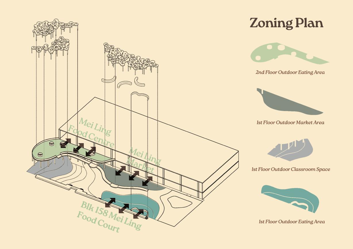
Design Hardscape and Zoning Plan
Zoning through hardscape flooring, colors and elevation has been decided upon in regards to indoor periphery land use for function spillover. As such, the previous car park and multipurpose court space has been transformed into a community hub to accommodate for this new design. EPDM flooring with different colors of yellow, orange and red are utilized to softly demarcate the different zones with circulation pathways. A bridge and ramp has also been added to improve vertical circulation and accessibility.
130

Softscape Design Function and Detailing
Besides aesthetic value, softscape has been integrated into my design for 3 additional purposes. Firstly, as a natural shading to create juxtaposition from the trellis pavilions. Secondly, as a wayfinding method and accent piece at the entrance of the design - beside Blk 158 leading from Mei Ling Street. This curates a pleasant experience when a user enters the site, welcoming them into the new landmark of Mei Ling Estate.
131

Trellis Pavillion Structure Detailing
The main source of shelter and shade in this design is the trellis pavilion. Inspired by the characteristics of a tree, I took aspects favored by informal space to create a site furnishing that will not only protect users below from rain or shine, but also provide privacy from the onlooking neighbors living in the HDBs above. An embedded garden programme is meant to soften and add greenery to the facade, while intertwining community participation.
132

The first section highlights the rationale behind the zoning plan and the need for a hierarchical layout to accommodate for the chosen activities. The second section demonstrates that the introverted space, envisioned to host activities including morning exercise and the outdoor classroom, is placed at the end of the design. This abides by the living room concept whereby the introverted private space is found in the nooks and crannies of a room.
133
Sections

Proposed Programmes and Activities
With the 4 main zones created in my design, allow said activities to take place in more conducive social space that inspire interaction. The proposed learning activities on site will be held in partnership with government schemes such as Queenstown Community Centre and Lions Befrienders, for Mei Ling Residents to have better accessibility to their existing programmes. The embedded community garden programme works in conjunction with the trellis pavilion structures, reinventing a typical community garden to instead add to facades and structures.
134

Day in the Life of a Mei Ling Resident
With The Outdoor Living Room, Mei Ling Residents will now be able to go about their daily normal routine in a new energized space alongside neighbors, forging new friendships and staying mentally and physically active. From morning Tai Chi to a breakfast Kaya Toast outdoor with friends under chirping birds perched on a tree, to an afternoon lesson on digital literacy and finally an outdoor dinner with their loved ones overlooking the sunset, Mei Ling residents will be able to live out their retirement years meaningfully.
135
The Observer’s Oasis
Calyn Chia Xin Mei
This project delved into understanding the behaviors and needs of active retired elderly men, shedding light on their desire for independence alongside a need for social interaction and physical activity. However, it observed their tendency to steer clear of crowded environments and social gatherings, potentially leading to feelings of isolation. Recognizing the pivotal role of both physical and mental stimulation in their overall well-being, the project emphasized the risk of health issues like dementia stemming from a lack of such stimulation. To counteract these challenges, the project proposed tailored solutions, including designated observation areas and activity zones, crafted specifically to accommodate the interests and comfort of elderly men. Furthermore, it advocated for their integration into community activities, tailored to their unique requirements. The peripheral area of Meiling Food Centre served as the focal point for the project’s design interventions. Through strategic placement of hidden spaces, multi-level areas, private nooks, and ramps of varying gradients, the design aimed to guide elderly men towards the bustling heart of the food center where many social stimulations occurs. This approach sought to offer spaces where they could comfortably observe social interactions while remaining within their personal comfort zones. Notably, ramps were emphasized as central design elements, designed to flexibly expand and contract to suit diverse activities and preferences and not serving as just a pathway. In essence, the project aimed to cultivate inclusive environments that foster both social engagement and individual comfort for elderly men, thereby promoting their overall well-being and sense of belonging within the community.
136

Axonometric Layers of Design Intervention & Design Strategies


The design incorporates multi-level spaces, hidden spaces, and private nooks to cater to the structured daily routines of active retired elderly men. Spaces includes programs like Share Share, Lucky Corner, and Grab ‘N’ Stay zones. Multi-level spaces maximize vertical space usage efficiently and hidden spaces often comes as a set and offer retreats for relaxation. Private nooks provide personalized areas for specific activities. This design approach optimizes space usage, minimizing dead zones, and enhancing meaningful engagement within the community.
137

Spatial Representations
“Grab ‘N’ Stay” is an extended area of level 2 hawker seating. Here, patrons can conveniently take away their food from nearby stalls and enjoy. “Lucky Corner” is located facing the carpark, allowing elderly to spot their favorite car plate number or any lucky numbers. This location holds significance in Fengshui, symbolizing wealth and health. ”The Play Zone” is designed for intergenerational bonding, catering to elderly individuals with grandchildren. ”Share Share” features a community kitchen connected to level 1 of the Meiling Food Centre.
138

Section thru Multi Level Spaces and Hidden Spaces
Hidden spaces within the community hub offer elderly men a retreat from the busyness, providing comfort and relaxation. Equipped with cozy seating, these areas encourage longer stays. Positioned near social hotspots, they allow for observation and social stimulation while maintaining personal comfort. In summary, hidden spaces balance solitude with social engagement, enhancing the well-being of elderly men in the community. Multi Level Spaces and Hidden Spaces almost always comes as a set to fully utilise the vertical spaces and reduce dead spaces.
139

How design interventions influences daily routine of active retired elderly men?
Design intervention transforms the daily routine of active retired elderly men by providing spaces and activities tailored to their needs. Ramps of different gradients facilitate a variety of intense or mild exercise, multi-level spaces offer social dining, while hidden areas provide a space for leisure time to happen around the periphery of Meiling Food Centre. The Lucky Corner also facilitates the hobby of elderly men, all within a bustling social node which is the Meiling Food Centre, ensuring the absorbant of both social and physical stimulation.
140
141
Cohesiety
Khoo Zhi Luo
Cohesiety is a proposed multifunctional hub designed to revitalize Mei Ling Estate in Queenstown, emphasizing intergenerational connections, food sustainability, and spatial interaction. The project aims to enhance cohesive¬ness and boundless spatial design that able to evolve through the existing and future of Mei Ling.
Cohesiety introduces a paradigm shift by intertwining traditional and modern elements. The partial preservation of the Mei Ling Food Centre & Market, maintaining its historical significance and sense of belonging it provides to the community. The modernization focuses on the front half of the food center and market, nearest to the landscape area, allowing for new types of activities and spaces that were previously not present in Mei Ling. By creating spatial connectivity, the project aims to encourage interaction and flow between different parts of the hub, facilitating a seamless blend of old and new. This connectivity fosters a sense of community by encouraging various activities to coexist, catering to people of all ages. The range of typologies within the hub reflects its multifunctional nature, which include production, vocation, play, learning, socialising, dwelling, and exchange. This diverse set of functions allows the project to meet the varied needs of the community, encouraging residents to engage with the space in different ways.
In summary, Cohesiety represents a thoughtful approach to community de¬velopment in Mei Ling Estate. By retaining elements of the past while introducing modern concepts, so to develop a vibrant and cohesive environment that fosters a strong sense of community. This blend of nostalgia and innovation seeks to bring new life to the area.
142

Contextual Analysis of Site and Targeted Persona
Analyse demographically and physical site research of the area at the landscapes of Mei Ling Food Centre & Market. Understanding the potential and existing issues of the site through surrounding site context and site analysis. Studies of targeted personas of their daily routines, living typologies and their needs and wants enable me as a designer to create new spatial designs that revitalise their lifestyles and the community.
143

Concept Diagram and Design Interventions
Explored different concept forms in using Mobius Band study to aid my design vision in wanting to weave the community of Mei Ling of the old and the new fabric together. This leads to my design objectives in wanting to create a new identity by redesigning a multifunctional hub to accomodate all walks of life to be able to enjoy the communal space while still be able to contribute and be part of the community. In addition, to promote intergenerational connectivity between spatial use.
144

The masterplan consist of different spatial activities to cater intergenration interactions such as a sunken farm, mini entrance urban plaza with a car porch, childcare centre, playground, open plaza, farmers’ market, community kitchen, hipster bar, cafe, a workshop area and a link bridge to connect future generation of residents to the hub area.
145
Masterplan

Sections & Elevations
Sections & Elevations to show the layers of spatial activities that are being redesigned. To communicate through design graphics of the spatial relationships between the outdoor landscapes and interior spaces, to emphasise how the design brings new identity and modernity to the existing image of Mei Ling estate.
146

Overview Main Perspective
Overall Perspective from the second level, to envision the new identity of Mei Ling Food Centre & Market, the spatial use in the landscapes that foster existing and new typologies that offers social, dwell, production, play, learn and exchange activities to occur in one spatial area.
147

Entrance Area Perspective View
Perspective of the entrance area to showcase a different eye level from the ground level in terms of how different users would perceive and use the communal spaces designed.
148

Concept Model & Physical Model
Concept model and physical model were part of exploration and visualization to aid my design communication and ideation thorughout my design intervention process.
149
Pinnacle @ Mei Ling stands as the main social, economic, and health hub for the residents of Mei Ling and the greater Queenstown district. It serves as a form of regional-estate identity that residents can proudly claim as theirs.
As the locality of Mei Ling lacks a regional hub for everyone to convene, socialise, transit or simply to ‘hang out,’ Pinnacle offers all that is they the residents need to sustain a healthy, happy and vibrant lifestyle and livelihood.
PINNACLE @ MEI LING
Ian Hiedie Zuraimi (Haidy)
As mentioned in our previous group study, “...the estate’s infrastructure and communal spaces lack considerations for the unique characteristics, lifestyle and routine of this group, perpetuating a premature generalization that undermines the diverse and vibrant nature of the able-bodied elderly community. ”
Hence, the new Pinnacle will be a hub for all to enjoy; a space for socialising, exposure to greenery and sun, vantage points for eye health, elevations for perspective possibilities, facilities, amenities and utilities for elderly healthcare, general public elemental therapy and a transit hub for people to move to and from Queenstown, boosting eco¬nomic and social activities in the area.
150

151 Top View of Pinnacle Integrated Hub


152 Various Perspectives of Pinnacle Integrated Hub


153
Top Plan of Pinnacle Integrated Hub
Side Plan of Pinnacle Integrated Hub


154
Side Plan of Main Contact, Tiers 1-4

155 Perspective of Main Contact Point

156
Perspective of Hydrotherapy Play

157
“Extended Community” is a visionary project that addresses the social isolation faced by elderly men, particularly those who lack social interaction in their daily lives. The initiative centers on the creation of semi-private spaces within HDB corridors, striking a balance between fostering social connections and respecting individuals’ need for privacy.
The design concept revolves around the idea of semi-privacy, acknowledging that many elderly males hesitate to participate in public social events due to feeling like they are intruding on private gatherings.
Similarly, residents may avoid actively engaging with elderly men out of concern for invading their privacy. “Extended Community” seeks to bridge this gap by providing a middle ground where social interaction can flourish without compromising personal boundaries.
EXTENDED COMMUNITY
Tan Jiayi Joey
The three-tiered approach to space allocation further enhances the project’s effectiveness. The ground floor hosts a bustling plaza and a stimulating playground, catering to larger group events and providing mental stimuli through various textures and sounds. Moving up to the middle floor, a gathering zone accommodates medium-sized activities, striking a balance between social engagement and personal space.
At the highest level, the sky garden and Community in Bloom Garden offer serene environments for intimate gatherings and quiet reflection, promoting mental and physical well-being. By providing a range of social stimuli across these spaces, “Extended Community” aims to empower elderly men to gradually integrate into social settings, fostering meaningful connections and reducing the risk of health issues associated with social isolation.
In conclusion, “Extended Community” stands as a beacon of innovative design and social inclusivity, paving the way for a more connected and vibrant community where aging individuals can thrive.
158


Introduction of Site


The

159 MEI LING MARKET & FOOD CENTRE LIONS BEFRIENDERS CENTRE EXERCISE CORNER QUEENSTOWN MRT STATION LIONS BEFRIENDERS CENTRE 1 1 2 3 4 5 MEI LING MARKET & LIONS BEFRIENDERS CENTRE 1 1 2
surrounding
drawings shows the difference in the types of interaction residents have with the
buildings
1. BETWEEN BLK 152 & 153
2. BESIDE BLK 151
5. BETWEEN BLK 153 & 154
5. BETWEEN BLK 146 & 147
4. BETWEEN BLK 157


Public, Semi-Private, and Private Space on Site
The diagrams shows the difference in the spaces before and after the design implementation
Public: Accessible to everyone
Semi-Private: Accessible to all, but inconvenient to go
Private: Accessible to some
160
CURRENT
AFTER

SECTION OF SKY GARDEN

SECTION OF GATEHRING ZONE

SECTION OF PLAZA AND PLAYGROUND

Section and Axonomotric View of Spaces
As the spaces progress upwards, the programmes also gets more private and intimate. This allows users to experience different social levels of activities, depending on their willingness to socialise that day.
161

MIDDLE STOREY

Landscape Layout Plan of Spaces

As the spaces progress upwards, the programmes also gets more private and intimate. This allows users to experience different social levels of activities, depending on their willingness to socialise that day.
162
TOP STOREY
BOTTOM STOREY

Overview of Spaces and Corridoors


The extended corridoors acts as an extra semi-private balcony space where they can people watch, denim do laundry and chat with neighbours or hold small social activities.
163

Plaza Area
The plaza is a space where large-sized group events or exercise groups held by lion befrienders can be held, this space aims to have the highest social stimulation with both mental and physical stimuli also present.
164

Kids Play Area
The playground would be one of the mental stimuli for the elderly as the play area contains different textures that produce a variety of sounds that stimulate their brain when they are near the area.
165
Beyond My Bubble
The Spaces Between Us: Pocket Landscapes
Jasmine Eng
In Mei Ling Heights, a segment of Mei Chin that is isolated from the rest of the neighbourhood due to the steep topography that makes it difficult for elderly with mobility issues to leave or enter, these residents are confined to their isolated bubbles. Daily routines offer few opportunities for connection, leading to elderly loneliness. “Beyond My Bubble” tackles this issue by transforming spaces between buildings based on analysing floor plans of HDB units to understand the desires and needs of the residents. The project creates a network of inviting pocket landscapes that encourage residents to step outside, build their strength and connect to their community.
Three distinct spaces offer unique design solutions. Enhance redesigns a badminton court to become an extension of residents’ ‘backyard’, creating private enclaves with shared hobbies like gardening. Viewing decks offer serene spots for reflection.
Bridge introduces a manageable boardwalk with resting areas incorporates the existing slope. This path not only helps residents build physical strength but also acts as a metaphorical bridge, encouraging them to venture and connect with the community. The boardwalk leads to a dedicated community space with pavilions for gatherings and quieter activities.
Finally, Burst represents the most active zone. Planting screens address unpleasant scents, while a skylight installed in the central pavilion enhances visibility of activities. Careful design of planting and paving will direct user flow towards the pavilion, encouraging participation and interaction.
Drawing inspiration from bubbles – individual spaces with the potential to connect and burst into shared experiences – the overall design language will be one of gentle curves and circular forms. “Beyond My Bubble” aims to have a profound impact on the lives of elderly residents in Mei Ling Heights. By creating inviting and accessible pocket landscapes, the project seeks to foster a more active lifestyle, connect communities and reduce elderly loneliness.
166


DAILY JOURNEY OF A RESIDENT

MEI CHIN VS. MLH ELEVATION
CURRENT SITE CONDITIONS: MEI LING HEIGHTS
The section shows the current site conditions where the site largely suffers from a mismatch of programming in its current design to the needs of the residents. Through a detailed analysis of the floor plan of the units, a conclusion can thus be made about the nature of the three different spaces (from left to right): Public, Private-Public and Private. The diagrams on the right show the limited routes taken by elderly residents in Mei Ling and how the lack of nodes and unsuitable spaces may lead to low levels of interaction in their everyday lives.
167


CONCEPT MODEL AND DIAGRAM
The concept diagram (CONCEPT: BUBBLE) illustrates how the design language and form was extracted from the concept of a bubble. In the concept model, the greyboard represents the journey of the elderly residents and the styrofoam balls represent nodes - the bigger nodes are their current condition and the small balls represent the design intention: to foster more interactions and to create more informal spaces for interaction throughout their day-to-day lives.
168

Design Section + Elements in each segment
This section illustrates the different design elements and design interventions, along with the three different segments of the design - Burst, Bridge and Enhance
169

ENHANCE: Render
170
Rendering of the Enhance segment of the design - showing the private gardens, more public community gardens and the viewing decks.


171
BRIDGE: Render
Rendering of the Bridge segment of the design - showing the pavilions (top left), one of the pavilions that is sunken into the ground for privacy (bottom left) and the boardwalk (right).


BURST
: Render

Rendering of the Burst segment of the design - showing the paving design, planting design that gently guides users in a flowing route towards the pavilion, the screening planting in front of the trash collection building and the skylight in the pavilion that will allow residents to see into the pavilion.
172


173
Final Model Photos
Greet, Grow, Ground a flourishing community from flourishing ‘villages’
In response to the loneliness among Singapore’s elderly population, where some face severe social isolation while most others feel lonely despite having friends and family, the design proposal is particularly pertinent in communities like Mei Ling, where the majority of residents are elderly, exacerbating their vulnerability to loneliness. The project aims to turn the community more vibrant and supporting that reduce loneliness, especially among elderly. The core of the concept lies in the division of the community into distinct ‘villages,’ each with its unique identity and theme inspired by geographical features. This segmentation encourages intentional movement and social interaction from one village to another, fostering community cohesion through. Four main objectives help to accomplish the project aim: achieving equitable use of space, fostering a sense of belonging, supporting government initiatives, and addressing environmental concerns such as sky litter. Recognizing the diversity of social dynamics, the proposal tailors its approach accordingly. It identifies two types of non-lonely individuals and designs multi-scale experiences within each village to cater to their social preference. A key of the project is the modal of the enabling communication, featuring planter mailboxes, meeting spaces, and bulletin boards, helps with facilitating communication and support among residents, which align with the title of greet neighbors, grow relationships, and ground in their home community. Through these targeted efforts, the proposal create a nurturing and supportive environment where residents can forge meaningful connections, cultivate friendships, and ultimately mitigate the loneliness among the elderly in the Mei Ling Community.
174
Dong Yukun

Mei Ling Community: Modal and its Analysis Implications
The community modal envisions distinct ‘villages,’ each with its geographic signature that bolsters identity, which will eventually encourage intentional movement and social engagement across the community. The project aims for equitable use of shared spaces like corridors, instills a sense of belonging by allowing residents to ‘own’ communal areas, and supports government’ initiatives such as Lions Befrienders with ample outdoor spaces. Additionally, it address the sky litter matter by attracting residents downstairs through repositioning everyday activities (eat, chores, rest...).
175

Village Typology; Analysis on Demonstration ‘Senses’ Village
The village typology is structured around the four aims and incorporating thematic design from geographic features. It employs multi-scale experiences for two types of non-lonely people based on spatial strategies inspired from the Mei Ling market. It features a enabling communication modal which takes an eclectic route between those who don’t communicate and those who engage directly. The demonstration village analysis serves as a groundwork, utilizing this spatial typology to shape the final design proposal.
176

‘Senses’ Village Layout Plan
177
Demonstration

The reconfiguration addresses space inequity by shifting the parking lot, creating an uncluttered corridor space that previously was a confusing blend of public walkways and private zones due to ground-level residents’ clothes poles and personal decorations. Residents establish a sense of belonging as they leave their laundry in this shared space. The strategic allocation of chores outdoors draws residents from their flats into communal life. Tables for meals and conversation further enhance the area’s social fabric, shaping a convivial atmosphere
178
Cothes Garden

These transparent planters allow individuals to observe the growth of plants, paralleling the development of friendships between the owners. The care of plants becomes a vehicle for communication, where residents can send letters during watering and nurturing sessions. Besides, this space links the sheltered pavilion and the journey to Lion Befrienders, which serves as a gathering space for events and interactions among the villagers.
179 MailBox

Developed from the multi-scale experience spatial strategy, recess nooks are placed far from main circulation, shielded by lush landscaping which provide a soft, natural privacy. Leveraging the hilly landscape, they open up to expansive views that invite contemplation. For those who relish solitude, these spots offer a peaceful haven for activities like reading, allowing for personal retreat while still connected to the community’s fabric.
180
Recess Nook

At each entry point of the garden, there are shoe shelves signaling residents to enter by barefoot and immerse themselves in a tactile exploration of various ground textures. This sensory-rich extension of the existing elderly fitness area introduces EPDM and invites interaction like water threading, pebble paths, and grassy expanses that connects various spaces. Shown here is the garden’s inactive zone, a peaceful enclave distanced from the active zone and enveloped by thoughtful landscaping, offering calm spaces for relaxation.
181
Bare Foot Garden (partial)
Slopeside Sanctuary
Choo Wei Ling, Clara
Beginning with an extensive study of elderly behavior within Meiling Estate, it became evident that this demographic can be categorized into two distinct groups: introverted and extroverted. Each group exhibits unique preferences and spaces they gravitate towards. Introverted elderly seek enclosed areas characterized by quietude and seating configured to minimize social interaction, such as individual seats or rows that don’t face one another. Conversely, extroverted elderly prefer open, noisier areas conducive to socialize, featuring seating configured to encourage group gatherings and lively conversations, with visibility for people-watching and interaction.
Guided by these observed parameters, the concept of “Slopeside Sanctuary” emerged. This design leverages on the untapped potential of slopes within the hilly landscape of Meiling Estate, transcending conventional slope treatments like stairs, ramps and amphitheaters. By repurposing overlooked spaces such as unused slopes and outdoor amphitheaters, the design carves out inviting spaces catered to both introverted and extroverted elderly. The sanctuary is divided into two main zones, each catering to the distinct needs of introverted and extroverted elderly, offering opportunities for social interaction or quiet contemplation.
Moreover, the design incorporates rainwater utilization to enhance the flexibility of the spaces, allowing elderly residents to customize the spaces based on their needs and personal preferences. This adaptable feature empowers individuals to adjust the ambiance, fostering a sense of ownership and comfort. Through thoughtful integration of topography, social dynamics, and environmental sustainability, Slopeside Sanctuary reimagines slopes as inclusive havens where elderly residents can thrive, connect, and find solace in the neighborhood.
182

Site Analysis
Understanding the characteristics of Introverted and Extroverted elderly residents in Meiling, and the types of spaces they gravitate towards to.
Addtionally, also identifying the current treatment of slopes on site, which does not fully maximise their potential as usable space for the elderly.
183

Design Plan and Rainwater Features
The current design plan splits the slope into the Extrovert and Introvert zone, with each zone featuring different spaces for the Extroverts and Introverts, respectively
Rainwater is also incorportated into the design as a means for the elderly to use to make the spaces they use more introverted, depending on the needs and preferences.
184

Overview of Slopeside Sanctuary
The Introvert Coves pictured on the left and the Extrovert Platforms seen on the right of the slope. The design also features a main ramp which is where the Extrovert Platforms are situated along, as well as a secondary path that leads into the Introvert zone. At the base of the slope, there is an open activity area for users of all ages, that the both the Extrovert Platforms and Introvert Coves have a good view of. <Source:
185
If used>

Platforms
186
Extrovert

187
Introvert Coves
mindfulness@meiling
Melissa Tang
mindfulness@meiling is a wellness zone located in Queenstown’s Meiling Estate. It caters to the needs of its residents, particularly seniors and wheelchair users, with a focus on intertwining and weaving them with the commu¬nity, as well as intertwining and weaving the hardscape on-site with softscape to create an experience and a journey that changes over time. It hopes to create a wellness zone that is an integrated hub and acts as a second home.
mindfulness@meiling is a response to its surroundings, with the presence of level ground for easy accessibility. It hopes to serve as an extension of the nearby Lions Befrienders, by creating a space that facilitates the health checkups conducted there. Through design interventions, various zones are integrated, including consultation and waiting areas, as well as a physiotherapy zone. This zone entails a water feature, where the sound of water hopes to allow residents to relax and make them feel calm. The space also hopes to serve as an extension of the nearby coffee shop, by turning the current seating area into an outdoor one, and allowing the space to be turned into an activity area as well.
These zones are arranged to facilitate easy access and the pathways are designed in a connected layout with loops that provide continuous circulation, allowing residents to navigate the space with ease.
Drawing inspiration from the characteristics of Meiling, the plant species used hope to engage the senses and evoke memories of the past, including plants that are colourful, textured, and that attract pollinators. Raised planters are included that are designed to enhance accessibility for wheelchair users.
Through these design features and community-based approach, mindfulness@meiling hopes to promote wellness, fostering a sense of ownership of the space.
188

Network of Formal Gathering Spaces in Meiling Estate
The strategy is to connect the existing formal gathering spaces, diversify the types of spaces and animate programmes into these spaces.
189

Zoning Diagrams
mindfulness@meiling hopes to serve as an extension of the nearby Lions Befrienders, by creating a space that facilitates the health checkups conducted there. The space also hopes to serve as an extension of the nearby coffee shop, by turning the current seating area into an outdoor one, and allowing the space to be turned into an activity area as well.
190

Plan of mindfulness@meiling
The overall plan of mindfullness@meiling, including the different zones and the surrounding context.
191


Section of Meadow Planting Zone and Waterfront Physiotherapy Zone
Raised planters are included that are designed to enhance accessibility for wheelchair users. The Waterfront Physiotherapy Zone entails a water feature, where the sound of water hopes to make residents feel calm and allow them to relax.
192

Entrance of mindfulness@meiling
Vehicular and pedestrian access to mindfulness@meiling
193

194
Canopy Cover Activity Zone
The Canopy Cover Acticity Zone facilitates programmes like nature-related crafts, promoting mindfulness.
Waterside
Waiting Zone

The Waterside Waiting Zone can accommodate up to 10 people, which follows the spatial requirements of the current waiting area during health checkups at Lions Befrienders.
195
WELCOME BACK SMALL ONES!
PLAY AS YOU LIKE
Everyone has a youth and adolescence stage when young, when people grow up, they always tend to remember and recall their childhood and those personal memories that are spent either with their friend of similar age or their parents who play with them together. Thus childhood activities like playing are key memories for visitors when passing through this playscape. Simple games involving movement such as hopscotch, skipping rope, hide and seek, What’s the time Mr. Wolf and board game that is systematically guided as there are rules and guidelines of the game being played like UNO cards, snake and ladder, tic tac toe and aeroplane chess. Teenagers produce feel¬ings and emotions at some point of time, reminiscing about their youth, may¬be even their dreams, vision or wishes they make, and nostalgia kicks in. “Welcome back little ones”, my space is envisioned for teenagers to once again become children. When they are children, they can play in the area more happily and without worries of their future. Not just local residents, kids from the immediate blocks that are visiting the food market can come into the playscape from the market. Parents can pay respect to the market, and can shop without disturbance as they can put their children in the playscape, bored teenagers who don’t want to wait for families can wait at the level two of the play area. The designed area involves a playscape of different levels of challenges suitable for children and teenagers to enjoy their childhood time! Level one is suitable for the teenager, they will feel nostalgic, playful once again being a child even though the teenager is still a child and to be engaged in games, like card games for the teenager, digital games in the doves, secret area as they engross in their phones. Level two is of a school playscape, children can learn systematic hand coordination in different level challenges.
196
Wang Lu


CONCEPT DIAGRAM
The concept of my design focuses on children and teenagers, a place full of vibrancy and joyment for the kids to play in the neighbourhood and it comes from childhood games like hopscotch. Square-like shapes are stacked on top of each other to show the imaginary steps of the area.
197

LARGE SITE CONTEXT LAYOUT
<Source: If used>
Site context of Mei Ling Heights to show the neighbourhood more clearly, with the MRT viaduct, Queenstown Station the key node and other places of interest that students tend to visit, the place is challenging to navigate and little area for them to play at after school or during weekends.
198
Detail layout

Level 1 of playscape
“Welcome back little ones” allows teenagers aged thirteen to nineteen to be children once again as there are stairs of 1 metres for people to climb up and after reaching, there are areas for relaxation, doves for people to play with each other and spend time together playing happily.
199

Eye- level scene #1&2

The physical model of level 1 shows different zones such as the relaxation doves to play games and the steps which follow the difficulty level of green, orange, light blue and red. Key elements such as benches, timber decking, shrubs and trees are represented by different types of material texture.
200
Level 1
Detail layout

Level 2 of playscape
Level 2 playscape consists of green colour, easiest for children as there is only lawn area, orange colour which requires climbing, followed by light blue playing slides for children to play with friends and lastly red colour, the highest platform of the playscape, levelling 0.5 metres each steps.
201


The physical model of level 2 shows the floor material of different levels, like the irregular crazy cut paving and the different difficulty level for each square area. Using turf as a material, it is an unrealistic representation of the hardscape material being used for the flooring.
202
Level
Eye-level scene #3&4
2
Physical model

Overall physical model shows the two levels beside the Mei Ling food centre, the 5 metres column is connected from level 1 to the concrete slab on level 2. Level 2 of playscape provides shade for the first floor of playscape, allowing visitors to feel comfortable while playing.
203
[Overall]
<Source: If used>
Moving Together
Lee Lu Yi
This is a project that seeks to redefine “movement”.
“Moving” has different meanings for everyone. For wheelchair and mobility aid users in Mei Ling Vista, it could mean fear or desire. Amongst the many types of movements in the estate – slowed and careful ones by the elderly, or reckless and carefree ones by children zooming throughout – wheelchair and mobility aid users often face physical and emotional challenges as they try to navigate through inaccessible or tight spaces. Often, this leads to the narrowing of their physical and social circle, leading to social isolation and inactive lifestyles.
“Moving Together” seeks to redefine neighbourhood living for these users by providing a space that caters to their physical, social and emotional needs. This is done through the following four key design strategies that serve to bringing the community to these users and encourage them to embrace movement and exercise:
Community Hub: creating a gathering hub that centralises all residential activities in one easy-access area, with zones for dining, reading, watching television, chatting and exercising.
Walking Playscape: using a mechanism to link built-in walking aids on el-evated spaces to movable fabric below that serve as an interactive play-ground, as a result connecting mobility aid users and children together as they coexist, separately.
Challenge Walkway: creating pathways that provide residents with the choice of varied walking difficulties through the manipulation of slope de-grees and steps.
Exercise Garden: providing exercise equipment for wheelchair users by integrating resistance band holders into community garden planters for arm exercises.
All in all, insteading of reducing the need for or shying away from movement, “Moving Together” seeks to challenge social norms by making movement fun and meaningful for those with mobility impairment, encouraging them to connect with the community and lead more vibrant and active lifestyles.
204


DIAGRAMS OF EXISTING SOCIAL AND PHYISICAL CONDITIONS


Social and physical characteristics of Mei Ling Vista recorded through site observations across various times of the day, interviews and personal experimentation (by using a wheelchair as a mode of transport).
205


DESIGN CONCEPTS
Top: illustration of key design strategies that encourage movement and exercise amongst users.
Bottom: illustration of initial concept model. The model contrasts between purely providing physical structures to aid wheelchair/ mobility aid users, resulting in separation from the rest of the community (left) and providing social and emotional support through integrating these users into the community (right).
206


OVERALL PLAN AND SECTION
Plan and section illustration of how the design comprises of various zones and moves gradually from ground level to the carpark rooftop through slopes.
207


COMMUNITY HUB RENDERS
208
From left to right, top to bottom: Renders of Overall Space, Dining Area, Activity Centre and Exercise Garden.


WALKING PLAYSCAPE RENDERS


Renders showing spatial relationship between dining/ activity centre and play area (top left and bottom right), walking aid structure (top right) and ground level (interactive playscape) (bottom left).
209


CHALLENGE WALKWAY RENDERS
210
Renders showing ground level (interactive playscape) (top left), Challenge Walkway perspectives (top right and bottom left), and top view of challenge walkway (bottom right).


211
MODEL PHOTOS
If used>
Images of blow-up model cutting across Playscape, Dining Area and Community Exercise Garden. Movable mechanism made up of fabric and sticks cut across wiremesh depicts the walking aid-playscape mechanism in the design.
<Source:
HARMONY CROSSING
(A MULTI SENSORY COMMUNAL PARK)
Felicia Poh Shi Han
“Harmony Crossing” is a residential park linking Queenstown MRT, existing Mei Ling HDBs and the surrounding future BTO flats and condominiums currently under construction. It’s designed with various zones - Garden, Fitness, and Play - catering to different ages and fostering connections among residents of different ages, by getting them to inter-mingle through different types of sensory experiences (Visual, Auditory, Tactile and Movement), through plants and activities proposed within “Harmony Crossing”.
The project site is at Mei Ling, a small neighbourhood in Queenstown where many elderlies reside. However, the dominance of the elderly population will eventually be diminished as more young families move into the surrounding BTO HDBs and condominiums currently under construction. The project addresses the shift in demographics by bridging age gaps, with a phased plan connecting Mei Ling to future housing and the Alexandra Queensway Park Connector. The phased plan is split into 2 phases, with Phase 1 connecting Mei Ling Market & Food Centre to Queenstown MRT. Phase 1 focuses on creating a safe pedestrian route with two overhead bridge ramps, ensuring accessibility for all, including the elderly and families with mobility aids or prams. Phase 2 connects Mei Ling Market & Food Centre to the existing PCN and focuses on creating an ecological connection between the 2 points, making this linear connection more seamless. For this Design Studio, only phase 1, “Harmony Crossing”, will be focused and elaborated in greater detail.
212
Mei Ling Site Analysis

This map shows the current site of Mei Ling and future development works. The future development works will result in a shift in demographics and social disconnection. This project addresses the problem by bridging age gaps, with a phased plan connecting Mei Ling to future housing and the PCN.
213

Harmony Crossing Concept Plan
Phase 1 - Harmony Crossing, is a connection pathway connecting Queenstown MRT, Mei Ling HDB and the Market. It consists of two overhead bridge ramps, ensuring accessibility for all. It also contains amenities and zones that appeal to the different age groups - garden, fitness and play.
214

Harmony Crossing Sectional Elevation
As seen from this sectional elevation, the project site for “Harmony Crossing” has several elevation differences (topography terrain), making it especially difficult for the elderly on mobility aids to move about. By proposing a seamless bridge-ramp walkway, this new route is made more accessible, safer and convenient for residents.
215

Perspective view of Garden Area
The Garden Area appeals to people of all ages and consists of a hydroponics farm system set up and allotment garden beds. The garden beds are raised such that they are of waist level so that adults and the elderly do not have to bend or kneel when doing gardening.
216

Perspective
view of Elderly and Adult Fitness Corners
The elderly and adult fitness corners have various fitness equipment that appeal to adult and elderly fitness enthusiasts. It is also connected to a sheltered pavilion, where residents can do Tai Chi or Zumba. Bird-attracting trees with ornamental flowers are planted around it to provide shade and attract biodiversity.
217

Perspective
view of Natural Play Area
The children’s nature play area is designed next to an existing preschool and contains natural play materials such as wood and sand. It also has a trampoline area. The play area is surrounded by bird-attracting trees and butterfly-attracting shrubs, to enrich biodiversity within the play zone and promote outdoor learning.
218

This physical model highlights the overhead bridge ramp across Mei Ling Street and the 3 zones - Garden, Fitness & Play. It also encompasses resting areas, a Pavilion area, a sheltered vehicle drop-off point as well as trees planted around this proposed route walkway
219
Detailed Physical Model
Bubbles And Books
Soh Seh Ting
“Bubbles and Book” presents an innovative passive space design beneath the HDB void deck, tailored to inspire outdoor learning experiences for preschoolers studying at sparklet tot near blk 145.
“Bubbles and Book” is an enchanting outdoor reading area designed specifically for preschoolers. Nestled amidst greenery, this inviting space offers a cozy retreat for children to immerse themselves in the world of books. Child-friendly furnishings and shelves are stocked with age-appropriate literature, encouraging young readers to explore, discover, and foster a lifelong love for reading in an open-air environment conducive to learning and play.
In addition to its educational focus, “Bubbles and Book” incorporates elements of relaxation and community engagement. A versatile footbath area provides residents with a serene retreat to unwind and recharge amidst the tranquil surroundings of the void deck. This dual-purpose design ensures that the space remains inclusive and accessible to residents of all ages, accommodating their diverse needs and preferences.
Furthermore, “Bubbles and Book” features designated spaces for storytelling sessions and movie screenings, enhancing opportunities for community interaction and cultural enrichment.
In summary, “Bubbles and Book” offers a dynamic and inclusive passive space that encourages outdoor learning, relaxation, and community engagement beneath the HDB void deck. By integrating educational components with recreational amenities, this innovative design enriches the lives of residents, fostering a vibrant and cohesive community hub that celebrates the joy of learning and storytelling amidst the wonders of nature.
220


of site analysis and concept
In mei ling there are a few preschools. However, I hardly see the preschoolars outdoor, which prompted me to do more research on this observation and I found that Singapore education do not have much outdoor learning time. Together with analysis gather from the workshop, in this ‘minority’ who wants and enjoys solidarity alone time, it made me realize that outdoor learning does not specifically have to be active. Therefore, for my concept is designing a reading space that can provide space for solitude and independent activities but yet still allows for interaction.
221
Diagram

After exiting out from the preschool, there would be an active area directly outside. The design would then slowly transit from an active space outside the preschool @ Blk 145 to a passive space under the void deck @ Blk 147.
222
Layout plan at Northern part of meiling @ Blk 147
Preschool

elevation A and B
Cutting through the active space for unrestricted play. Using the natural topography of the slope, the front section (section A) would be less steep with a gradient of 1:3.3 to cater to the younger preschooler and it would get steeper higher up (section B) with a gradient of 1:4 which can be a more challenging play area for the older preschoolers.
223
Section


Section elevation C
Section C shows the transition of the passive @ Blk 145 to active space @ Blk 147 void deck. After playing at the active area, preschoolars can make their way to the void deck. They can choose to take the book stairs and enter through the giant books which would guide them into a ‘new world”. Alternatively, teachers can also use the void deck space during curriculum time for storytelling.
224


elevation D
Readers can read while listening to the sound of water flowing. The next few layers are also reading areas that also doubles up as a bookshelf where children can take a book from the bookshelf and read. Eg layers can be sorted by genre like a library. At the lowest level, there would be a footbath. There would be a pump under the seats and water would be pumped back to the heater and filter kept in the electrical room at site.
225
Section


Towards the less steep side (left) of the hill, rocks and logs are placed naturally where preschoolars can run freely and create their own hang out space. On the right side of the hill wher it gets steeper, rocks and logs are more strategically placed where preschoolars can used it to climb up.
226
Rendered view of the active space


Model image of passive reading area
Model images shows the layers where people can sit and read while listening to the water stream. At the bottom of the layer, people can soak their feet in the footbath and relax. This allows the space to be used by others even when the preschoolars are not using it. Eg elderly uncles can chit chat and drink beer while soaking their feet at night
227
Loneliness among the elderly in Queenstown, where 42% of residents are elderly, is a pressing issue, with 2 in 5 experiencing loneliness due to declin¬ing health and a shrinking social network. To combat this, creating outdoor spaces is crucial, but Mei Ling Heights lacks such areas, leading to a lack of appeal for elderly residents to spend time outside.
The proposed solution is to transform Mei Ling Heights into a vibrant hub that encourages outdoor activities, particularly focusing on leveraging the Meiling Market, a popular spot for the elderly. By connecting various zones, including the market, multistorey carpark, and open-air spaces, the plan aims to enhance connectivity and offer enticing programs to prolong outdoor stays.
Brew and Blossom
Lim Xin Yi
The design includes retrofitting existing spaces to accommodate elderly needs, such as creating elevated platforms with sheltered walkways and accessible ramps. The centerpiece is a spiral ramp leading to BREW and BLOSSOM areas. BREW offers an indoor herbal tea garden for socializing and health-related activities, while BLOSSOM features a cutting garden with wildflowers and a pottery area. The ground level hosts a flower workshop and market, extending the market’s offerings.
The design emphasizes sensory experiences, from taste and smell to tactile engagement and auditory stimulation, aiming to foster new friendships and relationships among elderly residents. Ultimately, the goal is to create a ho¬listic journey from market to home, where residents can brew tea, engage in gardening and crafts, and blossom within their community.
228

Target Group and Site Analysis
In mei ling heights, the lack of public spaces for elderly is apparent, many of the public spaces available are used transitionally, with the lack of programming and lapse in connectivity of space, there’s no appeal to go out - aside for meal times - let alone to linger and wander around. To extend their time that they spend outdoor beyond their meals, meiling market became my start point and the plan is to conveniently lead them into programs that would lengthen their time they spend outside their house
229

Masterplan and Concept
If used>
The aim is to make Mei Ling heights a golden haven that encourages the going and staying outdoors to eliminate loneliness. The main concept are exposure, opportunity and retrofitting, giving rise to strategies to improve connectivity, create programmes and allow for multi-usage of space.
230
<Source:

Process of Extended Platform Design
The extended platform is a reiterative process of exploring zoning, connectivity, expansion, and elevation with consideration for access, sheltering functions and elevation connectivity, ultimately resulting in a flower-like platform with a key feature spiral ramp. <Source: If used>
231
<Source: If used>

Spiral Ramp Design
with the main feature being the spiral ramp, the winding path brings user into a semi-private area surrounded by wildflowers for the elderly to pluck and cut
232

Public-Private Spatial Creation
The use of planting for screening and framing of an area can impact the form of the space on top of windows and openings, giving rise to varying degrees of privacy in terms of visibility and accessibility that prompts the type of programming in the zone. <Source: If used>
233
<Source: If used>


Zoning and Programming of Space
Softscape near HDB offers passive activities like reading, with plants for a cutting garden and to screen HDB. Hardscape near plaza provides seating and a deck for viewing activities. An intermediate area allows pottery making. Ground level hosts a flower workshop and market, empowering elderly residents to contribute to their community.
234


Zoning and Programming of Space
Tea section offers familiar herbal teas with customizable options. Fruit section includes citrus fruits for cognitive stimulation. Wildflowers are chosen for adaptability and low maintenance, ensuring the cutting garden remains vibrant throughout the year.
235
used>
<Source: If
STUDENTS REFLECTIONS


236


237
STUDENTS REFLECTIONS


238


239
STUDENTS REFLECTIONS


240


241
242
FINAL REMARKS
KENYA ENDO

This studio focused on one of the most vulnerable profiles of the society, in order for students to realize how unfriend¬ly some of our neighborhood landscapes are built currently, and how challenging to count¬er-propose ideas to address specific needs from the local residents. After seeing all the ideas, it was my pleasure to have a glimpse of how our everyday landscapes can be reimag¬ined to be more inclusive, community-centric, and user-friendly. The studio outcome implies the huge role for landscape architects in the future, as a leader in reshaping our public outdoor spaces as a catalyst to tackle much more intricate social issues, such as ageing society, enhancing health & wellbeing of the city dwellers.
Melissa Yip

Everyone interacts with their physical environment differently, and without understanding, walking in their shoes, it is hard to perceive the different kind of attitudinal and environmental invisible and visible barriers that abound in our landscape.
Listening to the stories, insights and feedback from the community gave the students new definition and purpose; and they rose to the challenge by seeking to design tailor-made solutions which were targeted, and yet could still be inclusive to all. This document celebrates their efforts throughout the semester, and may the lessons, feelings and determination learnt together carry through school and their career as designers.
Huei Lyn Liu

Community engagement and participatory design is still at its nascent stage in Singapore’s overall development. It is, however, a process that cannot be ignored as society evolves and citizens desire a greater say in the shaping of their communities. Equipping and exposing students to the skills required for the participatory process is important; this challenges the designer mindset and how we can contribute to the built environment. The studio has been a refreshing reminder for all that designing for inclusivity and all members of the community requires interventions that are about creating space and place for the residents. The students did well and dove straight into the challenge and I hope they utilise the skills gained in this studio and apply it to other relevant projects.
243
244

 Published by CASA Centre of Advanced Studies in Architecture Department of Architecture School of Design and Environment
