5 minute read
OUR FONTS

from Brand Book
by Jenny Smith

Our Colors
Sea Foam Green—or#33b679, as we lovingly think of it—is or main jam. We usually pair it with white to give our designs a bright, positive vibe. Sea Foam Green is also the color of our hyperlinks and buttons.
Advertisement
SEA FOAM GREEN
CMYK: 72, 0, 34, 29 PANTONE : 2250 RGB 51, 182, 121 HEX: #33b679 SILVER LINING
CMYK : 036 / 000 / 006 / 090 PANTONE: 5315 RGB: 221, 221, 221 HEX: #DDDDDD
CHARCOAL
CMYK: 0, 0, 0, 87 PANTONE : Black 3 RGB: 34, 34, 34 HEX: #222222 SVELT
CMYK : 0, 0, 0, 20 PANTONE: Cool Gray 2 RGB: 204, 204, 20 HEX: #CCCCCC
Sea Foam Green—or#33b679, as we lovingly think of it—is or main jam. We usually pair it with white to give our designs a bright, positive vibe.
CORAL CARNIVAL CMYK: 0 / 72 / 30 / 0 PANTONE : 1777 RGB 223, 105, 121 HEX: #DF6979 GOLD FINCH CMYK : 0 /19 / 61 / 0 PANTONE: 1355 RGB: 239, 194, 108 HEX: #EFC26C MYSTIC CMYK: 48 / 65 / 0 / 0 PANTONE : 2074 RGB 148, 105, 167 HEX: #9469A7 BLUE EYES CMYK : 62 / 22 / 12 / 5 PANTONE: 4148 RGB: 107, 154, 173 HEX: #6B9AAD
BLUE SKIES CMYK: 25 / 0 / 0 / 0 PANTONE : 7457 RGB 192, 225, 232 HEX: #C0E1E8 LUCKY CHARMS CMYK : 55 / 0 / 45 / 0 PANTONE: 3385 RGB: 134, 199, 156 HEX: #86C79C
GREEN GRADIENT STARTS: #91D6AD STOPS: #33B679 CORAL GRADIENT STARTS: #9B7AA3 STOPS: #7F3E8D BLUE GRADIENT STARTS: #C1DCES STOPS: #77A3B6 PURPLE GRADIENT STARTS: #9B7AA3 STOPS: #7F3E8D
Our fonts
For headings, we primarily use Futura Medium & Northway script, depending on the requirements and style of the design.
Tip: Futura’s “?” looks odd. Avoid using futura when you have a sentence requiring a question mark.
Tip: This script is tightly packed and requires a bit of tracking (letter-spacing) to be properly legible. Make sure to add about 30-40 px space.
P H1
This is how Futura H1looks
H1
This is how Northwell H1 looks.
For the body text, we use the Avenir Font Family.
0123456789 !@#$%^^&*()_+-? <> “For a long time I used to go to bed early. Sometimes, when I had put out my candle, my eyes would close so quickly that I had not even time to say “I’m going to sleep.” And half an hour later the thought that it was time to go to sleep would awaken me; I would try to put away the book which, I imagined, was still in my hands, and to blow out the light; I had been thinking all the time, while I
was asleep, of what I had just been reading, but my thoughts
had run into a channel of their own, until I myself seemed actually to have become the subject of my book: a church, a quartet, the rivalry between François I and Charles V.” - Excerpt from Swann’s Way, by Marcel Proust
H1
I Heart Beauty by Earth!
H2
I Heart Beauty by Earth!
H3
H4
I Heart Beauty by Earth!
I Heart Beauty by Earth!
H5
I HEART BEAUTY BY EARTH!
H6
P
I HEART BEAUTY BY EARTH!
“For a l ong t ime I use d t o g o t o b e d ear ly. S o m e t i m e s , w h e n I h a d p u t o u t my candl e , m y ey e s w o ul d cl ose so qui c k l y t h a t I h a d n o t e v e n t ime t o say ‘I ’m goi n g t o sleep. ’” - E x c e r p t f ro m S w a n n’s W a y, b y M ar c e l P r o u s t
Our Imagery
We use clean, outlined icons in svg whenever possible. Icons can be either charcoal gray or our brand, Sea Foam Green.
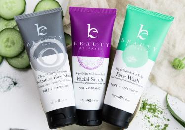
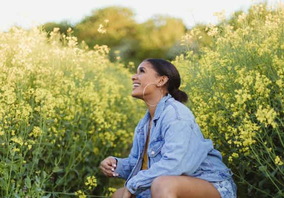
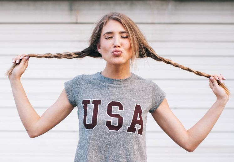
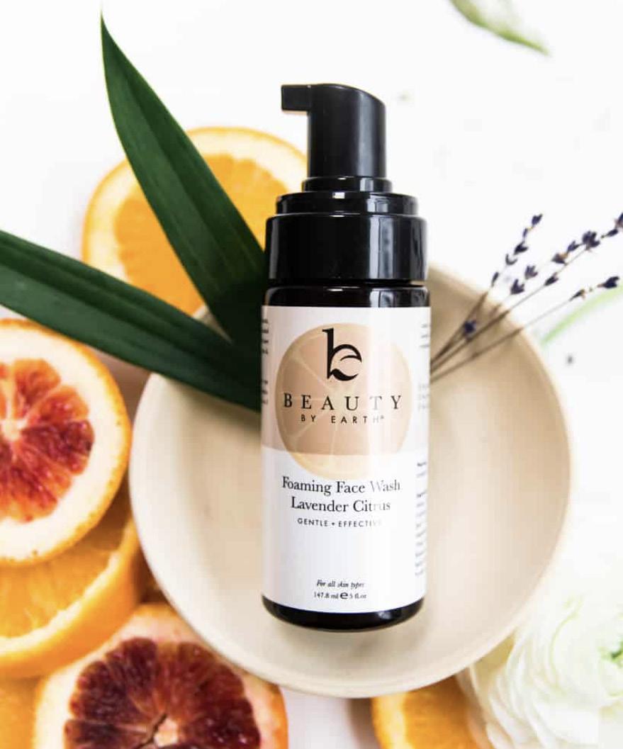
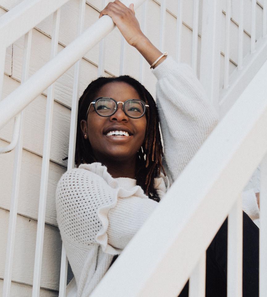
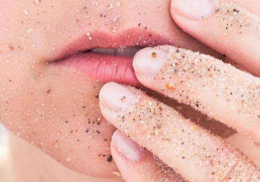
Our images and videography is bright, positive, natural, and happy! We prefer lifestyle photos most of the time and product photos when applicable. Imagery should always start from a storytelling perspective. We prefer to use real, authenticlooking content and often defer for lifestyle photos to unsplash.com as a resource.

Our mobile design is easy to use and functional on all mobile devices . We use a clean design strategy that’s simple and cohesive with our brand guidelines.
PHONE
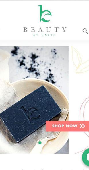
Our website design is bright and clean with pops of our brand colors that is a breeze to navigate. We use graphics that tell a story about our product and emphasize natural beauty.
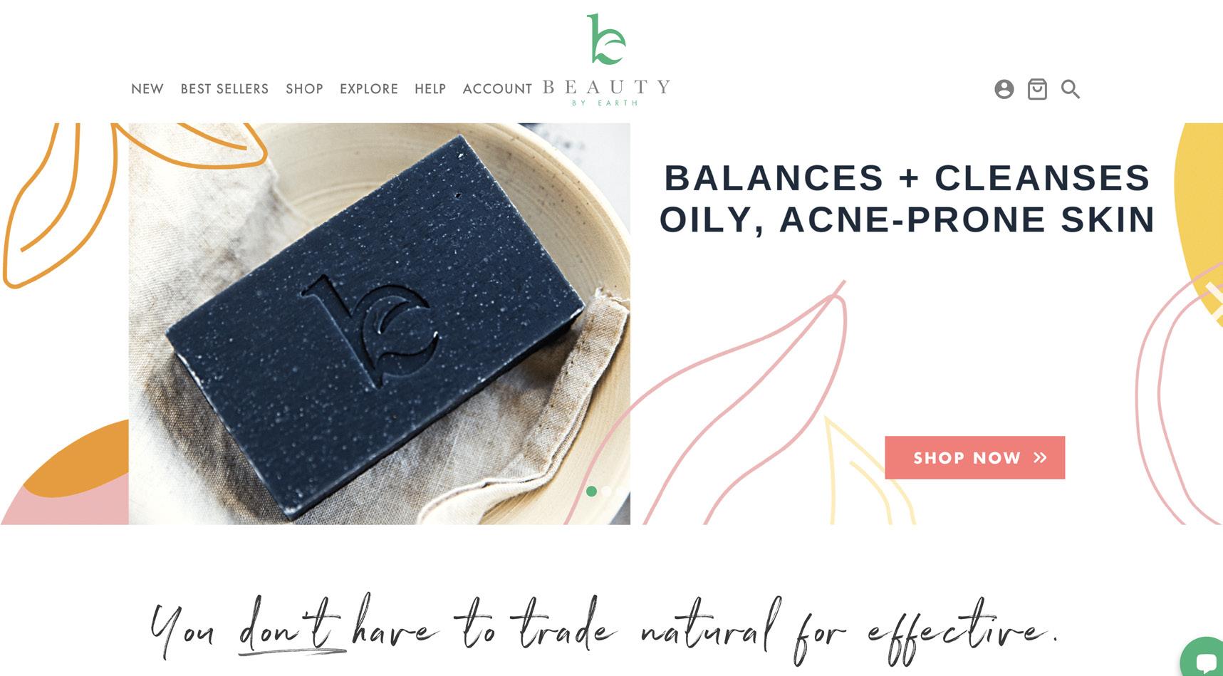
HOME PAGE


WE LOVE WHAT WE DO


FOR FURTHER INFORMATION PLEASE CONTACT US
beautybyearth.com