OLIVIA NORMAN
I am an interior design student with a passion for creating spaces that are impactful for each & every kind of user. I love the challenge of the design field and how it is always pushing me to create better spaces for the future.
While being a student of design and spending hours of time in studio, I do have other hobbies. I have a huge passion for graphic design, thrifting and creating lifestyle posts for my blog Instagram. I also love to draw using different kinds of media like pencil, marker and pen.
I also studied abroad the summer of 2022 in Florence, Italy. I learned the significance of Italian art, architecture and design through sketching and photography.
THE ANGEL OAK
Thesis | individual project
Charleston, South Carolina
Mission Statement:
As people start to travel again after the pandemic, they will want to stay in a place that feels safe and comfortable. The Angel Oak will provide a warm and highly personalized service with a special attention to detail.

Problem Statement:
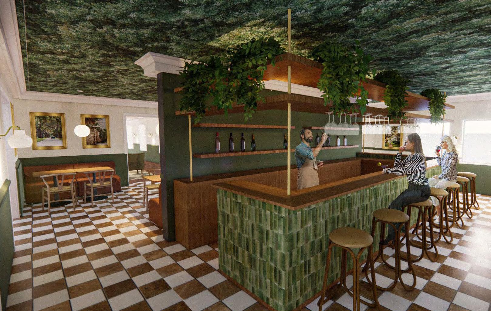
The design for the boutique hotel is a 3 story building on East Battery Street in Charleston, South Carolina. The building will host travelors looking to escape the busyness of the city and allow for a time to relax. The location of the building gives vacationers a prime spot to visit all the tourist areas. The Angel Oak will aim to provide a serene atmoshpere for each guest through the incorporation of luxurious rooms, a cozy lounge, a shared patio with sea views and a collection of luxury hotel brand products for each guest.
Concept Statement:
Inspired by the Angel Oak tree, one of the most visited spots in Charleston because of its serene and enchanting presence, this boutique hotel will embody the characteristics of the Angel Oak. The tree acts as a blanket and shelter over the things and people below it and so that is what the boutique hotel will represent for the guests.


East Battery Street
The site is located at the corner of E. Battery street and Water St.

THE BATTERY DISTRICT:

Where the base building is located, Battery district is one of the most visited parts of downtown Charleston. The fortified seawall and promenade known as “The Battery” was built in 1737 and demolished in 1789. It was then rebuilt in the 1820’s but locals still refer to it as “The Battery.” Homes on The Battery have a direct sea view and view of Fort Sumter.
FIRST, SECOND, & THIRD FLOOR ADJACENCY DIAGRAMS


FIRST FLOOR BLOCK DIAGRAM
SECTION | 3/32"=1ft.
FLOOR PLANS


FLOOR PLAN LEGENDS
LEVEL 1
1. Foyer/Entrance
2. Lounge
3. Reception
4. Cafe/ Bar
5. Outdoor Patio
6. ADA Gender Neutral Restroom
7. Commercial Kitchen
8. Administrative Office
LEVEL 2 & 3
9. Queen Suite
10. Attached Bathroom
11. Employee Lounge & Kitchenette
12. Back of House
CONCEPT/MOOD BOARD


HOTEL BRANDING PACKAGE


A boutique hotel is always a personalized branded experience for the guest and even the locals. It's all about the crafting of each element in each space so I knew it needed its own brand to help the hotel stand out. With keeping the logo of the Angel Oak tree and the color scheme of the interior design in mind, I crafted a brand package for each staying guest. I kept it clean, simple and earthy to furthermore represent the concept of the hotel and the design.



EXPLANATION FOR THE DESIGN OF THE SUITES

For the guest rooms, I wanted them to feel traditional to stick with the Charleston style. This meant I needed to keep the crown molding from the first floor and continue it to the second and third floor. I also designed a “chair rail” as decoration in some rooms with a baseboard of grass cloth material. I went with some warmer colors than the cafe space because it’s a space of relaxation. The canopy bed was a fun touch to reiterate the feeling of being “under the tree.”
BATHROOM INTERIOR ELEVATION PERSPECTIVE

MATERIAL SPECIFICATION


FURNITURE SPECIFICATION


NEXT
Fall 2022 | individual project

Seaport, Boston, MA.
Concept
The contrast between the built environment and green space is why the neighborhood of Seaport is a thriving place for human interaction. For the NEXT office the concept aims to reflect the diversity and fusion of Seaports industrial buildings and its outdoor parks to curate Seaport’s human experience. The goal of the space is to create a balance between the man made and natural experiences for a collaborative, functional and flexible work environment.


PROJECT LOCATION


Seaport Boston, MA.
SITE ANALYSIS

It’s a neighborhood between the Boston harbor and Fort Point District. It’s a place full of new ways of experiencing life. Seaport hosts tons of events like big conventions, exhibits and conferences. The building site is located right next to the Seaport Commons, Sea Green, and Harbor Way. These are all parks or plazas for people to hang out at and interact/ engage in each others company. Its a neighborhood where its people are encouraged to get to know one another and create interaction.
ADJACENCY DIAGRAM

Meeting Zone
Resident Zone
Social Zone


PERSPECTIVE OF CAFE


MATERIAL SPECIFICATION
1. Loke Leather

2. Grey Kingswood
3. Cesta Icehouse by Maharam


4. Bisque Wenge


5. Black Concrete

6. Quartz

7. Linnen Olive
8. Helsinki Crypton Eucalyptus
9. Concrete
10. Blue Bopeep

11. Dark Blue Bopeep
FURNITURE SPECIFICATION


RECREATE SPACES



REFLECT SPACES
RECHARGE SPACE
AXON DIAGRAM
This is an initial block digram to show the different types of spaces and their relationship with each other in the space. The yellow spaces are meant for showing to the public sense they are on that lower level close to the curtain wall. The green space is for interactions and casual breaks . The blue is for spaces to learn and debrief on what they were taught.

INITIAL SKETCHING & PARTI DIAGRAM
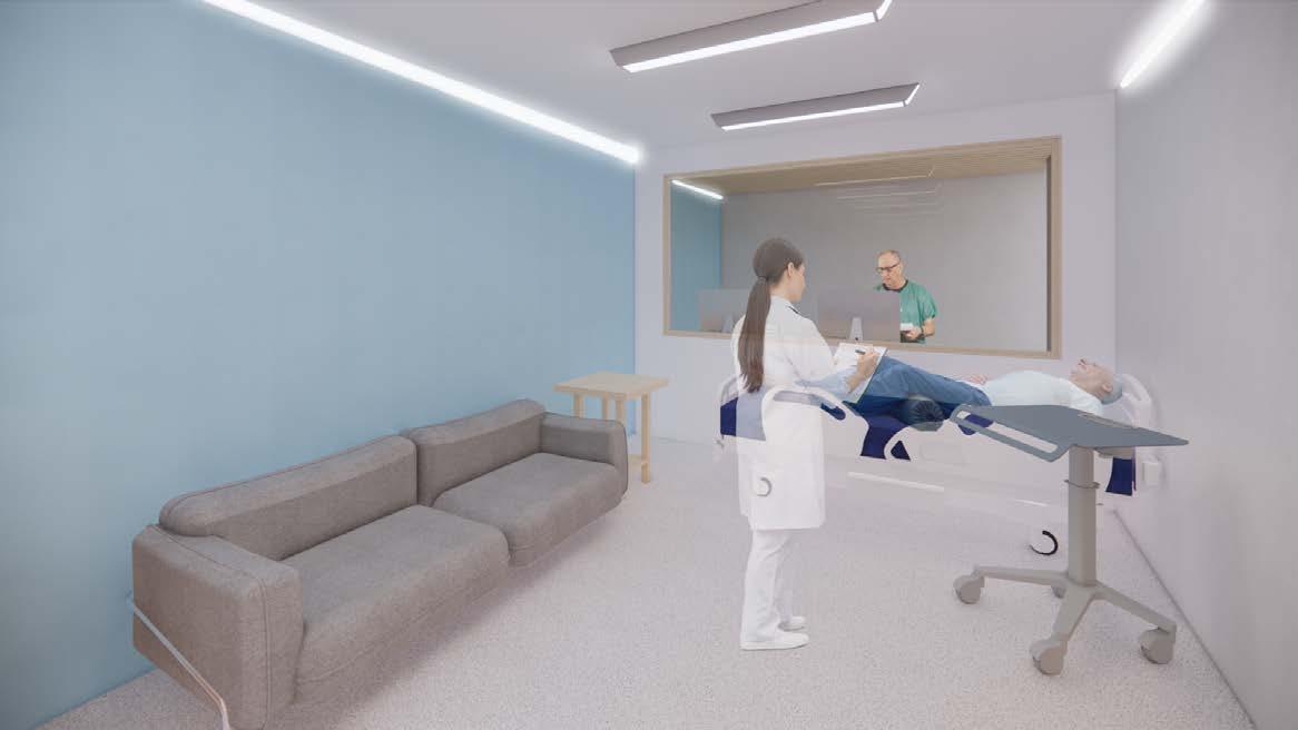
Sketches of initial thoughts on how the space could benefit from a open flow circulation path. After researching nursing clinics, a good circulation path was essential for creating a productive and successful environment.


FURNITURE SELECTION


MATERIAL SELECTION


 1. Light Oak Wood
2. White Terrazzo
3. True White Stone Tile
4. Wave Floor Carpet
5. Linen Light Blue Fabric
6. Aluminum Mesh
7. Gray Line Fabric
8. Pantone Paint:: Dark Green
1.
4.
3.
2.
7.
6.
5.
8.
POCKET BY STEELCASE HEALTH
POTRERO415 TABLE BY STEELCASE
MILO - SEATING STOOL BY KARL ANDERSSON
VERB BY STEELCASE
THINK BY STEELCASE
ROAM BY STEELCASE
PERSPECTIVE OF DEBRIEF ROOMS
PERSPECTIVE OF CONFERENCE ROOM


PERSPECTIVE OF DINING AREA

PERSPECTIVE OF CLASSROOM


COLLISION CO-WORKING
FALL 2021 | Individual project Roanoke, Virginia

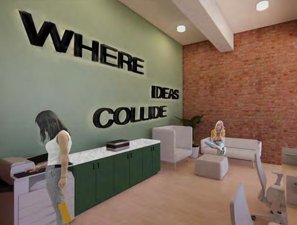
Collision is a co-working space located near downtown Roanoke. Roanoke is a city with many features but for this space, the building focuses on three main attractions, historical downtown the train station and the Blue Ridge mountains. Each location serves as a hub


the user might get intimidated or feel disconnected from the space because of the strangers that occupy it. So to help eliminate that issue, a wayfinding technique was used in the flooring to assist the user get around the space.

PARTI DIAGRAM OF FLOOR PLAN


SHOWS PATHS OF TRAVEL COLLIDING AND BECOMING ONE

TRANSITION SPACE

CONFERENCE ROOM FOR TECH START UP COMPANY
This space was designed with multifuntional use in mind. For most of the time, it is used as a 12 seated conference room. Once a week it is transformed into a yoga studio to comply with WELL standards. Furniture for the meeting space was chosen with mobility and easy deconstruction in mind. All chairs are stackable and the table can be flipped on its side and tucked away or taken out of the room.

BENCHING PERSPECTIVE
LOUNGE AND CONFERENCE ROOM PERSPECTIVE


ELEVATION OF PRIVATE OFFICES

ARTWORK EXPLANATION
All through out the building are pieces of work by Bonnie Mason. The paintings go well with the space because they reflect all three attractions that the building tries to highlight. It gives the space the perfect amount of color and creativity to balance out its neutral earthy tones and palette.
MATERIAL AND FF&E SPECIFICATION


The space aims to embody all three features of Roanoke while still having a cohesive flow of materials. To represent historical downtown, red brick was used for all structural walls. Concrete was used in the flooring to reflect the industrial train station. The wood paneling and green paint were used to give a earthy tone to imitate the mountains and forests all around the city. Overall the building has a neutral color palette to emphasis the materials selected.
 Arlo Lowback by Hightower Fern by Hayworth
Poppy Chair by Hayworth Benching by Hayworth
Red Brick Used on 12” walls
Concrete Used as wayfinding path
Light Oak Wood Paneling Used as main flooring
Green Paint Used as accent wall
Sketches in Italy


Summer 2022 | Study Abroad


