
WATCHES | STYLE | CULTURE ISSUE 86 The Evolution of the IWC MKXX The Art & Design Issue STYLE LEADERS DESIGNING WATCHES DEFINING DETAILS £ 9.95


What is good design? Don’t worry I’m not about to use my editor’s letter to pen a meandering thesis on the subject. It’s far too broad to get into whether I had one page or 1,000. The fact remains however that design is the broad subject that underpins why we all love watches.
The problem is that precisely what makes a good design is hard to pin down in words – so we didn’t. Instead, we enlisted Ben Li, a man far handier with a sketch pad than I could ever hope to be. You might know him better as @inkdial on Instagram, where he creates eyepopping horological art. From the Royal Oak to the Monaco, we asked him to pick out the elements that made some of the most iconic watches in existence so, well, iconic. Check out the results on page 96.
One icon we didn’t include was IWC’s legendary military pilots’ watch, not because it isn’t instantly recognisable – who can’t pick the Mk XI out of a line-up? – but because we decided to let Alex Doak wax lyrical about the ultimate aviation classic. From its original air force roots to the modern Mark XX, he explores the timeline of the archetypal pilots’ piece on page 50.

Of course, not all watches have been around forever, and if you take the raft of releases from the past couple of years as a barometer, watch design is healthier than ever, from small, independent microbrands to luxury powerhouses. To get an insight into how these paragons of good wrist taste get the job done, we spoke to the likes of Hermes, Studio Underd0g and Grand Seiko about everything from the macro – knowing your audience – to the micro – the minutiae of typography. All of that and more on page 59.
This being our Art & Design issue though, we dared ask the question: are watches art? And surprisingly we have two very different responses. On the one hand, jaded watch writer Alan Seymour explains his sheer frustration at timekeeping intermingling with art in this month’s Oracle Speaks on page 44.
On the other, the multi-disciplinary creative savant behind A Cold Wall*, Samuel Ross, explains his cross-medium approach to everything from industrial design to sculpture to his oversized collaboration with Hublot. He’s a man to whom everything, including the watch, is art – find out why on page 39.
In a same stylistic vein (albeit from a far more classical standpoint) Nick Carvell talks to Mark Frost, the man behind the current creative director of Duchamp. Previously of Kent & Curwen, Gieves & Hawkes and Tom (&) Ford, he’s one of the creative influences behind modern men’s tailoring. Find out why on page 82.

In a multi-disciplinary step I assume Ross would be proud of, we step from watch and fashion design to that of drinks – specifically the glasses you drink out of. Ever wondered just how much of an impact the shape of a wine glass has on the tasting experience? Find out on page 124, along with resident alcophile Aidy Smith’s glassware-varietal pairings on page 127.
So, fill the perfect glass filled with the perfect wine, get ready for insights into the obsessive nature of watch designers and as ever, enjoy this issue.
As ever, stay safe, stay sane and enjoy this issue.
Sam Kessler, Editor
Shane is a men’s style editor who has worked for a range of leading titles, including The MR PORTER Journal, Men’s Health UK, Esquire US, PORT, The Telegraph and Wallpaper*. He’s rather partial to a jazzy silk shirt, wide-leg trousers and a gin and Dubonnet (or three).


A lifelong fan of double denim (even triple on occasion), Nick started his career as the launch social media editor of MR PORTER before leaving to become associate style editor of British GQ, then editor of London men’s magazine The Jackal.
is a wine and spirits personality and presenter of the Amazon Prime TV Series, The Three Drinkers . He is often found scouring the globe for his next tipple. It’s a hard life, but someone’s got to do it. You can follow his adventures on Instagram at @sypped.
Alex is a freelance writer and editor based out of his east London home office / yoga studio / classroom (lockdown has brought its distractions, needless to say). Specialising in watches, you can find Alex’s timely words under mastheads as diverse as CNN, Evening Standard, GQ, Port and Mr Porter himself.
Going from amateur watch devotee and hoarder to freelance journalist, Alan Seymour has been writing about watches since 2005. He’s contributed to the likes of The Telegraph , Sotheby’s , Octane , The Week and more.
WATCHES | STYLE | CULTURE
EDITOR Sam Kessler sam.kessler@opulentmedia.co.uk
ART DIRECTOR Hicham Kasbi design@opulentmedia.co.uk
SUB EDITOR Dan Mobbs danmobbs@hotmail.com
JUNIOR COPYWRITER Michael Sonsino michael.sonsino@opulentmedia.co.uk
DIGITAL CONTENT MANAGER Michael Pepper michael@opulentmedia.co.uk
SOCIAL MEDIA EXECUTIVE & VIDEOGRAPHER Fraser Vincent

JUNIOR DIGITAL CONTENT MANAGER
Kelly Coombes kelly.coombes@opulentmedia.co.uk
PUBLISHER / CO-FOUNDER
Mark Edwards mark@opulentmedia.co.uk
MANAGING EDITOR / CO-FOUNDER
Tom Pettit tom@opulentmedia.co.uk

SENIOR ACCOUNT MANAGER ADVERTISING
Oliver Morgan oliver.morgan@opulentmedia.co.uk 020 8571 4615
Freddie Bridge Freddie.bridge@opulentmedia.co.uk 0208 057 1140
SENIOR ACCOUNT MANAGER
Phil Peachey Phil.peachey@opulentmedia.co.uk 020 3985 1414
OT MAGAZINE is published monthly by Opulent Media 020 8571 4615
Printed by Stephens & George Ltd using vegetable-based inks onto materials which have been sourced from well-managed sustainable sources


The creative director of A
73 — SAVING TIME
Ensure your GMT is ready and your Navitimer is in the saddle with our essential winders
80 — YOUR AUTUMN STYLE MANIFESTO
Introducing the brands with creative verve running through every thread
82 — THIS IS NOT A DUCHAMP ARTICLE
How Duchamp is taking inspiration from its French artist namesake
96 — PICTURE THIS Exploring the silhouettes that elevate special watches towards iconic design
113 — WATCH REVIEWS
OT gets hands on with timepieces from Escudo, Knot Designs, and Boldr


124 — THE PERFECT GLASS FOR THE PERFECT DRINK
Soberly exploring how your choice of glassware can utterly change your tipple of choice

133 — LONDON DINING FOR ART LOVERS
The London dining experiences that cater for your eyes as well as your taste buds
139 – UNSUNG VINTAGE HERO
Built for adventure, Nivada Antarctic’s Art Deco aesthetic has given it new life
144 – IN FOCUS
An enamel master, Art Deco styling, and a maritime infused watch go under the spotlight

What to think about when designing your dream watch
151 – MICROBRAND CORNER
Introducing the latest and greatest watches from the best small scale independents

The coolest things in sport right now
If a Lamborghini and Ducati were to drag race, we’d be hard-pressed to pick a winner. Fortunately, we no longer need to. Built on the base of the Panigale V4 S, Ducati has revealed what a Lamborghini bike really looks like with plenty of inspiration from the Huracán STO. Needless to say, the Ducati Streetfighter V4 Lamborghini is aggressive as all hell. It’s pushed around by 208 horsepower, which given its kerb weight of under 200kg, is a terrifyingly exciting prospect.
Limited to 630 bikes, you’ll also get the opportunity, if you so wish, to get a matching helmet, jacket and leathers. Should you want to match it to your Lambo though, you’ll need to be quick. That custom edition is limited to just 63. £55,995, limited to 630 bikes, ducati.com
 edited by: KESSLER

Putting the high in high-end audio, Seth Rogan’s seminal weed brand Houseplant is going full lifestyle with this streamlined collaboration with turntable specialist Pro-Ject. The classic belt-driven turntable is pared-back excellence, now draped in Houseplant’s cream and green livery. We’re not suggesting that getting stoned will enhance your listening experience (at least until it’s legal in the UK), but if you are planning on it, your music will sound a whole lot better on a Pro-Ject turntable with its built-in phono preamp than it will on your phone speakers. $550, houseplant.com

The latest addition to New York’s phenomenal RitzCarlton hotel is a welcome new potential haunt in the city’s phenomenally cool NoMad district. Zaytinya’s all-day fare runs the gamut of mezze, Lebanese, and Italian dishes and to reflect its Mediterranean inspirations, the interiors are defined by light, airy coolness. That’s especially true of the bar, which is dominated by two-toned blue discs on a curving wall, a palette fished from the Aegean Sea and referencing the evil eye. If the food’s as stand-out as the interior, we’ll be eating here on our next trans-Atlantic jaunt. zaytinya.com

The Nautilus 5711 (1A-018) Air Jordan 1 sounds like a sneakerhead watch lover’s wet dream come true. The Tiffany blue version of the coveted Nike high tops are created by design studio Ceeze and are made-to-order from a combination of silver tone lizard, patent leather, a napa liner, and that light blue suede. Finished with the Nike swoosh in white, the shoes are cool even if you didn’t manage to get hold of the matching Patek. Though if you did (well done) you owe it to your watch to get the matching set. $3,050, ceezemc.com

THE DETAIL:
• 42mm stainless steel case with 100m water resistance
• GP01800-2035 automatic movement with 54-hour power reserve
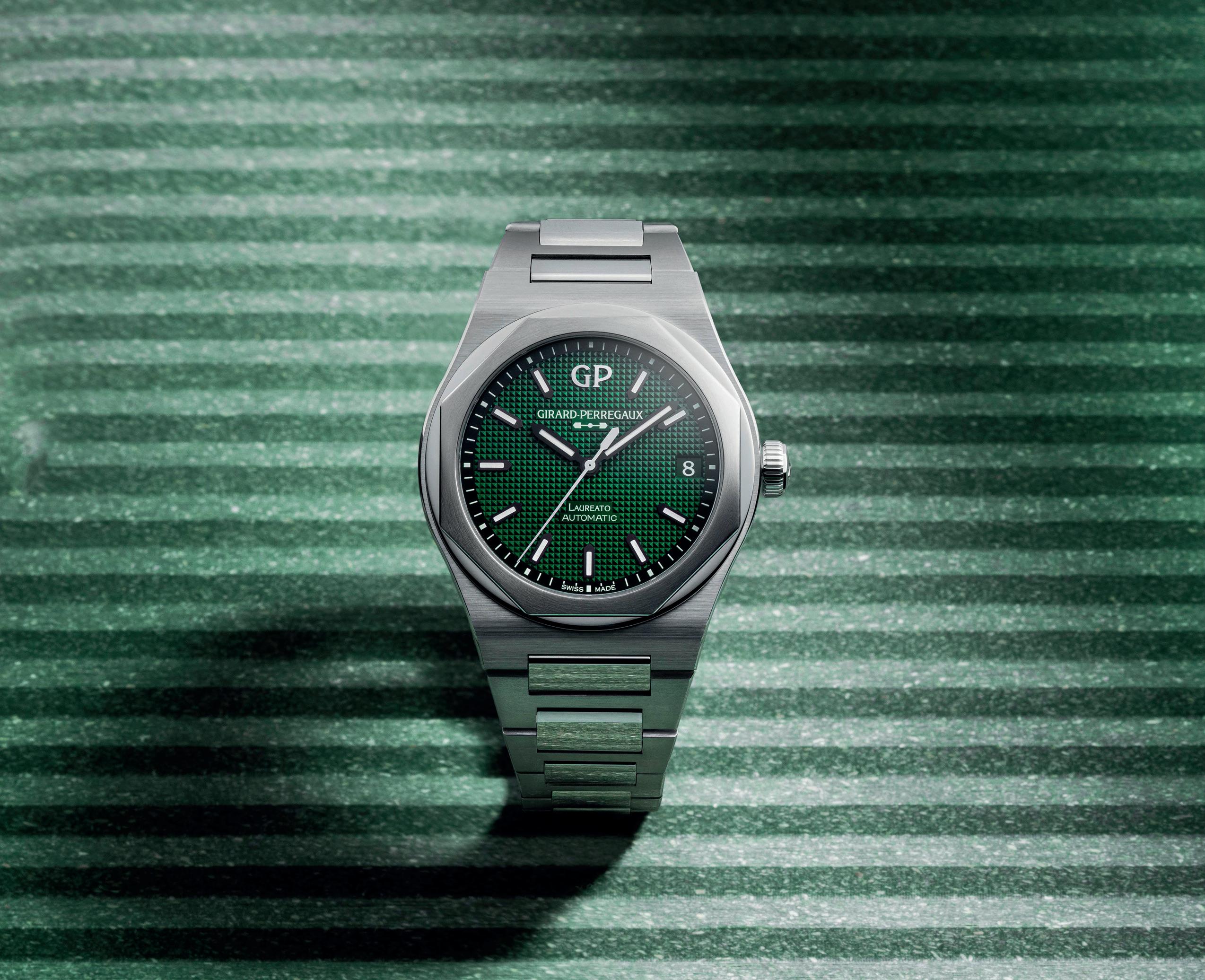
• £11,100, girard-perregaux.com
The Laureato might be one of the unsung heroes of the sports luxe movement in watchmaking, but Girard-Perregaux’s modern flagship is still an aesthetic heavy hitter with its cool, faceted design and integrated bracelet. Think of it as the hipster’s Royal Oak. That’s especially true of the latest green version. Sure, it was going to happen sooner rather than later, but that doesn’t mean it’s not a more-thanwelcome addition to the Laureato line-up with its rich, verdant colouring, and clous de Paris finish.
£11,100, girard-perregaux.com
Two British luxury icons come together for… something genuinely unexpected. This twisting sculpture of leather, copper, glass, aluminium, and light is the first whisky collaboration between Speyside’s Macallan and Crewe’s Bentley. While there’s frustratingly little to go on when it comes to the liquid inside (we’ve been assured that’s all to come) it’s hard not to look at this thing with more than a modicum of respect. It’s very un-Macallan, but as a work of off-kilter, artisanal craftsmanship, there’s never been a bottle like it. Let’s all hope the same can be said of the whisky.
At time of writing, we don’t have info on pricing and availability, but expect it to be eye-wateringly expensive and incredibly rare. bentleymotors.com


In last month’s magazine we looked at the history of Group B Rally and the Audi Quattro, arguably the most famous Audi in motorsport. However, Audi aren’t content to be consigned to racing history as they’ve announced they are joining the FIA Formula 1 World Championship from the 2026 season. The focus for them is squarely on the future. A leading factor in Audi joining the starting roster of teams are the new sustainability and cost-efficiency regulations being implemented from 2026.

WHAT’S GOING
The latest version of the Apple Watch is here, the Apple Watch Ultra. It’s designed to be their most robust and outdoor ready smartwatch yet. It has a 49mm titanium case with a sapphire crystal front, creating their largest and brightest screen. It’s worth noting that for a conventional watch, 49mm would be regarded as comically enormous. It’s also certified with a water resistance of 100m for that peace of mind when taking part in adventurous activities. Further updates include a fresh display designed to show as much data as possible to prevent scrolling through countless apps.


Find out more at apple.com
The celebration of the Audemars Piguet Royal Oak’s 50th anniversary continues with the launch of a new book detailing it history “from Iconoclast to Icon”. Published by Assouline and written by Bill Price, the book covers the cultural influence of the sports luxe timepiece, ranging from architecture, art and music to the global ambassadors who have become synonymous with the watch, like Kevin Hart and Serena Williams.
Opera Gallery are preparing to move to a new flagship gallery space in London in 2023, and ahead of the move they have created a pop-up exhibition space in the Burlington Arcade. The pop-up will focus on the works of Lita Cabellut, a Spanish multidisciplinary artist whose artworks are owned by several well-known public figures, including Hugh Jackman and Gordon Ramsay.
You can visit the exhibition, titled Fur & Feathers, until 8th October

Worth noting that for a conventional watch, 49mm would be regarded as comically enormous
The pop-up will focus on Lita Cabellut, a Spanish artist whose artworks are owned by several well-known public figures

One of legendary Japanese animator Hayao Miyazaki’s most beloved films is being adapted for stage as a musical by the Royal Shakespeare Company. A Studio Ghibli film as a musical by the RSC might sound like an odd combination but remember that the RSC was also behind Matilda the Musical and that’s one of the most joyous and fun pieces of theatre you can see. Plus, the puppets for each of the mythical animals present in the story are being created by the Jim Henson company, the team behind the Muppets. It will run from 8 October – 21 January at the Barbican Theatre.
Book now at barbican.org.uk
Searcys at 116 Pall Mall is hosting an exclusive concert in collaboration with the London Chamber Orchestra on 15 October. The concert will be the last in a series of performances celebrating the coming of autumn. Concert goers will be invited to a pre-concert tea, which includes salmon rillette and fresh pastries. As for the music, it will include Linda Buckley’s Exploding Stars, Max Richter’s On the Nature of Daylight, Elgar’s Nimrod, and Vivaldi’s Autumn from The Four Seasons.
Find out more at 116pallmall.com

Nobis aut doloriatia quis di odis ernatem porepe doloren

At the outset of 2022 Rolex increased their prices by around 4% across the board, due to increased demand for their watches and reduced supply. Now though, prices are going up by another 4% in the UK to account for the recent collapse of the pound. That means the Rolex Submariner Ref. 124060 started the year with a price of £6,550, sat at £7,150 for the majority of 2022 (a 9% increase) and is now £7,500. Other watches affected include the Daytona Ref. 116500LN, which is now above £12,000 and even Rolex’s 2022 models like the new Air-King, now £6,150.
That means the Rolex Submariner Ref. 124060 started the year with a price of £6,550, sat at £7,150 for the majority of 2022 and is now £7,500
The watch voting categories are: Dive, Chronograph, Dress, Travel, Field/Pilot’s, Sports Luxe, High Complication, Innovation, Accessible, and Readers’ Choice.
> > It’s safe to say that 2022 has been a turbulent year for all, but we’ve made it. 2023 is just around the corner. In celebration, we’re giving away a Baltic Aquascaphe GMT and all you need to do for your chance to win is answer one simple question. What is your favourite watch of 2022?
Tell us your answer by casting your vote in the inaugural Oracle Time Readers’ Watch Awards. You’ll be given the chance to vote for your favourite watch of the year across 10 separate categories and the results will be published in our December magazine. Just by submitting your votes you’ll be entered into the competition for the Baltic Aquascaphe GMT.
We’ve chosen eight of our favourite watches in each category that you’ll be able to choose from. But before cries of bias and foul play fill the air, don’t worry, we understand that everyone’s opinion differs and you don’t have to agree with our selections. For every category there’s an open slot where you can submit a vote for any watch you care to name, bearing in mind that it has to be suitable for the category and released in 2022.
Plus, the Readers’ Choice award is entirely down to you with no restrictions beyond being a 2022 timepiece. Whichever watch wins this award will feature on the cover of our December magazine, so if there’s a watch you really want to see as a cover star, make sure to vote.
Voting is open until 31 October 2022. Don’t forget that by submitting your votes, you’ll be entered into the Baltic Aquascaphe GMT give away. Visit oracleoftime.com or scan the QR code below to find all the information on the awards as well as instructions on how to vote.
When Oris released the calibre 400, we here at Oracle Time only had one question: when will we get it in a Divers Sixty-Five? Apparently, we weren’t the only ones, as when they finally answered our horological prayers last month with the release of the new Divers Sixty-Five 12H, Cambridgeshire-based collector of affordable timepieces @dialdaydreamer, quickly claimed one for himself – and he wasted no time in shooting it on the fittingly blue backdrop of our Sports issue.

Showing the watch off both front and back – proving that
yes indeed, there’s a calibre 400 in there – it’s a retro, utilitarian vibe that pairs well with the more general sport aesthetic of our (even more affordable) cover star, the Tissot PRX Chronograph. We’ve been promised some lume shots soon, so keep your eyes peeled for those.
Want to showcase your own eye for a perfectly composed watch shot? Well, get your hands on this issue, get snapping and don’t forget to use #oracletimeout for your chance to nab a page to yourself next month.
For now though, Oracle Time, Out.

THERE ARE MANY WAYS to get your Oracle Time fix. Our favourite is of course within these lovely glossy pages to which you can subscribe via our website. An annual subscription containing 10 issues of the magazine is only £89.50, more value than a serious microbrand watch. Alternatively, you can come and say hello on one of our many digital channels. Instagram is the perfect place to share your wristshots and thoughts with us – remember to use #OTWristshot. Or you can watch our latest video content on YouTube, listening to the dulcet tones of our editor via our website using the QR code in the top right.


IN DETAIL
• 43.97mm stainless steel case with 200m water resistance
• Seiko calibre 8L35 with 50-hour power reserve
• £2,740, limited to 500 pieces, seikoboutique.co.uk
Grönefeld isn’t usually a name synonymous with sporty watchmaking; classical haute horology yes, anything designed to get knocked about, no. But while the new 1969 DeltaWorks is still an impeccably made timepiece, it’s the only watch they’ve ever made that has more than 30m water resistance. It’s also big – 44.5mm – and light weight thanks to titanium construction. It’s a big but welcome departure for Grönefeld, enough that the salmon version might be our favourite timepiece of theirs to date.
• 44.5mm stainless steel case with 100m water resistance

• Calibre G06 automatic movement with 56-hour power reserve
• €49,800 excl. taxes (approx. £43,040), limited to 20 pieces a year, gronefeld.com
Colour is in the air with the latest nature-inspired Seiko, this time in the performance diving Prospex line. The Aurora, as its name suggests, is inspired by the undulating colours of the Nothern Lights - the blue spectrum in particular. Other than the dial it’s standard 43.97mm Prospex fare, with 200m water resistance – but that dial’s plenty worth talking about. It is however a limited edition which, given how hot fixed-production Seikos are, means that the Prospex 1970 Diver’s Aurora will go quick.
 Prospex 1970 Diver’s ‘Aurora’
THE DETAILS:
• 47mm titanium case with 300m water resistance
• P.9100/R calibre automatic movement with 72-hour power reserve
• £25,500, panerai.com
If Sylvester Stallone still collects Panerais, this will definitely be on his hit list. At 47mm, this giant Submersible is macho to the extreme, with specs to match its military inspirations, including 300m water resistance, a stealthy DLC coating and solid blocks of lume for low-light reading. And I mean… just look at it. Thank God it’s titanium, or it’d be a workout to wear. There’s no denying though that it’s an incredibly cool watch.

Not one to rest on their laurels with just a ‘basic’ full sapphire case, Aventi’s latest brings improved material Saphite to bear on their signature faceted case shape. The result is an intensely decorated blue-tinted beast, partially skeletonised dial, and six o’clock tourbillon. It’s definitely a statement piece – with a statement price of a very different sort. These kinds of watches normally stretch well into the six figures. The new Wraith? Around £22,100.

• 44mm x 49mm Saphite case
• GT-01S calibre manual-wind movement with 96-hour power reserve
• CHF 24,500 (approx. £22,100), aventi.com
Following their incredibly cool Tadao Ando collaboration, Bulgari has once again enlisted an architect to artify their sporty, Genta-designed icon. The architect in question is Kazuyo Sejima, responsible for the Louvre-Lens and the Rolex Learning Centre, among other projects. Here, the dial is made from a mirror-polished sapphire crystal with countless metal dots. It looks like an optical illusion, a world away from the usual industrial chic of the Octo.
• 40mm stainless steel case with 100m water resistance

• BVL calibre 138 automatic movement with 60-hour power reserve
• £12,000, limited to 360 pieces, bulgari.com
Manero Flyback 40mm
Fortunately, Seiko don’t have a monopoly on landscape-inspired watches, and for their latest edition of the superb (and all too often underrated) Manero Flyback, Carl F Bucherer echoes their own Alpine back garden in some striking colours. There’s the dressier cream and black with rose gold indexes; then there’s the three silver versions with red, green or blue contrasting subdials and a matching strap. Other than a slight smaller case, they’re not groundbreaking additions to the collection, but they’re lovely all the same.

THE DETAILS:
• 40mm stainless steel case with 30m water resistance
• CFB calibre 1973 automatic movement with 56-hour power reserve
• £5,300, carl-f-bucherer.com

Samuel Ross is a man with more hats than Royal Ascot. He’s a fashion label, an industrial designer, a sculptor, and a creative in whatever direction he happens to be facing at the time. To call him multi-disciplinary is far too narrow a label but listing everything he’s tried his hand at would get exhausting.

Mostly, Ross is known for his work on A Cold Wall*, a fashion label that mixes luxury menswear with architectural influences, and the lens of class and community. What that basically means is clothes with cool, industrial vibes, and a penchant for playing with materials. Yet as you might expect from a man with as many facets as Ross, A Cold Wall* isn’t his only outlet. In fact these days a good part of his creative output is through his studio, SR_A.
“SR_A’s a bit more loose, a bit more elastic,” says Ross, gesturing to his office
space, one filled with sketches, upcycled industrial art and electric bike concepts, among other things. “After building A Cold Wall* to the scale it’s at, SR_A is a testament to keeping creativity as pure as possible.”
It’s not exactly a direct aim and even for people far more creative than I, that kind of breadth would be daunting. How do you pick a project? How to you fine-tune your approach?
“That’s a really good point! It’s become a bit of a conundrum in how I’m actually categorised. If you look at the last three years of awards, they’re all for ‘changemaker’ because it’s a nondescriptive title. It’s a bit of fun playing with the idea of what a multidisciplinary practitioner look like these days and it’s something both V (Virgil Abloh) and I wanted to explore,
Words: Sam Kessler
THE CREATIVE DIRECTOR OF A COLD WALL* ON ART, OPPORTUNITY AND ONE MASSIVE WATCH
traversing the segue between the design and art space.”

It’s an approach that’s hard to pin down in any meaningful way and in large part that’s the point. But there is always one red thread running through and that’s emotion.
“I’d describe my own approach as experiential. I want make people feel something whether that’s provocation, enthusiasm, even startled, I just want them to have an opinion immediately. That’s the best way I can put it.
“A Cold Wall* was my first true incubator of that. When I think of the early days – we now do about 700 products a year – but there was always an element of world-building around it, a chance to try different things and see what worked or what burned my hand off.”
Trial and error is part of growing a
Samuel’s creative business, so evidently he wasn’t burned too badly by the experience. Sound though really has taken a back seat. Ross used to score all of his runway shows, now he uses actual musicians – “they’re far more proficient than me!”
“Trying new things has birthed a respect for the history of a craft, what makes a movement beyond objective aesthetic value. Why post-modernism, why brutalism, why deconstructivism, whatever it may be? It made me realise that you have to understand the legacy behind what you’re trying to do in order to look forwards.”
So, where does A Cold Wall* sit on that spectrum?
“Between brutalism and postmodernism for the most part,” replies Ross. “We look at mid-century German and social design like Studio Super, looking at design from an optimistic standpoint. Part of me knows that a large part of your design ethos comes from what you read early on, whether you happened to pick up neo-classical or post-modern, and for me it was that area.”
design brand and given A Cold Wall*’s five worldwide mono-stores, countless retailers and a space in Selfridges, there haven’t been all that many errors. Still, it’s reassuring in a schadenfreude kind of way to realise that even Samuel Ross has the occasional failure. So, what was it that burned him?
“Furniture. It took me years to understand furniture; seven years. I didn’t understand the level of resources required, the tools and machinery needed to articulate furniture. For a long time I was iterating it as a secondary outpost and there just wasn’t enough reverence for materials and how they worked, so I’d often produce rapid proto and scrap. The first piece that actually made it was in 2018 for Dover Street Market, with plenty of flat, powdercoated iron sheets.”
Now there’s a whole furniture wing to
Perhaps most importantly though –and something which Ross is very keen to underpin – is that his kind of broad approach to design and creativity is only possible with a grounding in theory, in education of the craft. It’s the idea that, while there are plenty of potentially great artists and designers out there, you need the knowledge to be able to back up your ideas.
For Ross that was a degree in graphic design and illustration at De Mortfort University, Leicester, where he graduated with a first. He then dived straight into product design after being scouted at his degree show. The thing is though, that wasn’t exactly what he wanted to do.
“I was actually considering a fine art degree,” he explains, “but I didn’t think someone of my background would be able to do it, to make it into a career. So, I did design instead.”
Evidently it wasn’t a bad decision, but it’s one that in recent years Ross has taken pains to rectify. Lately, creative polymath that he is, he’s been working as much in fine art as traditional design,
Trial and error has proven to be a part of growing the A Cold Wall* design brand, particularly when it comes to furniture, as Ross confessed it took him seven years to fully understand the process due to underestimating the level of resources required, as well as the tools and machinery needed
 Sitting somewhere between brutalism and post-modernism in its influences according to Ross, A Cold Wall*’s design cues have been drawn from Ross’s absorption of mid-century German social design in his youth
“I was considering a fine art degree, but I didn’t think someone of my background would be able to do it, to make it into a career. So, I did design instead”
As a Hublot Ambassador and a man of many talents, Ross is as happy showing off the bold colour and scale of the Big Bang Tourbillon Samuel Ross 45mm (above), as he is being selected as one of the Honourees in the People category at The Fashion Awards 2020 (right)


with sculptures and sketches aplenty, enough that he’ll soon be heading to the Basel Art Fair in Miami before opening his first gallery solo show here in the UK, doing his part to change the perceptions he himself fell victim to.

“The first time I saw a Michael Moore piece I thought who? What? Why? When? How? I feel in love with this idea of being able to generate a response across multiple generations. For me, sculpture has been a way of broadening what I have to give to the future via design versus extending what’s been done in the past. You don’t want to decimate the past, but you need both.”
Between A Cold Wall* becoming a catwalk and collaborative giant, and his upcoming domination of the art world, Ross has had a meteoric rise.
And while he worked hard for it all, it’s impossible to discuss his success without also mentioning the late, great Virgil Abloh.

“That opportunity was sensibility, serendipity and preparation coalescing. When he came across my portfolio on socials, he could see my work across disciplines, he could see the education. I
still believe that formal underpinning was the most important factor in him investing in me – his own background was architecture. Creative autonomy is good if you’re 18, or 23 and you’re naturally part of the zeitgeist, but that training is what leads to longevity. Virgil gave me an amazing opportunity.”
Over the past three years, it’s the kind of opportunity Ross has been paying back by building a funding programme specifically for creatives that deserve to reach a wider audience. This year’s award is now closed, but it’s something that so far has been instrumental in bringing some fresh faces into the design world.
“The main focus is looking at the lack of opportunity, and it’s not just about giving capital. We have an amazing advisory board – Tim Marlow of the design museum, Dr. Casely-Hayford of the V&A, Caroline Rush of the British Fashion Council, others I can’t remember right now. We’ve seen talent like Mac Collins come through who’s done some amazing work, Nigel Matambo in now consulting for Facebook, Dominique Petit-Frere went
on to win a Dezeen architecture prize, it’s been a privilege.”
It’s the idea of finding these exceptional creative talents and onboarding them into the education both Samuel Ross and Virgil Abloh so believe in, as it gives these would-be students the opportunity to turn their zeitgeist-driven eye into something much more enduring.
Of course, while that’s all great, we are, first and foremost, a watch magazine, and it would be remiss of us not to discuss the elephant-sized watch in the room: the Hublot Big Bang Tourbillon Samuel Ross. It’s… a lot, even by Hublot standards. A 45mm mix of titanium, both polished and satinfinished, with overwhelming industrial flourishes and plenty of orange, it’s about as shy and retiring as having a cathedral tattooed on the back of your head. Which is, in a roundabout way, how the Hublot relationship happened. Ross’s own tattoo – a St. Paul’s-esque splash of architecture – was inked by none other than fellow Hublot ambassador Maxime Buchi of Sang Bleu.
“I had this idea of alchemy in terms of the scale and weight – I’m used to wearing a 41mm or 39mm watch – of having this perforated polymer and lightweight titanium that is still a big, present watch. We curved the case to follow the form of your wrist so it sits more on your wrist than a traditional Big Bang. It’s a direction that we’ve committed to. There will be a wider offering – I’m excited to work with carbon fibre, recycled materials, I want to see a lot of precious metals on the watch, and I’m sure beyond that there will be additional models I’ll have an effect on. But for now I’m trying to get this thing into a 41mm case!”
There are certainly synergies between Ross and Hublot. For one, it harks back to the designer’s longing to cause a reaction. You can’t look at this limited edition and not have a strong opinion on it. For another, working with the confines (or opportunity) of fine watchmaking is like trying not to get burned by furniture again. It seems like Ross has been given the opportunity to play with fire once again and he’s excited to see how hot it can get.
Whatever work he undertakes, Samuel Ross longs to cause a reaction, whether it’s through A Cold Wall*’s ‘Solarised’ take on the Nike Zoom Vomero +5 (below), or through his Concrete Objects series (right)“I had this idea of alchemy in terms of the scale and weight of having this perforated polymer and lightweight titanium that is still a big, present watch”
Ignoring the white noise produced by an army of self-appointed horological ‘influencers’ found on YouTube, Instagram et al and their hyperbolic prattle extolling timepieces as art, watches can be clearly categorised as pieces of design. They are, at their core, tools, produced (primarily, at least) for specific, functional rhyme and reason. Be it a time only, world timer, chronograph, or perpetual calendar. Granted, post ‘quartz crisis’ and with the rise of the ubiquitous mobile phone, watches do now occupy a far more expressive and permissive space, but that doesn’t detract from the stoic timekeepers they ultimately are. I wager you’d be pretty vexed if you were to spend your hard-earned money on a watch which couldn’t complete the base function of accurately telling the time.
Art, on the other hand, by academic definition is a purely expressive form. Existing solely for itself and serving no other function or purpose. Pure, unadulterated self-indulgent freedom of expression and evocation (at its best). Art is the ultimate luxury, arguably.
This does not, however, detract from a watch’s individual charm or cultural status. Far from it, I find that if anything watches can be as, if not more, enriching as art. After all, much like architecture and clothing, one can live the vast majority of one’s life with them. Becoming trusted totemic, material companions dutifully tracking the minutes and hours to the highways and byways of our extant years. A celebration of the everyday, enjoyed each time you glance down for the time; as well as just looking cool. It’s not by chance that the watch has become an enduring touchstone gift to celebrate big life milestones.
All that isn’t to say applied art and artistic expression hasn’t successfully found its way into horology. Métiers d’art, for instance, sees watch manufactures such as Patek Philippe, Vacheron Constantin, Chopard, and Blancpain use the dial as a space to whimsically depict everything from wild animals to hot air balloons in onerous porcelain enamel. In 2016, Jaeger-LeCoultre used enamel and the Reverso’s trademark flippable caseback as a canvas to pay homage to Belgian surrealist René Magritte too. Several artists have also directly partnered with watch brands over the years to produce special limited editions. The likes of Richard Mille and Cyril Kongo, Movado and Andy Warhol, Hublot and Takashi Murakami, Bamford Watch Department and Marc Quinn, Swatch and Keith Haring, to name but a few. But I would maintain that these are, if anything, pieces of decorative art meant to further enhance the appeal of a practical object as opposed to being examples of fine art.
ARE WATCHES ART? TO PUT IT BLUNTLY: NO. AS FAR AS I’M CONCERNED, WATCHES ARE CATEGORICALLY NOT ART
The wizardry of the watch world explained
 Art and horology have collided over the years, as shown in 2016, when Jaeger-LeCoultre payed homage to Belgian surrealist René Magritte on the Reverso’s trademark flippable caseback

 Watches and art have a long history together that stretches back to 1560 when Florentine painter Maso di San Friano produced a portrait of what is believed to be the Grand Duke of Tuscany showing off a drum-shaped pocket watch (left), while in 1987 noted watch collector Andy Warhol created his ode to the elegance of Rado timepieces (above)
I love Panerai. The watches are timeless and I made this painting using black Panerai watch faces without hands in the pattern of the seeds in the head of a sunflower

A reciprocal crossover, watches can be found in the works of numerous celebrated artists. One of the earliest examples dates to c.1560 and is by Florentine painter Maso di San Friano. A portrait of an unidentified male, believed to be Cosimo I de’ Medici, first Grand Duke of Tuscany and member of OG art patron clan the Medici family, proudly holding a drum-shaped pocket watch. Jumping forward a few centuries, there are several sketches by Andy Warhol - a noted watch collectordepicting Rolex, Rado, Patek Philippe and, what looks to be a Cartier Tank. Damien Hirst, meanwhile, has included Panerai in several of his works, including actual wristwatches in the installations Killing Time (2008) and The
Tranquillity of Solitude (for George Dyer) (2006). While 2011 saw Hirst unveil two paintings created in collaboration with Officine Panerai itself that combine loose Luminor and Radiomir dials with his signature spin painting technique. Of the project Hirst said, “I love Panerai. The watches are timeless and I made this spin painting using black Panerai watch faces without hands in the pattern of the seeds in the head of a sunflower. I hope the painting makes you think ‘we are here for a good time not a long time’.”
Naysayers may well try and cite these as examples of watches as art. But I would point out that a mere depiction does not elevate the subject itself to ‘art’ status and in the case of readymade or found-object art, Marcel Duchamp, founding father of the movement, stated: “Everyday objects [are] raised to the dignity of a work of art by the artist’s choice.”
For example, Duchamp’s sculpture ‘Fountain’ (1917) hasn’t prompted people to tout urinals in general as ‘works of art’.
Damien Hirst produced two vivid and colourful paintings in 2011 using his signature spin painting technique that featured over 1,000 discarded Panerai dials


War has always incubated innovation, and that certainly goes for precision timekeeping – crucial wherever combat ventures next. That’s as true with the early, artillery shell-defying trench watches as it is in the cockpit, the latter being where some of the most iconic mil-spec pieces ever assembled are most at home.
This is perfectly illustrated by a more recent ‘Hollywood watch moment’ back in 2017, Dunkirk. After all, if there’s one director likely to get things bang-on, it’s Christopher Nolan. So, when Tom Hardy’s Spitfire pilot repeatedly pulls back his shearling cuff to note in chalk his dwindling fuel reserves, you know Nolan will have kitted him out with an authentic military-spec pilot’s watch. Not only is it a genuine Omega from WWII, but it’s not even the CK2292 model that less detail-oriented directors would have plumped for (the Omega that constituted most of the Swiss marque’s 110,000-strong supply to British forces over the course of the war).
No, Hardy’s fighter ace wears a particularly earlyiteration Omega, panic-ordered by the RAF in early 1940 to the tune of just 2,000 units. Its novel rotating ‘bezel’ around the dial aided navigation (remember

those tiresome time, distance, speed calculations in GCSE maths?) and cleverly, a second crown at four o’clock locked the bezel, so timing couldn’t be affected by accidental knocks in a cramped cockpit.
These are all the sorts of considerations that come into a military-specification, or ‘mil-spec’ pilot wristwatches. Ultra-utilitarian details and Boy’s Own anecdotes that not only make for vivid selling points, let alone real-world practicality, but have pushed forward the humble wristwatch’s development more than any other purpose.
It’s why, for military-watch aficionados – right up there with those Omegas, the Longines Weems and pre-1970s Panerais – there’ll always be a particularly treasured niche for the Mk series IWCs. And it’s why this year’s biggest blockbuster saw Maverick’s hotshot recruits flinging their F/A-18 Hornets through mountains sporting the latest Strike Fighter Tactical Instructor chronographs made for the US Navy’s actual ‘TOPGUN’ by IWC.
With all due respect to Omega, Thomas Hardy should probably have been sporting IWC’s ur Mk, the Mark IX – specced for the RAF in 1935. But once WWII started in earnest, the newfound strategic import of air dominance meant every Swiss, British, French, German, Japanese, and American watchmaker couldn’t kit-out the wrists of fighter and bomber crews nearly quickly enough.
Mark IX certainly contributed to victory throughout the Battle of Britain and beyond, keeping Spitfire and Hurricane pilots in no doubt as to their fuel reserves, thanks to a glass bezel to mark take-off time. With a black dial (small hacking seconds for a definitive, unobscured read-out), shatterproof dome, and large luminous numerals, it set the pilot-watch agenda – managing also to be the most rugged wristwatch yet built.
After all, it had to weather extreme plunges in temperature at altitude, vibrations fed back through the control stick from the engine, and turbulence acting on ailerons and rudder, plus extreme g-forces both negative and positive – all the while maintaining nigh-on-chronometer precision. Into the bargain, a soft-iron inner case, which protected IWC’s calibre 83 mechanics from the magnetism of all the solenoids populating the era’s ever-more-sophisticated cockpit instrumentation.
Collectors still go the maddest for IWC’s longestrunning flying machine, the magnificent Mark 11 (or Mark XI, depending on your – or indeed IWC’s – version of history). But what of the intervening ‘X’?
Don’t get us wrong, X is still the Holy Grail on the scale of mil-spec collectability, but only when dubbed ‘W.W.W.’ and accompanied by 11 other near-identical models from 11 other watchmakers. A complete set is fondly known – yes, you know already – as the Dirty Dozen.
Mark IX certainly contributed to victory throughout the Battle of Britain and beyond, keeping Spitfire and Hurricane pilots in no doubt as to their fuel reservesIWC set the pilot watch agenda with a shatterproof dome, large luminous numerals, and small hacking seconds for a definitive, unobscured read-out on a black dial, the Mk series helped to push forward the wristwatch’s development

 Collectors treasure IWC’s longest-running flying machine, the magnificent Mark 11, but the X remains the Holy Grail on the scale of mil-spec collectability, especially when accompanied by 11 other near-identical models from 11 other watchmakers fondly known as the Dirty Dozen and commissioned by the Ministry of Defence during WWII

With the flailing British watch industry already busy making cockpit instruments, detonator timers, and the like, the Ministry of Defence invited any Swiss manufacturer who could build a watch up to its newly rigorous spec of highly legible, luminous-white-onblack waterproof precision, to do so. More ‘infantry’ than ‘pilot’ in intention, but certainly heavily informed by the success of the Mark IX.
All in, 12 Swiss manufacturers got the job, collectively producing about 145,000 examples of ‘Watch. Wrist. Waterproof.’ to the MoD’s rigorous standards. This sounds a lot, but given that the most obscure brand (Grana) only made 5,000 W.W.W.s, collecting all 12 examples is nigh-on impossible, and therefore catnip to watch nerds.
Post-war, as engineering and technology boomed, the pipe-smoking boffins of the late-forties and fifties demanded even more precision, antimagnetism, and absolute lack of nonsense. Something pilots continued to benefit from, in the shape of the iconic Mark 11 of 1948. It was a natural evolution of IWC’s contribution to the W.W.W. war effort, which many consider the best of the 12, and forged the core DNA of a lineage that runs and runs – this year’s Mark XX the latest and greatest yet.
The Mk 11 was primarily military issue, therefore hard to come by until the MoD jettisoned them as surplus. The last consignment was delivered in 1978 to the Australian Air Force, but Mark 11 remained in service well into the eighties. By the time the mechanical watch revival hit, it was a bona fide collector’s item and an auction catalogue regular. Something that didn’t go unnoticed by IWC, who in 1988 introduced the Pilot’s Watch Chronograph Mechaquartz (Fliegerchronograph Ref. 3740) with styling drawn from the Mark XI and ticking to the tune of Jaeger-LeCoultre’s analogue quartz chronograph calibre 631 – one of the first to be developed.
A brief hiatus, then a tentative toe back into pure pilot territory, with the Mark XII. It was produced in hen’s teeth numbers, though; regardless of any lack in military credentials, or heft on the wrist, pounce if you see one.
Which brings us to 1999, and the launch of the Pilot’s Watch Mark XV Classic. Finally: Mark 11 desirability recaptured, in faithfully mechanical form. Size-wise, perfect at 9mm thick and 38mm across – 2mm up on the Mk XII. Helmets and goggles off to IWC for keeping these proportions reined-in over the ensuing years, despite contemporary tastes. The XX of 2022 is still just 40mm of corrosion-resistant stainless steel, sitting comfortably beneath fitted flying gloves.
In many ways, the Mark XX is the final form of the IWC classic. It shares many similarities with the previous model, but with the kind of quality-of-life minute adjustments that suggest someone at IWC has been trawling watch forums. The various indexes have been enlarged, the iron sights have been moved closer to the ‘this way up’ 12 o’clock triangle and the whole thing has been made slightly slimmer, all the better to slip under a cuff outside of a cockpit. Even the date window has been shifted out a millimetre and changed colour.
And while a date window is of little use at Mach 2.0 (let alone any hope of clean dial design) all other aviation credentials are intact, too. The high-contrast dial with white, luminous numerals and indices, the triangular index at 12 o’clock for absolute orientation, and precision ensured by the IWC-manufactured 32111 caliber with automatic winding and a power reserve of 120 hours – based on the geometry of ETA’s bulletproof workhorse, 2892, but made by Richemont Group’s Valfleurier facility, boasting an antimagnetic, isochronic silicon escapement.

The Mark XX is still the clean, clear, ultimately legible pilots watch that made the Mark XI a grail watch. It still has the hefty look and feel of a modern military piece. And it proves why IWC is still the reigning champ of the skies, whether that’s the cockpit of a Spitfire or a starring role in Top Gun.
If you feel the need, the need for speed, then IWC is still your wingman, any day.
The 2022 IWC XX stays true to its aviation roots, as the 40mm corrosion-resistant stainless steel watch features the same trademark high-contrast dial with white, luminous numerals and indices, and the triangular index at 12 o’clock for absolute orientation

WORDS: SAM KESSLER
WHAT EXACTLY DO YOU NEED TO THINK ABOUT WHEN DESIGNING YOUR DREAM WATCH?

We’ve all thought about it at one point or another. The story of a collector failing to find the watch of their dreams and going on to create it is a Kickstarter archetype, enough that moonlighting as a watch designer is worryingly tempting. All it takes is a good supplier, a website, and most importantly, a great watch.
Well, the first two are pretty simple. The latter though? Where does one actually start creating a watch? Sure, you might have the germ of an idea, be that something you’d like to buy yourself or a hole in the market ripe for exploitation, but how do you turn that into a fully realised idea? We caught up with some heavy hitters in the watch industry for a few tips.
Now, a blank page is a broad remit, so it’s worth deciding what kind of watch you want to create. Diving watches need to be relatively rugged and much larger than dress watches, while dress watches tend to be smaller and more delicate. Want to tap into the sports luxe zeitgeist? You’ll need industrial facets and an integrated bracelet. It’s worth looking at the classics in whatever field you want to create – the IWC MkXX or Breguet Type 20 for pilots’ piece, the Nautilus or Royal Oak for 70s luxury steel, the Submariner or Fifty Fathoms for divers. Only for inspiration mind you. I doubt anyone has a particular desire to build a… let’s say ‘homage’.
There is one aspect though that defines far more of what you can do than you might expect: the calibre. “The movement determines not only the diameter and volume of the watch,” explains NOMOS Glashutte’s Head of Design, Judith Borowski, “but also what will appear on the dial: Date, world time display, power reserve display, and three or, sometimes, two hands. The case is tailored to the movement by our designers, with the movement filling the case as much as possible.”
Then of course, you have to think of who you’re designing the watch for. No timepiece is created in a vacuum and even brands that have been relatively static in their design language are starting to embrace new ways of designing watches. Take Grand Seiko’s Evolution 9 collection, for example. It looks more like a Prospex offshoot, but with the high watchmaking they’re known for.

“‘The previous Grand Seiko models mainly used dressy mirror surfaces,” explains Grand Seiko Designer, Kiyotaka Sakai, “as they were meant to be worn in a suit. Considering work style in recent years, with many who wear sneakers to work, the whole world is becoming sporty. With such trends, I created the Evolution 9 case with a more hairline finish, which fits both on and off style.”
Perhaps one of the biggest factors that feeds into your initial idea pool though is one that no designer really wants to think about: price. Do you want to be an accessible alternative to a luxury timepiece, or are you facing the other direction and aiming higher than Seth Rogan on a Sunday night? Well, if the latter, then
Do you want to be an accessible alternative to a luxury timepiece, or are you facing the other direction and aiming higher than Seth Rogan on a Sunday night?Abandoning the dressy mirror finish of previous Grand Seikos, Designer, Kiyotaka Sakai added a more hairline finish to the Evolution 9 (above) for a sportier look, while at NOMOS Glashutte (right) they, “attach great value to good legibility, clarity and understatement”

 From the germ of an idea, through design sketches, to prototyping, and beyond, many factors have to be considered before that concept becomes a fully realised, wearable timepiece
dreams by design
From the germ of an idea, through design sketches, to prototyping, and beyond, many factors have to be considered before that concept becomes a fully realised, wearable timepiece
dreams by design


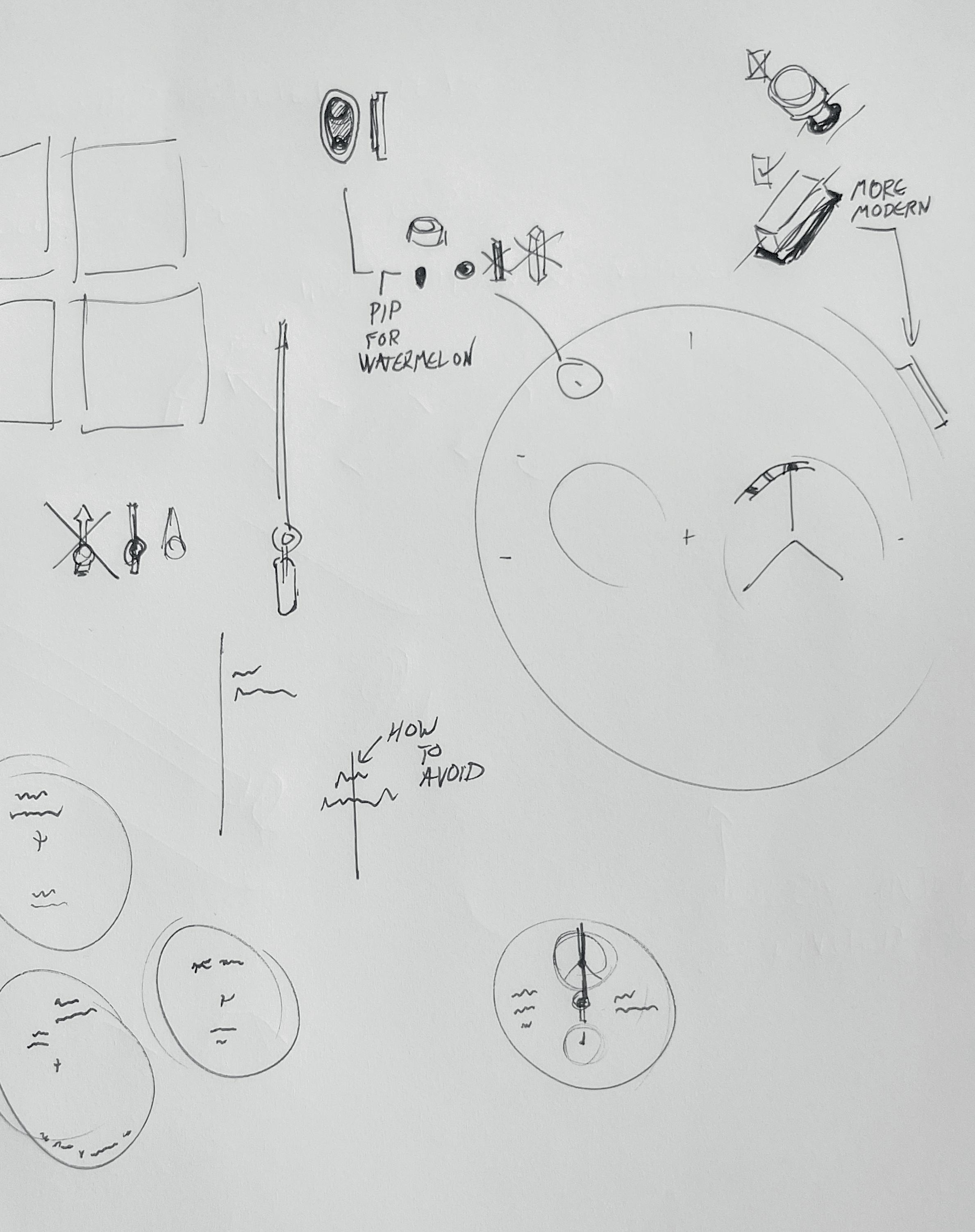
 Every element is considered in the design process, as detailed by the Glashutte design sketches on this page, while Studio Underd0g’s watermelon colour chart (right) shows the depth to which tone is considered before a watch is moved into production

 © David Marchon
price is no object. For accessibility, nobody does it better than Microbrands.
As Studio Underd0g founder (and Head of Design and Marketing Manager) Rich Benc says, “good design can be found at any price point. The same could be said for bad design too! With the way communication technology has evolved in the past decade, new and agile players are starting to innovate at a much faster rate – and lower price point – when compared with brands that have been around for decades. Of course, to be accessible means there may be certain limitations when it comes to materials and techniques. You won’t find an accessible platinum cased, tourbillon watch featuring hand-cranked guilloche dial anytime soon!”
A lower price point often means a cheaper movement

– Japanese instead of Swiss, let’s say – and lighter finishing across the board. But that’s not necessarily a bad thing. As Bulgari’s Fabrizio Buonamassa says: “What you often see in Italian design and industrial design history is to turn a constraint into an opportunity.” In that case he was discussing the QR code barrel of the Octo Finissimo Ultimate, but it’s a way of thinking that every would-be designer should adopt, be that case shape or dial layout.
Speaking of dials, despite one of the funkiest, most idiosyncratic dials around in his price point, Studio Underd0g’s approach to dials is oddly traditional: “I find that the approach for dial design resembles that of the ancient Chinese art of Feng Shui (which aims to achieve harmony and balance in an environment – typically associated with interior design). It’s also very important to realise that even though most dials are flat, they are still a three-dimensional component, which cannot be designed in isolation.”
Despite having a completely different aesthetic, veering only slightly from their Bauhaus roots, NOMOS Glashutte has a similar approach: “We attach great value to good legibility, clarity and understatement”, explains Borowski. “Every element is necessary. This gives the dial the strength it needs to be appealing in the long run. It is therefore always reduced to the essentials - without being minimalist at its core.”
So, no matter what you’re hoping to achieve on your watch face, less is more. After all, at its most fundamental sate, a watch is an instrument and needs to be readable. There’s also limited space to work with, so being careful with how you use it is, as pretty much every brand we spoke to mentioned, a careful balancing act.
What you actually include tends to be thematic – a tachymeter for a racing watch, the various timezones of a worldtimer – and that in turn is largely dictated by the movement. But one of the greatest balancing acts on any dial is the most often overlooked: the shape of the numerals and indexes.
If you’re going for the retro diving or military angle, a sandwich dial goes a long way to evoking it. Pure minimalism might call for hour markers and not much else. But if there’s one brand which, above all others, nail its typography, it’s Hermes – and that’s because it’s something that they think about from the very beginning.
“Typography is an integral part of our creative process since the beginning of the project,” explains Philippe Delhotal, Horological Creative Director at Hermes. “When we imagine the dial, we also imagine how will be the numerals dressing it up. It must be well visible but must remain discreet at the same time. Typography has the power to convey emotions, echoing the overall design of the watch and, very often, the shape of the case. They are all made-tomeasure at Hermès.”
No matter what you’re hoping to achieve on your watch face, less is more. After all, at its most fundamental sate, a watch is an instrument and needs to be readableThe impeccably dressed Fabrizio Buonamassa (above) at Bulgari cites the importance of trying to “turn a constraint into an opportunity” as an important element of design, while at Hermès (left) typography is an integral part of their creative process
It’s something you can see reflected in the funky numerals of the H08, one of the coolest luxury sports watches of the lot, despite (or perhaps because of) it’s Genta-free inspirations. The eight and nine in particular are inspired, different by one quarter of a curve. It’s not the only reason I love that watch, but it’s a big one.
Outside of Hermes, even small changes in a watch’s typography can make a real difference, and you do need to be careful with what changes you try to implement, as Borowski explains: “we once tried to omit the serifs from the numerals of our model Tangente – because, strictly speaking, you don’t need them. At first glance, it was not noticeable at all. But the watch suddenly lacked personality.”
A layout defined by the movement and species of watch, numerals that suit the feel and idiosyncrasies of the watch and anything superfluous stripped out and you’re onto a seriously classy dial. Then you can start playing with colour. This is where your personal taste can really thrive. I love bright colours (my daily
Between the dial, movement and case, there’ a lot to think about when it comes to designing your watch. You need to think about the type of watch you’re looking to create, who it’s designed for, and the price point you’re working in. You need to pin down the dial layout, taking a less-is-more approach to the limited canvas and then play with colours. But if there’s one thing to take away, it’s that with all those myriad ideas knocking about, the only way to design a watch is to get sketching.
As Benc says, “the reality is the design process is often a messy one (at least from an outsider’s eye). I find the most useful sketches are often done when inspiration strikes, be that on a napkin or post-it note.” And as you can see from his own sketches, you should never be embarrassed by your own drawing skills. So, get going. Just remember to credit me on the caseback.

You need to think about the type of watch you’re looking to create, who it’s designed for, and the price point you’re working in


> >
While Modalo offer a more classical approach to winders on the whole with elegantly laid-out, generally fuss-free quality, the Showtime dials up the performance aspect to new heights with a full carbon fibre front. It’s not all front either; the trio of winders can all be set separately, meaning that you can customise the speed to fit the watch, invaluable if you have a particularly delicate high complication piece one end, a rugged sports watch with a high power reserve the other. The rest of the construction is made from solidly luxurious high gloss wood from New Zealand, making it the closest thing to a modern Bentley dashboard you can get in a winder.
£439.50, modalo-com.myshopify.com
While there’s still some debate over whether constantly keeping your watch movement is a good thing or not, we’re inclined to say that it’s no bad thing. The best-condition classic cars are the ones that still get regularly used after all and the bottom line is anything that avoids the need to set your watch every few days when you want to switch it up is good in our book. That said, there’s a lot of difference between a basic watch winder, something that just jiggles your automatic rotor around, and something altogether more impressive. You don’t want your prize Nautilus to slum it in a featureless blank box on your sideboard; you want a piece of craftsmanship that lives up to the watch inside. Fine leathers, sculptural design, tech designed to keep your watch wear-ready at a moment’s notice, these are the best watch winders around right now. And hey, if you end up spending more on winders than watches, that’s fine too. They’re just that cool.
Words by Sam KesslerEnsure that your GMT Master is at the ready and your Navitimer is always in the saddle for a rainy day with an essential watch winder

> >
While this black box is about as aesthetically stripped back as possible, this combination of black and gunmetal lets the finer details do the talking, whether that’s the Rolex-esque fluted bezels around each of its four watch holders, or the superlative winding technology behind it. Each winder has an obsessive amount of rotation options and can be set anywhere between 300 and 1,200 turns per day, each of which are counted individually rather than estimated (as most winders are wont to do). The mechanism is even designed to stop your watch being overwound. There’s a reason WOLF is the big dog of watch winders.

£1,955, wolf1834.com
> >
What’s life without a bit of contrast? Or a watch winder for what matter. As the name suggests, the Rotor Racing collection from Italian winder specialists Scatola del Tempo takes their cool, minimal Rotor One and updates it through a petrolhead lens. That means a striking high contrast look in orange and black that’ll match a McLaren nicely. If you want to update the look, you can also opt for one of the Rotor collection’s signature interchangeable bezels. Hulk green to highlight the orange perhaps? Either way, the winder is completely autonomous with a three-year battery life, so feel free to stow it in its spiritual home in the garage next to your car.
£550, scatoladeltempo.com

“
If you want to update the look, you can also opt for one of the Rotor collection’s interchangeable bezels
Winders aren’t normally something you’d consider fun. That’s until you get a bright splash of pop art colour courtesy of Swiss KubiK. The brand’s an expert at turning what would be a dull box in less assured hands into something with much more aesthetic punch – and nothing punches quite as hard as this bright turquoise. With a soft touch surface its also surprisingly tactile, making for the kind of summery watch winder that you’ll actually enjoy using. That’s not something you can say about most winders. And yes, it pairs pretty immaculately with anything in Tiffany blue. £450, swisskubik.com

“
The brand’s an expert at turning what would be a dull box in less assured hands into something with much more aesthetic punch
> >
Part sculptural masterpiece, part gyroscopic carnival ride, the Orbit is one of the few watch winders that goes well beyond a tech-driven box. Designed and handmade in Finland, it’s a serious statement piece, but one that also offers an incredible 360-degree view of the watch inside. Sure, it’s not particularly efficient like a multi-watch box would be, but when it looks this good, what’s a little impracticality? Not that the winding system isn’t impeccable of course. The multi-directional movement mimics the movement of a watch on the wrist, giving it the most natural winding experience possible in the most out-of-this-world way. £1,334, orbitwinder.com

> >
Yes, this is Darth Vader’s TIE Fighter as a watch winder, which is to say we’d happily turn to the dark side to get this on our shelves. Created by Kross Studio, the designer behind the recent run of Lucasfilm-endorsed Star Wars timepieces devoted to the Death Star and Slave II (Boba Fett’s ship), this scaled-down fighter swaps out the cockpit for a single watch winder. There are plenty of winding options you can adjust via Bluetooth and the battery life is a solid two years. It’s not quite hyperspace levels of cuttingedge, but as winders go there’s nothing else quite like it.
CHF 2,500 (approx. £2,280), store.kross-studio.ch

“
It’s not quite hyperspace levels of cutting-edge, but as winders go there’s nothing else quite like it


\ 80 /
Introducing the brands with creative verve running through every thread
\ 82 / How Duchamp is taking inspiration from its French artist namesake
\ 93 /
Wear your art on your sleeve with our choice of sartorial masterpieces


\ 94 /
Ensure your feet are as ready for the countryside as they are the cocktail bar
EDITED BY SHANE C. KURUP & SAM KESSLER\ 96 / Exploring the silhouettes that elevate special watches towards iconic design
> > “Make it simple, but significant,” implored Don Draper in the cigarette in one hand, whisky in the other series Mad Men. And while that approach to cigarettes and alcohol isn’t condoned by the health authorities, or the Oracle Time team (at least not before lunch, anyway), the ethos of simple, but significant design is heartily condoned. Examples of good design are everywhere if you’re willing to hunt them out, from specially selected brands with a creative verve running through their every thread, to a reinvigorated design approach at Duchamp, and illustrations of the silhouettes that elevate certain watches to iconic status. Now, where’s that glass of whisky?
Facts and figures might be logical – and entirely necessary – but what would life be without a little imagination? For our Art and Design issue, we present the brands with creative verve running through every thread.

> > Cashmere and merino might be on your style radar, but yak wool?
Dechen Yeshi and her mother, Kim, founded Norlha in 2005 to bring the benefits of this lesserknown yarn to a wider audience, which has all the softness and warmth of its illustrious cousin, cashmere, but greater heft and resilience. Yeshi –whose father is Tibetan –established her workshop in the Gannan Tibetan Autonomous Prefecture to provide employment to the people of the plateau and reignite indigenous craft methods, including the hand felting of yak wool. Clothing, accessories and blankets made from khullu – the soft, downy fibres of baby yaks – are all part of the brand’s repertoire and once you’ve sampled it, you’ll never go back to plain old cashmere again. norlha.com
> > Despite the abundance of smart gadgets, sometimes you just can’t beat pen and paper for capturing those lightbulb moments. It’s exactly why luxury leather goods brand, Ettinger, has produced a limited edition leather-bound notebook with pro-paper artist, Rory Dobbs. Bound by historic London printers, Barnard & Westwood, the A5-sized plain-page jotter is housed in a sturdy yet soft cover embossed with Dobner’s most characterful illustration, Nigel the Owl, alongside a set of handsome pocket watches. As an added bonus, a proportion of the proceeds from the sale of each notebook go to the Queen Elizabeth Scholarship Trust, to inspire others to get their creative juices flowing.
Ettinger x Rory Dobner notebook £265, ettinger.com
© PhotographerNikki McClarron
> > Few brands know the importance of a cosy accessory like Begg x Co, which shouldn’t come as a surprise given its roots in the Scottish Borders. For AW22, alongside its usual offering of cloud-soft cashmere knits and scarves, it’s collaborated with celebrated Scottish painter and sculptor Brian McLean for a blanket featuring the shapes and colours of his Gardenworks series, which is inspired by the light and shade of his Menorcan studio garden. Just dive beneath it when the mercury heads south to feel the warm embrace of the Balearics. Valatzu Bruce McLean lambswool-cashmere blanket £755, beggxco.com


> > Parisian brands have always marched to their own-trend setting beat, but for the past few years, the house of Vuitton has been moving to a symphony entirely of its own. This creative dynamism is, in no small part, due to the maison’s late, great, creative director, Virgil Abloh. AW22 is the final collection to bear his singular touch and its mix of tapestry coats woven with work of painters Gustave Courbet and Giorgio de Chirico, street-ready floral-print parkas and plush velvet tailoring, showcase Abloh’s innate skill for fusing high and low, which brought streetwear into the realms of high fashion. This is the masterwork of one of the greats of the modern atelier.

louisvuitton.com

> > The Japanese are famed for a number of things: a skill for preparing raw fish, watches to rival those of the Cantons, and a fondness for karaoke being a few select examples. But a knack for competent, outside-the-box design is probably their biggest ace card. Vinicius Cipriano and Noelle Rodrigues, founders of Future Present, certainly think so. Established in London by the creative duo in 2021, the online destination is a veritable Aladdin’s cave of the brightest independent labels hailing from the far eastern nation.
The intelligently curated range of clothing and accessories offers technically advanced fabrics, innovative treatments, and idiosyncratic cuts that showcase the design prowess of the Land of the Rising Sun with the clarity of a crisp Niigata sake. futurepresent. london

> > Our Continental cousins might claim the bragging rights when it comes to highbrow art, but English culture has always been a rich source of inspiration for the artistically inclined – and in particular, for those in the rag trade. Through his eponymous label, S.S. Daley, Liverpudlian designer Steven Stokey-Daley riffs on the stylings of English aristocrats and eclectic country types. Alongside upcycling vintage embroidered tablecloths into one-of-a-kind shirts, his Britishmade argyle knits, oversized plaid outerwear, and billowy slacks have all the poetic whimsy of the Bloomsbury Group. So while you might not be Lord of the Manor, you can at least dress the part. ssdaley.com
© PhotographerChris YatesDuchamp’s new Head of Design Mark Frost tells us about how he takes inspiration from the French artist namesake of this famous British men’s brand
 Words by Nick Carvell
 STYLE — duchamp’s back
Mark Frost (right) cut his teeth at Tom Ford, before heading up the creative direction at Gieves & Hawkes, and most recently with Kent & Curwen
STYLE — duchamp’s back
Mark Frost (right) cut his teeth at Tom Ford, before heading up the creative direction at Gieves & Hawkes, and most recently with Kent & Curwen
It’s relatively common for art to spark the creative minds of the fashion world, but rarely is the connection between label and artist so explicit as at Duchamp. Founded in 1989 by Mitchell Jacobs, a former buyer at Browns department store in London, the British label was named after the famed French conceptual artist Marcel Duchamp as a way to forever tie (no pun intended) his philosophy into the way the brand approached design. Just over 30 years after the brand was established, Mark Frost is inheriting this legacy as the brand’s newly-anointed Head of Design.
“There’s a quote that Jacobs said while he was running the brand: ‘Duchamp turned everyday objects into art and I turned everyday icons of men’s fashion into wearable art’,” says Frost as I speak to him about his new role over coffee at Mortimer House in London. “I want to continue that legacy. For me, the purpose of art is to capture your attention in the moment, or make you feel something - and that’s what I want this label to do. I want there to be something unexpected.”
Of course, this is the driving principle that gave Duchamp the kind of grip on

the men’s accessories market that competitors could only dream about in the 1990s. Founded at the tail-end of the banking boom, Duchamp’s wildy colourful socks, graphic ties, and conceptually-shaped cufflinks made it the go-to brand for City boys looking to funk-up their straight-laced two-piece suits. Of course, this transitioned nicely into the pocket-square-and-skinny-suit obsessed generation of menswear dandies that emerged in the mid-2000s – something that no doubt encouraged the brand to branch out into a full tailoring line in 2013. However, as the suit and its necessary accoutrements fell out of favour not just with the fashionconscious younger crowd, but also in offices across the world, Duchamp London faltered.
That was until new owners revived the brand in May last year, placing Frost at the helm - a designer who cut his teeth in the studio at Tom Ford before heading up the creative direction at Gieves & Hawkes, and most recently, the David Beckham-backed menswear label Kent & Curwen. The challenges for him at Duchamp aren’t entirely dissimilar to the ones in those precious roles: take a brand with a distinct heritage (Savile Row suiting and traditional British sporting pursuits, respectively) and make that relevant for a new generation. And the evidence in his debut collection for the label is that he’s doing just that.
“We were putting this collection together as we came out of the worst of the pandemic and that desire to travel, to see new things just felt impossible to ignore,” says Frost of the line; Duchamp’s first in two years. “We kind of looked at this idea of nostalgia, the nostalgia of holidays and the things that you see on holiday.” Handled with Frost’s signature softly-softly approach, the result is a collection of apparel and accessories that takes patterns and colour seriously (this is Duchamp after all), but doesn’t hit you over the head with them. The result? Louche, camp collar linen shirts with delicate tile prints or blue and white brush-stroke stripes (reminiscent of an artist painting the detail into a deckchair); a Breton shirt embellished with a pop of yolky yellow; swim shorts in shades of coral
Taking inspiration from the artist Marcel Duchamp, who produced this 1925 poster for the third French Chess Championship, new Head of Design, Mark Frost has produced an homage of jostling 3-D squares in shades of orange, blue, and black that features on a range of shorts and shirts

 Frost’s debut collection at Duchamp draws on the nostalgia of holidays, resulting in louche, camp collar linen shirts with delicate tile prints or stripes, Breton shirts embellished with pops of yolky yellow, and swim shorts in shades of coral and cobalt blue
and cobalt blue. Other clothing in the collection is relatively restrained in its palette (a taupe suit here, a navy harington there), becoming the canvas for the more vivid centrepiece elements of the collection.
One pattern in particular catches my eye: a delightfully avant-garde collection of 3-D squares jostling for attention in shades of orange, blue, and black that features on shorts and shirts alike. This pattern, Frost tells me, is inspired by a chess poster designed by Marcel Duchamp for a French chess tournament
in 1925. The artist’s love of the game of kings (“He seemed to be more interested in chess than he was in painting or sculpting towards the end of his life,” says Frost) is also seen on the designer’s first drop of ties and accessories for the collection with a repeating pawn print cropping up on designs.
Perhaps the most surprising item in the collection is a sweatshirt with a seventies-style collar, intricate stitch detailing and a quarter zip cut from vanilla-white Terry cloth – eye-catching for, well, just how un-Duchamp it is. In
fact, the only real nod to the Duchamp of days-gone-by is so small you might just miss it: take a closer look at the metal zip-pull and you’ll notice it’s in the shape of a small tie (a small nod to the brand’s eccentricity that made me smile when I discovered it).
However, if this is a brand that made its name offering men an eye-boggling selection of jazzy patterns and colours, then this piece is quite possibly the biggest statement Frost can make as the driving force of the brand. And why shouldn’t he? Men have changed how they dress since the brand was founded, rarely wearing ties or cufflinks on a daily basis and increasingly not having wardrobes delineated into strict work and play sections. Duchamp needs to reflect that, of course, but does the idea of taking a brand primarily known for office accessories and translating it to the remote working, Casual Friday era not feel like a gargantuan challenge for Frost?
“Men might feel that they don’t have to wear ties or cufflinks now, but that means that those who wear them do so because they really want to,” says Frost. “Or maybe there’s now a different customer for Duchamp entirely –someone who wants to wear a T-shirt or a hoodie with a neckerchief, for example.”
While this first resort collection sets Frost’s vision for the brand, it will be the second collection (which drops this month) that is set to really showcase its full potential. Understandably, he’s keeping it under wraps at the time we speak, but he gives me a little hint at what’s to come.

“I’ve been thinking a lot about contradictions - day and night, hard and soft, tactile and rough,” says Frost. “Technique will be a very important part of the collections moving forward, so you’ll see Jacquard knitwear, for example, next season. Ultimately, I hope that both people who know the brand and people who don’t will be surprised.”
For a label named after an artist whose work changed the way people thought about what art could be forever in the early 21st century, Frost’s ambition for Duchamp just over 100 years later feels particularly apt.
“Maybe there’s now a different customer for Duchamp entirely – someone who wants to wear a T-shirt or a hoodie with a neckerchief”
These days the menswear scene is saturated by near-constant sneaker drops – so much so that it’s tricky to find a pair that feels unique. However, that’s not the case over at British brand Duke + Dexter, which recently added a totally custom shoe service to its offering. Entitled 1OF1 and run by the brand’s in-house artist, Jessica Pickard, the service allows you to treat the label’s signature styles as a bank canvas for your wildest footwear fantasies.
“One of my first pairs was for a groom who wanted a galaxy of stars hand-painted across both shoes, front, back and sides,” says Jess, when asked about her most exciting client briefs. “He thought of every detail, from the specific colours to the lining style inside the shoes to their wedding date on the heels. He even added wording to the soles! They were truly a pleasure to create.”
Whether you choose from the seasonal Artist Collection or go for a totally bespoke design, Jess hand paints your pair to order following an initial consultation to make sure that it’s exactly what you’re after – and, after a few weeks, your outta this world idea will be crafted and delivered to your home with a handwritten note from the artist herself (proof of provenance is key to any masterpiece, after all).


More information about the Duke + Dexter 1OF1 service at dukeanddexter.com
 Customers at Duke + Dexter can choose from the seasonal Artist Collection or go for a totally bespoke design, which is hand painted to order following an initial consultation and comes delivered to your home with a handwritten note from the artist
Words by Nick Carvell
Customers at Duke + Dexter can choose from the seasonal Artist Collection or go for a totally bespoke design, which is hand painted to order following an initial consultation and comes delivered to your home with a handwritten note from the artist
Words by Nick Carvell
Avoid the queue to dress like everyone else and put you best custom foot forward with the help of Duke + Dexter


1/ Emmanuelle Khanh Panther tortoise optical glasses, £300, ek.fr 2/ Jaeger-LeCoultre Tribute Enamel Hokusai ‘Amida Falls’, £POA, jaeger-lecoultre.com BODE Garden embroidered cotton shirt, £540, mrporter.com Completedworks Crunched: A Tale of Abandoned Legal Strategies platinum-plated ring, £295, completedworks.com Montblanc of Art Homage to Peggy Guggenheim limited edition 4810 fountain pen, £2,660, montblanc.com Marni Tribeca colour-blocked tote bag, £330, matchesfashion.com Purple Brand P002 paint splatter slim-fit jeans, £250, brownsfashion.com KARDO embroidered denim jacket, £220, kardo.co Maison Margiela Replica painter sneakers, £490, brownsfashion.com masterpieces


 Edited by SHANE C. KURUP
As summer gives way to autumn, ensure your feet are as ready for the countryside as they are the cocktail bar
> > After weeks of scorching heat and highest-on-record temperatures across the UK, the weather’s finally breaking as we drift – still a little warmer than we’d like – into the beginnings of autumn. And you know what that means: before you know it, the sun will be a distant memory as the floods cometh.
Perhaps that’s a bit too apocalyptic, but at the
a hole in your life ready to be filled by some solid autumn boots.
The question then is what do you go for?
There’s always a Chelsea boot if you fancy something that can just be pulled on at a moment’s notice. Or you can go full country clodhopper with a field boot, the kind you can only complete with copious splatterings of mud. Or you could land somewhere in-between with the noble, ruggedly versatile Chukka boot –and there’s no Chukka more noble or rugged than Edward Green’s new-for-2022 Lanark.
One the one hand the Lanark’s waxed suede is more than enough to keep off the British weather provided you stay out of the Thames, with three reverse eyelets high on the upper to stop water getting in. On the other, the dainite soles make for a much more relaxed, city-break kind of silhouette than the chunky, commando sole of a proper country boot. It still has decent grip for icy winter pavements, but looks far more elegant – as does not slipping onto your backside.
very least we’ll soon be entering what passes as a rainy season in our particularly bland climate, and your summer loafers like getting wet less than Gizmo, with equally horrifying results. Pair that with the fact that you’ve probably not bought much else over the past few years (it’s hard to justify new footwear when you’re barely going out) and it’s likely that you have
This version in green suede is a particular autumn highlight in a mossy, woodland shade. It’s already a characterful, carefully worn look, but its one that will only get better with age, if you treat it as well as you would a fine wine at any rate, which you should.
Edward Green shoes are an investment piece, whether they’re built for a cocktail bar or created for the countryside. You could consider these a double investment then; these handsome Chukkas work for both.
Edward Green Lanark Chukka Boots, £925, edwardgreen.com


What makes an iconic watch design? I don’t mean iconic in the everyday, overused sense, I mean the watches that have come to define whole eras of horological history. It could be their technical accomplishments; it could be who wore them, or it could be their iconoclastic impact. Whatever the reason, they’re the kinds of watches where all you need is to show a single key design element, a bezel here, a silhouette there, and even budding collectors will know what you’re talking about. Which is precisely what we’ve done.
We’ve worked with watch illustrator, Ben Li, better known on Instagram at @inkdial, to sum up eight truly iconic timepieces in sketch form. If you like what you see, I highly recommend you check out more of his work at inkdial.co.uk – or the incredible cover to this very issue. What says ‘watch lover’ more than an art print of your favourite watch? For now, read on and check out his work in brief, with an equally brief history of each unique design.
The bezel that launched a thousand sports luxe timepieces, the original Royal Oak was one of the few designs that can actually be called revolutionary. At the time the quartz crisis was a vortex of bad news for traditional horology, sucking many a brand into oblivion when they realised that these new-fangled movements were cheaper and more accurate than their mechanical counterparts.

Audemars Piguet however went the other way. In an era where most watches were gold, delicate numbers, they needed something to stand apart. The apocryphal story goes that they went to designer Gerald Genta and asked him, the night before the 1972 Swiss Watch Show, to come up with a concept. The hastily sketched result was a big, steel sports piece with an integrated bracelet and, topping it all, a chunky octagonal bezel with eight visible screws.
It’s a design that has been imitated ever since (occasionally by Genta himself) but in my opinion at least, never bettered. It may have seemed ludicrous in the 1970s that a steel sports piece could cost most than gold, but for us in the watch world that’s a well-mapped route these days, waters first charted by the Royal Oak.
Today there are a fair few variations of the Royal Oak, be that the chunky, macho Offshore collection, apparently countless flying tourbillons, or the latest generation of ‘Jumbos’ harking back to the 1972 original. Either way, it’s an enduring classic in the truest sense. You see that bezel, you instantly know what we’re talking about.
The Royal Oak wasn’t Genta’s only enduring success. Two years after his industry-shattering launch with Audemars Piguet, the designer went to Patek Philippe with a design for what their answer might be. Patek being one of the more cautious watchmakers, with a focus on elegant high complications – and one that didn’t need the boost as desperately as AP did – they didn’t
launch headlong into it. Instead, it was two years of development later before the concept would see the light of day at the Nautilus.
Inspired by a porthole, hence the name Nautilus, taken from the Jules Verne classic 20,000 Leagues Under the Sea, the new watch had another octagonal bezel, but smoother and more rounded, with protruding ears connecting it to the main body of the watch. It was a visually striking silhouette, but one that was also incredibly practical; it ensured a water resistance of 120 metres, which at the time was incredible.

There were other similarities to the
Royal Oak along with the bezel. The dial was blue, though used horizontal grooves like a ship’s deck rather than the more industrial Tapesserie, and it housed the same calibre 2121 movement. Patek Philippe though hit the nail on the head with one phrase: “one of the world’s costliest watches is made of steel.”
The slogan they launched the Nautilus with back in 1976 could still apply to the Nautilus of today, a design that’s barely changed over nearly 50 years. Will it change now the grand dame of luxury steel watches is discontinued? Probably not. At least not when it comes to that inimitable, muscular silhouette.
The El Primero started life as Zenith’s centenary challenge to themselves: to create the world’s first automatic chronograph. The development began in 1962, with an aim to launch just three years later, but it was a tall order. Not only was the watchmaker insistent it be an integrated chronograph rather than a module, it had to offer 1/10th of a second accuracy. That would make it the most accurate watch in the world. Oh, and they
wanted it to be small, too. And have a date. Needless to say, the designers overran. But by 1969, the El Primero, meaning ‘the first’ in Spanish, made its long awaited debut.
The delay meant that both Seiko and Chronometric Group got their automatic chronographs to market first, but even with a few months difference (the Seiko launched in May; the Zenith in September) the El Primero stood out. It was by far the best, as Zenith hit every single element they were aiming for.
The movement was actually placed in two watches initially, the A384 with its

tonneau case and smaller, 37mm size and the A386. The latter had a round case, thin bezel, and a scale dividing each minute into 100 to show off the 1/10th second accuracy. Visually, it was also defined by its three oversized and overlapping subdials in a trio of colours.
Of the two models (and the odd rarity that is the A385), the A386 came to define the El Primero as a racing chronograph. Its sportier look, easier readability, and the sheer coolness of those overlapping subdials carried it through as one of the biggest constants in Zenith’s line-up from 1969 to today.
Cartier’s history isn’t short of iconic watches. There’s the first pilot’s watch in the Santos; the archetypal rectangular piece in the Tank, and the ever-tactile Ballon Bleu. Yet while they all have facsimiles at other watchmakers, the Crash does not.
Surprisingly for a Parisian company, the Crash emerged from the brand’s Bond
Street location and Jean-Jacque Cartier. The story goes that what became the design started as a customer’s Cartier Baignoire, an oval-shaped dress watch with a Tank-ish dial. After getting damaged in a car crash, it was warped and distorted. Inspired, Jean-Jacque’s team created the first Crash in 1967.

There’s some debate on the matter, but it’s generally thought that the Crash was the first asymmetrical watch. Whether that’s entirely true or not, it was
considered avant-garde on release, a defiant, Dali-esque melting refresh of the Cartier DNA.
While the Crash never took off in the same way as the Tank, Santos, or Ballon Bleu, it’s become talismanic of Cartier’s unique design sensibilities – that they can pull pretty much anything off – and has come back into its own in recent years, with starring roles on the wrists of superstars like Kanye West and Jay-Z. To this day, there’s still nothing else like it.
Heuer (both pre and post TAG) has always been synonymous with motorsport, right from the early automotive chronographs in 1911, with milestones like the first 1/100th of a second stopwatch (the Mikrograph), or the Autavia stopwatch that, before OMEGA, was an Olympic timekeeper.
Possibly the biggest success in the field though was the Carrera, a nowlegendary racing chronograph built by
the founder’s great-grandson, Jack Heuer. However, he had another aim which, much like Zenith, was to build the first automatic chronograph. To do so, he collaborated with Buren, Dubois Depraz and Breitling to create the Project 99, renamed the Calibre 11. It was initially placed in a slightly upsized Carrera and an Autavia. But Heuer wanted a brand new watch for the brand new calibre and, at the same time, his design team had been working on a newly-patented, waterproof, square case. Released in 1969 alongside the El Primero, it became the Monaco.
The Monaco was an Instant success. The El Primero may have had the technical chops, with its integrated chronograph (the Calibre 11 was modular) but the world’s first waterproof, automatic chronograph was nothing to sniff at either and the case shape with its twin squared subdials was one of the most attractive layouts to date.
Even today the Monaco is a racingslanted classic, made famous by the inimitable Steve McQueen in the 1971 film Le Mans that remains an enduring icon of Heuer design.

The Navitimer began life in the early 1950s for one very specific function. This was still the early days of flight and pilots needed to use a logarithmic slide rule to make calculations throughout each flight, which seems a touch terrifying.
In 1952, Breitling was approached by the US Aircraft Owners and Pilots Association (AOPA) to create a members’ chronograph. So, the watchmaker decided incorporate the slide rule into a watch.
It wasn’t the first time Breitling had used a slide rule though, as the Chronomat of 1942 had a sliding telemeter. But adapting the function for aviation use meant taking a much more technical approach – and upsizing the case to a then massive 41mm – to make room for everything.
To make using the slide rule even easier, the Navitimer was given a tactile beaded bezel, something that (until the collection’s recent relaunch) became an instantly recognisable detail. In fact, the number of beads is an easy way to date various references.

This initial version wasn’t Breitling branded and only went to AOPA members, so it wasn’t until 1956 that it came onto the open market as the Navitimer we know and love today. It very quickly became synonymous with the golden age of air travel, a practical, stylish pilots’ watch that suited a sharp uniform and jet-setting wage.
Thankfully pilots no longer need to rely on a slide rule now they have a suite of electronics at their disposal, but it’s good to know that many will still be wearing a Navitimer in the cockpit. You never know what can happen.
The quintessential traveller’s timepiece – and not just because of the innate jet-set connotations of wearing a Rolex these days – the GMT Master-II is the second timezone timepiece that all others aspire to.
In the 1950s, air travel was becoming more the norm than a novelty. With it came a demand for some way of keeping track of time across the world in an era
before electronically synchronised clocks, particularly from pilots. So, tapping into that market, Rolex released the GMT Master in 1954.
The GMT Master had two things going for it. First was the cyclops magnifier over the date; the second was the dual time function of the calibre 1065, which had a 24-hour hand. This was read off the bezel, which wasn’t just bi-coloured to highlight day and night, but was rotatable. There were a few variations available, but the one that came to epitomise the GMT Master was the red and blue ‘Pepsi Cola’ version.

While the Ref. 6542 may have originally
been built for PanAm, the GMT Master took off, and in 1959 Rolex launched the second series, the Ref. 1675. However, bezel variations, sapphire crystals, and other slight evolutions aside, it took another couple of decades for the biggest change in the collection: the 1983 introduction of a newly-independent 24-hour hand and a name change to GMT-Master II.
The GMT-Master II is still the ultimate traveller’s watch, and that original Pepsi Cola bezel the most desirable of the lot. It’s hard to look at any GMT these days using red and blue and not see an homage to Rolex. Iconic barely cuts it.
The Reverso is far from the only watch on this list built with a particular purpose in mind, but it’s the only one whose purpose is quite this particular. It’s also the earliest chronologically (and, I guess, chronometrically) by far.
The story is actually an incredibly British one. In 1930, watch collector César de Trey was watching British army officers play polo in India, because that’s something we apparently did. One
of the officers had taken a ball to the watch, which had completely smashed the crystal. And so Trey saw an opening for a polo-proof wristwatch, an idea he took to Jacques-David LeCoultre.
Rather than reinforcing the crystal or anything so prosaic, LeCoultre instead opted to take the crystal out of the equation and create a (I assume much more complicated) rotating system. The concept was that off the horse, the watch would be a handsome, Art Deco dress watch; during play, it would be protected by its own caseback.
Was it necessary? Probably not. I doubt many serious polo players have much time to read their watch during a match. Was it cool? If you’ve ever played around with a Reverso, you’ll know the answer’s a resounding yes.
The Reverso, with its rectangular case and Art Deco good looks has seen little change over the past 90-odd years. There was the two-faced Due, metiers d’art and high complication references, and many tributes to earlier models, but the blueprint is always the same: that rotating, rectangular case.


> > Compromise is a dirty word, but it’s one that we’re used to putting up with – particularly when it comes to audio. While you may lavish attention on your home audio systems, with cutting-edge loudspeakers and amps, when it comes to headphones we’ve all been known to prioritise proximity over quality. That’s something Meze Audio is hoping to change. Unlike many audio brands that go back decades, Meze is a relatively recent success story. Founded in 2011, the idea started like most good ideas do, when Antonio Meze couldn’t find

the perfect pair of headphones. So, he decided to make them. He took a long, hard look at what was on the market and - experimenting with parts readily available - set about making his ears’ dreams come true. Normally these things take time, with careful planning and even more careful execution. And while the care and attention were certainly there, it only took until 2015 for Meze to break out with their phenomenal 99 Classics headphones. They stormed onto the scene, pairing the premium looks of wood and gold with impeccable sonic
performance, the kind that you can appreciate upon first listen.
More importantly, the 99 Classics epitomised Meze’s uncompromising approach to design, both technical and aesthetic. It’s why they’re finished so exclusively; it’s why they’re wired. And it’s why, today, new models are developed in-house from the ground up. There’s also a particular emphasis there on ‘classic’. Most headphones these days follow similar sleek, futuristic and often industrial designs. You know what we mean, plenty of black and white, smooth
curves and minimalism.
The 99 Classics – and by extension Meze’s overall vision – is the opposite. As the Yves Saint Laurent saying goes, “fashion fades, style is eternal” and while that’s particularly true in an industry dominated by built-in obsolescence, for Meze it’s ingrained in their DNA. Meze don’t make headphones for background listening, for zoning out while you work. They demand attention, flexing their technologyled listening experience while looking like the serious investment pieces they are. Their vivid, immersive soundstage offers incredibly balanced audio, designed for long listening sessions without harshness or fatigue.
It’s a level of quality only achievable with utter obsession, not just in the tech, but in the choice of materials and the smaller details – such as ensuring parts are easily replaceable so that the headphones really last.

From the initial drawing board to the final product, each pair of headphones has to be the best it can be – as close to perfect as your ears can identify.

Today the 99 Classics is still one of the most successful high-end headphones on the market, but now it’s been joined by the more modern 99 Neo, the state-of-the-art Elite and the gorgeous Empyrean. With the Advar, there’s also a pair of earbuds with all that Meze quality in a smaller, easily wearable package.

Compromise may sometimes be an inevitability, something that we simply need to put up with. But in the case of listening to the music you love, it doesn’t need to be – and with a pair of Meze headphones it won’t be for years to come.
mezeaudio.eu
Founded by Antonio Meze (below) in 2011, Meze’s range includes the Empyrean (above), the Advar earbuds (below, centre), and the original 99 Classics (below, right)
Words: Sam Kessler
WE TALK COLD CUTS AND KHANJARS WITH THE COFOUNDER AND CEO OF TECH-FORWARD PRE-OWNED WATCH SPECIALIST SUBDIAL


 Clockwise from left: Crane’s prized Royal Oak; his MoonSwatch Pluto bought in Edinburgh; his 1999 BMW 3 series purchased after getting carried away over a pub roast; and a Rolex with the rare Omani Khanjar on the dial, similar to one he sold through Subdial
What was the last watch you bought?
There are two answers to this!
Technically the MoonSwatch – I bought two while I was in Edinburgh early in the morning, saw a queue and thought why not. The last proper watch I bought though was the Royal Oak 14790ST. A couple of years earlier I got a 4100, slightly smaller in bi-metal and loved it. It was a bit too dressy for everyday and was still box fresh, and I felt bad every time it got a ding – so when a beaten to hell one came in I had to jump on it!
Do you collect anything outside of watches?
I’ve recently started collecting art in an incredibly amateur way, swapping watches for paintings. Otherwise, I have the same kind of interest in cars as I do in watches – I got a 1999 BMW 3 series after getting carried away over a pub roast. If I had all the money in world, I’d fill up a garage with 1990s German cars.
What, other than a watch, is at the top of your wishlist?
I just repainted my house and every wall was crying out for some colour, so I’m looking to get some more art for them! Something modern, ideally from Eddie Martinez if I could afford it. It’s almost
cartoony with really bright colours. I need to work out a way to trade my way up to one of those.
Transylvania was amazing, not what I expected at all. It has a Germanic feel to it with beautiful Alpine-esque architecture. But watch wise… when we’d just started out, we were sent a pic of a Daytona with the Omani Khanjar on the dial. I thought it was a joke. But the owner told me all about it, sent more pictures and I realised it might be genuine – he was given it by the Sultan of Oman on one of the first British tours over there to modernise their air force. I gave him the ballpark price - £400,000 to £800,000! We managed to find a buyer and both he and his wife enjoyed their retirement.

We started a company to do something meaningful, exciting and tech-led in an industry that didn’t have it. How can you find a way of making something that people use every day better? Watches was a chance to work with a really passionate group of people that appreciate it. Collectors that are a genuine pleasure
to deal with make everything worth doing. That’s the motivation.
A book/podcast/album that changed the way you think?
From a business sense my faourite podcast is This week in start-ups, which covers all things entrepreneurial. Hearing what other people in other industries are doing that you might be able to learn from is incredible. I take a lot from knowing that other people are going through what I’m going through.
Who is a celebrity/person of note/intellectual you admire?
I don’t particularly put people on pedestals.
What’s your ideal long weekend?
With the dog and girlfriend somewhere quiet. I love living in central London, but getting way to the Lake District, Camber Sands, somewhere like that is exactly what I need. Walk, drink, sleep, maybe some eating. Basically, as little as possible, a bit of exercise, reading in the evening, just life away from the city. Either that or a long weekend on a boat, drive down to Southampton and get on a sailing boat – to sail, drink, sleep, and maybe eat.
What would we always find in your fridge?
It’s permanently stacked with Romanian snacks and cold cuts. Every time my girlfriend’s parents come over to visit they bring a smorgasbord of meats and drinks – including Pálinka which is basically Romanian grappa. Apparently, its an acceptable way to start the day and it looks at me every time I open the fridge.
What’s a rule/mantra that you live by?
I’m someone that generally hates the thought that there’s a right way or a wrong way of doing something. You shouldn’t need to follow a process or a document without wondering why you’re doing it that way. It’s all about building things up from first principals, from approaching things fresh and new.
For Subdial, technology was the only part we had some grounding in and the rest was self-taught – it gives you the freedom to do things the way you want to do them.
It’s not just Transylvania that has impressed Crane with its Germanic feel and beautiful Alpine-esque architecture, as the Romania enthusiast also stacks his fridge with Romanian snacks, cold cuts, and the grappa-like spirit, PálinkaWatches was a chance to work with a really passionate people that appreciate it. Collectors that are a genuine pleasure to deal with make everything worth doing. That’s the motivation


Microbrands love diving watches. For every cool, unique racing watch or pilots’ piece, there’s a generous handful of unidirectional rotating bezels and solid water resistances. That’s what we’ve come to expect, diving watches are incredibly popular after all, but it does make standing out from the crowd hard. The best way to do it? Take an established design and make it your own. Case in point, the Ocean Seacrest from Portuguese brand Escudo.
Now, it’s no secret that there’s more than a touch of the Black Bay to the Seacrest. It has a similar 39mm stainless steel case, an almost identical crown and a (slightly more pared-back) bezel with the same grip, thickness and overall look. In short, if you saw its silhouette, you’d assume Tudor. That said, it’s an often-imitated design that Escudo has made all their own.
Escudo, in case you’re not up on your financial history, is a now-defunct Portuguese currency – the same coins on which you can find the cross that doubles as the watch brand’s logo. With that in mind, it’s no surprise to find out that Escudo is inspired by historical explorers.
It’s a theme that manifests itself in both the Portuguese colours on the diving bezel’s 12 o’clock market (doubling as a nice little flash of colour) and the absolutely inspired compass point indexes at 12, three, six and nine o’clock. The long arrows might be a touch small, but they work far better than they have any right to, turning a standard dive watch layout into something genuinely cool. It hints that, while Escudo are definitely playing it safe with their first launch, once the fledgling brand’s on more stable footing they’ll have some genuinely interesting ideas ready to go.
Then there’s the colourway. The Ocean Seacrest currently comes in three variations. The black and blue versions come with bezels matched to the dials. The Chocolate Bronze on the other hand is a completely different vibe. Rather than utilitarian, the mix of bronze-rimmed, brown bezel, black dial and bronze-edged numerals bring some much-needed old-world glamour to bear.
I’m a huge fan of contrast bezels, especially something a bit more unusual and not just blue, black, or green. I also love the small touches of bronze here and there – I love the metal, I hate the patina, so moderation is the name of the game as I don’t want to have it polished up every few weeks. And I love brown. It’s shorthand for modern vintage and for some reason not used nearly enough.


Put together, the Ocean Seacrest is one of the loveliest looking divers I’ve come across for a while. What it loses in originality, it more than makes up for in execution, and the additional explorer-centric details get a lot of good faith from me.
Specs-wise, you’re looking at 200m water resistance with a solid caseback (one that always aligns on a vertical plane so the engraved logo’s oriented the correct way, a nice touch) and a Sellita SW200-1 automatic movement. Escudo are calling it their calibre 1488, but as the specs are the same as the base movement and you can’t actually see any finishing through the solid caseback, I’m not sure how different it actually is.
I wish I did have more details
because at £1,650, it feels
On the flipside, there’s enough design savvy, novel details and build quality here that you’ll definitely feel like it was worth it. With so many divers following Tudor’s 60s-styled diver blueprint, it’s good to see someone in the same waters charting their own route. And at the end of the day, the Seacrest is a damn handsome watch. £1,650, escudo-watches.com
The mix of bronze-rimmed, brown bezel, black dial and bronze-edged numerals bring some much-needed old-world glamour to bear


It’s no secret that Japanese watchmaking is in its ascendency. Not that it’s been particularly quiet over the years mind you, with the horological giant of Seiko – and with it Grand Seiko and Credor – and Citizen Group. These days though with the likes of Minase and Kurono, it’s not just the big boys playing at that very specific slant on traditional watchmaking - and one of the most recent players to take to the field is Knot Designs.
Technically, the name is Maker’s Watch Knot, but given how much better Knot Designs sounds in translation, we’re going to stick to that. Especially because you’ll probably be hearing it a lot more in the future.

The concept behind the brand is relatively straightforward: bringing Japanese crafts to the wider world in an independent, accessible bit of wristwear. Now, accessibility is nothing new to Japanese watchmaking; the aforementioned Seiko and Citizen are global masters of that particular branch of the craft. But to attempt the same feat independently is an entirely different matter.
And so, we have the ATC-40 Chronograph, one of the premium models in Knot Designs’ already impressive (and generally customisable) collection. The big question then is how does it stack up against the competition? Honestly, pretty damn well.
While the ATC-40 isn’t as on-the-nose as some of Knot Design’s other pieces, created in collaboration with Japanese craftsmen working in things like Urushi lacquer, there are still some tell-tale signs of the country’s watchmaking at work.
The finishing and facets across the watch – particularly the lugs – are a standout, with various polished and brushed surfaces. It’s particularly eye-catching on the polished bezel against the brushed case. It’s as sharply done as a katana.
The stainless steel case itself feels unusual. While it’s pretty small across for a modern chronograph at 40mm, it’s oddly deep. On the one hand that gives it some serious heft; on the other, it’s not about to slip under a cuff any time soon. For most chronographs that’s fine, but the ATC-40 is particularly elegant. It does however feel incredibly solid on the wrist so while it might look comparatively small and pared-back from the front, it comes across as a lot more of a serious racing watch when you’re wearing it.
The elegance continues to the dial, which in this instance is pared-back white on black with minimal (for a chronograph) fuss. The subdials have convex rings around them rather than straight up borders, a contrast in finishing rather than the colour, and the tachymeter and hour markers don’t come too far into the dial. The downside to it all is that, with my quickly fading eyes, I find them rather hard to read. The typography is just too small, the side-effect of aiming for a minimal, elegant tri-compax layout in a 40mm watch.

Now, as Knot Designs’ entire raison d’etre is Japanese craftsmanship, it shouldn’t come as a surprise that inside we have a Seiko movement – specifically the calibre SII NE88. It’s a handsome movement equipped with a column wheel with vertical clutch, the kind of old-school chronograph function we all know and love.

The calibre has a 45-hour power reserve, decent accuracy with 28,800 beats per hour. Perhaps most importantly though,
it’s a damn sight more accessible than any of its Swiss counterparts. Again, not a surprise for a Japanese watch, but still one of the ATC-40’s biggest pros.
Overall, the ATC-40 feels premium. Between the various polished and brushed surfaces and plenty of little finishing details across the board, it’s an incredibly handsome (if less practical without reading glasses) chronograph. Throw in a solid movement and as many strap options as you want (seriously, it’s overwhelming – in a good way) and you have an impressive watch for the money.
Which, because I’m sure you’re wondering, is 110,000 Japanese Yen. At time of writing, the Yen’s particularly weak against the pound, meaning the ATC-40 will set you back just £680. That’s some serious value, even by Japanese standards, making for a watch that’s hard not to appreciate. With a few tweaks – and potentially a funky, artisanal dial – this could be a winner. ¥110,000 (approx. £680), en.knot-designs.com


Henry Ford famously said, ‘you can have any colour as long as it’s black’ and while there’s been some kickback from the watch industry in recent years by embracing colour, black is still an eternal. Black dials are everywhere, from simple diving watches to slabs of onyx. The question then is how do you do black and stand out? Obvious: make it the blackest black in the world.
A lot’s been said in the past about Vantablack. An acronym of Vertically Aligned Nanotube Arrays (I won’t get into the science of what that actually means, don’t worry) is a type of coating that absorbs 99.965% of visible light from pretty much any angle. In essence, that means anything coated in the stuff seems like a silhouette of itself. It’s damn unnerving, like your eyes are losing the plot.
It’s also incredibly cool and incredibly expensive. The former speaks for itself. The latter is because unless you handle it properly, you ruin the delicate coating. It’s historically pricey enough that most watch brands have avoided dabbling in Vantablack other than Moser, predominantly because Moser & Cie are a little bit insane.

Thankfully it’s not the only option. Musou Black is the next best thing and, for your eye, it’s as close as makes no difference. Plus, it’s cheaper to produce, easier to hand, and on Boldr’s latest take on their flagship Venture, the Singularity, makes for one hell of a visual statement.
The 38mm, faceted titanium case of the Venture Singularity is anything but intimidating. It’s lightweight and utilitarian, deceptively simple field watch fare defined by it’s four o’clock crown. Slap a brooding dial like this on it though and you have something entirely new.

The Musou black coating here actually absorbs 99.4% of light but the effect is the same. Dark as the PVD black case is, the dial is a hole in space and time. There is some light in the darkness though, with orange lumed hands, apparently inspired by the glowing gases around black holes. Using H3 gas tubes a la Ball would have been cool, but while radioactive materials around a singularity is apt (Stephen Hawking’s eponymous radiation can be found emanating around a black hole), standard lume keeps an already odd duck from mutating into something altogether too weird. Either way, there’s no danger of the orange glaring onto the dial which just absorbs the light, so the effect is of the hands skimming over a void. Your eyes probably think it’s a mystery watch.
The titanium bracelet is blacked out too, and the overall impact is of the stealthiest of stealth watches. But thanks to the contrast with the dial, the PVD titanium doesn’t actually look as dark as you might expect. Pair that with the 38mm sizing and light weight (91g), and the Venture Singularity is a fantastically wearable watch. It’s a little lightweight for my tastes, but it’s comfortable and the bracelet sits nicely.
Inside is the Seiko SII NH35A and while it might not have the best reputation in the world, is still a solid workhorse calibre. It lacks the finishing of other movements, but when you have a solid caseback it’s hard to care. That caseback is engraved with a depiction of the event horizon of a black hole, which is the point past which nothing – including light – can escape.
I’m not generally a fan of novel materials. Titanium’s often
Dark as the PVD black case is, the dial is a hole in space and time. There is some light in the darkness though, with orange lumed hands, inspired by glowing gases around black holes
Boldr already offer some serious accessibility in their collection especially when it comes to titanium, and there are plenty of Venture variations that flex that value. The fact that the Singularity comes in at just $449 – around £390 right now – is crazier than Sam Neill’s Event Horizon. And will probably age a damn sight better, too. $449 (approx. £390), boldrsupply.co
How your choice of glassware can utterly change your tipple of choice
What makes a drink? Well, the liquid in your glass of course, but what else? The temperature you drink it at has a marked impression on your palette –hence cold whites, room temperature reds – then how you drink it, whether that be with a touch of water to open a whisky up, or ice to dilute and cool a cocktail. But perhaps the most underrated aspect of all, the one all but the best bartenders tend to forget about, is the glass.
A glass is more than just something to hold your drink, otherwise we’d all drink out of plastic tumblers. Granted there’s a certain elegance to drinking out of a
champagne flute, but it’s more than that. It’s integral to the entire drinking experience. Indeed, there are three very important things your glass can dictate for your drink: presence, temperature, and aroma.
By presence I mean where the actual liquid hits your palate and how fast: where it is, essentially. In wine, that’s been refined to a rarefied craft thanks to a number of glasswear brands, most famously Riedel, but in a more general way, every wine glass ever made.
The general concept is that different grape varietals and styles of wine have different flavour profiles. That means
that they’re picked up by different tastebuds. So, like the sommelier at a Michelin star restaurant, you want to direct the wine to where it’s going to be appreciated most. This is why many glasses have more generous curves, larger sizes or smaller openings, dictating where it hits your palate, so the flavours it picks up – and the speed it does so – dictating the intensity.
The downside is that if you’re using a varietal-specific glass for the wrong wine, you’ll have a better time drinking out of that aforementioned plastic tumbler. Specialisation has its downsides – although there’s something delightfully epicurean about having a different glass for each of your favourite wines.
So, what about spirits? You don’t really want a full-on Martini splashing to the back of your palate, so you’re always going to sip it, and generally out of a Martini glass. Well, there’s one thing that still makes a huge impact in that case: temperature. In the case of a Martini, you want to keep it colder ice cold at least as long as the arctic circle has left, which is precisely what No. 3 gin has done with their limited edition collaboration with NUDE Glasswear.
Rather than attempt to create the perfect Martini glass themselves however, they enlisted Dr. Jungfeng Yang, a mechanical engineering specialist at the University of Leeds, with particular expertise in thermofluids – as it sounds, the science of how liquids interact with heat. As she admits herself though, it’s a balancing act.
“Drinkers care about the alcohol aesthetic more than the science itself,” she said. “However, the science, especially thermofluids, plays an important role in creating the foundation to shape drinks’ aesthetic –in turn, delivering that all important drinking experience for consumers.”
The main change in the glass is a new, thicker base, which not only retains the overall elegance of the Martini glass, but means it’ll keep the actual cocktail cool for 50% longer than your standard vessel. When it comes to a drink that’s pure alcohol, being able to take your time over it’s a very good thing.
It’s likely possible to create a better

glass, but as Dr. Yang points out, “those designs require the state-ofthe-art fabrication techniques like glass 3D printing, which isn’t commercially available yet, which make the Martini glass extremely expensive.” Priced at €95 (approx. £83) for a pair, her glasses aren’t cheap but are definitely affordable.
Then there’s aroma to consider. In wine, most glasses funnel the fragrance to help you better appreciate it. But in whisky, all that really results in is a nose full of ethanol. Unless, once again, you’re using the right glass – which in Norlan’s case, is a double-layered, multi-faceted beauty.

The Norlan Whisky Glass was actually designed by artist Sruli Recht and has since been refined by Ardnahoe master distiller Jim McEwan. The idea is that the perfectly special protrusions inside the glass expose more of the liquid to the air, helping the ethanol evaporate quicker. So, after an intense, short burst you’ll be able to nose the whisky without your eyes watering.
It helps of course that the glass is beautiful, but what if there were another solution? After all, the Craft Irish Whiskey Company (right) decided to just strip out the ethanol entirely.
Their Érimón is made from soda-lime glass, which has the natural property of absorbing ethanol. Combined with a depression in the base of the glass to create a whisky vortex (a solid cocktail name if ever I’ve heard one), it means that your delicate nostrils are far less burdened by that harsh alcohol smell.
All this isn’t to say that aesthetics isn’t important. Drinking is (or should be) a social activity, and part of the elegance of an evening of wine and cocktails is the glassware. That’s especially true if they’re in your own home, be that kitchen, bar or garden shed. But just bear in mind that there’s a lot more to the humble glass than what your drink looks like. It could impact your entire drinking experience.
The idea is that the perfectly special protrusions inside the glass expose more of the liquid to the air, helping the ethanol evaporate quicker. So, after an intense, short burst you’ll be able to nose the whisky without your eyes watering
It often surprises people to hear that a glass can make or break a drink. The reality is that curvature, depth, glass thickness and so many other variables have a profound impact on the smell and taste of what you’re sipping. For this reason, people have dedicated their entire careers to finding the ultimate sipping vessels. Thankfully, we’ve shortened that to a few pages, highlighting some of the best glasses by category.
I have used these glasses for years and swear by them. Regardless of the style of sparkling; Champagne, cava, crémant, English sparkling and so on,
you’re always offered a powerful bouquet in the glass. What’s more, the elevation results in the liquid hitting your tongue at the exact spot in order to get the best possible sensation across your tastebuds. Unlike a flute, the egg-shaped design allows the complex layers to grow and intensify, and the larger rim diameter enables them to be released in a way which is
not achieved with a narrow glass. The glass also includes a distinct ‘sparkling point’ to aid the formation of the Champagne bubbles. With a pack of six, each glass comes with its own colour, so you’re always aware whose is whose. No more cheekily taking the glass with most in it… £395 from The Riedel Shop (set of 6)

While a big glass bowl similar to the Oaked Whites choice (right) is the best option for Pinot Noir, there are many other lighter reds out there too that may not benefit as much from this style. Waterford Crystal have spent a significant amount of time creating a glass that does justice to said varieties. Each crystal vessel offers the utmost elegance with its contemporary design, delicate and deep bowl, v plunge, and crisp rim. £71 from Amara (set of 2)
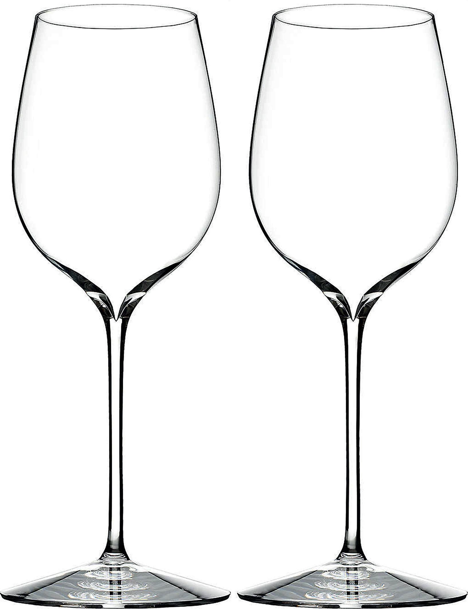

The generous oval bowl and wide rim of the Vertigo series makes it the perfect match for your oaky white wines. Currently, there is no other glass on the market that has such a distinct oval curvature to it, making this unique. I recommend to serve your white wines a touch cooler so that as they slowly adapt to room temperature, your tasting experience continues to elevate. This glass is a match made in heaven for any wine that is oaked, especially Chardonnay.
£49 from Nude GlassIts height makes it perfect for balancing high acidity and sugar of fruit forward white wines like Riesling, Viognier and even Sauvignon Blanc
Despite its thin stem, this glass is sturdy and tall, showcasing the upmost elegance. Its height makes it perfect for balancing high acidity and sugar of fruit forward white wines like Riesling, Viognier and even Sauvignon Blanc. A combination of design factors ensure that your wine has the perfect balance of fresh, mineral, and fruit all in one.
£85 from Riedel

“
Here we have one of the most aesthetically stunning glasses I’ve seen; it’s almost as if you’re looking into the ever-expanding universe, folding in on itself. It really is quite mesmerising. The ‘Intense’ brings forth a unique tapering neck which intensifies the aroma molecules. Given the specific diameter, more oxidation takes place, making it ideal for a wine that is being decanted.

£119 from zieherselection.com

“
It’s almost as if you’re looking into the ever-expanding universe, folding in on itself


London’s dining scene is a melting pot of culture, exquisite cuisine, element helping to enhance the other. From dramatic architecture beautifully appointed dining rooms to bars serve exhibition spaces artists, are many gorgeous places find a meal. are a handful of the dining experiences London eyes tastebuds.
Nestled at the heart of The Mandrake, you’ll find Jurema, the hotel terrace-based restaurant surrounded by a garden of hanging jasmine. On the menu are dishes like lamb shoulder adobo, yellow tail and ahi tiradito, and ethnobotanical cocktails. The property’s Artist in Residence programme makes The Mandrake an essential food destination for any art, culture, and lifestyle fan in London. Open to residents and the public, the art initiative sees illustrious artists of all kinds – photographers, illustrators, sculptors, tattoo artists, and more – staying and working on the premises while welcoming guests to watch them live and even become involved in their art. This October, The Mandrake welcomes Kour Pour from 4th to 11th October, followed by Jonas Burgert 12th to 16th October, both of whose artwork are featured in the hotel. Book now at themandrake.com/jurema
EDITED BY MICHAEL SONSINO RESTAURANT &BAR←
45 Whitechapel Road, Whitechapel, E1 1DU
PocketSquare is a skyline bar and terrace that champions local artists from east London. It’s an honest and authentic approach to art within the sphere of the hospitality industry, with businesses and individuals supporting each other in meaningful ways. A prime example of this is PocketSquare’s In2Art cocktail, a drink that is served with an art print on rice paper. Sales of the Campari, Mama Juana, Tepache and Bergamont cocktail support the IntoArt charity, a London based organisation supporting people with learning disabilities to become artists.

Book now at pocketsquare.london
↓

43 Upper Brook Street, Mayfair, W1K 7QR
Le Gavroche is the pinnacle of classic fine dining. Founded by the Roux brothers in 1967, it was the first restaurant in the UK to be awarded one, two, and three Michelin stars. Now its under the expert stewardship of Michel Roux Jr with a menu of soufflé, crab salad, salmon and roast veal. As for what makes it a great restaurant for art lovers, well that would be the Picassos, Giacomettis, Miros and Dalis hanging on the walls. Book now at le-gavroche.co.uk
It was the first restaurant in the UK to be awarded one, two, and three Michelin stars

↑ AMETHYST
6 Sackville Road, Mayfair, W1S 3DD
Sometimes you don’t need an abundance of art to make a fantastic dining environment. The Japanese-Nordic inspired restaurant Amethyst, by Carlo Scotto, proves that minimalism works fantastically as well. Their ground floor dining room contains just one table that seats up to 20 diners, but what a table it is. Carved from real amethyst and quartz it fills the space with its singular beauty. Additionally, the table allows customers to engage with the chef while he works as part of the Chef’s Table Experience featuring 12 courses with green curry, caviar tartelette, and more. Book now at amethystdining.com
As one of the foremost private members’ clubs in London, Annabel’s is known for hosting extraordinary events that, for the most part, are exclusive to members. However, they also
create extravagant facades on the exterior of the building that can be enjoyed by all, the most recent of which was themed around ‘Annabel’s for the Amazon’ in order to raise awareness for rainforest conservation. If you find yourself invited inside as a member or guest, expect limited edition drinks available exclusively at Annabel’s, such as a special edition Lost Explorer Mezcal. Find out more at annabels.co.uk
If you find yourself invited inside as a member or guest, expect limited edition drinks available exclusively at Annabel’s, such as a special edition Lost Explorer Mezcal

252 High Holborn, Holborn, WC1V 7EN
Scarfes Bar is dedicated to the artist and caricaturist Gerald Scarfe, essentially serving as a permanent gallery of his work. Alongside Scarfes’ original illustrations, the bar space is also home to over 1,000 antique books hand picked by a Portobello antiques dealer, creating a welcoming and homely atmosphere that enhances the quirky nature of the artwork on display. The drinks menu is one of the best in London with whiskies from Macallan, Dalmore, Karuizawa, and many more seeing the establishment rank highly in Best Bar competitions year after year. Scarfes was ranked No. 37 in the Top 500 in 2021. Find out more at scarfesbar.com
←
THE VAULT BAR AT THE NED 27 Poultry, London, EC2R 8AJ

Where best to keep an extensive art collection than a bar located in a disused bank vault? That’s exactly what The Ned has done with their Ned’s Club Downstairs, which includes The Vault Bar and Lounge, and plays host to 100 artworks curated by Kate Bryan of Soho House. The collection reflects the inequality of the financial sector by featuring artworks from 93 women and seven men – the inverse of the heads of the FTSE 100 companies.
Find out more at thened.com


Born in the heat of the Cold War, the Antarctic was designed to conquer the cold, but it’s the adventure watch’s Art Deco aesthetic that has helped it command attention ever since
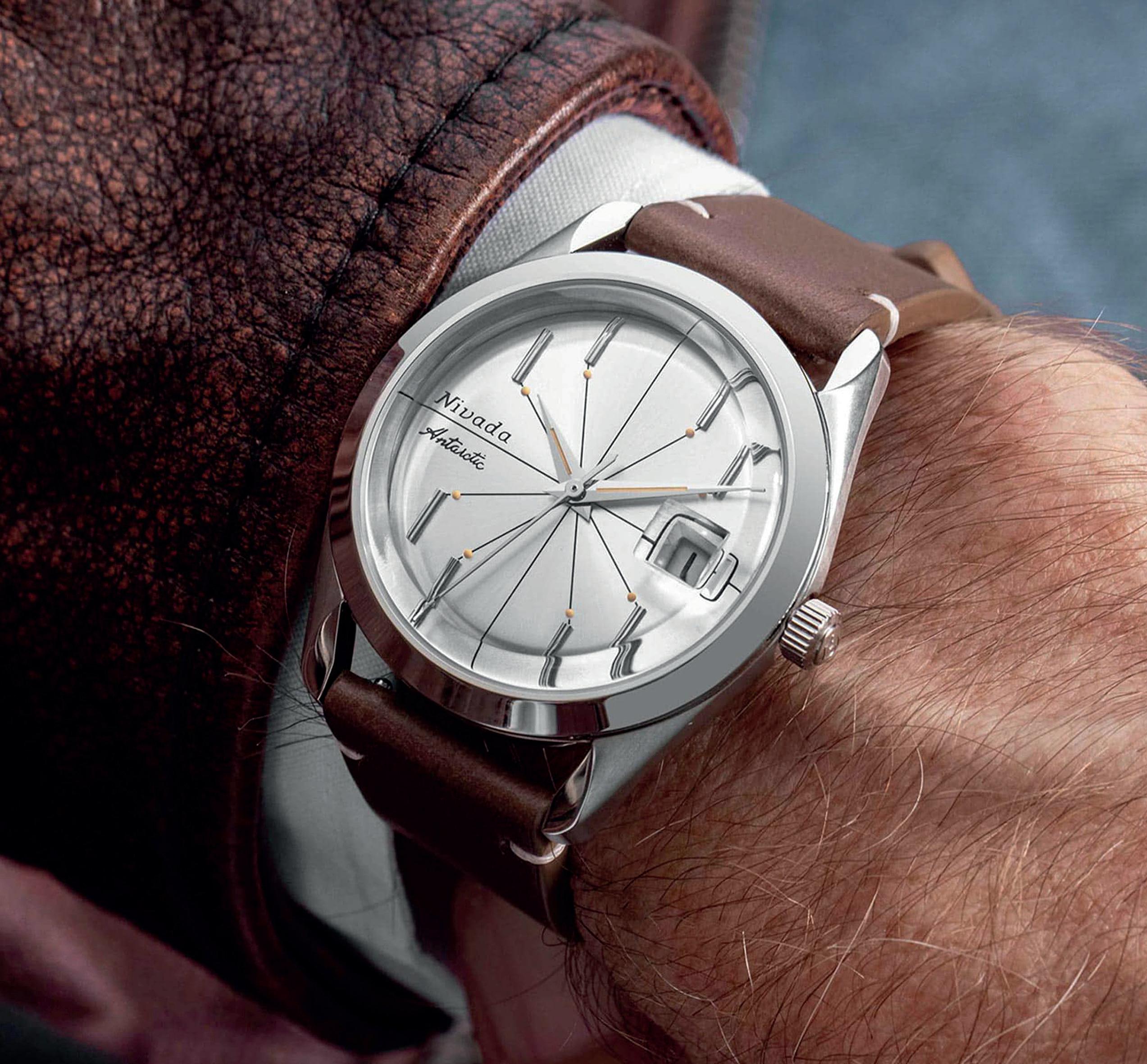
 Based on Nivada’s Aquamatic line, the Antarctic was an adventure watch with dressy sensibilities that combined a 35mm case and cool, bevelled lugs with elaborate, multi-faceted markers and unusually ornate dauphine hands. There was even a version with a 3D textured dial that evoked a snowy tundra
Most watches built for adventure take a no frills approach, at least historically. Plain dials built for readability and nothing else, rugged cases to match, the kind of utilitarian approach an expedition demands. Never would a watchmaker think of adding influences as purely aesthetic as Art Deco. Unless of course we’re talking about Nivada Grenchen.
First off, I’m just going to call the brand Nivada. They were branded differently in different places, and as the shortest name, that’s what I’ll use. However, it’s not just the name that’s up for some debate as the exact founding of Nivada is hard to pin down, though signs point to 1926. They cut their teeth on dress watches up until the 1950s when they segued into hardwearing, waterproof timepieces.
At the same time the Cold War was getting into full swing, the International Council of Scientific Unions was formed. To promote love peace and not nuking each other, they proposed the International Geophysical Year, a sharing of resources and cooperation. At the centre of that cooperation was the Antarctic.
Along with a number of other famous watchmakers, Nivada built some watches specifically designed to conquer the cold, in their case for the US Antarctic expedition, Operation Deep Freeze. It needed to be waterproof, anti-magnetic, and automatic – and so the Nivada Antarctic was born.
Based on the brand’s previous Aquamatic line, the Antarctic combined a 35mm case and cool, bevelled lugs with elaborate, multi-faceted markers and unusually ornate dauphine hands. Finished with a thick bezel for a bit of wrist presence, it was an adventure watch with dressy sensibilities. There was even a version with a 3D textured dial that evoked a snowy tundra – a philosophical precursor to what Grand Seiko’s known for today.
Adverts from the era (which use the name Nivada and Nivada Grenchen) highlight the rugged beards of the wearer and the extreme capabilities of the Antarctic, which was designed to be waterproof, antimagnetic, and automatic


Nivada built some watches specifically designed to conquer the cold, in their case for the US Antarctic expedition, Operation Deep Freeze
There were a number of different versions across the Antarctic I, II and III. Some had different indexes; some had different dials, including a fantastic (and rare) triangulation dial. There were even hidden crowns. Nivada really had fun playing within the limits of the case over the years.
Regardless of the variation, inside was an ETA movement, with the earliest version using ETA’s first automatic movement, the 1256 and later models (post 1955) used the replacement 2375. The latter was a more shock-resistance calibre that could take more of a beating but had the same 40-hour power reserve as its predecessor.
The Antarctic was a massive success for the brand. It’s not hard to see why. It wasn’t just as practical as any explorer’s watch, it looks better than most. In fact, it got enough goodwill that, despite losing the battle against quartz in the
1970s, Nivada Grenchen is back as a brand, largely due to the Antarctic. They even echoed that triangulation dial in the Antarctic Spider. The new models are more utilitarian than the originals which is a shame, but then you can get a decent condition piece from the 1950s for somewhere between £1,000 and £1,500.
The Antarctic might not have the cache of a Rolex Explorer, but between the unique dial execution and its expedition level endurance, it proved that you could have more fun with a beater than anyone expected.
Such was the success of the Nivada Antarctic that the brand have brought the stylish explorer back, although the newer models are more utilitarian than the 1950s originals, which are available at a tempting price range somewhere between £1,000 and £1,500

The Antarctic might not have the cache of a Rolex Explorer, but between the unique dial execution and its expedition level endurance, it proved that you could have more fun with a beater than anyone expected

 EDITED ART
Of all the decorative crafts lavished on watches –engravings, guilloches and the like – arguably the most demanding is enamelling. Even ‘basic’ monocolour enamel is tough enough to execute, with the potential for cracked dials and imperfections all too common. But that’s not the kind of enamel we’re talking about here. We’re talking about the kind of enamelling reserved for only the most intense of metiers d’art pieces, the collector’s pieces, and personal heirlooms that turn a watch face into a piece of art.
Unfortunately – and understandably – that kind of enamelling is exceptionally rare. Not only are there few watchmakers confident enough to give it a go, there are even fewer artisans able to make it a reality. That’s especially true if you’re looking for something bespoke.


It’s easy to see the appeal. You can design onto your watch face your favourite piece of art, some meaningful scene or design, or just something fun and abstract to really make the watch your own. And yet for something so wonderfully broad, the realities are very limiting. If you go to most watchmakers, they’ll only want to work on their watches – which makes sense, even if it’s not exactly egalitarian of them. Perhaps more importantly, you’ll be paying a ridiculous sum of money for a process that’s going to take a very long time.
It seems like if you want yourself a lovely enamelled dial, you’re stuck. But that’s where Ematelier comes in.
Based in Canada but with skills imported from the traditional enamelling home of Russia, Ematelier is one of the few places in the world you can get an expertly made enamel dials for any watch. The fact that they’re a fair price is a bonus.
Enamelling as a craft does cover a number of different techniques. You have your grand feu, the classic, multi-layer version you’ll find on most classical Swiss watches. You have Cloisonné, where gold wire is used to pick out a design before the space in-between is filled with enamel. Then you have miniature painting, which is self-explanatory. Where usually you’ll find these crafts across different studios, they’re all under Ematelier’s roof.
So, what’s the process? How does this actually work? Well, that depends on whether your dial is going in an existing watch or you’re opting for one of Ematelier’s own. As layers are being added to the dial, you need to make sure there’s actually room in the watch. Stock dials tend to be 0.4mm thick and even basic enamel will double that to at least 0.8mm.
Utilising skills imported from the enamelling home of Russia, Ematelier will enamel any brand of watch, which they then finish with their Geneva Technique that adds a layer of transparent enamel over the finished dial to protect it from wear and tear
Ematelier’s own watches are designed to take dials of up to 1.5mm thick. That means not only is there plenty of space for any design you care to imagine, it leaves room for their finishing touch: the Geneva Technique. This involves adding a layer of transparent enamel over the finished dial, protecting it from wear and tear. It’s an incredibly hard technique as it requires a further firing of the dial at a lower temperature so the already enamelled elements don’t melt. That’s especially hard with red, which can easily bleed in the process, ruining the whole thing.
Whichever you go for – an Ematelier in-house piece or your own watch – the process is the same. You work with a designer on your idea, whatever that may be, and like any bespoke piece they’ll mock it up for you. From there they’ll work with you to perfect the design as a dial before starting the weeks-long process of turning a blank dial into an enamel masterpiece. You can send them your watch for fitting or have it done yourself; either way the result is the same: immaculate.
We mentioned earlier that Ematelier’s dials are priced fairly, but given everything we’ve said you shouldn’t be expecting cheap. Budget anywhere between $8,000 and $12,000. It’s a lot of money to be sure, but for something unique, lavished with all the skill and expertise of masters of their craft – and compared to what you can get elsewhere – fair is fair. Find out more at ematelier.watch
If you have the artistic desire for a micro-painting on your watch dial, there’s one place to go


Art Deco as a creative movement has influenced watches for a good century by now, with some truly spectacular designs under its roaring 1920s canopy. The thing is, most of them follow similar blueprints, be that the Cartier Tank, JaegerLeCoultre Reverso, or something more recent like the Fears Archival. They’re rectangular, innately glamorous dress watches.
The odd counterpoint is that Art Deco was never entirely about straight lines. Sure, you can find countless examples of geometric shapes across art, design, and architecture from the period, but that’s far from everything. Just take a look at what might be the most iconic architectural example of Art Deco ever built, the Chrysler Building.
Built in 1930 as the tallest building in the world (if only for 11 months), the Chrysler Building was one of the earlier skyscrapers and a domineering presence on the East Side of Manhattan. Surprisingly, at the time feelings were mixed about the design, with the worse end of the spectrum calling it inane and unoriginal.
That seems crazy these days, as the Chrysler Building is a visual and historical landmark; a building that’s come to define not just the New York skyline, but art deco architecture in a more general way. That’s in large part due to its terraced crown of seven concentric arches with its signature triangular windows – and in that definitive detail, there’s nary a rectangle in sight.
It’s a genuine surprise that more brands haven’t adopted the Chrysler Building as their totem. In fact, there’s only really one: Bremoir, and their single debut watch, the Lexington - and I doubt we’d have needed to extoll the virtues of the Chrysler Building beforehand to see just how faithful the Lexington is to its Art Deco inspiration.

First, there’s the bezel. The three-stepped shape is a downsized version of the concentrically arched crown of the Chrysler Building, perfectly circular but still a tasteful nod to the architecture. But where are the arches without their windows? Given there’s only so much space on the bezel, those sharp triangles have instead been transformed into the outer hour markers and lumed for low-light readability. Even the minute markers echo the metalwork around the building’s entrance.
So far, so clear. But what really stops the Lexington being some on-the-nose tribute stripping out the key design elements of the Chrysler Building, is that, put simply, it’s a damn lovely watch. The sector dial with its brushed hour ring with gorgeous applied indexes, the 39mm sizing

and broad, vintage case shape all add up to a distinctly modern reinterpretation of 1920s style.
Of the variations available (there are four), the standout is by far the combination of blue dial with a copper hour ring. It has all the glamour of an Art Deco dress watch without actually being a dress watch per se. It’s also a whole lot more affordable than getting your hands on a genuine Art Deco period timepiece.
Despite the quality of finishing and a Swiss movement – the solid STP 1-11 caliber – the Bremoir Lexington is priced at a pretty damn tempting $985, or approximately £860 in old money. For a watch that’s embraced Art Deco as wholeheartedly as this, there’s nothing in this price range to compare it to. Add a few thousand and maybe.
Find out more at bremoir.com
Bremoir’s Lexington is an ode to the Art Deco styling of the Chrysler Building, as the threestepped shape replicates the concentrically arched crown of the iconic building, while the famous sharp triangles have been transformed into outer hour markers
Belfast is synonymous with its shipyards. Not only are they the industry on which Belfast made its name, but they dominate the city’s skyline. That’s particularly true of the Samson & Goliath cranes that you can see from practically any part of the city. The bright yellow industrial giants have an incredible history and have been in service for decades, working on ships of gargantuan proportions. Unfortunately, the shipyards’ greatest achievement was also one of the biggest nautical tragedies in history: the RMS Titanic.
You know the story, even without James Cameron’s saccharine involvement. In 1912, the RMS Titanic, the largest ship ever built, the invincible, unsinkable floating behemoth measuring in at nearly 270m long, left Harland & Wolf Shipyards in preparation for her maiden voyage. She left Southampton on her way to New York, but on 15th April hit an iceberg and sank, with the majority of passengers and crew going down with her.
What’s less known is that along with the Titanic, operator White Star Lines had Harland & Wolf build a pair of smaller ships, a perfect 1/4 scale model of the mothership designed as tender to get passengers on board. While the Titanic was lost, these two ships remained. Today though, only the SS Nomadic remains – impressive since it was, for a time, a party boat moored by the Eiffel Tower.
These days the SS Nomadic is in retirement and you can visit for yourself at Belfast’s Titanic Museum. If you want to get a sense of the sheer scale of the project when it was envisioned back in the 1910s, you need to go have a look. It’s bloody impressive. Perhaps more pertinent to a watch magazine though, it’s also alive in name through Nomadic Watches.

Nomadic Watches are as inseparable from Belfast as their nautical namesake. Their debut timepiece, the Maraí, literally translates to Irish Sea Farer, a tribute to the new horizons that Belfast’s great iron ships were created to explore. That of course means a solid dive watch – other than a marine chronometer, what else would you need for an Atlantic crossing or two? – and matching specs.

The Maraí 401 Pro has 200m water resistance, an automatic Swiss movement and all the bells and whistles of a proper Swiss timepiece – SuperLumiNova, sapphire crystal et al. It’s even available in a solid range of colours, be that the nauticallystandard blue, black and gold, or the incredible red and black Crimson Dawn.
Yet if there’s one design element that defines the Maraí, it’s not their good looks dredged from the
Inseparable from Belfast, Nomadic Watches’ debut timepiece, the Maraí (translates to Irish Sea Farer) is a tribute to the city’s great iron ships, but it’s the bright yellow second hand that honours Belfast’s Samson & Goliath cranes that really highlight its nautical provenance
golden age of 50s diving. It’s not their respectable specs and tool watch functionality. It’s a small yet unmistakable detail: the bright yellow second hand. The sweeping yellow second hand, perfectly straight, is a dial-mounted tribute to the very Samson & Goliath cranes that not only define the Belfast skyline but have been integral to the city’s main industry.
In short, without those cranes it’s perfectly feasible that the SS Nomadic wouldn’t exist; without the ship, Nomadic watches wouldn’t exist. For some watches a coloured second hand would be a throwaway detail. Here, it might just be the most thematically important part of the Maraí 401. Find out more at xxxxxx.com
Defined by Belfast’s maritime history, Nomadic pays tribute to one of the most famous ships ever built
• £300, 96zero.co.uk
Forget the usual ‘in the field’ look of most miliary-inspired watches; 96Zero’s take on the formula is inspired by the founder’s grandma who was instrumental in intercepting and decoding wartime messages. Hence, the typewriter-esque typography, with every other numeral represented by a letter rather than a number. Paired with a black dial, compass bezel and a full lume dial (those lettrs and numerals look phenomenal in the dark), this might be one of the most inventive field watches of the year. So far. 96zero.co.uk
THE SPECS:
• 40mm stainless steel case with 50m water resistance
• RGM modified calibre 1120 automatic movement with 42-hour power reserve
• $13,900 (approx. £12.190), limited to three pieces, rgmwatches.com


Marquetry is a dying craft. The wood-based mosaicadjacent technique is rarely seen these days, which given the results on RGM’s second model to use it, is a travesty. Depicting the USS Constitution – the oldest warship still afloat – leaving Malta in 1804, the detail depicted using different coloured woods is nothing short of spectacular. Otherwise this is RGM’s flagship Model 25, with an American-made 40mm case, designed specifically to highlight the dial. What better way to honour ‘old ironsides’ and the exquisite skill of marquetry?
rgmwatches.com
THE SPECS: • 42mm stainless steel case with 100m water resistance • Miyota 9015 calibre automatic movement with 42-hour power reserve From accessible horology to avant-garde designs, here’s the latest and greatest from the ever-creative world of microbrands. edited by: SAM KESSLER Field WatchField watches are now what dive watches were a couple of years back: everywhere (even here), so it takes a particularly standout version to, well, stand out. Enter RZE’s Valour 38. The 38mm titanium-clad field watch with its faceted, featherlight (57g) lozenge case and solid collection of dials (our money’s on the Arrowleaf yellow), it’s possibly the coolest field watch you can get for the money – which is, even for a stripped back beater, incredibly good. There are some bigger field watch makers out there that should be really worried right about now. rzewatches.com
Upcycling and diving go hand-in-hand these days (it’s hard to visit a coral reef if there aren’t any after all) and the Great White is a paragon of environmentally friendly watchmaking. A big, bold diving watch with a cool, high-contrast black and white look, it also has some teeth with its diving specs: 300m water resistance and and a chunky diving bezel. Oh and if you’re wondering where the lume is… it’s the entire dial. What’s more, 5% of every sale goes into supporting the Marine Conservation Society in support of cleaner oceans, which everyone can enjoy. sdcwatches.com

THE SPECS:
• 42mm stainless steel case with 300m water resistance
• Seiko NH35 movement with 41-hour power reserve
• £425, sdcwatches.com
 Valour 38
THE SPECS:
• 38mm titanium case with 100m water resistance
• Seiko NH38A automatic movement with 41-hour power reserve
• $299 (approx. £260), rzewatches.com
Valour 38
THE SPECS:
• 38mm titanium case with 100m water resistance
• Seiko NH38A automatic movement with 41-hour power reserve
• $299 (approx. £260), rzewatches.com
Hiseli take their New York vibes seriously and in the case of their pared-back, Champagne watch, elegantly. It might be an everyday wearer with a 40mm stainless steel case, but the dial – which varies from cream to glamorous Champagne depending on the light, with contrasting blued steel hands – is versatile enough to wear wherever, whenever and with whoever. Provided all three are in New York, obviously. Backed by an STP 1-11 movement and a very tempting price tag, it’s a quality casual timepiece. hesiliny.com


THE SPECS:
• 40mm stainless steel case with 50m water resistance
• STP 1-11 calibre automatic movement with 44-hour power reserve
• $595 (approx. £520), hesiliny.com
Proving that field watches aren’t just beaters, the first from Australian watch brand Second Hour is a winner. Slim, svelte and with one of the coolest field watch dials around – the blue and white version in particular shows off the brushed dial –it’s the kind of timepiece that can take a beating and look good doing it. At the time of writing, pre-orders aren’t quite open yet, but if like us you fell in love with their Gin Diver, this is one you’ll want to keep an eye on. And for this price, it’s worth snapping up. secondhour.com.au
THE SPECS:
• 40mm stainless steel case with 100m water resistance
• Miyota 9015 automatic movement with 42-hour power reserve
• AUS $675 (approx. £395),
• secondhour.com.au

> > Financially, the world’s in a bit of a conundrum. On the one hand, between the hangover issues from Covid 19 and the current geopolitical crisis on the continent, economic growth is less than ideal. At the same time, supply-and-demand has been causing staggering inflation across pretty much everything. It doesn’t sound like a time you’d want to invest. But that’s not necessarily the case.
With any kind of long-term thinking, it’s better to get invested than not, but clearly there are better times to invest than others. You don’t want to invest in an all-time high. Fortunately, post-lockdown is quite the opposite.
First you had the massive inflation caused by people not spending and logistical issues meaning a huge drop in supply and a huge increase and demand. Now, with the geopolitical atmosphere – not just Russia and Ukraine – inflation has continued but growth has not. It’s something we call ‘stagflation’. In short, things cost more and there’s less money to spend at the same time.
In terms of investments, bond markets have suffered, equities have readjusted and parts of the market that did well in lockdown – especially tech – have come back down. It’s not all doom and gloom though. In many ways, it’s a rebalance.
It’s led to many investments suddenly becoming more accessible than they were before. Equities, for example, have traditionally had a high bar for entry. Now they’re wellpriced, helping more investors get in on the ground floor. The rates for fixed income bonds – bonds that guarantee a certain return – have been increasing too, making them an attractively safe option.

But it’s not just about equities and bonds. When you have inflation at these sorts of levels, the biggest risk to your assets is inflation itself. As everything increases in price, your own assets are worth less and its value starts to get eroded.
Fortunately, there are some assets that are relatively inflation proof. Property is the big one as its value rises with inflation. Rental prices too go up, though in that case you need to make sure you actually have someone to rent from you. In a downturn individuals can afford less and companies might go bankrupt, so that’s not always a given.
Then there’s the sexiest of all assets: infrastructure. Long-term,
government backed projects like renewable energy are the closest thing to a sure-fire investment you can get right now. In this instance, energy prices – and thus income – is linked to inflation and thanks to the government backing, your investment is incredibly safe. They’re also long-term, which is always good. Infrastructure projects are basically ‘stagflation’ proof.
Then of course there’s gold. It’s the ultimate, traditional asset. It gives you some inflation protection as gold prices tend to go up as inflation does; it has a lot of recessionary protection and while it doesn’t actually earn money, it has innate value. It’s seen a small drop recently, making gold a particularly attractive investment. It never looks bad on your portfolio.
Now, this is a watch magazine, so we’re sure you’re wondering about more tangible assets. The problem there is that you need to know what you’re buying. You need to have expertise in that particular field, whether it’s art, wine, classic cars, or indeed watches. As a rule, they tend to do well with high inflation as there’s more demand for limited supply, but they can face a lot of market correction – something that watches are going through now.
But at least in these given cases, you can generally enjoy them and as we said at the beginning, it’s always good to invest. If you’re looking to get started or expand your portfolio, visit Nedbank Private Wealth to discover how you can make the most of your money. nedbankprivatewealth.com
Nedbank’s Tom Caddick on investing in a dubious economic environment
Glen Ogal is a Scottish lifestyle brand that produce a wide range of products from clothing to jewellery and watches. Their latest men’s watch is the Astronomer, currently available in either blue or black with four more variations set for release in 2023. It has a 44mm diameter stainless steel case with a dial depicting the night sky illuminated by luminescent stars. It also features a crescent moon-shaped pointer date powered by an automatic movement. £495, find out more at glenogal.com
Named after the Finnish concept of willpower and perseverance, the Sisu is a mechanical skeleton watch launched by Finnish watchmaker Jurmo last year. They pride themselves on their in-house composite technology, which allows the creation of unique surface treatments and coloured finishes on watch movements. A prime example of this is the Sisu Sky Blue’s stunning turquoise skeleton display - an industry first movement of this colour. The movement featured is the manual calibre ETA 6497 with 48-hour power reserve. Find out more at jurmowatches.com

Charlie Paris’ Concordia is a stylish and accessible diver that oozes 1960s retro diving watch charm. Specifically, the highly legible display with oversize round hour markers is inspired by the types of watches developed around the French Riviera in the 60s and associated with figures like the French explorer, Jacques Cousteau. Which makes sense for a modern French watchmaker like Charlie Paris. Inside, it houses the Soprod calibre P024. €745 (approx. £640), available from charlie-paris.com
Hesili is an American watchmaker that aims to capture the romantic vision of vintage New York. They achieved that with the launch of The Original Series One last year. It’s a charmingly retro piece, with a railway track minute scale and distinctive typography that evokes the golden era of New York. It has a 40mm stainless steel case and a gorgeous velvet green dial, offset with brass accents and houses the Swiss STP 1-11 automatic movement. $595 (approx. £490), available from hesiliny.com


Millar Watches’ Scuba Dive Watch is inspired by the classic retro divers that have become symbols of horological greatness. It has a 42mm diameter stainless steel case with 300m water resistance and a black ceramic bezel. The use of high tech ceramic at this level of accessibility is very impressive. Housed inside is the Sellita SW200 automatic movement with 38-hour power reserve, an industry staple used by brands of all sizes. £499, available from millarwatches.com

Everyone knows that the Omega Speedmaster is the iconic space watch, but are you familiar with the most iconic space watch strap? The Forstner Komfit is one of the only steel watch bracelets in history to have been approved by NASA for manned space flights and has even been to the moon. It has a two-layered construction and front facing clasp that make it easy and comfortable to use.

Plus, it was one of the first bracelets to feature micro-incremental adjustments, allowing it to be sized properly without the need for additional tools.
$125 (approx. £100), available from forstnerbands.com
Hirsch is an Austrian watch strap maker that has been operating since 1945, during which time it has been under the continuous stewardship of the Hirsch family. Their long heritage has allowed them to develop an excellent reputation and much experience in producing high quality straps. The Bagnore vintage brown calf strap, launched just last month, is a prime example of their work.
Named after a town in Tuscany, it’s made entirely from vegetable tanned calf leather providing exceptional texture and suppleness. It’s finished with retro cut edges and a triple hand-sewn decorative bar seam for a strong vintage aesthetic.

£79.95, available from hirschthebracelet.com
FinWatchStraps is a Finnish watch strap making company that specialise in handmade custom straps. In addition to their signature leather straps, they produce water resistant straps for those with active lifestyles. These are made from vegan sailcloth, providing great durability and comfort. They’re available in sizes from 17mm to 24mm including rare sizes such as 19mm, 21mm, and 23mm so that no adventure watch is left without a rugged and stylish strap. Prices from €85 (approx. £75), available from finwatchstraps.com
Once your watch collection gets to a certain size, you really need to think about how to store them safely, securely and without damaging them. The Delugs Zip Box can hold up to eight watches of all shapes and sizes without issue. On the large side it can house watches with case diameters of up to 54mm and on the small side it can fit straps as short as 14.5cm. Its compressible pillows means that no strap or bracelet will become stretched. Plus, with a great range of colours to choose from and a saffiano leather exterior, it’s just as good for display as it is storage.


£530.28, available from delugs.com
The Rigid Case from Temporal Goods is designed to keep your timepiece safe no matter what. Made from aircraft-grade carbon fibre and machined aluminium, it has a crushproof and water-resistant construction with patentpending innovations. On the inside, it has a foam-lined microsuede interior that offers a plush surface to protect your watch. The case is made in the USA and comes with a lifetime warranty. It functions as a single-watch travel case but can double as a display on your desk or dresser when not in use.
$350 (approx. £305), available from temporalgoods.com

Harris Tweed is known the world over for the quality of its craftsmanship and of course, the cultural significance of the material to the Scottish isles of Harris and Lewis. This Harris Tweed Jacket is exclusive to The House of Bruar – Scotland’s premier country fashion retailer. It has three-button cuffs, flapped side pockets and mock leather football buttons, giving the piece an unrivalled traditional look that suits fine occasions and casual ones. £245, available from houseofbruar.com

The Peacoat is an icon of refined vintage style, inspired by elements of military dress such as the classic navy reefer jacket from a century ago. The vintage design of this Peacoat has been preserved by Todd Snyder while at the same time the colours and patterns have been modernised with a chic, oversize plaid in tones of white and blue. It has two flap pockets, two handwarmer pockets and features real horn buttons. £866, available from toddsnyder.com
With autumn winds finding their grip in the countryside and howling through city streets, picking up a windproof coat is a must. The Canada Goose MacMillan Parka Wool is made from DynaLuxe Wool, consisting of a double layer of Italian wool that’s both warm and has excellent wind shielding properties. Plus, the Quicksand colour is the ideal match for environments both urban and country. While Canada Goose are known for producing coats that can survive the Arctic, this is more of a mid-range coat balancing function with style. £995, available from canadagoose.com

Briggs & Riley are one of the quintessential American travelware brands, creating a diverse and attractive range of luggage cases, bags and travel accessories. They also happen to be the only luggage company that provide a lifetime guarantee for their bags, offering free repairs for functional damage to your bag. The Baseline is their essential collection, consisting of carry-ons, backpacks and duffels in subtle black. Baseline Carry-On Spinner £599, available from briggs-riley.co.uk

Knitted in the Italian town of Bergamo in northern Italy, this cashmere zip-up from Luca Faloni is made entirely from two-ply pure cashmere from the Cariaggi Fine Yarns Collection. It follows Luca Faloni’s belief in using only the finest materials from traditional Italian manufactures, such as Cariaggi and Grandi & Rubinelli. By operating with traditional methods, they ensure the continued sustainability of the trade. £295, available from lucafaloni.com

The Italian producer of luxury writing implements is celebrating the launch of the FIFA World Cup with a series of intriguing, limited edition pens based on competing countries. This is the Classic England edition, which features the English flag on the lid, a red and white striated pattern body and gold nib – available as a fountain, rollerball or ballpoint pen. The limited edition package comes with two cartridges and a special World Cup themed notebook that marks the iconic history of England at the World Cup with special attention paid to 1966.

Ballpoint £510, Rollerball £625, Fountain £1,045, limited to 66 pieces each, available from montegrappa.co.uk
Outdoor Tech is a brand determined to find an equilibrium between the adventurous world at large and the convenience and comfort of modern life. The Mantas 2.0 Earbuds are fully wireless with six hours of play time and fast charging. They’re also made from sweat resistant material to protect them from your exertions. In order to accommodate for your personal preferences when exercising there are also numerous adjustable settings, including the ability to swap from stereo sound to mono, allowing you to keep one ear on your surroundings. $79.95 (approx. £70), available from outdoortechnology.com

The concept of kayaking will always be an appealing one, to set out on the waves with a paddle in hand and view the world from an entirely unique perspective. However, the struggle of carting a boat around is well known and many boat makers are exploring new ways of making transport easier. Oru Kayak have created an innovative solution, origami kayaks that can be folded away in minutes. Of course, they’re not actually made of paper, instead using lightweight and durable polypropylene.

£1,158, available from eu.orukeyak.com
Campfire Audio produce handcrafted earphones for discerning audiophiles. Their latest launch is Trifecta, which features earphones made from clear nylon that reveal the three internal, gold-plated, 10mm ADLC diaphragm dynamic drivers. The triangular configuration creates a performance enhancing acoustically tuned chamber to create a surprisingly rich and massive sound from such a small piece of technology. $3,375 (approx. £2,800), limited to 333 pieces, available from campfireaudio.com

GoPro has launched the latest generation of their robust, action ready camera and it has the best quality yet. The new Hero 11 Black features a larger sensor, 10-bit colour video, ultra-wide ‘HyperView’ field of view and HyperSmooth 5.0 video stabilisation. Plus, you don’t have to worry about losing footage after a particularly gnarly adventure as the camera can upload directly to the cloud and your phone. A feature that also you see highlights immediately to craft the perfect shot.
£549.98, available from gopro.com
 Oru Kayak – Beach LT
From a vintage King Seiko to golden legends, Taika Waititi’s watch collection is diverse, beautiful and utterly drool-worthy

It takes a special director to bring a strong artistic vision to the big screen, especially when it comes to comedy. Making people cry is easy (just kill the dog), but making people laugh is another matter entirely. One director serving us the laughs we need is Taika Waititi, the visionary behind Hollywood blockbusters like Thor: Ragnarok and cult sensation What We Do in the Shadows. Oh, and he also happens to have one of the most killer watch collections you’ve ever seen.
Genuinely, there are so many amazing watches in this man’s collection it’s difficult to know where to start. However, it’s never wrong to begin with a Rolex so let’s start there. Specifically, the Rolex Submariner Ref. 14060 with
matte black dial and bezel. It’s one of those watches that makes you stop for a moment and think, ‘you know what, Rolex really do know what they’re doing’. The proportions of the dial, the layout of the signature circle and rectangle hour markers, it’s all perfect.
On the red carpet, Taika’s watchmaker of choice is Cartier. He’s worn the Pasha de Cartier (left) and Santos de Cartier during the international premieres of Thor: Love and Thunder. While the Santos is a mainstay of the red carpet with its sports luxe design, the Pasha is less common. This is a shame because the classical, Art Deco aesthetic of the Pasha is superb, as Taika showcases.

To a certain extent, Rolexes and Cartiers are to be expected from any Hollywood icon. What makes Taika a certified watch nerd (like us) are the pieces in his collection that are obscure outside of watch collection circles. Watches like the Doxa Sub 1200T. The 1200T was produced in the 2010s as a modern reinterpretation of the SUB300 Conquistador, which was the first watch available to the public equipped with a helium escape valve. As such, the Conquistador is a hugely significant historical timepiece, in turn making the 1200T a highly collectable watch.

An even more desirable watch in Taika Waititi’s watch collection is the vintage King Seiko Special 5256-8000 (far left). King Seiko was originally a rival brand to Grand Seiko, but was eventually discontinued in the 1970s. In the final years of King Seiko, they knew that the brand would eventually be shut down and so they started printing the word ‘Special’ on the dials, making the provenance of Taika’s watch incredibly strong. Added to which it’s a beautiful piece. Fortunately, King Seiko has been revived in the form of a new heritage line from Seiko.
However, this is Taika Waititi we’re talking about, his watch collection wouldn’t be complete without a punchline. In this case it’s the fact that in addition to all these tasteful, carefully curated watches he also owns a full gold Rolex Daytona and a full gold Omega Speedmaster Moonwatch.
MOVIEWATCH
