3 minute read
POPS OF COLOR
POPS 0fCOLOR
Design: GAIL BARLEY, Gail Barley Interiors Photography: ABBY LIGA DOMENICO, Abby Liga Photography
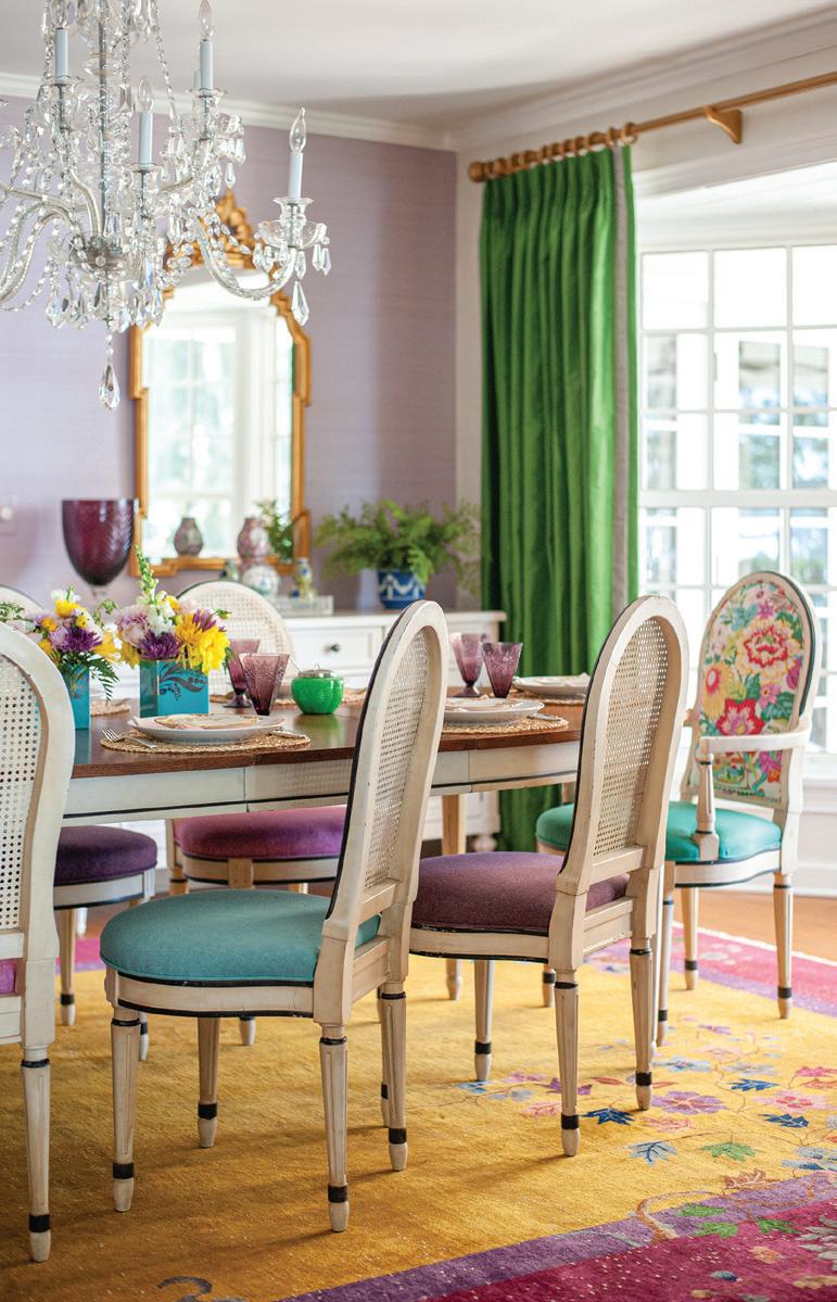
A VINTAGE CHINESE RUG GROUNDS THE PALETTE FOR THE LIVELY DINING ROOM WITH BRIGHTLY UPHOLSTERED CHAIRS AND WHITE FURNITURE AGAINST A LAVENDER GRASSCLOTH WALL. GAIL HAS HAD THE LIVING ROOM CHAIRS FOR ALMOST AS LONG AS SHE HAS BEEN IN THE HOUSE, BUT HAS REUPHOLSTERED THEM SEVERAL TIMES OVER THE YEARS.
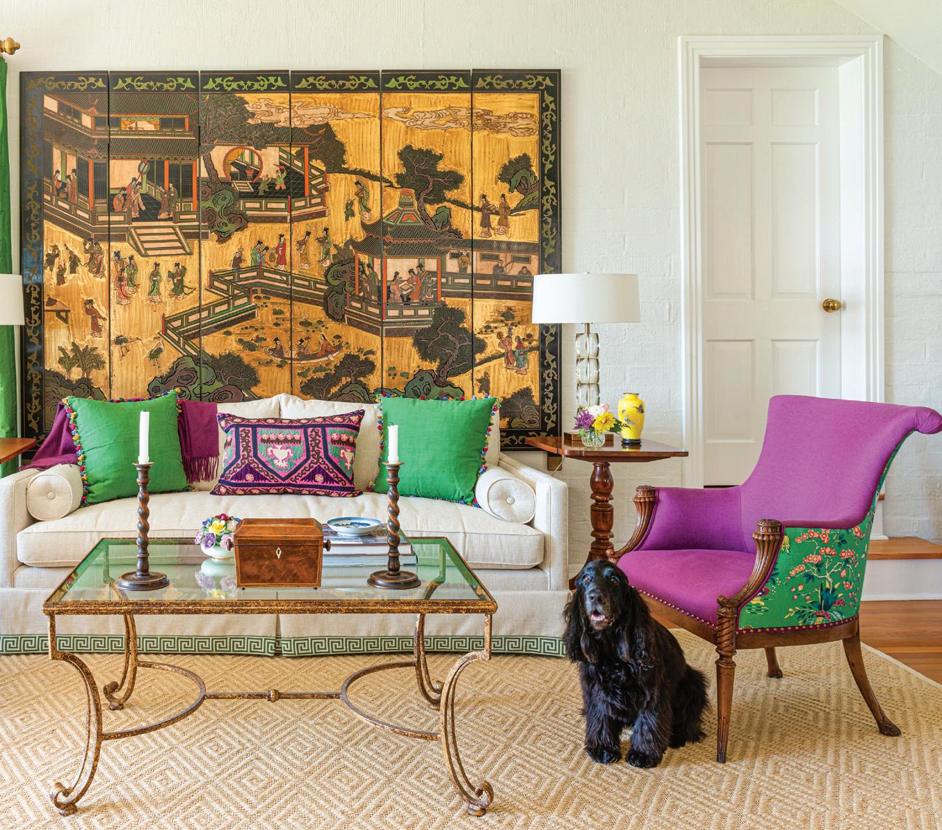
Designer Gail Barley, Gail Barley Interiors, recently refreshed the 1930s house she has lived in for 25 years. She had made some updates over the years but had kept the same color palette because of the existing furnishings. It was not an extensive renovation project as the kitchen had been remodeled, but she did expand a bathroom off the primary suite, replacing a 1970s version that was only 4' x 10'. She found the process easier than if she were designing for a client because she didn’t have time to agonize over every decision. “About five years ago I started refreshing because I had a lot of things I had inherited — oriental rugs and other furnishings. I didn’t replace a whole lot, but reupholstered, installed new drapes, added art and pillows. I kept many of the tables as is. I gave the oriental rugs to my sister to keep them in the family. But the colors changed from blues and reds to more of a Florida palette. I love color and now I have pretty much every color in the rainbow,” she says.
Gail used quite a bit of light neutrals throughout, including the walls, dining buffet and chairs, to balance the bolder colors. She didn’t want it to feel like a kaleidoscope full of random hues. “You want certain things to stand out, but you need the supporting players to let the stars shine,” she adds.
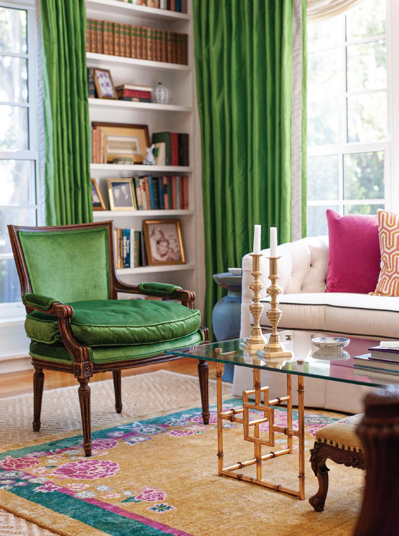
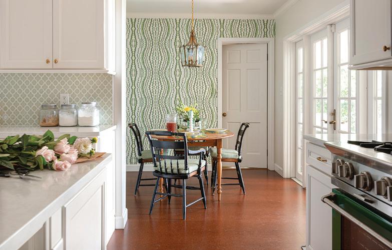
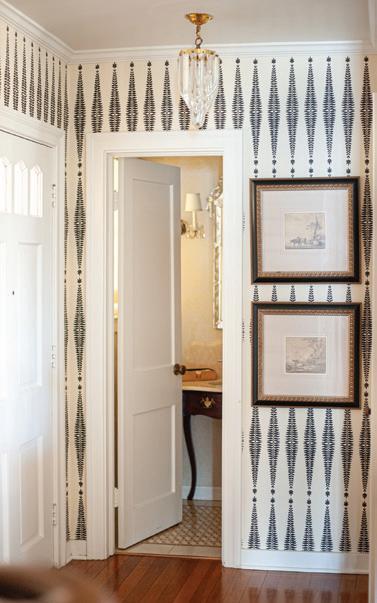
OTHER UPDATES IN THE LIVING AREA INCLUDE THE EMERALD GREEN DRAPES AND A REPRODUCTION RUG THAT MIMICS THE ONE IN THE DINING ROOM AND SEPARATES THE SPACE FROM THE OTHER SEATING AREA IN THE ROOM. THE LAYOUT DOES NOT FEATURE A FORMAL FOYER, SO GAIL DELINEATED THE ENTRY WITH WALLPAPER. IN THE BREAKFAST AREA, GREEN PATTERNED WALLPAPER GAIL DISCOVERED AT MARKET A FEW YEARS AGO ADDS INTEREST TO THE SUBDUED SPACE.
“We didn’t change the footprint of the kitchen because it would have been difficult, and I didn’t really want an open floor plan. The contractor had suggested taking down the wall between the kitchen and dining room, but since it was a more historic home, I did not want it to feel like a brand-new house. I like to be able to close the door to the kitchen, so we kept the size the same. I tell people we have a largesmall kitchen or a small-large kitchen. It was just making it more functional than just bigger,” she explains.
One standout element is the strategic use of wallpaper. “Wallpaper is finally
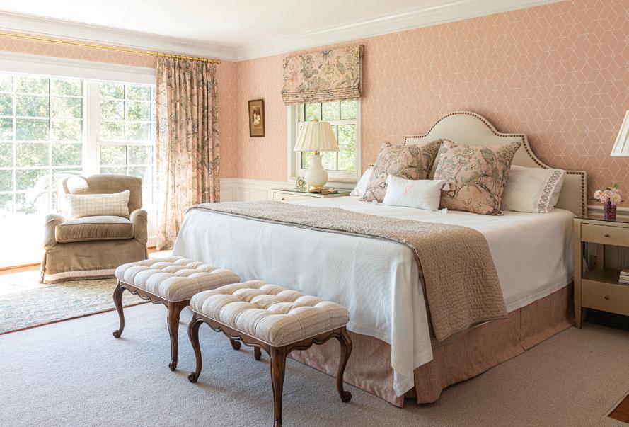
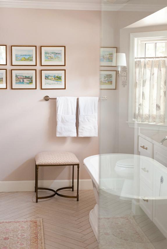
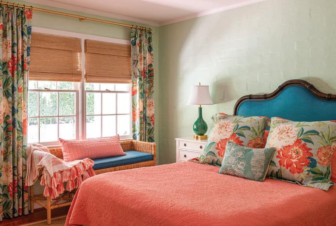
GAIL FOUND AND FELL IN LOVE WITH THE FABRIC SHE USED IN THE PRIMARY BEDROOM AND USED THAT AS THE BASE FOR THE DESIGN SCHEME THAT ALSO TIES INTO THE TAUPE AND PINKISH MARBLE FIREPLACE SURROUND. IN THE GUEST BEDROOM, GAIL CHOSE TO USE FLORIDA-HUED SHADES TO MAKE VISITORS FEEL WARMLY WELCOME. GAIL PARTICULARLY ENJOYS THE EXPANDED PRIMARY BATHROOM, BATHED IN SOOTHING COLORS THAT COORDINATE WITH THE BEDROOM.
coming back — I have always liked wallpaper. Grasscloth has been a pretty easy sell to clients because it’s, more or less, monochromatic. The lavender wall in the dining room is actually grasscloth. I like color and pattern and am not inclined to do what’s trendy because being in this business you see things come and go. I think you should suit yourself — buy things you love, and you will always love them,” she adds.
The home is filled with love and history. “I like that not everything is shiny and new. I feel like this has more of a sense of home with the personal items throughout. We encourage our clients to do the same and always ask about their special things,” she says.
