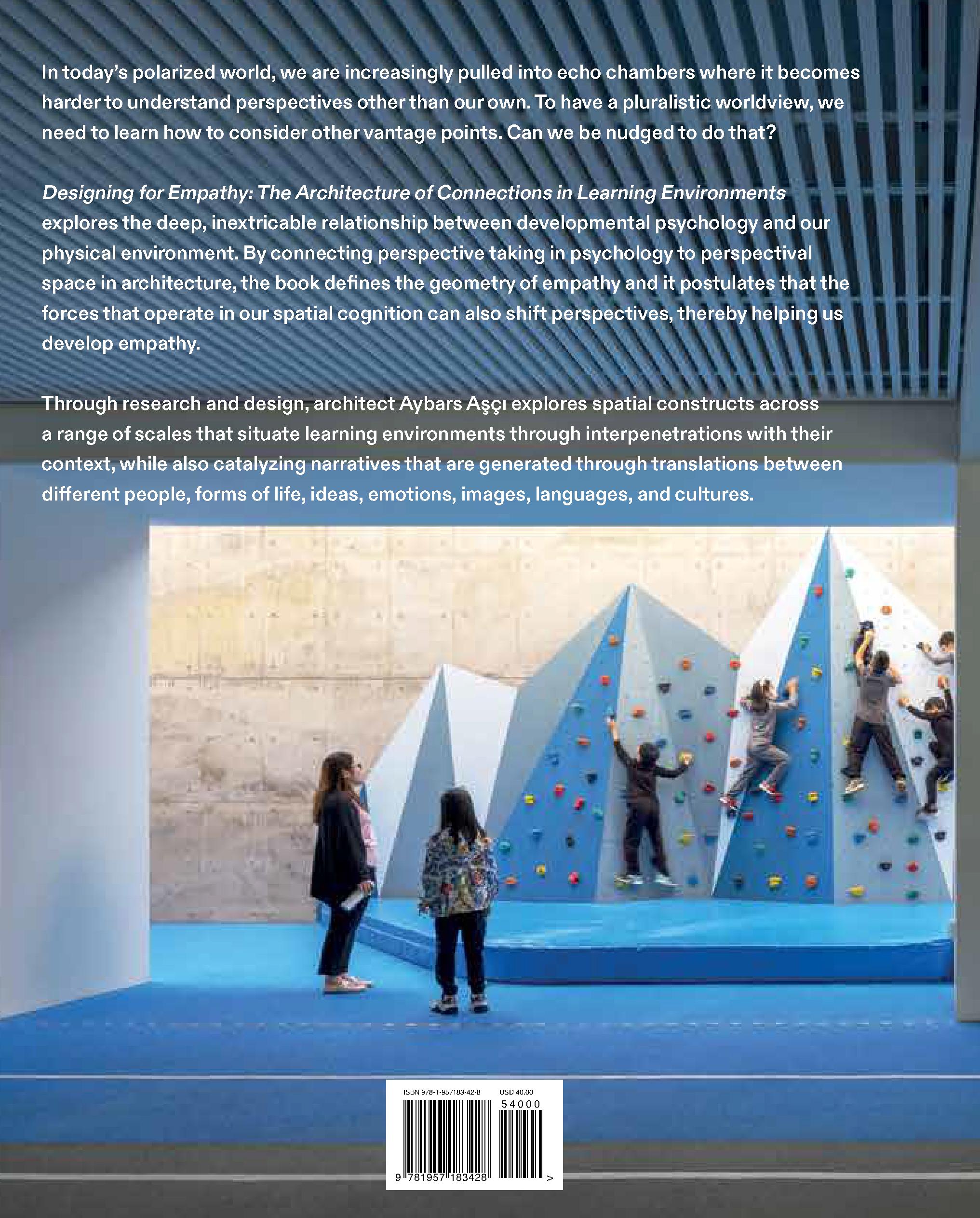


In 2016, I was invited to meet the leadership team of a pre-K through 12th grade school. They asked me to become their “global design architect,” collaborating on multiple campuses that were at different stages of development. Since then, the complexity of the design challenges we have been tackling has varied from large-scale campus planning to furniture design. During our research, the discussions we had with educators repeatedly touched on one key concept: empathy.
In development theory, the importance of empathy is frequently emphasized, but in architectural discourse empathy is much less studied. One reason may be, as architecture theorist Juhani Pallasmaa argues, that “geometric configurations are easier to imagine than the shapeless and dynamic acts of life and the ephemeral feelings evoked by architecture.”1 The origins of the discussions of empathy in architecture, however, can be traced back to the nineteenth-century German philosophy of aesthetics, where the concept of empathy originated.2
The term Einfühlung—translated as “feeling into”—was coined in the early 1870s by philosopher Robert Vischer in his dissertation on emotional projection.3 According to Vischer, Einfühlung describes unconscious projections of the body and soul into the form of the object.4 For instance, according to Vischer, the pleasure we take from observing horizontal lines— for example, watching the horizon—is related to the horizontal position of our eyes, or similarly, our appreciation of symmetry is because it is analogous to our body.5 A few decades later, Theodor Lipps popularized a psychological

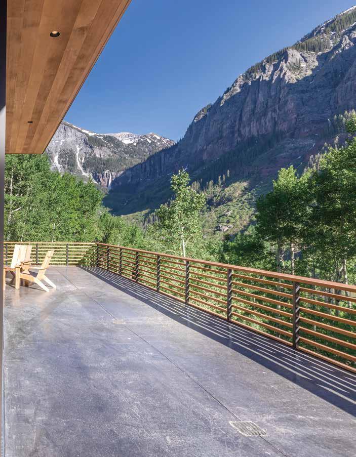
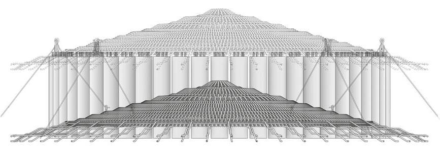
Woven bamboo roof construction:
The woven bamboo roof is built on the floor and then hoisted in place after completion. This method is used for ease of construction and to eliminate the need for scaffolding.
A Roof structure built at the ground
B Pulley and rope system to raise roof
C Roof rotation after hoisting (rotation angle: 280-mm radial segment)
D Bamboo roof members to weave into column reinforcement
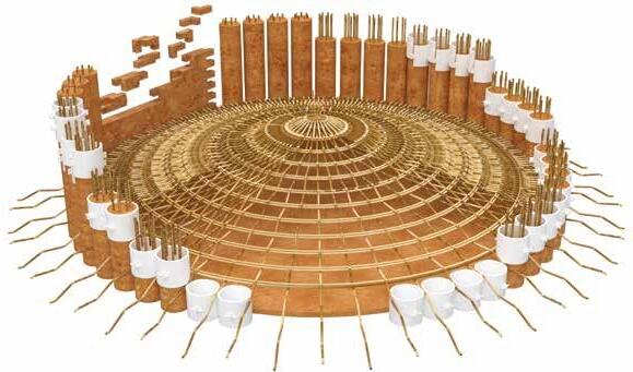
2 1 Bamboo sticks are placed into the formwork as reinforcement. (6) 25 mm diameter sticks measuring a minimum of 700 mm long are needed for each pour.
A 600 mm diameter split PVC pipe will serve as the slip formwork. The formwork is lightweight and reusable.

600 MM

3 The formwork is filled with compacted earth up to the rim of the formwork and it is rammed.
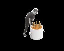


4 comprised of five pours of 500 mm each making the completed column a total of 2.5 meters tall. The bamboo reinforcing should stick out from the top by 200 mm to allow for the roof connection.
The formwork can now be moved up to create the next segment of the column. The same formwork can be used to create multiple pours.
After the earth has dried, the formwork can be removed. The pins that hold the formwork are released and the two parts of the formwork are separated.
In an essay on how a child acquires English expressions for space and time, psycholinguist Herbert H. Clark argues that the child acquires them “by learning how to apply these expressions to the a priori knowledge [that the child] has about space and time.”22 This a priori knowledge comes from a space Clark calls “P-space,” the perceptual space the child is born into. He writes:
The child is born into a flat world with gravity, and he himself is endowed with eyes, ears, an upright posture, and other biological structure. These structures alone lead him to develop a perceptual space, a P-space, with very specific properties. Later on, the child must learn how to apply English spatial terms to this perceptual space, and so the structure of P-space determines in large part what he learns and how he quickly learns it. The notion is that the child cannot apply some term correctly if he does not already have the appropriate concept in his P-space.23
As a baby discovers the phenomena of gravity that forces the objects she throws toward the floor, into disappearance from her vision, she is developing a broader world than her innate P-space, where objects exist beyond her immediate vision (object permanence). The baby expresses herself using deictic expressions in absence of spoken language. As she acquires the language expressions that relate to the concepts of P-space, she enters what Clark calls “L-space,” the concept of space underlying English spatial terms. L-space coincides with P-space, as such that “any property found in L-space should also be found in P-space.”24
Clark summarizes the characteristics of the P-space of a person, in upright position—what he calls the canonical position—as “the optimal position to perceive other objects visually, auditorily, tactually, etc.”25 And he defines these in geometric terms: “P-space consists of three reference planes and three associated directions: (1) ground level is a reference plane and upward is positive; (2) the vertical left-to-right plane through the body is another reference plane and forward from the body is positive; and (3) the vertical front-to-back plane is the third reference plane and leftward and rightward are both positive directions.”26 (Figure 3.6)
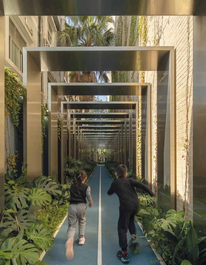
3.5 (Facing page) Avenues Shenzhen Campus, exterior playground.
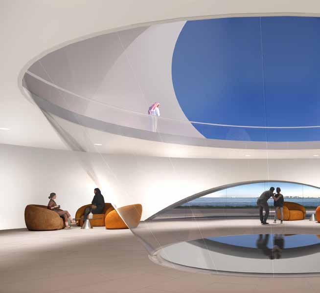
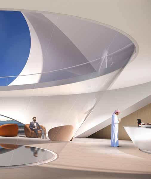
3.13 Interior view of the Doha Art Pavilion showing the juxtapositions of conical projections that can be experienced from a single vantage point.
3.14 Kaunas Concert Hall diagram of projections illustrating the light cones.
The power of these juxtapositions allows the individual to let go of their personal cone of vision defined by their vantage point, to wander into the other cones that define the space around them. The resulting space offers multiple perspectival hinges, to be experienced from a single vantage point. (Figure 3.13)
We further explored using projective geometry, as both the genesis concept and the final manifestation of the design, for a concert hall project in Kaunas, Lithuania. Whereas the conical projections of the Doha pavilion framed the sky, water, and the city, for this project we focused on tracing the light in the space by shrinking the opening size and creating a darker environment. As seen in Figure 3.14, a source plane (S1) is projected down to a target plane (G). Similarly, a second source plane (S2) is projected down to the same target plane (G). The intersection of these two projection cones forms the physical boundaries of space. Both source planes (S1) and (S2) are skylights. Target plane (G) is is illuminated by the light coming through the skylight planes. The resultant intersecting volume is cast in concrete, in effect turning the ephemeral lines of projections into the hard edges of the concrete surfaces. As daylight moves through these spaces, the angle of the sun will at times align with the projection cone.
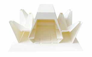

At these moments, the cone will be activated with light. At other times of day, the light will create additional projections on the walls of the cones. When the rays of the sun do not directly come through the skylight opening, exterior ambient diffuse light will bring gradient brightness from the skylight planes down toward the ground plane. The tracing of light into these cones throughout the day resonates with the projective cast of the concrete that defines the spaces.
The geometric construct illustrated in Figure 3.15, forms the tectonic integer of the project that is repeated in variations of scale and orientation throughout the building to create a field condition. The intersecting volumes of these multiple projection cones create the spatial syntax of the project. The location of the skylight frames and the angle of projection is calibrated to the solar movement, to give each space a unique light quality. The geometric intricacies created by the intersecting light projections cast in concrete become the architectural expression of the building, experienced both inside and out. Similar to the Philips Pavilion in its intentional use of projective geometry as both the genesis and the experience of architecture, this project attempts to shift the individual’s perspective toward a deeper appreciation of space, sculpted by light.
3.24 Diagram showing the design concept of the expansion to the Lima Art Museum based on using projective geometry. The facade articulation of the Exposition Palace is projected both in plan and section on the expansion site. Note the counterpoint between the facade rhythm of the historical building and the portals of the new expansion.
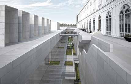
[now] can coexist with the original nineteenth-century building [then]. Just as Raphael’s The School of Athens creates a reciprocal time deixis between the observer and the painting, the portals of the new expansion building reciprocate with the Exposition Palace, to culturally bridge across [now] and [then], so they can be synchronous in the same place.
However, we wanted to connect further than the nineteenth-century [then]; we wanted to connect [before then] with the pre-colonial culture in Peru, to the stereotomic architecture of Inca. To achieve that, the project proposes a crevasse between the new expansion and the Exposition Palace, creating a below-grade monolithic landform that defines a layered sectional cut, running along the existing building. It almost acts like a foundation to the nineteenth-century structure, suggesting that the new expansion has been there long before [then], flipping the time sequence of [now] to become [before then].
The echoes of the Exposition Palace resonate throughout the new extension at varying scales and levels. Looking up from the new galleries, visitors see the framed views of each corresponding bay of the historical facade. Coming from the sunken gardens, visitors see the grandeur of the historic building
3.25 View of the crevasse between the new expansion and the historical building. The monolithic cascading levels descending along the facade of the historical building create a sense of foundation to it.

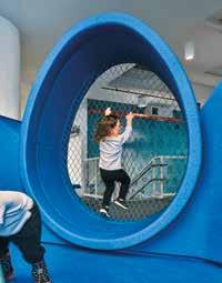
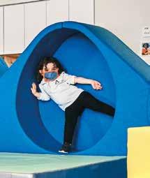
The niches are scaled for the size of toddlers, allowing them to easily reach the walls of the eggs with their arms and legs. This stretching inside the niche is also observed in the playroom.10 Toddlers stand up inside the niches and stretch their legs and arms, as they learn to balance and coordinate their movements. These spaces wrap their bodies and give them a sense of security and belonging. Not surprisingly, as observed by the teachers, the children refer to these eggs as “bedrooms.”
The project has a larger niche to allow the children other exploratory activities. They use the netting to climb or balance their bodies while using foam rollers to coordinate their movements. The children also use this as a more social space to gather in groups. According to the teachers, the children like the sensory push and pull of the net.11 They also like to observe through the net. The large egg niche is often referred by the children as the “elevator,” which they call each other out to go inside as they run around the room. Given that the project is in New York City, where elevators are a ubiquitous part of urban life, this name choice is perhaps not surprising.12 Elevators are confined spaces that are often occupied by multiple people. Their confined scale relative to other spaces is similar to the scale of the niches.
4.5 Avenues New York Small World movement room.
4.4 (Facing page) Learning to balance in the Avenues New York Small World egg niche.
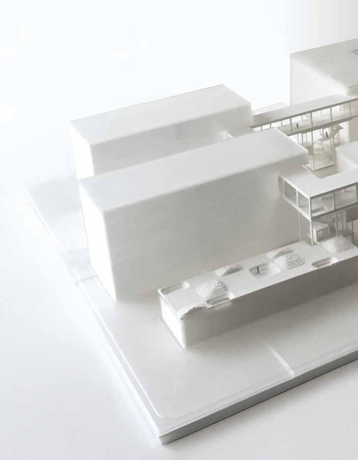
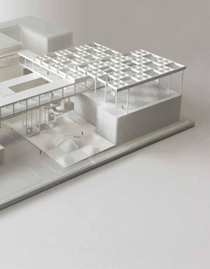
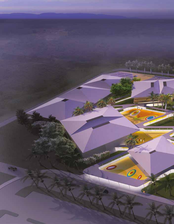
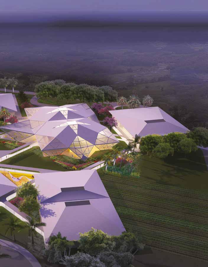

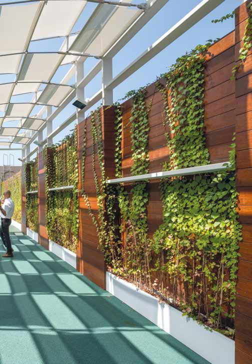
5.5 Students exercising on the play structures not only develop their motor skills, but also develop social and spatial experiences. The tensile canopy that protects from the intense sunlight in Shenzhen, creates a dappled light underneath. The breathable structure of the canopy and the green wall along the side of the playground creates a biophilic environment. The integration of natural elements into the movement space is a key design decision for this age group, when children start to differentiate movement and life, which in turn creates an appreciation of nature and helps develop empathy with the natural environment.
