LOOK INSIDE: Everyday Architecture. A Vast Wasteland?
/ 004
Private Life in the Burbs
4a. McMansions: The Settings
4b. McMansions: The Outsides
4c. McMansions: The Insides
4d. Smaller Houses in the Burbs
4e. Buildings with Many Bedrooms
4f. “Mobile” Homes
/ 005
Architecture on the Move
5a. Cars and Their Domains
5b. Gas Stations
5c. Industry
5d. Other Architecture on the Move
/ 006 Open Spaces
6a. Parks and Places Like Them
6b. Campuses and Places Like Them
6c. Sports in the Outdoors
6d. Open Space Gone to Waste
6e. Out in the Countryside
introduction: vast wasteland
Architects receive a lot of professional press periodicals (or we used to before they started only sending out digital simulacra of their magazines), which feature building projects that suit the editors’ sense of what’s considered excellent at the moment. But the trends of the moment are not our mission here, instead we’re interested in the 95% or so of buildings that, by and large, never make the cut of being considered notable. This is everyday architecture in the USA, the unsung and ubiquitous masses of buildings that line our streets and parking lots.
Is it fair to call this a vast wasteland? That memorable phrase was originally coined as an assessment of the television fare in 1961 by Newton Minow, then chair of the Federal Communications Commission. (And despite a choice of thousands of channels and services instead of four—vast indeed—on balance one might well say the same today.) In any case, a lot of what we see or, more to the point, usually fail to see on the way past, is pretty bad. Certainly not all of it; there are workmanlike buildings that do a good job of filling in the background, and there are occasional gems that get to be center stage for a while. While these deserve our admiration, the rest deserve a fair measure of dismay.
We do tend to look past all the rest; it becomes a blur, failing to garner our attention and often deservedly so. If we’re in the suburbs, we’re likely to be driving past at a brisk pace so there’s hardly an opportunity to observe in any case. And in the last analysis, such observing of the built environment is simply not in the nature of most citizens’ way of life anyway; like the frog in the pot with the water getting gradually hotter, we’ve gotten used to things and simply don’t notice how bad the built environment has become.
introduction: a wasteland
So, let’s have a look, principally in the darker reaches of ordinary, everyday American suburbia, at several types of everyday architecture. Except for the mega-scale of shopping centers, malls, and hospitals, these tend to be stand-alone buildings. Some of them, to be sure, are pretty big, but most sit in the streetscape or the landscape with space all around them, which is often asphalt paved. Some of these building types will also be found in the centers of cities, where property values will have reduced, if not eliminated those peripheries. Out in suburbia, though, most of them assert a very American quality of independence, each, as Harold Hill the Music Man said of each bassoon, having its big fat say. But, as Don Alhambra in Gilbert and Sullivan’s “The Gondoliers” would have it, “when everyone is somebody, then no one’s anybody!” Or in more urbanistic terms, buildings in the ’burbs line up with little sense of ensemble or context, each an ill-formed, isolated statement, ending up a sort of vague built chaos. With some trepidation, let’s check them out: we may even uncover some everyday work done well, diamonds in the rough out there in the wasteland.
all about
While commerce nowadays seems to be mightily focused on the online world, there’s still a lot of brickand-mortar business going on, out there among the big boxes and little boxes and in between. And most of them seem at least a bit unsatisfactory in one way or another, or both.
ll about sales
1a.
Shopping Centers
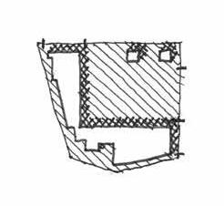
Shopping centers are an appropriate enough introduction to the subject of everyday architecture generally, since many of the other types that follow have some similar attributes, among them flattish roofs, synthetic stucco walls, and parking lots out front. An internet search for “shopping center architecture” reveals a variety of flashy modernist works, but these are not our subject. As distinguished herein from shopping malls, a different animal discussed elsewhere, shopping centers are agglomerations of shops and stores attached one to the next, sometimes bent around in a sort of “U” shape focused on the centerpiece, the sacred parking lot. Often enough these now tend to house a forlorn assortment of placeholder outlets, second-hand stores, and call centers, when they house anything at all. Configurations vary, of course, for they may be Us, or Ls, or just Is, in which in the latter case they will have devolved into the even more ubiquitous “strip centers” (Fig. 1.1).1
In each case one sometimes finds smaller “outparcels” out in front and these branch banks, fast-food outlets, and the like become the public face of the centers beyond. Some more recent incarnations of the shopping center, in addition to featuring the likes of Kohl’s, PetSmart, and Old Navy, may include one or more all-tooaptly named “big box” stores like Walmart or Target. For some reason this transforms them into “power centers.”
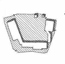
The enduring nature of such places, in addition to their pride of place being given over to parking, is the location of their service entrances at the outer edges of the property (Fig. 1.2). This does mean that the loading docks and dumpsters are out of sight from the retail entrances, but it also means that most of the periphery of the property features nothing but those building backsides. Sometimes, by the luck of the draw, the service precincts of adjacent properties will adjoin, such areas thus imposing their scruffy nature only on each other. But otherwise, as is the case often enough, the back doors of one end up being the view from the front doors of the next. There is something very American about the frontal parking lot, arising as it does from our love affair with the car. The actual retail entrances are very much a backdrop in these places, but one can hardly gainsay the logic of pulling into the parking lot, parking, and proceeding from there in visible, linear order to the retail
1 A reimagining of the strip center concept has been the so-called “office/distribution” development, tenants being anything from printing outfits to nonprofits to mysterious labs. Each slice in the strip comes equipped with a roll-up door in the back, such places being primarily intended for outfits with inventories. But many tenants seem to end up there mainly because the rent is cheaper, despite getting what they pay for.
1.2
A shopping center backside.
1.1 Shopping center plans: Us, Ls, Is.
destination. In contrast, back in true town centers dating from the turn of the last century, emporiums of commerce looked at each other across Main Street and parking was parallel, or angled, or back behind the buildings. “New Urbanist” schemes from late in the last century onward have promoted updated versions of this pedestrian-forward arrangement, with some success in a scattering of modest commercial centers, all comprising what’s really a new look at old urbanism.
But the enduring logic of parking lot fronted shopping remains hard to talk developers out of.
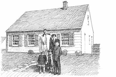
As a youngster, the author ran small grocery errands to a quaint little roadside store embedded in the neighborhood, fronting a corner junction with a bit of angled parking and houses on the other three corners (Fig. 1.3). It was a middle-class version of the corner market still seen in many inner-city neighborhoods. And it was the prototype of what would become, in a much debased and much less walkable form, the strip center, its front parking expanded back from the street
by 100 feet or more. Returning to the “new” idea of moving most of that parking to the rear or the middle of such a commercial block, this would have the benefit of shop entrances once again honoring the arriving pedestrian consumer rather than the arriving consumer’s car. That said, it’s true that such schemes must either have back as well as front entrances, or feature passageways leading to the front, with clever screening of the dumpsters. In the author’s own experience in at least two occasions, a developer was actually amenable to parking at the rear of a proposed suburban retail development, only for this well-intentioned ideal to morph, slowly but surely, into relatively tasteful versions of parking-forward centers. They’re hard to stamp out.
But encouraging examples, of a sort, do exist. Two, which, admittedly, have clearly benefited from enhanced budgets appropriate for their upper-middle-class patrons, are the commercial townlets of Freshfields Village enroute to Kiawah and Seabrook Islands, and, at a smaller scale, WaterColor
1.3
Corner shops in Westwood Hills, Kansas City, MO.
1.4
Watercolor Crossings, Watercolor, FL: not that unusual, perhaps, but a big step up from the usual.
2.19
An entertainment center floor plan, being an unbuilt scheme from the early years of the building type. In a case of planning by aggregation, this client would repeatedly come across some additional type of attraction or game, and space was then made for it one way or another in the constantly evolving plan.
inner-directed, the contents of such places may include arcade games, sports simulators, dining and drinking, miniature golf, roller skating and more (Fig. 2.19). One may question, just a bit, the societal worth of such places, but at least they get people away from their home screens for a while. As with the activity, the architecture is all on the inside at the FEC with a variety of carnivalesque form, color and lighting, while the outsides tend to be more of that solid and hulking sort.
A sort of ultimate in entertainment centers would be the outdoor variety, namely, the theme park. To be sure, these are far from everyday, varying in scale from modest village-like installations to destination mega-attractions. The industry leader is Disney, and deservedly so; just be sure to take twice the money you think you will remotely ever need when you visit. The Disney parks have done such a good job with their main streets and other thematic architecture that their efforts merit study by those doing “legitimate” urban design. And not all such places are out of doors: massive indoor theme parks exist, in the Emirates, Korea, Canada, and the USA, though they tend to be more in the nature of amusement parks than theme parks. It’s fair to say that any remnant of “educational” content will have been expunged from the former category, which is primarily about thrill rides.
The biggest structures of all that are dedicated to the entertainment of spectators are, of course, stadiums and arenas. These can be so large, at least in the case of major league scale venues, that it’s no longer possible to ignore their physical prominence, and considerable effort can go into giving them special qualities of memorable presence, or at least this seems to be the motive. Design trends for arenas and stadia are notably low on subtlety, ranging from nostalgic borrowings of olde ballpark imagery to extravagant, sometimes rather desperate flights of modernist fantasy featuring flying triangles, whirling cyclones and the like (Fig. 2.20).
A desirable trend with minor league parks sees them integrated into the urban fabric as opposed to being relegated to farmer’s field locations and incorporating elements of commercial and residential development. In this respect they exemplify a worthy effort at fitting in.
Arenas may generally feature those sports events that aren’t quite as largescale as football or baseball (though both now do exist in fully enclosed stadium mega-structures), and they sometimes also feature a unique category called “Sports Entertainment,” notably the activities of World Wrestling Entertainment (previously World Wrestling Federation, until the World Wildlife Fund raised an issue with that). Pro boxing, although presumably regarding itself as somewhat more legitimate than pro wrestling, remains a brutal display that can appeal to the baser instincts of spectators. It also constitutes a notable exemplar of one of the main reasons pro sports are so popular, which is sports betting. The author, brushing up on casino and entertainment architecture long ago, came across something enigmatically called “sports book.” What could this be: some sort of walk-through version of an encyclopedia dedicated to the history of sport? Sadly of course it means something more like “sports bookie,” where you can sit in a big room full of big screens displaying a wide variety of in-progress sports events and place your electronic bets.
2.20
Some present-day arenas in Minneapolis and Atlanta, these of the triangles-galore variety.
3.8 A megachurch.
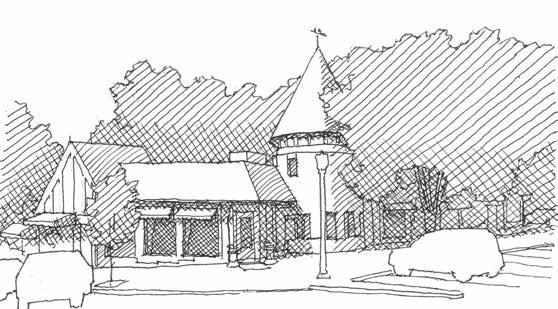
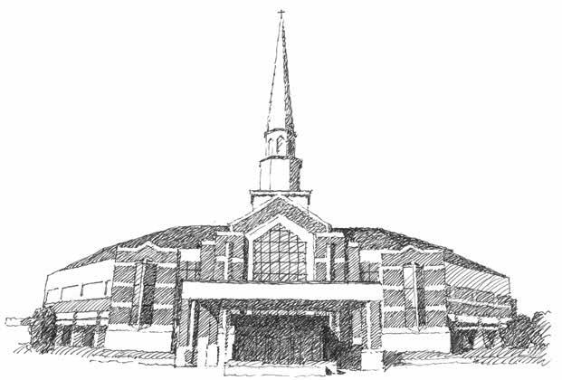
and the craft of carpentry have fallen on hard times, as has the expectation of what a suitable house of worship would be like. All that said, one should note that a good many small town and country churches represent good faith efforts, so to speak, often featuring brick veneered exteriors, so all is not lost. At the opposite extreme in scale from little country chapels we find the megachurches. Some of these have faced up to the reality that their naves are more in the nature of arenas, and have worked effectively within an aesthetic of modern-movement rectangularity as opposed to some dimly recalled ecclesiastical prototype. But the latter case is often the rule, wherein a traditional steeple is flanked by some version of massively overscale extensions, splayed to accommodate the thousand or more that may attend each of the several Sunday services (Fig. 3.8). Many attendees will do so virtually, and those present in person will be served by massive video screens to better convey the parts played by the several ministers, several choirs, and several musical ensembles. The interior is indeed an arena, wired for sound and light, theatrical in spirit and likely to be windowless. Perhaps it’s fair enough that the nature of the architecture is wholly secondary to this wholly interior experience, but the megachurch nave seems an ironic recall of the bare bones chapel in this regard, having become a big barn version and often having little intentional architectural expressiveness. On the exterior, an apparent desire for the perceived validation afforded by traditional church design has
sometimes resulted in ill-informed appliques of historicist motifs, such as scatterings of pedimented windows and overscale glazed archways. Strictly to see what would appear, the author made an internet search for “best church buildings in modern America” and one result was a post by “Tripadvisor”—ever the trustworthy research resource — listing “America’s 20 Most Beautiful Churches, Cathedrals & Basilicas to Visit.” These comprised 19 historicist edifices that were built long ago and one of a modernist persuasion ( Sedona’s Chapel of the Holy Cross). Such a selection, sobering enough for an unrepentant modernist, reflects a hard reality of religious architecture in modern times: the examples most admired by many are neither modern nor recent. Casting about among everyday cities and their everyday architecture for a handle on what does seem worthy, one does find that a recall of the past is most often present in religious buildings that stand out for their architectural, as well as urbanistic, competence (though it’s a bit sad for “competence” to appear as a benchmark). It seems fair to say that brick-clad churches of an historicist persuasion are generally more convincing architecturally than vinyl-clad ones, and that stone-clad ones are more convincing yet. Daring to name a denomination in this regard, one seems on firm ground in praising the Episcopalians for a frequently admirable job in church design and construction, which is, often enough, stone clad. But here again, as is so often the case nowadays, things come down to money, and
3.9
A view from above highlighting three actual downtown churches, illustrating the positive role that complex church massing can play.
stone is usually the most expensive cladding there is, so brick is more likely to be the best we can hope for.
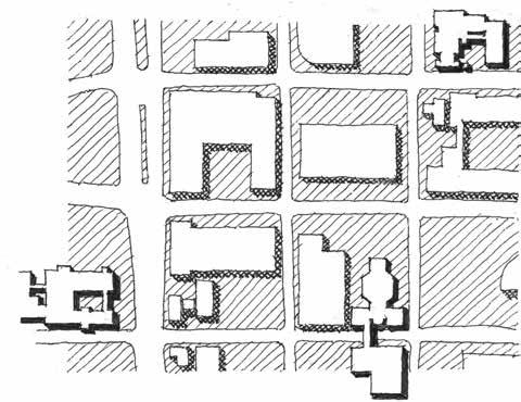
That reference to “urbanistic” matters concerns the fact that churches are sometimes the only interesting buildings around. Many an otherwise dull town is saved from utter ignominy, at least in terms of the drive-by impression it makes, by the intriguing massing qualities of a church (Fig. 3.9). Churches of a medium to larger persuasion will usually need a battery of Sunday school rooms, an office suite, and a fellowship hall with a commercial kitchen adjoining. Toward the larger end, they may also feature a chapel, parlor, choir rehearsal room, or youth fellowship suite. The fellowship hall may have a stage, and the kindergarten will have an outdoor play space. All of which is to state the obvious, that churches are often, if not usually, multi-building complexes, even though connected under a contiguous roofscape. Some may have felicitously gathered their forces around a cloister court, while others will have simply rambled on as occasion suggested.
While a generally historicist approach to church architecture can be good for the community in this urbanistic sense, a close-up view demands something more, for the apropos saying that God is in the details applies especially well in such cases. (Or was it the devil is in the details? Also, perhaps apropos.) Something resembling Gothic or Romanesque Revival—or, rather less commonly, Spanish Revival or neoclassical—needs careful attention to details and proportion to come off well. And that means scholarship and money, either or both of which may be in short supply. The historicist churches we are more likely to know and to like are likely to date from the earlier decades of the previous century, for both the body of historicist knowledge and the craftsmen to apply it are hard to come by at best in more recent times (Fig. 3.10). There was a substantial period—which still prevails in large degree—during which architects were inculcated with a design taboo regarding historicism, and this has had its impact on new church building design. A particular situation that comes readily to mind concerns the not infrequent need to make additions to historicist church buildings. Sometimes we see modernist additions, and this can be ok if they are handled carefully and deferentially (though that can be a deal killer proviso). But sometimes the addition attempts a middle ground, adopting some historicist
3.10
It can be done, but it isn’t cheap (a Presbyterian Church in Nashville, TN, completed in 2009).
Most would agree that the centerpiece of this taxonomy of everyday architecture would be the suburban house. It feels a little shameful to be writing critically about these because it’s a bit like shooting fish in a barrel, really: there are so many things wrong, and so many of them that are painfully obvious. But apparently these aren’t that obvious to builders or buyers. Well, that’s an elitist statement, to be sure, but one is led more or less unavoidably to that conclusion. True, maybe buyers have little choice and make the best of a bad deal when it comes to the suburbs-- one has to give them that. Suburban residential development—sprawl—arose from a complex combo of land value, population growth, desire for more space, desire for better amenities, the car’s ascendance—a bunch of issues. The deed is done, the burbs are here, and our mission now is simply to call out the bad to worse aspects that are ubiquitous in every city and town, in every state in the union, of millions of unaccountably bad houses.
The Type
A Field Guide to American Houses, by Virginia Savage McAlester, has been a remarkably useful and comprehensive classic since its first edition in 1984, with Lee McAlester. Its 2015 edition features significantly expanded coverage of metastatic variants on the American single-family house from the ’90s to the present, and one defers to that edition for its efforts to taxonomize American house types and subtypes of that period. The emphasis here, with some digressions, will be on the particular “style” known therein as “Millennium Mansion,” or elsewhere by the more widespread sobriquet “McMansion.” An internet resource defines the latter as “a large modern house that is considered ostentatious and lacking in architectural integrity,” a sentence elegant in the simplicity with which it sums up the two overarching negative attributes of millions of American homes.1
The above reference to a taxonomy suggests that the conundrum of the recent American house is a more complex animal than this one type. But the McMansion is its most visible and, indeed, its most readily critiqued manifestation. One surely hopes the view that its reign is in decline is correct, but despite such a development, the damage done remains extant and its impact widespread and long lasting.
Origins
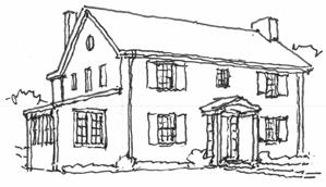
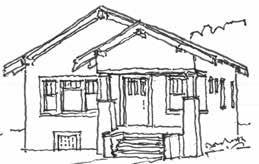
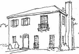
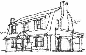
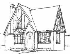
To set the stage, one recalls the heritage of styles from Europe, including Tudor, Mediterranean, French, and neoclassical variants, that joined Colonial Revival and craftsman styles from new world precedents in the form of the period revivals that populated the suburbs of the ’20s (Fig. 4.1). While these styles weren’t perfect, they were pretty good, achieving attractive, varied, well-proportioned, and
1 A website titled “McMansion Hell,” if still online, is worth checking out for some sharp commentary as well as some appalling images of the type.
comfortable approaches to modest single family residential design, equipped with dependable sets of well-honed design specifics. But by the ’30s, Europe had also spawned the advent of modernism in architecture, and this, along with the Great Depression and the impact of World War II, changed everything. The depression brought an end to the heyday of the period styles, and the war led in turn to mass housing estates of small, simple houses, often in the austere Cape Cod mold (Fig. 4.2). At the same time, the architectural profession was newly in thrall to the so-called International Style, arising most famously from the work and influence of Le Corbusier, Walter Gropius, Ludwig Mies van der Rohe, and their acolytes. So, demand for the period revivals— embodying convincing and deft designs drawn from informed knowledge of historical precedent— died out to no fault of their own, new house construction was simplified for economy and minimally embellished, and the profession left it all behind in any case for this new mistress. By the ’50s, residential architecture in America had sort of lost its way.
Since the ’30s the streetcar suburb had been replaced with the automobile suburb, and it was no longer necessary to walk to work or to the streetcar because we now had the privilege of getting out the car and driving to every single thing we needed or wanted to do. And as the ’40s became the ’50s and ’60s, consumers wanted a step up from wartime austerity, and in large part the effect on the little Levittown Cape Cod was to stretch it laterally, with the “rancher” and its variants eventually cropping up throughout much of the nation (Fig. 4.3). It’s true that some architects did some fine work in their preferred hothouse version of modernism (witness California’s “Case Study Houses” as one set of examples),but architects were increasingly regarded as a luxury, hired by the privileged rather than the masses. Developers did make some inroads into mass market versions of what became known eventually as mid-century modern, Eichler Homes being one example, but their innovations were in the minority.
4.3
A rancher. Subtle adjustments— breaks in the roof or wall plane, extended window proportions— offered improvements to their relative dreariness.
4.2
A Cape Cod house in Levittown, NY.
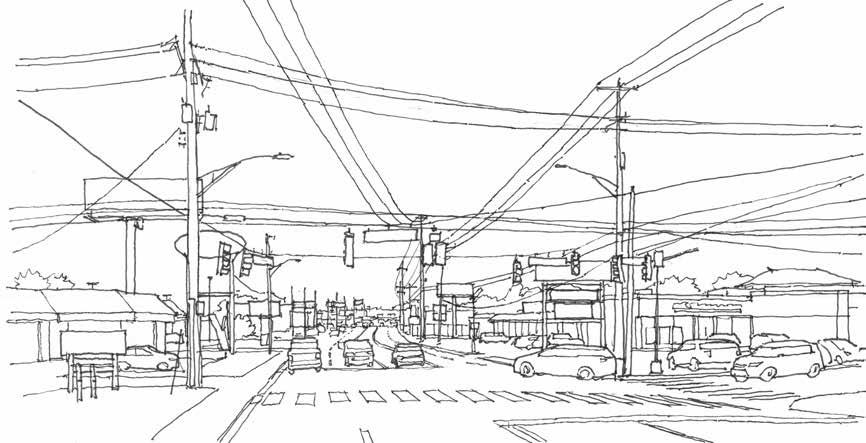
that may seem to be stating the obvious—surely we all know all about all that—but it can still be revealing to take a snapshot of the suburban commercial environment, exposing the uglification that we have become blind to (Fig. 5.6).
While in the thick of a commercial connector road, one often turns out to be negotiating a largely contiguous 300-foot-wide pavement of moving and parked traffic, interrupted only by the minimal islands and buffers required by law. Shrubs may or may not be surviving in those conditions, and trees have a way of being few and far between. To be sure, every so often the main drag is greenery-buffered, and in those cases the 300-foot-wide pavements are off to the sides where they are surrounded by big boxes and little boxes (see “Shopping Centers”). It’s even possible to drive, parallel to the main drag, from one parking lot to the next, on sort-of-default frontage roads.
Parking Garages
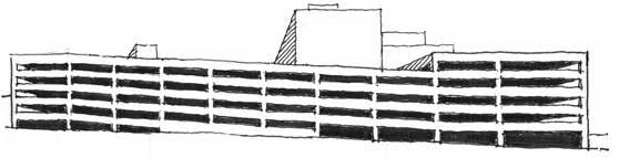
Once there are more cars than can be accommodated in parking lots, we get parking garages. Generally, these are no more attractive-- in a way they are even less so, rearing up to dominate the visual field with their bulk, relieved by no hint of human inhabitation. The most efficient parking garage designs turn out to involve park-on ramped floors, and unless these can be concealed in the middle—requiring a
site that is over 180 feet wide—one side of a garage will slope, offering the exhilarating impression of partial collapse (Fig. 5.7). Parking garages present a challenge to innovative designers, and brave attempts have been made to turn them into “art objects,” hard though that may be to visualize. Once they’re built, they’re hard to repurpose into anything else, something optimistic visionaries hope will be possible once car usage actually declines, given the assorted ramped floors and floor-to-floor heights suitable for garages and little else. In some high dollar parcels, on-site parking has been put fully underground, but this is very expensive, as is the constant forced ventilation required to keep them from filling up with carbon monoxide. More typically they rise up, with open sides permitting natural ventilation and views of many shiny grilles. Occasionally they’ve been tricked out to pose as office buildings with mullions in the “windows,” but since these can’t have any glass in them, the result tends to suggest the aftermath of a fire or a looting event. To give the due to some good practices regarding parking structures, if we must have them they can be buried in the middle of a block and surrounded by retail or residential. Or at the very least, the ground floors on street exposures can be lined with retail. And even if the site doesn’t permit or call for functions other than warehousing cars, it’s possible, given a sufficient budget and some ingenuity, to make a parking garage presentable, though this remains a bit of a long shot. (Fig. 5.8).
5.6
A car’s eye view of commercial suburbia.
5.7
The appearance problem of park-on ramps.
Other Car Places
Cars have a way of generating a whole variety of further sketchy environments, which are pertinent to the topic of everyday architecture in their own particular negative ways. Car dealerships tend to be flashy and graphics-intensive, and used car lots take that to the next level with their carnivalesque pennants and blazing illumination. There are chain emporiums that exist to take your car off your hands for fully as much as half of what it’s worth; if you’re there, you may well be badly in need of funds to deal with some other exercise in bad judgement, or simply for being stuck at the wrong end of the American dream, as so many are. The ultimate sad fate of car togetherness outside the parking lot or the parking garage is the junkyard (they may call themselves wrecker services or salvage auctions) which every urban area features somewhere. And there are car part emporiums, that turn out to be junkyards for cars that have been deconstructed, and there are fair sized graveyards devoted solely to tires. At least someone is collecting them, though tires still have a way of showing up in the ditch or the creek or put to decorative use in planting beds.
Having glanced at these sad automotive end games, one feels obliged to make note of the perfectly legitimate and perfectly architecturally boring family of car care centers, auto parts stores, muffler places, oil changers, tire stores, car washes, and the like, but little more need be said other than that such places are thick on the ground, attesting to the utter prominence and dominance of the car in society. And these places need not be boring! They present widespread opportunities, so seldom exploited, for innovative design, evocative of speed (well, responsible speed) and style. Clearly it turns out to be pretty easy to complain about cars and their domains, but ultimately they deserve a sort-of nod for their undeniable appeal in terms of freedom, style, and convenience. Once the frankly absurd internal combustion engine is finally replaced, cars will be hard to beat as the nation’s conveyance of choice. And, the roads are already there, as opposed to the railroad system, which largely doesn’t exist as such, through no fault of its own. Not to mention the propensity of cars to assist in cleaning up the national gene pool, though having pointed that out may be a bit too dark even for this commentary.
5.6
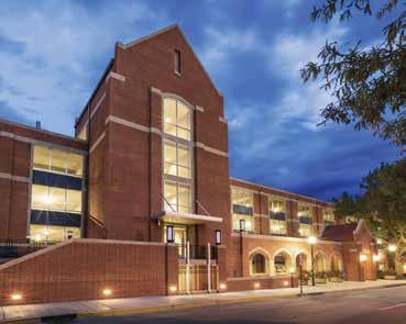
A parking garage designed for a conspicuous site on a Collegiate Gothic-ish campus, intentionally looking less obviously like a parking garage.
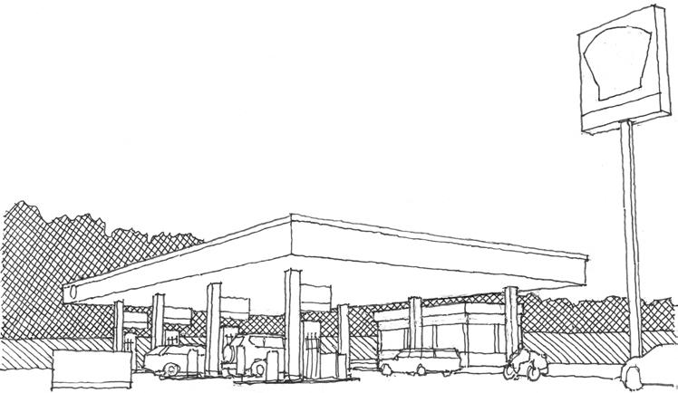
5b. Gas Stations
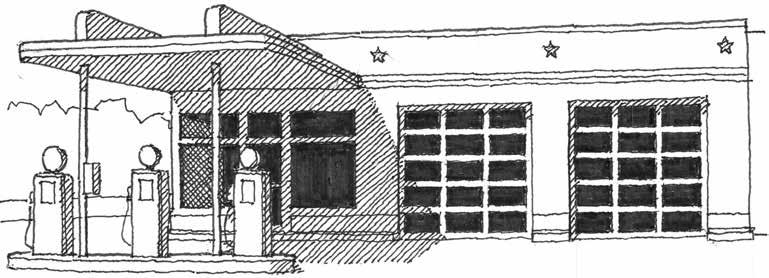
Back in the day when the single-family house sported revival styling, gas stations did as well. They were Tudor, Mediterranean, Mission Revival, Colonial Revival, and even sort of Georgian. But once the central place of petroleum in American daily life developed as such, the new idea of something called a “brand” came to pass and the increasingly ubiquitous stations came to be themed by their companies to encourage brand loyalty. Gas pumps themselves were wonders of singular design and graphics capped with internally illuminated bullseyes, shells, and crowns (Fig. 5.9). Oil companies went on to realize that it would be cheaper to simplify and standardize station design, so starting in the ’30s the distinctive variations in roofscape that were central to the revival styles changed into the flat tops of box-shaped stations. In their defense, these often sported appealing design qualities, characteristically derived from art moderne precedents, and eventually the impact of the “international style” further streamlined these designs. They typically retained a certain up-to-date dignity, sometimes clad in sleek and durable baked enamel on steel (Fig. 5.10).
But bit by bit, an interesting building type became less so, although innovations could still occasionally be glimpsed. Eliot Noyes, an architect and designer of the elegant Selectric typewriter, also designed some of the most eye-catchingly modernist gas stations, their round canopies balanced on centerpoles (Fig. 5.11). Innovations of quite another kind had been cropping up since the ’30s in the form of oddities with vaulted or hyperbolic paraboloid roofs, or in the shapes of shells, teapots, teepees, or airplanes. But these jaunty experiments were few and far between. By the ’60s, box stations were sometimes remodeled and, along with new ones, designed in some vaguely historicist (“Colonial Revival”) or residential (“ranch house”) motifs. Thus, a full circle of a sort had come to pass, in passing, but not in a particularly good way.
5.9
Some gas pump globes of yore.
5.10
Classic modernism in gas station design.
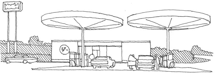
Once the Interstate System became the way everyone drove long distances, whether they liked it or not, the attendant gas stations followed suit and basically became nonentities. Rather than the station itself, what one first sees is the pylon sign, or rather the cluster of many, each 50, 80, or 100 feet tall, all vying for attention. Then comes the looming canopy, capable of accommodating the shipping containers on wheels that now rule the road.3 The unprepossessing boxbuilding beyond may have a flat roof, a “mansard,” or a fake gable, but we really have no recollection because that structure has ended up becoming utterly unmemorable, a sad denouement for its sporty design history (Fig. 5.12).
Inside that boxbuilding, no particular attention has been given to design niceties and the only thing one really sees are the rank upon rank of every possible variety of junk food, flanked by the coolers full of every possible variety of sugar-infused, flavored, carbonated water, mostly of the 20-ounce persuasion, and what still sadly passes for mass-produced beer in the United States, ready to hand
for one’s convenience upon continuing down the freeway. (Speaking of convenience, some states have long had drive-thru liquor stores, as far as that goes, but that’s another story.) Finally, the sales counter is positioned to protect the racks of otherwise easily stolen cigarettes, cigars, snuff, vaping devices, and paraphernalia for use in the consumption of illegal drugs. In addition to taking your money, the attendant sells lottery tickets, a popular item offering a chance at undeserved wealth sporting odds of 292 million to one or so. Once on a field trip to check out the design of courthouses, the author witnessed a judge avidly lining up for a couple of those.
At the pump we get to extract a credit card and insert it in the slot and then immediately remove it and immediately hopefully put it back where we found it (unless we must leave it there until TOLD to remove it). Perhaps, unaccountably, we must also enter our zip code, or our rewards code, though sunshine may well be rendering the digital information unreadable. Duct Tape (duck tape, if you prefer) may also be involved in the pump experience in one
3 Vivid shipping container imagery hardly does justice to the ever-growing length of 18 wheelers, for while the former is usually 40 feet long, the latter can be 80 feet long overall.
5.12
A present-day interstate gas station.
5.11
One of Eliot Noyes’ gas stations for Mobil.
6b.
Campuses and Places Like Them
The following odd cohort shares a commonality, being groupings of multiple buildings, normally found in or adjoining cities or towns, that involve a sort of symbiotic relationship with multiple associated outdoor open spaces.
Universities
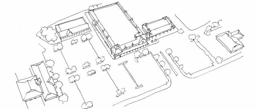
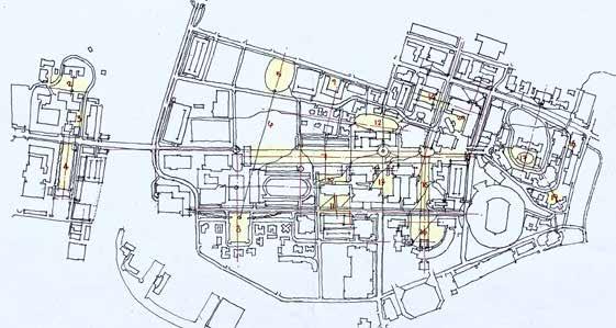
Colleges and universities across the country adhere, fairly consistently, to a “quadrangle” approach for the disposition of their buildings and open spaces. One can see precedents at places like Oxford and Cambridge where the buildings of the older colleges fully surround and define rectangular courtyards, thus resembling the cloisters of medieval abbeys. In more modern times such green squares are less fully enclosed by the buildings that define them, but the desirable sense of the outdoors as a “series of rooms” prevails, at least to some extent, some of the time. Greens or commons—larger open spaces with more irregular boundaries—are also to be found on the luckier campuses, as are elongated, axial “malls,” not to be confused with the suburban shopping
6.5
A preliminary study for a university master planning effort, showing a mixture of existing and proposed buildings. This dense urban campus still manages to be organized around quads, malls, and greens. (As is the way with master plans, this version is already well out of date.)
variety (Fig. 6.5). All this is to note the distinctive and leafy pedestrian-oriented role such campus open spaces play, in contrast to the typical urban spatial experience (the street) or the suburban one (the parking lot).
Military Bases
The US Department of Defense owns 30 million acres, found in every state in sometimes enormous installations. It’s the world’s biggest employer with the world’s biggest military spending more than twice over. While military bases involve a measure of defined open space, sort of like college campuses do, the buildings themselves fail to measure up very much. As with prison design, attractive architecture often seems felt to be inappropriate, a bit namby pamby, for the no-nonsense attitude that appears to prevail regarding life on the base. Drab buildings at these places do little to enhance the experience, and some small measure of blame for the dysfunction one sometimes hears about regarding military life might possibly be assigned to these dispiriting environments.
Fairgrounds
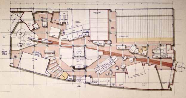
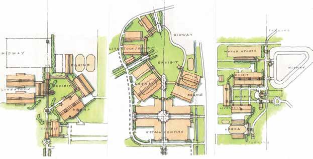
Fairgrounds are about as ubiquitous as campuses: two thirds of the more than 3,000 counties in the USA feature a fairground. While some are modest acreages, others are a pretty big deal, and state fairs are the biggest deals. Once lying rather fallow, except for a few weeks in the fall, more and more these places are becoming year-round events centers. As with campuses, a fairground features an assortment of buildings, but rather than libraries, classroom buildings, and dormitories, they feature arenas, exhibit buildings, and livestock barns. And instead of quadrangles, commons, and malls, they feature exhibit and midway lawns, amphitheaters, and livestock rings. So they amount to a lot more than the carnival, though that’s the main attraction for a good many visitors. Planning a fairground can be a significant exercise, just a bit like planning a college campus except with livestock involved and with lower budgets (Fig. 6.6). Fairground architecture has to deal with the challenge of its image—that these modest structures need no particular design attention—when in reality they need more than usual in order to overcome the often prevailing limitations of pre-engineered building systems, modest budgets, and modest expectations.
6.6
Some examples of concept-level fairground master plans for sites in Texas, California, and Illinois. All feature well-defined central open spaces.
Author Statement
The author, a retired architect, has done design work for branch banks, shopping centers, shopping malls, fast food outlets, single family houses, apartment buildings, retirement homes, car dealerships, churches, hotels, post offices, hospitals, clinics, restaurants, bars, parking facilities, office buildings, school and university buildings, dormitories, movie theaters, casinos, and entertainment centers.1 Despite having no experience in big box stores, drugstores, gas stations, or mobile homes (though he did once design the headquarters of a major mobile home company), he feels almost qualified to have taken all these building types a bit to task. He has authored several other books: Forming and Centering: Foundational Aspects of Architectural Design; Urban Lessons of the Venetian Squares; and Architecture’s New Strangeness: A 21st Century Cult of Peculiarity. This last may be considered a prequel to the present book, dealing as it does with high profile oddities of the present century, while Everyday Architecture deals with everything else. Following travels abroad as a Paris Prize recipient, he worked as an architect in North Carolina, Massachusetts, and Tennessee, where he helped found the architecture and planning firm BullockSmith, serving as its design director. With work nationwide and abroad, the firm has received numerous design awards despite having done a fair amount of everyday architecture.
1 Full disclosure, illustrations herein of architecture and planning work for which the author had principal design responsibility include numbers 2.14, 2.15, 2.19, 3.3 (upper), 3.10, 3.15, 3.23L&R, 5.8, 5.19 (lower), 6.5, 6.6, and 6.8.