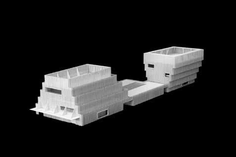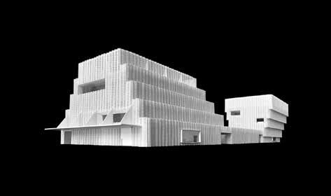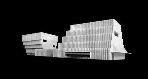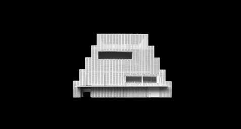
Published by Applied Research and Design Publishing, an imprint of ORO Editions.
Gordon Goff: Publisher
www.appliedresearchanddesign.com info@appliedresearchanddesign.com
Copyright © 2022 Knowlton School, The Ohio State University.
All rights reserved. No part of this book may be reproduced, stored in a retrieval system, or transmitted in any form or by any means, including electronic, mechanical, photocopying of microfilming, recording, or otherwise (except that copying permitted by Sections 107 and 108 of the US Copyright Law and except by reviewers for the public press) without written permission from the publisher.
You must not circulate this book in any other binding or cover and you must impose this same condition on any acquirer.
Contributors: Sharon Johnston, Mark Lee, Ashley Bigham, Todd Gannon, Benjamin Wilke Book Design: Benjamin Wilke Editor: Benjamin Wilke Project Manager: Jake Anderson
10 9 8 7 6 5 4 3 2 1 First Edition
ISBN: 978-1-957183-25-1
Color Separations and Printing: ORO Group Inc. Printed in Hong Kong.
AR+D Publishing makes a continuous effort to minimize the overall carbon footprint of its publications. As part of this goal, AR+D, in association with Global ReLeaf, arranges to plant trees to replace those used in the manufacturing of the paper produced for its books. Global ReLeaf is an international campaign run by American Forests, one of the world’s oldest nonprofit conservation organizations. Global ReLeaf is American Forests’ education and action program that helps individuals, organizations, agencies, and corporations improve the local and global environment by planting and caring for trees.
INTRODUCTION
BE NJAMIN WILKE
SHAP E AND SERIALITY TODD GANNON
A DISCUS SION WITH SHARON JOHNSTON AND MARK LEE SHAR ON JOHNSTON, MARK LEE, ASHLEY BIGHAM, STUDENTS JOHN STON MARKLEE: SELECTED PROJECTS
ME NIL DRAWING INSTITUTE
UC LA MARGO LEAVIN GRADUATE ART STUDIOS
UN IVERSITY OF ILLINOIS AT CHICAGO CENTER FOR THE ARTS
7
157 HOME
160 PR
CREDITS
DATA 161 IMAGE CREDITS 162 BI
CONTENTS
8
20
50
64
74
94 RI CE UNIVERSITY VISUAL & DRAMATIC ARTS 100 MCA CHICAGO 106 CASA DE MONT 118 PORCH HOUSE 13 0 HUT HOUSE 142 PH ILADELPHIA CONTEMPORARY 150 MIAMI DESIGN DISTRICT
VALUES AS HLEY BIGHAM
OJECT
&
OGRAPHIES / ACKNOWLEDGMENTS


6
Pavilion of Six Views
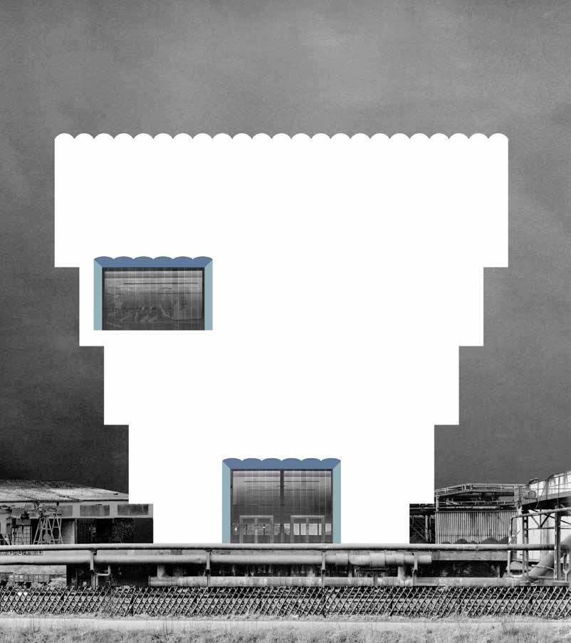
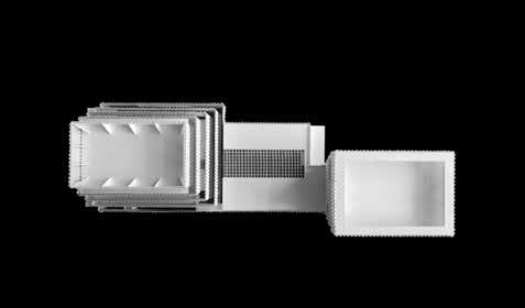
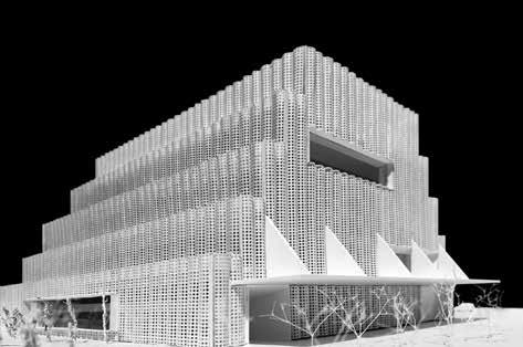
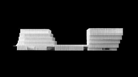
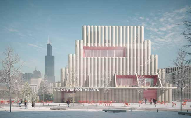
UIC Center for the Arts
Butterfly House
Poggio Golo Winery
Vault House
SHAPE AND SERIALITY

TODD GANNON
10 Nov 2006
I board the Pacific Surfliner at Union Station, southbound for San Diego. It’s midafternoon and, though I know I’m going to roast, I slide into a window seat on the righthand side. After about an hour of nondescript warehouses and sleepy OC suburbs we trace a wide arc at Dana Point and I claim the reward for my now sun-seared brow. The Pacific opens alongside in all its horizontal splendor and for the rest of the trip I stare down at the waves that lap at the beach in slow syncopation with the clatter of the train.
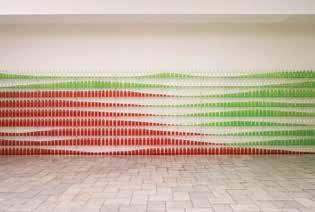
I disembark at dusk and hop the tram to San Ysidro, where I walk across the border into Mexico. Fifteen minutes later the taxi deposits me at the Instituto de Cultura de Baja California. I am maybe an hour early for the opening of Critical Mass [Fig. 1], an installation by Johnston Marklee (JML), the Los Angeles-based architecture firm led by Sharon Johnston and Mark Lee.
Inside, eight glass shelves on metal standards line two walls of the gallery. The shelves support several hundred identical glass bottles arranged in neat rows, with a ninth row placed on the floor beneath the lowest shelf. The bottles have been filled to varying levels with apple-colored liquids to suggest attenuated waves across the

array. Gala gives way to Granny Smith as the eye travels bottom to top and left to right. I am informed that the height of the liquid indexes the population of residents living in irregular and planned housing settlements in Tijuana, but this seems less the point of the exhibition than a kind of ruse, extraneous trivia deployed primarily to justify continued staring at the glistening ondas de colores
So, I stare. Before long, red bottles appear to advance in my field of vision as green ones recede, an effect that renders the ensemble an illusory seascape, islands on a placid sea. Oblique views, especially from the corner of one’s eye, highlight the shimmer of the glass, which makes the waves seem to move. After three hours on the train, the ABBA spacing of the standards against the even staccato of the bottles does not seem the least bit accidental.
The show was mesmerizing. But it seemed to have less to do with JML’s then-current concerns than with preoccupations I thought they had left behind. At the time, the firm was enjoying the groundswell of attention that erupted upon completion of the Hill House in Pacific Palisades. This justly celebrated work marked a significant swerve for the still-young office, one that appeared to move away from themes of seriality and repetition that drove earlier projects toward a pursuit of arresting singular shapes.
8
Fig. 1 Installation View, ‘Critial Mass’ at the Tijuana Cultural Center, Nov 10-30, 1996
Fig. 2 Palos Verdes Art Center
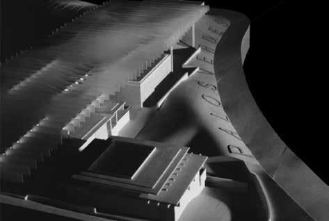
Consider the Palos Verdes Art Center competition entry of 2000, an important early effort and crucial ancestor of Critical Mass. Here, JML unifies an elegantly rambling collection of low volumes by floating a vast abstracted pergola overhead [Fig. 2]. Fashioned of translucent acrylic in an otherwise basswood model, the canopy is rectilinear in plan, though each of its vertical fins is shaped with gentle curves top and bottom that render the array a single, rippling surface. In some photos the project seems to prefigure the installation in Tijuana, with the horizontal array flattening to the vertical picture plane. In others it calls to mind more distant affiliations including the Shroud of Turin, a ghostly surface that similarly suggests a corporeality that is no longer—or perhaps never was—present.
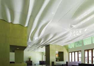
Though JML’s scheme for Palos Verdes went unrealized, the firm completed a version of its sculpted canopy at the Penner House in Palm Springs in 2000. Not long after, they returned to the undulating overhead plane in the Orchid restaurant in Santa Monica [Fig. 3]. Reversing the approach in Palos Verdes, where they conjure a virtual surface from an abundance of structure, here an actual surface floats above with no indication of support. Yet seriality remains in the unashamedly visible panel joints, which register the ceiling’s reticulation as they trace undulated curves across its luminous topography.

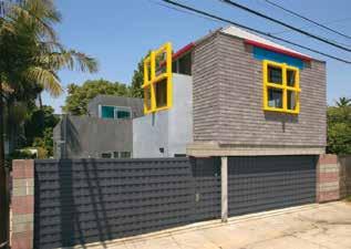
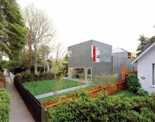
By then, Johnston Marklee had already completed an important early commission in which repetition reappears in a new, stealthier form. The Sale House [Fig. 4] replaces a Venice bungalow on the same property as the 2-4-6-8 House by Morphosis. A key early work by the firm then led by Thom Mayne and Michael Rotondi, 2-4-6-8 comprises a 20-foot square studio volume, clad in asphalt shingles and capped with a pyramidal metal roof, perched atop a two-car garage of colored concrete block [Fig. 5]. On each wall of the studio the architects locate a single foursquare window, each one incrementally larger than its neighbor to the left. Turn in circles at the center of the space and the windows will appear to expand and contract as you spin.

Taking their cues from the earlier structure, JML repeats the square plan of 2-4-6-8’s upper volume twice—first to form the main volume of the new house and again to define the central void of its patio. Each of the four original windows is echoed in the upper part of the new house, though here they align at the head rather than the sill and are displaced to the edge of each facade.1 The displacement of the upper windows occurs in the opposite direction of their increase in size (which itself reverses 2-4-6-8’s clockwise expansion), a move that both reinforces and counters

9
Fig. 3 Orchid Restaurant
Fig. 4 Sale House and 2-4-6-8 House beyond
Fig. 5 2-4-6-8 House
PROJECT CREDITS & DATA
Menil Drawing Institute (2012-2018)
Client: The Menil Collection
Location: Houston, Texas
Status: Completed
Architecture Team: Sharon Johnston, Mark Lee, Nicholas Hofstede, Andri Luescher, Anton Schneider, Rodolfo Reis Dias, Jeff Mikolajewski, Maria Letizia Garzoli, Douglas Harsevoort, Elizabeth Jones, Maximilian Kocademirci, David Gray, Mehr Kanpour, Mike Todd, Toni-Maria Anschuetz
Collaborators: Gilbane (contractor), MVVA (landscape), Guy Nordenson and Associates (structure), Cardno Haynes Whaley (associate structure), Stantec (MEP), Lockwood Andrews Newnam (civil), Simpson Gumpertz & Heger (building enclosure), George Sexton Associates (lighting), Tillett (landscape lighting), AECOM (cost estimating), Arup (acoustic & AV/ IT), Architect’s Security Group (security), ACI (code), Terracon (geotech), Olsson (soils), WC3 (irrigation)
UCLA Margo Leavin Graduate Art Studios (2016-2019)
Client: University of California Los Angeles
Location: Culver City, CA, USA
Status: Completed
Architecture Team: Sharon Johnston, Mark Lee, Nicholas Hofstede, Lindsay Erickson, Tori McKenna, David Gray, Ryan Hernandez
Collaborators: UCLA Capital Programs (project management), Abbott Construction (contractor), Simpson Gumpertz & Heger (structure & building envelope), Pamela Burton & Company (landscape), KPFF (civil), ME Engineers (MEP), Horton Lees Brogden (lighting), Veneklasen (acoustics & AV/IT), Jensen Hughes (code & accessibility), Van Duesen Associates (vertical transportation), C Plus C Consulting (specifications), Mollet Geiser & Co (environmental graphics), Capital Projects Group (cost estimating), GAIA (LEED), Places Studio (visualizations)
UIC Center for the Arts (2018-2019)
Client: University of Illinois at Chicago
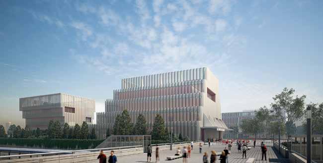
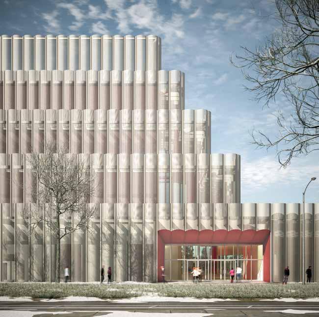
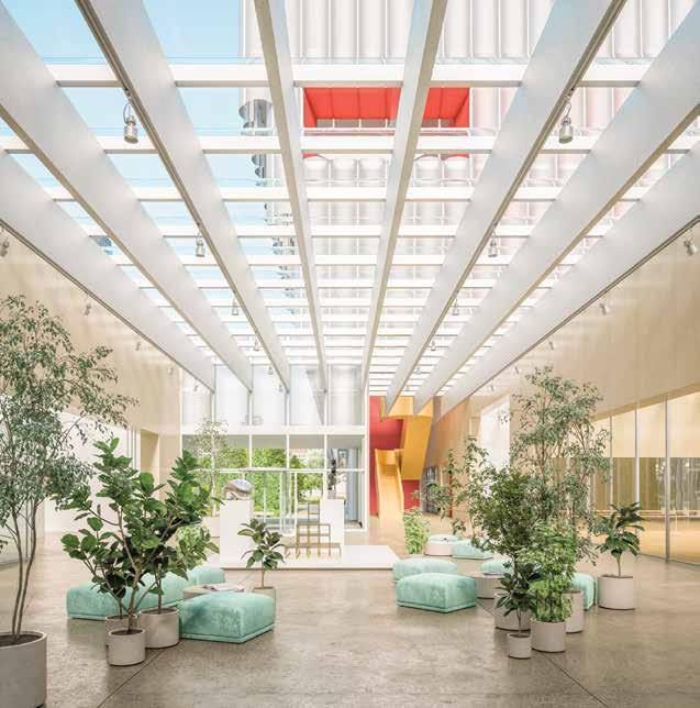
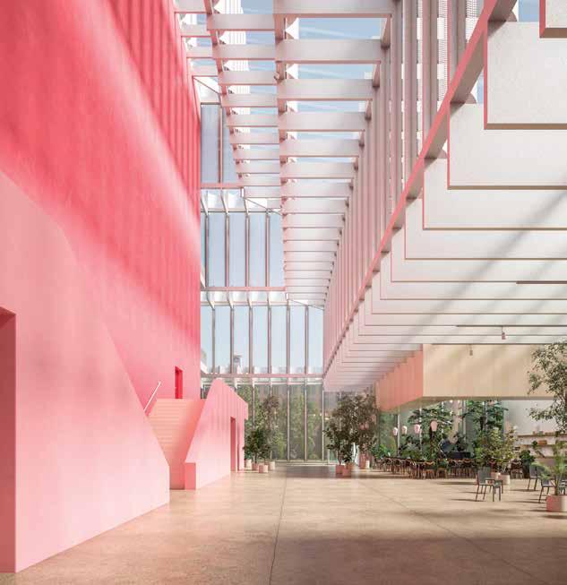
Location: Harrison Field, Chicago, Illinois Status: Competition
Architecture Team: Sharon Johnston, Mark Lee, Nicholas Hofstede, Anton Schneider, Justin Kim, Miaojie Ted Zhang, Elena Hasbun, Alicia Chen, Isabel Strauss, Seunghyun Kang
Collaborators: UrbanWorks (AOR), LERA (structure), BuroHappold (MEP), Reed Hilderbrand (landscape), Schuler Shook (theatre), Threshold (acoustics & AV/IT), TERRA (civil), Thirst (environmental graphics), CCS (cost estimating), 1825 (visualization)
Museum of Contemporary Art Chicago (2015-2017)
Client: Museum of Contemporary Art Chicago
Location: Chicago, Illinois
Status: Completed Architecture Team: Sharon Johnston, Mark Lee, Nicholas Hofstede, Lindsay Erickson, Jeff Mikolajewski, Juan Salazar, Nathan Kiebler, Ellen Marsh
Collaborators: Harley Ellis Devereaux (AOR), Simpson Gumpertz & Heger (structure), Environmental Systems Design (MEP), George Sexton Associates (lighting), Cerami (AV/IT), Kirkegaard (acoustics), Lerch Bates (vertical transport), Places Studio (visualization), 1825 (visualization)
Casa de Mont (2014-2020) Location: Pacific Palisades, Los Angeles, California Status: Completed Architecture Team: Sharon Johnston, Mark Lee, Rodolfo Reis Dias, Anton Schneider, Mary Casper, Jeff Mikolajewski, Fiona Cuypersstanienda, Nathan Kiebler, David Himelman
Collaborators: RJC Builders (contractor), William Koh & Associates (structure), Meline Engineering (MEP), C.W. Howe (civil), Loisos Ubbelohde (lighting), Pamela Burton & Company (landscape), Studio Shamshiri (interiors)
Porch House (2011-2013) Location: Los Angeles, CA Status: Completed Architecture Team: Sharon Johnston, Mark Lee, Anton Schneider, Katrin Terstegen, Lindsay Erickson, Gary Ku, Ian Thomas, Mie Benson, Philipp Breuer
Collaborators: Simpson Gumpertz & Heger (structure), Antieri & Haloossim Consulting Engineers (MEP & FPE), Greenlee & Associates (landscape), Luminesce Design Inc. (lighting), C.W. Howe Partners Inc. (civil), Geosystems, Inc. (geotechnical), Loisos + Ubbelohde (sustainability), Rob Southern (interior design), Bulthaup (kitchen design), Pacific Crest Consultants (expeditor), Becker & Miyamoto (surveyor); RJC Builders, Inc.(contractor)
160
Hut House (2010-2014)
Client: Chan Luu
Location: Kauai, Hawaii
Status: Completed
Architecture Team: Sharon Johnston, Mark Lee, Nicholas Hofstede, Andri Luescher, Lindsay Erickson, Anton Schneider, Allessandro Carrea, Karl Wruck, David Gray
Collaborators: Roy K. Yamamoto & Associates (AOR), Project Design Inc (structure), Esaki Engineers (civil), KMT II (geotech), Luniesce Design (lighting), GSLA Studio (landscape), Aqua Engineers (septic), 360 Site (survey), Island Solar (solar)
Philadelphia Contemporary (2018-2019)
Client: Philadelphia Contemporary Location: Philadelphia, PA, US Status: Concept Design
Architecture Team: Sharon Johnston, Mark Lee, Andri Luescher, Lindsay Erickson, Seunghyun Kang, Ryan Hernandez, Toshiki Nimi, Miaojie Ted Zhang
Collaborators: MGA (AOR), LERA Consulting Engineers (structure), Vanderweil (MEP), Meliora (civil), Andropogon (landscape), Transsolar (climate engineering), Mollet Geiser & Co (environmental graphics), Tillotson (lighting), Directional Logic (cost estimating), 1825 (visualization)
Miami Design District (2012-2017)
Client: Dacra Location: Miami, FL, US Status: Completed Architecture Team: Sharon Johnston, Mark Lee Lindsay Erickson, Rodolfo Reis Dias, Thibaut Pierron, Austin Kaa
Collaborators: SB Architects (associate architect), Duany Plater-Zyberk (master plan architects), CHM Engineering (structural), TLC Engineering (MEP), Island Planning Corporation (landscape), Spiers & Major (lighting)
IMAGE CREDITS
All reasonable efforts have been made to trace the copyright holders of the visual material reproduced in this book. The publisher and the Knowlton School apologize to anyone who has not been reached. Errors and omissions should be brought to our attention and will be corrected in future editions. All images and drawings courtesy of Johnston Marklee, except as follows:
Courtesy of Johnston Marklee. Visualization by 1825: 15 (top and bottom), 35, 75 (top and middle), 77 (both), 78, 79 (both), 93 (both), 142 (all)
Photos by Eric Staudenmaier: 8 (left), 9 (top), 10 (top), 12 (bottom), 13 (all), 14 (all), 21, 25, 29, 30, 109 (both), 119 (bottom), 124 (both), 125 (top left), 126 (top right), 129 (bottom), 134 (both), 137 (top), 140, 141 (top), 157 (both)
Photo by Gustavo Frittegotto: 10 (bottom)
Photos by Carlos Domenech: 15 (middle), 151 (bottom right), 153, 156 (top right)
Photos by Louis Heilbronn: 16 (both), 44, 45
Courtesy of Johnston Marklee. Visualization by Places Studio: 17 (top), 94 (top and bottom right), 95 (bottom), 97 (top)
Courtesy of the Menil Collection. Photos by Richard Barnes: 17 (bottom), 18, 19 (both), 42 (bottom), 52 (top and bottom left), 53 (bottom right), 57 (both), 59 (bottom), 61 (top left), 63 (top)
Courtesy of the Menil Collection. Photo by Paul Hester: 59 (top)
Courtesy of Johnston Marklee. Visualization by Igor Brozyna: 39 (bottom), 69 (top)
Photo by Phil Arnold: 49
Photos by Iwan Baan: 69 (bottom), 71 (both)
Courtesy of MCA Chicago. Photos by Kendal McCaughtery + Hall & Merrick: 102 (top left and top right)
Photo by Livia Corona Benjamin: 159
161
BIOGRAPHIES
ACKNOWLEDGMENTS
BENJAMIN WILKE is the editor of the Source Books in Architecture series. He teaches design studios and other courses in architecture at the Knowlton School at The Ohio State Univeristy. He has edited publications on the work of Stan Allen, Preston Scott Cohen, Neil Denari, Ryue Nishizawa / SANAA, and Rem Koolhaas / OMA AMO.
SHARON JOHNSTON is Professor in Practice at the Harvard Graduate School of Design; she has taught at Princeton University and the University of California, Los Angeles and has held the Cullinan Chair at Rice University and the Frank Gehry International Chair at the University of Toronto. In 2019, Sharon Johnston was named Architectural Record’s Women in Architecture: New Generation Leader
MARK LEE is the Chair of the Department of Architecture at the Harvard Graduate School of Design. He has also taught at Princeton University, the University of California, Los Angeles, the Technical University of Berlin, and ETH Zurich. He has held the Cullinan Chair at Rice University and the Frank Gehry International Chair at the University of Toronto.
ASHLEY BIGHAM is co-director of Outpost Office and an Assis tant Professor at the Knowlton School at The Ohio State University. She has been a Fulbright Fellow in Ukraine, a MacDowell Fellow, and a Walter B. Sanders Fellow at the University of Michigan’s Taubman College of Architecture and Urban Planning. Her writing and work has appeared in publications such as MAS Context, Metropolis, Mark, CLOG, and Surface. The design work of Outpost Office has been exhibited at the Chicago Architecture Biennial, the Milwaukee Art Museum, the Tallinn Architecture Biennale, Roca London Gallery, Wedge Gallery, and The Cooper Union.
TODD GANNON is a professor of architecture at the Knowlton School at The Ohio State University. His books include Reyner Banham and the Paradoxes of High Tech, The Light Construction Reader, Et in Suburbia Ego: José Oubrerie’s Miller House, A Confederacy of Heretics (with Ewan Branda), and monographs on the work of Morphosis, Bernard Tschumi, UN Studio, Steven Holl, Mack Scogin Merrill Elam Architects, Peter Eisenman, and Eric Owen Moss.
I would like to extend a big thank you to all of those who helped make this publication possible. I am especially grateful to Sharon Johnston and Mark Lee for their generosity. Thanks to everyone at Johnston Marklee. Nichole Valliere deserves a special thanks, as her communication and effort with all things related to this publication was essential at every step.
Thank you to Ashley Bigham and Todd Gannon, whose contributions to the content included here provide original perspectives on the work of Johnston Marklee. At the Knowlton School, Dorothee Imbert and Todd Gannon have been and continue to be incredibly generous in their support of the Source Books in Architecture series. Thank you to Jaimie Mollison, Carla Sharon, and the whole of the Knowlton School administrative team for their assistance with this and every publication.
A continued thanks to Gordon Goff and Jake Anderson at ORO/ AR+D for their guidance, expertise, and patience.
Finally, Brittney Wilson’s assistance has been critical to the success of this project. Her constant attention to detail has been invaluable. Thank you.
162

