42 minute read
Supporting your efforts on diversity


Nicola Morrill
Not everything that counts can be counted and not everything that can be counted counts.
Albert Einstein
Numerous studies have shown the benefits of a diverse, equitable workplace for business performance, innovation, customer loyalty, and employee engagement. Most, if not all, organisations and institutions, no matter their size, will have activity underway related to Diversity. The discipline of Operational Research (O.R.) and Analytics can support organisational efforts in Equity, Equality, Diversity & Inclusion (EDI) in a number of ways.
This column briefly outlines several ways that O.R. can help with a range of areas organisations are likely to be covering as part of their EDI work, focussing on a number of common issues.
AGREEING AND DELIVERING YOUR EDI AMBITION An important place to start on your journey is to determine your EDI ambition and agree a strategy and programme of work to achieve this. All areas are important but to have impact, focus is needed.
The Strategic O.R. area has several methods that are of use to these activities. In 2011, a special edition of the Journal of Operational Research Society (Volume 62, Issue 5) on O.R.’s contribution to supporting strategy provided an insight into a range of these. One “soft” O.R. method that lends itself very well to helping create your EDI strategy and also in supporting the design of the programme of work is Causal Mapping, often referred to as Strategy Mapping.
A Causal Map is hierarchical in structure (linking means to ends) and built with a focus on achieving goals. The process of creating the maps is ideally a group process and this in itself will add lots of value to a collective understanding of goals around EDI, what is required to achieve these and some of the potential challenges around this.
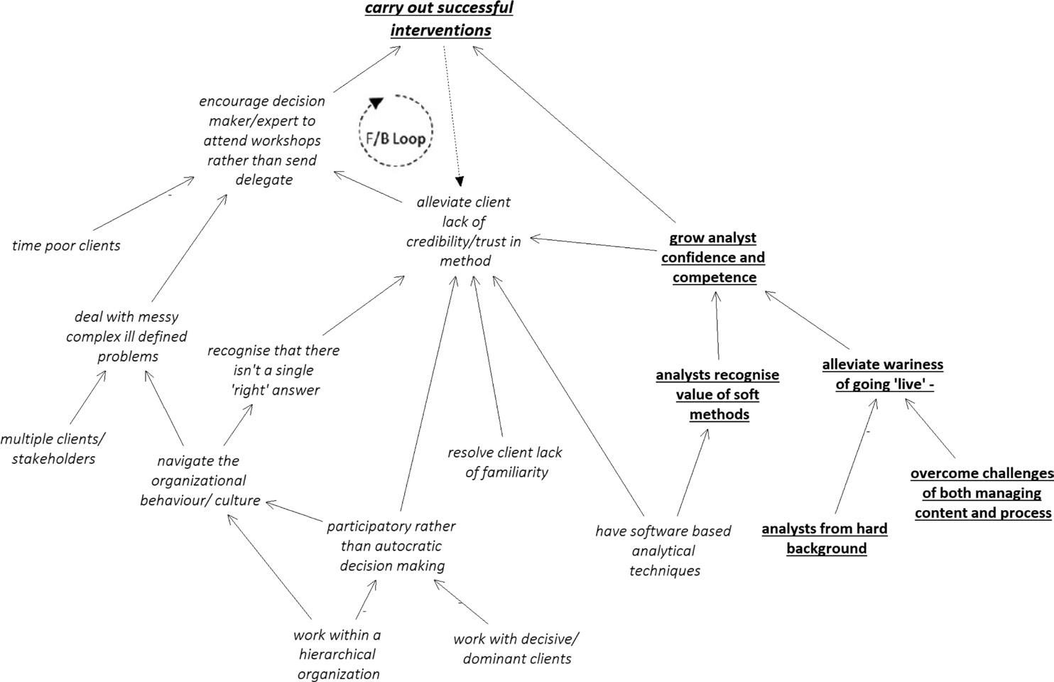
Figure 1 is an example of a causal map (taken from the Journal of the Operational Research Society – see http://bit.ly/ CausalMap) about carrying out a successful piece of work for a client. The map concept at the bottom of an arrow has an impact (positive or negative) on the concept at the head of an arrow. So, for instance, one way to “alleviate client lack of credibility/trust in a method” is to “resolve the client’s lack of familiarity” (with the method). Another way is to “carry out successful interventions”.
The method could be used to build a similar picture but based around how to achieve the EDI goals of an organisation. For instance, a desire to create an inclusive organisation may require the barriers to inclusion to
FIGURE 1 A CAUSAL MAP
be understood and there are many ways this could be achieved. Creating the causal map will help understand the different activities as well as some of the richer context around your organisation and what may or may not work.
UNDERSTANDING THE CURRENT PICTURE A key part of developing your strategy and programme of work is to understand your current picture and this can be achieved in a number of ways, focussing on different aspects of understanding and taking different approaches to do this.
Creative Approach Soft Systems Methodology (SSM) is a powerful tool to gain broad insight into how EDI is working (or not) in your organisation in comparison to how it should ideally be working. There are many aspects to SSM and a particularly accessible part is something called a Rich Picture. This is a drawing, usually produced in a group setting, that enables a view of a situation to be shared. It embraces complexity and includes relationships, feelings and anything else that the group believe may be relevant to the situation being explored. Rich Pictures are a pretty ideal tool to understand the current picture within your organisation or team and, importantly, it includes softer factors too. A picture really does paint a thousand words!
Figure 2 is an example drawing about planning for organisational success. While this includes business processes and activities it also highlights how different parts of the organisation may be feeling. This link, https://bit.ly/ RichPictures, provides a short overview of the value of Rich Pictures.
Picture through numbers A key part of your EDI picture is to understand how diverse your organisation is and, in order to do this, data is required. The use of data could focus on descriptive statistics to provide a snapshot view of diversity. For instance, counting the number of females and, with intersectionality in mind, also the number of disabled females within different areas of an organisation as well as overall. EDI best practise suggests capturing trends on the data of interest, rather than acting on a snapshot view.
One step further is to capture data around the processes within the organisation, such as recruitment and promotion. This can be used to pinpoint where, if at all, there may be a challenge related to onboarding or promoting diverse talent.
O.R. as a discipline is able to advise on what it may be useful to collect – not always what is easiest to count or, indeed, numbers. Where data (numeric and non-numeric) is stored in lots of different areas, O.R. can help with pulling this all together in an efficient way. For larger organisations, the challenge of pulling data together can be quite onerous and, again, something that O.R. is well versed in doing.
ANTICIPATING CHANGES AND UNDERSTANDING WHAT SUPPORT WORKS ‘BEST’ The analytics side of O.R. has many methods available to support organisations getting upstream of the diversity challenges in their organisation by anticipating where issues may arise. For instance, based on recent trends, what area of the workforce are likely to leave and how will this impact diversity? Figure 3 (see http://bit.ly/DashBoard-Example) uses Machine Learning techniques to explore who is likely to leave an organisation and presents the outputs in a dashboard.
O.R. also has methods that will help understand what measures are most likely to reduce the likelihood of a particular demographic leaving.
MONITORING PROGRESS Monitoring progress against your EDI strategy is important and I think the following quote from an article written by Siri Chilazi and Iris Bohnet (http://bit.ly/ ChilaziBohnet) sums it up well: “Manage DEI in exactly
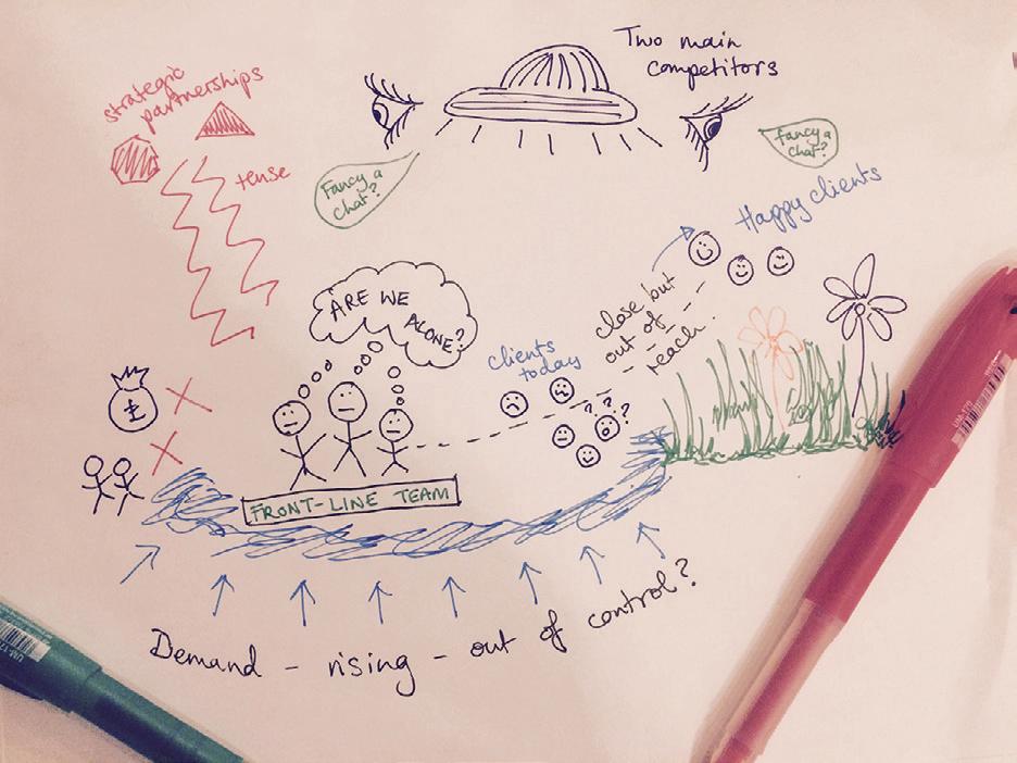
FIGURE 2 A RICH PICTURE
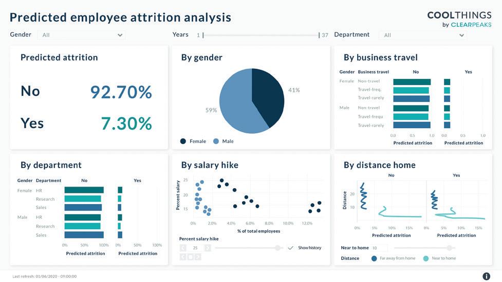
FIGURE 3 AN EXAMPLE OF A DASHBOARD
the same rigorous and data-driven way you manage the rest of your business. Achieving DEI objectives requires no more and no less than the use of the same planning, feedback, and accountability processes that are deployed to reach targets in sales, product development, and budgeting. Data drives targeted action and creates accountability in these domains, and so it should in DEI as well.” And O.R. as a discipline has much to offer!
WANT TO LEARN MORE? The OR Society runs training courses on much of the above if you want to bolster your inhouse team. For instance, training in methods such as forecasting, multivariate statistics, data science and systems modelling. A number of other training establishments and professional societies also provide training across some of these areas too.
SHAPING MY NEXT PIECE If there is something, related to O.R., that you would like me to consider for my next ‘column’ in Impact then please get in touch. I’ll be pondering what to write about over the coming months…. The goal is to share the discipline with users/potential users of O.R. by highlighting how it could support ‘business’ challenges they may be facing.
Nicola Morrill is a Systems Thinking Consultant at Dstl, a certified coach and the current Diversity Champion of the O.R. Society. She writes in a private capacity – all views expressed are her own and all examples are available in the open domain. You can contact her on Nicola.impact@gmail.com


© Royal Mail
ROYAL MAIL’S ESTIMATED DELIVERY WINDOW
BETTY SCHIRRMEISTER IN 2019 ROYAL MAIL LAUNCHED ITS ENHANCED ESTIMATED DELIVERY WINDOWS providing an increasing number of customers with 2-hour delivery windows (see https://www.youtube.com/ watch?v=RpBsNQxBtU4). The model behind this high performing product was built by Royal Mail’s data science team and has been successfully put in production thanks to great collaboration and communication across the business. Royal Mail is a business with history. It can trace its origins to Henry VIII, followed by over 500 years during which it has influenced postal services around the world.
In 2015, state ownership came to an end and Royal Mail became fully privatised. Today Royal Mail is one of the largest employers in the UK, providing one in every 194 jobs, with 140000 employees, 90000 of which are postmen and women. The service Royal Mail provides today still follows the “one-price-goes-everywhere” universal service obligation on a range of letters and parcels going to 31 million households. This poses a tough challenge to Royal Mail in order to stay
competitive in a market that has, since 2006, been increasingly filled with other postal providers.
The parcel business is becoming more important with revenue increasing year on year. This trend is accompanied by a shift in customer needs, such as the wish for trusted updates regarding deliveries. In April 2019, Royal Mail introduced higher precision estimated delivery windows, with time frames as narrow as two hours. “Notifying customers of their expected delivery time the day before we deliver is just one of the ways we are helping to make our customers’ lives easier. Coupled with a shorter estimated delivery time, of as little as two hours, creates a step change in convenience for online shoppers. … This latest innovation is part of our major investment in changes that increase convenience for our customers and their recipients.” (Royal Mail spokesperson)
The data science challenge we were facing was how to provide a delivery window estimate for customers while not being able to track parcels, as seen in other delivery companies who follow a delivery manifest. In Royal Mail, parcels are part of a broader traffic mix of which a large portion is not ‘digitally visible’. In addition, postmen and women currently still deliver parcels as part of their normal route, which includes a variety of untracked items, such as letters and hence makes it difficult to evaluate workload beforehand. Additionally, postmen may switch routes and approach journeys in different sequences or at different starting times, again depending on workload. Consequently, considering the variability of workload delivering to 31 million households, an algorithmic approach to predicting doorstep delivery time slots was required.
Applying cloud solutions enabling clustering and filtering of a vast amount of unlabelled GPS data in combination with regression techniques and an additional filtering based on confidence levels, has enabled us to nevertheless provide reliable delivery windows to the vast majority of our customers. This work was heavily reliant on cross functional solutions, keeping the business in the loop about progress along the way.
INNOVATION NEEDS DATA SCIENCE At Royal Mail we have placed big data and data science at the core of our business growth, aiming to be increasingly data driven in our decision making. It is applied data science, which enabled us to provide estimated delivery windows, originally four hours wide, and after a cycle of algorithm improvement reducing the window sizes to estimates as narrow as two hours.
Royal Mail’s data science team is working on a range of projects that either strengthen key services or generate data-driven products for Royal Mail. As for the estimated delivery windows, the model is taking into account a set of features ranging from weekdays, time series to geo-locations. The model will generate a confidencevalue for each address. Based on these values addresses will receive an estimated delivery windows, for which we can guarantee an exceptional level of accuracy and coverage to our customers. Additionally, performance of the algorithm can be easily accessed via dashboards and is continuously monitored.
However, implementing great data science work in a business of Royal Mail’s size can be challenging and relies on multiple factors: (1) advanced data acquisition, storage and maintenance, (2) communication across the business

and (3) coordinated cross-functionalwork.
Looking elsewhere, as few as 13%, 1 in 8, data science projects make it into production according to Deborah Leff, CTO for data science and AI at IBM. In her opinion, the main reasons for this are (i) missing access to data, (ii) a lack of communication, and (iii) a poor collaboration across teams (see http:// bit.ly/DeborahLeff ).
BIG DATA Royal Mail’s operations are generating raw GPS data via delivery routes every day with GPS coordinates fed into our systems every few seconds. These data are being made accessible, cleaned and filtered using cloud services, including tools such as Hadoop, Spark and GCP. Additionally, we have access to a well-maintained data warehouse, with historic data of the past years. Within Technology, the data and engineering team (D&E) combines data analytics, data science and data engineering to facilitate the use of our data for innovative products within our company.
With easy access to data of good quality, we were able to combine months of filtered GPS data with years of historic tracked parcel data to create a solid, if still quite noisy, training dataset for the estimated delivery window (EDW) algorithm. Based on patterns observed in this historic training dataset, our algorithm could start building predictions. Having access to enough good quality data for a model to train on is key for the start of a successful data science project.
BUSINESS UPTAKE Good communication with the business, building up trust with your stakeholders is key on the journey to delivering a data product, seeing it run live in the business, and consequently being used as a ‘business as usual’ tool on a daily basis.
Our data scientists have kept up a continuous communication stream with stakeholders, and other teams involved in the EDW production pipeline, explaining the science behind the model and instilling confidence in our ways of working. To guide the business through our development phase we have generated an interactive dashboard where parameters can be tuned and model outputs directly influenced by stakeholders. Providing stakeholders with a more active role during the model building process while guiding their decisions around implementing and using results has contributed towards enabling trust in the data science work and confidence in our solution. We believe that data science should not be a black box that has to be trusted blindly.
CROSS-FUNCTIONAL TEAMWORK Data science work is but one step towards implementing data driven products within a business. The ability to communicate and collaborate with different teams is important. Finding successful, agile ways of working that can be applied across teams are essential for a successful product delivery.
For the estimated delivery window, we have paired data scientists and data engineers to help translate the science into an application that can be easily used by other parts of the business. While some data scientists have worked on algorithm improvements, others have worked closely with data engineers to generate clean, fully tested code and improve the application design.
A SUCCESS STORY As a result of the Covid pandemic, historical delivery patterns are currently less reliable for predicting future delivery patterns. This is due to an exceptional rise in parcel usage, significant reductions in letters and new working methods that prevent our delivery staff sharing a van.
Nevertheless, the estimated delivery window development for Royal Mail parcels has been a data science success, which, aside from a great data science team, has been based on (1) excellent data quality and quantity made available in our infrastructure to work with big data, (2) continuous communication across the business, and (3) close collaboration across different teams, particularly within technology.
Dr. Bettina E. Schirrmeister is Principal Data Scientist at Royal Mail. She has completed a PhD in Computational Biology at the University of Zurich, worked as a senior research fellow at the University of Bristol and joined Royal Mail as a data scientist in 2016. Since her start at Royal Mail, she has led and delivered various data science projects around forecasting and predictive analytics, as well as schedule optimisation and is leading data product innovation for Royal Mail.

© emirhankaramuk/Shutterstock
RENAULT’S SUPPLY CHAIN AND MANUFACTURING
ALAIN NGUYEN
RENAULT’S SUPPLY CHAIN AND MANUFACTURING span over 40 plants in 17 countries, 3500 supplier sites, 5000 delivery destinations. It manages 300,000 parts references and uses daily 3500 trucks to supply parts to factories, and 2000 trucks to deliver cars. The car seen above is Renault’s best seller first compact SUV.
O.R. has been applied to Renault’s supply chain and manufacturing for more than 20 years. During this time, a wide variety of issues have been addressed. Often based on in-house developments, O.R. tools help the business make breakthroughs in terms of cost performance.
These tools are designed by a centralised O.R. team from the new digital transformation department, located in Paris. The team is composed of four permanent staff, one PhD and one intern. We focus solely
on optimisation engines, while connections to databases and graphical user interface are dealt with by IT departments. In order to take into account thoroughly the business rules in our algorithms, we develop a deep knowledge of the supply chain and manufacturing business. This dual mindset (business and O.R.) is critical to elicit the, often implicit, business rules, and to convert them into optimisation constraints and objectives. Another important asset is that, since we all come initially from IT departments, we also have a good knowledge of Renault’s information systems and IT infrastructure, which is key to a fast delivery into production of our algorithms.
We detail hereafter a few cases that have been addressed.
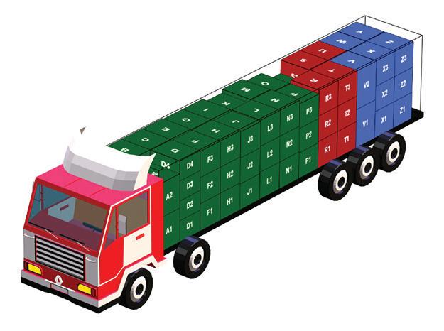
CONTAINER LOADING Renault have to send parts from Europe to factories worldwide (Brazil, India, China, Russia). In addition to the daily loading of containers, logistics platforms must estimate every week the number of containers needed for the following weeks. Therefore, a loading tool is at the heart of the activity of logistics platforms. The minimisation of the number of shipped containers is critical since a gain of one cubic metre per container can generate huge annual savings for logistics platforms. A large quantity of small/ medium/large items have to be packed into containers of different sizes, as can be seen in Figure 1. We first developed a local search algorithm, but it could not surpass experts’ loading skills. So, we ran a European academic challenge, then contracted with the winner team to integrate their algorithm and roll it out in our logistics platforms. The winning team (two researchers from a French university) designed an original optimisation method which beat all bin packing specialists’ algorithms. It was a great example of partnership with researchers and delivered results beyond our wildest expectations.
TRUCK LOADING AND DELIVERIES ANTICIPATION Everyday 3500 trucks deliver parts to our plants worldwide. The filling rate of these trucks is critical, since the inbound transportation yearly budget is over several hundred millions of euros. The specificity of Renault is that transportation is synchronised with production control. Deliveries can be anticipated two to three days beforehand in order to better fill the trucks, as shown in Figure 2. In Figure 2, the first truck from day D+1 has been cancelled thanks to the anticipation of all its orders from D+1 to D. The second truck of day D+2 has been cancelled thanks to the move of all its content to the first truck of D+2. The arrows represent the anticipation of orders. The delivery orders sent to suppliers define the quantity to be delivered but also the date-timed truck in which the parts should be loaded.
© Renault

FIGURE 1 LOADING PLAN ON THE FLOOR Everyday 3500 trucks deliver parts to our plants worldwide
We experimented with optimisation software from major suppliers, but all failed to cope with our very specific process and huge data volume (7-weeks horizon). We therefore implemented a heuristics-based algorithm to manage deliveries anticipation and coupled it with a 2D placement method based on best-fit strategies. To cope with the huge data volume, we run the optimisation in Google Cloud Platform, with a dedicated server per plant and with lots of tuning to improve performance, all of which could not be done by standard commercially available software.
The tool was a major success in terms of cost benefits, though quite disruptive for suppliers. For the very first time,
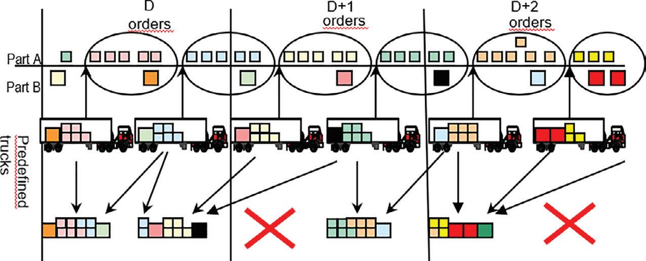
FIGURE 2 ANTICIPATING DELIVERIES © Renault
FIGURE 3 WEB TOOL TO VISUALISE LOADING PLANS FOR SUPPLIERS – 2D VIEW
FIGURE 4 WEB TOOL TO VISUALISE LOADING PLANS FOR SUPPLIERS – 3D VIEW FIGURE 5 OPERATORS FILL THE HOLES UNDER THE CAR BODY
they can visualise loading plans with a Renault’s web tool (see Figures 3 and 4) and have to follow them. In Figure 3 the three truck views represent the left-side, right-side and top view. Colours represent different suppliers loaded in the same truck, there are two suppliers in the displayed truck, the blue one and the red one. In addition to 2D views, the 3D view, as seen in Figure 4, gives a more comprehensible representation of the loading plan. Since truck filling rates are optimised, there is no longer room left for suppliers to add late deliveries surreptitiously! Also, the tool becomes very intrusive in the way packages should be regrouped into stacks and loaded into the trucks, whereas before suppliers and drivers were free to load as they want. The change management needed huge resources: there were more than 10 process engineers on the job, but only one engineer on the optimisation algorithm.
LINE BALANCING FOR POLISHING WORKSHOP Line balancing is very time consuming for workshop managers. The objective is to assign the list of production tasks to the minimal number of operators, with the main constraint that every operator should perform all their tasks within the cycle time, i.e. the time during which a vehicle goes through the operator’s workstation (usually one minute).
In the polishing workshop of the paint line, the tasks consist in filling the holes under the car body with polish, as seen in Figure 5. Parts will be clipped under the body, thanks to these holes.
We have to take into account operation times and moving time from one hole to another. Operation times were easy to obtain. But moving times were harder to determine, since they were not available before the development of the tool. It would have been excessive to ask managers to measure all the moving times of their operators. As a result, we made gross approximations of the moving time between holes, based either on the distance between the holes, or on the times between blocks when the holes do not belong to the same block of the car floor (which is divided into six same-sized blocks).
A column generation method of mathematical programming was implemented and enables workshop managers to simulate several configurations with fewer operators, which is impossible to do manually. The tool is also used by headquartered process engineering teams to benchmark the quality of the line balancing done manually in some plants. Unsurprisingly very experienced workshop managers generate very cost-effective line balancing (nearly

© Renault
© Renault
FIGURE 6 VIEW OF ALL THE HOLES TO BE FILLED
equivalent to the tool) while junior managers are not as effective as the tool.
It was critical to provide a graphical and intuitive representation of the solution, as shown in Figure 6, (where each colour represents holes assigned to an operator, and edges display the operators’ movements) so that workshop managers can validate the solution’s feasibility and quality.
KITTING LAYOUT The kitting concept is designed for high diversity parts. Instead of locating these parts along the assembly line, which would require considerable space, the kitting concept requires that these parts are located in kitting areas, where operators will prepare kits of parts dedicated for each vehicle, in a kitbox (see Figure 7). Then a train of kitbox is moved to the assembly line, and when a vehicle arrives at the operator’s workstation, only the kitbox associated with this vehicle is brought to the operator.
The objective of the kitting layout model is to minimise the layout surface and the kitting operators moving times while satisfying very specific constraints of each plant (e.g. constraints associated with Automated Guided Vehicles used to move kitbox).
The difficulty was to develop a generic tool for all plants, and not a list of workshop-specific algorithms. It required time-consuming discussions with the plants’ layout specialists. The roll out of the tool also required a fulltime resource in every plant. The trick is to convince the layout specialists that although the tool does not produce a perfect kitting layout, the tool provides a layout finalised for 80-90% of the parts (the user may have to modify the layout of 10-20% of parts) and enables the user to simulate several scenarios of layouts.
Once the layout is calculated, a second tool enables the simulation of the movements of operators with virtual reality headsets (see Figure 8). It is a huge improvement compared to the existing process where layout specialists had to implement physically the kitting area to check the efficiency of the layout.
CONCLUSIONS O.R. demonstrates major benefits in terms of cost reductions for the supply chain and manufacturing. In a context where investments are severely capped, O.R. provides a golden opportunity to increase productivity.
Although O.R. tools already cover a large array of topics, much remains to be done on the field. The current projects involve the network design for the delivery of parts from suppliers to plants and the empty packages dispatch from plants back to suppliers, which are two very complex issues, because there are many contradictory objectives, and also because processes are not well formalised.
The main hurdle is a lack of ‘facilitators’, middlemen who understand O.R. principles and benefits as well as the business whereabouts. We need these facilitators to interact with field managers, formalise their needs and assist users in using the O.R. tools, which is not the easiest part!

FIGURE 7 A KITBOX © Renault
FIGURE 8 3D SIMULATION OF THE KITTING AREA WITH VIRTUAL REALITY Alain Nguyen is the combinatorial optimisation expert at Renault, where he has spent all his career. He started in the AI team in the 1990s developing expert systems, then moved to the O.R. team in the 2000s, where he contributes to the development of the major tools for the supply chain and manufacturing. He has been a member of the bureau of the French O.R. Society since 2020.

© WFP/Damiloa Onafuwa
SARA VALIÑO, WOUTER SMEENK AND KOEN PETERS
2021 HAS SEEN SOME OF THE LARGEST LOGISTICAL OPERATIONS IN THE HISTORY OF MEDICINE, with governments all over the world rushing to roll out the various COVID-19 vaccines to their citizens. It is exciting to see operational research (O.R.) playing a pivotal role in many of the distribution plans in high-income countries, but it is not (yet) a tool that people tend to look to in developing countries. Complex analytics are hard to apply in environments with lower data maturity after all, but with pragmatic and creative approaches a lot of value can still be unlocked.
The United Nations World Food Programme (WFP) has a long history of providing humanitarian assistance in challenging environments. Last year as many as 115 million people were provided with food assistance in more than 80 countries. WFP has increasingly been looking to analytics and O.R. to improve and manage its life-saving operations, and was awarded the 2021 Franz Edelman Award for Achievement in Advanced Analytics, Operations Research and Management Science for its use of O.R. to deliver food assistance amid emergency responses.
Many of the industry standard models and tools fall short when exposed to a humanitarian setting, so in order to be able to utilise analytics in remote parts of the world where it works, WFP has had to come up with pragmatic approaches that balance the need for modelling complex operational environments with the availability and quality of data. This challenge is not just WFP’s alone, but spans the entire humanitarian sector.
Increasingly WFP is being requested to support governments and NGOs in improving their supply chain operations through analytics, building on the methodologies that were developed for its own operations. Through its Health Supply Chain Strengthening team, WFP has been exploring how it could use the analytics it was applying to its own supply chain to improve and manage medical supply chains in challenging environments, working with partners such as Takeda, The Bill & Melinda Gates Foundation, and The Global Fund. This article will look at one of these collaborations in more detail.
OPTIMISING DELIVERY ROUTES FOR THE CENTRAL MEDICAL STORE OF CÔTE D’IVOIRE Public health distribution networks traditionally mirror administrative structures, which is not always beneficial for the supply chain execution and can lead to a surplus of storage points, greater distances driven, and higher numbers of vehicles in use. Sub-optimal supply chain networks not only tend to push up costs, but also increase management complexity and impact overall performance.
Questions such as “how many warehouses? In which locations? How should we best route products for delivery?” are common for supply chain professionals trying to carry out these complex operations. When so many parameters are involved, it’s difficult for the human brain to find ideal solutions. This is where mathematical optimisation helps to rigorously explore the options and their impacts, allowing for better supply chain decisions. In the public health space, where resources are often scarce, such approaches can help unlock important value.
In 2019, as part of a broader collaboration between the Ministry of Health in Côte d’Ivoire and WFP’s Health Supply Chain Strengthening team, WFP began working with the Central Medical Store of Côte d’Ivoire (NPSP) to use its analytical capabilities to help optimise a public health distribution system. As part of a decentralisation strategy, the NPSP opened a regional distribution hub in the central city of Bouaké. Truck delivery routes across the country needed a complete redesign to operationalise this new hub and so WFP worked alongside the NPSP to define an optimal delivery network blueprint.
With the launching of its second distribution hub in Bouaké, the NPSP aims to improve service levels for the health facilities it serves. Originally more than 450 facilities were supplied from the Central Medical Store in Abidjan once per month. The NPSP developed a baseline delivery plan for a two-hub operation and invited WFP to challenge it and potentially come up with more optimal delivery routes. The objective? Minimise distances travelled by trucks while delivering to all client sites within the current onemonth cycle, whilst in parallel analyse solutions that could allow a future reduction of the delivery cycle from monthly to twice per month.
THE APPROACH In collaboration with NPSP technical experts, WFP prioritised, structured, collected, and analysed data as well as applied various algorithms to evaluate different scenarios within the given constraints and data availability, but this wasn’t without its challenges.
One of the major hurdles was the lack of data that optimisation experts typically expect when conducting analyses around facility allocation and vehicle routing decisions. For example, there was no geolocation available on NPSP’s client sites, and historic data
on demand and delivery volumes was specified in numbers of parcels (with unknown contents, volume, and weight for those parcels). The former was addressed through a location mapping exercise (using a mobile geo-tagging app), and to address the latter the parcel deliveries had to be used as a proxy for actual demand volumes – critical if you want to identify the most appropriate delivery routes. Data on routes between each health facility was collected using the Google Maps API once each facility was properly geo-tagged.
The next step was to identify zones and circuits that could be used to replenish the 450+ health facilities, based on their distance to the two hubs, the geographic layout of Côte d’Ivoire, and insights from the operational team. NPSP was planning to allocate a quarter to a third of the total volume to the new hub in Bouaké, so a clustering algorithm was used to allocate a sub-set of facilities accordingly (see Figure 1), based on their estimated demand and the relative distance to each hub. Circuits were then developed together with logisticians on the ground based on available truck sizes, demand estimations, and the major road networks in each region.
One important consideration was that NPSP should be able to run analyses independently, so the entire process was captured in an Excel-based tool that they could use to redefine demand, circuits, and routes and automatically assess the performance of their new plan across a wide range of KPIs. Examples include average truck utilisation, number of kilometres driven, the logistics cost, and the overall number of trips required to fulfil all operational demand.
RESULTS Besides evaluating the performance of the baseline (the one-hub model) and the new NPSP proposal, the optimisation approach was used to explore strategies for different network configurations and demand projections. Two scenarios in particular were explored: an optimised scenario following the current approach of monthly delivery cycles, and an optimised scenario with 15-day delivery cycles for each facility. Each of the scenarios represents a delivery plan, allocating specific client sites to Abidjan or Bouaké agencies, and grouping sites into six new delivery rounds. The NPSP performed targeted field tests to ensure proposed delivery routes were feasible, and when needed, adjustments were made. The Excel implementation meant that the whole process was very transparent and easy to adjust.
In the current supply chain set-up (the one-hub model) the total distance that has to be covered to supply all zones is approximately 47,000km across 91 trips. Opening the new warehouse in Bouaké is expected to decrease this to approximately 45,000km without any changes to the number of trips. These gains were not as high as expected because the proposed circuits and zones were not yet optimised for the new set-up. After applying the optimised circuits and
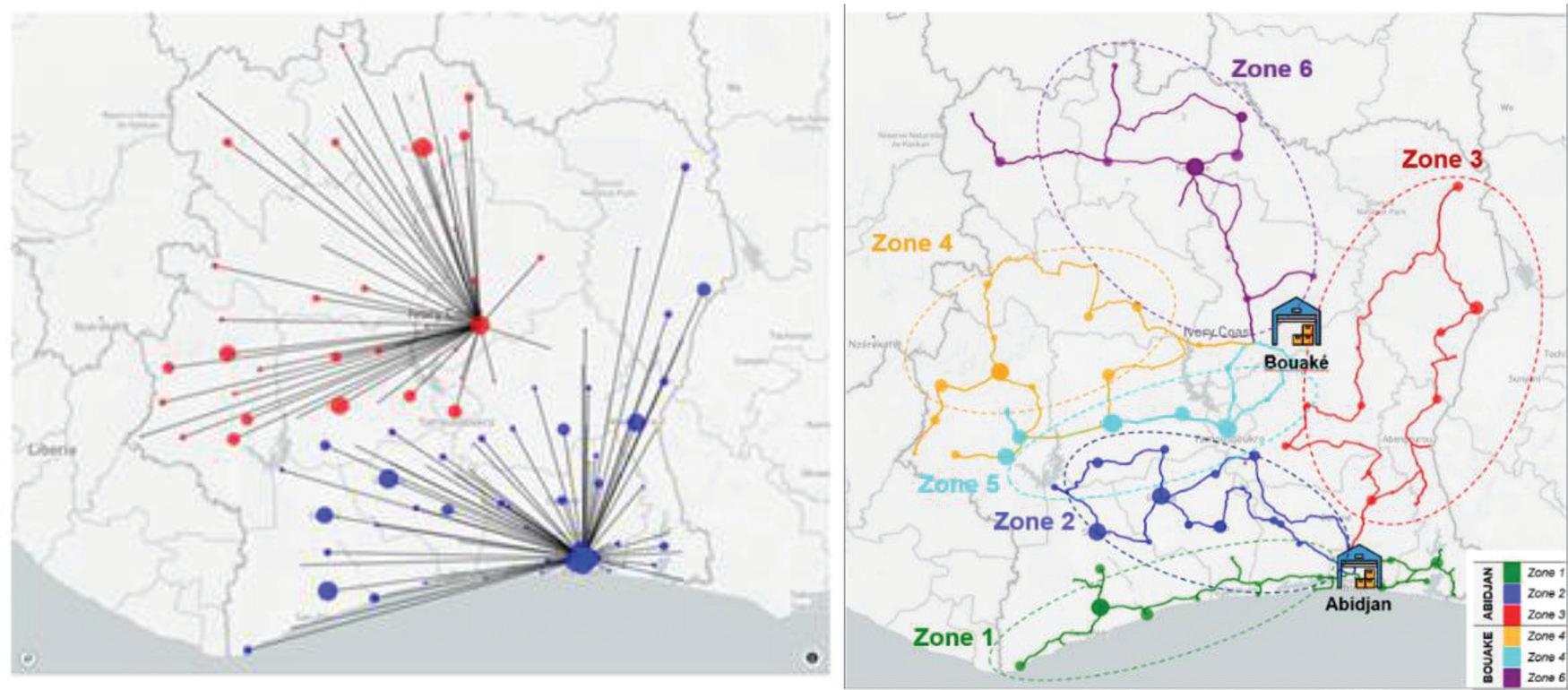
FIGURE 1 ALLOCATING HEALTH FACILITIES TO HUBS (LEFT), TRUCK CIRCUITS (RIGHT)
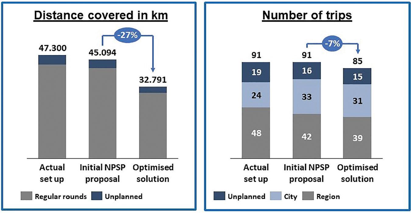
FIGURE 2 PROJECTED KPI IMPROVEMENTS OF THE OPTIMISED SOLUTION COMPARED TO THE CURRENT ONE-HUB NETWORK SETUP AND THE INITIAL PROPOSAL FOR THE TWO-HUB NETWORK zones, the total driving distance is expected to drop by another 12,000km to 33,000km, representing a reduction of 27 percent. Furthermore, the expected number of trips necessary for one delivery cycle is expected to drop from 91 to 85 and the average truck capacity utilisation increases from 49 percent to 88 percent if the optimised circuits and zones are implemented (see Figure 2).
Additionally, WFP Supply Chain Planners explored the potential of moving from 30-day delivery cycles to 15-day cycles. An operating model where the frequency of delivery is increased would improve the service level and benefit big customers especially, with high quantity orders every cycle. Compared to the initial NPSP proposal, the optimised 15-day cycle scenario still represented a 14 percent reduction in distance covered (38,896km) and 33 percent increase in vehicle utilisation (82 percent), but the number of required trips (per month) would increase from 91 trips to 103 trips. A hybrid model where only the biggest facilities (representing 20 percent of demand) would receive two deliveries per month was found to be the most robust, also accounting for expected increases in operational demand.
IMPLEMENTATION With this powerful analysis and encouraging results in its hands, the NPSP was empowered to pick and implement the scenario that it sees best fit to serve its clients and reach its goals. Handover sessions took place with NPSP focal points on how to use and configure the Excel tool. While the tool is not a structural solution to manage medicine distribution networks (e.g. if a new hub opens in the country the core optimisation exercise of clustering locations and defining the delivery zones should be produced again), it has proven to be a useful offline tool to explore small changes in the network (e.g. manual modification of a circuit) and to perform quick comparisons of scenarios.
The NPSP undertook field missions to confirm the operational feasibility of proposals developed with WFP and adjustments were made to the models to fully align with realities in the field. The additional scenarios that were developed with NPSP experts allowed them to explore feasibility of future increase of service levels (e.g. the 15 days scenario) and operational demand. Delays in the Bouaké hub project were faced due to the ongoing COVID-19 response, but NPSP leadership had all the necessary analysis required to make the best possible strategic network design decisions available.
Finally, in November 2020 the new Bouaké hub opened and NPSP confirmed that the study was used for the routing design of most of the new itineraries. As recommended by WFP, a second feasibility check was done before the opening and some of the itineraries were adapted due to access constraints. Also following WFP recommendations, the NPSP implemented a hybrid

model: a 15 day delivery cycle for key customers with high rotation and a one month delivery cycle for remaining customers.
REFLECTION Although data availability and quality are still challenging in many parts of the world, there is no question that analytics can still bring business value. Analysing operations in such a context requires a softer and more pragmatic approach than we are used to in the field of operational research, but when we let go of our expectations and ideal scenarios there is a lot that can be done with the data that is there. That’s why it’s imperative to continue working with NGOs and governments to help them unlock the untapped potential of their data, and help them to do more good with their limited resources.
Sara Valiño has been working with WFP’s Supply Chain Planning and Optimization service for three years, strengthening the supply chain planning practices of WFP’s partners in the health sector and supporting WFP’s operations in Latin America with advanced analytics. She has a Master’s degree in Supply Chain Management from the MITZaragoza Logistics Center. Wouter Smeenk has been working with WFP’s Supply Chain Planning and Optimization service for four years, developing and applying operational research tools to support the operations of WFP partners and governments, including the control tower backing WFP’s COVID-19 response. He has a Master’s degree in Operations Research from Tilburg University.
Koen Peters has been working with WFP’s Supply Chain Planning and Optimization service for seven years, developing and applying operational research tools to support the design and management of WFP operations. He has a Master’s degree in Operations Research from Tilburg University and is currently pursuing a PhD in humanitarian logistics at the Zero Hunger Lab.

NET ZERO EMISSIONS – FROM WHY TO HOW
BEVAN FREAKE
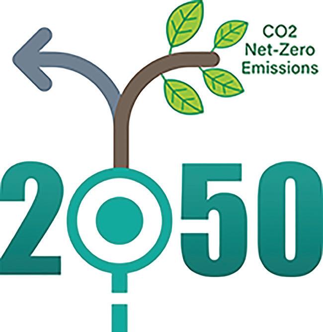
MOST OF US UNDERSTAND THE NEED to drastically reduce man-made greenhouse gas (GHG) emissions to limit the effect of climate change and its damaging consequences. The need to achieve net zero emissions has been much publicised, but what does this actually mean for how we live our lives and the changes that will need to be made? How can we heat our homes, fuel our transport, and supply our electricity? How different will 2050 need to be?
To help answer these questions, the UK Government’s Department for Business, Energy & Industrial Strategy (BEIS) have developed two new online energy and emissions Calculators for creating pathways to net zero, called My2050 and the MacKay Carbon Calculator. At a launch on 3 December 2020, in his opening statement the then Minister, and now Secretary of State, for BEIS, Kwasi Kwarteng, said ‘I believe a green recovery can lay the foundations of a clean and prosperous future, and the Calculator gives a common language for us to represent that shared vision.’
THE POLITICAL LANDSCAPE Governments across the globe recognise it is essential to cut emissions. In 2015, 196 Parties came together under the Paris Agreement to transform their development trajectories and set the world on a course towards sustainable development. The agreement aims to limit warming to 1.5–2°C above pre-industrial levels. In 2019 the UK became the first major economy to commit to a ‘net zero’ target, requiring the UK to bring all greenhouse gas emissions to net zero by 2050 under the Climate Change Act. Following this, in November 2020, the UK Prime Minister announced a 10-point plan of action for 2030 and in early December, he announced the UK’s first Nationally Determined Contribution (NDC) to reduce greenhouse gas emissions by 68% by 2030. The UK also jointly holds the presidency for the UNFCCC Conference of Parties meeting in Glasgow during November this year (better known as COP26) to push for greater international commitment in the fight against climate change.
WHAT ARE THE CALCULATORS? The Calculators are analytical models for identifying and exploring the range of physically possible scenarios for cutting greenhouse gas emissions. They are accompanied by interactive online tools allowing individuals to use the model themselves, both at high level for the non-expert, and intricate detail for the expert. They are designed to aid understanding of the options for meeting our emissions targets, identify any crucial decision points and engage the public in the debate by helping them to understand the trade-offs.
The problem is broken down and presented to you through simple choices for ‘levers of decarbonisation’. For each lever, you set the level of ambition anywhere on a scale from minimal effort (level 1) to the maximum effort deemed plausible (level 4). For example, the proportion of cars and vans that are electric vehicles remains at today’s level under level 1 but reaches 100% under level 4. Levels of ambition were set in consultation with experts across industry and academia so they should not be regarded as only being a government view.
The original UK 2050 Calculator was developed in 2010 and the simplified My2050 version was launched in 2012, aimed at the general public. Over 20,000 people submitted pathways using the tool, providing a unique insight into the public’s preferences for a lowcarbon future. Guidance was produced for teachers so it could be used in the classroom as well.
The inspiration and driving force behind the original Calculator was the late Sir David MacKay and the principles in his book Sustainable Energy – Without The Hot Air. He stressed the importance of quantifying the challenges we face with numbers rather than adjectives and breaking the problem down into manageable chunks. The new tool was designed with the same philosophy and was named after him in tribute.
MY2050 My2050 (https://my2050.beis.gov.uk/) is about helping the public and schools to engage with net zero and the ways in which individuals can help through their lifestyle choices. You decide the level of ambition under 15 levers, covering both
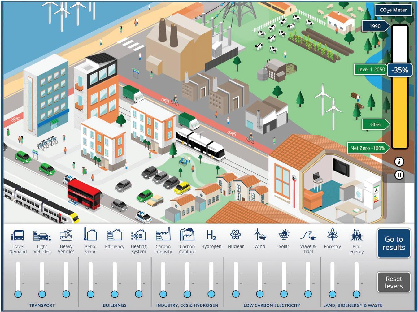
MY2050 HOME PAGE.
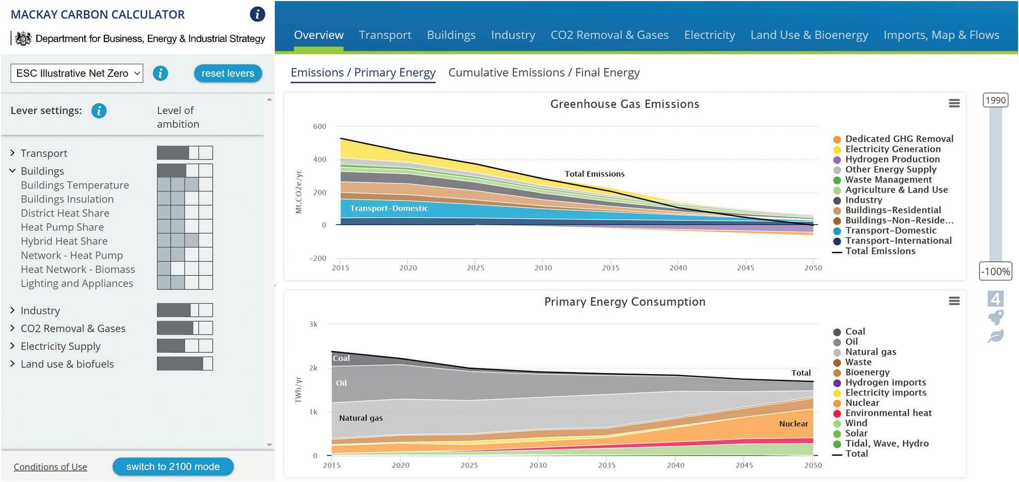
MACKAY CARBON CALCULATOR UNDER ESC (ENERGY SYSTEMS CATAPULT) ILLUSTRATIVE NET ZERO PATHWAY.
energy demand and supply across sectors such as transport, buildings, industry and electricity generation. Clicking any lever name opens an information page on the technology and the lever options to allow more informed choices. Immediate feedback on the implications of your choices is provided through an eye-catching animation and a greenhouse gas (GHG) meter showing the percentage emissions reduction. The tool has a game-like feel designed to reinforce the goal of meeting net zero emissions. Although 15 independent levers allow a lot of possible combinations, only a few of them lead to net zero.
THE MACKAY CARBON CALCULATOR The MacKay Carbon Calculator (https://mackaycarboncalculator. beis.gov.uk/) is a much more detailed tool aimed at a better informed user. It offers both greater flexibility with 45 decision levers and more comprehensive feedback with 30 interactive graphs focussed on key metrics for different areas of the energy system. It also introduces new features in the more advanced ‘2100 mode’, where the timing of action is brought under consideration. You are now able to customise when you think each system change should occur by choosing the start and end point for the action. This gives you the opportunity to explore options for when we could reach net zero or to prioritise which areas decarbonise early and which come later. If the number of choices feels overwhelming, you can start from a pre-set example pathway, ‘ESC Net Zero Illustrative’, provided as an independent balanced pathway to net zero by partners Energy Systems Catapult (ESC).
Both tools are based on the same spreadsheet model which has also been published for complete transparency and to allow full customisation. This is more detailed still with over 160 levers.
BRINGING OUT THE KEY CHOICES Reaching net zero emissions requires difficult choices and there is no single right way of doing it. The Calculator confronts issues head on, putting the power in your hands to choose between often competing options. For example, should our buildings be converted so that heat is supplied from district heating networks or heat pumps? Or should we continue to use gas boilers, but fuel them using a gas grid that has been decarbonised with low carbon hydrogen or biogas? Should we supply zero carbon electricity from nuclear or focus on renewable technologies such as wind and solar? Should we use more land for forestry and bioenergy, and if so, will this require changes to our diet in order to free up land currently used for livestock? How should we balance behavioural and technology change?
The Calculator emphasises that net zero is a whole system problem.
The importance of both demand and supply side actions is a core feature. Switching to hydrogen will only reduce emissions if you ensure that hydrogen is supplied from low carbon sources. The impact of converting from petrol and diesel to electric vehicles may seem surprisingly small if you do not supply the additional electricity demand with low carbon generation. The tool forces you to make conscious choices so you gain a more rounded understanding of the problems at hand.
When must action start? 2050 may seem far off but when you consider a car may last 10–15 years, a boiler 10–20 years and a power station up to 50 years the choices we make today are hugely important. How quickly can we deploy new technology and adjust behaviour? Change will not happen overnight so net zero is a problem for now, not just for 2050.
GLOBAL IMPACT AND INFLUENCE Climate change is a global concern, and the UK is not the only country facing the issue of how to decarbonise our energy system. Analysts in other countries became interested in the Calculator approach very quickly after the original was published. With the launch of the EU Calculator in 2020, 61 Calculators have now been or are being developed (55 countries, four territories and two cities). Each one has taken the overall approach developed by BEIS and adapted it to local circumstances.
Since the creation of the first UK Calculator in 2010, the UK Government has been supporting other countries to create their own Calculators through BEIS-funded international outreach work. The 2050 Calculator international outreach programme is part of UK International Climate Finance, and in its first phase supported ten developing countries to create Calculators. It has been extended due to demand, and is currently supporting projects in India, Malaysia, Nigeria, the Philippines, Thailand and Vietnam, with proposals in development for Colombia, Kenya and Zimbabwe.
Around the world, BEIS-supported Calculators have been used to develop NDCs (Nationally Determined Contributions) as commitments to the Paris Agreement (in India, Vietnam, Colombia, and Nigeria), national energy plans and sectoral action plans. They have also informed policymakers, the general public and industry on decarbonisation strategies as well as raising awareness of key issues. All this is possible because the Calculators provide an open, trusted and transparent forum for policymakers to co-design, develop and build solutions to climate, energy and land use issues.
If you would like further information about the Calculators, there is a Government carbon Calculator page (https://www.gov. uk/guidance/carbon-calculator), or you can email the Calculator Team at mackaycarboncalculator@beis.gov.uk. To support use of the tools in schools, the Royal Geographical Society has created GCSE and A-level teaching resources which are available on its website, or via the gov.uk page. We hope the tools will make the conversation around net zero more accessible to a wider audience and support debate on planning our low carbon future.
Bevan Freake is a member of the Government Operational Research Society (GORS) working for the Department for Business Energy & Industrial Strategy (BEIS). He was the modelling lead in developing the MacKay Carbon Calculator and has experience working on other whole energy system models for projecting UK energy and emissions and cost optimisation to meet emissions targets.


