

2
ABOUT THE AUTHOR
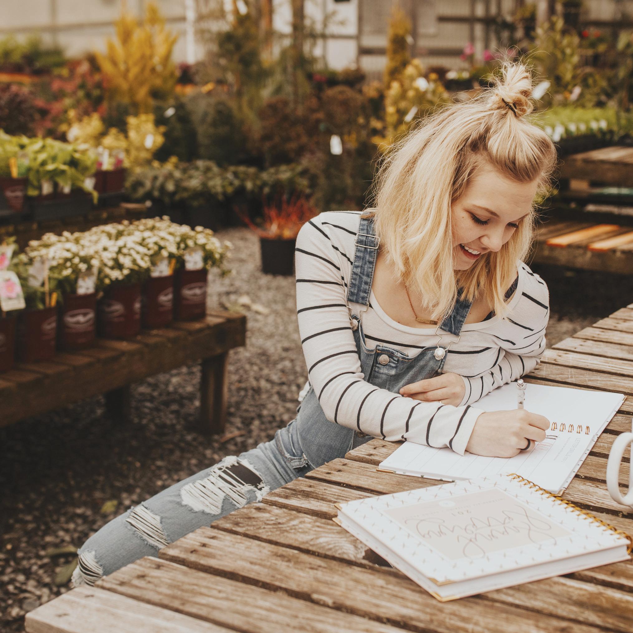
Hey, hi, hello! I am so excited you decided to pick up this little book of mine! I want to take a moment to introduce myself. I’m Sarah, aka Chalkfulloflove. I love Jesus, a strong pour of red wine, and a successful trip to Target® .
For as long as I can remember I have loved drawing, sketching, and lettering. I grew up waiting for the next poster board project in elementary school.
I’ve always been a lover of art and anything visually pleasing. You can catch me walking around the store for hours staring at packaging design. I usually make all my purchases based on that (which is probably a terrible way to shop!). I spend most of my time with my husband and two pups at home. Is anyone else a major homebody?
I went to college for graphic communications, and was able to design and print so many fun projects. It was a dream come true. After graduating, I spent a few years working different graphic design jobs, but I felt unfulfilled. Eventually, I moved to a new city and found myself looking for a new creative outlet. I discovered chalk lettering and modern calligraphy. In 2013, I started a modest Etsy shop on a whim, and sold custom calligraphy wedding signs. That shop has grown into something beyond all of my expectations!
Over the last several years, my CFL audience has grown and started to show more and more interest in learning to letter. I decided to go out of my comfort zone, and began to teach hand lettering workshops for beginners. To my surprise, these workshops became incredibly popular. People started flying in from around the country to learn from me. Whoa. This is how the book you hold in your hands was born: it is an answer to my audience’s request to make my hand lettering workshops more widely available.
Okay, okay! Enough about me—let’s start learning! You can find more of my work on Instagram @chalkfulloflove, or at chalkfulloflove.com.
4
What’s inside LETTER BASICS 6 THE HOW TO 10 FAVORITE TOOLS 16 LETTER DRILLS 20 CONNECTING LETTERS 52 DANCING LETTERS 64 MIXING LETTERS 72 FLOURISHES + ILLUSTRATIONS 82 EVOLUTION OF DESIGN 94 LETTERING PROJECTS 98 let’s start lettering
What’s inside
As I mentioned earlier, this book is based on content that I wrote and created for my beginner hand lettering workshops. We will begin with a little vocabulary lesson and an overview of letter basics. Next, I will walk you through lettering techniques. I will also dish on all of my go-to tools. However, the real meat of the book is the letter drills. If you really want to master hand lettering, you will do it by perfecting these simple letter forms. The repetition and memorization of these movements will take you from hobbyist to expert!
Many of you will want to jump right to connecting letters because you’re eager to put some words together. I get it—you want to know how to write your name prettily! But remember, taking the time to perfect your letter forms will give you so much more confidence if you do this before you move into the connecting section of this book.
After you learn to connect, we will start to talk about ways to change up your styles by making your letters “dance” and adding flourishes. The book will end with a lesson on how to put simple, cute designs together, with plenty of opportunity for you to practice!
My dream for this book was for it to be pretty enough for you to display on your shelf or coffee table, but for it to also be practical for you to grab a glass of wine, crack open the book, and practice right on the pages. The thick, premium paper and spiral binding sets this workbook apart from others. If you prefer to preserve the interior of the book, simply use tracing paper over the letter drills to master the letter forms.
Are you ready? Grab your coffee or wine, and let’s start lettering!
5

part 1
Lettering Basics

7
letter basics
Let’s start off with some letter basics. My background is in graphic design, and one of my favorite parts of design is typography. As a designer, I was taught early on about the kinds of type that work well together. I love this challenge! When lettering, understanding the basics of type is important to your overall design. Do you remember all those crazy font fads back in the days of AOL Instant Messenger®? When I was younger, I secretly liked Curlz and Comic Sans. (Don’t tell anybody!) That phase has passed, I’m happy to report. Okay, enough embarrassing secrets. Let’s dive into the basics of type!
BASICS OF TYPE
Serif refers to the feet of the letter. Serif is the easiest type to read, which is why most books use it for body type.
Sans is French for “without”. Therefore, a sans serif font has no feet! It is a personal favorite of mine to match with hand lettering.
Baseline refers to the line where your letter sits.
The meanline is half the distance from the baseline to the cap height.
8
letter basics
BASICS OF TYPE
The downstroke is the downward stroke of the letter, which is the thickest part.
Any upstrokes of calligraphy letters can be referred to as hairline strokes. They are the thinnest part of your letter.
A cross stroke is the line that crosses through your letters. Think capital letters “A,” “H,” “F” and the lowercase letter “t.” These can be as basic or as decorative as you like!
An ascender extends above the mean line, and can be found in the letters “t,” “h,” “k,” and “l.”
A decender extends below the baseline and can be found in “g,” “y,” “p,” “q,” and “f.”
9

part 2 The HOW TO

11
the background
Calligraphy has been around for hundreds of years, and there are many different styles. My father introduced me to calligraphy. He is an engineer and has always enjoyed lettering and drawing. (I guess we just figured out where I got it!) He had a huge drafting table and the biggest pen collection I have ever seen. He used old-school Blackletter pens, which could be manipulated depending on the angle they were used to write with. This style is referred to as “Gothic.” Years later, I discovered my love for modern calligraphy, and my dad kept trying to get me to use this type of pen, but it definitely didn’t produce the look I was after!
Unlike Blackletter, modern calligraphy stems from Copperplate calligraphy, and it depends on pressure rather than angle. Modern calligraphy can be rendered with an array of tools, from pointed pens to watercolor brushes. This whimsical lettering style can be achieved with just about any tool. I have even seen people use traditional Crayola® markers! This is the beauty of lettering: there really aren’t any rules.
The modern calligraphy look you achieve depends on your tool, and how you use it. Certain tools will “give” a bit, and release more ink or paint when pressed harder. Calligraphy is all about using pressure to create thick downstrokes and thin upstrokes. When lettering a word, you will use your tool to press harder on the way down through your letter form, and to press very lightly on the way up. You can even mimic this look by using a monoline pen (like a Micron® pen), which is actually my preferred method!
The alphabets I teach in this book can be done with the tool of your choice. The shapes of the letter forms will stay the same, but you will achieve different looks with each tool.
12
the TECHNIQUES
In any calligraphy workshop, you will likely begin with a simple exercise to get used to your tool. Start by drawing simple shapes with your tool of choice to perfect your pressure before you move on to letter forms. When put together, these simple shapes create letters. Once you master these simple shapes, letters won’t be scary! Practice simple “u,” “c,” and “l” shapes with your tool, and see if you can master the different pressures.
With a monoline pen (like a Micron), you will keep a consistent pressure throughout, and then add a downstroke in the second pass through. (I will explain this in more detail on the next page.) At first, a monoline pen may feel a bit thin and shaky, but it becomes easier to use with time and practice.
Brush pens can be tricky to master, but the results are beautiful! There are brush pens with a variety of sizes and tip types. If you are beginner, I recommend getting a smaller brush with a harder tip, which is easier to control. You want to maintain a consistent angle of pen to paper, and apply more pressure on your downstroke and less pressure on your upstroke.
With a traditional pointed pen, the ink sits in a tine on the nib of the pen. When you apply pressure, the tine opens and the ink flows heavier. This type of pen is notoriously hard to control, but it does create a beautiful, traditional calligraphy look. However, I don’t recommend this type of pen for lettering newbies!
TOOL TECHNIQUE
monoline, brush, pointed pen
13
the how to
As I mentioned previously, my preferred method is to work with a consistent pressure using a monoline pen. With my particular style of script lettering, I produce the traditional calligraphy effect by creating my downstroke after I letter my word.
First, I draw my letter with a pen, a pencil, or chalk. Then, I go back and create a thicker downstroke by drawing a second connecting line and filling it in. When using thicker tools like chalkboard and paint pens, this effect can be produced by outlining the downward strokes.
First, I letter the word plainly.
Third, I finish the word by filling in the downstrokes!
Second, I create downstrokes. The pink highlighted circles indicate a downstroke on the inside of the letters, and the green circles indicate a downstroke on the outside of the letter form.
14
1 2 3
the
how
Everyone eventually develops their own style of lettering. You start out by mimicking a style you like, and then you put your own twist on it. Right now, I am really loving rounder letters with exaggerated curves and thick downstrokes. Lettering is all about learning the muscle movements required to produce each letter, and keeping control of your pen. Trust me, my day-to-day handwriting looks nothing like this. You do not have to have nice handwriting to be a good letterer!
to TIPS + TRICKS
1. Whether it’s lettering, faux calligraphy, brush calligraphy, or traditional calligraphy, the key to becoming great is to practice a lot. Lettering is not likely to come naturally to you, but if you devote time to it every day or week, you will improve so much. I look back on projects I created when I first started Chalkfulloflove, and I am embarrassed by them. But, I am also amazed by how far I have come in a few years. You can do it!
2. Try all sorts of pens. In the next chapter, I will share some of my favorite tools. Don’t limit yourself to these, however. Try out thick, thin, brush, and broad tips.
3. If you feel like you’re getting burned out or even experiencing cramping in your hand (I know, it hurts!), I recommend that you take a step back and take a break. You will take the fun out of lettering if you overdo it!
4. Finding your own style is what will set you apart and make you more successful. Once you understand and master the basic movements and shapes, it becomes easy to manipulate the letter forms to create different styles. Do you like letters that dance? Maybe you like large flourishes. Do you prefer when the letters are all even and perfect? Gather inspiration from letterers and calligraphers you admire, and try to find a style that speaks to you.
15

tOOLS

17
part 3 Favorite
FAVORITE toOLS
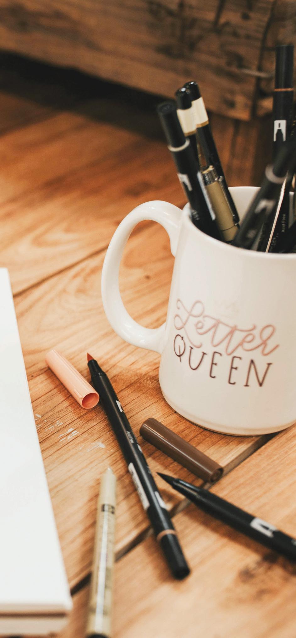
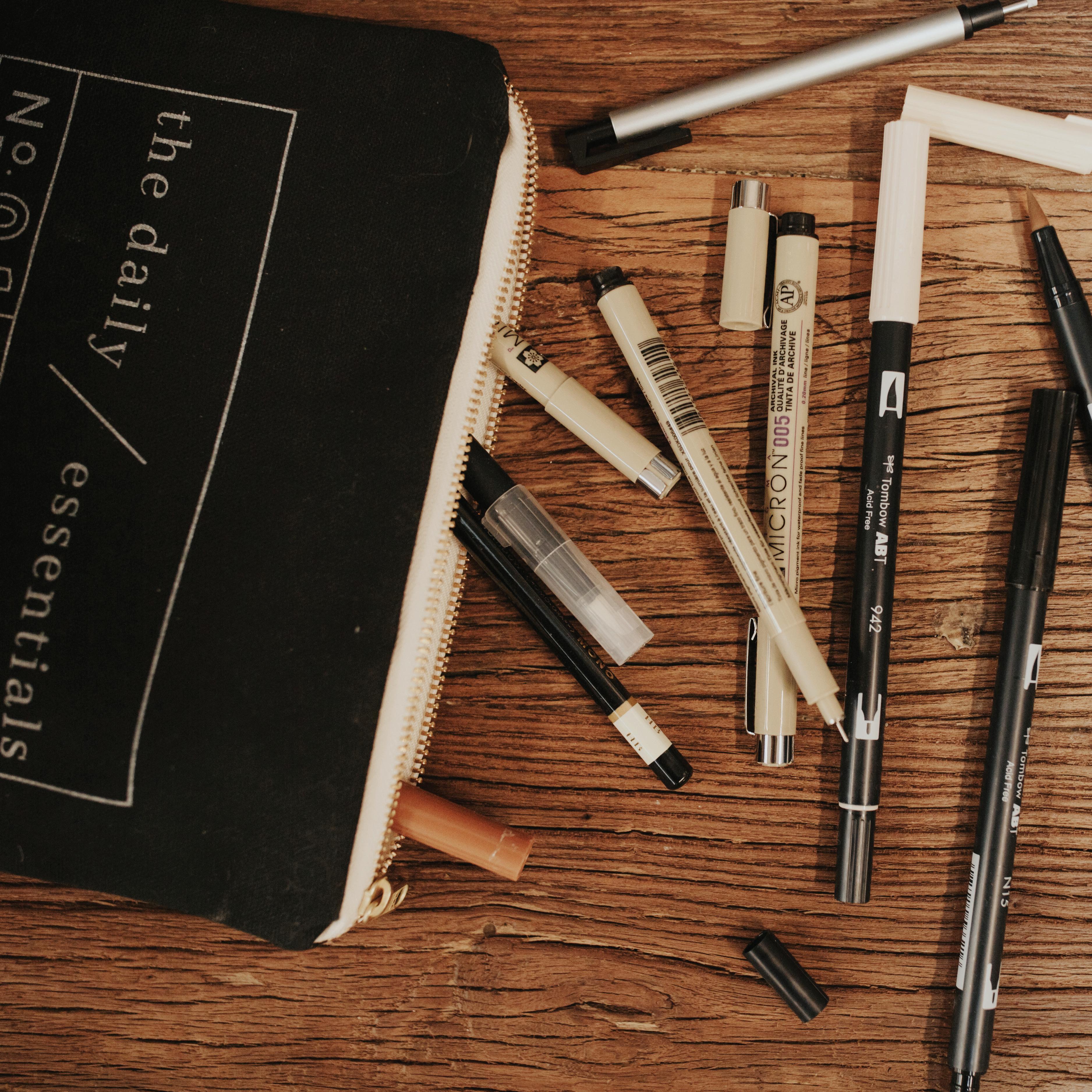
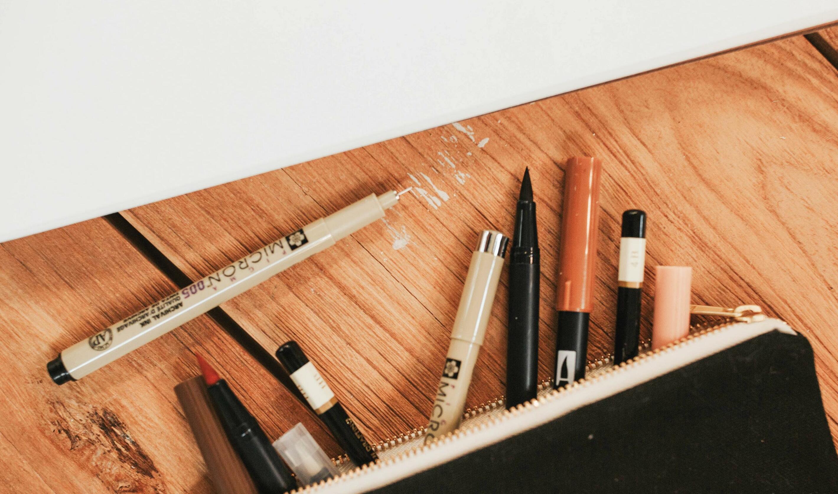
The beauty of lettering is that you can use any tool that you want. Personally, I am most comfortable sketching my entire design in pencil. Nothing fancy – I use a .7 lead mechanical pencil, just like I did in high school. Then I trace over that with a Micron pen. Once I finish with the pen, I go back and erase any traces of pencil.
MICRONS
You can tell by the name of this particular pen that the point is very small. These pens use archival ink and are known for their smooth, flowing writing. This is definitely my day-to-day pen for the majority of my designs. It took some major getting used to, but once mastered, I found it to be my most versatile pen! The Micron is all about control. You may see shaky lines at first, and that’s okay! Part of mastering your letter shapes is learning to flow with the pen. Micron pens are made by the brand Pigma® and can be purchased at any local craft store, office supply store, or online. I recommend getting the six-piece set and determining your favorite sizes. I personally love the 02, 05, and 08.
CHALK PENS
Because I love working with chalkboards (hence the name Chalkfulloflove), chalkboard markers are my first love. My favorite brand is Chalk-Ink®. I prefer the fine point, but all of them work great on most chalk surfaces. The drawback of Chalk-Ink markers is that when erased, they may leave a “ghost” of your lettering or illustration. This can easily be removed with a Mr. Clean Magic Eraser®. Chalk-Ink markers can be purchased from their website.
BRUSH PENS
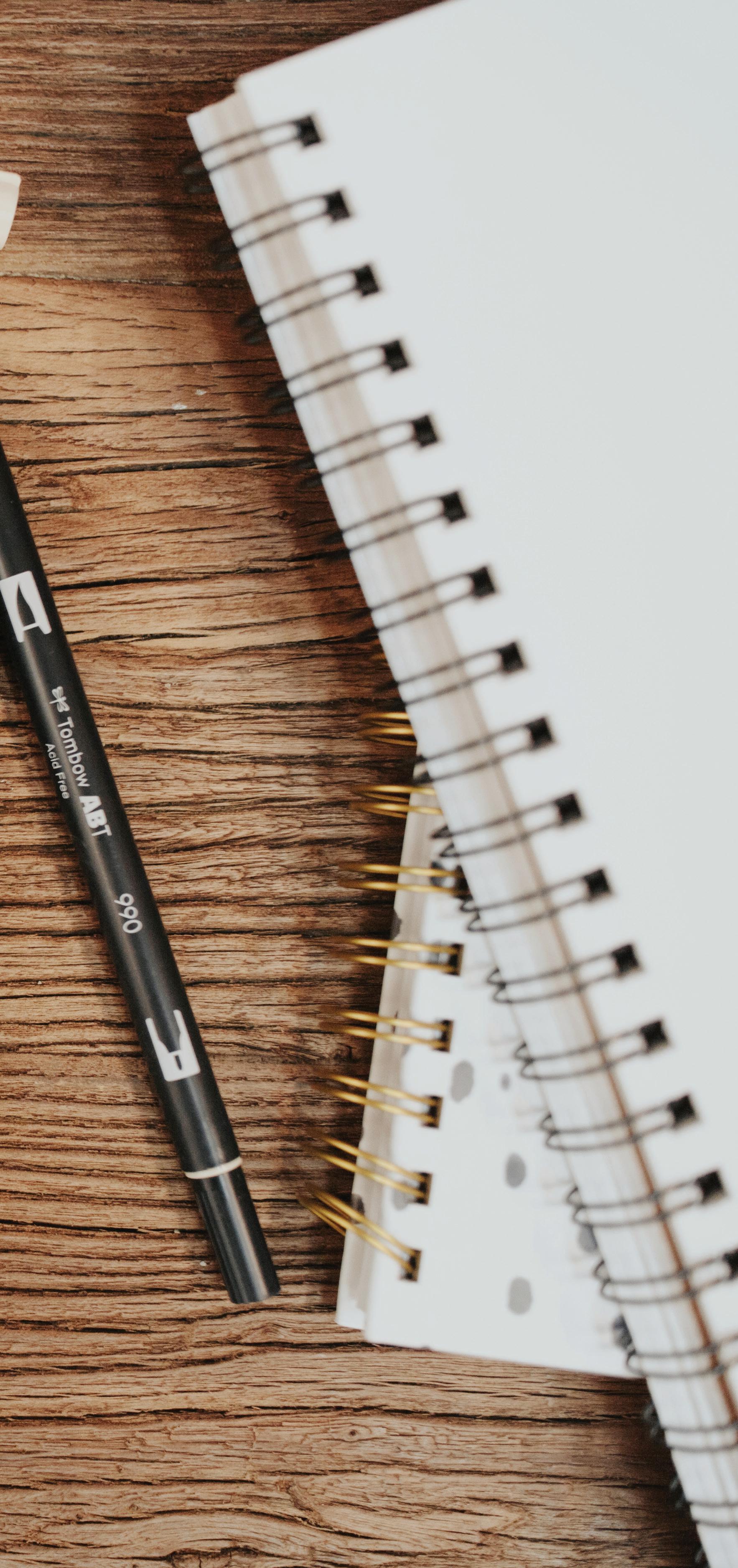
Brush pens are some of my favorite lettering tools. As we talked about in the technique section, these can be very sensitive to pressure. Some of my go-to brush pens are Tombow® Fudenosuke soft and hard tip brush pens, Sakura® Coloring brush pens, and Tombow Dual tip brush pens!
18
SHARPIES

If someone is struggling with the Micron, I often recommend they switch to a Sharpie®. This is a great tool to use when you are first learning. The thick point is easier to control than a Micron pen. Just your standard black Sharpie will work great. This can be purchased at any craft store, office supply store, or online.
QUALITY PAPER
The quality of your paper is easy to overlook, but you’ll regret it if you use cheap, thin paper. Using high-quality paper will help you, especially if you want to digitize your piece. I tend to use paper with an 80 lb. or 110 lb. cover weight. You can buy this at any craft store, office supply store, or online.

part 4
LetteR DRILLS

21
LETTER DRILLS
Trace the letter shapes by following the arrows, then use the space to the right to practice on your own!
PRO TIP
To preserve your book and get more practice space, try using tracing paper over the letter drills.
22
LETTER DRILLS
23
