1 minute read
CORPORATE IMAGE
The meaning of the name comes from the love we have for bread, which has been a staple in our diet since time immemorial.

Advertisement

In PANDICCIÓN an ovation is made for bread, both Mexicans and from all over the world, being this an element of enjoyment at all hours of the day.
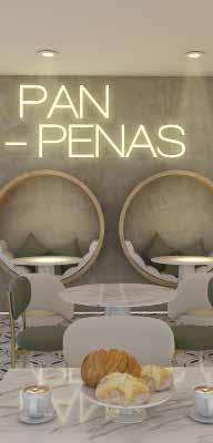
The shape used in the logo makes a fusion between the shell, a typical Mexican bread, and a cup of coffee, its perfect companion. using lines that go from minimalist to the deco, thus reflecting the interior of the restaurant. For the same reason the colors are preserved in black and yellow.
Uniforms
White polo shirt with sublimated logo and black jeans


