COMPETITIVE BENCHMARKINGHOTEL / WEB
Naruseviciute UX Design Institute /Module 2/ Assignment 1
Paulina

• Review 4 websites to understand how the best-in-class websites work
• Understand the conventions
• Highlight strengthsweaknesses
• Summarise the findings and provide lessons learned.
In this presentation I will focus on:
• Homepage
• Search engine
• Room selection
• Completing the booking
citizenM- markets itself as affordable luxury experience in some of the most exciting cities.
citizen M targeted customer is a modern mobile worker. The company focuses on creating community and sparkling ground for startups and mobile workers.
Azulik Tulum - markets itself as a ‘‘mystical experience ‘‘ where customer is invited to reconnect with itself and the nature during their stay in their unique rustic-luxe resort -‘‘sanctuary’’.
Azulik Tulum is an adult only hotel, probably the most insta famous hotel that attracts a number of young professionals. It offers experiences of hospitality, gastronomy, healing, fashion, architecture, innovation and art.
Airbnb is an online marketplace that connects people who want to rent out their homes with people who are looking for accommodation in specific locales.


Airbnb is usually cheaper option to hotel rooms. They also sell unique experiences within the destinations that are often arranged by airbnb hosts or other members of the airbnb community.
Third most popular travel booking websites (Worldwide)


Booking.com is an online travel agency for lodging reservations and other travel products.
Second most popular travel booking websites (Worldwide)
Commentary
• From the homepage it seems that it is orientated to the existing customer who is aware of the hotel and its offers as there is no selling image/ narrative what hotel is about.
`Hotels` is the first option but user is made aware of the other services offered.


2 Poor sequence of the tasks. It would seem that Hotels and Destinations contain the same information whilst these tabs refer user to different information. ‘Meetings` tab could be confusing for the user as it isis not immediately clear what it is about . Card sorting exercise would be beneficial to define the tasks in navigation bar.
3 Discount offering takes the most important space on the Homepage .

4 Image does not represent the hotel brand and tells nothing to the user/customer about the hotel.
5 Search engine well laid out . It explains to the user what has to be filled in in each field. ‘Rates & offers`tab could be confusing for the user. Does that mean if I do not select best available i do not get ‘best’ offers?
6 Live chat support is a great feature as it allows customer to feel they can talk to someone if they have any issues with their booking.
7 Feedback feature is a nice feature to have as customer can feel their opinion is appreciated, however if I am a new customer I will probably have no feedback yet while visiting the homepage. Having this feature after the chosen operation is complete would be more beneficial.
Destination tab offers a choice between location of the stay and actual hotel for the user which may already know their preferred hotel or is a returning customer.
2 Search provided in Calender format to help user plan their stay with less friction. It has the price tag allocated to each day, which helps customer to find a better deal and helps with planning if their dates are flexible.


3 ‘Rooms and Guests ` tab is useful as guest can book multiple rooms. However, it appears that guest can book the same number of people per room. Therefore, the tab is not particularly functional if for example I want to book 2 rooms , but have 3 people in one and 2 people in another room.
4 ‘Rates and Offers` tab has two functions in it`Best available` and Promotion code.`Best available` appears to be a default option and `rates and offers` does not appear to be active when changing locations or hotels. Could be confusing for the user.
Information about the chosen hotel presented in a separate tile. ‘Hotel information` provides useful information about the hotel and what is included in the rooms. ‘Neighbourhood’ tab contains information on the neighbourhood and attractions around the hotel. Useful tool for the customer.
2 `Select your rate` tile presents a number of rates for the rooms, assuming they are based on the cancellation policy and flexibility. Naming of different rate options could be cleared to differentiate them.


Chosen reservation details are always on display . User can review booking details before proceeding to payment.
4 Live chat with an agent is possible during working hours. User is updated when agent is online and when offline.
Add-ons are presented in another window. User can select what other offerings they want to choose during their stay.
2 Informal tone/ message to help user understand the suggested offerings better.
3 Suggestion to log in to users account before proceeding to booking .
4 Chosen booking details are always on display and user can modify the dates and guest number as necessary. The next step ‘‘add details’`is clearly noted which mitigates the possible confusion what happens next.


COMPLETING THE BOOKING 1
Once user selected the room type and added all the extras, they are presented with ‘add details ‘ box which appears to be straightforward and not lengthy.
2 User is invited to create its account. It appears to be compulsory in order to complete the reservation. The process is straightforward as the user has just to add the password

3 Chosen booking details are always on display and user can modify the dates and guest number as necessary at any times. The next step ‘payment’ is explained.

Observations :
• Once I added all my details to proceed to the payment I realised the button to proceed to payment is still greyed out. Which lead me to click on sign in tab and then a totally new window to create account. I personally found it really annoying as initially I did not want to create the account and also now I had to fill in all my details again.


1
The error I made once filling in the ‘details tab was that I forgot to fill in the country code for the telephone number, therefore I couldn’t process to next step ‘‘payment’ .
2 If when clicked on ‘next : payment I would have got a red error message saying country code was not filled in it would have saved me time going back and forward and opening two different windows
Since I couldn’t proceed to the payment I’ve got confused and opened two new windows trying to figure out how I get to the payment.
Once user fills in the guests details they are taken to the final step- ``payment`` where they need to add their card details to complete the booking. User can choose if they want to pay now or at the hotel.


• Orientated to attract new customer
• Very minimal, well laid out Homepage design. No visual clutter.
• Strong message conveyed.
Very Strong selling video, that portrays location, architecture, rooms and experiences offered in the hotel.

1 2 Simple ‘Book Now’ button, that brings you straight to booking room option. However, visual design of the tab is not great as there is no great contrast between the tab and the image. This could limit accessibility to site for certain users.
1

• Very minimal search engine. Well laid out with just few main tasks possible- booking a villa and finding existing reservation.

1Search engine is well laid out with minimal steps. It is clear user has to choose dates for their stay, there is a restriction of max. 2 people per room. ‘‘Book’’ and ‘‘Cancel’’ tabs are emphasized with contrasting colour.

2 Search provided in Calender format to help user plan their stay with less friction.
3 ‘Find a reservation tab’ seems pretty straightforward to use.
Hotels details are on display, which is useful if customer wants to directly call the resort or check the location before booking.
2
User can modify the dates and guest number as necessary.
3 Information regarding Covid is put in a separate tile. Customer can view covid information before booking the room.
4 Chosen reservation details are always on display . User can review booking details before proceeding to payment.


5 Customer can modify room selection by selecting filters.
6 Each room has a picture so the customer knows exactly how their room is going to look like and can base their decision on that. Meaning they may be willing to pay more if they like the room. Add-ons are displayed on the same page and customer can choose whether they want a room with or without add-ons. Full price is always visible.
Once user selected the room type they are taken to the new window where they have to fill in their details . Communication is clear. User is presented with the box where they could write to hotel administration any additional needs and preferences.
2 Payment information follows Guest details .


3 Hotel policies could be read before completing the booking. The most important policies that could affect their reservation are on display.
3 Clear message that after filling all the required information the booking is complete.
Commentary


• Well laid out homepage: clear hierarchies, composition, no visual clutter.
• Great contrast in colours .
• Not too many feature colours.
• Dark background makes it easier to read the text and is less annoying to the eye. 1
Customer account tab is well laid out. There was a red notification dot on the profile icon to remind the user to sign in . It disappears when you click on it once, therefore it is not annoying.
2 Well laid out and minimal navigation bar, explaining what the company is offering.
3 Very clear, minimal design search engine.
4

4 Company clearly shows it is responsive to the ongoing humanitarian crisis and cares for its community.
5 Strong selling image.
Search engine is well laid out with minimal steps. Location tab allows user to choose whichever location they want and suggests the areas within that location.
It also has an option for the customer who is undecided and is flexible with their trip . ‘‘I’m flexible’ tab brings the user to the new window where they can find a number of unique places and experiences Airbnb hosts offer across the globe.


2 Search provided in Calender format to help user plan their stay with less friction.
3 ‘Guest’ tab has ‘infants’ and ‘pets’ included which means no time wasted reading multiple descriptions of properties
1
Booking details are always on display and can be modified.
Tile with filters to assist user with room/ apartment selection.
3 User can see if rooms are in demand on the dates they are looking to book.
4 Each room/ apartment selection box has a picture of the apartment, its offerings, rating and price included.
5 Apartments are mapped out on the map, price tags are added, therefore the user can make their decision quicker based on price and location at the same time. Saves time for the customer.
1

Information about the apartment/ room displayed on a page :

1. Good quality images of the apartment.
2. Information about the host


3. Information about the place and what it offers as well as the calender where you can see dates when apartment is not available.
4. Apartment rating and reviews
5. Apartment location
6. Information about the host and house rules.
1 Reservation details are always on display.
Once user selected the room / apartment they are taken to new window where they have to log in. Due to the business type of Airbnb registration is compulsory as it helps hosts to get to know their guests.

2 Log in or sign up appears to be straightforward.. Also it includes various options (f.e Facebook, google) to connect with users existing accounts, which saves time for the user.
3 Reservation details are always on display and includes the image and rating of the chosen apartment .
2
Since user had to logged in to their account they do not need to add their details anymore. Trip details are on display for users review.


2 Payment tab remembers users card number so only one click required to add payment details.
3 User is asked to add a message to the host and introduce himself
4 Main policies that could affect customers reservation are on display before proceeding to the booking.
5 As reservation is not complete until the host approves it , the button clearly conveys this message “ Request to book’’.
Commentary

• Website Homepage does not have very special graphic design features but it is well laid out

• Feature colour contains all the main features and creates focus for the eye.
1
`Register` and `Sign in` options are default. Contrast makes it clear for the user
2 Website remembers the user as asks to sign in. Great feature, however the message box is quite big and contains a lot of information.
3 User is immediately informed what offerings are available with `Stays` remaining as default option.
4 Search engine is very clear and well laid out.
5 Important information is shown on the homepage but it is not prioritised .
6 `Recent searches` is very useful feature for the user who is browsing multiple hotels, dates or locations at the same time.
7 Discounts and deals are laid out modestly

1Search engine is well laid out with minimal steps. Location tab has a function to show popular destinations.

2 Search provided in Calender format to help user plan their stay with less friction.

3 ‘Guest’ tab has ‘children’ included which saves time for people traveling with kids reading multiple hotels policies as some hotels may be adult-only.

1
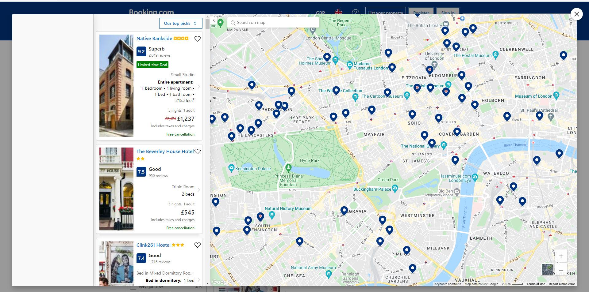
After completing booking details user is presented with a pop up window which contains hotels images and basic details as well as the map with hotel locations.

2
Apartments are mapped out on the map, when hovering over the hotel pin the box on the left shows the hotel details that is located there.
3 Booking details are always on display and can be modified.
4 User can apply multiple filters before booking the hotel. This would narrow the search as well.
5 User can browse the hotels without the map and make a decision based on the chosen filters and individual liking.
Information about the apartment/ room displayed on a page :


1. Good quality images of the apartment.
2. Information about the hotel. Each room listed with pictures, what`s included in the room and price.
3. Answers to frequent questions about the property are presented. This reduces the amount of people calling the property. Information about the hotel surroundings are given to assist customer with decision making.
4. Facilities at the hotel explained
5. Important details about the reservation explained. Marked in a different colour to emphasize the importance.

6. FAQs about the hotel. This reduces the amount of people calling the property.

1 Reservation details are always on display. Includes the location of the hotel.
2 Rating and newest reviews visible immediately.
Each room type in the chosen hotel has a clear description as well as pictures to assist customer with room selection.
2 Before Clicking ‘I`ll reserve’ the summary of your reservation is displayed.

1
3
COMPLETING
1
Summary of the hotel is on display.
2 Before adding the details user is whether they are an existing user which would shorten the process of booking.


3 As a new user they are asked to fill in main information about themselves.

4 Information about the room is displayed once again, for user to check before completing reservation.
5 User is asked if they want to add the add-ons to their stay.
6 User is presented with a box to fill in if they have special request.
7 User is asked to fill in their arrival time if it is known. This helps hotel staff to plan accordingly.
8 The button ‘Next: Final details` does not clearly convey the message if after completing the details above your reservation is complete or hotels needs more information about the guest. (I did not carry on, as I assumed this would be a final step and my reservation would be confirmed)
NOTE: Citizen M is a hotels chain and Azulik Tulum is a boutique hotel established just in one location, therefore its booking process is more straightforward.
Strengths:
• Customer support is available online. Agent activity (online or offline) is visible.
• Search provided in Calender format to help user plan their stay with less friction. It has the price tag allocated to each day, which helps customer to find a better deal and helps with planning if their dates are flexible.
Homepage:
• No strong selling point/ narrative . It would be difficult for the new customer to understand what hotel is about
• Poor sequence of the tasks in the navigation tile. No hierarchies or segregation of the content in topics. Naming conventions could be misunderstood by new customers. Card sorting exercise would be beneficial.
Search engine :
• Appears to have non functional commands - rates & offers .
• Guest and room numbers are under one category. User is able to select specific number of rooms but guests number wold have to be the same in both rooms as there is no other command to segregate them.
• No photograph of the room.
• Add ons on the separate page- multiple steps.
• Registration required to complete the booking. The process is not complicated but could be misleading if new user (like me in this instance) fills the guest details form incorrectly and cannot process to next step, but the form does not show the error message.
:
Homepage :
• Very minimal, focused on strong marketing (video) and simple booking process.

• Has minimal number of steps: selecting dates- selecting rooms -completing reservation .
• During the room selection step , each room has a photo and description to make decision easier for customer. Also customer is more likely to choose more expensive room if they see the difference in the image.
• Add-ons were displayed on the same page as rooms which means customer can add additional offerings without being directed to next page.
• Customer has an option not to register in order to complete reservation, which is an advantage as not all customers are willing to spend time registering or want to register at all.
• Hotels telephone number is displayed on the Reservation form , which means if customer has any issues they can contact the hotel by phone.
• Sometimes text is used over the image which could be difficult to read. (refer to Web Content Accessibility Guidelines.)

NOTE: Airbnb connects people who want to rent out their homes/ rooms with people who are looking for accommodation , while Booking. com is an online travel agency where customer can reserve any accommodation that is on the Booking.com database- hotels, hostels, guesthouses. It connects private landlords and commercial businesses with people who are looking for a holiday rental.


Strengths:
Homepage :
• Very minimal, clear interface, clear navigation, no visual clutter.
• Notification pin to remind the user to sign in. Disappears once clicked on once .
• Search engine is well laid out with minimal steps. Location tab allows user to choose whichever location they want and suggests the areas within that location.
• It also has an option for the customer who is undecided and is flexible with their trip . ‘‘I’m flexible’ tab brings the user to the new window where they can find a number of unique places and experiences Airbnb hosts offer across the globe.
• Apartments are mapped out on the map, price tags are added, therefore the user can make their decision quicker based on price and location at the same time. Saves time for the customer.
Completing reservation:
• Log in or sign up appears to be straightforward.. Also it includes various options (f.e Facebook, google) to connect with users existing accounts, which saves time for the user.
Strengths:
Homepage :
• Very clear homepage focused just on the booking process.
• Reminds the user to sign in. (The message could be shorter and less cluttered. )
• `Recent searches` is very useful feature for the user who is browsing multiple hotels, dates or locations at the same time.
Weaknesses: Booking Process :
• Language is not always clear when completing reservation - “I’ll reserve’’ and ‘Next: Final details’’- both sounds like it could be final step.