

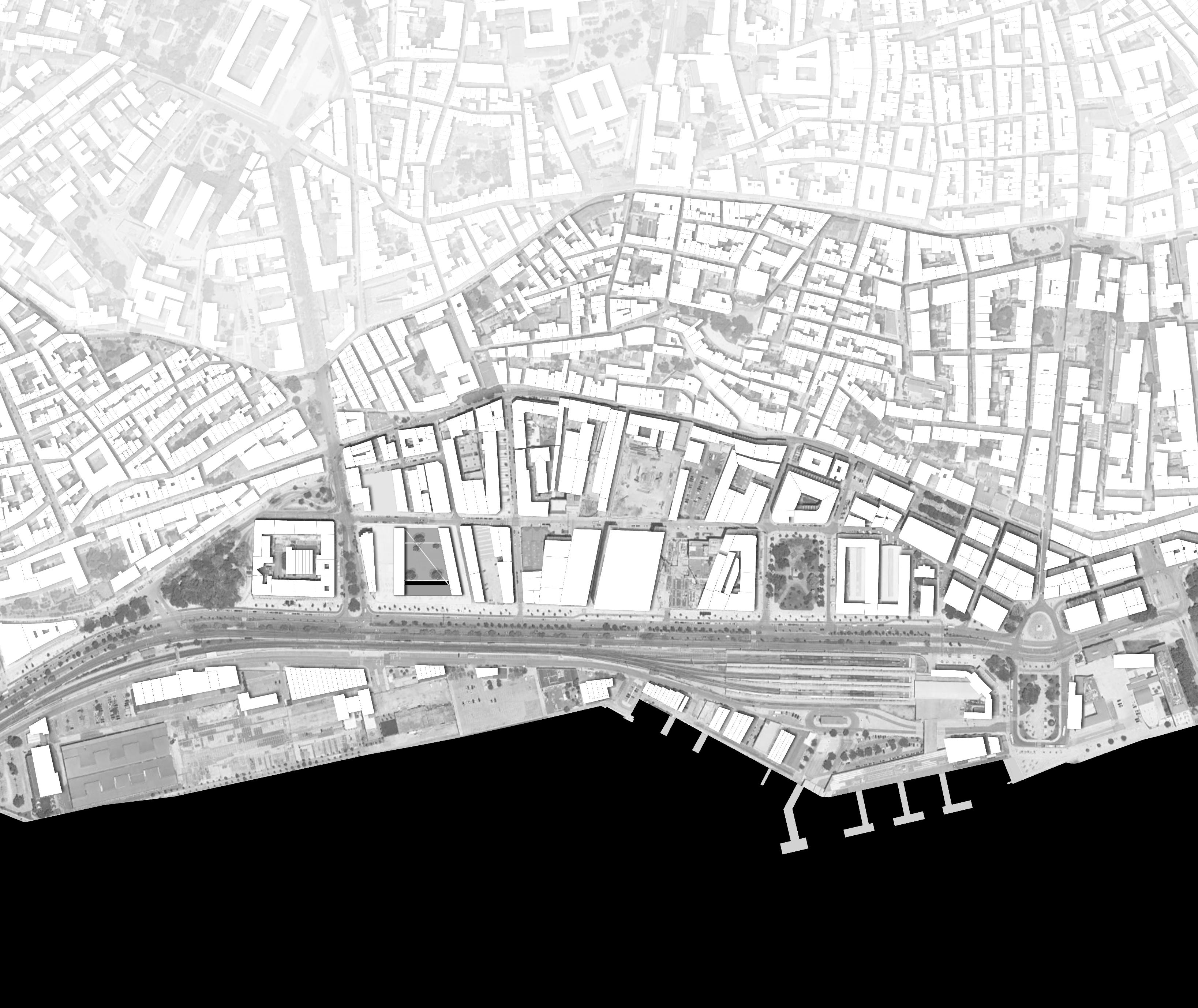
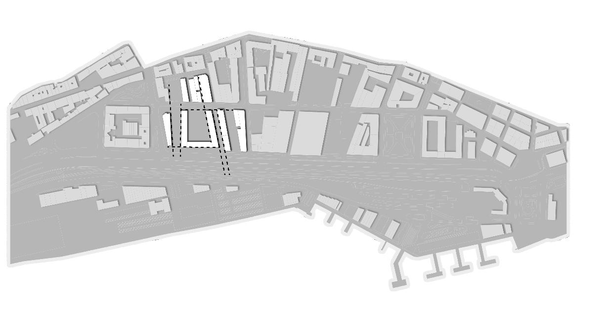
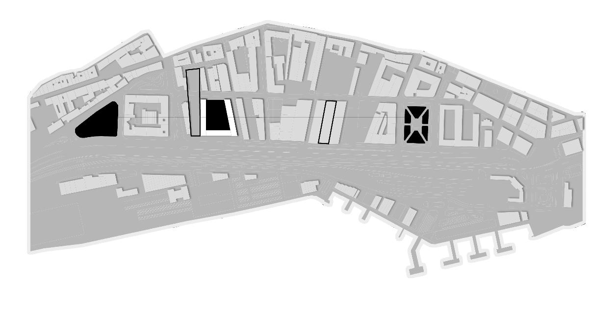
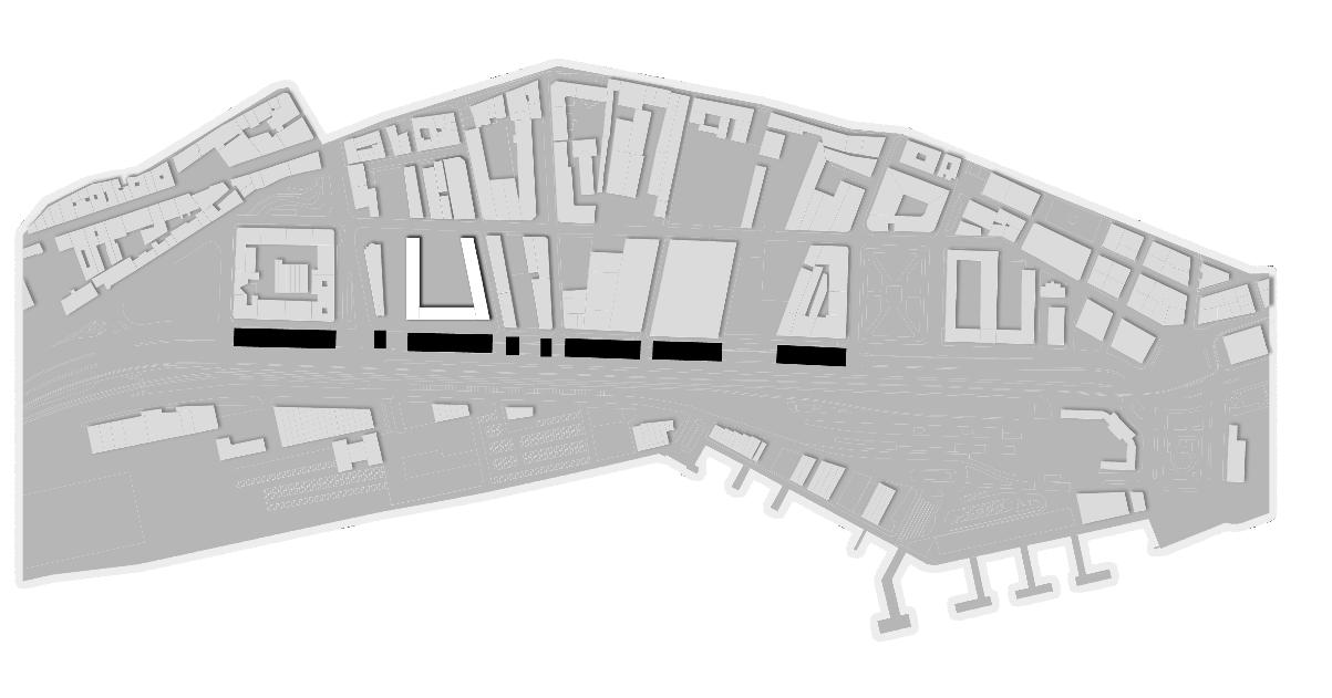
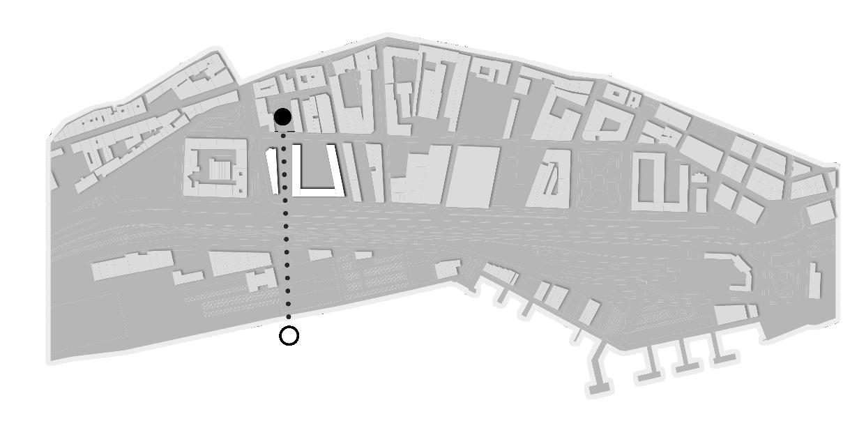
ADHC | POLIMI 2022-2023 | PAULO DAVID _ BARBARA BOGONI _ CAMILLO MAGNI GROUP 01 CIBOTTO MARINA_CORRADINI CHIARA_LI HAOXING_PEREA PEDRO PABLO CITY . WATER . INTENSITY M03 . DESIGN DWELLING (WITH)IN THE LIMIT 01 DIAGRAM FOR MASTERPLAN MASTERPLAN scale 1:2500 080
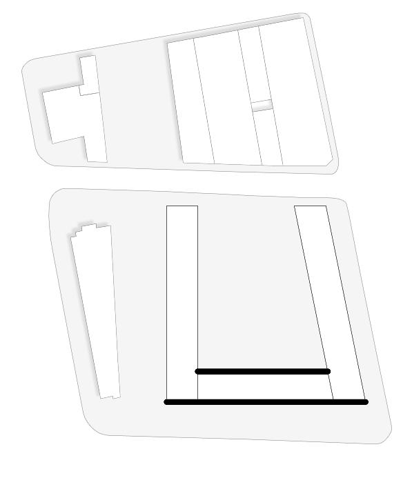
alignments
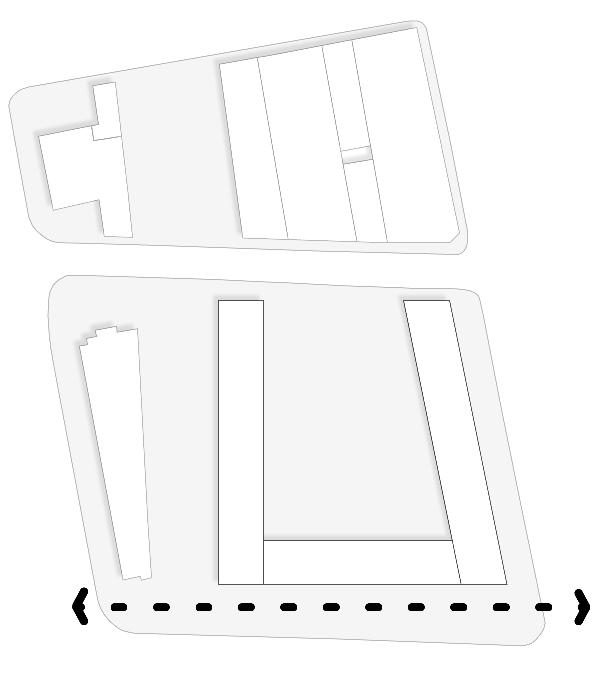
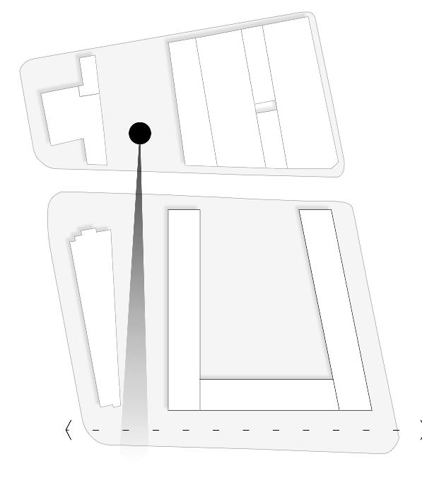
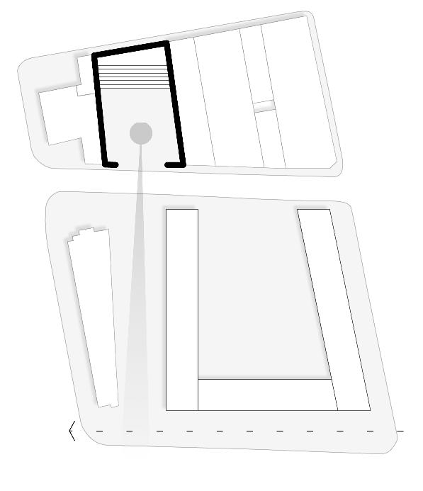
urban voids pattern 2. elevations rhythm 4. visual connection
1.
3.

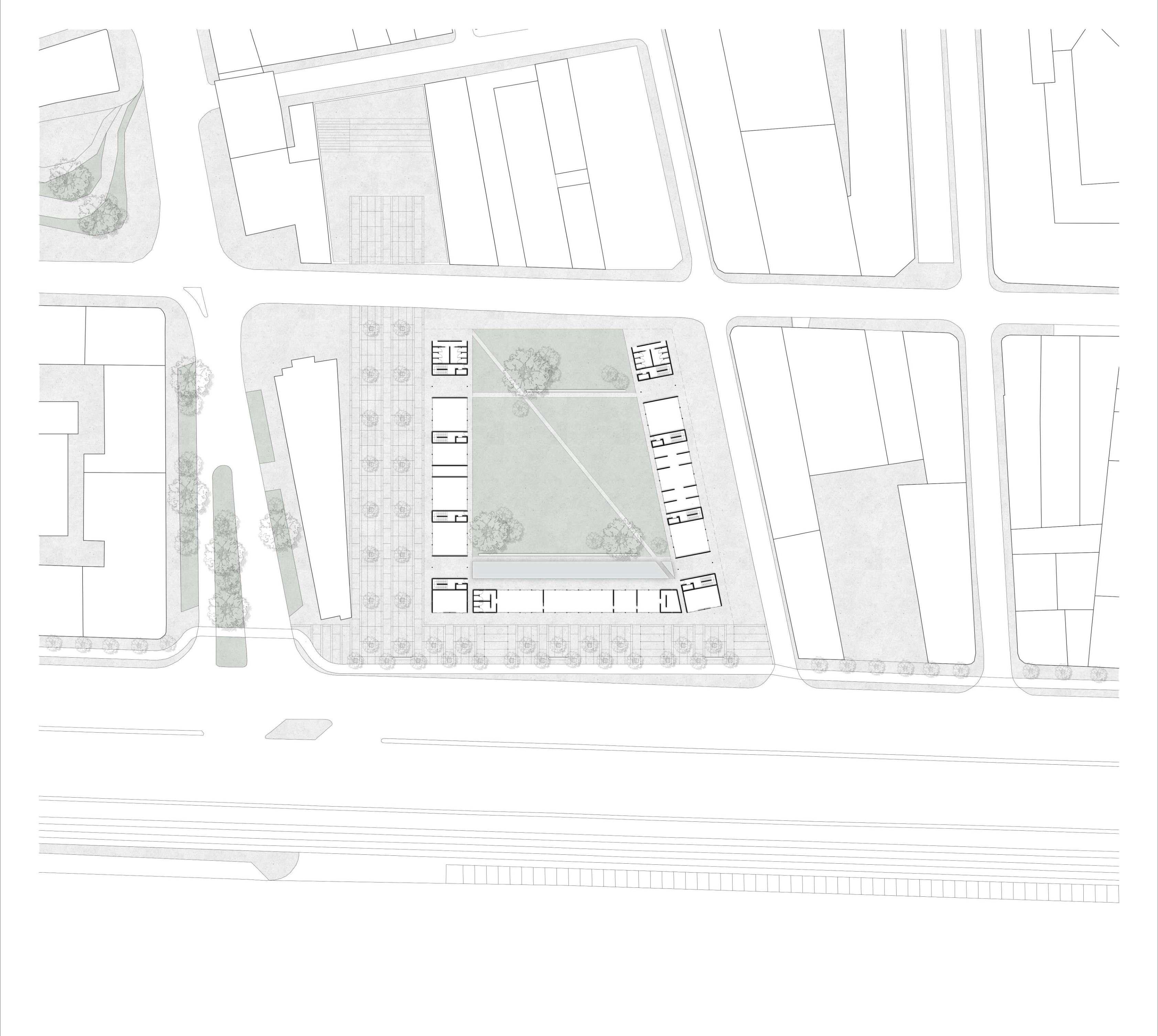
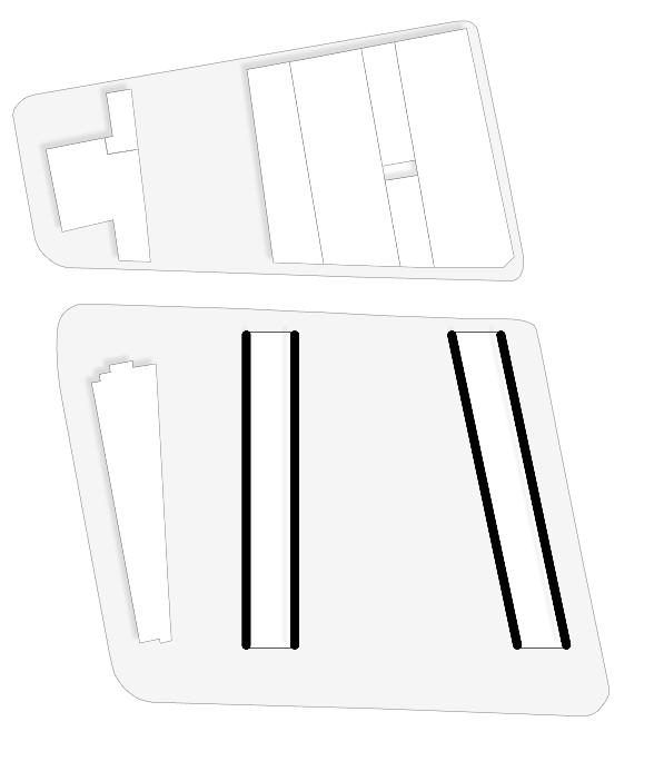
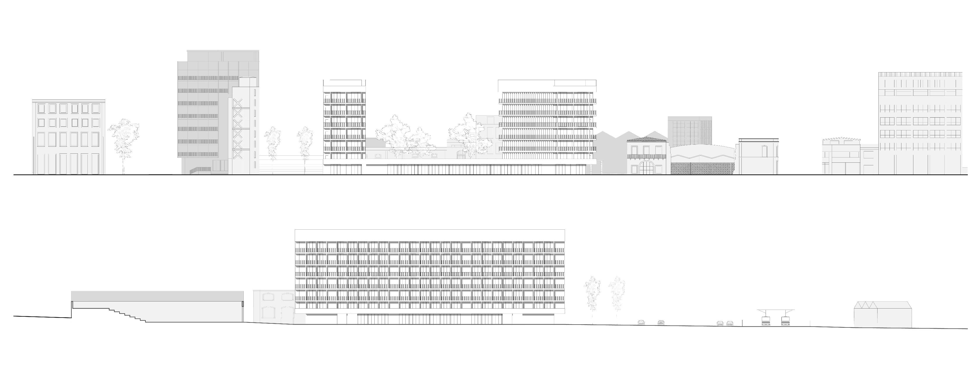
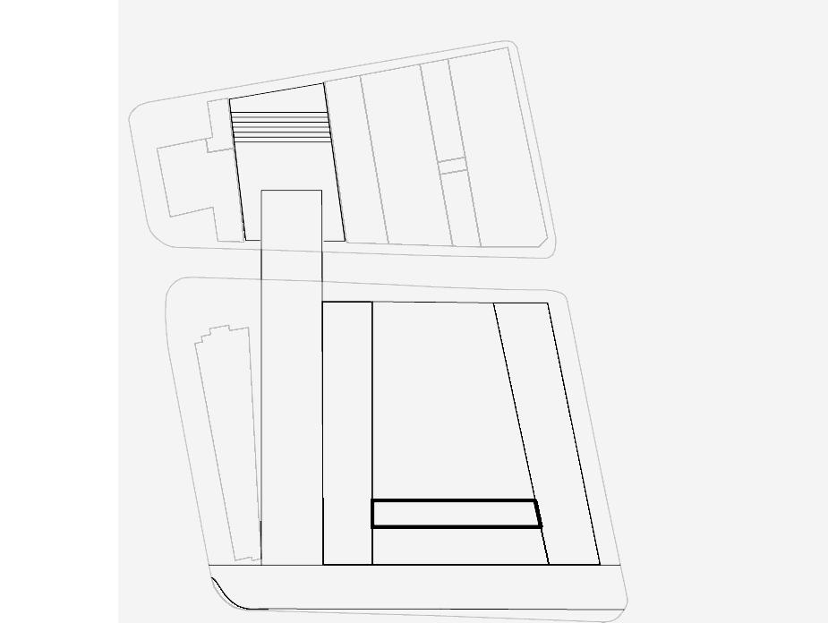
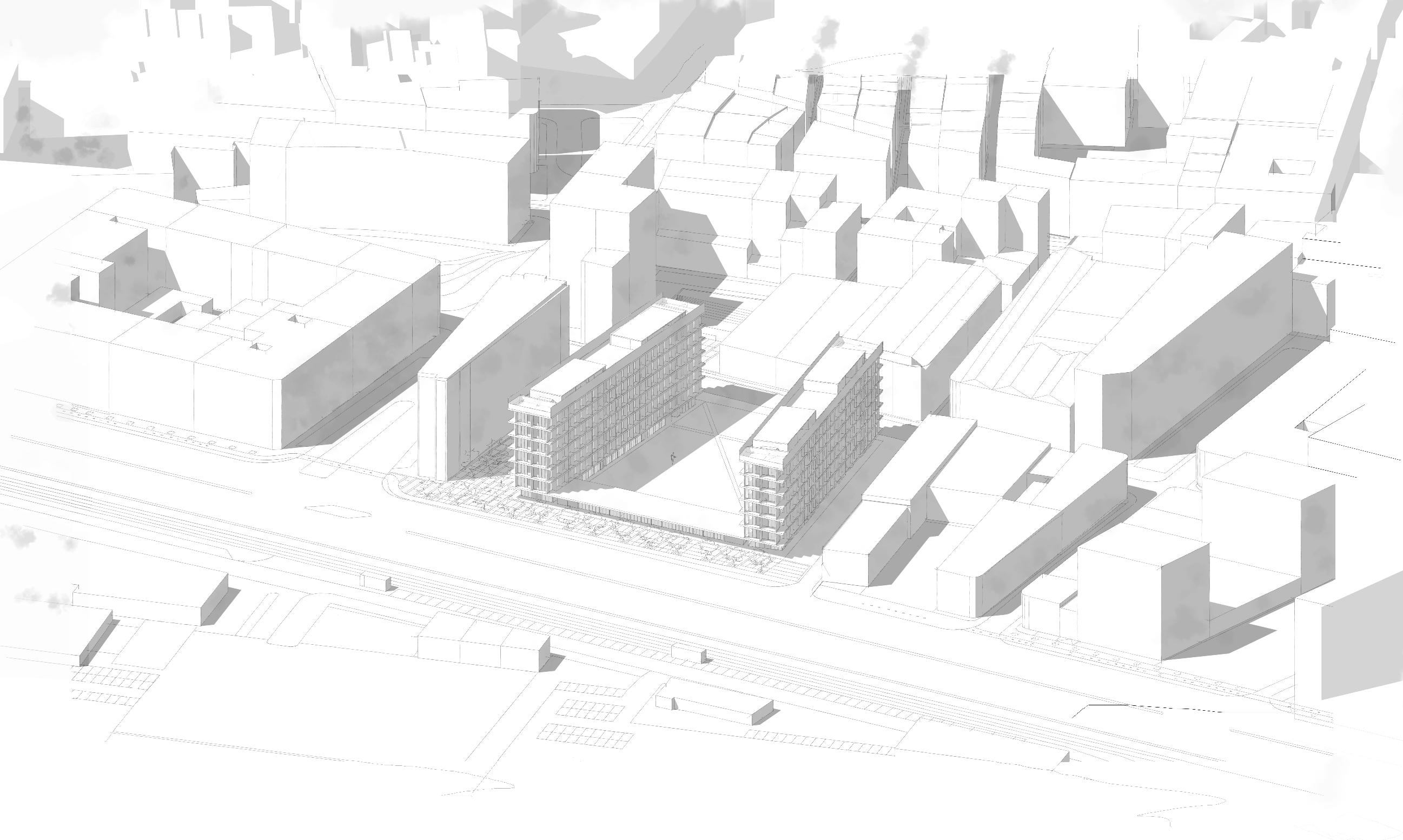
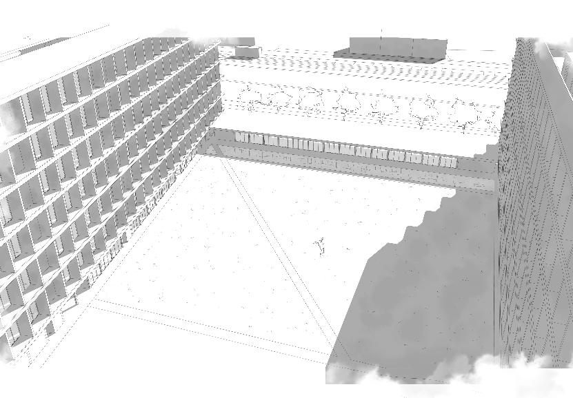
ADHC POLIMI 2022-2023 PAULO DAVID _ BARBARA BOGONI _ CAMILLO MAGNI GROUP 01 CIBOTTO MARINA_CORRADINI CHIARA_LI HAOXING_PEREA PEDRO PABLO CITY WATER . INTENSITY M03 DESIGN DWELLING (WITH)IN THE LIMIT 02 ADHC POLIMI 2022-2023 PAULO DAVID _ BARBARA BOGONI _ CAMILLO MAGNI CITY WATER . INTENSITY M03 DESIGN DWELLING (WITH)IN THE LIMIT 03 GROUP 01 CIBOTTO MARINA_CORRADINI CHIARA_LI HAOXING_PEREA PEDRO PABLO VOLUMETRIC PLAN scale 1:1000 DIAGRAM DESIGN PROCESS 080 1. building vertical guidelines 2. building orizzontal guidelines 3. existing public space guidelines 4. new urban connection 5. new square with frame towards the river COLLAGE URBAN SKYLINE LOCATION PLAN scale 1:500 ENVIRONMENTAL SECTIONS scale 1:500 1. hairdresser 2. laundry 3. tobacco shop 4. diner 5. clothes shop 6. infopoint 7. co-working space 8. free exhibition room 9. minimarket 10. library 11. toy library 7 8 10 11
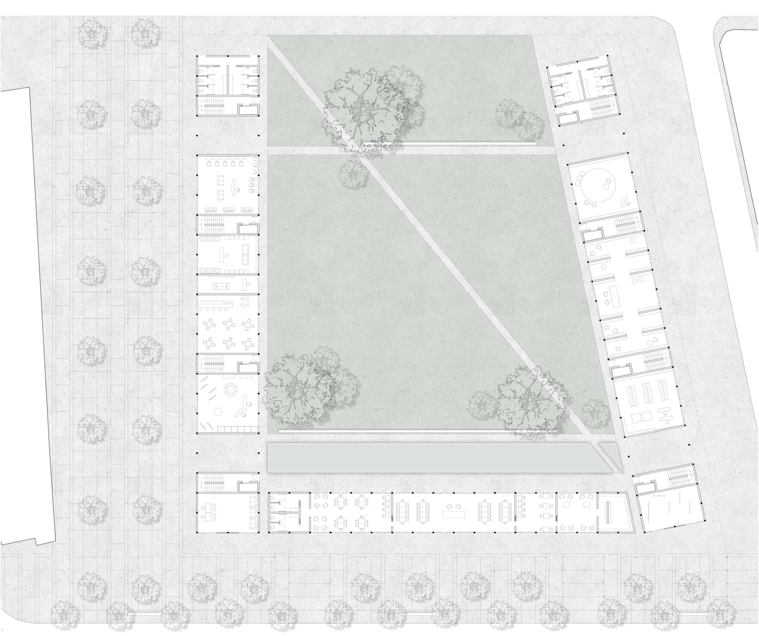
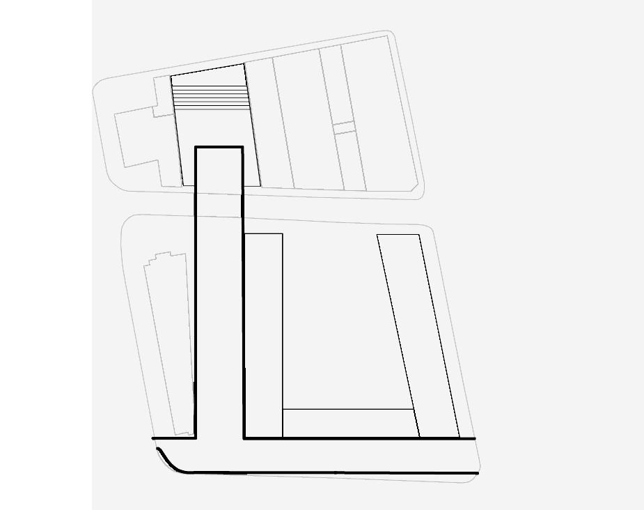
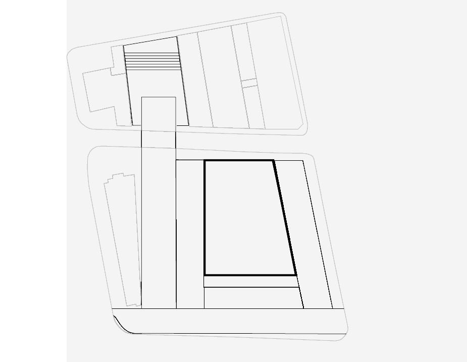
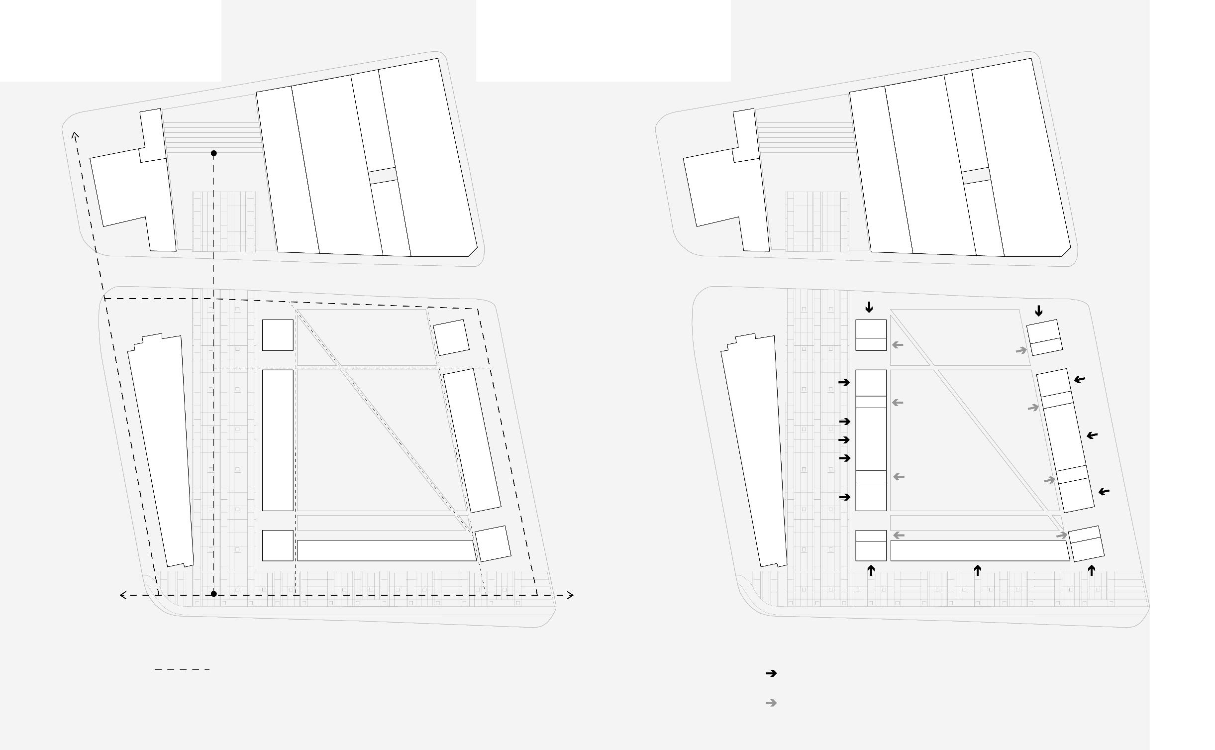
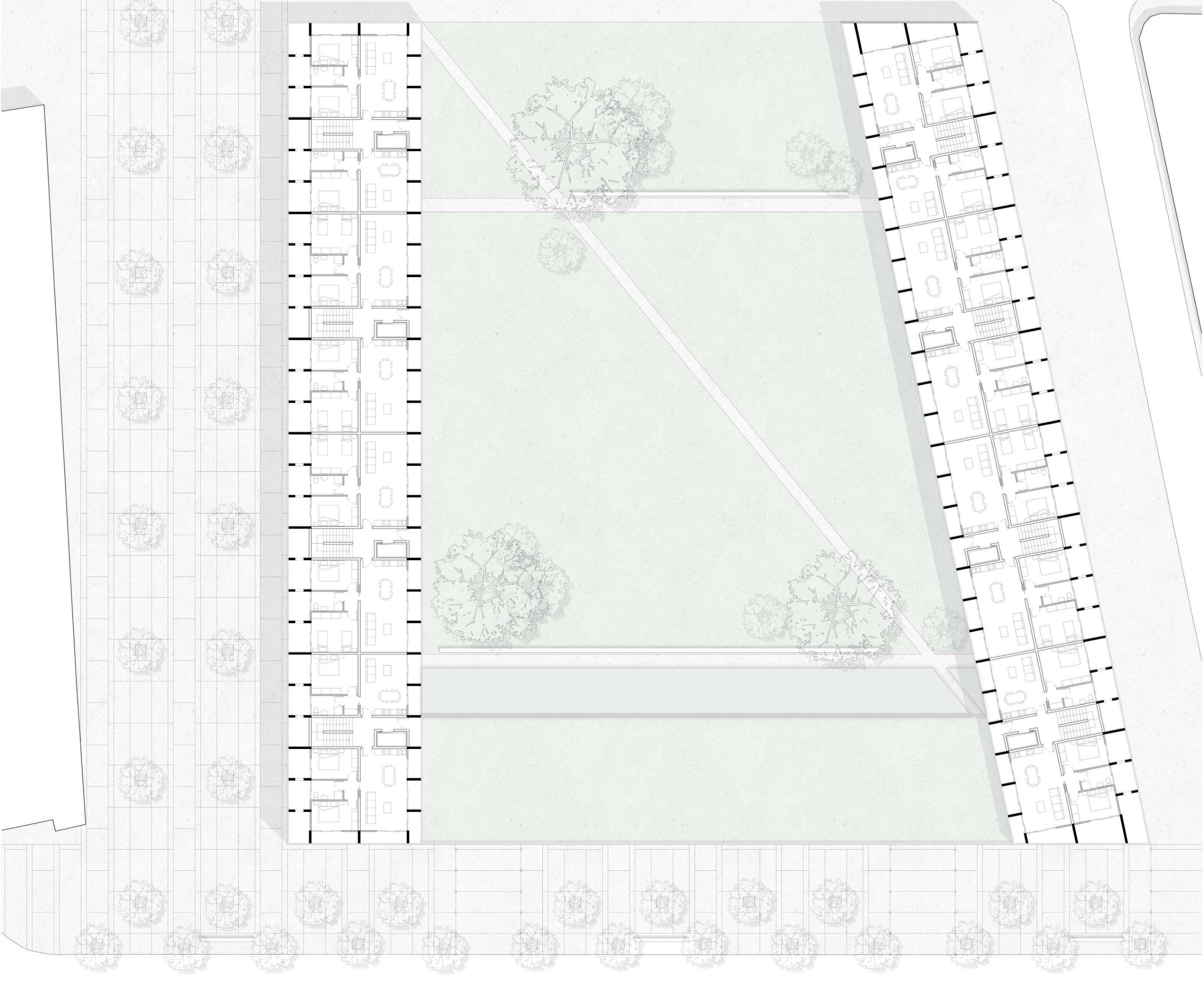
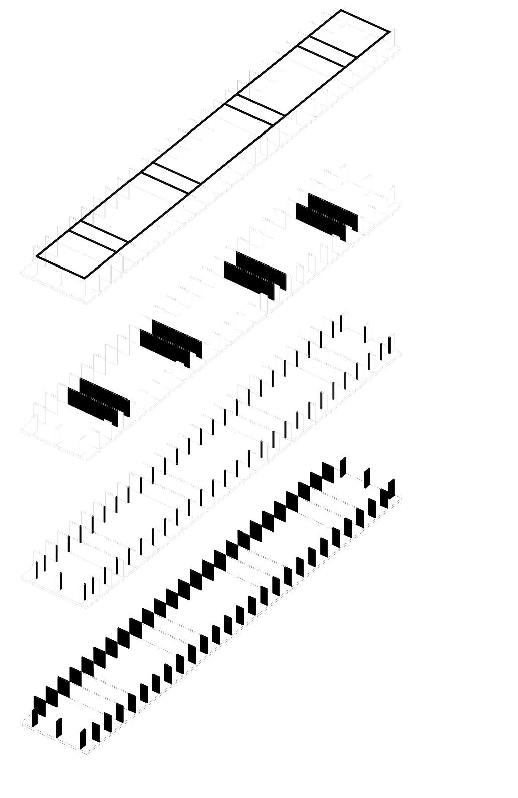

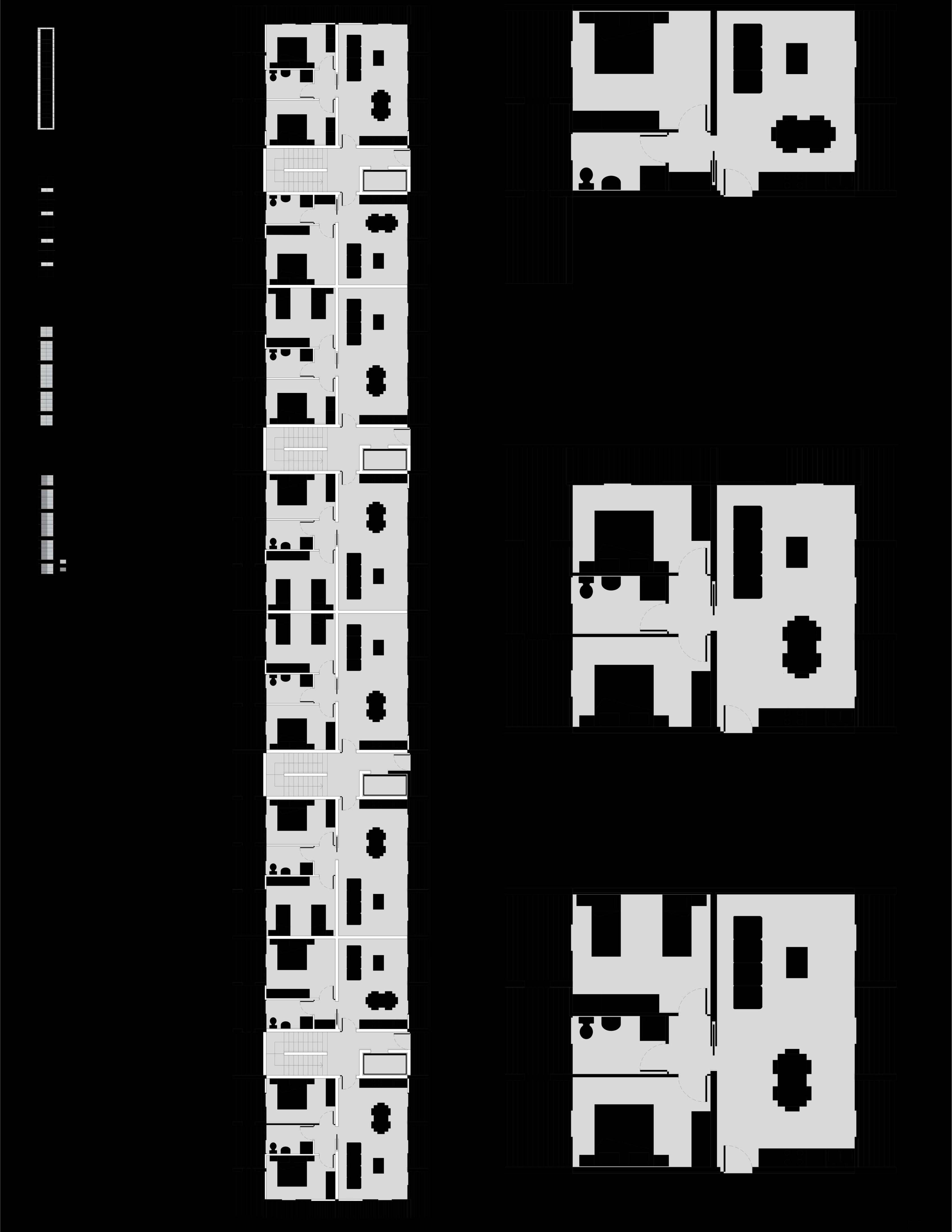
ADHC POLIMI 2022-2023 PAULO DAVID _ BARBARA BOGONI _ CAMILLO MAGNI CITY WATER . INTENSITY M03 DESIGN DWELLING (WITH)IN THE LIMIT 04 GROUP 01 CIBOTTO MARINA_CORRADINI CHIARA_LI HAOXING_PEREA PEDRO PABLO GROUP 01 CIBOTTO MARINA_CORRADINI CHIARA_LI HAOXING_PEREA PEDRO PABLO ADHC POLIMI 2022-2023 PAULO DAVID _ BARBARA BOGONI _ CAMILLO MAGNI CITY WATER . INTENSITY M03 DESIGN DWELLING (WITH)IN THE LIMIT 05 main paths secondary paths DIAGRAM PUBLIC SPACE 080 DIAGRAM CIRCULATION 040 DIAGRAM BUILDINGACCESSES 040 public environments entrances private environments entrances water green pavimentation GROUND FLOOR PLAN scale 1:200 TYPE FLOOR PLAN scale 1:200 DIAGRAM STRUCTURE scale 1:500 AXONOMETRY TYPE FLOOR PARTITIONS scale 1:200 facade rhythm pillars partitions for vertical distribution beams
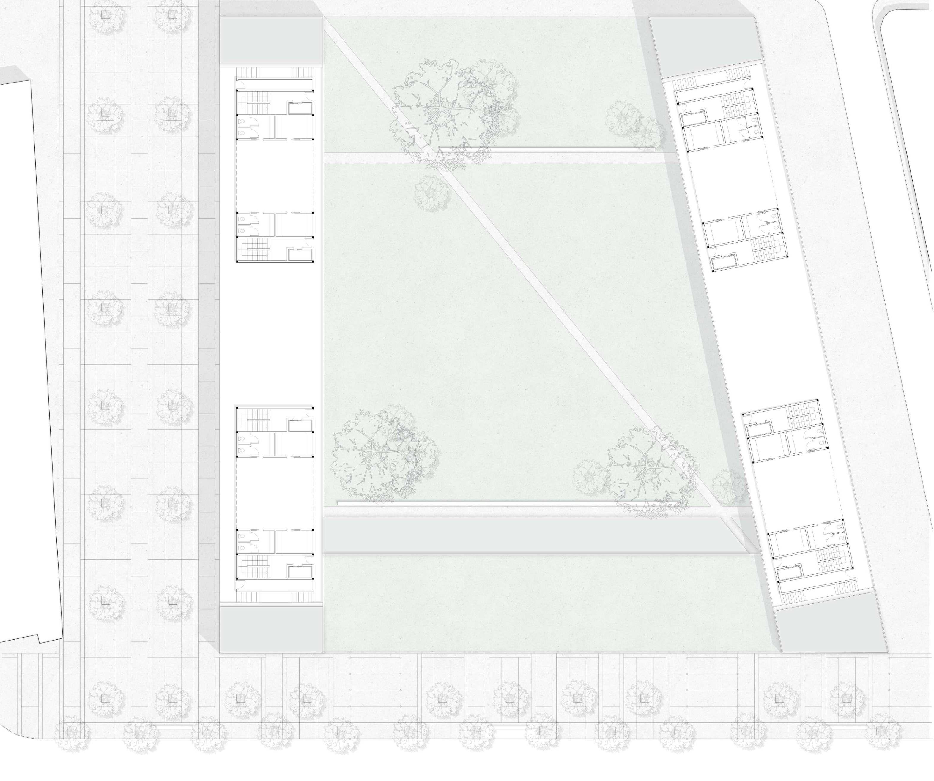
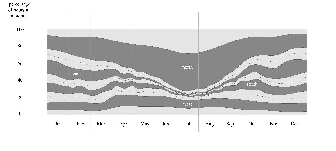
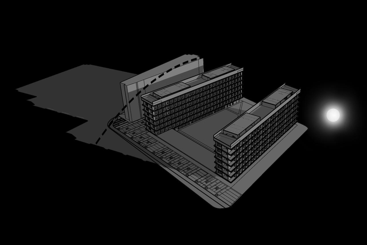
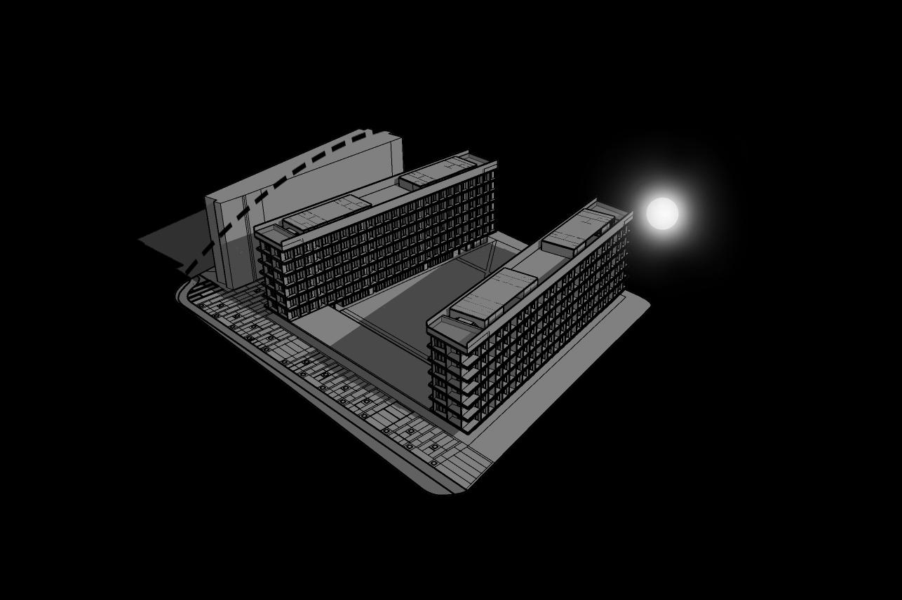
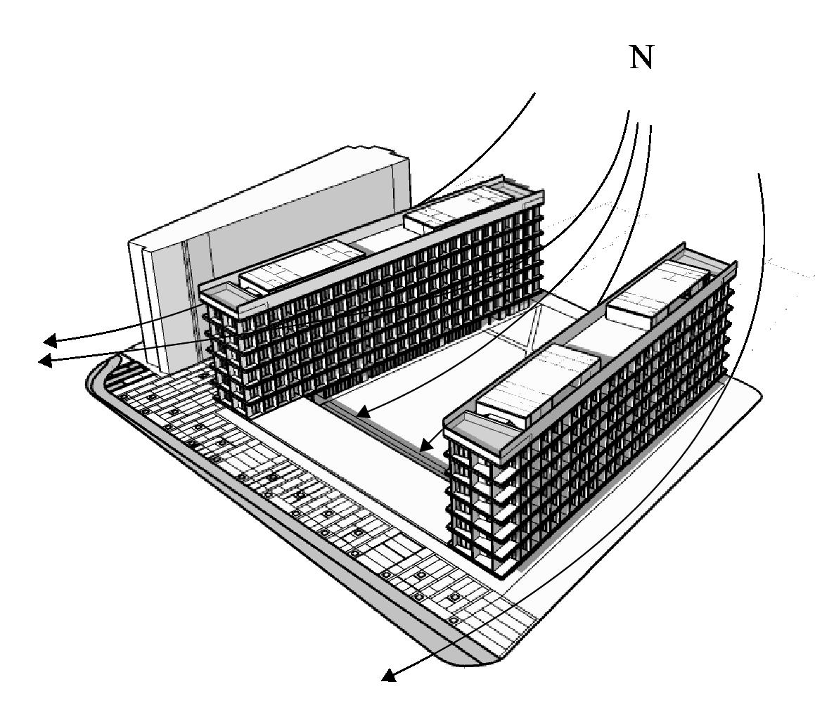
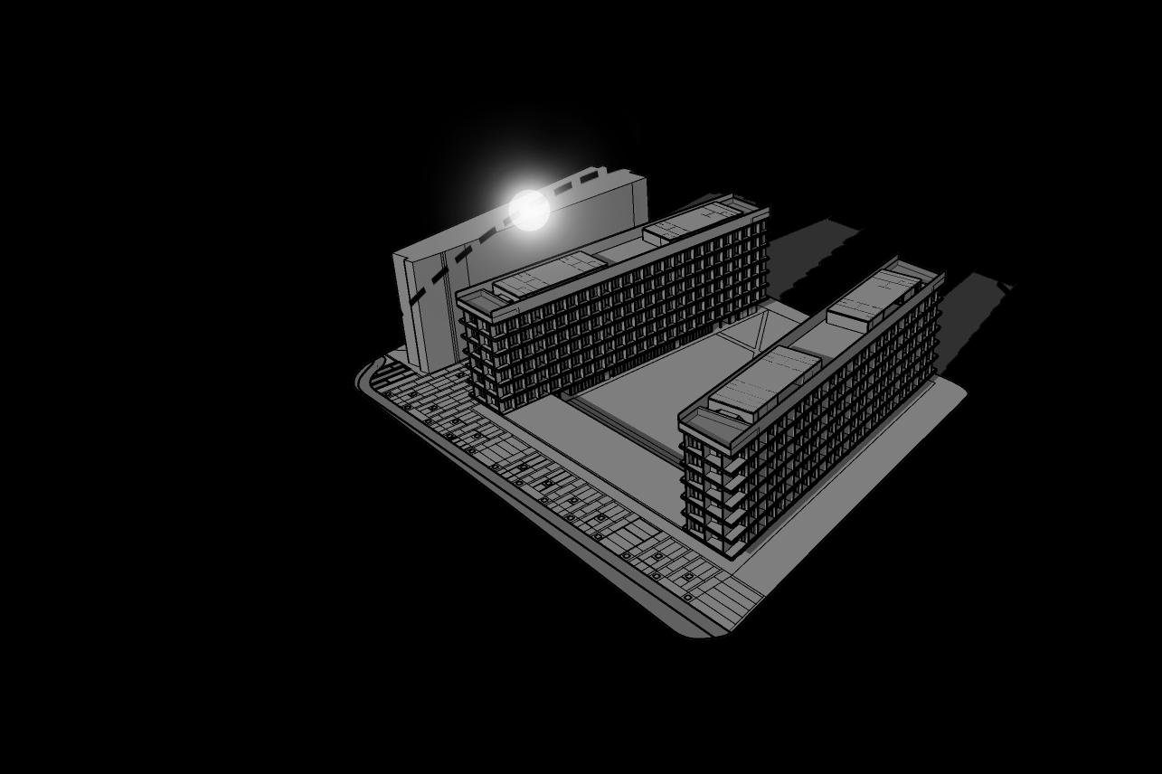
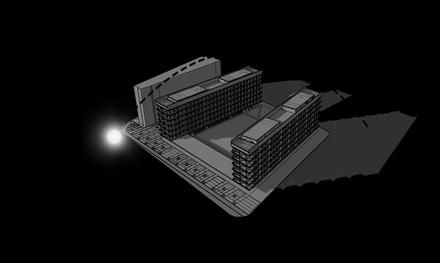
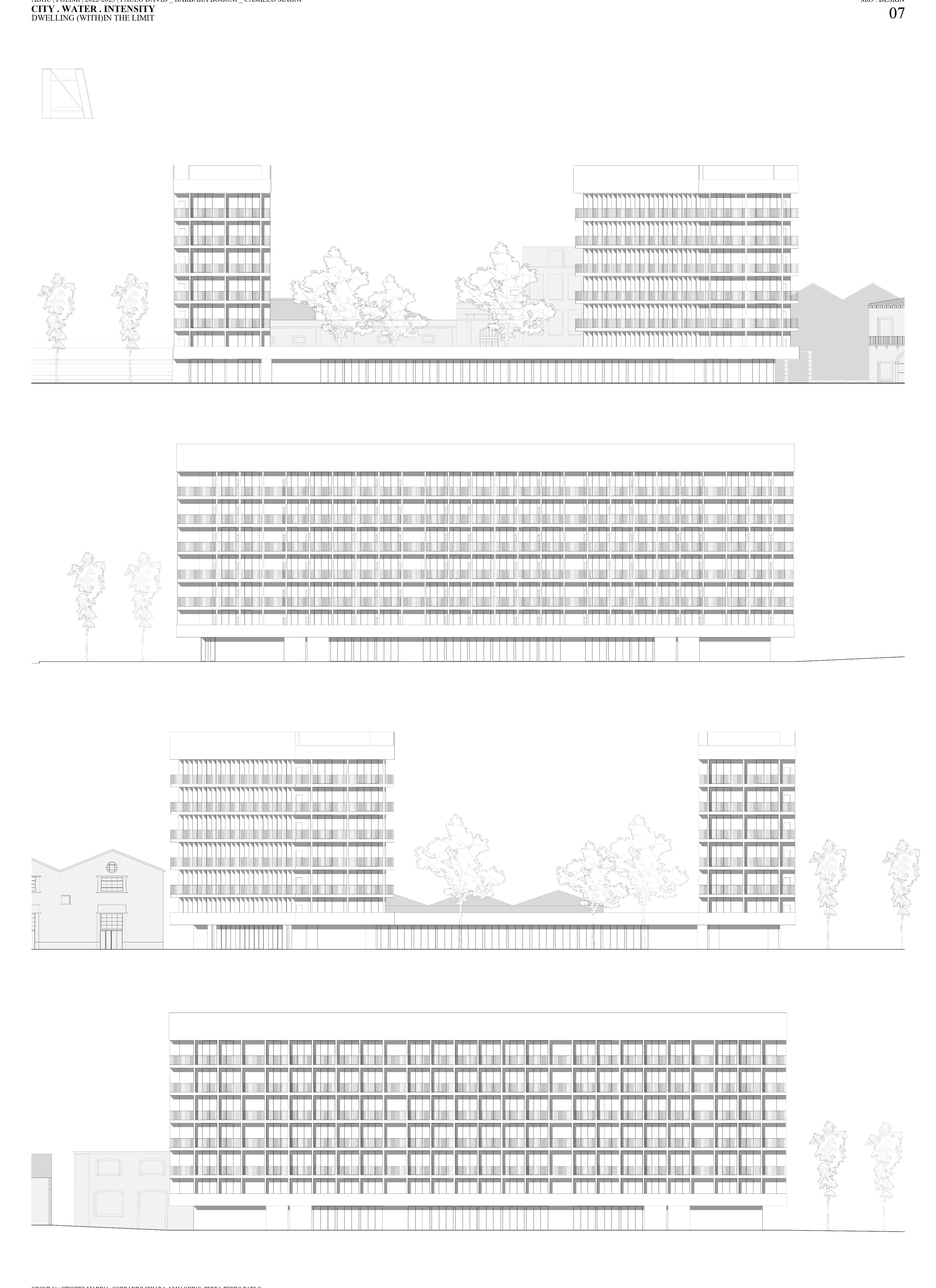
ADHC POLIMI 2022-2023 PAULO DAVID _ BARBARA BOGONI _ CAMILLO MAGNI CITY WATER . INTENSITY M03 DESIGN DWELLING (WITH)IN THE LIMIT 06 ADHC POLIMI 2022-2023 PAULO DAVID _ BARBARA BOGONI _ CAMILLO MAGNI CITY WATER . INTENSITY M03 DESIGN DWELLING (WITH)IN THE LIMIT 07 GROUP 01 CIBOTTO MARINA_CORRADINI CHIARA_LI HAOXING_PEREA PEDRO PABLO GROUP 01 CIBOTTO MARINA_CORRADINI CHIARA_LI HAOXING_PEREA PEDRO PABLO TOP FLOOR PLAN scale 1:200 SOUTH ELEVATION scale 1:200 EAST ELEVATION scale 1:200 NORTH ELEVATION scale 1:200 WEST ELEVATION scale 1:200 DIAGRAM SHADOWS AM 10AM 2AM 5AM DIAGRAM WIND The predominant average hourly wind direction in Lisbon varies throughout the year. The wind is most often from the north for 11 months, from January to December 9, with peak percentage of 74% on July 24. The wind is most often from the east for 3.6 weeks, from December to January 3, with peak percentage of 29% on January 1. source: weatherspark.com Since the project area is located near the river, the average wind speed is higher, so the project thought how to deal with this.

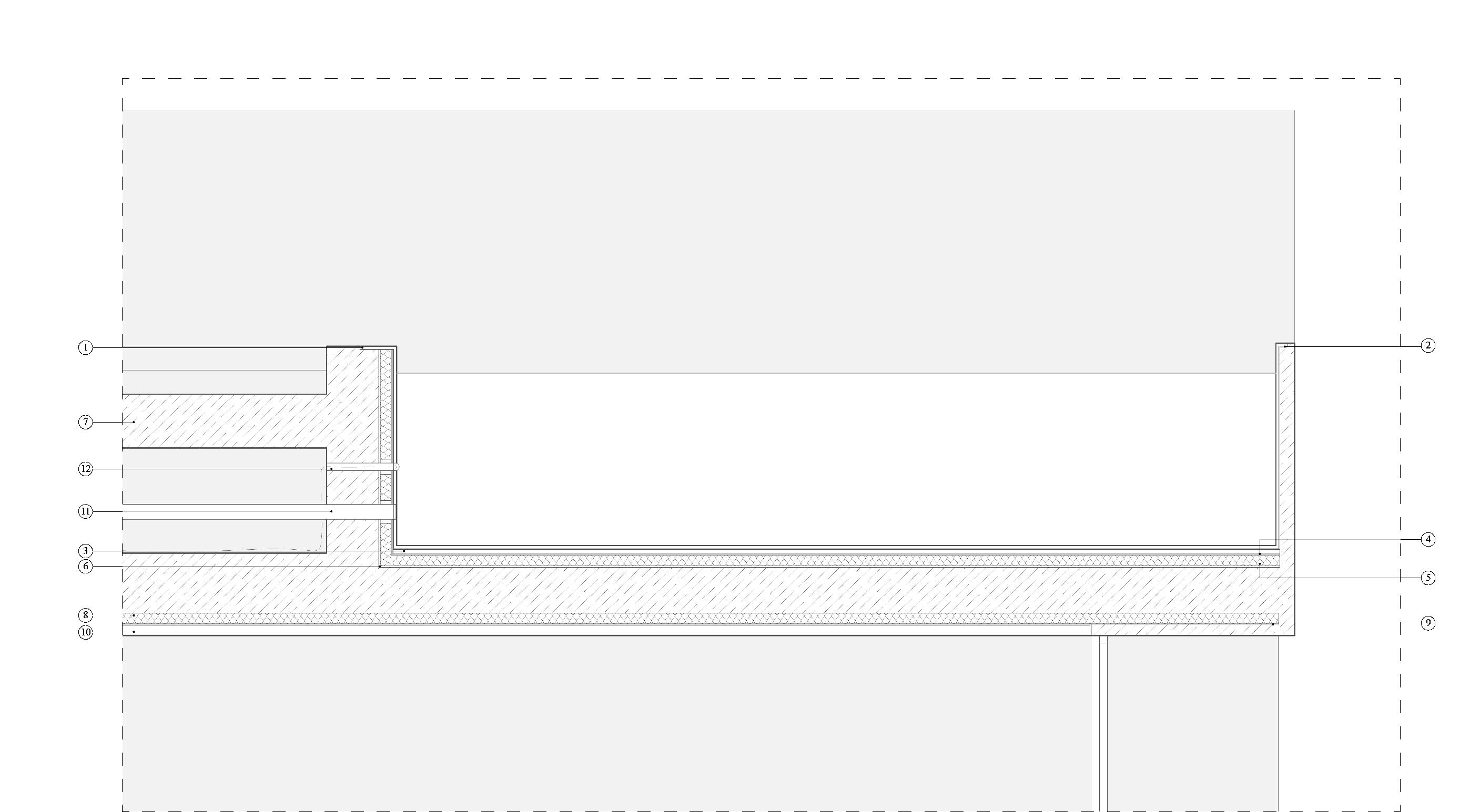
GROUP 01 CIBOTTO MARINA_CORRADINI CHIARA_LI HAOXING_PEREA PEDRO PABLO GROUP 01 CIBOTTO MARINA_CORRADINI CHIARA_LI HAOXING_PEREA PEDRO PABLO ADHC POLIMI 2022-2023 PAULO DAVID _ BARBARA BOGONI _ CAMILLO MAGNI CITY WATER . INTENSITY M03 DESIGN DWELLING (WITH)IN THE LIMIT 08 ADHC POLIMI 2022-2023 PAULO DAVID _ BARBARA BOGONI _ CAMILLO MAGNI CITY WATER . INTENSITY M03 DESIGN DWELLING (WITH)IN THE LIMIT 09 SECTIONA-A’ scale 1:200 SECTION B-B’ scale 1:200 DETAIL POOL scale 1:20 B B’ A A’ 1. ceramic cladding 2. tile glue 3. cement mortar 4. double layer waterproofing film for swimming pools 5. insulating layer of bentonite 6. polypropylene sheet 7. reinforced concrete floor 8. thermo-acoustic insulation in glass wool 9. bituminous sheath 10. false ceiling for systems 11. lighting system 12. piping system for draining and collecting water
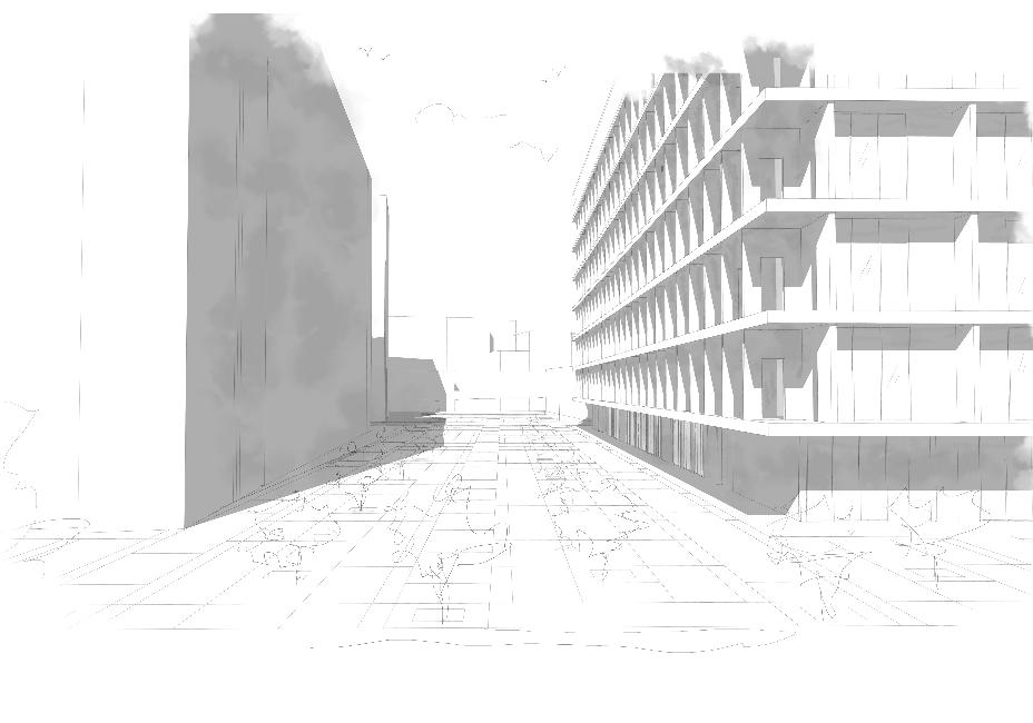

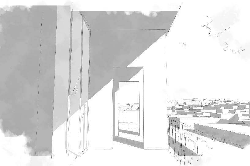
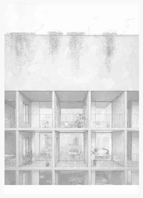
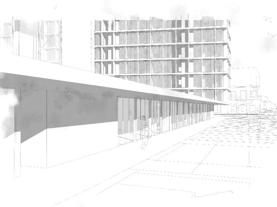
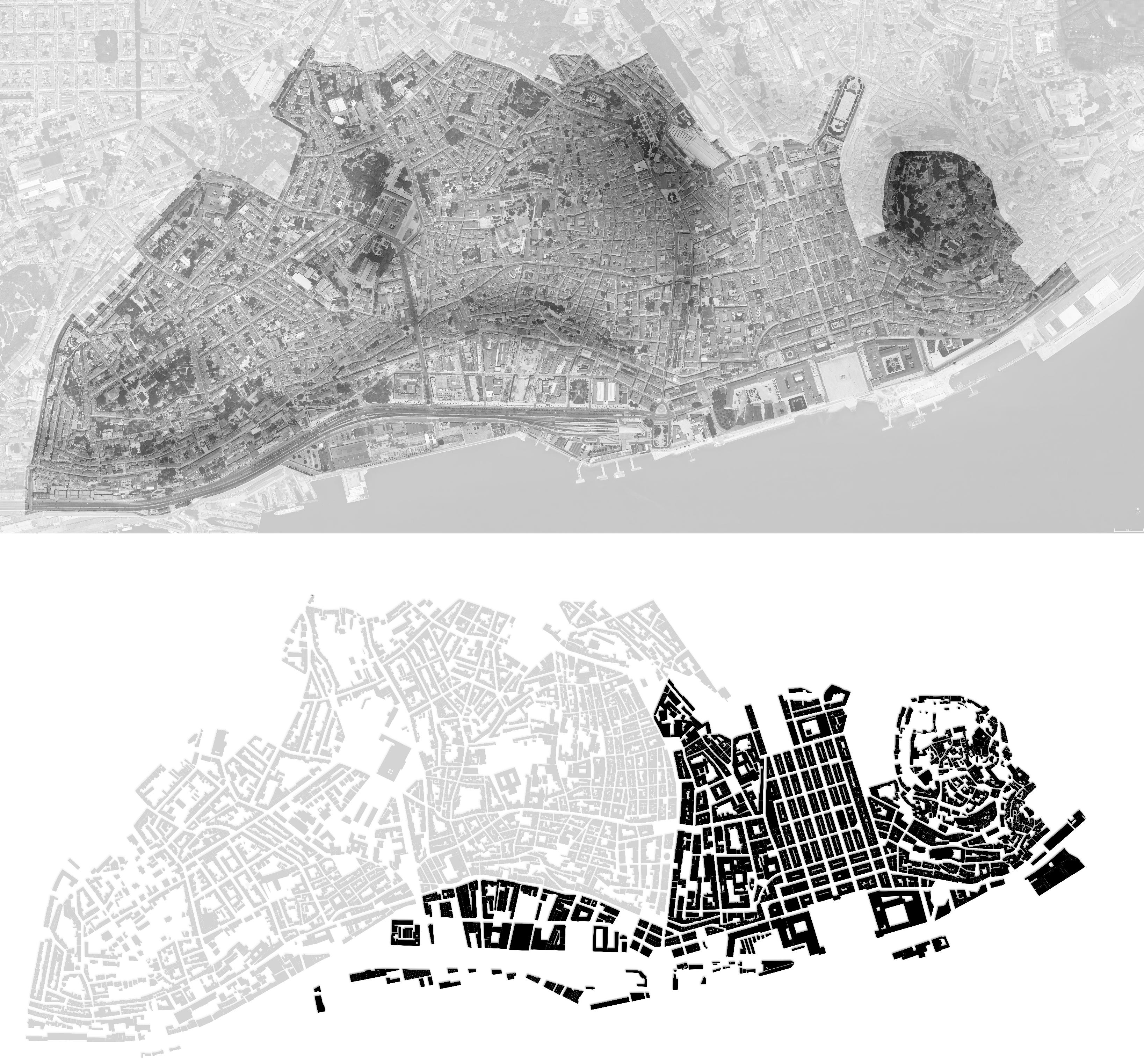


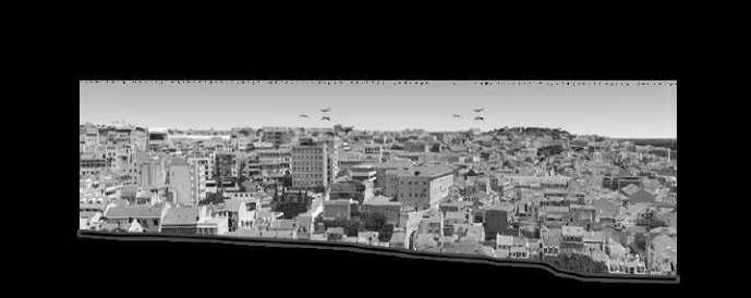
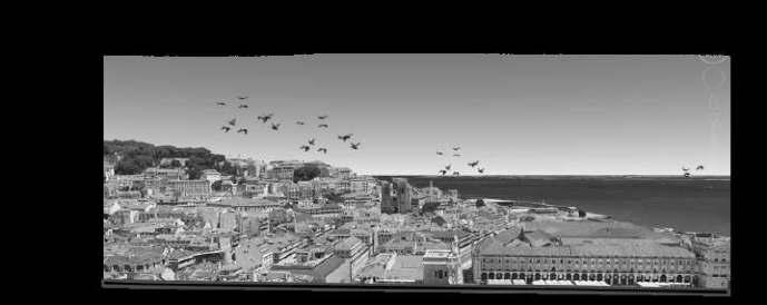
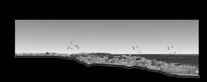
ADHC POLIMI 2022-2023 PAULO DAVID _ BARBARA BOGONI _ CAMILLO MAGNI CITY WATER . INTENSITY M03 ANALYSIS DWELLING (WITH)IN THE LIMIT 01 ADHC POLIMI 2022-2023 PAULO DAVID _ BARBARA BOGONI _ CAMILLO MAGNI GROUP 01 CIBOTTO MARINA_CORRADINI CHIARA_LI HAOXING_PEREA PEDRO PABLO CITY WATER . INTENSITY M03 DESIGN DWELLING (WITH)IN THE LIMIT 10 GROUP 01 CIBOTTO MARINA_CORRADINI CHIARA_LI HAOXING_PEREA PEDRO PABLO It is completely renovated neighborhood with new commercial and cultural spaces. In the past was originally landing place for sailors who sought the pleasures of the mainland after having been to the sea. Therefore, over time it has become an industrial area dominated and rich in different fabrics. They have changed their function over time and due to its continuous innovation there are currently several cultural and academic places for young people. TERRITORYANALYSIS TOPOGRAPHY scale 1:7000 TERRITORYANALYSIS URBAN FABRIC scale 1:7000 CAIS DO SODRE Sandwiched between the Barrio Alto and the Baixa, the Chiado district is one of the historic areas of Lisbon. Numerous avenues branch off from the homonymous Largo do Chiado square, where there are several historical monuments including Convento do Carmo and the Church of São Roque. The urban fabric follows the gradient creating many lift points (elevadores) and miradouros. CHIADO The Baixa district, rebuilt after the 1755 earthquake, therefore follows the Pombaline style with a new plot of orthogonal streets, which arises in “mediated” relationship with the pre-existing context. It is defined by development of the building orthogonal to the river and by another parallel that opens towards the river, establishing a relationship of immediate continuity with it. BAIXA Alfama is the oldest and most charming district of Lisbon; charming maze of cobbled lanes and traditional buildings that stretches over craggy hills from the banks of the Tagus to the Castelo de São Jorge. Historically Alfama was located outside the castle walls; was neighborhood where only extremely poor people lived. As Lisbon developed and transformed into major maritime city, the neighborhood remained humble, hard and deprived area inhabited by sailors and longshoremen. ALFAMA
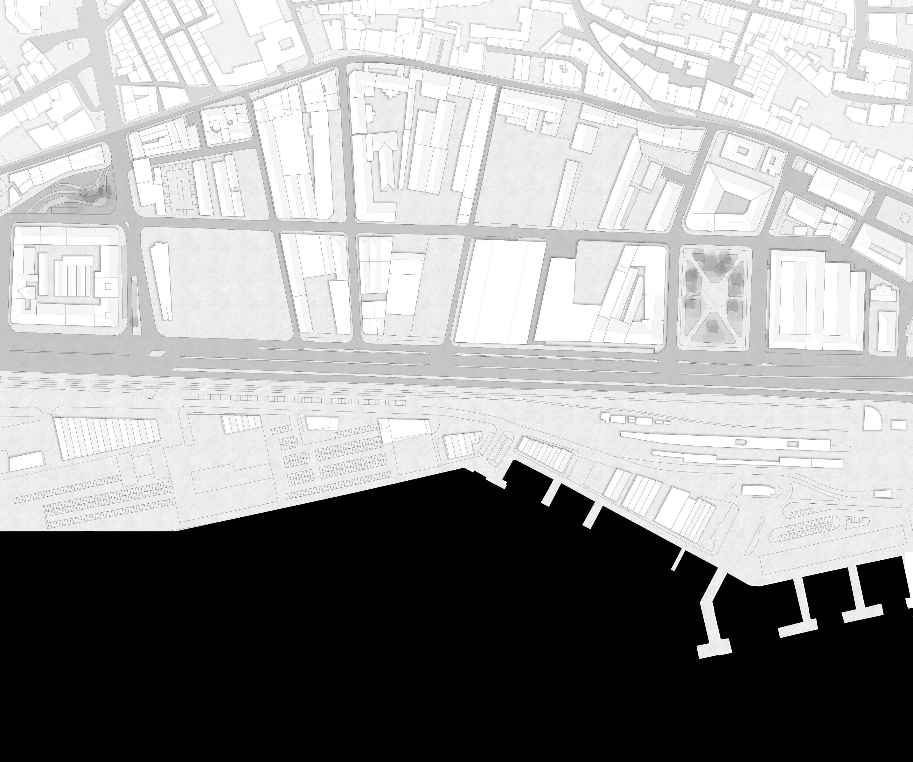
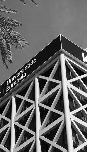
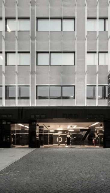
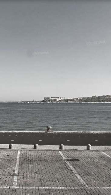
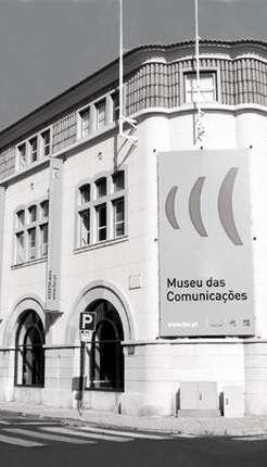
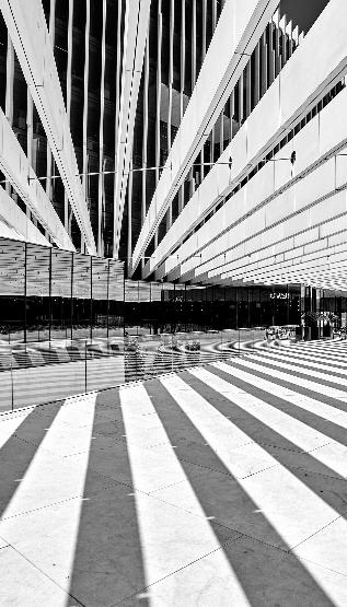
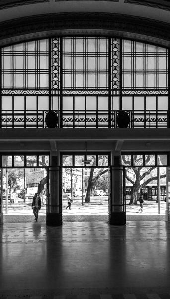
ADHC | POLIMI 2022-2023 | PAULO DAVID _ BARBARA BOGONI _ CAMILLO MAGNI GROUP 01 CIBOTTO MARINA_CORRADINI CHIARA_LI HAOXING_PEREA PEDRO PABLO CITY . WATER . INTENSITY M03 ANALYSIS DWELLING (WITH)IN THE LIMIT 02 1 2 3 4 5 6 1 IADE - Creative University2 Dom Luís office building, gym and plaza 3 Urban voids in front of Tejo river4 Museu das Comunicações5 EDP Headquarters and public plaza6 Cais do Sodré station URBANANALYSIS CAIS DO SODRE scale 1:2000 The project area is located in the district of Cais do Sodre. In the survey we noticed that it is a recently redeveloped area with new commercial and cultural attractions. Today it is a nightlife/live place, full of commercial establishments, academic institutions, cultural institutions and offices. The area has an advantageous location near the sea and one of the most important railway stations in the city, Cais de Sodre which distributes the metro, the tram and the ferry.



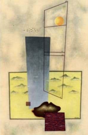
Composizione 57 12, Manlio Rho
ELEMENT OF PAVILION BUILDING REFERENCES
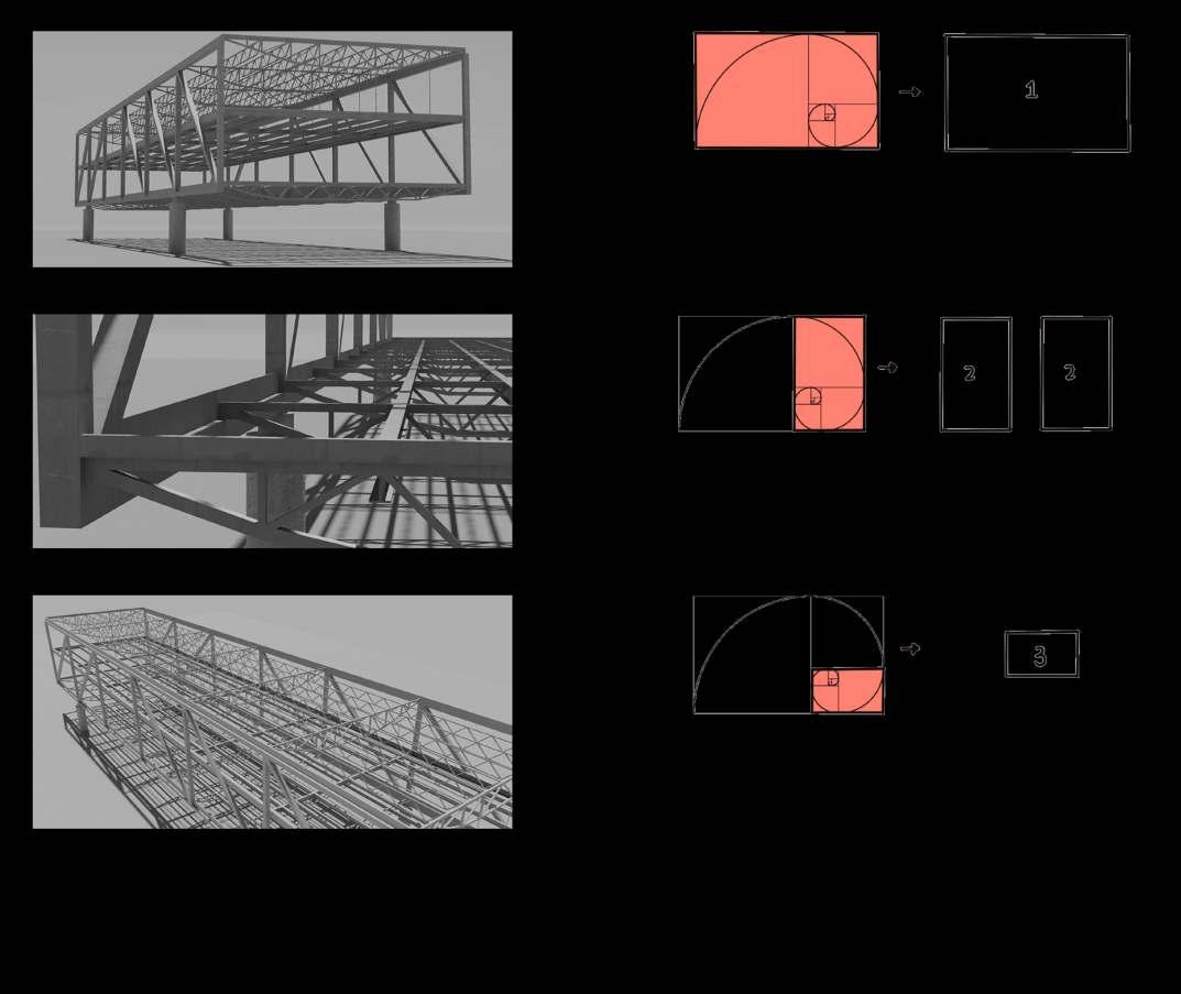
VIERENDEEL BEAM STRUCTURAL REFERENCE
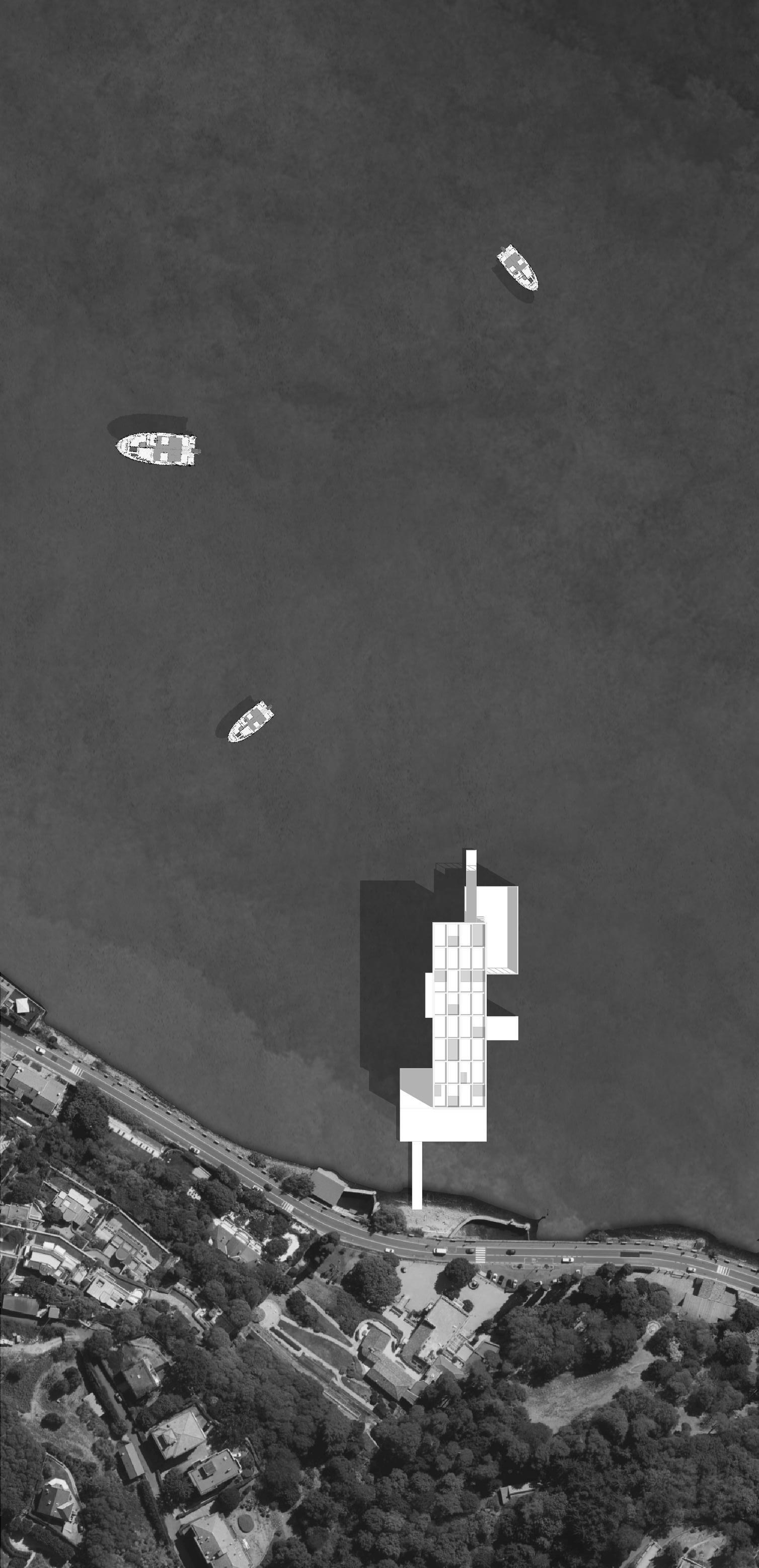
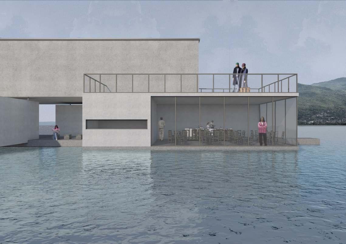
The shape of the pavilion is composed in different blocks, organised according to the painting of the italian master Manlio Rho. In his painting he characterized all the shapes with different color and sizes. In the floating pavilion for the city of Como the design follows the same rule and work also with the context going to disposed the single block according to specific point of view, especially on the rationalist part of the city, on the historical parto of Comom on the other side of the lake and on the city of Cernobbio.
Also the roof follows the same rule of different shape in chaotic order.
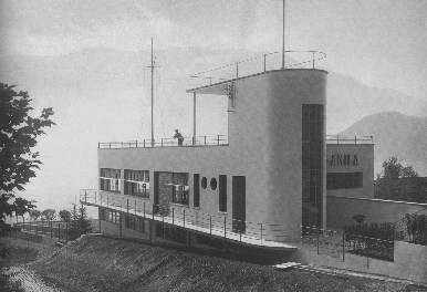
The Italian Powerboat Association of Como Lake organized, since the 1920, sports events on Como Lake. For the importance that it was acquiring, the architect Pietro Lingeri who was member of the Association, he thought to a project concerning the new headquarters.
The site chosen for the construction of the building, purchased in 1931, is located in Tremezzo close to the lake and bordering the mouth of the river Bolvedro. The architecture is inspired by that of a ship whose structure is designed to ensure maximum functionality, such as the semicircular terrace that juts out into the lake, which was conceived as the preferred viewing spot for speedboat races
The shape of the pavilion is composed in different blocks, organised according to the painting of the italian master Manlio Rho. In his painting he characterized all the shapes with different color and sizes. In the floating pavilion for the city of Como the design follows the same rule and work also with the context going to disposed the single block according to specific point of view, especially on the rationalist part of the city, on the historical parto of Comom on the other side of the lake and on the city of Cernobbio.
Also the roof follows the same rule of different shape in chaotic order.
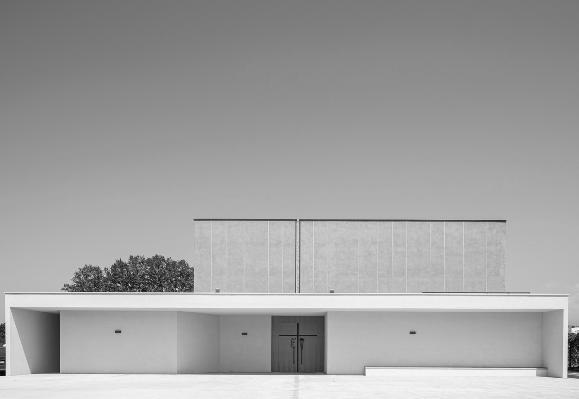
The geometry of the new church, with a rectangular plan, retains the memory of the previous building.
The parish premises and the rectory are articulated around a central patio. The liturgical hall has a double height and is surrounded by volumes of lower height: the presbytery, the working chapel, the side nave, the penitentiary and the baptistery. The project was developed following criteria of environmental sustainability and the structures are made of X-LAM wood. The interior and exterior of the building have also been the subject of careful lighting design.
THE GOLDEN RATIO RATIONALIST REFERENCE


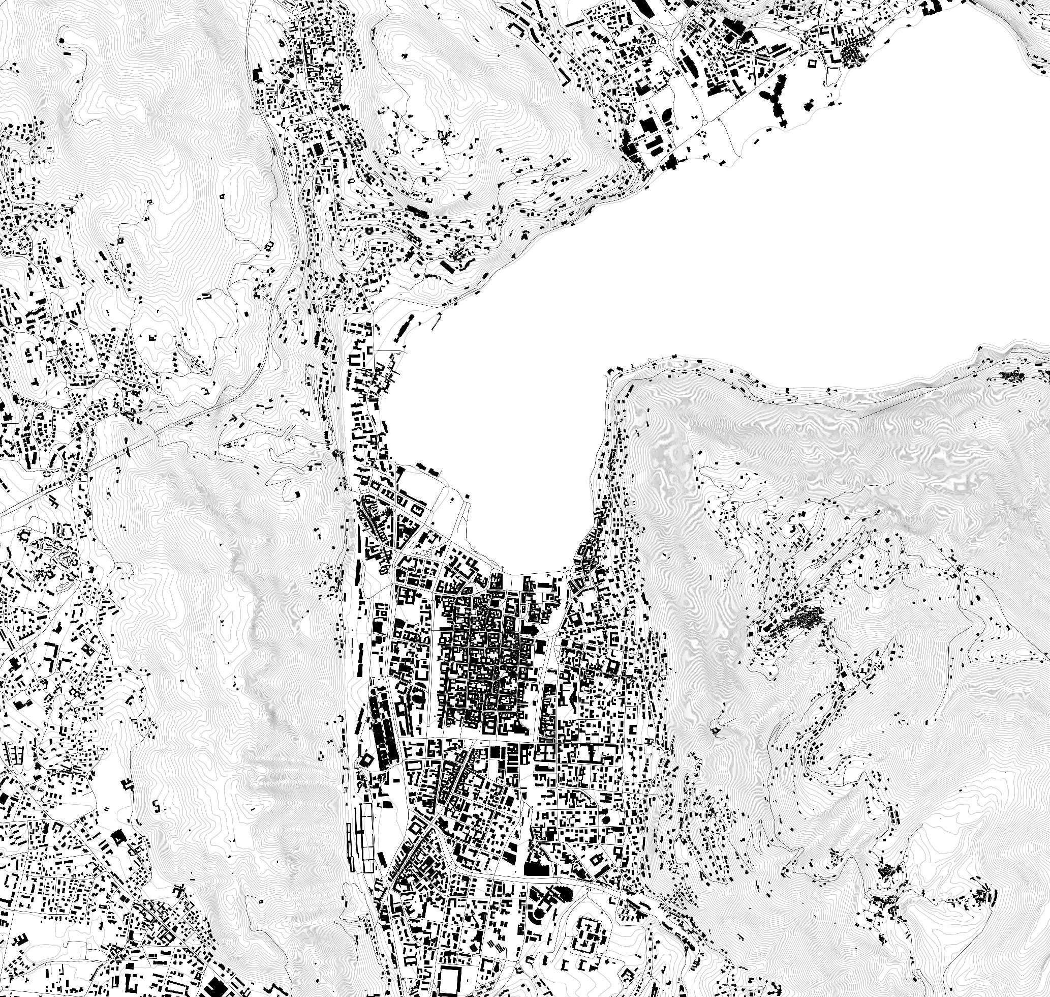
ANALYSIS OF THE SITE 1:15000
PROJECT AREA
SPACES AND LIGHT ELEMENT OF THE PROJECT

IC ARCHITECTURAL DESIGN AND HISTORY Chiara Baglione, Matteo Moscatelli Giorgia Concato, Fabio Marino, Simone Milani P.01 GROUP 5 Edoardo Sartori, Abuhay Yared Dessalegn, Pedro Pablo Perea, Nicolàs Serrano Serrano, Liu Wanxin ARCHITECTURAL DESIGN 57 12 PAVILION
View of the lake
Como Rationalistand existing Como COMO
Historical
CERNOBBIO
Historical axis
Rationalist axis
VILLA AMILA Pietro Lingeri / 1927
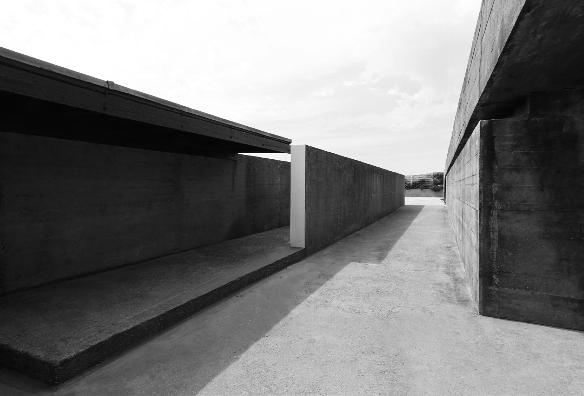
PISCINE LECA DE PALMEIRA / Alvaro Siza / 1966
CHIESA DI VARIGNANO Tamassociati 2019
57 12 PAVILION FLOATING PAVILION BIRD’S EYE VIEW MASTERPLAN 1:400
EXHIBITION SPACE SERVICES TRANSITION SPACES SPACES TO STAY
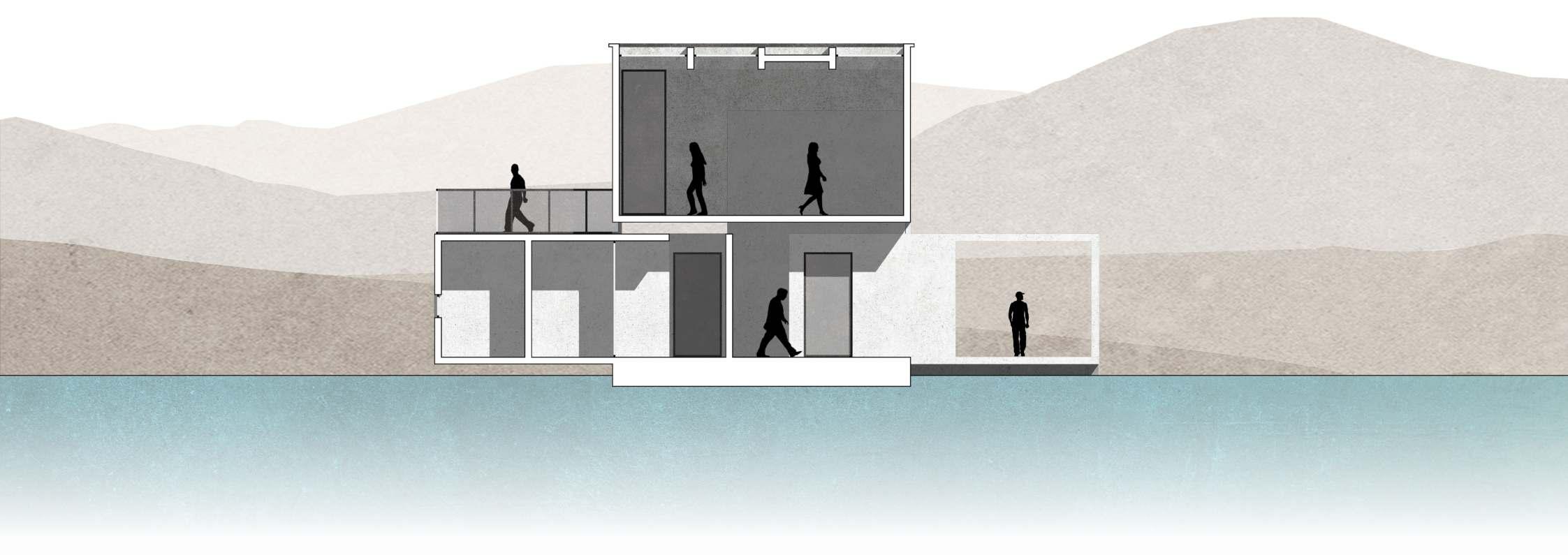
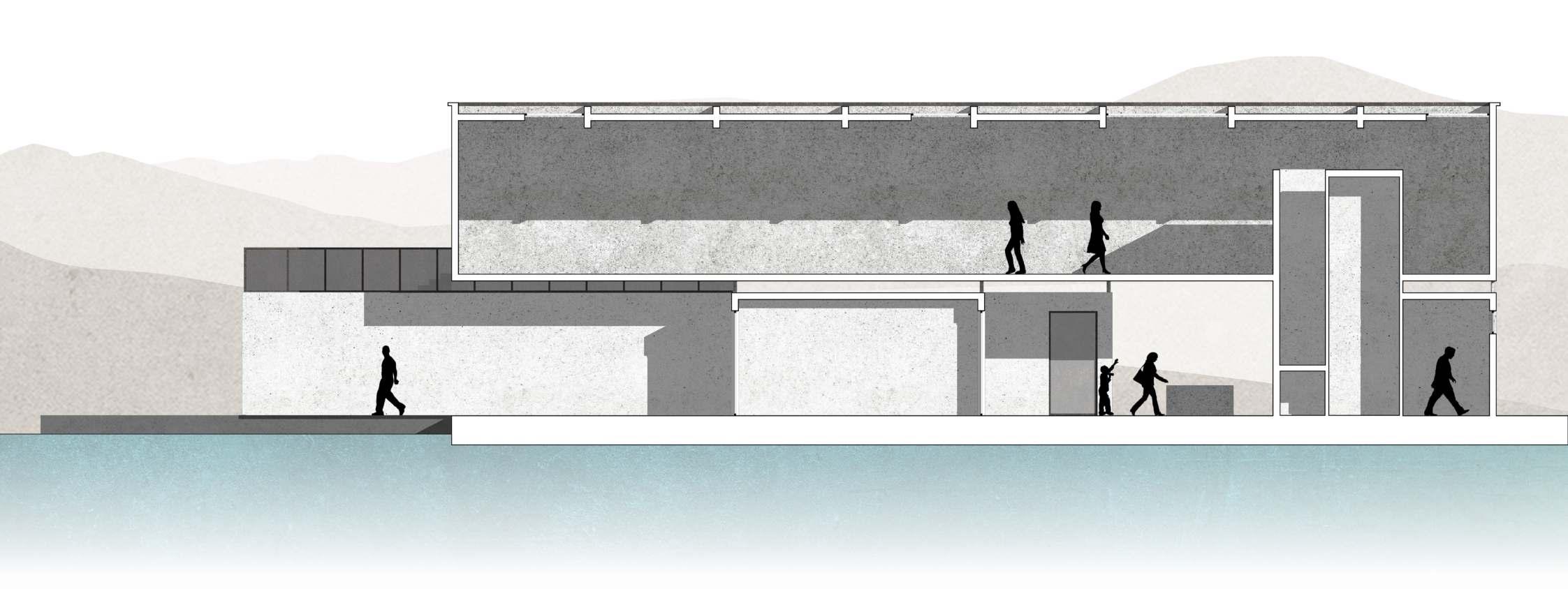


IC ARCHITECTURAL DESIGN AND HISTORY Chiara Baglione, Matteo Moscatelli Giorgia Concato, Fabio Marino, Simone Milani P.02 GROUP 5 Edoardo Sartori, Abuhay Yared Dessalegn, Pedro Pablo Perea, Nicolàs Serrano Serrano, Liu Wanxin ARCHITECTURAL DESIGN 57 12 PAVILION 3 10 9 A’ A B B’ 1 2 3 4 5 6 7 8 A’ A B B’
SECTION
A-A’
1:100
SECTION B-B’ 1:100
SOUTH ELEVATION 1:100
GROUND FLOOR 1:100 FIRST FLOOR 1:100 LEGENDA 1-ENTRANCE 2-TICKET OFFICE 3-VERTICAL DISTRIBUTION 4-STORE 5-BATHROOM 6-BOOKSHOP 7-KITCHEN 8-BAR 9-EXHPOSITION SPACE 10-TERRACE
WEST ELEVATION 1:100



IC ARCHITECTURAL DESIGN AND HISTORY Chiara Baglione, Matteo Moscatelli Giorgia Concato, Fabio Marino, Simone Milani P.03 GROUP 5 Edoardo Sartori, Abuhay Yared Dessalegn, Pedro Pablo Perea, Nicolàs Serrano Serrano, Liu Wanxin ARCHITECTURAL DESIGN 57 12 PAVILION
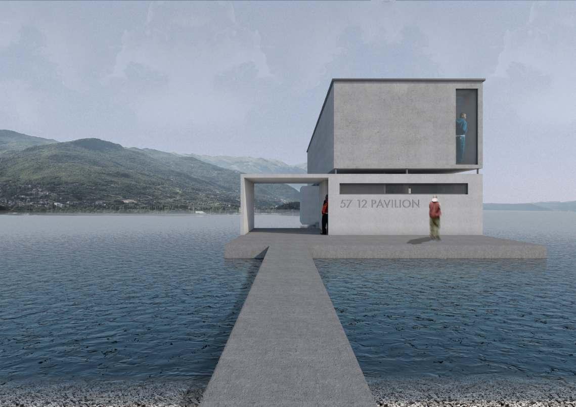
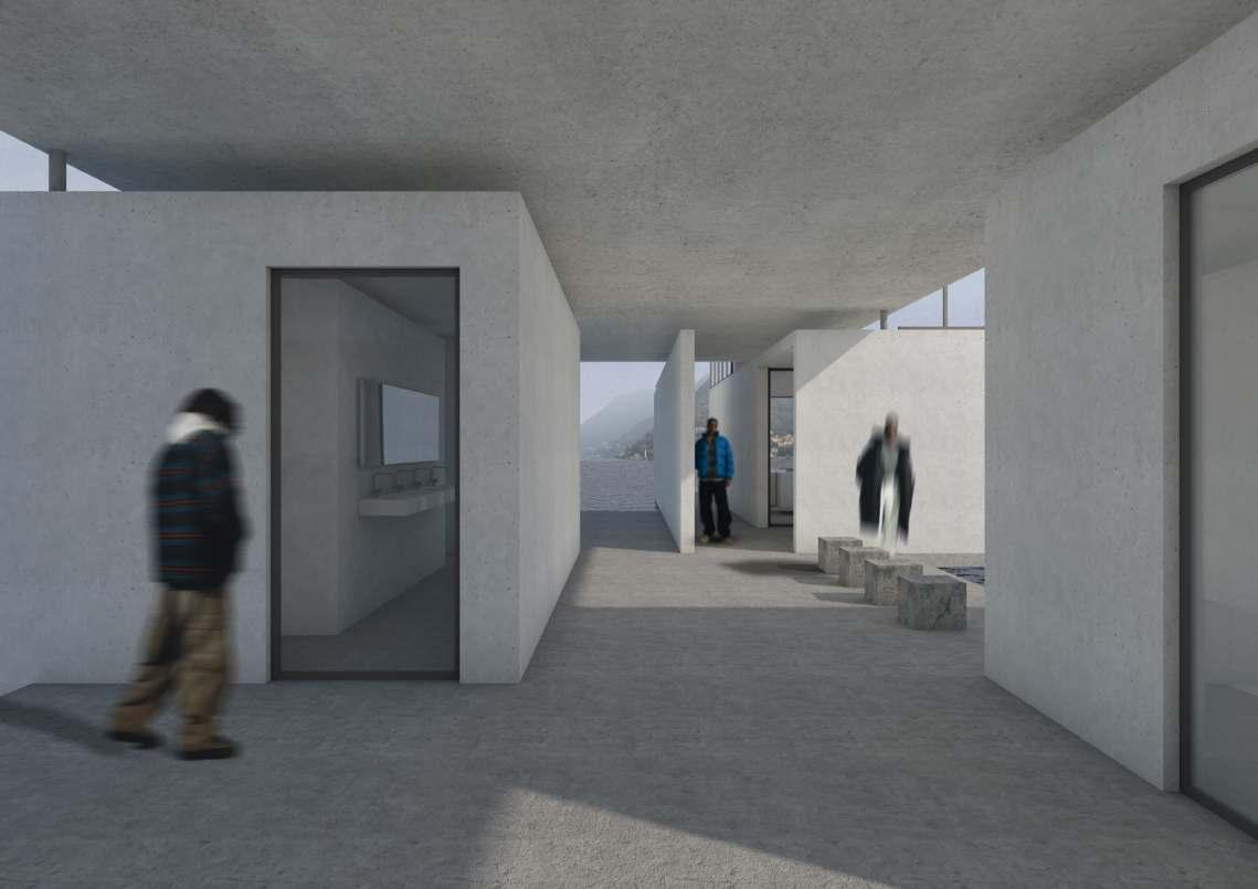
VIEW FROM THE ENTRANCE OF THE PAVILION
VIEW OF THE GROUND FLOOR
ROOF PLAN
FIRST PLAN
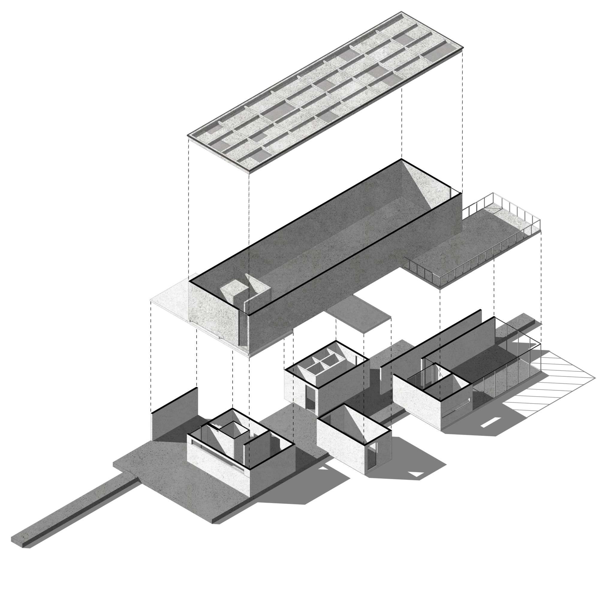
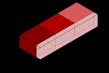
AXONOMETRY EXPLOSION PROJECT’S LAYERS
GROUND PLAN
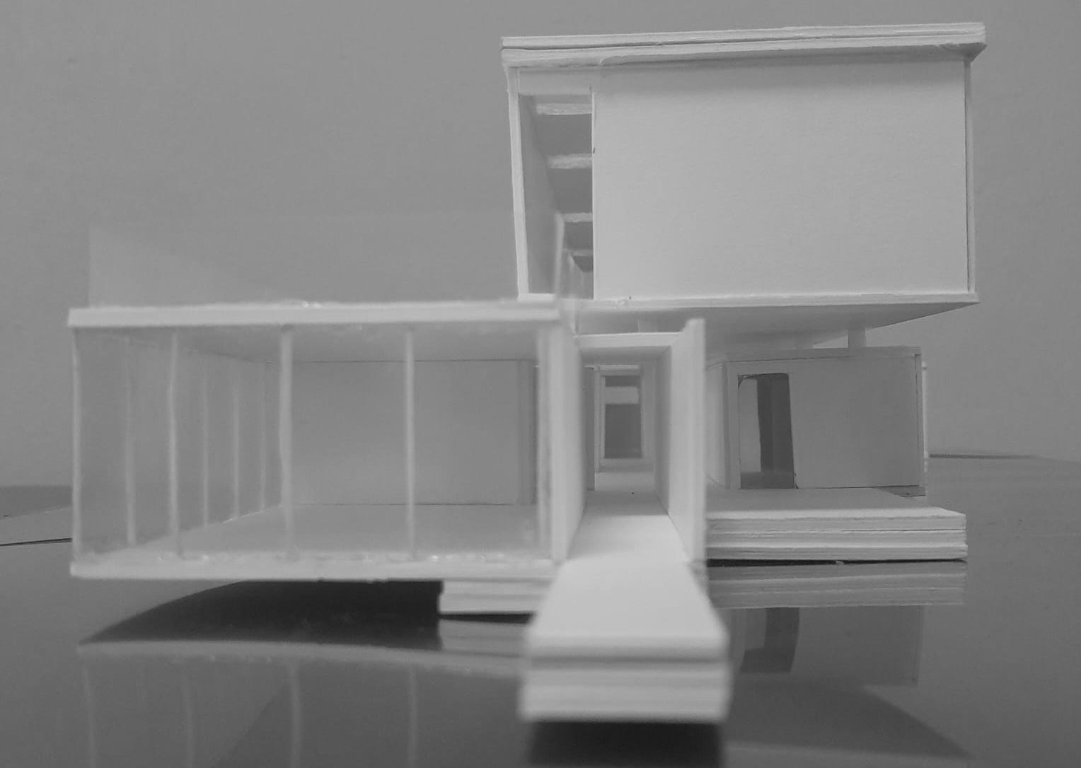
STRUCTURE OF THE FLOATING PAVILION DETAIL OF THE PROJECT
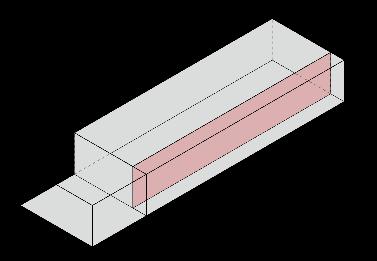
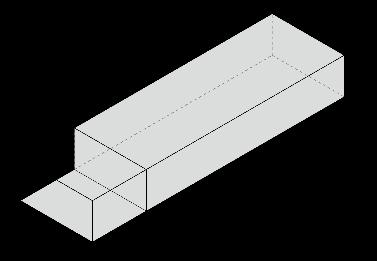
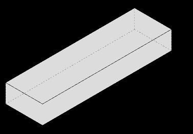
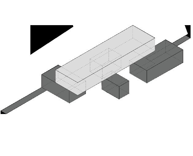
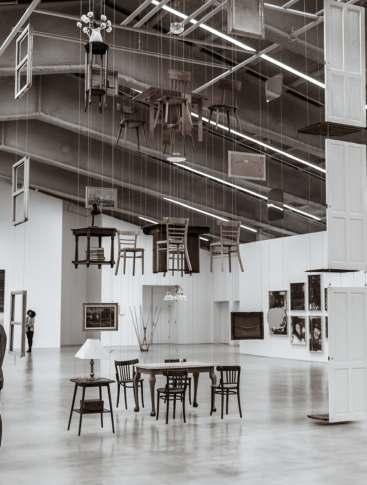
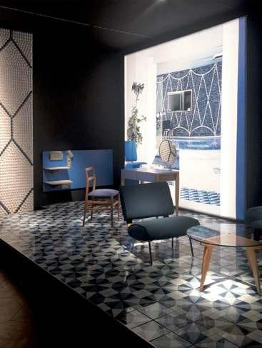
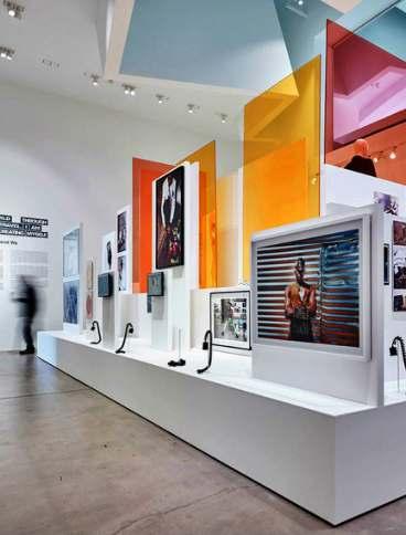






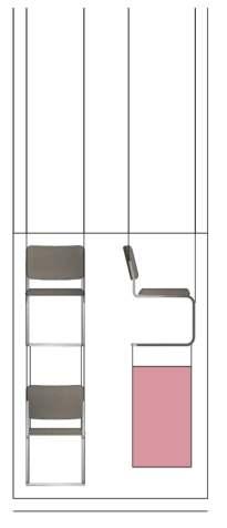


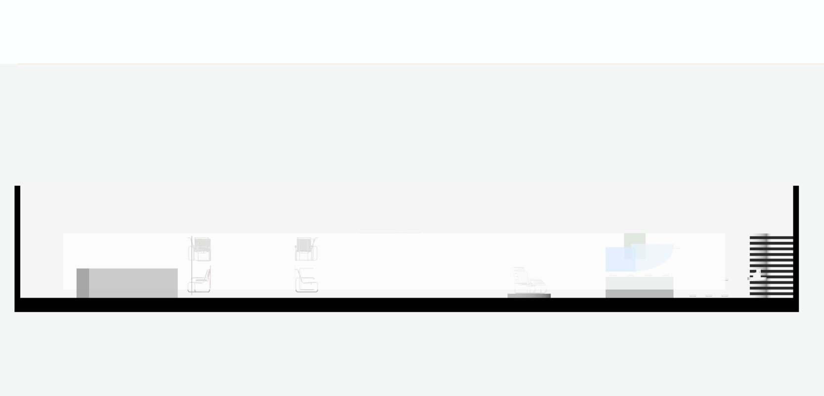






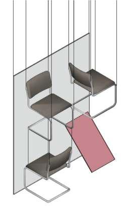


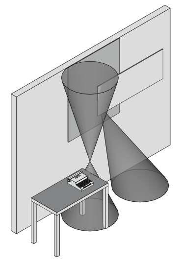


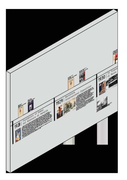
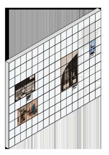


1 2 3 4 ARCHITECTURE WITHOUT ARCHITECTS DAMIÁN ORTEGA, 2010. LOCATIONS VARIABLE MAKING AFRICA A CONTINENT OF CONTEMPORARY DESIGN VITRA DESIGN MUSEUM, 14.03 13.09.2015 REFERENCES COPOSITIONAL SCHEME a c d e g h k 1 2 3 4 ESC 1:100 b L’ L EXPOSITION PLAN 1. THE COLUMBUS FURNITURE A. 34E, MARCEL BREUER, 1933. B. 1FA, ERCOLE FACCIOLI, 1933. C. 195PA, GIUSEPPE PAGANO, 1934. D. SELF SPRUNG CHAIR, GIUSEPPE TERRAGNI, 1936. 2 THE DESIGN EXHIBITIONS E. GERMAN SECTION, WERKBUND PARIS, 1930. F. CASA DI UN ARTISTA SUL LAGO, V TRIENNALE DI MILANO, GRUPPO COMO 1933. G. SALA DI ATESSA PER LO STUDIO DI UN MEDICO, BOTTONI & PUCCI, VI TRIENNALE DI MILANO, 1936. 3 THE STORES, PRODUCT DISPLAY H. OLIVETTI VITRINE, XANTY SCHAWINSKY, 1935. OLIVETTI VITRINE, SINISGALLY & PINTORI, 1938. J. LAGOMARSINO STORE, BIANCHETTI & PEA, 1942. K. LAGOMARSINO STORE, BI VANCHETTI PEA, 1942. 4. THE GRAPHIC TIMELINE L. VARIOUS ARTISTS AND DATES HARMONY IN FORM: TRACING THE BAUHAUS INFLUENCE ON PRE-WWII ITALIAN DESIGN EXHIBITION TOUR ESC 1:100 L’ COMPLETE ESC 1:100 IC ARCHITECTURAL DESIGN AND HISTORY Chiara Baglione, Matteo Moscatelli Giorgia Concato, Fabio Marino, Simone Milani P.04 GROUP 5 Edoardo Sartori, Abuhay Yared Dessalegn, Pedro Pablo Perea, Nicolàs Serrano Serrano, Liu Wanxin EXHIBITION DESIGN 57 12 PAVILION EXPOSITION PLAN YLIC BACKDROP STEEL SUSPENSION CABLES SUSPENDED EXHIBITION PANEL ORIGINAL PICTURES STEEL TUBE CHAIRS PAINTED WHITE BASE PLATFORM ESC 1:50 34E STEEL SUSPENSION CABLES FROSTED TRANSLUCENT ACRYLIC BACKDROP ORIGINAL STEEL TUBE FURNITURE COLOR TINTED ACRYLIC INFO PANEL ESC 1:50 b FREESTANDING EXHIBITION PANEL HIGHLY ACCURATE STOREFRONT REPRODUCTION BASE PLATFORM ESC 1:50 CONCRETE WALL ORIGINAL BOOKS/MAGAZINES ADHESIVE VINIL PRINT ORIGINAL POSTERS ESC 1:50 L SUSPENDED GRID ACRYLIC PANEL ORIGINAL POSTERS/ISSUES ESC 1:50 L’


1933 V

The 5th triennale opened in may 1933 in the new milanese premises of the palazzo dell’arte, designed by Giovanni Muzio. Architecture is the protagonist with an exhibition dedicated to modern european architecture and italian rationalism, recognised by the regime as the country’s technical and cultural avant-garde.
The exhibition of decorative arts sees the participation, with wall paintings, mosaics and plastic works, of major italian artists including Massimo Campigli, Carlo Carrà, Felice Casorati, Giorgio de Chirico and Achille Funi, coordinated by Mario Sironi.
The first Milan triennale marked the beginning of a fortunate relationship with sempione park, where forty temporary constructions of an experimental nature were created, designed by famous italian architects including Figini and Pollini, Giuseppe Terragni, Piero Portaluppi, Pietro Lingeri, the BBPR group and Piero Bottoni.


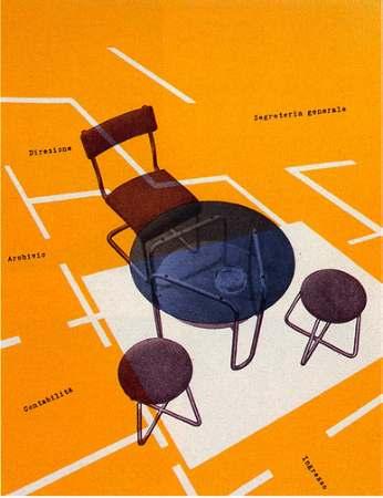






1936 VI TRIENNALE DI MILANO
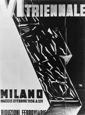
The programme of the edition, defined by edoardo persico and giuseppe pagano, sees the link between the fascist regime and modernist architecture consolidated.
Pagano designed the outdoor pavilion, destroyed by bombing during the second world war, and a glass-concrete tower that serves as the entrance to the exhibition.
Parco Sempione hosts an open-air cinema-theatre and the fountain by Mario Radice and Cesare Cattaneo. foreign presences are valuable with the french section curated by le corbusier, the finnish section by alvar aalto and the swiss section by Max Bill. The pride of this edition are the international urban planning exhibition, the exhibition of building systems and the exhibition of ancient goldsmiths with an installation by franco Albini.
The dynamic relationship between ancient symbolism and modern form was pursued in numerous installations at successive triennials, such as the 1936 sala d’onore designed by Edoardo Persico, Marcello Nizzoli, and Giancarlo Palanti with the sculptor Lucio Fontana. although ephemeral, these installations were significant in their propagation of images that reconciled the ancient and the modern.
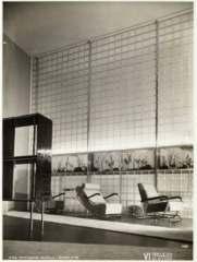
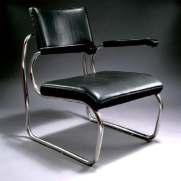


1942 E42/ESPOSIZIONE UNIVERSALE DI ROMA
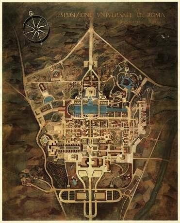
The last great fascist initiative in architecture and urban planning concentrated on a world’s fair for 1941, thirty years after rome’s first hosting.
The exposition of 1942, or “e42,” was designed to avoid the usual commercial features and focus on elevated spiritual issues such as the progress of humanity.
“The olympics of civilization, yesterday, today and tomorrow” was the theme adopted by the exposition’s general commissioner,Vittorio Cini. Marcello Piacentini was commissioned by cini in 1936 to lay out e42.















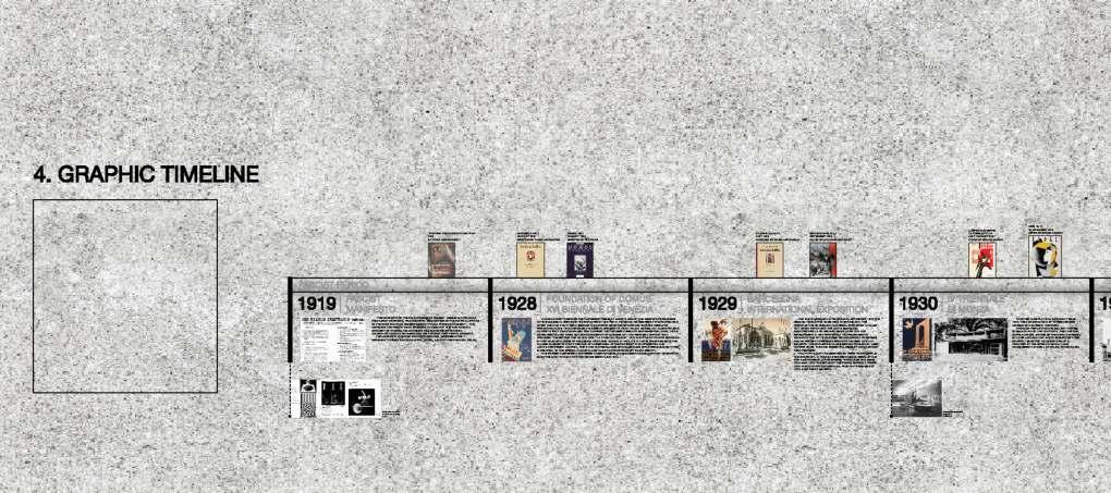
Chiara Baglione, Matteo Moscatelli Giorgia Concato, Fabio Marino, Simone Milani P.04 Edoardo Sartori, Abuhay Yared Dessalegn, Pedro Pablo Perea, Nicolàs Serrano Serrano, Liu Wanxin 57 12 PAVILION HARMONY IN FORM: TRACING THE BAUHAUS INFLUENCE ON PRE-WWII ITALIAN DESIGN THE TIMELINE THE GRAPHIC GRID 1928 1929 1930 1932 1934 1935 1936 1937 1938 1939 1940 1942 1945 1919 FOUNDATION OF DOMUS XVI BIENNALE DI VENEZIA BARCELONA INTERNATIONAL EXPOSITION IV TRIENNALE DI MONZA MOSTRA DELLA RIVOLUZIONE FASCISTA ITALIAN AERONAUTICAL EXHIBITION VI TRIENNALE DI MILANO WORLD EXPO 1937 PARIS ITALIAN TROOPS SEIZED ETHIOPIA ITALIAN RACIAL LAWS 1939 NEW YORK WORLD'S FAIR ITALY'S ENTRY INTO WORLD WAR E42 ESPOSIZIONE UNIVERSALE DI ROMA FASCIST MANIFESTO WORLD WAR PERIOD POST-WAR PERIOD FASCIST PERIOD LONG-LIVED DESIGN JOURNAL, PONTI AND HIS NEOCLASSICIST COLLEAGUES EXPLORED BUILDING TYPES DER ROHE, THE QUINTESSENTIAL PIECE 20TH-CENTURY GRUPPO (ELECTRIC HOUSE GROUP ONES THAT, ENLIGHTENED OUR MARTYRS AND HEROES, THEY MAY THROUGH PIACENTINI’S AGENCY, AVANT-GARDE MOVEMENT WAS GIVEN ACHILLE FUNI, COORDINATED MARIO SIRONI. THE FIRST MILAN TRIENNALE MARKED BEGINNING EXPERIMENTAL NATURE WERE CREATED, DESIGNED FAMOUS ITALIAN ARCHITECTS INCLUDING FIGINI ROOM: NOTHING STANDING THE GROUND, WALLS LINED WITH SILVERED CANVAS MOVEMENT GAVE WAY MORE RESOLUTE, CONSERVATIVE TREND EDOARDO PERSICO, MARCELLO NIZZOLI, AND GIANCARLO PALANTI WITH THE SCULPTOR LUCIO FONTANA. TERRACES, COURTS GALLERIES, THE TOWER FORM, CLASSICAL ITALIAN COLONIAL EMPIRE (1923–1947). THE RACIAL LAWS DENIED ROGERS AND REMAINED DOUBT FOR LONG TIME BETWEEN DIFFERENT, SOMETIMES CONFLICTING REPUDIATE HIS SUFFOCATING ALLIANCE, DESIRE FOR TACTICAL AND STRATEGIC
TRIENNALE DI MILANO
the 1930s there was always room for the modern design. The triennale, transferred in 1933 from Monza to a permanent pavilion in Milan built by Muzio, reained an influential domain for the development of a viable language of rationalist architecture.
Throughout
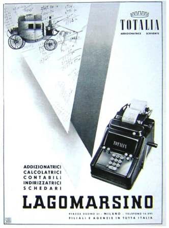
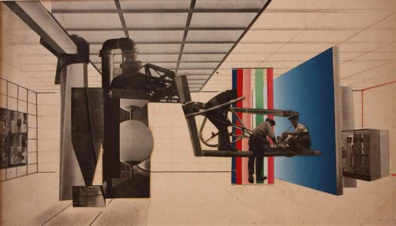
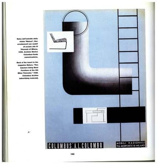
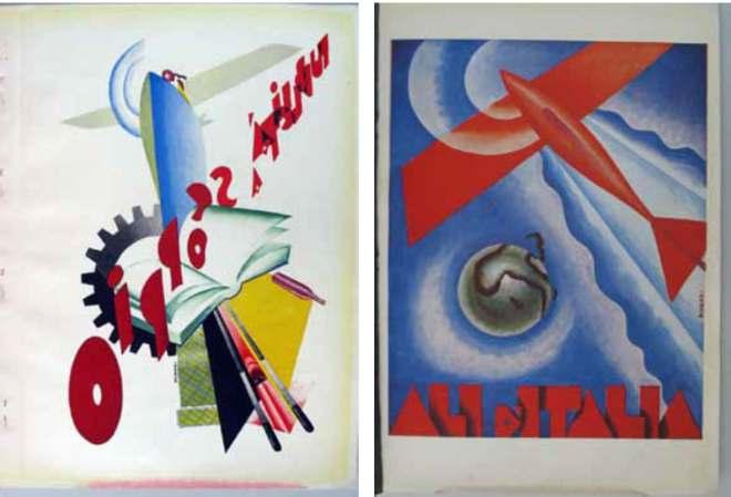
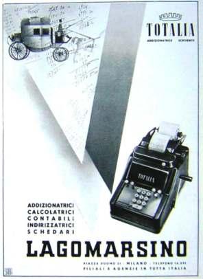
Manifesti pubblicitari. Lagomarsino, Anni 40’ Manifesto per Kardex. R. muratore, 1940 Schizzi progettuali per mostra dei coloranti acna nel padiglione montecatini. Fiera Campionaria di Milano Bianchetti & Nizzoli, VI triennale di Milano. Columbus Archive, 1936
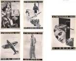
Viaggio Nello Spazio. Bruno Munari, 1932 Advertising plates from programma almanacco dell’italia veloce. Milan: Edizioni Metropoli, 1930
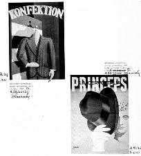
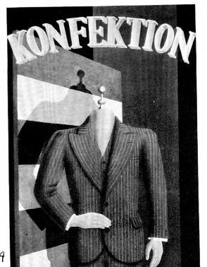
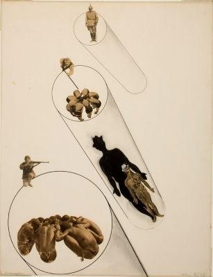
Poster advertising men’s cloths. Alexander Schawinsky, 1928 In the name of the law. Lazlo Moholy-Nagy, 1927
57 12 Pavilion
Via Per Cernobbio 21, 20100
Como CO
T+34 3101000100 5712pavilion.it
Opening hours
Orari di apertura
Tues-Sat 10-18 oclock
Mar-Sab 10-18
Mon closed
Lun chiuso
Sun 10-20 oclock
Dom 10-20
Closed on public holidays
Chiuso nei giorni festivi
Admission
Ammissione
Adults Adulti
Reduced ridotto
Children (6-18 years)
Bambini (6-18 anni)
Families Famiglie Groups Gruppi
Guided Tour Visite Guidate
Wed-Sun 14-16 pm
Mer-dom 14-16 pm
To book guided tours for groups and schools please contact Per prenotare visite guidate per gruppi e scuole si prega di contattare tours@5712pavilion.it


tracing the bauhaus influence on pre-wwii italian design
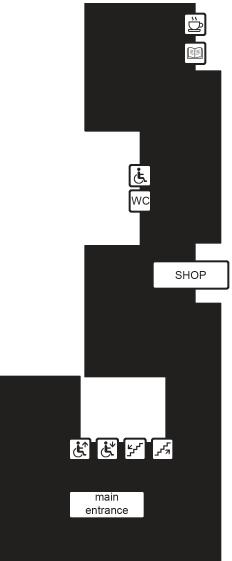

P P Parking lot B B B Bus station ViaTriulzioBelgioioso ViaPer Cernobbio 57 12 Pavilion Fondazione Antonio Ratti Via Bignanico
BY: PAVILION MAP: GROUND FLOOR harmony in form 13.09.2023 - 01.02.2024
SPONSORED
Columbus furniture
FLOOR
1.
The
FIRST
Design exhibitions
2.
The
Stores, product display
3.
The
Graphic Timeline
4. The
FRONT INTERNAL 1 INTERNAL 2
BACK
3. THE STORES, PRODUCT DISPLAY
The collaboration between widely known brands and recognizable architects and designers was one of the most fruitful partnerships that were seen in the decades of the 30’s and 40’s. Not only the modern architecture and design influenced the design of the factories, headquarters and residences of the workers, as seen in Ivrea with Figini & Pollini, it also laid the road for the creative minds to experiment with all the studies related to materials, lighting and color coming from the Bauhaus workshops being widely published in international expositions.
The result was one of the most varied and creative array of interior design and product displays by the big names in all types of consumer goods industries.
Starting as now is usual from the Bauhaus, maybe the most comprehensive collection of what was being produced and studied in this school of art and design was the MoMa exposition of 1938 titled “Bauhaus: 1919-1928” in which an extensive collection of works came to light to the international press. This event also works as a starting point to make hypotheses of where may have some of the Italian architects taken their inspiration from.
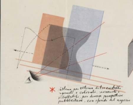
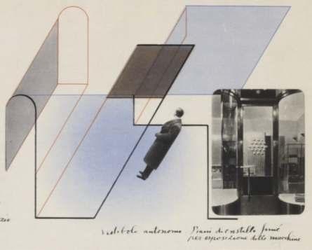
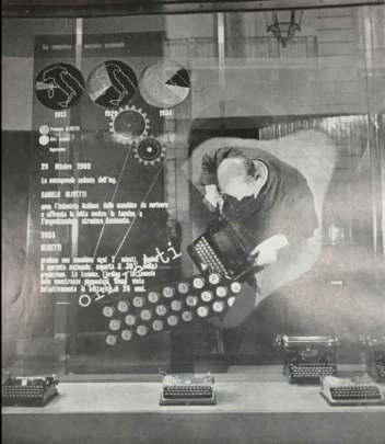
Starting from the applied concept of transparency in a storefront we have the display by Alexander Schawinsky for a Olivetti store in Torino in 1935. The Swiss designer, alumnus of the Bauhaus himself used this approach as main concept for one of the displays at the store with variability on his mind, in his own words:
“Showcase system of three shaped and colored sliding and folding crystals, for different advertising perspectives, with shop backgrounds.”
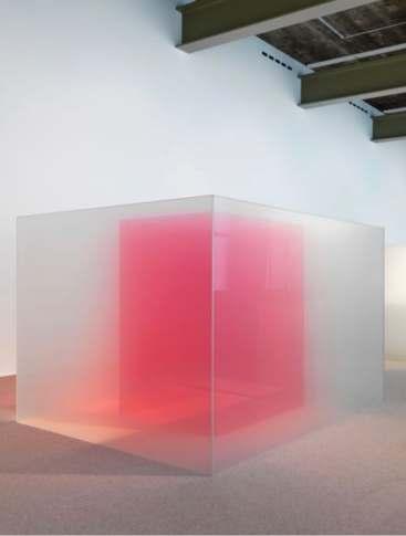
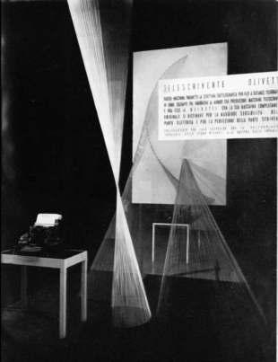
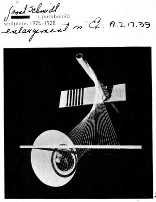
The second concept worth to me mentioned is the use of hyperbolic paraboloids made with threads for creating translucent volumes for a Olivetti storefront in Galleria Vittorio Emanuele, Milano in1938. The design was executed by Leonardo Sinisgalli & Giovanni Pintori. Experiments like this one were performed in the sculpture lab of the Bauhaus as early as 1926.
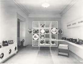
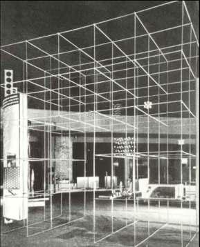
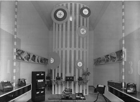
The installation in the Lagormarsino Apuania store in 1942 by Bianchetti & Pea comprises of a 4x4 white grid within which the machines and pictures are exhibited, thus changing the concept of a simple shelve, to a whole compositional element, protagonist of the store. Solutions like this one were previously explored by Gropius himself in multiple exhibitions in the 30’s and also presented by various Italian architects in the fairs an expositions of their country.
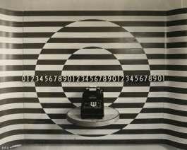
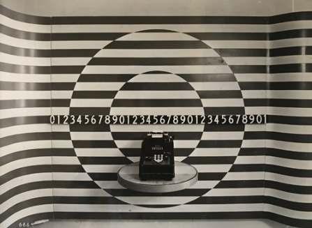
The store in Salerno in 1942 also by Bianchetti & Pea combines the conventional numbers present in the calculators of the store with the bold black and white patterns and work as a contrasting and eye catching backdrop for advertising these products.
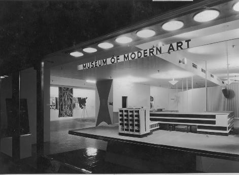
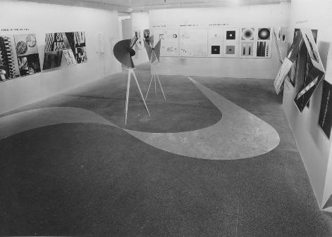
 Pictures of part of the exposition Bauhaus1919-1928, MoMa, 1938. Taken from the MoMa website.
Olivetti Torino store project, 1935. by Alexander Schawinsky
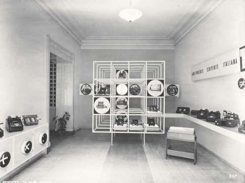
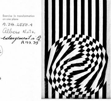
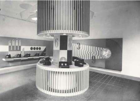
Apuania era dominato dalla presenza di una griglia tridimensionale per il display delle macchine calcolatrici, analoga a quella già proposta da Bianchetti e Pea nei progetti per il negozio Olivetti, ispirata all’allestimento creato da Gropius, in collaborazione con Joost Schmidt, per la sezione dei metalli non ferrosi alla mostra DeutschesVolk-Deutsche Arbeit di Berlino del 1934. Nel negozio di Foggia una composizione grafica, formata dall’incrocio di linee chiare e scure verticali e orizzontali e da cerchi concentrici ruotati uno rispetto all’altro, richiamava gli studi geometrici svolti nel corso preliminare di Josef Albers53 . Un’altra possibile fonte di suggestioni e idee – in particolare per le aste colorate a strisce nei negozi di Pisa, di Foggia e di Padova – si può individuare nella sala della Svizzera allestita da Max Bill allaVITriennale del 1936, un episodio che aveva suscitato all’epoca un notevole interesse54 . Masipossonocoglierealtririmandiadallestimentitemporanei,bastipensareaivolumicilindricialistelli nel negozio di Ancona che riprendevano la soluzione adottata da Bianchetti e Pea nel padiglione dell’Italviscosa alla fiera di Milano del 1940, o ai pannelli del punto vendita di Biella, giocati sul tema formale dellagrigliaedeirettangoli,cheevocavanocomposizionianalogheconcepiteinpiùoccasionidaNizzoli. Non mancavano immagini utilizzate anche nella pubblicità a stampa, come l’ingrandimento del rotolo di carta della addizionatrice svolto sulle pareti e sul soffitto nel negozio di Cremona, o la rosa dei venti in quello di Caserta, mentre in altri casi le figure evocavano il luogo sede del negozio, come il timone utilizzato a Salerno o la stilizzazione di motivi “navali” e “lagunari” adottati nello spazio commerciale di Venezia con risultati piuttosto naïves55 .
Èpurverochenellaprospettivadiprogettoacolori,pubblicatasempredaZveteremichsullepaginedi“Domus”, quell’ambiente appariva più elegante e rarefatto rispetto alla soluzione realizzata. I progettisti – recitavalalungadidascalia–avevanocreatouna«scenografia»,«unasintesideglielementipiùpittoreschidi Venezia»,prolungandoedesaltandoinmodooriginale,«comeinunteatroaccesoetrasfigurato,l’incanto elaquintessenzadellospiritoartisticodiunacittàgloriosa»,peresporrelemacchineLagomarsinoinuna «concentrata realtà magica»56 . Nelvolumedel1949BianchettiePeaalternavanoleimmaginideiloronegoziperlaLagomarsinoaquelle dialcunipuntivenditaprogettatidaBernasconiperlaOlivetti,forseperproporreunpossibileconfronto tralastrategiaadottatadall’aziendadiIvrea–basatasullacreazionedinegozi«eleganti»e«lussuosi»(così è definito dai due progettisti il punto vendita di Bologna)57 – e quella messa in campo da loro, in accordo con il committente, che puntava invece su una comunicazione pubblicitaria più immediata e “popolare”
by Walter Gropius & Joost Schmidt
 Olivetti Torino display, 1935. by Alexander Schawinsky
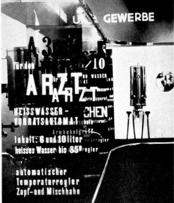
Hot water boilers, gas and water exhibition, Berlin, 1928. by Alexander Schawinsky
Olivetti Galleria Vittorio Emanuele display, 1938. by Leonardo Sinisgalli & Giovanni Pintori.
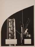
Master checklist, Bauhaus 1919-1928, Moma, 1936.
Lagomarsino store, Apuania, 1942-1943. by Bianchetti & Pea
28
Storia e Futuro / DOI: 10.30682/sef5522b
Fig. 6: angelo Bianchetti, Cesare Pea, negozio lagomarsino a Salerno, 1942 (Fondo angelo Bianchetti, archivio Jan Jacopo Bianchetti, Canzo).
Fig. 7: angelo Bianchetti, Cesare Pea, negozio lagomarsino ad ancona, 1942 (da Bianchetti, Pea 1949).
Lagomarsino store, Salerno, 1942-1943. by Bianchetti & Pea
Master checklist, Bauhaus 1919-1928, Moma, 1936.
Exhibition of non-ferrous metals, Berlin 1934.

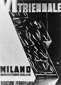
 V Triennale di Milano Poster, 1933.
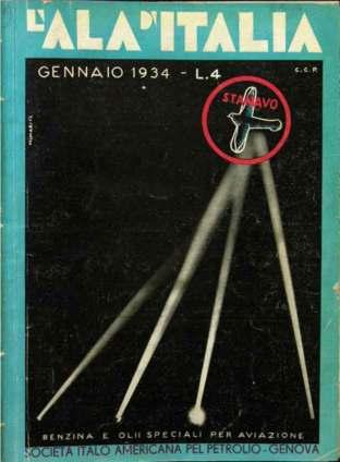
L’Ala d’Italia, January 1934. Cover by Bruno Munari
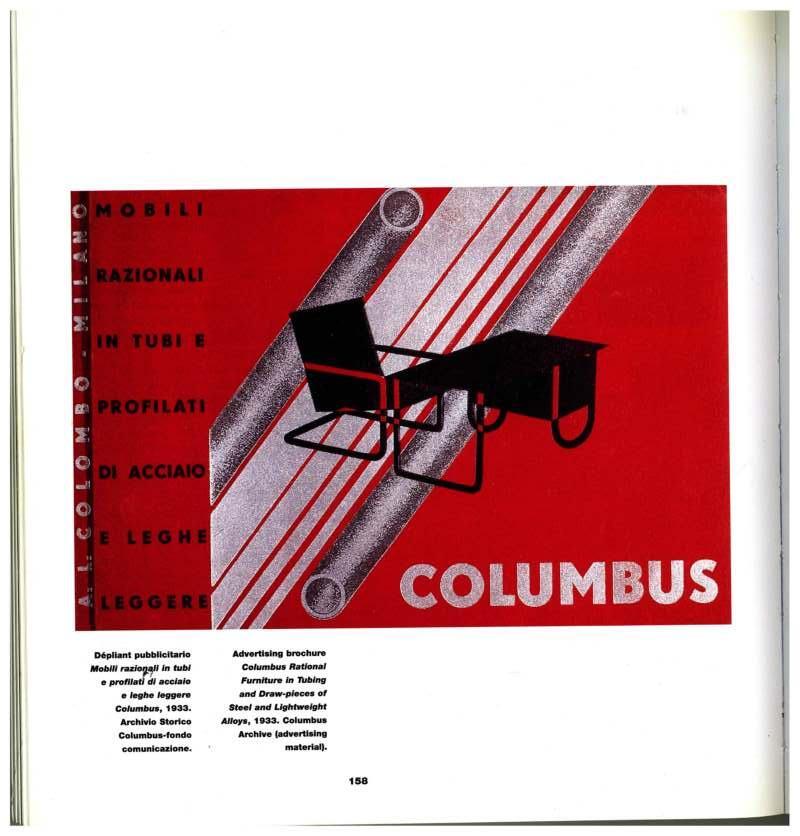
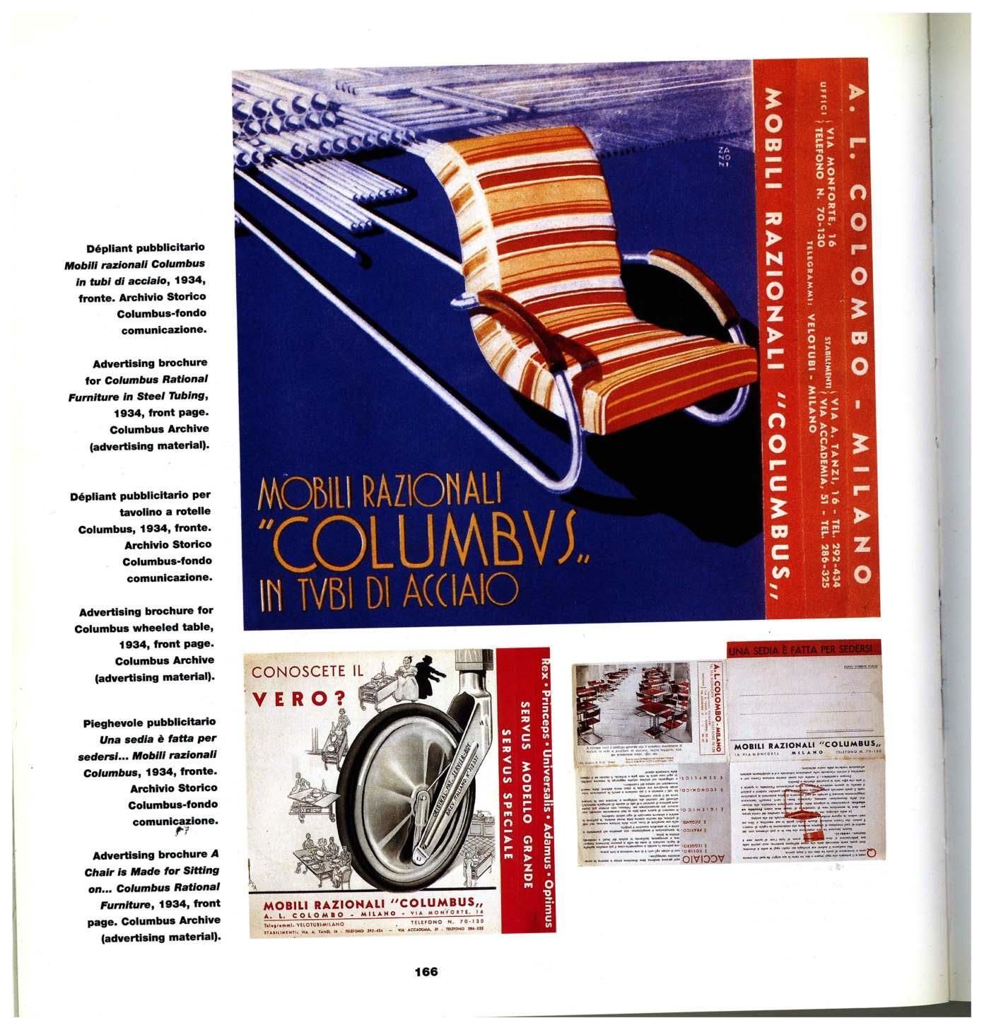
Advertisement brochure, Columbus, 1934. Columbus historical archive.
Manifesto per Kardex, 1940. Cover by R. Muratore.
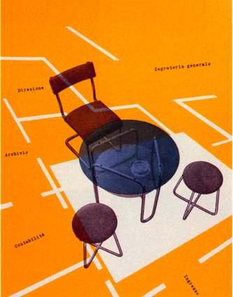
Advertisement, Lagormasino, 1940.


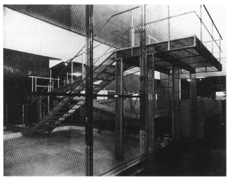

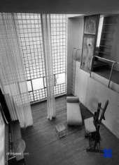
 German Section, Werkbund Exhibition, Paris 1930. Metal viewing bridge over swimming bath, designed by Walter Gropius with furniture by Marcel Breuer.
German Section, Werkbund Exhibition, Paris 1930. Communal areas of a multi-storey collective apartment block,designed by Walter Gropius with furniture by Marcel Breuer.
Angelo Bianchetti, Cesare Pea, negozio lagomarsino ad ancona, 1942 (da Bianchetti, Pea 1949).
Angelo Bianchetti, Cesare Pea, negozio lagomarsino a Padova 1941 (Fondo angelo Bianchetti, archivio Jan Jacopo Bian- chetti, Canzo).
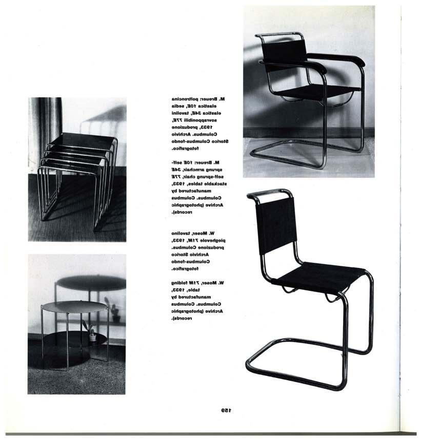

 1FA, Ercole Faccioli, 1933. Columbus archive
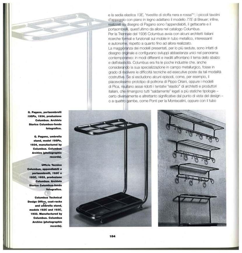
195PA, Giuseppe Pagano, 1934. Columbus archive
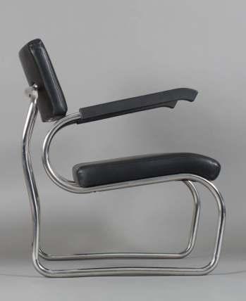
Sant’Elia armchair, Giuseppe Terragni, 1936. Zanotta.
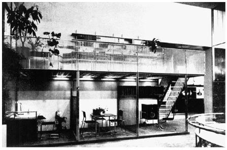
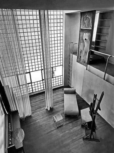
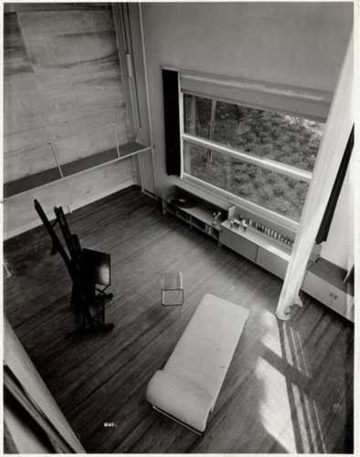
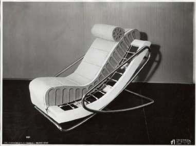
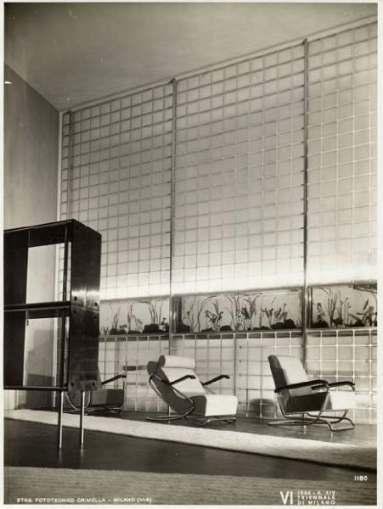 German Section, Werkbund Exhibition, Paris 1930. Mezzanine gallery, designed by Walter Gropius with furniture by Marcel Breuer.
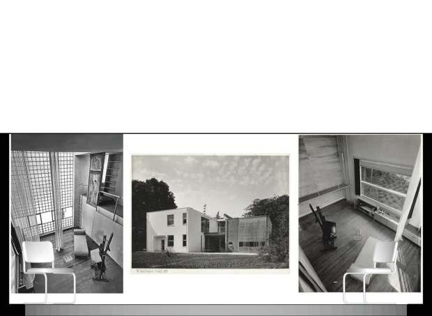
vvv V Triennale di Milano 1933. Designed by Giuseppe Terragni
Casa per un artista sul lago di Como, V Triennale di Milano 1933. Designed by Giuseppe Terragni
Cross-frame armchair with elastic suspension and foam padding by Columbus for the Sala di attesa per lo studio di un medico, VI Triennale di Milano, 1936.
Sala di attesa per lo studio di un medico , VI Triennale di Milano, 1936.
Piero Bottoni & Mario Pucci


 Pictures of part of the exposition Bauhaus1919-1928, MoMa, 1938. Taken from the MoMa website.
Olivetti Torino store project, 1935. by Alexander Schawinsky


 Olivetti Torino display, 1935. by Alexander Schawinsky
Hot water boilers, gas and water exhibition, Berlin, 1928. by Alexander Schawinsky
Olivetti Galleria Vittorio Emanuele display, 1938. by Leonardo Sinisgalli & Giovanni Pintori.
Master checklist, Bauhaus 1919-1928, Moma, 1936.
Lagomarsino store, Apuania, 1942-1943. by Bianchetti & Pea
28
Storia e Futuro / DOI: 10.30682/sef5522b
Fig. 6: angelo Bianchetti, Cesare Pea, negozio lagomarsino a Salerno, 1942 (Fondo angelo Bianchetti, archivio Jan Jacopo Bianchetti, Canzo).
Fig. 7: angelo Bianchetti, Cesare Pea, negozio lagomarsino ad ancona, 1942 (da Bianchetti, Pea 1949).
Lagomarsino store, Salerno, 1942-1943. by Bianchetti & Pea
Master checklist, Bauhaus 1919-1928, Moma, 1936.
Exhibition of non-ferrous metals, Berlin 1934.


 V Triennale di Milano Poster, 1933.
L’Ala d’Italia, January 1934. Cover by Bruno Munari
Advertisement brochure, Columbus, 1934. Columbus historical archive.
Manifesto per Kardex, 1940. Cover by R. Muratore.
Advertisement, Lagormasino, 1940.
