Interiors 2023
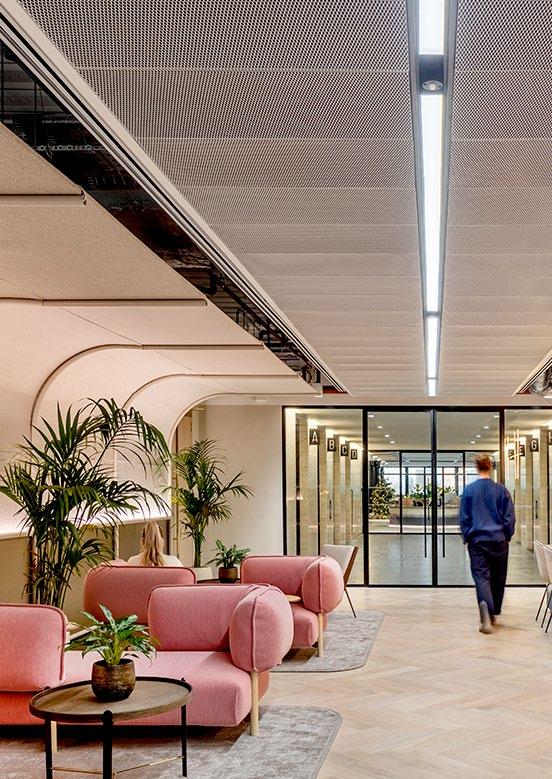
Since 1935, we’ve believed that design has the power to make the world a better, more beautiful place.
Who we are


Since 1935, we’ve believed that design has the power to make the world a better, more beautiful place.

London has long been considered the design capital of the world, and our studio is perfectly placed in the heart of the action. Sitting at the boundary between the fastpaced City of London and the eclectic melting pot of the East, our studio is a microcosm of the city itself. We bring the energy and flair of London through our doors—it’s a place where diversity thrives, collaboration is key, and design excellence leads the way.
In 2019, award winning architecture firm Penoyre & Prasad joined Perkns&Will as a studio of the London office. We also collaborate with our sister company, branding and experience design studio Portland


You see work everywhere and our people love having spaces to collaborate, think and create. →


The model shop is located in the visitor area behind a fully glazed wall, exposing and showcasing our design processes through the use of physical modelmaking.

“We are curious, experimental and we place research and knowledge sharing at the heart of our design practice. We believe true, meaningful innovation is achieved when the power of imagination is combined with robust technical expertise, in depth knowledge and the support of the latest technologies.”
― MIJAIL GUTIERREZ, PRINCIPAL








 Richard Jordan Principal Linzi Cassels Principal, Design Director
Jason Turner Associate Principal
Siobhan O’Leary Associate Principal
Simon Bone Associate Principal
Jo Wright Principal, Managing Director
Dave Halpenny Senior Associate
Mehmet Ermiya, Senior Associate








 Mijail Gutierrez Principal
Natalie Smith Principal, Workplace Strategy
Adam Strudwick Principal
Elena Panagiotidis Associate Principal
Joelle Laney Senior Associate
Caterina Onorati Senior Associate
Aleks Romiszewski Senior Associate
Erik Svensson Senior Associate
“Curiosity drives my constant pursuit for innovation and the exploration of ideas that lead to the design of purposeful and inclusive environments.”
MIJAIL GUTIERREZ, PRINCIPAL
Client: EBRD Size:358,000 square feet


Completion Date: 2022
Sustainability: On target for WELL Platinum & BREEAM Outstanding
The Vision for 5 Bank Street was to co-create and deliver a best-in-class working environment for our client’s new headquarters.With an emphasis on wellbeing, sustainability, diversity and inclusion, and community from the outset, the design fosters a culture of choice, collaboration, and innovation. The new workspace is functional and flexible, supporting the business and employees’ needs ina fair and transparent manner.
Moving its headquarters to a new location allowed the EBRD to approach its workplace with a fresh mindset that reflects a paradigm shift towards sustainability, wellbeing and social responsibility; a shift driven by huge global changes the business experienced during a nearly 30-year tenure in its former building and the enormous social shifts turbocharged by the pandemic
Above: Craftmanship and nature. Left: The beggining of the journeyThroughout EBRD’s new workplace, the design seeks to connect occupants with nature, and uses many elements of biophilic design to enhance their wellbeing. Natural materials, patterns of nature, and geographical references to the sweeping curves of the Thames in joinery details are employed. In addition, there are over 3000 trees and plants throughout the building. Reflecting the idea of a pathway through nature, the staircase is lined with continuous timber panelling, curving around a single, centrally placed tree. Workplace floors foster a culture of choice, collaboration and innovation. Signage and environmental graphics reflect organic shapes and the movement of water.


The design and construction phase of the fit-out prioritised sourcing responsible materials, with an emphasis on circularity and reduced emissions. The aim is for the development to be a net zero carbon fit-out, as a part of the Bank’s firmwide offsetting strategy. The design of the building retains a strong focus on performance not just in terms of energy and whole life carbon, but also with regards to air, water, acoustics and lighting quality which will be continually verified in the operational facility.
Client: Tik Tok
Size: 94,141 square feet
Completion Date: 2022
Sustainability: ™ Gold, WELL Certified ™
The vision of the first TikTok home in London was to create an authentic, energetic, and inclusive workplace destination that unlocks the creative force of its people and the imagination, embraces innovation, instills a sense of pride, and celebrates its mission to inspire creativity and bring joy.

Nearly 80% of the London staff was hired during lockdown and the company’s vision was to create a space that can be a real magnet for their staff, a space that will be responsive, dynamic and adventurous, a home of bubbling creativity with the music at heart.
The brand is expressed from the shopfront with the full height expressive and colourful curtains that wrap the facade, made from overlapping shapes of the Tik Tok logo which is an integral part of the brands identity. The brand is also expressed on the core with the support of local artists who create murals to reflect the energy of TikTok and becomes muted and calming as you move deep into the focus spaces of the floorplate.
Above: The Ground Floor Entrance
Left: The Kaleidoscope office


The purpose of the Kaleidoscope office is to create the first physical community hub, an authentic, energetic, and inclusive workplace destination for TikTok. A home for the creative, the curious and the visionary. And a fantastic, healthy place to work, learn and play.

Clockwise from Top Left: An agile environment that supports different workstyles with the right settings in close proximity. ‘Creator’s Lounge’ at the Ground Floor with large suspended installation inspired by ballpits. An inclusive environment with sustainable materials.

The wellness rooms have a calming colour palette made up of natural materials. The curtains and blinds help to create a private space and provide visual and acoustic separation from the surroundings. Enclosed eeting spaces are cladded with fabric with solid colours – there is no use of bold or busy patterns that may cause visual stimulation to neurodiverse population. The colour palette on the open plan spaces where employees will do focused or collaborative work is muted and consists of lighter tones with complementary pastel tones of green, red, blue. In addition to that, there are no strong reflections or bright, bold colours that can be visually difficult to neurodivergent people.

Phone booths and enclosed meeting spaces which hold up to eight people have been designed to be demountable, removeable and all fitted with suitable sound insulation. Acoustic strategies were implemented accessing speech privacy and reverberation to control the noise from train movements and building services.
Indoor air monitors have also been installed in meeting rooms and open plan with the data accessible to all employees.
The signage and wayfinding has all been branded consisting of rounded forms, circles and semi-circle shapes.
The colour scheme of community areas has a balanced portion of the brand colours- black, white and splashes of colour.
Murals inspired by Lodon were commissioned by Tik Tok. This makes the project locally relevant creating big floor landmarks a that make connections to the city.

In celebration of their 10th anniversary, Maven decided to make the move to 155 Bishopsgate and bring together their active trading teams to an office that was welcoming, efficient, and impactful, with adaptable spaces that could be reconfigured to grow with the business. It was their priority that the space reflected the industrial heritage of the area, with a focus on hospitality and creating a new sense of community.

Subsequently, our concept considered the idea of ‘markets’ and how the meaning of the word has evolved in The City over time. Taking inspiration from Spitalfields market, and other traditional market planning principles, a grid was created that allowed for flexibility within a given space, and created active pathways with different destinations as people move about the floor. The team was also influenced by the temporary structures of markets, which stimulated ideas of designing for dissassembly, and acknowledgingthe industrial style buildings in the area.

As a trading but also fintech firm, Maven was clear they did not want their new office to look traditional. A series of modular elements that could be added or subtracted as the business evolved over time were created. Three main framing devices can be utilised to create spaces offering various levels of privacy which adapt to the needs of Maven’s teams. This detail echoes the curves of Billingsgate Market by revealing and concealing spaces. The open modular framework can be easily fitted and slot into either solid or fabric panels. The team decided to not use any permanent fixings or welding meaning that the joints are revealed to show how the structure is formed and yet presents as considered and refined


“A modern working environment that puts socialising and hospitality at the heart”Top: Built Meeting Room featuring the open modular framework
Social spaces were very important to Maven in order to create a ‘home away from home’. Gathering spaces include a bar, a fully catered server and lounge. Outdoor spaces were also important, and we designed a beautiful landscaped terrace. Other amenities included a fully kitted gym space which allowed for yoga, peloton and personal training sessions aswell as fully AV integrated. A wellness suite, which can also be adapted to a massage room, mothers room, prayer room were created to make everyone in the office feel welcome and cared for. A games area which included a space to play video games and pin ball machines was another important social space that was aimed to appeal to new recruits and takes care of traders. This energetic space can be transformed to a break out space and training area, where the teams can be inspired to work.
It was important to the design aesthetic that the frames did not appear industrial. The team opted for a polyester powder coating. This can be removed when the frames reach end of life and allows the metal to be reused or recycled.
Maven’s people encouraged us to create a space that was not traditional for a financial or fintech firm. It was important to our client that the look and feel of each space - from the trading floor to the amenity’s areas - had consistent brand messaging throughout. The trading floor has a relaxed and light design, accentuated by the darker and richly appointed social spaces all using materials that can be reused and recycled at the end of their life. The result provided our client a new office with beautiful interactive spaces, that inspires productivity, and stimulates a unified culture.


London, UK
Size:90,000 square feet

Completion Date: 2022

The workspace enables a new way of working that is agile and creative. Removing formality allows staff feel safe to express their ideas.

Client: Arup
Size: 135,000 square feet
Completion Date: 2021
Sustainability:
BREEAM Excellent WELL
Global built environment consultancy Arup’s London team sits across two sites in the city centre. When the lease on one of offices came to an end, the organisation used this as an opportunity to reconsider its London portfolio and rethink how they work in the future.

The new office is located in the 80 Charlotte Street, a new building that Arup delivered engineering services, and is located close to their retained office on Fitzroy Street. Although Arup embarked on this journey prior to the Covid19 outbreak, the pandemic prompted them to reconsider the ways they wanted to work as an organsiation, and ultimately how much space they required.
Of the two spaces, Fitzroy Street is predominantly with allocated seating in a more traditional workspace environment. Complimenting this, 80 Charlotte Street is an unassigned team space, with a wide range of work settings and collaboration areas, which supports the new, agile ways of working employees want in a post-covid world.
The London campus is a space with a unique identity, showcasing the creative, curious and innovative brand.
The user experience of 80 Charlotte Street was a key driver of the design. We wanted to create workplace with a strong ethos, one that was frictionless, highly engineered, focused, accessible. Intuitive, and seamless. There had to be complete equity around the building, from the moment you entered the space to every work setting.
Entering the office on the ground floor, guests are met by a grand by welcoming space, passing by an experimental maker space, an open auditorium, and communal amenities. There is an emphasis on permeability on the journey to the heart of the building, with views to technology, workspace, and designer spaces. Moving around the first floor, there is a more intimate scale, where staff can bring together external guests and teams for meetings and collaboration.
Perkins&Will and Arup worked closely to understand the requirements of the Arup workforce, and create highly engineered space that would suit their varied ways of working.

Pivoting from a ‘me space’ to a ‘we space’ approach, 80 Charlotte Street supports the wider Arup campus with a flexible office that boasts a vast range of different work settings. The ratio of desk space to collaboration space was changed from 60:40 to 70:30 across all floors, with 50% of desks being removed on Level 1. There is also a new focus on long term adaptability, with three quarters of the fit our on each floor plate being able to be disassembled and moved.
We worked with an accessibility consultant on every aspect of the design, to ensure there is complete equity across all spaces and work settings at all scales.
A new lift was introduced alongside the main staircase, so that the arrival experience for those that needed lift access did not differ from the user journey of others. All individual settings are also suitable for DDA access and wheelchair users, so again all staff have the same access and ability to work seamlessly with their teams.
Arup wanted to push the boundaries with smart and sustainable design. 80 Charlotte Street is among the first large-scale allelectric buildings in London, and the office achieved BREEAM Excellent and Well Gold certification. Adaptable design was a key driver on the project, in a concerted effort to drive down embodied carbon. For example, 100% of the task chairs and meeting room chairs were reused or refurbished for the new office. By adopting smart technology throughout, such as people counters, air quality and temperature sensors, environment controls and feedback buttons, and desk user modules, the business can capture data to continually improve the efficiency of the space from both a human and environmental standpoint.


“Our new space at 80 Charlotte Street sets new standards for flexible office spaces and will be looked on as a benchmark in the years to come.”
― TIM CHAPMAN, ARUP LONDON OFFICE LEADER
Perkins&Will and Arup worked collaboratively throughout the process with Arup taking an initial lead on workplace strategy and Perkins&Will supporting the further development and application of the strategy, Perkins&Will also supported Arup in delivering a fully rounded Change Management process throughout the project, into occupation and beyond. Perkins&Will took overall ownership for the interior architecture, finishes and FFE, whilst Arup led the design of key building interventions such as the new structural timber auditorium staircase. The architectural team was complimented by a full Arup consultancy team of MEP, Acoustics, Smart Buildings, IT/AV, Accessibility, Fire Strategy and Project and Cost Management.


Client: Man Group Size: 260,000 square feet
Completion Date: 2021
Asset management company Man Group relocated from its Mayfair premises and consolidated it UK workforce in refurbished premises at Riverbank House in the City of London.

As both tenant and landlord, Man Group not only designed their new office floors, but were also able to direct the look and feel of the building reception and common areas, connecting the brand throughout the building. Inspired by leisure and hospitality spaces, the lobby has a lounge feel with welcoming seating and concierge pods, as well as wooden wall panelling and soft lighting.
Visitors are welcomed at Man Group’s dedicated floors on Level 5, with a reception space and barista offering coffee and refreshments. This floor is also home to a client suite, which, unusually, is open plan with views into the working floors, to help foster an environment of transparency for all those who come into the space, whether guest or employee.

Staff spaces extend across Levels 4 and 6, with a range of work settings and amenities. The business aims for a flat hierarchy, and this is reflected with most of the staff working on open floors. Traditional desking is supplemented with flexible scrum space, break out areas, and a dedicated presentation facility for traders and visitors. Meeting rooms of various sizes are provided, an auditorium with a dedicated AV room, as well as informal cafés and tea points throughout.


Man Group also support their staff beyond the day job, providing areas for wellness and relaxation; including a music room, and model shop; and a wellness suite with gym equipment. A very special campfire room has been created, inspired by a Bedouin tent for teams to gather round a fire pit and connect without technology.
In an effort to reduce the amount of waste produced in the move, much of the existing office was retained from the previous tenants, upgrading only what was needed. Man Group’s branding was added to this throughout all spaces, picked up through the colour palette and bespoke design elements.


 Clockwise from Top Left: Scrum space; modelshop; campfire room..
Man

London, United Kingdom
Client: WarnerMedia
Size: 115,000 square feet
Completion Date: January 2020
Sustainability: BREEAM Excellent
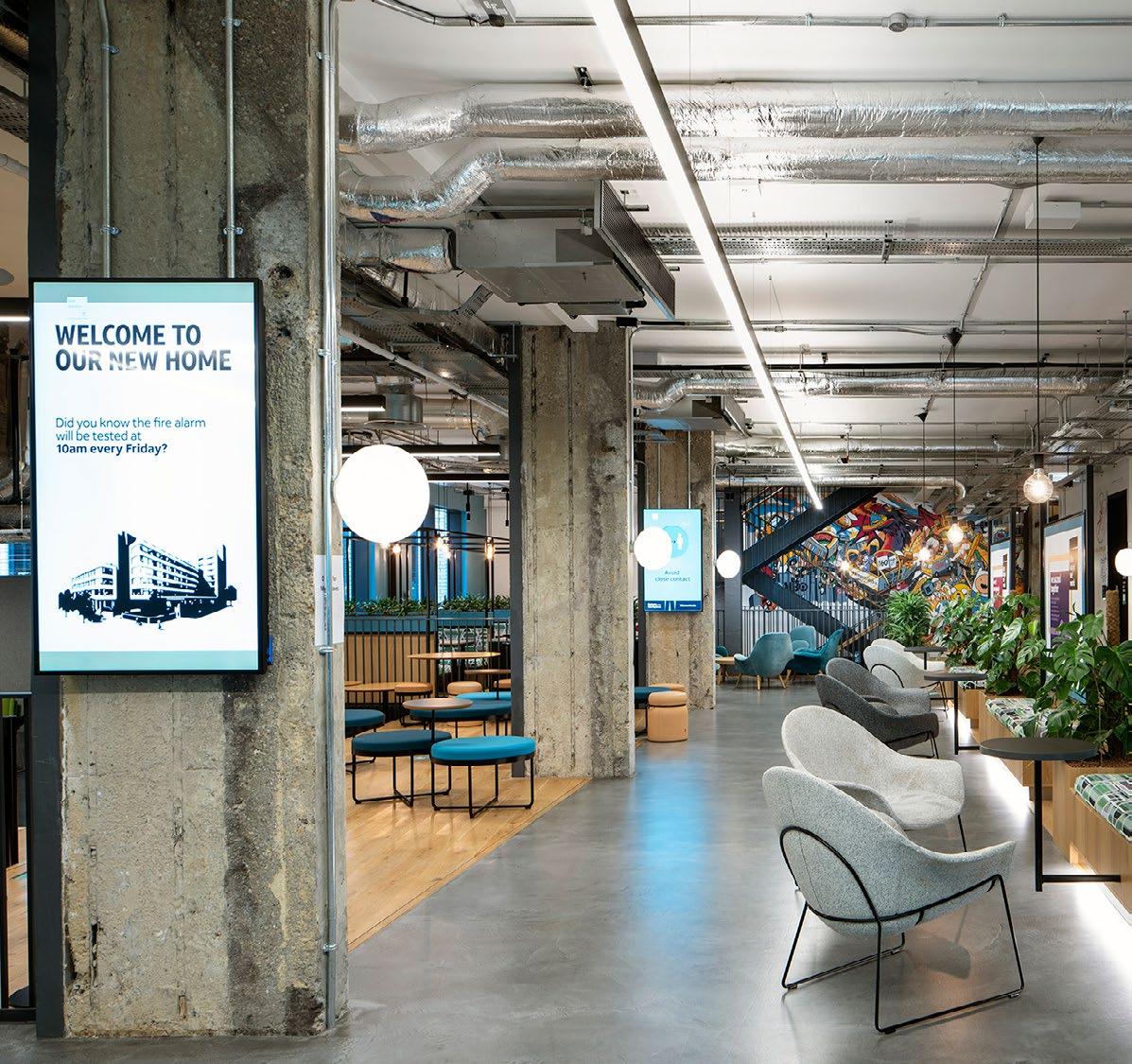
The Social. Bringing people together and enhancing collaborative experiences was crucial to WarnerMedia in its new space. The entire Ground and Lower Ground floors are social spaces that utilise the architecture and raw materiality to create the canvas for changeable brand and storytelling opportunities.
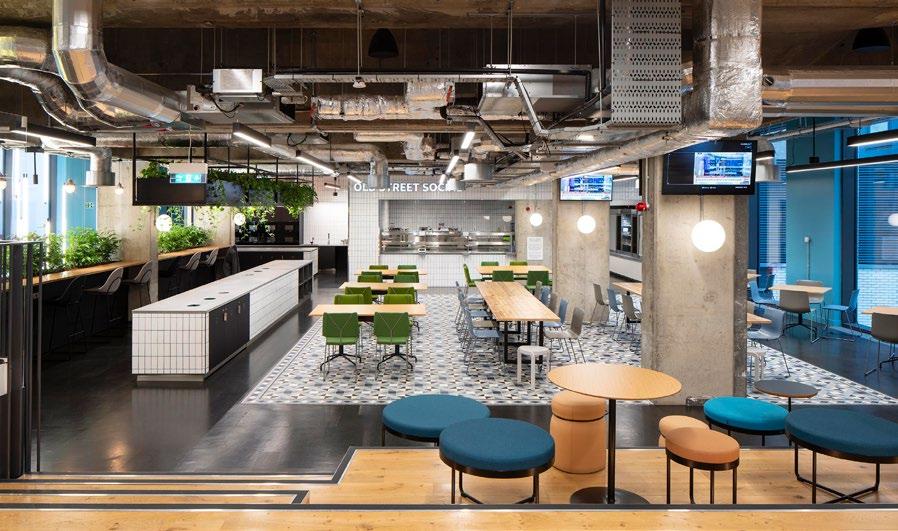
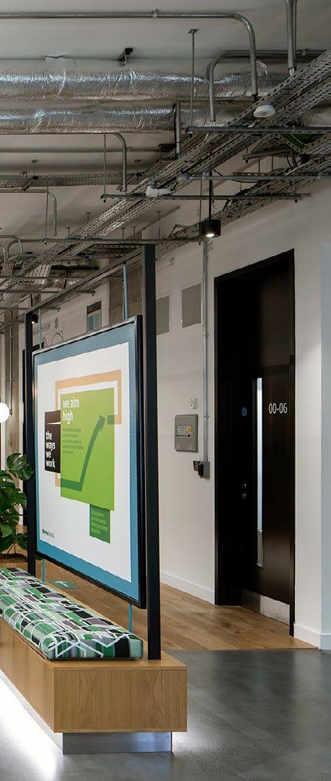
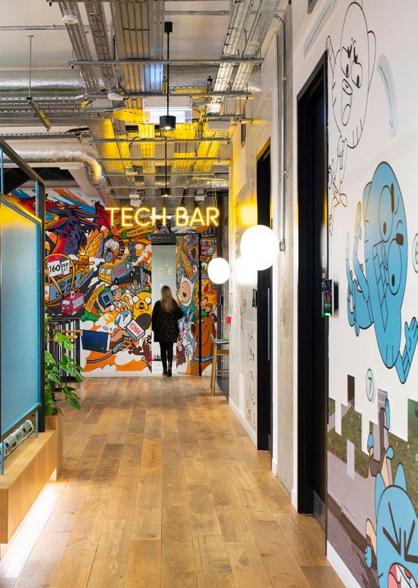

These new spaces allow colleagues to form stronger connections whilst working in spacious areas.
↑ Culture Street. Brand and storytelling moments are woven into the fabric of the design of ‘culture street’. Artwork can be updated and personalised over time. Visible from all points of the workspace, the street provides a touchpoint to the floors.

 →
The Hive
London, United Kingdom
Client: Beazley

Size: 50,000 square feet
Completion Date: January 2021
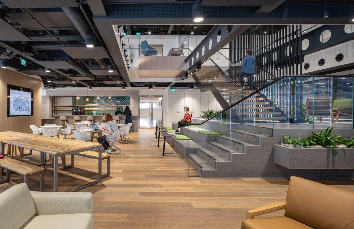
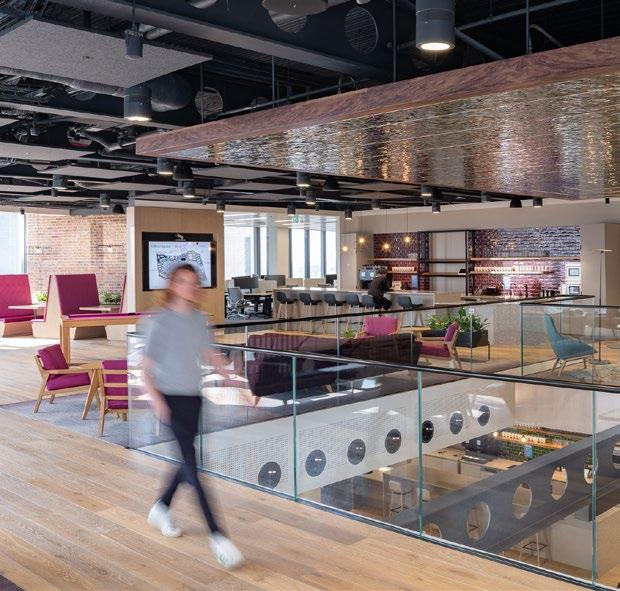
The Social. Bringing people together and enhancing collaborative experiences was crucial to WarnerMedia in its new space. The entire Ground and Lower Ground floors are social spaces that utilise the architecture and raw materiality to create the canvas for changeable brand and storytelling opportunities.


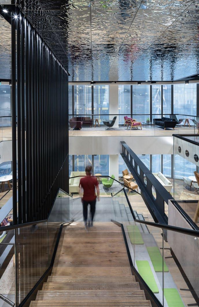
These new spaces allow colleagues to form stronger connections whilst working in spacious areas.
↑ Culture Street. Brand and storytelling moments are woven into the fabric of the design of ‘culture street’. Artwork can be updated and personalised over time. Visible from all points of the workspace, the street provides a touchpoint to the floors.
 →
The Hive

London, United Kingdom
Client: Confidential
Size: 20,000 square feet
Completion Date: 2020
Sustainability: BREEAM Excellent (for base build)
― WHAT MAKES IT UNIQUE
A lot of integrated art, specialist detailing, feature destinations. View through ‘the observatory’ takes you to the end of the building with a view.
London, United Kindom
Client: Evelyn Partners
Size: 93,000 square feet
Completion Date: 2022
Client: Microsoft
Size: 105,000 square feet
Completion Date: 2020
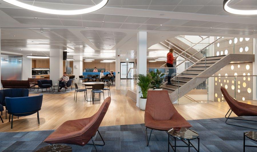
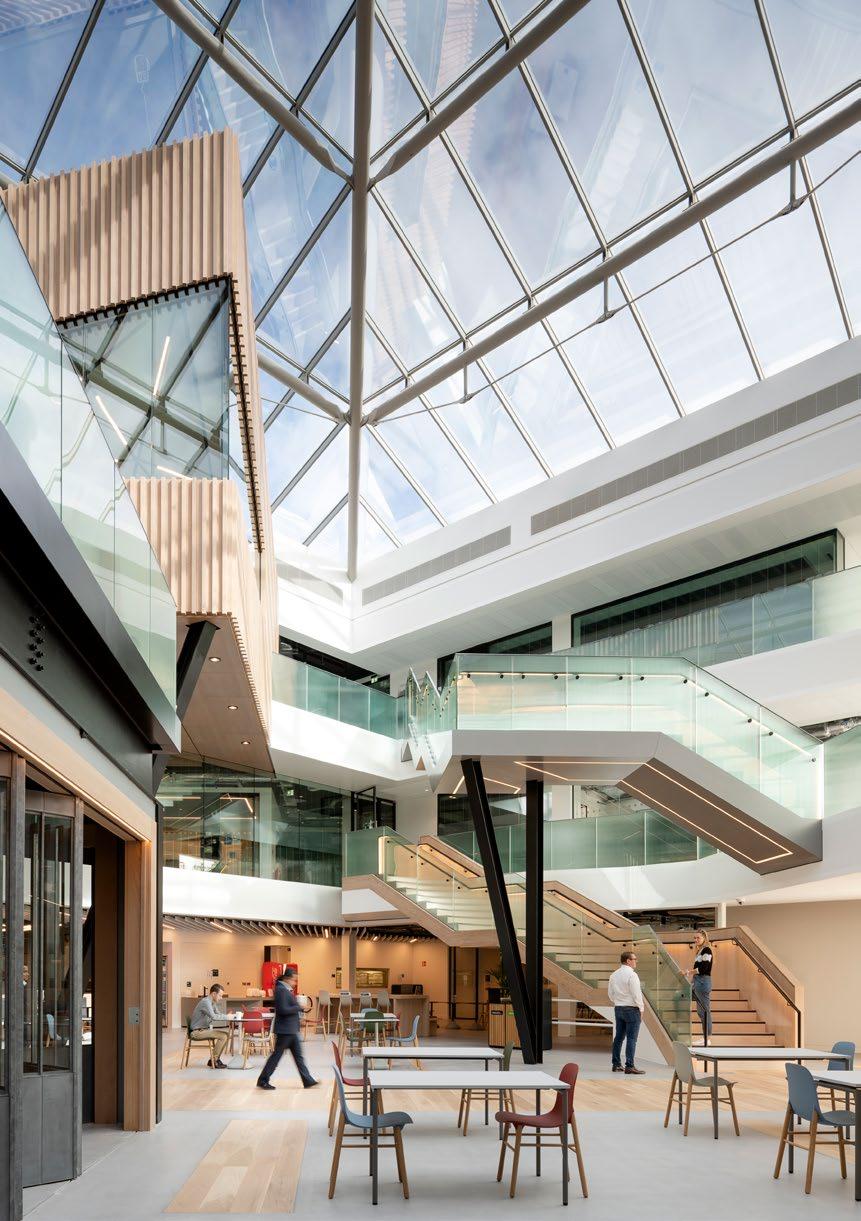
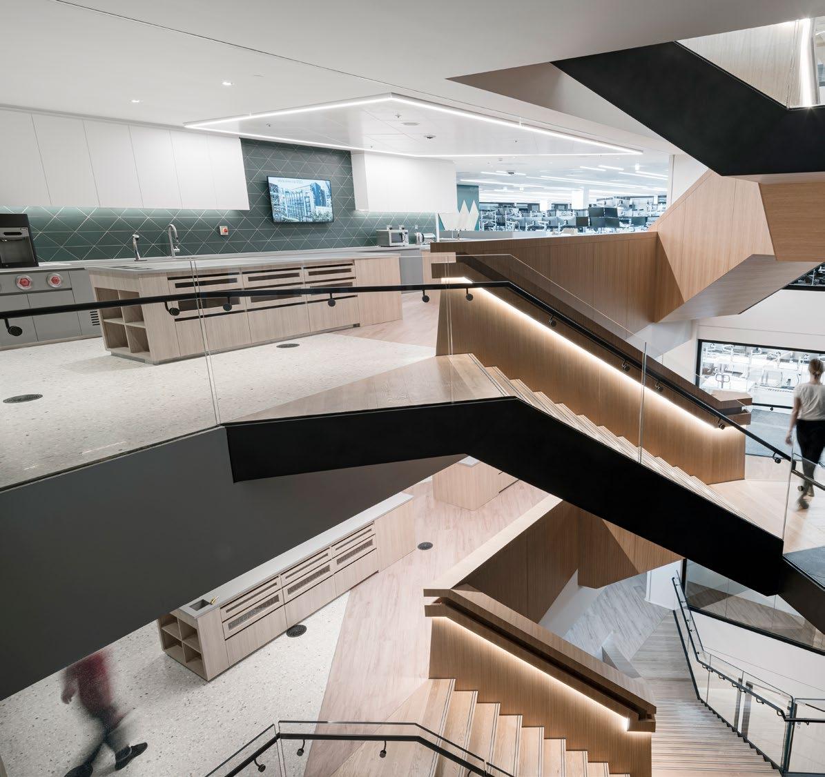
The atrium completely re-imagined and now features a vast staircase that links all three levels. Dedicated project and focus rooms on working floors are centralised to create a spine from which desks branch out to create neighbourhoods close to natural light.
― WHAT MAKES IT UNIQUE
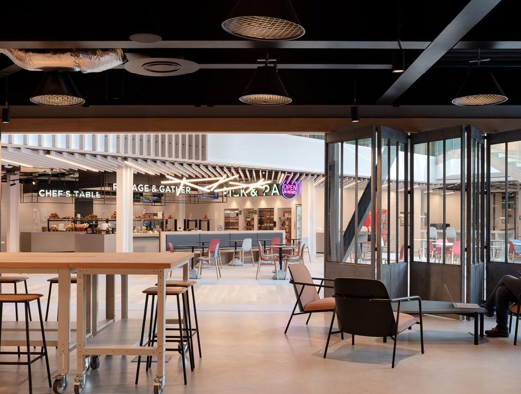
As technology changes how we live, work and play, OMC is the perfect setting for a company driving this change.
London, United Kingdom
Client: Confidential
Size: 150,000 square feet
Completion Date: 2020
WHAT IT IS
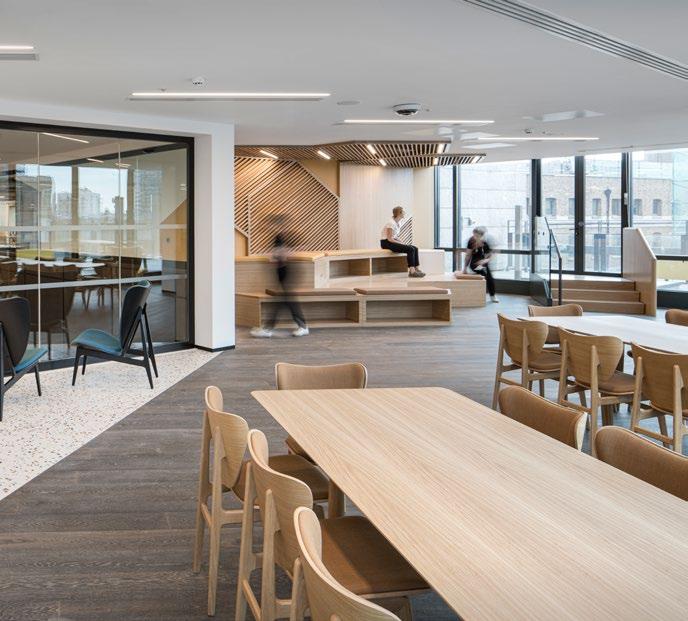
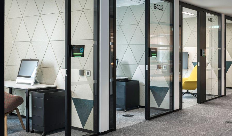
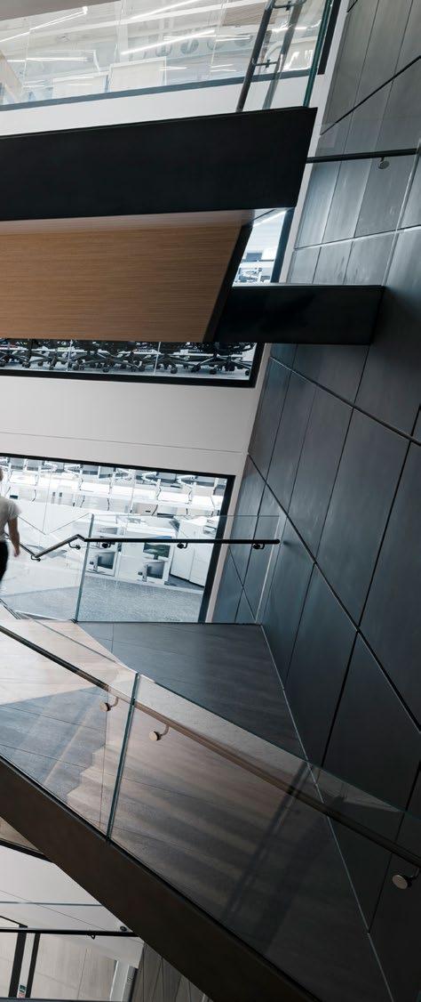
A space that allows its employees to be efficient in their day, while also having some outlets for fun and continue the culture to support innovation and creativity was the key driver to the design response.
Client: Financial Conduct Authority
Size: 425,120 square feet
Completion Date: 2018
Sustainability: BREEAM Excellent
Awards:
Finalist, Property Awards, Wellbeing Category, 2019
Finalist, BCO Awards, Fit out of Workplace Category, 2019
Shortlisted, Mixology19, Large Commercial
Interiors Project of the Year, 2019
Shortlisted, INSIDE/Offices, 2019
→
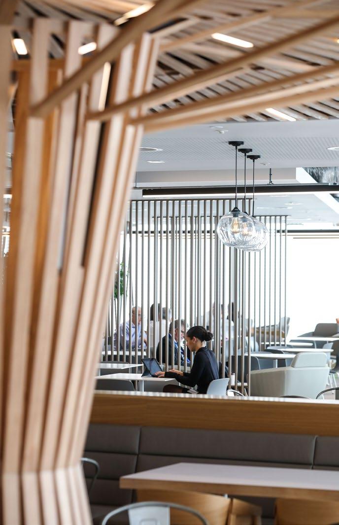
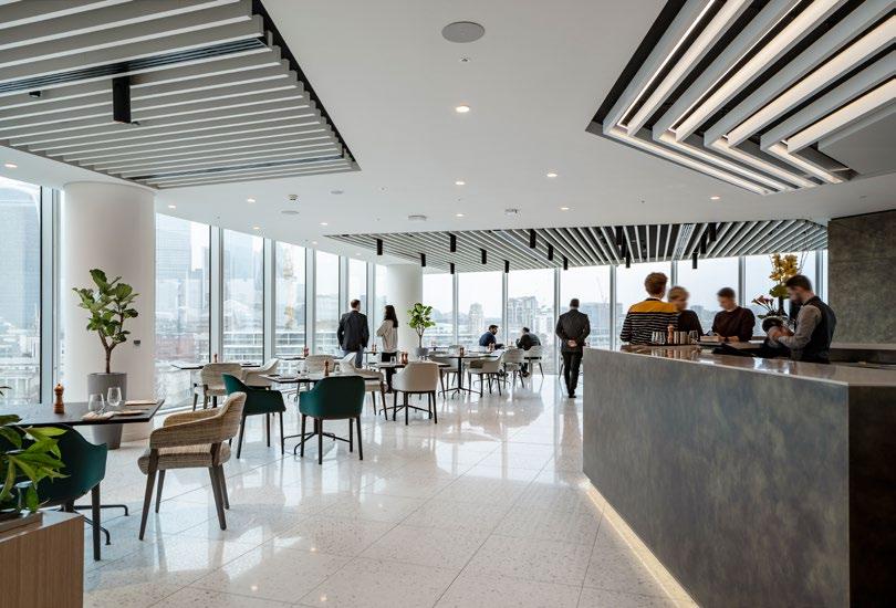
The staff restaurant on level fifteen offers healthy food options, with access to a large roof terrace and sweeping views across London. This prime space was allocated for staff use, and has been designed with multifunctionality at the core. It supports working, meeting, dining and events.
― A THOUGHTFUL DESIGN
A shift in the hierarchy of space allows more space to be given to amenity and collaboration areas, giving more choices of how and where to work.
↑
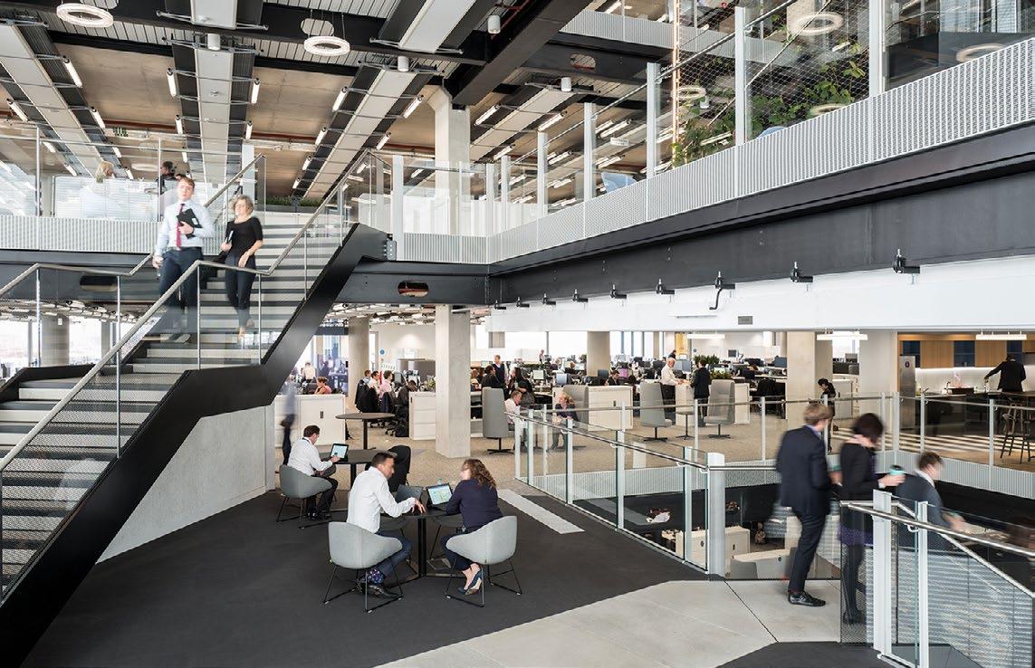
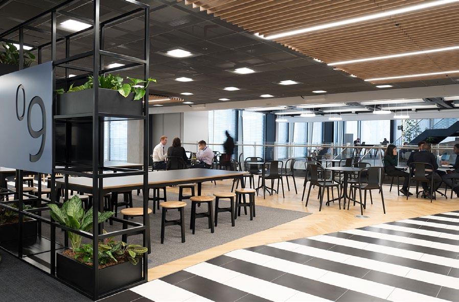
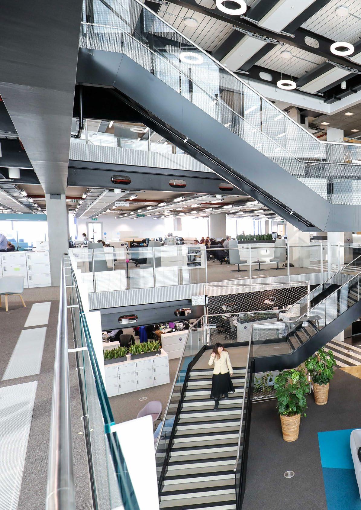
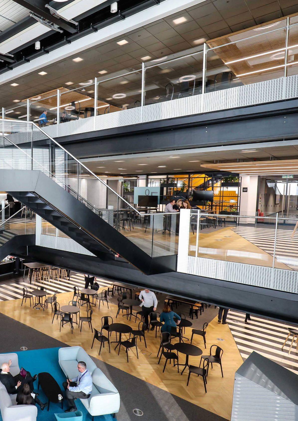
The building design is encouraging informal conversations, this has improved connectivity and is contributing to wellbeing. The introduction of a connecting staircase was a major architectural intervention to the base build scheme. This feature activates the atrium and attracts staff to the front of the building.
―
Cutting
edge, modern workspace pushing the boundaries of what an office should be for a world class financial organisation.
London, United Kingdom
Client: Confidential
Size: 225,000 square feet
Completion Date: 2019
Sustainability: LEED Gold, BREEAM Excellent
― WHAT WE DID

We brought staff together from four locations into one, a new office over 10 floors in the heart of London.

→ The success of the space is ultimately measured by the users who now have a canvas to work with, which has creativity at its heart and promotes the business in a truly dynamic and energetic way.

Wellness was a key design driver, and the space acheived both LEED Gold and BREEAM Excellent sustainability accreditations.
→
The interior blends in harmony with the base building design and palette, with interventions in the building reception and a plan that enhances the curves and flow of the building form.
↑ All offices are located in internal space and standardised in area to allow simple conversion into meeting rooms or vice versa to support future flexibility.


Budapest, Hungary
Client: Confidential
Size: 61,000 square feet
Completion Date: 2018
Sustainability: LEED Platinum ®
Awards:
Winner, Hungarian Office of the Year Awards, 2019
A space that celebrates people coming together, connecting, cocreating and interacting into an innovative and healthy environment.
→
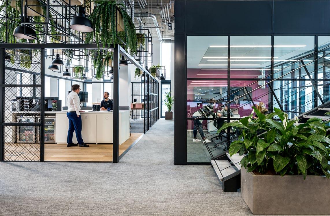
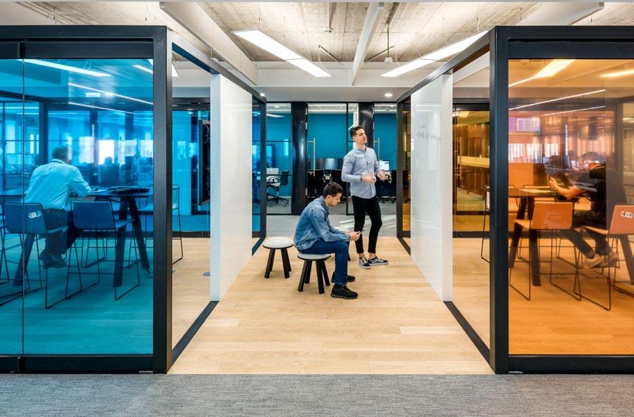
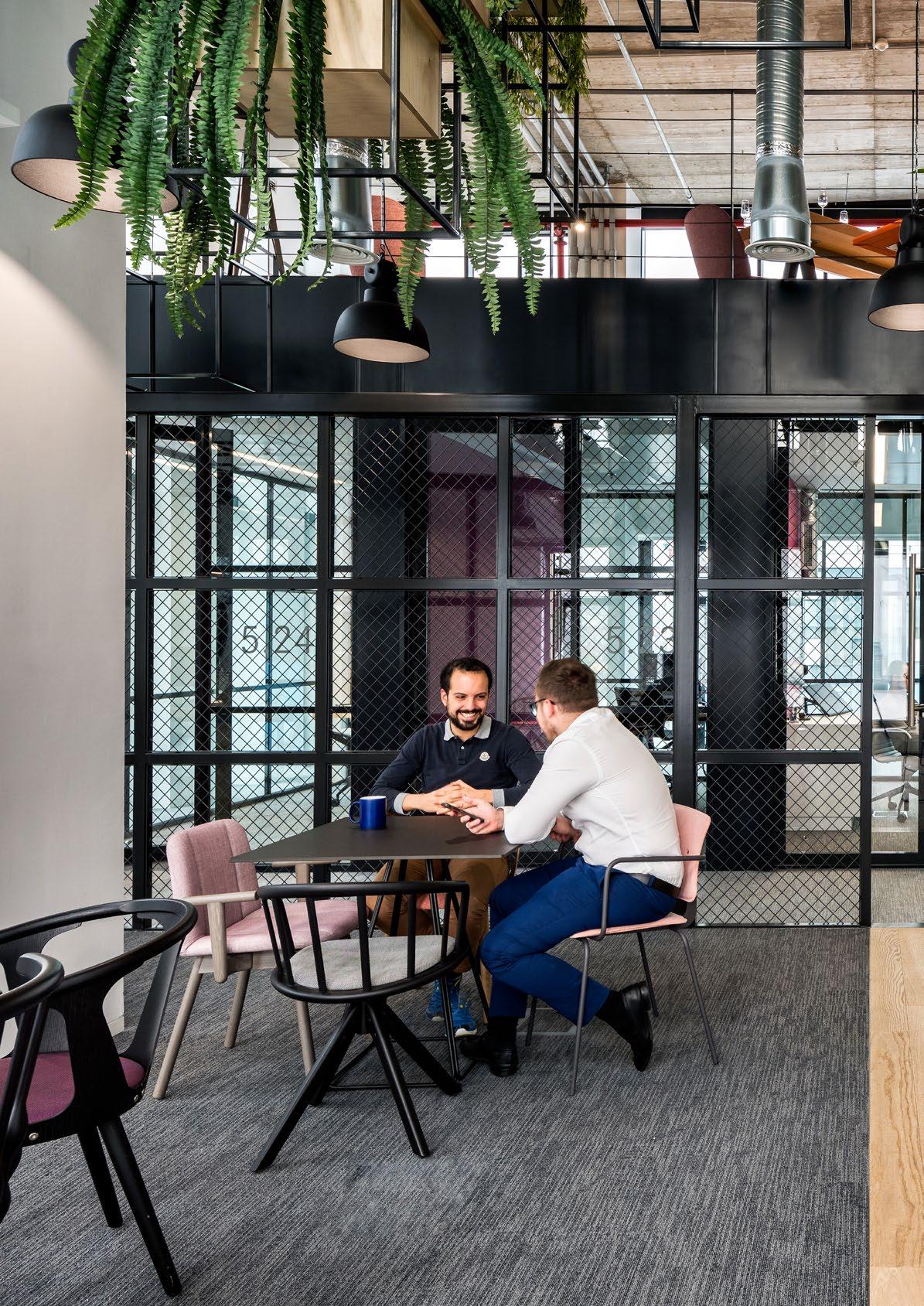
― WHAT IT IS A Tech Hub for Co-Creation
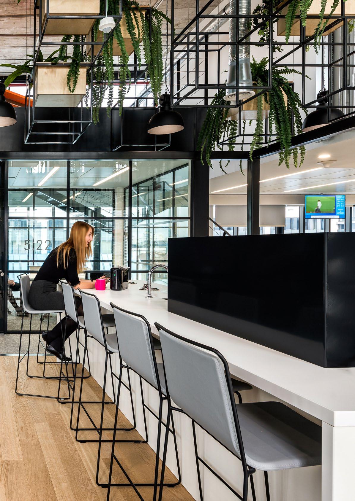
London, United Kingdom
Client: Confidential
Size: 30,000 square feet
Completion Date: 2019
― WHAT MAKES IT UNIQUE
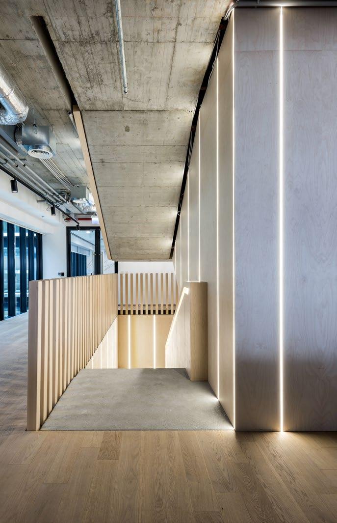
An exposed soffit and feature timber gridded ceiling used in conjunction with a variety of furniture settings.
↑
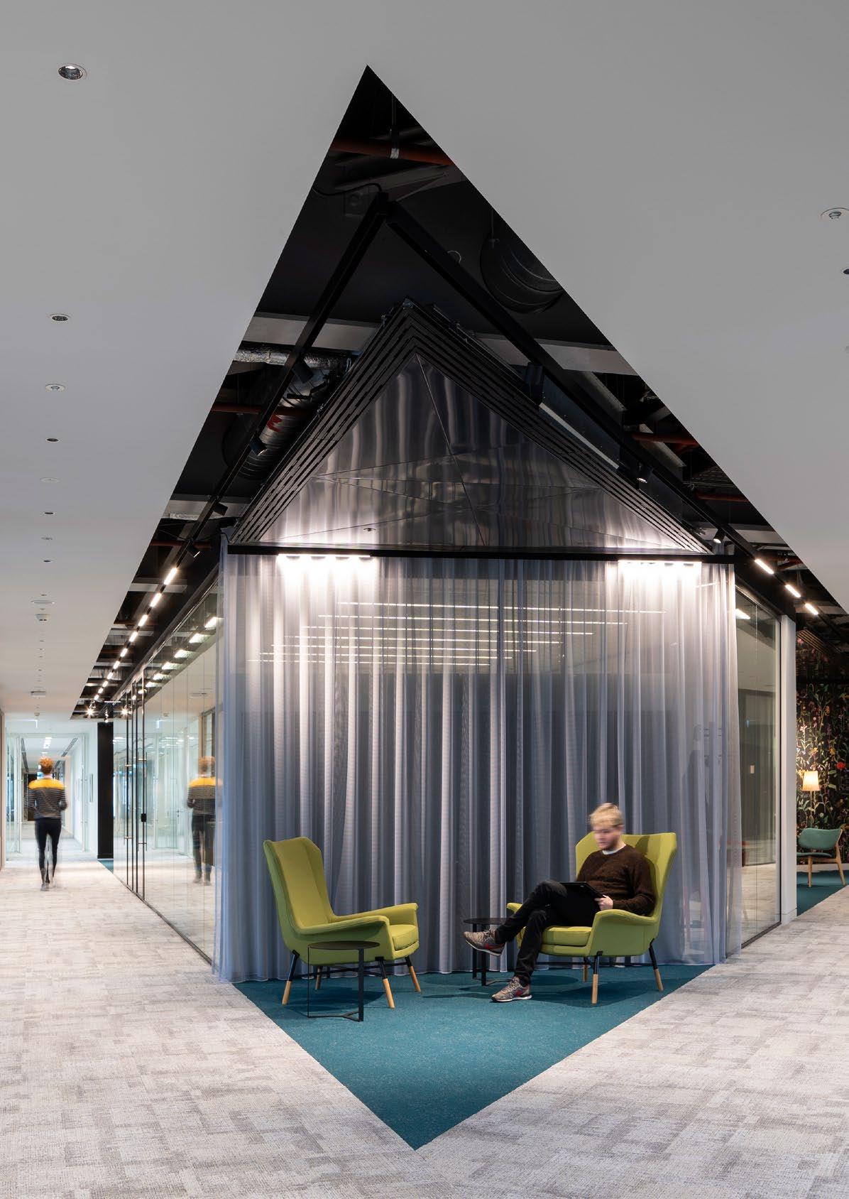
A space that does not feel like a corporate office, enabling individuals to get-awayfrom-the-desk.
←
The cafe has been refurbished to bring this up-to-date so it is more like a contemporary coffee bar
→
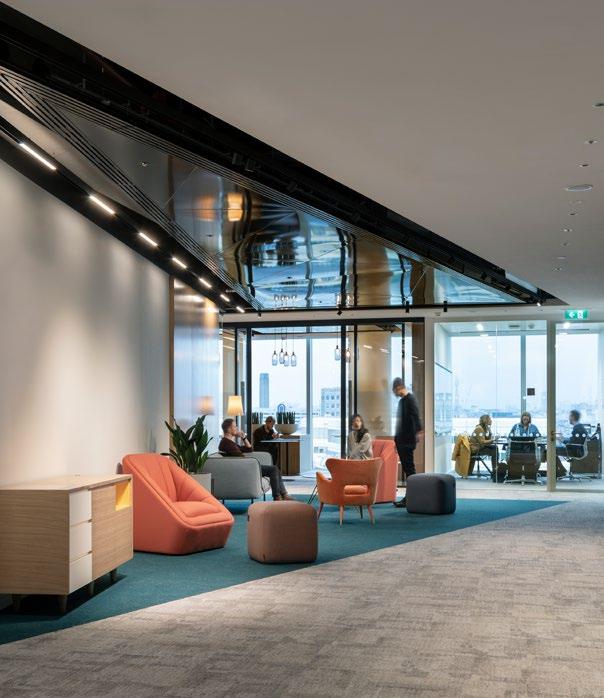
Existing office space, on the top floor of One More London, has been replaced with an assortment of sizes and geometries of meeting facilities
Dublin, Ireland
Client: NTMA
Size: 143,838 square feet
Completion Date: 2019
Sustainability: LEED Platinum ® , Fitwel
Awards:
Winner, Interior Architectural Project of the Year, Irish Building & Design Awards, 2019
― WHAT MAKES IT UNIQUE
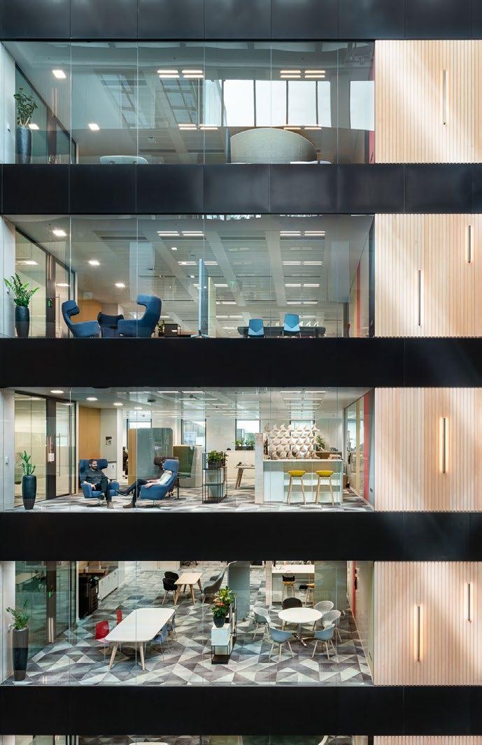
A workplace with wellness planted at the heart, a stunning restaurant in a building with views over the docks.
Destinations are distributed to encourage movement and an array of alternative work settings for collaboration and quiet work are located around the atrium.
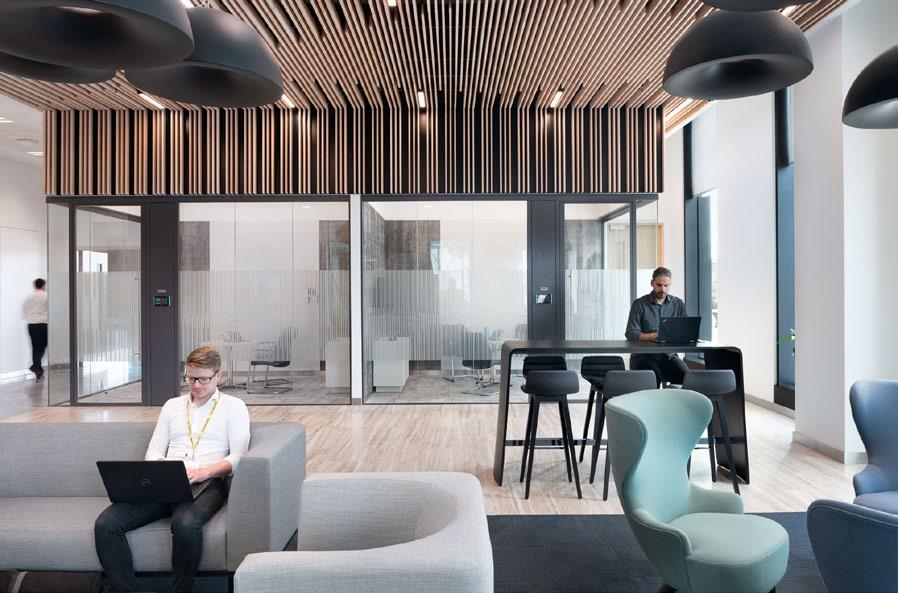
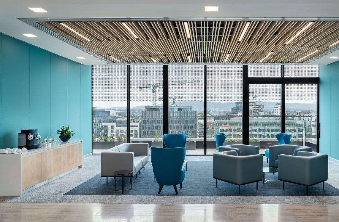
Sustainability and wellbeing were key drivers in the brief for their new offices. Following a study of the building, the project team carefully designed the spaces in relation to the building’s orientation and sitespecific conditions, such as natural light and ventilation. This allowed the team to create a design that met the functional requirements of each space, while also maximising the natural conditions of the environment.
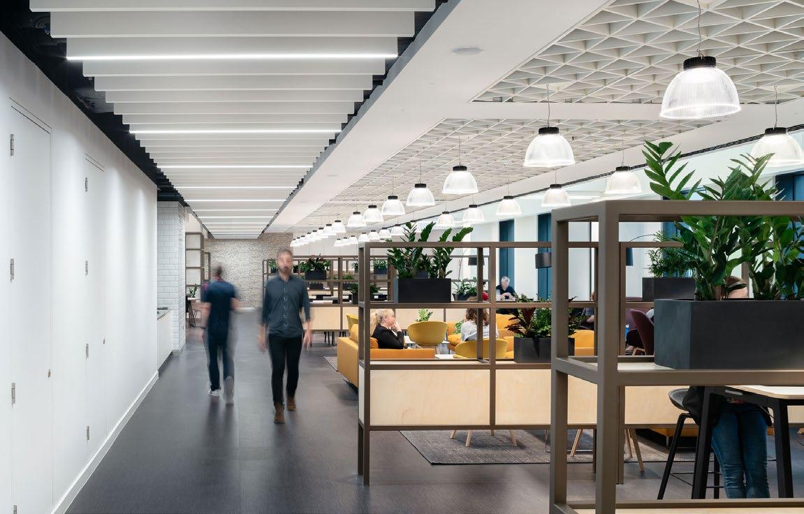
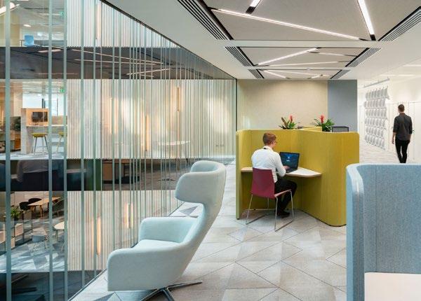
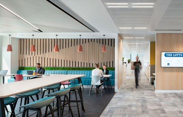 Treasury Dock
We designed an activity based work environment where views to the waterfront are maximized.

Dublin, Ireland
Client: Indeed
Size: 19,375 square feet
Completion Date: 2017
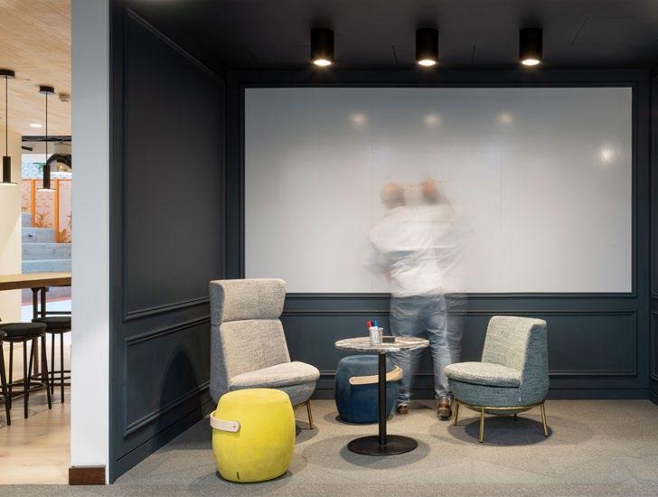
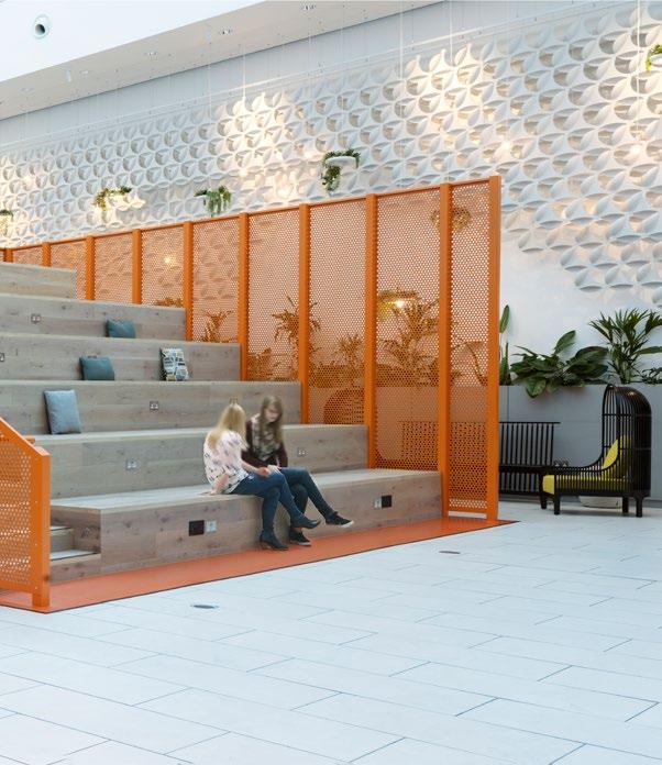
↑ Flexible space has improved collegue connectivity.
←
Extrawork spaces are giving more employees opportunities to comfortably work.
→
There are multiple areas for communication and conversations.
― WHAT MAKES IT UNIQUE
The workspace enables a new way of working that is agile and creative. Removing formality allows staff feel safe to express their ideas.







We believe that design has the power to inspire joy, uplift lives, and strengthen the spirit of community.








We work across the building process, from occupancy. We are adept at looking at the to the micro, while ensuring that sustainability wellness underpins everything that we do.


We are an interdisciplinary, research-based architecture and design firm, founded in 1935 on the belief that design has the power to transform lives.
from planning to the macro sustainability and do.


Guided by our core values—design excellence, diversity and inclusion, research, resilience, social purpose, sustainability, and well-being—we are committed to designing a better, more beautiful world.
We’re focused on making people’s lives better—holistically—by designing places that promote well-being from the inside out.
We’re redefining sustainability as one of several interconnected parts to a greater, more meaningful whole. It’s a philosophy we call Living Design.
We believe research holds the key to greater project performance. Our researchers and designers work in partnership from project start to completion. Together, they assess our clients’ goals and innovate ways to achieve them.
The White Chapel Building
10 Whitechapel High Street
London, E1 8QS