PIETRO
2016—2023
Hello :) I’m Pietro, an italian designer currently based in Amsterdam.
CONTACTS: hello@piezmartin.com
(+39) 331 8695 664
EDUCATION
Currently writing thesis for Communication Design MA, PoliMi — Milano, Italy.
2022 ATHENS Exchange
UPM — Madrid, Spain
2022 Erasmus exchange
ESAD — Caldas Da Rainha, Portugal
2020 Graduated BA
Communication Design
PoliMi — Milano, Italy
MAIN EXPERIENCES
Currently
Visual Design Intern TIN — Amsterdam
2016-Now
Founder, Art Director and DJ Holy Chapel — Lecco

2020 Editorial and Graphic Designer
Better Days — Milano
2015-2018
Assistant Art Director
Tsunamiclub — Milano
BLUE CHIPS STUDIO ��

WEB DESIGN
BRANDING FREELANCE COMMISSION
PROJECT DEVELOPED WITH Andrea Fumagalli (@__sfumato), Emanuele Coppo (@coppodesign).
Blue Chips Studio is a creative agency founded by Tommaso Biagetti and Sara Olivetti operating in the Italian indie/hip-hop music scene. They commissioned us the creation of a new brand for the agency and a website, for which I was responsible for the UI design, prototyping and support of the implementation in Wordpress.

The website was designed to have a fluid responsive behavior, with the aim of maintaining consistency in all possible viewport formats, always with a focus on the pictures and movies of the agency’s projects.

The characterizing element of the site is the “label” object: it represents the atomic element of the design system from which all the iterations built on the site derive.

UI & UX DESIGN PROTOTYPING

INTERACTION DESIGN MA COURSE
PROJECT DEVELOPED WITH Alessia Arosio, Lorenzo Bernini, Carlo Boschis, Martina Melillo, Marco Perico, Ottavia Robuschi.
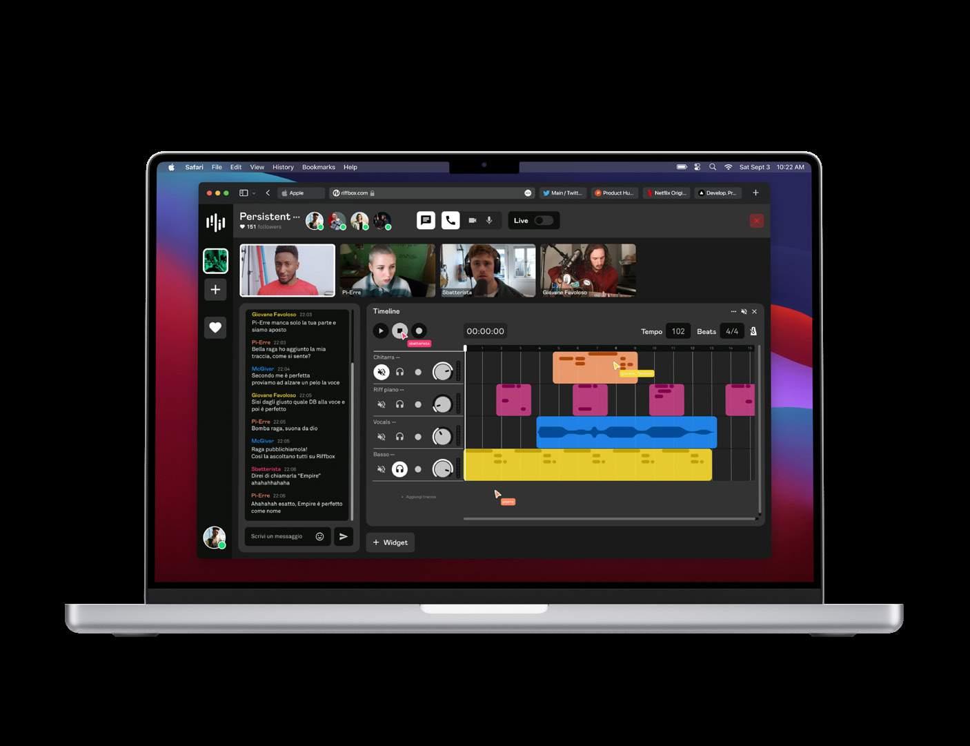
Followed by professor Fabio Sergio (Fjord Europe co-lead) we researched and analyzed what was happening to the life of individuals during the 2020 Covid-19 pandemic.
We ended up finding as a project opportunity the lack of interaction between amateur musicians and their difficulties linked to music production.

Riffbox was therefore created to meet the needs of members of amateur bands to be able to connect with each other in a virtual space to listen, share and create music. The application evolved into an online service available for both web, desktop and mobile, which allows the users to explore the bands and artists present through a “radio” section or directly from the “box”: virtual rooms where artists organize live jams and share their creative process with the viewers.

2016—2022
HOLY CHAPEL ��
ART DIRECTION EXPERIENCE DESIGN
MOTION DESIGN

OWN BUSINESS
PROJECT DEVELOPED WITH Andrea Fumagalli (@__sfumato).
Holy Chapel represents an alternative type of clubbing entertainment.


Since the beginning in 2016 we organized thirteen events and more than thirty private parties for external clients.


We decided to link the visual language of the brand to the theme of the parties, allowing the identity to gradually evolve in time. This fluidity has become the distinctive character of the brand.


2019-2020 LA VICEVITA ��
EDITORIAL DESIGN

BA THESIS PROJECT
PHOTO CREDITS
Giuseppe Miotto (@beppemiotto).
La vicevita is a visual book: a book that, thanks to particular graphical, compositional and material solutions, is able to enhance the reading experience.


In particular, the binding and the visual and chromatic qualities of the papers used allow the application of the project concept, based on the interpretation of the work: the idea of the existence of a parallel state of life called vicevita.


Through an initial process of analyzing the work, it was possible to outline the project concept, consisting of two core elements: suspension and heterogeneity. These two were then translated into visual form and applied through the design choices: the first by placing a colored page between the printed pages, the second by changing the color of these pages.


BRANDING STRATEGY
VIDEO/MOTION GRAPHICS

FINAL SYNTHESIS MA COURSE
PROJECT DEVELOPED WITH Alessia Arosio, Lorenzo Barilla, Stefano Ferrari, Filippo Tortelli.
Aria Fritta Pro is a fake product part of the EasyDesign fictional brand campaign developed for the final delivery of our last main course in the MA. Design often suffers from misunderstandings about the social role and the contribution it makes, that goes beyond appearance and aesthetics. The project rides this stereotype to reflect on the real effects that design can apply to the social context.
Aria Fritta Pro represents, ironically, all the simplistic solutions that are mislabeled as design.

The video spot, targeted specifically to museums managers, use an ironical tone of voice to represent the “skills” of the designer as a spray that can fix all the problems of ugly, unpopular and small museums.

The strategy started with the three main touchpoint (Facebook ads, Instagram ads and a Linkedin fake profile) brings our targets on the Aria Fritta website. Here the (hidden) message is revealed: design is not pure aesthetics but instead can be particularly useful in the everyday life contexts for engagin social innovation.

BRANDING

PACKAGE DESIGN
COMMERCIAL CONTEST
PROJECT DEVELOPED WITH Marco Perico (@eternit_tm).
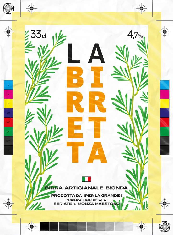
La Birretta is our proposal to the new in-house brewrey of the italian supermarket chain Iper La Grande I.


In the brief was requested to create a brand that could catch the eye of those people who whats to take a small brake from the shopping and have a drink at the refreshment area.
The connection between beer and food seemed perfect to us, so we based the packaging concept on the relationship between the taste of beers and the gastronomic combinations.
ALL COMMERCIAL RIGHTS RESERVED TO IPER MONTEBELLO S.P.A.


EDITORIAL DESIGN CONCEPTING
MUNICIPALITY OF NEMBRO (BG)
PROJECT DEVELOPED WITH Alessia Arosio, Lorenzo Barilla, Stefano Ferrari, Filippo Tortelli.

/665 is a reconversion project for a museum situated in Nembro (BG), Italy, that we co-designed with three local teenage students.
The Nembro Files are the report that through the metaphor of “classified documents” tells about the co-design experience carried out by us together with the students to the Municipality.

/665 is a project that involves the youth of Nembro city with projectoriented activities that take place in the museum: an annual event that allows to a group of teenagers to design and manage an immersive experience with the “escape room” format inside the museum building and the management and maintenance of the project itself by a team that every year chages.
After the co-design activities that lead to this concept, a brand book containing all the instructions necessary to build the /665 project was delivered by us to the Municipality of Nembro.

MONASTERO DI TORBA ⛪

BRANDING
EDITORIAL UI DESIGN
FAI - FONDO AMBIENTE ITALIANO
PROJECT DEVELOPED WITH Francesco Nicolotti, Luca
Bernandi, Gianluca Locatelli.
The aim of the project was to create a new visual identity for the Monastery of Torba, a historic site that is part of the FAI.
The definition of identity stared from researching in the field, on the events that this place has experienced over the course of almost 1500 years. Therefore, in search of a strong connection with the past, a sign was designed, the new logo, which would reflect and be the symbol of the ancient nature of the place, together with the evident religious meaning.

Through the development of the identity, an innovative form of promotion of the place was devised, with a series of cultural, musical and culinary events.
The related visual communication is diversified in the aesthetic of the artifacts according to their function: the institutional ones are fixed, the other ones change over time based on the season.

In the end we produced a little guide of the place and the brand manual to present the identity.


CONTACTS: hello@piezmartin.com
(+39) 331 8695 664
OTHER PROJECTS ON: behance.net/pietro-martina
ISSUU: issuu.com/pietromartina
LINKEDIN:
linkedin.com/in/pietro-martina/
INSTAGRAM / ANALOG PHOTOS: @piezmartin.lab
if u hire me I promise I’ll cook a ton of risotto and pasta for everyone, just let me know what’s your fav sauce �� hope to see u soon ��
FONTS Banana Grotesk, Monkey Type. BPdots, Backpacker.