01
REFLECTIONS ON DESIGN
This is the second issue of Anima. We set out last year to make a magazine that filled a gap in the design conversation. In a world in which information is instantly available, design needs a place for a more reflective view: somewhere to get to the heart of things and a chance to consider what is relevant. This edition finds out about a new generation of architects and discovers how they train. It looks at the language of typography and at life on the Moon. Nathalie du Pasquier and Dieter Rams share their inspirations and Samuel Ross predicts what is next. Welcome back.
02
Nathalie du Pasquier
Mami Wata
Otl Aicher
Barbara Kruger
Samuel Ross
Alessandro Mendini
Dieter Rams
Ferran Adrià
03
016 042 136 202 216 176 118 022 Issue Two 978 17394387 5 3
04 DEFINING THE NEW AND THE NEXT DAVÓNE TINES SINGER & CREATOR KANTEMIR BALAGOV FILMMAKER DALTON PAULA VISUAL ARTIST & EDUCATOR OONA DOHERTY CHOREOGRAPHER TOLIA ASTAKHISHVILI VISUAL ARTIST MOOR MOTHER POET & MUSICIAN SAM ENG GAME DEVELOPER ANNA THORVALDSDOTTIR COMPOSER HO TZU NYEN VISUAL ARTIST FOX MAXY FILMMAKER & VISUAL ARTIST

CHOREOGRAPHER
OONA DOHERTY

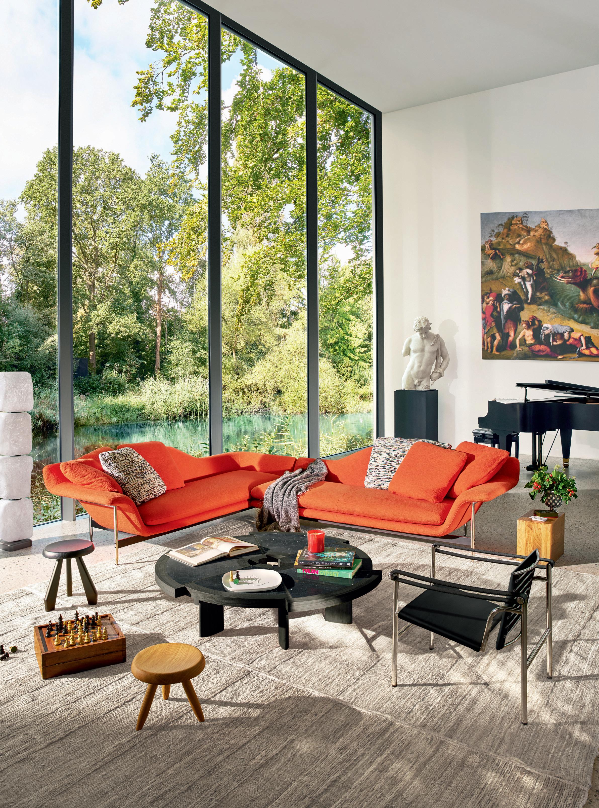
Dambo sofa collection, design Piero Lissoni. bebitalia.com
Milan London Paris Munich New York Washington DC Dallas Miami Boston


Designed by Italian Architect Antonio Citterio, Personal Line makes your home training experience truly unique with hundreds of video workouts on the integrated display and through Technogym App. Download the Technogym app Call +39 0547 650111 or visit technogym.com

HOME WELLNESS
DESIGN IS INNOVATION WITH A TWIST.

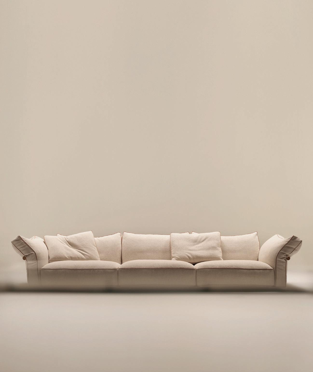
CAMELOT SOFA. DESIGN ANTONIO CITTERIO
MILAN DESIGN WEEK 16–21 APRIL 2024
SALONE DEL MOBILE. MILANO RHO FIERA HALL 9 | BOOTH E05 – F02 / E11 – F08
FLEXFORM MILANO VIA DELLA MOSCOVA 33
Nathalie du Pasquier is inspired, photographs by Alice Fiorilli
Afrosport celebrates cultural values
Pictograms: a language without words
Nuclear sublime, text by Richard Brook, photographs by Michael Collins
Galerie kreo, photographs by Emma Le Doyen
Living on the moon:
Hassell Architects have a plan
London School of Architecture, photographs by Henry Gorse
The political uses of typography, artwork by Alfie Allen
Technogym, photographs by Carlo Valsecchi
Samuel Ross, a conversation with a polymath
How the Milan Triennale changed design history
A portrait of the designer as an editor Alessandro Mendini
Milan in a van, photographs by Paolo Zerbini
Dieter Rams
looks back at Braun and forward to Vitsœ
Future recipes, artworks by Sharp & Sour, Leyu Li and Studio H
Design is on the menu: from Alexander Girard to Terence Conran
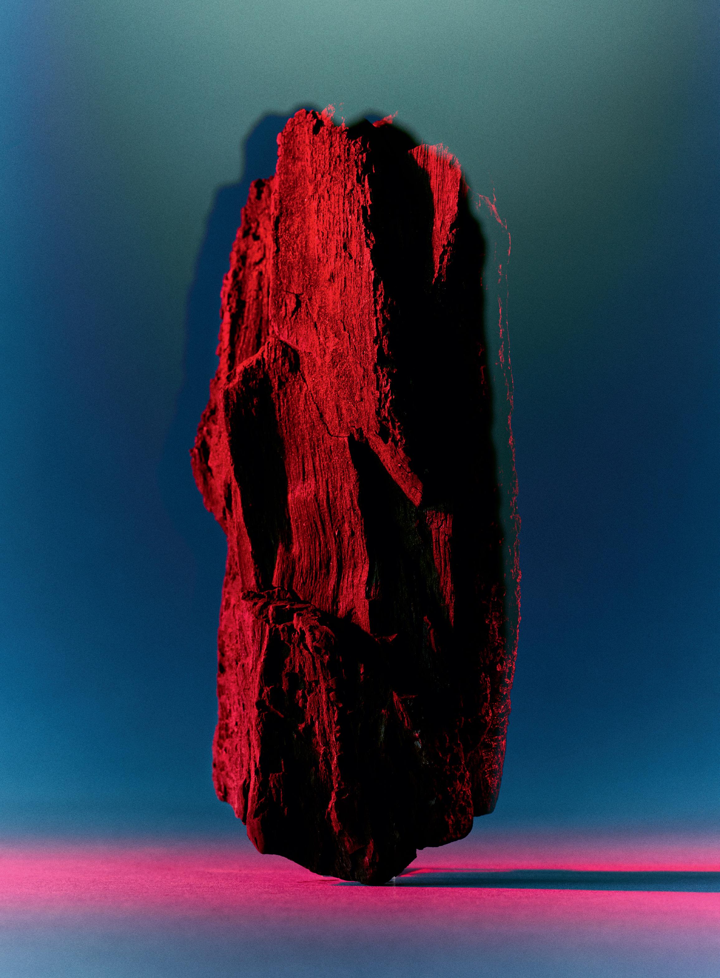
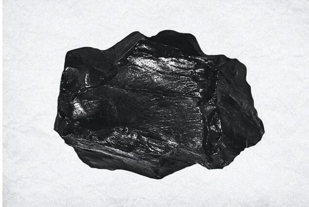
Alternatives to charcoal, text by Adriana Gallo
016 022 042 062 082 100 106 118 130 136 156 176 188 202 208 216 228
CONTENTS
Two of the designers we feature in this issue belong to the same generation. Dieter Rams and Alessandro Mendini were born within a year of each other, but it is hard to imagine two more different approaches, even if both had a certain distaste for the cruder aspects of commerce. Rams, throughout his career, has held to the belief that a designer is able to make a difference. That there is in absolute terms such a thing as good design, in both the performance and aesthetic sense, as well as the moral one. Mendini has always taken a much more nuanced view.
Rams did his best to purify the language of design to the extent that it could erase time and fashion. But the speed of technological change has rendered so much of his work for Braun obsolete, if beautiful. Mendini’s work has embraced the stronger flavours, and some of it now seems rooted in a particular moment in time. When Mendini was the editor of Domus, he put Rams on the cover of the magazine back in 1984 and interviewed him, one of the more historically unlikely encounters. Mendini asked Rams, who was clearly upset by one of his questions, “You were the prophet of the mythic period of Braun design. I have always thought of asking you this question: was your utopia functionalist or was it poetic and purist?” To which he replied: “I was not the ‘prophet’ of Braun design; if anything, I was a fairly important collaborator and companion in arms. Especially during the second period of Braun design. The first Braun period was marked by the Ulm school, through Hans Gugelot, in the sphere of product design and Otl Aicher in that of graphic design. My own work and that of my group would have been unthinkable without the way paved by them.”
The parameters of the world of design that their two positions established continue to shape the environment in which another generation operates. For this issue of Anima, we talked to Samuel Ross, who is fortunate to be able to learn from both, to take from them what he needs, and to form his own direction. Ross is emerging as a true polymath, involved with mass-produced objects, as well as art and design, driven by a sense of conviction that his work has a cultural purpose. We also photographed the students of the London School of Architecture, a much needed experiment in education, rooted in a practice that reflects the priorities of a new generation. We went to Milan to explore a newly invigorated Triennale and its archives, looked back on places to eat, and forward to the menus of the future.
In an age of short attention spans, and instant news, Anima gets below the surface to the heart of things to look at what makes design relevant.
– Deyan Sudjic
013
WHAT ANIMA IS THINKING
EDITOR-IN-CHIEF Deyan Sudjic
MANAGING EDITOR Ayla Angelos
ART DIRECTION AND DESIGN Hondo Studio (Fran Méndez and Maria Vioque Nguyen)
PHOTO EDITOR Max Barnett
PHOTO EDITOR-AT-LARGE Holly Hay
SUB-EDITORS Sarah Kathryn Cleaver and Gus Wray
CONTRIBUTORS
Alfie Allen, Richard Brook , Quentin Buttin, Elena Campese, Emma Le Doyen, Antea Ferrari, Alice Fiorilli, Adriana Gallo, Henry Gorse, Steve Harries
Victoria Hely-Hutchinson, Leyu Li, Toby Marshall Nathalie du Pasquier, Studio H, Sharp & Sour, Paolo Zerbini
PUBLISHER AND EDITORIAL DIRECTOR Dan Crowe
ASSOCIATE PUBLISHER Andrew Chidgey-Nakazono
ADVERTISING DIRECTOR Andrew Chidgey-Nakazono andrew@port-magazine.com
ACCOUNTS Charlie Carne & Co.
CIRCULATION CONSULTANT Logical Connections James Laffar jlaffar@thelogicalchoice.com
SYNDICATION syndication@port-magazine.com
CONTACT Ayla Angelos ayla@anima-magazine.com
ANIMA ONLINE anima-magazine.com
TYPEFACE
At Aero and At Haüss Mono designed by Pedro Arilla, available at Arillatype.Studio®
Bradford designed by Laurenz Brunner, available at Lineto
Foundry Gridnik™ designed by Wim Crouwel, available at Linotype
Futura designed by Paul Renner available at Bauer Types
Anima is published by Port Publishing Limited Somerset House, Strand London, WC2R 1LA port-magazine.com
Anima is printed by Park Communications
Registered in England no. 7328345
All rights reserved. Reproduction in whole or in part without written permission is strictly prohibited. All prices are correct at time of going to press but are subject to change. All paper used in the production of this magazine comes, as you would expect, from sustainable sources.
www.anima-magazine.com
014
MASTHEAD

Nathalie du Pasquier
WORDS
The artist Nathalie du Pasquier talks about the things that inspire her is inspired
016
Nathalie du Pasquier PHOTOGRAPHY Alice Fiorilli
(Right) Mesopotamian sculptures from the first half of the third millennium BC


018 Visiting a friend’s studio is always stimulating and inspiring. Pino Guidolotti is a photographer I have known for many years. Now he lives in a small town in the south of Italy and does not make many photos anymore. But he is not only a photographer, he has also always been an incredible artist, building strange sculptures, crazy toys, making beautiful drawings and other things. When I go to the south in the summer and visit him, going to his studio is always a surprise. He takes photos of people, places and things out of his drawers, installing them on the walls, and it is always different. There are his drawings in black and white, the objects he recently made from painted wood, feathers and materials he finds around. The stories that emerge from these juxtapositions are reminiscent of past times but also very exotic. His studio, full of books as well, is like a magic room.
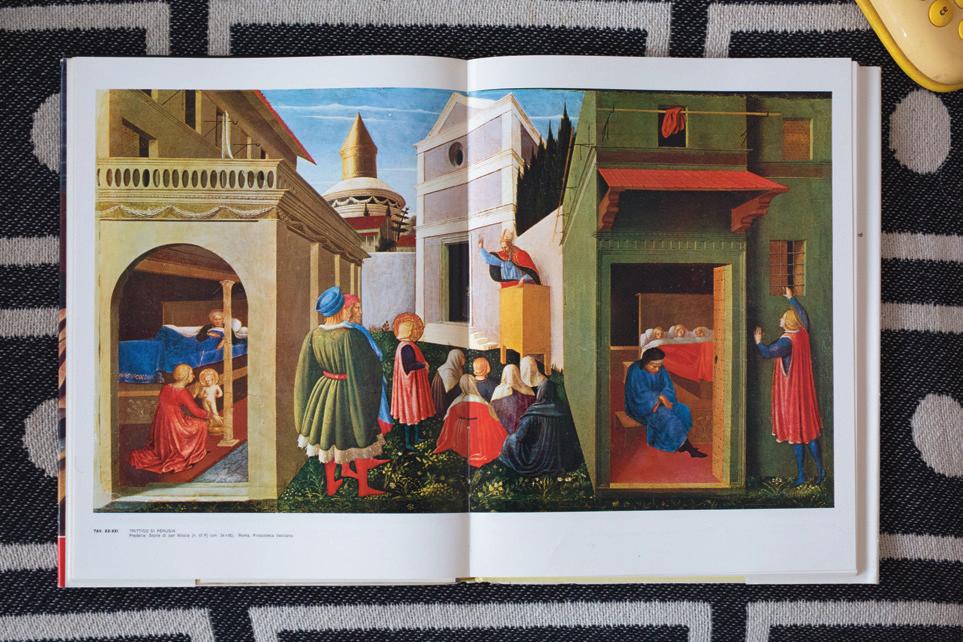
I am a painter; I live in Italy. Italian Renaissance paintings are what I first looked at when I started painting. There are many painters I love from that period, but I chose this painting by Fra Angelico because it is so peaceful and, in this moment, I need to be reminded of peaceful things, the Tuscan light falling from the sky, the small flowers on the ground. This painting is not big, it is one panel of a predella under the story of San Nicola. I think what strikes me here is the architecture, like a series of big objects or theatre props that are enough to place the actors in their situations. It is very simple; nothing is useless, and it is also very descriptive and clear. The two rooms opening on the right and on the left of the painting are illuminated enough to see what happens inside. It is a bit like a theatre, and I think that is what I find inspiring.
 The studio of Pino Guidolotti
(2) A painting by Fra Angelico
(1)
(2)
(1)


(3)
I don’t remember when I first encountered these two figures, maybe in 1988 when I was reading the Epic of Gilgamesh. I find them amazing, these big eyes probably staring at very far away stars, deeply concentrated and at the same time lost. Their tiny hands holding I don’t know what. I think they are a man and a woman. In the book where I found this picture, they say they are two gods, but for me they are very human and seriously curious about the unknown. I think I feel like them when I forget about where I live.
(4) Hand-made books
I like books, I like making books. Before the invention of print, books were hand made. Also, after Gutenberg some precious books were still made and illustrated by hand. There are some beautiful medieval books which are very much in my heart, but here I have chosen two pages from a Persian book. There are no images, only framed calligraphy. I do not understand the meaning of what is written but these abstract pages remind me how the art of inscribing messages on a page is important and in fact can be enough.
(5) The future
This is a photo in an old children’s sci-fi book. I like the big computer with all the buttons, the nylon pink hair of the girl operating the machine, which is so different from what we use now. But still, that is the future. The future inspires me. In my work there is always the future, not the past, the future made of all the past digested but we don’t know for what purpose.

019
Mesopotamian sculptures from the first half of the third millennium BC
NATHALIE DU PASQUIER
(3)
(5)
(4)
(6)
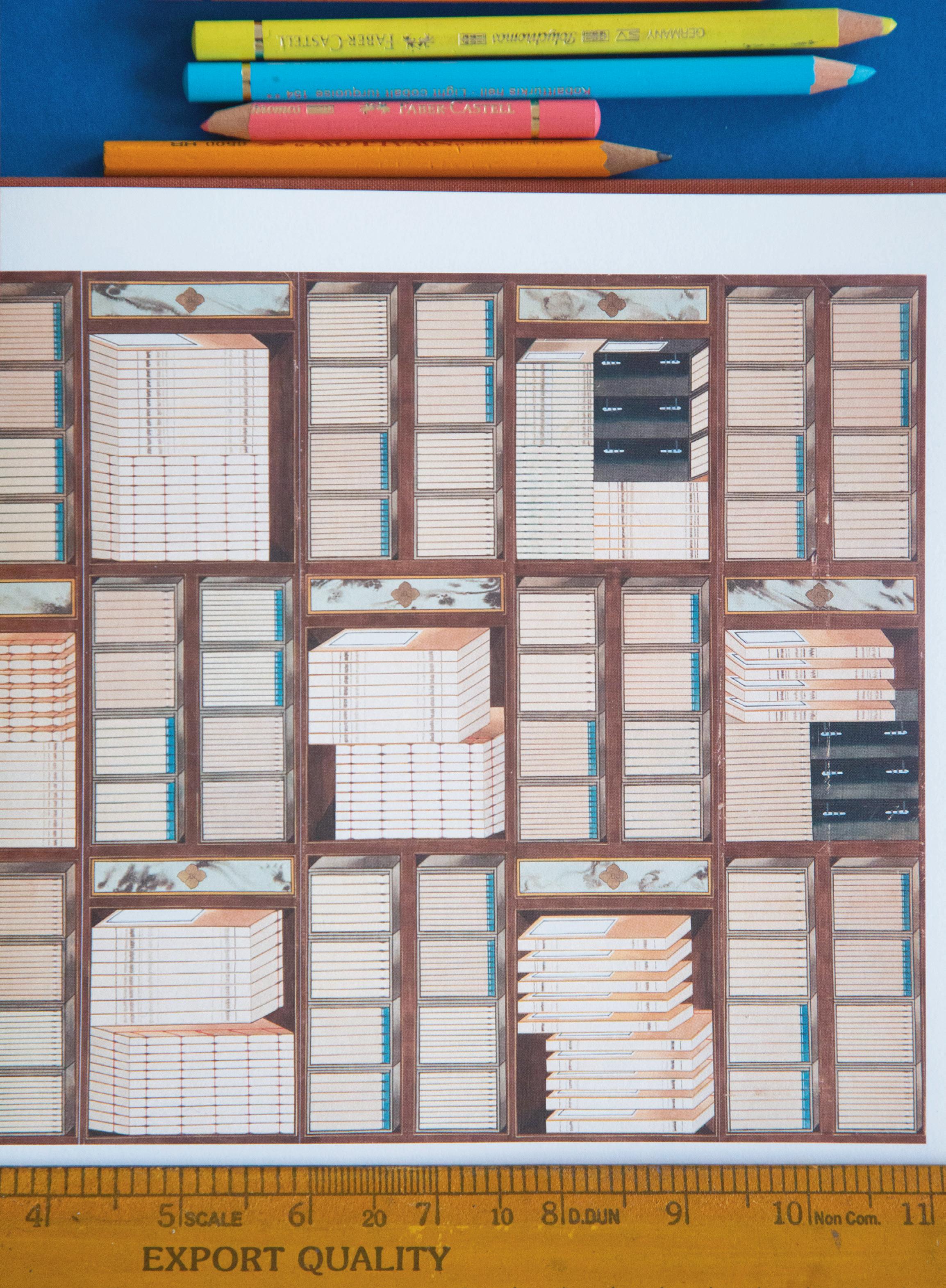
These types of paintings are named Chaekgeori and Chaekgado, I think they had a kind of influence on me. I saw the first ones before I became a painter in 1986, in bad black and white photocopies and I was immediately interested by these compositions made only of objects. Chaekgado are paintings representing pieces of furniture, like big shelves in which heteroclite objects are installed. At the time, in 1986 I was still working as a designer and I liked the way the elements were represented in axonometry. I liked the exotic aspect of the precious objects displayed with piles of books, all very regular. In the Chaekgeori paintings the objects and furniture are combined on one stand, they are like a pile of objects making one big object. I think at this point in my life they inspire me, or at least I remember them when I build my “constructions”, putting together elements from different periods of my work and new paintings.
(7)
This book was given to me for Christmas this winter by a good friend. It is a book of Mediterranean recipes and it is organised by ingredients. I cook mostly vegetarian. It is enough to open the book and find an unusual way of preparing things I am used to cooking in more or less the same way every time. It is a very thick book, and recipes are illustrated with small photos where food is displayed on nice plates. It also tells you how long to spend on the preparation – many do not require much time which is also very inspiring!

(7)
020
(6)
Korean painting
A big cookbook
AFROSPORT, a new publication from Mami Wata, spotlights Africa’s history and global influence through sport and design
022
WORDS Ayla Angelos

023
(Above) Photography Eric Lafforgue

024
(Right) (Below) New Year’s Eve Gusheshe spinning in Botshabelo, Free State, South Africa, Dec 31 2011. Photography Jo Voets Photography Christian Bobst
(Below right) AFROSPORT book cover. An athlete is photographed playing donga, a stick fighting sport from Ethiopia

Launched in Cape Town in 2017, Mami Wata is a clothing brand that combines a powerful graphic aesthetic with a commitment to investing in local production and communities. The name – West African pidgin for water spirit – reflects Mami Wata’s roots in Cape Town’s surf culture, which is not a western import, but a sport that can be traced back to at least 1640 in what is now Ghana and is better understood as the revival of an ancient practice. Mami Wata aims to use African-grown cotton, and its products range from an R800 rand T shirt – about £32 – to a £500 medium-length surfboard. The brand describes the simple graphic design that decorates the board as inspired by the patterns found on walls built in Ndebele communities, which relate to tribal identity. According to its site, “many consider these designs to be modernist but in actual fact they predate modernism by many thousands of years”.

Mami Wata was started by Andy Davis, Nick Dutton and Peet Pienaar, who recruited Selema Masekela, the American-born son of the famous South African jazz musician Hugh Masekela, as an investor and collaborator. Selema Masekela is a filmmaker, sports reporter and producer who encouraged Mami
Wata to publish its first book, AFROSURF, which celebrated the energy and optimism of African surfing. It has been followed by a second book, AFROSPORT, which takes a wider view. Through the lens of sport, the new book presents a powerful celebration of Africa’s distinctive contribution to design and culture. “The world in general knows very little about Africa and why certain things look the way they do,” says Mami Wata’s creative director Peet Pienaar. “Western designers think that everything that happens in Africa is vernacular and that African designers are behind in some way. Western design isn’t the default.”
As a discipline, African design is rooted in centuries-old traditions and a style that encompasses a broad range of techniques, reflecting the cultural, historical and socio-economic contexts of its diverse regions. From ornate cave paintings in South Africa’s Cederberg Mountains to masks produced by cultures across the continent, its histories are as varied as its communities. For centuries, fractals have been used in Africa as a design tool across sculpture, architecture and pattern making, even in the creation of sports jerseys and uniforms. In 2018, South African researchers confidently dated the
criss-cross patterns they found on a fragment of rock in the Blombos Cave as having been carved an unimaginable 77,000 years ago. They interpreted them as representing the earliest-known example of abstraction used as a form of graphic communication. Despite these ground-breaking innovations, African design has been marginalised within the global discourse. AFROSPORT isn’t going to change all that on its own, but it makes a strong case.
“A lot of design schools are pushing African designers to become western designers because that’s the default,” Pienaar says. “When African designers start including cultural elements into their designs, it’s immediately seen as vernacular. All of us who are culturally ethnic are excluded.” Without knowledge and awareness of its history, this perpetuates the stereotype that African design is only synonymous with animal prints and Sahara aesthetics. Whereas, in reality, it is a dynamic and playful discipline that’s rooted in connectivity and a shared post-colonial mindset. AFROSPORT is more than just a celebration of African design and sports culture – it's a call to action by placing Africa at the centre. “The world is going to be influenced by Africa,” says Pienaar. “It's very important that people start being more aware of what's happening. It's time that we read more about Africa.”
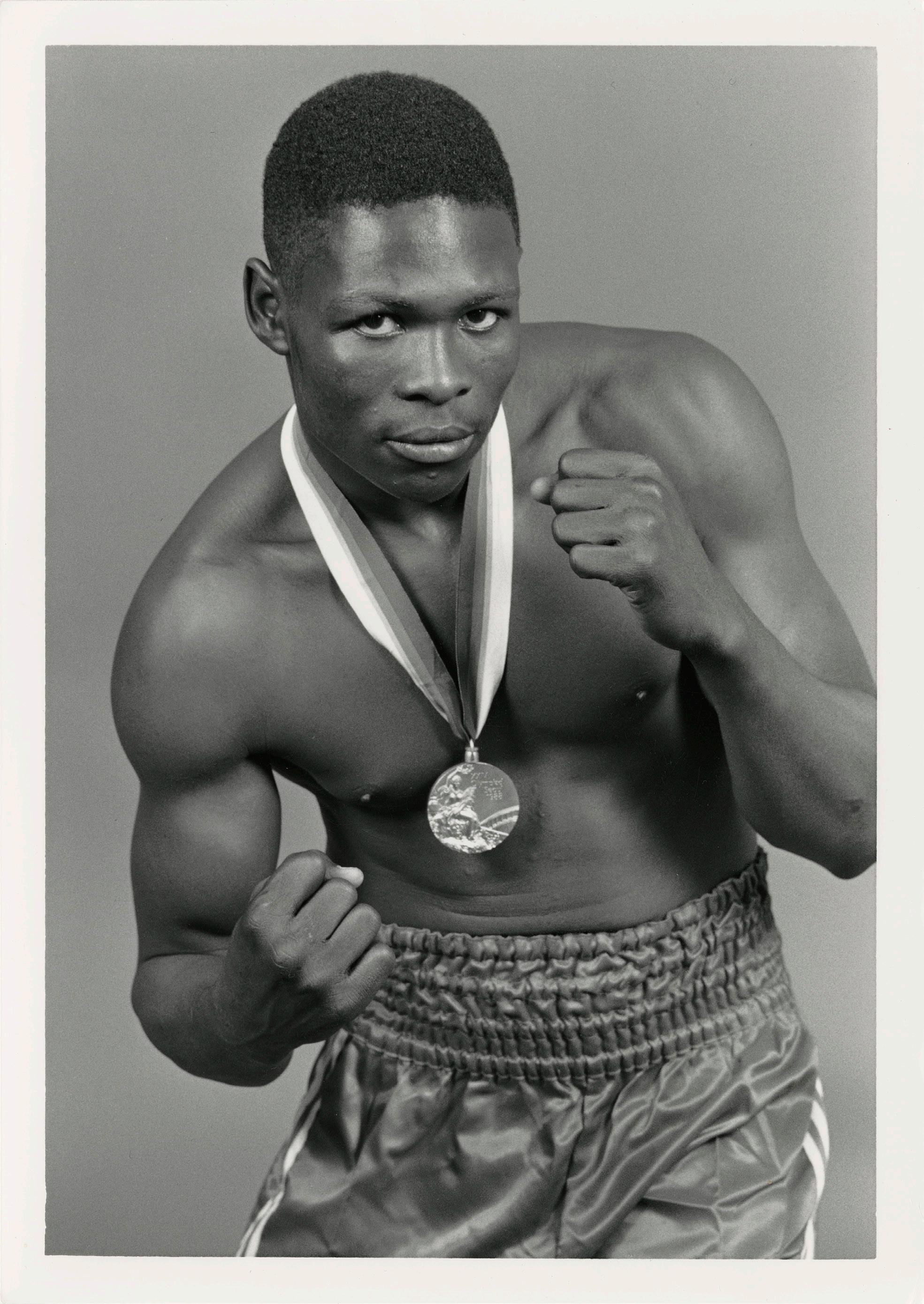
With its deliciously iridescent coruscating graphic cover, fuelled by reflective pinks and almost-lilac blues, the book takes a seductive rather than a didactic approach. A thick, boxy border directs the eye to a striking photograph taken 14 years ago by Eric Lafforgue. In perfect central alignment, the subject’s head is protected by a helmet of woven knots, his lips pursed as his eyes fire off into the distance. He’s in the midst of a game of donga, a stick fighting sport hailing from Ethiopia. Inside the book, Robert Wangila, a professional boxer from Kenya, raises his fists as he poses triumphantly for the camera (the photographer remains unknown). Wangila won a gold medal at the 1988 Summer Olympics in Seoul. His pendant hangs proudly around his neck, decorated by Giuseppe Cassioli’s portrayal of Nike, the Greek goddess of victory. She holds a winner’s crown and palm in her hands, while the Colosseum is depicted in the background – the top right corner is where the name of the host city and Games numeral sits.
do”

026
(Right) (Above)
Image of Robert Wangila, who won a gold medal at the 1988 summer Olympics in Seoul. Photographer unknown
Photography Laurent Gaudin
“The general world knows very little about Africa and why certain things look the way they
AFROSPORT
028
(Above) Photography Laurent Gaudin
029
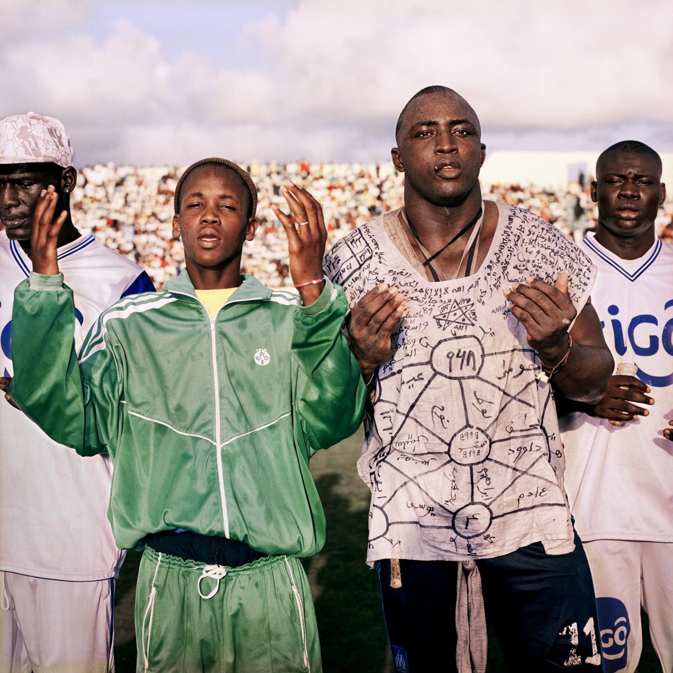
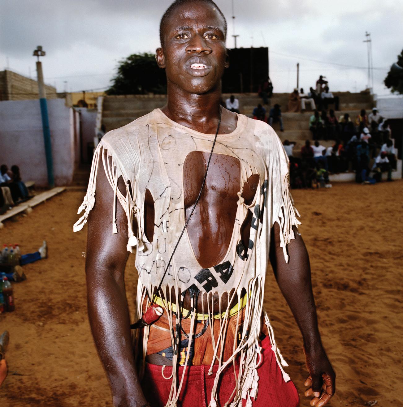
(Above) Serer wrestler before his fight at the Adrien Senghor arenas. Photography
AFROSPORT
Laurent Gaudin

The relationship between sport and design has long been dynamic and mutually reinforcing, driving culture, economy and social development. Its role is highlighted through AFROSPORT’s 150 photographs from image-makers such as Pieter Hugo, Nana Yaw Oduro and Kyle Weeks. It documents significant events including the Rugby World Cup Trophy Tour in Cape Town last year, and the moment that the Senegalese football team won the Africa Cup of Nations for the first time in 2022. In a bustling, smoky image, the team are portrayed raising their trophy in a gesture of victory in the crowded streets of Dakar. The book highlights sports from boxing to motorbike racing, as well as some that are more traditional or less well known. This includes dambe fighting, a martial art from the Hausa people of Nigeria, and laamb wrestling, a Senegalese fusion of traditional wrestling styles that has overtaken football in popularity. Contributions from writers, artists, skate brands, filmmakers and sports figures including Joakim Noah, Didier Drogba and Gerard Akindes each offer their perspective on how sport and design has played an influential role in their lives, and the development of Africa.
“There’s a strong new language in Africa that's happening now and it’s completely mixed up with western culture”
Casting a wide net from the past to the present day, AFROSPORT portrays Africa’s identity amidst a shifting societal landscape. Driven by the continent’s rapid growth in population, the so-called youthquake that has given Africa the largest percentage of people under the age of 25 in the world, a new visual language is emerging. Demographic change is both a challenge in its effect on unemployment rates, access to education and healthcare, and an opportunity. A youthful Africa offers a vast pool of creativity and innovation. If effectively tapped into, it has the potential to drive economic growth, placing the younger generation at the front of visual culture.
At the same time, globalisation and the instant communication of social media has sparked a new kind of interaction between the West and the Global South. Football is inescapable. In Cape Town and Johannesburg, people wear Chelsea jerseys embellished with the symbols of western consumerism, which have been co-opted into everyday clothing. Traditional sports, such as donga, are attracting more attention and sporting talents no longer need to leave their homes to start a career. African culture has

AFROSPORT
(Left) (Below) The Gris-gris Wrestlers of Senegal. Photography Christian Bobst
A wrestling tournament held on a basketball court at the Olympique de Ngor stadium, Senegal. Photography Christian Bobst
(Above)
032
(Right) Orlando Pirates Photography @kgotmotso_neto

034
(Above)
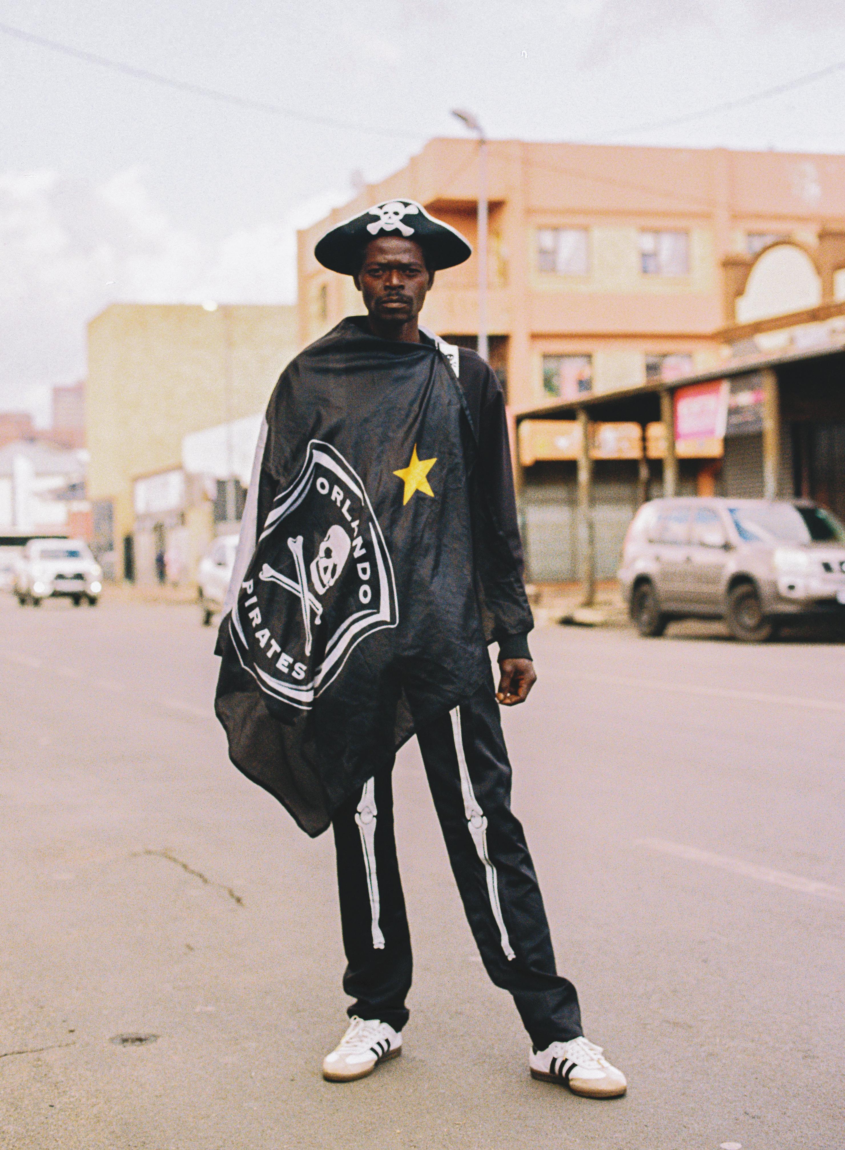
(Right) Fans attending an Orlando Pirates football match, wearing the team's signature skull and crossbones. Photography Rogan Ward
The Orlando Pirates is a football team based in Orlando, Soweto


assimilated western influences, and the line between the two has eroded. The colonial powers had originally introduced European sports as part of their supposed civilising mission and saw them appropriated by their unwilling subjects. Something similar is happening now. “There's a strong new language in Africa that's happening now, and it’s completely mixed up with western culture,” says Pienaar. “A lot of people think that African designers use symbols as appropriation or as aspiration. But the Nike logo, for example, holds a completely different meaning, since it isn't available in most African countries. People start seeing the symbol appear on jerseys and at football matches, but they don’t associate it with the product. There’s a new language developing.”
“There’s an incredible playfulness in African design, especially in sport”
Okoh, a Ghanaian teacher, artist and hockey player, designed Ghana’s national flag in 1957 with three colours – green, yellow and red – plus a black star. The latter is identified as a symbol for the emancipation of Africa, adopted first from the flag of Black Star Line, a shipping line established by Marcus Garvey which ran from 1919 to 1922. When other former colonies became independent, they opted for the same colour palette in solidarity.
It could also be said that Africa’s unique visual language – one that exudes a sense of boldness, storytelling and shared values – matured once the continent became independent in the 60s. Theodosia Salome
The design ethos of AFROSPORT embodies this spirit, characterised by bold colour palettes and a non-linear approach to layout and composition. It avoids formal grid layouts in favour of organic, free-flowing aesthetics, nodding to the lively nature of the design language. This becomes evident throughout the graphics, designed by Pienaar and the Mami Wata team, and in the stories that unfold throughout the pages. One such example is that of The Orlando Pirates, a football team based in Soweto,
035
AFROSPORT
 (Left) (Above) South African football culture, photography @kgotmotso_neto
Kaizer Chiefs Football Club are a South African professional football club based in Naturena, Johannesburg
AFROSPORT
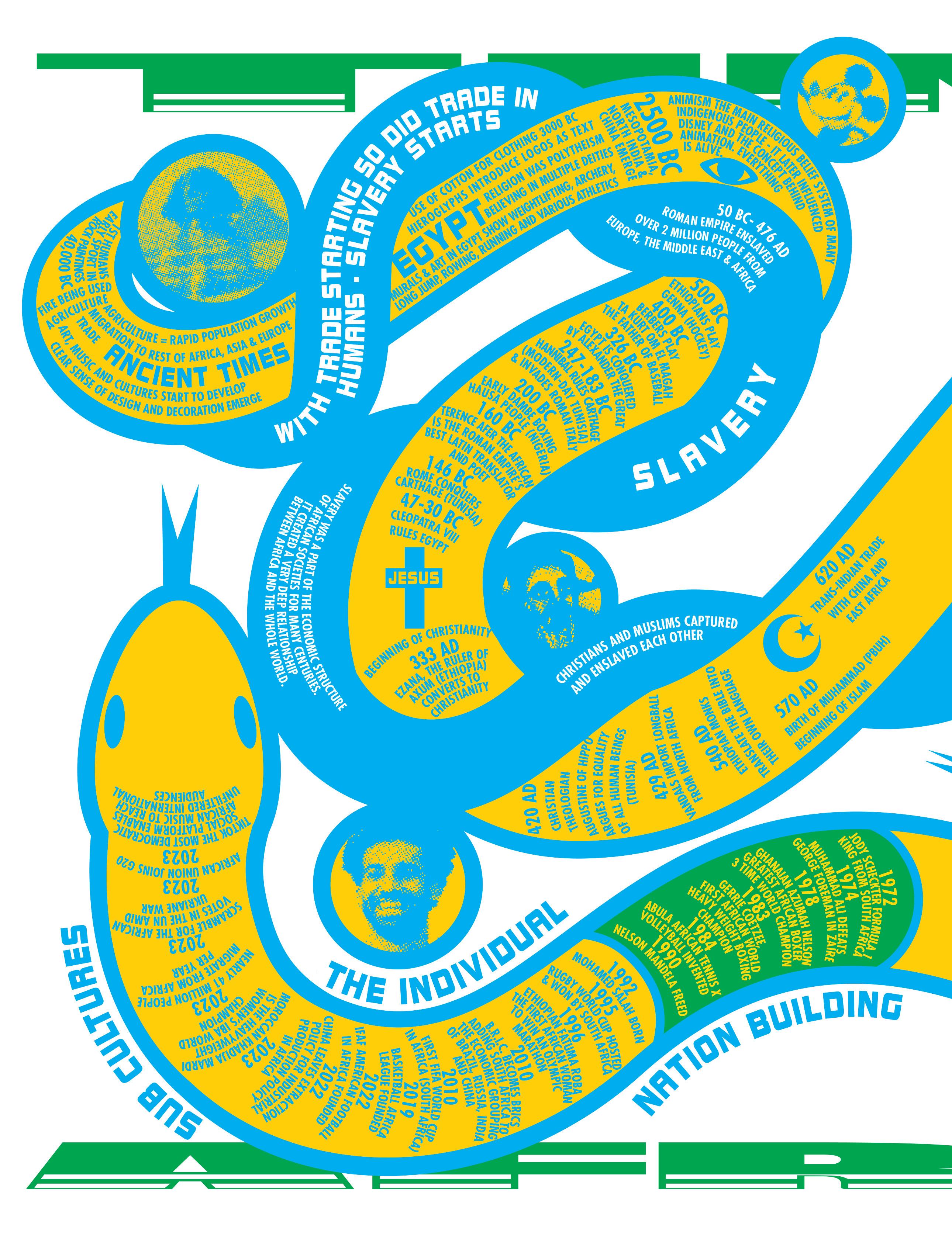
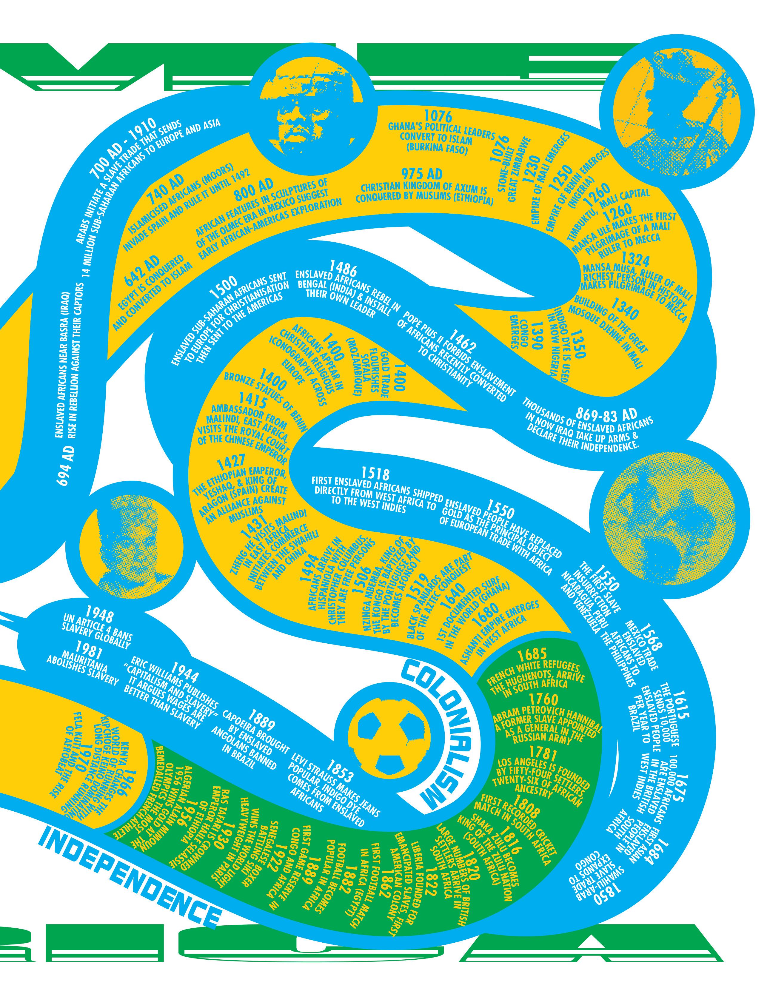
(Above) Timeline of African history, courtesy of AFROSPORT

Orlando. Formerly known as the Orlando Boys Club, the teenagers who originally formed the club in 1984 eventually broke away to join Andries ‘Pele Pele’ Mkhwanazi, a boxing instructor who encouraged the genesis of a new football club in 1987, dubbing them ‘amapirate’, which means ‘pirates’ in isiZulu. The team took a name that had been intended as an insult, and created a logo and identity that resonated with their defiance – a monochromatic skull and crossbones. It refers back to the buccaneering days of Caribbean piracy, but also to the iconography of contemporary American football. Pienaar finishes, “there’s an incredible playfulness in African design, especially in sport.”
 (Above) Ghana BMX, courtesy of AFROSPORT

041 AFROSPORT
(Above)
(Left) Photography Rogers Ouma
Tour D'Afrique, the original transcontinental journey and flagship bicycle expedition. Photography Chris Keulen
A △○−☺⤓♡↘■↖ language ♡↘■↖ ☐△○−☺⤓♡↘■↖ △○ ↘■↖ without ⤓♡↘■↖ ☐△○−☺⤓ words
☐△○−☺⤓♡↘■↖ ☐△○−☺⤓♡↘■⤓ From ancient hieroglyphs to the Olympic Games and architectural signs for the deaf community, pictograms have become a powerful tool for shaping our daily experiences, fostering kinshipy and speaking volumes without uttering a single word
WORDS Ayla Angelos 042
You’ve been awake since dawn and you step into the airport, a passport clutched in one hand and a coffee cup in the other. The atmosphere is buzzing with fellow bleary-eyed travellers, and the frenetic pace feels dizzying, as if you’re working your way through an obstacle course. Your gate number is called, and each hurdle becomes harder and more challenging – you leap over an abandoned suitcase, swerve a puddle of cola and squeeze through the duty-free minefield. And finally, you spot an arrow-bearing icon guiding you through the maze. A simple silhouette of an aeroplane signals the way to check-in counters, while a suitcase icon beckons towards baggage claim.
You’ve made it to the gate, and you couldn’t have done it without the humble airport pictograms. The visual cues have become a universal language, embedded so deep into society that most may not even notice their impact. They melt into walls, signage and doors as if they were part of the furniture, soaking up as much information as possible to forge their own ecosystem of graphics and illustrations. As travellers, we become unwitting participants in this non-verbal dialogue, each arrow and icon guiding us through the labyrinth of terminals, replacing the chaos of the airport – and many other places of civilisation – with an experience that prioritises a straightforward journey above anything else.
“More than ever before, we read and understand the world around us in images”
Pictograms have long served as a powerful and versatile means of communication. The earliest instances trace back to ancient civilisations, engraved or painted on cave walls. The Egyptians used hieroglyphics, a form of pictogram writing, to convey a wide range of concepts and ideas, while the Sumerians employed pictograms on clay tablets for record keeping. In ancient China, oracle bone script featured pictographic characters inscribed on bones and shells, which were used as a method of pyromantic divination, the practice of using fire or flames to seek knowledge of the future. In the modern era, pictograms have become standardised and widespread, particularly in public spaces and transportation systems. Road signs, for instance, employ a suite of symbols to convey warnings, prohibitions and directions. They do, however, have national variations; Margaret Calvert and Jock Kinneir gave Britain a particularly impressive set as part of their work on a new road signage system. And some signs have turned into graphic fossils – railways are still being represented by long-vanished steam locomotives, and digital speed cameras by traditional-looking analogue cameras. The rise of the emoji is a new form of communication that conveys emotions and expression through a singular icon, albeit one that tends to offer a literal interpretation.
043
(1) Fencing, copyright ©1976 by ERCO, www.otl-aicher-pictograms.com
(1)
Pictograms have played a significant role in global events, notably the Olympics, which has used them as part of its branding. Since their inception at the 1964 Tokyo Olympics – the first time a graphic visual system was used to communicate the games without words –pictograms have served as a way to convey information, transcend language barriers and allow athletes, officials and spectators from various linguistic backgrounds to easily identify and understand the different sporting disciplines. Kamekura Yusaku developed a modernist emblem and a set of 39 informational icons appearing stencil-like and bold, a cohesive identity wrapping the games tightly together.
Yusaku’s pictograms were a turning point. In subsequent games each Olympic host city has tried to put its own creative stamp on the design of pictograms with greater or lesser degrees of success. The most authoritative example is Otl Aicher’s work for the 1972 Olympic Games in Munich.
(Image) Water polo, copyright ©1976 by ERCO, www.otl-aicher-pictograms.com
A LANGUAGE WITHOUT WORDS 045
Aicher attempted to continue the modernist tradition of Bauhaus-era functionalism in post-war Germany. His wife’s sister had been one of the White Rose group, whose resistance to Hitler led to their murders. As a memorial to her, and as an institution dedicated to developing a humanistic approach to design that would reinforce a democratic society, they established the Ulm School of Design in 1953. It helped to create the refined language used by Braun consumer electronics. Aicher himself designed a font that he named Rotis, and an identity for Lufthansa. His most enduring legacy is his work for the Olympics. He created a comprehensive visual identity system that included pictograms, colourful graphics and typography. The identity showcased Aicher’s belief that design could foster communication across cultural and linguistic barriers; it reflected simplicity, clarity and functionality, and rejected the ornamental excesses associated with Nazi propaganda, embracing a more rational and democratic approach to design. As such, the pictograms displayed geometric shapes and a minimalist approach, all the while conveying the dynamic movements inherent in each sport. Whether it was the arc of a diver, stride of a runner or swing of a tennis racket, each pictogram captures the essence of the sport it represented with fluid, energetic lines that remained consistent and accessible throughout. “The copyright-protected system is characterised by a strict grid and consistent simplification,” says Kai Gehrmann, who’s responsible for the global licensing and further development of the Otl Aicher pictograms. “Each symbol follows standardised design rules, comparable to the grammar rules of verbal language.”
While devising the system, Aicher turned to the iconography of the 1964 Olympics in Tokyo, seeking to devise a suite that was less pictorial and more consistent. He ensured that the essence of each pictogram was captured in a straightforward and comprehensible manner. This system, which became known for its clarity and recognisability, went on to define a whole design epoch; it continued to expand since the 70s and now includes more than 750 pictograms that go far beyond sport. “More than ever before, we read and
understand the world around us in images,” says Gehrmann. “Today, pictograms are an integral part of the design of digital interfaces, for example, which should be understandable globally regardless of language. In this respect, the fields of application are even more diverse today than they were during Aicher's lifetime.”
And while many continued to embrace this ethos, others have sought to challenge it. For the Paris 2024 Olympic and Paralympic Games, this new set of icons marks a departure from previous styles, showcasing a wilful break from tradition (or from Aicher).
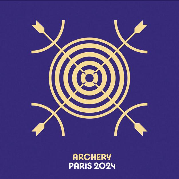
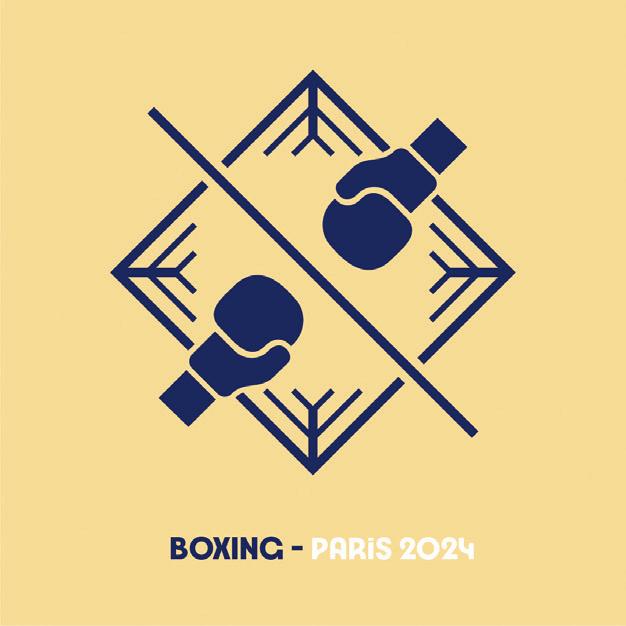
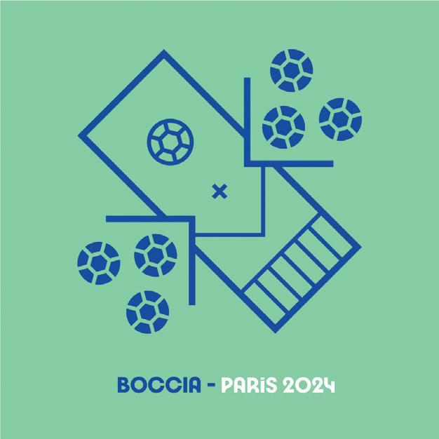
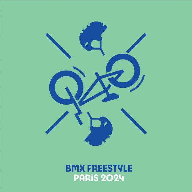
Led by Joachim Roncin, head of design for Paris 2024, and in collaboration with agency W, the suite of 62 pictograms are unconventionally dynamic and expressive, capturing the action and excitement of each sport, and the buzzing atmosphere of the Games. Bendy moves of a gymnast and the powerful strokes of a rower are forged into athletic, almost liquid lines and valiant forms, cradled in vibrant colour palettes with a heavy use of purple. Each icon is composed of three graphic elements designed around an axis; eight of which are shared between the Olympic and Paralympic Games.
While Aicher’s pictograms were rooted in standardisation and clear communication, the Paris 2024 iconography bears a more idiosyncratic approach that is sometimes hard to interpret. President Tony Estanguet referred to the pictograms as “badges of honour” that symbolise the wearer’s belonging to the chosen sport family, embodying a sense of belonging and community. “A pictogram is also a symbol that is collectable,” said Estanguet at a pictogram launch event. “When you’re an athlete, you're proud about showing off the pictogram of your sport – pins, T shirts… I remember collecting those things.”
The Olympics – and sports in general – wasn’t the first nor only industry to combine pictograms in a systematic approach.
046
(3) (2) (1) (4)
Fencing, copyright ©1976 by ERCO, www.otl-aicher-pictograms.com
(5) (6)
047
(Images) For the Munich Olympics in 1972, Otl Aicher devised a comprehensive system to define each sport with a maximum economy of means, including torch race (1) bobs (2) powerlifting (3) mountain biking (4) hurdling (5) and aerial skiing (6)
A LANGUAGE WITHOUT WORDS
(Images) Pair-skating (1) and triathlon (2) Water polo, copyright
(1) 048
©1976 by ERCO, www.otl-aicher-pictograms.com
A LANGUAGE WITHOUT WORDS (2) 049


“A

050
pictogram is also a symbol that is collectable”
(Images) Paris 2024 Summer Olympics, credit Paris 2024



051 A LANGUAGE WITHOUT WORDS




052
(Images) India State Election Symbols, copyright ©2018, Official Website of State Election Commission, Government of Puducherry, India
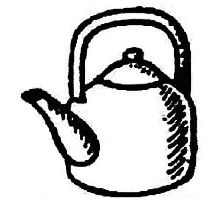
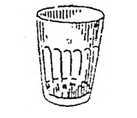
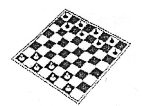
In India, when millions of eligible voters go to the polling booths for the elections, their vote is cast with a symbol: a ceiling fan, bungalow, umbrella, bottle, coconut or a mango to name just a few. Most of the symbols were drawn by hand in pencil by the late draughtsman M S Sethi, who retired in 1992, giving the identity of the icons a sketchy and minimalist aesthetic. The symbols appear on electronic voting machines in India, representing the 2,300-odd political parties; they’re published on banners, plastered across rallies, printed on pamphlets and election manifestos. The icons have been part of the process since 1952, the year India held its first election after the country gained independence from British colonial rule. Because 80 per cent of the population was illiterate, they decided on a foolproof and easy way for voters to be able to identify their chosen parties.

Just like the parties, which ebb and flow with society and popularity, the list of symbols is a work in progress. By 2004, there were fewer than 10 symbols for candidates to choose from – including the ceiling fan, telephone, air conditioner and dish antenna. Now, the Election Commission of India (ECI) maintains thousands, representing everyday life in India. A large portion of these are items of clothing or grooming utensils, many are household items, a couple are transport vehicles and there are just two animals, the elephant and the lion. These are the last remaining on the list due to complaints around ill-treated live animals being used in the rallies. The Maharashtrawadi Gomantak Party (Goa), the Hill State People’s Democratic Party (Meghalaya) and the All India Forward Bloc (West Bengal) have chosen the lion, yet, of course, won’t be able to rally with their real-life mascot. In 1991, the election commission ruled out using fauna as a symbol, too, due to concerns from activists who feared people might attack a creature if it embodied the symbol of an opposition.
Many of the symbols may seem curiously abstract, the nail clippers for example, but they don’t just represent a political party. They elicit the transformation of India from more rural depictions like a plough, cow and cart, to symbols like a tractor, truck and electric pole, then a laptop, computer mouse and USB stick. The symbols are made to be neutral, yet equally bear weight with emotional appeal and their ability to be relatable. And once they’re chosen, or ‘reserved’ by a party, they cannot be used by another again. Despite their rough and pixelated appearance, the Indian election symbols are a powerful and striking example of the part that pictograms can play in national life.
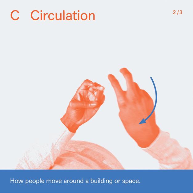
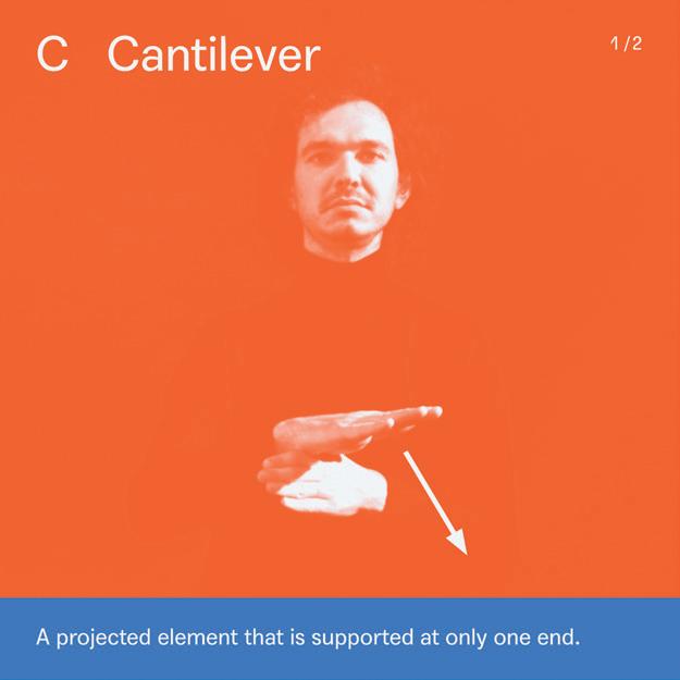
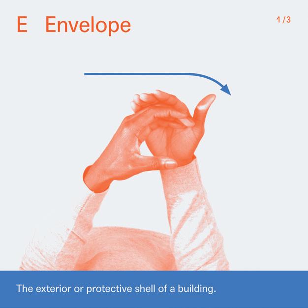
Sign language might be understood as another form of pictogram. Chris Laing, the founder of Deaf Architecture Front (DAF) and Signstrokes, is making
053 A LANGUAGE WITHOUT WORDS




054
(Images) India State Election Symbols, copyright ©2018, Official Website of State Election Commission, Government of Puducherry, India


055 A LANGUAGE WITHOUT WORDS
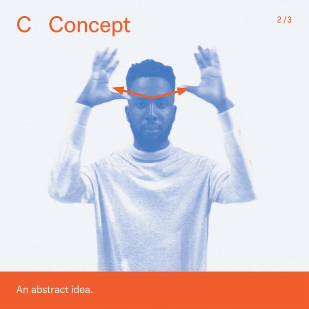
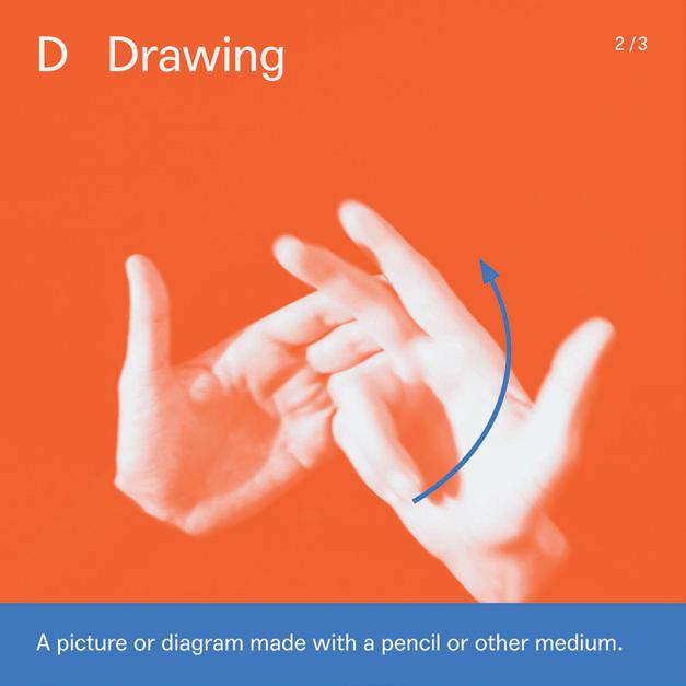
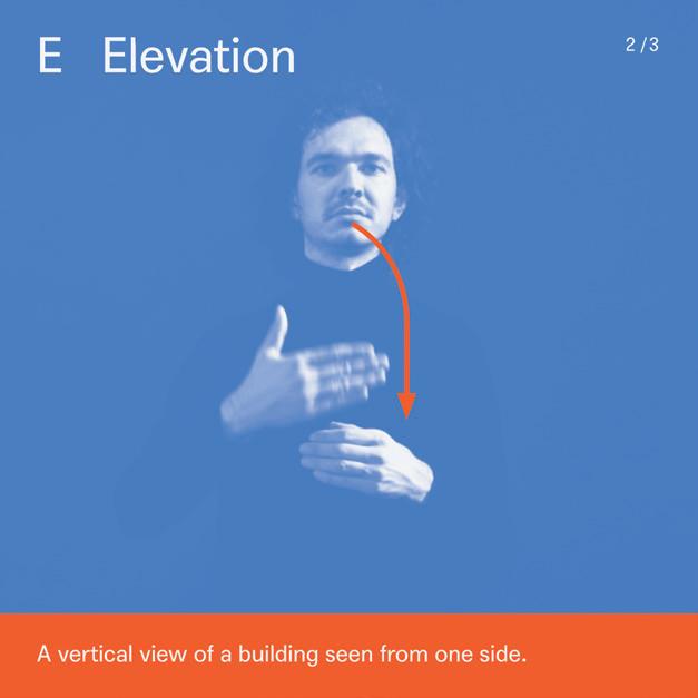
significant strides in promoting inclusivity and accessibility by developing signs within the field of architecture. In his research, he found that fewer than 15 deaf people are currently training to become architects in the UK. DAF aims to address the challenges that they face by sourcing interpreters, obtaining learning support and translating specialist terminology into British Sign Language (BSL). Laing also launched Signstrokes to convey architectural concepts.
“Pictograms are used as learning tools in education settings, both for young deaf children aspiring to become architects, to students at university and those who want to gain an understanding of the language used in architecture”
Laing, an architectural designer who is deaf himself, established both companies in response to the barriers he faced throughout his career. “I had to create and use ad hoc signs with every interpreter that I worked with, as there was no corpus of terms for architecture that was readily accessible,” he says. “Facing challenges like this can be very isolating.” After meeting a fellow student who was facing a similar experience, they both aligned on a standardised set of terms and initiated the launch of Signstrokes. With support from Kate Rowley, a researcher in linguistics at Deafness Cognition and Language Research Centre (DCAL), and funding from the architectural practice Haworth Tompkins and the Knowledge Exchange at University of the Arts London, they set up a public workshop to translate the terms into BSL. They followed three strategies – the C handshape, visibility and two signs becoming one – to develop the terms and turn them into a graphic system as part of the Signstrokes archive. “Pictograms are used as learning tools in education settings, both for young deaf children aspiring to become architects, to students at university and those
who want to gain an understanding of the language used in architecture,” Laing says. “It’s a valuable resource for both deaf architects and their hearing colleagues, so as to share knowledge and better communication in a studio setting.”
In some ways, Laing’s visual language can be likened to Aicher’s. It’s visually clear, accessible and universally understood. The graphics have captions and show the content step by step, opening up the language to the deaf community. “Pictograms will play an important role in the future as they represent BSL and other languages in a way that is accessible and inclusive,” he says.
“Aicher was convinced that the clarity and recognisability of pictograms are directly related to the limitation of form and structure to the essentials. Pictograms have a task to fulfil: They enable orientation and understanding. This applies then, now, and in the future”
Growing recognition of the importance of inclusive design practices gives Aicher’s philosophy of a language without words more relevance than ever. “Aicher was convinced that the clarity and recognisability of pictograms are directly related to the limitation of form and structure to the essentials. Pictograms have a task to fulfil: They enable orientation and understanding. This applies then, now, and in the future,” says Gehrmann. “I do not see inclusion/representation and design/aesthetics as contradictory. The right thing that fulfils the intended task is always also beautiful. It is like mathematics. For a mathematician, a functioning formula will always have an aesthetic quality.”
056


057
A LANGUAGE WITHOUT WORDS
(Images) Signstrokes, Chris Laing








A LANGUAGE WITHOUT WORDS
(Images) Signstrokes, Chris Laing
☐△○−☺⤓♡↘■
☐△○−☺⤓♡↘■ ☐△○−☺⤓♡↘■
△○−☺⤓♡↘■
☐△○−☺⤓♡↘■
☐△○−☺⤓♡↘■
☐△○−☺⤓♡↘■ ☐△○−☺⤓♡↘■
☐△○−☺⤓♡↘■
☐△○−☺⤓♡↘■
060
“Pictograms
will play an important role in the future as they represent BSL and other languages in a way that is accessible and inclusive”
061

The nuclear
062
WORDS Richard Brook PHOTOGRAPHY Michael Collins
sublime

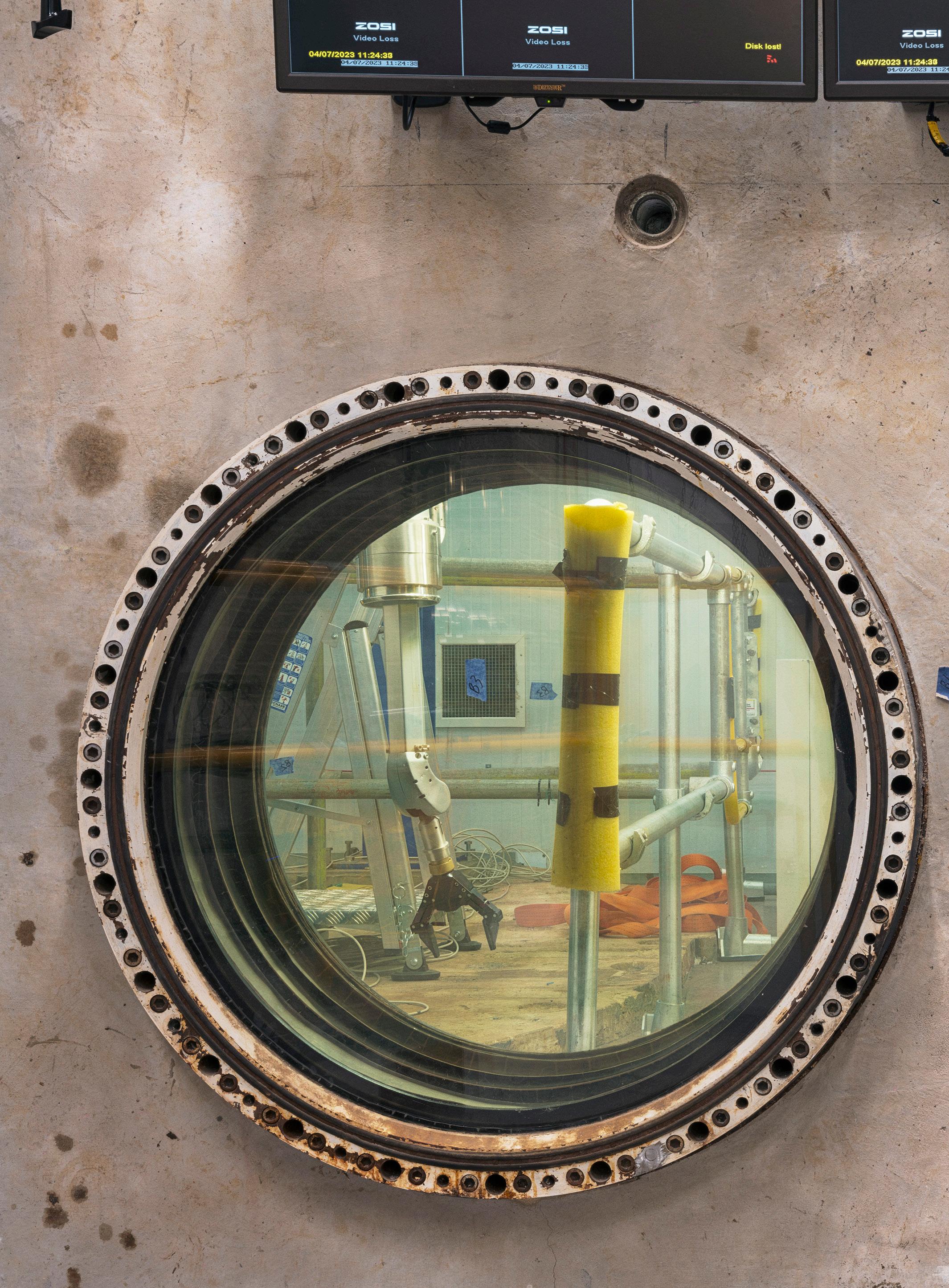
Intermediate Level Waste Store, concrete overpack, No 2, Trawsfynydd, 2021
063
Michael Collins was given access to Britain’s nuclear power stations. His photographs provide an insight into a remarkable series of spaces, once seen as the future of power generation. Some have reached the end of their working lives, and are now in the process of being dismantled. Other are still functioning, while an experimental new generation of reactors take shape, a reminder that we depend on atomic power.
Writing in 1979, the American artist Robert Morris observed that, “in one form or another, technology has produced the monuments of the 20th century: the mines, the rocket assembly buildings so vast that weather forms inside, the Four Corners Power Complex, the dams of the 1930s, the linear and circular accelerators of the 1950s and 1960s, the radio telescope arrays of the 1960s and 1970s, and soon, the tunnel complex for the new MX missile.”1 Morris’ essay was about land art as a form of reclamation in the context of the vast opencast mines that scarred the North American landscape. In observing the monumental status of an industrial legacy, he sought to question how such sites should be viewed in the future – whether they should be afforded heritage status. In so doing, Morris asked his audience to consider the formal and material treatment of redundant structures once they had become technologically obsolete. Should they be obliterated or camouflaged, or was a better strategy to retain some memory of their presence? His argument trod a thin line between ecological sensitivity, consciousness of heritage and the commercial possibilities of commissioned art as a form of amelioration and commemoration.
1Morris, R. (1979) ‘Notes on Art as/and Land Reclamation’. Revised version of a keynote address, July 31 1979. Published in Morris, R. (1993) Continuous Project Altered Daily. The Writings of Robert Morris (Cambridge, Massachusetts: MIT Press) pp.211-231.
Morris’ observations are increasingly prescient in Britain today, where the monuments of its post-war modernisation programme have routinely been demolished before their true significance has been explored or understood. Most of the large coal-fired power stations built in the 1960s have now been decommissioned. Many of them have already been blown up, and their sites cleared. The distinctive silhouette of the parabolic cooling tower, the iconic form of power generation, was
064
 065
(Below)
THE NUCLEAR SUBLIME
(Above) Gas Circulator Torness 2023 Redundant controls Dounreay Fast Reactor sphere airlock 2023
 066 (Right) Interior of in-vessel training facility of JET Fusion reactor No 1
 (Right) (Overleaf)
Obsolete master slave manipulated Reactor 2 Dungeness 2023
Master slave manipulator Dragon Reactor Winfrith 2023


indelibly inscribed in the mind’s eye of an entire population and is steadily and purposefully being eradicated from view. The requirement for cooling water-situated power stations on low lying, level land where their massive forms were visible to any traveller on the motorway network, itself expanded in parallel with the capacity of the national grid. Motorways and carbon giants were not the only forms of new infrastructural landscapes that emerged in the post-war decades – where coal fired meant coal fields. The geography of Britain’s nuclear power stations was markedly more remote and almost exclusively coastal. Only Harwell and Trawsfynydd are exceptions.
To the communities that harboured atomic energy production facilities, their impact was absolute. Small settlements expanded to accommodate incoming workers. Supply chains and attendant social, cultural and essential provisions tied entire families to nuclear employment, amongst the spheres, domes and oddly cubist forms of reactor halls. In the UK, by 1976, 13, of an eventual 19, nuclear reactors were connected to the national grid from 11 sites. The first was Calder Hall at Sellafield in Cumbria, which went onstream in 1956. The most recent nuclear power station in Britain is Sizewell B, which opened in 1995. It was the year in which nuclear-generated electricity peaked at 25 per cent of the total supply. It is down to less than 18 per cent today.
devoid of nature at all. This collected series of images presents an entirely man-made environment shaped exclusively by function and, as such, defining its own order, tonal palette, and graphic catalogue.
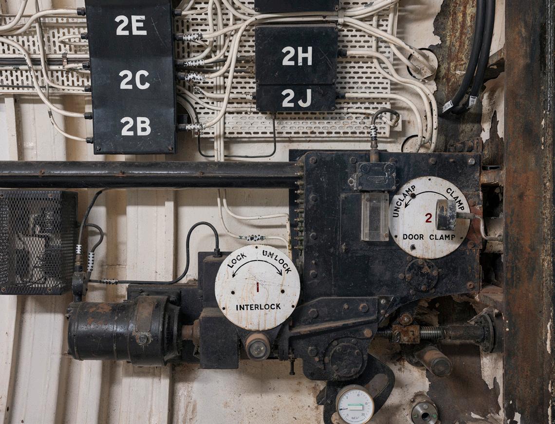
Collins is knowledgeable about his subject. He has a long-held interest in industrial structures and landscapes. A connection with the Financial Times opened the door to his first nuclear power station, Sellafield, and, after waiting nine months to achieve security clearance, his visit revealed to him both the archaeological nature of these sites and a technological palimpsest – stasis in tandem with layering that is uniquely industrial and is amplified in nuclear sites. The photographs that he took then attracted the attention of the Nuclear Decommissioning Authority which is charged with responsibility for dealing with the afterlife of the power stations after they cease operating. The NDA sees consultation with the public as an essential part of its activities, and it was this that motivated Collins’ commission to document the stations. Collins accepted the commission with the proviso that he would be free from direction from the NDA. It would be understood as a creative project, rather than commercial photography. His uncompromising stance was understood and accepted by the public body and access, whilst highly controlled in terms of safety, was effectively unlimited.
Not subject to the decarbonisation programme that drove the demolition of coal and oil-fired facilities, a generation of nuclear power stations has reached the end of its operational life. Unlike the carbon operations, the winding down of atomic sites is incremental. The half-life of spent nuclear fuel necessitates that change is at a glacial pace. From a heritage perspective, this gives time to consider the value of the old stations. It offers the opportunity to appreciate the preserved image of facilities that were founded on notions of stability and maintenance regimes that prioritised a status quo – change for change’s sake was not desirable.
The photographer Michael Collins is one of the few people who have been afforded access to all of Britain’s nuclear sites. His new book, The Nuclear Sublime, captures, in extraordinary detail, a moment and an aesthetic that is as intriguing as it is unsettling. Collins’ view though is not one of objects in a field, his is an interiorised perspective, a rare glimpse into contained space that is almost devoid of natural light, indeed
His work reflects Bernd and Hilla Becher’s powerful documentation of the typologies of industrial architecture, and he shares their fascination with various forms of record photography. When Collins met the German artist duo in Dusseldorf, they discussed the question of the influence of the Neue Sachlichkeit photographer Albert Renger-Patzsch on their work. Bernd Becher told Collins that the canon was not that useful to him and produced a gazette of local industry from the Siegen area where he grew up as an example of the type of image that inspired him.
Collins has explored many archival collections and champions their inherent cultural value. For him, the period in which municipal departments and large engineering contractors routinely employed professional photographers represented documentary photography in its purest form. It has left a largely unknown but very valuable legacy of images that are yet to be fully appreciated for the technological record they contain and the corresponding socio-cultural narratives that they support. He believes they deserve statutory protection in the same way that buildings are protected by listing for their architectural or historic significance.
071
(Above)
2
A
(Left)
Pile Cap detail Reactor
Dungeness
Pile Cap and Crane, Reactor 2 Dungeness A 2022
THE NUCLEAR SUBLIME


072

073
1A
NUCLEAR SUBLIME
(Below) (Left) (Below Left) Pile cap Crane Control No 1A Sizewell A 2022
Control Panel Crane Control No
Manifolds and Valve Control System Cryoplant International Thermonuclear Experimental Reactor 2022 THE


In Collins’ work this “most matter of fact” aesthetic is important. He seeks clarity, a depth of field, sharpness of focus and compositions that are revealing and not necessarily exhibiting mood or sensation. This careful and informed approach lends the photographs in this collection a neutral quality that commits the viewer to visual interrogation, every detail, mark, insignia, object, or colour has its own meaning that narrates a bigger story beyond the limits of each frame. Collins’ aim is not to document, despite employing a documentary style, and this is manifest in the images which ask more questions than they answer in their production.
Collins describes nuclear sites that have been decommissioned as “private museums”, and their interior details as free from the interpretation of curators. His gaze into these secure spaces, admittedly personally thrilling by virtue of their inaccessibility, allows the viewer to form their own interpretations. Collins’ text accompanying his images is as precise as the photography and describes the processes of production. In so doing, Collins contextualises the contents of each image within a bigger system at the same time as liberating the viewer, allowing their own interrogation and interpretation. Fittingly they have a sense of containment, that each photograph is only giving a glimpse of a fraction of the spaces and sequences that constitute these systems. Here, the sublime is expressed in the absence of a complete understanding of how a nuclear power station functions, and our inability to grasp the consequences of nuclear energy and nuclear waste. Even an apprehension of nuclear physics and fission only offers a partial grasp of the operations of such complex sites, and it is this incomplete operational perspective that is captured in the photographs and in their compilation. They are an archive record, they are traces and memories of people and processes, but they are also artefacts in their own right.
(Previous Page)
(Right)
Turbinehall Chapel Cross No 1 2022
Waste Skip (New) Chapel Cross
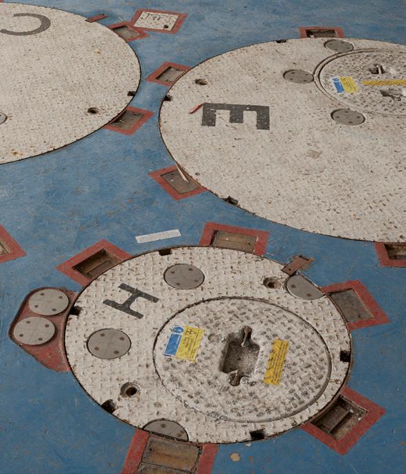
in this case, safety. It makes sense to demarcate functions in clearly contrasting colours. At Dungeness the pile caps – the thick concrete mats – are marked out in white on a blue floor so that a crane operator can be unequivocal in their motion. For decades designers have toyed with these aesthetics. Ben Kelly’s work for Factory Records and others is perhaps the most celebrated. The floors of the reactor halls also call to mind Sam Jacob Studio’s recent scheme for the Science Museum Group’s National Collections Centre. Both are codified spaces. However, the contrast in purpose is stark. An underlying sense of the seriousness of the codification of these operations is hard to shake and, as fascinating as their reading and interpretation is to the viewer, as beautiful as the aesthetic may seem, the images are inevitably ominous.
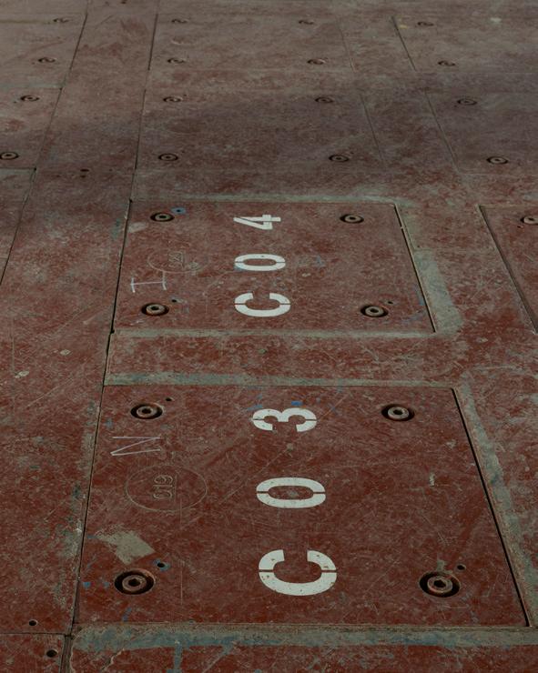
Beyond the content of each photograph, a nuclear aesthetic is made evident. Pragmatic industrial design creates its own visual image, a lexicon of function and,
The book includes photographs from British nuclear power stations at Chapelcross, Dounreay, Dungeness, Sizewell, Torness, Trawsfynydd and Wylfa. However, this is more than a work to record and recall: Collins’ conception of The Nuclear Sublime extends to those facilities that are developing a new generation of power production to address the transition from carbon. The closing images are from sites researching nuclear fusion reactors in the UK and France. These new objects are not the worn, patinated, entropic surfaces of power stations past, they are crisp, cast and overwhelmingly polished stainless steel and aluminium edifices, some with their cellophane wrappers yet to be removed. More than those that preceded them, their image is “bewilderingly technological”, “challenging the limits of our comprehension”. By their inclusion Collins reminds us that the ghosts of nuclear past are not monuments to histories – in the absence of any viable alternative, they are but a staging post to a seemingly inexorable future.
The Nuclear Sublime is published by RRB Photobooks £50. A special edition including a print is available for £200.
Photographs copyright Michael Collins.
076
(Above)
Pile Cap Reactor 2 Trawsfynydd 2023

 (Right) Turbine Hall Gauge Board Sizewell A No 1 2022
 079
079
THE NUCLEAR SUBLIME
(Left) Control Room Reactor 2 Dungeness A 2022
080
Window No 10 Irradiated Fuel Cave Dounreay Prototype Fast Reactor 2023
Right) Dounreay Prototype Fast Reactor Mortuary Control Panel 2023
Refuelling Cavity Reactor Sizewell B No 2 2023
 (Below) (Right) (Below


081
WORDS Deyan Sudjic PHOTOGRAPHY
Where design meets art
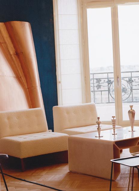
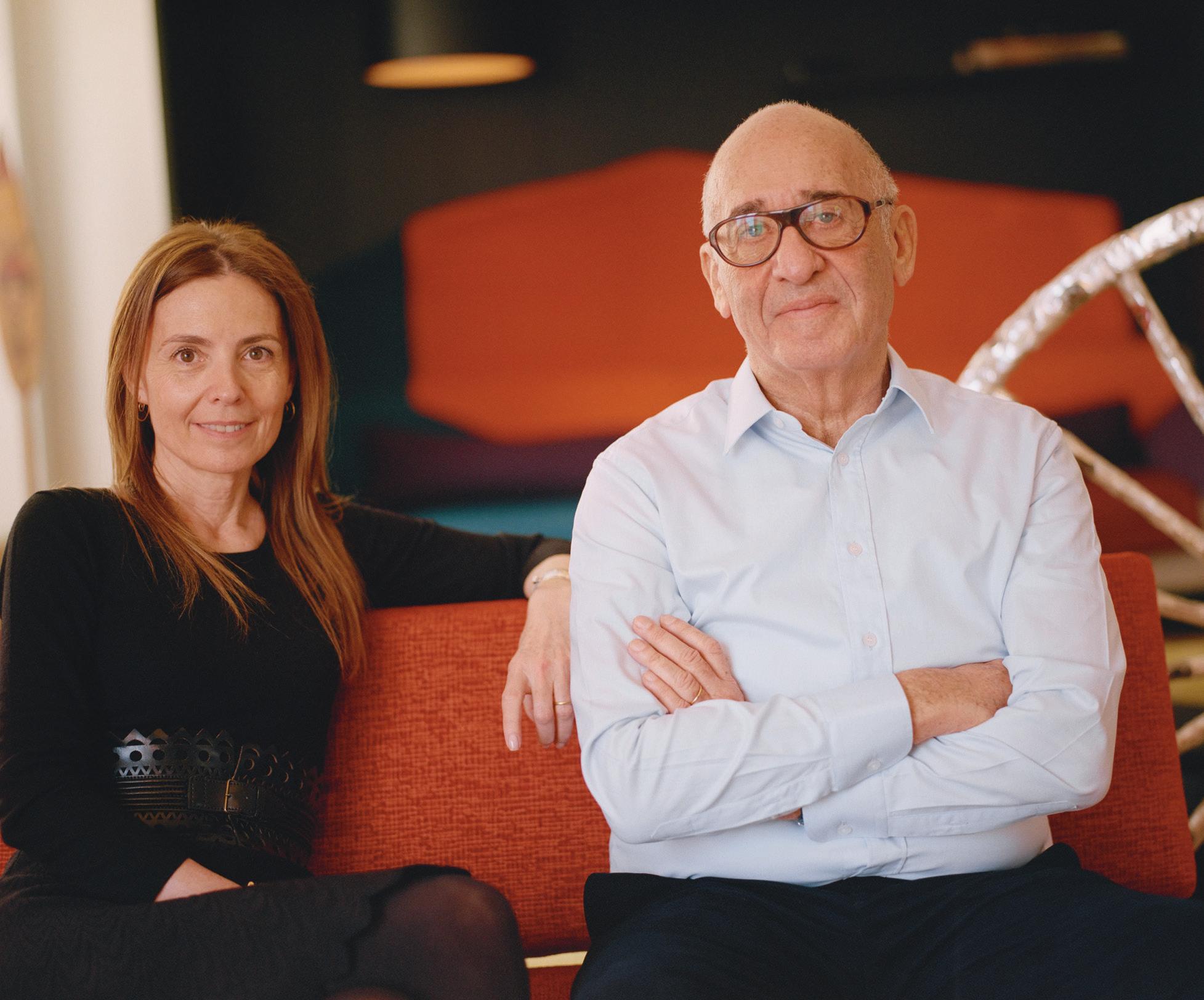
Clémence and Didier Krzentowski set up Galerie kreo in Paris as the outcome of their personal collection. It provides a distinctive view of contemporary design
082
Emma Le Doyen
(Right) Commissioned and displayed by their gallery, Marc Newson's Quobus storage system has a practical purpose. Photography Emma Le Doyen
(Left) The Krzentowski apartment overlooks the Seine, and is filled with their collections. Photography Emma Le Doyen

Clémence and Didier Krzentowski established Galerie kreo in 1999 in the rue Louise Weiss, an unprepossessing area of eastern Paris. They joined a group of galleries focused on French contemporary art that left the high rents of the Marais in the city centre behind and moved into a building leased cheaply to them by the government. At a time when the Parisian art scene had become something of a backwater eclipsed by London, Berlin and New York, rue Louise Weiss turned into a thriving platform for new work. “I won’t go so far as to say that it stopped us being ashamed of being French when it came to contemporary art, but it certainly gave us a reason to hope,” one gallery owner described the project later when the artists’ attention had moved to other areas of Paris.
Galerie kreo brought something new to the mix of contemporary culture: design. Its opening exhibition was titled Furniture and Objects 1960-2000 and mixed vintage pieces followed by new work from such designers as Marc Newson and Ron Arad. The gallery developed a distinctive personality, offering design from the recent past, particularly lighting from France and Italy, dating between 1945 and 1985 but also by working with contemporary designers to produce limited editions. Galerie kreo stands out from other galleries that offer what was sometimes called design art, a blurry category that sometimes fails to be either. The designers it works with belong almost exclusively to the mainstream of industrial design. Jasper Morrison, for example, who had his first solo exhibition with kreo in 2006, has produced flat screen televisions for
084
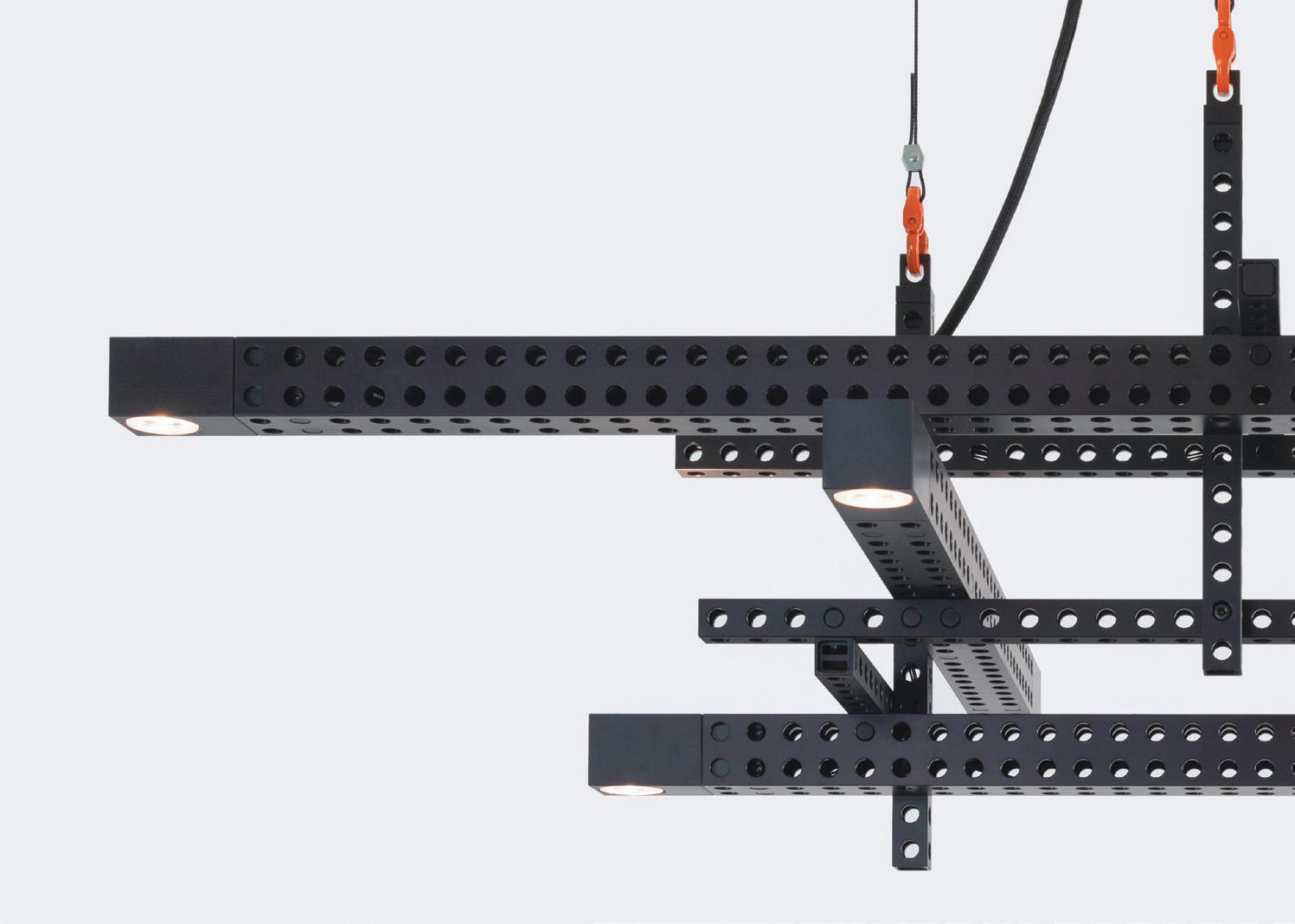
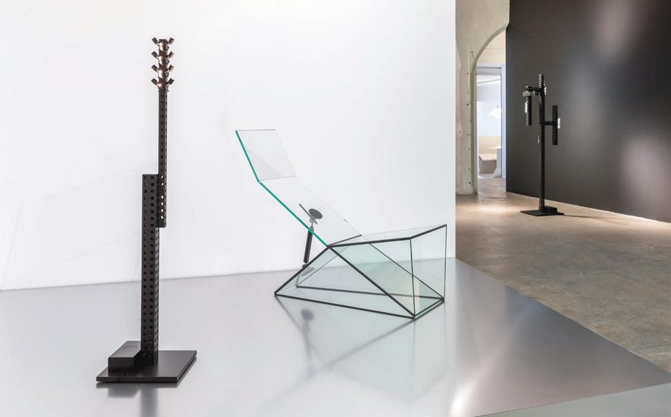
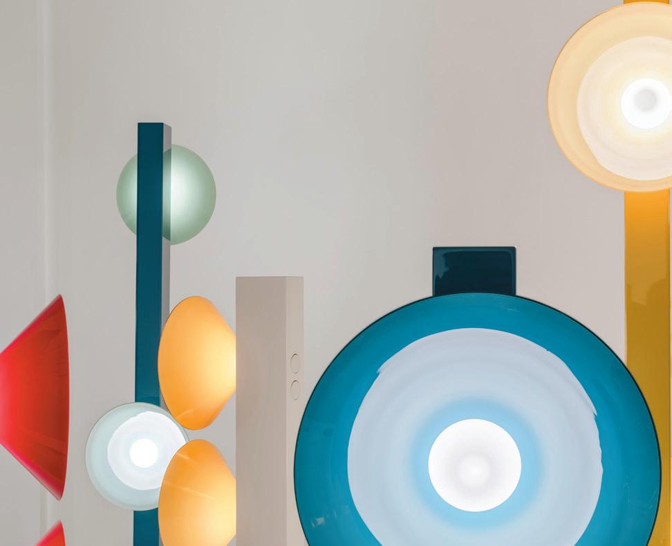
(Above) Grcic used square section aluminum, a ready-made material from the car industry, for precision engineering as the basis for a group of seven lights. Displayed is a group of glass tables and a chair. Photography Alexandra de Cossette, courtesy Galerie kreo

Sony, cameras for Canon and furniture for Muji. Like Morrison, Konstantin Grcic, who was Morrison’s first assistant, has also been involved with mass production. This experience gives both designers an insight into the potential of industrial materials and technology. Morrison designed the Air Chair for Magis, which has been made in the hundreds of thousands. It depends on industrial gas-blown plastic moulding techniques, developed to make cheap components for car interiors, that require no finishing or manual work, which allows them to sell for £118 each. Morrison’s Carrara table collection for kreo is put together by hand and made from aluminium honeycomb and marble in an edition of just 12, along with what is known as a prototype, or artist's proof, and is available for up to £43,000.
The concept of the limited edition comes from the early days of printing and moulding techniques, when each impression caused a slight drop off in quality as the copper plate was brought into contact with the paper, or each time a mould was used to make a cast. Translating the concept of the edition to contemporary design is not an exact match. It is not about avoiding a deterioration in the sharpness of an impression. Limited editions reflect the experimental nature of the pieces which cannot be mass-produced at reasonable prices. An edition allows for designers to experiment with what is possible without the constraints of mass production.
085
 (Above) Konstantin Grcic named his show Transformers, but confessed that his lamps were neither tranformable, nor robots. He used aluminium and glass for furniture that he suggests should not be seen as furniture
(Right) For a group show each designer taking part produced their own version of a ladder. Virgil Abloh contributed the Leaders ladder, inscribed with the names of people he found inspirational.
Photography Alexandra de Cossette, courtesy Galerie kreo
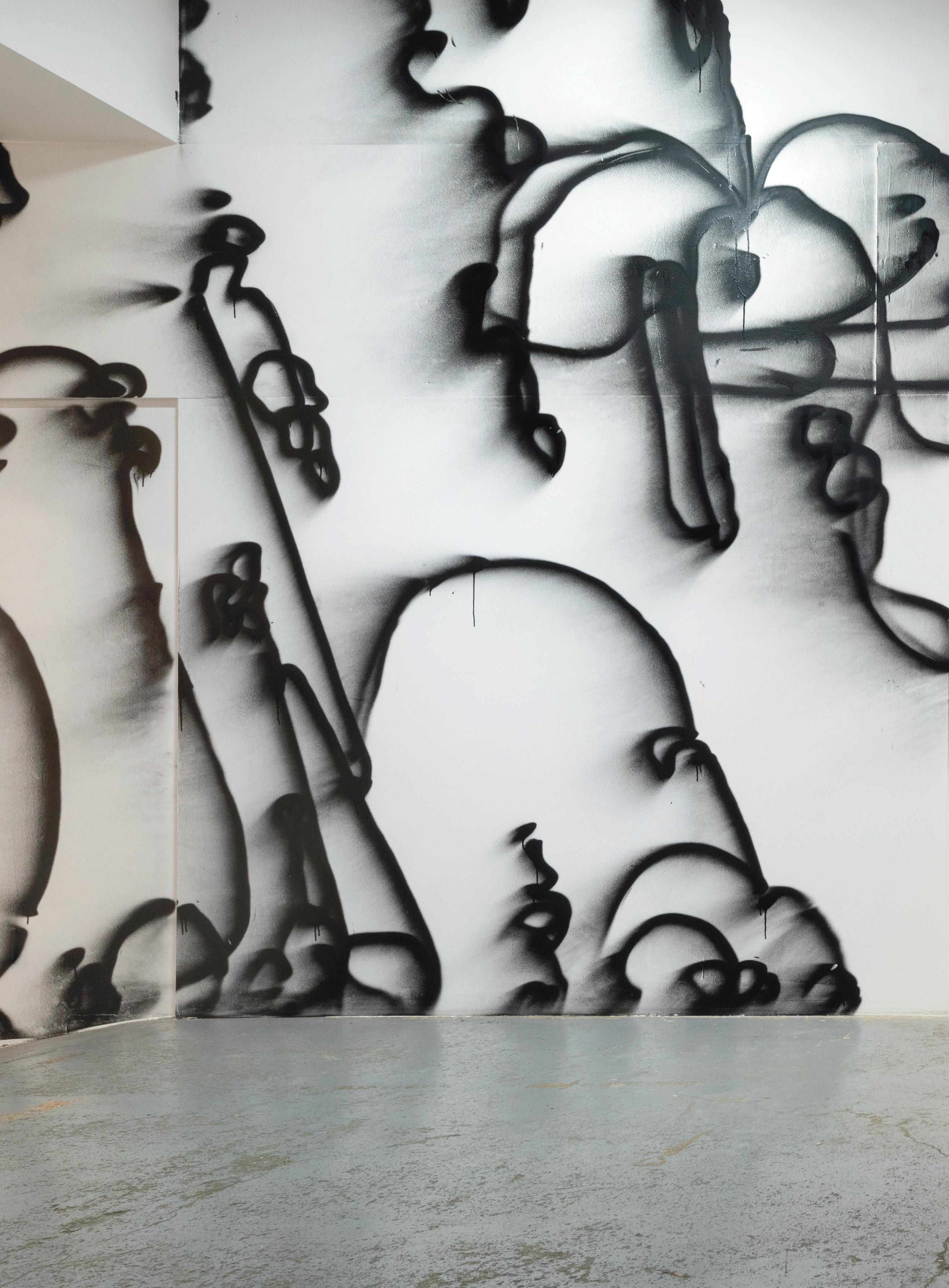 (Image) Galerie kreo paid tribute to Virgil Abloh with Echosystems, an exhibition that placed work that inspired or attracted him, including Jerszy Seymour's ladder, set against the mural by Pablo Tomek. Photography Alexandra de Cossette, Courtesy Galerie kreo

You can use a Carrara table as a stand for a stereo system, to hold a vase or a framed photograph, but if you could afford to buy one, its role in a domestic interior would go beyond its practical purpose. Even as a child, Jasper Morrison understood that some objects and certain pieces of furniture could create what he calls “an atmosphere” that put him in a good frame of mind. He remembers a room in his grandfather’s house as the first modern space that he ever encountered. He noticed that it had bare floorboards, a shag pile rug and a Dieter Rams designed Braun radiogram, a line-up that he later realised was the result of his grandfather’s prolonged exposure to Denmark. “It was an early revelation that a space like that could make you feel better. Subliminally I knew I felt good or bad in a place instantly. Discovering that design can cause a change in the atmosphere of a place was vital. Function can be handled, but the atmosphere of an object is its most important quality.”
For Morrison, and other designers from his generation such as Tom Dixon and Ron Arad who began their careers in the London of the 1980s, making furniture themselves in very small numbers was a necessity. There were no manufacturers interested in working with them. So, Ron Arad started by salvaging seats from Rover cars, Tom Dixon taught himself to weld, and Morrison made 20 examples of a side table using two sets of bicycle handlebars at each end of a plank. One set to stand on, the other to hold up the glass tabletop. It was a witty reminder of Marcel Breuer’s first cantilevered steel chair that had been inspired by the Adler bicycle that he rode around Dessau while teaching at the Bauhaus. And it paid Morrison’s rent for a while.
Grcic, who designs mass-produced furniture for Vitra and lighting for Flos, but like Morrison also has a sensibility that brings him close to the art world, used to compare the design of editioned pieces to the relationship between working on a Formula 1 car, made each year in low single figures and producing a high-volume production car. There are technologies to be transferred and concepts to be shared.
But Clémence Krzentowski has another explanation for the appeal that producing a collection with kreo has for the designers that they work with regularly. Against a background in which many product categories, from cameras to music systems and TV sets, have dissolved into the digital cloud, working with physical objects with people who care about the way in which they are made remains important for designers. And even in the furniture world, many companies no longer maintain the same direct relationships with designers that they once had.

088
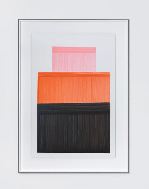
(Left) Pen and ink drawing by Ronan Bouroullec
Photography Alexandra de Cossette, courtesy Galerie kreo
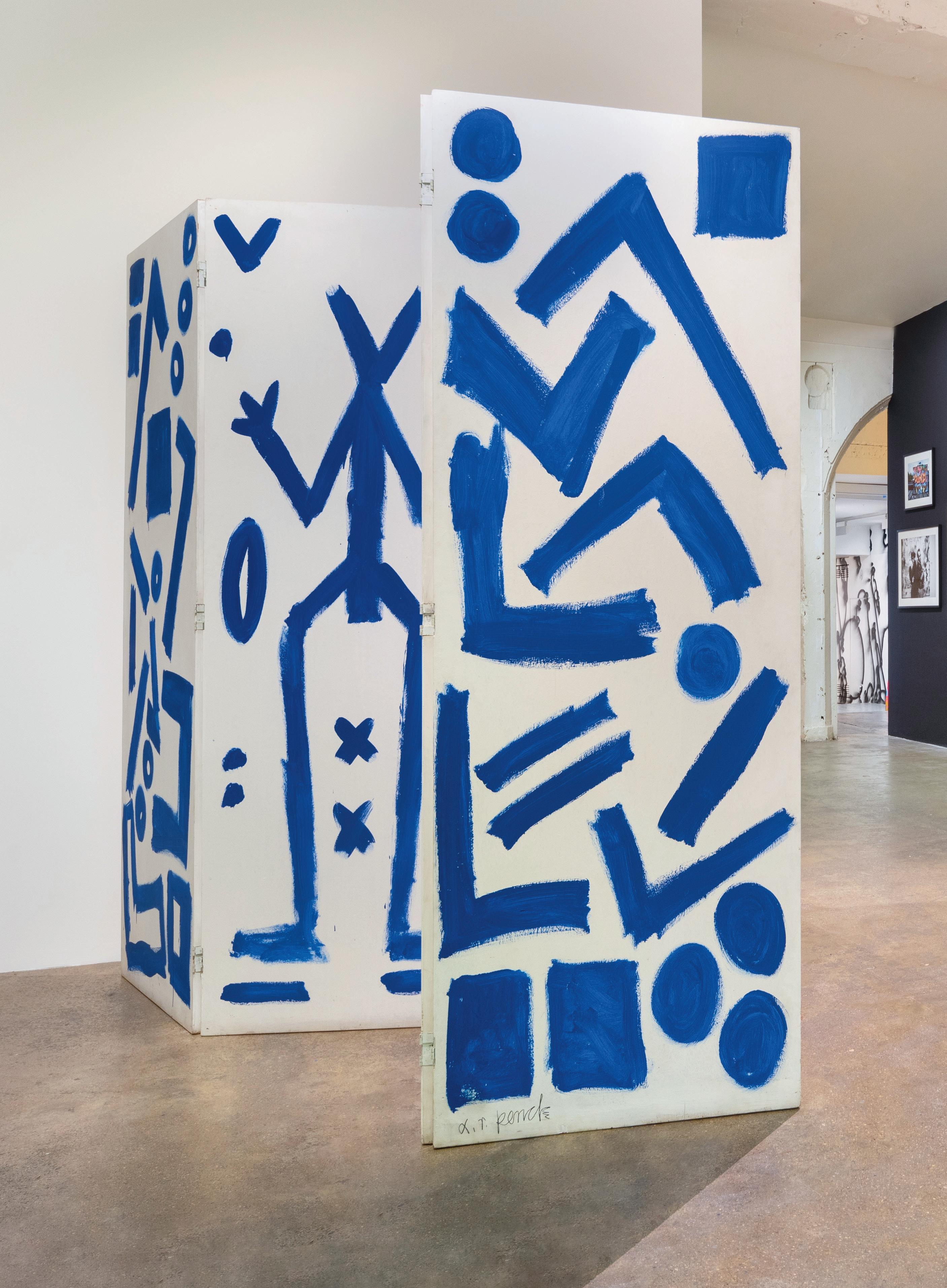
(Right) AR Penck's bold painting formed part of the Echosystems exhibition.
Photography Alexandra de Cossette, courtesy Galerie kreo
(Above) Tajimi 08 one of a series of ceramic pieces by Ronan Bouroullec.
Photography Alexandra de Cossette, courtesy Galerie kreo
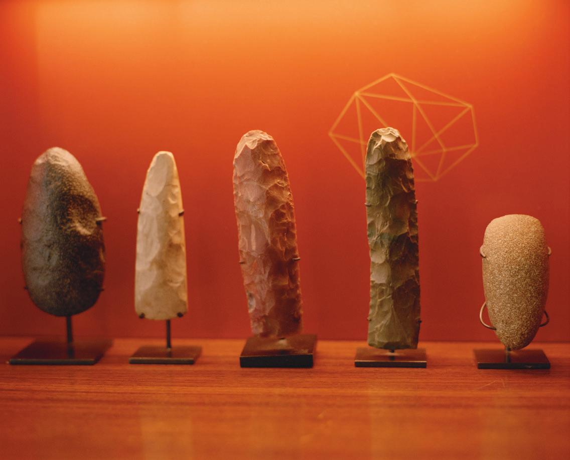
Galerie kreo has been shaped by Didier Krzentowski’s lifelong passion for collecting. He started by assembling a collection of key rings and then of watches as a child. Early on he bought a complete series of Nan Goldin photographs from her first show in Paris and has been accumulating art ever since. At various times he has collected flint tools, lesser-known Hermès bags from 1950 to 1980, and the furniture of Pierre Paulin. He told Alice Rawsthorn from the New York Times that he had originally planned to build a modern chair collection but discovered it was too late –Rolf Fehlbaum, founder of the Vitra Design Museum had beaten him to it. After he acquired a Verner Panton Wire lamp, better described as secondhand rather than vintage given that it was made as recently as 1972, Krzentowski realised that 20th-century lighting was still unclaimed territory. Since then, he has built up more than 800 examples of lights of all kinds going back to the 1950s. A Swiss publisher has produced two books documenting it.
Clémence Krzentowski was working for the Winter Olympics in France in 1992 when she had the idea of commissioning Philippe Starck to design the torch. After the games, Didier and Clémence set up a consultancy together that choreographed commercial partnerships for designers, such as the Ricard branded carafe and pitcher, respectively by Garouste & Bonetti and Marc Newson, produced for the pastis maker.
090
(Below) Edward Barber and Jay Osgerby's lighting pieces, titled Signal, were shown both in Paris and in London. Photography Alexandra de Cossette, courtesy Galerie kreo
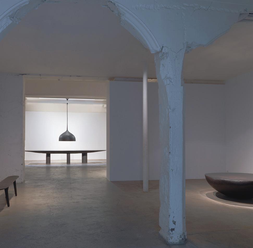
But Didier spent more and more time haunting showrooms and flea markets to pursue his collecting obsession, and Galerie kreo became all consuming. It was successful enough to move from its original home to a much larger space on the rue Dauphine in Saint-Germain-des-Prés, close to the Seine, in 2008. They took over what had been Ruby's, a nightclub on the ground floor of the Hôtel de Mouy, a grand late 17th-century townhouse.
The gallery’s philosophy has been to produce new collections of work with individual designers, and to intersperse them with group shows that mix the well established with newcomers. It is a chance to find new talent, without imposing the pressure of a solo show on less experienced designers.
Along with Marc Newson, Jasper Morrison and Konstantin Grcic, kreo has built up long-term relationships with both Ronan and Erwan Bouroullec, Hella Jongerius and Ed Barber and Jay Osgerby, among others. And in 2020 they staged Efflorescence, a solo show with Virgil Abloh, at the time working for Louis Vuitton’s menswear collections.
The Krzentowskis were close to Azzedine Alaïa and his approach to fashion, but had been careful to avoid their collections being co-opted by a prominent fashion label. With Abloh, who had trained as an architect and was himself a serious collector of contemporary design, it was clear that was not the intention. Design fascinated him, and Abloh brought his own distinctive sensibility to the project.
After Abloh’s sadly early death in 2021, kreo brought together Echosystems, a remarkable celebration of his life and influences from skateboard to graffiti, art from Gordon Matta-Clark and JeanMichel Basquiat as well as design by Tom Dixon, Jerszy Seymour and the Bouroullecs. In a sense it was also a summation of Abloh, and of the unique achievement of Galerie kreo.
091
(Left) Guillaume Bardet's 2019 exhibition. Photography Fabrice Gousset, courtesy Galerie kreo
WHERE DESIGN MEETS ART
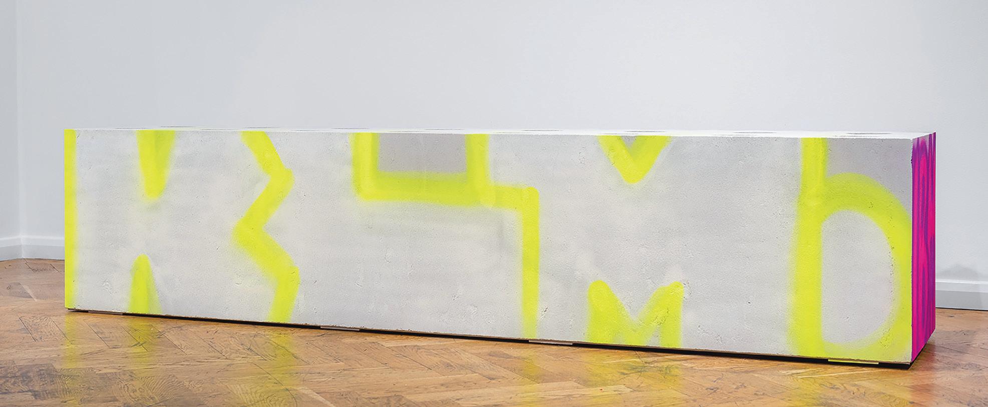
(Above) A piece made by Virgil Abloh for his first collaboration with Galerie kreo, the Effloresence exhibition, returned for Echosystems. Photography Deniz Guzel, courtesy Galerie kreo

 092 (Right) Doshi Levien's Kinari bedside table. Photography Alexandra de Cossette, courtesy Galerie kreo
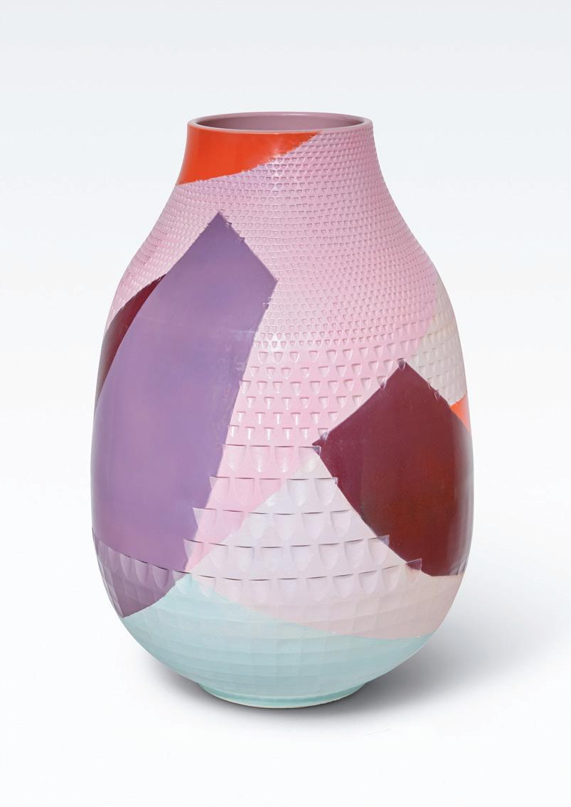
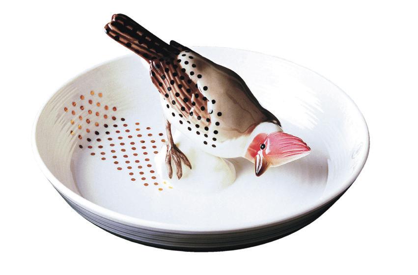
(Left and above) A vase and a flask made by Hella Jongerius during her exploration of the interaction between colour and form, part of a long relationship with the gallery. Plate with bird is another of her pieces. Photography Sylvie Chan-Liat, courtesy Galerie kreo


095
(Above) Not all of Didier Krzentowski's collections are contemporary. He has a number of flint tools that were made before the age of mass production and machines.
WHERE DESIGN MEETS ART
Photography Emma Le Doyen

096
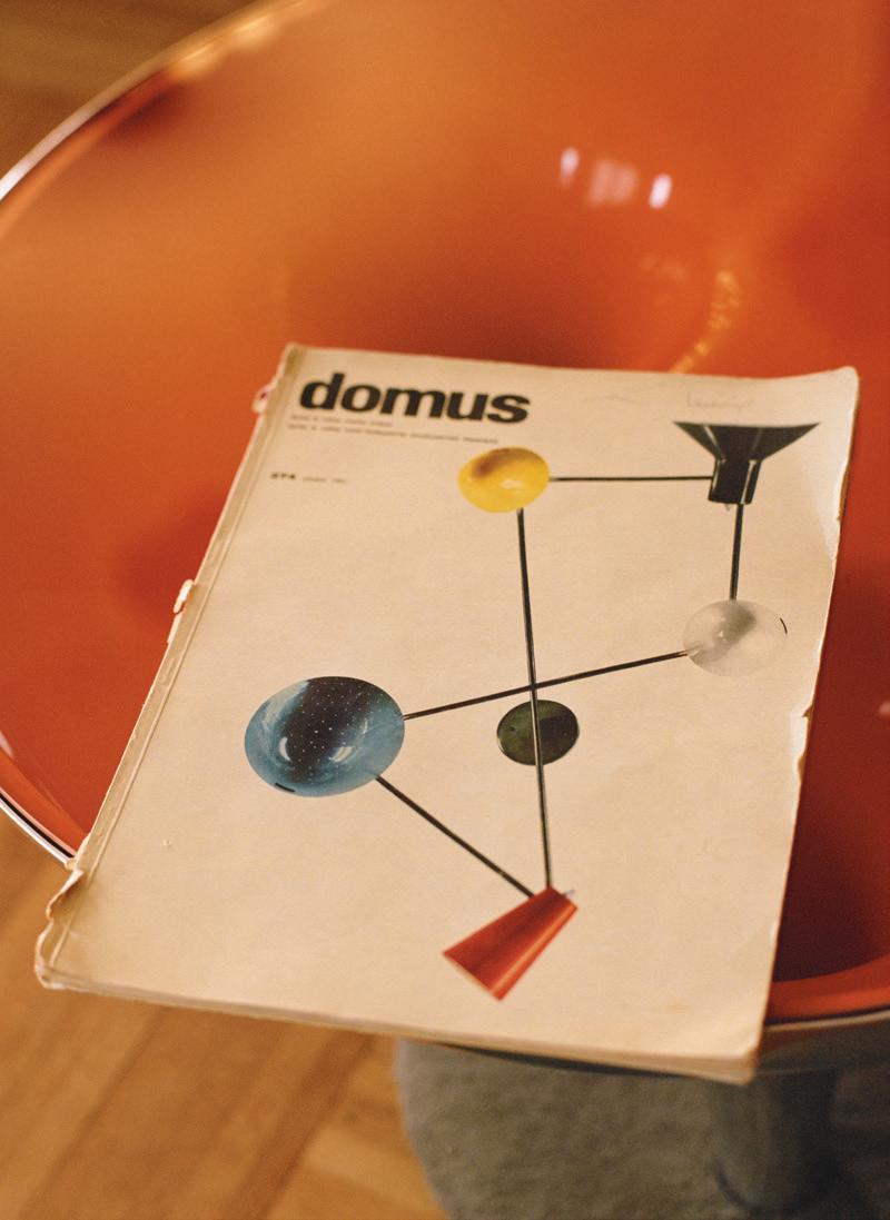
(Below) Didier Krzentowski has an extensive collection of lights, with a focus on Italian and French designers from 1950 to 1980. The Gino Sarfatti wall lamp was particularly rare. He saw it on the cover of an ancient copy of Domus and was determined to track it down. Photography Emma Le Doyen


099
WHERE DESIGN MEETS ART
(Above) Clémence and Didier Krzentowski in their apartment.
Lab and processing by S.C.A.N. Services
What does it take to design a habitable civilisation on the moon? Hassell reveals the Lunar Habitat Masterplan, offering a glimpse into humanity’s next frontier
Living on the Moon
0100 o
(Right) Frontal view of Hassell's Lunar Habitat Masterplan, copyright ©imigo
WORDS Ayla Angelos

Despite the robot moon lander Odysseus breaking one of its legs on touch- down in February, America’s plans to establish a long-term lunar human settlement are moving ahead. More than 50 years since the last time humans walked on the moon and the Apollo 17 mission returned to earth, NASA’s Artemis programme is taking shape. It involves funding private companies such as Elon Musk’s Space X and Jeff Bezos’ Blue Origin to build the rockets, and Intuitive Machines to design and make the landers that, between them, would make a return possible. Despite pushing back the tentative date for the first human to return to the moon to 2026, NASA is still planning to build a lunar base within a decade.
“It’s a bit like having a masterplan for a city; you don’t always know how it will be filled in”
is changing; the astral community is becoming much more inclusive. Tourism will be a thing,” says De Kestelier. “In our masterplan, we’ve set it up so that it can be developed in different ways, whether that’s tourism, science, research, exploration or manufacturing. It’s a bit like having a masterplan for a city; you don’t always know how it will be filled in.”
0102
America is not the only country planning for the trip. There have been recent Japanese, Indian, Chinese and Russian un-manned missions. The European Space Agency (ESA) has its own programme, which involves collaborating with NASA.
The idea of lunar settlements has preoccupied filmmakers and science fiction writers with increasing levels of technical plausibility ever since Stanley Kubrick’s 2001: A Space Odyssey correctly predicted the idea of a space station in earth orbit acting as a gateway to a lunar base. Since then, films such as Moon, Gravity and The Martian have depicted sterile, utilitarian base camps and remote research stations in which isolated individuals are trapped in the most unforgiving conditions.
Xavier De Kestelier, an architect based at the international practice Hassell, began thinking about space flight as a child, and has worked on concepts for lunar, Martian and low-earth orbit living in his professional life. Having lead Norman Foster’s submission for NASA’s 3D Printed Habitat Challenge in 2019, he acknowledges that the modular bubble-shaped structures shown in Ridley Scott’s film The Martian, in which Matt Damon’s character struggles to survive after being marooned on the Red Planet, are likely to resemble what might actually be built with a fair degree of accuracy. Most recently, he led the design of the Lunar Habitat Masterplan, conceived in collaboration with ESA and Cranfield University.
The ambition of the project represents a significant step forward compared to previous plans for settlements in space, which have been designed to accommodate a maximum of 12 astronauts – the capacity of the International Space Station (ISS). De Kestelier envisages a community that could grow in self-contained stages to reach a maximum capacity of 144 people. This reflects the evolving nature of the idea of space travel and its fundamental purpose. SpaceX has launched some extremely wealthy tourists into space, and flights have gone up to the ISS, meaning that space tourism is well and truly underway. The Lunar Habitat Masterplan has been designed to cater for a wider range of people hoping to travel to the moon. “The type of astronaut
It’s no secret that the moon is a vastly inhospitable place. It has no atmosphere, and while scientists have identified limited concentrations of water molecules at the moon’s poles, the Artemis mission will have to find usable amounts of water to make permanent settlement possible. Bringing it from earth in sufficient quantities would make no economic sense in the medium and long term, it would demand too many rockets to be feasible. Another equally difficult problem to overcome is the absence of a magnetosphere to protect the moon from solar wind and radiation. “The big difference between the moon and the earth is that our planet is electromagnetically charged. We have an invisible shield protecting us from radiation from the sun and the cosmos,” De Kestelier explains.
Living in a rock cave with walls thick enough to screen out harmful radiation would be the idea solution, but since none have yet been identified, the ESA plan envisages that the astronauts would need to build their own protection. Cargo rockets would bring teams of lightweight solar-powered robotic printers, capable of operating in swarms to scoop up lunar dust and form it into thousands of solid hexapod forms, something like the concrete barriers used to guard against coastal erosion on earth. Also in the cargo bay would be a large lightweight plastic balloon packed flat, that once inflated would provide the form on which the robots would build the protective shell and ensure that it took the planned shape. A subsequent rocket would bring the living quarters themselves, also inflatable, that would be inserted under the shell in groups of three or four, each one equipped with a prefabricated airlock.
ESA’s masterplan suggests a basic inflatable unit that could house four astronauts, with its own solar power supply, and with enough space for them to live, work and socialise. The settlement would grow by adding more and more of these units, connected by airlocks, and inflatable external corridors to allow for communication and privacy.
The units would be pressurised and allow for an assortment of uses and layouts, such as kitchens, living rooms, labs, greenhouses and gyms. Each basic unit is 10m by 23m and is structured on three levels. Astronauts would sleep and move between one unit and another at the lowest. Above that is an elevated walkway, an inflated tube which De Kestelier calls a “lunar street”. There is an external route for astronauts to enter the lunar environment through an airlock or connect to rovers, vehicles that


can operate in low gravity which were called dune buggies in the Apollo era, three of which were left behind in the 1970s.
Life on the moon is not all about having a place to rest your head during the extended night (which lasts 14 earth days), or a porch to put your moon boots on. It’s also about making the planet as welcoming a place as possible to live for the long-term. “We need to start planning for how larger communities can not only just survive, but also thrive and live on the moon,” says De Kestelier. If you look at the ISS (and most of the film depictions), you’re met with a cliché assortment of cold, sterile materials and tiny spaces for the astronauts to manoeuvre in –there’s enough room to house a city of mechanical equipment, but nowhere to relax and unwind. The ISS doesn’t even have a living space – it was apparently cost-engineered out of the design. The Lunar Habitat Masterplan has designed a more comfortable settlement with both recreational spaces and bedrooms, cushioned by the aesthetics of a “nice little boutique hotel”, says De Kestelier. In the bedroom renders, for example, the floor has carpets and bamboo finishes. “We imagine growing bamboo on the moon,” he adds. “It grows quickly in greenhouses and can be used to create more tactile environments.”
The location of the habitat also plays a vital role in the survival of its residents. If you’re on the moon’s equator, you’d have 14 days of day and 14 days of night. A case of SAD would kick in every two weeks, the temperature would drop and you’d be unable to harbour enough solar energy. “Which is terrible and bad for your mental health,” says De Kestelier. The Lunar South Pole, where he has sited the settlement, is on a slightly higher level and the sun will turn 360-degrees around it over 28 days, providing a constant source of energy. “The sun is always there,” De Kestelier adds. It’s also near the Shackleton Crater, close to India’s Chandrayaan-3 spacecraft landing base from last year, where ice can likely provide sufficient drinking water and suitable options for mining.

Having worked with anthropologists, psychologists, roboticists and astronauts, the Lunar Habitat Masterplan shows that space settlements don’t have to be as sterile as those that came before. The concept is yet to physically land on the moon, but when astronauts return to space via the Artemis programme, and people start staying more permanently in the 2030s, these designs will be put through their paces. After thorough research and testing based on existing science, Xavier and the team are certain of their concept. “The way we approach design is, for us, never sci-fi. It’s always sci-fact.”
0103
(Below) Copyright ©imigo
LIVING ON THE MOON
(Above) Photograph of the Lunar Habitat Masterplan, courtesy Hassell
 (Image) Concept bar for the Lunar Habitat Masterplan, copyright ©imigo
 Sara Doherty (Right)
New Ways of Teaching Architecture
The London School of Architecture is Britain’s first independent school for architects since 1849. It’s small, but making a big difference
106
PHOTOGRAPHY Henry Gorse


108
Oliver Hartley
Jahba Anan
Olivia Bailward
Rose Hussey LSA communications manager
(Above)
(Above)
(Above)
(Above)

109 LONDON SCHOOL OF ARCHITECTURE
LSA 1st year students (Above)
Photography Henry Gorse
(Left and Above)

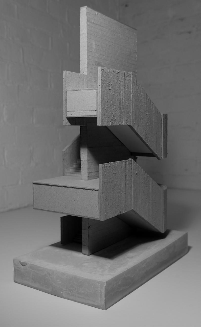
Thomas Harris

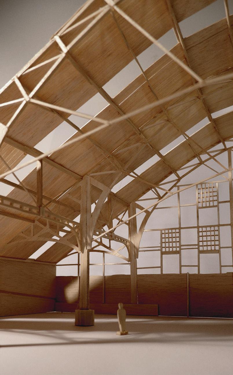
Completed his undergraduate architecture degree at the University of Plymouth, followed by an urban design course in Vancouver. He has a placement with Mulroy Architects. Pictured with his model of a staircase at Denys Lasdun’s National Theatre.
110
Photography Henry Gorse (Above)
Louis Duvoisin
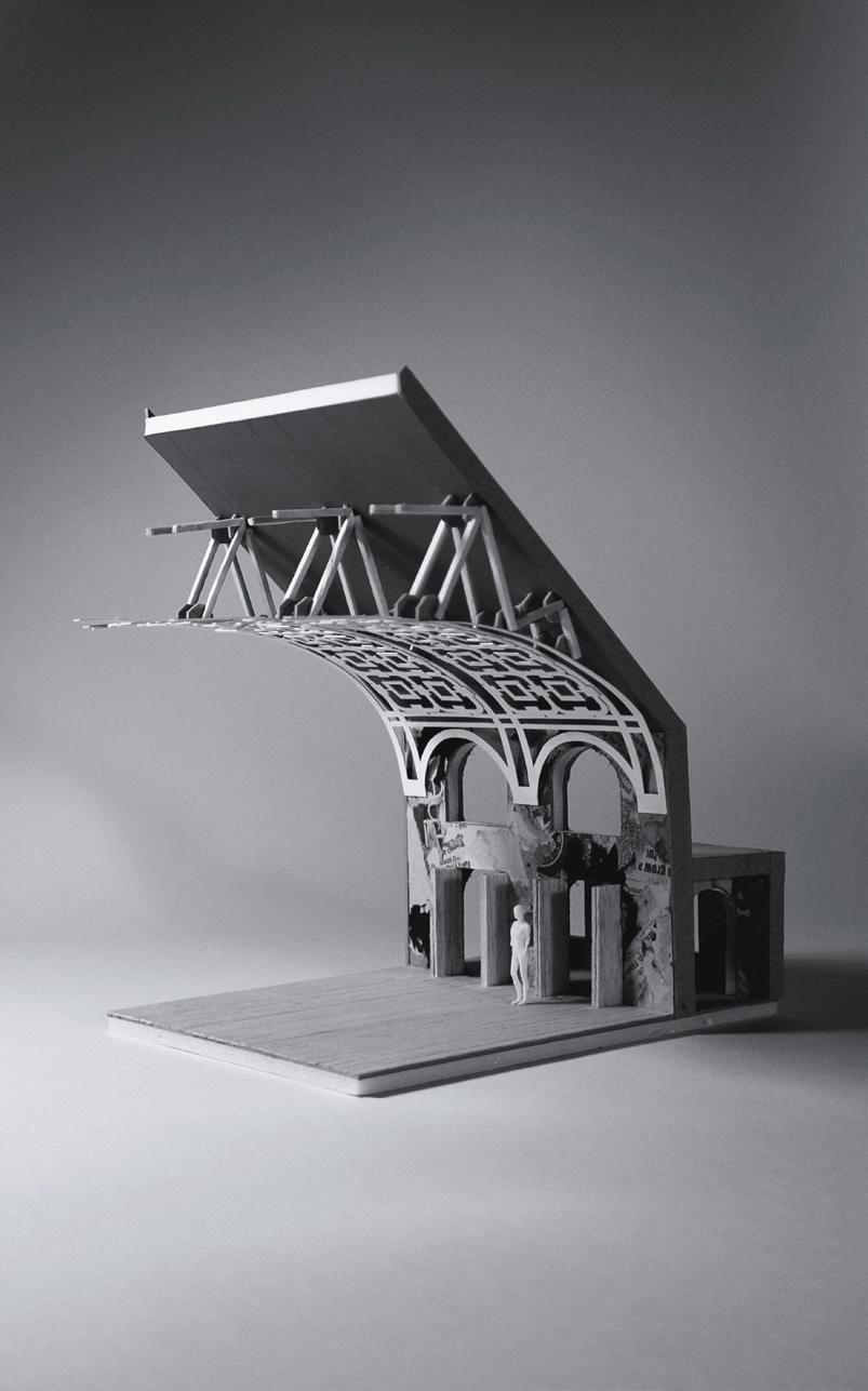
He studied for his first degree in architecture at Newcastle University. While working for his MA Arch at the LSA he has worked for Grimshaw Architects. His major project is for the Battersea Arts Centre.

0111
LONDON SCHOOL OF ARCHITECTURE
Photography Henry Gorse (Below)
Connie Pidsley
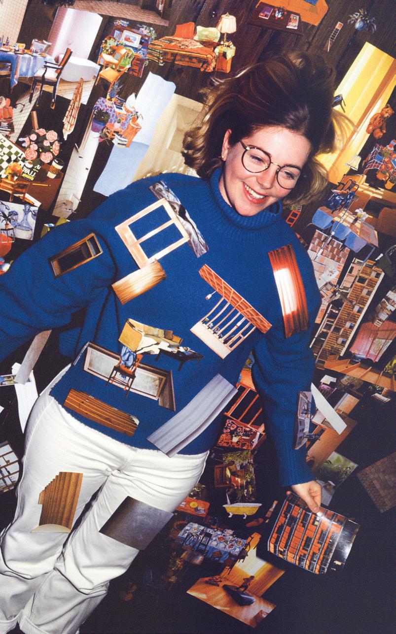
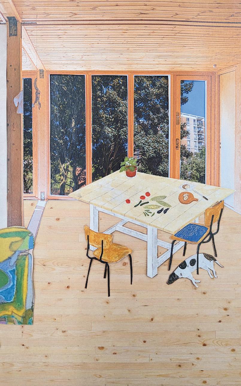
Her first degree was at the University of Sheffield. Her placement while at the LSA is with AOC AOC Architecture. Her second year project focuses on creating regenerative housing, and explores a series of spaces within the home.

112
Photography Henry Gorse (Below)



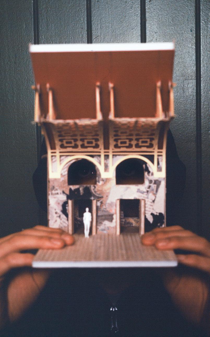
He is a graduate of the Kent School of Architecture. After two years working for Butler Hegarty, a specialist conservation practice, he started at PDP London while studying at the LSA. He is pictured with his model of New Temple.
113 LONDON SCHOOL OF ARCHITECTURE
Adam Dudley-Mallick
Photography Henry Gorse (Above)
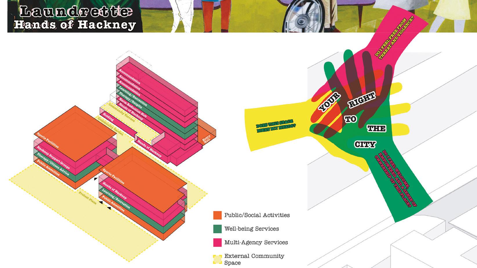
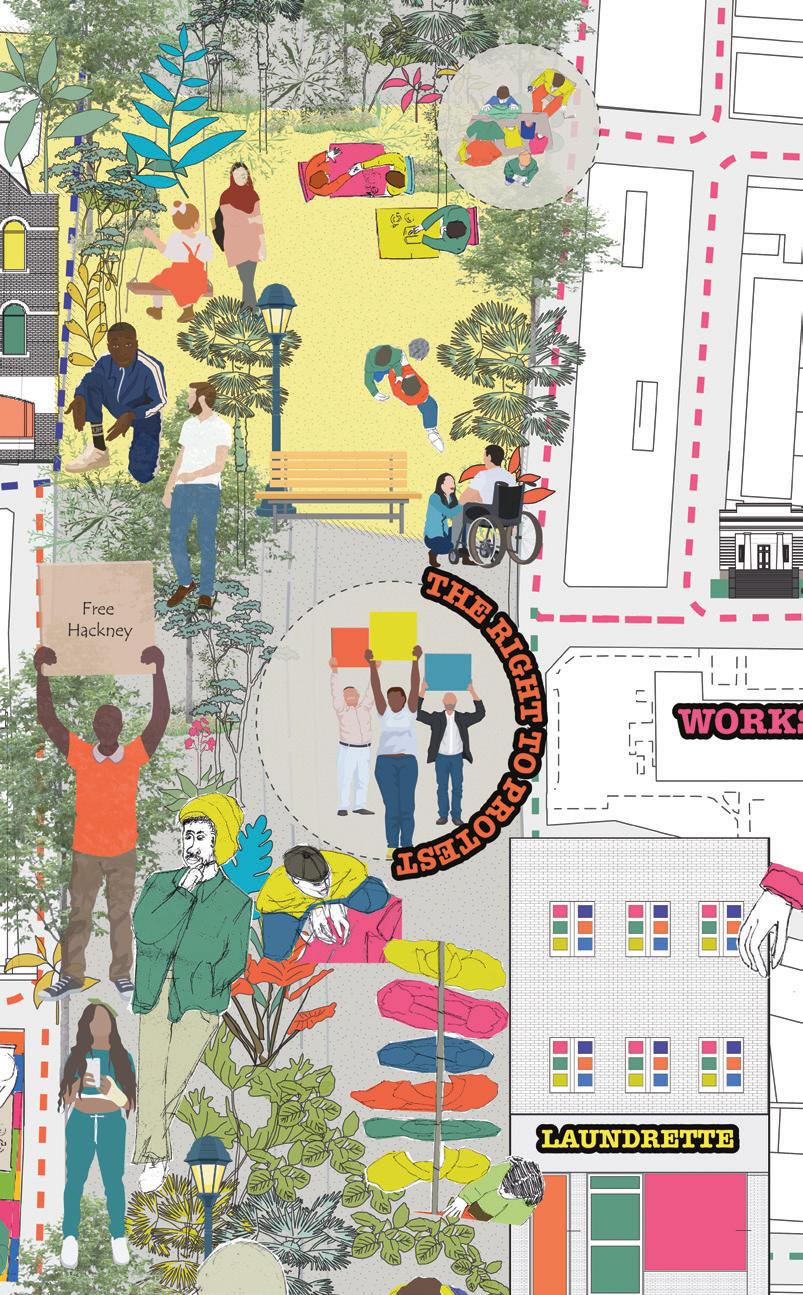

Wiame Azzouzi
She is a graduate of Chelsea’s interior design programme and studied architecture at the University of Westminster. Her project, House of Hackney focuses on the issues of regeneration facing the London borough.
114
Ella Daley
She graduated from the University of Westminster five years ago, where she was a prize winning student. She worked with Selencky Parsons and Haptic Architects while studying at the LSA. Her thesis project develops an approach toward the integration of large scale development with existing communities in Deptford, the area of London in which she grew up.


115 LONDON SCHOOL OF ARCHITECTURE
Photography Henry Gorse (Below)
The London School of Architecture is now in its fifth home since it was established in 2015, a vaulted parish hall attached to Holy Trinity, a high Victorian church in Dalston. It started off in Somerset House, then moved to Soho, before switching to East London. While universities are locked in a debt-fuelled race to build ever more elaborate premises to attract the international students whose high fees they rely on to survive, the LSA, as it is known, has a different and more frugal model. Moving from site to site has allowed it to invest in teachers and students rather than property, while it experiments with a new approach to architectural education. It is outsourcing its buildings, just as it is outsourcing its academic validation. LSA students get their degrees from the University of Liverpool.
The LSA was the product of the architecture student turned critic Will Hunter, who voiced his thinking about architectural education in an opinion piece he wrote in the Architectural Review. He described what he called alternative routes to architecture, triggered by the shift in British educational economics that saw tuition fees rise from £3,000 a year to £9,000. It was a move that he believed would turn architecture into the preserve of the privileged. The LSA strategy was to concentrate on the last two years of the five years of academic study that it takes to qualify as an architect in Britain, by creating a network of architectural practices to work with its students. The first year of its two-year programme sees them work three days in practice, and two in the school. The second year is spent on a degree project at the school. Students are paid in by their employers, which is financially important, but it also embeds them in the world of architectural practice. Neal Shasore succeeded Hunter as the head of the school in 2022. The LSA calls itself the first independent school in London since the establishment of the Architectural Association in 1847.

from some of the largest, such as Foster and Partners, to much smaller offices, its students are motivated not so much by looking to a wider view, they are looking to supplement an academic education with the grounding that comes from being based in practice. “They wanted a more rounded education to learn about what we might call architecture with a capital A. Today education is all about architecture with a big A, what we need now is to make architecture more accessible.”
The school is still small – this year’s new intake of 65 students was its largest ever. There are certainly financial benefits to being paid three days a week in an architectural office, but, according to Hardingham, the majority of the candidates that the school interviews say that the major attraction is the chance that it offers to get a foothold in practice.
Along with the way in which the school engages with its architectural practice network, the LSA has two other distinctive characteristics. One is its commitment to group working, which most of the first year is based on. Teaching is not based on the unit system, with dominant unit leaders setting briefs, it is the students who set the pace. The other characteristic is the use that the school makes of London as the raw material for its projects.
Within the British system, the LSA has served to unlock entrenched ways of doing things. Its students have started to win medals. And its graduates have, so far, all managed to find jobs after they have completed their studies.

Like the AA, the LSA is essentially about the architectural profession teaching its own. In 1847, entry to the profession was based on an apprenticeship system, and the AA was started by articled pupils working in offices, looking for a wider range of input into their education. Samantha Hardingham, the LSA academic director, points out that though the LSA depends on the network of 200 architectural practices in London,
Photography Henry Gorse
Photography assisted by Toby Marshall
116
(Above and Right)

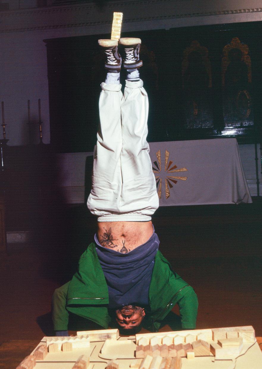
117 LONDON SCHOOL OF ARCHITECTURE
Remi LSA 1st year students
George Shaheen LSA programme coordinator
(Above)
(Above) (Above)
 WORDS Ayla Angelos
ARTWORK Alfie Allen


Few typefaces carry as much political weight as Futura. From avant-garde to mainstream, to being in Barbara Kruger’s hands and then appropriated by fashion, we explore the journey of the most-used typeface, from its inception in the 1920s to its role in shaping cultural discourse today
The question raised, both by such popular books as Simon Garfield’s Just My Type and by the graphic designer Otl Aicher, is the extent to which it is not only words, but also the font in which those words are printed that can carry meaning. Aicher challenged the use of capital letters in German as representing the submission of society to authoritarianism. And as if to confirm his view, when Herbert Bayer used a lowercase b for the Bauhaus identity, the Nazis regarded it as a provocation and a subversive gesture that confirmed their suspicion of what they called cultural Bolshevism. This did not, however, stop Bayer from working for the Third Reich on a series of posters after 1933. Perhaps a better question to ask than ‘are typefaces political?’ is ‘can the meaning of a font change over time or is meaning inherent and fixed?’ Certainly, there are few typefaces that have been called on to carry as much political weight as Futura, or that have gone through so many shifts in perception, from culture to commerce and back.

HERE MEN FROM THE PLANET EARTH FIRST SET FOOT UPON THE MOON JULY 1969, A. D. WE CAME IN PEACE FOR ALL MANKIND
Futura is the work of Paul Renner, dating back to 1924, a designer who certainly hoped to express his view of the world in the way that he drew each letter with simplicity and directness. When the typeface was released by the Bauer Type Foundry in 1927, Frankfurt
was in the middle of a radical experiment in building enlightened social housing using prefabricated construction techniques and simple modern forms. The City Architect Ernst May brought Grete Schutte-Lihotzky from Vienna to design the famous Frankfurt kitchen, mass produced for the city’s thousands of new homes. For Renner, Futura was an attempt to distil the essence of the machine age represented by that new vision of what a city could be, into a font, encapsulating the same ethos of clarity, precision and optimism that defined the early 20th-century modernism of Frankfurt. The foundry released the font in light, regular and bold weights, and it was an immediate commercial success. Its design, characterised by clean lines, a perfectly rounded ‘o’, uniform strokes and geometric forms, stood in stark contrast to the ornate embellishments of the Victorian era. In 1930, the type family grew to include semi-bold, bold condensed, light oblique and regular oblique, plus a book weight which was added in 1932. Today there are some 20 Futura styles, applied in a range of media.
Futura was marketed perhaps opportunistically as the “font of the future” by the Bauer Type Foundry. Bauer had used the slogan before when it was promoting Wienyk-Kursiv, an
(Right) Plaque which Apollo 11 astronauts left on the moon, NASA
120
Paul Renner, 1927, Photography Eduard Wasow (Below)
NEIL A. AMSTRONG ASTRONAUT MICHAEL COLLINS ASTRONAUT EDWIN E. ALDRIN, JR. ASTRONAUT
RICHARD NIXON PRESIDENT, UNITED STATES OF AMERICA


 (Right) Courtesy Bauer Type Foundry
(Right) Courtesy Bauer Type Foundry
(Right) Courtesy Bauer Type Foundry
121 THE POLITICAL USES OF TYPOGRAPHY
(Above) Courtesy Bauer Type Foundry
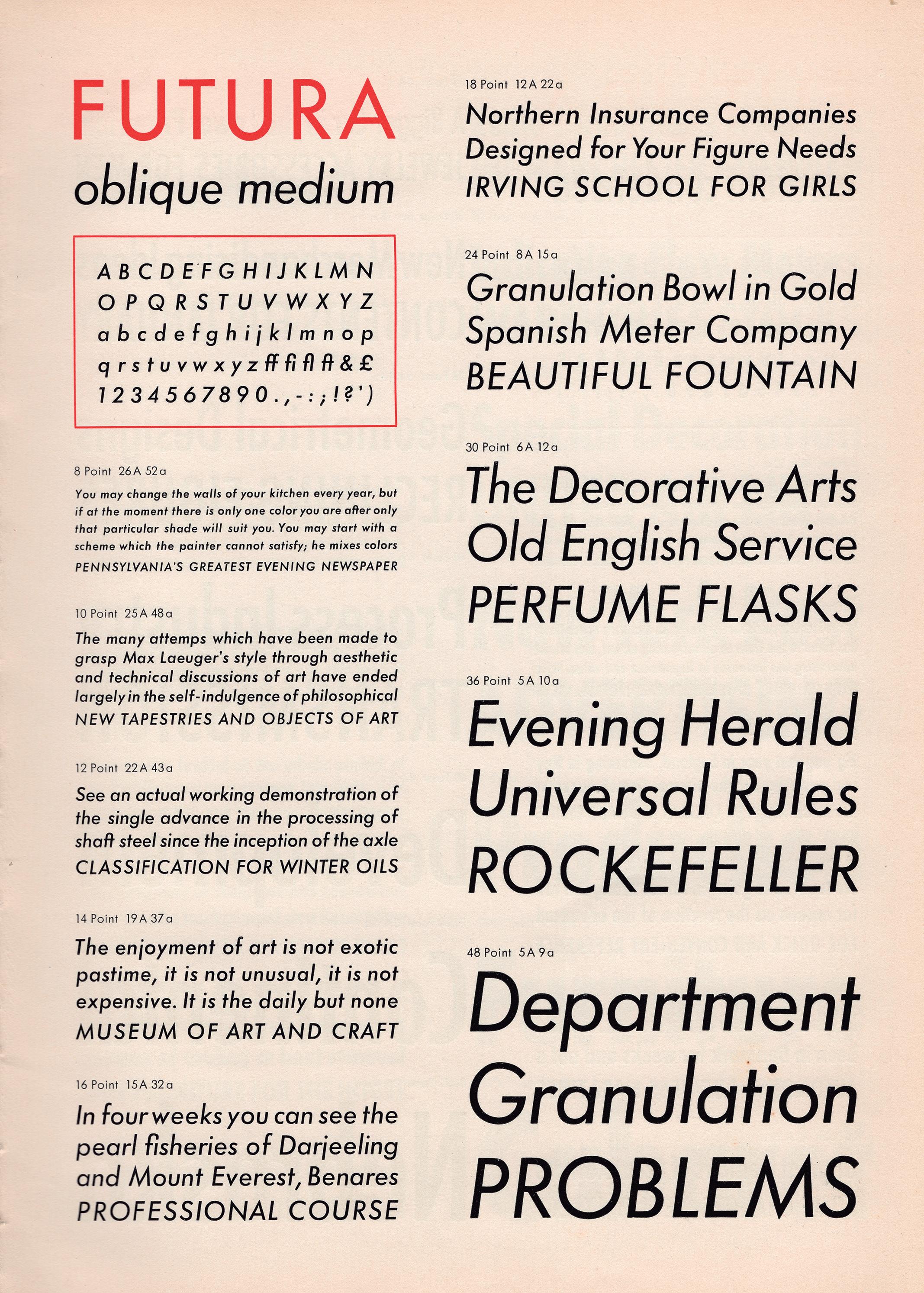
122
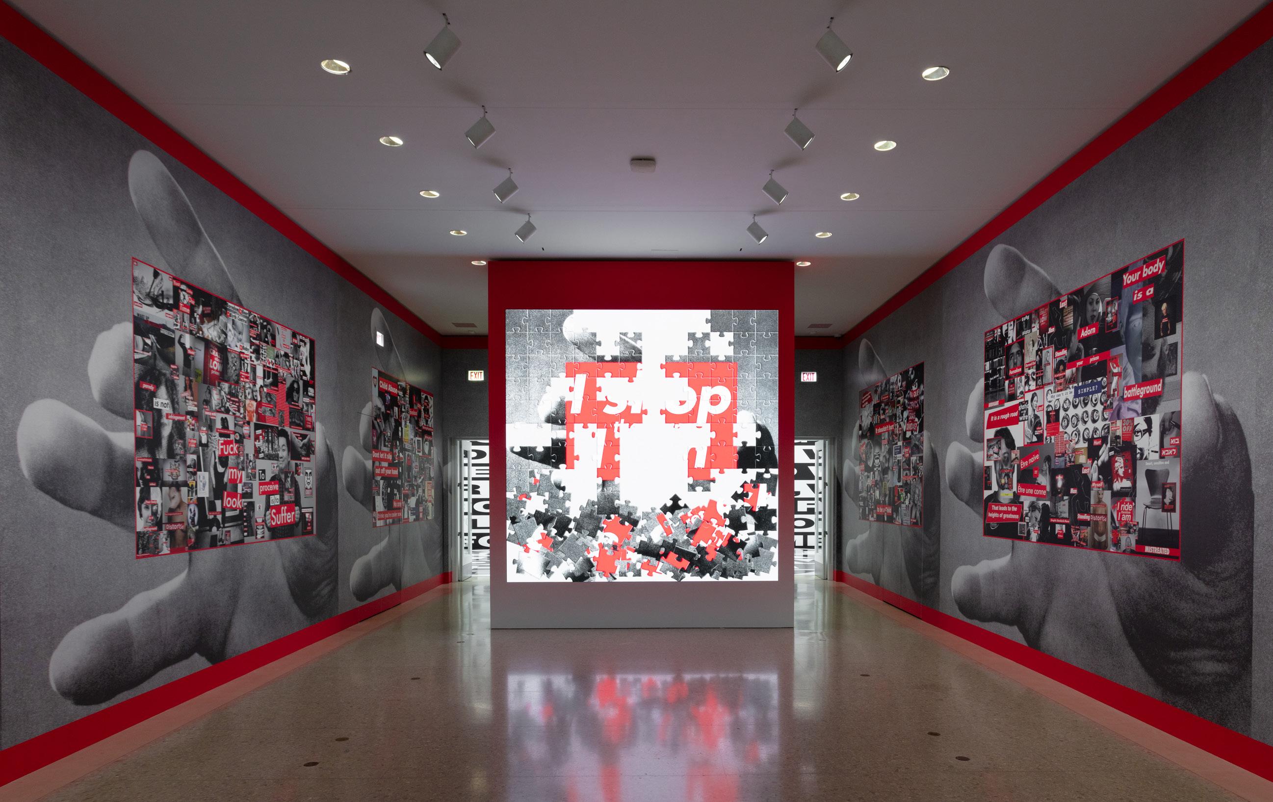
Barbara Kruger THINKING OF YOU. I MEAN ME. I MEAN YOU. Installation view, The Art Institute of Chicago–AIC, Chicago, September 19, 2021-January 24, 2022 Courtesy the artist and Sprüth MagersPhoto: The Art Institute of Chicago

elaborate and somewhat prim script it released a decade earlier, and which never lived up to its namesake. Design historian Dan Reynolds once suggested, “I think the company had a marketing slogan in its back pocket, which it hoped would eventually stick. With Futura, it finally did.”
With the rise to power of a Nazi party violently opposed to what it called ‘degenerate art’, typography became a visible everyday expression of a culture war. The Nazis insisted that gothic blackletter fonts, supposedly rooted in Aryan heritage, were the only true German way to print a text. To use Futura was not only to make a political statement, but a potentially life-threatening one. Renner himself was arrested, dismissed from his professorship in Munich, and forced into exile in Switzerland.
That early history has not stopped what started out as an expression of an avant-garde idea from becoming, by some measures, the most ubiquitous typeface in the world. Futura became ubiquitous enough for NASA to use it somewhat inelegantly in all capitals on the plaque Apollo 11 left behind on the moon, marking the first lunar landing of an astronaut. The advertising industry was quick to adopt it as a way to signal the aspiration of a brand to present itself as progressive and forward thinking. Doyle Dane Bernbach’s self-deprecating ‘Lemon’ campaign for the Volkswagen Beetle
(Above)
Johnson Space Center, Houston, Texas: The official Apollo 11 mission patch, NASA Courtesy Bauer Type Foundry
(Left)
THE POLITICAL USES OF TYPOGRAPHY
(Above)
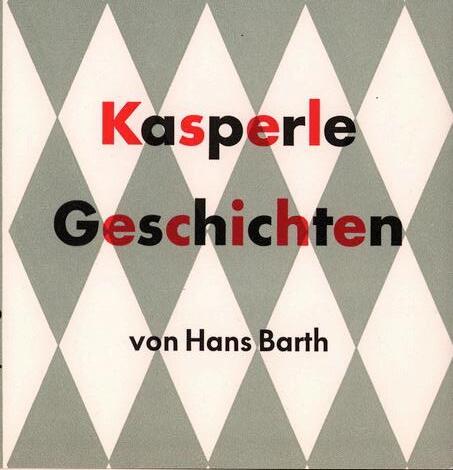
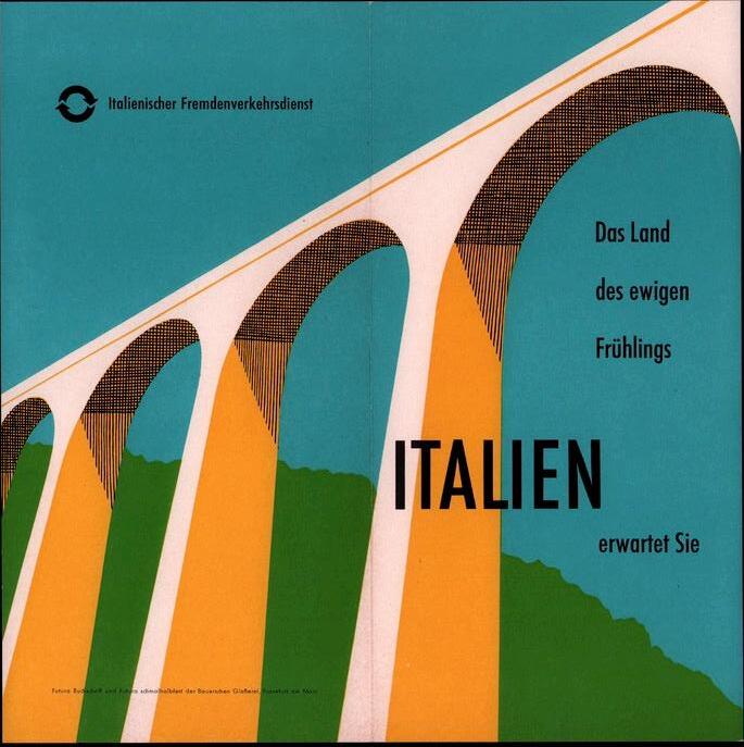

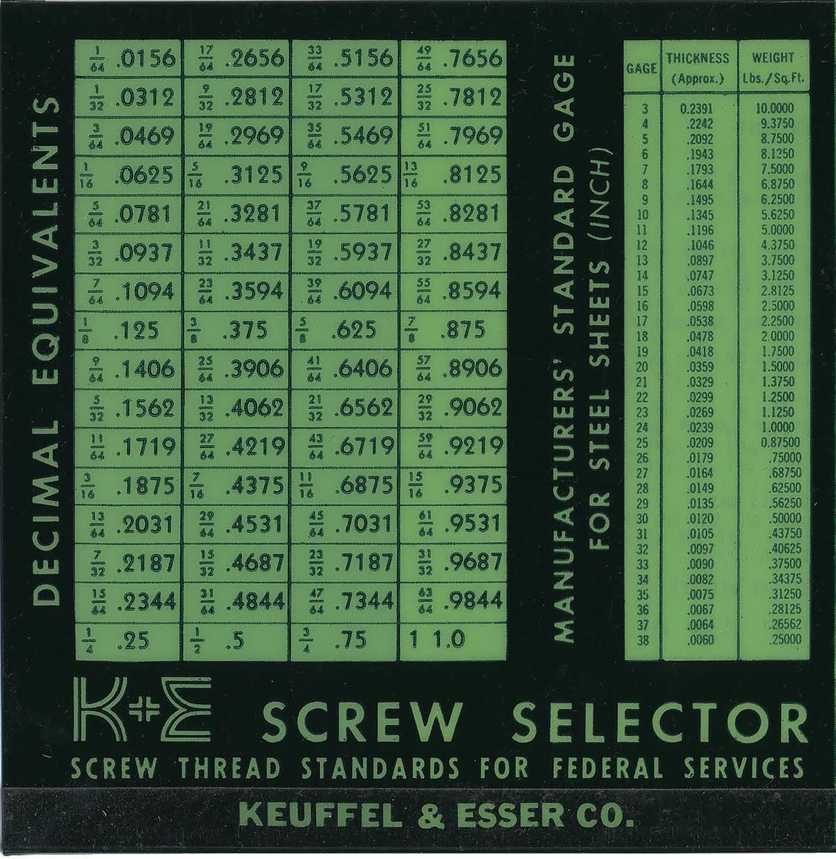 (Below) Courtesy Bauer Type Foundry

 (Left) K&E Screw Selector. Image from the collection of the Hoboken Historical Museum
in 1960 was an early example. Its political roots go back to a time when it was used to communicate powerful messages, and so it is not surprising that it has been seen as a vehicle to communicate commercial messages in an equally powerful way. Some have suggested that its saturation through advertising has diluted its impact. In 1992, there was even a tongue-in-cheek campaign to abolish Futura Extra Bold Condensed, citing its overuse in commercial contexts and labelling it the most overused typeface in advertising history.
Beyond advertising, the film director Stanley Kubrick, who was notoriously particular about typography, liked the clarity of Futura, which he used in the titles for 2001: A Space Odyssey and A Clockwork Orange. Wes Anderson also shares his enthusiasm for the font, even going so far as featuring it in the set design for The Royal Tenenbaums.
Douglas Thomas published Never Use Futura (2017), a book in which he took a more nuanced view of its history. “Futura is the lingua franca of 20th-century advertising,” Thomas explained in an interview with Artsy. “So if you’re trying to critique commercialism, what better than to use the same visual language as the advertisers themselves?”


126
(Left) Courtesy Bauer Type Foundry
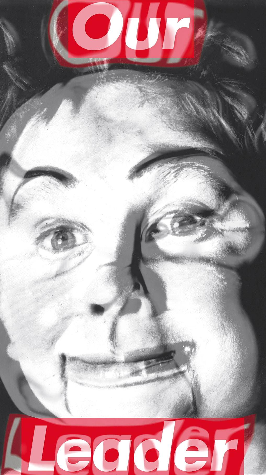
That is exactly what such feminist artists as Jenny Holzer, Guerrilla Girls and Barbara Kruger have done. Guerrilla Girls, for example, created posters in the 80s with headlines like “When Racism & Sexism Are No Longer Fashionable, What Will Your Art Collection Be Worth?” and “Do women have to be naked to get Into the Met Museum?”. The blend of wit, direct language and Futura Bold Extra Condensed was provocative, and, by speaking the language of advertising, made for a powerful way to communicate.
“Do women have to be naked to get Into the Met Museum?”
Perhaps one of the most notable contemporary artists to harness the power of Futura is Barbara Kruger. She brings to her work the direct experience of her early job with Condé Nast as a magazine designer creating layouts for glossy magazines that had to hold their own against advertising spreads. Her bold, uppercase letters in red and white, set against black-andwhite photography, shout “I shop, therefore I am" and “Your body is a battleground". It’s creative propaganda, a stand against consumerism. Yet she’s never liked the term ‘political art’. By appropriating the visual language of advertising and subverting it, Kruger exposes the underlying messages of consumer culture, women’s rights and power structures, while demanding that her viewers confront uncomfortable truths.
Kruger’s use of Futura is sharp, intentional and timeless. In her hands it remains a biting weapon. Kruger’s solo show at The Serpentine, her first in London for 20 years, reminds us all of her potency. Murals, large-scale room wraps, immersive artworks and bold use of text are both medium and message. In her sharply observed choice of Futura as her primary typeface, Kruger has given the font a new twist.
127
(Left) Barbara Kruger Untitled (Our Leader), 1987/2020 Single-channel video on LED panel, sound, 24 sec.350.1 × 200.1 cm
THE POLITICAL USES OF TYPOGRAPHY
What was avant-garde and became first mainstream and then banal commercialism, was reclaimed by Kruger for use by critical voices. And inevitably it gave the most voracious consumers of culture, advertising and fashion another chance to exploit it.
Supreme, a clothing brand that started out as a small skateboarding shop in New York, famously appropriated Kruger’s Futura Bold Italic for its logo. Then when street clothing brand Married to Mob used the Supreme logo to brand ‘Supreme Bitch’ hats and T shirts, Supreme sued demanding $10million for copyright infringement. This provoked Kruger to send a blank email with an attachment titled ‘fools.doc’ saying, “What a ridiculous clusterfuck of totally uncool jokers. I make my work about this kind of sadly foolish farce. I’m waiting for all of them to sue me for copyright infringement.”
“So if you’re trying to critique commercialism, what better than to use the same visual language as the advertisers themselves?”

128
(Right) Courtesy Bauer Type Foundry
I MEAN ME. I MEAN YOU. The Art Institute of Chicago–AIC, Chicago, September 19, 2021-January 24, 2022 Courtesy the artist and Sprüth MagersPhoto: The Art Institute of Chicago
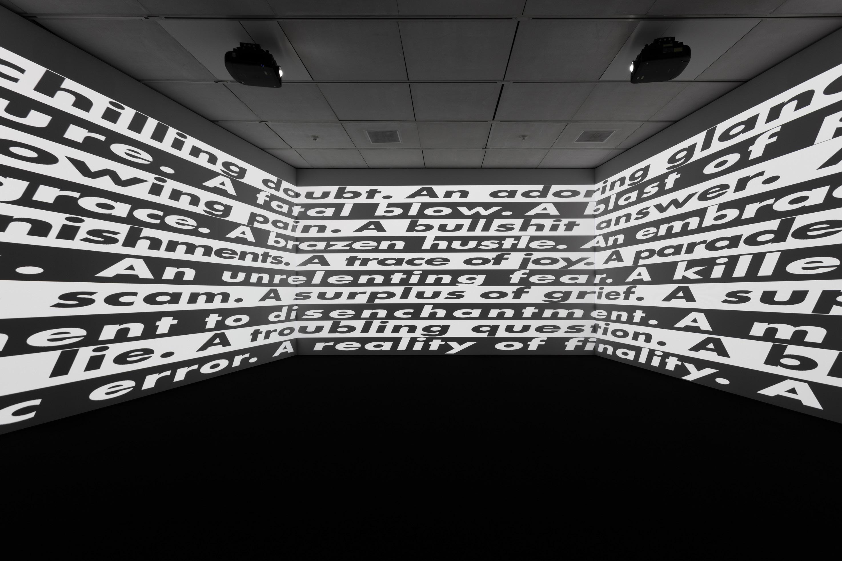
129
THE POLITICAL USES OF TYPOGRAPHY
(Below) Barbara Kruger Untitled (No Comment), 2020 Three-channel video installation, colour, sound, 9 min. 25 sec. Installation view, BARBARA KRUGER: THINKING OF YOU.
Fit for purpose

Antonio Citterio’s work for Technogym includes architecture as well as design
130
PHOTOGRAPHY Carlo Valsecchi
 (Above) A timber structure is efficient in energy terms, and allowed for construction to be carried out in a sequence of discrete campaigns
(Left) The new development sits in the midst of an agricultural landscape shaped by drainage ditches and fields layed out in Roman times

Carlo Valsecchi is far from being a conventional architectural photographer. The cool precision of his work, which suggests an affinity with the objectivity of Bernd and Hilla Becher, rather than an attempt at seduction, is what attracted Antonio Citterio. When he started work on a monograph of his architectural projects , he wanted to see what his buildings looked like through Valsecchi’s vision.
Working with film, rather than a digital camera, Valsecchi photographed a selection of Citterio and Patricia Viel’s buildings. They include high-rise residential buildings in Asia, the transformation of Milan’s former main post office into contemporary workspaces, and office buildings in Hamburg. Valsecchi’s images are like x-rays, revealing the structure beneath the surface, and spaces inside buildings, without any trace of the people that inhabit them.

Of all the projects that Valsecchi photographed for the book, the Technogym Village on the edge of the small city of Cesena is the one that encapsulates the range of Citterio’s work as both an architect and an industrial designer. Technogym was started by Nerio Alessandri in 1983 when he was just 22 years old. He made fitness equipment in his garage. It has
more than 2,000 employees now and sells its increasingly sophisticated equipment around the world. The products are everywhere, from the training suites of champion’s league football teams to health spas in resort hotels, city centre gyms and the homes of domestic users. In a world of wellness, Pilates and personal trainers, there was a rapidly growing market for intelligently conceived equipment. Technogym filled it with its innovative approach.
Alessandri quickly understood that fitness is more a way of life than a matter of machines confined to training gyms. He set out to embody that way of life in the complex of buildings that Citterio was commissioned to design on a site on the edge of Cesena, between Rimini and Ravenna. Alessandri calls it a fitness village. Alongside the factory there is a hotel, an exhibition space, an auditorium, a public park, gymnasium and restaurant. Cesena is in the Emilia Romagna, an Italian province known for its food: Parmigiano cheese, Parma ham, balsamic vinegar, culatello salami and pasta. Locally sourced products could be part of the culinary attraction. Citterio’s architecture, which makes extensive use of laminated timber structure was designed with low environmental impact in mind.

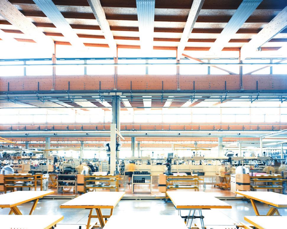 (Above and Right) (Left) Technogym's production hall is based on a timber structure and the use of natural light
The geometry of the roof gives the complex the look of a natural landscape

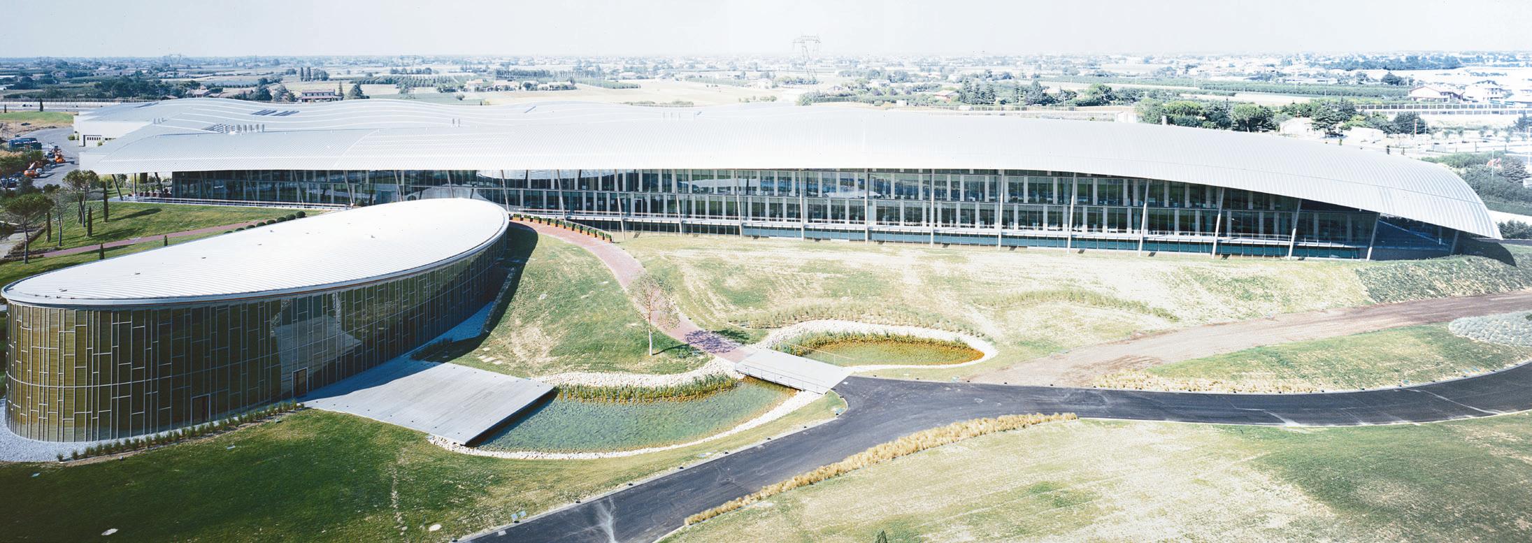


Technogym Village is sited on the edge of Cesena, close to the autostrada to Bologna, and is intended to be seen from passing cars. It was planned as a kind of architectural landscape in a series of strips, paraphrasing the traces of the centurial grid laid out by Roman surveyors subdividing the land in regular plots with a network of paths and drainage ditches. Closest to the road is the production hall, made up of a cluster of ribbon-like forms, each with an undulating roof that allows daylight into the heart of the building. Moving past them at speed, the ribbons set up a strong visual rhythm that suggests a ploughed field, or waves lapping against the shore.
On the far side of the factory is an office building four stories high, its glass walls screened from solar gain by a striking curved roof that twists and turns above the rectangular block beneath. Beyond that is a free-standing elliptical form that houses the wellness centre and an underground conference centre. A public park is the fourth element.
After the complex was completed, Citterio was commissioned to design an initial six pieces of equipment for the company’s Personal range. It was one of the first attempts to give such objects the tactile quality of furniture, or consumer electronics. Citterio brought the visual language of his cast aluminium work chairs to the equipment that he designed for Technogym. Unlike a lounge chair, or a desk lamp, there are few settled precedents for what a domesticated treadmill or a weightlifting bench might look like. Some pieces in the range have a strong digital element, and require the incorporation of a screen. Many need a motor of some kind – in the case of a treadmill quite a large one. Citterio worked on more than the look of the machine, he was also keen to understand how they would be used, and how they would relate to their surroundings.
“You don’t really design objects like these, you see what they already have at the company and then start to ask questions and make suggestions,” says Citterio. “For the running machine, what they had was a machine that put the motor in front in a huge volume that made it very hard to relate to the room around you. So, you ask, can you change the motor position, and reduce its size?” For Citterio the project has been a chance to work at both the scale of design and of architecture.
135
(Left) The ribbon like forms of the production hall is designed to make an impression on motorists passing on the neightbouring autostrada
FIT FOR PURPOSE
(Below left) The complex includes offices, a restaurant, fitness centre and convention centre that Technogym call a wellness village
Carlo Valsecci's photographs are on exhibition at the Palazzo Morando via Sant' Andrea Milan until May 12 2024.
A book of his photographs of the work of Antonio Citterio and Patricia Viel ACPV ARCHITECTS is published by Silvana

What is next for
Samuel Ross IN CONVERSATION WITH Ayla Angelos
(Image) Acrylic drawing on canvas
136
Samuel Ross
Samuel Ross, among many other things in the last 12 months, has shown his art at the White Cube gallery in London, launched ACW’s SS24 collection, exhibited his editioned pieces of furniture at Friedman Benda in New York, and unveiled his designs for mass-produced bathroom fittings for Kohler. He is 33 years old.
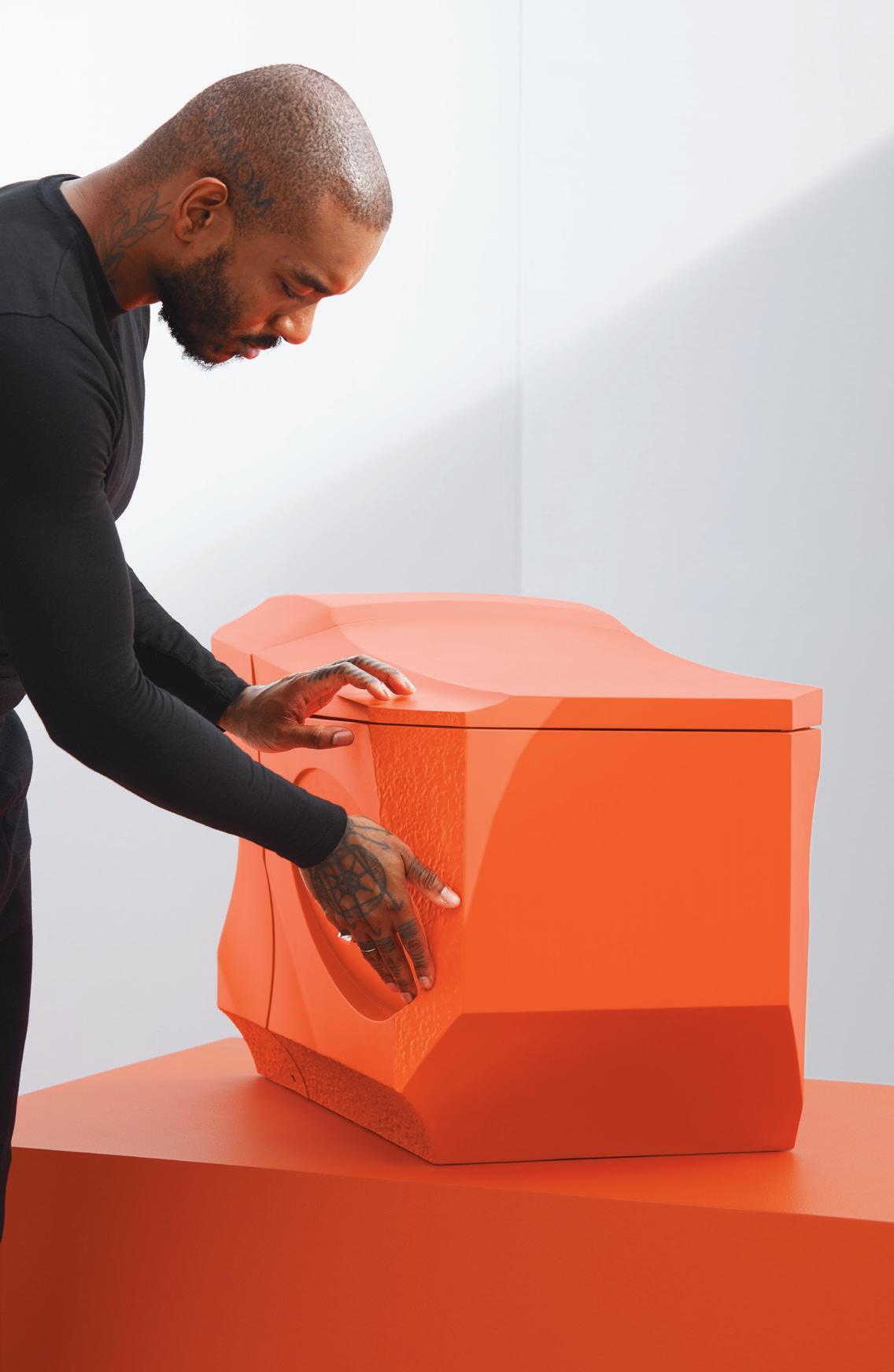
 (Above) A new bathroom fitting project made in collaboration with Kohler, 2024, courtesy Kohler Co.
138 This apparently random range of enthusiasms is more than brand extension. Ross’ Land exhibition at the White Cube was a powerful collection of sculpture fabricated from sheet, steel and sombre paintings. Some of the assemblies of steel pieces welded together were finished in vivid orange, bright yellow and oxblood paint, suggesting to some eyes the early work of Anthony Caro. The canvases are soaked in paint, suggesting collapsed landscapes and supine bodies. Ross sees them as an exploration of Black experience, and that they are the beginnings of a pictorial lexicon for what British Caribbean abstraction could look like.
ACW, or A-COLD-WALL*, to spell out the brand name in full, is a fashion label that Ross began from his home 10 years ago. It has bricks and mortar – actually steel and concrete – concept stores in Shanghai and Beijing, as well as Harrods and Selfridges. He sold his stake in the business to his partners in February. Ross’ gallerist in New York, Marc Friedman, describes him as one of the most multifaceted talents he has ever worked with.
Ross studied graphic design at De Montfort University, Leicester, then worked with Virgil Abloh. And now he is only just getting started.
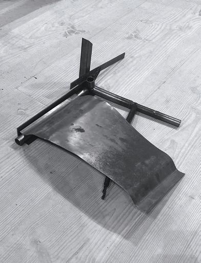
 (Right) Acrylic paintings
(Left) Steel


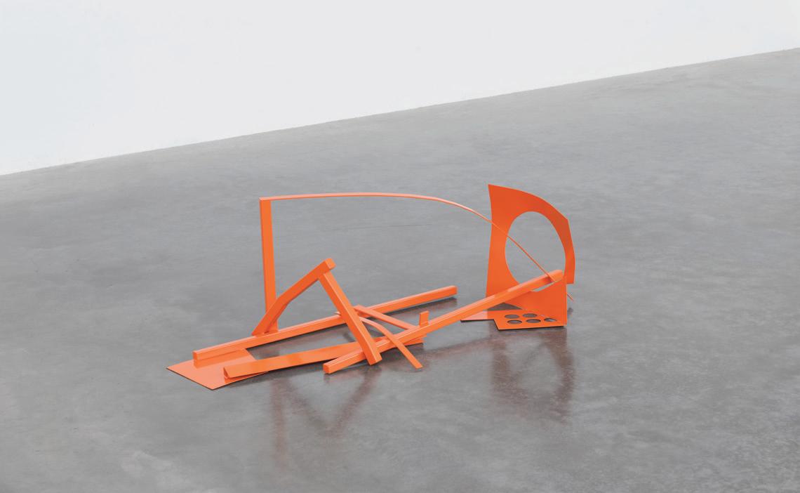
Where did it all start?
I was fortunate to be moulded and shaped as a child by my parents who are two practicing artists and educators. My father studied at Central Saint Martins and majored in fine art but then became a stained glass procurement specialist. He restores stained glass windows for cathedrals and churches around the world as well as being a practicing artist. My mother is a painter but also a lecturer primarily in sociology and psychology. I was home schooled for a large portion of my childhood, so the idea of having a regulated tract didn't really exist. I spent a lot of time between the Caribbean islands and the UK, in-between Brixton and rural Northamptonshire. There is this multiplicity almost to the way in which I experienced the world from quite a young age.

I don't come from a capitalist inclined background, I’m the one who's more interested in consumer goods, products and transactions related to expression. My parents won't engage in those types of conversations. The idea of expression was always at the forefront, and I have early memories of building pinhole cameras from scratch with my father. We were quite heavily involved in local DIY-engineering communities, like the Homebrew Computer PC movement of the mid to late-90s. Collecting archival Apple Macs was a huge part of my childhood.
There’s a stark contrast between growing up in the city and the Northamptonshire countryside. I can imagine that had quite an influence on your language as a designer, but also as a person.
This was the era of New Labour and, as a market town, it was still relatively prosperous. You had waves of immigrant overspill into Wellingborough for over three decades or so, hence why we were also there. It had a similar makeup to Leicester; Leicester is the only city in the UK that has a white minority. Wellingborough had a really strong South Indian, Southeast Asian and Afro Caribbean community mixing with a lot of white working class. So, the idea of Britishness and growing up was quite dynamic, where you would go to the park and see complete integration of who you're playing cricket or football with. It wasn't as divisive as it is now, I'd say.
141
Ayla Angelos Samuel Ross
(Left) Others See It, 2022
(Above) Metal sculpture show at White Cube 2023
IN CONVERSATION WITH SAMUEL ROSS
(Left) Work from Land exhibition at White Cube, London


142
(Above) (Right) Two works from the Land exhibition Mirror Mirror, on display at Chatsworth as part of its 2023 exhibition
(Above) Two works from the Land exhibition

I moved up full-time from Brixton at the age of four, so my first core memories, which are etched into my existence, are of being carried on my mother's shoulder in Brixton market and Brixton Hill. I would turn my head and only see a sea of Blackness, only Caribbean faces. These are my first memories of England. When I started to age and live outside of London, then this wider view of Britain opened up.
What attracted you to study graphic design and product design?
Initially, I was going to go directly into fine art and major in illustration. But I think the ailments of coming from a pretty liberal house, which didn't necessarily prioritise economics, led me to make more pragmatic decisions in terms of discipline. I was concerned about what the market actually looked like at that point, where I would fit into it and if it would satisfy the fire
I have for trade and communication. The alchemy of visual communication is so enthralling. It's almost like burning a stick of incense, where it conveys so much more than what can be expressed through its apparition, like the scent, the heaviness, the sweetness, that act itself. All of those types of semantics and semiotics are taught to you when you go and pursue visual communication. Early memories of being stimulated by Apple products, and understanding how it was down to creative choices; I wanted to be able to make those types of choices in the future to affect people.
found my Instagram profile and he emailed me. I put out the email last year, and it went viral for some short time. It grounded how the meeting happened. It wasn't as though he saw my profile and sent me a fire emoji, it was really formal. This was 12 years ago.
You went on to found A-COLD-WALL* in 2015, what were your reasons for setting up that label?

There are two components to it. The first is that I had spent the last four years of my life travelling with Virgil and becoming part of a global creative community, which is primarily based in America. If you look at that canon of who were Virgil's contemporaries, and who he reported into, they're all American – Jerry Lorenzo, Heron Preston, Justin Saunders, obviously Virgil himself. They're all American. I'm British and European. After travelling on these excursions, it was clear that whatever I had to say, within that class of consumer goods, wasn't going to be what they had to say, because the origin story is completely different. Though the affinity and understanding of the American or global experience was there.
You began interning for Virgil Abloh, who was not only a friend but became a mentor. Can you tell me about this experience?
There became a point in time where I cross analysed what I had been reading and studying and what I was doing. I didn't feel as though there was an upward trajectory, which could be pursued working for private, independent design companies. I started looking beyond that remit. I was already partaking in elements of street culture; I started a T shirt brand when I was in university, and I was the guy at that house party who was handing out business cards for people to check out the products. I was doing a lot of pasted street art at night in the city. I was scoring and self-filming short videos. But at this time, it felt quite exploratory and it was quite undefined. Those traits would then go on to assist with working with Virgil, because he needed someone who could work across several different disciplines. Because I had that curiosity across the different fields, I could do it. He
“A-COLD-WALL* was about capturing the unseen, this architectural projection that comes from the underclass and the working class experience” (Right)
The actual crux of it was from a dissertation that I wrote at the end of my studies, which was the alchemic properties of how apparel and menswear can transform and move you across different class systems. The only difference was A-COLD-WALL* was about capturing the unseen, this architectural projection that comes from the underclass and the working-class experience; the environments, palettes and textures, but also the sharing of materials between South Kensington and Lewisham, and how material becomes the denominator of class through architecture. It all stemmed from a life experience and then it was about conveying that through the product. The beauty of that narrative is that, because it's all just like a postmodern experience, you can scale it and project it on most macro economies, which is why A-COLD-WALL* was able to be applied into different demographics quite easily.
You’ve described your clothing as armour, which I thought was a really interesting way to put it. Can you tell me about that notion? It’s the history and the personification of what we want, particularly the items in menswear. I think about a brass or bronze chest plate and the gilets that we create, and it's the same type of vernacular or archetypes that are age old. How do you recontextualise what's already known, and make sure that it's
144
Drawing (Left) Painting made with ink
appropriately placed for modernity? Part of my contribution to menswear is trying to correct what masculinity can be and tapping into some of those antiquated views. I feel kind of relevant in the dichotomy of how we engage with image and identity.
For example, it's not by chance that the viral meme of December was about how often you think about Rome. It also translates to the trend cycle of how many gilets we've been able to sell that have a tension in the pleating that is reflective of two millennia of armour. It's all within the same type of channel of thought when it comes to the psyche of menswear and the truth in how men often want to feel when they buy clothes from my particular ilk of designers. The ilk isn't a race or a diaspora thing, it's more a proposition of what menswear and masculinity could potentially be. And we often frack, mine, refine and clean it up, but leave elements of it quite feral and open. It goes back to the idea of removing the smog and this synthetic layer of what it means to exist now and be part of the day-today norms. The resurgence of athleticism is also tied to this wanting for something which feels slightly more assured and maybe not aged, but as though it comes from some type of genealogy or lineage of sorts when it comes to identity. Clothing is a huge proponent of that.
The studio has this industrial but also artisanal mindset; I see industrial as being perceived for the masses, while artisanal as more traditional and less mechanical. How does this pairing play out in the processes and materials of your creations?
“We're supposed to try and discern what is next versus just copying another postmodern or mid-century design”
I think that it plays out specific to the particular project or the needs of the client. There are times where, as a brand and as an identity, having that tension point between the ultra-harsh industrial perspective, the synthesised perspective, and then having the artisanal craft in quiet rooms, a cool ephemeral perspective, work really well in terms of a visual literacy. There's this tension point, which means there's no fatigue in terms of what the audience experiences. You're tapping into all types of mythology tied to craft, heritage, location, the British archetype and identity, and it can sometimes soften and make it more approachable by using figurines, characters, animation and archetype. On the other side, you've got the pristine and at times quite analytical arm, which is asymmetry, synthetic use of colour, and an almost VR and AR richness. Those are the two pillars and codes of the house, you could say.
You then started to veer more into product design and launched your own design studio, SR_A.
SR_A is now turning four years old. I first put together the business model for what SR_A could potentially solve in early 2019. Part of it is looking for these ways to extend a particular perspective and sensibility beyond clothing, and into more of a world or an ether. You start thinking about the blazer, the pants, the short, the attire and what feeling that has to offer, but also the environment itself. You start thinking about the temperature, the scent and the type of experience you'd like to be paired with the garments, which brings you into the solid objective and form. You start thinking about how some of the virtues or perspectives that you hold in fashion could also be applied to public space. I also partly found that, for the rigour of conversation I wanted to have, the arts and design felt slightly more appropriate. Fashion is more so based on the servitude and the experience that you offer the end user.
You returned to painting during Covid and held your inaugural solo exhibition Land at White Cube Bermondsey in 2023, exhibiting a series of abstract paintings and sculptures. How does this interlink with your past and present disciplines?

I thought it was important to show a slightly more intimate and private component of my practice, which is fundamentally a huge part of who I am before it is a product. This is why abstraction was selected versus figuration, which is trending for Black artists. I have no interest in figuration, I think it is absurd and I have no interest in it at all. That’s not to say that there aren’t incredible portraiture painters and drawers out there, but I personally have no interest in the external and just replicating that. I think that to simply purport physiology feels a bit trite at times. I'm much more interested in the interior self that we all have to offer; how wide one's nose is is nonsensical. Hence why abstraction was selected.
145
IN CONVERSATION WITH SAMUEL ROSS

146
(Right) Samuel Ross at work in his studio (Left) Anaesthesia 2022


0148
(Left) Acrylic paintings

I continue to paint and I'm now considering the type of relationship I want to have with the art world, straddling the line of partaking in similar shows when appropriate, but also not necessarily becoming employed by the art world. That's not necessarily the pursuit I have. It’s more like a historic issue of filling voids of untold stories in a particular medium of painting, rather than art for money. I already trade commercially in two other disciplines; thus I wouldn't wish to trade so close to my sense of self or my essence. At that point, there is nothing sacred. The art space is the one space which is incredibly sacred to me and still remains quite private actually.
After launching the Formation 01 faucet with Kohler last year, you’re now collaborating on a project for them that launches in Milan in April. Can you speak more about this?
When you engage with the product in person, several questions come up. These questions arise in the same way as experiencing, say, the first time you see a Henry Moore sculpture in Kensington Gardens – the who, what, why, how and when. There's this tension of newness that is brought about by the ambiguity of performance, which is what young designers should be doing. We're supposed to try and discern what is next versus just copying another postmodern or mid-century design. It's already happened, it's dead; we can't live as ghosts in a previous shadow, we need to turn to newness in the future. That's my job as an artist and designer – to go into darkness and find newness through shape, form, material, language and experience. When you engage with both the toilet and the sink, you will not know what these objects are
until you touch, go close and export the function of the objects. Part of the strength of the forms is that they solicit you to engage with them. It comes from a curiosity standpoint, from an expressive standpoint and also from an engineering standpoint, where we've filed multiple patents of material on water flow along this process. It's a really special and rare project that will push the needle in water solutions and how they are delivered for decades to come. It’s an advent shift.
How does it feel to have sold something that has been such an important part of your work?
I look at it from the concept of time and how I’ve spent a third of my life building out one particular perspective. You may only get eight to nine decades if you're lucky, and I've had one of those decades allocated to A-COLD-WALL*. There always needs to be this threshold of newness. For me, you should have a renewal every eight to 10 years.
What's the next step?
There will be more products, garments and apparel that will fall under a different moniker. It’s really exciting to have someone else say it versus me say it.
150
(Below) SR_A's redesign of Acqua di Parma's Colonia fragrance, 2023
(Above) SR_A's redesign of Acqua di Parma's Colonia fragrance, 2023
(Right) Painting made with ink

152
(Top) Work shown at Land (Above) Concave, 2022
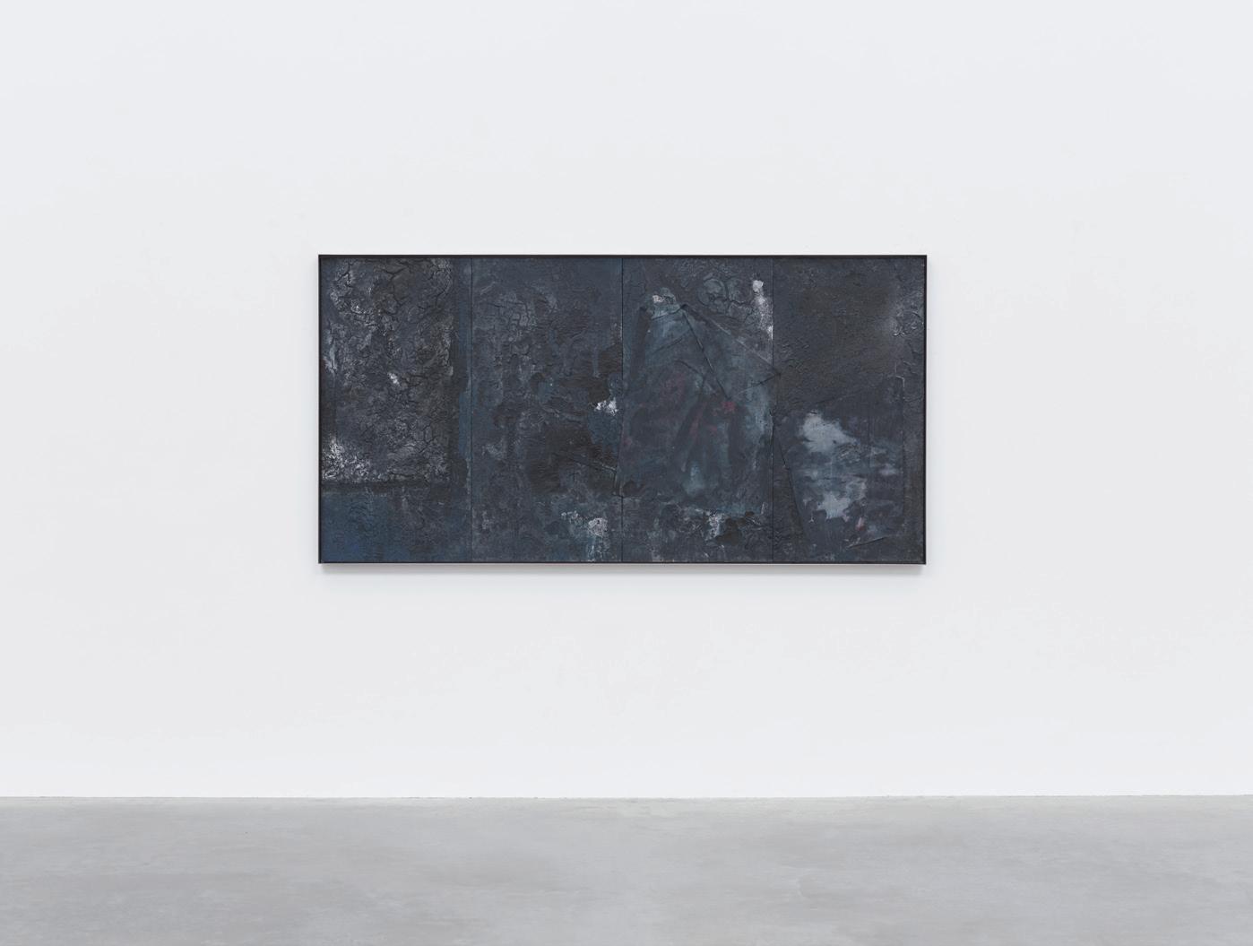

153
(Below) Upon III 2022
IN CONVERSATION WITH SAMUEL ROSS
(Above) Others See It, 2022
 (Image) A new bathroom fitting project made in collaboration with Kohler, 2024, courtesy Kohler Co.

How the Milan Triennale
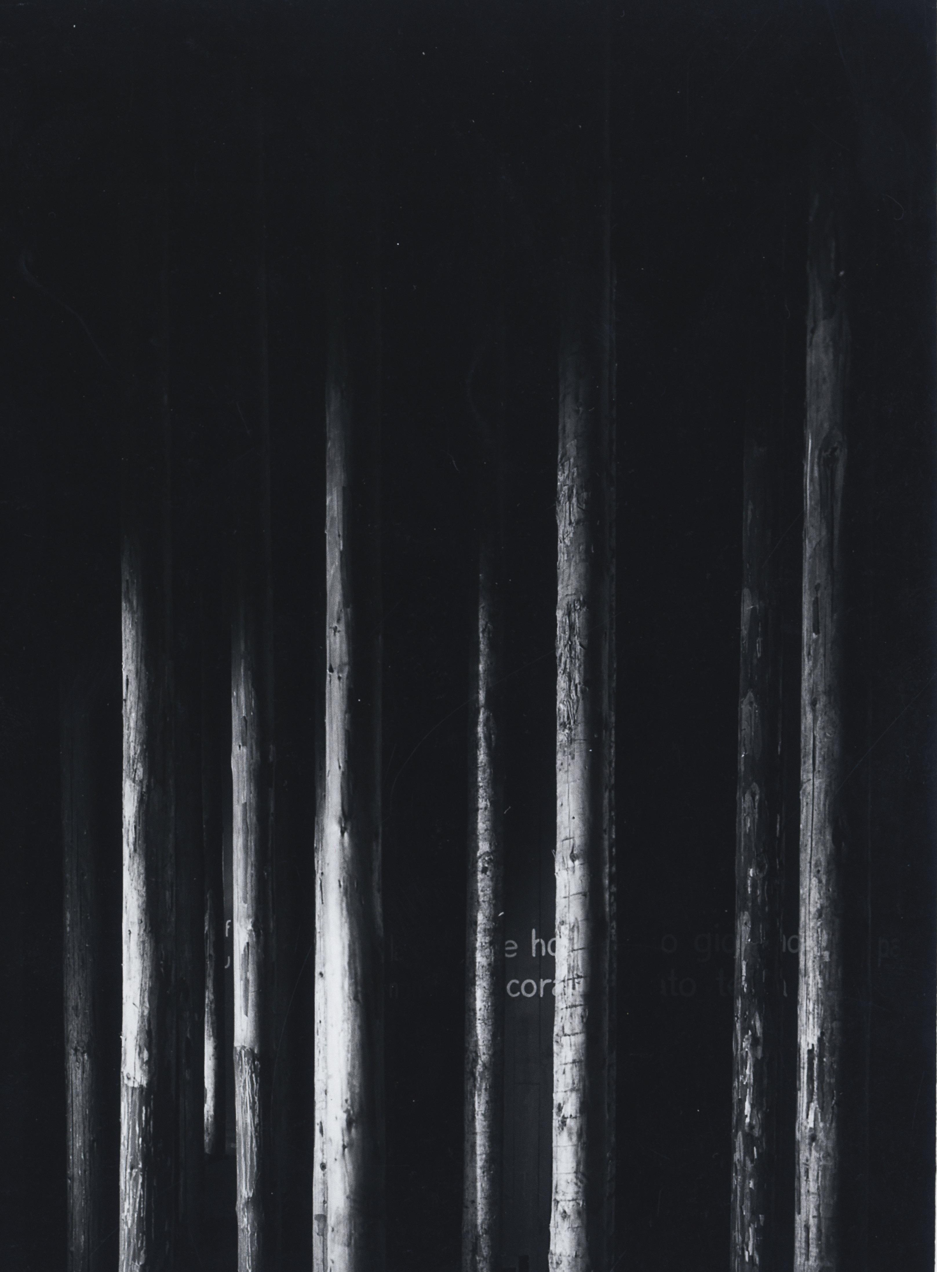
changed design history
156
WORDS Deyan Sudjic PHOTOGRAPHY courtesy Milan Triennale
After more than a century, Milan’s Triennale is making its archive available to the public. It tells the story on one of the keys to Milan’s continuing place as a centre for the world of design

There was a time when the opening of a new edition of Milan’s Triennale exhibition would have had as much impact in the world of design as the Venice Biennale or Documenta in Kassel can sometimes have on art and artists, though their long-term relevance might also be in doubt now. One of its founders was Gio Ponti, and in the early years, he used it as a platform to define a specifically Italian version of modernity. Ponti was followed by Ernesto Nathan Rogers who set out his agenda for rebuilding Italy after World War Two in the Triennale by asking architects to work at every scale; “from the city to the spoon” as he put it. Both Ponti and Rogers belonged to the Italian tradition of architect intellectuals, who combined the roles of magazine editors and curators with practice.
Ettore Sottsass got his first public exposure in the Triennale’s galleries, as did Vico Magistretti. Each edition was curated by a leading Italian architect, but it was also determinedly internationalist in its outlook, and attracted an audience from around the world. There were national contributions with their own curators. The 1951 Triennale, for example, brought one of the first of Charles and Ray Eames’ chairs to Europe from America, before it became commercially available. It was also the year that the Triennale used the term industrial design for the first time. At the same exhibition, the work of Scandinavian designers set an example that other countries tried to follow. In 1960, a fragment of a school built using the British prefabricated buildings system, CLASP, was one of the largest exhibits.
Despite that heritage, the role of the Triennale itself has faded over the years, while the annual furniture fair staged in Milan from 1961, and more recently its semi-parasitic fringe, has grown ever larger and more unmanageable. Venice began to stage landmark architecture biennales in the off years when there was no art on show there. It was Venice that identified post-modernism in 1980 when Paolo Portoghesi curated The Presence of the Past.
It was never clear what Muzio’s building, which has an auditorium as well as a sequence of galleries, would do in the years between Triennale editions. The idea that it might become a permanent museum of design was floated as early as 1951 by Franco Albini but not implemented until more than half a century later. The building became the venue for temporary exhibitions of varying quality, and for commercial displays that attempted to fill the gap in its budgets left by diminished municipal support. At times, the Triennale, run by the city of Milan, has struggled to offer a coherent account of its purpose.
That picture has changed with the leadership of Stefano Boeri, the current president of the Triennale, and Marco Sammicheli, who was appointed as the director of the Triennale Design Museum in 2022.
Sammicheli has organised a semi-permanent exhibition that traces the story of Italian design back to the origins of the Triennale with wit and flair. There are many familiar objects, but they are given a context. And there are also some items made famous by the history books, but which very few people have
157
(Below) Mario Sironi poster for the first Triennale in Milan
(Left) Aldo van Eyck installation for the 1968 Triennale
actually seen, such as the Elea mainframe computer made by Olivetti. This was the machine about which Ettore Sottsass asked himself, “what should a computer look like”, and answered, “not like a washing machine”. Sammicheli was also able to reconstruct a Sottsass domestic interior that is now a long-term fixture on the upper floor of the Triennale building. The difficulty with this kind of display is that, while furniture design can have the longevity to remain relevant after a century or more, the development of technology moves much faster. When Marcello Nizzoli’s work on typewriters for Olivetti was first shown in the Triennale it was a news report. Now a Lettera 22 or a Castiglioni-designed Phonola radio is more like an obituary, they are examples of technologies that no longer have relevance to the way that daily life is lived today. And it has the effect of turning what was once contemporary design into something like the collections of silver snuff boxes that haunt the more obscure corridors of museums of decorative art throughout northern Europe.
In its current newly energised incarnation, the Triennale opened its archives to the public earlier this year to document its remarkable history. They provide a fascinating account of the evolution of design through posters, catalogues and contemporary photographs. Despite having provided a platform for radical modernism, the Triennale’s roots are in the Fascist era, represented by Giovanni Muzio’s Palazzo dell’Arte in Milan’s Sempione park, built in 1933 as a permanent home when the institution transferred into the centre of the city from its original base in Monza, and the posters of the regime artist Mario Sironi. The Triennale of Decorative Arts had been initiated 10
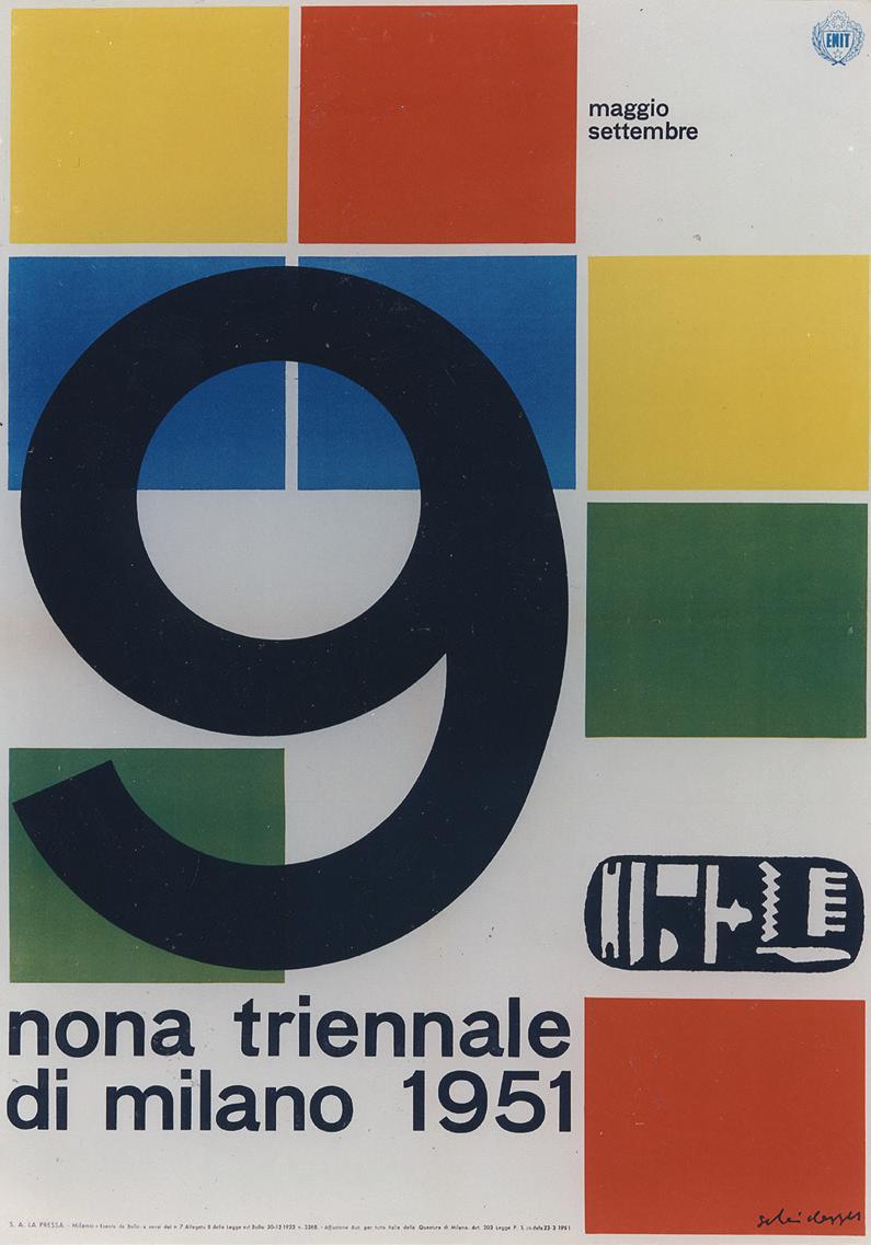
158
(Below) Ernst Scheidegger's poster for the 1951 Triennale
(Right) The entrance hall of Muzio's monumental rationalist building decorated for the post war Triennale

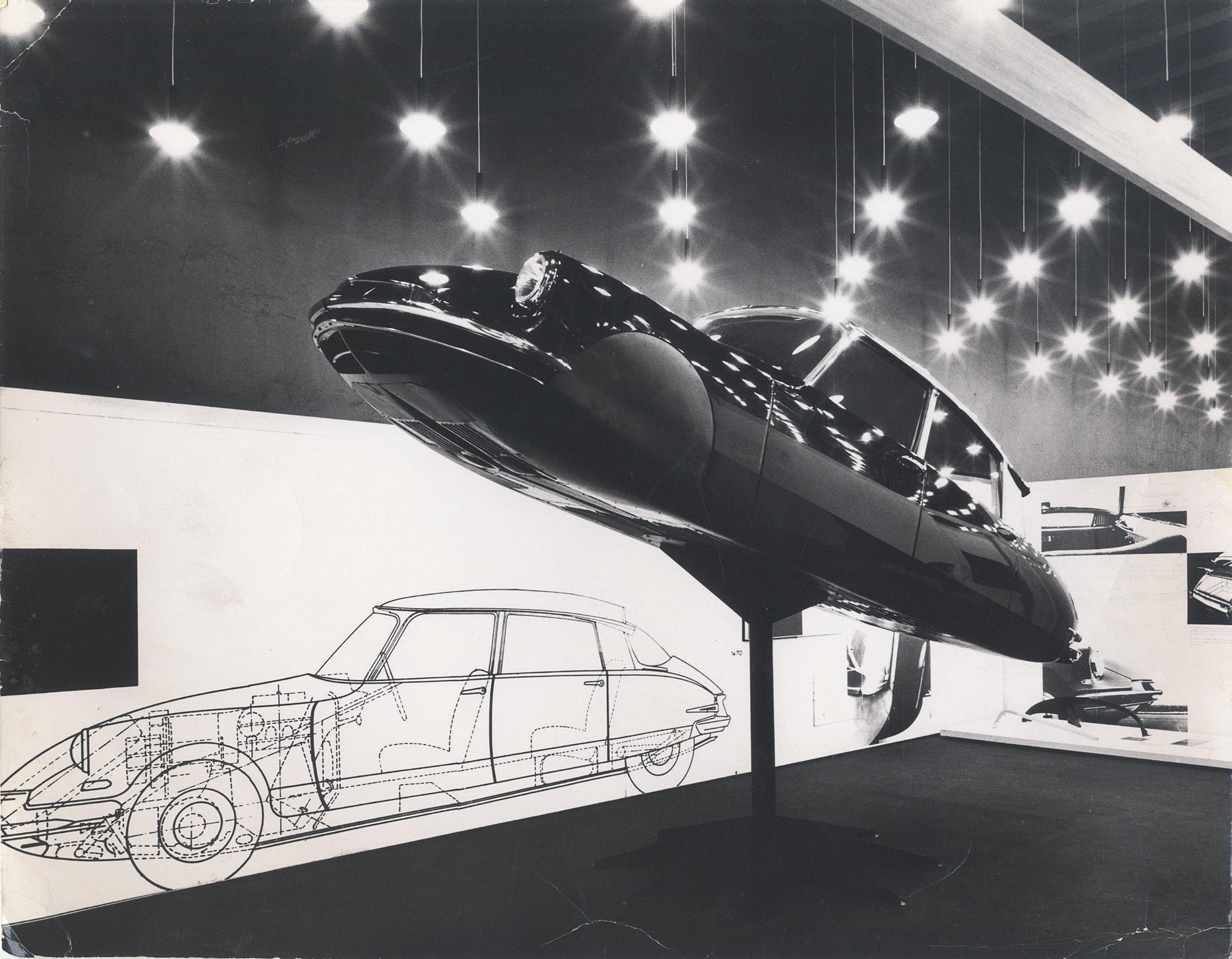

In 1968 a Formula One car was positioned on the main stairs, where it survived a sit-in and student occupation
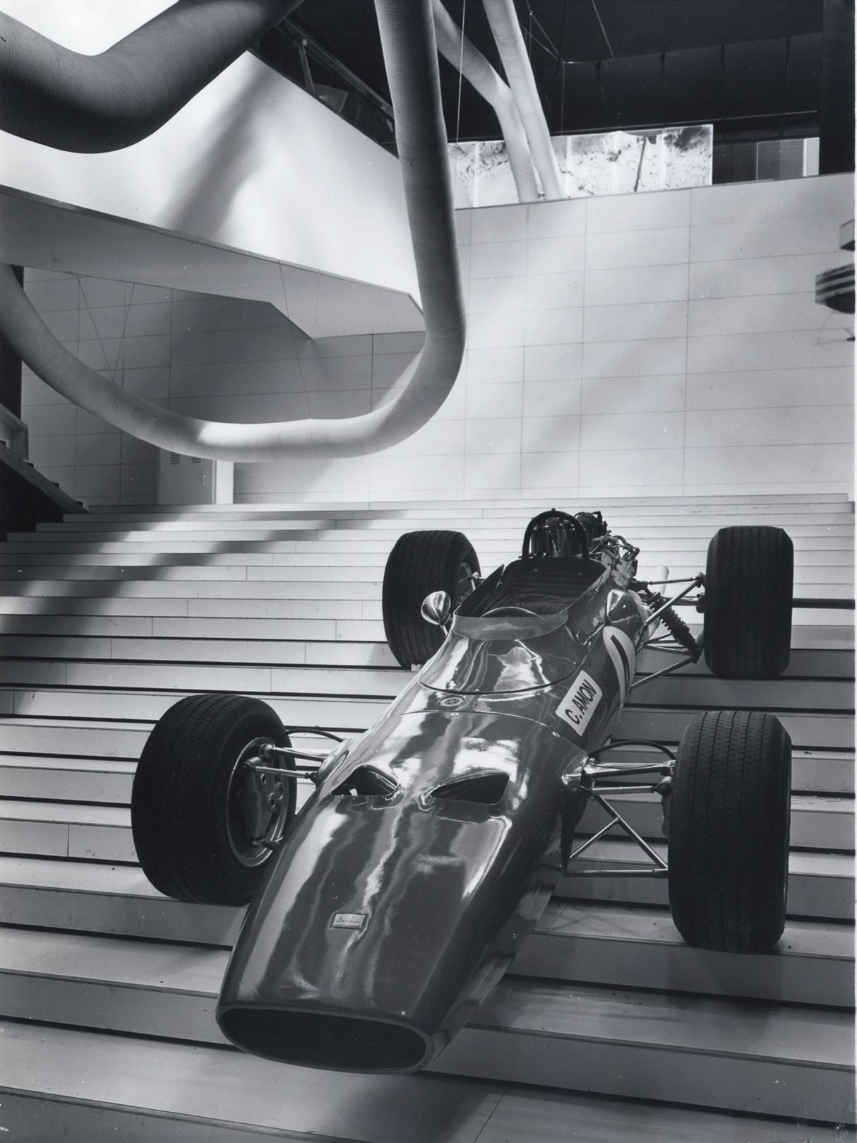
161
(Left) (Below) The Triennale made cars part of its displays early on. The shark-like Citroen DS was suspended from the ceiling in 1957. Before that there was a Pininfarina designed by Cisitalia in 1954, and in 1968
HOW THE MILAN TRIENNALE CHANGED DESIGN HISTORY
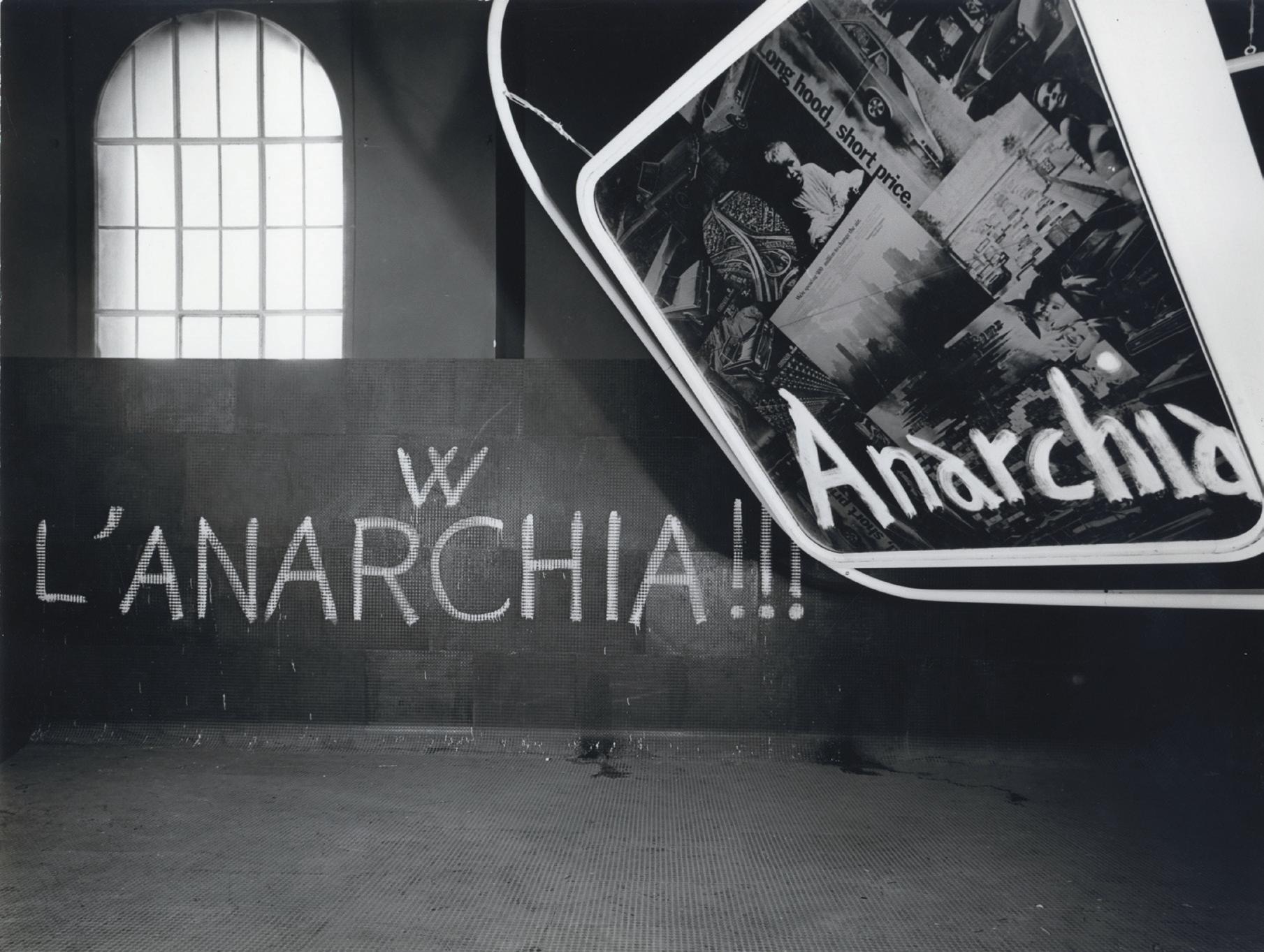
The events surrounding it proved so traumatic, that the idea of an international design exhibion in Milan almost died out, The director, Giancarlo di Carlo was no reactionary. He paid tribute to the street protests sweeping the world, top right, putting an overturned car on show. But that did not stop protestors daubing real slogans on the displays
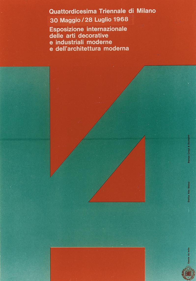 (Right) (Above) Abe Steiner's poster for the 1968 Triennale
162

years earlier by Guido Marangoni in a wing of the 18th-century imperial palace in Monza, built as a Habsburg version of Versailles. In its early versions, the Triennale brought the Art Deco work of Émile-Jacques Ruhlmann to Italy. Marangoni started Casabella, one of Italy’s most influential architectural magazines, and established Italy’s first school of design, which would survive until the 1940s. In those days, the Triennale was closely associated with Mussolini and those artists and architects favoured by the regime.
But from the period of post-war reconstruction up until 1968, when a group of student radicals occupied the building to protest against elitism and consumerism, the Triennale brought together examples of new thinking about design and architecture from all around the world at intervals – sometimes longer than the nominal three years. Every Italian architect and designer of note at one time or another has shown their work at the Triennale, from Ernesto Nathan Rogers to Mario Bellini. It became a showcase for radical new exhibition techniques; Aldo Rossi, Vico Magistretti, the Castiglioni brothers and Mario Bellini all worked for the Triennale. Gaetano Pesce notoriously constructed Italy’s landscape from prosciutto and parmesan, which looked pretty when it opened but soon started to reek under the hot spotlights, as the designer knew it would.
“Enough of the Fascist Triennale”
It offered more than temporary exhibitions. In 1947, the eighth Triennale took housing as its theme, and set about rebuilding a large suburban area to the north-west of Milan, known to this day as QT8 –Quartiere Triennale 8. It was planned around a new park with an artificial hill created from the rubble left by war-time bombing, and featured prefabricated four-story housing, among the first to be built in Italy. It would have been hard to predict in advance the suddenness with which the Triennale lost its way with the 14th edition, led by Giancarlo De Carlo, a sensitive and gifted architect. De Carlo chose the theme Il Grande Numero, literally translated as ‘the greater number’, which he saw as a critical exploration of the impact on society of a population explosion, of mass production and mass culture. To investigate these topics, he invited a range of leading architects and designers to take part. But Italy in 1968 was on the edge of the violent social unrest of the 1970s, the years that culminated in the kidnapping and murder of the former prime minister Aldo Moro by the Red Brigades. Striking workers from the Pirelli factory occupied the Galleria, trapping diners in the walnut and mirror-panelled salon of the Savini restaurant, where a clutch of waiters in tailcoats and white ties locked the doors against the mob. The Triennale turned into a flashpoint.
163
HOW THE MILAN TRIENNALE CHANGED DESIGN HISTORY
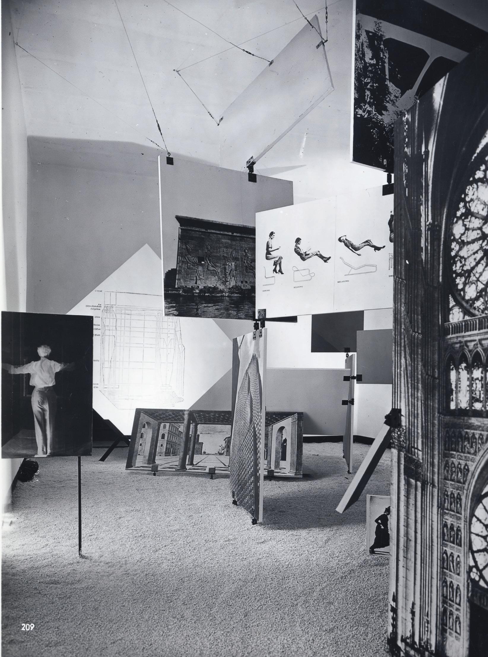
164

165
HOW THE MILAN TRIENNALE CHANGED DESIGN HISTORY
(Left and Above) In 1951, Ernesto Rogers curated and designed the Triennale with his exhibition Architecture, the Measure of Man
Muzio’s palazzo was invaded by angry students who occupied the building immediately after the opening ceremony. Within the year, street protests and occupations gave way to a wave of terrorist bombings. Nobody could be sure if they were left-wing or right-wing bombings, or even right-wing bombings pretending to be left wingers pretending to be right wing. In 1969, a bank in the Piazza Fontana was bombed, killing 17 people. Milan police pulled in an innocent railway worker, along with scores of other left wingers. His defenestration from an upper floor interrogation room provoked Dario Fo to write his bitter farce, Accidental Death of an Anarchist.
“Enough of the Fascist Triennale”, cried one placard carried by protestors in 1969. One of the slogans painted on the wall proclaimed “Milano=Parigi”. The occupiers from the Brera and the Politecnico architecture schools were determined to have as much excitement as their counterparts at the Sorbonne. They were joined by some of their teachers, among them the architect Enzo Mari and the artist Arnaldo Pomodoro. The latter explained what had caused the occupation. “After the war, the Triennale had become an international reference point for creativity and design. In those days it had not been a place in which an object was expected to be completely commodified. It was understood that design could be regarded as a means of communication and of understanding. We hadn’t expected that design could be used in such entirely different ways.
Sport was used as a theme to demonstrate the applications of the new materials that became available in the post war years
In the 1930s,and the last Fascist era Triennale in 1940 crowds came to see the latest in new technology, such as Caccia Dominioni and Castiglioni's Phonola wirelessype
Vico Magistretti was responsible for designing an installation on the future of work for the 1951 Triennale.
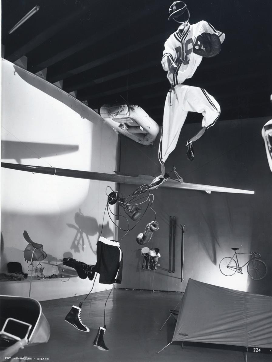
166
(Right) (Below right)
(Right)
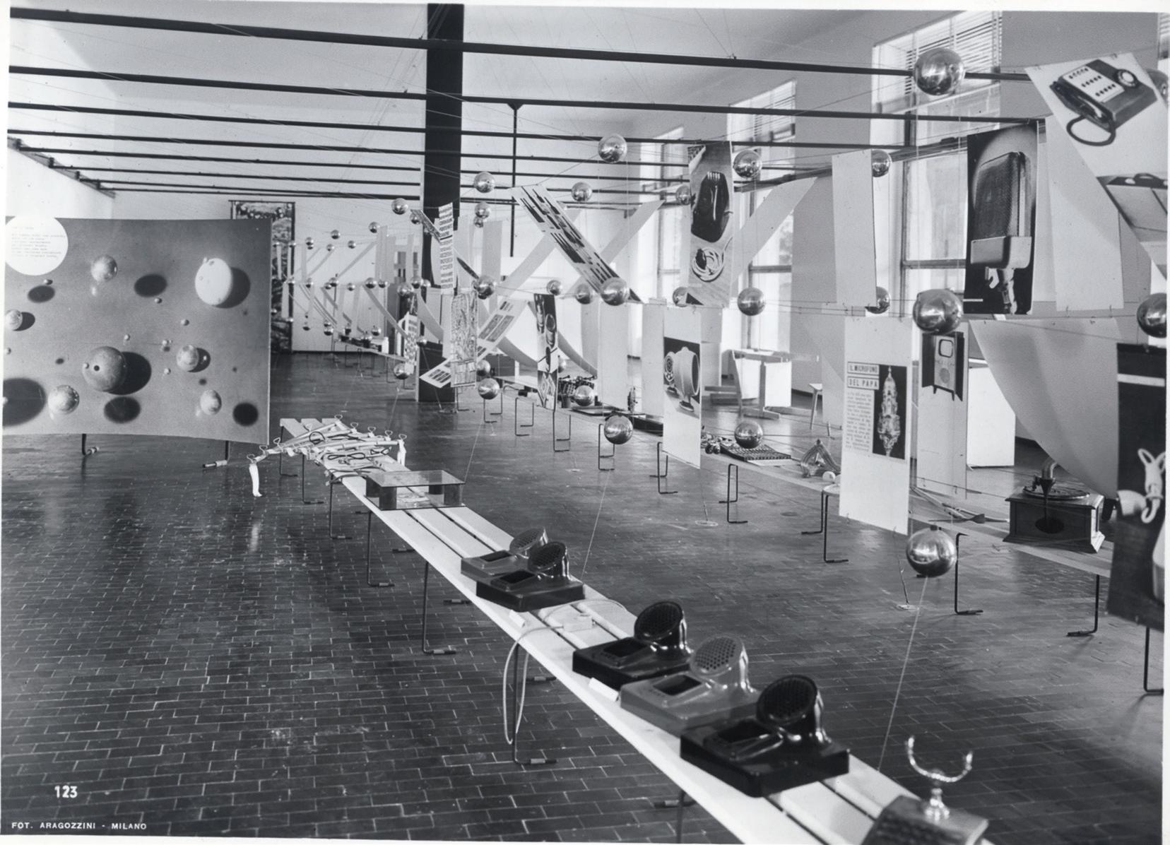
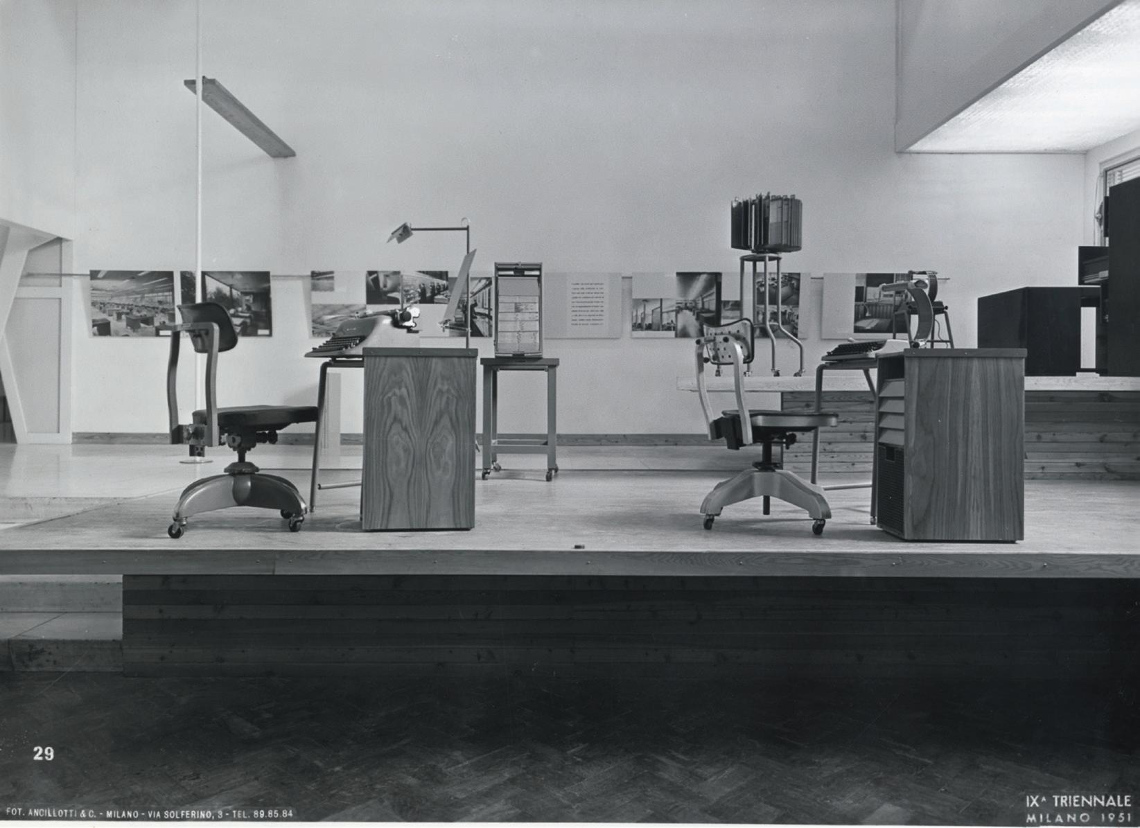
MILAN
DESIGN HISTORY
HOW THE
TRIENNALE CHANGED

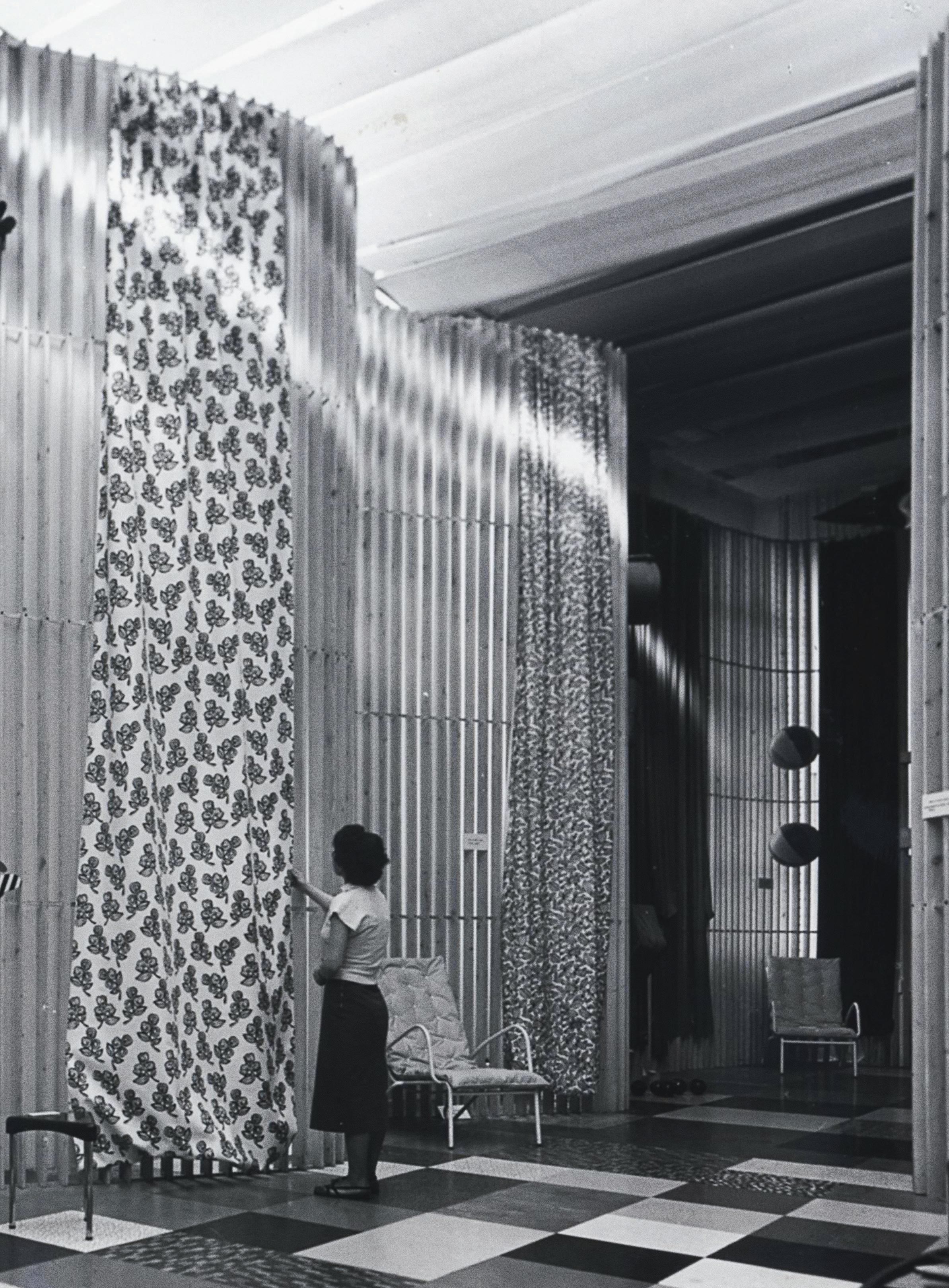

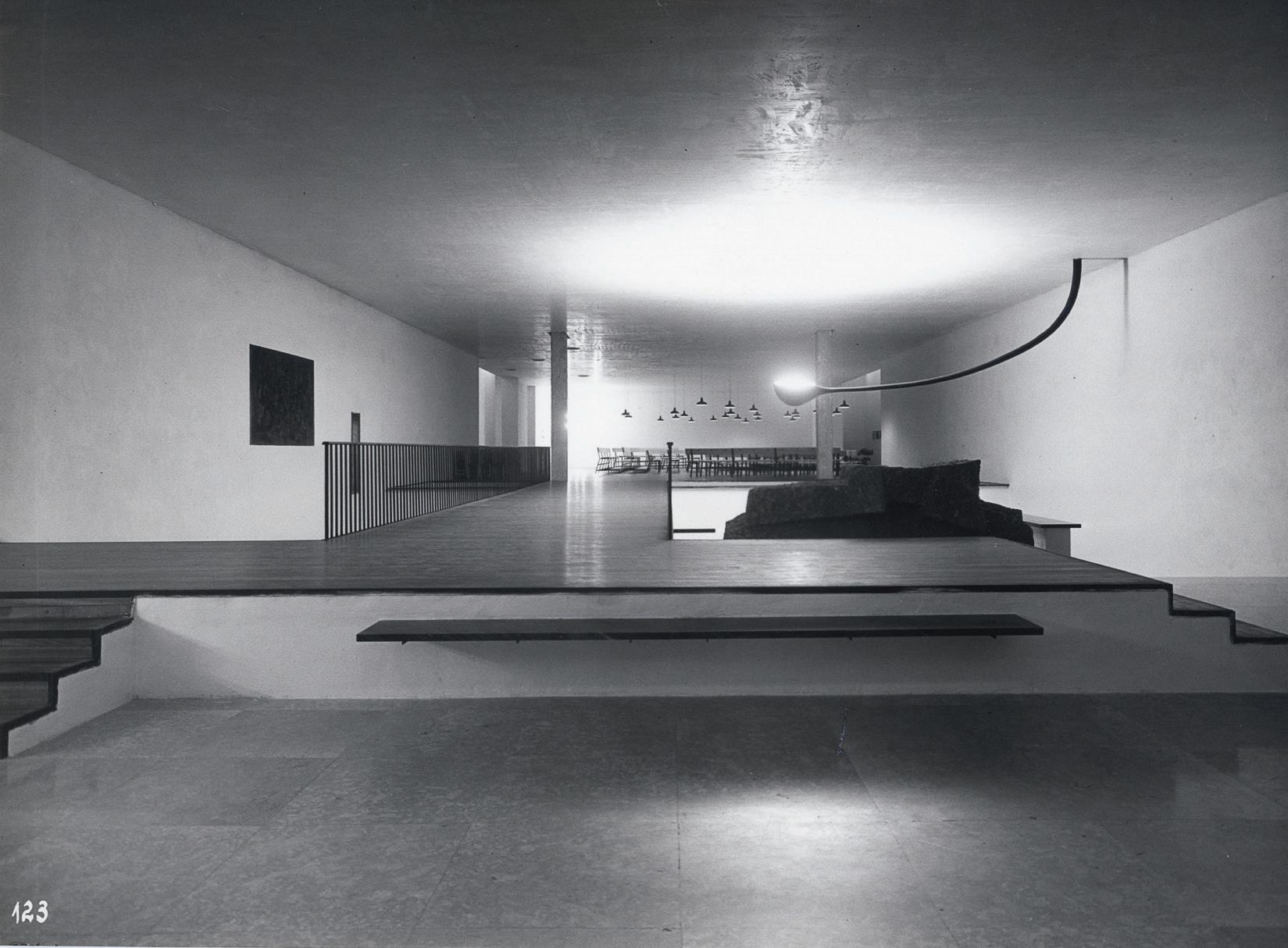
170
(Previous Page) For the 1951 Triennale the architect Angelo Mangiarotti designed a display for what were then recently developed new plastics
(Above) Before Milan's furniture fair spread across the city, the Triennale established a presence in the city centre, in the Galleria

171
(Above) (Left) Aldo Rossi and Luca Meda inserted a steel bridge into the main entrance to the Triennale building in 1964
HOW
MILAN TRIENNALE CHANGED DESIGN HISTORY
Achille and Pier Giacomo Castiglioni's lighting display
THE

Archigram from London also took part that year
Within hours of opening, the exhibition closed after it was occupied by radicals protesting against the commercialisation of the Triennale, Riot police evicted them

We had reached the point of revulsion; design was still being presented as if it were the product of research, and utopian invention. But it wasn’t that anymore, because, in the interim, competition between companies intent on selling more products regardless of their quality had overwhelmed design. The mass production of objects triggered the advertising that has destroyed the principles of the Triennale.”
According to Andrea Branzi, Enzo Mari tried to have it both ways. He was outside the Triennale with the protesting students, but he also had his own work on show inside. De Carlo, who had risked his life to take up a gun to fight fascism with the Italian resistance during the closing stages of World War Two, and had joined the Anarchist movement, had the courage at age 50 to push his way into the building daubed with Maoist and anarchist slogans to argue with teenage Trotskyites and Situationists determined not to trust anybody over 30. “The city is a machine, the speculator uses it, the architect designs it, and the worker builds it to be crushed,” read one banner.
The demonstrators broke in and found installations designed by Alison and Peter Smithson, Aldo van Eyck, Arata Isozaki, George Nelson, Saul Bass and Archigram. In a surreal turn of events, De Carlo had anticipated their protests. One display included an overturned burned-out car, street barricades and heaps of cobblestones in a faithfully life-like evocation of the Parisian street protests of May that year. The mirrors that formed part of van Eyck’s installation were smashed. The Smithson’s somewhat sentimental evocation of Florentine street life apparently attracted particular scorn from the demonstrators.
The riot police were called to evict them, the damage they had done was repaired, the exhibition reopened, but the Triennale would never be the same again. The building remained active, but the idea of an international exhibition of contemporary design went into abeyance.
For a while, the place was taken by individual curators. In 2010, it was Alessandro Mendini. Among the 800 or so objects that Mendini gathered together in March 2010, for the exhibition he called Quali cose siamo, ‘the things we are’, he found enough room for a kitsch reproduction of Michelangelo’s David, a two meter-high Ferragamo shoe, a Mussolini-era steel helmet and an exquisite still life by Giorgio Morandi. It was an elegantly displayed, sometimes baffling and sometimes infuriating cabinet of curiosities. The year after, it was the turn of Alberto Alessi, who produced what amounted to a book on the walls of a museum with a great deal of text to address his theme, Dream Factories: People, Ideas and Paradoxes of Italian Design. It was only when Paola Antonelli from the Museum of Modern Art in New York put on Broken Nature in 2019, a disturbingly impressive Triennale designated as the 22nd edition, on the existential threat to the survival of the human race posed by climate change, that the event regained some of its original intellectual charge.
173
(Left) (Below) (Overleaf)
The British artist Lynn Chadwick's installation in the 1968 Triennale was positioned next to the giant stack of filing cabinets that formed part of Saul Bass's display
HOW THE MILAN TRIENNALE CHANGED DESIGN HISTORY




Alessandro Mendini was a designer who was as interested in ideas as he was in things



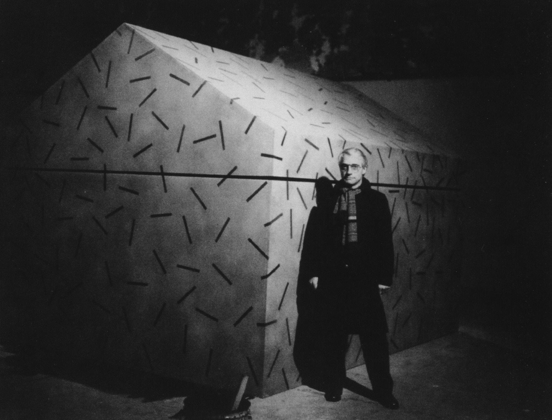

Alessandro Mendini was always unfailingly congenial, always extremely generous with his time, and welcomed me to Milan as the first editor of Domus from an Anglo-Saxon country in the magazine’s history, even though our approaches to the publication that we both edited, albeit several years apart, could not have been more different. For him, Domus was an extension of his life and work as a designer. For me, the magazine itself was the project. It was my vantage point to explore the world of design.
In person, he was not what I would have expected from my visit to Groningen at the time of the city’s new museum building opening in 1994. His design could fairly be described as extreme, while he himself was the embodiment of well-mannered restraint. But then Mendini always wore his green Loden coat, the uniform that the Milanese bourgeoise use to remind us that their city had once been an Austro-Hungarian provincial capital, even as he set out to undermine and subvert their assumptions.
In the context of a remote city in the far north of the Netherlands, the Groeningen Museum, which was Mendini’s most ambitious and most complete architectural work, seemed anything but polite. It struck me as an architectural version of exquisite corpse, the surrealist game played by André Breton. The museum was composed of four elements, each clearly designed by a different individual, stitched loosely together in the style of Frankenstein’s monster. One major section, the Coop Himmelb(l)au pavilion, wasn’t even thought of when Mendini, Philippe Starck and Michele de Lucchi started work.
Frank Stella was meant to be the fourth participant in the game, but his concept of a Teflon-coated structure proved to be both impractical and too costly. Coop Himmelb(l)au’s replacement had trouble keeping the rainwater out.
None of the individual architectural pieces relates to the others in shape, form or colour, and yet the resulting train crash has a powerful presence. At first
(Above) Alessandro Mendini, at the 1979 Milan Triennale, and his installation titled 'Whispering architecture'
(Right)


178
(Below) During the 1970s Mendinii's architecture diverged from those post modernists who experimented with reintroducing quotations from history. Mendini's buildings and the drawings on which they were based were about the creation of more personal images
"All in gold", Mendini asked himself in his drawing from 1990 for the museum in Groeningen that he designed with separate wings by Coop Himmelb(l)au, Philippe Starck and Michele de Lucchi
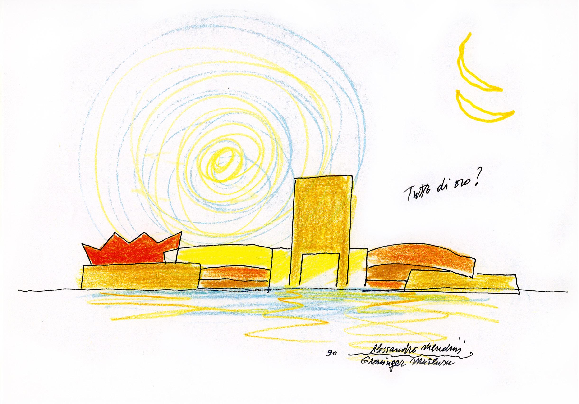
the local community was horrified. A series of sustained protests blocked construction work on the site for a whole year. In the way of such disputes, the bad feelings dissipated once the project opened, and it has come to be embraced as an idiosyncratic but essential landmark for the Netherlands.
The idea of assembling a structure made up from multiple ill-fitting components came not from Mendini himself, but from the museum director, Frans Haks. He commissioned Mendini to be the principal architect directly, on the understanding that he would bring together multiple voices to work on distinct parts of the project. The work of the four design teams amounted to the largest elements in the museum’s collection, dwarfing the scale of its paintings, ceramics and furniture, but acting just as much as visitor attractions. It was an approach that certainly reflects Mendini’s essential strengths. He was as much a curator and an editor as he was an architect or a designer. At the time Haks first approached Mendini in his architectural studio, established with his brother in 1989, he was still comparatively inexperienced. He had made his reputation not by building, but for the quality of his skills as an editor and a curator, and the attention that his project to find new designers for Alessi and transform the brand’s identity had attracted. Mendini’s relationship with Haks was important for both men.
As well as the museum, Mendini designed Haks’ home in Amsterdam.
Mendini, born in 1931, grew up in a house in Milan designed for his parents by Piero Portaluppi, a distinguished architect and collaborator of Gio Ponti. After graduating as an architect himself, Mendini worked in Marcello Nizzoli’s studio, which was responsible for many of Olivetti’s most memorable products. But Mendini first attracted attention for his work as a magazine editor.
“They wanted to find ways to emphasise the cultural significance of design”
Even before he identified the Arte Povera movement, Germano Celant, the art critic and advisor to Miuccia Prada’s Fondazione Prada, had coined the term ‘radical design’ to describe the work of Andrea Branzi, Enzo Mari, Ettore Sottsass and the others who came together briefly in the 1970s. Mendini became the editor of Casabella just as they were coming to prominence. He identified the magazine with a judicious range of views filling its pages between 1970 and 1975. Their most consequential expression was the Global Tools movement, heavily influenced by Californian and British radical thinking as expressed by Stuart Brand’s Whole Earth Catalogue, which is best described as a print version of Wikipedia. As Brand put it on the annually updated cover of the book, it offered access to tools. Meetings of the Global Tools group were held in Ettore Sottsass’s studio in via Manzoni, designers and architects from Naples,
ALESSANDRO MENDINI RETROSPECTIVE
Florence and Milan came together. They were uncomfortable with the idea that design was simply a technical discipline, put to work for the purposes of sophisticated entrepreneurs. They wanted to find ways to emphasise the cultural significance of design, to use design as a critical tool and undermine the over-simplistic assumptions of the manufacturers who relied on designers to make desirable products for them. The fractious nature of Italian design politics made Global Tools a short-lived movement.
Mendini moved on and left Casabella to start his own magazine. He called it Modo, which was Mendini’s attempt to identify a new and more international spread of voices. At the same time, he joined Alessandro Guerriero and his sister Adriana who had opened a gallery in Milan that they called Studio Alchymia or Alchimia – spellings fluctuated over time. It was a name that signalled their counter-cultural aspirations, though in the English-speaking world, punk was already pouring scorn on hippiedom. Design was only one of the Guerriero’s many interests. Alchymia made connections with artists, explored radical ideas about fashion, and staged theatrical happenings and events in its gallery.
When Alessandro Mendini joined Guerriero, he came to be seen as the spokesman for Alchymia’s point of view. His platform as an editor first at Casabella, then at Modo and Domus, made Alchymia much more visible as a movement than it had previously been. Mendini had an ability to make memorable objects in a way that Guerriero did not. He started to design, or as he put it, ‘redesign’ pieces of furniture that, unlike the work made by Guerriero, placed a value on production quality. They even began to find a market. Guerriero and Mendini started to curate Alchymia

(Previous page) A Mendini interior at its most decorative. He kept returning to the idea he had of using patterns to transform existing designs, most often the traditional armchair which was the basis for his Poltrona di Proust Named for the French writer Marcel proust, an ddecorated with brush strokes borrowed from the painter Paul Signac
exhibitions in which Sottsass, Andrea Branzi and Michele De Lucchi also took part.
Some years later Mendini wrote a manifesto for Alchymia in which he suggested that “Alchymia believes that memory and tradition are important. But the new drawing is free from rhetorical ghosts, frozen and decanted by Alchymia in a formal and kaleidoscopic style Alchymia believes in despecialisation: ‘confused’ methods of creation and production can live side by side; crafts, industry, informatics, new and obsolete techniques and materials.”
Mendini had the idea of reinventing classic pieces of design; ‘decorating’ such icons of Italian furniture as Gio Ponti’s Superleggera chair by adorning it with flags. At least in part, he was suggesting that it was time for design to stop being ‘original’, and for designers to reflect on what had already been achieved before designing anything new. For an exhibition that he worked on in Ferrara in 1978, he came up with the Poltrona di Proust: painting a generic contemporary version of a baroque armchair with pointillist brushstrokes based on the French painter Paul Signac. It was taken up as part of Alchymia’s catalogue and sold in small numbers like a work of art, before being commercialised and mass produced.
It formed part of Alchymia’s Bau. haus collection shown at the Salone del Mobile in Milan in 1980, along with the Sinerpica table lamp designed by Michele de Lucchi, and Sottsass’s Le Strutture Tremano table. Mendini would later use the same decorative pointillism for a wristwatch that he produced for Swatch.
Sottsass did not last long with the group. He left Alchymia in part because of his frustration with Guerriero’s disorganisation, and also as a reflection of his fluctuating relationship with Mendini. However, as the fashion entrepreneur Elio Fiorucci, who was close both to Sottsass and Mendini, suggested, Memphis and Alchymia represented two versions of the same wave. Alchymia was about provocation. Memphis was going to be more serious, something like the Wiener Werkstätte founded in 1903 by Koloman Moser and Josef Hoffmann, or the design for production arm of the Bauhaus itself.
Modo and Studio Alchymia between them turned Mendini into a major figure in the worldwide phenomenon of post modernism. It attracted the attention of Domus magazine, whose publisher decided to appoint him as the successor to founding editor Gio Ponti.
180

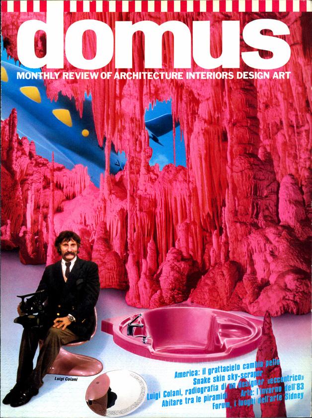
Magazines were a vital part of Mendini's practice. He edited Casabella, founded Modo and succeeded Gio Ponti as the editor of Domus in 1979. At the same time he kept up a continuous stream of half fantastical manifestos. He was a cofounder of the Alchymia group, and invented Fragilisme for an exhibition at the Cartier Foundation in Paris where he worked with two equally uncategorisable designers turned artists: Vincent Beaurin and Fabrice Domercq
ALESSANDRO MENDINI RETROSPECTIVE
(Left)
(Left)
The Triennale's exhibition takes its title from the note Mendini made on a drawing from 2006, "I am not an architect, I am a dragon"
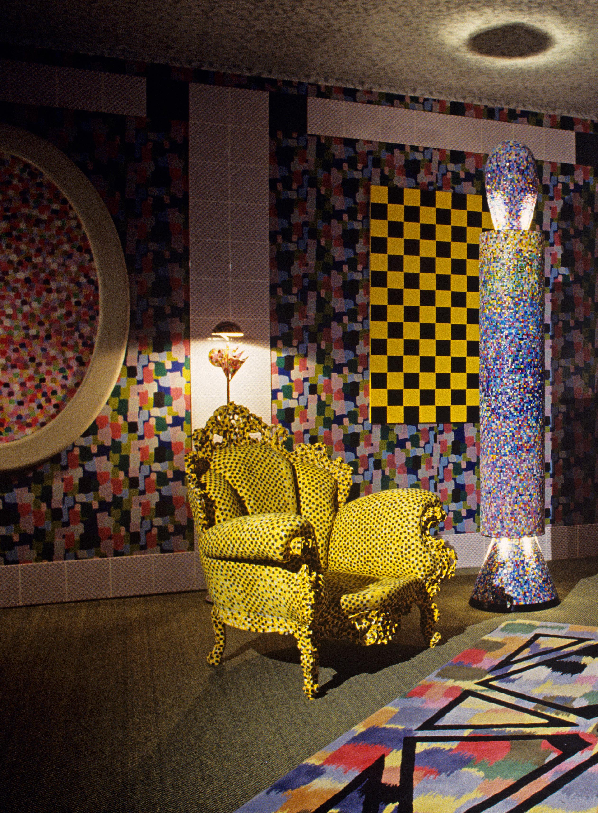

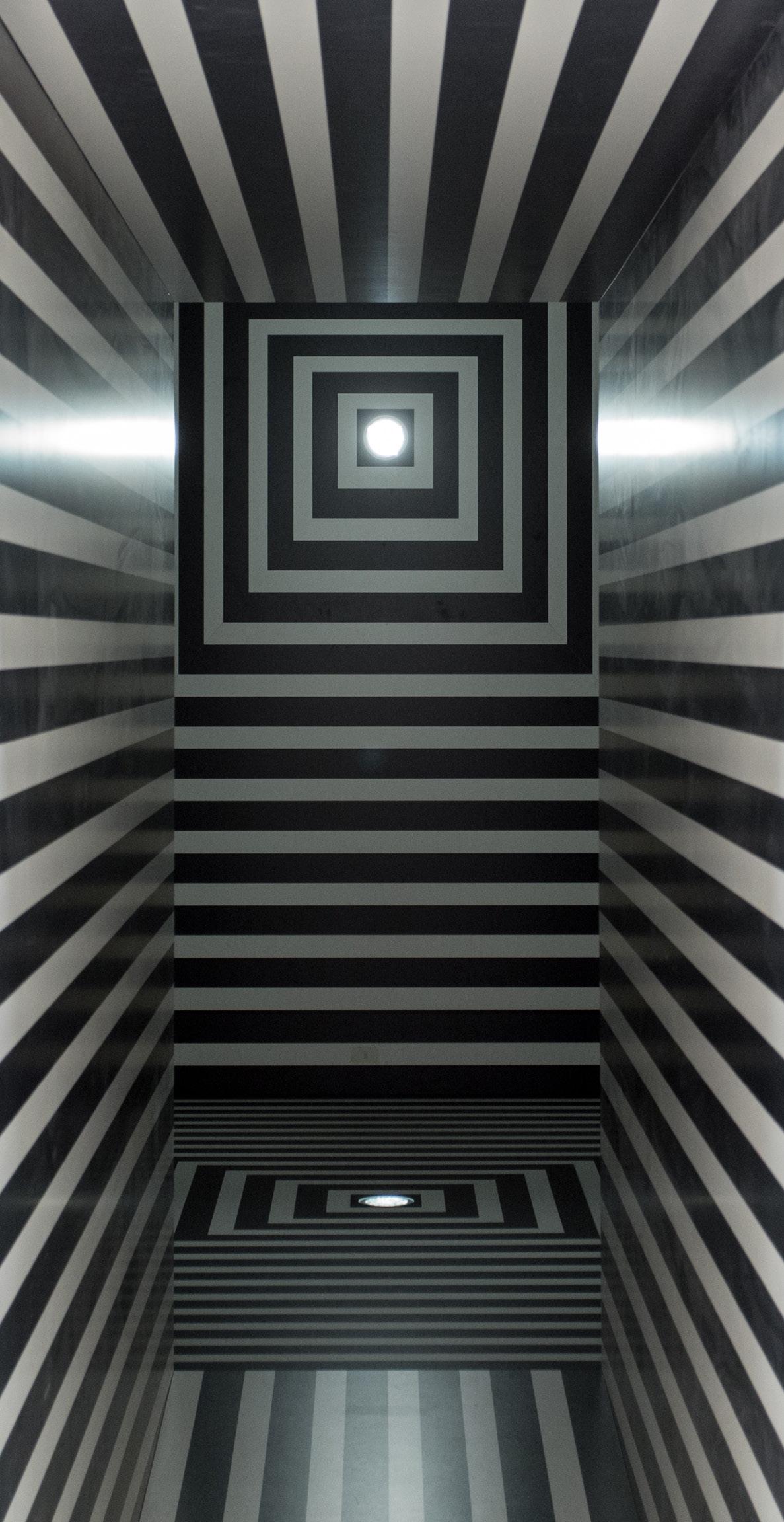

was a co founder of the Alchymia
a wilder predecessor of Ettore Sottsass' Memphis
Mendini's table made in 1981 is from that period. He was interested in decorating existing objects, rather than designing new ones
Mendini never confined himself to one language of design, and was ready to explore the potential of creative tension collaboratng with others
At Domus, where he had two distinct periods as editor, he learned from certain aspects of Andy Warhol’s Interview magazine, especially in the treatment of the covers, and offered a conceptual model that HansUlrich Obrist would follow in his curatorial practice. His first years at Domus was the period in which he was closest to Ettore Sottsass. He asked Sottsass to design the pages of the magazine, they would spend weekends together in Barcelona, and Mendini asked him to design for Alchymia.
Mendini’s work as an art director, which began in the 1980s with Alessi and continued with Swatch, can be seen as another version of his skills as an editor –in the English meaning of the word, as an individual who sets a direction for a publication, and searches for a wide range of content to fill it. He was assembling material in such a way as to present a particular viewpoint, rather than to become a journal of record.
Of course, there are individual works designed by Mendini himself for both Alessi and Swatch that are memorable for their own sake. But his real impact was in assembling work by others, beginning with the Venturis, Michael Graves and Richard Meier’s design for the Tea and Coffee Piazza. Mendini had caught something in the air, which would one day lead to Starck’s Juicy Salif, now perhaps presented as the embodiment of all the excesses of the 1980s, as much as Raymond Loewy’s work summed up the shallowness of the Streamline era. And Mendini was tireless in continuing to search the world for new and interesting people.

185
(Above) (Left) (Below)
Mendini
group,
movement.
ALESSANDRO MENDINI RETROSPECTIVE
Model of the Groeningen Museum
Mendini’s work on the Naples metro network was another example of that same talent for bringing together a collection of artists, architects and designers whose individual contributions are impressive, but where the project as a whole has the greatest significance.
As with the journalism that was once understood as the first draft of history, magazines provided a fascinating insight into particular moments in the evolution of design. But in their nature they were created in the heat of the moment, and do not always provide a picture that ages well. Looking at Groeningen today, the appropriateness and the longevity of using an editorial strategy to shape the architecture of a museum is questionable. Starck’s design work may well one day be the subject of a rediscovery or a revival, but his architecture, like that of Michele de Lucchi’s pavilion, is slight. Both struggle to hold their own against Mendini and Wolf Prix.
Like Charles Jencks, whom he recruited to contribute to the original Tea and Coffee Piazza collection, Mendini was an intellectual as much, or perhaps more, than he was a designer. His design work was about strong ideas, rather than about formal or tactile qualities.
There is a comparison to be made between Mendini and Ettore Sottsass, whose relationship over the years fluctuated from close friendship to awkward rivalry. Just remember Mendini’s exhibition at the Triennale Quali cose siamo in 2010, where the only exhibit that related to Sottsass was Sambonet’s pitiless naked portrait of him. Mendini’s career was fundamentally about the exploration of a series of signs, symbols and arguments. Sottsass was ready to argue, but had a different sensibility. He knew how to give a chair, or a vase, or a machine form, as well as how to decorate it.
Having said that, the way that Louis Vuitton is now using Yayoi Kusama suggests that Mendini had a premonition about the direction that consumerism was taking, and the continuing relevance of his ideas. An effigy of Kusama stands 15m high in the centre of Paris. She holds a Louis Vuitton bag in one hand, and a brush in the other with which she is flicking paint at Bernard Arnault’s office across the street. The splashes stick to the length of the 19th-century stone façade like pastel-coloured cowpats. They are the same dots that decorate the company’s bags, which are the subject matter of her canvasses and which she first started painting onto the naked bodies of people taking part in Soho happenings in 1960s New York.
It’s a phenomenon that reflects the use Mendini made of Paul Signac’s brushstrokes at every scale, from the architecture of Groningen to that of a Swatch wristwatch, by way of the Poltrona di Proust. In the end, Mendini’s ability to span the gap between high culture and commerce, between theory and populism, may have been his most impressive achievement.

(Above and Right) (Below)
The Lassu chair from 1974 was realised in various forms. The wooden version was set on fire and photographed for Domus. There was a later edition in cast bronze. Lassu, Italian for ‘up there’, was part of what Mendini called his war on functionalism. The archetypal chair sits on a pyramid, which makes it hard to reach. But once you manage to get there, it offers a new view of the world
Mendini’s marble ‘suitcase for the ultimate journey’, a metaphorical tombstone for our posessions

186
This is an edited version of a text published in the Electa catalogue for Alessandro Mendini’s exhibition
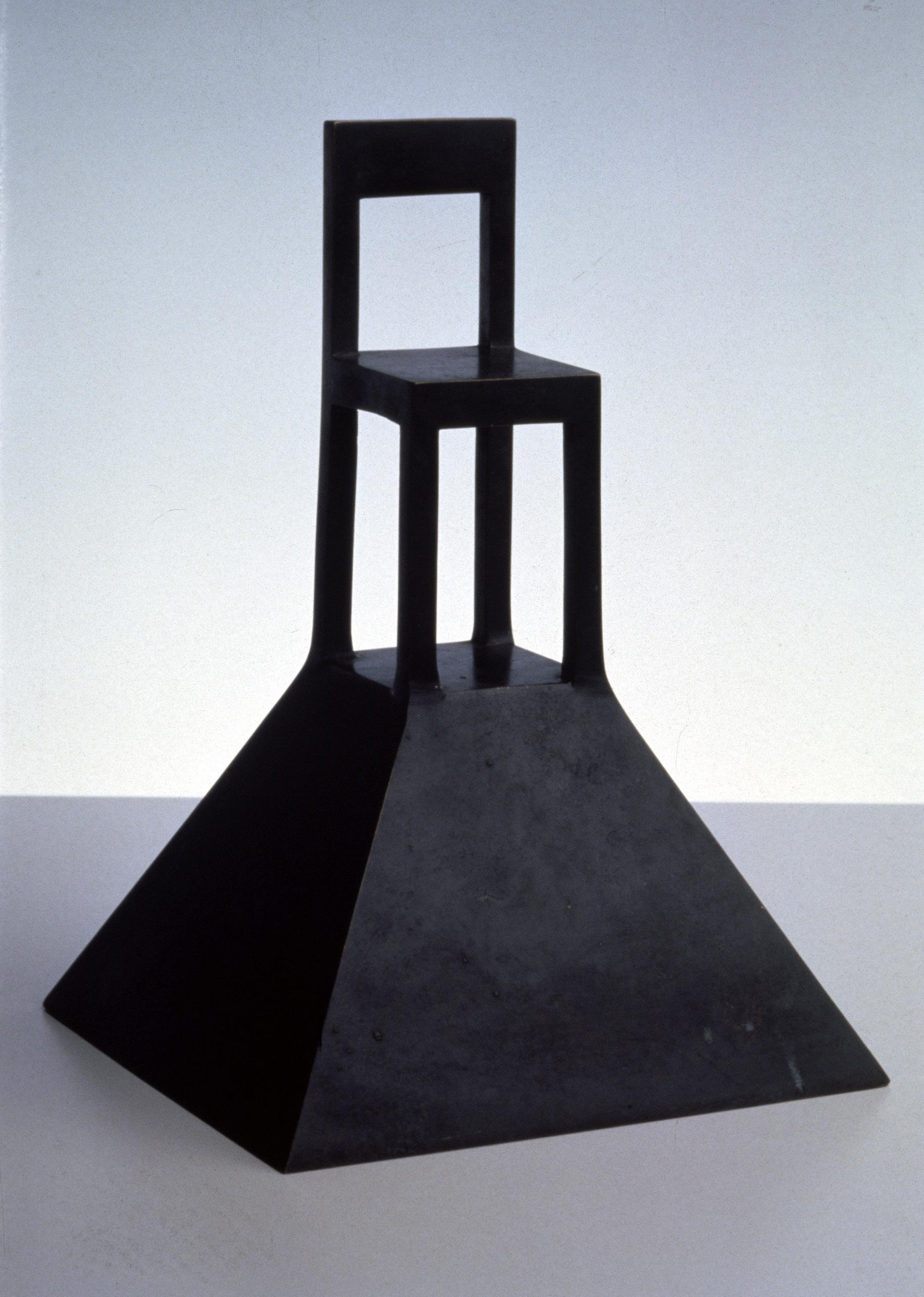
187 ALESSANDRO MENDINI RETROSPECTIVE
Milan in a van

188
PHOTOGRAPHY Paolo Zerbini
(Above) Minotti: Torri Nest Nendo (Right) Cassina Carlotta armchair Tobia and Afra Scarpa

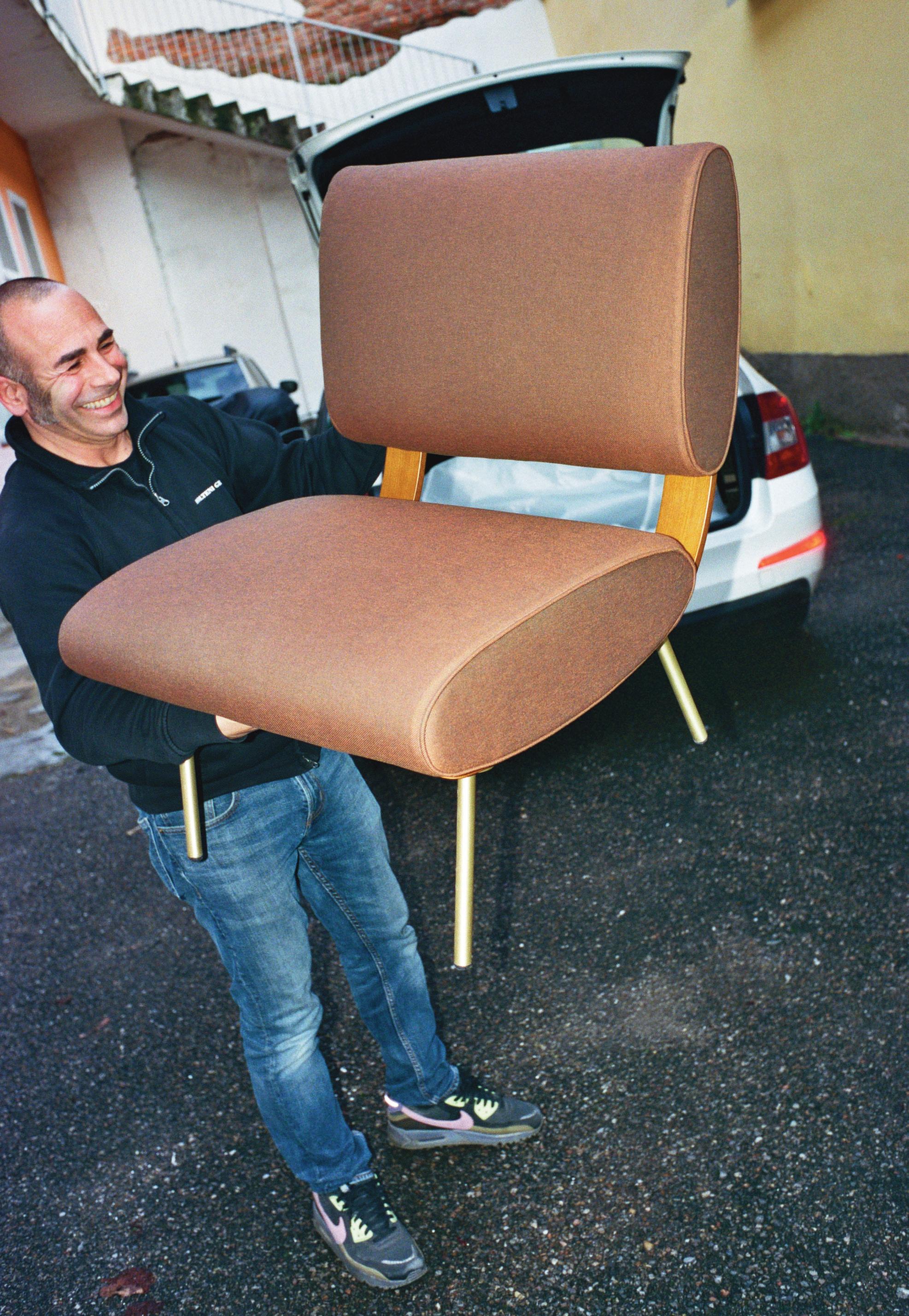

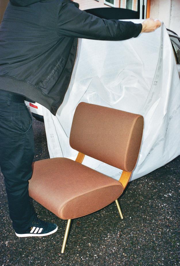


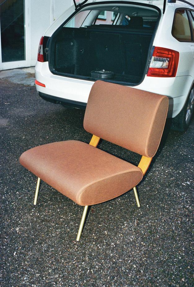

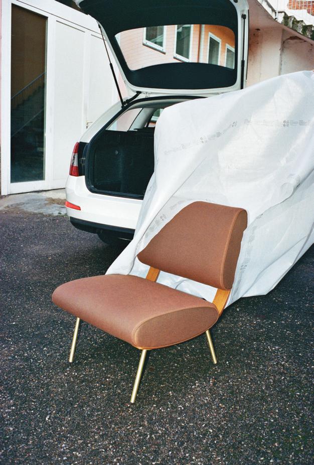

MILAN IN A VAN
Molteni: Round D.154.5 Gio Ponti
 (Above and Right) Flexform: Doris armchair Antonio Citterio


MILAN IN A VAN
(Left and Above) Living Divani: Lemni Marco Lavit
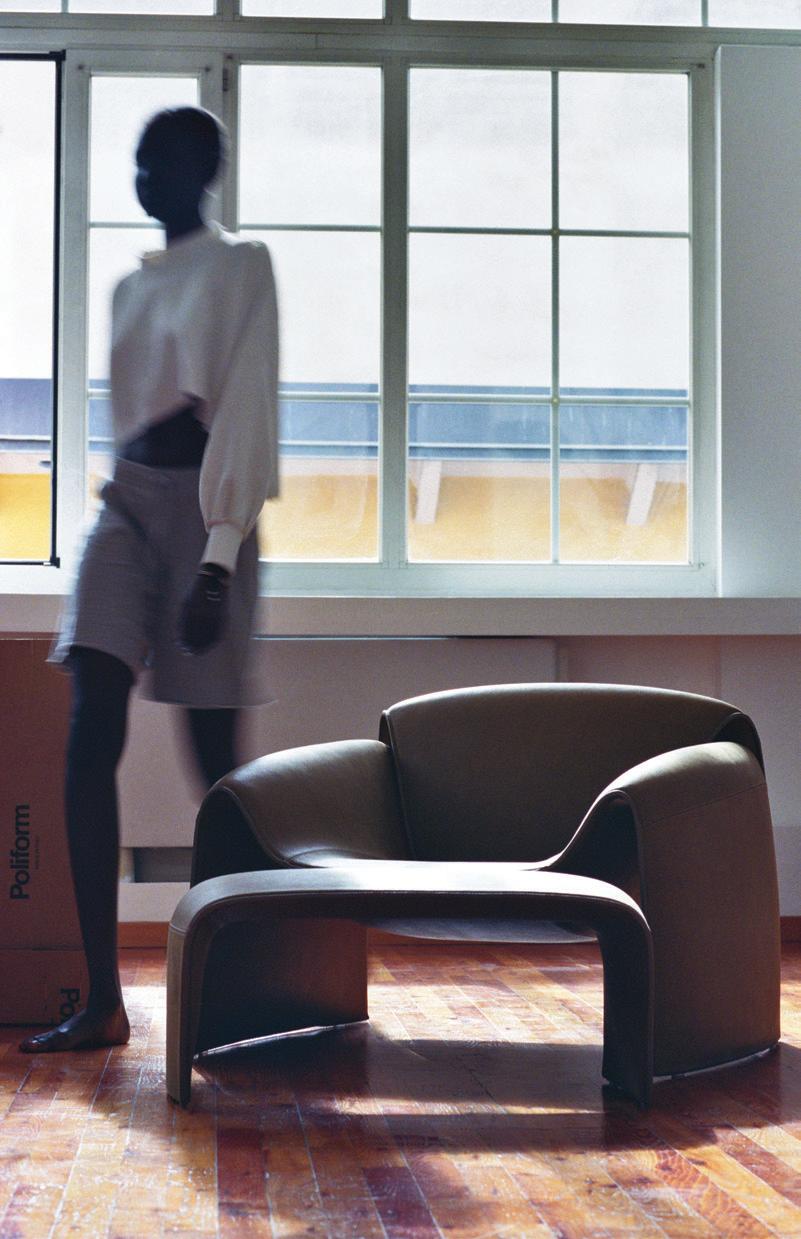
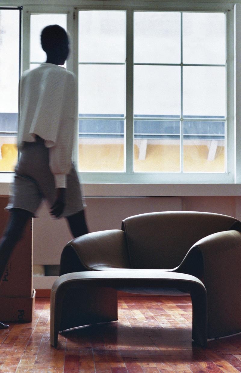
196
(Above and Right) Poliform: Le Club Jean-Marie Massauf


198

MILAN IN A VAN
(Left and Above) De Padova: Everyday Life Paul Smith


200
(Above and Right) B&B Italia: Soft Cage Mario Bellini
Photography assisted by Elena Campese, Quentin Buttin and Antea Ferrari. With thanks to Martina and Aluk @monster, and Barbara Zilli @PERF

Dieter Rams l ks back at Braun and forward for Vitsœ
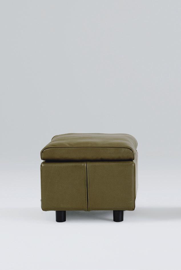
 202 (Above) The 620 Chair with footstool ©Vitsoe (Right) Braun calculator from the Thomas Strong collection
WORDS Deyan Sudjic

Designed 65 years ago, Dieter Rams’ shelving system, now made in Britain, has outlived his work at Braun
Meeting Dieter Rams in Vitsœ’s still relatively new British factory in Leamington Spa last February, my mind went back to our first encounter more than 40 years earlier at Braun’s headquarters in Kronberg, a suburb north-west of Frankfurt. He was in his early 50s then, but his hair was already snow white. He was dressed in what could have been a descendant of the same caramel-coloured corduroy jacket that he wore in the 1980s – in contrast the drawing office staff wore white coats like laboratory technicians. The context was somewhat different this time. The Braun studio in 1983 was a study in neutrality: an entirely monochrome interior in which the only splash of colour came from the vivid orange pack of Ernte 23 cigarettes that Rams twisted continually in his hands as we talked.
Vitsœ in its current incarnation in Britain, the creation of its managing director Mark Adams, has a warmer atmosphere. The factory is generously proportioned, naturally lit and ventilated and uses almost no power from the grid. It is built from high-performance laminated veneer timber that gives it the refined sense of fitness for purpose of a sailboat designed for speed. A reflection perhaps of the involvement, alongside delivery architects Waugh Thistleton and Martin Francis. Though

he trained as a furniture designer, Francis worked with Norman Foster for 20 years, among other things on devising the façade of the Willis Faber building in Ipswich that hangs like a three-story high undulating glass curtain. He engineered IM Pei’s design for the pyramid at the Louvre, and has designed a number of impressive boats himself. The Leamington building is the architectural analogy for the infinite adaptability offered by the 606 Universal Shelving System designed by Rams that is Vitsœ’s most successful product.
Over the course of his long career, Rams has only worked for two companies. He joined Braun aged 23 in 1955 and remained there until his retirement in 1997. He was a consultant to Vitsœ, the company founded in 1959 in Frankfurt by Niels Vitsœ, an importer of Danish furniture to what was then still West Germany, and Otto Zapf, a designer from Frankfurt, and Rams himself. Rams brought the sensibility of his work as an industrial designer to the storage and seating that he designed over the years for Vitsœ. He saw them both as expressions of an underlying system. But the trajectory of the two companies was very different. Braun was a family firm founded by Max Braun, and led, when Rams joined, by Braun’s two sons, Erwin and
(Above) The Vitsœ factory, Leamington Spa
Artur. In 1967, Gillette bought a controlling stake in the company for the equivalent of $500m in today’s values. Rams had no qualms about American ownership. “They bought us because of our designs, and they had an idea to use us to design a premium range for Gillette. I got invited to Boston to meet senior people ahead of the rest of the Braun management team, but it came to nothing,” Rams told me. Until 1984 Braun remained an autonomous business within the Gillette orbit. Thereafter, Braun went through a period of managed decline that was to accelerate after Rams’ retirement. Whole product divisions were abandoned or sold off. The final flicker of Braun from the Rams era was extinguished in 2005 when Procter and Gamble bought Gillette. Braun is now a label without a personality, lost inside a sprawling conglomerate. The Braun name has been licensed to a wide range of businesses. Watches and clocks are made in China by a Hong Kong-based firm. De’Longhi of Italy have the license for household appliances.
company. Rams was introduced to Niels Vitsœ by Zapf, a Sudetenland German, expelled from Czechoslovakia in 1945, who was working on display units that he offered to Braun. Zapf worked together with Rams on the designs for what was initially called Vitsœ and Zapf but left in 1969 and set up his own business.
“My contact at Ulm was with Gugelot. I had no problems with Bill, but when we met, he couldn’t see me, I was empty air to him”
The cultural ambition of the original Braun ideal survives in Vitsœ. The Vitsœ building in Leamington Spa is not a factory in the sense of a traditional production line. It assembles, packages and distributes tailor-made storage installations, as well as some of the seating ranges that Rams designed for Vitsœ, along with his side tables. Mark Adams began by working as Vitsœ’s distributor in 1985. After Niels Vitsœ retired, Adams took over the leadership of the company, and then in 1995, in a move that ran counter to the direction of most industries that have been moving east, he switched production and operations to Britain, rather than the other way around. He set up in London, and then made the move to its purpose-built HQ in Leamington Spa. The whole team, from finance to social media, cabinet-makers to dispatch, eat lunch together every day. It is cooked by Will Leigh, a chef who used to work for Jeremy Lee at the Blueprint Café at the Design Museum in London. He is happy to turn the vegetables that some staff grow at home into chutney or jam in specially labelled Vitsœ jars. Over lunch, the view from the dining area looks out onto Kim Wilkie’s landscaping.
The American graphic designer Tom Strong donated his collection of more than 250 Braun products, from cine cameras to electric shavers, radios to television sets, to Vitsœ, and it is now displayed in the building. The pieces offer the chance for Rams to reflect on his work. As he sits with evident pleasure on an example of a 620 sofa made in Britain by Vitsœ, I ask him about his relationship with Niels Vitsœ. “Most of the ideas came from me,” Rams replies. He had been working on the idea of a universal storage system from 1957, partly because of the work he was doing on designing display shelves for Braun showrooms. He offered it to the firm set up by Vitsœ and Zapf in 1959 when he secured Braun’s permission to work for another
“I got to know Otto Zapf because he would sometimes come to my office. Once he showed me some designs for what I would call ‘normal’ furniture, rather than what we knew at the time as ‘modern’. He told me he had done them for Niels. He was very proud of them, but they were not for me. He wanted me to recommend someone to photograph them, and I suggested somebody that I knew from Braun. Niels was very different to Otto. It came to the point where they didn’t understand one another. They were starting to fight with each other, instead of working together. I always found myself caught between them. But I was closer to Niels Vitsœ because he had the production facilities. After the photo session, Zapf asked me if I would be able to design some furniture with him. I didn’t say yes, and I didn’t say no. But it soon came to the point where I discovered that with the production facilities Zapf had, he would not be able to realise the design I had in mind.”
Rams is often associated with the Ulm design school opened in 1953 by the graphic designer Otl Aicher, his wife Inge Scholl, with the Bauhaus graduate Max Bill as the rector. But for Rams, who had apprenticed as a carpenter and studied interior design, then worked for a Frankfurt architect before being recruited by Braun, the relationship was more personal than institutional. He liked Hans Gugelot, the Dutch-born architect who worked in Max Bill’s office and was then recruited to lead the industrial design programme at Ulm. It was Gugelot and Rams working together who produced the SK4 radiogram with the Perspex lid that defined the stereo for three decades. “My contact at Ulm was with Gugelot. I had no problems with Bill, but when we met, he couldn’t see me, I was empty air to him.”
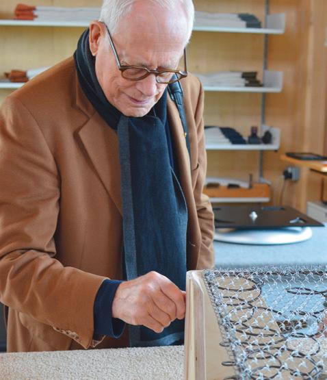
Rams has had a remarkable impact on design not just in the second half of the 20th century when he was most active, but also in the 21st century in ways that would have been hard to predict when I interviewed him for the Sunday Times in the 1980s. The artist Richard Hamilton used the imagery of Rams’ designs for Braun, and even the company logo as the subject matter of his own work. There were Hamilton screen prints based on Braun’s toaster, and even ‘The Critic Laughs’, a sculpture featuring a set of plastic dentures impaled on the barrel of a Braun electric toothbrush. For Hamilton this was more than irony, or scepticism about consumerism.
“I have for many years been uniquely attracted towards his design sensibility; so much so that his consumer products have come to occupy a place in my heart and consciousness that Mont Sainte-Victoire did
0204

Dieter Rams was recruited to Braun for his skill as an interior designer, his first task was to remodel the company's showrooms. His sketch from 1955 shows his strategy, and includes his idea for a shelving system that eventually led to 606 and Vitsœ
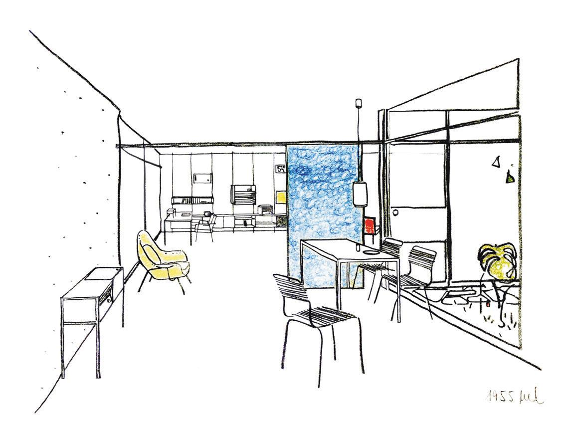
in Cézanne’s,” he wrote. The tribute to Rams’ ET66 calculator paid by Jony Ive’s calculator interface on the first-generation iPhone certainly helped maintain a mystique around the Rams language of design. There was also the idea that Braun, according to Rams, provided a sense of order in a troubled world. The workmanlike way that each part of the Rams universe had its place, represented by the coded sets of numbers and letters that he used to designate each component, helped to suggest that everything was part of a bigger plan. As Sam Hecht, co-founder of the London studio Industrial Facility, once put it, "every piece he has ever done looks as if it has been designed for the same room.” And then there was Rams’ own way of describing his designs. How could you not warm to a designer who suggests that he is trying to achieve the qualities of a well-trained English butler, always discrete and invisible when not required, but ready to perform effortlessly well when needed. Of course we love Braun, and that far-off past, before our own times when the only butlers left in Britain work for oligarchs.
How, also, could you not warm to a designer who talked about his distress at the untidy world to the extent that he took a sack with him on country walks to gather the litter he encountered. In this Rams context, the Vitsœ projects are particularly important and poignant. The pace of technological change has inevitably made many categories of consumer electronics such as those exquisite cine cameras, Hi-Fi systems and open-reel tape players redundant. But the 606 Universal Shelving System, which is 65 years old, is still as relevant as it has ever been. And components made today still fit parts from the original production run.
205
(Above and Left) (Below) Rams was prepared to use colour, but only sparingly. He compares it to having a bowl of flowers on his desk
The Atelier audio component system, in production between 1980 and 1990, was designed to be stacked vertically or horizontally, a format which was widely adopted by other manufacturers. There was a record, player, a tuner, a cassette player and an amplifier. From 1982 it came with a matching stand. A TV monitor was added in 1986.
“The last system that was made using Braun technology. After this, the systems were built with lots of different components from Asia. We couldn’t control the quality and the consistency anymore.”
Dieter Rams
620 Chair Programme ©Vitsœ
Designed by Dieter Rams, 1962
Manufactured by Vitsœ + Zapf, West Germany, 1962-69; Wiese Vitsœ, West Germany, 1970-94; sdr+, Germany, 1995-2012; Vitsœ, Great Britain, since 2013
Dieter Rams devised the 620 Chair Programme that, like his 606 shelving, was a kit of parts that could be configured in multiple ways. The basic module was a lounge chair, which can be configured as a two or three seat sofa. It can have a high or a low back, mounted on castors or a swivelling base and has a matching stool. With modifications, it has been in continuous production since 1962. Customers still replace the upholstery – in their own homes – 50 years after their original purchase.
“At the end of a photographic session, Otto Zapf came up with a question for me. He asked if I was able to make some furniture with him. I didn’t say yes, and I didn’t say no.”
Dieter Rams
FS 80 TV
Designed Dieter Rams, 1964
“The first free standing television like this was made by Wega, which was then sold to Sony by a manager who had worked for Braun. I was very interested in getting him back for our Hi-Fi business. But he was placed in an impossible position, management was changing too fast, so he went to the competition.”
Dieter Rams
Lady Braun style electric shaver
Designed by Roland Ullmann 1988
“I always think about the all-male design team designing what they called the Lady Braun, and wondering what psychology is going on there.”
Mark Adams.
“I was always against these products, but there was no help for it. It was a very strong business at this time for Gillette. It was a business which they needed, and they wanted to expand the shaver series.”
Dieter Rams


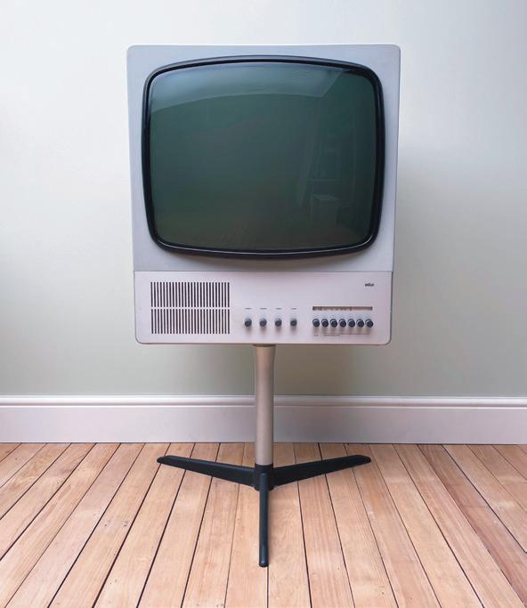

206
Atelier 1 Audio System ©Braun
Designed by Peter Hartwein and Dieter Rams, 1980
(1) (3) (2) (4) (4) (3) (2)
Domino ashtray
Designed by Dieter Rams 1960
For years, Braun was noted for its cigarette lighters, and the accompanying ashtrays. As a heavy smoker, Rams took a keen personal interest. Unlike most Braun products, they came in a range of bright colours.
“You need some activities also with colours. And that’s what was behind this ashtray. It had a psychological function. You could put them on a smoking table, instead of a vase of flowers. With Gillette behind them, the Braun management were focused on exporting worldwide. They wanted smaller items that were easier to ship, easier to handle and to service.”
Dieter Rams
ET66 control calculator
Designed by Dieter Rams and Dietrich Lubs, 1987
The tribute to Rams’s ET66 calculator paid by Jony Ive’s calculator interface on the first-generation iPhone certainly helped maintain a mystique around the Rams language of design.
“Ettore Sottsass once told me during the Memphis era that he had wanted to get away from the pressure of working for Olivetti with Memphis, and then found he had a lot of followers. I prefer using colour like on the ET66 where it has a purpose.”
Dieter Rams
D6 Combiscope
Designed by Dieter Rams, 1962
Slide projectors were part of the Braun range as early as the 1950s. The Combiscope was an ingenious blend of projecter and slide viewer.
“I still like this. I was lucky to have always had the possibilities of exploring new technologies.”
Dieter Rams
Nizo S8 Super 8 cine camera
Designed by Robert Oberheim, 1975
Braun took over the Munich-based manufacturer Niezoldi and Krämer in 1963, and gave their dated looking products the Dieter Rams look with the original optical quality.
“This was still a Braun decision. They bought Niezoldi and Krämer, shortened to Nizo. They were based in Munich. I was often at this time in Munich. I never forget it. They have their breakfast late in the morning, the second one. And always with weisswurst. It was too early for me to eat this heavy food. And they have again, not a little glass, but they have this mass, they call it mass, to drink beer.”
Dieter Rams
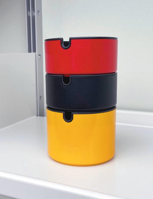


(5) (7) (6) (8) (5) (6) (8) (7)
If the world is going to feed an ever-growing number of mouths even as global warming upends agriculture, our approach to food will have to change. To explore the culinary landscape of tomorrow, Anima has enlisted the creativity of three teams of designers to craft their own recipes for the future. Cultivated meats, water-purifying mussels, zero-waste bread and the versatile fruits indigenous South Africa trees are all on the menu.
A recipe for the future of food
WORDS Ayla Angelos
208
(Right) Marula, Studio H, 2024
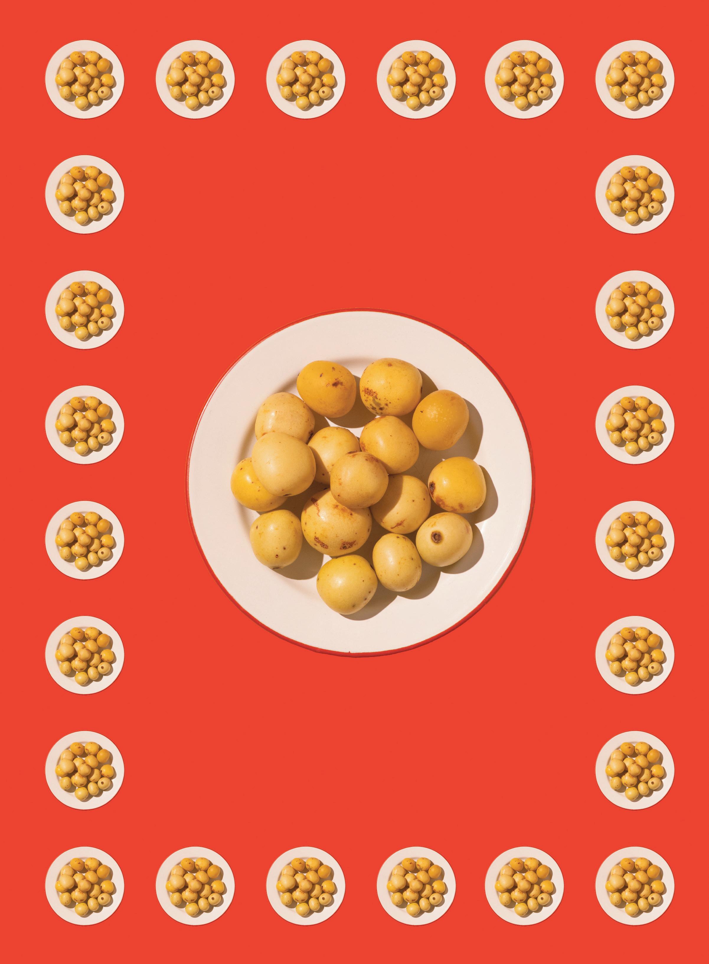


The marula tree
Studio H
Studio H – a South African design studio led by Hannerie Visser and JC Landman – is exploring the path to a sustainable future. Its recipe highlights the versatility of the marula, an indigenous fruit-bearing tree local to the Southern African miombo woodlands. Marula fruit and seeds are used by all of Southern Africa’s culinary cultures. They are a domestic resource but also have a spiritual aspect. Archaeological evidence of marula nut processing (as indicated by tools that are almost identical to those used today) dates back at least 2,000 years. For this dish, the studio recounts the multiple ways in which marulas can be processed and enjoyed.
The fruit
The marula fruit is high in vitamin C, potassium, calcium and magnesium. It can be eaten fresh or preserved either as Afrikaans-style maroela jelly (which is commonly eaten with venison) or fermented into fruit wines. Mukumbi is a marula wine made by the Vhavenda people. Brewers traditionally engage in muhwedzo rituals whereby, before anyone is permitted to drink the beverage, they offer a portion of mukumbi to their chief who assesses quality and thereafter declares the summer drinking season open. U phasa offerings are also made to ancestral spirits to bless the community for the season ahead. Afrikaner distillers often use marula fruits for their twice-distilled mampoer moonshines. It is also made into Amarula cream liqueur. The Springbokkie (‘little Springbok’ in Afrikaans) is a popular cocktail shooter composed of crème de menthe and Amarula.
The nut
The marula ‘nut’ (actually, the seed inside the pip) can also be used to produce marula nut butters and ‘milks’ ideal for use in vegan dairy desserts. Vegan marula nut milk ice creams are wonderfully creamy in taste and texture – much more so than those made with other milk replacements.
The oil
Marula oil is a healthy source of carotenoids and vitamin E, which act as antioxidants to help prevent cell damage. Venda-style mukoki/muhwaba (preserved, dried meat) is first flavoured with stamped seeds, onrulonga and marula oil (which also has an anti-bacterial preservation effect) before being dried and thus has a different flavour profile to biltong.
The root
The roots are used in various tea-like infusions medicinally.
211
H, 2024 A RECIPE FOR THE FUTURE OF FOOD
(Images) Marula, Studio
Leyu Li
Leyu Li, based in London, explores the boundaries between biotechnology, food and sociology through speculative fiction. For her dish, Leyu Li has created a colourful salad using fictionalised cultivated meat, proposing a world where hybrid meaty plants become the norm.
Unlike the Beyond Meat burgers we see on the shelves today, lab-grown meat is created by taking stem cells from animal muscle and placing them into a nutrient broth where they multiply and turn into muscle fibres. All of this is done without killing the animal and is a process which helps combat global warming. Studies have shown that meat production causes nearly 60 per cent of the agriculture industry's greenhouse gas emissions; lab-grown meat could be one of the many answers to climate change reform.
In Li’s salad, she mixes fictionalised ‘broccopork’, ‘mushchicken’, ‘peaf’, beefy kale and arugula; the plants’ surface on each ingredient works as scaffolding for the meat tissue cells to grow along their structures. All the greens in the salad have in-vitro meat tissues in veins and on the outer surfaces. The result is an example of how both meat and vegetables can combine into the same product, opening up the dialogue about lab-grown meat as the future of protein.
Future salad
Broccopork (Broccoli + Pork)
Stir fry broccopork for best results.
Mushchicken (Mushroom + Chicken)
Simmer mushchicken to make a new type of chicken soup.
Peaf (Pea + Beef)
Add peaf to cook a new kind of fried rice.
Beefy Arugula and Kale
Wash, chop and toss with the other ingredients to make the future salad.
212
(Right) Future salad, Leyu Li, 2024


Beans and Mussels
Sharp & Sour
Founded by María Fuentenebro and Mario Mimoso, Sharp & Sour is a multidisciplinary design studio based in Madrid and Arnhem, and focused on the future of food. Fuentenebro and Mimoso believe the choices that we make about the food we eat can reverse the damage we have inflicted on the planet. Their bean and mussel soup is inspired by fabes con almejas, a traditional Spanish dish, and each ingredient has been selected for its positive impact on the planet: mussels that purify seawater, beans that regenerate soil, and seaweed, which can boost oxygen and effectively sequester carbon.
Water-purifying mussels
Molluscs, including mussels, are rich in nutrients, sequester carbon and purify seawater. They thrive on microscopic organic matter, including agricultural runoff. They can be grown sustainably simply by lowering ropes into the sea to which they attach. They need no extra feed, and naturally regenerate the ecosystem in which they live.
Nitrogen-fixing beans
Beans play a vital role in maintaining soil health through their remarkable ability to ‘fix’ nitrogen. They act as natural fertilisers thanks to their symbiotic relationship with the bacteria in the soil, increasing its fertility without chemicals. Beans are highly nutritious, serving as a rich source of protein as well as fibre, vitamins and minerals.
Oxygen-boosting seaweed
Seaweed and algae play a crucial role in boosting oxygen levels in aquatic environments as well as in the atmosphere, contributing to more than half of the world's oxygen production. This process not only supports marine life but also helps to mitigate the effects of global warming by absorbing excess carbon dioxide from the atmosphere. They are also a valuable source of vitamins, minerals and omega-3 and, in the case of the spirulina and kelp featured in this recipe, provide a high dose of proteins too,
Zero-waste bread
What if we could create a system in which stale bread can be given a new life rather than be thrown away? This 'repurposed bread' is a mosaic of different regenerated breads, transformed into something new.
Salt-tolerant Samphire
Samphire can thrive in areas where traditional crops would struggle. It requires minimal freshwater to grow, making it a more sustainable alternative to other water-intensive crops. Rich in vitamins, minerals and antioxidants, samphire can offer a nutritious addition to many dishes.
Air-purifying mushrooms
While mushrooms themselves do not perform photosynthesis, certain species, such as mycorrhizal fungi, play a role in carbon sequestration and soil health. Additionally, some mushrooms have been found to effectively filter out harmful pollutants, making them not only a nutrient-dense food source but also an incredible air remediation powerhouse.
(images) Beans & Mussels, Sharp & Sour, 2024
214

Five restaurants where architecture and design have made a big impression
Design on the menu
216
(Right) The end of a power lunch at the Four Seasons in New York's Seagram Tower, Photography Victoria Hely-Hutchinson
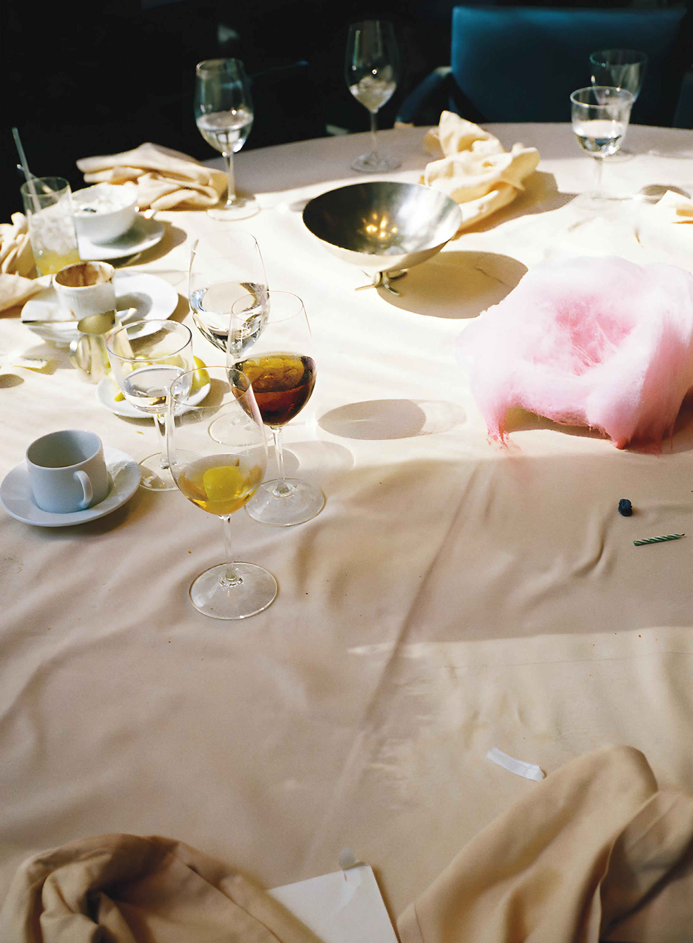


When the 23-year-old Terence Conran first saw a vacant shop at the scruffier end of London’s Kings Road in Chelsea he considered using it as a showroom for his furniture business, which would one day reach as far as shops in Seoul and Tokyo. But he chose instead to open a restaurant, that he called Orrery. It was named for a mechanical model of the solar system given to him by his parents, and he would use it again many years later for another restaurant that would earn a Michelin star. The menu at the first Orrery, given that Britain was still subject to the food rationing that had been introduced during the Second World War, could only be simple. But the interior, with blown-up Victorian engravings, and hanging planes suspended from the ceiling, was inspired by what he had seen helping his friend and tutor from Central School of Arts and Crafts Eduardo Paolozzi and artist Richard
218
Hamilton creating exhibitions and interiors for the newly founded Institute of Contemporary Art.
Orrery, Kings Road, London, 1954
(Above) Terence Conran named his restaurant for an astronomical model of the solar system.The menu reflected a British food culture that had yet to recover from war time shortages
(Right) Conran designed the interior and made the furniture in his own workshop. Images courtesy the Conran Archive at the Design Museum

220 The Time & Life building is a 48-floor tower that completed the Rockefeller Center 30 years after work started on the project, a complex of high-rise towers and public spaces. Henry Luce’s Time & Life magazine publishing business included Fortune, the magazine for which George Nelson, the creative director for Herman Miller, worked. And it was Nelson who played an important part in fitting out the building. His friends Ray and Charles Eames worked on the furniture of the lobbies for the company’s magazines. And Alexander Girard, who was responsible for Herman Miller’s textiles, and later gave Braniff the most distinctive corporate identity any airline has ever had, designed a restaurant in the building. He did the interiors, the graphics and the cutlery, while the Eameses created their La Fonda chair for him.


(Images) Girard was never afraid of using strong colours. Images courtesy Alexander Girard Archive Vitra Design Museum
Alexander Girard designed every inch of La Fonda del Sol, except the furniture. His friends Charles and Ray Eames did a special chair for him
La Fonda del Sol, Time & Life Building, New York, 1960
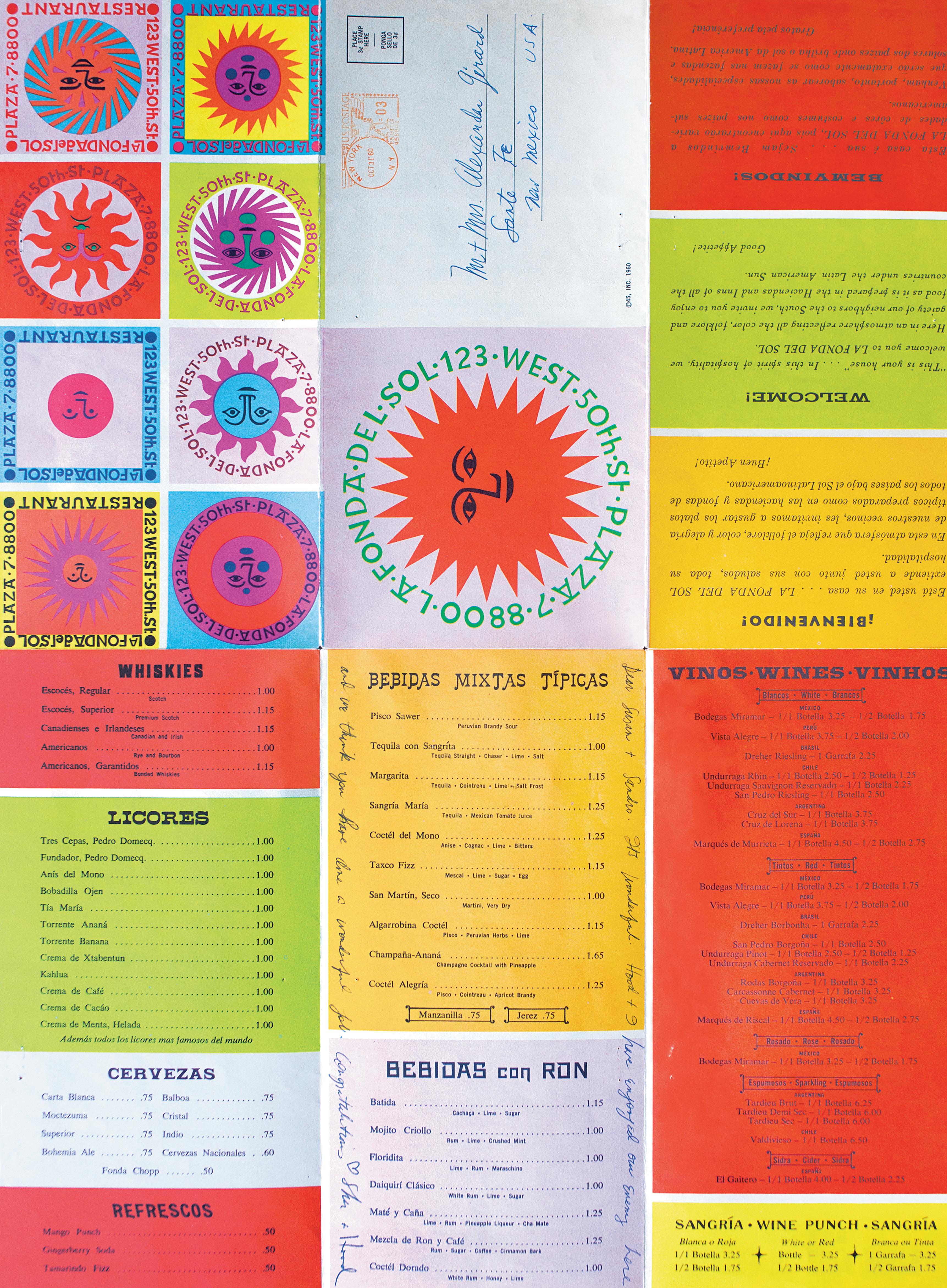
Phyllis Lambert, the daughter of Samuel Bronfman, trained as an architect and was responsible for persuading her father to use Mies van der Rohe to design the Seagram Building. This was Mies’s first chance to realise the idea of a glass tower, set on an urban plaza. It became a model followed, mainly with rather less success, around the world. At the foot of the building, Mies left space for two restaurants. The most famous of them, The Four Seasons, was designed by Mies’ one-time champion, Philip Johnson, with whom he later fell out. Johnson, for all his faults (which included leaving his role as the Museum of Modern Art’s first curator of architecture to spend two years as a full-time organiser of an American fascist party) succeeded in creating one of New York’s great interiors. There was an ambitious art programme for the restaurant. There was a piece by James Rosenquist. The stage curtain that Picasso painted for Diaghilev’s Ballets Russes hung on one wall. Mark Rothko accepted a commission to paint a series of murals, but decided, having had dinner in the restaurant, to withdraw. “Anybody who will eat that kind of food for those kinds of prices will never look at a painting of mine,” he later told his studio assistant. It did not deter President Kennedy from celebrating his birthday there. Emil Antonucci’s logo type and menu design survived a sequence of changes in ownership.




222
(Below) Below Antonucci's typography applied to a commemorative menu for a private dinner
(Right) Phillip Johnson shielded the restaurant's main dining room from the outside world with bronze chains that gently rippled throughout the day. Photography Victoria Hely-Hutchinson
(Right) Pan American Building Dinner, Four Seasons, menu. Credit The Culinary Institute of America
The Four Seasons, Seagram Building, New York, 1959
 (Image) An unlikely dish of candy floss for lunch-goers at the Four Seasons restaurant. Photography Victoria Hely-Hutchinson
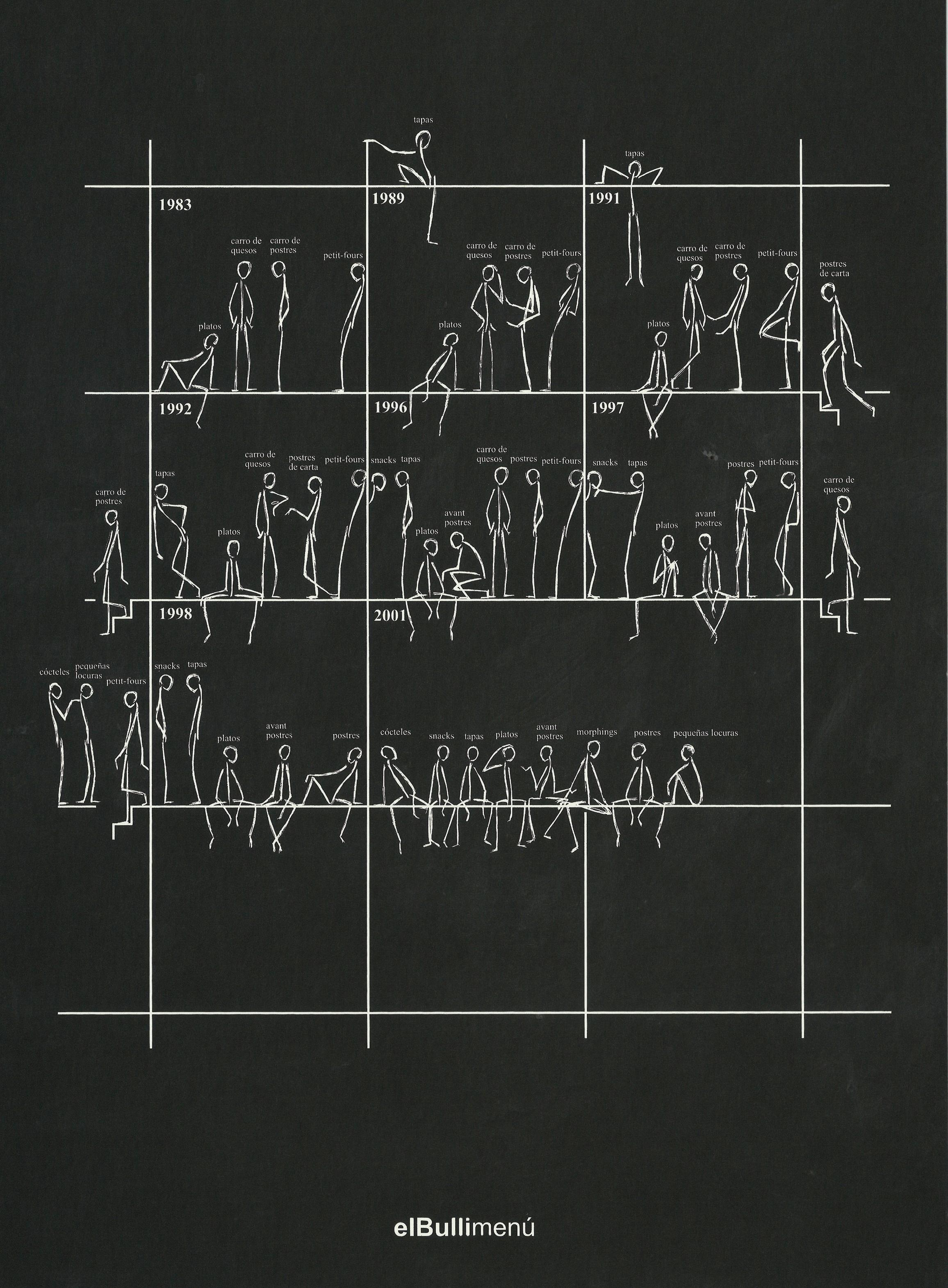 (Image) The evolution of El Bulli from a beach cafe to what many called the greatest restaurant in the world

El Bulli, Catalonia, Spain, 1964
Ferran Adrià closed El Bulli, his restaurant overlooking the Mediterranean, in 2011. But his radical experiment with food, and the experience of eating in the restaurant is still talked about. Adrià could be said to have completely redesigned food, by going back to first principles to create textures and flavours with little connection to traditional cuisines. El Bulli was not a place in which the menu was a document that you used to make a choice of dishes to eat. It was more like the catalogue that an art gallery might give you. Each meal was a performance, reflected in the menu. Adrià’s menus were small format, with very little in the way of seduction. The pertinent example is from October 2004, and describes a €145 dinner prepared by Adrià with the winemaker Telmo Rodriguez. In the summer of 2008, Adrià organised a dinner at the restaurant at which a group including Vicente Todolí, former director of Tate Modern, the artist Richard Hamilton, and a group of artists and chefs discussed the relationship between food and art.
(Below) Adrià devised pictograms to describe his approach for the menu for Richard Hamilton's dinner discussing food and its connection to art. Pictograms designed by Marta Méndez Blaya, copyright and photography
Foundation Archive


225
El Bulli
(Below) El Bulli's original interior was simple, the food, however, was anything but simple. Copyright and photography El Bulli Foundation Archive
DESIGN ON THE MENU
(Left) Copyright and photography El Bulli Foundation Archive


Noma, Copenhagen, 2003
Since René Redzepi opened the doors to the original Noma in 2003, in what would become a milestone for Danish gastronomy, the restaurant, not content with earning three Michelin stars has also been named as Best Restaurant in the world. Its original location was in Standgade 93, a warehouse on the waterfront in Christianshavn, Copenhagen, which closed after 63 of 435 diners became ill from a chef spreading norovirus. In 2018, Noma relocated to an urban farm just outside the city, working with Bjarke Ingels and his architecture firm BIG to transform a former Danish navy ammunition store into a culinary haven. With only 40 seats, including reserved spots for students, Noma is intimate and relaxed despite its intimidating track record. Studio David Thulstrup and local manufacturer Brdr Krüger worked to furnish it with the specially made ARV chair and table.
Noma trained some of the most accomplished chefs of a generation, who have gone on to establish their own restaurants in Copenhagen and beyond. Aiming to revive the authentic use of local ingredients and cooking methods, Noma's menu reflects its commitment to seasonal and local ingredients, divided into three themes that showcase the best of each season –from Scandinavian shellfish to vegetables and game. After 20 years, Noma will close after its winter 2024 season, and transform into a test kitchen, Noma Projects, with a pop-up restaurant and online service.


227
(Left) Noma has one menu that changes seasonally throughout the year, starting with seafood to vegetables and ending on game and forest. Photography Ditte Isager
(Below) Studio David Thulstrup and local manufacturer Brdr Krüger furnished the interior. Photography Søren Aagaard
(Left) Vegetable season runs from June to September and no meat is served in the duration. Photography Ditte Isager
DESIGN ON THE MENU
(Right) The restaurant is built on a protected ex-military warehouse. Photography Rasmus Hjortshõj
Alternatives

For affluent westerners charcoal is the means to add flavour to garden barbecues. But in much of the world, with no affordable alternative, it is both life threatening and essential. The way to address its more negative consequences can only be based in an understanding of its cultural significance
to Charcoal
228
(Right) Photography Steve Harries, charcoal supplied by BIG K
WORDS Adriana Gallo

Charcoal is a historic fuel source deeply entangled with the story of humanity. It’s used both by choice (such as recreational grilling or camping) and by necessity. Countries with limited energy infrastructures and untenably high costs turn to charcoal rather than more centrally distributed fuel types such as oil and natural gas. The use of charcoal in such contexts, however, is associated with negative health effects and extensive environmental impacts. These are impacts that attract cynical interest as well as well-meaning if often ineffectual concern.
Charcoal is the solid residue that is left after wood is carbonised at high temperatures under controlled conditions with minimal oxygen. The resulting material performs better than burning wood in an open fire. It generates more heat and water than wood when it burns, and more carbon dioxide. This makes charcoal efficient to use and efficient to transport, though also results in more toxic by-products. It has been an essential aspect of everyday life for so long that it has also become an essential part of what it is to be human. As far back as the palaeolithic era, human society was organised around a circle of stones arranged to form a hearth. In our contemporary use of charcoal, we unknowingly carry with us its historical context. Indeed, the Latin word ‘focus’ translates to ‘domestic hearth’ (the fireplace or stove) and suggests the symbolic importance of the heat source around which we organise our lives.
Charcoal became deeply linked with industry and technology until the industrial revolution’s insatiable demand for fuel caused a switch to coal. While industry moved to coal, fossil fuels and electricity, global domestic cooking practices remained tied to charcoal.
Traditionally, charcoal is produced by firing wood or other biomass in either pits or mounds. Both of which can be used on a small or large scale, though charcoal produced in a kiln burns the best and retains the most energy compared with charcoal made by more traditional methods. Historically, those doing the charcoal burning were almost always marginalised or impoverished. Wealth was manifested in the ability to pay for charcoal to be made and transported. In classical times the least fortunate would have worked as charcoal makers and huddled around the communal stoves at the local bathhouse rather than a private (charcoal-heated) hearth. Charcoal also represented, as it does today, a complex and tangled web of relationships between the rich and the poor, producers and consumers, and urban and rural.

There is a remarkable continuity in the evolution of the design of the tools that we use to cook with charcoal. Simple to construct three stone fires for example, a bed of coals within a triangle formed by three stones, on which a cooking pot, or fireproof surface can sit, are still widely used in remote settings or where resources are limited. The drawback is that they are inefficient and quickly loose heat.
Ancient Greek and Roman stoves and braziers usually with two levels or a single elevated level above the ground, to heat the cooking surface above a bed of coals, have a lot in common with modern equipment. Multiple vessels could be nested within the structure for simultaneous simmering of stews or legumes, or a flat top or grill would be used depending on what was being cooked. The ancient brazier was used to cook food or keep food warm in dining rooms, with the upper part of the apparatus often made from bronze or clay. Similar forms can be found in contemporary DIY and camping stoves, but also in newer non-charcoal-based solutions like solar power, in locations with limited access to centralised gas or electricity.

It was charcoal that helped humans to develop and evolve. Around 30,000 BC it was used not just to warm a cave, but also to draw on its walls. The use of bronze was made possible by the high burning temperature of charcoal. The global sea trade was facilitated by the use of barrels treated with charcoal, and sugar purified by passing through it.
Charcoal briquettes came into being alongside the development of the automobile. In 1919 Henry Ford invited Michigan real estate agent Edward G Kingsford on

230
(Center) (Above)
A shallow rectangular cooking brazier (eschara) in terracotta, including cover. 6th-4th century BCE (Agora Museum, Athens)
Cooking on sunbeams, demonstration by female scholar India

231
ALTERNATIVES TO CHARCOAL
(Above) Design for a lump of fuel by inventor William P. Taggart, patented May 14 1895

a trip to identify possible sites to acquire hardwood for the new Model T. Kingsford helped Ford to purchase land and build out a sawmill and parts plant. Both generated a great deal of wood waste and Ford financed a solution for using the waste products: a compressed lump of sawdust, wood scrap, tar and cornstarch, which would be named the briquette. The briquette remains common as it is relatively inexpensive to produce due to the filler and binding materials. Wood charcoal is to briquettes what cheese is to the processed variety.
Charcoal, and the design of stoves that use it, is an indicator of economic and infrastructural development, or lack of it. It is the cheapest and least regulated fuel source. It is widely available, and there is a deeply rooted understanding of how to cook with it. The preparation and sale of charcoal is a common income source for individuals and households in areas with limited employment opportunities, women in particular. This production is in response to the overwhelming need described by Melaku Bekele and Zenebe Girmay in their Reading through the Charcoal Industry in Ethiopia: Production, Marketing, Consumption and Impact, published by the Forum for Social Studies: “Dependency on charcoal is rather increasing as a result of rapid growth in urban population, and rise in price of modern sources of energy like electricity, LPG and kerosene.” Charcoal production has been shown to increase incomes of those who make and sell it and is a welcome buffer and solution for families experiencing extreme financial hardship or unexpected financial shocks. It mediates a certain kind of vulnerability that in many cases can be dangerous or even fatal. The overwhelming majority of Bangladeshi women surveyed knew cooking smoke posed a serious health hazard but most preferred to spend their money on “doctors, schools, electricity, clean water, latrines, seeds for planting and structures to protect their land from flooding,” rather than cleaner stoves. The World Future Council estimates that 80 per cent of Africans rely on biomass (mainly wood and charcoal) for their energy. Areas where the industry of producing charcoal for cooking dominates see rates of deforestation that vastly exceed rates of tree planting. In short, Africa is losing forest at a faster rate than other continents, a phenomenon tied to charcoal use.
Africa is losing forest at a faster rate than other continents, a phenomenon tied to charcoal use
The dominance of charcoal is more or less uncontested without centralised access to electricity, gas or oil. In contexts where transitioning to an alternative fuel is infrastructurally impossible, cleaner-burning charcoal or charcoal made from invasive species are being explored to address broader effects of deforestation and desertification. Prosopis juliflora, or mesquite, is a fast-growing tree native to Peru, Central America and the Caribbean. Planted in parts of Africa as an attempt to add vegetation to deforested areas and to provide fuel to communities, it has since become highly invasive and even disrupts transhumance pastoral practices in the area, making it difficult to graze livestock in an already fragile ecosystem. Authors Bekele and Girmay describe the use of alternate charcoal materials such as bamboo, Prosopis juliflora, cotton stalk, coconut shells and coffee husks as viable alternatives to wood charcoal. A study in Ecological Economics more thoroughly analyses the specific use-case of P. juliflora, accounting for the actual potential for charcoal production to decrease the negative impact of the invasive plant in relation to its potential economic impacts. It finds that “charcoal production is arguably an effective way of managing Prosopis from a welfare point of view given that it is one profitable livelihood option for farmers”. Though from an environmental point of view, it alone would not fully reverse the proliferation of the plant, the study proposes its continued use as fuel due to its observable positive effects on the welfare and economic realities of households in the region while still mitigating some effects of the invasive plant.
As with the invention of the charcoal briquette, use of waste products rather than wood cut for charcoal production can minimise deforestation while solving a waste problem. One proposed solution is a briquette produced from waste coconut shells. This preserves markets for charcoal which allows those involved in

233
(Left) Workers stacking freshly made charcoal in earth ovens to be used in barbecues
(Above) Old style east stone oven (tandyr)
ALTERNATIVES TO CHARCOAL
the processing and distribution to go on making a living. It also allows for the continuation of traditional cooking methods. The impulse to apply free market charitable approaches to solve the symptom (charcoal use) of a problem (lack of resources or lack of equitable distribution of resources) is fundamentally flawed. We can clearly see the relative effects of investment in isolated solutions to problems (such as the unsuccessful One Laptop Per Child project unveiled in Rwanda) versus investing in changing the conditions that perpetuate the use of charcoal in the first place.
There are cleaner-burning stoves or ones with more considered exhaust systems that minimise the health effects of the burning. Rocket stoves, for instance, are cheap and efficient burners of wood or charcoal. By design they maximise the heat being produced proportional to the amount of fuel and integrate chimneys to direct smoke or by-products of burning away from the cook. The Chinese National Improved Stove Program beginning in the 1980s is a seldom-discussed example of a successful campaign to increase access to higher quality and less polluting cookstoves. It focused on the distribution of stoves to rural communities, particularly stoves with chimneys and with better fuel efficiency to reduce smoke exposure. It remains one of very few examples of a successful mass move from older cooking technologies and is credited with introducing nearly 200 million improved stoves by the late-1990s. The initiative has been updated to meet with current research on the impacts of burning biomass and China has continued the project with the implementation of new and cleaner stove technologies.


Electric and gas are intuitive and common replacements for charcoal but come with a health and environmental cost. For wealthier individuals and nations, gas and electricity have minimal locally visible health and environmental impacts as those effects are effectively exported to the Global South or poorer neighbours who live near sites where that energy is extracted and processed. Other alternatives to charcoal or biomass stoves include solar-powered devices available for purchase or makeable through an active DIY community. These technologies are relatively nascent and remain ergonomically alien to the average cook but may offer the kind of independence and low cost that has great potential in developing areas.
Another format, not often raised in conversations around movement away from charcoal, is the communal oven or communal kitchen model. It’s an example of the consolidation of resources (in this case energy and infrastructure) away from the individual household. Historic and contemporary examples include communal ovens in Palestine,

234

“After all, cooking with charcoal is just as aesthetically enjoyable in Kenya as it is in Kansas”
cooperative olive presses and grain mills in Italy, Soviet shared kitchens or even the school cafeteria or worker’s canteen. There is a broader conversation to be had around the distribution of resources and labour with a critical gaze directed at short-sighted for-profit projects that encourage a move away from collective or shared resources and labour, preferencing the conversion of poorer communities into richer ones solely to engage in global commerce and exponentially growing levels of consumption.

Charcoal as a heat source has shaped the way in which we use heat and consume food. It is inextricable from cooking traditions the world over. It is essential to place charcoal in that context and understand it as an intuitive and historic heat source. As Caren Irr writes in Fueling Culture: 101 Words for Energy and Environment, “After all, cooking with charcoal is just as aesthetically enjoyable in Kenya as it is in Kansas.” We can easily identify the ways in which charcoal use can signpost regions or communities that are in the midst of a certain kind of development. And rather than seeking to prescribe individual household solutions, we can contribute meaningful investment in equitable development of infrastructure and resources to allow for healthier and economically viable alternatives. There is an artificial choice, as with the environmental impact of producing and burning charcoal, between solving for a broader environmental problem and a more localised economic one. In actuality, the two are interrelated and solved by improvements to infrastructure and political attention in the equitable distribution of resources alongside thoughtful regulation of exploitative industries in a given region. Data for per capita carbon emissions is conclusive: the global north is disproportionately responsible for the amount of carbon emitted into the atmosphere, and to feign concern over the carbon emissions of nations with burgeoning infrastructures and without a realistic alternative allows for further penalisation of those regions. In this negotiation, there is something to be interrogated in how we might carry over traditional use and design (of systems, tools and spaces) into non-charcoal cooking so as to maintain continuity with traditional cooking practices without sentimentalising and thus decontextualising them.

235
ALTERNATIVES TO CHARCOAL
ALFIE ALLEN is an independent graphic designer and art director based in London.
RICHARD BROOK is an architect, architectural historian and professor at Lancaster University.
EMMA LE DOYEN is a photographer, director and visual artist based in Paris.
ALICE FIORILLI is an Italian photographer working across landscapes, portraits and interiors.
ADRIANA GALLO is a writer and artist living and working in Brooklyn.
HENRY GORSE is a London-based artist working in fashion and art photography.
STUDIO H is a South Africa-based design and brand consulting studio.
STEVE HARRIES is a photographer based in London.
VICTORIA HELY-HUTCHINSON is a director and photographer based in New York and London.
LEYU LI is a London-based food designer and artist.
NATHALIE DU PASQUIER is a Milan-based artist, designer and founding member of the Memphis Group.
SHARP & SOUR is a design studio based in Madrid.
PAOLO ZERBINI is a photographer based between London and Milan.
CONTRIBUTORS


THE CASSINA PERSPECTIVE
Milan Paris Madrid London Athens Dubai New York Los Angeles Tokyo Seoul
cassina.com


 The studio of Pino Guidolotti
(2) A painting by Fra Angelico
(1)
(2)
(1)


 (Left) (Above) South African football culture, photography @kgotmotso_neto
Kaizer Chiefs Football Club are a South African professional football club based in Naturena, Johannesburg


 (Above) Ghana BMX, courtesy of AFROSPORT


 065
(Below)
 066 (Right) Interior of in-vessel training facility of JET Fusion reactor No 1
 (Right) (Overleaf)
Obsolete master slave manipulated Reactor 2 Dungeness 2023
Master slave manipulator Dragon Reactor Winfrith 2023


 (Right) Turbine Hall Gauge Board Sizewell A No 1 2022
 079
079
 (Below) (Right) (Below


 (Above) Konstantin Grcic named his show Transformers, but confessed that his lamps were neither tranformable, nor robots. He used aluminium and glass for furniture that he suggests should not be seen as furniture
(Right) For a group show each designer taking part produced their own version of a ladder. Virgil Abloh contributed the Leaders ladder, inscribed with the names of people he found inspirational.
Photography Alexandra de Cossette, courtesy Galerie kreo
 (Image) Galerie kreo paid tribute to Virgil Abloh with Echosystems, an exhibition that placed work that inspired or attracted him, including Jerszy Seymour's ladder, set against the mural by Pablo Tomek. Photography Alexandra de Cossette, Courtesy Galerie kreo


 092 (Right) Doshi Levien's Kinari bedside table. Photography Alexandra de Cossette, courtesy Galerie kreo
(Left and above) A vase and a flask made by Hella Jongerius during her exploration of the interaction between colour and form, part of a long relationship with the gallery. Plate with bird is another of her pieces. Photography Sylvie Chan-Liat, courtesy Galerie kreo


 (Image) Concept bar for the Lunar Habitat Masterplan, copyright ©imigo
 Sara Doherty (Right)


 WORDS Ayla Angelos
ARTWORK Alfie Allen


 (Right) Courtesy Bauer Type Foundry
(Right) Courtesy Bauer Type Foundry
(Right) Courtesy Bauer Type Foundry


 (Below) Courtesy Bauer Type Foundry

 (Left) K&E Screw Selector. Image from the collection of the Hoboken Historical Museum


 (Above) A timber structure is efficient in energy terms, and allowed for construction to be carried out in a sequence of discrete campaigns
(Left) The new development sits in the midst of an agricultural landscape shaped by drainage ditches and fields layed out in Roman times


 (Above and Right) (Left) Technogym's production hall is based on a timber structure and the use of natural light
The geometry of the roof gives the complex the look of a natural landscape


 (Above) A new bathroom fitting project made in collaboration with Kohler, 2024, courtesy Kohler Co.

 (Right) Acrylic paintings
(Left) Steel


 (Image) A new bathroom fitting project made in collaboration with Kohler, 2024, courtesy Kohler Co.


 (Right) (Above) Abe Steiner's poster for the 1968 Triennale


 (Above and Right) Flexform: Doris armchair Antonio Citterio


 202 (Above) The 620 Chair with footstool ©Vitsoe (Right) Braun calculator from the Thomas Strong collection
WORDS Deyan Sudjic


 (Image) An unlikely dish of candy floss for lunch-goers at the Four Seasons restaurant. Photography Victoria Hely-Hutchinson
 (Image) The evolution of El Bulli from a beach cafe to what many called the greatest restaurant in the world

