6 minute read
Upcoming Trends with Designer Jackie Glass
While we may not have a designated Design Week like the fashion industry has in order to tout the new trends coming down the runway, there are some exciting new ideas coming your way for the year 2024.
Here is a list of my Top 10 trends that will start making their way into retailers and design studios.

1) SATURATED COLOUR
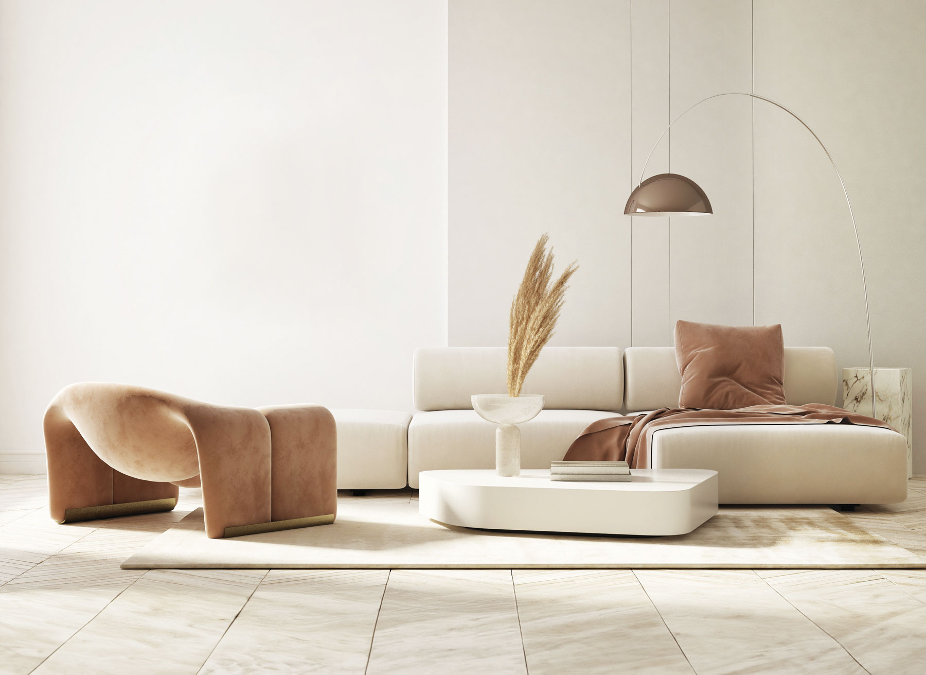
A new colour forecast is the freshest way to update any living space and surprisingly we’re seeing richer, more saturated tones than in previous years. We’ll always love our neutral tones; every designer, including me, has their favourite palette. Still, it’s so refreshing to see deeper tones on walls and furniture, which create a moodier vibe.
2) WALLPAPER MANIA
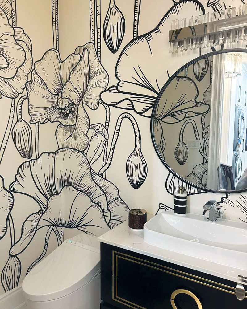
It wasn’t that long ago that clients were wildly opposed to wallpaper. But boy, have things changed! Gone are the days when wallpaper removal was difficult and selections were limited. Today’s wallpaper is bold, bright and beautiful with something for every design style. Recently, when designers coaxed their clients to use wallpaper, they would suggest papering a focal wall or small space; however, today’s trend is to boldly wallpaper the entire room. The result is strong and confident. Look for a large pattern and don’t forget that drama can be created with monochromatic colours and patterns just as well as strong colourful tones.
3) THE SEVENTIES ARE CALLING
One thing stood out with the fabrics being presented this season. We saw deep saturated colours that a had a decided 70s vibe. Rusts, olive greens and purples took centre stage and were often seen in a velvet finish – very rich, very cozy and very retro. Mix those tones with charcoals, creams and blacks and 2024 has never looked so cool.
4) SHAPES OF THINGS TO COME
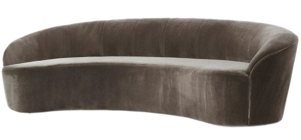
A balance of curvilinear and rectilinear shapes in any room is critical for a cohesive space. But design, for several years, tended to focus on linear lines. Today we're seeing a return of more rounded shapes. Sofas, ottomans and case goods are now curvier and more shapely than ever before. While a good dose of both is important in a room, furniture with shape adds a sense of playfulness and a sensual quality we haven't seen for a long time.
5) FLUTED FINISHES
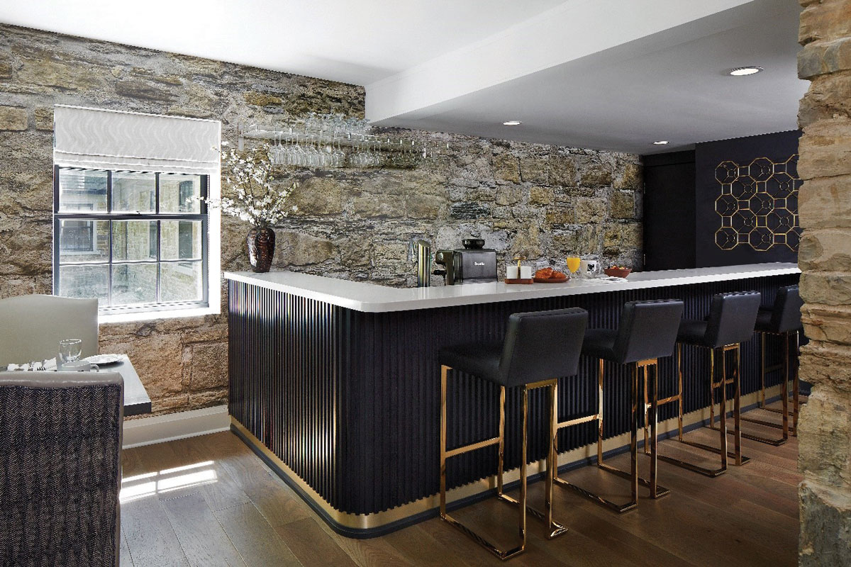
This was unexpected. Cabinetry and furniture recommendations are often deliberately selected to be simple in style, the reason being that clean lines stand the test of time. However, we've started seeing fluted detailing on everything from wall accents and bar fronts to furniture and cabinetry. Because there's a resurgence of architecturally curved walls, fluted details add a Euro-chic elegance that seems to have some staying power.
6) METAL MIX
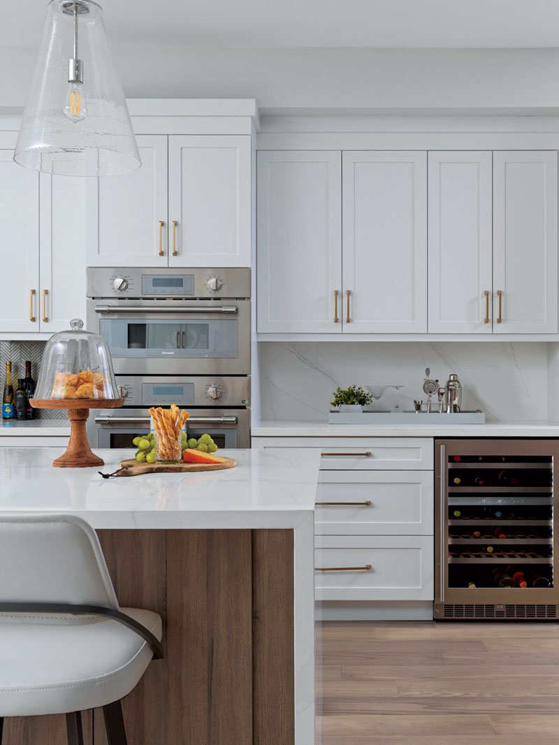
It used to be that we either had brass finishes or silver finishes and never the two should meet – particularly in one room. Then came the time when we courageously mixed the two together and it became acceptable. Fast forward, and brass merged with gold tones. We even added matte black and graphite finishes to the mix. How refreshing to add yet another metal – enter copper. This orange-hued finish marries well with many of our tried and true finishes. Used alone for dramatic accents or mixed with other finishes like matte black or graphite, copper has a patina and beauty that easily refreshes any room.
7) BIG ART
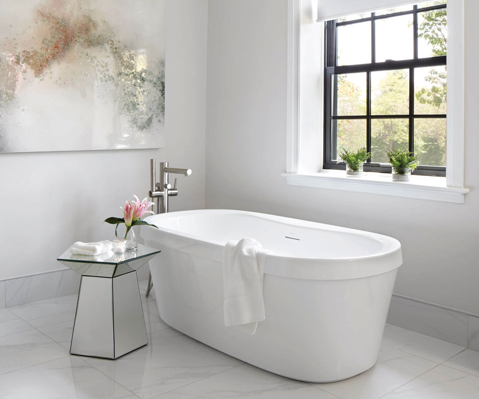
I love art. It's one of the single most important elements to finish off a room. It's personal and expresses personality and a journey of life. But the size of art is getting noticeably bigger, graphic, and mounted simply. Gone are layered mattes and frames. Pieces of art are often simply “canvas-mounted” and placed strategically on walls to garner attention. Art is personal and emotional so pay attention to the story you're telling and make it a big one.
8) NEW TERM IN TOWN
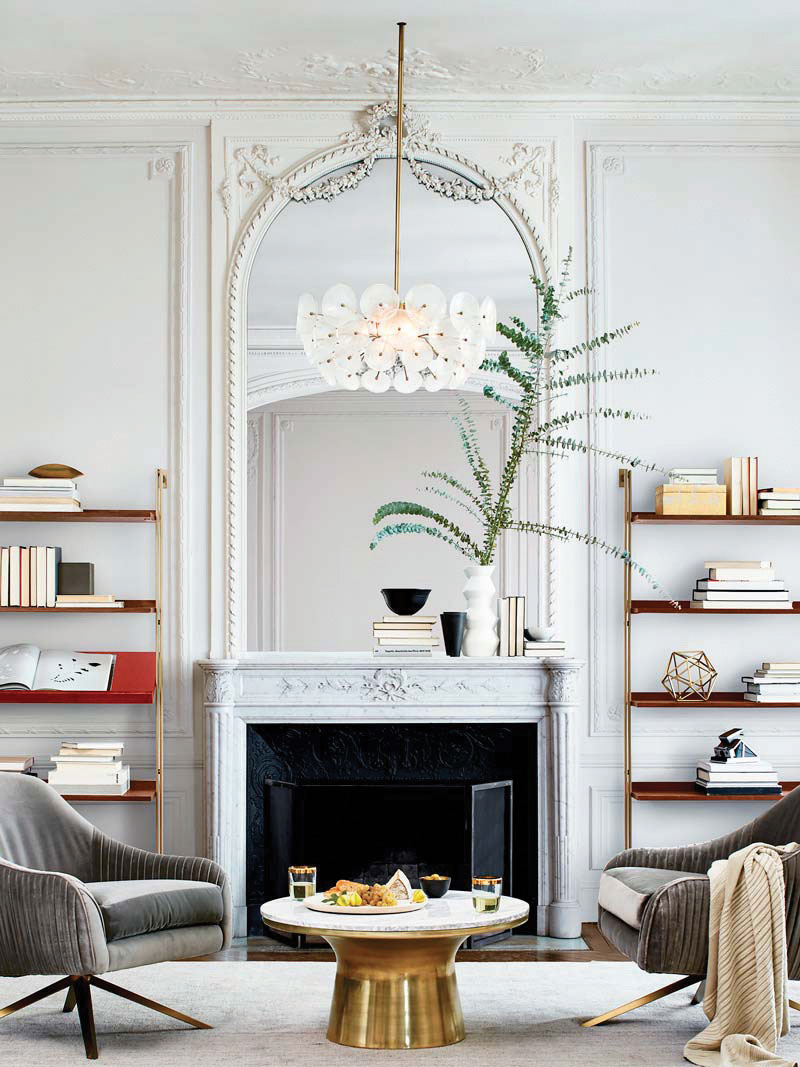
This is refreshing. We actually have a new design term creating some conversation. It's dubbed Modern Fancy. The definition is not new; it simply refers to how the past influences the present – a return to the warmth of wood, rich warm colours like oxblood and a generous dose of timeworn furniture and collectibles.
9) MESS(Y) KITCHENS
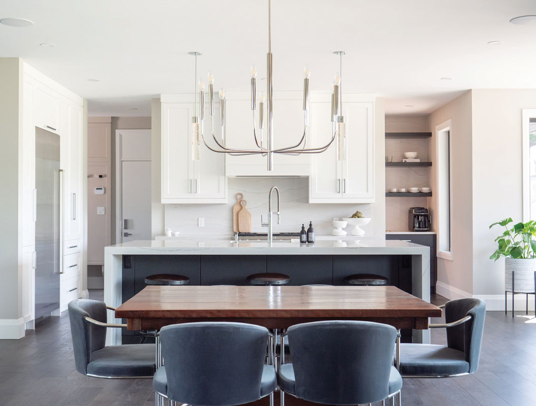
While not every home has the room for a small secondary kitchen, dubbed the mess kitchen, let it be known that the mess kitchen is alive and well, and many a renovator is still willing to forgo a closet in order to gain that space. Keeping small appliances like coffee makers and toasters out of sight and hiding dirty dishes when entertaining makes the mess kitchen an area designers always try to incorporate in their kitchen design.
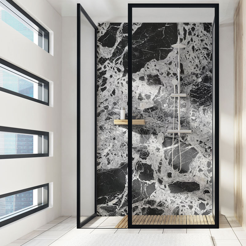
10) MARBLE DRAMA
First came granite and then solid surfacing for countertop choices. But the countertop finish of choice for some years has been quartz. Its hygienic qualities, ease of care, and endless selections made it a designer's dream. But lately, there's been a subtle return to an organic and natural style. Designers are now turning to the drama of marble. These hand-selected dramatic slabs are used as a single focal element as the star of the room. Often acting as art, the simplicity and movement of marble or stone create a breathless beauty in kitchens and bathrooms.
As a designer, I embrace and acknowledge design trends each year. It's always exciting to me and I also think a small dose of a trend in any living space is refreshing. Sometimes all it takes is a new wall colour or collectible to excite the senses and feel a part of something that is now.


