7 minute read
Our Personality
from GEC style Guide
by Quan Phan
DESIGN ELEMENTS Our Personality
The Gender + Equality Center’s designs may vary, but all designs follow these principles. They shape our decisions to design and create our educational/publicity materials, not only for our graphics but also for the language attached to those materials.
Advertisement
Each principle has a set of guiding questions to ensure our designs are aligning with our brand essence.
We are bold.
Our design and our approach to the content should be bold. They should be attention-grabbing and generate conversations among our audience.
We are approachable.
Our language and graphics must be easy to understand and approachable to our audience. The topics we discuss are often heavy and can be shame-triggering. Our content should be straightforward and digestible for the community.
We are professional.
The language and the design elements we use must communicate and stem from our sense of professionalism. We are a representative of the University and our community at large.
We are educational.
This principle is at the heart of what we are trying to do. The content we put out, via graphics or language, must be based on research and recommended best practices in the field. The approach of how we display the content, graphically or language, must be of service to our audience’s learning process.
DESIGN ELEMENTS Our Personality
We are bold...
It isn’t easy to stand out in the sea of digital content. Regardless of the quality of our materials, the truth is, if our graphic materials are not standing out, no one will engage with our work. It starts with what we are trying to say.
Our messages should be timely, relevant, and personal to our audience. They should also be able to be easily understood on their own without much explanation. We can certainly be playful as long as we don’t compromise on the integrity of the message. Then, our graphics are supporting what we are trying to say. Overall, it should be attention-grabbing, succinct, and direct.
GUIDING QUESTIONS:
• What do I feel when I look at this? • Do I genuinely want to learn more about this subject based on this graphic? • What kind of discussion does this generate? • Are we being intentional when we craft our message and graphics? • Is there an element that makes me smile upon closer inspection?
I SAW THE BRUISES & CHOSE TO IGNORE THEM...
UNTIL I COULD TALK TO MY FRIEND ALONE. I DIDN’T WANT TO PUT HER IN DANGER.
The University of Oklahoma is an equal opportunity institution – www.ou.edu/eoo. For accommodations on the basis of disability, please contact the Women's Outreach Center at (405) 325-4929. The combination of color choices and graphic illustrations are eye-catching and stand out among other designs.
This was reliant on the shock factor. The “punchline” was smaller and can be lost. This can be triggering to survivors.
but we are not aggressive.
Have you ever felt taken aback or been overwhelmed by a graphic? That’s certainly the opposite reaction of what we want. Attention-grabbing does not equal shock value. If you want our audience to start a discussion, make sure that we set them up for a meaningful discussion about the subject, not about how we approach that subject!
DESIGN ELEMENTS Our Personality
We are professional...
The language and the design elements we use must communicate and stem from our sense of professionalism. After all, we still have a duty to represent the University and our community at large.
The easiest way to communicate our professionalism is through our standard of graphics. Making sure that we provide high-quality graphics and content is extremely important. Always double-check our messages and graphics to make sure they don’t have any typos (we inevitably will, and of course, we will still find them after we get them printed or post online... such is life!). Also, make sure that we send appropriate files so that none of our work is pixilated or in the wrong format. Some of our content is heavy, and they are real experiences that people have to live through. We don’t want to make light of these issues in any way.
GUIDING QUESTIONS:
• Does this follow the graphic guidelines? • Do the design elements or language feel appropriate? • Are there any mistake or typo in our work? Always double check your work, or find another set of eyes if you’re unsure. • Does it feel clean and uncluttered? • Does the composition of the graphics look balanced?


This design does meet our standards of professionlism. The design is clean, although it could show more of our personality.
Make sure to double check your work to make sure that there is no typo or that all the links/QR codes/details are accurate.
but we are not cold.
Just because we are professional does not mean that we don’t have a personality. We want to be sincere in our messaging and be culturally relevant and timely. Most of our events or campaigns reoccur annually, so ask yourself: what makes this year special?
DESIGN ELEMENTS Our Personality
We are approachable...
Our language and graphics must be easy to understand and approachable to our audience. No one needs to major in social sciences to understand our content. If people don’t understand what we are saying, they can’t learn from it. Use Layman’s terms to describe what we are trying to communicate.
Our graphics should be inviting and friendly. We are charismatic and fun people! Make sure our graphics reflect our personality as the Center in an appropriate way.
Another way to look at it is through the lens of accessibility and representation. Make sure we follow our works, represent the vast array of our audience, and are accessible.
GUIDING QUESTIONS:
• Would a stranger to the subject be able to understand what we are saying? • Are we using any jargon that might confuse people? • Are our graphics accessible to everyone? (especially people with visual impairment?) • Are our graphics/content representative of our diverse community? (race, ethnicity, gender, body types, etc.) • Are we being charismatic and friendly?


The illustration with black outlines and graphic colors along with the cursive font create an approachable vibe.
Whether intentional or not, the image comes off as phallic. Also this reminds us of the poster example of rape culture.
but we are not juvenile.
Again, fall back on our professionalism principle. It is okay to be punny, but don’t make it cringy (we all know an example of this from somewhere). It is tempting to make our content lighter but avoid crude jokes and cheap laughs. We don’t want to disrespect anyone’s experience.
DESIGN ELEMENTS Our Personality
We are educational...
This principle is at the heart of what we are trying to do. In fact, all other principles link back to this one. Graphics are an important strategy for us to educate our audience by displaying information and resources in a visually appealing way.
The content we put out must be based on research and recommended best practices in the field. We are viewed as the expert on campus for what we do, and our content must reflect that standard. As more research comes out, we must be able to change our approach. Don’t be stagnant in our ways!
The approach of how we display the content, graphically or language, must be of service to our audience’s learning process. Don’t over-clutter or make our graphics distracting.
GUIDING QUESTIONS:
• What are we trying to communicate? Does this graphic serve that purpose? • How recent and relevant is the information we have? From whose perspectives is that information being produced? • Are the graphics distracting the audience from the information?


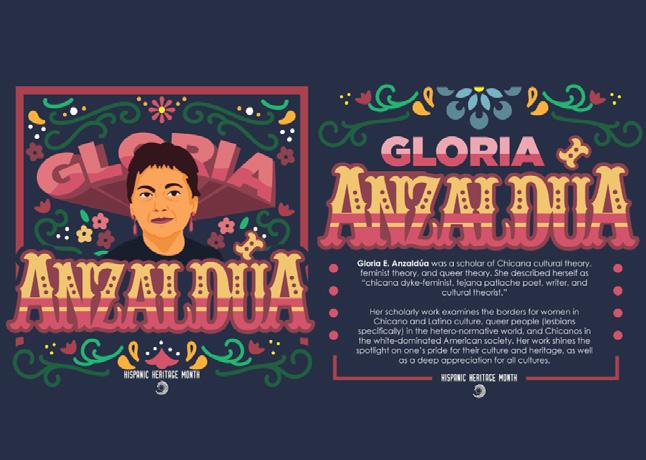
The graphic is informational and engaging with the illustrations and hand-drawn graphics.The accompanying information is wellresearched.
We will continue to educate our community, but the GEC will not patronize or shame our audience.
but we are not snobby.
We want to speak with authority but certainly don’t want to talk down or patronize our audience. Everyone’s learning journey is different, and our content is for everyone. Shame is certainly not an educational tool. It is essential to make the best effort to meet people where they are and educate people.


