identity
name and branding for an ngo background and brief : The cricketer’s foundation was about bringing music to the deprived children. Music as a method of healing!
our approach : Why shouldn’t NGOs be interesting? We created a cat who played the guitar, like the cricketer did and his mew became the name of the foundation.
branding a global forum event conducted by the india today group background and brief : It was a first of its kind in India. India Today character was to be continued and also meant to attract the intellectual crème de la creme.
our approach : develop the thinking man icon, and so the branding becomes a thinking man’s forum without any ambiguity, classic in stature and a colour palatte that continues the India Today groups branding.
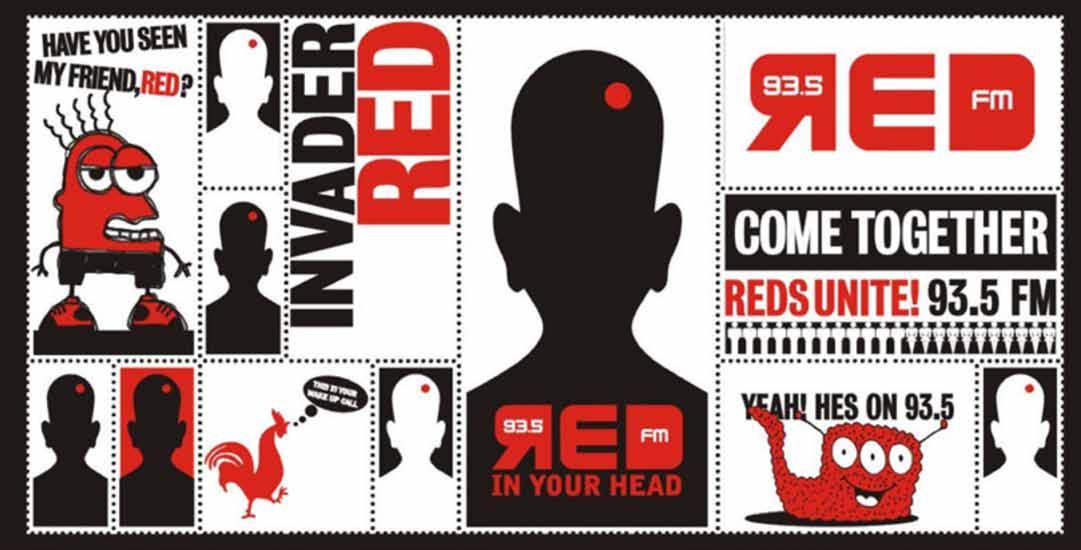
branding of a radio station
background and brief : When this FM station was launched, it wanted to be like a cult radio station which played choice music and have the right degree of cool. our approach : Russia meets rocknroll! This came from the name. With the theme line ‘get red in your head’ we could give the brand a minimal. Strong and alternative radio station appeal.
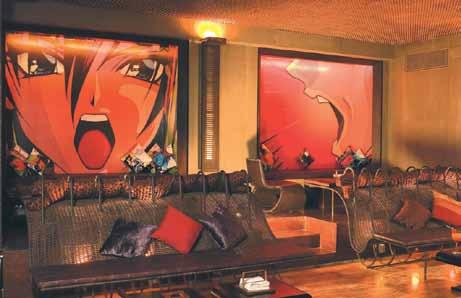
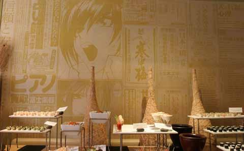
name & identity for a south east asian fine dining restaurant & night club in mumbai background and brief : In the crowded competitive high end dining scene in Mumbai, we had to standout and create an aura for this south east asian dining and night club. our approach : Tokyo meets new York in Mumbai city! An exploration into zen, gave us the name and treating it like the name of story would create the mystery. For the logo gave it a zen like silence. For the interior wall graphics. We took various Japanese newspaper classified and strung them together to create walls. And for the night club it was manga art.
a fashion store in mumbai
background and brief : This was before malls had invaded india. This young clothes store that was looking to be franchised. While the clothes were international, they need to have empathy with the vernacular Indian. The shops were small and so needed a standout value.
our approach : Hindi meets UK style! Billy means cat in hindi. That became the name and set the tone. We used cats and drawings of cat to occupy the walls, glass panels, shopping bags etc. So with minimum elements the memorability is emphasized.
branding for a CONSULTING FIRM
background and brief : Founded by some of the stalwarts with solid experience in the Indian industry domain. Their belief: we can enable sales excellence in organisations with sales, consistent sales and repeat sales. our approach : The name effectus was taken in lower caps with a sturdy but easy looking font with the orange sign on the left depcting growth.
branding for a botique valuation firm in australia background and brief : the founders had many years of diversified experience across all sectors of real estate, they wanted a logo which depicted adaptability, solutions and valuations.
our approach : the shape of a roof was given to the logo. Accord also means to be in harmony/ compatible. The wedges has to be compatible with each other for the structure to be strong, which is depicted in the logo
advertising
BHIMA JEWELLERS
We had to develop an ad campaign for the launch of Bhima’s Diamond collection. They wanted to show their range of jewellery, but with a tight budget. Created different style using the same model thus creating variety within their budget.
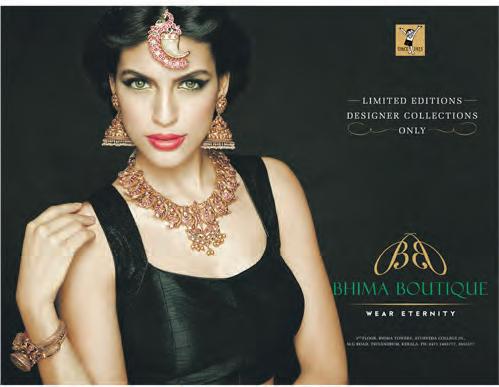
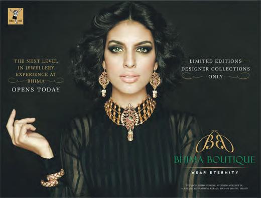
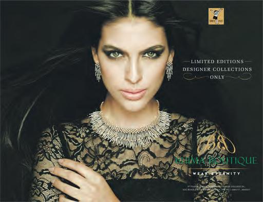
BHIMA BOTIQUE
Bhima Jewellery were opening their chain of Botique shops selling handcrafted limited edition designer collection. A theme with the colour black was used to highlight the jewellery. As in the case of Diamonds here too one model with different styling was used.
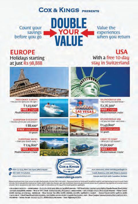
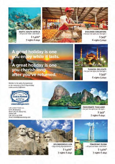
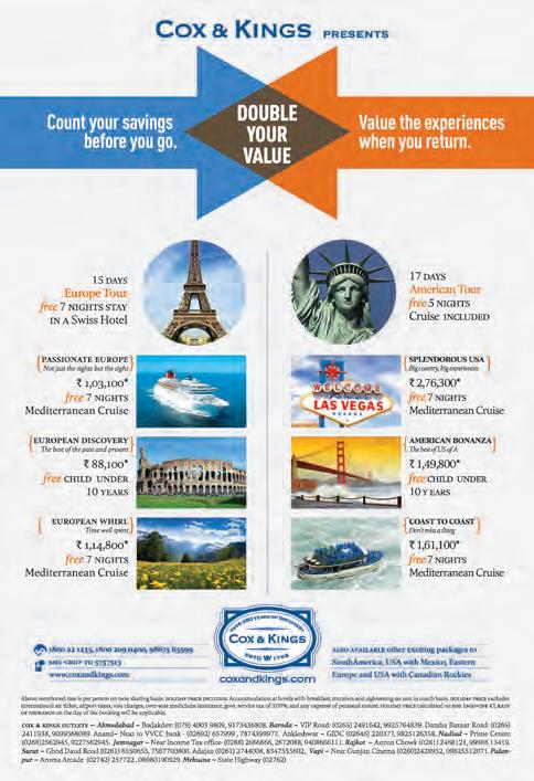
COX & KINGS
Ads for Cox and kings for their International travel packages
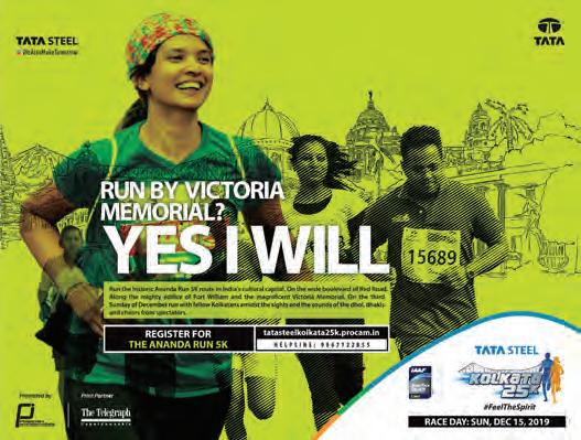
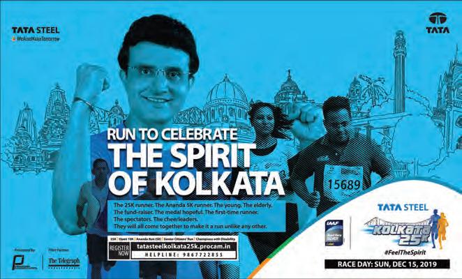
Kolkata25K Run
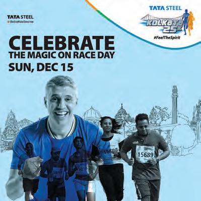
Ad Campaigns for the marquee event in Kolkata involving Sourav Ganguly and other international athletes and local runners.
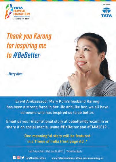
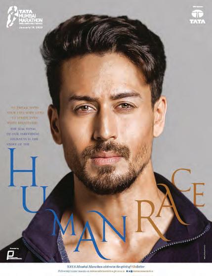
Tata Mumbai Marathon
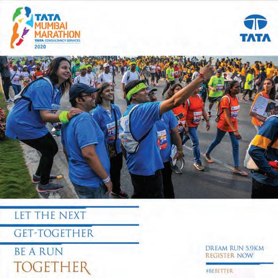
Ad Campaigns for the world’s 7th largest and Asia’s largest marathon involving Brand ambassador Tiger Shroff, Mary Kom to name a few. The ads help increase the registrations every year by more than 25% every year.
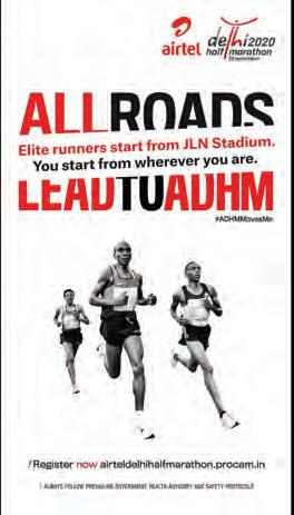
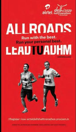
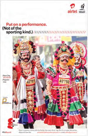
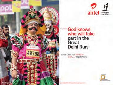
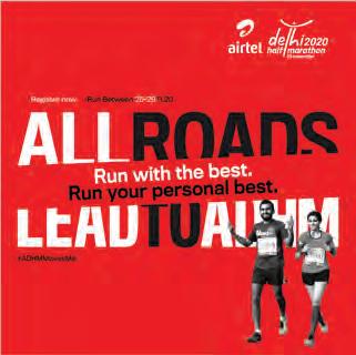
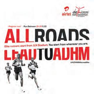
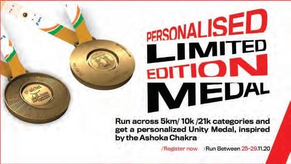
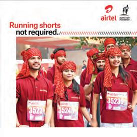
Airtel Delhi Half Marathon
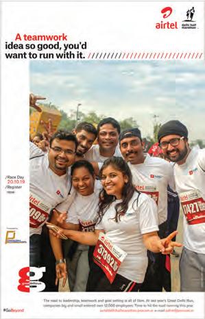
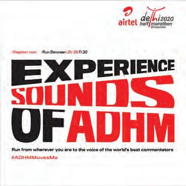
Ad Campaigns for the marathon termed as one of the fastest courses in the world.
brochures
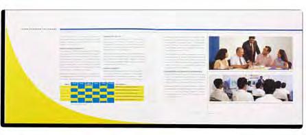
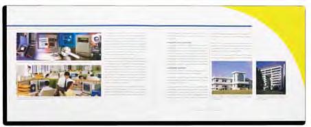
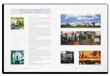
YOKOGAWA BLUESTAR
This process control systems company, wanted to elaborate its working and make clear their complexity of process and value they offer. Their Japanese branding was integrated.
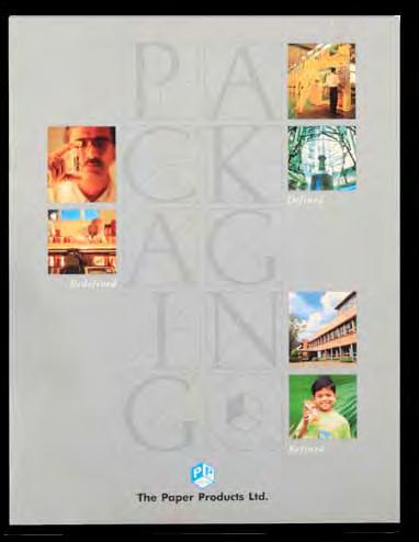
PAPER PRODUCTS LTD
An all detailed, elaborate corporate brochure was designed and implemented for Indias biggest packaging company.

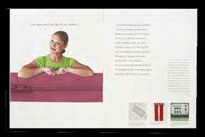
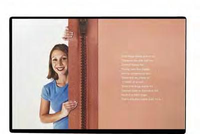
TEX ZIPPERS
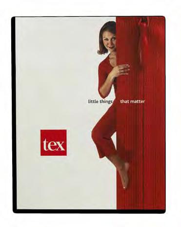
This high end zipper manufacturer wanted to communicate, that his products were as good as whats made the world over. We decided to elaborate the technical with a lighter tone and also communicate the corporate view of the company.
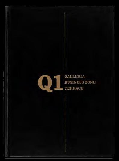
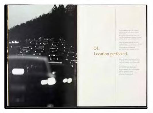
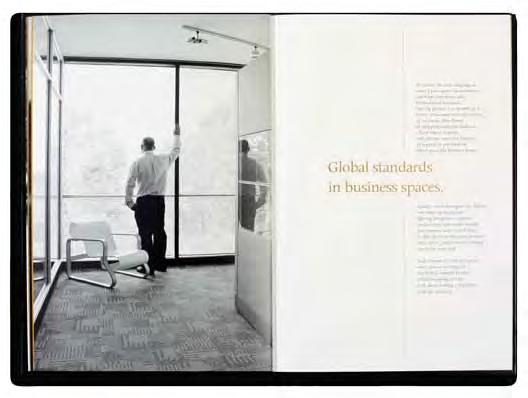
Q1
This is an elite real estate offering in Kochi. High end mall, offices offering state of the art luxury this project was to be seen as one of a kind for high end investors through this brochure.
editorial
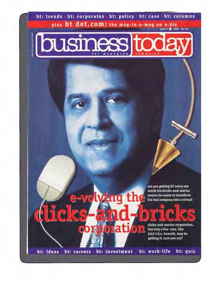
BUSINESS TODAY MAGAZINE
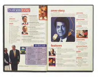
The redesign of this magazine was done in coincidence with the internet era. The design systems were conceived and issues were implemented along with the team.
INDIA TODAY PLUS

India today’s premium lifestyle magazine,needed its character to be more defined. We did the design systems and implemented the issue of change.
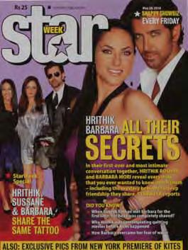
COVERS FOR STARWEEK MAGAZINE
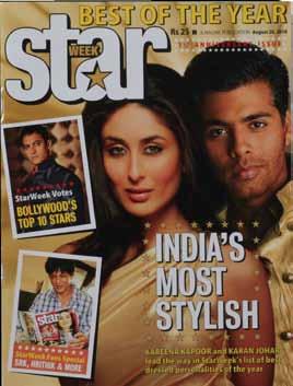
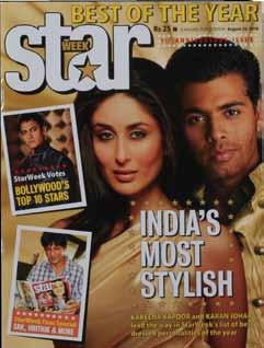
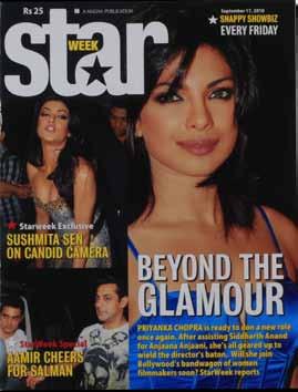

Besides development of the masthead, we formatted the design look of the cover and we implement these covers on an ongoing basis since its inception
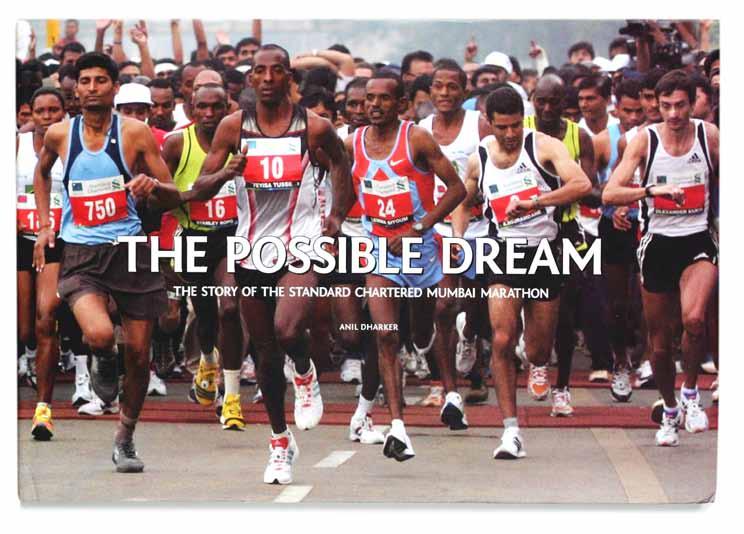
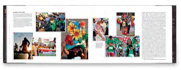
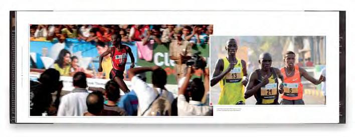
COFFEE TABLE BOOK FOR MUMBAI MARATHON
This coffee table book chronicles the Mumbai Marathons journery since its inception
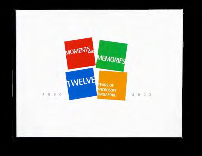
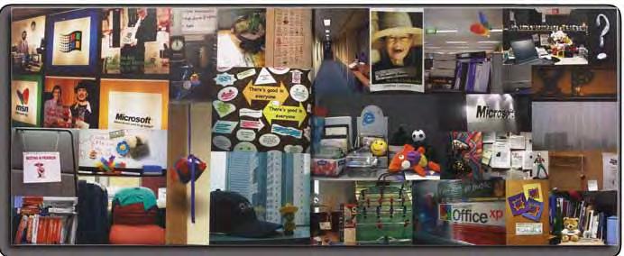
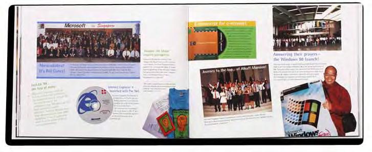
MICROSOFT SINGAPORE 12 YEARS
This book that commemorated 12 years of the organisation, which was meant to be part corporate and part team building, was executed completely in Singapore.
digital
Airtel Delhi Half marathon
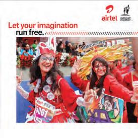
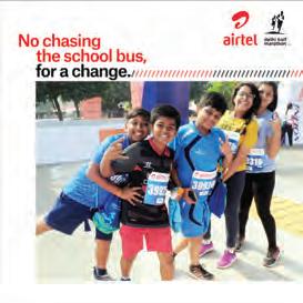
Social Media creatives over 2 years. (images from the event were used to deliver targetted messages.
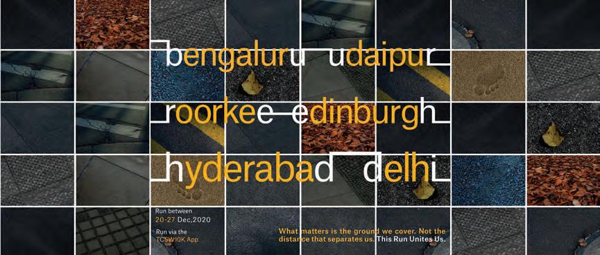
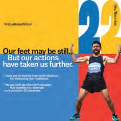
TCS World 10K
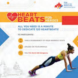
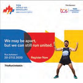
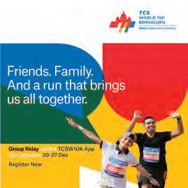
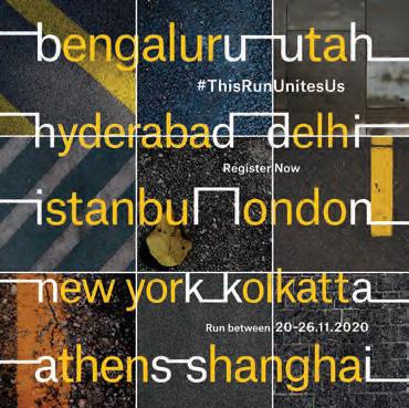
Social Media creatives the event (Virtual run 2020) and the event in 2109
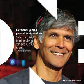
Sunfeast India Run As ONE.
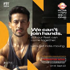
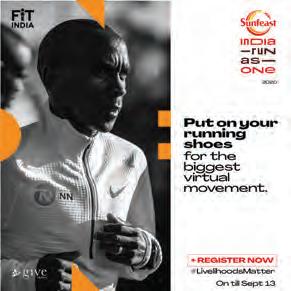
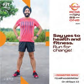
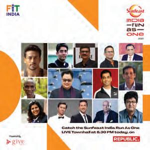
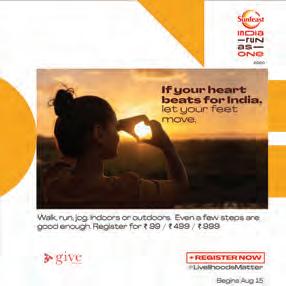
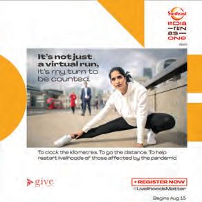
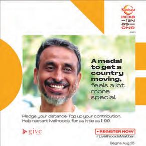
The word One was used as the Design language and creatives created around it for the first edition of the virtual run
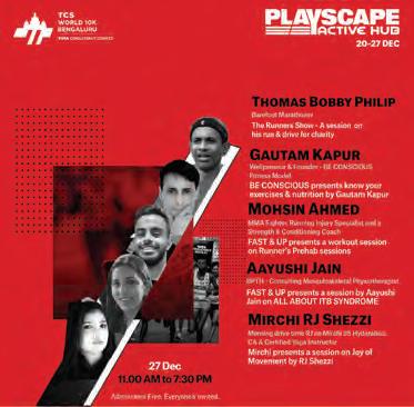
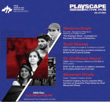
Playscape Active Hub
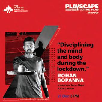
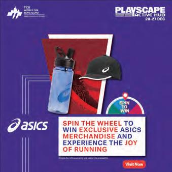
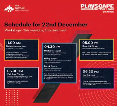
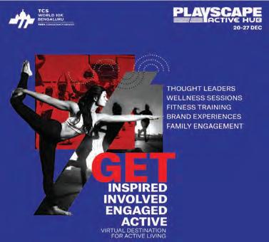
A series of Digital creatives for the Virtual Expo which is an engaging and interactive platform for the active living community
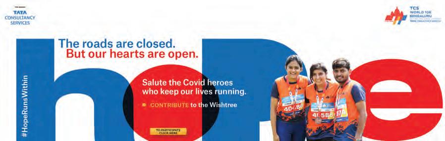
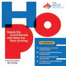
HOPE RUNS WITHIN
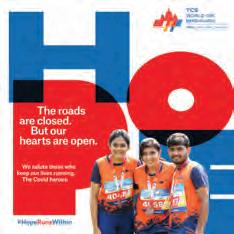
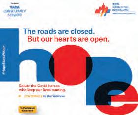
Digital creatives for a specially curated fundraising platform to raise funds for the Covid heros
Terence Lewis Professional Training Institute
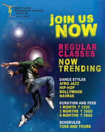
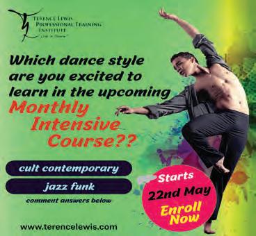
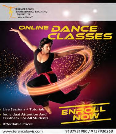
A series of Digital advertisments for the dance academy. The idea was to bring out the liveliness and stand out of the cluttter of typical creatives
packaging
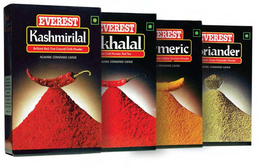
EVEREST PURE SPICES
For this leading food products brand we developed the entire packaging for their pure spices range, wherein we tried to give it a strong, distinct character so as to separate itself from the others on a crowded shelfspace.
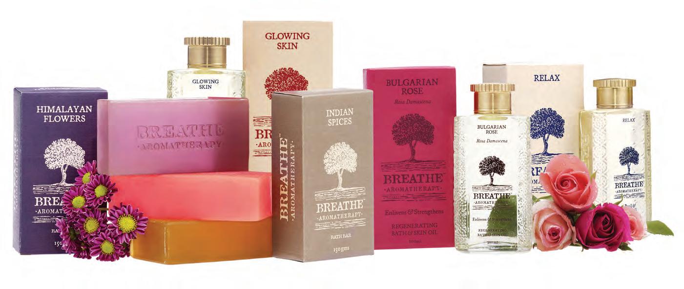
BREATHE AROMATHERAPY
For this elite beauty product, the entire packaging range required to separate sub brands and also distinctly separate the various products in each sub brand.
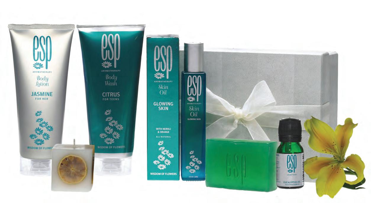
ESP AROMATHERAPY
this beauty product range was meant for malls and a high turnover. so we made the branding sharp, sophisticated and slightly luxurious and strong.
earth’s hbs
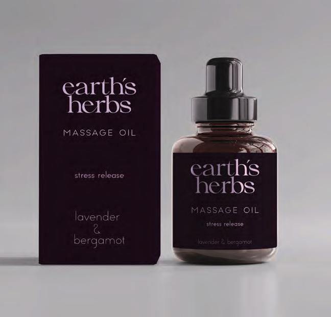
EARTH’S HERBS
this beauty product range was meant for custom orders only they wanted the branding to be very simple but having a feel of luxury.
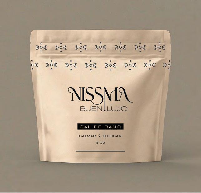
BUEN L UJO
NISSMA
this luxury beauty product range were made to order. the branding sharp, sophisticated and luxurious
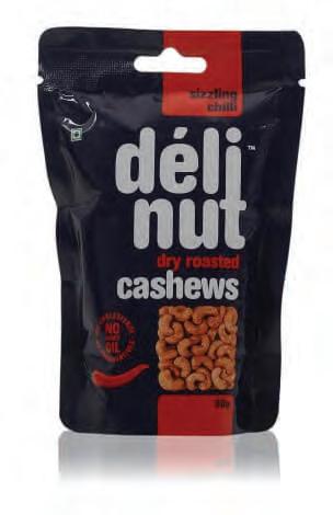
DELI NUT CASHEWS
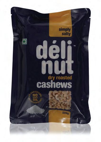
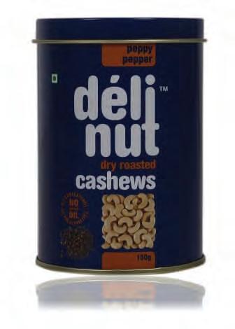
The company exporting cashews required a packaging to stand out amongst the other brands in the shelves. The Name was made in simple bold lettering to make it stand out.
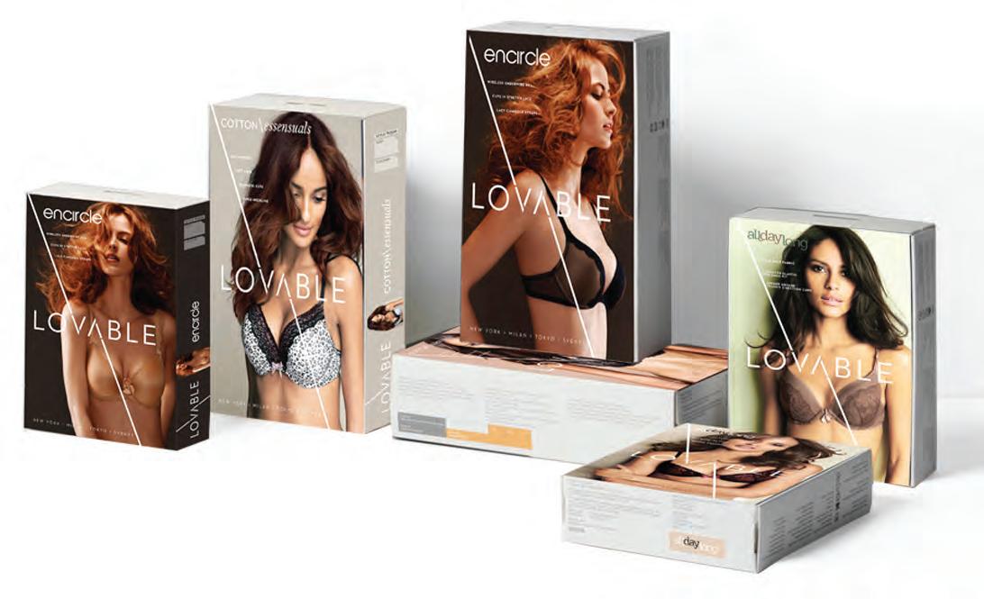
LOVABLE’s NEW RANGE OF LINGERIE
Lovable India was launching their new, bold and hi-end range of lingerie in the market they wanted the packaging to make a bold statement. The following concept was developed and approved.
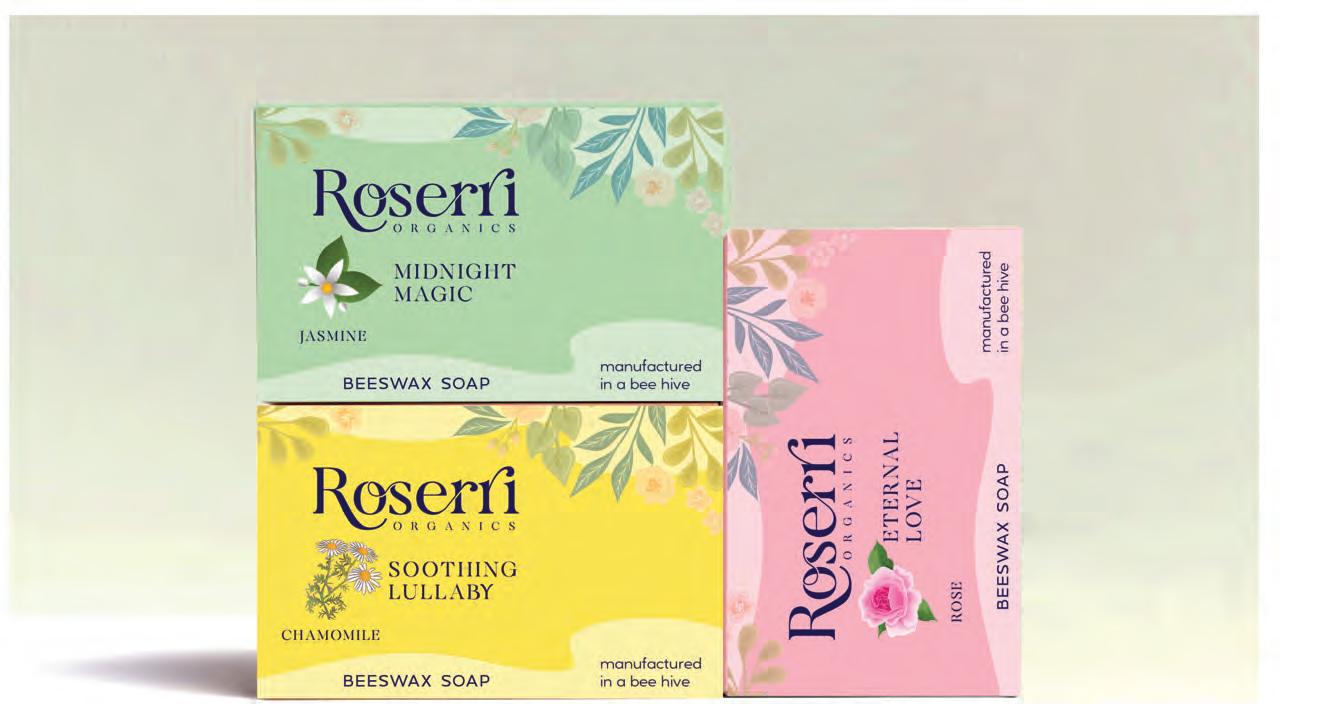
ROSERRI ORGANICS
A handmade soap with Beeswax as their primary ingredient their packaging was printed on hand made papers to give it a rich feel
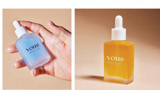
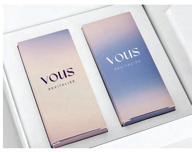
VOUS
An aromatherapy brand their brief for their packaging was to be as simple and clutter free as possible.
others
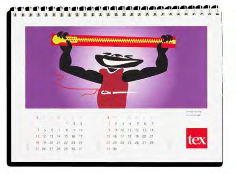
CALENDARS FOR TEX ZIPPERS
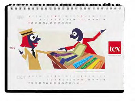
The various aspects and features of the zippers were made into stylised humourous art so as to make this category interesting.
WALLS at SEIJO AND THE SOUL DISH
To reflect the branding and to emphasise the flavour of the restaurant and bar, we designed the walls like a Japanese classified newspaper page mixed with a little manga comics to energise it in the restaurant and use high energy manga comic art in the club area.