1 minute read
CONCEPT OF EMPHISIS

from Color Theory - Final Booklet
by rasabra

2. CONTRAST OF VALUE
3. CONTRAST OF A DESIGN FEATURE
Advertisement

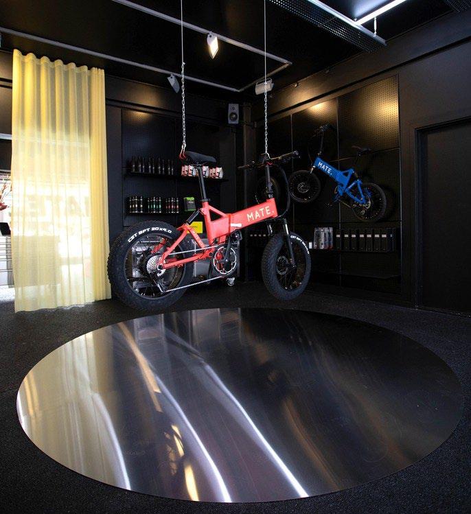
The vibrant orange is an eye-catching and leads the client to the focal point Bike.
The color orange is bringing the idea of energy and stimu- lates activity. It helps to accent the forms of landscaping and its different terrains.
The screen projects an array of multi environment with different values and set the mood for the product. The dark blue captures a moment when the bikers stop by to apreciate the view The lighter violet gives the lightness required for the speed wanted for an adventure
The element stainless steel is constantly used in the space to relate to the materiality of the bikes. The stainless steel is contrasting with the softness of other elements found in the place, as carpet and wood.