
2024
ARCHITECTURAL, INTERIOR & ENVIRONMENTAL DESIGN
RAYMOND KUANG


DESIGN WORK EXPERIENCE
Passionate about design; from concept to construction.
Seeking a position where I can design exciting environments working closely with established brand.

PROFILE EDUCATION
Brainstation UX Design
George Brown College
Continuing Education
Ontario Building Code:
•
General Legal
• •
Part 9: Small Buildings
Building Envelope
University of Toronto
Honours Bachelors of Arts.
•
Major in Architectural Design
•
•
Minor in Mathematics
Minor in Human Geography

TECH. SKILLS
• •
Adobe Illustrator
Adobe InDesign
Adobe Photoshop AutoCAD
•
Microsoft Office

RECOGNITION
Sept 2017 - Apr 2018
Freelance Draftsperson
Andrew Manson Design
Design Intern
Andrew Richard Design
Sept 2013 - May 2017
2024 - May 2024 Research Team Member
Building Operations Assistant
Rotman School of Management & Rotman Commerce
Design Assistant
University of Toronto Division of Infrastructure Planning

OTHER EXPERIENCE
Marvin Canada 2018 Student Competition
2nd Place Finalist
Mentor
Dr. Norman Bethune Collegiate Institute
Shadowing Extern
Daniel Karpinski Architect & Turner Fleischer Architects


01 Solventum Signage
Signage Project | Nov 2023 - Present
Project By: BrandActive
Client: Solventum
Project Phase: Phase 1
Sites: 500+ locations globally
Collaborators: American Interstate Signcrafters, Siegel+Gale & Bitro Group
Project Brief
Solventum (formerly known as 3M Health Care) is a spin-off from the 3M brand focused on healthcare products. All existing 3M Health Care locations are currently transitioning to the Solventum brand.
Working with the design agency, Siegel+Gale, who created the new brand, my role was to refine the initial design concepts into a feasible sign family. I coordinated with a sign vendor to construct the sign prototypes, develop a comprehensive standards document and review initial shop drawings from global sign vendors.
From late-2023 to early-2024, the first project phase developed the signage standards, this consists of the exterior signs and one interior reception sign. This sign family is currently under construction and being implemented globally.
Provided Sign Concepts
Solventum Location Monument Sign
Monument*
Initial Design Concept provided by Siegel+Gale


Directional Pylon / Monument
The most innovative and challenging entry of the sign family was the illuminated ground signage. The design agency envisioned illuminated returns on the sides and top from edge-to-edge.

S4

I conducted a feasibility study that identifed the edge-to-edge returns as a potential manufacturing risk. The tighter spacing to fit the internal structure could lead to mulitple points of failure both during construction and after installation. I explored various methodologies and created alternate designs.
Axonometric Drawing provided by American Interstate Signcrafters LED Layout provided by Bitro Group
Channel / Dimensional Letters*
*Priority sign type for HQ site
Interior Directional / Room IDs
Present at HQ but will be explored at a later date


Interior Door Vinyls /
Present at HQ but will be explored at


Note: Other signs (i.e., interiors) at HQ will be explored at a later date, concepts shown here as reference
Working closely with the vendor, we identified and engineered a solution that could achieve the original design concept without compromise. An additional lighting specialist was brought on board to determine the appropriate LEDs, layout and lighting techniques to ensure a bright consistent illumination for the three different illuminated elements: logo, returns and text.


MN.L.X.I / Location monument


After client approval; all materials, dimensions, alignments and other decisions for the sign are captured into a standard specification. This specification serves as a guide for the global sign program and all vendors.


This process of concept refinement, feasibility study, and prototyping is conducted for each sign in the sign family. Each sign has it’s own series of challenges and decisions. All of which are recorded and expanded upon in the signage standards document. If custom signs are required, the standards document would provide a general direction of what to do.
Materials, text alignments, design aesthetic and other details are shared between signs to unify the sign family and maintain brand consistency.


Brookings, South Dakota


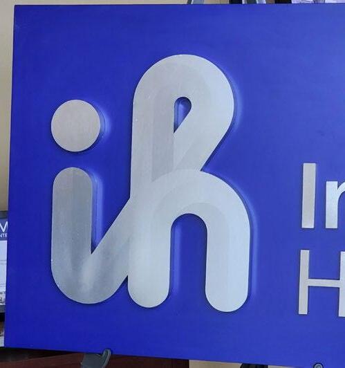
02Intermountain Health Asset Rebrand
Signage & Fleet Project | Dec 2022 - Present
Project By: BrandActive
Client: Intermountain Health
Project Phase: Phase 1 to 4
Sites: 300+ locations within the US
Collaborators: YESCO, FutureBrand, Bitro Group & Miratec Solutions
Project Brief
Intermountain Health is a major healthcare provider in the Midwestern states of the US. With their rebrand, multiple phases of development were deployed to transition locations and assets.
Working with concepts provided by FutureBrand, who created the new brand, my role was to adapt the designs into feasible sign, fleet and ID badge families. I coordinated with vendors to develop prototypes and created comprehensive standard documents for the entire program.
The scope of this project required multiple BrandActive designers to manage all the different physical assets to be rebranded. We all worked in close collaboration to ensure brand consistency.
Intermountain Health Signage Prototypes

The new brand design posed a unique challenge with the curvilinear gradient logo. A vinyl specialist was chosen to ensure high quality, consistent colours from one source.
For the lobby reception sign, I proposed experimental letter forms to compliment the unique shape of the logo icon. Each with their own unique form and complexities.
Ultimately, the metallic logo design was approved noting that it would be for limited applications and would required modified contrast levels before installation.
Reception Letters: Icon Face Options
Reception Letters: Icon Face Options


letters can be different depth from icon for dimensionality
• Digitally printed gradients on opaque vinyl
• Matches channel letter face
• Mimic the unique dimensionality of logo without forming the unique shape
• Lowest production cost and time compared to other icon face options

2 Bevel edges
•
•
•
•


• Flat face with bevel edges letters with metallic returns
• Digitally printed gradients on opaque vinyl
• Subtle dimensionality with bevel edges


The pylon sign (left) required a methodical approach to bring to life.
The illuminated elements were divided into four zones to ensure each was suffficiently bright.
Directional messaging is placed on replaceable panels made from a specialty acrylic.that is black in the day and white at night.


Wholesale letters were incorporated in the program to achieve a sharp look at small scales. These letter signs are “true trimless” and beyond the capabilities of a typical sign vendor.

Intermountain Health ID Badges


Creating new ID badges was another set of challenges.
Intermountain Health wanted to use their existing equipment but it lacked the sophistication to print full bleed, accurately colour match or use the new brand font.
I collaborated closely with their internal team to adapt the design to work within their parameters of equipment.


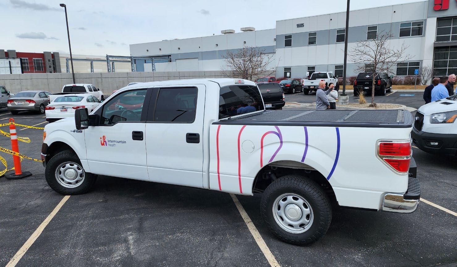
Designing fleet is one of the smoother aspects of this project, as graphical alignments and vendor coordination were straightforward. Fleet graphics involve fewer materials and equipment which means less points of failure.
Intemountain Health owns a diverse fleet line up, a large number of vehicle types used for a variety of purposes. For this rebrand, different designs had to be applied to different vehicles but all still feel like a unified family.


03 Tim Horton’s Innovation Cafe Patio Proposal
Retail Project | July 2019 - Nov 2019
Project By: MMC
Client: Brookfield Properties & Tim Horton’s
Project Phase: Proposal Only
Sites: 130 King St West, Toronto
Project Brief
In 2019, Tim Horton’s launched it’s only Innovation Cafe in Toronto as an enhanced brand experience. This location featured a more upscale design aesthetic and enhanced menu. MMC Architects was not involved with the interior design of the restaurant but did create the patio design proposal.
Working with the design aesthetic of the interior, I supported the architect and visualization team with elements of the 3D modeling, presentation documents, FF&E and the seating plan.
The patio proposal was under review from Dec 2019 until early-2020 with the final decision scheduled for the late-spring. Unfortunately, the cafe was officially closed in mid-2021 due to the COVID-19 pandemic. The general design philosophy is reflected in the 2023 interior space rebrand of Tim Horton’s restaurants but this patio design proposal remains unseen.


Midtown Common FF&E and Signage
04
Interior Project | Sept 2018 - Mar 2019
Project By: MMC
Client: Cushman & Wakefield
Project Phase: Phase 1 to 2
Sites: 201 1st Ave South, Saskatoon
Project Brief
Midtown Mall is a popular shopping centre in Saskatoon. As part of their 2017 renovation plan their food court, “Midtown Common”, was relocated to the former Sears space. This was done to accommodate a larger number of mall patrons, restructure the mall’s overall circulation and create new retail opportunities throughout the mall.
In phase 1, I supported the design team by designing the new FF&E, the seating plan, establishing the tenant design criteria, elements of the 3D modeling, renderings and the tender packages.
In phase 2, my responsibility was to create the tender package for the mall’s updated interior signage and wayfinding.


Throughout the project lifecycle, I worked on many aspects of Midtown Common and with various teams.
MIDTOWN COMMON
With the interior design team, I worked on FF&E drawings, signage drawings and connected with vendors during the tender process.
TENANT DESIGN CRITERIA SECTION 4 FOOD COURT TENANT CONDITION TYPES
29 M ARC h 2019
With the visualization team, I worked on the Sketchup model and the individual renders.
With the drafting team, I reviewed the tenant drawings and built the FCU standards.

/ MIDTOWN JUL 19, 2018 SASKATOON, SK
VIEW OF FOOD HALL SK-0769
Midtown Common FF&E - Typ. Tenant Sign Tender Drawing


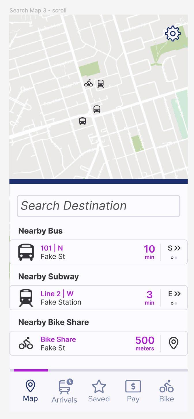
4. Map Screen
1. Splash Screen 2. Onboarding for New Users
1. Splash Screen 2. Onboarding for New Users


1. Splash Screen 2. Onboarding for New Users 5A. Routes 5B. Schedules
5A. Routes 5B. Schedules
5A. Routes 5B. Schedules
• Only the user and task flows have been

to Figma Prototype (Click to Access)

3. Login Screen 4. Map Screen
3. Login Screen 4. Map Screen


05Brainstation UX Design Capstone Project
Personal Project | Mar 2024 - May 2024
Notes
Notes
Project Brief
• Only the user and task flows have been prototyped
There’s been a growing trend where architectural designers are transitioning into UX design fields. As part of my personal growth and an internal initiative at BrandActive, I enrolled in one of Toronto’s leading UX Design classes to understand what makes this field so attractive and what I can learn from the experience. Signage and branded environments have been described as the “physical UX design” which guided my approach throughout the course.
• Only the user and task flows have been prototyped
• It is assumed that GPS, camera and Bluetooth permissions have been granted prior as well as a the user having a stable internet connection
My capstone project focused on the UX design behind a transit app. I’ve been a TTC commuter for my entire life with a keen interest in it’s physical intrastructure. I felt that designing a transit app would be a good application of UX principles with real-world implications.
• It is assumed that GPS, camera and Bluetooth permissions have been granted prior as well as the user having a stable internet connection
Many of the principles I learned are applicable to any design field. Upon completing the class, I led a workshop at BrandActive to educate our staff on UX design principles and collaborated with my department director on how we can better collaborate with design agencies.
Bus Stop Photo
Bus Stop AR
Bus Stop Photo
Bus Stop AR
Link
Bus Stop Photo
Bus Stop AR
notifications regarding service disruptions
• Many service disruption notices are only shared on the transit service’s website
• Service disruptions shown in navigation apps are unclear or not made immediately aware at the beginning of the route
Time Tracking
Time Tracking
To understand and design a transit app, it is important to identify the common points of failure as seen in the current industry leaders.
Lack of Integration
estimates and live tracking on available transit apps are or absent
estimates and live tracking on available transit apps are or absent
feature “live tracking” rely on the official scheduled time transit vehicle actually is
feature “live tracking” rely on the official scheduled time transit vehicle actually is
UX design requires the designer to empathizing with users. By experiencing the problem yourself, conducting interviews and developing personas, the needs of the design can be identified. This forms the basis of a strong experiential design.
• Despite showing all transit options for a route, no transit app integrates the various payment required
• Commuting options such as bikesharing are not supported
often feel frustrated not knowing when the transit vehicle creates distrust amongst users and the transit system
often feel frustrated not knowing when the transit vehicle creates distrust amongst users and the transit system
Lack of Real World Reference
Immediate Service Updates
Immediate Service Updates
However, something that wasn’t taught in class but learned through my career of design experience is that one design does not solve an entire problem, a multistage process is required.
Frustration Mitigation
Transit Solution is a Multifaceted Approach
no provide real time up-to-date information or regarding service disruptions
no provide real time up-to-date information or regarding service disruptions
Mitigation
• An app cannot solve every issue with transit, only mitigate user frustrations


Designing Solutions: Frustration Mitigation
• Despite being a navigation tool, apps are becoming increasingly minimalistic which leads to information being too abstract or not aligning to the real world


Real time tracking information is not intuitive or always available in the Transit app
Major transit apps do not reflect the up-to-date service disruptions or do have live tracking of transit vehicles. Commuting can be a frustrating experience for some and needs features to keep commuters feeling positive.
disruption notices are only shared on the transit service’s media but not in navigation apps
disruption notices are only shared on the transit service’s media but not in navigation apps
• Utlimately a transit solution requires multiple phases and steps
Steps Towards a Complete Transit Solution
• A transit app only being one step in a grand design proposal towards a complete solution
1. TTC website and social media have upto-date information regarding delays and service disruptions
Google Maps’ notice does not reflect any of the actual disruptions
Notices to service disruptions are not well highlighted
disruptions shown in navigation apps are unclear or not made aware at the beginning of the route
disruptions shown in navigation apps are unclear or not made aware at the beginning of the route
Transit App Proposal
Integration
Integration
1. TTC website and social media have upto-date information regarding delays and service disruptions 2. Google Maps’ notice does not reflect any of the actual disruptions 3. Notices to service disruptions are not well highlighted 4. Real time
4. Real time tracking information is not intuitive or always available in the
• Focus design on real time tracking and immediate up-to-date information so transit users can plan their commute accordingly
Transit App Improve service, cleanliness & safety
app
all transit options for a route, no transit app integrates payment required
• Track all buses, trains and subways in the immediate GTA
options such as bikesharing are not supported
Steps Towards a Complete Transit Solution
all transit options for a route, no transit app integrates payment required options such as bikesharing are not supported
Increase transit frequency Physical environment improvements (Routes, stations, infrastructure)
• Integrate payment for the various transit lines and options along with showing the total cost of a trip
World Reference
World Reference
• i.e., PRESTO, Viva Rail ticket, Bike share payment, etc.
• Centralize information of all transit options into the app
navigation tool, apps are becoming increasingly leads to information being too abstract or not
real world
Approach mitigate user phases and steps proposal towards a up-to-date accordingly immediate GTA options along
navigation tool, apps are becoming increasingly which leads to information being too abstract or not real world
• Pull information from transit service websites and social media
• Service disruption alerts that are present and more noticeable
• Unite every commuter’s transit experience by being the go-to app
• Real world visualization of transit information with photo details of transit stops and AR navigation to transit stops for reference
2
Accurate Real Time Tracking Servce Distruption Alerts / Centralized Information taken from Official Transit Sources
• This will ensure users will remain orientated to their physical space
World Visualization through Photo Details and AR Navigation Details
Integrate Payment and Other Transit Options
Transit
5. The display for routes in the Transit app is abstract with its use of colour bars
Steps Towards a Complete Transit Solution
Accurate Real Time Tracking Servce Distruption Alerts / Centralized Information taken from Official Transit Sources
Real
Persona 2: Infrequent Commuter
Empathy Map
General Empathy Map
analysis identifying was improving the details increase (Mississauga’s drive or commute, lost transit or


Says Does Think

Evelyn Chan
Age: 21 years old
“I don’t want to check four different websites and apps to use all the different transit options, I want to see and pay for everything in one spot.”
Bio:
Evelyn is a student at George Brown College and works part-time in midtown Toronto. She takes various kinds of transit depending on her schedule, sometimes using the bike share if it’s a nice day. She takes the GO train to see her family in Oakville once a month to get out of the city and like to explore the GTA.
Pain Points:
Goals:
• Arrive to school, work and her plans out on time
• Conveniently pick a transit option that best suits her and knows the cost of her trip all in one place
• To graduate and enter a career in her field of study
• Feel safe and comfortable when commuting
Potential Solutions:
Location: Toronto, Ontario
Work: College Student
Archetype: Infrequent Commuter
• Uncomfortable with the cleanliness and safety of the transit vehicles downtown
• One centralized transit app with integration and information for all the various options available in the immediate GTA
• Include bike share into the transit app
Personality: Outgoing, active, relaxed, likes to try new things, enjoys exploring, conscious of her surroundings
• Has to use multiple apps and websites to plan and pay for her various commutes and travel methods. A lot of steps towards planning a trip
• Arrival times are usually wrong and doesn’t want to be late to class or work
• Real time tracking for transit vehicles on transit app
Feels
In order to successfully emphathize with user, I conducted a series of interviews with commuters to identify their key problems, typical commuting experiences and suggestions for transit improvement.
These discussions helped me identify the opportunities my transit app project would capitalize on and develop the personas my design would solve for.
Habits: Checks transit website and social media before commuting, stands on the subway because the seating seem unhygienic, regularly checks the bus schedule
• Transit options don’t extend as far as she would like when she’s exploring the GTA or going to work
• No proper app to use the city’s bike shares
Persona 1: Regular Commuter

Andrew Thomson
Age: 30 years old
Location: Etobicoke, Ontario
Work: Office Project Manager
Archetype: Regular Commuter
Personality: Time conscious, organized, poor sense of spatial awareness/directions
Habits: Sleeps during the morning commute, always leaves early in anticipation of train not arriving on time, opens multiple transit apps to double check train arrival times, memorizes the train schedule
• Notifications and/or obvious warnings on the route information to alert user of delays/service interruptions pulled from transit social media
• In-app reporting feature or regular surveys online to gauge commuter needs, frustrations and how to improve
“Every time I get to the train station, the ETA is always wrong. It feels like I’m constantly between trains with no way of knowing when the next one will arrive.”
Bio: Andrew works a 9-to-5 in downtown Toronto. He commutes during rush hour taking the train to Union Station then the subway to his office and ocassionally the bus. He’s lived in the GTA his whole life and is used to the woes of transit. He prefers driving when he’s not in the city and visiting nearby national parks.
Pain Points:
• Schedule and actual arrive times for transit vehicles are not aligned, causing him and many other commuters to be too early or late
• Uncertain whether a delay has occured until he’s experiencing it
• Difficulty reading the map or finding the right bus stop when he’s in an unfamiliar area
• Lack of reliable information and communication from the transit service to the riders
• Feels guilty that he always has to leave work early to catch an uncertain train before it gets too crowded
Goals:
• Arrive to work fully rested and on time without having to compromise his schedule or wait too long
• Know the real arrival time and if there’s a delay
• Feel certain that he’s at the right bus stop and where is he on the map so he doesn’t get lost
Potential Solutions:
• Real time tracking for transit vehicles on transit app
• Notifications and/or obvious warnings on the route information to alert user of delays/service interruptions pulled from TTC/GO social media
• AR navigation or photo references of the desired bus stop and relevant information related to the physical environment
• Saved routes with account preferences so user can know the best time to depart and get home
Transit App Information Architecture
User Flow: Task 1 - AR Navigation
Task Flow
Flow User Flow
To structure a UX design, one must develop it’s information architecture (the framework) to understand how a user would navigate through the app and discover information.
A user with an account opens the app to see the AR Navigation for the first bus stop for their route User Flow
From there, one would develop the task flow and user flow to identify the various steps and processes to get from point A to point B.
These conceptual diagrams are then used to develop the wireframe and prototypes of the app. Once in a more final state, brand colours and fonts are explored.
Wireframe:

Wireframe: Task 1 - AR Navigation

Wireframe: Task 1 - AR Navigation [Reiterations]


Revisions
Revisions
• [Reiterate 1] Renamed Details” to “AR Nav.” more clear on what is
• [Reiterate 1] Renamed Details” to “Photo make it more clear function is
• [Reiterate 1] Added to street names more obvious that ‘cicked’ as well
• [Reiterate 2] Added between stops readability and separation elements
• [Reiterate 1] Renamed “AR Details” to “AR Nav.” to make it more clear on what the function is
• [Reiterate 1] Renamed “Photo Details” to “Photo Ref.” to make it more clear on what the function is
• [Reiterate 1] Added an arrow to street names to make it more obvious that these can be ‘cicked’ as well
• [Reiterate 2] Added lines between stops to help readability and separation of elements
Figma linked here
raymondkuang794@gmail.com
www.linkedin.com/in/raymond-kuang/