


V&A/RCA HISTORY OF DESIGN MA 2021-22 COHORT PUBLICATION


CO-LEADER, ART DIRECTOR - NATASHA DODWELL-ADAMS
CO-LEADER, PUBLICATION DESIGNER - MOLLY GISBOURNE
PHOTO EDITOR - PHOEBE HAYNES
COPY EDITOR - CAROLINE WHITE

4
inbetween features the V&A/RCA History of Design MA 2021-22 cohort.
/www.rca.ac.uk/study/programme-finder/history-of-design-ma/ Printing by Mixam.
All images are credited, contact individuals for further information. Text belongs to the authors.
inbetween uses Times New Roman, Avebury, and Adhesive Nr. Seven typefaces. And the ‘inbetween typeface’ was designed by Natasha Dodwell-Adams for this purpose.

5 Welcome to inbetween Acknowledgements 2 Introduction 4 Hybrid 10 Progress 36 Disrupt 54 Other Projects 76 Conclusion 78
Programme Academic Staff
Sarah Cheang
Josie Kane
Louise Purbrick
Simon Sladen
Spike Sweeting

Simona Valeriani
Visiting Lecturers/V&A Curators
Tanveer Ahmed
Justine Boussard
Emily Candela
Elizabeth Currie
Caitlin Langford
Caroline McCaffrey-Howarth
Alka Raman
Cheryl Roberts
Elaine Tierney
Administrative Staff

Sophie Arp


Tess Piggott
TSM Teaching Teams
Andrea Foffa
Miriam Phelan
Georgina Izzard
Katie Irani
Charlotte Slark
The V&A/RCA Programme and the graduating students are also grateful for the support of student research provided by the following:
Visiting Lecturers and Guest Speakers
Tom Allbeson, Nicola Ashmore, Louise Baird-Smith, Anna Bates, Lydia Caston, Christine Checinska, Daan van Dartel, Niambh Dillon, Serena Dyer, Erica de Greef,


James Hevia, Katherine Howells, Grant Ibb, Veronica Isaac, Benedict O’Looney, Anthony O’Shaughnessy, Daren Kay, Alf Le Floris, Kate Le Versha, Alexandra Loske, Lesiba Mabitsela, Martin-McAuliffe, Scarlett Millar, Henry Mulhall, Ceyda Oksay, Riya Khanchandani, Louise McAward-White, Eileen Reiner, Samantha L.


Thanks also to: Former Head of Programme
Marta Aimar and Former Programme Administrator
Andrew Hulse
Thanks also to
Jo Norman, Ken Neil, Angie Applegate, Zoheir Beig, Amy Ching-Yan Lam, Max Donnelly, Connie Karol-Burke, Ruth Hibbard, Nick Humphries, Christopher Marsden, Aloń Meron, Susan North, Divia Patel, Neil Parkinson, Angus Patterson, Freddie Robbins, Jacques Schumacher, and the many there V&A and RCA staff that assisted our students in researching their essays and worked with them on other projects.
The Climate Museum
The Design Trust

Fair Museum Jobs
The Research Collective for Decoloniality and Fashion
The Royal Pavilion and Brighton and Hove Museums
Awards and Bursaries:
The Robert Beacroft Barker Fund
The Anthony Garden Fund
The Sylvia Lennie England Fund
The Gillian Naylor Essay
Prize in memory of Tom Naylor
The V&A History of Design Fund
The Clive Wainwright Memorial Fund

6

7
RO tion


 BY SARAH CHEANG AND SPIKE SWEETING
In between our introduction and our conclusion, you will find the work of the students who graduate this year from the 15/18 month enhanced V&A/ RCA MA History of Design. When they first arrived, stepping through the gilded V&A galleries and smooth modernist interiors of the RCA, it was September 2021. On that day, the students told us about past projects they had worked on and the research plans that they had for their time with us. In a world newly emerged from the Covid-19 pandemic, we were starting to reoccupy real physical spaces, together again, but there was much to contend with. We worked hard, we innovated as well as compromised, so that ideas, dreams, but not viruses, might pass between us.
Across the forty-year history of our MA programme and continuing an even longer history of partnership between the RCA and the V&A, both institutions encourage us to set the bar high. But this partnership also exists to provide the space that is needed to explore new approaches to history and material culture as a collaborative venture — in between the museum and the art college, in between
experimental first steps and nerve-wracking public facing outcomes such as exhibitions, publications and symposiums. Because education is not just training, it is transformation. As Sara Ahmed suggests, while the pursuit of knowledge can enable transformation, transformation is also a form of labour that leads to knowledge.1 When we open ourselves up to real learning, confronting our vulnerabilities as well as exploring our strengths in collaboration with others, our worlds are changed.
It is also moments of transition that the V&A/RCA History of Design Programme chooses to scrutinise and promote. Michel Serres, perhaps the preeminent philosopher of in-betweenness, suggests that the saga of the Ancient Greek sea god Proteus is interesting when he transforms himself into a lion, a tree, a snake or water to evade capture. But the far more alluring conceptual challenge his story poses rests in the work needed to identify the nature of his transitions; to slow the magic down and observe the in-between state as the forms change and when Proteus is neither a pig or a leopard but incomplete and full of potential. Serres’s observation resonates in
so far as the attraction of design history and, indeed, the skill of design historians resides in the ability to arrest processes of transition, to consider them, and make them legible, whether that be the shepherding of molten glass into branded drinking vessels or diagraming the continual kneading of values that give objects their social meaning. And, more often than not, design historians find themselves in between mutable ‘technology’ and intransigent ‘culture’, tracing the particularities of processes, institutions and emotions amongst communities of bewildering diversity as they encounter flux. In this regard, our students are Protean themselves, continually beginning anew by reinventing the methods, terms of reference and definitions the discipline requires.
In this publication, we share some of these transformations, keenly observed moments of transition and epistemic reconfigurations. Monkey fur, penal colonists, Cotswold farmers, royal waistlines, spiritualist publishers, carnival queens, and cotton genes (not jeans!) all feature and illustrate the ambition of our students to propose new actors in the history of design.

8
Image

9
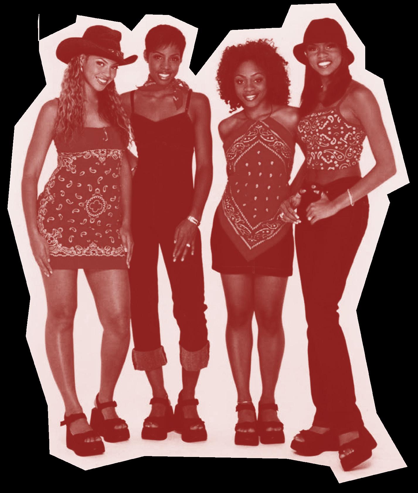
Credits: Destiny’s Child in the 1990s, wearing matching Americana outfits (bandana print, denim, and cowboy hats) made by Beyoncé’s mother Tina Knowles
1 Sara Ahmed, On Being Included: Racism and Diversity in Institutional Life (Durham: Duke University Press, 2012) pp. 173-187.


: a thing made by combining two or more different elements; a mixture, a joining of forces, an amalgamation or fusion. The word HYBRID is significant for the design historian whose job often involves looking across complex webs of history to understand how and why changes in design happen. Our work is always situated in hybrid spaces, drawing together the past and the future, the historical and the contemporary, the new and the old. The term HYBRID reflects the large array of research topics found within our cohort, topics which are wide-reaching, varied and expansive. As a group of individuals straddled between the digital and physical realms, with experience of both online and in-person teaching throughout our time on the course, the word HYBRID feels apt to describe our collective viewpoints. As the last group to experience both part-time and full-time options for undertaking the course, HYBRID ultimately reflects our in-betweenness.


This section will focus particularly on student’s work with a hybrid topic or idea. These projects often involve a combination of old and new themes, sometimes using historical concepts or ideas as a framework for approaching contemporary questions surrounding the material culture of design. The hybrid nature of these topics is also reflected in their varying geographical and temporal focus, as well as in these student’s ability to link different aesthetic styles with theoretical concepts, ultimately synthesising new avenues for design history research. Some examples of these topics include Alice Conibere’s work on the transcultural aspect of 1960s synthetic fibre production; Caroline White’s study into the aesthetics of Americana and national identity in clothing; and William Seung’s project on the dualistic representation of London in contemporary video games, amongst many more. The scope of the research found in this chapter highlights the importance of understanding hybridity as a key concern in the discipline of design history. By incorporating two or more themes or topics, these students have been able to create exciting juxtapositions which have not been explored fully before now. These projects therefore represent some of the most exciting contributions in design-history scholarship to date.


 Words by Natasha Dodwell-Adams
i a L a L o N z
Procuring Poundbury:
Investigating Construction Management and Building Practice in Phase I of Poundbury, Dorset
Despite their significance, narratives of construction processes are commonly excluded from histories of design and the built environment; traditionally, the notion of the ‘architect as designer’ takes precedent. This dissertation challenges these accounts and works to interpret the role of construction within the design process. I examine the urban extension of Poundbury, Dorset, as a case study, primarily focusing on the construction management and building procurement process of Phase I housing in the development. Utilizing several interviews, primary design documents provided to me by the building company
C.G. Fry & Son, and correspondence obtained at the National Archives of the UK, this project identifies the design agency of the building company at Poundbury. It outlines the complex network of construction management during the building process, highlighting the unforeseen organizations and forces which altered and influenced Poundbury housing design Finally, this dissertation examines the methods of construction used at the development and works to magnify the role of the builder. This project establishes a framework for construction research within design history and finds that analysing the
social, political, and economic circumstances during the building procurement process provides fundamental insight to the design of the built environment.
Please contact me at


isabelalonzo99@gmail.com

The urban extension of Poundbury, Dorset, exemplifies hybridity in its unique capacity to embody the ‘old’ and ‘new’ at its core. A combination and contradiction of tradition and modernity, the construction of Poundbury blends modern methods of construction with traditional English design, ultimately creating something new altogether.

14
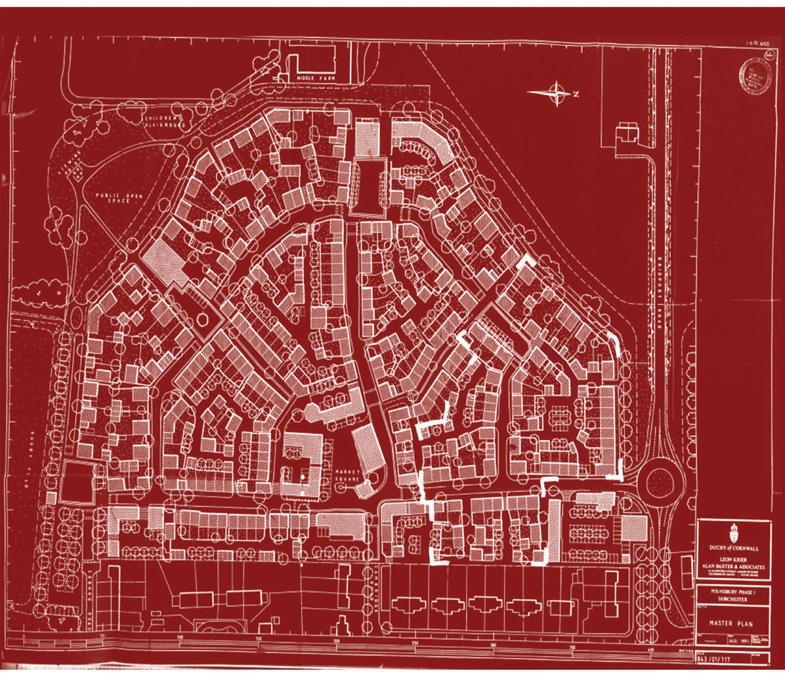
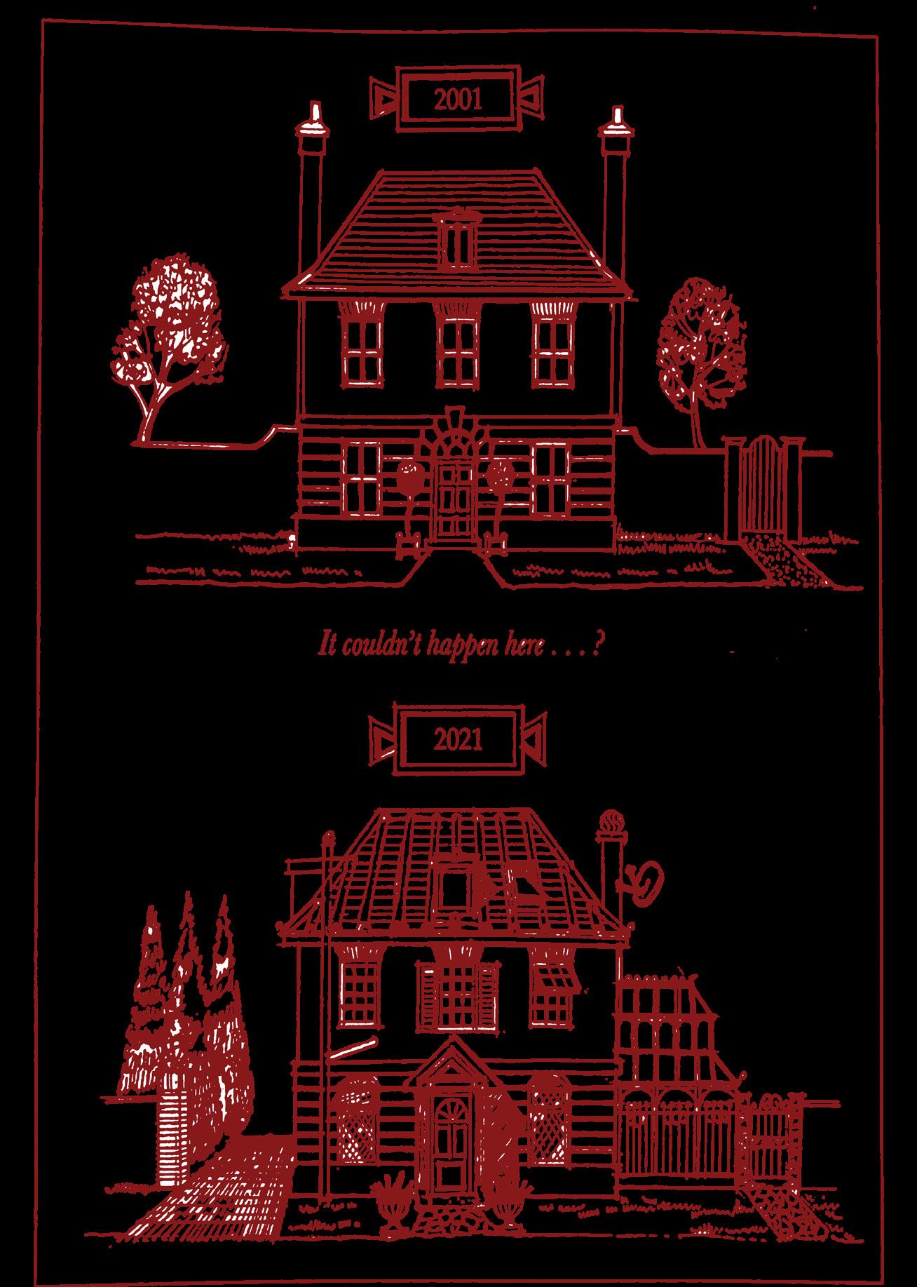
Image Credits, above: Unknown maker, ‘It couldn’t happen here...?’ Housing Illustration, in the Poundbury Design Guidance, Duchy of Cornwall, ca. 2001, courtesy of C. G. Fry & Son, [print illustration digitally photographed by Isabel Alonzo]. Opposite: Leon Krier and Alan Baxter & Associates, Master Plan, digital screenshot of document, in Dorset Council Planning application: 1/E/93/000164, August 1991
R O WA n VE r a R

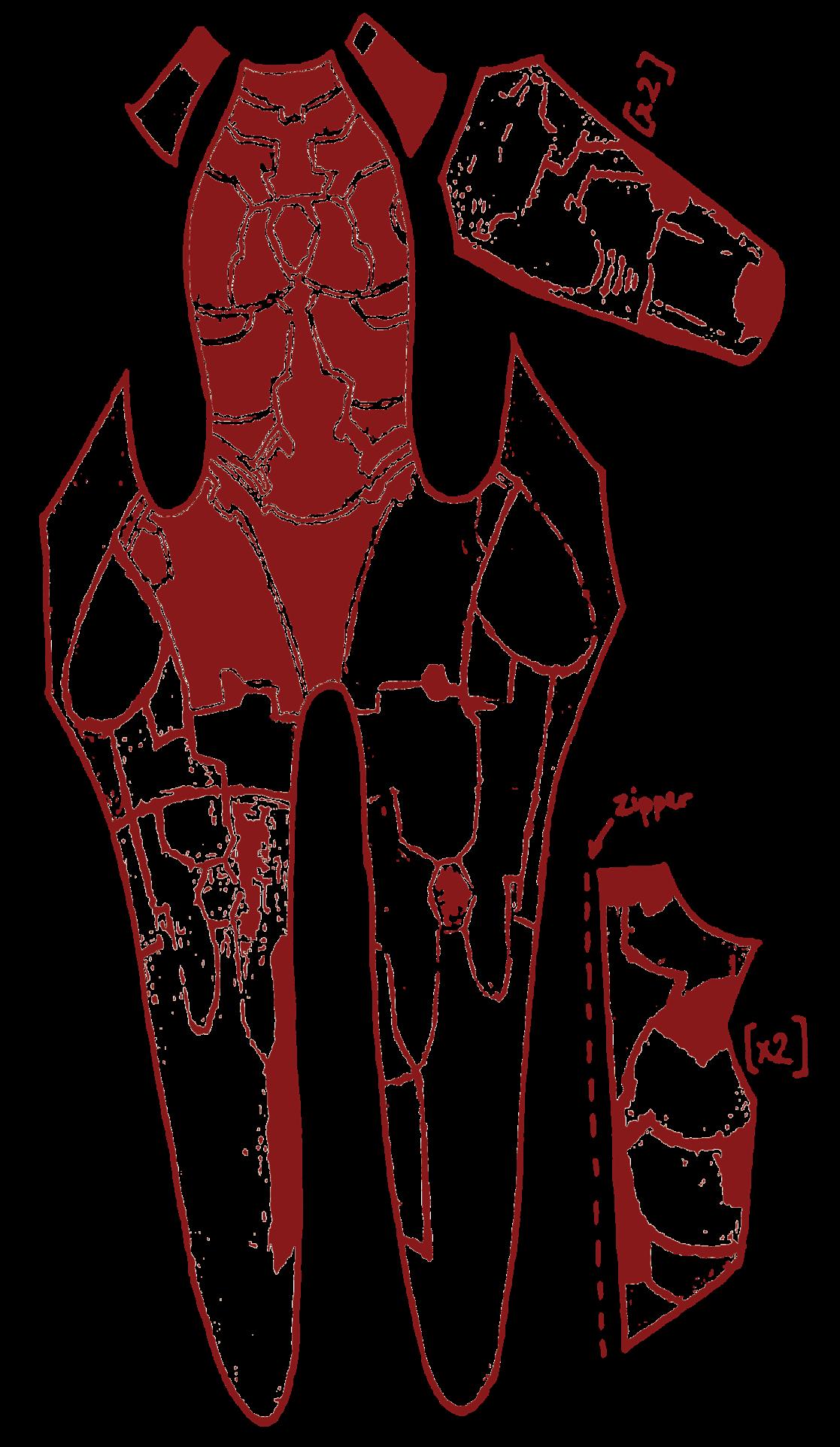
Universal Unitards: Democratic Hierarchies and Skill-Sharing in the Cosplay Community


This paper aims to demonstrate the structure of the social and skill-based hierarchy within the cosplay community through the examination of the professional, amateur and casual tiers of said hierarchy. In relating these tiers to each other through the use of production and consumption, this paper argues for the structure of the cosplay community as a democratic, open-access hierarchy using the design of the unitard as a through line. Firstly, I examine the business professional market through three case studies that examine the tiers of the market for unitard cosplays as consumed by all levels of cosplayer, but particularly casual cosplayers. Fi-

nally, I examine the open-access community of personal garment construction by professional and amateur makers online as examples of peer-based reciprocal learning communities.
This paper aimed to examine the cross-section of the variety of not only materials but creative practises that exist within the cosplay making and casual cosplay community. This group of makers and wearers thus provides an excellent example of a hybrid creative collective.
LinkedIn: Rowan Everard
Instagram:
@scratchingthesurfaceondesign

16
a i C C ib RE


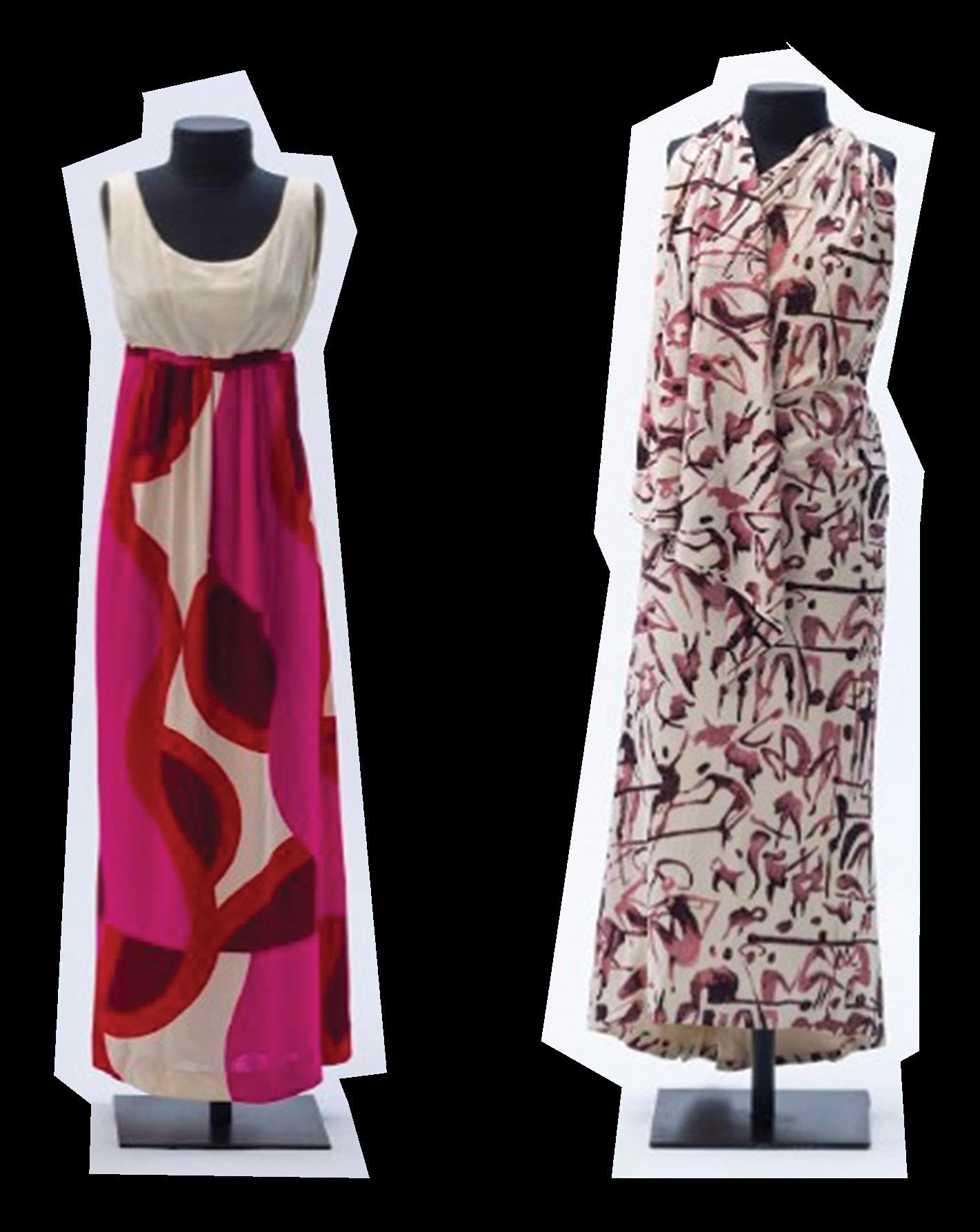
Modernising Fabrics for a Modernising Nation: Rhodia Synthetic Fibres and the French Connection with a “National Fashion” of Brazil, 1959-1969
This study takes as its premise the possibility that a textile company of French origin may have had a market advantage when introducing a brand-new textile material to Brazilian consumers in the second half of the twentieth century. The protagonist was Rhodiaceta, a subsidiary of the Rhône-Poulenc chemical company, with a long history producing artificial and synthetic fibres in France. The parent company, by turn, had a long history in Brazil, having established a subsidiary there in the first decades of the 1900s. This was the Companhia Química Rhodia Brasileira, commonly known as Rhodia.
Although Rhodia launched the synthetic filament nylon in Brazil in 1955, promotion of the company’s fibres began in 1959, marking the start of this study’s time period. Reference to “the 1960s” frequently acts
as a shorthand for a new peak of societal affluence, increased consumption, and cultural transformation, particularly in regard to youth culture. This applies to Brazil within the parameters of the country’s unique socio-political and economic situation: specifically the rule of a military dictatorship following a democratic period of relative stability and growth. Campaigns for the “Rhodia Selections”, the firm’s fashion-oriented, consumer-facing promotion of its fibres, including polyester as of 1961, were executed by advertising manager, Livio Rangan. The end of the time period, 1969, is demarcated by his last full year in the post, by which point Rhodia had achieved hugely significant success in sales of synthetic fibres.

The premise of this study is based on the French fashion connection with Brazil, which had
been significant since the nineteenth century, crystallising with the consolidation of haute couture in the middle of that period. It proposes that the long-standing association of France with fashion was leveraged within the marketing strategy of Rhodia, and in the design of garments for its promotions; it presumes the capacity of advertising to mediate a quality of “Frenchness”. It also acknowledges that fashion is a transcultural experience and explores the other of the twin poles on which Rhodia’s strategy was based: the association of the company with the creation of a “national fashion” of Brazil. This is carried out within a framework that considers global and national drivers behind the production and consumption of synthetic fibres and an analysis of French-Brazilian fashion circulation through consideration of the “centre-periphery” model.
17

18
Image Credits: Deconstructed sketch of the parts of a unitard, illustration by Rowan Everard.

19
os, design by Ugo Castellana; from the Rhodia collection of MASP - Museu de Arte de São Paulo Assis Chateaubriand. The dress with the print of small people - Long dress with scarf, 1965, print by Carybé, design by Alceu Penna (author's attribution); from the Rhodia collection of MASP - Museu de Arte de São Paulo Assis Chateaubriand.
ata a o Dw LL-A am


Fashioning the Domestic: the Intersection of Contemporary Jewellery Design and Women’s Craft Practices in Britain, 1981-2006
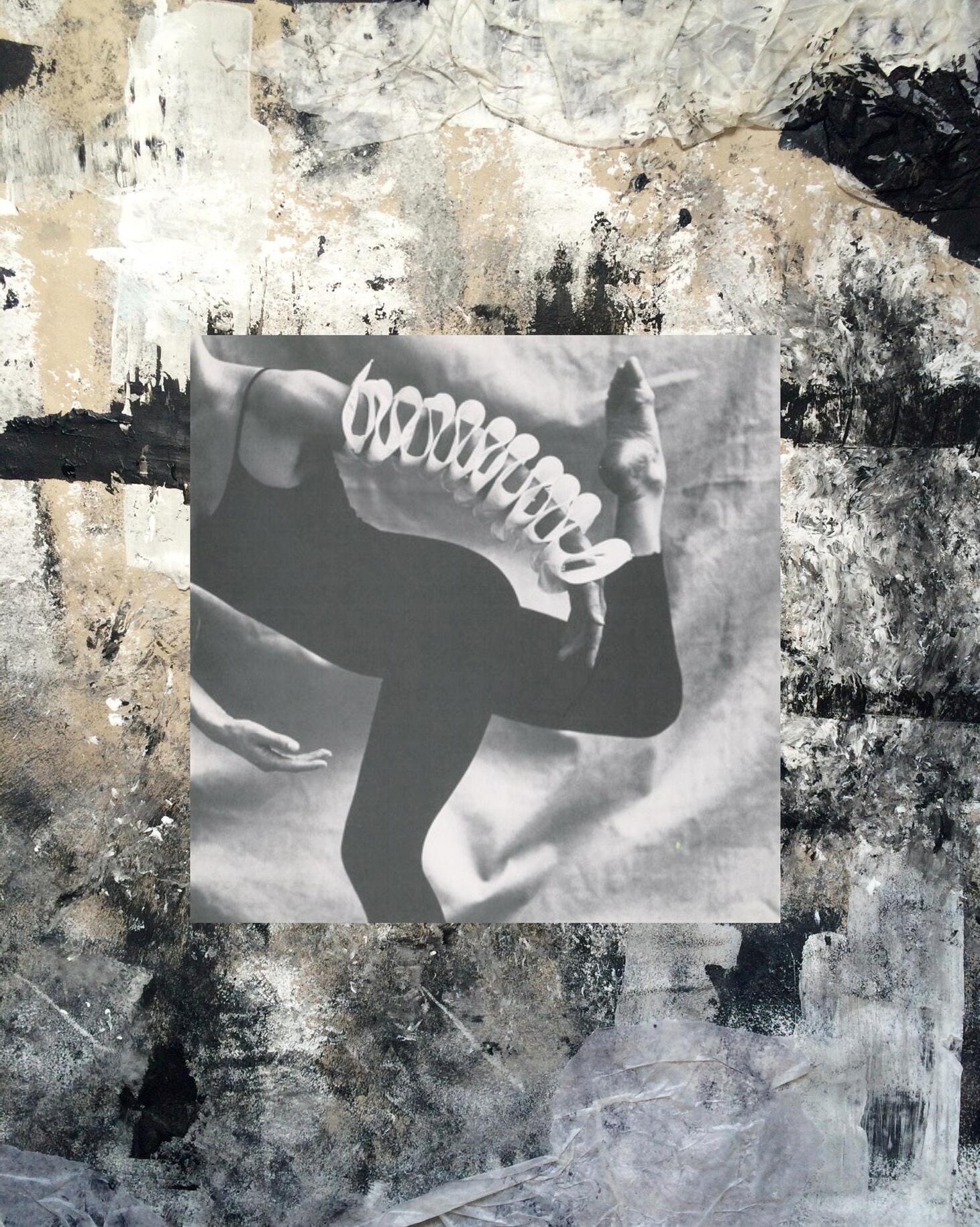
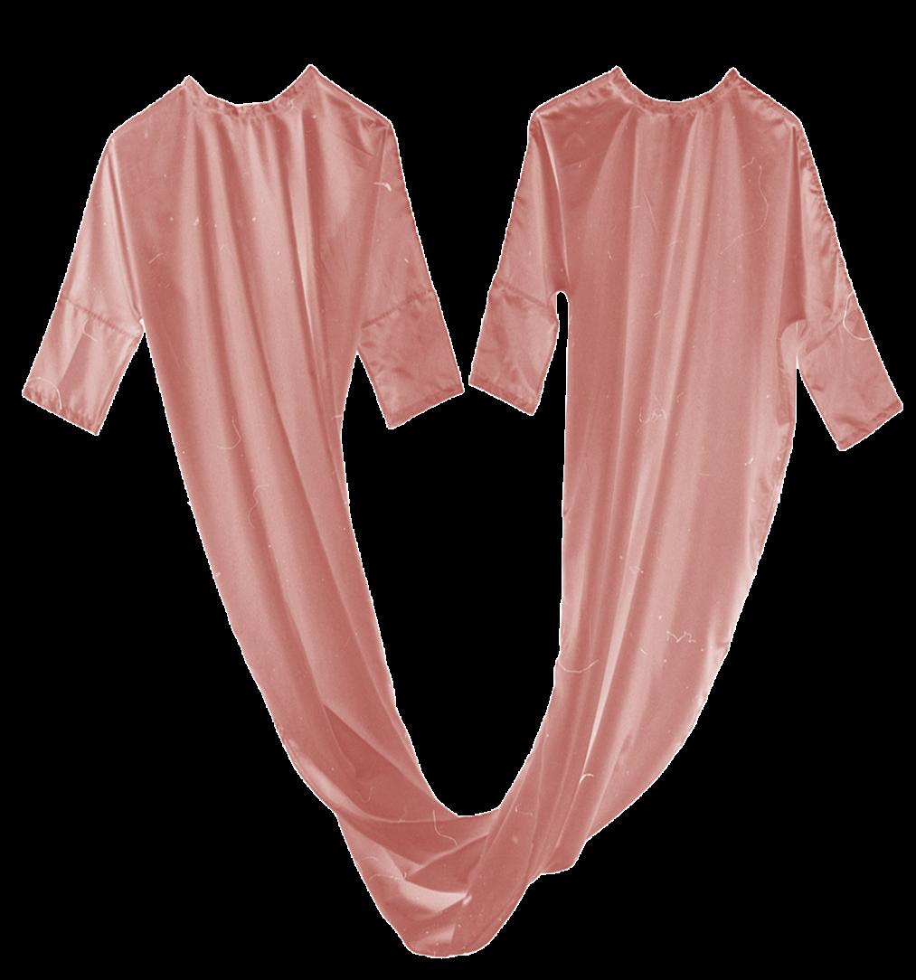
Existing histories of jewellery design fail to address the connection between domestic crafts, such as weaving, sewing and knitting, with contemporary jewellery produced in Britain between 1981 and 2006. This dissertation acts as an interruption to prevailing scholarship, bridging the gap between two disciplines which, at surface level, appear unrelated. The study makes a case for Caro line Broadhead and Nora Fok to be considered as two pio neers of a new style of jewellery which combines domestic, tex tile-based techniques with bod ily adornment: resulting in the subversion of predominant no tions of femininity. This results in the creation of wearable ob jects which transcend the defini tion of jewellery, taking the form of sculptures, garments and installations. Ultimately, this dissertation causes the reader to contemplate the role jewellery plays in fashioning the body, and how this relates to the formation of women’s gender identities.
Image Credits, this page: Caroline Broadhead, Twinshirt, 1984, Broadhead's Private Collection. Opposite: Caroline Broadhead, 22-in-1 Armpiece, 1984, cotton fabric and nylon line. 11 x 223.5 cm. Crafts Council Collection, London. Wearer and photographer unknown.
Natasha is a multidisciplinary creative based in London. Her research and writing focuses on histories of gender-based craft and exploring the body through dress. She endeavours to develop her own jewellery making practice alongside her current work at Royal Museums Greenwich.
Instagram: @natasha_____mary
Email: natashadodwellart@

21
MO LL G i S O u r N


Farmer Fashion and the Posh Boy Aesthetic
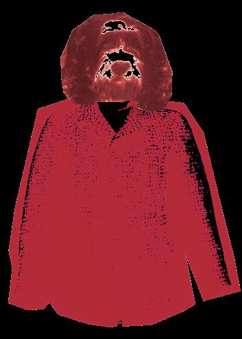
Through my training as a fashion journalist, I was disappointed by the lack of representation of my peers in the Cotswolds, where I grew up, and I enjoyed teaching my city classmates, my international friends about the style quirks of the farmers. So, I took it upon myself to describe and analyse what I termed ‘farmer fashion’ – the distinct dress choices of those who live and work and identify with the land. A few years passed and I thought less about farmer fashion, until TikTok’s obsession with the suffix ‘-core’ to describe ultra-specific ‘aesthetics’ started to deliver the ‘posh boy aesthetic’ to my For You Page (the algorithm’s disturbing, unprompted accuracy strikes again). And there was farmer fashion: ironically (yet decisively unironically) displayed on the bodies of trust
fund boys. It seemed confusing to me that young men with comfortable wealth are choosing to wear clothing that I saw as provincial, archaic, nationalistic. This dissertation combines fashion theory, archive work, and an ethnography practice to uncover the (typically design history) design, production, and consumption of this same style worn by two different demographics.
The first chapter focuses on design and gives a historiographical and historical context to farm workwear. Similarly, I investigate the other demographic using a timeline approach: I trace countrywear as a distinct and separate style for historical ‘posh boys’ back to the sixteenth century. I focus on the materiality of the style through specific design elements, fabrics, and brands and this leads to a discussion of shooting uniform and the extent to which the countrywear style can be considered a uniform. The uniform/subculture/ anti-fashion labels hover around this aesthetic, and I devote argument to each as labelling this style will give a better understanding of how the demographics interact within wider culture.
As a uniform, countrywear allows wearers to (boast?) present their crucially-English pastoral connections to observers. In this chapter I take a descriptive, participant-observation trip to Cheltenham Races to explore what elements make up the modern-day countrywear style: I find specific styling cues (such as layering), and specific materials, garments, and brands that are used universally (across both demographics) to create the look.
Chapter Two’ title, ‘Producing a Patriotic Subculture’, is misleading; I refer to the production of the style in terms of its perpetuation, its unchanged aesthetic codes over centuries – what has enabled the countrywear style to last for so long? Partly, this is due to countrywear having been used as shorthand for ‘Englishness’ in media and fashion. I take care, yet am rigorous with, a discussion of what Englishness/Britishness is and what it might mean to the young men wearing this style. I use Alison Goodrum’s work to back up and grow my arguments within the specific demographics of my study, and analyse how brands, such as Hackett, commodify and

22
capitalise off a connection to the countryside and typical Englishness. The 1990s’ Anglomania is referenced for exporting Englishness abroad. A more targeted analysis of agency and who ‘is allowed’ to wear this style is situated in Chapter Three within its general focus of countrywear as displaying power. Back to this chapter however, and I am sat in the pub. I am sat in what used to be a favourite haunt of the Sloane Rangers, on the hunt for present-day iterations of the subculture. Sloane Rangers, a term coined by Ann Barr and Peter York in The Official Sloane Ranger Handbook (1982) were a group of young people of a certain class living around Sloane Square, London in the 1980s. They were sartorially characterised as separate from the stereotypical trends of the Eighties, and were epitomised by the late Diana, Princess of Wales. This celebrity media coverage and success of the handbook popularised the countrywear style, and grew its associations to the pastoral, patriotism, to power. I flip this subculture discussion to modern-day media, to the communication and language of TikTok. Examples of TikToks by different creators (farmer- and posh boy- identifying) highlight the specificity and gatekeeping of the countrywear style.

Moving into consumption and
Chapter Three approaches the topic literally and semiotically: firstly, I visit countrywear stores in the Cotswolds and in London to analyse their similarities and differences, and I consider other ways of buying such as at events (large industry events like the Three Counties Show, and local events for example a point-topoint) and online. My research led me into a strange rabbit hole, one that I had to buy a monogrammed, leather hip flask for entry: the Chelsea LifeJacket, an Instagram brand run by some of the TikTok creators that I analysed previously that market themselves as a private members club. Tying everything together is the underlying semiotic field that has lapped under the surface of the dissertation; here is where I discuss how this style is ‘read’ and understood by observers. I created my own word association survey and found that participants could not distinguish between photos of countrywear on the different demographics or through different time periods. Participants holistically identified wealth, the land, and Englishness. TikToks are used again to illustrate how creators are perpetuating this idea of themselves in these clothes, and providing guides so that with the right Ralph Lauren polo, you too can live like this! And the ‘old money’, American Ivy, countrywear crossover provides insights to

how this style is read universally. The conclusion invites further work to question those in power. Why are young people still aspiring to a historic, nationalised fashion in this globalised, postmodern world?
My research in archives, handing extant garments, and scouring old photographs, combined with hours justifiably spent watching TikToks and in pubs, gives a hybrid methodology to design history research. Not to mention that farmer fashion (and the posh boy aesthetic) is essentially rooted in history, yet continues with gusto through to the present. An adaptable style — for its legacies with different social groups over different times — requiring a hybrid approach.
Find me @mollygis on Instagram and Twitter.
Image Credits: Walton Hardy, “The Cotswold Shepherd” who lived in Ilmington. 1930 Our Warwickshire Photo archives. And Norfolk Jacket, 1890-1900, V&A, T.356&A-1984
23
w il L AM u N


From Victorian to Near-future: a Study of London’s Representation in Blockbuster Videogames through the Lens of Assasin’s Creed: Syndicate (2015) and Watch Dogs: Legion (2020)
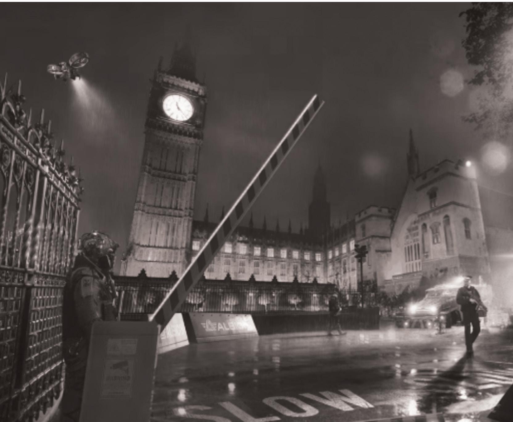
The consumption of videogames has been on an upward trend for a long time, and Covid-19 pandemic has further accelerated this trend in the UK. The country’s capital, coincidentally, is also a frequent videogame location. The pervasiveness of videogames in our contemporary lives and the relatively under-researched topic of London’s representation in videogames have prompted the question of what makes London popular as a videogame location. Through an analysis of two blockbuster titles, Assassin’s Creed: Syndicate (Ubisoft Quebec, 2015) and Watch Dogs: Legion (Ubisoft Toronto, 2020), both set in London but in different time periods (the former in the Victorian era and the latter in the near-future), this dissertation attempts to shed light on what qualities of London were selected to be omitted or amplified in the virtual world. Taking a design-historian approach, this dissertation refers to not only the videogame itself but also materials that shed light on the production process, including but not limited to accompanying publications, videogame reviews and news reports, and oral interviews. Ultimately, this re-

search reveals there are at least three qualities — a relevant metropolitan, an embodiment of historicity and modernity, and a multicultural hub — that make London a special location for videogame designers and players to continue consuming.
This dissertation is hybrid as it looks at the design of fictional Victorian and near-future London in two different videogames and extracts a common thread between them.
Born in Hong Kong and now based in London, William Seung works at the Somerset House Trust as an assistant curator. Before relocating to London, he worked as an assistant curator/curatorial assistant of design and architecture at M+, where he was heavily involved in a variety of exhibitions, including the inaugural show Things, Spaces, Interactions (2021). During his studies, he also co-curated the exhibition Queer They Are (2022) at the Royal College of Art.
Instagram: @wseungseung
Twitter: @William_Seung
LinkedIn: @William Seung
Image Credits: Concept art of Watch Dogs: Legion, showing the Big Ben. Illustration extracted from Rick Barba, Watch Dogs: Legion: Resistance Report (London: Titan Books, 2020), p. 4.

25
C A i n W hi T


How to Dress Well in Middle America, or, Why We Don’t and Why That Doesn’t (Quite) Make Sense:
An Exploration of Americana Aesthetics, Good Taste, and National Identity in Clothing
26
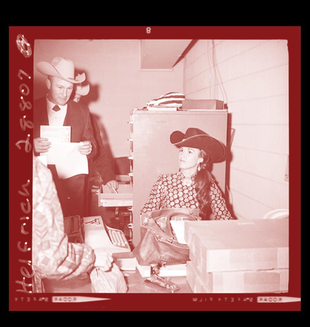
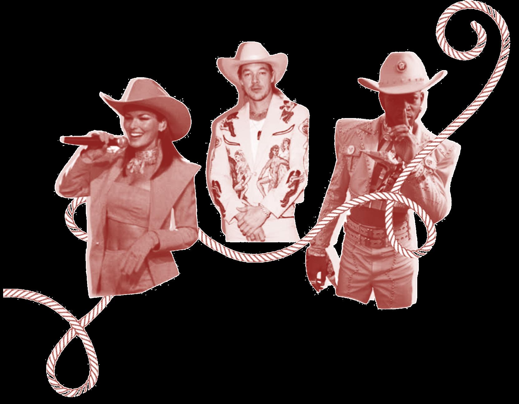
Image Credit, opposites: Collage of pink cowboy outfits worn by musicians Shania Twain (2022), Diplo (2020), and Lil Nas X (2020). Above: Helfrich, DeVere. “Post-Rodeo, December 10, 1966,” in DeVere Helfrich Rodeo Photographs, National Cowboy Museum.
While the clothing of rural America (namely workwear and Westernwear) remains consistently relevant in contemporary fashion, middle America retains, at the same time, a paradoxical reputation for fashion “backwardness.” The contemporary clothing of the region is consistently a national joke, even as Carhartt double-knee pants and cowboy boots took over trend cycles from 2018-2022. This project attempts to address that schizophrenic narrative: how, if middle American “heritage” clothing is so lastingly admired, did the region come to hold such a low position in the national fashion hierarchy? Relying on a combination of theories, this thesis traces how certain Midwestern garments became symbols of national identity, how Americana clothing has continued to dominate national fashion
throughout the decades, and how shifting structures of shopping divorced rural America from its heritage of style. Finally, it poses a solution to the division at the heart of the Midwest’s sartorial identity, answering the question in the title: How does one dress well in middle America?
Caroline is from Oklahoma (ideal for cowboy-boot commentary) and now works at Bode, where she continues to explore American textiles and fabric histories. She can be reached at caroline.g.blanc@gmail.com
This project is “Hybrid” in that it explores a style worn—paradoxically—at both ends of a “cool” spectrum and at both ends of a social spectrum. It attempts to explain and to bridge those gaps..
P oe B f i E L e r
Plaster Cast Greco-Roman Sculpture in the 18th Century: English Collections and their Collectors
The Race to Catch Up: English Taste in the Antique Sculpture of Italian Fifteenth-Century Collections.
During the nineteenth century in England — in the era of museums, industrialisation and Victorians — plaster casts of antique, medieval, and renaissance sculptures and architecture was at the peak of its popularity, widespread across European and American museums, as well as in public exhibitions such as that at the Crystal Palace. These museums refer to the use of plaster casts as an important educational tool and method of bringing the most famous and admired sculptures and architecture home to their countries so they could be seen and admired by a wider audience.
The question arises: how did these very famous sculptures, foremost owned by the wealthy Italian aristocracy and the Italian church from the fifteenth century, come to be moulded and copied for Great Britain’s landed gentry? What sculptures made from Greco-Roman antiques were used to decorate the interiors of some of eighteenth-century England’s wealthiest country estates
and London town houses? This is the focus of this work. These plaster-cast sculptures, which have come to be displayed in museums and public educational institutions in Great Britain, have been somewhat overlooked in scholarship — hereas the period in plaster-casting history of the nineteenth century, when the plaster casts were produced for museums across Europe, has been well-documented.
In this dissertation, the story behind how the copies of Greco-Roman sculpture arrived in England, alongside why these copies were chosen and collected, and why they have influenced what people think of today when they hear ‘Greco-Roman sculpture’ will be explored through the lens of the best preserved collections, such as those of Kedleston Hall, Derbyshire England (now within the ownership of the National Trust). The dissertation also draws on the archival records left behind by their collectors and the agents the collectors used to create their collections of casts.
The late seventeenth and eighteenth century saw a new type of English nobleman ushered in,


one interested in the redesigning of their great homes. Casts of famous sculpture from western antiquity gained popularity in the sixteenth century and seventeenth century in Europe, used as a symbol of wealth and refinement amongst the European monarchy. The fashion which began in Italy of collecting copies of recently unearthed archaeological sculpture was adopted much later in England than in the rest of Europe, and English collectors who would display casts of Greco-Roman origin in their homes and gardens, wanted specifically to imply they held a worldly interest in art and other cultures.
The classical revival in England and interest in plaster Greco-Roman sculptures became widespread when the Grand Tour became de rigeur for gentlemen. The legendary collections of the Uffizi and Borghese galleries, which were two of the most famous and praised sculpture galleries of antiques viewed whilst on tour, had no equal in England, and were unattainable for the gentleman buyers of the time.
Departing from the medieval period, England was lagging
28

behind the rest. Europe, and in particular Italy, had embraced modern medicine, art, antiques, philosophy, science and so forth in the fifteenth century. The addition of sculpture amongst other types of art, once found only in the collections of renowned families of Italy such as the Medicis, to the collections of Englishmen’s homes was an attempt by the upper class of England to emulate the great families of Italy, so as to add ‘a British provenance’ to their own artwork and history and elevate themselves to the status the Italian aristocracy held over them in the world of art and design.
Theme: Hybrid
The blending of Classical revivalism and the neoclassical design of eighteenth-century interiors is a hybrid story, which to understand one must jump between the Roman Emperors Nero and Hadrian, archeological discoveries in the fifteenth century in Italy, the legendary Medici family of Florence, and the English gentry on the Grand Tour.
To be hybrid is to be made up of many facets, to be a result of more than one thing, and this is precisely what the collecting
habits of the eighteenth-century gentlemen were: a classical revival of the Greco-Roman period, but inspired by fifteenth-century Italian collectors and the Italian Renaissance.

CV details -
p.a.fielder@outlook.com
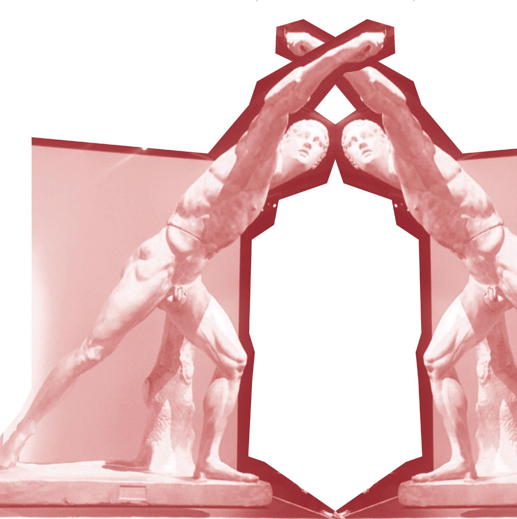
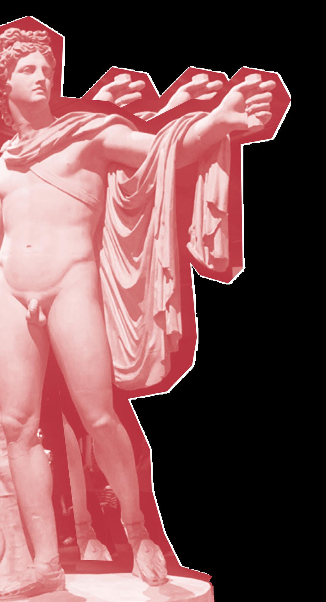
Image Credits, this page: Apollo Belvedere, C,1800-1850. Museum of Classical Archaeology Cambridge. Previous: Borghese Gladiator, Cast by Brucciani & Co, c.1850-1900. Royal Academy of Arts, London.

30

31
i y SiL
The Modern, Hybrid Design of Fashion Representation: Harper’s Bazaar and Man Ray
1934-1939
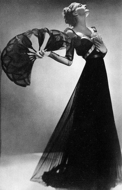
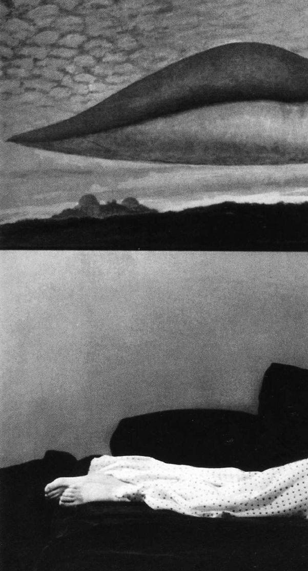
Through the focused study of Man Ray’s photographic work for Harper’s Bazaar between 1934 and 1938, this thesis shall argue that fashion photography is a historically unique hybrid model of design. I will provide a sustained visual analysis of a range of photographs produced by Man Ray for the publication and present a novel reading that considers the production of fashion representation and consequently reconstructs the community involved. My first chapter shall present a historiographical assessment of Man Ray’s career and observe the significant neglect of his involvement with Harper’s Bazaar. Man Ray’s autobiography Self-Portrait will consistently support my dissertation and illustrate that he was dismissive of his fashion activities, which has contributed to the historiographical neglect of this section of his career. I shall propose that the limited exhibitions and literature that have presented his fashion photography have neglected the context of the magazine and have conse-
quently not considered elements surrounding the production of fashion representation. My second chapter will present a visual assessment of the composition of Man Ray’s photographs within the pages of Harper’s Bazaar through the art direction of Alexey Brodovitch and the leadership of editor-in-chief Carmel Snow. I will underscore the methods Brodovitch employed to communicate Man Ray’s images to the reader. My third chapter shall evaluate how Man Ray represented the material and symbolic significance of fashion through various photographic techniques. This shall involve a consideration of framing, lighting and technical experiments and will capture how Man Ray embedded the aesthetics of Surrealism within his photographic designs. My fourth chapter will analyse the internal components of the production and reflect on the choreography of models, the fashion designs represented and the approach to set. Finally, I will capture the significance of my conclusions by considering

the implications for the reader. Through the assessment of this body of work, this dissertation shall show that innovative and creative fashion representation is a collaborative production which has been overlooked within literature from the fields of art and photographic history. It is from placing the study of fashion photography into the sphere of design history that this medium can be fully recognised.
My dissertation explored the hybrid medium of fashion photography, specifically the multiple elements that led to the production of Man Ray’s fashion photographs published in Harper’s Bazaar between 1934 and 1939.
Contact:

emily.silk@outlook.com

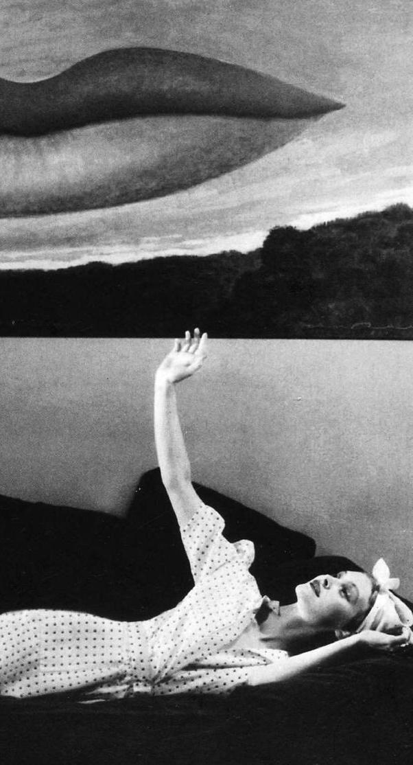
Image Credits, next page: Man Ray, Against his surrealist painting ‘Observatory Time – The Lovers’, Man Ray photographs a beach coat by Heim of white silk painted with little brown foxes, Harper’s Bazaar, November 1936.

32
m

33
Image Credits: Man Ray, The Consensus of Reason, Harper’s Bazaar, March 1936
34
35


is a mysterious term- much like success, its measure is invariably determined by the individual. Have we made progress? Could be read: Something has changed, is it beneficial?


Progress can also be difficult to measure empirically, as it is often something that is not immediately observable. It requires an understanding of what came before, and the relationship between the before and the after. This is the skill of a historian.
Think of identifying progress as this: when gas clouds form new, brightly burning stars billions of lightyears away, the only way we can spot them is to look even more closely at the present assortment of stars in our sky and pick out the outliers and, sometimes, there aren’t any to be found.
It is this kind of close analysis in the pursuit of observing change over time that the following historians have employed gleefully, albeit their night skies have been archives, libraries, museum collections, auction catalogues and ancient manifests. And as much as each of us have been trying to identify, categorise and understand certain modes and stimuli for progress in our research we have inadvertently gone about creating progress of our own.


Progress in the way academia thinks about certain subjects. Progress in the way a family considers its heritage. Progress in the methodologies used by historians. The joy of historical research is that each new endeavour is, in itself, instigating progress.
Additionally, these types of endeavours give us an opportunity to progress too. An opportunity to change, and to grow introspective of our own relationships with the world around us via the objects which inhabit it. It is this object-focused analysis which the following works all share and relish in, and it is our call-to-action that these topics might urge others to look more closely at the human stories behind objects, be it the clothes we wear, the furniture we use, the theatre stage we stare deeply into or the priceless marvels behind glass in the V&A.
The following papers are not simply records of historical progress, then- not simply detached observations of change over time- they are designed to instigate their own progress. Striving to push the humanities forward with innovative research methods, modes of analysis and insights borne from the individual authors’ myriad backgrounds. These include research into glass, both 21st and 18th Century, fashion and textiles, also both 21st and 18th Century, theatre, post-war furniture, board games and even the tyranny of capitalist botany. Each paper contains more than a little bit of its author’s DNA, though thankfully not literally (despite the metaphorical blood, sweat, and tears that went into the research) and each one is unique.
We hope you enjoy reading the following excerpts of research, and we hope they highlight the unseen ways in which designers and merchants have shaped the world around us through continual improvement, or progress, of their products and services.
Words by Alex Tinkler
W kt ri a i J w a
Tapczan-półka — Furniture Design and Ways of Living in Post-War Poland
How is the design of the tapczan-półka a symbol of the post-war living conditions in Poland between the years 1945 to 1989 and how did the contemporary political regime impact its design?
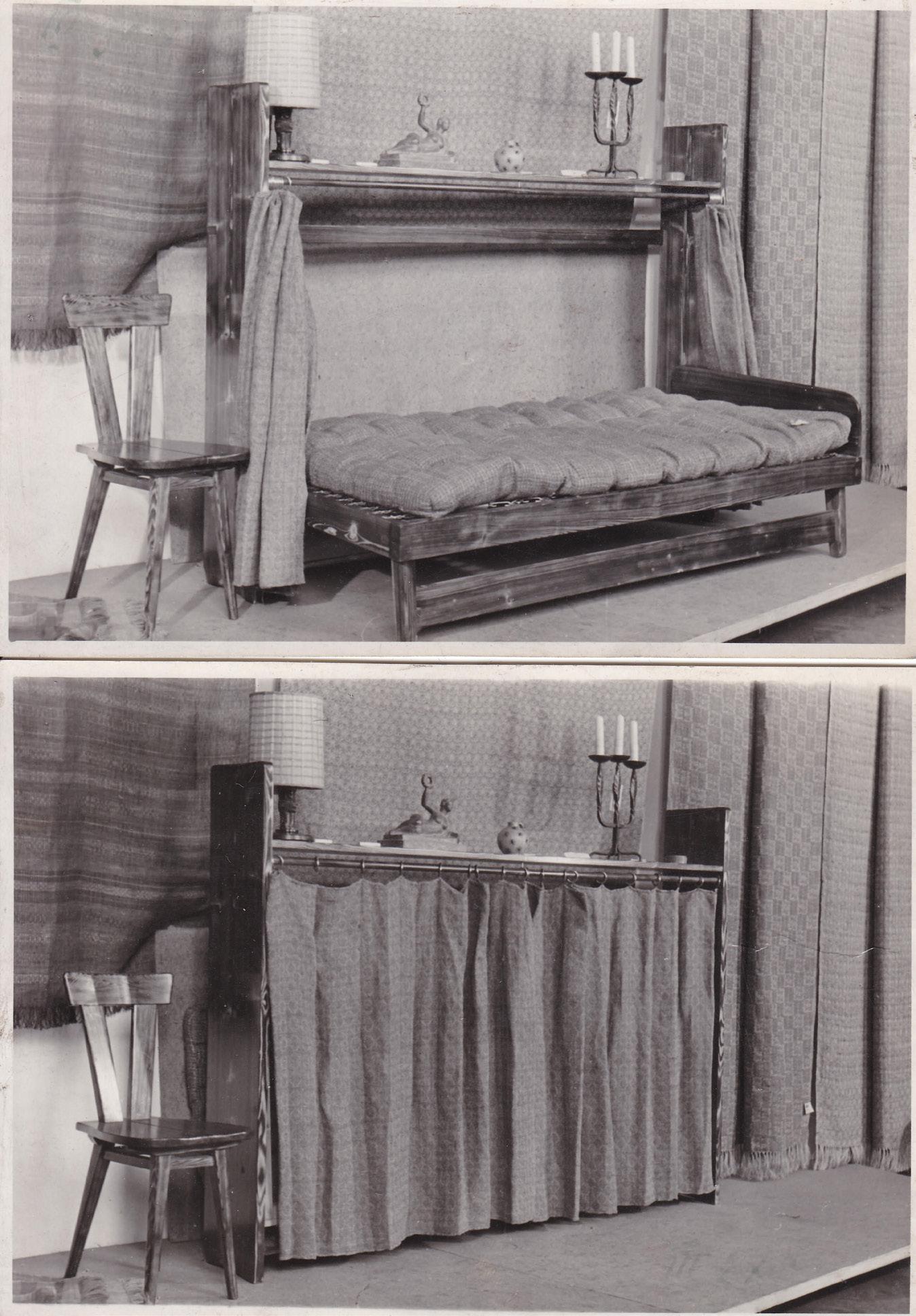
A tapczan-półka [couchshelf], is a fold-up and -down couch with shelves or cupboards above it. It was first introduced in Poland in 1945 by Władysław Wincze as a design response to small living spaces. The housing shortage together with strict housing norms imposed by the socialist government presented Poles with a problem of how to design their living space in the most efficient and multifunctional way. Polish post-war furniture market was saturated with furniture pieces too large for the newly built smaller flats and Wincze’s invention proved to be the perfect ‘modern’ piece of furniture per the socialist ideology. Initially manufactured by an independent artists’ cooperative out of durable and native materials, the tapczan-półka’s design was soon to be appropriated by other designers
as well as manufacturers, and its production process was altered.


Between the period of 1945 and 1989, the tapczan-półka was used by people of all ages and could be found in many flats all around Poland, yet no in-depth research about it has been carried out by Polish or international scholars. This utilitarian furniture piece acts as a nostalgic object to remember the everyday life realities of life under the socialist regime. Its material traces as well as the histories of its users are starting to disappear, and this research acts as a permanent record of the untold stories. Previously unexamined archival materials aid in uncovering how is the design of the tapczan-półka a symbol of the post-war living conditions in Poland between the years 1945 to 1989.
How did the contemporary political regime impact its design, production, consumption, and mediation? Oral testimonies are used to demonstrate the difference in narratives between those imposed by the socialist state
and the tapczan-półka users. Visual evidence is used alongside written primary and secondary sources making apparent how political, economic, social, cultural, and technological factors impacted the lifecycle of the tapczan-półka.
Being the first in-depth research into the design, production, consumption, and mediation of the tapczan-półka between the years 1945 and 1989, this project reveals how this object became more than just a symbol of the Polish post-war living conditions.
How my work links to the theme of progress: In the years between 1945 and 1989, a clear design change can be observed in the tapczan-półka’s design, production, consumption, and mediation. The design change was simultaneously symbolic of the political, social, cultural, economic, and technological changes and progress which occurred in Poland at the time.
kijowskawiki@gmail.com

www.wiktoriakijowska.com
Instagram: @wikikijowska

40

41
L er
X

TThe Beilby Decade, 1760-1770: Enameled Glassware, England and the Business Acumen of the Ingenious Beilbys
Based in Newcastle upon Tyne, a North East port city in Eng- land, the Beilby family consisted of William, his brother Ralph, sisters Elizabeth and Mary, and lesser-known brothers John and Thomas. Their father, William Beilby, Snr., was a Durham-born gold- and silversmith and en- graver. By all accounts — and looking at the examples of his work which survive in collec- tions to this day — he was a prolific and talented engraver, at that. It is surprising, then, to learn that he went bankrupt in 1756, the same year in which eldest son and heir to the Beil- by family business John died.
AJust one year prior to the death of John, however, the namesake of the family patriarch, William Beilby, Jnr., was apprenticed to John Haseldine, a watch enamel- ler based in Birmingham. Replete with burgeoning enamelling skill, William starts painting dec- orative scenes onto glasswares in or around 1760. For over 20 years William forges ahead cre- ating some of the most incredible pieces of enamelled glassware the world has ever seen, amass- ing a clientele inclusive of Roy- alty and with aristocracy abound.
Imagine its 1780. You are the most prolific enameller of glass- ware in the world and have com- pleted commissions for multiple members of the Royal Family, both in England and in the Neth-



erlands. Business is booming and, around you, your family is reaping the rewards of their own endeavours. You move in haughty circles and have privileged access to several aristocratic homes. You have spent years carefully building networks, amassing an auspicious clientele, and forging an inimitable reputation. Then, one day, you decide ‘I quit.’
Had an unknown, unremarkable maker decided to quit their day job and decided to take up teaching it would hardly be worth writing about and, I dare say, there probably was quite a few who did so. But to really appreciate the implications of the decision we need to systematically explore the magnificence of William Beilby’s venture across the better part of a very active decade. All the innovation, market insight, influence, identity, and novelty William Beilby used resulted in a business that was, by and large, peerless.
‘The Beilby Decade’ is a strategic breakdown of the facets of the Beilbys’ business and interrogation of each in the pursuit of building a more nuanced and representative image of their enterprise. The aim of this is not to rewrite the histories of the Beilby family, those which currently exist are ostensibly accurate if somewhat patchy, the aim instead is to reframe the way in which we regard the family. There will

42
be varying terms used to describe the entirety of the family hereafter: craftspeople, artisans, virtuosos, artists etc. However, the most important way to describe them would be ‘designers’, or:
‘a planner with an aesthetic sense… [they give]1 the right weight to each part of the project at hand, and [they know] that the ultimate form of the object is psychologically vital when the potential buyer is making up [their] mind’.2
Traditional analyses of Beilbys’ glassware tend to bifurcate the Beilbys’ chosen mode of decoration from the object itself, either choosing to focus on the applied enamel decoration or the glass object it is applied to — the result of this is a body of knowledge that positions Beilby pieces as just one part of a larger, homogenised category of “Eighteenth Century glass”. Of course, this is not to suggest that the Beilbys are the be all and end all, as it were, but rather to point out there has not been a study carried out which accurately charges the change over time of the Beilbys’ output. The objects disseminated by William Beilby were ostensibly luxury items and the consumers of them were notably well-todo. Indeed, much can be made of the clientele of the Beilbys, which includes names like William of Orange and the Prince of Wales, among many others. The Beilbys were a well-connected family and
fortified these connections by strategically targeting the upper classes with extraneous ventures such as drawing classes for the ladies of wealthy households, and map- making and city planning for local government. But what they tapped into specifically, was a vein of high taste that was emerging in the Eighteenth Century for items that could adorn the homes of the wealthy and demarcate their status as important, influential individuals.3
The rationale for this study is greater than simply understanding the comings and goings of a relatively small Newcastle firm and their haughty clientele — the Eighteenth Century in England saw seismic changes in manufacturing and marketing of art and design objects. If we can understand, through design language and intent, the way the Beilby workshop process their decisions, how the market shaped their choices and where their impetus for iteration came from, we can, in the future, potentially use this as a potential framework by which to measure the activities of similar contemporaneous businesses and situate our knowledge of the Beilbys in a larger and more informed understanding of Eighteenth Century glass.
In a nutshell: The glassware they supplied — original and outstanding; the skills they employed — virtuosic and ephemeral. This was a family, a business, at the


cutting edge 260 years ago, and one we can still observe today as exemplars of innovative business practice and market manipulation in the field of product design, albeit a business forgotten by time, overshadowed by the reputation and objects it forged.
1 N.B. quotation has been edited to remove gendered pronouns
2 Bruno Munari, Design as Art: Bruno Munari, Illustrated edition (London? UK: Penguin Classics, 2008). P. 29
3 Florian Knothe, ‘European Eighteenth-Century Glass: The Revival of Heraldry in England and the Extraordinary Production of Finely Enameled Glasses by the Beilbys of Newcastle’, Art Hongkong, no. 102 (2015), 206-15; Cottle, ‘Family Connections’.
43
Image Credits: Wine Glass, William Beilby, V&A, C.623-1936.
RA C S a T r


Performing Post-Performance: What is the place of theatrical models post their lives as tools in Exhibitions? And to what extant can curators and exhibitions creators use design to engage audiences with theatrical models most effectively?
Theatrical models are a critical component in the creation of theatre and performance. From experimental first drafts in the form of initial and sketch models, the working and experimental white card models, all the way through to the final scenographic model and theatrical model box, multiple forms of theatrical model will be made — and most will be destroyed — by the end of the production process. In the National Theatre Archive, there are only twenty-one models out of the over eight hundred plays the National has produced since opening on the 22nd of October 1963. My dissertation explored the place of theatrical models post their lives as tools in exhibitions. To what extent can curators and exhibition creators use design to engage audiences with theatrical models most effectively? In Chapter One, this question is addressed through textual and

material analysis of theatrical models, identifying and defining the different forms of theatrical models designers will use throughout the pre-performance process and identifying theatrical models as having an essence of performance not dependant on the live performances for which they were made. Chapter Two uses three case studies of theatrical models displayed post-performance at the Royal Opera House, National Theatre, and Victoria and Albert Museum to explore how curators and exhibition creators can engage audiences with this essence of performance in theatrical models. Demonstrating how the design of exhibitions has allowed theatrical models to move between models of and models for, facilitating a deeper relationship between theatrical models and their audiences in museums and displays. Granting theatrical
models their own identity — not by completely exorcising the ghosts of performance past from them, but by offering more possibilities for visitors to engage with not just the history and memories of theatrical models but the essence of performance and the tools for imagination found in all models.
Grace has over four years of experience working in both cultural and UK government policy. She is currently Policy and Communications Manager at the Royal National Theatre in London. Before this, she worked on policy at the Cabinet Office and the Department for Culture, Media and Sport. She completed her undergraduate degree at the Royal Central School of Speech and Drama, studying Design for the Stage. Grace is passionate about working towards communities where theatre is viewed as vital.
44


45
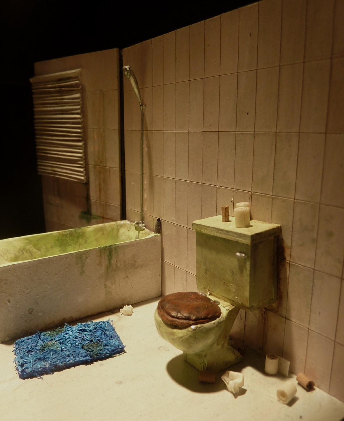
Image Credits: Initial sketch for a model by Grace
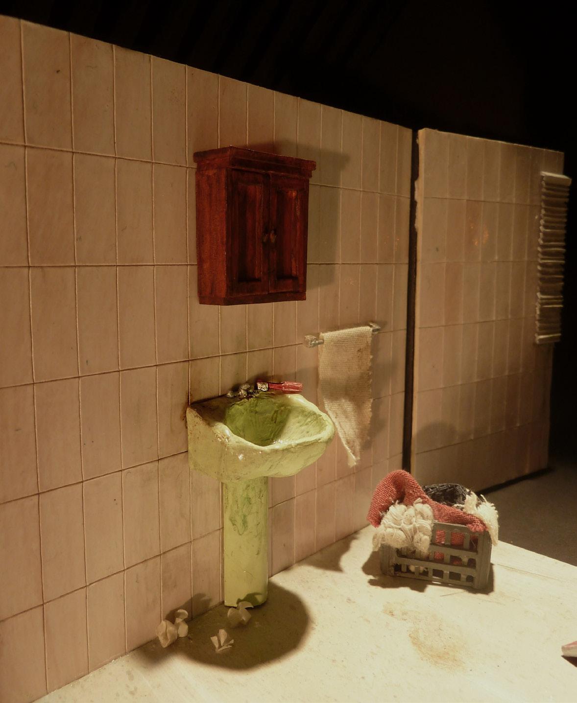 Image Credits: Photos of final scenographic model by Grace
A f a F r a c s
The Cotton Question: How 19th-Century Imperialists and Botanists Redesigned the Cotton Plant to Suit the British Industrial Context
The Cotton Question examines how imperial botanists designed the cotton plant to fit industrial needs in Imperial India in the late 19th century. The cotton plant went from quite a diverse plant with unique regional characteristics cultivated and domesticated by people in their native habitats, to essentially only four varieties—and only one widely grown variety. The reason there are only four types of cotton today is human intervention: cultural, political and scientific. In the British Empire’s quest to create a competitive cotton industry, they found it necessary to turn to technology to catch
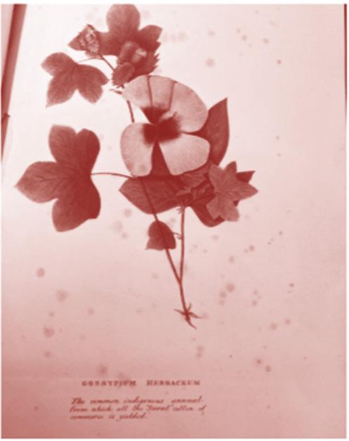
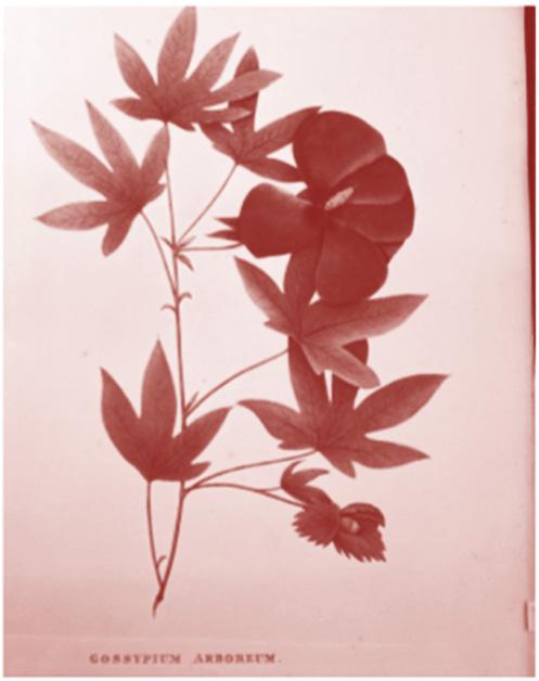
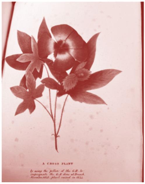
up with other cotton industries. It was this technology that demanded a different variety of cotton. Thus, botanists set out to provide one that would be commercially viable in order to suit industrial purposes.
My dissertation fits the theme of progress because it examines how imperial botanists redesigned the cotton plant to suit industrial needs.
Email: 10001553@network.rca.ac.uk


Instagram: @sassafrases
 Image Credits: G. arboreum, G. herbaceum, and A Cross Plant. Burns, Alexander. 1845.Royal Botanical Gardens Kew, pq633.51(5)
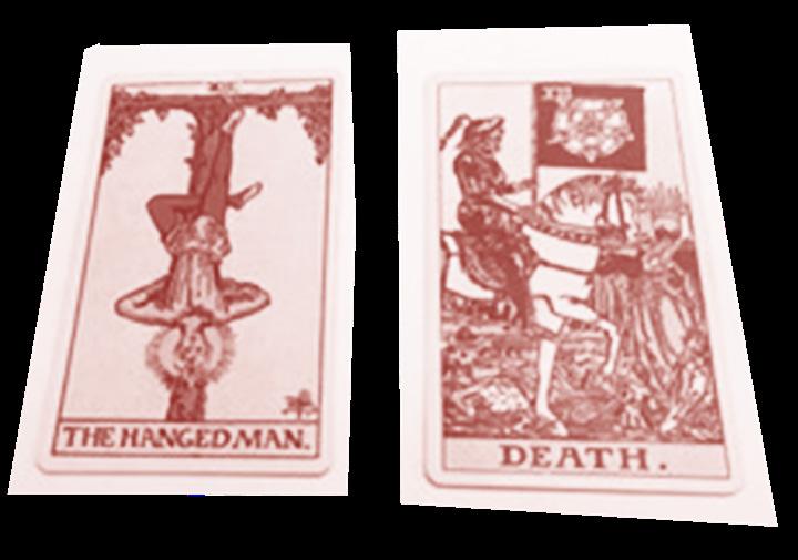
This dissertation examines the introduction and popularization of tarot cards in early 20th century Britain. Looking at some of the other material objects used in divination throughout this era, it is noticeable that tarot is an outlier amongst these things in their enduring use. What has made tarot cards long-lasting cultural objects when compared to other divination methods like crystal-ball gazing, palmistry, scrying, and reading tea leaves? And more specifically, what are the elements of their design and production that have contributed to this status? The aim of this dissertation is to answer those questions by using the RiderWaite-Smith tarot deck, published in 1909, as a case study.
Ca S e M E r s


Designing the Occult: The Origins of the Rider-Waite-Smith Tarot Deck
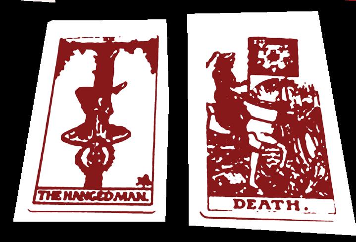
Rider-Waite-Smith tarot deck brings to light the skillful and successful ambiguous business strategies that were used in its design and production. This dissertation displays how these strategies were used to create a long-lasting product with mass appeal.
To do so, it analyzes three main primary sources: the cards themselves, handbooks made to accompany the deck, and the popular 20th century occult journal The Occult Review. Close reading and analysis of these sources revealed a thread of intentional commercialism within occult business practices in this era. Ultimately, investigating the commercialism of the

This body of research reflects the theme of progress in its interrogation of the development of occult commercialism in the early 20th century and, in doing so, complicates and expands upon existing academic discourse on the occult Instagram: @caseyjordan95.
Image Credits: Waite, Arthur Edward and Pamela Colman Smith, The Hanged Man and Death, c. 1920. Width: 6cm, Height: 13cm. E.426-1934, London, Victoria & Albert Museum. Image author’s own
49
E S e P H o C oo
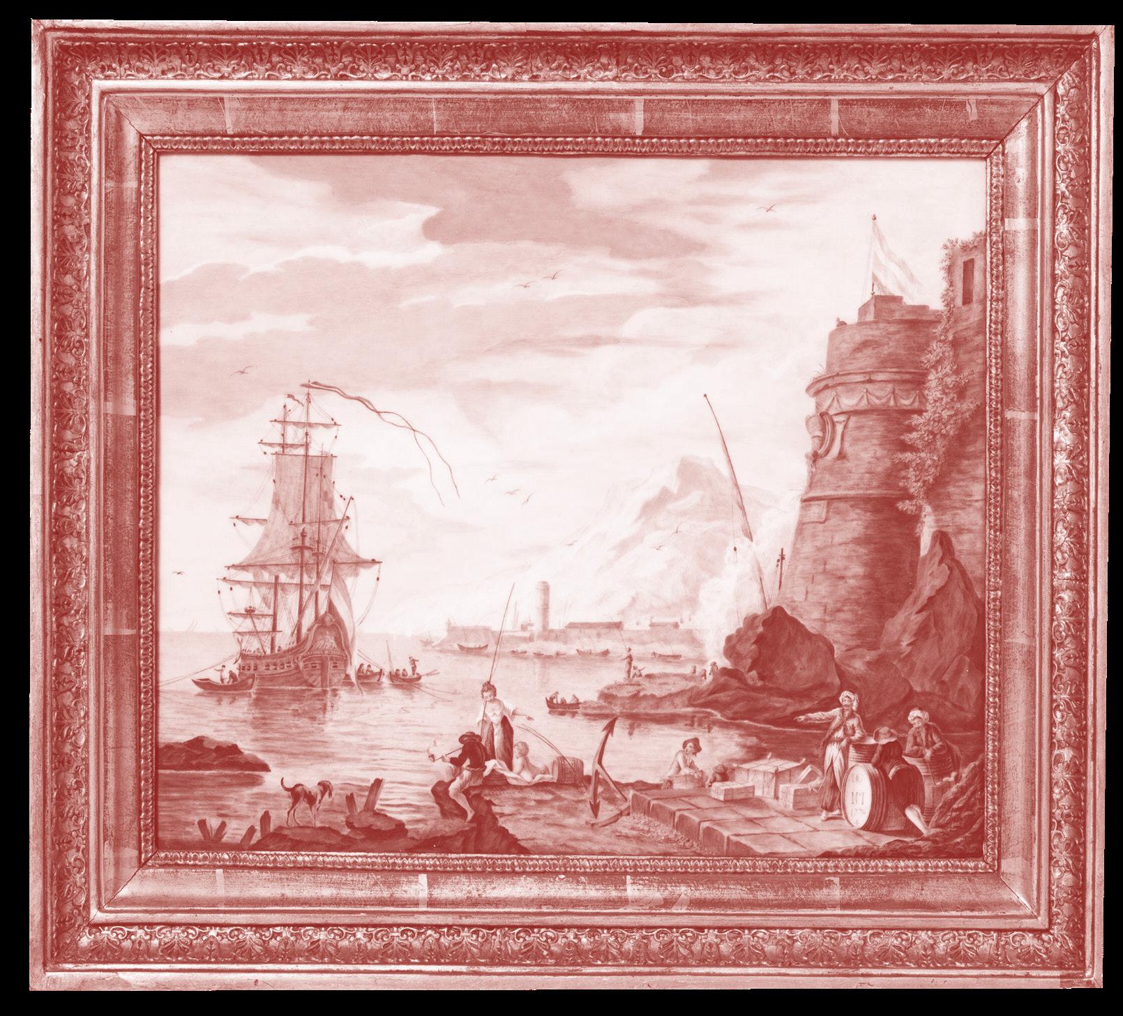


 Image Credits: Painted Porcelain Plaque 1776, depicting a Seascape of a Dutch ship and cloth ends with bale marks. Possibly based on the painting, Sunrise: Levantine merchants on a quay below a castle, a Dutch man-of-war at anchor beyond Sunset. By CHARLES-FRANÇOIS GRENIER DE LACROIX 1766. Porcelain Plaque, Made by Sévres Factory Victoria and Albert Museum. Accession number: 771-1882
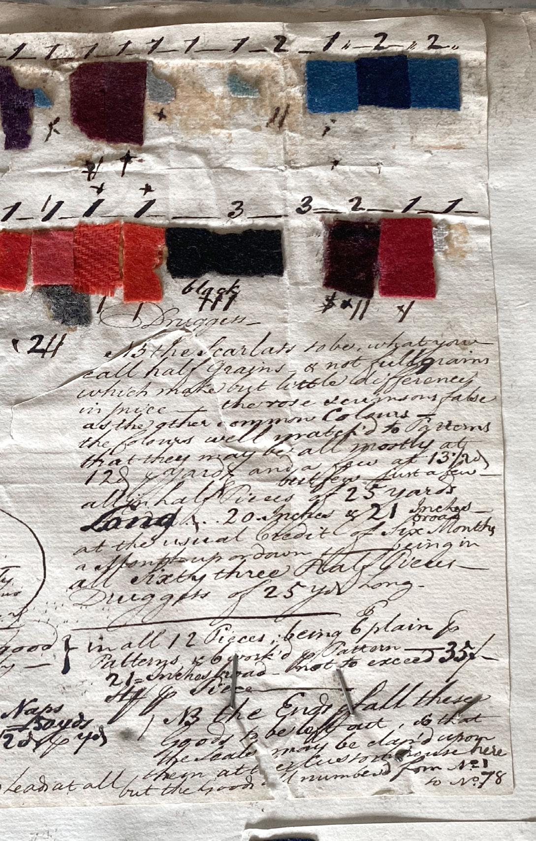
By the mid-eighteenth century, Britain had mastered the art of woollen cloth production and exploited its global trade networks. However, the technical development of woollen cloth is often overlooked in favour of ideas like the introduction of cotton and other new materials. The regional differences in these woollen cloths’ physical design and production are little-known. Therefore, this research explores the provincial characteristics of eighteenth-century woollen cloth by using newly discovered archival evidence from a prominent but often forgotten woollen merchant-manufacturer from the Devon and Somerset borders and questions the design, production, and trade networks used during the late eighteenth century prior
A Flotilla of Fashion
to the industry industrialising.


This research builds outwards from an order book kept by local textile producers Were and Co. Evidence of this nature, which combines cloth samples and commercial information, has often been used to foreground the complexity of mercantile activity in this period. I add to this claim that it provides a point of entry into a much larger community of small manufacturers — dyers, weavers, fullers, spinners, etc. — who were the mainstays of the Weres’ success but are much more obscure in historical terms. I argue that the demand for more variety in cloth was led by the firm trying to maintain its global trade networks while at the same time trying
to curtail the risk to its business during a time of great turmoil, c.1781 to 1826. Indeed, there was an escalation in the variety of goods made before the industry industrialised that needs to be explained and linked to older explanations for technical change. This investigation suggests the diversification in cloth design was also linked to the customer or agent’s demand for new and better colours and styles of cloth for the new fashion market in regions of Europe. This research will also explore ways of illustrating and measuring these findings to identify and understand how this merchant-manufacturer’s business constraints in the production and trade of woollen cloth in the late eighteenth century were resolved.
51
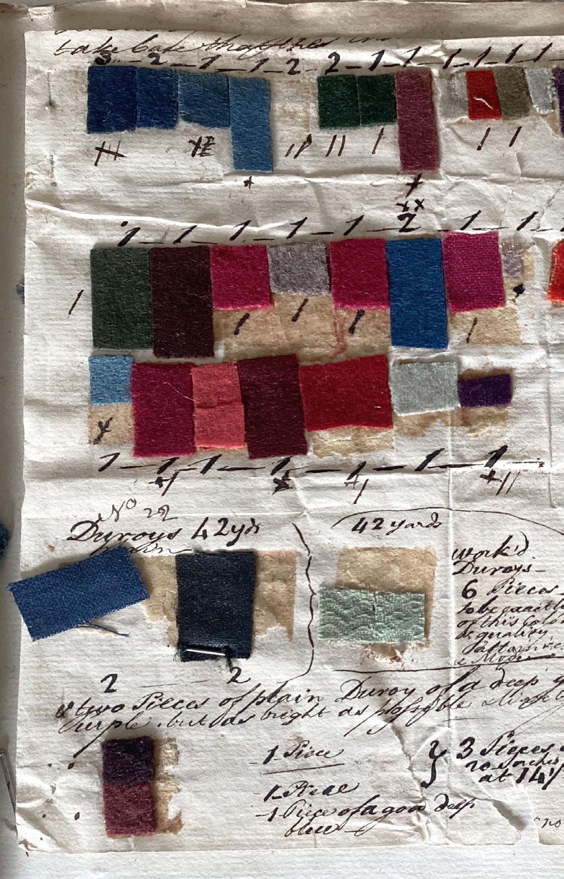
Letter in Fox Family Order Book. c. 1781-1789, Wellington, Somerset, United Kingdom


: to unsettle, disturb, break from tradition—a concept naturally close to the heart of design history. Disruption is the pivot point between tradition and something new, between a thing that’s “always been this way” and a thing that demands to be changed. Through the lens of a single disruption, the design historian can investigate both the static and the dynamic aspects of a genre.
If we think about design history as the history of “things with attitude,” á la Judy Attfield, then the two most important “things" within the category are (1) the paragon of the category, the beau ideal, the prime example, and (2), the wild thing, the disruptor, the one that breaks the genre, changing it into something new. These are things like Brunelleschi’s dome, the suffragette movement, the invention of iron, the at-home fitness tape—all knock something loose in their field, something which can never be put back the same way again.
In the history of designed things, there is constant play between these two poles. The gradual shift from disruptor to paragon occurs over and over again throughout design cycles—someone in the Ancient Near East smelted the first iron tool (disruptor) and begat the Iron Age (paragon); Shigetaka Kurita dreamed up the first emoji and changed the way humans communicate. This cycle between Design and Design is the crux of design history, the life force that keeps alive the field.


In this section, the writers explore some of the many and varied disruptions begging investigation: Georgie Hobday’s monkey-fur capes, Cate McCowin’s Depression glass sets, Florencia Denti’s painted rotulos. Each of these disruptions stands both within and without of the category to which they belong; all are “in-between” in some essential way, and all prompt a period of in-betweenness in which the rest of the category shifts to reconstitute itself around them. In that way, each of the designed things or designers in this section has made history—has made design history, to be more specific—and as such must be investigated as we chart the “whys” behind each of these wild things.


 Words by Caroline White.
ho b A Es


This dissertation has been written with the aim of exposing ways in which masculinity was communicated, represented and understood through the crafting of the masculine form in the early nineteenth century. The focused date span is from 1800 – 1825, however a contextual buffer of such has also been key to this study.
The body of work is split into three main chapters: the Social Body, the Royal Body, and the Geographic Body.Each explores how foundation garments were used to shape the male figure in order to communicate coded messages, with each chapter covering different intentions. The first covers individual interactions between social familiars, how a language was developed through the bodily rhetoric and the ideals of celebrity. The second presents a case study on the careful crafting of George IV and what the shape of a royal figurehead could communicate and represent for the health, future and priorities of a nation. The third examines the mass manipulation of flesh as a political device: how the standardisation of silhouette aided the military
within the context of the Napoleonic wars and the integral creation of a patriotic image. Each study compares primary source imagery such as contemporary satirical prints and portraiture. The intentions of each are assessed and compared to surviving evidence, such as a paper ‘waist control belt’ created for George IV, as well as clothing and tailoring account ledgers. Social theologists such as Foucault, Elias, and Davidson are examined and their ideologies applied to arguments such as the authenticity of material reproduction and mass individuality.
The nature of the formation of masculinities through the use of foundation garments is, in itself, contradictory and full of irony. The popularity of the dandy in early nineteenth-century society is intertwined throughout, and the cyclical nature of fashion is an ever-present reminder of the fragility in the representational value of gender.
Embodying the Dandy falls perfectly into the field of DISRUPTION. The piece explores the disruption of gender norms, the disruption of ‘proper’
society and the disruption of monarchical power through an object that appropriately disrupts the natural form, posture and performance of the human body: the corset.
My educational background is far from historically based — I graduated in 2019 from London College of Fashion with a First in Fashion Contour (lingerie and swimwear design) and until 2021, worked within the luxury lingerie and fashion industry, quenching my thirst for design construction. Following a spontaneous (COVID 19/winefuelled) last minute application to this course, I’ve had the opportunity to explore aspects of historical dress and foundation garment construction through material culture and social studies: areas I had never considered beyond the stitching of a seam or the wiring of a cup. Following this MA, I am now working for a luxury fashion company as a quality-control specialist assessing the construction of mouthwatering vintage designer pieces, with hopes to pursue a PhD.
The Metropolitan Museum of Art, Laceing [sic] a Dandy (2022) <https://www.metmuseum.org/art/collection/search/384283> [Accessed 15th November 2022].

58
Embodying the Dandy:
How Early Nineteenth Century Male Foundation Garments Constructed, Shaped and Supported Perceptions of Masculinity.


59
M Li a SpreaDBo o g


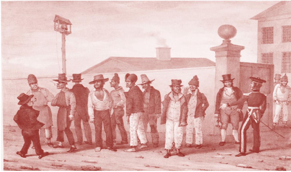
Orange is the New Outback: Government-issued Convict Clothing as Uniform in 1830s New South Wales
 28.6 cm, sheet height 22.2 cm x width 28.6 cm. Canaberra, Australia, The National Gallery of Australia 95.344
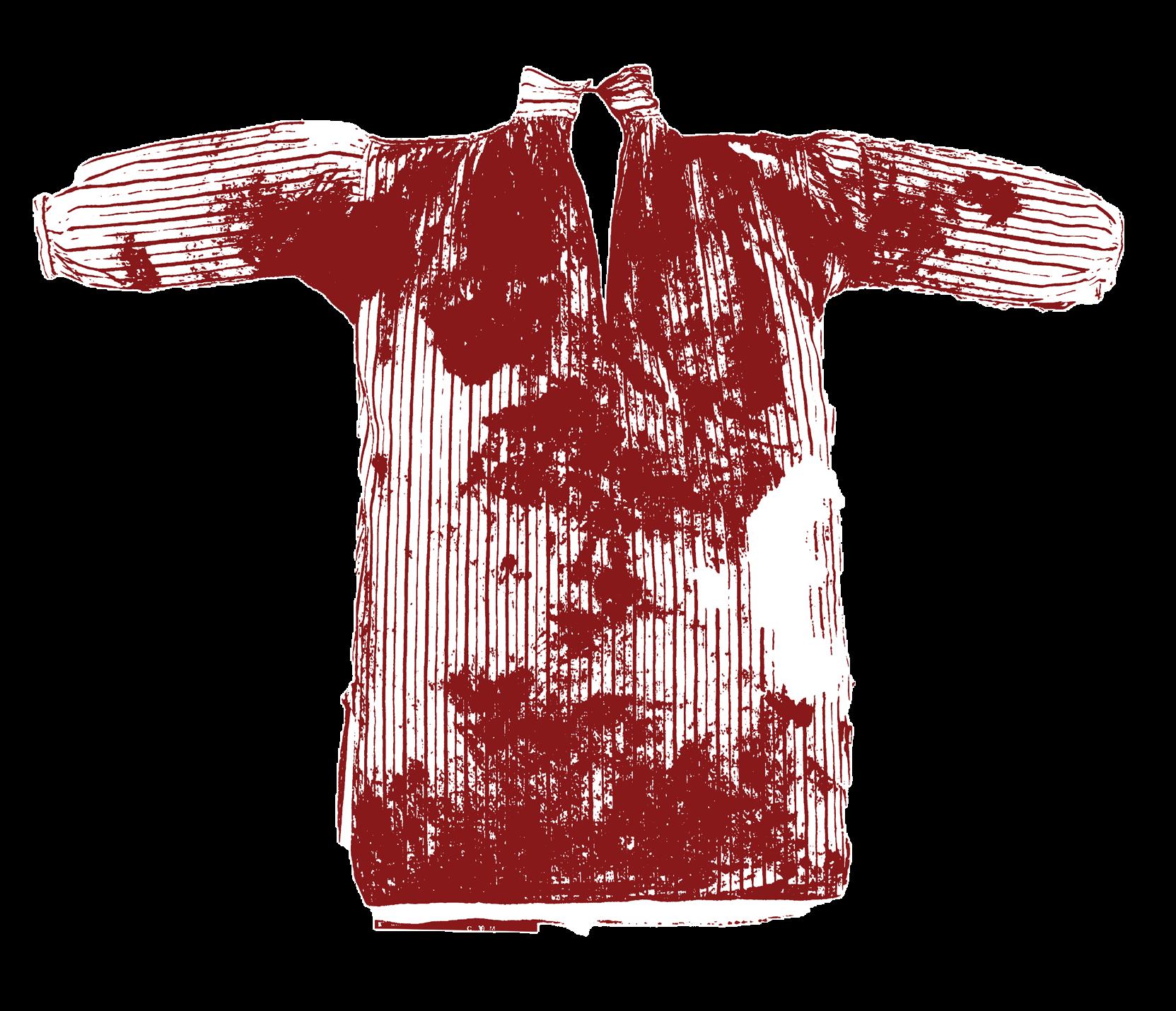
Above: Unknown maker, Convict Shirt, c. 1840. Striped cotton, with ‘BO (and broad arrow)’ (Board of Ordinance) stamp, recovered by restoration workers from Hyde Park Barracks. Australia, Sydney Living Museums HBP/UF51.
Uniforms utilise clothing’s ability to convey personal identity as a way to distinguish the wearer from wider society and signify their belonging to a group, subsequently implying their alignment with the roles or opinions expressed by that group. As such, uniforms can be used as a method of control and, specifically in the case of prison uniforms, of punishment and dehumanization. The public labour transported convicts were forced to do in colonial New South Wales meant that convicts were a very visible part of life public life, with clothing being one of the main methods of distinguishing the free from the imprisoned. My dissertation argues that the British government utilised convict clothing as a social tool of distinction, control and punishment when issuing clothing to the convict men labouring in the public works in 1830s New South Wales.
Many academics have suggested that unreliable shipments of clothing during this period pre-
vented the creation of a cohesive convict uniform. My dissertation challenges this by viewing the uniform as a flexible series of symbols displayed through clothing indicating the wearer’s convict status, rather than focusing on the necessity for complete uniformity of dress. As the concept of a convict uniform was still in its infancy during this period, a cohesive image of what convict clothing should look like did not exist as it does today. To ascertain the importance of design in the purchasing and issuing of clothing then, as well as the compromises when challenges occurred and the subsequent interpretation of convict clothing by the wider public, I consulted government correspondence, contemporary newspaper articles, and contemporary depictions of convicts. Ultimately, my study takes a rather broad view of what constitutes a ‘convict uniform’ in that, so long as the wearer could be identified as a convict, the actual uniformity of convict garb was less significant. In this way, al-
though the government’s aim to consistently issue uniform clothing rarely successful, consistent elements such as the fabric used or the ‘broadmarks’ signifying that the clothing belonged to the government became shorthand for convict status to the external viewer, and thus could be considered a uniform. My dissertation, therefore, calls for a re-examination of this subject beyond our modern understanding of a convict uniform to recognise the place of intentional design in the clothing issued to convicts during this period.
My dissertation disrupts the narrative that supply was too inconsistent for design to play a significant role in the government issue of convict clothing in 1830s New South Wales by re-examining convict uniform as a collection of recognisable sartorial symbols, rather than a consistent, cohesive outfit.
Email: melissaspreadborough@ hotmail.com
F O EN C A TI


Rotulos: Understanding Mexican Popular Art and Design and its Relevance in Today’s Market
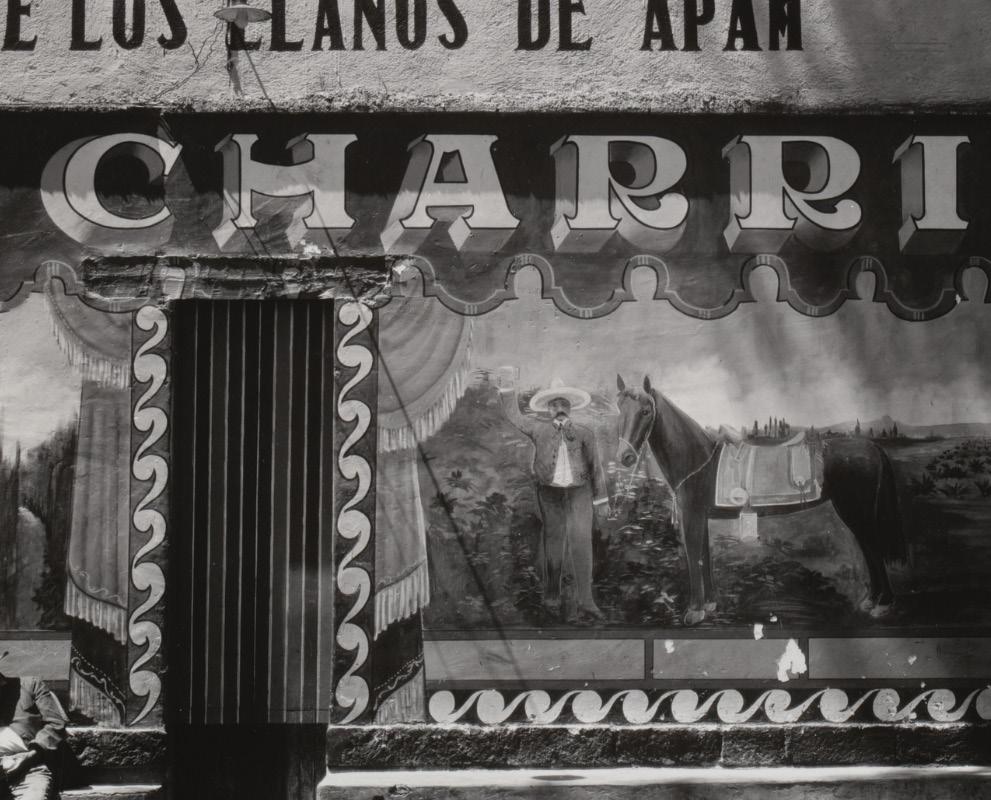 Image Credits: Edward Weston Pulgería, Mexico 1926 MoMA collection: https://www.moma.org/collection/works/53578
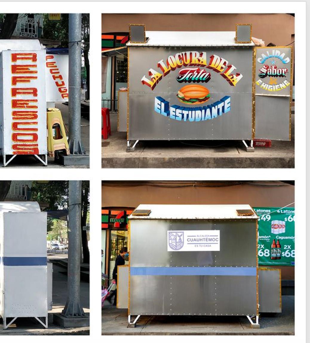
Hand-painted commercial signs, better known as rotulos in Mexico, became common after the Mexican Revolution ended in 1920 and businesses started trading again. They are used as a visual aid to sell products, advertise, or simply embellish storefronts. Though anonymous, many of these signs display great artistic skill. Sign-makers are not instructed in the canons of academia, they acquire their knowledge as an apprentice of someone who has been working in this field for years and they normally address customers from a similar social background as the maker. In the contemporary urban landscape, literally covered in logos and advertisements from big corporations, rotulos stand out because of their humorous messages and colourful letters and caricatures.
Rotulos are part of the vernacular language with which people offer products and services and express themselves; in addition, they represent a living catalogue of what has taken place in the city — from a record of what people eat (gastronomic history archive) to an urban navigation aid for those who don’t speak the language or know how to read.
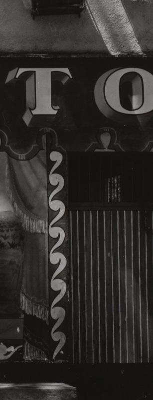
This signage has permeated the art world. Contemporary artists have retaken not only their iconography, typographies and chromatic language but also the

medium from which they come. Many photographers, designers and creatives have captured the beauty (or lack of it) of the rotulos, which are key elements of the cityscape of Mexico. Today they are appreciated as nostalgic elements that capture the daily spirit of a Mexico that is dying out in the digital era. And despite being painted on street stalls, rotulos are not ephemeral murals. Rather, they are painted to last a lifetime — or for at least as long as the business endures. For this reason, the signs are also a constant source of employment, needing to be consistently re-painted and restored. In the long term, this method is more resistant and more sustainable than digital printing.
Sign painting is not only an essential part of Mexico City’s public space but also an important component of its visual culture. The rotulos are an expression of popular art that should be studied, protected, and documented. Were the signs to be eliminated, not only are their authors insulted and the stalls they decorate depersonalized, but we also are deprived of the right to a diverse market that is inclusive and representative of the popular sector of Mexican society. This dissertation traces the history and identity of this dying trade and examines the more recent challenges affecting rotulos’ production, consumption, and future.
63

Before and after the invention of the Cuauhtémoc administration’s intervention @re.chida on Instagram Mexico City, 2022

66
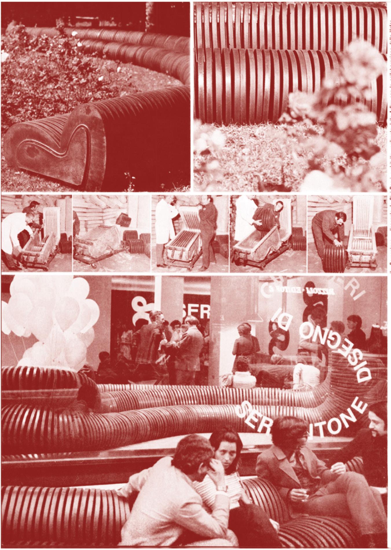
Images of the spread for Cini Boeri’s ‘Serpentone’, Domus Issue 505, December 1971, page 40. Domus Archive
B a R ce A - of


Cini Boeri: An Under-Represented Force in the History of Design


Cini Boeri (1924-2020)was a prolific Milanese architect and industrial designer. Over her seventy-five-year career, Boeri produced an enormous body of work in the field of industrial design and architecture. Her contribution to the design movement of post-war Italy was extensive and ground-breaking, but despite several design industry awards, Boeri never received anywhere near the same level of notoriety as many of her peers. While not dismissed by industry, her innovative contributions to the Italian modern design canon and their influence on her contemporaries never attained the broader recognition of other designers of the period.
This absence or omission begs the question: was Boeri overlooked because she was a woman and/or because she was not as self-promotional as her male colleagues? My methodology for this dissertation relies on a selection of case studies of her industrial design work and brings together many original sources — some translated into English for the first time — including Boeri’s own published writing and personal accounts from interviews. This primary research, along with relevant historiography and secondary sources, results in a compelling argument for Boeri’s novel contribution as an industrial designer and innovator in the history of design.
67
J a D O


Caribbean Hues: Nadinola Deluxe, Carnival Queens and the Performance of Beauty

68
Image Credits, above: Ten types - One People Beauty contest. This double-page spread was photographed at one of the last remaining cannons at Fort Charles, Port Royal Jamaica, in 1955; it was historically owned by the United Kingdom in the colonial period of the late 17th century until emancipation was granted in August 1962. Each bears the same halter-necked swimsuit, delicately curled tresses and pointed toes.‘Ten Types- One People’ beauty competition image originally seen in Rochelle Rowe, Imagining Caribbean Womanhood (Manchester: Manchester University Press, 2013).But Figure 2 was published in Peter Abrahams, Jamaica: An Island Mosaic (London: HM Stationery Office,1956) Rowe, Imagining Caribbean Womanhood. P. 120.
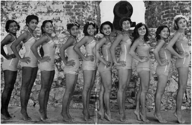
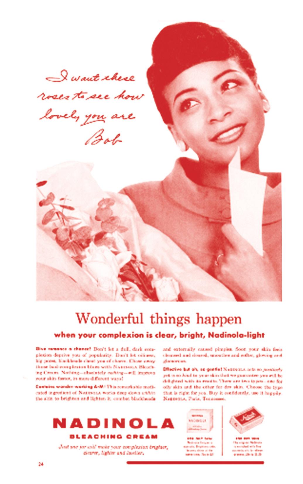
Image Credits, opposite: Nadinola ad from Ebony Magazine. Nadinola Bleaching Cream ‘Wonderful things happen’. This advertisement for Nadinola Bleaching cream creates an environment that would indulge the practice of skin bleaching by gently implying how life could improve if the user had a lighter skin. This is represented in a love note and flowers stating ‘ I want these roses to see how lovely you are’ implying that the model’s loveliness can only be seen when she interacts with Nadinola. Without using the product and becoming desirable she would not be receive affection from male counterparts. This advertisement suggests that desirability is malleable but under very specific guidelines.
This dissertation project uses oral history and an object-led approach to research the cultural ecologies in Jamaica and Britain, determining the persistence of skin bleaching within the Caribbean diaspora. This project includes case studies of the landscape of Jamaica and Britain starting in the 1950s, relating to race, beauty standards, ethnicity and image in order to contextualise identity within these environments. The first case study centres in Jamaica, introducing the ‘Ten Types–One People’ beauty contest, and later the development of ‘Miss Ebony’ and the power of media
outlets that orchestrated the upkeep of the image of Blackness alluding to undesirability.
The second chapter follows the production of Nadinola Deluxe and the advertisements showcased in Ebony & Flamingo magazine that attributed to the extensive use of bleaching creams and agents. The final chapter follows the journey of Caribbean immigrants once they arrive in Britain and the various constructs that inform their identity which is documented in the West Indian Gazette, which tried to create a new formation of beauty for dark-skinned people in the development of the Car-
nival Queen beauty contest.
This dissertation fits into the theme of Disrupt, as it challenges the Eurocentric beauty standards that have been long-established throughout colonised countries. It allows the reader to distinguish a new perspective on beauty and how it can be mobilised as a performative feature but also a distinct factor of identity especially for Black women.
Contact details:
jade.lindo@rca.ac.uk
C A c C OW

‘Depression Glass’ and the Design Agency of Women as Consumers


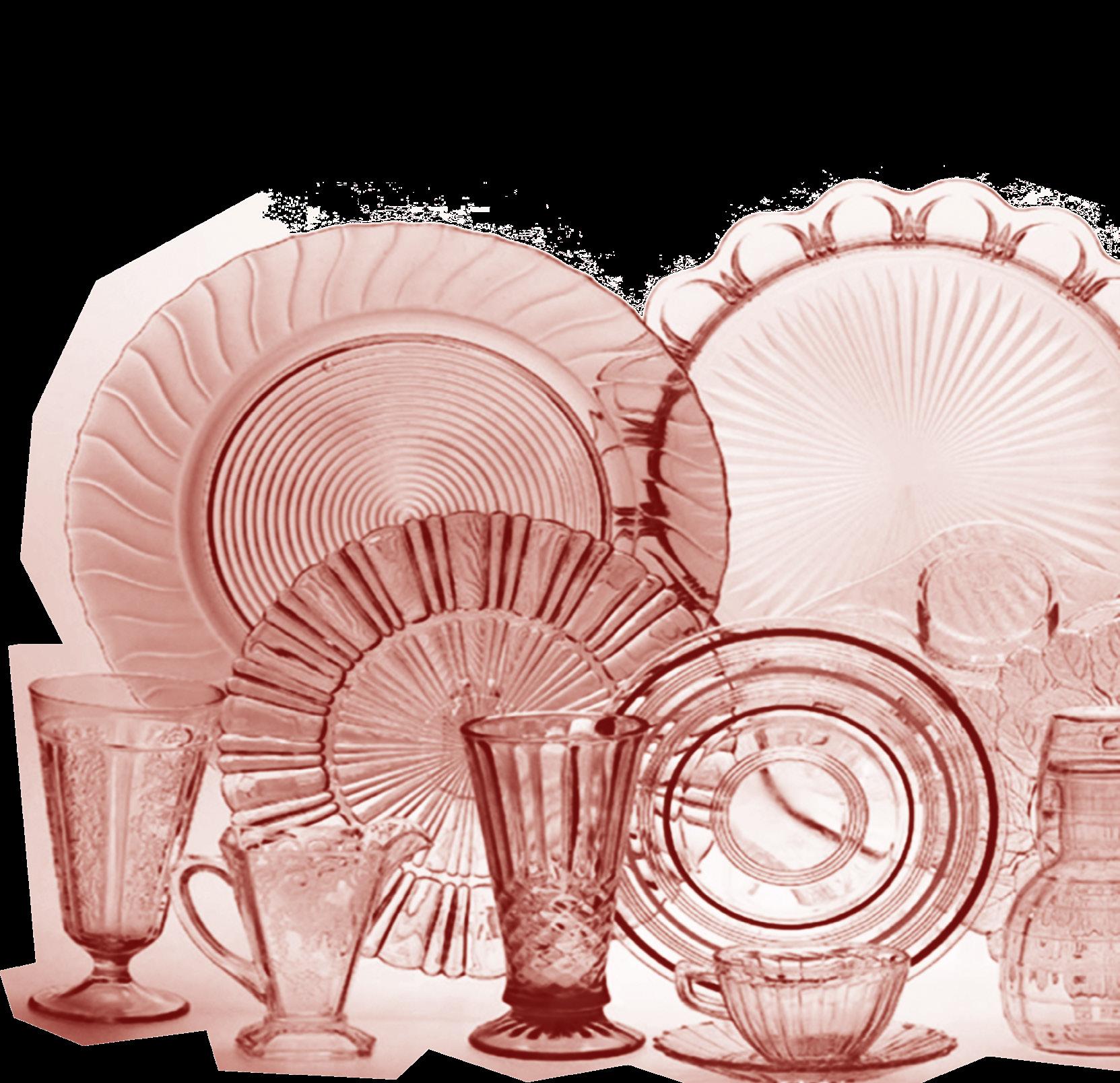

The focus of this dissertation is on what is known today as ‘depression glass’ — the pressed, mass-manufactured functional glassware sold cheaply or given away as premiums for other goods during the Depression years in the United States, from 1929-1939. Depression glass is an extremely popular collector’s item and a beloved area of United States material culture. Despite its popularity, and the circulation of information about it in collector’s guides, there has yet to be a thorough academic examination of depression glass. By using Depression-era functional glassware in the United States as a lens through which to view
patterns of female consumption and homemaking, the following questions can be explored: how did the consumption of depression glass inform its production and design? And to what extent did the glassware’s female consumers have agency over its design? Establishing women as the primary consumers of household goods and thus vital to the economy prior to and during the Great Depression provides the important basis that women consumers had influence on the production and design of tableware. This agency that women consumers had on the design of tableware is translated to women’s agency over the design of depression glass, examined through the glassware’s design, production, consumption, and mediation.

I am disrupting the current field of design and consumer history through my prioritisation of both depression glass, a relatively little-researched area of material culture, as well as highlighting the design agency of women as consumers. catemccowin@gmail.com @tangiblehistories

71
Image Credit: Cover. Barbara and Jim Mauzy, Mauzy’s Depression Glass, (Atglen, PA: Schiffer Publishing, 2011)
C R O C h
Embodying Rebellion: Exploring the Constructions of Gender and Lesbian Self-Identities through Leather Fashion within the 1980s Post-Punk era of London
My dissertation is intended to investigate the constructions of lesbian, specifically ‘dyke’, self-identities through leather fashion during the 1980s postpunk era of London and using the group The Rebel Dykes as a case study. Beginning with the constructions of lesbian ‘space’ and ‘place’, there will be an exploration of leather being worn in different settings, such as the private and public spheres, which will lead the discussion into the selfmade, ‘dyke’ specific, fetish club nights called Chain Reaction. Additionally, there will be a discussion on the semiotics of leather fashion, specifically its connections to the alternative sexual practice of sadomasochism, and its connections to negative connotations, such as fascism and Nazism, and how this affected ‘dyke’ visibility throughout this period. Lastly, there will be an incorporation of personal accounts from
Billy Goodfellow, a member of The Rebel Dykes, from our oral interview together that will greatly strengthen the overall analysis on ‘dyke’ fashion identities and provide a valuable insight into the lived experiences of life during this period in London, thus bridging the gap between researcher and those lives that are being written about.
I’m Lucy and I specialise in fashion history, specially investigating identity through clothing and how symbolism through this medium helps construct these identities, both personal and social identities. Previous work of mine include: exploring the change in design of corsets through the influence of fetishism and female empowerment and uncovering the western influence on 19th century Japanese kimonos and how their symbolism changed as a result, as well as many other topics. I
also helped to create a group exhibition with my friends, titled Black Botanical: The Root of Caribbean Medicine and collaborated on a group heritage publication titled Old Home Zine, which included creating posts about various topics such as a feminist perspective on natural heritage. In my personal time I created a blog and Instagram titled The Fashion Historian where I have a collection of articles varying from hip-hop artists’ influence on jewellery design, the artistic use of prosthetics in creating personal fashion identities for those differently abled, as well as many more topics
Personal email:
lucyroche4@gmail.com


RCA email:
10000276@network.rca.ac.uk Instagram: @thefashionhistorian_ .
72
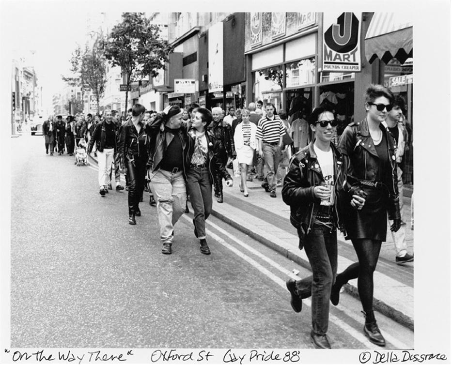
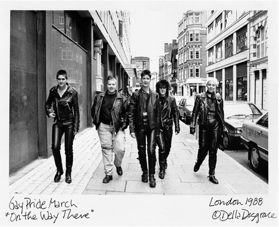
Black and white photograph taken of the Rebel Dykes at the Gay Pride March in London in 1988 (Photographed by Della Disgrace). This is a screenshot taken from the Rebel Dykes documentary film (2021) by Lucy Roche, however it can also be found on Del Lagrace Volcano’s [Della Disgrace] website: https://www.dellagracevolcano.se/
Black and white photograph, taken in 1988, which depicts punk ‘dykes’ dressed in predominantly leather clothing. An interesting aspect to this image is the apparent display of ‘dyke’ visibility within the public sphere. These are some of the themes that are unpacked in my dissertation. (Photographed by Della Disgrace). Image credits as above.

73
Chic Simians: Monkey Fur, Sexuality, Power Dressing 1910-1940


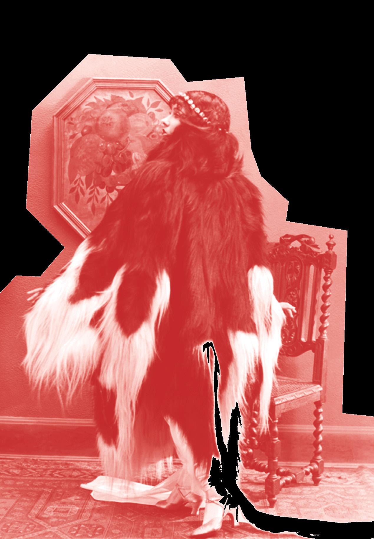

or g O b a
Fur is a highly emotive and divisive material. Arguably more than any other fur, monkey fur elicits visceral reactions of horror, disgust, and unease. Our proximity to simians rendered the notion of wearing their skins particularly perverse and abhorrent. Despite these aversions, monkey fur emerged as one of the most fashionable furs of the period 1910-1940, indeed the fashionable fur par excellence of 1922.
Monkey fur was not a staple fashionable fur, its popularity oscillated with the whims of fashion. Reactions to the materials fashionable status are uniquely poised to elucidate particular cultural concerns and anxieties. Monkey fur’s evocation of African primitivism for Western consumers played a part in both its rejection and allure.
Monkey fur’s materiality is near identical to human hair. Both monkeys and hair had complex and uneasy relationships to notions of racial hierarchies in Britain during this period. Monkey fur brought these notions to bare on the fashionable arena. Further, the fur’s popularity ascended concomitantly with the increasing hairless norm of the fashionable female body. As female body hair became increasingly abject, fashion design embraced a material almost identical to human hair. The hairlessness of modern femininity starkly juxtaposed the hairy style statement of fashionable monkey fur; hairless mod-

ernism meets hairy primitivism.
Fur’s erotic multitudes and instinctive libidinal associations, coupled with the complex entanglements of monkeys with unbridled sexuality and lascivious desire contributed to the sex appeal of monkey fur fashions. The material’s erotic charge was further reinforced by celebrity and its unique use in glamorous Hollywood costume.
Integral to the history of fashionable monkey fur is Elsa Schiaparelli, whose idiosyncratic use of the material powerfully evoked Surrealist concerns of displacement, and the Freudian influence of the uncanny. Schiaparelli’s use of monkey fur was a decadent effrontery, a reclamation of the materials connotations of horror, cruelty and disgust; monkey fur as a bold assertion of outré fashionable femininity.
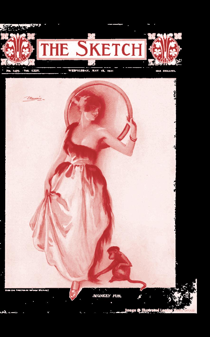
75
Image Credit: Opposite page: Gloria Swanson in a hyperbolic monkey fur cape in 1922. Above: A tentative touch. Fashionable monkey fur feature in The Sketch 1922
Where are historians? The romantic image of dusty archives, papers shuffling, and an academic with their nose in a book is neither realistic nor helpful for anyone. The ‘History as Public Practice’ unit encouraged us to consider the historian’s position in outside of academia: where does history of design integrate into wider society? Alongside the research you have been reading about here in inbetween, we have been creating and contributing to public-facing projects to educate, inspire, and generate conversations around the history of design. On the opposite page are just a few of the projects we have engaged with in the process of finding what type of design historian we are and what social relevance our work has.


76
ary 2023, organised by Phoebe Fielder and Sophie Arp.

‘Black Botanicals: The Root of Caribbean Medicine’ curated by Jade Lindo, Wiktoria Kijowska, Lucy Roche and Sophie Seeyave


100 Days of Groceries, a community inspired exhibition by artist Neeli Malik @vegetable. peeli Assisted in set up and event hosting : Phoebe Fielder
Rowan Everard, Grace Santry, and William Seung curated an exhibition at the RCA about queer spaces for women in London with the support of the programme, ‘Queer They Are’
‘The Power in Small Things’, a 2-day online ‘Across RCA Workshop’ designed and run by Alice Conibere and Cate McCowin, supported by Florencia Denti
A student led zine project bringing a creative lens to discussions on history and heritage studies. @oldhomezine created and led by Molly Gisbourne. Collaborators: Lucy Roche, William Seung, Isabel Alonzo, Cate McCowin, Rowan Everard, Casey Meyers, Caroline White, Natasha Dodwell-Adams
Wiktoria Kijowska - Design History Society Ambassador
‘Making London Porcelain’; part of this V&A CapCo Project involved 6th formers re-creating early porcelain recipes and co-producing an exhibition at Stratford Library. Alice Conibere, Cate McCowin, and Grace Santry were the students supporting the V&A Team on this project.
77 In-between Symposium Febru-

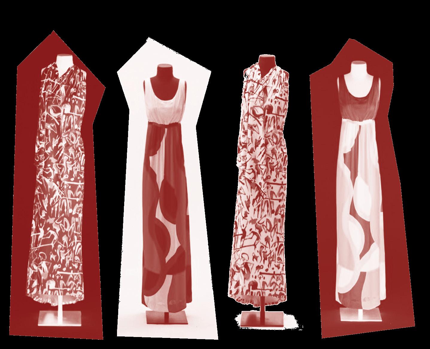
78
Con L io


 BY SARAH CHEANG AND SPIKE SWEETING
Homi Bhabha writes that ‘the “Beyond” is neither a new horizon, nor a leaving behind of the past … Beginnings and endings may be the sustaining myths of the middle years.’2 What he alludes to here is the condition of being in-between two positions of cultural and temporal difference, in an complex and unfixed state of identity. However, this is not to say that research conducted by this cohort of students has no identity. Far from it. Distilling the work on display shows a commitment to engaging with the inequitable legacies of (Britain’s) empire, the ‘liquid’ modernities ushered in by digital and biological capitalism, the elaboration of identities through performance and the use of product design as a mechanism to explore underrepresented communities.
What sits behind our work as design historians is not always visible but deserves reflecting on. Curiosity — the urge to go off and discover things in far flung archives or arrange interviews with far out interlocutors — requires supercharging through transformative experiences that enlighten us, reshape our understanding of the world and sharpen an interventionist urge. In the best kinds of learning experiences, all endings become the beginning of the next breath-taking adventure.

79
2 Homi K. Bhabha, The Location of Culture (London: Routledge, 1994) p.1


 BY SARAH CHEANG AND SPIKE SWEETING


 Image Credits: Photos of final scenographic model by Grace


 28.6 cm, sheet height 22.2 cm x width 28.6 cm. Canaberra, Australia, The National Gallery of Australia 95.344
Above: Unknown maker, Convict Shirt, c. 1840. Striped cotton, with ‘BO (and broad arrow)’ (Board of Ordinance) stamp, recovered by restoration workers from Hyde Park Barracks. Australia, Sydney Living Museums HBP/UF51.


 Image Credits: Edward Weston Pulgería, Mexico 1926 MoMA collection: https://www.moma.org/collection/works/53578


 BY SARAH CHEANG AND SPIKE SWEETING


