

OUTDOOR LIVING


ENGAGE YOUR SENSES
Individuality and personality define luxury living. Unexpected layouts with a tailored and eclectic mix of shapes, colors, and textures. Going bold while also embracing the rich tones of nature. That’s where Seville Home’s local expertise shines. And it’s available to homeowners and professional designers alike.
Begin your home transformation or next design project with us today.


 Kimberly Karen Becky Elizabeth Carrie Dave Meredith
Your Seville Home Designers

At Seville Home, enjoy:
• Boutique-level service combined with an expansive in-stock collection
• Refreshed Bernhardt Interiors Boutique exclusive to Seville Home in KC
• Significant retail savings from the most celebrated American furniture makers
• Generous advantages for professionals through our Designer Partner Program
Designer Partner Program details @SevilleHome.com/Partner


 Exterior Shades


HEALTH BENEFITS
PREVENTS

FLUSHES


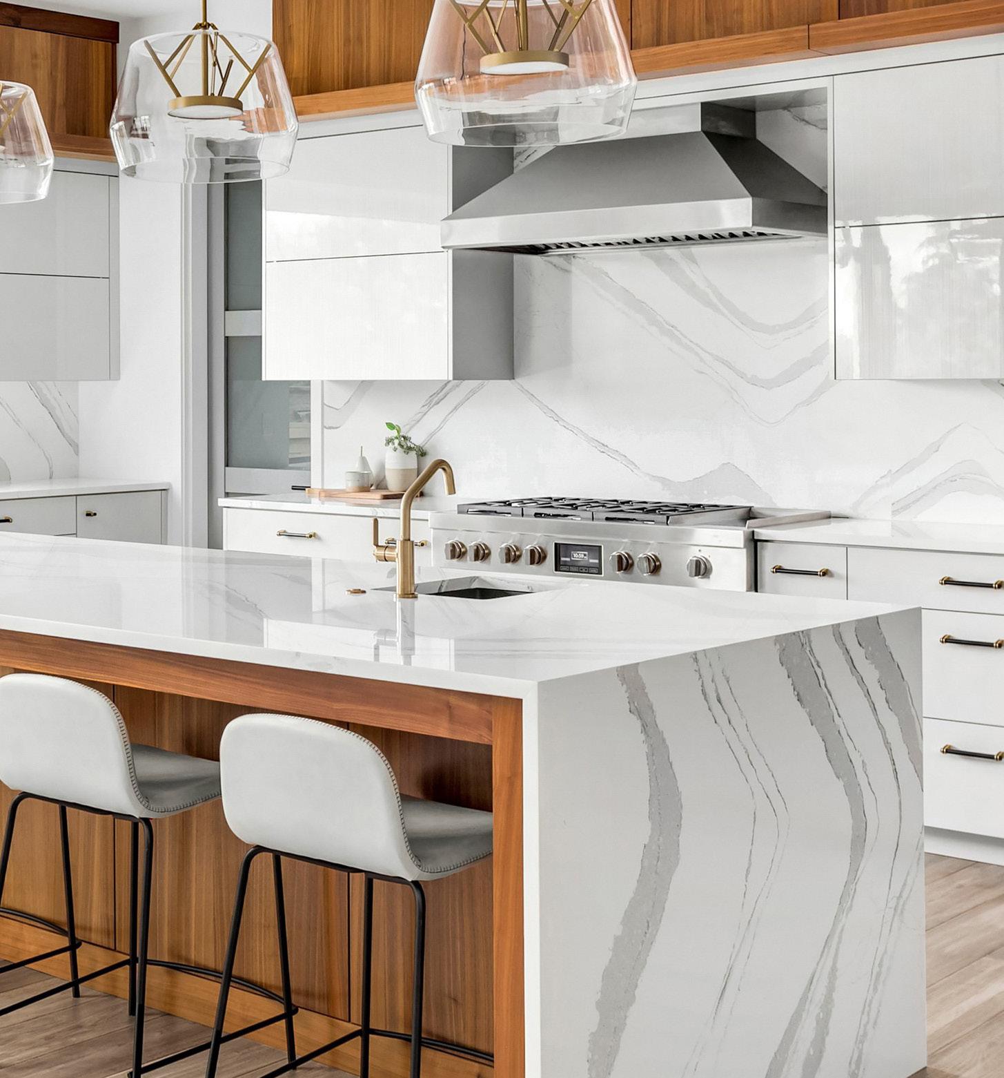
QUALITY STONE FOR KC’S FINEST HOMES!
Countertops | Backsplashes | Wet Rooms
The finest selection of Granite, Quartz and Quartzite imported from Brazil and other parts of the world.







The Sunbrella® Custom Window Collection introduces draperies and shades built with Sunbrella strength and style. Our curated collection features a range of color palettes, an array of textures and styles to elevate any space.






WELCOME TO ROCKTOPS!
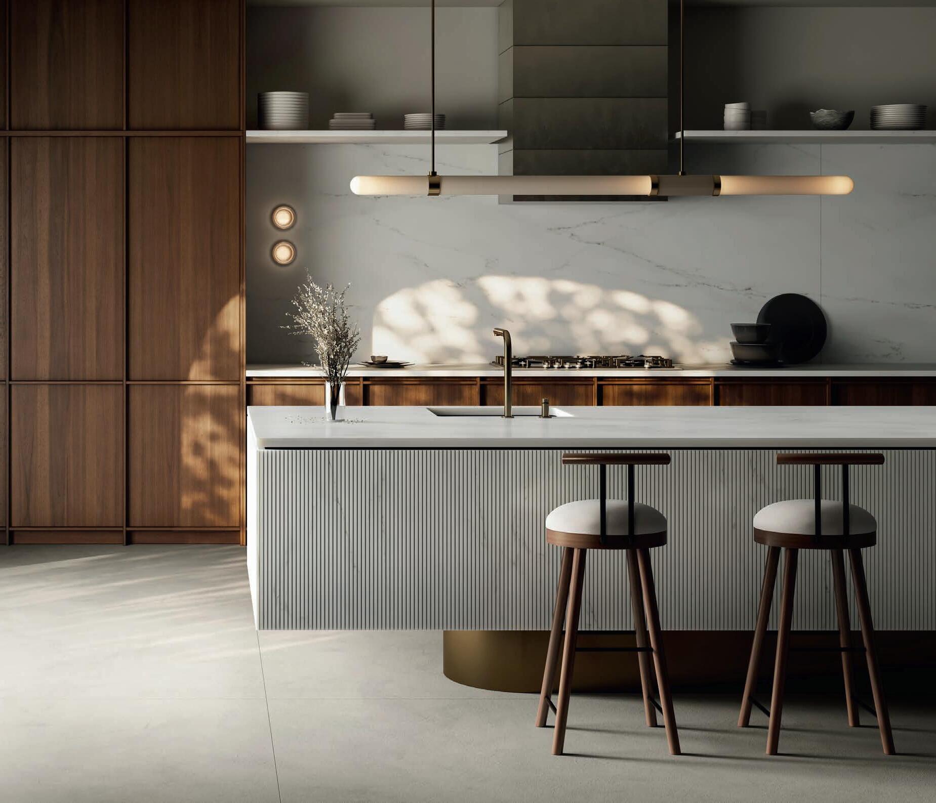
Sure, we have beautiful granite, quartz, marble, and quartzite! But that’s not what makes Rocktops awesome. Our people do. Good, talented, honest people who genuinely love making Kansas City countertops look amazing. In addition to our remarkable products and dedicated team, we are proud to announce that we are now serving the Kansas City metro area with both our Olathe and Lee’s Summit showrooms. Further enhancing our commitment to bringing exceptional countertops to this vibrant community. Come say hi!
ROCKTOPSKC.COM 1140 S. Enterprise St.
913.782.0802
2890 NE Independence Ave. Lee’s Summit, MO. 64064
816.272.0526



IN-PERSON DESIGN SERVICES VIRTUAL DESIGN SERVICES


226 Heart Transplant
An impressive design team collaborates on the modernization of a Lake Quivira home with a glass-walled, vaulted volume at its core.
68 SHOP LOCAL
Find your outdoor outfitting inspo in these fun and functional items.
80 LIVE + STAY + PLAY
Deep diving at the KC Zoo’s new Sobela Ocean Aquarium; splashing around at Lake Olathe’s revamped beach.
98 PAST PERFECT
Two historic limestone buildings become a new hotspot for Black-owned businesses at 2000 Vine.
108 COMMUNITY CULTURE
Lake lifestyles across the metro.
120 CREATIVE TYPE
Landscape architects transform problem properties.
130 KITCHEN + BATH
Black-and-white glam from Lemonhouse Interiors; a Starr model home finds echo and flow in its material palette.

196 The New Old
Homoly Design + Build triples the size of a client’s Westwood bungalow yet retains its charming character.
ONLINE EXCLUSIVE
178
Favorite Pair of Themes
Midwest & Co. leads a Leawood home to a sublimely classic-yet-cozy place.
182 “I Do” Landscape
Olathe acreage becomes a picture-perfect wedding backdrop with landscape tips from Creative Outdoor Spaces.


188 On Point
A Lake Winnebago landscape rules the shoreline with a master plan from Lorax Design Group.
148 ROOMS WE LOVE
A modern room addition on a French Provincial home opens up indoor-outdoor living opportunities; a local designer gets called on for long-distance designing; a Brookside shopkeeper launches interior design services.
206 CAPE COD-METOLOGY
Collected Living Design revives a classic Cape Cod in Fairway with a cosmetic makeover.
216 HARMONIOUS HOME
Stephanie Stroud Interiors hits all the right notes in an extensive redesign for a young, musical family.
236 MODERN ENGLISH MANOR
Female home builder Grace & Nell crafts her personal home with authentic details and modern luxuries.
248 RESOURCES
252 ADVERTISERS
260 SANCTUARY
A renaissance project transforms a Juliet balcony.


 Photo by Matt Kocourek
andrea@mydesignkc.com

If you’ve ever read our staff bios on mydesignkc.com, you will find one commonality: we all say our favorite place to be is outside. I doubt that’s unique to us five; as humans, we are naturally drawn to spend time outside of our homes. For some, it can be as rustic as sitting on a stump around a fire pit; for others, it’s lounging resort-style beside a pool. Both are correct. Only the approach is unique.
As a person who sees all the finest work happening across this beautiful city, the biggest trend in nature (if something so universal and timeless could have a trend) is unequivocally to bring both the inside out and the outside in. We cover our outdoor spaces with protective structures and decorate with potted plants inside. Luxury fabrics and fast-drying foam allow us to upgrade our sitting arrangements for hours of comfortable use under the sun and stars. We install sheetglass windows in our homes that feel like direct accesses we could simply step through. We hang TVs atop fireplaces for the viewing pleasure of either option and place water features just beyond our doors for the soothing sounds of trickling motion.
I’m impressed by the number of area residents whose connection to nature is more than just a patio space but an everyday lifestyle— they choose to live at a lake. Again, a choice arises—which lake —that factors in individual experience and perspective. For instance, some community lakes are mainly for wildlife viewing, such as Cedar Creek’s Shadow Lake; there’s swimming and paddle boarding allowed at The Lake of the Forest in Bonner Springs; and then there’s top-speed skiing available at Lake Lotawana. Which suits you best?
There are many opportunities for a lake lifestyle in the metro—see our lengthy list on page 108—but to snag a house at one of them can only be wrought through tough competition. Best of luck, mates!
Of course, you can always create your own private pond like the Olathe homeowners on page 182 did. But, if you can’t beat ‘em (or join ‘em), follow the crowd to Lake Olathe’s new public-access beach (seen on page 80), where you can swim, fish and rent canoes, kayaks, paddle boards and pedal boats. I might see you there on the giant infl atable challenge course this summer, or rather, actually, just soaking up the rays on the sand.
I’ll definitely be taking the kids to visit the Kansas City Zoo’s new Sobela Ocean Aquarium (page 86) a time or two while they’re out of school.
However you choose to connect with nature this summer, let it be a fusion of comfort and awe. Find the moments of peace, serenity and kinship, and really take them in. I wish you many pleasant mornings filled with bird songs, alfresco evenings with friends and food, and everything sunny in between!
Don’t miss your chance to tour 15 of the region’s finest custom homes crafted by skilled artisans and builders. Proceeds benefit Habitat KC’s ReStore.
BUY HERE:
August 9-11, 16-18, 23-25
11 a.m.-6 p.m.
Tickets: $25


The Ashner Family is proud to present our newest community from the $600s


CUSTOM CLOSETS & GARAGES

KITCHEN SYNC
There is nothing quite as personal as your home. It is one of the purest expressions of your individual style. With endless ways to customize and configure your appliances, Sub-Zero, Wolf and Cove are the ideal choice for more kitchens than ever. Begin your journey to the kitchen of your dreams at Warners’ Stellian Appliance. Our knowledgable specialists ask the right questions to find the perfect match for your needs. And with fair and fast service, our team is ready 7 days a week, catering to your schedule, not the other way around.


Brian
Michael
Nate
EVENT
Brian
VIDEOGRAPHER
1593

EDITORIAL SUBMISSIONS
Designers, architects, builders and homeowners are invited to submit projects. Email andrea@mydesignkc.com with photos
jared@mydesignkc.com
mydesignkc.com/subscriptions
$35 for 1 year (5 issues)
$55 for 2 years (10 issues)
For subscription questions, lost issues, or to cancel a subscription: circulation@mydesignkc.com
mydesignkc.com/digital-issue


Personal Resort
Find your outdoor outfitting inspo in these fun and functional items.
Words by Andrea Darr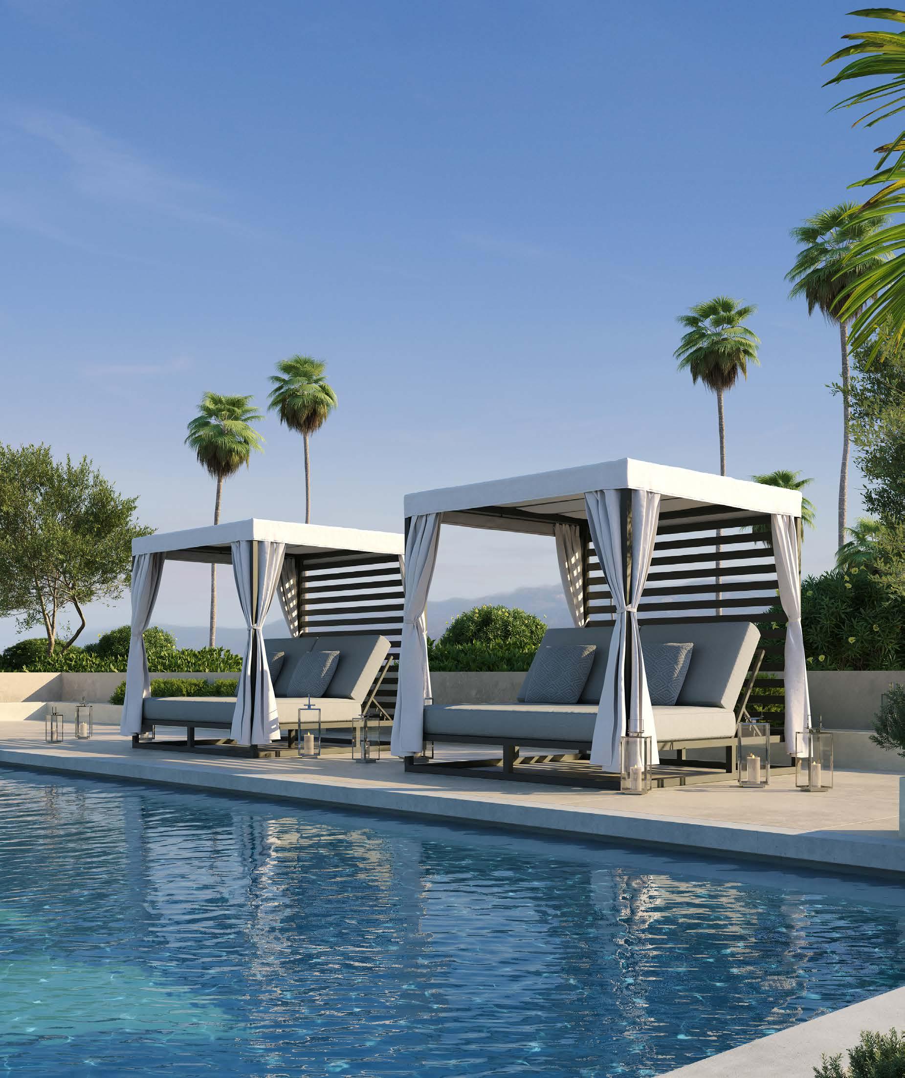
Amini’s carries an ample supply of outdoor furnishings—like this day bed with a canopy, part of the Park Place Collection by Castelle. The contemporary design is weather-resistant thanks to its aluminum construction and acrylic-blended fabric.
Amini's Galleria has long been known as a leading supplier of game tables, rugs, lighting, and indoor and outdoor home furnishings. You can’t miss their golden dome when driving along Metcalf Avenue in Overland Park—and that’s not the only one around. The family business has grown since 1975 when Mack Amini opened the first location with only five pool tables. Amini’s now has three other locations—in St. Louis, Oklahoma City and Tulsa—and you’ll find a family member at each one still to this day.
Their large scale in brick-and-mortar stores as well as online means they have global buying power. You can find similar prices on items out there—but you can’t find their customer service and lifetime technical service. When your pinball machine goes dark, who you gonna call?
10595 Metcalf Overland Park, Kansas Aminis.com

You can’t deny the fringed charm of a striped backyard tent from the Business & Pleasure Co. Set it up in the backyard for the babes—either kind. It sports a UPF 50-rated fabric composed of UV-, water- and mold-treated cotton canvas. Available through West Elm.

If your picnic passes dusk, pull out a lantern and open up another bottle. The teakwood Porto lantern surpasses camping style with its Japanese-inspired simplicity. Lit by embedded solarpowered LEDs, it makes a sunburst pattern of light and shadow through the vertical lines of the cage. Choose teak or weathered wood, round or square form. Available at RH.

Whether you’re traveling 50 feet from your kitchen or 50 miles to your closest vineyard, don’t forget to take your style with you. This waxed cotton canvas tote is insulated to keep your beverages and snacks cool—both kinds of cool. The twobottle bag comes with a corkscrew, a cheese knife and an acacia cheese board.
Find it at West Elm.


Roll up your rug and head out to greener pastures. Or stay put on your patio. Either way, an outdoor rug provides softness underfoot and makes a design statement at the same time. We like the tropical vibes emanating from the Barbados rug from Safavieh. Available locally through Nebraska Furniture Mart and other retailers.


The occasional mid-summer microburst is nothing to be feared if you have the Tuuci Ocean Master MAX. Built to the standard of a luxury racing yacht, it is engineered to resist wind and provide the ultimate shade—and comes with a 15-year warranty to back it up. Choose either a centerpost or cantilevered design with canopy options in several shapes and more than 20 colors. You can even accessorize it with an infrared heater and automated LED lights. Available locally through RH.

Alfresco dinners are the way to go on a summer’s eve. But some outdoor furniture doesn’t look so appetizing. That’s not the case with the organic curves of the Cruz Outdoor Dining Table, a gorgeous piece cut from natural stone—marble. Its warm tones and soft cylindrical base legs will make you drool. Available through Arhaus.

If you’ve ever stood up from an outdoor chair with its lines molded into your irritated skin, you can only imagine how luxurious this Avino Outdoor Lounge Chair could feel. The silhouette is befitting of any dining room, yet its performance upholstery means its perfect poolside. Shown in Aman Terra, this sculptural piece can really enhance your relaxation experience all around. Find it at Arhaus.
If you live in one of KC’s established neighborhoods, you appreciate the timeless designs of the homes in the area. As such, you may appreciate patio furniture that also fits the mold. Product lines from Castelle come in traditional, transitional and contemporary styles and—best—are solidly made. They have incredible cast-aluminum furniture that is high-end, beautiful and will NOT blow away (i.e., heavy weight),” says Ellen Holder of Backyard by Design, a supplier of outdoor furnishings.
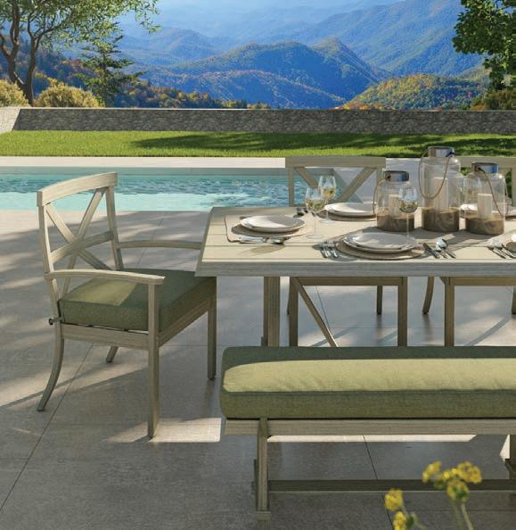


The clean lines of modern houses built today need equally crisp outdoor furnishings to match—like the Luna outdoor sofa set, made of commercial-grade aluminum and powder-coated in white. Cushions come in slate or silver. Available through Yardbird; which ships directly from the factory to your home. Their business model weaves in sustainable practices so you can enjoy your outdoor environment even more.


You’ve probably got a billiards table in your basement right now, but do you have one on your lanai? Made of solid tropical hardwoods, the Cumberland Outdoor Pool Table by Legacy is suitable for outdoor play. The backing is a marinegrade high-density fiberboard, so at least your table is on an even playing field. Still, watch out for sharks around you. Available through Amini’s.


Is it still summer if you don’t have a neighborhood cornhole tournament? How about adding ring toss or tic-tac-toe to your artificial turf rec area? These games and more can be yours from Ledge Lounger. Available locally through Backyard by Design, a visionary landscape design firm that works with clients from planning through project completion—and even to the fun outfitting stage.


It’s going to make you sweat. No need to hide out in the bathroom—grab your little white towel and take the heat right outside your patio door in the five-by-seven-foot NorthStar Outdoor Sauna by Finnleo. And maybe take a friend, too. Available through Amini’s.


Love at First Light

You don’t live in Bali (unfortunately), so don’t put cheap, flammable basketweave sticks in your garden when you can have a glass-enclosed dancing flame from Tempest Torch. It is the high-end tiki torch. Both short and tall posts are available for staking anywhere on your property, or you can mount the fixture right to your exterior wall for a most welcoming entry. Available locally through Midwest Fireplace.
Built-in fire pits are awesome, but sometimes so is portability. Try this out at a tailgate— it has grilling accessories. Cowboy Cauldron Co. makes solid-plate-steel hanging cauldrons with a tripod frame—The Dude, The Wrangler, The Ranch Boss and The Urban Cowboy. Available for local pickup at Colonial Gardens.
You spent hours selecting the perfect counter, cabinets, and colors. Bring it all together with luminous pendants and wall sconces from the original Wilson Lighting Showroom.
OVERLAND PARK 10530 Marty St. 913.642.1500 Mon-Fri 9 to 6 | Sat 10 to 5


Olathe Oasis
Decades after acquiring this property, southern Johnson County residents enjoy a popular new multiuse park.
Words by Lisa Waterman Gray | Photos by Randy Braley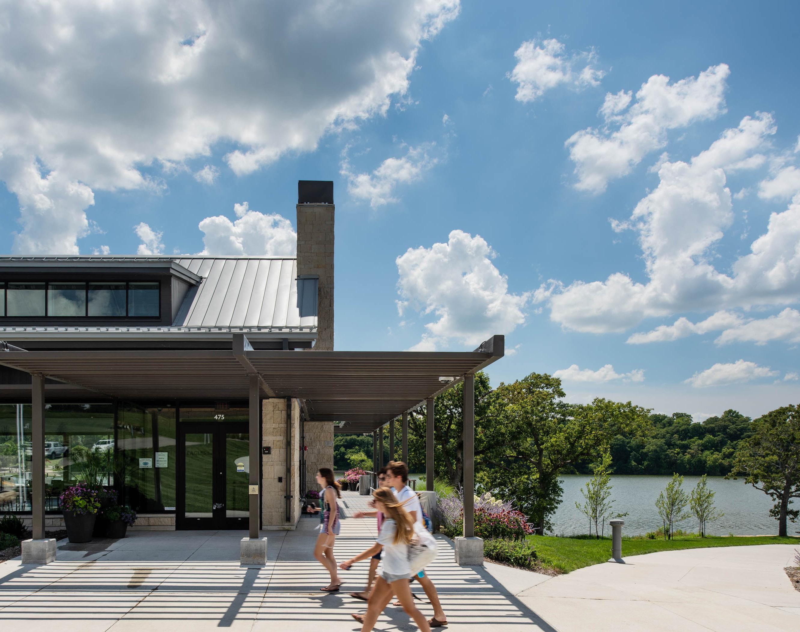
“This was one of the most underutilized parks in the city; it is now one of the most heavily visited parks in the state.”
~ Hank Moyers, Confluence
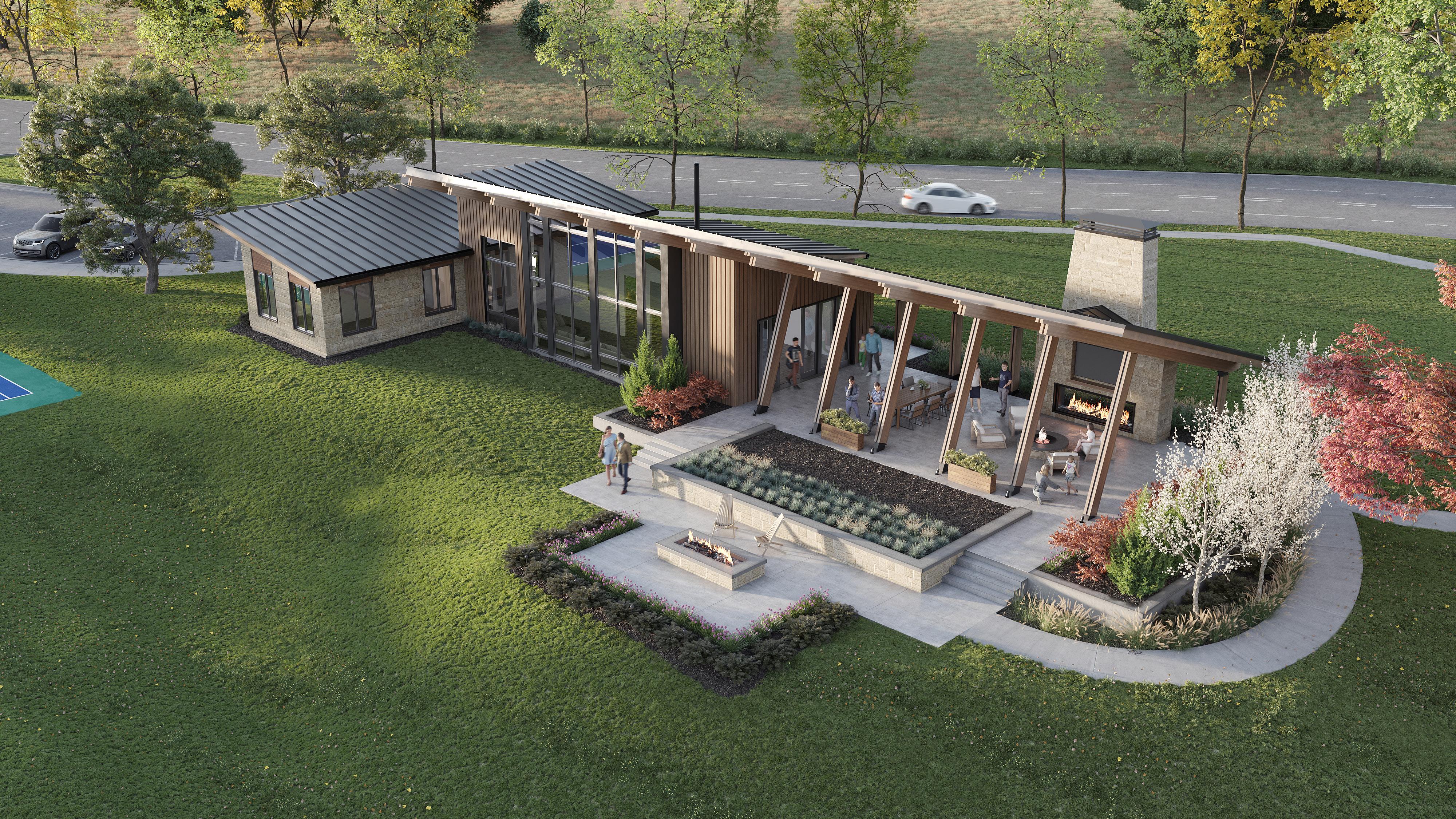
The City of Olathe’s newly opened Lake Olathe Park is the long-awaited result of a revitalization process rooted in robust community input, which guided designers as they transformed this former 18-hole golf course into a recreational destination.
“We were on a team with Confluence [landscape architects] to master-plan everything,” says project architect Brian Garvey with SFS Architecture. The property now features an amphitheater and abundant landscaping alongside a fishing pier, marina, swimming beach and a renovated shelter.
A sprayground complements a network of playgrounds and four miles of walking trails. In addition, a gorgeous water feature incorporates an 1,800-foot cascade into the lower pond and lake.


“This was one of the most underutilized parks in the city,” says associate principal Hank Moyers of Confluence. “It is now one of the most heavily visited parks in the state.”
The new Eagles Landing building offers 6,500 square feet of venue space for corporate and private events. It features a catering kitchen, bar area, private dining area, dressing rooms and restrooms. Other amenities include a fireplace, projector and screen, Bluetooth speakers and LED lighting.
The design team’s target aesthetics comprised timeless architecture and experiences connected to the water. The finished building showcases custom-built pieces emulating the native prairie and the lake, as well as black metal details that pay homage to prairie fires. A backdrop of creamy walls fl ank its massive windows, while wood beams draw the eye up to the white plank ceilings. A furnished wood deck also invites visitors outside.
“It’s a modern structure on the prairie that was intended to be native and durable,” Brian says. “Inside, you feel like you’re over the lake, with three transparent sides [created with windows]. It’s a simple building form with a gable roof and stone base.”
“There was a commonality in the use of materials for everything on the site, including timber and limestone,” Hank adds. “It was important for us that this common theme carried all the way through and uniquely identified the City of Olathe, from signage to building materials.”

Architect: SFS Architecture, @sfsarchitecture
Landscape Architect: Confluence, @thinkconfluence
Contractor: Titan, @titanbuilt


Midwest Ocean
Visitors enjoy a deep-water experience at the Kansas City Zoo’s new Sobela Ocean Aquarium.
Words by Lisa Waterman Gray | Photos by Michael Robinson
At the new Sobela Ocean Aquarium inside the Kansas City Zoo, nearly 8,000 creatures and more than 200 species occupy 34 habitats and 650,000 gallons of water, spanning floor-to-ceiling aquariums, a giant dome and a walk-through archway. The U.S. Green Building Council also granted LEED Silver certification to the fully accessible building.


The design “…was a combination of a lot of different aquariums,” says Sean Putney, the Zoo’s executive director and CEO. “We traveled to and brought back many ideas from other exhibits to create an enjoyable experience for anyone visiting here. We wanted a wide variety of animals that people would appreciate and [also] tell good stories. The sea otters are officially owned by the U.S. government and abandoned by their mom, and they have become ambassadors for the species.”
Multiple firms nationwide collaborated to bring this incredible aquarium to life. EHDD Architecture and El Dorado Architects—based in San Francisco and Kansas City, respectively— designed and implemented the project. Meanwhile, Seattle-based Studio TJP created the sea-animal infrastructure, and the aquarium


specialists from Space Haus in Chicago designed the animal exhibits.
“El Dorado projects positively impact people’s lives,” says local architect and firm partner David Dowell, who has been friends with EHDD’s CEO, Jennifer Devlin-Herbert, since attending grad school at UC Berkeley. “A major aquarium in the middle of North America has incredible potential to inspire and educate about the important role oceans play in regulating a healthy environment. Now, everyone in the region has an opportunity to understand this connection.”
El Dorado has learned from EHDD’s remarkable expertise in sustainability, as well. As David explains, “Aquariums are an environmentalimpact challenge given the amount of concrete involved and the volume of resources devoted to creating artificial, healthy habitats for aquatic life.”


This project introduced CarbonCure Technologies to the Kansas City market. Another stalwart of sustainability, the firm called for the use of recycled CO₂ to help reduce concrete’s carbon footprint without compromising its performance.
“We made sure the whole building was dignified, befitting the important role of this project within the Kansas City Zoo and Aquarium campus,” David says. “I feel very proud of the building we delivered to Kansas Citians. And I think it’s safe to say everyone involved will remember it as a pinnacle project in our careers.”
Kansas City Zoo & Aquarium, @kansascityzoo
Architects: El Dorado, @eldoradoinc and EHDD (San Francisco)
Contractor: JE Dunn Construction, @jedunnconstruction



Urban Acupuncture
Visionary planners convert two abandoned yet beautiful limestone buildings into a new hotspot for Black-owned businesses.
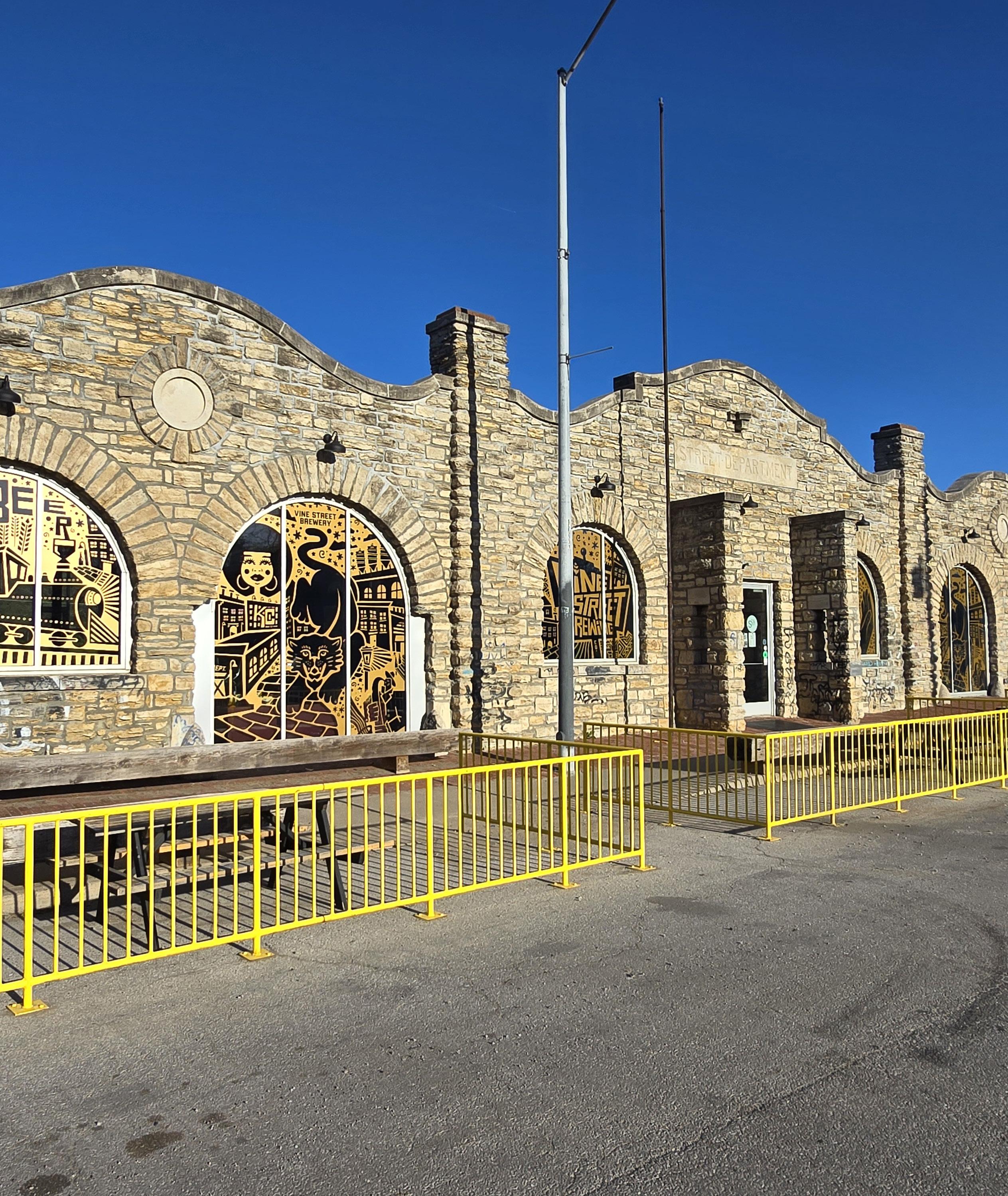
Afew blocks south of the 18th and Vine district in Kansas City, Missouri, two former public works buildings have been transformed into a brewery, an art gallery, an event space and more.
The 150-year-old limestone buildings at 2000 Vine previously housed the city’s water and street departments. Vacant since the late 1970s, the structures were on the city’s list of dangerous buildings—the windows were boarded up, walls were tagged by graffiti and roofs had caved in.


Landscape architect and urban planner Tim Duggan, owner of Phronesis, hatched the brilliant idea to convert the blighted 10,000-square-foot buildings into a mixed-use and retail development.
He pitched it to real-estate attorney Shomari Benton, his former Beacon Hill neighbor, and Jason Parson, the president and CEO of Parson + Associates, a local public relations firm. The trio of partners bought the city property in 2017.
Tim, who specializes in a design approach known as “urban acupuncture,” saw the project as a natural progression of his passion for revitalizing old buildings.
“It’s super-intense work, and it’s super-intense craziness,” he says. “But it’s also not really work because it’s what I enjoy.”
The renovations at 2000 Vine honor the buildings’ storied history with a contemporary update. New roofs and windows were installed, but traces of graffiti remain on the walls and floors.
Today, the former water department has an open floor plan with sleek white offices for Shomari’s law firm—Benton Lloyd & Chung LLP—Phronesis,


and Lillian James Creative. The large arched windows provide views of the downtown skyline.
On the lower level, the former workhorse stable now houses the Warren Harvey Art Gallery—displaying walls lined with the painter’s vibrant creations—as well as Keno G Ink, a tattoo and piercing shop. An in-house event space also features a bar from a locally milled walnut tree from 35th and Benton Boulevard.
“Finding the right tenant mix was one that we welcomed,” Shomari explains. “[Through] community outreach, figuring out what the community wanted from this project, [and] what it didn’t want from this project.”
Gold designs on the converted street department’s front-exterior windows preview the businesses inside. One tenant is Vine Street Brewing Co., launched in 2023—Kansas City’s first Black-owned brewery. Spanning two floors


of taprooms, the thriving brewery hosts live music, trivia and bingo nights.
A wooden piano-key wall separates Vine Street Brewing Co. from its neighbor, The Spot—a café, grocery store and job-training facility, which also opened in 2023. There, employees are enrolled in Chef Shanita McAfee-Bryant’s culinary training program called The Prospect KC.
An outdoor patio of salvaged cobblestones connects the exterior of the two buildings at 2000 Vine. In May 2023, the partners were awarded Central City Economic Development (CCED) funds to add even “more robust outdoor amenities” to the nearly two-acre property by the fall of 2025.
“The intent was to have an outdoor, flexible community space,” Tim says, referring to the property’s potential for accommodating private events or a public beer garden. “So I think that’s our ultimate goal—a destination on Vine that can reinforce [and] complement the tenant mix.”
Venue | Art Gallery | Workspace: 2000vine.com Landscape | Planning | Infrastructure: Phronesis, @phronesis_kc


New


CENTRAL SURFACES
 Material: Riovalli Marble
Design: Trove Homes

On the Waterfront
Lake living isn’t just for the weekend—it’s a way of life across the metro.Words by Megan Felling
The benefits of lake living are endless, including all the activities that are part of a quintessential lake lifestyle. Outdoor enthusiasts can find a surprising number of lake communities right here in Kansas City, where lakefront property owners are having fun boating, fishing, skiing and swimming any day of the week.
Many popular communities are becoming increasingly more resort-like with world-class amenities, including golf courses, elaborate clubhouses and restaurants, yacht clubs, beaches, marinas, fishing docks, walking trails and a full social calendar of events year-round.
Homeowners Candace and Tom E. have lived at both Lakewood and Raintree Lake. “We really enjoy the atmosphere of a lake community, whether that’s being out on a boat, fishing from the shore or just taking a walk in the evening,” Tom says. “It’s always fun watching the fireworks
over the water on the Fourth of July. A nice feature at Raintree Lake is the ability to rent the clubhouse and a pontoon boat for a holiday or family gathering.”
Lakefront property buyers have different considerations than buyers of typical suburban neighborhood properties. For example, flood insurance may be required, and taxes may be higher. If your property has a private dock, it will require regular maintenance, and overgrown lake weeds and algae can require additional time and energy to clean up. Homeowners must also be aware that tracking sand and water into the house may cause damage, especially over time.
Competition for lake houses is high in many communities—especially for new or remodeled homes—and price ranges vary. While most lake homes in the metro are primary residences,

Tommy Needles, a real estate agent with Keller Williams Platinum Partners, notes that the majority of homes at Lake Lotawana are second homes or weekend getaways. Yet, at Riss Lake, Janet Agron with the The Rob Ellerman Team at ReeceNichols says that most homes are primary residences, with many homeowners being “snowbirds”—residents who have a second home elsewhere.
Whether you’re looking for a part-time cabin or a waterfront location to build your dream house, there are a multitude of options for lake-life enthusiasts around the metro area. Moreover, each community features its own distinct style and array of amenities. Check out some of KC’s premier lakeside communities, and you’ll be on your way to listening to the soothing sound of the water and enjoying glorious sunsets from your new deck.

Cedar Creek
cedarcreek-kc.com, @cedarcreekkc
Located just southwest of K-10 and K-7, six communities of single-family homes and maintenance-provided villas wind through rolling hills, limestone bluffs, treed valleys, tranquil lakes and open green space. Hundreds of acres will always remain in their natural state and preserved, surrounded by abundant wildlife.
The 65-acre Shadow Lake—primed for sailing and fishing—is at the heart of the community. No private homeowner docks are allowed. Amenities include a top-rated golf course, a park and miles of walking trails. The Estates at Canyon Oaks, the newest single-family neighborhood, is now accepting lot reservations.
Lake of the Forest
lakeoftheforestkansas.com
This gated private community features 163 homes surrounding a 40-acre lake for swimming and fishing. It also has a nine-hole golf course, clubhouse and tennis courts. Located between Edwardsville and Bonner Springs, Kansas, off I-435 and K-32, it offers an easy commute to downtown Kansas City, Lawrence and Olathe.
Canaan Lake
Several neighborhoods surround this 55-acre lake in Wyandotte County, Kansas, where private docks are allowed. Residents enjoy proximity to the Legends Outlets shopping and dining district and Dub’s Dread Golf Club.
Black Swan Lake
blackswanlake.org
This private community of 134 homes straddles Shawnee and Kansas City, Kansas. Its 18-acre lake is ideal for canoes, paddle boards, row boats and kayaks.
Creekmoor
creekmoor.com, @highpointcreekmoor Creekmoor’s maintenance-provided villas and single-family homes are designed around its signature amenities—Lake Creekmoor, a private 108-acre fishing and boating lake, and the 18hole Creekmoor Championship Golf Course. The sports court, swimming pools and walking paths cater to an active lifestyle. New construction and resale homes are available in this Raymore, Missouri, master-planned community.



Riss Lake
risslakeinfo.com, @risslakelife
Located in Parkville, Missouri, Riss Lake offers easy access to nearby restaurants, grocery stores and shopping, with Kansas City International Airport and downtown KC each less than a 15-minute drive away. The 134-acre stocked lake features a marina with covered boat slips; a fishing dock; three swimming pools; a tennis court; a playground; nature trails; and volleyball, basketball and pickleball courts. The HOA owns approximately 25 feet of land between the shoreline and residential property lines. A variety of new-home sites are available throughout Riss Lake and maintenance-provided Riss Lake Reserve, plus a new community of 38 maintenance-provided twin villas is coming this summer.
Loch Lloyd
lochlloyd.com, @lochlloydcountryclub
This secluded gated community spans both Cass County, Missouri, and Johnson County, Kansas, offering low-maintenance villas, custom-designed homes on the golf course and lakeside estates. A new neighborhood of wooded acreage homesites has expanded the community into the Blue Valley School District, just minutes from the 135th Street corridor, with easy access to shops and dining. The rolling wooded terrain is the centerpiece of Loch Lloyd, showcasing a 110 -acre lake and an 18hole championship course designed by golfing legend Tom Watson. While residents do not have private docks, they enjoy access to two marinas, nature trails, a fitness center, tennis and pickleball courts and a swimming pool—all overseen by a 24/7 security team.
Weatherby Lake
cityofweatherbylake-mo.gov
The 274-acre Weatherby Lake in the Northland is an established haven with community amenities that include a private lake with a sandy swimming beach, a waterfront pavilion, a large community center, a soccer field, parks, tennis and pickleball courts, various clubs for all interests and coordinated holiday festivities. The lake offers incredible fishing, boating, kayaking, sailing and windsurfing. Most first-tier homes own property down to the water, and private docks are allowed. Limited new build opportunities and options for resale and teardowns/rebuilds exist.
Lake Quivira
cityofl akequivira.org, @lake_quivira
This gated private community of nearly 400 houses is centered around a 224-acre springwater lake near the Kansas River in Johnson County, Kansas. It was initially established as a vacation spot away from the city. Amenities include the Lake Quivira Country Club, which features an 18-hole championship golf course, beach, state-of-the-art community center, driving range, chipping range, tennis and pickleball courts, playgrounds, hiking trails, waterfalls, park and picnic areas. The last custom-build lot available is for sale and adjacent to a green belt.
Lake Lotawana
lakelotawana.org, @lakelotawanabeautification
Lotawana, which means “sparkling water,” is a manmade lake bordering Blue Springs and Lee’s Summit, Missouri. Built in the 1920s, it encompasses 640 acres and is home to 1,179 unique residences. With its own city hall and police and fire departments, the Lake Lotawana Association maintains the water, roads and other services around the lake, including snow removal in the winter and water patrol in the summer. An easement runs around the shoreline, so most property lines extend only some of the way to the water’s edge. Active community amenities include a yacht club and ski club, tennis courts and a playground, as well as many social events and dock parties. Available homes include resale and teardown custom rebuilds.


Gardner Lake
gardnerlake.info
Residents have been enjoying this manmade 125-acre lake in Johnson County, Kansas, since the 1930s. Most homes are lakefront, with gently sloping yards down to the lake. Private docks are allowed.
Lake Tapawingo
laketapawingomo.com
The City of Lake Tapawingo, Missouri, adjoins Blue Springs and Independence. Founded as an “exclusive sports retreat and rest haven,” it was built on 315 beautiful rolling wooded acres. The community has grown to nearly 375 homes—many of which have been owned by the same families for generations. Private docks are allowed. Residents enjoy boating, water skiing, kayaking, swimming and fishing. Waterfront resale homes are available in various price ranges.


Lakewood
lpoa.com, lslakewood
Located within the Blue Springs and Lee’s Summit, Missouri, school districts, this expansive master-planned community on 2,200 acres features a range of homes, from new maintenance-provided villas and family homes to luxurious lakefront mansions. Residents enjoy frequent social events and clubs, in addition to the community’s two marinas, swim beach, golf course, sports courts, clubhouses, swimming pools and hiking trails.
Prairie Lee Lake
woodlandshores.net
Woodland Shores is a community of 200 upscale homes on the northeast shore of Prairie Lee Lake, a 150 -acre freshwater reservoir in Lee’s Summit, Missouri. Its ideal location—near downtown Lee’s Summit, Fleming Park and Lake Jacomo—is surrounded by thousands of acres of parkland, trails and undeveloped woodlands.
Lake Waukomis
lakewaukomis.org
This highly sought-after community in Platte County, Missouri, surrounds a 90 -acre lake with private docks. Amenities include walking trails; a community shelter house; a playground; a disc golf course; and pickleball, tennis and basketball courts.
Raintree Lake rlpoa.com
In southern Lee’s Summit, the privately owned, 235 -acre lake community contains more than 2,000 homes in various sizes and price ranges, from new villas to established estates. High-speed boats—ideal for water-skiing fans— are allowed. There’s also an Olympic-sized swimming pool and protected swim docks in this popular community.




BEYOND LAWN AND GARDEN
Landscape architects step up with solutions for large-scale, complex properties.
Words by Cynthia Billhartz Gregorian
Picture this: you've decided to dramatically redesign your backyard. Now, the question is, do you hire a landscape architect or a landscape designer? Many people are confused by the distinction.
A good place to start answering that question is to consider the size and complexity of your landscaping project and the scope of each landscape professional's expertise. Designers often have associate degrees in a botanyrelated field, along with qualified, on-the-job experience and knowledge. They provide an excellent service for projects around the house. However, some projects require fullscale work—such as shifting massive volumes of soil—thus requiring a professional who can manage the underpinnings and other technical aspects.


Landscape architects are mandated to have a bachelor’s or master’s degree in their field, meaning they have studied a bevy of disciplines, including design, construction techniques, natural and social sciences, art and history. Hence, they tend to tackle larger, more complicated projects.
For instance, landscape architect Jeffrey Preuss of Jeffrey Preuss Landscapes in Stuttgart, Kansas, has been called onto 20-acre residential construction sites to consult on the proper placement of a new home for optimal solar orientation, drainage and grading. The job scope also involves working with the location of other buildings, adjacent land use, ponds and other existing or planned structures on the property.
“A landscape architect tends to take a bigpicture approach and then consolidate it down and scale [it] into the details,” says Jeffrey. “A lot of times, a landscape designer or a garden designer tends to work on a smaller scale and be more plant-specific and then expand out to the larger scale.”
When the owners of a century-old mansion in St. Joseph decided to do something about their large, steeply sloped backyard, they knew they’d need an architect rather than a designer. The terrain, which dropped precipitously from the back of their house, would require terracing mounds of earth and installing retaining walls. So they called Lorax Design Group, a landscape architecture and planning firm in Overland Park to tackle the job.
By the time the Lorax team had finished, the yard had been converted into a swimming oasis on par with those at five-star luxury resorts. It comprises a multi-level pool fl anked by a pavilion on one end and a pool house— reconfigured from a pre-existing garage—on the other. This incredible transformation results from two years of intensive sketching, planning, engineering and construction. Numerous feats of engineering are at play around the landscape, so an architecture degree was necessary for the project’s success.

Katie Martinovic, vice president and the principal landscape architect at NSPJ Architects, says landscape architects also tend to pay more attention to overall landscape views, factoring in exterior and interior perspectives of not just the clients’ properties but adjacent ones as well.
“We help with the flow of the site to make it reflect and highlight the architecture of the home,” Katie explains. “If [a home] is existing or built enough that we can figure that out, or we have the plans and elevations, we make sure that we’re accounting for that.”
She had a recent project at Meadowbrook, a neighborhood in Prairie Village, where the clients had bought an adjoining lot. They wanted her to design a space that felt intimate and secluded.
“We incorporated a little fire pit sitting area with landscaping around it and columns to mark the entry,” she says.
She also installed outdoor lighting and decorative pavers to help make the space feel more luxurious.
Katie also notes that about 20 to 30 percent of NSPJ’s landscaping clients ask for non-plant materials, such as concrete, gravel, mulch and other non-grass ground covers. However, installing an excess of those materials in the wrong places can cause drainage issues—a situation where an architect’s unique skill set comes in handy.


That said, Katie notes that landscape designers have their place in planning beautiful outdoor spaces. They often work hand-in-hand with architects to lend an extra layer of creativity and select the proper plants for the architectural plans. She adds that there are also some jobs where hiring an architect would be overkill.
“We don’t really get rid of rabbits [and] can’t help you get rid of weeds,” she says. “That’s where it’s better for a landscape designer or a horticulturist to work with clients.”
Jeffrey Preuss Landscapes: @jeff.preuss.design
Lorax Design Group: @loraxdesigngroup
NSPJ Architects: @nspjarchitects


SCAN FOR MORE INFOMATION ON BUILDER


Lemon Aid
A soured kitchen enjoys a refreshing twist on glam style and functional upgrades.
Words by Gloria Gale | Photos by Courtney Marie Productions


When life hands you lemons...call Meredith Lemons, a local pro who knows a thing or two about good design.
That’s precisely what happened when Matt and Mea Watson needed a talented designer who could tackle an extensive renovation project within the couple’s suburban home.
“Our 20-year-old house needed serious updating,” says Matt, adding that the focus was on an outdated kitchen and primary bathroom.
Meredith, owner of Lemonhouse Interiors, found the kitchen’s previous Tuscan style dated and far too dark for the young family.
“Right from the beginning, I knew that a tearout—literally down to the studs—was called for,” she explains. “I wanted the Watsons to visualize the changes, so I had renderings drawn up. They agreed to move forward [with] renovating the kitchen into an expansive space where this large family with five children could gather.”


Arched doorways are original architectural features of the home and definitely worth keeping. Black-painted trim accentuates the feature and ties in with the back hall's diamond-pattern floor.

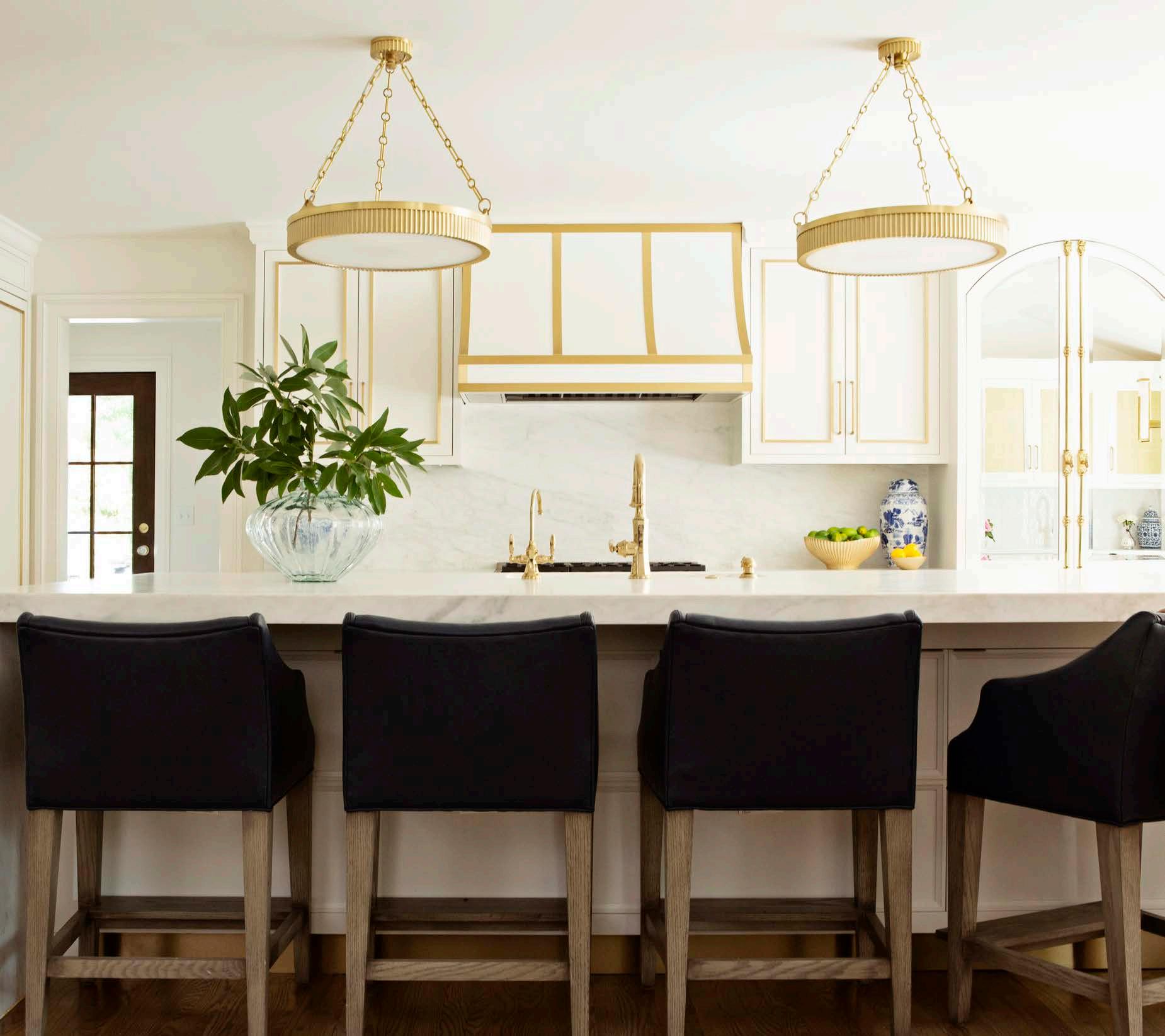
In addition to being beautiful, with a luxury range and elegant white quartzite on the island top and backsplash, the space is ergonomically well-designed. Once hindered by impractical bar-height countertops, the now-reconfigured room features countertops low enough for Mea to enjoy cooking in comfort. The adjacent mudroom and pantry— two spaces reconfigured from the old kitchen design—further enhance the workflow.
Meredith utilized a black-and-white monochromatic scheme to increase an uninterrupted visual flow.
“These design elements, plus the luxurious glass-accented bar area that was once a play space, give the couple an integrated area to gather while everyone stays out of Mea’s way,” she explains.


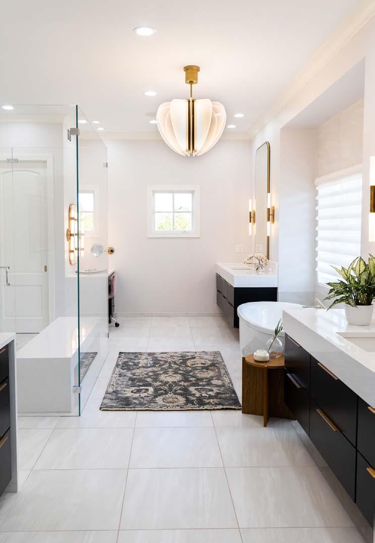
Previously unattractive, the primary bath decor shines brightly with an uncluttered design, simple black-andwhite color scheme and smart brass fixtures throughout.
Once the kitchen renovation was complete, Meredith proceeded with a design solution to revamp the couple’s primary bathroom. Like the kitchen, that renovation was a complete tearout, resulting in a freshly polished and bright, spa-appointed interior.
Previously, the bathroom was a dated space with pillars and unfashionable cabinets. The room now showcases a black-and-white color scheme, highlighted by handsome dual vanities, his-and-hers toilets and a large zero-entry shower with a quartz bench.
Throughout the renovation, the couple anticipated a job well done and knew it was worth the wait.
“This was a big job, but I count it as a mission accomplished,” Meredith says.
A joyful kitchen and elegant bath are now in place, making the family’s day-to-day all the more delightful.


Echo and Flow
A two-toned kitchen blends warm woods, black accents and a stunning wall of glass cabinets.Words

Sisters Emily Contrucci and Elizabeth Van Maanen of Little Black Dresser Interiors created a bold yet timeless kitchen and bath in this Overland Park home.
Blending warm wood tones and monochromatic colors into the space made it feel unique while maintaining its classic, cozy vibes. However, the real show-stopper of the kitchen is the custom wall of glassfront cabinetry, complete with a stained wood backer.
“Glass cabinets can scare people off, but literally [any] everyday functional item can be staged in a way that looks like art,” Emily says.
The addition of black cabinets added interest to the space without compromising the iconic look. Pairing them with the lighter-toned island and backsplash allowed for a light, bright and airy feel as well.


“I’m especially fond of the kitchen’s two-toned design, which is complemented beautifully by the marble countertops,” says the new homeowner and fashion influencer Egreis Gjergjani of @thestilettomeup. (She's hired LBD to customize some spaces—like the closet, of course—so stay tuned for updates on this house!)
“We could either play it safe and stick to the light, bright, white kitchen, which is beautiful and timeless, or make a bold statement but still do it in a timeless way,” Elizabeth explains.
The cabinets offer functional storage for displaying special or sentimental pieces. Additional storage can be found along the side cabinet wall, adjacent to the paneled refrigerator/freezer and coffee bar.
The design elements echo and flow throughout the kitchen, forming a cohesive space that feels equally elegant and authentic. The backsplash coordinates with the waterfall island, while the grasscloth wallpaper on the ceiling adds texture to the space. Elements of exquisite woodwork carry into the floating shelves and custom butcher block within the prep pantry.
The spa-like primary bath also achieved an elegant and cohesive design. A variety of textured tiles work together to create an impressive and unified statement. An important consideration when achieving this fl awless look was the bathroom layout itself. Placing the shower directly in line with the tub, for example, allowed for a marble mosaic to be visually centered on the floor.
Black 3-D subway tiles installed vertically extend three-quarters of the way up the vanity wall, creating a dramatic niche for the freestanding bathtub. Black was also painted onto the ceiling and arched storage nook.
In the shower, chevron-patterned tiles imitate the appearance of a solid-wood wall behind the wall-spanning stone bench, pairing nicely with the Zellige tile on the remaining shower walls.
White-oak cabinets with waterfall countertops, brass hardware and bubble pendants make this luxurious bathroom an impeccable counterpoint to the kitchen—a private retreat that can energize and renew a weary soul.







“ Your Project , Our Passion”


OUR MISSION: KCBR Design l Remodel is dedicated to community involvement, personal development, and professional growth. We accomplish every goal by setting the bar at the highest levels in service to our clients, our vendors, and our teams. We energize the lives we touch with endless positivity, inspiration, and the power to make a lasting impact.


Long-Distance Lifeline
A local designer reinvents a short-term rental property in Austin as a soulful, masculine retreat— and quickly.
Words by Christine Emming
When Andy Fromm relocated from Kansas City to Austin, Texas, the market was at a peak, making it difficult to find a local designer. Andy had previously worked with Kansas City-based designer Andrea Glinn of Glinn Interiors on a brand-new residence in Aspen, Colorado, and reached out to her again. For Andrea, who regularly hosts client meetings on Zoom, working on long-distance projects is an everyday affair, making her an ideal fit for the venture. Once reconnected, Andy and Andrea resumed their easy rapport to expedite this extensive interior redesign project.
The five-year-old house had been furnished for use as an Airbnb rental. Andy had no furniture and needed all the basics, but he also


wanted someone to take the time to find some special pieces. Along with the usual series of Zoom calls for this project, Andrea traveled to Austin multiple times to ensure the client could procure custom, local pieces for this home.
“The challenge with this project was the timeline,” Andrea says. “The client wanted to move into the home six weeks after purchasing the house, and every single item in the home had to be sourced—he was bringing nothing with him.”
Since the project’s time frame was so short, Andrea was intentional about ensuring the necessities were move-in ready. Andy explains, “I wanted all the furniture for Thanksgiving with my boys, which was only five months after I bought the house and three-and-a-half months after I moved in.”
On one project-focused weekend trip, Andrea and Andy completed 70 percent of the decisions—all before he even owned the



house.
“That was efficient, fun and a little crazy,” Andy says, “but I’m thrilled with how it turned out.”
While a few custom items had longer lead times, Andrea sourced as much as possible to be ready in time, assuring her client a fully functional home by move-in day.
Given Andy’s preference for natural materials used in a modern way, Andrea made a point of incorporating key pieces from local artisans. The custom coffee table by Yucca Stuff—an Austin fabricator—is similar to a smaller table in its furniture line, which Andrea wanted to make larger. So, she reversed the materials, creating a wood top with a stone base instead of a stone top with a wood base.
“Local Texas limestone is full of fossils and brings so much life and interest to the space,” Andrea says.
The duo also purchased pieces for the primary bedroom from Yucca Stuff, including custom headboards and a chest for the foot of the bed.


Because Andy loves pottery, he and Andrea met with local potter Samantha Heligman at Settle Ceramics to buy ceramics for daily use. Linen textiles by Libeco knit the rooms together with warm, natural tones. The capstone of the primary bedroom—the cerused oak desk made in 1940s-era France—is a curved focal point.
Andrea also accounted for her client’s lifestyle as an empty-nester who mostly lives on the first floor.
“I have three boys [who] I always want to have room for,” Andy says. “And when company comes, the living space and bedrooms upstairs are tons of fun.”
The house had great bones, but its Airbnb vibe felt a bit soulless. Some simple touches—from custom sheers that softened the light to a bespoke ceramic chandelier over the dining room table—easily warmed the whole space. Andrea furnished easygoing and cozy poolside seating and a fun upstairs living area to create multiple hangout spaces perfect for when Andy’s boys or other guests are in town. The custom foosball table from RS Barcelona diversifies the team rosters with women and people with a range of skin tones, adding yet another touch of whimsy.
Interior Designer: Glinn Interiors, @andreaglinninteriordesign


913.851.7300

RANKED #5 TEAM AT REECE NICHOLS: EXPERIENCED = RESULTS


Jorjy, Personified
Local shop owner and designer Pam DiCapo brings her fun-loving style to a classic Plaza-area home.
Words by Jessica Bahr | Photos by Laurie KilgoreEclectic sophistication greets you at the door of this Country Club Plaza area home, announcing Pam DiCapo’s interior design services through her Brookside-based shop, Jorjy. Her design approach here is inviting, friendly and, according to Pam, most definitely outside the box.
“The client loves the unexpected and is a blast to work with,” Pam explains. “She knows what she wants and will not stop until it’s just right. I’m the same way, so we worked well


together for that reason. Every facet of this job was really fun for me.”
While any number of elements could spark Pam’s creativity, it all started with the tile for this project—a story that’s repeated in beautifully unexpected ways throughout the home. From the “insane” marble wall in the primary bedroom to the fireplace to the brass-inlay kitchen backsplash, the element of tile sets the stage. At the same time, an assembly of other finishes—including glass and reclaimed wood—creates an atmosphere that is alltogether modern, multifaceted and timeless.
Her talent for keeping things classic yet relevant speaks to Pam’s design expertise. She owns two shops in Brookside, right next door to each other. Lauren Alexandra is a treasured children’s clothing and nursery boutique, first opened in 1994. Jorjy, launched years later in


“Every creative adventure is a journey.”
~ Pam DiCapo, shop owner and interior designer


2019, is a more lifestyle-focused boutique that features one-of-a-kind furnishings, gifts and registry items, as well as Pam’s inhouse interior design services.
The whole-home design and styling services she offers through Jorjy are a natural overflow from her Lauren Alexandra clientele. Pam has been designing nurseries since 1994 when her first nursery project was featured in The Kansas City Star. Soon after, the designer’s own lake house was featured in Southern Living
“People started calling from all over the country. What a fun time that was—preinternet!” Pam reminisces with a laugh. “People would also come into Lauren Alexandra and say, ‘I want my house to feel like your store,’ and so it began. My design and styling services grew from there.”
Though she still personally curates both shops, Pam says her signature aesthetic is Jorjy, personified: layers, textures and


The indoor-outdoor living space showcases Pam’s ability to find endless ways of mixing materials and styles for an invitingly curated look. She is most proud of projects like this home, where clients can call it “their happy place.”

endless ways to mix things up. That same expressive palette certainly plays out in this inaugural Jorjy-designed home.
With the debut of Jorjy and her interior design services, Pam has intrepidly greeted her latest endeavor with trademark humor and keen business sense: “Every creative adventure is a journey. If you believe in yourself, you can do whatever you want to do. There’s a world of inspiration at our fingertips; don’t be afraid to jump in!”
Interior Designer: Jorjy, @shopjorjy


This growing family wanted an outdoor oasis that would respect the existing architecture while offering a modern take on the traditional veranda. The vision was to create a space that feels connected to the outdoors, could change with the seasons and would accommodate a range of family gatherings.

Modern Veranda
A French Provincial home in Mission Hills adds a Parisian-inspired modern-meets-traditional new form.
Words by Andrea Darr | Photos by Michael RobinsonAndrea and Steve Morgan had recently returned from visiting her aunt in Florida when the longing for a big veranda set in. Andrea’s lifelong experience of sitting on her aunt’s screened-in porch became something she wanted for her own home.
“I grew up with that,” Andrea says. “It’s where we spent all our time—either in the kitchen or on the porch. We gravitated toward it.”
So when the couple’s real-estate agent, Andy Bash, took them to see a French Provincialstyle house in Mission Hills in 2019, Andrea saw a place with potential for her dream to come true. She looked at Steve and said, “‘We could do the porch thing,’” Andrea recalls. “I’d always envisioned it—if it would work.”
The 1960s-built home was decadently trimmed and accented, dripping with gold chandeliers and traditional cabinetry. And though the Morgans loved that, they didn’t exactly want more of it with their new addition. Rather, Andrea’s Pinterest board was filled with modernmeets-traditional inspiration. Her previous job took her to Paris, where she appreciated the city’s architecture—particularly how Parisian designers preserve old buildings’ character while adding beautiful modern additions. Andy connected them with a local architecture and interior design firm that could do just that: SixTwentyOne.
The couple met with co-founders Jacob Littrell and Dan Brown,

initially thinking they’d put a porch to the side on the back of the house.
“Andrea told us her dream of a big veranda and sitting out on the porch,” Jacob says. “They wanted to enjoy the experience through the seasons.”
The duo pondered whether they could develop something more usable year-round or at least three out of four seasons—a design that, as Dan says, “doesn’t blend in, doesn’t blur the lines, but dissolves them completely.”

They proposed a 1,500-square-foot addition across the entire back of the house, with four bays opening to the backyard and a modern wood pergola covering an outdoor grill area on the side.
“SixTwentyOne came back with this idea mapped out,” Andrea says. “And we loved it. They did an amazing job listening and understanding.”
However, while the couple greatly desired the indoor-outdoor space, they didn’t want it to diminish the main light source coming into the


back of the house where their main living room is located.
The design team ran a handful of daylight studies to test how much light came into the living room at various times of the day in the existing space. They then tried to match that with the room addition.
“We didn’t stop adding windows and skylights until we got there,” Dan notes.
The studies-based approach alleviated any anxiety the Morgans had about the project. “The minute we saw the numbers work out, we knew we could move forward,” Andrea says.
The veranda’s design intentionally distinguishes it from the existing house in its modern form, yet the use of similar materials, such as white brick, preserves the original character.
“The aesthetic of the house was incredible,” Jacob says. “It was easy for us to do something not obvious but to juxtapose older and newer

“It’s not an open-concept house, but this allows us to live openly."
~ Homeowner Andrea Morgan


forms. We appreciate the modern intervention of something historic.”
The long, linear space is divided into two areas: an “adult side” sectioned off by a dual-sided fireplace at the primary suite entrance and a side with dining and seating areas just beyond the living room and den.
The space isn’t cooled or heated except by ceiling fans and radiant heat emanating from the limestone floors, respectively. The black-framed doors punctuate the crisp white walls and open onto the formal garden, where mature vegetation beckons them outside.
The veranda has become the family’s new favorite space—just like Andrea’s aunt’s screened porch was for her.
“We use it every night,” Andrea says. “It’s our safe haven, and it’s so relaxing.”
Architect/Interior Designer: SixTwentyOne, @sixtwentyone_
Contractor: Gahagan-Eddy, @gahaganeddy
Interior Designer: Brasstacks Design + Build, @brasstackskc


The informal dining space off the kitchen is a cozy place to gather. The balance of the warm wood beams and natural light makes a calming and mood-enhancing space. "We wanted this space to feel elevated yet approachable— the leather banquette is perfect for kiddos to climb up to eat and easy to clean," the designers say, adding, "The oval table helps with getting in and out of the banquette, and we were able to maximize the table length with the curved corners."

Favorite Pair of Themes
Classic yet cozy, this Leawood home finds a sublimely happy balance.
Words by Meghan Craig | Photos by Brynn Burns
Timeless elegance blended with pops of color. A mix of vintage and modern pieces. Sophistication and function tailored to the lifestyle of a busy family of four. Midwest & Co. developed these themes for their Leawood clients, culminating in a classic home that feels cozy— like a favorite pair of jeans—yet maintains a refined aesthetic throughout its interior.
Owners Janna Coglizer and Megan Shepherd have a motto: “Love your home.” It reflects how each of their projects is tailored to create unique, curated spaces that authentically reflect their clients.
“We spend a lot of time getting to know our clients, their families, their interests, their goals and what brings them joy,” Janna says. “We believe that the space you are in impacts your mood and perspective. Our goal is always to create spaces that inspire joy.”
For this client, Midwest & Co. carefully blended traditional architectural details with modern elements. The home features a neutral color palette, with exciting splashes of color from room to room to keep things light-hearted and fun. Natural materials contribute to the depth, warmth and texture that make the space feel extra cozy.
Interior Designer: Midwest & Co., @mid_westandco Builder: Wulff Building + Additions, @wulffbuilding
“Our goal is always to create spaces that inspire joy.”
~ Midwest & Co. designers, Janna and Megan
Scan the QR code to view the full story online.


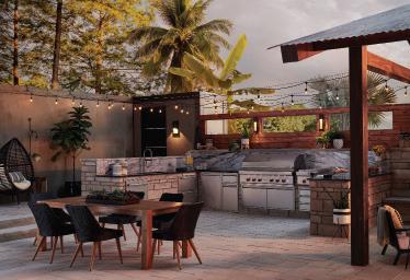
Hestan’s award-winning design and performance are born from years building kitchens for America’s most acclaimed chefs. Performance innovations like Hestan’s Smart Gas technology provide precision control. The Smart Gas burner controls the exact gas burner temperature – not just a Lo to Hi burner power setting. Smart Gas technology is available on Hestan Dual Fuel Ranges and Gas Rangetops. Premium indoor and outdoor products from ranges to refrigeration to dishwashers to grills and ventilation products, and everything in between, Hestan brings even the dreamiest indoor and outdoor kitchens to life. And all are available in twelve colors.
home.hestan.com


“I DO” LANDSCAPE
Hands-on homeowners refine the gardens on their Olathe acreage for a picture-perfect wedding backdrop.

Finding the perfect outdoor wedding venue can be tricky. It needs an abundance of lush grass, colorful flowers, various greenery and open spaces to welcome guests and set the stage for a breathtaking ceremony. When the daughter of these Olathe homeowners decided her parents’ backyard would be the ideal spot for her wedding, they knew they had some work to do to transform it into a dreamy matrimonial backdrop.
“These returning clients are do-it-yourselfers,” notes Laura Stack, designer, horticultural consultant and owner of Creative Outdoor Spaces. “I was called back to give them some ideas of how to tidy up their landscape.”
When it comes to helping gardeners refine their spaces, Laura starts by explaining and emphasizing the importance of scale and creating vignettes.
“We talked about what they have, how to repurpose and where to transplant [existing plants] to serve a purpose and make more sense,” she explains. “When you are in big spaces, you need to make things fit the scale. We made the pond beds bigger, added masses of a few varieties and repeated accent plants.”

 Potted and perennial flowers bring color and texture to the surrounding planting beds of the swimming pond.
Vivid and healthy at the pond edge, Creeping Jenny creeps toward the pea gravel beach entry.
The zero-entry beach is just steps from the home's back deck and screened-in porch.

The home was originally a farmhouse. When the owners purchased it, they already knew they wanted a naturalistic exterior for their new home. Thus, they made landscaping decisions to accentuate the land in the front and backyard, such as natural stonework and a pool design that resembles a pond.
A pond pool functions like a traditional pool— descending from shallow to deep—but with natural edges and borders. The gradient from the pool’s entrance to the deep end is also very subtle. Here, the entrance is off the deck, guided by a path of river stones leading into the shallow end. On the opposite end, a large fl agstone slab creates a lounge area and doubles as the pool’s deep-end diving board. The added dock and babbling-brook waterfall feature enhance the pool’s relaxing atmosphere.
The homeowners are also avid gardeners, planting bright flowers and shrubs around the property. Laura helped them refine the plant life around the pond pool to complement their gardening and the mature plants in the yard.
“What was missing around the pool landscape were evergreens and taller plant heights,” Laura explains. “The mostly perennial garden landscape lacked winter appeal and interest. The expansive view needed taller plants to frame foreground views of the spacious lawn and woodland background.”
To address this, Laura left the aquatic plants that the homeowners had previously selected and refined the pond’s landscape by making suggestions and additions to the surrounding


beds. She also removed some plants and flowers to emphasize and repeat fewer plant varietals, allowing them to keep the central focus on the pool.
“We chose a few common-denominator plants and planted them en masse throughout the landscape beds around the pool perimeter to create a comprehensive overall view,” Laura says.
Thinking of how the wedding guests would move around the backyard, her team installed fl agstone landscaping around the pool for seating, sunbathing and—most importantly—a walkway. The fl agstones form a natural walking path around the house, ushering guests to the front door or back of the home.
 The homeowners, who are avid gardeners, selected the plants and flowers used throughout the space. They hired Laura to help refine the space and create a cohesive experience in the yard.
The dock offers a spot for relaxing anytime, from enjoying morning coffee to evening chats.

For the home’s front exterior, they concentrated on curb appeal by using natural materials to create photo-ready vignettes. In the driveway, the team increased the landscaping around the fountain, establishing it as the chosen focal point.
“To showcase and bring the fountain feature into scale, we added larger ledge stones to widen the driveway and river rock to expand the landscape bed,” Laura describes.
Next, she enlarged the beds around the mature trees to bring the planting beds into scale with the surrounding foliage. The extended beds also help direct guests to the front door or to the back of the house. Laura then created a pathway from the main tree to the front door by removing some of the landscaping the homeowners had previously planted. Opening up this space helped maintain focus on the standout trees, flowers and plants in the garden beds.
 Hedge logs found on the property add visual interest and serve a practical purpose as bed borders.


Rather than purchase new plants, they repurposed hostas and daylilies from other spaces around the house to fill in the larger beds.
“So many people want to remove everything, and I don’t really recommend that,” advises Laura. “If you have some [plants and trees] that are mature, keep those and then allow other things to mature [around them].” This strategy ultimately creates a more true-to-life landscape that mimics those found in the wild.
Laura also created a feature element near the home with hedge logs upcycled as bed borders. “The client was excited to repurpose their collection of stumps as landscape accents and logs as bed borders,” she says. “We also had a creative notion to construct a retaining wall. We dug a three-foot trench and set the logs upright and nestled them together.”
Designing photo-worthy stops along the way— from the fountain to the front door to the backyard— creates the perfect backdrop for any occasion. With a touch of twinkle lights throughout, the space transformed into a truly magical setting, perfect for celebrating a family wedding.
Landscape Consultant: Creative Outdoor Spaces
Natural Pool Designer: Total Habitat, @totalhabitat
 A pond pool functions like a traditional pool with a shallow end and a deep end, but differs with its natural edges and borders. From the back of the house, the view of the water is more naturalistic.

On Point
A Lake Winnebago landscape rules the shoreline with its master plan for multi-level hardscaping and mature botanical plantings.
Words by Veronica Toney | Photos by Josie HendersonWhen building a home, people often think about how it will grow and change with their family’s needs, yet they frequently overlook the exterior of their home in the planning process. This was not the case for the owners of this Lake Winnebago home, who desired a landscape design that would function seamlessly now and evolve beautifully over the years.
Kurt Kraisinger, founder and president of Lorax Design Group, used this as inspiration to develop a master plan that maximizes the home’s lake views and creates gathering spaces for the family.

How do you make it comfortable for family and small groups but also for 100 people?
“You have to create a series of outdoor rooms—different seating areas and breakout areas—to make it feasible for both,” Kurt explains.
The landscape master plan divides the property’s outdoor areas into three levels that seamlessly transition the 15-foot elevation drop from the house down to the dock. The first level features hardscaping standouts, such as the auto court, basketball court and parking structures. The second level extends from the home’s basement to the pool and artificial

turf recreation area. The third level features a naturalistic walkway leading to the dock.
This design required an intensive retaining wall system. Kurt utilized natural quarry-block limestone for many of the larger retaining walls and a limestone veneer for the concrete retaining walls to match the home’s exterior.
“There’s a transition that happens between [the pool] and the natural, earthy aesthetic of the retaining walls, where the landscape kind of blends back into nature,” he explains. “The shoreline is organic, so we wanted the walls to feel that same way.”
The homeowners also requested an “instant landscape” of mature trees, flowers and foliage. Lorax collaborated with Medellin Landscaping to select plant materials with varying heights to ensure the design would look more natural and full-bodied from day one.
The landscaping is now brimming with life, featuring 30 plant varietals around the house. For trees, they incorporated a mix of upright spruce, maple, river birch and magnolias. A bouquet of prairie grasses, hydrangeas, daisies and perennial flowers adds pops of seasonal color beneath the canopy.
“For Missouri or Kansas landscapes, we use a lot of native prairie grasses that are naturally drought-tolerant and, therefore, don’t require a lot of water and are fairly rugged,” Kurt adds. “It’s the type of plant material that can withstand the elements but adds a lot of seasonal, vibrant color in the fall and winter.”
On the second tier, he designed different seating and breakout areas to help the space work for various small gatherings and large parties. Water features play a crucial role in the backyard’s design. The family includes young children, so the homeowners wanted a pool area that they could use for family time and exercise. The pool’s reef ledge features six to eight inches of water and bubblers, providing an interactive, shallow-depth space for kids to get acclimated to the water. It's also an ideal spot for adults to


Limestone quarry block retaining walls mimic the materials used on the home’s exterior. The walls are made from 14inch wedge blocks that are approximately two feet deep. This stair transitions from the pool deck down to the lake.

Serviceberry, sumac, juniper, feather reed grass, little bluestem and switchgrass are used in the terraced beds along a crushed limestone path to the dock below.
“For Missouri or Kansas landscapes, we use a lot of native prairie grasses that are naturally droughttolerant and therefore don’t require a lot of water and are fairly rugged,” Kurt says. “It’s the type of plant material that can withstand the elements but adds a lot of seasonal vibrant color in the fall and winter.”
 River birch and tall grasses fill in one of the slopes down to the water—a simple yet powerful combo that holds its own.
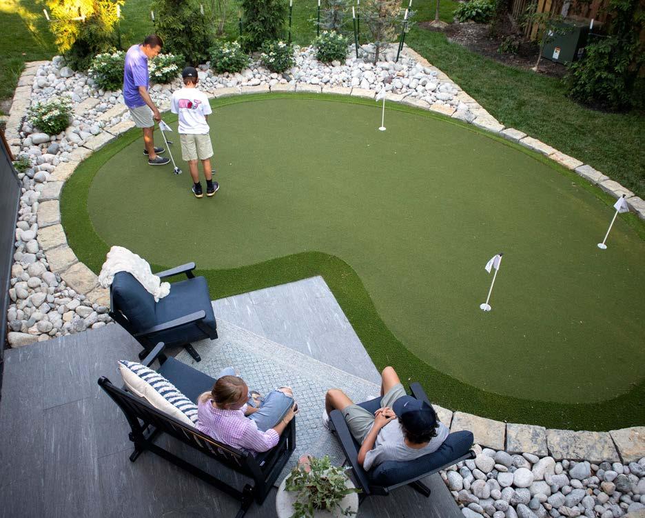
Right: Artificial turf is a big residential trend right now. Kid- and petfriendly and low-maintenance, Kurt allowed for a large expanse of it along the elevated ridge of the point.


sit and relax on a chaise lounge before jumping into deeper water. The pool’s deep end features another hang-out area—a swim-in grotto-style structure with additional seating and a cascading waterfall. Above the waterfall is the platform and top of the waterslide that extends into the pool. The homeowners wanted a lap lane for exercise, as well, so they designed it along the pool’s infinity edge.
“Because [the pool] is adjacent to the lake, the idea of creating an infinity edge was so that it has that allure from inside the pool [while] you’re looking out over that water and aligning it up with the lake water,” Kurt says. “The negative edge gives you that view out over the lake.”
Connected to the pool area is a lowmaintenance recreation space topped with artificial turf, which allows the family to go outside and play year-round.
The pool's reef ledge is an interactive space for lounging and acclimating to the water. A lap lane is adjacent to the infinity edge. At the deep end of the pool, a swim-in structure has additional seating and a cascading waterfall. from the jump platform and waterslide entrance above.The front of the house could be described as a transitional style, while the back is more geometric, with lots of clean contemporary lines.


The homeowners wanted an “instant landscape” that included trees, flowers and foliage that wouldn’t take 10 years to fill out. Because the homeowners host charity events, they requested truly unique plants for guests to enjoy. Understanding the size and scale required to meet their desires, Medellin Landscaping nearly bought out the local supply of material a year in advance of construction. "I had this huge plant palette of trees and shrubs, and I would just call in a delivery when a section would open up to plant," says owner Ricardo Medellin. "It was just so much fun, and it's still happening as we speak. This is one of the most unique jobs when it comes to creativity. "

“Artificial turf is a growing trend in residential [properties] right now,” Kurt says. “Historically in Kansas City, we have those weeks in the winter with 50- to 60-degree days [when] you want to go out and enjoy the outside.” As he explains, artificial turf is an increasingly popular add-on for outdoor areas, requiring minimal maintenance compared to a traditional grass lawn. This spares homeowners from mowing, fertilizing, watering and other tedious lawn-care chores; it also helps kids stay active, allowing them to play outside year-round. “The turf even has an antimicrobial built into the fiber so dogs can go outside, and then you can wash it off.”
In the final transition from the upper levels to the dock, Lorax incorporated plant beds and native grasses that mimic the lake’s natural shoreline. A crushed-limestone walkway leads from the auto court on one side and stairs from the pool deck on the other, offering two paths to the lake. One of the most important parts of the landscape design also lives on this level—a hidden hillside bunker that provides storage for machinery, pool chemicals and other outdoor equipment.
“It’s a unique property,” Kurt says. “It’s the manmade transition back into that natural aesthetic.”
Landscape Architect: Lorax Design Group, @loraxdesigngroup Plant Specialist: Medellin Landscaping, medellinlandscaping.com


The challenge: transform a cottage-style 1930s Westwood bungalow into a spacious home that retains authenticity to the time period and the surroundings.
“The neighborhood has a lot of homes with character, and I didn’t want to knock down and build a modern house that would stick out from the rest,” the homeowner says.
However, expanding a home on a lot that formerly housed a quaint 1,600 square feet into one that would grow to 5,300 square feet is extra challenging. Fortunately, as a recently named finalist for the National Custom Home Builder of the Year Award by the National Association
of Home Builders, the homeowners’ choice of Homoly Design+Build was ideal for tackling this large-scale project.
When a home’s transformation is this big, teamwork is critical to the project’s success, requiring the homeowners, interior designers and architects to work seamlessly together. Urban Prairie Architectural Collaborative’s Paul Minto and Homoly Design+Build’s interior designer and marketing director, Molly Robinson, also joined forces for the task. Together, they created a design solution that blends perfectly into the charming Westwood, Kansas, surroundings. To help preserve the home’s original essence,
“The
 The project team successfully preserved most of the trees in the front and backyard, ensuring that the beloved character of the Westwood area remained intact.
TheNew Old
A Westwood bungalow triples in size yet retains its charming character.
Words by Meghan Craig | Photos by Bob Greenspan

Paul and his team extended the rear of the house and expanded its second floor—all while working to ensure most of the trees in the front and backyard would be saved. Garage space and an expanded driveway were also added to the exterior’s new design, which upon close examination, purposely mimics the silhouette of the original home.
As the home grew significantly in size, Molly and her team employed various interior design techniques to maintain the charm of the original space.
“The transition from a cozy cottage to a larger, more dynamic space allowed for the incorporation of design elements that brought personality and excitement to every corner,” she says. “The homeowners envisioned a home with unique spaces everywhere you turn.”
The team helped make this vision a reality by using colors, textures and pieces ranging from antique to modern.
 Above: The dining room set is a good mix of traditional and transitional pieces, capped by a golden dome fixture from Visual Comfort.
A courtyard is revealed through 10-foot-tall steel doors at the center of the home for a convenient indoor/outdoor experience. In between, a Frame TV looks like a piece of art hung above the cast stone fireplace. Also, notice the reversed darker trim and lighter wall color.


Morris & Co.'s Chrysanthemum wallpaper on the ceiling of the breakfast nook solidifies this space as ultra-charming.
The custom Roman shades and dinette add comfort to this much-loved space just off the kitchen.

Molly’s goal was to blend the historic charm of the Westwood neighborhood with updated design elements that were beautiful, functional and tailored to meet the homeowners’ specific needs and tastes.
“I find that what makes every project truly interesting, particularly this one, is the opportunity to craft spaces that not only reflect the clients’ personality and style but also push the boundaries of design,” Molly says. “Together with the homeowners, we sought to integrate unique elements that would surprise and delight both the residents and [their] visitors.”
The collaboration between designers and homeowners went seamlessly, as the homeowners enjoyed making selections along the way.
Herringbone white-oak floors and a stained island ground the lighthearted kitchen, while two Mitzi fixtures float overhead. The custom hood seemingly disappears into the background, allowing the blackframed windows to be the main focal point.

 A laundry room on the main level includes a dog door, crates and a custom cat condo.
Floor-to-ceiling doors that exit to the back patio perfectly frame a large-scale floor mirror from Anthropologie. In its reflection, you can see the custom-built dresser and Morris & Co.'s Montreal wallpaper sourced from Design & Detail.


 With 10-foot-tall ceilings, the wet room's glass door is massive, showcasing the simplicity of mushroom-colored straight-laid tile.
A window placed above the vanity allows for natural light in the primary bathroom. The inset cabinet fronts have a reeded detail.
“Though someone had renovated it (probably a few times), I wanted the home to be traditional without being stuffy.”
~ the homeowner
“I honestly loved every part of the renovation, but my favorite was probably selecting the ‘final touch’ aspects, like paint, finishes and fixtures,” the homeowner says.
While the bungalow transformed into its current four-bedroom, three-and-a-half-bath layout, the project team updated the home’s interior—and accentuated its character—by infusing traditional elements with modern touches and new materials. The use of colorful accents, captivating wallpaper and innovative lighting also cultivated an atmosphere of creativity and surprise, giving the renovated home a delightful and inviting feel.
“Collaborating with these homeowners, who were open to new ideas and willing to take risks, is another factor that made this project truly interesting and fun,” Molly says.
 Anonymous by Sherwin-Williams makes a delicious and cozy backdrop to the family room's pink velvet couch.
Video Interview

Unique elements can be found throughout the home, from the row of windows leading to the primary suite and the garage to the cozy breakfast nook encompassed by windows on three sides. The renewed living room and kitchen areas showcase airy 12-foot ceilings; meanwhile, the reimagined attic space features an office/lounge space and reading nook. A standout feature is the 10-foot-tall set of steel doors that open to a charming courtyard and water feature located at the center of the home. Beautifully designed, the courtyard is an ideal space for entertaining, enjoying a meal or simply escaping the hustle and bustle of a busy day.
“My favorite part of the renovation and addition was how seamlessly the home was integrated into the neighborhood, creating the illusion that it has been there as long as the trees,” Molly says.
This close attention to detail was the key to helping retain the home’s charm, its character—that “special something”—that makes it a classic Westwood home, no matter its age.
Architect: Urban Prairie Architectural Collaborative, @urbanprairiekc
Contractor/Interior Designer: Homoly Design + Build, @homolydesignbuild
 The library paneling, trim and walls are painted in one monochromatic color and beautifully frame the quartz fireplace surround.


CA PE COD-METOLOGY
Collected Living Design revives a classic Cape Cod in Fairway with a cosmetic makeover.
Words by Gloria Gale | Photos by Nate Sheets The front living room features a set of original French doors that open to the front yard. The fireplace stone is original but was updated with a traditional molding mantle.

Distinctive neighborhoods abound in the Kansas City metro—some burgeon with elegance and stature; some are notably historic. Many homes are built on land worth more than the home itself, while many are situated on sprawling landscapes. None of those situations, however, apply to the resilience and character of the Fairway neighborhood. With its 1950s-era collection of modest-sized homes in a prized location, a Fairway address is so desirable that properties for sale are a rarity.
Luck was on buyer Reid Rosen’s side as he and his wife found their dream home—one of the neighborhood’s signature Cape Cod residences. Though the three-bedroom, four-bath home checked all the boxes, upon closer inspection, Reid admits their new residence “was going to need work, especially after a walk around revealed the home definitely had character but
lacked the charming decor of a traditional Cape Cod style that [he] envisioned.”
Reid reached out to Liberty-based Laurie Champ, lead designer of Collected Living Design, and brought her on board during the 2021 remodel. Together, they agreed that the 3,000-square-foot house had good bones—all of the hallmarks of a Cape Cod were in place, including a shingle-clad exterior, the requisite dormers and a steep-pitched roof—but its design needed an aesthetic and functional revival. Hampered by low ceilings, drablooking stained floors and walls, and a previous homeowner’s decorative additions of barn wood and corrugated sheet metal, the project’s goals pointed to a complete cosmetic revamp.
“Our first task was removing the gray color and weathered barn wood found on many surfaces,” Laurie says.
Laurie reoriented the island in the kitchen and highlighted it with mitered-edge quartzite countertops. She lime washed the original stone wall in the back of the kitchen to soften the color palette.
The preexisting plank hardwood floors were stripped and replaced with a deep walnut-toned stain that continues throughout the house.
To optimize the kitchen’s role as a central hub of everyday life, Laurie replaced the old cabinetry with new, more functional Shakerstyle cabinets. She painted over the gray on the walls with a lighter, creamy tone and installed quartzite countertops that elevate the overall look, giving the space a timeless appeal.
An original stone facade on the wall above the stove appeared splotchy and overly masculine—clearly in need of an aesthetic facelift. “By limewashing the stone, it acted like bleach, unifying the overall appearance,” Laurie describes. “All of these elements made a huge difference in the style of this area.”
That authentic detail and more delighted Reid. “I’m a perfectionist, plus I love history,” he says. “Anything we added to accentuate Old World charm was a positive.”
Another case in point was Laurie’s addition of brass hardware throughout, as well as wood beams on the kitchen and living room ceilings. She even touched on the landscape design by incorporating a vintage brick footpath leading up to the home.
of


Given that Fairway is known for its abundance of mature trees, Reid appreciated that the backyard was previously finished with a patio and fireplace accentuating the surrounding lush foliage.
“Because we like to spend time outdoors, we also redesigned a tack shed for my wife,” he adds.
Even the basement got a makeover. The new stone fireplace and bookshelves—two features any gentleman would love—enhance the comfort and ambiance of the expansive space, making it a perfect spot for entertaining family and friends.
Slowly, over a five-month renovation, a classic Cape Cod home emerged. Nothing had been done to modify its architectural characteristics, from the fireplaces to the central hall staircase, yet everything felt new and transformed.
“That has been so important,” Reid says. “We didn’t need to gut the home down to the studs, if


 The basement has a cozy corner of built-in bookshelves with picture lights.
In the primary bedroom, the designers plastered over a "Colorado style" cobblestone fireplace but elected to keep the large rustic mantle beam for an Old World feel.


anything. Each room on both the upstairs and [the] main level has the integrity of a cottage we were looking for.”
Laurie used a quiet mix of neutral furnishings throughout the revived home, purposefully avoiding intrusive visuals, such as too much pattern. When asked to pick her favorite place in the house, she replies: “It would be the living room with its classic French doors.”
Adjacent to the living room, the dining room welcomes all with subtle wall art, wood elements and woven cane chairs surrounding an oak table.
“Now the home has a cohesive feel that is perfectly suited to the homeowners,” Laurie says. “It was a team approach between myself and Reid. He’s happy; so am I.”
Interior Designer: Collected Living Design, @collectedlivingdesign Resources: Page 248
In the primary bathroom, the designers chose Jeffrey Court tiles for the floor and exposed brass Waterworks fixtures. The highlight of the guest bath is the custom tile layout on the floor and bluestripe accent around the base of the shower.

A Kelly Porter painting from Blue Gallery takes center stage in the striking music room and lounge area, located adjacent to the entry. There's a formality yet casualness to this multi-functional room for the whole family. The velvet chairs are custom-upholstered and the console below the artwork is by Made Goods. The French doors leading into the living room are flanked by the bespoke details of custom-designed built-ins.

HARMONIOUS
HOME
Stephanie Stroud Interiors hits all the right notes in an extensive redesign for a young, musical family.
Words by Susan Cannon | Photos by Laurie Kilgore
As with the rest of the home's redesign, the living room represents both familiarity and reinvention. To steward its transformation, the design team built out the fireplace wall and modernized it with a streamlined classic mantle and flanking nooks featuring matching inlaid burl chests in the Regency style. The extra-large chandelier—reminiscent of a medieval English two-tiered torch fixture—is in perfect scale for the height of the room and adds just the right classic mix for the contemporary furniture.
If you can imagine, this was a hot mess,” says Megan, referring to the original interior of the home she and her husband, Josh, recently bought. They found the spacious two-story house, built in 1990, to be cluttered with tired design details, various outdated flooring in every room and a spatial layout that didn’t meet their needs. They also wanted a conservatory for their kids, who are avid piano, guitar and violin musicians.
Before purchasing the home, the couple had been neighbors with Caril Duncan, a designer at Stephanie Stroud Interiors. Sharing similar aesthetics with Caril, the homeowners decided to hire the firm to take on the complex renovation and complete redesign of their home, including all new furniture, lighting and surface materials.
“We have a pear orchard and farm near Paola,” Megan explains, “and since the home we moved from was much smaller, we decided to move most of our things down there.”
Though reconfiguring the first floor’s layout and confusing flow posed a challenge, the mission was a resounding success. The designers also loved that Megan was keen on achieving upscale uniqueness.

“She was super trusting and let us be creative and really embraced our ideas,“ Stephanie says.
When asked about her level of involvement with the designers, Megan says she found it very collaborative. She has a precise eye for detail as an engineer, and as an art lover, she possesses a strong visual sensibility.
“There were only a few ideas I had to sleep on, such as the scale of the dining room chandelier,” Megan adds, though admitting she loves the outcome.
Stephanie brought in Jim Kostusik, the owner of Redstone Homes, as the contractor. Nearly


the entire main floor had to be taken down to the studs to reconfigure the interior spaces. Once they were working with a blank slate, the designers’ first step toward modernization was to unify the flooring with light-toned hardwoods installed throughout the home. They then stripped the entryway of distracting wallpaper, replacing it with attractive, floor-to-ceiling wainscoting. Other outdated features—such as the contrived wood detailing and the arched windows above the entrance and fl anking coat closets—were also removed. To elevate the entry, the designers created discreet pocket doors for the closets and turned the single front door into paned double doors, adding the perfect touch of modern elegance to the large space.
As Caril, who had a large hand in the decorating, explains, “We like the blend of traditional elements mixed with modern style.” Their selection of black for the classic banister and steps created a bold statement as well as a smart starting point for the graphic black hues that carry through all the main living spaces. The alluring music room, located to the left of the entry, beckons visitors with its rich, dark-colored walls and shiny black grand piano. It exudes sophistication with cozy velvet
Hand-applied black plaster on the hearth adds graphic modernity to the airy space. The hearth’s fireplace nook seemed diminutive, so the designers added a larger square cubby for firewood to its left, creating balance. The framed art above the mantle conceals the flatscreen TV. The kitchen's island and backsplash are topped with Paonazzo marble from Carthage Stoneworks. A Stephen Dinsmore still life painting of pears is from Blue Gallery, hanging below a handrubbed antique brass sconce by Aerin.
 The eye-catching Hoopoe Leaves wallpaper is by Cole & Son; the jeweled light fixture is by Kate Spade. The striking marble vanity is from Carthage Stoneworks.

seating, custom-built cabinets and a vibrant contemporary painting. The new cabinetry accommodates a bar on one side of French doors and a turntable and LP vinyl records on the other. However, the room perfectly serves two purposes, which is a testament to the designers’ clever problem-solving.
“The kids use this space on a daily basis for their music—more than even we do,” Megan explains. “But we use it as much for entertaining as the living room.”
Beyond the musical alcove, an impressively airy, grand-scale living room boasts two stories of floor-to-ceiling windows. The designers conceived a more modern space by removing the grandiose woodwork extending to the ceiling
above the fireplace. They also eliminated the adjacent wall’s lit-up nooks and built-in cabinets in favor of a brand-new, custom-designed modern fireplace.
Because the living room flows into the hearth room and kitchen, the design team put extensive thought into modernization, detail, tone and texture, creating a sense of cohesion that is reserved yet elegant. They also incorporated high-quality surfaces and furnishings throughout. For example, the hearth room was pared back to showcase its newly plastered black wall as the key design element within the space.
Another masterful redesign, the new custom kitchen is truly next-level. Originally, the design was so busy that it needed the most
The master bedroom is designed with custom furnishings in a soothing pale palette that has a welcoming look that blurs the lines of contemporary and traditional styles.


streamlining. Thus, the designers reconfigured it by moving around cabinets and appliances and adding a large pantry/baking room with an extra oven behind a set of double doors. The copperfront oven—the only item used from the prior design—melds beautifully with the surrounding wood tones. It’s now a kitchen design that even a Michelin-starred chef would be lucky to have.
A few steps away is a newly created flex room that serves as Josh’s office by day and a poker room for him and his buddies by night. It can easily transform into a guest room with a full bath and a wall unit accommodating a slide-in bed. Josh brought in curated collectibles and found the large classic painting at auction, making the space a real reflection of him. A nearby small powder room—designed with statement-making wallpaper and a stunning, custom marble vanity—winds full circle toward the front hallway, conveniently tucked between the back stairwell and mudroom on one end and the dining room on the other. A chic mix of furnishings, standout lighting and specially embroidered wallpaper give the dining room a glamorous feel and major wow factor, impressing guests as it opens up to the entrance hall across from the music room.
Upstairs, the relaxing redesign of the primary bedroom—replenished with customized furnishings—carries over into the renovated primary bath, to which the designers also gave bespoke treatment. Each element was thoughtfully considered, including the tiled floor pattern that emulates a throw rug, adding interest to the elongated space.
In every detail, the project team parlayed a visual vocabulary of classic, timeless design that is also modern and rooted in the now. Their contemplative approach, aimed at bringing uniqueness with fresh and detail-oriented eyes, is something they and their clients relish.
Interior Designer: Stephanie Stroud Interiors @stephaniestroudinteriors
Contractor: Redstone Homes, @redstonehomes
Resources: Page 248
This home’s transformation is beautiful and has an inviting sensibility that didn’t exist before— one that is harmonious and sure to amaze all who cross its threshold.

H rt Transplant
The central section of the house was gutted and transformed into a modern hub of the home, featuring open living, dining and kitchen areas flanked by glass walls on both sides of the house for connecting with the beautiful environment. The views of the sloped site seemingly flow through the space.

An impressive design team collaborates on the modernization of a Lake Quivira home with a glass-walled, vaulted volume at its core.Words by Andrea Glinn | Photos by Nate Sheets
it is nearly impossible to distill the feeling of “home” into a checklist of wants and needs.
For Eric and Katie Vossman, dreaming of what their home could be was the impetus for remodeling their 1970s lake house.
“We want our kids to grow up in a space that is thoughtfully designed,” Katie explains. “Creating beauty around them is very important to us.”
To execute their vision, the Vossmans reimagined their house’s physical structure while exploring how to manifest the heartwarming essence of “home” for their growing family.
When the couple stumbled across a house—their future home—on wooded acreage for sale in the area, they jumped at the chance to buy it, even though it needed
a complete overhaul. The young family was already living in the neighborhood, but with their third child on the way, a larger home with an expansive, nature-filled lot proved too tempting to resist.
“I grew up in this lake community—my grandparents moved here in the 1960s, and my family has lived here since—so I knew that there were not many places like this out here, with a large lot and the potential to see the landscape surrounding it on all sides,” Eric says.
The Vossmans lived in the home for a few years before they were ready to remodel. Despite their background as trained architects, the couple chose to collaborate with a top-tier remodeling team—including McHenry Shaffer Architecture, Kali Buchanan
A water feature placed right next to the house is a delight whether viewed from inside or outside.
Large custom doors and windows finished in Douglas fir add warmth to the modern space. Two Moooi chandeliers add sculptural interest but are still light in their visual weight. The slim black pendants over the island help balance the tall, dark fireplace surround opposite of them.
Interior Design and the general contracting and sustainability gurus at Kala Performance Homes—to bring their vision to life.
Their combined expertise was vital to finding ideal solutions to issues within the existing 1978 home. Its problems were not limited to its old age and inefficiency: the home needed a heart transplant. The home’s orientation on the property also had incredible potential for spectacular views, but this opportunity went almost entirely unrealized.
“The existing home had eight-foot ceilings—which were typical of the era—and small windows with an 80-inch head height. There was no connection to the landscape, and every view was clipped,” notes architect Brandon Froelich. To create a central space where the family could comfortably gather,

entertain and live a modern life while enjoying the scenery, the team decided to dissect the home by removing an entire section and gutting the rest.
With the family’s lifestyle in mind, the project team demolished the central core of the house, replacing it with a nine-foot, glass-walled, vaulted volume. The new scissored truss structure allows for an all-glass façade, through which the landscape is not only seen but “seems to pass through the house,” Brandon describes.
The space’s transparency yields stunning vistas throughout the house, delighting residents and guests with scenes of the sweeping treeline and sky beyond. Additionally, the original windows were replaced with new, amply-sized ones, further brightening the home.
“You can see out from any place you stand in


the house,” Katie says. The couple’s desire to frame picturesque views led to ne’er a darkened corridor, closet or bathroom. Instead, they welcomed the transcendental quality of natural daylight to pervade every room.
Although the entire home was notably modernized, the design magic is especially palpable in the living space.
“One of my favorite design moments occurs at the interior corners,” Katie says. “The drapery pockets were designed into the structure, so the details are clean and seamless.”
Eric’s favorite element of the house may be the double-sided, modern wood-burning Spartherm stove. He revels in its efficiency—it draws in outdoor air while lifting indoor air along the face of the heated firebox, releasing it back into the space through natural convection—and enjoys honing his art of building fires as well.
Efficiency is par for the course, given Kala’s emphasis on passive and sustainable construction methods. In addition to the wood stove, the home
 Honed granite countertops were sourced from Carthage Stoneworks; the matte custom oak cabinetry is by Hinge Woodworks.
The recessed TV wall mimics the same design feature in the kitchen opposite of it. Soft linen drapery allows the homeowners to control views and light when needed; it also adds texture to the space. The drapery hardware and "stackback" are concealed in a shade pocket.
The pantry and drop zone at the end of the corridor are part of a thoughtful approach to the layout.


 A seating area on one side of the fireplace offers a cozy space within the large volume.
Firewood peeks out of the custom wood storage opening in the side of the blackened steel fireplace surround.

A perfectly framed pair, the entry foyer and library relate directly across from one another. Framed by thickened white-oak "portals," the design leads your eye directly to the view of the spectacular tree canopy outside.


adheres to many of the standards of Passive House design: air-tight construction, triple-pane glass, super insulation, no thermal bridges and utilization of the sun’s energy for creating shade in the summer and capturing solar gain in the winter.
“Experiencing the perfect temperature on the hottest or coldest days—while enjoying incredible views through the large windows— is the result of implementing Passive House construction standards,” says David Schleicher, Kala’s general contractor.
This emphasis on comprehensive comfort is fundamental to the spirit of home. The space looks as good as it feels, too. To anchor the primarily white palette of the open living space, designer Kali Buchanan used black-stained wood cabinetry for visual weight at both ends
 The new second-floor plan better accommodates the family with two generous bedrooms, a full bathroom and a small loft or entertaining space for the sisters to enjoy. Wall coverings were selected to bring color and individuality to these spaces.
The primary bathroom is defined by simplicity and function. The space is warm and inviting, delineated by the central white-oak floor flowing from the bedroom and the closet, while a slab of marble supports the pedestal base of the freestanding tub. The walnut vanity and linen storage bring deeper warmth and a timeless modern appeal to the room.


The reconfigured second-level bathroom adds more detail with an inset-slab style vanity in a warm walnut finish. The added skylight brings natural light while the terrazzo-style tile brings texture and playfulness into the shared kids bathroom.
A well-placed window floods the steam shower with light. The space is flanked by two recessed storage nooks with his-and-hers shower heads. The slender black wall tile is repeated on the floor, and the white surround gives margin and high contrast to the crisp space.
Far from its day before running water existed in homes, the primary bath is a luxurious oasis awaiting the Yateses after spending their days working or playing outside.

Architect: McHenry Shaffer Architecture, @mchenryshafferarchitecture
Interior Designer: Kali Buchanan Interior Design, @kalibuchananinteriordesign
Builder: Kala Performance Homes, @kalabuilt
Resources: Page 248
of the room. Then, to aesthetically warm the space, the team opted for light oak floors and wood-clad glazing rather than black metal-framed mullions, as the Vossmans had initially envisioned. Because the kitchen, dining and living areas openly flow into each other, Kali was intentional with her selections of decorative light fixtures.
“I didn’t want them to compete,” she notes. “Since we chose a series of tall, slim, dark pendants over the island, I wanted something loose and organic in the other areas.”
When Katie and Kali came across Moooi’s Flock of Light chandelier, they immediately knew it was just what the project needed. These decisions added to the home’s character, making it feel more bespoke and unique.
Re-envisioning the house and integrating it with its surroundings gave the Vossman residence a new lease on life—and improved the family’s lives as well.
“We created a space that energizes us, where we can thrive alongside each other and enjoy family life,” Katie says.
What more could a family want in a home?
 The powder bathroom brings drama to the home with its playful wall covering by Drop It Modern and a special green quartzite countertop over a floating walnut vanity. Brass fixtures and organic shapes loosen up the clean geometry.

Modern English Manor
An Artisan builder crafts her personal home with timeless, authentic details and modern luxuries.
Words by Christine Emming | Photos by Matthew Anderson
"I just love how this kitchen came together," says homebuilder Lauren Browne. "It's truly the heart of the home. The combination of natural elements of marble and wood butcher block, plus mixing unlacquered brass fixtures with the polished nickel hardware creates the perfect balance of luxury and relaxed comfort."

Lauren Browne, founder of Grace & Nell Homes, is a third-generation home builder and one of the few women in a leading role within the industry.
“My dad and grandfather were home builders here in Kansas City, and I grew up on job sites,” Lauren says. “Going to work with my dad was my absolute favorite thing. After graduating from college, I went to work in the family business full-time.”
As the company’s chief operating officer (COO), Lauren oversaw the building of up to 100 homes per year.
She took a break from construction, staying home full-time to start her family. After a couple years of pause, she was ready to rejoin the workforce.


“I knew I loved home building but also wondered if the love was because that’s all I knew,” she says.
Then, an offer came in for her to work for a Fortune 500 company, which she accepted. Though the experience was rewarding, Lauren missed the creativity involved with home building.
“Everywhere I turned, the same types of homes were being built on repeat,” she explains. “[The] variations in beautiful architecture is what makes for long-standing communities.”
Her passion and prowess as a builder shine brightly through Grace & Nell’s most recently completed custom home, the Modern English Manor, an authentic representation of Lauren's design style.
The home was designed around the vision Lauren held for this staircase, including all the wainscoting and custom iron railings. "I love curated spaces and mixing antiques with new furnishings," Lauren says. One notable decor piece is the 18th-century foot bath on the shelf of the great room. "I found it at an estate sale a few years ago, and it's become one of my favorite pieces."
“Equally, I think of the three dimensions in every room—walls, floors and ceilings. Each room should tell its own story that connects with the whole home,” Lauren says. Envisioning a union of timeless English architecture with modern design, she included the traditional asymmetrical exterior features plus modern natural materials and metal finishes into the Manor’s design.
A soft, swooping roofl ine built with custom concrete tiles was a key exterior design element that required keen attention to detail early in the construction phase. Lauren’s crew worked with framers to test and perfect the swoop angles, building up the angle significantly more in the field to achieve the desired emphasis of the curves when viewing the home from the street.
“As we built up the angles, we tested samples of the concrete roof tiles to ensure they would effectively follow the curve,” she says. “The result was worth the extra effort.”
A shared center line for the fireplace and cooktop is a must when designing a kitchen and great room that neighbor one another. In this kitchen, however, that shared center line created an unideal asymmetrical layout that required design finesse to perfect.

sourced
 Lauren intentionally
the stone cast mantel from a Salt Lake City-based company. This centerpiece reminds her of her time spent there during a stint in the corporate world.


One of Lauren's core beliefs is that your home should be a place to be inspired and refreshed. "Our primary suite does just that," she notes. "I absolute love every element, from the crystal chandeliers to the mix of wood tones and custom textiles."
Left: Carrying the wood floors and wainscoting through the primary bath adds warmth and continuity to the room.
“One thing I love in European kitchens is the use of real marble and wood countertops,” Lauren says. “Combining both at the island was just the solution we needed.”
The kitchen sink, centered with the marble counter and the cooktop, establishes symmetry while the large butcher block at the end creates a satisfying visual balance.
The finishes throughout reflect a longestablished home—one with heart. The English manor inspiration carries throughout the interior of the home with abundant wainscoting, dormers at the entry and second floor and well-appointed room sizes that are spacious yet cozy. Myriad luxe finishes—European white-oak flooring, a mix of metals, imported handmade fixtures from England, Italian marble and lacquered cabinetry—uplevel the home’s grand interior. Whole-home automation makes the best of both worlds, seamlessly merging the timeless finishes of the Old World with the residing family's modern needs.
Equally passionate about a home’s beautiful

finishes and what lies behind its walls, Lauren’s build standards surpass the industry norms.
“As a builder, I am continuously managing construction decisions based on how well a given element will provide long-term performance [within] the home,” Lauren says. With nearly zero soffits and an asymmetrical style, it was crucial to ensure the home was truly dried in. For example, before insulation or sheetrock were installed, Lauren’s crew watertested the whole home.
“Based on the reaction from our trade partners, it was clear this practice is almost never done,” Lauren says.

 Multiple gathering spaces, including this chic space in the lower level, make room for friends and family to connect.
By strategically placing the foundation of the home, Lauren was able to get daylight windows from what should have been a flat lot. To help create a more elevated view, the window wells are done in painted brick to match the exterior of the home.


Over time, average rainfall amounts could have built up moisture. But with this extra step, the team was able to prevent even the smallest water leaks that could have gone undetected.
Lauren will bring this same level of critical detailing to her featured home on the 2024 Artisan Home Tour this summer.
“It’s truly original, and there’s nothing else like it in Kansas City,” Lauren notes.
She collaborated with Nell Hill’s on furnishings and decor. The home’s interior has it all—a gourmet kitchen and caterer’s kitchen, a spacious primary suite with a marble water room, a golf simulator, a full smart-home system with lighting control and more.
Lauren founded Grace & Nell Homes in 2019, a decision she made not only for her love of home design but also because she recognized a lack in build quality and overall client experience. Lauren thus maintains a highly collaborative dynamic with clients and gives clear, direct communication throughout the process.
“I don’t cut corners, and I put even more attention into the construction details that aren’t seen,” she says.
Whether it’s for her own home or her clients’ homes, that is the true sign of a well-built home—and one that comes from the heart.
Architect: NSPJ Architects, @nspjarchitects
Builder/Interior Designer: Grace & Nell Homes, @graceandnell Resources: Page 248
 The upstairs loft was designed with teenagers in mind, with its game table and space to hang out. "The nautical flags are a fun nod to my kids' initials—N and B," Lauren notes.
A custom-made vanity mimics the look of an apothecary cabinet; unlacquered brass fixtures add an aged feel.
"The draperies in my daughter's room may be my favorite textile in the whole home," Lauren says. "I love the traditional and whimsical feel they bring."

Scan here to watch the video featured on My KC LIVE

Like Lauren's style?
See another of her custom-built homes on the 2024 Artisan Home Tour—it's one of 15 homes open to the public this summer: August 9-11, 16-18, 23-25. Scan here for details.


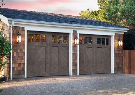


Stylish 1.5 Story Home greets you with a Secured Entry, Winding Staircase with Award Winning Bob Faust Wrought Iron compliments; Ornate Lobmeyr Chandelier shipped from Austria; Den/Study with Fireplace; Multiple SAFE Rooms; Exercise Room; Formal Dining and Gourmet Kitchen. 5 Bedrooms; 5 Full 2 Half Baths; 4 Fireplaces; Granite Floor Tile over concrete subflooring. 4 Car Garage and Ample Storage. Professionally Engineered to incorporate construction with Iron Beams, Metal Studs, Steel Plates, Brick, Slate/Tile Roof over Perlite Underlayment, Concealed Gutters, Back-up 35,000 KW Cummings Power System add to the Sustainability of this Quality Crafted Home. Acre+ Estate Lot within walking distance to Ti any Greens Clubhouse and Golf Course. $2,606,383.00


ECHO AND FLOW
Interior Designer: Little Black Dresser Interiors Builder: Starr Homes Appliances and Plumbing Fixtures: Ferguson Cabinets: Cabinets by King Countertops: Cambria
Fabrication: Canaan Stone Works Flooring: Legacy
Furnishings: Charmed House Interiors Lighting Fixtures: Little Black Dresser Interiors New Home Community: Terrybrook Farms–Rodrock Development
HARMONIOUS HOME
Interior Designer: Stephanie Stroud Interiors Contractor: Redstone Homes Art: 913 Cabinets: Parks Cabinets Countertops: Carthage Stoneworks Flooring: Kenny’s Tile Furnishings, Hardware, Lighting Fixtures, Wall Coverings, Window Coverings: Stephanie Stroud Interiors
HEART TRANSPLANT
Architect: McHenry Shaffer Architects Interior Designer: Kali Buchanan Interior Design Cabinets: Hinge Woodworks Contractor: Kala Performance Homes Countertops: Carthage Stoneworks Fireplace: Spartherm Windows: SmartWin; Alpen Wall Coverings: Drop It Modern

CAPE COD-METOLOGY
Interior Designer: Collected Living Design Cabinets: Precision Woods Countertops: Stone Surface Lighting Fixtures: Relative Lighting Window Coverings: Solar Shield Blinds Shades Solutions
MODERN ENGLISH MANOR
Architect: NSPJ Architects Builder/Interior Designer: Grace & Nell Homes Tile: Emser Countertops and Backsplash: Rocktops Plumbing Fixtures: House of Rohl Paint: Benjamin Moore Door Knobs and Hardware: Emtek; Classic Brass; Top Knobs Appliances: Ferguson Range: Lacanche; Art Culinaire USA Cabinets: Profile Cabinet
Smart Home System: MAVi Flooring-Hardwoods: SVB
Wood Floors Furniture: Nell Hill’s; Prize Home + Garden Lighting: Wilson Lighting; Visual Comfort


1 Perfect Door - Elizabeth Chiesa 94 1perfectdoor.com
A Thyme for Everything 118 athymeforeverything.com
A Total Door 89 atotaldoor.com
Aladdin Oriental Rug Company 43 aladdinorientalrugs.net
Amborn Stone 138 ambornstone.com
Amini’s Galleria 18-19 aminis.com
Anchor Remodel 181 anchorremodel.com
apd_studios+ 94 adamapfeifer.com
Aquatic Consultants Inc. 129 aquaticconsultantsinc.us
Architectural Craftsmen 146 archcraftsmen.com
Area Rug Dimensions 49 arearugdimensions.com
Ashner Construction Company 61 ashnerconstruction.com
Assured Waitstaff 246 celbedil@aol.com
B.L. Rieke Custom Homes 2 blrieke.com
Backyard by Design 127 backyardbydesignkc.com Bank 21 166 onlinebanking.bank21.com
Banner Garage 103 bannergaragekc.com
Battle Creek 46 battlecreek.info
Berkshire Hathaway Lake of the Ozarks 259 searchlakeozarkshomes.com
Bichelmeyer Renovations 173 bichelmeyerrenovations.com
Luxury Resource Directory
Bledsoe Construction 34 thekingofbackyardbling.com
Bleu Grace Designs 103 bleugrace.com
Bordner Home Improvement IBC thinkbordner.com
Brancato’s Catering 251 brancatoscatering.com
BRH Design 93 brhdesign.com
California Closets 89 locations.californiaclosets.com/ks/kansas-city
Castilleja-Furniture-Gallery-Showroom
mattcastilleja.com
cecilandrayhomes.com Central States Tile
csttile.com
Surfaces
centralsurfaces.com
cosentino.com Costain Construction
costainconstruction.com
Crown Cabinetry 62 cabinetsbycrown.com
Design & Detail to the Trade 65 designanddetailstl.com
Designer’s Library 26 designerslibrarykc.com
Eden Floral + Events 116 edenfloralandevents.com
Faust Construction 99 faustconstruction.com
Ferguson Bath, Kitchen & Lighting Gallery 32 build.com/ferguson
Gaumats International 35 gaumatsinternational.com
Gillpatrick Woodworks 138 gwoodllc.com
Glinn Interiors 96 glinninteriors.com
Good Earth Water Gardens 104 goodearthwatergardens.com
Grace & Nell Homes 87 graceandnell.com
Gutter Cover Kansas City 155 guttercoverkc.com
Haw Contemporary Art Gallery 53 hawcontemporary.com/info Heather L Lowe 83 heatherllowe.com
Herron + Partners 99 herronandpartners.com
Hickok Homes 81 hickokhomes.com
High Prairie Landscape Group 10-11 highprairieoutdoors.com
Home Builders Association of Greater Kansas City 258 kchba.org
Homes By Chris 117 hbcbuilder.com
HomeServices of America: ReeceNichols & BHHS KC Realty 24 reecenichols.com
Homoly Design + Build 59 homoly.com
Hurst Construction 151 hurst.build
Imperial Roofing 257 imperialroofingkc.com
Interior Design Beth Phillips 105 idbp.net
International Materials of Design 246 imdtile.com
Jami Meek Designs 115 jamimeekdesigns.com
JCLC Homes 71 jclchomes.com
JHR Building 254 jhrbuildingcompany.com
Jorjy 146 shopjorjy.com
Journey Home Team / Compass Realty Group 115 jenniferharveyteam.com
JS Robinson 54-55 jsrobinson.com
Justin Thornton Painting Co 151 facebook.com/Justinthorntonpainting
Kanas City Remodel & Handyman Allen 155 kansascityremodel.com
Kansas City Regional Association of Realtors 159 kcrar.com
Kara Kersten Design 93 karakerstendesign.com
Karin Ross Designs 50 karinrossdesigns.com
KC Wholesale Carpet 133 kcwholesalecarpetstores.com
KCBR Design Remodel 145 kcbathremodel.com
KDR Designer Showrooms 31 kdrshowrooms.com
Kenneth Estates 84 kennethestates.com
Kitchen Design Gallery 91 kitchendg.com


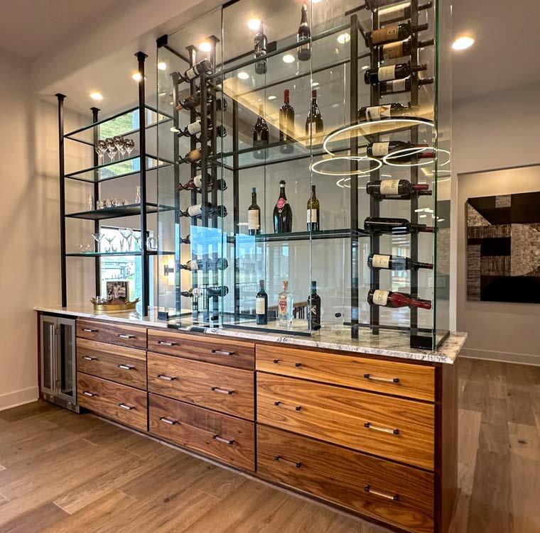


Kitchens & Baths by Briggs 149 kbbriggs.com
Kitchens by Kleweno 69 kleweno.com
Knotty Rug Company 67 knottyrug.com
Koehler Building Company 253 koehlerbuildingcoinc.com
Kohler Signature Store by First Supply 249 kohler.com
Lake Ozark Real Estate / Jonathan Hartenstein 169 luxurylakerealty.com
Lambie Homes 25,27 lambiehomes.com
Liberty General Contracting 175 facebook.com/profile.php?id=100063858463826
Lisa Schmitz Interior Design 66 lisaschmitzinteriordesign.com
Loch Lloyd BC lochlloyd.com
Locks & Pulls 64 locksandpullskc.com
Lorax Design Group 66 loraxdesigngroup.com
Lusso Porcelain & Design 121 lussoporcelain.com
M. Sudermann Interior Design | Sid & Co. 23 sidandcompany.com
Madden-McFarland Interiors 39 maddenmcfarland.com
Maggie O’Connor Doolittle ~ ReMax Premier Realty 96 maggie-doolittle.remax-midstates.com
Maison de Marnie 153 maisondemarnie.com
Martanne Construction 177 martanneconstruction.com
Maverick Outdoor Living & Design 157 maverickoutdoorkc.com
Meierotto Jewelers IFC-1, 6-7 mjewelry.com
Midwest Fireplace 143 midwestfireplacekc.com ML Designs 129 mldesignskc.com
MMH - Madi Mali Homes 36 madimalihomes.com
Luxury Resource Directory
Rodrock Development - Terrybrook Farms 38 terrybrookfarms.com
Rodrock Development/ Sundance Ridge 113 rodrock.com
Rooted Landscape 173 rootedland.com
Roth Living 22 rothliving.com
Santa Fe Painting 78 santafecorporation.com
Schloegel Design Remodel 42 remodelagain.com
SCI - Surface Center Interiors 30 sci-surfaces.com
Tamara Day 45 tamaraday.com
The Abbott 250 abbotteventskc.com
The Bison Hut Company 134 bisonhut.com/sauna The Blind
Windows & Doors
platinumxp.com Pleasant Valley Millworks
instagram.com/tallgrassww
portfolio-home.com
pbarts.com
ProSource Wholesale
prosourcewholesale.com
Radio Controlled Garage Door and Gate
rcgdg.com
Ramsey Interiors 84 ramseyinteriors.com
Raynor Garage Doors of Kansas City
raynorkc.com
ReeceNichols / Rebekah Schaaf
rschaaf.reecenichols.com
Reliance Construction Group 153 reliancekc.com
Renovations by Starr Homes 119 renobystarr.com
Rensen House of Lights 71 rensenhouseoflights.com Rio Granite
riogranite.com
Standard 52 rmstandard.com Rocktops 40 rocktopskc.com


Scovell Remodeling 156 scovellremodeling.com
SEA Design 126 seadesign@kc.rr.com
Seville Home 4-5 sevillehome.com
Simplicity KC 143 simplicitykc.com
Six Twenty One 126 sixtwentyone.com
Solar Shield Blinds Shades Solutions 163 kcmoblinds.com
Spiess Custom Homes 125 spiesscustomhomes.com
Starr Homes 16-17 starrhomes.net
Stewart Builders 167 stewartbuilderskc.com
Stewart Title 118 stewart.com/Kansas-City
Stone Creek Midwest 165 stonecreekmidwest.com
Stonehenge Outdoor 176 stonehengeoutdoor.com
Storied Interiors 256 storied-interiors.com
Sunlighten , Inc. 51 sunlighten.com
SVB Wood Floors 58 svbwoodfloors.com
Tallgrass Windows & Doors 144 tallgrasswindows.com
Tom Johnson - Keller Williams
VIEW OUR INTERACTIVE LUXURY RESOURCE DIRECTORY BY TRADE CATEGORY


AUGUST 9-11, 16-18 AND 23-25,


IN 2023 LAKE OF THE OZARKS
Perched outside a bedroom suite, this Juliet balcony overlooks extensive brick patios and exquisite gardens. The view was always great, but the previous structure was rotting away and causing damage to the roof below. Moreover, it had lost its luster as a place of tranquility.
“The actual finish of the balcony components could best be described as ‘blah,’” says architect Bruce Wendlandt. “Our goal was to bring forth a design solution that was more architecturally exciting and more usable in every way.”
The replacement structure required crews to precision-cut the existing patio and hand-dig new frost footings to avoid disturbing the surrounding patio.
Bruce expanded the balcony’s sitting area by cantilevering the floor. Though wood-framed, the flooring system comprises thin-cut pavers atop a selfdraining custom copper floor pan that protects the wooden base. The selfdraining system prevents future water damage and aesthetically ties into the home’s Old World aesthetics.
Whereas the original balcony was unprotected, the new design integrates a roof element that is both architecturally dynamic and extends the number of days the balcony can be enjoyed—even on rainy days, the primary bedroom doors can remain open, providing natural ventilation. Additionally, a new infill roof element to the north of the balcony serves as both fall protection and water diversion. Finally, a reclaimed antique iron railing aesthetically ties in with the property while staying maintenance-free.
The new balcony reigns as the crowning jewel of the established gardens.

Architect:
Wendlandt & Stallbaumer, @wendlandtstallbaumerarchitectsContractor: E & E Quality Builders, eandequalitybuilders.com
Renaissance for a Balcony
An Old World-style home’s garden perch receives an adoration-worthy upgrade.


