


Spring is a time of renewal, refreshing and doing all those tasks that have been put off during the dark days of winter. Sometimes that means adding in some fresh linens, some bright colors or changing out rugs or throw pillows. Sometimes, it’s not that simple.
For our “Renovation of the Year,” the homeowners of an apartment in a historic St. Charles Avenue building decided to start from scratch with the help of Leslie Newman of Space Interior Design to create a calm, reflective space to showcase their carefully curated art collection and to better reflect their own personalities. The results, we think, are stunning.
We also take a peek at a glorious condo located at the Four Seasons Hotel and Private Residences. Helmed by Penny D. Francis, principal designer and owner at Eclectic Home, the team worked to incorporate the joie de vivre of New Orleans into the home’s aesthetic. Color, pattern and play all work together to create a chic escape with lots of personal touches.

Spring is also our chance to highlight some of the best examples of innovation and design in the kitchen. Whether your focus is on entertaining, incorporating all the gourmet bells and whistles, or creating a family friendly space for weeknight dining (and perhaps doing homework), we have something to inspire you.
As always, we have the latest in décor, style, gardening, home organization and much more to get you ready for spring. As Dolly once said, “If you want the rainbow, you have to put up with a little rain.” It’s time to get to work, sweep out the old, bring in fresh linens and add pops of color to welcome the sun… and the rainbows.
EDITORIAL
Editor Ashley McLellan
Creative Director Tiffani Reding Amedeo
Style Editor Andy Myer
Web Editor Kelly Massicot
Contributing Writers Jenny Adams, Lee Cutrone, Fritz Esker, Rebecca Friedman, Misty Milioto, Margaret Zainey Roux
Copy Editor Liz Clearman
ADVERTISING
Vice President of Sales and Marketing
Kate Henry, Kate@MyNewOrleans.com
Account Director Meggie Schmidt
Senior Account Executives Erin Chiartano, Brooke Genusa MARKETING
Marketing Manager Greer Stewart
Manager Rosa Balaguer Arostegui
Designers Ashley Pemberton, Czarlyn Ria Trinidad
CIRCULATION
Distribution John Holzer
ADMINISTRATION
Office Manager Mallary Wolfe
Chief Executive Officer Todd Matherne

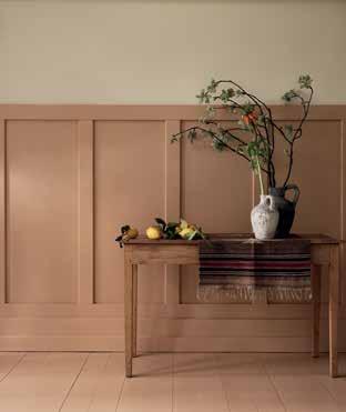
Pantone recently announced Peach Fuzz as its 2024 Color of the Year, and Farrow & Ball has six colors that illustrate the peachy trend. For example, Faded Terracotta No. CC8 is a soft, pale orange inspired by the shade of terra cotta pots and tiles; and, for a slightly richer shade, try Fake Tan No. 9912, a warm peach with an earthy tone that looks gorgeous in rooms with southern exposure. Other colors in the collection include Pink Ground No. 202, Pink Cup No. 9801, Menagerie No. 63 and Setting Plaster No. 231. For the ultimate cocooning effect, International Brand Ambassador Patrick O’Donnell recommends color drenching an entire room using the ultra matte Dead Flat finish in any one of these shades. Available for order at Spruce Wallpaper and Fabric Showroom, 2043 Magazine St., 265 0946, sprucenola.com.

In their new book, “Bohemian Soul: The Vanishing Interiors of New Orleans” ($65, Rizzoli), designer and writer Valorie Hart and photographer Sara Essex Bradley feature a collection of 17 eclectic homes representing the best of old bohemian New Orleans. The homes those of locals Patrick Dunne, Constantine Georges, Pres Kabacoff and Sallie Ann Glassman, Mary Cooper, Dr. Jessica Harris and more are in direct contrast to the conventional design of today. Instead, these homes celebrate the unique decorative style of New Orleans, rich with patina, family heirlooms and history. Available at Octavia Books, 513 Octavia St., 899 7323, octaviabooks.com.
Longue Vue House and Gardens is once again hosting its Design Symposium, taking place this year from April 11 13. This year’s distinguished event celebrates the rich design legacy of landscape architect Ellen Biddle Shipman. Event highlights include a lecture by William Curtis, co founder of Houston based Curtis & Windham Architects, followed by a patron reception with passed hors d’oeuvres (April 11 at 5 p.m.); a presentation by Courtney Coleman and Bill Brockschmidt from Brockschmidt & Coleman (a firm that originated in New York City but recently expanded to New Orleans) followed by a garden picnic (April 12 at 10 a.m.); and a Symposium Community Day where guests can engage with speakers, participate in discussions and more (April 13 at 11 a.m.). Tickets start at $250. 7 Bamboo Road, 488 5488, longuevue.com.
The New Orleans Botanical Garden in partnership with City Park Conservancy and the New Orleans Town Gardeners, a member of the Garden Club of America is hosting the Heart of the Park Hat Luncheon on April 24. Don your garden cocktail attire and join for the VIP Hour from 11 a.m. noon and the luncheon from noon 2 p.m. General tickets are $150, patron tickets are $250, and sponsorship opportunities range from $2,500 to $25,000. Proceeds benefit the care of City Park’s historic urban forest and the community programs supported by The New Orleans Town Gardeners. 1 Palm Drive., 482 4888, neworleanscitypark.org.
After more than 10 years of wear and tear in the kitchen and dining rooms, Restaurant R’evolution is in a new season of vitality. Sonesta International recently invested $1.5 million to refresh the restaurant, commissioning The Johnson Studio at Cooper Carry in Atlanta (an award winning firm that created the initial design). The refresh includes refurbished tables; re covered purse stools; new dining chairs, bar stools and carpets; new paint; and new Louisiana artwork in the dining rooms. Final kitchen touches will come later this year. Chef Folse also has reintroduced some of the most popular dishes from his since burned down Lafitte’s Landing restaurant in Donaldsonville on the Restaurant R’evolution menu. For example, the Crawfish Montegut features fried Louisiana crawfish tails, artichoke and smoked tomato rémoulade, while the Shrimp Patterson includes black eyed pea beer batter, red pepper coulis and herb oil. 777 Bienville St., 553 2277, revolutionnola.com.
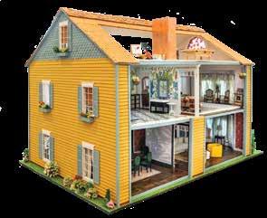
Hattie Sparks Collins, principal and owner of locally based Hattie Sparks Interiors, was recently amongst eight designers who created custom dollhouses for the Houston based fundraising event, La Petite Maison Gala. A Houston native, Collins was the only designer outside of Texas to participate, and she created a decidedly New Orleans themed dollhouse. To do so, she collaborated with some of the best talent in New Orleans, including Alexis Walter, Frank Relle, Mary Ball, Doorman and E. Lee Jahncke Mead, among others. Collins drew inspiration from the colorful houses, wide front porches and special details found in New Orleans residential architecture. Inside, she created spaces that are warm, inviting, and full of color and local art. The dollhouses were auctioned off at the gala, which directly benefits A Shelter For Cancer Families, and raised more than $235,000 for the organization. hattiesparks.com

Art, accessories, and what we need now according to the lady of the house - the House of Hazard, that is.
PRODUCED BY MARGARET ZAINEY ROUX



1 Fresh Perspective
I love original art and, right now, I’m obsessing over photographer Ben Depp’s Louisiana landscapes. He shoots them from an aerial view so they are not too literal and almost read as modern abstract compositions. bendepp.com
2 Table Talk
I love mixing china patterns for a formal dinner. It gives the table a curated feel and makes a great conversation starter. You don’t need an entire collection to make an impact a set of vintage plates or chargers will do. wirthmoreantiques.com
3 Form Meets Function
Ceramic pots aren’t just for flowers. They are versatile vessels for styling bookshelves and tabletops and make practical catch alls for paperclips on a desk or keys by the door. Pots A Lot is great local resource for artisan made pieces. potsalot.com
4 Asian Influence
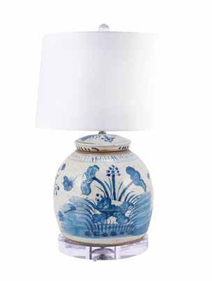
Every room can use a blue and white Asian moment. A pair of hand painted lamps, a single antique ginger jar, whatever, wherever! In a contemporary space, they add a classic sensibility and infuse more traditional rooms with whimsy. houseofhazardinteriors.com
5
Stylish Storage
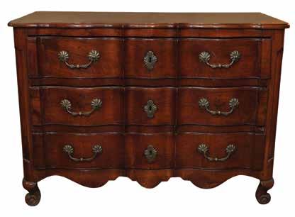
There is no better way to ground a room than with an unbelievable antique chest. French, Italian, English, American there is style and provenance to suit every space. And who can’t use more storage? Ma Maison Furnishings.

Springtime means porch weather – sitting, sipping, watching the world go by. We’ve assembled some ideas for keeping entry spaces like porches and mudrooms looking their best for the season.
BY REBECCA FRIEDMAN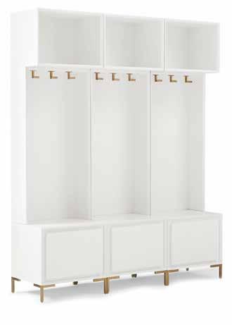
Mudroom magic
If you’re lucky enough to have a mudroom with a little more space, a locker system can be an excellent solution for coats, shoes, and other gear.

By the numbers
Make your address stand out with a handcrafted address sign, like this beauty from local ceramics artist Rachael DePauw.


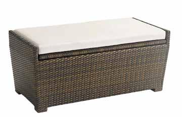
Seating and storage
Porch swings are pretty, but an attractive bench with storage can pull double duty. Add a cushion for comfortable seating plus storage for cleaning supplies, pet gear, and other outdoor needs.
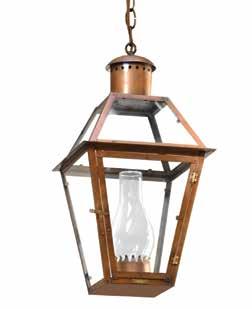
Lighten up
New light fixtures can refresh or update a porch at any price point. For the classic New Orleans look, Bevolo is always a winner.
Clean sweep
Keep things tidy with a porch broom that’s both utilitarian and beautiful, like this handmade Swedish model by Iris Hantverk.
Neat feet
No more scattered footwear in the mudroom or entryway! Keep shoes off and away inside a sleek shoe cabinet that blends right in.
Rain gear wrangling
A lovely umbrella stand can hold not only umbrellas but walking sticks or other items that need easy access.


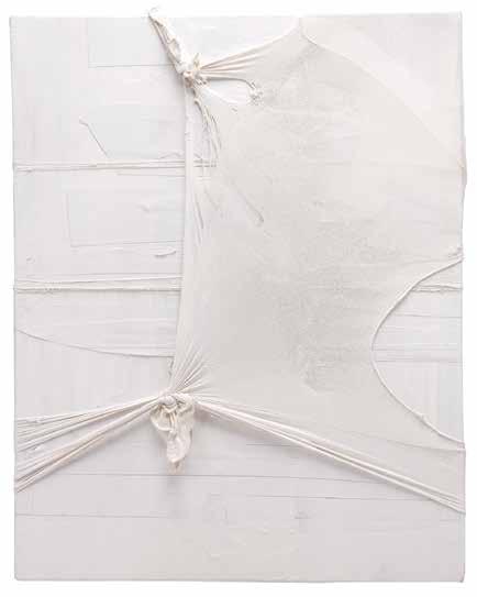

Sidonie Villere’s monochromatic mixed-media works, have a quiet serenity and a minimalist aesthetic. At the same time, they have layers of meaning and materials.
Such duality is at the core of Villere’s art. Rather than conflicting, she sees opposing forces that exist in tandem as a necessary, equalizing ballast that provides stability for the challenges of life.
“My works are self-portraits,” said Villere. “They deal with all the things I see and feel in life and with the human condition. They are personal and universal.”
Villere’s artistic path was forged early, during family vacations on the Mississippi Gulf Coast and at summer camp where the outdoors was both playground and classroom. Digging in the dirt gave way to working with clay, which eventually led to a BFA in Ceramics from Newcomb and an MFA in Ceramics from University of Massachusetts, Dartmouth. In the years that followed, she taught, married and had children before turning to art as her fulltime career. Her background in ceramics is evident throughout her work. But clay is just one of many materials she uses in her working visual vocabulary. Wood, netting, metal mesh, nylon stocking, string, paper, plaster, paint, canvas, wool and plastic are also part of her tactile, malleable mix.
“I love to see what the materials can say for me,” said Villere, who molds, blends, even burns the materials together to create textural, sculptural “picture objects” mostly clad in white.
White gesso board with crumpled plaster-dipped canvas squeezed with wire jutting out from behind a taut overlay of sheer, veil-like nylon stocking speaks to questions of revealing versus concealing, something we all encounter in presenting ourselves in relationships, work and the world at large. A swathe of bleached wool (that looks like cotton) looped and tightened with string and mounted on wood explores a similar question of dualism. Is the string binding the mass or supporting it? An amalgam of fishing net, pressed together with wood, plaster and other materials against canvas-covered plywood looks vaguely nautical and brings the word “wreckage” to mind. But are the components pieces of wreckage or salvage? Hollow, bone-like pieces inspired by lava tubes are both partially closed and partially open. Even Villere’s creative process involves opposites. While the work looks fragile, she drops, stomps on and breaks the pieces to arrive at the ethereal outcome.
“I’m about the contradictions in self preservation,” she says.
Sidonievillere.com LEE CUTRONE

A handful of ingredients and just a few steps are all it takes to perfect Chef Alon Shaya’s sophisticated springtime salad.
PRODUCEDBY
MARGARET ZAINEY ROUX
Chef Alon is a multiple James Beard Foundation Award winner and has received several esteemed accolades including Best Chef in the South (2015). Along with his wife Emily, he founded Pomegranate Hospitality which includes Saba, Saba’s Lounge, and Miss River and Chandelier Bar at Four Seasons Hotel New Orleans. He is the author of “Shaya: An Odyssey of Food, My Journey Back to Israel,” which is part memoir and part cookbook that shares his personal journey and explores the transformative power and magic of food and cooking.
Bresaola Salad with Arugula and Parmesan
Serves 4
¼ pound bresaola (cured beef), thinly sliced
6 tablespoons preserved lemon vinaigrette, divided 6 cups lightly packed fresh arugula
1 ½ teaspoons Aleppo pepper
1/3 cup finely grated Parmesan cheese
1. Shingle the slices of bresaola in an overlapping layer on a large plate or serving platter, and drizzle 2 tablespoons dressing all over.
2. Toss the arugula with the last ¼ cup dressing and the Aleppo pepper, then pile the greens in a big tuft over the bresaola. Top with Parmesan cheese.

1 Appearance
Round, oval or spherical in shape, the glorious watermelon sports a variegated rind of dark and pale green. Inside, the watermelon bursts with sweet, yellow or red flesh and contains black, brown or white pips (unless you happen upon a seedless variety, of course).
2 Use
While watermelon is perfect just as it is, there are many uses for this flavorful fruit. It can be used in cocktails, barbecue sauce, salsa and salad, and it can also be grilled. Pickled watermelon rinds are another creative use and a great way to cut waste.
3 Grow
According to the LSU AgCenter, watermelon seeds can be directly planted in the ground in mid-March or early April after all threats of frost have passed. Another option is to plant the seeds in seedling trays no more than three weeks before the date you want to set transplants in the ground. Choose a well-drained, sunny spot as watermelon vines need six to eight hours of direct sunlight each day to develop fruit. A single watermelon vine can easily grow eight to 10 feet, so plant in a wide area. Plant a row, then skip one to two rows. Set transplants (or seeds) three to four feet between one another on the row. Watermelons are ready for harvest when the bottom sports a small yellow patch and the tendril closest to the top the fruit has turned brown.

4 Learn
A hill of melons is a group of three to six seeds planted together, according to the LSU AgCenter. Once the seedlings emerge, growers usually thin the vines to one or two vines per hill. For smaller home gardens, one or two watermelon vines can be planted at the edge of raised beds and allowed to grow in the area immediately outside of the bed.
5
Lagniappe
Guinness World Record holder
Christopher Kent of Sevierville, Tennessee, grew the heaviest watermelon to date (350.5 pounds) in 2013.


From coffee cans to cocktail glasses, arrangements can sprout anywhere this spring
THERE IS SOMETHING SO ROMANTIC AND European about a visit to the French Quarter flower shop Flora Savage. At the little cottage, located on the corner of Royal and Barracks, owner Suzy Black throws the shutters wide, and customers step up to the open windows to order.
Inside the single, small room, buckets bear a riot of colors with whatever is fresh and in season, be it grand peonies or blood-red roses, soft yellow tulips or blooming lilies.
Black has decades of experience in the field of flowers (pun intended), although she no longer does weddings or large events. Instead, she relies heavily on her online presence, offering same-day floral delivery. And, of course, people stop by the darling shop to select a few stems.
“If you like arranging, we say our store is for you,” she laughs.
If you do like arranging flowers at home, this spring, Black advises rethinking your standard vase. So many things in your house can work as a cool alternative - even something you might otherwise throw away.
When first planning our arrangements, and deciding on whether we want tall and skinny or round and low, do you have any guidelines? I find low and wide is harder if you are an amateur. Tall and skinny is easy. It’s just getting the right flowers with longer stems for that. When you are going with low, wide arrangements, chicken wire is a great trick. You can also use rocks to hold stems.
If we want to think-outside-the-box on our vases, does anything work? As long as it can hold water, it should be possible. If it’s not waterproof, I suggest lining it with plastic or a trash bag, and then putting in your floral foam, chicken wire or rocks. Chicken wire will be easier if you are doing a really
weird shape. You can also fill a vase with Mardi Gras beads.
What are a few unusual containers you have used? We once created a Mardi Gras wedding, and we used old Café Du Monde coffee cans. It was so cute and used something someone might have just thrown out. We have used Mint Julep cups, Grecian busts, and upside-down drums. We’ve used shoes for the Muses parade week. For those, we lined them with plastic and used floral foam. And we did a Halloween arrangement once, where we made the shoe look as if bones and blood coming out of it. The bones were just bleached sticks, and the blood was red amaranthus. For that, we used a men’s dress shoe. It was so creepy and cool.
What if we want to lower our own environmental footprint by using an unusual vessel? Again, things like old coffee cans or broken pitchers work great. You can go to Goodwill and find a ton of inexpensive stuff. We have used half a watermelon before, and that’s great. You don’t need foam. Simply cut the watermelon in half and stick the stems into the flesh. They stay put and stay hydrated. However, a watermelon arrangement is only good for a single event. It won’t keep more than a few hours.
What are you most excited about this spring in New Orleans? Flower-wise … tulips are my favorite. I always get excited for this season. Cool hybrids have come out this year and I cannot wait to use them in arrangements. I’m also excited about a new wholesaler in the city. Mayesh is an online wholesaler, and they are opening a warehouse in town, out in Jefferson. And, of course, I’m always excited to see our customers who stop by the shop or call us. Flora Savage is open 10 a.m. to 5 p.m., all days except Sunday.
— BY JENNY ADAMS




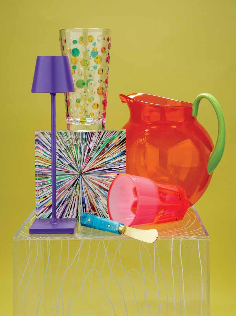
Lucite table: Acrylic Timber side table with fused woodgrain pattern by Gus Modern, available at Eclectic Home, eclectichome.net. Lamp, pink glass, pitcher and cheese knife/butter spreader: Poldina Pro Zafferano Micro rechargeable lamp in purple powder-coated metal; Mario Luca Giusti acrylic Palla pitcher in orange and green and Double Face tumbler in fuschia; Tizo Design cheese knife/butter spreader in blue resin with gold finish, available at Judy at The Rink, judyattherink.com Square candy dish, polka dot glass: Fireworks acrylic candy dish and rainbow dots acrylic glass, available at Hazelnut, hazelnutneworleans.com


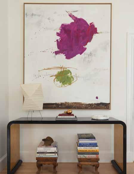
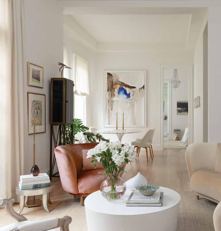
 A striking work by Anastasia Pelias (“Joan B.,” from Ferrara Showman Gallery in New Orleans) overlooks the oval Knoll Saarinen table in arabescato marble and dining chairs from Design Within Reach.
Small house, big art” was the owner’s vision for transforming her newly purchased apartment in a historic St. Charles Avenue building. And that’s what Leslie Newman of Space Interior Design helped create: A haven for the homeowner’s cherished art collection that captured the space’s airy elegance and calm atmosphere.
This wasn’t Newman’s first project with the homeowner, or her first encounter with the building, which dates to 1906, having evolved over that time from a private home to rental apartments to condominiums in the late 1990s. Newman had previously helped the same client decorate a unit on the building’s first floor and had assisted with remote design work during the pandemic, when the client was still living in a home out of state. Newman is also a former resident of the building (who led the redecorating effort of its lobby and hallways). But this was her first chance to work with the homeowner on a project from scratch, aided by Matthew Kohnke, the owner of MNK Design/Build (whose other projects include local businesses Cure and Vals as well as multiple residences).
The second-floor apartment’s good bones were apparent from the start. The homeowner was immediately drawn to the ample light and high ceilings, as well as a smart floor plan that made the unit feel much bigger than its 926 square feet. Those attributes made for a strong foundation, but as the owner said, “It wasn’t balanced. And it wasn’t graceful. And so, we started changing things.”
In addition to balance and grace, the apartment needed a boost in other priority areas. The first was storage, as it offered only a 7’x7’ bedroom closet and a built-in cabinet that sat awkwardly in a corner of the dining room. Next was a powder room, as the unit’s sole bathroom could only be accessed through the bedroom. The kitchen needed a total rethink, and of course, the final layout had to maintain abundant wall space for art while prioritizing sight lines that accentuated the space’s height and airiness.
In addition to the renovation, the homeowner sought a look that was softer and more feminine than her previous spaces, which leaned more contemporary. That led Newman toward rounded shapes in furnishings and a neutral palette that let the artwork shine. The two referred to the design direction as “modern French” and let that spirit guide their selections of furniture and ornamental pieces.
To create the powder room, Newman, Kohnke, and the homeowner transformed the living-room-adjacent laundry room into a dual-function space, adding a toilet and bar sink topped with black marble. They hid the stacked washer/ dryer behind sleek cabinetry, which disguised the laundry function completely. To create additional design interest, Newman chose smoked glass layered with a smaller gold

mirror and a chandelier by Circa. Decorative painter Anne McGee gave the ceiling some visual punch with a gold twist. Said Newman, “When you’re sitting in the living room, you can notice it, but I didn’t want it to be just painted or gold leaf – it looks a little scratchy and broken down, which I really like.”
In the living room, there was no obvious space for a television, so Newman asked local metal fabricator David C. Rockhold to create a metal column that would hold the TV and serve as a sculptural element. Rockhold also created the room’s custom curtain rods and rings, which Newman
wanted to “feel heavy and genuine instead of someone else’s thinner rods - I wanted to have heft to it.”
Because the apartment had no foyer or entry space, Newman simulated the feeling by moving the walls forward a bit and building closet towers on each side of the front door, offering 12-foot high storage for coats, as well as other accessories and files. The closets were covered by the low-profile cabinet front approach employed elsewhere in the home, creating highly functional storage that virtually disappeared into the walls.
The living room ceiling had to be lowered slightly to accommodate
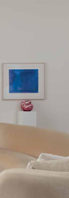
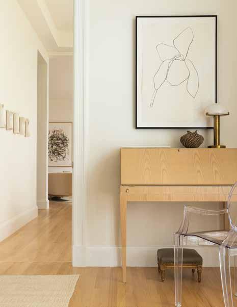
Facing page: Clear sight lines through the apartment emphasize height and airiness and highlight the homeowner’s art collection. Below: In the streamlined office space, a fold-down desk by Maxine Snider keeps the computer out of sight. A Kartell Louis Ghost chair from Design Within Reach and drawing by Ellsworth Kelly maintain the clean lines.
ductwork for air conditioning in the powder room (the previous laundry room was not air-conditioned), and the dining room adopted a slightly lower cove ceiling to allow the kitchen stove to vent outside (a change from the former recirculating model). Given the generous “starting” ceiling heights, the homeowner felt these were “totally worthwhile” tradeoffs for upgraded mechanical function.
In the kitchen (previously a U-shaped space dating to the mid-’80s), Newman moved the entrance from the dining room to the living room side, expanded the footprint slightly by taking a bit of space from the
dining room, and changed the layout to a more efficient galley arrangement. Kohnke created custom drawers and cabinetry that suited the homeowner’s specifications, all designed with precision to optimize storage and function and hide what the homeowner called “the uglies,” like the trash bin and water filter.
Moving the kitchen/dining room wall ended up shifting the placement of the bedroom door, creating a smoother sightline through the apartment (which Newman highlighted with an eye-catching antique chandelier in the bedroom). Interior doorways were raised to emphasize
the feeling of height. The team was able to keep most of the unit’s original windows and glass (“You can see it wave in the sunlight – it’s gorgeous,” said the homeowner), and where necessary, Kohnke matched any new woodwork to the existing designs.
The bedroom presented a dilemma common to many old New Orleans homes – an uneven wall where the building had settled over time – which the homeowner noticed when having shutters installed. Kohnke worked some visual magic by moving moldings and adjusting the shutters to create the illusion of evenness. Newman added functionality to the room with a cozy reading nook in one corner and a workspace in the other, moving the built-in cabinet that once occupied a corner of the dining room into the bedroom to create a concealed storage space for office necessities. That same storage approach was used to corral the homeowner’s extensive collection of books on each side of the bed, with hidden cabinets serving as bookshelves.
In the primary bath, an old whirlpool tub was replaced with a glassedin shower/tub. Kohnke designed streamlined cabinetry with (deceptively) ample storage capacity, and the porcelain bathroom tile was sourced from
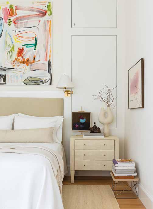
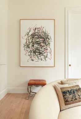
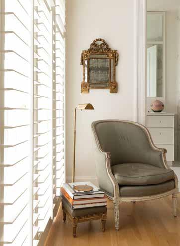
This page: The serene bedroom space welcomes a colorful work by Andreas Breunig (“oT4,” from Nino Mier Gallery in Los Angeles) over the bed and another by Helen Frankenthaler. Concealed built-in shelves on each side contain the homeowner’s books with minimal visual clutter. Facing page: Top, left: The pristine primary bathroom features custom cabinetry by Matthew Kohnke and hardware sourced from H. Rault. The tile is from Stafford Tile & Stone. Top, right: The kitchen is a study in form and function, with custom cabinets by Matthew Kohnke and Taj Mahal quartzite on countertops and backsplash. A colorful piece by Anastasia Pelias (“Automatic,” from Ferrara Showman Gallery) enlivens the scene. Bottom, left: In the living room, Joan Mitchell’s “Sunflower V” hangs above a vintage bench from Chairish. Bottom, right: A light-filled corner of the bedroom holds a cozy reading nook, with an antique chair and mirror from Karla Katz Antiques.
Stafford Tile & Stone. “We needed something that could stand on its own because it’s really only the floor and shower,” said Newman.
Apart from the tile in the bathroom, the intent had been to keep the original flooring through most of the home. However, a water leak from the apartment upstairs upended those plans very late in the renovation process, requiring the team to rip up the already refinished floors. Newman chose a new red oak flooring to provide a neutral background with a matte finish. “I wanted this floor to be invisible, not make any statement – just pretty,” said Newman. That leak also meant tearing out and reinstalling the living room ceiling, which had already been redone once during the process to add an overlooked air conditioning vent.
Those headaches aside, the homeowner was thrilled with the end result: a gracious space that offers tranquil views of the stained-glass windows in the neighboring church and a backdrop for the breathtaking paintings and sculpture that adorn every room. As she said, “[Newman] had the vision. I had the art. I wanted a small house where I could put big art… And that’s what we ended up with – big art.”


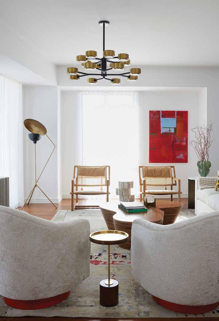
When a West Coast family, who has roots in the Crescent City, purchased a vacation condo at the Four Seasons Hotel New Orleans, they wanted the interior design to reflect their love of the city, its cultural diversity and its energy. Their real estate agent recommended Penny D. Francis, principal designer and owner at Eclectic Home, to create the home of their dreams. “A real departure from their more traditional primary residence, this home-awayfrom-home evokes an energy fueled by pattern, color, texture and a mix of vintage, custom and antique furnishings,” Francis says.
Woodward Construction handled the buildout of the 2,800-square-foot condo, while Francis and her team worked with trade suppliers
to execute the design for the three bedroom, two-and-a-half bathroom project. “We first and foremost understood how they wanted to live in the home and developed a design direction that satisfied their desire for color, pattern and comfort,” Francis says.
The homeowners also expressed their interest in showcasing local talent and sourcing works through local galleries. Francis presented several gallery offerings to get an understanding of the aesthetic and medium that spoke to her clients. After receiving their input, she made studio and gallery visits, and presented them with options for consideration. The home now features work from local artists (such as photography by Wallace Merritt, sourced through Cole Pratt Gallery) plus vintage pottery and decorative objects.
“Approachable, impactful, layered and cu-
rated design was the goal,” Francis says. “With a young family, finishes and fabrics that were high-performance were strongly considered for durability. You don’t have to sacrifice good design if you have a young family - you have to make good choices.”
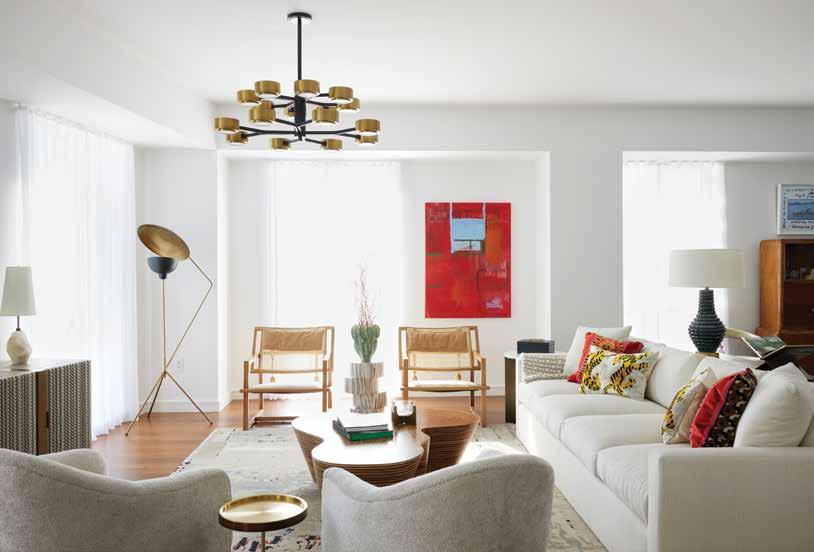
As such, Francis custom-designed and fabricated all of the beds with high-performance fabrics that look luxurious and have tremendous staying power. Other custom pieces include the sofa in the living room, the Milo Baughman midcentury swivel chairs with red veneer base, the gold ottomans in the dining space and
bedroom ottomans. Other special touches include the light fixtures, with the living, dining and kitchen areas all having statement fixtures to define and balance the space. Francis and her team infused pops of color through accent fab-
rics, textiles and wall coverings.
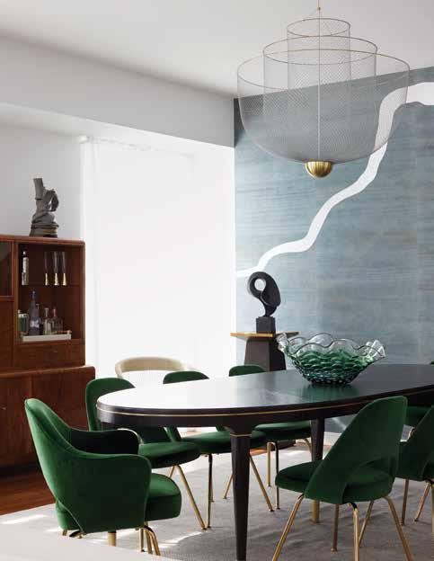
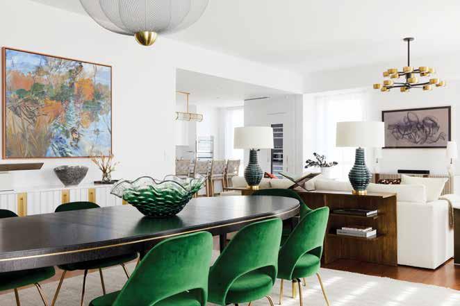
“They also have a love of modern furnishings,” Francis says. “We incorporated two [family heirloom] Platner chairs into the design as well as an Eames lounge chair in the guest bedroom. The mix of periods is apparent in the home from the Knoll dining chairs in a rich forest green to the 1920s Art Deco bar/hutch and Directoire style-inspired dining table. The mix is what brings interest and character to the space.”
According to Francis, her clients allowed her to explore and push the envelope, while also allowing her to strike a balance throughout the design process. Because the condo is perched atop the winding Mississippi River, Francis felt it was important for her design to pay homage to it. “Phillip Jeffries introduced a wood veneer wall covering [in the dining area] - Adorn - featuring a winding pattern that, to me, looked like the river below,” Francis says. “The muted blue sky color was the perfect hue to reflect the outdoors and the silver leaf of the river.”
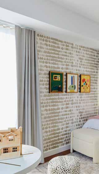
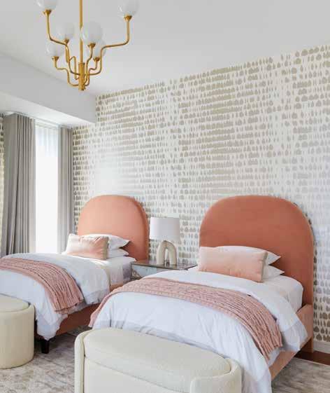
Meanwhile, in the girls’ room, Francis created a bright and cheerful color palette that could evolve as the children grew. Because the trapezoidal shape of the room and plentiful windows created a challenge, Francis and her team decided to play with shapes.
“The custom headboards with their Art Deco rounded [shape] in a subtle blush velvet, the storage ottomans with their rounded edges and the round accent game table allow the eye to pay less attention to the shape of the room and more to the overall calming effect of the space,” Francis says. “The scale of the Schumacher wall covering in its Champagne color was a perfect complement to the feminine blush hue of the beds and bedding.”
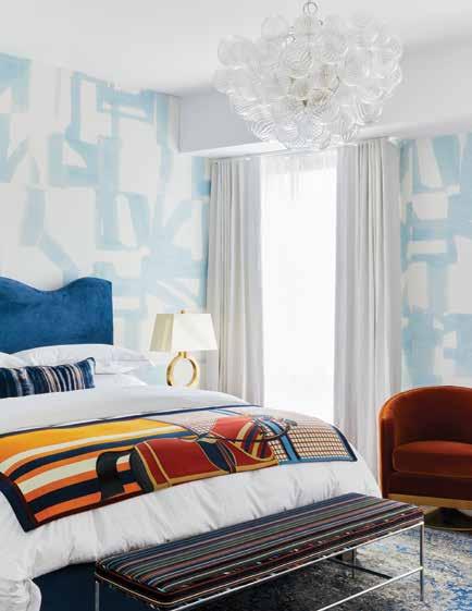
In the primary bedroom, Francis juxtaposed a hand-painted, abstract-patterned grasscloth wall covering in blue and white with a custom blue headboard in a wave pattern as another subtle nod to the Mississippi River. Francis then introduced contrasting colors with a clay-colored accent chair and a cashmere throw with an
equestrian motif.
While wood flooring grounds each of the spaces throughout the condo, the wall coverings and textiles give each room its own design identity. “Although different in each room, there is cohesion in the tone of color and the anchor of neutrality of color in the living spaces,” Francis says.
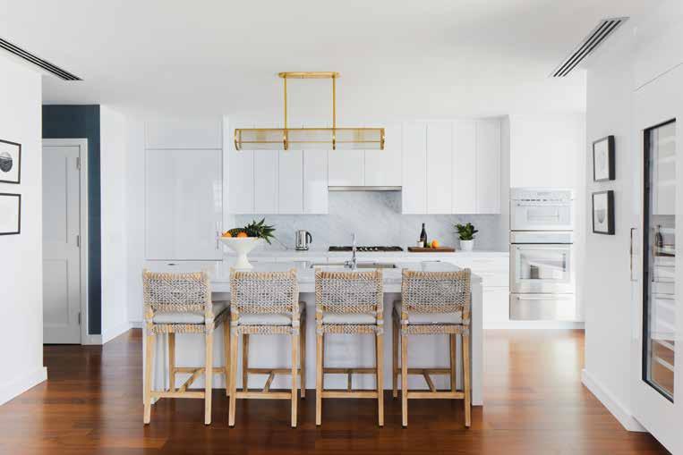
In the kitchen, which has stainless steel appliances, Francis introduced a mix of metals through the brass and glass Ralph Lauren light fixture over the island. She also added local black and white photography, and durable woven-rope stools, to create contrast to the custom high-gloss-white cabinets.
Overall, Francis describes this home as chic, curated, balanced and engaging. “Design is so much more than selecting pretty things,” she says. “It is a craft and about the people that will live there, about the execution of the design and the sheer joy when you can impact the lives of your clients and be part of the memories that will be made.”

Top, right: The light and airy primary bedroom flaunts wall covering by Phillip Jeffries, a custom-made bed with bedding by Matouk and an Hermès throw, a light fixture by Julie Neill, a custom swivel chair, a vintage bench upholstered in Maharam fabric and a lamp from Eclectic Home.
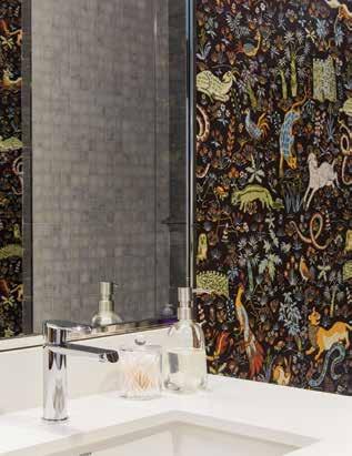
Top, left: Penny D. Francis custom-designed the twin beds with fabric by Opuzen. The storage ottomans, lamp and night stand are all from Eclectic Home. Bottom, left: The guest bedroom has a custom-made upholstered flange bed and bedskirt, a light fixture by Petite Friture, a rug by Jaipur, a vintage Eames chair and ottoman, and a dresser from Eclectic Home. Bottom, right: The whimsical animal-motif wallpaper in the powder room is by House of Hackney.

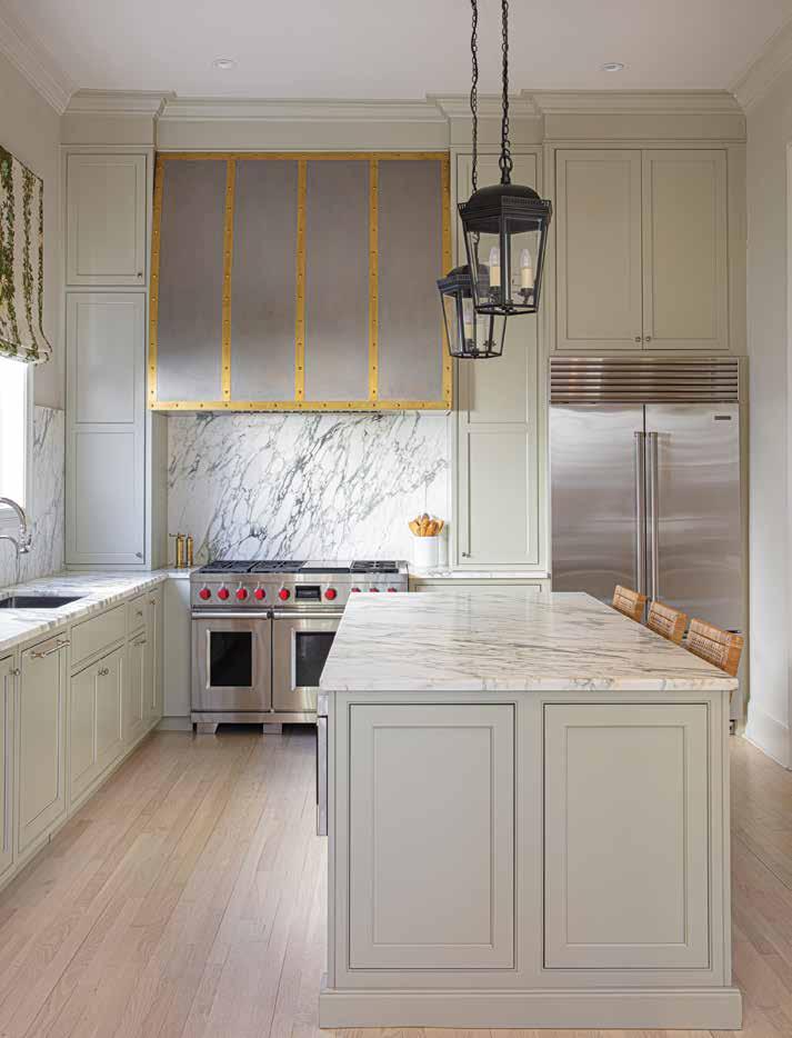
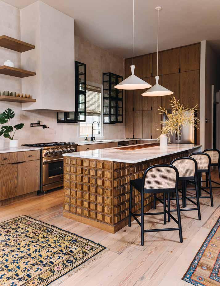
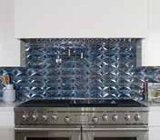
Contractor: Franklin Santos Stair Fabrication: VULK, architect and fabricator for stair design Designer: Lauren Ferrand with Ferrand Design Cabinets: Central City Millworks Flooring: Refinishing by Classic Hardwood Floors Hood: Limestone plaster finish custom matched by Sylvia T. Designs Countertops: Existing Backsplash: Hand-glazed porcelain tile from Mediterranean Tile and Stone Fixtures: Existing and the new faucet from Delta Lighting: Kitchen island pendants - Exposior White Pendant Lights 27” by Paul McCobb from CB2; dining table pendants - Aqua Gallery Lighting Cabinet Hardware: Emtek Furniture: Vintage sourcing
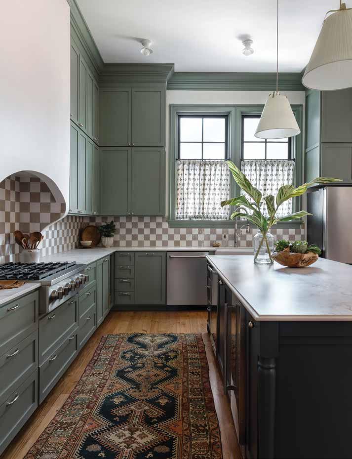
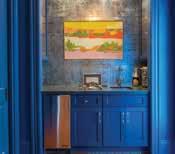
Contractor: JLV Construction Designer: Morgan Cattaneo, Cattaneo Studios Cabinets and island: Custom designed by Cattaneo Studios, built by Daniel LeDocte Range Hood: Custom designed by Cattaneo Studios, built by JLV Construction Flooring: Red pine Countertops: Dekton Entzo Backsplash: Marazzi USA Fixtures: Sink - Bocchi; faucetSignature Hardware Lighting: Flush mounts and pendants from Schoolhouse Appliances: GE Café
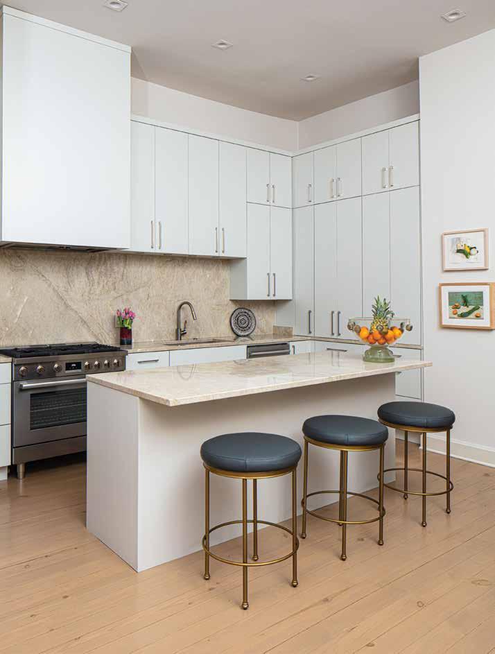
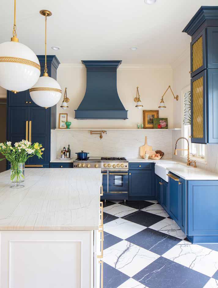
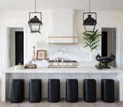
Contractor: Sanderson Services Designer: Maureen Stevens Design Cabinets: Legacy Chelsea Maple painted in Gale Force, Campbell Cabinets Flooring: Florim marble-look tiles, Triton Stone Countertops: Quartzite, Triton Stone Backsplash: Quartzite, Triton Stone Fixtures: Georgian Era, Perrin & Rowe from the House of Rohl, Southland Plumbing Lighting: Hendricks Globe Pendant & Gale Library Wall Light, Cabinet Maker’s Picture Light, all from Circa Lighting/Armstrong Lighting Doorknobs: Restoration Hardware Appliances: All Thermador except for the kitchen range which is BlueStar; Fossil Blu Fireclay farmhouse sink Decorative Grille: Katonah Hardware Wallpaper: Annie Moran Shade Fabric: Palm Orleans
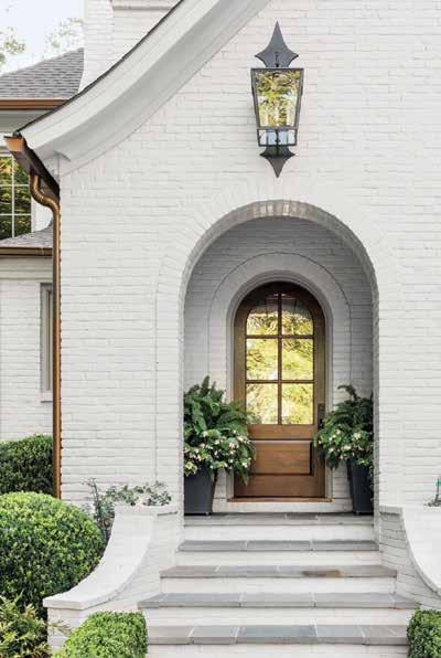
SO YOU’VE DECIDED YOUR BRICK EXTERIOR OR INTERIOR walls need to look a little livelier and you decide to paint them. However, before you start on that project there are several points to consider because painting brick is in many ways different than painting smooth walls.
Brian Ammerman, owner of Five Star Painting NOLA, said brick creates challenges because it is very porous and textured when compared to a smooth wall. He said paint will soak into brick the same way water can soak into concrete on a rainy day. As a result, choosing to paint brick is an important decision. Once paint is absorbed by the brick, you cannot change your mind and say you want it unpainted.
“You can change the color, but not the painted look,” Ammerman said.
This can be tricky because smooth walls allow for trial and error. You may think purple will look fabulous in your bedroom, but once it actually goes on the wall you may realize you’re not crazy about it. That’s a choice you can undo. You cannot do trial and error on a painted look for your brick. The only way you could test it is to buy bricks that are identical to the ones in your house and try the paint out on the test bricks to see if you like it.
Ammerman said painting brick provides enough challenges that most people should hire a professional to do it. Even if they have successfully painted standard walls in bedrooms or living rooms, brick will be harder. He said anyone who proceeds on their own should also be aware that painting brick will be much messier than painting a smooth wall. You will get paint on yourself, and likely any bushes, plants, or greenery in the vicinity.
“This is something that is very challenging even for hardcore DIY types to do,” Ammerman said.
Ammerman added that a masonry primer is a good idea for painting brick because it will stop the brick from continuing to absorb the paint. This will prevent you from needing to apply as many as three to four coats of paint. Not using primer is one of the most common mistakes Ammerman sees homeowners make. He also recommends using Sherwin Williams SuperPaint, which comes with a lifetime warranty.
If you decide to take your chances and paint the brick yourself, “Architectural Digest” recommends you have the following items: wire scrub brush, soap, water, trisodium phosphate, paint brush, paint roller, masonry or latex paint (and primer), drop cloths and painter’s tape. If you’re uncertain what trisodium phosphate does, it can be mixed with water to clean the brick if the standard combo of soap and water does not work. The brick should also be regularly washed after the paint job to keep it in good condition.
“Architectural Digest” further warns that homeowners should never paint damaged or wet brick. If the brick is not clean, dry, and in good condition, the painting process can cause additional damage. A dry mop can be used remove dust from spots that you are unable to reach. Acidic cleaners should be avoided when cleaning brick as it can alter the final paint job. Small cracks in the brick should be repaired with acrylic caulk before painting. If the cracks are large and the damage is significant, homeowners should consult a professional for advice.
If you want an alternative to painting, staining the brick can work well on bricks that are in good condition. Staining absorbs into the surface of the brick and will make the brick shine while still retaining a natural brick look. Another alternative to full-on painting is whitewashing, which uses watered-down paint to cover the brick with a white coat. This will allow the texture of the brick to be visible while covering the red color. The thickness of the whitewash can be adjusted to control how much of the original color remains.
— FRITZ ESKER


Add a sense of stylish comfort to your home with palette-appeasing neutral tones that inspire a calm sanctuary and transformative tranquility.
BY AMY GABRIELCast a lovely light with a Holt leather pendant, a pairing of walnut wood and top-grain leather. Pottery Barn, potterybarn.com.
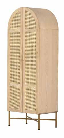
Add ambience with sculptural candleholders from Uttermost, made of tamarind wood and accented with satin black candle cups. Armstrong’s Lighting, armstrongslighting. com.

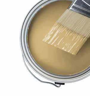
Dried Chamomile paint calls to mind calming teas and natural settings. behr.com.
Lounge luxuriously on a Divisadero Sofa in a linen mix fabric and color dubbed Rêve Greige. Villa Vici, villavici.com


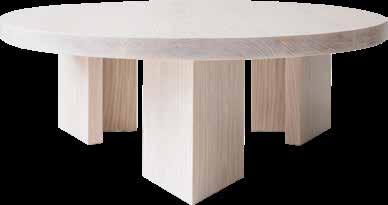
Solidify the scene with a Euclid geometric coffee table with a white cerused ash finish. Sunday Shop, sundayshop.co.
Sound dreams are made upon a classic Scandinavian-style bed with hidden drawer storage. Scandinavia Furniture, scandinaviafurniture.com.



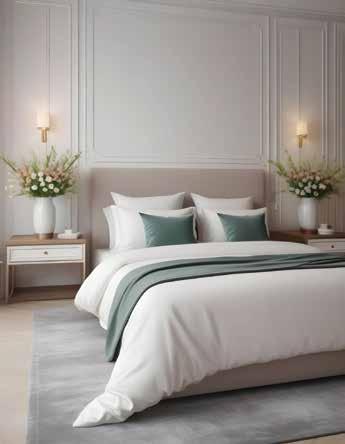
SPRING BRINGS A WELCOME CHANGE EVERY YEAR, but after record-high summer temps and this winter’s hard freeze, New Orleans residents are especially ready for the region’s best weather. Synonymous with festival season, spring is a time for entertaining both indoors and out and provides a good excuse for a fresh start around the house. We checked in with local experts on tips for sprucing up the home to usher in this convivial season.
Starting with the basics, designer Chad Graci begins with bedding.
“I usually change out my bedding in the spring to something lighter and brighter with fewer pillows,” he says. “I think spring is about opening up windows, airing out rooms, and letting nature back in. Bring some flowers in for spring - groundbreaking.”
Flowers are one way to reintroduce color to the home, something all experts agree is a welcome trend this year. A return to richness and color is overtaking the last decade’s obsession with white and gray. Regarding textiles - from rugs to upholstery and window treatments - Designer Kelly Sutton is observing a warmer color palette with earthy colors that can still feel neutral in certain circumstances.
For Sutton, spring inspires change.
“Sometimes I’m craving a new feeling and will paint an accent wall or just assess some of the spaces and see how I can adjust the arrangement to breathe new life into the room while purging anything that is not needed anymore,” she says.
Less can be more, stresses Sutton. Small changes like simplifying the styling of a bookcase can change the feel of a room. She recommends identifying dual purpose pieces that can make a room more organized and less cluttered. Another way Sutton likes to change the vibe in a room is through a new area rug, which can either brighten things up or bring in more color or texture.
Owner and president of NOLA Rugs, Inc., Sharon Schenck is celebrating her 50th year in the global rug business. Schenck’s expertise provides an advantage for local rug shoppers. Her biggest tip is to seek quality first and foremost, which means seeing and touching a new rug in person. Color and quality can be deceiving in online photographs.
Natural rug fibers like wool and silk are best. Both have been used for hundreds of years and still outperform today’s less environmentally friendly, off-gassing alternatives. According to Schenck, designing, sizing, and graphing a custom, hand-knotted rug now takes a fraction of the time it once did, which opens up a world of options for rooms that need custom sizes or colors.
Spring is also a great time to clean your current rug.
“The beauty of a good handwoven rug with solid dyes is that it can typically be totally wet washed,” says Schenck. Stains and spills should be cleaned right away, and high-traffic rugs probably need a wash every few years.
Sprucing up doesn’t always mean adding something new - at Sylvia T. Designs, owner and master artisan Sylvia Thompson-Dias revitalizes aspects of the home through refinishing. She recommends refinishing cabinets when they start to show wear and tear or feel out of style. Refinishing can breathe new life to them while adding value to the home without the high cost of replacement. The same is true of cracking plaster.
“There are a lot of options these days to address plaster issues, and now, with modern materials, you don’t have to replace lath,” she says. “Beautiful and high-quality lime plasters, which breathe and are durable, can be applied to drywall, for instance.”
For people looking to spruce up their kitchen, plastering your stove hood adds pizzazz without breaking the bank. According to Thompson-Dias, this central, eye-catching feature looks more artistic than paint or stainless steel and can complement tile, wood, and other materials.
And what about your outdoor space? For an exterior spruce up, Mullins Landscaping associate landscape designer Matthew Quitzau recommends first freshening up garden beds post-winter with simple weeding, trimming, and re-mulching.
“This not only revitalizes the beds without significant costs but also prepares the plants for new growth,” he says. For new projects, Quitzau sees a trend toward simpler planting designs with fewer tiers or specimen plants set in a mass of groundcover. His advice - no matter the size of your design - is to plan for adequate irrigation.
“Ensuring a consistent watering system for new and existing plants is crucial for their survival and thriving,” he says. Considering last year’s hot, dry summer, it’s better to plan in spring for what next season may bring.
KELCY WILBURN













Accent chairs provide wow factor for any number of spaces.
AN ESSENTIAL DESIGN ELEMENT, ACCENT chairs not only provide extra seating for guests but they also are a great way to add eye-catching color, texture or style to a room. While certain colors or patterns may be too overwhelming for other large pieces of furniture, such as a sofa or loveseat, they work well on smaller items like accent chairs. Introduce a pop of color with the Fringe Chair,
which is custom made in Portugal for Villa Vici’s Private Label Collection. Available in several colors (like lime green, aqua blue and a pretty pink), the chairs feature velvet with matching-color fringe - offering a fun, flirtatious take on a classic silhouette. “We also love a setting with a round coffee table flanked by four chairs,” says Vikki Leftwich, interior designer and owner at Villa Vici. 4112 Magazine St., 899-2931, villavici.com — MISTY MILIOTO

