Blocking Diagram


Floor Plans


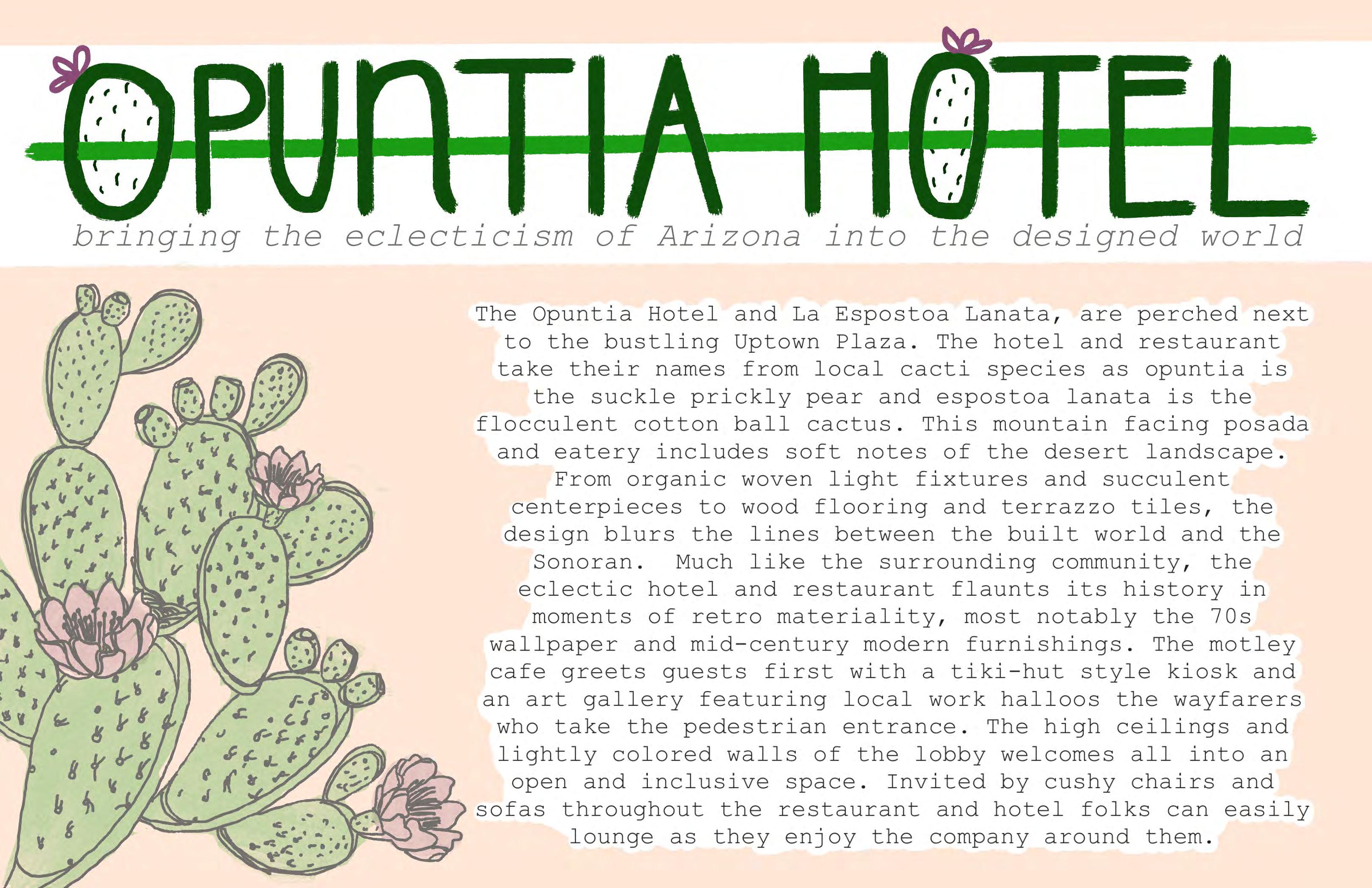
THE CONCEPT

THE MATERIALS


Rendered 1st Floor Plan


Scale: 1/32”=1’-0”

 Teal Shag Carpet Pink Shag Carpet Light Wood Flooring Dark Wood Flooring
Brown Shag Carpet Polished Concrete Yellow Shag Carpet Terrazzo Tiles
Teal Hexagonal Ceramic Tile
Orange Hexagonal Ceramic Tile
THE MATERIALS


Rendered Guestroom Plate Floor Plan


Scale: 1/32”=1’-0”

THE LOBBY


 Rendered Coffee Bar
Rendered Lobby Seating
The Location:
Light Wood Flooring Teal Hexagonal Ceramic Tile
Retro Wallpaper
Dark Wood Panels
Pink Shag Carpet
Teal Shag Carpet
THE PATIO


The Location:


 Rendered Exterior Patio Seating
Polished Concrete
Dark Wood Panels
Tenara Canopy
Structure Beige Ext Stucco
THE EXECUTIVE
THE EXECUTIVE



CONCEPT & BRANDING

As many products and services in the modern world continue to suggest alternative sustainable solutions, rUSE aims to educate and provide resources for the Arizona community that makes it easy to choose the items that are sustainable and fit their needs. By providing a community space that starts conversations about various sustainable issues while allowing the community to collaborate, learn and grow closer to their interests in many mediums we hope to bring light to information that is or can seem to deceive.


PRODUCTS & SERVICES


Community engagement will take place in the form of providing sustainable products and services to the local region from the local region.


FIRST FLOOR PLAN

FIRST FLOOR RENDERED FLOOR PLAN
SCALE: 3/32” = 1’-0”

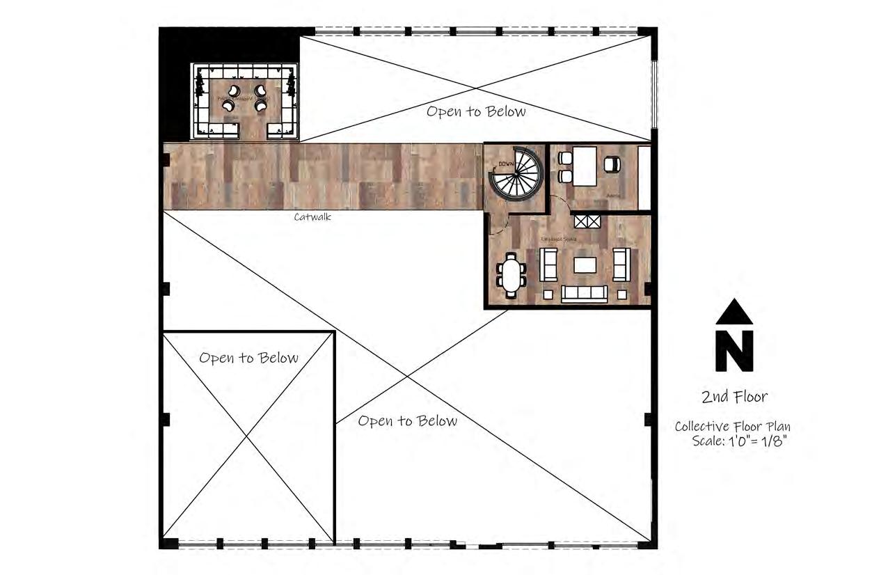
SECOND FLOOR PLAN
SECOND FLOOR RENDERED FLOOR PLAN

SCALE: 3/32” = 1’-0”
rETAIL DISPLAY DETAIL
RETAIL DISPLAY ENLARGED TOP VIEW
SCALE: 1/2” = 1’-0”
RETAIL DISPLAY LEFT ELEVATION


SCALE: 1/2” = 1’-0”
RETAIL DISPLAY SECTION CUT
SCALE: 3/4” = 1’-0”


RETAIL DISPLAY RIGHT ELEVATION

SCALE: 1/2” = 1’-0”
COMMUNITY PIT rENDERING

COFFEE BAR ELEVATION
This space is to feel evocative of water while still giving attention to the pollution issues in our oceans and bodies of water. There is bubble lights and a wave and bubbles mosaic on the back wall that symbolize the ocean. The materials call attention to the pollutants in our planet’s bodies of water such as the broken CDs and glass. This coffee and tea bar serves as a focal point on water pollution in this zone.

Currently, the health clinic has brand standards that have been requested to keep the same as they are satisfied with what they have created. Given that we respect this decision and want to stay true to the brand we have only played with ways to link their current branding to our design concept. Our approach is centered around the ability of the clinic to connect with its customers by making a clinic, this will help in their healing process.
MOUNTAINPARKHEALTHCENTER


CONCEPT COLLAGE


In our design, we pulled elements from our local habitats that embodied a sense of oasis, connection, and trust. We used patterns in nature throughout our design that were tied to Arizona to accomplish these goals. Different users call different landscapes home. Some feel most at ease in a forest, whereas others are most familiar with a desert-scape. We designed this clinic to provide a variety of landscapes in our spaces so that anyone could connect with a piece of their surroundings.


Our team had many ideas on how to make our lobby and communicating stairs a special moment. We had focused on sunlight as a primary means early on. We later incorporated the plant and skylight idea into an indoor garden.

We still felt that a special skylight moment to connect users to the Arizona sun and sky was necessary, but not in the lobby. We devised a design for a large opening in the patio that could have shifting shadows throughout the day.
Lobby and communicating stair design concepts


Patio design with large skylight that runs through both floors.

Early Bubble Diagram
Conceptual Development
Bubble Diagram
Early Blocking Diagram

Midterm Blocking Diagram

BLOCKING DIAGRAM FLOOR 2


We took a visit to Phoenix Children's East Mesa Clinic and interviewed some of the nurses working there as well as walked around the space. Based on our observations and feedback from nurses we prioritized adjacencies of programming as shown to the left. The clinic rooms are central, and employee workspaces, lounges, and storage areas are all adjacent to one another surrounding the clinical area.
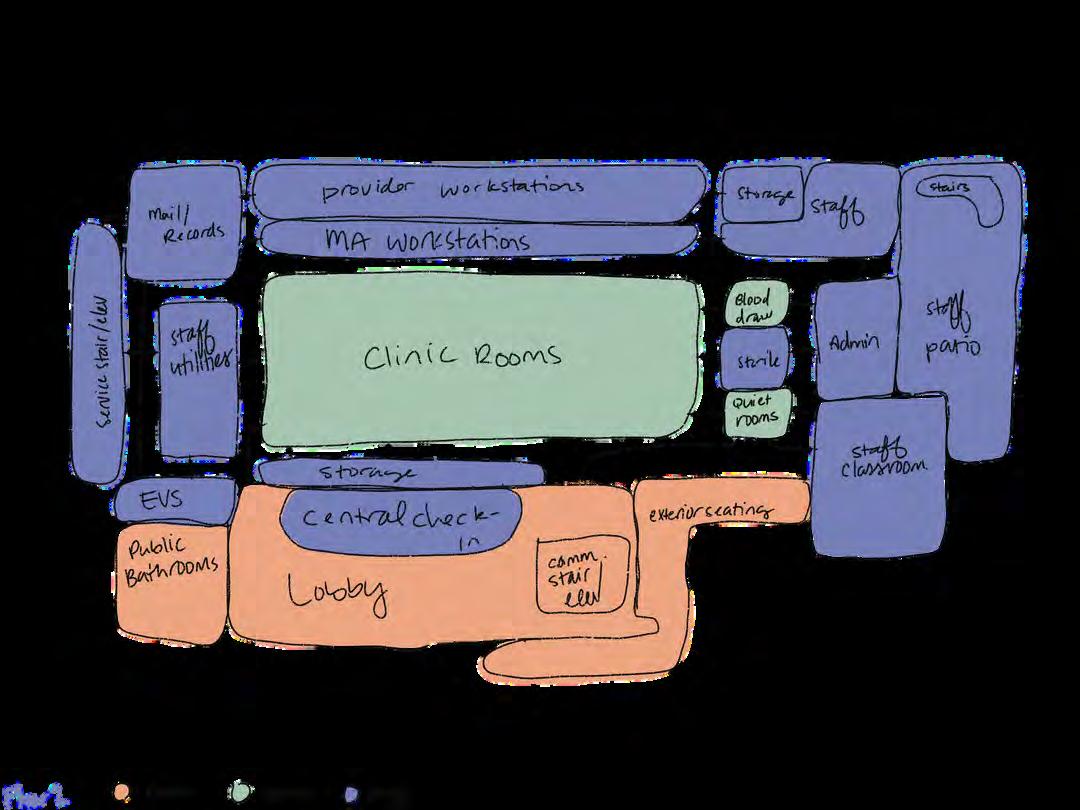
RENDERED FLOOR PLAN LEVEL 1

SCALE: 1/16" = 1'-0"


For the flooring materials, we chose rubber for high traffic areas and spaces that needed to be clean. The public areas have a brown rubber, staff areas have a green rubber, and public walkways have a tan rubber. These rubber floorings are antimicrobial, durable, and softer on the foot compared to vinyl. Areas that can have a carpet have either the public snake pattern carpet tile or the staff geometric carpet tile. These materials are all placed for wayfinding.


RENDERED FLOOR PLAN LEVEL 2


SCALE: 1/16" = 1'-0"


Similarities between the first and second floors are no exception in the flooring materials. The mail/records room does contain the geometric carpet, as well as the admin, and staff classroom. All exterior materials are kept the same as existing to reduce cost and environmental impact.

RENDERED REFLECTED CEILING PLAN LEVEL 1


SCALE: 1/16" = 1'-0"


Both levels of the plan are nearly identical for materials and light fixtures. We chose acoustic wooden panels as an accent piece in staff areas. Simple patterned gypsum in the lobby highlights the full-height ceiling with an ascending height wood paneling over the seating to provide acoustic support and a focal point. We placed the act panels everywhere else. The blue-colored panels are used exclusively in the staff areas.

RENDERED REFLECTED CEILING PLAN LEVEL 2


SCALE: 1/16" = 1'-0"


We chose integrated and recessed lighting throughout to create subtle illumination. We added an artificial skylight in the examination rooms to provide a calming view for patients.

The lobby space features a custom check-in desk. With the orientation of the desk as shown, guests can be welcomed by the same front desk assistant whether they enter on the South or West ends of the building. In addition, the desk has space for 5 workers to meet with patients and their families. Each workspace is equipped with two chairs for guests, and the rest of the lobby provides versatile seating options. A mix of standard chairs, moveable individual seats, and mass seating modules for parties of various sizes is provided. All seats utilize materials that are easy to clean or replace in individual sections as needed. This furniture layout allows access to the window for all with individual seats being moved to the side with ease.


In the exam rooms, we have a special feature of mock skylight panels with an LED backlight mimicking daylight CRI levels. Each exam room is equipped with the same furniture and fixtures and the only change is the accent scene that gets chosen by the patient during check-in. This allows for a universal experience on the patient and staff ends. Shown to the right is one of the five options available in each set of exam rooms. This means that there will be three of each type of exam room on each floor, in case others of the type are in use; the user is still able to be seen in their chosen healing space. Different materials will be used in the staff portion of the room to create a subtle boundary of spatial designation to the patient.


CONCEPT STATEMENT

NEXT’s design is inspired by the local Lion’s Mane Jellyfish which embodiesthecompany’smissionforaninnovative,diverse,inclusive, and sustainable workplace and product. This jellyfish is highly adaptive to harsh environments and inspires NEXT towards innovation in these tumultuous times. In its nature as a brainless creature yet fierce predator, the Lion’s Mane celebrates overcoming adversity. NEXT’s commitment to sustainability is inspired by the most energy efficient animalonearth,thejellyfish.Theirfloorplanis adaptable with multi-functional spaces like the Lion’s Mane jellyfish which can thrive in cold, high pressure waters and in areas of high human activity. Because the jellyfish’s nervous system operates in subdivisions of active neurons diffused throughout its whole body, Nexters are also broken up into their teams spread across the building working together toward a common goal. Transparency is alsoanimportantfactortobothNEXT’sdesignanditsrelationtothe translucent jellyfish. The design is a play of volumes in space much like a jellyfish is the void of the ocean. Structural elements intentionally do not reach the ceiling to create a sense of floating in the space. To mimic the sea creatures’ bioluminescence, Next’s lightingisonly diffused.

The color palette is drawn from the Lion's Mane Jellyfish. Blues were chosen to both represent the ocean and because it has a psychological effect of creating both calmness and productivity for users in the space. The warm tones of coral pink and rust-orange were picked from the jellyfish's tendrils. These colors represent success, bravery, and strength which are necessary values for an innovative company like NEXT. The blue and orangecolorscreatea complementarycolorscheme.The brown and gray tones add neutrals to the color palette and are pulled from the jellyfish's top membrane. These colors represent technology, agreement, and honesty whicharekeyattributesforNEXT.


NEXT’s logo is directly inspired by the design concept, the Lion's Mane Jellyfish. The jellyfish is both connected to NEXT and leading it which is symbolic of the company's innovative mindset in the technology world.


PROCESS WORK


 SCALE: NTS
SCALE: NTS
SCALE: NTS
SCALE: NTS
SCALE: NTS
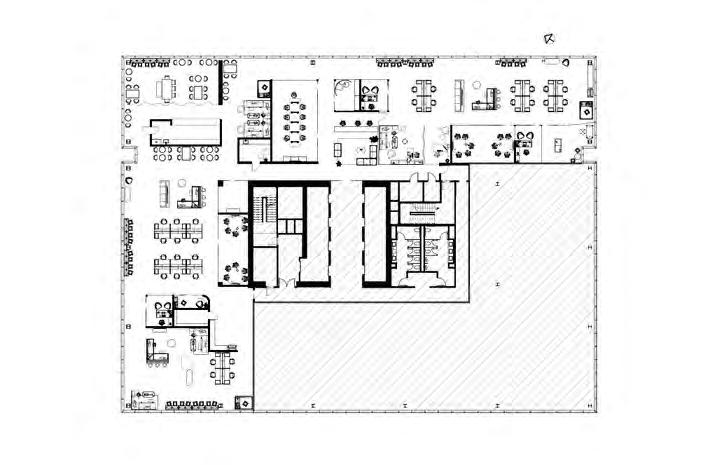
FLOOR PLAN

SCALE: 1/16" = 1'-0"

LARGE MEETING LARGE MEETING LARGE MEETING RM RM RM MOM'S MOM'S MOM'S RM RM RM
RETAIL RETAIL
RESOURCES RESOURCES RESOURCES STOR. STOR. STOR.
TEAM SPACE TEAM SPACE TEAM SPACE TEAM SPACE SPACE TEAM SPACE TEAM SPACE TEAM SPACE TEAM SPACE


INCLUSION INCLUSION INCLUSION LAB LAB LAB HOME HOME HOME OFFICE OFFICE OFFICE LAB LAB
DIR. DIR. OFFICE OFFICE OFFICE DIR. DIR. DIR. OFFICE OFFICE OFFICE DIR. DIR. OFFICE OFFICE OFFICE
WORKSTATIONS WORKSTATIONS WORKSTATIONS WORKSTATIONS WORKSTATIONS WORKSTATIONS WORKSTATIONS WORKSTATIONS WORKSTATIONS WORKSTATIONS WORKSTATIONS
WELLNESS WELLNESS YOGA YOGA YOGA STUDIO STUDIO STUDIO RESOURCES RESOURCES RESOURCES
PROJECT RM PROJECT RM RM PROJECT PROJECT PROJECT RM RM RM

Marigold Carpet Square PHONE PHONE RM RM RM PHONE PHONE PHONE RM RM RM PHONE PHONE PHONE RM RM RM PHONE PHONE PHONE RM RM RM


RECEPTION RECEPTION RECEPTION

MATERIALS PALETTE

 Acrylic
Walnut Grills
Do Re Mi Carpet Square
Copper Carpet Square
Quartz Countertop
Ceiling Cloud
Fabric Upholstery
Oak Flooring
RECEPTION



The key to a cohesive organizational identity is more than just brand colors and a slogan. It's about expressing shared values, brand, and methods in a way that makes employees feel connected to the company. Once that connection is achieved, employees become more successful and feel a sense of belonging and loyalty.

Suspended Linear Led


 Armstrong Serpentina Waves
Oak Flooring
Armstrong Grille
Silestone Calcatta Gold Quartz
Steelcase Forest Coffee Table
West Elm Work Boardwalk
YOGA STUDIO


The Yoga Studio is an additional wellness space focused around movement and destressing. This space will give employees the ability to stretch their body through yoga, which is good for relieving tension physically, spiritually, and mentally. Taking stretch breaks is good for both wellness and productivity. This is just one of the ways NEXT can care for the wellbeing of its employees.
 Sherwin-Williams Ivory Lace
Oak Flooring Armstrong Grille
Steelcase Turnstone Bassline Modern Storage
WORKSTATION


The post-pandemic workplace is a very different workplace than even just five years ago. The integration of hybrid work has vastly shifted the office and has opened the door for unassigned seating, a practice that NEXT uses. Employees choose their seat based on the type of work they need to accomplish, and that seat typically changes throughout the day. It's important to have a variety of seating to facilitate this.


PHONE ROOM + DIRECTOR'S OFFICE


Attracting and retaining top talent in today's market is harder than ever, but it's achievable through good design. Making the workplace more comfortable, connecting employees to the company identity, and providing amenities that excite users can attract and retain top talent. This can be done through ergonomic furniture, natural daylight, inspiring colors and materials, free snacks, and/or amenity spaces.


 Do Re Mi Carpet Square
Armstrong ACOUSTIBUILT
Armstrong Grille
Steelcase Mackinac
Coalesse Joel Lounge Chair
Steelcase Campfire Standing Height Slim Table
TEAM SPACE + WORKSTATION


Every employee has a way that they like to work and what that looks like shifts depending on the type of work they need to accomplish. A successful workplace will have a variety of working zones and could include lounge, individual, group, quiet, noisy, open, enclosed, etc. Employees will want to be in the office if there is an area that they like to work, especially if it's as good as or better than the one they have at home.


 Armstrong Soundscapes Trapezoid
Coalesse Stackable Montara650 bar stool
Do Re Mi Carpet Square
Dotted Carpet Square
Through the local expressions of Downtown Phoenix in both the natural and built environments, this concept bridges the historic site with the present day. It also connects young explorers to their community through a focus on public art.


COLOR


Designing with sustainable practices in mind to enhance the environmental quality of the space.


Creating forms that reflect the contemporary art movement in Downtown Phoenix.


Artistic Expression Locality


A design that is characteristically unique to Downtown Phoenix.

Community Connection

Providing a communal space that welcomes all and brings people together.
Inclusivity
Accessible design principles that make the space enjoyable for all.
Exploration of the city of Phoenix through art locality, and the people.
Seeing the courtyard as a central part of the building, our team sought to make it a crucial piece to the plan and the movement of the space. We developed a structural component that serves as circulation from the first level to the fourth that focuses on accessibility. It will also be a sculptural piece that ties into the concept of artistic expression.
Our team also felt that keeping the integrity of the historic layout of the building was paramount. We drew our new spaces within the parameters of the existing walls and kept the entrance of the building in the same place. We also developed an open cafe dining space that celebrates the rose window, which was a source of inspiration for the courtyard component.
Since we are a firm that puts a large emphasis on community, we planned for as much public space as we could. We also incorporated several areas for community engagement that were inspired by the concept, hence the art gallery and community creation spaces.

We highly considered ease of access for security as a key part of the planning process. That led us to put the daycare and its classroom space on the first floor and away from the rest of the museum. It also led us to the decision to put the exhibit spaces all on the second floor. To make it easy for visitors to find restrooms we stacked them on each floor on the southeast corner, also known as the South Tower. We stacked the employee-only areas on the north side for similar ease and familiarity. We also developed the building layout in a manner that would support after-hours activities and have key security measures in place. The restrooms, leasable space, and art gallery can be open while the lobby, exhibits, daycare, offices, and other museum-specific areas are closed off.

Museum Required Areas

Storage & Back of House Community Areas

Leasable Zones

MATERIALS


SCALE 1/16” = 1’-0”
The first level includes several points of entry, the four double doors on the front facade for visitor entry, the art gallery entry which is a public/community entrance, the storage doors for employees, and the basement level stair entry which is for employees only as well. This level has several public-facing spaces, including the lobby, art gallery, and the courtyard. The daycare and its amenities are also included on the level for ease of access.
FLOOR PLAN LEVEL 1

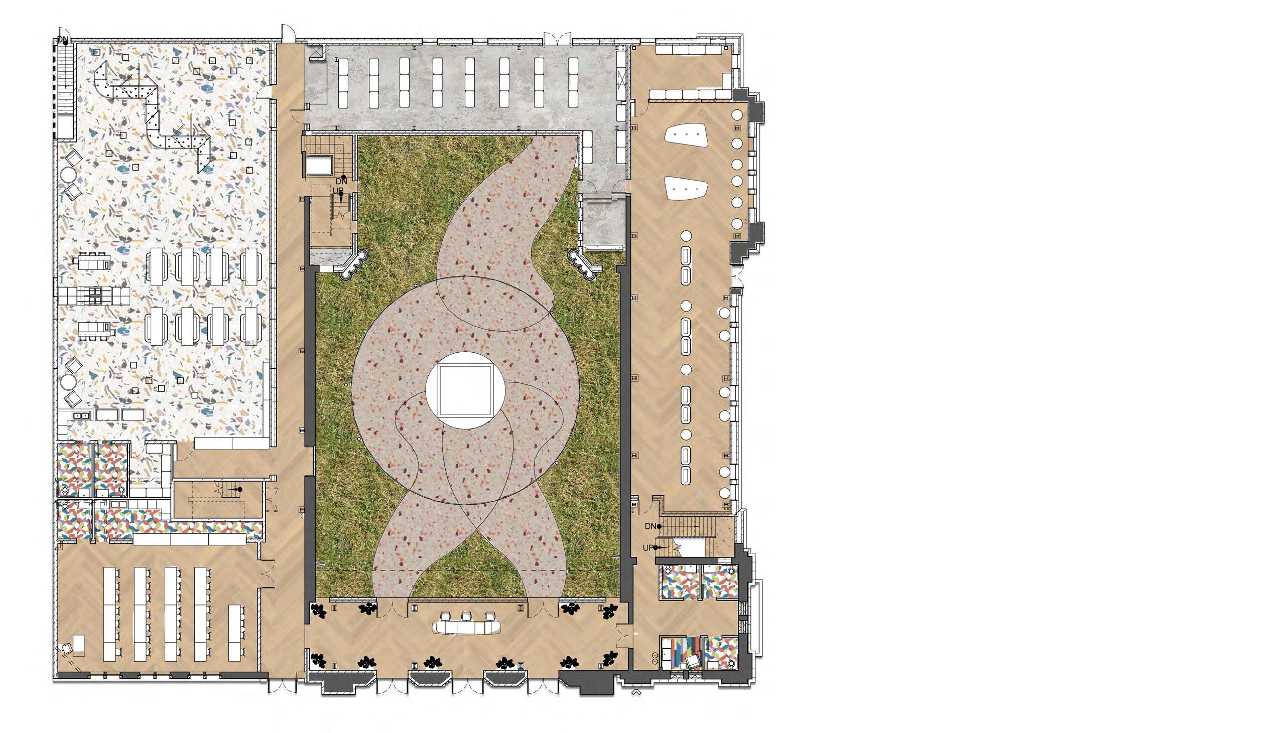
The second level contains the two exhibit spaces as well as the cafe and the first level of dining. The courtyard component links the two sides of the building to create accessibility as the west wing is about 2 feet lower than the east side. The ADA-accessible ramp makes it easy for all guests to enjoy both exhibits.
This level also has the first floor of office space which includes some desking, meeting space, a private office, a separate restroom, and a kitchenette break room.


SCALE 1/16” = 1’-0”


FLOOR PLAN LEVEL 2


The third level has rooftop space on the west side, which could feature a mural (see betterments section for more details). It also has a creation space which has a large wall for painting as well as other creative activities. The second level of dining is also included on this floor. This dining level features the rose window, a prominent symbol of the historic building. This floor also has a second level of offices which includes more loose desking, an open kitchenette, lockers, and more informal meeting space.

SCALE 1/16” = 1’-0”


FLOOR PLAN LEVEL 3


SCALE 1/16” = 1’-0”

Level 4 is the top level of habitable space. There is room for leasable space that can double as additional dining, a birthday party area, or a reception zone. Also included on this floor is an interactive area for an outdoor exhibit, a storytime area, and a quiet zone. The quiet zone is intended to be a peaceful space that can help kids calm down if they are feeling over-excited, overwhelmed, nervous, or in any way that would require them to be excused from the public areas of the building.
This floor is also great for hosting events, such as First Fridays, wedding receptions, etc. It would be a very flexible space with easily moveable furniture.


FLOOR PLAN LEVEL 4


The first space visitors will see is the lobby. The reception desk is centrally located with splatter paint to clearly indicate to guests where to make their first stop. The wall behind the desk is a branding moment, with a raised letter sign and tiles. The tile background was chosen to merge the brand of the museum with the history of the abbey. It is composed of an eclectic smattering of historic and recycled tiles.

MATERIALS


Half-wrapped columns that artistically showcase the columns but also protect young children who would want to touch them


The central structure of the courtyard provides not only accessible access to the different levels but is also a communityfocused exhibit. The glass of the guardrail is a moment for guests to draw with dry-erase markers and create art for everyone to enjoy. Additionally, there are “talk tubes” which allow for communication between the levels. Kids on the third level can make friends with the kids on the second level with this interactive exhibit piece.


“Floating” circular disks at various heights that can be rotated and spun by both children and parents.

Exploratory “tubes” that include various patterns within them, creating both visual and tactile experience.
The exhibits are made to feel very exploratory and playful. The exhibit spaces also make use of different colors, shapes, textures, and tactile play elements. Children are encouraged to get “lost” in the space, while exploring someplace new. The exhibit spaces are very flexible and can be easily re-worked into new spaces depending on changes that playologists within the museum wish to make.

MATERIALS


Ceiling trusses left exposed to allow for custom lighting features to be added to the space.

Colorful glass panels that create a maze-like navugational experience. The glass keeps the space very open, and allows for views all throughout the exhibit.


Part of our community engagement plan is to incorporate a rooftop mural visible from a birds-eye view but is also available for visitors to walk on. This betterment would involve hiring a local artist to create a mural approximately 79 feet wide by 237 feet long on the rooftop of the west side of the abbey.


The design of this mural would be focused on creating a map of Downtown Phoenix that has the Monroe Abbey at its center. The map can include images of key buildings, sites, and any other imagery that celebrates Downtown Phoenix. Shown on this page is an artistic representation of what could be possible for this mural. It can be included in this project to create an aerial landmark for the Monroe Abbey. Birds-eye views of the site will clearly see this mural, making the Abbey easy to spot from above. It can also be a bridge between the building’s historic past and the culture of present-day Phoenix, all while creating a snapshot of history.

The concept for this mural was chosen because it links back to the design concepts: locality, artistic expression, and community connection. The map is a clear link to Downtown Phoenix, but the reason it is in an open and public area is that we felt that the mural should feel part of the community. It should be a symbol within Downtown. Since public murals are a large part of Phoenix’s cultural identity, it seems appropriate that a design inspired by Phoenix would have a large mural. Also, hiring a local artist will really solidify those design concepts.


