RMIT


VOL 12 Nº2 | 2022 AUSTRALIAN DESIGNERS AND JAPAN


Archival research and photography Simone Rule
Editorial Board
Suzie Attiwill rmit University
Michael Bogle Sydney, nsw
Mauro Baracco Baracco + Wright Architects
Nanette Carter Swinburne University
Liam Fennessy rmit University
Christine Garnaut University of South Australia
Philip Goad University of Melbourne
Brad Haylock rmit University
Robyn Healy rmit University
Andrew Leach University of Sydney
Catherine Moriarty Brighton, uk
Michael Spooner rmit University
04 Editorial Harriet Edquist and Sarah Teasley
08
George Kral & Bernard Joyce’s Australian trade pavilions in Japan: connecting the Asia-Pacific world 1957-1962 Harriet Edquist
Norma Tullo: exporting Australian fashion to Japan Sarah Teasley and Harriet Edquist
27
Laurene Vaughan rmit University 24
Prue Acton: licensing in Japan Sarah Teasley
Contact
rmitdesignarchives@rmit.edu.au www.rmit.edu.au/designarchives

We acknowledge the people of the eastern Kulin Nations on whose unceded lands we conduct our business and we respectfully acknowledge their Ancestors and Elders, past and present.
issn 1838-7314 | Published by rmit Design Archives, rmit University. Text © rmit Design Archives, rmit University and individual authors. This Journal is copyright. Apart from fair dealing for the purposes of research, criticism or review as permitted under the Copyright Act 1968, no part may be reproduced, stored in a retrieval system or transmitted by any means without the prior permission of the publisher.
Cover Fashion poster for Kamikaze, 1982, designer Robert Pearce for Kamikaze, RMIT Design Archives. ©Anne Shearman.
Preceding Pages Perspective of apartments for Clarendon Street, East Melbourne, known as Carnich Towers, 1968, architects, Romberg and Boyd, RMIT Design Archives donated through the Australian Government’s Cultural Gift Program in memory of Frederick Romberg and Robin Boyd, 2008.
© 2022 Estate of Robin Boyd, courtesy of the Robin Boyd Foundation; and © 2022 Diane Masters.
Below Tension 25, ‘Made in Japan’, March–April ‘91 (South Yarra, VIC: Extensions Partnership, 1991, RMIT Design Archives. © Ashley Crawford.
30
Robert Pearce and Japan
Harriet Edquist and Sarah Teasley
34
“I’m sorry. That’s heaven”.
Interview with Michael Trudgeon Michael Trudgeon interviewed by Sarah Teasley
38
FDC Promotion in Japan in 1992 Sarah Teasley
42
Tension: The Japan Issue 1991

Ashley Crawford Terence Hogan interviewed by Harriet Edquist
46
The International Architects Lecture Series, Melbourne and post-war Japanese Architecture
Harriet Edquist
52
Quintessential Melbourne: Howard Raggatt’s entries in the Shinkenchiku Residential Design Competition, 1981 and 1991 Philip Goad
Design archives hold significant material for understanding, revisiting and reflecting on historical conditions and events, well beyond the expected boundaries of design. Sometimes, this is apparent: we would expect – and rightly so – for the holdings of the rmit Design Archives to provide insights into the cultural, social and economic history of Melbourne, and of Australia more widely.

Through archival materials like receipts, diaries, business cards and photographs, we can learn about Melbourne’s urban development and creative geographies by tracing the locations of designers’ studios, meetings and clients. Sample books and order books tell us something about retail, about household finances and consumer taste. Architectural drawings provide a glimpse into how Australians organized work, home and leisure, how we dreamed of organizing them better, and how changing ideas of safety, risk and beauty shaped those environments. As physical artefacts, all of these objects, like the myriad other items that comprise a design archive, embody the history of Australia’s materials and manufacturing industries.

This issue of the rmit Design Archives Journal explores how design archives can provide insights into less expected histories, too, depending on the slice we take through them. The ‘slice’ for this issue is Australian designers’ relationships with Japan, 1960–1990. To compile the issue, we asked: What evidence of the relationship that designers in Australia have had with Japan – not as an imagined aesthetic, but as a place home to people and projects – can we find in the archives? What do those professional relationships, captured in itineraries, sample books, press clippings and interviews, as well as in magazine covers, nightdresses, trade fair interiors and architecture competition entries say about the diverse, nuanced ways that designers working in Australia understood Japan – as a market, a competitor, a former enemy turned trading partner and eventually ally and beacon of possibility? What do those micro-histories say about cultural, economic and geopolitical relationships between Australia and Japan, as nations in the Asia-Pacific region? And what do they tell us about design practice and its contexts in Australia, as the locale for material in the rmit Design Archives?
Some of those stories, presented fragmentarily in these pages, concern the ways that renewed trade relations between the two countries offered opportunities for designers. Harriet Edquist’s essay on the designs that George Kral and Bernard Joyce created for the Australian pavilions at trade fairs in Tokyo and Osaka in the early 1960s demonstrates how resurgent interest in promoting trade within the Asia-Pacific region, created a platform for design experimentation and income. Kral and Joyce’s exhibition designs, captured in full sets of working drawings together with photographs, amplify the role that trade pavilions played in propagating a vision of the Australian economy.
The archives of fashion designers Norma Tullo and Prue Acton, like those of Kral and Joyce held in the rmit Design Archives, take the story into the 1970s. Both Tullo and Acton found distributors for their lines in Japan. Both designers benefited from growing household incomes and the increase in fashion consumption and shopping as leisure in Japan from the mid-1960s onwards, particularly amongst young women. Press clippings, sketches, swatches and other archival materials present a story of Japanese retailers seeing Tullo and Acton’s clothes as right for particular demographics and Tullo and Acton adapting their Japanese lines to fit Japanese consumer taste, against a backdrop of Australian government support for trade with Japan.
By the 1980s, some designers in Australia saw Tokyo as an epicentre of cutting-edge style. For designers like Robert Pearce, Michael Trudgeon and Terence Hogan, part of a group of young creative practitioners across graphics and publishing, fashion, music, architecture and club culture, the ebullient design and architecture produced in Japan –not least to differentiate products in the country’s crowded consumer market – showed how design could be. For these designers, Japan was a market, yes, but avant-garde designers and architects in Japan were also kindred spirits and co-conspirators. And the creative eclecticism of 1980s Japanese graphics, particularly, inspired them to create irreverent mashups of Japanese and Australian text and imagery alike, as a way of situating Australia, too, as part of the Asia-Pacific.
The importance of magazines as legacy documents that record sometimes ephemeral or lost engagements between Australia and Japan is illustrated in a cluster of architectural media documents held in the Archives. In 1983, the journal Transition published an interview with Japanese architect Shinohara Kazuo, one of several Japanese architects who visited Melbourne in the 1970s and 1980s to deliver talks at international speaker events. These traces point to a long standing interest amongst Australian architects in contemporary Japanese architecture.
Philip Goad’s detailed and revealing discussion of Howard Raggatt’s competition entries for the 1981 and 1991 Japanese Schinkenchiku competition is illustrated with pages from Transition, Backlogue: Journal of the HalfTime Club, contemporary commentary and observations by Howard Raggatt. Again, a focus on interactions with external events and organizations, in this instance an architectural competition, can tell us much about local conditions as well as international relations.
We hope that the issue’s cut across design disciplines will prompt reflection on how design histories are curated and compiled, as well. Design histories are still often disciplinefocused, no matter how loud the call to interdisciplinarity might be. This is particularly the case with fashion and architecture. But taking Australian designers’ interactions with initiatives and people in Japan as our lode star, we began to discern in the material we gathered together the outlines of a different way to approach design histories. There are limitations to this issue. This is not an issue about Japanese design, rather it explores how designers working predominantly in Melbourne related to products, styles and initiatives created in Japan, and to Japan as a market for Australian goods. It is also not an issue about geopolitical relations between Japan and Australia in the postwar period, let alone an issue about either country’s position in the postwar Asia-Pacific. These are topics that design archives can support. We sincerely hope that researchers will pursue them in more depth, taking the material presented here as an invitation. There is important work to be done exploring the reactions, responses and interests of designers in Japan and those who visited Australia in relation to Australia as part of Asia-Pacific in this period. And perhaps most noticeably of all, this issue explores relationships between Australians from European backgrounds ‘with’ Japan. There is significant work to be done documenting and amplifying the design experiences and stories of Australians of Japanese and other Asia-Pacific ancestry, and to consider the design history of Australia as part of the Asia-Pacific region, particularly as created and experienced by Aboriginal, Indigenous and Torres Strait Islanders..
The glimpses of design practice and culture in postwar Australia are meant as invitations to look more deeply into what an archive can offer. We hope to prompt you to come and explore these stories about Australian designers and Japan and the materials behind them more deeply. But also to come to the archives with your own particular angle, to see what you find.
Harriet Edquist and Sarah Teasley Editors
 Harriet Edquist

In 2013 Shirley Kral donated a collection of material to the rmit Design Archives that came from the practice of her former husband Czech-born designer George Kral. Among it is a scrapbook compiled by his daughter Inge Kral that includes photographs of the Australian Pavilion erected for the Tokyo International Trade Fair in 1961 and a set of 17 drawings of the exhibition layout, including one perspective and 16 working drawings. These were designed by Kral and Bernard Joyce both of whom were in the office of Bogle & Banfield, an architectural practice that had been established by Gordon Banfield and Alan Bogle the year before. The drawings were completed in early 1960. The building documented here, almost unknown in Australian architectural history, is a significant addition to the un-researched history of Australia’s small post-war pavilions designed for annual trade exhibitions around the world.
Joyce and Kral, both émigrés, had been collaborating on trade exhibition design for some time. Joyce had arrived from England in 1949 and completed his architectural degree at Melbourne University.1 Kral had arrived from the former Czechoslovakia at around the same time as Joyce, by way of Paris. It is unclear where he gained his design training, possibly in Prague.2 By the mid-1950s both had established themselves in practice, Joyce as an architect and Kral as an interior designer and graphic designer and for a few years they practised together. Shirley Kral records in her diary, excerpts from which are in the Kral collection, that on 25 March, 1957 their plans for a Tokyo exhibit were finished and ready to post to Japan: “G would have liked to go to Japan to supervise the exhibition.”3 She also notes that “Mr Watson, who supervised the Tokyo Exhibition for the Department of Trade” visited Kral at this time. The drawings for this early collaboration unfortunately seem to have perished although the pavilion is briefly mentioned in Overseas Trading the official publication of the Department of Trade in its May edition that year.
Under a large headline Australia on Show in Japan, we read “A Holden Special sedan displayed in the Australian pavilion at the Japan International Trade Fair in Tokyo has proved one of the features of the fair, since it opened on May 5.”4 The photograph accompanying the article shows a small crowd of visitors inspecting the car which is poised beneath a banner inscribed “Australia.” The exhibit would therefore have been housed within a general fair pavilion, not separately.
Shirley Kral also notes in June 1957 that “George is racing to complete the drawings for the Canadian National Exhibition to be ready tomorrow.”5 Photographs of this exhibit were published in Overseas Trading where they suggest that style of slender timber grid supporting largescale photographs behind open display shelves that typified mid-century exhibition design.6 This exhibit, like numerous others the Department of Trade sent around the world, was probably housed within an existing building. It is unclear how these government commissions came to Kral and Joyce, but possibly through Kral in the first instance given his professional expertise and considerable flair in exhibition design. He and Shirley were also friendly at that time with Peter Hunt who worked for the Department. In August 1957 Shirley Kral notes that Mr Wood of the Department of Trade had offered Kral a salaried position as “head of the Design Department at 2,200 pounds a year, probably more.”7 He chose to remain a freelance designer. However, further commissions from the Department of Trade came their way.
There were three kinds of trade fair that Australia participated in during the post-war decades, as Overseas Trading advised its readers in 1961; the international general fair; the specialised fair and the national trade exhibition. The international fair “is one which admits a wide range of products and is open to all countries. Some of these fairs are held once or twice a year, others occur less frequently.”8 The Tokyo International Trade Fair and
Preceding Pages
Australian Pavilion, Japanese International Trade Fair, Tokyo, 1961, architects, George Kral and Bernard Joyce, RMIT Design Archives, William Nankivell Collection.
Opposite Australian Pavilion, Japanese International Trade Fair, Tokyo, 1961, 1960 architects George Kral and Bernard Joyce, Bogle & Banfield Architects © Beverley Bjornesjo, Cecile Banfield, Marilyn Banfield; Bogle Family.
george kral & bernard joyce’s australian trade pavilions in japan: connecting the asia-pacific world 1957–1962 Continued

the Canadian National Exhibition, the largest in the world, were examples of the first type and Kral and Joyce were involved with at least four of these between 1957 and 1962. The international specialised fair was, by contrast, closed to the public and admitted “only the products of a particular industry or group of allied industries.” Australia’s modernist pavilion for the 1961 Singapore International Air Show, which expressed on the exterior something of its freight of advanced space-related technologies and weaponry housed within, was an example of this type.9 The third type of fair was the national trade exhibition, representing all types of industry held in a foreign country. Australia hosted these in New York, London and elsewhere (where they often comprised unhappy kiosks filled with tinned fruit and meat) but also at sea in the form of a floating trade mission. In 1958 the Commonwealth Department of Trade commissioned the Delos, the Australian Trade Mission’s floating ‘expo’ which made its way around the trading ports of South-East Asia and was captured during loading by British Pathé.10 Initially, the co-ordination and display was under the direction of the Publicity Directorate which set the standards, space and colour selection for individual exhibitors although Shirley Kral notes in a diary entry of 23 October 1958 that Kral was working on the Delos.11 It seems that within this tripartite arrangement, the international general fair was the most prestigious and they called forth from the Department of Trade the most interesting design commissions.
The description of the types of fair available to Australian producers and manufacturers was published in a November 1961 issue of Overseas Trading which had a special focus on Japan.12 Private trade had re-commenced with Japan on a limited scale in 1947. As Overseas Trading, then published by the former Department of Commerce and Agriculture noted in July of that year, 400 representatives of private trade would be allowed into occupied Japan and Australia’s share was 6%, to be allocated by an interdepartmental committee on the basis of predetermined trade priorities, and preference given to “firms who had engaged in direct trading with Japan, or who had branches in Japan, prewar.”13 After this restricted beginning there followed a prosperous decade where “Australia’s economy rode happily on the sheep’s back but [. . .] relied heavily on Britain as its primary export market.” Over the course of the 1950s and 1960s however Britain’s share of Australia’s export market fell while Japan’s share rose. In 1950–51 Japan ranked as Australia’s fourth largest export market, and in 1955–56, the second.14 A key facilitator in the Australia - Japan trade alliance was the Japan External Trade Organization (JETRO), a “Japanese government organisation that provides free business support services to companies expanding to Japan.”15 However, while Australia luxuriated in an expanding export market, Japan’s trade deficit with Australia continued to grow until it became unsustainable, forcing Australia to loosen its discriminatory restrictive import controls. In May 1956, Australia entered into trade negotiations with Japan and an agreement was signed in July 1957. In a memorandum to the Department of External
Opposite Australian Pavilion, Japanese International Trade Fair, Tokyo, 1961, 1960 architects George Kral and Bernard Joyce, Bogle & Banfield
Architects © Beverley Bjornesjo, Cecile Banfield, Marilyn Banfield; Bogle Family.

Affairs, T. W. Eckersley in Tokyo noted that the granting of most-favoured-nation treatment to Japan had far larger consequences for the future well-being of the relationship between the two countries than simply trade.16
It was in this conciliatory milieu that Kral and Joyce received their first design commissions, the 1957 pavilion for Tokyo from the Department of Trade, which was from 1956 under the purview of Minister for Trade, John McEwan. The Directorate of Trade Publicity was responsible for the first Osaka Fair in 1954 and possibly the two following ones in Japan. As they also put together the 1954 Penang Fair it may well be that until the mid-1950s all exhibitions were designed in-house by the Directorate.17 Perhaps they felt it was time to bring in designers; in October 1957 Overseas Trading devoted an entire page to the foundation of the Australian Industrial Design Council, so they were not blind to the benefits of the design ‘value-add.’18
Australia did not participate in the post-war World Expos at Brussels in 1958 or Seattle in 1962. Instead, it ramped up the design quotient in its important international trade fairs. In 1960 Gordon Andrews, one of Australia’s most celebrated designers was commissioned by the Department of Trade to design Australia’s exhibit for the 41st Comptoir Suisse in Lausanne Switzerland. The idea was to depict modern Australia, a guest nation at the fair, its people and products. The fair was held on the grounds of the Palais de Beaulieu in September and Australia’s exhibit was housed in and around the central exhibition hall. It was a prestigious commission in the heart of Europe and Andrews excelled in portraying the country as a diverse, successful and burgeoning nation. The story had been told before – reticently at Wellington in 1939 for example - but not by such an experienced communicator. Indeed, the exhibition was, according to

one Swiss financial editor: “The centre of a vast economic offensive on the whole of Western Europe.”19 It was accompanied by a concurrent exhibition of contemporary Australian architecture curated by Robin Boyd in Zurich, an economic seminar, and, perhaps surprisingly, a fashion parade. Australia was pitching itself as something other than an unworldly source of raw product.20
While the Department of Trade chose the celebrated Andrews for Europe in 1960 they did less well at Osaka in the same year although this might have been the first time in Japan that Australia fielded its own pavilion. It is unclear who designed the Osaka pavilion and its fleeting appearance in a Pathé newsreel shows a distinctly ordinary, suburban-looking building.21 With an area of 600 square metres it was, according to Overseas Trading, the biggest ever to be presented in Asia and was described by Japanese commentary as being “the most publicity-conscious national pavilion.”22 For whatever reason, perhaps the success of the Andrews pavilion in Lausanne and a growing awareness of the sophistication of the Japanese consumer, the Department of Trade decided to lift their game for the Tokyo exhibition in 1961. By commissioning Joyce and Kral they demonstrated an ambition to showcase Australian architectural and exhibition design quite as much as its raw and manufactured products.
Australian Pavilion, Japanese International Trade Fair, Tokyo, 1961
The choice of Kral and Joyce for Tokyo presumably rested on their work for Tokyo in 1957 and the trade ship Delos. Perhaps the Directorate wished to emulate the success of the Andrews pavilion the year before. But Andrews was a consummate exhibition designer with significant international experience including design for Olivetti and
an exhibition at the 1954 Fiera di Milano. He was not an architect and he understood how to sell a product. While Kral, still in his 20s, was equally adept at commercial design he was something of a maverick, and Joyce was an architect; in the hands of these two obsessives the pavilion was full of architectural ideas and over-detailed, the products subsumed under a highly original orchestration of materials, texture and rich colour.


The pavilion featured “Australian jarrah in the facings and the floors; Australian structural steel in the frame; and an Australian Brownbuilt roof”.23 The roof rested on white blade walls. It was opened by the Governor of Tokyo, Mr Azuma Ryūtarō and visited by Crown Prince Akihito who “commented on the pavilion’s impressive design and imaginative use of jarrah timber.”24 Indeed, “the rich red West Australian jarrah timber panels on the pavilion’s outer walls and its highly polished jarrah flooring” impressed both visitors and the Press alike.25 The leading financial daily, the Nihon Keizai Shinbun
described the Australian pavilion as “unique in conception.” Noted Japanese designer Takashi Kōno said the pavilion was a “beautiful example of commercial design,” and the designer of Germany’s pavilion said that Australia’s was easily the best pavilion.”26
The entrance was in the centre of the building on axis with the exit.27 The white gravelled courtyard in front, planted with short, round manicured bushes (azaleas?), was a quiet acknowledgement of its Japanese context; there were no eucalypts. Indeed, the pavilion as a whole was remarkably free from Australian visual clichés with the exception of the boomerang inspired sculptural form in front. The interior was organised in rough quadrants about the central aisle; to the right on entry was the reception and office; to the left the
Australian Way of Life and Wool. Further on, the industrial and medical displays were on the left facing primary products (photographs of stud bulls), mining and agricultural products.

At the central crossing a large illuminated and stylized map of Australia was mounted on a black wall.
On the wall to the left of the entrance was a huge mural print of a surfer riding a wave as though down into the exhibition space. Sporting images were a favourite of Australian pavilions and surfing was a well-known and commercialised sport. But this image brought something new because it recorded a pivotal moment in Australian surfing. The surfer was riding a light-weight balsa and fibreglass board of the type that had been introduced into Australia from Malibu in 1956 by visiting Americans and, with Californian surf culture generally, revolutionised surfing here. The photograph had, in fact been used at Lausanne the year before, accompanied there by an example of the new Australian-designed surfboard. The photograph heralded Australian innovation in board design and manufacture in the 1960s and the birth of RipCurl, Billabong and Quiksilver, leaders in the multibillion-dollar global market. To the left of the surfer was another, smaller mural print depicting a group of merinos, heroic producers of Australia’s wealth. Next to that image were three alcoves displaying woollen garments. Wool, as yet unchallenged by iron ore, was Australia’s main export to Japan and it was presented in a variety of ways throughout the exhibition.
Jostling sheep as Australia’s most lucrative export were iron ore and other minerals and Kral’s hand can be seen in the display of mineral samples, to most people objects of excruciating dullness. Japanese industrial demand for raw materials was strong. And 1960s Australia was discovering just how massive were the mineral deposits littered about
Opposite Australian Pavilion, Japanese International Trade Fair, Tokyo, 1961, architects George Kral and Bernard Joyce, Bogle & Banfield Architects, unknown photographer, RMIT Design Archives.
This Page Australian Pavilion, Japanese International Trade Fair, Tokyo, 1961, architects George Kral and Bernard Joyce, Bogle & Banfield Architects, unknown photographer, RMIT Design Archives.
Above Australian Pavilion, Japanese International Trade Fair, Tokyo, 1961, architects George Kral and Bernard Joyce, Bogle & Banfield Architects, unknown photographer, RMIT Design Archives.
Opposite Australian Pavilion, Japanese International Trade Fair, Osaka 1962, architects, George Kral and Bernard Joyce, 1961, RMIT Design Archives ©2022 Kral Family.
the country. This fortuitous complementarity “created a dynamic environment in which both countries promoted their mutual trading interests and fostered a closer relationship.”28 As if to express the value of the exchange Kral positioned the mineral samples individually on separate short black columns under internally lit Perspex boxes like precious objects, just as he had done when presenting other luxury consumer products in his retail interiors. These displays were not designed for the casual passer-by. They were designed for close encounter. Here Kral was commenting, possibly ironically, on the traditional display of Australia’s mineral wealth in vast piles of accumulation.
Photographs of products and animals mounted in light boxes were arrayed in rows on the wall, on pillars, on low shelves or suspended vertically from the ceiling; other large panels were suspended horizontally closer to the ceiling, probably difficult to see without straining your neck. Kral liked to activate the ceiling as a display space. Instead of displaying the fabric exhibits in the usual way of draping on a model or hanging from a wall, they were mounted separately in frames as screens and positioned in such a way as to create smaller spaces for display: one thinks of Lilly Reich’s fabric partitions in her Berlin exhibitions of the early 1930s. Kral (it is unlikely that this was a move by the austere Joyce) also covered the timber pillars that divided the exhibition space with foil, silver, gold and orange to one side; light blue, dark blue and silver to the other. With the brilliantly polished jarrah floor, illuminated light boxes, pendant lights with black shades, black walls, coloured fabric screens and shining foil, the interior was richly detailed with intense colour accents and probably rather dark; and typical of Kral’s commercial interior design.


The Kral collection in the Archives also holds the working drawings for Kral and Joyce’s second pavilion in Japan designed for Osaka in 1962. Given the praise bestowed on their Tokyo pavilion, and also for the sake of economy the Department of Trade commissioned Joyce and Kral to repurpose it for Osaka where two million visitors were expected and 100 Australian exporters, twice the number of Tokyo, would exhibit their products. It was dismantled and re-erected on its new site and the interiors re-designed and enlarged to accommodate the increased number of exhibits. The entrance was screened by seven tall flagpoles flying Australian and Japanese flags, according to Overseas Trading. The arrangement was reminiscent of a classical colonnade and the pavilion’s plan was cruciform. The drawings were prepared between November 1961 and January 1962 in the design studio at Gallery A in South Yarra which was the brainchild of Kral and he and Joyce oversaw their production and initialed them.29
Overseas Trading noted: Constructed mainly from Australian materials, including
textured hardwoods and steel, the pavilion covers 6,400 square feet. Its drum-like facade is panelled in red straight-grained Australian Jarrah and it features an Australian made pre-fabricated roof. A large Australian crest carved in wood will dominate the front outside wall of the pavilion and Australian and Japanese flags will fly side by side in front of the forecourt. Two entrances lead from the forecourt to the main display area. Subtle, indirect lighting will be a feature of most exhibits and one of the most striking will be a series of columns with inset fibre-glass panels containing illuminated displays of
various minerals.30
Detail was pared back and space simplified - no fabric space dividers or foil-clad columns although the mineral samples were still treated with special fervour. All was matt black and white (white text on black background), untreated timber, and meticulously detailed installations each with individual lighting. Only the arrangement of the dried eucalypts adorned with toy koalas was “left entirely to the dresser.” One can hear Kral’s disapproval seeping through the instruction. In an interactive spirit, the public
were invited to food tastings, the offerings being prepared in a kitchen adjacent to the food displays. The pavilion also had specialised display areas to accommodate heavy machinery and “an Australian made car, automobile parts and re-conditioning equipment [which] will illustrate the progress which the motor vehicle industry has made in the past 12 years to become one of Australia’s most important manufacturing industries.”31 Other products that were exhibited and carefully detailed on the drawings were shells, jewellery, opals, leather goods including hides, blankets, lingerie, swimsuits, kangaroo fur coats, chemicals,

george kral & bernard joyce’s australian trade pavilions in japan: connecting the asia-pacific world 1957–1962 Continued

Left Australian Pavilion, Japanese International Trade Fair, Tokyo, 1961, architects, George Kral and Bernard Joyce, RMIT Design Archives, William Nankivell Collection.
Below left and right Australian Pavilion, Osaka Trade Fair 1962, architects George Kral and Bernard Joyce, Gallery A Design Group, drawn by B.H.J. December 1961, RMIT Design Archives. ©2022 Kral Family.


grains, television equipment and sporting goods. It was a success, attracted over half a million visitors and clocked up good sales from costume jewellery to bread slicing equipment and a Repco grinding machine. The following year, for the 1963 Tokyo pavilion, the Department of Trade brought back Gordon Andrews whose bold, expedient portal frame structure was itself an exhibit, covered externally with imagery and text, and boasting large inviting entrance doors. The bright, white interior featured both an internal garden and, more ominously, a display like “a huge grocery store” shelves groaning with canned, bottled and packaged foodstuffs.32 Australia’s trade pavilion DNA was not to be defeated; the contrast with Kral and Joyce’s restrained somewhat arcane pavilion was pointed.

The trade exhibition as “grey architecture” World Expo pavilions, from Joseph Paxton’s 1851 Great Exhibition building to Osaka Expo ‘70, are highly aestheticised often experimental objects that occupy a place in the canon of architecture as repositories of national ideologies whose role as trade exhibitions is subsumed under extravagant expressions of cultural aspiration. While architectural historians tend to focus on these bright and alluring buildings, the hard-working disposable trade exhibition pavilion has gone largely unnoticed, at least in Australian design history. Yet these small buildings provide evidence of Australia’s ability to sell itself as an industrialised, innovative nation able to contribute to the world economy in myriad ways from raw products to sophisticated aeronautical instruments. And, as the 1950s and 60s progressed, design became an important element of Australia’s self-representation. The assumption that Osaka Expo ‘70 was unusual in that it “allowed Australia to represent itself as something other than a combined farm and mine to the exposition’s large Japanese audience,” as Carolyn Barnes and Simon Jackson suggest, is wide of the mark. Australia had been doing just that for decades.33 World’s Fair and Expo buildings have often been given more credit for affecting the real world than they deserve. In fact, we could conclude that they sailed along on the back of the endless cycle of trade exhibitions.
These latter shed light on the role that trade exhibition design - or exhibition design generally - played in Australia’s architectural development. For example, in 1966 Overseas Trading proclaimed that the Osaka trade pavilion was “the seventh pavilion built by the Australian Government for Japanese Trade Fairs since 1960.”34 Of those seven Kral and Joyce designed 1961 and 1962; Gordon Andrews 1963; Brunton, Lilly and Brunton 1964 and 1965. Joyce had entered a design competition with David Brunton and John Lilly in the early 1950s.35 Brunton, Lilly and Brunton designed other Australian pavilions at this time including one for the 1964 New Zealand Easter Show in Auckland. Overseas Trading noted expansively that the designers were “a leading Australian industrial design group” and featured ‘a suave perspective sketch and description of the building’.36 These pavilions are all worth study. Further, the buildings and their contents gesture towards a recognition of the imbrication of modern architecture and trade and of the way Australia figured itself in world contexts.
Opposite Australian Pavilion, Osaka Trade Fair 1962, architects, George Kral and Bernard Joyce, architects, Gallery A Design Group, RMIT Design Archives. ©2022 Kral Family.
Above Symbols for exported goods, Osaka Trade Fair 1962, Gallery A Design Group, RMIT Design Archives. ©2022 Kral Family.

While the emphatic, often architecturally ambitious pavilions for World Expos, such as Osaka Expo ‘70, crafted a unified and one might conclude, simplistic or at least unambiguous and attractive images of the nation, the trade exhibitions by contrast were smaller and targeted the import potential of each host country - whether it be in Europe, United Kingdom, United States, South America, India, Africa, Asia or Oceania. Australia traded all over the world. The exhibitions might be mere booths or stands in a larger international fair or they might be as at Lausanne in 1960 and in Japan from the late 1950s stand-alone pavilions designed by architects or professional exhibition designers. Or they might be trade ships like the Delos, Straat Banka and Centaur which forged networks of connections between trading ports across the Asia-Pacific region. Collectively they formed what Alex Bremner has termed in a different context, “grey architecture,” the architecture of international trade, transport, logistics, agreements, protocols and other visible and invisible infrastructures that bind the world together. While Bremner and other scholars have focussed on the role of this unheralded grey
architecture in the creation of the colonial ‘Atlantic World’ and, indeed, the ‘Tasman World’ it is a useful idea to bring to the discussion of Australia’s unsung trade exhibitions which helped produce a post-war ‘Asia-Pacific World.’ 37
The author thanks Simon Reeves for assistance.
1 For an outline of Joyce’s early career see Harriet Edquist, “William Nankivell Collection”, RMIT Design Archives Journal, vol 1 no 2 2011 : 10–11.
2 For an outline of Kral’s career see, Harriet Edquist, “George Kral (1928-1978): graphic designer and interior designer,” RMIT Design Archives Journal, vol 3 no 2 : 13.
3 Shirley Kral, diary extract, 1957, typescript, George Kral collection, RMIT Design Archives.
4 Overseas Trading, vol 9 no 9 (May 15 1957) : 149.
5 Shirley Kral, diary extract, 1957, typescript, George Kral collection, RMIT Design Archives.
6 Overseas Trading, vol 9 no 19 (October 2 1957) : 325.
7 Shirley Kral, diary diary extract, 1957, typescript, George Kral collection, RMIT Design Archives.
8 Overseas Trading, vol 13 no 21 (November 3 1961) : 492.
9 Overseas Trading, vol 13 no 6 (April 7 1961) : 134.
10 https://www.britishpathe.com/video/ VLVA368WLEH68HJ0GJ124FHQQHJJ8-AUSTRALIAFLOATING-SHOWROOM/query/floating
11 Overseas Trading, vol 14 no 2 (February 9 1962) : 33.
12 Overseas Trading, vol 13 no 21 (November 3 1961) : 492.
13 Overseas Trading, vol 1 no 3 (July 1947) : 6.
14 Chapter 5 “Australia and Japan - A trading tradition”, https://www. aph.gov.au/Parliamentary_Business/Committees/Senate/Foreign_ Affairs_Defence_and_Trade/Completed_inquiries/1999-02/japan/ report/c05, accessed 28 July 2022.
15 https://www.jetro.go.jp/australia/, accessed July 28 2022.
16 Chapter 5 “Australia and Japan – A trading tradition.”
17 Overseas Trading, vol 6 no 3 (March 1954) : 13.
18 Overseas Trading, vol 9 no 19 (October 2 1957) : 39.
19 Overseas Trading, vol 12no 20 (October 14 1960) : 468.
20 Overseas Trading https://nla.gov.au/nla.obj-1098117905/ view?sectionId=nla.obj-1124051448&partId=nla.obj1098506279#page/n12/mode/1up
21 https://www.britishpathe.com/video/ VLVA8KJRZ1NW9609NZHV828AUAHZP-JAPAN-OSAKAINTERNATIONAL-TRADE-FAIR-OPENED/query/OSAKA, accessed July 28 2022
22 Overseas Trading, vol 12 no 10 (May 25 1960) : 22.
23 Overseas Trading, vol 13 no 6 (April 7 1961) : 133.
24 Overseas Trading, vol. 13 No. 8 (May 5 1961) : 189.
25 Overseas Trading, vol 13 no 8 (May 5 1961) : 189.
26 Overseas Trading, vol 13 no 8 (May 5 1961) : 189.
27 Photographs of the exterior and interior displays was published in Overseas Trading vol 14 no 9 (May 18 1962) : 216.
28 Chapter 5 “Australia and Japan - A trading tradition”, https://www.aph.gov.au/Parliamentary_Business/Committees/ Senate/Foreign_Affairs_Defence_and_Trade/Completed_ inquiries/1999-02/japan/report/c05, accessed July 28 2022.
29 For Gallery A see Edquist, “George Kral,” : 15–16.
30 Overseas Trading, vol 14 no 3 (February 23 1962) : 68.
31 Overseas Trading, vol 14 no 3 (February 23 1962) : 68.
32 Overseas Trading, vol 15 no 10 (May 31 1963) : 230.
33 Carolyn Barnes, Simon Jackson, “Staging Identity. Australian Design Innovation at Expo ‘70, Osaka,” Journal of Design History, vol 25 no 4 (November 2012) : 400–413.
34 Overseas trading, vol 18 no 8 (29 April 1966) : 176.
35 Edquist, “William Nankivell,” : 30.
36 Overseas Trading, vol 15 no 24 (13 December 1963) : 561.
37 See, for example, G A Bremner and Andrew Leach, “The Architecture of the Tasman World, 1788–1850,” Fabrications, vol 29 no 3 (2019) : 303–316.
Opposite Pulpit, St Andrew’s Church Westbury, 1904, carved by Nellie Payne, photograph Harriet Edquist.
Above Pulpit (detail), St Andrew’s Church Westbury, 1904, carved by Nellie Payne, photograph Harriet Edquist.
Bottom Memorial plaque to Sarah Lindsay, St Andrew’s Church, Westbury. Carving and repoussé by Nellie Payne early 20th century, photograph courtesy Steven French.

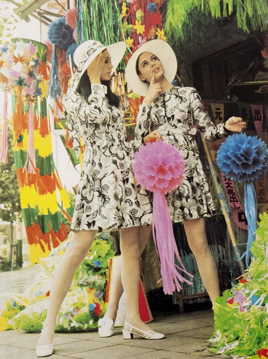
At the 1960 Lausanne trade fair, the Australian contingent presented a fashion show featuring garments made from Australian wool. The monthly Overseas Trading announced that “Australian wool will be presented as a top fashion fabric in 70 Australian-designed and made garments to be modelled by Australian and European mannequins.”.1
The parade, held in a Lausanne store, L’Innovation, was coordinated by Department of Trade officer Judy Stenberg. The brief account of the parade in Overseas Trading 2 September is illustrated by photographs of Stenberg and three un-named models wearing garments by un-named designers. Australian designers had not yet achieved named status, although this would soon change. One of the models, Diane Masters, is pictured in a wattle-themed evening dress; her personal archive is in the rmit Design Archives collection which has a copy of the photograph.2 In another article in Overseas Trading on 30 September the fashion component was again singled out for mention, as receiving favourable notice by European commentators.3 In October yet another review of the exhibition carried a photo of Masters on the catwalk, noting: “Top model Diane Masters shows a classic wool suit at L’Innovation. High quality Australian fashions are now being displayed in over 40 Swiss stores.”4 Still no word on the designers.
The lesson to be taken from this new focus of the Department of Trade was clear: Australia was not only a leading producer of fine wool but also had both the industrial capacity to turn it into high-quality fabric and the design capacity to transform the fabric into fashion. Fashion thereafter became a staple of Australian trade fair representation, including at the Osaka and Tokyo fairs. The Australian pavilion at the 1961 Tokyo Trade Fair featured wool fabric both as a structural element in the interior design and as fashion: three garments displayed on mannequins, each posed on an opaque glass platform mounted in a niche. Wool also featured as knitwear and as the subject of research. Overseas Trading also notes that an unnamed Japanese department store displayed a kimono made from Australian wool as a side promotion; further research in Japan could tell much more of this story.5 From 1963 the fashion parade was a feature of Australian trade fairs.6
In the 1960s, the impetus to export Australian wool fashion and Australia’s fashion industry intersected with the growing market for western style ready-to-wear clothing in Japan and some Japanese retailers’ strategies for capitalizing on it. After the Second World War, the number of women in Japan wearing western-style clothing grew quickly, particularly in urban centres.7 Factors contributing to urban women’s decisions to switch from kimono to
western-style dresses and blouses, jumpers and skirts for everyday wear included the lower cost of acquiring and maintaining western-style clothing and the relative ease of wearing, washing and maintaining it, compared to kimono. In the 1950s, many women either sewed westernstyle clothing themselves from patterns or hired one of the growing number of western-style seamstresses to sew clothing for them. By the 1960s, textile manufacturers and retailers saw ready-to-wear clothing for women and men alike as potential growth areas, especially in lines targeting the postwar baby boom or danchaku sedai, then in their teens and early twenties.8 As the economist Ishii Susumu and others have explored, some wholesalers, textile firms and – more unusually – department stores saw licensing lines from overseas designers as a way to differentiate their products, particularly at a higher but still accessible price point. In this system, foreign designers signed contracts with Japanese firms to produce garments designed overseas but with input from the Japanese firms into what was likely to be popular shaping the product selection and styling, and patterns cut to Japanese sizing. The Japanese department store Takashimaya signed a contract with Pierre Cardin in 1959, and major textile company Toray Co Ltd with Yves Saint-Laurent in 1963.
The archives of designers Norma Tullo and Prue Acton, both held at the rmit Design Archives, provide nuanced, textured insight into how these relationships worked, from the rhythm of design and production cycles and contract negotiations to the design process and the nature and process of maintaining a business relationship at distance, across language, national borders and business cultures. Because Tullo and Acton and their Japanese
Above Christmas Card from Norma Tullo, 1975, RMIT Design Archives, ©Christopher Tullo King Opposite ‘Young Idea, Tours Tokyo in the Long-Sleeved Crêpe Dress’, Vogue Australia: October 1968, No. 6, photographer David Hewison, RMIT Design Archives.

Top ‘Young Idea, Tours Tokyo in the Long-Sleeved Crêpe Dress’, Vogue Australia: October 1968, No. 6, photographer David Hewison, RMIT Design Archives.

Below Pages from Norma Tullo’s Scrapbook 1975–1977, RMIT Design Archives.
Opposite Cover of Prue Acton
1979 Spring & Summer Collection Fashion Show for Kanto, 1979, RMIT Design Archives © 2022 Prue Acton.
partners worked often by post, exchanging ideas through letters, sketches and fabric samples, the relationships have produced a rich material archive. Travel diaries, itineraries and trip notes provide further insights into the business and experience of Australian designers’ interactions with Japanese fashion firms.
Norma Tullo was one of Australia’s leading fashion designers in the 1960s and 1970s, after launching her ready-to-wear label in Melbourne in 1956. Tullo’s clothes became known for youthful chic, and Tullo found commercial success and an increasingly high profile. In 1966, the Tokyo department store Isetan, known itself for a high-end, younger clientele, contracted directly with Tullo to produce a womenswear line for the Japanese market. Isetan had since the 1950s accumulated data about their customers’ body shapes and invested in research on ready-to-wear, to incorporate pattern making, size-grading and draping from westernstyle sewing into the manufacturing practices of their subcontractors.9 Isetan launched Tullo’s boutique as part of an “Australia Week” promotion, coinciding with the 1966 Osaka Trade Fair.10 Press clippings held in the rmit Design Archives document the launch, including a fashion show and reception in the gardens of the Australian Embassy. Archival holdings also provide an insight into Tullo’s eponymous boutique in Isetan’s flagship store in Shinjuku, and are complemented by the archives held by Isetan, now part of Isetan Mitsukoshi Holdings, Ltd, in Tokyo.

1 For an overview of the Lausanne fair see Overseas Trading vol 12 no 18 (September 16 1960) : 416.
2 Overseas Trading, vol 12 no 17 (September 2 1960) : 397.
3 Overseas Trading, vol 12 no 20 (September 30 1960) : 446.
4 Overseas Trading, vol 12 no 20 (October 14 1960), 469. Another photograph of the parade showing a model striding over sacks of wool, was published in Overseas Trading, vol 13 no 10 (June2 1961), : 221.
5 Overseas Trading, vol 13 no 8 (May 5 1961) : 189.
6 For a photograph of one parade, see Overseas Trading, vol 15 no 10 (May 31 1963) : 228.
7 On changes in women’s dress in postwar Japan in English, see Penelope Francks and Janet Hunter, eds, The Historical Consumer: Consumption and Everyday Life in Japan, 1850–2000. (Hampshire and New York: Palgrave Macmillan, 2012).
8 On changes in textile manufacturer and retailers’ strategies in response to the emergent, increasingly affluent domestic market for western-style ready-to-wear clothing in 1960s Japan in English, see Susumu Ishii “The Japanese apparel industry and consumer society from 1950 to the 1970s” in Haruhito Takeda (ed) Micro-performance during Japan’s High-Growth Era, (Singapore: Springer 2016) : 3–38 and Pierre-Yves Donzé and Rika Fujioka, “The Formation of a Technology-Based Fashion System, 1945–1990: The Sources of the Lost Competitiveness of Japanese Apparel Companies.” Enterprise & Society, vol. 22, no. 2, 2021 : 438–74.
9 Susumu Ishii “The Japanese apparel industry and consumer society from 1950 to the 1970s” in Haruhito Takeda (ed) Micro-performance during Japan’s High-Growth Era, (Singapore: Springer 2016), 21.
10 Email correspondence from Takako Kawachi, Isetan Mitsukoshi Co. Ltd. to Ann Carew, RDA, September 19, 2022, and Overseas Trading, vol 18 no 8 (April 29, 1966), 176 and Overseas Trading, vol 23 no 6 (April 2, 1971) : 123.
Like Norma Tullo, Prue Acton played a major role in defining the look and ethos of Australian fashion domestically and abroad from the 1960s onwards, after launching her brand in Melbourne in 1963. Acton was early amongst Australian designers to sell overseas. Acton’s parents, who were active in managing the business, signed a deal to distribute her clothes in New York. Two licensing contracts in Japan followed, with Japanese clothing wholesaler Kashiyama for a women’s outerwear line and with manufacturer Wacoal for a women’s homewear line. Operating two licensing agreements with different firms in Japan required diplomacy.

Top Left Sketch of pyjamas for Prue Acton’s Wacoal Range, c. 1977, RMIT Design Archives © 2022 Prue Acton.

Top Right Design for playsuit for Prue Acton ‘Summer Sportswear Range’ for Kashiyama, c. 1980, RMIT Design Archives © 2022 Prue Acton.
Opposite Preliminary drawing for Prue Acton’s Kashiyama Sportswear Line, 1976, RMIT Design Archives © 2022 Prue Acton.

After the contract with Kashiyama expired in December 1976, Acton entered into a new licensing agreement for women’s outerwear with the Kanto Group, another wholesaler, facilitated by the Sydney office of importerexporter Yagi Tsūshō.1 Letters in the Archive detail wacoal’s concern that Acton had entered into a licensing agreement with another Japanese firm.2 The Archive also records the work Acton’s firm did to assuage their concerns, including in-person diplomacy, pointing out the difference between Acton’s nightwear for wacoal and the daywear line for Kanto Group, and suggesting that Acton, with her existing American presence, could support wacoal in a discussed expansion into the US and European markets.3 The correspondence, sketches and shared designs and fabric swatches also show how Acton varied the lines in response to requests from the licensing partners to their commentary on consumer preferences and to sales figures. Acton created new nightgowns and pyjama sets specifically for Wacoal. Acton’s sketches and notes show the design development of the nightwear, including form, fabrics, and detailing. Correspondence and Acton’s own notes also reflect the reception of the different collections for Kashiyama, Kanto Group and wacoal and how this shaped collections. Acton analysed sales figures to understand market responses to her designs, and to determine styles likely to be popular. In April 1980, Acton wrote to Narahara Tōru, an employee in the Merchandising Division at wacoal , to inquire whether lower sales figures since August 1979 reflected a mismatch between the ‘avante garde’ style, she had adopted in collections that year and a preference amongst her Japanese consumer base for a
more feminine, country – or at Acton phrased, it ‘feminist’ – style of previous collections.4 In his response, Nagahara concurred with her hypothesis, writing:
‘We think this does not necessarily mean that the feeling of ‘avante garde’ meets the Japanese market. It seems that the designer brand of Prue Acton has been evaluated as “better products” with its new, distinguished character. From this standpoint we would appreciate it if you will keep creating the designs of your own character, not limiting to avante garde.’5
At a time when Acton’s designs in Australia were shifting towards a more angular, contemporary look, Narahara’s comment suggests that Acton’s consumer base in Japan associated her eponymous brand with a particular style. Acton’s next collection for wacoal suitably emphasised a more country, feminine look. But the correspondence also signals a potential challenge in designing and licensing clothes across national fashion cultures and markets, especially in a pre-digital age.
Comparing the written correspondence with design sketches and sent samples shows the significant role that on-the-ground research and feedback from Japanese partners played in Acton’s designs for the Japanese market, especially working at distance when regular travel meant annual trips and communication happened largely by post. But travel played a role as well. Itineraries and travel diaries from Acton’s trips to Japan in the late 1970s and early 1980s, sometimes as part of more extensive trips to multiple countries in East Asia, also provide a granular sense of the experience of international fashion licensing, including the rhythm of meetings, sight visits and complexities of aligning
expectations for working relationships. Trips allowed Acton to experience local fashion trends directly, supporting design development for her collections. Acton could handle swatches and view the manufactured items herself, towards improving materials and processes. Her notes from a 1978 trip to Japan include, “Can we update colours more often for wacoal ? Colours are very poor. Terrible navy, green for summer!” and “please pay more attention to engineering borders & patch designs.” 6
In-person meetings may have afforded more direct and honest feedback than correspondence. Archival materials documenting Acton’s travels also illuminate how the combination of at-distance correspondence and in-person meetings allowed designers like Acton and licensing manufacturers and retailers like wacoal , Kanto Group and Kashiyama to maintain relationships. Indeed, Acton’s own notes scrawled on the itinerary for a 1978 trip to Japan note that despite concerns about wacoal’s displeasure with Acton for the multiple licensing agreements in Japan, flagged in the itinerary as a live issue for the visit, wacoal were “On contrary Very Happy Big increases!” 7
Together with archives like those of Norma Tullo, holdings in the Acton archive regarding international licensing agreements with Japan provide a powerful insight into the ways that designers and design and fashion industries in Japan and Australia interacted between the late 1960s and mid-1980s, during an important period for fashion in both countries.
1 Prue Acton, Prue Acton Australia Pty., Ltd. Letter to Mr Toru Nagahara, Merchandising Division, WACOAL Corp, September 13, 1978. RMIT Design Archives. On Kashiyama, see Pierre-Yves Donzé and Rika Fujioka, “The Formation of a Technology-Based Fashion System, 1945–1990: The Sources of the Lost Competitiveness of Japanese Apparel Companies.” Enterprise & Society, vol. 22, no. 2, 2021 : 450–54.

2 See for example Toru Nagahara, Merchandising Division, WACOAL, Letter to Miss Prue Acton, Australia Pty., Ltd., September 7, 1978, RMIT Design Archives.
3 Prue Acton, Prue Acton Australia Pty., Ltd., Letter to Mr Toru Nagahara, Merchandising Division, WACOAL Corp, September 13, 1978. RMIT Design Archives, and Unnamed Business Director, Prue Acton Australia Pty., Ltd., Letter to Mr. Koichi Tsukamoto, President, Wacoal Corp, September 13, 1978, RMIT Design Archives.
4 Prue Acton, Prue Acton Australia Pty., Ltd., Letter to Mr Toru Nagahara, Merchandising Division, WACOAL Corp, April 23, 1980. RMIT Design Archives.
5 Toru Nagahara, WACOAL, Letter to to Miss Prue Acton, Prue Acton Australia Pty., Ltd., May 12, 1980, RMIT Design Archives.
6 Pages in ‘Itinerary for Japan Trip December 9-16 1978,’ creator, Prue Acton Australia Pty Ltd, RMIT Design Archives, (colour swatches).
7 Page titled WACOAL visit in ‘Itinerary for Japan Trip December 9–16 1978,’ creator, Prue Acton Australia Pty Ltd, RMIT Design Archives.

Some of the ways that avant-garde Japanese fashion arrived into Melbourne can be seen in a group of objects from the Fashion Design Council (fdc ) and the Robert Pearce archives, both held at the rmit Design Archives. Pearce, Kate Durham and Robert Buckingham formed the fdc early in 1984, as a collective way to promote smallscale fashion brands in Melbourne. Pearce, Durham and Buckingham, along with collaborator Jane Joyce, all visited Japan in the mid-1980s. fdc meeting minutes held in the Archives record how members integrated travel to Japan –and Japanese style – into their visions for the fdc
Pearce was a highly skilled fashion illustrator who worked across media from major Australian newspapers to underground publications and emergent shops. He was an inveterate consumer of Japanese print media including illustrations. His own style of illustration was indebted to, among others, Yajima Isao, evidenced in his promotions for the Australian Wool Board and the poster for the small innovative fashion shop Kamikaze.
Pearce was also a consummate entrepreneur who used his many networks to promote contemporary fashionAustralian, Japanese, French - on platforms and in media channels not used to such things. Pearce along with Merryn Gates had started a show, En Masse, on Melbourne’s 3rrr community radio station. As visible in the tape presented here, Pearce dedicated several of those one-hour shows to presenting avant-garde fashion from Tokyo, including interviews with representatives from the labels. In 1985, he curated the exhibition “Art About Fashion” at acca (Australian Centre for Contemporary Art) to foreground, as he put it, “the works of over 20 international and contemporary Australian artists currently responding to elements of (the world of) fashion.” Pearce included fashion illustration alongside garments in the show, including the work of illustrator Yoshida Katsu (whom he interviewed for Crowd magazine in September 1984). From correspondence held in the Archive, we know that Pearce also hoped to show the work of “cult” illustrator Yumura Teruhiko (“Terry”), corresponding with Yumura’s agent Shikita Kioshi in Tokyo. When entrepreneur Joe Saba opened his eponymous shop in Melbourne in 1984, becoming the first person in Australia to sell the clothes of avant-garde designers like Comme des Garçons and Yamamoto Yohji, Pearce designed the invitation to the launch.
Preceding Pages Fashion poster for Kamikaze, 1982, (detail) designer Robert Pearce for Kamikaze, RMIT Design Archives. ©Anne Shearman
Opposite Robert Pearce, letter to Kioshi Shikita regarding the 'Art About Fashion' exhibition, February 15, 1985.
©Anne Shearman 2022
Left Audio reel box titled ‘En Masse Japanese Fashion Tape’, 1984, Creators Robert Pearce for 3RRR.
©Anne Shearman

The archives of Norma Tullo and Prue Acton illustrate how two entrepreneurial fashion designers leveraged Australia’s developing trade relations with Japan in the 1960s and 1970s to find new markets for their fashions, inhabiting the future silently foreshadowed by the three garments on display in Kral and Joyce’s Tokyo 1961 pavilion. By the early 1980s, the flourishing of avantgarde labels in Tokyo afforded by increased affluence in Japan, especially amongst young unmarried workers, brought Japanese fashion to shops and to the imagination of designers in Australia.

Left ‘Issey Miyake Clothes available from SABA’ Crowd Magazine, Edition 3, March, 1984, (Melbourne: Vic: Crowd Productions Pty Ltd) photography Andre Lehmann, model Mari Funaki ©Michael Trudgeon, Jane Joyce; © 2022 Andrew Lehmann.

Above Postcard for SABA Opening, designed by Robert Pearce, c. 1984, RMIT Design Archives. © 2022 Joe Saba; Anne Shearman.

 Interviewer: Sarah Teasley
In the early 1980s, designer Michael Trudgeon began experimenting with typography and layout from Japanese graphics in his designs for Fast Forward, the Melbourne audio-cassette music magazine conceived and edited by Bruce Milne and Andrew Maine. In 1983, Maine, Trudgeon and Jane Joyce launched the interdisciplinary practice Crowd Productions and began publishing Crowd magazine, a platform for celebrating and exploring emergent style and culture in Melbourne and further afield. Trudgeon reflects on the creative energy that Japanese architecture, fashion, graphics, music and style had on its editorial direction and design.

As a kid in 1964, I remember seeing the bullet train on the cover of Japanese trade magazines that my parents, who were both librarians, would bring home from the Palmerston North Public Library. And going, “Oh my god, that’s the future,” because there were no bullet trains anywhere else in the world except Japan. And then in 1970, when I was in high school, there was the Osaka Expo. Suddenly the drawings I had seen by Archigram and Cedric Price in gorgeous books which I’d forced my parents to buy for me as a 10-year-old were being built in Japan. Then I saw the graphics being created in Japan in the 1970s, especially posters. Again, it was like “This is the future.”
I had an enormous fascination for Swiss graphics and Swiss architecture – concrete and minimal – and Le Corbusier. Then we started seeing this kind of stuff turning up in Japan. Again, it was a sense that “They’re building the future.” Suddenly it was “Where do we find out more about Japan?” It was like they had the laboratory where they were building what everyone else had been talking about.
mashing-up japanese graphics in melbourne Weirdly, in the process of the punk explosion, the idea that everyone from my generation could simply start expressing themselves meant was people were looking everywhere for inspiration. We were voraciously consuming everything. I think it was inevitable, being on the Pacific Rim, that the sheer sophistication of what was happening in Japan started to turn up here at the edge of it. While I was working on the last couple of issues of Fast Forward, I was going and pillaging Japanese graphics to develop starting points for new ways of thinking about things. One of the things we’d come to understand by around 1980 was about the way Japanese designers could very exquisitely take other people’s ideas, Japanesify them and shoot them back out again. Even Metabolism was incredibly informed by European avant-garde thinking. They were bringing their own entirely Japanese way of imagining and understanding the world to it. But that synthesis was a whole mix of things. There’d be, you know, these advertising campaigns like ‘More beautiful human life’, and these immaculately drawn logos that were so crafted. And so you became an addict. The conversations we were having at Crowd were that we were part of Asia, and the dominant culture was becoming Japanese. So I thought, well, “What would be the most Australian thing you could do?” Well, the most Australian thing you could do would be to you shoot it right back at you. “If the Japanese were taking Swiss and other kinds of western motifs and Japanesifying them up, and shooting them back again, why don’t we do the same to them?” So, the idea was to just announce from the get-go that we are part of Asia – the South-East Asian conurbation – and as such are going to declare ourselves highly influenced by Japanese culture because it’s so dominant, so experimental, and so compelling. But we’ll do it in a way that’s irreverent. We’ll do what they’ve done and take things that we really like, and just mash them up.
Opposite Crowd Magazine, Edition 4 June 1984 (Melbourne, VIC: Crowd Productions Pty Ltd, 1984), RMIT Design Archives. ©Michael Trudgeon; Jane Joyce; photograph of SANDII from Sandi and the Sunsetz © Ken Runtuwene.
Right Crowd magazine, Edition 1, October 1983 (Melbourne, VIC: Crowd Productions), RMIT Design Archives ©Michael Trudgeon; Jane Joyce.
“I’m sorry. That’s heaven.” Interview with Michael Trudgeon
At the time, we went to London every other year. The most exciting stuff in London we were buying was all the Japanese stuff. All over London, it was like “find the Japanese stuff”. We’d go to Comme des Garçons and all the boutiques and then all of the smaller brands, a lot of them which have disappeared, like Arrston Volaju. And then obviously eventually we got to Tokyo. And then it was no longer the gateway drug – we were there. So we started to think about a combination of where we were and this idea of refinement and development of sensibilities. It was such a lethal cocktail, it was completely impossible to avoid. People traveling to Japan for business and stuff would bring back magazines, and then the English press started to pick up on it as well. There were these gorgeous big fat Japanese graphic magazines. Quite early on there was a shop in Bourke Street, I think, a very expensive graphics shop, and there were people who were buying modern graphic work in Japan, and then there were the exhibitions at the aa by Japanese architects like Shin Takamatsu. And there were the exhibition publications, like the beautiful box set that they produced of that exhibition of his drawings. And you see these and you’re having a flashback going, “Oh my god, Osaka 1970 hasn’t stopped.” And the gateway drug is just getting more and more incandescent.
The first time I went to Tokyo, I walked into Parco and these various stores and they’re still some of my most treasured objects, things that you’ve never ever seen outside of Tokyo, never seen outside of Japan, more designerly than anything you’ve ever seen in your life. Biomorphic calculators that are so exquisitely colored and shaped and finished and graphicked that nothing comes close. We just had to buy everything. And you come back and your house becomes a shrine to Japanese design. And of course, as a designer this is what’s feeding my design passion.
The commitment and the extreme finessing of the aesthetic were mesmerizing. There was a club called Blue, which was acid jazz. You entered down a back lane and went into the small antechamber, and then it was a hole punched in the wall into a series of rooms, but the whole thing internally was immaculate. It was beautifully finished with one of the most incredible sound systems I’ve ever heard. But there were no doorways, just holes punched between the rooms. It was a mixture of the highest technology you could possibly see and that immaculate finish, down a dead-end alley that was just a mess. It was mind-blowing. You don’t have an idea of any bigger narrative. It was like, “Well, this is what the rest of the world’s going to be like, so let’s enjoy it now.”
The domestic market was really important [for supporting designers and companies to create eye-catching products]. There are 34 million people in the Tokyo metropolitan area, still the biggest city on earth, and there are 100 million people in Japan. I was discovering that [the companies that make] all these incredible products didn’t ever bother having to export them. Why go through the pain of trying to convince the Brits or anyone else that this product needs to pass various things? If it passes Japanese law, then that’s it. And so it became a kind of hothouse.
It got to the point that by 1993, when we were commissioned to do the kitchen of the future for Hyde Park Barracks, and the Museum of Sydney, I just got on a plane and went straight to Tokyo. We needed to understand what’s happening in the future of kitchens. It became an addiction because it always delivered. It was only in my more recent visits where it has been explained to me by people who’ve got a much deeper insight in terms of Japanese culture, that what I lived through, and sought and celebrated was what the Japanese called the bubble. And that it was not the way the Japanese now see themselves. networking between crowd magazine and colleagues in japan When we started Crowd, it was like, “Well that’s going to be the benchmark, that is the platform on which the thing will be based.” At Crowd, this became part of our modus operandi. Exploring what that relationship meant became the basis for the different interviews with people: Japanese illustrators, fashion designers and musicians. We’d just go and talk to all these people. Obviously, we were reacting to them in a very particular way. You would discover these other backgrounds, and other dimensions that were informing how they saw themselves, you know. They were practitioners in their own particular way. Whether it was writing or fashion, it became very clear that part of the Japanese cultural tradition viewed art and craft and practice in an experimental mode, without needing any further justification. The community that had started to form in Australia was definitely very informed by the idea that there was a kind of innate veracity in artistic expression. You know, it wasn’t just self-indulgent job avoidance. You have conversations with Japanese people and there were a whole lot of things you didn’t have to explain. Certain kinds of barriers weren’t there, and other sorts of shared fascinations were. This made it an exciting pathway to go down.
With Crowd the final gesture in all of this was, “Well, we’ve designed a magazine, we’re working on a magazine, half our content is Asian,” and at that stage this meant Japanese really. So in 1984, Jane [Joyce] said, “Well, we’ve got to sell it in Japan, because we’ve got all this Japanese content.”
So, Jane being Jane basically got on a plane and flew to Tokyo. I’m not sure who her contacts were in Japan, but she literally walked into a highly regarded boutique distributor. I think we’d found out who was distributing English magazines like The Face and ID. She just marched in and said, “Here’s our magazine we would like you to distribute it.” It was unheard of. I don’t know how she did it. I mean they won’t even let you into meetings in Japan unless you’ve been introduced by someone who they consider of appropriate caliber or sensibility. After that, every month they were the first people to pay. The magazines would go out – also to North America and Britain – and the first cheque that would come back would be the Japanese one. When we decided to terminate publication, they were the first people we wrote to immediately, because we’d learnt that there were certain characteristics in the relationship that you just had to uphold.
The aesthetic for Fast Forward was just pastiching, trying to make it obvious that there were similar preoccupations, but in effectively a post-punk way. It’s not done with finessing. But [unlike earlier issues] the cut-and-paste is starting to get an Asian-cut and-paste. I was playing around with metaphor manipulation, informed by the effort Japanese designers put into their typography. But it did not represent by any means the kind of sophistication that they were bringing to the table.
By Crowd 1 in October 1983, Japanese graphics were suffusing the landscape of references. October 1983 was going to be trilingual, with German and Japanese, so we had translations. I spent a lot of time on the logo. I wanted to understand and finesse the way the Japanese work
with typography. The original logo was this big. I used the big Japanese graphic design books to understand how to build the character of each letter, doing multiple versions. It was all hand-drawn, everything from scratch, because the character of every single letter and each quirk had to be simpatico across the issue. It’s straight-up Japanese composition. I’m not suggesting it’s well done, by any means. Aesthetically it’s a nightmare. But the level of attention to the details and trying to understand how to work with the different typefaces was very different. The notion was the complete collision of every kind of cultural exploration. By Crowd 3, it was a much more sophisticated adoption of these motifs. It was different and more balanced, based on an understanding how to do Japanese graphic design in a way that was more consistent with the way the Japanese may or may not do it.

Excerpts from the longer interview, edited for concision and clarity.
Top Left Crowd magazine, Edition 1, October 1983, (Melbourne, VIC: Crowd Productions), cover photograph by Jack Sarafian. RMIT Design Archives. ©Michael Trudgeon, Jane Joyce; cover photograph ©2022 Jack Sarafian
Top Right Extract from ‘Social Social’ column in Crowd Magazine, Edition 3, 1984 (Melbourne, VIC, Crowd Productions), RMIT Design Archives, ©Michael Trudgeon; Jane Joyce.


In February-March 1992, the fdc ’s Robert Buckingham had the opportunity to present independent Australian fashion designers’ work to retailers and wholesalers in Japan as part of Australian-Japanese trade promotion activities. By 1992, the fdc was the Fashion Design Corporation., Ltd. Buckingham managed the FDC Shop on Collins Street in Melbourne. In the first leg of the trip, the World Fashion Trade Fair (wftf ) in Osaka. Buckingham traveled as part of an 11-firm mission of ‘Australian apparel and textiles’ organised by the Australian Chamber of Manufactures, as part of the acm ’s International Gateway Program to “promote business opportunities between Australian manufacturers and overseas companies.” 1
10 Australian designers including Abyss, Peter Zygouras and Vivienne Savage participated in the fdc , showing samples and folios.2 According to Buckingham’s post-trip report, the trip had five aims: to assess the Osaka trade fair as an appropriate place for distributing fdc -affiliated designers’ work; to see distribution and retailing in Japan; to “meet with importers, wholesalers & retailers to get an understanding of how they operate; to show the designs/ folios to these people – get a response to work & look at possibility of Japan as a potential market for Australian fashion and to make contacts for potential sales and distribution in Japan.” 3
Following the fair’s end, Buckingham traveled to Tokyo where he toured shops and shopping districts and met with a buyer from the Daimaru Department Store. Daimaru had recently opened in Melbourne, and stocked local designers including Zygouras and Savage.4 Helen Rowe. a member of the more establishment Fashion Design Council of Melbourne, formerly at department store Myer, the Australian Wool Board and at that time an adviser to the fdc Shop, made the connection on Buckingham’s behalf.5
As articulated in Buckingham’s notes from the trip and a September 2022 interview at the rmit Design Archives, the trip did not result in deals for the Australian designers promoted. One sticking point concerned price in relation to quality and recognition. Importing collections into Japan added costs, which a complex system of wholesalers, agents and retailers recouped by selling them at a markup. Retailers and Austrade, the Australian Trade and Investment Commission, felt that the cachet of “imported”
brands would justify the higher price tags for consumers.6 But the fdc samples, made in small runs and sold at a lower price point for a particular Australian market, were never intended to compete with European luxury exports in terms of market, styling or quality of fabrics and construction. A further complication was the association of Australia with nature, beaches and lifestyle rather than fashion, thanks to years of tourism campaigns. As a result, Buckingham’s interlocutors in Japan felt that for consumers, the quality of the fabrics and construction of the fdc samples would not justify the higher cost of imported garments from a country not recognised as a fashion leader.7 Producing the clothes in Japan under a licensing agreement would have lowered unit costs and price point, but little-known Australian brands would not have the necessary brand recognition, prestige or scale to make a licensing agreement commercially viable from a Japanese business perspective. In effect, the business models of fdc designers and the Japanese retailers and wholesalers met did not align.8
The fdc ’s presentation of designers also misaligned with Japanese buyers’ expectations, indicating different understandings of what, precisely, was on offer.
Buckingham traveled to Japan with folios and samples for Autumn/Winter ’93 collections. In his post-trip summary, Buckingham noted that for buyers in Japan, unfamiliar with the Australian designers, this wasn’t enough information to risk a deal. Buyers weren’t interested in purchasing one-off collections, but wanted contracts for multi-year provision, to build a brand image and loyal client base. This required understanding the brand’s development and image over time – material the fdc had not prepared. As Buckingham notes, “Much more interested in ‘history’, They want to see where designers have developed from & what they have done in the past rather than this just season – this is part of the culture in Japan that looks at long-term relationship rather than one off purchases.” 9
There was also a match-making mismatch. The Osaka trade fair attracted wholesalers, and Daimaru was an established department store with an appropriately bourgeois clientele. Had Buckingham been introduced to or sought out smaller boutiques in Japanese cities specializing in independent local designers or ‘manshon makers,’ especially those connected to the city’s extensive nightlife subcultures, the
Opposite Top ‘Australian Independent Design’ advertising booklet for World Fashion Trade Fair, Osaka, graphic designer, Peter Rosetzky, illustrator, Shane Carroll, Fashion Design Council of Australia collection, RMIT Design Archives. ©2022 RMIT University; Shane Caroll.
Opposite bottom Pages from a handwritten report titled “Japan,” 1992, author Robert Buckingham, Fashion Design Council of Australia collection, RMIT Design Archives ©RMIT University.
By the late 1980s, Australian trade organisations were well-aware of the possibilities offered by Japan’s booming consumer economy, and the Japanese government facilitated international trade conversations through yet more trade fairs and other international events, from the International Design Exposition held in Nagoya in 1989 to Expo ’90, the International Garden and Greenery Exposition, held in suburban Osaka.
Above Pages from a handwritten report titled “Japan,” 1992, author Robert Buckingham, Fashion Design Council of Australia collection, RMIT Design Archives ©RMIT University.
conversations might have been more positive. But again, little prior knowledge, a reliance on established fashion relationships between Australia and Japan and the short duration of the trip meant that Buckingham wasn’t set to meet the right people – indeed, the trip was meant to understand the system.
A larger issue was the image of Australian fashion in Japan. Promotional copy in Japanese accompanying the acm brochure for the Osaka Fair introduced Australian fashion was casual, outdoorsy and life-style driven, with bright colours and an ‘Outback’ feel, along with a residual emphasis on knitwear.10 Buckingham’s notes reinforce this framing and the disadvantage at which it placed brands like Abyss targeting young, urban Australian women interested in more avant-garde style:
[Austrade’s] attitude was that Australia’s strength in fashion lay in casual/resort/swimwear/lifestyle. Fashion that relates to [the Japanese] perception of Austr & way in which Austr has been promoted re. Tourism. ...
‘Perception of Australia is not of a ‘fashion’ centre; beach, outdoors, outback, color etc. (Promotion of Australian tourism relates to outback rather than cities); explain multi-cultural/sophisticated etc. 11
In relation to this image, fdc clothes seemed inauthentic: too urban, too dull-coloured, and insufficiently ‘Australian’. (Buckingham notes that respondents “Thought looked ‘English’”.12)


Timing may also have been an issue. The Japanese asset-price bubble, inflated in the late 1980s by real-estate and stock market investment, burst in 1991. By early 1992, areas like Shibuya in Tokyo remained phantasmagorias of consumer delight, but corporate exuberance was beginning to be replaced by concern. Buckingham heard and sensed this on the ground. One of his conclusions, titled ‘Economy’, noted
“b/c of some sort of recession in Japan at the moment there is a rationalisation on – this is not encouraging for us b/c it means that Japanese are not as keen to look at new labels at the moment.” 13 But the commercial activity by overseas manufacturers described in Buckingham’s report indicates how potential importers to Japan – European and American as well as Australian, in this instance – had not yet recognised the tide-change, and in early 1992 continued to see the Japanese market as full of possibility.14
Like all of the vignettes presented in this issue, the 1992 fdc promotion in Tokyo and Osaka represents only one instance amongst the many trade, professional, cultural and personal connections between design communities in Australia and Japan in the period. But the reasons for the trip’s frustrations suggest some avenues for understanding the nature of these connections by the early 1990s. Thanks to a decade of publicity around Japanese economic affluence, the growing recognition in Australia as elsewhere of Japanese cities, particularly Tokyo, as hubs of design creativity, product innovation and consumer exuberance, increased travel, interchange and friendships between young Australian and Japanese designers and other creatives, the visibility of Australian licensed brands like Prue Acton alongside European and American brands in Tokyo boutiques, and increased Japanese investment in Australia, including the new Daimaru department store in Melbourne, possibility seemed apparent. But the intricacies of interactions, specificities of the cultures and systems in fashion industries in the two countries and the simple time lag between changes on the ground becoming apparent to offshore visitors and collaborators like Australians engaging with Japanese retailers and markets all made effective engagement more complicated.
In this way, archives like the fdc s present rich possibilities both for historians and as prompts for sharpening design industry thinking around international and intersector relationship-building now and in the future. In one aspect, fdc material in the rmit Design Archives presents the trajectory of independent Australian fashion design in the 1980s and 1990s as well as the fdc s history. By the early 1990s, increased recognition allowed many independent designers to have their own shops or boutiques in larger retail outlets. fdc promotion and the fdc Shop were increasingly unnecessary, and affected by the declining economy in Melbourne at the time. The shop on Collins Street closed in mid-1992. But Buckingham’s report, like Trudgeon’s interview and the archives of Acton, Tullo, Raggatt, Pearce, Joyce and Kral, give rich detail about design and markets in Japan as well as in Australia. Buckingham’s notes on retail pricepoints for womenswear, boutique design and street fashion in early 1990s Tokyo, for example, are an exciting source for writing Japanese history, hiding in plain sight in an unexpected place. So too are his impressionistic notes about how the changing economy was beginning to impact retailer and consumer behaviour on the ground. Raising attention to these possibilities, indeed, is a principal objective of this issue of the rda Journal
Acknowledgements: Many thanks to Robert Buckingham for generously sharing his recollections of the 1992 trip.
1 Australian Chamber of Manufacturers, “Mission to the World Fashion Trade Fair Osaka, 28th February – 10th March, 1992”, The Australian Trade Commission Austrade and the Osaka Chamber of Commerce and Industry supported the Gateway initiative. The mission to the WFTF was also facilitated by Prue Wigley, Trade Commissioner at the Australian Consulate-General in Osaka.
2 Australian Chamber of Manufacturers, “ACM Mission Members” in “Mission to the World Fashion Trade Fair Osaka, 28th February –10th March, 1992,” RMIT Design Archives.
3 Robert Buckingham, ‘Overview’ in “Japan,” handwritten trip report, c. 1992, 1, RMIT Design Archives.
4 Fashion Design Corporation, “Australian Independent Design,” promotional brochure (Melbourne: Fashion Design Corporation, Ltd., 1992), 20, 22, RMIT Design Archives.
5 Robert Buckingham, interview with author, September 13, 2022, RMIT Design Archives.
6 “They saw ‘designer fashion’ as difficult b/c it was right up against European labels & Japanese are very keen on authenticity – so for most Japanese ‘designer’ simply means French or Italian – being ‘made in Italy’ on a garment sells it – Japanese even have product made in Italy to give it prestige.” Robert Buckingham, ‘Austrade’ in Robert Buckingham, “Japan,” 14, RMIT Design Archives.
On foreign luxury fashion imports in Japan, see Pierre-Yves Donzé and Rika Fujioka, ‘The Democratisation of Luxury and Expansion of the Japanese Market, 1960–2010,’ in Pierre-Yves Donzé, and Rika Fujioka, eds. Global Luxury : Organizational Change and Emerging Markets since The 1970s, (Springer Singapore, 2017), 133–156.
7 Robert Buckingham, interview with author, September 13, 2022, RMIT Design Archives. See also Robert Buckingham, ‘Meetings & Response – in General’ in “Japan,” 11–12, RMIT Design Archives, which notes Japanese interlocutors were “unimpressed” with the fabrics and that the Daimaru representative, also the Givenchy buyer, “hated fabrics.”
8 According to Buckingham’s notes, Austrade also presented this as a reason why established Australian brands with an overseas market presence such as Country Road were not interested in the Japanese market. “Apparently not interested in Japan b/c price too high & finish not good enough,” Robert Buckingham, ‘Austrade’ in “Japan,” 11, RMIT Design Archives.
9 Robert Buckingham, ‘Our presentation’ in “Japan,” 10, RMIT Design Archives.
10 Australian Chamber of Manufacturers, “WFTF ’92 AUSTRALIA,” 1, promotional material (Japanese), RMIT Design Archives.
11 Robert Buckingham, ‘Austrade’ in “Japan,” 14, RMIT Design Archives.
12 Robert Buckingham, ‘Meetings & Response – in General’ in “Japan”, c. 1992, 11, RMIT Design Archives.
13 Robert Buckingham, ‘Conclusions,’ in “Japan,” 25–26, RMIT Design Archives.
14 European and Australian expectations for potential sales vs. the scaled-down nature of the 1992 Fair are apparent in Robert Buckingham, ‘Osaka Fair’ in “Japan,” 12–13, RMIT Design Archives.


Interview with Ashley Crawford and Terence Hogan. Interviewer: Harriet Edquist
In 1983, Ashley Crawford launched Tension, an Australian and international arts magazine, from Melbourne. Ashley explains: I started it with Designer Terence Hogan and Editor Robin Barden, with myself as Publisher and Editor-in-Chief. An independent bi-monthly of culture, Tension published original work by Nick Cave, Jean Baudrillard, Timothy Leary, Gerard Malanga, Keith Haring, Gerald Murnane, Paul Taylor, Adrian Martin, Catharine Lumby, McKenzie Wark, Mike Parr, John Nixon, and numerous others. In some respects, it started as a friendly alternative to Paul Taylor’s Art & Text, but while his was an art-discourse journal Tension was a popular culture magazine with a heavy emphasis on the visual arts (which would eventually take over as its main topic). Our first cover featured Iggy Pop and our second David Bowie, so it was by no means a theoretical journal. It covered cinema, music, architecture, and fashion in more or less equal measure depending on the events of the day.
Published in 1991 as the magazine’s final issue, Tension 25 was a special issue on contemporary Japan, including articles on popular culture, department stores, anime, graphic design, art, the advertising industry in Japan and what they termed the “new Tokyo.”
Editor Ashley Crawford and designer Terence Hogan remember how the special issue came together. While it was titled ‘Made in Japan’, the issue’s appearance and contents also reflect the growing connections between businesses and creative individuals in Australia and Japan, and the deepening interest in Japanese style and fashions in 1980s Melbourne that made it possible for the issue to be ‘made in Melbourne.’
One thing you may notice, aside from the amazing graphics and extraordinary content, is the dearth of the Internet. Not an email address or website referenced anywhere. It’s 1991 and its pre-Net and pre-Web and we were about to visit a decidedly alien culture and put together an entire magazine. And yet on page 4 there is a long list of thank-yous and acknowledgements. Thus, even before Google, networking was possible, perhaps slower than now, but perhaps also of finer quality and, in retrospect, the telephone, the post and the pub-lunch could work just fine. We relied hugely on the newfangled technology of the fax with its dratted thermal paper which has since faded into oblivion. But then the
first issues of Tension were largely written on an old Remington typewriter! The potentials of the Internet were still Science Fiction and the hippest iterations of that were William Gibson’s Neuromancer and Ridley Scott’s Blade Runner, both of which referenced Japan strongly. In Melbourne, the Fashion Design Council was burning hot and the references in fashion circles were all Yohji Yamamoto and Comme des Garçons.
Local designers such as Robert Pearce and Michael Trudgeon (Crowd magazine) were passionate about all things Japanese. Of course we had to respond. Tension was rather hip at the time so I could talk STA Travel into swapping a full-page advertisement for two plane tickets to Tokyo for myself and designer Terence Hogan. Then I visited (advertising firm) Dentsu’s office in Sydney and they offered to sponsor the trip. Tension stalwarts Catharine Lumby and McKenzie Wark had connections, as did the artist Peter Callas. Close friend Robert Thomson was head of the Tokyo office of the Financial Times. Ross Westcott from the Australia-Japan Foundation bent over backwards for us. But for the life of me I cannot remember how we met the magical Yukiko Shikata who we wasted no time appointing as our Tokyo Editor and who remains a firm friend decades later. A trip to Tokyo without an Asahi with Yukiko would be a sin! It was our designer Terry Hogan who supplied the visual glue that bound the project together.
Opposite Cover of ‘Made in Japan’ in Tension 25, March–April ’91 (South Yarra, Vic: Extensions Partnership, 1991) RMIT Design Archives ©Ashley Crawford.


Terence Hogan:
There was quite a buzz about Japanese fashion during the 80s, particularly in Melbourne, and a growing interest in Japanese graphics and animation, manga comics and other things. In fact comics had always been an area of special interest for me. All of this is reflected in our magazine and in projects other people were doing in Melbourne at the time, including Crowd Productions and the Fashion Design Council.
The trip to Tokyo was done on a shoestring. We slept on couches and relied on contacts and friends while frantically getting around to as many art events and interesting galleries as we could in a few short days. Some of these contacts and friends became invaluable later for World Art: the magazine of contemporary visual arts (1994–1995). In particular, Yukiko Shikata became an important part of our set up as World Art’s Tokyo editor. It was Yukiko who curated the pages of “fax art” in the Japan issue of Tension, featuring groups like Complesso Plastico and Dumb Type. The fax machine being a crucial piece of technology at the time. I have some great memories of what was my first trip to Tokyo and it boosted my own interest in Japanese visuals, especially photography and illustration, the look of the city etc.
Tension evolved out of Ashley’s Virgin Press magazine and was always driven by our own personal enthusiasms (and fun) as much as anything. That spirit never really left, even when a little money came in later to try and make a business out of it, unsuccessfully. It was always just a small group of friends trying to do something interesting.
For about half of its run Tension was put together in the flats that Ashley and I shared with others in the Hawksburn area, and around 1988 we opened a small office in an old corner shop nearby, where Ash was then living.
The June 1988 Tension 13 was the first job I did on a computer, using an early Adobe Pagemaker desktop publishing program on a little Macintosh II. I believe Tension was one of the first mags in the world to do this.
For the previous twelve issues it had been old-school cut & paste with galleys of type, halftone bromides, pen-drawn rules, etc. But the pages for all the rest of the Tensions including the Japan issue were still printed out as fullpage mono proofs at a South Melbourne typesetter. It was a sort of transitional hybrid system – doing layout on the Mac but still presenting printers with art pasted onto card with tracing paper overlays and hand-written instructions.

For me, Tension 25 is patchy from a design point of view, but it has some excellent things in it and I have very fond memories of working on the whole project.
All Images ‘Made in Japan’ in Tension 25, March–April ’91 (South Yarra, Vic: Extensions Partnership, 1991) RMIT Design Archives. ©Ashley Crawford


 Harriet Edquist

The collections of the RMIT Design Archives document two intersecting flows of influence and interest relating to Australia’s relationship with post-war Japan: one, an outward flow of goods framed by Australian trade agreements and economic priorities with Japan; the other, an inward flow of ideas and objects more loosely arranged around personal interests in Japanese design. Less obvious in the Archives, but faintly present in the magazine collection is a third flow, that of Japanese architects visiting Australia.
In the Archives’ magazine collection is the February 1983 issue of Transition which published an interview with Shinohara Kazuo who was invited to Australia as a guest of the the International Architects Lecture Series. The series had started in 1980 after the raia -sponsored conference, The Pleasures of Architecture brought out international speakers Michael Graves (usa ), Rem Koolhaas (The Netherlands) and George Baird (Canada). Greg Missingham recalls that “Each Series included from three to five speakers who gave a longish public lecture (Hans Hollein’s went for over 3 hrs) and visited at least rmit and UoM [University of Melbourne]. [Peter] Eisenman spent a couple of days sitting in the Gossard Building [rmit ] chatting with students.”1
In Melbourne, the Series started in the Palais and moved to the Dallas Brooks Hall, thereafter, presumably because it was so much bigger and better. Melbourne had audiences in the thousands, at least twice what they could attract in Sydney. It was the major architectural event in town. The last few lectures were sparsely distributed and at other venues.2
The series, which ran until 1988 was not the first; from 1969 to 1972 Robin Boyd organised the Melbourne Oration series with speakers J M Richards, Peter Blake and Giancarlo de Carlo, the last of whom spoke a few days after Boyd’s sudden death in October 1972.3 Japanese Metabolist architect Kikutake Kiyonori arrived next but his visit, organised by Boyd, was handled by others and has been largely forgotten. Boyd had published two studies of recent Japanese architecture for New York publisher George Braziller: Kenzo Tange (1962) and New Directions in Japanese Architecture (1968).4
While Boyd admired individual buildings and architectural practices in Japan he was appalled by Tokyo itself, which displayed, he thought “all the visual idiocy of the 20th century” and was a “terrible mess”, a parody of both Eastern and Western cultures.5 He had visited the country in 1961 and 1965 and, as Philip Goad points out, the effect of the visits was immediately apparent in his architecture.6 It is clear for example, in a suite of drawings held in the Archives for the unrealised apartment project designed by Boyd in East Melbourne, Carnich Towers.
Boyd was therefore an obvious person for Diane Romberg to consult when she and her husband, Boyd’s partner Frederick Romberg, decided to visit Japan in 1968. Boyd outlined a brief but pithy itinerary.
A decade after Kikutake Kiyonori visited Melbourne the newly inaugurated International Architects Lecture series brought out four more Japanese architects; Shinohara Kazuo (1982) and the younger generation represented by Andō Tadao (1985), Hasegawa Itsuko (1986) and Itō Toyō (1987). Goad, who attended the lectures (except that by Itō Toyō) and showed both Andō and Hasegawa around Melbourne, noted that Shinohara was at the time “much admired by people like [Melbourne architect] Kai Chen and others”.7 By the 1980s Boyd’s high modernist anxieties about Tokyo were obsolete: the avant-garde architects and theorists outside Japan now embraced Tokyo’s urban condition, no longer a “terrible mess” but, rather, a clue to the future.
Acknowledgements: Many thanks to Peter Downton, Philip Goad, Greg Missingham and Alex Selenitisch for their help compiling this information.
Preceding Pages
Transition Vol. 3, No. 2, February 1983 (Melbourne Vic: RMIT University, School of Architecture and Design).
RMIT Design Archives. ©RMIT University
Opposite Perspective of apartments for Clarendon Street, East Melbourne, known as Carnich Towers, 1968, architects, Romberg and Boyd, RMIT Design Archives donated through the Australian Government’s Cultural Gift Program in memory of Frederick Romberg and Robin Boyd, 2008. © 2022 Estate of Robin Boyd, courtesy of the Robin Boyd Foundation; and © 2022 Diane Masters
Right
Letter from Robin Boyd to Diane Romberg, February 15, 1968, RMIT Design Archives donated through the Australian Government’s Cultural Gift Program in memory of Frederick Romberg and Robin Boyd, 2008.


© 2022 Estate of Robin Boyd, courtesy of the Robin Boyd Foundation; and © 2022 Diane Masters.
Opposite Transition Vol. 3, No. 2, February 1983 (Melbourne Vic: RMIT University, School of Architecture and Design)
RMIT Design Archives ©RMIT University.
1 Greg Missingham, email correspondence with the author, September 2, 2022.
2 Greg Missingham, email correspondence with the author, September 2, 2022.
3 Philip Goad, email correspondence with the author, September 8, 2022.
4 For an account of Robin Boyd's Japanese publications see Philip Goad, “Robin Boyd and
the post-war ‘Japanisation of Western ideas,” Architectural Theory Review, 1:2 (1996): 110–120.
5 Goad, "Robin Boyd": 113.
6 Goad, "Robin Boyd": 114.
7 Philip Goad, email correspondence with the author, 8 September 2022.


In the 1980s, Melbourne’s architecture culture experienced a moment of intense intellectual engagement with its disciplinary roots and its disciplinary definitions. There was, in a particularly postmodern turn, a newfound confidence in and belief that architecture might embody ideas beyond utility; that architecture might also exist beyond the act of building; in short, that there was an architecture culture beyond conventional office practice. This culture was fostered by an existing generation of early and mid-career architects who not only designed and built but also wrote and taught, and around them, a group of graduate architects and students who - without fear or favour - did the same. At one level, the output might simply be described as discourse – and it arose through a myriad of activities: publications, meetings and debate, exhibitions and competitions. But the significance lies more in its intentionality: the deliberate building and consolidation of a local architecture culture.
This paper focuses on just one of those activities, the Shinkenchiku Residential Design Competition, run from Japan since 1965, and two entries (1981 and 1991) by Melbourne architect Howard Raggatt (1951–). Using the competition drawings, texts and oral history, it can be argued that these two entries exemplify Melbourne’s productive embrace in the 1980s of the global design competition – what the architectural historians Tom Avermaete and Cathelijne Nuijsink have described in their discussion of the Shinkenchiku Competition as a cross-cultural ‘architectural contact zone,’ which can act as a powerful basis for the local promotion and dissemination of architectural ideas.1 Expanding their thesis further as a chapter in Rethinking Global Modernism, where they examined the different but significant responses to the Japanese competition by groups of architects from Soviet Russia, Yugoslavia and Great Britain in the 1980s, Avermaete and Nuijsink’s concept of the ‘architectural contact zone’ can also be applied to Raggatt’s entries and their reception in Melbourne. As Avermaete and Nuijsink argue:
The Shinkenchiku Competition illustrates how a common design problem posed in the brief results in a confrontation and exchange of ideas as soon as an international cohort of architects respond (differently) to the brief. Extensive translations and (mis)interpretations of the original theme follow this response. This effect of translated ideas and concepts is vital in the understanding of the competition as a generator of knowledge about
architecture. This exchange of ideas plays a role at the international as well as local levels…. Within the local architecture culture, a competition necessitates a reflection on what the meaning – the equivalent, the opposite, and the complementary – is of one’s own understanding of a specific architectural theme.2
1980s Melbourne
In the short space of just over a decade – from around 1979 to 1991 – Melbourne’s architecture culture transformed. No one event or action was more significant. Rather, it was the sum of many. In January 1979, the HalfTime Club was founded by a group of young, recent architecture graduates.3 As minuted at their first meeting at a student share-house in Carlton, one of the key objectives of the club was “Intelligent discourse [that] aims to improve an individual’s ability to analyse and criticise architecture” and “an essential aspect of the ‘club’” was the “Formation of architectural ideologies.”4 Also in 1979, editors Ian McDougall and Richard Munday (also founding members of HalfTime Club) launched Transition magazine.5 That same year, the exhibition Four Melbourne Architects was held at the Powell Street Gallery in South Yarra, showing the work of Greg Burgess, Edmond & Corrigan, Peter Crone and Norman Day. In 1980, as if in national echo, the Royal Australian Institute of Architects (raia ) went ‘postmodern’ with ‘The Pleasures of Architecture’ convention held in Sydney with keynote speakers Michael Graves, Rem Koolhaas and George Baird. An accompanying exhibition
“Howard Raggatt – 1981 Shinkenchiku Residential Design Competition,” Transition Vol 3, no. 1 March 1982, (Melbourne, Vic: RMIT University, School of Architecture and Design), RMIT Design Archives ©2022 RMIT University; Howard Raggatt; Ian McDougall.
Opposite “Howard Raggatt – 1981 Shinkenchiku Residential Design Competition,” Transition Vol 3, no. 1 March 1982, (Melbourne, Vic: RMIT University, School of Architecture and Design), RMIT Design Archives ©2022 RMIT University; Howard Raggatt; Ian McDougall.
presented entries from across the country that speculated on the completion of ‘Engehurst,’ a John Verge-designed villa in Sydney’s Woollahra.6 A committee of the raia led by UTS Professor Neville Quarry also established an International Architects Lecture Series in 1980, which ran until 1988 and brought a host of the world’s leading postmodern architects to Melbourne and Sydney.7 In Melbourne, there was a rash of exhibitions, including Seven in the Seventies (1981), Architecture as Idea (1984), New Classicism? Ten Melbourne Architects (1986) and 5 ar (1986) at the University of Melbourne’s Ewing and George Paton Gallery, amongst many others. A series of significant nationally held design competitions for major public buildings and urban sites that ranged from Parliament House (1980), Stockman’s Hall of Fame (1980), Newcastle Harbour and Foreshore (1981), Adelaide 2000 (1986), State Library of Victoria (1986) to the Museum of Victoria (1993-4) offered opportunities for architects to explore ideas. The outcomes of the competitions were discussed in print in Transition and in lively debate at the HalfTime Club. There was also a series of international design competitions – mostly emanating from Asia – which Melbourne architects entered such as the The Peak in Hong Kong (1982-3), famously won by Zaha Hadid, and the Indira Gandhi National Centre for the Arts (1986) in New Delhi. Of especial interest however to many Melbourne-based architects were the design competitions that came out of Japan. Part of their attraction to architects in Melbourne was the long-running commitment to projects of a theoretical and speculative nature: their focus was the drawing of ideas. Different from other competitions where the search was for an architect to be commissioned or the design of a specific site-based building such as those American design competitions documented by Hélène Lipstadt,8 these competitions were purely intended as forums for the production of ideas. One of the oldest of these types of competitions, the annual Central Glass International Architectural Design Competition, sponsored by the Japanese firm, Central Glass Co. Ltd., began in 1966. It opened to international entries in 1976 although the jury remained comprised of distinguished Japanese architects. In 1981, the theme was a ‘Meditation Chapel.’ Melbourne architect Greg Burgess’s entry was an intensive study in centralised geometry, with particular focus on the circle.9 Though unpremiated, for Burgess it was a project that crystallised a whole series of ideas then running through his own practice. He presented it at a Half-Time Club meeting on 24 November 1981, on the same evening that graduate architect Des Smith spoke on his alterations and additions for Mushroom Records in South Melbourne and Monash University curator Jenepher Duncan and academic Conrad Hamann presented the exhibition, Seven in the Seventies 10 Burgess’s Meditation Chapel was also featured and discussed in Michael Tawa’s article on Burgess’s architecture in Transition in 1984.11 This was typical for architecture circles in Melbourne at the time: engagement with international discourse and locally, intense discussion and public exposure – people were willing to talk, share and debate: architecture mattered.
The Japanese competition that drew most attention from the Australian architecture community in the 1980s and which had done so since 1965 was the Shinkenchiku Residential Design Competition run by the architectural journal Japan Architect and sponsored by its publisher, Shinkenchiku-Sha Pty Ltd. Like the competitions run by Central Glass, the judges were initially all Japanese architects, but instead of a team of jurors, a sole judge first set the theme then decided the competition. Judges included prominent architects Seike Kiyoshi (1965), Tange Kenzō (1966) and Yoshimura Junzō (1968). In 1975, for example, Arata Isozaki as judge proposed the competition theme of ‘House for a Superstar.’12 From 1976, international architects were often appointed as judges for the year. The inclusion of architects such as Richard Meier (1976, ‘A House for an Intersection’), Peter Cook (1977, ‘Comfort in the Metropolis’), Charles Moore (1978, ‘Machiya As Muko Sangen Ryodonari’13) and James Stirling (1979, ‘A House for Karl Friedrich Schinkel’) in addition to Japanese architects meant that the competition became distinctly more global, more overtly postmodern, and reflective of historical moments in international architectural culture.
Australians had early success in the competition, including Richard V Clayton (1968, Third Prize, ‘A Residential Group for Six Households’), David Harbison (Honourable Mention, ‘Urban, Low Rise, Group Dwellings’), rmit student Thomas Lee Siew Pham from Singapore (1974, Honourable Mention, ‘Urban, Low Rise, Group Dwellings’) and architect-academic Phillip Gibbs with his Deakin University Malaysian-born students, A. Karim Hussein and The Boon Chiong (1980, ‘A House at the Disjuncture of History and Now’). The year before, on October 9, 1979, at a meeting of the HalfTime Club held in the Lord Newry Hotel in North Fitzroy14, Gibbs had presented his research on the traditional Malay house and Australian house and their relationships to systems building and ‘symmetry theory,’ research that led to the competition entry and ultimately publication in Transition in 1984.15
Expatriate Australians Peter Wilson and Jenny Lowe, both ex-University of Melbourne students and recent graduates from the AA, also had success in the Shinkenchiku Competition: Lowe in 1977 (Special Award, ‘Comfort in the Metropolis’) and 1979 (‘A House for Karl Friedrich Schinkel’); and Wilson with fourth place in 1976 (‘A House for an Intersection’) and 1977 (‘Comfort in the Metropolis’), an Honourable Mention in 1979 (‘A House for Karl Friedrich Schinkel’), first place in 1988 (‘Comfort in the Metropolis’) and second place in 1989 (‘Disprogramming’). Wilson’s drawing skills were exceptional and ensured him legendary status from afar within the Melbourne architectural scene. His 1979 competition entry was illustrated and discussed by British architect-academic Nigel Coates in Transition in 1981.16 While Wilson’s success was extraordinary in the history of the Shinkenchiku Competition over a more than ten-year period, locally – in Melbourne – two entries in 1981 and 1991 had more noticeable impact and garnered equal mythical status – but for different reasons.
In 1981, the brief for the Shinkenchiku Residential Design Competition was for ‘An Exhibition House on the Grounds of a Museum of the Twentieth Century.’ The competition theme had been set by its single judge, eminent Japanese architect Maki Fumihiko. Introducing the competition, Maki cited the significant contribution that the detached single-family house had made to the development of modern architecture, citing examples such as Le Corbusier’s Villa Savoye, Frank Lloyd Wright’s Fallingwater and closer to home, in Japan, Azuma Takamitsu’s own house (the tiny skyscraper-like Tower House in Aoyama, Tokyo of 1966) as well as the houses of Hara Hiroshi. Maki also noted that in countries like Japan, exorbitant land values were signalling the end of “the role and very existence of the urban detached house.”17 Entrants were therefore asked to design what they thought was “the quintessence of the urban detached house.”18 The site – fifty metres by fifty metres –was the south-eastern corner of the garden of an imaginary ‘Museum of the Twentieth Century.’ The house was not to exceed 300 square metres in floor area, and it “must be, not an abstract image, but something that can be built and used as a family home.”19 The practical requirements of the competition was that two A1-size sheets only were to be submitted (entrants were not permitted to submit panels) by 31 August 1981, and drawings were not to be returned to competitors.
Howard Raggatt’s entry is significant partly because of its form but also, as will be shown, for its provocative medium of presentation. His design took up the entire 50 by 50 metre square site: it was more of a compound than a single object. The site’s square perimeter was enclosed on three sides by an elevated walkway supported by a double row of stick-like columns of indeterminate structure. In scale, it looked like builder’s hoarding around a large construction site. This was intentional: Raggatt was interested in giving the impression that the project was not entirely finished or fully determined.20 The fourth side, which closed the square, comprised two generous driveway entrances and, continuing the ‘fence’ theme, a linear series of twelve ‘Abiding Rooms,’ elevated like the walkway, had the appearance of builders’ sheds overlooking the site. The driveways – one entered from the right and departed from the left – ramped downwards to an underground car park for what appears to be two – not regular-sized cars – but commercial-scaled trucks. In plan, this half-round diagram echoed the plan of Villa Savoye’s car-determined ground level plan. But here, Raggatt appears to transport the quintessential aspect of Le Corbusier’s automobileinfluenced design into a different realm. This ‘house’ is more like a fortified or industrial encampment.
At the site’s centre is a skeletal steel tower that in form is anthropomorphic. On the one hand, it recalls the electricity pylons familiar sights on Melbourne’s peri-urban landscape.
On the other, its ‘head,’ ‘arms’ and outstretched ‘back legs’ evoke a low-tech ‘Aussie’ version of El Lissitzky’s Constructivist icon and proclamatory gestured Lenin Tribune (1920–4). But there are different allusions.
The tower has a draped ‘cape,’ which runs from the tower’s ‘shoulders’ and is carried above the ground by the twelve monastic-styled ‘Abiding Rooms.’ The house proper is situated at the base of the tower. Its prosaic open living/ dining/kitchen space is accessed by lift from the submerged garage and there is a large opening facing north giving onto a square terrace shaded by the ‘cape’ above and with what appears to be a raised altar or outdoor table (a tabernacle suggested by Raggatt21). Inside, the elevator continues upwards to a mezzanine floor and successive levels, presumably bedrooms. On the southern side of the house is a series of four cylindrical enclosures arranged 2 x 2 and which have a square windowless room at the centre. Above hovers a circular egg or loaf: it’s not clear what this arrangement signifies. Further adding to the strangeness of the composition is what appears to be a stretch of unmade road or bridge supported off V-shaped struts at ‘hip’ height of the tower.
So, what did it all mean? In 1982 and years afterward, Raggatt’s competition entry enjoyed near mythical status amongst Melbourne’s young architects, graduates, and students of architecture. The references in Raggatt’s entry are many. One of the most telling (and later noted by Harriet Edquist22) is the deliberate echo of a ‘Primitive Temple’ illustrated by Le Corbusier in his section on ‘Regulating Lines’ in Towards a New Architecture (1922). His description is worth quoting extensively:
The men of the tribe have decided to form a shelter for their god. They place him in a spot where they have made a clearing, properly laid out; they put him under cover in a substantial hut and they drive in the pegs of the hut to form a square, a hexagon, or an octagon. They protect the hut by a solid palisade and drive in the pegs to take the shrouding of the ropes attached to the tall posts of the fence. They mark out the space to be reserved for the priests and set up the altar and the vessels of sacrifice. They open up an entrance in the palisade and they place it on the axis of the door of the sanctuary.
You may see, in some archaeological work, the representation of this hut, the representation of this sanctuary: it is the plan of a house, or the plan of a temple….
There is no such thing as primitive man; there are primitive resources. The idea is constant , in full sway from the beginning….
Is it not true that most architects today have forgotten that great architecture is rooted in the very beginnings of humanity and that it is a direct function of human instinct?
… Architecture is the first manifestation of man creating his own universe, creating it in the image of nature, submitting to the laws of nature, the laws which govern our own nature, our universe.
…. A supreme determinism illuminates for us the creations of nature and gives us the security of something poised and reasonably made, of something infinitely modulated, evolved, varied, and unified.23
Above “A Primitive Temple” plan from Le Corbusier, ‘Regulating Lines’ in Towards a New Architecture (1922).

Le Corbusier provided a plan of this temple/house and an axonometric projection that depicted the enclosed structure as a large tent and outside, and on axis with the tent entry and the entrance to the palisaded compound, there was an altar and a ‘Vase of oblation.’24

One could argue that Raggatt’s design is an Australian version of Le Corbusier’s ‘Primitive Temple’ as the quintessential house (temple). But he goes further, overlaying more and more references: the caped body, even suggesting the figure of a ‘kangaroo.’25 Tellingly, the only words across the entire 16 A4 panels are two, paired in capitals and placed side by side beneath the scheme’s major elevation: ‘Eschatological Quintessence.’ Both words hint at the underlying intent behind Raggatt’s design, and both have meaning that suggest greater metaphysical forces at work. Eschatological means literally relating to death, judgment and the final destiny of the soul and of humankind,26 and in Christian terms specifically, the Last Judgment and the Resurrection – all ideas central to Raggatt’s closely held Christian beliefs. Quintessence means literally the fifth and highest element (aether or ether) in ancient and medieval philosophy that permeates all nature and is the substance containing the celestial bodies.27 Directly beneath these two words Raggatt drew five shapes (a circle, semi-circle, triangle, square and egg) as if alluding to quintessence, and also for him, a deliberate unstated reference to the Godai, the five elements of Japanese Buddhist thought: earth (chi), water (sui), fire (ka), wind (fu) and void (kū – also associated with quintessence or aether/ether). Raggatt thought the judge, Maki, would perceive the allusion.28 Significantly, the
competition entry was the first time that Raggatt had used the term ‘eschatological.’ Thereafter, he dropped it from future presentation drawings and projects, using instead the term ‘Resurrection City,’ which, he felt, had stronger connotations with architecture, urbanism, his Christian faith and also its association with the human condition, including human rights.29 In recalling the reasons for this shift, Raggatt also noted the use some years before of ‘Resurrection City’ as the name given to the 3000 wooden tents erected on the Mall by thousands of African Americans who had travelled to Washington DC to honour Martin Luther King’s memory and pursue his vision until they were evicted on 24 June 1968.30 For Raggatt, the term ‘Resurrection City’ therefore had deeper and multiple resonances.31
Raggatt’s 1981 entry was also distinguished by its unusual presentation style. Instead of the required 2 A1 sheets, he used 16 A4 sheets taped together as 2 A1 panels (i.e., 2 x 8 A4 sheets – “eight is a good number” according to Raggatt32) when finally sent off to Tokyo. Each sheet was a deliberately and slightly different colour, each being hand coloured and rubbed to varying degrees with boot polish, including moments when gold ink, very sparingly, was used. The impression of the whole was like a series of medieval illuminated texts drawn by many and regarded as one. Raggatt also wanted the possibility that the drawings be read as a “series of puzzle pieces,” where “it was not clear whether it was one thing.”33 Across the roof plan with its ‘body,’ there was a red inkblot – like a Rorschach test or the sinister stain of a momentous event. These were craft techniques of drawing representation intentionally adopted and not the pristine delineation techniques associated with ‘professional’ architects at the time.
The winners were announced internationally in The Japan Architect in February 1982. Raggatt’s entry was unpremiated but another entry from Melbourne by Julie Goode gained an honourable mention. Both were discussed at HalfTime Club meetings in Melbourne: Raggatt’s on 1 March 1982, which included “a knotty discussion ensued with regard to Nietzsche’s influence on the earlier protagonists of modernism,” and Goode’s on 28 June 1982. Ian McDougall also reviewed Raggatt’s entry in Transition in March 1982, where he declared that:
The presentation is fresh and cryptic; the proposal is eccentric and evasive, but real enough to suggest some homiletic intention. Acclaim has been loud from local viewers of the scheme.34
McDougall criticized the conventional depiction of Goode’s scheme, stating it “offered a ‘reasonable’ proposition, less euphoric and underpinned by a less romantic attitude than Raggatt’s.”35 In the same issue of Transition, architect, artist, and concrete poet Alex Selenitsch, then teaching at rmit, offered an artistically arranged reading of the numbers, diagrams, and words of Raggatt’s scheme. One sentence is especially revealing:
This House is not about Building, but via the drawings, themselves metaphors, building is being used to demonstrate Eschatology, and even this latter word is metaphoric, being Greek for ‘Last Word/s.’ 36
Five years later in 1987, Harriet Edquist expanded upon Raggatt’s ‘Critical Architecture’ in Transition, offering what continues to be one of the most comprehensive and scholarly accounts to date of an aspect of his design methods.37 She used the 1981 Shinkenchiku Competition entry as the touchstone for a larger discussion of Raggatt’s 1980s work, where she suggested: …two crucial ideas for Raggatt’s conception of his architectural practice are played out here – that of the loss of what has been termed the ‘mastery’ of Modernism (the cast-off pylon), and the possibility of ‘redemption’ through a critical process infused with Christian values and analagous [sic] to central Christian dogma (the pylon Christ).38
Raggatt’s 1981 competition entry also deserves contextualization. In 1981, he had just started teaching at rmit – it was his first year there - and he was operating a sole practice from home after working for Norman Day in 1980. The competition was undertaken at a time when Raggatt had just completed the Capper House, Macleod (1979), which he’d done when working for Day and resembled a little chapel: it was, in his words, “the renovation of something that didn’t exist.”39 At the time, Raggatt was interested as-found objects or in the words of French artist Marcel Duchamp (with whose work Raggatt has held a career-long preoccupation), ‘ready mades.’ He designed a ‘toilet block’ house and several schemes that included the cross-section fragment of the West Gate Bridge. He was interested in culverts and containers, brutal fragments of infrastructure that could be ‘redeemed.’40 His Shinkenchiku competition entry also followed on from working with Day on ‘The completion of Engehurst’ for the ‘The Pleasures of Architecture’ exhibition for the 1980 raia Convention in Sydney in May 1980. At the time, Raggatt was also reading Nietzsche’s Thus Spake Zarathustra (1883–5), trying to understand his writings from a Christian point of view, especially his provocative and oft-quoted phrase, ‘God is Dead.’41
In 1991, Raggatt entered the Shinkenchiku Residential Design Competition for the second time after a ten-year hiatus. The competition theme was ‘Another Glass House’ and the judges were the unlikely combination of New York architect Philip Johnson and Osaka-based architect Tadao Ando, 35 years younger than his American counterpart. It was a strange, even bizarre pairing that caught Raggatt’s attention.42 The premise of the competition was disarmingly open: there was no site nor any functional brief. Entrants were simply asked to “reconsider” Johnson’s Glass House at New Canaan (1949) and “looking ahead to the next century, develop another glass house project.”43 Raggatt jumped at the chance to enter. In the ten years since 1981, much had changed in architectural theory globally, in the mechanics of architectural drawing, and in his own practice. In 1991, Raggatt was now a co-director of the Melbourne-based firm of Ashton Raggatt McDougall (arm , now arm Architecture) and completing a projectbased master’s degree under the supervision of Leon Van Schaik at rmit University. The competition entry was
included as part of his 1992 thesis submission and was published together with seven other Melbourne architects’ masters work in Fin de Siecle? and the twenty-first century architectures of Melbourne (1993).44 It had also been published the year before in the first volume of Backlogue, the journal of the HalfTime Club.45
At the time Raggatt had recently designed two other related projects on real sites that were also included in his thesis submission: the Howard/Kronberg Medical Clinic in Footscray (1991–2) and acer (Australian Council for Educational Research), Monash University, Clayton, 1989-91 (unbuilt). Both projects addressed notions of authorship and what Raggatt described as ‘notness’ and his investigation of this idea through his deliberate targeting of iconic projects of twentieth century architecture and using the new techniques of digital design as a documentation design tool. The Shinkenchiku Competition entry therefore needs to be seen alongside these practice works and investigations of drawing and representation as well as within the context of the competition itself. In his thesis, Raggatt structured his written exegesis around these three projects with the titles: ‘Not Villa Savoye et al’ (acer ), ‘Not Vanna Venturi House Etcetera’ (Howard/Kronberg Clinic) and ‘Not Philip Johnson Glass House , even’ (Shinkenchiku Competition entry).
Unlike the 1981 competition entry, the 1991 submission included images and text. None of the line drawings or three-dimensional images were hand-drawn. The 2 A1 sheet format was achieved by the creation of an A3 book (portrait view) but printed on one side only and folded (at the time, Raggatt considered the book as an anachronistic bearer of knowledge).46 All the images were produced digitally, and with the aid of Paul Minifie and Dean Boothroyd, both then working in the ARM office. This dissociation from the hand was deliberate. But Raggatt found justification for doing do in the techniques of anamorphic projection, which pre-dated the advent of the computer-generated image by hundreds of years, and which for Raggatt was crystallised in Hans Holbein the Younger’s painting The Ambassadors (1533). There, in what appears to be a relatively conventional double portrait of two well-dressed gentlemen leaning on a desk containing meticulously rendered objects in the manner of a still life, is in the foreground is a strange, distorted shape, which, when viewed from a particular angle reveals itself to be a human skull. It is one of the most celebrated examples of anamorphosis in art. The human skull in Holbein’s painting is most commonly thought to be a form of memento mori (an object that reminds one of the inevitability of death). As with the Quintessential House, Raggatt uses the term ‘eschatological,’ in describing the project and referring to Johnson’s advanced age, writes that “it is hard to completely exclude thoughts of an escatological [sic] future when asked by a judge of near four score years and ten.”47 Raggatt also returns to his preoccupation with the work of Marcel Duchamp, as well as ironic reference to the two judges, and the entry is replete with references to them, to Holbein’s painting, to the Glass House, to Mies van der Rohe, and to Raggatt’s constant theme of impending death and the possibility of redemption:
Above “Glass House Competition Entry 1990/1991” in Backlogue: Journal of the HalfTime Club, Volume One, March 1992, (Melbourne Vic: HalfTime Publications), RMIT Design Archives. ©2022 Howard Raggatt, Paul Minifie, Dean Boothroyd.


With such larger than life Judges perhaps it is inevitable that thoughts turn to Heaven and Earth or at least to a future which no longer denies a vision of righteousness even if only between puffs on large cigars and designer ashtrays to bum them out.48
And an ashtray is what Raggatt produces as ‘Another Glass House.’ Using the mechanism of the eye brought to view the plan of Johnson’s Glass House through a conical mirror, the distorted shape that results – complete with the rendition of the house’s herringbone brick paving – resembles a large circular ashtray with a mirrored cone at its centre. Raggatt added a hypothetical stone or ceramic base to the ashtray engraved with Japanese characters (supplied by Melbourne graduate architect Marika Neustupny), which spelt out Raggatt’s post-structural renaming of the project as ‘A Not Her Gl Ass Ho Use.’ The competition panels were to be read then as a complete explication of the process in text and drawn form. Raggatt even went so far as to include a series of axonometric diagrams to describe the anamorphic process complete with what appears to be a red ink stamp of ‘authentication’ that read:
This exploded axonometric shows elements of the conical anamorphosis. When this projection is viewed from above the apex of the mirror cone an exact image of the original orthogonal Johnson Glass House plan is presented to the viewer.
By writing the routine so that the reflection of the Johnson House is located with the apex of the cone at the centre of the ablutions block the resulting anamorphic literally turns the original in.49
At the base of these exploded views was a black shadowed image of Mies van der Rohe puffing on a cigar. The other images were extraordinary. One showed the ‘ashtray’ sitting on a Mies van der Rohe’s glass-topped coffee table (Philip Johnson had one in the Glass House) with its X-shaped
base together with two coffee cups, a bonsai tree and a Hokusai postcard (for Japanese reference) of The Great Wave off Kanagawa (1831), an hourglass and a chocolate grinder borrowed from Duchamp’s The Bride Stripped Bare by Her Bachelors, Even (1915–23), the artwork more commonly known as The Large Glass. Above a hand holding a mirror with an eye above the ‘ashtray’ gives a clue to how one might ‘read’ the ‘still life’ below on the coffee table and hence connect the plan of Johnson’s Glass House with the vista from its living room collaged as a photograph onto the same panel. Another extraordinary image (Panels 4 and 5) is developed from within the ‘ashtray’: it depicts a courtyard house with the coffee table now shown ‘inside’ and with Duchamp’s Bachelors (now 3-D figures) joining presumably Johnson and Andō for coffee, while ‘outside,’ the looming ghost-like presence of Hokusai’s Great Wave off Kanagawa balanced by the conical mirror, which is located as if to echo Mt Fuji’s place in the original woodblock print. Above this image, two female saints shed tears and are labelled as ‘Even Another Bride Stripped Bare by Her Bachelors, Even Another.’ Panel 8 offers the most direct three-dimensional image of the ‘ashtray’ courtyard house in colour but with a background of a pyramid mound in a landscape, a graveyard, a section of Nolli’s figure-ground map of Rome, and the ‘new map’ of the printed circuit board of the computer.
For Raggatt, the 1991 competition entry was an anti-plan and a statement against the domination of the eye of God (Mies) and the (Miesian) plan and achieved using Holbein’s famous painting as a launching point to investigate the transformation made possible by distortion. He wanted to question the authority of the ‘plan’ as the generator, suggesting that a project might emerge from something other than the functional logic of the plan, which he felt had become almost tyrannical in contemporary design thinking.50 Despite Raggatt sketching the anamorphic projection using simple geometry to realise that placing the mirror cone at
the centre of the circular bathroom would indeed turn the plan inside out, part of the excitement for Raggatt, Minifie and Boothroyd was that they were not sure what formally would result when they asked rmit’s Centre for Design to write the program to achieve the anamorphic projection. It was a revelation, especially in the detailed distortion of the main structural columns, everything else curving, including the herringbone brick floor pattern. For this reason, the 1991 competition entry may have been the first time that a digitally generated design rather than a digitally documented design was produced in Australia. This is from where the ‘ashtray’ came. At the beginning, the nature of the distorted image was unknown. Only when it was generated by the computer could it be then transformed into a ‘house’ and an ‘ashtray’ for Mies’s cigars (and possibly also for Duchamp, also an inveterate cigar smoker!).
The difference between the representational media of the two competition entries of 1981 and 1991 was dramatic. Yet Raggatt’s eschatological message was the same in both. In ten years, he had not resiled from that position. At a broader scale, Raggatt’s 1991 entry was, in many respects, symptomatic of global architectural theory at one of its most complex moments where architecture, literary theory, questions of authorship and the unspoken implication and possibilities of generative digital design collided in a dense cacophony of sophisticated voices. Significantly, the announcement of the winners of the 1991 competition was different from previous years. At Johnson’s suggestion, it took place in the United States, at the Glass House in New Canaan and afterward there was a discussion (later published51) about the winning entries back in Manhattan, and which included the two judges and post-structuralist theorists, critics and academics Jeffrey Kipnis, Mark Wigley, Greg Lynn, and Stan Allen, as well as architects Taeg Nishimoto and George Kunihiro, and MoMA curator Terence Riley. New York too, it seemed was excited to engage in global interest created by the Shinkenchiku Competition.
As with 1981, in 1991 Raggatt’s entry was unplaced. But it was also late. He was notified by the competition organizers that his drawings had not arrived in Tokyo by the due date.52 His entry however was not entirely lost to discourse – at least not in Australia. As with the Quintessential House, Raggatt used the competition entry as a vehicle to provoke local discussion through publication and as a key element of his graduate studies, guaranteeing its position within Melbourne’s local architectural folklore. Today, these two competition entries – while completed ten years apart and unpremiated – continue more than a decade later to garner interest amongst architects, students, and scholars. Significantly, they bracket a decade when architectural exhibitions, competitions and discursive journals were repositioned as elements of near equal status to the formal act of building – a history of which, with reference to Melbourne, remains to be written.53 The two competition entries also provide a snapshot of Howard Raggatt’s developing design tactics. They show the value of the competition – in this instance the Shinkenchiku Residential Design Competition – as a laboratory for intellectual experiment. They also demonstrate the international networked nature of a certain type of architectural research and practice in the 1980s.

Significantly, the Shinkenchiku Residential Design Competition is now the subject of architectural historical research in English as well as in Japanese. This was further expanded in 2021 with the launch of a digital archive by Cathelijne Nuijsink at the Institute for the History and Theory of Architecture (gta) at ETH Zurich, which solicits lost competition entries from 1965 until 2020.54 Of the 17,000 entries over this period that did not win any award and may never have been published, Howard Raggatt’s 1981 and 1991 competition entries are important: they deserve inclusion and international recognition for their ongoing significance to the advancement of late twentieth century architectural discourse in Australia.

Above Howard Raggatt’s entry in the Shinkenchiku Residential Design Competition, 1981, (detail), courtesy ARM Architecture, © Howard Raggatt.
1 Tom Avermaete and Cathelijne Nuijsink, “Architectural Contact Zones: Another Way to Write Global Histories of the Post-War Period?” Architectural Theory Review, vol. 25, no. 3 (2021): 350–361. See also Tom Avermaete and Cathelijne Nuijsink, “An Architecture Culture of ‘Contact Zones’: Prospects for an Alternative Historiography of Modernism” in Vikramaditya Prakash, Maristella Casciato and Daniel E. Coslett (eds), Rethinking Global Modernism: Architectural Historiography and the Postcolonial (Abingdon: Routledge, 2021), 103–119.
2 Avermaete and Nuijsink, “An Architecture Culture of ‘Contact Zones,’”: 114.
3 The founding members of the HalfTime Club were (in alphabetical order): Kai Chen, Peter Craig, Julie Eizenberg, George Hatzisavas, Simon Hill, Peter Kohane, Merja Koivistoinen, Hank Koning, L.Lee, Richard Leonard, Grant Marani, Ian McDougall, Richard Munday, Howard Raggatt, Philip Schemnitz, Kaye Secombe and Des Smith.
Written records of the Club use different spellings.
4 Minutes of the HalfTime Club, January 16, 1979, in “HalfTime Minutes,” Backlogue: Journal of the HalfTime Club, 3 (1999), 125.
5 The first meeting of the HalfTime Club as it became known (there was no name at the first meeting) was held January 16, 1979, at 392 Cardigan Street, Carlton. At the second meeting (6 February 1979) held at 361A Brunswick Street, Fitzroy, the Club name had been officially adopted and Richard Munday and Ian McDougall presented their idea for a new periodical that would be released in April 1979 (when it officially became known as Transition). Minutes of the HalfTime Club, January 16, 1979, and February 6, 1979, in “HalfTime Minutes,” Backlogue: Journal of the HalfTime Club, 3 (1999): 123–6.
6 For ‘The completion of Engehurst’ exhibition entries, see the special issue devoted to ‘The Pleasures of Architecture,’ 1980 RAIA Convention, Sydney, Architecture Australia (May 1980).
7 Japanese architects invited to Australia as part of that 1980–88 series included Shinohara Kazuo (1976), Andō Tadao (1985), Hasegawa Itsuko (1986) and Itō Toyō (1987). In 1972, Kikutake Kiyonori visited and spoke in Melbourne as part of the Melbourne Oration series initiated by Robin Boyd in 1969, which included J.M. Richards, Peter Blake and Giancarlo de Carlo.
8 Hélène Lipstadt (ed), The Experimental Tradition: Essays on Competitions in Architecture (New York: Princeton Architectural Press, 1989).
9 The jury for the Meditation Chapel (1981) included Itō Kisaburō, Ikeda Takekuni, Hayashi Shōji, Okada Shinichi, Uchii Akizō and Takashima Hiroshi.

10 Minutes of the HalfTime Club, November 24, 1981, in “HalfTime Minutes,” Backlogue: Journal of the HalfTime Club, 3 (1999): 96–97.
11 Michael Tawa, “Greg Burgess: The Way of Transformation,” Transition, no. 13 (1984): 14–19.
12 The winner of the 1975 ‘House for a Superstar’ was English-born architecture student at the Architectural Association in London, Tom Heneghan, then studying under Ron Herron and Peter Cook. Heneghan had designed a house for film star, Raquel Welch. Hans Hollein and Ron Herron shared joint second prize.
13 Charles Moore proposed the theme, ‘Machiya As Muko Sangen Ryodonari,’ which translates as ‘The Townhouse Neighbourhood: A House on Each Side and Three Across the Street,’ as a tribute to Yoshimura Junzō’s competition theme of ten years before (1968).
14 Minutes of the HalfTime Club, October 9, 1979, in “HalfTime Minutes,” Backlogue: Journal of the HalfTime Club, 3 (1999), 118–119.
15 Philip Gibbs, “The Australian Timber House” and “A New Model for Understanding the Australian House,” Transition, no. 13 (1984): 8–13.
16 Nigel Coates, “The Villa Auto,” Transition, vol. 2, no.1 (March 1981): 34–37.
17 Maki Fumihiko, “Shinkenchiku Residential Design Competition 1981,” The Japan Architect (February 1981): 2.
18 Maki Fumihiko, “Shinkenchiku Residential Design Competition 1981,” The Japan Architect (February 1981): 3.
19 Maki Fumihiko, “Shinkenchiku Residential Design Competition 1981,” The Japan Architect (February 1981): 3.
20 Howard Raggatt, interview with the author, September 20, 2022.
21 Howard Raggatt, interview with the author, September 20, 2022.
22 Harriet Edquist, “Docta Ignorantia: Paradoxes of Faith, Doubt and Architecture,” in Mark Raggatt and Matiú Ward (eds), Mongrel Rapture: the architecture of Ashton Raggatt McDougall (Melbourne: Uro Publications, 2014): 1384–5.
23 Le Corbusier, Towards a New Architecture (London: The Architectural Press, (1927) 1946 edition, reprint 1963, translated from the French by Frederick Etchells), 65–70.
24 Oblation means a form of offering. In Christian liturgy, such oblations form an integral part of the Eucharistic service and often take the form of gifts of bread and wine offered to God Commonly described as the offertory and comprising the ‘lesser oblation,’ the ‘greater oblation’ is the offering of the Blood and Body of Christ to God, the Father.
25 Howard Raggatt, interview with the author, September 20, 2022.
26 Merriam-Webster Dictionary (online).
27 Merriam-Webster Dictionary (online).
28 Howard Raggatt, interview with the author, September 20, 2022.
29 Howard Raggatt, interview with the author, September 20, 2022.
30 It is very likely that the example of the 1968 ‘Resurrection City’ initiative was a part inspiration for the establishment of the Aboriginal Tent Embassy in Canberra on January 26, 1972.
31 Howard Raggatt, interview with the author, September 20, 2022.
32 Howard Raggatt, interview with the author, September 20, 2022.
33 Howard Raggatt, interview with the author, September 20, 2022.
34 Ian McDougall, “Howard Raggatt – 1981 Shinkenchiku Residential Design Competition,” Transition, vol. 3, no. 1 (March 1982): 15. The term ‘homiletic’ means in this case, relating to the art of preaching or writing sermons.
35 Ian McDougall, “Howard Raggatt – 1981 Shinkenchiku Residential Design Competition,” Transition, vol. 3, no. 1 (March 1982): 18.
36 Alex Selenitsch, “On Howard Raggatt’s house – Writings are drawing on building,” Transition, vol. 3, no. 1 (March 1982), p. 20.
37 Harriet Edquist, “Howard Raggatt’s ‘Critical Architecture’: Redeeming the Modern,” Transition, no. 21 (September 1987): 49–52. These ideas were further expanded in Harriet Edquist, “Docta Ignorantia: Paradoxes of Faith, Doubt and Architecture,” in Mark Raggatt and Matiú Ward (eds), Mongrel Rapture: the architecture of Ashton Raggatt McDougall (Melbourne: Uro Publications, 2014), 1381–96.
38 Edquist, “Howard Raggatt’s ‘Critical Architecture’: Redeeming the Modern, ” 50.
39 Howard Raggatt, interview with the author, September 20, 2022.
40 Howard Raggatt, interview with the author, September 20, 2022.
41 Howard Raggatt, interview with the author, September 20, 2022.
42 Howard Raggatt, interview with the author, September 20, 2022.
43 “Shinkenchiku Residential Design Competition 1991,” Japan Architect, (January 1991): 3.
44 Leon Van Schaik (ed), Fin de Siècle? and the twenty-first century architectures of Melbourne (Melbourne: A 38 South Publication, 1993). The eight candidates, who comprised the inaugural cohort completing the Master of Architecture by Project in 1992 included Norman Day, Peter Elliott, Nonda Katsalidis, Allan Powell, Howard Raggatt, Ivan Rijavec, Alex Selenitsch and Michael Trudgeon.
45 “Glass House Competition Entry 1990/1991,” in Peter Brew, Felicity Scott and Paul Minifie (eds), Backlogue, vol. 1 (March 1992): 176–185.
46 The idea of a ‘book’ for the 1991 competition entry paralleled ARM’s interest at the same time of providing ‘books’ of ideas to their clients to assist them in understanding their projects, where precedents and allusions to buildings, artworks and artefacts were intrinsic to their design method. Howard Raggatt, interview with the author, September 20, 2022.
47 Howard Raggatt, “Notness: Operations and Strategies for the Fringe,” 162.
48 Howard Raggatt, “Notness: Operations and Strategies for the Fringe,” in Leon Van Schaik (ed), Fin de Siècle? and the twenty-first century architectures of Melbourne (Melbourne: A 38 South Publication, 1993), 162.
49 Quotation on page 2 of Howard Raggatt’s ‘Another Glass House’ competition entry, 1991.
50 Howard Raggatt, interview with the author, September 20, 2022.
51 “Discussion on Another Glass House Competition,” The Japan Architect, vol. 1 (January 1992) : 13–23.
52 Howard Raggatt, interview with the author, September 20, 2022.
53 One of the few articles that noted the Melbourne preoccupation with architectural drawing in the early 1980s was Dael Evans, “Architectural drawings: scribblings or cravings,” Tension, 6 (January/February 1985): 40–1.
54 For information on the Shinkenchiku Residential Design Competition Archive, see https://callforlostentries.com/context
CONTACT US
Email rmitdesignarchives@rmit.edu.au www rmit.edu.au/designarchives
Tel +61 03 9925 9946
Post RMIT Design Archives, RMIT University GPO Box 2476 Melbourne Vic 3001
@rmitdesignarchives
Researchers are able to access rmit Design Archives by prior appointment. For instructions and information see Collection Access at www.rmit.edu.au/designarchives
Email rmitdesignarchives@rmit.edu.au or submit an online request at www.rmit.edu.au/designarchives
For information about donations to the rmit Design Archives email rmitdesignarchives@rmit.edu.au
The rmit Design Archives has endeavoured to contact the copyright holder of this material. In the event you are the copyright holder of material contained within this edition, RMIT is seeking to hear from you in the use of this work. Please contact rmit immediately to discuss permission release and consent. Contact: copyright@rmit.edu.au
The RMIT Design Archives Victoria Street, Melbourne, 2019. Photograph: John Gollings. ©John Gollings.

Ashley Crawford is the former editor of Tension, World Art and 21•C magazines and the author of Dark Gnosis: Religious Imaging in Millennialist America (Palgrave MacMillan, New York).
Philip Goad is Chair of Architecture and Redmond Barry Distinguished Professor at the University of Melbourne. Recent co-authored and edited books include Architecture and the Modern Hospital: Nosokomeion to Hygeia (2019), Bauhaus Diaspora and Beyond: Transforming Education through Art, Design and Architecture (2019) and Australia Modern: architecture, landscape and design 1925–1975 (2019).
Harriet Edquist is a curator and design historian and Professor Emerita in the School of Architecture and Urban Design at RMIT University.
Terence Hogan is a graphic designer, retired.
Sarah Teasley is Professor of Design at RMIT University and the author of Designing Modern Japan (Reaktion, 2022).
Michael Trudgeon is Professor of Design at RMIT University and Design Director at Crowd Productions.
Following publishing convention, names of Japanese people mentioned in this issue are given in the standard order of surname first, personal name second, with the exception of people mentioned in interviews, in which case the name order is as given in the interview.
