GRAPHIC DESIGNER
“ MAKE IT SIMPLE, BUT SIGNIFICANT.”


“ MAKE IT SIMPLE, BUT SIGNIFICANT.”

As far back as I can remember, I have always had an affinity for beautiful things. Flower petals sitting on the sidewalk on a sunny day, the ornate detailing on the side of an old building, the blending of colors on a canvas hanging in my grandma’s living room, the monumental lettering on the front cover of a magazine. It was all an enchanting feeling.
Through my life the question of how to capture it has evolved. Back and forth, and around again, confusing me, but driving me to find answers.
At times I thought this beauty I searched for had to be projected onto myself, other times that it had to come from somewhere within me. Now I realize that this beauty I search for is already there. It’s a magic that exists all around us, perceivable in unique ways by each individual.
As a designer and visual storyteller, I allow myself to be inspired by the world around me. Always curious and seeking. This has allowed me to work and collaborate with very talented people, and to create amazing pieces that have been displayed in various galleries and publications.
As a visionary, my ultimate goal is to make long-lasting connections and bring to life innovative ideas.
So reader, as you flip through the pages of this magazine, I hope that my story and the message I have written here resonate in your own mind.
Most Sincerely,
ROMINA COMBE, EDITOR IN CHIEF
Romina COMBE is a passionate and sophisticated graphic designer, dedicated to the art of visual storytelling and presentation. Taking pride in her ability to create modern and eye-catching designs, she has extensive experience in brand identity and marketing. Her graphic design and photography work has been featured in a variety of different art galleries, as well as magazines and newspapers.

FLORIDA GULF COAST UNIVERSITY
DIGITAL MEDIA DESIGN, B.A. 2015-2020
GRAPHIC DESIGNER
CELSIUS MARKETING INTERACTIVE
FEB 2021- JAN 2022
GRAPHIC DESIGNER
PARTSVU
MAY 2020- OCTOBER 2020
GRAPHIC DESIGNER
PREVENTION & WELLNESS
OCTOBER 2019- JULY 2020
PHOTOGRAPHER
FLORIDA GULF COAST UNIVERSITY
AUGUST 2019- MAY 2020
GALLERY DESIGNER
WASMER ART GALLERY
AUGUST 2019- MAY 2020
“ MAKE IT SIMPLE, BUT SIGNIFICANT.
BRANDING DESIGN
PACKAGING DESIGN
EDITORIAL DESIGN
ILLUSTRATION
ANIMATION
PHOTOGRAPHY
ILLUSTRATOR
INDESIGN
PHOTOSHOP

PREMIEREPRO
AFTEREFFECTS
FRENCH ADVANCED
IF YOU HAVE ANY QUESTIONS OR JOB INQUIRIES, ROMINA IS HAPPY TO TALK
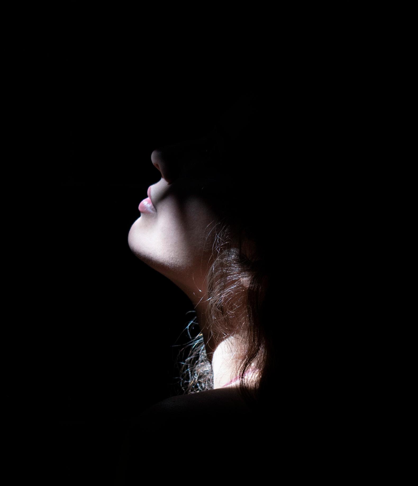
RÊVERIE: THE ETHEREAL ESSENCE


Here Romina has designed a modern and sophisticated perfume line. It is a manifestation of the minimalist and graceful elegance of today’s young women. This project entails everything that involves the development of a highend beauty brand:

Brand Identity Guide

Poster Advertisements
Perfume Bottle Design
Packaging Design
Logo Design And more.
Select pieces from this collection were shown in The Wasmer Art Gallery at Florida Gulf Coast University.
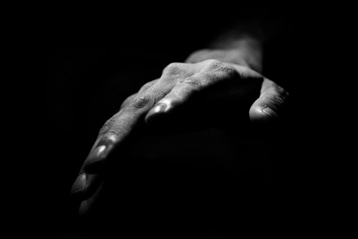
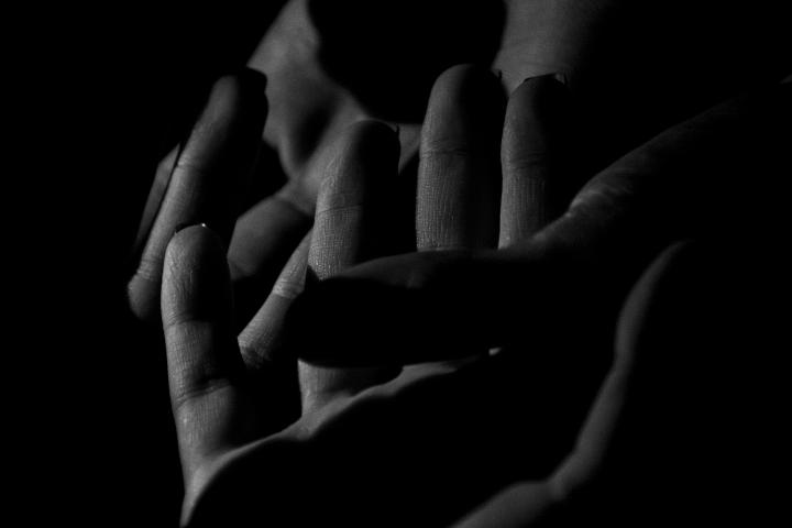
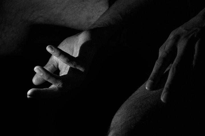
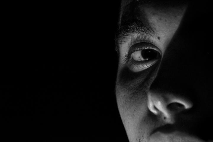
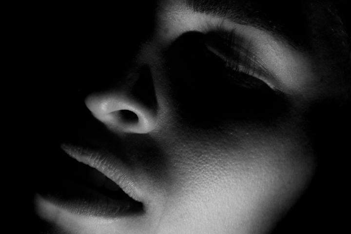
This collection of photographs was made to capture the abstract and obscure sentiments given to us during our most intimate moments. It is transient and infinite.


COMPLETE BRAND IDENTITY DESIGN

The FIREHOUSE COMMUNITY THEATRE is a local company located in Bonita Springs, FL. Although being quite small and loved by the community, the company lacked a visual identity and overall branding. For this project Romina re-envisioend what The Firehouse Community Theatre could be. She closely observed their values, learned their mission, and what their vision for the future was. The result was a modern and trendy style guide. Complete with logo design, marketing material, and brand values.


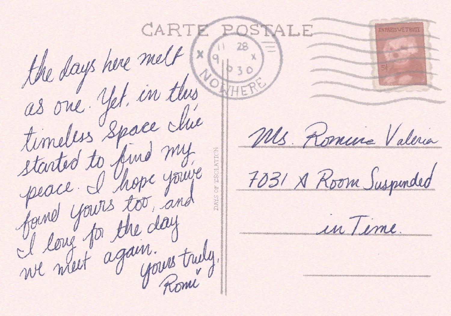
In a series of illustrated postcards, Romina expresses the flow of emotions and thoughts that take place during a period of isolation. Started at the beginning of quarantine during the COVID pandemic, this is a personal window to the murmurs of the soul. Capturing glimpses of a bedroom, a bookshelf, a kitchen, and other seemingly mundane snapshots. During this time, our travels become internal rather than external. In this way, we find that our very homes become our place for self-discovery and exploration.

Made in collaboration with the Florida Gulf Coast University Archives, this project was inspired by a rare collection of vintage French books from before the 1600s. These books depicted renderings of mythological sea creatures, including mermaids, strange sea vipers, and other oddities. From this, university students in the creative writing program wrote poems and short stories inspired by the books. Romina was most drawn to a poem written about a mysterious mermaid who would lure men into deadly waters. The ominous and entrancing nature of this led her to create a mystical tarot card. This piece was printed and professionally mounted on a 24x30 inch frame.

INSPIRED BY ASPECTS OF FUTURISM AND ART NOUVEAU, THIS DROPCAP DESIGN EMPLOYS A GEOMETRIC BUT SURREALIST VISION. THE USE OF LIGHT PINKS AND BLUES ADD TO THE DAINTY AND YOUTHFUL ELEGANCE, WHILST THE OVERLAYS AND HARD LINES COMMUNICATE A MORE MODERN AND PERHAPS TECHNOLOGICAL IMAGE. IT IS A BEAUTIFUL BLEND OF NATURALISM AND MODERNISM.


For this piece, ROMINA was requested to make a poster that would be used to illustrate the history and use of the typeface: BODONI. When doing research for this project, she became largely inspired by the famous designer Cipe Pineles, who designed for the following magazines: Vogue, Charm, & Seventeen. Pineles widely used Bodoni in many of her fashion magazines and made it a pivotal asset. As such, ROMINA decided to pay homage to her use of this typeface by arranging the information akin to the layout of a fashion magazine. The result was a sophisticated and visually intriguing educational poster that effectively informed viewers of this very classic typeface.
This work was printed, framed, and used throughout design classrooms.
This poster art was commissioned by the head of the Theatre Department at Florida Gulf Coast University. His request was that a cinematic poster be made for their upcoming original production called “Water Stories.” At the time that Romina was hired for this project, the show itself was still in the beginning stages. As such, much of the story was yet to be written. Due to this, she was given a very abstract description of what the show would be. This allowed her to take some creative freedom in allowing herself to visualize the very potential of the plot, while not making it so specific that it could limit further changes. The result was a dynamic scene depicting water at work, and taking in various elements of the earth and sky.
This piece was used as the official poster art for the show and was featured in several local magazines, as well as the official catalog.


This project was done in collaboration with the graphic designer, Haley Keller and the Digital Media Design, B.A. program at Florida Gulf Coast University.
The main inspiration for this campaign developed after studying Sustainable Design abroad in Denmark, Sweden, and England.
The designers took notice of the large advancements that had taken place in Europe with regards to sustainability and environmental awareness.
One of the things that most stood out to them was the large use of biodegradable containers at food establishments in Europe. They rarely, if ever, saw styrofoam being used or handed out. Knowing that styrofoam is one of the worst polluters, they resolved to encourage the use of biodegradable containers here in the USA.
Their approach was a straightforward one.
They wanted something that would quickly grab people’s attention and deliver the message in an instant. For this they decided to use a STOP and GO method. Colors are such a strong part of our visual language and traffic lights are a great example of that.
So by using this method they created something that becomes universally understood. Keeping the design clean and modern for visual appeal. The result was a successful ad campaign that quickly and effectively delivers a valuable environmental message.
WHY YOU SHOULD AVOID
100,000 A SINGLE FACEWASH PRODUCT CAN CONTAIN PLASTIC MICROBEADS
ONE PLASTIC MICROBEAD CAN ABSORB
1,000,000
TIMES MORE TOXIC CHEMICALS THAN THE WATER AROUND IT
DESIGNED TO GO DOWN THE DRAIN
5 MM
CAN’T BE FILTERED THROUGH SEWAGE AND END UP IN OCEANS, LAKES, AND RIVERS
25% OF FISH SAMPLED IN CALIFORNIA CONTAINED PLASTIC IN THEIR GUTS
BIODEGRADABLE ALTERNATIVES:
JOJOBA BEADS
APRICOT KERNELS GROUND UP SHELLS
Microbeads are miniscule pieces of plastic that are found in many of our skincare products. In order to spread awareness of the negative impact that these plastics have on the environment, Romina created this modern infographic. The design is modern, minimal and fashionable. The colors are soft and inviting, thus catching the attention of the target audience. The typographical elements are simple and sit within a visual hierarchy, making the information easy to follow.
THIS PIECE WAS DISPLAYED IN FGCU CLASSROOMS.
What’s an ICE PIE? We don’t know!
All we know is Mickey Mice makes them and they’re only ¢25.
Inspired by themed advertisements found throughout the Walt Disney World theme parks, Romina decided to parody the classic 1940’s Mickey Mouse poster by turning it into a vintage ad for an imaginary dessert called an “ICE PIE.” This poster was hand illustrated and digitally composed. This was a personal project. It was not printed, sold, or distributed. It was made purely in appreciation of the amazing work that Disney Imagineers do to make their parks a truly magical experience.

PartsVU is an eCommerce company that focuses on the sale and distribution of boating equipment. They work with brands such as YAMAHA and MERCURY. They are well-known in the boating industry and sell to clients all across the United States.
Here are several designs that Romina made for PartsVU during her time as the Graphic Designer there. She worked alongside the CEO to ensure that every design communicates a modern and approachable message. Through her involvement, PartsVU was able to advance their visual marketing and develop their brand identity.

During her time at PartsVU, Romina was in charge of designing graphics and layouts for email marketing, sales banners, pop up advertisements, etc. She was also in charge of branding design (logo, style guide, etc.) and product photography.

To find out more about her contribution to PartsVU, contact Romina at rominavcombe@gmail.com.


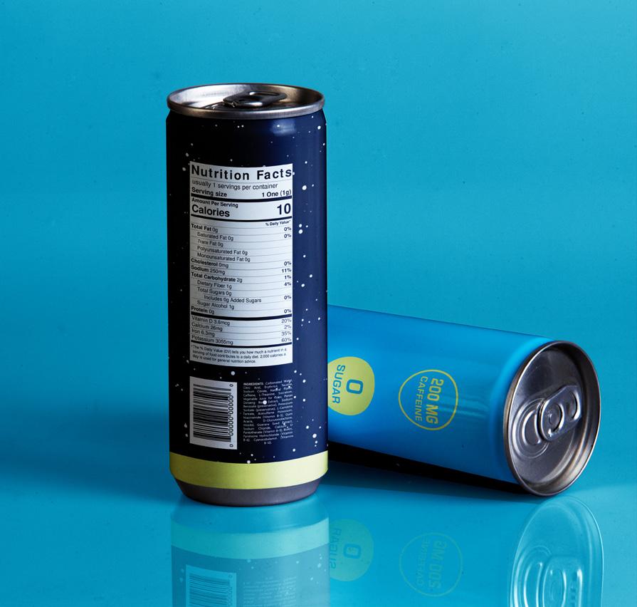
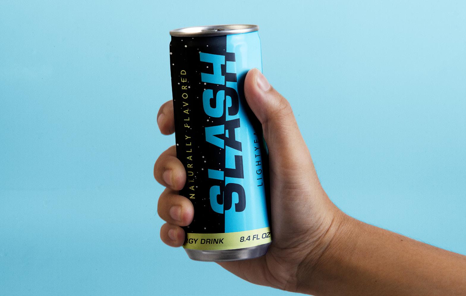
Graphic Designer - Feb 2021 to Jan 2022

