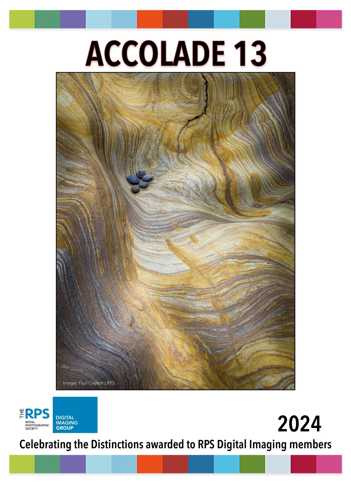
Welcome to DI Accolade 13.
You may well be wondering why it has taken nearly a year from the previous edition for this one to come out. We can only apologise, we have not wanted it to be this long and are very much aware that there are many of you that have been successful with distinctions and yet have not been invited you to take part in Accolade.
Without wishing to lay blame anywhere, the way that we used to be updated with distinction successes stopped, and despite many requests for the information it was not provided. Therefore, we had to think of different ways to contact successful candidates. There are those we know personally, those we reached out to in previous editions and on Facebook, but we know we are still missing many.
A benefit for having a lower number of contributors is that we have been able to give each more space to discuss their distinctions and they make for fascinating reading. There are some really stunning panels at all levels in this issue, with a great deal of variety in subject matter.
We even have a husband and wife pairing of Kenneth Ness FRPS and Patricia Ness LRPS – a very talented household!
Enjoy this issue and once again please get in touch with us if you have been successful in 2023 and wish to be in a future issue of Accolade.
Holly Stranks Assistant Editor

The majority of us aspire to improve our photography and can consider ourselves on a photographic journey. Also as humans we have the capacity to improve. As Steven Hawkins famously said “there should be no boundaries to human endeavour”.
Attaining or working towards a Distinction should be considered our ‘journey’ and whilst getting the coveted letter after our name, is always a good feeling, it is the journey ‘there’ which is the important part.
By reading the stories of our contemporaries in Accolade 13 you may find hope, inspiration, or simply pleasure from seeing their images. The questions we ask each contributor aims to draw out salient learning points, or cover aspects we as individuals may not have thought about in our own prospective panels. We can learn from one another; find an answer that helps us to see something of relevance to our own work.
Most of all Accolade celebrates our DI members work and gives them a window to show us their panels and achievement. To all those who were successful in 2023 we give you our warmest congratulations. But if you tried but were not successful this time out then do not despair. “It’s fine to celebrate success but it is more important to heed the lessons of failure” – Bill Gates. And that is precisely what we can do with Distinctions as you can learn from the feedback and take advantage of the support that is offered. You can get there – you will get there, through application and dedication.
Janet Haines digchair@rps.org
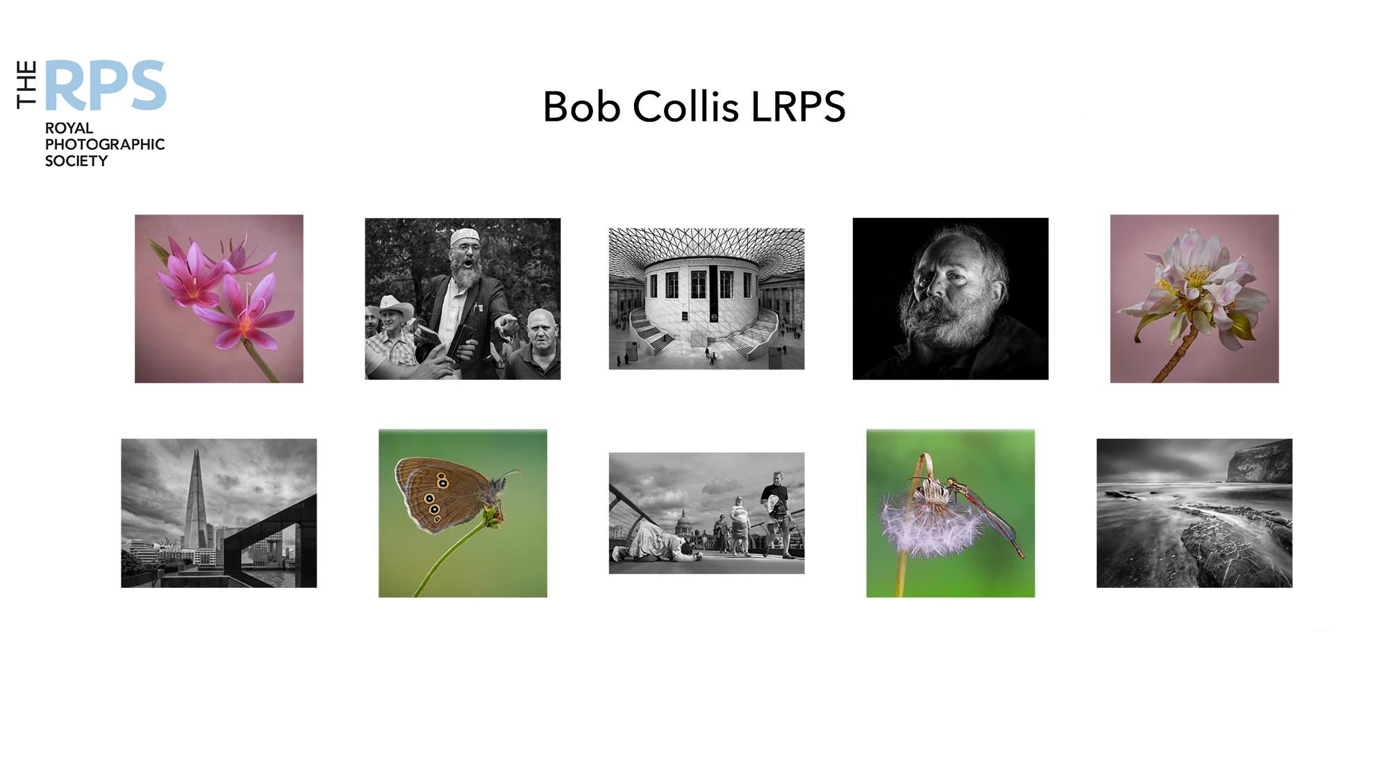
Name Bob Collis
Successful L Panel in February 2023
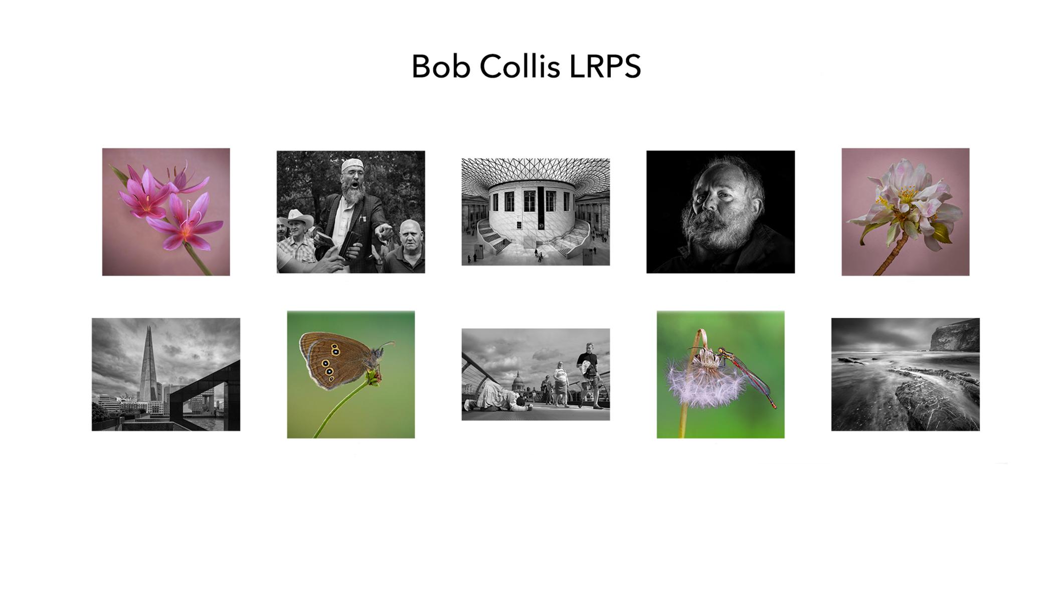
My L Panel was formed from images that had performed well in competitions at Woodley Photographic Club and in British Photographic Exhibitions. I used the judge’s remarks and scores to gauge the merits of each photo; progressively improving each image after each competition. When putting possible panels together I aimed to cover as many photographic genres as possible, ending up with a panel comprising street photography, architecture, wildlife, portraiture, flowers and seascape. Added to this, I wanted to include a mix of monochrome and colour images, and was surprised that I ended up with more monochrome than colour; but it worked. Whilst this approach meant that I had not necessarily selected my favourite images, I could be fairly sure that there was a good chance of demonstrating that I had met the technical abilities required for the Licentiate Distinction.
In finalising the panel, I found that several images became quickly ‘locked in’, whereas a few of them ‘came and went’. Deciding on the last two was the greatest challenge. The advice given by the RPS experts on my One-2-One and Advisory Day helped me to solve the problem and I ended up replacing two images in the few weeks before submission for the Assessment Day.
I watched the Assessment on-line and my confidence grew when I heard the positive comments received from the assessment panel. Then there was a deeper discussion over a couple of the images, and I began to doubt myself, but the chair announced that I had been successful. I felt relief, great delight and also pride at having been awarded an RPS Distinction.
Success Story 1 Location Reading
My journey to achieving the Distinction definitely improved my photography. Whilst I didn’t take any special courses, I attended more RPS tutorials and Thames Valley DIG presentations, and took greater notice of the feedback given by judges in competitions. I found that there are many excellent photographers around who are willing to give advice, and this made the difference in being able to put together a successful panel.
It took me a couple of years to find the courage to have a real go at gaining the distinction, having submitted a panel to an Appraisal Day several years previously and then deciding not to take the panel forward. So I was first time lucky, but after some years of deliberation.
Favourite image
My favourite image in the panel is the street shot taken of a beggar on the Millenium Bridge in London when passers-by were trying either to ignore him or were making dismissive faces. When I saw the beggar, I instinctively lowered my camera to floor level so as to capture the scene at the beggar’s level. I call the picture ‘Beggar’s Belief’ because the beggar hopes he will receive some ‘alms’, but he cannot see the distain on the passers-by faces who are determined not to give any; all of which is set against the all-seeing cathedral in the background.
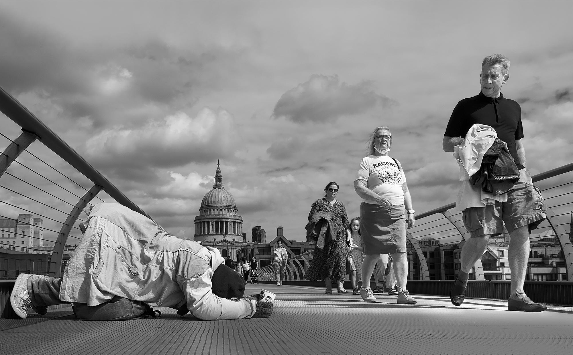 Fujifilm X-T3, 1/2400 sec, f5, ISO 160, Fujinon 16mm f1.4 prime lens.
Image of your choice
My second favourite image in the panel is of the Ringlet Butterfly taken on a photographic course in Devon at around 9.30 in the evening in mid-July, when the mid-summer light was at its best as we approached dusk. There were many butterflies of different species in the meadow and the colours of the grass and sky were glorious. The temperature had cooled, and the butterflies were in ‘sleep-mode’ so didn’t move at all; allowing us to set slower shutter speeds to capture the fading light and to keep shooting until it was too dark. One of my best photographic moments!
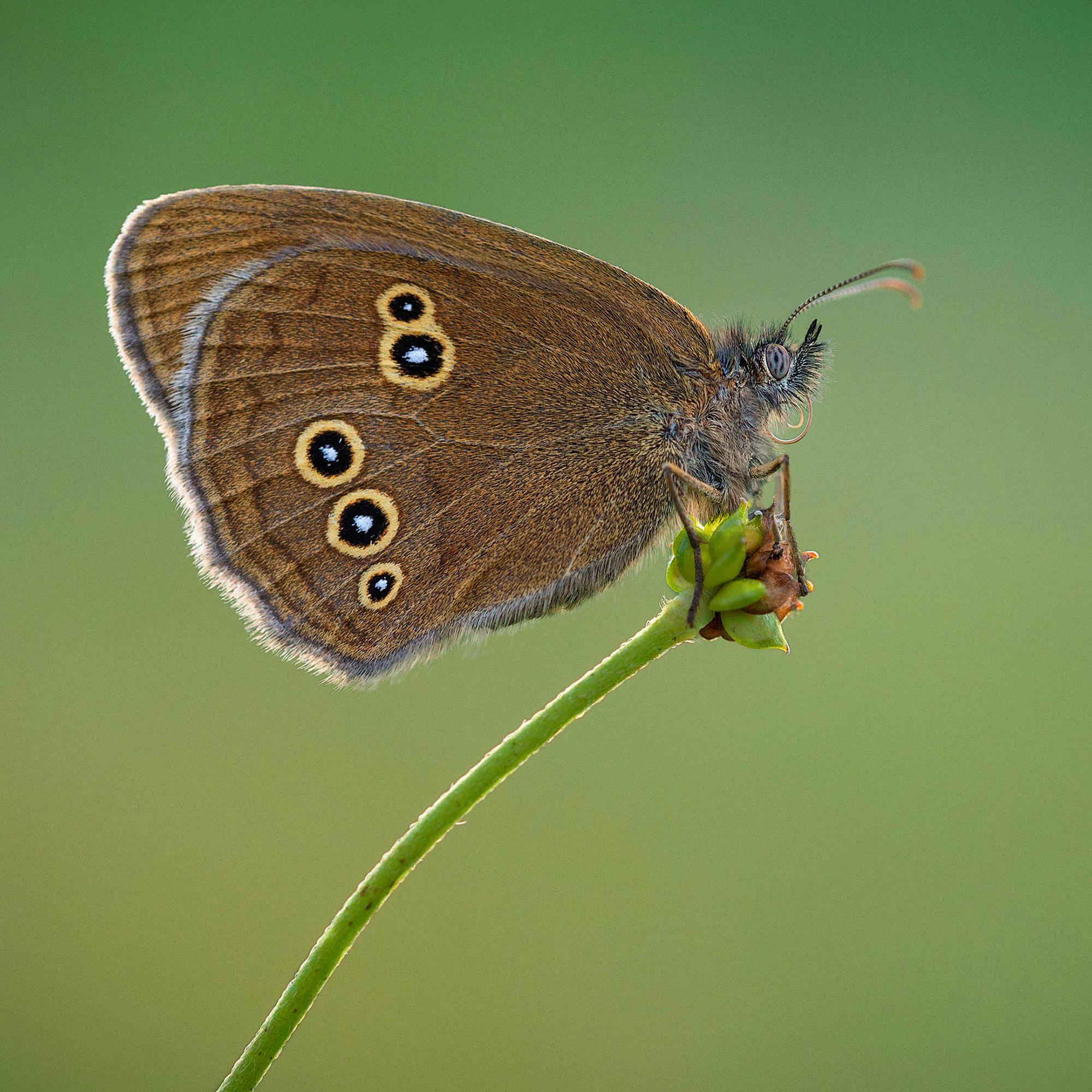
One of the most important tips that I picked up was to think more about the role that space plays within the image and how tightly to crop around the subject. This applies differently to each image, depending upon the subject and the intention of the photographer. Cropping close to the subject often produces a more impactful image, whereas leaving greater areas of space around the subject can be more creative, but it can also detract from the composition. I went with the advice given on my One-2-One and ended up cropping closer so as to increase impact.
Nikon D610, 1/20 sec, f7.1, ISO 800, Sigma 105 macro lens at 35mm, taken with a tripod.
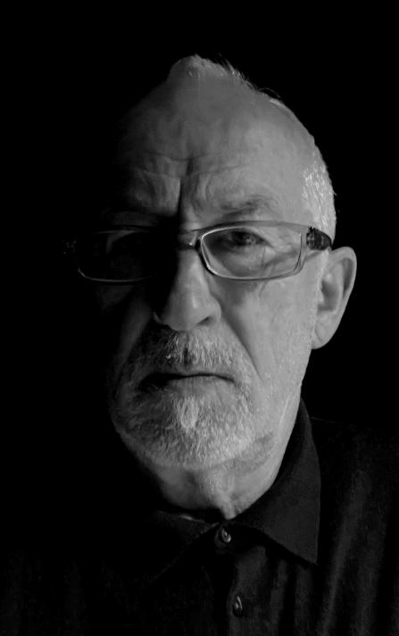
About my panel
My final panel came about after a couple of years of gathering potential images and eventually coming to the conclusion I might be ready for the assessment. That said, it took several months to whittle down my original 50 or so images to 20 and then 10. But even then, after scrutinising the criteria in more detail, I recognised that I might need two or three new images to meet specific aspects of the criteria. In some senses, the L panel seemed to require a lot more variety and demonstrate a wider range of camera skills than the A or F panels and so it was a real job to address as many of the criteria as possible, at the same time as selecting a cohesive panel that worked as an eleventh image. At that time, in early 2023, I was unable to find any RPS Advisory Days in my area, so I signed up for a one to one session. After a few weeks, I was contacted by the fabulous Viveka Koh FRPS FIPF, who was incredibly helpful and gently guided me and supported my final selection, although, there were only two or three images that I swapped out. Her positivity and generous advice gave my confidence a real boost and crucially helped me to refine my selections and organise the layout to create more balance in the panel. This was especially the case when selecting pairs of images, both in colour and in monochrome, and with the latter she advised that I try to aim for similar tones of contrast when choosing pairs of images.
I had a mix of both 16 x 9 and square images, as well as colour and mono, so getting the layout plan right took some time. I lost count of the number of sample plans, but I wanted to demonstrate some creativity, as well as a good range of camera skills, different shutter speeds and depth of field etc, so I felt it was essential to take professional l advice if I was to meet the rather exacting range of criteria. And, as I am not really big fan of assessments, I was determined to pass first time and not have to come back again. So, having Viveka's experienced eye behind me was vital in giving me the belief that my panel could and would pass the assessment.
As if I needed further help with my panel, I also explored the RPS archive and watched numerous videos and one other assessment online, all of which contributed to a better understanding that not only did the prints need to be of a high quality and demonstrate a wide range of camera skills and settings, but choosing the right layout was crucial to the overall look and the balance of the panel. Clearly, it is not possible to tick every one of the stated criteria, but I was very conscious of the need to make sure that a good number of key criteria were evident across the whole panel.
Success Story 2 Name Neil Purcell Location Bristol Successful L Panel – May 2023
I guess the panel reflects a broad range of interests, and although there are several landscape images, I would not necessarily define myself as a landscape photographer. Back in the day, having spent most of my art degree in a darkroom, I have to say I am still very keen on black and white imagery, despite having swapped the wet, chemical processing for the rather dry computer and inkjet printing method. Textures in the landscape is an ongoing personal project, so I wanted to include some of these in the panel. Also, I enjoy the particular challenge of capturing decisive moments in sport too and so, the final selection came about after a lengthy process of elimination, where I focused on both my favourites images, as well as those I felt met some of the key criteria. If pushed to define myself, I suppose you could say I'm an outdoor photographer.
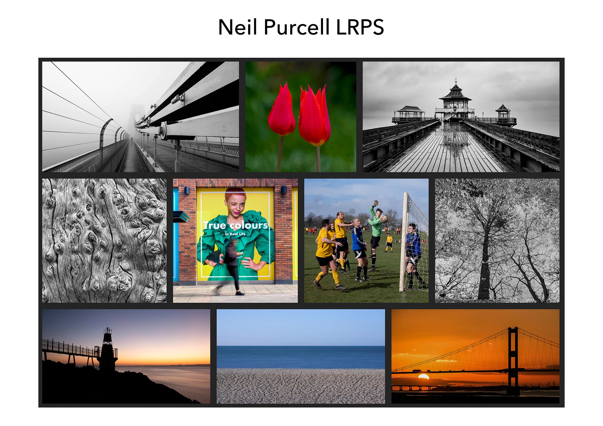
My favourite image
My favourite image is Dungeness Point. A honeypot location, I know, but despite the myriad com-positional options in this glorious part of the Kent coastline, I chose this image as my favourite because, in my view, it captures the essence of the place, the peace, the quiet, the edge of the world feel of the place where it meets the sea, with the texture of the pebbles and the contrasting blues of the sea and the sky. To me, amongst a range of other things, it speaks of a meditative place, a place where one can just sit and be and enjoy the quietude, the nothingness of the great blue yonder, filled with beauty and calm. At least, it was at the time of shooting, which was shortly after dawn, using a Fuji XT4 f/14 8.0sec ISO 160 + Kase ND64 magnetic filter.
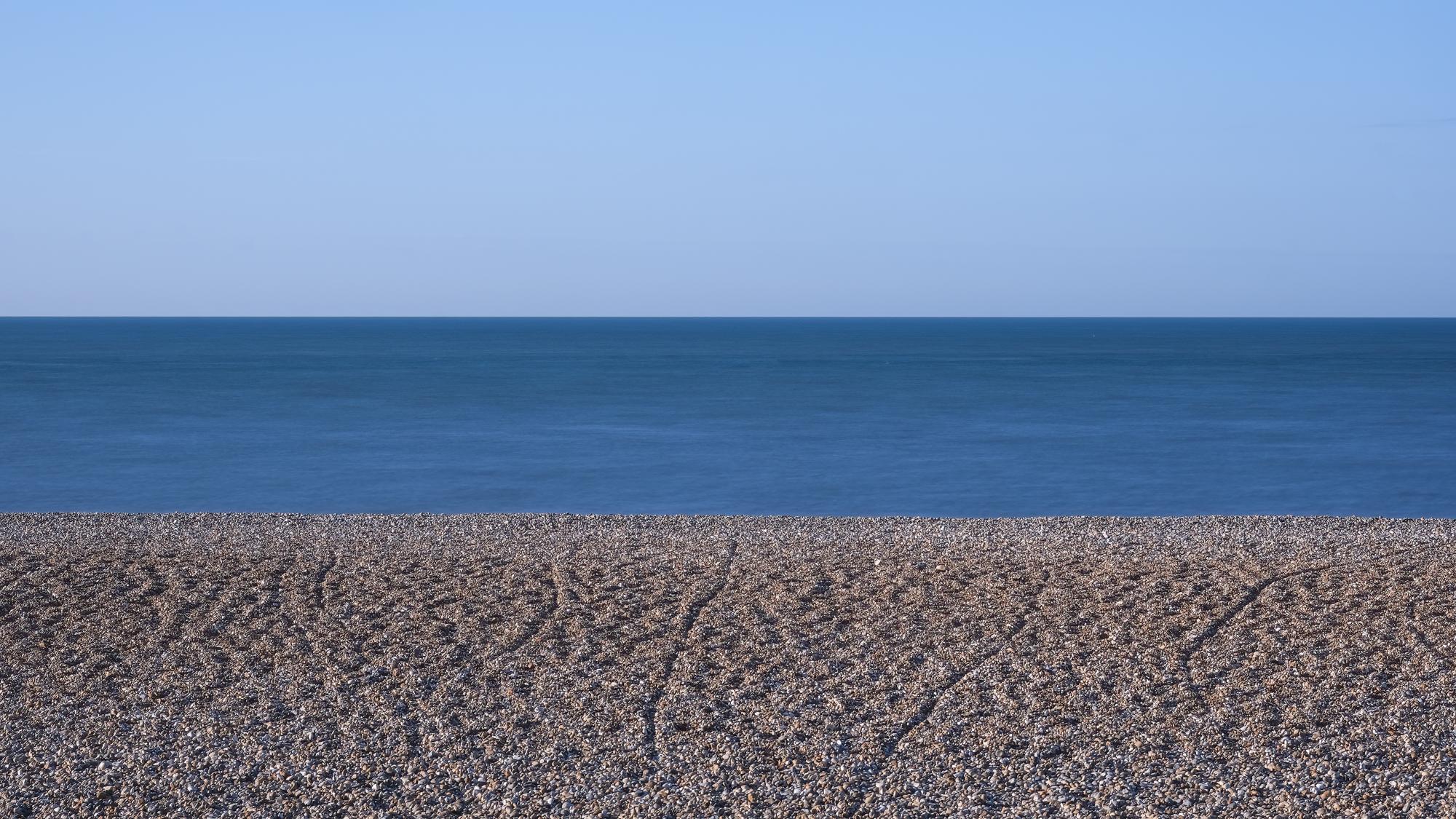
Wha did I Learn
Gathering images for my panel took place over the course of a couple of years, during which time I completed the OU Digital photography: creating and sharing better images course, advertised as ideal preparation for the Licentiate distinction. This led me on to innumerable online and in-person RPS workshops and Zoom sessions covering topics such as, Lightroom, Photoshop, Topaz, the Nik Collection, Hi-Key projects, woodland projects, photowalks, Street Photography, monochrome processing and bookmaking. It has been a fantastic photographic journey these past few years and now I usually have one or two workshops booked in the diary, as I always like to keep busy and have a project on the go to help me improve my work, to learn new skills and meet new people. So, from a practical point of view, putting the L panel together, was a very intensive learning process, which taught me so much about image making and processing, although, despite all my previous experience in the darkroom, I felt I'd only just begun to scratch the surface of digital image making.
During this quite intensive learning curve, there have been many photographers and course tutors who have taught me a great deal and given me so much advice and support, whether it be through their RPS workshops or one to one advice sessions. So, special thanks particularly go to Viveka Koh, Joe Houghton, Mark Banks and Simon Ellingworth, who have all helped me in many different ways. That said, it seems to me at this early stage in my photographic journey there is still so much more to learn, many more images to make and lots more exciting projects to complete.
My other image
My other image is The End of the Pier. It's a black and white shot of the Pagoda Café on the end of Clevedon Pier in North Somerset. I love this image for a number of reasons, not least because of the splendid Victorian architecture, but principally because monochrome is generally my preferred medium. For me, this one image is a great example of what black and white can bring to a specific composition. It's the atmosphere, the mood, the details and the textures that all combine to convey the nature of the place and the conditions at the time. On this particular day, I also learned another important lesson in landscape photography, and that is, to never be shy of going out with my camera, even if the weather is a bit grim. Obviously, you need to have appropriate clothing, and I didn't on this day, but learning that inclement weather can often result in fabulous photography, especially in black and white, has been a vital lesson to learn, as the rich monochrome tones can, for me, often reveal previously unseen aspects of a place so much more than colour.
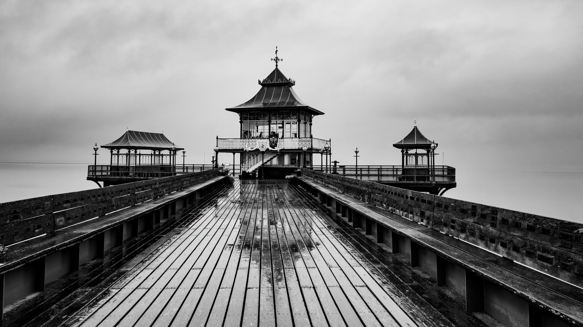 Fuji XT4 18mm 1/125 f/14 ISO 200
About my panel
Success Story 3
Name
Patricia Ness
Location: Aberdeenshire, St Cyrus
Successful L Panel in (July) 2022
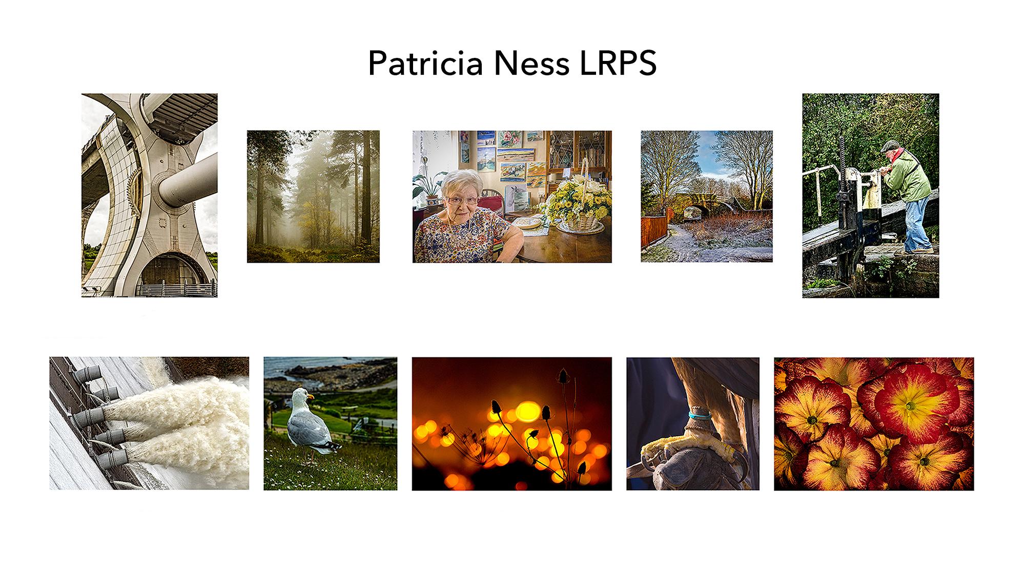
After a very long journey, my final Panel was put together in about 6 months. Some were there from the start, 3 architectural type views – No 1 a close up of the supports at the Falkirk Wheel ( 24mm :ISo200: 1/350@ f11), the other No 6, Laggan Dam and it was pouring with rain, the dam was in full spate (105mm at 1/180@ f8 ISO 400) both using a Canon 7D 24-105 F4L IS. Another of the Kelpies was discarded later. I had two that gave examples of depth of field – No 7, the startled expression on the herring gull’s features was the result of a loud bang going off at Elgol, which stopped him long enough to get the shot. No 9 is the hand reared eagle (Star or Fluffy I couldn’t tell them apart) was on the wrist of a fellow club member so I was able to use the telephoto – Canon 600D lens EF70-200 f2.8 IS - hand held at 200mm ISO200 1/400@f8 – having been told not to have eye contact I focused upon his claws.
So far none were in my comfort zone and had rarely been in previous panels but had passed muster when they had. They got me through Lists 1 & 2, so I went looking for “visual awareness” and pulled in the No 2 and No 4. No 2 was a misty day at Capo Woods. It had to be cropped to fit into the panel. and this became part of a problem as my photos were both portrait, landscape and square. No 4 is the old bridge at the rear of the houses, I had shot it in all seasons but the winter shot was the best and easily went into square format.
My panel was growing and now I printed out in quarter size the individual photos plus potentials for the missing 4. With these small prints I shuffled them around until I had the workings for a panel, some needing changing the dimensions to fit in. I needed a vertical to replace the Kelpie at No 5 and the man struggling to turn the winch on a lock gate cropped to a vertical and because of the rain tonally balanced with the Falkirk Wheel.
My panel was growing and now I printed out in quarter size the individual photos plus potentials for the missing 4. With these small prints I shuffled them around until I had the workings for a panel, some needing changing the dimensions to fit in. I needed a vertical to replace the Kelpie at No 5 and the man struggling to turn the winch on a lock gate cropped to a vertical and because of the rain tonally balanced with the Falkirk Wheel. I had 4 squares which became the centre top and bottom row. I needed another landscape to balance the Laggan Dam. A photo of my Mum on her 100th birthday gave another horizontal but because it was bright needed to be central – top row finished. I had a creative view of yellow ‘n red primulas which worked either vertical or horizontal, but was too dominant and was normally removed though liked. A night shot of some thistles against the bright lights of Matlock Bath covered depth of field and visual awareness and was also a counter to the top row. Suddenly I had a panel which went from light to bright across the rows and the too dominant suddenly became the perfect end stop. I was there. In the end I was both elated and relieved! If someone mentions an ‘A’ Ken will shoot either me or himself.
What did I learn whilst doing this
Over the 7 years I took part in several photo forums and whilst it had seemed I had the knowledge I found it difficult to apply it to a specific panel that met with approbation. In 2020/21 I applied for a 1-2-1 and booked into an Advisory Day. Talking to Stewart Wall, following one of my attempts, he said to take the RPS Criteria and apply it directly to my photographs. Two things have come out of this, The first is that that LRPS really is just a confirmation of your ability to use a camera correctly, to look at what you are taking, and to show your skills at producing a pleasing photograph. Having finally realised this, and wish I had realised this sooner. Choosing the final images became a matter of creating the Panel itself. I would recommend people go for their “L” early in their photography journey, my age and health now prohibits me being able to take up a challenge of further distinctions
I have not entered for any other photographic qualifications, this was my first attempt: though I have creative textile qualifications.
The range of tutorials and YouTube Videos has given up a plethora of new ways of using Photoshop; Having been a Photoshop addict since Version 2.1. Sean Bagshaw’s Zoom & Vid on TK Masks made some actions for more user friendly. Also being able to see other Panels and hear them spoken about gave a good idea of what is required.
My favourite image
My favourite photo is the one of my mother taken on her 100th birthday. She was sitting with her back to her many oil and watercolour paintings, with a bouquet of flowers on a table alongside, a record of her many interests. I happened to glance up to see a wry smile on my mother’s face. I did not notice at first, the card on the table. I had caught my mother trying to imitate the pose of The Queen on her 100th year Birthday card.
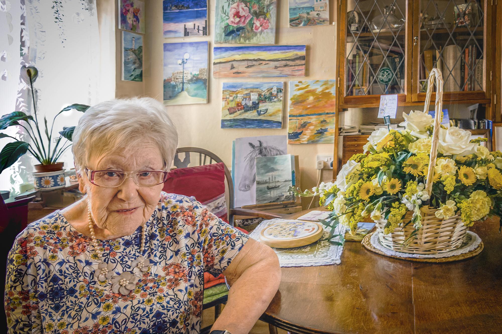 Canon PowerShot G12 6.1-30.5mm f/6.1 mm f2.8
My other image
It came about after photo stacking the faded hydrangea. I accidentally moved one of the stacks and enlarged it.
The vase had been taken on a blue backdrop cloth and it had a crease where it met the wall. Growing the vase shot meant the crease was in the wrong place.
Taking a second photo and using it for the actual backdrop solved that problem; though I had to make the shadow of the little vase cross the vase base of its larger component. I used a piece of tree bark material to give a texture together with another consisting of scattered Forget-me-Knots.
These I used as a background overlay for the whole picture. Its deliberate blueness was a barrier to being able to use it.
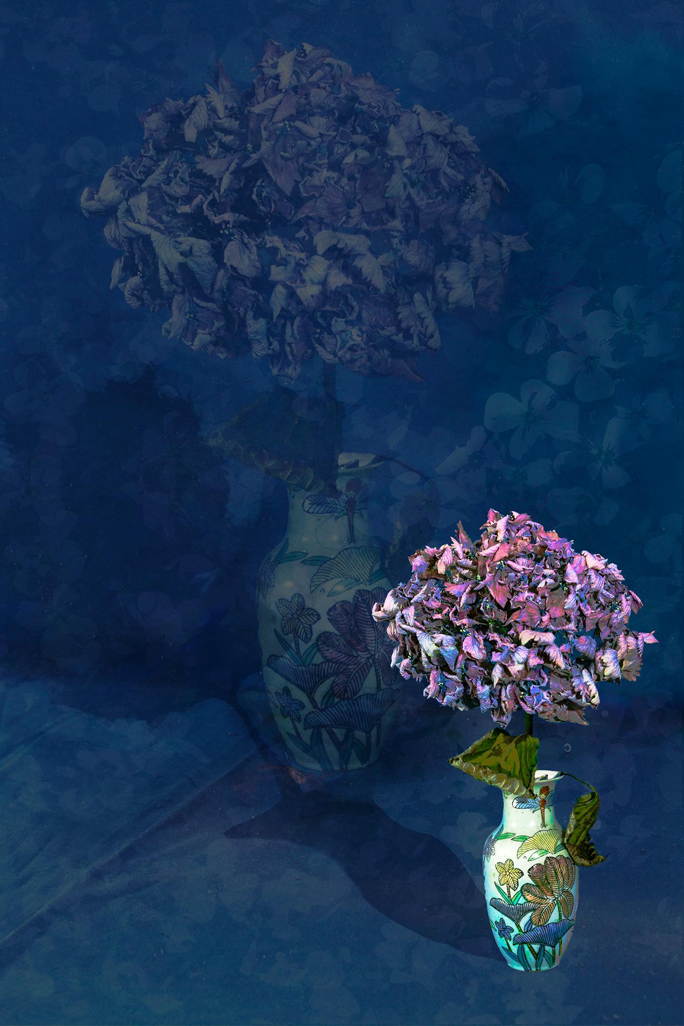 Canon 7D EF24-105mm f/4L IS USM 0.7 s at f/6.7 250ISO
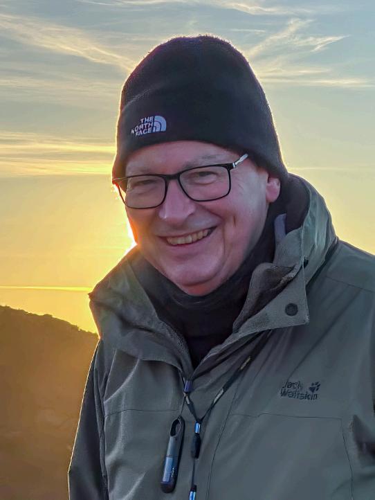
About my panel
Success Story 4
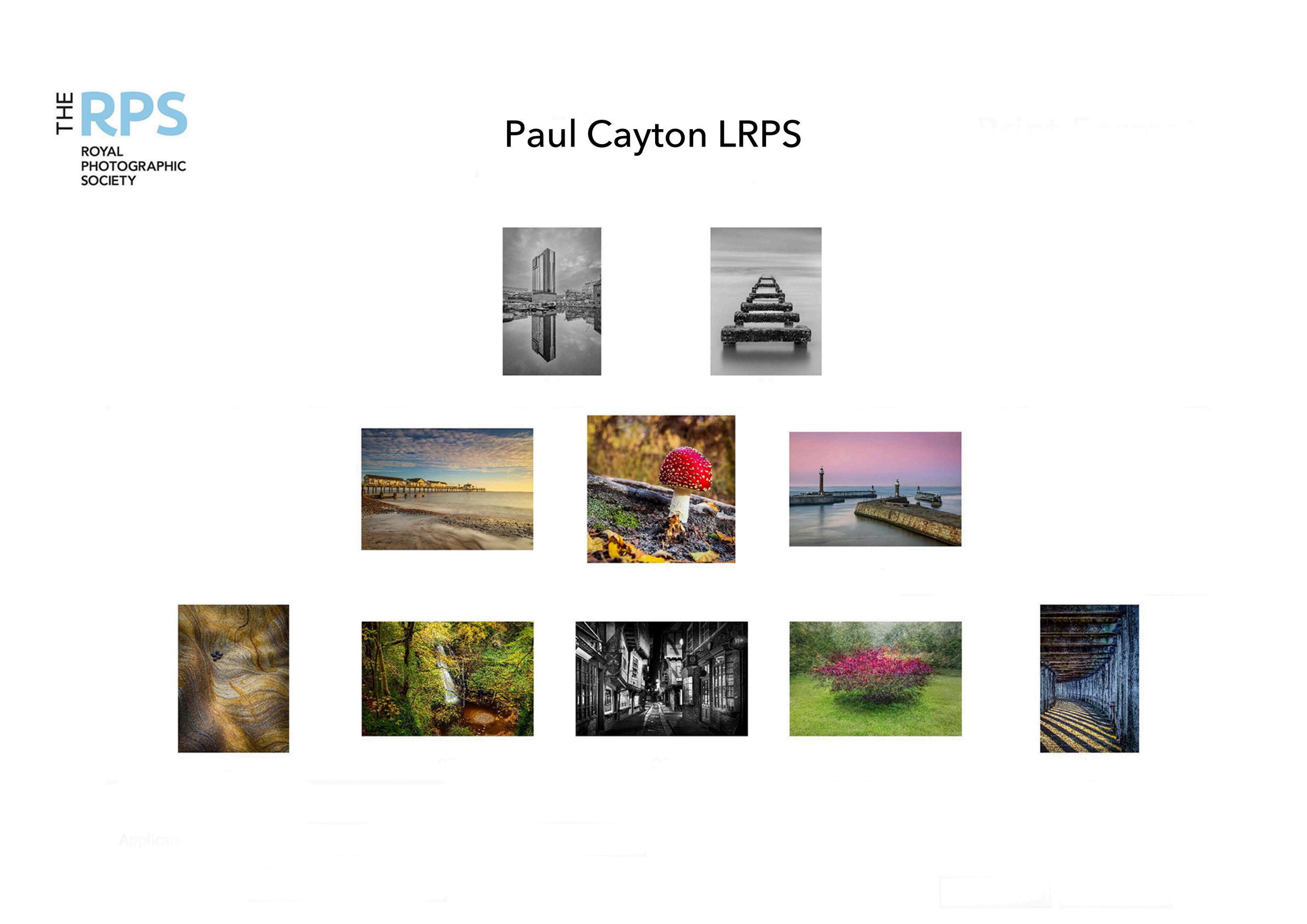
Name: Paul Cayton
Location: Morton-on-Swale, North Yorkshire
Successful L Panel in May 2023
I was relieved given that my first submission was in February failed, but I was invited to resubmit.
The assessors were very positive in the February submission, until one of them said, about one image ‘But…….’ Then they were all over the image like a rash. On the day they suggested two issues to put right.
When I received my assessment form only one of those issues was mentioned plus something not mentioned on the day. On both assessments the quality of my printing and mounts was commented on.
It takes time and patience to get to the final 10 images. I probably started with over 50 potential images. Discussions with other LRPS friends helped me refine the initial selection down and then refine it again. I learned a lot about printing and am grateful to a professional photographer for his advice and help in producing bespoke icc profiles and calibrating my printer.
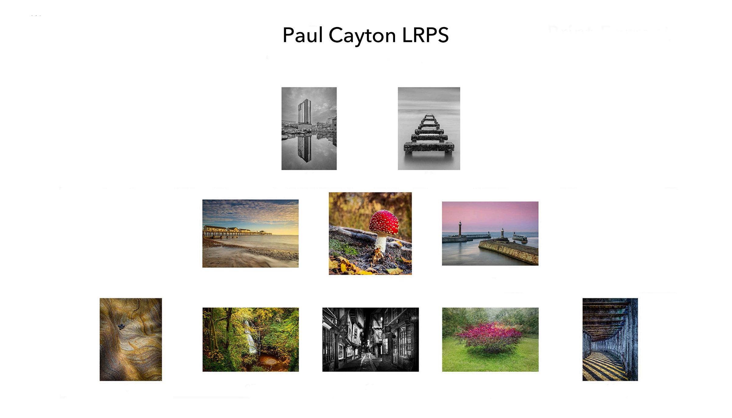
My favourite image
I don’t have one favourite image. If I did the submission again, I would probably not use at least half of the images, as when I look at them now I think I have a much better portfolio. But Image 6, the ‘Rock Study’ is probably the one.
It’s a focus stacked image using around 10 images then stacked in Photoshop and finalised in Lightroom.
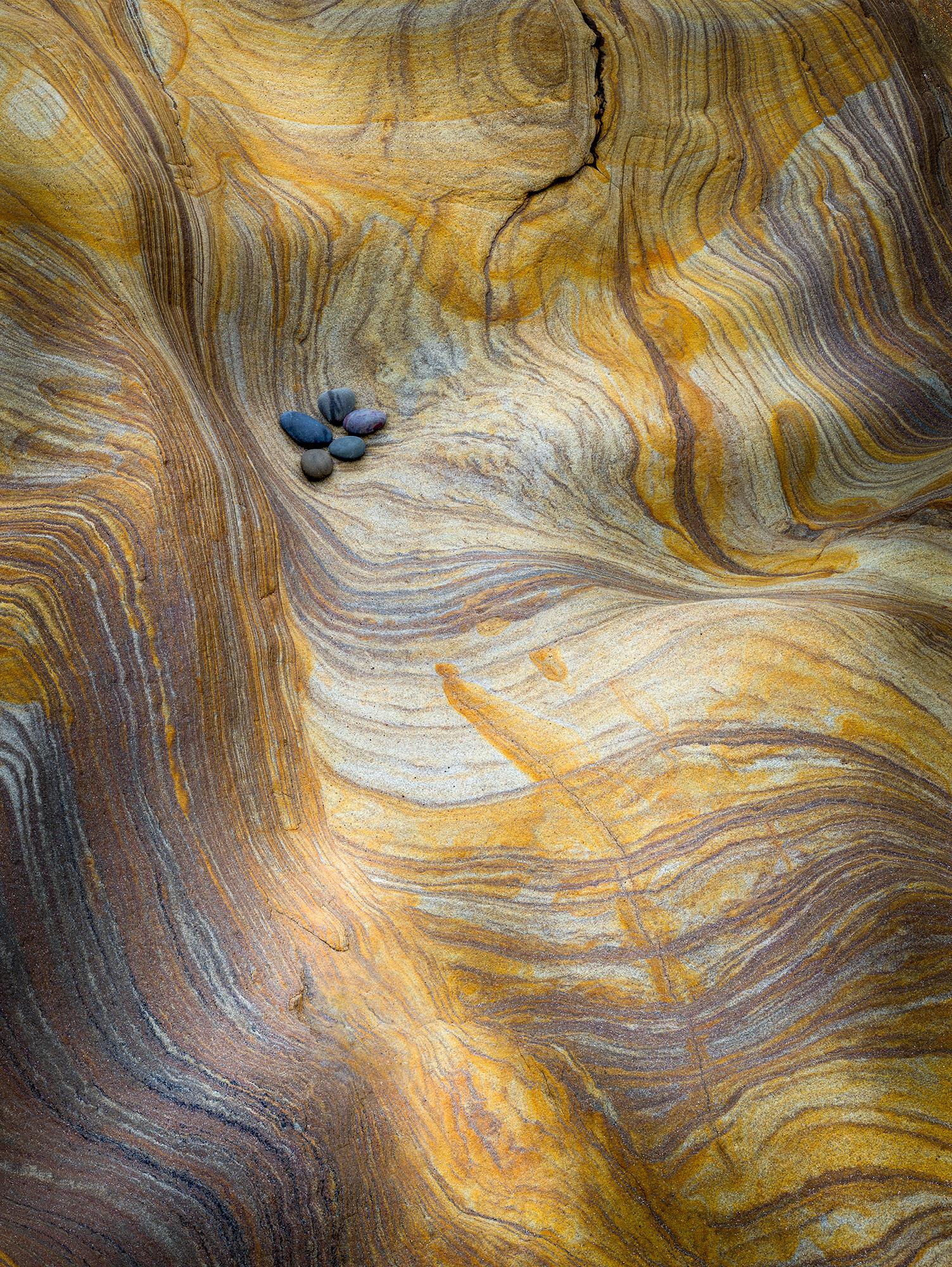 Canon EOS R with Canon EF 50mm lens using EF to EOS R adapter. 1/50th second, F11, ISO 160.
My other image
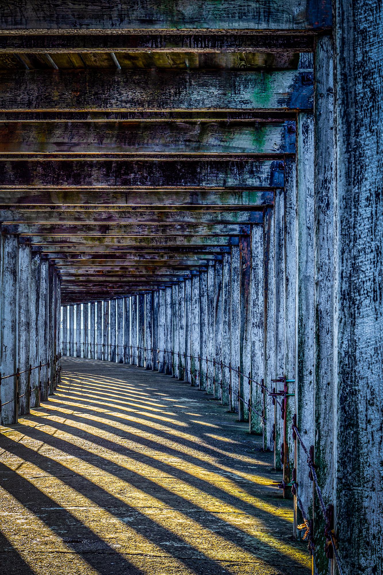
This was taken quite some time ago and I only went under the pier on a whim. It was only then I noticed the shadows and patterns being made. I processed this image in Lightroom adjusted shadows and increased colour saturation and cropped.
Canon 6D with EF 24 – 105mm lens, 1/20th second, F10, ISO 100
About my panel
Success Story 5
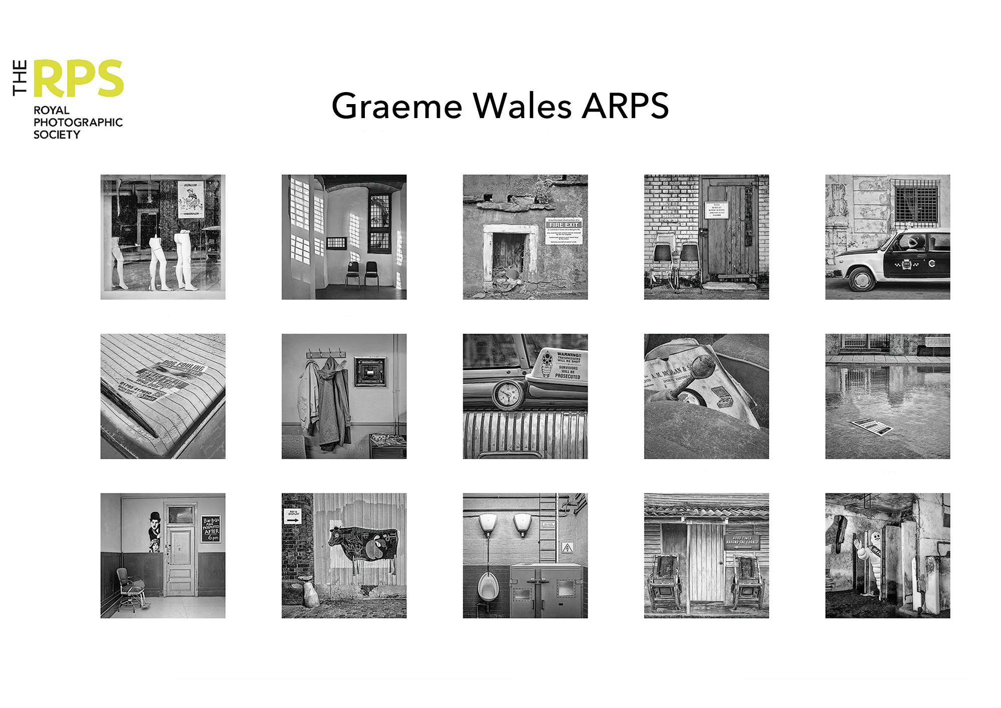
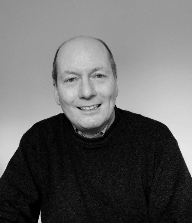
Name Graeme Wales
Location Surbiton
Successful Successful A Panel in April
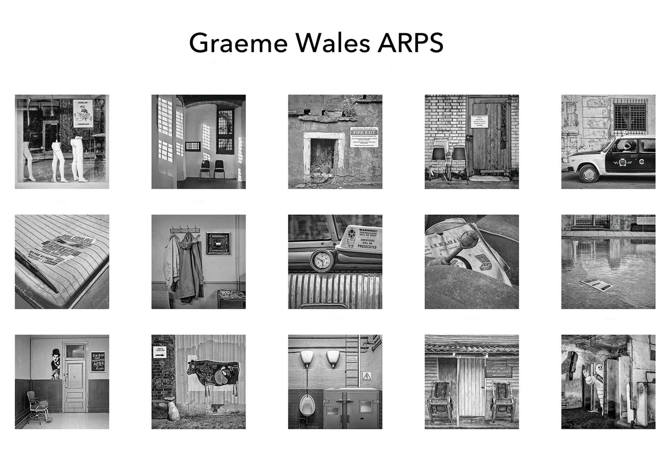
I had always thought that I would enter a panel into the Visual Art category, but I realised that the type of photographs that I take do not always fit this genre nor indeed do they necessarily do well in camera club competitions! Thus, my submission was for the Contemporary category.
On a holiday in Berlin, 6 years ago my wife suggested we look at the Helmut Newton exhibition. In the exhibition bookshop I first discovered the work of Filip Dujardin. It fitted my sense of quirkiness, and I thought I had the Photoshop skills to create similar images. It was later at a camera club competition when the person sitting next to me commented on the image being displayed, (not knowing it was mine), that scenario would never happen in real life that the concept of ‘Incongruity’ was born.
It was important in each image, for the unexpected component to be clearly seen. Working in colour, even if there were common colour strands, proved to be either distracting or made it difficult for the panel to achieve a cohesive balance.
Therefore, I decided to produce each image in monochrome and further adopt a square format to force the viewer to look straight into the prints. This was further helped by using double mounted 40 by 40cm mounts. Each print was then printed on Lustre paper to bring out the detail in each image.
A further challenge was to make sure that when viewed as a panel there was a consistent monochromatic look. All too often on the assessment day submissions failed because two or three images did not have the same monochromatic style as the rest.
A tip I learnt when going for the ‘L’ was to print the 15 images on 6by4 paper and lay these out on the dining table and revisit the arrangement over several days and even weeks. It was by pursuing this strategy that quite early on Image 1 was fixed in the top left corner allowing the viewer to walk into the panel, and Image 15 was likewise fixed in the bottom right corner waving the viewer goodbye.
The assessment day itself was as ever nerve wracking. The assessors all looked very serious and glum. The Chair announced Graeme Wales ARPS and was very complimentary with her summary comments. She finished by thanking me for submitting a very controlled and well though out panel, with a tremendous variety of images. And all those gloomy faces were apparently a tactic to stifle internal chuckles!
After the result I was in seventh heaven, but I was really grateful for the Chair for her appreciative comments which meant a lot to me.

I feel the journey to gaining a RPS Distinction should be taken slowly. It is not a rush, but it is all about savouring the discovery and consolidating learning on the way. I thought I had the necessary Photoshop skill level, but to make the images look superficially plausible I had to learn several skillsets via numerous online videos: the difference between cast shadows and contact shadows, together with the techniques of colour blending, shading, colour toning, rim light and spill lights. Then on top of this I learnt the methods of using Luminosity Masks to process tones, thus avoiding masks and feathering.
I also attended printing courses in which I learnt to properly analyse the printed image, by first soft proofing, and producing test strips to ensure that each monochromatic image had the same look. I also learnt to be careful when applying a subtle vignette. If the edges and corners of an image already have dark areas, then these will become even darker with a vignette. Luminosity masks to the rescue and for fixing dark prints (blocked up shadows).
I also sought online one-to-one advice from the RPS, first regarding my Statement of Intent, which confirmed my project would be suitable for the Contemporary genre and then a year later a further session regarding my panel. This was of great assistance.
I gained my ‘L’ back in 2010. Back then I made the mistake of leaving a copy of the RPS Journal out, which my wife looked up and found that I could no longer put off applying for an assessment. I have always been a perfectionist and never wanted to go through with an assessment unless I felt I had a very good chance of success. So, during the 13 years I started two projects, only to reach image 7 each time before finding that I was repeating images. I realised that my project briefs each time were too restrictive to allow sufficient variety. However, exploring the concept of ‘Incongruity’ gave me a much greater remit. At times it felt too broad and that it is why it took me 6 years to come up with sufficient images along with spares. The project was always at the back of my mind. I never went out with the sole purpose of capturing an image for the panel. I would be photographing completely different subjects when sometimes inventiveness would come to mind!
I have been a regular follower of the DIG Saturday zoom lectures. From these I have used Microsoft OneNote to make notes of tips, techniques, and hints that I can quickly look up, when processing an image. This has been a great help to my post-processing workflow.
My favourite image
(Hope the Plumbing is Good). This was taken at Scotland’s Secret Bunker near St Andrews. It fits in with the more surreal aspect in the panel and was one of the initial images. It has always raised a chuckle!
Blending in the generator, ladder and signs plus removing plumbing and urinals were the challenges. This image needed planning regarding contact shadows and as mentioned previously cast shadows. Since a high ISO was set Topaz DeNoise AI was utilized. The glowing red of the generator had to be toned down.
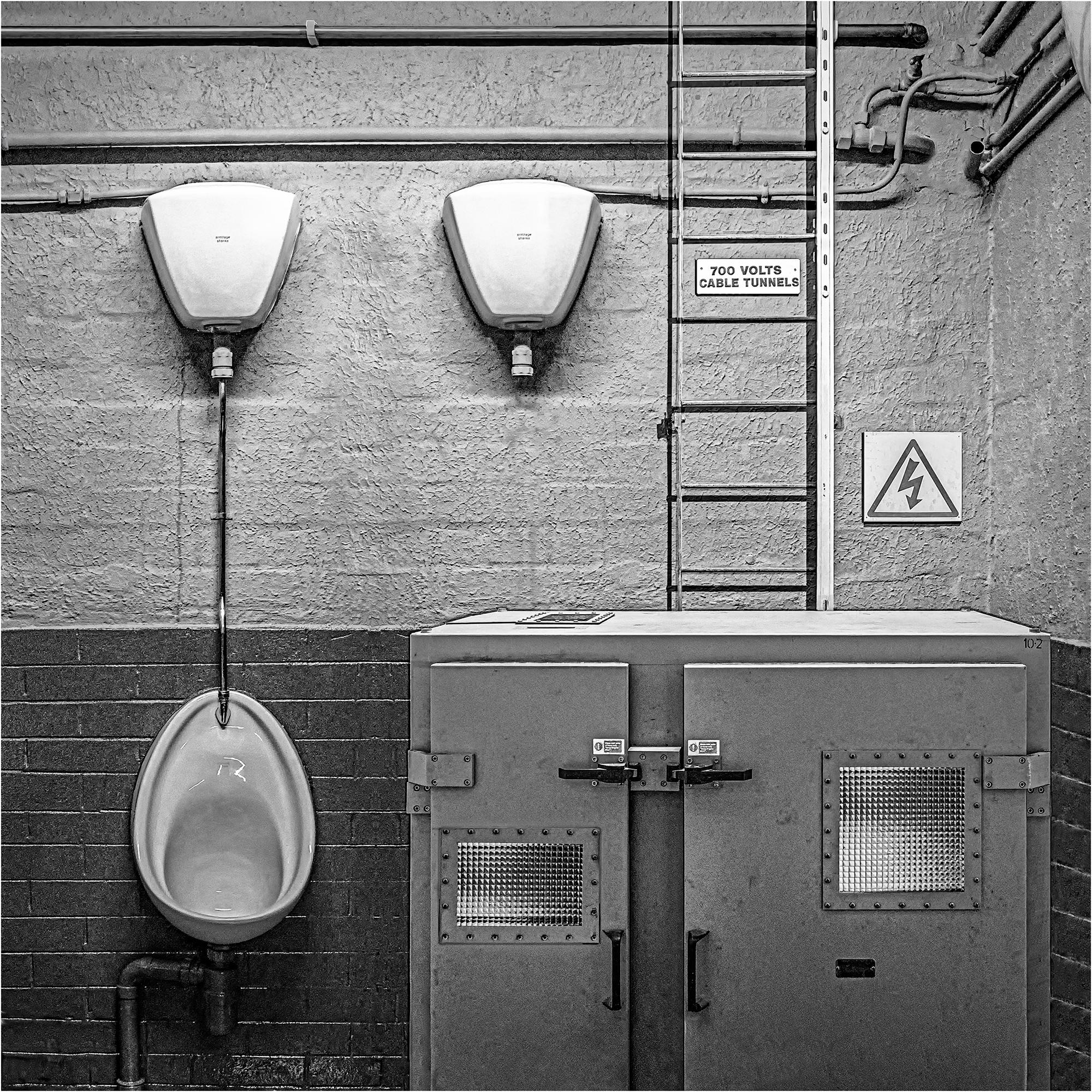
shutter
aperture f5 ISO 3200
Fuji XPro2 18mm (Fuji XF 18-55mm)
1/35s
My other image
(Nautical Elements) that I would like to mention did not fit visually in with the panel, due to the predominance of glass that gave it a glossy look, regardless of the processing! (The rest of the images in the panel had more of a grunge feel.) The main image was taken in the City of London at night with the Life Saving Notice shot in West Bexington on a bright sunny day. The latter needed toning down and its’ perspective altered to fit on the wall. Again, Luminosity masks were of great use!
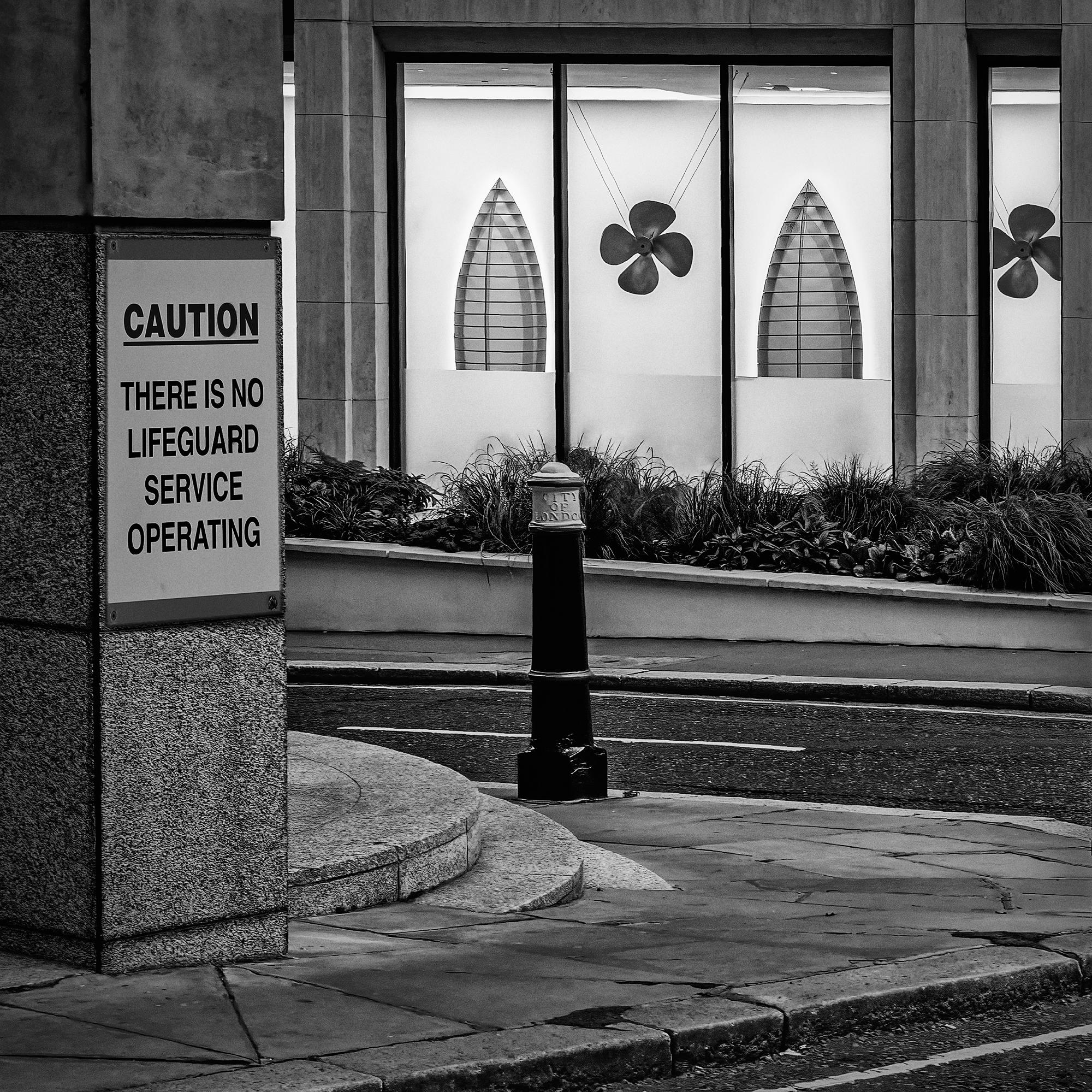
Camera settings: Fuji XPro2 50.5mm (Fuji XF 18-55m) shutter 1/35s aperture f14 ISO 2000
About my panel
Success Story 6
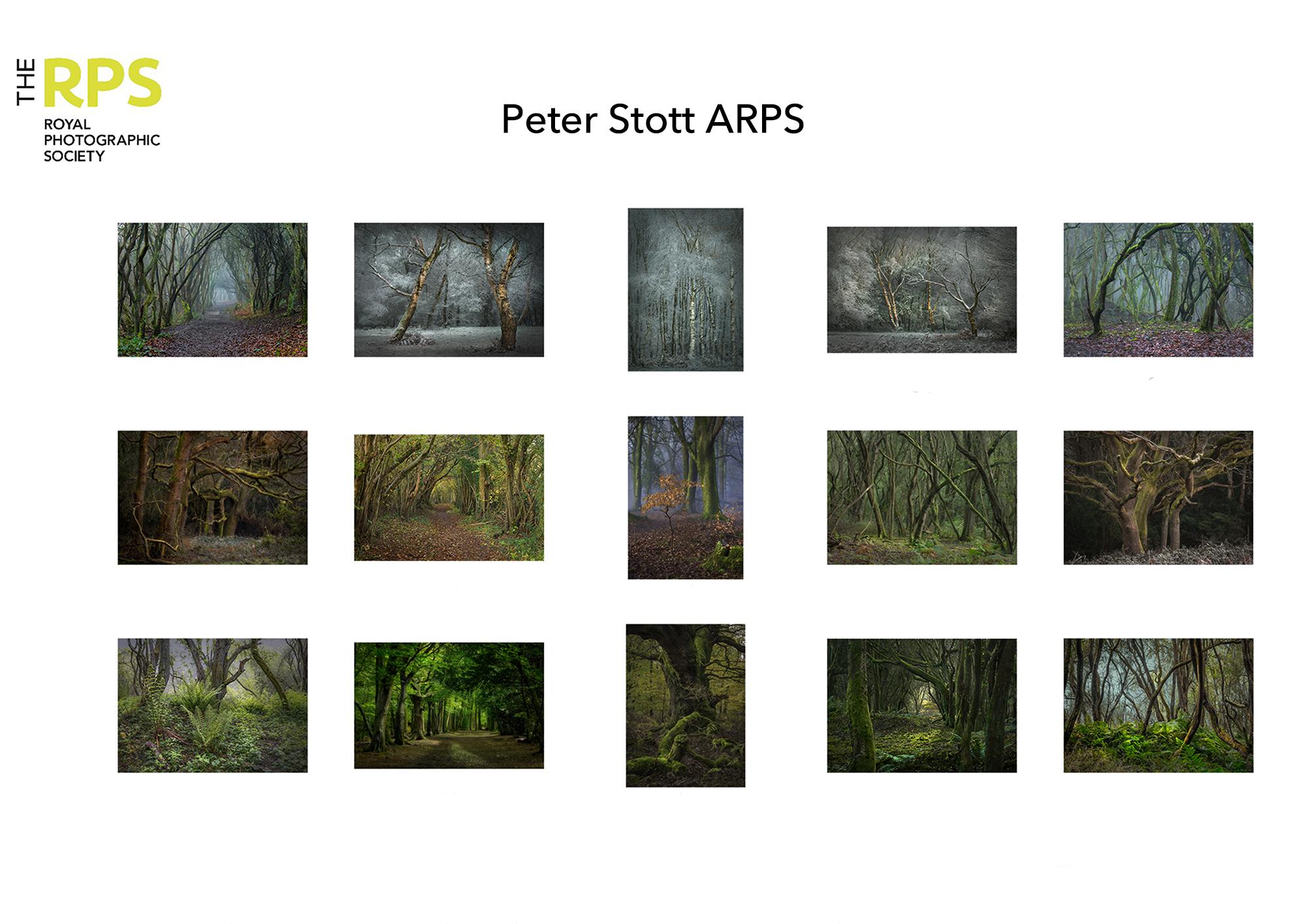
Name Peter Stott
Location: Tadworth, Surrey
Successful A Panel in October 2023
My panel consisted of Intimate portraits of woodland chosen to provide viewers with the opportunity for a variety of possible psychological interpretations. Historically, woodland pictures have been used in psychological practice to explore mood, thoughts and inhibitions. Some offer opportunities to engage concepts within fairy stories – like travelling into a tunnel, entanglement, witches’ fingers, Rapunzel’s Tower.
We all see such pictures differently and this series offers opportunity for exploring thoughts.
These are complex pictures with differing tonality and textures. The main difficulty lay in choosing harmonising tonalities whilst fulfilling the statement of intent.
The central portrait depicted three generations of trees – sapling, mother tree and decaying grandmother. Above was a young, sprightly silver birch in its prime; and below an ancient tree, in the process of decay. On either side of these three portraits were landscape pictures chosen to balance the ideas of tunnels, strength (oaks at the periphery) and fingers entrapping the viewer or searching for light. Brighter images were concentrated in the centre.
I entered A4 prints so as to be sure that the assessors saw what I saw. The frames were textured beige pre-cut card; and the paper was Permajet Oyster 271 which suited the varying images well. I printed them at home on an inexpensive Canon printer – some of them several times to get the right result.
I attended the assessment virtually and thought it wasn’t going too well. There seemed to be a lot of discussion about the statement of intent, and differing interpretations of the images – which of course was the purpose of the portfolio. The criticisms seemed to get stronger as the assessors became more animated. I was taken aback when the chairman announced that I had achieved the distinction and my pulse slowed considerably. Since then, I have been embarrassed by the attention of the guys at the camera club and have been pleased to have been asked to present to the group.
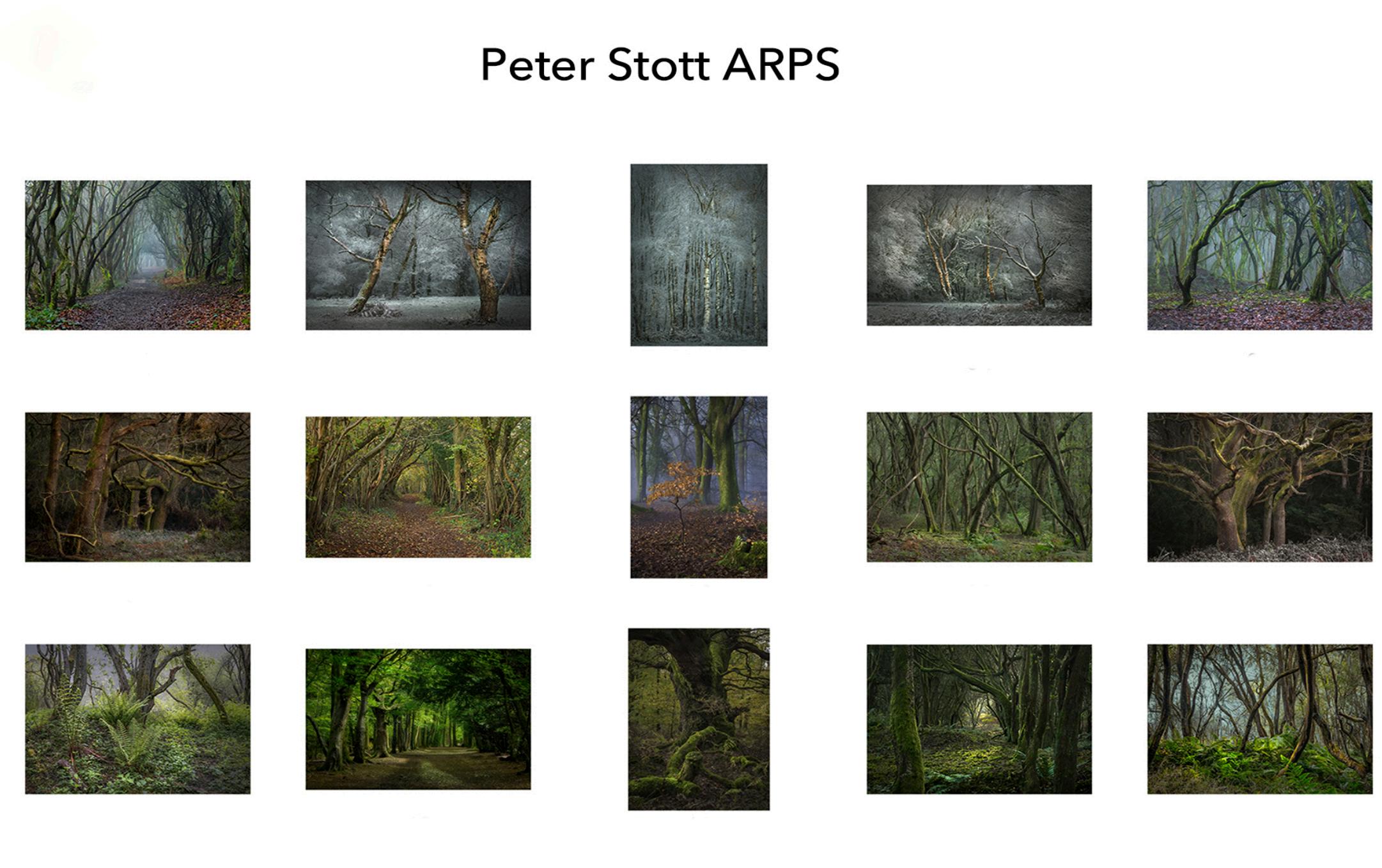
The evolution of the panel took around three years. (Woodland and weather are no respecter of the RPS’s timetable.) During that time I did a couple of RPS woodland outings, attended several on-line courses for new techniques, watched a previous ARPS assessment and attended a workshop in my own SE region.
I was particularly helped at the outset by an FRPS member of my camera club and the One2One session arranged via the RPS.
Woodland is very challenging and a couple of things I have learned from the DI is that simple is better and that reality can be changed in creative ways.
I am still concentrating on woodland, but focussing down and experimenting with techniques like detail extraction, fX files, and displacement mapping.

My favourite image
My favourite picture is the central picture of the sapling with the mother and grandmother tree. Some think it is over-saturated but I think this adds a vibrancy that immediately grabs the attention - particularly on social media.
I like that it leads to a discussion of the wood-wide web in which fungi mycelia transmit nutrients and water from dying trees to nurture the young; and how they act as chemical messengers to warn of attack by pathogens. Trees need a future too.
I took this picture in January, on a cold misty morning when there was little wind, and shafts of sunlight were illuminating points of interest.
A tight f-stop was used for depth of field with a long expose to enhance colours and contrast – and of course post-processing played its part. The blue cast is a feature of the mist. I like to paint with light to enhance a 3dimensional effect – nearer objects appearing brighter and haze enhancing distance.
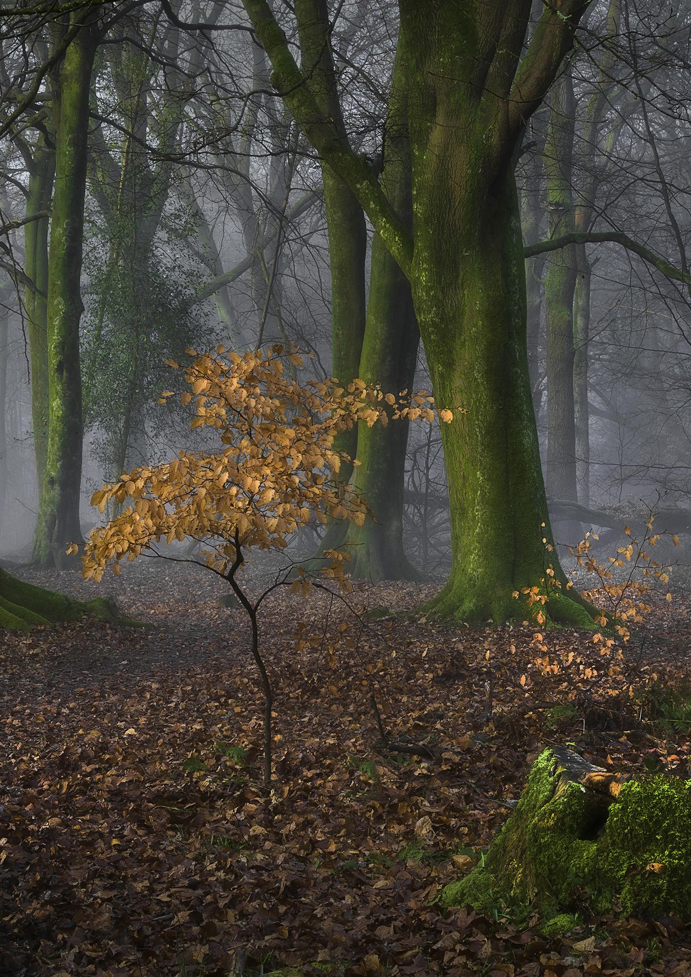 Canon EOS 1D MkII. Lens Canon 70-200 f2.8 USM at 75mm. 0.6sec; f32; ISO 200
My other image
‘Snow Geese Chasing the Moon’ depicts rising geese startled by the appearance of our hover boat in the delta of the Copper River in Alaska.
It was a misty day, raining, and the background was uninspiring. So I added a second shot in the background – the moon taken back in the UK.
The image needed a lot of careful cutting and pasting to get the desired effect.
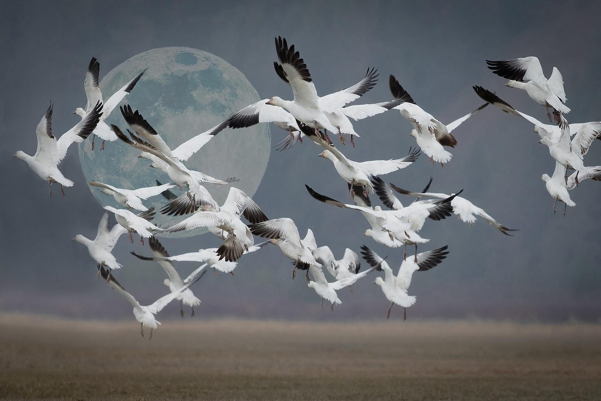 Canon 5D Mk4. Lens Canon EF 300mm f2.8 ISII USM. 1/4000sec f4.0 ISO 800
Moon: Canon 1D MkII. Lens Canon EF 300mm f2.8 ISII USM with 1.4X TC III. Effective focal length 420mm. 1/400 sec at f5.0 ISO 100
About my panel
Success Story 7
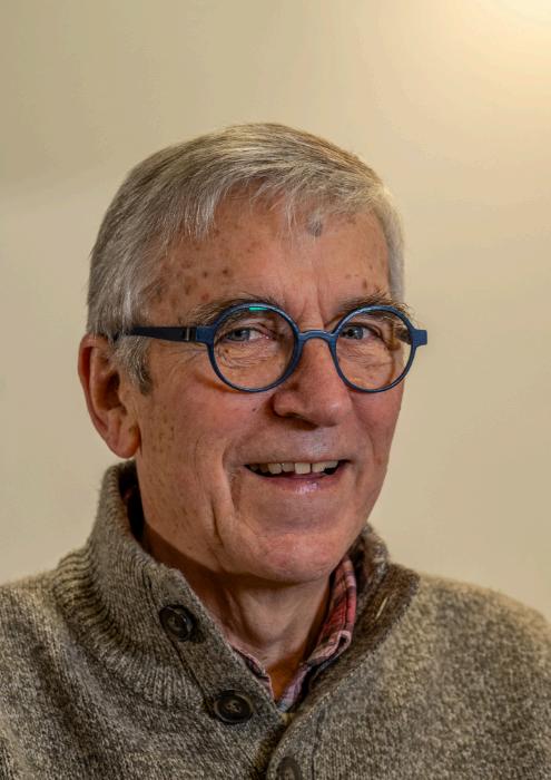
Name: John Grubb
Location: Peterborough,
Successful A Panel in November 2023
Applied and Potraiture
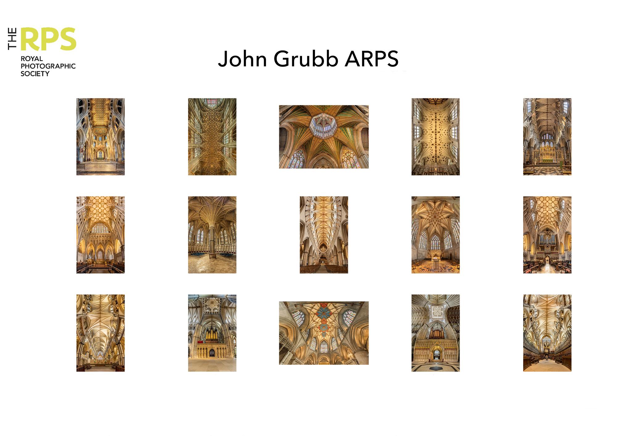
My late wife and I have been interested in cathedrals for many years, visiting many on our travels around the UK and Europe. We looked at these magnificent buildings from varying perspectives, my wife’s from an architectural background and mine primarily photographic. Images taken during these early visits tended to be more traditional, views down the nave and stained glass windows, nothing out of the ordinary.
A visit to Gaudi’s La Familia Sagrada in Barcelona whilst on holiday in 2016 changed all that. The architecture was absolutely stunning resulting in many images primarily of the ceiling. A suitable image was selected and included within my successful ‘L’ panel.
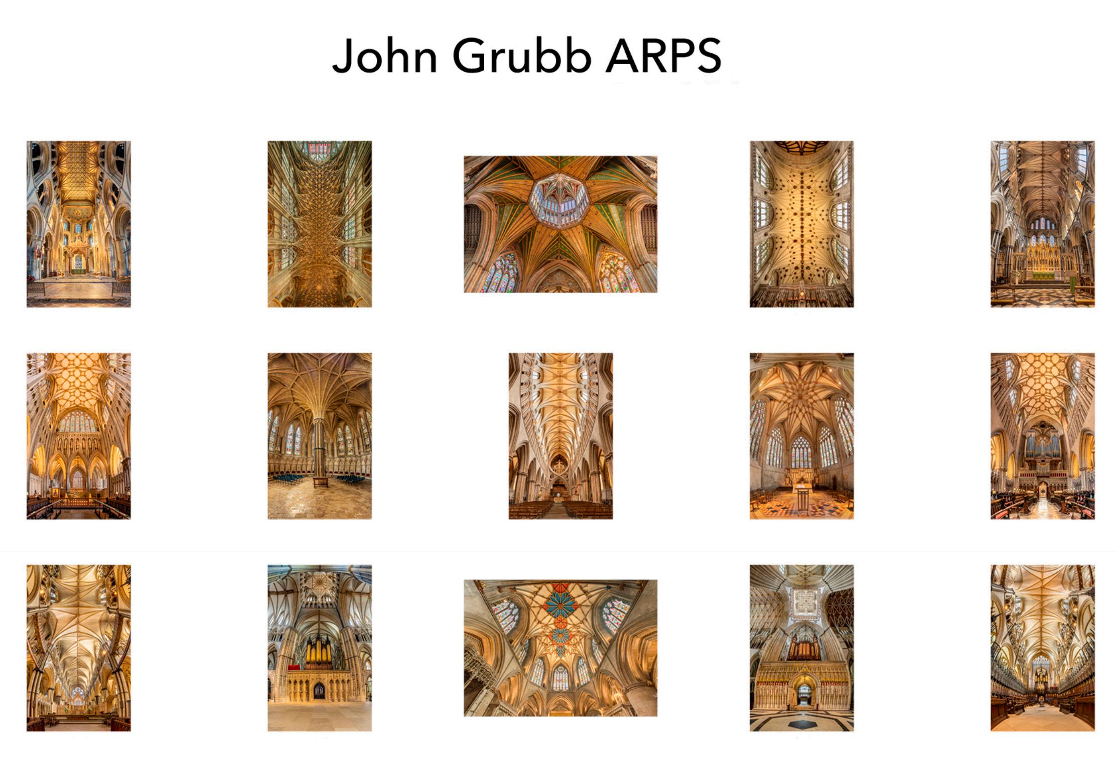
The images of Gaudi’s cathedral started to make me think about creating a panel of architectural aspects of English cathedrals for my ‘A’ panel. On organised tours, the guides would tend to focus on historical rather than architectural aspects. They would often say, ‘look at our magnificent ceiling’, everyone would look up, get a crocked neck and then move onto the next historical aspect. So, my thoughts began to focus on the architectural aspects and how to capture the ceilings and put them into context with the rest of the building. I wanted to be able to show the detail and intricate work, the awe and grandeur I witnessed in these magnificent buildings.
I began to experiment with a tilt shift lens and a very wide angle lens; however, these did not capture the image I was trying to create. Even a fisheye lens did not produce the desired effect. Returning to the tilt/shift lens and the concept of stitching images together made me start to think about 90 degree vertical panoramas.
After numerous visits to Peterborough cathedral experimenting with various angles and viewpoints, I was able to develop my chosen style.
The distortion created, particularly from ceiling lines, not only added to the creativity on the individual images but also the layout of the panel as a whole. The images of the ceilings at Wells and Lincoln taken along the length of the nave and chancel create a ‘wineglass’ effect. However, some of the architectural features deserve an undistorted view, such as the octagon at Ely and the ceiling above the high altar at Tewkesbury. In addition, the ceilings at Winchester and Gloucester are very intricate and warranted a straightforward vertical shot. Together they all started to form a more balanced panel thus avoiding repetition.
I had decided that I would submit printed images as I believe this brings out the best in a photograph. Attending the assessment in Bristol was a nerve wracking experience and listening to the assessors’ comments first hand is invaluable. When the chair of assessors announces an acceptable panel and your name, I felt elated and relief after spending a long time compiling the images and creating the panel. I was also saddened that my wife, my inspiration, did not see the final presentation.
What I Learnt
My panel was being developed during the pandemic and I found that some of the RPS weekly zooms were invaluable particularly those which focused on the distinction process and experiences of other successful panels.
The process of going through my ‘L’ panel taught me to focus on the detail in getting each image into a near perfect condition, ensuring that exposure, depth of field and elimination of distractions were all properly considered. The dynamic range of lighting within cathedrals is quite dramatic with bright colourful windows and dark shadows around columns proving to be an interesting challenge in exposure settings. Learning the use of HDR and multiple exposures proved to be quite critical to bring out the detail within the stained glass and the shadows of the interior.
Having assembled many images, I needed to reduce the number down to 15 but had reached the point of not seeing ‘the wood for the trees’. I showed my proposed panel to members of my camera club and local u3a photo group who passed some useful comments that helped me decide on the final layout.
Probably the most useful comments were made during my one-2-one with Kevin Wilson, the whole concept of the distortion of the images was not immediately apparent and he stressed the importance of aligning the panel with the SOI. This resulted in a few changes in the image layout and ‘tweaking’ of the wording in the SOI.
The other issue that caused some concern was the colour balance across the palate, whilst there may have been some distortion in submitting the images in DPI format, I made the decision to recheck the colour profiling on each image and then reprint – in the end a worthwhile exercise.
The key learning message is to seek comments and advice, listen to the feedback particularly the one2one process and amend as appropriate, it certainly paid off for me.
RPS Associate Panel
Statement of Intent
On my visits around the country I have visited many cathedrals and abbeys. Early images I took failed to capture the atmosphere and drama of the architecture of these historic buildings. On organised tours, guides often focus on historical aspects and to a lesser extent on the architecture, with the result that the visitor fails to fully appreciate the grandeur and scale of the building.
The intent of my panel is to convey the awe that I felt when studying the incredible craftsmanship in the architecture of these magnificent buildings. The distortion inherent in the concept of vertical panoramas creates an interesting wider view of scale inside the building. This concept has been developed in some images to give an enhanced appreciation of the aesthetics of the building.

Assessment date 8 November 2023
John Grubb LRPS
My favourite image
Peterborough cathedral, my local cathedral. I was able to make numerous visits to experiment with different ideas which took many attempts to get right. The final image was taken during a twilight workshop evening session devoted to photography. Not only multiple images in viewpoint but also HDR, a challenging dynamic range resulting in some 30 images taken to make the final version. I even managed to persuade the verger to allow me to temporarily remove the bright ‘no entry’ ropes for the evening.
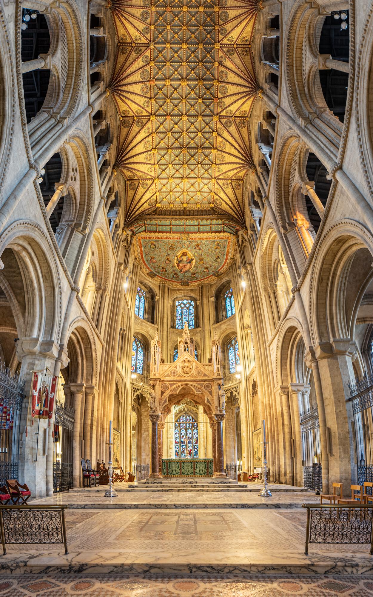
Exif data: Nikon D750, Nikor 14-24mm f2.8 at 14mm f7.1, 1/2sec ISO 200
My Other Image
The image of Gaudi’s cathedral ceiling in Barcelona, the one that got away, used for my ‘L’ panel so not eligible for the A. Entering the building, the sights and atmosphere simply takes your breath away, it is absolutely stunning. Although a busy place I managed to take the photo while lying on the floor to get coverage and stability.
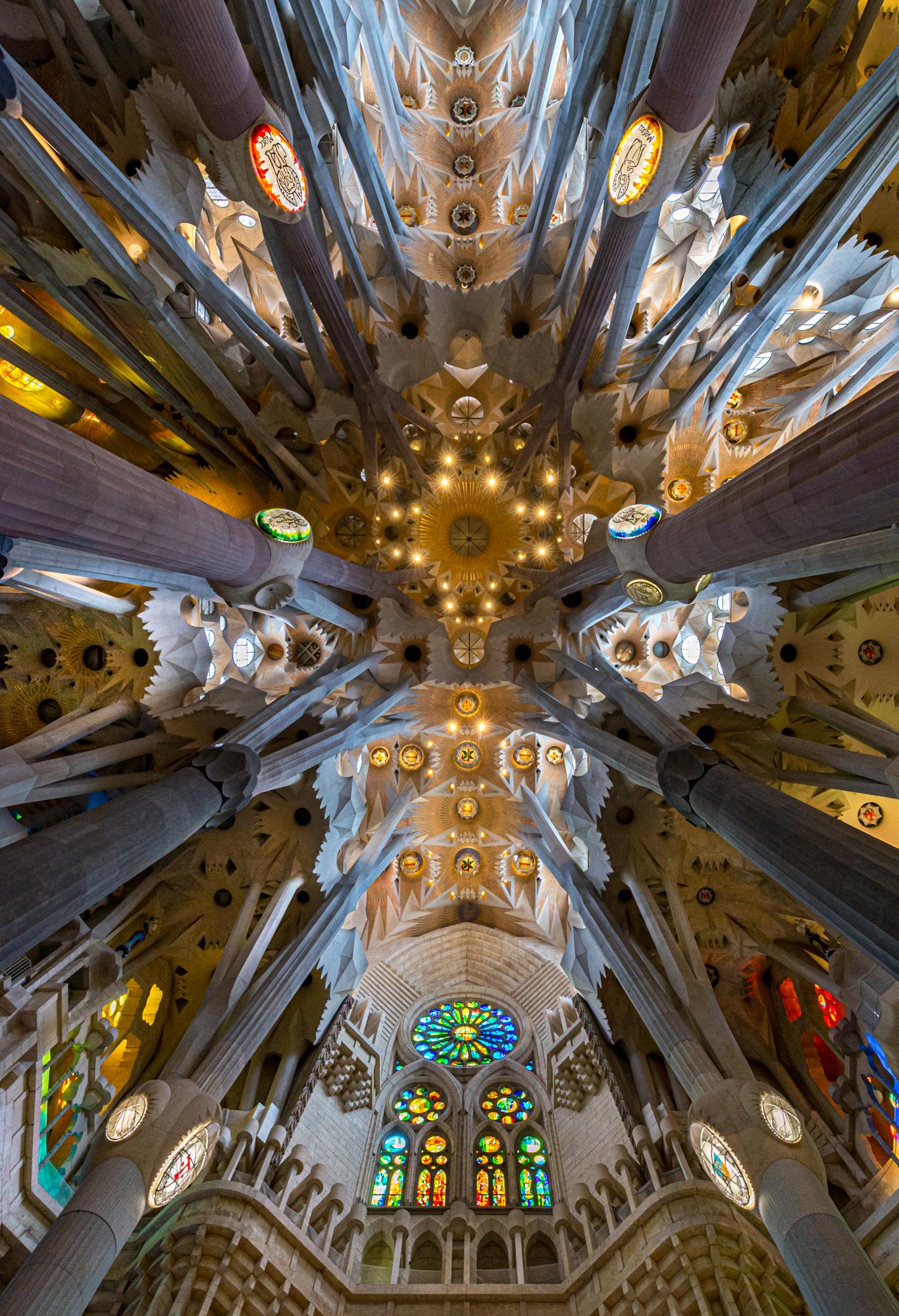 Exif data: Nikon D600 Nikor 14-24mm f2.8 at 14mm 1/50sec f5.6
ISO 1000

About my panel
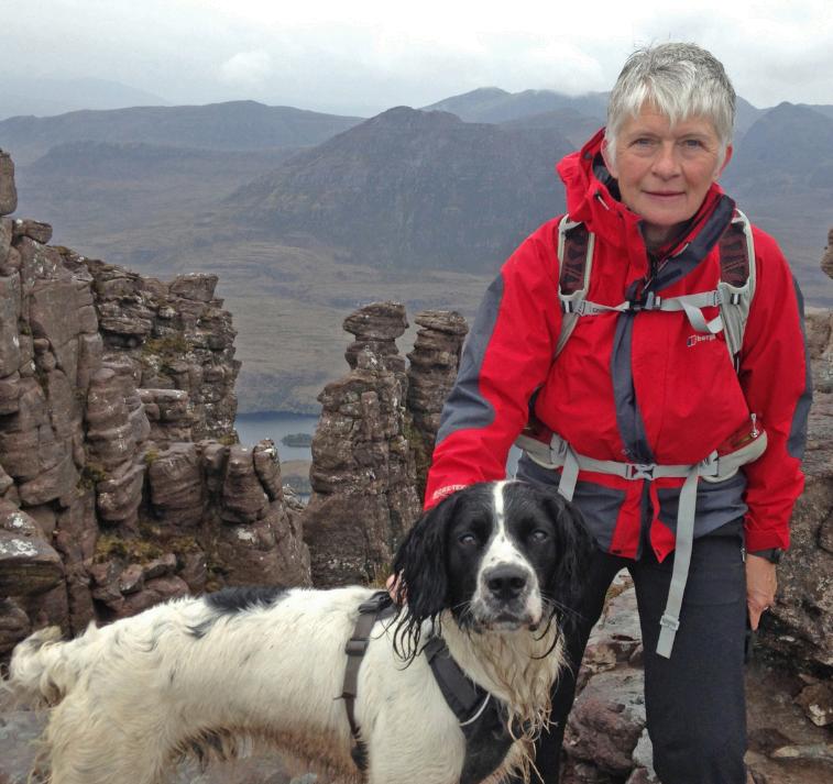
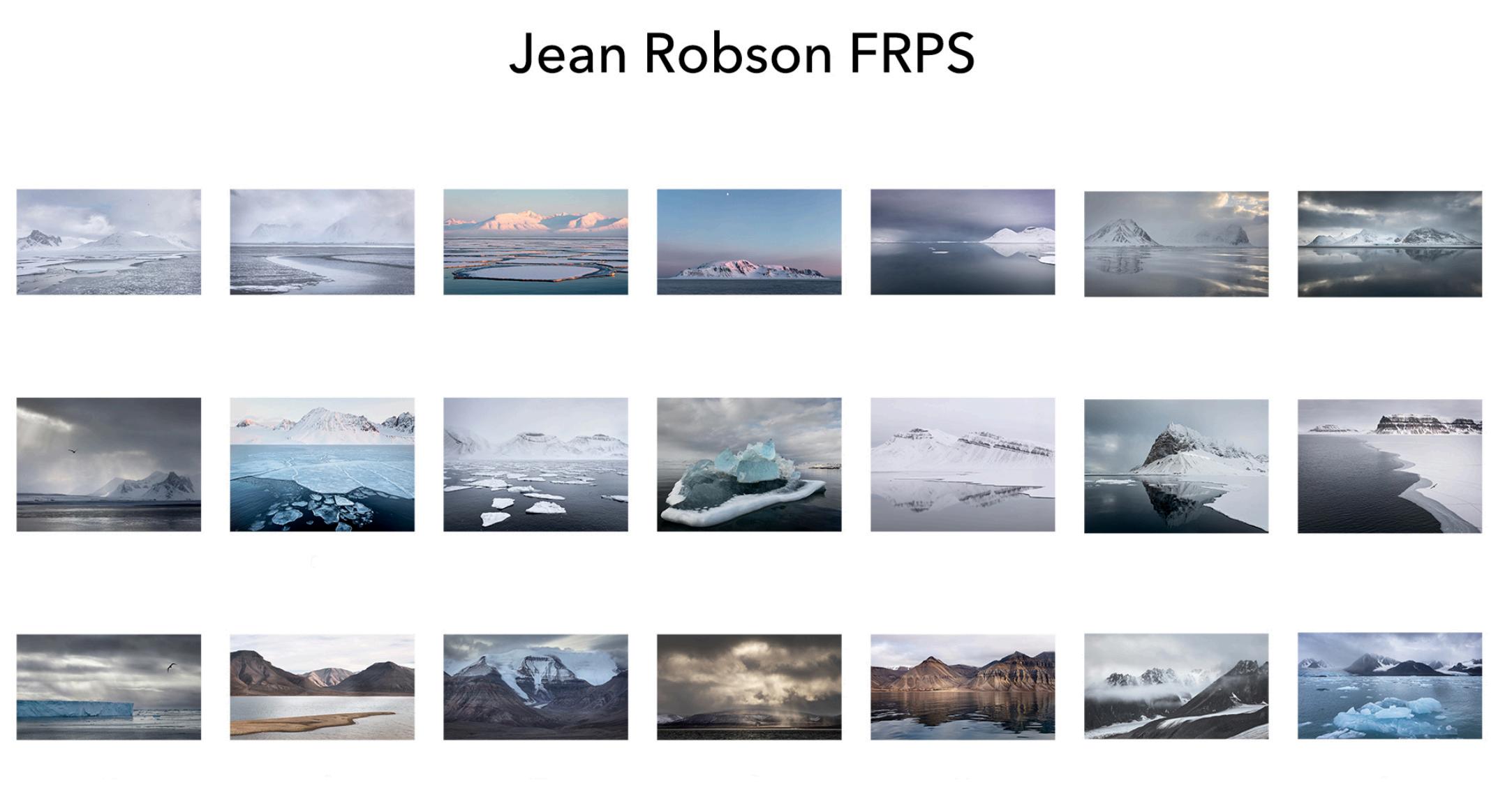
Name Jean Robson
Location: Scotland Region,
Successful F Landscape Panel
April 2023
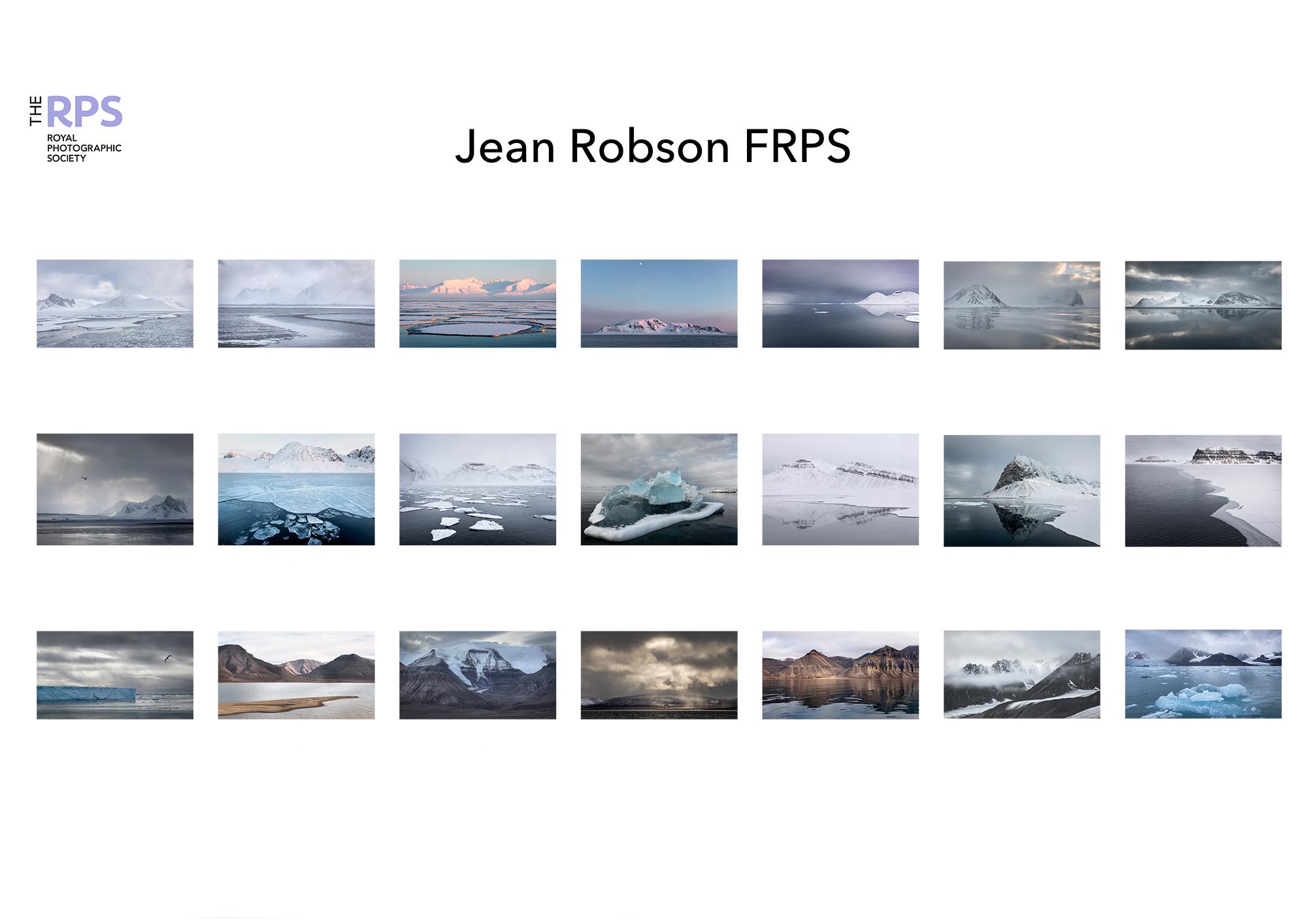
We had been trying to visit Svalbard for several years, but trip cancellations because of vessel problems or COVID had thwarted attempts since 2018; so when in late 2021 I saw cancellation advertised for the first week of the season in 2022 we grabbed it despite already having a booking for the last week of the season (which we were convinced was jinxed and would not happen).
Advertising brochures suggest that low soft arctic light and wildlife around every corner is the norm, but knowing mountains at high latitudes we went looking forward to whatever we got. Whilst fellow travellers sat inside drinking coffee and bemoaning conditions, I spent hours on deck lapping up the fabulous scenery. The white outs in which snow-covered hills and sea ice became indistinguishable, the dark foreboding storm clouds, and the snow clouds each held a particular magic. I felt determined to create a body of work with which I could show others the wonder of the High Arctic in all weather conditions.
Challenges were significant, photographing from the deck was the norm; with only occasional sorties in the zodiac inflatables (because the ice was extensive), meant limited perspectives. Continual movement and engine vibration resulted in limited shutter speed options. When the weather was at its worst we were locked inside with no access to the deck; and extensive ice meant that we had opportunities to visit a relatively small range of fjords. My project therefore had limited options for variation in image styles, perspectives, and background scenery.
On our return we were still convinced that another COVID wave or other problem would prevent us returning to the archipelago at the end of the season, so I put together a panel of images, and submitted. The assessors felt that there was insufficient variety.
images for others that added to my story and submitted, this time successfully.To our amazement our autumn trip went ahead, I was therefore able to document more less than perfect arctic weather! The issues with movement and perspective were not different but access to different areas was possible, and more geological features could be illustrated when swept clear of snow. I was therefore able to develop a panel with more variety, and arranged a 1:1 with Paul Mitchell. The 1:1 was invaluable, Paul bluntly told me that the first panel was better, that was just what I needed to hear! I realised that I had, unconsciously, moved away from trying to convey the story that I wanted to tell, towards trying to please the assessors. I revisited the first panel, exchanged some of the
Success Story 8
To our amazement our autumn trip went ahead, I was therefore able to document more less than perfect arctic weather! The issues with movement and perspective were not different but access to different areas was possible, and more geological features could be illustrated when swept clear of snow. I was therefore able to develop a panel with more variety, and arranged a 1:1 with Paul Mitchell. The 1:1 was invaluable, Paul bluntly told me that the first panel was better, that was just what I needed to hear! I realised that I had, unconsciously, moved away from trying to convey the story that I wanted to tell, towards trying to please the assessors. I revisited the first panel, exchanged some of the images for others that added to my story and submitted, this time successfully.

So, what have I learned?
1. That for a successful panel you need to want to convey a message, so that you are perfectly happy to spend hours creating the images. On the deck of the ship, I spent hours selecting compositions then waiting for a bird to fly in, or a cloud to move, or the light to change, and loved every minute of it.
2. To avoid thoughts about the expectations of assessors becoming more important than the message.
3. I had not considered production of a landscape panel before the trip, and would never have pre-visualised the resulting images. For me going to places that I am interested in, and being open to whatever I see, works better and generates more enthusiasm that going somewhere with the intension of creating a particular image.
4. Save all your RAW files till your panel has been assessed! Having chosen the very best RAW file of a scene, and processed it when I came to put together the panel I found a couple of times, that the aspect ratio did not fit the sequence. As I still had all the RAW files it was simple to select a different version and process that. Just because it is the very best version of the view doesn’t mean it is the very best version for the sequence.

Statement of Intent
Arctic Moods
I hope to share the superb majesty of the High Arctic in differing conditions.
In early spring ice and snow dominate.
I aim to show days where light is flat, creating a minimalistic beauty. Days of stormy clouds, allow me to communicate feelings of foreboding for coming storms. Clear days with low light provide opportunities to capture a more classical arctic beauty.
As the ocean moves under the forming ice, the landscapes are transformed. I have displayed a small selection of the changing shapes and patterns.
As the year progresses, the barren lands are swept clear of snow, sea ice disappears, and it is easier to approach the glaciers. This allows me to illustrate some of the geological features that shaped these lands.
I hope my panel conveys the enthusiasm I feel for travel in and understanding of the High Arctic.
Jean Robson
Landscape assessment 13 April 2023
My favourite image
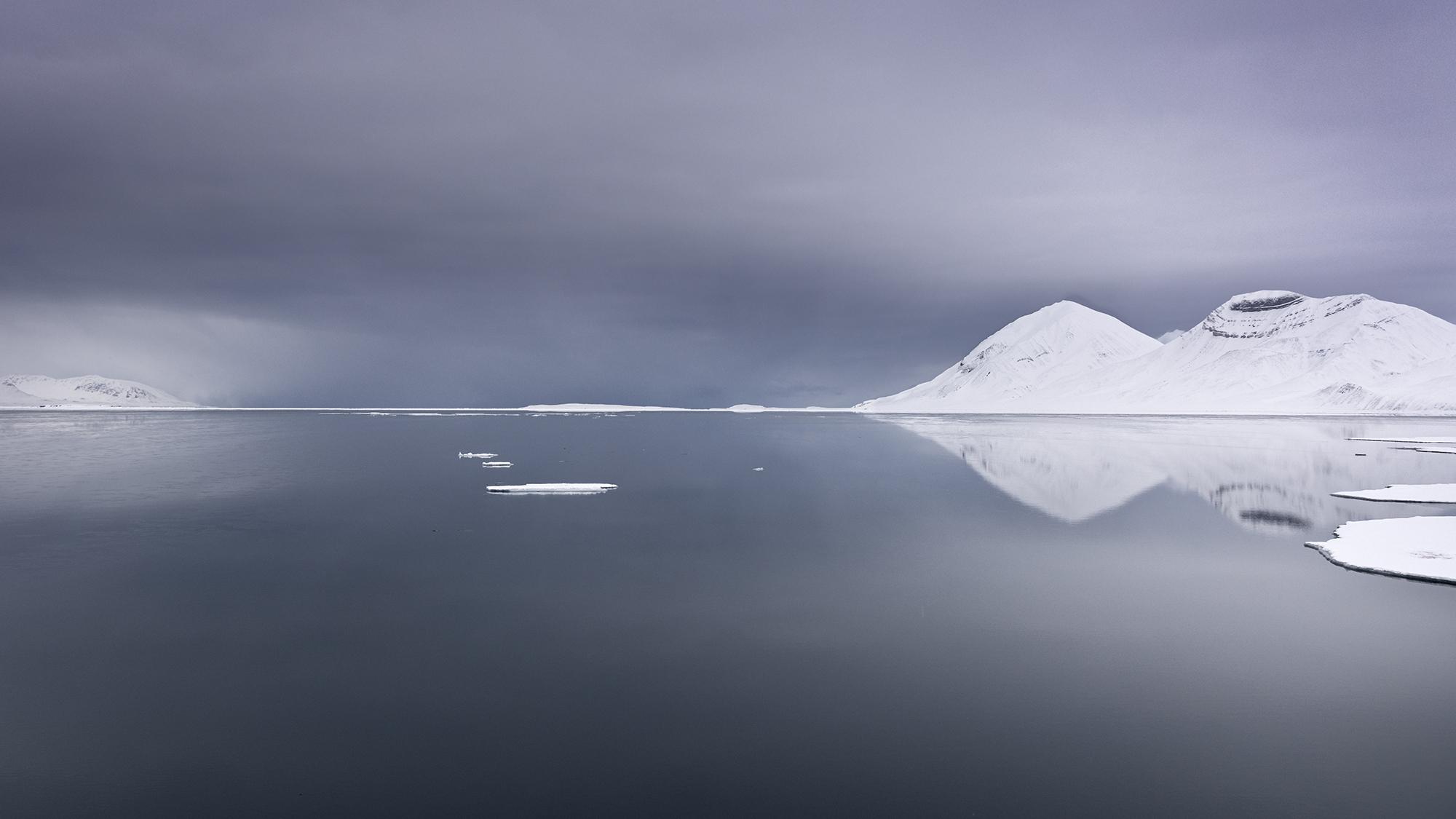
My favourite image is this one of a snow storm approaching, I feel that it sums up the cold, the threatening weather but also the beauty of the place.

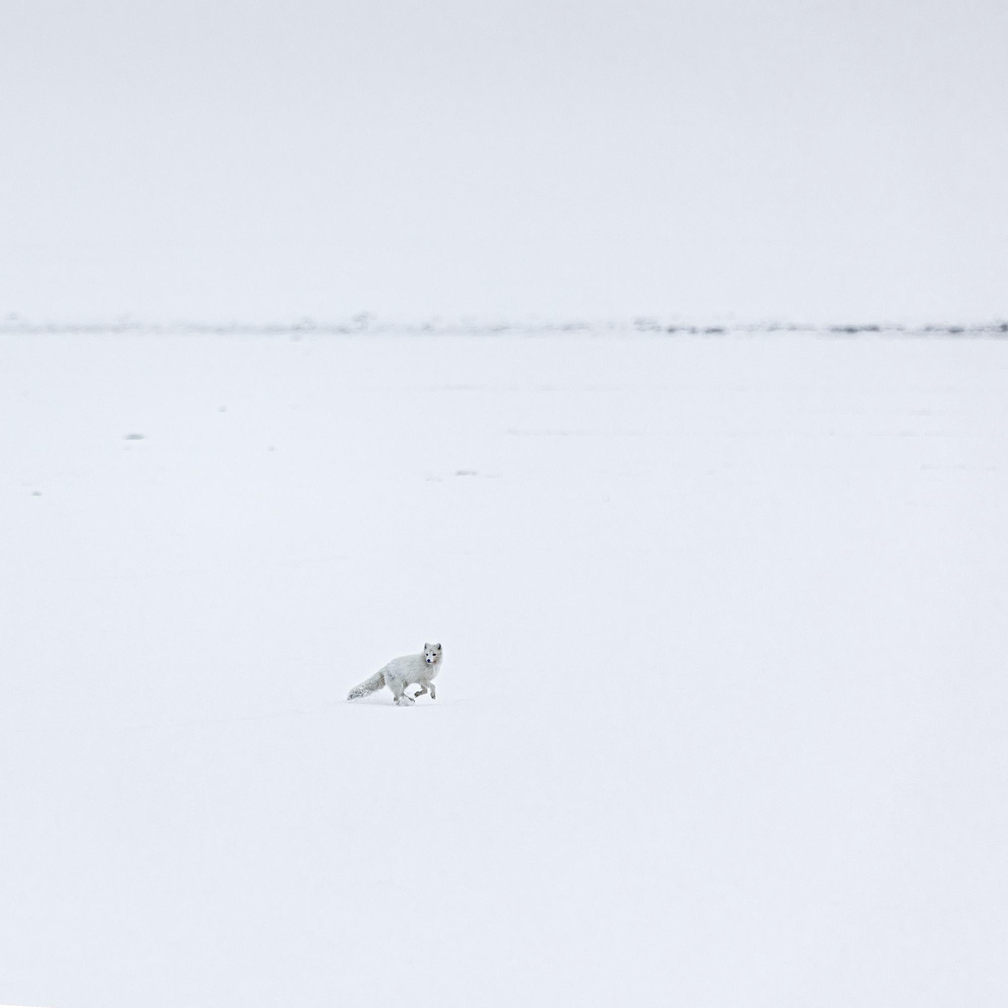
I would have loved to include the image of an arctic fox appearing out of the mist, so small in the vast white home. For me it sums up the emptiness of his challenging environment, the landscape often hidden in the enveloping mist with the occasional living thing appearing, but it doesn’t include enough landscape for a landscape panel.
f14 1/80 iso 125

I was absolutely delighted to be awarded a fellowship, though there is much more to learn! But, as well my pleasure at success.
I was really pleased when one assessor said that my pictures “made me want to go there” as that affirmed the reason for starting the work –to show people that it is an incredible place in all weather.
f7.1. 1/2000. iso 640

Success Story 9
Name Kenneth Ness FRPS
Location Aberdeenshire
Successful F Applied Panel June 2023
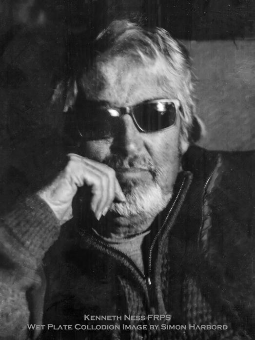
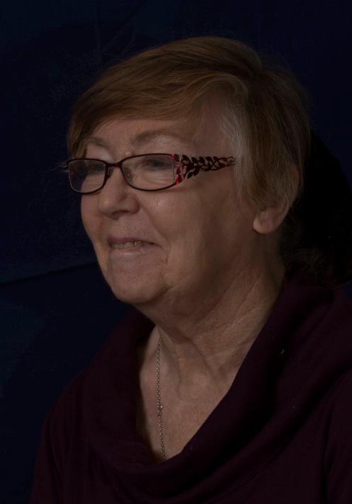
The portrait is a Wet Plate Collodion taken by a friend, Simon Harbord who died a couple of years ago. He lived not far from me and he was a leading exponent of vintage photography processes. I felt that this is a half decent rendering of my mug and a tribute to his work.
About my Panel
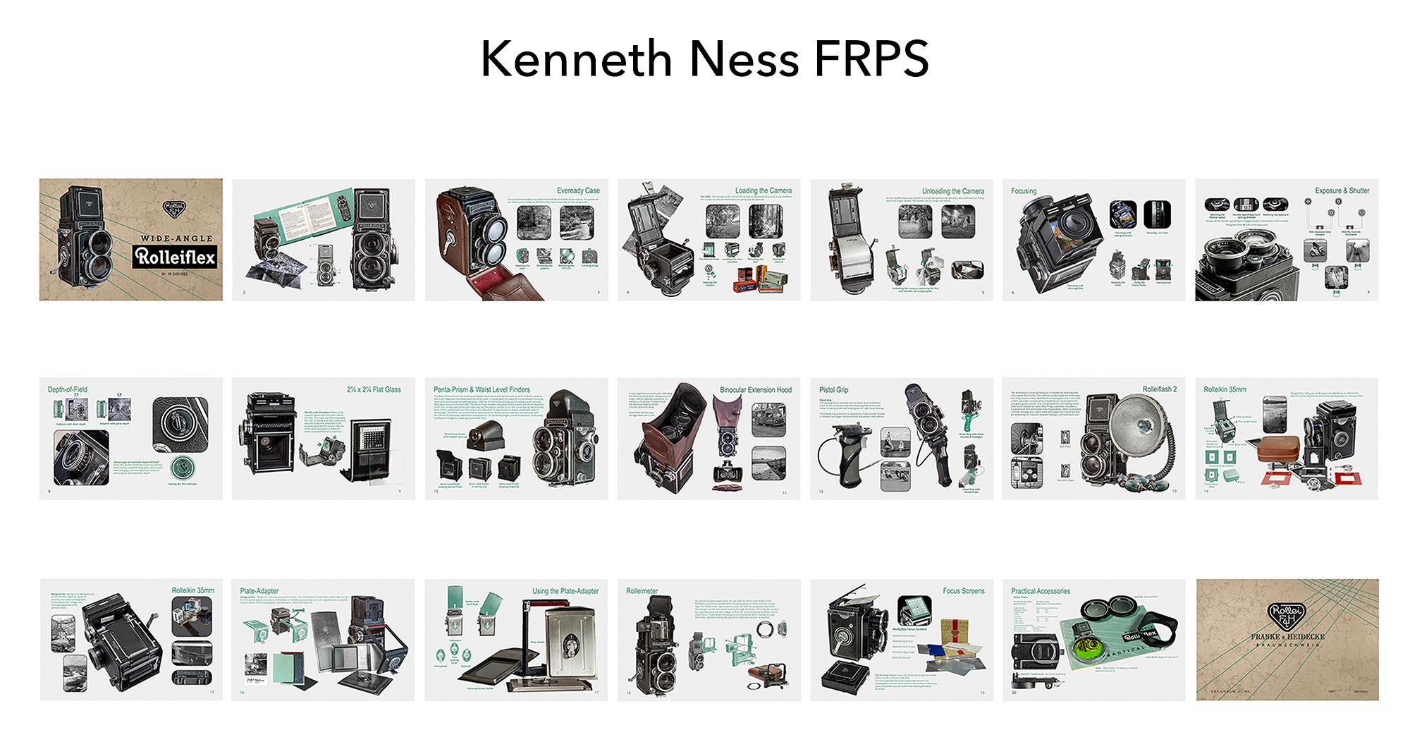
Having tried several ideas for a Fellowship Panel, none of which met my expectations or piqued my interest to any degree in the subject, I realised that, like my Associate Panel, I needed a project that I could empathise with. This led me to one aspect of Photography that I had dabbled in, which was, collecting vintage cameras.
I no longer collect cameras that are destined to sit in a cupboard, and the Rolleiflex Wide Angle is now used on a regular basis by me, to the point it became an obvious choice. I am fortunate in that the camera was inherited and came with a wide range of accessories.
Whilst I enjoy digital photography, there is a magic to using film and Rolleiflex cameras are amongst the finest there ever were. With only twelve images on a roll of 120 film, thought has to go into the taking of each image to ensure waste is kept to a minimum. The camera was, of course, captured using a Canon 5D Mklll and a 24 -105mm f/4 L IS lens. Generally my photography consists of Landscapes and Woodland scenes although I have an eclectic taste and any subject that catches my eye is photographed. I predominately use black and white film.
Building a Panel that would illustrate the features and range seemed at first to be a daunting task, however, looking through the accessories that I had accumulated, I realised that these same accessories made the Rolleiflex a true system camera.
I decided to lay the panel out as if each image were a page taken from a sales brochure for the camera. Whilst, strictly more than just a selling tool, this panel strove to enhance each accessory.
The criteria dictated that there needs to be twenty photographs. However on looking at the layout, without a “back” page the thing looked incomplete.
This was resolved with the inclusion of a twenty first page. Text, page numbers and titles within each page gave clarity to the purpose of each accessory. I added small thumbnails illustrating the function and operation of each component. These were generated from photographs coloured in green to emphasis the part and then screened. This followed the overall style of Rollei manuals and I felt an affinity to the original booklets would enhance the images.
This was my second attempt and originally I had used an old ledger’s pages for the backdrop. This was a mistake and was replaced with an off-white background more suited to the period. I also took this opportunity to add and enhance the pages. I tightened the layout, removed surplus text and added further thumbnail images.
Whilst being disappointed by my initial rejection, I had another one-2-one with Paul Walker FRPS and together the errors were corrected. I would always recommend these advisories and my elation at my success is hard to describe. I had reached the pinnacle of my photographic path.


What I Learnt
I have learnt much over the years, moving thought the Licentiateship, Associateship and finally, Fellowship. What has become apparent is the need for clarity of purpose, a belief in your project and guidance from those who will finally evaluate your work. I have mastered new techniques and methods of working with Photoshop and skills such as Focus Stacking have proved their worth. One compliment praised my cut-outs and the quality of my main images. This I found particularly gratifying.
Yes, I had rejections; my “A” first attempt was a disaster and found to be formulaic in both images and layout. With help from two eminent Fellows, I tackled the panel with more thought and was successful on the second attempt. As a consequence, I did not repeat the same mistakes on my Fellowship’s first attempt. There it was a consequence of the background being inappropriate, something I realised too late. Help with panels, was taken up fairly early on but as I progressed through the Distinctions, my own experience helped together with my constant criticising of what I produced. The mantra of the Panel being the last image never left my mind and helped me build the successful presentation
I did not directly use ideas from any of the DI webinars. Some ideas came via YouTube but only in the general sense, e.g. techniques in processing etc. I do not know if there has been a project such as this which is so off-the-wall. In the Peer2Peer groups, no-one was sure how it would do. Personally, I’m rather pleased with the result as it is just that bit different.
Yes, it has made me a better photographer. As a Scottish Photographic Federation Judge, it has bolstered my confidence enormously, allowing me to use my skills to benefit others.
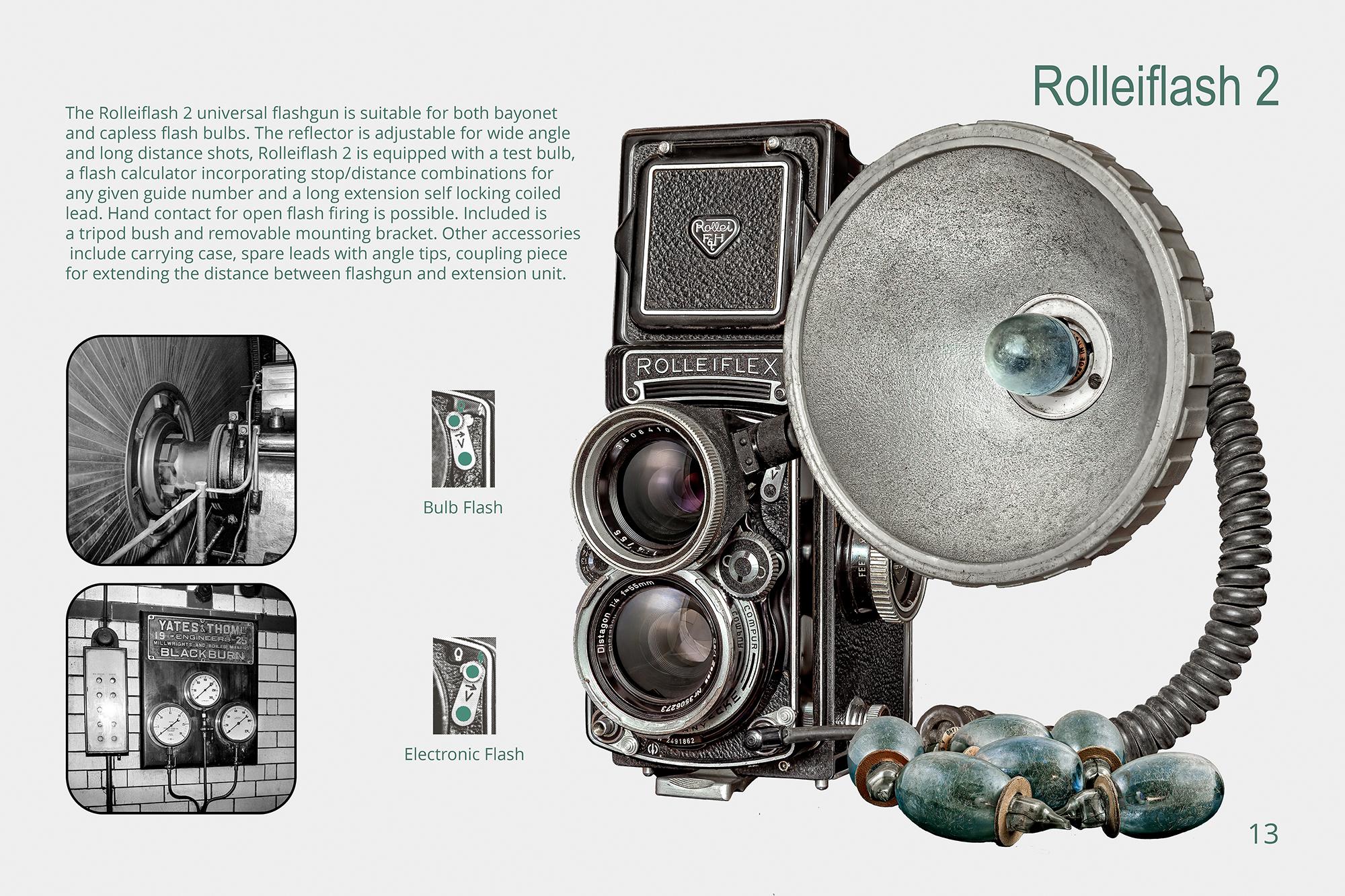
Out of a “Technical” panel of twenty images, it is difficult to select one image over others. No 11, the Binocular Hood was challenging due to the components being taken at different times and lighting. I think the Rolleiflash is the one that gave most reward. The lens mount was not for a Wide-Angle and would not fit onto the bayonet of the lens. I had to photograph all the parts separately and blend them together after “adjusting” each part. The elation came when I realised you “couldn’t see the join”.

All the panel images are composite and comprise of the main image i.e. the camera and supplementary supporting images taken from earlier B&W negatives. All major components are photo stacked with Helicon Remote and blended in Photoshop.
The small supplementary images are treated in a similar fashion. The sections that relate to the page are separated into layers and a green colour is applied. Using Filter Gallery, they are screened to create a Letterpress printed effect. The green and black are maintained throughout. All text uses the same shade of green.

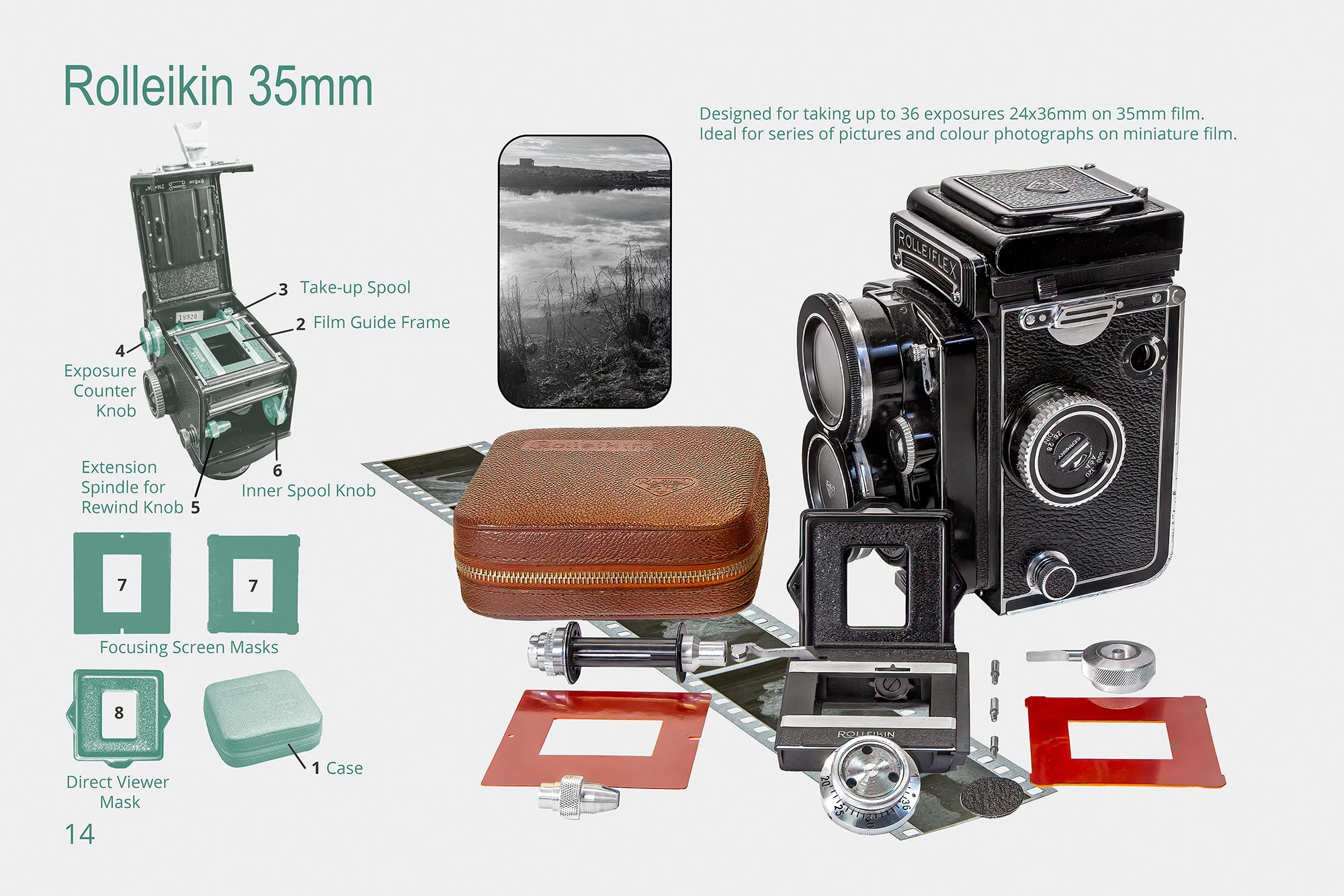
Another interesting aspect of the Rollei cameras is the ability to convert to 35mm using the Rolleikin adaptor. You gain the use of a quality lens, at the cost of being forced to use portrait format in you images. This is an inconvenience where landscape work is your prime interest. Conversely, studio and portrait work is made easier and allows a greater number of images per roll of film. Most parts of the conversion are left in place only requiring the 35mm carrier, cassette adaptor and viewfinder masks to be added prior to use.

Why I Created this FRPS Panel
In October 2021, I submitted a Contemporary Fellowship Panel for assessed but was unsuccessful.
Not to be deterred, the following month I decided to create something new and to submit that work for Assessment in the Visual Art category in June of the following year. However I determined with absolute clarity two critical aims:
1. I would take full ownership for this project from beginning to end and would either fail or succeed based upon my own merit. In my prior submission I took advice from many and various peers and participated in two One-to-One Appraisals with a Panel member, but in doing felt that I lost ownership for that piece of work.
2. For people to view the resulting images and smile, I had to engender a sense of fun and enjoyment throughout the whole photographic and the post production experience. Above all, I had to enjoy the process myself and I wanted the individuals who were willing to take part to laugh with me. I recall November 2021 was one of those times when the Press were being particularly critical of families spending too much time on computer devices, not eating healthily or getting enough exercise. We were being told we were getting more obese! It seemed to me that involving family groups in something that focussed on humour might be a good start.
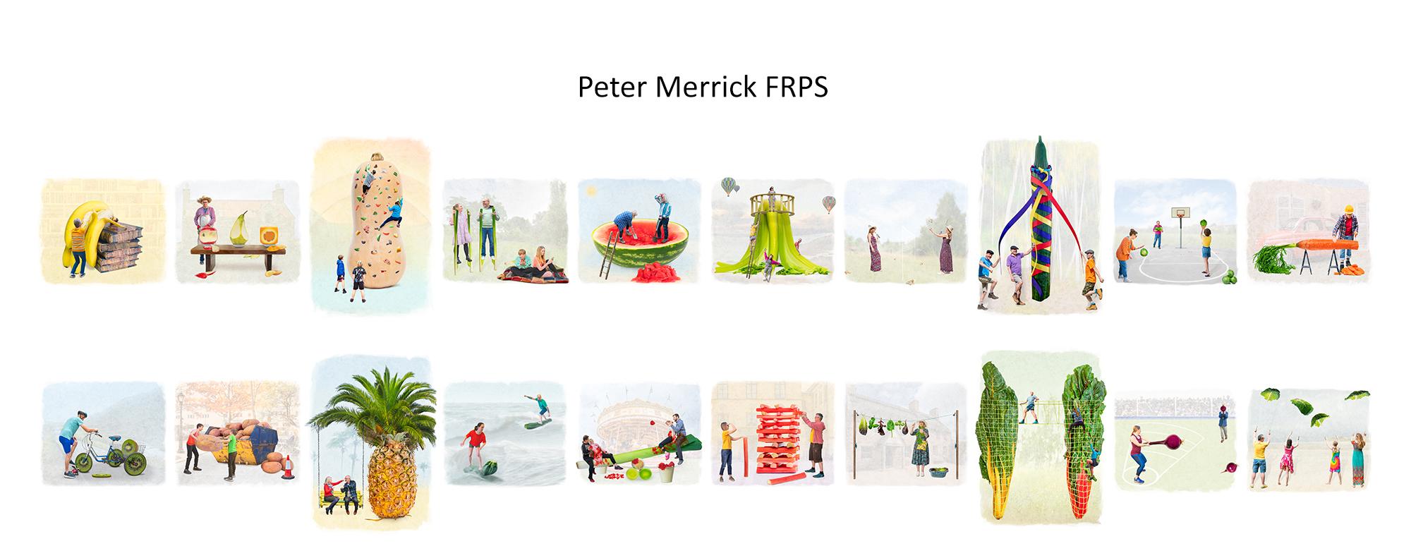
So, I imagined walking around my local Supermarket, stopping at each fruit or veg bin, thinking “What could I do with a …” The first object I came across (and therefore in position 1 in the Panel) was a bunch of bananas, so of course, if it was as large as a person, the effort to peel it must be considerable. It was then not very difficult to come up with the Storyline, a critical part of the success of this project and then another 19 comical cameos just seemed to follow.
Now you need to know a couple of things about my preferred style of photography. I like to create an image that tells a story. It will normally include a person or people. They will often be inserted into another location where it would not have been normally possible for me to photograph them. The cameo had to be believable, lighting and colour tones had to be consistent between foreground and background, shadows will have to be added to effectively anchor the people.
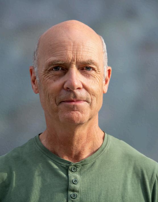
Peter Merrick Success Story 10 Successful F Visual Art June 2022 Name Location Brighton
For this project I wanted to do something new, hence the “fantasy” style not explored by me before. I knew the final output would be printed on matt textured paper and with hue increased and colours slightly de-saturated as though it might be included within a children’s comic book.
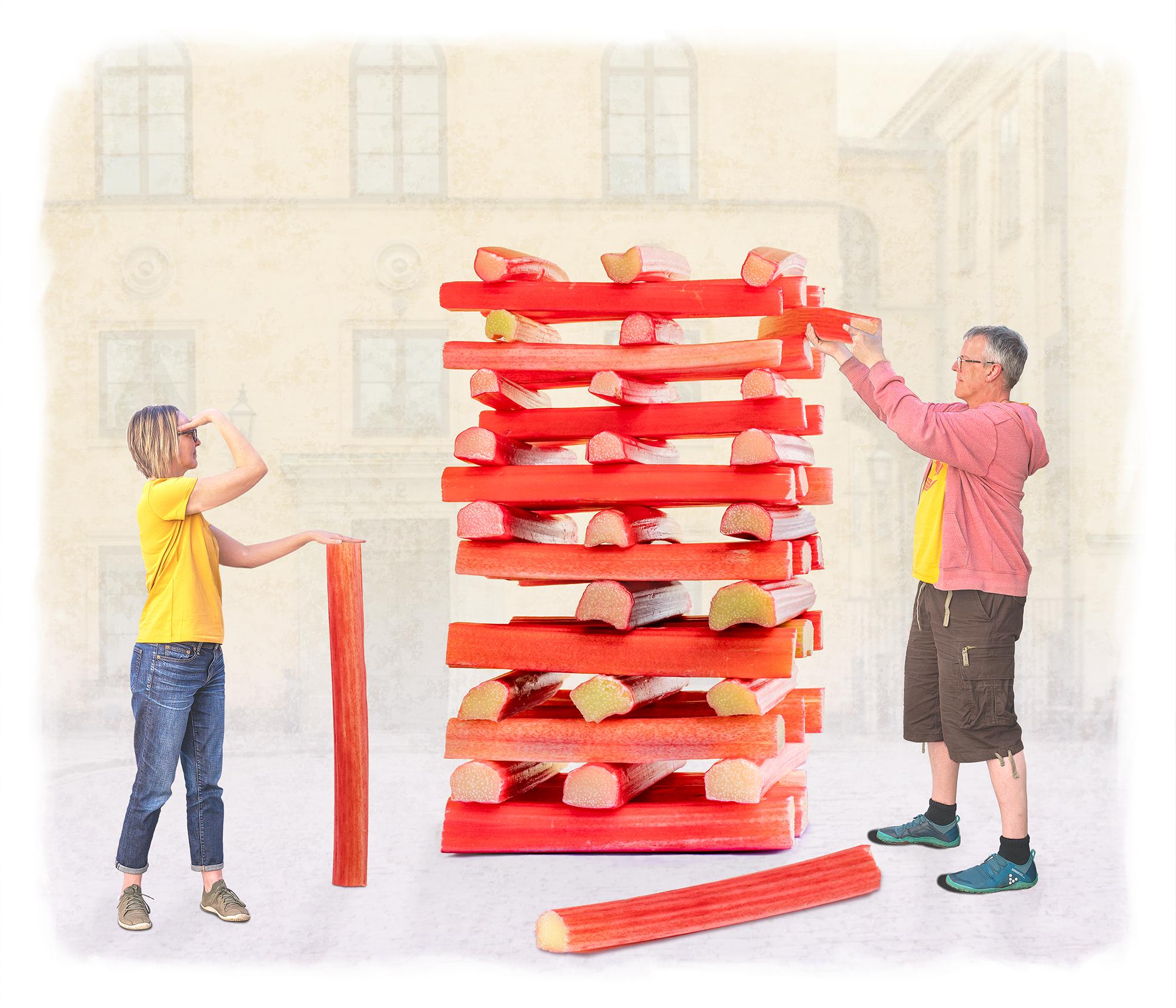
So, to explain the process I will describe it through one of the images, namely the Jenga Rhubarb competition
(Image Number 16). Step 1, go to the local Supermarket, buy a lot of similar thickness and colour stalks. (The Supermarket did very well out of this project!)
Build a tall Jenga tower with similar lengths of cut Rhubarb, carefully stacked so as not to fall over with a couple of “removed” stalks and a partially moved one. I had already planned where the two people would stand/be posed. Explain in advance to the two participants what they would need to do and ideal colour co-ordinated clothing. Photograph tower in kitchen as lighting was good. Having a working print was critical in posing the people, photographed out of doors against a white background with consistent light direction and to simplify cutting of people into the image. Selected backgrounds were added last to support the story line and colour compatibility from my library of images, taken over many years. As this image was a “competition” to be held in public a “town square“, seemed the right choice.
Equally there was another image of a family of four kite flying cabbage leaves (Number 20). Where might you fly a kite, well of course on a beach? So Luskentyre Beach seemed again the obvious choice. Whilst the locations may have meant little to anyone else, they were important to me and I wanted the memory of being at those locations to be preserved.
An element of “coercion” was also required to persuading some participants to allow me to photograph them. It sometimes required copious amounts of food and drink. Drink normally preceded the photo shoots and food afterwards! So for three of the images we invited 3 other couples around for “lunch, including the “Boys are Back in Town”. The girls had to be photographed first before the drinks flowed, the boys afterwards. You might be able to tell that from the “Boys” image!
(Number 8)


This is probably the hardest question for me to answer as all of the images leave me with fantastic memories. This project was never simply about trying to achieve a Fellowship with the Royal Photographic Society!
Over a Christmas family gathering in December 2021, I was trying to explain to my brother-in-law about this project. He has written a number of short stories set in the 1980’s typically involving Teenagers, their lives, music, loves and football from that time. So I said to him, how about writing me an Ode to go with each image. He agreed and what he produced was incredible. It also enabled me to separately produce a book to go alongside this project which had also been my intent. I had imagined that perhaps such a book would have some humorous and promotional benefit for use in health or educational situations and for discussion in family groups.
So, for the two images I have selected for this article (numbers 16 and 4 in Panel), I include below for your merriment, those Odes.


The Distraction of Shorty’s Legs
The Rhubarb Jenga World Cup Final was a real nail-biter, ‘Shorty’ Adams V the Yellow Peril, scrapper versus fighter. Shorty had the height advantage and was determined to make her flounder, But The Peril knew all the moves and tricks, she was always a rebounder.
One stalk here, one stalk there, the game was pure mustard, But one false start and they both knew they could end up in the custard.
Shorty ducked and dived, he shuffled like a young Ali, But the Peril was no shirker, with her background in the Royal Ballet.
The game was on a knife edge, the crowd was far from mellow, Shorty in his trendy shorts, The Peril in trademark yellow. The audience held its collective breath, as Shorty made his move, Having come a cropper to the Peril before, he had a point to prove.
He stepped up without a second thought, showing no trepidation, And pulled the stalk from the growing pile without any hesitation. The move was one of sheer finesse, he pulled it clear of the wobbling pile, Even in those infamous shorts, he showed he still had a certain style.
As the crowd applauded, The Peril watched in silent admiration, She couldn't help herself, Shorty's hairy calves were her infatuation. Those dashing shanks made her sigh, and those thighs just made her shiver, Those knobbly knees made her shaky, his ankles made her quiver.
By now she was in such a tizz, that when it came to pull, She was in such a state of leggy delirium, she had no game at all. The crowd waited as she hesitated, by those sexy pins, Instead of winning Jenga, she could see only his shapely shins.
She took a swig of cooling water, but wished it was a nip of sherry, She was no good to man or beast, she'd come over all unnecessary. The Peril was shaking like a leaf, and now she was just too distracted, And when she made her fatal pull, it could not be retracted.
There was a deathly rumble as the crowd hushed, but the rhubarb came crashing down, And Shorty Adams was deemed the champ, as it was his legs that had won the crown.
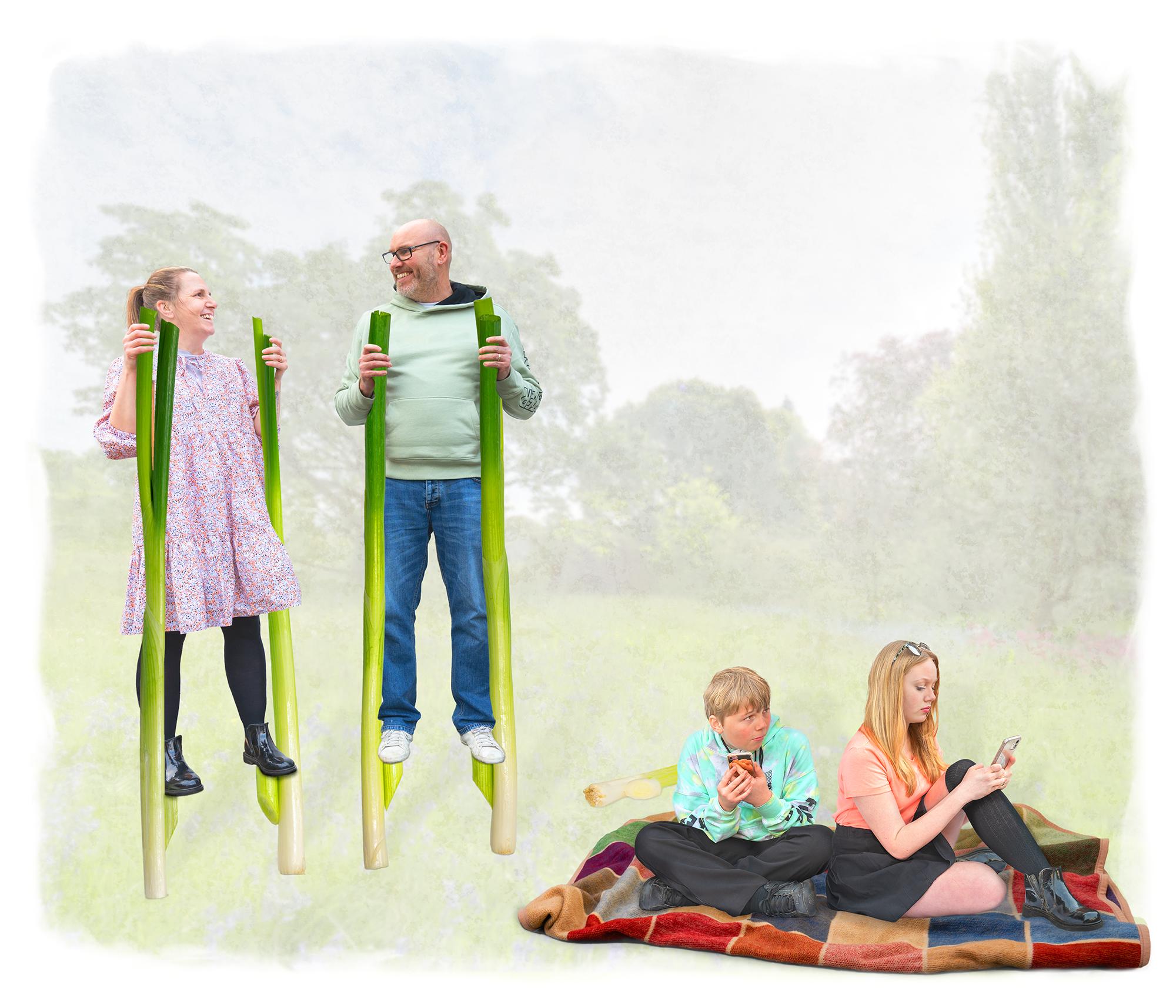
A Spring in their Step
'Kids today!' Kirsty said, 'Why do they bother getting out of bed?'
Lee agreed 'It's just too bad, I was convinced this mobile thing was just a fad!'
Archie and Millie spent all day on their phones, 'We have to' they said, 'to drown out your moans!'
Kirsty was fed up, at the end of her tether, She felt like knocking their heads together.
'Do you remember Lee, when they used to speak?
'Now they tell me that I'm a freak!'
'A freak, you say?' Lee said that night in bed, That's put the germ of an idea in my head!'
'If they think we're freaks, that's what we'll be, Maybe then we'll make them see!'
The very next day, they climbed out of bed, Immediately collecting their giant veg and said.
'I've got some plans for some freaky games, Then we'll see if they still call us names.'
'Kids come and see what we have got!'
'We are on our phones, we'd rather not!'
So if the horse won't be drawn to water, They'd take the games to their son and daughter!
'Try this for size Lee told Millie,' 'But I'm busy dad, don't be silly!'
Unperturbed, Lee came through the door, And Millie's face almost fell through the floor. Lee wore a hat made from a cabbage leaf, With a suit made from banana skins underneath
Millie exclaimed 'What on earth are you wearing? Wear that to work and they'll all be staring!'
'Well, you called us freaks, so here you go, Welcome to the parent-freak-show!'
And with that Kirsty appeared, Wearing a celery skirt and a satsuma beard!
'OMG Mother,' Archie did stutter, 'You look like a complete and utter nutter!'
'Well, like your Dad says, you called us freaky, Maybe this will teach you not to be so cheeky!'
Then Lee and Kirsty went back upstairs, Followed all the way by their children's stares.
Archie & Millie went back to their gaming, Shaking their heads from all that shaming.
Then they noticed through the living room door, That Mum and Dad were coming back for an encore.
'Oh no, not again please!'
Archie said to Millie as they tapped their keys.
'What now?' squealed Millie, 'What have they built?'
As Lee and Kirsty walked in on Spring Onion stilts!
'Try walking on these, it's really tricky!'
But the kids didn't care, they just took the Mickey. 'Ah well, we know when we're beat,' Said Lee jumping down to stand back on his feet.
Admitting their failure, Mum and Dad left them alone, And the kids went back to playing with their phones.
'Archie,' said Millie 'Those stilts were cool you know?'
Archie said 'yes, but whatever you do, don't you tell them so!"

Hanging Plans for more
Detailed viewing
ACCOLADE 13


 Fujifilm X-T3, 1/2400 sec, f5, ISO 160, Fujinon 16mm f1.4 prime lens.


 Fuji XT4 18mm 1/125 f/14 ISO 200


 Canon PowerShot G12 6.1-30.5mm f/6.1 mm f2.8
 Canon 7D EF24-105mm f/4L IS USM 0.7 s at f/6.7 250ISO


 Canon EOS R with Canon EF 50mm lens using EF to EOS R adapter. 1/50th second, F11, ISO 160.


 Canon EOS 1D MkII. Lens Canon 70-200 f2.8 USM at 75mm. 0.6sec; f32; ISO 200
 Canon 5D Mk4. Lens Canon EF 300mm f2.8 ISII USM. 1/4000sec f4.0 ISO 800
Moon: Canon 1D MkII. Lens Canon EF 300mm f2.8 ISII USM with 1.4X TC III. Effective focal length 420mm. 1/400 sec at f5.0 ISO 100


 Exif data: Nikon D600 Nikor 14-24mm f2.8 at 14mm 1/50sec f5.6
ISO 1000
