


Wednesday 2nd to Wednesday 30th November
EDINBURGH PHOTOGRAPHIC SOCIETY
68 Great King Street, Edinburgh EH3 6QU
Viewing times:
Club nights from 19:00 on Mondays and Wednesdays. Please email before visiting on these evenings, to ensure there are no programme changes. The exhibition is displayed in the main meeting room.
Weekends: Sat 5 Nov and Sun 6 Nov from 12:00-4:00 pm
Sat 26 Nov and Sun 27 Nov from 12:00-4:00 pm
For other visiting times please email Doug at ephotosoc@gmail.com www.edinburghphotographicsociety.co.uk
Saturday 28th January 2023 at 3pm GMT
Book online from ‘Events’ on the Group’s website
In 2014 James began shooting his first abandoned building series ‘Decadence’, and has now built up a large portfolio taken in some of the most striking locations in Europe and beyond. His primary focus is capturing rich colour palettes and straight lines in the camera, then utilising modern postprocessing techniques to develop each completed image.
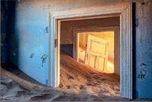
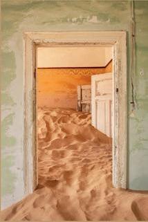
This presentation discusses the elements of an on-going project - James's latest series “Uninhabited”, which will take around four years to complete, due to the slowing down of the world with the global pandemic.
In this series James takes you to some of our planet's best ghost towns, villages and cities. The first images were taken during 2017 in Chernobyl and then during 2019 James visited the UAE, Namibia, Turkey and South East Asia to shoot elements of this project. It is due to be a larger than usual series, due to the fact James visited a large number of locations. In this talk we look at the challenges he faced along the path to capturing beautiful shots. This presentation follow up to his abandoned architecture talk.
James's work has been shortlisted in several international competitions, most recently a category winner for Architecture in both the Chromatic colour awards and the ND Awards 2017, and in March 2018 he was runner up in the Architecture category of the International Photography of the Year competition.
Chair & Magazine Editor
Dr David F Cooke FRPS davidfcooke@btinternet.com
S Secretary
Graham Lingley LRPS cegsecretary@gmail.com
Treasurer Nigel Rea ARPS creative.treasurer@rps.org
Digital Exhibition Coordinator
David Rutter FRPS creativeimage@rps.org
Membership & Communications Coordinator Clive Watkins LRPS creativecomms@rps.org
Webmaster Steve Varman LRPS creative.publications@rps.org
THE TEAM
Online Talks Coordinator
Jan Harris ARPS creative.talks@rps.org
Print Exhibition Coordinator
Moira Ellice ARPS moira.ellice13@gmail.com
Print Exhibition & Event Assistant Nigel Rea ARPS
Print Exhibition Assistant Mick Cant
Print Exhibition (Stamford Hospital)
David Baxter LRPS
Flickr Administrator
David Ryland ARPS david_1@btinternet.com

Facebook Administrator
Margaret Rainey FRPS
Creative Portfolio Group
David Harris ARPS creative.portfolio@rps.org

Facebook facebook.com/groups/rpscg
Or search Facebook for 'RPS Creative'
Exclusive to Creative Eye Group members. We run small, private Facebook peer review groups to exchange images and critiques (up to 8 members per groupl) To join a group, contact Steve Varman at creative.publications@rps,org
FRONT COVER IMAGE
1107831 NO 89: 2022 ISSUE 3 CONTENTS 22
Editor: Dr David F Cooke FRPS ( 11 RPS Creative Eye Group Magazine: No 89 2022 Issue 3 3
© 2022 All rights reserved. Apart from storage and viewing in its entirety for personal reference, no part of this publication may be reproduced, stored in a retrieval system or transmitted in any form without prior permission of the copyright holder. The Royal Photographic Society, the Creative Eye Group and the Editor accept no liability for the misuse of any content or for any breach of copyright by a contributor. The views expressed in this magazine do not necessarily reflect the policies of the Royal Photographic Society or the Creative Eye Group. Unless otherwise indicated, all images are from, and copyright of, the authors.
Registration 16
753 3057 5
For this years exhibition Members were invited to submit up to four images each with one being selected from everyone for inclusion in the final digital display to represent the collective work of the Creative Eye Special Interest Group. The images would form the Exhibition Slideshow on the Creative Eye website and would also be printed in the first edition in 2023 of the Creative Eye magazine.
We received 466 images from 118 members and the Selection Panel consisted of Athena Carey MFA ARPS, Simon Leach FRPS and Viveca Koh FRPS. On a sunny Saturday in early October a closed Zoom meeting took place for the Selectors to examine
and discuss the merits of all images with the intention to identify one image from each member for the Exhibition and also the top ten images to receive one of the awards on offer. These were the Commended, Highly Commended, the three Selector’s Awards, and finally the RPS CEG Gold Medal for the best in the whole Exhibition.
It was a tough selection process which took over nine hours to complete due to the images being of such high quality. The Selectors had a very difficult time deciding which was the best from each Members’ panel of four and much deliberation took place over the technical quality, level of creativity, and emotional
In this issue, we have four articles and and new section, ‘How it was created’ in which members describe in detail how they created one of their images.
For Jan Beesley ARPS (page 5), photography is expressing a feeling, a mood or an impression rather than just reproducing what is in front of her. She enjoys the unpredictability of the results of the techniques she uses and explains her work and how she is drawn towards connections with the natural world. Jan often writes short poems to go with her images and these are presented alongside the images.
Dain Rhys Evans LRPS, (page 11) discusses his quest to find his true photographic sense of place. He realises that, for him, photography is
about self-expression and creating an image true to his vision. He explains how his work developed, where his motivation comes from and he discusses some of his work in detail.
A Sense of Place is the theme of the article starting on page 16 by Dr David Townshend FRPS. For some time, David has been developing a body of work which seeks to capture ‘a sense of place’ through impressionistic images. He describes different ways in which this may be achieved and concludes his article with an image of Morston Quay in which the viewer can sense the strokes of the painter’s brush as an impression of peace and quiet is created but you realise that the creator is using a camera and not a paintbrush.
communication and connection garnered from each image. Interestingly the Selectors all very quickly identified the Gold Medal winning image “Abstract Structure” from Rob Kershaw ARPS and it was after several rounds of working through and reducing the number of images that the final ten were chosen.
The Digital Exhibition is now live on the Creative Eye website and will also be shown at photographic societies including Edinburgh and Smethwick.
David Rutter FRPS CEG Digital Exhibition CoordinatorStarting on page 22, Andrew Barrow MA FRPS tells us how he produces images using a broken lens which doesn’t focus properly. For Andrew, it is the abstraction of the resultant images that appeals to him. By contrast, his studio work has been inspired by 17th Century still life images. He says that he can only produce images if he works to a specific brief and he uses the The Washing Line Project as an example of this.
I hope you will find the content of this issue interesting and that you enjoy reading articles and how three of our members have created their images. I hope too that they will inspire and encourage you to develop your own photography.
 Jan Beesley ARPS
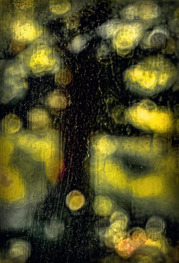
Through the Glass
Like many photographers my photographic journey has been a long and winding road. I never really thought of myself as a “photographer” while growing up, but looking back, I realise I have always been taking images of one sort or another.
As an adult, I started to become more serious about photography, I explored many different genres, but in retrospect, I can see that there was a common thread in that I was trying to express a feeling, a mood, or an impression rather than a direct reproduction of what was in front of me. Inspired by both artists and photographers I want to be able to paint with my camera in a way that I can’t paint with a brush!
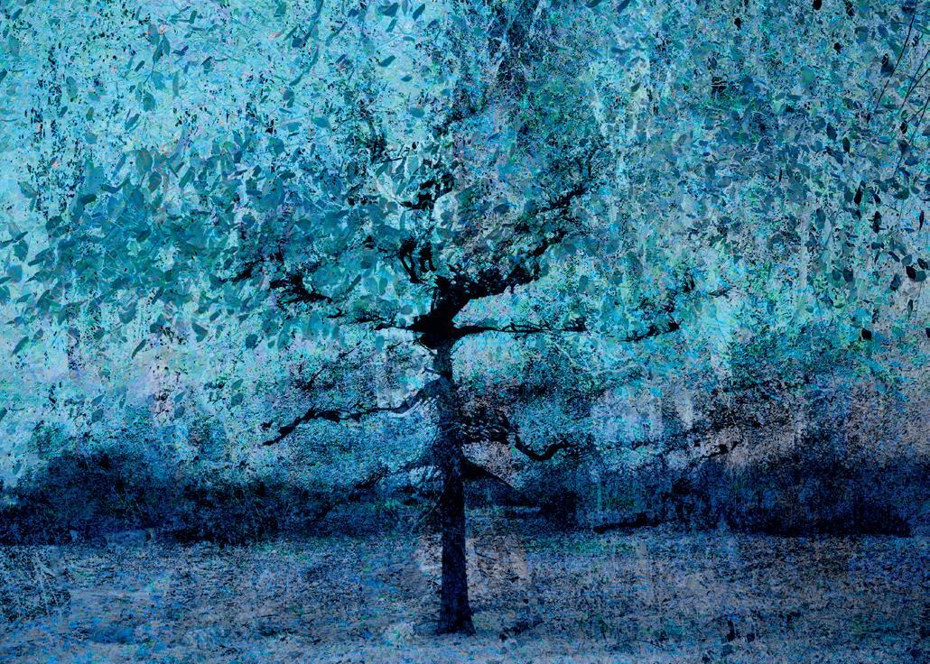
Chill winter trees mourn the passing of summer leaves, from their outstretched boughs. Yet in those dark branches, sleep the sharp green buds of hope.
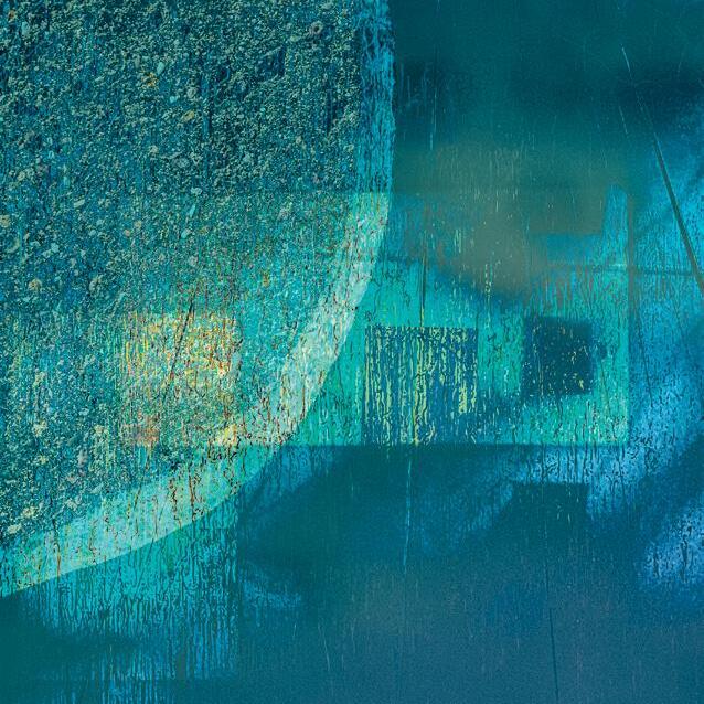
Wanting something slightly different I found myself drawn to obscured views, distortions, and reflections. My Associateship panel used images focussed on the dust on the windows of my summerhouse. By focussing on the dusty surface, the landscape beyond became abstract.
However, it was the discovery of techniques such as intentional camera movement and multiple exposure that really opened a creative door for me. I love the fact that the results are unpredictable and hard to replicate, I love the whole process of experimentation and the fact that there is no right or wrong in the world of abstraction.
I recently took part in a year-long exploration of the intersection of photography, abstraction and creativity under the tutelage of Valda Bailey and Doug Chinnery. Without doubt this has inspired me and helped me to find my voice creatively, although that voice is ever changing and hopefully evolving! My work leans towards abstraction but is not fully abstract, nor is it fully impressionistic. Doug and Valda describe this type of work as photographic expressionism which seems the most appropriate label to use, if indeed a label is needed.
The earth blooms yellow hopeful songs fill still chill air new promises made.
Living between the South Downs and the Ashdown Forest in Sussex I am inspired by my local landscape and the subtle changes which occur throughout the seasons.
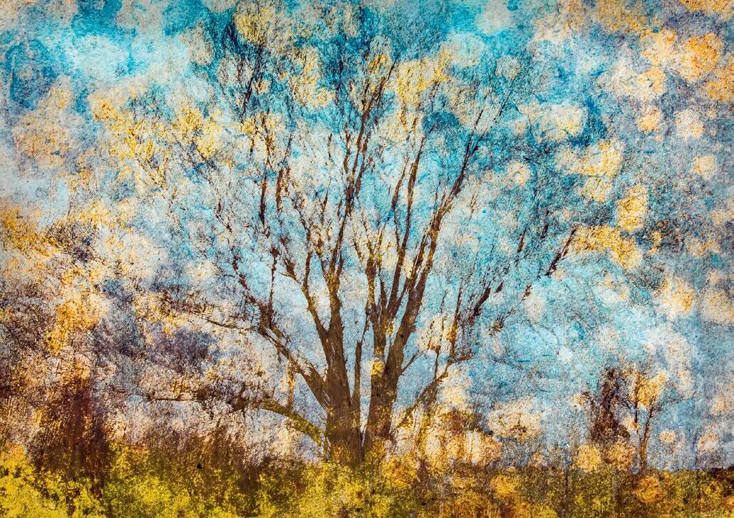
By connecting with the natural world, we experience time in a more elemental way than the human constructs of hours and minutes. The broad sweep of seasonal changes is made up of many tiny moments of change. A moment can be the time it takes for the shadow of a cloud to pass over a hill, or for a leaf to fall from branch to earth. In those moments of connection, the ticking clock is stilled. People describe this feeling as being “in the moment” or of being mindful or in a state of flow. For me, those moments are what photography is all about and those are the feelings I seek to express.
It is impossible to say where the boundaries of a moment lie. Each moment has a resonance of its past and a foreshadow of its future. For instance, a bare tree in winter contains within it the new growth of spring, the nourishment of summer and the release of autumn. Using multiple exposure is one way to represent these different aspects within one frame and this is the approach I took in my series Turn Turn Turn.
Days lengthen the sun gives green to the eartha skylark sings.
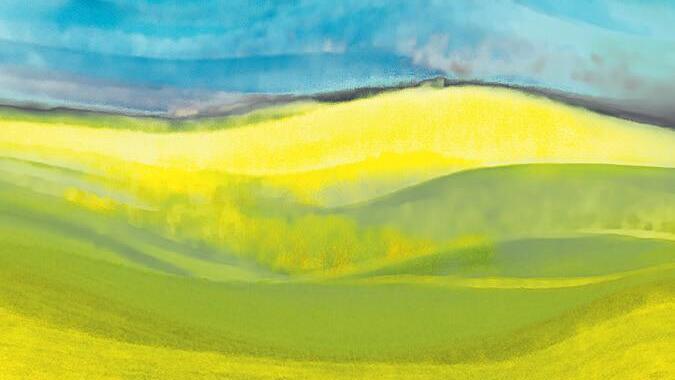
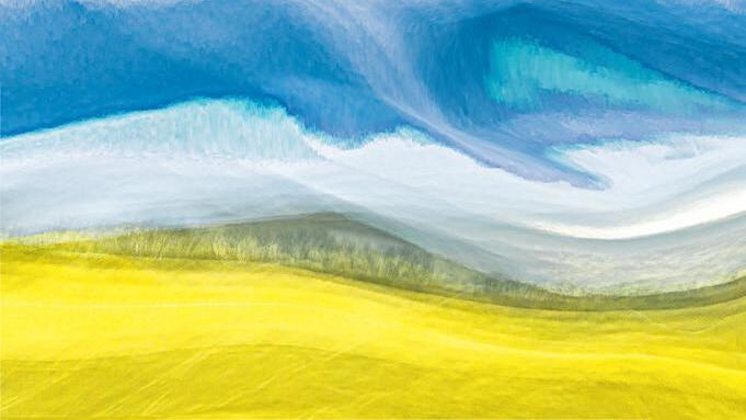
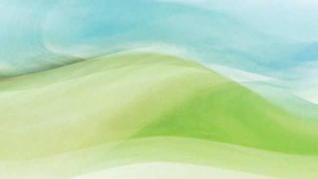
Intense skies, fleeting shadows, all storms pass.
On the other side of the hill the sun is always shining and the sky forever blue.
Summer gathers her skirts and prepares to flounce from the stage
The colours of the earth slowly shake themselves awake.
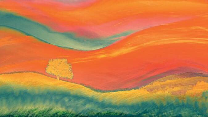
I quite often write short poems to go with my images to try and represent that moment of connection in a different way. I know many people shy away from even titling their images and I fully understand why, but for me the words are important too. Bringing words and image together in such a way that one doesn’t overwhelm the other is something I am still grappling with, so I am venturing into the world of hand-made books which is something I find challenging but also very satisfying.
Sometimes my images are a more straightforward response to shapes, light and colour and what those things intuitively suggest. The South Downs have long inspired artists and writers with their sinuous curves and ever-changing contours as the shadows paint the hills. A current and ongoing project is to try and represent something of their essence through my photography. I use ICM and multiple exposure to bring to the fore the shapes, shadows and colour to express feeling and mood.
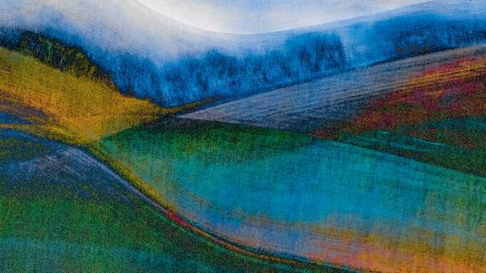
Human interaction with the natural landscape is another area of interest, particularly when that intervention is gradually reclaimed by nature. A recent visit to the Sound Mirrors at Denge provided much inspiration. The concept of these huge concrete structures mutely “listening” is intriguing. They are megalithic monuments to human ingenuity which were sadly never used due to the subsequent development of radar technology. Yet these structures stand as proud and intriguing as the pyramids at Luxor. I was drawn by the sheer scale and the pleasing geometry of their shapes, which I have expressed through the use of multiple exposures.
I mentioned the year-long course with Bailey Chinnery – the culmination of this course is to be an exhibition at the Horsebridge Gallery in Whitstable Kent, during November 2022. The Abstract Rhythm and Blue Notes exhibition will be a celebration of photographic expressionism featuring the diverse and creative work of 14 artists from across the globe, alongside work from Doug and Valda. There will also be talks and workshops. I am very excited to be involved in this and having seen the work of the other artists involved can safely say it promises to be quite an exciting event - so if you are interested, please do come along and see us. All details on the website at https://arbnexhibition.co.uk
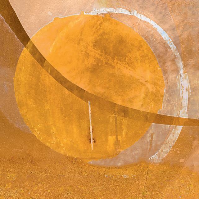
You can see more of Jan’s work at: https://janbeephotography.com/ and https://www.instagram.com/jan.beesley/
Tounderstand where I am now, I need to start at the beginning. It took me a long time to find my true photographic sense of place, which, ironically, turned out to be where I began.
At school, in the late eighties, in order to fill up my timetable options, I chose a new photography course that was being run by my current art teacher. My father had always had an interest in photography and so it was his suggestion that I try taking it. My artistic abilities up to that point had -been, let's say sparse, but I was creative, and I felt a desire to express myself.

The initial lessons I remember were rather flat and being sent out onto the streets armed with a rather beaten-up 1970s film camera and told to “take pictures” really didn't help. I needed inspiration and guidance. Fortunately, that appeared soon after in a film we were shown during one lesson about the history of photography. Watching established photographers talking about their work and seeing their pictures made a connection. Suddenly I realised what photography was all about, it was self-expression, creating an image true to one’s vision. This holds for all photography I believe. Nature,
editorial, street, Fine Art, etc. all rely on the photographer’s ability to channel the scene in front of them through their own unique creative 'filters'.
My photographic work at school then took on a new lease of life. I was excited by having an artistic outlet that allowed me to quickly produce a picture without needing a skill in drawing or painting. I still have the negatives: vast apples the size of a house sitting in farmers’ fields created by double exposure, friends’ faces solarized and reticulated. I loved those early days, the experimentation and the
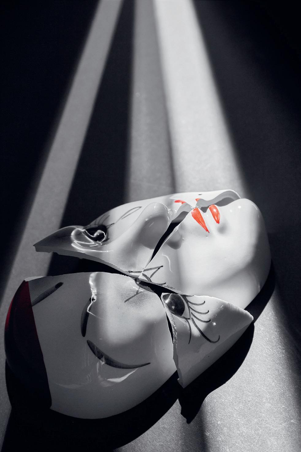
freedom. Working within the art department, and taught by my art teacher, created a wonderful hybrid environment that infused my photography with a strong artistic bias. However, as so often happens, life then took over, jobs limited my time, and photography as a career was never seen as viable, though I worked in photographic retail for a number of years and tried my hand at editorial work. The previous desire to express myself photographically waned, until the sad loss of my parents. It was only then that I felt a need for a creative outlet again even if only for my own benefit. A
decorative Pierrot mask that had fallen, broken and was sitting waiting to be thrown away immediately connected with how I felt. A shaft of light coming from a nearby door provided the rest of a picture ('Broken') that said more than I could ever say in words. Since then, I haven't looked back. Photography, again, provides me with a way to say something and the intervening years have provided much in the way of inspiration.

My motivation comes from a variety of sources. I'm often inspired by music, song titles or lyrics. The
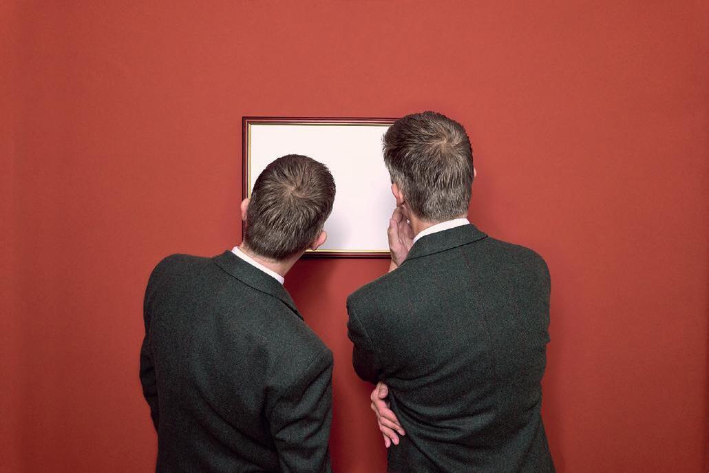
emotion behind a song often acts as an open invitation to illustrate it I find. It's no surprise that album covers have always been a real joy for me, I love the connection between music and art, sometimes literal, sometimes obscure. It's this masking of intent I often find appealing. Images have depth and interest for me when they can be seen from different perspectives, or with hidden meanings. 'Your shirt, on my chair' inspired by a line from a song by Laurie Anderson, is a good example. A shirt casually draped over a chair is simple enough, but for me it
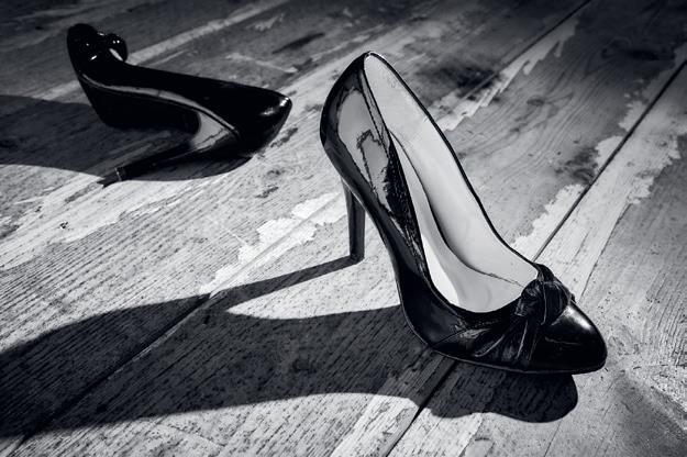
Your Shirt on My Chairposes questions particularly in the context of the title. Why is your shirt on my chair? There's an underlying suggestion of intimacy with a hint of casual impermanence that I find intriguing. What's the story here? This idea of a narrative runs through much of my work. The strong, architectural, almost defiant foreground shoe in 'Jacqueline' contrasts with its discarded counterpart in the background. This, for me, sets a scene from an unknown, yet engaging plot.
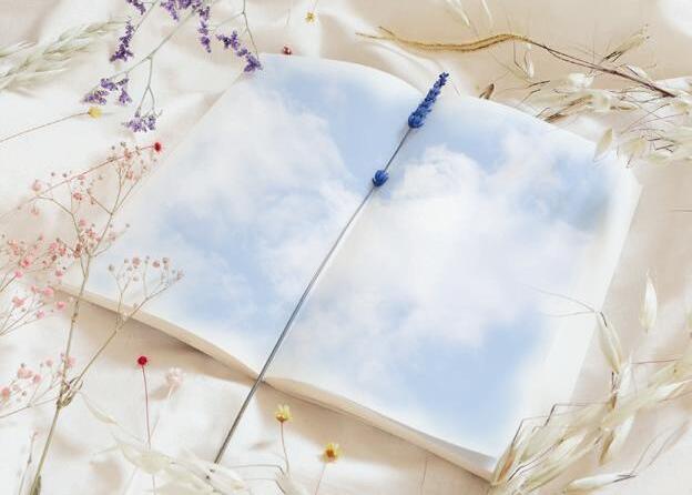
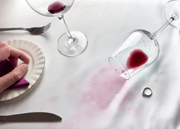
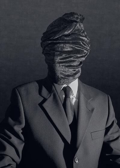
'First Goodbye', another song-inspired piece, tells a rather more literal tale of love and loss, but always, I hope, there is an intrinsic desire in the pictures to make a connection with the viewer. Something that reaches out to them and touches past-memories, experiences, hopes and fears. However, not everything I do has to be so 'deep'. Sometimes it's a joy to create images such as 'Calico Days' inspired by the events on a beautiful early spring day or 'Trick of the Night' which came from a walk home through the atmospheric dark streets of London on a rainy night. In a similar low-key style, 'Not One of Us' seeks to pose questions around the theme of personal identity and how it is abused and masked by others in order to segregate.
Technically, I work very simply using objects I have around me or I can easily procure. Twin continuous lights in various combinations take care of the lighting, though I prefer to use sunlight where possible, as it has a unique quality I find difficult or impossible to get from artificial lighting. I used to shy away from compositing, preferring to do it all 'in camera', but now I'm more inclined to composite images if it's the only practical way to achieve the shot. The final look of the picture is probably the part I spend the most time on, cropping and grading the image until it
 Jacqueline
First Goodbye
feels 'right' – there is no preset method, just trial and error. Some images I think look best in a cinematic style, often because that's how they were originally envisaged as in 'Letters About the Weather', for example.


There's a strange sense of
completeness that comes from returning to where you began. It took a long time to travel from the apple in the field over thirty years ago to today's work, but the distance is practically zero. Those aspects of photography that inspired me all those years ago inspire me today. If I can express myself through a
photograph then I am happy but nothing brings me more joy than seeing someone else make a connection with it too.
You can see more of Dain’s work at: https://dainrhysevans.com
Trick of the Night Not One of Us Letters about the Weather
disparate areas as Lanzarote and the Lake District! (More of these perhaps at some point in the future).
One way to convey ‘sense of place’ is to take a traditional, representational photograph – ‘this is what it looked like when I was there’. And quite possibly you would have the same image as countless others have taken from the same spot.
But there is another way, one that is more fun, produces unique results and adds layers of intrigue and emotion – impressionist photography. Discovering this approach, courtesy of Valda Bailey and Doug Chinnery, has been life changing. I spent my whole career as a scientist, during which time I would have regarded being called an ‘artist’ as a mild insult. Now I describe myself as an artist who creates impressionist and abstract images using the camera as his tool. How things change!
a visit to the Norfolk coast. An early morning stroll beside the creek at Morston Quay – the tide quietly rising, waders feeding at the water’s edge, boats stirring at their moorings, ripples glinting in the low sunlight. Do those words convey a sense of place – could you imagine you were actually there? Does that sense of place bring back memories?
‘Sense of place’ is hard to define (try
googling the phrase) but something I think we all experience. I take it to mean both the intrinsic character of a place and the attachment people have for it. For some time now I have been developing a body of work that seeks to capture ‘sense of place’, not with words but through impressionist images. Much of my exploration has been on the coast, particularly in Norfolk, but I have recently extended it to such
I use multiple exposure and intentional camera movement techniques, combined with blending modes. I compose images incamera – in the field – and complete the images later using Lightroom, and very, very occasionally also Photoshop. A key aspect of my approach is that my images comprise several elements. Because those elements are photographed during one visit to a location, they have an inbuilt sense of that place at that time. Their success depends on spontaneity and serendipity.
I hope my images encourage you to pause and explore. With luck, you might agree that they are striking,
intriguing and sometimes enigmatic, like a halfrecalled memory tantalisingly just out of reach.
Compositionally, the Norfolk coast is quite challenging - trying to create a body of work in a landscape that basically comprises one completely dominant line – the horizon. Much of the Norfolk coast is very flat, not just the sandflats and saltmarsh but also the low clifflines. That is where the creativity comes in!
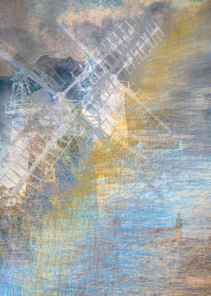
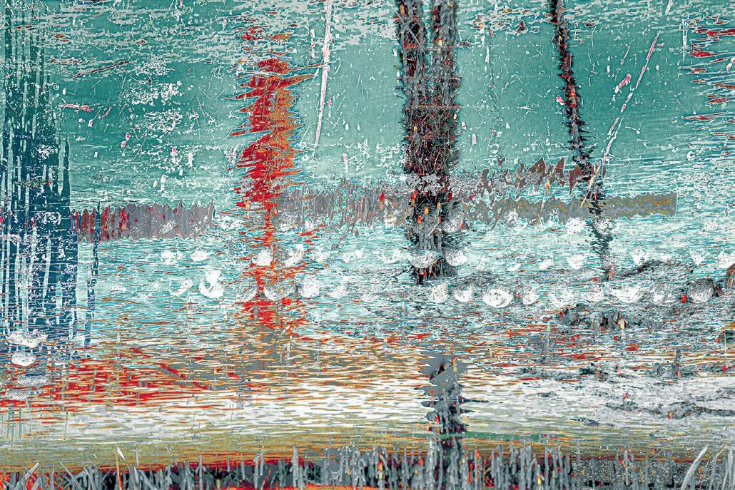
A ‘sense of place’ image might include identifiable elements. Alternatively, it might simply convey the feeling of being there. Image 1 Through the reeds, Cley Windmill is an example of the former. This is my interpretation of an iconic landmark – the windmill at Cley. The image includes impressions of the windmill, the adjacent building and the creek, softened by the texture of the surrounding reedsall the elements of Cley Windmill and its setting combined in one image. Similarly, image 2 Morston moorings is my impression of a seal-trip boat at its moorings in the creek at Morston – that early morning moment described in the introduction.
In contrast, Image 3 Cobbles and creek, Blakeney is more about feeling the atmosphere, but the image
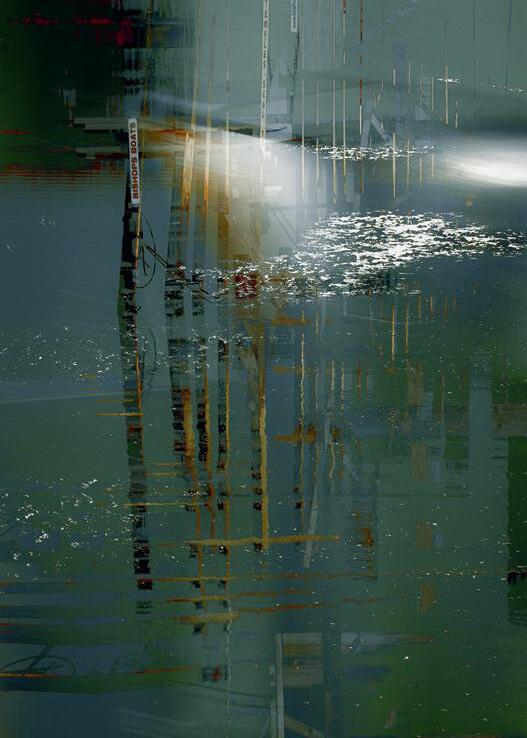
still contains the essence of Blakeney Harbourthe cobbles in the walls of quayside buildings combined with the reeds, ripples and creek, and reflections of the boat masts and rigging –all the elements within one unique and utterly personal image.
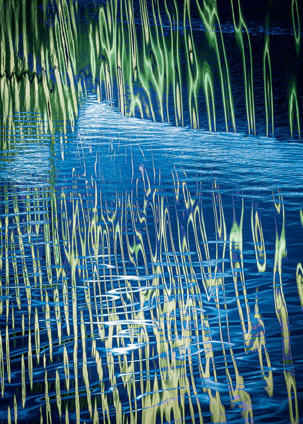
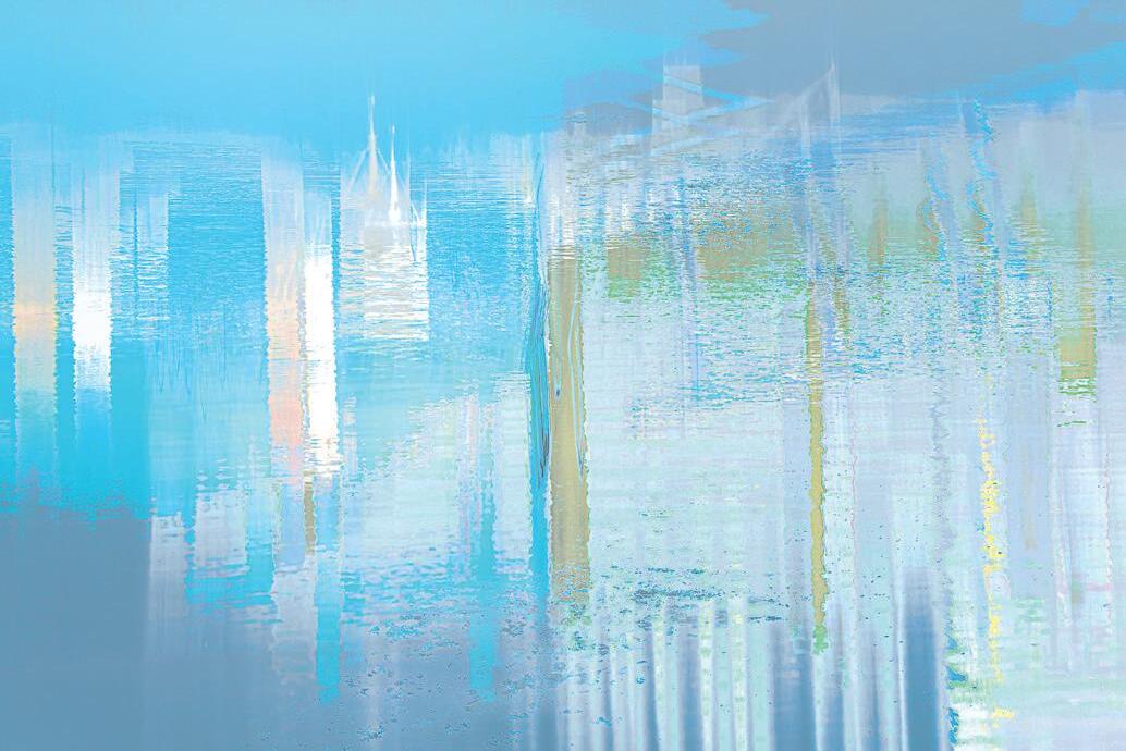
Light, colour and shapes are important to this series of images, as too is water. Water provides patterns, reflections, highlights, distortions, impressions, all of which change with a gust of wind, the passing of a cloud or the ebb and flow of the tide. Image 4 Vanishing Point is all about water. It captures the feeling of rippling water amongst the reeds as you sit on the quayside looking across Blakeney Harbour towards the saltmarsh. But the lack of specific landmarks adds a timeless element to it.
Does this impressionist approach always work?
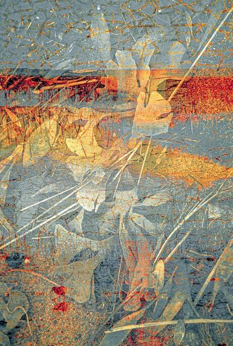
Of course not! There are times when the creative juices fail to run, I feel no emotion and it requires an effort to persist. That is more likely on a bright sunny summer’s afternoon than a bleak winter’s morning. In fact I find that midsummer is best avoided because of the harsh light and holidaymaker traffic jams. But even after a day apparently devoid of creativity, as I review and edit the images on my computer screen something emerges – often through the chance combination of the composition and a Lightroom preset. Serendipity is also my best friend in the field as, for example, in image 5 Strandline. Here we see the essence of a Norfolk saltmarsh – the horizon, some texture from an old, crazed sign, and marram and bladder wrack along the strandline. All elements present at that moment. But serendipity helped make this image into something special, with the chance appearance of a redshank pottering across the bottom of the image.
A photographer friend tells me my images bring back memories of childhood holidays in Norfolk. Such visits to the seaside might mean buckets and spades, windbreaks, the beach, and lots and lots of colour. At Heacham, adjacent beach hut owners compete to have the most colourful paintwork, and their efforts create an overwhelming sense of fun and joyImage 6 Technicolor beach huts.
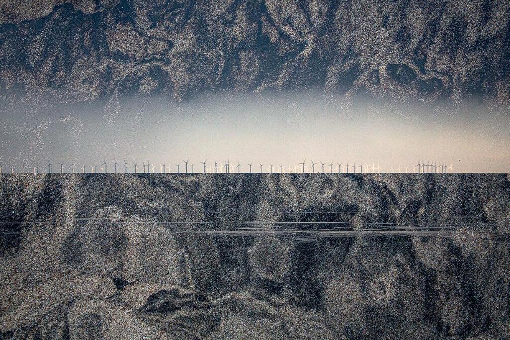
Of course, ‘sense of place’ is not just about holidays and happy memories - it is possible to convey other emotions. Image 7 A sea of windmills captures the sense of place during a dark and windy November afternoon on Holme Beach when the weather began to change. As the sky cleared from the north, the distant wind turbines were lit by the sun, whilst those nearer the coast remained in the shadow of the storm clouds. With the help of the texture of the sandy foreshore, as I stood there I created
a dramatic new seascape.
On the north eastern corner of Norfolk, the coast is rapidly eroding, in places at a rate of three metres a year. In image 8 Happisburgh storm I try to convey the sense of danger and despair as winter storms move the collapsing cliff line ever closer to the village and its church, despite the concrete sea defences.
So finally, let’s return to the calm of Morston Quay. In Image 9 Abstraction you can sense the strokes of the painter’s brush as he
creates an impression of the peace and quiet of that creek in the winter sunshine – but now you realise that he holds not a paintbrush but a camera.
You can see more of David’s work on his website at
https://davidtownshend.com
where you can buy his book Impressions of the Norfolk Coast.

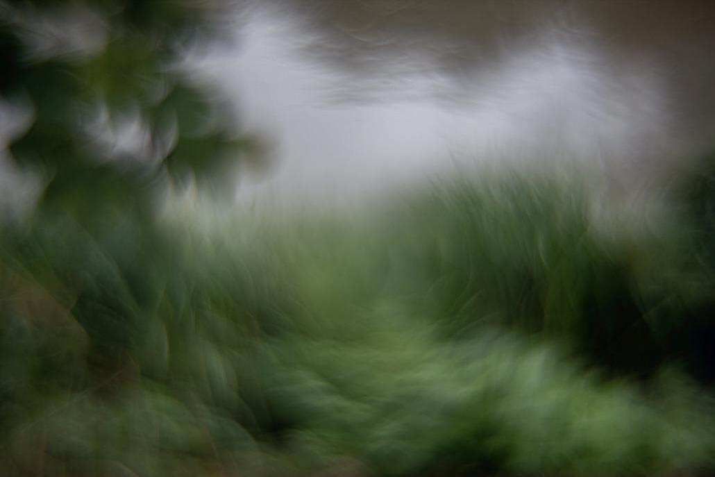
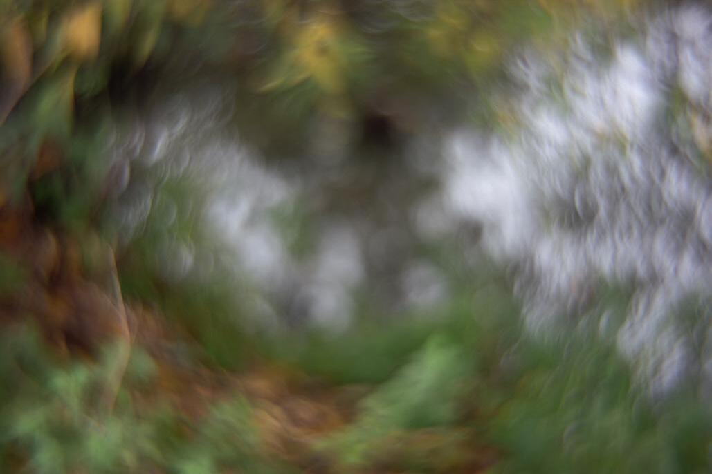
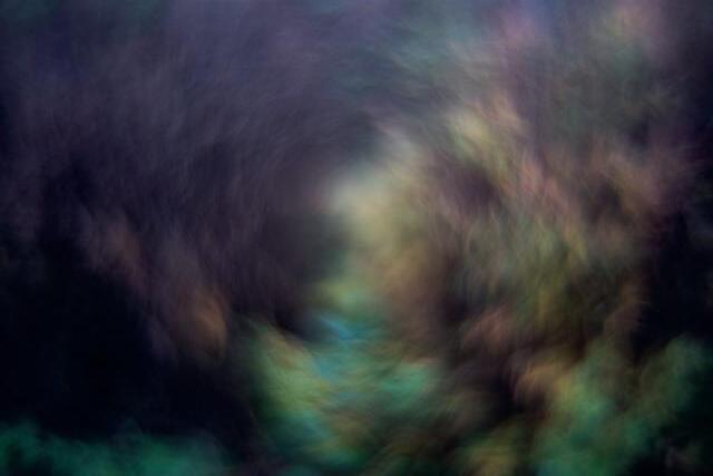
the cluttered shelves in the studio I have, somewhere, a lens that is technically broken. It’s nothing fancy so not worth repairing; a cheap eBay purchase where the listing neglected to mention that it doesn’t focus properly. With the right combination of settings, it can however produce some interesting in-camera effects. Lights such as a string of Christmas bulbs in Florence or Blackpool’s illuminations can form into some totally amazing abstract shapes and
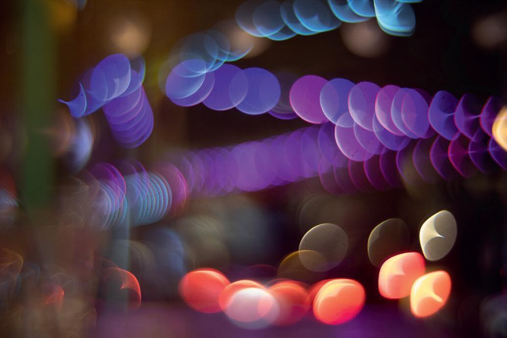
forms. It’s very hit and miss!
When used on other subjects, such as the highly colourful plastic tables and chairs I spotted on a dull overcast day at an Italian road-side café, it makes great abstract ‘impressions of place’ type images – trees and undergrowth along the Thames soften into little more than colours and textures in an impressionistic abstract while those table and chairs become an
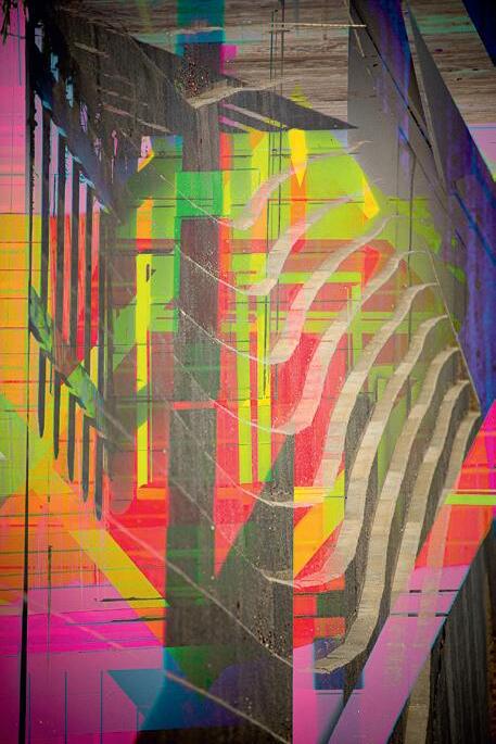
avant-garde image concentrating simply on shape and colour. When used on buildings and street scenes, such as these here taken in Oxford, there is more of an indication of the subject; but it is softened with the image relying on the light and a suggestion of form and line to give a firmer perception of the subject, but one that is still abstract and uncertain. As I said it is a very hit-n-miss affair; many, many images just don’t work.
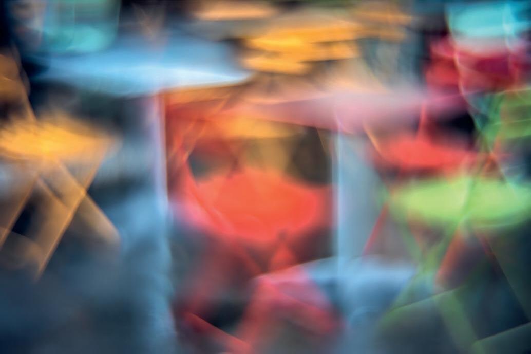
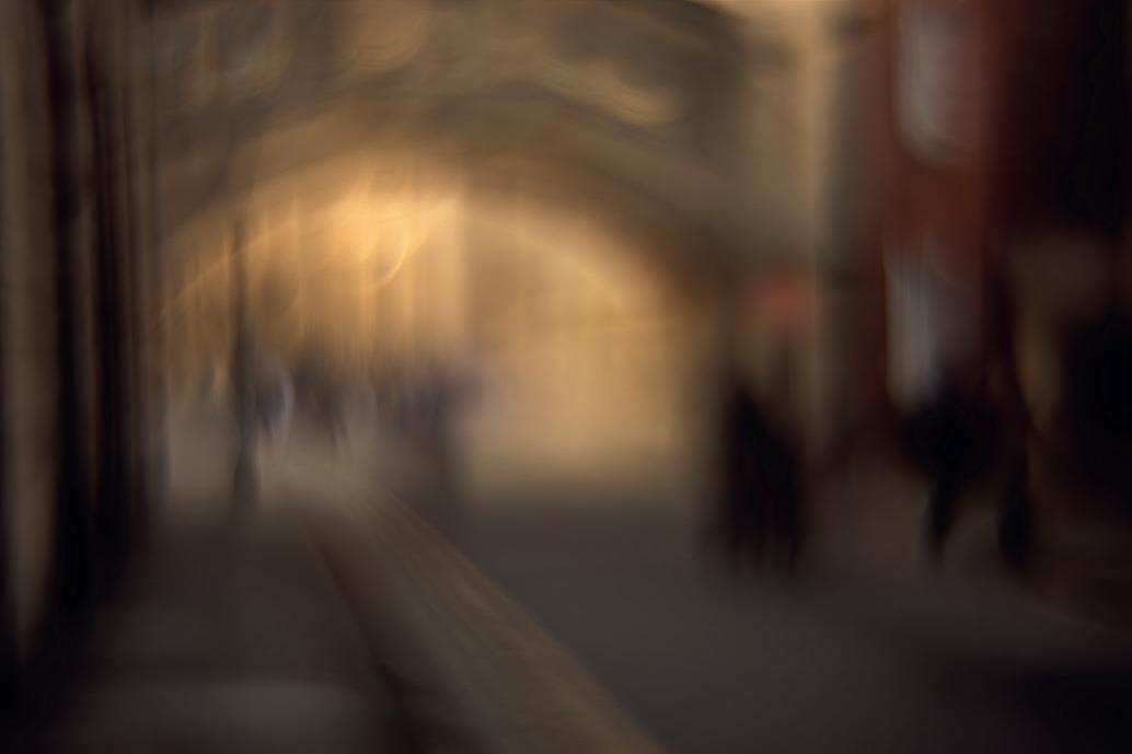
It’s the abstraction of the resultant images that appeals to me, soft forms and shapes that give an ‘impression’ and not a pure photographic recreation of what I am looking at. While many of the images have vibrant colours, the ones that most appeal to me are those with a limited colour palate.
I’m particularly fond of a seascape triptych I created in Blackpool. They were selected to be part of a large photographic exhibition there back in 2019.
My studio work is a total contrast to the impressions of place idea. Here the second-floor gallery in the Ashmolean Museum has provided much inspiration. The collection of 90 still-life paintings by 17th century Dutch and Flemish artists has had a direct influence on my cocktail images – another of my passions is making cocktails at home, so why
not combine two interests thought I – that I designed for an Instagram account.
While I don’t include much in the way of symbolic meaning in this work (such as the transience of life) many of the arrangements and obviously the light (some making use of the natural light, some taken using speedlights and reflectors) are directly influenced. The collection of props, glasses, bowls, and such like reached mammoth proportions. All acquired from scouring charity shops, antique arcades and eBay. I had a huge cull of these props just last month and the shelves in the studio are still overflowing. I’ve a collection of 12 different vintage weighing scales that I used for a series of food still-lifes, just for something different. Of course, the old-masters style is used widely in photography; but one hopes that a personal take on the style manifests
itself over time.
As you can probably deduce, I can only produce images if I work to a specific brief or project. I can no longer just wander off and take random images unless I have a specific project to work to. This, I believe, stems from completing an MA in photography.
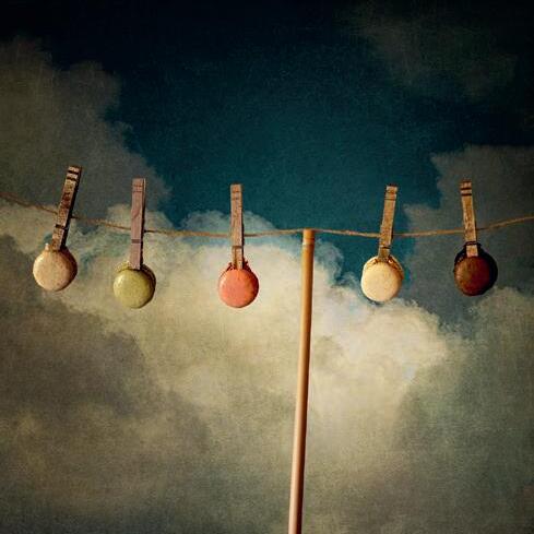
One such project, was the Washing Line Series. Basically, this was food hanging from a washing line. I wanted to create a body of work that was coherent and technically fine but also contained a little whimsy and frivolity.
In reality the washing line was a piece of string strung between two cstands. A table was just underneath to catch any falling food. Grief, that fried egg was messy, but by far the worse were the macarons. All the food was hung from a line and not photoshopped in, as many people
Bakewell Tart, Washing Line Project. It only became apparent later that the butterfly triangle mirrored the shape of the slices.
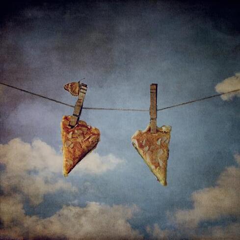
Macarons, Washing Line Project. The most difficult image to take. You won’t believe the trouble and mess this one caused… the number of boxes of macarons I went through to get just five hanging at the same time was many!

Landscape Abstract 1
Landscape Abstract 2
assume. This series was specifically designed for the Fellowship distinction; the statement of intent being:
“The Washing Line Project takes food as its subject but displays the differing items in a way remote from the usual glossy magazine depiction of food. Drawing on elements from old masters paintings the images display an intentional whimsey and humour. There are some that could be interpreted as raising questions of abundance, social distancing, loneliness, but overall, it is general silliness with a quintessential staple of the British garden; the washing line”.
This was the second set of images I contemplated submitting for the Fellowship distinction. The first was a small selection of images I had used for the Final Major Project in the MA. This set made it to an advisory day down in Bristol but as it was put up on the wall, I felt it wasn’t quite right. Whether this was noticeable to the others in the room I don’t know but I felt, as I looked at the images in that familiar 3-line pattern, that this was a project created for a specific reason and trying to shoe-horn it into another just didn’t work. On the back of this I had already decided not to pursue the Fellowship with that specific set. Hence a rethink, some creative plays and idea storming before the Washing Line series became a reality.
The idea was simple enough but involved a lot of walking around my little market town hunting down interesting garden walls, walls with garden sheds behind, clouds, oh so many clouds, and then the little additions such as a small airplane or a Red Kite.
My current projects? Well, I am heading back outside and indulging in some landscape panoramas. Using the elongated format intrigues me. I am not terribly good at landscapes in general so more practice required. I am also waiting on the arrival of a long telephoto lens, something that has long been absent from my equipment shelf. So it will be interesting to see how this influences the type of landscape images I take in the future. Thinking of minimalistic and abstract here I am looking forward to seeing what direction my creativity takes me in the future.
You can see more of Andrew’s work at:
https://andrewbarrow.co.uk/
https://www.instagram.com/andrew_barrow_photos https://www.instagram.com/cocktail.collection

In essence this is quite a simple image with much of the work being done “in camera” with not a lot of Photoshop work. I made the image originally for a “Food” themed competition within my club, Halstead & District Photographic Society.
Props used: A few lengths of old pallet wood as a base, Pineapple, Coconut and spoon. Camera and other equipment: Fujifilm X-T2, tripod, Small flash head (Pro Line 300) with directional honeycomb grid. (Alternatively you could use a continuous light source provided you could control the direction, spread and intensity.)
Silver reflector card. Camera settings: 50 - 140mm Fujifilm f2.8 lens set at 70mm, 1/250 sec @ f8 , ISO 200
I had decided from the start to go with a square format so laid the boards down at an oblique to the camera to create some feeling of perspective, I also decided I wanted soft (ish) directional lighting with a black background. Next, after cutting a section from the pineapple and halving the coconut, I arranged them as seen (coconut propped up with some blue tack) and having framed the image in the viewfinder I took a series of exposures at 1/250 sec without the flash turned on, closing down the aperture after each shutter release until I obtained a pure black frame with the ambient light present. (My native flash sync speed is 1/250 sec.) Then it was just a case of switching on the flash unit and adjusting the power output to achieve a pleasing exposure. The lighting came from the left-hand side of the image with a slight downward angle, a silver reflector card on the right-hand side bounced some light back into the pineapple. A further refinement was to place some tissues between the flash and the honeycomb grid to soften the directional lighting. When I was happy with the basic setup and lighting it was just a case of chopping up the slice of pineapple into chunks and placing them on the boards, grating some of the coconut and sprinkling this over the chunks, in the coconut half, and placing a pile on the boards. The spoon was an afterthought to fill an empty space and act as a lead in to the image.
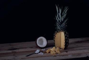

A few minor tweaks in Photoshop, bringing up the shadows, taking down the highlights a fraction, some colour correction, a bit of sharpening and some clone tool work to remove unwanted spots and generally tidy up.
At this stage I thought I had finished, but then I noticed I had a large blank black area which I thought would be distracting, so I thought a photo of the image on the wall would do to fill this. Aside from the minor tweaks as described, this photo on the wall was really the only Photoshop work in the whole image, I duplicated the image created so far onto another layer, and then made a rough photo frame using the pallet wood, which I then photographed in daylight on a plain surface, made a selection and cut the frame from its background, then imported this on a new layer. The frame layer and the duplicated layer were grouped together where I resized the image to fit behind the frame, resized the combined photo and frame to fit into the available space and finally added some perspective with the transform tool, a little gaussian blur to move the new photo layer into the background. I could have continued to resize this layer group and kept adding it to the resulting image on the wall, but thankfully decided to stop where I did, or I could have gone on into infinity!! And beyond?
 George Heath LRPS

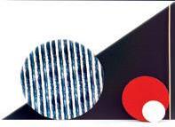
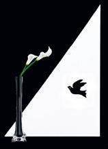
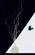
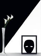
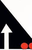
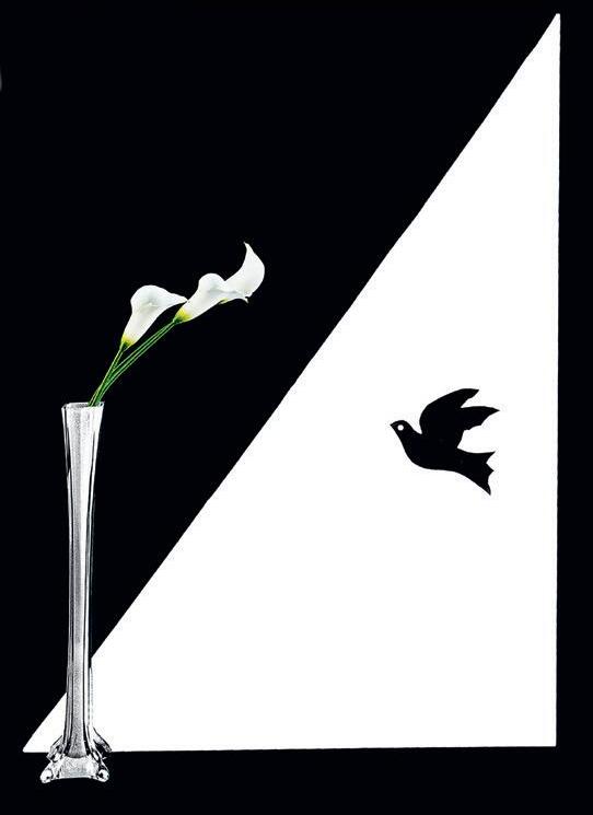
As many people in my local photographic region know, I do have a particular style in the Still Life genre. I don’t follow the traditional bowl and flowers type of still life beloved of great artists. Therefore during the two years when we were restricted to our homes I started looking at different shapes. I began playing around with cardboard shapes in black and white (see Figure1) then sometimes I added colour until I decided that the triangular shapes in black and white were what I wanted to use as the background to the image that I was trying to get in a quite simplistic and minimal style. I experimented with various props and flowers, trying to find an arrangement that worked well together, Figs. 2 and 3. In Figures 4 and 5 I was trying out various scenarios, adding a mask and picture frame or a vase and some twigs. With Figure 6 I was almost there but the black coloured vase did not work against the background so I changed it to a white vase, and slightly repositioned the bird. After a few minor tweaks in Photoshop, I don’t do a lot of post processing, I had the final print.
I use a Sony Alpha 6000 camera tripod mounted with two lenses - 16 to 50mm and 55 to 210mm varying their use to suit what I am trying to achieve. My studio is the conservatory at the back of the house and because the roof gives diffused light it is pretty good for lighting my subjects. I can always adjust the blinds on the windows to either cut out or increase the amount of light I need.
 by Katherine Rynor ARPS

I create my images either from my imagination or a work of art I might see and would like to create the image photographically using my camera and Photoshop.
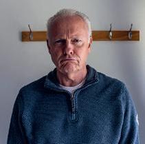
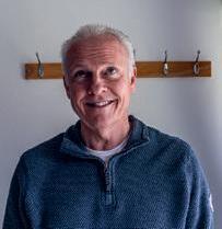
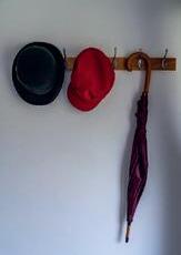
My first images were Images 1 to 4.
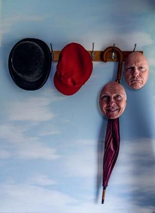
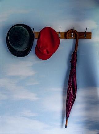
All the 4 images were shot at the same time using the same natural side light from the window, so the shadows and exposure create a believable surreal image! Next, I added a sky background in Photoshop and used the blend Mode Soft light, Image 5.
Next, I cut out the faces and added a bevel and emboss using layer Style in Photoshop, to create the

mask impression of the face, then I added a drop Shadow also in layer Style, matching the shadow direction with the umbrella that was hanging on the peg, Image 6.
I then added the image of the man taking the Happy Face. I cut out just the man from the original image and added it on a new layer in Photoshop, Image 7.
Next, I cropped the image at the top and added a Texture layer in Photoshop and blended the image using Multiply in Blend Modes, Image 8.
Initially I was happy with this final image however I decided I wanted to make the man’s face blank as he was putting on the Happy Face, plus
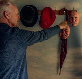
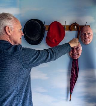
I thought his jumper was maybe too blue and overpowered the image.
Also, I thought the image was too saturated so I added a Hue and Saturation adjustment layer and desaturated mainly the skin tone, which was too yellow.
Then, using the Cloning Tool, I cloned skin from the man’s face to cover his features to give him a blank face, Image 9.
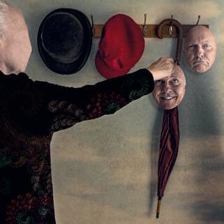
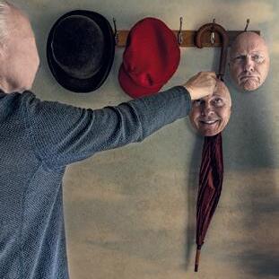
Next, I cut out the blue jumper and made a separate layer with just the blue jumper. Using an image I had created in photoshop of a clockface using the Fractal Technique where you take just one image and replicate it again and again and form patterns, Image 10. I clipped the
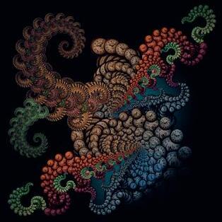
Fractal image onto the cut out blue jumper and blended the two images using Blend Mode Multiply, Image 11.
Finally, I completed the image with a vignette.
Dr David F Cooke FRPS
(Editor)davidfcooke@btinternet.com
Website rps.org/ceg
Social facebook.com/groups/rpscg flickr.com/groups/rps-creative
