

THE MAGAZINE OF THE ROYAL PHOTOGRAPHIC SOCIETY DIGITAL IMAGING GROUP Number 98 2023 Issue 3 DIGIT

Details of all Digital Imaging events are available on its website at bit.ly/RPSDIEventsListingOnline


5 Rounds throughout the year; each a different topic – 6th Round is the finals. Members vote for the 5 winners in rounds 1 to 5. Online viewing of the finals, with eminent selectors making the Awards. New easy to use image submission web site. You can check the voting scores and view the gallery following each round. Round 1 subject announced on 1 August 2023.
Subject is – Flora and/or Fauna (insects included, but not domesticated animals)
Submissions open 1 October 2023
You have the chance to be one of the top 5 winners each round, who will be featured in DI Online. You do not have to enter each round to ultimately become one of the finalists. Whatever your style of work you can enter each round. Mono, coloured, toned, ICM, creative - whatever you wish.
The round topics will be announced 2 months prior to the submission date.
For full informatoin, to read the rules and FAQ go to www.rps.org/di/di-competition.
Janet Haines ARPS (Chair) digchair@rps.org
Trevor Pogson LRPS (Treasurer) digtreasurer@rps.org
Jocelyn Edwards LRPS (Secretary) digsecretary@rps.org
Melanie Chalk ARPS (Workshops and DI Online) digworkshops@rps.org
Dennis Knowles (Accolade Editor) digaccolade@rps.org
Kenneth Ness FRPS (DI Comp Sec) digcompsec@rps.org
Jean Robson FRPS (Membership and eCircles) digmem@rps.org
Holly Stranks FRPS (Accolade) hollystranksphotography@gmail.com
Neill Taylor LRPS (Online Events) digevents@rps.org

Martin Tomes (T-W-T development) twt@rps.org
Lois Wakeman LRPS (Web Editor) digweb@rps.org
Rex Waygood (Events) digexpo@rps.org
CO-OPTED
Gary Beaton (DIGIT Editor) digiteditor@rps.org
Sylvie Domergue (International) sylvielft@gmail.com
Deborah Loth (Casting Director) digcomms@rps.org
Booker T Skelding bookertskelds@gmail.com
DI CENTRE COORDINATORS
Southern
Dr Barry Senior Hon FRPS 01425 471489 digsouthern@rps.org
2 Group events
3 Contacts
4 From the chair
Janet Haines
4 Editorial
Gary Beaton
5 Underwater photography
David Keep FRPS
10 Abstract photography - a personal view
Lois Wakeman LRPS
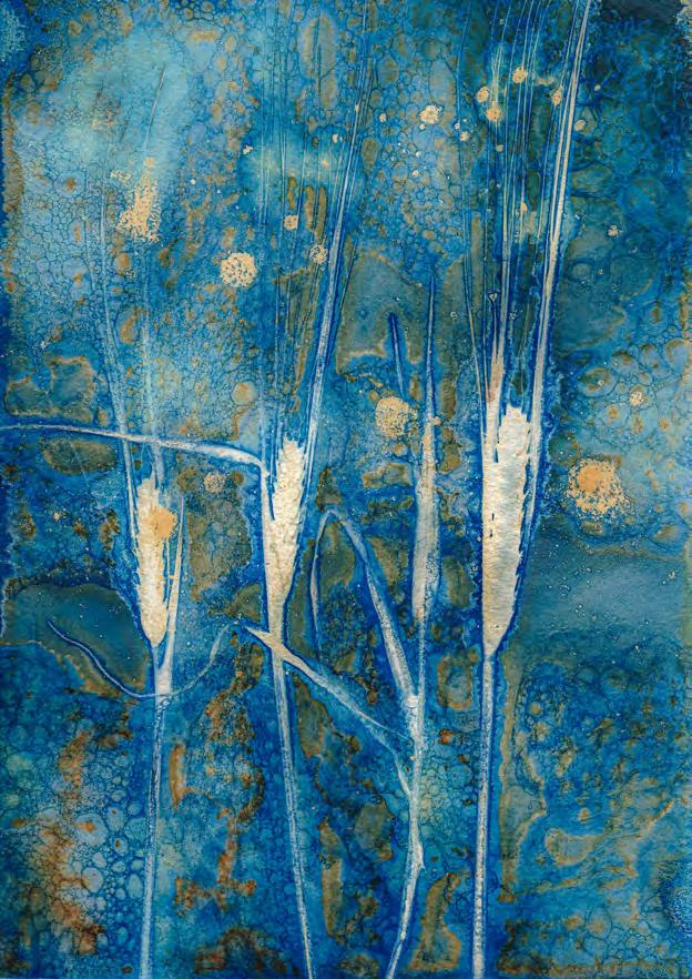
16 How To Make Cyanotypes
Alan O’Brien ARPS
20 Astro-landscape photography
Dave Lynch
25 Travel photography close to home
Kath Phillips ARPS
29 Project: The Huskar pit tradgedy 1838
Wendy North
32 DIGIT Challenge: 2/10,000th of a league under the sea
Evelyne Peten
33 DIGIT Challenge: A Tower Reading
Neil Wittman ARPS
35 In previous issues
Cover image by David Keep FRPS
© 2023 Apart from storage and viewing in its entirety for personal reference, no part of this publication may be reproduced, stored in a retrieval system or transmitted in any form or by any means, electronic, mechanical, photocopying, recording or otherwise without the written permission of the Editor. The Royal Photographic Society, RPS Digital Imaging and the Editor accept no liability for misuse of any of the content or for any breach of copyright by a contributor. The views expressed in this magazine do not necessarily reflect the policies of the Royal Photographic Society or of RPS Digital Imaging.
Unless otherwise indicated, all images are from, and copyright of, the authors.


How often have we Members talked about ‘them and us’ or other variants on that theme? Sometimes we are referring to the staff v the member groups; at other times perhaps the Trustees are the ‘them’ to ‘us’. Often, we see little or no cohesion between the Special Interest Groups (SIGs). Regions that hardly ever work with each other or SIGs. Then there are the International Members; out there somewhere but due to time zones or the Society being too UK centric, feeling marginalised. But things are changing and changing for the better.
At the MemCom (Members Committee) to which every Region and SIG are invited to send along their representative, we now spend 50% of our time cross referencing ‘best practice’ and hearing about how various Groups or Regions operate – learning from one another, with the aim of delivering better programmes for the members.
DI is currently working with the Landscape group on the Talk-Walk-Talk (T-W-T) project, which is proving to be very popular with UK members not just our own SIG members. In one or two cases Regions have engaged with the programme too. As we take this programme to the next stage we sincerely hope that more Regions will join us, plus we will make it available to International members.
In this issue we have a fascinating selection of both images and techniques to try or simply enjoy. David Keep shares some of his favourite and stunning underwater shots and describes how he captured them. Lois Wakeman shows us how beautiful and thought-provoking abstract images can be found all around us, and in the most unexpected places.
Digital imaging has enabled us to manage image capture and processing entirely on devices and screens. But Alan O’Brien has been going back to basics and experimenting with one of the earliest photographic processes with a twist - wet cyanotypes. And although each of his unique cyanotype prints is beautiful in itself, each could form the basis for further digital manipulation.
Dave Lynch takes similarly beautiful images of the night sky and manages to combine these with landscapes and buildings. He tells us of a trip to the
DI is also now engaging with the RPS House Education department and working on how to co-ordinate our workshop offerings. We will have common documents and evaluation processes. In this way we can ensure that the standards are maintained across the organisation. You will start to see joint promotions. We are slowly closing the gap on the ‘them and us’.
Members may have a loyalty to a specific group or region, but at the end of the day if they see a special meeting they fancy being offered by a.n.other group then rightly they should join in. Each of us is first a member of the RPS, secondly may choose to be aligned with a Group, or by default of where we live, a Region or Chapter. As individuals we should take advantage of the wide variety of that which is on offer across the spectrum of the RPS groups.
Regional Organisers, SIG Chairs, Chapter organisers and staff should all now embrace working together for the total good of both the Society and the Members. Whenever there is an opportunity to deliver something better together for the benefit of Members we should all try to ‘mind the gap’ and continue along the path of closing it all together. Only if we work unselfishly and openly with one another will the Society thrive and prosper.
Isle of Harris to celebrate his wife’s birthday, which just happened to present an opportunity to take some images of the skies...and lighthouses.
Kath Phillips shows how we don’t have to travel far to enjoy travel photography. And that ‘travel’ is not necessarily just geographic distance but can also be time.
Wendy North tells us of a photographic technique that she was trying and a camera club conversation which prompted an almost year-long project resulting in a flag book documenting a local mining accident. The great news for those that like to display their work in physical form is that Wendy has promised to tell us more about how she created the book in a future issue.
Our two Challenges in this issue, from Evelyne Peten and Neil Wittman, show us how we can each stamp our own individuality on our work.
As ever, I hope you enjoy reading it as much as we have enjoyed curating it.
The sight of wildlife in the seas and oceans is beautiful and largely reserved for those who dive in the waters. But, if we do not dive, the next best thing is to share beauty with others through photographs. David Keep tells us how he does just this.
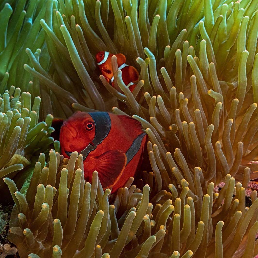
Underwater photography combines the two things I’m really passionate about - diving and photography. Given the chance, I would do it every day. I’ve been a scuba diver for over twenty years and
as I became more interested in photography it was a natural progression for me to shoot and share the incredible sights I’ve seen underwater over the last two decades. This is what I
especially love about underwater photography: as with all things, if you see the extraordinary enough times, it becomes ordinary and you stop seeing it through the eyes of someone seeing it for the
first time. But, with a camera in my hand, I can do that all over again. I took the plunge seven years ago. I realised I would be learning about a specialised and technically challenging form of photography. I also knew I would have to spend a fair amount of money acquiring the best possible kit to enable me to achieve quality shots. Unfortunately, underwater photography is pretty technology dependent if you want good results. I would be misleading you if I said otherwise. Of all the branches of photography I have tried, this one makes the most demands on your kit and there is no doubt that better results come from good kit. Yes, you still need good technique, but I am afraid that without the right gear it is going to
be a struggle.
I use a Canon 5DS R in a Nauticam underwater housing. Really important additions are the two powerful strobes (flashes) that restore the colour back into the underwater scene. Water filters out colour from sunlight and the deeper you go the more colours disappear, that’s why many underwater images appear grey and colourless. The colour is there but the camera cannot record it. The strobes bring artificial sunlight and restore colour. Getting sufficient light on your subject is challenging, but the angle of the light is also important if you want to show all the glorious details. Flat light does not show them off at their bestbut this is when being underwater
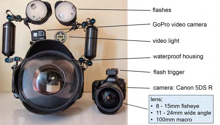
is an advantage. The strobes are mounted on two articulated arms, giving a reach of almost 1m from the camera per strobe. It’s easy to position them, and indeed yourself, to get the best lighting effect, because you can move effortlessly in all three dimensions. On land we would have to alter tripods and off camera flash stands, but underwater it can be achieved quickly without difficulty.
My workflow is to decide camera settings, manually alter the strobes for the required light intensity and then think about the direction I want the light to hit the subject. With practice it becomes second nature to be honest. It wasn’t too difficult to adapt my diving style to photography, but I soon discovered that underwater currents are your main enemy. It’s difficult to free up the mental capacity to select the correct camera settings and composition when you are holding on for dear life to stop yourself being swept away! But, as composition is everything in photography, you must find a way to remain stable so you can frame your picture. This usually involves jamming yourself into some crevice or holding the camera close into your body so you can stabilise it.
I try to tell stories with my images, so I look for situations that help convey the character of my subject and (I hope) allow you to make a connection with the creature. Here are the stories behind four of my favourite underwater images included in my FRPS panel.
The two weeks I spent in the Bahamas photographing sharks was, without a doubt, one of the best trips of my life. For sheer adrenalin-pumping excitement, it cannot be beaten. I deliver a talk on underwater photography to local camera clubs and natural history groups and it is always the shark section that makes people sit up the most. I use the opportunity to present sharks in a positive light as
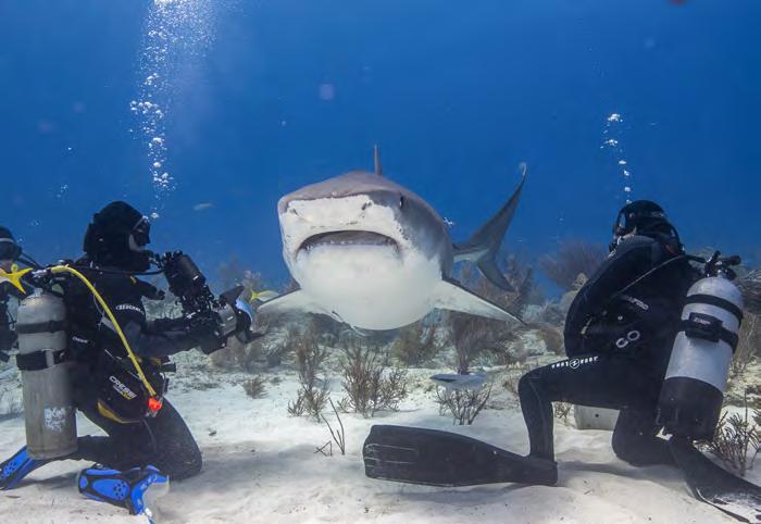
I actually find them graceful and gentle.
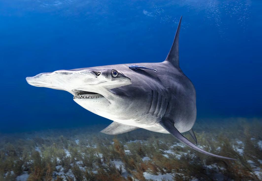
The thriller movie Jaws has a lot to answer for - sharks are not the maneating killing machines they are often portrayed as being. Having previously photographed tiger sharks in this region, it was shots of great hammerheads that I was after on this occasion. The unusual shape of their heads puts their eyes further apart, making them great hunters, particularly in low light. I found that they were difficult to photograph because to show the head in all its glory the body often ends up at an awkward angle but I got lucky with the shot I included in my panel and feel it shows the power and beauty of this remarkable fish.
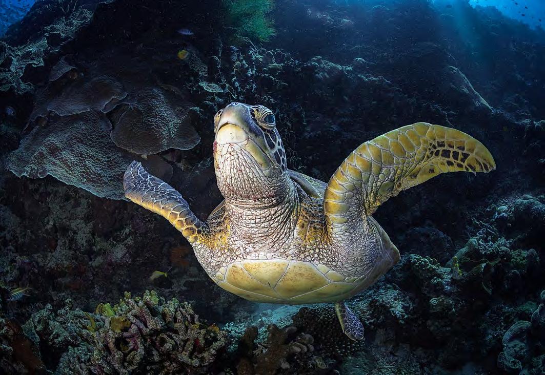
The green turtles of Bunaken
I travelled to the Indonesian island of Bunaken specifically to photograph green turtles because they are abundant there. Whenever I come across turtles on dives I am always struck by their calm demeanour - they really don’t do anything in a hurry.
A large turtle has an eye which is roughly the same size as ours and as you approach you can clearly see that you are being observed. I think we associate best with creatures on which we can imbue human characteristics, and to me a turtle seems like a wise old sage, quietly observing you before passing judgement on your worth.
I particularly wanted to get a headon shot so I could see the eye - and that was the real challenge. Turtles breathe air, surfacing roughly every 20 minutes, so as they headed off for the surface, I would swim alongside trying to get that head-on shot. I had lots of failed attempts - it’s par for the course with underwater photography - but eventually I got the shot I wanted - I am so happy with it because, of course, you can see that beautiful eye!
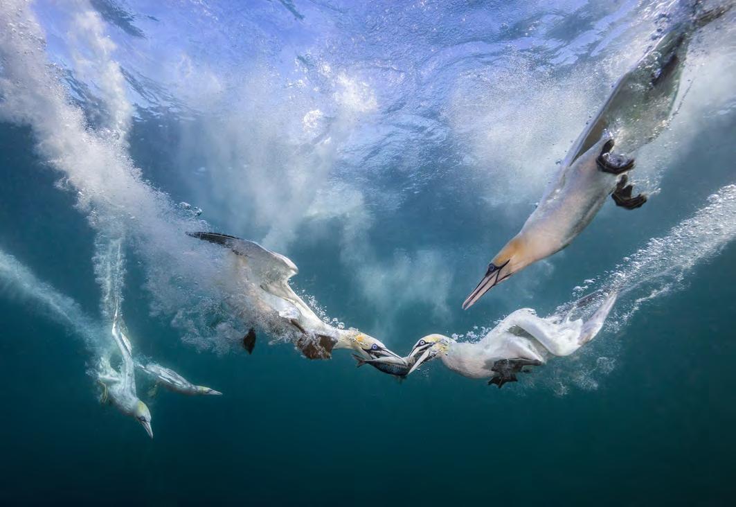
My interest in gannets was piqued
when I visited RSPB Bempton near Bridlington in the UK. The chalk cliffs at this nature reserve are home to the UK’s largest mainland breeding gannet colony. I discovered that the gannet is a beautiful bird which is extremely agile on the wing, if a little boisterous in nature. Gannets sight fish from the air then dive down at literally breakneck speeds of up to 60mph (97km/hr), folding their wings back and hitting the water like a dart. Forward momentum takes them around three metres down and then they then use their wings to fly underwater up to 15 metres deep.
After observing them from the cliff tops, I decided that to photograph them underwater, as they made their headlong dive to capture fish, would be a real challenge - but one worth pursuing. I went to Shetland to try this because the water is much clearer there. However, it is also very cold - around 10° Celsius - so I had to wear a thermal diving suit. I used a local tour boat to take me to the gannet colony at Noss Point and, on arrival, the gannets gathered in their hundreds around the boat. When I first went under I was concerned about getting hit by one of them, but I quickly saw that they are far too agile for that. After all, they always avoid hitting each other - and I am a much bigger target to avoid.
The sound of the birds hitting the water all around me was like bombs going off. It’s a sensation I will never forget and overall this shoot was an experience I will remember for the rest of my days. I was thrilled with the shots and the one I chose for my panel especially as everything came together perfectly. I vow to return.
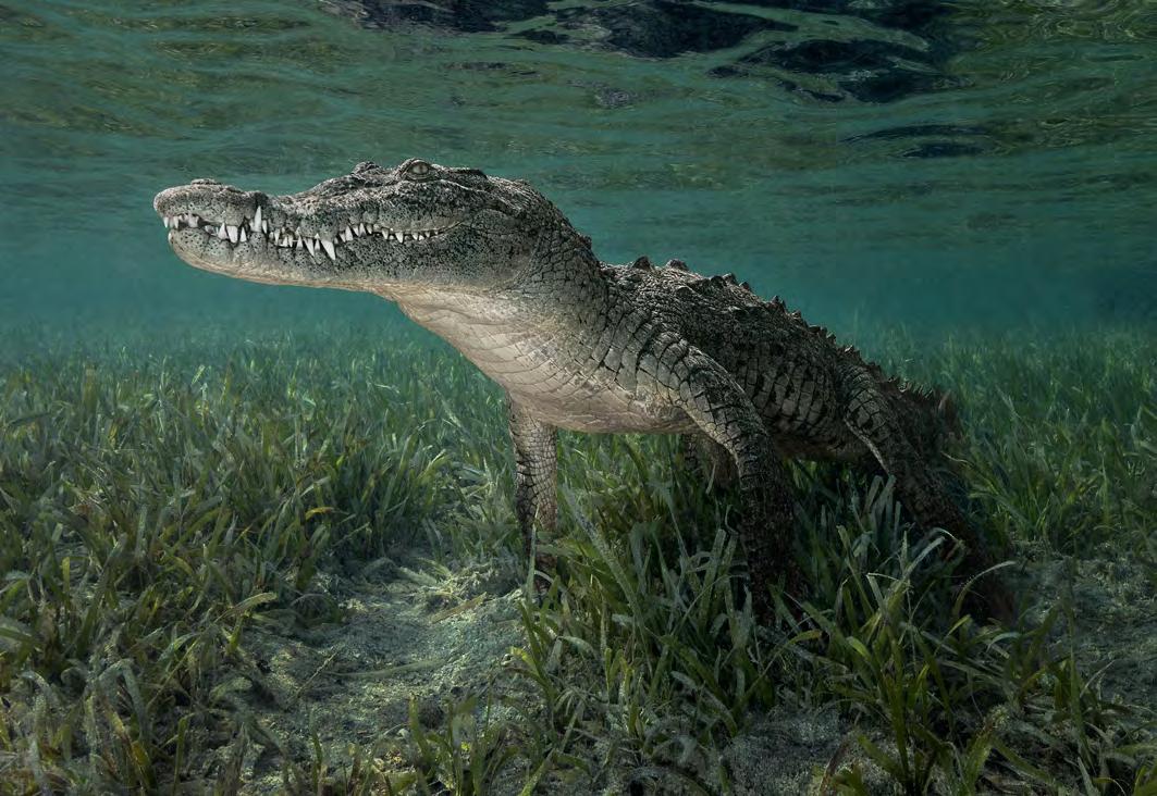
I have always had a bizarre fascination with crocodiles ever since I was a child watching Tarzan wrestle them weekly on TV. I spend ages watching crocs in wildlife parks - are they asleep or just waiting for an opportunity to pounce? I found
a dive operator in Cuba offering excursions where you could observe crocodiles.
When I asked if I could photograph them, I think they saw me as a bit mad. However, they assured me that my shoot could be done ‘relatively safely’. I was taken to a labyrinth of mangrove islands within a marine sanctuary. It took us two days to find a crocodile the right size: too big and it would be too dangerous; too small and the images would have no impact. When we did find a suitably sized male, my guide slipped into the water first and, after sensing the mood of our new friend, he invited me to join him. Was I nervous? You bet I was!
As soon as I entered the water the crocodile swam straight over to me to investigate. After a few seconds he decided I was of no interest and proceeded to find a spot to settle on the sea floor. He may have settled, but over the two hours I spent in the water, I never settled once. It was another great experience ticked off and I am delighted with the shots I got. But would I do it again? Definitely not!
This article was first published in the Spring 2023 edition of The Iris, with kind permission of the RPS Nature Group.
If you would like to see more of David’s work, or book him for a 90-minute talk on underwater photography, either in person or via Zoom, you can find details on his website at davidkeepphotography.co.uk.
LOIS WAKEMAN LRPS

Not all photographs have an obvious subject. Abstract photography is a means of depicting a visual image that does not have an immediate association with the object world. Lois gives us her take on the genre.
I suspect that, like art, abstract photography is largely in the eye of the beholder, and one can find long esoteric discussions and
many definitions - varying from the prosaic: how was it made and by what techniques?; what tropes does it use (colour, pattern, texture
etc.)? - to the more nebulous: can you tell what it is?; does it remind you of anything?; how does it make you feel?… Rather than
disappearing down the rabbithole of dry academic theory, which often sheds little light or understanding, I prefer to try and formulate, here, a common-sense approach to the subject. Only you as readers can judge whether I am successful or not.
Perhaps in some ways, an abstract photograph is usually about some aspect of its subject rather than a recognisable representation of its subject, which isn’t always true of a straight landscape, streetscape, still life or portrait etc.
Truly abstract photographs, I suppose, are apparently removed from reality according to some definitions, but of course they all have their origins in something physical, even if it is obscured by the removal of an easily recognisable subject or by the concatenation of several different subjects. (Contrast this with abstract paintings that are drawn from the mind of the artist and don’t necessarily have any connection with the world.) I don’t think it’s necessary to be completely foxed by its subject for
a photograph to be considered abstract, but at least to be left pondering for a moment or two on what it means or intrigued by what it evokes.
Not being bound by the ‘rules’ and stereotypes of representational photography gives the photographer licence to play and explore creative avenues that might otherwise not be open, and likewise gives the viewer a chance to imagine, as well as see what’s in front of him or her.
So, what are typical features of an abstract? They might include simplification and minimalismoften by focusing on a small part of a subject; a lack of context; ambiguous scale - in our fractal natural world, a huge delta can look just like a tiny beach rivulet; a depiction not of the thing itself but a reflection, shadow or refraction; a palimpsest of broken and overlapping layers; using colour, pattern or texture as the major elements of a composition; taking an unexpected viewpoint
or noticing the beauty in a banal subject that most people would walk past unseeing …
Then there are techniques we can use to further distance the subject from reality - for example, ICM (intentional camera movement), creative use of DOF (depth of field) and bokeh (the quality of defocused areas), long and very short exposure, multiple exposures, light-painting, infra-red capture, distorting lenses; and finally on to more or less extensive postprocessing using layers, blend modes, masks, filters and so on.
Speaking personally, most of my more abstract images are intimate landscapes from the natural and built world (or ‘small scenes’ as Sarah Marino so charmingly called them in her DIG Saturday talk in May 2023), captures of dilapidated or rusty stuff, and plays of light.
I have become increasingly disillusioned with the formulaic and highly saturated, perfectly composed Instagram-worthy images one finds all over the web and social media. It seems to me that the more photos we
see, the less imaginative and the more conformist they become. (Some people make the same observation about certain camera club competitions - but as I’ve never taken part, I can’t comment.) Of course, it’s true that there are very few original photos taken today now that cameras are so ubiquitous, but at least you can increase the odds on originality by picking your abstract subjects.
Although I have always been a fairly non-confrontational character, I am not really a conformist by nature. So, producing images that are
designed to please everyone and his (or her) dog isn’t really where I get my photographic satisfaction. I want to make images that please me, and increasingly, as I have practised and refined my vision, that means a lot of abstract, or at least semi-abstract, images.
So I spend time losing myself in the debris on the shore or the woodland floor, examining drain covers and road markings for interesting patterns, seeking out peeling paintwork, dusty windows or distressed concrete, and lots of other activities that sometimes get
me odd looks. But it’s a lot more mindful than rushing about looking for the next Insta-worthy image, and, I suspect, more personally satisfying on the whole.
A lot of abstract images are unimaginatively called Untitled I, Untitled II, or even more prosaically, just Untitled (better not to have one at all!). I think a good title can often add to the impact of an image, providing another dimension. (I may be biased here, as I’ve earnt my living for almost 50 years from
writing!) That’s not always the case though - sometimes, one may want the viewer to draw his or her own inferences from an image. This was the case a couple of years ago when I staged an exhibition called “Waterline” with a friend. All the images were of dilapidated boat hulls, chosen to be reminiscent of other subjects, and it was rewarding to hear what visitors read into the images, without the prompt of a descriptive title. I think that’s one of the charms of an abstract image, being able to let the imagination roam.
If you have so far resisted the call of the abstract or aren’t sure where to start, here are a few small projects you might like to explore to free yourself from the tyranny of the representational.
• Take a set of photos of a small part of your chosen subject, framing it to make compelling compositions that may hint at the whole rather
than pinning it down.
If you find it hard to think in squares or rectangles, make yourself a piece of card with a cut-out and use it to frame up.
• Look down when you are walking along (best not done on a busy street) and see what you might normally walk past or over, unseeing.
• Conversely, look up, or get your knees muddy close to the groundanything that gives you a viewpoint away from your normal eye level.
• Find an unloved building or other structure and look for the beauty in dilapidation.
• Deliberately de-focus - especially effective at night or with a subject including specular highlights. Or squint when choosing a subject to get an overall impression!
• Try layering different images together, either in camera or in post-processing.
• Look for reflected or refracted plays of light on different surfaces
or in watery media.
• Make colour or texture, or a repeating pattern, your main or only subject.
• Choose a specific composition to work with (for example, symmetry, leading lines, groups of three …)
I mentioned projects as I find they are a much more rewarding way to work than making one-off images. The more of a given subject or way of working we practise, the easier it is to really think about our work and develop it, perhaps in unexpected ways. A body of work (whether a whole catalogue or just a short sequence of related images) can have more impact, conveying your vision in a way that one photo cannot.
Developing a project, and successfully sequencing it, has the added benefit of being useful practice for your next Distinction!
But however you tackle your abstract photography, enjoy the freedom to mess about and make images that don’t necessarily have to be perfectly lit and focusedjust because we are adults doesn’t mean we can’t learn through play! I’m also a potter in my spare time, and raku pottery, with its unpredictable and sometimes serendipitous outcomes, is a craft analogue of this way of working. In both cases, the results may not be worth keeping - but when they are, it gives a tremendous sense of satisfaction
If you would like to learn a little more, here are a couple of articles devoid of the sometimes tendentious or pompous theorising that often seems to infest writing about abstraction: theartstory.org/movement/abstractphotography/ shutterstock.com/blog/abstractphotography-history
If you’re wondering what you’ve been looking at, you can find out on the inside of the back cover.
Cyanotype was one of the first photographic processes developed but it remains relevant today. A resurgence of interest in the process has led to variations offering a variety of artistic effects that can be easily achieved with simple equipment.
The cyanotype is a very early photographic process that has seen a resurgence of interest amongst artists and photographers in recent years. It was invented in 1842 by Sir John Herschel whose father was Sir William Herschel, first president of the Royal Astronomical Society and discoverer of the planet Uranus in 1781. As well as contributing to the early development of photography, Sir John also carried on his father’s astronomical work and was himself President of the Royal Astronomical Society on three occasions. John’s aunt (William’s younger sister) was Caroline Herschel who also became an accomplished astronomical observer and discovered many new comets.
In 1843 the first book of photographs ever published was produced by Anna Atkins using this process and called Photographs of British Algae: Cyanotype Impressions. Given the antiquity of the method, you will not be surprised to hear that Photoshop skills will not be required in learning this technique; in fact you do not even need a camera.
The cyanotype has become popular partly because of its simplicity; two chemicals (potassium ferricyanide and ferric ammonium citrate), when mixed together become sensitive to UV light. The mixture is essentially a light sensitive emulsion and is then painted on to a sheet of paper. Both the chemicals are relatively harmless, despite the potentially worrisome mention of cyanide in one of them. Ferricyanide quickly reduces to ferrocyanide which is actually a food additive (E536) used in table salt. Ferric ammonium citrate is also a permitted food additive (E381) and is one of the ingredients in the popular Scottish
The objects to be photographed are placed on top of the sensitised paper and held in place by a sheet of glass. This is then exposed to UV light from the sun which causes a chemical reaction to take place in which the blue dye ferric ferrocyanide, or Prussian Blue is produced. After washing in water and drying for a few hours, the exposed parts of the paper are seen to have become a rich blue colour. Those parts of the paper underneath the objects are shadowed from the UV rays and show as white. This is often referred to as a Classic Cyanotype.
More recently, a modified method has been developed called the Wet Cyanotype process. This involves adding various substances to the coated paper before exposure to the sun with the intention of creating interesting textures and colour changes in the final image. The most commonly used of these modifiers are soap bubbles, vinegar and turmeric. Others include salt
and lemon juice, though you can experiment with any number of other common kitchen ingredients.
To get started, you will need the following materials (see figures 1 and 2):
1. Reasonably good quality artist’s watercolour paper such as that supplied by Windsor and Newton or Daler Rowney and others. This is typically 300 gsm in weight, and needs to be sturdy enough to survive the washing process. As well as paper, prints can also be made on fabric or even wood, stone and egg shells.
2. A garden spray bottle for adding vinegar.
3. Distilled white vinegar.
4. The two cyanotype chemicals potassium ferricyanide and ferric ammonium citrate. For convenience, I use a kit supplied by Jacquard, available from artists suppliers. A kit costs about £25 and is sufficient for 60-70 A4 prints.
5. Protective gloves. Although
relatively harmless, the chemicals will stain your skin and clothing blue.
6. A container for mixing the chemicals. I use an old yoghurt pot.
7. A couple of syringes or other simple means of measuring equal volumes of the two chemicals in millilitre amounts. The exact proportions of the two chemicals are not critical.
8. A brush for applying the chemical mixture to the paper. Japanese Hake brushes or foam brushes are often recommended for this, available in art and craft shops.
9. Plastic tray(s) for applying soap bubbles and washing the final print. I bought a set of three used Paterson developing trays from eBay for about £15.
10. One or more picture frames for holding the paper and objects flat during the exposure. Clip frames are cheap and widely available. The frame should be slightly larger than the size of paper you intend to use to allow space around the edge for placing clamps. I covered the edges
of the glass with electrical tape to prevent sharp edges.
11. Four clamps per frame for holding everything flat during the exposure. If the objects being imaged are not flat, they can be held in place using a sheet of clingfilm, which can impart an interesting texture of its own to the final image.
The process I use goes as follows:
1. Mix equal volumes of the two cyanotype chemicals in the kit together, sufficient to coat one sheet of A4 paper. Coverage depends on the absorbency of the paper you are using; I find that about 1.5ml of each solution is sufficient to cover one A4 sheet. I do this in a shady part of my garage, out of direct sunlight, as once the two chemicals are combined the mixture becomes sensitive to light. Complete darkness however is not required. Wear protective gloves and a protective apron or old clothes as the chemicals stain and can be hard
to remove.
2. Paint the mixture onto the paper using a brush. I generally cover the whole sheet evenly or you can just paint over the middle part of the paper leaving a ragged edge of brush strokes and a white border for a more arty, hand-crafted type look. Some people then leave the paper to dry overnight in a dark place. However, I proceed directly on to the next stage while the paper is still damp.
3. Next add a layer of soap bubbles to the surface of the paper and spray with a few squirts of vinegar. You can also add any other ingredients at this stage such as turmeric or salt.
4. Place the objects(s) to be imaged on the paper. Interestingly shaped leaves, flowers, ferns, feathers etc. all make good subjects.
5. When all the materials have been added, cover everything with a sheet of glass (or clingfilm), place clamps round the edge of the frame and place in the sun to expose. I generally leave it for around 2 hours on a clear sunny day, maybe twice
that if it’s cloudy. You don’t need bright sunshine for the process to work, there is usually enough UV around even on an overcast day, though perhaps less so in the depths of winter. Longer exposure times allow more UV to penetrate the objects covering the paper and so give more detail of the structure of a leaf for example. Shorter exposure times tend to produce a plain white silhouette of the object. If in doubt, overexpose.
6. Once you have decided the exposure is finished, remove the glass sheet and the flowers, leaves etc. from the paper and place it in a tray containing cold water for 5-10 minutes, agitating frequently. If I have used turmeric, I find this tends to stick to the paper and I have to gently brush it off during the wash. This washing stage removes any unreacted chemicals and fixes the
final print.
7. After the wash, I place the paper flat on the ground and photograph it from above to make a record of the colours and tones of the image at this stage of the process. These are usually quite different from the final result once the paper has dried and been exposed to the air for a while.
8. After washing, the print can be left to dry during which time the chemicals slowly oxidise and attain their final deep blue colour after about 24 hours. Alternatively, the oxidation process can be speeded up by soaking the print in a bath of dilute hydrogen peroxide for 1-2 minutes. I use 5ml of 3% hydrogen peroxide in 1 litre of water. The print will quickly develop the characteristic deep Prussian Blue colour after which it should be
washed again in cold water and left to dry.
For some people this will be the end of the process and you will have produced a unique work of art that you can frame or offer for sale. Alternatively, you can photograph or scan the print and import the image into Adobe Lightroom or Photoshop where you can make final adjustments to bring out the colours and contrasts in the image.
If you don’t like the typical cyanotype blue of the finished print, you can bleach it and tone it with various substances like tea or coffee for a more muted look. Whole books have been written on this aspect alone. You can also mix digital and analogue by creating a digital negative in Photoshop and printing it on to acrylic followed by contact printing using the Classic Cyanotype process (i.e., without adding the soap bubbles, vinegar and turmeric etc.).
The wet cyanotype process is somewhat unpredictable in that you never quite know exactly how things are going to turn out. But that is possibly what appeals most and keeps you coming back for more. Beware, it can become addictive! There is a wealth of further information available online. I particularly recommend the website alternativephotography.com and Mike Ware’s website mikeware. co.uk, where his 400 page book Cyanomicon, a comprehensive account of the history, chemistry, practicalities and art of the cyanotype is available in the Free Book Downloads section
l
You can find more details about the cyanotype process, including links to suppliers, and a selection of my images on my website at obrienphotography.co.uk or follow me on Instagram at alanobrien365
DAVE LYNCH
I got into Astro landscape photography during lockdown. At the time I was shooting with an Olympus M4/3 system and Olympus UK directed their staff, who would have otherwise been furloughed, to run a series of free online workshops three times a week. It was fantastic; they covered a whole range of topics, from learning about all aspects of the Olympus system menu to guidance on shooting genres from widefield landscapes all the way down to macro. It
was a great support to Olympus photographers in those strange times. I found the astro-landscape talks really inspiring and that was that. I upgraded my camera body, bought a new lens and now I’m fixated on monitoring the skies for clear nights and the location of the moon and the Milky Way!
It’s been a steep learning curve. Landscape astrophotography obviously involves shooting in very low light conditions, and requires the photographer to consider how
to optimally expose a scene with both the foreground and night sky in focus, whilst at the same time avoiding too much noise and/or creating star trails (unless of course you want to create them!). It’s a technical challenge which I really enjoy, and on top of that of course, you need to give some thought to creating an attractive composition with an interesting foreground subject.
What we need to be able to do is capture as much light as possible,
so a full frame camera is best, coupled with a fast wide-angle lens and stabilised on a tripod as the exposure times will always be at least a few seconds long. I also occasionally use a star tracker which is a small, motorized mount that sits between a camera and a tripod and rotates the camera synchronous
with the rotation of the Earth. This prevents star trails that would otherwise be captured during long exposures. It means that you can have exposures of the night sky more than a couple of minutes. It can get very cold in the middle of the night so other important pieces of equipment are warm clothes!
One photographer I bumped into one winter night even had electric socks and an electric gilet. I was mightily jealous as I chittered away whilst peering through my view finder!
The position of the Milky Way moves throughout the year and
also varies according to latitude. It’s critical to spend time planning shots in order to determine when the optimal juxtaposition of the Milky Way (or any other celestial object you want to shoot) will be relative to your subject, and also to know the phase and location of the moon which can either act as a light polluter or a useful illuminator. Fortunately, there are a few apps that can help with that; my favoured one is PhotoPills
I live in Aberdeen which suffers from substantial light pollution. This limits what I can do from my house, so any opportunity to get into darker skies is always welcome. Fortunately, I can hop in a car and be in much darker skies west of the city within an hour. The only issue is that being so far north in the UK there is only a limited window to shoot the galactic core, the most interesting part of the Milky Way. It’s below the horizon for the winter months and only really gets above the horizon between April and September. However, due to the absence of real darkness during the
summer, you really won’t be able to see the Milky Way during June and July so the shooting window is a bit limited for me. Plus, of course, Scottish weather doesn’t always cooperate to provide cloudless night skies!
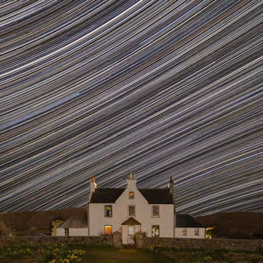
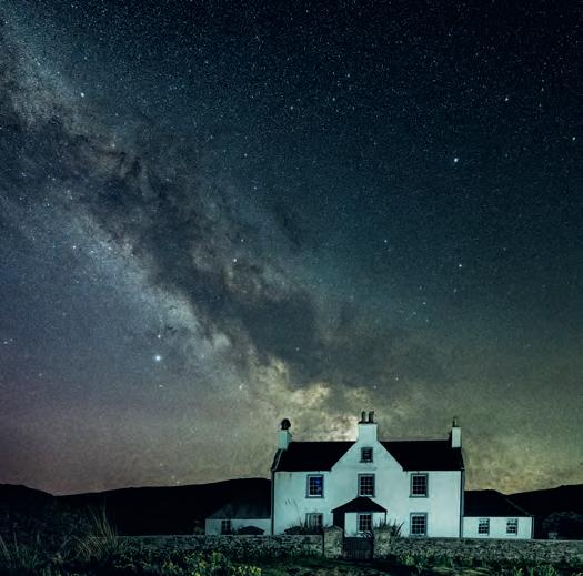
Back in March this year I travelled to the Isle of Harris with my wife, Gail, to celebrate her birthday. Photographers will likely be familiar with the stunning coastal landscapes in the Outer Hebrides - like the perennially popular Luskentyre beach - but the island’s remoteness and very low population density also means it has minimal light pollution so it’s fabulous for capturing images of the night sky. Luckily for me, my wife’s birthday fell on a day when the moon was only 13% and with the light free skies amazingly clear of cloud, and a successful spousal negotiation, I was well set for a night of shooting the stars.
We were staying in the Scarista House, a hotel just above the spectacular Scarista beach. It’s a
beautiful old manse and provides an interesting foreground to incorporate into a night sky shot. I had two objectives in mind; one to construct a star trail image and the second to image the structure of the Milky Way. I set the camera up with an intervalometer - f/3.2, ISO 1600, 30 second exposurepressed the shutter and went to bed for four hours! I gathered more than 500 images which I then stacked in post to create a composite star trail image. I also shot 20 frames specifically for the Milky Way structure - f/3.2, ISO 800, 10 seconds. The shorter exposure time minimises the risk of getting star trails. I then stacked them together using a programme called StarryLandscapeStacker which helps remove noise from the final image and helps resolve detail in our home galaxy.
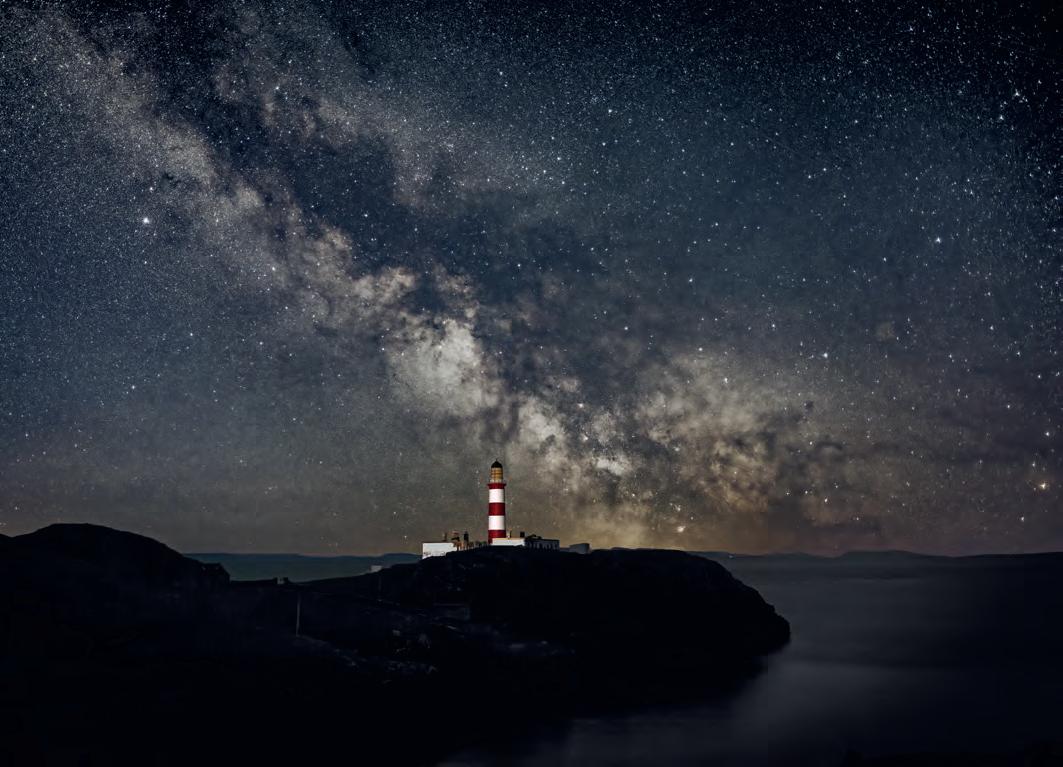
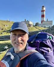
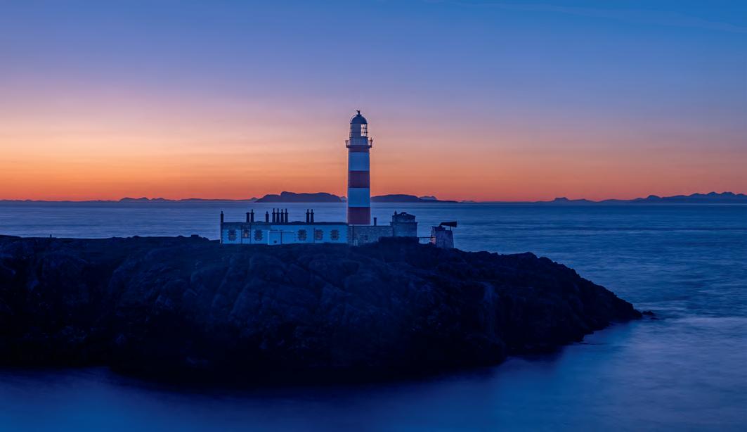
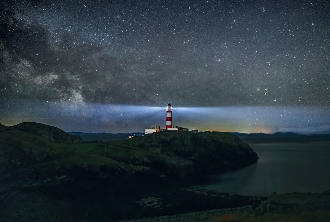
While we were on Harris, we visited the Eilean Glas lighthouse on the adjoining island of Scalpay. The lighthouse is in a beautiful, somewhat remote setting and is very striking; a 30-metre tower
painted with three distinctive broad red bands and with the beautiful Isle of Skye in the distance to the south. I’m fascinated by lighthouses, so much so that I bought the book The British Lighthouse Trail: A Regional Guide, by Sarah Kerr. It’s a veritable treatise on the lighthouses around the UK coast. Gail and I have been slowly ticking them off; a bit like a sedentary version of bagging the Munros. One thing I’ve been keen to do is shoot a lighthouse with the Milky Way as a backdrop, so our visit to Eilean Glas gave me an opportunity to scout out a shot.
Using the Augmented Reality feature in the PhotoPills app, it’s possible to view a composition through a camera phone and see the Milky Way superimposed on top. You can then adjust the time and date and watch the Milky Way move through the sky until you see an optimal composition where the Milky Way lines up with your subject. I could see from the app that the Milky Way would be in an optimal position behind the lighthouse the following month on the 19th April at 0300 and, with a new moon, it would be ideal dark conditions. So, I hoped for clear
skies and made plans to return for a night-time shoot.
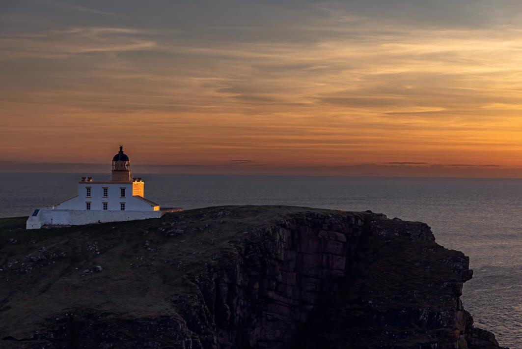
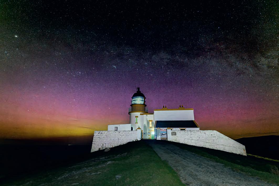
Sure enough, one month later my crossed fingers seemed to have worked - a high pressure was forecast over Harris for a few days coinciding with the new moon! So off I headed west to catch the ferry from Ullapool to Stornoway. Lighthouses are a little tricky to shoot due to the strength of the light beam, so I stopped off for a practice shoot at Stoer Lighthouse north of Ullapool the night before I caught the ferry. I arrived in time for an utterly spectacular sunset, and I was delighted to get some images of the lighthouse in a wonderful golden light before settling down to shoot in the dark …. and freezing conditions!
Lighthouses operate with a distinct lamp signature that allows sailors to identify the different lighthouses from the sea. The Stoer lighthouse signature is a white light with a single flash every 15 seconds. So, I set my camera with a 13 second exposure timing to avoid the intensity of the lighthouse beam and managed to get an acceptable image of a horizontal part of the Milky Way behind the lighthouse
and with, rather unexpectedly, a mild Aurora Borealis to boot.
The lighthouse at Eilean Glas is a 2.5km walk from the road end which would have been fine other than I was carrying a full pack with my camping gear, camera equipment including star tracker and panoramic rig and as many warm clothes as I could squeeze into my rucksack. There is a bothy at the lighthouse that I was able to use which was perfect for setting up my base. I arrived mid-afternoon so had plenty of time to scope out the best location for that evening and plan my approach to capturing the lighthouse and the core of the Milky Way. Once astronomical twilight ended at 2325, I set up my small LED panel just a few 10s of metres from the lighthouse to provide some foreground lighting, then placed my tripod around 250m away on the hillside overlooking the lighthouse, and waited for the Milky Way to get into position.
The Eilean Glas lamp signature is three white flashes every 20 seconds and again I shot at 10 second exposures to minimise the risk of star trailing and to comfortably shoot in the gap between the
flashes. As it turned out however, the lamp has a barrier installed to prevent the light illuminating the land, so I was protected from the main beam whilst shooting which enabled me to capture some shots of the milky way with the beam of the lighthouse. I also shot with my star tracker, which allowed me to collect images with a twominute exposure, at a low ISO of 400. With these settings and the very low levels of light pollution, it was possible to gather an image with lots of detail of the Milky Way structure. One complexity of using a star tracker is that the foreground gets blurred over the period of the exposure as the camera is tracking the movements of the stars. To manage this, I had to create a composite image, shooting a separate image of the sky and the lighthouse then blending them together during post-processing. And of course, one of the added benefits of shooting through the night is that you are also already on location for the sunrise; so, no
struggling to overcome the lure of a warm bed to get the best of early morning golden hour! Definitely a plus point of astro-landscape photography!
It’s a challenging but rewarding experience working to capture night-time images in remote locations, and there is something quite extraordinary doing it in complete silence and darkness. I am still in learning mode; after each shoot I always try and draw out take-aways that I can build on to improve the shots for when the clouds clear again and I get to head out into the night with my new electric gilet!
KATH PHILLIPS ARPS
Some argue that it is impossible to take a travel photograph in your home country, surrounded by a culture, landscape or architecture which is familiar to you. Why?
Because it is that whole sense of exploration, the excitement of new discoveries that makes for effective travel photography. But then, everywhere is somebody’s home!
Others claim ’I can take a travel photograph as soon as I step outside my front door’. Why?
Because the core requirement for a travel photograph is not that it is of some exotic location but that it demonstrates a sense of place. Even ChatGPT gets that. Asked what a travel image should look like, it lists the first characteristic as ‘A sense of place: The image should
capture the essence of the location, whether it’s a natural wonder, an iconic landmark, or a vibrant street scene. The image should evoke a sense of place and transport the viewer to that location.’
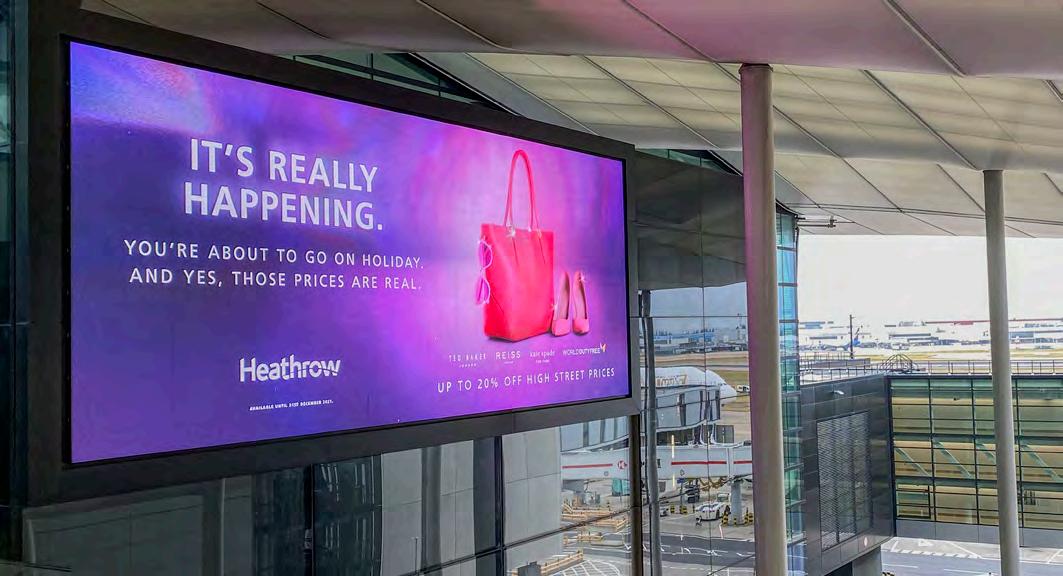
As I have had more time to consider the nature of travel photography, I have begun to examine my own thinking about this dilemma. Over recent years, as we have been less able to travel overseas, there have been a number of opportunities to check my ideas. I remember the feeling walking into Terminal 3 at Heathrow, knowing I was about to fly abroad for the first time in three years: even the images around the terminal reinforced my excitement: the greyness of the sky didn’t matter.
Do I feel that same sense of anticipation if I’m travelling at home? Often, the answer must be ’Yes’ and, equally, it might be ‘No’ if I’m visiting a place in Thailand, where I lived for more than ten years, that I’ve already been to more times than I can remember.
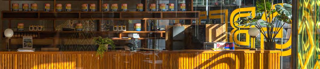
In October 2022, the Travel Group organised a weekend in Birmingham part of which was a photowalk around the Digbeth area, focussing largely on the redevelopment of the Bird’s Custard Factory. I don’t know Birmingham at all. This was completely new to me and I was interested to see what images would be forthcoming. You can see one of my favourites of the day at the top of the next page. While to some extent this may be
thought to convey a sense of place, I don’t think of it as a travel image. I took it primarily because of the colours; the way the wood in the sunshine is echoed by the custard tins on the higher shelf. As we walked from Aston through the HS2 building works to our destination, cameras clicked incessantly as each of the photographers involved found something of interestbut the images I took were not travel photographs as I see them: they had no particularly positive message about the area.
A few months later, in May 2023, the Group held a weekend of talks and workshops at RPS House in Bristol. One of the workshops focussed on being ‘in the moment’, using all our senses when we explore
a place. We photographed the Paintworks area and once again I left amazed that a small group of people could find such differences in such a limited area. Places are like that: we are often able to discover something new every time we visit. Sometimes we need to be reminded that we each see differently. And on this occasion, we were encouraged to look at the detail, the little things we might walk past in our haste to ‘get somewhere’.
Travel photography is not just about iconic landscapes or buildings, it’s not even about people. It is about experience. I was struck by words in a blog by Matthew Kirsten (expertvagabond.com) ‘Travel photography is like a time machine,
freezing memories from a journey that you can look back on and enjoy for years.’ More importantly, for me, though, he added ‘Plus it can help others find new inspiration’
That’s the key to good travel photography: it informs, ‘Travel photography is all about bringing the world to people and exposing to them what else is out there. It’s about educating people about the customs of other cultures, showing them how they differ from their own. ‘ (Clint Burkinshaw, Iceland Photo Tours)
I remember first experiencing the pleasure of being able to share with others images of places I had enjoyed and which they had not experienced when, in my late twenties, I had the opportunity to
travel to India and Israel studying (and photographing) religious practices there. Without mobile phones, communication with home was very slow and limited. Because I was away for four months I used to send rolls of slide film home to be processed. That way, the family could see where I was and what I was experiencing.
So, travel photography for me came to be about culture, about people and places that were totally beyond my audience’s experience. It was different. It broadened horizons and increased understanding.
But why can we not share the uniqueness of the places and people nearer to home?
What happens if I go out with a camera at home and behave as if I were a visitor? Some would say that’s not possible.
I looked back at photos I have taken on holidays or days out in the UK. All, as it happens, in England. I was disappointed how few there were that I felt at all pleased with.
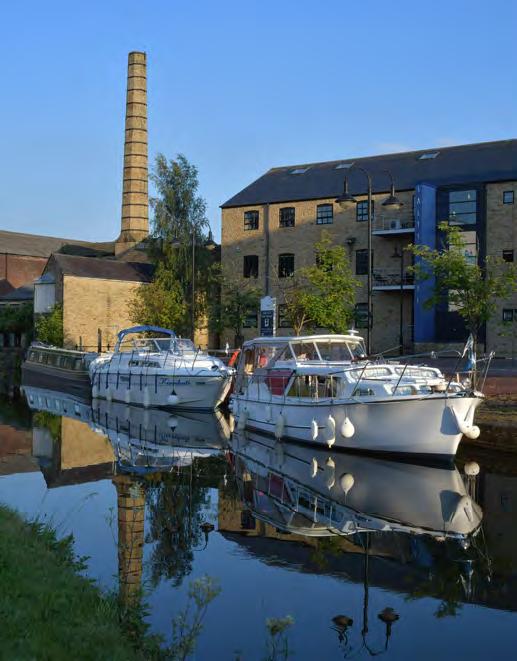
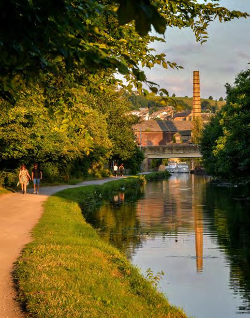
The images of the canal at Saltaire (see previous page bottom) taken just a few hundred yards apart early on a July evening, a few years ago, give quite different insights into the
area and its use.
Sometimes the desire to ensure that a photograph is more than just a record shot helps us to think about different angles and times of day, but sometimes we have little control over the time we are able to visit.
The image of Alum Chine on the Isle of Wight (see above) was taken from the top of the cliffs on a warm, sunny afternoon making it possible to emphasise the contrasting colours and shapes of the coastline.
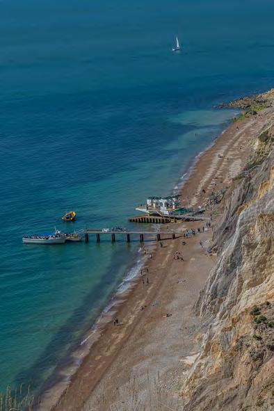
The scale is important here, too, with the size of the people on the beach and of the tiny dinghy in the distance giving an idea of the height of the rocky cliffs.
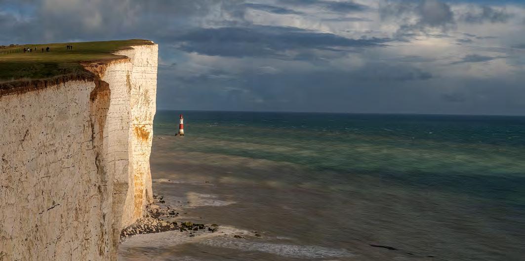
In the image below, taken one autumn afternoon at Beachy Head, I enjoy the juxtaposition of the sunlit cliff with the lighthouse and the people walking on the clifftop. The lighthouse looks so small and vulnerable from this angle.
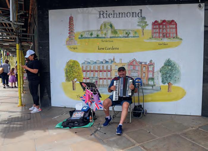
And then I decided to go to a place where I lived in the 1970s (see next page) to see whether I could take the eyes of a travel photographer to a place I used to know well. Of course, I was influenced by my memories and found myself asking ‘What’s different?’, ‘What do I want to tell people about this place?’
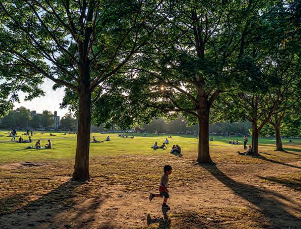
On a Friday evening in late summer, groups gathered on the ‘village’ green socialising, enjoying the sunshine and the opportunity for the children to run free for a while. There were gatherings, too, around the pubs on the edge of the green.
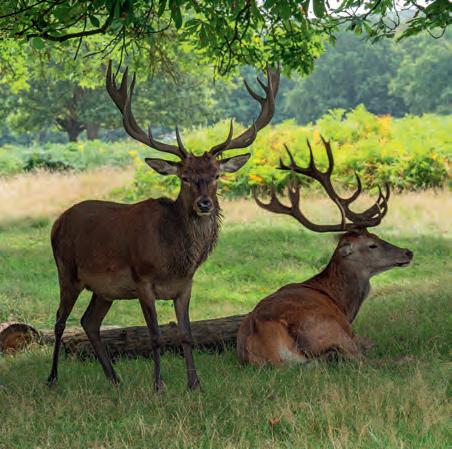
At the top of the hill, the park is still home to herds of deer and it is usually best to see them early in the day. But this is a park for allhumans, too, exercise here.
And the ‘village’ that is Richmondupon-Thames has new coffee shops and a busker taking advantage of the site of the old department store as it undergoes re-development. But my favourite view? For me, iconic Richmond, looking over the Thames from the top of the hill....was disappointing. I feel it’s more impressive at a time of year when there are fewer leaves on the trees than during my visit. And that just goes to show that Steve Mc Curry was right when he said ‘There’s no guarantee that you’re going to make good pictures just because you happen to be in an exotic location. The same rules of photography still apply: light
and composition and a particular moment. You may be in an incredible place with an incredible story to tell, but you still have to craft it in a certain way.’
So, have I decided whether travel photographs can be taken closer to home?
It is clear to me that Travel Photography is less a genre and more a mindset: it is HOW we see, not WHAT we see. Elliott Erwitt talks about ‘finding something interesting in an ordinary place’ and Bill Brandt sums it up nicely for me, writing ‘It is part of the photographer’s job to see more intensely than most people do.
He must have and keep in him something of the receptiveness of the child who looks at the world for the first time or of the traveler who enters a strange country.’
What an amazing store of images of our own country (wherever that is!) we would have if we all used all our senses to feel and to share the uniqueness of the place where we are. Let’s be excited by the things closest to us. Maybe then we will share Alfred Eisenstaedt’s experience. He said ‘I enjoy traveling and recording far-away places and people with my camera. But I also find it wonderfully rewarding to see what I can discover outside my own window. You only need to study the scene with the eyes of a photographer. ‘
You can have the mindset of a travel photographer without being a photographer who travels overseas. I certainly aim to bring the mindset of a travel photographer to places nearer home and to create a more inspiring collection of local images
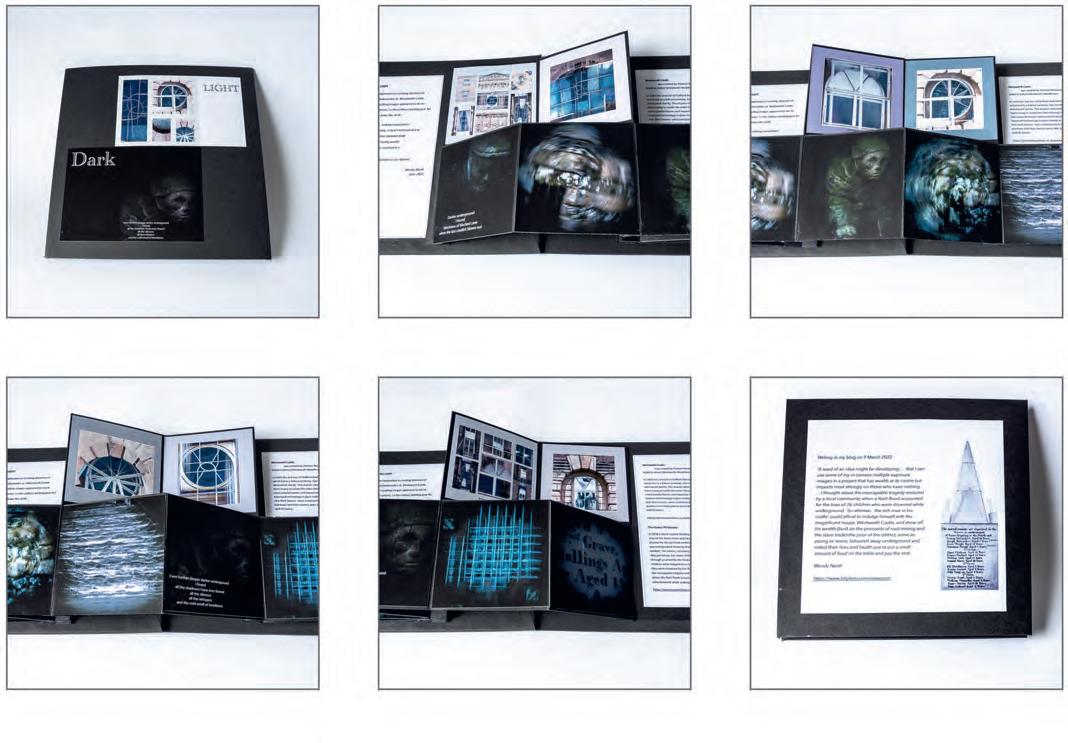
WENDY NORTH

This project began In September 2021. Following an introduction from Glenys Garnett, I’d begun to be interested in using in-camera multiple exposure and wanted a
building that was close to home where I could experiment and try this process out. Wentworth Castle, a National Trust administered property, is two miles from where I
live, so on my doorstep. In the end I made five visits to take photographs of the house for this project. One thing that began to emerge from some of the multiple exposure
window images were shapes that had the appearance of Pit Wheels. There’s a certain amount of irony in this as much of the wealth that went into constructing the building would have come from the proceeds of coal mining.
Later in the year, the photography club I belong to (Penistone) made the suggestion that we should do a project that linked our relationship with a past experience or connection to the present. My grandad was a miner at the Glass Houghton Colliery in Castleford and initially I thought of him, but
then I couldn’t visualise how I would create the images to tell his story. So, I thought about a local mining tragedy - the Huskar Pit Disaster in 1838. Interestingly, the Huskar Pit was actually owned and run by a neighbour of the family who owned Wentworth Castle.
Writing in my Blipfoto blog on 9 March 2022
`A seed of an idea might be developing ... that I can use some of my in-camera multiple exposure images in a project that has wealth at its centre but impacts most strongly on those who have

nothing. ...I thought about the inescapable tragedy endured by a local community in 1838, when a flash flood accounted for the lives of 26 children who were drowned while underground.
So whereas, `the rich man in his castle’ could afford to indulge himself with a magnificent home and a show of his wealth (built on the proceeds of coal-mining and revenue from the slave trade) the poor of the district, some as young as seven, laboured away underground and risked their lives and health to pay their rent and
put a small amount of food on their table.
I began by visiting the memorial to the children in Silkstone Common on a March afternoon when I was able to photograph the two sculptures that represent the children. I added some extra light onto their faces to represent the glimmer of a candle in the dark. in order to create images to represent the tunnel with the water flowing through I visited nearby Worsbrough Mill and used a combination of in-camera multiple exposure while turning the camera round to represent the tunnel. I then took photographs of a barred window to represent the ventilation door that actually trapped them when the water came rushing along the usually dry stream bed. None of these images were made in Photoshop - they were all incamera.
All of this was finally assembled into a flag book so that the dual narrative of the two life styles could be seen alongside one another. The rich man in his castle living in the
Light while the poor man and his children laboured and died in the dark. A project that I finally called Light and Dark.
The book was finally completed on the 15 July, ten months after I first began taking photographs at Wentworth Castle
You can find more of Wendy’s work at instagram.com/wendy_ north_photography including a video of the finished flag book depicting the Huskar pit tragedy at instagram.com/tv/ CjIgwVDjJn0/
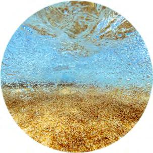
Having started out as a mountain, landscape, and wildlife photographer, and traipsing about with all the heavy and cumbersome equipment that it entails, I recently discovered snorkelling in the crystal clear and warm turquoise waters Cyclades, and water is my new subject of choice, and the equipment therefore had to change.
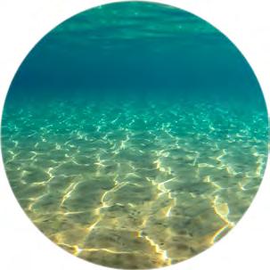
Head down, the only sound being of my own rhythmic breathing, I am transported into another world, a world of silence and serenity, a world below the surface, invisible to many. Exploring the coastline, different formations of rocks appear, occasionally disturbed by a marine animal. Time becomes irrelevant and the sensation is relaxation and peace.
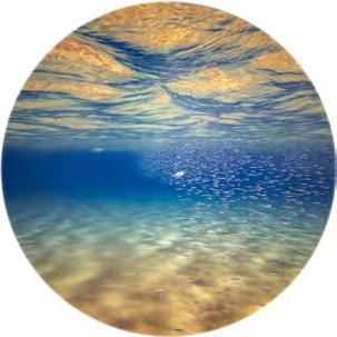
Every year in June, a group pf friends have a group exhibition. This exhibition forces me to sort, process and choose the photos that have been accumulating on my hard drive and put together series or themes. For a few years now, the underwater shots have been accumulating and something had to be done with them! Maybe printing the photos in a round format would convey the impression of being in a submarine, drifting effortlessly in a quiet, timeless environment?
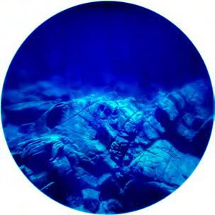
My equipment is not high-tech. The versatile GoPro replaced all the heavy stuff. I either shoot RAW photos or take stills from videos. These, however, can’t be blown up very big. I also have an iPhone case made by SeaLife, the SportDiver, that took a little getting used to, however GoPro photos seem to be more creative. The Olympus ‘Rugged’ has difficulty focusing when in moving water, but I use it to record all the diverse creatures found on the rocks and the seabed.
My processing is really very simple. A series of enhancements are done in LightRoom, mostly dehaze, clarity, and adjusting the white balance, which is often too green. Then, to clean up the photo: denoise, getting rid of flecks of highlights, adjusting the contrast by increasing the whites and the blacks.
The final touch is cropping the photo to a square format, applying a full vignette, highlight priority, +100 for a white background, and no feather. This gives the circular image. Then, after much hesitation, deliberation, and annoying family and friends, a selection is made. The result is an HD print on a round metal backing
I have always had a vague interest in tarot cards, runes and mystical things so when I happened across a tarot deck based on the work of Gustav Klimt I just had to have it (I love his work, in particular the Beethoven frieze and his portraiture). I went back to the shop when the next ‘pay day’ came around and it was mine. Thus inspired, I began working with the deck and delving into my subconscious. I found myself wanting to write haiku to compliment the cards and my thoughts, and so the ‘Tower reading’ came into being.
For this reading (after shuffling the cards) I drew The Tower from the major arcana and then the Knight of Swords, 9 of Pentacles, the Knave of Chalices, the 2 of Wands and the 2 of Swords from the minor arcana. I am now of the habit of drawing a card from the major arcana and five from the minor arcana, the major card
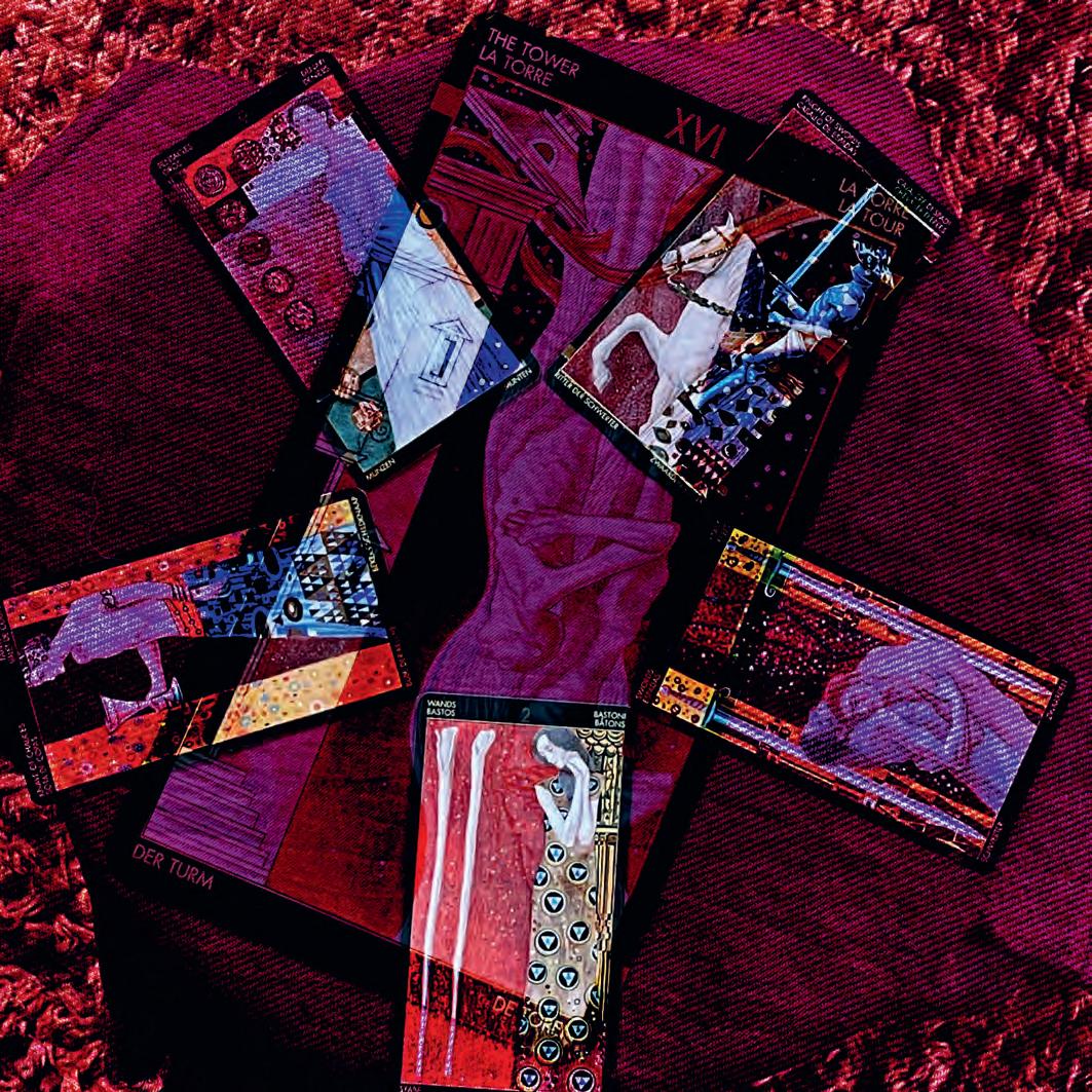
sets the ‘tone’ of the reading and I set the five minor cards on the points of the pentagram because it pleases me.
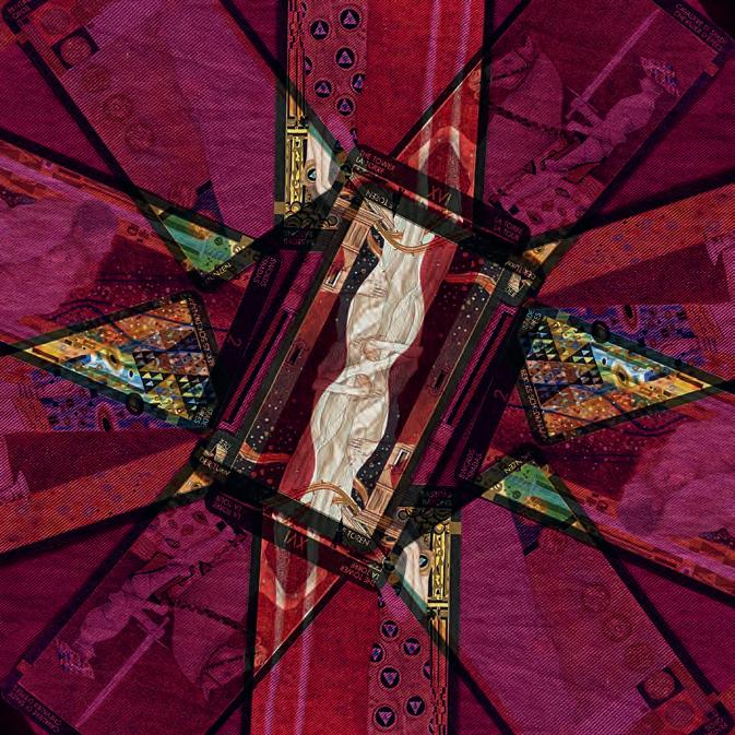
The Tower centred the reading and the minor arcana were read, anti-clockwise from the Knight of Swords.
I photographed the cards, in situ, several times with my iPhone and imported them into the application PhotoSplit (kindly brought to my attention by an artist friend).
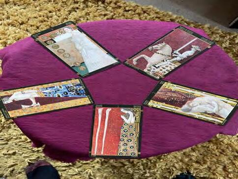
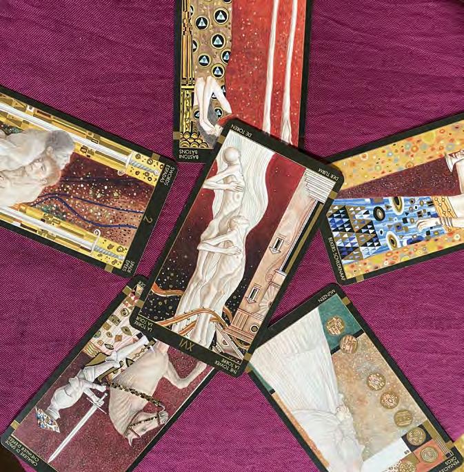
Using the multi-exposure function, I arranged and blended the images many times until I was pleased with the results and was inspired to produce the haiku (a three line poem of five, seven and five syllables on the respective lines).
I used the #almosthaiku hashtag to begin with but now I am more confident I use #haiku and #haikuphotography nowadays.
I see the haiku as an extended title for the artwork and try to make something of a symbiosis of the two art forms l
All previous issues are available from the DIGIT Archive at rps.org/di/digit-archive/
2
2
3 Contents
4 From the chair Janet Haines
4 Editorial
Gary Beaton
5 Taking to bird photography like a duck to water
Maggie Bullock ARPS
13 You can tweak images in an app?

Nicki Gwynn-Jones FRPS
18 A Photographic Adventure in Rocky Creek Canyon
Brian Menzies and Albert Hakvoort
25 We each see the world differently
Alison Webber FRPS
29 Talk-Walk-Talk
Richard Ellis ARPS
31 DIGIT Challenge: Woodland Impressions Jen Spiers
33 DIGIT Challenge: The Shipwreck Ken Hurst-Earl
35
If you were wondering what you were looking at in Lois Wakeman’s article, here are the answers.
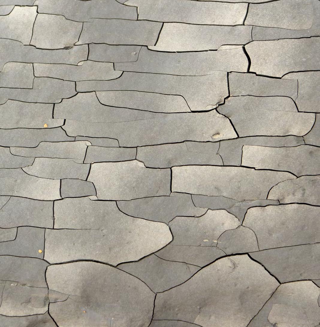
Page 10 - A crazed shale boulder on Seatown beach
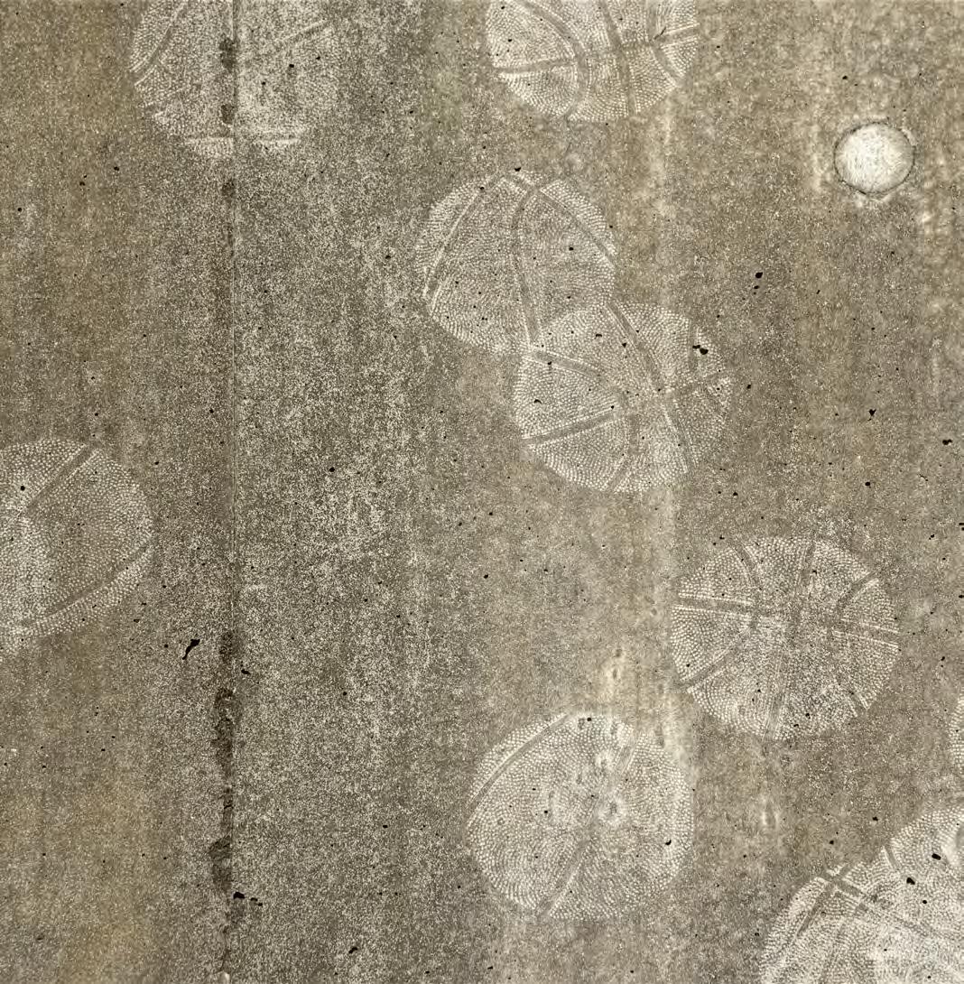
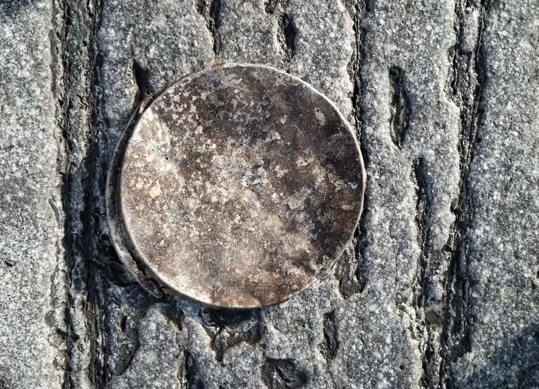
Page 11 - Impressions of a basketball on a concrete seawall
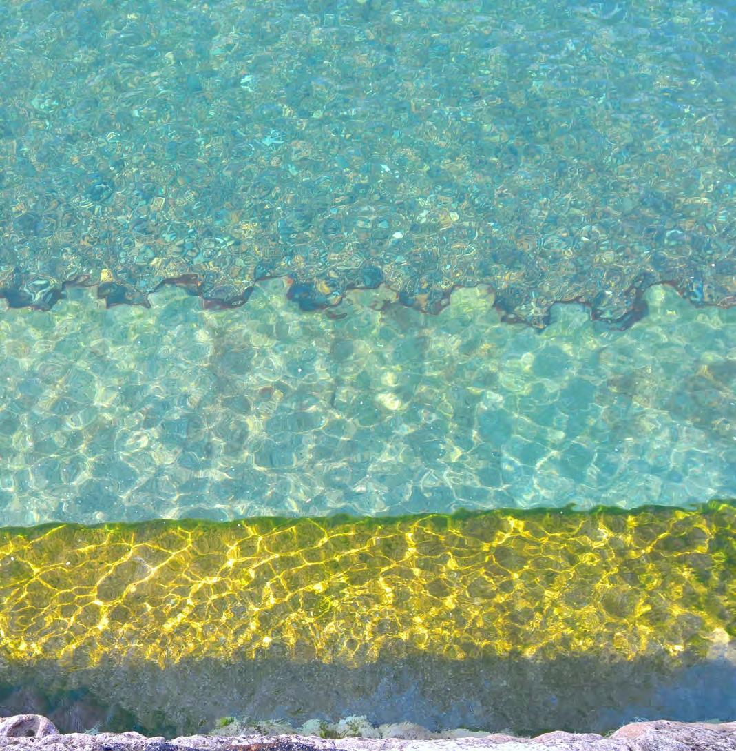
Page 12 - Looking down to the undersea foundations of the Cobb harbour wall, Lyme Regis
Page 13 - Boat hull detail
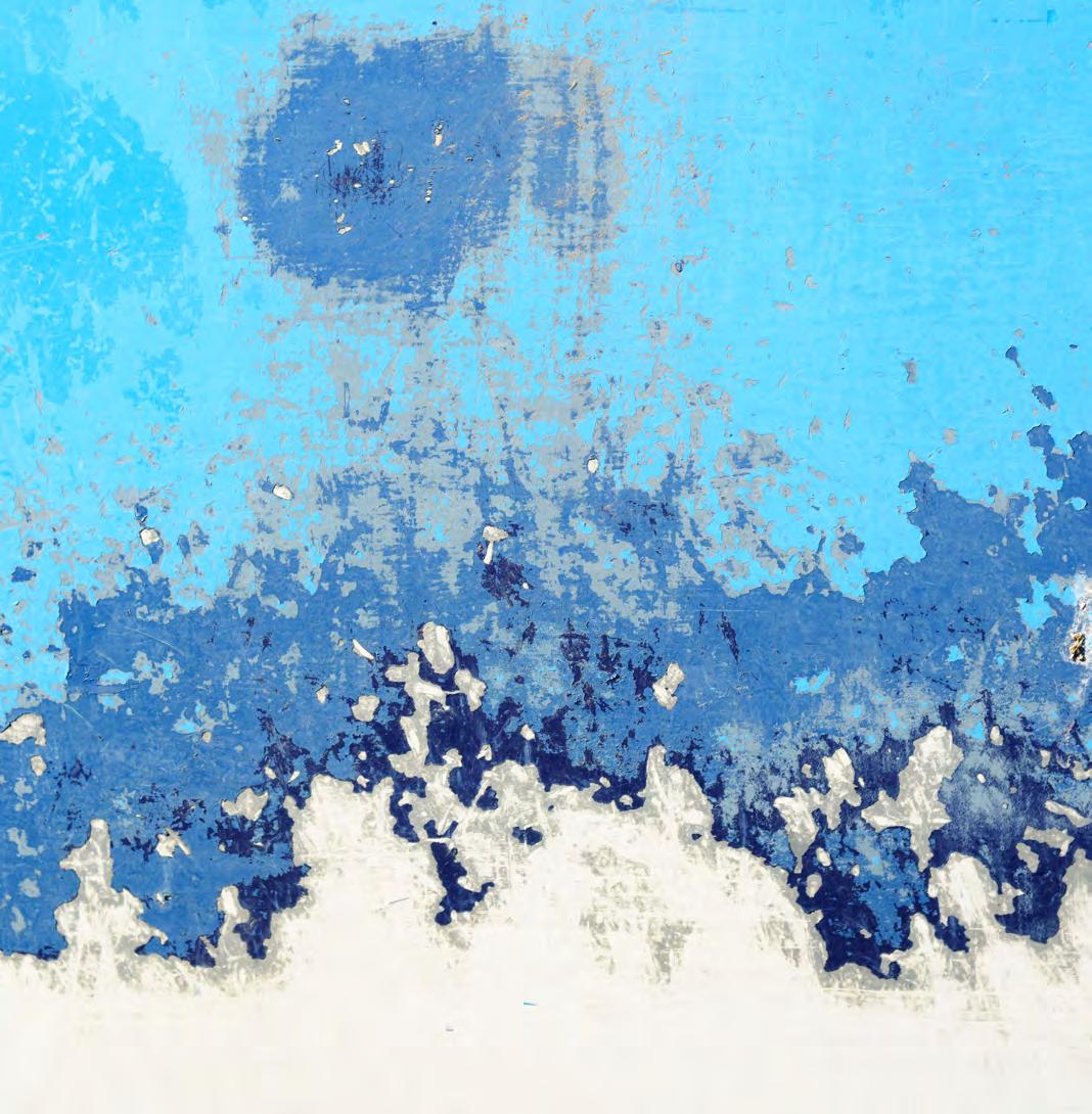
Page 14 - A corroded garage door
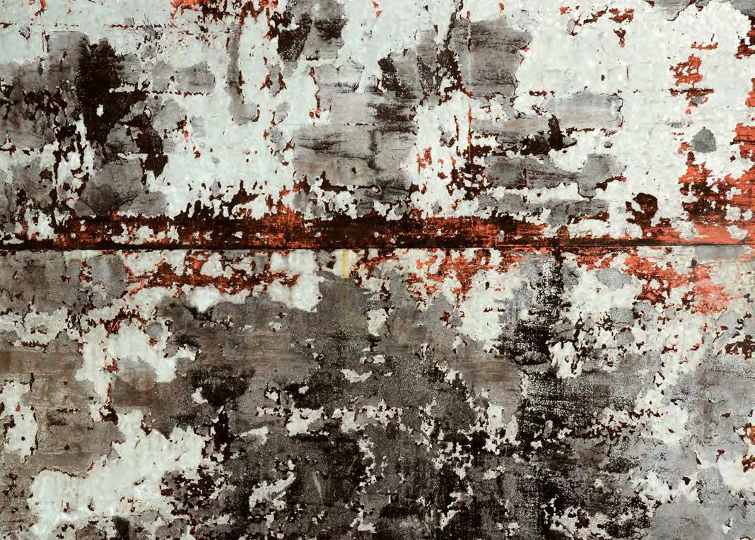
Page 15 - An old paint can lid and limestone boulder (one of my ‘Rusty Planets’ series) on Lyme Regis beach