CREATIVE EYE


Presentations of members’ work, including recent projects, distinctions and achievements, with:
Steve Varman LRPS, Margaret Rainey FRPS, Julie Cowdy ARPS, David Jordan FRPS, David Harris ARPS, Wendy Irwin ARPS, Steve Geer FRPS, Mike Kwasniak FRPS
Date: 26 June 2022
Time: 10:30 to 15:10 (BST)
Where: Online (book online)
Cost: Free
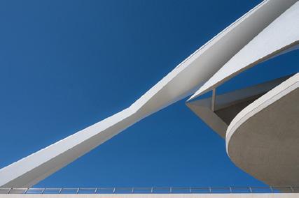
Iñaki Hernández-Lasa FRPS
Born in Bilbao and living in Ireland since 1990, Iñaki specialises in architectural photography and shares with many photographers his absolute passion for the Guggenheim Museum in his native city
Date: 10 September 2022
Time: 15:00 (BST)
Where: Online (book online)
Cost: Free (Creative Eye member)
£2 (RPS member)
£4 (non RPS member)

Exclusively for Creative Eye Group members, showing a part of East London that you may not be familiar with! The pace will be slow, with many opportunities to capture what you see, and meet other group members. Booking required.

Date: 10th July 2022
Time: 10:30am for a 10:45am start (3.00pm finish)
Where: Meet at West Ham underground station
Cost: Free
A selection of prints, including a slideshow of the full exhibition.
Date: 16 August to 18 September 2022

Time: 09:30 to 16:30 (Mon-Fri), 10:30 to 16:00 (Sun)
Where: The Apex Gallery, Bury St Edmunds, IP33 3FD
Cost: Free
For further details regarding events please visit the Creative Eye Group website: rps.org/ceg
CREDIT: Steve Varman LRPS CREDIT: Brian Titchiner CREDIT: Iñaki Hernández-Lasa FRPS
The Exhibition published here includes comments on the Gold Medal, Selectors’ Awards, Highly Commended and Commended prints. These start on page 28. The other accepted prints section, containing 126 images, starts on page 35. Images are presented in alphabetical order of the photographer’s surname.
There are also three articles by members on their photography.
Margaret Rainey FRPS returned to her home city of Glasgow after many years away to find that it had changed so much that she didn’t know it anymore. She decided that it was high time she got reacquainted and, in her article starting on page 5, she explains how she went about this by doing a creative project on the city, and tells us the techniques she used to capture her images.
Neil Scott FRPS has always had an eye for the unusual and a sense of humour that can be dark and anarchic or provocative. In his article starting
on page 12, he shows us some of the images he has created as part of his Visual Puns project and explains how they were made.
The project has its roots in an image of his which was accepted for the London Salon and in his local camera club’s competition on the theme of “fruit and veg”.
In his article starting in page 20, Paul O’Flanagan LRPS discusses the question ‘what is it?’ which, he is always asked when he shows his photographic work to photographers and nonphotographers alike. He gives us some pointers into what goes into making his images and how he hopes people who view them will respond to them.
I hope you will find the content of this issue interesting and that you enjoy both reading the magazine and looking at the many images which are presented. I hope too that they will inspire and encourage you to develop your own photography.
DavidChair & Magazine Editor Dr David F Cooke FRPS
davidfcooke@btinternet.com
Secretary Graham Lingley LRPS cegsecretary@gmail.com
Treasurer Nigel Rea ARPS creative.treasurer@rps.org
Digital Exhibition Coordinator David Rutter FRPS creativeimage@rps.org
Membership & Communications Coordinator Clive Watkins LRPS creativecomms@rps.org
Design & Webmaster Steve Varman LRPS creative.publications@rps.org
TEAM
Online Talks Coordinator
Jan Harris ARPS
creative.talks@rps.org
Print Exhibition Coordinator
Moira Ellice ARPS
moira.ellice13@gmail.com
Print Exhibition & Event Assistant
Nigel Rea ARPS
Print Exhibition Assistant

Mick Cant
Print Exhibition (Stamford Hospital)
David Baxter LRPS
facebook Facebook facebook.com/groups/rpscg
Or search Facebook for ‘RPS Creative’
facebook Facebook Study Groups
20
Exclusive to Creative Eye Group members. We run small, private Facebook peer review groups to exchange images and critiques (up to 8 members per group). To join a group, contact Steve Varman at creative.publications@rps.org
flickr Flickr flickr.com/groups/3510780@N20/pool Or search groups for ‘RPS’
© 2022 All rights reserved. Apart from storage and viewing in its entirety for personal reference, no part of this publication may be reproduced, stored in a retrieval system or transmitted in any form without prior permission of the copyright holder. The Royal Photographic Society, the Creative Eye Group and the Editor accept no liability for the misuse of any content or for any breach of copyright by a contributor. The views expressed in this magazine do not necessarily reflect the policies of the Royal Photographic Society or the Creative Eye Group. Unless otherwise indicated, all images are from, and copyright of, the authors.
Flickr Administrator
David Ryland ARPS david_1@btinternet.com
Facebook Administrator
Margaret Rainey FRPS
Creative Portfolio Group
David Harris ARPS creative.portfolio@rps.org
Field Trip & Photo Walk Coordinator
Rebecca Johnson LRPS creativewalks@rps.org
Website: rps.org/ceg Printed
Cover: Light Path by Roger Ford FRPS
The Royal Photographic Society, RPS House, 337 Paintworks, Arnos Vale, Bristol, BS4 3AR, UK, t +44 (0)117 3164450 | www.rps.org | VAT Registration No. GB 753 3057 41 Registered Charity No. 1107831
From Moira Ellice ARPS, Print Exhibition Coordinator: The change to the format, which was to give more members an opportunity to enter the exhibition, was an overwhelming success, resulting in more than double the usual number of entries. For many, it was their first attempt to enter a photographic print competition.
I was a delighted, not only with members’ interest, but also to be able to communicate with several members who contacted me to clarify certain points about which they were unsure.
I was so grateful to the selectors and helpers who ensured that the Selection Day ran smoothly and professionally.
It was also the first occasion upon which the Print Exhibition was replicated in the format of a slideshow, produced by David Rutter FRPS to whom sincere thanks are due.


The slideshow can be viewed on the Creative Eye website and will also enable the complete exhibition to be displayed at venues where there is limited hanging space for prints.
From Joan Jordan ARPS, Print Exhibition Selector: Together with fellow selectors Ian Wilson and David Townsend I had a very enjoyable day at Whittlesford Village Hall. We had been invited to select the images for the 2022 print exhibition. It was very refreshing to see prints after the past couple of years when everything we had seen was digital on our computers at home. There was a wonderful entry of very creative prints sent from all over the world. The prints were unmounted, which enabled more members from overseas to enter and made postage a lot cheaper as all entries were sent in to Moira before the day.
There was no audience present, just us selectors, Moira and a small number of willing volunteers to handle the prints. As selectors, we found this very refreshing as we were able to discuss freely and, we hope, choose a balanced selection of excellent prints for the exhibition. We first selected one print from every member’s entry, thus ensuring that everyone who took the trouble to enter would have at least one of their images displayed in the exhibition. We then went through the remaining images to do the very difficult job of selecting the best to make up the numbers needed for the exhibition. This done we put our heads together to agree on the image which stood out to us three selectors as the best image and deserving of a Gold Medal. Following that we agreed on 3 images deserving of highly commended and 3 more which deserved commended certificates. We then took on the task of each choosing the image which we individually picked out as our selector’s award.
I hope we made a few people happy! The day went very smoothly and I hope that the same procedure will be put in place for future selections. Well done to everyone who entered.
How do you go about investigating a new city, photographically? Even more of a challenge – how do you go about investigating your native city, when you find you don’t know it anymore? That’s what I’ve been trying to do over the last year or so.
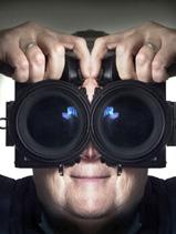
I was born, grew up and went through my education in Glasgow. On completing university, as so many did
then, I had to move away from Scotland to get suitable work. Fast forward to almost four decades later, I took early retirement and moved back to my home city to find a place I didn’t recognise.
From the grim, rather grimy No Mean City in Victorian black I recalled from the 1970s, Glasgow had, in the intervening decades, undergone a transformation.
Face scrubbed, posh frock on, she had stepped out in a big way. European City of Culture 1990; UK City of Architecture & Design 1999; UNESCO City of Music 2008. And in 2021, Glasgow, amazingly, topped the Condé Nast Traveller list of Best Places to Visit. Old sandstone buildings, clean and beautiful, new glass developments, bright and shiny, the city had, like
Doctor Who, regenerated into something completely different. I decided it was high time we got reacquainted, and I got to know my ‘new’ home town again.

Naturally, I felt the best way to achieve that was with my camera. How else?! Starting as an excuse to wander round the city’s various districts and get to know them anew or for the first time, it morphed into a whole project. I’m not one of life’s “people photographers”, indeed I prefer to shoot anything but, so the project would not involve people. Photographically, I’m much more drawn towards landscape/ cityscape, abstracts and architecture and Glasgow has a plethora of great architecture which quickly drew my attention. In 2017, I’d done my Fellowship on abstract architecture around London, but this time I wanted to go in a somewhat different direction, so’s not to repeat myself, and it then became a question of “what’s another way to be Creative about this?” How could I get some creative shots that were fresh, and that I hadn’t seen done of Glasgow before?
The answer came out of some work done for an online course I am doing, run by Bailey Chinnery Photography. Those who know Valda Bailey and Doug Chinnery will know that most of their work is based around Intentional Camera Movement (ICM) and multiple exposure techniques. I’ve been trying to improve my skills in these areas for a few years now – I don’t find it easy, and often struggle with inspiration for subject matter, particularly during
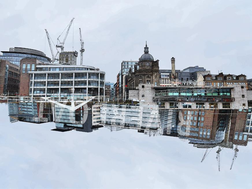
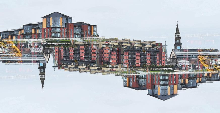
Once an area for shipping, now part of the new riverside with homes and hotels.



lockdowns when travel is so restricted. However, the combination of not being able to travel far and wanting to refamiliarize myself with the nearby city seemed an ideal opportunity to use the latter as the basis for my course project, and use some creative techniques along the way.
I started with a variety of shots of a variety of subject matter to determine what ‘worked’ and what didn’t. I could have gone several ways at this point but decided to focus on multiple
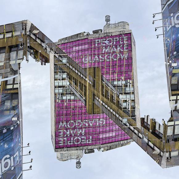
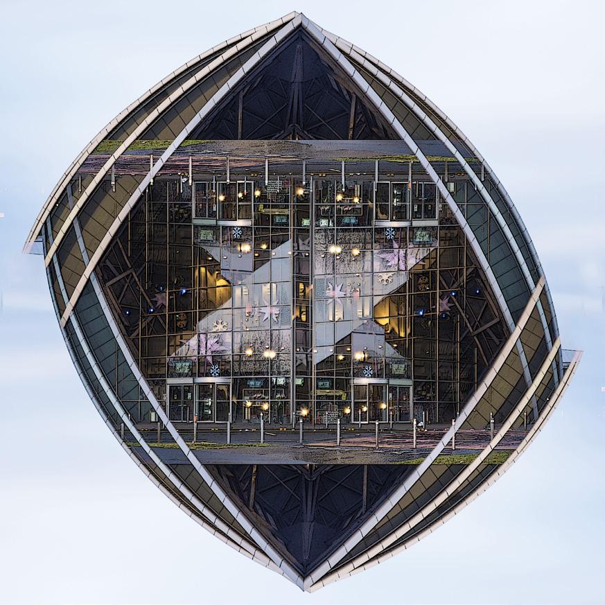
exposure images, mainly because my ICM success is so random! Serendipity kicked in at this point, when I saw some creative architectural shots from Glenys Garnett, involving the skyline of Leeds, and this inspired me to attempt something similar with Glasgow. These ended up being comparatively simple double exposures, to isolate and abstract building elements and ‘float’ them against the sky, creating geometric shapes or skylines which give the city a creative twist.

“Castles in the Air” appear, with gothic spires, or “Floating Cities” arise out of humdrum river skylines. Obviously this could be taken further with more exposures of the same subject combined but I found that I preferred to Keep It Simple, Stupid, and retain recognisable building elements, so that things are at once both familiar and different from the norm.
I discovered that picking the right weather was important – grey/white skies are ideal to create backgrounds of plain negative
Victorian city chambers and cenotaph space in which to float the shapes; blue skies with puffy clouds are not really suitable as these create their own patterns in the background which detracts from the subject matter. Fortunately, “bad weather” white skies are not uncommon in Scotland, and I had plenty of grey winter days in which to experiment!

Equipment for creating such shots need not be
complicated. This sort of work may be done in-camera if your camera has capabilities for several multiple exposure shots and various blending modes available with which to combine them. Experiment with one shot, then a second with the camera upside down (you get some strange looks!), and blend them with Lighten mode. If your camera does not have blending mode
capability other than “average” mode, then the single shots may be taken to a computer and combined in Photoshop using the blending modes there. Phone shots may also be used, with apps such as ‘PhotoSplit’ or ‘Union’, which enable various blending modes for multiple images. Photoshop will give the greatest scope and control for experimentation and it also
allows normal digital activities such as cloning, patching, etc. to touch up any oddities arising from the blends. The resulting images can bring a whole new look to old stone structures and create futuristic forms from the glass and steel ones.
I would imagine that there is scope for this type of imagery in most cities, especially those with redeveloped areas
or a river skyline running through them. I plan to try this style out in other places I may visit when travel opens up fully again. Meantime, I continue to explore my own city, reacquainting myself with the old and getting to know the new. Not all change is always for the better and some beautiful old buildings that I recall from childhood have been lost to time, but
some new icons have also been created and become synonymous with the Glasgow skyline.
I hope that my reinterpreting the city’s architecture in a creative way leads to natives and visitors alike seeing Glasgow in a new light and appreciating both its history and its new modern ‘face’. In the words of the city motto - Let Glasgow Flourish!
 NEIL SCOTT FRPS

Ihave always had an eye for the unusual and a sense of humour that can be dark, and sometimes anarchic or provocative. I have been taking photographs for over 70 years but have rarely been satisfied with straightforward images – pictures of things in front of the camera, unless I had some control over what was there. My two main interests are street photography and still life. Much of my street stuff is taken during the week of August at the Edinburgh Festival Fringe. The High Street (or Royal Mile) is absolutely crammed with thousands of people, tourists, performers, the denizens of the
capital, and the less fortunate in society who beg for coppers. But rather than photographing the colourful performers and buskers, I tend to look for the unusual amongst the visitors who often are more exotic than the thespians. This genre has taken a knock over the last couple of years due to the pandemic, but, paradoxically, allowed me to develop more time to my other passion.
Some years ago I was pleased when one of my acceptances in the London Salon, one of the most difficult salons in which to be successful, was Catfish. It is a basically straightforward
image, being simply a framed painting of a cat apparently looking down at a blue dish on which were three succulent mackerel. I pondered for a while for a suitable title, but then the two subjects – cat and fish – put together made the name catfish. The idea for the image came to me one day when the sun caught the framed painting, and knowing cats’ predilection for fish, I popped out to the local supermarket to buy some. When I got to the fish counter I spotted some beautiful mackerel and asked the fishmonger for three. “Please give me good-looking ones” I
said, meaning that I wanted undamaged ones, no missing eyes or fins or torn scales. The fish-seller then gave me a strange look but carefully selected three unmarked specimens. “They’re for a photograph” I remarked, hoping to explain my strange request. However, this comment seemed to worry the man even more, and he handed the fish over without a word.
The picture was easy to set up, just placing the blue plate and three mackerel on a tablecloth under the painting. A 50mm lens with a smallish aperture on the front of my tripod-mounted camera, and God’s Light (diffused sunlight coming through the dining room window) was all the technology required, and the London selectors were impressed enough to accept it for their annual exhibition.

Some time later my camera club ran a competition on the theme of “fruit and veg” so I put my thinking cap on, engaged my warped sense of humour and pondered on the subject. I immediately put aside any notion of bowls of oranges, grapes or apples, and Spring Onions was conceived. Like Catfish, this was a simple table-top image. The background is a large sheet of white paper arranged as

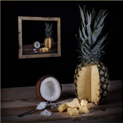
an infinity curve; the two onions came from the kitchen, and the springs from ebay, one of the richest sources of materials for any table-top or still life imagery. I put the springs to use in another pun, combining them with a gold pocket watch – and Springtime was born, although it has been suggested to me that Spring Watch might be an alternative title. This time the background is an A3 sheet of paper stippled with artists’ acrylic paint. Coconuts quickly followed, with the same backdrop, an old cocoa tin from ebay and a handful of old nuts and bolts. By now I had invested in a mirrorless camera with an 1855mm zoom lens, but the other technicalities were just the same. With four images now showing promise as a panel, I embarked on a project to produce a series of visual puns which is still ongoing. Most images are table-top style, the notable exception being Seahorse, which is a composite of two images. The horse was an inquisitive beast which came to investigate when I was taking


some landscape images in rural Fife. I had a 12-24mm lens on the camera and the horse was so close that its nose was almost touching the front element. This explains its rather distorted features. The sea is just waves coming onshore in St Andrews.
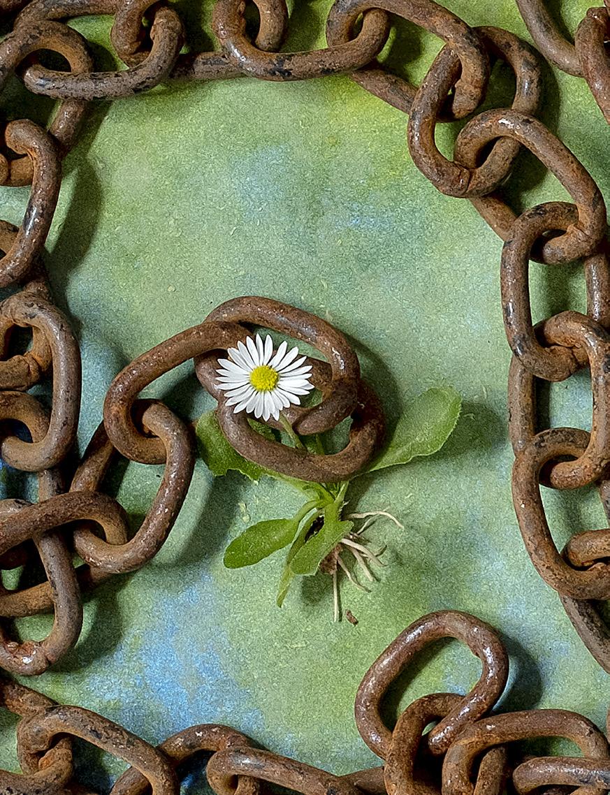
Now that my creative juices were in full flow, I searched dictionaries and thesauruses for words that I could put into pictures. Daisy Chain and Chain Mail made good use of another
purchase from ebay – the rusty chain. When my wife saw the heavy, rusty old chain she asked me where it came from. On being told of its provenance she said “You mean you were daft enough to buy an old chain on ebay?” “Well,” was my response, “Some beggar was selling one!” Daisy Chain was simple –literally a small lawn daisy and the chain on a sheet of paper painted green. Chain Mail took a bit more effort. I had the idea
initially to call this Chain Letter, so I took an envelope, tore it and placed the chain so that it looked as if it had been in the envelope, added another envelope and placed the items behind my front door, as if they had been delivered by the postman.
Jaws is perhaps a crossover image, in that it also features in another of my projects – song and film titles. Again the set-up is so simple. Just an old corroded self-gripping wrench placed on

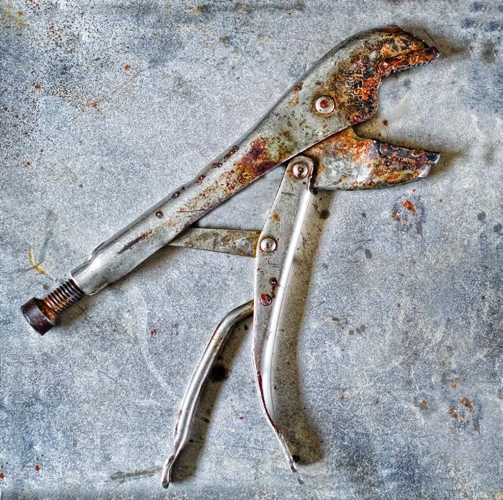
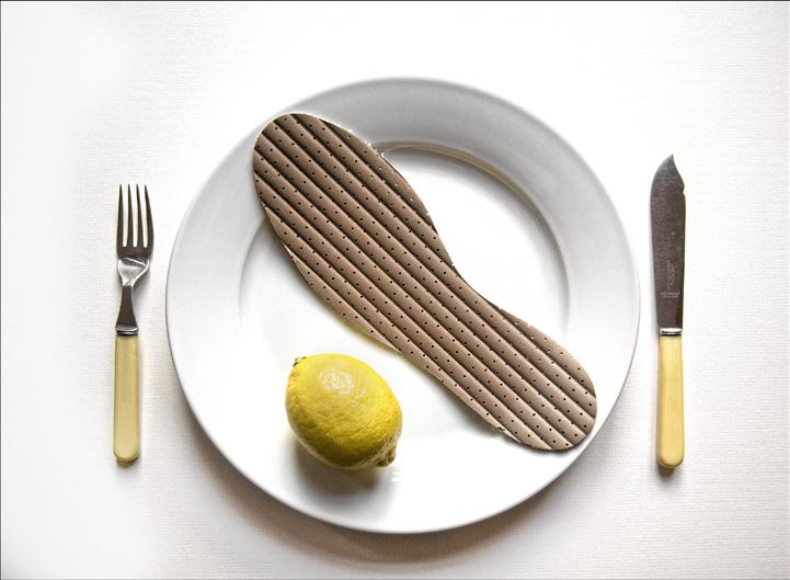


a redundant floor tile. But the corrosion scars and the rivet gave the appearance of some sort of wild beast with its staring eye and open maw. This one has also been accepted at the London Salon. Returning to the piscine theme I created Lemon Sole, perhaps the best pun image to date. There was no need to visit ebay for this one, as all the ingredients were in the house, including the perhaps archaic fish knife and fork that I had kept in one of my boxes of odds and ends for just such an eventuality. These articles were simply placed on a white tablecloth on the dining room table, as if for a proper meal, and I waited for God’s light to do its best. Beating Time was influenced by one of
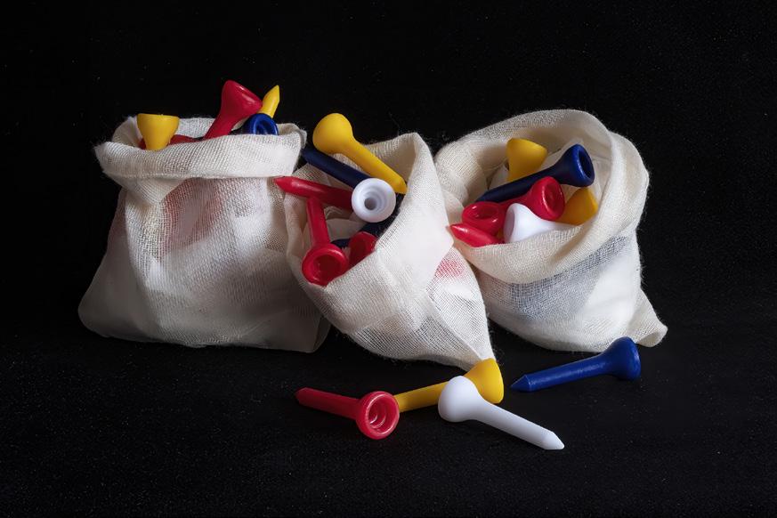
my photographic heroes, the Dadaist photographer, painter and sculptor Man Ray. His image, La Femme, produced in 1920, features not an alluring female model but a food whisk lit strongly from the side, creating bold shadows. I dared to try to emulate the master’s work by including an old pocket watch, thus suggesting the title. Jack in the Box is another simple image, the title just describing what it is, a playing card in a little wooden box. No need for ebay again, but with a background of black velvet. This is surely the best material for a jet black background as, hung at the correct angle, it does not reflect light. Tee Bags did require a couple of searches on ebay for
little cotton bags and a packet of golf pegs, plus, of course, my black velvet.
These are just some of my Visual Puns project, which is undertaken mainly for my own amusement and that of fellow camera club members. For some years I sought distinctions and entered national and international salons with reasonable success culminating with my RPS Fellowship in 2012. Nowadays, however I am content to please myself, rather than try to impress selectors and judges. Instead of looking to produce single, standalone images I prefer to work in panels or series of images. However occasionally a single “good” image may result which is a bonus.

This is an article which I have had in mind for several months now. The reason being that when I show my work to photographers and nonphotographers, the question that I always get is: ”What is it?”
I think this question applies to abstract art as well as photography. The reply that I always make is: “What do you see?” This is usually followed by a long silence. The problem arises because we are educated to see documentary/ straight/ traditional/ realistic/ representational photographs. This occurs through our educational system and into our adulthood. No-one explains abstraction. We have no mental image of an abstract with which to compare a photograph.
Apart from saying ‘what do you see’ the other question is: “What do you feel”? I can’t answer the “What do you feel” question as that is determined by who you are as a person/ artist/ photographer.
But let me start by giving you some pointers by explaining what goes into making my images. When I start to make a photograph, I have to feel some connection or emotional response to my subject matter. If that is not there, whilst I might make a photograph out of frustration or the feeling that I don’t
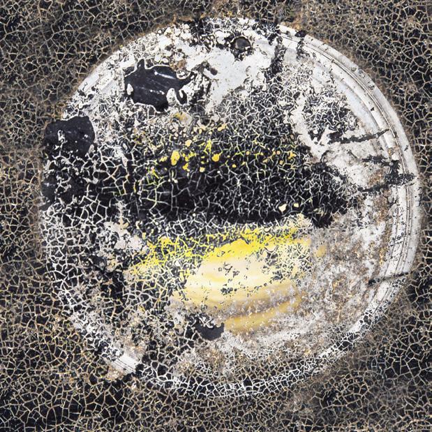
I fight against using titles for my images, but for this one it is important. The title that I use is ‘Disintegration’. It is multiple exposure (ME) based on an allotment. The allotment was becoming very run down and untidy. It used to be looked after by a man and a joyful family. But they stopped coming. Other allotment holders told me that he had become ill. You can see how everything has become fragmented. But it is more nuanced than that as there seems to be a breakdown in camera technique as most is soft with just one sharp area. Disintegration. You are rewarded by looking.
want to have wasted my time, the result is usually rubbish. This sense of connection is only a recent emotion for me. How or why it has arisen I don’t know. But there is no doubt that it is there and it is valuable. I would hope that the viewer of my work would also feel an emotional response. This response can be good or bad. If there is a response, then hopefully, I will have you hooked. This is because either response will create greater involvement with what you see as you try
to analyse the image.
Christopher Rothko when writing about the work of his father Mark Rothko, who created colour field paintings, described that viewers would cry when viewing a canvas covered in maybe just two colours. I would not expect such an extreme reaction to my work!
On a more serious note, starting with that emotional response I will then analyse what is in front of me. I am looking for the basics of any composition such as

line, shape, colour, pattern, and texture. Of these line, shape and colour are the most important. I also try to visualise how they may react with each other and how I can use them. Looking for these basic items is your starting point when viewing abstract images. It is best not to try and analyse what the subject matter is because often, you will not have a clue!
Starting with shapes I will try to work out how I can fit them together. At this point I use my camera trying to
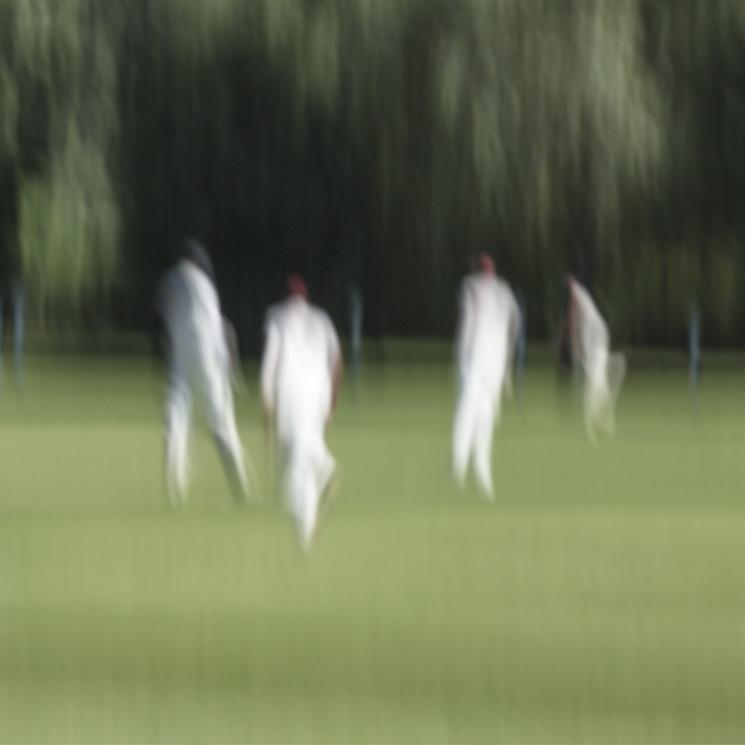
The theme of this photograph was motion. The players are about to change ends.
frame my subject matter in a way that I feel is pleasing. I find it hard work trying to achieve this. I never get it right the first time. I just have to keep going. It can take 20 shots or more to achieve what I want. Failure is important as it improves what I do and helps me to learn.
Like most club photographers I started entering club competitions with varied success. I then moved on to entering BPE’s
and FIAP competitions. In 2018 I stopped entering all competitions. I did this as I realised that I was taking photographs to please a judge that I did not know and whose biases I did not know. I think that I felt the need to get ‘The Shot’ was taking me in a direction that I didn’t wish to pursue.
Competitions are of course a game. If you want to play the game, then that is what you must do. But I wanted
out. I found that I was in a strait jacket in which I was trying to undo the belts. I used to see myself as a landscape photographer but upon reflection what I really liked was being out in the countryside.
At this stage I was trying to find alternatives. I moved to Intentional Camera Movement, which I enjoyed and still do, and then onto Multiple Exposures. I made a conscious decision to
Another use of line, shape, colour, and texture. I had to take something like ten attempts to reach this point. It was one of my first images using the technique of ME. One of the members of Synergy, my group of ten, compared it to a Gerard Richter! Flattering.
I like the strong colour in this image. It is the way that it is breaking up that I like.
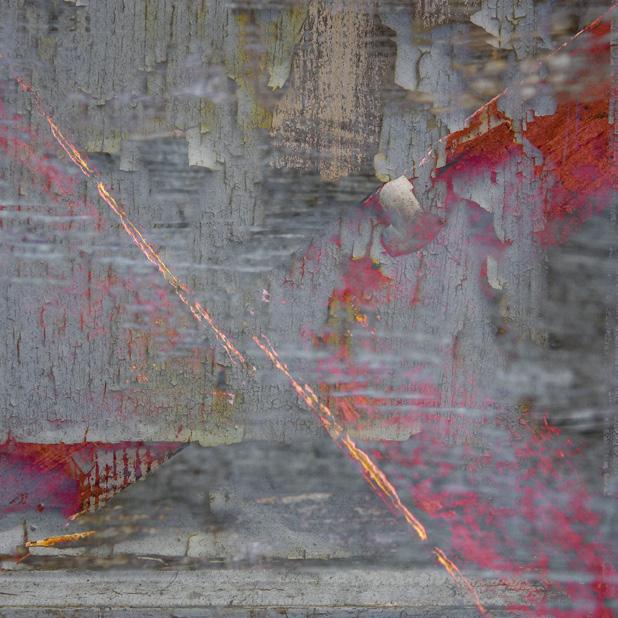

This image is based on shape, colour and texture. In addition, the background adds to the overall effect. The key feature is the bloom on the bottom left of the circle.

Lines and texture have been used in this image. The colour palette works well. The overall effect is that of a seascape.
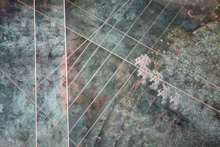
follow my own path. I find that I get a great pleasure from achieving a pleasing photograph. I find that I am in a place of peace during the process. I also get into a state known as ‘ FlOW’. By this I mean that I lose total awareness of what is around me. Recognising that whilst it feels good there is also a danger. Someone could steal my camera gear and I wouldn’t know. Most of the time I don’t use a camera bag as I find it very restrictive.
The constant pull of the bag is distracting. Using just a camera and one lens is very liberating.
I find that having moved to abstract work that my eye for a photograph has changed. By this I mean that I have gained an ability to see detail and not the larger picture. An example of this occurred recently when I was beside a canal concentrating on water reflections and the colours on the canal boats. I met up with another
photographer and we started talking. I asked him what he was photographing. He said the canal, the boats and overhanging weeping willow. I had never noticed that there was a photograph to be had. This eye for detail can be learned by looking for detail when you are out and about. You don’t need a camera, just look and eventually you will train your eye. Minor White used to do such an exercise. Having achieved this I realised that it has reduced my visual

The use of shape and tone are important here. The technique of multiple exposure creates depth which is only perceived by seeing.
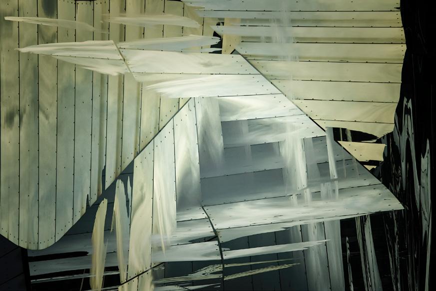
seeing for other styles of photography. But I don’t find that a loss.
One of the problems with moving to abstraction is to find an audience. I know photographers say that if they are happy that is all they need. I don’t think that is true. One needs an audience of some kind. I am in a club of ten members, they are great at giving me feedback. They may not understand what they are seeing but they apply principles of photography and can see the weakness in a composition. Then they let me know!
I feel a certain sadness that Abstraction is not a recognized style in the way that sport, portraiture, and other categories such as nature are recognised. I acknowledge the support given by the RPS with its’ online groups, monthly image discussions and the production of magazines such as Creative Eye. But within the wider world of photography this recognition does not seem to exist.
What conclusions have I come to? For me abstraction is fulfilling. I need an emotional response to what
I am seeing to allow me to proceed. It takes me to a state of flow and peace. I mainly use shape, lines, and colour. I use just my camera and one lens.
Most of my work is serendipitous. Failure is important and to be expected. I like my viewers to decide for themselves what they are seeing.
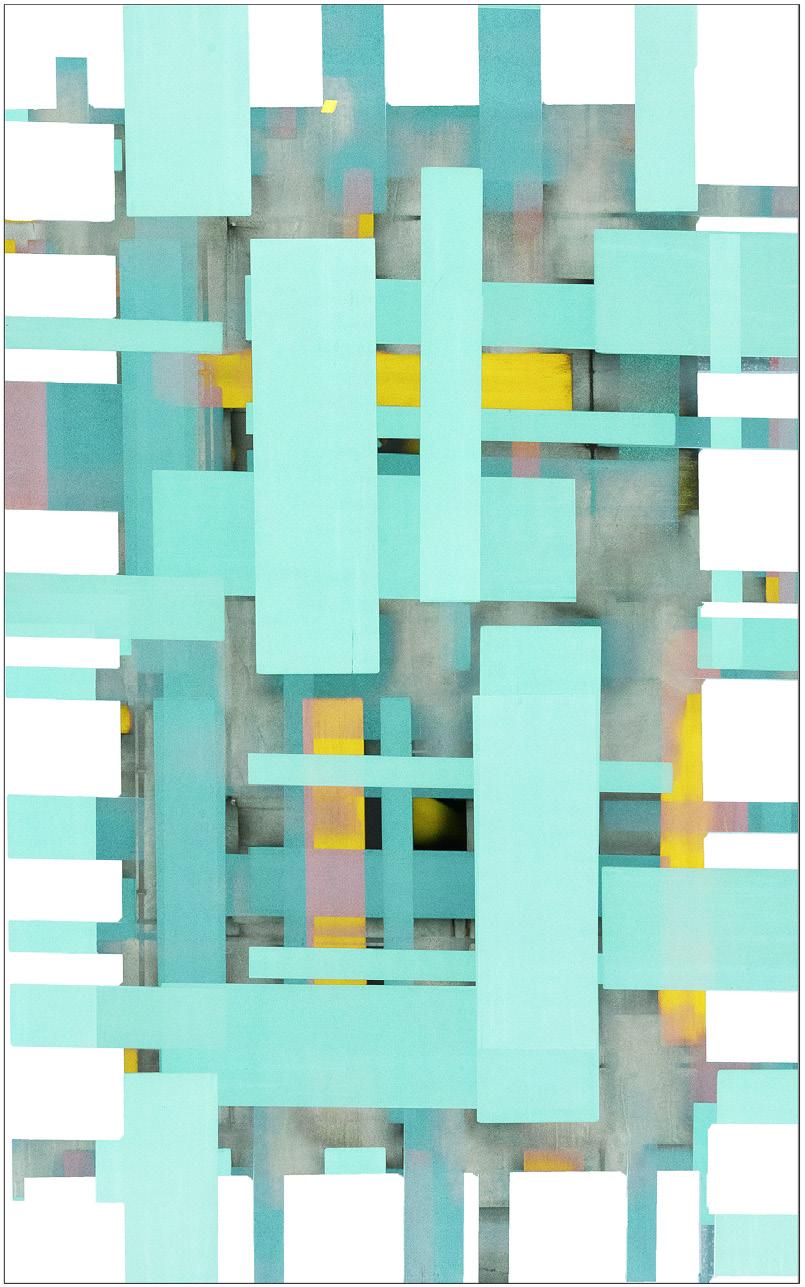
JANIE: My photography has always been grounded in the landscape as I love to be outdoors in nature. I attempt to reflect the moods and beauty of the world around me and to draw inspiration from around the coast and countryside of the British Isles. I am particularly attracted to water and the play of light on and through water.
Increasingly I am drawn to intentional camera movement, multiple exposures and long exposures to create images that do not exist in real time, but which show that the camera can be used as a creative tool to express emotion and demand interpretation.
Like many of you, the last two years had changed my photography not only in the challenges of finding beauty in the smallest things and getting to know my local patch better; but, also in the time and space that has allowed me to explore learn and experiment with different techniques, both in-camera and in post-processing.
“Golden Trees” was taken on a dull April day within walking distance from my home. It’s a small area that I have really begun to appreciate bringing together water, trees, reeds and reflections, and constant changes throughout the seasons.
This image was taken hand-held on
But the timeless quality of the woodcut effect, the flattened perspective and limited but entrancing colour palette was created using a combination of Photoshop transform tools, layers and blend modes including the difference blend mode; and the aged photo pre-set in Lightroom.
I am very pleased to gain this award in a print exhibition as I really enjoy printing my own images, experimenting with different photographic papers, and presenting that final look of the finished picture.
JOAN: A very apt title for this beautifully creative image. The print positively glowed with a golden hue. The reflection of the trees in the water has been beautifully seen but Janie’s creative eye saw the possibility to enhance this view by doubling up the scene and using symmetry to complete her image so perfectly. Add in very competent processing and Janie’s print stood out to each of us selectors as a worthy winner of the Gold Medal. Well done Janie, an excellent image.

IAN: The true sign of a great print is that it sticks in the mind when first seen and
only gets better on subsequent viewings. There is a beauty and simplicity in Golden Trees which has the timeless quality of an etching, and this is emphasised further by the restricted, warm colour palette. There were some superb images entered into the exhibition, but all three selectors kept being drawn back to this one as their unanimous gold medal choice.
DAVID: This striking image captured the attention of all the judges from the start. It is a composition of strong shapes and varied textures from the natural world. Lines come from the vertical reeds and fan-shaped tree branches. Horizontal patterns in the apparent sky - actually the water surface - criss-cross the image. Although the image is a reflection, the square format effectively constrains that symmetry.
What lifts this photograph from the ordinary and makes it a winner is the editing. It has converted it into a magical image, glowing like burnished metal. It has a graphic quality where the lines and textures are all important. The rich tones within the limited colour palette are then highlighted by the silvery effect on the tree branches.
This is a fine image from a very creative photographer and a worthy winner of the Gold Medal.
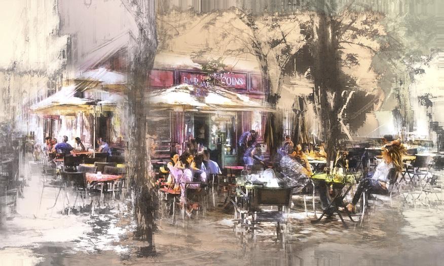
COLIN: Apparently café culture throughout France is in decline due to the 2008 smoking ban, the rise of the digital age and the gradual trend towards higher quality artisanal cafés.
This image was taken back in June 2019 at the popular “Bar des 13 Coins” in the old quarter Le Panier district of Marseille. The treatment mainly comprised of some adjustment layers, a white vignette, perspective correction and a combination of Redfield filters to recreate that outdoor Parisian neighbourhood feel that we all associate with France.
IAN: Photographs are an excellent way of capturing and documenting the world around us, but creative use of light, colour and compositional design can also be used to convey both atmosphere and emotion. Café Culture is a perfect example of this, instantly transporting the viewer to a tree-lined Parisian boulevard with its inhabitants enjoying relaxed conversation in the warm sunshine. One can smell the roasting coffee and sumptuous gâteaux, such is the feeling evoked by this image, and my desire to sit down at one of the tables and partake of the goodies on offer is almost irresistible!
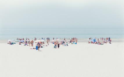
ROGER: I took a trip to meet some friends, who are not photographers, in May and arrived at Luskentyre Beach on the Isle of Harris just before midday. When I asked how long we were going to stay I was told a maximum of one hour. As a consequence, I decided not to use my tripod and proceeded with just my camera and a 24-70mm lens.

I saw and took this image having been attracted by the waterline, the sand, the hills in the background and clouds in the sky. When I viewed the result, I was delighted to see the breaking wave on the right-hand side but decided to simplify the image by omitting the clouds using a ‘letterbox’ crop.
JOAN: I really enjoyed this image. It was a difficult choice, having to choose one amongst so many deserving of an award. However, I kept returning to this one - I always think that if you view an image and really wish you could have been the one to have taken it then it has to be given some kind of recognition. I have no idea where this beach is situated but I immediately wanted to be there. Seascapes such as this are not readily regarded as creative. It is quite difficult to make a landscape or seascape scene ‘creative’ but this one certainly managed it and really deserves to be in the Creative Eye exhibition. Such a tranquil, peaceful scene. Extremely simple in composition and excellently processed with muted colours with an artistic, painted look. A work of art , beautifully printed on an appropriate art paper. Well done Roger!
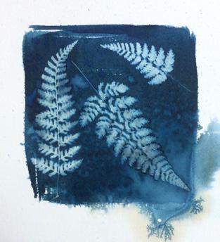
GRAHAM: I have been experimenting with cyanotypes for the past year and after spending hours wrestling with the process of getting the right digital negative, I think I might have finally cracked it – at least I now tend to be satisfied with the first exposure and final print. I captured this little vignette with my smart phone from a hedgerow just around the corner where I live and thought it would be
a suitable candidate for a cyanotype image. The quote “ beauty in the mundane ” comes to mind which I hope the viewer might perceive as I did.
DAVID: The cyanotype process was invented by Sir John Herschel, early in the history of photography, and his friend Anna Atkins produced a famous series of cyanotype images of botanical specimens. This
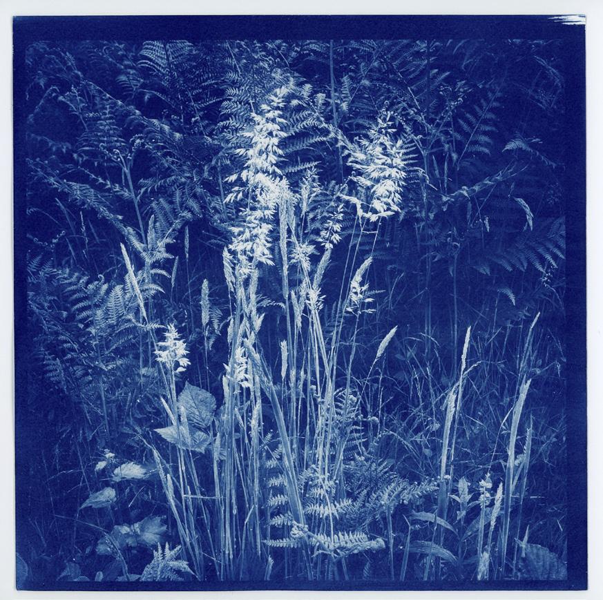
image, selected for my individual award, gives a refined modern take on the cyanotype, whilst retaining that botanical connection.
The square format and monochrome blue combine to concentrate the viewer’s eye on the shapes and composition. The photographer has taken a simple subject from the foot of a hedge and cleverly created depth, with the subdued background of
bracken and the lightened grass stems at the front. Within the square there are diagonals rising from both corners to a central peak of open grass flowers, with others in bud to the sides.
The blue of the cyanotype combined with the subtle textures of the subject create a sense of calm contemplation. Congratulations to the photographer for creating this intriguing image.
 by Jan Beesley ARPS
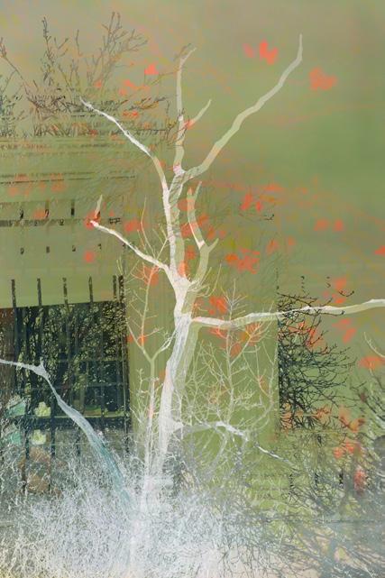
In trees secret dreams Colour fills their weary boughs Dark earth awakens. Looking at the bare branches of trees in winter it is hard to imagine them in full leaf. The inspiration behind this image was the thought that inside those bare, gaunt branches lies the potential for new growth, new life, new splendour.
So although the Winter can seem a dark time, without that necessary respite the tree could not sustain itself through the vibrant spring and summer. Letting go again in Autumn to rest and prepare for the next year.
Trees are such a powerful metaphor for the potential which lies within us all to become our essential selves, to recover from dark days and begin anew.
On a technical level this image was made using Intentional camera movement and multiple exposure to create the colours and effect I was seeking to represent this idea.
In January I was shooting hoar frost and was distracted by the light on these trees as the rising sun skimmed those at the edge, so I vowed to return. A few days later I had a chance. I captured a few ‘straight’ images, but wasn’t sure they quite did justice to the feeling of a winter woodland awakening from the long, dark night. I then started shooting multiple exposures with one image sharp and one with intentional camera movement. Whilst I tried to capture the desired image in camera, ultimately I combined two raw files in Photoshop, using layer masks to optimise the combination.

I was delighted that “Flying Low Over the Water” received recognition as I regard the style I use for images such as these as being in the Marmite category.

It was shot on the daily, early morning dog walk on the beach, which is barely 5 minutes’ walk from my home, on a very still day with barely a ripple on the water. The intention was to strip out all unnecessary detail, via a combination
of suitable capture settings and post processing, to convey the tranquil peace and gentle activity I was lucky enough to enjoy. Typically, it requires only a short wait for some form of bird to fly by and in this case a passing seagull duly obliged and added a bonus by flying low and heading for a post, known locally as a Whithey, which marks some oyster layings and creating a subtle reflection.
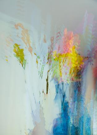
The Lisianthus was a gift – beautiful and softly colourful. My image was made to try and convey that beauty and prolong it. Using InCamera multiple exposure (Canon 5D MkIV), the first shot (about 0.5sec) was taken hand-held with a small swirly motion (needed several attempts before I got one I liked); then using a tripod, the 2nd shot was an in-focus photo of the flowers superimposed on the swirl. Slight adjustments were made in Photoshop. However the background was rather dark and too green so I played around with a couple of filters, a white layer and blend modes to come up with an image that hopefully conveyed the soft and ethereal beauty of the Lisianthus.

Dawn Flight by Kate Barclay LRPS

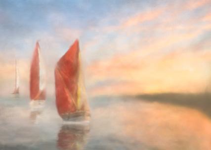
It was New Years Day 2022 at 8.00 in the morning; I was standing on the beach watching and photographing a glorious dawn unfolding before me. It was one of the best dawns I had experienced for a few months. The colours ranged from early morning pre dawn blues to stunning dramatic pinks and yellows to subtle hues of all the colours as the sun rose above the horizon. This image was taken towards the end of the morning using a technique called ICM –Intentional Camera Movement, which is a creative way of working with long exposure photography and implies deliberately moving the camera during an exposure. This technique can create some stunning and sometimes unpredictable results, and is all about giving oneself the time and space to see what is unfolding in front of you, allowing you to capture your image in a more creative way.
This image – abstract, evocative and moody, is meant and I hope provokes an ethereal response in you the viewer.
by
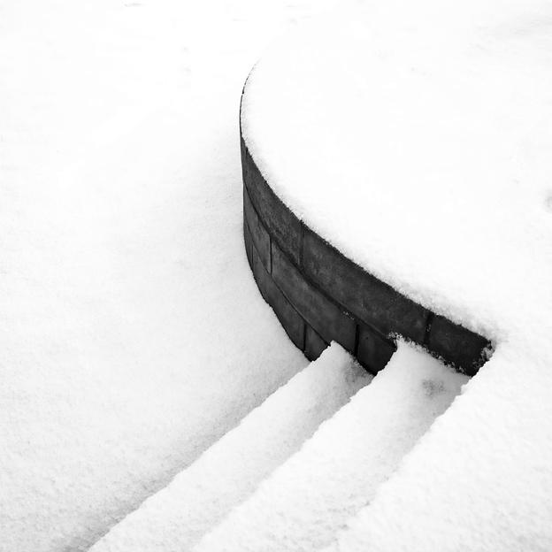
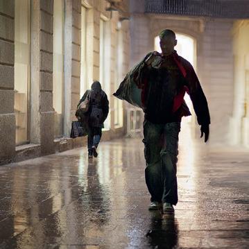
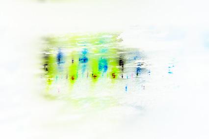
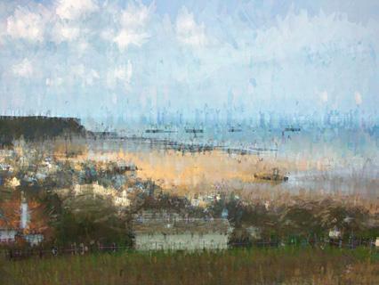
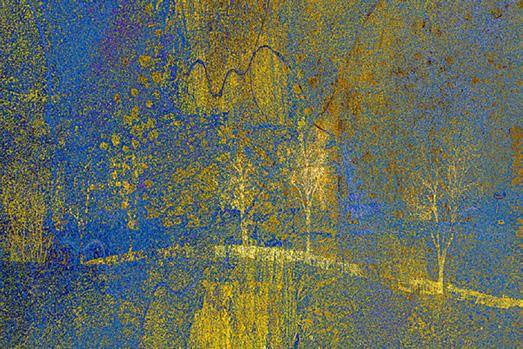
Steven Whittaker ARPSI’m a wandering type of photographer, and the image was taken in the snow, of my home town in Arbroath, during the COVID lockdown, for a documentary series trying to show the desolation / isolation that pervaded small towns at that time, but also showing the beauty that exists in mundane and everyday places…that in the negativity there is always a positive angle. You just have to look.
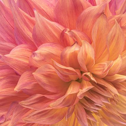


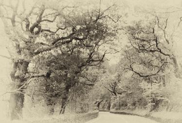


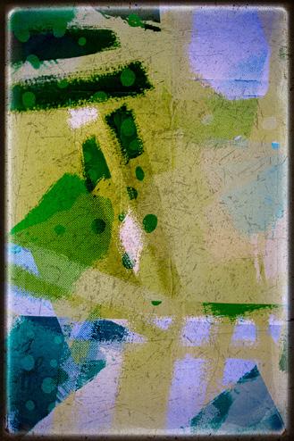
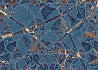
Abstract 74, 21 Feb 2022
 by Andy Bolsover
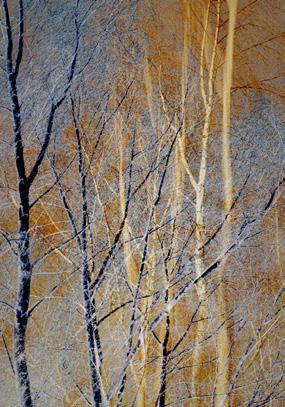
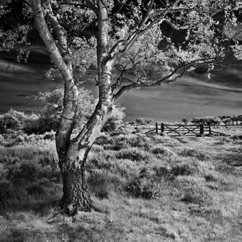
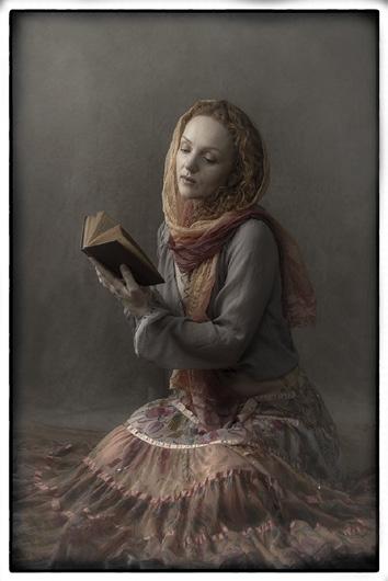
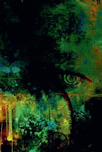
Abstract

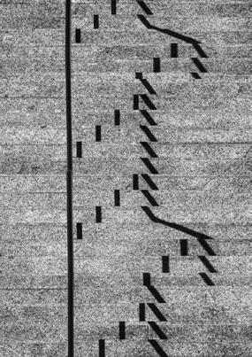

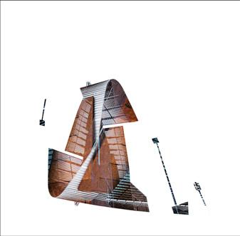

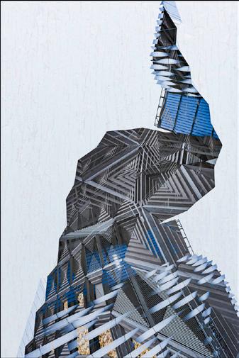










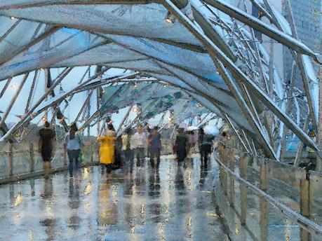
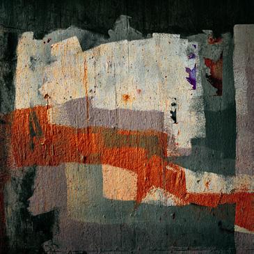

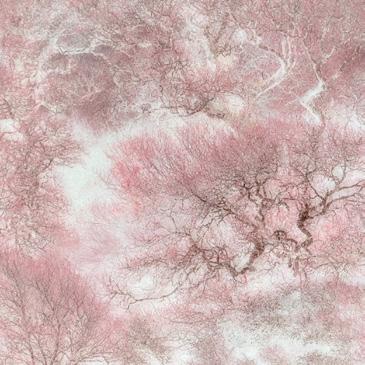

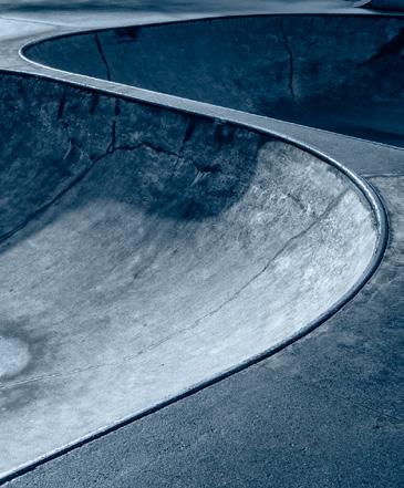











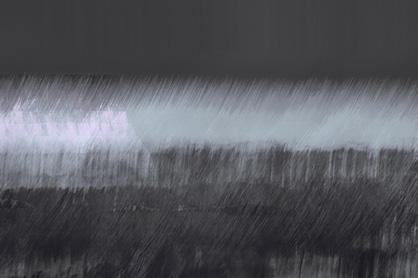
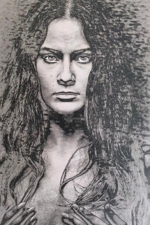
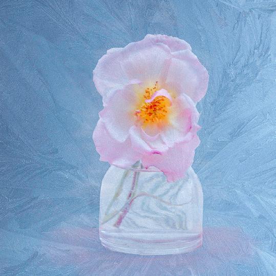
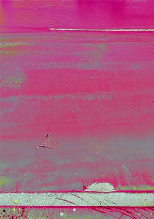

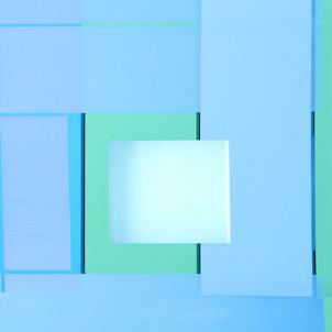





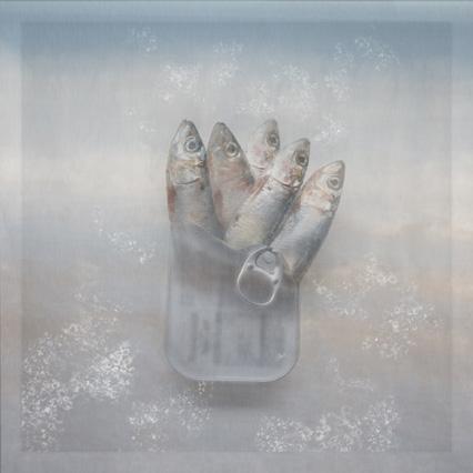


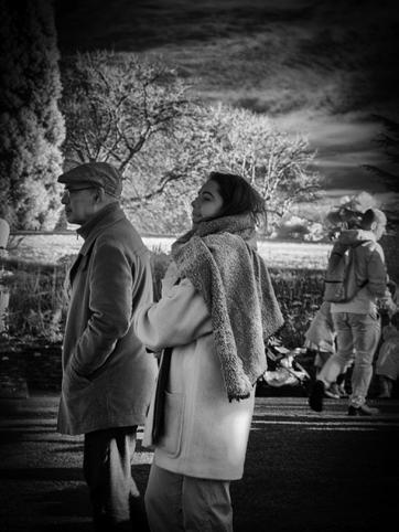
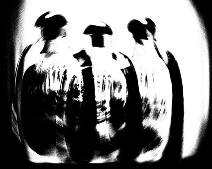

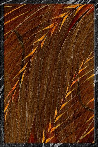







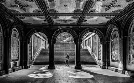



 Bethesda Isolation by Clive Watkins LRPS
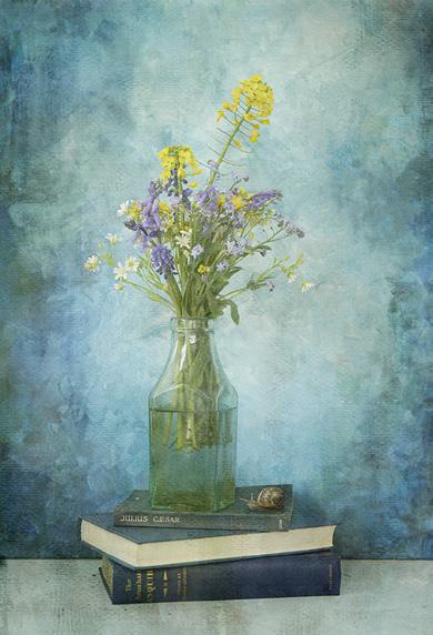
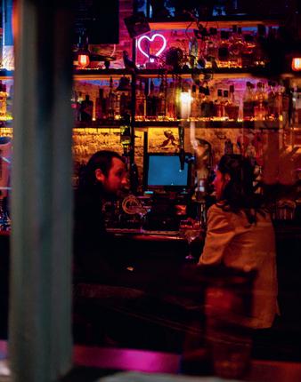
Into the Inferno by Paul Wells
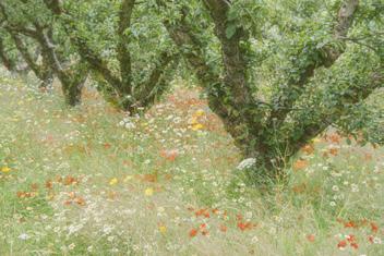
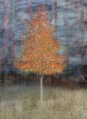
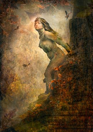
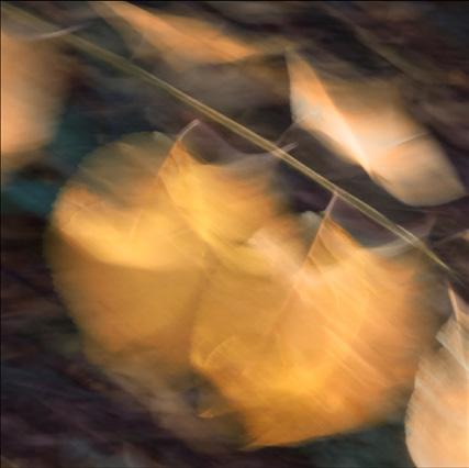
Autumn Frolic by Veronica Worrell ARPS MA
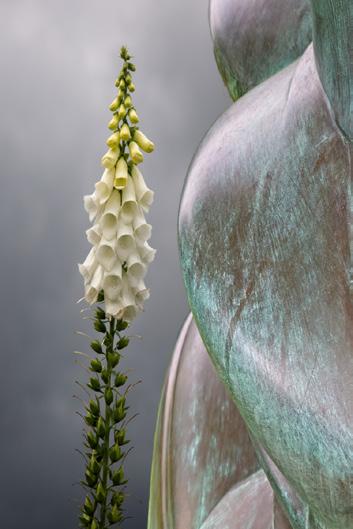
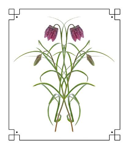
Entangled Magic by Veronica Worrell ARPS MA
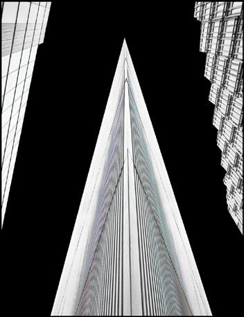
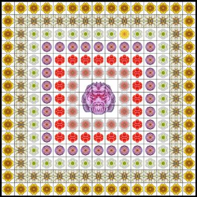
Kaleidoscope by Ernest Wright

